A Concise Presentation By Mr. Deepak Sarangi M.Pharm 1

Control chart ppt
Jul 15, 2015
Welcome message from author
This document is posted to help you gain knowledge. Please leave a comment to let me know what you think about it! Share it to your friends and learn new things together.
Transcript
A Concise Presentation
By
Mr. Deepak Sarangi M.Pharm
1
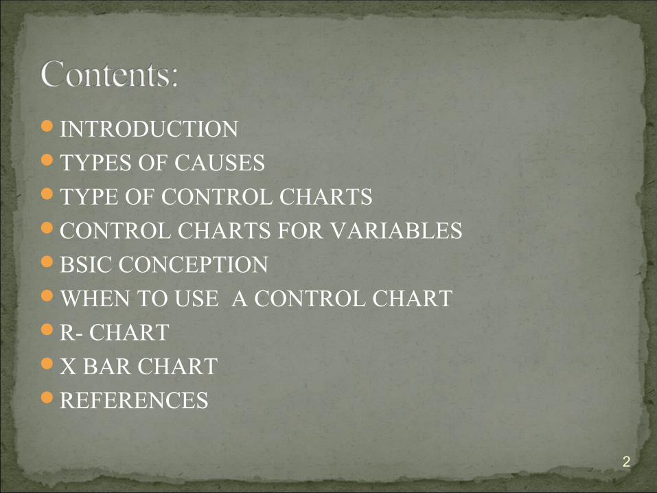
INTRODUCTIONTYPES OF CAUSESTYPE OF CONTROL CHARTSCONTROL CHARTS FOR VARIABLESBSIC CONCEPTIONWHEN TO USE A CONTROL CHARTR- CHARTX BAR CHART REFERENCES
2
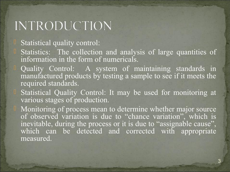
Statistical quality control: Statistics: The collection and analysis of large quantities of
information in the form of numericals. Quality Control: A system of maintaining standards in
manufactured products by testing a sample to see if it meets the required standards.
Statistical Quality Control: It may be used for monitoring at various stages of production.
Monitoring of process mean to determine whether major source of observed variation is due to “chance variation”, which is inevitable, during the process or it is due to “assignable cause”, which can be detected and corrected with appropriate measured.
3
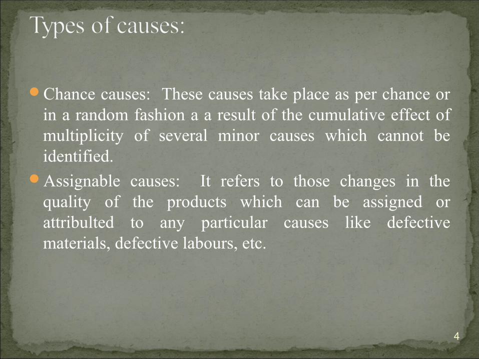
Chance causes: These causes take place as per chance or in a random fashion a a result of the cumulative effect of multiplicity of several minor causes which cannot be identified.
Assignable causes: It refers to those changes in the quality of the products which can be assigned or attribulted to any particular causes like defective materials, defective labours, etc.
4

Types of the control charts
•Variables control charts1. Variable data are measured on a continuous
scale. For example: time, weight, distance or temperature can be measured in fractions or decimals.
2. Applied to data with continuous distribution
•Attributes control charts1. Attribute data are counted and cannot have
fractions or decimals. Attribute data arise when you are determining only the presence or absence of something: success or failure, accept or reject, correct or not correct. For example, a report can have four errors or five errors, but it cannot have four and a half errors.
2. Applied to data following discrete distribution5

VARIABLE CHARTS: X-bar charts: In this charts, the sample means are plotted in
order to control the mean value of a variable. R-Chart: In this chart, the sample ranges are plotted in order to
conrol the variability of variable. S chart: In this chart, the sample standard deviations are plotted
in order to control the variability of the variable. S**2 chart: In this chart, the sample variances are plotted in
order to control the variability of a variable. ATTRIBUTE CHARTS: C chart: In this chart , we plot the number of defecties (per day,
per batch, per machine) Uchart: In this chart, we plot the rate of defectives. Np chart: In this chart, we plot the number of defective and
sample size. P chart: In this chart,we plot the percent of defectives.
6
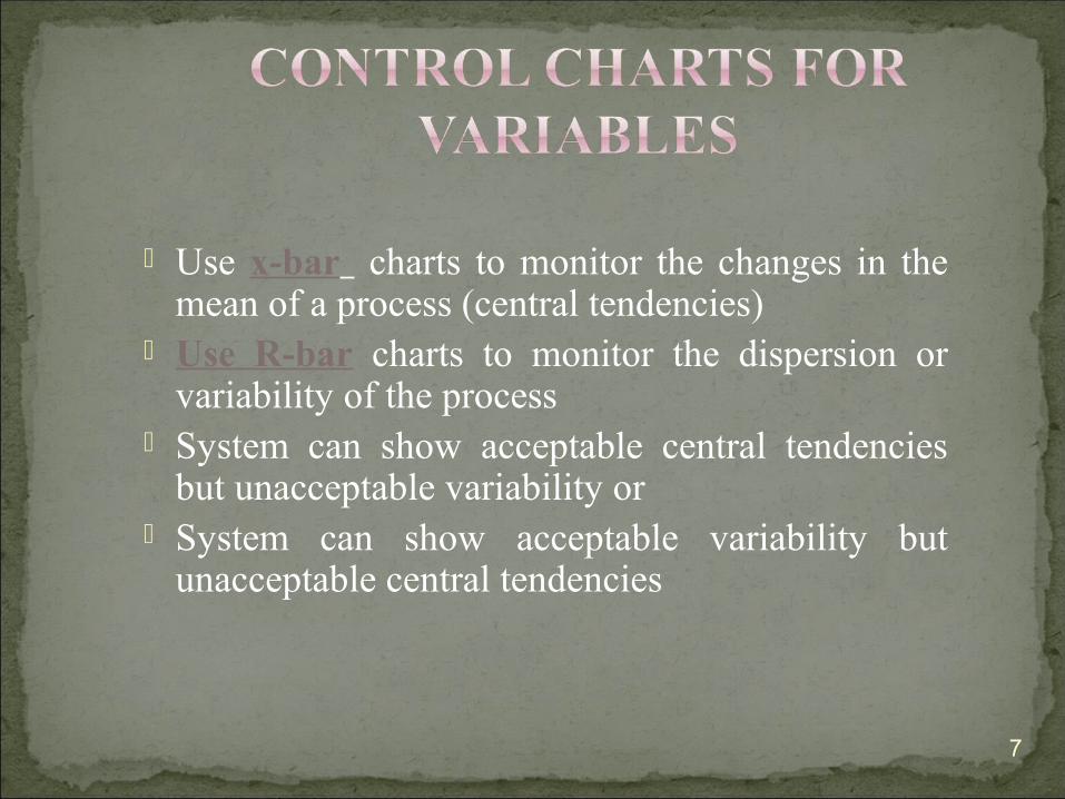
Use x-bar charts to monitor the changes in the mean of a process (central tendencies)
Use R-bar charts to monitor the dispersion or variability of the process
System can show acceptable central tendencies but unacceptable variability or
System can show acceptable variability but unacceptable central tendencies
7
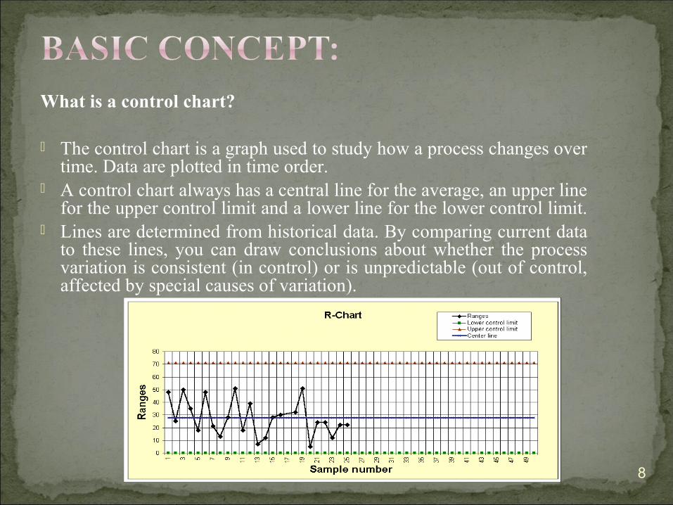
What is a control chart?
The control chart is a graph used to study how a process changes over time. Data are plotted in time order.
A control chart always has a central line for the average, an upper line for the upper control limit and a lower line for the lower control limit.
Lines are determined from historical data. By comparing current data to these lines, you can draw conclusions about whether the process variation is consistent (in control) or is unpredictable (out of control, affected by special causes of variation).
8
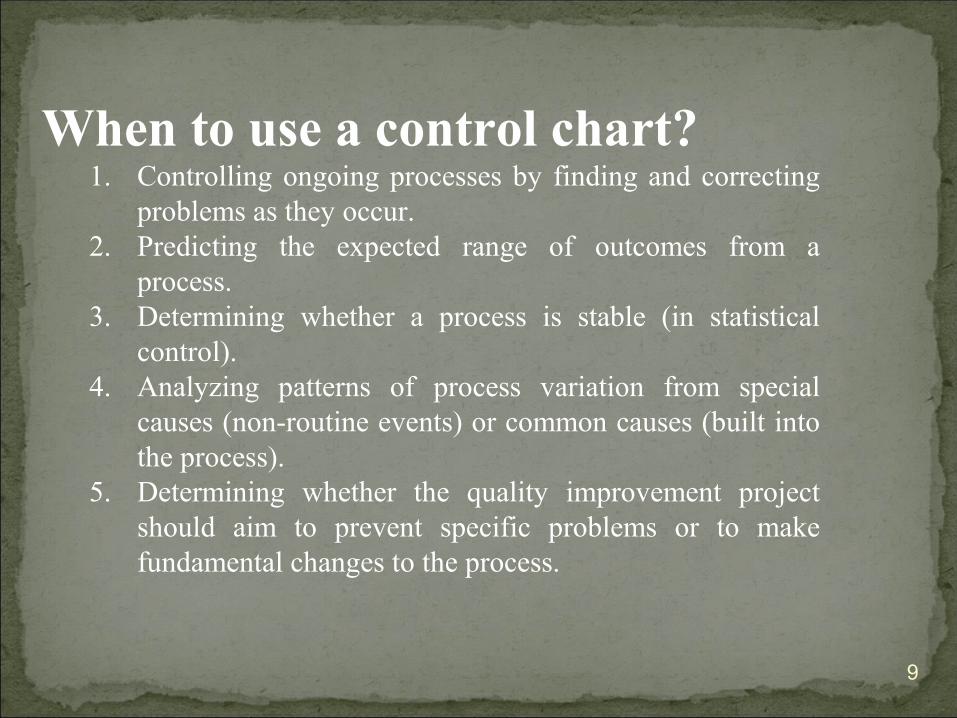
When to use a control chart?1. Controlling ongoing processes by finding and correcting
problems as they occur. 2. Predicting the expected range of outcomes from a
process. 3. Determining whether a process is stable (in statistical
control). 4. Analyzing patterns of process variation from special
causes (non-routine events) or common causes (built into the process).
5. Determining whether the quality improvement project should aim to prevent specific problems or to make fundamental changes to the process.
9
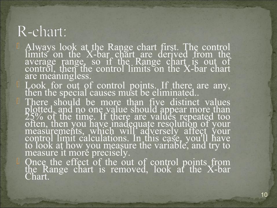
Always look at the Range chart first. The control limits on the X-bar chart are derived from the average range, so if the Range chart is out of control, then the control limits on the X-bar chart are meaningless.
Look for out of control points. If there are any, then the special causes must be eliminated..
There should be more than five distinct values plotted, and no one value should appear more than 25% of the time. If there are values repeated too often, then you have inadequate resolution of your measurements, which will adversely affect your control limit calculations. In this case, you'll have to look at how you measure the variable, and try to measure it more precisely.
Once the effect of the out of control points from the Range chart is removed, look at the X-bar Chart.
10

The X-bar chart monitors the process location over time, based on the average of a series of observations, called a subgroup.
X-bar / Range charts are used when you can rationally collect measurements in groups (subgroups) of between two and ten observations. Each subgroup represents a "snapshot" of the process at a given point in time. The charts' x-axes are time based, so that the charts show a history of the process. For this reason, data should be time-ordered; that is, entered in the sequence from which it was generated. If this is not the case, then trends or shifts in the process may not be detected, but instead attributed to random (common cause) variation.
For subgroup sizes greater than ten, use X-bar / Sigma charts, since the range statistic is a poor estimator of process sigma for large subgroups. In fact, the subgroup sigma is always a better estimate of subgroup variation than subgroup range. The popularity of the Range chart is only due to its ease of calculation, dating to its use before the advent of computers.
For subgroup sizes equal to one, an Individual-X / Moving Range chart can be used, as well as EWMA or CuSum charts.
X-bar Charts are efficient at detecting relatively large shifts in the process average, typically shifts of +-1.5 sigma or larger. The larger the subgroup, the more sensitive the chart will be to shifts, providing a Rational Subgroup can be formed. For more sensitivity to smaller process shifts, use an EWMA or CuSum chart.
)
11
andRchartxforRA
andSchartxsAxLCL
andSchartxsAxUCL
2
3
3
)(
)(
−=
+=
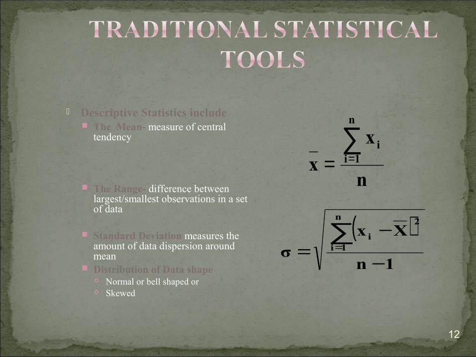
Descriptive Statistics include The Mean- measure of central
tendency
The Range- difference between largest/smallest observations in a set of data
Standard Deviation measures the amount of data dispersion around mean
Distribution of Data shape Normal or bell shaped or Skewed
n
xx
n
1ii∑
==
( )1n
Xxσ
n
1i
2
i
−
−=
∑=
12
xx
xx
n21
zσxLCL
zσxUCL
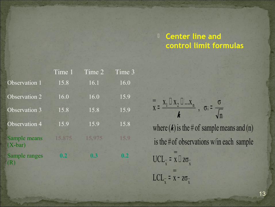
sampleeach w/in nsobservatio of# theis
(n) and means sample of # theis )( wheren
σσ ,
...xxxx x
−=
+=
=++=
kk
Center line and control limit formulas
Time 1 Time 2 Time 3
Observation 1 15.8 16.1 16.0
Observation 2 16.0 16.0 15.9
Observation 3 15.8 15.8 15.9
Observation 4 15.9 15.9 15.8
Sample means (X-bar)
15.875 15.975 15.9
Sample ranges (R)
0.2 0.3 0.2
13
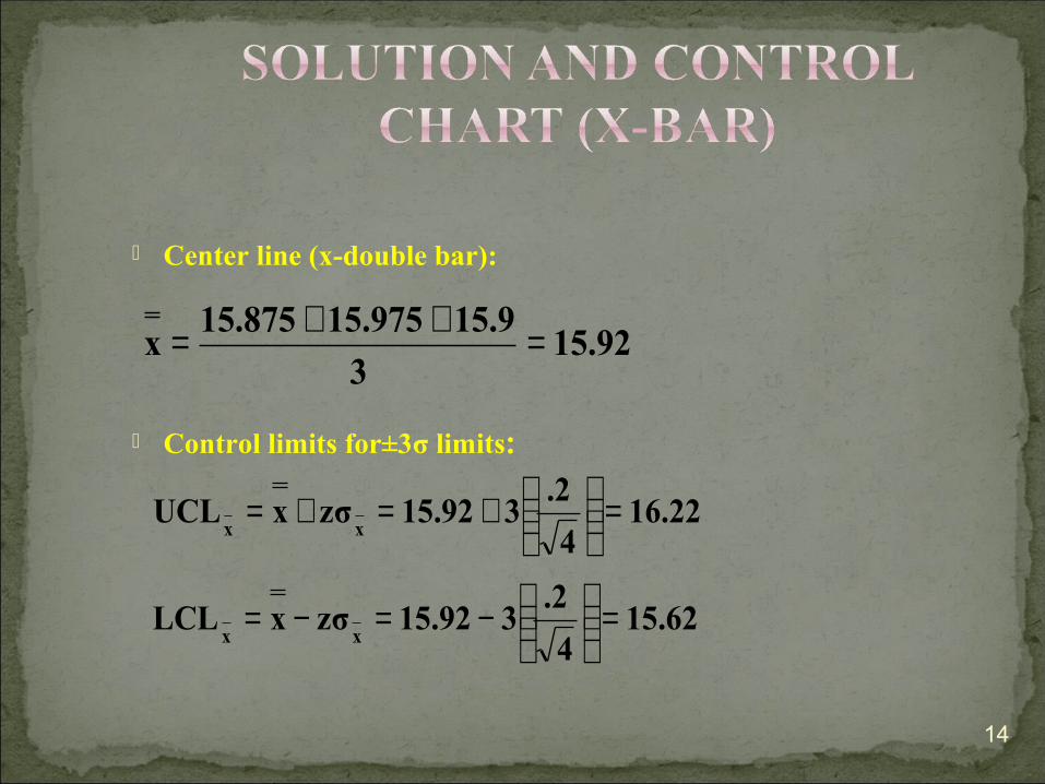
Center line (x-double bar):
Control limits for±3σ limits:
15.923
15.915.97515.875x =++=
15.624
.2315.92zσxLCL
16.224
.2315.92zσxUCL
xx
xx
=
−=−=
=
+=+=
14

15

Center Line and Control Limit formulas:
Factors for three sigma control limits
0.00.0(.233)RDLCL
.532.28(.233)RDUCL
.2333
0.20.30.2R
3
4
R
R
===
===
=++=
Factor for x-Chart
A2 D3 D42 1.88 0.00 3.273 1.02 0.00 2.574 0.73 0.00 2.285 0.58 0.00 2.116 0.48 0.00 2.007 0.42 0.08 1.928 0.37 0.14 1.869 0.34 0.18 1.8210 0.31 0.22 1.7811 0.29 0.26 1.7412 0.27 0.28 1.7213 0.25 0.31 1.6914 0.24 0.33 1.6715 0.22 0.35 1.65
Factors for R-ChartSample Size (n)
16
17

Use this method when sigma for the process distribution is not know
Control limits solution:
( )( ) 15.75.2330.7315.92RAxLCL
16.09.2330.7315.92RAxUCL
.2333
0.20.30.2R
2x
2x
=−=−=
=+=+=
=++=
18
CH. NARASIMHA RAO, A TEXT BOOK OF BIOSTASTICS.
REMINGTON, PRAMACEUTICAL PRACTICE, 19TH EDITION.
19
20
THANKS for viewing the ppt
For more ppts on pharma related topics plz
contact [email protected]
Or find me at following linkwww.facebook.com/sarangi.dipu
Related Documents