Contents Page Versions Paige Hetherington

Contents Page Versions
Jul 30, 2015
Welcome message from author
This document is posted to help you gain knowledge. Please leave a comment to let me know what you think about it! Share it to your friends and learn new things together.
Transcript

Contents Page Versions
Paige Hetherington
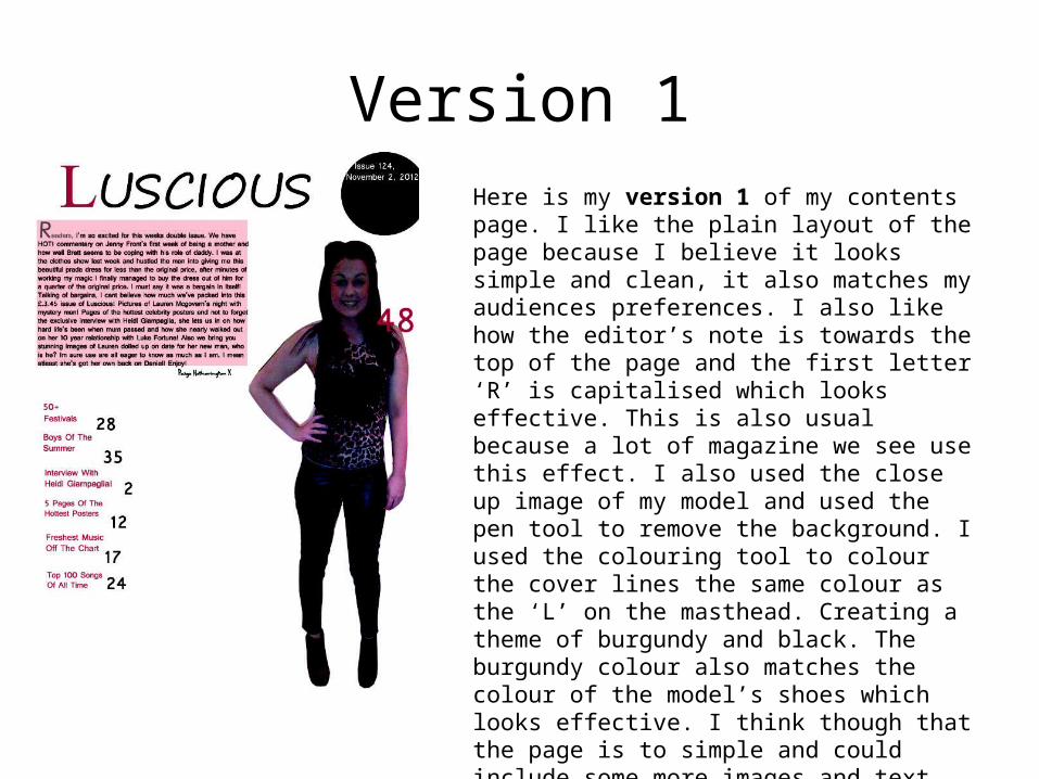
Version 1Here is my version 1 of my contents page. I like the plain layout of the page because I believe it looks simple and clean, it also matches my audiences preferences. I also like how the editor’s note is towards the top of the page and the first letter ‘R’ is capitalised which looks effective. This is also usual because a lot of magazine we see use this effect. I also used the close up image of my model and used the pen tool to remove the background. I used the colouring tool to colour the cover lines the same colour as the ‘L’ on the masthead. Creating a theme of burgundy and black. The burgundy colour also matches the colour of the model’s shoes which looks effective. I think though that the page is to simple and could include some more images and text.
Version 2
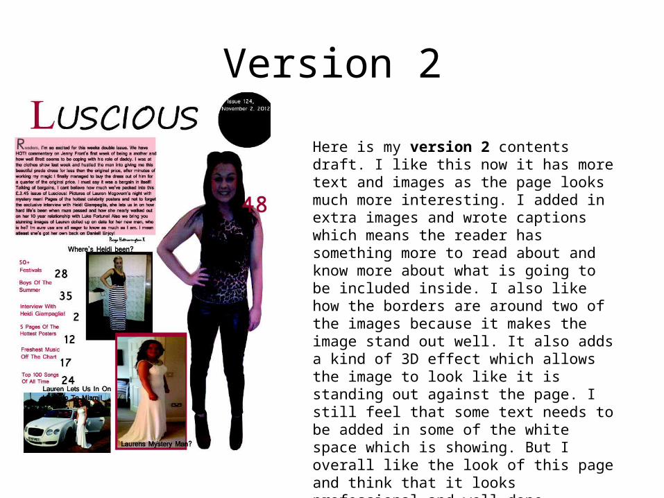
Here is my version 2 contents draft. I like this now it has more text and images as the page looks much more interesting. I added in extra images and wrote captions which means the reader has something more to read about and know more about what is going to be included inside. I also like how the borders are around two of the images because it makes the image stand out well. It also adds a kind of 3D effect which allows the image to look like it is standing out against the page. I still feel that some text needs to be added in some of the white space which is showing. But I overall like the look of this page and think that it looks professional and well done.
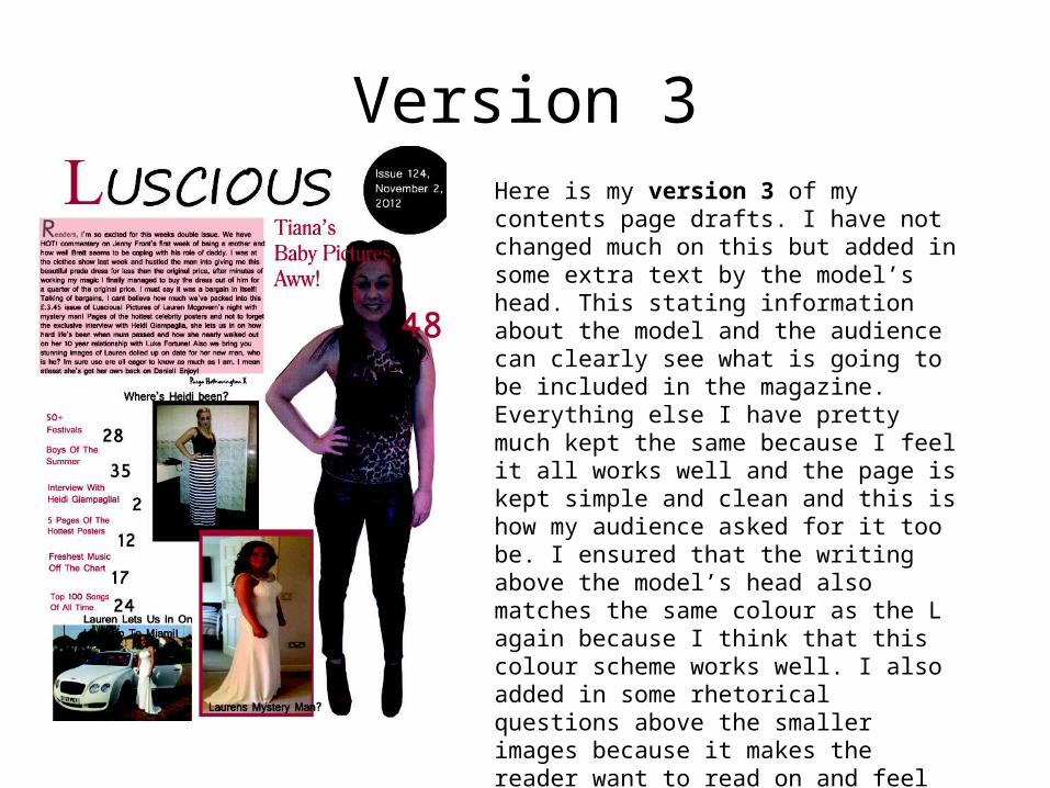
Version 3Here is my version 3 of my contents page drafts. I have not changed much on this but added in some extra text by the model’s head. This stating information about the model and the audience can clearly see what is going to be included in the magazine. Everything else I have pretty much kept the same because I feel it all works well and the page is kept simple and clean and this is how my audience asked for it too be. I ensured that the writing above the model’s head also matches the same colour as the L again because I think that this colour scheme works well. I also added in some rhetorical questions above the smaller images because it makes the reader want to read on and feel eager to find out more.
Version 4
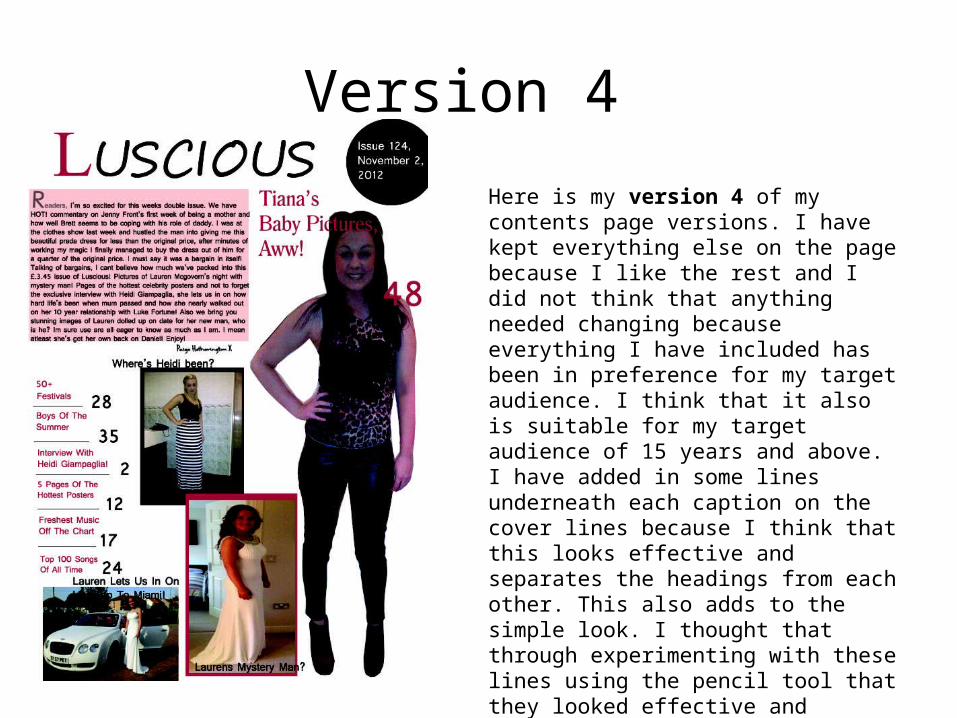
Here is my version 4 of my contents page versions. I have kept everything else on the page because I like the rest and I did not think that anything needed changing because everything I have included has been in preference for my target audience. I think that it also is suitable for my target audience of 15 years and above. I have added in some lines underneath each caption on the cover lines because I think that this looks effective and separates the headings from each other. This also adds to the simple look. I thought that through experimenting with these lines using the pencil tool that they looked effective and professional so decided to keep them.
Related Documents


