CONTENTS PAGE OVERVIEW WE LOVE POP

Contents Page Overview
Aug 05, 2015
Welcome message from author
This document is posted to help you gain knowledge. Please leave a comment to let me know what you think about it! Share it to your friends and learn new things together.
Transcript
CONTENTS PAGE OVERVIEW WE LOVE POP
INTRODUCTION
The ‘We Love Pop’ contents page has been designed in a way which is fun and interesting for it’s young readership to look as, so they do not feel as though they are being bombarded with information and are therefore more inclined to read it. Through carrying out an investigation into the contents page of ‘We Love Pop’ it is possible to identify similar features which occur throughout the issues of the magazine.

CONVENTIONS
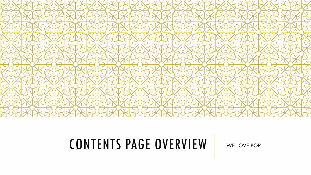
These four contents page for this pop magazine can be seen as conventional in many way. One repeated feature is how the masthead is in a bold, black font which makes it stand out and clearly indicates the purpose of the page. The main image on the page relates to the feature article which is on the cover to further excite the audience and links with how the age group of the readership of this magazine would be fairly young so they would prefer to see a balance of text and images. In addition to this the main image used on the contents page is a mix of males, females, solo artists and bands which indicates that pop music has a wide range of artists within it. In each different contents page there is a letter from the editor placed next to the main image which shows that the magazine wants the audience to feel connected to the through the use of direct address and also colloquial language as the editor says ‘all the gossstraight to you’. This also links wit the interest of the reader as they would find gossip interesting and would encourage them to carry on reading. There are also brightly labelled page numbers along with more images of artists with humorous captions underneath such as ‘I love cougars’ underneath an image of Harry Styles. This engages the audience as they are being entertained through the use of language consistently in all issues.
ARTISTS
The main artists which are used on the contents page are always placed in the middle third of the page drawing more attention towards them, and adding more colour alongside the text. The is also a number in the corner of the main artist image indication where they can find more information on them. On the right hand third of the page is a group of images of various artists which are usually male, which relates to how the target audience are young girls who are interested in the topic of celebrity males. In addition to this there is also a line of celebrity faces placed at the bottom of the page, and the celebrities featured in these are predominantly male. By using mainly male artists on the contents pages of this magazine makes it clear of what the interest of the readership are and also reflects the type of artist they would like to know more about.
SIMILARITIES & DIFFERENCES
The overall layout of each of the contents pages are very similar, as the headline, main image, letter from the editor and page numbers are always located in the same area. This makes it easier for the audience to know where to find all the information and allows them to become more familiar with the magazine. Despite this, there are some subtle differences between the contents pages, for example the background colour which changes with each issue, though this does not give much difference to the overall look. This may be done so the audience does not get bored of the look. There also some other subtle colour changes for example in some issues the magazine will alternate the colouring of the page numbers. One final difference is the artists which appear. This variety enables to audience to continuously widen their knowledge on different celebrities and keeps the information current. The similarities create a strong brand identity, and the differences enable the audience to stay engaged in the information being given out to them.
FONT
The main font used on the contents page is black serif. This text type remains throughout all the contents pages. The headings are written in a bolder version of this but still in black which is fairly unconventional for a pop magazine since usually there are more bright, eye catching colours used for the text. Keeping the text fairly plain allows the rest of the page to be more creative without looking busy, and therefore is an effective use of text. The page numbers are written in different colours which allows the reader to notice immediately where they can find an article they were interested in without having to search the page. In each addition of the magazine the editor’s note signs off with her signature which makes it more personal and also adds an element of creativity to the page.
QUOTES
Quotations are used heavily throughout all the issues of this magazine, even on the contents page. It helps entertain the reader and always have an element of excitement and interest present, for example one caption on the contents page is ‘I was in pieces leaving Marvin’ (boyfriend) so this makes the read want to discover what happened between them. Another example of quotations being used to generate excitement are when one famous boy band member from One Direction says ‘If I tease you that usually means I like you’, so while this will entertain and draw in the reader, it is also giving them advice which they would want to learn more from. The quotes are always in a brighter font colour than the overall black text which shows that the magazine particularly wants them to stand out since they know it will interest the reader.
COLOUR
Colour is used heavily throughout the magazine to reflect genre, and is unique in each issue of the magazine. Similarities are the areas of the page which the colours are used, though each section is a different colour each issue. The main text is written in black so that it does not make the page appear too busy, and also makes it stand out more since it contrasts against the white background. The areas of the page which change colour are the border, quotations and page numbers, since they are what the reader would be most interested in looking at. These are always shown in bright fun colours, for example pink occurs most often. This may be because it is stereotypically a feminine colour and therefore would appeal to the female audience. The brightness and overall positive colour scheme is representative of pop music.

LAYOUT
The layout of the contents page is kept the same throughout each issue to maintain brand identity, and also so the audience can familiarise themselves with the layout and therefore get to know the magazine better which would encourage them to keep buying it. The main image is always placed in the centre on the page with the headline at the top. The editors letter is located next to the main image, in the left hand third which is where the eye is drawn to first and will consequently encourage more people to read it and feel connected to the editor. The page numbers are placed at the bottom left hand corner and images of various artists are placed on the right hand side of the page. These all remain the same throughout every issue of the magazine and therefore creates a strong brand identity.

CONCLUSION
Having carried out this overview, it is obvious that We Love Pop has its own brand identity and signature look that can be effortlessly acknowledged by its target audience. This is achieved through the use of stylistic and layout devices among the issues, and is a clearly successful way in helping the magazine to sell and succeed.
Related Documents