Welcome message from author
This document is posted to help you gain knowledge. Please leave a comment to let me know what you think about it! Share it to your friends and learn new things together.
Transcript


Contact Information:
Healthcare Cost and Utilization Project (HCUP) Agency for Healthcare Research and Quality
540 Gaither Road Rockville, MD 20850
http://www.hcup-us.ahrq.gov
For Technical Assistance with HCUP Products:
Email: [email protected]
or
Phone: 1-866-290-HCUP
Recommended Citation: Steiner C, Andrews R, Barrett M, Weiss A. HCUP Projections: Cost of Inpatient Discharges 2003 to 2013. 2013. HCUP Projections Report # 2013-01. ONLINE December 11, 2013. U.S. Agency for Healthcare Research and Quality. Available: http://www.hcup-us.ahrq.gov/reports/projections/2013-01.pdf.

HCUP Projections:
Cost of U.S. Inpatient Discharges
HCUP (10/02/13) i HCUP Cost of Inpatient Discharges Projections
Table of Contents Introduction ................................................................................................................................ 1
Summary ................................................................................................................................... 3
All Discharges ............................................................................................................................ 4
Average Total Hospital Cost ................................................................................................... 5
Number of Discharges ........................................................................................................... 7
Percentage of Discharges ...................................................................................................... 9
Average Length of Stay .........................................................................................................11
Maternal and Neonatal Discharges ...........................................................................................13
Average Total Hospital Cost ..................................................................................................14
Average Total Hospital Cost by Age ......................................................................................15
Average Total Hospital Cost by Sex ......................................................................................16
Average Total Hospital Cost by Payer ...................................................................................17
Average Total Hospital Cost by Income ................................................................................18
Number of Discharges ..........................................................................................................19
Number of Discharges by Age...............................................................................................20
Number of Discharges by Sex ...............................................................................................21
Number of Discharges by Payer ............................................................................................22
Number of Discharges by Income .........................................................................................23
Percentage of Discharges .....................................................................................................24
Percentage of Discharges by Age .........................................................................................25
Percentage of Discharges by Sex .........................................................................................26
Percentage of Discharges by Payer ......................................................................................27
Percentage of Discharges by Income ....................................................................................28
Average Length of Stay .........................................................................................................29
Average Length of Stay by Age .............................................................................................30
Average Length of Stay by Sex .............................................................................................31
Average Length of Stay by Payer ..........................................................................................32
Average Length of Stay by Income .......................................................................................33
Mental Health Discharges .........................................................................................................35
Average Total Hospital Cost ..................................................................................................36
Average Total Hospital Cost by Age ......................................................................................37
Average Total Hospital Cost by Sex ......................................................................................38
Average Total Hospital Cost by Payer ...................................................................................39

HCUP Projections:
Cost of U.S. Inpatient Discharges
HCUP (10/02/13) ii HCUP Cost of Inpatient Discharges Projections
Average Total Hospital Cost by Income ................................................................................40
Number of Discharges ..........................................................................................................41
Number of Discharges by Age...............................................................................................42
Number of Discharges by Sex ...............................................................................................43
Number of Discharges by Payer ............................................................................................44
Number of Discharges by Income .........................................................................................45
Percentage of Discharges .....................................................................................................46
Percentage of Discharges by Age .........................................................................................47
Percentage of Discharges by Sex .........................................................................................48
Percentage of Discharges by Payer ......................................................................................49
Percentage of Discharges by Income ....................................................................................50
Average Length of Stay .........................................................................................................51
Average Length of Stay by Age .............................................................................................52
Average Length of Stay by Sex .............................................................................................53
Average Length of Stay by Payer ..........................................................................................54
Average Length of Stay by Income .......................................................................................55
Injury Discharges ......................................................................................................................57
Average Total Hospital Cost ..................................................................................................58
Average Total Hospital Cost by Age ......................................................................................59
Average Total Hospital Cost by Sex ......................................................................................60
Average Total Hospital Cost by Payer ...................................................................................61
Average Total Hospital Cost by Income ................................................................................62
Number of Discharges ..........................................................................................................63
Number of Discharges by Age...............................................................................................64
Number of Discharges by Sex ...............................................................................................65
Number of Discharges by Payer ............................................................................................66
Number of Discharges by Income .........................................................................................67
Percentage of Discharges .....................................................................................................68
Percentage of Discharges by Age .........................................................................................69
Percentage of Discharges by Sex .........................................................................................70
Percentage of Discharges by Payer ......................................................................................71
Percentage of Discharges by Income ....................................................................................72
Average Length of Stay .........................................................................................................73
Average Length of Stay by Age .............................................................................................74
Average Length of Stay by Sex .............................................................................................75

HCUP Projections:
Cost of U.S. Inpatient Discharges
HCUP (10/02/13) iii HCUP Cost of Inpatient Discharges Projections
Average Length of Stay by Payer ..........................................................................................76
Average Length of Stay by Income .......................................................................................77
Surgical Discharges ..................................................................................................................79
Average Total Hospital Cost ..................................................................................................80
Average Total Hospital Cost by Age ......................................................................................81
Average Total Hospital Cost by Sex ......................................................................................82
Average Total Hospital Cost by Payer ...................................................................................83
Average Total Hospital Cost by Income ................................................................................84
Number of Discharges ..........................................................................................................85
Number of Discharges by Age...............................................................................................86
Number of Discharges by Sex ...............................................................................................87
Number of Discharges by Payer ............................................................................................88
Number of Discharges by Income .........................................................................................89
Percentage of Discharges .....................................................................................................90
Percentage of Discharges by Age .........................................................................................91
Percentage of Discharges by Sex .........................................................................................92
Percentage of Discharges by Payer ......................................................................................93
Percentage of Discharges by Income ....................................................................................94
Average Length of Stay .........................................................................................................95
Average Length of Stay by Age .............................................................................................96
Average Length of Stay by Sex .............................................................................................97
Average Length of Stay by Payer ..........................................................................................98
Average Length of Stay by Income .......................................................................................99
Medical Discharges ................................................................................................................. 101
Average Total Hospital Cost ................................................................................................ 102
Average Total Hospital Cost by Age .................................................................................... 103
Average Total Hospital Cost by Sex .................................................................................... 104
Average Total Hospital Cost by Payer ................................................................................. 105
Average Total Hospital Cost by Income .............................................................................. 106
Number of Discharges ........................................................................................................ 107
Number of Discharges by Age............................................................................................. 108
Number of Discharges by Sex ............................................................................................. 109
Number of Discharges by Payer .......................................................................................... 110
Number of Discharges by Income ....................................................................................... 111
Percentage of Discharges ................................................................................................... 112

HCUP Projections:
Cost of U.S. Inpatient Discharges
HCUP (10/02/13) iv HCUP Cost of Inpatient Discharges Projections
Percentage of Discharges by Age ....................................................................................... 113
Percentage of Discharges by Sex ....................................................................................... 114
Percentage of Discharges by Payer .................................................................................... 115
Percentage of Discharges by Income .................................................................................. 116
Average Length of Stay ....................................................................................................... 117
Average Length of Stay by Age ........................................................................................... 118
Average Length of Stay by Sex ........................................................................................... 119
Average Length of Stay by Payer ........................................................................................ 120
Average Length of Stay by Income ..................................................................................... 121
Appendix I: HCUP Data Partners ............................................................................................ 123
Appendix II: Definitions for Hospital Service Lines and Outcomes .......................................... 124
Appendix III: Methods ............................................................................................................. 130

HCUP Projections:
Cost of U.S. Inpatient Discharges
HCUP (10/02/13) 1 HCUP Cost of Inpatient Discharges Projections
Return to Contents
Introduction Nearly one-third of all health care spending in the United States is attributed to inpatient hospital services.1 Between 1997 and 2010, aggregate inflation-adjusted hospital costs grew by 3.8 percent annually.2 Inpatient hospital costs vary substantially by condition.3 For example, in 2010 the average hospital cost for a newborn infant was well below the average cost across all hospital stays. Hospital costs also vary by other factors, such as patient age and primary payer.4 Adults aged 45 and older accounted for nearly two-thirds of aggregate hospital costs in 2010 and Medicare-covered patients accounted for approximately half of costs. Timely information on trends in costs for various types of hospitalizations provide analysts and policy makers with baseline information that can be used to help evaluate the impact of health improvement efforts. A novel initiative from the Agency for Healthcare Research and Quality’s (AHRQ) Healthcare Cost and Utilization Project (HCUP) is used in this report to produce timely, current inpatient statistics on the cost of hospitalizations according to specific service lines (e.g., maternal and neonatal, surgical). The HCUP State Inpatient Databases (SID) from 2003 to 2011 include about 305 million inpatient discharges from 47 States. The list of statewide data organizations that contribute to HCUP is available in Appendix I. In this report we use the historical SID data with early 2012 data from 9 HCUP States to develop national quarterly projections of 2012 and 2013 hospital costs and other inpatient statistics for all hospitalizations (any reason) and by five distinct service lines that together encompass all types of discharges:
• maternal and neonatal hospitalizations
• mental health hospitalizations
• injury hospitalizations
• surgical hospitalizations
• medical hospitalizations.
1 Kashihara D, Carper K. National health care expenses in the U.S. civilian noninstitutionalized population, 2009. MEPS Statistical Brief #355. January 2012. Agency for Healthcare Research and Quality, Rockville, MD. http://www.meps.ahrq.gov/mepsweb/data_files/publications/st355/stat355.pdf. Accessed July 3, 2013. 2 Pfuntner A, Wier LM, Steiner C. Costs for hospital stays in the United States. HCUP Statistical Brief #146. January 2013. Agency for Healthcare Research and Quality, Rockville, MD. http://www.hcup-us.ahrq.gov/reports/statbriefs/sb146.pdf. Accessed July 3, 2013. 3 Ibid. 4 Ibid.

HCUP Projections:
Cost of U.S. Inpatient Discharges
HCUP (10/02/13) 2 HCUP Cost of Inpatient Discharges Projections
Return to Contents
Introduction (continued) Statistics for each service line are reported in total and separately by age group (0–17, 18–64, and 65 and older, except maternal and neonatal service line, which is reported as neonatal and maternal), sex (male and female, except maternal and neonatal service line, which is reported as male newborn, female newborn, and female maternal), expected primary payer (Medicare, Medicaid, private insurance, uninsured)5, and community-level income (lowest vs. highest income quartile). The service lines reported in this study are identified on an inpatient stay record. Appendix II includes specifications for the various service lines. Four outcomes are projected for each service line: average total hospital cost, counts of inpatient discharges, percentage of discharges, and average length of stay. Average total hospital costs reflect actual expenses incurred in the production of hospital services; the average costs do not include physician billing. No adjustment has been made to the costs to equate them to a constant year. However, a reference line is included that depicts the cost per admission in the first quarter of 2003 adjusted for economy-wide inflation only. In HCUP, the length of stay counts nights spent in the hospital. If a patient is admitted and discharged on the same day, the length of stay is zero. A detailed explanation of the projection methodology is included in Appendix III. More information on HCUP is available on the HCUP User Support Website (http://www.hcup-us.ahrq.gov).
5 Discharges with a primary payer of “other government” or unknown are not included in the projections reported by primary payer. Thus, the sum of discharge counts and percentage of discharges across primary payer will not equal the total.

HCUP Projections:
Cost of U.S. Inpatient Discharges
HCUP (10/02/13) 3 HCUP Cost of Inpatient Discharges Projections
Return to Contents
Summary The following table summarizes the change from annual estimates in 2003 to projected annual estimates in 2013 by service line for each of the four outcomes. Up or down arrows indicate change of over 10 percent between annual weighted estimates from 2003 to 2013. Dashes indicate inconsistent or little change.
Measure
Projected Annual Total Discharges
2013
Change from 2003 to 2013 Projection Average
Total Hospital
Cost
Number of Discharges
Percentage of
Discharges
Average Length of
Stay
Maternal and Neonatal Discharges 8,257,262 −− −− −− Mental Health Discharges 2,162,395 −−
Injury Discharges 1,775,279 −− −− −−
Surgical Discharges 7,484,127 −− −− −−
Medical Discharges 17,759,597 −− −− −− Detailed graphs showing historical data and projections by quarter follow for each service line and outcome. Additional graphs show trends within each service line by age, sex, payer, and income.

HCUP Projections:
Cost of U.S. Inpatient Discharges
HCUP (10/02/13) 4 HCUP Cost of Inpatient Discharges Projections
Return to Contents
All Discharges
All discharges include hospital stays for any reason. Using the HCUP SID from 2003 to 2011 and early 2012 data from 9 States, outcomes for all discharges are projected for 2012 and 2013.
Projections include the following:
• Average total hospital cost. Average total hospital cost reflects actual expenses incurred in the production of hospital services; physician costs are not included. For comparison, a line is included that depicts the change in the average inpatient hospital cost per admission in the first quarter of 2003 (Q1 2003) due solely to economy-wide inflation. The difference between the actual/projected cost line and the inflation-adjusted Q1 2003 cost line represents cost increases due to other non-inflation factors, such as new technology and patient case mix.
• Number of discharges. Discharge counts exclude inpatient stays that were transferred out to another acute care hospital. This ensures that these events are not double counted.
• Percentage of discharges. The denominator for the percentage of discharges is all discharges in the United States.
• Average length of stay. In HCUP, the length of stay counts nights spent in the hospital. If a patient is admitted and discharged on the same day, the length of stay is zero.

HCUP Projections:
Cost of U.S. Inpatient Discharges
HCUP (10/02/13) 5 HCUP Cost of Inpatient Discharges Projections
Return to Contents
All Discharges
Average Total Hospital Cost
Key Findings: • Average hospital cost across all discharges increased over time, from about $7,500 in 2003 to $10,500
in 2011.
• Average hospital costs differed among the five service lines. Service lines in order from highest to lowest average hospital cost (with 2011 average cost noted) were: surgical ($20,500), injury ($14,000), medical ($9,000), mental health ($6,000), and maternal/neonatal ($4,000).
• Using a Gross Domestic Product (GDP) price index, a cost of $10,000 in 2003 would be equivalent to a cost of $12,000 at the end of 2011.
• By 2011, the average hospital cost exceeded the cost expected by inflation alone across all discharges and for all service lines except mental health.
Inflation-adjusted Q1 2003 Costs: Cost per admission in the first quarter of 2003, adjusted for economy-wide inflation. Source: Agency for Healthcare Research and Quality (AHRQ), Center for Delivery, Organization, and Markets, Healthcare Cost and Utilization Project (HCUP), State Inpatient Databases (SID)

HCUP Projections:
Cost of U.S. Inpatient Discharges
HCUP (10/02/13) 6 HCUP Cost of Inpatient Discharges Projections
Return to Contents
All Discharges
Average Total Hospital Cost
Inflation-adjusted Q1 2003 Costs: Cost per admission in the first quarter of 2003, adjusted for economy-wide inflation. Source: Agency for Healthcare Research and Quality (AHRQ), Center for Delivery, Organization, and Markets, Healthcare Cost and Utilization Project (HCUP), State Inpatient Databases (SID)

HCUP Projections:
Cost of U.S. Inpatient Discharges
HCUP (10/02/13) 7 HCUP Cost of Inpatient Discharges Projections
Return to Contents
All Discharges
Number of Discharges
Key Findings: • The number of discharges overall remained relatively stable over time at about 9,500,000 discharges
per quarter.
• The medical service line had the highest number of discharges, constituting about 4,447,000 discharges per quarter in 2011.
• The maternal/neonatal and surgical service lines had about half as many discharges as the medical service line. In 2011, the maternal/neonatal service line had about 2,090,000 discharges per quarter and the surgical service line had about 1,925,500 discharges per quarter.
• The mental health and injury service lines had about one-tenth as many discharges as the medical service line. In 2011, the mental health service line had about 526,000 discharges per quarter and the injury service line had about 446,000 discharges per quarter.
Source: Agency for Healthcare Research and Quality (AHRQ), Center for Delivery, Organization, and Markets, Healthcare Cost and Utilization Project (HCUP), State Inpatient Databases (SID)

HCUP Projections:
Cost of U.S. Inpatient Discharges
HCUP (10/02/13) 8 HCUP Cost of Inpatient Discharges Projections
Return to Contents
All Discharges
Number of Discharges
Source: Agency for Healthcare Research and Quality (AHRQ), Center for Delivery, Organization, and Markets, Healthcare Cost and Utilization Project (HCUP), State Inpatient Databases (SID)

HCUP Projections:
Cost of U.S. Inpatient Discharges
HCUP (10/02/13) 9 HCUP Cost of Inpatient Discharges Projections
Return to Contents
All Discharges
Percentage of Discharges
Key Findings: • The medical service line had the highest percentage of discharges, constituting about 45.8 percent of
all discharges from 2003 through 2011.
• The maternal/neonatal and surgical service lines had about half as many discharges as the medical service line. The maternal/neonatal service line had about 23.2 percent of all discharges and the surgical service line had about 21.1 percent of all discharges from 2003 through 2011.
• The mental health and injury service lines had about one-tenth as many discharges as the medical service line. The mental health service line had about 5.2 percent of all discharges and the injury service line had about 4.7 percent of all discharges from 2003 through 2011.
The denominator for the percentage is all discharges in the United States. Source: Agency for Healthcare Research and Quality (AHRQ), Center for Delivery, Organization, and Markets, Healthcare Cost and Utilization Project (HCUP), State Inpatient Databases (SID)

HCUP Projections:
Cost of U.S. Inpatient Discharges
HCUP (10/02/13) 10 HCUP Cost of Inpatient Discharges Projections
Return to Contents
This page intentionally left blank.

HCUP Projections:
Cost of U.S. Inpatient Discharges
HCUP (10/02/13) 11 HCUP Cost of Inpatient Discharges Projections
Return to Contents
All Discharges
Average Length of Stay
Key Findings: • The average length of stay across all discharges remained relatively stable over time at about 4.7
days.
• The mental health service line had the longest length of stay at about 7.0 days in 2011. The surgical service line had the next longest length of stay at about 5.6 days in 2011.
• The injury and medical service lines had the next longest lengths of stay at about 4.8 and 4.7 days, respectively, in 2011.
• The maternal/neonatal service line had the shortest length of stay at about 3.2 days in 2011.
Source: Agency for Healthcare Research and Quality (AHRQ), Center for Delivery, Organization, and Markets, Healthcare Cost and Utilization Project (HCUP), State Inpatient Databases (SID)

HCUP Projections:
Cost of U.S. Inpatient Discharges
HCUP (10/02/13) 12 HCUP Cost of Inpatient Discharges Projections
Return to Contents
All Discharges
Average Length of Stay
Source: Agency for Healthcare Research and Quality (AHRQ), Center for Delivery, Organization, and Markets, Healthcare Cost and Utilization Project (HCUP), State Inpatient Databases (SID)

HCUP Projections:
Cost of U.S. Inpatient Discharges
HCUP (10/02/13) 13 HCUP Cost of Inpatient Discharges Projections
Return to Contents
Maternal and Neonatal Discharges
Maternal and neonatal discharges include hospital stays specifically related to conception and child birth, including contraception, abortion, and pregnancy-related issues as well as newborns. Using the HCUP SID from 2003 to 2011 and early 2012 data from 9 States, outcomes for maternity and neonatal discharges are projected for 2012 and 2013.
Projections include the following:
• Average total hospital cost overall and by age group, by sex, by expected primary payer, and by lowest and highest community income quartiles. Average total hospital cost reflects actual expenses incurred in the production of hospital services; physician costs are not included. For comparison, a line is included that depicts the change in the average inpatient hospital cost per admission in the first quarter of 2003 (Q1 2003) due solely to economy-wide inflation. The difference between the actual/projected cost line and the inflation-adjusted Q1 2003 cost line represents cost increases due to other non-inflation factors, such as new technology and patient case mix.
• Number of discharges overall and by age group, by sex, by expected primary payer, and by lowest and highest community income quartiles. Discharge counts exclude inpatient stays that were transferred out to another acute care hospital. This ensures that these events are not double counted.
• Percentage of discharges overall and by age group, by sex, by expected primary payer, and by lowest and highest community income quartiles. The denominator for the percentage is defined for each graph.
• Average length of stay overall and by age group, by sex, by expected primary payer, and by lowest and highest community income quartiles. In HCUP, the length of stay counts nights spent in the hospital. If a patient is admitted and discharged on the same day, the length of stay is zero.

HCUP Projections:
Cost of U.S. Inpatient Discharges
HCUP (10/02/13) 14 HCUP Cost of Inpatient Discharges Projections
Return to Contents
Maternal and Neonatal Discharges
Average Total Hospital Cost
Key Findings: • The average hospital cost for discharges in the maternal and neonatal service line increased over
time, from about $3,000 in 2003 to $4,000 in 2011.
• The increasing trend appears to continue in 2012 and 2013, with the average hospital cost projected to be $4,500 at the end of 2013.
• Using the Gross Domestic Product (GDP) price index, a cost of $3,000 in 2003 would be equivalent to a cost of $3,500 at the end of 2011.
• By 2011, the average hospital cost exceeded the cost expected by inflation alone.
Inflation-adjusted Q1 2003 Costs: Cost per admission in the first quarter of 2003, adjusted for economy-wide inflation. Source: Agency for Healthcare Research and Quality (AHRQ), Center for Delivery, Organization, and Markets, Healthcare Cost and Utilization Project (HCUP), State Inpatient Databases (SID)

HCUP Projections:
Cost of U.S. Inpatient Discharges
HCUP (10/02/13) 15 HCUP Cost of Inpatient Discharges Projections
Return to Contents
Maternal and Neonatal Discharges
Average Total Hospital Cost by Maternal and Neonatal (Age = 0)
Key Findings: • The average hospital cost for discharges in the maternal and neonatal service line was about $500
higher for mothers than for newborns.
• Mothers had an average hospital cost that increased from about $3,000 in 2003 to $4,500 in 2011.
• Newborns had an average hospital cost that increased from about $2,500 in 2003 to $4,000 in 2011.
Inflation-adjusted Q1 2003 Costs: Cost per admission in the first quarter of 2003, adjusted for economy-wide inflation. Source: Agency for Healthcare Research and Quality (AHRQ), Center for Delivery, Organization, and Markets, Healthcare Cost and Utilization Project (HCUP), State Inpatient Databases (SID)

HCUP Projections:
Cost of U.S. Inpatient Discharges
HCUP (10/02/13) 16 HCUP Cost of Inpatient Discharges Projections
Return to Contents
Maternal and Neonatal Discharges
Average Total Hospital Cost by Sex
Key Findings: • Mothers and male newborns had similar average hospital cost for discharges in the maternal and
neonatal service line at about $3,000 in 2003 and increasing to $4,500 in 2011.
• Female newborns had the lowest average hospital cost at about $2,500 in 2003 and increasing to $3,500 in 2011.
Inflation-adjusted Q1 2003 Costs: Cost per admission in the first quarter of 2003, adjusted for economy-wide inflation. Source: Agency for Healthcare Research and Quality (AHRQ), Center for Delivery, Organization, and Markets, Healthcare Cost and Utilization Project (HCUP), State Inpatient Databases (SID)

HCUP Projections:
Cost of U.S. Inpatient Discharges
HCUP (10/02/13) 17 HCUP Cost of Inpatient Discharges Projections
Return to Contents
Maternal and Neonatal Discharges
Average Total Hospital Cost by Payer
Key Findings: • Medicaid-covered patients had the highest average hospital cost for discharges in the maternal and
neonatal service line, increasing from about $3,000 in 2003 to $4,500 in 2011.
• Privately insured patients had the next highest average hospital cost, increasing from about $2,500 in 2003 to $4,000 in 2011.
• Uninsured patients had the lowest average hospital cost, increasing from about $2,500 in 2003 to $3,000 in 2011.
Inflation-adjusted Q1 2003 Costs: Cost per admission in the first quarter of 2003, adjusted for economy-wide inflation. Source: Agency for Healthcare Research and Quality (AHRQ), Center for Delivery, Organization, and Markets, Healthcare Cost and Utilization Project (HCUP), State Inpatient Databases (SID)

HCUP Projections:
Cost of U.S. Inpatient Discharges
HCUP (10/02/13) 18 HCUP Cost of Inpatient Discharges Projections
Return to Contents
Maternal and Neonatal Discharges
Average Total Hospital Cost by Income
Key Findings: • The average hospital cost for discharges in the maternal and neonatal service line was about $500
higher for those residing in the lowest income communities than those residing in the highest income communities.
• Those residing in the lowest income communities had an average hospital cost that increased from about $3,000 in 2003 to $4,500 in 2011.
• Those residing in the highest income communities had an average hospital cost that increased from about $2,500 in 2003 to $4,000 in 2011.
Inflation-adjusted Q1 2003 Costs: Cost per admission in the first quarter of 2003, adjusted for economy-wide inflation. Source: Agency for Healthcare Research and Quality (AHRQ), Center for Delivery, Organization, and Markets, Healthcare Cost and Utilization Project (HCUP), State Inpatient Databases (SID)

HCUP Projections:
Cost of U.S. Inpatient Discharges
HCUP (10/02/13) 19 HCUP Cost of Inpatient Discharges Projections
Return to Contents
Maternal and Neonatal Discharges
Number of Discharges
Key Findings: • The number of discharges in the maternal and neonatal service line remained relatively stable from
2003 through 2006, vacillating around 2,267,000 discharges per quarter and then decreasing to 2,090,000 discharges per quarter in 2011.
• The decreasing trend appears to level off in 2012 and 2013, with quarterly discharges projected to be 2,048,500 at the end of 2013.
Source: Agency for Healthcare Research and Quality (AHRQ), Center for Delivery, Organization, and Markets, Healthcare Cost and Utilization Project (HCUP), State Inpatient Databases (SID)

HCUP Projections:
Cost of U.S. Inpatient Discharges
HCUP (10/02/13) 20 HCUP Cost of Inpatient Discharges Projections
Return to Contents
Maternal and Neonatal Discharges
Number of Discharges by Maternal and Neonatal (Age = 0)
Key Findings: • The number of discharges in the maternal and neonatal service line was similar for mothers and
newborns over time at about 1,114,000 discharges per quarter between 2003 and 2011.
Source: Agency for Healthcare Research and Quality (AHRQ), Center for Delivery, Organization, and Markets, Healthcare Cost and Utilization Project (HCUP), State Inpatient Databases (SID)

HCUP Projections:
Cost of U.S. Inpatient Discharges
HCUP (10/02/13) 21 HCUP Cost of Inpatient Discharges Projections
Return to Contents
Maternal and Neonatal Discharges
Number of Discharges by Sex
Key Findings: • Mothers had approximately twice the number of discharges in the maternal and neonatal service line
as did either male or female newborns, remaining relatively stable from 2003 through 2006 at about 1,182,500 discharges per quarter and then decreasing to 1,081,500 discharges per quarter in 2011.
• Male and female newborns had a similar number of discharges over time, remaining relatively stable at about 535,000 discharges per quarter between 2003 and 2011.
Source: Agency for Healthcare Research and Quality (AHRQ), Center for Delivery, Organization, and Markets, Healthcare Cost and Utilization Project (HCUP), State Inpatient Databases (SID)

HCUP Projections:
Cost of U.S. Inpatient Discharges
HCUP (10/02/13) 22 HCUP Cost of Inpatient Discharges Projections
Return to Contents
Maternal and Neonatal Discharges
Number of Discharges by Payer
Key Findings: • Privately insured patients had the highest number of discharges in the maternal and neonatal service
line in 2003 at about 1,191,000 discharges per quarter. Medicaid-covered patients had the second highest number of discharges in 2003 at about 860,000 discharges per quarter. Discharges decreased over time among privately insured patients and increased among Medicaid-covered patients. By 2011, privately insured and Medicaid-covered patients had a similar number of discharges at about 971,000 discharges per quarter.
• Uninsured patients had the second lowest number of discharges, decreasing from about 92,500 discharges per quarter in 2003 to 67,500 discharges per quarter in 2011.
Source: Agency for Healthcare Research and Quality (AHRQ), Center for Delivery, Organization, and Markets, Healthcare Cost and Utilization Project (HCUP), State Inpatient Databases (SID)

HCUP Projections:
Cost of U.S. Inpatient Discharges
HCUP (10/02/13) 23 HCUP Cost of Inpatient Discharges Projections
Return to Contents
Maternal and Neonatal Discharges
Number of Discharges by Income
Key Findings: • Those residing in the lowest and highest income communities had a similar number of discharges in
the maternal and neonatal service line between 2003 and 2005 but diverged by 2011.
• Those residing in the lowest income communities had a relatively stable number of discharges at about 599,000 discharges per quarter.
• Those residing in the highest income communities had about 522,000 discharges per quarter in 2003, decreasing to 445,500 discharges per quarter in 2011.
Source: Agency for Healthcare Research and Quality (AHRQ), Center for Delivery, Organization, and Markets, Healthcare Cost and Utilization Project (HCUP), State Inpatient Databases (SID)

HCUP Projections:
Cost of U.S. Inpatient Discharges
HCUP (10/02/13) 24 HCUP Cost of Inpatient Discharges Projections
Return to Contents
Maternal and Neonatal Discharges
Percentage of Discharges
Key Findings: • Discharges within the maternal and neonatal service line remained relatively stable, vacillating around
23.2 percent of all hospitalizations.
The denominator for the percentage is all discharges in the United States. Source: Agency for Healthcare Research and Quality (AHRQ), Center for Delivery, Organization, and Markets, Healthcare Cost and Utilization Project (HCUP), State Inpatient Databases (SID)

HCUP Projections:
Cost of U.S. Inpatient Discharges
HCUP (10/02/13) 25 HCUP Cost of Inpatient Discharges Projections
Return to Contents
Maternal and Neonatal Discharges
Percentage of Discharges by Maternal and Neonatal (Age = 0)
Key Findings: • The percentage of discharges within the maternal and neonatal service line was similar for newborns
and mothers over time, at about 50.0 percent of discharges each.
The denominator for the percentage is U.S. discharges within the maternal and neonatal service line. Source: Agency for Healthcare Research and Quality (AHRQ), Center for Delivery, Organization, and Markets, Healthcare Cost and Utilization Project (HCUP), State Inpatient Databases (SID)

HCUP Projections:
Cost of U.S. Inpatient Discharges
HCUP (10/02/13) 26 HCUP Cost of Inpatient Discharges Projections
Return to Contents
Maternal and Neonatal Discharges
Percentage of Discharges by Sex
Key Findings: • Mothers had the highest percentage of discharges within the maternal and neonatal service line,
remaining relatively stable over time at about 52.0 percent of discharges.
• Male and female newborns had a similar percentage of discharges, remaining relatively stable over time at about 24.0 percent each.
The denominator for the percentage is U.S. discharges within the maternal and neonatal service line. Source: Agency for Healthcare Research and Quality (AHRQ), Center for Delivery, Organization, and Markets, Healthcare Cost and Utilization Project (HCUP), State Inpatient Databases (SID)

HCUP Projections:
Cost of U.S. Inpatient Discharges
HCUP (10/02/13) 27 HCUP Cost of Inpatient Discharges Projections
Return to Contents
Maternal and Neonatal Discharges
Percentage of Discharges by Payer
Key Findings: • Privately insured patients had the highest percentage of discharges within the maternal and neonatal
service line in 2003 at about 53.7 percent of discharges. Medicaid-covered patients had the second highest percentage of discharges in 2003 at about 38.8 percent of discharges. The percentage of discharges decreased over time among privately insured patients and increased among Medicaid-covered patients. By 2011, privately insured and Medicaid-covered patients had a similar percentage of discharges at about 46.5 percent.
• Uninsured patients had the lowest percentage of discharges, decreasing from about 4.2 percent of discharges in 2003 to 3.2 percent in 2011.
The denominator for the percentage is U.S. discharges within the maternal and neonatal service line. Source: Agency for Healthcare Research and Quality (AHRQ), Center for Delivery, Organization, and Markets, Healthcare Cost and Utilization Project (HCUP), State Inpatient Databases (SID)

HCUP Projections:
Cost of U.S. Inpatient Discharges
HCUP (10/02/13) 28 HCUP Cost of Inpatient Discharges Projections
Return to Contents
Maternal and Neonatal Discharges
Percentage of Discharges by Income
Key Findings: • Those residing in the lowest and highest income communities had a similar percentage of discharges
within the maternal and neonatal service line in 2003 but diverged by 2011.
• Those residing in the lowest income communities had about 25.1 percent of discharges in 2003, increasing to 27.7 percent in 2011.
• Those residing in the highest income communities had about 23.6 percent of discharges in 2003, decreasing to 21.3 percent in 2011.
The denominator for the percentage is U.S. discharges within the maternal and neonatal service line. Source: Agency for Healthcare Research and Quality (AHRQ), Center for Delivery, Organization, and Markets, Healthcare Cost and Utilization Project (HCUP), State Inpatient Databases (SID)

HCUP Projections:
Cost of U.S. Inpatient Discharges
HCUP (10/02/13) 29 HCUP Cost of Inpatient Discharges Projections
Return to Contents
Maternal and Neonatal Discharges
Average Length of Stay
Key Findings: • The length of stay for discharges in the maternal and neonatal service line remained relatively stable
over time at about 3.1 days.
• The stable trend appears to continue in 2012 and 2013 with length of stay projected to be 3.2 days at the end of 2013.
Source: Agency for Healthcare Research and Quality (AHRQ), Center for Delivery, Organization, and Markets, Healthcare Cost and Utilization Project (HCUP), State Inpatient Databases (SID)

HCUP Projections:
Cost of U.S. Inpatient Discharges
HCUP (10/02/13) 30 HCUP Cost of Inpatient Discharges Projections
Return to Contents
Maternal and Neonatal Discharges
Average Length of Stay by Maternal and Neonatal (Age = 0)
Key Findings: • Length of stay for discharges in the maternal and neonatal service line was 1.0 days longer for
newborns than for mothers, and remained relatively stable over time for both groups.
• Mothers had a length of stay of about 2.7 days.
• Newborns had a length of stay of about 3.7 days.
Source: Agency for Healthcare Research and Quality (AHRQ), Center for Delivery, Organization, and Markets, Healthcare Cost and Utilization Project (HCUP), State Inpatient Databases (SID)

HCUP Projections:
Cost of U.S. Inpatient Discharges
HCUP (10/02/13) 31 HCUP Cost of Inpatient Discharges Projections
Return to Contents
Maternal and Neonatal Discharges
Average Length of Stay by Sex
Key Findings: • Length of stay for discharges in the maternal and neonatal service line was similar for male and female
newborns, remaining relatively stable over time at about 3.7 days.
• Mothers had a length of stay that was 1.0 days shorter than for either male or female newborns. Mothers' length of stay remained relatively stable over time at about 2.7 days.
Source: Agency for Healthcare Research and Quality (AHRQ), Center for Delivery, Organization, and Markets, Healthcare Cost and Utilization Project (HCUP), State Inpatient Databases (SID)

HCUP Projections:
Cost of U.S. Inpatient Discharges
HCUP (10/02/13) 32 HCUP Cost of Inpatient Discharges Projections
Return to Contents
Maternal and Neonatal Discharges
Average Length of Stay by Payer
Key Findings: • Medicaid-covered and privately insured patients had similar lengths of stay for discharges in the
maternal and neonatal service line, remaining relatively stable over time at about 3.2 days.
• Uninsured patients had a length of stay that was about 0.6 days shorter than insured patients and remained relatively stable over time at about 2.6 days.
Source: Agency for Healthcare Research and Quality (AHRQ), Center for Delivery, Organization, and Markets, Healthcare Cost and Utilization Project (HCUP), State Inpatient Databases (SID)

HCUP Projections:
Cost of U.S. Inpatient Discharges
HCUP (10/02/13) 33 HCUP Cost of Inpatient Discharges Projections
Return to Contents
Maternal and Neonatal Discharges
Average Length of Stay by Income
Key Findings: • Length of stay for discharges in the maternal and neonatal service line was similar for adults residing
in the lowest and highest income communities, remaining relatively stable over time at about 3.2 days.
Source: Agency for Healthcare Research and Quality (AHRQ), Center for Delivery, Organization, and Markets, Healthcare Cost and Utilization Project (HCUP), State Inpatient Databases (SID)

HCUP Projections:
Cost of U.S. Inpatient Discharges
HCUP (10/02/13) 34 HCUP Cost of Inpatient Discharges Projections
Return to Contents
This page intentionally left blank.

HCUP Projections:
Cost of U.S. Inpatient Discharges
HCUP (10/02/13) 35 HCUP Cost of Inpatient Discharges Projections
Return to Contents
Mental Health Discharges
Mental health discharges include hospital stays specifically related to mental health, including mood and personality disorders, alcohol-related disorders, and substance abuse-related disorders. Using the HCUP SID from 2003 to 2011 and early 2012 data from 9 States, outcomes for mental health discharges are projected for 2012 and 2013.
Projections include the following:
• Average total hospital cost overall and by age group, by sex, by expected primary payer, and by lowest and highest community income quartiles. Average total hospital cost reflects actual expenses incurred in the production of hospital services; physician costs are not included. For comparison, a line is included that depicts the change in the average inpatient hospital cost per admission in the first quarter of 2003 (Q1 2003) due solely to economy-wide inflation. The difference between the actual/projected cost line and the inflation-adjusted Q1 2003 cost line represents cost increases due to other non-inflation factors, such as new technology and patient case mix.
• Number of discharges overall and by age group, by sex, by expected primary payer, and by lowest and highest community income quartiles. Discharge counts exclude inpatient stays that were transferred out to another acute care hospital. This ensures that these events are not double counted.
• Percentage of discharges overall and by age group, by sex, by expected primary payer, and by lowest and highest community income quartiles. The denominator for the percentage is defined for each graph.
• Average length of stay overall and by age group, by sex, by expected primary payer, and by lowest and highest community income quartiles. In HCUP, the length of stay counts nights spent in the hospital. If a patient is admitted and discharged on the same day, the length of stay is zero.

HCUP Projections:
Cost of U.S. Inpatient Discharges
HCUP (10/02/13) 36 HCUP Cost of Inpatient Discharges Projections
Return to Contents
Mental Health Discharges
Average Total Hospital Cost
Key Findings: • The average hospital cost for discharges in the mental health service line increased over time, from
about $4,500 in 2003 to $6,000 in 2011.
• The increasing trend appears to continue in 2012 and 2013, with the average hospital cost projected to be $6,500 at the end of 2013.
• Using the Gross Domestic Product (GDP) price index, a cost of $4,500 in 2003 would be equivalent to a cost of $5,500 at the end of 2011.
• The average hospital cost through 2011 remained relatively consistent with the cost expected by inflation alone.
Inflation-adjusted Q1 2003 Costs: Cost per admission in the first quarter of 2003, adjusted for economy-wide inflation. Source: Agency for Healthcare Research and Quality (AHRQ), Center for Delivery, Organization, and Markets, Healthcare Cost and Utilization Project (HCUP), State Inpatient Databases (SID)

HCUP Projections:
Cost of U.S. Inpatient Discharges
HCUP (10/02/13) 37 HCUP Cost of Inpatient Discharges Projections
Return to Contents
Mental Health Discharges
Average Total Hospital Cost by Age
Key Findings: • Adults aged 65 and older had the highest average hospital cost for discharges in the mental health
service line at about $7,000 in 2003 and increasing to $9,000 in 2011.
• The two youngest age groups had similar average hospital cost at about $4,500 in 2003 and increasing to $6,000 in 2011.
Inflation-adjusted Q1 2003 Costs: Cost per admission in the first quarter of 2003, adjusted for economy-wide inflation. Source: Agency for Healthcare Research and Quality (AHRQ), Center for Delivery, Organization, and Markets, Healthcare Cost and Utilization Project (HCUP), State Inpatient Databases (SID)

HCUP Projections:
Cost of U.S. Inpatient Discharges
HCUP (10/02/13) 38 HCUP Cost of Inpatient Discharges Projections
Return to Contents
Mental Health Discharges
Average Total Hospital Cost by Sex
Key Findings: • The average hospital cost for discharges in the mental health service line was similar for males and
females, increasing from about $4,500 in 2003 to $6,500 in 2011.
Inflation-adjusted Q1 2003 Costs: Cost per admission in the first quarter of 2003, adjusted for economy-wide inflation. Source: Agency for Healthcare Research and Quality (AHRQ), Center for Delivery, Organization, and Markets, Healthcare Cost and Utilization Project (HCUP), State Inpatient Databases (SID)

HCUP Projections:
Cost of U.S. Inpatient Discharges
HCUP (10/02/13) 39 HCUP Cost of Inpatient Discharges Projections
Return to Contents
Mental Health Discharges
Average Total Hospital Cost by Payer
Key Findings: • Medicare-covered patients had the highest average hospital cost for discharges in the mental health
service line, increasing from about $6,000 in 2003 to $8,000 in 2011.
• Medicaid-covered patients had the second highest average hospital cost, increasing from about $4,500 in 2003 to $6,000 in 2011.
• Privately insured and uninsured patients had the lowest and similar average hospital cost, increasing from about $3,500 in 2003 to $5,000 in 2011.
Inflation-adjusted Q1 2003 Costs: Cost per admission in the first quarter of 2003, adjusted for economy-wide inflation. Source: Agency for Healthcare Research and Quality (AHRQ), Center for Delivery, Organization, and Markets, Healthcare Cost and Utilization Project (HCUP), State Inpatient Databases (SID)

HCUP Projections:
Cost of U.S. Inpatient Discharges
HCUP (10/02/13) 40 HCUP Cost of Inpatient Discharges Projections
Return to Contents
Mental Health Discharges
Average Total Hospital Cost by Income
Key Findings: • The average hospital cost for discharges in the mental health service line was similar for those residing
in the lowest and highest income communities, increasing from about $5,000 in 2003 to $6,500 in 2011.
Inflation-adjusted Q1 2003 Costs: Cost per admission in the first quarter of 2003, adjusted for economy-wide inflation. Source: Agency for Healthcare Research and Quality (AHRQ), Center for Delivery, Organization, and Markets, Healthcare Cost and Utilization Project (HCUP), State Inpatient Databases (SID)

HCUP Projections:
Cost of U.S. Inpatient Discharges
HCUP (10/02/13) 41 HCUP Cost of Inpatient Discharges Projections
Return to Contents
Mental Health Discharges
Number of Discharges
Key Findings: • The number of discharges in the mental health service line increased over time from about 453,000
discharges per quarter in 2003 to 526,000 discharges per quarter in 2011.
• The increasing trend appears to level off in 2012 and 2013, with quarterly discharges projected to be 540,500 at the end of 2013.
Source: Agency for Healthcare Research and Quality (AHRQ), Center for Delivery, Organization, and Markets, Healthcare Cost and Utilization Project (HCUP), State Inpatient Databases (SID)

HCUP Projections:
Cost of U.S. Inpatient Discharges
HCUP (10/02/13) 42 HCUP Cost of Inpatient Discharges Projections
Return to Contents
Mental Health Discharges
Number of Discharges by Age
Key Findings: • Adults aged 18 to 64 had the highest number of discharges in the mental health service line,
increasing from about 350,500 discharges per quarter in 2003 to 417,500 discharges per quarter in 2011.
• Adults aged 65 and older had the next highest number of discharges, remaining relatively stable over time at about 68,000 discharges per quarter.
• Children aged 0 to 17 had the lowest number of discharges, remaining relatively stable over time at about 37,500 discharges per quarter.
Source: Agency for Healthcare Research and Quality (AHRQ), Center for Delivery, Organization, and Markets, Healthcare Cost and Utilization Project (HCUP), State Inpatient Databases (SID)

HCUP Projections:
Cost of U.S. Inpatient Discharges
HCUP (10/02/13) 43 HCUP Cost of Inpatient Discharges Projections
Return to Contents
Mental Health Discharges
Number of Discharges by Sex
Key Findings: • Males and females had a similar number of discharges in the mental health service line in 2003 but
diverged by 2011.
• Males had about 230,000 discharges per quarter in 2003, increasing to 277,000 discharges per quarter in 2011.
• Females had about 223,000 discharges per quarter in 2003, increasing to 248,500 discharges per quarter in 2011.
Source: Agency for Healthcare Research and Quality (AHRQ), Center for Delivery, Organization, and Markets, Healthcare Cost and Utilization Project (HCUP), State Inpatient Databases (SID)

HCUP Projections:
Cost of U.S. Inpatient Discharges
HCUP (10/02/13) 44 HCUP Cost of Inpatient Discharges Projections
Return to Contents
Mental Health Discharges
Number of Discharges by Payer
Key Findings: • Medicare- and Medicaid-covered patients had the highest and similar number of discharges in the
mental health service line, increasing from about 130,000 discharges per quarter in 2003 to 152,000 discharges per quarter in 2011.
• Privately insured patients had the second lowest number of discharges, remaining relatively stable over time at about 124,000 discharges per quarter.
• Uninsured patients had the lowest number of discharges, increasing from about 47,000 discharges per quarter in 2003 to 63,500 discharges per quarter in 2011.
Source: Agency for Healthcare Research and Quality (AHRQ), Center for Delivery, Organization, and Markets, Healthcare Cost and Utilization Project (HCUP), State Inpatient Databases (SID)

HCUP Projections:
Cost of U.S. Inpatient Discharges
HCUP (10/02/13) 45 HCUP Cost of Inpatient Discharges Projections
Return to Contents
Mental Health Discharges
Number of Discharges by Income
Key Findings: • Those residing in the lowest income communities had about 73,500 more quarterly discharges in the
mental health service line than those residing in the highest income communities.
• Those residing in the lowest income communities had about 142,000 discharges per quarter in 2003, increasing to 174,500 discharges per quarter in 2011.
• Those residing in the highest income communities had about 77,500 discharges per quarter in 2003, increasing to 89,000 discharges per quarter in 2011.
Source: Agency for Healthcare Research and Quality (AHRQ), Center for Delivery, Organization, and Markets, Healthcare Cost and Utilization Project (HCUP), State Inpatient Databases (SID)

HCUP Projections:
Cost of U.S. Inpatient Discharges
HCUP (10/02/13) 46 HCUP Cost of Inpatient Discharges Projections
Return to Contents
Mental Health Discharges
Percentage of Discharges
Key Findings: • Discharges within the mental health service line increased from about 4.8 percent of all
hospitalizations in 2003 to 5.6 percent in 2011.
The denominator for the percentage is all discharges in the United States. Source: Agency for Healthcare Research and Quality (AHRQ), Center for Delivery, Organization, and Markets, Healthcare Cost and Utilization Project (HCUP), State Inpatient Databases (SID)

HCUP Projections:
Cost of U.S. Inpatient Discharges
HCUP (10/02/13) 47 HCUP Cost of Inpatient Discharges Projections
Return to Contents
Mental Health Discharges
Percentage of Discharges by Age
Key Findings: • Adults aged 18 to 64 had the highest percentage of discharges within the mental health service line,
remaining relatively stable over time at about 78.5 percent of discharges.
• Adults aged 65 and older had the next highest percentage of discharges, remaining relatively stable over time at about 13.9 percent of discharges.
• Children aged 0 to 17 had the lowest percentage of discharges, decreasing from about 8.3 percent of discharges in 2003 to 7.4 percent in 2011.
The denominator for the percentage is U.S. discharges within the mental health service line. Source: Agency for Healthcare Research and Quality (AHRQ), Center for Delivery, Organization, and Markets, Healthcare Cost and Utilization Project (HCUP), State Inpatient Databases (SID)

HCUP Projections:
Cost of U.S. Inpatient Discharges
HCUP (10/02/13) 48 HCUP Cost of Inpatient Discharges Projections
Return to Contents
Mental Health Discharges
Percentage of Discharges by Sex
Key Findings: • Males and females had a similar percentage of discharges within the mental health service line in 2003
at about 50.0 percent of discharges each. By 2011, the percentages diverged with males having about 52.7 percent of discharges and females having about 47.3 percent.
The denominator for the percentage is U.S. discharges within the mental health service line. Source: Agency for Healthcare Research and Quality (AHRQ), Center for Delivery, Organization, and Markets, Healthcare Cost and Utilization Project (HCUP), State Inpatient Databases (SID)

HCUP Projections:
Cost of U.S. Inpatient Discharges
HCUP (10/02/13) 49 HCUP Cost of Inpatient Discharges Projections
Return to Contents
Mental Health Discharges
Percentage of Discharges by Payer
Key Findings: • Medicare- and Medicaid-covered patients had the highest and similar percentage of discharges within
the mental health service line, remaining relatively stable over time at about 28.9 percent of discharges.
• Privately insured patients had the next highest percentage of discharges, decreasing from about 27.1 percent of discharges in 2003 to 24.4 percent in 2011.
• Uninsured patients had the lowest percentage of discharges, increasing from about 10.4 percent of discharges in 2003 to 12.1 percent in 2011.
The denominator for the percentage is U.S. discharges within the mental health service line. Source: Agency for Healthcare Research and Quality (AHRQ), Center for Delivery, Organization, and Markets, Healthcare Cost and Utilization Project (HCUP), State Inpatient Databases (SID)

HCUP Projections:
Cost of U.S. Inpatient Discharges
HCUP (10/02/13) 50 HCUP Cost of Inpatient Discharges Projections
Return to Contents
Mental Health Discharges
Percentage of Discharges by Income
Key Findings: • Those residing in the lowest income communities had about 14.9 percentage points more discharges
within the mental health service line than those residing in the highest income communities.
• Those residing in the lowest income communities had a relatively stable percentage of discharges over time at about 32.6 percent of discharges.
• Those residing in the highest income communities had a relatively stable percentage of discharges over time at about 17.7 percent of discharges.
The denominator for the percentage is U.S. discharges within the mental health service line. Source: Agency for Healthcare Research and Quality (AHRQ), Center for Delivery, Organization, and Markets, Healthcare Cost and Utilization Project (HCUP), State Inpatient Databases (SID)

HCUP Projections:
Cost of U.S. Inpatient Discharges
HCUP (10/02/13) 51 HCUP Cost of Inpatient Discharges Projections
Return to Contents
Mental Health Discharges
Average Length of Stay
Key Findings: • The length of stay for discharges in the mental health service line remained relatively stable over time
at about 7.2 days.
• The stable trend appears to continue in 2012 and 2013 with length of stay projected to be 6.8 days at the end of 2013.
Source: Agency for Healthcare Research and Quality (AHRQ), Center for Delivery, Organization, and Markets, Healthcare Cost and Utilization Project (HCUP), State Inpatient Databases (SID)

HCUP Projections:
Cost of U.S. Inpatient Discharges
HCUP (10/02/13) 52 HCUP Cost of Inpatient Discharges Projections
Return to Contents
Mental Health Discharges
Average Length of Stay by Age
Key Findings: • Adults aged 65 and older had the longest length of stay for discharges in the mental health service
line, remaining relatively stable over time at about 9.6 days.
• Children aged 0 to 17 had the next longest length of stay, remaining relatively stable over time at about 8.2 days.
• Adults aged 18 to 64 had the shortest length of stay, remaining relatively stable over time at about 6.6 days.
Source: Agency for Healthcare Research and Quality (AHRQ), Center for Delivery, Organization, and Markets, Healthcare Cost and Utilization Project (HCUP), State Inpatient Databases (SID)

HCUP Projections:
Cost of U.S. Inpatient Discharges
HCUP (10/02/13) 53 HCUP Cost of Inpatient Discharges Projections
Return to Contents
Mental Health Discharges
Average Length of Stay by Sex
Key Findings: • Length of stay for discharges in the mental health service line was similar for males and females,
remaining relatively stable over time at about 7.3 days.
Source: Agency for Healthcare Research and Quality (AHRQ), Center for Delivery, Organization, and Markets, Healthcare Cost and Utilization Project (HCUP), State Inpatient Databases (SID)

HCUP Projections:
Cost of U.S. Inpatient Discharges
HCUP (10/02/13) 54 HCUP Cost of Inpatient Discharges Projections
Return to Contents
Mental Health Discharges
Average Length of Stay by Payer
Key Findings: • Medicare-covered patients had the longest length of stay for discharges in the mental health service
line, remaining relatively stable over time at about 9.3 days.
• Medicaid-covered patients had the second longest length of stay, remaining relatively stable over time at about 7.3 days.
• Privately insured patients had the second shortest length of stay, remaining relatively stable over time at about 5.7 days.
• Uninsured patients had the shortest length of stay, remaining relatively stable over time at about 4.9 days.
Source: Agency for Healthcare Research and Quality (AHRQ), Center for Delivery, Organization, and Markets, Healthcare Cost and Utilization Project (HCUP), State Inpatient Databases (SID)

HCUP Projections:
Cost of U.S. Inpatient Discharges
HCUP (10/02/13) 55 HCUP Cost of Inpatient Discharges Projections
Return to Contents
Mental Health Discharges
Average Length of Stay by Income
Key Findings: • Length of stay for discharges in the mental health service line was similar for adults residing in the
lowest and highest income communities, remaining relatively stable over time at about 7.2 days.
Source: Agency for Healthcare Research and Quality (AHRQ), Center for Delivery, Organization, and Markets, Healthcare Cost and Utilization Project (HCUP), State Inpatient Databases (SID)

HCUP Projections:
Cost of U.S. Inpatient Discharges
HCUP (10/02/13) 56 HCUP Cost of Inpatient Discharges Projections
Return to Contents
This page intentionally left blank.

HCUP Projections:
Cost of U.S. Inpatient Discharges
HCUP (10/02/13) 57 HCUP Cost of Inpatient Discharges Projections
Return to Contents
Injury Discharges
Injury discharges include hospital stays specifically related to injuries, including fractures, wounds, burns, and maltreatment. Using the HCUP SID from 2003 to 2011 and early 2012 data from 9 States, outcomes for injury discharges are projected for 2012 and 2013.
Projections include the following:
• Average total hospital cost overall and by age group, by sex, by expected primary payer, and by lowest and highest community income quartiles. Average total hospital cost reflects actual expenses incurred in the production of hospital services; physician costs are not included. For comparison, a line is included that depicts the change in the average inpatient hospital cost per admission in the first quarter of 2003 (Q1 2003) due solely to economy-wide inflation. The difference between the actual/projected cost line and the inflation-adjusted Q1 2003 cost line represents cost increases due to other non-inflation factors, such as new technology and patient case mix.
• Number of discharges overall and by age group, by sex, by expected primary payer, and by lowest and highest community income quartiles. Discharge counts exclude inpatient stays that were transferred out to another acute care hospital. This ensures that these events are not double counted.
• Percentage of discharges overall and by age group, by sex, by expected primary payer, and by lowest and highest community income quartiles. The denominator for the percentage is defined for each graph.
• Average length of stay overall and by age group, by sex, by expected primary payer, and by lowest and highest community income quartiles. In HCUP, the length of stay counts nights spent in the hospital. If a patient is admitted and discharged on the same day, the length of stay is zero.

HCUP Projections:
Cost of U.S. Inpatient Discharges
HCUP (10/02/13) 58 HCUP Cost of Inpatient Discharges Projections
Return to Contents
Injury Discharges
Average Total Hospital Cost
Key Findings: • The average hospital cost for discharges in the injury service line increased over time, from about
$10,000 in 2003 to $14,000 in 2011.
• The increasing trend appears to continue in 2012 and 2013, with the average hospital cost projected to be $15,000 at the end of 2013.
• Using the Gross Domestic Product (GDP) price index, a cost of $10,000 in 2003 would be equivalent to a cost of $12,000 at the end of 2011.
• By 2011, the average hospital cost exceeded the cost expected by inflation alone.
Inflation-adjusted Q1 2003 Costs: Cost per admission in the first quarter of 2003, adjusted for economy-wide inflation. Source: Agency for Healthcare Research and Quality (AHRQ), Center for Delivery, Organization, and Markets, Healthcare Cost and Utilization Project (HCUP), State Inpatient Databases (SID)

HCUP Projections:
Cost of U.S. Inpatient Discharges
HCUP (10/02/13) 59 HCUP Cost of Inpatient Discharges Projections
Return to Contents
Injury Discharges
Average Total Hospital Cost by Age
Key Findings: • The two oldest age groups had the highest and similar average hospital cost for discharges in the
injury service line at about $10,000 in 2003 and increasing to $14,000 in 2011.
• Children aged 0 to 17 had the lowest average hospital cost, increasing from about $7,500 in 2003 to $10,500 in 2011.
Inflation-adjusted Q1 2003 Costs: Cost per admission in the first quarter of 2003, adjusted for economy-wide inflation. Source: Agency for Healthcare Research and Quality (AHRQ), Center for Delivery, Organization, and Markets, Healthcare Cost and Utilization Project (HCUP), State Inpatient Databases (SID)

HCUP Projections:
Cost of U.S. Inpatient Discharges
HCUP (10/02/13) 60 HCUP Cost of Inpatient Discharges Projections
Return to Contents
Injury Discharges
Average Total Hospital Cost by Sex
Key Findings: • The average hospital cost for discharges in the injury service line was about $2,500 higher for males
than females.
• Males had an average hospital cost that increased from about $11,000 in 2003 to $15,500 in 2011.
• Females had an average hospital cost that increased from about $9,000 in 2003 to $12,500 in 2011.
Inflation-adjusted Q1 2003 Costs: Cost per admission in the first quarter of 2003, adjusted for economy-wide inflation. Source: Agency for Healthcare Research and Quality (AHRQ), Center for Delivery, Organization, and Markets, Healthcare Cost and Utilization Project (HCUP), State Inpatient Databases (SID)

HCUP Projections:
Cost of U.S. Inpatient Discharges
HCUP (10/02/13) 61 HCUP Cost of Inpatient Discharges Projections
Return to Contents
Injury Discharges
Average Total Hospital Cost by Payer
Key Findings: • Medicaid-covered patients had the highest average hospital cost for discharges in the injury service
line, increasing from about $11,000 in 2003 to $15,000 in 2011.
• Privately insured patients had an average hospital cost that was similar to the average hospital cost for Medicare- and Medicaid-covered patients. Privately insured patients had an average hospital cost that increased from about $10,000 in 2003 to $15,000 in 2011.
• Medicare-covered patients had the second lowest average hospital cost, increasing from about $10,000 in 2003 to $13,500 in 2011.
• Uninsured patients had the lowest average hospital cost, increasing from about $9,000 in 2003 to $12,000 in 2011.
Inflation-adjusted Q1 2003 Costs: Cost per admission in the first quarter of 2003, adjusted for economy-wide inflation. Source: Agency for Healthcare Research and Quality (AHRQ), Center for Delivery, Organization, and Markets, Healthcare Cost and Utilization Project (HCUP), State Inpatient Databases (SID)

HCUP Projections:
Cost of U.S. Inpatient Discharges
HCUP (10/02/13) 62 HCUP Cost of Inpatient Discharges Projections
Return to Contents
Injury Discharges
Average Total Hospital Cost by Income
Key Findings: • The average hospital cost for discharges in the injury service line was similar for those residing in the
lowest and highest income communities, increasing from about $10,000 in 2003 to $14,000 in 2011.
Inflation-adjusted Q1 2003 Costs: Cost per admission in the first quarter of 2003, adjusted for economy-wide inflation. Source: Agency for Healthcare Research and Quality (AHRQ), Center for Delivery, Organization, and Markets, Healthcare Cost and Utilization Project (HCUP), State Inpatient Databases (SID)

HCUP Projections:
Cost of U.S. Inpatient Discharges
HCUP (10/02/13) 63 HCUP Cost of Inpatient Discharges Projections
Return to Contents
Injury Discharges
Number of Discharges
Key Findings: • The number of discharges in the injury service line remained relatively stable over time, vacillating
around 449,000 discharges per quarter.
• The stable trend appears to continue in 2012 and 2013 with quarterly discharges projected to be 444,000 at the end of 2013.
Source: Agency for Healthcare Research and Quality (AHRQ), Center for Delivery, Organization, and Markets, Healthcare Cost and Utilization Project (HCUP), State Inpatient Databases (SID)

HCUP Projections:
Cost of U.S. Inpatient Discharges
HCUP (10/02/13) 64 HCUP Cost of Inpatient Discharges Projections
Return to Contents
Injury Discharges
Number of Discharges by Age
Key Findings: • Adults aged 18 to 64 had the highest number of discharges in the injury service line, vacillating around
225,500 discharges per quarter over time.
• Adults aged 65 and older had the next highest number of discharges, increasing from about 168,500 discharges per quarter in 2003 to 189,500 discharges per quarter in 2011.
• Children aged 0 to 17 had the lowest number of discharges, decreasing from about 47,500 discharges per quarter in 2003 to 37,000 discharges per quarter in 2011.
Source: Agency for Healthcare Research and Quality (AHRQ), Center for Delivery, Organization, and Markets, Healthcare Cost and Utilization Project (HCUP), State Inpatient Databases (SID)

HCUP Projections:
Cost of U.S. Inpatient Discharges
HCUP (10/02/13) 65 HCUP Cost of Inpatient Discharges Projections
Return to Contents
Injury Discharges
Number of Discharges by Sex
Key Findings: • The number of discharges in the injury service line was similar for males and females, remaining
relatively stable over time at about 225,000 discharges per quarter.
• Quarterly discharges did appear to vacillate for males, with more discharges occurring during the third quarter of each year. Females had a more stable pattern of discharges over time.
Source: Agency for Healthcare Research and Quality (AHRQ), Center for Delivery, Organization, and Markets, Healthcare Cost and Utilization Project (HCUP), State Inpatient Databases (SID)

HCUP Projections:
Cost of U.S. Inpatient Discharges
HCUP (10/02/13) 66 HCUP Cost of Inpatient Discharges Projections
Return to Contents
Injury Discharges
Number of Discharges by Payer
Key Findings: • Medicare-covered patients had the highest number of discharges in the injury service line, increasing
from about 166,000 discharges per quarter in 2003 to 193,000 discharges per quarter in 2011.
• Privately insured patients had the second highest number of discharges, decreasing from about 140,000 discharges per quarter in 2003 to 119,000 discharges per quarter in 2011.
• Medicaid-covered patients had the second lowest number of discharges, increasing from about 51,500 discharges per quarter in 2003 to 57,500 discharges per quarter in 2011.
• Uninsured patients had the lowest number of discharges, remaining relatively stable over time at about 49,000 discharges per quarter.
Source: Agency for Healthcare Research and Quality (AHRQ), Center for Delivery, Organization, and Markets, Healthcare Cost and Utilization Project (HCUP), State Inpatient Databases (SID)

HCUP Projections:
Cost of U.S. Inpatient Discharges
HCUP (10/02/13) 67 HCUP Cost of Inpatient Discharges Projections
Return to Contents
Injury Discharges
Number of Discharges by Income
Key Findings: • Those residing in the lowest income communities had about 33,000 more quarterly discharges in the
injury service line than those in the highest income communities.
• Those residing in the lowest income communities had about 116,000 discharges per quarter in 2003, increasing to 129,000 discharges per quarter in 2011.
• Those residing in the highest income communities had a relatively stable number of discharges over time at about 93,500 discharges per quarter.
Source: Agency for Healthcare Research and Quality (AHRQ), Center for Delivery, Organization, and Markets, Healthcare Cost and Utilization Project (HCUP), State Inpatient Databases (SID)

HCUP Projections:
Cost of U.S. Inpatient Discharges
HCUP (10/02/13) 68 HCUP Cost of Inpatient Discharges Projections
Return to Contents
Injury Discharges
Percentage of Discharges
Key Findings: • Discharges within the injury service line remained relatively stable at about 4.7 percent of all
hospitalizations.
The denominator for the percentage is all discharges in the United States. Source: Agency for Healthcare Research and Quality (AHRQ), Center for Delivery, Organization, and Markets, Healthcare Cost and Utilization Project (HCUP), State Inpatient Databases (SID)

HCUP Projections:
Cost of U.S. Inpatient Discharges
HCUP (10/02/13) 69 HCUP Cost of Inpatient Discharges Projections
Return to Contents
Injury Discharges
Percentage of Discharges by Age
Key Findings: • Adults aged 18 to 64 had the highest percentage of discharges within the injury service line, vacillating
around 50.2 percent of discharges over time.
• Adults aged 65 and older had the next highest percentage of discharges, vacillating around 40.2 percent of discharges over time.
• Children aged 0 to 17 had the lowest percentage of discharges, decreasing from about 10.9 percent of discharges in 2003 to 8.3 percent in 2011.
The denominator for the percentage is U.S. discharges within the injury service line. Source: Agency for Healthcare Research and Quality (AHRQ), Center for Delivery, Organization, and Markets, Healthcare Cost and Utilization Project (HCUP), State Inpatient Databases (SID)

HCUP Projections:
Cost of U.S. Inpatient Discharges
HCUP (10/02/13) 70 HCUP Cost of Inpatient Discharges Projections
Return to Contents
Injury Discharges
Percentage of Discharges by Sex
Key Findings: • Males and females had a similar percentage of discharges within the injury service line, vacillating
around 50.0 percent each over time.
• Females appeared to constitute a higher percentage of discharges in the first quarter of each year and males appeared to constitute a higher percentage of discharges in the third quarter of each year.
The denominator for the percentage is U.S. discharges within the injury service line. Source: Agency for Healthcare Research and Quality (AHRQ), Center for Delivery, Organization, and Markets, Healthcare Cost and Utilization Project (HCUP), State Inpatient Databases (SID)

HCUP Projections:
Cost of U.S. Inpatient Discharges
HCUP (10/02/13) 71 HCUP Cost of Inpatient Discharges Projections
Return to Contents
Injury Discharges
Percentage of Discharges by Payer
Key Findings: • Medicare-covered patients had the highest percentage of discharges within the injury service line,
increasing from about 38.3 percent of discharges in 2003 to 43.4 percent in 2011.
• Privately insured patients had the second highest percentage of discharges, decreasing from about 32.3 percent of discharges in 2003 to 26.7 percent in 2011.
• Medicaid-covered patients had the second lowest percentage of discharges, remaining relatively stable over time at about 12.1 percent of discharges.
• Uninsured patients had the lowest percentage of discharges, remaining relatively stable over time at about 10.8 percent of discharges.
The denominator for the percentage is U.S. discharges within the injury service line. Source: Agency for Healthcare Research and Quality (AHRQ), Center for Delivery, Organization, and Markets, Healthcare Cost and Utilization Project (HCUP), State Inpatient Databases (SID)

HCUP Projections:
Cost of U.S. Inpatient Discharges
HCUP (10/02/13) 72 HCUP Cost of Inpatient Discharges Projections
Return to Contents
Injury Discharges
Percentage of Discharges by Income
Key Findings: • Those residing in the lowest income communities had about 7.3 percentage points more discharges
within the injury service line than those residing in the highest income communities.
• Those residing in the lowest income communities had a relatively stable percentage of discharges over time at about 28.1 percent of discharges.
• Those residing in the highest income communities had a relatively stable percentage of discharges over time at about 20.8 percent of discharges.
The denominator for the percentage is U.S. discharges within the injury service line. Source: Agency for Healthcare Research and Quality (AHRQ), Center for Delivery, Organization, and Markets, Healthcare Cost and Utilization Project (HCUP), State Inpatient Databases (SID)

HCUP Projections:
Cost of U.S. Inpatient Discharges
HCUP (10/02/13) 73 HCUP Cost of Inpatient Discharges Projections
Return to Contents
Injury Discharges
Average Length of Stay
Key Findings: • The length of stay for discharges in the injury service line remained relatively stable over time,
vacillating around 5.0 days.
• The stable trend appears to continue in 2012 and 2013 with length of stay projected to be 4.8 days at the end of 2013.
Source: Agency for Healthcare Research and Quality (AHRQ), Center for Delivery, Organization, and Markets, Healthcare Cost and Utilization Project (HCUP), State Inpatient Databases (SID)

HCUP Projections:
Cost of U.S. Inpatient Discharges
HCUP (10/02/13) 74 HCUP Cost of Inpatient Discharges Projections
Return to Contents
Injury Discharges
Average Length of Stay by Age
Key Findings: • Adults aged 65 and older had the longest length of stay for discharges in the injury service line,
decreasing from about 5.9 days in 2003 to 5.3 days in 2011.
• Adults aged 18 to 64 had the next longest length of stay, remaining relatively stable over time at about 4.7 days.
• Children aged 0 to 17 had the shortest length of stay, remaining relatively stable over time at about 3.3 days.
Source: Agency for Healthcare Research and Quality (AHRQ), Center for Delivery, Organization, and Markets, Healthcare Cost and Utilization Project (HCUP), State Inpatient Databases (SID)

HCUP Projections:
Cost of U.S. Inpatient Discharges
HCUP (10/02/13) 75 HCUP Cost of Inpatient Discharges Projections
Return to Contents
Injury Discharges
Average Length of Stay by Sex
Key Findings: • Length of stay for discharges in the injury service line was similar for males and females, remaining
relatively stable over time at about 5.0 days.
Source: Agency for Healthcare Research and Quality (AHRQ), Center for Delivery, Organization, and Markets, Healthcare Cost and Utilization Project (HCUP), State Inpatient Databases (SID)

HCUP Projections:
Cost of U.S. Inpatient Discharges
HCUP (10/02/13) 76 HCUP Cost of Inpatient Discharges Projections
Return to Contents
Injury Discharges
Average Length of Stay by Payer
Key Findings: • Medicare- and Medicaid-covered patients had the longest and similar length of stay for discharges in
the injury service line, remaining relatively stable over time at about 5.5 days.
• Privately insured patients had the second shortest length of stay, remaining relatively stable over time at about 4.5 days.
• Uninsured patients had the shortest length of stay, remaining relatively stable over time at about 3.9 days.
Source: Agency for Healthcare Research and Quality (AHRQ), Center for Delivery, Organization, and Markets, Healthcare Cost and Utilization Project (HCUP), State Inpatient Databases (SID)

HCUP Projections:
Cost of U.S. Inpatient Discharges
HCUP (10/02/13) 77 HCUP Cost of Inpatient Discharges Projections
Return to Contents
Injury Discharges
Average Length of Stay by Income
Key Findings: • Length of stay for discharges in the injury service line was similar for adults residing in the lowest and
highest income communities, vacillating around 4.9 days over time.
Source: Agency for Healthcare Research and Quality (AHRQ), Center for Delivery, Organization, and Markets, Healthcare Cost and Utilization Project (HCUP), State Inpatient Databases (SID)

HCUP Projections:
Cost of U.S. Inpatient Discharges
HCUP (10/02/13) 78 HCUP Cost of Inpatient Discharges Projections
Return to Contents
This page intentionally left blank.

HCUP Projections:
Cost of U.S. Inpatient Discharges
HCUP (10/02/13) 79 HCUP Cost of Inpatient Discharges Projections
Return to Contents
Surgical Discharges
Surgical discharges include hospital stays during which any type of surgical procedure is performed, not otherwise classified as maternity and neonatal, mental health, or injury. Using the HCUP SID from 2003 to 2011 and early 2012 data from 9 States, outcomes for surgical discharges are projected for 2012 and 2013.
Projections include the following:
• Average total hospital cost overall and by age group, by sex, by expected primary payer, and by lowest and highest community income quartiles. Average total hospital cost reflects actual expenses incurred in the production of hospital services; physician costs are not included. For comparison, a line is included that depicts the change in the average inpatient hospital cost per admission in the first quarter of 2003 (Q1 2003) due solely to economy-wide inflation. The difference between the actual/projected cost line and the inflation-adjusted Q1 2003 cost line represents cost increases due to other non-inflation factors, such as new technology and patient case mix.
• Number of discharges overall and by age group, by sex, by expected primary payer, and by lowest and highest community income quartiles. Discharge counts exclude inpatient stays that were transferred out to another acute care hospital. This ensures that these events are not double counted.
• Percentage of discharges overall and by age group, by sex, by expected primary payer, and by lowest and highest community income quartiles. The denominator for the percentage is defined for each graph.
• Average length of stay overall and by age group, by sex, by expected primary payer, and by lowest and highest community income quartiles. In HCUP, the length of stay counts nights spent in the hospital. If a patient is admitted and discharged on the same day, the length of stay is zero.

HCUP Projections:
Cost of U.S. Inpatient Discharges
HCUP (10/02/13) 80 HCUP Cost of Inpatient Discharges Projections
Return to Contents
Surgical Discharges
Average Total Hospital Cost
Key Findings: • The average hospital cost for discharges in the surgical service line increased over time, from about
$14,500 in 2003 to $20,500 in 2011.
• The increasing trend appears to continue in 2012 and 2013, with the average hospital cost projected to be $22,500 at the end of 2013.
• Using the Gross Domestic Product (GDP) price index, a cost of $14,500 in 2003 would be equivalent to a cost of $17,500 at the end of 2011.
• By 2011, the average hospital cost exceeded the cost expected by inflation alone.
Inflation-adjusted Q1 2003 Costs: Cost per admission in the first quarter of 2003, adjusted for economy-wide inflation. Source: Agency for Healthcare Research and Quality (AHRQ), Center for Delivery, Organization, and Markets, Healthcare Cost and Utilization Project (HCUP), State Inpatient Databases (SID)

HCUP Projections:
Cost of U.S. Inpatient Discharges
HCUP (10/02/13) 81 HCUP Cost of Inpatient Discharges Projections
Return to Contents
Surgical Discharges
Average Total Hospital Cost by Age
Key Findings: • The youngest and oldest age groups had similar average hospital cost for discharges in the surgical
service line in 2003 at about $15,500. By 2011, children aged 0 to 17 had an average hospital cost that was $3,500 higher than adults aged 65 and older.
• Children aged 0 to 17 had an average hospital cost that increased from about $15,000 in 2003 to $25,500 in 2011.
• Adults aged 65 and older had an average hospital cost that increased from about $16,500 in 2003 to $22,000 in 2011.
• Adults aged 18 to 64 had the lowest average hospital cost, increasing from about $13,000 in 2003 to $19,500 in 2011.
Inflation-adjusted Q1 2003 Costs: Cost per admission in the first quarter of 2003, adjusted for economy-wide inflation. Source: Agency for Healthcare Research and Quality (AHRQ), Center for Delivery, Organization, and Markets, Healthcare Cost and Utilization Project (HCUP), State Inpatient Databases (SID)

HCUP Projections:
Cost of U.S. Inpatient Discharges
HCUP (10/02/13) 82 HCUP Cost of Inpatient Discharges Projections
Return to Contents
Surgical Discharges
Average Total Hospital Cost by Sex
Key Findings: • The average hospital cost for discharges in the surgical service line was about $3,500 higher for males
than females.
• Males had an average hospital cost that increased from about $16,000 in 2003 to $22,500 in 2011.
• Females had an average hospital cost that increased from about $13,000 in 2003 to $19,000 in 2011.
Inflation-adjusted Q1 2003 Costs: Cost per admission in the first quarter of 2003, adjusted for economy-wide inflation. Source: Agency for Healthcare Research and Quality (AHRQ), Center for Delivery, Organization, and Markets, Healthcare Cost and Utilization Project (HCUP), State Inpatient Databases (SID)

HCUP Projections:
Cost of U.S. Inpatient Discharges
HCUP (10/02/13) 83 HCUP Cost of Inpatient Discharges Projections
Return to Contents
Surgical Discharges
Average Total Hospital Cost by Payer
Key Findings: • Medicare- and Medicaid-covered patients had the highest and similar average hospital cost for
discharges in the surgical service line, increasing from about $16,500 in 2003 to $23,000 in 2011.
• Privately insured and uninsured patients had the lowest and similar average hospital cost, increasing from about $12,500 in 2003 to $18,000 in 2011.
Inflation-adjusted Q1 2003 Costs: Cost per admission in the first quarter of 2003, adjusted for economy-wide inflation. Source: Agency for Healthcare Research and Quality (AHRQ), Center for Delivery, Organization, and Markets, Healthcare Cost and Utilization Project (HCUP), State Inpatient Databases (SID)

HCUP Projections:
Cost of U.S. Inpatient Discharges
HCUP (10/02/13) 84 HCUP Cost of Inpatient Discharges Projections
Return to Contents
Surgical Discharges
Average Total Hospital Cost by Income
Key Findings: • The average hospital cost for discharges in the surgical service line was about $1,500 higher for those
residing in the lowest income communities than in the highest income communities.
• Those residing in the lowest income communities had an average hospital cost that increased from about $15,500 in 2003 to $21,500 in 2011.
• Those residing in the highest income communities had an average hospital cost that increased from about $13,500 in 2003 to $20,000 in 2011.
Inflation-adjusted Q1 2003 Costs: Cost per admission in the first quarter of 2003, adjusted for economy-wide inflation. Source: Agency for Healthcare Research and Quality (AHRQ), Center for Delivery, Organization, and Markets, Healthcare Cost and Utilization Project (HCUP), State Inpatient Databases (SID)

HCUP Projections:
Cost of U.S. Inpatient Discharges
HCUP (10/02/13) 85 HCUP Cost of Inpatient Discharges Projections
Return to Contents
Surgical Discharges
Number of Discharges
Key Findings: • The number of discharges in the surgical service line remained relatively stable over time at about
2,016,500 discharges per quarter.
• The stable trend appears to continue in 2012 and 2013 with quarterly discharges projected to be 1,871,000 at the end of 2013.
Source: Agency for Healthcare Research and Quality (AHRQ), Center for Delivery, Organization, and Markets, Healthcare Cost and Utilization Project (HCUP), State Inpatient Databases (SID)

HCUP Projections:
Cost of U.S. Inpatient Discharges
HCUP (10/02/13) 86 HCUP Cost of Inpatient Discharges Projections
Return to Contents
Surgical Discharges
Number of Discharges by Age
Key Findings: • Adults aged 18 to 64 had the highest number of discharges in the surgical service line, remaining
relatively stable over time at about 1,110,000 discharges per quarter.
• Adults aged 65 and older had the next highest number of discharges, remaining relatively stable over time at about 822,000 discharges per quarter.
• Children aged 0 to 17 had the lowest number of discharges, remaining relatively stable over time at about 84,500 discharges per quarter.
Source: Agency for Healthcare Research and Quality (AHRQ), Center for Delivery, Organization, and Markets, Healthcare Cost and Utilization Project (HCUP), State Inpatient Databases (SID)

HCUP Projections:
Cost of U.S. Inpatient Discharges
HCUP (10/02/13) 87 HCUP Cost of Inpatient Discharges Projections
Return to Contents
Surgical Discharges
Number of Discharges by Sex
Key Findings: • Females had about 145,000 more quarterly discharges in the surgical service line than males.
• Females had a relatively stable number of discharges over time at about 1,081,000 discharges per quarter.
• Males had a relatively stable number of discharges over time at about 935,500 discharges per quarter.
Source: Agency for Healthcare Research and Quality (AHRQ), Center for Delivery, Organization, and Markets, Healthcare Cost and Utilization Project (HCUP), State Inpatient Databases (SID)

HCUP Projections:
Cost of U.S. Inpatient Discharges
HCUP (10/02/13) 88 HCUP Cost of Inpatient Discharges Projections
Return to Contents
Surgical Discharges
Number of Discharges by Payer
Key Findings: • Medicare-covered patients and the privately insured had the highest and similar number of discharges
in the surgical service line in 2003 at about 851,500 discharges per quarter. Discharges remained relatively stable over time for Medicare-covered patients but decreased among privately insured patients to 735,000 in 2011.
• Medicaid-covered patients had the second lowest number of discharges, increasing from about 154,500 discharges per quarter in 2003 to 187,000 discharges per quarter in 2011.
• Uninsured patients had the lowest number of discharges, increasing from about 66,000 discharges per quarter in 2003 to 83,500 discharges per quarter in 2011.
Source: Agency for Healthcare Research and Quality (AHRQ), Center for Delivery, Organization, and Markets, Healthcare Cost and Utilization Project (HCUP), State Inpatient Databases (SID)

HCUP Projections:
Cost of U.S. Inpatient Discharges
HCUP (10/02/13) 89 HCUP Cost of Inpatient Discharges Projections
Return to Contents
Surgical Discharges
Number of Discharges by Income
Key Findings: • The total number of discharges in the surgical service line was similar for those residing in the lowest
and highest income communities between 2003 and 2006, remaining relatively stable at about 490,500 discharges per quarter.
• Those residing in the lowest income communities continued to have a relatively stable number of discharges between 2006 and 2011 at about 507,500 discharges per quarter.
• Those residing in the highest income communities had about 500,000 discharges per quarter in 2006, decreasing to 426,000 discharges per quarter in 2011.
Source: Agency for Healthcare Research and Quality (AHRQ), Center for Delivery, Organization, and Markets, Healthcare Cost and Utilization Project (HCUP), State Inpatient Databases (SID)

HCUP Projections:
Cost of U.S. Inpatient Discharges
HCUP (10/02/13) 90 HCUP Cost of Inpatient Discharges Projections
Return to Contents
Surgical Discharges
Percentage of Discharges
Key Findings: • Discharges within the surgical service line remained relatively stable at about 21.1 percent of all
hospitalizations.
The denominator for the percentage is all discharges in the United States. Source: Agency for Healthcare Research and Quality (AHRQ), Center for Delivery, Organization, and Markets, Healthcare Cost and Utilization Project (HCUP), State Inpatient Databases (SID)

HCUP Projections:
Cost of U.S. Inpatient Discharges
HCUP (10/02/13) 91 HCUP Cost of Inpatient Discharges Projections
Return to Contents
Surgical Discharges
Percentage of Discharges by Age
Key Findings: • Adults aged 18 to 64 had the highest percentage of discharges within the surgical service line,
remaining relatively stable over time at about 55.0 percent of discharges.
• Adults aged 65 and older had the next highest percentage of discharges, remaining relatively stable over time at about 40.8 percent of discharges.
• Children aged 0 to 17 had the lowest percentage of discharges, remaining relatively stable over time at about 4.2 percent of discharges.
The denominator for the percentage is U.S. discharges within the surgical service line. Source: Agency for Healthcare Research and Quality (AHRQ), Center for Delivery, Organization, and Markets, Healthcare Cost and Utilization Project (HCUP), State Inpatient Databases (SID)

HCUP Projections:
Cost of U.S. Inpatient Discharges
HCUP (10/02/13) 92 HCUP Cost of Inpatient Discharges Projections
Return to Contents
Surgical Discharges
Percentage of Discharges by Sex
Key Findings: • Females had about 7.2 percentage points more discharges within the surgical service line than males.
• Females had a relatively stable percentage of discharges over time at about 53.6 percent of discharges.
• Males had a relatively stable percentage of discharges over time at about 46.4 percent of discharges.
The denominator for the percentage is U.S. discharges within the surgical service line. Source: Agency for Healthcare Research and Quality (AHRQ), Center for Delivery, Organization, and Markets, Healthcare Cost and Utilization Project (HCUP), State Inpatient Databases (SID)

HCUP Projections:
Cost of U.S. Inpatient Discharges
HCUP (10/02/13) 93 HCUP Cost of Inpatient Discharges Projections
Return to Contents
Surgical Discharges
Percentage of Discharges by Payer
Key Findings: • Medicare-covered patients and the privately insured had the highest and similar percentage of
discharges within the surgical service line in 2003 at about 42.5 percent of discharges. The percentage of discharges remained relatively stable over time for Medicare-covered patients but decreased among privately insured patients to 38.2 percent in 2011.
• Medicaid-covered patients had the second lowest percentage of discharges, increasing from about 7.7 percent of discharges in 2003 to 9.7 percent in 2011.
• Uninsured patients had the lowest percentage of discharges, increasing from about 3.3 percent of discharges in 2003 to 4.3 percent in 2011.
The denominator for the percentage is U.S. discharges within the surgical service line. Source: Agency for Healthcare Research and Quality (AHRQ), Center for Delivery, Organization, and Markets, Healthcare Cost and Utilization Project (HCUP), State Inpatient Databases (SID)

HCUP Projections:
Cost of U.S. Inpatient Discharges
HCUP (10/02/13) 94 HCUP Cost of Inpatient Discharges Projections
Return to Contents
Surgical Discharges
Percentage of Discharges by Income
Key Findings: • Those residing in the lowest and highest income communities had a similar percentage of discharges
within the surgical service line between 2003 and 2008 but diverged by 2011.
• Those residing in the lowest income communities increased from about 23.3 percent of discharges in 2003 to 26.0 percent in 2011.
• Those residing in the highest income communities had a relatively stable percentage of discharges over time at about 23.3 percent.
The denominator for the percentage is U.S. discharges within the surgical service line. Source: Agency for Healthcare Research and Quality (AHRQ), Center for Delivery, Organization, and Markets, Healthcare Cost and Utilization Project (HCUP), State Inpatient Databases (SID)

HCUP Projections:
Cost of U.S. Inpatient Discharges
HCUP (10/02/13) 95 HCUP Cost of Inpatient Discharges Projections
Return to Contents
Surgical Discharges
Average Length of Stay
Key Findings: • The length of stay for discharges in the surgical service line remained relatively stable over time at
about 5.6 days.
• The stable trend appears to continue in 2012 and 2013 with length of stay projected to be 5.6 days at the end of 2013.
Source: Agency for Healthcare Research and Quality (AHRQ), Center for Delivery, Organization, and Markets, Healthcare Cost and Utilization Project (HCUP), State Inpatient Databases (SID)

HCUP Projections:
Cost of U.S. Inpatient Discharges
HCUP (10/02/13) 96 HCUP Cost of Inpatient Discharges Projections
Return to Contents
Surgical Discharges
Average Length of Stay by Age
Key Findings: • The youngest and oldest age groups had the highest and similar length of stay for discharges in the
surgical service line, remaining relatively stable over time at about 6.3 days.
• Adults aged 18 to 64 had the shortest length of stay, remaining relatively stable over time at about 5.0 days.
Source: Agency for Healthcare Research and Quality (AHRQ), Center for Delivery, Organization, and Markets, Healthcare Cost and Utilization Project (HCUP), State Inpatient Databases (SID)

HCUP Projections:
Cost of U.S. Inpatient Discharges
HCUP (10/02/13) 97 HCUP Cost of Inpatient Discharges Projections
Return to Contents
Surgical Discharges
Average Length of Stay by Sex
Key Findings: • Length of stay for discharges in the surgical service line was 0.7 days longer for males than females
and remained relatively stable over time for both genders.
• Males had a length of stay of about 6.0 days.
• Females had a length of stay of about 5.3 days.
Source: Agency for Healthcare Research and Quality (AHRQ), Center for Delivery, Organization, and Markets, Healthcare Cost and Utilization Project (HCUP), State Inpatient Databases (SID)

HCUP Projections:
Cost of U.S. Inpatient Discharges
HCUP (10/02/13) 98 HCUP Cost of Inpatient Discharges Projections
Return to Contents
Surgical Discharges
Average Length of Stay by Payer
Key Findings: • Medicaid-covered patients had the longest length of stay for discharges in the surgical service line,
remaining relatively stable over time at about 7.5 days.
• Medicare-covered patients had the second longest length of stay, remaining relatively stable over time at about 6.6 days.
• Uninsured patients had the second shortest length of stay, remaining relatively stable over time at about 5.4 days.
• Privately insured patients had the shortest length of stay, remaining relatively stable over time at about 4.4 days.
Source: Agency for Healthcare Research and Quality (AHRQ), Center for Delivery, Organization, and Markets, Healthcare Cost and Utilization Project (HCUP), State Inpatient Databases (SID)

HCUP Projections:
Cost of U.S. Inpatient Discharges
HCUP (10/02/13) 99 HCUP Cost of Inpatient Discharges Projections
Return to Contents
Surgical Discharges
Average Length of Stay by Income
Key Findings: • Length of stay for discharges in the surgical service line was 1.1 days longer for those residing in the
lowest income communities than those residing in the highest income communities.
• Those residing in the lowest income communities had a length of stay that remained relatively stable over time at about 6.3 days.
• Those residing in the highest income communities had a length of stay that remained relatively stable over time at about 5.2 days.
Source: Agency for Healthcare Research and Quality (AHRQ), Center for Delivery, Organization, and Markets, Healthcare Cost and Utilization Project (HCUP), State Inpatient Databases (SID)

HCUP Projections:
Cost of U.S. Inpatient Discharges
HCUP (10/02/13) 100 HCUP Cost of Inpatient Discharges Projections
Return to Contents
This page intentionally left blank.

HCUP Projections:
Cost of U.S. Inpatient Discharges
HCUP (10/02/13) 101 HCUP Cost of Inpatient Discharges Projections
Return to Contents
Medical Discharges
Medical discharges include hospital stays specifically related to treatment of any medical problem, not otherwise classified as maternity and neonatal, mental health, injury, or surgical. Using the HCUP SID from 2003 to 2011 and early 2012 data from 9 States, outcomes for medical discharges are projected for 2012 and 2013.
Projections include the following:
• Average total hospital cost overall and by age group, by sex, by expected primary payer, and by lowest and highest community income quartiles. Average total hospital cost reflects actual expenses incurred in the production of hospital services; physician costs are not included. For comparison, a line is included that depicts the change in the average inpatient hospital cost per admission in the first quarter of 2003 (Q1 2003) due solely to economy-wide inflation. The difference between the actual/projected cost line and the inflation-adjusted Q1 2003 cost line represents cost increases due to other non-inflation factors, such as new technology and patient case mix.
• Number of discharges overall and by age group, by sex, by expected primary payer, and by lowest and highest community income quartiles. Discharge counts exclude inpatient stays that were transferred out to another acute care hospital. This ensures that these events are not double counted.
• Percentage of discharges overall and by age group, by sex, by expected primary payer, and by lowest and highest community income quartiles. The denominator for the percentage is defined for each graph.
• Average length of stay overall and by age group, by sex, by expected primary payer, and by lowest and highest community income quartiles. In HCUP, the length of stay counts nights spent in the hospital. If a patient is admitted and discharged on the same day, the length of stay is zero.

HCUP Projections:
Cost of U.S. Inpatient Discharges
HCUP (10/02/13) 102 HCUP Cost of Inpatient Discharges Projections
Return to Contents
Medical Discharges
Average Total Hospital Cost
Key Findings: • The average hospital cost for discharges in the medical service line increased over time, from about
$6,500 in 2003 to $9,000 in 2011.
• The increasing trend appears to continue in 2012 and 2013, with the average hospital cost projected to be $9,500 at the end of 2013.
• Using the Gross Domestic Product (GDP) price index, a cost of $6,500 in 2003 would be equivalent to a cost of $8,000 at the end of 2011.
• By 2011, the average hospital cost exceeded the cost expected by inflation alone.
Inflation-adjusted Q1 2003 Costs: Cost per admission in the first quarter of 2003, adjusted for economy-wide inflation. Source: Agency for Healthcare Research and Quality (AHRQ), Center for Delivery, Organization, and Markets, Healthcare Cost and Utilization Project (HCUP), State Inpatient Databases (SID)
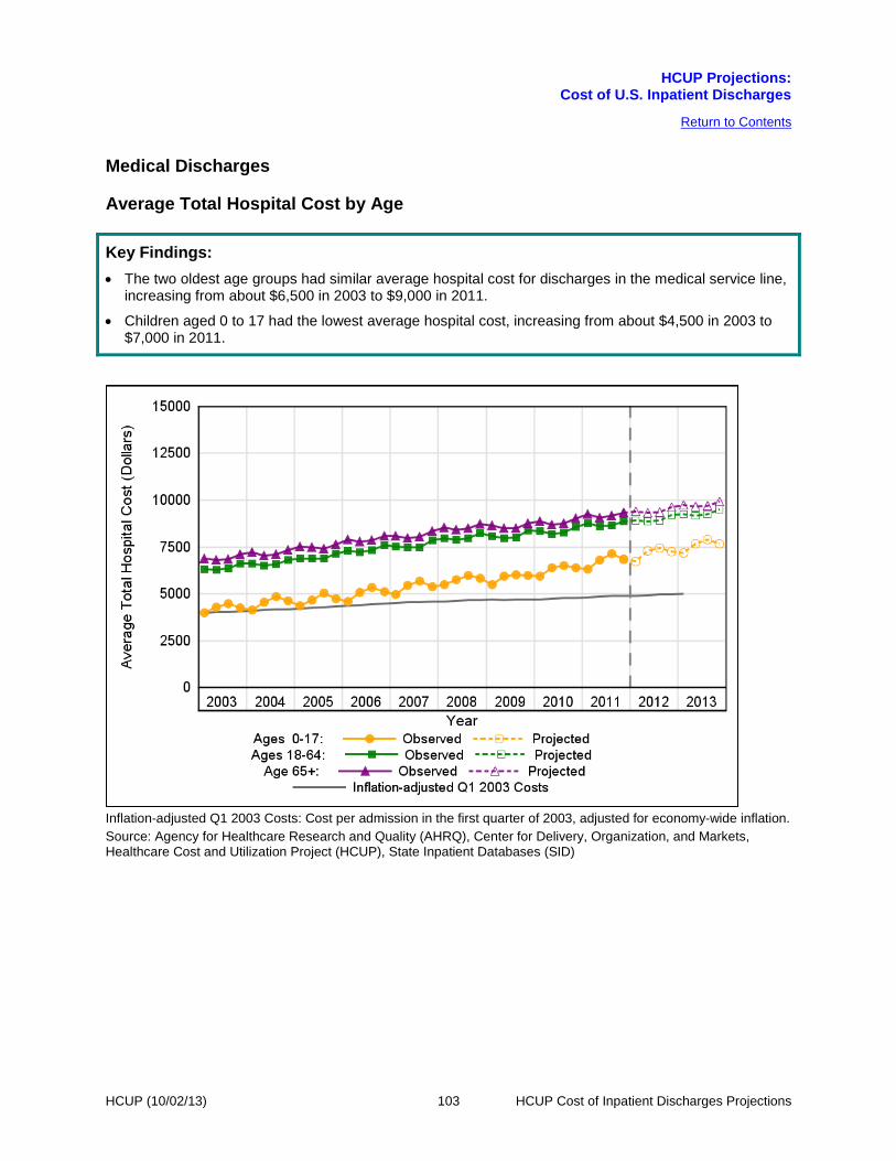
HCUP Projections:
Cost of U.S. Inpatient Discharges
HCUP (10/02/13) 103 HCUP Cost of Inpatient Discharges Projections
Return to Contents
Medical Discharges
Average Total Hospital Cost by Age
Key Findings: • The two oldest age groups had similar average hospital cost for discharges in the medical service line,
increasing from about $6,500 in 2003 to $9,000 in 2011.
• Children aged 0 to 17 had the lowest average hospital cost, increasing from about $4,500 in 2003 to $7,000 in 2011.
Inflation-adjusted Q1 2003 Costs: Cost per admission in the first quarter of 2003, adjusted for economy-wide inflation. Source: Agency for Healthcare Research and Quality (AHRQ), Center for Delivery, Organization, and Markets, Healthcare Cost and Utilization Project (HCUP), State Inpatient Databases (SID)

HCUP Projections:
Cost of U.S. Inpatient Discharges
HCUP (10/02/13) 104 HCUP Cost of Inpatient Discharges Projections
Return to Contents
Medical Discharges
Average Total Hospital Cost by Sex
Key Findings: • The average hospital cost for discharges in the medical service line was similar for males and females,
increasing from about $6,500 in 2003 to $9,000 in 2011.
Inflation-adjusted Q1 2003 Costs: Cost per admission in the first quarter of 2003, adjusted for economy-wide inflation. Source: Agency for Healthcare Research and Quality (AHRQ), Center for Delivery, Organization, and Markets, Healthcare Cost and Utilization Project (HCUP), State Inpatient Databases (SID)

HCUP Projections:
Cost of U.S. Inpatient Discharges
HCUP (10/02/13) 105 HCUP Cost of Inpatient Discharges Projections
Return to Contents
Medical Discharges
Average Total Hospital Cost by Payer
Key Findings: • Medicare-covered patients had the highest average hospital cost for discharges in the medical service
line, increasing from about $7,000 in 2003 to $9,500 in 2011.
• Medicaid-covered patients had the second highest average hospital cost, which was similar to the cost for Medicare-covered patients, increasing from about $6,500 in 2003 to $8,500 in 2011.
• Privately insured patients had the second lowest average hospital cost, which was similar to the cost for Medicaid-covered patients, increasing from about $5,500 in 2003 to $8,500 in 2011.
• Uninsured patients had the lowest average hospital cost, which was similar to the cost for privately insured patients in 2003 but diverged by 2011, increasing from about $5,500 in 2003 to $7,500 in 2011.
Inflation-adjusted Q1 2003 Costs: Cost per admission in the first quarter of 2003, adjusted for economy-wide inflation. Source: Agency for Healthcare Research and Quality (AHRQ), Center for Delivery, Organization, and Markets, Healthcare Cost and Utilization Project (HCUP), State Inpatient Databases (SID)

HCUP Projections:
Cost of U.S. Inpatient Discharges
HCUP (10/02/13) 106 HCUP Cost of Inpatient Discharges Projections
Return to Contents
Medical Discharges
Average Total Hospital Cost by Income
Key Findings: • The average hospital cost for discharges in the medical service line was similar for those residing in
the lowest and highest income communities, increasing from about $6,500 in 2003 to $9,000 in 2011.
Inflation-adjusted Q1 2003 Costs: Cost per admission in the first quarter of 2003, adjusted for economy-wide inflation. Source: Agency for Healthcare Research and Quality (AHRQ), Center for Delivery, Organization, and Markets, Healthcare Cost and Utilization Project (HCUP), State Inpatient Databases (SID)

HCUP Projections:
Cost of U.S. Inpatient Discharges
HCUP (10/02/13) 107 HCUP Cost of Inpatient Discharges Projections
Return to Contents
Medical Discharges
Number of Discharges
Key Findings: • The number of discharges in the medical service line remained relatively stable over time, vacillating
around 4,369,500 discharges per quarter.
• The stable trend appears to continue in 2012 and 2013 with quarterly discharges projected to be 4,440,000 at the end of 2013.
Source: Agency for Healthcare Research and Quality (AHRQ), Center for Delivery, Organization, and Markets, Healthcare Cost and Utilization Project (HCUP), State Inpatient Databases (SID)

HCUP Projections:
Cost of U.S. Inpatient Discharges
HCUP (10/02/13) 108 HCUP Cost of Inpatient Discharges Projections
Return to Contents
Medical Discharges
Number of Discharges by Age
Key Findings: • Adults aged 65 and older had the highest number of discharges in the medical service line, remaining
relatively stable over time at about 2,167,500 discharges per quarter.
• Adults aged18 to 64 had the next highest number of discharges, increasing from about 1,748,000 discharges per quarter in 2003 to 1,926,500 discharges per quarter in 2011.
• Children aged 0 to 17 had the lowest number of discharges, decreasing from about 363,000 discharges per quarter in 2003 to 307,000 discharges per quarter in 2011.
Source: Agency for Healthcare Research and Quality (AHRQ), Center for Delivery, Organization, and Markets, Healthcare Cost and Utilization Project (HCUP), State Inpatient Databases (SID)

HCUP Projections:
Cost of U.S. Inpatient Discharges
HCUP (10/02/13) 109 HCUP Cost of Inpatient Discharges Projections
Return to Contents
Medical Discharges
Number of Discharges by Sex
Key Findings: • Females had about 419,500 more quarterly discharges in the medical service line than males.
• Females had a relatively stable number of discharges over time at about 2,394,000 discharges per quarter.
• Males had a relatively stable number of discharges over time at about 1,974,500 discharges per quarter.
Source: Agency for Healthcare Research and Quality (AHRQ), Center for Delivery, Organization, and Markets, Healthcare Cost and Utilization Project (HCUP), State Inpatient Databases (SID)

HCUP Projections:
Cost of U.S. Inpatient Discharges
HCUP (10/02/13) 110 HCUP Cost of Inpatient Discharges Projections
Return to Contents
Medical Discharges
Number of Discharges by Payer
Key Findings: • Medicare-covered patients had the highest number of discharges in the medical service line, remaining
relatively stable over time at about 2,324,000 discharges per quarter.
• Privately insured patients had the second highest number of discharges, decreasing from about 1,130,500 discharges per quarter in 2003 to 1,004,000 discharges per quarter in 2011.
• Medicaid-covered patients had the second lowest number of discharges, increasing from about 542,000 discharges per quarter in 2003 to 625,000 discharges per quarter in 2011.
• Uninsured patients had the lowest number of discharges, increasing from about 194,000 discharges per quarter in 2003 to 254,500 discharges per quarter in 2011.
Source: Agency for Healthcare Research and Quality (AHRQ), Center for Delivery, Organization, and Markets, Healthcare Cost and Utilization Project (HCUP), State Inpatient Databases (SID)

HCUP Projections:
Cost of U.S. Inpatient Discharges
HCUP (10/02/13) 111 HCUP Cost of Inpatient Discharges Projections
Return to Contents
Medical Discharges
Number of Discharges by Income
Key Findings: • Those residing in the lowest income communities had about 495,000 more quarterly discharges in the
medical service line than those residing in the highest income communities.
• Those residing in the lowest income communities had about 1,233,500 discharges per quarter in 2003, increasing to 1,399,500 discharges per quarter in 2011.
• Those residing in the highest income communities had a relatively stable number of discharges over time at about 845,000 discharges per quarter.
Source: Agency for Healthcare Research and Quality (AHRQ), Center for Delivery, Organization, and Markets, Healthcare Cost and Utilization Project (HCUP), State Inpatient Databases (SID)

HCUP Projections:
Cost of U.S. Inpatient Discharges
HCUP (10/02/13) 112 HCUP Cost of Inpatient Discharges Projections
Return to Contents
Medical Discharges
Percentage of Discharges
Key Findings: • Discharges within the medical service line remained relatively stable over time, vacillating around 45.8
percent of all hospitalizations.
The denominator for the percentage is all discharges in the United States. Source: Agency for Healthcare Research and Quality (AHRQ), Center for Delivery, Organization, and Markets, Healthcare Cost and Utilization Project (HCUP), State Inpatient Databases (SID)

HCUP Projections:
Cost of U.S. Inpatient Discharges
HCUP (10/02/13) 113 HCUP Cost of Inpatient Discharges Projections
Return to Contents
Medical Discharges
Percentage of Discharges by Age
Key Findings: • Adults aged 65 and older had the highest percentage of discharges within the medical service line,
remaining relatively stable over time at about 49.6 percent of discharges.
• Adults aged 18 to 64 had the next highest percentage of discharges, remaining relatively stable over time vacillating around 42.7 percent of discharges.
• Children aged 0 to 17 had the lowest percentage of discharges, decreasing from about 8.6 percent of discharges in 2003 to 6.9 percent in 2011.
The denominator for the percentage is U.S. discharges within the medical service line. Source: Agency for Healthcare Research and Quality (AHRQ), Center for Delivery, Organization, and Markets, Healthcare Cost and Utilization Project (HCUP), State Inpatient Databases (SID)

HCUP Projections:
Cost of U.S. Inpatient Discharges
HCUP (10/02/13) 114 HCUP Cost of Inpatient Discharges Projections
Return to Contents
Medical Discharges
Percentage of Discharges by Sex
Key Findings: • Females had about 9.6 percentage points more discharges within the medical service line than males.
• Females had a relatively stable percentage of discharges over time at about 54.8 percent of discharges.
• Males had a relatively stable percentage of discharges over time at about 45.2 percent of discharges.
The denominator for the percentage is U.S. discharges within the medical service line. Source: Agency for Healthcare Research and Quality (AHRQ), Center for Delivery, Organization, and Markets, Healthcare Cost and Utilization Project (HCUP), State Inpatient Databases (SID)

HCUP Projections:
Cost of U.S. Inpatient Discharges
HCUP (10/02/13) 115 HCUP Cost of Inpatient Discharges Projections
Return to Contents
Medical Discharges
Percentage of Discharges by Payer
Key Findings: • Medicare-covered patients had the highest percentage of discharges within the medical service line,
remaining relatively stable over time at about 53.2 percent of discharges.
• Privately insured patients had the second highest percentage of discharges, decreasing from about 26.7 percent of discharges in 2003 to 22.6 percent in 2011.
• Medicaid-covered patients had the second lowest percentage of discharges, increasing from about 12.8 percent of discharges in 2003 to 14.1 percent in 2011.
• Uninsured patients had the lowest percentage of discharges, increasing from about 4.6 percent of discharges in 2003 to 5.7 percent in 2011.
The denominator for the percentage is U.S. discharges within the medical service line. Source: Agency for Healthcare Research and Quality (AHRQ), Center for Delivery, Organization, and Markets, Healthcare Cost and Utilization Project (HCUP), State Inpatient Databases (SID)

HCUP Projections:
Cost of U.S. Inpatient Discharges
HCUP (10/02/13) 116 HCUP Cost of Inpatient Discharges Projections
Return to Contents
Medical Discharges
Percentage of Discharges by Income
Key Findings: • Those residing in the lowest income communities had about 11.3 percentage points more discharges
within the medical service line than those residing in the highest income communities.
• Those residing in the lowest income communities had a relatively stable percentage of discharges over time at about 30.7 percent of discharges.
• Those residing in the highest income communities had a relatively stable percentage of discharges over time at about 19.4 percent of discharges.
The denominator for the percentage is U.S. discharges within the medical service line. Source: Agency for Healthcare Research and Quality (AHRQ), Center for Delivery, Organization, and Markets, Healthcare Cost and Utilization Project (HCUP), State Inpatient Databases (SID)

HCUP Projections:
Cost of U.S. Inpatient Discharges
HCUP (10/02/13) 117 HCUP Cost of Inpatient Discharges Projections
Return to Contents
Medical Discharges
Average Length of Stay
Key Findings: • The length of stay for discharges in the medical service line remained relatively stable over time at
about 4.8 days.
• The stable trend appears to continue in 2012 and 2013 with length of stay projected to be 4.6 days at the end of 2013.
Source: Agency for Healthcare Research and Quality (AHRQ), Center for Delivery, Organization, and Markets, Healthcare Cost and Utilization Project (HCUP), State Inpatient Databases (SID)

HCUP Projections:
Cost of U.S. Inpatient Discharges
HCUP (10/02/13) 118 HCUP Cost of Inpatient Discharges Projections
Return to Contents
Medical Discharges
Average Length of Stay by Age
Key Findings: • Adults aged 65 and older had the longest length of stay for discharges in the medical service line,
remaining relatively stable over time at about 5.4 days.
• Adults aged 18 to 64 had the next longest length of stay, remaining relatively stable over time at about 4.4 days.
• Children aged 0 to 17 had the shortest length of stay, remaining relatively stable over time at about 3.3 days.
Source: Agency for Healthcare Research and Quality (AHRQ), Center for Delivery, Organization, and Markets, Healthcare Cost and Utilization Project (HCUP), State Inpatient Databases (SID)

HCUP Projections:
Cost of U.S. Inpatient Discharges
HCUP (10/02/13) 119 HCUP Cost of Inpatient Discharges Projections
Return to Contents
Medical Discharges
Average Length of Stay by Sex
Key Findings: • Length of stay for discharges in the medical service line was similar for males and females, remaining
relatively stable over time at about 4.8 days.
Source: Agency for Healthcare Research and Quality (AHRQ), Center for Delivery, Organization, and Markets, Healthcare Cost and Utilization Project (HCUP), State Inpatient Databases (SID)

HCUP Projections:
Cost of U.S. Inpatient Discharges
HCUP (10/02/13) 120 HCUP Cost of Inpatient Discharges Projections
Return to Contents
Medical Discharges
Average Length of Stay by Payer
Key Findings: • Medicare-covered patients had the longest length of stay for discharges in the medical service line,
remaining relatively stable over time at about 5.4 days.
• Medicaid-covered patients had the second longest length of stay, remaining relatively stable over time at about 4.6 days.
• Privately insured and uninsured patients had the shortest and similar length of stay, remaining relatively stable over time at about 3.9 days.
Source: Agency for Healthcare Research and Quality (AHRQ), Center for Delivery, Organization, and Markets, Healthcare Cost and Utilization Project (HCUP), State Inpatient Databases (SID)

HCUP Projections:
Cost of U.S. Inpatient Discharges
HCUP (10/02/13) 121 HCUP Cost of Inpatient Discharges Projections
Return to Contents
Medical Discharges
Average Length of Stay by Income
Key Findings: • Length of stay for discharges in the medical service line was similar for those residing in the lowest
and highest income communities, remaining relatively stable over time at about 4.8 days.
Source: Agency for Healthcare Research and Quality (AHRQ), Center for Delivery, Organization, and Markets, Healthcare Cost and Utilization Project (HCUP), State Inpatient Databases (SID)

HCUP Projections:
Cost of U.S. Inpatient Discharges
HCUP (10/02/13) 122 HCUP Cost of Inpatient Discharges Projections
Return to Contents
This page intentionally left blank.

HCUP Projections:
Cost of U.S. Inpatient Discharges
HCUP (10/02/13) 123 HCUP Cost of Inpatient Discharges Projections
Return to Contents
Appendix I: HCUP Data Partners
Alaska State Hospital and Nursing Home Association
Arizona Department of Health Services
Arkansas Department of Health
California Office of Statewide Health Planning and Development
Colorado Hospital Association
Connecticut Hospital Association
Florida Agency for Health Care Administration
Georgia Hospital Association
Hawaii Health Information Corporation
Illinois Department of Public Health
Indiana Hospital Association
Iowa Hospital Association
Kansas Hospital Association
Kentucky Cabinet for Health and Family Services
Louisiana Department of Health and Hospitals
Maine Health Data Organization
Maryland Health Services Cost Review Commission
Massachusetts Center for Health Information and Analysis
Michigan Health & Hospital Association
Minnesota Hospital Association
Mississippi Department of Health
Missouri Hospital Industry Data Institute
Montana MHA - An Association of Montana Health Care Providers
Nebraska Hospital Association
Nevada Department of Health and Human Services
New Hampshire Department of Health & Human Services
New Jersey Department of Health
New Mexico Department of Health
New York State Department of Health
North Carolina Department of Health and Human Services
North Dakota (data provided by the Minnesota Hospital Association)
Ohio Hospital Association
Oklahoma State Department of Health
Oregon Association of Hospitals and Health Systems
Oregon Health Policy and Research
Pennsylvania Health Care Cost Containment Council
Rhode Island Department of Health
South Carolina Budget & Control Board
South Dakota Association of Healthcare Organizations
Tennessee Hospital Association
Texas Department of State Health Services Utah Department of Health
Vermont Association of Hospitals and Health Systems
Virginia Health Information
Washington State Department of Health
West Virginia Health Care Authority
Wisconsin Department of Health Services
Wyoming Hospital Association

HCUP Projections:
Cost of U.S. Inpatient Discharges
HCUP (10/02/13) 124 HCUP Cost of Inpatient Discharges Projections
Return to Contents
Appendix II: Definitions for Hospital Service Lines and Outcomes
This section includes the coding criteria used to identify discharges for each hospital service line. Each discharge was assigned to a single hospital service line hierarchically, based on the following order: maternal and neonatal, mental health, injury, surgical, and medical. Coding criteria to define the service lines are based on International Classification of Diseases, Ninth Revision, Clinical Modification (ICD-9-CM) codes, the HCUP Clinical Classifications Software (CCS), or Diagnosis-Related Groups (DRGs). CCS categorizes ICD-9-CM diagnoses and procedures into a manageable number of clinically meaningful categories.6 DRGs categorize discharges by expected use of hospital resources based on diagnoses, procedures, age, sex, and discharge disposition. The DRG was assigned based on the discharge date and was not sensitive to the reporting of indicators of the diagnoses being present on admission. Outcomes of interest include the following:
• Average total hospital cost:
Total cost for discharges that meet the coding criteria for the service line, including transfers
Discharge counts (definition below)
• Discharge counts:
Number of discharges that meet the coding criteria for the service line, excluding discharges transferred out to another acute care hospital
• Percentage of discharges:
Number of discharges that meet the coding criteria for the service line,
excluding transfers Discharge counts (definition above) for all hospitalizations or the
service line, excluding transfers
• Average length of stay:
Total days for discharges that meet the coding criteria for the service line, including transfers
Discharge counts (definition above)
6 HCUP Clinical Classifications Software (CCS). Healthcare Cost and Utilization Project (HCUP). U.S. Agency for Healthcare Research and Quality, Rockville, MD. Updated March 2013. http://www.hcup-us.ahrq.gov/toolssoftware/ccs/ccs.jsp. Accessed July 3, 2013.
100 x

HCUP Projections:
Cost of U.S. Inpatient Discharges
HCUP (10/02/13) 125 HCUP Cost of Inpatient Discharges Projections
Return to Contents
Appendix II: Definitions for Hospital Service Lines and Outcomes
Outcomes of interest are reported overall and by age group (0–17, 18–64, and 65 and older, except maternal and neonatal service line, which is reported as neonatal and maternal), sex (male and female, except maternal and neonatal service line, which is reported as male newborn, female newborn, and female maternal), expected primary payer (Medicare, Medicaid, private insurance, uninsured)7, and community-level income (lowest vs. highest income quartile).
7 Discharges with a primary payer of “other government” or unknown are not included in the projections reported by primary payer. Thus, the sum of discharge counts and percentage of discharges across primary payer will not equal the total.

HCUP Projections:
Cost of U.S. Inpatient Discharges
HCUP (10/02/13) 126 HCUP Cost of Inpatient Discharges Projections
Return to Contents
Appendix II: Definitions for Hospital Service Lines and Outcomes Maternal and Neonatal Service Line
Coding criteria:
Maternal and neonatal stays are defined using the following CCS principal diagnosis categories:
Maternal: • 176: Contraceptive and procreative management • 177: Spontaneous abortion • 178: Induced abortion • 179: Postabortion complications • 180: Ectopic pregnancy • 181: Other complications of pregnancy • 182: Hemorrhage during pregnancy; abruptio placenta; placenta previa • 183: Hypertension complicating pregnancy; childbirth and the puerperium • 184: Early or threatened labor • 185: Prolonged pregnancy • 186: Diabetes or abnormal glucose tolerance complicating pregnancy; childbirth;
or the puerperium • 187: Malposition; malpresentation • 188: Fetopelvic disproportion; obstruction • 189: Previous C-section • 190: Fetal distress and abnormal forces of labor • 191: Polyhydramnios and other problems of amniotic cavity • 192: Umbilical cord complication • 193: OB-related trauma to perineum and vulva • 194: Forceps delivery • 195: Other complications of birth; puerperium affecting management of mother • 196: Normal pregnancy and/or deliver
Neonatal: • 218: Liveborn • 219: Short gestation; low birth weight; and fetal growth retardation • 220: Intrauterine hypoxia and birth asphyxia • 221: Respiratory distress syndrome • 222: Hemolytic jaundice and perinatal jaundice • 223: Birth trauma • 224: Other perinatal conditions

HCUP Projections:
Cost of U.S. Inpatient Discharges
HCUP (10/02/13) 127 HCUP Cost of Inpatient Discharges Projections
Return to Contents
Appendix II: Definitions for Hospital Service Lines and Outcomes
Mental Health Service Line
Coding criteria:
Mental health visits are defined using the following CCS principal diagnosis categories:
Starting in 2007: • 650: Adjustment disorders • 651: Anxiety disorders • 652: Attention-deficit, conduct, and disruptive behavior disorders • 653: Delirium, dementia, and amnestic and other cognitive disorders • 654: Developmental disorders • 655: Disorders usually diagnoses in infancy, childhood, or adolescence • 656: Impulse control disorders, NEC • 657: Mood disorders • 658: Personality disorders • 659: Schizophrenia and other psychotic disorders • 660: Alcohol-related disorders • 661: Substance-related disorders • 662: Suicide and intentional self-inflicted injury • 663: Screening and history of mental health and substance abuse codes • 670: Miscellaneous disorders
From 2003 to 2006: • 65: Mental retardation • 66: Alcohol-related mental disorders • 67: Substance-related mental disorders • 68: Senility and organic mental disorders • 69: Affective disorders • 70: Schizophrenia and related disorders • 71: Other psychoses • 72: Anxiety; somatoform; dissociative; and personality disorders • 73: Preadult disorders • 74: Other mental conditions • 75: Personal history of mental disorder; mental and behavioral problems;
observation and screening for mental condition

HCUP Projections:
Cost of U.S. Inpatient Discharges
HCUP (10/02/13) 128 HCUP Cost of Inpatient Discharges Projections
Return to Contents
Appendix II: Definitions for Hospital Service Lines and Outcomes
Injury Service Line
Coding criteria:
Injuries are identified using the principal diagnosis and a scheme recommended by Safe States Alliance, previously known as the State and Territorial Injury Prevention Directors Association (STIPDA). The table below lists the diagnosis codes in the range 800–999 used to identify injuries.
Includes: • 800–909.2, 909.4, 909.9: Fractures; dislocations; sprains and strains; intracranial
injury; internal injury of thorax, abdomen, and pelvis; open wound of the head, neck, trunk, upper limb, and lower limb; injury to blood vessels; late effects of injury, poisoning, toxic effects, and other external causes, excluding those of complications of surgical and medical care and drugs, medicinal or biological substances.
• 910–994.9: Superficial injury; contusion; crushing injury; effects of foreign body entering through orifice; burns; injury to nerves and spinal cord; traumatic complications and unspecified injuries; poisoning and toxic effects of substances; other and unspecified effects of external causes.
• 995.5–995.59: Child maltreatment syndrome. • 995.80–995.85: Adult maltreatment, unspecified; adult physical abuse; adult
emotional/ psychological abuse; adult sexual abuse; adult neglect (nutritional); other adult abuse and neglect.
Excludes: • 909.3, 909.5: Late effect of complications of surgical and medical care and late
effects of adverse effects of drug, medicinal, or biological substance. • 995.0–995.4, 995.6–995.7, 995.86, 995.89: Other anaphylactic shock;
angioneurotic edema; unspecified adverse effect of drug, medicinal and biological substance; allergy, unspecified; shock due to anesthesia; anaphylactic shock due to adverse food reaction; malignant hyperpyrexia or hypothermia due to anesthesia.
• 996–999: Complications of surgical and medical care, not elsewhere classified.
It should be noted that the above definition of injury includes five diagnosis codes that are also included under two CCS diagnosis categories used for the definition of the mental health service line:
• CCS = 660 (Alcohol-related disorders): diagnosis 9800 (toxic effect of ethyl alcohol)
• CCS = 661 (Substance-related disorders): diagnoses 96500 (poisoning by opium), 96501 (poisoning by heroin), 96502 (poisoning by methadone), 96509 (poisoning by other opiate).
Because of the hierarchical ordering used to assign discharges to service lines, those discharges with one of these five principal diagnosis codes were assigned to the mental health service line and not the injury service line.

HCUP Projections:
Cost of U.S. Inpatient Discharges
HCUP (10/02/13) 129 HCUP Cost of Inpatient Discharges Projections
Return to Contents
Appendix II: Definitions for Hospital Service Lines and Outcomes Surgical Service Line
Coding criteria:
Surgical stays are identified by a surgical DRG. The DRG grouper first assigns the discharge to a Major Diagnostic Category (MDC) based on the principal diagnosis. For each MDC there is a list of procedure codes that qualify as operating room procedures. If the discharge involves an operating room procedure, it is assigned to one of the surgical DRGs within the MDC category; otherwise it is assigned to a medical DRG.
Medical Service Line
Coding criteria:
Medical stays are identified by a medical DRG. The DRG grouper first assigns the discharge to a Major Diagnostic Category (MDC) based on the principal diagnosis. For each MDC there is a list of procedure codes that qualify as operating room procedures. If the discharge involves an operating room procedure, it is assigned to one of the surgical DRGs within the MDC category; otherwise it is assigned to a medical DRG.

HCUP Projections:
Cost of U.S. Inpatient Discharges
HCUP (10/02/13) 130 HCUP Cost of Inpatient Discharges Projections
Return to Contents
Appendix III: Methods
This appendix describes the methods for projecting national outcomes of inpatient stays using the HCUP State Inpatient Databases (SID). The methodology leverages the breadth of States (up to 47) and longitudinal data (up to ten years) to improve the timeliness of estimates of inpatient statistics. The following factors make this initiative possible:
• the longitudinal nature of HCUP State databases
• the breadth of the databases across 47 States
• the capacity of our HCUP Partners to provide timely quarterly data
• the modeling expertise among HCUP staff, both Federal and contract
• the use of recently-released SAS Econometric Time Series® Software
• the automated assembly of analytic results into a streamlined, ready-to-deliver report using technology developed for another AHRQ product, the State Snapshots (developed in conjunction with the National Healthcare Quality and Disparities Reports).
HCUP includes the largest collection of longitudinal hospital care data in the United States, with all-payer, encounter-level information beginning in 1988. The number of HCUP Partners has expanded over the years to include an ever-larger percentage of hospital discharges nationwide. In fact, the 2010 HCUP State Inpatient Databases (SID) encompass more than 97 percent of all U.S. community hospital discharges, made possible by the data collection efforts of State data organizations, hospital associations, private data organizations, and the Federal government. The list of statewide data organizations that contribute to HCUP databases is available in Appendix I. Although full-year administrative hospital data typically lag the current calendar year by nine to 15 months, some HCUP Partner organizations can now produce quarterly data files within four to six months following the close of a quarter. This “early” data is used to inform the projection models.
Discharges from the SID were limited to those from hospitals that were open during any part of each calendar year and were designated as community hospitals by the American Hospital Association (AHA) Annual Survey of Hospitals, excluding rehabilitation hospitals. The definition of a community hospital was that used by the AHA: "all nonfederal short-term general and other specialty hospitals, excluding hospital units of institutions."
Projected outcomes include the following:
• Average total cost for inpatient stay
• Count of inpatient discharges
• Percentage of inpatient discharges
• Average length of stay

HCUP Projections:
Cost of U.S. Inpatient Discharges
HCUP (10/02/13) 131 HCUP Cost of Inpatient Discharges Projections
Return to Contents
Appendix III: Methods
Total hospital charges were converted to costs using HCUP cost-to-charge ratios based on hospital accounting reports from the Centers for Medicare & Medicaid Services (CMS).8 Costs reflect the actual expenses incurred in the production of hospital services, such as wages, supplies and utility costs, while charges represent the amount a hospital billed for the case. For each hospital, a hospital-wide cost-to-charge ratio is used. Hospital charges reflect the amount the hospital billed for the entire hospital stay and does not include professional (physician) fees. Inflation adjustments were not applied to the observed total cost. Projected total costs will estimate inflated charges. In HCUP, the length of stay counts nights spent in the hospital. If a patient is admitted and discharged on the same day, the length of stay is zero. Each outcome is projected for the measures specified in Appendix II: Definitions.
Projections were generated using the SAS Time Series Forecasting System™ (Version 9.2).9 Projections were calculated first by State and then weighted proportionally to the nine Census divisions and the nation. For each State, the software automatically selected from among 40 different time series models the model with the lowest mean absolute percentage error (MAPE) for that State.
National quarterly trends were calculated as a weighted average of the State-level quarterly trends within each division. Each State’s weight was proportional to its total number of discharges (excluding newborns) as reported in the AHA Hospital Survey. These AHA-based weights were used throughout the period, 2003–2012. For 2012, we had early quarterly data for 9 States. The 2012 projections incorporated observed rates for these 9 States and incorporated rates estimated from time series models for the remaining States. For 2013, the projections were entirely based on rates estimated from time series models.
Table A summarizes the data available from States in each division and each State’s percentage of its division’s discharges. Rows highlighted in red represent States for which no data were available throughout the period. These missing States represent small percentages of the total division discharges except for the East South Central division, which is missing data from Alabama, constituting about 26% of discharges. The yellow cells in Table A indicate missing years of data for States that contributed to the projections. The green cells in Table A highlight States for which “early” 2012 data were incorporated into the projections. In the Pacific and West North Central divisions, States with early data represent more than half of the population in the division.
8 HCUP Cost-to-Charge Ratio Files (CCR). Healthcare Cost and Utilization Project (HCUP). 2001–2009. U.S. Agency for Healthcare Research and Quality, Rockville, MD. Updated September 2012. http://www.hcup-us.ahrq.gov/db/state/costtocharge.jsp. Accessed July 3, 2013. 9 Large-Scale Automatic Forecasting Using Inputs and Calendar Events. White Paper, SAS Institute Inc., 2009.

HCUP Projections:
Cost of U.S. Inpatient Discharges
HCUP (10/02/13) 132 HCUP Cost of Inpatient Discharges Projections
Return to Contents
Table A. Available Data for Projections of Cost of U.S Inpatient Discharges
Division State
Calendar year
Total
Percent of 2011 Total Division
Discharges 2003 2004 2005 2006 2007 2008 2009 2010 2011 2012
Qtrs Qtrs Qtrs Qtrs Qtrs Qtrs Qtrs Qtrs Qtrs Qtrs Qtrs
East North Central
IL 4 4 4 4 4 4 4 4 4 0 36 27.7
IN 4 4 4 4 4 4 4 4 4 0 36 14.0
MI 4 4 4 4 4 4 4 4 4 0 36 21.2
OH 4 4 4 4 4 4 4 4 4 0 36 24.8
WI 4 4 4 4 4 4 4 4 4 0 36 12.3
East South Central
AL 0 0 0 0 0 0 0 0 0 0 0 25.9
KY 4 4 4 4 4 4 4 4 4 3 39 23.5
MS 0 0 0 0 0 0 0 4 4 0 8 16.1
TN 4 4 4 4 4 4 4 4 4 0 36 34.5
Middle Atlantic
NJ 4 4 4 4 4 4 4 4 4 4 40 21.5
NY 4 4 4 4 4 4 4 4 4 0 36 47.5
PA 4 0 0 0 0 4 4 4 4 0 20 31.0
Mountain AZ 4 4 4 4 4 4 4 4 4 4 40 28.9
CO 4 4 4 4 4 4 4 4 4 0 36 22.9
ID 0 0 0 0 0 0 0 0 0 0 0 7.1
MT 0 0 0 0 0 0 4 4 4 0 12 4.5
NM 0 0 0 0 0 0 4 4 4 0 12 9.3
NV 4 4 4 4 4 4 4 4 4 0 36 12.2
UT 4 4 4 4 4 4 4 4 4 0 36 12.6
WY 0 0 0 0 4 4 4 4 4 0 20 2.5
New England CT 4 4 4 4 4 4 4 4 4 0 36 24.7
MA 4 4 4 4 4 4 4 4 4 0 36 45.5
ME 4 0 0 4 4 4 4 4 4 0 28 9.2
NH 4 4 4 4 4 4 4 0 0 0 28 9.1
RI 4 4 4 4 4 4 4 4 4 0 36 7.2
VT 4 4 4 4 4 4 4 4 4 0 36 4.3

HCUP Projections:
Cost of U.S. Inpatient Discharges
HCUP (10/02/13) 133 HCUP Cost of Inpatient Discharges Projections
Return to Contents
Division State
Calendar year
Total
Percent of 2011 Total Division
Discharges 2003 2004 2005 2006 2007 2008 2009 2010 2011 2012
Qtrs Qtrs Qtrs Qtrs Qtrs Qtrs Qtrs Qtrs Qtrs Qtrs Qtrs
Pacific AK 0 0 0 0 0 0 0 4 4 0 8 1.4
CA 4 4 4 4 4 4 4 4 4 2 38 74.7
HI 4 4 4 4 4 4 4 4 4 4 40 2.7
OR 4 4 4 4 4 4 4 4 4 0 36 7.7
WA 4 4 4 4 4 4 4 4 4 0 36 13.5
South Atlantic
DC 0 0 0 0 0 0 0 0 0 0 0 1.0
DE 0 0 0 0 0 0 0 0 0 0 0 1.5
FL 4 4 4 4 4 4 4 4 4 0 36 31.5
GA 4 4 4 4 4 4 4 4 4 4 40 16.2
MD 4 4 4 4 4 4 4 4 4 0 36 9.6
NC 4 4 4 4 4 4 4 4 4 0 36 15.9
SC 4 4 4 4 4 4 4 4 4 0 36 7.7
VA 4 4 0 4 4 4 4 4 4 3 35 13.4
WV 4 4 4 4 4 4 4 4 4 0 36 3.1
West North Central
IA 4 4 4 4 4 4 4 4 4 0 36 14.8
KS 4 4 4 4 4 4 4 4 4 0 36 13.9
MN 4 4 4 4 4 4 4 4 4 3 39 25.9
MO 4 4 4 4 4 4 4 4 4 3 39 29.1
ND 0 0 0 0 0 0 0 0 4 0 4 3.3
NE 4 4 4 4 4 4 4 4 4 0 36 8.9
SD 4 4 4 4 4 4 4 4 4 0 36 4.0
West South Central
AR 0 4 4 4 4 4 4 4 4 0 32 8.0
LA 0 0 0 0 0 4 4 4 4 0 16 12.4
OK 0 0 4 4 4 4 4 4 4 0 28 10.2
TX 4 4 4 4 4 4 4 4 4 0 36 69.4
Related Documents
![REPRODUCING KERNEL ESTIMATES, BOUNDED … · arxiv:1309.6072v4 [math.cv] 30 apr 2014 reproducing kernel estimates, bounded projections and duality on large weighted bergman spaces.](https://static.cupdf.com/doc/110x72/5adde0b47f8b9a4a268e200b/reproducing-kernel-estimates-bounded-13096072v4-mathcv-30-apr-2014-reproducing.jpg)