Connor Steel Portfolio CO NN OR ST EE L.

Welcome message from author
This document is posted to help you gain knowledge. Please leave a comment to let me know what you think about it! Share it to your friends and learn new things together.
Transcript

Connor Steel Portfolio
CONNORSTEEL.
4 5
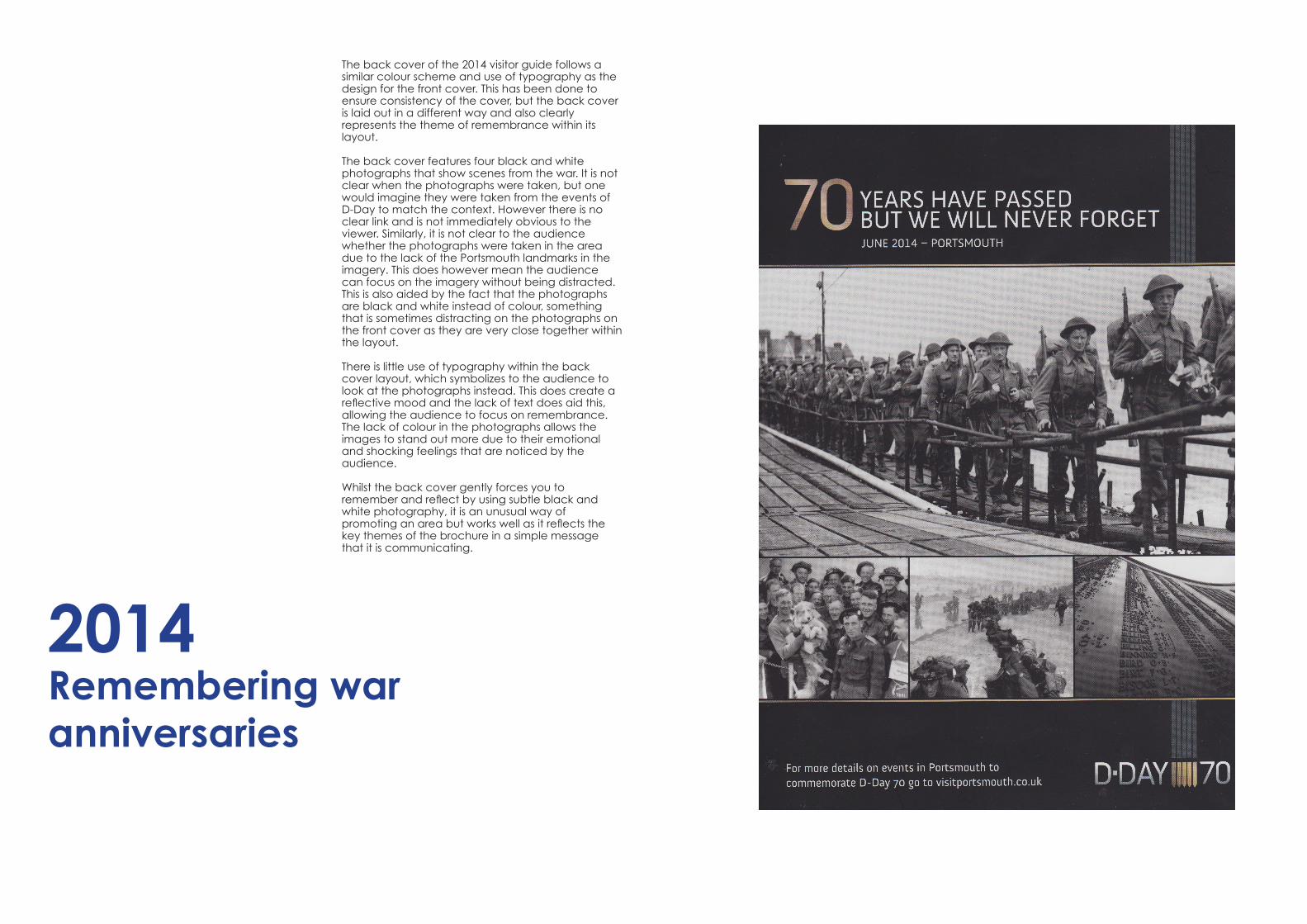
2014 Remembering war anniversaries
The back cover of the 2014 visitor guide follows a similar colour scheme and use of typography as the design for the front cover. This has been done to ensure consistency of the cover, but the back cover is laid out in a different way and also clearly represents the theme of remembrance within its layout.
The back cover features four black and white photographs that show scenes from the war. It is not clear when the photographs were taken, but one would imagine they were taken from the events of D-Day to match the context. However there is no clear link and is not immediately obvious to the viewer. Similarly, it is not clear to the audience whether the photographs were taken in the area due to the lack of the Portsmouth landmarks in the imagery. This does however mean the audience can focus on the imagery without being distracted. This is also aided by the fact that the photographs are black and white instead of colour, something that is sometimes distracting on the photographs on the front cover as they are very close together within the layout.
There is little use of typography within the back cover layout, which symbolizes to the audience to look at the photographs instead. This does create a reflective mood and the lack of text does aid this, allowing the audience to focus on remembrance. The lack of colour in the photographs allows the images to stand out more due to their emotional and shocking feelings that are noticed by the audience.
Whilst the back cover gently forces you to remember and reflect by using subtle black and white photography, it is an unusual way of promoting an area but works well as it reflects the key themes of the brochure in a simple message that it is communicating.

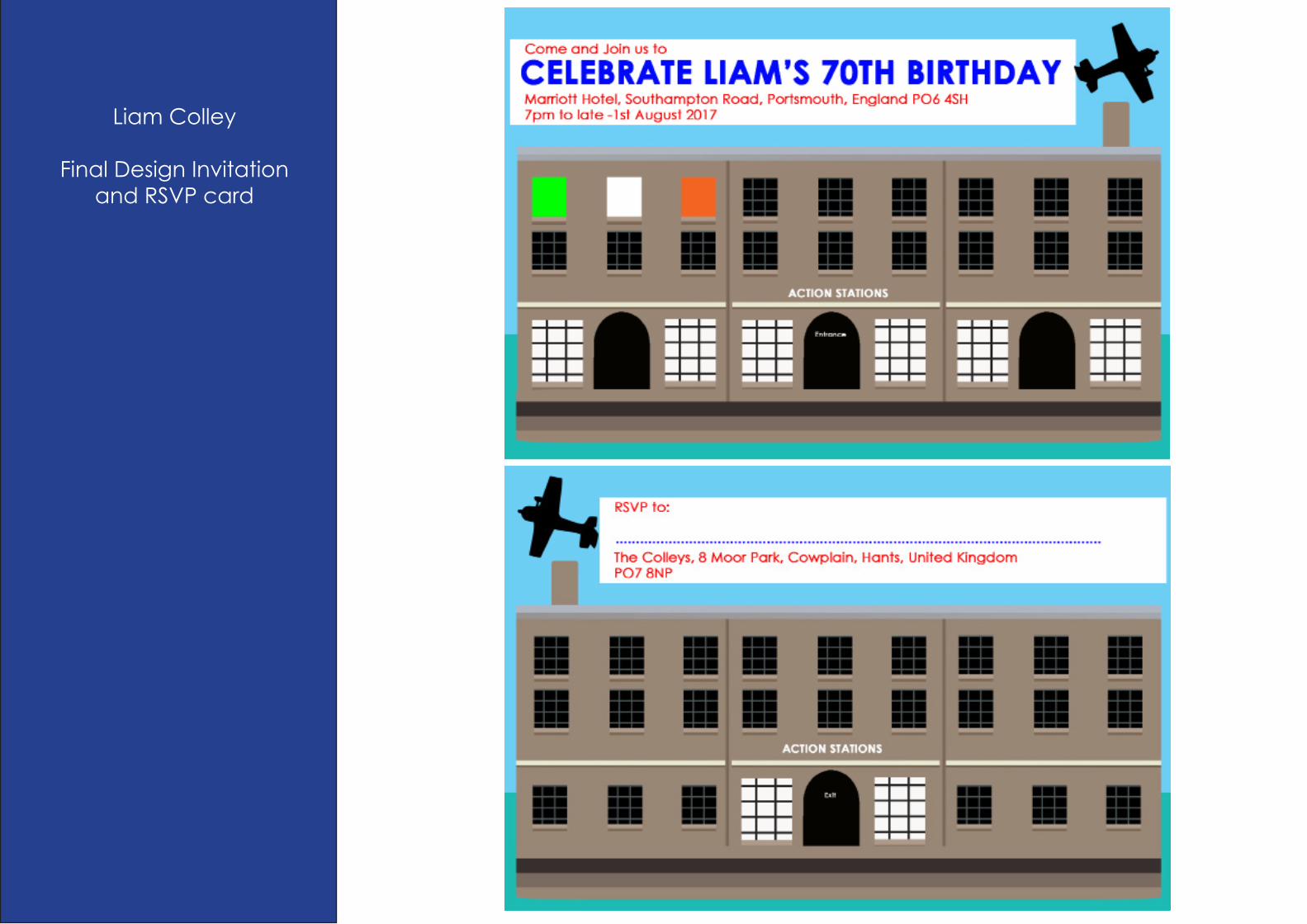
Liam Colley
Final Design Invitation and RSVP card
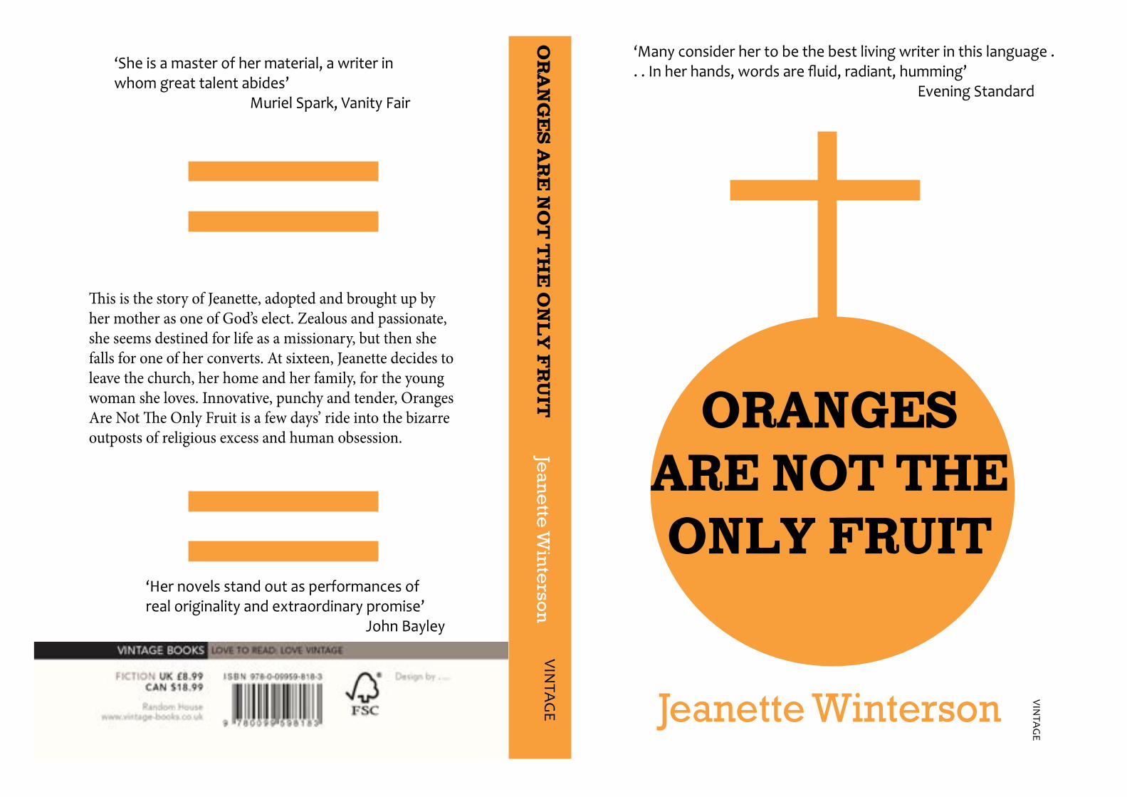
ORANGES ARE NOT THE ONLY FRUIT
‘Many consider her to be the best living writer in this language . . . In her hands, words are fluid, radiant, humming’ Evening Standard
VINTA
GE
Jeanette Winterson
OR
AN
GE
S A
RE
NO
T T
HE
ON
LY
FR
UIT
VINTA
GE
Jean
ette
Win
terso
n
This is the story of Jeanette, adopted and brought up by her mother as one of God’s elect. Zealous and passionate, she seems destined for life as a missionary, but then she falls for one of her converts. At sixteen, Jeanette decides to leave the church, her home and her family, for the young woman she loves. Innovative, punchy and tender, Oranges Are Not The Only Fruit is a few days’ ride into the bizarre outposts of religious excess and human obsession.
‘She is a master of her material, a writer in whom great talent abides’ Muriel Spark, Vanity Fair
‘Her novels stand out as performances of real originality and extraordinary promise’ John Bayley
Related Documents