An Introduction to COLOR THEORY

Welcome message from author
This document is posted to help you gain knowledge. Please leave a comment to let me know what you think about it! Share it to your friends and learn new things together.
Transcript

An Introduction to COLOR THEORY

Color
• Color is a property of light. When we say an object is red, for example, we mean that its surface absorbs certain wavelengths of light and reflects others. If our eyes see only the long wavelengths we call red, we identify it as a red object. If all wavelengths of light are absorbed, we see a black object; if all are reflected, we see a white object.

ColorThere are three aspects about color that you
need to know:
•HUE: is the color we see (such as red)
•VALUE: is the lightness or darkness of a color (maroon is a dark value of red and pink is a light value)
•CHROMA: is the brightness or intensity of the color (some reds are appear bright and clear while others appear muddy or dull
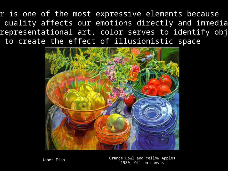
Color is one of the most expressive elements because its quality affects our emotions directly and immediately.- In representational art, color serves to identify objects and to create the effect of illusionistic space
Orange Bowl and Yellow Apples1980, Oil on canvas
Janet Fish

The Color Wheel•There are 3 primary colors: Red, Yellow and Blue
•These colors can’t be mixed to be made
•They make all the other colors on the wheel
•If you draw straight lines connecting the primaries, you will create a triangle

Primary color scheme


The Color Wheel•When you mix equal parts of 2 primary colors together, you get a secondary color
•Secondary colors are Orange, Green, and Violet (Purple)
•If you draw straight lines connecting secondary colors, you will create a triangle

Making ColorWhen you mix equal parts of a primary and a secondary color together, you will get a tertiary color
Tertiary colors are Red-Orange, Red-Violet, Blue-Green, Blue-Violet, Yellow-Orange and Yellow-Green

Hue is another name for color…

Saturation refers to how pure, or how much pigment Is in the color. It may also be called color intensity.

A Tint of a color is made by mixing it with white.
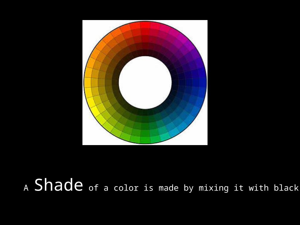
A Shade of a color is made by mixing it with black.

A Tone of a color is made by mixing it with gray

Color Schemes

Learning how to use color is important. If you just add colors to a picture without thinking about why you’re using
them, the result could be visually confusing.
You must think of the mood you wish to convey with your work and choose colors appropriately.
Sometimes, less is more.
COLOR SCHEMES ARE LOGICAL, BALANCED RELATIONSHIPS OF COLORS based on the twelve hue color wheel. Using color schemes eliminates the need for
selecting colors based on trial and error. They are useful in establishing visual unity and preventing poor color
combinations.
Color Schemes

Warm ColorsRed, red-orange, orange, yellow-orange and yellow are warm colors
Warm colors appear to advance (or come forward) in a picture and make objects appear to be larger
They remind us of fire or sun and bring excitement and boldness to art.
Warm colors make objects seem larger and to come forward (advance) in a work of art
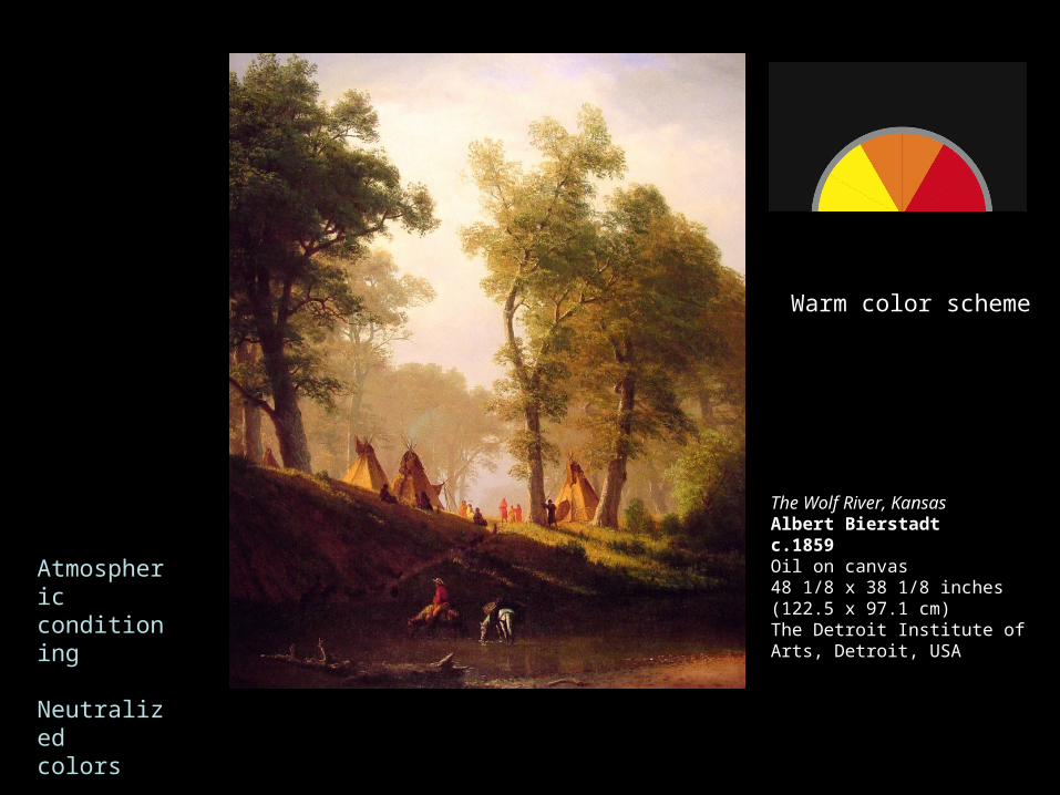
Atmospheric conditioning
Neutralizedcolors
The Wolf River, KansasAlbert Bierstadtc.1859Oil on canvas48 1/8 x 38 1/8 inches (122.5 x 97.1 cm)The Detroit Institute of Arts, Detroit, USA
Warm color scheme

Cool ColorsGreens, blues, and violets are cool colors.
Cool colors appear to recede (or go back into) the picture and make objects seem smaller.
These colors are calm and restful. They make us think of cool water, distant mountains, sky and foliage.

Color evokes mood
Cool color scheme
Pablo Picasso,
The Tragedy, 1903, oil on wood, 1.053 x .690 m (41 7/16 x 27 3/16 in.), National Gallery of Art, Washington,

A Monochromatic color scheme uses only one color.Different values are created by using tints, shades,
And tones of that color.

Analogous colors are colors that are in close proximity to each other on the color wheel that share similar hue and saturation. You Usually need to use at least three colors in a row.


2 colors directly across from each other on the color wheel (plus all of their tints, shades,
tones, and neutrals).
A Complimentary color scheme uses


The Split Complementary scheme is a variation of the standard complementary scheme. It uses a color and the two colors
adjacent to its complementary. This provides high contrast without the strong tension of the complementary scheme.


A Triad uses three colors equally spaced around the color wheel. This scheme is popular among artists because it offers strong visual contrast while retaining balance, and color richness.
The triadic scheme is not as contrasting as the complementary scheme, but it looks more balanced and harmonious.


Color Schemes• A Double Split-Complimentary color
scheme is when you use the colors on either side of a set of compliments. An example could be: Red-Orange, Yellow-Orange, Blue-Green and Blue-Violet

A Tetrad or Double Complimentary is the richest of all the schemes because it Uses 2 sets of complimentary colors (plus tints, shades, and tones).

Monochromatic Complementary Analogous
Cool/Warm Triad Tetrad

Henri Fantin-LatourFrench, 1836 - 1904Still Life, 1866oil on canvas, 62 x 74.8 cm (24 3/8 x 29 1/2 in.)National Gallery of Art, Washington
Local color (objective color)
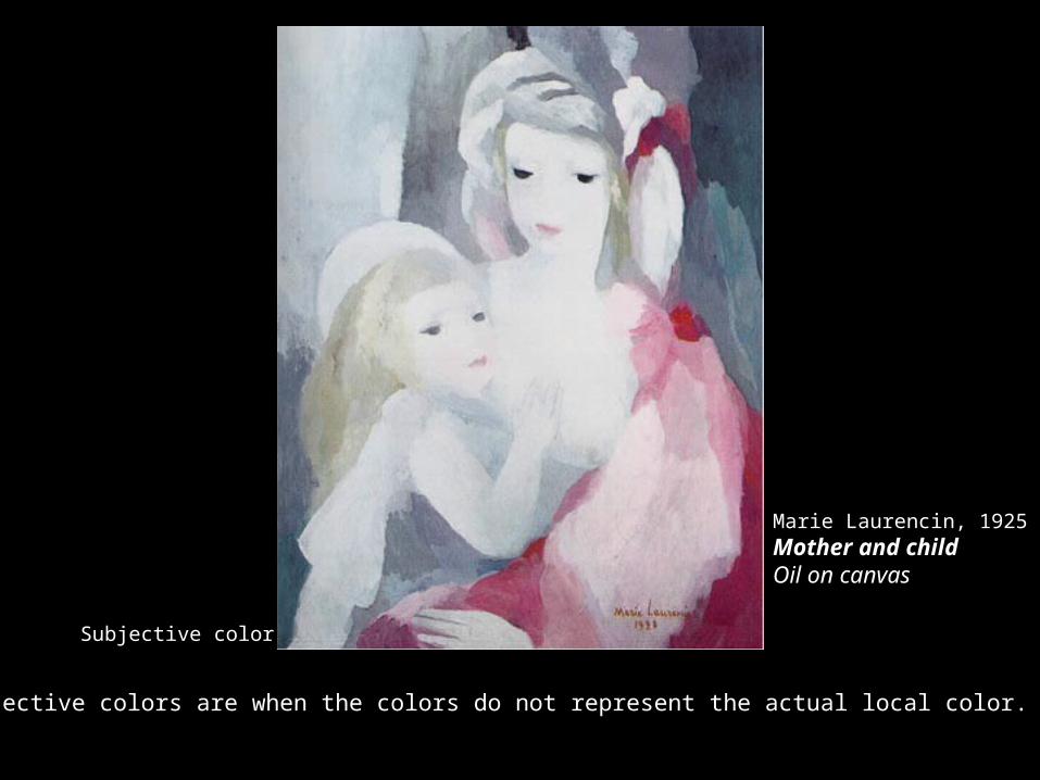
Subjective color
Subjective colors are when the colors do not represent the actual local color.
Marie Laurencin, 1925Mother and childOil on canvas
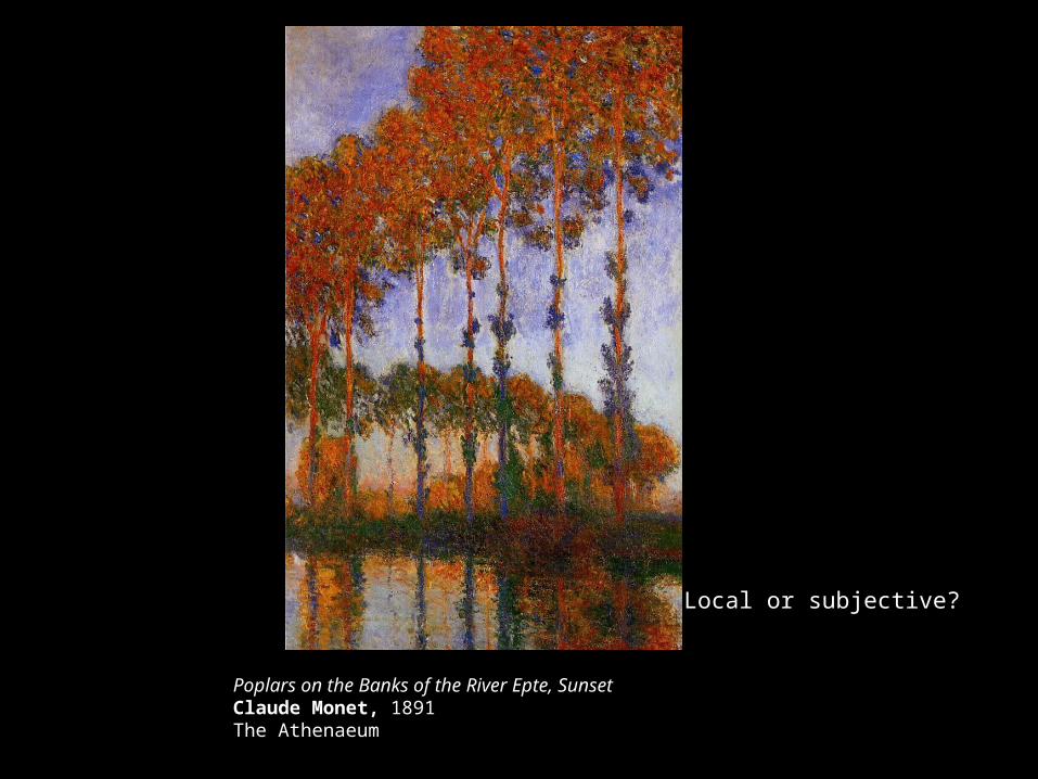
Poplars on the Banks of the River Epte, SunsetClaude Monet, 1891The Athenaeum
Local or subjective?

Conditioned color & atmospheric conditioning-
colors appear more intense in the foreground
and have a lesser value in background
Conditioned color & Neutralized Color

Neutralized color - color intensity is neutralized by adding
its complement or a neutral color, white, black or grey.
Conditioned color & Neutralized Color

Local color: the actual color of an object
Tonal color: the color variations that result from the effects of light and shadow.
Reflected color -any object you look at is influenced by the color of the environment.
These colors are reflections of surrounding objects.
Local Color
Reflected Color
Tonal Color

Light intensity
- a color appears lighter when the color around it is darker
Michelangelo Merisi called CaravaggioMadonna dei Palafrenieri (1605)oil on canvascm. 2,92x2,11Borghese Gallery
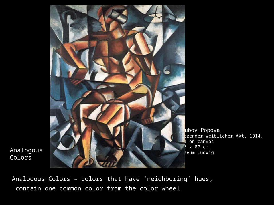
Liubov PopovaSitzender weiblicher Akt, 1914, Oil on canvas106 x 87 cmMuseum LudwigAnalogous
Colors
Analogous Colors – colors that have ‘neighboring’ hues,
contain one common color from the color wheel.
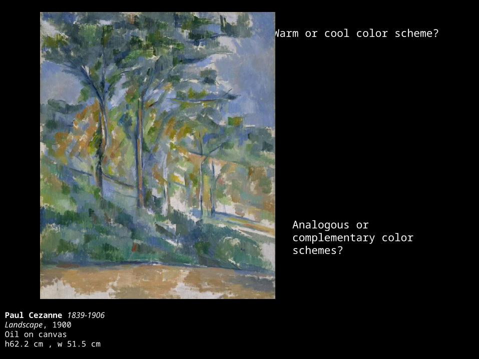
Warm or cool color scheme?
Paul Cezanne 1839-1906Landscape, 1900Oil on canvas h62.2 cm , w 51.5 cm
Analogous or complementary color schemes?

Georges Seurat French, 1859-1891A Sunday on La Grande Jatte—1884Oil on canvas207.5 x 308 cm
Optical color mixtures are when the artist depends on the eye to mix the colors.

Local color?
Chuck CloseLyle, 2002Chuck Close (American, born 1940)147-color silk screen65 1/2 x 53 7/8 in. Edition of 80
Optical colormixture
Complementary color scheme?
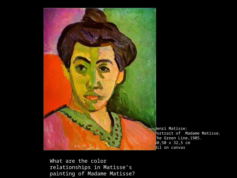
Henri Matisse: Portrait of Madame Matisse.The Green Line,1905.40,50 x 32,5 cm Oil on canvas
What are the color relationships in Matisse’s painting of Madame Matisse?
Related Documents