1 New & Revised - Includes Genesis Heat Set Oils

Welcome message from author
This document is posted to help you gain knowledge. Please leave a comment to let me know what you think about it! Share it to your friends and learn new things together.
Transcript
1
New & Revised - Includes Genesis Heat Set Oils
2
There seems to be a mystique about mixing colors. The novice painterprocrastinates or delgates this responsibility to a paint manufacturer butultimately the day arrives when the painter wants to take control of thepalette colours. This can happen only when the painter takes the responsi-bility to learn to mix colour.
Mixing colour is very exciting. The knowledge of how to control andcreate colour is the ultimate in creativity. It is not difficult to master, but itwill take time, patience, practice, but most of all desire.The intent of this book is to provide a guide to mixing colour. It is myhope that it will be useful regardless of whether the preferred medium isoil, alkyd, acrylic, watercolour, pastel, pencil or coloured ink. Colour theoryapplies to all media. All that differs is technique.
Colour is so closely interwoven with the other four basic elements of artthat it would be impossible to discuss colour without examining its rela-tionship to line, form, texture and space. The importance of colour to har-mony and composition are also inseparable, as are chemistry and tem-perature.
Please understand that colour reproduction of a paint mixture in printedform is almost always inaccurate. Every effort has been made to providethe highest quality of photography, colour separations and printing. How-ever, it is not possible to duplicate the myriad nuances of paint with onlyfive colours of printer’s ink. Furthermore, oil reflects the light differentlythan acrylic. Pencil and watercolour have their own individual properties.Therefore it may be difficult, if not impossible, to accurately match thecolour samples. Use these only as a guideline. The eye must be trained toanalyze colour. The brain must be trained in the proper use of colour.
Brands of paint also make a difference. Use the brand that is readilyavailable, but do use the best grade of paint in that brand. Inferior pigmentand inferior chemistry will never produce luminosity.Above the entrance to The Boston Children’s Museum hangs a quota-tion which reads:
I hear, and I forgetI see, and I remember I do,
and I understand
Mixing colour can only be learned and understood by doing, by actuallymixing the colour.
PREFACE
3
Learning to see colourScientifically, colour is energy measured by wave lengths, amplitudes andvelocity.
All colour originates from light rays and the eye sees that which is notabsorbed by the receiver of the light. This is oversimplification, and thesubject is expanded upon in the text where it is relevant. The usage ofcolour, in the concept of this study, lies beyond the realm of physics. Ifmore information is desired, there are many technical manuals that an-swer the scientific aspect of colour.
To the layman colour is light, an emotional experience, associated withpersonal perceptions and backgrounds. All colour is optical. Each personperceives colour differently. Each person brings different experiences andreactions to colour. These carry a strong influence which affect the usageand understanding of colour application.
The first colour that an infant sees is red. The eye of the infant thenslowly perceives other colours but shows a preference for the brightestones. Gradually, the maturing eye is aware of the many differences incolour. This evolves naturally but the influence of teachers, personal pref-erence, personal abilities cannot be denied.
Atmosphere will influence how colour is perceived. On a clear sunnyday, the colours will appear more intense than when viewed under an over-cast sky, through a fog, or in the dim moonlight. Favorite colours will bemore easily managed than colours to which there is an aversion. Coloursassociated with happy occasions or special events in one’s life differ fromone individual to another. In order to successfully see colours, in essenceto judge them clinically, past histories and personal preferences cannot beignored, but must be set aside.
Colour is independent only when it is the solitary colour being used.Colour has relationships to each element in a design or composition. Thevisual perception is influenced by surrounding factors, the intensity andpath of light, atmospheric conditions, and emotional factors.
The eye must be trained to identify the basic parent colour, then ma-nipulate that colour to be compatible with all of these factors. Toaccomplish
“I am really enthralled by these laws and theories of colours.Ah, if only they had taught us about them when we were young!”
Vincent van Gogh (1853-90)
The black and white study/exercise charts in this book may be photocopied for the personaluse of the purchaser. Any other duplication of any material, whether in black and white orcolour, by any means whatsoever, (this includes photocopy and photography) is in violationof copyright laws.
© 1986-2008 Kingslan Publications 4670 Hickory St Omaha NE 68114
4
this task, the colour must be judged first by its colour family, then whetherit is light or dark, and ultimately whether it is bright or dull. The matter ofmanipulation to this end begins with understanding the logical process ofproblem solving, which is founded upon learning the basics of art theoryand application.
There are those who are blessed with a natural intuition who can feel thecorrectness of a colour. However, that intuition can be enhanced by knowl-edge, just as a musician who has perfect pitch finds that his performanceis elevated by the study and practice of musical concepts and theories.
Most of us do not have that natural intuition but must struggle throughthe learning process by first learning the names of the notes, then thescales in order to play a musical chord. One individual may prefer to learncountry music, others direct their energies toward the classics, or possiblycontemporary jazz. It’s all music from the same scale of notes. Manyprogress to creating original works, but only after a long period of dupli-cating the works of those they admire.
As in music, there is order and logic in the world of art, colour anddesign. There are guidelines and basic formulae that produce that order. Aperiod of study is required in order to learn the application of these guide-lines. The artist will progress to creating original work if there is suffi-cient desire, dedication, and determination.
We will approach this study of colour mixing from a casual, but aca-demic viewpoint. It doesn’t matter if you perceive yourself as a folk artist,a decorative artist, a fine artist or a hobby and craft painter, the process forlearning to mix paint is founded on the same time honored and provenprinciples.
At first glance, the task may seem to be gigantic. You can eat an el-ephant if you take it one bite at a time. Digest that small amount then goback for more. The definitive word is digest. Give yourself time to absorband use each concept a small amount at a time.
It is impossible to learn how to mix colour without actually doing it.The one thing I cannot teach is experience.
Please assemble the following materials:Palette padSlim, flexible palette knifeFine Permanent MarkerBrushesBrush cleaner suitable to your medium
5
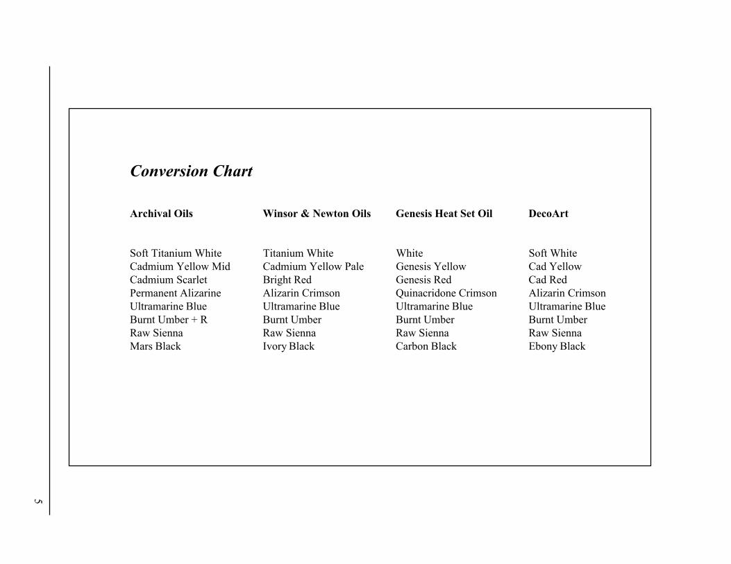
Conversion Chart
Archival Oils Winsor & Newton Oils Genesis Heat Set Oil DecoArt
Soft Titanium White Titanium White White Soft WhiteCadmium Yellow Mid Cadmium Yellow Pale Genesis Yellow Cad YellowCadmium Scarlet Bright Red Genesis Red Cad RedPermanent Alizarine Alizarin Crimson Quinacridone Crimson Alizarin CrimsonUltramarine Blue Ultramarine Blue Ultramarine Blue Ultramarine BlueBurnt Umber + R Burnt Umber Burnt Umber Burnt UmberRaw Sienna Raw Sienna Raw Sienna Raw SiennaMars Black Ivory Black Carbon Black Ebony Black
6
“Forget where it is you have been and concentrate on where you are going.”Anonymous
Learning the vocabularyIt is difficult to understand any instructions if the vocabulary is foreign.In this text I have used academic terms. It is my hope that this will enablethe artist to study other manuals with better understanding. A bibliogra-phy of reference books is given. These were my major reference books,but my twenty years of experience in teaching colour theory has been myprimary source of learning. Part of the vocabulary terms that will guidethe reader to better understanding is defined below. Please refer to theGlossary for an additional index.
Binder: Refers to the vehicle which locks the pigments together to formpaint. In oil it is usually refined linseed, poppy or safflower oil. Alkyd’sbinder is a combination of alcohol and acid. Gum arabic is the water-colour vehicle. Polymers unite the pigments of acrylic and acrylic/gouache. Egg yolk is used in egg tempera.
Extender: Refers to an ingredient thatwill make the paint flow or be-come more transparent. Winsor & Newton Blending & Glazing Mediumis my extender of choice. Many artists who work in oils or alkyds mix anextender of stand oil, damar varnish and turp. Watercolour and acrylicsare both extended through the use of water. The latter frequently uses apolymer emulsion as well.
Medium: Refers to the type of paint used, such as oil, alkyd, acrylic,watercolour, gouache, tempera, etc. The plural of medium is media.
Palette: Can be the surface onwhich the colours are arranged and mixed,or the colours used to mix other colours. For the purposes of these exer-cises the palette that I use is given on the previous page.
Pigment: The dry powdered colouring agent that is added to give paintits colour. Pigment is the same in all media.
Shade: To lower the value of a colour by using black or any colour valuebelow the basic or local value.
7
Tint: To raise the value of a colour by using white or any colour valueabove the basic or local value. Also tint could mean to imbue a colourwith a hint of another colour.
Hue, Value and Intensity: These three words describe the dimensionsof colour. Each has different characteristics and will be studied one at atime.
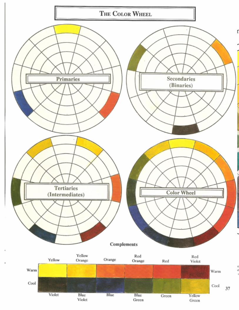
HueHue, by definition, is the proper name of a colour. Hue denotes the fam-ily of colour and there are twelve “families” that compose the basic wheelof colour. The primary definition of hue in this text will refer to the propername of each colour as it relates to the colour wheel.
Hue also can alternately refer to the decorative or fashionable descrip-tion of a colour. Sea green, powder blue, brick red, dusty rose, mauve areexamples. The colour families are indicated in these examples. How-ever, when the names are Virginia Creeper, Carnelian, or Flesh the artistmust have had experience with these in order to know their components.
These names were found on swatches in a paint store. Who would guessthat Virginia Creeper is pink, or that Carnelian is orange. Each individual’sperception of Flesh would be coloured by his/her own origins.
The study of “Hue” begins with identifying and mixing the twelvefamilies that are the integral parts of the basic colour wheel.
Mix large amounts of paint. The same colours will be used for all theexperiments and it is disruptive when concentration must be broken tomix additional paint.
PrimaryPrimary means first. All colour originates from these three primaries.These are also frequently referred to as basic, original, ideal and pure.The primaries are: Yellow, Red, and Blue
These three are the Adam and Eve of the pigmented colour families.Theygive birth to the other nine colour families on the wheel. Thesethree colours must be pure. By pure, I mean that they cannot containwhite, black, or any other colour additive.
The primary colours cannot be mixed but can be manufactured. Thethree primaries that I prefer are: Cad Yellow Pale, Cad Red, and Ultra-marine Blue.
8
The name attached to a colour by a manufacturer differs. For instance,Cad Yellow Pale in Winsor & Newton is equivalent to Cad Yellow Me-dium in Grumbacher and Liquitex. Cad Yellow Mid is the counterpart inJoSonja Acrylic Gouache. DecoArt labels their bottled acrylic as Cad-mium Yellow.
A Conversion Chart appears on Page 5 which should guide you in theproper selection of pure primary colours. Regardless of the medium inwhich you work, the primary colours must be pure for proper mixing ofsubsequent pure colour. I cannot urge you strongly enough to use thefinest grade of paint available to you. The results are well worth theexpense.
SecondarySecondary colours are mixed by combining primaries. Binary is synony-mous with secondary. This will be the first step in training the eye to seeand the mind to judge. Mix the secondary colours as follows:
Orange = Red + YellowAn ideal orange has been mixed when the eye can no longer see eitherred or yellow. Regardless of the paint medium that is used, this will betrue. Colour analysis is a decision determined by what the eye sees.
Green = Yellow + BlueLook closely at the resulting mixture. A balanced green is achievedwhen neither the blue nor the yellow is obvious.
Violet = Red + BlueIn mixing this colour, chemistry plays an important part. If Cad Red andUltramarine Blue are mixed, the resulting colour is not violet. The chemi-cal reaction of the pigments produces a brownish red, somewhat likerust. To preserve the purity of the violet, Alizarin Crimson must be usedinstead of Cad Red. This is problematic when working with acrylicssince Alizarin Crimson is incompatible with the chemistry of the acrylicbinder. Therefore, Naphthol Crimson or Acra Violet should be substi-tuted for the Alizarin Crimson. Depending upon brand, a bit of DioxazinePurple may need to be added to the Crimson or Violet. If working withbottled acrylics, be certain that the violet you use does not contain anadditive of white or black.
A balanced violet shows neither a hint of red, nor blue. Since the eyecannot see this slight nuance in a colour this dark, add a tiny bit of whiteto the corner of the mixing pile (not the whole pile, this is just a test).White will reveal if one or the other colours dominate. Remember, youonly want to see the violet.
9
TertiaryTertiary means third. Not everyone uses the same vocabulary thereforeconfusion can exist when studying colour. The term “tertiary” has beendefined in two different ways.
Some European and early colourists use tertiary when combining a sec-ondary with the primary that lies diametrically opposite on the colourwheel, or when combining two secondaries. Mixing this combination ofthe three primaries (1 + 1 + 1=3) results in dull mixtures that are no longerpure, better identified as russets, burgundies, or other earth tones.
A contemporary definition of tertiary refers to the combination of a pri-mary and its neighboring secondary. In this context, some manuals usethe term “Intermediate” since the mixture rests between a primary and asecondary on the colour wheel.
I feel this clarification is necessary in order that there is no misunder-standing with this possible source of confusion when doing further inde-pendent research or when using this manual. To argue which definition iscorrect is not productive. They both have merit.
When teaching, however, it is important to be clear and consistent in theusage of terms. I prefer to use tertiary in reference to the third step inmixing colour; that of combining aprimarywith a secondary. It is easier tounderstand that the tertiary colours are mixed by combining a primaryand a secondary (1 + 2=3). This will be less confusing when subsequentlystudying intensity.
There are six tertiary colours which are a mixture of two parts of onehue and one part of the other. You must coordinate the eye and mind forthe task of comparing each intermediate to its neighbor. The white back-ground of the palette will influence perception. As each of the followingtertiary colours are mixed, hold the palette knife with some of the colouron the tip, next to its neighbors. Decide if the colour is correct in compari-son to its neighbors.
Yellow Green = Yellow + GreenTheoretically it should be possible to combine equal parts of yellow andgreen and easily achieve the correct mixture. However, only the eye canjudge a colour since pigments do not always balance. The resulting colourshould be predominantly yellow, showing just a nuance of green.
Blue Green = Blue + GreenThe heavily pigmented yellow may overpower the weaker blue and insistupon showing a yellow cast. The colour should be adjusted by addingblue until the green leans to the blue side. Optically it rests between thetwo colours, green and blue, showing a dominance of blue.
10
Blue Violet = Blue + VioletBy adding blue to violet, the colour is shifted into the bluer range. Asbefore, a small amount of white added to the side of the pile will revealthe dominant colour.
Red Violet = Red + VioletRed Violet again poses a challenge when working with acrylic mediumsince Alizarin Crimson is not available. In order to shift the violet into thered family, the suggested acrylic substitute is Acra Violet or NaphtholCrimson (with maybe a touch of Dioxazine Purple if too red). The prob-lem does not exist in watercolour since Alizarin Crimson is compatiblewith its binder, gum arabic.
Red Orange = Red + OrangeThe pigment power in these two is nearly equal making it the easiest toproportion. The eye should be able to perceive a dominance of red in thiscolour, which lies between red and orange on the colour wheel.
Yellow Orange = Yellow + OrangeYellow Orange The pattern for mixing continues. As was experiencedwith the red orange, the nearly equal pigmentation allows easy mixing.The colour rests between yellow and orange, with the yellow dominant.
Colour management is dependent upon being able to find and identify theroot of a colour: its family origin. These twelve colours are the familiesinto which all subsequent colours are first categorized. These hues arepure and unadulterated. They are the yardstickby which all other coloursare measured. When properly arranged in a circle they comprise the stan-dard colour wheel.
If a different brand or medium is used, the results may not be the samecolour wheel as I have achieved with Winsor& Newton Artist Oils. Donot assume that they are incorrect because they differ from mine. Thereare many ways to be right and each artist must establish which primarieswork best based on experience, personal taste and the medium used.
Analyze the twelve hues that have been mixed. Judge the relationshipof the primaries to the secondaries and the tertiaries to the secondaries,while searching for too much or too little dominance. When satisfied thatthe colours are balanced, paint them on the colour wheel.
The colour wheel and all other charts may be photocopied. Heavilyspray the copy with Krylon Matte or Crystal Clear to seal and the paperwill be oil impervious. Some copy machines will accept the thickness ofVidalon matte paper. This makes an excellent surface for all media.
11
Place the sheet on a clipboard for stability and ease of handling. I mightalso suggest that the paper could be punched to fit into a notebook.If youwish, this entire book could be hole-punched and placed into thenotebook as well. Simply pry up the staples in the center. Remove eachpage and punch. Re-assemble the book in numerical order. The pagescould also be cut down the center. This would ease the insertion of yourworksheets in the sequence where you prefer them to be.
ValueThis is the term used to define shades of gray, plus black and white. Valueis also used to evaluate the degree of lightness or darkness of a colour.The terms value and tone are synonymous and interchangeable. Someartists combine the terms into “tonal value”.
Value is the most important aspect of a painting, design or compositionbecause it is the values used that create the form, dimension, mood, rhythmand emphasis. Think of value as a black and white television. When colouris tuned in it is exciting but it doesn’t alter the dimension.
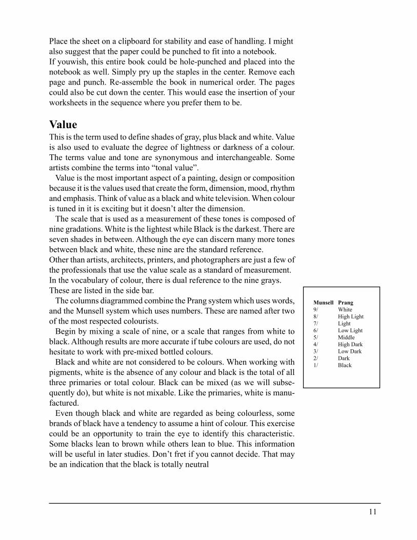
The scale that is used as a measurement of these tones is composed ofnine gradations. White is the lightest while Black is the darkest. There areseven shades in between. Although the eye can discern many more tonesbetween black and white, these nine are the standard reference.Other than artists, architects, printers, and photographers are just a few ofthe professionals that use the value scale as a standard of measurement.In the vocabulary of colour, there is dual reference to the nine grays.These are listed in the side bar.
The columns diagrammed combine the Prang system which uses words,and the Munsell system which uses numbers. These are named after twoof the most respected colourists.
Begin by mixing a scale of nine, or a scale that ranges from white toblack. Although results are more accurate if tube colours are used, do nothesitate to work with pre-mixed bottled colours.
Black and white are not considered to be colours. When working withpigments, white is the absence of any colour and black is the total of allthree primaries or total colour. Black can be mixed (as we will subse-quently do), but white is not mixable. Like the primaries, white is manu-factured.
Even though black and white are regarded as being colourless, somebrands of black have a tendency to assume a hint of colour. This exercisecould be an opportunity to train the eye to identify this characteristic.Some blacks lean to brown while others lean to blue. This informationwill be useful in later studies. Don’t fret if you cannot decide. That maybe an indication that the black is totally neutral
Munsell Prang9/ White8/ High Light7/ Light6/ Low Light5/ Middle4/ High Dark3/ Low Dark2/ Dark1/ Black
12
Most of the work will be done initially on the palette and transferred to theValue Chart on Page 87. Use a fine permanent marker to section off thepalette by drawing nine lines across. Since paint will be mixed in thesesections they should be evenly spaced. Write the same numbers and wordson the palette that are shown in the first two columns on the left side of theValue Chart. This organization coordinates the palette with the chart. Anadded benefit is that it is the foundation of the value scale system of mix-ing colour.
Mixing requires large quantities of paint therefore squeeze out an amountof white and black about the size of a half dollar or larger. Place the whiteat the top. It is Value 9. Black is Value 1 and should be placed at thebottom.
Mix all nine values before placing them on the chart since adjustmentsmay need to be made. Begin with the medium tone.
Middle value (5)Value 5, the middle tone, is achieved by mixing approximately equal por-tions of black and white. This will vary from brand to brand and frommedia to media. This should be mixed in the middle of the palette, on thesquare marked Value 5.
Low light (4)Move aportion of the middle value to the Low Light (Value 4) square andadd a small amount of white until it appears to be lighter than the midtone.The eye should be able to discern the difference.
Light (3)Value 3 is mixed by moving a portion of Low Light into that zone andadding white again until the eye can see a lighter tone.
High light (2)Take a portion of Light and move this up to the next zone. White is addedagain to raise the value of Light to High Light. This tone is almost white.
Pause and evaluate the mixes. If there is a steady gradation of shades frommiddle value to white with no drastic step between then the goal has beenachieved. However, defer transferring the mixes to the chart until the darkvalues have been mixed.
Mixing the dark values is a bit more challenging because it is not easyfor the human eye to discern the subtle differences in the dark ranges.
13
High dark (6)Take a portion of the Middle tone and move the paint into this section.Add black until the mix appears to be slightly darker than the mid-toneabove it on the palette.
Dark (7)Divide a portion of Value 6 mixture and move this into the Dark section ofthe palette. Dark Value 7 is mixed by adding black to a portion of Value 6.Compare each value to the one above. Train the eye to identify the nuancethat makes the difference.
Low dark (8)This is almost black and is the most difficult value to judge.
There is a reason for mixing these values in alignment. As each value isdeveloped, it is compared to and evaluated with the value above and thevalue below. The eye cannot make this judgment if it must skip across awide space. Form this habit in the initial study of mixing and it will be-come a habit that will help to judge when mixing value scales in colour.When the values are adjusted to your satisfaction paint the squares on thechart. Place the chart in a notebook or file as this will be used in a laterexercise.The statement was made earlier that it is the values used that create theform, dimension, mood, rhythm and emphasis. The following pages con-tain examples.
14
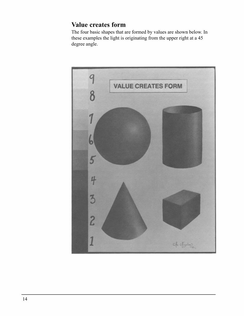
Value creates formThe four basic shapes that are formed by values are shown below. Inthese examples the light is originating from the upper right at a 45degree angle.
15
Value creates dimensionBoth of the headings relating to value and dimension are broad state-ments and almost impossible to capsulize since any examples I mightoffer would be out of context with their surroundings.
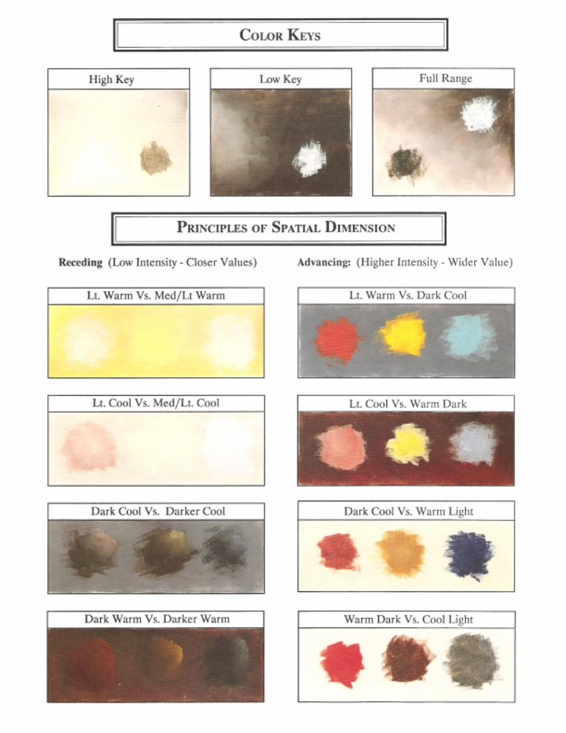
Close value contrast recedesReceding areas are created by using close values. The light value recedeson light background, the darker value fades away on the dark background.The same illusion could be expected if a near middle value were placedon a medium background.
Wide value contrast advancesThe opposite reaction occurs when light is placed in front of a dark back-ground, and dark is positioned on the light. This disproves a commonlyheld theory that dark recedes and light comes forward. The most impor-tant principle to remember in colour and value application is that “It’s allrelative. Nothing stands alone.”
Close value contrast unitesJust as strong value contrast will pull the eye to a particular section of aClose values unite composition, close value contrast will guide the eye tothe next element. Consider how your eye was able to track easily up anddown the value scale without distraction. Use this principle to add rhythmand flow to a composition. Close values can act as a bridge from oneportion to the next and will help to create harmony.
Wide value contrast dividesValue can be used to separate as well. A separation of values can createwide values divide an illusion of empty space.
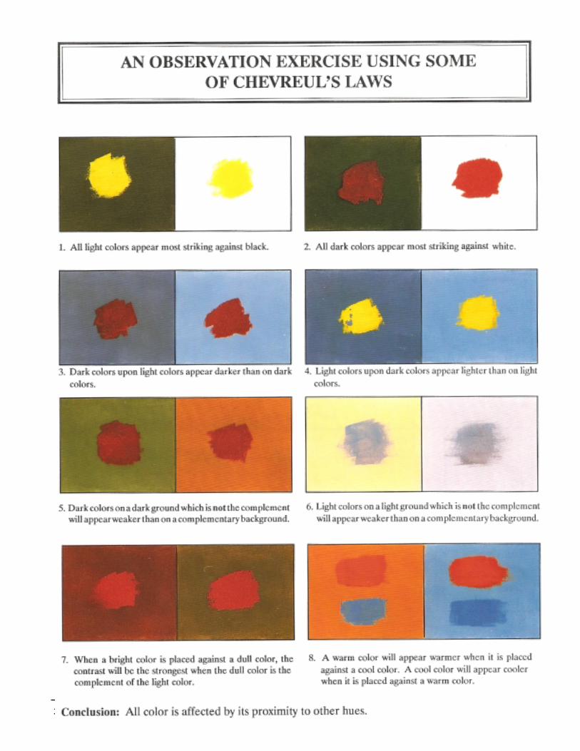
The eye can be fooled. A value can appear to be lighter when placed ona dark surface, however that same value will give the illusion of beingdarker when placed on a light surface. Refer to An Observation ExerciseUsing Some of Chevreul’s Laws on Page 52.
This phenomena also occurs when values are placed side by side, suchas on the value scale chart. Compare the value of each square where ittouches the one above. For instance, look at the bottom of Value 3 whereit touches Value 4. The tone of 3 where it touches 4 appears to be slightlylighter than where 3 touches 2.
16
Once again, the conclusion is reached that a value can only be judgedinrelation to its surroundings. The equation of Value 1 through 9 is onlyvalid when used in relationship to the standard value scale.
There is a computer term that I love and frequently use when trying toexplain this phenomena. The computer term is “WYSIWYG” (pronouncedwizzywig). The acronym means “What you see is what you get.” Thecolour translation would be that what you mix on the palette is not alwayswhat you see when the mixture is applied to the painting.
All of the above theories on value were first identified by M. E. Chevreul,an 18th Century French expert on colour. His works have had a profoundinfluence on all schools of painting from Impressionism to Op-Art.Throughout these lessons, his time proven principles will continue to bea guide.
Colour tonal valuesEarlier I compared value to a black and white television set. If colour isadded, it is exciting to note that the values do not change. That is becausecolour also has value.Yellow is obviously the lightest colour on the wheel and violet is thedarkest. When the eye travels from the yellow down the wheel it is appar-ent that each of the hues become slightly darker as they get closer toviolet.
Each colour on the spectrum has a normal value in its original positionon the colour wheel:
9/ White8/ High Light: Yellow7/ Light: Yellow Green
Yellow Orange6/ Low Light: Orange
Red Orange5/ Middle: Red
Green4/ High Dark: Blue Green
Blue3/ Dark: Red Violet
Blue Violet2/ Low Dark: Violet1/ Black
To tint and to shade are descriptions of value. Since these two elementsare so interwoven with intensity, chemistry and temperature, a discussionwill be deferred until later.
17
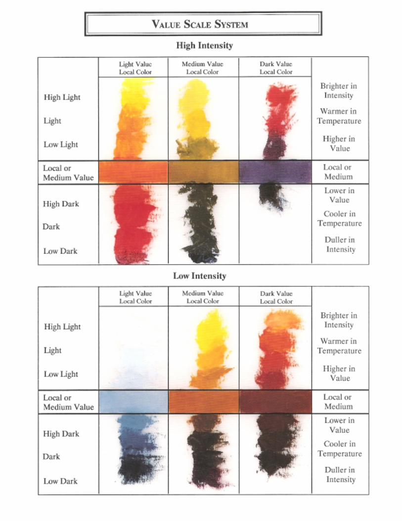
IntensityIntensity refers to the relative brightness or dullness of the colour. Chromaand intensity are synonymous. Some other words that describe degrees ofintensity are bright, dull, pure, raw, loud, soft, honking, density, satura-tion, quiet, toned, neutralized and grayed.
These define the intensity of the colour, regardless of whether that co-lour is light or dark. Intensity is independent of value. Thus a blue couldbe a baby blue and it would be described as low intensity but of a highvalue since the true blue has been weakened with white. Navy Blue wouldbe described as low intensity blue, but a dark value. In this instance thepurity of the blue was weakened with black. The only time that the bluewould be its full, pure intensity is when it is at its normal hue on thecolour wheel.
Intensity is that dimension of colour that is often the difference in achiev-ing the loud colour of a gypsy wagon or the quiet restfulness of an An-drew Wyeth interior.
While intensity is independent of value, it has a scale of measurementwhich may use words or numbers:
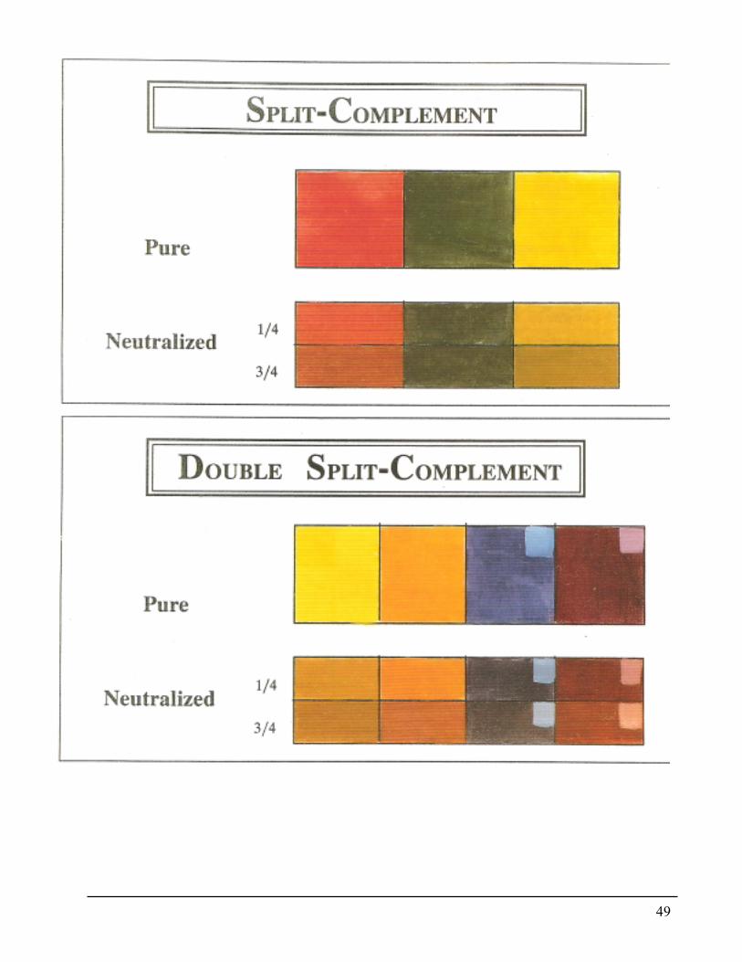
Pure colour - Maximum Intensity - no additive1/4 diluted - Strong intensity - the colour is still very bright1/2 diluted - Moderate Intensity - the colour is apparent, but weak3/4 diluted - Weak intensity - the colour is dull, but identifiableNeutralized - Totally grayed - the colour is gray, brown or black
There are several choices to be explored which will neutralize or dull acolour. An educated choice cannot be made without learning the resultsachieved from all the methods. The exercises and charts in this book havebeen designed and tested through seminars to give you exposure to eachmethod. I think that as experience is gained, you will understand thatproper control will require using a combination of neutralizing agents.
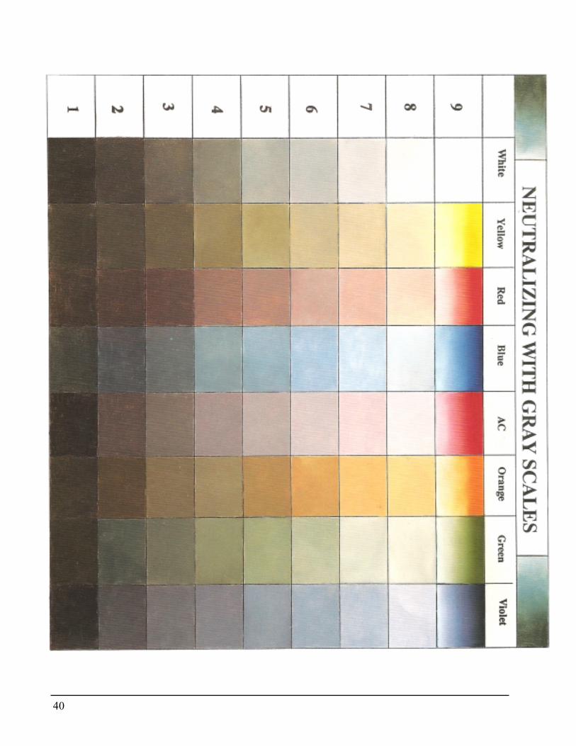
Neutralizing with graySince we have some background with the value chart, let’s begin by neu-tralizing with a combination of black and white, or the gray scale.In this exercise we will complete the chart that was begun when the valuescales were mixed. The objectives of this exercise are to:
� Determine the reaction of the pure hue when gray is added.� Train the eye to judge and compare values.� Equalize values.
18
It is possible to become so engrossed in the exercises that the purposeor objective is frequently lost in the mixing process There are two choicesin how to proceed with this exercise. The first is to mix large amounts ofthe gray value scale, ranging from black to whit e with the seven tones inbetween. Alternately, gray, black, and white ma~ be added independentlyto each value. As the exercise progresses it becomes apparent that bothmethods will be used.
The other alternative for those working in heat set oil medium would beto use the Neutral Grays that are manufactured by Genesis. These havebeen formulated to the Munsell gray scale.
The following colours should be remixed or you could determine whichtubes or bottles are equivalent to those on the chart. Often the beginnerfeels more comfortable with pre-mixed colours but colour control willnever be achieved until the hues are mixed from the pure primaries. Placeor remix the following colours: Yellow, Red, Blue, Alizarin Crimson (orequivalent), Orange, Green and Violet.
The above seven colours were selected because they represent the pri-maries, secondaries and a cool red (AC). Red is a peculiar colour in thatanother pigment must be used to create the darker pure red. This is animportant facet to remember. Because of its chemistry, the red family ofcolour requires special handling.
Record these colours across the top of the chart so that they align withthe “White”. This will give a visual reference of what the colour lookedlike before the grayswere added. It is also beneficial to blend a bit ofwhite into one side of the pure hue. This will document how the colourappears when tinted with white.
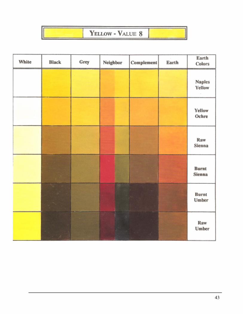
Yellow Hue - Value 8Begin with the yellow hue. It is normally a Value 8 so by adding a Value8 gray, the value of the yellow will remain the same when it is placed inthis square. Here is where some judgement must be used. Add too muchgray and the yellow will be lost. However, the value remains the same;only the intensity is changed.
As the gray is added, there is a surprising result. The yellow may changeto a greenish hue. This is because of the black in the gray mixture. If blackmust be placed in a family for colour management, it is normally treatedas if it were in the blue family.
It may be that the brand you are using did not result in green, but brownwas produced. There are myriads of reasons for this. Accept that the reac-tion your colours made were different than mine and that this is a discov-ery process about how colour reacts when using gray as a neutralizer.
19
Add a Value 7 gray to the yellow. This yellow is lighter than the gray.The yellow may lighten the gray. If so, the values are equalized byadding a small amount of black - a wee bit - until the mixture is thesame value as the Gray Scale 7.
Is the colour now so grayed that the yellow hue is gone? Bring itback by adding yellow until the intensity of this square is about thesame as the square above it.
Compare the value of the grayed yellow to the value on the grayscale. It should be the same, but still be slightly darker than the grayedyellow above it on the chart. As before, too much gray will kill theyellow so also attempt to keep the yellow at the same pace as in thesquare above.
Continue with this process, adding gray to the yellow to neutralize,then adding black and/or white, if necessary, to bring the colour to thesame value as the gray on the same line. In other words, the Value 6gray should equalize the Value 6 toned yellow. Value 5 gray shouldequalize with Value 5 toned yellow, etc. Each time white, black orcolour may also be needed.
Black, technically is colourless. However, a small amount of each ofthe seven hues will be added to black to illustrate how black can beforced to assume a bit of colour.
The conclusions that follow throughout this text reflect myobservations. Record any additional thoughts you may have.
Conclusions� When yellow is neutralized with gray, the colour will shiftto
the green side.� The value of the gray will lighten when the lighter value� yellow is added.� In order to equalize thevalues, a darkervalue (black in this
instance) must be added.� * Valueswill only match when the values of the admixes are
equal.� *The amount of gray added will determine how much of� the original colour is lost, or neutralized.� *If the colour has become too gray, the original pure colour� is added to equalize the intensity.� *It is more difficult to identify the colour in the Values 3,� 2, and 1. In darker tones, colour is not easily seen.
*These conclusions apply to all subsequent hues that are neutralized usingthese gray scales.
20
Visual aidsTraining the naked eye to judge values is a repetitive exercise. The moreit is practiced, the stronger the judgment skills will become. There aresome visual aids that may be helpful in this process. They are:
Cobalt glassDark blue glass is mounted in a holder that looks like a magnifying glass.The subject being viewed must be in exceptional light in order to see itthrough the dark glass.
Acetate filtersOriginally I used only a red filter to judge values. I realized that the redwas not effective when judging the warmer colours. When a green filter isput with the red filter the result is a “black” filter. To make them sturdythey were mounted between two pieces of 5 x 7 mats.
The filter papers I use are 5 ml acetate. If you cannot locate these youmight experiment with coloured book report covers. If the acetate is toothin, use two thicknesses of each colour.
As the mixes are viewed through the filter they are reduced to graytones. Thus the eye is not influenced by the colour. Hold the filter at vari-ous lengths from your eyes until you find a comfortable viewing distance.This does take practice.
SquintingAs the eyelids are squeezed, the lashes act as a diffuser. This will noteliminate the colour but does help in making a better judgement.
Turn the work upside downThis allows the dominant eye to judge the opposite half of the work. Adominance in vision is genetic and has no relationship to the dominantside of the brain. One eye will align objects better than the other. There isno advantage to being right eye dominant versus left eye dominant. Addi-tionally, there is no advantage to knowing which eye is dominant.
Take a break!Fatigue affects judgment. A short rest refreshes the eye, the mind and thespirit.
21
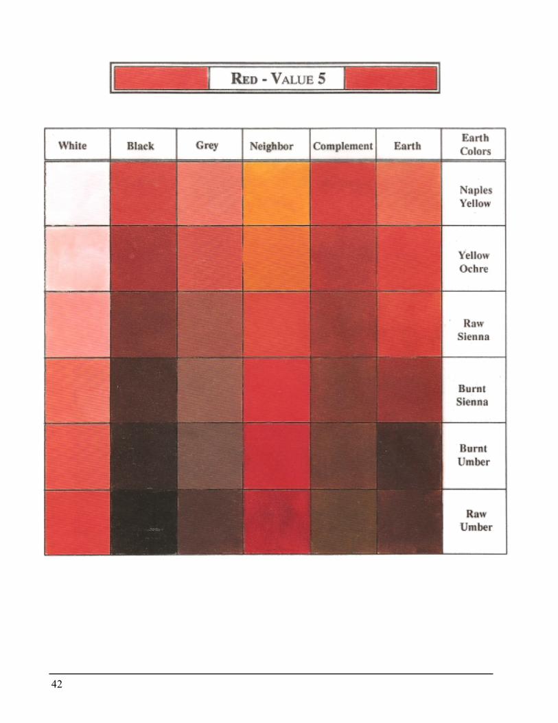
Red - Value 5The step by step means of mixing the values is almost the same as withtheyellow. The major difference is that the red is basically Value 5. Itmight beeasier to begin with the Value 5 and mix up to 9 and down to 1.
Red is especially hard on the optical senses. Look away occasionallyfrom the mixes and charts in order that the nerves may recover since theeye may begin to see the after image of red which is green. This will helpto avoid eye fatigue which leads to brain fatigue.
Because red is Value 5,white may need to be added with the gray tonesabove, and the darker tones below the Value 5 might require adjustingwith black. If the red hue is lost and the colour becomes too indistinct,adjust by adding the pure red.There is no magic formula. WYSIWYG.
Conclusions� Some reds turn brownish as the gray is added; others may take
on a more mauve appearance. The results depend upon thechemistry, brand and medium.
� Because red is Value 5 it was efficient to begin the mixingprocess at Value 5.
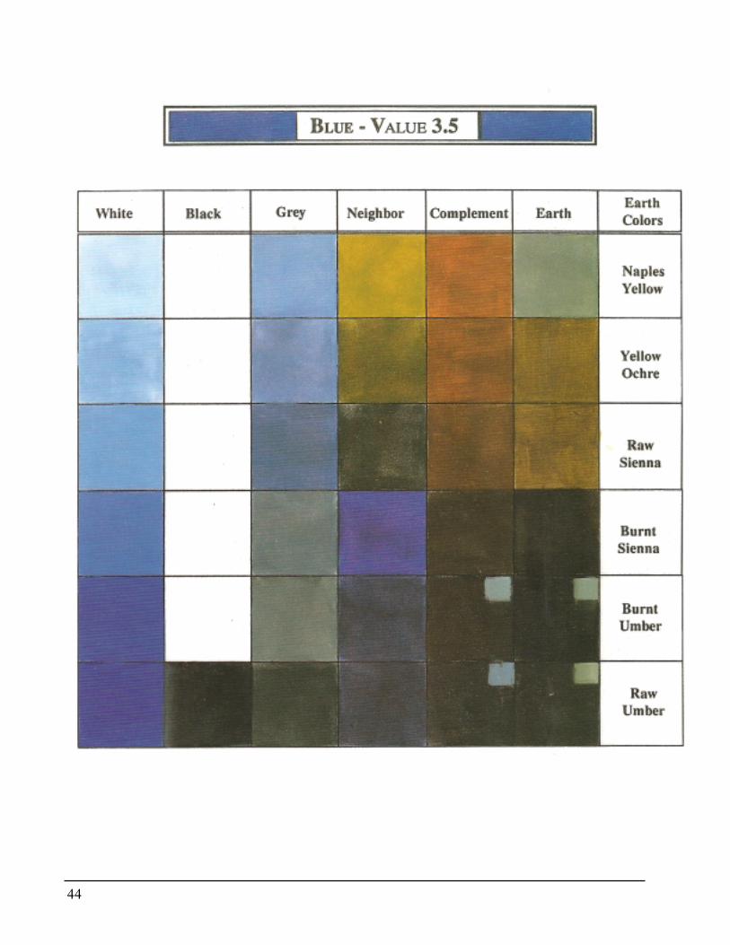
Blue - Value 3.5Continue along the same steps as above. The value of blue is quite dark,somewhere between 3 and 4. Because it is so dark it may be a bit moredifficult to match.
In the darker ranges the colour will disappear into gray very easily somore blue must be used to maintain the hue. This is especially true in the3 and 4 range.
In the Values 4 and above, the white that must be added to adjust thevalue may make the colour appear too blue. If so, add a lighter value gray.
It is becoming more of a challenge to keep all three values equal to eachother as well as equal to the Gray Scale. Compare the value first to thegray scale, then to its neighbor.
Conclusions� Blue holds its colour family when neutralized with the grays.� It’s basic hue is easily lost in the three lowest values.� Gray is an easy method for neutralizing blue without losing its
basic colour.� The ability of the eye to judge colour and value relationships
diminishes when it must cross a distance to make those comparisons.
22
AC or Red Violet - Value 2.5Two reds are used: pure red and a dark cool red. It is part of the chemistryof working with pigments. The dark cool red I have used is Alizarin Crim-son, Quinacridone Crimons, Naphthol Crimson, Acra Violet, Thalo Vio-let or Magenta are all reasonable substitutes in acrylics.
As the AC is mixed with the gray values, some soft mauve tones resultin the lighter range. Dull, quiet violets result in the darker values.Just one more review: Add white or lighter gray to adjust in the valuesabove 3, and black or darker value gray to darken below.
Conclusion� Red Violet/AC shifts into the violet family when merged with the
grays and blacks. This is because of the bluish nature of the black.� Gray might be a good choice to mix with the red violet when quiet
lavenders are desired.
Orange - Value 6Begin mixing to match the neighboring values at the Value 6 range.Reaction of the orange to the grayvaries greatly. Some brands have a highpercentage of yellow and tend to assume a dirty green in the light valuesand a khaki tone in the dark ranges. Those with more red than yellowpigment react by turning into warm browns. Experiment with your brandso you will know what to expect.
As with every other mixture, add orange if the colour disappears intothe gray. Equalize both the value and the amount of colour that is visible.
Conclusions� Some soft browns and mossy greens may result.� Orange may not hold its family colour when mixed with gray tones.
Green - Value 5When green is neutralized with gray, the hue is still apparent. It may seemredundant to say that the resulting hues are “gray-green” but this doesproduce quiet greens.
The method for matching the values with the gray scale is the samethroughout. Add white or lighter value gray if the mix is too dark. Addblack or darker value gray if it is too light. Add the pure hue if it is toogray.
Conclusion� Green mixed with gray stays in its colour family.� Gray plus green results in greens that push to the blue side if the
black leans to the blue side.� Green is on a value par with red.
23
Violet - Value 2This is the darkest colour value on the scale. Begin neutralizing with theValue 2 Gray.
There is quite a bit of distance between the violet square and the grayscale square. In order to compare the values mixed, hold the mixingknife with colour on it over the square.
Conclusions� Violets do not shift out of their colour family when mixed with
gray.� The colour tends to fade into gray in the dark range thus requi-
ing an addition of pure colour.� Depending upon the proportion of red to blue, the grays may
take on a hint of mauve or blue.
File your completed chart in the notebook. This will give a ready docu-mentation as to what results and reactions may be expected when gray ischosen as a neutralizer.
Neutralizing with gray produces a range of colours which are oftenreferred to as “dusty or misty”.
Gray is just one of the options to use when neutralizing a colour. Thenext choice that we will explore is how to use the complements to changethe intensity of a colour.
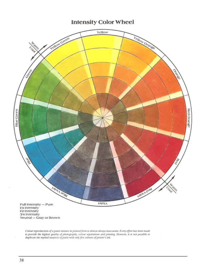
Neutralizing with the complementYou will need the black and white Intensity Colour Wheel on Page 87.Please do not skip over this exercise because you fear it may be difficultor irrelevant. To truly comprehend and control colour, one must thor-oughly understand the colour wheel. There are many types of colourwheels available commercially, but I developed this particular wheel in1977 because I could find none that entirely served my purpose. ThisIntensity Colour Wheel was designed to reveal the effect of complemen-tary colours upon each other; their relative value, and the changes thatoccur.
Reference to the Intensity Colour Wheel on Page 38 should be kept toIntensity colour wheel a minimum. It is not productive to just match mycolours. Remember your goal is to train your colour eye and your brainto perceive what is happening on your palette. Use mine as a guidelineonly. Caution is given that no printed colour reproduction is ever accu-rate.
24
Hues that lie directly opposite each other on the colour wheel are calledComplementary colours.
Webster’s Dictionary defines complementary as “that which completes”.In the context of colour studies this means that the complement of a givencolour completes the missing two original primaries. For example, thecomplement of red is green. Red is the primary and green is composed ofthe other two primaries, blue and yellow.
Listed below is a table of the complementary colours. Since these areused continually, it would be well to commit them to memory:
YellowYellow OrangeOrangeRed OrangeRedRed Violet
VioletBlue VioletBlueBlue GreenGreenYellow Green
Complementary coloursIt is necessary that you know this table as readily as your name. Onebecomes friendly with people when one knows their names. This is truealso of colour.
Squeeze out the colour onto the palette. Don’t skimp. If you waste paintyou can always buy more. If you waste time it is irretrievable. Your con-centration is broken each time you must put out more paint and remix.Waste paint, not time.
Each pile of paint should be about the size of a half dollar. Line themacross the top of your palette in value scale order, reading from left toright: White - Yellow - Red - Red Violet - BlueHabit can be a liberating servant. Develop the habit of thinking in termsof the value as well as the hue. By placing colours consistently in thesame place on the palette, habit will find them when the mind is preoccu-pied with weightier problems.
It is not possible for me to give accurate mathematical percentages toachieve a particular mixbecause colour is pigment and the reaction varieswith each medium, brand, and choice of primaries. A manufacturer usessophisticated scientific testing to control how much pigment is added.
This controls the quality and consistency of the product. Percentagesare of no value to the artist unless the desired results are always to be the
25
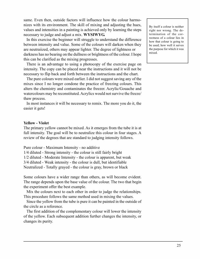
By itself a colour is neitherright nor wrong. The de-termination of the cor-rectness of a colour lies inhow that colour is going tobe used; how well it servesthe purpose for which it wasmixed.
same. Even then, outside factors will influence how the colour harmo-nizes with its environment. The skill of mixing and adjusting the hues,values and intensities in a painting is achieved only by learning the stepsnecessary to judge and adjust a mix. WYSIWYG.
In this exercise the beginner will struggle to understand the differencebetween intensity and value. Some of the colours will darken when theyare neutraiized, others may appear lighter. The degree of lightness ordarkness has no bearing on the dullness or brightness of the colour. I hopethis can be clarified as the mixing progresses.
There is an advantage to using a photocopy of the exercise page onintensity. The copy can be placed near the instructions and it will not benecessary to flip back and forth between the instructions and the chart.
The pure colours were mixed earlier. I did not suggest saving any of themixes since I no longer condone the practice of freezing colours. Thisalters the chemistry and contaminates the freezer. Acrylic/Gouache andwatercolours may be reconstituted. Acrylics would not survive the freeze/thaw process.
In most instances it will be necessary to remix. The more you do it, theeasier it gets!
Yellow - VioletThe primary yellow cannot be mixed. As it emerges from the tube it is atfull intensity. The goal will be to neutralize this colour in four stages. Areview of the degrees that are standard to judging intensity follows.
Pure colour - Maximum Intensity - no additive1/4 diluted - Strong intensity - the colour is still fairly bright1/2 diluted - Moderate Intensity - the colour is apparent, but weak3/4 diluted - Weak intensity - the colour is dull, but identifiableNeutralized - Totally grayed - the colour is gray, brown or black
Some colours have a wider range than others, as will become evident.The range depends upon the base value of the colour. The two that beginthe experiment offer the best example.
Mix the colours next to each other in order to judge the relationships.This procedure follows the same method used in mixing the values.
Since the yellow from the tube is pure it can be painted in the outside ofthe circle as a reference.
The first addition of the complementary colour will lower the intensityof the yellow. Each subsequent addition further changes the intensity, orchanges its purity.
26
In the instance of yellow, as its complement Violet is added, the reactiondiffers. The result may appear to contain a hint of green, oranoe, or lean tobrown. Green is produced when the blue in the violet is out of balance.Orange results if the violet has too much red.
At this stage any mixes that have shifted away from the yellow must beadjusted in order to be an accurate reference on the intensity on thecolour wheel. The brown tone will result when the pigment is balanced.
If the green cast is undesirable, how can it be changed? Here is theremedy: What is the colour you wish to kill? Green. What is the comple-ment to green? Red. So a small amount of the red is mixed into the pile.Continue adding meager bits of red until the green disappears.
Should too much red be added to kill the red, the colour may shift toorange. How does one get rid of the orange? By adding orange’s comple-ment, blue.
I will repeat again that a colour is only correct if it serves its purpose.The green happens. The orange happens. Accept that and deal with it.This knowledge could be useful if ever those particular colours are desir-able and you will be happy you took the time to document your findings.
The next addition of the complement to yellow will further dull thecolour, but the yellow should still be fairly apparent. If green or orangeresult, it can be repaired.
As the yellow is neutralized it soon becomes obvious that the colouralso darkens invalue with each addition of the violet. This is an inevitableresult because the violet is just above black on the value scale and yellowrests just below white. The darkening of the colour is a by-product thatmay be used to advantage.
If the colour becomes too neutralized, it is cleared by adding the parentcolour. In this instance the hue would be brightened with yellow.
Yellow can be neutralized through many stages, but in order to keep thecolour wheel somewhat standardized, mix only the four stages outlinedabove. The yellow is pure at the perimeter. During the first step the yel-low is still bright but it begins to show a slight hint of brown. Each addi-tion of violet further weakens the colour. Add violet in the fourth stageuntil the yellow totally loses its hue. It will appear to be brown or black.This totally neutralized colour should be placed in the center hub of thewheel.
Five intensities will have been mixed progressing from pure, ideal yel-low and becoming progressively more brown.
Following each mixture are listed some of my deductions concerningthe colours. Yours may differ. We are seeing through different eyes andexperiences. Write down your own personal conclusions and observa-tions so they won’t be forgotten. I might also suggest that you jot downwhat it is that you still may not understand. This will provide a feeling ofaccomplishment when the answers are found.
27
Conclusions� Yellow may have a tendency to shift into the orange or
green range depending upon the violet used.� If it is necessary to “kill” the orange cast, the complement
of orange is used - blue.� If it is necessary to “kill” the green tinge, the complement of green
is used - red.� Neutralizing light value yellow with the dark value violet will
automatically lower the value of the yellow.� Yellow is considered to be totally neutralized when it becomes
brown or black.� Addition of the pure hue, in this instance yellow, will brighten the
mix if it has become too neutral.
The addition of a pure hue will brighten any mixture with the exceptionof Red Violet. This is explained when the Red Violet tertiary is studied.It is useful to know how each of the neutralized colours appears whenwhite is added. This will give a visual reference of how many soft mixescan be achieved. As each mixture is added to the wheel add a measure ofwhite to the right side. For practice sake try to make each of these tints thesame value in each segment. One side could be mixed with black to ob-serve that reaction. I chose not to do this because of lack of space in eachsection.
Violet - YellowViolet has already been mixed. This is the complement that is used toneutralize yellow family.
Each colour seems to have a challenge unique unto itself. Yellow dis-plays a habit of shifting towards its neighboring hues of green or orange.Violet’s peculiarity is that it is of such a dark value that the eye has diffi-culty in determining to what degree it has been neutralized. Therefore, inorder to reveal what the results are, add a small amount of white to theedge of each pile.
It is helpful to first add white to the pure colour when the value is asdark as this is. As the colours are mixed remember that it is the intensitythat is being compared and each test mix should appear gradually moregrayed. As white is added to test each neutral mix, bring the test value tothe same tone as the pure colour tint. Each subsequent test should be atthe same value/tone. This will continue to reinforce training of the eve.
28
The chemical ingredients in violet are much weaker than those in yellow.Add very small amounts of yellow paint. The powerful cadmium mayhave a tendency to continually push the violet to the yellow side. As be-fore, the colour is cleared back to violet by adding the pure hue.
Be alert to what is happening on the palette. Follow the same step bystep procedure as with the yellow. When satisfied, apply the mixes to thewheel. Remember to add the white to the right side in order to record thegray tones.
Controlling violet is not easy. This factor is the cause of many brightintense paintings wherein the violet screams. Compare this method ofneutralizing violet with its complement to the previous experience of us-ing the gray value scale. Did you find one method easier than the other?The answer would depend upon how and where the colour was going tobe used. Don’t make a decision until all the remaining options have beenexplored.
Conclusions� As violet is neutralized the value remains approximately the same.� A small amount of white added to the corner of each mix helps to
judge the intensity change.� If each of the test patches are mixed to approximately the same
value, it will be easier to compare the intensity relationships.� Violet becomes black when totally neutralized.� It is a bit more difficult to neutralize violet with yellow than it was
when the gray scale was used.� The dark value of the violet overpowers the yellow value. Thus a
shift into green or orange family may not be visible.� The cadmium in the yellow is so much stronger than the ingredi-
ents in violet that it was difficult to hold the violet in its own family.
Red - GreenCad Red is a strongly pigmented true primary red. Cad Red Light andCad Scarlet lean more toward the Red Orange family.
Less expensive alternates are Bright Red, Grumbacher Red and HarrisonRed. However, these reds tend to lean toward blue and do not mix as clearand bright an orange as does the Cad Red. If you are working in anothermedium and you have had difficulty with the reds and oranges turningmuddy, it may be that the red you are using is too blue. As a result whenit mixes with yellow, the resulting orange is slightly neutralized by theblue in the red.
29
The peculiarity of the red and green complements is that they are equal ornearly equal in value. There will be little or no obvious change in valueas the colours neutralize each other.
Mix green again. A balanced green will show no visual preference forblue or yellow.
The red and green are so finely balanced that it will be difficult to keepeach hue in its proper family. There may be a tendency for the red tosuddenly appear green. The red has been over neutralized and should beadjusted by adding pure red to pull it back into its own range.
Should the mixture take on a violet tint, the complement of violet (yel-low) should be slowly added to bring the mixture back into its red range.
This shift into violet maybe caused by having too much blue in thegreen mix or the red may be one that leans to the blue side.
Some lovely hues emerge when red is neutralized with the green. Softdull earthy tones result. When the colour is placed on the intensity wheeland the white is added to one side, the tints produced might appear to bedusty, misty grays or light earthy Southwestern colours.
Conclusions� Red and green are nearly equal in value producing mixes that do
not change appreciably in value.� The red tone tends to easily lose its colour family in the
dullest ranges.� An imbalance of blue in the green complement could cause the
red to show a violet cast.� Red will usually turn to a deep rich brown when totally neutral-
ized.
Green - RedThis exercise should be easy because everything that happened withredwill probably happen with green. It shows a tendency to lose its fam-ily very quickly. Like red, it has a short range.
Should the eye be unable to determine if the green has crossed over tothe red side, adding a small amount of white to the corner of the mixturewill reveal whether it is greenish or reddish.
If any of the green mixes shift into any other family, it is brought backby adding the complement of the unwanted colour.
The green should be painted in its proper place on the wheel. Whenwhite is added to the corner the colour is mellowed further. It is pretty
exciting to think about the many uses for these gray greens. Comparethese to the greens achieved on the value chart. The choices are multiply-ing.
30
ConclusionsGreen is equal or nearly equal in value to red.Like red, green shifts easily into its complement’s familyWhen totally neutralized, green changes to a cool darkbrown.
Blue - OrangeThis is the combination that will most readily produce black. The valueof the blue is almost the same as violet. Therefore the same inability tojudge the mixtures aswas experienced with violet canbe anticipated here.
Repeat the neutralizing of blue in the same manner as the violet. Test-ing with equal value tints is so important. The eye can possibly becomeconfused if the test values are not equalized.
Like violet, it is a struggle to neutralize this colour with its comple-ment. The blue is weaker than the orange and the orange has a tendenc\ todominate. When this happens the blue family is lost and the result ap-pears more brown than blue. As before, shift the family back by addingthe pure hue.
Conclusions� Blue is similar to violet. The dark value makes judging difficult.� Blue can be neutralized until it turns black.� This colour has a very short range of neutral scales.� A small amount of white added to the corner of each mix helps
to judge the intensity change.� If each of the test patches are mixed to approximately the same
value, it is easier to compare the intensity relationships.� It is a bit more difficult to neutralize blue with orange than it
was when the gray scale was used.� The cadmium in the orange mix is so much stronger than the
weaker blue that it was difficult to hold the blue in its ownfamily.
31
Orange - BlueMany similarities to yellow/violet will be seen. Unless there is a suffi-cient amount of red in the orange, the mixes will turn green.
If too much red is in the orange, then the mix could show a violet tint.Green will kill the red tone and yellow will kill the violet.
This is a very enlightening range to work with since it provides manysurprises. Tones similar to burnt sienna, red iron oxide, and deep brownsbecome apparent.
Like yellow, a value change is seen in the orange as it is dulled. Orangehas a much wider range from pure to “dead”. This is valuable knowledgethat can be used when it is necessary to darken as well as dull orange.
This method produced a very different set of neutral colours than whenthe gray values were used earlier. A decision about which is appropriatedepends upon the circumstances and the purpose for which the colour isbeing mixed.
Conclusions� Orange may have a tendency to shift into the green or violet
range depending upon how much red is in the orange.� If it is necessary to “kill” the violet cast, the complement of
violet is used; i.e., yellow.� If it is necessary to “kill” the green tinge, the complement of
green is used; i.e., red.� Neutralizing the fairly light value orange with the dark� value blue will automatically lower the value of the orange.� Orange can be neutralized until it becomes black.� Pure orange will brighten the mix if it has become too
neutral.
Neutralizing the tertiariesThe tertiary colours are neutralized following the same system. Thecomplementary toners will lie diametrically opposite each other on thecolour wheel.
There is one extremely important exception: Red Violet is a maverick.If Red violet is over neutralized, it is cleared with Alizarin Crimson or itsequivalent, not Cad Red. Cad Red reacts to the blue in the red violet.Instead of clarifying the red violet the result may be a dull tone. Thisthought should be retained for the situation where a quick method formixing a dull red is needed.
32
Alizarin Crimson or its equivalent is the bright red violet hue that be usedto complement yellow green. A small amount of violet mix added to theAlizarin Crimson to bring it closer to the ideal red violet.
To outline the method of neutralizing the tertiaries would be redundantsince the system is the same as for the primaries and secondaries. Thesame traps need to be avoided. The hue takes on an unwanted tinge? Thecomplement of the tinge will kill it. The colour has shifted? It is pushedback with the pure hue. The dark values are impossible to see? They aretinted to equal values. It all follows the same thought process.
Remember to put the white in the side of the colour when it is paintedon the intensity wheel.
Heave a deep sigh. What an accomplishment. One hundred and forty-fourcolours and tints have been mixed from just five tubes of paint.Add tothis to the 56 mixed on the value scale. And we have only just begun.
If there is sufficient curiosity to continue, additional tones could he mixedby combining yellow with yellow-orange, yellow-orange with redorange,continuing around the wheel. It is truly mind boggling. I suppose that iswhy Albert Munsell devised his system of classifying hues, values, andintensities with a colour tree rather than a wheel.
Neutralizing with whiteIf any pigmented ingredient is added to a colour, that colour is weak-ened or neutralized.
White weakens colour. Adding white to a colour is just one form oftinting. When a colour is tinted with white it has also been dulled. Whenwhite was placed to one side of each mixture on the intensity colourwheel,the hue was further neutralized. This combination of methods producedmixes that were brought still more distant from their origin. The whitealso raised the value.When working with the Exercise Sheet on Page 87 (also pgs. 42-44),place the pure colour at the bottom. Add white by slow increments andsee how many times the colour being studied can be diluted until it disap-pears into pure white.
The lighter value pure tones have a much shorter range while the purehues that are darker in value can be tinted many times before the huedisappears. Record the conclusions reached on the bottom of each sheet.
33
Neutralizing with blackBlack weakens colour. Adding black to a colour is one method of shading.Therefore when black has been added to darken a colour, the hue is alsoweakened and dulled. It would have been interesting to also add black toa portion of the intensity colour chart, but I chose not to because of spacelimitations.
Black should rest at the bottom of the chart. Add the hue being analyzedto the black to judge the reactions. Yellow will probably act up again byturning green. Discover what happens as each hue responds to the addi-tion of black. Record your conclusions. A colour may appear disagree-able, but place it on the sheet anyway. In a different situation it might bejust what is needed and this documentation will help in remembering howit was mixed.
Neutralize with a neighborThe fifth method of neutralizing is by using the colour’s neighbor hue onthe wheel. First let’s define “neighbor”. It is the colour that rests immedi-ately above or below a colour on the wheel.
Neutralizing with a neighbor does not dull the colour in the sense that itrobs the hue of its brightness, but it does neutralize in that the originalcolour is no longer pure. It has been imbued with another colour. Forinstance, orange is added to red. The red has been weakened by orange: itis no longer pure red. A result of this admixture is that the red is alsolighter in value.
Using red again as an example, red violet could be used to weaken thered. The value of the red is lowered, therefore it is no longer pure red.What is the purpose of using a neighbor? This method might be chosenwhen the intent is to keep the overall intensities fairly bright as well as tolower or raise the value in order to create the form.
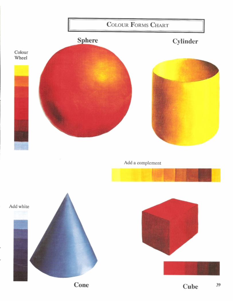
Refer to Page 39 (Colour Forms Chart). The red ball is quite intense. Itis very bright throughout, even in the dark area. The purpose was to createan extremely bright shape. The ball must maintain its intensity in both thedarker and lighter areas or it would no longer be bright. The red isweakened(intensity lowered) by the addition of neighboring colours on the wheel.Using this method is a classic example of the use of the values of eachpure colour as they appear on the colour wheel.
34
A green ball could be formed in the same manner. Start with bright green.Add yellow-green, then yellow to lighten. Follow down the other side ofthe colourwheel to darken the green. Progress toblue green, blue. then toblue-violet and violet if necessary. The ball would register as a green ballof fairly high intensity. The green has been weakened by the addition ofthe neighbors.Some colours have a wider range. Yellow could be lowered in value
by using the colours on the right or the left side of the wheel. The samewould be true of violet. The lighter values on either side could be used toraise the value of the violet. The results would differ and the choice isdetermined by need.
Green and red rest in the middle. These two hues appear to stay intheir own colour families as their values are raised and lowered by theaddition of their respective neighbors. Please remember that red violetmust be used between red and violet if neutralizing of the red is not de-sired.
Speculate how many different ways this method of neutralizing with aneighbor could be used, remembering that the addition of the neighboralso has the potential of raising and lowering value. As knowledge grows,so do the available options.
No one should be able to dictate choices to you when there is so muchfrom which you can pick and choose to suit your personal needs. I readthat it has been computed that the unaided human eye can differentiatebetween ten million colours. That is mind boggling!
Neutralizing with earth coloursIn the portion of the exercise sheets on Pages 42-44 that use earth coloursas toners I have used six of the most familiar tube colours. Generally,.Naples Yellow and Raw Sienna show the greatest variance from one brandto another. Different media may produce unlike results. The objective ofthese experiments is to learnwhat happens in your preferred medium us-ing your preferred palette of colours.
When using an earth toner it is important to know their colour familiesas well as the relative value of each earth colour. This will help to use thisform of neutralizing to best advantage. The following information refersto tubed oil, watercolour, acrylic and acrylic/gouache colours. The me-dium being used is not an influencing factor. Pigment is pigment. How-ever, when using pre-mixed bottled colours, the colour may have beenweakened with a white additive and this must be taken into consideration.Specific brands are mentioned only when it makes a difference in thecolour family.
35
Red Family: Burnt Umber (Winsor & Newton, Rembrandt,Liquitex, JoSonja)
Burnt Sienna
Yellow Family: Naples YellowYellow OchreYellow OxideRaw UmberBurnt Umber (Grumbacher or Shiva)Raw Sienna (Winsor & Newton, Rembrandt)
Orange Family: Raw Sienna (Liquitex)
Green Family: Green Earth Olive Green
Violet Family: Brownish Madder Mars Violet Burnt Carmine
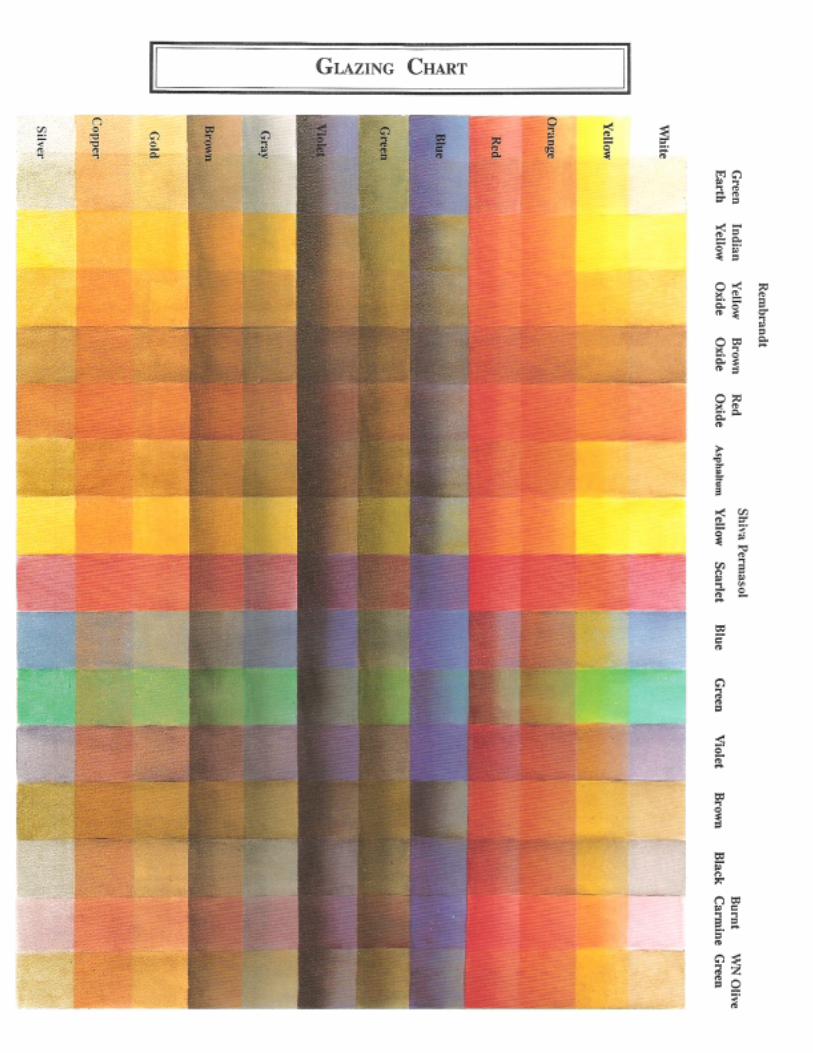
Nentralizing with GlazesA glaze is a transparent colour that is applied over an already driedglazesopaque colour (See “Chemistry”). Veiling is synonymous with glazing.Antiquing is a decorative form of glazing.
First, the colour family or unwanted characteristic of the undertoneshould be determined. The choice of the glazing colour could be thatcolour’s complement or an earth tone. I have provided a chart on Page 41that shows some of the effects of glazing in oils.
Make a chart that documents the effect your brand and media wouldhave upon your colours. The surface could be Vidalon, Poster Board,masonite or watercolour paper. Begin by drawing one inch lineshorizontally to coincide with the number of opaque colours you choose toanalyze. Metallic colours were added at the bottom of the example sinceI felt this information would be valuable when working with the Wood-carver clientele in our art store. Include any colours that recur frequentlyon your palette or for which you might have specialized need.
Paint the same colour all the way across, horizontally, between the lines.On the example a small amount of white was blended in the top of eachopaque colour in order to view the reaction of the colour’s tint to theglaze.
36
If working in oil or acrylic/gouache a good safety measure might be toisolate the layers with a coat of varnish or other medium. Be sure to writethe names of the opaque colours used along the left side.
Some paints are transparent by nature. Others are made transparent bythe addition of an extender. It has been my experience that more success isachieved if a colour is used that is naturally transparent or one that hasbeen formulated to be transparent by the manufacturer such as ShivaPermasol Oils. These are outstanding. The basic Permasol kit contains thecolours necessary to mix the secondaries and tertiaries. Black and whiteare also available in Permasol.
Manufactured glazes are available in acrylic and acrylic/gouache.Watercolour can be transformed to a glaze by the addition of water. Suc-cess is more easily achieved with the less pigmented colours.
Winsor & Newton brand of Raw Sienna is semi-transparent. Liquitex andmost other brands tend to be more opaque.
Your choice of transparent colours should be listed across the top in oneinch increments. The glaze should then be drawn from top to bottom. ver-tically. Strive for a very even application. The colours that I used are listedon the Glazing Chart that appears on Page 41.
The printing process cannot duplicate the luminosity that is achievedwith glazing. The full optical experience can only be gained from makingyour own glazing chart. Do it. You’ll be amazed at the results.
Other choices for neutralizingA colour that is already mixed and dulled is one more option. The choicewill be even more fruitful when the colour selected is of equal value to thetone that is being neutralized. It will then change only the intensity, not thevalue. This toner could be one that has been mixed for another purposeand is already on the palette or it could be a colour that has been dulled bythe manufacturer, for instance Barn Red, Indigo Blue or Rose Pink.
Use any or all combinations of the options available for neutralizers.It is now apparent that there is no one method suitable to dull all colours.When a neutralizer is added the value may change and/or the colour familymay shift. Relate the judging of colour mixes to cooking. To taste the stewmay not always reveaal what is in the stew but it could divulge what ismissing. Colour is similar. Once the colour is mixed it is judged to deter-mine if anything is missing, then identify which ingredient(s) may need tobe added to make the mix suit your palette (or palate) and purpose.
37
38
39
40
41
42
43
44
45
46
47
48
49
50
51
52
53
Should you wish to record how a colour will react to each of the optionslisted above, duplicate and use the chart on Page 87. Each column repre-sents one of the means available. Record the colours and your conclu-sions on the chart for future reference. There are coloured guides on Pages42-44 which illustrate the reaction of the three primaries. It would be atremendous learning experience to take all twelve hues and record theirreactions to each option available for neutralizing colour.
Repeat the exercise with any unusual colour that you use frequently.Burnt Carmine is a favorite of mine. The first step would be to identifythe colour’s origin. I would place Burnt Carmine in the Red Violet family.Then test the colour’s reaction to all the choices for neutralizing. To ana-lyze a colour in this manner will show exactly what may be expected ofthe colour thus allowing a more educated usage of the colour.
Recap of neutralizing options
� Value of grey� Complement� Earth colour� White� Black� Neighbor� Glazes� A dull colour previously mixed.� A combination of the above options.
54
Brighten a ColourBrightening or clearing a colour is the opposite of neutralizing. This is asimple process once the original colour family is identified. The primaryor parent hue is added to the dulled colour. Because of the chemistry ofthe paint, Alizarin Crimson is use to clarify dark reds, as well as thosecolours which borer red violet. A few suggestions to brighten or intensifyyour colors are:
Yellow: Add Cad Yellow Medium, Pale, or Light, Lemon yellow,Hansa Yellow.
Blue: Add Ultramarine Blue, Prussian Blue, or Cobalt BlueRed: Add Cad Red, Grumbacher Red, Bright Red, Harrison Red,
Naphthol Red LightRed Violet: Add Alizarin Crimson, Geranium Lake, Naphthol CrimsonOrange: Add Cad Yell Deep, Cad Orange or a mix of CYM + CR.Green: Add (Yellow + Blue), Permanent Green Light, Brilliant
Green, Emerald Green, Chrome Oxide Green.Violet: Add AC + UB, Dioxazine Purple, Shiva Astra Violet,
Mauve.Black: Add any BlueGlazing: Pull a bright transparent colour over a colour of the same
family and the undertone will brighten. Example, glaze anundertone of Cad Red with Permasol Scarlet.
One more reminder: In brightening dark reds, remember to use Alizarin Crim-son or its equivalent. When the colour has cleared to the ideal or pure redviolet, it can then be further brightened by the addition of Cad Red, BrightRed, etc. If you add yellow or orange family to dark red, there is usuallysufficient red violet in the dark red to react to the its compleementaryyellow,and the result is a dull rust instead of bright, intense red.
In all honesty, I hate painting charts but I do love learning and that’s theprice that must be paid. Now that the charts are completed, analyzed andplaced in the notebook, it would be fair to question why intensity is so im-portant. If value creates the form, what influence does intensity play in apainting? While there is no simple answer I will try to give some conciseexplanations at this point. This subject is expanded upon in the sections onColour Schemes, Harmony, Dimension and An Observation Exercise UsingSome of Chevreul’s Laws.
High bright intensity helps to create the emphasis in a colour scheme. Theeye will automatically zero in on the strongest hues thereby creating the lead-in necessary to form a center of interest area. (See Page 77)
55
Confusion is created when too many intense colours are used. The eyecannot focus on one area, therefore the eye jumps from one section orobject to another.
Low intensity hues provide resting places. Low intensity colours seemmore quiet and harmonize with each other more easily. However, too higha percentage of low intensity tones can be boring.
Intensity establishes space. Low intensity colours seem to recede whilethe colours that are relatively brighter push to the foreground.
In order to completely understand the characteristics of colour it is nec-essary to explore temperature, chemistry and psychology. (This almostsounds like a medical report instead of a book about colour theory.)
TemperatureAn individual’s perception of the temperature depends upon that person’sbackground and experience. If a Canadian were to visit Neebraska in theSpring, our temperature might be thought of as warm. Conversely, a visi-tor from Florida would think it quite cooL Colour temperature is relativeand changes with the manner in which it is used. Colours are identified aswarm or cool only on their own home base, the colour wheeL When thecolour travels to the painting it must be adapted to the new environment.
If a line were drawn through the colour wheel that intersected yellowgreen and green on one side, and that line were continued directly acrossuntil it intersected red and red violet on the other side of the circle, half ofthe colours would be designated as warm and the other half would bedesignated as cooL
56
Cool versus warmIt is possible to warm a basically cool colour by the addition of a warmhue. Thus blue families can be warmed by adding a yellow or red familycolour.
Conversely, a warm colour can be cooled by the addition of blue or anycolour that has blue as an ingredient. For example, green or violet.
The temperature of a colour can also be altered with a glaze. A warmtone pulled over a cool tone will result in warming the cool colour. Thereverse is true if a cool colour is pulled over a warm one.
White will cool a colour while Black is considered to be a warmingagent. However, this is not true of all blacks. Mars or Ferrous Black arewarm, while Ivory Black and Carbon Black tend to lean to the blue sideand do not warm.
The names of the warm family earth tones are usually preceded by theword “Burnt”. The cooler earth tones are preceded by the word “Raw”.Naples Yellow and Yellow Ochre are cool earth tones.
The complement of a warm colour is cool, and vice versa. This shouldbe taken into consideration when neutralizing with a complement. Theresult is that the colour is not only dulled, but its temperature is also al-tered. Refer to the intensity colour wheel that was painted earlier. Thistemperature reaction is more obvious in some families than in others.
Green is cool in relationship to yellow green, but warm when related toblue green. Yellow green is warm compared to green, but cool when usednext to yellow. The temperature of a colour is used and judged by itsrelationship to its surroundings and neighbors, and by its purpose in thedesign.
A choice of palette colours may be related to temperature. Some artistsuse a “double palette”. By that I mean that there is usually a Cool Whiteand a Warm White. Each of the primaries are represented by their warm/cool counterparts. For instance, Ultramarine Blue (cool) would be bal-anced with Cerulean or Thalo Blue (warm). Lemon Yellow or Cad Yel-low Light would represent the cool yellow, with Cad Yellow Pale or CadYellow as the warm yellow. Cad Scarlet or Naphthol Red Light (warm)would be balanced by Bright Red or Cad Red Medium (cool). It’s allrelative.
Temperature contrastBy nature, the warm colours are aggressive, assertive and attractive andgenerally thought to cause a subject to advance. The colours on the coolside of the wheel are by nature, quiet, restful and often formal and thoughtto spatially recede. This is only partially true: If a warmed colour is placedon a warm background, the warmed colour will recede. Conversely, acooled colour will advance on a warm background. These principles ofspatial dimension are illustrated on Page 50.
57
This seeming contradiction occurs because the closer or more equal rela-tionships become, the more the objects tend to recede or lose importance.In a like manner, close values also recede. The same result could be ex-pected when using close intensities.
This warm/cool dichotomy exists in all media. The section titled “Ele-ments of Art” further addresses the role that temperature and its seemingcontradictions play in determining variety, harmony and domiinance in apainting.
Conclusion� To warm a cool colour, add a yellow or red family colour, the
complement, black, a warm glaze, and/ or a warm earth tone.� To cool a warm colour add a blue family colour, the complement,
white, a cool glaze, and/or a cool earth tone.� Temperature is relative to its surroundings.� Warm temperatures seem to advance, but warm temperaatures re-
cede on a warm background.� Cool temperatures recede on a cool background, but cool tem
peratures will advance on a warm background.
ChemistryI usually shy away from anything too scientific, but there are some areasof chemistry that must be addressed.
OpaqueDenotes a colour that is dense. An opaque paint will block out any colourunderneath. It is said to have good covering power.
TransparentThe pigment in transparent paints have been separated with an extenderto allow the light to partially pass through to expose some of the colour orvalue underneath. A colour may be transparent by nature or it may bemanufactured to be transparent. The artist may also cause an opaque colourto become transparent by the addition of a transparent colour or an ex-tender. Some extenders are liquid, others are gels.
A transparent colour may be changed to become more opaque by theaddition of an opaque colour. An opaque colour is weakened by the addi-tion of a transparent colour.
The previous section on glazing contains additional information con-cerning opaque and transparent colours.
58
PermanentDenotes colours that will not fade or change under normal conditions. Ifa painting is exposed to outside weather elements, hung in a sunny win-dow or an area subject to freeze/thaw cycles, the permanency of the colourswill be threatened regardless of medium or chemistry. The wisest courseis to choose permanent colours, then protect the object from the elements.
The permanency rating of a colour is usually supplied by themanufaccturer and can be obtained upon request. Some manufacturersprint this information on the tube or jar.
FugitiveThe colour is not stable; subjectto change under stress and time elements.A fugitive colour cannot be changed to a permanent one.
When a colour is thinned too far with a medium, the exposed pigment isat greater risk. Whenever possible it is wise to avoid stretching coloursthat are labeled as fugitive.
If watercolour paper is not ph balanced, it could cause a paint to becomefugitive.
HueWhen the word “hue” follows the name of the colour on the label, thisindicates that the hue, value and intensity are the same but the chemistryis different. Examples would be Cerulean Blue Hue, or Naples YellowHue.
It is possible to closely match or duplicate the hue, value, and intensityof most tube or bottled paints. It is not always possible to duplicate thechemistry. As an example: Asphaltum originally had no pigment. Its colourwas derived from asphalt tar suspended in a binder. Since this was a veryunstable paint the hue, value and intensity of Asphaltum has now beenreplicated with permanent pigments.
Carmine is another colour that may be matched in hue, value and inten-sity, but not its special chemical ingredients. However since Carrminecolours are frequently made with an extract from ground beetles, I prefernot to even attempt to duplicate the chemistry. “The Artist’s Handbook”byRalph Mayer should answer almost any question concernning the chem-istry of paint.
59
Tinting StrengthRefers to the degree of the strength of the pigment used to colour paints.Think of it as pigment power; some have it, some don’t. For example,Prussian or Thalo Blue are the super powers, while green earth is a weak-ling. The degree of a colour’s tinting strength is coded on themanufacturer’s charts along with the permanency rating.
One of the rules of thumb for mixing colour is to add a highly pig-mented colour to a weaker one. In general, glazes are weak in pigmenta-tion. Green Earth, Asphaltum, and Indian Yellow are examples of weakmixes. Prussian Blue and Alizarin Crimson, although transparrent, havetremendous tinting ability. Develop the habit of mixing the strong into theweak, the opaque into the transparent, and the dark into the light.
CompatibilityNature establishes rules and if these rules are observed there is usually noproblem with compatibility. However, some cautions need to be pointedout concerning reactions that can occur if nature’s rules are ignored.
Copper compounds (ex: Verdigris) should not be mixed with sulphurcompounds or lake colours (ex: Ultramarine Blue, Alizarin Crimson orGeranium Lake).
Lead based colours (Ex: Flake White) should not be mixed with sulphurbased colours (ex: Ultramarine Blue and Alizarin Crimson) as they willdarken and possibly craze with age.
Prussian Blue and Chrome colours, when mixed together, may reduceand lose their colour.
Oil base and water colour base paints will not mix. Oils will not mixwith watercolours, acrylics or acrylic/gouache. Alkyds and oils are com-patible and may be intermixed. It is risky to mix brands of acrylic sincethe ingredients may not be compatible. All brands of oil paint are simi-larly formulated and thus are compatible with each other and can be inter-mixed.
Oil and alkyd base products may be placed over water base products butwater base products should never be placed over oil base products. Oilpaints and alkyds may be used over acrylics or acrylic/gouache. The re-verse should never be done.
This law of physics must be observed in the preparation and finishing ofa painting. Water based sealers may be placed under oils. Oil base sealersshould not be used under acrylics. The oil in the sealer will ultimatelyresist the water based product and the acrylic peels.
60
It follows that water base varnishes should not be used over oils. The sealwill ultimately be broken and the air will separate whatever adhesion mighthave occurred and the acrylic varnish peels or crazes. You can’t fool MotherNature. The oil will eventually rise to the top.
Use a product that is formulated for the medium. Whenever possible itis wise to use the same brand from start to finish. Manufacturers expendenormous amounts of time, money, and expertise to develop products thatare friendly with each other. If it is necessary to use hardware store prod-ucts, test them thoroughly before applying to a painting. Paint a test boardwith sensitive colours. Those that are the most likely to react are: white,which may turn yellow; blue, which may turn green; and mauve, whichmay be neutralized to an orangey mud tone. This testing will also report ifthe products will react to each other by crazing, peeling, or cracking.
Health & SafetyWhen penicillin was discovered it was purported to be a miracle cure. Asthe dosages became more frequent, intolerance levels were reached andallergic reactions resulted. These reactions were not predictable. Of course,not everyone becomes allergic to the drug. I use this analogy to discusspossible reactions to the chemical products in paints.
There are many new painting products on the market that are purportedto be safe and non-allergenic, but only time will tell. Just as the earlymedical professionals were not able to predict if and when intolerrancelevels would be reached with antibiotics, sufficient time has not yet elapsedto truly evaluate what reactions could occur with the new discoveries.
If you suspect an allergy problem, only an allergist can conduct the testsnecessary to identify the offending agent. If an allergy truly does exist it isusually to the binder or extenders. Should the problem originate from thebinder or extenders, try a different medium.
If pigment is causing the problem, the offending agent would be univer-sal to all paint since the same pigments are used in oil, acrylic, watercolour,alkyd, gouache. Some water based products which contain ammonia, form-aldehyde and fungicides can cause respiratory reactions as levels of intol-erance are reached. Only a doctor can advise you. You are responsible foryour health and it would be foolish to just accept the word of anotherartist or manufacturer.
In addition to allergic reactions, some products can cause other serioushealth problems when misused. Avoid over exposure to any product. Workonly in well ventilated rooms. Wear a mask whenever spraying and onlyspray out of doors or where there is an exhaust fan
61
specifically designed to evacuate chemicals from the room. If pregnant,seek and obey your doctor’s advice.
Use good hygiene by washing your hands frequently, especially beforeeating or preparing food. Don’t smoke while in your studio or around themedia or sprays. As with penicillin, it may take a number of years tobecome sensitive to a product but the cumulative effects of working withpaint or pastels can be avoided or delayed by using common sense. Usethe same self-protective care with all products, regardless of the mediumin which you are working. A more detailed study of this subject can beobtained by reading Artist Beware, by Michael McCann.
Psychology of colourWithin the limited space allotment in this book it is not possible to delvedeeply into this subject. However, the artist must be alert to colour asso-ciation and symbolism in order to create mood, movement and dimen-sion.
Colour has a powerful effect upon on our emotions. Memory of andassociation with specific colours can bring opposing reactions to differ-ent individuals. Religions use colour symbolisms to denote happy andsad passages during the liturgical year. Advertising and marketing fieldsutilize colour to sell their products. Emotional response to colour is usedin hospitals, restaurants, schools, the home, prisons, and the fashion in-dustry.
Fast food restaurants are known to use hot colours to stimulate appetitesor to hasten the turnover at their tables. Although a friend who owns sev-eral franchises of a major fast food company told me that the emphasis ischanging and blue will be used more frequently because it symbolizescleanliness. Additionally, she reports, the quiet blue hues seem to have acalming effect on the children that frequent these restaurants.
Hospitals found that green surgical garments provide needed opticalrelief from the red blood. The patient’s rooms are usually quiet pastels toencourage rest and recuperation, while the sunrooms and activity roomspromote cheerfulness through the use of warm colours.
Prisons place unruly inmates in a room painted in a particular shade ofpink because of its soothing effect. However, there is a limited amount oftime that the prisoner may be kept in the room or else there is an oppositereaction and irritability recurs.
Fashion colours change frequently. If they did not, the clothing and fur-niture manufacturers as well as the interior decorators would suffer finan-cial reverses. The trends usually run in seven year cycles.
62
Introverts and conservatives prefer blue while red is the colour of theextrovert. Intellectuals are attracted to yellow, while green is the preferrenceof well-balanced individuals. Theoretically, artists thrive on violet.
Although pastels and misty colours are associated with babies, the nurs-eries that cater to children’s instincts are decorated in the primary colours.Infants first see black and white, followed by red. Children love brightintense colours whereas the mature senior citizen tends to prefer mutedtones.
It is interesting to note that the cold Scandinavian countries tend to usea high percentage of cooled colours in their folk art, while the South Ameri-can and African folk art is predominantly warm intense colours. The cli-matic temperatures in which these folks live affect the colours that theysee and ultimately use in their art form.
The temperature of a room can be affected by the colours used. Thethermostat may read the same in a blue room as it does in a yellow room,but the body’s sense of temperature will react differently to each colour.
Manis the only animal that sees colour. Contrary to popular belief, thebull responds to the motion of the Matador’s cape, not the traditional redtones.
Hunters wear red hats in order that they will be obvious. Red is thesymbol of danger and caution. Blue is easily recognized as the policeman’suniform. Yellow has become the colour of fire engines because it is moreobvious on gray days than the red that was formerly used.
Just as colour relationship produces a warm and a cool side, colour as-sociation is also dual: a positive and a negative.
YellowMost luminous of all colours, but usually the least popular. The colour ofthe sun, yellow is cheerful and gay. Negatively, yellow is associated withcowardice, treachery, deceit and illness.
RedThe symbol of courage, red is aggressive, exciting, and an attentionngetter.Red is an erotic colour as exemplified by its association with bordellodecorations. Negatively, red is associated with violence, defiiance andmartyrdom. Red causes eye and mental fatigue and can cause restlessnessand irritability if used at high intensity in large proportion.
BlueCool, serene and tranquil. Blue is a passive colour. It is also a perspectivecolour because it recedes by nature. Negatively, blue is associated withloneliness, melancholia and cold temperatures.
63
OrangeSun, warmth, and gaiety describe orange. The warmest colour on the spec-trum since it contains both of the warm hues. Suggests vitality and strength.Used in large quantities, orange can be overwhelming and causes irrita-tion and nervousness.
VioletVioletRich, pompous, royal and aristocratic describes violet or purple. A sym-bol of authority and associated with mysticism. Negatively, violet is asso-ciated with melancholia, mourning and celibacy.
GreenThought to be God’s favorite colour because He used so much of it. Greenis relatively neutral in its emotional effect, having many of the same ele-ments as blue. Green symbolizes hope, faith and immortality. Negaatively,green can be a bilious tone and is often associated with the military.
WhiteThe colour of purity, innocence and associated with truth. White is a bridalcolour. Negatively, white is also used as a colour of mourning in manycountries and is the colour of surrender.
GrayQuiet, restful, the colour of maturity. An ideal background for most colours,especially if imbued with a portion of the complement of a colour in thecenter of interest area. Humility, resignation and the aging process aresymbolized by gray.
BlackAssociated with darkness, secrecy and death. On the positive side, blacksymbolizes formality and stateliness.
BrownEarthy. Richness and growth are characterized by the brown tones. Brownscan be sombre and sad or rich and warm. Negatively, brown symbolizespoverty and hopelessness.
Colour can induce moods, create excitement and dimension. Colour af-fects our physical and mental well-being. Experiments have been con-ducted supporting its curative effects. This fundamental understanddingof the impact that colour associations can have upon the human spirit isfascinating and one that should be a guide when making colour selectionsin art, fashion, decorating and everyday life.
64
To learn and understand colour theory is important, but the application ofthat knowledge is the main objective. In order to do so it is beneficial tostudy colour schemes, the elements of art, how to create a strong emphasisor center of interest, to establish dominance, variety, and finally the summa-tion of all these, harmony. Only principles and guidelines will be presentedin this manual. It shall be the responsibility of the user to adapt these con-cepts to each individual situation.
Webster’s Dictionary defines art as “acquired proficiency in doing or per-forming; creative adaptation of skill to the production of beautiful things.”
The key words are “acquired proficiency ... adaptation of skill.” Thesephrases infer that technique is also an important part of the creative process.Technique, which is dictated by the medium used, is independent of theory.Technique can also be equated with personal style. The academics of art canbe applied to all media and adapted to any technique.
Colour is just one of the elements of art. The remaining elements of artline, form, texture and space. These must be considered singly and collec-tively when composing a painting. Each must be adapted to the subject mat-ter, media used and technique being employed.
LineWhen analyzing a person’s handwriting a judgement is frequently made con-cerning the attributes of the writer based upon the writing style exhibitedand the presentation. Is it graceful, sloppy, rhythmic, or unintelligible? Dothe thoughts presented in the written material tend to jump around, or dothey flow easily from one area to another?
Similarly, the line of design in a painting gives an impression of the artistin the same way that handwriting may analyze the writer. It is the line ofdesign that leads the viewer through the painting, contributing to an impres-sion of unity, variety, rhythm and interest. If the artist’s thoughts are orga-nized, the lines will lead the viewer’s eye casually from one section to thenext, finally bringing the eye back to its beginning.A discussion follows which outlines some of the basic lines of design thatare most frequently used.
When I studied flower arranging several years ago I learned that the funda-mental line of design used in arrangements is the Hogarth curve.
The elements of art
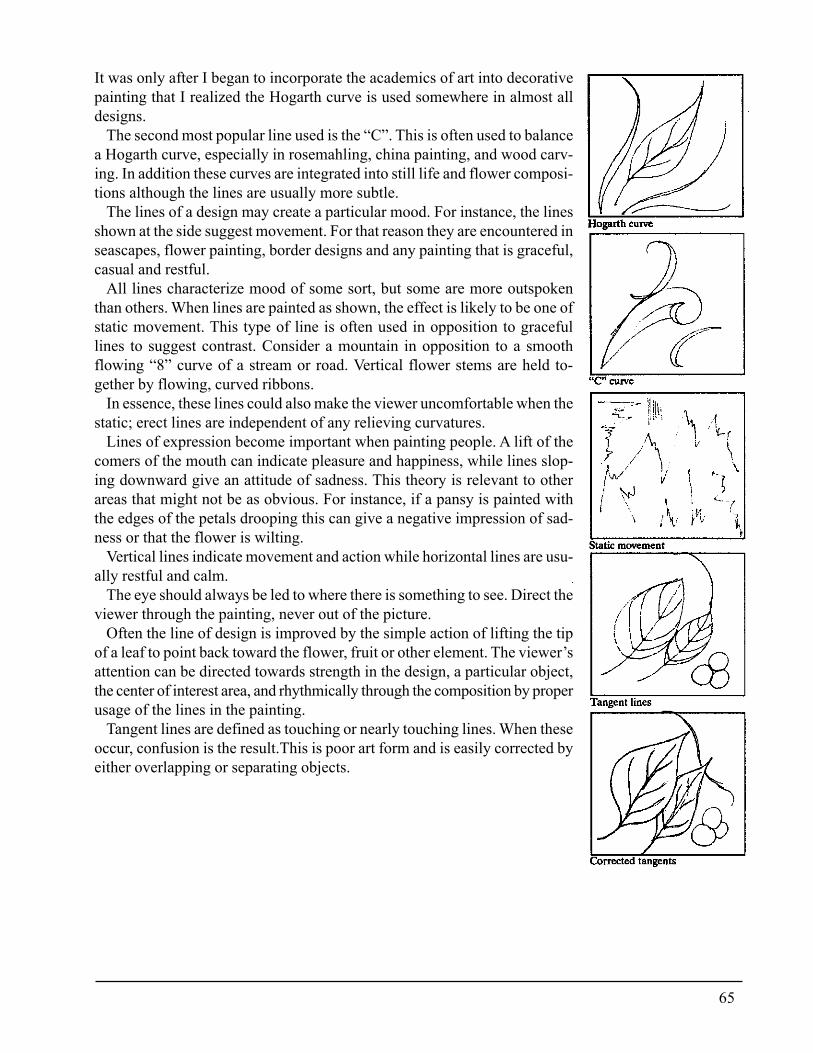
65
It was only after I began to incorporate the academics of art into decorativepainting that I realized the Hogarth curve is used somewhere in almost alldesigns.
The second most popular line used is the “C”. This is often used to balancea Hogarth curve, especially in rosemahling, china painting, and wood carv-ing. In addition these curves are integrated into still life and flower composi-tions although the lines are usually more subtle.
The lines of a design may create a particular mood. For instance, the linesshown at the side suggest movement. For that reason they are encountered inseascapes, flower painting, border designs and any painting that is graceful,casual and restful.
All lines characterize mood of some sort, but some are more outspokenthan others. When lines are painted as shown, the effect is likely to be one ofstatic movement. This type of line is often used in opposition to gracefullines to suggest contrast. Consider a mountain in opposition to a smoothflowing “8” curve of a stream or road. Vertical flower stems are held to-gether by flowing, curved ribbons.
In essence, these lines could also make the viewer uncomfortable when thestatic; erect lines are independent of any relieving curvatures.
Lines of expression become important when painting people. A lift of thecomers of the mouth can indicate pleasure and happiness, while lines slop-ing downward give an attitude of sadness. This theory is relevant to otherareas that might not be as obvious. For instance, if a pansy is painted withthe edges of the petals drooping this can give a negative impression of sad-ness or that the flower is wilting.
Vertical lines indicate movement and action while horizontal lines are usu-ally restful and calm.
The eye should always be led to where there is something to see. Direct theviewer through the painting, never out of the picture.
Often the line of design is improved by the simple action of lifting the tipof a leaf to point back toward the flower, fruit or other element. The viewer’sattention can be directed towards strength in the design, a particular object,the center of interest area, and rhythmically through the composition by properusage of the lines in the painting.
Tangent lines are defined as touching or nearly touching lines. When theseoccur, confusion is the result.This is poor art form and is easily corrected byeither overlapping or separating objects.
66
Recap� A curved line is more pleasing than a straight line.� The Hogarth curve is the most rhythmic line of design.� The “C” is also popular, frequently used to balance a Hogarth curve.� Static, angular and jerky lines create unrest.� The eye should be led to where there is something to see.� Vertical lines indicate strength and movement.� Horizontal lines are usually restful and calm.� Contrast is created when static or straight lines are used in opposi-
tion to curved lines.� Avoid tangent lines by either overlapping or separating objects.
Form or StructureWith the possible exception of folk art or stroke designs, compositions thatare properly developed begin with understanding the form or anatomy of theobjects contained in the painting. In order to be dimennsional the forms orshapes must be stated correctly. Otherwise the objects appear flat and dis-torted.
As discussed earlier, the form of an object is shaped by the values used.It is the effect of light falling upon the object that causes the varying degreesof light, medium and dark which produces a three dimensional look on a onedimensional surface. In effect, an optical illusion is created.
When the path of the light is interrupted by an object, the result is a castshadow. Included in the following illustrations are diagrams of the shadowsas they might occur. A more comprehensive study of shadows can be ob-tained in my Notebook Series edition titled “Shadow Study” which may beordered from this author.
There are four basic forms that singly or in combination shape most ob-jects. These are: cube, sphere, cone, and cylinder. The trihedron, a solid tri-angle, is frequently included as one of the basic shapes. It is not includedhere because it is an angular cone and its inclusion would be redundant.Angles can be added to any of the basic shapes to create additional planes.However, the formation begins with the basic shape, then the angles aresharpened to create the “hedrons”.
The chart on Page 14 illustrates the formation of the four basic shapes invalues, while the chart on Page 39 shows the same forms composed in co-lour.
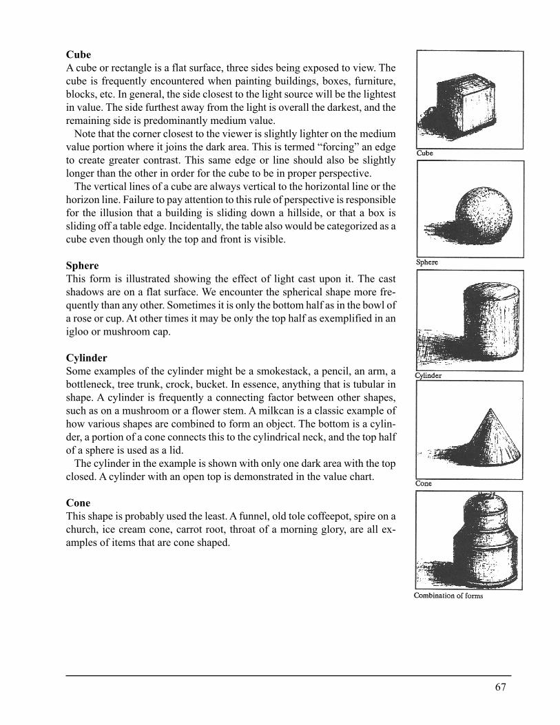
67
CubeA cube or rectangle is a flat surface, three sides being exposed to view. Thecube is frequently encountered when painting buildings, boxes, furniture,blocks, etc. In general, the side closest to the light source will be the lightestin value. The side furthest away from the light is overall the darkest, and theremaining side is predominantly medium value.
Note that the corner closest to the viewer is slightly lighter on the mediumvalue portion where it joins the dark area. This is termed “forcing” an edgeto create greater contrast. This same edge or line should also be slightlylonger than the other in order for the cube to be in proper perspective.
The vertical lines of a cube are always vertical to the horizontal line or thehorizon line. Failure to pay attention to this rule of perspective is responsiblefor the illusion that a building is sliding down a hillside, or that a box issliding off a table edge. Incidentally, the table also would be categorized as acube even though only the top and front is visible.
SphereThis form is illustrated showing the effect of light cast upon it. The castshadows are on a flat surface. We encounter the spherical shape more fre-quently than any other. Sometimes it is only the bottom half as in the bowl ofa rose or cup. At other times it may be only the top half as exemplified in anigloo or mushroom cap.
CylinderSome examples of the cylinder might be a smokestack, a pencil, an arm, abottleneck, tree trunk, crock, bucket. In essence, anything that is tubular inshape. A cylinder is frequently a connecting factor between other shapes,such as on a mushroom or a flower stem. A milkcan is a classic example ofhow various shapes are combined to form an object. The bottom is a cylin-der, a portion of a cone connects this to the cylindrical neck, and the top halfof a sphere is used as a lid.
The cylinder in the example is shown with only one dark area with the topclosed. A cylinder with an open top is demonstrated in the value chart.
ConeThis shape is probably used the least. A funnel, old tole coffeepot, spire on achurch, ice cream cone, carrot root, throat of a morning glory, are all ex-amples of items that are cone shaped.
68
TextureThis element of art describes the surface quality of an object. Texture isdirectly related to the sense of touch. A glass is smooth, a cactus is prickly, abrick is rough, a tennis ball is fuzzy. These are all examples of varieties oftextures. Contrast can also be created through use of texture. For example,placing a smooth apple in front of or next to a rough, weathered bucket.
Confusion can result if texture is overused. A visual image of an artichokein front of a woven basket against a background of a field of daisies paints avery busy picture.
In addition, texture affects the manner in which light and shade are de-picted. A tennis ball would absorb much more light than would a chromeball. Reflected light and colour would either be absorbed or bounced off in asimilar manner.
Texture must be considered when depicting reflections of other objects ina still life or landscape. In order to reflect shapes or colours, the texture mustbe smooth and sufficiently polished to mirror the colour or objects.
SpaceCreating an illusion of space can be difficult when working on a flat or onedimensional surface. To give a feeling of depth, it is necessary to know alittle about perspective. There are many excellent books on the technicaldrawing aspect of perspective, but for the purposes of this study only thoseareas which relate to colour perspective will be covered.
SpatialSometimes referred to as aerial perspective, this category encompasses theplanes or geometric surfaces of a painting. In this instance space is dividedinto front, middle and rear planes.
The front plane is also referred to as the foreground. This plane consists ofthe objects or area closest to the viewer. The elements on this plane will benearest the bottom of the picture, the front table line, or the flowers in frontof a bouquet. Because there is little atmospheric interference these items arein sharper focus and would:
� Have the widest range of values.� Display the highest degree of contrast.� Be relatively warmer on a cool background, and cooler on a warmer
background.� Exhibit the greatest degree of detail.� Be in sharper focus.
69
Each of the above principles has been discussed previously with theexception of how to create sharper focus. Please note that I have used “er”at the end of the word sharp because the degree of crispness is relative tothe composition and the style and technique of the artist.
In itself, sharp focus is recognized as a style of painting wherein allobjects are rendered as photo realistic. Within the realm of this principle,the objects in the foreground should be depicted with more defined edges.The texture and detail are developed more fully.
A crisp edge is more obvious because of color and value contrast, but inthe realm of my realistic style this edge is also neat and tidy.
The rear plane consists of the elements that are the farthest from theviewer. There is a greater degree of atmospheric haze encountered in aRear plane landscape than in a still life design. Therefore the degree of grayingof colour in a landscape could be greater depending upon the light sourceand intensity as well as the time of day and the season. Normally, thisatmospheric distortion does not occur in a still life or flower arrangement.The objects to the rear of a design or at the farthest distance in alandscapewould relatively:
� Be very close in value within the elements and in relation to thebackground as a whole.
� Be neutralized grayer than foreground material, particularlylandscapes.
� Be closer to the temperature of the background. Warm againstwarm, cool against cool.
� Show softer edges.� Be in softer focus, exhibiting less detail.
A discussion of the last two principles would be in order at this pointsince this material has not been covered previously.
Softer focus occurs in a painting when the values and intensities areclose where objects meet. This is challenging to accomplish when a lightvalue rests next to a dark value and the basic values cannot be changedwithout altering the form or colour. Often the problem can be solved byreflecting equal value or colour from the edge of one object or area ontothe other.Another suggested method for creating softer edges would be throughapplication of a shadow. Pulling a small amount of the shadow’s colouronto the edge of the object causes a closer value relationship, thus soften-ing the receding edges.
70
An accent or colour common to both objects helps to soften an edge byreason of minimizing contrast and providing each object with a commonfactor.
Contrast can be lessened by glazing or by mixing a common colourinto both objects or areas.
One final suggestion. Use a soft brush to slightly blend two adjacentlines together. Take care that the object or area, is not distorted, but onlythat the touching edge is slightly muffled.
The middle plane is the section that rests midway between the front andrear and acts as a connecting link. Detail will be evident in this section,but in relationship to the front, it is a bit less sharp. However the detail inthe middle plane is not quite as soft as the rear plane. The colour is notquite as bright as the foreground, but less muted than the rear plane. Thisis also true for the value relationships.
Size and proportionThe relationship of the size of objects in a composition portrays a feel-
ing of space. Those objects closest to the viewer in a landscape will besized much larger than those in the distance. The size of individual ob-jects in a still life or floral will not usually diminish with distance sincethe composition does not project sufficient depth. However, the sizerelationships are a consideration. A pea obviously should not be largerthan an apple. The proportion of objects to each other should be in scaleto the overall height, width and breadth of the entire composition.
Colour can be effective when trying to alter the visual size of an objector area. A large objectwill appear smaller if it is paintedwith a darkvalue,low intensity colour. A small object will appear larger if it is painted witha colour that is light in value and bright in intensity.
LinealTwo bodies cannot occupy the same space. To be sure that this physicallaw is not beingbroken, check the design for accuracy before transferringthe drawing to the surface. Place a ruler at the bottom of the sketch andslowly slide the ruler toward the top. The ruler should first touch theobject closest to the viewer (flower arrangements excepted). As this pointischecked, also notice whether the ruler also touches the bottom of anyother object. If so, shift one to a slightly different level.
71
As the ruler progresses upward, continue analyzing that each item restson the correct plane, with none on exactly the same level.
The planes of a flower arrangement would be divided in a differentmanner. The flower(s) in the front of the bouquet would collectivelyformthe front plane. As the flower groupings recede deeper into thebouquet, the planes are assessed accordingly. Should the flowers beplaced in a container, then the guidelines for still life or landscapeswould apply to the objects that are seated on a surface.
There must be room for an object to occupy the space required by itsdepth and dimension. Rear table lines mustbe sufficiently behind ob-jects in order to avoid the illusion that any subject matter is falling offthe back edge. Every element in a still life, landscape, flower arrange-ment, or any other type of compositional art requires its own space.
When several objects are included in a still life design, it is beneficial todraw in the bottom of each object where it rests on the surface as if theobject were transparent. Spherical object should be defined at their wid-est angle instead of at the bottom. Any lines that would overlap wouldindicate that the object does not have its own space. The line drawingshould be changed accordingly. The painting is the responsibility of theartist and it is foolish to knowingly copy any faults in a sketch.
72
“Go Slowly. You make fewer mistakes.” Michelangelo, (1475-1564) His Diary
Elements of harmoniouscompositionHarmony has been defined as the pleasing arrangement or combination ofparts. Thus a harmonious composition is a pleasant balance of hues, val-ues, intensities, contrast, size, space, lines, and texture, with a small mea-sure of discordance for interest.
Harmony is the summation of all of the elements of art. In essence,harmony is the action of organizing these elements, a process of selectionand problem solving that involves unifying all parts to compose a pleas-ing whole.
The first consideration towards this objective is to identify the goal orobjective of the painting. One of my favorite sayings is “If you don’tknow where you are going, there is no road that will get you there”. Thisis especially appropriate to colour composition because if there is no clearcut objective or plan for reaching the destination, the probability of suc-cess is limited.
GoalOne cannot hope to arrive at any given destination unless there is an iden-tifiable purpose or plan. Therefore the first step is to establish those ob-jectives.
While this sounds so simple it is probably one of the most complexproblems since it dictates that thought must be given to the project beforethe artist picks up the paint and brush, or sets out the palette.
Central ideaThe painting should have a theme or purpose. Is the desired result to
be a still life, stroke painting, flowers, folk art, landscape, primitive,rosemahling, etc.
Is the mood of the painting to be one of quiet serenity, action, countrylife, antiquity, nostalgia, formality, gaiety, or any other of a myriad ofthemes.
Once decided upon, everything else within the project must serve thispurpose. The selection of the individual elements to be contained in thepainting are directed toward fulfilling the goal statement. The surface or
73
object the painting decorates, the colours used within the colour plan, theline, form, texture, space, brush strokes and finish must all support thestated purpose.
Select only those colours and values that will complement the centralPurpose is primary idea of the project. The best choice of colours will bethose that are typical of the mood, period, and articles in the painting.
Review the section concerning the psychology of colour. Determinewhich colours are more supportive of the mood, theme and central ideathat is planned.
A knowledge of which colours are associated with a particular period orwhich fashion colours are currently popular can be an indicator to select-ing colours that are appropriate to the theme.
If the work of art is a commissbn, the client may prescribe which themeand colour scheme is indicated.
Folk art infers traditional colours indigenous to the country of origin.Research along these lines is beneficial.
Colour schemesA scheme is a plan, therefore a colour scheme is a plan of how to organizecolours. Colour schemes are also referred to as colour harmonies.
It is helpful to have a colour compass as a guide when planning colourthemes. One of the finest is a Grumbacher product and should be avail-able from most art suppliers.
In the center of this book are examples of the colour schemes which arethe standards. In the diagrams the intensities were lowered by using thecomplementary colour.
Colour schemes are divided into two categories: related and contrastingharmonies.
Related harmonies:MonochromaticThis particular plan uses variations of one hue. Blue was used in the illus-tration. The values and intensities may and should differ. While this is avery safe harmony it can become a very boring scheme.
Monochromatic harmonies produce serene moods if the values are veryclose. Contrast in texture, values, and subject matter will often compen-sate for the lack of interest in tonal change.
Monochromatic schemes are dependent upon value contrast to createthe center of interest area. Study the squares along the bottom markedA, B, and C on Page 45. These are painted in light, medium and darkvalues. The B square is bright and intense and commands attention. In C,the blue has been neutralized to nearly black and except for its contrast
74
with the light background, is much more quiet. The A square demands theleast amount of attention because it is so close in value to the backgroundof the paper.
Compare the three squares painted inside A, B, and C. Note how thedark square in light valued A seems to advance, while the light squares inthe darker valued B and C are the advancing squares. Conversely, the lightsquare on the light value A recedes, while the darker values recede on Band C.
NeutralThis colour scheme is similar to monochromatic but is composed of coloursthat have been neutralized almost beyond identity. The component thatseparates neutral schemes from monochromatic is that several colours ofvery low intensity are used. The harmony is related through the commontones of colours. Andrew Wyeth is a master at manipulating neutral colourschemes without boring the viewer.
AnalogousThe third friendly or related harmony colour scheme is analogous. Thereare two schools of thought on how to compose an analogous scheme. Onesuggests that the colours should range from one primary to the next. Forinstance, from red to blue. Another theory declares that an analogousscheme is composed of five neighboring colours on the wheel, and thatthese should have one colour in common. Use either or both, the choice isyours.
In the example shown on Page 46, I opted to use the theory of one colourin common. Each of the five colours are descendants of yellow.
When planning or using a scheme, the neutralized and earth tones areconsidered part of the scheme. It is necessary to include these quiet tonesto provide a resting place or a bridge across intense areas.
Analyze the ABC squares at the bottom of the page which are shown inlight, medium and dark values. The green is the most intense while theother two have been totally neutralized.The brighter colours commandattention in A, while the neutralized seem to relax. Those tones which areclosest in value are the least competitive. The same is true of the other twosquares and it is interesting to notice how the lighter and duller valuerecedes in C versus the darker and duller values in B. In the latter instancethe warm, dull dark provides less contrast with the warm, dull dark back-ground. If a section of a painting is to be minimized, equalize value, hue,and intensity as closely as possible.
75
Contrasting harmonies:TriadicThis type of colour harmony is composed of three colours which areequidistant on the colour wheel. The easiest to use are the primaries.The illustration on Page 47 uses Yellow Green, Red Orange, and BlueViolet.
As colours from this scheme are patched on the various backgrounds inA, B,and C, the conclusions reached are consistent with previous experi-ments. The pure red-orange tends to dominate in every square, but par-ticularly so when placed against the dulled red-orange background inSquare B.
ComplementaryThis colour plan consists of two colours which lie diametrically oppo-site each other on the colourwheel. The most dramatic of the comple-mentary arrangements is violet and yellow since these hues are also thehighest and lowest values of the colour circle.
A complementary scheme using red and green are the most difficult todevelop because the value of red versus green shows very little vari-ance.A type of visual vibration occurs when two complements are touching.This is called “simultaneous contrast”. The optic nerve is soon irritatedby this phenomena and quickly darts to another spot in the painting. Thiseffect is relieved by imbuing a bit of each colour into both hues. For ex-ample, a bit of red is put into the green, and an amount of green is infusedinto the red.
Because the complements tend to create this excitement each pair hasbeen used to symbolize holidays. Yellow and violet are Easter colours,orange and black (black is blue neutralized) are used at Halloween, and ofcourse Christmas is traditionally associated with red and green.
Study the effects of the swatches of colour placed on the backgroundcolours of the ABC Squares diagrammed on Page 48 and form conclu-sions as to what reactions occur. Which colours seem to advance; whichto recede. Which are the most commanding of your attention and why.Train the eye to identify and the mind to analyze why and soon it is appar-ent that colour relationships follow a sensible, logical pattern.
Split ComplementaryThis colour scheme uses three hues on the wheel (see Page 49). Deter-mine which colour is to be the dominant hue (I used red), then locate itscomplement on the wheel. The complement of red is green. The green issplit into its two neighbors, yellow green and blue green. It is also permis-sible to use the green as part of the opposing range of colour.
76
Double Split ComplementaryThe starting point for this plan (Page 49) is to identify two complemen-tary colours. In the example, yellow and violet were selected. The yellowis split into its two neighboring tones of yellow green and yellow orange.The violet is split into its two neighbors, blue violet and red violet.
Split AnalogousRefer to the example above. When the complementary colours betweenthe split, yellow and violet, are included in the scheme it is often referredto as a split analogous scheme.
Polychromatiche colour wheel would be the example for a polychromatic scheme. Allscheme twelve hues are used.
This can be a pleasing usage of colour or it can be extremely confusing.As the range of colours widens so does the risk of producing a schemethat is erratic and static.
Planning a colour schemeThe thought of planning a colour scheme may seem intimidating until itis equated with getting dressed. I don’t know a person who goes into theircloset and says “I think I will dress in a split complementary colour schemetoday.” The decision as to what clothing to wear is exactly the same asdeciding what colours to use. What is the occasion? Different clothingwould be selected if going golfing than for the office, or a Ball. Whatwillthe temperature be like? What kind of image is to be projected?
The first item of clothing selected may be a blouse or shirt. Then a pairof slacks or skirt is chosen that “goes with” the top. Each subsequent itemis related to the developing ensemble. The extremities of the body nor-mally receive the small parts, such as shoes and earrings and these arechosen to harmonizewith the other clothes. A favorite pin may not ex-actly “go with” the outfit but maybe you want to wear it anyway becauseit makes you feel good, or your intuition tells you that this one area needsa little pizzazz.
If the discipline of planning a colour scheme according to the tradi-tional method seems intimidating, try the clothing method. Put it togetherusing your past experience and intuition. I loathe to see intuition mini-mized. It is that part of the psyche that speaks for the subconscious. Atruly balanced artist uses both intuition and intellect.
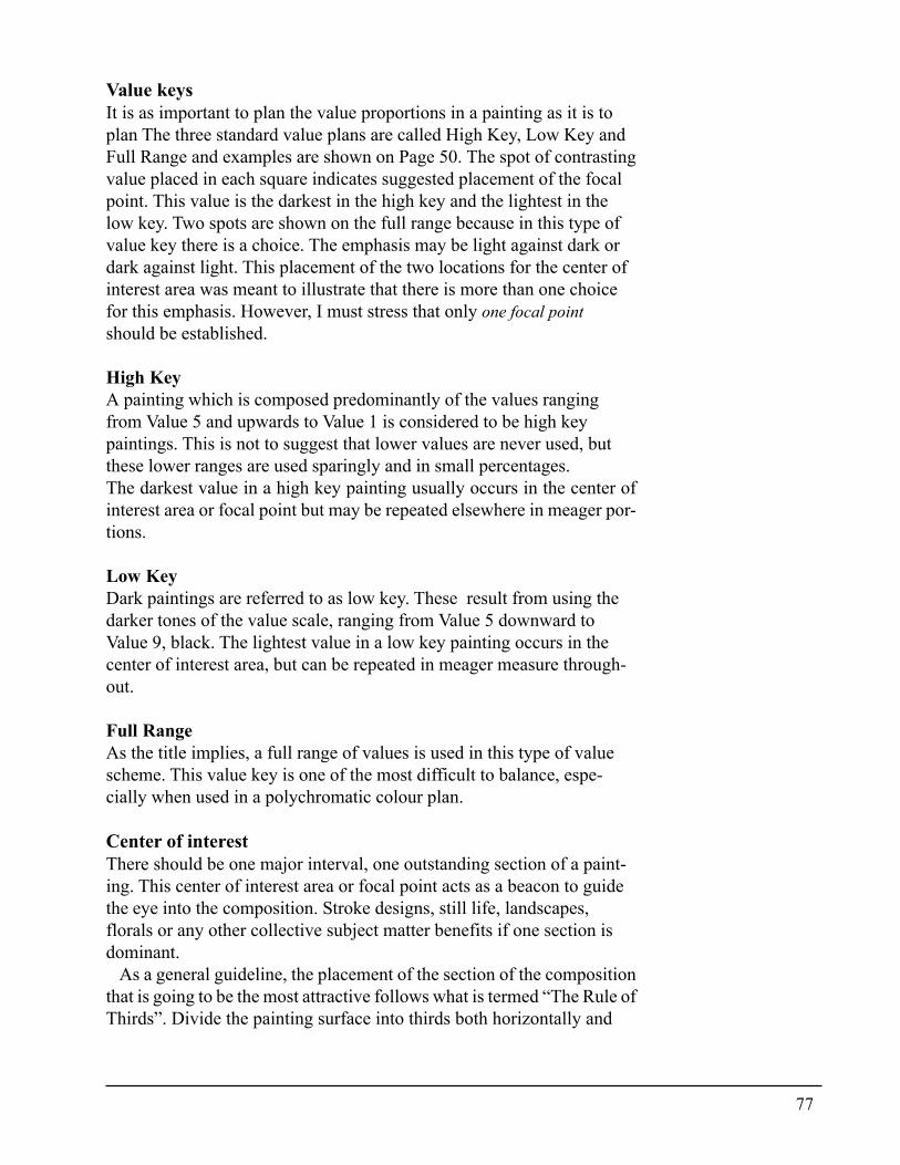
77
Value keysIt is as important to plan the value proportions in a painting as it is toplan The three standard value plans are called High Key, Low Key andFull Range and examples are shown on Page 50. The spot of contrastingvalue placed in each square indicates suggested placement of the focalpoint. This value is the darkest in the high key and the lightest in thelow key. Two spots are shown on the full range because in this type ofvalue key there is a choice. The emphasis may be light against dark ordark against light. This placement of the two locations for the center ofinterest area was meant to illustrate that there is more than one choicefor this emphasis. However, I must stress that only one focal pointshould be established.
High KeyA painting which is composed predominantly of the values rangingfrom Value 5 and upwards to Value 1 is considered to be high keypaintings. This is not to suggest that lower values are never used, butthese lower ranges are used sparingly and in small percentages.The darkest value in a high key painting usually occurs in the center ofinterest area or focal point but may be repeated elsewhere in meager por-tions.
Low KeyDark paintings are referred to as low key. These result from using thedarker tones of the value scale, ranging from Value 5 downward toValue 9, black. The lightest value in a low key painting occurs in thecenter of interest area, but can be repeated in meager measure through-out.
Full RangeAs the title implies, a full range of values is used in this type of valuescheme. This value key is one of the most difficult to balance, espe-cially when used in a polychromatic colour plan.
Center of interestThere should be one major interval, one outstanding section of a paint-ing. This center of interest area or focal point acts as a beacon to guidethe eye into the composition. Stroke designs, still life, landscapes,florals or any other collective subject matter benefits if one section isdominant.
As a general guideline, the placement of the section of the compositionthat is going to be the most attractive follows what is termed “The Rule ofThirds”. Divide the painting surface into thirds both horizontally and
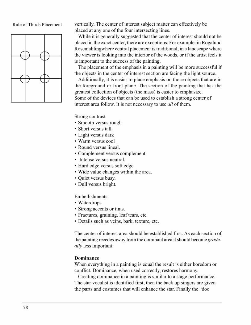
78
vertically. The center of interest subject matter can effectively beplaced at any one of the four intersecting lines.
While it is generally suggested that the center of interest should not beplaced in the exact center, there are exceptions. For example: in RogalundRosemahlingwhere central placement is traditional, in a landscape wherethe viewer is looking into the interior of the woods, or if the artist feels itis important to the success of the painting.
The placement of the emphasis in a painting will be more successful ifthe objects in the center of interest section are facing the light source.
Additionally, it is easier to place emphasis on those objects that are inthe foreground or front plane. The section of the painting that has thegreatest collection of objects (the mass) is easier to emphasize.Some of the devices that can be used to establish a strong center ofinterest area follow. It is not necessary to use all of them.
Strong contrast• Smooth versus rough• Short versus tall.• Light versus dark• Warm versus cool• Round versus lineal.• Complement versus complement.• Intense versus neutral.• Hard edge versus soft edge.• Wide value changes within the area.• Quiet versus busy.• Dull versus bright.
Embellishments:• Waterdrops.• Strong accents or tints.• Fractures, graining, leaf tears, etc.• Details such as veins, bark, texture, etc.
The center of interest area should be established first. As each section ofthe painting recedes away from the dominant area it should become gradu-ally less important.
DominanceWhen everything in a painting is equal the result is either boredom orconflict. Dominance, when used correctly, restores harmony.
Creating dominance in a painting is similar to a stage performance.The star vocalist is identified first, then the back up singers are giventhe parts and costumes that will enhance the star. Finally the “doo
Rule of Thirds Placement
79
wah” singers (so called because all they are allowed to sing is doo wah)receive material that is the least important of all. The stage is the atmo-sphere in which the performers function. None compete with the star,but help in every way possible. Can you imagine the result if the backup singers began to sing a different melody, the doo wahs sang off key,and the back drop fell forward?
Recall this visual image when developing a painting. No section or ob-ject should be permitted to compete with the area that is designated to bethe dominant focal point. Do not misconstrue this to mean that the remain-ing areas are neglected. Indeed not. They are developed to the fullest, butprogressively a little bit less than the focal area.
Dominant colourIn any well balanced colour composition there should be a dominance ofone colour over the rest. Dominance should not be equated with bril-liance since the dominant hue may be the quietest colour. The dominantcolour is usually the colour that is represented by the highest percentage.
When viewing a colour scheme, one colour will be proportionately greaterthan the rest. This colour may not appear in the center of interest area, butcould help to determine the hues and intensities for that section. For in-stance, the dominant colour is a middle value, low intensity blue and theblue has been slightly warmed. Then the colours selected for the focal areamight be cooled reds. The cool to offset the warming of the blue, the red asa near complement to the blue. The values could be very light or very darkto contrast the middle value. Relationship of colour revolves around hue,value and intensity.
Background colourBackgrounds must never be permitted to be aggressive. This would bethesame as the falling back drop in the stage analogy given earlier,
The selection of a colour for the background of a painting is one of themost important decisions to be made. The background is the atmospherein which a painting thrives or dies. The subject matter is constantly influ-enced by the background hue, value and intensity. As a general guidelinebackgrounds must be quiet, must not distract from the subject matter, butmust complement the painting.
If the background is obvious before the center of interest area, they arein competition. An exception might be if the background is intended to bethe actual focal point.
Do not hesitate to repaint a background in a different colour, value orintensity should it fail to complement the completed painting. It is tedioustopaint around objects already developed, but if the alternative is a failedpainting, then the tedium can be borne. Glazing or antiquing the back-ground colour could be another alternative.
80
The colours of light seem to be the most unifying colours for a back-drop. When yellow, yellow orange and orange are dulled to their grayesttones, almost any hue looks well against them. The value of the grayedtone would be dependent upon the value key selected.
Cool grays, grayed blues and greens are always good complements to towarm foreground tones. These are especially harmonious to portraituresince they complement the warm face and body tones.
The values in a background may change, but this change should besubtle. The path of light is a consideration in value placement. Generallythe lightest side of the background will be opposite the lightest side inthe foreground.
Any rouging or colour repetition in the background will bemoreeffective if it subtly repeats the colours in the composition.
Regardless of the colour and value choice it is imperative that the intensity should be dulled. Bright colours can be used in small amounts butthe larger the area, the lower the intensity used. This could apply to objectswithin a painting as well.
Because the background is the atmosphere in which the painting lives,some of the background colour should be repeated in the composition.Depending upon placement, this should be suitably neutralized or bright-ened.
Colour proportionIf a guideline is needed to apportion colour in a scheme, the followingmay be a key. The highest percentage or largest areas of colour should beof the lowest intensity. The next largest area is still neutralized, but isslightly brighter, and the smallest or least percentage may be thebrightest.
UnityUnity is the thread that holds a painting together. Many of the elements ofunifying a composition have already been discussed. For instance, oneidea should dominate, one major focal point adds emphasis, a paintingis keyed to value and colour.
Other means of establishing unity in a painting are through repetition,consistency, and continuity.
Repetition of colours is pleasing when the colours are echoed. A strongstatement is echoed slightly weaker, then the colour weakens as it fadesaway. This is true in accents in particular.
81
To repeat a colour three times is a good objective, but spacing isimportant. A colour that appears on one side of the design can beRepeti-tion balanced by placing its weaker cousin on the other side. The thirdapplication can be somewhere in between. Using one colour in variousintensities and values as accents or turning colours throughout acomposition unifies.
The path of light through a painting provides unity. One light sourceis used in order to avoid creating conflicting shadow patterns. Consis-tency in placement of these lights and shadows provides harmony. Theartist cannot always paint what is seen. A classic example is a painting Isaw in a local art show. The artist began the painting in the morning anddepicted the roof shadows as being cast west. The landscape was not com-pleted until late afternoon. She saw the ground shadows casting east andpainted them as she saw them, casting east even though previously ap-plied shadows were casting west. Keep this in mind when working witha set up. Paint things as they should be not as they might be perceived.The difference between an artist and a camera is that the artist improveson nature to suit the purpose while the camera records what it sees.Manipulate light and shadow to be harmonious.
Colour KeysA method for unifying colour is through the use of colour keys. Keyingunifies colour by giving each colour a common denominator.To use one colour in all the colours used is a means of keying a scheme.The analogous colour scheme where yellow was used in every mixtureone colour exemplifies this quite well. Early tole painters used an earthcolour in every mixture. By adding a bit of the dominant colour orbackground colour into every mixture is another means of keying onecolour throughout the scheme.
Antiquing is a means of colour keying. On one occasion I addedUmber to the varnish to darken and age a painting. This produced aunifiedcolour overall.
Glazing is another option. A colour can be glazed over the entiredesign, as in antiquing, or just on a small area or a few objects.
BalanceThis may be solved with repetition of values, intensities, colour andtemperature throughout a composition.
An overall light scheme requires some dark values for balance just asa dark composition must be relieved with light passages throughout.Cool dominance is relieved by a few warm touches,
82
Accent colours are repeated throughout the entire colour scheme Thesebecome the thread that sews the colours together.
In each of the above instances, the repetition must never be exactlythe same. It is varied through a difference in metering, intensity, size,tints and shades.
Organizing the path of light and shadow promotes balance in thecomposition. If the light originates from one source and consistentlyilluminates the objects in the same manner, the dark value in the shad-ows on the opposite side will balance this light.
VarietyVariety is developed after unity is established. It is the small touches ofdiscordance that provides interest and relief. Variety is considered to bethe spice of art. Subtle touches flavor a painting, while too much spicecan be distasteful. Use these touches carefully. These maybe added asthe painting is developed with necessary additions at the final stages.The accent colours in a painting are one form of adding these touches.Accents are relatively bright colours used in small amounts. Accents areuseful for repeating colours and they also can act as transition areas orbridges to pull the eye from one area to the next.
Since these accents are not intended to change the form or anatomy ofan object they are usually placed at the edge. This is especially relevantwhen painting fruits and containers. If the value of the accent is nearly thesame value as where it is placed, distortion should not occur. As an ex-ample, if a light accent is painted over a dark receding edge, the edgecould appear to have a bulge. The reverse would be true if a dark accent isplaced on a lighter value receding edge, it could appear that there was ahole.The value of accents in flowers may not distort the shape as in fruitsand containers but the same consideration must be given to the place-ment.
While there may be several accents of the same colours, the size, valueand intensity should never be equal. The focal point will be strengthenedif the brightest accent(s) are positioned in this area.
Variety is achieved through opposition. Straight lines are relieved bycurved lines. Large areas of dulled colour are relieved by small areas ofbrighter hues. Dominantly warm colour schemes should have touchesof cool tones for contrast. High key paintings should have some darkvalues for accent.
Variety should be established when painting groupings, such as leavesor grapes. Any collection of objects can be harmonized through use ofcommon colour, but that colour should be varied through different tones,different intensities of hues, change in size, change in direction of veinsor stems, change, change, change. Equality is boring. Remember that anyliving thing is constantly changing otherwise it dies.
83
Methods for judging harmony and balance
Turn the painting upside down and set the painting at arm’s length orseveral feet away.
Look in the opposite direction of the painting. Close your eyes andsqueeze your eyelids together (this lubricates the eye).
Slowly turn back toward the painting and determine what is the first areayou see. This should be of highest contrast. Remember, the definitiveword is area, not object. This judges the center of interest or focal area.
Analyze the dominant colour. This should be the highest percentage ofcolour in the painting. It does not necessarily mean the brightest, althoughthat may be true. The background is part of this percentage.
Analyze what colour is in the next proportion or what hue you see afterthe dominant tone. This is the sub-dominant hue and should travel inmeasure throughout the painting. While this is lesser in percentage thanthe dominant, it may be slightly brighter in small areas, and should bedifferent intensities.
The third colour percentage you see should also repeat, but in lessermeasure. Small amounts may be intense and are often used as accents.
The last colour you see should be a discordant tone. For example, youshould be able to see some cool tones in a warm dominant composition,and warm tones in a cool dominant.
Are there any areas over which the eye must jump a great deal in order toconnect with the next repetition; the colour should easily transfer fromone area to the next. Pretend that the repetition of colours is the threadthat sewsyour painting together. If any area is lacking, the harmonywithinmay unravel.
Finally, there may be discordant notes in extremely small measure. A discor-dant is usually a colour outside the colour scheme or one that is out ofharmony with the composition. A discordant provides variety.
There should be a dominant value in the painting; i.e., high key (mostlylight values), low key (mostly dark values) or mid-value.
84
All three values should be represented in a painting. A dominantly highkey painting should have some dark sections and some medium valuesections. It is the percentage of light that determines if the painting is highvalue keyed. The same is true of low key, or dark value keyed paintings. Arepresentation of light and medium value is necessary for harmony. Adominantly mid-value must carry through in the same manner; adequaterepresentation of lights and darks.
How to usethevalue scale system of mixingThis method of mixing colourfor usage in still life and floralcompositionscan be applied to many other subjects as well. The excep-tion might be for landscapes where the principles of spatial perspectivecould prescribe a different flow of colours.
It might be well to first review some of the basic guidelines to mixingcolour. Wipe knife each time before picking up colour additives. Thiswill keep mixtures pure, as well as retain the purity of original colours.
Whenmixing alightvalue, add darkvalues to lightvalues. When mixinga dark value, add light values to dark values.
Add the stronger pigment to the weaker pigment colours. Example:Burnt Umber to Ultramarine Blue; Alizarin Crimson to Green Earth.To brighten, or clear up a muddied colour, add the pure, raw colourfamily. To dull a colour, see Page 53.
Set up the palette in the sequence previously given. The pure coloursshould spread across the top, leaving the entire center section for mixing.Use an indelible marker to mark off the palette as before.If the values are mixed in the proper zones on the palette, it then becomesa simple transition to place them on the painting as outlined on the colourguideline maps that accompany each lesson.
Establish the medium value first. This value is always relevant to thebackground and any neighboring tones already established. It is the mostimportant value because it is the colour seen in its natural state. This issometimes referred to as the body or mass tone. Almost all the scalesbeginby establishing the mid-tone of the object first since all othervalues are relevant to this local value mixture.
The medium value has no equation to the medium value on the grayscale system. The value and intensity of this local colour changes with everysituation and the corresponding lights and darks are judged in relationshipto each new local or mass tone.
85
As the colour nears the light source it should:� Lighten in value (add white, colour wheel neighbor, or both).� Warm (add a warmer colour such as yellow or red family).� Clarify or brighten, i.e., slightly intensify. (Add pure colour
family or warmer neighbor on the wheel).
As the colour recedes away from the light source, it should:� Darken in value (add black, neighbor, or darker valueearth tone).� Cool (add a cooler colour).� Dull in intensity (Add complement, black, neighbor, earth tone,
or darker value gray).
Refer to the chart on Page 51. This illustrates some of the reactions whenthe primaries and secondaries are mixed according to the above formula.
The mid value (body, mass tone or basic) should be evaluated beforeany of the succeeding mixes. Do not judge by what is seen on thepalette.
The reference on the palette is to the white background. Evaluationsare more successful when the colour is judged in its own environment,the painting. Put a small amount of the color on the surface, then decideif it is proper. Ugly on the palette may be picture perfect, or vice versa.Close value ranges are easier to blend than wide value separation. Closevalues are Strive for five to seven values. When placing the values, you mayskip one easier to blend value, but not more. Medium value must separate lightsand darks.
I have written several books that explain the technique of applying thevalue scale system to a painting. The video Blending Techniques of aMastervisualizes the value scale method. My video Introduction to Colourcomplements the material in this manual. Please contact me if these arenot available in your area.
Chevreul’s LawsPlease make the time to study the example on Page 52 concerning thismost important facet of colour relationships. I use the term “colour sur-prise” because what is mixed on the palette takes on an entirely differentappearance when placed in the context of its surrounding colours. Forthis reason all mixtures must be judged in the atmosphere in which theyare going to be used.
86
In closingYou must want to learn about colour or you would not be reading thisbook. Therefore you have met the first requirement for learning: Desire.
The next requisite is Determination. It takes a large measure ofdetermination to make (not take, you have to make) the time to studyandapply the principles of colour mixing. You must stop reading abouthow to mix colour and start to mix, experiment and possibly falter thefirst time or two. But remember that you have not failed until you stoptrying.
Dedication is the third “D” for success. Dedication to a cause or objec-tive means that you must give up something you want in order to achievesomething you want more. It may be necessary to give up some free time,diversification, non productive habits, pre-mixed paints, to name a few.
Of course, there is a fourth “D” and that is Dollars. Consider the spend-ing of dollars for new products an investment because six to nine tubes ofnew standard colours of paint could replace a multitude of premixed prod-ucts. You may feel that paint is being wasted while learning how to mixcolours, but this is only temporary. When the mixing process is under-stood the savings in dollars and time is tremendous.
Additionally, you will have control. You will be out of the passengerseat and into the driver’s seat and on the path to personal creativity.Paint in Peace,
G
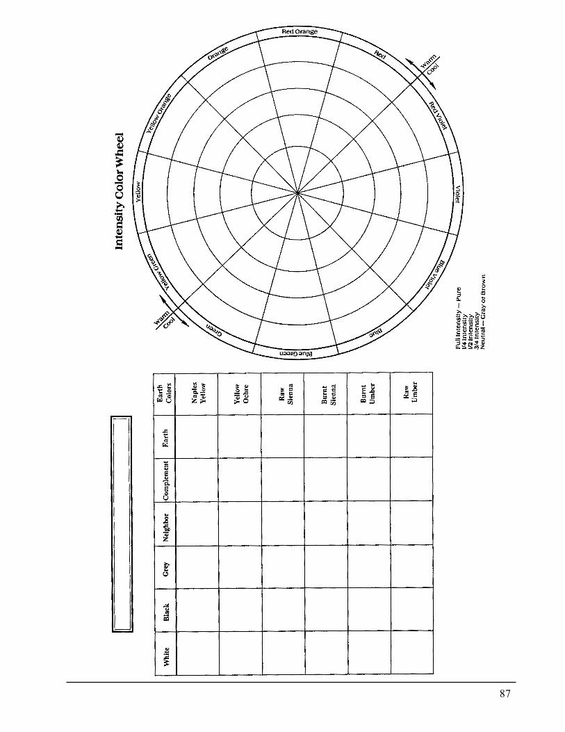
87
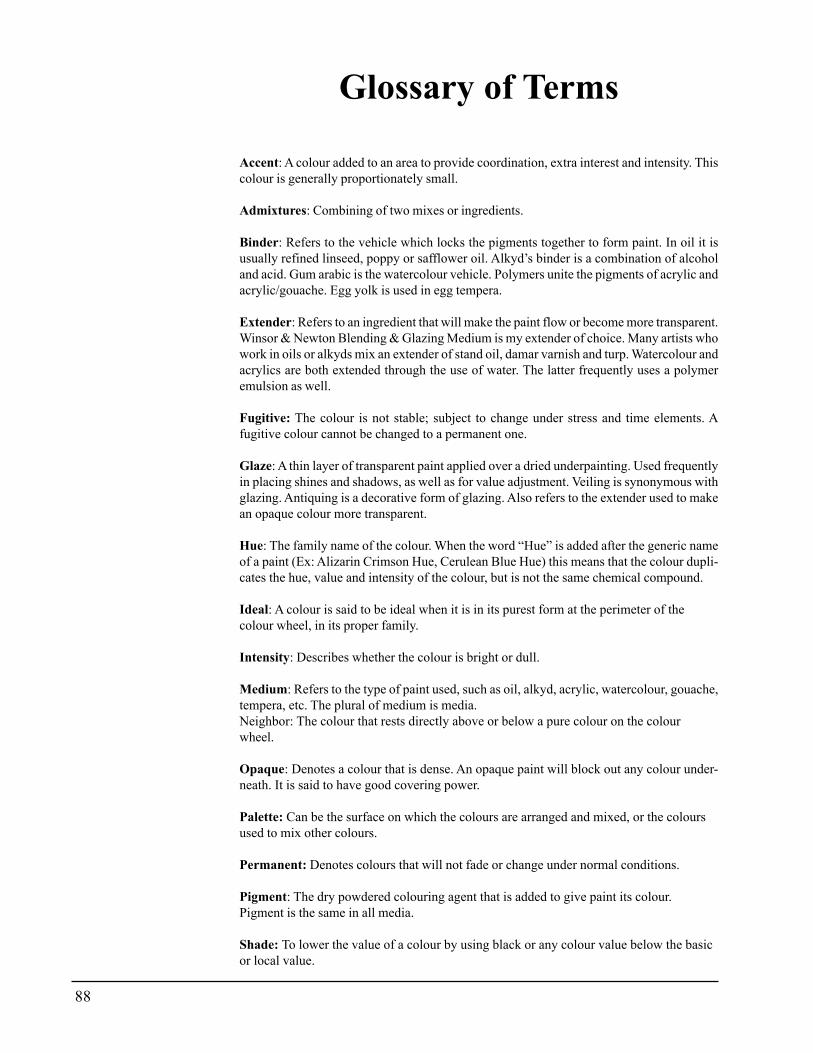
88
Glossary of Terms
Accent: A colour added to an area to provide coordination, extra interest and intensity. Thiscolour is generally proportionately small.
Admixtures: Combining of two mixes or ingredients.
Binder: Refers to the vehicle which locks the pigments together to form paint. In oil it isusually refined linseed, poppy or safflower oil. Alkyd’s binder is a combination of alcoholand acid. Gum arabic is the watercolour vehicle. Polymers unite the pigments of acrylic andacrylic/gouache. Egg yolk is used in egg tempera.
Extender: Refers to an ingredient that will make the paint flow or become more transparent.Winsor & Newton Blending & Glazing Medium is my extender of choice. Many artists whowork in oils or alkyds mix an extender of stand oil, damar varnish and turp. Watercolour andacrylics are both extended through the use of water. The latter frequently uses a polymeremulsion as well.
Fugitive: The colour is not stable; subject to change under stress and time elements. Afugitive colour cannot be changed to a permanent one.
Glaze: A thin layer of transparent paint applied over a dried underpainting. Used frequentlyin placing shines and shadows, as well as for value adjustment. Veiling is synonymous withglazing. Antiquing is a decorative form of glazing. Also refers to the extender used to makean opaque colour more transparent.
Hue: The family name of the colour. When the word “Hue” is added after the generic nameof a paint (Ex: Alizarin Crimson Hue, Cerulean Blue Hue) this means that the colour dupli-cates the hue, value and intensity of the colour, but is not the same chemical compound.
Ideal: A colour is said to be ideal when it is in its purest form at the perimeter of thecolour wheel, in its proper family.
Intensity: Describes whether the colour is bright or dull.
Medium: Refers to the type of paint used, such as oil, alkyd, acrylic, watercolour, gouache,tempera, etc. The plural of medium is media.Neighbor: The colour that rests directly above or below a pure colour on the colourwheel.
Opaque: Denotes a colour that is dense. An opaque paint will block out any colour under-neath. It is said to have good covering power.
Palette: Can be the surface on which the colours are arranged and mixed, or the coloursused to mix other colours.
Permanent: Denotes colours that will not fade or change under normal conditions.
Pigment: The dry powdered colouring agent that is added to give paint its colour.Pigment is the same in all media.
Shade: To lower the value of a colour by using black or any colour value below the basicor local value.
89
Tint: To raise the value of a colour by using white or any colour value above the basic orlocal value. Also tint could mean to imbue a colour with a hint of another colour.
Tinting Strength: This refers to the degree of strength of the pigment used to colourpaints.
Turning Color: This is a color that is placed on the blending line between the dark andmedium values. The value and temperature is turning from medium to dark; from warm tocool. Also may be referred to as burnishing color.
Transparent: The pigment in transparent paints have been separated with an extender toallow the light to partially pass through to the colour underneath. A colour may be transpar-ent by nature or it may be manufactured to be transparent. The artist may also change anopaque colour to transparent by the addition of a transparent colour or an extender. Someextenders are liquid, others are gels.
Value: The relative lightness or darkness of a colour in relationship to a value scale.
WYSIWYG: Pronounced wizzywig, a computer term whose acronym stands for “WhatYou See Is What You Get”. I use the term in reference to colour to indicate that no matterwhat formula or process is used, all that matters is what the eye sees, because that is whatyou got
90
Bibliography
Birren, Faber. Color & Hunian Response. New York: Van Nostrand Reinhold, 1978.
Birren, Faber. History of Color in Painting. New York: Van Nostrand Reinhold Company, 1965.
Birren, Faber. Principles of Color. New York: Van Nostrand Reinhold, 1969.
Blake, Wendon. Creative Color. New York: Watson-Guptill Publications, 1972.
Blake, Wendon. Color in Watercolor. New York: Watson-Guptill Publications, 1982.
Chevreul, M. E. The Laws of Harmony and Contrast of Colors. New York: Van Nostrand Reinhold Company, 198
I. Covino, Frank. Controlled Painting. Cincinnati, Ohio: North Light Publishers, 1982.
Fabri, Ralph. Color, A Complete Guide forArtists. New York: Watson, Guptill, 1967.
Fabri, Ralph. Light, Color& Environment, Revised Edition. New York: Van Nostrand Reinhold Company, 1982.
Goldstein, Harriet and Vclta.Art in Everyday Life. New York, New York: The MacMillan Company, 1950.
Graves, Maitland. Art of Color and Design. New York: McGraw Hill, 1951.
Grumbacher Color Compass. New York: Grumbacher Company, 1977
Guptill, Arthur. Color Manual ForArtists. New York: Van Nostrand Reinhold Company, 1962.
Itten, Johannes. The Color Star. New York: Van Nostrand Reinhold Company, 1985.
Itten, Johannes. The Elements of Color. New York, N.Y.: Van Nostrand Reinhold Company, 1970.
Kobayashi, S. A Book of Colors. New York. Harper & Row, 1987.
Leland, Nita. Exploring Color. Cincinnati, Ohio: North Light Publishers, 1985.
Munsell, A. H. A Grammar of Color. New York: Van Nostrand Reinhold Company, 1969.
Powell, William. The World of Color and How to Use It. Tustin, Ca.: Foster Art Service, Inc., 1984.
Sargent, Walter. The Enjoyment And Use Of Color. New York: Dover Publications, 1964.
Salemme, Lucia A. Color Exercises For The Painter. New York: Watson-Guptill Publications, 1970.
Van Wyk, Helen. Successful Color Mixtures. Rockport, Ma.: Art Instruction Associates, 1983.
Van Wyk, Helen. Basic Oil Painting. Rockport, Ma.: Art Instruction Associates, 1985. Van
Wyk, Helen. Welcome To My Studio. Rockport, Ma.: Art Instruction Associates, 1989.
Van Wyk, Helen. Your Painting Questions Answered fro»t A to Z. Rockport, Ma.: Art Instruction Associates, 1988.
Wilcox~ Mitchell. Color Theory For Oil Colors orAcrylics. New York: Watson, Guptill Publications, 1983.
Winsor & Newton. Notes On The Composition and Permanence of Oil Colours. London, England
91
Genesis Heat Set Oils Addendum
What are Genesis Heat Set Oils?Genesis Heat Set Oils is an entirely new product, composed of chemistrynot previously used in artist's paints. It works so much like traditionaloils, and lacking a better description it is characterized as oil paint. Themain advantage of Genesis is that it does not dry until you use a heatingprocess to set the oils. This means that the paint, mixes and their applica-tion to the painting are fluid until you decide to dry them. It is not thesame chemistry as oils; therefore certain adjustments must be made in itsusage.
Genesis cannot be mixed with any other medium. This means that it isnot intermixable with traditional oils, acrylics, gouache, watercolor, etc.
Do not seal the wood since the heat setting process could cause blister-ing of any sealer that contains shellac or alcohol. Chemical incompatibili-ties have also been reported when other types of sealers have been used.However, two coats of acrylic (not latex) paint will sufficiently seal rawwood. After a slight sanding, additional coats are applied to further smooththe surface. Wipe any sanding dust with a moist cloth. A tack cloth couldleave an oil or varnish residue, which repulses the Genesis.
Use only high quality wood or Masonite. Inferior wood contains sap orpitch that rises to the surface when the Genesis is heat-set. If in doubt, testby subjecting the wood to the heat-setting process before painting. Shouldany sap or resin appear, this indicates that the object is not a good candi-date for Genesis. Porcelain techniques will be featured in a later article.Trupan or MDF wood is also suitable for Genesis.
How do you Heat Set?There are three methods for heat-setting the paint:
� Use a home oven. Preheat the oven to 300 degrees. Turn off the oven.(This prevents accidents should you need to leave or should you forgetthere is a painting in the oven). Cover a cookie sheet or pizza stone withfoil and place the painting on this. Set the timer for 15 minutes. Tie some-thing on the oven handle or place a Post It Note on the oven door toremind you that there is a painting inside. To place the painting directlyon the oven rack could create "hot spots" possibly resulting in blisters.The cookie sheet or stone allows easy removal. When removing the paint-ing, use a hot pad for safety.
92
� Use a Genesis Oven following instructions supplied with the oven.
� Use the Genesis Heat Gun or a similar gun used for stamping. A hairdryer does not generate enough heat to set the paint. The Genesis Gun isused differently than a hair dryer. It is much hotter and must be used withall safety precautions. The nozzle should be held about four inches abovethe surface and is held in one place-not rotated. If the gun is held too closeto the surface there is a risk of blistering the surface. Heat-set in areas offour to six inches at a time. Hold the gun in one spot until the surface feelsuncomfortably warm then move to the next section.
Does the paint look different after heat set process?You will find that the painting does not change in value or sheen as it isheated. This makes it difficult to determine when it has dried. Wad a chemi-cal-free facial tissue and softly wipe the tissue across the painted area. Ifany color shows on the tissue, this indicates that the paint needs furtherheating.
The entire design may be transferred at once since it is not affected bythe heating process. If erasing is necessary, use an art gum eraser to re-move unwanted transfer lines.
What Type of Palettes?A glass palette must be used for this product. Wax palette or parchmentpalettes tend to leech out the binder in the paint, thus negating the chemi-cal factor that allows the paint to remain fluid. The paper palettes may beused temporarily, but the paint must be transferred to a Wingate or glasspalette. Only ¼" glass should be used for safety reasons. These can becustom cut to fit palettes by any glass company in your area. Plexiglas isnot an option. Large amounts of mixes of paint may be stored in glass jarsor Genesis jars.
Paint in JarsAs the paint is removed from the jar it is in a solid state. Mixing with apalette knife renders it more fluid. However, too much mixing causes it tobecome somewhat transparent. This is an advantage if you wish to use thepaint as a glaze but is not productive if you wish it to remain opaque.
Allow the paint to set and it will congeal. This characteristic permits theartist to totally control the paint's consistency.It is necessary to use more paint than you might be accustomed to using inour blending techniques. If you have worked in Alkyds you will find theamount of paint to be applied to the surface to be about the same. Shouldyou find the paint becoming too transparent on the surface the cause maybe over-mixing or over working the product. Allow the paint to rest a bit.The cause also could be that not enough paint has been applied to thesurface.
93
How do you Glaze?Glazing Gel can be used when glazing. Our method is mix glaze withcolor until the desired transparency is chieved. Then load the brush verysparingly with the color or mixture to be used as a glaze. This allows theluxury of using any color as a glazing color. Solid paint may be addedwhere additional opacity is needed.
Can you mix with other oils?Any product containing oils or any other chemical should be avoided tominimize chemical reactions. Edges may be cleaned with a clean brushmoistened with Genesis thinner. Wipe off any excess thinner from thesurface. Fingerprints and paint smudges can be removed in the same wayor you may choose to erase them with a product called PlastiTak. Its pri-mary use is to adhere posters to walls, etc and may be found in the schoolsupply or office department of most stores. Mona Lisa brand paint thinneris another option.
How do you clean up afterwards?Brushes do not need to be cleaned between painting sessions. When youfeel it necessary to clean brushes there are several products that are effi-cient. We recommend soap-based products, such as Dawn DishwashingDetergent. The only brush cleaner we use is Mona Lisa Paint Thinner as itis odorless and totally non-toxic..
What type of Varnish is best?Spray products should not be used over or under the heat-set oils. Wehave used Final Coat brush on varnish with success. The first applicationmay separate or "bead". Ignore this as subsequent coats will fill in as thevarnish is self leveling.
View Free Usage Video on our web site at www.kingslan.com
Related Documents


