Color Accessibility Greg Kraus University IT Accessibility Coordinator North Carolina State University [email protected] @gdkraus

Color Accessibility Greg Kraus University IT Accessibility Coordinator North Carolina State University [email protected] @gdkraus.
Dec 24, 2015
Welcome message from author
This document is posted to help you gain knowledge. Please leave a comment to let me know what you think about it! Share it to your friends and learn new things together.
Transcript

Color Accessibility
Greg KrausUniversity IT Accessibility Coordinator
North Carolina State [email protected]
@gdkraus

Concepts

Two Questions We Ask With Color Accessibility
1. Given moderate visual acuity loss, can a person read this content without the aid of assistive technologies?
2. If a person needs an assistive technology, does our content prevent them from modifying the content to meet their needs?

Planning for Color and Visual Deficiencies
• There are a wide range of color deficiencies and visual impairments
• How do we plan for them all?

Visual Impairment Simulator
• NoCoffee• Chrome Extension

Standards: Taking the Guessing Out of Conformance
• WCAG 2– Color is not the sole means of conveying
information– Provide sufficient contrast based on the size of the
text and the conformance level desired
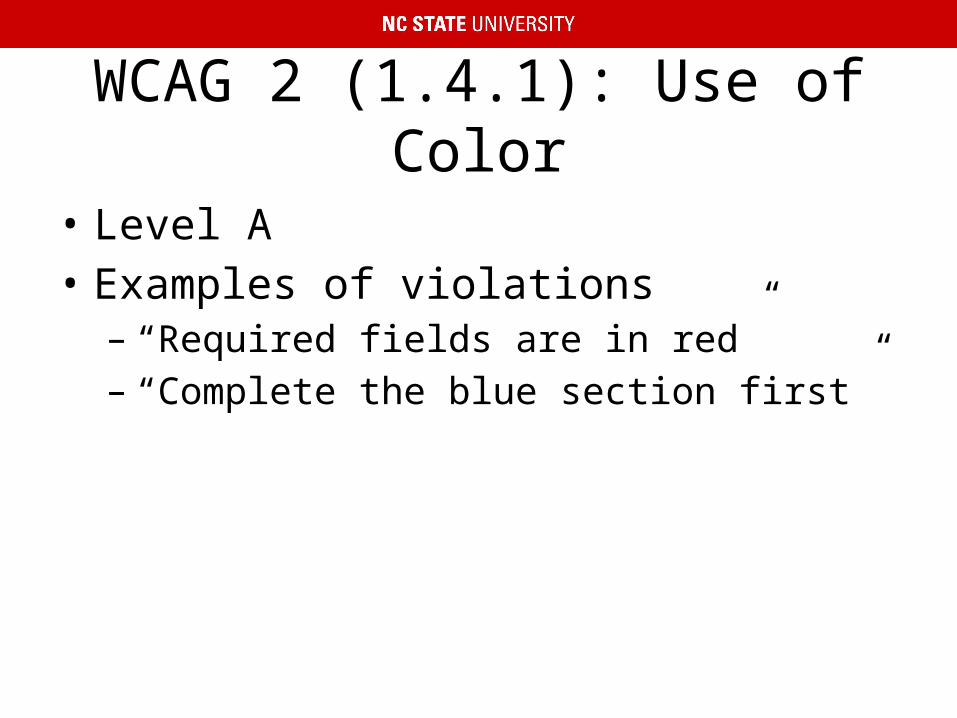
WCAG 2 (1.4.1): Use of Color
• Level A• Examples of violations– “Required fields are in red”– “Complete the blue section first”

WCAG 2 (1.4.3 and 1.4.6): Contrast
• Level AA and Level AAA Conformance• Ratios– 3:1 minimum acceptable contrast for standard text and
vision– 4.5:1 accounts for moderately low visual acuity (vision
loss equivalent to approximately 20/40)• typical visual acuity of people at roughly age 80
– 7:1 accounts for users who typically do not depend on assistive technologies for visual impairments (vision loss equivalent to approximately 20/80)

What Is Covered in WCAG Contrast Requirements?
• Text• Does NOT apply to– Logos– Inactive form elements– Purely decorative text– Incidental text in photos– Other UI elements

WCAG 2 Conformance Levels and Ratios
• Level AA– 18 pt. or 14 pt. bold 3:1– Smaller, 4.5:1
• Level AAA– 18 pt. or 14 pt. bold 4.5:1– Smaller, 7:1
• 18pt (1.5em, 150%)• 14pt (1.2em, 120%)

Beyond WCAG 2
• (Acknowledge Wayne Dick from CSU Long Beach for information)
• There is no average person with low vision• 35+ critical structures in the human visual
system– Multiple ways these structures can break
• Bright light is painful to many people with low vision

What Else To Consider
• Practice strict separation of presentation from content
• Anticipate users changing your color scheme• Potentially provide text enlargement with
reflow to 300% (WCAG 2 AA only requires 200%)

Tools

Eyedropper Tools
• Colour Contrast Analyser• Desktop application for Windows and OS X• Strengths– Can choose any colors on the screen
• Weaknesses– Anti-aliasing of text– Text over a non-uniform background– Must manually check elements

Colour Contrast Analyser

Automated Tools
• WAVE• Juicy Studio Accessibility Toolbar• Strengths– Automatically checks all color combinations– Can account for text size
• Weaknesses– Text over images– Text in images– Text over CSS3 gradients

Text Over Images

Anti-Aliased Text

Image Analysis
• Color Contrast Analyzer for Chrome• Chrome extension• Strengths– Checks the page as it is rendered
• Weaknesses– Cannot differentiate between text and other user
interface elements

Color Contrast Analyzer: Original Image

Color Contrast Analyzer: Mask

Color Contrast Analyzer: Text Over Images

Color Contrast Analyzer: Text in Images

Testing Color Palettes
• NC State Accessible Color Palette Evaluator• Web-based application• Build a color palette• Compare all of the color combinations to see
which have enough contrast• Sample Accessible Palette Evaluator

Color Palette Extractor
• Color Palette Extractor• Detects all of the colors defined in a page• Populates the Color Palette Evaluator

Color Palette Tweaker
• Tanaguru• Web-based application• Pick two colors and adjust one of them to
make the contrast great enough to meet WCAG

Substituting Style Sheets
• Web Evaluation Tools

Questions
Related Documents