CoDesign With Data Graham Michael Dove Centre for Creativity in Professional Practice City University London Presented for the degree of Doctor of Philosophy July 2015

Welcome message from author
This document is posted to help you gain knowledge. Please leave a comment to let me know what you think about it! Share it to your friends and learn new things together.
Transcript
CoDesign With Data
Graham Michael Dove Centre for Creativity in Professional Practice City University London Presented for the degree of Doctor of Philosophy July 2015
II
Abstract
Design is a process of changing current situations into preferred ones, through conversations with design materials, and an understanding of the present practice of the designed artefact’s future users. Domain-relevant data, such as those generated by personal and autonomous computing systems, are an increasingly important design material presenting new ways to explore current practice. Examples of these data include that being generated by people using smartphones, health and fitness monitors, smart energy meters and social media; or that from official statistics made publicly available via Open Data initiatives.
This thesis details research developing CoDesign With Data, a novel approach to collaborative early-stage design workshops in which working with domain-relevant data is the key distinguishing feature. During a CoDesign With Data workshop participants are given the tools and techniques to help them seek insight from data, gain an understanding of the context these data might come from, and to inspire creative design ideas. These tools and techniques build on an understanding of research into information visualization and applied creativity. The activities in which they are used build on the experiences reported from other approaches to creativity in collaborative requirements gathering and design workshops.
The aim of this research is to support design innovation that results in new products or services appropriate to the contexts in which they will be used. To investigate the primary research question, and evaluate the tools and techniques being developed, two design experiments and three case studies were undertaken. In each study, examples of tools, in the form of workshop materials and information visualization interfaces, and techniques, in the form of workshop activities, are presented, and simple takeaways for design practice are offered. Finally, the knowledge and understanding gained during this research is presented as a series of guidelines and recommendations, and a description of the current state-of-the-art CoDesign With Data workshop.
III
Table of Contents
1 Introduction ................................................................................................. 15 1.1 Background and Motivation ................................................................ 16 1.2 Research Question and Contribution .................................................. 19
1.2.1 Research Question ....................................................................... 19 1.2.2 Academic Contribution ................................................................. 22
1.3 Structure of this Thesis ........................................................................ 23 1.4 Appendices ......................................................................................... 27
2 Research Background ................................................................................ 28 2.1 Design Research ................................................................................. 28 2.2 The Landscape of Design Research ................................................... 30 2.3 Tools, Techniques, Methods and Approach ....................................... 33 2.4 Related Approaches ............................................................................ 35
2.4.1 Creativity in Requirements Gathering Workshop .......................... 37 2.4.2 Generative Design Research ........................................................ 40 2.4.3 Inspiration Card Workshop ........................................................... 43
2.5 Related Tools and Techniques ............................................................ 45 2.5.1 Information Visualization: Tools for Exploring Data ...................... 46 2.5.2 How Visualization Tools are Used in this Research ...................... 51 2.5.3 Applied Creativity: Techniques for Ideation ................................. 52 2.5.4 Using Creativity Techniques in this Research .............................. 55
2.6 Summary of the Research Background .............................................. 58 3 Methods ...................................................................................................... 60
3.1 Research Methods .............................................................................. 60 3.2 Evaluation Methods ............................................................................. 62
3.2.1 Creativity Support Index ............................................................... 63 3.2.2 Evaluating Generative Design Outputs ........................................ 64 3.2.3 Rating the Creativity of Design Outputs ....................................... 66 3.2.4 Reflection Postcards ..................................................................... 68 3.2.5 Video Analysis .............................................................................. 73 3.2.6 Additional Evaluation Methods ..................................................... 74
3.3 Roadmap to the Individual Studies ..................................................... 74 4 Ambiguity in Visual Encodings ................................................................... 77
4.1 Introduction .......................................................................................... 77 4.2 Research Question .............................................................................. 79 4.3 Workshop Details ................................................................................. 81
IV
4.3.1 Background .................................................................................. 81 4.3.2 Participants ................................................................................... 81 4.3.3 Workshop Materials ...................................................................... 82 4.3.4 Visualization Interface Design ...................................................... 83 4.3.5 Workshop Activities ...................................................................... 89
4.4 Evaluation Methods ............................................................................. 92 4.4.1 Supporting the People Designing ................................................. 93 4.4.2 Assessing the Design Product ..................................................... 94 4.4.3 Understanding the Design Process .............................................. 97
4.5 Results ................................................................................................. 98 4.5.1 Supporting the People Designing ................................................. 98 4.5.2 Assessing the Design Product ..................................................... 99 4.5.3 Understanding the Design Process ............................................ 102
4.6 Discussion ......................................................................................... 105 4.7 Reflections ......................................................................................... 108
4.7.1 Research and Evaluation Methods ............................................. 108 4.7.2 Takeaways .................................................................................. 110
5 Case Study: E.ON Energy ........................................................................ 111 5.1 Introduction ........................................................................................ 111 5.2 Research Questions .......................................................................... 112 5.3 Workshop Details ............................................................................... 114
5.3.1 Background ................................................................................ 114 5.3.2 Participants ................................................................................. 115 5.3.3 Workshop Materials .................................................................... 115 5.3.4 Visualization Interface Design .................................................... 116 5.3.5 Workshop Activities .................................................................... 122
5.4 Evaluation Methods ........................................................................... 128 5.4.1 Supporting the People Designing ............................................... 129 5.4.2 Assessing the Design Product ................................................... 131
5.5 Results ............................................................................................... 132 5.5.1 Supporting the People Designing ............................................... 132 5.5.2 Assessing the Design Product ................................................... 138
5.6 Discussion ......................................................................................... 142 5.7 Reflections ......................................................................................... 144
5.7.1 Research and Evaluation Methods ............................................. 144 5.7.2 Takeaways .................................................................................. 146
6 Case Study: MIRROR ............................................................................... 147 6.1 Introduction ........................................................................................ 147 6.2 Research Questions .......................................................................... 148
V
6.3 Workshop Details ............................................................................... 150 6.3.1 Background ................................................................................ 150 6.3.2 Participants ................................................................................. 150 6.3.3 Workshop Materials .................................................................... 150 6.3.4 Workshop Activities .................................................................... 152
6.4 Evaluation Methods ........................................................................... 156 6.4.1 Supporting the People Designing ............................................... 156 6.4.2 Assessing the Design Product ................................................... 157
6.5 Results ............................................................................................... 159 6.5.1 Supporting the People Designing ............................................... 159 6.5.2 Assessing the Design Product ................................................... 162
6.6 Discussion ......................................................................................... 167 6.7 Reflections ......................................................................................... 169
6.7.1 Research and Evaluation Methods ............................................. 169 6.7.2 Takeaways .................................................................................. 171
7 Analytical & Intuitive Creativity ................................................................. 172 7.1 Introduction ........................................................................................ 172 7.2 Research Question ............................................................................ 174 7.3 Workshop Details ............................................................................... 176
7.3.1 Background ................................................................................ 176 7.3.2 Participants ................................................................................. 177 7.3.3 Workshop Materials .................................................................... 178 7.3.4 Visualization Interface Design .................................................... 181 7.3.5 Workshop Activities .................................................................... 190
7.4 Evaluation Methods ........................................................................... 192 7.4.1 Supporting the People Designing ............................................... 193 7.4.2 Assessing the Design Product ................................................... 195 7.4.3 Understanding the Design Process ............................................ 196
7.5 Results ............................................................................................... 197 7.5.1 Supporting the People Designing ............................................... 197 7.5.2 Assessing the Design Product ................................................... 199 7.5.3 Understanding the Design Process ............................................ 202
7.6 Discussion ......................................................................................... 208 7.7 Reflections ......................................................................................... 213
7.7.1 Research and Evaluation Methods ............................................. 213 7.7.2 Takeaways .................................................................................. 215
8 Case Study: One Small Change ............................................................... 216 8.1 Introduction ........................................................................................ 216 8.2 Research Questions .......................................................................... 217
VI
8.3 Workshop Details ............................................................................... 218 8.3.1 Background ................................................................................ 218 8.3.2 Participants ................................................................................. 219 8.3.3 Workshop Materials .................................................................... 220 8.3.4 Visualization Interface Design .................................................... 221 8.3.5 Workshop Activities .................................................................... 230
8.4 Evaluation Methods ........................................................................... 239 8.4.1 Supporting the People Designing ............................................... 241 8.4.2 Assessing the Design Product ................................................... 244
8.5 Results ............................................................................................... 246 8.5.1 Supporting the People Designing ............................................... 246 8.5.2 Assessing the Design Product ................................................... 254
8.6 Discussion ......................................................................................... 258 8.7 Reflections ......................................................................................... 262
8.7.1 Research and Evaluation Methods ............................................. 262 8.7.2 Takeaways .................................................................................. 265
9 Discussion ................................................................................................ 266 9.1 Research Question ............................................................................ 266 9.2 Contribution ....................................................................................... 266
9.2.1 Tools, Techniques, Methods and Approach .............................. 267 9.2.2 Contribution at the Level of Approach ........................................ 268 9.2.3 Contribution at the Level of Method ............................................ 268 9.2.4 Contribution at the Level of Technique ....................................... 269 9.2.5 Contribution at the Level of Tool ................................................. 270 9.2.6 Comparison to Other Design Approaches ................................. 270
9.3 Recommendations for Design Practice ............................................. 277 9.3.1 Guidelines for CoDesign With Data Workshops ......................... 277 9.3.2 Recommendations from Individual Studies ................................ 278
9.4 Research Methods ............................................................................ 280 9.4.1 Design Experiments .................................................................... 281 9.4.2 Case Studies ............................................................................... 286
9.5 Evaluation Methods ........................................................................... 290 9.5.1 Creativity Support Index ............................................................. 290 9.5.2 Evaluating Generative Design Outputs ...................................... 291 9.5.3 Rating the Creativity of Design Outputs ..................................... 292 9.5.4 Reflection Postcards ................................................................... 293 9.5.5 Video Analysis ............................................................................ 295 9.5.6 Additional Evaluation Methods ................................................... 295 9.5.7 Summary of Evaluation Methods ................................................ 296

VII
9.6 Limitations & Future Work .................................................................. 297 9.7 Concluding Comments ...................................................................... 301 9.8 CoDesign With Data: February 2015 ................................................. 302
9.8.1 Phase 1: Framing the Problem ................................................... 303 9.8.2 Phase 2: Generating Alternatives ............................................... 304 9.8.3 Phase 3: Selecting Design Ideas ................................................ 305
VIII
Table of Figures
Figure 1: Reproduction of Sanders & Stappers' Map Describing the Emerging Landscape of Design Research Approaches and Methods (Sanders & Stappers, 2012, p.21) ................................................................................... 30
Figure 2: Sanders and Stappers' emerging landscape of design map. Updated to show where the CoDesign With Data approach sits (Sanders & Stappers, 2012, p.p.21) ................................................................................................ 32
Figure 3: Roadmap to the tools, techniques and evaluation methods used in each individual study undertaken for this research .................................... 76
Figure 4: Participants exploring one of the information visualization interfaces during a workshop activity .......................................................................... 82
Figure 5: Screenshot of IV1 the information visualization interface designed with a less ambiguous visual encoding ....................................................... 85
Figure 6: Screenshot of IV1, filtered to show the cost of washing machine energy consumption on Thursday ........................................................................... 85
Figure 7: Screenshot of IV2 the information visualization interface designed with a more ambiguous visual encoding ..................................................... 86
Figure 8: Screenshot of IV2, filtered to show the cost of washing machine energy consumption on Thursday ........................................................................... 86
Figure 9: Participants using the less ambiguous information visualization interface during Activity 2 ........................................................................... 88
Figure 10: Participants generating new product or service ideas using a combinational creativity technique during Activity 3 .................................. 91
Figure 11: Co-designers create new service ideas during workshop activities .. 114 Figure 12: Screenshot of the information visualization interface filtered to show
lighting consumption in kilowatt-hours .................................................... 119 Figure 13: Screenshot of the information visualization interface filtered to show
consumption of the audio visual class of appliances in kilowatt-hours .... 119 Figure 14: Screen shot of the information visualization interface showing details
for the audio visual class of appliances during the 1pm to 2pm time slot on Wednesday ................................................................................................. 120
Figure 15: Screenshot of the information visualization showing energy consumption for Monday .......................................................................... 120
Figure 16: Co-designers using the iPad information visualization to generate ideas ............................................................................................................ 123
Figure 17: Overview of participants’ responses to the Reflection Postcard prompts ....................................................................................................... 133
Figure 18: Co-designers working collaboratively to describe their household in Activity 1 ...................................................................................................... 136
Figure 19: Examples of outputs produced in Activity 1: Who Lives Here? ....... 137
IX
Figure 20: Example of the outputs produced during Activity 5 Generating Service Designs .......................................................................................... 140
Figure 21: Participants creating descriptions of MIRROR applications and data in Activity 1: Data Description .................................................................... 153
Figure 22: Participants making a map of the MIRROR applications and data . 154 Figure 23: Overview of participants' responses to the reflection prompts ........ 159 Figure 24: Completed 5WsH hexagonal worksheet describing MIRROR's Carer
application .................................................................................................. 163 Figure 25: Completed 5WsH hexagonal worksheet showing MIRROR's Sensor
Data application ......................................................................................... 164 Figure 26: Completed 5WsH worksheet for MIRROR's WATCHiT / Timeline
applications ................................................................................................ 164 Figure 27: Map of MIRROR applications and data with coloured threads
indicating connections and how they are made ......................................... 165 Figure 28: Hexagonal representation of a new idea connecting data from three
MIRROR applications: WATCHiT, CareReflect and KnowSelf ................ 166 Figure 29: Hexagonal worksheet describing a new idea to use proximity data
from the Sensor Data application to augment the WATCHiT / Timeline application .................................................................................................. 167
Figure 30: Participants using the iPad interface in which smart energy data are visualized to find inspiration for design ideas ........................................... 178
Figure 31: Screen shot of the interface visualizing smart energy data filtered to show the energy consumption of families during weekdays in the summer .................................................................................................................... 184
Figure 32: Screen shot of the interface visualizing smart energy data, filtered to show weekend consumption for single occupant households, on winter weekends .................................................................................................... 184
Figure 33: Screen shot of the interface visualizing smart energy data, showing the details for wet appliances at 3pm, filtered as in Figure 32 ................. 185
Figure 34: Screen shot of the interface displaying Flickr photographs with the default filter search term ‘Home appliances’ ............................................ 189
Figure 35: Screen shot of the interface displaying Flickr photographs filtered with the search term 'Wash and clean' ...................................................... 189
Figure 36: Screen shot of the interface displaying Flickr photographs filtered with the user entered search term 'smart energy' ..................................... 190
Figure 37: Individual CSI ratings given by each participant ............................. 197 Figure 38: Aggregate scores for the different CSI dimensions of creativity ..... 198 Figure 39: Individual participant's average rating for the importance of the
relevant design artefact to their idea generation ...................................... 199 Figure 40: Graphs showing: a) the number of ideas generated during each
Activity 2; b) the mean creativity; c) the mean novelty score; and d) the mean usefulness score; for final ideas. ...................................................... 200
Figure 41: Graph showing how much time was spent with the different design artefacts during idea generation, together with the number of ideas
X
recorded during that period of use: a) in chronological time; and b) in aggregate time ............................................................................................ 201
Figure 42: Video analysis of participants in condition C1 working with the interface in which smart energy data are visualized ................................. 204
Figure 43: Video analysis of participants using the interface displaying photographs from Flickr, tagged with terms relevant to domestic energy consumption .............................................................................................. 207
Figure 44: Participants in the One Small Change workshop generate candidate solution ideas ............................................................................................. 219
Figure 45: Screen shot of the interface visualizing student attitudes towards sustainability .............................................................................................. 222
Figure 46: Screen shot of the visualized student attitudes data, filtered to show responses from only female respondents .................................................. 223
Figure 47: Screen shot of the visualized student attitudes data, filtered to show only the responses of first year undergraduates ....................................... 224
Figure 48: Screen shot of the visualized student attitudes data, filtered to show the details of respondents who agreed that behaving sustainably is their responsibility ............................................................................................. 225
Figure 49: Screen shot of the visualized student attitudes data, filtered to show the details of respondents who agreed that a lack of knowledge was a barrier to their behaving sustainably ........................................................ 226
Figure 50: Screen shot of the interface visualizing bin contamination data .... 227 Figure 51: Screen shot of the visualized bin contamination data, filtered to show
only the general waste bins ....................................................................... 228 Figure 52: Screen shot of the visualized bin contamination data, filtered to show
the data from February .............................................................................. 229 Figure 53: Screen shot of the visualized contamination data, filtered to show a
combination of Dry Recycling & Food Waste Bins in January, February & April ........................................................................................................... 230
Figure 54: Co-designers seeking insight in the visualized data during the One Small Change Workshop ........................................................................... 232
Figure 55: Co-designers vote for their favoured solution ideas during the One Small Change workshop ............................................................................ 238
Figure 56: Creativity Support Index scores for: a. Workshop Day 1: Define the Problem; and b. Workshop Day 2: Generate and Select Design Ideas ..... 246
Figure 57: Aggregated scores for the importance co-designers gave to each CSI factor: a. Workshop Day 1; and b. Workshop Day 2 ................................. 247
Figure 58: Co-designers’ ratings of the importance of the information visualization interfaces to understanding the topic in: a. Workshop Day 1; and b. Workshop Day 2 ............................................................................. 248
Figure 59: Co-designers’ ratings of how effectively the information visualization interfaces provided inspiration for their idea generation. ........................ 248
Figure 60: Changes in co-designers' self-reported level of domain knowledge: a. motivations for sustainable behaviour; b. barriers to sustainable behaviour; and c. knowledge of how different types of recycling and waste
XI
bin are used. Bars represent pre-workshop, post day 1 and post day 2 questionnaires for each co-designer (in order left to right). .................... 248
Figure 61: Co-designers' views of the importance of different aspects of the workshop: a. Individual Thinking; b. Group Discussion; c. Expertise of Group Members; d. Activities Using information Visualizations; e. Facilitation. ................................................................................................ 249
Figure 62: Co-designers' responses on the Reflection Postcards with regards to improvements in their understanding of the subject matter being considered .................................................................................................. 250
Figure 63: Workshop factors that helped co-designers to gain an improved understanding of the subject matter, as highlighted in participants' Reflection Postcard responses ................................................................... 250
Figure 64: Co-designers' view of the degree to which the information visualizations stimulated group discussion and individual thinking, from the follow up questionnaire ....................................................................... 252
Figure 65: Evaluation ratings from domain experts for: a. the Problem Statement output from Workshop Day 1; and b. the Design Idea output from Workshop Day 2 ............................................................................... 254
Figure 66: Selected change intervention hexagon, describing co-designers' idea to display data about waste and recycling at the site of the bins .............. 256
Figure 67: Co-designers describe their selected candidate solution using the large A0 size hexagonal worksheet ............................................................ 257
Figure 68: CoDesign With Data (February 2015) overview .............................. 302 Figure 69: CoDesign With Data - Phase 1 Framing the Problem ..................... 304 Figure 70: CoDesign With Data - Phase 2 Generating Alternatives ................. 305 Figure 71: CoDesign With Data - Phase 3 Selecting Design Ideas .................... 305 Figure 72: CoDesign With Data (February 2015) ............................................. 306
XII
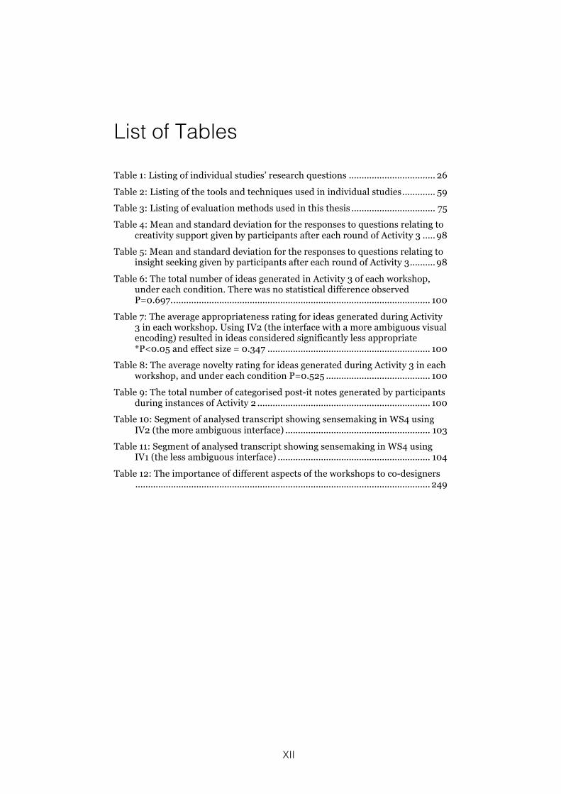
List of Tables
Table 1: Listing of individual studies’ research questions .................................. 26 Table 2: Listing of the tools and techniques used in individual studies ............. 59 Table 3: Listing of evaluation methods used in this thesis ................................. 75 Table 4: Mean and standard deviation for the responses to questions relating to
creativity support given by participants after each round of Activity 3 ..... 98 Table 5: Mean and standard deviation for the responses to questions relating to
insight seeking given by participants after each round of Activity 3 .......... 98 Table 6: The total number of ideas generated in Activity 3 of each workshop,
under each condition. There was no statistical difference observed P=0.697. ..................................................................................................... 100
Table 7: The average appropriateness rating for ideas generated during Activity 3 in each workshop. Using IV2 (the interface with a more ambiguous visual encoding) resulted in ideas considered significantly less appropriate *P<0.05 and effect size = 0.347 ................................................................ 100
Table 8: The average novelty rating for ideas generated during Activity 3 in each workshop, and under each condition P=0.525 ......................................... 100
Table 9: The total number of categorised post-it notes generated by participants during instances of Activity 2 .................................................................... 100
Table 10: Segment of analysed transcript showing sensemaking in WS4 using IV2 (the more ambiguous interface) ......................................................... 103
Table 11: Segment of analysed transcript showing sensemaking in WS4 using IV1 (the less ambiguous interface) ............................................................ 104
Table 12: The importance of different aspects of the workshops to co-designers .................................................................................................................... 249

XIII
Acknowledgements
I would like to thank all the co-designers who have taken part in the
studies reported in this thesis. I would also like to thank all those
who have read, reviewed and commented on all or part of this
thesis. I would like to acknowledge the support of E.ON International
Research Initiative and all the partners involved in the “Visualising
the smart home: creative engagement with customer data” project;
the support of the partners in MIRROR; and the help and support of
City University London’s Environmental Champions Network and
Green Dragons. I would like to thank City University London for the
studentship that made it possible for me to undertake this research.
I would also like to thank all the members of City University London’s
Centre for Creativity in Professional Practice, Centre for Human
Computer Interaction Design, and giCentre for all their help, advice
and support during this research. Finally I would like to pay special
thanks to Sara Jones whose patient support and advice has been
instrumental in helping me to arrive at this point. It would have been
a much tougher and far less enjoyable journey without her
supervision.
XIV
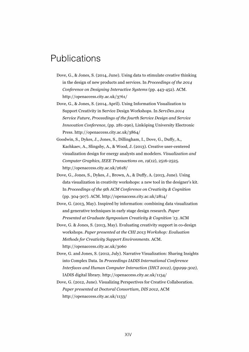
Publications Dove, G., & Jones, S. (2014, June). Using data to stimulate creative thinking
in the design of new products and services. In Proceedings of the 2014
Conference on Designing Interactive Systems (pp. 443-452). ACM.
http://openaccess.city.ac.uk/3761/
Dove, G., & Jones, S. (2014, April). Using Information Visualization to
Support Creativity in Service Design Workshops. In ServDes.2014
Service Future, Proceedings of the fourth Service Design and Service
Innovation Conference, (pp. 281-290), Linköping University Electronic
Press. http://openaccess.city.ac.uk/3864/
Goodwin, S., Dykes, J., Jones, S., Dillingham, I., Dove, G., Duffy, A.,
Kachkaev, A., Slingsby, A., & Wood, J. (2013). Creative user-centered
visualization design for energy analysts and modelers. Visualization and
Computer Graphics, IEEE Transactions on, 19(12), 2516-2525.
http://openaccess.city.ac.uk/2618/
Dove, G., Jones, S., Dykes, J., Brown, A., & Duffy, A. (2013, June). Using
data visualization in creativity workshops: a new tool in the designer's kit.
In Proceedings of the 9th ACM Conference on Creativity & Cognition
(pp. 304-307). ACM. http://openaccess.city.ac.uk/2814/
Dove, G. (2013, May). Inspired by information: combining data visualization
and generative techniques in early stage design research. Paper
Presented at Graduate Symposium Creativity & Cognition ‘13. ACM
Dove, G. & Jones, S. (2013, May). Evaluating creativity support in co-design
workshops. Paper presented at the CHI 2013 Workshop: Evaluation
Methods for Creativity Support Environments. ACM.
http://openaccess.city.ac.uk/3060
Dove, G. and Jones, S. (2012, July). Narrative Visualization: Sharing Insights
into Complex Data. In Proceedings IADIS International Conference
Interfaces and Human Computer Interaction (IHCI 2012), (pp299-302),
IADIS digital library. http://openaccess.city.ac.uk/1134/
Dove, G. (2012, June). Visualizing Perspectives for Creative Collaboration.
Paper presented at Doctoral Consortium, DIS 2012, ACM
http://openaccess.city.ac.uk/1133/
15
1 Introduction
Designing new products or services is a process by which “courses
of action aimed at changing current situations into preferred ones”
(Simon, 1996, p.111) are devised through a “reflective conversation
with the materials of a design situation” (Schön, 1992) and where to
“design with future use activity in mind means to start out from the
present practice of the future users” (Bødker et al., 1988). This thesis
details research developing a novel approach to early-stage design
workshops, the CoDesign With Data approach. This approach uses
domain-relevant data that describe aspects of the present practice
of future users, for example the data from smart energy meters or
responses to official questionnaires, as a material to inspire creative
design ideas.
This chapter begins by describing the background to this thesis,
outlining its inspirations and presenting the motivations for
undertaking the research it details. Here I discuss the wider cultural
context of technological, political and societal developments that
forecast the growing importance of domain-relevant data to many
design projects. This will outline why the detailed research is both
interesting and important to fellow researchers of design and
human-computer interaction. Following this, I present the questions
that were investigated during this research, and state the academic
contribution that it makes. Finally the thesis structure is laid out and
the contents of the remaining chapters outlined.
16
1.1 Background and Motivation
What are domain-relevant data? And why should they be of interest?
The short answer is that they can be a variety data that describe or
represent some aspect of the wider context or domain of a design
situation. This is explored in more detail below. They are also an
increasingly available resource following the growth in ubiquitous
computing systems (Weiser, 1991; Abowd, 2012) and the rise of the
open data movement1. Finally, they are a resource that is likely to
become more important as people generate increasingly large and
detailed records describing their everyday activities.
It is now commonplace to carry a smartphone or tablet device that
keeps one constantly connected to location services, search
engines and social media (Nielsen, 2014; Lomas, 2012). Personal
health, wellbeing and fitness monitors, such as those made by Fitbit2
and Jawbone3, which can capture and record activity and biometric
data, are also growing in popularity and have the potential to
change people’s relationships with the medical profession. Similarly,
smart energy meters and smart electricity plugs that capture fine-
grained information about the way people use energy are becoming
familiar4. As are smart thermostats that learn about people’s habits
from the detailed data they collect, such as Nest5 and Hive6. The
records generated and stored by each of these technologies
represent an example of domain-relevant data, and the trails they
leave behind can tell stories that we might use to understand the
1 www.theodi.org 2 www.fitbit.com 3 www.jawbone.com 4 e.g. www.plugwise.com/smart-home 5 www.nest.com 6 www.hivehome.com
17
ways that existing products and services are being used in current
practice. In addition, where products that generate these data do
not exist already, it is now relatively straightforward to devise custom
low cost data gathering solutions, which utilise cheap sensors to
meet specific research requirements (Burke et al., 2006).
These types of data are rapidly becoming a key component in the
way major societal issues are addressed (Ofcom, 2013). For
example, one of the primary motivations behind the UK Department
of Energy and Climate Change’s plan to rollout smart energy meters
to upwards of twenty four million UK homes and businesses by 2020
(Department of Energy and Climate Change, 2012) is that they expect
the consumption data these smart meters generate to kick start the
development of new services that encourage customers to shift
energy consumption away from peak demand times. This in turn will
reduce the need for those standby power stations that are most
polluting, and thereby help the UK meet sustainability and green
energy targets (Ofgem, 2011).
Another reason to be interested in domain-relevant data is the
increasing public availability of official statistics, which is due in part
to the impact of the open data movement. Examples of such open
data include census and demographic information, government
spending and service provision, housing market statistics and real-
time transport information, all of which are accessible via the UK
government’s data website7. Each of these is an example of domain-
relevant data that might help us better understand the changes
taking place at the wider level of community or society. Data from all
7 data.gov.uk
18
of these different sources have the potential to inspire important new
insights that inform design research and ultimately lead to better
design solutions.
But how should we interrogate these data in order to extract value
from them? Many current approaches to extracting value from data
are based on the algorithmic use of statistical and machine learning
techniques (Witten & Frank, 2005), a good example of this approach
being Amazon’s recommendation system (Linden et al., 2003).
However, these approaches, which are often associated with so-
called ‘Big Data’, can have a number of potential problems relating
to the context the data are drawn from or the individual stories they
can represent (Boyd & Crawford, 2012). The CoDesign With Data
approach that I have developed through the research detailed in
this thesis offers an alternative based on human creativity rather
than machine learning. This approach is not meant to compete with
Big Data algorithms. Indeed, it might be used to complement the
kind of understanding that can be derived automatically.
During a CoDesign With Data workshop participants take part in a
series of activities that help them seek insight from domain-relevant
data and share their individual knowledge and experience in order
to gain a better understanding of the context these data may have
come from, and to provide inspiration for creative design ideas. In
the studies reported in chapters 4, 5 and 7 the domain-relevant data
used are the kind of quantitative data generated by smart energy
meters. Additionally in Chapter 7 the energy domain is also
represented by the kind of data available in social media, in this
19
case Flickr8 photographs. In Chapter 8 the domain-relevant data are
responses to a large-scale questionnaire study and data
representing contamination in university waste bins. Chapter 6
explores the different types of data available within the domain of a
European research project investigating reflective practice at work.
1.2 Research Question and Contribution
The research detailed in this thesis aims to respond to the
opportunities offered by the growing availability of domain-relevant
data. In so doing I have developed a novel approach to early-stage
design workshops, the CoDesign With Data approach. This
approach uses tools that represent data interactively and
techniques that prompt creativity to help participants gain and share
an improved understanding of the contexts these data might be
drawn from, and in turn inspire creative design ideas. This is done
with the ultimate aim of delivering better products and services.
1.2.1 Research Question
Section 1.1 identified the new opportunity these domain-relevant
data offer. This might be summed up as the chance to present a
view of potential future users’ current practice at a scale or
resolution that is not generally practical with most human-centred or
user-centred design methods. For example, domain-relevant data
might offer the opportunity to study the activities of larger numbers
of people, over longer periods of time than methods such as
Contextual Design (Beyer & Holtzblatt, 1999), albeit at a relatively
course granularity.
8 www.flickr.com
20
The objective of the research detailed in this thesis is to investigate
how this opportunity can be exploited, and the research question
that guided this enquiry was:
How can seeking insight into domain-relevant data help participants
in early-stage co-design workshops gain a richer understanding
of the context under investigation, and provide inspiration for
creative design ideas?
This research question assumes two key relationships, which are
discussed below. First, the relationship between data and context;
how exploring domain-relevant data and the context of the activities
being undertaken when they are generated can provide insight into
what might be considered design problems. Second, the nature of
inspiration, and how insights into domain-relevant data can provide
inspiration for possible design solutions.
1.2.1.1 Data and Context
Section 1.1 introduced domain-relevant data, gave examples of
what they might be, and explained that algorithmic or Big Data
approaches to understanding these data can been criticised for
failing to appreciate the context surrounding the practices and
activities they are drawn from (Boyd & Crawford, 2012). Such an
appreciation and understanding of the context surrounding future
users’ current practice is a key principle of user-centred design, as
we see for example in the Contextual Design approach (Beyer &
Holtzblatt, 1997).
My research question reflects this tension between domain-relevant
data offering potential insights into the practice and activities of a
large number of possible future users over a long period of time,
21
and the user-centred requirement to understand the specific context
in which these activities and practices take place in close detail. It
asks how we might help co-designers gain a richer understanding
of the context from which these data are drawn, through sharing
their knowledge, including implicit knowledge, of particular
instances, activities or practices that these data might represent.
This can be understood as an investigation into the ways that
domain-relevant data might provide the raw material from which
insights into the problem space of a design situation can be found.
1.2.1.2 Inspirat ion
In addition to inquiring how domain-relevant data might support an
improved understanding of the problem space of a design situation,
my research question also asks whether exploring domain-relevant
data might inspire ideas for possible design solutions. This is
important because activities in which external inspiration is
intentionally sought are included in many design processes, for
example those used at IDEO (Kelly & Littman, 2001, pp.142-46), and
have been shown to be an effective source of creative design ideas
(Halskov, 2010; Eckert et al., 2000).
My research question asks how co-designers’ insight seeking can
be supported so that any insights they might find inspire creative
design ideas. Within this I include enquiry into different ways in
which domain-relevant data might be represented, and also
different ways in which workshop activities might be structured so
that creative exploration of domain-relevant data can inspire
participants to look at the data in ways that lead them to discover
new, unexpected and inspirational insights.
22
Having a single research question addressing both the problem and
the solution spaces of a design situation reflects the complexity of
the relationships between seeking insight, understanding the
domain context, and generating creative design ideas. These may
not be clearly separate stages that progress in a simple linear
fashion but may be more iteratively intertwined. Indeed, this is likely
to be the case, given the way in which design problems and design
solutions can be said to co-evolve (Dorst & Cross, 2001).
1.2.2 Academic Contribution
The main contribution to academic knowledge in the field of Human-
Computer Interaction made in this thesis is the CoDesign With Data
approach that I developed during this research. This is a novel
approach to collaborative early-stage design in which working with
domain-relevant data is the key distinguishing feature. During a
CoDesign With Data workshop participants take part in a series of
activities using the tools and techniques I have developed to help
them: seek insight into domain-relevant data; share their individual
knowledge to gain an improved understanding of the possible
contexts these data might come from; and use the insights gained
as inspiration for creative design ideas. During this research I
developed and published a number of tools and techniques, which I
combined in novel workshop methods. I also developed and
published a new method of evaluating creativity support using
Reflection Postcards. The CoDesign With Data approach describes
how a set of tools, in the form of example information visualization
interfaces and other workshop materials, and techniques, in the
form of example workshop activities, can be combined into methods
for undertaking early-stage collaborative design workshops.
23
1.3 Structure of this Thesis
Chapter 1 introduces the research detailed in this thesis, places it
in a social and technological context, and outlines my research
questions and academic contribution.
Chapter 2 provides an academic background to the research, in
which important literature are reviewed and related work described.
In doing so, it places the work described here in an academic
context of design research.
Chapter 3 introduces the research and evaluation methods used
during the individual studies undertaken for this thesis, and provides
a roadmap for how these studies relate as the research progressed.
Chapter 4 describes my first design experiment investigating how
to represent domain-relevant data to workshop participants. In this
study ambiguity in the visual encoding with which data are
represented is considered. I found that ideas generated in
workshops using an interface where ambiguity was intentionally
increased were found to be significantly less appropriate to the
domain under consideration. This work was presented in a paper at
the ACM Designing Interactive Systems conference, Vancouver,
June 2014 that is included in Appendix A.
Chapter 5 describes a case study in which the findings from the
first design experiment are put into practice in a service design
workshop held with customers and staff of E.ON Energy. I found that
activities using visualized domain-relevant data and generative
design techniques were engaging for participants, helped them
gain a better understanding of the design context, and inspired
creative ideas. This work was presented in a paper at the
24
ServDes.2014 Service Design and Innovation Conference in
Lancaster, April 2014 that is included in Appendix A. The novel
Reflection Postcard method of evaluation was developed for this
study and presented at the CHI 2013 Workshop: Evaluation
Methods for Creativity Support Environments, a short paper is
included in Appendix A.
Chapter 6 describes a case study in which I continue to
investigate the generative design approach used in Chapter 5 in a
workshop held with representatives of MIRROR, a European
research consortium. I found this to be an effective way of gaining
an improved understanding of the data available to a design
situation, and of inspiring and recording creative design ideas.
Chapter 7 describes my second design experiment investigating
how to represent domain-relevant data to workshop participants. In
this study two interfaces designed to prompt different styles of
creative thinking are compared. I demonstrate distinct differences in
the way these two interfaces were used, and show that certain
aspects of participants’ creative processes were supported more
effectively in workshops where quantitative data were visualized in a
way designed to prompt an analytical style of creative cognition.
Chapter 8 describes a final case study in which the lessons learnt
in previous studies are brought together, and the emerging
CoDesign With Data approach is studied, during a service design
workshop held with representative students and staff from City
University London’s Environmental Champions. I found positive
evidence of effective support and inspiration for participants’
creative design processes, both through directly prompting ideas
25
and also by providing a common ground on which participants can
share their differing knowledge and experience.
Chapter 9 provides a discussion of, and reflections on, the
research carried out for this thesis. My research questions and
contribution are revisited, and the recommendations for practitioners
presented in full. I also revisit the research methods I used and
discuss their suitability and effectiveness. Finally, I outline some key
limitations, and suggest areas for future research.
Each of the chapters 4 to 8 reports a specific study, addressing
sub-questions of my primary research question:
Chapter 4 RQ4 What would be the effects of increasing the ambiguity in the visual encoding used to represent smart energy data on workshop participants’ ability to gain insight, and on the creativity of the product and service ideas those participants subsequently generate?
Chapter 5 RQ5.1 Would using iPad interfaces to explore visualized domain-relevant data be engaging to workshop participants, and support collaboration in a real world setting?
RQ5.2 Would participants successfully gain an understanding of the data and therefore insight into the design context from their activities using the information visualization interface?
RQ5.3 Would the combination of insight seeking using information visualization interfaces and generative design activities help participants share their existing knowledge and explore different possible interpretations of an ambiguous design context?
Chapter 6 RQ6.1 Would workshop activities in which generative design is combined with applied creativity techniques help co-designers share their individual perspectives
26
on the data available to a design situation?
RQ6.2 Would these activities improve individual co-designer’s understanding of those data, where they come from and how they might be used?
RQ6.3 Would these activities inspire co-designers’ creative ideas as they look for possible new uses for these data during exploratory design?
Chapter 7 RQ7.1 How would participants’ idea generation activities differ? When given:
A: A digital design artefact designed to prompt creative cognition in an analytical way by visualizing smart energy data in a traditional style.
B: A digital design artefact designed to prompt creative cognition in an intuitive way by presenting photographs from social media in a direct visualization style.
Chapter 8 RQ8.1 Would the CoDesign With Data tools and techniques support participants’ insight seeking and help them gain a better understanding of the design context? During workshops in which they:
A: Identify and formulate a specific Problem Statement
B: Generate candidate solutions and select a Design Idea
RQ8.2 Would the CoDesign With Data tools and techniques support and inspire participants’ creative design processes? During workshops in which they:
A: Identify and formulate a specific Problem Statement
B: Generate candidate solutions and select a Design Idea
Table 1: Listing of individual studies’ research questions
27
1.4 Appendices
Volume II of this thesis contains the following appendices:
Appendix A: Papers published during the period of this research.
Appendix B: Design outputs resulting from the case studies
reported in chapters 5, 6 and 8
Appendix C: Design materials used in the workshops detailed in
this thesis.
28
2 Research Background
This thesis details my development of a novel approach to early-
stage design workshops, the CoDesign With Data approach. The
research it describes is situated within the field of human-computer
interaction, which, Fallman has argued, is increasingly becoming a
“design-oriented field” (Fallman, 2003). This work can therefore
usefully be described as design research. I will briefly discuss how
this term can be understood, and clarify how it is used in this thesis.
2.1 Design Research
In discussing the nature of research and it’s standing with regards
to academic degrees in the field of design, Archer (1995) makes the
distinction between “research about practice; research for the
purposes of practice; and research through practice” (underlined
emphasis in the original). According to Archer, research about
practice includes studies of the materials, processes,
methodologies and outputs of design. Research for the purpose of
practice underpins practitioner activity and refers to the work done
to gain the understanding that informs product or service
development. Research through the medium of practitioner activity
involves exploring and testing a proposition by constructing or
enacting some intervention in the real world, and in which the
investigator is likely to be a significant actor. This is otherwise known
as Action Research.
29
When I talk about design research with regards to the studies
detailed in this thesis, I am usually referring to research about
practice. Here, new methods for early-stage design workshops,
featuring novel combinations of tools and techniques, are
described, and their use explored and explained. The case studies
described in chapters 5, 6 and 8 were undertaken as part of real
world design processes in which I was an active participant. Here I
was selecting and enacting interventions with the aim of testing
propositions and therefore design research might also be thought of
in terms of research through practice. Also, the outputs from these
case studies informed ongoing design activity and therefore the
design research was at times research for the purpose of
practice.
This indicates that there are situations where the term design
research may have multiple interpretations, and retain a certain
degree of ambiguity. However, I believe that the context of each
instance of use should be clear enough for the meaning at that time
to be apparent. An alternative is to understand design research
along similar lines to Ezio Manzini who has described it as being “an
activity that aims to produce knowledge useful to those who design:
design knowledge that designers and non-designers (individuals,
communities, institutions, companies) can use in their processes of
designing and co-designing” (Manzini, 2009) (emphasis in the
original).
30
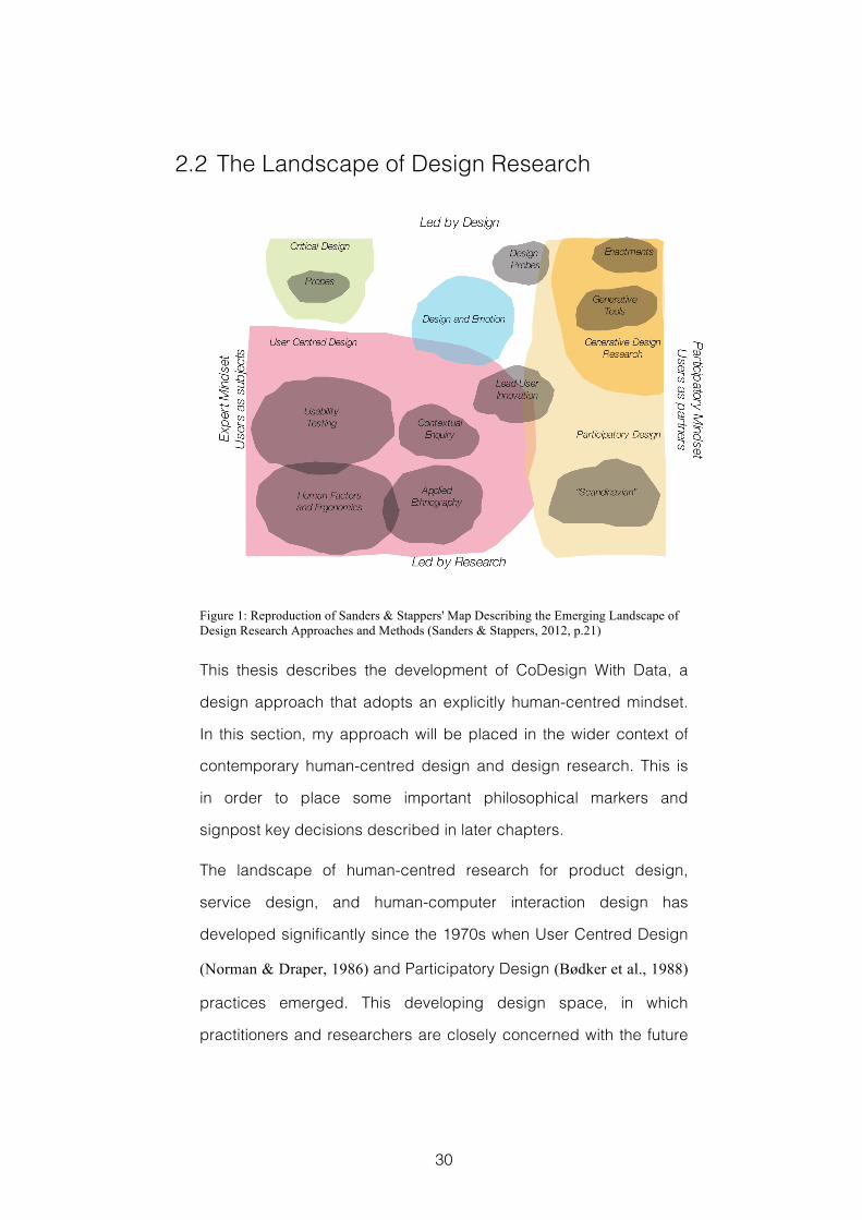
2.2 The Landscape of Design Research
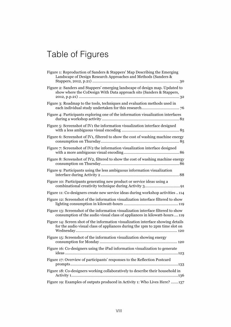
Figure 1: Reproduction of Sanders & Stappers' Map Describing the Emerging Landscape of Design Research Approaches and Methods (Sanders & Stappers, 2012, p.21)
This thesis describes the development of CoDesign With Data, a
design approach that adopts an explicitly human-centred mindset.
In this section, my approach will be placed in the wider context of
contemporary human-centred design and design research. This is
in order to place some important philosophical markers and
signpost key decisions described in later chapters.
The landscape of human-centred research for product design,
service design, and human-computer interaction design has
developed significantly since the 1970s when User Centred Design
(Norman & Draper, 1986) and Participatory Design (Bødker et al., 1988)
practices emerged. This developing design space, in which
practitioners and researchers are closely concerned with the future
31
users of their design outputs, has been usefully described by
Sanders and Stappers (2012, p.21) through a two dimensional map
in which the vertical axis describes different design approaches and
runs from ‘led by research’ through to ‘led by design’ and the
horizontal axis describes a varying mindset from ‘users as subjects’
to ‘users as partners’. Figure 1 shows a reproduction of this map.
The vertical axis strongly reflects the background that the different
approaches have emerged from. Towards the ‘led by research’ end
of the vertical axis lie approaches such as Applied Ethnography and
traditional Human Factors research that have been strongly
influenced by disciplines such as cognitive psychology, sociology,
engineering and anthropology. In contrast the ‘led by design’ end of
the vertical axis is populated by approaches to design research that
are based in exploration through design artefacts, such as Critical
Design and Generative Design Research. These are approaches
that have emerged from practices developed in schools of art,
design and architecture.
Positioning along the horizontal axis reflects a given approach’s
mindset with regards to the role of the future user in the design
process. Towards the ‘users as subjects’ end of the spectrum lie
Critical Design approaches and methods such as Usability
Evaluation that reflect the position of design researcher as expert
who designs for people. Towards the ‘users as partners’ end lie
those methods and approaches such as Scandinavian Participatory
Design and Generative Co-creation where the role of design
researcher is closer to that of a facilitator who designs with people.
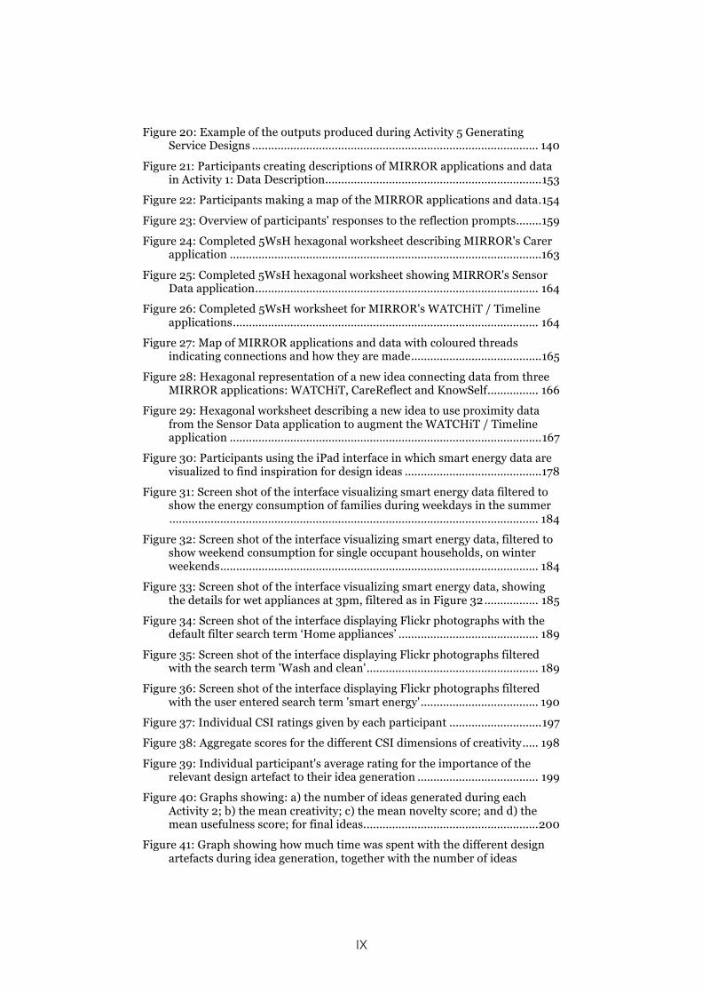
In Figure 2, the map’s original content has been updated with the
addition of the CoDesign With Data approach that was developed
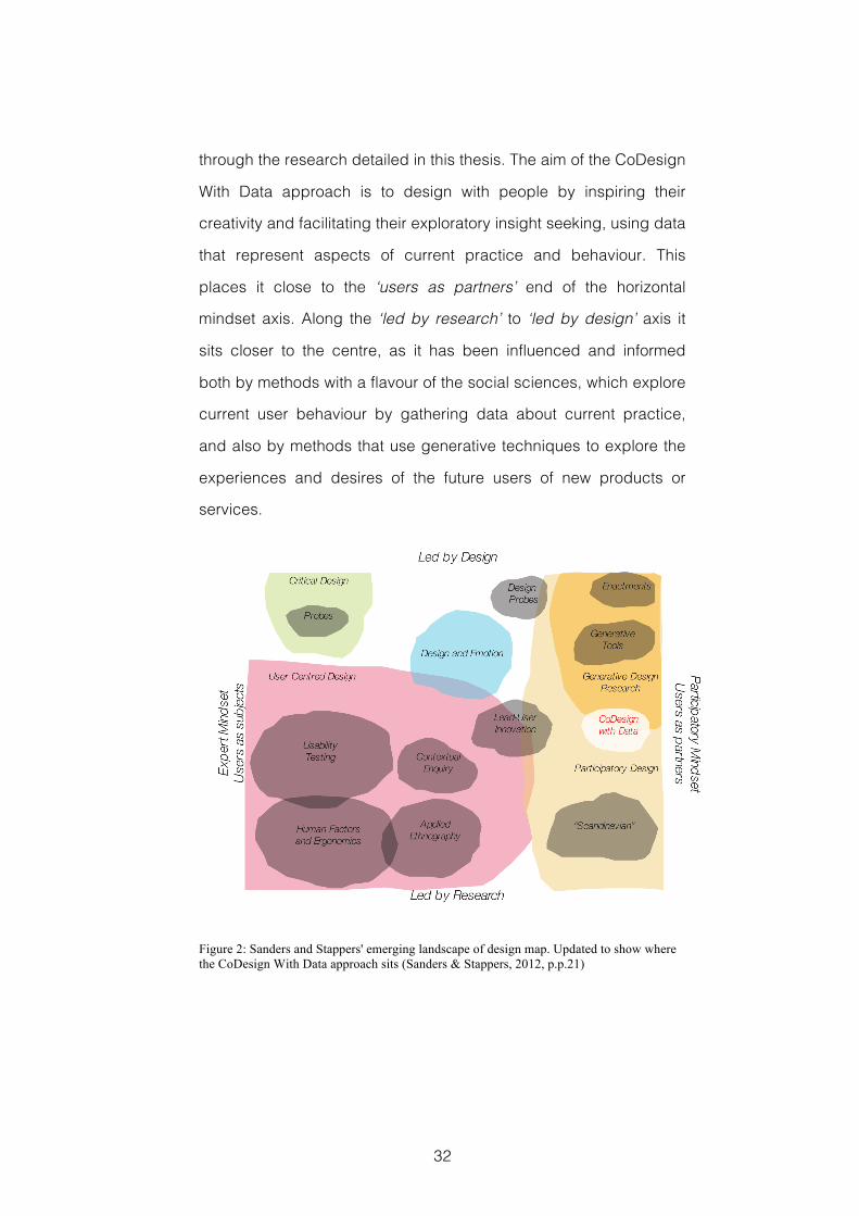
32
through the research detailed in this thesis. The aim of the CoDesign
With Data approach is to design with people by inspiring their
creativity and facilitating their exploratory insight seeking, using data
that represent aspects of current practice and behaviour. This
places it close to the ‘users as partners’ end of the horizontal
mindset axis. Along the ‘led by research’ to ‘led by design’ axis it
sits closer to the centre, as it has been influenced and informed
both by methods with a flavour of the social sciences, which explore
current user behaviour by gathering data about current practice,
and also by methods that use generative techniques to explore the
experiences and desires of the future users of new products or
services.
Figure 2: Sanders and Stappers' emerging landscape of design map. Updated to show where the CoDesign With Data approach sits (Sanders & Stappers, 2012, p.p.21)
33
2.3 Tools, Techniques, Methods and Approach
The aim of the research presented in this thesis is to develop an
approach to early-stage co-design workshops in which domain-
relevant data that represent aspects of current practice provide
inspiration for creative design ideation. By exploring these data
creatively with stakeholder representatives, we can share an
understanding of the context they are drawn from, and use the
insights gained and ideas generated to design innovative products
and services appropriate to their future users. The primary
challenge faced is to find ways of presenting these domain-relevant
data in a way that is appropriate for the participating stakeholder
representatives, our co-designers. These co-designers are unlikely
to be experienced data analysts and therefore data should be
presented in a way that makes them accessible. Also, I want to
inspire co-designers’ creativity and use this to explore a broad
context for these data, which should therefore be presented in a
way that is engaging, inspiring and that prompts creative ideas.
To describe how the CoDesign With Data approach responds to
such challenges, the distinction between tools , techniques ,
methods and approach made by Sanders, Brandt and Binder
(2010) in their framework for describing the application of
participatory design practices has been adopted. This distinction
helps to generalise the results found in this research by allowing
other design researchers to adopt individual elements and combine
them with tools and techniques described elsewhere or to extend
them and develop methods and approaches of their own.
34
Description at the level of tools tells us about the material
component of a particular intervention or what that intervention looks
like. In the research detailed here, the tools used are the design
artefacts used. These are the interactive interfaces in which the
domain-relevant data are visualized, together with the worksheets
and other materials used to inspire, prompt, capture and record
design ideas, during particular workshops.
Description at the level of technique tells us how these tools are
used in a particular situation. In the research detailed here, this is a
description of the specific activities undertaken during particular
workshops.
Description at the level of method tells us how the combination of
tools and techniques are put together to address defined goals. In
the research detailed here, this is the format of particular
workshops.
Description at the level of approach tells us about the mindset
within which the research is conducted and can provide a guide to
the type of methods that are likely to be adopted. As Figure 2
shows, in the CoDesign With Data approach this is a collaborative,
participatory mindset that seeks to works with stakeholder
representatives, and that combines elements of design led and
research led techniques.
During the development of the CoDesign With Data approach I have
trialled several methods, each involving different combinations of
tools and techniques inspired by previous research. In section 2.4,
three different approaches to stimulating and inspiring creativity in
early-stage design and requirements gathering workshops will be
discussed, and the tools and techniques they employ described.
35
This related work shows how others have responded to the
challenge of designing better products and services by employing
the creativity of stakeholder representatives. This will be followed in
section 2.5 by a discussion of key research in the fields that have
influenced important elements in the development of the example
tools, techniques and methods that I have used in the CoDesign
With Data approach, and that are described in the research detailed
in the remainder of this thesis.
2.4 Related Approaches
Design is an inherently creative process in which consciously
seeking inspiration can play an important role. This is evidenced in
the innovation strategies practiced at design companies such as
IDEO where sources of inspiration such as The Tech Box, a centrally
located filing cabinet filled with a changing array of things such as
smart materials, interesting toys, miniature batteries and
electroluminescent displays, are seen as pivotal (Kelly & Littman,
2001, pp.142-46; McGrane, 1999) Bødker, Nielsen and Petersen (2000)
describe how systematic collaboration between designers and
stakeholder representatives leads to creative design results that are
based on but transcend current user practice, and Greenbaum &
Madsen (1993) describe how workshops can be used to give
stakeholders an important voice in design projects. It makes sense,
therefore, that activities in which there are deliberate attempts at
prompting creativity and inspiring ideation should also be an
important feature of collaborative or participatory design workshops.
In the following sections I will discuss three examples where these
types of activities have been used to: uncover novel requirements
36
(Maiden et al., 2004), explore future experience (Sanders & Stappers,
2008), and create new concepts for design (Halskov & Dalsgård,
2006). There are a number of other tools and techniques used in
collaborative design, participatory design, co-design, and co-
creation practice and research e.g. (Brandt, 2006; Bødker et al., 2000);
however, the three approaches discussed have been
comprehensively reported and are explicit in the methods they use
to inspire or stimulate participants’ creativity. Each of these
examples takes a distinctly different approach to collaborative
design workshops. They were selected for closer discussion
because the approaches they adopt are effective in addressing
specific aspects of the design workshop space that are important to
my research.
The Creativity Workshop discussed first was selected because it
takes place in the very earliest, requirements gathering phase of a
design project. It is distinctive because it represents pre-design
work being undertaken for large-scale and complex socio-technical
systems. The project undertaken with E.ON, which included the
studies described in chapters 4 and 5, was aimed at a similar scale.
The activities that take place during this workshop are strongly
rooted in psychological theories of creativity and the applied
creativity techniques based on these. This might be described as a
scientific approach to inspiring participants’ creativity, based on
participants searching for ideas. These factors are explored in the
studies reported in chapters 4, 5, 7 and 8.
The Generative Design Research discussed next also takes place at
the very front end of design projects. However, the techniques used
37
here, whilst also based on psychological theories, are more strongly
rooted in the expressive elements of creativity i.e. making things.
This approach is co-creational, i.e. closely collaborative, with the
design researcher’s role being to facilitate participants’ expressive
creativity. Generative Design Research explicitly aims to explore the
experiential aspects of the requirements that future users might
have from the product or service being designed. Generative tools
and techniques are investigated in the studies reported in chapters
5 and 6, where they were used to help participants’ gain an
understanding of the context data come and to express future
design opportunities.
The Inspiration Card Workshop discussed third is important
because it takes place at a later stage in the design process where
design concepts are being generated. The described workshop is
also shorter and more closely focused on designing interactive
systems than the Creativity Workshop. The Inspiration Card
Workshop shows how selected images can be used as a material to
represent features of the domain of a design situation, and how
these can be combined creatively to generate useful design
concepts. Domain-relevant images and photographs are used to
help participants explore and understand the context data might
come from, and to prompt different kinds of creative thinking during
the studies reported in chapters 5 and 7.
2.4.1 Creativity in Requirements Gathering Workshop
In recent years there has been a move towards understanding
requirements engineering as a process of creative problem solving
e.g. (Maiden et al., 2004; Maiden et al., 2007; Jones et al., 2008; Maiden et
38
al., 2010). As part of this process, a format for the Creativity
Workshop has been developed in which a range of stakeholder
representatives undertake a series of different activities that
generate ideas and identify requirements for large-scale socio-
technical projects, such as air traffic control systems. These
requirements have been shown to be both novel and appropriate for
their context, and may otherwise have remained unexpressed.
The structure of this workshop, and the activities undertaken during
it, are based on the application of psychological models of creative
processes, such as those put forward by Poincaré (1913), Boden
(2004), and Csikszentmihalyi (1997), and applied creativity models,
such as the Creative Problem Solving (CPS) method (Isaksen et al.,
2011). This workshop typically takes place over two days to allow for
a period of incubation (Poincaré, 1913), in which ideas
subconsciously germinate. It is made up of iterations of divergent
idea generation activities followed by activities in which
convergence and agreement are sought. These activities aim to
stimulate three types of creativity: exploratory, combinational and
transformational (Boden, 2004, pp.3-6). Another important part of the
philosophy behind these workshops is the desire to create a playful
and supportive atmosphere, where tensions or conflicts from
everyday work are removed, barriers broken down, and which
encourages creative flow (Csikszentmihalyi, 1997).
2.4.1.1 Tools
Typically, the tools used in a Creativity Workshop might include
post-it notes and marker pens for collecting and organising ideas,
39
flip charts and boards for gathering outputs, and tools for describing
requirements e.g. use-case cards. In addition to these, large sheets
of paper and other materials for creating rich storyboards might be
used in combinational creativity activities. Other tools, for example
balloons that might be used to make animals, play an important role
in the scene setting and staging of a Creativity Workshop.
2.4.1.2 Techniques
Typically, a Creativity Workshop will include a series of different
activities based on a number of techniques. For exploratory
creativity the aim is to search the space of partial or complete
possibilities. Effective techniques for exploratory creativity include
analogical reasoning and brainstorming with creativity triggers.
Analogical reasoning is a process of mapping or transferring
information from a source domain to the target domain, the target
domain being the domain of the problem currently being considered
(Maiden et al., 2004). Key here is the idea that each domain should
be a different instantiation of a shared abstraction, that they should
share knowledge structures, but that they should have syntactical
differences. Brainstorming with Creativity Triggers is a process in
which ideas are generated in response to specific triggers, such as
‘Service’, ‘Participation’ or ‘Connections’. These activities are
typically used during divergent phases of the workshop (Jones et al.,
2008).
Transformational creativity is the result of changing or breaking the
rules that are implied by or constrain the partial or complete
possibilities that define the search space in which exploratory
creativity takes place. To achieve this, techniques such as
40
constraint removal, in which domain assumptions are challenged
and ideas previously considered impossible are suggested, have
proved effective. These activities also typically take place during
divergent phases of the workshop (Maiden et al., 2010).
In activities based on combinational creativity techniques, elements
from multiple sources, for example randomly introduced objects or
pairs of existing requirements, are combined to create new ideas.
Typically, these combinational ideas might be expressed in a rich
storyboard. These activities would typically take place during
convergent phases of the workshop (Maiden et al., 2007). In addition
to the techniques that inform the workshops’ main activities, other
techniques that encourage playfulness, breakdown inhibitions and
let off steam, and support a positive atmosphere, are important to
the success of Creativity Workshops (Maiden et al., 2004).
2.4.1.3 Takeaways
The use of applied creativity techniques, which are based on a solid
theoretical basis, to structure workshop activities and support
participants’ creative processes, is a key lesson that can be taken
from the body of work describing the Creativity Workshop in
requirements engineering.
2.4.2 Generative Design Research
Generative approaches, in which the co-creation of artefacts is used
to uncover insights into people’s lives and materialise knowledge for
design requirements e.g. (Sanders, 2000; Sanders, 2005; Sanders &
Stappers, 2008; Sanders & Westerlund, 2011; Sanders & Stappers, 2012)
have increasingly been recognised as an effective approach to
41
design research. Key to this approach is the practice of design
researchers creating generative toolkits. These toolkits are made up
of intentionally ambiguous stimuli and given to co-designers who
use them to make expressive artefacts. These artefacts can
describe future objects and become the focus of discussions that
encompass future experience.
The Generative Design Research approach is based on theories of
everyday creativity (Bohm, 2004), an appreciation that all people
have the capacity to be creative in their everyday activities. This is
similar to Boden’s concept of p-creativity, or creativity in the
psychology of an individual (Boden, 2004, p.2). Another key idea
underpinning this approach is that design is increasingly concerned
with experience, and that experience is best understood as the
subjective moment at which dreams and memories meet (Sanders,
2001). According to Sanders, exploring what people make is an
important technique in designing for experience, because it extends
further into the past memories and the future dreams of participants
than either watching what they do, which covers the current
situation, or listening to what they say, which typically extends only
to the recent past and near future (Sanders, 2001). This exploration of
what people make tells design researchers about ideas and feelings
that cannot be shared easily in purely verbal terms, helps to bring
out tacit knowledge and highlight unknown wishes or desires not
met by existing products or evident in current practice.
2.4.2.1 Tools
The tools of generative design research are typically organised and
presented as toolkits, a toolkit being “a collection of tools that are
42
used in combination to serve a specific purpose” (Sanders et al.,
2010). According to (Sanders & Stappers, 2014), these “[t]oolkits are
made of 2D or 3D components such as pictures, words, phrases,
blocks, shapes, buttons, pipe cleaners, wires, etc.” In addition, they
are specific to the project or domain under investigation, and are
used by co-designers “to make artefacts about or for the future”
(Sanders & Stappers, 2014). Toolkits are used both by individuals and
small groups, in processes that are typically guided and facilitated.
The tools in these toolkits may be intentionally ambiguous, so that
different people can interpret them in different ways, opening room
for creativity.
2.4.2.2 Techniques
Specific examples of the techniques used in generative design
research are closely tied to the particular toolkits prepared for
individual design projects. However, collectively these techniques
can be described as facilitated making, where both factors, the
making and the facilitation, are considered important. The making
will generally result in the creation of an artefact, which might take
the form of a collage or model, and through which competing ideas
can be considered and ambiguities resolved. The facilitation
provides guidance, instruction and scaffolding for participants,
encouraging their creativity and structuring activities to help them
recall and interpret memories, explain feelings, and express
imagined future experiences.
2.4.2.3 Takeaways
Generative design research demonstrates the importance of
encouraging participants’ creativity with making activities. It also
43
reminds us that the design qualities of the tools we provide our co-
designers are an important feature of these tools. Finally, this
research shows us that making use of ambiguity can be a key
technique for exploring experience, and activating different
memories and feelings in people.
2.4.3 Inspiration Card Workshop
The Inspiration Card Workshop (Halskov & Dalsgård, 2006; Halskov &
Dalsgård, 2007; Halskov, 2010) takes a shorter form than the Creativity
Workshop described above. It has been used to develop design
concepts in participatory interaction design projects. This workshop
may last somewhere in the region of two hours, and is undertaken
with the objective of combining the findings of initial domain studies
with sources of technological inspiration, to create new design
concepts.
The activities undertaken in an Inspiration Card Workshop are
based on Schön’s theoretical understanding of design as a
reflective conversation with materials (Schön, 1992), and Ehn’s
identification of the balance between tradition and transcendence in
design innovation (Ehn, 1988, p. 28). These workshops also build on
previous work in which small cards are used to represent ideas,
aspects of the design context and other design materials by,
amongst others (Brandt & Messeter, 2004; Tudor et al., 1993).
2.4.3.1 Tools
The key tool used in the Inspiration Card Workshops is a set of
Inspiration Cards. These Inspiration Cards are small, 2” by 3”,
cardboard cards that represent either information about the domain
44
of the current design project, Domain Cards, or applications of novel
and inspirational technologies, Technology Cards. Along with the
Inspiration Cards, large worksheets are used to create collages
describing novel design concepts, called Concept Posters. In
addition to these custom materials, standard workshop stationary,
such as marker pens, is also used.
2.4.3.2 Techniques
The structure of an Inspiration Card Workshop is simple, consisting
of three stages: shared understanding; combination and co-
creation; and concept presentation.
During the shared understanding stage, each of the selected
Inspiration Cards is presented in turn. During the combination and
co-creation activity, which makes up the majority of the workshop,
participants collaboratively combine Inspiration Cards on the large
worksheets, and add textual descriptions or sketches, to make
Concept Posters. Halskov (2010) has described four main
techniques at play when interacting with the Inspiration Cards. The
most fundamental is Selection, in which a certain aspect or feature
is picked; this may be followed by Adaptation in which these
features undergo a modification so they better fit the current
situation; Translation is the process of taking a source of inspiration
from one place or situation and transplanting it to another; and
Combination, which for Halskov is the most necessary for
innovation, involves combining previously unrelated elements. This
is similar to Boden’s combinational creativity (Boden, 2004, p.3),
which has also been applied in the Creativity Workshops discussed
above.
45
In the final section of the Inspiration Card Workshop, a reflection
technique is used in which participants discuss or present each of
the design concepts that have been generated. This reflection is to
share a common understanding rather than to evaluate ideas. In this
way knowledge from the field under investigation and experience
from previous situations can be shared and explored as a way of
encouraging innovative ideas.
2.4.3.3 Takeaways
The Inspiration Card Workshop shows us how inspiration can be
found in images and other representations of the design situation’s
domain context, and how exploration of that context can be a
creative activity. They also show us that participatory creativity
activities can be successfully undertaken in time-restricted formats.
2.5 Related Tools and Techniques
In this section, the research background to the data exploration
tools and applied creativity techniques used in the CoDesign With
Data approach will be discussed. Section 2.5.1 provides a
background to the information visualization research that has
informed the way domain-relevant data are presented to workshop
participants. Section 2.5.3 discusses techniques that deliberately
structure and facilitate the creative process with the aim of
stimulating ideation and inspiring innovation. Using combinations of
these tools and techniques enables me to make domain-relevant
data accessible, engaging and inspirational to participants, and is
one of the factors that differentiate CoDesign With Data from other
approaches to collaborative workshops during early-stage design.
46
2.5.1 Information Visualization: Tools for Exploring Data
A key challenge for CoDesign With Data workshops is to present
domain-relevant data in a way that is accessible to participants and
which engages and inspires them. These participants are
representative stakeholders and it is unlikely that they will be skilled
or experienced data analysts. The field of information visualization
research provides important guidance for using interactive
interfaces to represent data in a way that supports insight seeking in
diverse audiences.
Information visualization has classically been defined as “the use of
computer-supported, interactive, visual representations of abstract
data to amplify cognition”, its purpose being “insight not pictures”
(Card et al., 1999, p.7). To achieve this, information visualization
makes use of the human visual system’s powers of pattern
recognition and discrimination, mapping selected data to visual
variables such as colour, shape or size in order to support
perceptual processing and therefore enable users to explore large
amounts of what may be complex data. A detailed explanation for
this process can be found in Ware, who argues, “perception and
cognition are closely interrelated, which is why the words
understanding and seeing are synonymous” (Ware, 2012, p.xvi).
Information visualization has entered popular culture and been used
to present data in ways engaging to public audiences in examples
like Hans Rosling’s Gapminder 9 presentations of international
development data and Aaron Koblin’s Flight Patterns 10 , which
displays the flight paths of US air traffic.
9 www.gapminder.com 10 www.aaronkoblin.com
47
Tufte provides seminal guidance on visually representing
quantitative information, showing ways to effectively present
numbers through abstract graphical images, and providing advice
on how to communicate with clarity, precision and efficiency, and
avoid ambiguity or distortions of what the data have to say (Tufte,
1983). Similarly, Bertin argues “[t]he entire problem is one of
augmenting this natural intelligence in the best possible way, of
finding the artificial memory that best supports our natural means of
perception” (Bertin, 2011, p.xiv). By this he means finding the visual
variables that will most effectively convey information and lead to
insight and understanding. Few provides guidance for how these
ideas of graphical clarity and effective use of visual variables can be
applied to the visual analysis of data using interactive software (Few,
2009). His focus in this guidance is an understanding of how best to
represent quantitative data for the purposes of analytical
exploration. This is important because we aim to present information
in ways that are understandable to participants.
Shneiderman identified information visualization as one of the key
tools to support twenty-first century creativity, when describing the
GENEX model of creative processes (Shneiderman, 1999;
Shneiderman, 2000). According to Shneiderman, it is particularly the
opportunities information visualization provides for comparing
alternatives thoroughly and rapidly, to help users gain insight and
generate ideas or hypotheses that are important in supporting
creative activities. This is important because my aim is to use the
insights gained from data to inspire participants’ creativity, and to
48
provide a platform on which they might share their experiences and
knowledge to better understand the context these data come from.
Elmqvist et al. discuss interaction in information visualization using
Csikszentmihalyi’s term flow as a key signifier for what they term
‘fluid interactions’ (Elmqvist et al., 2011). Flow describes the state of
total immersion in an activity, particularly creative activities
(Csikszentmihalyi, 1997). Elmqvist et al. use fluid interactions to
breakdown and describe the aspects of interaction style used in
those visualizations highlighted as best in class. These best in class
exemplars then form the basis for a useful set of design guidelines.
(Elmqvist et al., 2011).
One of the systems highlighted as demonstrating fluid interactions is
the Name Voyager application (Wattenberg & Kriss, 2006). This is an
online application for exploring the historical popularity of American
baby names. Through tools such as Name Voyager, Wattenberg
and Kriss have shown how information visualization can encourage
people to undertake data exploration as a social activity. They
describe how the Name Voyager application was often used by
groups of two or more users to find subtle patterns and gain or
share knowledge. Wattenberg and Kriss argue that it is factors such
as smooth animation and large prominent interaction elements that
facilitate this social activity (Wattenberg & Kriss, 2006). These are
important lessons for this research, where information visualization
will be employed to inspire the creativity of non-expert users working
in collaborative activities.
As the field of information visualization research matures, the range
of activities visualization is employed to support has expanded, and
49
new styles of visualisation design have emerged. Pousman, Stasko
and Mataes (2007) describe a class of casual information
visualization characterised as being non-work related, with a user
base not necessarily expert in data analysis, and where utilitarian
design goals can be traded in for a wider interpretation of what is
deemed useful. The visualization styles they describe are used to
support peripheral or ambient information seeking, social data
analysis, and as data art. Viégas and Wattenberg (2007) use artistic
visualization’ as a classifier to describe visualization techniques that
express a particular, contextualized viewpoint. Kosara (2007) uses
‘artistic visualization’ to describe examples that evoke deep
emotional or intellectual responses.
Manovich (2011) makes a distinction between traditional information
visualization and ‘direct visualization’. According to Manovich,
information visualization uses graphical primitives, such us point,
line, and simple geometry, “to stand in for objects and the relations
between them”; and spatial variables, such as size, position, and
shape, “to represent key differences in the data and reveal patterns
and relations”. Manovich then identifies direct visualization as a new
form “creating new visual representations from the actual media
objects (images, video) or their parts” (Manovich, 2011). An example
of this can be seen in TimeLine 11 . Manovich has also noted
elsewhere that any mapping between data and representation is
potentially arbitrary, and has argued, therefore, that information
visualization techniques might be employed to display the ambiguity
inherent in experience (Manovich, 2002). These different ways of
11 manovich.net/index.php/exhibitions/timeline
50
representing data are of particular importance to the design
experiments described in Chapter 4 and Chapter 7.
As we can see from this brief discussion of the literature, information
visualization research provides a wealth of resources to help select
appropriate representations with which to present domain-relevant
data to workshop participants. However, there remain some key
gaps in this research. Most notably, Shneiderman first identified
information visualization as being a key technology for supporting
creative processes at the turn of the twenty-first century
(Shneiderman, 1999). However, there has been little or no research
that has focused on explaining why this might be so, or on how this
support can be provided since then.
Evidence for this gap in the research is provided by a search of the
IEEE Explore, ACM Digital Library, Academic Search Complete,
Science Direct and JSTOR databases, together with the City
University London library online database. This search, using the
search terms ‘creativity AND information visualization’ and ‘creativity
AND data visualization’ and searching title, abstract and author
keyword fields, returned just one entry (apart from that related to
Shneiderman’s original work), which described in detail how
information visualization was explicitly used as a creativity support
tool. Webb and Kerne seek to support information-based ideation
for users of digital libraries or information collections (Webb & Kerne,
2011). They highlight the implicit structuring of information used in
their visualization technique, as being in opposition to the
formalization and explicit structuring typically required by
information visualization. Whilst there are lessons to be learnt from
51
this work, it is not an approach directly relevant to the research
detailed in this thesis.
This research gap also tells us that, although there are key lessons
to be learnt from research in this field, I cannot simply import the
practices of information visualization designers into my work without
seeking some empirical evidence for their efficacy in the setting I
aim to employ them. This is a key motivation for undertaking the
design experiments described in Chapter 4 and Chapter 7.
2.5.2 How Visualization Tools are Used in this Research
2.5.2.1 Insight Seeking
Insight is the key reason for visualizing information (Card et al., 1999,
p.7). It is also a key stage in many models of creative processes
(Lubart, 2001). Exploring ways to help co-designers find insight in
domain-relevant data is one of my research objectives. However the
processes by which information visualization users seek and gain
insight are not well understood (North, 2006; Yi et al., 2008). North
suggests that to study such insight seeking, it is better for
researchers to observe the insights users gain on their own, through
the use of think-aloud or similar protocols, rather than instructing
them on exactly what insights to look for (North, 2006). However,
within the constraints of time limited workshop activities, there may
also be a requirement to provide some structure or guidance for
participants. With this in mind, I experimented with techniques that
encourages participants to freely explore the visualized data but
that also use simple, open questions to provide loose guidance and
prompt participants to record the things that they find interesting or
52
important. Examples of this Insight Seeking technique can be found
in the workshops reported in chapters 4, 5 and 8.
2.5.2.2 Using iPads for Visualization Interfaces in Workshops
The form factor of the device used to present interactive information
visualization interfaces to participants is another important factor in
a co-design workshop setting. Henderson and Yeow (2012) studied
the use of iPads in primary education and found that children would
pick the device up and use it intuitively. They found strong evidence
that the iPads were engaging for, and supported the collaboration
of, groups of children undertaking project work. The form factor,
mobility and relatively large multi-touch screen, they suggest, are
well suited to facilitating shared use. This suggests that an iPad
would also support workshop participants in collaborative data
exploration whilst they simultaneously undertake other tasks
associated with idea generation, such as sketching, note taking,
writing on post-its and generative activities. Another option that
might have been an alternative, tabletop computers, was ruled for
practical reasons of portability. Whilst other devices may also be
suitable, iPads have proved effective in all the studies in which I
have used them, giving me no practical reason to experiment with
alternatives as part of this research.
2.5.3 Applied Creativity: Techniques for Ideation
The application of techniques, methods or activities that aim to
deliberately stimulate creativity, innovation and ideation has been a
subject of interest at least as far back as the publication of Alex
Osborn’s seminal Applied Imagination (Osborn, 1952) in 1952. This
was the book in which the term and technique of brainstorming,
53
probably the most widely known method of deliberate creativity, was
first introduced. Since then, many different techniques have been
published and popularised e.g. (De Bono, 2010; Foster, 1996), and
Osborn’s original ideas expanded and developed into the Creative
Problem Solving (CPS) framework (Isaksen et al., 2011). A key aspect
of the CPS approach, also found in similar methods e.g. Synectics
(Gordon, 1961), is the role of facilitation as a form of creative
leadership. This, according to VanPatter (2012), is a major factor in
distinguishing such applied creativity techniques from Design
Thinking, e.g. (Brown, 2008), because it separates process
knowledge, about how to stimulate and organise creative ideas,
from content knowledge, about the subject of design. For an
overview of the development of CPS, and a listing of some of the
empirical research that has gone into its verification, see (Isaksen &
Treffinger, 2004). Elsewhere, Biskjaer et al. (2010) provide an
overview of methods for inspiring creativity in interaction design.
The techniques these approaches to applied creativity use have
been categorized on a number of occasions, most of which have
resulted in two distinct groups of techniques. These two groupings
have variously been labelled logical and intuitive (Shah et al., 2000),
linear and intuitive (Miller, 1987, pp.64-81), and analytical and intuitive
(Couger et al., 1993). In each case the discriminating features of the
two groups are closely similar, and in this thesis I have adopted the
terminology analytical and intuitive when discussing these two
categories.
54
2.5.3.1 Analyt ical Techniques for Idea Generation
Applied creativity techniques that promote an analytical style of
creative thinking or problem solving provide a structure within which
candidate solutions can be sought. They take advantage of different
ways to organize known information and can be described as being
sequential, systematic, logically ordered and involving an organized
decomposition and analysis of the problem at hand. When a
candidate solution is discovered using an analytical style of creative
thinking, it may seem like the obvious or inevitable result of the
process undertaken. Examples of analytical style creativity
techniques include: Force Field Analysis, Progressive Abstraction,
5WsH, and Inversion. In this research I have used the 5WsH
analytical creativity technique, see section 2.5.4.1.
2.5.3.2 Intuit ive Techniques for Idea Generation
Applied creativity techniques that prompt an intuitive style of
thinking are described as being holistic, taking a single step, and
often rely on a single image or symbol to stimulate unconscious
thought processes. Candidate solutions that are discovered using
an intuitive style of creative thinking may appear to come from
nowhere and be surprising to the person who generates them. They
may be considered unpredictable, and yet they can also lead to
novel ideas. Examples of intuitive style creativity techniques include:
Wishful Thinking, Metaphor, Imagery, and Brainstorming. In this
research I have used the intuitive creativity technique Brainstorming
with Post-its, see section 2.5.4.2. The generative design research
techniques I have used can also be said to prompt a similarly
intuitive style of creative cognition, see section 2.4.2.
55
2.5.4 Using Creativity Techniques in this Research
Whilst the activities in each of the workshops reported in this thesis
were designed specifically for the purposes of that particular
workshop, a number of these applied creativity techniques are
repeated, or are influential, across different workshops. 5WsH was
selected because it is a simple and powerful technique for
structuring co-designers’ ideas, which can be used in many
situations. Brainstorming was selected because it is probably the
most familiar creativity technique, is a powerful way of generating
ideas quickly and offers variations that make it useful in different
situations. Combinational creativity was selected because it makes
explicit the key factor explaining creative processes, i.e. combining
existing ideas and concepts into new ones. Each of these
techniques is described in detail below.
2.5.4.1 5WsH
As we saw in section 2.5.3.1 a subset of applied creativity
techniques has been categorised as analytical. Amongst these is
5WsH in which the six basic who, what, why, where, when and how
questions, often associated with detective work or journalism, are
used in a systematic and cyclical way to widen an individual or
group’s perspective on the situation at hand. In the CPS approach
5WsH is associated with an exploration of the available data during
the ‘Understanding the Challenge’ phase (Isaksen et al., 2011, p.p.66).
In other instances it is used as a structured framework to identify
problems and opportunities, and to provide a comprehensive
approach to describing resolutions (Couger et al., 1993).
56
In the workshops described in chapters 6, 7 and 8, I used custom
hexagonal worksheets as a way of further structuring participants’
outputs when using this technique. These hexagons are divided into
six triangular segments, each of which contains one of the ‘who,
what, why, where, when and how’ questions. These are used
because the hexagonal shape suggests equal weighting for each
question, and because they require turning and manipulation such
that the questions might be answered in any order chosen by the
participants. In addition, hexagons can also be tessellated to make
connections between the edges, linking different ideas, entities, or
data. The 5WsH technique is used in the workshops reported in
chapters 6, 7 and 8.
2.5.4.2 Brainstorming
Brainstorming, first described by Osborn, is arguably the most
widely known and widely used applied creativity technique (Osborn,
1952, p.52). It is an important and effective part of the Creative
Problem Solving (CPS) framework (Isaksen et al., 2011, pp.39-41). In
Brainstorming, a problem is stated and then ideas off the top of the
head are suggested in any order. One of the key ground rules is that
evaluation and judgement are suspended until all ideas have been
collected.
A variation on brainstorming is Brainstorming with Post-its, in which
participants write down their ideas individually and then share and
build on them. This results in a reduction in the effect of dominating
individuals, ensures all participants have an opportunity to share
their ideas, and can lead to idea rotation, with different participants
expanding and improving the ideas of others (Couger et al., 1993).
57
Brainstorming with Post-Its has been widely used in the
requirements gathering Creativity Workshops discussed in section
2.4.1 (Maiden et al., 2010). Another variation on this technique is
Brainstorming with Creativity Triggers (Jones et al., 2008). In this
technique, specific words or triggers are used to prompt and focus
idea generation in particular areas. Creativity Triggers have been
used as an effective guide to brainstorming in requirements
gathering workshops. Brainstorming with Post-its is used in the
workshops described in chapters 4, 5, 7 and 8. A variation on
Brainstorming with Creativity Triggers, which used Behaviour
Change Triggers, is used in the workshop described in Chapter 8.
2.5.4.3 Combinational Creativi ty
Creativity has often been described in terms of a process that
involves combining existing concepts (Boden, 2004, p.3), or blending
matrices of thought (Koestler, 1964, p.95) into novel ideas. In CPS
(Isaksen et al., 2011, p.39), Seeking Combinations is a technique for
building on previously generated ideas by using them as the basis
for suggesting new ones, and connecting one option to another.
Combinational creativity techniques that explicitly ask participants to
take ideas from two different sources, such as unconnected
functions or features, and combine them, or to apply a familiar
service to new information or new delivery mechanisms, have been
used effectively in requirements gathering workshops (Maiden et al.,
2004). Activities in which aspects of combinational creativity
techniques are used feature in each of the workshops reported in
this thesis. The most explicit examples of this are in the workshops
reported in chapters 4, 6 and 7.
58
2.6 Summary of the Research Background
In this chapter we have seen how organising and describing the
contributions made by the research undertaken for this thesis in
terms of tools, techniques, methods and approach can help to
generalise its findings. This is because each of the different
elements can then be taken by other design researchers and
refined, combined, and applied in new contexts. We have also seen
how positioning the CoDesign With Data approach within human-
centred design research, as an approach that aims to design with
stakeholders, and as one that has been inspired by design-led and
research-led methods, helps to clarify its philosophical grounding. I
have described some key related work, providing details of three
different approaches to stimulating or inspiring participant creativity
in design workshops. Each of these approaches has provided
important lessons, regarding different tools and techniques and how
they can be applied, to take into my own workshop design. Finally, I
have discussed in detail, research in information visualization that
strongly informs the tools I develop for creatively exploring domain-
relevant data with workshop participants; and also applied creativity
techniques that inform and inspire the activities where these tools
are used. Chapter 4 through to Chapter 8 report individual studies.
Where appropriate, each of these chapters reviews additional
literature of specific importance to that study. A listing of the tools
and techniques used in each of these studies is provided below.
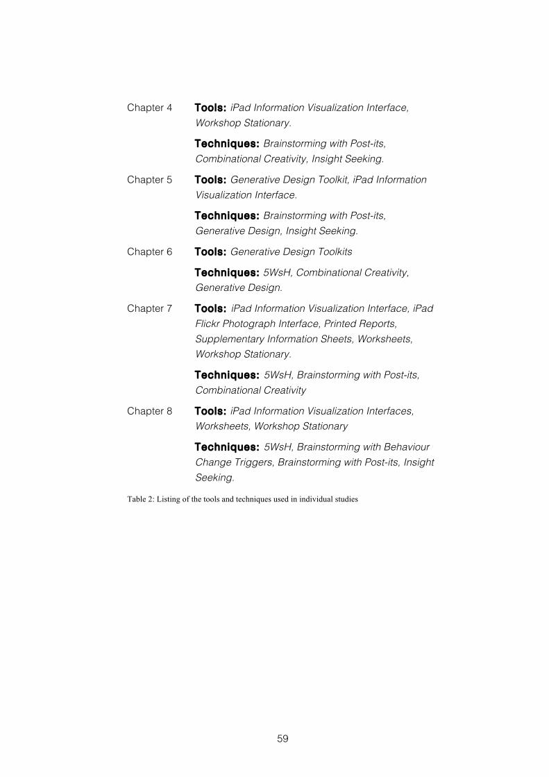
59
Chapter 4 Tools: iPad Information Visualization Interface, Workshop Stationary.
Techniques: Brainstorming with Post-its, Combinational Creativity, Insight Seeking.
Chapter 5 Tools: Generative Design Toolkit, iPad Information Visualization Interface.
Techniques: Brainstorming with Post-its, Generative Design, Insight Seeking.
Chapter 6 Tools: Generative Design Toolkits
Techniques: 5WsH, Combinational Creativity, Generative Design.
Chapter 7 Tools: iPad Information Visualization Interface, iPad Flickr Photograph Interface, Printed Reports, Supplementary Information Sheets, Worksheets, Workshop Stationary.
Techniques: 5WsH, Brainstorming with Post-its, Combinational Creativity
Chapter 8 Tools: iPad Information Visualization Interfaces, Worksheets, Workshop Stationary
Techniques: 5WsH, Brainstorming with Behaviour Change Triggers, Brainstorming with Post-its, Insight Seeking.
Table 2: Listing of the tools and techniques used in individual studies
60
3 Methods
3.1 Research Methods
In order for enquiry to qualify as research suitable for academic
recognition, it should meet the criteria of being “systematic enquiry
whose goal is communicable knowledge” (Archer, 1995). This
requires that: “it is pursued according to some plan”; “it seeks to
find answers to questions”; “the objects of the enquiry are posed by
the task description”; “the findings of the enquiry must go beyond
providing mere information”; and “the findings must be intelligible to,
and located within some framework of understanding for, an
appropriate audience” (Archer, 1995). To help assess whether
enquiries meet these criteria, particularly where they involve an
element of enquiry through practitioner activity, such as the case
studies reported in chapters 5, 6 and 8 of this thesis, Archer
suggests we ask seven questions:
1. Was the activity directed towards the acquisition of knowledge?
2. Was it systematically conducted?
3. Were the data explicit?
4. Was the record of the conduct of the activity “transparent”, in the
sense that a later investigator could uncover the same
information, replicate the procedures adopted, rehearse the
argument conducted and come to the same (or sufficiently
similar) conclusions?
5. Were the data employed, and the outcome arrived at validated
in appropriate ways?
6. Were the findings knowledge rather than information?
61
7. Was the knowledge transmissible to others?
Furthermore, to be considered useful design research, studies
should also aim for a degree of generalizability because this
“enables the designer to move from an endless succession of
unique cases to broad explanatory principles that can help solve
many kinds of problems” (Friedman, 2003). I will return to these
questions in section 9.4, where I will reflect on the methods adopted
in this research to provide evidence that it should be considered
suitable for academic recognition.
Generating the new design knowledge that makes the academic
contribution stated in section 1.2.2, and answers the research
question set in section 1.2.1 has largely been a pragmatic and
practical undertaking. Therefore, within this thesis I do not take a
dogmatic position with regards to the philosophy of design
research, but rather take what I feel to be the best and most useful
advice on a case-by-case basis. This pragmatic approach
combines simple design experiments, reported in chapters 4 and 7,
and situation specific case studies, reported in chapters 5, 6 and 8.
The aim of a design experiment is to explore the practice and
performance of design teams in an empirical study where variables
of interest are as far as possible controlled, while other factors
remain as representative of real world design contexts as possible.
Cash et al. (2012) argue that such experiments can be very useful in
showing possible trends and giving valuable insights into particular
design contexts.
The purpose of a design case study is to investigate the effects of
the intervention being studied in a particular real world context. Here
62
the researcher may be an active participant, devising, planning and
implementing the intervention, such research is termed Action
Research. Whilst the findings of such research may well be
situation-specific and non-objective, the value of Action Research to
design studies is widely acknowledged e.g. (Archer, 1995).
Such an approach is not novel. Design researchers have used
experimental studies for over forty years and such empirical study
forms a valuable part of design research providing insight in support
of theory generation (Cash et al., 2012). Likewise, studying the effects
of interventions made in a particular context is also valuable as it
can “produce insights which might otherwise never be obtained”
(Archer, 1995) and which can lead to hypotheses for testing in a
more generalised setting.
3.2 Evaluation Methods
To evaluate the research detailed in this thesis, I have attempted to
follow Cross (1999) in investigating three main factors: the people
designing, including empirical studies of designer’s behaviour; the
design processes they undertake, including the development and
application of techniques to help the designer; and the design
products that result. I have adopted a pragmatic, mixed methods
approach to evaluation and data collection in which I have
combined the responses from questionnaires with the qualitative
reflections of participating co-designers, evaluated the creativity of
design outputs, and analysed video data. Triangulating different
evaluation metrics is an approach that has been used successful in
evaluating creative experiences (Carroll & Latulipe, 2012).
63
Each of the studies reported in this thesis includes methods for
asking the people designing to provide data evaluating the design
processes they undertake. This data is provided through their
written reflections and their completed questionnaires. I have
labelled this evaluation: Support ing the People Designing .
Each of the studies reported also includes an evaluative measure of
the design products that result from the workshops. I have labelled
this evaluation: Assessing the Design Product . The two design
experiments reported in chapters 4 and 7 also use analysis of video
recordings to report on detailed aspects of how the people
designing perform the design processes they undertake. In these
design experiments I have labelled this evaluation:
Understanding the Design Process . Descriptions of the key
evaluation methods I have used are listed below.
3.2.1 Creativity Support Index
3.2.1.1 Data Collection
The Creativity Support Index (CSI) (Carroll et al., 2009) is a
standardised survey metric, similar to the NASA TLX questionnaire
(Hart & Staveland, 1988), and is used for evaluating the effectiveness
with which a given tool provides support for it’s user's creative
processes. It is a questionnaire made up of two parts. In the first
part, participants answer twelve questions, which assess six
different dimensions associated with creativity. These six
dimensions have been derived from the literature on creativity and
creativity support tools. They are: Collaboration, Enjoyment,
Exploration, Expressiveness, Immersion, and Results Worth Effort.
There are two questions for each dimension, each addressing it
64
from a slightly different perspective. In the second part of the CSI,
participants are asked to answer a total of fifteen questions that are
designed to assess the relative importance of each of the six
creativity support dimensions to the activity the participant has been
undertaking. The participants in the studies reported in chapters 7
and 8 were each given printed copies of the CSI questionnaire to
complete individually.
3.2.1.2 Data Analysis
To calculate an individual participant’s CSI evaluation score, I first
take the rating they gave for each of the six creativity support
dimensions. Following this, the rating they gave for the importance
of each of the creativity support dimensions to the activity they have
just undertaken is calculated. The product of these two values is
then standardised to give a score out of one hundred. This provides
a metric based not only on the effectiveness of the tool with relation
to the different dimensions of creativity support, but one that also
reflects the relative importance of each off these dimensions to the
creative task being undertaken; an indication of the extent to which
each participant felt that the tool they had been using supported
their own creative processes. The analysis of CSI evaluation scores
for the studies reported in chapters 7 and 8 are included in
Appendix D of this theses.
3.2.2 Evaluating Generative Design Outputs
3.2.2.1 Data Collection
The outputs generated in activities 1 and 5 of the E.ON workshop
reported in Chapter 5, and in each of the activities in the MIRROR
workshop reported in Chapter 6, resulted from the type of making
65
activities used in the Generative Design Research detailed in
section 2.4.2. They might best be described as collage and are
captured on the worksheets co-designers created. The video
recordings of co-designers explaining their design ideas and talking
through the things they have made provide supporting data here.
3.2.2.2 Data Analysis
Generative Design Research is typically research for the purpose of
design practice (Archer, 1995), and its qualitative outputs are
typically analysed rather than evaluated or assessed for creativity. In
order to evaluate these outputs, I built on guidance provided for
analysing their content (Sanders & Stappers, 2012, pp.197-206). I
sought to assess whether participants were gaining insight and
understanding from the CoDesign With Data activities that would
lead to creative design ideas. To do this I looked at the degree of
richness and detail in the representations co-designers created, as
this would provide evidence of their gaining and/or sharing an
improved understanding of the workshop’s domain context.
In the study reported in Chapter 5 examples of this richness and
detail might include: the way that insights found in the data were
explained with combinations of photos; the number of these
representations of data insight; the detail with which they are
represented; whether the insights found were connected to form a
consistent story; and how the stories created by different groups
differed from each other (thereby reflecting the individuality of the
participants creating them). In the study reported in Chapter 6
examples of this richness and detail might include: the detail with
which data are represented, e.g. the type of data, how they are
66
generated and where they are used; the number of implicit
connections between existing applications that had been made
explicit; and the number of new opportunities identified. The
processes and measures involved in these evaluations are
discussed in detail in their respective chapters. Examples of the
outputs generated in these activities are included in Appendix D of
this thesis.
3.2.3 Rating the Creativity of Design Outputs
3.2.3.1 Data Collection
A number of other workshop outputs were also assessed for
creativity. In the study reported in Chapter 4, the ideas generated
during each instance of Activity 3 in all the workshops were collated,
counted and rated. In the study reported in Chapter 6, the new
connection ideas from Activity 2 and the new use ideas from Activity
3 were collated and counted. In the study reported in Chapter 7,
individual ideas on post-it notes, generated during Activity 3, were
collated and counted, and the design concepts generated during
Activity 4, represented on hexagonal 5WsH worksheets, were rated.
In the study reported in Chapter 8 the Problem Statement generated
at the end of day 1 of the workshop, and the Selected Design Idea
described at the end of day 2 of the workshop, and captured on a
5WsH worksheet, were assessed. A full listing of the ideas
generated in Activity 3 of the study reported in Chapter 4 and in
Activity 3 of the study reported in Chapter 7, together with a
transcript of each of the design concepts generated in Activity 4 of
the study reported in Chapter 7 are included in Appendix D of this
thesis. The Problem Statement and Selected Design Idea from the
67
study reported in Chapter 8 are included in Appendix B of this
thesis.
3.2.3.2 Data Analysis
The first step in the analysis and rating of design ideas is to collate
all the ideas from a single study together. Each idea, either from an
individual post-it note or other representation such as a 5WsH
worksheet, is transcribed into a separate spreadsheet entry. Video
recordings of co-designers’ explanations of their design ideas are
also transcribed. Following this I then took two different approaches
to assessing the creativity of these design outputs. First, where there
were multiple ideas generated during a workshop activity, I
calculated the total number of ideas generated for each instance of
that activity. This gives a measure of fluency, which has been
identified as being an important attribute of creative thinking
(Guilford, 1966). It was an approach used to assess the outputs of
Activity 3 in Chapter 4, activities 2 and 3 in Chapter 6, and also
Activity 3 in Chapter 7.
The second approach is for the creativity of individual ideas to be
assessed through a rating. In these assessments of the creativity of
design ideas, two components are generally considered. These
components are novelty, and some notion of utility, such as
usefulness or appropriateness. This is because novelty and
appropriateness (or usefulness) are considered to be the two key
dimensions to many definitions of creativity, for example (Sternberg &
Lubart, 1999). Such an approach to evaluation is outlined in Dean et
al (2006) and has been previously used in Jones et al (2008). This
measurement can typically be done through the subjective ratings
68
of domain experts (Hocevar, 1981). In the study reported in Chapter
4, three independent domain experts assessed each idea
generated during Activity 3 for novelty and appropriateness. These
experts were two postdoctoral engineers and an experienced
domestic energy advisor.
In addition to measuring aspects of novelty and utility separately,
Amabile has argued that assessors are able to consistently rate
creative output as a single measure, using their own consensual
definition of creativity (Amabile, 1983). Following this, each output
from Activity 4 in the study reported in Chapter 7 was assessed by
participants, each of whom rated the ideas of all groups apart from
their own, for all three factors: creativity, novelty and usefulness.
Similarly, each of the two outputs from the study reported in Chapter
8 was assessed by three independent domain experts; including a
manager responsible for recycling and waste, a student union
official running a waste and recycling initiative, and an associate
editor of the UK’s leading materials and recycling magazine. These
evaluations are discussed in more detail in their respective
chapters. The collated assessments for each of the studies reported
are included in Appendix D of this thesis.
3.2.4 Reflection Postcards
The Reflection Postcard method of evaluating creativity support
during workshop activities is a novel method I developed during this
research. It was presented at the ACM CHI 2013 workshop
‘Evaluation methods for creativity support environments’ (Kerne et al.,
2013). A short paper is included in Appendix A of this thesis.
69
3.2.4.1 Data Collection
During a co-design workshop we often want to create and maintain
an atmosphere that is relaxed, supportive, engaging and playful.
However, we might also want to gather evaluation data whilst
participants’ experiences using the tools or techniques under
investigation are fresh, i.e. during the workshop itself. This can lead
to a conflict of interests. Stopping generative or ideation activities to
ask participants to complete questionnaires highlights academic
concerns, which may lead them to feel they are being tested. This
may cause anxiety, which has been shown to impact negatively on
creative processes during idea generation activities, for examples of
this see (Baas et al., 2008).
The Reflection Postcard method is a way of capturing evaluation
data that can become part of the workshop’s creative activities.
Participants are given individual postcards containing reflection
prompts derived from the study’s research questions, which are
used to assess selected aspects of the workshop’s activities. Each
postcard captures evaluation data similar to that gained from an
open questionnaire question, but uses a more playful form factor
that I believe is more appropriate to the workshop context. This is a
form factor familiar to many people and that is also evocative of
sharing experiences. The prompts should be relatively short and
directed towards answering a particular area of concern. The
postcards should feel personal, encourage reflection and allow
space for creative responses.
A typical example of the prompt used in a Reflection Postcard is:
“Please reflect on your involvement in the previous two
activities. Write a few sentences thinking in particular about how
70
engaged you were, how absorbed or distracted, and how easily
you feel you worked with other members of your team. Try to think
about the extent to which the technology helped or hindered you
in this regard”
This was used to address issues of engagement and collaboration
during the case study reported in Chapter 5. Another example
prompt is:
“Please reflect on your involvement in today’s workshop. Write a few
sentences thinking in particular about whether your
understanding of the subject matter has increased and if so which
were the particular elements of the workshop that helped you gain
this improved understanding.”
This was used to assess changes participants’ domain
understanding in the case study reported in Chapter 8. The prompts
on each of the Reflection Postcards given to participants during this
research can be found in the chapters reporting the studies in which
they are used. They are also included as part of Appendix C.
3.2.4.2 Data Analysis
The first step in analysing Reflection Postcards is to transcribe and
collate each participant’s response. Typically a single postcard will
be used to address two related areas of concern. Therefore, the
next step is to check that the participants’ response has addressed
each of these concerns. Following this, each response is placed into
one of five categories: totally positive, partially positive, neutral,
partially negative or totally negative. The purpose of these
categories is to gain a simple overview of the tone of participants’
responses that reflects the exploratory nature of this research.
71
Finally, individual quotes are taken from the responses to provide a
detailed illustration of participants’ views. The categorisation
process is explained below, using examples taken from the study
reported in Chapter 5
To be considered totally positive the participant’s response should
address each of the areas concerned with only positive comments.
This example shows a totally positive response to the issues of
collaboration and engagement:
“I felt that we worked well as a team and found it interesting to
decide on the type of family and their possible activities. The iPad
was useful in deciding the uses the family made of possible
equipment they had.”
To be considered partially positive the participant’s response might
use qualifying words like quite, as we see in this example, again
looking at collaboration and engagement:
“Generally felt quite interested in the tasks as they were quite fun, I
worked quite well with my team and the tech made it a lot easier to
look through the data.”
Another way in which a response might be considered partially
positive is if there is a mixture of positive and negative comments,
but where the overall response is still positive, as we see in this
example where engagement was considered totally positive but
collaboration partially positive:
“I felt engaged all the time; found it easy to concentrate and time
passed quickly. Worked easily with other team members.
Technology helped but with only one iPad it was difficult to analyse
all the data in the time allowed.”
72
Responses classed as neutral were generally those where a
particular concern was not addressed.
To be considered partially negative, a response might include
qualifying language, as seen in this example that was considered
partially negative for both gaining an overview and spotting patterns
and relationships:
“A bit difficult to get the info from the iPad. So some of the patterns
were not too easy to appreciate.”
Another way a response might be considered partially negative is if
it included a description of a problem or a negative experience that
was mitigated in some way, as seen in this example that was
considered partially negative for generating ideas and exploring
alternatives but neutral with regards to incorporating existing
knowledge:
“Not too easy to explore the ideas suggested by the iPad, but I did
get used to it!!”
To be considered totally negative, a response might report a
problem or a negative experience without any additional mitigating
details, as seen in this example that was considered totally negative
for both gaining an overview of the data and also spotting patterns
and relationships:
“It was difficult to form an overview as there seemed little
consistency in the data. If I knew the household this would be ok.
Very hard without some more information.”
Each use of Reflection Postcards is discussed further in the relevant
chapters. A full listing of all the analysed postcard responses can be
found in Appendix D of this thesis.
73
3.2.5 Video Analysis
3.2.5.1 Data Collection
In order to help me gain a better understanding of participants’
creative processes, each of the design experiments reported in
chapters 4 and 7 were video recorded. In each workshop
undertaken for these studies a single video camera was placed at a
distance that would not interfere with participants’ activities but
would capture an overview of their actions, together with their
associated conversations.
3.2.5.2 Data Analysis
To better understand the specific activities under investigation, key
segments of these video recordings were selected for close
analysis. These key segments were selected using a critical incident
approach in which “important facts concerning behaviour in defined
situations” are extracted using a technique in which “only simple
types of judgement are required of the observer” (Flanagan, 1954).
In the study reported in Chapter 4, it is participants’ insight seeking
and sensemaking activities that are under investigation. In this
chapter, a thematic analysis (Braun & Clarke, 2006) based on
theories of sensemaking (Pirolli & Card, 2005; Russell et al., 1993) was
used to explain participants’ behaviour. In the study reported in
Chapter 7, it is the way in which participants’ ideas emerge during
divergent ideation sessions in which they are given one of two
digital design artefacts as a source of inspiration that is
investigated, using a microanalysis technique of critical incidents
(Flanagan, 1954) that describe this behaviour. These examples of
74
video analysis are discussed in detail in their respective chapters.
Examples of the transcribed video data taken from these studies are
included in Appendix D of this thesis.
3.2.6 Additional Evaluation Methods
In addition to the methods described above, other evaluation
methods used during this research include: questionnaires to
assess the importance of the tools and techniques under
investigation, and the influence of these tools and techniques on
participants’ design ideas; analysis of the provenance of design
ideas; and thematic analysis (Braun & Clarke, 2006) of design outputs
to assess sensemaking. Further details of these evaluation methods
are included in the relevant chapters. Examples of the
questionnaires can be found in Appendix C and of the analysed
data in Appendix D of this thesis.
3.3 Roadmap to the Individual Studies
Chapter 4 through to Chapter 8 report individual studies in which the
particular workshop details describe the method adopted, the
activities undertaken represent the techniques chosen, and the
information visualization interfaces and materials used make up the
tools. Each of these chapters also includes a reflection upon the
activities undertaken, the materials used, the evaluation methods
adopted, and the lessons learnt. This is to provide space to discuss
the overall development of the CoDesign With Data approach, whilst
using the discussion section of these chapters to discuss the
findings of the individual studies. It follows Schön’s understanding of
“[d]esign as a reflective conversation with the situation” (Schön, 1995,
75
p.76), where the design situation is the development of the
CoDesign With Data approach itself. Each of these chapters also
describes the particular research and evaluation methods adopted
for that study. Finally, each of these chapters also finishes with a
brief takeaway outlining the lessons from the study that can be
offered to design practice. A list of the evaluation methods used in
each study is provided below:
Chapter 4 Questionnaires; Rating the creativity of design outputs; Thematic analysis of design outputs; Tracing the provenance of ideas; Video analysis.
Chapter 5 Evaluating generative design outputs; Reflection Postcards.
Chapter 6 Evaluating generative design outputs; Reflection Postcards.
Chapter 7 Creativity Support Index; Questionnaires; Rating the creativity of design outputs; Video analysis.
Chapter 8 Creativity Support Index; Questionnaires; Rating the creativity of design outputs; Reflection Postcards; Tracing the provenance of design ideas.
Table 3: Listing of evaluation methods used in this thesis
Figure 3 presents a graphical representation of the roadmap to the
individual studies reported in chapters 4 to 8. It shows the
development of the tools, techniques and evaluation methods used
in this research, highlighting where they were first used and how
their use progressed.
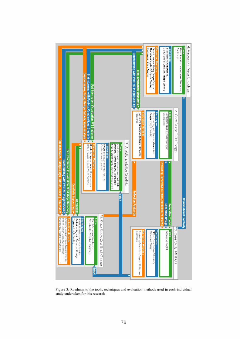
76
Figure 3: Roadmap to the tools, techniques and evaluation methods used in each individual study undertaken for this research
77
4 Ambiguity in Visual Encodings
This design experiment begins to investigate how best to present
domain-relevant data to workshop participants. It studies the effects
of increasing the ambiguity in the visual encoding with which smart
energy data are represented on participants’ ability to gain insight
from these data, and on the creativity of their subsequent design
ideas. Increasing the ambiguity in the visual encoding is found to
have a negative impact on participants’ sensemaking and therefore
their ability to gain insight. This in turn led to design ideas that were
considered significantly less appropriate to the domain of domestic
energy. A paper detailing this design experiment was presented at
the ACM Designing Interactive Systems Conference DIS 2014, in
Vancouver June 2014 (Dove & Jones, 2014(b)), and is included in
Appendix A of this thesis. The study was conducted as part of the
“Visualising the smart home: creative engagement with customer
data” (E.ON International Research Initiative, 2012) project, funded by
the E.ON International Research Initiative.
4.1 Introduction
Design problems often exist in a complex and messy context,
without stopping points, and with a high degree of associated
ambiguity. Such ambiguity is a reflection of the difficulties of what
have become known as wicked problems (Rittel & Webber, 1973;
Buchanan, 1992). Yet the same ambiguity also provides an
opportunity or a resource that can be embraced, both during the
78
design process (Sanders, 2001), and in the designed artefact (Gaver
et al., 2003).
In section 2.4.2 we saw how ambiguous stimuli are used in
generative design research, where they are employed in toolkits to
inspire workshop participants’ exploration of experience and desire
(Sanders, 2000; Sanders, 2001; Sanders, 2005). In another example,
Gaver and Dunne (1999) use ambiguity as a key feature of the
artefacts created for cultural probe packages given to older
residents of a large Dutch housing development to elicit creative
responses to design research questions. Similarly, Cruz and
Gaudron (2010) exploit ambiguity with Open-ended objects,
employed as a preparatory tool in design workshops. In addition,
there are also many practitioner-oriented and commercial
approaches to applied creativity, especially those used in design,
which urge followers to be comfortable with ambiguity in their own
creative thinking, and to experiment playfully with the many
possibilities it can present e.g. (Brady, 2012; IDEO, 2013).
Several lines of research in the psychological study of creativity also
suggest that working successfully with ambiguous stimuli is likely to
be associated with creative outcomes. This relationship, between a
tolerance of ambiguity and creativity, was highlighted in Guilford’s
foundational research (Guilford, 1957). Vernon considered it to be a
necessary condition for creative personalities, because it permits
individuals to be satisfied with partial or sub-optimal solutions to
complex problems (Vernon, 1970). Sternberg & Lubart suggest that a
tolerance of ambiguity enables people to remain open and continue
working through complex situations longer, thereby increasing the
79
probability that they will discover a novel solution (Sternberg & Lubart,
1995), and Zenasni, Besançon and Lubart have demonstrated the
relationship empirically (Zenasni et al., 2008).
In section 2.5.1, we saw how information visualization techniques
can offer a number of different ways to represent data. The data
graphics described by influential authors such as Few (2006; 2009)
and Tufte (1983), in which the clear and unambiguous presentation
of quantitative data for analytical exploration is valued, are widely
familiar through their association with business analytics. However,
we also saw a number of alternative categories of information
visualization design style including: casual information visualization
(Pousman et al., 2007), artistic visualization (Kosara, 2007; Viégas &
Wattenberg, 2007), and direct visualization (Manovich, 2011). Each of
these shows that information visualization techniques are not
restricted to the unambiguous representation of quantitative data.
Moreover, Manovich also argues that any mapping between data
and representation is potentially arbitrary, and that information
visualization techniques might therefore explicitly display the
ambiguity inherent in experience (Manovich, 2002).
4.2 Research Question
In developing the CoDesign With Data approach I am asking how
domain-relevant data might be used to help co-designers find
insight, and inspire creative design ideas. Therefore, investigating
appropriate ways to represent these data for workshop participants
is a fundamental research interest for me. For the reasons outlined
above, the degree of ambiguity in the visual encoding, i.e. the
80
mapping between data elements and graphical elements, is an
important variant in the information visualization design space for
me to explore. In this design experiment I wanted to know what the
effects of increasing the ambiguity in the visual encoding would
have on the creativity of participants’ design ideas. To help
understand this, I also want to know the impact on participants’
ability to gain insight into the underlying data.
My initial exploration of this area was guided by the following
research question:
RQ4 What would be the effects of increasing the ambiguity in the
visual encoding used to represent smart energy data on
workshop participants’ ability to gain insight, and on the creativity
of the product and service ideas those participants subsequently
generate?
An opportunity to investigate this question came through my
involvement in the “Visualising the smart home: creative
engagement with customer data” (E.ON International Research
Initiative, 2012) project. Here, we were working with E.ON Energy to
creatively use the data generated by smart energy meters to inspire
design ideas that would benefit consumers and help to reduce peak
energy demands. Before holding a workshop with E.ON customers
and staff, see Chapter 5 of this thesis, I wanted to better understand
how the smart energy data should be represented. To achieve this,
and answer my research question, I carried out a design experiment
in which ambiguity in the visual encoding was the variable under
consideration. The reasons for undertaking design experiments are
discussed in section 3.1.
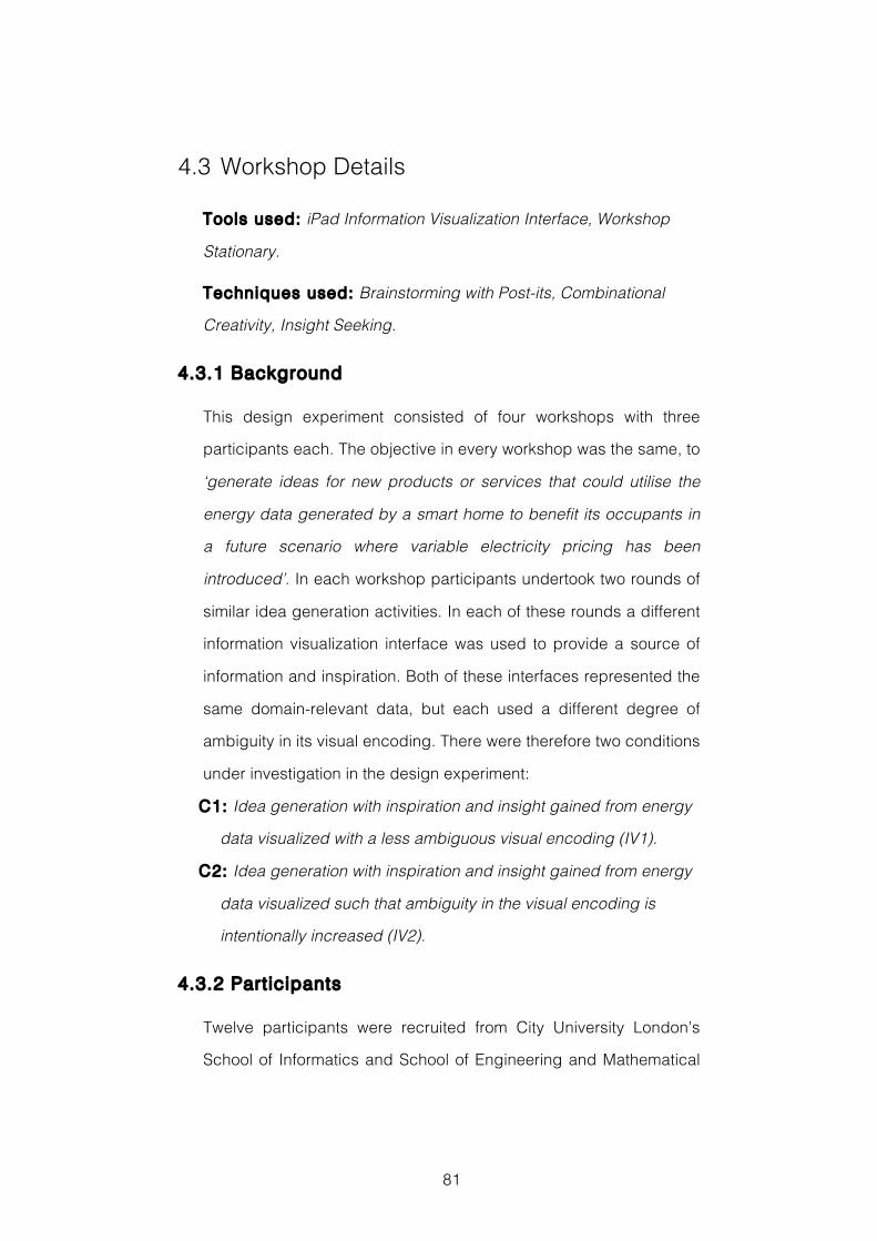
81
4.3 Workshop Details
Tools used: iPad Information Visualization Interface, Workshop
Stationary.
Techniques used: Brainstorming with Post-its, Combinational
Creativity, Insight Seeking.
4.3.1 Background
This design experiment consisted of four workshops with three
participants each. The objective in every workshop was the same, to
‘generate ideas for new products or services that could utilise the
energy data generated by a smart home to benefit its occupants in
a future scenario where variable electricity pricing has been
introduced’. In each workshop participants undertook two rounds of
similar idea generation activities. In each of these rounds a different
information visualization interface was used to provide a source of
information and inspiration. Both of these interfaces represented the
same domain-relevant data, but each used a different degree of
ambiguity in its visual encoding. There were therefore two conditions
under investigation in the design experiment:
C1: Idea generation with inspiration and insight gained from energy
data visualized with a less ambiguous visual encoding (IV1).
C2: Idea generation with inspiration and insight gained from energy
data visualized such that ambiguity in the visual encoding is
intentionally increased (IV2).
4.3.2 Participants
Twelve participants were recruited from City University London’s
School of Informatics and School of Engineering and Mathematical
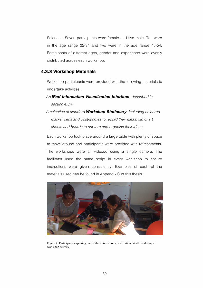
82
Sciences. Seven participants were female and five male. Ten were
in the age range 25-34 and two were in the age range 45-54.
Participants of different ages, gender and experience were evenly
distributed across each workshop.
4.3.3 Workshop Materials
Workshop participants were provided with the following materials to
undertake activities:
An iPad Information Visualization Interface, described in
section 4.3.4.
A selection of standard Workshop Stat ionary, including coloured
marker pens and post-it notes to record their ideas, flip chart
sheets and boards to capture and organise their ideas.
Each workshop took place around a large table with plenty of space
to move around and participants were provided with refreshments.
The workshops were all videoed using a single camera. The
facilitator used the same script in every workshop to ensure
instructions were given consistently. Examples of each of the
materials used can be found in Appendix C of this thesis.
Figure 4: Participants exploring one of the information visualization interfaces during a workshop activity
83
4.3.4 Visualization Interface Design
This study used two custom designed interfaces. Interface IV1 was
designed with a less ambiguous visual encoding, and interface IV2
was designed with ambiguity in the visual encoding intentionally
increased. Both were developed using the D3 JavaScript library
(Bostock et al., 2011), and presented to participants using iPads (see
Figure 4), for reasons discussed in section 2.5.2.2.
4.3.4.1 Data
The same data were visualized in both interfaces. These data were
randomly selected from a set of anonymised electricity consumption
data generated by the smart plugs and smart meters deployed in a
test-bed of one hundred and thirty households that make up a long-
term technology trial in Milton Keynes, UK. These represent
consumption records for selected appliances named by the
household (e.g. refrigerator or T.V.), and for total electricity
consumption, all generated at three-minute intervals.
4.3.4.2 IV1: Less Ambiguous Visual Encoding
4.3.4.2.1 Visual Design
Interface IV1, Figure 5 and Figure 6, is designed with a less
ambiguous visual encoding. It is based on a dashboard style of
interface that utilizes features including a bar chart to show
consumption within price bands; a linear timeline and bubble chart
to show consumption through 24 hours; and area charts to show
percentage of consumption in price bands. Each of these elements
is commonplace within information visualization design. IV1 follows
guidelines for designing quantitative data clearly and
84
unambiguously to enable analytical exploration, found in Few (2006;
2009) and Tufte (1983). In particular, Tufte advises that it is
important to include “Clear detailed and thorough labelling to defeat
graphical distortion and ambiguity. Write out explanations of the
data on the graphic itself. Label important events in the data.” (Tufte,
1983, p.56) Few describes well-designed dashboard interfaces as
delivering information that is: “[d]isplayed using concise and often
small media that communicate the data and its message in the
clearest and most direct way possible” (Few, 2006, p.98). In this
interface, the days, appliances and units of measure (cost and
kilowatt hours) are clearly labelled, and easily identifiable scales are
used to help fix the values of data items in users’ minds.
4.3.4.2.2 Interaction
IV1 is an interactive information visualization interface. The data in
IV1 are filtered via buttons: along the bottom, representing the
appliance types; along the top, representing days of the week; and
on the right hand side of the interface, representing the units of
measure. Figure 5 shows IV1 in its default state displaying the data
for total electricity consumption, on Monday, and measured in
kilowatt-hours. The filtering is AND filtering, Figure 6 shows how the
updated data reflect selection of the washing machine from the
appliances list, Thursday from the days, and cost, as a unit of
measure. These selections update each element of the visual
interface to reflect the corresponding data values. Interface IV1 is
available to use online12
12 www.grahamdove.com/eon/infovis1.html
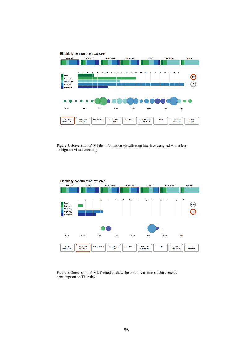
85
Figure 5: Screenshot of IV1 the information visualization interface designed with a less ambiguous visual encoding
Figure 6: Screenshot of IV1, filtered to show the cost of washing machine energy consumption on Thursday
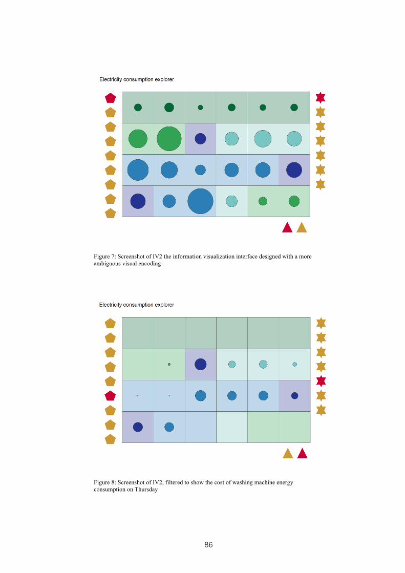
86
Figure 7: Screenshot of IV2 the information visualization interface designed with a more ambiguous visual encoding
Figure 8: Screenshot of IV2, filtered to show the cost of washing machine energy consumption on Thursday
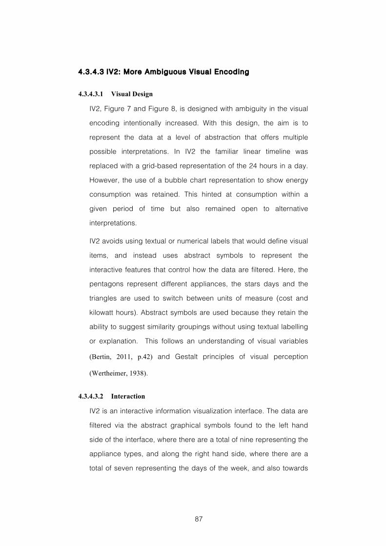
87
4.3.4.3 IV2: More Ambiguous Visual Encoding
4.3.4.3.1 Visual Design
IV2, Figure 7 and Figure 8, is designed with ambiguity in the visual
encoding intentionally increased. With this design, the aim is to
represent the data at a level of abstraction that offers multiple
possible interpretations. In IV2 the familiar linear timeline was
replaced with a grid-based representation of the 24 hours in a day.
However, the use of a bubble chart representation to show energy
consumption was retained. This hinted at consumption within a
given period of time but also remained open to alternative
interpretations.
IV2 avoids using textual or numerical labels that would define visual
items, and instead uses abstract symbols to represent the
interactive features that control how the data are filtered. Here, the
pentagons represent different appliances, the stars days and the
triangles are used to switch between units of measure (cost and
kilowatt hours). Abstract symbols are used because they retain the
ability to suggest similarity groupings without using textual labelling
or explanation. This follows an understanding of visual variables
(Bertin, 2011, p.42) and Gestalt principles of visual perception
(Wertheimer, 1938).
4.3.4.3.2 Interaction
IV2 is an interactive information visualization interface. The data are
filtered via the abstract graphical symbols found to the left hand
side of the interface, where there are a total of nine representing the
appliance types, and along the right hand side, where there are a
total of seven representing the days of the week, and also towards
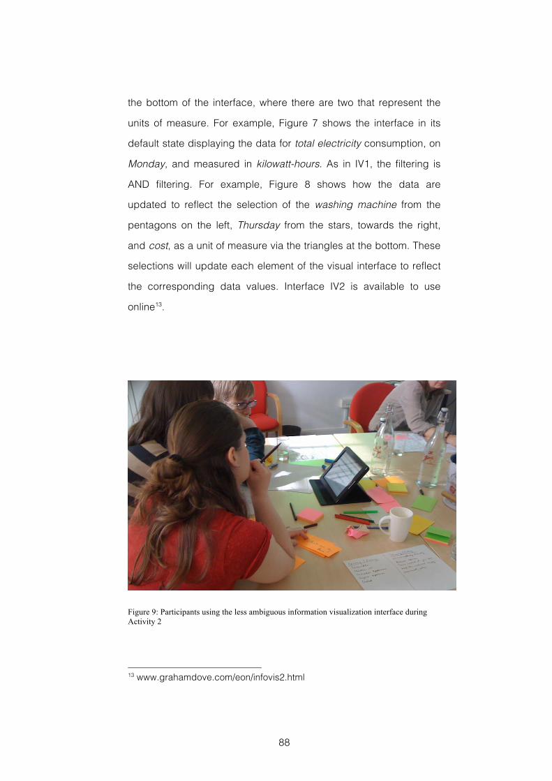
88
the bottom of the interface, where there are two that represent the
units of measure. For example, Figure 7 shows the interface in its
default state displaying the data for total electricity consumption, on
Monday, and measured in kilowatt-hours. As in IV1, the filtering is
AND filtering. For example, Figure 8 shows how the data are
updated to reflect the selection of the washing machine from the
pentagons on the left, Thursday from the stars, towards the right,
and cost, as a unit of measure via the triangles at the bottom. These
selections will update each element of the visual interface to reflect
the corresponding data values. Interface IV2 is available to use
online13.
Figure 9: Participants using the less ambiguous information visualization interface during Activity 2
13 www.grahamdove.com/eon/infovis2.html
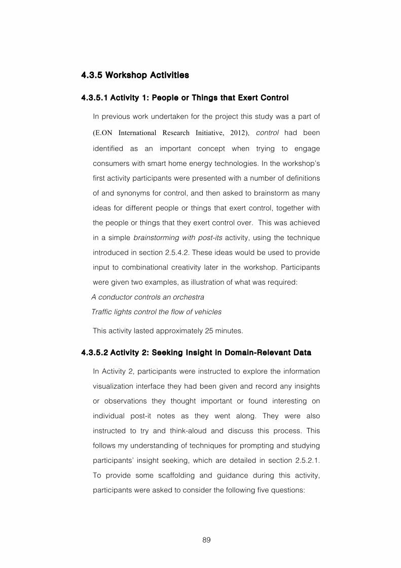
89
4.3.5 Workshop Activit ies
4.3.5.1 Activity 1: People or Things that Exert Control
In previous work undertaken for the project this study was a part of
(E.ON International Research Initiative, 2012), control had been
identified as an important concept when trying to engage
consumers with smart home energy technologies. In the workshop’s
first activity participants were presented with a number of definitions
of and synonyms for control, and then asked to brainstorm as many
ideas for different people or things that exert control, together with
the people or things that they exert control over. This was achieved
in a simple brainstorming with post-its activity, using the technique
introduced in section 2.5.4.2. These ideas would be used to provide
input to combinational creativity later in the workshop. Participants
were given two examples, as illustration of what was required:
A conductor controls an orchestra
Traffic lights control the flow of vehicles
This activity lasted approximately 25 minutes.
4.3.5.2 Activity 2: Seeking Insight in Domain-Relevant Data
In Activity 2, participants were instructed to explore the information
visualization interface they had been given and record any insights
or observations they thought important or found interesting on
individual post-it notes as they went along. They were also
instructed to try and think-aloud and discuss this process. This
follows my understanding of techniques for prompting and studying
participants’ insight seeking, which are detailed in section 2.5.2.1.
To provide some scaffolding and guidance during this activity,
participants were asked to consider the following five questions:
90
‘What do you see?’
‘What do you think it is for?’
‘What are you thinking whilst you explore?’
‘What do you notice in the visualization?’
‘What story does it tell?’
This activity typically lasted approximately 25 minutes.
4.3.5.3 Activity 3: Generating Product and Service Ideas
In this activity participants were instructed to select one of the
outputs from Activity 1 and one of the outputs from Activity 2, and
combine them to inspire an idea for a new product or service that
would utilise smart home energy data to benefit the occupants of
that home. The background to this type of combinational creativity
technique is described in section 2.5.4.3. Participants were
instructed to repeat this process as often as they could, re-using
ideas from Activity 1 and Activity 2 as often as they liked and in any
combination they chose. Each idea was recorded on a separate
post-it note. After about twenty minutes participants briefly
explained their ideas to camera. These were later transcribed and
given to the independent domain experts who would evaluate them
for novelty and appropriateness.
4.3.5.4 Repeat Activi ty 2 and Activity 3
After a short break and refreshments, participants were asked to
repeat Activity 2 using the second information visualization interface,
and then to repeat Activity 3, combining the outputs of Activity 1 with
those generated in the second instantiation of Activity 2.
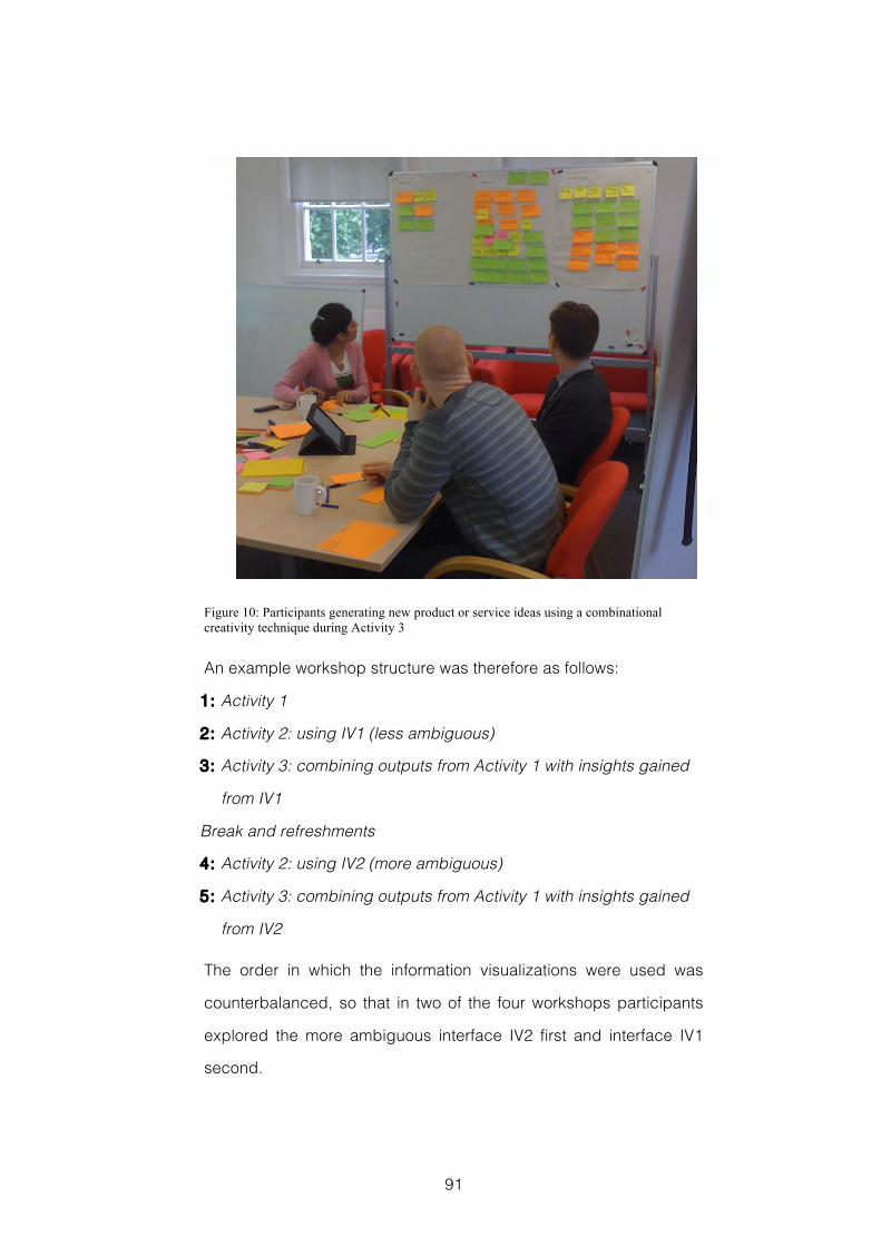
91
Figure 10: Participants generating new product or service ideas using a combinational creativity technique during Activity 3
An example workshop structure was therefore as follows:
1: Activity 1
2: Activity 2: using IV1 (less ambiguous)
3: Activity 3: combining outputs from Activity 1 with insights gained
from IV1
Break and refreshments
4: Activity 2: using IV2 (more ambiguous)
5: Activity 3: combining outputs from Activity 1 with insights gained
from IV2
The order in which the information visualizations were used was
counterbalanced, so that in two of the four workshops participants
explored the more ambiguous interface IV2 first and interface IV1
second.
92
4.4 Evaluation Methods
My aim with this design experiment was to investigate the effects of
increasing the ambiguity in the visual encoding used to represent
smart energy data on the workshop participants’ design ideas. To
help understand this, I also wanted to know the impact of increased
ambiguity on participants’ ability to gain insight into the underlying
data. Based on my understanding of the literature discussed in
section 4.1 I thought that an increase in ambiguity might reduce the
appropriateness of the ideas generated, as a result of difficulties in
participants’ insight seeking. However, I thought it also possible that
an increase in ambiguity might lead to increased novelty because of
the greater space available for imaginative leaps.
To help answer the research question outlined in section 4.2, I
gathered evaluation data in five ways. First, after each round of
workshop activities, participants were given a questionnaire to
complete. Second, all the product or service ideas generated in
each round of Activity 3 were collated and transcribed; these were
then given to domain experts to rate for novelty and
appropriateness. Third, the post-it notes on which participants wrote
their observations in each round of Activity 2 were collated and
sorted to help evaluate their insight seeking. Fourth, video data of
participants using the information visualizations interfaces in each
round of Activity 2 were analysed. This was again to help
understand their insight seeking. Finally, I traced the provenance of
the elements that were combined to generate the most appropriate
idea that emerged. Each of these is discussed in more detail during
the following sections.
93
The evaluation methods used in this study, and the data collected
will be discussed in terms of Supporting the People Designing,
Assessing the Design Product, and Understanding the Design
Process. This structure follows Cross (1999), and is explained in
more detail in section 3.2.
4.4.1 Supporting the People Designing
The questionnaire given to participants after each round of Activity 3
consisted of seven questions. Four of these, Q1 to Q4, were derived
from the Creativity Support Index (Carroll et al., 2009), a standardised
survey metric for measuring the support that tools provide for
creative processes, which is discussed in more detail in section
3.2.1. These were:
Q1: I was very engaged and absorbed using the visualization. I
enjoyed it and would do it again.
Q2: I was prompted to generate ideas that were new and varied.
Q3: I was able to work together with others easily.
Q4: I felt able to explore many different options, ideas or outcomes.
The final three questions were concerned with the extent to which
the tools and techniques used in Activity 2 supported participants’
insight seeking whilst they explored the smart energy data. These
questions were derived from research describing how users gain
insight from information visualization undertaken by Yi et al (2008)
and North (2006). They were:
Q5: I could easily identify relationships and patterns in the data that
contributed to new ideas.
Q6: It was easy for me to gain an overview of the data using the
visualization.
94
Q7: I was able to combine my existing knowledge with insights from
exploring the visualization to generate ideas that I had not
previously considered.
Responses to all questions were collected using a Likert scale rating
from 1 strongly agree to 5 strongly disagree. To analyse the
questionnaire data, I first collated the individual responses.
Following this, I first used Levene’s test of equality of variance,
followed this with the relevant Student’s or Welch’s t-test, and finally
used Cohen’s d measure of effect size for those results that were
significant.
4.4.2 Assessing the Design Product
To evaluate the creativity of design ideas that were generated in
each round of Activity 3, I looked at three factors. First I looked at
the total number of ideas generated under each condition, to give a
measure of fluency, an important attribute of creative thinking
(Guilford, 1966). Having looked at the fluency with which participants
generated ideas during Activity 3, the next step was to look at the
appropriateness of these ideas. To do this, the ideas from each
round of Activity 3 had been transcribed, collated and their order
randomized, they were then presented to three separate domain
experts. The experts included two postdoctoral engineering
researchers, working on the wider project, and a member of the
research team with over three years experience in advising and
helping domestic energy consumers. These domain experts were
also asked to rate each idea from 0 to 5 for appropriateness, based
on their view of the idea’s usefulness within the domain of domestic
smart home energy services and it’s fit to the workshops’ objective,
95
‘generate ideas for new products or services that could utilise the
energy data generated by a smart home to benefit its occupants in
a future scenario where variable electricity pricing has been
introduced’. The other key facet of creativity under investigation in
this evaluation is novelty. To assess this, the same domain experts
were also asked to rate each of the transcribed ideas generated
during the different rounds of Activity 3, from 0 to 5 for novelty. This
they based on their understanding of how new the idea was to the
domain of domestic smart home energy services. The background
to this approach to evaluating the creativity of workshop outputs is
described in more detail in section 3.2.3.
To statistically compare the fluency of participants’ idea generation,
and the appropriateness and novelty of those ideas generated, I
adopted the same approach as with the questionnaire data. Again, I
first used Levene’s test of equality of variance, and followed this with
the relevant Student’s or Welch’s t-test, before finally applying
Cohen’s d measure of effect size for those results that were
significant.
In addition to assessing the design products that were generated in
each round of Activity 3, I also looked at the outputs from each
round of Activity 2. This was to help me understand and evaluate
participants insight seeking using each of the information
visualization interfaces. Yi et al (2008) have suggested using models
of sensemaking such as those proposed by Pirolli and Card (2005)
and Russell et al (1993), to help understand the process through
which users gain insight from information visualization. These
models describe how people:
96
1: Iteratively search the available information in order to create
useful mental representations.
2: Instantiate and manipulate these representations to create
possible schemas that describe the subject currently of interest.
3: Investigate these schemas to develop new insight on the subject.
4: Use these insights to generate new knowledge products.
To help understand participants’ insight seeking during Activity 2,
my focus was on the first three stages of these models. If
successful, this would result in participants’ gaining, and recording
on a post-it, new insights. On this basis, four distinct categories of
post-it note data were identified:
Data Insight (DI): An insight gained into the underlying data. In
sensemaking this would be the point where investigating a
schema produced new insight.
Data Hypothesis or Question (DQ): A hypothesis or question
about what the data being visualized represent. In sensemaking
this is where schema are being instantiated, manipulated and
investigated.
Observation About Use (OU): A suggestion for a context in
which the visualization would be useful or an observation about its
purpose. In sensemaking this is the initial search for useful mental
representations.
Observation About the Interface (OI): A statement, comment,
question or criticism of some part of the visualization’s interface or
interactions. In sensemaking this is the initial search for useful
mental representations.
Once again, to analyse differences in the number of post-its that fell
into each category following the sorting process, I first used
97
Levene’s test of equality of variance. I followed this with the relevant
Student’s or Welch’s t-test, and finally used Cohen’s d measure of
effect size for those results that were significant.
The final stage of my analysis of the design products was to look at
the idea that had been given the highest average score for
appropriateness, and to trace the elements that had been combined
to generate this idea. This was done with the aim of identifying
whether the idea was the result of a successful episode of
sensemaking, and if so, using which information visualization
interface.
4.4.3 Understanding the Design Process
The aspect of the design process of most interest in this evaluation
was the insight seeking during Activity 2. To facilitate this evaluation
I analysed the video recordings from each workshop. In this analysis
the conversation and activity surrounding periods where
participants were interacting with the information visualization during
each round of Activity 2 were transcribed. Following this, a thematic
analysis technique (Braun & Clarke, 2006) was used to assess the
effectiveness of these episodes of attempted sensemaking
behaviour. This thematic analysis used a coding scheme that was
based on the four categories of post-it I had derived from models of
sensemaking (Pirolli & Card, 2005; Russell et al., 1993), and which is
described above.
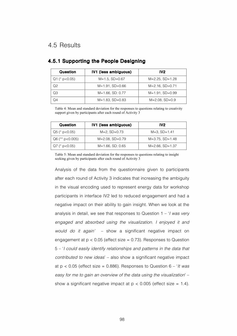
98
4.5 Results
4.5.1 Supporting the People Designing
Question IV1 ( less ambiguous) IV2
Q1 (* p<0.05) M=1.5, SD=0.67 M=2.25, SD=1.28
Q2 M=1.91, SD=0.66 M=2.16, SD=0.71
Q3 M=1.66, SD: 0.77 M=1.91, SD=0.99
Q4 M=1.83, SD=0.83 M=2.08, SD=0.9
Table 4: Mean and standard deviation for the responses to questions relating to creativity support given by participants after each round of Activity 3
Question IV1 ( less ambiguous) IV2
Q5 (* p<0.05) M=2, SD=0.73 M=3, SD=1.41
Q6 (** p<0.005) M=2.08, SD=0.79 M=3.75, SD=1.48
Q7 (* p<0.05) M=1.66, SD: 0.65 M=2.66, SD=1.37
Table 5: Mean and standard deviation for the responses to questions relating to insight seeking given by participants after each round of Activity 3
Analysis of the data from the questionnaire given to participants
after each round of Activity 3 indicates that increasing the ambiguity
in the visual encoding used to represent energy data for workshop
participants in interface IV2 led to reduced engagement and had a
negative impact on their ability to gain insight. When we look at the
analysis in detail, we see that responses to Question 1 – ‘I was very
engaged and absorbed using the visualization. I enjoyed it and
would do it again’ – show a significant negative impact on
engagement at p < 0.05 (effect size = 0.73). Responses to Question
5 – ‘I could easily identify relationships and patterns in the data that
contributed to new ideas’ – also show a significant negative impact
at p < 0.05 (effect size = 0.886). Responses to Question 6 – ‘It was
easy for me to gain an overview of the data using the visualization’ –
show a significant negative impact at p < 0.005 (effect size = 1.4).
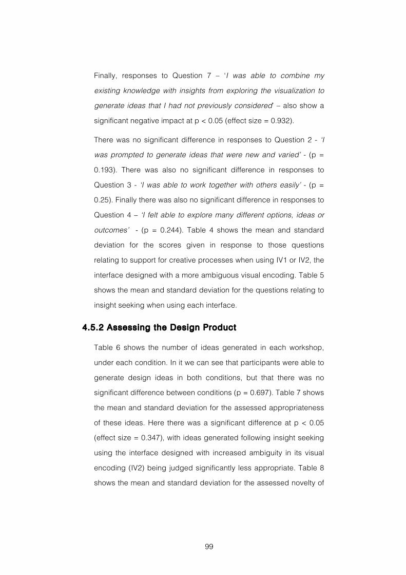
99
Finally, responses to Question 7 – ‘I was able to combine my
existing knowledge with insights from exploring the visualization to
generate ideas that I had not previously considered’ – also show a
significant negative impact at p < 0.05 (effect size = 0.932).
There was no significant difference in responses to Question 2 - ‘I
was prompted to generate ideas that were new and varied’ - (p =
0.193). There was also no significant difference in responses to
Question 3 - ‘I was able to work together with others easily’ - (p =
0.25). Finally there was also no significant difference in responses to
Question 4 – ‘I felt able to explore many different options, ideas or
outcomes’ - (p = 0.244). Table 4 shows the mean and standard
deviation for the scores given in response to those questions
relating to support for creative processes when using IV1 or IV2, the
interface designed with a more ambiguous visual encoding. Table 5
shows the mean and standard deviation for the questions relating to
insight seeking when using each interface.
4.5.2 Assessing the Design Product
Table 6 shows the number of ideas generated in each workshop,
under each condition. In it we can see that participants were able to
generate design ideas in both conditions, but that there was no
significant difference between conditions (p = 0.697). Table 7 shows
the mean and standard deviation for the assessed appropriateness
of these ideas. Here there was a significant difference at p < 0.05
(effect size = 0.347), with ideas generated following insight seeking
using the interface designed with increased ambiguity in its visual
encoding (IV2) being judged significantly less appropriate. Table 8
shows the mean and standard deviation for the assessed novelty of
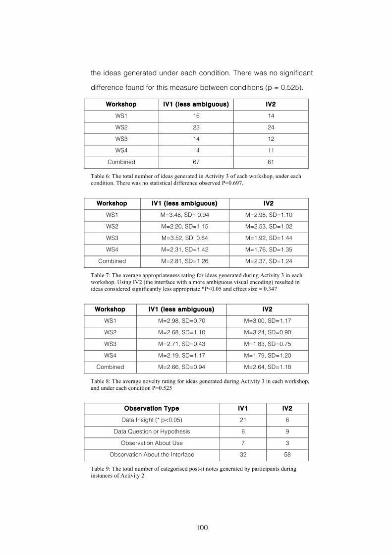
100
the ideas generated under each condition. There was no significant
difference found for this measure between conditions (p = 0.525).
Workshop IV1 ( less ambiguous) IV2
WS1 16 14
WS2 23 24
WS3 14 12
WS4 14 11
Combined 67 61
Table 6: The total number of ideas generated in Activity 3 of each workshop, under each condition. There was no statistical difference observed P=0.697.
Workshop IV1 ( less ambiguous) IV2
WS1 M=3.48, SD= 0.94 M=2.98, SD=1.10
WS2 M=2.20, SD=1.15 M=2.53, SD=1.02
WS3 M=3.52, SD: 0.84 M=1.92, SD=1.44
WS4 M=2.31, SD=1.42 M=1.76, SD=1.35
Combined M=2.81, SD=1.26 M=2.37, SD=1.24
Table 7: The average appropriateness rating for ideas generated during Activity 3 in each workshop. Using IV2 (the interface with a more ambiguous visual encoding) resulted in ideas considered significantly less appropriate *P<0.05 and effect size = 0.347
Workshop IV1 ( less ambiguous) IV2
WS1 M=2.98, SD=0.70 M=3.00, SD=1.17
WS2 M=2.68, SD=1.10 M=3.24, SD=0.90
WS3 M=2.71, SD=0.43 M=1.83, SD=0.75
WS4 M=2.19, SD=1.17 M=1.79, SD=1.20
Combined M=2.66, SD=0.94 M=2.64, SD=1.18
Table 8: The average novelty rating for ideas generated during Activity 3 in each workshop, and under each condition P=0.525
Observation Type IV1 IV2
Data Insight (* p<0.05) 21 6
Data Question or Hypothesis 6 9
Observation About Use 7 3
Observation About the Interface 32 58
Table 9: The total number of categorised post-it notes generated by participants during instances of Activity 2
101
In Table 9 we see analysis of the different categories of post-it note
created under each condition in Activity 2. This provides evidence
to help explain the differences in participants’ insight seeking and
idea generation when using the different information visualization
interfaces. Here we see that increasing the ambiguity in the visual
encoding used in interface IV2 had a significant negative impact at
p < 0.05 (effect size = 1.884) on the number of observations that
were subsequently categorized as Data Insight. The differences
seen between the numbers of post-it notes in each of the other
categories was not found to be significant. These were: post-its
categorised as Data Hypothesis or Question (p = 0.723); post-its
categorised as Observation About Use (p = 0.426); and post-its
categorised as Observation About the Interface (p = 0.113).
Finally for this section I investigated how the idea that received the
highest average score for appropriateness, 4.66 out of a possible 5,
developed. We look at the idea with the highest average score for
appropriateness because this is the aspect of creativity for which
there was a statistically significant difference between conditions. I
found that the idea emerged during a round of activities in which the
less ambiguous IV1 interface was being used. The idea that scored
most highly for appropriateness was a suggestion to install a
microcontroller into fridges so that their energy consumption could
be regulated away from peak hours, and it was recorded in
workshop WS4 with the post-it headline “Microcontrol ler to
Fridge Energy Consumption”. Looking at the outputs
generated during Activity 1 in this workshop, I found that listed
amongst the things or people that exert control was a
microcontrol ler . Then, looking at the post-it notes generated
102
during the round of Activity 2 using IV1 (the less ambiguous
interface) in this workshop, we find that there is the Data Insight
“Fridge Is Almost Stable Consumption For Every Day” . This
Data Insight reflects the conversations participants had around
fridge consumption, some of which is shown in Table 11. From this,
and from the explanation of the idea given to camera, it seems
plausible to suggest that the Data Insight gained exploring the data
visualized in interface IV1 during Activity 2 contributed to the idea
generated during the combinational creativity in Activity 3.
4.5.3 Understanding the Design Process
Analysis of the video data recorded during each occurrence of
Activity 2 suggests that participants discuss instances of Data
Insight (DI) more frequently whilst using IV1, the information
visualization interface that was designed with a less ambiguous
visual encoding. This indicates a greater number of successful
episodes of sensemaking. Conversely, we see that when using IV2,
the visualization in which ambiguity in the visual encoding was
intentionally increased, participants spent the largest proportion of
their conversation on Observation About the Interface (OI). Here it
seems that participants’ sensemaking was focused on searching for
useful mental representations of the available information and they
were less successful in creating and manipulating the schema that
might lead to their gaining insight. Conversation is about the things
that are immediately visible, the interface elements, rather than
consideration of the data they may represent.
Table 10 shows a fragment of conversation between participants P1,
P2 and P3 from workshop WS4, which demonstrates the difficulties
they encountered using the more ambiguous IV2 to explore the
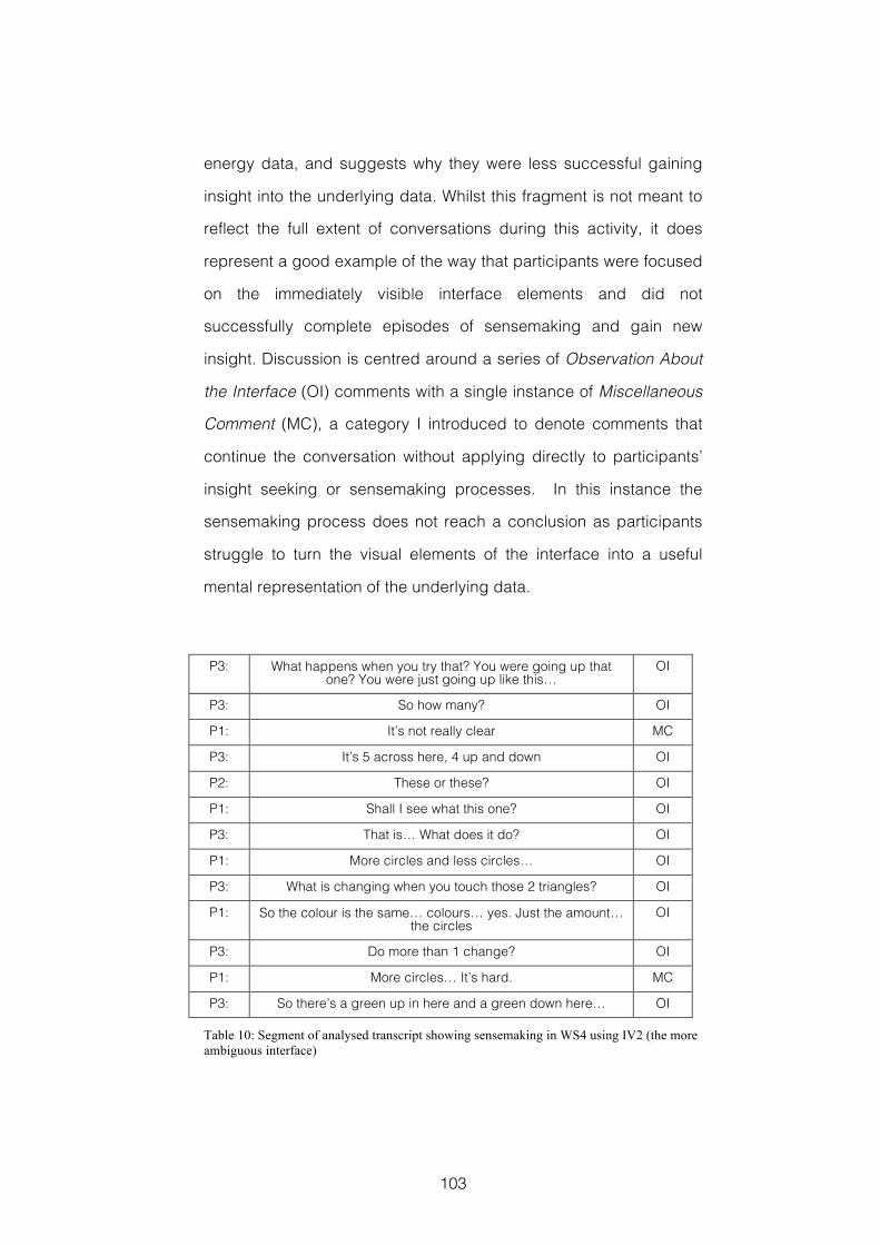
103
energy data, and suggests why they were less successful gaining
insight into the underlying data. Whilst this fragment is not meant to
reflect the full extent of conversations during this activity, it does
represent a good example of the way that participants were focused
on the immediately visible interface elements and did not
successfully complete episodes of sensemaking and gain new
insight. Discussion is centred around a series of Observation About
the Interface (OI) comments with a single instance of Miscellaneous
Comment (MC), a category I introduced to denote comments that
continue the conversation without applying directly to participants’
insight seeking or sensemaking processes. In this instance the
sensemaking process does not reach a conclusion as participants
struggle to turn the visual elements of the interface into a useful
mental representation of the underlying data.
P3: What happens when you try that? You were going up that one? You were just going up like this…
OI
P3: So how many? OI
P1: It’s not really clear MC
P3: It’s 5 across here, 4 up and down OI
P2: These or these? OI
P1: Shall I see what this one? OI
P3: That is… What does it do? OI
P1: More circles and less circles… OI
P3: What is changing when you touch those 2 triangles? OI
P1: So the colour is the same… colours… yes. Just the amount… the circles
OI
P3: Do more than 1 change? OI
P1: More circles… It’s hard. MC
P3: So there’s a green up in here and a green down here… OI
Table 10: Segment of analysed transcript showing sensemaking in WS4 using IV2 (the more ambiguous interface)
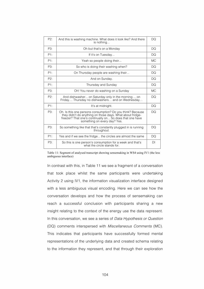
104
P2: And this is washing machine. What does it look like? And there is nothing...
DQ
P3: Oh but that's on a Monday DQ
P1: If it's on Tuesday... DQ
P1: Yeah so people doing their... MC
P3: So who is doing their washing when? DQ
P1: On Thursday people are washing their... DQ
P2: And on Sunday. DQ
P1: Thursday and Sunday DQ
P3: Oh! You never do washing on a Sunday MC
P2: And dishwasher... on Saturday only in the morning ... on Friday.... Thursday no dishwashers… and on Wednesday…
DQ
P1: It’s at midnight. DQ
P3: Oh. Is this one persons consumption? Do you think? Because they didn't do anything on those days. What about fridge-freezer? That one's continually on... So does that one have
something on every day? Yes.
DQ
P3: So something like that that's constantly plugged in is running throughout.
DQ
P1: Yes and if we see the fridge... the circles are almost the same DQ
P3: So this is one person's consumption for a week and that's what the circle stands for.
DI
Table 11: Segment of analysed transcript showing sensemaking in WS4 using IV1 (the less ambiguous interface)
In contrast with this, in Table 11 we see a fragment of a conversation
that took place whilst the same participants were undertaking
Activity 2 using IV1, the information visualization interface designed
with a less ambiguous visual encoding. Here we can see how the
conversation develops and how the process of sensemaking can
reach a successful conclusion with participants sharing a new
insight relating to the context of the energy use the data represent.
In this conversation, we see a series of Data Hypothesis or Question
(DQ) comments interspersed with Miscellaneous Comments (MC).
This indicates that participants have successfully formed mental
representations of the underlying data and created schema relating
to the information they represent, and that through their exploration
105
these schema are being investigated, re-framed and manipulated.
At the end of this conversation fragment we see the group reach a
conclusion that the data relates to a single household’s energy
consumption, this I classified as Data Insight (DI).
4.6 Discussion
My aim with this design experiment was to investigate the effects of
increasing the ambiguity in the visual encoding used to represent
smart energy data on workshop participants’ ability to gain insight,
and on the creativity of the product and service ideas those
participants would subsequently generate. The choice of ambiguity
as the variable to investigate was inspired by the many connections
that have been made between ambiguity and creative performance,
some of which are outlined in section 4.1. Another key objective of
this investigation was to start laying down guidelines for designing
the information visualization interfaces that are a key tool in the
CoDesign With Data approach ahead of the service design
workshop described in the case study presented in Chapter 5.
When we look at this study’s findings, they indicate that the tools
and techniques used to explore domain-relevant data in a CoDesign
With Data workshop can inspire participants to generate ideas for
new products and services that are highly appropriate to the domain
for which they are intended. These results also indicate that
intentionally increasing the ambiguity in the visual encoding used in
the interface with which participants explore these domain-relevant
data has a negative impact on creative performance. In particular,
this is shown with respect to the appropriateness of the ideas
generated. There was no evidence to support the suggestion that
106
increased ambiguity might result in ideas that are more novel. There
was also no evidence found in this study that increasing the
ambiguity in the visual encoding used to represent data had
increased the fluency of participants’ idea generation. The body of
work discussed earlier, which suggests a strong connection
between ambiguity and creativity, indicates that this is an area for
future study.
The evidence from the questionnaire data, the thematic analysis of
post-it note outputs from the insight seeking in each round Activity 2,
and the detailed video analysis of participants’ conversations during
the same activity, all demonstrate the relative difficulties in
participants’ sensemaking when using the interface with increased
ambiguity. These difficulties had a subsequent impact on
participants’ ability to gain insight into the context of energy
consumption from the data visualized in the interface, and I suspect
this is the chief contributing factor to the significant differences in
the appropriateness of the creative outputs generated in the two
conditions. It should be noted that in this within subjects design
experiment, in which the same data were visualized in both
conditions and the colour schemes in both interfaces were largely
similar, there appeared to be no evidence of a learning effect
(Greenwald, 1976). There was nothing in the data collected that
suggested those groups using the less ambiguous IV1 in the first
round of activities had benefitted from their successful insight
seeking when subsequently using IV2 in the second round of
activities. This too is an area for further investigation.
In this study each group of participants was given a single iPad on
which to collaboratively explore the visualized information. The
107
evidence from the video recordings of each workshop suggests this
use of an iPad was a success. As Figure 4 also indicates, the single
iPad supports co-designers’ collaborative creative activities during
workshop activities providing additional evidence in support of
previous findings (Henderson & Yeow, 2012), which are discussed in
section 2.5.2.2. There was no evidence in this study of factors that
are known to impact on group creativity, such as production
blocking where one participant may dominate group work,
evaluation apprehension where participants may be reluctant to
share ideas, or free riding where participants may take a back seat
and not contribute. However, because these factors have been
noted in other studies, for examples see (Warr & O'Neill, 2005), they
should remain a consideration in future studies.
Whilst there was also no evidence found in this study of any positive
benefit for participants’ creativity when ambiguity in the visual
encoding of data was increased, a positive relationship between
ambiguity and creativity has been acknowledged previously, for
example (Gaver et al., 2003; Sanders, 2001). As an alternative to giving
ambiguous representations of domain-relevant data to co-
designers, we might consider designing workshop activities that are
more able to exploit the ambiguity in the design context the data are
derived from and in the different interpretations that participants’
personal experiences and knowledge suggest. For example, we
might consider introducing tools and techniques based on the
Generative Design Research discussed in section 2.4.2, or
employing images such as those contained on the Domain Cards
used in the Inspiration Card Workshop discussed in section 2.4.3.
Another way of approaching this might be through the use of
108
brainstorming prompts, such as the Creativity Triggers used in the
requirements gather workshops discussed in section 2.4.1, which
are open to a range of possible interpretations.
The findings from this design experiment provide a useful start to
understanding the role that domain-relevant data might play in
inspiring stakeholder creativity during early-stage design
workshops. Whilst the constraints of visualizing the same data with
sufficient differences on a single parameter to facilitate two distinct
conditions for experimental comparison mean that the interpretation
of ambiguity is arguably a simplistic one, the findings still indicate
that we should be wary of intentionally increasing the ambiguity
employed in the visual encoding used to represent these data to co-
designers. In addition, the designs chosen for this study were based
on an understanding of previous research, existing guidelines and
practice, and also benefitted from the advice of visualization experts
in City University London’s giCentre. Therefore, accepting the
exploratory nature of this research, I am confident in the lessons
suggested in this study’s findings.
4.7 Reflections
4.7.1 Research and Evaluation Methods
4.7.1.1 Benefits and Limitat ions of Study Design
This study was a small-scale, within subjects, experimental
comparison of two conditions. It enabled me to observe the effects
of using two different information visualization interfaces on the
same groups of participants, undertaking the same activities. One
benefit of this approach is that it reduces the impact of human
109
variables, such as individual differences in problem solving style
(Selby et al., 2004), which can play an important role in creative
activities. This increases confidence in the reliability of the study’s
findings. However, the relatively small number of participants limits
their generalizability. A full checklist of threats to the validity (Cook &
Campbell, 1979, pp.37-95) of this study’s findings is included in
Appendix D, Section 9.6.
The importance of the role of the facilitator during a design
workshop was made evident when participants were using the more
ambiguous interface IV2. Under experimental conditions, when
participants struggled to make sense of the interface the facilitator
was unable to step in and provide assistance, as these difficulties
were amongst factors being investigated. In addition, there were
occasions when the facilitator’s interventions, e.g. to provide
scheduled time checks, impacted negatively on participants’
creative flow. This is a potential limitation of such design-
experiments.
4.7.1.2 Limitat ions of Data Collection and Analysis
The thematic analysis undertaken for this study was based on
models of sensemaking (Pirolli & Card, 2005; Russell et al., 1993)
previously identified as a suitable way of understanding information
visualization users’ insight seeking (Yi et al., 2008). Whilst these
sensemaking models appear to have provided an effective
framework for undertaking such an analysis, future studies would
benefit from independent coding by additional researchers to
mitigate threats to the validity of findings.
110
Counting ideas and having domain experts rate them for novelty
and appropriateness are both recognised methods of measuring the
creativity of ideas participants’ record during divergent idea
generation tasks (Dean et al., 2006). However, there were difficulties
in precisely transmitting participants’ intentions through transcripts
of the descriptions made during the workshop activities. This can
result in unreliable ratings. Previous research has also noted
problems with the reliability of this method to produce replicable
results (Christiaans, 2002).
The questionnaire data provided insights into participants’
perceptions of the support and inspiration provided for their creative
design activities. However, using the full version of the Creativity
Support Index (Carroll et al., 2009), backed up with a similarly
validated measure of insight support, would have offered a more
robust way of assessing this.
4.7.2 Takeaways
T4.1 Designing interfaces that visualize domain-relevant data with
an intentionally ambiguous visual encoding appears to have a
negative impact on co-designers’ sensemaking, and reduces the
appropriateness of their subsequent design ideas.
T4.2 Interactive interfaces in which domain-relevant data are
visualized appear to provide an engaging tool for co-designers.
T4.3 Presenting visualized data to co-designers on a tablet device
such as an iPad appears to provide a form factor that supports
their collaborative design activities.
111
5 Case Study: E.ON Energy
This case study puts into practice the findings from the design
experiment reported in the previous chapter. It investigates the
effectiveness of presenting visualized data to co-designers on an
iPad in a real world setting. Generative design tools are introduced
so that I can investigate how effectively they help improve co-
designers’ understanding of the possible contexts that domain-
relevant data might come from. A paper detailing this case study
was presented at the Fourth Service Design and Service Innovation
Conference: ServDes.2014, in Lancaster April 2014 (Dove & Jones,
2014(a)). It is included in Appendix A of this thesis. The novel
Reflection Postcard method of evaluation was developed for this
study and presented at the CHI 2013 Workshop: Evaluation
Methods for Creativity Support Environments, a short paper is also
included in Appendix A. The case study was conducted as part of
the “Visualising the smart home: creative engagement with customer
data” (E.ON International Research Initiative, 2012) project, funded by
the E.ON International Research Initiative. Details of the design idea
that resulted from this workshop are included in Appendix B, and
are available online14.
5.1 Introduction
In recent years design practice has moved closer to the future users
of the product or service being designed (Sanders & Stappers, 2008).
14 www.grahamdove.com/energyaudit
112
In design processes where stakeholder participation is a key
element, designing the design process and organising participation
become cornerstones (Brandt, 2006). I had two primary research
objectives for the workshop reported in this case study. The first was
to apply the lessons learnt in the design experiment reported in
Chapter 4 in a real world design situation. This was to find out
whether the information visualization tools would be an effective part
of co-design activities when working with members of the public.
The second was to see whether seeking insight from information
visualization interfaces could be combined with ‘making’ activities,
similar to those used in the Generative Design Research approach
outlined in section 2.4.2, to provide a source of inspiration. As
discussed in section 4.6, this might be an alternative way to make
use of the positive aspects of ambiguity in design situations.
In the toolkit I put together to support co-designers’ generative
activities, I opted to use images and photographs taken from online
sources as a way of representing selected aspects of the design
context. A similar use of images to represent the domain of a design
problem can be found in (Sanders & Stappers, 2012, p.71), and in the
Inspiration Card Workshop discussed in section 2.4.3. To facilitate
the co-designers’ exploration of the many different possibilities
implied by the ambiguous nature of any design context, I gave them
a wide variety of images in each category. These are discussed
further in section 5.3.3.
5.2 Research Questions
In this case study my aim was to investigate whether presenting
visualized information to co-designers on an iPad would be effective
113
in a real world setting, working with members of the public. Would it
be engaging, support their insight seeking, and inspire their creative
design ideas? If this were the case it would provide supporting
evidence for the findings of the design experiment reported in
Chapter 4. The design of the information visualization interface used
would also put into practice the lessons I had learnt during that
study. In addition, I wanted to investigate workshop activities that
would combine insight seeking using the information visualization
interface with generative design toolkits. My aim was to help co-
designers explore and understand the domain context, share their
individual knowledge, and to inspire their design ideas. This study
was guided by three research questions:
RQ5.1 Would using iPad interfaces to explore visualized domain-
relevant data be engaging to workshop participants, and support
collaboration in a real world setting?
RQ5.2 Would participants successfully gain an understanding of
the data and therefore insight into the design context from their
activities using the information visualization interface?
RQ5.3 Would the combination of insight seeking using information
visualization interfaces and generative design activities help
participants share their existing knowledge and explore different
possible interpretations of an ambiguous design context?
An opportunity to investigate these questions came through my
involvement in the “Visualising the smart home: creative
engagement with customer data” project. Here, we were working
with E.ON Energy to find creative ways of using the data generated
by smart energy meters as inspiration for the design of consumer
services that help to reduce peak energy demands. This case study
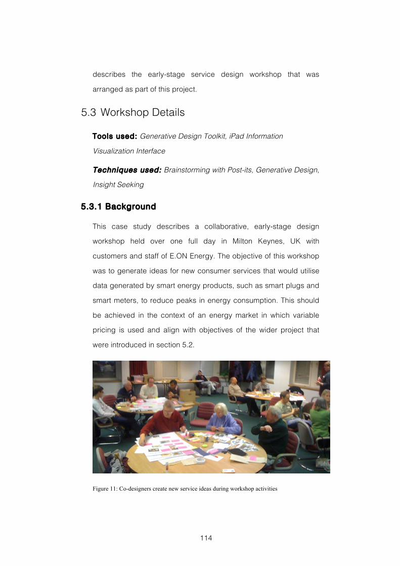
114
describes the early-stage service design workshop that was
arranged as part of this project.
5.3 Workshop Details
Tools used: Generative Design Toolkit, iPad Information
Visualization Interface
Techniques used: Brainstorming with Post-its, Generative Design,
Insight Seeking
5.3.1 Background
This case study describes a collaborative, early-stage design
workshop held over one full day in Milton Keynes, UK with
customers and staff of E.ON Energy. The objective of this workshop
was to generate ideas for new consumer services that would utilise
data generated by smart energy products, such as smart plugs and
smart meters, to reduce peaks in energy consumption. This should
be achieved in the context of an energy market in which variable
pricing is used and align with objectives of the wider project that
were introduced in section 5.2.
Figure 11: Co-designers create new service ideas during workshop activities
115
5.3.2 Participants
The workshop took place with a total of thirteen co-designers, ten
male and three female. Eleven of the co-designers were E.ON
customers who were recruited from amongst the households taking
part in a long-term trial of smart energy technologies, which E.ON
have been conducting in Milton Keynes. The remaining two co-
designers were members of E.ON staff, one technical and the other
from marketing. Both members of E.ON staff were employed within
their smart meter programme. All co-designers were familiar with
energy monitoring and the data that smart meters generate. They all
had prior experience with simple visualizations of energy data
through the monitors used in the technology trial. The customers
who took part in the workshop were already engaged in and
informed about energy related issues. This is evidenced by their
voluntary participation in E.ON’s technology trial.
5.3.3 Workshop Materials
Each group of co-designers were given the following materials to
help them during their design activities:
A Generative Design Toolkit, described below
An iPad Information Visualization Interface, described in
section 5.3.4
The workshop took place in a large room. Group work took place
around large tables with plenty of space. Co-designers were
provided with refreshments and a video camera was used to record
co-designers’ explanations of their design ideas after Activity 1 and
Activity 5. The generative design toolkit given to each group of co-
116
designers to support their design activities was made up of the
following items:
A1 sized worksheets for creating the collages that would represent
co-designers’ design ideas in Activity 1 and Activity 5
A1 sized worksheets for capturing and organising co-designers’
ideas, recorded on post-its during Activity 4
A collection of around three hundred individually printed
photographs that were collected from various websites and
organised into five categories: people, buildings, transport, food
and technology. Each category included a variety of
representative examples so that co-designers could interpret and
combine them in the way they thought best.
Typical workshop stationery, such as coloured marker and felt-tip
pens, post-it notes, coloured paper shapes, glue, tape and
scissors.
Examples of each of the materials used in this workshop can be
found in Appendix C of this thesis.
5.3.4 Visualization Interface Design
The information visualization interface used in this workshop was
designed specifically for this purpose. It reflects the lessons learnt
during the study reported in Chapter 4. In that study it was found
that increasing the ambiguity used in the visual encoding of data
elements, resulted in ideas that were considered significantly less
appropriate to the domain of domestic energy. The interface was
developed using the D3 JavaScript library (Bostock et al., 2011), and
presented to each group of participants via the web browser on a
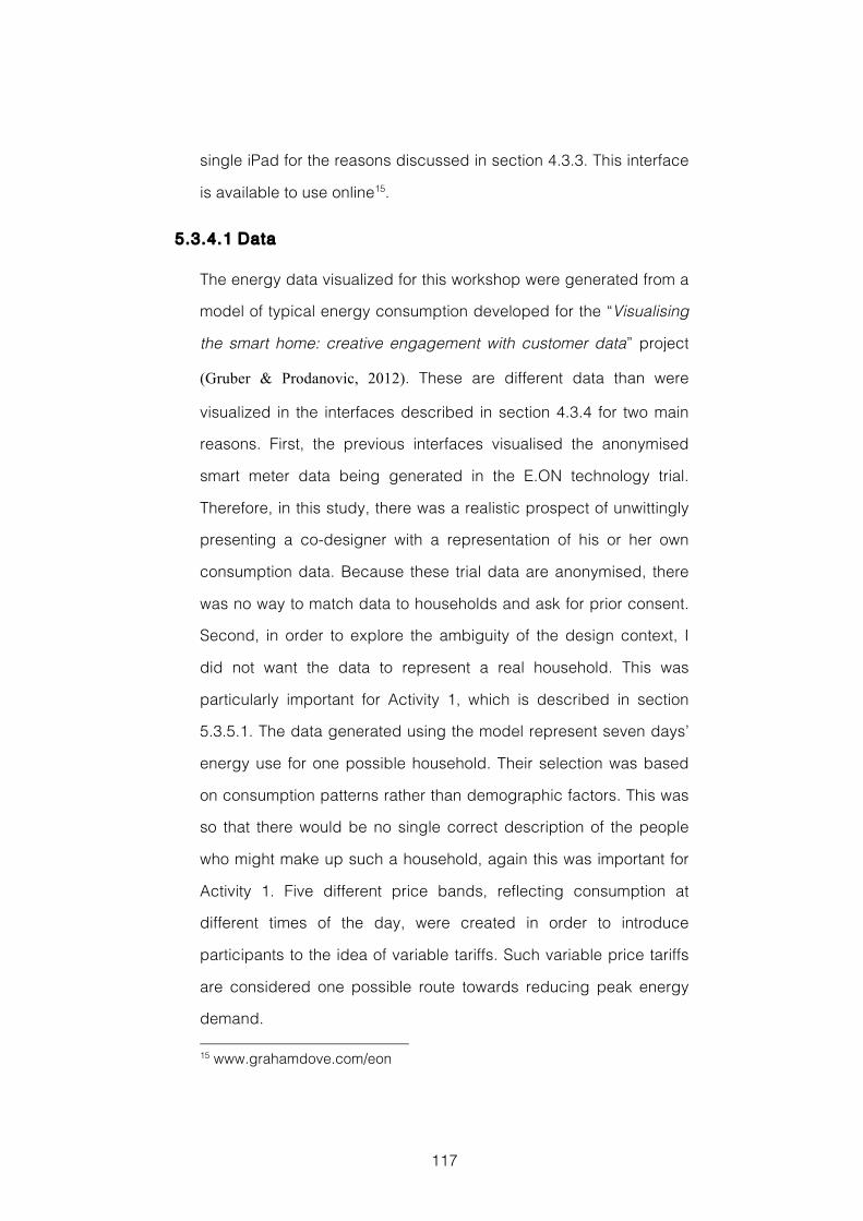
117
single iPad for the reasons discussed in section 4.3.3. This interface
is available to use online15.
5.3.4.1 Data
The energy data visualized for this workshop were generated from a
model of typical energy consumption developed for the “Visualising
the smart home: creative engagement with customer data” project
(Gruber & Prodanovic, 2012). These are different data than were
visualized in the interfaces described in section 4.3.4 for two main
reasons. First, the previous interfaces visualised the anonymised
smart meter data being generated in the E.ON technology trial.
Therefore, in this study, there was a realistic prospect of unwittingly
presenting a co-designer with a representation of his or her own
consumption data. Because these trial data are anonymised, there
was no way to match data to households and ask for prior consent.
Second, in order to explore the ambiguity of the design context, I
did not want the data to represent a real household. This was
particularly important for Activity 1, which is described in section
5.3.5.1. The data generated using the model represent seven days’
energy use for one possible household. Their selection was based
on consumption patterns rather than demographic factors. This was
so that there would be no single correct description of the people
who might make up such a household, again this was important for
Activity 1. Five different price bands, reflecting consumption at
different times of the day, were created in order to introduce
participants to the idea of variable tariffs. Such variable price tariffs
are considered one possible route towards reducing peak energy
demand. 15 www.grahamdove.com/eon
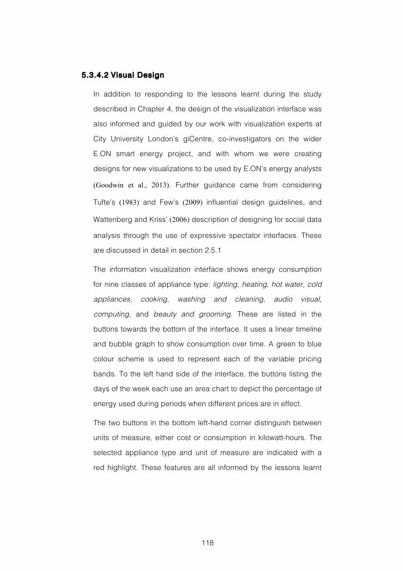
118
5.3.4.2 Visual Design
In addition to responding to the lessons learnt during the study
described in Chapter 4, the design of the visualization interface was
also informed and guided by our work with visualization experts at
City University London’s giCentre, co-investigators on the wider
E.ON smart energy project, and with whom we were creating
designs for new visualizations to be used by E.ON’s energy analysts
(Goodwin et al., 2013). Further guidance came from considering
Tufte’s (1983) and Few’s (2009) influential design guidelines, and
Wattenberg and Kriss’ (2006) description of designing for social data
analysis through the use of expressive spectator interfaces. These
are discussed in detail in section 2.5.1
The information visualization interface shows energy consumption
for nine classes of appliance type: lighting, heating, hot water, cold
appliances, cooking, washing and cleaning, audio visual,
computing, and beauty and grooming. These are listed in the
buttons towards the bottom of the interface. It uses a linear timeline
and bubble graph to show consumption over time. A green to blue
colour scheme is used to represent each of the variable pricing
bands. To the left hand side of the interface, the buttons listing the
days of the week each use an area chart to depict the percentage of
energy used during periods when different prices are in effect.
The two buttons in the bottom left-hand corner distinguish between
units of measure, either cost or consumption in kilowatt-hours. The
selected appliance type and unit of measure are indicated with a
red highlight. These features are all informed by the lessons learnt
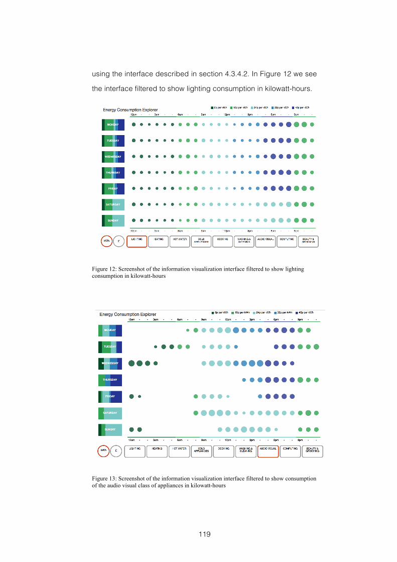
119
using the interface described in section 4.3.4.2. In Figure 12 we see
the interface filtered to show lighting consumption in kilowatt-hours.
Figure 12: Screenshot of the information visualization interface filtered to show lighting consumption in kilowatt-hours
Figure 13: Screenshot of the information visualization interface filtered to show consumption of the audio visual class of appliances in kilowatt-hours
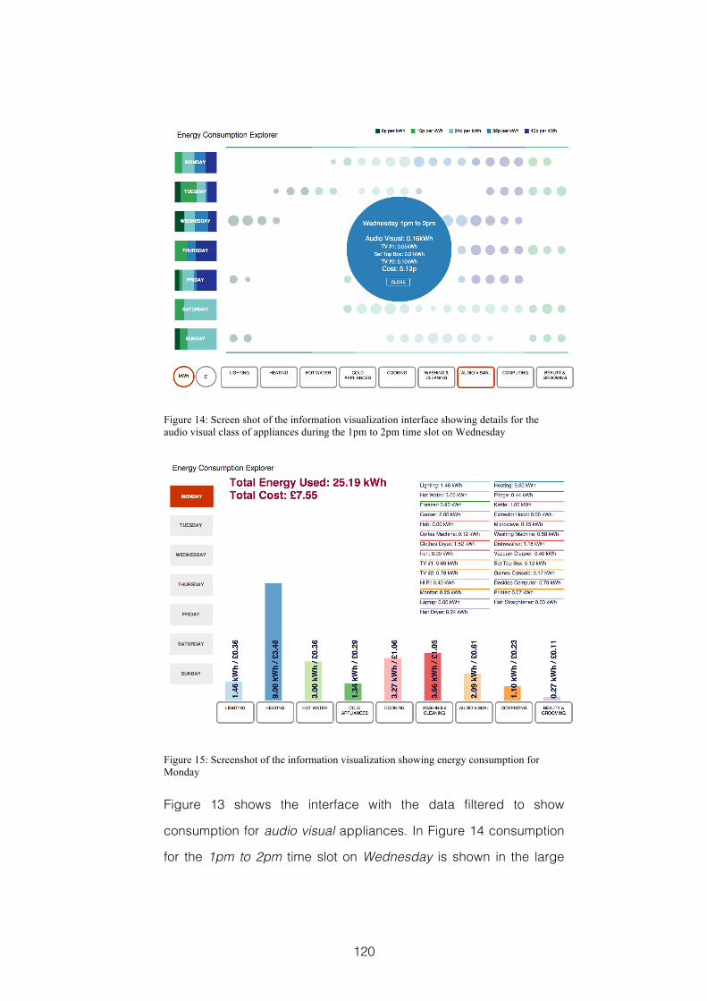
120
Figure 14: Screen shot of the information visualization interface showing details for the audio visual class of appliances during the 1pm to 2pm time slot on Wednesday
Figure 15: Screenshot of the information visualization showing energy consumption for Monday
Figure 13 shows the interface with the data filtered to show
consumption for audio visual appliances. In Figure 14 consumption
for the 1pm to 2pm time slot on Wednesday is shown in the large
121
bubble in the centre of the screen. This bubble is coloured to reflect
the price-band in effect at that time. This feature provides more fine
grained detail than had been available in the interfaces used in the
previous design experiment.
Figure 15 shows the details for Monday. Here, a bar graph is used
to show consumption for the different classes of appliance, each of
which contains specific instances of appliance. For example, the
cooking class contains instances of cooker, hob, kettle, microwave,
coffee machine, and extractor hood. The details for these individual
appliances are shown towards the top right-hand corner, as can be
seen in Figure 15. Again, this view was introduced into the interface
design to provide more fine grained detail than had been present in
the interface described in section 4.3.4.2. It also reflects the larger
number of appliances present in the data generated by the model
than was present in the data being generated by the trial
participants. The colour schemes used in the interface are derived
from examples in (Harrower & Brewer, 2003).
5.3.4.3 Interaction
Figure 12 shows the interface filtered to show the data for lighting
consumption in kilowatt-hours. Having selected the audio visual
button towards the bottom of the screen, Figure 13 shows the data
filtered to represent those appliances in the audio visual class. In
addition to these buttons, the interface also adopts a direct
manipulation of the data approach to interaction. This means that
the visual elements representing these data are also the interaction
elements that control how the data are filtered. For example, when
the bubble representing consumption between 1pm and 2pm on
122
Wednesday is selected, as in Figure 14, the details for that time slot
are displayed. This follows Shneiderman’s (1996) mantra of
“Overview first, zoom and filter, then details on demand”. In a similar
way, selecting the button for Monday towards the left-hand side of
the interface displays the full details for that day, as in Figure 15.
5.3.5 Workshop Activit ies
The workshop lasted a total of approximately 6 hours, including a
break for refreshments. It was made up of five activities. Four of
these were design activities. Activity 3 was used to gather
evaluation data. In this activity co-designers worked individually. In
Activity 4 all co-designers worked in a single large group. All other
activities were undertaken in small groups of three or four co-
designers. Co-designers self-selected these groups, with the only
criterion being that each group should have at least one member
experienced and confident using an iPad, as this was how they
would interact with the visualized energy data.
5.3.5.1 Introduction
Prior to the start of the workshop’s activities the day’s objectives
were outlined and co-designers were reminded of the benefits of a
positive and supportive atmosphere to their collaborative idea
generation. Each group of co-designers was also given their iPad
with the information visualization interface. A brief introduction to its
visual encoding, data and interactive features was given, and a
short period of time was allowed for co-designers to familiarise
themselves with its use. Each co-designer was also given a
document describing the information visualization interface. This is
included with the workshop materials in Appendix C of this thesis.
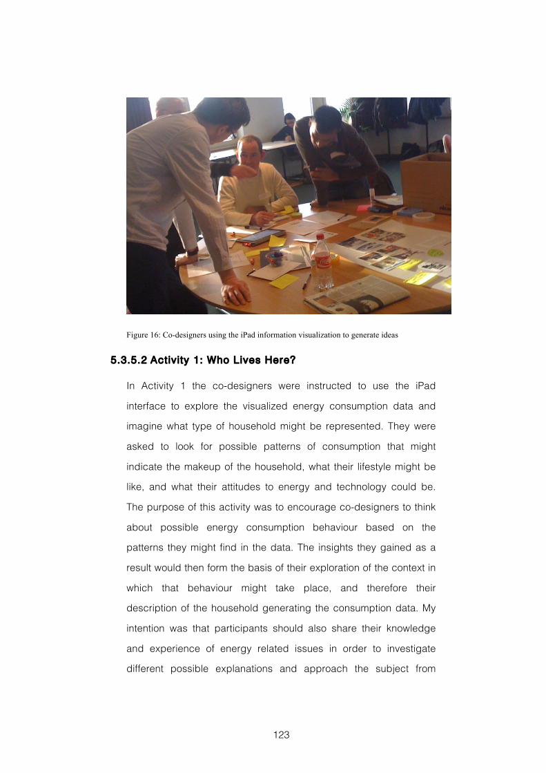
123
Figure 16: Co-designers using the iPad information visualization to generate ideas
5.3.5.2 Activity 1: Who Lives Here?
In Activity 1 the co-designers were instructed to use the iPad
interface to explore the visualized energy consumption data and
imagine what type of household might be represented. They were
asked to look for possible patterns of consumption that might
indicate the makeup of the household, what their lifestyle might be
like, and what their attitudes to energy and technology could be.
The purpose of this activity was to encourage co-designers to think
about possible energy consumption behaviour based on the
patterns they might find in the data. The insights they gained as a
result would then form the basis of their exploration of the context in
which that behaviour might take place, and therefore their
description of the household generating the consumption data. My
intention was that participants should also share their knowledge
and experience of energy related issues in order to investigate
different possible explanations and approach the subject from
124
different perspectives. This is an important step towards co-
designers gaining a richer understanding of the design context,
which would help to inspire creative ideas. In addition, because
there was no correct answer to the ‘Who Lives Here?’ question I felt
there would be space left for co-designers to say something about
what they thought to be important, whilst at the same time reducing
any reticence they might feel talking about data that represented
their own consumption in a group setting.
Each group used the generative design toolkit to create an A1 sized
collage that described the imaginary household who best reflected
the insights they found in the data. The worksheet contained areas
to show the household’s members, the type of property they live in,
the type of energy consumer they are, how they might feel about
technology, what their mealtimes might look like and the ways they
travel. These representative households were subsequently used as
personas that the group would consider when developing their
smart energy service ideas. After approximately 45 minutes working
on their collage, each group in turn presented their household to the
whole workshop. This was recorded on video. During this
explanation, they described the insights they had found and how
these contributed to the household they had created. This activity
lasted a total of approximately 60 minutes.
5.3.5.3 Activity 2: Win a State of the Art Smart Home
In Activity 2 co-designers were again instructed to investigate the
energy consumption data that was visualized in the iPad interface.
This time they were asked to put themselves in the position of the
household they had described in Activity 1 and look for ways they
could be smarter in their energy use. This could mean reducing the
125
total amount of energy consumed, or changing consumption
behaviour to reduce their potential energy bill. The purpose of this
was first to capture ideas about which behaviours were using
significant amounts of energy at peak times, and second to
investigate which instances of energy consumption it would be
acceptable to change. Activity 2 took the form of a competition, in
which the prize was to have their home retrofitted with the state-of-
the-art in energy saving smart home technologies. Each group
completed an entry form on behalf of the household they described
in Activity 1. On it they listed their top five ideas for smarter energy
use together with their answer to a tiebreaker question, which asked
them to briefly describe a piece of smart home technology that
would improve their household’s lives and lead to smarter use of
energy. This activity lasted approximately 40 minutes.
In the refreshment break that followed Activity 3, each co-designer
was given a sticker and asked to vote for which of the competition
entries they thought had responded most effectively and most
creatively to the questions asked.
5.3.5.4 Activity 3: Reflection Postcards
This activity was used to gather evaluation data. It was the first time
that the Reflection Postcard technique described in section 3.2.4
was used. Each co-designer was asked to work individually to
reflect on their experiences using the information visualization
interface during the previous two activities. To guide their
reflections, and gather their responses, co-designers were asked to
complete three postcards, each of which had a short prompt printed
on it. These prompts are discussed in detail in section 5.4.1. This
activity lasted approximately 30 minutes and ended with
126
participants ‘posting’ their Reflection Postcards into a small red post
box.
5.3.5.5 Activity 4: Smart Home Data
For this activity all the co-designers came together to work as a
single large group. It was made up of three rounds of brainstorming
with post-its in which the opportunities offered by and possible
implications of the energy consumption data that might be
generated by a smart home were explored, and ideas for possible
new services generated. In this activity the co-designers were asked
to imagine that they had won the smart home technology
competition they entered in Activity 2. It was now five years in the
future and they have been living with the technology as part of their
lives for some time. The aim with this activity was for co-designers to
think a little more widely about the types of data that might be
generated in a smart home, the new services this might enable, and
the possible implications associated with these data and services.
The first round of brainstorming collected ideas for different types of
data that their smart home could generate. Here co-designers were
asked to consider the services provided by the smart home, how it
might manage appliances, and the data it would need to capture in
order to function effectively. The second round of brainstorming
asked participants to think about how they felt about these data
being collected. They were asked to consider the different things,
both good and bad, that could be done with these data, and to
share the emotions they felt and thoughts they had about these. In
the third round of brainstorming participants were asked to think of
ideas for products or services that might utilize these smart home
data to make their lives better. They were asked to consider the
127
emotions that had been triggered and support positive feelings or
turn negative responses round so that the product or service would
mitigate this to provide a positive outcome. This activity lasted
approximately 50 minutes
5.3.5.6 Activity 5: Generating Service Designs
In the day’s final activity, each group of co-designers selected one
or more of the ideas generated during the day, which they
developed these more fully into an idea for a new service for
customers that would be based on smart home energy data. This
service should reflect the needs identified for the representative
household that the group had created in Activity 1. Each group’s
generative design toolkit included three A1 worksheets on which to
describe their service at each of three key stages. On the first
worksheet they were asked to describe what it would be like when
the household sign up for the new service, addressing factors such
as their household’s motivations. On the second worksheet they
described how it would feel the first time that the service was used
by their household. On the third worksheet they described what it
would be like once the service was an established part of their
household’s life. These worksheets were completed in a similar
fashion to those used in Activity 1. After approximately 60 minutes
working on their service designs, this activity concluded with each
group describing their idea to the workshop as whole and to
camera. They also explained how the proposed new service
reflected insights they had found in the data during the morning’s
activities. This activity lasted approximately 90 minutes.
128
5.4 Evaluation Methods
My aim in this case study was to test in practice the lessons
regarding information visualization design I had learnt during the
design experiment reported in Chapter 4. Would co-designers find
exploring visualized smart energy data engaging? Would the
interface support their insight seeking? And would the data inspire
their creative design ideas? Would an iPad be a suitable form factor
to use during workshop activities? I also wanted to investigate
workshop activities that would combine insight seeking using an
information visualization interface with generative design
techniques. Would this help them share a richer understanding of
the domain context and inspire their design ideas?
The evaluation methods and data collected for this case study will
be discussed in terms of two factors highlighted as important to
design research. These are: the people designing and the design
product (Cross, 1999). The reasons for adopting this structure are
explained fully in section 3.2. I used two evaluation methods to help
answer the research questions detailed in section 5.2. To better
understand how the tools and techniques used were Supporting the
People Designing I used Reflection Postcards. When Assessing the
Design Product, I evaluated each group’s final service design idea,
together with the outputs from Activity 1 and Activity 2. These were
the activities in which co-designers worked most closely with the
domain-relevant data.
129
5.4.1 Supporting the People Designing
To assess how co-designers felt their insight seeking was being
supported and their creative processes were being inspired during
workshop activities I used the Reflection Postcard method. This
method is presented in detail in section 3.2.4. It was developed for
this case study, and this was the first time that it was used. For this
evaluation I gave each of the co-designers three postcards. Each
postcard had a different reflection prompt printed on it for the co-
designer to respond to. These prompts were derived from the
questions I used in the evaluation of the previous design
experiment, reported in section 4.4. The postcards were given to co-
designers to complete during the workshop, immediately following
the activities in which they worked most closely with the visualized
domain-relevant data. This meant that Activity 3 was dedicated to
gathering this evaluation data.
The first of the Reflective Postcard prompts addressed the issues of
co-designers’ engagement and collaboration. The prompt was
derived from statements 1 and 3 in the earlier questionnaire. It read:
“Please reflect on your involvement in the previous two
activities. Write a few sentences thinking in particular about how
engaged you were, how absorbed or distracted, and how easily
you feel you worked with other members of your team. Try to think
about the extent to which the technology helped or hindered you
in this regard”
The second of the Reflective Postcard prompts addressed
codesigners’ ability to gain an overview and to identify relationships
and patterns within the energy consumption data. This prompt was
derived from statements 5 and 6 in the earlier questionnaire. It read:
130
“Please reflect on your understanding of the information contained in
the data visualization. Write a few sentences, thinking in particular
about how easily you managed to gain an overview of what was
represented. Also think about how quickly you grasped what the
information meant, did you spot clear patterns and relationships
or did you find it confusing? Did it prompt you to think of ideas
you had not previously considered?”
The third of the Reflective Postcard prompts addressed co-
designers’ idea generation, their exploration of alternative ideas,
and the degree to which co-designers’ previous knowledge and
experience could be incorporated with the insights gained exploring
the visualized data. This prompt is derived from statements 2, 4 and
7 in the questionnaire:
“Please reflect on how you used the data visualization to first create
your household and then to devise competition answers. Write a
few sentences, thinking in particular about how easily you were
able to explore possible options and come up with different ideas.
Did you use your prior knowledge as well as the information
shown? And how easy you found it to relate that prior knowledge
to the data?”
Analysis of the transcribed Reflection Postcards involves first
assessing whether each of the concerns mentioned in the prompt
has been responded to, and then assigning the reflections on each
concern to one of five categories: totally positive; partially positive;
neutral; partially negative; and totally negative. In each case
individual responses are used to illustrate findings.
131
5.4.2 Assessing the Design Product
To assess the design product I looked at the outputs from each of
Activity 1, Activity 2 and Activity 5. For the collages created during
Activity 1 and Activity 5 I followed the evaluation method outlined in
section 3.2.2. Here I was looking for evidence that insight gained
from the data and understanding gained from shared knowledge
was being used to describe a possible context for those data, and
inspire creative design ideas that would respond appropriately to
that context. The video recordings of co-designers explaining their
design ideas and the insights that had gone into them to the whole
workshop supported this analysis.
When analysing the outputs from Activity 1, I was looking for
evidence that co-designers had based the households they
described on insights gained from patterns in the visualized data. I
was looking for evidence that patterns describing particular energy
consumption behaviour had been identified and interpreted
according to the co-designers own knowledge and experience, and
that explanations for the different individual behaviours could be
combined to create an internally consistent description of a
household. I was also looking for evidence that co-designers had
explored different possible alternatives. This might be shown if the
households they described were distinct, and the factors that had
led to them were different. Evidence of inspiration for co-designers
creativity would be found in imaginative details in the stories behind
these households.
My analysis of the service design outputs created during Activity 5
followed a similar process to that for the outputs from Activity 1. I
was looking for evidence that each group of co-designers had
132
developed ideas appropriate for the representative household that
they had created during Activity 1. If this was the case, these ideas
should also represent the insights found in the patterns of visualized
data and the shared understanding of the possible design-context.
Again I was looking for evidence of inspiration, and here I was also
looking for any evidence of novelty in the form of unfamiliar services
or new implementations of familiar services. Richness and detail in
the collages created for both Activity 1 and Activity 5 would be
evidenced by co-designers selection and use of the photographs
they were given. Further evidence would be provided by sketches,
text and use of other materials such as coloured paper shapes.
Analysis of the competition entries that were completed for Activity 2
looked for evidence that the ideas co-designers suggested ideas for
smarter energy use were based upon evidence they had found
exploring the visualized data. These ideas should reflect the insights
that had led to the descriptions, in Activity 1, of the households
represented by the consumption data. In addition, more than one
group suggesting the same ideas would also provide evidence of
insights gained from the visualized data.
5.5 Results
5.5.1 Supporting the People Designing
Figure 17 shows an overview of the Reflection Postcard analysis. We
see the number of responses directly addressing each concern,
and the number of these that are in each category from totally
positive to totally negative. It is immediately apparent that a large
majority of co-designers’ reflections on the workshop activities were
either totally positive or partially positive.
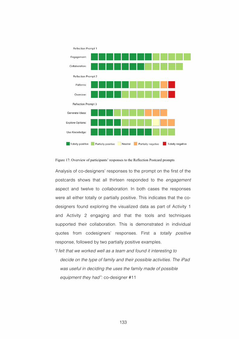
133
Figure 17: Overview of participants’ responses to the Reflection Postcard prompts
Analysis of co-designers’ responses to the prompt on the first of the
postcards shows that all thirteen responded to the engagement
aspect and twelve to collaboration. In both cases the responses
were all either totally or partially positive. This indicates that the co-
designers found exploring the visualized data as part of Activity 1
and Activity 2 engaging and that the tools and techniques
supported their collaboration. This is demonstrated in individual
quotes from codesigners’ responses. First a totally positive
response, followed by two partially positive examples.
“I felt that we worked well as a team and found it interesting to
decide on the type of family and their possible activities. The iPad
was useful in deciding the uses the family made of possible
equipment they had”: co-designer #11
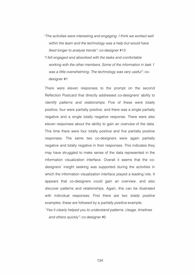
134
“The activities were interesting and engaging. I think we worked well
within the team and the technology was a help but would have
liked longer to analyse trends”: co-designer #13
“I felt engaged and absorbed with the tasks and comfortable
working with the other members. Some of the information in task 1
was a little overwhelming. The technology was very useful”: co-
designer #1
There were eleven responses to the prompt on the second
Reflection Postcard that directly addressed co-designers’ ability to
identify patterns and relationships. Five of these were totally
positive, four were partially positive, and there was a single partially
negative and a single totally negative response. There were also
eleven responses about the ability to gain an overview of the data.
This time there were four totally positive and five partially positive
responses. The same two co-designers were again partially
negative and totally negative in their responses. This indicates they
may have struggled to make sense of the data represented in the
information visualization interface. Overall it seems that the co-
designers’ insight seeking was supported during the activities in
which the information visualization interface played a leading role. It
appears that co-designers could gain an overview, and also
discover patterns and relationships. Again, this can be illustrated
with individual responses. First there are two totally positive
examples, these are followed by a partially positive example.
“Yes it clearly helped you to understand patterns. Usage, timelines
and others quickly”: co-designer #5
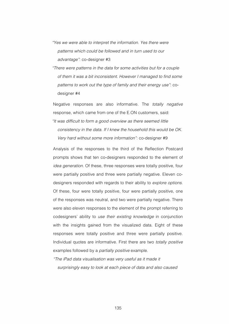
135
“Yes we were able to interpret the information. Yes there were
patterns which could be followed and in turn used to our
advantage”: co-designer #3
“There were patterns in the data for some activities but for a couple
of them it was a bit inconsistent. However I managed to find some
patterns to work out the type of family and their energy use”: co-
designer #4
Negative responses are also informative. The totally negative
response, which came from one of the E.ON customers, said:
“It was difficult to form a good overview as there seemed little
consistency in the data. If I knew the household this would be OK.
Very hard without some more information”: co-designer #9
Analysis of the responses to the third of the Reflection Postcard
prompts shows that ten co-designers responded to the element of
idea generation. Of these, three responses were totally positive, four
were partially positive and three were partially negative. Eleven co-
designers responded with regards to their ability to explore options.
Of these, four were totally positive, four were partially positive, one
of the responses was neutral, and two were partially negative. There
were also eleven responses to the element of the prompt referring to
codesigners’ ability to use their existing knowledge in conjunction
with the insights gained from the visualized data. Eight of these
responses were totally positive and three were partially positive.
Individual quotes are informative. First there are two totally positive
examples followed by a partially positive example.
“The iPad data visualisation was very useful as it made it
surprisingly easy to look at each piece of data and also caused
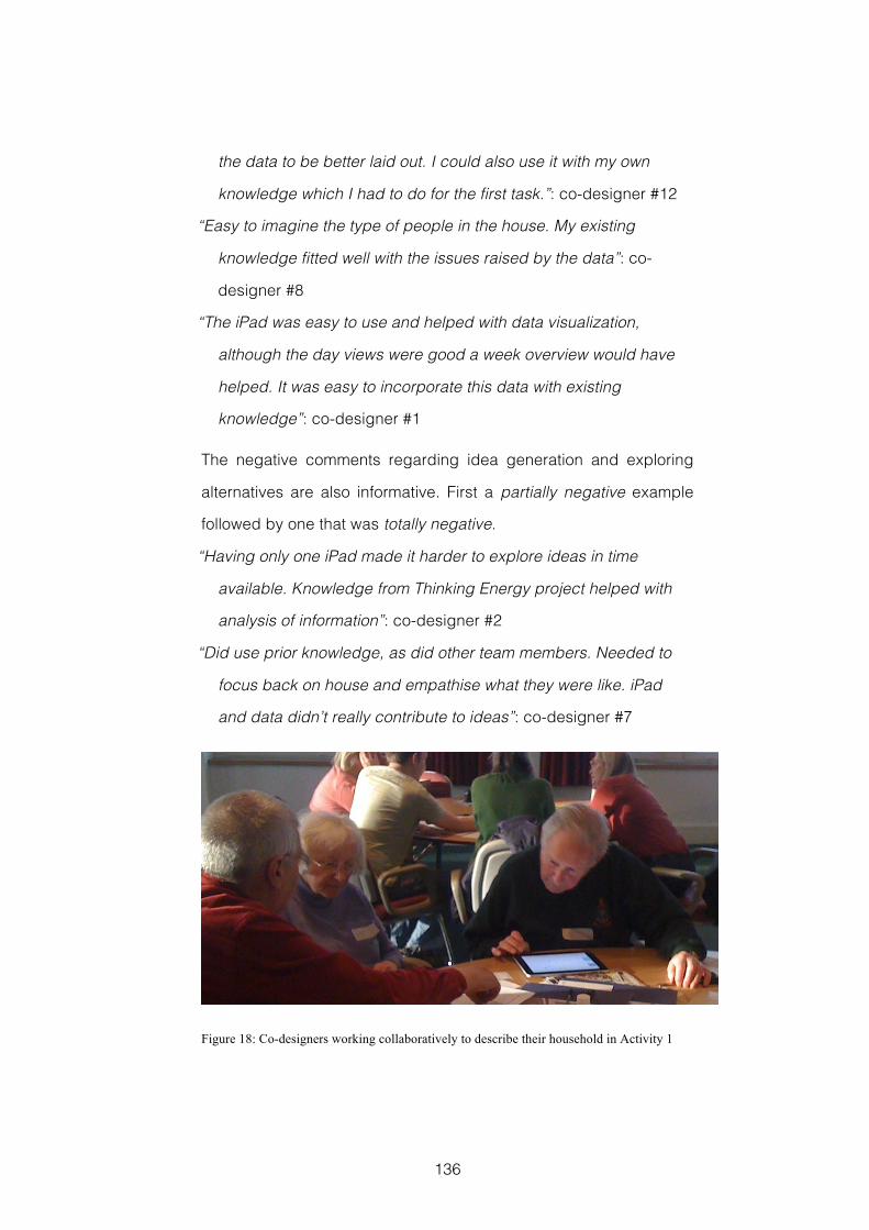
136
the data to be better laid out. I could also use it with my own
knowledge which I had to do for the first task.”: co-designer #12
“Easy to imagine the type of people in the house. My existing
knowledge fitted well with the issues raised by the data”: co-
designer #8
“The iPad was easy to use and helped with data visualization,
although the day views were good a week overview would have
helped. It was easy to incorporate this data with existing
knowledge”: co-designer #1
The negative comments regarding idea generation and exploring
alternatives are also informative. First a partially negative example
followed by one that was totally negative.
“Having only one iPad made it harder to explore ideas in time
available. Knowledge from Thinking Energy project helped with
analysis of information”: co-designer #2
“Did use prior knowledge, as did other team members. Needed to
focus back on house and empathise what they were like. iPad
and data didn’t really contribute to ideas”: co-designer #7
Figure 18: Co-designers working collaboratively to describe their household in Activity 1
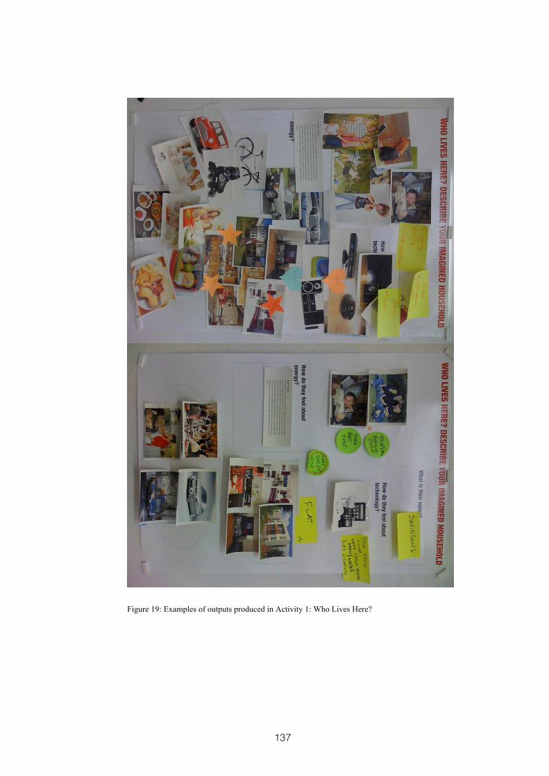
137
Figure 19: Examples of outputs produced in Activity 1: Who Lives Here?
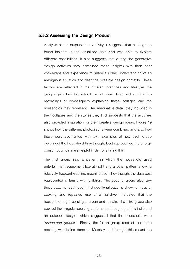
138
5.5.2 Assessing the Design Product
Analysis of the outputs from Activity 1 suggests that each group
found insights in the visualized data and was able to explore
different possibilities. It also suggests that during the generative
design activities they combined these insights with their prior
knowledge and experience to share a richer understanding of an
ambiguous situation and describe possible design contexts. These
factors are reflected in the different practices and lifestyles the
groups gave their households, which were described in the video
recordings of co-designers explaining these collages and the
households they represent. The imaginative detail they included in
their collages and the stories they told suggests that the activities
also provided inspiration for their creative design ideas. Figure 19
shows how the different photographs were combined and also how
these were augmented with text. Examples of how each group
described the household they thought best represented the energy
consumption data are helpful in demonstrating this.
The first group saw a pattern in which the household used
entertainment equipment late at night and another pattern showing
relatively frequent washing machine use. They thought the data best
represented a family with children. The second group also saw
these patterns, but thought that additional patterns showing irregular
cooking and repeated use of a hairdryer indicated that the
household might be single, urban and female. The third group also
spotted the irregular cooking patterns but thought that this indicated
an outdoor lifestyle, which suggested that the household were
‘concerned greens’. Finally, the fourth group spotted that more
cooking was being done on Monday and thought this meant the
139
household might batch cook meals and reheat them later in the
week. They also noted a pattern in the heating that suggested a
household member worked from home or worked part-time.
Each shows that a pattern was first identified in the visualized data,
for example the apparently infrequent cooking. This was then
explained in a way that reflected the knowledge, experience and
concerns of those co-designers, and also the insights gained from
other patterns identified in the data, for example when the cooking
data was combined with data about using the hairdryer. These
insights and the shared understanding then seem to provide
inspiration for creative descriptions explaining the contexts in which
the energy consumption data might have been generated.
Looking at the collages describing new service design ideas that
were created in Activity 5, for example Figure 20, there is again
evidence of the way that insights found in the visualized energy
consumption data, which were represented in the households
created in Activity 1, are reflected in the service deign ideas. Two of
the groups each developed separate ideas for a detailed energy
audit. Both of these ideas described energy and money saving
services that would be built on top of the fine-grained information
and detailed historical consumption reports that can be generated
from smart home energy data. Both of these were the result of
patterns of energy consumption, particularly in lighting and heating,
that the groups thought reflected inefficient use. This also reflected
the group members’ interest in reducing their own energy
consumption and saving money.
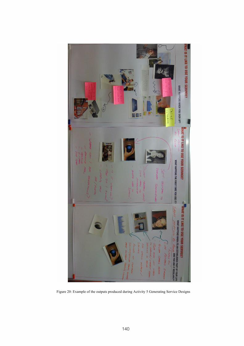
140
Figure 20: Example of the outputs produced during Activity 5 Generating Service Designs
141
The third group developed a service that would automatically
manage heating and lighting based on what it can learn about the
household’s behaviour from the data generated by the smart energy
products over time. This service similarly reflected the patterns of
heating and lighting consumption highlighted by the two groups
who suggested the energy audit services. These patterns of heating
and lighting consumption were also highlighted in the competition
responses that were completed for Activity 2, and which are
discussed below. The final group developed an automated
shopping service based on a smart fridge. This reflected the
cooking patterns they had seen and which they thought meant the
household lived a busy, outdoor lifestyle.
To assess the creativity of these outputs I was looking for evidence
of two key factors. First, that the ideas developed were appropriate
for the household that group of co-designers had identified as being
represented in the data, and which reflected patterns of energy
consumption behaviour they had uncovered. Second, I was looking
for novelty, in the form of ideas for new services or new
implementations of existing services, but which were different from
those already familiar. This follows an understanding of creativity as
being something that can show both novelty and a measure of utility
e.g. (Sternberg & Lubart, 1999), and provided a connection to the way
design outputs were evaluated in section 4.4.2.
In each of the service ideas described there was evidence of
appropriateness. All were a development of the insights and ideas
gained from the visualized data during the first two activities, and a
coherent story of how the service ideas respond to the needs of the
household members can be told. In addition, all of these ideas have
142
elements of novelty in the way they were to be implemented. They
can be considered to show what we might term incremental
creativity as they build on the already familiar. The energy audits
build on ideas already current in the longer term E.ON technology
trial that the workshop participants were recruited from. The smart
fridge is an idea, which in different forms has been around for the
last decade, occasionally gaining a high public profile (Kuniavsky,
2008). The service that would automatically adjust heating and
lighting has some similarities to products like the Nest thermostat16.
Finally, analysis of the competition entries completed during Activity
2 also shows evidence of co-designers’ insight seeking being
effectively supported. This is because they were clearly able to spot
patterns and relationships between the data. Similarities between
the different groups’ responses show how these were consistently
found. The following three ideas were listed somewhere amongst
their five suggestions by all the groups:
Use washer and drier overnight during cheaper tariffs
More intelligent and efficient use of heating and hot water
Turn lights off when out of the room
5.6 Discussion
This case study suggests that the activities in which co-designers
used an iPad to investigate visualized smart energy data were
engaging in a real world setting. It also suggests that the visualized
data represented in the iPad interface provided effective support for
co-designers insight seeking, through their finding clear patterns
and relationships, and that using the iPad to present the
16 www.nest.com
143
visualization enabled collaboration and fitted in well with other
design activities. The combination of generative design techniques
and visualized domain-relevant data appears to have been
effective. Co-designers used their knowledge and experience to
develop possible explanations for things that the data left
ambiguous, such as different reasons for why the household’s
cooking might appear erratic. There is also some evidence that the
insights from the data and the shared understanding of the design
context inspired creative ideas. Similarly to the design experiment
reported in Chapter 4, this seems more evident in the
appropriateness of the ideas than in their novelty. However, such
incremental levels of creativity are often the result of human-centred
design methods (Norman, 2010).
Co-designers’ responses gathered using the Reflection Postcards
were not entirely positive, and there was evidence that working with
the information visualization interface was difficult for two of the co-
designers. To some degree this was mitigated by their involvement
with the generative activities, which helped them share the insights
gained by other group members, and contribute their own
experience and understanding of the design context. This should be
investigated further, and may indicate that co-designers would
benefit from closer facilitation and more personal support. However,
overall the evaluation data discussed here seem to provide
additional evidence in support of the positive findings from the
design experiment reported in Chapter 4.
In Activity1 and Activity 5, the visualized data, the photographs, and
the worksheets play a role that is perhaps analogous to that of the
Inspiration Cards and Concept Posters described in Inspiration
144
Card Workshop described in section 2.4.3. That is, they act as a
catalyst for collaboration and ideation, and provide an external
source of inspiration for emerging ideas. They also provide a
framework for the kind of combinational creativity discussed in
section 2.5.4.3. The worksheets provide a physical space for
participants to collect representations of things they are familiar
with, which can be associated with new insights gained from data
exploration, to build a richer understanding of the design context.
This workshop, like the one reported in Chapter 4, demonstrated
that working with domain-relevant data could inspire appropriate
ideas that demonstrate an incremental type of creativity. Norman
and Verganti (2014) discuss the difference between incremental
innovation, which leads to doing something better, and the more
rare radical innovation, which leads to doing something different.
They argue that it is changes in the meaning ascribed to a product
or service, perhaps following or alongside the introduction of new
technology, which leads to these radical innovations. An important
challenge for future work will be to try and move beyond the ability
to generate appropriate ideas, and inspire participants’ creativity in
more radical directions.
5.7 Reflections
5.7.1 Research and Evaluation Methods
5.7.1.1 Benefits and Limitat ions of Study Design
This case study described a workshop where the aim was to
engage members of the public and generate creative design ideas.
A key research aim was to investigate how the findings from the
145
design experiment detailed in Chapter 4 would translate to a real-
world setting. Here, we see evidence in support of the previous
findings. In particular we find that using an iPad to present
visualized energy data to each group of co-designers was effective
with the representative E.ON customers, much as it had with the
previous study’s participants, see section 4.6. Future workshops
may investigate using multiple iPads. However, it seems likely that
the penetration of smartphones and tablet devices is such that a
degree of familiarity with and working knowledge of these devices
can now be expected amongst large numbers the general UK
public. It should also be remembered that this was a single
workshop, held with a self-selecting group of participants who are
engaged with the technology and issues surrounding smarter
energy consumption. Because of this, the reliability of these findings
in other contexts is limited, and further study should be undertaken
in other domains and with other populations.
5.7.1.2 Limitat ions of Data Collection and Analysis
A key challenge in creative design workshops is generating an
atmosphere that is relaxed, supportive, engaging and playful.
Collecting evaluation data can interfere with this aim, because
stopping creative activities to complete questionnaires may result in
participants feeling that they themselves are being assessed, which
can be a cause of anxiety and impact negatively on their creativity.
The Reflection Postcards were successful in overcoming this issue,
and they provide data similar to that available from open-ended
questionnaire questions. Responses are also gathered at a timely
point, when the experiences are fresh in participants’ minds.
However, they do not provide the depth of response that might be
146
achieved with other more traditional qualitative approaches. Further
questioning, asking for more detailed responses, either in follow up
interviews or later questionnaires would be one method of
augmenting this data.
Another way to support the data captured from Reflection Postcards
would be to provide each group of participants with a facilitator who
could observe and report on their activities in more detail. This might
be further augmented by video recording each group. However, the
use of video cameras might be counter productive, and have a
negative, inhibiting effect on participants’ creative activities.
5.7.2 Takeaways
T5.1 Workshop activities that combine generative design
techniques with seeking insight in visualized domain-relevant data
appear to inspire useful design insights.
T5.2 Interactive iPad interfaces in which domain-relevant data are
visualized appear to provide an engaging tool for co-designers
who are members of the public, in a real world setting.
T5.3 Presenting visualized data on a tablet device such as an iPad
appears to provide a form factor that is suitable for co-designers
collaborative design activities during generative design.
T5.4 Generative design toolkits, which include items such as
photographs, appear to be an effective way of helping co-
designers interpret the ambiguous contexts that domain-relevant
data are drawn from.
147
6 Case Study: MIRROR
In this case study I continue to investigate the generative design
approach used in Chapter 5. I also use the 5WsH creativity
technique and custom hexagonal worksheets for the first time.
These were then used in all of the studies that follow this one.
6.1 Introduction
Design problems are often complex and open, and in such cases it
is typically only the value desired from the design outcome that is
known upfront. One of the key challenges with such problems is to
create both an artefact (product, service or system) and also an
understanding of its intended use, the means by which this artefact
contributes to the desired value (Dorst, 2011). In such a situation it is
common for the design problem and the design solution to co-
evolve as the designer’s understanding increases and the creative
design process progresses (Dorst & Cross, 2001). However, whilst
such design problems are undetermined, they are not entirely free,
and there remain a number of hard constraints to be identified
through information gathering and analysis during early-stage
design work (Dorst, 2003). When data are amongst a project’s key
design materials, the nature of those data available is likely to be
one of these hard constraints. It is therefore important to understand
their type and features, where they come from and how they might
be used, and also to identify possible connections between them at
an early stage.
148
As part of a longitudinal investigation into a human-centred
approach to designing geovisualization applications, Lloyd and
Dykes (2011) undertook collaborative stakeholder workshops. Their
aim was to share an understanding of the domain data and of the
possibilities offered by visualization during early-stage design and
requirements gathering activities. This was to better understand
needs, and to build knowledge and trust between collaborators. In
design work undertaken with E.ON energy analysts, as part of the
“Visualising the smart home: creative engagement with customer
data” project discussed in chapters 4 and 5, this approach to
human-centred information visualization design was extended to
incorporate applied creativity techniques (Goodwin et al., 2013). In
other instances, designers of information visualization interfaces and
data graphics might typically undertake these exploratory
processes using computational tools, such as the R programing
environment, to work directly with data. Such a process is described
in (Yau, 2011, pp.71-74). Here, I wanted to know if co-designers
would be able to share their individual perspectives and gain an
improved understanding of the available data, including how they
are generated and where they might be used, through workshop
activities that combined generative design with applied creativity
techniques. I also wanted to know if these tools and techniques
would support co-designers’ creative processes as they investigate
possible new connections and uses for these data.
6.2 Research Questions
In developing the CoDesign With Data approach I am seeking to
understand how insight gained from domain-relevant data can
149
improve co-designers’ understanding of the domain context and
inspire creative design ideas. As outlined above, a key aspect of
this approach will be methods for understanding the nature and
potential of those data available to a design situation. My initial
exploration of this was guided by three research questions:
RQ6.1 Would workshop activities in which generative design is
combined with applied creativity techniques help co-designers
share their individual perspectives on the data available to a
design situation?
RQ6.2 Would these activities improve individual co-designer’s
understanding of those data, where they come from and how they
might be used?
RQ6.3 Would these activities inspire co-designers’ creative ideas
as they look for possible new uses for these data during
exploratory design?
An opportunity to investigate these questions came through a
workshop to explore ways of realising additional value from the data
generated by different applications associated with MIRROR17, a
European FP7 research project. Here was an undetermined design
problem, in which data were a key material, and that involved a
number of different stakeholders, each with a partial understanding
of, and a different perspective on, the available data. This case
study describes the workshop that took place to explore this design
opportunity. Details of the understanding captured and the design
ideas generated during this workshop are available online18.
17 www.mirror-project.eu 18 www.grahamdove.com/mirror
150
6.3 Workshop Details
Tools used: Generative Design Toolkit
Techniques used: 5WsH, Combinational Creativity, Generative
Design
6.3.1 Background
This case study describes a workshop held over one full day in
Amsterdam, Holland. Co-designers were representatives from
consortium members of MIRROR; a European FP7 research project
investigating the creation of easily used applications to support
employees’ reflective learning at work. The aim for this workshop
was for co-designers to gain a better understanding of the data
generated by the applications being developed in some of the
different work packages in MIRROR, and use this understanding to
identify new ways of connecting these data to design novel
services.
6.3.2 Participants
The workshop took place with a total of ten co-designers, six male
and four female, representing six different work packages. Each of
the co-designers had an in depth understanding of the data
generated by the applications developed for their own work
package, but more limited knowledge of that generated by other
MIRROR applications.
6.3.3 Workshop Materials
Co-designers were given the following materials to help them with
the workshop’s activities:
151
A Generative Design Toolkit , described below
The workshop took place in a large room with plenty of space and
tables that could be combined and arranged in a variety of ways to
facilitate work in groups of different sizes. Co-designers were
provided with refreshments and a video camera was used to record
co-designers’ explanations of their design ideas after each of the
activities. The generative design toolkit that was put together for the
activities undertaken in this workshop was made up of the following
items:
A2 sized hexagonal 5WsH worksheets used in Activity 1
A3 sized hexagonal 5WsH worksheets used in Activity 2
A 2.1m x 1.8m blank sheet of paper used to layout the MIRROR data
“map” for Activity 2 & Activity 3
Coloured embroidery thread to make data links explicit in Activity 2
and Activity 3
Materials for creating collages in Activity 1 and Activity 3 including
coloured shapes, human figures, cut-outs of words relevant to
MIRROR (e.g. Creative, Prompt, Reflection, Stories); the care
home domain, which is one of the MIRROR test bed domains
(e.g. Carer, Co-Worker, Family, Friend, Home, Manager, Notes,
Resident); or data (e.g. Audio, Categorical, Complex, Date/Time,
GPS Location, Image, Numeric, Simple, Text, Video)
Typical workshop stationary such as coloured pens, scissors, glue,
tape and post-it notes
Examples of all the materials used in this workshop can be found in
Appendix C of this thesis.
152
6.3.4 Workshop Activit ies
Following a brief introductory explanation of the day’s proposed
activities, the workshop was divided into three main sections. These
were separated by a break for lunch and another for afternoon
refreshments. Finally there was an individual reflection activity that
was used for evaluation purposes, and is discussed in section 6.4.
6.3.4.1 Activity 1: Data Descript ion
In this activity, participants worked in two smaller groups, each with
five members. Its purpose was to start sharing individual co-
designers understanding of the data generated in their MIRROR
work package. In each group, the co-designers took turns to
describe the application or applications being developed in their
work package to the other members of that group. They were asked
to outline how these applications would be used, the data they
generate, and what that data is subsequently used for. To capture
this knowledge, the remaining participants in the group were
creating a visual representation of the data being described. To do
this they used an A2 sized 5WsH hexagonal worksheet for each
application, together with any of the other materials provided in their
generative design toolkit. The co-designer who was describing the
application and its data was instructed to use the questions printed
on the 5WsH hexagonal worksheet as a guide for their description,
and those creating the visual representation used these same 5WsH
prompts as a basis for further questions of their own. The 5WsH
technique was introduced in section 2.5.4.1.
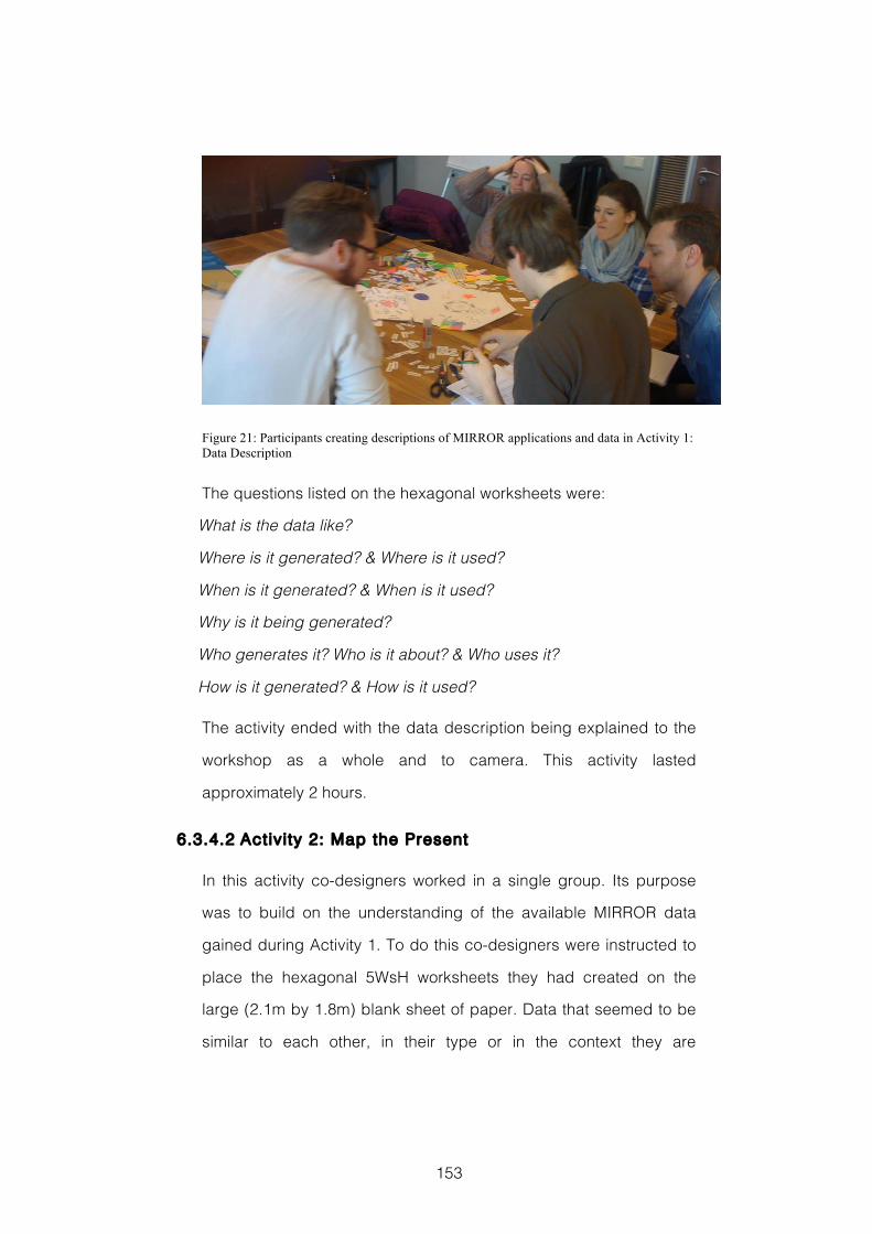
153
Figure 21: Participants creating descriptions of MIRROR applications and data in Activity 1: Data Description
The questions listed on the hexagonal worksheets were:
What is the data like?
Where is it generated? & Where is it used?
When is it generated? & When is it used?
Why is it being generated?
Who generates it? Who is it about? & Who uses it?
How is it generated? & How is it used?
The activity ended with the data description being explained to the
workshop as a whole and to camera. This activity lasted
approximately 2 hours.
6.3.4.2 Activity 2: Map the Present
In this activity co-designers worked in a single group. Its purpose
was to build on the understanding of the available MIRROR data
gained during Activity 1. To do this co-designers were instructed to
place the hexagonal 5WsH worksheets they had created on the
large (2.1m by 1.8m) blank sheet of paper. Data that seemed to be
similar to each other, in their type or in the context they are
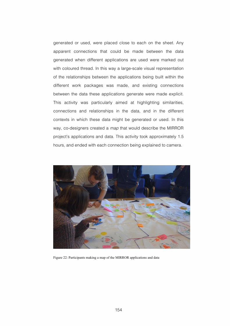
154
generated or used, were placed close to each on the sheet. Any
apparent connections that could be made between the data
generated when different applications are used were marked out
with coloured thread. In this way a large-scale visual representation
of the relationships between the applications being built within the
different work packages was made, and existing connections
between the data these applications generate were made explicit.
This activity was particularly aimed at highlighting similarities,
connections and relationships in the data, and in the different
contexts in which these data might be generated or used. In this
way, co-designers created a map that would describe the MIRROR
project’s applications and data. This activity took approximately 1.5
hours, and ended with each connection being explained to camera.
Figure 22: Participants making a map of the MIRROR applications and data
155
6.3.4.3 Activity 3: Map the Future
In this activity co-designers worked in a single group. Its purpose
was to use the understanding of the available MIRROR data gained
during the previous two activities as inspiration for creative ideas.
These ideas would describe new uses and novel combinations of
the MIRROR data that might lead to innovative services being
designed. Co-designers were instructed to look for three kinds of
opportunity. They might: identify data from one application that
could be combined with data from another; take the data from one
application and use it to extend the functionality of another
application; or to take the data from one application and place it into
the context in which another application is used.
To help make these new connections explicit and generate ideas for
new services, participants used the A3 sized 5WsH hexagonal
worksheets, together with any of the other materials provided in their
generative design toolkit. Each of these hexagonal new data
connection idea sheets that the co-designers created was then
placed on the MIRROR data map and any connections with existing
applications were again made explicit with coloured thread. The
questions listed on the 5WsH worksheets were:
What is the data?
Where is it going to be used?
When is it going to be used?
Why is it going to be useful?
How is it going to be used?
Who is going to use it?
This activity took approximately 1.5 hours, which included time for
each idea to be explained to camera.
156
6.4 Evaluation Methods
My aim in this case study was to investigate whether co-designers
would be able to share their individual perspectives and gain an
improved understanding of the data available in a design situation
through workshop activities that combined generative design with
applied creativity. In addition I wanted to know if these tools and
techniques would inspire co-designers’ creative ideas as they
investigate possible new connections and uses for these data.
Similarly to that reported in section 5.4, the evaluation methods used
here will be discussed in terms of the people designing and the
design product. This choice is introduced in section 3.2. Again
similarly to the evaluation reported in section 5.4, I used Reflection
Postcards to better understand how the tools and techniques used
were Supporting the People Designing, and used the methods
introduced in section 3.2.2 when Assessing the Design Product.
6.4.1 Supporting the People Designing
To evaluate co-designers’ perceptions of the support the tools and
techniques used had provided for their insight seeking, and the
inspiration provided for their creative ideas during the workshop
activities, they were given three Reflection Postcards. The prompt
on the first Reflection Postcard was used to evaluate whether the
workshop’s activities had helped to improve their understanding of
the available data. It asked co-designers to consider whether they
had an increased understanding of the data following the workshop,
and whether this understanding was represented in the workshop
outputs. The prompt read:
157
“Do you feel that the workshop has increased your understanding of
the data being generated in the Mirror Project? Does the map we
created represent this understanding?”
The prompt on the second Reflection Postcard was used to assess
the inspiration provided for co-designers’ creative ideas. The
prompt asked participants to consider their creative contribution to
the workshop’s activities, and whether these contributions were
represented in the workshop outputs. The prompt read:
“Do you feel that you were able to contribute new ideas and
suggestions to the workshop? Were these reflected in the map we
created?”
The prompt on the third Reflection Postcard was used to address
the extent to which individual co-designer’s were able to express
their perspective on the emerging design situation, and how
accurately these different views were represented in the workshop’s
output. The prompt read:
“Do you feel that you were able to express your perspective on the
Mirror Project data? Was this satisfactorily represented when we
created the map?”
Again in a similar way to that described in section 5.4.1, analysis of
the responses involved: assessing whether the individual concerns
had been responded to; and whether that response was a totally
positive, partially positive, neutral, partially negative or totally
negative reflection.
6.4.2 Assessing the Design Product
To assess the design product I looked at the output of each activity
in turn. When analysing the outputs generated during Activity 1 I
158
was looking for details such as: the data type or types generated;
how often data are generated; who the application’s users are;
where and when the application is used and data are generated; the
work context in which the data are generated; and the work context
in which the data are analysed or reflected upon. This would
suggest that the co-designer representing the work package
developing the application in question had successfully shared their
individual understanding of those data with the other members of
the group, who had been able to represent that understanding with
clarity and detail.
To analyse the outputs generated during Activity 2, I recorded the
number of connections between existing MIRROR applications and
their data, which the co-designers were previously unaware of, but
that had now been made explicit. I then looked at these connections
in more detail to check that they were consistent and valid and
therefore provided evidence of an improved understanding of the
data.
In my analysis of the outputs from Activity 3 I first recorded the
number of new ideas for possible connections between MIRROR
data or applications and possible new services. Following this, I
looked at these ideas in more detail. Similarly to my analysis of the
hexagons made in Activity 1, I was looking for details such as: the
data type or types being generated or shared; details about the
users who the new service might benefit; where, when and in which
work contexts the new service might be used; and how and in which
contexts the new data connections might help reflective practice.
Examples of such richness and detail in the way co-designers’
described and represented these ideas would suggest that they
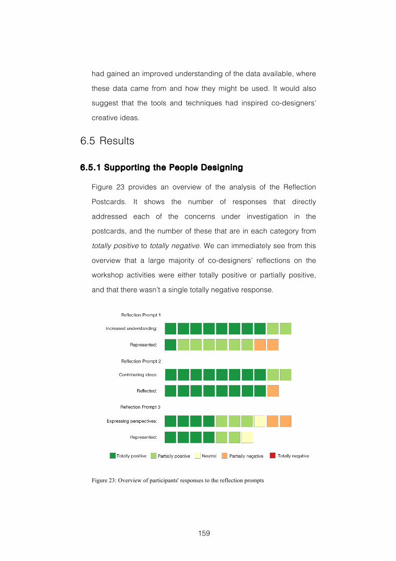
159
had gained an improved understanding of the data available, where
these data came from and how they might be used. It would also
suggest that the tools and techniques had inspired co-designers’
creative ideas.
6.5 Results
6.5.1 Supporting the People Designing
Figure 23 provides an overview of the analysis of the Reflection
Postcards. It shows the number of responses that directly
addressed each of the concerns under investigation in the
postcards, and the number of these that are in each category from
totally positive to totally negative. We can immediately see from this
overview that a large majority of co-designers’ reflections on the
workshop activities were either totally positive or partially positive,
and that there wasn’t a single totally negative response.
Figure 23: Overview of participants' responses to the reflection prompts
160
Analysis of the responses to the prompt on the first Reflection
Postcard shows that all ten co-designers responded with regards to
their increased understanding of the MIRROR data. Of these, eight
responses were totally positive and that the two remaining were
partially positive. A typical example of the totally positive responses
comes from co-designer #2:
“Yes, indeed. Although we have heard what different apps do in the
past 2.5 years, I only now realised some new aspects of various
apps that I didn’t know.”
Of the partially positive respondents, one noted some new insight
but considered their understanding before the workshop to already
have been good, whilst the other acknowledged an increased
understanding but noted that not all MIRROR work packages and
application tools were represented.
There were nine responses regarding how this understanding was
represented. Of these, one was totally positive, six were partially
positive, and two were partially negative. A typical example of the
partially positive responses comes from co-designer #8:
“Yes! Though the map got a bit confusing at the end, which is
basically awesome, because that means that we did (good) work
:) Personally I suggest to write down the newly created knowledge
of the map in an organised, structured textual way.”
Three of the co-designers who were partially positive had noted that
they thought the map became either complicated, difficult to
analyse, or hard to remember. A similar thing was also noted by one
of the co-designers whose response was partially negative. This co-
designer said they ‘believe it is hard to understand the map
afterwards, especially alone’.
161
Analysis of co-designers’ responses to the prompt on the second
Reflection Postcard showed all ten responding with regards to their
ability to contribute new ideas. Eight of the responses were totally
positive with respect to this question, whilst the remaining two were
partially positive. A typical example of the totally positive responses
comes from co-designer #1:
“Yes I was able to contribute a couple of ideas I had thought about
in the past and set them into the right context.”
There were nine responses regarding how well this was reflected in
the final output. Eight were totally positive, and one was partially
negative. The partially negative response commented on the
process becoming ‘too much’ and that they had to concentrate on
the contributions of other co-designers. A typical example of the
totally positive responses comes from co-designer #3
“and [Yes] to the map we made all together. I was a bit sad the
session for generating new ideas didn’t go on far longer”
Analysis of responses to the prompt on the third Reflection Postcard
showed all ten co-designers responded with regards to how well
they could express their individual perspectives. Four responses
were totally positive, three were partially positive, and one co-
designer, who was unsure that they had a particular perspective on
any of the data, was neutral. An example of the totally positive
responses comes from co-designer #7:
“Yes! It’s interesting that there are that many different views on the
project. Actually I wasn’t aware of that fact. At least I did not know
about all of them”
The remaining two co-designers’ responses were partially negative.
An example of these comes from co-designer #2:
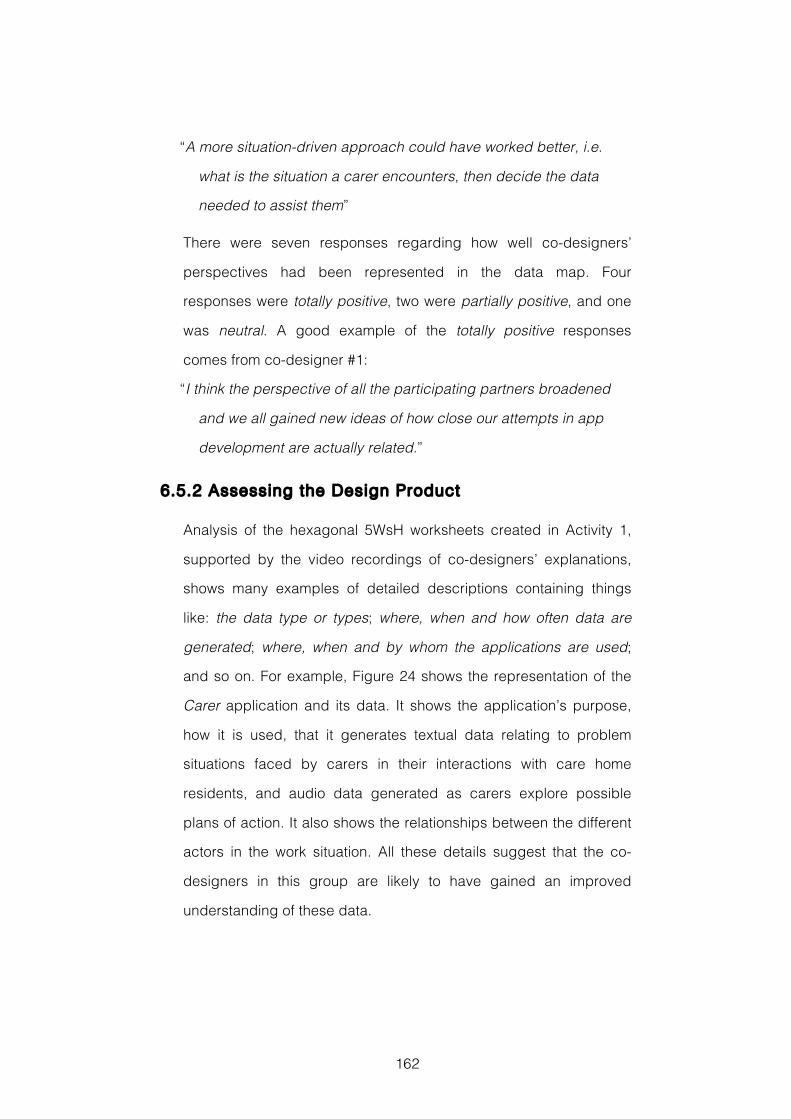
162
“A more situation-driven approach could have worked better, i.e.
what is the situation a carer encounters, then decide the data
needed to assist them”
There were seven responses regarding how well co-designers’
perspectives had been represented in the data map. Four
responses were totally positive, two were partially positive, and one
was neutral. A good example of the totally positive responses
comes from co-designer #1:
“I think the perspective of all the participating partners broadened
and we all gained new ideas of how close our attempts in app
development are actually related.”
6.5.2 Assessing the Design Product
Analysis of the hexagonal 5WsH worksheets created in Activity 1,
supported by the video recordings of co-designers’ explanations,
shows many examples of detailed descriptions containing things
like: the data type or types; where, when and how often data are
generated; where, when and by whom the applications are used;
and so on. For example, Figure 24 shows the representation of the
Carer application and its data. It shows the application’s purpose,
how it is used, that it generates textual data relating to problem
situations faced by carers in their interactions with care home
residents, and audio data generated as carers explore possible
plans of action. It also shows the relationships between the different
actors in the work situation. All these details suggest that the co-
designers in this group are likely to have gained an improved
understanding of these data.
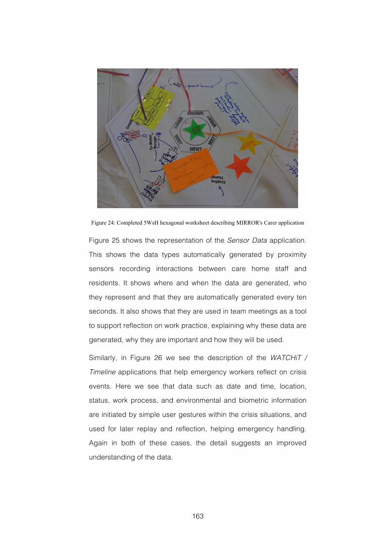
163
Figure 24: Completed 5WsH hexagonal worksheet describing MIRROR's Carer application
Figure 25 shows the representation of the Sensor Data application.
This shows the data types automatically generated by proximity
sensors recording interactions between care home staff and
residents. It shows where and when the data are generated, who
they represent and that they are automatically generated every ten
seconds. It also shows that they are used in team meetings as a tool
to support reflection on work practice, explaining why these data are
generated, why they are important and how they will be used.
Similarly, in Figure 26 we see the description of the WATCHiT /
Timeline applications that help emergency workers reflect on crisis
events. Here we see that data such as date and time, location,
status, work process, and environmental and biometric information
are initiated by simple user gestures within the crisis situations, and
used for later replay and reflection, helping emergency handling.
Again in both of these cases, the detail suggests an improved
understanding of the data.
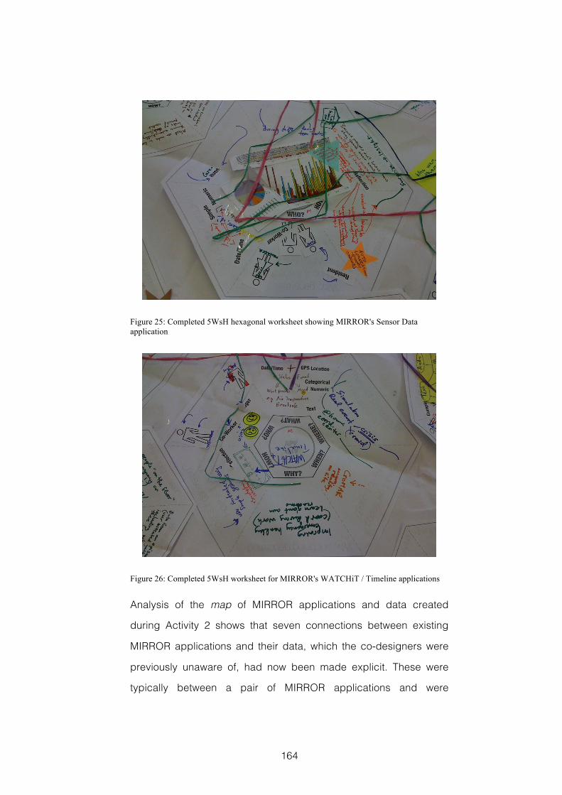
164
Figure 25: Completed 5WsH hexagonal worksheet showing MIRROR's Sensor Data application
Figure 26: Completed 5WsH worksheet for MIRROR's WATCHiT / Timeline applications
Analysis of the map of MIRROR applications and data created
during Activity 2 shows that seven connections between existing
MIRROR applications and their data, which the co-designers were
previously unaware of, had now been made explicit. These were
typically between a pair of MIRROR applications and were
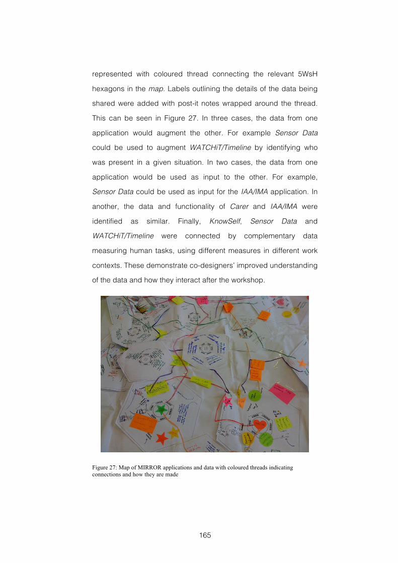
165
represented with coloured thread connecting the relevant 5WsH
hexagons in the map. Labels outlining the details of the data being
shared were added with post-it notes wrapped around the thread.
This can be seen in Figure 27. In three cases, the data from one
application would augment the other. For example Sensor Data
could be used to augment WATCHiT/Timeline by identifying who
was present in a given situation. In two cases, the data from one
application would be used as input to the other. For example,
Sensor Data could be used as input for the IAA/IMA application. In
another, the data and functionality of Carer and IAA/IMA were
identified as similar. Finally, KnowSelf, Sensor Data and
WATCHiT/Timeline were connected by complementary data
measuring human tasks, using different measures in different work
contexts. These demonstrate co-designers’ improved understanding
of the data and how they interact after the workshop.
Figure 27: Map of MIRROR applications and data with coloured threads indicating connections and how they are made
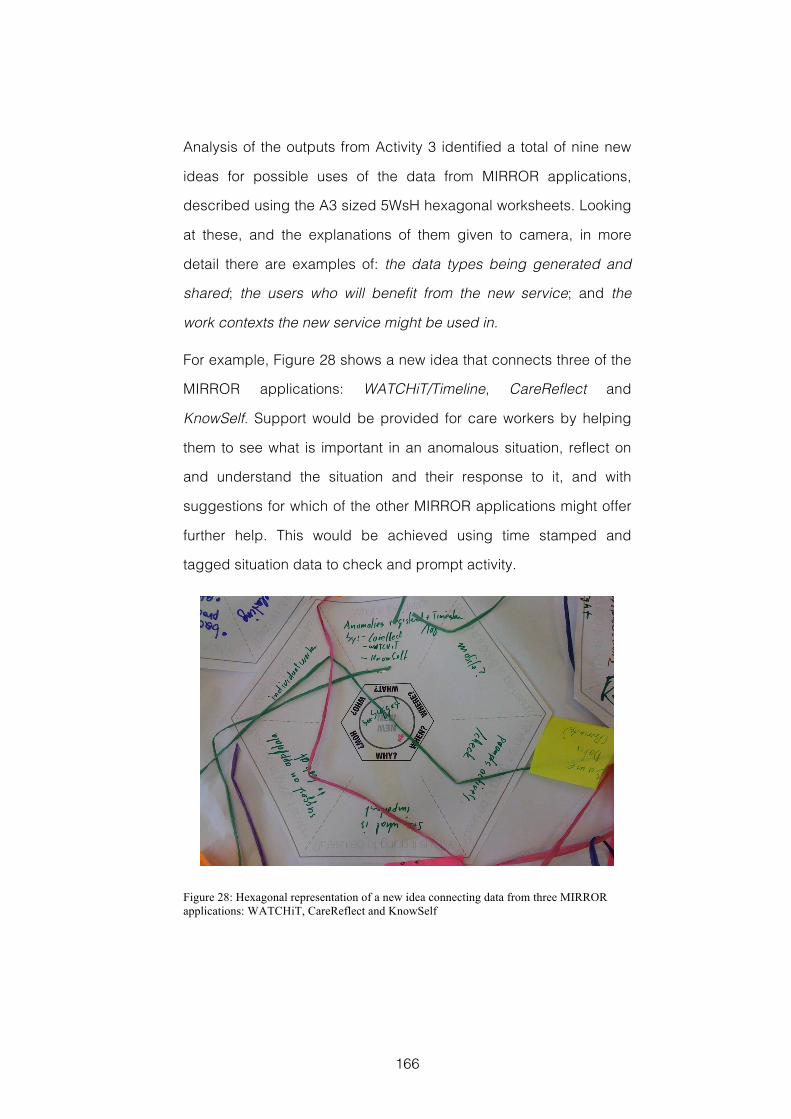
166
Analysis of the outputs from Activity 3 identified a total of nine new
ideas for possible uses of the data from MIRROR applications,
described using the A3 sized 5WsH hexagonal worksheets. Looking
at these, and the explanations of them given to camera, in more
detail there are examples of: the data types being generated and
shared; the users who will benefit from the new service; and the
work contexts the new service might be used in.
For example, Figure 28 shows a new idea that connects three of the
MIRROR applications: WATCHiT/Timeline, CareReflect and
KnowSelf. Support would be provided for care workers by helping
them to see what is important in an anomalous situation, reflect on
and understand the situation and their response to it, and with
suggestions for which of the other MIRROR applications might offer
further help. This would be achieved using time stamped and
tagged situation data to check and prompt activity.
Figure 28: Hexagonal representation of a new idea connecting data from three MIRROR applications: WATCHiT, CareReflect and KnowSelf
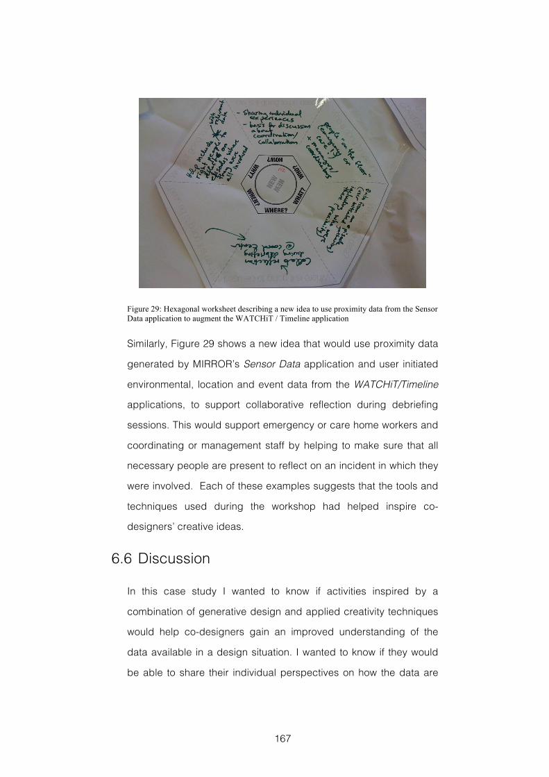
167
Figure 29: Hexagonal worksheet describing a new idea to use proximity data from the Sensor Data application to augment the WATCHiT / Timeline application
Similarly, Figure 29 shows a new idea that would use proximity data
generated by MIRROR’s Sensor Data application and user initiated
environmental, location and event data from the WATCHiT/Timeline
applications, to support collaborative reflection during debriefing
sessions. This would support emergency or care home workers and
coordinating or management staff by helping to make sure that all
necessary people are present to reflect on an incident in which they
were involved. Each of these examples suggests that the tools and
techniques used during the workshop had helped inspire co-
designers’ creative ideas.
6.6 Discussion
In this case study I wanted to know if activities inspired by a
combination of generative design and applied creativity techniques
would help co-designers gain an improved understanding of the
data available in a design situation. I wanted to know if they would
be able to share their individual perspectives on how the data are
168
generated and where they might be used, and whether all this
would help inspire creative ideas about new uses for these data.
The detail and richness in the descriptions of MIRROR applications
and their data made during Activity 1 suggests that the tools and
techniques I used during this workshop were successful in helping
co-designers share their individual perspectives, and that this
contributed to an improved understanding of these data, where they
come from and how they might be used. This improved
understanding can also be seen in the number of connections
between data that co-designers made explicit in Activity 2, and the
number of new ideas they were able to generate in Activity 3.
Co-designers’ responses to the prompts on the first and the third
Reflection Postcards provide supporting evidence with regards to
an improvement in their understanding and to how well individual
perspectives were expressed. However, co-designers’ reflective
responses also highlight some areas for possible caution. Concerns
were raised about the complexity of the map representation made
during the workshop, and how effectively the knowledge it
contained could be retained or re-used at a future date. The
knowledge in this map was translated into an online resource19, with
the intention of providing a preparatory resource for a follow-up
workshop, at which its effectiveness could be evaluated.
Unfortunately time pressure meant that the focus of each of
MIRROR’s work packages returned to evaluating existing
applications and this follow-up workshop was not possible.
The number and richness of new ideas generated during Activity 3
also suggests that the tools and techniques used during this
19 www.grahamdove.com/mirror
169
workshop were effective in helping co-designers find inspiration in
their improved understanding of the MIRROR data and their
potential uses. Responses to the second Reflection Postcard
prompt also suggest that co-designers felt able to contribute ideas,
and that those ideas were reflected in the map they created. One of
the co-designers again commented that the process of representing
ideas had become “too much” and this, combined with the
concerns about complexity shown earlier, suggests that co-
designers may require different levels of support during these
activities. Further study of effective facilitation techniques for these
activities is an area for future work. Similarly, further study should be
made into methods for effectively translating, organising, structuring
and sharing the knowledge generated.
6.7 Reflections
6.7.1 Research and Evaluation Methods
6.7.1.1 Benefits and Limitat ions of Study Design
This case study described a workshop in which the aim was to help
co-designers gain an improved understanding of the available data
and use this to inspire creative design ideas. A key objective was to
investigate whether activities combining generative design activities
with applied creativity techniques would be effective in this regard.
To do this, the 5WsH creativity technique, discussed in section
2.5.4.1 was used to help structure co-designers’ thinking, and the
hexagonal worksheets were used to help structure their outputs.
This was successful, and I repeated this combination in the design
experiment reported in Chapter 7 and the case study reported in
170
Chapter 8. The generative design activities appeared to help co-
designers share their knowledge and represent new ideas.
However, some co-designers expressed doubts about how well the
knowledge generated could be transferred. This is a concern that
will need to be considered in future studies. It should also be
remembered that this case study was exploratory, and involved a
single workshop with participants drawn from a very particular
population. Because of this the generalizability of the findings is
limited, and further study required.
6.7.1.2 Limitat ions of Data Collection and Analysis
This case study used Reflection Postcards as a key source of
evaluation data. The strengths and limitations of this method are
discussed in Chapter 5. However, in this workshop, given the
background of the participants, I may also have been able to use
questionnaires to gather more detailed evaluation data. The other
source of evaluation data was the outputs generated during the
workshop’s activities.
Whilst the number of new ideas generated during the workshop’s
activities doesn’t say anything definitively positive about the
inspiration provided for co-designers’ creative design ideas, a
severe shortage of new ideas would have raised a warning flag
about the activities’ effectiveness. Assessing creativity through the
qualitative aspects of the workshop’s outputs is also challenging,
relying on largely subjective judgements. The validity and reliability
of this evaluation method would be improved if consistent ratings
could be obtained from a number of independent domain experts.
In an exploratory case study, this evaluation method provides early
indicators, both positive and negative, of the intervention’s possible
171
impacts. Because of the evaluation difficulties highlighted above, I
chose not to include generative design activities in either of my
remaining studies, reported in chapters 7 and 8.
6.7.2 Takeaways
T6.1 Workshop activities that combine applied creativity techniques,
such as 5WsH, with generative design activities, such as
mapmaking, appear to help co-designers gain an improved
understanding of the data available to a design situation, which in
turn can help inspire creative design ideas.
T6.2 Custom worksheets, such as the hexagonal worksheets used
with the 5WsH, appear to help participants structure the ideas
they generate using applied creativity techniques.
172
7 Analytical & Intuitive Creativity
This chapter describes my second design experiment. Two
interfaces designed to prompt different styles of creative thinking
are compared. It builds on the lessons from the first design
experiment in Chapter 4 and the use of photographs during the
case study reported in Chapter 5
7.1 Introduction
Design can be described as an activity that takes place in the ‘world
of imagination’, and where exploratory interaction with artefacts
such as sketches, models and diagrams is used to manipulate
ideas and concepts (Rittel, 1987). The artefacts that facilitate this
exploration are known as design artefacts (Bertelsen, 2000), and can
take a number of different forms including pencil sketches and
digital CAD drawings (Perry & Sanderson, 1998). Other examples
include the interfaces and toolkits I have used in previous studies,
the photographs and other generative design materials discussed
by Sander and Stappers e.g. (2012, p.71) or the cards used in the
Inspiration Card Workshop, see section 2.4.3.
A key aspect of developing the CoDesign With Data approach is
building design artefacts to investigate different ways that domain-
relevant data might be used to prompt workshop participants’
insight seeking and inspire creative design ideas. In section 2.5.1,
we saw that there are a number of possible ways to visually
represent these data. These include the type of information
173
dashboards used to analyse business data described by Few
(2006), and the ambient, social or artistic visualization techniques
that Pousman, Stasko and Mataes (2007) describe as casual
information visualization. We also saw how different styles of
visualization design have been categorised as traditional information
visualization or direct visualization (Manovich, 2011), and as
analytical visualization or artistic visualization (Kosara, 2007). In
section 2.5.3 we saw how creative cognition can be prompted,
inspired and supported using different styles of applied creativity
technique, and how these techniques can be categorised as either
analytical or intuitive (Couger et al., 1993).
Parallels can be drawn between traditional (Manovich, 2011) or
pragmatic (Kosara, 2007) styles of visualization, used for analytical
investigation of quantitative data, and analytical techniques for idea
generation (Couger et al., 1993). Both prompt and support a
structured, linear, stepwise interrogation and exploration of
information as a route to gaining insight and generating new ideas.
Both are also concerned with organizing and decomposing the
available information as a tool for problem solving. Parallels can also
be drawn between the direct (Manovich, 2011), casual (Pousman et al.,
2007) and artistic (Kosara, 2007; Viégas & Wattenberg, 2007) styles of
visualization, described in section 2.5.1, which are used to
represent information, including media objects such as
photographs, in an evocative, or ambient and peripheral way, and
the intuitive techniques for idea generation. Both can be said to
directly prompt more subjective insights, drawn from the
unconscious in a way that might surprise the person involved.
174
In chapters 4 and 5 we saw how the type of quantitative data
generated by smart energy meters can be represented in a
dashboard style interface to reveal interesting insights into energy
consumption practices, and how these can be used to prompt
creative design ideas. Equally, it is also possible that insight
regarding energy consumption practices might be gained through
the study of social media data, such as photographs on Flickr20 or
Tweet21 streams. Using these types of data as a way to understand
social practice is discussed by Boyd and Crawford (2012) and
Manovich (2012). My aim for this study was to investigate whether
the parallels between the different categories of applied creativity
technique and the different categories of information visualization
design style could be exploited in digital design artefacts. If this is
the case then participants might use these different sources of
domain-relevant data in different ways, and to prompt different types
of creative design idea.
7.2 Research Question
To explore this in more detail I investigated the ways in which
participants’ idea generation activities varied when given one of two
alternative digital artefacts as a source of design inspiration. The
first of these was an interface designed to prompt creative cognition
in an analytical way by visualizing smart energy data in a traditional
style. This was similar to the interfaces I had given to participants
during the studies reported in chapters 4 and 5. The second of
these was an interface designed to prompt creative cognition in an
intuitive way by presenting Flickr photographs in a direct 20 www.flickr.com 21 www.twitter.com
175
visualization style. In addition to its role in prompting creative
thought in an intuitive way, this interface was also an alternative way
of introducing the more ambiguous domain-relevant information
represented in the photographs used as part of the generative
design toolkit I had given to participants in Chapter 5’s study. In the
study reported here I was guided by the following research
question:
RQ7.1 How would participants’ idea generation activities differ?
When given:
A: A digital design artefact designed to prompt creative cognition
in an analytical way by visualizing smart energy data in a
traditional style.
B: A digital design artefact designed to prompt creative cognition
in an intuitive way by presenting photographs from social
media in a direct visualization style.
To undertake this investigation I planned a small-scale design
experiment (Cash et al., 2012). Design experiments are discussed
in more detail in section 3.1. In this study, the design context was
that of domestic energy consumption, and the variable of interest
was the different digital design artefacts given to participants to
inspire their idea generation. In addition to the two conditions
represented by each of the design artefacts outlined above, this
design experiment also had participants in a control condition, in
which no additional source of inspiration was given, and in a
condition where participants were given printed reports outlining
changes in energy consumption. This last condition was intended
to act in a similar way to that of a placebo condition (Cash et al., 2012)
in that it would provide as an intervention a familiar artefact with
176
which each of the interfaces under consideration could also be
compared. In this condition, participants were given two printed
reports generated by the UK Energy Saving Trust22. These reports
are of the type often used to inform design projects and which might
be made available to focus groups.
7.3 Workshop Details
Tools used: iPad Information Visualization Interface, iPad Flickr
Photograph Interface, Printed Reports, Supplementary Information
Sheets, Worksheets, Workshop Stationary
Techniques used: 5WsH, Brainstorming with Post-its,
Combinational Creativity
7.3.1 Background
In this design experiment, eight groups of three participants each
were taken through a workshop, typically lasting around two hours,
in one of four conditions, with two workshops in each condition:
C1: Idea generation with a digital design artefact designed to
prompt creative cognition in an analytical way by visualizing smart
energy data in a traditional style
C2: Idea generation with a digital design artefact designed to
prompt creative cognition in an intuitive way by presenting
photographs from social media in a direct visualization style.
C3: Idea generation with printed reports outlining changes in energy
consumption practices.
C4: Idea generation with no additional source of inspiration.
22 www.energysavingtrust.org.uk
177
In each of these workshops, participants were given the same
objective, derived from a public challenge set by NESTA (NESTA,
2013), and worded as follows:
‘The aim of this challenge is to come up with ideas for new products,
technologies, services or incentives that shift domestic electricity
demand to off-peak times in order to reduce carbon emissions.’
To increase the ecological validity of the study (Brewer, 2000), the
activities under investigation were carried out within a full workshop,
taking participants through each stage of the creative design
process. Each workshop followed exactly the same format.
7.3.2 Participants
A total of twenty-four participants aged between 22 and 45 were
recruited, three in each of the eight workshops. There were fourteen
male and ten female participants. These included members of the
Environmental Champions Network at City University London, who
are volunteer student and staff representatives with an interest in
and knowledge of energy saving and environmental issues;
postgraduate electrical engineering and environmental technology
students; and postgraduate students studying interaction design,
information visualization, and creativity science.
Participants from different backgrounds were distributed across the
different workshops, with each workshop having a mix of
participants who contributed knowledge from the energy domain,
and of a design discipline or the study of creativity. The intention
here was to provide each workshop with participants who had
complementary skills and experience that would help them address
different aspects of the design challenge.
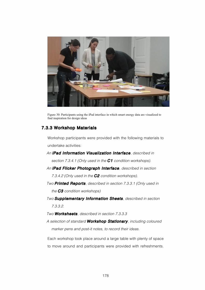
178
Figure 30: Participants using the iPad interface in which smart energy data are visualized to find inspiration for design ideas
7.3.3 Workshop Materials
Workshop participants were provided with the following materials to
undertake activities:
An iPad Information Visualization Interface, described in
section 7.3.4.1 (Only used in the C1 condition workshops).
An iPad Fl icker Photograph Interface, described in section
7.3.4.2 (Only used in the C2 condition workshops).
Two Printed Reports, described in section 7.3.3.1 (Only used in
the C3 condition workshops)
Two Supplementary Information Sheets, described in section
7.3.3.2.
Two Worksheets, described in section 7.3.3.3
A selection of standard Workshop Stat ionary, including coloured
marker pens and post-it notes, to record their ideas.
Each workshop took place around a large table with plenty of space
to move around and participants were provided with refreshments.
179
The workshops were all videoed using a single camera. The
facilitator used the same script in every workshop to ensure
instructions were given consistently. Examples of each of the
materials used in these workshops can be found in Appendix C of
this thesis.
7.3.3.1 Reports
In the two workshops under the C3 condition participants were
given a pair of printed reports produced by the UK Energy Savings
Trust23, which describe changes in energy consumption patterns.
The UK Energy Savings Trust is a social enterprise that aims to offer
impartial advice to communities and households on how to reduce
carbon emissions, use water more sustainably and save money on
energy bills. This was to fulfil a role similar to that of the placebo
condition discussed by Cash et al. (Cash et al., 2012). These reports
are of the type often used as background data to inform design
projects.
The first of the two reports, ‘Powering the Nation’ (Energy Savings
Trust, 2012), shows an overview and summary of the data collected
in the UK Household Electricity Use Study (DEFRA, 2012). This study
also provided the data that was visualized for the interface used in
condition C1, and discussed in section 7.3.4.1. The second, ‘Rise of
the Machines’ (Energy Savings Trust, 2011), provides a detailed
analysis of changes in household appliance use since the 1970s,
outlining differences in the number and types of appliances in
typical households, and also the amount of energy these appliances
typically use. Both reports feature a mixture of textual information
23 www.energysavingtrust.org.uk
180
describing energy consumption in detail, data tables showing
factors such as the penetration of household appliances and energy
consumption rates, and graphs and infographics depicting these
data. The report ‘Rise of the Machines’ is 20 pages long and is
available online (Energy Savings Trust, 2011). The report ‘Powering the
Nation’ is also available online (Energy Savings Trust, 2012), and is 15
pages long. Each report was printed in full colour on A4 paper and
presented to participants bound in a plastic clear view folder.
7.3.3.2 Supplementary Information Sheets
Participants in all eight workshops were given the same two sheets
containing supporting information. These two sheets were:
A Brief document outlining the challenge being set; the problem of
peak energy demand; example solution areas; and a graph
showing electricity demand on the grid over one week.
A Guide document to suggest aspects of the design challenge
participants might consider. This contained four questions: ‘How
might different people use electricity?’ ‘What might be taking
place that causes peaks in demand?’ ‘What are the constraints
that cause electricity to be used at different times?’ and ‘How
might these constraints be overcome?’
7.3.3.3 Worksheets
Each group of participants in all eight workshops was given the
same two worksheets to help capture and organise their ideas.
These two worksheets were:
An A1 printed worksheet to organise their ideas during the idea
generation activity. This was designed with a pair of crossed axis
representing two dimensions of a possible solution space. Top to
181
bottom the axis was ‘Individual Households’ to ‘Communities’. Left
to right the axis was ‘Technology’ to ‘Behaviour Change’.
An A2 sized 5WsH hexagonal worksheet to develop and describe
their final solution idea at the end of the workshop. This contained
six questions asking participants to consider the ‘Who, What,
Why, Where, When and How’ that would describe their product or
service when in use.
7.3.4 Visualization Interface Design
The digital design artefacts used in this study were both designed
specifically for this purpose, and were developed using the D3
JavaScript library (Bostock et al., 2011). They were presented to each
group of participants via the web browser of an iPad. Each of the
groups in the relevant experimental condition was given a single
iPad. Section 2.5.2.2 outlines the reasons for using iPads in a
workshop setting.
7.3.4.1 Visualized Smart Energy Meter Data
With this interface the aim was to prompt participants’ creative
thinking in an analytical style (Couger et al., 1993). It uses a
visualization style similar to that Manovich describes as traditional
information visualization (Manovich, 2011), and that Kosara describes
as pragmatic visualization (Kosara, 2007). This digital design artefact
is available to use online24.
24 www.grahamdove.com/energyshift/infovis.html
182
7.3.4.1.1 Data
This interface visualizes the type of quantitative data generated by
smart energy products, such as smart meters and smart plugs. The
data were obtained from two sources. Energy consumption data
were taken from the UK Household Electricity Use Study (DEFRA,
2012) commissioned by the Department for Environment Food and
Rural Affairs (DEFRA). The study monitored domestic electrical
appliances in a total of 251 owner-occupier households across
England over the period of April 2010 to April 2011. Contained
within this report is a catalogue of the range and quantity of
electrically powered appliances, products and gadgets found in the
typical home and a measure of the frequency and patterns of their
use, indicating user habits. Information indicating peak demand
times on the UK National Grid was derived from one year’s historical
demand data (National Grid, 2014).
7.3.4.1.2 Visual Design
This interface, see Figure 31, is based on what Few calls a ‘faceted
analytical display’ (Few, 2009, p.107), a style that is more commonly
known as an information visualization dashboard. The interface is
divided into three sections. Towards the top, it uses a combination
of bubble chart and linear timeline techniques to show average
hourly consumption of different classes of domestic appliance
reflecting the users’ currently selected filters. Below this a heatmap
timeline displays half-hourly National Grid demand data in deciles,
this reflects the currently selected season and day filters. Towards
the bottom of the screen, the average yearly consumption for each
of the appliances featured in the visualization is shown using a
183
series of bar charts, one for each class of appliance. This reflects
the currently selected demographic filter. The interface uses a
divergent colour scheme for the demand data and a qualitative
colour scheme for the domestic appliances, based on
recommendations found in (Harrower & Brewer, 2003).
7.3.4.1.3 Interaction
Users interact with the visual interface of the design artefact to filter
the data using a series of graphical icons, arranged around the top
right hand corner of the screen. These represent household type:
single households, shared housing, families and older couples;
season: summer and winter; and day: weekday or weekend. The
interface enables a simple AND filter. User interaction updates the
visualization of hourly and yearly average consumption data, and
also the national grid demand data.
In Figure 31 we see the data visualized with the filters selecting
weekday consumption in summer for families, this is indicated with a
dark outline given to the relevant buttons. Figure 32 pictures the
interface updated to reflect the selection of single occupancy
households energy consumption during winter weekends. Selecting
any one of the bubbles representing a single hour along the timeline
displays the details of the energy consumption of the relevant class
of appliance during that hour. This is shown in Figure 33.
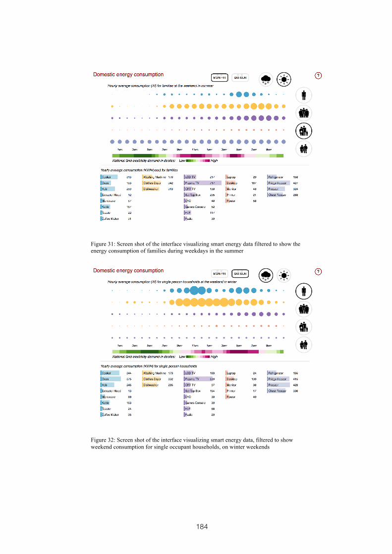
184
Figure 31: Screen shot of the interface visualizing smart energy data filtered to show the energy consumption of families during weekdays in the summer
Figure 32: Screen shot of the interface visualizing smart energy data, filtered to show weekend consumption for single occupant households, on winter weekends
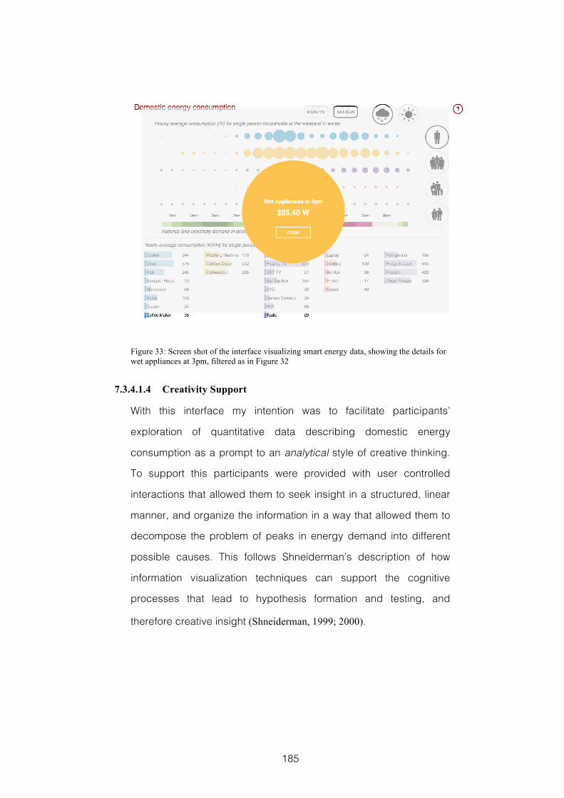
185
Figure 33: Screen shot of the interface visualizing smart energy data, showing the details for wet appliances at 3pm, filtered as in Figure 32
7.3.4.1.4 Creativity Support
With this interface my intention was to facilitate participants’
exploration of quantitative data describing domestic energy
consumption as a prompt to an analytical style of creative thinking.
To support this participants were provided with user controlled
interactions that allowed them to seek insight in a structured, linear
manner, and organize the information in a way that allowed them to
decompose the problem of peaks in energy demand into different
possible causes. This follows Shneiderman’s description of how
information visualization techniques can support the cognitive
processes that lead to hypothesis formation and testing, and
therefore creative insight (Shneiderman, 1999; 2000).
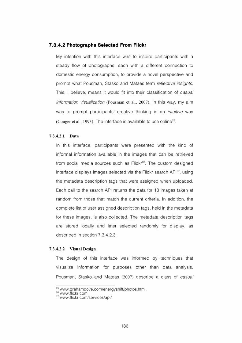
186
7.3.4.2 Photographs Selected From Fl ickr
My intention with this interface was to inspire participants with a
steady flow of photographs, each with a different connection to
domestic energy consumption, to provide a novel perspective and
prompt what Pousman, Stasko and Mataes term reflective insights.
This, I believe, means it would fit into their classification of casual
information visualization (Pousman et al., 2007). In this way, my aim
was to prompt participants’ creative thinking in an intuitive way
(Couger et al., 1993). The interface is available to use online25.
7.3.4.2.1 Data
In this interface, participants were presented with the kind of
informal information available in the images that can be retrieved
from social media sources such as Flickr26. The custom designed
interface displays images selected via the Flickr search API27, using
the metadata description tags that were assigned when uploaded.
Each call to the search API returns the data for 18 images taken at
random from those that match the current criteria. In addition, the
complete list of user assigned description tags, held in the metadata
for these images, is also collected. The metadata description tags
are stored locally and later selected randomly for display, as
described in section 7.3.4.2.3.
7.3.4.2.2 Visual Design
The design of this interface was informed by techniques that
visualize information for purposes other than data analysis.
Pousman, Stasko and Mateas (2007) describe a class of casual
25 www.grahamdove.com/energyshift/photos.html. 26 www.flickr.com 27 www.flickr.com/services/api/
187
information visualization, in which utilitarian design goals can be
traded in for a wider interpretation of what is deemed useful. Further
inspiration was taken from the type of visualization interface design
that Manovich has described as direct visualization, in which “new
visual representations from the actual media objects (images, video)
or their parts” are created (Manovich, 2011).
The interface, Figure 34, is based on a photo browser style, and
displays eighteen images in a six by three grid. The images
displayed are those selected in the search process described in
section 7.3.4.2.3. The initial request to the Flickr API when the
representation is first loaded searches for images whose metadata
description tags match the search term Home appliances. Every
750 milliseconds another API call is made and a single randomly
selected image from the grid is replaced by a single image
randomly selected from those returned in the new search. This
means that users do not have direct control over the images that are
being shown, and that they are presented with a diverse variety of
photographs, without the option to narrowly focus their search.
There is a smooth faded transition between these images. Two
description tag strings, randomly selected from those in the local
store, are also shown. Each of these is displayed separately in one
of the two text boxes towards the centre of the interface. The tags
displayed are updated every 1250 milliseconds.
7.3.4.2.3 Interaction
In this interface, interactivity is intentionally restricted. Images
update automatically, which discourages users from focusing their
attention too narrowly on images of a specific type or with specific
content. Whilst users are not able to select and retain individual
188
images, they can change the image search criteria by selecting
from one of the preselected categories Wash and clean, see for
example Figure 35, Cook and cool, Home entertainment or
Computers and gadgets, each of which is shown at the top of the
screen. Alternatively, users can input their own search terms using
the large text entry box at the top right, see for example Figure 36.
Changing the search term does not immediately update all the
images in one go. Rather, individual images are updated more
slowly over time, one at a time following each API call. This means
that there is a slow transition from a visual interface that represents
the old search criteria to one that represents the new, which creates
an opportunity for new, perhaps unexpected, connections between
more distantly related images or concepts to be formed. This follows
theories of combinational creativity discussed in section 2.5.4.3.
7.3.4.2.4 Creativity Support
With this interface, my intention was to inspire participants’ idea
generation with imagery and expand the idea space they explored.
The Flickr photographs are selected via description tags, which
have connections to energy consumption that might be ambiguous,
such as Wash and clean. Therefore the photographs displayed
might be only be tangentially related to energy consumption. This
was a deliberate attempt to widen participants’ focus in order to
increase the opportunities for unfamiliar connections to be made
and combinations of possibly familiar concepts turned into creative
ideas. Also, to reduce the likelihood that participants would focus
their ideation on particular areas by retaining specific photographs,
users could not directly control the images shown in the interface,
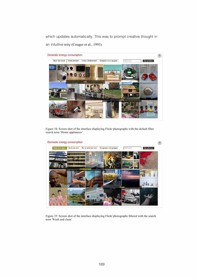
189
which updates automatically. This was to prompt creative thought in
an intuitive way (Couger et al., 1993).
Figure 34: Screen shot of the interface displaying Flickr photographs with the default filter search term ‘Home appliances’
Figure 35: Screen shot of the interface displaying Flickr photographs filtered with the search term 'Wash and clean'
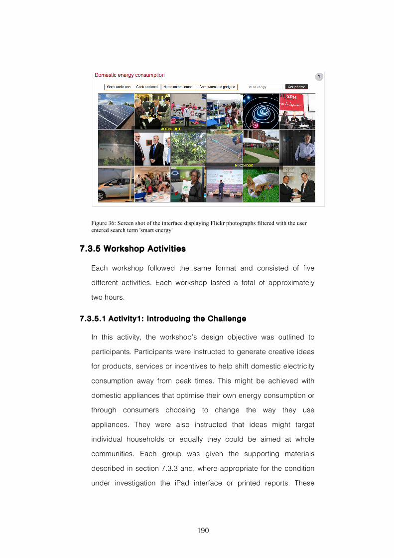
190
Figure 36: Screen shot of the interface displaying Flickr photographs filtered with the user entered search term 'smart energy'
7.3.5 Workshop Activit ies
Each workshop followed the same format and consisted of five
different activities. Each workshop lasted a total of approximately
two hours.
7.3.5.1 Activity1: Introducing the Challenge
In this activity, the workshop’s design objective was outlined to
participants. Participants were instructed to generate creative ideas
for products, services or incentives to help shift domestic electricity
consumption away from peak times. This might be achieved with
domestic appliances that optimise their own energy consumption or
through consumers choosing to change the way they use
appliances. They were also instructed that ideas might target
individual households or equally they could be aimed at whole
communities. Each group was given the supporting materials
described in section 7.3.3 and, where appropriate for the condition
under investigation the iPad interface or printed reports. These
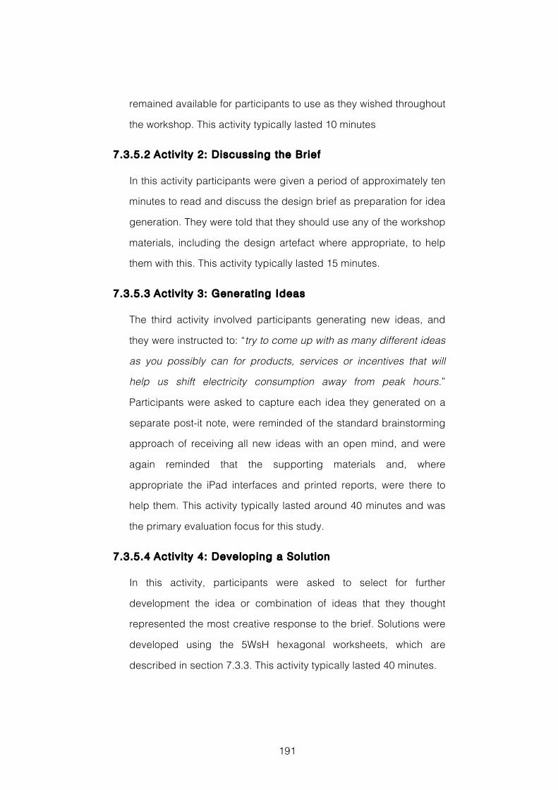
191
remained available for participants to use as they wished throughout
the workshop. This activity typically lasted 10 minutes
7.3.5.2 Activity 2: Discussing the Brief
In this activity participants were given a period of approximately ten
minutes to read and discuss the design brief as preparation for idea
generation. They were told that they should use any of the workshop
materials, including the design artefact where appropriate, to help
them with this. This activity typically lasted 15 minutes.
7.3.5.3 Activity 3: Generating Ideas
The third activity involved participants generating new ideas, and
they were instructed to: “try to come up with as many different ideas
as you possibly can for products, services or incentives that will
help us shift electricity consumption away from peak hours.”
Participants were asked to capture each idea they generated on a
separate post-it note, were reminded of the standard brainstorming
approach of receiving all new ideas with an open mind, and were
again reminded that the supporting materials and, where
appropriate the iPad interfaces and printed reports, were there to
help them. This activity typically lasted around 40 minutes and was
the primary evaluation focus for this study.
7.3.5.4 Activity 4: Developing a Solut ion
In this activity, participants were asked to select for further
development the idea or combination of ideas that they thought
represented the most creative response to the brief. Solutions were
developed using the 5WsH hexagonal worksheets, which are
described in section 7.3.3. This activity typically lasted 40 minutes.
192
7.3.5.5 Activity 5: Presenting the Solut ion
In the workshop’s final activity each group was asked to describe
their solution to camera. This activity typically lasted 10-15 minutes
7.4 Evaluation Methods
In this design experiment my aim was to compare how participants’
idea generation activities might vary when given one of two
alternative digital design artefacts as a source of design inspiration.
The first of these was an interface designed to prompt creative
cognition in an analytical way by visualizing smart energy data in a
traditional style. The second was an interface designed to prompt
creative cognition in an intuitive way by presenting Flickr
photographs in a direct visualization style.
To answer my research question, see section 7.2, I collected three
different kinds of data. First, participants were given a questionnaire
to complete at the end of each workshop. This consisted of the
questions required by the Creativity Support Index (CSI) (Carroll et
al., 2009), plus two additional questions directly addressing the
influence of the relevant design artefact on their idea generation.
This questionnaire was not given to the groups in the control
condition workshops, as under this condition there was no design
artefact to evaluate. Second, each workshop was videoed with a
single camera in order assess how the design artefacts were used
during idea generation. Finally, the outputs of each workshop were
assessed. As in the previous design experiment, reported in
Chapter 4, the evaluation methods and data collected will be
discussed in terms of Supporting the People Designing, Assessing
193
the Design Product, and Understanding the Design Process. This
choice of structure is explained fully in section 3.2.
7.4.1 Supporting the People Designing
To investigate the extent to which participants felt that the design
artefacts supported their creative processes during their idea
generation activities, I used the questions from the Creativity
Support Index (CSI) (Carroll et al., 2009). The CSI is made up of two
parts, and is a standardized survey metric for evaluating the
effectiveness with which a given tool provides support for it’s user's
creative processes. This is discussed in detail in section 3.2.1. In
the first part, participants answer twelve questions that assess six
different dimensions associated with creativity. There are two
questions for each factor, addressing it from a slightly different
perspective. These were slightly reworded from the original
questionnaire to refer appropriately to the relevant design artefact.
For example the two questions addressing Collaboration that were
given to participants who had used the interface that visualized
smart energy data were:
“The iPad information visualization allowed other people to work with
me easily”
“It was easy to share ideas with other people using the iPad
information visualization”
For each question, the rating scale ranged from 1 strongly disagree
to 9 agree strongly.
In the second part, participants are asked to answer a total of fifteen
questions designed to assess the relative importance of each of the
six dimensions to the activity the participant has been undertaking.
194
The final CSI score for each participant is calculated as a product of
the ratings they provided for each of the creativity factors in the first
part multiplied by the importance they attached to that factor in the
second part. This enabled a comparison of the effectiveness of
each of the different design artefacts given to participants to
support their design ideation. To analyse this data, each
participant’s final CSI score was calculated and grouped according
to which of the design artefacts they had used during their
workshop. I then performed a one-way ANOVA, followed by a Tukey
test, to evaluate for statistical significance between the scores for
each condition.
In the second part of the CSI, participants are asked to answer a
total of fifteen questions designed to assess the relative importance
of each of six dimensions to the activity the participant has been
undertaking. To assess which of the different dimensions of
creativity support measured in the CSI were most important to
participants I totalled the score given to each dimension by each
participant after each workshop.
To directly investigate how important the different design artefacts
were to participants’ idea generation, two further statements were
included in each post workshop questionnaire. As in the CSI, these
addressed the same issue from two slightly different perspectives.
Again the wording of these statements varied slightly to refer
appropriately to the relevant design artefact. For example, the two
statements given to those participants who had used the iPad
interface visualizing smart energy data were:
“I had many ideas as a result of using the iPad information
visualization”
195
“The iPad information visualization played an important role in the
ideas I had”.
These statements were rated on a scale of 1 strongly disagree to 9
agree strongly. The responses were analysed separately from the
CSI data. To check for statistically significant differences between
conditions, a one-way ANOVA test followed by a Tukey test for
significance between scores for each condition was performed.
7.4.2 Assessing the Design Product
To assess the creativity of the workshops’ outputs, the design
products, I took two different approaches. First, I counted the
number of ideas that were generated during Activity 3 in each
workshop to gain a measure of creative fluency. Second, I asked
each participant to evaluate all of the final solution ideas excluding
the one developed during their own workshop. Participants were
asked to rate each of the solutions between 0 and 5 for creativity:
where 0 represented a solution with no creativity and 5 a solution
that was highly creative. Because creativity of outputs is often
understood in terms of novelty and usefulness e.g. (Sternberg &
Lubart, 1999), participants were also asked to assess all of the
solutions for novelty: where 0 was an idea that was familiar in the
context of domestic energy and 5 was an idea that was highly novel
with regards to domestic energy; and usefulness: where 0 was an
idea that would fail to reduce peak domestic energy consumption
and 5 was an idea that would effectively reduce peak domestic
energy consumption. This type of approach to assessing design
products is discussed in more detail in section 3.2.3.
196
To check for statistically significant differences between conditions,
a one-way ANOVA test followed by a Tukey test for significance
between scores for each condition was performed.
7.4.3 Understanding the Design Process
In order to understand in a little more detail the way in which the
different design artefacts were used during participants’ design
processes the video recordings of each workshop were analysed. In
this analysis particular attention was paid to Activity 3 in which
participants were generating divergent ideas. From these
recordings I was able to determine: the amount of time each group
spent interacting with the design artefact they had been given;
whether this interaction was collaborative or individual; and whether
this interaction was immediately followed by, or included, the group
generating and recording any new ideas on post-it notes.
Following this, I undertook a microanalysis of key sections of video
from workshops in the two conditions of primary interest, where
participants were given one of the digital design artefacts. In this
analysis participants’ visible interactions with the iPad interface were
captured, together with their conversation and those instances
where they recorded ideas on post-it notes. This was in order to
gain a more nuanced and detailed picture of the way that
participants used each of the digital design artefacts.
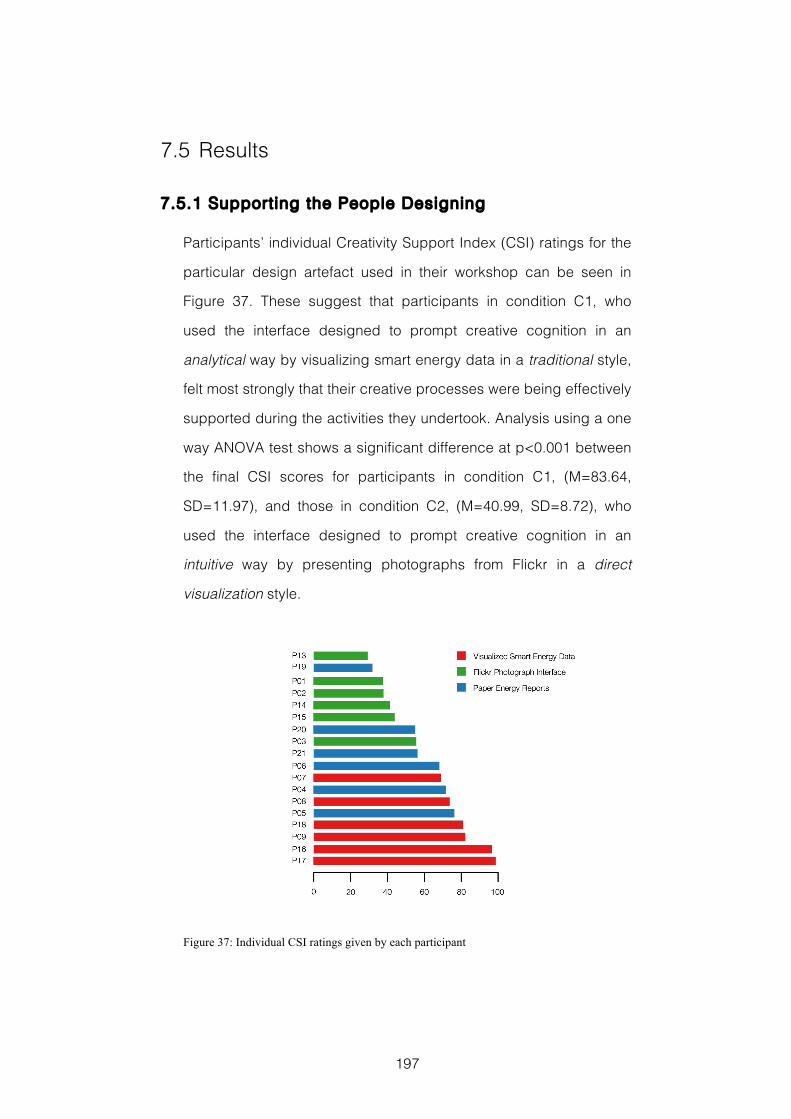
197
7.5 Results
7.5.1 Supporting the People Designing
Participants’ individual Creativity Support Index (CSI) ratings for the
particular design artefact used in their workshop can be seen in
Figure 37. These suggest that participants in condition C1, who
used the interface designed to prompt creative cognition in an
analytical way by visualizing smart energy data in a traditional style,
felt most strongly that their creative processes were being effectively
supported during the activities they undertook. Analysis using a one
way ANOVA test shows a significant difference at p<0.001 between
the final CSI scores for participants in condition C1, (M=83.64,
SD=11.97), and those in condition C2, (M=40.99, SD=8.72), who
used the interface designed to prompt creative cognition in an
intuitive way by presenting photographs from Flickr in a direct
visualization style.
Figure 37: Individual CSI ratings given by each participant
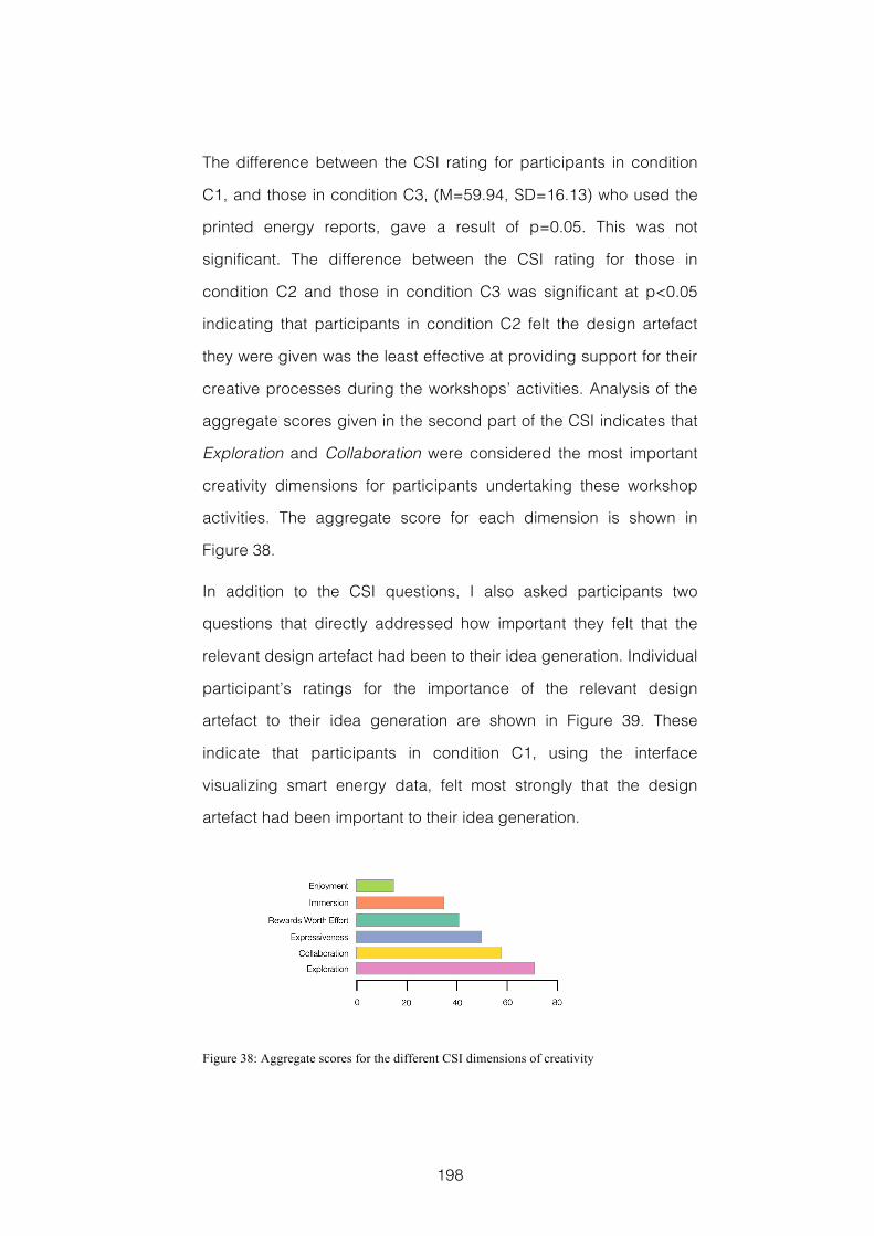
198
The difference between the CSI rating for participants in condition
C1, and those in condition C3, (M=59.94, SD=16.13) who used the
printed energy reports, gave a result of p=0.05. This was not
significant. The difference between the CSI rating for those in
condition C2 and those in condition C3 was significant at p<0.05
indicating that participants in condition C2 felt the design artefact
they were given was the least effective at providing support for their
creative processes during the workshops’ activities. Analysis of the
aggregate scores given in the second part of the CSI indicates that
Exploration and Collaboration were considered the most important
creativity dimensions for participants undertaking these workshop
activities. The aggregate score for each dimension is shown in
Figure 38.
In addition to the CSI questions, I also asked participants two
questions that directly addressed how important they felt that the
relevant design artefact had been to their idea generation. Individual
participant’s ratings for the importance of the relevant design
artefact to their idea generation are shown in Figure 39. These
indicate that participants in condition C1, using the interface
visualizing smart energy data, felt most strongly that the design
artefact had been important to their idea generation.
Figure 38: Aggregate scores for the different CSI dimensions of creativity
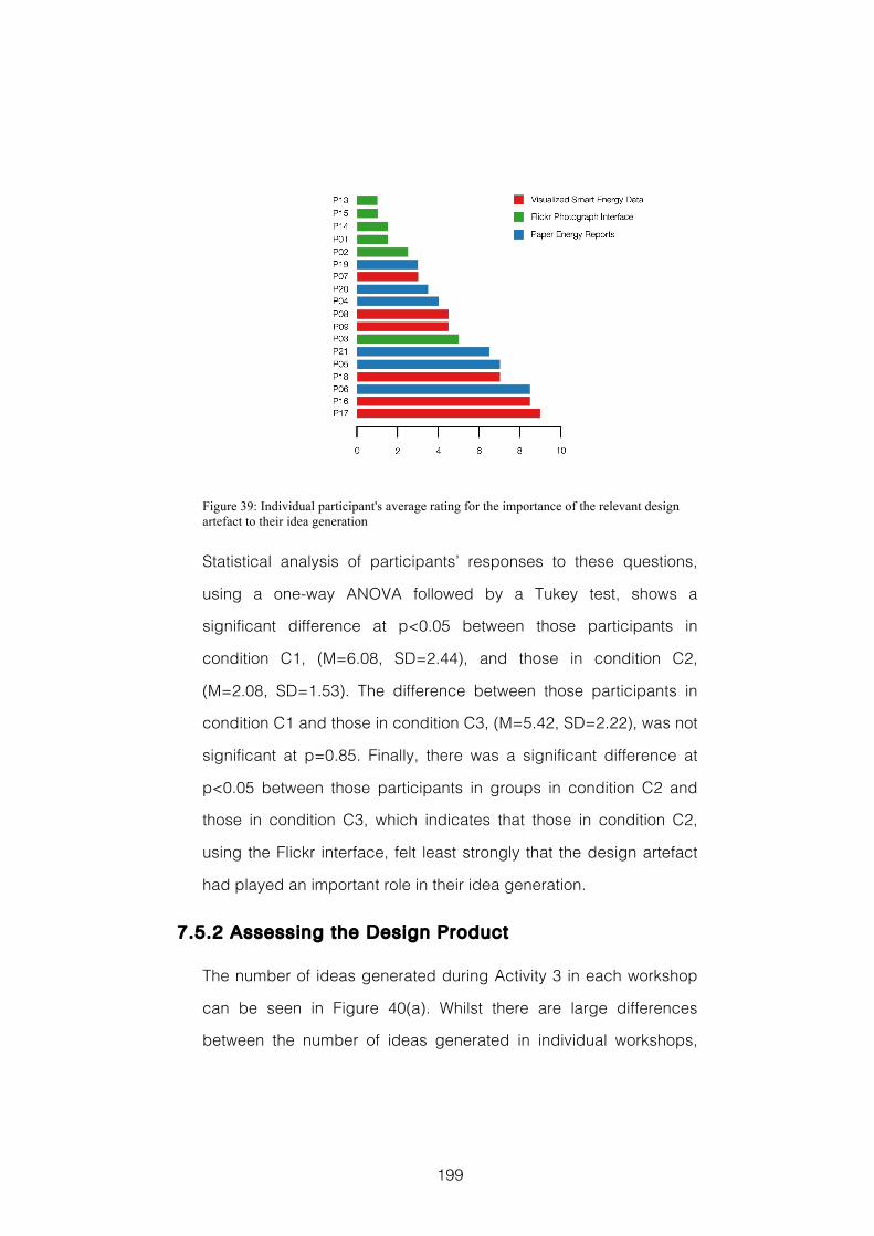
199
Figure 39: Individual participant's average rating for the importance of the relevant design artefact to their idea generation
Statistical analysis of participants’ responses to these questions,
using a one-way ANOVA followed by a Tukey test, shows a
significant difference at p<0.05 between those participants in
condition C1, (M=6.08, SD=2.44), and those in condition C2,
(M=2.08, SD=1.53). The difference between those participants in
condition C1 and those in condition C3, (M=5.42, SD=2.22), was not
significant at p=0.85. Finally, there was a significant difference at
p<0.05 between those participants in groups in condition C2 and
those in condition C3, which indicates that those in condition C2,
using the Flickr interface, felt least strongly that the design artefact
had played an important role in their idea generation.
7.5.2 Assessing the Design Product
The number of ideas generated during Activity 3 in each workshop
can be seen in Figure 40(a). Whilst there are large differences
between the number of ideas generated in individual workshops,
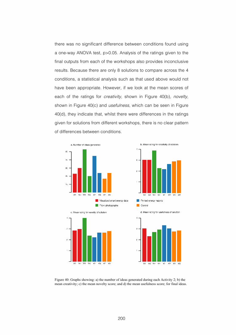
200
there was no significant difference between conditions found using
a one-way ANOVA test, p>0.05. Analysis of the ratings given to the
final outputs from each of the workshops also provides inconclusive
results. Because there are only 8 solutions to compare across the 4
conditions, a statistical analysis such as that used above would not
have been appropriate. However, if we look at the mean scores of
each of the ratings for creativity, shown in Figure 40(b), novelty,
shown in Figure 40(c) and usefulness, which can be seen in Figure
40(d), they indicate that, whilst there were differences in the ratings
given for solutions from different workshops, there is no clear pattern
of differences between conditions.
Figure 40: Graphs showing: a) the number of ideas generated during each Activity 2; b) the mean creativity; c) the mean novelty score; and d) the mean usefulness score; for final ideas.
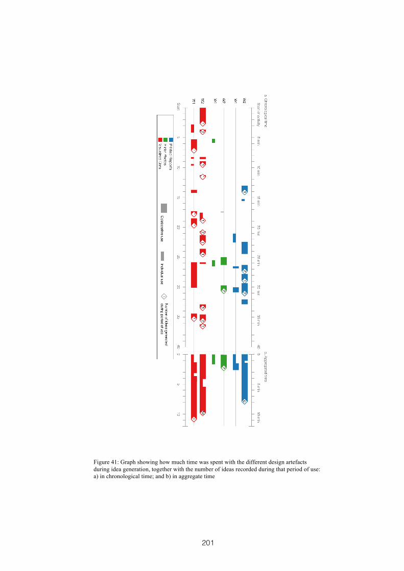
201
Figure 41: Graph showing how much time was spent with the different design artefacts during idea generation, together with the number of ideas recorded during that period of use: a) in chronological time; and b) in aggregate time
202
7.5.3 Understanding the Design Process
My initial analysis of the video recordings of Activity 3 in each
workshop provides an overview that begins to reveal differences in
the ways the different design artefacts were used. Figure 41 shows
that in the workshops in condition C1 participants spent a greater
amount of time interacting with the visualized smart energy data,
and that much of this time was spent on collaborative exploration.
Collaboration and exploration are important here because I found
them to be the dimensions of creativity support that participants felt
were most important when I looked at the aggregate ratings from the
second part of the CSI analysis. This analysis also shows that during
the workshops in condition C1 a greater number of ideas were
recorded on post-it notes as part of, or directly following, use of the
design artefact. In the workshops in condition C2 participants’ idea
generation seems to proceed with less direct reference to or
interaction with the Flickr photo interface, and there appear to be
fewer instances where ideas were recorded on post-it notes as part
of, or directly following, use of the design artefact. The two
workshops in the reports condition C3 do not show a consistent
pattern of interaction, exploration and collaboration during
participants’ idea generation activities. One of these workshops
appears to be most similar to the workshops in condition C1, where
participants were given the visualized smart energy data, and the
other being more like the workshops in condition C2, where
participants were given the interface displaying Flickr photographs.
However, this overview analysis tells only a simplified story. The
patterns of interaction, exploration and collaboration seen in the
workshops in conditions C1 and C2 may simply reflect the
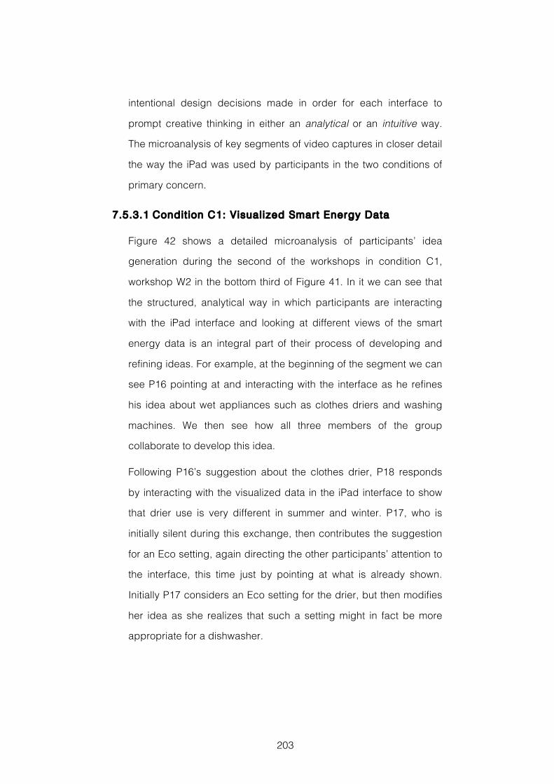
203
intentional design decisions made in order for each interface to
prompt creative thinking in either an analytical or an intuitive way.
The microanalysis of key segments of video captures in closer detail
the way the iPad was used by participants in the two conditions of
primary concern.
7.5.3.1 Condit ion C1: Visualized Smart Energy Data
Figure 42 shows a detailed microanalysis of participants’ idea
generation during the second of the workshops in condition C1,
workshop W2 in the bottom third of Figure 41. In it we can see that
the structured, analytical way in which participants are interacting
with the iPad interface and looking at different views of the smart
energy data is an integral part of their process of developing and
refining ideas. For example, at the beginning of the segment we can
see P16 pointing at and interacting with the interface as he refines
his idea about wet appliances such as clothes driers and washing
machines. We then see how all three members of the group
collaborate to develop this idea.
Following P16’s suggestion about the clothes drier, P18 responds
by interacting with the visualized data in the iPad interface to show
that drier use is very different in summer and winter. P17, who is
initially silent during this exchange, then contributes the suggestion
for an Eco setting, again directing the other participants’ attention to
the interface, this time just by pointing at what is already shown.
Initially P17 considers an Eco setting for the drier, but then modifies
her idea as she realizes that such a setting might in fact be more
appropriate for a dishwasher.
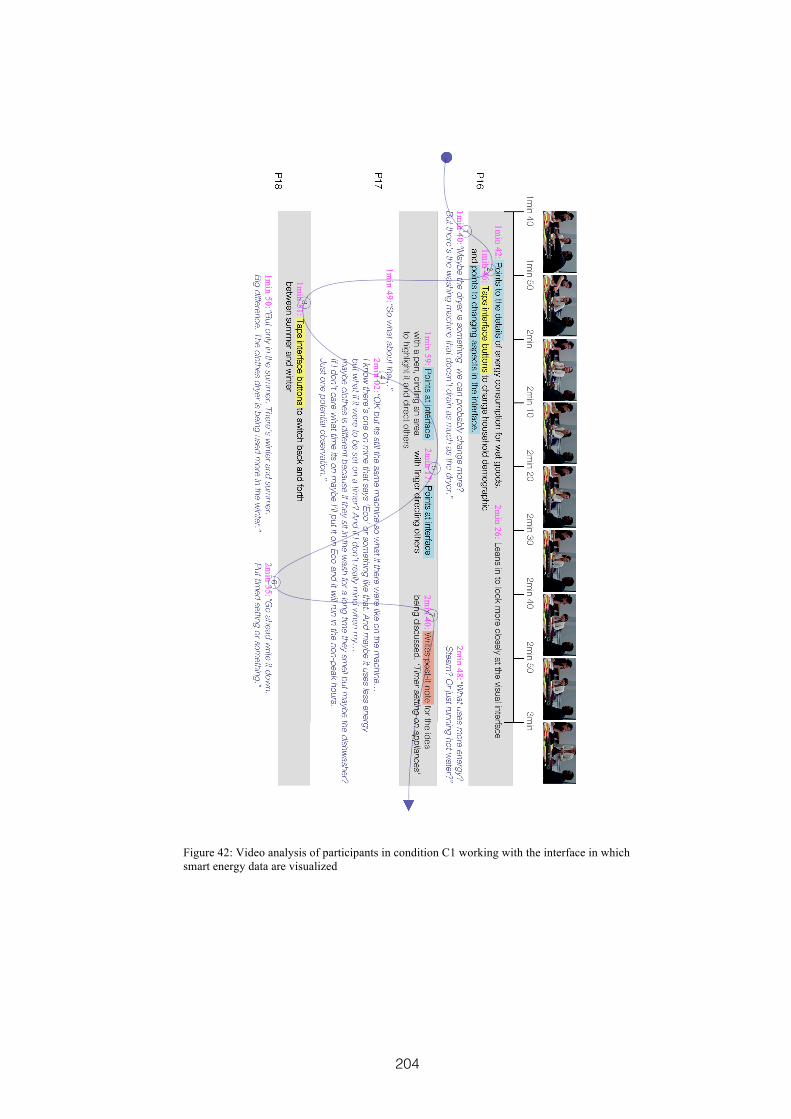
204
Figure 42: Video analysis of participants in condition C1 working with the interface in which smart energy data are visualized
205
The visualized smart energy data is being used as a source of
specific insights, which participants combine with their existing
domain knowledge, as the basis for generating and developing
these ideas. These interactions, and the conversation that takes
place around the iPad interface, result in P17 recording the idea
‘Timer setting on appliances’. Here we see the emergence of an
idea, for saving energy when using wet appliances, which came
about through a systematic and collaborative exploration of the
information. This sequence involved all participants in both
conversation and exploratory interaction with the digital design
artefact. The interactions surrounding the development of this idea
involved direct use e.g. tapping interface buttons to change the
view of the data, and also reference to the data during conversation
e.g. by pointing out information to underpin their contributions to the
development of the idea.
This theme of saving energy whilst using wet appliances, which
started with participants exploring the data to analyse where energy
might be effectively saved, remained a focus for long periods of
their idea generation, and this group generated many ideas that
fitted this theme. These included ideas for communal washing and
drying spaces that variously recycled the energy used in heating the
water for washing, or used green houses to improve drying, and
schemes for students in shared housing. It was a theme that
became the key feature of the candidate design solution this group
selected and developed during activity four of the workshop. This
candidate solution involved an overnight community laundry service,
which they felt would increase efficiency, and shift significant energy
consumption away from peak hours. The visualized data also played
206
an important role as a reference point during the selection,
refinement and development of this idea in activity four of the
workshop.
7.5.3.2 Condit ion C2: Fl ickr Photographs
Figure 43 shows a detailed microanalysis of participants’ idea
generation during the second of the workshops in condition C2
using the interface representing Flickr photographs, workshop W2 in
the middle of Figure 41. Here, participants do not use the interface
to facilitate a systematic and structured process of comparing
alternatives as we saw them do in the previous example. Rather,
they take inspiration in a more direct way with a riff of ideas resulting
from a single image. This is a process that appears to rely more on
unconscious creative connections, and which involve an element of
surprise to the participants involved.
The initial stimulus to a period of effective idea generation is the
image that prompts P13 to think about ‘Science Fiction’, and which
in turn triggers P13 and P14 to discuss personal energy generators.
This reference to personal generators then triggers P15 to think of
the film Back to the Future, which he discusses with P14. The result
of this discussion is an idea to use personal waste as a source of
power. At the end of this brief period, two post-it notes recording
new ideas are written. The first contains the idea ‘Our own electricity
generators’, and the second contains the idea ‘Use our waste to
generate electricity’.
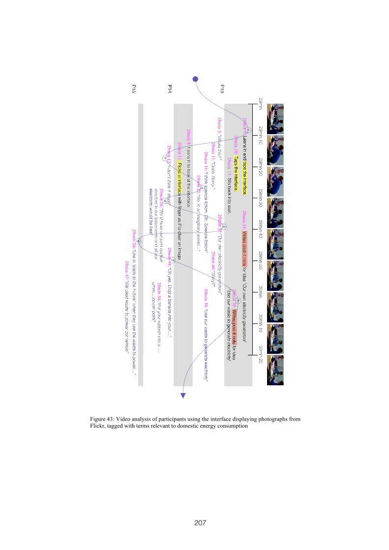
207
Figure 43: Video analysis of participants using the interface displaying photographs from Flickr, tagged with terms relevant to domestic energy consumption
208
This segment of analysis shows an effective period of participants’
collaborative idea generation. However, in this description
collaboration does not focus around participants using the iPad
interface to systematically explore information. Instead, in this
instance, the focus is on the way they share and build on the ideas
and connections that are inspired by a single image. There is less
interaction with the iPad interface, which acts as a trigger for the
ideation process rather than forming an integral part of the way
ideas are developed and refined. The ideas they generate appear to
emerge from participants’ imaginations in a more direct or intuitive
way. In this segment we also see different pairs of participants
collaborating and discussing their ideas rather than all three working
together simultaneously with the iPad as a focus.
The themes of science fiction, personal energy generation and
generating electricity from waste did not survive as a focus for this
group, who ended up generating a variety of different ideas for
reducing peaks in energy demand. The candidate design solution
that this group selected was a web-based service to track
households’ electricity consumption; provide a forum for discussion;
act as a repository for energy saving ideas; and be a place where
competition between groups of friends or different localities can be
arranged. The iPad played no immediately obvious role in the way
this group selected their candidate design solution in activity four of
the workshop.
7.6 Discussion
In this design experiment my aim was to compare participants’ idea
generation activities when they were given one of two different
209
digital design artefacts, each of which takes a different source of
domain-relevant information and presents it in a way that inspires
creative thinking. The first of these digital design artefacts was
designed to prompt creative thinking in an analytical way by
visualizing smart energy data in a traditional style. The second was
designed to prompt creative thinking in an intuitive way by
presenting photographs from social media in a direct visualization
style.
When we look at the analysis of the Creativity Support Index (CSI)
(Carroll et al., 2009) questionnaire data we see that participants given
the interface visualizing smart energy data felt significantly more
strongly that their creative processes were being effectively
supported by that interface during their idea generation activities,
than those given the interface presenting the Flickr photographs. We
similarly see that these participants also felt significantly more
strongly that the interface played an important role in the ideas they
generated. At first glance this may seem to suggest that interfaces
visualizing quantitative data provide significantly more effective
creativity support than those presenting qualitative data from social
media sources. However, my additional analysis of the second part
of the CSI data, which indicates that exploration and collaboration
are the dimensions of creativity support most important to
participants undertaking these workshop activities leads me to
believe there could be an alternative explanation.
One of the key design decisions made when developing the digital
design artefacts used in this study was to vary the degree of user-
controlled interactivity between each of the two examples. The
reasons for this are outlined in section 7.3.4. As Elmqvist et al.
210
outline in their discussion of fluid interactions for information
visualization, providing users with well-designed user-controlled
interactive features: helps to promote flow, supports direct
manipulation and minimises the Gulfs of Action (Elmqvist et al., 2011).
Each of these factors also supports participants’ exploration of the
information represented in the interface and collaboration with other
group members. I would suggest therefore that it is likely to be the
level of interactivity in the interface design that is the key factor in
explaining the differences in the CSI ratings participants gave each
of the digital design artefacts. A greater degree of interactivity in the
interface may also promote feelings of agency and self-efficacy.
This means that users can have a greater belief that, with their
knowledge and skills, they are able to produce creative outcomes.
This is known to be a key driver of individual creativity (Plucker &
Makel, 2010), and may translate to this collaborative setting.
Investigating how participants might use an interface that presented
domain-relevant images, such as the Flickr photographs, in a more
interactive exploratory way, where they could select and retain
things of interest is an obvious area for future research. Such an
interface would arguably be more in keeping with my own previous
use of photographs in the study reported in Chapter 5. It would also
arguably be more in keeping with other approaches to using
imagery as a source of inspiration during design workshops, e.g.
(Sanders & Stappers, 2012, p.71; Halskov & Dalsgård, 2006).
The initial video analysis, in which an overview of the number and
nature of interactions together with the number of new ideas
recorded on post-it notes, also seemed to indicate that the interface
211
visualizing smart energy data provided more effective support for
participants’ creativity during idea generation activities. However the
microanalysis of the episodes of idea generation identified as being
inspired by each of the digital design artefacts suggests that this
might again be a reflection of the intentional design decisions made
in their development. In this detailed view the differences between
the ways the artefacts prompt and inspire creative thinking become
more apparent.
Participants using the interface visualizing smart energy data
interacted with the iPad in a structured and linear way, exploring
different views of the data and systematically building on their ideas
through the insights they found. They also remained much more
closely focused on the same theme throughout their idea generation
activity, and continued to return to the data in order to develop and
refine their ideas. Participants using the interface displaying Flickr
photographs on the other hand appeared to take inspiration more
directly or even subconsciously from a single image. Whilst the
interface was responsible for the initial prompt, the ideas developed
because the participants riff off of each other’s contributions. In this
example we also see a degree of humour and surprise at the ideas
that are being generated. Each of these descriptions of idea
generation reflects the style of creative thinking that the particular
design artefact was intended to prompt.
My analysis cannot describe the whole story of participants’ creative
ideation. The limitations, particularly of time and scope, associated
with a relatively constrained design process, such as the one
undertaken in these design workshops, meant that there were less
opportunities for those ideas that bubble up over an extended
212
period to emerge. These ideas are also more difficult to correctly
identify and attribute through video analysis. In a similar way, those
ideas that come as flashes of inspiration may be under valued, in
comparison with those that follow longer periods of questioning, in
an evaluation where time spent with the digital design artefact is one
of the metrics for utility. Each of these elements is an important
factor in assessing support for an intuitive style of creative thinking.
It is also perhaps unsurprising that the analysis of the workshop
outputs should be inconclusive. With early-stage, exploratory design
experiments there is often a limited understanding of the relationship
between the processes at work and the outputs produced. For
example, when Hilliges et al. (2007) compared the effectiveness of
an electronic brainstorming system using an interactive tabletop and
a large wall display with traditional paper and pen methods, they
found no difference in the quality and number of ideas generated in
each condition. Similarly, when Buisine et al. (2007) compared an
interactive tabletop interface for mind mapping with a traditional
paper-based approach they found that although both collaboration
and subjective perceptions of the tool were higher when using the
interactive tabletop, there was no real difference in the ideas
produced. However, it remains important to collect and analyse data
about workshop outputs in order to identify any early indications of
possible impacts both positive and negative. Gaining an
understanding of participants’ individual cognitive styles, perhaps
through pre-tests, might also help us to better understand
differences in the number and quality of outputs between groups.
Returning to my reasons for undertaking this study, I found some
initial evidence to suggest that different types of digital design
213
artefact, representing different aspects of the design context, can
be used to prompt and support different styles of creative thinking.
The findings from this study also suggest the likely benefits of
providing workshop participants with tools that prompt both
analytical and intuitive styles of creative cognition. Indeed these
styles of creative thinking, and the techniques that are used to
prompt and support them, should be seen as being complementary
rather than competing alternatives. This is the case in methods such
as CPS (Isaksen et al., 2011), where each type of technique has its
place during different stages and activities. It was also one of the
reasons I had combined generative design activities with visualized
data in the study reported in Chapter 5. Studying how these different
types of digital design artefact can be used in conjunction with each
other, and at which stages in the design process each might be
more effective, is an area for future study.
7.7 Reflections
7.7.1 Research and Evaluation Methods
7.7.1.1 Benefits and Limitat ions of Study Design
In this study, comparison was made between two different iPad
interfaces, both representing domestic energy consumption. Two
additional conditions, one with printed reports and a control
condition, were also included. This followed the recommendation of
Cash et al. (2012). Unfortunately, these two additional conditions did
not provide a great amount of help in understanding how the two
digital artefacts were used. This was largely due to the effect of
additional unknown variables impacting on participants’ creative
214
performance, which reduces reliability when comparing measures of
creativity in different conditions. A full checklist of threats to the
validity (Cook & Campbell, 1979, pp.37-95) of the results found in this
study is included in Appendix D, Section 12.6. In addition, the
control condition meant I had two workshops that did not provide
CSI data, and this was an important metric. In similar
circumstances, I think it better to include additional groups in the
conditions of primary interest and do without these others. This
would provide more CSI data and more examples in the videos for
close microanalysis.
7.7.1.2 Limitat ions of Data Collection and Analysis
Having reflected on the design experiment reported in Chapter 4,
the full Creativity Support Index (CSI) (Carroll et al., 2009)
questionnaire was given to participants in this study. This enabled a
more reliable comparison between participants’ perceptions of the
support provided by the different interfaces. In addition it also
enabled me to identify which of the dimensions associated with
creativity were most important to participants in the context of these
workshop activities. However, as mentioned above, I was not able to
use it with a control condition, which may be a future concern.
Analysis of video data allowed me to distinguish between individual
and collaborative use of the different interfaces, and to identify those
instances where a post-it note idea was part of, or directly followed,
interaction with the interface. It also enabled me to investigate
individual periods of idea generation in which the design artefacts
played an important role more closely. Here the analysis was
exploratory, looked to identify different patterns of use, and was
215
represented visually to show the flow of interaction, collaboration
and ideation. However, future study should included independent
coding to help turn this exploratory investigation into a generalizable
theory describing the different ways that ideas emerge. Video
analysis only enables investigation of the visible aspects of
participants’ ideation activities. This is not the whole story, and
finding ways to access the personal, introspective and even
unconscious aspects of participants’ creative ideation is a major
research challenge e.g. (Busse & Mansfield, 1980; Dijksterhuis &
Meurs, 2006; Whitfield, 2007; Zhong et al., 2008) that remains outside
the scope of this thesis.
7.7.2 Takeaways
T7.1 Exploration and Collaboration appear to be the dimensions of
creativity support that are most important to co-designers during
CoDesign With Data workshops
T7.2 Designing information visualization tools with interfaces that
provide a high degree of user-controlled interactivity appears to
support the Collaboration and Exploration dimensions of co-
designers’ creative processes.
T7.3 The parallels between ‘analytical’ or ‘traditional’ styles of
information visualization design and ‘analytical’ categories of
applied creativity technique; and between ‘direct visualization’
and ‘intuitive’ categories of applied creativity technique appear to
offer the opportunity to present different sources of domain-
relevant data in ways that prompt different types of design idea.
216
8 Case Study: One Small Change
In this final case study I bring together the lessons learnt from the
studies reported in the previous chapters. The CoDesign With Data
approach that I have been developing is studied in a two-stage
workshop.
8.1 Introduction
Design is a purposeful activity that can be said to conclude with a
“commitment to a plan that is meant to be carried out” (Rittel, 1987).
It can be described as a process of first identifying a problem and
then generating alternatives as a means of finding a solution that
matches satisficing criteria (Simon, 1996, pp.118-25). In addition, this
process of identifying a design problem involves not simply
accepting the problem space as given, but also includes a process
of structuring and formulating that problem (Cross, 2006, p.p.77).
In this final case study, my aim was to take key elements of the
CoDesign With Data approach and study them within a purposeful
design process that was connected to a real world activity in which
the co-designers had both an intrinsic interest and also a degree of
domain knowledge. I also wanted this process to have two phases.
First, a phase in which the co-designers would identify, structure
and formulate the specific design problem under consideration.
Second, a phase in which they would generate candidate ideas and
propose a design solution. This was to investigate whether the tools
217
and techniques I have been developing might be more effective in
identifying problems or in generating and selecting design ideas.
8.2 Research Questions
This case study attempts to bring together and build on the lessons
learnt during my previous studies in order to explore those aspects
described above in more detail. The first phase’s activities, leading
up to the identification of a specific Problem Statement, would build
on the case study held with E.ON that was described in Chapter 5,
and less directly on the design experiment described in Chapter 4.
The second phase’s activities, where ideas for candidate solutions
would be generated and a Design Idea selected, would build on the
lessons learnt in the design experiment described in Chapter 7.
To investigate how effectively the CoDesign With Data approach
uses domain-relevant data to support participants’ insight seeking
and provide inspiration for their creative design ideas during each of
the two phases described previously, I set two research questions:
RQ8.1 Would the CoDesign With Data tools and techniques support
co-designers’ insight seeking and help them gain a better
understanding of the design context? During workshops in which
they:
A: Identify and formulate a specific Problem Statement
B: Generate candidate solutions and select a Design Idea
RQ8.2 Would the CoDesign With Data tools and techniques support
and inspire co-designers’ creative design processes? During
workshops in which they:
A: Identify and formulate a specific Problem Statement
B: Generate candidate solutions and select a Design Idea
218
An opportunity to investigate these questions came through a
project run as part of City University London Students Union’s Green
Dragons28 initiative, in which I am working with members of City
University’s Environmental Champions network to design ways to
reduce waste and encourage recycling. This project remains
ongoing at the time of writing this thesis. The design proposal that
resulted from this workshop, and which was put forward to the City
University London Environmental team and the National Union of
Students Green Dragons officers, is included in Appendix B.
8.3 Workshop Details
Tools used: iPad Information Visualization Interfaces, Worksheets,
Workshop Stationary
Techniques used: 5WsH, Brainstorming with Behaviour Change
Triggers, Brainstorming with Post-its, Insight Seeking
8.3.1 Background
This case study describes a workshop held over two successive
days for One Small Change, a project funded by the City University
London Student Union’s Green Dragons initiative. This initiative is a
scheme to provide support and funding for City University students
and staff who have identified opportunities to improve sustainability.
The objective of the One Small Change project is to design a simple
service that helps City University students to reduce waste, choose
re-usable options or improve recycling, and in this way to make the
green option the simplest or default option.
28 www.green-dragons.co.uk
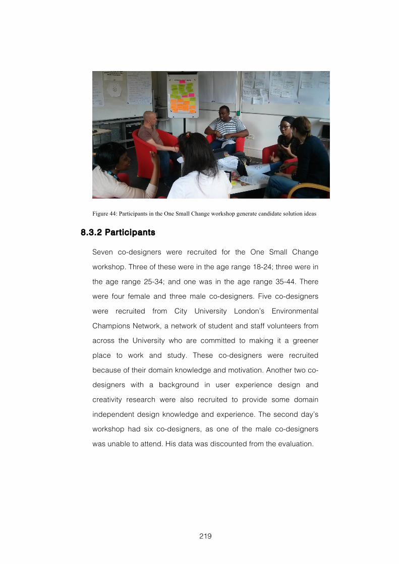
219
Figure 44: Participants in the One Small Change workshop generate candidate solution ideas
8.3.2 Participants
Seven co-designers were recruited for the One Small Change
workshop. Three of these were in the age range 18-24; three were in
the age range 25-34; and one was in the age range 35-44. There
were four female and three male co-designers. Five co-designers
were recruited from City University London’s Environmental
Champions Network, a network of student and staff volunteers from
across the University who are committed to making it a greener
place to work and study. These co-designers were recruited
because of their domain knowledge and motivation. Another two co-
designers with a background in user experience design and
creativity research were also recruited to provide some domain
independent design knowledge and experience. The second day’s
workshop had six co-designers, as one of the male co-designers
was unable to attend. His data was discounted from the evaluation.
220
8.3.3 Workshop Materials
Co-designers were provided with the following workshop materials
to help them during their design activities:
Two iPad Information Visualization Interfaces, described in
section 8.3.4
A selection of custom Worksheets designed to support individual
activities, described below
A selection of standard Workshop Stat ionary, including coloured
pens and post-it notes to record their ideas, blank flip chart
sheets, and smiley face stickers for voting.
The workshop took place in a large room with plenty of space to
move around and tables to work at. Co-designers were provided
with refreshments and each of the two phases of the workshop was
videoed using two cameras. Examples of each of the materials used
in this workshop can be found in Appendix C of this thesis.
The custom worksheets used to support co-designers during
particular activities were as follows:
A0 sized hexagonal 5WsH worksheet used on Day 2 in Activity 8:
Describe the Design Idea
A1 sized worksheets to collect and organise the outputs from:
Day 1, Activity 2: Examples of Waste
Day 1, Activity 3: Insight Seeking
Day 1, Activity 6: Problem Abstraction
Day 2, Activity 3: Behaviour Change Triggers
Day 2, Activity 7: Idea Validation
A2 hexagonal 5WsH worksheets to record ideas during:
Day 1, Activity 4: Opportunities for Change
Day 2, Activity 5: Design Intervention Ideas
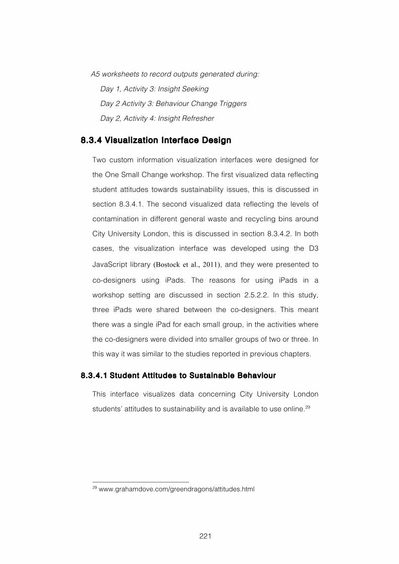
221
A5 worksheets to record outputs generated during:
Day 1, Activity 3: Insight Seeking
Day 2 Activity 3: Behaviour Change Triggers
Day 2, Activity 4: Insight Refresher
8.3.4 Visualization Interface Design
Two custom information visualization interfaces were designed for
the One Small Change workshop. The first visualized data reflecting
student attitudes towards sustainability issues, this is discussed in
section 8.3.4.1. The second visualized data reflecting the levels of
contamination in different general waste and recycling bins around
City University London, this is discussed in section 8.3.4.2. In both
cases, the visualization interface was developed using the D3
JavaScript library (Bostock et al., 2011), and they were presented to
co-designers using iPads. The reasons for using iPads in a
workshop setting are discussed in section 2.5.2.2. In this study,
three iPads were shared between the co-designers. This meant
there was a single iPad for each small group, in the activities where
the co-designers were divided into smaller groups of two or three. In
this way it was similar to the studies reported in previous chapters.
8.3.4.1 Student Att i tudes to Sustainable Behaviour
This interface visualizes data concerning City University London
students’ attitudes to sustainability and is available to use online.29
29 www.grahamdove.com/greendragons/attitudes.html
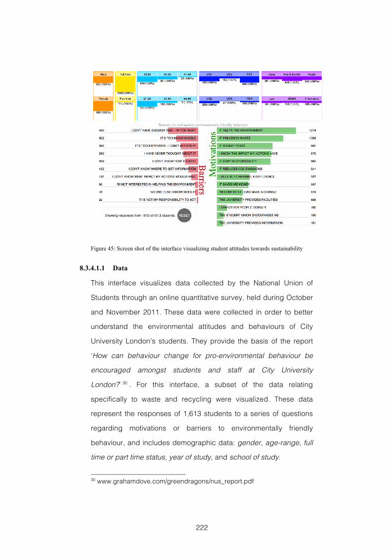
222
Figure 45: Screen shot of the interface visualizing student attitudes towards sustainability
8.3.4.1.1 Data
This interface visualizes data collected by the National Union of
Students through an online quantitative survey, held during October
and November 2011. These data were collected in order to better
understand the environmental attitudes and behaviours of City
University London’s students. They provide the basis of the report
‘How can behaviour change for pro-environmental behaviour be
encouraged amongst students and staff at City University
London?’ 30 . For this interface, a subset of the data relating
specifically to waste and recycling were visualized. These data
represent the responses of 1,613 students to a series of questions
regarding motivations or barriers to environmentally friendly
behaviour, and includes demographic data: gender, age-range, full
time or part time status, year of study, and school of study.
30 www.grahamdove.com/greendragons/nus_report.pdf
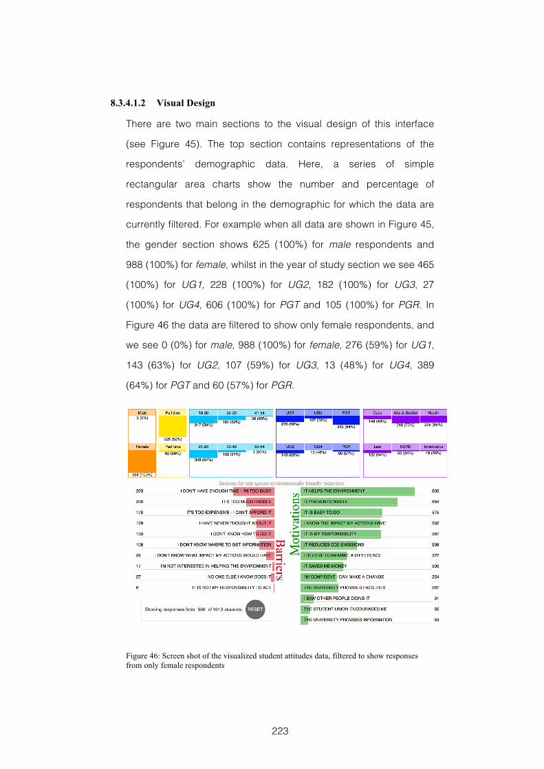
223
8.3.4.1.2 Visual Design
There are two main sections to the visual design of this interface
(see Figure 45). The top section contains representations of the
respondents’ demographic data. Here, a series of simple
rectangular area charts show the number and percentage of
respondents that belong in the demographic for which the data are
currently filtered. For example when all data are shown in Figure 45,
the gender section shows 625 (100%) for male respondents and
988 (100%) for female, whilst in the year of study section we see 465
(100%) for UG1, 228 (100%) for UG2, 182 (100%) for UG3, 27
(100%) for UG4, 606 (100%) for PGT and 105 (100%) for PGR. In
Figure 46 the data are filtered to show only female respondents, and
we see 0 (0%) for male, 988 (100%) for female, 276 (59%) for UG1,
143 (63%) for UG2, 107 (59%) for UG3, 13 (48%) for UG4, 389
(64%) for PGT and 60 (57%) for PGR.
Figure 46: Screen shot of the visualized student attitudes data, filtered to show responses from only female respondents
224
In Figure 47, where the data are filtered to show only responses
from first year undergraduates, we see 189 (30%) for male, 276
(28%) for female, 465 (100%) for UG1 and 0 (0%) for all other years
of study. In each case the percentage value reflects the percentage
of that demographic being shown, i.e. 276 is 28% of the total female
respondents, and the area of the coloured rectangle reflects the
proportion of the filtered data, i.e. 276 as a proportion of 465 first
year undergraduates.
The second section of the interface, below this, shows the number
of respondents in the currently filtered data that agree with the
different statements regarding motivations or barriers to
environmentally friendly behaviours. These are displayed using two
simple horizontal bar charts from the centre outwards, motivations in
green to the right and barriers in red to the left.
Figure 47: Screen shot of the visualized student attitudes data, filtered to show only the responses of first year undergraduates
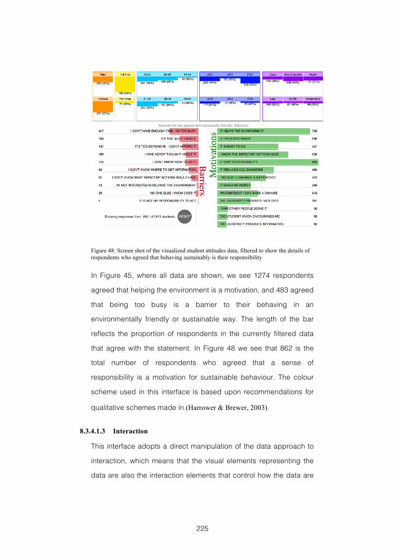
225
Figure 48: Screen shot of the visualized student attitudes data, filtered to show the details of respondents who agreed that behaving sustainably is their responsibility
In Figure 45, where all data are shown, we see 1274 respondents
agreed that helping the environment is a motivation, and 483 agreed
that being too busy is a barrier to their behaving in an
environmentally friendly or sustainable way. The length of the bar
reflects the proportion of respondents in the currently filtered data
that agree with the statement. In Figure 48 we see that 862 is the
total number of respondents who agreed that a sense of
responsibility is a motivation for sustainable behaviour. The colour
scheme used in this interface is based upon recommendations for
qualitative schemes made in (Harrower & Brewer, 2003).
8.3.4.1.3 Interaction
This interface adopts a direct manipulation of the data approach to
interaction, which means that the visual elements representing the
data are also the interaction elements that control how the data are
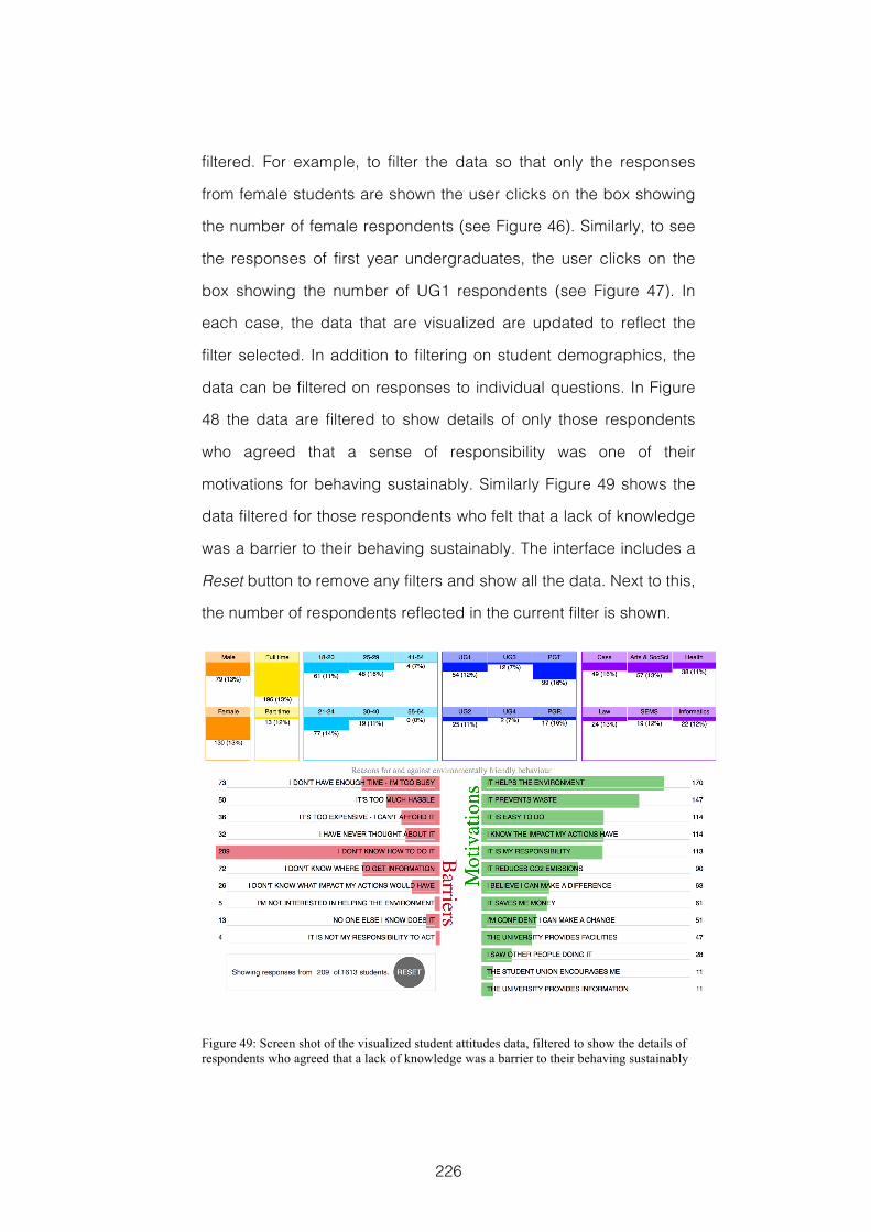
226
filtered. For example, to filter the data so that only the responses
from female students are shown the user clicks on the box showing
the number of female respondents (see Figure 46). Similarly, to see
the responses of first year undergraduates, the user clicks on the
box showing the number of UG1 respondents (see Figure 47). In
each case, the data that are visualized are updated to reflect the
filter selected. In addition to filtering on student demographics, the
data can be filtered on responses to individual questions. In Figure
48 the data are filtered to show details of only those respondents
who agreed that a sense of responsibility was one of their
motivations for behaving sustainably. Similarly Figure 49 shows the
data filtered for those respondents who felt that a lack of knowledge
was a barrier to their behaving sustainably. The interface includes a
Reset button to remove any filters and show all the data. Next to this,
the number of respondents reflected in the current filter is shown.
Figure 49: Screen shot of the visualized student attitudes data, filtered to show the details of respondents who agreed that a lack of knowledge was a barrier to their behaving sustainably
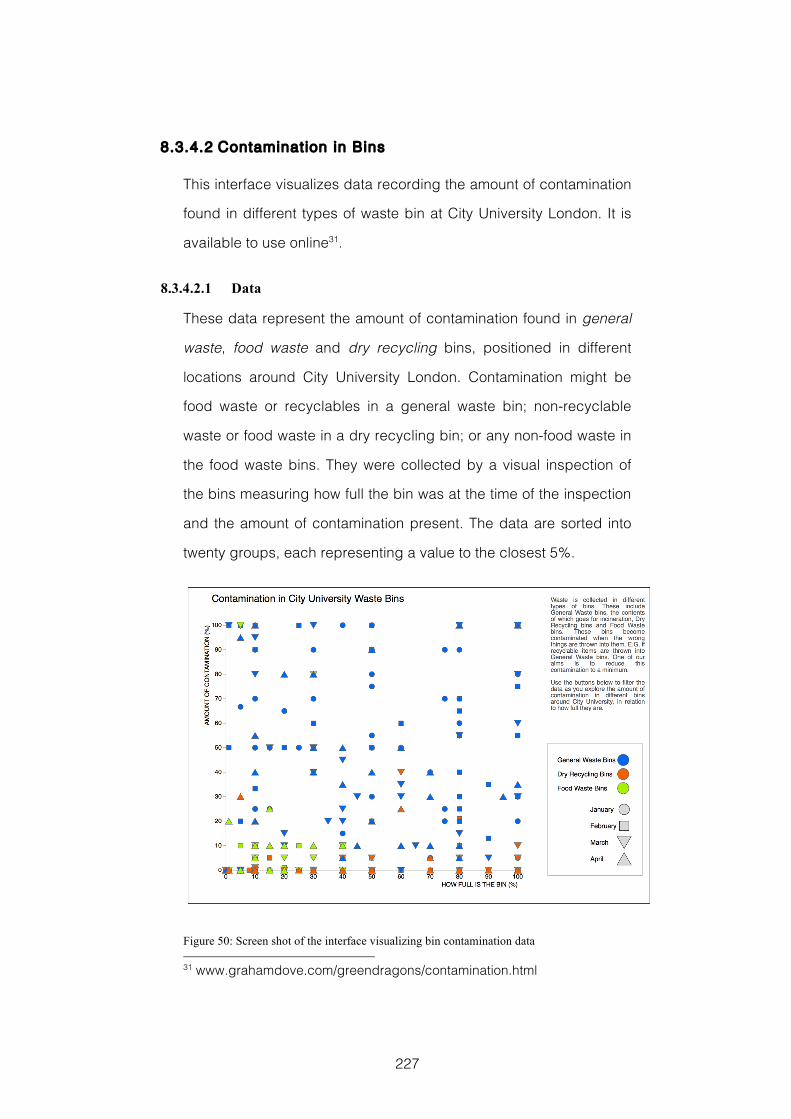
227
8.3.4.2 Contamination in Bins
This interface visualizes data recording the amount of contamination
found in different types of waste bin at City University London. It is
available to use online31.
8.3.4.2.1 Data
These data represent the amount of contamination found in general
waste, food waste and dry recycling bins, positioned in different
locations around City University London. Contamination might be
food waste or recyclables in a general waste bin; non-recyclable
waste or food waste in a dry recycling bin; or any non-food waste in
the food waste bins. They were collected by a visual inspection of
the bins measuring how full the bin was at the time of the inspection
and the amount of contamination present. The data are sorted into
twenty groups, each representing a value to the closest 5%.
Figure 50: Screen shot of the interface visualizing bin contamination data 31 www.grahamdove.com/greendragons/contamination.html
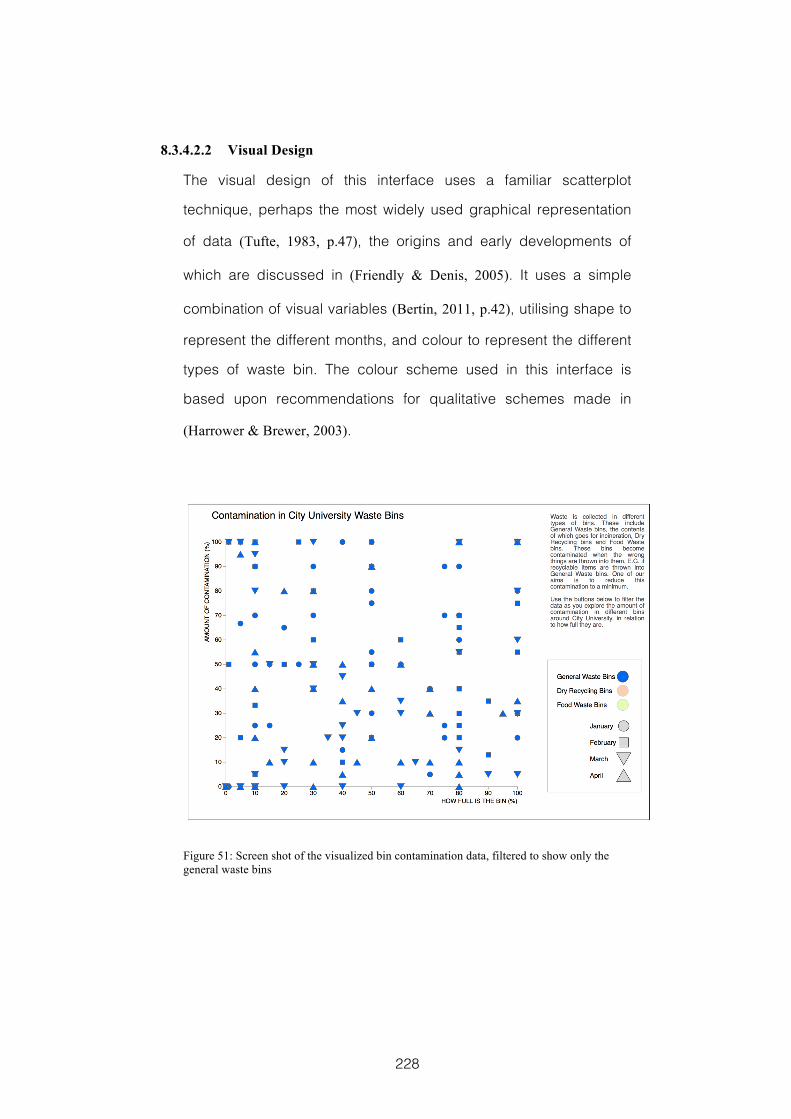
228
8.3.4.2.2 Visual Design
The visual design of this interface uses a familiar scatterplot
technique, perhaps the most widely used graphical representation
of data (Tufte, 1983, p.47), the origins and early developments of
which are discussed in (Friendly & Denis, 2005). It uses a simple
combination of visual variables (Bertin, 2011, p.42), utilising shape to
represent the different months, and colour to represent the different
types of waste bin. The colour scheme used in this interface is
based upon recommendations for qualitative schemes made in
(Harrower & Brewer, 2003).
Figure 51: Screen shot of the visualized bin contamination data, filtered to show only the general waste bins
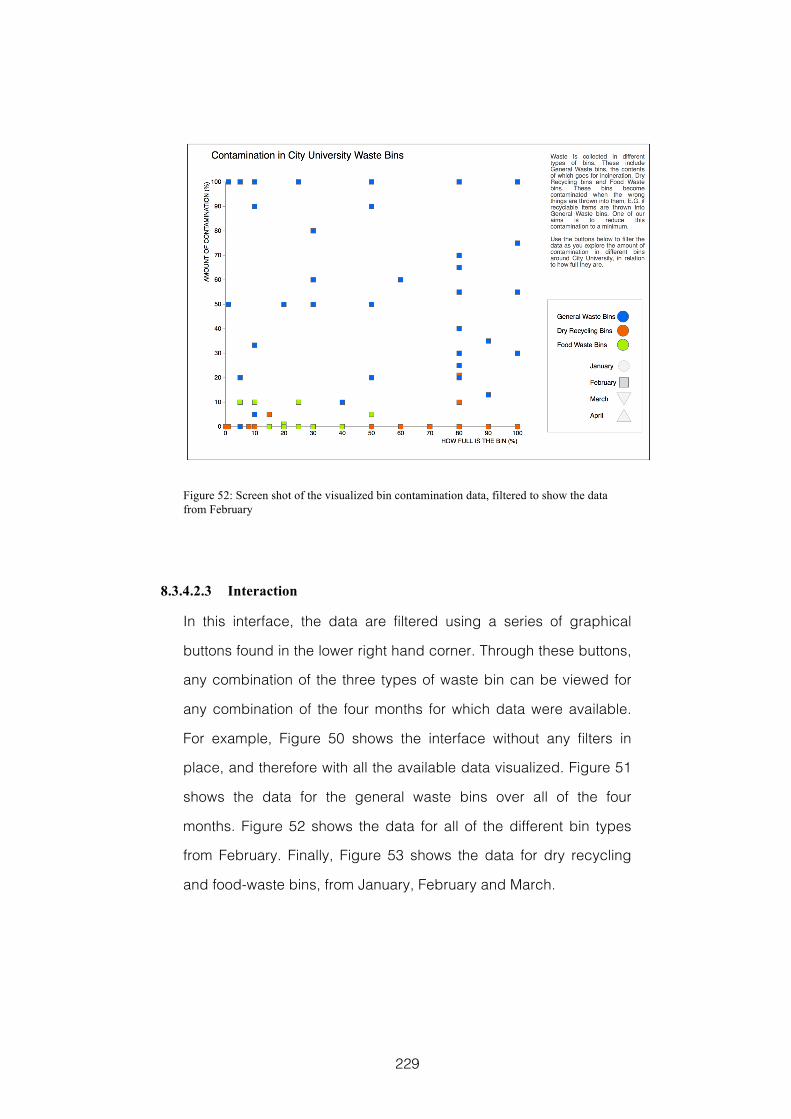
229
Figure 52: Screen shot of the visualized bin contamination data, filtered to show the data from February
8.3.4.2.3 Interaction
In this interface, the data are filtered using a series of graphical
buttons found in the lower right hand corner. Through these buttons,
any combination of the three types of waste bin can be viewed for
any combination of the four months for which data were available.
For example, Figure 50 shows the interface without any filters in
place, and therefore with all the available data visualized. Figure 51
shows the data for the general waste bins over all of the four
months. Figure 52 shows the data for all of the different bin types
from February. Finally, Figure 53 shows the data for dry recycling
and food-waste bins, from January, February and March.
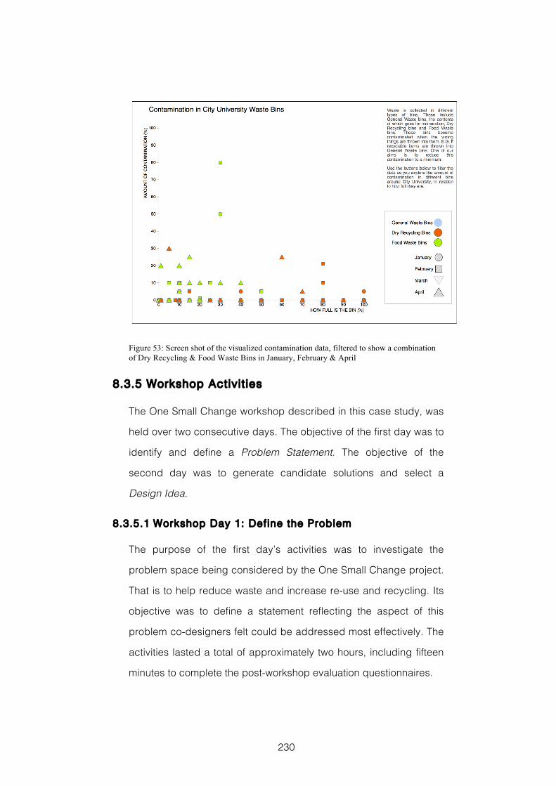
230
Figure 53: Screen shot of the visualized contamination data, filtered to show a combination of Dry Recycling & Food Waste Bins in January, February & April
8.3.5 Workshop Activit ies
The One Small Change workshop described in this case study, was
held over two consecutive days. The objective of the first day was to
identify and define a Problem Statement. The objective of the
second day was to generate candidate solutions and select a
Design Idea.
8.3.5.1 Workshop Day 1: Define the Problem
The purpose of the first day’s activities was to investigate the
problem space being considered by the One Small Change project.
That is to help reduce waste and increase re-use and recycling. Its
objective was to define a statement reflecting the aspect of this
problem co-designers felt could be addressed most effectively. The
activities lasted a total of approximately two hours, including fifteen
minutes to complete the post-workshop evaluation questionnaires.
231
8.3.5.1.1 Activity 1: Introduction to the Design Challenge
In this activity, co-designers were given a brief introduction to the
design challenge they were being set, and to the scope of each of
the workshop’s two days. As part of this introduction they were read
the following guiding statement:
“The One Small Change project aims to design a simple service that
helps City University students to reduce waste, choose re-usable
options or improve recycling. In this way the greenest option
becomes the simplest or default option. In today’s workshop we
will be thinking about the things that are disposed of at City
University, how these things end up in the bins that they do. What
motivates City University’s students to act sustainably? And what
are the barriers that stop them from doing so? At the end of
today’s workshop we will have identified a clearly stated problem.
In tomorrow’s workshop we will be generating ideas for potential
solutions to this problem.”
This statement was also printed so that co-designers could refer to it
as they wished. This activity took approximately 5 minutes.
8.3.5.1.2 Activity 2: Examples of Waste
In this activity, co-designers were first asked to work individually and
suggest five examples each of things that might be thrown into the
waste or recycling bins at City University London. Each example
was written on an individual post-it. Co-designers then shared their
ideas, which were organised by the facilitator on a flip chart sheet.
Following this, there was a round of further suggestions in which co-
designers worked collectively to build on the initial ideas. This
activity took approximately 15 minutes.
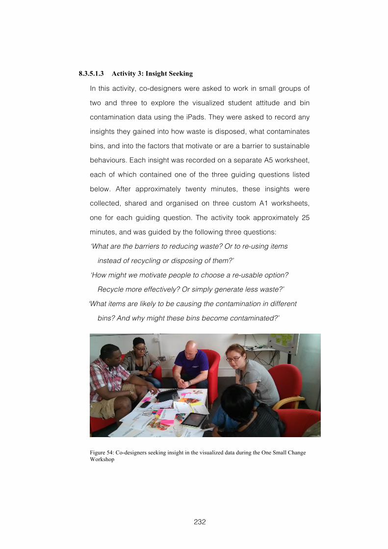
232
8.3.5.1.3 Activity 3: Insight Seeking
In this activity, co-designers were asked to work in small groups of
two and three to explore the visualized student attitude and bin
contamination data using the iPads. They were asked to record any
insights they gained into how waste is disposed, what contaminates
bins, and into the factors that motivate or are a barrier to sustainable
behaviours. Each insight was recorded on a separate A5 worksheet,
each of which contained one of the three guiding questions listed
below. After approximately twenty minutes, these insights were
collected, shared and organised on three custom A1 worksheets,
one for each guiding question. The activity took approximately 25
minutes, and was guided by the following three questions:
‘What are the barriers to reducing waste? Or to re-using items
instead of recycling or disposing of them?’
‘How might we motivate people to choose a re-usable option?
Recycle more effectively? Or simply generate less waste?’
‘What items are likely to be causing the contamination in different
bins? And why might these bins become contaminated?’
Figure 54: Co-designers seeking insight in the visualized data during the One Small Change Workshop
233
8.3.5.1.4 Activity 4: Opportunities for Change
In this activity, co-designers again worked in small groups of two
and three. They were asked to identify and describe opportunities
for making student behaviour more sustainable at those touch points
where waste is being generated or disposed of. Co-designers were
instructed to continue using the information visualization interfaces
to build on the insights identified during the previous activities. Each
idea was recorded on a separate A2 sized 5WsH hexagonal
worksheet. After approximately twenty minutes, these ideas were
shared and pinned to the wall. This activity lasted approximately 25
minutes, and was guided by the following five questions that were
printed on the worksheets:
‘What is the situation we would like to change?’
‘Why might it be happening?’
‘When does the problem become apparent?’
‘Where does the problem originate?’
‘Who do we need to engage in order to change this situation?’
‘How significant would the impact of changing this situation be?’
8.3.5.1.5 Activity 5: Opportunity Selection
In this activity, co-designers voted to select their favoured
opportunity ideas. Each co-designer was given three smiley face
stickers to place on the hexagon or hexagons they selected. Voting
was based on two criteria: how simple it would be to address and
how significant the impact on sustainability would be. This activity
lasted approximately 10 minutes.
234
8.3.5.1.6 Activity 6: Problem Abstraction
In this activity, all co-designers worked together to further
investigate the Opportunity for Change that had received most
votes. To do this, co-designers were asked to brainstorm numerous
contributing factors in answer to the question ‘Why might it be
happening?’ (where it was the opportunity in question). Following
this, the most promising answer was selected and used to describe
an Opportunity for Change at a different level of abstraction. Co-
designers were then asked to brainstorm answers to the ‘Why might
it be happening?’ question for this opportunity too. This activity
lasted approximately 20 minutes.
8.3.5.1.7 Activity 7: Select the Problem Statement
In this activity, all co-designers worked together in a facilitated
discussion to define and select the Problem Statement that they
considered most effectively and appropriately described the
situation they would like to address in the following day’s workshop.
This activity lasted approximately 10 minutes.
8.3.5.2 Workshop Day 2: Generate and Select Design Ideas
The purpose of day two’s activities was to take the Problem
Statement defined at the end of day one and generate candidate
solutions before selecting their preferred Design Idea. The outputs
and workings from the first day were displayed around the
workspace, and were therefore visible and available for co-
designers to refer to or use. The activities lasted a total of
approximately two and a half hours, including fifteen minutes for co-
designers to complete evaluation questionnaires.
235
8.3.5.2.1 Activity 1: Recap
In this activity, the facilitator provided a brief recap of the previous
day’s activities. This was to re-introduce the Problem Statement that
had been agreed upon, and to remind co-designers of key
landmarks in the process through which it had been reached. This
activity lasted approximately 5 minutes.
8.3.5.2.2 Activity 2: People To Engage
In this activity, co-designers initially worked alone to identify
candidate people or organisations within City University London who
might need to be engaged in any solution devised. After five
minutes these initial ideas were collected and shared. Following this
there was a brief round of collective work in which all co-designers
worked together to build on the initial suggestions. This activity
lasted approximately 10 minutes.
8.3.5.2.3 Activity 3: Behaviour Change Triggers
In this activity, co-designers used a series of behaviour change
triggers as prompts for brainstorming ideas for situations in which
possible candidate solutions might exist. Using triggers to stimulate
and guide participants’ brainstorming is based on the technique of
Creativity Triggers, which has been used effectively in creative
requirements gathering workshops (Jones et al., 2008) and is
discussed in section 2.5.4.2. The behaviour change triggers used in
this activity were derived from a set of publicly available behaviour
change strategy cards produced by design company Artefact
Group (Artefact Group, 2012).
236
The activity started with five minutes of individual work, in which
initial ideas were individually recorded on A5 worksheets, each
printed with one of the following behaviour change triggers:
‘What can we do to increase the sense of control, ownership and
personal identification?’
‘How might we emphasise gains and reduce losses?’
‘How can we set up positive expectations and provide feedback to
reinforce commitment?’
‘What can we do that will focus attention, reduce uncertainty and
minimise decision-making?’
After the initial five minutes work, the ideas were collected, shared,
organised and displayed on one of four A1 worksheets; each
printed with one of the behaviour change triggers. Following this, all
co-designers worked collaboratively to build on these initial ideas.
This activity lasted approximately 20 minutes.
8.3.5.2.4 Activity 4: Insight Refresher
The purpose of this activity was to refresh co-designers’
understanding of the visualized sustainability data and to remind
them of the insights they had gained exploring the information
visualization interfaces in the previous day’s workshop. Once again,
new insights were individually recorded on A5 worksheets. After
approximately ten minutes work in small groups of two or three, the
additional insights gained were collected and shared on A1
worksheets. This activity lasted approximately 15 minutes and was
guided by the same questions used in the previous day’s activity:
‘What are the barriers to reducing waste? Or to re-using items
instead of recycling or disposing of them?’
237
‘How might we motivate people to choose a re-usable option?
Recycle more effectively? Or simply generate less waste?’
What items are likely to be causing the contamination in different
bins? And why might these bins become contaminated?’
8.3.5.2.5 Activity 5: Design Intervention Ideas
In this activity, co-designers worked in pairs to generate initial ideas
for interventions that would respond to the projects’ overall objective
of designing a new service to change student behaviour and reduce
the amount of waste being generated. To achieve this, co-designers
were asked to think of ideas that might respond to the Problem
Statement they had defined at the end of the first day. They were
asked to use the data visualized on the iPad interfaces, together
with insights and ideas from earlier in the workshop to help inspire
them. To describe these interventions, co-designers used A2 5WsH
hexagonal worksheets. After approximately twenty minutes work the
ideas they generated were shared and displayed. This activity
lasted approximately 25 minutes and was guided by the following
questions printed on the worksheets:
‘What is the change you would like to make?’
‘Why might this change be effective?’
‘When does the change take place?’
‘Where does the change take place?’
‘Who will be affected by this change?’
‘How does this change respond to students’ motivations and
barriers?’
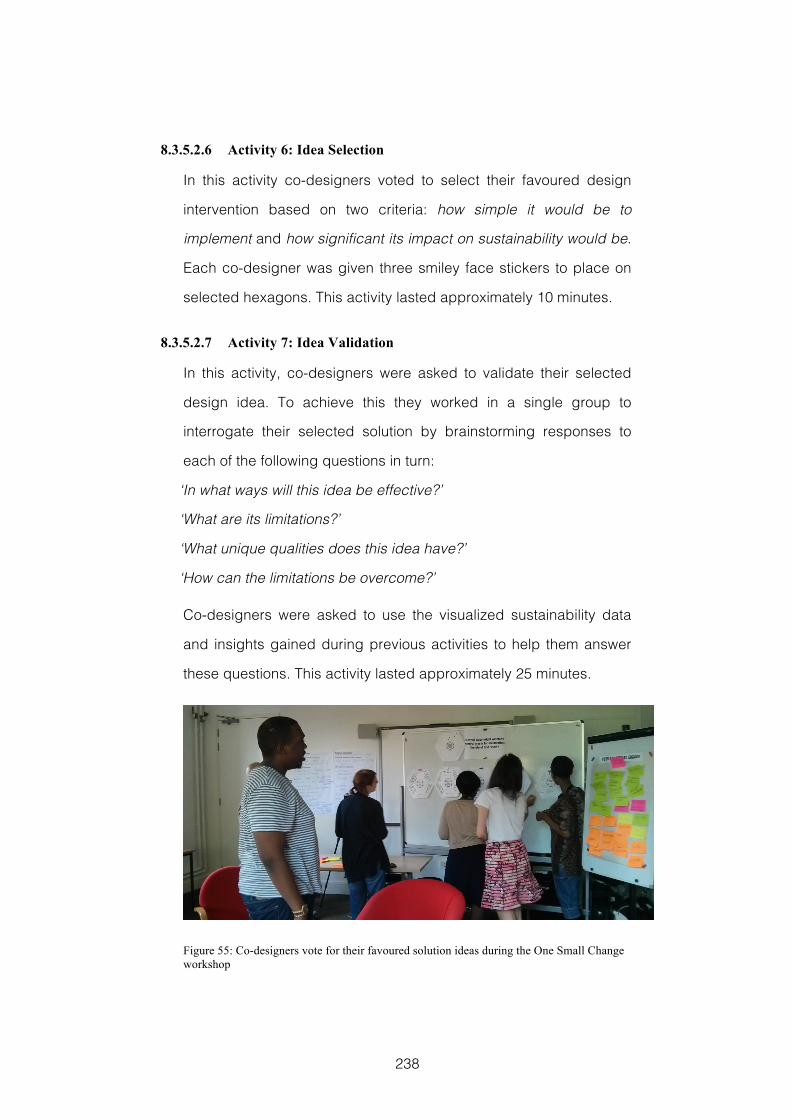
238
8.3.5.2.6 Activity 6: Idea Selection
In this activity co-designers voted to select their favoured design
intervention based on two criteria: how simple it would be to
implement and how significant its impact on sustainability would be.
Each co-designer was given three smiley face stickers to place on
selected hexagons. This activity lasted approximately 10 minutes.
8.3.5.2.7 Activity 7: Idea Validation
In this activity, co-designers were asked to validate their selected
design idea. To achieve this they worked in a single group to
interrogate their selected solution by brainstorming responses to
each of the following questions in turn:
‘In what ways will this idea be effective?’
‘What are its limitations?’
‘What unique qualities does this idea have?’
‘How can the limitations be overcome?’
Co-designers were asked to use the visualized sustainability data
and insights gained during previous activities to help them answer
these questions. This activity lasted approximately 25 minutes.
Figure 55: Co-designers vote for their favoured solution ideas during the One Small Change workshop
239
8.3.5.2.8 Activity 8: Describe the Selected Design Idea
In this activity, all co-designers worked together to describe their
selected service design idea in greater detail. To help structure this
description, they were given an A0 sized 5WsH hexagonal
worksheet on which they could write or sketch to describe elements
of the service experience. This activity lasted approximately 20
minutes and was guided by the following questions printed on the
worksheet:
‘What is the service idea?’
‘Why should this service be developed?’
‘When will this service be used?’
‘Where will this service be used?’
‘Who will benefit from this service and who will implement it?’
‘How will this service increase environmentally friendly behaviour?’
8.3.5.2.9 Activity 9: Describe the Selected Design Idea to Camera
In the final activity of the workshop the selected Design Idea was
presented to camera. This activity lasted approximately 5 minutes.
8.4 Evaluation Methods
My aim with this case study was to evaluate the emerging CoDesign
With Data approach as a design process with two distinct phases.
This was to compare the effectiveness of the tools and techniques
during each phase. To answer my research questions, see section
8.2, I collected data from pre- and post-workshop questionnaires,
and Reflection Postcards given to co-designers after each day’s
activities. I also asked three domain experts to rate each of the
day’s final outputs, and I collated the outputs from individual
240
activities to trace the provenance of the Problem Statement
generated on day one and the Design Idea selected on day two.
The questionnaire I gave to each co-designer prior to the start of the
first day’s activities collected their demographic information and
asked them to rate their knowledge on selected aspects of the
design context. The questionnaires I gave co-designers at the end
of each day’s activities included the questions required for the
Creativity Support Index (CSI) (Carroll et al., 2009); two questions
addressing their insight seeking; two questions addressing the
impact of the information visualization interfaces on co-designers
design ideas; and the questions relating to knowledge of the design
context asked in the pre-workshop questionnaire. The questionnaire
given to co-designers after the second day’s activities additionally
asked them first to rate the importance of each of five workshop
dimensions to the development of their ideas, and then for any other
comments they might wish to share. A follow up questionnaire was
also sent to co-designers one week after the workshops in which I
asked them about the role that the information visualization
interfaces had played in their individual thinking and in their group
discussions. The Reflection Postcard given to co-designers after
each day contained the same prompt in order to compare their
thoughts at each phase. The first day’s postcard was returned at the
start of the workshop’s second day. The second day’s postcard was
returned by post.
As in my previous case studies the evaluation methods and data
collected will be discussed in terms of Supporting the People
Designing and Assessing the Design Product. This choice of
structure is explained fully in section 3.2.
241
8.4.1 Supporting the People Designing
To assess the effectiveness with which the CoDesign With Data
tools and techniques supported co-designers’ creative processes
during their design activities in the One Small Change workshop, I
once again used the questions from the Creativity Support Index
(CSI) (Carroll et al., 2009). As in the evaluation reported in section 7.4,
the questions were slightly reworded from the original questionnaire
to refer directly to the information visualization tools being used.
Again similarly to the evaluation reported in section 7.4, the total of
the scores given in response to each dimension in the second part
of the CSI questionnaire was used to assess the relative importance
of the different creativity support dimensions to co-designers. The
CSI is discussed in detail in section 3.2.1.
To assess how effectively the information visualization tools
supported co-designers’ insight seeking and helped them to gain a
better understanding of the topic under consideration, the
questionnaire given to them after each day’s activities included the
following two questions:
My understanding of the topic under investigation improved as a
result of using the iPad information visualizations.
I was better able to answer questions regarding the topic under
consideration as a result of using the iPad information
visualizations.
These were presented as statements with Likert scale agreement
ratings ranging from 1 strongly disagree to 9 agree strongly. This is
the same format as the CSI questions are presented. In my analysis
I calculated the mean of the rating given to these two questions by
each person, for each day.

242
To assess how effectively the information visualization tools
provided inspiration for co-designers’ idea generation, the
questionnaire given to them after each day’s activities included the
following two questions:
I had many ideas as a result of using the iPad information
visualizations
The iPad information visualizations played an important role in the
ideas I had
These were also presented as statements with Likert scale
agreement ratings ranging from 1 strongly disagree to 9 agree
strongly. In my analysis I calculated the mean of the rating given to
these two questions by each participant, for each day.
To assess whether co-designers had gained an improved
understanding of the design context, as represented in the data,
three questions were included in the questionnaire given to them
before the start of the first day, and also in the questionnaire given
to them after each day’s activities. Co-designers were asked to rate
their knowledge, in each case, from 1 minimal knowledge to 7 deep
knowledge in response to the following statements:
The things that would make City students more environmentally
friendly
The things that prevent City students’ environmentally friendly
behaviour
How students use the different types of bin available at City to
dispose of things
Responses to these questions were collated at each stage they
were asked, and the results graphed.
243
To assess the relative importance of different aspects of the
workshop in the development of their design ideas, co-designers
were asked to rate each of five different workshop aspects on a
scale from 1 unimportant to 7 very important. These aspects were:
Time spent thinking about the subject matter individually;
Discussions with other group members; The expertise of other
group members; Doing activities with information visualizations; and
Workshop facilitation. To analyse this data, the responses were
collated and the mean, median, range and standard deviation
calculated. This provides an overall picture regarding which of these
aspects participants had found effective. Each co-designer’s
response to these questions was graphed to highlight emerging
patterns.
In addition to my questionnaires, the degree to which the workshop
activities had helped co-designers gain a better understanding of
the design context and the relative importance of different aspects
of the workshop were both addressed by the prompt in the
Reflection Postcard given to each co-designer after each day’s
activities:
Please reflect on your involvement in today’s workshop. Write a few
sentences thinking in particular about whether your
understanding of the subject matter has increased and if so which
were the particular elements of the workshop that helped you gain
this improved understanding.
To analyse the responses co-designers gave on the Reflection
Postcards, they were first transcribed and the responses to each
part of the prompt separated. They were then ascribed to one of five
244
conditions: Totally positive; Partially positive; Neutral; Partially
negative; or Totally negative.
Following my initial analysis of the questionnaires, I wanted to
evaluate how important the information visualization tools were in
stimulating and focusing co-designers’ individual thinking and group
discussions during the workshop’s activities. To do this co-
designers were given a follow-up questionnaire a week after the
workshop, in which they were asked two open questions:
To what extent did the information visualizations stimulate and focus
the group discussions you had?
To what extent did the information visualizations stimulate and focus
your individual thinking?
To analyse these, the responses were first transcribed and each
question separated. These were then ascribed to one of five
conditions: Totally positive; Partially positive; Neutral; Partially
negative; or Totally negative.
8.4.2 Assessing the Design Product
To assess the design product, three domain experts were given a
document outlining the Problem Statement participants had defined
together with a description of the Design Idea they had selected.
These domain experts included the member of University staff with
responsibility for managing recycling and waste, the student union
official running a major national student waste and recycling
initiative, and an associate editor of the UK’s leading materials and
recycling magazine with over ten years experience. The document
briefly described how the Problem Statement had been arrived at
during the first day’s activities, and how the Design Idea had
245
developed during the second. Some examples of how the Design
Idea might be implemented were also included. The domain experts
were asked to rate the Problem Statement on three measures: from
1 unimportant to 5 very important, on how important they thought the
problem it describes is; from 1 very familiar to 5 very novel, on how
novel they thought the problem it describes is; and from 1
uncreative to 5 very creative, on how creative they thought the co-
designers had been in identifying this problem. The same three
domain experts were also asked to rate the Design Idea on three
measures: from 1 ineffective to 5 very effective, on how effective
they thought it would be in reducing waste and improving recycling;
from 1 very familiar to 5 very novel, on how novel they thought the
solution was; and from 1 uncreative to 5 very creative, on how
creative they think it is. The rating given by each domain expert for
each assessment factor was then collated for each day’s final
output. In addition, the domain experts were also asked for any
other thoughts or comments they might have. These were
transcribed, and ascribed to one of five conditions: Totally positive;
Partially positive; Neutral; Partially negative; or Totally negative.
To trace the provenance of the Problem Statement, and understand
its development, I worked backwards through the collated outputs
of the first day’s workshop, starting with the Problem Statement
itself. For each activity I identified the outputs that had contributed to
the development of the ideas represented in the Problem Statement.
A similar process was carried out to analyse the provenance of the
Design Idea. In this case I started with the Design Idea itself and
worked backwards through the activities of both days of the
workshop in turn.
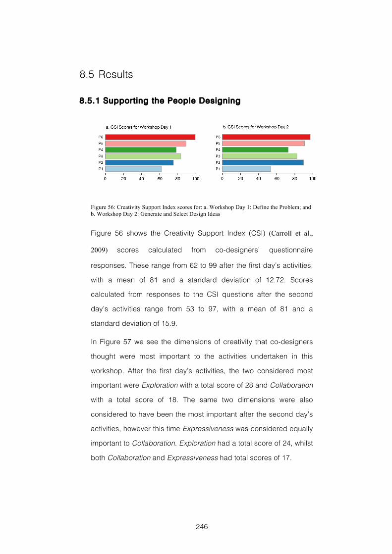
246
8.5 Results
8.5.1 Supporting the People Designing
Figure 56: Creativity Support Index scores for: a. Workshop Day 1: Define the Problem; and b. Workshop Day 2: Generate and Select Design Ideas
Figure 56 shows the Creativity Support Index (CSI) (Carroll et al.,
2009) scores calculated from co-designers’ questionnaire
responses. These range from 62 to 99 after the first day’s activities,
with a mean of 81 and a standard deviation of 12.72. Scores
calculated from responses to the CSI questions after the second
day’s activities range from 53 to 97, with a mean of 81 and a
standard deviation of 15.9.
In Figure 57 we see the dimensions of creativity that co-designers
thought were most important to the activities undertaken in this
workshop. After the first day’s activities, the two considered most
important were Exploration with a total score of 28 and Collaboration
with a total score of 18. The same two dimensions were also
considered to have been the most important after the second day’s
activities, however this time Expressiveness was considered equally
important to Collaboration. Exploration had a total score of 24, whilst
both Collaboration and Expressiveness had total scores of 17.
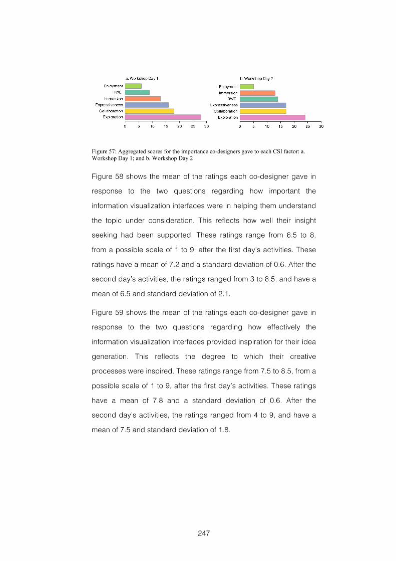
247
Figure 57: Aggregated scores for the importance co-designers gave to each CSI factor: a. Workshop Day 1; and b. Workshop Day 2
Figure 58 shows the mean of the ratings each co-designer gave in
response to the two questions regarding how important the
information visualization interfaces were in helping them understand
the topic under consideration. This reflects how well their insight
seeking had been supported. These ratings range from 6.5 to 8,
from a possible scale of 1 to 9, after the first day’s activities. These
ratings have a mean of 7.2 and a standard deviation of 0.6. After the
second day’s activities, the ratings ranged from 3 to 8.5, and have a
mean of 6.5 and standard deviation of 2.1.
Figure 59 shows the mean of the ratings each co-designer gave in
response to the two questions regarding how effectively the
information visualization interfaces provided inspiration for their idea
generation. This reflects the degree to which their creative
processes were inspired. These ratings range from 7.5 to 8.5, from a
possible scale of 1 to 9, after the first day’s activities. These ratings
have a mean of 7.8 and a standard deviation of 0.6. After the
second day’s activities, the ratings ranged from 4 to 9, and have a
mean of 7.5 and standard deviation of 1.8.
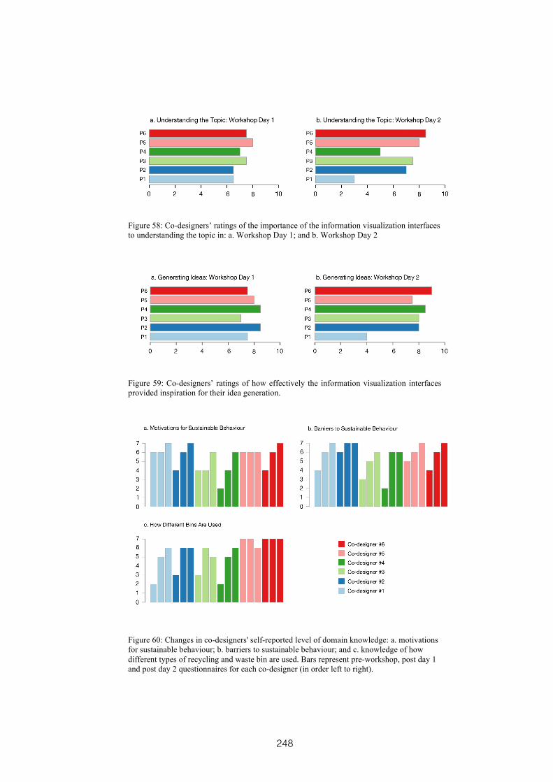
248
Figure 58: Co-designers’ ratings of the importance of the information visualization interfaces to understanding the topic in: a. Workshop Day 1; and b. Workshop Day 2
Figure 59: Co-designers’ ratings of how effectively the information visualization interfaces provided inspiration for their idea generation.
Figure 60: Changes in co-designers' self-reported level of domain knowledge: a. motivations for sustainable behaviour; b. barriers to sustainable behaviour; and c. knowledge of how different types of recycling and waste bin are used. Bars represent pre-workshop, post day 1 and post day 2 questionnaires for each co-designer (in order left to right).
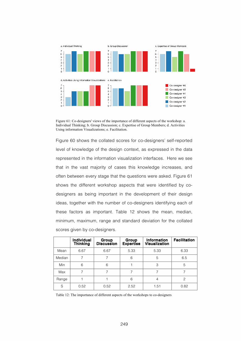
249
Figure 61: Co-designers' views of the importance of different aspects of the workshop: a. Individual Thinking; b. Group Discussion; c. Expertise of Group Members; d. Activities Using information Visualizations; e. Facilitation.
Figure 60 shows the collated scores for co-designers’ self-reported
level of knowledge of the design context, as expressed in the data
represented in the information visualization interfaces. Here we see
that in the vast majority of cases this knowledge increases, and
often between every stage that the questions were asked. Figure 61
shows the different workshop aspects that were identified by co-
designers as being important in the development of their design
ideas, together with the number of co-designers identifying each of
these factors as important. Table 12 shows the mean, median,
minimum, maximum, range and standard deviation for the collated
scores given by co-designers.
Individual Thinking
Group Discussion
Group Expertise
Information Visualization
Facil i tat ion
Mean 6.67 6.67 5.33 5.33 6.33
Median 7 7 6 5 6.5
Min 6 6 1 3 5
Max 7 7 7 7 7
Range 1 1 6 4 2
S 0.52 0.52 2.52 1.51 0.82
Table 12: The importance of different aspects of the workshops to co-designers
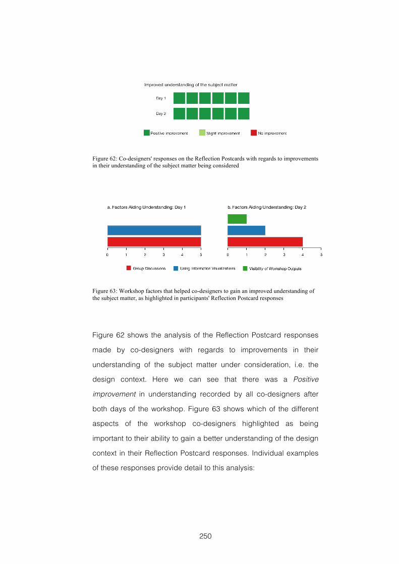
250
Figure 62: Co-designers' responses on the Reflection Postcards with regards to improvements in their understanding of the subject matter being considered
Figure 63: Workshop factors that helped co-designers to gain an improved understanding of the subject matter, as highlighted in participants' Reflection Postcard responses
Figure 62 shows the analysis of the Reflection Postcard responses
made by co-designers with regards to improvements in their
understanding of the subject matter under consideration, i.e. the
design context. Here we can see that there was a Positive
improvement in understanding recorded by all co-designers after
both days of the workshop. Figure 63 shows which of the different
aspects of the workshop co-designers highlighted as being
important to their ability to gain a better understanding of the design
context in their Reflection Postcard responses. Individual examples
of these responses provide detail to this analysis:
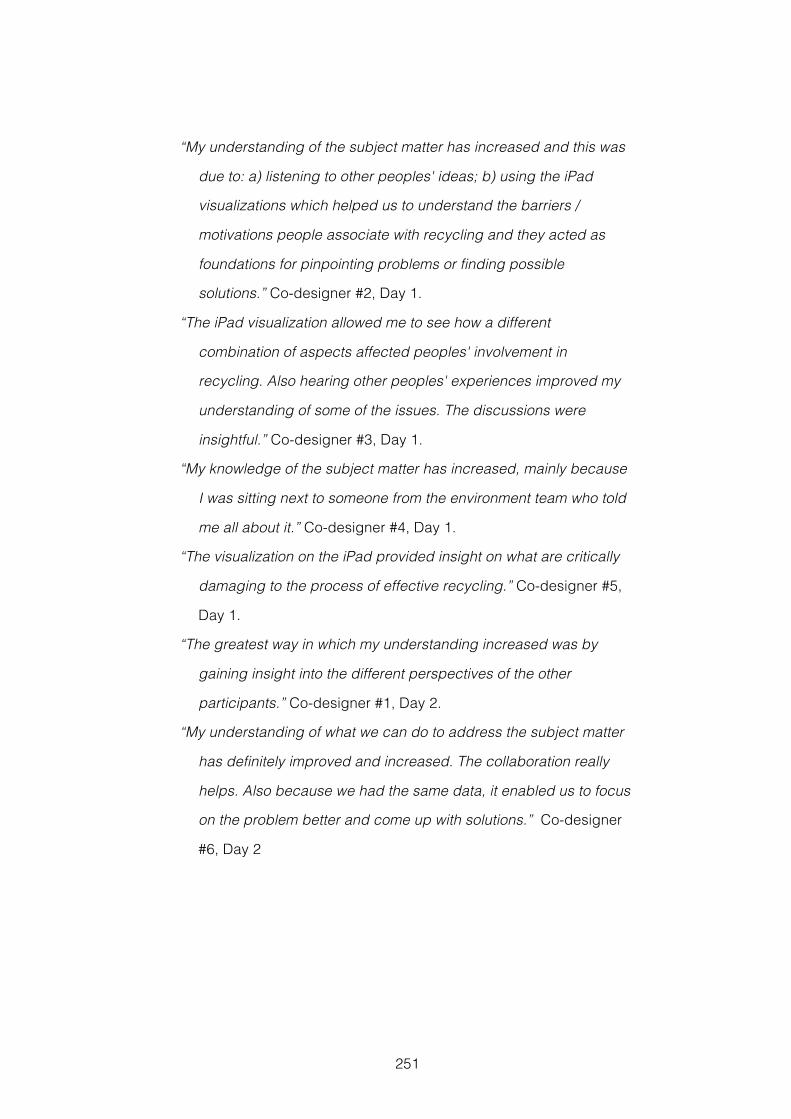
251
“My understanding of the subject matter has increased and this was
due to: a) listening to other peoples' ideas; b) using the iPad
visualizations which helped us to understand the barriers /
motivations people associate with recycling and they acted as
foundations for pinpointing problems or finding possible
solutions.” Co-designer #2, Day 1.
“The iPad visualization allowed me to see how a different
combination of aspects affected peoples' involvement in
recycling. Also hearing other peoples' experiences improved my
understanding of some of the issues. The discussions were
insightful.” Co-designer #3, Day 1.
“My knowledge of the subject matter has increased, mainly because
I was sitting next to someone from the environment team who told
me all about it.” Co-designer #4, Day 1.
“The visualization on the iPad provided insight on what are critically
damaging to the process of effective recycling.” Co-designer #5,
Day 1.
“The greatest way in which my understanding increased was by
gaining insight into the different perspectives of the other
participants.” Co-designer #1, Day 2.
“My understanding of what we can do to address the subject matter
has definitely improved and increased. The collaboration really
helps. Also because we had the same data, it enabled us to focus
on the problem better and come up with solutions.” Co-designer
#6, Day 2
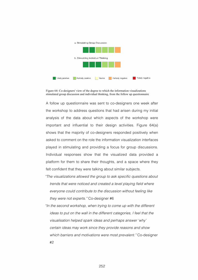
252
Figure 64: Co-designers' view of the degree to which the information visualizations stimulated group discussion and individual thinking, from the follow up questionnaire
A follow up questionnaire was sent to co-designers one week after
the workshop to address questions that had arisen during my initial
analysis of the data about which aspects of the workshop were
important and influential to their design activities. Figure 64(a)
shows that the majority of co-designers responded positively when
asked to comment on the role the information visualization interfaces
played in stimulating and providing a focus for group discussions.
Individual responses show that the visualized data provided a
platform for them to share their thoughts, and a space where they
felt confident that they were talking about similar subjects.
“The visualizations allowed the group to ask specific questions about
trends that were noticed and created a level playing field where
everyone could contribute to the discussion without feeling like
they were not experts.” Co-designer #6
“In the second workshop, when trying to come up with the different
ideas to put on the wall in the different categories, I feel that the
visualisation helped spark ideas and perhaps answer ‘why’
certain ideas may work since they provide reasons and show
which barriers and motivations were most prevalent.” Co-designer
#2
253
However, not all of the responses were positive, one co-designer
thought that a better focus could have been gained by distilling the
visualized data down to simple statements.
“Whilst the visualisation did stimulate group discussions, I think
focus would have been better gained just with simple statements,
for example, saying x% of general waste bins are contaminated,
and an explanation of what contamination was in this context.”
Co-designer #4
Figure 64(b) shows that most of the co-designers also responded
positively when asked to comment on the role the information
visualization interfaces played in stimulating and providing a focus
for individual thinking. Individual responses show how the visualized
data triggered co-designers to think again about the subject.
“It also helped me to present ideas that gave reasons for why people
may not recycle.” Co-designer #5
“The visualisations made me question some of my own ideas.” Co-
designer #3
Again there was a partially negative aspect to one of the responses.
In this instance, Co-designer #1 highlighted that the information
visualizations did not help his original thinking, but rather that they
were more useful in helping communication and sharing.
“The information visualizations largely reinforced my gut feeling on
this particular matter – they did not have a substantial effect in
stimulating or focussing my original thinking, but they did allow
me more easily to draw attention to specific ideas by pointing to
the visualization rather than needing to communicate and explain
in great detail.” Co-designer #1
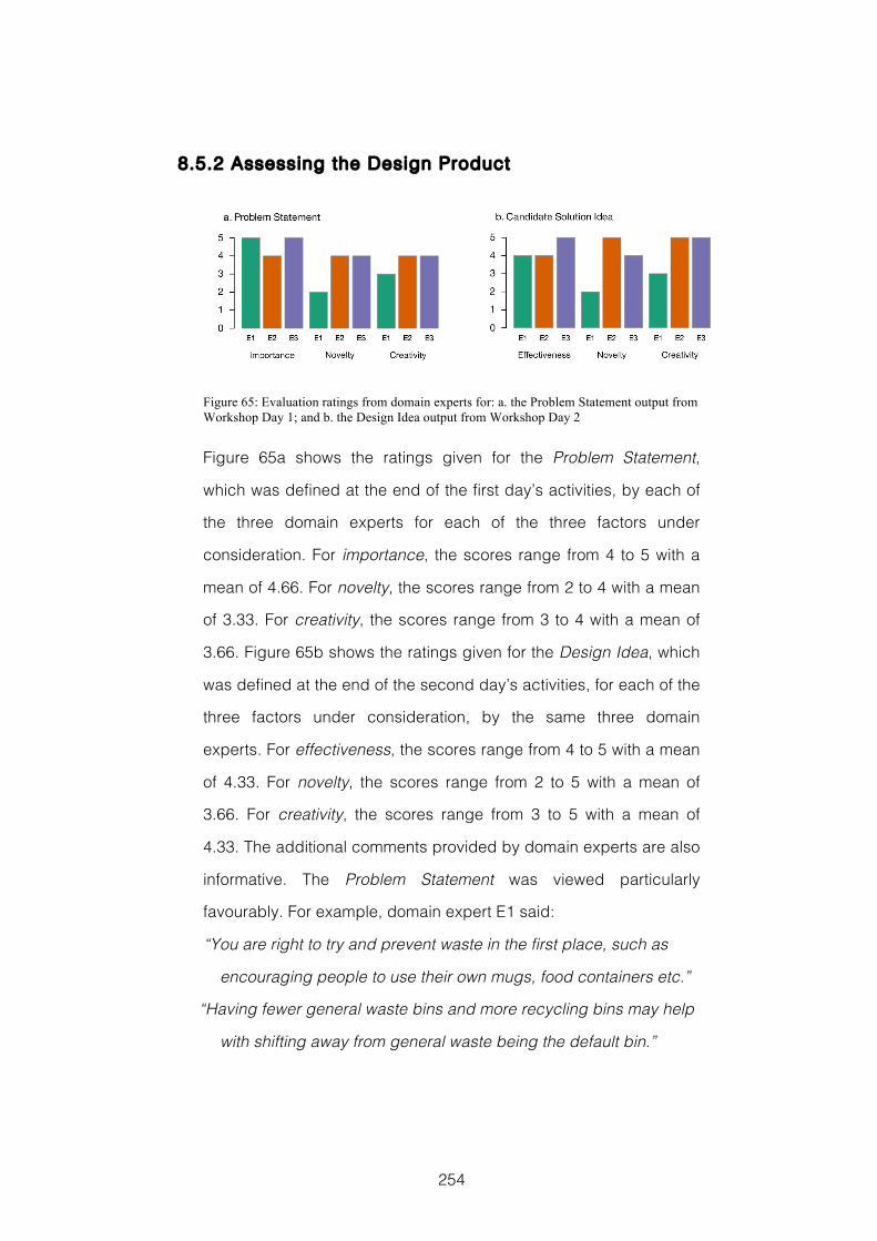
254
8.5.2 Assessing the Design Product
Figure 65: Evaluation ratings from domain experts for: a. the Problem Statement output from Workshop Day 1; and b. the Design Idea output from Workshop Day 2
Figure 65a shows the ratings given for the Problem Statement,
which was defined at the end of the first day’s activities, by each of
the three domain experts for each of the three factors under
consideration. For importance, the scores range from 4 to 5 with a
mean of 4.66. For novelty, the scores range from 2 to 4 with a mean
of 3.33. For creativity, the scores range from 3 to 4 with a mean of
3.66. Figure 65b shows the ratings given for the Design Idea, which
was defined at the end of the second day’s activities, for each of the
three factors under consideration, by the same three domain
experts. For effectiveness, the scores range from 4 to 5 with a mean
of 4.33. For novelty, the scores range from 2 to 5 with a mean of
3.66. For creativity, the scores range from 3 to 5 with a mean of
4.33. The additional comments provided by domain experts are also
informative. The Problem Statement was viewed particularly
favourably. For example, domain expert E1 said:
“You are right to try and prevent waste in the first place, such as
encouraging people to use their own mugs, food containers etc.”
“Having fewer general waste bins and more recycling bins may help
with shifting away from general waste being the default bin.”
255
Whilst domain expert E2 said:
“The problem identified in the workshops (how to make general
waste for incineration the bin of last resort) is certainly an
important one and quite relevant for us at City. The proposed
solution to this particular problem is quite novel and creative and
has the potential to be quite effective.”
“Reducing the number of general waste bins is just part of the actual
problem at City. The other equally important problem is that
people tend to contaminate the recycling bins with food/liquid
waste.”
Domain expert E3 said:
“Simple and very effective!”
“Another thing would probably be to reduce the number of bins for
general waste for incineration and mainly have recycling bins
available around the campus.”
The Problem Statement that was the final output of the first day’s
activities was: In what ways might we make general waste
the bin of last resort? Tracing the provenance of this output
shows that it was arrived at through the following steps, clearly
indicating the passage from insights to ideas.
On investigating the visualized data during Activity 3, co-designers
had noted that people were too busy or that it took too much time to
behave sustainably. This meant that there was a lack of
convenience and that carrying things around is annoying, also that
there was too much thinking about what goes in what bin. Amongst
the reasons for this were different bins in different places; the right
bin is not where you are or where you are going; labelling on bins is
unclear; and that there are more general waste bins .
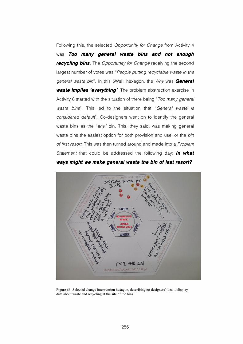
256
Following this, the selected Opportunity for Change from Activity 4
was Too many general waste bins and not enough
recycling bins . The Opportunity for Change receiving the second
largest number of votes was “People putting recyclable waste in the
general waste bin”. In this 5WsH hexagon, the Why was General
waste implies ‘everything’ . The problem abstraction exercise in
Activity 6 started with the situation of there being “Too many general
waste bins”. This led to the situation that “General waste is
considered default”. Co-designers went on to identify the general
waste bins as the “any” bin. This, they said, was making general
waste bins the easiest option for both provision and use, or the bin
of first resort. This was then turned around and made into a Problem
Statement that could be addressed the following day: In what
ways might we make general waste the bin of last resort?
Figure 66: Selected change intervention hexagon, describing co-designers' idea to display data about waste and recycling at the site of the bins
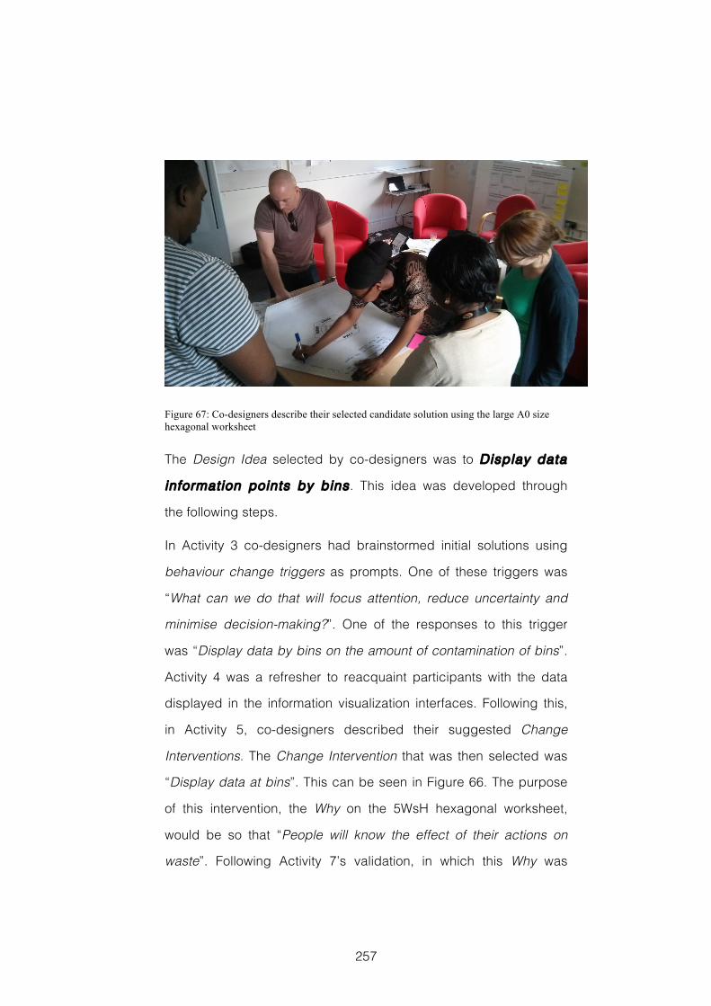
257
Figure 67: Co-designers describe their selected candidate solution using the large A0 size hexagonal worksheet
The Design Idea selected by co-designers was to Display data
information points by bins . This idea was developed through
the following steps.
In Activity 3 co-designers had brainstormed initial solutions using
behaviour change triggers as prompts. One of these triggers was
“What can we do that will focus attention, reduce uncertainty and
minimise decision-making?”. One of the responses to this trigger
was “Display data by bins on the amount of contamination of bins”.
Activity 4 was a refresher to reacquaint participants with the data
displayed in the information visualization interfaces. Following this,
in Activity 5, co-designers described their suggested Change
Interventions. The Change Intervention that was then selected was
“Display data at bins”. This can be seen in Figure 66. The purpose
of this intervention, the Why on the 5WsH hexagonal worksheet,
would be so that “People will know the effect of their actions on
waste”. Following Activity 7’s validation, in which this Why was
258
explored in more detail, the final Design Idea was described on a
large 5WsH hexagonal worksheet, see Figure 67. This idea was
considered to be effective because it is a “Simple way to encourage
people to make a more extensive/proper use of the bins”. This idea
was furthered developed into the proposal that is presented in
Appendix B of this thesis.
8.6 Discussion
My aim with this case study was to investigate how effectively the
emerging CoDesign With Data approach’s use of domain-relevant
data would support co-designers’ insight seeking and provide
inspiration for their creative design ideas during each of two distinct
design phases. The first phase would lead up to co-designers
defining a Problem Statement. In the second co-designers would
generate candidate solutions and select a final Design Idea. This
case study would also bring together and build on the lessons learnt
in my previous studies.
When we look at the ratings given by the independent domain
experts to the final output from each of the phases we see that the
tools and techniques used during the workshop activities led to co-
designers successfully identifying a specific problem to address
and defining it in a Problem Statement domain experts considered
important. The same domain experts also considered that the
Design Idea co-designers developed was likely to be effective, and
that co-designers had been creative in its design. This can be
considered positive evidence for the effectiveness of the CoDesign
With Data approach.
259
Investigating the provenance of each of these outputs shows that
the Problem Statement can be clearly traced back to insights
regarding the greater number of general waste bins and the barriers
to sustainable behaviour, which co-designers discovered through
exploring the visualized data during Activity 3’s insight seeking. The
origins of the Design Idea co-designers selected also reflect the
importance of the data to their thinking. However, here we see the
important influence of wider thinking too, particularly that initiated by
the behaviour change triggers.
The Creativity Support Index (CSI) (Carroll et al., 2009) ratings
calculated from co-designers’ questionnaire responses range from
62 to 99 after the first day and from 53 to 97 after the second. The
mean rating was 81 after both days. These figures are comparable
with those calculated from responses given by participants who had
used the interface visualizing smart energy data in a design that
aimed to prompt creative thinking in an analytical way during the
design experiment reported in Chapter 7, see section 7.5.1. This
offers additional evidence for the effectiveness of this type of
interface in CoDesign With Data workshops. Also similarly to the
findings reported in section 7.5.1, the dimensions of creativity
support that co-designers considered most important were again
Exploration and Collaboration. This suggests that those findings and
the factors relating to interaction discussed in section 7.6 may be
generalizable to many instances of similar workshops. This is an
important consideration for the way information visualization
interfaces and workshop activities are designed and used in
CoDesign With Data workshops.
260
Findings from the other questionnaire data and the Reflection
Postcard responses suggest the workshop’s activities were effective
in helping co-designers gain a better understanding of the design
context, and that the visualized data contributed inspiration to co-
designers’ ideas. However this data also point to the importance of
group discussions and sharing other co-designers’ knowledge in
this respect. When we look at the questionnaire data relating to
which aspects of the workshop were important in the development
of design ideas, group discussion and individual thinking were
considered important by all co-designers. When we factor in the
Reflection Postcard responses, this appears to have been
particularly the case for the second day’s activities.
Responses to the follow-up questionnaire suggest that for most co-
designers exploring the domain-relevant data visualized in the iPad
interfaces provided a focus for and stimulated both of these
aspects. One thing of note is that the co-designer who was most
familiar with the details of the design context before the workshop
was the one most positive about the role of the visualized data in the
group discussions. This was co-designer #6 whose role at the
University includes managing the Environmental Champions
Network on a day-to-day basis. Co-designer #6 highlights how the
data “allowed the group to ask specific questions”, and “created a
level playing field where everyone could contribute”. This can be
compared with co-designer #4 who had thought “simple
statements” might have been better, and whose Reflection Postcard
response on the first day had said “My knowledge of the subject
matter has increased, mainly because I was sitting next to someone
from the environment team who told me all about it”. Co-designer #4
261
was the co-designer with least detailed knowledge of the domain
context. She was also the co-designer whose self-reported level of
domain knowledge was lowest at the start and showed the greatest
increase by the end.
This suggests that the information visualization interfaces may have
been being used as a common ground where information and
opinions could be shared. In this way they were performing a role
analogous to that ascribed to boundary objects (Star, 1988; Star,
2010). The term boundary object is used to describe objects that
have a meaning or purpose that can be shared by groups who are
collaborating or cooperating without consensus. Importantly though,
a boundary object should also have an existing, more specific
purpose for at least one of the groups, which precedes the more
vague or ambiguous shared purpose. In this workshop, the
information visualization interfaces were artefacts specifically given
to participants in order to perform particular workshop activities. It
would therefore be incorrect to refer to them specifically as
boundary objects.
Using the term boundary object analogously is still potentially useful
though, because it relates to an important factor in the relationships
between co-designers, and between co-designers and the tools
they are given. Fischer and Shipman (2013) and Arias and Fischer
(2000) discuss something similar in participants’ use of novel digital
systems they call ‘domain-oriented design environments’ during
collaborative or social creativity. Carlile provides examples of
design artefacts, such as sketches and models, acting as boundary
objects in new product development (Carlile, 2002). Here the
262
artefacts are used to transform knowledge as well as to share it
between representative design engineers, manufacturing engineers,
sales representatives and production staff. Further study is required
of this collaborative aspect of using information visualization
interfaces in workshops.
Returning to the research questions asked in section 8.2. Were there
differences in the support provided for co-designers’ insight seeking
between the two days of the workshop? Responses to the
questionnaires and Reflective Postcards would suggest there were,
and that the information visualization interfaces played a more
significant role when defining the Problem Statement on day one
than when generating candidate solutions and selecting a Design
Idea on day two. Similarly, it also appears to be the case that the
information visualization interfaces were a more important source of
inspiration for co-designers’ creative design process on day one
than on day 2. These factors suggest that the tools and techniques
for working with domain-relevant data, particularly those using
information visualization techniques to prompt creative thought in a
structured and analytical way, developed during this research are
likely to be particularly well suited to identifying and formulating
design problems. However, confirmatory investigation is needed.
8.7 Reflections
8.7.1 Research and Evaluation Methods
8.7.1.1 Benefits and Limitat ions of Study Design
This case study enabled me to compare Reflection Postcards and
questionnaire responses at the end of each phase of a two-phase
263
workshop held over consecutive days. It also provided an output
from each phase that could be assessed by independent domain
experts. However, a large number of activities were included in a
limited timespan, which led to a degree of compromise. In
particular, the selection and validation of the final Design Idea were
truncated. Future workshops might therefore follow the Creative
Problem Solving (CPS) method (Isaksen et al., 2011) in having three
distinct phases.
My comparison of the evaluation data at different stages is
informative and highlights possible areas where the methods under
investigation might be particularly effective. However, it should be
remembered that this case study involves a single workshop with a
particular set of participants and therefore the reliability of
attempting to transfer the findings to other contexts is limited.
I had also thought that separating the two phases over consecutive
days would be important to provide time for co-designers’ ideas to
incubate overnight. Such periods of incubation have been identified
as a key stage in creative processes e.g. (Lubart, 2001), and they are
considered an important and effective element in the Creativity
Workshops discussed in section 2.4.1. However, there was no
obvious way to assess the effectiveness of providing a period of
incubation when studying a single workshop, and so it was not
something explored in detail. This is perhaps a factor that could
usefully be studied in a future design experiment.
8.7.1.2 Limitat ions of Data Collection and Analysis
In this case study I gathered evaluation data from multiple sources
in an attempt at triangulation, and to mitigate any threats to the
264
validity and reliability of any findings. The combination of Creativity
Support Index (CSI) (Carroll et al., 2009) ratings, other questionnaires
and Reflection Postcards provides a comprehensive account of
participants’ self-reported perceptions of the effectiveness of the
workshop’s activities. This could be augmented with participant
interviews, but any added value should be weighed against the
extra demands placed on those taking part. To support this
evidence, I also asked independent domain experts to rate each
day’s final output. This provides an alternative assessment of the
workshop’s effectiveness, and one that is an accepted and useful
measure of their success (Dean et al., 2006; Jones et al., 2008), even if
it does have limitations with regards to consistency (Christiaans,
2002).
The major limitation in the evaluation data gathered during this case
study was the failure to gather video data. In the design experiment
reported in Chapter 4, detailed analysis of the video recordings of
participants’ use of the different information visualization interfaces
enabled me to gain an understanding of the sensemaking
processes that were taking place. Similarly, in the design
experiment reported in Chapter 7, detailed analysis of the video
recordings of the activities surrounding participants’ idea
generation, enabled me to gain a picture of the differences in the
way participants were inspired by the different design artefacts.
My intention had been to undertake a similarly close and detailed
analysis of the video recordings of the activities undertaken during
this workshop. However, here the workshop setting was less
controlled, activities were not situated around a single table, and the
265
dynamic changes between small and large group working meant
that even with two cameras the video recordings I made did not
capture the necessary interactions sufficiently well. This was a
failing in my approach, and finding alternative ways to capture video
data is an important consideration for future research. It may prove
effective to use the forward facing camera on an iPad to record the
conversations that the users of that particular iPad have, and
combine this with a log of their interactions with the visualized data.
However, this might also require a significantly longer development
time when building information visualization interfaces.
8.7.2 Takeaways
T8.1 Interactive interfaces that visualize domain-relevant data
appear to provide a common ground on which workshop co-
designers are able to share their knowledge and develop creative
design ideas.
T8.2 Activities in which co-designers seek insight in visualized
domain-relevant data, using interactive interfaces designed to
prompt creative thinking in a structured analytical way, appear to
be particularly well suited to identifying and formulating design
problems.
266
9 Discussion
At the outset of this thesis, I described design as being a process
by which “courses of action aimed at changing current situations
into preferred ones” (Simon, 1996, p.111) are devised through a
“reflective conversation with the materials of a design situation”
(Schön, 1992) and where to “design with future use activity in mind
means to start out from the present practice of the future users”
(Bødker et al., 1988). I also explained how domain-relevant data,
generated during everyday activities, offer new ways to gain an
understanding of possible future users’ current activities.
9.1 Research Question
To investigate this opportunity, I set myself the following research
question:
How can seeking insight into domain-relevant data help participants
in early-stage co-design workshops gain a richer understanding
of the context under investigation, and provide inspiration for
creative design ideas?
9.2 Contribution
In response to this question, I have been developing the CoDesign
With Data approach to early-stage design workshops, in which
working with domain-relevant data is the key distinguishing feature.
This has been the primary contribution of the research detailed in
this thesis. During a CoDesign With Data workshop participants take

267
part in a series of activities using the tools and techniques I have
developed to help them: seek insight into domain-relevant data;
share their individual knowledge to gain an improved understanding
of the possible contexts these data might come from; and use the
insights gained as a source of inspiration for creative design ideas.
This research has been exploratory and the CoDesign With Data
approach remains a work in progress. However, this research has
received validation through peer-reviewed publication at
international conferences. These publications, reproduced as
Appendix A, include studies of the tools, techniques and methods
developed, and discussion of a new method of evaluating creativity
support during workshops using Reflection Postcards.
9.2.1 Tools, Techniques, Methods and Approach
In section 2.3, I introduced a framework of tools , techniques ,
methods and approach that has been used to structure the
different aspects of a participatory design workshop (Sanders et al.,
2010). I adopted this framework to organise the different aspects of
the workshops described in this thesis, and I will now use it again to
structure the contribution made by this research in more detail. The
level of approach describes an overall mindset or guiding
philosophy. The level of method refers to specific combinations of
tools and techniques that have been brought together to meet the
goals of a particular workshop. The level of tool describes different
material elements of a workshop, including visualized domain-
relevant data. Finally, at the level of technique I am describing how
these tools might be used during a workshop activity.
268
9.2.2 Contribution at the Level of Approach
The contribution made by this research at the level of design
approach has been first to identify the opportunity offered by
domain-relevant data, data which describe aspects of potential
future users’ current practice; and second to demonstrate how these
data can be used as a raw material through which co-designers are
able to explore the domain context of a design situation, and use the
insights they gain as inspiration for creative design ideas. Findings
from each of the studies reported in chapters 4, 5, 7, and 8 indicate
that co-designers find exploring visualized domain-relevant data to
be not only useful and engaging, but also a source of inspiration for
creative design ideas. This offers a new approach through which
human-computer interaction design researchers might investigate
activities of interest, frame design problems, and stimulate co-
designers’ creative ideation.
9.2.3 Contribution at the Level of Method
At the level of workshop method , the main contribution of this
research has been the empirical evidence, gained through analysis
of Creativity Support Index (Carroll et al., 2009) data, which shows
that exploration and collaboration are key creativity parameters
to support during this type of workshop. This finding, from the
studies reported in chapters 7 and 8, reflects the importance to co-
designers of developing, sharing and validating alternative ideas
about what might be happening during the activities represented in
the data. These alternative ideas are important because they go on
to form the basis of an improved understanding of the domain
context, and provide a source of inspiration for design ideas.
269
Supporting exploration and collaboration therefore becomes an
important guideline when designing a workshop, one that underpins
the development and selection of the tools and techniques used
during its activities.
9.2.4 Contribution at the Level of Technique
At the level of workshop technique , the contributions of this
research are as follows. Findings from chapters 7 and 8 suggest
that important parallels can be drawn between analytical (Kosara,
2007) or traditional (Manovich, 2011) methods of visualizing
information, and structured activities that prompt an analytical style
of creative cognition (Couger et al., 1993; Shah et al., 2000). We can
therefore develop workshop activities that prompt and guide co-
designers’ exploration of suitably visualized quantitative data, using
an analytical style of creative cognition, which lead them to find
insights about the domain context of a design situation, and which in
turn inspire useful design ideas. Findings from Chapter 5 suggest
that interactive information visualization interfaces can also be used
effectively in combination with generative design techniques
(Sanders, 2000), such as making collages. Findings from the study
reported in Chapter 8 suggest that using creativity techniques to
explore visualized domain-relevant data can be an effective way to
identify and formulate design problems. Finally, findings from the
studies reported in chapters 5 and 6 suggest that generative design
activities can help co-designers’ interpret and resolve ambiguities in
data, and therefore increase their understanding of the domain
context in which data are generated.
270
9.2.5 Contribution at the Level of Tool
The contributions of this research at the level of workshop tool are
as follows. Findings from the studies reported in chapters 4, 5, 7
and 8 all indicate that co-designers find interactive interfaces that
visualize domain-relevant data, and which are presented using an
iPad, to be an engaging tool that supports their collaborative design
activities. The study reported in Chapter 5 suggests that this may be
true for a broad range of the public. Findings from the study
reported in Chapter 4 suggest that these interfaces should not
represent domain-relevant data with a visual encoding that
increases ambiguity, as this will have a negative impact on co-
designers’ sensemaking and subsequently reduce the
appropriateness of their design ideas. Findings from the study
reported in Chapter 7 suggest that these interfaces should be
designed with a high degree of user-controlled interactivity, as this
appears to support their collaborative exploration. Findings from the
study reported in Chapter 8 suggest that these interfaces can
provide a common ground on which co-designers are able to share
their knowledge and develop creative design ideas. Findings from
the study reported in Chapter 5 suggest that collections of domain-
relevant images or photographs can help co-designers interpret
ambiguity in data and in the domain contexts where data are
generated.
9.2.6 Comparison to Other Design Approaches
To further demonstrate the contribution of this research to the field of
human-computer interaction design, comparisons can be made with
other design approaches used in the field. Section 1.2.1 introduced
271
the question that guided this research and described two key
relationships it assumes. I will use these two relationships again now
to frame my comparison with other design methods. First is the
relationship between data and context, and how exploring domain-
relevant data, and thinking about the context of the activities being
undertaken when these data are generated, can provide insight into
design problems. Here I will compare the Codesign With Data
approach to Contextual Design (Beyer & Holtzblatt, 1997). Second is
the nature of inspiration, and how insights from exploring domain-
relevant data can provide inspiration for possible design solutions.
Here I will compare the CoDesign With Data approach to the
Inspiration Card Workshop (Halskov & Dalsgård, 2006).
It is also worth noting here that when I talk about design context or
domain context I am discussing the possible contexts in which the
activities represented in the domain-relevant data might have taken
place. An alternative understanding of design context is the context
in which the design process is taking place. This is discussed in
(Svanaes & Gulliksen, 2008), and is not something I am directly
making reference to in this thesis.
9.2.6.1 Data and Context
Contextual Design (Beyer & Holtzblatt, 1997; Beyer & Holtzblatt, 1999)
is a method that covers the entire front-end of the design process,
through a series of structured phases. It is an information-based
method that is heavily influenced by close study techniques
imported from the applied social sciences, such as ethnography. It
results in a highly detailed understanding of the domain context of
future customers’ work that is well suited to the custom design of
272
software and systems for a particular work environment. This means
that even in its agile incarnation (Beyer et al., 2004) it is both time and
labour intensive. In contrast, CoDesign With Data is relatively
lightweight with a focus on creative workshop activities. However,
whilst not equivalent, both approaches take data as a starting point
and can be said to follow a basic principle of designing from data.
The way in which each gathers and treats data will be the basis on
which comparison can be made.
The data used for Contextual Design are gathered during the initial
contextual inquiry phase, when one-to-one field interviews and
observations of customers and their work are conducted. For
Contextual Design, “the principle of context tells us to go to the
customer’s workplace and see the world as it unfolds.” Because “All
the richness of real life is there, able to jog the customer’s memory
and available for study” (Beyer & Holtzblatt, 1997, p.47). Here, context
is something experienced by the design researcher who is acting
like an apprentice in order to learn about work tasks with the aim of
relating the data she collects to concrete instances rather than
abstract examples. Typical contextual inquiry interviews might last
two to three hours each. Interviews will be held with two to three
people for each identified work role. This may result in around
twenty interviews. For commercial software systems this might be
repeated in six different businesses (Beyer & Holtzblatt, 1997, pp.75-
76). The result of this is large amounts of qualitative data, such as
notes and sketches detailing interviews and observations, each
referring to specific instances of work practice.
273
The analysis of Contextual design data is a process that turns these
concrete instances of work practice into abstractions and models,
such as workflow diagrams, sequence models, cultural models and
physical environment models. Following the creation of individual
models, a consolidation process in which designers attempt to
“develop a sense for a whole customer population from particular
instances and events” through affinity diagrams and consolidated
work models takes place (Beyer & Holtzblatt, 1997, p.151). It is the
insights gained from abstracting these data into models, and then
consolidating and interpreting these models that leads to initial
design ideas. During a Contextual Design process it could be said
that design ideas emerge as the data are transformed from
individual instances into abstract representations.
The data used during a CoDesign With Data workshop may be of
different kinds, both qualitative and quantitative, and can come from
any number of sources. In most cases these data are likely to have
been generated or collected for a previous purpose, other than the
current design process, and include domestic and social data as
well as work place data. For example, smart meter and smart plug
energy data are generated to measure everyday energy
consumption, whilst Flickr and social media data are generated so
that people can share images, thoughts, ideas and feelings with
each other. The visualized representations of these data used in a
CoDesign With Data workshop can be thought of as collated
abstractions of the different instances of current practice taking
place when they were generated. This might offer a view on the
activities of larger numbers of people, over longer periods of time,
and in a wider range of settings than is practical during a Contextual
274
Design process, albeit at the cost of being at a much courser
granularity.
The activities undertaken during a CoDesign With Data workshop
aim to employ stakeholder knowledge and creativity to share ideas,
based on participants’ own experiences, which describe possible
instances in which these data might have been generated.
Stakeholders are being asked to interpret the data through the lens
of their own experience, use this to provide insights into the domain
under consideration, and use these insights to inspire creative
design ideas. During a CoDesign With Data workshop it could be
said that design ideas emerge as the data are transformed from
abstract representations into individual instances.
In a Contextual Design process, the decision has already been
made to design something. Here data are collected and analysed to
ascertain exactly what form that thing should take. The story these
data tell is in the form of a documentary, accurately describing the
context of customers’ current work practices. Whilst this is also
possible with CoDesign With Data, it is not always necessarily the
case. At times, data might be a starting point, and the aim of the
workshop might either be to generate ideas that use these data to
address a known issue, as in the case studies reported in chapters
5 and 8; or simply to investigate whether these data can be
combined or repurposed to increase their value, as in the case
study reported in Chapter 6. In this way CoDesign With Data can be
a more speculative endeavour than Contextual Design. Here,
understanding the domain context becomes exploratory, and data
are used to tell a more imaginative story. I do not believe that these
two ways of understanding domain context are incompatible, rather
275
that they are different and hopefully complementary. A detailed
contextual enquiry into the domain is a likely next step in developing
design ideas generated during a CoDesign With Data workshop.
9.2.6.2 Inspirat ion
As well as potentially offering a different way of understanding the
domain context of a design situation, the insights gained exploring
domain-relevant data during a Co-Design With Data workshop also
offer a new source of inspiration for creative design ideas. With this
in mind it is instructive to compare CoDesign With Data with the
Inspiration Card Workshop (Halskov & Dalsgård, 2006) that was
described in section 2.4.3. Taking the Inspiration Card Workshop as
a case study, Halskov identifies four different strategies through
which sources of inspiration are related to design ideas: selection, in
which some particular feature of the inspiration source is identified
for future use; adaptation, in which a selected feature of the
inspiration source is taken and modified in some way; translation, in
which a selected feature of the inspiration source is taken and
placed into a new context; and combination, in which previously
unrelated features from different inspiration sources are combined
to make something new (Halskov, 2010). These four strategies reflect
the generative activities undertaken during the Inspiration Card
Workshop. Here participants’ creativity is harnessed through making
activities, and pre-selected cards showing domain and technology
images provide the primary source of inspiration. These strategies
also reflect that the Inspiration Card Workshop is largely a process
of convergent thinking in which design concepts are developed. In
the Inspiration Card Workshop, the bulk of divergent creativity takes
276
place in the pre-workshop phase where the Domain and Technology
cards are prepared.
A CoDesign With Data workshop includes an explicit phase of
divergent creative thinking prior to convergence activities. In each of
the studies reported in chapters 4, 5, 7 and 8 of this thesis we have
seen how visualized data can be a source of inspiration for these
divergent ideation activities. During these periods, participants’
insight seeking plays an important role. These insight seeking
activities highlight two strategies for relating sources of inspiration to
design ideas that differ from those described above, and provide
evidence of the novel contribution of the CoDesign With Data
approach in this area.
The first of these can be understood as being Pattern Recognition.
Pattern Recognition describes the strategy of identifying visually
salient aspects of an interface that are likely to relate to some
structure or pattern in the underlying data. The second can be
understood as Sensemaking. Sensemaking describes the strategy
of relating the visually salient patterns found in the visualization
interface, first to the underlying data, and through this to the
activities that these data represent. These two strategies are closely
linked, and in many cases Sensemaking will follow Pattern
Recognition just as Adaptation, Translation or Combination may
follow Selection in the Inspiration Card Workshop.
The close video analysis undertaken for the studies reported in
chapters 4 and 7 illustrates examples of both Pattern Recognition
and Sensemaking strategies. In Chapter 4, Table 10 shows an
example of the Pattern Recognition strategy unfolding. It includes
statements like “It’s 5 across here, 4 up and down”, “So the colour is
277
the same… colours… yes. Just the amount… the circles” and “So
there’s a green up in here and a green down here…”, each of which
show how participants are looking for structure and pattern in the
visualization interface. Again in Chapter 4, Table 11 shows an
example of the Sensemaking strategy unfolding. Here we see
statements such as “On Thursday people are washing their...”, “And
on Sunday” and “Is this one persons consumption? Do you think?
Because they didn't do anything on those days. What about fridge-
freezer? That one's continually on”, which show participants trying to
understand the activities represented by the data that are visualized
in the interface. In Chapter 7, Figure 42 shows another example of
participants using a Sensemaking strategy. This includes
statements such as “Maybe the dryer is something we can probably
change more?” and “There’s winter and summer. Big difference.”.
Again, participants are responding to the visualization interface by
trying to understand the activities represented in the underlying data
and finding inspiration for their ideation.
9.3 Recommendations for Design Practice
In addition to making a contribution to academic knowledge, it is my
aim that the research detailed in this thesis also benefits design
practice. With this in mind, some key guidelines for using domain-
relevant data as a design material have emerged. These are listed
below.
9.3.1 Guidelines for CoDesign With Data Workshops
G1 Exploration and collaboration are key dimensions of co-
designers’ creative processes to support.
278
G2 Visualizing domain-relevant data on an iPad is engaging for co-
designers, and compatible with their other design activities.
G3 Combining visualized data with generative design activities and
applied creativity techniques inspires creative design ideas.
G4 Representing quantitative data unambiguously in an interactive
interface prompts creative thinking in an analytical way well suited
to formulating design problems.
G5 Interfaces and generative toolkits that present a large number of
domain-relevant photographs help co-designers interpret
ambiguity and understand the contexts data are drawn from.
G6 Custom worksheets help co-designers structure the ideas they
generate using visualized data and applied creativity techniques.
These key guidelines have been derived from the design practice
takeaways that end each of the chapters 4 to 8. These takeaways
are recommendations based on the research findings from each of
the individual studies, and are listed in full below.
9.3.2 Recommendations from Individual Studies
T4.1 Designing interfaces that visualize domain-relevant data with
an intentionally ambiguous visual encoding appears to have a
negative impact on co-designers’ sensemaking, and reduces the
appropriateness of their subsequent design ideas.
T4.2 Interactive interfaces in which domain-relevant data are
visualized appear to provide an engaging tool for co-designers.
T4.3 Presenting visualized data to co-designers on a tablet device
such as an iPad appears to provide a form factor that supports
their collaborative design activities.
279
T5.1 Workshop activities that combine generative design
techniques with seeking insight in visualized domain-relevant data
appear to inspire useful design insights.
T5.2 Interactive iPad interfaces in which domain-relevant data are
visualized appear to provide an engaging tool for co-designers
who are members of the public, in a real world setting.
T5.3 Presenting visualized data on a tablet device such as an iPad
appears to provide a form factor that is suitable for co-designers
collaborative design activities during generative design.
T5.4 Generative design toolkits, which include items such as
photographs, appear to be an effective way of helping co-
designers interpret the ambiguous contexts that domain-relevant
data are drawn from.
T6.1 Workshop activities that combine applied creativity techniques,
such as 5WsH, with generative design activities, such as
mapmaking, appear to help co-designers gain an improved
understanding of the data available to a design situation, which in
turn can help inspire creative design ideas.
T6.2 Custom worksheets, such as the hexagonal worksheets used
with the 5WsH, appear to help participants structure the ideas
they generate using applied creativity techniques.
T7.1 Exploration and Collaboration appear to be the dimensions of
creativity support that are most important to co-designers during
CoDesign With Data workshops
T7.2 Designing information visualization tools with interfaces that
provide a high degree of user-controlled interactivity appears to
support the Collaboration and Exploration dimensions of co-
designers’ creative processes.
280
T7.3 The parallels between ‘analytical’ or ‘traditional’ styles of
information visualization design and ‘analytical’ categories of
applied creativity technique; and between ‘direct visualization’
and ‘intuitive’ categories of applied creativity technique appear to
offer the opportunity to present different sources of domain-
relevant data in ways that prompt different types of design idea.
T8.1 Interactive interfaces that visualize domain-relevant data
appear to provide a common ground on which co-designers are
able to share their knowledge and develop creative design ideas.
T8.2 Activities in which co-designers seek insight in visualized
domain-relevant data, using interactive interfaces designed to
prompt creative thinking in a structured analytical way, appear to
be particularly well suited to identifying and formulating design
problems.
9.4 Research Methods
In section 3.1 I introduced the research methods adopted for the
studies reported in this thesis. I then outlined the mixed methods
approach to evaluation that I adopted. I also outlined Archer’s (1995)
criteria for judging whether an investigation qualifies as research
suitable for academic recognition. The studies reported have been
one of two types: chapters 4 and 7 reported small-scale design
experiments; and chapters 5, 6 and 8 reported case studies. Each
has merits and drawbacks, which will be discussed separately in
the following two sections. However, in combination they provided
what I believe has been an effective way to structure this exploratory
research. In each case, my studies have been described in
sufficient detail that another researcher could repeat the activities,
281
evaluation and analysis methods. The caveat with exploring
creativity support, particularly in a collaborative context, is that there
are a vast number of variables, many beyond the knowledge and
control of the researcher, that impact on participants’ performance
and outputs, and that might ultimately lead to different results.
Mixing the methods of study and evaluation used in this research
was an attempt to mitigate this.
9.4.1 Design Experiments
The aim of the design experiments reported in chapters 4 and 7 was
to explore the practice and performance of design teams in an
empirical study where variables of interest are, as far as possible,
controlled, while other factors remain as representative of real world
design contexts as possible. Cash et al. (2012) argue that such
experiments can be very useful in showing possible trends and
giving valuable insights into particular design contexts.
Each of these studies meets Archer’s requirements:
They were pursued according to a detailed and clearly laid out plan
that included research questions that I intended to answer
Detailed descriptions of the tasks, their objectives and the evaluation
methods that would be used to assess them were given
The findings, whilst including useful information that could be
applied to practice, also included new knowledge and provided
details of how our understanding can be applied to new contexts
The findings were presented in a way intelligible to academic
human-computer interaction and design research audiences. In
the case of the study reported in Chapter 4 this was validated by
282
the acceptance of a paper reporting this design experiment in the
ACM DIS 2014 conference (Dove & Jones, 2014(b)).
9.4.1.1 Threats to Validity
Design experiments, such as those reported in chapters 4 and 7,
can be seen as quasi-experimental. Cook and Campbell (1979,
pp.37-95) provide a classification scheme for assessing the validity
of the findings of this type of research, consisting of four main types
of validity: Statistical Conclusion Validity; Internal Validity; Construct
Validity and External Validity. Whilst these experiments have been
exploratory and small-scale, they have resulted in some important
initial findings. Key threats to the validity of these findings are
detailed below. A checklist for all threats to validity for each of these
studies is included in Appendix D of this thesis.
9.4.1.1.1 Statistical Conclusion Validity
These design experiments were exploratory and small-scale with
relatively few participants in each condition. This raises the threat of
a Type II Error due to Low Statistical Power. Rating design outputs
for measures of creativity, whichever method is used, is subjective
and therefore introduces potential issues for The Reliability of
Measures. These threats are mitigated through the multiple different
approaches to evaluation adopted throughout this research. Having
multiple evaluators mitigates the reliability of the ratings given to
design outputs. In these design experiments there are a large
number of variables interacting in complex ways such that some of
what is happening within the situation being studied may remain
entirely unknown. This failure of knowledge is of the type identified
within medical practice as necessary fallibility by Gorovitz and
283
MacIntyre (1975). This necessary fallibility brings with it threats of
Random Irrelevancies in the Experimental Setting and Random
Heterogeneity of Respondents. There is a degree to which the
second of these can be mitigated through pre-screening and
assigning participants. However, in such small-scale exploratory
research they must be accepted as inevitable and reported as such.
9.4.1.1.2 Internal Validity
For reasons relating to the necessary fallibility described above,
threats to the internal validity due to History, Maturation and
Selection are also possible. Again, whilst these may be mitigated to
some degree by pre-screening and assigning participants, the
exploratory small-scale nature of the design experiments
undertaken during this research means that in practice these threats
should be accepted and reported. Possible threats due to
Compensatory Equalization of Treatments, Compensatory Rivalry by
Respondents Receiving Less Desirable Treatments, and Resentful
Demoralization of Respondents Receiving Less Desirable
Treatments in the study reported in Chapter 7 have all been
mitigated through careful experimental design and workshop
design. Activities undertaken in each condition were in all key
aspects, apart from those under consideration, the same. In
addition, participants were not made aware of the precise nature of
the investigations or of the differences between conditions, and
therefore had no reason to consider themselves as “underdog” or in
a “deprived condition”.
284
9.4.1.1.3 Construct Validity
The design experiments undertaken during this research use
information visualization interfaces as material representations of the
constructs under investigation: ambiguity in Chapter 4, analytical
and intuitive styles of creative thinking in Chapter 7. As a result there
are possible threats to construct validity due to Inadequate
Preoperational Explication of Constructs, Mono-Operation Bias, and
Confounding Constructs and Levels of Constructs. Critique of these
interfaces by visualization experts in City University London’s
giCentre offers some mitigation to these threats. However, the
practical requirements of differentiating interfaces for different
experimental conditions means that these constructs are by
necessity simplified. This threat to construct validity is recognised
and means that further investigation should be undertaken to
confirm findings. Threats to construct validity due to Evaluation
Apprehension are mitigated by careful consideration of scene
setting and through the design of workshop activities. Threats due to
Experimenter Expectancies are mitigated through data checking by
other researchers and supervisors. The design experiment reported
in Chapter 4 had a within subjects design, threats to construct
validity due to Interaction of Different Treatments are mitigated here
by counter balancing the order of presentation.
9.4.1.1.4 External Validity
In all research in which participants are recruited through voluntary
response to advertisements there is the threat to external validity
due to Interaction of Selection and Treatment. Where design
experiments are held on University premises, and with members of
the student population recruited as participants, there is a threat to
285
external validity due to Interaction of Setting and Treatment. In this
research, such threats are mitigated by the case studies that were
used to investigate the issues under consideration in real life
settings with wider populations. However, the limitations of small-
scale design experiments, and the exploratory nature of the
investigations undertaken during this research mean that these
threats must to some extent be expected, accepted and reported.
9.4.1.2 Lessons for Future Design Experiments
There were also other valuable lessons that will inform future
studies. The first of these lessons is practical. Each of the
workshops that I ran for the two design experiments lasted between
two and three hours, and each workshop required a minimum of
three participants. It is challenging to recruit sufficient participants,
and to arrange to have them in the same place at the same time, for
the required amount of time. The practical effect of this is that
screening and pre-testing for psychological factors, such as
problem solving style (Selby et al., 2004), is not always possible. This
can reduce the reliability of the findings.
Similarly, Cash et al. (Cash et al., 2012) argue strongly for the use of a
placebo as well as a control condition to increase reliability.
However, on reflection, using the printed reports in this fashion
during the study reported in Chapter 7 may not have been the best
approach. I feel I would have probably learnt more by having a
greater number of groups in the two conditions of primary concern
so that I could gather more video data to study the detailed use of
the different design artefacts more closely.
286
Each of these means that the findings from small-scale exploratory
design experiments remain initial, should be treated with caution,
and therefore backed up by additional study in a real world setting.
Given these caveats, design experiments are a useful technique for
initial studies exploring the impacts of novel interventions. For
example, the ambiguity studied in Chapter 4, which intentionally
imposed difficulties inhibiting participants’ design activities.
9.4.2 Case Studies
To assess whether studies involving enquiry through practitioner
activity, such as the case studies reported in chapters 5, 6 and 8,
constitute valid academic research, Archer (1995) suggests we ask
seven questions. These I will address in turn:
1. Was the activity directed towards the acquisition of knowledge?
Each of the case studies undertaken for this thesis was guided by
clear research questions and had a detailed evaluation plan that
aimed to produce new knowledge.
2. Was it systematically conducted?
Each was also pursued according to a detailed and clearly laid out
plan that included research questions, descriptions of the activities
undertaken, and the evaluation methods used.
3. Were the data explicit?
The types of data collected, details of their evaluation, and
examples of these data are all reported clearly.
4. Was the record of the conduct of the activity “transparent”, in the
sense that a later investigator could uncover the same
information, replicate the procedures adopted, rehearse the
287
argument conducted and come to the same (or sufficiently
similar) conclusions?
Each case study contains a workshop plan that includes details of
the participants, the data collected and the methods used to
evaluate these data. These should provide a clear guide for any
later investigator wanting to repeat the process and test the findings
and conclusions reached.
5. Were the data employed, and the outcome arrived at validated
in appropriate ways?
The evaluation methods used to collect data and validate the
outcomes were selected for their suitability according to relevant
literature, and their effectiveness is discussed in detail in the
reflection sections of the individual chapters and in a more general
sense in section 9.5 below.
6. Were the findings knowledge rather than information?
In section 9.3.2 there were examples from each case study showing
that the findings of this research included useful information that can
be applied to practice, new academic knowledge, and details of
how to apply current understanding to new contexts.
7. Was the knowledge transmissible to others?
The findings in each of chapters 5, 6 and 8 are presented in a way
intelligible to academic human-computer interaction and design
research audiences. In the case of the study reported in Chapter 5,
this is validated by the acceptance of a paper in the ServDes 2014
conference (Dove & Jones, 2014(a)).
288
9.4.2.1 Threats to Validity
Case study research is also subject to threats to validity. These can
be categorised as Construct Validity, Internal Validity, External
Validity and Reliability (Riege, 2003; Runeson & Höst, 2009).
9.4.2.1.1 Construct Validity
The assessment of evaluation data gathered through Reflection
Postcards, and evaluations of generative and other design outputs,
each include a necessary degree of subjective interpretation. This is
to some degree mitigated through discussion with other researchers
and supervisors. Further mitigation comes through comparison with
the findings from design experiments.
9.4.2.1.2 Internal Validity
The case study reported in chapter 6 was purely exploratory and its
findings are reported as preliminary and in need of further
investigation. No causal relations are reported. The case studies
reported in chapters 5 and 8 explore interventions, which were
previously tested in design experiments, in a real-world setting.
Their purpose was to provide supporting data to that already
obtained during the design experiment. Whilst there may be threats
to the internal validity of the findings in individual case studies, these
are mitigated by the multiple sources of data obtained throughout
this research.
9.4.2.1.3 External Validity
The case studies reported in this research were small and within
restricted domains. Even given the mitigation of comparison with the
findings in the design experiments and with findings in related
289
literature, there is an obvious threat to external validity and
generalizability. Further study in other domains is required so that
the initial findings reported here can be validated. Such future work
is discussed in more detail in section 9.6.
9.4.2.1.4 Reliability
As discussed previously, this research was undertaken in
accordance with recommendations made by Archer (1995) and
should be easily repeatable by a future researcher, who given the
caveats discussed earlier, should come to similar results. This
mitigates threats to the reliability of this research.
9.4.2.2 Lessons for Future Case Studies
Similarly to the design experiments discussed previously, there were
practical constraints placed on what was achievable in the case
studies undertaken. These were not case studies in which a
researcher investigates design practice by making a longitudinal
study of the normal working practice of participants, an example of
which can be found in Onarheim’s study of engineering firm
Coloplast (Onarheim, 2012). This research required participants to
give up their time voluntarily to take part in workshops. It was
therefore not always possible to try out all the interventions I would
have liked, and the workshop design was typically shorter than
would have been ideal. In future it would be beneficial to test the
particular combinations of tools and techniques used over multiple
instances of a workshop, with different sets of participants. This
would provide greater confidence in the reliability of any findings.
However, it should also be remembered that in design practice cost,
290
time and access to participants are all real considerations, and so
methods should be flexible and adaptable.
9.5 Evaluation Methods
To evaluate the tools, techniques and methods used during this
research I have followed Cross (1999) and investigated three
factors: the people designing, including empirical studies of
designer’s behaviour; the design processes they undertake,
including the development and application of techniques to help the
designer; and the design products that result. In the sections below
I discuss the main evaluation techniques used. My aim in using
multiple methods to evaluate these different factors was to provide
evidence from a number of supporting sources that builds a richly
descriptive story, and which helps us to understand and explain the
reasons that the tools and techniques used in the CoDesign With
Data workshops are successful or not.
9.5.1 Creativity Support Index
The Creativity Support Index (CSI) (Carroll et al., 2009) is a
standardised survey metric for evaluating the effectiveness with
which a given tool provides support for it’s user's creative
processes. It is discussed in detail in section 3.2.1. In the design
experiment reported in Chapter 4, I used a simple questionnaire that
was partly based on the questions asked in the CSI as a measure of
support for insight seeking and creativity. A key reflection from this
study was that, in the context of a design experiment, the simpler
questionnaire was not powerful enough and that it would be much
291
more effective to use the CSI in full, which I did in the studies
reported in chapters 7 and 8.
During my evaluation of the design experiment reported in Chapter
7, the CSI data I collected provided an important comparison
between conditions, and highlighted clear differences between the
interfaces. In addition, I also used the CSI data in a simple but novel
way that enabled me to identify which were the dimensions of
creativity support participants thought most important during the
CoDesign With Data workshop activities. The CSI data I collected
during the case study reported in Chapter 8 allowed me to make a
comparison between each day of the workshop. In addition, it also
enabled me to make a comparison with the data collected during
the previous design experiment, which strengthens the reliability of
the findings in both studies.
The CSI was developed to measure the specific creativity support
provided by different computer-based tools. In this research I have
been measuring the support provided by combinations of tools,
both digital and analogue, and techniques. Future research should
investigate whether this metric could be adapted or extended in
response to this change in context.
9.5.2 Evaluating Generative Design Outputs
The creativity expressed in the outputs made during activities using
Generative Design toolkits does not reflect fully formed ideas or
highly finished artefacts. In the studies reported in chapters 5 and 6
I assessed these outputs for evidence that the tools and techniques
participants used had prompted insight and inspired creativity. This
analysis was subjective, based on my interpretation of the artefacts
292
co-designers had made, and was further influenced by my
understanding of participants’ intentions. In these exploratory
investigations such an approach was adequate for my needs. For
future studies, a method of evaluating these outputs by independent
domain experts, which could be used with a similar confidence to
the ratings given to written design outputs, should be developed.
9.5.3 Rating the Creativity of Design Outputs
Independently rating the creativity of design outputs generated
during workshop activities was undertaken in two main ways. First I
calculated the number of ideas generated and recorded during
activities in the divergent phase of workshops to give a measure of
creative fluency (Guilford, 1966). Second, the creativity of selected
design outputs was measured through the ratings provided by
domain experts (Hocevar, 1981). Here, a rating for appropriateness
and a rating for novelty, two key dimensions of creativity (Sternberg &
Lubart, 1999), where provided. This follows an approach outlined in
Dean et al. (2006) and used in Jones et al. (2008). In the studies
reported in chapters 7 and 8 a rating for creativity was also given.
This follows Amabile, who has argued that assessors are able to
consistently rate creativity using their own consensual definition
(Amabile, 1983).
These ratings provide a useful measure with which to compare the
outputs of groups in different conditions of a design experiment, and
also a simple measure indicating the creativity of the ideas co-
designers generate during case studies. However caution should be
taken over the use of this method in isolation, as there have been
questions raised about how reliably it can produce replicable results
293
from different domain experts (Christiaans, 2002). Also, because there
are inevitable differences in the creative performances of individual
participants, and also between the collective performances of
different groups, many different factors can impact on the ratings
given to these design outputs. Pre-screening individual participants
for cognitive style and creative performance, and then balancing
groups accordingly might mitigate this. Kurtzberg and Amabile
review creative performance in individuals and groups, and begin to
outline the complex dynamics of diversity and conflict in team-level
creativity (Kurtzberg & Amabile, 2000). Isaksen and Aerts discuss the
impact of different problem-solving styles on creativity and what this
means for fostering creative environments (Isaksen & Aerts, 2011).
Each of these offers pointers to how, given the resources, such
mitigation might be achieved. However, in practice I believe it better
to counter the possible effects of individual and team creative
performance by taking additional measures, such as the CSI, and
by studying the processes being undertaken through video
recordings and looking for evidence of success or difficulty. It might
also be useful in future studies to ask co-designers to provide their
own rating of the creativity of their design outputs as a way of
measuring creativity within the individual, or p-creativity (Boden,
2004, p.2).
9.5.4 Reflection Postcards
Reflection Postcards are a novel method for evaluating creativity
support during workshop activities. The method was developed
during this research, and is a secondary contribution of this thesis.
The Reflection Postcard method was initially developed for the case
294
study reported in Chapter 5 as a workshop activity that gathered
evaluation data in a creative way, conducive to maintaining a
positive atmosphere. Later, I used the postcards in different ways.
For the case study reported in Chapter 6 I asked participants to
complete the postcards at the end of the workshop. For the case
study reported in Chapter 8 I asked participants to take the
postcards away and complete them at home, and participants were
given stamped and pre-addressed envelopes with which to return
the postcards.
On a positive note, the Reflection Postcards provide an effective
alternative to asking open questionnaire questions, and break up
the evaluation process with a change of format. However, in
isolation, the data they provide is limited and so they should always
be used in conjunction with other evaluation methods. In future, I
would again use the Reflection Postcard method during a dedicated
workshop activity, where the contrast with evaluation questionnaires
is most pronounced. For reflections at a greater distance from the
activities in question, I would again provide stamped addressed
envelopes and give them to participants to take away.
Throughout this research I have been developing ways to use
information visualization tools and applied creativity techniques to
encourage participants’ reflection-in-action (Schön, 1995, pp.49-69),
so that they consider the context of data as they seek insight and
develop design ideas. Reflection Postcards are a method that aims
to prompt participants’ reflection-on-action (Schön, 1995, pp.275-79),
so that I can gain a better understanding of their creative processes,
and draw appropriate lessons for how best to support them within
CoDesign With Data workshops.
295
9.5.5 Video Analysis
To better understand participants’ creative design processes, key
segments of the video recordings of the design experiments
reported in Chapter 4 and Chapter 7 were studied. I used a
thematic analysis (Braun & Clarke, 2006) based on theories of
sensemaking (Pirolli & Card, 2005; Russell et al., 1993) to gain an
understanding of support for insight seeking (Chapter 4). I
undertook a close study of the interactions with and around different
interfaces during critical incidents (Flanagan, 1954), to understand
how ideas emerge (Chapter 7). This analysis enabled me to gain an
initial understanding of what was taking place, and provided
important insight into the creative design processes taking place.
Such an understanding is sufficient for the exploratory research I
have been undertaking here. However, in future this video analysis
would benefit from independent coding by multiple researchers. In
Chapter 7, I introduced a novel method of representing this analysis
of short segments of video in which I aim to represent the flow of
interaction, collaboration and ideation. The usefulness and reliability
of this type of representation should be investigated further during
future studies.
9.5.6 Additional Evaluation Methods
In addition to the methods outlined above, I also used
questionnaires to assess individual aspects of the CoDesign With
Data approach, such as their influence on and inspiration for
participants’ design creativity. I also analysed the outputs of
individual activities to trace the provenance of ideas and to assess
participants’ sensemaking and insight seeking processes. As the
296
research developed and I more clearly understood the factors I was
looking for, my evaluation became more detailed. This is particularly
evident in the development of the questionnaires I used. Examples
of each of these questionnaires can be found in Appendix C.
9.5.7 Summary of Evaluation Methods
Each additional evaluation method provided new data that helped to
build up evidence in support of my findings. Using this type of multi-
layered approach is important when undertaking exploratory
investigations into the effectiveness of novel workshop methods
because, taken alone, individual methods might be unreliable. This
is evidenced in the design experiment reported in Chapter 7. Here it
is the story that emerges from multiple evaluation methods that
allows us to appreciate the different ways that creative ideas
emerge when using each of the digital design artefacts.
The need to develop particular methods of evaluating creativity
support environments, such as the tools and techniques used in
design workshops, is the subject of ongoing study (Kerne et al.,
2013). The ethnographic methods that HCI has imported from the
social sciences are not appropriate to use in isolation during the
case studies I have reported, because the workshop activities are
not part of the normal daily lives of participants. Also, the design
experiments I report do not evaluate individual user’s interactions
with a technology whilst undertaking well defined tasks. This means
that measuring factors such as the time taken to complete a task,
the number of mistakes made whilst undertaking that task, or other
quantitative measures of task performance recorded in controlled
user studies is also not an appropriate mode of evaluation. This
297
research has contributed to the investigation of evaluation methods
for creativity support environments in a small way through the
Reflection Postcard method, and also through the detailed
descriptions of the way that multiple evaluation methods can be
combined to present evidence that helps us understand design
processes and creative performance.
9.6 Limitations & Future Work
This research has been undertaken through a series of small-scale
exploratory studies. These studies had only a small number of
participants and each group of participants took part in only one
workshop. In addition, the domains studied and data used during
these studies have been closely similar. This has allowed me to gain
an initial understanding of the important issues under consideration,
but at the same time it limits the reliability and generalizability of any
findings. This research has also focused on using data as a key
design material within a co-located workshop setting. This is not the
only approach possible. Because these data are digital, and
because they can easily and effectively be visualized online, there is
an opportunity to explore crowd sourcing as an alternative method
of eliciting creative design ideas from co-designers. Here we might
take inspiration from open innovation platforms such as Open
Ideo32. For this to be the case, future research should be undertaken
to investigate how workshop activities and techniques for inspiring
and prompting creativity can be translated into an online,
asynchronous setting. Extending this research to an online crowd
32 www.openideo.com
298
sourced setting also offers one possible route to expanding the
number of participants that can be included in studies.
The case study, reported in Chapter 8, had a workshop design that
was divided into two distinct parts held on consecutive days. These
two parts were, first a problem identification phase, and second a
phase to generate and select a candidate solution. The second
phase included a single activity of idea validation, which in practice
allowed little time for testing the efficacy of different solutions with
reference to insights found in the visualized data. This was a definite
limitation, all be it one that was due to the practical constraints of
time and participant availability. The Creative Problem Solving
method identifies three distinct phases: Understanding the
Challenge, Generating Ideas and Preparing for Action (Isaksen et al.,
2011, pp.31-32). Similarly, the UK Design Council’s ‘double diamond’
model of creative design processes identifies four phases: Discover,
Define, Develop and Deliver (Design Council, 2007, pp.6-8). In both
cases, there is specific work undertaken during the final phases in
which candidate solutions are iteratively subjected to validation,
improvement, selection or rejection.
Intuitively, the insights that can be gained from exploring domain-
relevant data seem likely to be helpful during a validation process.
Indeed, during the study reported in Chapter 7 there was some
evidence of this in action. The group whose interactions with the
analytical style interface visualizing smart meter data are pictured in
Figure 42 not only used the visualized data to focus their idea
generation but also repeatedly referred back to the data to check
their insights and think about the possible impact of their candidate
ideas whilst they were selecting and developing their proposed
299
solution. Future iterations of the CoDesign With Data approach
should include a period dedicated to selecting, testing and
validating candidate solution ideas against insights found in the
domain-relevant data. Future research should investigate how
effective the tools and techniques developed for the CoDesign With
Data approach, or variations on them, might be during an extended
phase of idea validation and selection.
In the study reported in Chapter 5 a decision was taken to visualize
data generated from a model of typical energy consumption rather
than use the smart meter data being generated within the
technology trial that participants were recruited from. This was partly
in order to explore typical rather than specific consumption
behaviours, but also because the data generated from the trial was
anonymised, which meant that I was unable to match particular data
to individual households and ask for informed consent. These issues
of privacy and consent can be a key concern when working with
domain-relevant data, as it may be of a personal or personally
identifiable nature. Even in data that has been anonymised or
pseudo-anonymised people can often be uniquely identified from
combinations of simple demographics (Sweeney, 2000).
However, it could also be true that working directly with participants’
own personal data might have a positive impact on their levels of
intrinsic motivation, which is known to be a contributing factor in
creative performance (Amabile, 1996, pp.115-19). There are many
issues with regards to the ethics of personal data that will be
important to using the CoDesign With Data approach in practice.
Particularly as one of the domains where data are becoming
increasingly available or easy to collect is personal health and
300
fitness. Therefore, identifying ways of working effectively, ethically
and creatively with participants’ personal data is an important area
for future research.
The design outputs that participants have created in each of the
studies reported in this thesis often appear to score well on
measures of appropriateness, but less well on measures of novelty.
The CoDesign With Data approach is not alone in this, as human-
centred design practice in general has been criticised for only
resulting in incremental innovation (Norman, 2010). Whether or not
this is inevitable in human-centred design remains open to debate.
In any case, future research should be undertaken to investigate if
there are combinations of tools and techniques that can increase
the novelty of the design ideas that result from CoDesign With Data
workshops.
My experiences in the studies reported here suggest an area that
appears promising in this regard. Following the studies reported in
chapters 5 and 7 I suspect that a workshop in which participants
undertake activities designed to prompt different styles of creative
thinking offer the best route to more radically creative design ideas.
This would likely include activities to prompt an analytical style of
creative thinking, through visualizing quantitative data and using
techniques like 5WsH, alongside activities that prompt an intuitive
style of creative thinking. This intuitive style of creative thinking
might be achieved using interfaces that present social media data in
combination with techniques such as Brainstorming with Triggers, or
through generative toolkits that include a variety of domain-relevant
photographs. Future studies should investigate whether this is the
301
case, and if so whether this can be utilised to inspire unexpected
creative connections and innovative design ideas.
Norman and Verganti (2014) suggest that radical innovation comes
from exploring and understanding changes in technology and/or
meaning. Future CoDesign With Data workshops might use
information visualization techniques to represent technological and
cultural change, for example through timeline style interfaces, and
explore the meaning of these changes with participants. Another
way to achieve this might be to import tools and techniques from
other design approaches, such as writing Design Fictions (Sterling,
2009). These might be based on insights found visualizing and
extrapolating trends in domain-relevant data. Finally, there are
applied creativity techniques, such as the Imagery Trek (Isaksen et
al., 2011, pp.101-02), which intentionally take participants on a journey
into different places in an attempt to open them up to ideas outside
their normal sphere of thinking. Future CoDesign With Data
workshops might also investigate how these techniques can be
adapted to working with domain-relevant data as a way of inspiring
greater novelty in participants’ design ideas.
9.7 Concluding Comments
The research undertaken for this thesis has been exploratory. It is
often reporting initial findings that are contingent on confirmation or
qualification through future study. The process of developing the
CoDesign With Data approach remains an ongoing, iterative
conversation with the domains of design research and design
practice, and with data as a design material. This process follows a
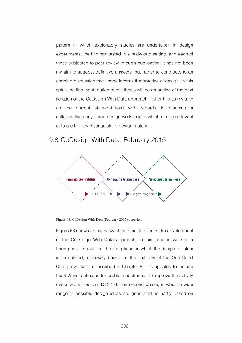
302
pattern in which exploratory studies are undertaken in design
experiments, the findings tested in a real-world setting, and each of
these subjected to peer review through publication. It has not been
my aim to suggest definitive answers, but rather to contribute to an
ongoing discussion that I hope informs the practice of design. In this
spirit, the final contribution of this thesis will be an outline of the next
iteration of the CoDesign With Data approach. I offer this as my take
on the current state-of-the-art with regards to planning a
collaborative early-stage design workshop in which domain-relevant
data are the key distinguishing design material.
9.8 CoDesign With Data: February 2015
Figure 68: CoDesign With Data (February 2015) overview
Figure 68 shows an overview of the next iteration in the development
of the CoDesign With Data approach. In this iteration we see a
three-phase workshop. The first phase, in which the design problem
is formulated, is closely based on the first day of the One Small
Change workshop described in Chapter 8. It is updated to include
the 5 Whys technique for problem abstraction to improve the activity
described in section 8.3.5.1.6. The second phase, in which a wide
range of possible design ideas are generated, is partly based on
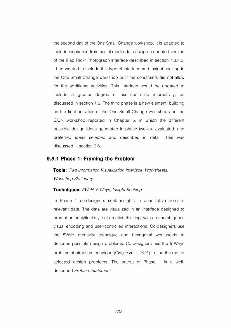
303
the second day of the One Small Change workshop. It is adapted to
include inspiration from social media data using an updated version
of the iPad Flickr Photograph interface described in section 7.3.4.2.
I had wanted to include this type of interface and insight seeking in
the One Small Change workshop but time constraints did not allow
for the additional activities. This interface would be updated to
include a greater degree of user-controlled interactivity, as
discussed in section 7.6. The third phase is a new element, building
on the final activities of the One Small Change workshop and the
E.ON workshop reported in Chapter 5, in which the different
possible design ideas generated in phase two are evaluated, and
preferred ideas selected and described in detail. This was
discussed in section 9.6.
9.8.1 Phase 1: Framing the Problem
Tools: iPad Information Visualization Interface, Worksheets,
Workshop Stationary
Techniques: 5WsH, 5 Whys, Insight Seeking
In Phase 1 co-designers seek insights in quantitative domain-
relevant data. The data are visualized in an interface designed to
prompt an analytical style of creative thinking, with an unambiguous
visual encoding and user-controlled interactions. Co-designers use
the 5WsH creativity technique and hexagonal worksheets to
describe possible design problems. Co-designers use the 5 Whys
problem abstraction technique (Couger et al., 1993) to find the root of
selected design problems. The output of Phase 1 is a well-
described Problem Statement.
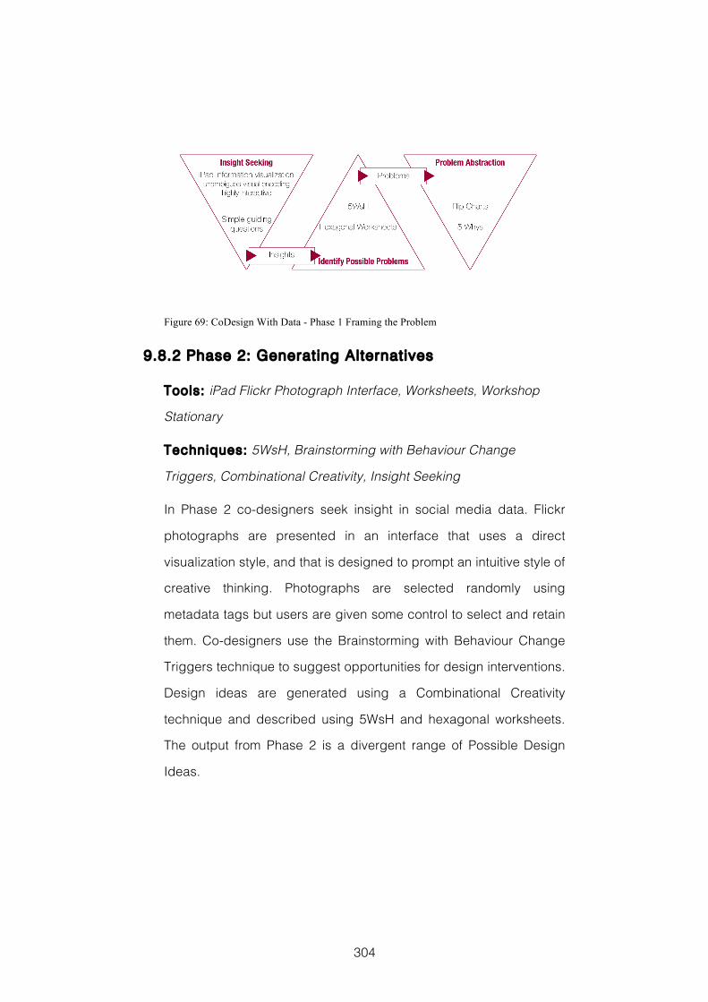
304
Figure 69: CoDesign With Data - Phase 1 Framing the Problem
9.8.2 Phase 2: Generating Alternatives
Tools: iPad Flickr Photograph Interface, Worksheets, Workshop
Stationary
Techniques: 5WsH, Brainstorming with Behaviour Change
Triggers, Combinational Creativity, Insight Seeking
In Phase 2 co-designers seek insight in social media data. Flickr
photographs are presented in an interface that uses a direct
visualization style, and that is designed to prompt an intuitive style of
creative thinking. Photographs are selected randomly using
metadata tags but users are given some control to select and retain
them. Co-designers use the Brainstorming with Behaviour Change
Triggers technique to suggest opportunities for design interventions.
Design ideas are generated using a Combinational Creativity
technique and described using 5WsH and hexagonal worksheets.
The output from Phase 2 is a divergent range of Possible Design
Ideas.
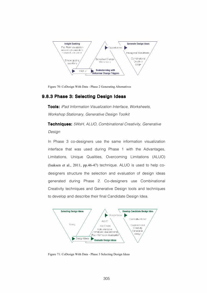
305
Figure 70: CoDesign With Data - Phase 2 Generating Alternatives
9.8.3 Phase 3: Selecting Design Ideas
Tools: iPad Information Visualization Interface, Worksheets,
Workshop Stationary, Generative Design Toolkit
Techniques: 5WsH, ALUO, Combinational Creativity, Generative
Design
In Phase 3 co-designers use the same information visualization
interface that was used during Phase 1 with the Advantages,
Limitations, Unique Qualities, Overcoming Limitations (ALUO)
(Isaksen et al., 2011, pp.46-47) technique. ALUO is used to help co-
designers structure the selection and evaluation of design ideas
generated during Phase 2. Co-designers use Combinational
Creativity techniques and Generative Design tools and techniques
to develop and describe their final Candidate Design Idea.
Figure 71: CoDesign With Data - Phase 3 Selecting Design Ideas
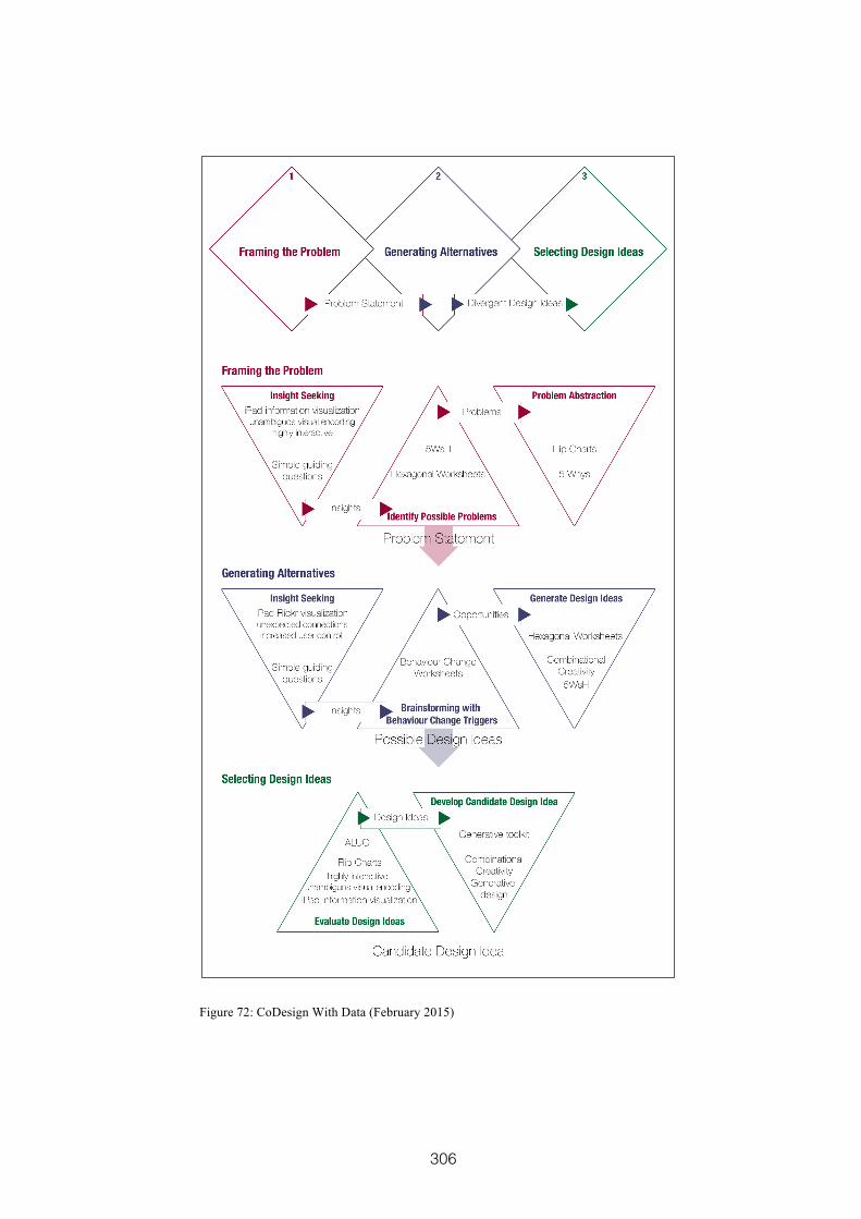
306
Figure 72: CoDesign With Data (February 2015)
307
References
Abowd, G.D., 2012. What Next, Ubicomp?: Celebrating an Intellectual Disappearing Act. In Ubiquituos Computing. Pittsburg, PA, 2012. ACM.
Amabile, T.M., 1983. The social psychology of creativity: A componential conceptualization. Journal of Personality and Social Psychology, 45(2), pp.357-76.
Amabile, T.M., 1996. Creativity in context. Buffalo: Westview Press.
Archer, B., 1995. The nature of research. Co-Design: the interdisciplinary journal of design and contextual studies, pp.6-13.
Arias, E.G. & Fischer, G., 2000. Boundary objects: their role in articulating the task at hand and making information relevant to it. In International ICSC Symposium on Interactive & Collaborative Computing (ICC’2000). Wollongong, 2000. ICSC Academic Press.
Artefact Group, 2012. Behaviour Change Strategy Cards. [Online] Available at: http://www.artefactgroup.com/content/tool/behavior-change-strategy-cards/ [Accessed 2 November 2014].
Bødker, S. et al., 1988. Computer Support for Cooperative Design. In Computer-Supported Cooperative Work. Portland, Oregon, 1988. ACM.
Bødker, S., Nielsen, C. & Petersen, M.G., 2000. Creativity, cooperation and interactive design. In Proceedings of the 3rd conference on Designing interactive systems: processes, practices, methods, and techniques. New York, 2000. ACM.
Baas, M., De Dreu, C.K.W. & Nijstad, B.A., 2008. A meta-analysis of 25 years of mood-creativity research: hedonic tone, activation or regulatory focus. Psychological Bulletin, 134(6), pp.779-806.
Bertelsen, O.W., 2000. Design artefacts: towards a design-oriented epistemology. Scandinavian Journal of Information Systems, 21(1), pp.15-28.
Bertin, J., 2011. Semiology of graphics. Redlands, CA: Esri Press.
Beyer, H. & Holtzblatt, K., 1997. Contextual Design: Defining Customer-Centered Systems. San Francisco: Morgan Kaufmann.
Beyer, H. & Holtzblatt, K., 1999. Contextual Design. Interactions, 6(1), pp.32-42.
Beyer, H., Holtzblatt, K. & Baker, L., 2004. An agile customer-centered method: Rapid Contextual Design. In C.Z.e. al., ed. Extreme Programming and Agile Methods - XP/Agile Univers. Berlin: Springer-Verlag. pp.50-59.
Biskjaer, M.M., Dalsgaard, P. & Halskov, K., 2010. Creativity methods in interaction design. In Proceedings of the 1st DESIRE Network Conference on Creativity and Innovation in Design. Aarhus, 2010. Desire Network.
Boden, M.A., 2004. The creative mind: Myths and mechanisms. London: Routledge.
Bohm, D., 2004. On Creativity. London: Routledge Classics.
308
Bostock, M., Ogievetsky, V. & Heer, J., 2011. D³ data-driven documents. Visualization and Computer Graphics, IEEE Transactions on, 17(12), pp.2301-09.
Boyd, D. & Crawford, K., 2012. Critical questions for big data: Provocations for a cultural, technological, and scholarly phenomenon. nformation, Communication & Society, 15(5), pp.662-79.
Brady, S., 2012. Tolerance for ambiguity. [Online] Available at: http://www.prismdecision.com/tolerance-for-ambiguity [Accessed 24 July 2014].
Brandt, E., 2006. Designing exploratory games: A framework for participation in particpatory design. In Proceedings of the ninth Participatory Design Conference. Trento, 2006. ACM.
Brandt, E. & Messeter, J., 2004. Facilitating collaboration through design games. In Proceedings of the eighth conference on Participatory design: Artful integration: interweaving media, materials and practices-Volume 1. Toronto, 2004. ACM.
Braun, V. & Clarke, V., 2006. Using thematic analysis in psychology. Qualitative research in psychology, 3(2), pp.77-101.
Brewer, M.B., 2000. Research design and issues of validity. In Reis, H.T. & Judd, C.M. Handbook of research methods in social and personality psychology. Cambridge: Cambridge University Press. pp.3-16.
Brown, T., 2008. Design Thinking. Harvard Business Review, 86(6), pp.84-93.
Buchanan, R., 1992. Wicked problems in design thinking. Design Issues, 8(2), pp.5-21.
Buisine, S. et al., 2007. Computer-supported creativity: Evaluation of a tabletop mind-map application. In Harris, D. Engineering Psychology and Cognitive Ergonomics. Berlin: Springer. pp.22-31.
Burke, J.A. et al., 2006. Participatory Sensing. Workshop Paper. LA: University of California eScholarship Center for Embedded Network Sensing.
Busse, T.V. & Mansfield, R.S., 1980. Theories of the creative process: a review and a perspetive. The Journal of Creative Behavior, 14(2), pp.91-103.
Card, S.K., Mackinlay, J.D. & Shneiderman, B., 1999. Readings in information visualization: using vision to think. San Francisco: Morgan Kaufmann.
Carlile, P.R., 2002. A pragmatic view of knowledge and boundaries: boundary objects in new product development. Organization Science, 13(4), pp.442-55.
Carroll, E.A. & Latulipe, C., 2012. Triangulating the personal creative experience: self-report, external judgments, and physiology. In Graphics Interface. Toronto, 2012. ACM.
Carroll, E.A., Latulipe, C., Fung, R. & Terry, M., 2009. Creativity factor evaluation: Towards a standardized survey metric for creativity support. In Proceedings of the seventh ACM conference on creativity and cognition. Berkeley, 2009. ACM.
Cash, P., Elias, E., Dekoninck, E. & Culley, S., 2012. Methodological insights from a rigorous small scale design experiment. Design Studies, 33(2), pp.208-35.
309
Christiaans, H.H.C.M., 2002. Creativity as a design criterion. Creativity Research journal, 14(1), pp.41-54.
Cook, T.D. & Campbell, D.T., 1979. Quasi-Experimentation Design & Analysis Issues for Field Settings. Boston: Houghton Mifflin Company.
Couger, D.J., Higgins, L.F. & McIntyre, S.C., 1993. (Un)Structured creativity in information systems organizations. Management Information Systems Quarterly, pp.375-97.
Cross, N., 1999. Design Research: A Disciplined Conversation. Design Issues, 15(2), pp.5-10.
Cross, N., 2006. Understanding design cognition. In Cross, N. Designerly ways of knowing. London: Springer. pp.77-93.
Cruz, V. & Gaudron, N., 2010. Open-ended objects: a tool for brainstorming. In Proceedings of the 8th ACM Conference on Designing Interactive Systems. Aahus, 2010. ACM.
Csikszentmihalyi, M., 1997. Flow and the Psychology of Discovery and Invention. New York: HarperPerennial.
De Bono, E., 2010. Lateral Thinking: A Textbook of Creativity. London: Penguin.
Dean, D.L., Hender, J.M., Rodgers, T.L. & Santanen, E.L., 2006. Identifying quality, novelty and creative ideas: Constraints and scales for idea evaluation. Journal of the Association for Information Systems, 7(10), pp.649-99.
DEFRA, 2012. [Online] Available at: http://randd.defra.gov.uk/Default.aspx?Menu=Menu&Module=More&Location=None&Completed=0&ProjectID=17359 [Accessed 30 July 2014].
Department of Energy and Climate Change, 2012. Key milestone for smart meters rollout. [Online] Available at: https://www.gov.uk/government/news/key-milestone-for-smart-meters-rollout [Accessed 16 July 2014].
Design Council, 2007. Eleven lessons: managing design in eleven global brands. Research study. London: Design Council Design Council.
Dijksterhuis, A. & Meurs, T., 2006. Where creativity resides: the generative power of unconscious thought. Consciousness and Cognition, 15, pp.135–46.
Dorst, K., 2003. The problem of design problems. In Expertise in Design. Sydney, 2003. Design Thinking Research.
Dorst, K., 2011. The core of 'design thinking' and its application. Design Studies, 32(6), pp.521-32.
Dorst, K. & Cross, N., 2001. Creativity in the design process: co-evolution of problem-solution. Design Studies, 22(5), pp.425-37.
Dove , G. & Jones, S., 2014(a). Using information visualization to stimulate creativity in service design workshops. In Proceedings of the fourth Service Design and Service Innovation Conference. Lancaster, 2014(a). Linköping Electronic Conference Proceedings.
310
Dove, G. & Jones, S., 2013. Evaluating creativity support in co-design workshops. [Online] Available at: http://openaccess.city.ac.uk/3060/ [Accessed 03 August 2014].
Dove, G. & Jones, S., 2014(b). Using data to stimulate creative thinking in the design of new products and services. In Proceedings of the 2014 conference on Designing interactive systems. Vancouver, 2014(b). ACM.
E.ON International Research Initiative, 2012. 2012 topic: Smart Home a new customer relationship with energy. [Online] Available at: http://www.eon.com/content/dam/eon-com/en/downloads/i/IRI_2012_23_-_screen.pdf [Accessed 24 July 2014].
Eckert, C., Stacey, M. & Clarkson, J., 2000. Sources of inspiration: a language of design. Design Studies, 21(5), pp.523-38.
Ehn, P., 1988. Work-oriented design of computer artifacts. Stockholm: Arbetslivscentrum.
Elmqvist, N. et al., 2011. Fluid interaction for information visualization. Information Visualization, 10(4), pp.327-40.
Energy Savings Trust, 2011. The rise of the machines - a review of energy using products in the home from the 1970s to today. [Online] Available at: http://www.energysavingtrust.org.uk/Publications2/Corporate/Research-and-insights/The-rise-of-the-machines-a-review-of-energy-using-products-in-the-home-from-the-1970s-to-today [Accessed 30 July 2014].
Energy Savings Trust, 2012. Powering the nation - household electricity-using habits revealed. [Online] Available at: http://www.energysavingtrust.org.uk/Publications2/Corporate/Research-and-insights/Powering-the-nation-household-electricity-using-habits-revealed [Accessed 30 July 2014].
Fallman, D., 2003. Design-oriented human-computer interaction. In Proceedings of the SIGCHI conference on Human factors in computing systems. Ft. Lauderdale, 2003. ACM.
Few, S., 2006. Information Dashboard Design. Sebastpol, California: O'Reilly.
Few, S., 2009. Now you see it. Oakland, CA: Analytic Press.
Fischer, G. & Shipman, F., 2013. Collaborative design rationale and social creativity in cultures of participation. In Carroll, J.M. Creativity and Rationale. London: Springer. pp.423-47.
Flanagan, J.C., 1954. The critical incident technique. Psychological Bulletin, 51(4), pp.327-60.
Foster, J., 1996. How to Get Ideas. san Francisco: Berrett-Koehler.
Friedman, K., 2003. Theory construction in design research: criteria, approaches and methods. Design Studies, 24(6), pp.507-22.
Friendly, M. & Denis, D., 2005. The early origins and development of the scatterplot. Journal of the History of the Behavioral Sciences, 41(2), pp.103–30.
Gaver, W.W., Beaver, J. & Benford, S., 2003. Ambiguity as a resource for design. In Proceedings of the SIGCHI conference on Human factors in computing systems. Ft. Lauderdale, 2003. ACM.
311
Gaver, W. & Dunne, A., 1999. Projected realities: conceptual design for cultural effect. In Proceedings of the SIGCHI conference on Human Factors in Computing Systems. Pittsburg, 1999. ACM.
Gaver, B., Dunne, T. & Pacenti, E., 1999. Cultural Probes. Interactions, pp.21-29.
Goodwin, S. et al., 2013. Creative User-Centered Visualization Design for Energy Analysts and Modelers. Visualization and Computer Graphics, IEEE Transactions on, 19(12), pp.2516-25.
Gordon, W.J., 1961. Synectics: The development of creative capacity. New York: Harper & Brothers.
Gorovitz, S. & MacIntyre, A., 1975. Toward a theory of medical fallibility. The Hasitings Centre Report, 5(6), pp.13-23.
Greenbaum, J. & Madsen, K.H., 1993. Small changes: Starting a participatory design process by giving participants a voice. Participatory design: Principles and practices, 3(1), pp.289-98.
Greenwald, A.G., 1976. Within-subjects designs: to use or not to use. Psychological Bulletin, 83(2), pp.314-20.
Gruber, J. & Prodanovic, M., 2012. Residential energy load profile generation using a probabilistic approach. In Computer Modeling and Simulation (EMS), 2012 Sixth UKSim/AMSS European Symposium on. Malta, 2012. IEEE.
Guilford, J.P., 1957. Creative abilities in the arts. Psychological Review, 64(2), pp.110-18.
Guilford, J.P., 1966. Measurement and creativity. Theory into practice, 5(4), pp.185-89.
Halskov, K., 2010. Kinds of inspiration in interaction design. Digital Creativity, 21(3), pp.186-96.
Halskov, K. & Dalsgård, P., 2006. Inspiration Card Workshops. In Designing Interactive System. Pennsylvania, 2006. ACM.
Halskov, K. & Dalsgård, P., 2007. The emergence of ideas: The interplay between sources of inspiration and emerging design concepts. CoDesign: International Journal of CoCreation in Design and the Arts, 3(4), pp.185-211.
Harrower, M. & Brewer, C.A., 2003. Colorbrewer. org: an online tool for selecting colour schemes for maps. The Cartographic Journal, 40(1), pp.27-37.
Hart, S.G. & Staveland, L.E., 1988. Development of NASA-TLX (task load index): results of empirical and theoretical research. Advances in psychology, 52, pp.139-83.
Henderson, S. & Yeow, J., 2012. iPad in education: A case study of iPad adoption and use in a primary school. In System Science (HICSS), 2012 45th Hawaii International Conference on. Hawaii, 2012. IEEE.
Hilliges, O. et al., 2007. Designing for collaborative creative problem solving. In Proceedings of the 6th ACM SIGCHI conference on Creativity & cognition. Washington, 2007. ACM.
312
Hocevar, D., 1981. Measurement of creativity: review and critique. Journal of Personality Assessment, 45(5), pp.450-64.
IDEO, 2013. Through the fog! [Online] Available at: http://www.ideo.com/life-at-ideo/item/through-the-fog [Accessed 24 July 2014].
Isaksen, S.G. & Aerts, W.S., 2011. Linking problem-solving style and creative organizational climate: and exploratory interactionist study. International Journal of Creativity and Problem Solving, 21(2), pp.7-38.
Isaksen, S.G., Dorval, K.B. & Treffinger, D.J., 2011. Creative Approaches to Problem Solving. Third Edition ed. London: Sage.
Isaksen, S.G. & Treffinger, D.J., 2004. Celebrating 50 years of reflective practice: Versions of creative problem solving. The Journal of Creative Behavior, 38(2), pp.75-101.
Jones, S., Lynch, P., Maiden, N. & Lindstaed, S., 2008. Use and influence of creative ideas and requirements for a work-integrated learning system. In Proceedings International Requirements Engineering, 2008. RE'08. 16th IEEE. Barcelona, 2008. IEEE.
Kelly, T. & Littman, J., 2001. The Art of Innovation: Success Through Innovation the IDEO Way. London: Profile Books.
Kerne, A. et al., 2013. Evaluation methods for creativity support environments. In CHI'13 Extended Abstracts on Human Factors in Computing Systems. Paris, 2013. ACM.
Koestler, A., 1964. The Act of Creation. London: Hutchinson.
Kosara, R., 2007. Visualization criticism-the missing link between information visualization and art. In Information Visualization, 2007. IV'07. 11th International Conference. Zurich, 2007. IEEE.
Kuniavsky, M., 2008. Evolution of the Fridge Computer. [Online] Available at: http://www.orangecone.com/archives/2008/01/the_fridge_comp.html [Accessed 03 August 2014].
Kurtzberg, T.R. & Amabile, T.M., 2000. From Guilford to creative synergy: opening the black box of team-level creativity. Creativity Research Journal, 13(3 & 4), pp.285-94.
Linden, G., Smith, B. & York, J., 2003. Amazon.com Recommendations: Item-to-item Collaborative Filtering. Internet Computing, 7(1), pp.76-80.
Lloyd, D. & Dykes, J., 2011. Human-centered approaches in geovisualization design: Investigating multiple methods through a long-term case study. Visualization and Computer Graphics, IEEE Transactions on, 17(12), pp.2498-507.
Lomas, N., 2012. Research: UK Smartphone Penetration Hits 58%, Tablets At 19%. Brits A Nation Of Online Shoppers: £1,000+ Now Spent Online Per Year. [Online] Available at: http://techcrunch.com/2012/12/13/research-uk-smartphone-penetration-hits-58-tablets-at-19-brits-a-nation-of-online-shoppers-1000-now-spent-online-per-year/ [Accessed 21 July 2014].
Lubart, T.I., 2001. Models of the Creative Process: Past, Present and Future. Creativity Rsearch Journal, 13(3), pp.295-308.
Maiden, N., Gizikis, A. & Robertson, S., 2004. Provoking creativity: Imagine what your requirements could be like. Software, 21(5), pp.68-75.
313
Maiden, N. et al., 2010. Requirements engineering as creative problem solving: A research agenda for idea finding. In Requirements Engineering Conference (RE), 2010 18th IEEE International. Sydney, 2010. IEEE.
Maiden, N., Manning, S., Robertson, S. & Greenwood, J., 2004. Integrating creativity workshops into structured requirements processes. In Proceedings of the 5th conference on Designing interactive systems: processes, practices, methods, and techniques. Cambridge MA, 2004. ACM.
Maiden, N., Ncube, C. & Robertson, S., 2007. Can requirements be creative? Experiences with an enhanced air space management system. In Software Engineering, 2007. ICSE 2007. 29th International Conference on. Minneapolis, 2007. IEEE.
Manovich, L., 2002. The anti-sublime ideal in data art. [Online] Available at: http://meetopia.net/virus/pdf-ps_db/LManovich_data_art.pdf [Accessed 24 July 2014].
Manovich, L., 2011. What is visualization? Visual Studies, 26(1), pp.36-49.
Manovich, L., 2012. Trending: the promises and challenges of big social data. In Gold, M.K. Debates in the digital humanities. Minneapolis: Minnesota Press. pp.460-76.
Manzini, E., 2009. New Design Knowledge. Design Studies, 30(1), pp.4-12.
McGrane, S., 1999. New York Times. [Online] Available at: http://www.nytimes.com/1999/02/11/technology/for-a-seller-of-innovation-a-bag-of-technotricks.html?pagewanted=all&src=pm [Accessed 16 July 2014].
Miller, W.C., 1987. The creative edge: Fostering innovation where you work. Reading, MA: Addison-Wesley.
National Grid, 2014. National Grid Data Explorer. [Online] Available at: http://www2.nationalgrid.com/UK/Industry-information/Electricity-transmission-operational-data/Data-explorer/ [Accessed 30 July 2014].
NESTA, 2013. Dynamic Demand Challenge. [Online] Available at: http://dynamicdemand.nesta.org.uk/ [Accessed 30 July 2014].
Nielsen, 2014. Smartphone Milestone: Half of Mobile Subscribers Ages 55+ Own Smartphones. [Online] Available at: http://www.nielsen.com/us/en/insights/news/2014/smartphone-milestone-half-of-americans-ages-55-own-smartphones.html [Accessed 21 July 2014].
Norman, D.A., 2010. Technology first, needs last: the research-product gulf. interactions, 17(2), pp.38-42.
Norman, D.A. & Draper, S.W., 1986. User centred system design: New perspectives on human-computer interaction. Hillside, New Jersey, USA: L. Erlbaum Associates Inc.
Norman, D. & Verganti, R., 2014. Incremental and Radical Innovation: Design Research vs. Technology and Meaning Change. Design Issues, 30(1), pp.78-96.
North, C., 2006. Towards Measuring Visualization Insight. Computer Graphics and Applications, 26(3), pp.6-9.
314
Ofcom, 2013. Machine to machine communications. [Online] Available at: http://consumers.ofcom.org.uk/news/machine-to-machine-communications/ [Accessed 21 July 2014].
Ofgem, 2011. Energy Demand Research Project : Final Analysis. [Online] Available at: https://www.ofgem.gov.uk/ofgem-publications/59105/energy-demand-research-project-final-analysis.pdf [Accessed 15 July 2014].
Onarheim, B., 2012. Creativity from constraints in engineering design: lessons learned at Coloplast. Journal of Engineering Design, 23(4), pp.323-36.
Osborn, A.F., 1952. Applied Imagination. New York: Scribners.
Perry, M. & Sanderson, D., 1998. Coordinating joint design work: the role of communication and artefacts. Design Studies, 19(3), pp.273-88.
Pirolli, P. & Card, S., 2005. The sensemaking process and leverage points for analyst technology as identified through cognitive task analysis. In Proceedings of International Conference on Intelligence Analysis. McLean, VA, 2005. Mitr.
Plucker, J.A. & Makel, M.C., 2010. Assessment of creativity. In Kaufman, J.C. & Sternberg, R.J. The cambridge handbook of creativity. Cambridge: Cambrdige University Press. pp.48-73.
Poincaré, H., 1913. The foundations of science: Science and hypothesis. New York: The Science Press.
Pousman, Z., Stasko, J.T. & Mataes, M., 2007. Casual information visualization: Depictions of data in everyday life. Visualization and Computer Graphics, IEEE Transactions on, 13(6), pp.1145-52.
Riege, A.M., 2003. Validity and reliability tests in case study research: a literature review with hands-on applications for each research phase. Qualitative Market Research: An International Journal, 6(2), pp.75-86.
Rittel, H.W.J., 1987. The reasoning of designers. In Proceedings of the 1987 Conference on Planning and Design in Architecture : 1987 International Congress on Planning and Design Theory. Boston, 1987. The American Society of Mechanical Engineers.
Rittel, H.W. & Webber, M.M., 1973. Dilemmas in a general theory of planning. Policy Sciences, 4(2), pp.155-69.
Runeson, P. & Höst, M., 2009. Guidelines for conducting and reporting case study research in software engineering. Empirical Software Engineering, 14(2), pp.131-64.
Russell, D.M., Stefik, J.M., Pirolli, P. & Card, S., 1993. The cost structure of sensemaking. In Proceedings of the INTERACT'93 and CHI'93 conference on Human factors in computing systems. Amsterdam, 1993. ACM.
Sanders, E.B., 2000. Generative Tools for CoDesigning. In Scrivener, Ball & Woodcock Collaborative Design. London: Springer-Verlag. pp.3-12.
Sanders, E.B., 2001. Virtuosos of the experience domain. In Proceedings of the 2001 IDSA Education Conference. Boston, 2001. IDSA.
Sanders, E.B., 2005. Information, Inspiration and Co-creation. In Proceedings of the 6th International Conference of the European Academy of Design. Bremen, 2005. European Academy of Design.
315
Sanders, E.B.-N., Brandt, E. & Binder, T., 2010. A framework for organizing the tools and techniques of participatory design. In Proceedings of the 11th biennial participatory design conference. Sydney, 2010. ACM.
Sanders, E.B.-N. & Stappers, P.J., 2008. Co-creation and the new landscapes of design. CoDesign, 4(1), pp.5-18.
Sanders, E.B.-N. & Stappers, P.J., 2012. Convivial Toolbox: Generative Research for the Front End of Design. 1st ed. Amsterdam: BIS.
Sanders, E.B.-N. & Stappers, P.J., 2014. Probes, toolkits and prototypes: three approaches to making in codesigning. CoDesign: International Journal of CoCreation in Design and the Arts, 10(1), pp.5-14.
Sanders, E.B.-N. & Westerlund, B., 2011. Experiencing, exploring and experimenting in and with co-design spaces. In Proceedings Nordes No 4 (2011) - Making Design Matter. Helsinki, 2011. Nordic Design Research.
Schön, D.A., 1992. Designing as reflective conversation with the materials of a design situation. Knowledge-Based Systems, 5(1).
Schön, D.A., 1995. The Reflective Practitioner. London: Basic Books.
Selby, C., Treffinger, D.J., Isaksen, S.G. & Lauer, K.J., 2004. Defining and assessing problem solving style: design and development of a new tool. Journal of Creative Behaviour, 38(4), pp.221-43.
Shah, J.J., Kulkani, S.V. & Vargas-Hernandez, N., 2000. Evaluation of idea generation methods for conceptual design: effectiveness metrics and design of experiments. Journal of Mechanical Design, 122, pp.377-84.
Shneiderman, B., 1996. The eyes have it: A task by data type taxonomy for information visualizations. In Visual Languages, 1996. Proceedings., IEEE Symposium on. Boulder, 1996. IEEE.
Shneiderman, B., 1999. Supporting creativity with advanced information-abundant user interfaces. Technical. Maryland: University of Maryland University of Maryland.
Shneiderman, B., 2000. Creating creativity: user interfaces for supporting innovation. ACM Transactions on Computer-Human Interaction (TOCHI), 7(1), pp.114-38.
Simon, H.A., 1996. The Sciences of the Artificial. Third Edition ed. Cambridge, Massachusetts, USA: MIT Press.
Star, S.L., 1988. The structure of ill structured solutions: boundary objects and heterogeneous distributed problem solving. In Huhns, M. & Gasser, L. Readings in distributed artificial intelligence. Menlo Park: Kaufman. pp.37-54.
Star, L., 2010. This is not a boundary object: reflections on the origin of a concept. Science, Technology, & Human Values, 35(5), pp.601-17.
Sterling, B., 2009. Design fiction. Interactions, 1 May. pp.20-24.
Sternberg, R.J. & Lubart, T.I., 1995. Defying the crowd: Cultivating creativity in a culture of conformity. New York: Free Press.
Sternberg, J. & Lubart, T.I., 1999. The concept of creativity: Prospects and paradigms. In Sternberg, R.J. Handbook of creativity. Cambridge: Cambridge University Press. pp.3-15.
316
Svanaes, D. & Gulliksen, J., 2008. Understanding the context of design - towards tactical user centered design. In Proceedings of the 5th Nordic conference on Human-computer interaction: building bridges. Lund, 2008. ACM.
Sweeney, L., 2000. Simple demographics often identify people uniquely. Data Privacy Working Paper. Pittsburgh: Carnegie Mellon University Carnegy Mellon University.
Tudor, L.G., Muller, M.J. & Dayton, T., 1993. A CARD game for participatory task analysis and redesign: macroscopic complement to PICTIVE. In INTERACT'93 and CHI'93 Conference Companion on Human Factors in Computing Systems. Amsterdam, 1993. ACM.
Tufte, E.R., 1983. The visual display of quantitative information. Cheshire, CT: Graphics Press.
VanPatter, G.K., 2012. Lost Stories in Applied Creativity History. [Online] Available at: http://www.humantific.com/lost-stories-applied-creativity-history-2/ [Accessed 11 August 2014].
Vernon, P.E., 1970. Creativity: selected readings. London: Penguin.
Viégas, F. & Wattenberg, M., 2007. Artistic data visualization: Beyond visual analytics. In Online Communities and Social Computing. Berlin, 2007. Springer.
Ware, C., 2012. Information visualization: perception for design. San Francisco: Morgan Kaufmann.
Warr, A. & O'Neill, E., 2005. Understanding design as a social creative process. In Proceedings of the 5th conference on creativity & cognition. London, 2005. ACM.
Wattenberg, M. & Kriss, J., 2006. Designing for social data analysis. Visualization and Computer Graphics, 12(4), pp.549-57.
Webb, A.M. & Kerne, A., 2011. Integrating implicit structure visualization with authoring promotes ideation. In Proceedings of the 11th annual international ACM/IEEE joint conference on Digital libraries. Ottawa, 2011. ACM.
Weiser, M., 1991. The Computer for the 12st Century. Scientific American, 265(3), pp.94-104.
Wertheimer, M., 1938. A source book of Gestalt psychology. New York: Hartcourt, Brace and co.
Whitfield, T.W.A., 2007. Felings in design - a neuroevolutionary perspective on process and knowledge. The Design Journal, 10(3), pp.3-15.
Witten, I.H. & Frank, E., 2005. Data Mining: Practical Machine Learning Tools and Techniques. Second Edition ed. San Francisco: Morgan Kaufmann.
Yau, N., 2011. Visualize This. Indianapolis, Indiana: Wiley.
Yi, J.S., Kang, Y.a., Stasko, J.T. & Jacko, J.A., 2007. Toward a deeper understanding of the role of interaction in information visualization. Visualization and Computer Graphics, IEEE Transactions on, 13(6), pp.1224-31.

317
Yi, J.S., Kang, Y.A., Stasko, J.T. & Jacko, J.A., 2008. Understanding and characterizing insights: How do people gain insights using information visualization? In Proceedings of the 2008 Workshop on BEyond time and errors: novel evaLuation methods for Information Visualization. Florence, 2008. ACM.
Zenasni, F., Besançon, M. & Lubart, T.I., 2008. Creativity and tolerance of ambiguity: An empirical study. The Journal of Creative Behavior, 42(1), pp.61-73.
Zhong, C.-B., Dijksterhuis, A. & Galinsky, A.D., 2008. The merits of unconscious thought in creativity. Psychological Science, 19(9), pp.912-18.
Related Documents