CHRISTINE KHOO

Welcome message from author
This document is posted to help you gain knowledge. Please leave a comment to let me know what you think about it! Share it to your friends and learn new things together.
Transcript

C H R I S T I N E K H O O

01 | TypefaceThis typeface was inspired by the folds of basket weaving and the art of origami.
Green : Was chosen as a background colour to make viewing easy on the eye.Yellow : Used to soften the look as the letterforms can look too sharp.Peach & neon green : Were used to guide the eye to the form of the letter.
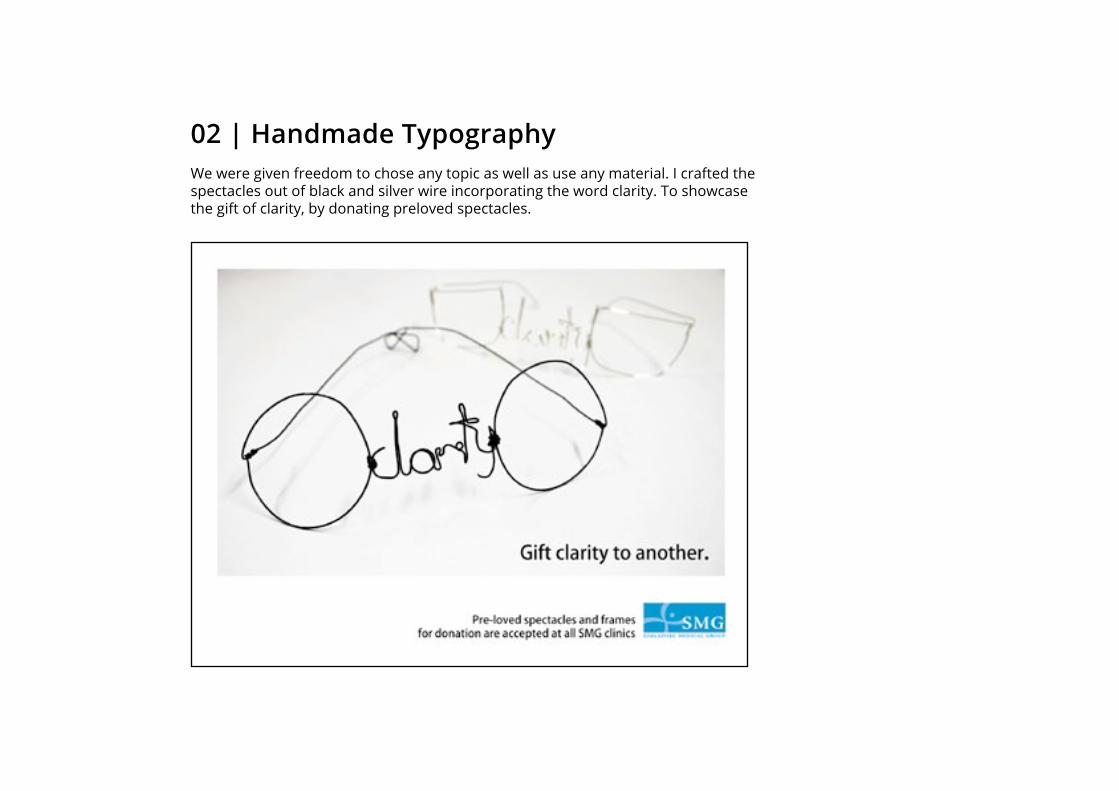
02 | Handmade TypographyWe were given freedom to chose any topic as well as use any material. I crafted the spectacles out of black and silver wire incorporating the word clarity. To showcase the gift of clarity, by donating preloved spectacles.

03 | The Upper RoomThe client wanted the design to reflect his specialty in interior design, which included a lot of trimming. This was reflected in the frame of the business card. Hot-stamping was incorporated into this design to highlight the company’s name.

04 | Magazine Layout The look and feel of the layout on the right was designed to fit with the picture below. The reason being, they were both featured in the same issue. Thus it was important to create a cohesive look.
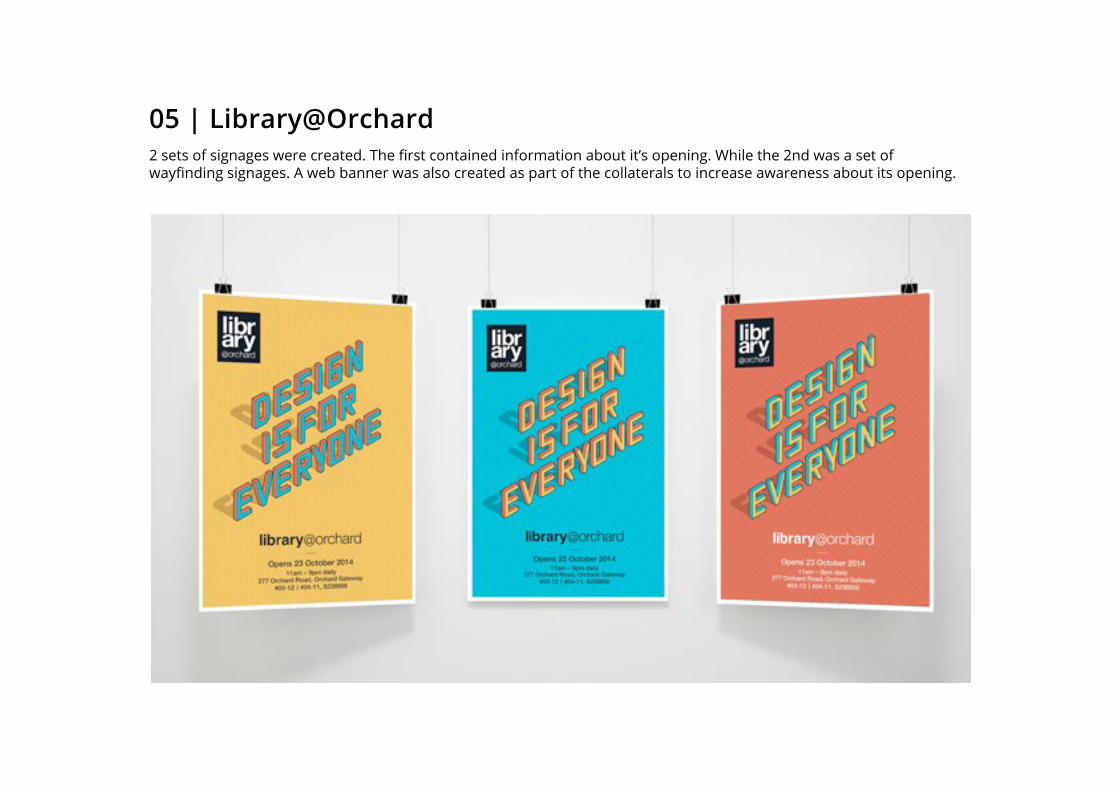
05 | Library@Orchard2 sets of signages were created. The first contained information about it’s opening. While the 2nd was a set of wayfinding signages. A web banner was also created as part of the collaterals to increase awareness about its opening.

Directional Signages

Newspaper AdWeb Banner
06 | Library@Orchard
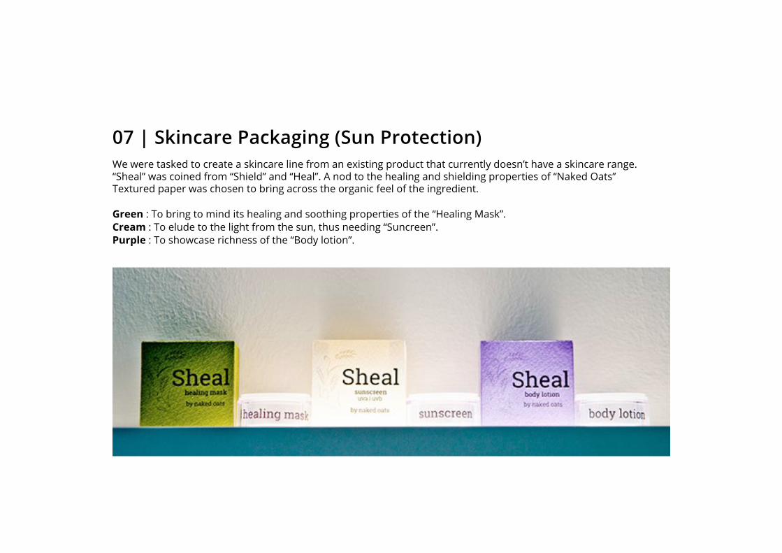
07 | Skincare Packaging (Sun Protection)We were tasked to create a skincare line from an existing product that currently doesn’t have a skincare range. “Sheal” was coined from “Shield” and “Heal”. A nod to the healing and shielding properties of “Naked Oats” Textured paper was chosen to bring across the organic feel of the ingredient.
Green : To bring to mind its healing and soothing properties of the “Healing Mask”.Cream : To elude to the light from the sun, thus needing “Suncreen”.Purple : To showcase richness of the “Body lotion”.
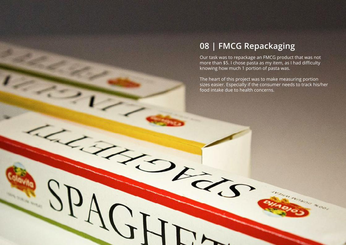
08 | FMCG RepackagingOur task was to repackage an FMCG product that was not more than $5. I chose pasta as my item, as I had difficulty knowing how much 1 portion of pasta was.
The heart of this project was to make measuring portion sizes easier. Especially if the consumer needs to track his/her food intake due to health concerns.
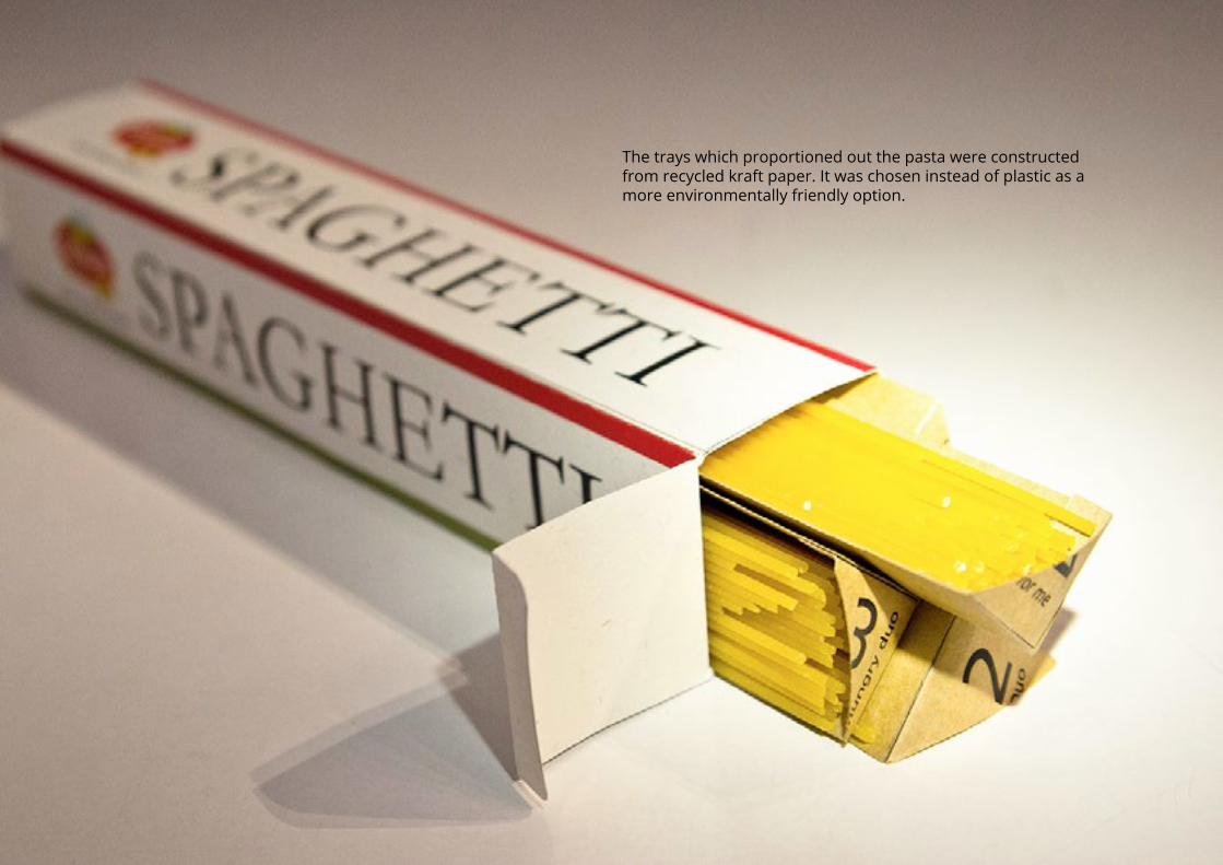
The trays which proportioned out the pasta were constructed from recycled kraft paper. It was chosen instead of plastic as a more environmentally friendly option.

A little infographic created to showcase the portions inside. Together with information on the weight of a serving.
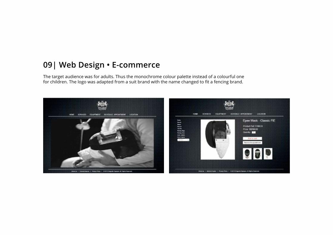
09| Web Design • E-commerceThe target audience was for adults. Thus the monochrome colour palette instead of a colourful one for children. The logo was adapted from a suit brand with the name changed to fit a fencing brand.

Web Design (mobile site) Mobile phones are a huge part of our daily lives. Thus, to make it more convenient for people to access the products on-the-go. The design was adapted to fit the requirements of a mobile site.
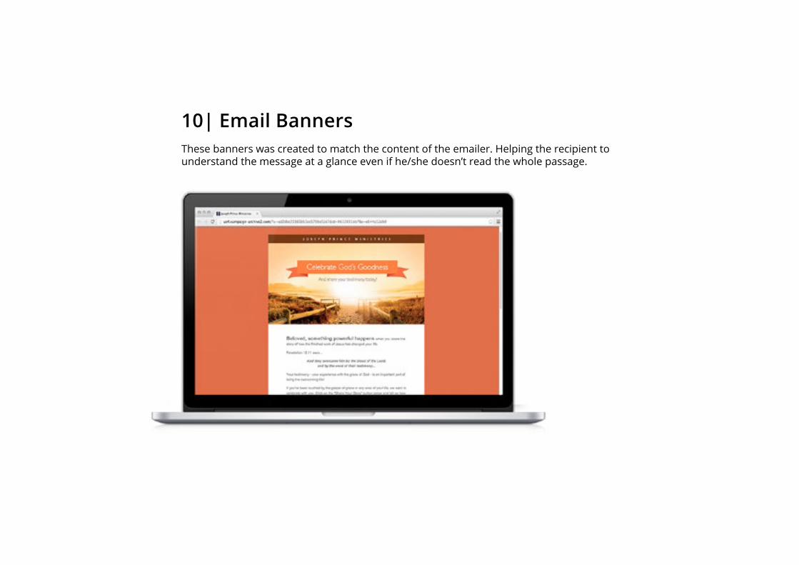
10| Email BannersThese banners was created to match the content of the emailer. Helping the recipient to understand the message at a glance even if he/she doesn’t read the whole passage.

Shown below are the rest of the other banners created in the set. The purpose was to give the viewer a fresh experience even when viewing similar contant.

This set of email banners were created for another purpose. Likewise, the purpose is to give the viewer a quick understanding of the content even if he/she was giving it a quick browse.

Shown below are the rest of the other banners created in the set. The purpose was to give the viewer a fresh experience even when viewing similar contant.
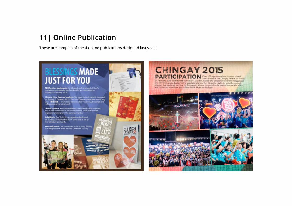
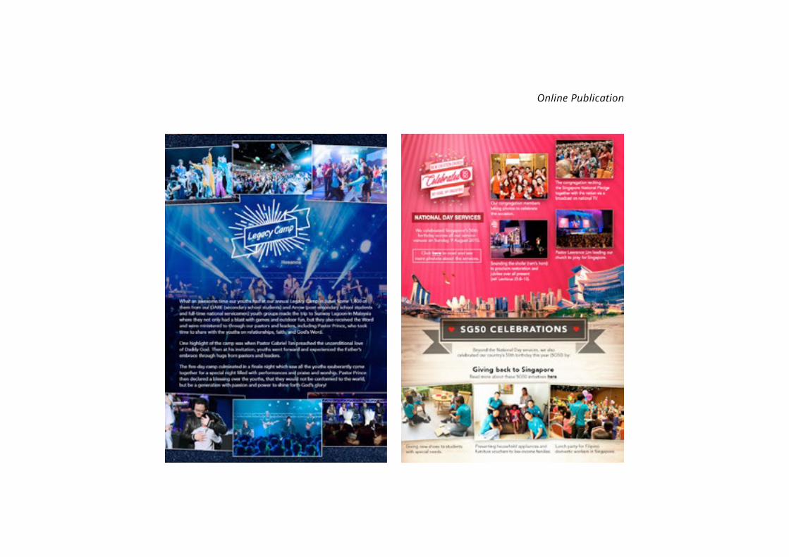
11| Online PublicationThese are samples of the 4 online publications designed last year.
Online Publication

12 | Social Media ArtworkThese 2 pieces of artwork were designed for “Chinese New Year” and “Mother’s Day” last year.
Related Documents