Edinburgh Research Explorer Cheat Sheets for Data Visualization Techniques Citation for published version: Wang, Z, Sundin, L, Murray-Rust, D & Bach, B 2020, Cheat Sheets for Data Visualization Techniques. in CHI '20: Proceedings of the 2020 CHI Conference on Human Factors in Computing Systems., 144, ACM, ACM CHI Conference on Human Factors in Computing Systems, Honolulu, Hawaii, United States, 25/04/20. https://doi.org/10.1145/3313831.3376271 Digital Object Identifier (DOI): 10.1145/3313831.3376271 Link: Link to publication record in Edinburgh Research Explorer Document Version: Peer reviewed version Published In: CHI '20: Proceedings of the 2020 CHI Conference on Human Factors in Computing Systems General rights Copyright for the publications made accessible via the Edinburgh Research Explorer is retained by the author(s) and / or other copyright owners and it is a condition of accessing these publications that users recognise and abide by the legal requirements associated with these rights. Take down policy The University of Edinburgh has made every reasonable effort to ensure that Edinburgh Research Explorer content complies with UK legislation. If you believe that the public display of this file breaches copyright please contact [email protected] providing details, and we will remove access to the work immediately and investigate your claim. Download date: 10. Jul. 2022

Welcome message from author
This document is posted to help you gain knowledge. Please leave a comment to let me know what you think about it! Share it to your friends and learn new things together.
Transcript
Edinburgh Research Explorer
Cheat Sheets for Data Visualization Techniques
Citation for published version:Wang, Z, Sundin, L, Murray-Rust, D & Bach, B 2020, Cheat Sheets for Data Visualization Techniques. inCHI '20: Proceedings of the 2020 CHI Conference on Human Factors in Computing Systems., 144, ACM,ACM CHI Conference on Human Factors in Computing Systems, Honolulu, Hawaii, United States, 25/04/20.https://doi.org/10.1145/3313831.3376271
Digital Object Identifier (DOI):10.1145/3313831.3376271
Link:Link to publication record in Edinburgh Research Explorer
Document Version:Peer reviewed version
Published In:CHI '20: Proceedings of the 2020 CHI Conference on Human Factors in Computing Systems
General rightsCopyright for the publications made accessible via the Edinburgh Research Explorer is retained by the author(s)and / or other copyright owners and it is a condition of accessing these publications that users recognise andabide by the legal requirements associated with these rights.
Take down policyThe University of Edinburgh has made every reasonable effort to ensure that Edinburgh Research Explorercontent complies with UK legislation. If you believe that the public display of this file breaches copyright pleasecontact [email protected] providing details, and we will remove access to the work immediately andinvestigate your claim.
Download date: 10. Jul. 2022
Cheat Sheets for Data Visualization TechniquesZezhong Wang1, Lovisa Sundin2, Dave Murray-Rust1, Benjamin Bach1
1 University of Edinburgh, UK, 2 University of Glasgow, UK{zezhong.wang, d.murray-rust, bbach}@ed.ac.uk, [email protected],
Time Curve PitfallsTime Curve Anatomy
Time Curve Visual Patterns
Time Curve Construction
A
BC
D
E
The spatial distance is what you get if you place a ruler between two time points and measure the distance.
It gives the difference between two time points as measured by the similarity metric.
The curvilinear distance approximately gives the total amount of change between two points.
It depends on the particular algorithm used.
Curvilinear distance
Spatial distance
Time point
Direction of time
A B C D EA
BC
D
E
A
BC A
AB C
BC
The space that the time curve inhabits does not have axes.
Whether a curve self-intersects or not depends on the particular
algorithm.
The interpretation of the time curve depends critically on the
meaning of the similarity metric.
The lengths of the curve segments in-between are a result of the
algorithm and does not mean time interval in-between
The snapshots we have of the system may not have been recorded at regular time intervals. The time curve only assumes information about the order of time points.
? ?
The curve lengths between points therefore say nothing about relative time duration.
Only for linear process is it possible to orient the curve so that it aligns with the left-to-right direction of time.
Time
Mistaking curvilinear distance for time
Attach meaning to the axes
Over-interpreting intersections
Not understanding the similarity metric
A transition is a curve that drastically heads from one cluster (form) to another)
A cluster is a region of a curve where time points are densely packed, reflecting small and incremental changes without major changes in form.
A U-turn happens when there is a reversal in process, and a succes-sion of time points begins folding pack
A cycle is a curve that comes back to a previous point after a long progression.
When the curve is straight, this suggests an effective process that changes without returning to previous shapes.
An outlier is when the curve tries out a new location and immediately returns, reflecting an anomaly.
When oscillations return to the exact form and location it previously was, therefore flip-flopping between two states, it is known as alteration.
When the curve is highly non-linear and repeatedly backtracks to previous locations, this suggests an in effective process.
The move from one location to another indicates a development
Whether the curve self-intersects or not depends on the algorithm
Oscillations are when the curve moves back and form between two different regions, while still evolving in some direction.
Outliers U-turns
Clusters Transitions
Cycles AlternationsOscillations
Effectivedevelopment
Ineffectivedevelopment
Time point
Edit distance between 2 and 4
0 1 2 3 4 5 6 7 8012345678 10876
1789
1789
10876
Distance matrix
Time point0 1 2 3 4 5 6 7 8
012345678
10876
1789
1789
1789
10876
10876
Having filled out the entire distance matrix we know the edit distance, the difference, between any two points.
For example, point 8 is about 6 times more different to point 2 than point 4.
0
1 23
45
7
6
8
Now what if we translated that to literal distances between time points?
Proceeding to link these time points together in their time order gives us a curled up curve, called a time curve.
0
1 234 5
7
6
8
Time curve
Time point
Visual PatternsParallel CoordinatesVisual PatternsBoxplot
Set of nodes where every node is connected to every other node. Set of nodes where almost all nodes are connect-
ed. If all links would be present, the cluster is called a clique. There is no strict criteria for how many edges are required.
A star is when one note is connected to a set of mutual-ly non-connected nodes.
Trees are hierarchically organised sets of nodes, like a multi-level star.
These are nodes that connect two otherwise disconnected components.
This is when two sets of nodes are not connected within the same set, but connected across sets.
Hubs are highly connected nodes, i.e., nodes with many connections.
A path is a set of nodes connected to each other in a sequence. If the sequence is closed it is a cycle.
The bundling effect can make it hard to quickly identify hubs, but they are often connected to multiple bundles
Paths are cycles are often visible as extend-ed arcs.
Stars are often easy to spot from the nodes radiating from a central node like a palm tree
The articulation point
Bicliques are usually highly visible because they form two bundles, like a palm tree, each correspond-ing to the set.
Cliques in confluent drawings can sometimes appear star-like at a distance, but tightly bundled up close.
The bundling makes a cluster appear less dense than it normally would.
The root note
Confluence Graph Visual Patterns
Clusters Cliques
Bicliques Stars
Trees Hubs
Articulation points Paths and cycles
A correlation is visible through rather parallel polylines between two axes.
Correllations indicate that high values in on data dimensions co-occur with high values in another dimension.
Correllations are not causa-tions!
Inverse correlations indicate that high values in one data dimension co-occur with low values in another data dimen-sion.
An inverse correlation is visible through lots of crossing polylines between two axes.
Groups indicate many elements with the same value or similar values.
Groups are visible by many lines intersecting an axis at the same position.
Clusters indicate data elements with similar values across several dimensions.
Clusters are visible as polylines ‘following’ each other across several axes, resulting in bundles.
Positive Correlation
Negative Correlation
Groups
Parallel lines
Crossing lines
Converging lines
Grouped linesClusters
Strong correlation
Weak corre-alation
Strong negative
correlationWeak
negative correalation
Fat box Thin box
The One-side outlier The two-sides outlier
If the box plot will look symmetric, the distribution will be normal, there are few exceptionally large or small values. The mean will be about the same as the median.
Possitive Skewness
Negative Skewness
Overlapping
A distribution with a positive skew would have a longer whisker in the positive direction than in the negative direction.
A distribution with a nega-tive skew would have a longer whisker in the nega-tive direction than in the positive direction.
The lower quartile and the median are overlapped, this occurs when the 25% of values are same between the lower quartile and the median.
The minimum and the lower quartile are overlapped, this occurs when the 25% of values are same between the minimum and the lower quartile.
Outlier(s)
Outliers
When reviewing a boxplot, an outlier is defined as a data point that is located outside the whiskers of the boxplot (e.g: outside 1.5 times the interquartile range above the upper quartile and bellow the lower quartile).
One possible distribution of this boxplot
is shorter than
is longer than
Ballanced
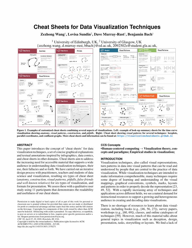
Figure 1. Examples of customized cheat sheets combining several aspects of visualizations. Left: example of look-up summary sheets for the time curvevisualization showing anatomy, visual patterns, construction, and pitfalls. Right: Cheat sheet showing visual patterns for several techniques: boxplots,parallel coordinates, and confluent graphs. More cheat sheets and information can be found at: https://visualizationcheatsheets.github.io
ABSTRACTThis paper introduces the concept of ‘cheat sheets’ for datavisualization techniques, a set of concise graphical explanationsand textual annotations inspired by infographics, data comics,and cheat sheets in other domains. Cheat sheets aim to addressthe increasing need for accessible material that supports a wideaudience in understanding data visualization techniques, theiruse, their fallacies and so forth. We have carried out an iterativedesign process with practitioners, teachers and students of datascience and visualization, resulting six types of cheat sheet(anatomy, construction, visual patterns, pitfalls, false-friendsand well-known relatives) for six types of visualization, andformats for presentation. We assess these with a qualitative userstudy using 11 participants that demonstrates the readabilityand usefulness of our cheat sheets.
Permission to make digital or hard copies of all or part of this work for personal orclassroom use is granted without fee provided that copies are not made or distributedfor profit or commercial advantage and that copies bear this notice and the full citationon the first page. Copyrights for components of this work owned by others than ACMmust be honored. Abstracting with credit is permitted. To copy otherwise, or republish,to post on servers or to redistribute to lists, requires prior specific permission and/or afee. Request permissions from [email protected] ’20, April 25–30, 2020, Honolulu, HI, USA.Copyright is held by the owner/author(s). Publication rights licensed to ACM.ACM ISBN 978-1-4503-6708-0/20/04 ...$15.00.http://dx.doi.org/10.1145/3313831.3376271
CCS Concepts•Human-centered computing→ Visualization theory, con-cepts and paradigms; Empirical studies in visualization;
INTRODUCTIONVisualization techniques, also called visual representations,turn patterns in data into visual patterns that can be read andunderstood by people that are central to the practice of datavisualization. While visualization techniques are intended tomake information comprehensible, many techniques requiresome degree of learning and understanding of the visualmappings, graphical conventions, symbols, marks, layoutsand patterns in order to properly decode the representation [23,49, 52]. With a rapidly increasing array of techniques andapplications across different fields, we see a natural demand forinstructional resources to support a growing and heterogeneousaudience in creating and decoding data visualisations.
There is no shortage of resources to learn about data visual-ization, including books (e.g., [46, 56, 27]), survey papers,workshops (e.g., [60, 69]), classes, and online catalogues oftechniques [59]. However, much of this material talks aboutgeneral topics in visualization such as deception, design,presentation, tasks, storytelling or layouts. We find a lack of
material that supports the understanding of specific visualiza-tion techniques: How to decode visualizations correctly? Whatpatterns can we see and how should we interpret them? Whatare common misinterpretations to avoid for a given technique?.There is a specific need for resources that are tightly structuredand standardized, which align with established visual designprinciples and which are easy to understand.
In order to support the development of material for learning,teaching, and the regular use of visualization techniques, thispaper presents cheat sheets for visualization techniques (Fig. 1).In particular, we are interested in how to design cheat sheets thatare understandable and usable. Our cheat sheets are inspired byinfographics, data comics [73, 15, 74], assembly instructions,and the wide range of examples of cheat sheets for programminglanguages. In the context of visualization techniques, we definea cheat sheet as “a set of concise, annotated graphical explana-tions of aspects of a specific visualization technique”. They aimto provide carefully designed visual and textual explanationsin a concise way, while focusing on the most important knowl-edge necessary for given tasks. We imagine cheat sheets to sup-port two scenarios: i) first-time learning aided through slides,posters, books, or activities, and ii) as look-up material duringan actual data exploration process. Our cheat sheets, in their cur-rent form, do not aim to overview and classify visualization tech-niques, nor to support finding the “right” technique for a task.
In this paper, we present cheat sheets for a selection of non-trivial visualization techniques representative to different datatypes (temporal, relational, hierarchical, statistical/quantitative,multidimensional) and taught by our collaborators: parallel co-ordinates plots (PCP), adjacency matrices, Whiskers Plots (box-plots), tree maps, confluence graphs [16] and time curves [17].Using an iterative design process that involved 8 experts andregular feedback, we designed six different types of cheat sheetsfor each technique, each of which explains a specific aspect of atechnique and supports a different usage scenarios: (a) anatomyexplaining visual elements, (b) construction explaining the gen-eral idea of a technique, (c) its visual patterns, (d) common pit-falls, (e) well-known relatives relating a visualization to a morecommonly known representation, and (f) false-friends whichshow visualizations that look similar but have to be interpreteddifferently. Introduction is to give a high-level overview overthe technique. Results from the controlled user study and co-design sessions show consistently high ratings for readabilityand usefulness, encouraging extension to other techniques andthe development of class-room activities around cheat sheets.We refined our design guidelines and respective visual design-materials in our co-design workshops, eventually inviting ev-eryone to create cheat sheets for teaching, personal learning,and for any new visualization technique that gets designed.
RELATED WORK
Visualization LiteracyMany forms of literacy are considered essential in a data society,such as data literacy, numeracy, and visual literacy [26, 62].Visualisation literacy relates to these, but is specifically situatedaround making use of visualizations: Boy et al. [25] providea formal description for visualization literacy as “the ability toconfidently use a given data visualization to translate questions
specified in the data domain, as well as interpreting visualpatterns in the visual domain as properties in the data domain”.This definition emphasizes the ability to translate informationfrom the specific application domain to the visual domainand back. The translation requires correctly interpreting thegraphical conventions of a visualization in order to create a con-sistent mapping between data and graphics, so that higher-leveldomain tasks can be mapped onto lower-level visualizationtasks. Consequently, Börner et al. [23] define visualizationliteracy at a task level including “interpreting patterns, trends,and correlations in visual representations of data”. Bertin [22]describes three sequential stages of interpreting a visualization:an external identification stage where a reader recognizes theframe of visual encoding (e.g. axes, labels and dimensions);an internal identification stage where a reader identifies visualcharacteristics (visual patterns); and a final perception ofcorrespondence stage where a reader analyzes the content andextracts messages from the visualization. Similarly, the NOVISModel [49], describes readers encountering unfamiliar visu-alizations as wandering through the following five activities:encountering, constructing a frame, exploring the visualization,questioning the frame and floundering on the visualization.
Visualization Cheat Sheets are our approach to supportvisualization literacy by providing a concise and consistentset of explanations for understanding specific visualizationtechniques, their visual marks and visual patterns. As learningis a process, our sheets aim to support a range of tasks and stepsrelated to visualization literacy while focusing on supportinglearning and lookup during use.
Learning Support for Visualization TechniquesMaterials to support the learning of visualization techniquesare presented in various formats with different scenarios inmind. Scientific papers introducing a novel technique can oftenbe considered a primary source of learning about a technique.To this end, many papers include conceptual descriptionsof the technique, diagrams on the creation of examples anddemonstrate visual patterns (e.g. [40, 39, 14, 17, 16]), althoughsome focus exclusively on the visual patterns (e.g. [37, 72,21]). Text books (e.g. [46, 28, 58, 71]) tend to offer summariesof techniques alongside comprehensive knowledge aboutvisualization design principles, goals, work flows, visualizationcategories, encoding and collections of examples and specificvisualizations techniques. For example, Munzner [56] explainsvisualization techniques on a by-case bases, showing exampleimplementations and discussing advantages and drawbacks.Researchers also propose the concept of learning unfamiliarvisualizations by analogy [61], and tool for progressivelyconstructing visualizations from visual channels and units [68].
More systematic description of visualizations are found inWilkinson [71], who demonstrates a catalog with mathematicalprinciples and fundamental components of quantitativestatistics graphics. However, to quickly understand and usevisualization techniques, more succinct and novice-friendlyinstructions are required. Kirk [46] systematically presents39 visualisation techniques, each being presented on a singlepage, with primarily textual descriptions, but with consistentlystructured information covering description, examples, how
to read it, presentation tips and variations & alternatives.Similarly, some online resources gather information aboutvery specific techniques, prepared by different educators andwithout general structure, e.g, on WikiPedia [11] and onlinevideos [41], or collections of pitfalls, but without graphical ex-planations [5]. The DataVizProject [7] and Chart doctor [4] listtypes of visualization techniques with examples, categorizationand descriptions, and backed up with abstract pictograms, butdo not provide specific aid for understanding and learning.
The project closest to our visualization cheat sheets are some ex-amples in the Data Visualization Catalogue [59]. The cataloguelists 60 visualization techniques, each of which coming with anexample, a textual description, an anatomy, links to tools, and alose tag list (e.g., ‘data-over-time’, ‘patterns’). For some exam-ples, it lists similar techniques to aid selection. With the samegoal of identifying suitable chart types, data-to-viz.com [38]provides similar contents yet adds ‘common mistakes’ and‘build your own’ with R and python galleries. While the col-lection covers many techniques, many explanations lack detail,depicted patterns are rarely and only superficially explained,and there is no deeper support in engaging with learning andusing the technique. To the best of our knowledge, no resourceor format exists with cheat sheets in the detail we propose.
Cheat Sheets and Visual ExplanationsThe traditional usage of ‘cheat sheet’ is “a piece of paper bear-ing written notes intended to aid one’s memory, typically oneused surreptitiously in an examination.” [10, 31]. Using—butmore so preparing—cheat sheets has been found to improvestudents’ exam performance [67, 66], especially when studentsspend time with preparing cheat sheets [32, 42]. Suggestions forgood cheat sheets include hand-made content and good (visual)organization [66]. Consequently, cheat sheets have been used tolearn programming languages and support their daily use [1, 50,19, 42], data analysis [6], and types of neuronal networks [1].These cheat sheets provide the most important information ata glance, and are intended to be looked up during a specifictask. In data visualization, types of cheat sheets have been usedto help designers choose a chart type [36, 4, 35] and designeffective visualizations [64, 43]. However, similar to the visual-ization chooser cards [33] and flashcards [63], these approacheseither do not focus on techniques, or concentrate on cataloguingtechniques rather than supporting use and understanding.
Our cheat sheets draw on this practice of providing importantinformation at a glance in a structured form, and aim to supportthe learning of visualization techniques. This is distinctfrom the process of choosing a specific visualization type,instead dealing with the construction and metaphor, the varietyof visual patterns, possible visual misinterpretations [57]specific to a particular technique. To provide appropriate visualillustrations, we draw inspiration from infographics and comics.Comics in particular, with their unique combination of com-plementary text and pictures, sequential narrative, and generalfamiliarity, have been found beneficial for science education[34, 45], communicating complex data-related concepts [69]including confidence intervals, hypothesis tests, regressions,and simple statistical graphs [47, 65]. More recently, comics
have been used as general format for data-driven storytellingmedium [73, 15], coming with specific design patterns [18].
DESIGN PRINCIPLESBased on early exploratory prototypes and backgroundliterature, we identified the following initial design principlesfor creating cheat sheets:
• D1—Modularity: To introduce structure, we propose typesof cheat sheets, each focusing on explaining a specific aspectsuch as visual patterns or visual parts. This is to reduceovercrowding, and to allow for different combinations ofsheets to support different situations and different formats.• D2—Context independence: Sheets should not rely on
specific data examples or external contexts.1 Our goal isto explore the content of cheat sheets and which concisegraphical illustrations are required to communicate thiscontent. By keeping our sheets context-free and abstract, weaim for reusability across examples and to learn about howabstract sheets can be while still allowing people to applythem to their specific examples at hand.• D3—Clear graphics: As data visualizations are a form of
visual languages and aim to facilitate memory and lookup,our goal with cheat sheets is to explain as much as we canthrough graphical content and use text where graphicalcontent alone is not sufficient.• D4—Style neutrality: Strong graphic styles can have
implications and can render a graphics work specific to anarrower audience [51]. Following our principle of context-independence, with this paper, we aim to explore cheat sheetsfor a general audience and to allow for simple adaptation tomore specific cases where necessary. For this work, we usedstylistically consistent simple black-white graphics, partly in-spired by the very minimalist but clear xkcd style [55], whileat the same time avoiding overly minimalist designs [20].Although color is an important visual variable, we focus onthe basic structure and layout of visualization techniques;color is a general design decision whose application is oftenindependent from a specific technique and therefore greatlyvarying with the specific visualization instance.
RESEARCH AND DESIGN METHODOLOGYWe designed a collection of cheat sheets using an iterativeseven-step design process.
1) Idea generation: we selected several common yet non-trivial visualization techniques such as treemaps, adjacencymatrices and horizon graphs, and used these to explore a rangeof cheat sheet types to explore various aspects: comparison,variation, advantages and drawbacks, concrete examples etc. 2)Expert workshop and co-design: we conducted a two-hourco-design workshop with three senior university lecturers spe-cialising in geographic visualization, medical informatics, anddata visualization. Participants were asked to introduce a vi-sualization technique (a PCP) to students unfamiliar with thattechniques using sketches and as little text as possible (D3).All participants created material in a comic style with concreteexamples and a story to motivate and introduce the specific1Note that following the Expert Workshop in Section 4 we relaxedthis principle
technique (e,g., peoples’ biological characteristics, fruits andnutrition facts). Participants were then asked to feedback onthe draft sheets prepared in step 1 (visual patterns, pitfalls and,construction, variations, and comparison) for PCPs, boxplots,and treemaps. The workshop highlighted the need for concreteexamples (contrary to our principle of context-independence)and helped us narrow down our choice to the final set of sixsheet types. 3) Expert interviews: after redesigning our sheetsbased on feedback, we consulted individually with four univer-sity lecturers (medical informatics, graphic design, illustrationand digital learning), on potential use cases. As well as small de-sign tweaks, suggestions included: handing out the Introductionbefore a lecture and visual patterns during and after the lecture;handing out all sheets in a creative course on physicalizationto inspire students; adapting the style and data examples fromthe Introduction to the specific context of their own lectures.4) Readability feedback: after another set of internal itera-tions, we conducted individual readability walk-throughs withfour graduate students in design and computer science, all ofwhom had briefly encountered the respective techniques in theirlectures. We obtained feedback on ambiguities that requiredfurther explanation and how much they have understood theconcepts. 5) Design-by-example: we asked a researcher anddesigner unfamiliar with our research to create cheat sheets foradditional visualizations based on our examples (they are nowa coauthor of this paper). The example’s structure was found tobe straightforward and salient enough for the new researcher toproduce sheets for three additional visualizations with only min-imal consultation. The main question involved the Introductionsheet (explained in Section 5), the structure of which was delib-erately left open to encourage tailored story-lines for the specificvisualization and the data examples necessary to explain a visu-alization. 6) Readability study with non-experts: to obtainfurther feedback on readability, usability and to refine our de-sign, we conducted an empirical user study following the rapiditerative test and evaluation method [53] with 11 participantsnovel to visualization (Section 7). 7) Guideline workshop:we eventually, conducted two workshops with a total of fivevisualization experts and non-experts to apply, evaluate, andrefine design guidelines for creating additional cheat sheets.
CHEAT SHEET TYPESThis section reports on six types of cheat sheets informed bythe expert workshops, expert interviews and the readabilitystudy with non-experts. According to our design principleof modularity (D1), this section describes cheat sheets forindividual aspects of visualization techniques. Figure 1 givesan idea how different sheet types can be combined into a formatfor a final presentation. For each type we give a brief definition,explain its motivation and its design.
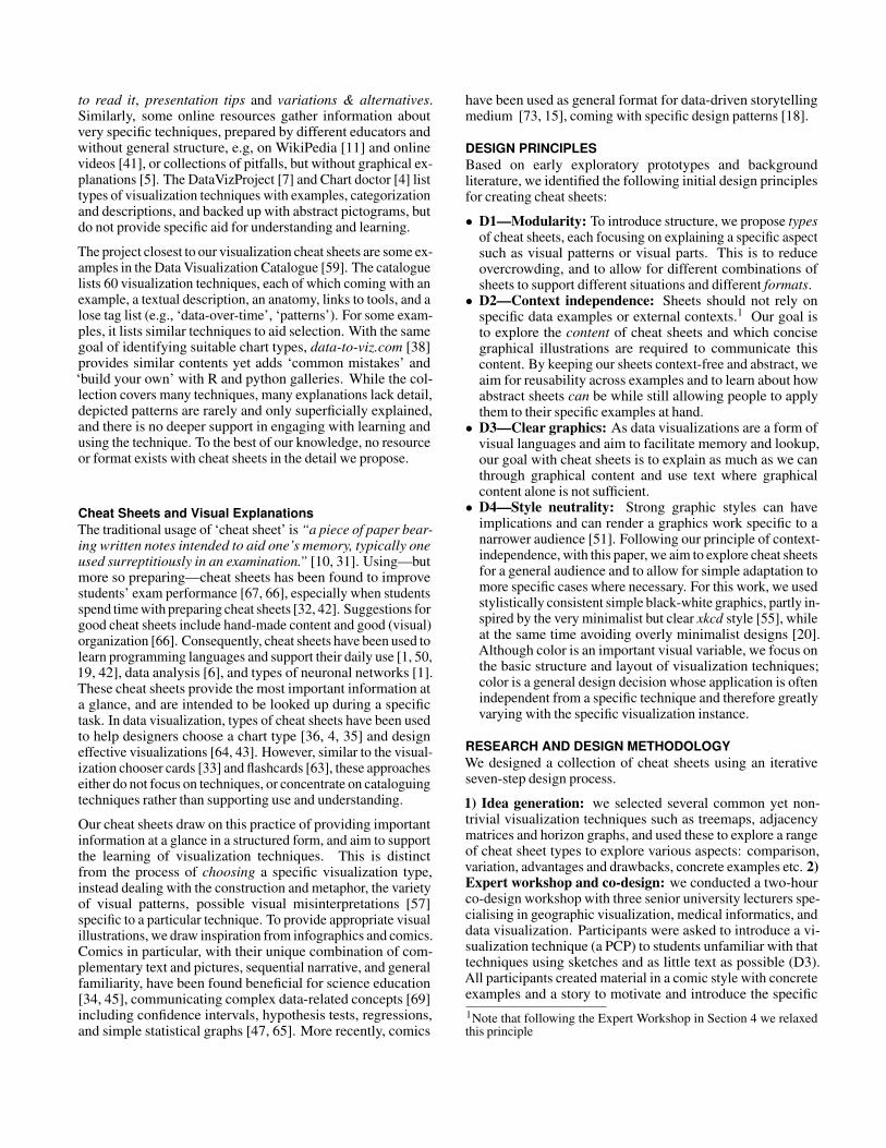
ANATOMY explains the visual elements of a visualizationtechnique, their composition, their specific terminology, andhow they relate to the data (Fig. 2). The visual componentsof a visualization can include individual visual marks (in thesense of Bertin [22]) as well as groups of marks, axes, locationsin a visualization etc. Our design for Anatomy was inspiredby graphics-first explanations in patents using a bare minimumof ink while relying on black, white, and shades of gray only.Text labels are connected to their components through simple
Filled Cell
Row
ABCDEFGHIJKL
A B C D E F G H I J K L
The same node A
Adjacency Matrix Anatomy
Link
Node
Column Node
Diagonal Self-links
Empty Cell No link
Figure 2. Anatomy sheet for adjacency matrix; labels for visual elementsare shown on a gray background for highlighting while data terms areshown on a white background linked to the visual terminology; arrowsare curved to not interfere with the rather geometric visualization; red isused to show information overlaid on black elements.
ConstructionParallel Coordinates
100
2 4 6 8 10 12 14 16
Fibers (gr.)
Calories (gr.)
200
300400
500
Proteins100
2 4 6 8 10 12 14 16
1
2
3
4
5
6
7
8
x=Fiber (g)
z=Protein (g)
200
300
400
500
y=Calories
100
2
4
6
8
10
12
14
16
1
23
45
67
8
x=Fiber (g)z=Protein (g)
200
300
400
500
y=Calories
100
x=Fiber (g)z=Protein (g)
200
300
400
500
y=Calories
1000
1
2
3
4
5
6
7
0
1
2
3
4
5
6
7
0
2
4
6
8
10
12
14
0
2
4
6
8
10
12
14
0
2
4
6
8
10
12
14
x=Fiber (g)z=Protein (g)
200
300
400
500
y=Calories
1000
1
2
3
4
5
6
7
x=Fiber (g)z=Protein (g)
200
300
400
500
y=Calories (g)
0
10
20
30
40
50
60
70
80
90
100
0
10
20
30
40
50
60
70
80
90
100
0
0.1
0.2
0.3
0.4
0
2
4
6
8
10
12
14
16
AvocadoOrange
BananaApricots
Persimmons
0
2
4
6
8
10
12
14
1000
1
2
3
4
5
6
7
Fiber (g) Water (g) Calcium (g) Carbohy. (g) Fat (g)Protein (g)
200
300
400
500
Calories
AvocadoOrange
BananaApricots
Persimmons
Protein: 0.3
Calories: 190
Fiber: 8
0
10
20
30
40
50
60
70
80
90
100
0
10
20
30
40
50
60
70
80
90
100
0
0.1
0.2
0.3
0.4
0
2
4
6
8
10
12
14
16
0
2
4
6
8
10
12
14
1000
1
2
3
4
5
6
7
200
300
400
500
AvocadoOrange
BananaApricots
Persimmons
“Axes” = Dimensions
“Polylines” = data elements
Fiber (g) Water (g) Calcium (g) Carbohy (g) Fat (g)Protein (g)Calories
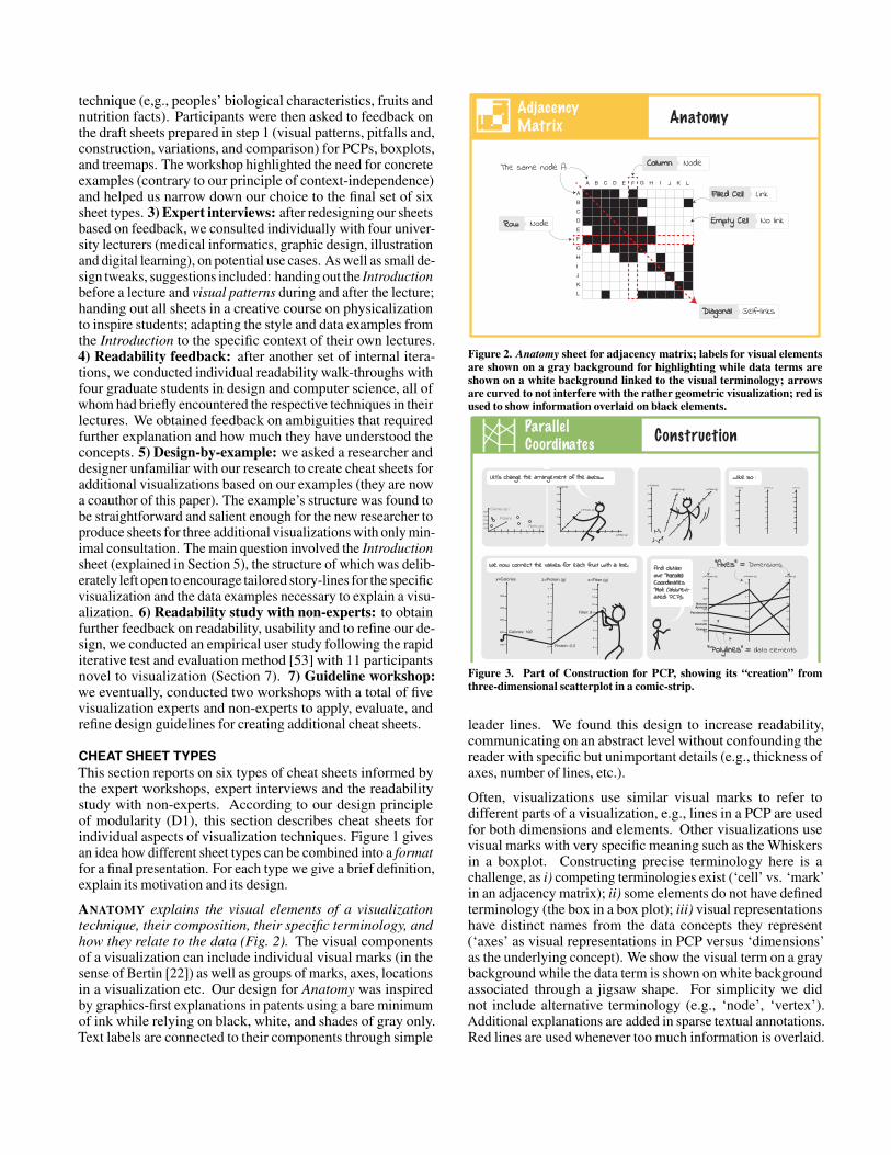
Let’s change the arrangement of the axes... ...like so :
We now connect the values for each fruit with a line. And obtain our Parallel Coordinates Plot (abbrevi-ated: PCP).
See how we can show many dimensions?
For better readability, let’s add colors.
Figure 3. Part of Construction for PCP, showing its “creation” fromthree-dimensional scatterplot in a comic-strip.
leader lines. We found this design to increase readability,communicating on an abstract level without confounding thereader with specific but unimportant details (e.g., thickness ofaxes, number of lines, etc.).
Often, visualizations use similar visual marks to refer todifferent parts of a visualization, e.g., lines in a PCP are usedfor both dimensions and elements. Other visualizations usevisual marks with very specific meaning such as the Whiskersin a boxplot. Constructing precise terminology here is achallenge, as i) competing terminologies exist (‘cell’ vs. ‘mark’in an adjacency matrix); ii) some elements do not have definedterminology (the box in a box plot); iii) visual representationshave distinct names from the data concepts they represent(‘axes’ as visual representations in PCP versus ‘dimensions’as the underlying concept). We show the visual term on a graybackground while the data term is shown on white backgroundassociated through a jigsaw shape. For simplicity we didnot include alternative terminology (e.g., ‘node’, ‘vertex’).Additional explanations are added in sparse textual annotations.Red lines are used whenever too much information is overlaid.
Node-link diagram Adjacency Matrix8
8
31
56472
171618141510119
1312
31 5 6 4 7 2 17 16 18 14 15 10 11 9 13 12
In the example, nodes are connected in three clusters, and these clusters are connected as well.
Adjacency Matrix Well-known relative
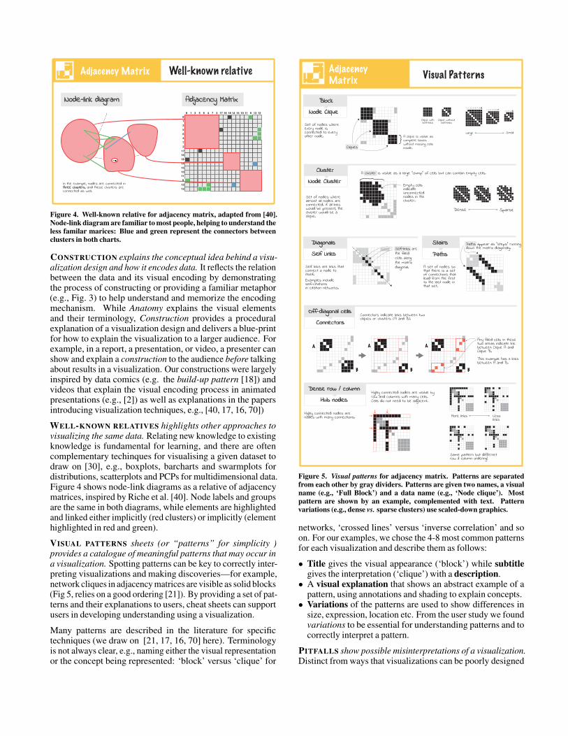
Figure 4. Well-known relative for adjacency matrix, adapted from [40].Node-link diagram are familiar to most people, helping to understand theless familar marices: Blue and green represent the connectors betweenclusters in both charts.
CONSTRUCTION explains the conceptual idea behind a visu-alization design and how it encodes data. It reflects the relationbetween the data and its visual encoding by demonstratingthe process of constructing or providing a familiar metaphor(e.g., Fig. 3) to help understand and memorize the encodingmechanism. While Anatomy explains the visual elementsand their terminology, Construction provides a proceduralexplanation of a visualization design and delivers a blue-printfor how to explain the visualization to a larger audience. Forexample, in a report, a presentation, or video, a presenter canshow and explain a construction to the audience before talkingabout results in a visualization. Our constructions were largelyinspired by data comics (e.g. the build-up pattern [18]) andvideos that explain the visual encoding process in animatedpresentations (e.g., [2]) as well as explanations in the papersintroducing visualization techniques, e.g., [40, 17, 16, 70])
WELL-KNOWN RELATIVES highlights other approaches tovisualizing the same data. Relating new knowledge to existingknowledge is fundamental for learning, and there are oftencomplementary techinques for visualising a given dataset todraw on [30], e.g., boxplots, barcharts and swarmplots fordistributions, scatterplots and PCPs for multidimensional data.Figure 4 shows node-link diagrams as a relative of adjacencymatrices, inspired by Riche et al. [40]. Node labels and groupsare the same in both diagrams, while elements are highlightedand linked either implicitly (red clusters) or implicitly (elementhighlighted in red and green).
VISUAL PATTERNS sheets (or “patterns” for simplicity )provides a catalogue of meaningful patterns that may occur ina visualization. Spotting patterns can be key to correctly inter-preting visualizations and making discoveries—for example,network cliques in adjacency matrices are visible as solid blocks(Fig 5, relies on a good ordering [21]). By providing a set of pat-terns and their explanations to users, cheat sheets can supportusers in developing understanding using a visualization.
Many patterns are described in the literature for specifictechniques (we draw on [21, 17, 16, 70] here). Terminologyis not always clear, e.g., naming either the visual representationor the concept being represented: ‘block’ versus ‘clique’ for
Adjacency Matrix Visual Patterns
Block
Node Clique
Set of nodes where almost all nodes are connected. If all links would be present, the cluster would be a clique.
Empty cells indicate unconnected nodes in the cluster.
Cluster
Node Cluster
Dense Sparse
Diagonals
Self Links
Off-diagonal cells
Connectors
Set of nodes where every node is connected to every other node. A clique is visible as
complete blocks without missing cells inside.
Clique withself-links
Large Small
1 2 3 4 5 6 7 8 91 2 3 4 5 6 7 1 2 3 4 5
Clique without self-links
Cliques
A cluster is visible as a large “clump” of cells but can contain empty cells.
Examples include self-citationsin citation networks.
Self-links are the filled cells along the matrix diagonal. Self links are links that
connect a node to itself.
A set of nodes so that there is a set of connections that lead from the first to the last node in that set.
Paths appear as “steps” running down the matrix diagonally.
Paths
Connectors indicate links between two cliques or clusters (A and B).
Any filled cells in these two areas indicate link between Clique A and Clique B.
This example has 3 links between A and B.
A
B
A
B
A
B
Highly connected nodes are nodes with many connections.
Highly connected nodes are visible by row and columns with many cells. Cells do not need to be adjacent.
Dense row / column
Hub nodes
More links Less links
Same pattern but differnet row & column ordering!
Stairs
Figure 5. Visual patterns for adjacency matrix. Patterns are separatedfrom each other by gray dividers. Patterns are given two names, a visualname (e.g., ‘Full Block’) and a data name (e.g., ‘Node clique’). Mostpattern are shown by an example, complemented with text. Patternvariations (e.g., dense vs. sparse clusters) use scaled-down graphics.
networks, ‘crossed lines’ versus ‘inverse correlation’ and soon. For our examples, we chose the 4-8 most common patternsfor each visualization and describe them as follows:
• Title gives the visual appearance (‘block’) while subtitlegives the interpretation (‘clique’) with a description.• A visual explanation that shows an abstract example of a
pattern, using annotations and shading to explain concepts.• Variations of the patterns are used to show differences in
size, expression, location etc. From the user study we foundvariations to be essential for understanding patterns and tocorrectly interpret a pattern.
PITFALLS show possible misinterpretations of a visualization.Distinct from ways that visualizations can be poorly designed
80859095100105110115120125
30
20 0
1
2
3
4
40
50
60
Different dimensions usually have different scales and units.
Values on axes can start form values other than ‘O’.
859095100105110115120125
1
2
3
4
3
4 0
1
2
3
4
2
1
0
Values on axes can be either decending or acending.
Axis scales Truncated axes Axes order
When the data are distributed into “bimodal” tather than the “one lunmp” vases, a box plot would not give you any evidence of this.
“bimodal”
“one lunmp”
Bimodal?
Overlapping The minimum and the lower quartile are overlapped, this occurs when the 25% of values are same between the minimum and the lower quartile.
Boxplot Pitfalls
PitfallsParallel Coordinates
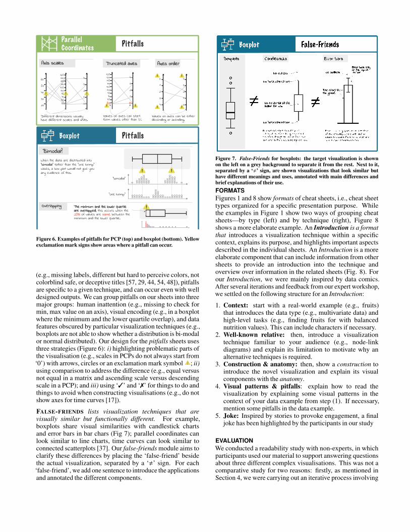
Figure 6. Examples of pitfalls for PCP (top) and boxplot (bottom). Yellowexclamation mark signs show areas where a pitfall can occur.
(e.g., missing labels, different but hard to perceive colors, notcolorblind safe, or deceptive titles [57, 29, 44, 54, 48]), pitfallsare specific to a given technique, and can occur even with welldesigned outputs. We can group pitfalls on our sheets into threemajor groups: human inattention (e.g., missing to check formin, max value on an axis), visual encoding (e.g., in a boxplotwhere the minimum and the lower quartile overlap), and datafeatures obscured by particular visualization techniques (e.g.,boxplots are not able to show whether a distribution is bi-modalor normal distributed). Our design for the pitfalls sheets usesthree strategies (Figure 6): i) highlighting problematic parts ofthe visualisation (e.g., scales in PCPs do not always start from‘0’) with arrows, circles or an exclamation mark symbol ; ii)using comparison to address the difference (e.g., equal versusnot equal in a matrix and ascending scale versus descendingscale in a PCP); and iii) using ‘3’ and ‘7’ for things to do andthings to avoid when constructing visualisations (e.g., do notshow axes for time curves [17]).
FALSE-FRIENDS lists visualization techniques that arevisually similar but functionally different. For example,boxplots share visual similarities with candlestick chartsand error bars in bar chars (Fig 7); parallel coordinates canlook similar to line charts, time curves can look similar toconnected scatterplots [37]. Our false-friends module aims toclarify these differences by placing the ‘false-friend’ besidethe actual visualization, separated by a ‘,’ sign. For each‘false-friend’, we add one sentence to introduce the applicationsand annotated the different components.
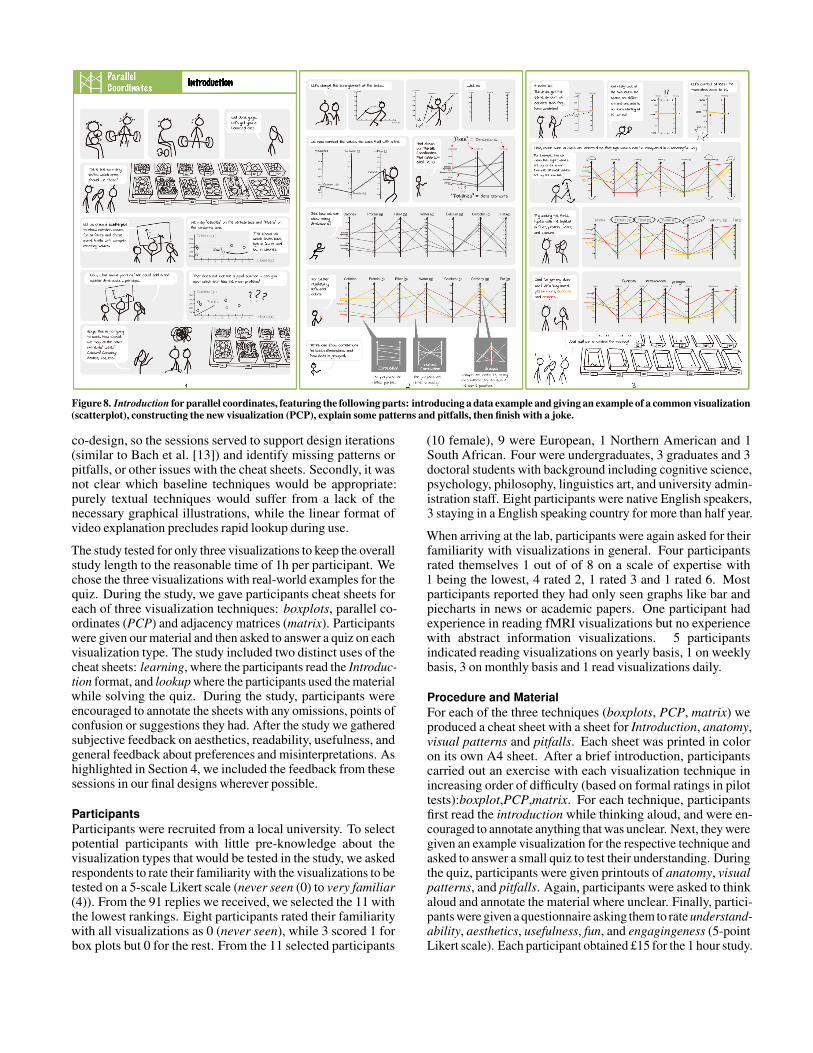
Figure 7. False-Friends for boxplots: the target visualization is shownon the left on a grey background to separate it from the rest. Next to it,separated by a ‘,’ sign, are shown visualizations that look similar buthave different meanings and uses, annotated with main differences andbrief explanations of their use.FORMATSFigures 1 and 8 show formats of cheat sheets, i.e., cheat sheettypes organized for a specific presentation purpose. Whilethe examples in Figure 1 show two ways of grouping cheatsheets—by type (left) and by technique (right), Figure 8shows a more elaborate example. An Introduction is a formatthat introduces a visualization technique within a specificcontext, explains its purpose, and highlights important aspectsdescribed in the individual sheets. An Introduction is a moreelaborate component that can include information from othersheets to provide an introduction into the technique andoverview over information in the related sheets (Fig. 8). Forour Introduction, we were mainly inspired by data comics.After several iterations and feedback from our expert workshop,we settled on the following structure for an Introduction:
1. Context: start with a real-world example (e.g., fruits)that introduces the data type (e.g., multivariate data) andhigh-level tasks (e.g., finding fruits for with balancednutrition values). This can include characters if necessary.
2. Well-known relative: then, introduce a visualizationtechnique familiar to your audience (e.g., node-linkdiagrams) and explain its limitation to motivate why analternative techniques is required.
3. Construction & anatomy: then, show a construction tointroduce the novel visualization and explain its visualcomponents with the anatomy.
4. Visual patterns & pitfalls: explain how to read thevisualization by explaining some visual patterns in thecontext of your data example from step (1). If necessary,mention some pitfalls in the data example.
5. Joke: Inspired by stories to provoke engagement, a finaljoke has been highlighted by the participants in our study
EVALUATIONWe conducted a readability study with non-experts, in whichparticipants used our material to support answering questionsabout three different complex visualisations. This was not acomparative study for two reasons: firstly, as mentioned inSection 4, we were carrying out an iterative process involving
Introduction
Figure 8. Introduction for parallel coordinates, featuring the following parts: introducing a data example and giving an example of a common visualization(scatterplot), constructing the new visualization (PCP), explain some patterns and pitfalls, then finish with a joke.
co-design, so the sessions served to support design iterations(similar to Bach et al. [13]) and identify missing patterns orpitfalls, or other issues with the cheat sheets. Secondly, it wasnot clear which baseline techniques would be appropriate:purely textual techniques would suffer from a lack of thenecessary graphical illustrations, while the linear format ofvideo explanation precludes rapid lookup during use.
The study tested for only three visualizations to keep the overallstudy length to the reasonable time of 1h per participant. Wechose the three visualizations with real-world examples for thequiz. During the study, we gave participants cheat sheets foreach of three visualization techniques: boxplots, parallel co-ordinates (PCP) and adjacency matrices (matrix). Participantswere given our material and then asked to answer a quiz on eachvisualization type. The study included two distinct uses of thecheat sheets: learning, where the participants read the Introduc-tion format, and lookup where the participants used the materialwhile solving the quiz. During the study, participants wereencouraged to annotate the sheets with any omissions, points ofconfusion or suggestions they had. After the study we gatheredsubjective feedback on aesthetics, readability, usefulness, andgeneral feedback about preferences and misinterpretations. Ashighlighted in Section 4, we included the feedback from thesesessions in our final designs wherever possible.
ParticipantsParticipants were recruited from a local university. To selectpotential participants with little pre-knowledge about thevisualization types that would be tested in the study, we askedrespondents to rate their familiarity with the visualizations to betested on a 5-scale Likert scale (never seen (0) to very familiar(4)). From the 91 replies we received, we selected the 11 withthe lowest rankings. Eight participants rated their familiaritywith all visualizations as 0 (never seen), while 3 scored 1 forbox plots but 0 for the rest. From the 11 selected participants
(10 female), 9 were European, 1 Northern American and 1South African. Four were undergraduates, 3 graduates and 3doctoral students with background including cognitive science,psychology, philosophy, linguistics art, and university admin-istration staff. Eight participants were native English speakers,3 staying in a English speaking country for more than half year.
When arriving at the lab, participants were again asked for theirfamiliarity with visualizations in general. Four participantsrated themselves 1 out of of 8 on a scale of expertise with1 being the lowest, 4 rated 2, 1 rated 3 and 1 rated 6. Mostparticipants reported they had only seen graphs like bar andpiecharts in news or academic papers. One participant hadexperience in reading fMRI visualizations but no experiencewith abstract information visualizations. 5 participantsindicated reading visualizations on yearly basis, 1 on weeklybasis, 3 on monthly basis and 1 read visualizations daily.
Procedure and MaterialFor each of the three techniques (boxplots, PCP, matrix) weproduced a cheat sheet with a sheet for Introduction, anatomy,visual patterns and pitfalls. Each sheet was printed in coloron its own A4 sheet. After a brief introduction, participantscarried out an exercise with each visualization technique inincreasing order of difficulty (based on formal ratings in pilottests):boxplot,PCP,matrix. For each technique, participantsfirst read the introduction while thinking aloud, and were en-couraged to annotate anything that was unclear. Next, they weregiven an example visualization for the respective technique andasked to answer a small quiz to test their understanding. Duringthe quiz, participants were given printouts of anatomy, visualpatterns, and pitfalls. Again, participants were asked to thinkaloud and annotate the material where unclear. Finally, partici-pants were given a questionnaire asking them to rate understand-ability, aesthetics, usefulness, fun, and engagingeness (5-pointLikert scale). Each participant obtained £15 for the 1 hour study.
Data and QuestionsEach quiz contained between 6 and 7 questions about thatparticular visualization example, chosen with respect to thecheat sheet components available to the participants. Questionscovered low-level reading tasks such as finding single values,making comparisons and identifying patterns. Answersincluded multiple choice, true-false and short answers, andeach question contained an ‘I am not sure’ option to minimiseguessing. The full set of materials and questions can be foundin the appendix. In detail:
• We showed 27 boxplots of varying shapes, coveringthe 1908 summer Olympic athlete ages [9]. Examplequestions included true or false questions (‘More than halfof female archery athletes were older than than 40 yearsold.’) and short answer questions (‘How many groups werepositively skewed?’). Some questions were constructedto be challenging, e.g. ‘More than 25% of male boxingathletes were 30 or above 30 years old’ required participantsto understand overlapping quartile ranges and their meaning.• for PCP we chose two data sets to cover our questions;
Fisher’s Irish data [8] (with 4 dimensions) and the carparameters data set [3] (8 dimensions). Example questionsincluded ‘What’s the relation between E and F?’ and ‘Whatsthe biggest values recorded at D?’.• For matrix, we chose Les Misèrables co-occurrence
network [24], showing visual patterns such as cliques,clusters, or bridges. Example questions for the matrixincluded ‘Are the nodes 14 and 77 connected?’ or ‘Arecliques A and B connected?’.
As the study went on, we made some modifications to theexample datasets to improve readablility, as well as betterfitting the examples to our tasks. For example, for the matrix,we applied an ordering algorithm to facilitate the identificationof clusters [21]. For boxplot we removed some overlappingoutliers to avoid confusion and allow precise counting wherenecessary. For PCP, we reversed one axis to introduce a typicalpitfall. In all cases, we anonymized the data labels.
Results and FindingsOur data included quantitative results from the quiz, subjectivefeedback, and findings from thinking aloud.
Cheat sheets usability and readability—Subjective feed-back on our cheat sheets was very positive. On a scale between-2 and 2, it shows consistently high and very high rankingsfor understandability, usefulness, and the other measures withrather small confidence intervals (98% Bonferroni-correctedfor pairwise comparison). On average, understandabilityhas been rated 1.6 (Introduction=1.5, Visual patterns=1.5,Anatomy=1.9, Pitfalls=1.6); aesthetics has been rated 1.8(Introduction=1.8, Visual patterns=1.6, Anatomy=2.0, Pit-falls=1.7); usefulness has been rated 1.4 (Introduction=1.8,Visual patterns=1.7, Anatomy=1.0, Pitfalls=1.1); fun with 1.8and engaging with 1.7 had only been asked for Introduction.Introduction and anatomy received the highest ratings overall:
“Introduction are surprisingly clear. I felt like I understoodenough after looking at them.”(P5). Participants particularlyliked narration and humor in the Introduction (“having a storyline to follow made it much easier to understand what were the
Boxplot
Did not use
Used once
Used few times
Used many times
PCP AM Boxplot PCP AM Boxplot PCP AMBoxplot PCP AM
Assembly Visual Patterns PitfallsAnatomy
61
31
61
31
2
2
61
4
5
2
2
7
2
1
5
5
3
4
31
6
2
221
4
2
41
2
5
2
2
3
51
2
3
4
22
2
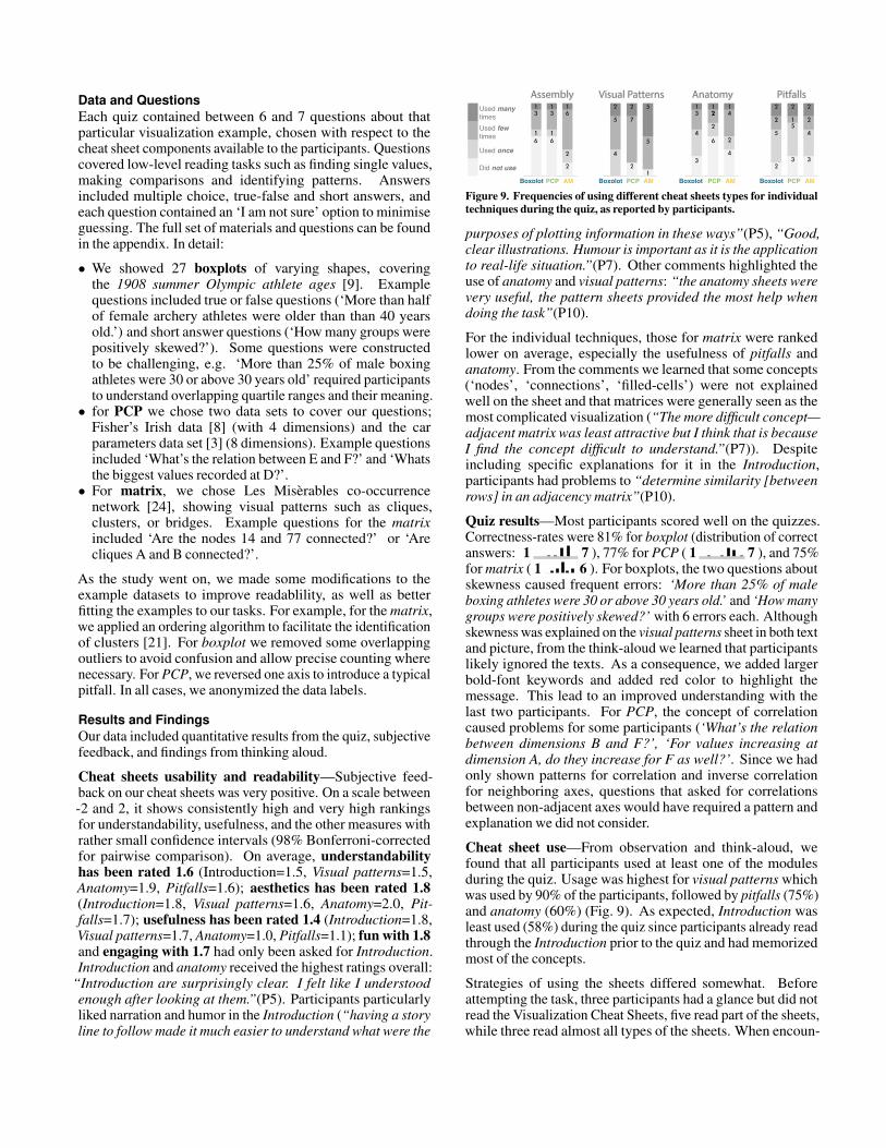
Figure 9. Frequencies of using different cheat sheets types for individualtechniques during the quiz, as reported by participants.
purposes of plotting information in these ways”(P5), “Good,clear illustrations. Humour is important as it is the applicationto real-life situation.”(P7). Other comments highlighted theuse of anatomy and visual patterns: “the anatomy sheets werevery useful, the pattern sheets provided the most help whendoing the task”(P10).
For the individual techniques, those for matrix were rankedlower on average, especially the usefulness of pitfalls andanatomy. From the comments we learned that some concepts(‘nodes’, ‘connections’, ‘filled-cells’) were not explainedwell on the sheet and that matrices were generally seen as themost complicated visualization (“The more difficult concept—adjacent matrix was least attractive but I think that is becauseI find the concept difficult to understand.”(P7)). Despiteincluding specific explanations for it in the Introduction,participants had problems to “determine similarity [betweenrows] in an adjacency matrix”(P10).
Quiz results—Most participants scored well on the quizzes.Correctness-rates were 81% for boxplot (distribution of correctanswers: 1 7 ), 77% for PCP ( 1 7 ), and 75%for matrix ( 1 6 ). For boxplots, the two questions aboutskewness caused frequent errors: ‘More than 25% of maleboxing athletes were 30 or above 30 years old.’ and ‘How manygroups were positively skewed?’ with 6 errors each. Althoughskewness was explained on the visual patterns sheet in both textand picture, from the think-aloud we learned that participantslikely ignored the texts. As a consequence, we added largerbold-font keywords and added red color to highlight themessage. This lead to an improved understanding with thelast two participants. For PCP, the concept of correlationcaused problems for some participants (‘What’s the relationbetween dimensions B and F?’, ‘For values increasing atdimension A, do they increase for F as well?’. Since we hadonly shown patterns for correlation and inverse correlationfor neighboring axes, questions that asked for correlationsbetween non-adjacent axes would have required a pattern andexplanation we did not consider.
Cheat sheet use—From observation and think-aloud, wefound that all participants used at least one of the modulesduring the quiz. Usage was highest for visual patterns whichwas used by 90% of the participants, followed by pitfalls (75%)and anatomy (60%) (Fig. 9). As expected, Introduction wasleast used (58%) during the quiz since participants already readthrough the Introduction prior to the quiz and had memorizedmost of the concepts.
Strategies of using the sheets differed somewhat. Beforeattempting the task, three participants had a glance but did notread the Visualization Cheat Sheets, five read part of the sheets,while three read almost all types of the sheets. When encoun-
tering a problem, a majority of participants first tried to solvethe questions themselves before consulting the sheets. If theyconsulted the sheet, they first tried to answer their question fromthe graphics and only then consulting the textual annotations.
Design changes—We engaged in four major design iterationsduring the study, informed by participants’ feedback. Changesincluded: highlighting data and terms in Introduction; usingred to highlight visual elements in pictures with more than twovisual hierarchies; adding keywords or annotation to clarify themessage; adding terminology for both visual elements and dataelements in anatomy. We also added variations for each pattern(“does a cluster have to have self links?”(P3)), which resolvedissues after P3 (“very easy and quick to find out importantinformation that helped me answer questions”(P5).) We foundthat the ’bridge’ pattern on the matrix visual patternscontainedtoo much information at once, so it was split across severalpanels, despite the additional visual complexity.
GUIDELINE WORKSHOPTo further evaluate how well our designs and cheatsheetssupport our goal, we decided to call for another co-designsession. This time we prepared a set of design guidelines andvisual instructions for creating cheat sheets (call them ‘metacheat-sheets’), to see if these guidelines help participants tocreate cheat sheets for their own purposes. We created generalguidelines as well as guidelines specific to each sheet type withstep-by-step instructions, examples, design suggestions, andpractices to avoid.
We invited three visualization experts with teaching experiencefrom academia and industry (female, all new to the study), andtwo participants with more casual experience (non-experts).During the 2-hour workshop, we i) introduced our cheatsheets (10min), then ii) asked participants to annotate existingcheat sheets for 3 visualisations (30min), then iii) discussedusefulness and possible application scenarios, and eventuallyiv) using our guidelines to construct a cheat sheet for avisualisation technique a participant was familiar with.
Similar to the study, participants’ annotations and commentsshowed points of appreciation: “really clear and explicitdescription”(P1) as well as points where additional expla-nation was needed: “mention ‘Cluster’ along an axis afterintroducing correlation”(P2) which fed into our design process.Participants appreciated the introduction comics, as the storiesgot past perceptions that “data is boring and visualization isdifficult and I can not do it”(P1); “Low in complexity, but easyto understand in here [pointing to her head]”(P5).
Using our guidelines, participants created new cheat sheetsfrom scratch for timelines, connected scatter plots, word clouds,bar charts and sankey diagrams (see supplementary material).These sheets were coherent with our guidelines; participantsorganized the contents by dividers or space, and included cleargraphics and meaningful annotations. Symbols (arrows, ‘3’,‘7’, ‘+’ and ‘-’) are used in all of their drafts in proper cases.Some participants invented new types of cheat sheets which wewill consider to explore in future work, e.g., design variations,colour encodings, and user interactions. Participants also raisedopen challenges related to using a limited space efficiently for
the most important information; preparing materials for otheraudiences than oneself; and creating construction sheets forabstract concepts such as word clouds.
Most importantly, participants reported that the process ofcreating cheat sheets helped them learn and think about avisualization technique, as the guidelines provided a structureto cover many aspects of a visualization, which evoked activelythinking (e.g., “if I were to have a test in the next hour, onvarious types of data visualization, what are the likely test ques-tions?”(P4). Informed by discussions with the participants,we envisage the following scenarios for using cheat sheets:
• Teaching: visualization cheat sheets provide ‘out-of-the-box’ teaching materials for presentations in off-line andonline courses or workshops, presented and explained onslide shows, handouts or videos (Anatomy, Construction,Visual Pattern, Well-known relative, Pitfalls).• Learning: cheat sheets can support independent learning,
e.g., the introduction introduces basic knowledge about avisualization with comics.• Analysis: Cheat sheets can provide a rapid overview of
advanced techniques for analysts to use during exploratoryanalysis: as print-outs at an analysts desk, or through anonline website.
DISCUSSION AND FUTURE WORKUsefulness of Cheat Sheets—Our study set out to show ifcheat sheets are a possible way to support visualization literacy,and to refine our final designs and design principles. Our studyindicates that we are able to create understandable cheat sheetsthat novice participants liked and found useful for developingunderstanding of complex visualisations and that creatingcheat sheets helps understanding and memorizing noveltechniques. By iterating with experts and novices, we haverefined the protocol for creating cheat sheets to enhance clarityand relevance. Together with specific feedback, this has ledto the revised guidelines summarised at the end of this section.
Limitations—Our study has two key limitations. Firstly, wecannot say how much cheat sheets improved real performance,or which parts were most important. There are many dimen-sions to any graphical work from aesthetics to conceptualstructure, and resource-intensive experimental designs wouldbe needed to truly establish the causal effect of each aspect.Our study did not have a factorial design, but instead exploredmultiple design decisions at once for the sake of rapid iterationand convergence, for which 11 participants were enough. More-over, the use of cheat sheets in a lab setting is rather artificial.As a first step, we have investigated cheat sheets in isolation,but there are questions about the complementarities betweencheat sheets and other formats (e.g., videos, tutorials) and howthese can be brought together for particular learning pathways.However, cheat sheets are intended as concise and structuredsupport material for learning, and as a lookup aid when deci-phering visualizations, rather than replacements for traditionallearning activities and explanations. Future studies should thusassess the use of cheat sheets as general medium for teachingin the classroom or at the office, and investigate which teachingactivities they support best. Eventually, we have used simple,closed tasks, that do not require much context, so future studies
should assess how cheat sheets support higher level tasks thatrequire exploration, comprehension and domain knowledge.
Cheat Sheets to Deal with Complexity—The visualizationtechniques that we are exploring here are relatively complex,both in their presentation and construction. For example, inadjacency matrix, cliques are conceptually simple, but the wayin which graphics are constructed to make them apparent—re-ordering matrix based on similarity measures, mapping linksto cells—is both conceptually and cognitively complex fornovices. Participants highlighted these difficulties, but stillsuccessfully answered the quiz. Cheat sheets show promisehere, as the basic concepts can be presented in a way that helpsnovices get to grips with the general principles, with moresubtle details presented both in patterns and potential pitfalls.
There are many design decisions that have gone into our cheatsheets, and we cannot claim completeness or universality here.In particular, there are many patterns that could be highlighted,and their importance is often relative to a particular datacontext. Similarly, there are decisions to make about whether toclassify an example as a pitfall or a variation (e.g. row orderingin matrices, axis ordering for PCPs). In the absence of categori-cally correct approaches, we hope that by highlighting both thepatterns and the confusions around them, our cheat sheets canhelp to build up a considered approach to visual interpretation.
Cheat sheet formats—There is potentially a huge designspace for cheat sheet formats to explore. Besides Introductionand examples in Figure 1, examples include posters, slide-shows, videos, or embedded in interactive visualizations aspop-up reading-guides.
Using, Adapting, Improving, Extending—Our cheat sheetsare ready to use for everyone and can be found online. Theyhave been designed around simple, extensible templates, withthe intention that there is a flexibility in the way in which theyare used. The modularity of our cheat sheets makes it possibleto assemble their content in new ways (Fig. 1), collecting andorganizing the components to fit a particular audience andformat, e.g., posters, mini cheat sheets with only vital infor-mation; explanatory notes in infographics or data comics [18];inserted into slide shows or data videos [12].We therefor invitedesigners, educators, researchers, and practitioners to use ourmaterial, to create their own cheat sheets, and to suggest direc-tions for the expansion of cheat sheets that merit exploration.Firstly, more examples of patterns, pitfalls and illustrativeexamples will emerge for each sheet. Through experience withdeployment and learning, these can be noted and shared. Withappropriate support, learners can be enlisted to explain theissues that confused them, adding a broad empirical base to thecollection of issues. Secondly, more visualization types canbe added, and we hope that the cheat sheet structure helps thecreators of new visualizations (e.g., researchers, designers) tobring their work to a wider audience. Thirdly, additional sheettypes can be added, such as explaining interactions or variantsof a technique. While we considered some of these in our earlydesigns, we found these types require more research whilenot being essential to explain a visualization technique and theconcept of cheat sheets as in this paper. More (including non-graphical) information could be added around a visualization
technique, such as examples, tools, and data types, explainingalgorithms for layouts and re-ordering or covering specificusage strategies such as identifying clusters in matrix or tracingcorrelation in PCPs. Some of these may be specific to particularvisualizations, but practise will help to draw out commonalities.Finally, we have worked with a general explanation of eachvisualization technique, but there is space for additional sheets,or particular configurations aimed at specific contexts such asmedical patient data or nutrition. Similarly, high level tasksand specific analysis strategies should be considered.
Towards Guidelines for Creating Cheat Sheets—As alreadymentioned, there are far too many factors involved in ourcheat sheets to assess the value of each individual decision.Importantly, there is a lot of value in creating cheat sheets bystudents as making cheat sheets requires a good understandingof technique, a critical eye, the structuring of knowledge, anda clear presentation. To facilitate the creation of cheat sheets,we summarize some core advice we have learned during ourresearch and the workshops. The full set of instructionalmaterial for creating visualization cheat sheets (‘meta cheatsheets’) including the full list of guidelines and accompanyinggraphical explanations are found online.
• Abstraction is good to make examples general and makethis generalizability understood.• Concrete examples help understanding a visualization in
the first place such as in our Introduction.• Visual hierarchy, using fonts, sizes, gray backgrounds,
grouping, and careful use of colors and separators helpsstructure content and make information retrievable.• Maximize graphic-text ratio to support lookup and visual
examplification; use text to give additional information.• If necessary, split information across several comic panels
to reduce visual complexity and aid explanation.• Show pattern variations wherever possible to help
understanding the main characteristic of a pattern.• Use complementary terminology to help linking concepts
from visual space, abstract data space, and concreteapplication space.
CONCLUSIONThis paper introduces the concept of cheat sheets to supportliteracy around visualization techniques. Each cheat sheethas visual material covering the aspects that are vital forunderstanding a technique, such as anatomy, common patternsor pitfalls. We defined six types of sheets for six common, yetnon-trivial visualization techniques and refined them throughan iterative method involving expert interviews and workshops,readability feedback, design-by-example, a readability studyand a guideline workshop. To aid creation of new cheat sheets,we present a refined set of design guidelines along with ourfreely available and modifiable library of cheat sheets. We hopethat this material helps the community to build a common lan-guage and repository of material towards defining and developa plan for visualization literacy for complex and non-trivialvisualization techniques, and that this inspires an uptake andpopularization of the many different visualization techniques.
REFERENCES[1] 2017. Cheat Sheets for
AI, Neural Networks, Machine Learning, Deep Learning& Big Data. https://www.mercuryminds.com/blog/cheat-sheets-ai-neural-networks-machine-learning-deep-learning-big-data/. (2017). Last access: 2019-03-11.
[2] 2019. Box and whisker plot. https://www.brainingcamp.com/lessons/box-and-whisker-plots/lesson.php.(2019). last access: 2019-03-07.
[3] 2019. Car parameters.https://stackoverflow.com/questions/19213961/parallel-coordinates-program-written-with-processing-cant-show-anything-in-mac. (2019). last access: 2019-03-12.
[4] 2019. Chartdoctor. https://github.com/ft-interactive/chart-doctor/blob/master/visual-vocabulary/
Visual-vocabulary.pdf. (2019). last access: 2019-03-07.
[5] 2019. Data and Visualization Hazards. http://visualizingrights.org/kit/hazards/index.html. (2019).
[6] 2019a. DataCamp. https://www.datacamp.com/community/data-science-cheatsheets. (2019).
[7] 2019b.DataVizProject. https://datavizproject.com. (2019).
[8] 2019.Fisher’s irish data. https://en.wikipedia.org/wiki/File:ParCorFisherIris.png. (2019). last access: 2019-03-12.
[9] 2019. Olympicsathlete ages in summer 1908. http://www.zingchart.com/gallery/chart/#!vertical-boxplot-html-tooltip.(2019). last access: 2019-03-12.
[10] 2019. oxford dictionaries.https://en.oxforddictionaries.com/definition.(2019). Last access: 2019-03-12.
[11] 2019. Parallel coordinates. https://en.wikipedia.org/wiki/Parallel_coordinates. (2019).
[12] Fereshteh Amini, Nathalie HenryRiche, Bongshin Lee, Andres Monroy-Hernandez,and Pourang Irani. 2017. Authoring data-driven videoswith dataclips. IEEE Transactions on Visualizationand Computer Graphics 23, 1 (2017), 501–510.
[13] Benjamin Bach,Natalie Kerracher, Kyle Wm Hall, Sheelagh Carpendale,Jessie Kennedy, and Nathalie Henry Riche. 2016. Tellingstories about dynamic networks with graph comics.In Proceedings of the SIGCHI Conference on HumanFactors in Computing Systems. ACM, 3670–3682.
[14] Benjamin Bach, Emmanuel Pietriga, and Jean-DanielFekete. 2014. Visualizing dynamic networks with matrixcubes. In Proceedings of the SIGCHI Conference onHuman Factors in Computing Systems. ACM, 877–886.
[15] Benjamin Bach, Nathalie HenryRiche, Sheelagh Carpendale, and HanspeterPfister. 2017a. The emerging genre of data comics. IEEEComputer Graphics and Applications 37, 3 (2017), 6–13.
[16] Benjamin Bach, Nathalie Henry Riche, Christophe Hurter,Kim Marriott, and Tim Dwyer. 2017b. Towards unam-biguous edge bundling: Investigating confluent drawingsfor network visualization. IEEE Transactions on Visu-alization and Computer Graphics 23, 1 (2017), 541–550.
[17] Benjamin Bach, Conglei Shi, Nicolas Heulot, Tara Mad-hyastha, Tom Grabowski, and Pierre Dragicevic. 2016.Time curves: Folding time to visualize patterns of tempo-ral evolution in data. IEEE Transactions on Visualizationand Computer Graphics 22, 1 (2016), 559–568.
[18] Benjamin Bach,Zezhong Wang, Matteo Farinella, Dave Murray-Rust,and Nathalie Henry Riche. 2018. Design patterns fordata comics. In Proceedings of the SIGCHI Conferenceon Human Factors in Computing Systems. ACM, 38.
[19] Ashok R Basawapatna,Kyu Han Koh, and Alexander Repenning. 2010. Usingscalable game design to teach computer science frommiddle school to graduate school. In Proceedings of thefifteenth annual conference on Innovation and technologyin computer science education. ACM, 224–228.
[20] Scott Bateman, Regan L Mandryk, Carl Gutwin,Aaron Genest, David McDine, and Christopher Brooks.2010. Useful junk?: the effects of visual embellishmenton comprehension and memorability of charts.In Proceedings of the SIGCHI Conference on HumanFactors in Computing Systems. ACM, 2573–2582.
[21] Michael Behrisch, BenjaminBach, Nathalie Henry Riche, Tobias Schreck, andJean-Daniel Fekete. 2016. Matrix reordering methods fortable and network visualization. In Computer GraphicsForum, Vol. 35. Wiley Online Library, 693–716.
[22] Jacques Bertin, William J Berg, and Howard Wainer.1983. Semiology of graphics: diagrams, networks,maps. Vol. 1. University of Wisconsin press Madison.
[23] Katy Börner, AdamMaltese, Russell Nelson Balliet, and Joe Heimlich. 2016.Investigating aspects of data visualization literacy using20 information visualizations and 273 science museumvisitors. Information Visualization 15, 3 (2016), 198–213.
[24] Mike Bostock. 2012. Les MisérablesCo-occurrence. https://bost.ocks.org/mike/miserables/.(2012). last access: 2019-03-12.
[25] Jeremy Boy, Ronald A Rensink, Enrico Bertini, andJean-Daniel Fekete. 2014. A principled way of assessingvisualization literacy. IEEE Transactions on Visualizationand Computer Graphics 20, 12 (2014), 1963–1972.
[26] Valerie J Bristor andSuzanne V Drake. 1994. Linking the language arts andcontent areas through visual technology. THE Journal(Technological Horizons In Education) 22, 2 (1994), 74.
[27] Alberto Cairo. 2012. The Functional Art: An introductionto information graphics and visualization. New Riders.
[28] Alberto Cairo. 2016. The truthful art:Data, charts, and maps for communication. New Riders.
[29] David Carr.1999. Guidelines for designing information visualizationapplications. In ECUE’99: 01/12/1999-03/12/1999.
[30] Chunlei Chang, Benjamin Bach, TimDwyer, and Kim Marriott. 2017. Evaluating perceptuallycomplementary views for network exploration tasks.In Proceedings of the SIGCHI Conference on HumanFactors in Computing Systems. ACM, 1397–1407.
[31] Thomas NDorsel and Gary W Cundiff. 1979. The cheat-sheet:Efficient coding device or indispensable crutch? TheJournal of Experimental Education 48, 1 (1979), 39–42.
[32] Brigitte Erbe.2007. Reducing test anxiety while increasing learning:The cheat sheet. College teaching 55, 3 (2007), 96–98.
[33] Stephanie D. H. Evergreenand Gavin McMahon. 2019. Data visualization chartchooser cards. http://chartchoosercards.com/. (2019).
[34] Matteo Farinella.2018. The potential of comics in science communication.Journal of science communication 17, 1 (2018), Y01.
[35] Stephen Few.2012. Designing Effective Tables and Graphs. (2012).
[36] Steve Franconeri.2018. Which Visualization? A quick reference.http://experception.net. (2018). Last access: 2019-03-11.
[37] Steve Haroz, Robert Kosara, and Steven L Franconeri.2016. The connected scatterplot for presentingpaired time series. IEEE Transactions on Visualizationand Computer Graphics 22, 9 (2016), 2174–2186.
[38] Conor Healy. 2019.data-to-viz.com. https://www.data-to-viz.com/. (2019).
[39] Jeffrey Heer, Nicholas Kong, and Maneesh Agrawala.2009. Sizing the horizon: the effects of chart size andlayering on the graphical perception of time series visu-alizations. In Proceedings of the SIGCHI Conference onHuman Factors in Computing Systems. ACM, 1303–1312.
[40] Nathalie Henry and Jean-Daniel Fekete. 2006.Matrixexplorer: a dual-representation system to exploresocial networks. IEEE Transactions on Visualizationand Computer Graphics 12, 5 (2006), 677–684.
[41] Sarada Herke. 2019. Graph TheoryFAQs: 03. Isomorphism Using Adjacency Matrix. https://www.youtube.com/watch?v=UCle3Smvh1s&t=27s. (2019).
[42] I-Han Hsiao and Claudia López. 2016.Lessons Learned from Students’ Cheat Sheets: GenericModels for Designing Programming Study Guides. In2016 IEEE 16th International Conference on AdvancedLearning Technologies (ICALT). IEEE, 209–211.
[43] Noah Iliinsky. 2019. VisualizationDesign Thinking for Effective Data Visualization.https://datascientistinsights.com/2012/12/
05/design-thinking-for-effective-data-visualization/.(2019).
[44] Gerald Everett Jones.2011. How to lie with charts. LaPuerta Books and Media.
[45] Jiyoon Kim, Min Suk Chung, Hae Gwon Jang, andBeom Sun Chung. 2017. The use of educational comicsin learning anatomy among multiple student groups.Anatomical sciences education 10, 1 (2017), 79–86.
[46] Andy Kirk. 2016. Datavisualisation: a handbook for data driven design. Sage.
[47] Grady Klein andAlan Dabney. 2013. The cartoon introduction to statistics.Hill and Wang, a Division of Farrar, Straus and Giroux.
[48] Ha-Kyung Kong,Zhicheng Liu, and Karrie Karahalios. 2018. Framesand slants in titles of visualizations on controversialtopics. In Proceedings of the SIGCHI Conferenceon Human Factors in Computing Systems. ACM, 438.
[49] Sukwon Lee, Sung-Hee Kim, Ya-HsinHung, Heidi Lam, Youn-ah Kang, and Ji Soo Yi. 2016.How do people make sense of unfamiliar visualizations?:A grounded model of novice’s information visualizationsensemaking. IEEE Transactions on Visualizationand Computer Graphics 22, 1 (2016), 499–508.
[50] MakaylaLewis. 2018. Sketchnotes in UX Design cheat sheet.https://makaylalewis.files.wordpress.com/2018/09/ux-cambridge-2018-cheat-sheet.pdf.(2018). Last access: 2019-03-11.
[51] Matt Madden. 99. ways to tell a story:Exercises in style. New York, NY: Chamberlain Bros (99).
[52] Adam V Maltese, Joseph A Harsh, and DubravkaSvetina. 2015. Data visualization literacy: Investigatingdata interpretation along the novice—expert continuum.Journal of College Science Teaching 45, 1 (2015), 84–90.
[53] Michael C Medlock, DennisWixon, Mick McGee, and Dan Welsh. 2005. The rapiditerative test and evaluation method: Better products inless time. In Cost-Justifying Usability. Elsevier, 489–517.
[54] Mark Monmonier.2018. How to lie with maps. University of Chicago Press.
[55] Randall Munroe. 2015. Thing explainer:complicated stuff in simple words. Hachette UK.
[56] Tamara Munzner. 2014.Visualization analysis and design. AK Peters/CRC Press.
[57] Anshul Vikram Pandey, Katharina Rall, Margaret LSatterthwaite, Oded Nov, and Enrico Bertini. 2015. Howdeceptive are deceptive visualizations?: An empiricalanalysis of common distortion techniques. In Proceedingsof the 33rd Annual ACM Conference on HumanFactors in Computing Systems. ACM, 1469–1478.
[58] Sandra Rendgen, Julius Wiedemann, Paolo Ciuccarelli,Richard Saul Wurman, Simon Rogers, and Nigel Holmes.2012. Information graphics. Taschen Cologne, Germany.
[59] Severino Ribecca. 2019. The datavisualization catalogue. https://datavizcatalogue.com.(2019). last access: 2019-03-07.
[60] Jonathan C Roberts, Chris Headleand, and Panagiotis DRitsos. 2016. Sketching designs using the five design-sheet methodology. IEEE Transactions on Visualizationand Computer Graphics 22, 1 (2016), 419–428.
[61] Puripant Ruchikachornand Klaus Mueller. 2015. Learning visualizations byanalogy: Promoting visual literacy through visualizationmorphing. IEEE Transactions on Visualizationand Computer Graphics 21, 9 (2015), 1028–1044.
[62] MiloSchield. 2004. Information literacy, statistical literacyand data literacy. In IASSIST QUARTERLY (IQ). Citeseer.
[63] Jon Schwabish. 2016. The Graphic Continuum FlashCards. https://policyviz.com/2016/10/31/introducing-graphic-continuum-flash-cards/. (2016).
[64] JonSchwabish. 2019. Core Principles of Data VisualizationCheatsheet. https://policyviz.com/product/core-principles-of-data-visualization-cheatsheet/. (2019).
[65] Woollcott Smith and Larry Gonick.2005. The cartoon guide to statistics. Collins Reference.
[66] Yang Song and DavidThuente. 2015. A quantitative case study in engineeringof the efficacy of quality cheat-sheets. In 2015 IEEEFrontiers in Education Conference (FIE). IEEE, 1–7.
[67] Yoav Wachsman andothers. 2002. Should cheat sheets be used as study aidsin economics tests. Economics Bulletin 1, 1 (2002), 1–10.
[68] Qianwen Wang, Zhen Li, Siwei Fu,Weiwei Cui, and Huamin Qu. 2018. Narvis: AuthoringNarrative Slideshows for Introducing Data VisualizationDesigns. IEEE Transactions on Visualizationand Computer Graphics 25, 1 (2018), 779–788.
[69] Zezhong Wang, Shunming Wang, MatteoFarinella, Dave Murray-Rust, Nathalie Henry Riche,and Benjamin Bach. 2019. Comparing Effectiveness andEngagement of Data Comics and Infographics. (2019).
[70] Hadley Wickham and Lisa Stryjewski.2011. 40 years of boxplots. Am. Statistician (2011).
[71] LelandWilkinson. 2012. The grammar of graphics. In Handbookof Computational Statistics. Springer, 375–414.
[72] Leland Wilkinson, AnushkaAnand, and Robert Grossman. 2005. Graph-theoreticscagnostics. In IEEE Symposium on InformationVisualization, 2005. INFOVIS 2005. IEEE, 157–164.
[73] Zhenpeng Zhao, Rachael Marr,and Niklas Elmqvist. 2015. Data Comics: SequentialArt for Data-Driven Storytelling. tech. report (2015).
[74] Zhenpeng Zhao, Rachael Marr, Jason Shaffer, andNiklas Elmqvist. 2019. Understanding Partitioning andSequence in Data-Driven Storytelling. In InternationalConference on Information. Springer, 327–338.
Related Documents