Chapter 5 – Section D Charts / Graphs Used in the Media

Chapter 5 sections 5 c and 5d
Jul 14, 2015
Welcome message from author
This document is posted to help you gain knowledge. Please leave a comment to let me know what you think about it! Share it to your friends and learn new things together.
Transcript
Chapter 5 – Section D
Charts / Graphs Used in the Media
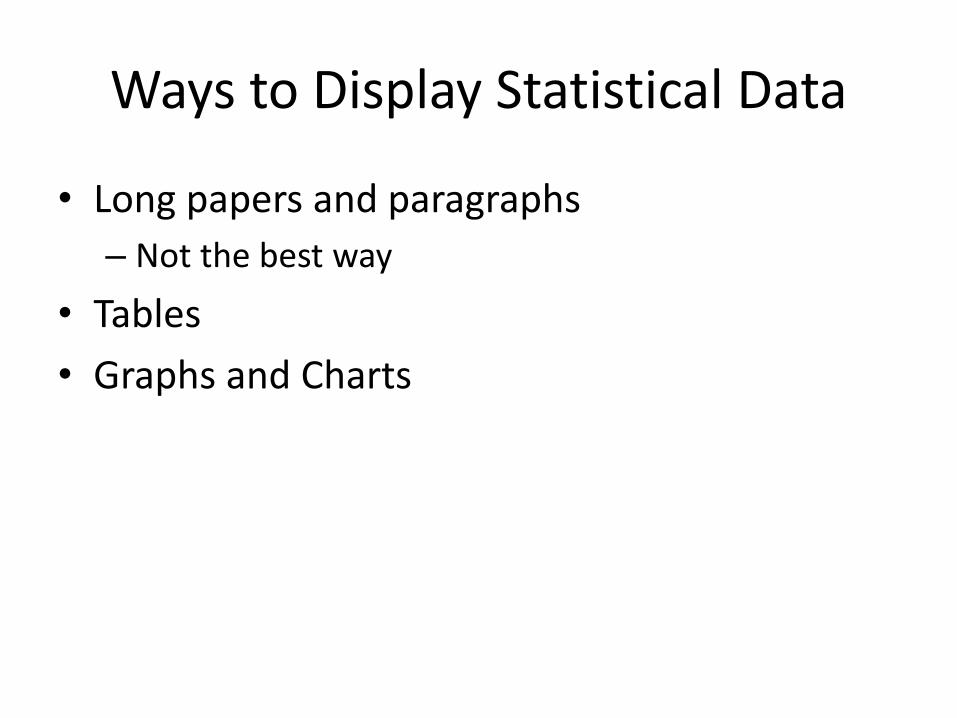
Ways to Display Statistical Data
• Long papers and paragraphs
– Not the best way
• Tables
• Graphs and Charts
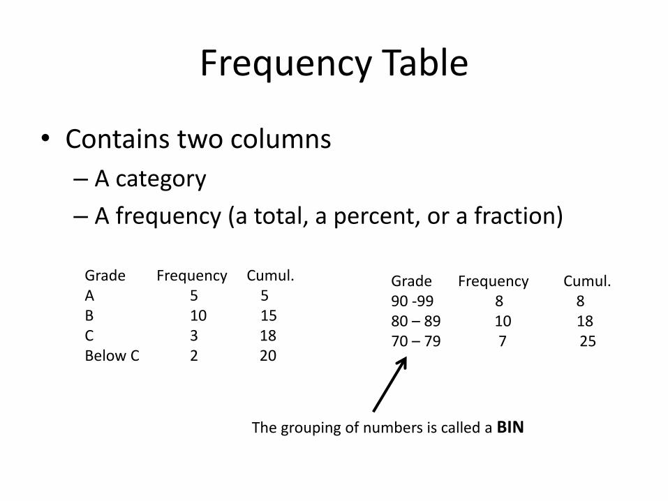
Frequency Table
• Contains two columns
– A category
– A frequency (a total, a percent, or a fraction)
Grade Frequency Cumul.A 5 5B 10 15C 3 18Below C 2 20
Grade Frequency Cumul.90 -99 8 880 – 89 10 1870 – 79 7 25
The grouping of numbers is called a BIN
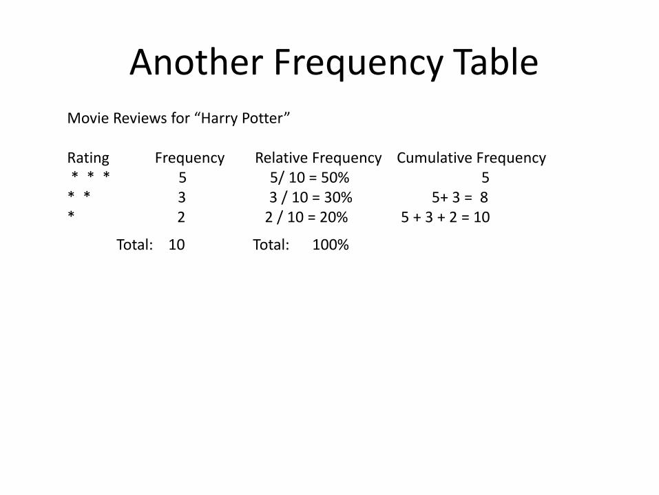
Another Frequency TableMovie Reviews for “Harry Potter”
Rating Frequency Relative Frequency Cumulative Frequency* * * 5 5/ 10 = 50% 5
* * 3 3 / 10 = 30% 5+ 3 = 8* 2 2 / 10 = 20% 5 + 3 + 2 = 10
Total: 10 Total: 100%
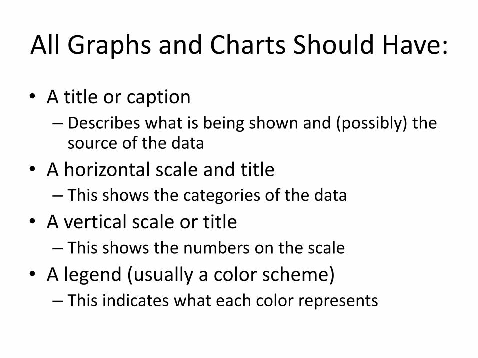
All Graphs and Charts Should Have:
• A title or caption – Describes what is being shown and (possibly) the
source of the data
• A horizontal scale and title – This shows the categories of the data
• A vertical scale or title– This shows the numbers on the scale
• A legend (usually a color scheme)– This indicates what each color represents
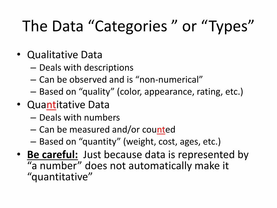
• Qualitative Data– Deals with descriptions– Can be observed and is “non-numerical”– Based on “quality” (color, appearance, rating, etc.)
• Quantitative Data– Deals with numbers – Can be measured and/or counted– Based on “quantity” (weight, cost, ages, etc.)
• Be careful: Just because data is represented by “a number” does not automatically make it “quantitative”
The Data “Categories ” or “Types”
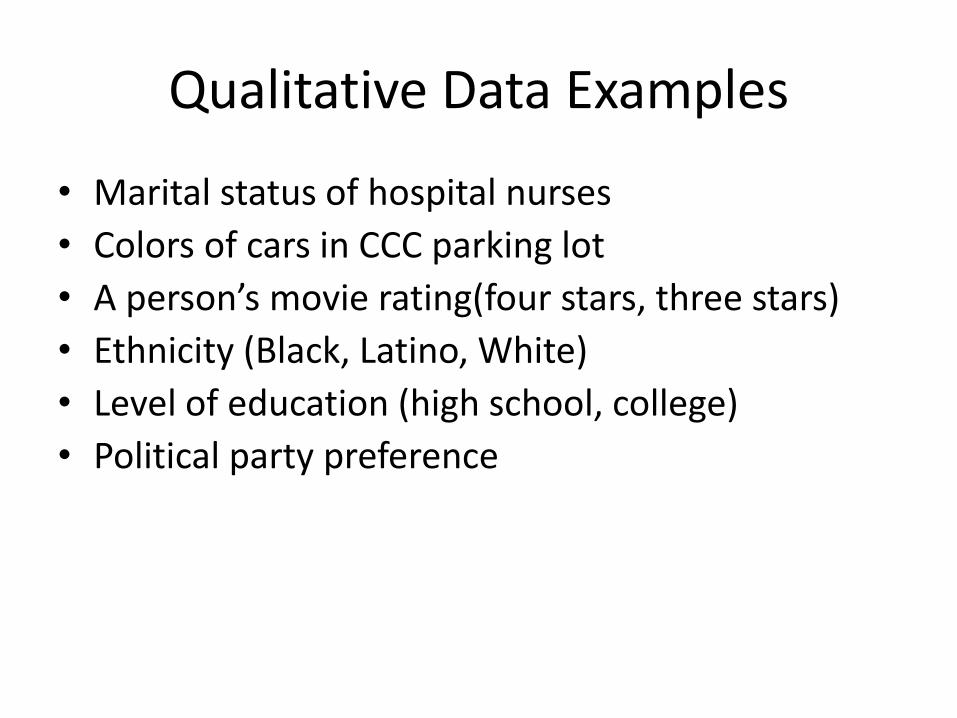
• Marital status of hospital nurses
• Colors of cars in CCC parking lot
• A person’s movie rating(four stars, three stars)
• Ethnicity (Black, Latino, White)
• Level of education (high school, college)
• Political party preference
Qualitative Data Examples

• Time it takes to run a kilometer
• Weight of lobsters in a tank at a restaurant
• Ounces of fruit in a smoothie
• Seating capacity of football stadium
• Age of people living in nursing home
• Number of people jailed for drug possession
Quantitative Data Examples
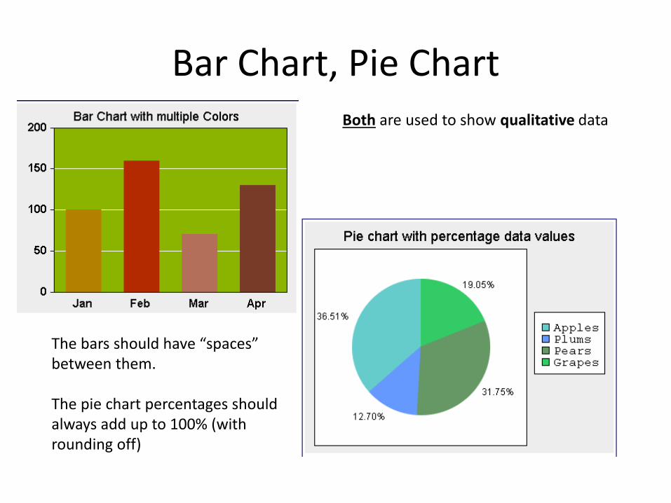
Bar Chart, Pie ChartBoth are used to show qualitative data
The bars should have “spaces” between them.
The pie chart percentages should always add up to 100% (with rounding off)
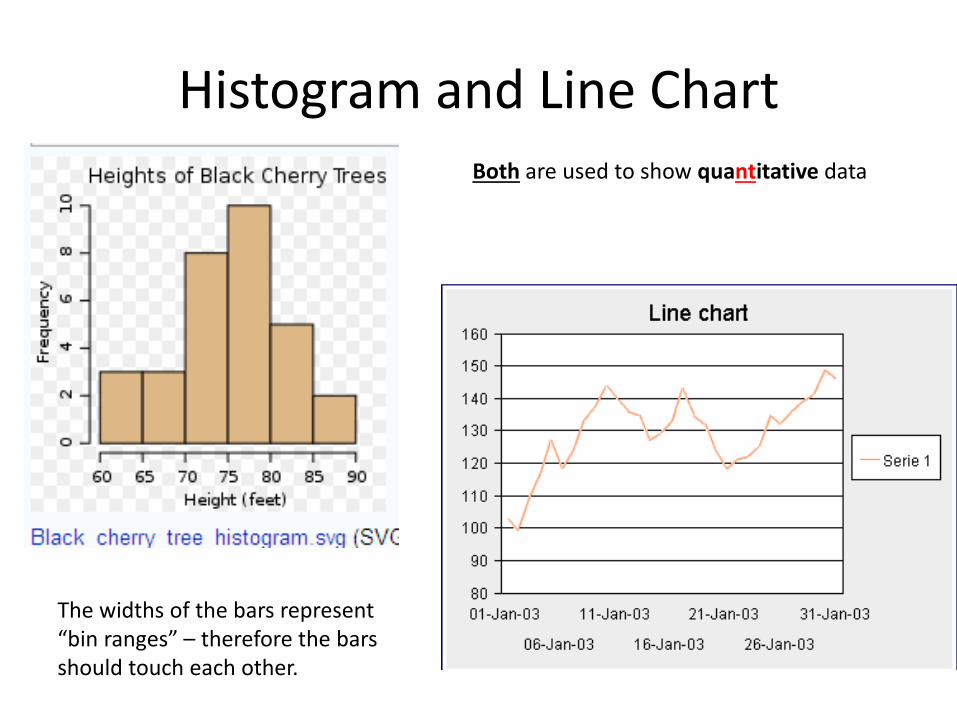
Histogram and Line ChartBoth are used to show quantitative data
The widths of the bars represent “bin ranges” – therefore the bars should touch each other.
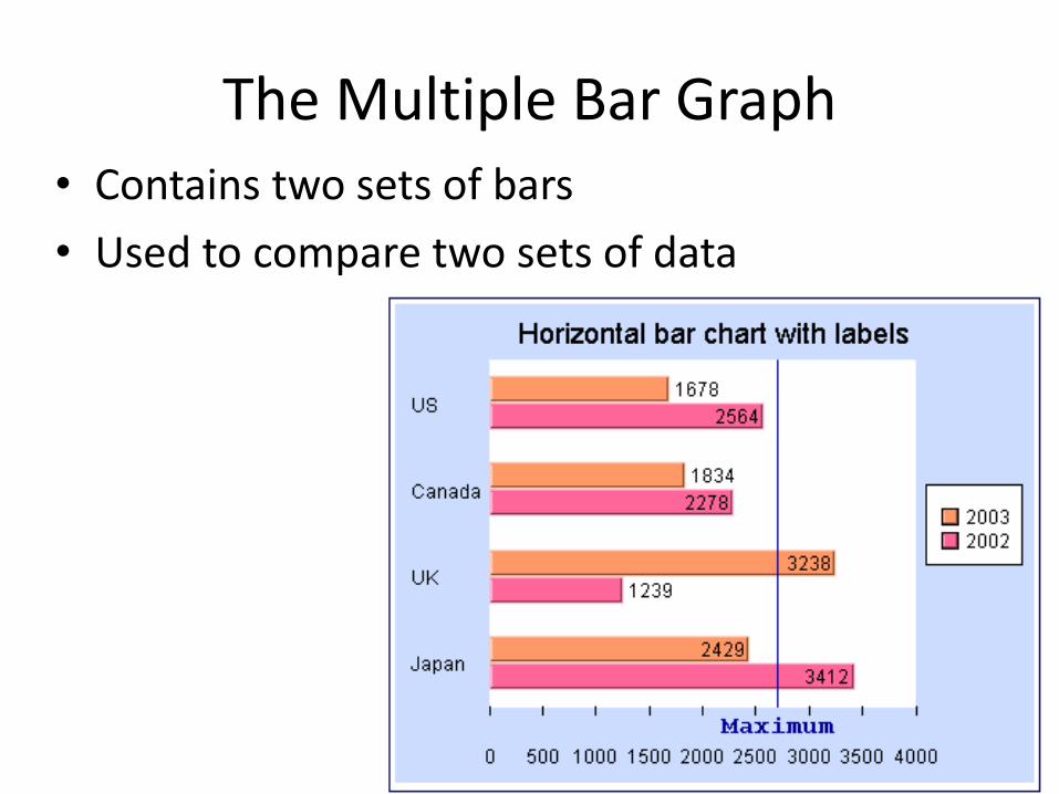
The Multiple Bar Graph• Contains two sets of bars
• Used to compare two sets of data
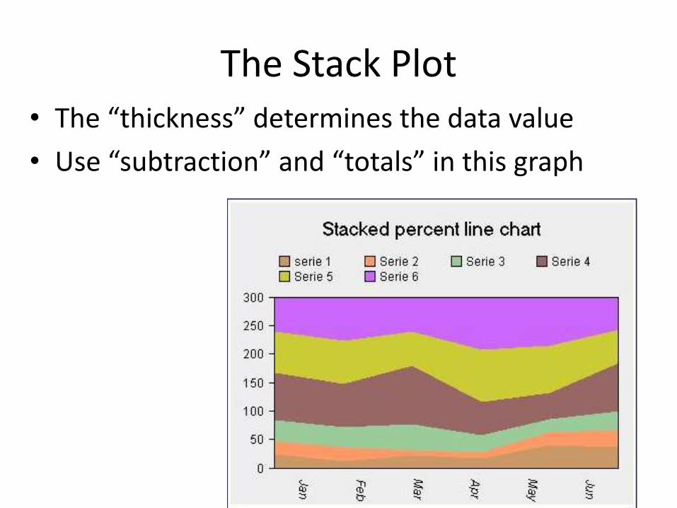
The Stack Plot• The “thickness” determines the data value
• Use “subtraction” and “totals” in this graph
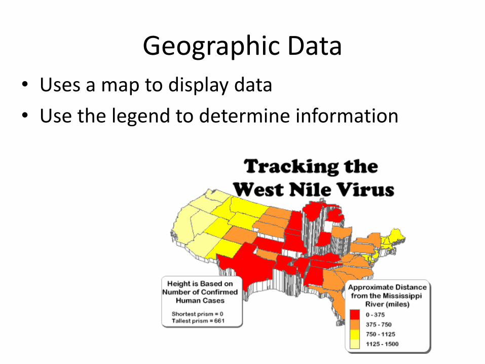
Geographic Data• Uses a map to display data
• Use the legend to determine information
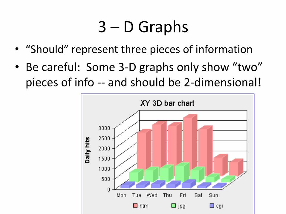
3 – D Graphs• “Should” represent three pieces of information
• Be careful: Some 3-D graphs only show “two” pieces of info -- and should be 2-dimensional!

Pictographs• Often embellished with artwork to make the
display more attractive / attracting
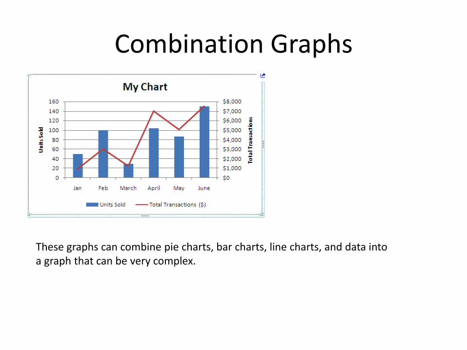
Combination Graphs
These graphs can combine pie charts, bar charts, line charts, and data into a graph that can be very complex.
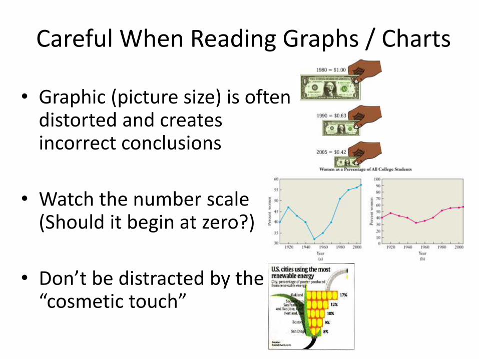
Careful When Reading Graphs / Charts
• Graphic (picture size) is often distorted and creates incorrect conclusions
• Watch the number scale (Should it begin at zero?)
• Don’t be distracted by the “cosmetic touch”
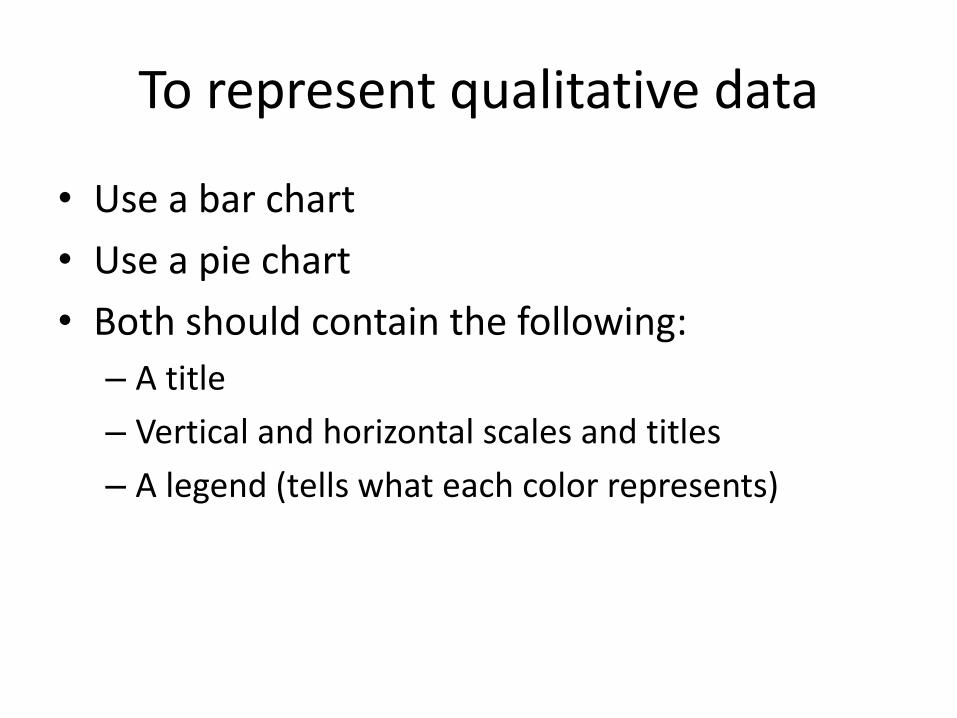
To represent qualitative data
• Use a bar chart
• Use a pie chart
• Both should contain the following:
– A title
– Vertical and horizontal scales and titles
– A legend (tells what each color represents)
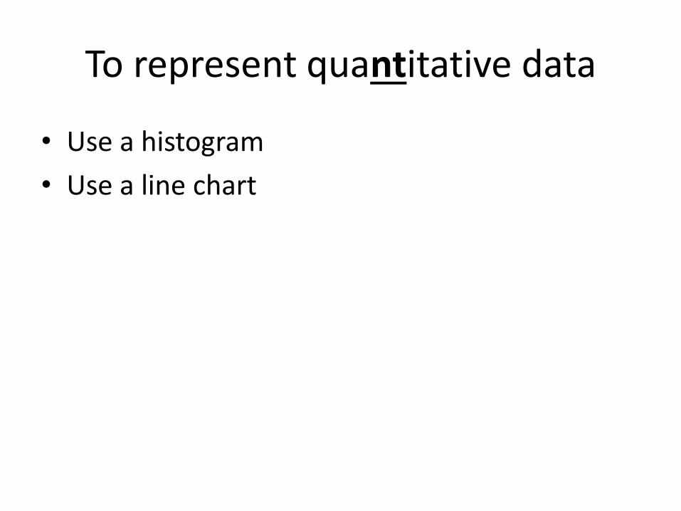
To represent quantitative data
• Use a histogram
• Use a line chart
Related Documents

![e Governance%5B1%5D%5B1%5D[1]](https://static.cupdf.com/doc/110x72/577d33c21a28ab3a6b8ba828/e-governance5b15d5b15d1.jpg)


![Grammar book%5 b1%5d%20%281%29[1]](https://static.cupdf.com/doc/110x72/55a0ba691a28abf7608b482c/grammar-book5-b15d20281291.jpg)