METHODS OF DATA COLLECTION AND PRESENTATION Chapter 2

Welcome message from author
This document is posted to help you gain knowledge. Please leave a comment to let me know what you think about it! Share it to your friends and learn new things together.
Transcript

METHODS OF DATA COLLECTION AND PRESENTATION
Chapter 2

What is data?•refers to facts or figures from which
conclusion can be drawn.
• information collected, organized, analyzed, and interpret by statisticians.
•needed whenever we undertake studies or researches which are designed to answer particular problems, or to provide a base with which certain decisions may be formulated.

Kinds of Statistical Data•Qualitative data - classificatory data
ex. Sex, religion, citizenship•Quantitative data - either counts or measures
ex. Weekly allowanceNote: Qualitative data can be transformed into
quantitative data by coding; ex. Female=1, Male=0•Primary data - to information gathered
directly from an original source•Secondary data - refer to information taken
from published or unpublished data which were previously gathered by other individuals or agencies

Advantages of primary over secondary data:
1. Primary data frequently give detailed definitions of terms and accurate statistical units used in the experiment or in the survey.
2. Primary data lend more relevance to the
researcher's study because of his direct participation in the project.
3. Primary data are more reliable because of their first‑hand nature.

Methods of Data Collection1. Survey method - the desired information is
obtained either through personal interview of or by distributing questionnaires to respondents.
2. Observations method - the desired information is obtained by observing and recording the behavior of persons, organizations, etc. but only at the time of occurrence.
- Direct observation can be used to discover a variety of types of information including aspects of social and economic behavior.

3. Experimental method - used when the objective is to determine the cause and effect relationship of certain variables under controlled conditions.
Experimental data are used to test hypotheses on significance of effects of one or more controlled variables on certain characteristics of the unit of analysis.
Methods of Data Collection

Forms of Data Presentation•Textual Presentation
- an expository form describing a set of information.
- a useful manner of presenting limited amounts of information.

Example:
The carabao or kalabaw in Filipino is a type of water buffalo in our country. The carabaos are usually associated with farmers because these animals are used in farms. Their life span is about 18 to 20 years. A female carabao can give on calf each year.
Now is the time for you to shine!Join
SEARCH for the GOLDEN DIVA
June 12, 2010, 6pm @ Plaza Musica1st Prize - 20, 000 Php2nd Prize – 15, 000 Php3rs Prize – 10, 000 Php
The Republic of the Philippines has more than 7 000 islands.
BEST REVIEW CENTERPassing Rate
98% LET (Licensure Exam for Teachers)
96% Nursing Board ExamAVAIL NOW OF THE
DISCOUNT!

• the process of condensing classified data and arranging them in a table.
Types of tables 1. General or reference table ‑ used mainly as
a repository of information; its primary purpose is to present data in such a way that individual items may easily be found by a reader; it is often placed in an appendix.
b) Tabular Presentation Forms of Data Presentation

2. Summary or text table ‑ usually small in size and designed to guide the reader in analyzing the data; usually accompanies a text discussion.
Parts of a Formal Statistical Table:1. Heading ‑ consists of the table number, table
title, and headnote, when necessarya. Table number ‑ identifies and positions a table
within a series, it is preceded by the word "Table" with a capital T
b. Table title ‑ the what, how classified, where and when of the table; a brief statement of the nature, classification and geographic area and time reference of the data.

c. Headnote ‑ not a necessary part; statement is enclosed in brackets [ ] or in parentheses and appearing between the table title and the top rule of the table; or after the title
2. Boxhead - portion of the table which consists of the spanner and column heads or captions describing the data in each columna. Column head - basic unit of the boxhead;
descriptive title placed directly above the column to which it refers
b. Spanner head ‑ title under which column heads are further classified

3. Stub ‑ contains the stub head, center heads and line captions; the first column on the left where the line descriptions are.
a. Stub head ‑ describes the stub listing as a whole in terms of classification presented
b. Center head ‑ describes a group of line captions
c. Line caption ‑ describes the data on a given rows.
4. Field (body) ‑ depository of information appearing in the cells.
5. Footnote ‑ statement qualifying or explaining the information presented in, or omitted from specific cells, columns or lines.

Footnotes are of 3 distinct forms:1. General footnote ‑ a statement which
qualifies the table as a whole; introduced by the word "Note" followed by a colon
2. Specific footnote ‑ "keyed" statement which qualifies, describes, or explains the information presented in a specific cell, line or column; item qualified is assigned a reference symbol ("key") which is repeated at the beginning of the footnote
3. Source note ‑ statement indicating the specific source of the statistics or a portion of them

c) Graphical PresentationThe graphical presentation of data
provides you with a picture of the significant relationships of the facts or data presented.
Such relationships are presented with simplicity for easy comprehension.
Graphs refer to diagrams or drawings which show the successive values of a changing quantity.
Constructed to answer specific needs and for specific purposes.
Forms of Data Presentation

1) Line Chart The curve or line chart is the oldest,
simplest, most familiar, and most widely used method of presenting statistics graphically.
The fluctuations or movement of this line show the variations in the trend.
The variation is presented using a continuous line to show the continuity of the data presented.
Used when we wish to know how one value changes with respect to another value over successive periods of time.
Forms of Data Presentation

Line Chart Example
0 1 2 3 4 5 6 7 8 9 100
200
400
600
800
1000
1200
1400
MaleFemale
Fig. 1. Number of Enrolees in Tabok National High School by gender, SY 2000 - 2010
Frequency
Year
Forms of Data Presentation

2) Column Chart (Vertical Bar Chart) Its primary purpose is to depict numerical
values of a given item over a period of time. These values, either absolute or percent, are
represented by the height of the column. preferable to the line chart when a sharper
delineation of trend is to be shown. Used to compare magnitudes Types:
Single bar graph Bilateral bar graph – used when the
characteristics are opposite in nature and are to be compared.
Multiple Bar Graphs – three or more bars Subdivided bar graph
Forms of Data Presentation

Single Bar Chart Example
2009 2010 2011-100
100
300
500
700
900
1100
1300
1500
Year
Fre
qu
en
cy
(%)
Fig. 2. Number of Enrolees for three consecutive school years in Malangsa Elementary Schoo, SY 2009 - 2011
Forms of Data Presentation

2009 2010 20110
1
2
3
4
5
MaleFemale
Year
Fre
qu
en
cy
(%)
Fig. 2a. Relative frequency of grade 5 elementary pupils for three consecutive school years in Malangsa Elementary School by gender, SY 2009 - 2011
Note: The bars do not touch each other. This indicates the discrete nature of the variable being grouped.
Bilateral Bar Chart Example
Forms of Data Presentation

Fig. 2b. Relative frequency of grade 5 elementary pupils for three consecutive school years in Malangsa Elementary School by gender, SY 2009 - 2011
2009 2010 20110
1
2
3
4
5
6
7
8
FemaleMale
Year
Fre
qu
en
cy
(%)
Subdivided bar chart Example
Forms of Data Presentation

3) Horizontal Bar Chart the simplest form of graph
comparing different items as of a specified date.
It is especially suited to represent categorical data.
Bars may be arranged in numerical or alphabetical order, depending on the purpose of the chart and the given data.
Just like the vertical chart, horizontal bar chart also has different types.
Forms of Data Presentation

Others
Palmolive
Pantene
Clear
Rejoice
Dove
0 20 40 60 80 100 120 140 160 180 200
139
100
150
166
180
200
Number of Users
Sh
am
poo
Singular Horizontal Bar Chart Example
Fig.3. Number students using different brands of shampoo, June 2014
Forms of Data Presentation

CME
CE
CAFS
CoE
CAS
CFNR
0 100 200 300 400 500 600 700550
400
480
320
180
650
680
380
250
280
FemaleMale
Number of Enrolees
Coll
eg
e
Fig.3. Number of enrolees per college by gender, SY 2010-2011
Bilateral Horizontal Bar Chart Example
Forms of Data Presentation

CME
CE
CAFS
CoE
CAS
CFNR
0 100 200 300 400 500 600 700
550
400
480
320
180
650
680
380
250
280
Female#REF!
Number of Enrolees
Coll
eg
e
Subdivided Horizontal Bar Chart Example
Fig.3. Number of enrolees per college by gender, SY 2010-2011
Forms of Data Presentation

4) Circle Graph (Pie Chart) Used in illustrating how a whole quantity is
divided into parts. Used when percent distribution of a whole
into its component parts are to be presented.
The circle is divided into sectors that are proportional in size to the corresponding frequencies or percentages
Forms of Data Presentation

10%
15%
30%
5%
40% School ProjectTransportationHouse RentalLeisure Expenses Food
Pie Graph Example
Fig. 5. Expenses of Marla in January 2014
Forms of Data Presentation

5. Statistical MapThis type of chart is used to present
geographical statistics. It should be used only when geographic distribution is of permanent importance and when data can be readily and correctly interpreted in this form.
Forms of Data Presentation
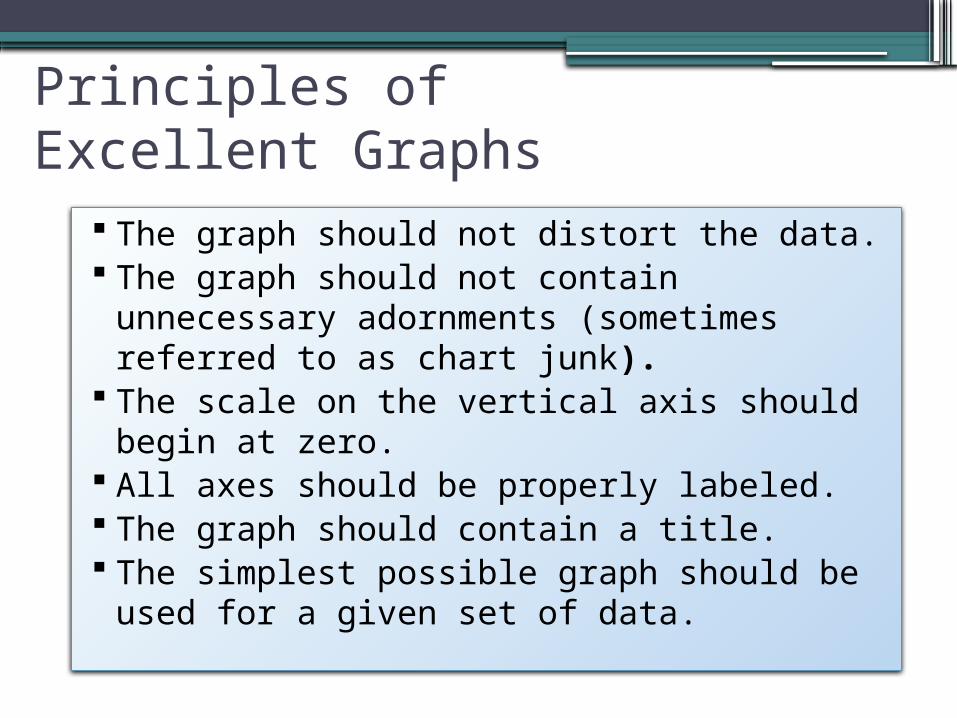
Principles of Excellent Graphs
The graph should not distort the data. The graph should not contain unnecessary
adornments (sometimes referred to as chart junk). The scale on the vertical axis should begin at zero. All axes should be properly labeled. The graph should contain a title. The simplest possible graph should be used for a
given set of data.

Graphical Errors: Chart Junk
1960: $1.00
1970: $1.60
1980: $3.10
1990: $3.80
Minimum Wage
Bad Presentation
Minimum Wage
0
2
4
1960 1970 1980 1990
$
Good Presentation

Graphical Errors: No Relative Basis
A’s received by students.
A’s received by students.
Bad Presentation
0
200
300
FR SO JR SR
Freq.
10%
30%
FR SO JR SR
FR = Freshmen, SO = Sophomore, JR = Junior, SR = Senior
100
20%
0%
%
Good Presentation

Graphical Errors: Compressing the Vertical Axis
Good Presentation
Quarterly Sales
Quarterly Sales
Bad Presentation
0
25
50
Q1 Q2 Q3 Q4
$
0
100
200
Q1 Q2 Q3 Q4
$

Graphical Errors: No Zero Point on the Vertical Axis
Monthly Sales
36
39
42
45
J F M A M J
$
Graphing the first six months of sales
Monthly Sales
0
39
42
45
J F M A M J
$
36
Good PresentationsBad Presentation

Chap 2-
33
Some Additional Considerations in Constructing Tables and Charts Tables MUST have a Table Number and Table
Title Charts MUST have Figure Number and Figure
Title If one is using a secondary data, he MUST
indicate a SOURCE NOTE below the table or chart
Titles MUST be concise In a chart, the length of the Y-axis is shorter than
the X-axis (Y-axis about ¾ of the X-axis)
Related Documents