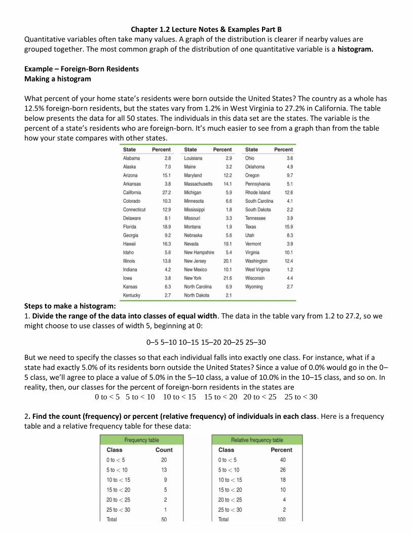
Chapter 1.2 Lecture Notes & Examples Part B Quantitative variables often take many values. A graph of the distribution is clearer if nearby values are grouped together. The most common graph of the distribution of one quantitative variable is a histogram. Example – Foreign-Born Residents Making a histogram What percent of your home state’s residents were born outside the United States? The country as a whole has 12.5% foreign-born residents, but the states vary from 1.2% in West Virginia to 27.2% in California. The table below presents the data for all 50 states. The individuals in this data set are the states. The variable is the percent of a state’s residents who are foreign-born. It’s much easier to see from a graph than from the table how your state compares with other states. Steps to make a histogram: 1. Divide the range of the data into classes of equal width . The data in the table vary from 1.2 to 27.2, so we might choose to use classes of width 5, beginning at 0: 0–5 5–10 10–15 15–20 20–25 25–30 But we need to specify the classes so that each individual falls into exactly one class. For instance, what if a state had exactly 5.0% of its residents born outside the United States? Since a value of 0.0% would go in the 0– 5 class, we’ll agree to place a value of 5.0% in the 5–10 class, a value of 10.0% in the 10–15 class, and so on. In reality, then, our classes for the percent of foreign-born residents in the states are 0 to < 5 5 to < 10 10 to < 15 15 to < 20 20 to < 25 25 to < 30 2. Find the count (frequency) or percent (relative frequency) of individuals in each class . Here is a frequency table and a relative frequency table for these data:

Welcome message from author
This document is posted to help you gain knowledge. Please leave a comment to let me know what you think about it! Share it to your friends and learn new things together.
Transcript
Chapter 1.2 Lecture Notes & Examples Part B Quantitative variables often take many values. A graph of the distribution is clearer if nearby values are grouped together. The most common graph of the distribution of one quantitative variable is a histogram. Example – Foreign-Born Residents Making a histogram What percent of your home state’s residents were born outside the United States? The country as a whole has 12.5% foreign-born residents, but the states vary from 1.2% in West Virginia to 27.2% in California. The table below presents the data for all 50 states. The individuals in this data set are the states. The variable is the percent of a state’s residents who are foreign-born. It’s much easier to see from a graph than from the table how your state compares with other states. Steps to make a histogram: 1. Divide the range of the data into classes of equal width. The data in the table vary from 1.2 to 27.2, so we might choose to use classes of width 5, beginning at 0:
0–5 5–10 10–15 15–20 20–25 25–30
But we need to specify the classes so that each individual falls into exactly one class. For instance, what if a state had exactly 5.0% of its residents born outside the United States? Since a value of 0.0% would go in the 0–5 class, we’ll agree to place a value of 5.0% in the 5–10 class, a value of 10.0% in the 10–15 class, and so on. In reality, then, our classes for the percent of foreign-born residents in the states are
0 to < 5 5 to < 10 10 to < 15 15 to < 20 20 to < 25 25 to < 30
2. Find the count (frequency) or percent (relative frequency) of individuals in each class. Here is a frequency table and a relative frequency table for these data:
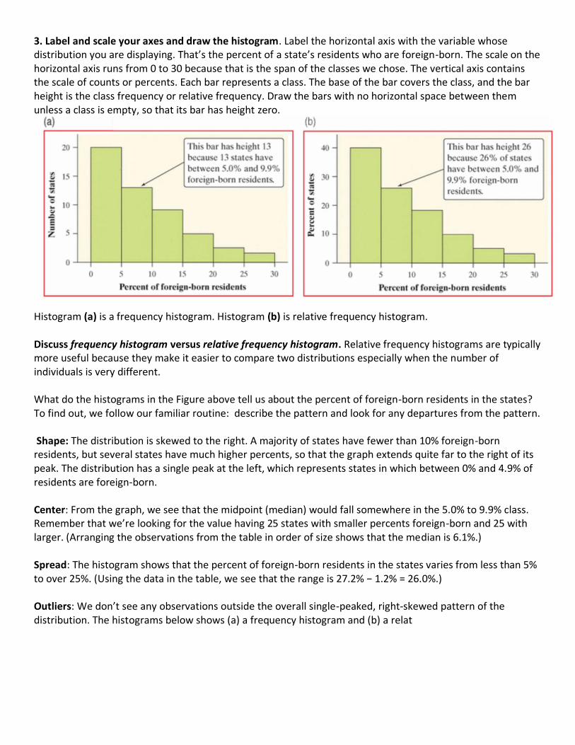
3. Label and scale your axes and draw the histogram. Label the horizontal axis with the variable whose distribution you are displaying. That’s the percent of a state’s residents who are foreign-born. The scale on the horizontal axis runs from 0 to 30 because that is the span of the classes we chose. The vertical axis contains the scale of counts or percents. Each bar represents a class. The base of the bar covers the class, and the bar height is the class frequency or relative frequency. Draw the bars with no horizontal space between them unless a class is empty, so that its bar has height zero. Histogram (a) is a frequency histogram. Histogram (b) is relative frequency histogram. Discuss frequency histogram versus relative frequency histogram. Relative frequency histograms are typically more useful because they make it easier to compare two distributions especially when the number of individuals is very different. What do the histograms in the Figure above tell us about the percent of foreign-born residents in the states? To find out, we follow our familiar routine: describe the pattern and look for any departures from the pattern. Shape: The distribution is skewed to the right. A majority of states have fewer than 10% foreign-born residents, but several states have much higher percents, so that the graph extends quite far to the right of its peak. The distribution has a single peak at the left, which represents states in which between 0% and 4.9% of residents are foreign-born. Center: From the graph, we see that the midpoint (median) would fall somewhere in the 5.0% to 9.9% class. Remember that we’re looking for the value having 25 states with smaller percents foreign-born and 25 with larger. (Arranging the observations from the table in order of size shows that the median is 6.1%.) Spread: The histogram shows that the percent of foreign-born residents in the states varies from less than 5% to over 25%. (Using the data in the table, we see that the range is 27.2% − 1.2% = 26.0%.) Outliers: We don’t see any observations outside the overall single-peaked, right-skewed pattern of the distribution. The histograms below shows (a) a frequency histogram and (b) a relat
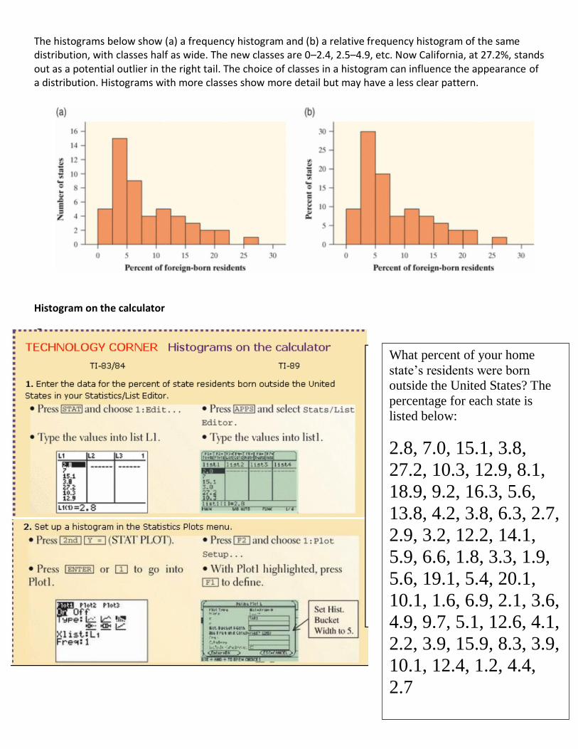
The histograms below show (a) a frequency histogram and (b) a relative frequency histogram of the same distribution, with classes half as wide. The new classes are 0–2.4, 2.5–4.9, etc. Now California, at 27.2%, stands out as a potential outlier in the right tail. The choice of classes in a histogram can influence the appearance of a distribution. Histograms with more classes show more detail but may have a less clear pattern.
Histogram on the calculator
What percent of your home
state’s residents were born
outside the United States? The
percentage for each state is
listed below:
2.8, 7.0, 15.1, 3.8,
27.2, 10.3, 12.9, 8.1,
18.9, 9.2, 16.3, 5.6,
13.8, 4.2, 3.8, 6.3, 2.7,
2.9, 3.2, 12.2, 14.1,
5.9, 6.6, 1.8, 3.3, 1.9,
5.6, 19.1, 5.4, 20.1,
10.1, 1.6, 6.9, 2.1, 3.6,
4.9, 9.7, 5.1, 12.6, 4.1,
2.2, 3.9, 15.9, 8.3, 3.9,
10.1, 12.4, 1.2, 4.4,
2.7
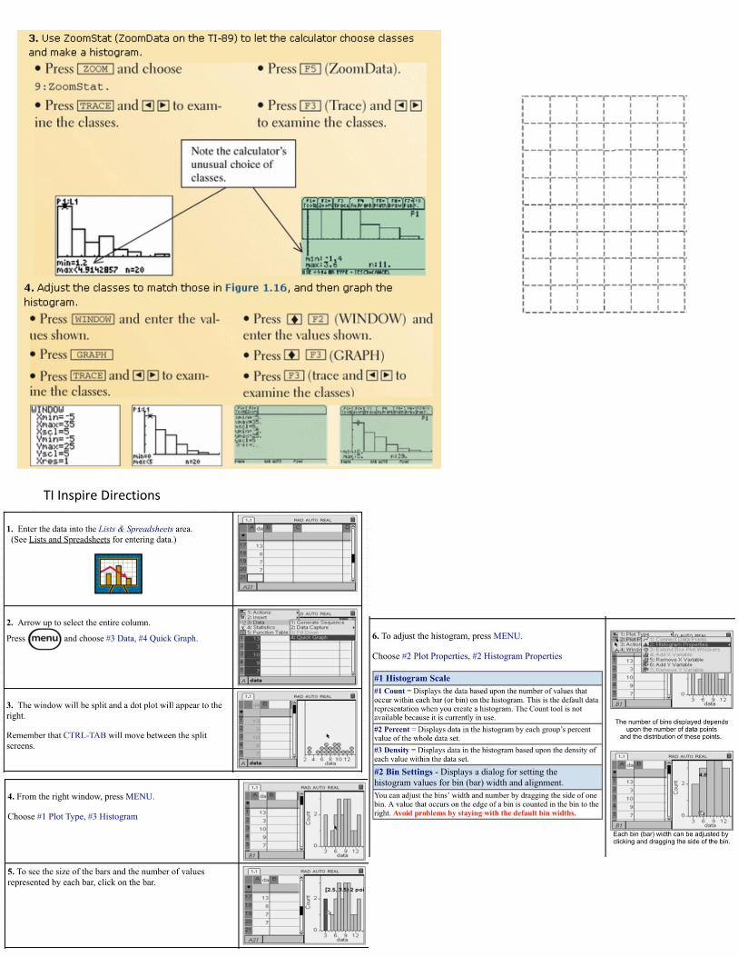
TI Inspire Directions
Check Your Understanding Many people believe that the distribution of IQ scores follows a “bell curve,” like the one shown in the margin. But is this really how such scores are distributed? The IQ scores of 60 fifth-grade students chosen at random from one school are shown below. 1. Construct a histogram that displays the distribution of IQ scores effectively 2. Describe what you see. Is the distribution bell-shaped?
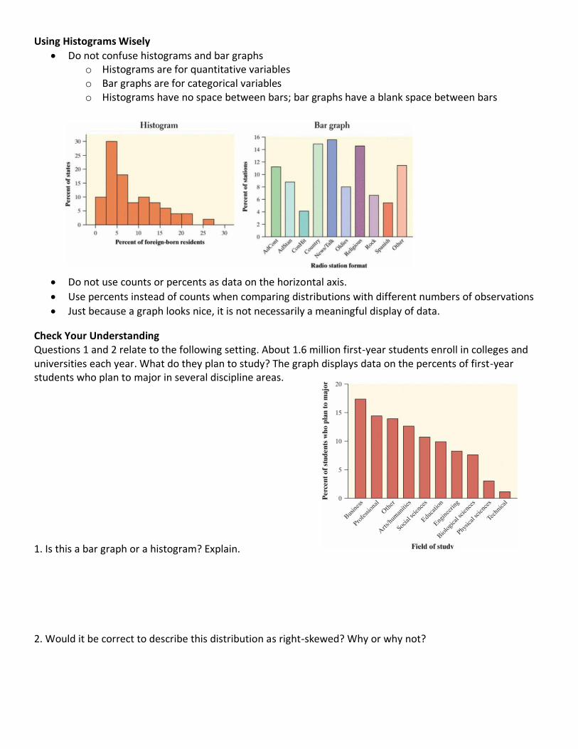
Using Histograms Wisely
• Do not confuse histograms and bar graphs o Histograms are for quantitative variables o Bar graphs are for categorical variables o Histograms have no space between bars; bar graphs have a blank space between bars
• Do not use counts or percents as data on the horizontal axis.
• Use percents instead of counts when comparing distributions with different numbers of observations
• Just because a graph looks nice, it is not necessarily a meaningful display of data.
Check Your Understanding Questions 1 and 2 relate to the following setting. About 1.6 million first-year students enroll in colleges and universities each year. What do they plan to study? The graph displays data on the percents of first-year students who plan to major in several discipline areas.
1. Is this a bar graph or a histogram? Explain.
2. Would it be correct to describe this distribution as right-skewed? Why or why not?
Related Documents