Case Study Notes Top Of The Pops and We Love Pop

Welcome message from author
This document is posted to help you gain knowledge. Please leave a comment to let me know what you think about it! Share it to your friends and learn new things together.
Transcript

Case Study NotesTop Of The Pops and We Love Pop

Type/Focus of Magazine
The type and focus of the Top of the Pops magazine is:
• The latest chart information• Celebrity gossip• Fashion and beauty advice• Quizzes• Song lyrics• Posters.
The magazine has originated from the TV show Top of the Pops.

Magazine Facts
• Published by BBC Magazines.• The current Editors name is Peter Hart.• The magazine was first launched in February
1995.• It’s published monthly• The price of the magazine is £2.99• The magazine is distributed in WHS, newsagents
and supermarkets.

Analysis of Front CoverThe front cover of the magazine has a large bold masthead placed at the top of the page which catches the eye of the reader.
There are many cover lines which reflect the stories inside.
There are 4 main colours on the front cover. They are red, pink, black and white.
The issue number, price, date and bar code.
The cover model makes eye contact with the audience.
The cover model is Justin Bieber who is popular amongst the target audience.
The camera shot with the cover model is a medium shot.
The font and the font colour appeal the target audience.
The left third contains the most important information about what will be in the magazine.
Analysis of Contents PageThere are many large and small images these reflect on what stories are inside
The colour scheme is based on the target audience. Top of the pops are aiming their magazine at young girls and that’s why they use bright pink
White background
Contents pages are organised into sections to help the reader find the section they are most interested in
Page numbers tell the reader where to find the article
Contents pages are laid out in columns
Magazine title appears at the top of the contents page
Pictures also have a page numbers on them

Analysis of Double Page Spread
Large title lets the reader know what the article is about
Big graphics that takes up ¼ of the page attracts the eye of the reader making them intrigued to read the article
Several smaller images of celebrities that readers may recognise
The interview is with celebrities that the target audience may be interested in
Small font allows the article to be longer
There is sometimes something extra added onto the page this could be ideas for the next weeks main article or some famous quotes. This is a really good feature to have as it advertises other parts of the magazine.

Type/Focus of Magazine
The type and focus of the We Love Pop magazine is:• The latest chart information• Celebrity gossip• Fashion and beauty advice• Quizzes• Song lyrics• Posters.

Magazine Facts
• Published by Egmont UK Ltd.• The current Editors name is.• The magazine was first launched in• It’s published• The price of the magazine is• Available in all newsagents, supermarkets, WH
Smiths, Boots, Superdrug.

Analysis of Front CoverThe front cover of the magazine has a large bold masthead placed at the top of the page which catches the eye of the reader.
The left third contains the most important information about what will be in the magazine.
The cover model is Tulisa who is popular amongst the target audience and is on X Factor.
The camera shot with the cover model is a medium shot.
The cover model makes eye contact with the audience.
The font and the font colour appeal the target audience.
There are many cover lines which reflect the stories inside.The issue number, price, date
and bar code.
Analysis of Contents Page
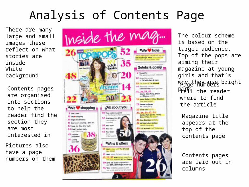
There are many large and small images these reflect on what stories are inside
Page numbers tell the reader where to find the article
Contents pages are organised into sections to help the reader find the section they are most interested in
Contents pages are laid out in columns
White background
Pictures also have a page numbers on them
Magazine title appears at the top of the contents page
The colour scheme is based on the target audience. Top of the pops are aiming their magazine at young girls and that’s why they use bright pink

Analysis of Double Page SpreadThere is sometimes something extra added onto the page this could be ideas for the next weeks main article or some famous quotes. This is a really good feature to have as it advertises other parts of the magazine.
Big graphics that takes up ¼ of the page attracts the eye of the reader making them intrigued to read the article
The interview is with celebrities that the target audience may be interested in
Small font allows the article to be longer
Large title lets the reader know what the article is about
Several smaller images of celebrities that readers may recognise
Related Documents