TERRY HOAGE VINEYARD RE-DESIGN BY SARA HAMLING Department of Art and Design College of Liberal Arts Cal Poly, San Luis Obispo November 2009

Welcome message from author
This document is posted to help you gain knowledge. Please leave a comment to let me know what you think about it! Share it to your friends and learn new things together.
Transcript

Terry Hoage Vineyard re-design
BY
SARA HAMLING
Department of Art and Design
College of Liberal Arts
Cal Poly, San Luis Obispo
November 2009

i
aBsTraCT
This document includes an introduction to the Terry Hoage Vineyard Re-Design project in-
cluding the problem, the purpose and limitations of the study and a glossary of terms. It also
includes an overview of the research found before the design process, a documentation of the
design process and a summary with recommendations for students with similar projects. Im-
ages are referenced throughout the paper; these images can be found at the end of the paper.

ii
TaBLe oF ConTenTs
abstract........................................................................................................................... i
Table of Contents........................................................................................................... ii
CHaPTer 1: introduction........................................................................................ 4–8
Statement of the Problem................................................................................................. 4–5
Purpose or Objective of the Study..................................................................................... 5–6
Limitations of the Study....................................................................................................... 6
Glossary of Terms............................................................................................................. 6–8
CHaPTer 2: review of research............................................................................ 9 –11
CHaPTer 3: Procedures and results.................................................................... 12–20
CHaPTer 4: summary and recommendations.................................................... 21–22
Visual aids.............................................................................................................. 23–33
Bibliography................................................................................................................. 34

4
CHaPTer 1—inTrodUCTion
statement of The Problem
For my senior project I worked with Terry Hoage Vineyards, which is a small family-
run vineyard in Paso Robles. I created a new identity system (a comprehensive system of
identification methods created to promote a company) to portray Terry Hoage Vineyards as
a contemporary, sophisticated and sustainable local winery. Their old identity system did not
support these basic concepts. The old mark was a combination of the letters T and H (figure
1). The letters were set in a calligraphic font that entwined within the boundaries of a square.
The mark was playful, quirky and amateur and did not portray Terry Hoage Vineyards with
the sophistication they were hoping for. Their other printed material was also too quirky and
amateur. The typefaces used were not consistent. Often the type had legibility issues because
of the typeface itself or because of excessive tracking (figure 2). Because of these issues, the
Hoages invited me to create a new identity system for them.
To begin, I redesigned the winery’s mark so it can serve as its identity with or without
the text, “Terry Hoage Vineyards.” I also redesigned their wine bottle labels. The Hoages have
7 different wines and therefore 7 varying labels. The names of each of the 7 wines are double
entendres with both a reference to wine making and a reference to football. For example, The
Hedge, one of the Hoages’ syrahs, refers to a pruning technique and a fabled feature of the
football stadium at the University of Georgia. The wines are named this way because of Terry
Hoage’s connection to the NFL. Terry Hoage played in the NFL from 1984–1996 which
gave him and his wife, Jenn, the financial ability to open their winery. Even though this
double entendre is important and meaningful to the owners they did not want football to be
5
a focus for their logo or labels.
Even though I designed the labels in the fall they will not be printed until February
of 2010 because that is when the wine varietals are mixed. I have spoken with WS Packaging
throughout the design process so that the label is created according to their printing needs.
The Hoages also wanted some collateral papers including letterhead, business cards, tasting
cards, an envelope and a brochure. These will also not be printed until the wine labels are
printed because the Hoages want to debut the new logo at the same time as the new wine
bottles. This comprehensive set of papers will help Terry Hoage Winery brand itself through
the consistent use of its mark, type and overall design aesthetic.
The Hoages wanted their bottles and paper pieces to be more sustainable and eco-
friendly which is another factor in my design. It is easy to choose a wine bottle that uses
less glass, making it more lightweight and wasting less resources. It is more difficult to find
paper for wine labels that is recycled or made of post-consumer waste, and these may end up
not as environmentally sustainable. While there are many recycled paper options in general,
there are not a lot of options for recycled wine labels. However, the other paper pieces will be
printed using recycled and post-consumer waste paper, as there are many more paper op-
tions. The Hoages also wanted me to mock-up the new logo on wine glasses, corks and hats.
These will hopefully be produced in the future as the need arises.
Purpose or objective of The study
The main purpose of this project is to create a comprehensive series of design pieces
around a common theme. The logo, labels, and all other collateral all work together to create
a clear brand message about Terry Hoage Vineyard. The project also shows my range of de-
6
sign abilities (including logo design, print and package design) within the scope of one large
project. The project helped me learn how to work with a real design client in order to create
a comprehensive design series that both parties can be happy with. I learned more about how
to communicate effectively in order to create design work that is useful for both the client
and the designer. I also learned about the wine industry and what role design plays in it.
Limitations of The study
The main limitations on this project are the client’s limitations surrounding design and
budget. The logo must use the letters T and H with no other imagery. The wine labels need
to keep the basic information in the same spot on each different label. Each wine label needs
to have a main color that will change, based on which kind of wine it is. The limitations in
terms of budget are easier to keep within. The Hoages gave me no specific financial amount to
keep my design under, but let me know that they had it in their budget for special features like
embossing and foils which told me I did not need to worry too much about cost.
glossary of Terms
Calligraphic: Lines characterized by qualities usually associated with cursive writing, espe-
cially that produced with a brush or pen
debossing: Creation of hollow patterns on a substrate
die: Specialized tool used to cut paper (in this case); they are generally customized and
uniquely matched to the product they are used to create
display Face: Typefaces that are used exclusively for decorative purposes and are not suitable

7
for body text; they usually have very specific characteristics and hence have very limited uses
embossing: Creation of raised patterns on a substrate
Foil: A thin metal membrane of less than 150 microns; also used to describe any thin metal
Font: A set of characters from a specific typeface in one size, style, weight, and width
identity system: A comprehensive system of identification methods created to promote a
company, person, or idea; includes such things as logo, letterhead, envelope, business card,
and web site
Kerning: The typographic technique, also known as letterspacing, used to adjust (open and
tighten) the slight distances between letters to avoid character collisions, as well as irregular
and unwanted spaces
Leading: The space between lines of text that is measured from one baseline to the next; it is
expressed in points
Legibility: The quality of type that affects the perceptibility of a word, line, or paragraph of
printed matter
Logo: A graphical element that, together with its logotype form a trademark or commercial
brand
Logotype: A uniquely set and arranged typeface
Mark: The logo without the logotype
Pantone: Trade name of the company operating the Pantone Matching System (PMS) used
to specify colors for print
Printing Plates: Printing processes such as offset lithography use printing plates to trans-
8
fer an image to paper or other substrates; the plates may be made of metal, plastic, rubber,
paper, and other materials; a plate is prepared for each color used, or four plates in the case of
4-color (CMYK) process printing
Process Printing: Color reproduction using the four process colors (cyan, magenta, yellow
and black)
readability: The property of type that affects the ease with which printed matter can be read
for a sustained period
sans-serif: A typeface without serifs
serif: A finishing stroke added to the main stems of letterforms
Tracking: The typographic technique used to adjust (open and tighten) the overall spacing of
words, lines, and paragraphs to improve the readable appearance of text
TTB: Alcohol and Tobacco Tax and Trade Bureau
Typeface: The specific design of a full character set (alphabet, numerals, punctuation, diacrit-
ics) that is unified by consistent visual properties
Varietals: Wines made primarily from a single named grape variety, and which typically dis-
plays the name of that variety on the wine label; examples of grape varieties commonly used
in varietal wines are Cabernet Sauvignon, Chardonnay and Merlot
X-height: The height of the lowercase letters without ascenders and descenders

9
CHaPTer 2—reVieW oF researCH
The most important research I gathered before beginning this project were the tech-
nical requirements to know when designing a wine label. Some of this I learned from the
Hoages themselves, other information I learned from various governmental web sites:
–The year, varietals, and alcohol percentage of each wine will change from year to year, while
the rest of the label will stay the same. Because labels are printed using sets of expensive plates
these three pieces of information should be printed using the same color, so that only this
one plate needs to be re-created each year.
–Before deciding upon the exact size of your wine labels, ask the printing company if they
have pre-made dies close to the size you want so that your client does not have to pay to have
a specific die created.
–Because white wines are chilled in ice, the labels need to be water resilient if the label is to
remain intact. Therefore, the white wine labels are limited to paper, while the red wine labels
can be made of natural felt and other materials as well.
–There are specific requirements that need to be on the “front” of wine labels. The Alcohol
and Tobacco Tax and Trade Bureau considers the front of the wine bottle to be what most
people consider to be the back of the bottle. The information that is necessary includes the
vintage date, the estate grown/produced/bottled, the appellation of origin, the viticultural
area, the alcohol content, a declaration of sulfites, the brand name, the varietal designations,
other designations and the country of origin, the name and address, and the net contents. If
the net contents is imprinted in the bottle itself it is not necessary on the label.
I also learned some things to consider about the design of the label itself. Much of this

10
information I found on design web sites or from specific articles related to winery branding.
One piece of information came from an article in Wine Business Monthly called, “Wine Label
Design: What Makes a Successful Design.” In it Lance Cutler says, “Nothing is as important
to a brand’s identity as its label. That’s because, as consumers, we can’t help but link our feel-
ings about what is in the bottle to what is on the bottle.” This is important to note because it
shows that consumers will make decisions about your wine based on the label and not always
based on the taste. Therefore, it is just as important for a high quality winery to have a success-
ful label as a lower quality winery because the consumer may not be purchasing based solely
on taste.
In the same article, Chuck House says, “We don’t design for the client, we design for
the client’s customers. That’s where the success is going to come from. It’s not figuring out
what the client might want, but what’s going to be successful with the job he needs to per-
form.” This helped me remember to filter what the Hoages said they wanted through what will
ultimately be a successful identity for their winery. I needed to take their suggestions and add
my own design insight to create the most successful identity that pleases the client and will
attract the client’s customers.
The article also had advice about the design process. Bob Johnson says, “A label is a
sculpture. I tell clients to put their labels on a curve as soon as they can.” This is another aspect
of the wine label design that might be forgotten about until late in the process. The wine
labels appeared to have slightly different proportions when on the curved bottle than when
you looked at them straight on. So, it was important that I mocked up the label on the bottles
themselves in case the proportions needed to be changed.
In another article from Wine Business Monthly titled, “The Power of Wine Label

11
Design,” Christopher Sawyer says, “If your wine label isn’t conveying a distinct story, speaking
to your winery’s unique identity and creating a lasting impression, it’s not doing its job.” I kept
this in mind throughout the design process to ensure that I always had the Hoages’ specific
identity as a contemporary, sophisticated and sustainable local winery in mind.

12
CHaPTer 3—ProCedUres and resULTs
To begin my project I set up a meeting with Jenn Hoage to talk about the general
scope of the project. We discussed the brand that Terry Hoage Vineyards had already created
and how the Hoages would like to continue to develop that brand in their new logo. Jenn
explained to me that Terry Hoage Vineyards was a high class winery and that their new logo
needed to reflect this. Visually, the new logo needed to be contemporary, bold and simple.
They wanted to use a san-serif typeface for the logotype in order to keep with this contempo-
rary quality. Their old logo was bold and simple, but did not reflect the high class look they
were interested in.
After discussing the logo itself, we talked about the wine labels I would be creating.
Jenn had no attachment to the old labels, so I was free to be creative in their new manifesta-
tion. There was one concept from the old labels that we thought would be effective to keep
for the new labels. Each varietal of wine maintained the same overall look, but had one main
color that changed. Jenn informed me of some of the technical requirements that would
make printing the labels easy and cost-effective. Because the labels are printed using costly
printing plates, certain information that would change from year to year (year, varietal,
alcohol percentage) all needed to be printed in the same color. Each plate uses one color, so
for each color or foil a different plate needs to be made. By remembering this small thing, I
ensured that multiple plates would not have to be created every year. There were also some
particulars to remember regarding the legal information that needed to be included on the
labels, such as the year, varietal, location of production and bottling, government warning,
the phrase “contains sulfites,” alcohol percentage, and a disclaimer specific to Terry Hoage
Vineyards stating that they are not affiliated with the Hogue Cellars. These technical require-

13
ments were very important to Jenn, because they needed to be on the labels for legal reasons.
We then discussed the applications that the Hoages thought were important for their
needs. Their main need was for letterhead, business cards, tasting cards, an envelope and a
brochure. We did not talk very in great detail about these applications, since so much of the
design was dependent on the design of the new logo and labels. Essentially, the design of
these applications would be left to me once we had agreed upon the overall design aesthetic
of the logo and labels.
The Hoages worked with WS Packaging in the past for their wine labels, so I thought
it was important to visit the factory early and learn what services they offer. I met with Ryan
Mahoney at WS Packaging at the beginning of June. He showed me around the factory,
explained the different kinds of printers they used, and showed me examples of previously
designed wine labels. This helped me understand the overall printing process so I had a more
comprehensive knowledge. Ryan showed me a wide variety of previously created wine labels
which gave me some inspiration as to what was possible in terms of embossing, different
kinds of foils and label shapes.
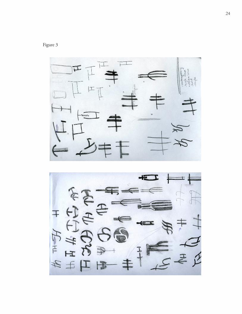
Over the summer between Spring Quarter of 2009 and Fall Quarter of 2010 I
worked on sketching a basic mark for the Hoage’s logo. I sketched only using the letters T
and H as we had talked about which created some limitations. I could either create some-
thing visual representative out of the letters that would relate to wine or winemaking, or I
could abstractly represent their winery using the placement and formal qualities of the letters
themselves. My initial sketches included many of both approaches, but eventually I decided
upon a few logo sketches which were more abstract representations (figure 3). I felt that this
overall concept was more likely to be effective because it creates a unique mark that viewers

14
can take their own meaning from and associate only with that winery. Creating a mark that
implies an image, on the other hand, will bring about connotations that could be more easily
misinterpreted because of personal biases.
I met with Jenn and Terry Hoage on Wednesday, September 16th to go over the
logo sketches I had completed so far and to re-affirm where we were in the design process.
I showed the Hoages the two logo sketches that I thought had the most potential and tried
to point them towards the one that I thought was strongest. They eventually agreed with me
about which was the strongest sketch. They thought that the logo was simple and refined and
looked as if someone had taken a calligraphy brush and drawn it very quickly (figure 4). They
did have one thing they wanted changed. They thought the crossbar of the T and H was too
low and would need to be raised in order to increase readability.
After we settled on the logo that would be developed, we talked about the rest of the
design process. They told me about the general wine seasons. Harvest takes place in Sep-
tember and October and the bottling generally occurs in January and February. Because of
this schedule they would not have the exact information that I would use on the labels until
next year. I would be using last year’s information and would change it later when the wine
varietals were mixed. Because of this the actual printing of the labels wouldn’t be until Febru-
ary or March of the next year. My other pieces also would not be printed until the next year
because they wanted to unveil the new logo and identity all at once with the arrival of a new
wine season. This allowed me the time to add the exact content later in the design process
and work on the design aesthetic first and foremost.
Before I began to make the logo digital, I refined it by hand (figure 5). I experi-
mented with the weights of each strokes and specifically with which side of each stroke was
15
lighter and which side was heavier. I eventually decided that the most important aspect of
the strokes should be that the three vertical strokes needed to be different based on whether
they were a part of the T or the H. So, the stroke that was a part of the T was heavier at the
bottom, and the strokes that were a part of the H were heavier on the tops. I chose to make
the vertical bar heavier on the left side because the T needed more emphasis. After making
the logo digital, I decided to play with how the four lines of the logo crossed each other. I
chose to place the first line of the H in front of the crossbar and the second line behind. This
helped make the logo more dynamic and give it more depth.
After the logo was digitally refined, the next step was to lay out the most important
design piece for a winery— the wine label. I wanted to emphasize the verticality of the logo
by creating an extremely vertical label as well. I needed to keep in mind that there should be
a specific space for the pattern that the Hoages wanted on each label. When sketching label
options I tried using different elements (straight vs. curvy lines, rectangles vs. circles, repeat-
ing elements vs. only one) to play with what would emphasize the label’s verticality while still
remaining simple and contemporary (figure 6).
I finally chose one label that I thought was most successful in terms of keeping the
sophistication while still allowing space for the text and pattern (figure 7). This initial design
was altered slightly by the addition of a more complicated die-cut. I decided that the label
should be cut down on the corners so the center strip appears as if it sits on top of the side
pieces. This effect emphasizes the verticality of the label even further by contrasting the larger
piece against the shorter one.
I met with Amiel at WS Packaging on Monday, October 12. Amiel is the representa-
tive that the Hoages have worked with in the past so I met with him instead of Ryan. Since

16
now I had a design in mind for my labels we had the chance to discuss more in depth about
my specific label design. I learned more about die-cutting, foils, paper types, bottles and
cost. Since the label for the front of the wine bottles was a very specific shape, I thought they
might not have a pre-existing die created similar to it. When I showed Amiel the shape he
agreed that they did not have a die already cut to a shape similar. This meant that we would
have to pay a fee to have a specific die created for the shape I wanted. Fortunately this is a
one time fee, so long as the Hoages stay with this same label shape for a number of years. In
this case, the fee would be less significant. After we talked about the dies, we discussed foil
options. I had originally wanted to use foil on the logo itself. Since the logo is two colors, I
wanted to use two different color foils on every label. After telling Amiel this, he let me know
that using two different color foils would essentially double the cost of my labels because they
would need to be run through the machines twice. This was not an option, so I had a few
decisions to make. I could use one foil color for the logo or one foil color on certain parts of
all the labels. Amiel also showed me a “foil” that could be placed over ink that places a sheen
on the logo. I thought this would be the best option for the Hoages because their logo needs
two colors to clearly distinguish the T from the H and there is no obvious way to incorporate
a foil consistently on all the labels that is not on the logo. This sheen would allow the logo to
stand out and pop off the label while keeping the integrity of the logo itself. The Hoages also
wanted the logo to be embossed. The embossing along with the sheen will help the Hoage’s
logo to be the most prominent part of their labels.
Once I had the layout of the label down in terms of size, shape and placement of text,
I started experimenting with pattern options. I wanted to play with patterns that had mean-
ing related to wine and winemaking. After struggling with inspiration I began playing with
17
the idea of using the stains that wine bottles left when wine has spilled down the side and
ends up on the rim at the bottom. I created many wine stains and tried different methods
of creating stains. I placed the bottles down slowly and softly with very little wine on them.
I threw the bottles down with lots of wine on them which created splatters and splashes. I
played with the ridges created by one wine bottle over another. I tried dripping the wine
down the paper and tried using a wine glass instead of a wine bottle to see the visual differ-
ences. Eventually I chose to create a pattern of stains that attempted to show off the ridges on
the bottom of the bottles (figure 8). Once the pattern was complete I scanned and placed the
image into my wine label document (after some work in Photoshop to increase the contrast
and color vibrancy). I finally saw how the labels might look with all the elements of logo,
type and pattern together (figure 9).
Since I had the pattern I was planning to use complete, starting to design the busi-
ness system seemed more manageable. I began laying out the letterhead, business cards and
tasting notes. I carried the same placement of the logo and the type and occasionally the pat-
tern onto these pieces. This consistent placement helps the consumer to recognize the brand
immediately.
I met with Jenn and Terry Hoage again on Monday, October 26. We discussed how
the label was progressing and what still wanted to be changed. They liked some aspects but
definitely had some things they wanted changed. Overall they wanted a slightly different
mood for the label. They thought that the label as it was had a “big corporation” feel and
they wanted something that had the sense that it came from a boutique. They wanted the
winery to feel artisanal and small. They also told me that the wine stain pattern was not go-
ing to work, since they felt that it had been done before. They decided that they definitely
18
wanted to create a different pattern for each label. After seeing the wine stain pattern they
decided they wanted a more solid definition between color and background which meant
that the design needed to have cleaner lines. They wanted the patterns not to be geometric,
and to be based on wine inspired images if possible. There was a misunderstanding about
the logo type in that I was unclear that the phrase, “Terry Hoage Vineyards” needed to be in
the exact same size, font, color, spacing and transparency in all places. This altered our plans
on the use of the phrase. The Hoages had always thought that they may eventually drop the
name, “Terry Hoage,” and just become TH or TH Vineyards because of legal issues with the
Hoage Cellars. Because of this we decided that the logo didn’t always need to include this
logotype along with it. The mark could stand on its own. Because of this change, we decided
that the front of the labels will only display the mark itself without the phrase, “Terry Hoage
Vineyards.”
After this meeting with the Hoages I had a lot to figure out. My current label was off
track in terms of the correct direction for the winery. I started by re-designing the type on
the front and back labels (figure 10). I had been using a sans-serif for the logotype and a serif
for the varietal and body copy. After looking back I saw that the serif typeface was a part of
the main problem. The serif typeface was too old and was what made the winery have a more
corporate feel. I chose to change this and use the sans-serif Trade Gothic for the majority of
the text on the label and used a display face for the specific name of the wine. I had to manu-
ally alter the letters of this text after all the pieces were laid out because the letterforms were
too quirky and in some cases illegible. This display face was a helpful addition to my design
because it related to the logo itself. The strokes of the display face looked like they had been
drawn quickly and varied in line width, like the logo. I used the more orange color from the

19
logo to highlight the name on both sides of the labels. All other text was in the dark brown
color. For the less important governmental warnings, this brown was made more transparent
so it would play less of a role in the design.
Once I had the type of the label laid out I began redesigning the patterns to be used
on the labels. I started by gathering a variety of pictures like wine grapes, wine bottles and rows
of grapevines for inspiration. I eventually used some of these pictures to create the wine label
patterns. The patterns were simple and made of repeated organic elements. Some of the pat-
terns were more linear while others were more shape oriented so I used a specific ragged stroke
around the edge of all the patterns to create a cohesion about them despite their differences
(figure 11).
With the labels more fully developed, I began thinking about the paper I thought
would be most effective for this project. I knew it needed to be environmentally friendly and
I wanted paper with a slight texture to it since the labels themselves were fairly simple. I de-
cided to use one of the Neenah Environment brand papers. I chose a paper that was slightly
off-white called Recycled Natural White. This paper was also a part of Neenah’s Classic Col-
umns series which added the slight texture I wanted. The reason I chose this specific brand
of paper was for its diverse number of options that were environmentally friendly. The paper
I chose was FSC certified, Green Seal certified, made carbon neutral and is a minimum 30%
post consumer waste.
Finally, the labels were conveying the message the Hoages wanted for their winery.
They were simple and clean, presenting the winery as a small, high class, boutique winery.
I was able to move on and translate the design to the rest of the design pieces. Since I had
already laid out the business card, letterhead and tasting notes after completing my previous

20
design, I was able to keep the basic layout of logo, type and pattern. I changed the typefaces
so they matched the type on the new label (figure 12). I treated the information in a con-
sistent way across these pieces which helps the viewer understand what they are looking at
more quickly. After completing these papers, I worked on the brochure which kept the basic
style I had previously established but added the use of a new element— photo (figure 13). I
chose to stray from the standard three fold brochure because I wanted the Hoage’s brochure
to stand out and because I found a brochure option that emphasized the verticality of the
brochure which is something I had been emphasizing in the logo and the labels. The bro-
chure shape I worked with folded so that you saw three sections of the brochure at one time.
I placed photos on these sections so they would be seen in vertical strips upon first viewing
the brochure. This helped organize the sections of information for the rest of the brochure.
I knew the last section needed to be used as an application for the Hoage’s wine club. This
made it clear where to place the basic information about the winery. I made sure to put the
contact information and map on the sections of the brochure that would not be torn off if
the customer chose to join the wine club.

21
CHaPTer iV—sUMMary & reCoMMendaTions
When this project was complete I was very happy with it overall. Despite the fact
that I had to change the direction of my design halfway through the quarter, I managed to
pull it all together in the end. Because I was consistent with the usage of my design elements
throughout the pieces of the project early on, I was able to successfully change the key aspects
to the Hoage’s new look at a late stage. This consistency between pieces is what brought the
project together at the last minute to give the Hoages a new identity system that is thought-
ful and appropriate.
There were some decisions that were clearly a good choice in this process. One deci-
sion that was extremely helpful was my choosing to meet with WS Packaging early and often.
They helped me understand the entire process of label making and not just the financial side.
This holistic knowledge helped me to understand how to design the labels so they would
be the most cost-effective. For instance if I hadn’t visited WS Packaging early in the process
I would have continued designing under the mind-set that I could use two foils. If I had
learned this late in the process it would have been detrimental to my project. They also told
me how to set up my files so that it would be easier on me later on in the process to get my
files ready for the printer.
If I were to do this project again there are some choices I could have made better as
well. I think it is important to be in contact with the client as much as possible. I probably
could have saved myself some time if I had been in more back and forth contact with the
Hoages. I waited to show them my ideas until they were nearly complete instead of bounc-
ing ideas off them earlier on in the process. If I had done this it would have allowed me more
experimenting time between some of my unsuccessful ideas. I also would have experimented

22
with different patterns more. Because I lost time after my first pattern was unsuccessful, I
didn’t have a lot of time to spend experimenting with new kinds of patterns. This could have
been avoided though if I had sent the Hoages more interim compositions.
The most important thing I learned during this project was about how to design for
the consumer. In the case of a winery, the identity is the story you are selling to the customer.
Every part of the identity should work to reaffirm this story in the customer’s mind. To make
the winery most successful, this story needs to be unique and relevent for the specific direction
of the winery. The story should stay with the customer after the visit or the wine is gone. It
should make them remember that vineyard over others for some specific reason. The identity
is the basis for this story and the stronger the identity is, the stronger the story will be.

23
VisUaL aids
Figure 1
Figure 2
24
Figure 3

25
Figure 4
Figure 5

26
Figure 6

27
Figure 6 continued

28
Figure 7
Figure 8

29
Figure 9
Figure 10

30
Figure 10 continued

31
Figure 11

32
Figure 12

33
Figure 13

34
BiBLiograPHy
Cutler, Lance. “Wine Label Design: What Makes a Successful Label.” Wine Label Design: What Makes a Successful Label Wine Business Monthly, 15 Aug. 2006. Web. 20 Oct. 2009.
Elder, Gerri L. “61 Exceptionally Creative Wine Label Designs.” 61 Exceptionally Creative Wine Label Designs | Design + Ideas on WU Web Urbanist, n.d. Web. 20 Oct. 2009.
Hallberg, Skye, and Ron Woloshun. “What the label says about your wine.” What the label says about your wine | Practical Winery & Vineyard Magazine Practical Wine & Vineyard, July 2007. Web. 20 Oct. 2009.
Sawyer, Christopher. “The Power of Wine Label Design.” The Power of Wine Label Design Wine Business Monthly, 15 Apr. 2006. Web. 20 Oct. 2009.
The Dieline Eds. Andrew Gibbs and Yael Miller. N.p., n.d. Web. 20 Oct. 2009. <www.
thedieline.com>.
Related Documents