Automation of Brownfield Development Workflows 1 Automation of Brownfield Development Workflows Master Thesis Andreas Al-Kinani Vorgelegt am Institut für Mineral Resources and Petroleum Engineering, Lehrstuhl für Petroleum Production and Processing Montan Universität Leoben, Österreich und bei Services Petroliers Schlumberger (SIS), Baden, Österreich November 2006

Brownfield Development
Dec 08, 2015
oil field
engineering
development
efficient production
engineering
development
efficient production
Welcome message from author
This document is posted to help you gain knowledge. Please leave a comment to let me know what you think about it! Share it to your friends and learn new things together.
Transcript

Automation of Brownfield Development Workflows
1
Automation of Brownfield Development Workflows
Master Thesis
Andreas Al-Kinani
Vorgelegt am Institut für Mineral Resources and Petroleum Engineering, Lehrstuhl für Petroleum Production and Processing
Montan Universität Leoben, Österreich und bei
Services Petroliers Schlumberger (SIS), Baden, Österreich
November 2006

Automation of Brownfield Development Workflows
2
Ich erkläre an Eides statt, dass ich die vorliegende Diplomarbeit selbständig und ohne fremde Hilfe
verfasst, andere als die angegebenen Quellen und Hilfsmittel nicht benutzt und die den benutzten
Quellen wörtlich und inhaltlich entnommenen Stellen als solche erkenntlich gemacht habe.
Mit montanstudentischem Glück Auf!
(Andreas Al-Kinani)

Automation of Brownfield Development Workflows
3
Acknowledgments I am very proud about having accomplished this work, but I am very well aware of the fact that there are a lot of people, who have helped me getting to this point. First of all I want to thank my academic supervisor Univ.-Prof. Dipl.-Ing. Dr.mont. Gerhard Ruthammer for putting me in charge of this very interesting and challenging topic and supervising my work. I would like to extend my thanks to the team of the Schlumberger office in Baden, Austria for hosting me for such a long time and for all the time and patience spent listening to and answering my questions. I greatly appreciate the BRIGHT development team for sharing their time and their knowledge with me. I would like to thank Maxim Pinchuk, Blaine Hollinger, and Iain Morrish. I especially want to thank Georg Zangl for advising my thesis, taking a lot of time answering my questions, motivating and challenging me, and for putting so much confidence in my work. Finally I would like to thank my friends and my family for constantly reminding me that there is more in life than working on my profession. Especially I would like to thank my sisters, Nadine and Naevin, and my mum and my dad for being such a big financial, emotional and motivational support.

Automation of Brownfield Development Workflows
4
Abstract Brownfields are gaining increased attention by the oil and gas industry as they bear a high potential of being an important energy source, providing a big part of future’s hydrocarbon production. Brownfields are very old fields with a long production history. Usually the wells in a Brownfield are approaching the end of their productive lives and very often they are being produced with the technology that has been installed back then when the fields were brought on-stream. In the first part of this work an approach to identify development opportunities in a Brownfield is presented. The available data to evaluate these fields are usually restricted to produced and injected monthly volumes and very few petrophysical data. Based on this sparse set of information a series of workflow steps is performed to suggest an optimal field development plan. The suggested operations in the field development plan are drilling additional infill wells, recomplete wells in another layer, change wells from producer to injector or do a work over operation on a specific well. The second part of this work elaborately deals with the implementation of the workflow steps in a software product. The software product reduces the necessary time for a field study from eight weeks to three or four days by simultaneously improving the overall study accuracy. The user is automatically guided through the workflow and the necessary user intervention is reduced to a minimum. In the given version the software is able to automatically generate a rough geologic model, forecast the well production, find significantly better or worse producing wells (outliers) and suggest the best infill locations. Das Interesse der Erdöl- und Erdgasindustrie an „reifen“ Öl- bzw. Gasfeldern steigt, da diese Felder oft noch wirtschaftliche Mengen an produzierbaren Kohlenwasserstoffen enthalten. Reife Öl- bzw. Gasfelder sind Felder, aus denen seit einigen Jahrzehnten mit üblicherweise sehr geringen Produktionsraten gefördert wird und in die in den letzten Jahren normalerweise sehr spärlich investiert wurde. Der erste Teil der vorliegenden Arbeit präsentiert eine Evaluierungsmethode für reife Öl- und Gasfelder. Ziel dieser Prozedur ist es, das noch vorhandene Produktionspotential in einem Feld zu identifizieren und einen Feldentwicklungsplan vorzuschlagen. Die Problematik hierbei liegt in der üblicherweise sehr begrenzten Menge an Produktions- und geologischen Daten. Basierend auf diesen wenigen Informationen liefert die präsentierte Prozedur einen optimierten Feldentwicklungsplan. Der Feldentwicklungsplan schlägt die besten Lokationen für neue Sonden vor, empfiehlt gewisse Sonden von Produzenten in Injektoren umzuwandeln und schlägt vor, welche Sonden gewarten werden sollen. Der zweite Teil dieser Arbeit befasst sich sehr detailliert mit der Implementierung dieser Prozedur in ein Computerprogramm. Das Programm reduziert den notwendigen Zeitaufwand fuer ein Studie von acht Wochen auf ca. vier Tage. Die notwendigen Eingriffe der Benutzerin bzw. des Benutzers wurde auf ein Minimum reduziert. Die derzeitige Version des Programms ist in der Lage automatisch ein grobes geologisches Modell zu generieren, die zukünftige Produktion aller Sonden vorherzusagen, signifikant besser oder schlechter produzierende Sonden zu identifizieren und die besten Lokationen für neue Sonden vorzuschlagen. Abschliessend wird das Computerprogramm am Beispiel einer Gaslagerstätte präsentiert .

Automation of Brownfield Development Workflows
5
Index Index..........................................................................................................................1 List of figures............................................................................................................7 1. Introduction..........................................................................................................9
1.1. Outline.............................................................................................................9 1.2. Scope of work ...............................................................................................10 1.3. RAPID Workflows........................................................................................11 1.4. BRIGHT Advisor..........................................................................................16
2. Literature Review ..............................................................................................20 2.1. Probabilistic Reasoning under Uncertainty ..................................................20
2.1.1 Uncertainty..............................................................................................20 2.1.2 Conditional Probabilities and Baye’s Theorem ......................................26 2.1.3. Bayesian Belief Networks......................................................................28 2.1.4. Marginalization and Evaluation of Posterior Probability ......................38
2.2. Production Forecasting Techniques used in BRIGHT..................................42 2.2.1 Decline Curve Analysis8 .........................................................................42
2.3. Geologic Interpolation10, 22............................................................................44 2.4. Outlier Detection5 .........................................................................................45
2.4.1. Definition Outlier...................................................................................46 2.4.2. ‘Leave-one-out’ Cross validation12........................................................46 2.4.3. Severity and Reliability..........................................................................50
3. Theory .................................................................................................................51 3.1 Rapid Workflow1, 3, 18 ....................................................................................51
3.1.1 Data Preparation and Quality Control.....................................................52 3.1.2 Reservoir Compartmentalization and Analysis ......................................54 3.1.3 Reservoir Data Review ...........................................................................57 3.1.4 Heterogeneity Index Analysis3, 19 ...........................................................60 3.1.5 Completion Efficiency Analysis .............................................................66 3.1.6 Recovery Analysis ..................................................................................67 3.1.7 Drainage Radius Analysis24 ....................................................................70 3.1.8 Secondary Phase Movement Analysis ....................................................71 3.1.9 Vintage Analysis.....................................................................................72 3.1.10 Performance Indicator Analysis............................................................75 3.1.11 Infill selection .......................................................................................76
3.2. BRIGHT Workflow ......................................................................................77 3.2.1. Introduction............................................................................................77
3.3. Interview Screen ...........................................................................................78 3.4. Petrophysical Data ........................................................................................81
3.4.1. Petrophysical Data Requirement............................................................81 3.4.2. Interpolation Techniques .......................................................................82
3.6 Gridding .........................................................................................................84 3.6.1 Voronoi ...................................................................................................85 3.6.2 Delaunay Triangulation ..........................................................................87
3.7 Automatic Decline Curve Analysis ...............................................................88 3.8 Outlier Detection............................................................................................91 3.9 Uncertainty.....................................................................................................95
3.9.1 Spatial Interpolation Uncertainty............................................................95 3.9.2 End rate Uncertainty ...............................................................................99 3.9.3 DCA Uncertainty ..................................................................................102 3.9.4 Total Uncertainty ..................................................................................104

Automation of Brownfield Development Workflows
6
3.10 Reasoning...................................................................................................106 3.10.1 Infill location selection .......................................................................107 3.10.2 Implementation in BRIGHT ...............................................................109 3.10.3 Range setup.........................................................................................115 3.11 Workflows..............................................................................................120
4. Examples ...........................................................................................................125 4.1. Application of BRIGHT .............................................................................125
5. Conclusions and Future Outlook....................................................................132 5.1. Current Limitations.....................................................................................132 5.2. Future Developments ..................................................................................134
References .............................................................................................................136

Automation of Brownfield Development Workflows
7
List of figures Figure 1: Typical Production Profile28...........................................................................9 Figure 2: Accuracy vs. Project Duration......................................................................12 Figure 3: RAPID Workflow.........................................................................................13 Figure 4: Key Performance Indicator Wallpaper.........................................................15 Figure 5: BRIGHT workflow.......................................................................................16 Figure 6: Production Rate vs. relative Time of an oil well..........................................24 Figure 7: Outlier detection ...........................................................................................25 Figure 8: Difference Plot .............................................................................................26 Figure 9: Graphical Representation of a Bayesian Belief Network.............................30 Figure 10: The parameter's value range is subdivided into five different states.........31 Figure 11: Normal distributed density function for an arbitrary parameter.................32 Figure 12: Evenly distributed range limits...................................................................33 Figure 13: Pessimistic Range setup .............................................................................34 Figure 14: Optimistic Range Setup..............................................................................35 Figure 15: Conditionally independence and dependency14 .........................................36 Figure 16: Part of the Bayesian Belief Network described in Figure 6 .......................37 Figure 17: Workflow to determine the posterior probability in a Bayesian Network .39 Figure 18: Conditional Probability Table ....................................................................40 Figure 19: Inverse Distance weighing vs. Kriging weighing10....................................45 Figure 20: Sinusoidal distribution of values ................................................................48 Figure 21: Outlier is identified.....................................................................................48 Figure 22: Kriged map of Porosity ..............................................................................49 Figure 23: Kriged map of Porosity without outlier......................................................49 Figure 24: RAPID workflow .......................................................................................51 Figure 25: Status map for an oil field18........................................................................54 Figure 26: Pressure profile of a well18 .........................................................................55 Figure 27: Pressure profile of a well with only two measurements18 ..........................56 Figure 28: Pressure profile compartment18 ..................................................................56 Figure 29: Pressure Map18 ...........................................................................................57 Figure 30: Production Performance Maps18 ................................................................58 Figure 31: Log Data Maps18 ........................................................................................59 Figure 32: Heterogeneity Index Oil for a well.............................................................62 Figure 33: Heterogeneity Index Oil for a well - Bad Performer..................................63 Figure 34: Heterogeneity Index Scatter Plot................................................................64 Figure 35: Heterogeneity Index Scatter Plot - well performing well...........................65 Figure 36: Heterogeneity Index on a field level ..........................................................65 Figure 37: Comletion Efficiency Scatter Plot..............................................................66 Figure 38: Decline Curve Analysis (Rate vs. Time) of an oil production well ...........68 Figure 39: Maps of Forecasted Parameters18 ...............................................................70 Figure 40: Vintaging - Event Identification.................................................................72 Figure 41: CFD Plot Best 12 Month Oil Rate [STB/d]18.............................................73 Figure 42: Cumulative Frequency Plot ........................................................................74 Figure 43: Best 12 month production rate versus Well spacing ..................................75 Figure 44: BRIGHT's Workflow .................................................................................77 Figure 45: Petrophysical Data Availability..................................................................82 Figure 46: ordinary Kriging for gaps (left) compared to averaging for gaps (right) ...84 Figure 47: Voronoi Grid Diagram ...............................................................................85

Automation of Brownfield Development Workflows
8
Figure 48: Bounding Radius ........................................................................................86 Figure 49: Triangulation and infill location position...................................................87 Figure 50: Triangulation Grid with infill locations......................................................88 Figure 51: Decline Curve Analysis screen...................................................................90 Figure 52: Decline curve with negative slope..............................................................93 Figure 53: Outlier Detection Screen ............................................................................94 Figure 54: Forecasted Rate and its three components .................................................92 Figure 55: Linear Interpolation vs. ordinary Kriging ..................................................96 Figure 56: Spatial Interpolation Uncertainty Map.......................................................98 Figure 57: Low Endrate Uncertainty ...........................................................................99 Figure 58: High Endrate Uncertainty.........................................................................100 Figure 59: Comparison of Formulations for Endrate Uncertainty.............................101 Figure 60: Endrate Uncertainty Map .........................................................................102 Figure 61: DCA Uncertainty Map .............................................................................103 Figure 62: Uncertainty Summary...............................................................................105 Figure 63: Total Uncertainty Map .............................................................................106 Figure 64: Infill location selection Bayesian Belief Network ...................................107 Figure 65: Average Distance to Drainage Area.........................................................108 Figure 66: Analysis Screen ........................................................................................110 Figure 67: Score without deviation............................................................................112 Figure 68: Score with deviation.................................................................................113 Figure 69: Monte Carlo Analysis, Score....................................................................114 Figure 70: Monte Carlo Analysis, Scenario 2............................................................114 Figure 71: State Range setup .....................................................................................116 Figure 72: Pessimistic Range setup ...........................................................................117 Figure 73: Infill Location map...................................................................................118 Figure 74: Optimistic Range setup ............................................................................119 Figure 75: Infill location map ....................................................................................120 Figure 76: Infill Location Selection Workflow schematic ........................................122 Figure 77: Production Plot Leismer...........................................................................125 Figure 78: Porosity Bubble Map................................................................................127 Figure 79: Voronoi Grid ............................................................................................128 Figure 80: Decline Curve Analysis............................................................................129 Figure 81: Range Setup..............................................................................................130 Figure 82: Infill Locations Scoring............................................................................131

Automation of Brownfield Development Workflows
9
1. Introduction
1.1. Outline Brownfields are gaining increased attention by the oil and gas industry as they bear a
high potential of being an important energy source, providing a big part of future’s
hydrocarbon production. Brownfields are old fields (developed 30 years or longer
ago) with a long production history. The fields are generally mature with declining
production rates. Usually the wells in a Brownfield are approaching the end of their
productive lives28 and very often they are being produced with the technology that
was installed back then when the field was brought on-stream. The Recovery
Efficiency in a typical Brownfield lies between 35 [%] and 40 [%]. Today
Brownfields account for approximately 70 [%] of worldwide oil production.29 The
willingness to invest a lot of money into their development is usually rather low since
most of the Brownfields are high cost, low productivity fields29. Therefore companies
do not want to invest too much money or too much time to find development
opportunities. However, especially infill drilling operations and stimulation jobs can
extend the decline phase of the field production profile thus leading to an extended
cash flow, which subsequently would be beneficial to the whole economic situation of
the field. Many publications and a lot of research therefore focus on investigating
Brownfields very quickly but as accurately as possible. Since there is neither enough
time nor enough data, the integrated field review usually is restricted to monthly
production rate data and very few values for some geologic parameters. It is therefore
very challenging to give decisive and precise recommendations.
Figure 1: Typical Production Profile28

Automation of Brownfield Development Workflows
10
Figure 1 shows a typical production profile of an oilfield or a gas field. At first the
exploration phase is initiated and the first exploration wells are drilled (Phase A to D).
This phase is very expensive and there is no hydrocarbon production that covers the
high exploration costs. Then the development phase (Phase E) starts and the
production rate increases up to a plateau (Phase F - G), which – especially depending
on the field operation strategy – can be longer or shorter in time. This should also be
the time frame, when the capital that has been expended should be earned back by the
oil or gas sales (Payback time). From now on the field production will lead to a
positive cash flow. Then the peak production rate is encountered and the production
rate as well as the cash flow in general starts to decrease leaving a long tail towards
the end of the production life time (H1, H2, H3, I).
Brownfields are usually already in Phase H. The production rates are generally
declining and the cash flow from the field decreases with every month. However, if
the production rate tail in Figure 1 can be extended for a few years, the additional
cash flow could be very significant, especially considering the high energy prices as
encountered in the year 2006. The main operations to extend the tail period of the
production profile are stimulation (i.e. fracturing jobs) or infill drilling operations29.
Infill drilling operations help to drain the so called ‘sweet spots’ (undrained parts of
the reservoir) leaving less oil or gas behind than the original well spacing set up.
Stimulation jobs create a high permeability path from the well bore to the reservoir,
generally increasing the drainage area of the well and thus producing hydrocarbon
volumes that could not be reached by the unstimulated well.
1.2. Scope of work This document contains a detailed technical description about the so-called RAPID
processes implemented in BRIGHT and about the development of BRIGHT.
BRIGHT is a software tool that automates the RAPID Brownfield Development
workflows that have been developed in the Schlumberger DCS office in Calgary,
Canada. In its final version, BRIGHT will perform a field production review and
automatically suggest the economically most feasible next projects, for example
drilling an infill well, change wells from producer to injector, completing wells in
another layer, do a work over operation, etc. BRIGHT’s primary goal is the

Automation of Brownfield Development Workflows
11
enhancement of production (extend the Phase H in Figure 1) and subsequently the
improvement of the economic performance indicators of a field’s production strategy.
This work should cover a detailed documentation about the development of the first
version of BRIGHT. It will cover an elaborate view on the underlying RAPID
workflow and a first implementation version in BRIGHT. The first BRIGHT version
will offer the infill well candidate selection workflow as the only field development
option, leaving the other development projects (work over candidate selection,
potential injectors candidate selection, recompletion candidate selection) for later
versions of BRIGHT.
The workflow steps will be presented in the order as they are performed by the
software to increase the readability and understanding of this document. The RAPID
processes as underlying theory will be described prior to the BRIGHT implementation
efforts.
1.3. RAPID Workflows RAPID is a Schlumberger internal Workflow definition that should guide the engineer
through the necessary tasks to perform a field study for mature fields. The idea behind
RAPID is to define a uniform and systematic approach to field studies to streamline
the approaches of individual engineers. To achieve that goal a series of MS Excel
Spreadsheets, MS Access Database Templates and Macros and Reporting Templates
have been set up to assist the engineer in the field review.
RAPID is filling a gap in reservoir evaluation and field production review between a
less accurate quick review of available data and a time consuming but accurate
evaluation of the field with the help of an integrated 3D dynamic numerical reservoir
simulation model.
This requirement is presented schematically in the figure below1. The diagram points
out the dependency of the accuracy of a solution to the time that a team has to invest.
Depending on the preconditions (available data, involved tools, experience of the
engineer/the team this curve can be flatter or steeper). What this diagram also shows,
though, is that the accuracy most generally will converge to an ‘overworked solution’.
Any more time invested from a certain time point on will not lead to an increased
accuracy and is therefore not beneficial for the project.

Automation of Brownfield Development Workflows
12
Figure 2: Accuracy vs. Project Duration The question marks in Figure 2 indicate that the accuracy of the RAPID studies will
be in between the two extremes – a “Quick Review” and a “3D Integrated Project”.
RAPID will enhance the accuracy of a quick review by consuming less time than a
fully integrated project.
The cornerstones of RAPID are:
• A fixed timeline: Schlumberger DCS guarantees that the field evaluation will take
eight weeks. This timeline is independent of the field size, the number of wells or
the complexity of the reservoir.
• Fixed Costs: Since the approach is unified and the amount of work and time can
therefore be estimated fairly accurately, Schlumberger DCS guarantees to stay
within the proposed budget. The above considerations (independent of field size,
independent of number of wells, independent of complexity of reservoir) do apply
here too.
RAPID employs a series of statistical tools and interpolation techniques to investigate
a field, based on its historical production data and very few petrophysical data. The
goal is to “assess, optimize, enhance and manage overall production”1. A RAPID
study should help define the next field development steps:
• Identify the most promising infill drilling locations (“Infill Drilling Workflow”)
• Identify wells, that have been shut in, but might be profitable, when they come
back on stream (“Reactivation Workflow”)

Automation of Brownfield Development Workflows
13
• Select wells to be recompleted in a different reservoir layer or from a producing
well to an injecting well (“Recompletion Workflow”)
• Find wells that most probably need a work over (“Work over Workflow”).
The ten steps of the RAPID workflow are depicted in Figure 3.
Figure 3: The ten steps of the RAPID Workflow The techniques that have been employed to fulfill all these tasks are described in
Chapter 3. Briefly summarized the main steps are:
1. Data Preparation and Quality control: The client provides the data that have to be
organized in a way that they fit in RAPID’s Database template. This is due to the
fact that the automated macros are synchronized with the template and therefore
they only work properly when entered in the given template.
Another important aspect of that step is that the engineer gets familiar with the
data. He or she gains a better knowledge of the field and therefore knows better
what to expect. This is very often a tedious step and plays a very important role in
the workflow.
2. Pressure Modeling: It is beneficial (but not compulsory) to have continuous
pressure information about the field of interest. The pressure curves are created
for each well individually and, if the pressure signatures of the wells are similar,

Automation of Brownfield Development Workflows
14
summarized and averaged to obtain a pressure curve on the compartment or field
level.
3. Reservoir Review Data Analysis: The main production performance indicators are
presented in plots at different time points in the life of the field. That way
discrepancies and abnormalities should be detected.
4. Recovery Analysis: Individual well recoveries are investigated by creating
production decline curves for each well. This provides the engineers with a rough
estimation of well and aerial performance.
5. Vintage Analysis: Vintage Analysis groups the wells according to events. Very
often the different development cycles of a field (as presented in Figure 1) are
used for determining the vintage cycles. That allows the comparison of the
performance of the wells belonging to similar time intervals of the field’s life.
6. Heterogeneity Index Analysis and Completion Efficiency Analysis: Different
performance indicators are compared to surrounding wells (peer group) to find
under or over performing wells. Completion Efficiency additionally takes
petrophysical data into account, to find for a given petrophysical setting abnormal
production performance.
7. Secondary Phase Movement Analysis: The goal of this step is to identify unswept
areas based on transient water cut analysis and aerial traction and investigation of
the injected or produced secondary phases.
8. Performance Indicator Analysis: Performance Indicators such as ‘Best 12 Month
Hydrocarbon production’, ‘5 years cumulative Hydrocarbon production’, etc. are
compared to find correlations, outliers and trends that have to be regarded when
suggesting a new infill location.
9. Production/ Interference Radius Analysis: The Production/ Interference Radius
Analysis should guarantee a maximum recovery for the infill wells. For gas wells
it should be avoided to place an infill well into an area with severe interference
and therefore higher pressure drawdown. For oil fields the investigation should
detect swept areas that will most probably not contain any hydrocarbons.
10. Infill Selection and Reporting: All preceding steps are needed to prepare the data,
which are needed to come up with a reliable infill location suggestion. By having
performed steps 1 to 9 the engineer should be able to suggest infill locations and
give information about its most probable initial hydrocarbon production rate,
estimated hydrocarbon recovery and hydrocarbon recovery factor. The selection

Automation of Brownfield Development Workflows
15
procedure will be validated before it is used for a forecast. In the validation
process the wells of the last infill drilling campaign are considered as nonexistent
and it is tested, whether the RAPID workflow comes up with similar estimated
values for the initial rate and forecasted recovery as measured or determined for
these wells. If this is the case, RAPID is a reliable tool to forecast infill well’s
production and recovery.
A series of plots are created in the framework of a RAPID study. These plots are
referred to as “Wallpaper”, because of their size and ability to cover all the walls in an
office room – most of the time even of a conference room.
Figure 4: Key Performance Indicator Wallpaper
The plots usually show the development of a transient key performance indicator in
time, as production continues. By comparing the plots of the parameters and by
looking into the time dependency, engineers tried to find abnormalities, such as high
cumulative hydrocarbon production in a geological unfavorable area, possibly
Automation of Brownfield Development Workflows
16
unswept areas, pressure communications between producing wells and between
injecting and producing wells, etc.
1.4. BRIGHT Advisor BRIGHT is a software tool that should fulfill the above requirements and
simultaneously reduce the required user intervention to a minimum. The basis for the
development of BRIGHT is a documentation compiled by the engineers, who
performed RAPID studies on a regular basis. The main request to the software is –
besides the far lower time requirement – an increase in accuracy, so that in Figure 2
BRIGHT will be located closer to the integrated 3D projects regarding accuracy.
BRIGHT will be able to automatically extract similar information that has been
derived out of the RAPID workflow steps described earlier and present them as
clearly and accurately as possible. The necessity for all the huge wallpaper plots
(Figure 4) etc. should be reduced and subsequently the time required for completing a
project should be much shorter. It has been estimated that for any given study an eight
week RAPID project should be reduced to a three day BRIGHT study.2
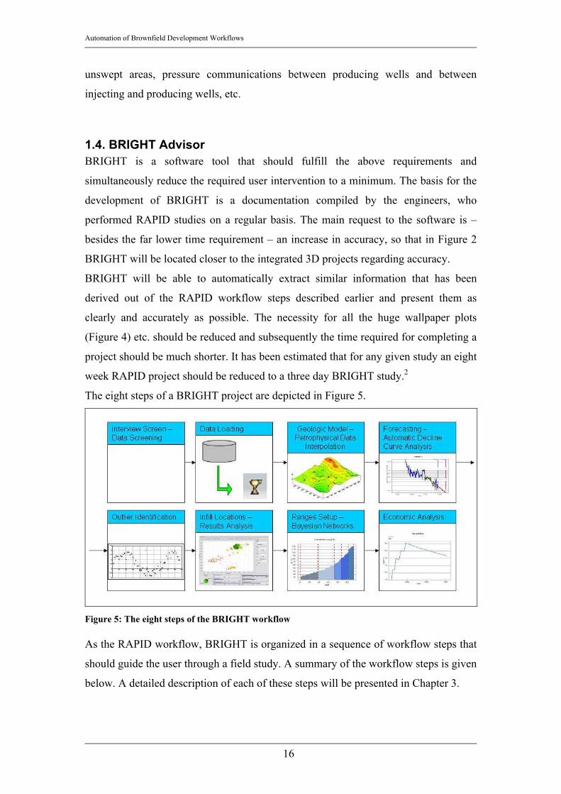
The eight steps of a BRIGHT project are depicted in Figure 5.
Figure 5: The eight steps of the BRIGHT workflow As the RAPID workflow, BRIGHT is organized in a sequence of workflow steps that
should guide the user through a field study. A summary of the workflow steps is given
below. A detailed description of each of these steps will be presented in Chapter 3.
Automation of Brownfield Development Workflows
17
1. Interview Screen: BRIGHT is a software tool that heavily relies on statistics, and
more importantly, on interpolation. It is therefore extremely important that the
user is aware of the restrictions of the usage of BRIGHT or its risk, when used in
very complex reservoirs and/or under highly transient conditions.
The interview screening makes sure that the given project is suitable to be
analyzed with BRIGHT and that the user is familiar with the data. The result of
the Interview screening is a score that can be roughly translated as a ‘reliability
score’ and a recommendation on how to proceed (e.g. BRIGHT is the appropriate
tool, use BRIGHT with caution or BRIGHT should not be used for the given
geologic setting or production environment).
2. Data Loading: One of the main requests in the development of BRIGHT is that
BRIGHT should be able to perform a study with very few data. The data that need
s to be loaded are therefore usually only the time dependent production volumes
per well, and if available, a few petrophysical data. The reliability of the study and
of the interpolation increases with the amount of reliable data available.
3. Petrophysics: BRIGHT uses a minimum of petrophysical data for its analysis.
However, a certain amount of data is needed to come up with values for HCIP
(hydrocarbons in place) and subsequently Sweep Efficiency, Recovery Factor, etc.
BRIGHT only needs the petrophysical data for a few wells and based on that
information it will interpolate the data for the other wells either by determining
the arithmetic mean of the available values or by ordinary Kriging.
4. Basic Locations and Well Selection: BRIGHT presents the available and
interpolated data in a bubble plot, where the well locations are presented in the x-y
plane and the parameters can be displayed as either the bubble size or the bubble
color or both. The plot informs roughly about the potential and history in different
areas of the reservoir and helps the engineer to choose an area to focus on.
5. Automatic Decline Curve Analysis: The production forecast for each well is
created separately and fully automated. BRIGHT searches for the best exponential
curve fit in a predefined interval of data to create a decline curve. The accuracy of
the fit is measured with the correlation coefficient and the Root Mean Square
Error (RMS Error) (see Chapter 3.7).
( )∑ −=2
Curvefitmeasured qqRMS Equation 1

Automation of Brownfield Development Workflows
18
BRIGHT will automatically optimize the best fit decline curve by iterating while
changing the decline rate to minimize the RMS Error.
6. Outlier detection: Detecting outliers is a very crucial step in BRIGHT’s workflow.
Outliers are defined as wells that perform either significantly better or
significantly worse than its surrounding neighbors. The procedure to find outliers
is called ‘Exclusion Mapping’ and described in detail in Chapter 2.4.
7. Analysis: The output is presented in a bubble map similar to the Basic Locations
and Well selection part. Again the possible locations of the infill wells are
presented in the x-y plane and the forecasted and interpolated parameters are
presented as either bubble size or bubble color or both. Besides the interpolated
values of future performance indicators (e.g. forecasted 3 Year cumulative
production, Estimated Recovery, Decline Rate, etc.) a score can be displayed. This
score is calculated in a series of conditional probability calculations (Bayesian
Networks, see Chapter 2.1.3, Chapter 3.10) and reduced to a single numeric value
through marginalization (Chapter 2.1.4). The calculation takes all of these future
performance indicators into account and can therefore be used to compare the
locations and determine which of these locations is most likely to be successful.
8. Results: In the results section the values are displayed in a grid to allow a numeric
evaluation of the result. The wells can be ranked according to their score and color
coded to highlight wells with a higher score. The grid shows all parameters that
have been used to evaluate the score.
9. Range Setup: The range setup is a way to modify the underlying assessment logic.
This is very important since the algorithm is hard coded; the engineer’s
assessment to a reservoir however is very subjective. The Range Setup influences
the severity of a certain parameter in the evaluation of the score. It is in the
engineer’s responsibility to assign certain weights based on importance to the
parameters by changing the range limits. A detailed description is given in the
Chapter on Range Setup (Chapter 3.10.3).
10. Economics: BRIGHT performs a basic economic analysis based on information
about the economic environment and based on a selection of projects to be
executed. BRIGHT will therefore calculate the economics for a base case, where
none of the projects will be started and for an infill case, where the selected
projects will be executed.

Automation of Brownfield Development Workflows
19
The input will contain economic thresholds and a price. The engineer has to enter
the Capital Expenditure that will be invested in that field in the upcoming years.
Moreover the input will contain technical constraints such as the number of rigs or
the number of wells that can be drilled in a certain season. Based on this input an
automated field development plan will be suggested that takes into account all of
the capital and technical constraints.
The economics part of this project is not described here since this would go
beyond the scope of this technical documentation.

Automation of Brownfield Development Workflows
20
2. Literature Review
2.1. Probabilistic Reasoning under Uncertainty
2.1.1 Uncertainty
Uncertainty is a very important part of BRIGHT. Therefore it is compulsory to come
up with a way to describe uncertainty and to provide an integrated, reliable and
comprehensive description of the field’s properties to the engineer. All engineers
involved in BRIGHT development agree that it is more important to address and
characterize the uncertainty than to strive for a more and more precise single numeric
value forecast.
The concept of uncertainty is presented in the following chapter. The discussion of
how uncertainty is applied in BRIGHT is found in Chapter 3.9.
In Reference 6 Korb and Nicholson present the main sources for uncertainty.
According to them uncertainty arises through:
• Ignorance: Due to the “limits of our knowledge” there will never be absolute
certainty about facts and values somebody has to deal with.
In the field of Brownfield Development, ignorance is a very important and
frequent source of uncertainty. Due to the very often highly heterogeneous
nature of a field it is basically impossible to fully and accurately describe the
whole field. There will generally be some areas of the field with poor
measurement frequencies or no measurements at all.
• Physical randomness or indeterminism: According to Korb and Nicholson
this relates to the fact that even if every possible property about an object can
be measured, there will still be some uncertainty due to nature’s randomness.
The authors presented the imaginary example of the coin toss, where
everything can be perfectly measured (e.g. exact measurements of coin
properties, exact coin spin measurements, etc.). Yet there will still be the
uncertainty about the outcome of a coin toss due to the physical randomness.
In the reservoir modeling part of BRIGHT’s workflow this kind of uncertainty
does not play such an important role since geologic parameter usually are not
purely randomly distributed but follow a certain spatial distribution. However,

Automation of Brownfield Development Workflows
21
when looking at highly heterogeneous reservoirs, the uncertainty due to
randomness or indeterminism plays an important role.
• Vagueness: Vagueness refers to the difficulty in describing or classifying a
certain state. Many expressions used in everyday conversations are not a
hundred percent clear. For example certain evidence can be classified as
“high” without being totally clear about what “high” stands for. That leads to
problems in understanding and even more in reproducing a certain assessment
and adds uncertainty to an issue.
In BRIGHT the uncertainty due to vagueness is approached by implementing
the so called “Range setup”, which will be explained later. The purpose of the
Range Setup is to clarify the ranges for certain expressions (“states”) by
defining the upper and lower value limit for e.g. “high”.
2.1.1.1 Uncertainty in Reservoir Modeling In the context of reservoir modeling Jeff Caers explains in Reference 10 the reason for
uncertainty as the “incomplete knowledge regarding relevant geological, geophysical,
and reservoir-engineering parameter of the subsurface formation”. Caers further
exemplifies uncertainty in reservoir modeling as being subdivided into three groups:
(1) the uncertainty about the reservoir structure and petrophysical properties such as
e.g. Porosity, Net pay thickness, etc. (2) the uncertainty about fluid properties and
their distributions and initial states (e.g. initial Formation Volume Factors, initial
water saturations, etc.) and (3) the uncertainty about how fluids and reservoir rocks
behave under changing physical conditions.
BRIGHT preferably addresses the uncertainty due to lack of knowledge about the
petrophysical parameters and the initial distribution of fluids in the reservoir. In
BRIGHT’s workflows the information about hydrocarbons in place plays an
important role and a good estimate for a well’s petrophysical values and the
associated uncertainty is therefore of great importance. The introduction of an
uncertainty parameter, which will be discussed later, should increase the reliability of
forecast and project evaluations. Preferably this parameter will indicate regions in the
reservoir where the estimation of petrophysical parameters is not reliable.
Caers warns especially from “Data uncertainty” and “Model uncertainty”. Data
uncertainty comes from acquisition, processing and interpretation of the measured

Automation of Brownfield Development Workflows
22
data. It has to be clear that to consistently compare and interpolate data each
measurement of the parameter of interest should be performed under the same
condition with the same measurement tool setup. As can be easily understood, in
Brownfields with operating histories of some decades it is almost never the case, that
a series of accurate and reliably consistent measurements of petrophysical parameters
have been performed. BRIGHT’s approach to “Data uncertainty” is to use a one-fold
cross validation outlier detection. This concept will be explained later in this
document.
Regarding Model uncertainty Caers points out that each interpolation for a parameter
at a certain location is based on an underlying model. Assuming that the available
measurements of a certain parameter in several locations in the reservoir are perfect
(no uncertainty) there are still a series of possible spatial models of that parameter that
– regarding the constraints due to the locations with exact measurements – are all
valid. The underlying model therefore has to “choose” one of the realizations and
therefore inevitably introduces randomness and subsequently uncertainty. Since this is
especially an issue of spatial density of measurements and lies in the nature of a
petroleum reservoir, BRIGHT does not and cannot specifically address this issue.
2.1.1.2 Uncertainty in forecasting of time series The uncertainty associated with the forecast of a time series as encountered when
forecasting the production data of a well is only poorly documented in current
research papers. The measurement of the quality of a fit of a forecasted decline curve
is identified as a very significant factor in determining the uncertainty of a forecast.
BRIGHT uses curve fitting methods to reduce the Root mean square error in the fitted
part of the curve. Outliers in the time series of the production data would drag the
fitted curve into a wrong direction and therefore falsify the result or lead to a
suboptimal fit. Therefore one of the main efforts in the strive for a reduced
uncertainty is to eliminate the outliers in the time series and at the same time decrease
the Root mean square error of the fit.
Reference 11 discusses the application of wavelets for the detection of outliers in time
series. In BRIGHT development the authors’ ideas were used to come up with a
methodology to identify these outliers. Bilen and Huzurbazar describe the existence of
two types of outliers in time series, the ‘Additive Outlier (AO)’ and the ‘Innovational
Outlier (IO)’. To illustrate these two types of outliers the authors compare an
Automation of Brownfield Development Workflows
23
observed time series tZ with a parallel outlier free series tX , that is fit according to
the so called ARIMA model (Auto regressive integrated moving average technique)
of order p, d, and q. p is a description for the numbers of autoregressive terms, d is a
count of the seasonal filters and q is defined as the number of lagged forecast errors.
The additive outlier per definition only has an influence at the time point of the
disturbed measurement. An AO has therefore no disturbing effect on surrounding
points. The definition of an AO is:
)(tIXZ TAOtt ⋅+= ω Equation 2
AOω describes the magnitude of the disturbance and this is multiplied by )(tIT , which
is 1 if the time point of interest lies within the time series. AOω is randomly
distributed and its magnitude can not be correlated with the time series itself.
The innovational outlier (IO) however affects surrounding observations. It is therefore
defined as:
)(tIXZ TIOtt ⋅Γ⋅+= ω Equation 3
The terminology is basically the same as for the AO in Equation 2. The introduction
of Γ accounts for the disturbance effects on surrounding points beyond the time point
T of the measurement through the memory of the system.
Additive outliers have the biggest influence on a time series, since they influence or
falsify the statistics and therefore also lead to a worse curve fit and essentially to a
wrong forecast. The authors propose an approach using wavelets to eliminate these
additive outliers. To explain the methodology of wavelets in details is beyond the
scope of this work. Wavelet transforms can be considered as a form of time-frequency
representation that is localized in both time and frequency.12 The idea of wavelet
analysis in outlier detection of time series is to use the discrete wavelet transform
(DWT) to decompose the time series tZ in vectors of wavelet
coefficients )0(),0(...,),2(),1( CDJDJD −− . C(0) is the coefficient vector of the
wavelet transform after performing all possible decompositions to obtain all D
vectors. The D vectors contain the high frequency content and are therefore extremely
sensitive on jumps or bumps in the data. It is now possible to analyze
)0(...,),2(),1( DJDJD −− in order to find outliers.
In BRIGHT a very similar but in terms of coding less demanding approach was
pursued. The idea is to calculate a series of moving averages of the production rate vs.

Automation of Brownfield Development Workflows
24
time relationship. The calculated moving averages are the 4 months moving average
and the 8 months moving average. The production rate itself captures the high
frequency part of the time series, the 4 months moving average captures the medium
frequency part of it and the 8 months moving average represents the “long term”
average of the time series. Comparing these three values leads to different
discrepancies (Figure 8), which can easily be identified as outliers in the plot of the
actual time series (Figure 7).
Figure 6: Production Rate vs. relative Time of an oil well, pink line is fitted with all points; green line is not regarding outliers
Figure 6 presents the discrepancy of a curve fit regarding the outliers versus a curve
fit without regarding them in a semi logarithmic plot. As can be seen due to the
outliers (peaks below 1000 [STB/d]) the decline of the pink (lower) line is
significantly steeper than the green (upper) line (not regarding outliers). Thus the
production forecast by the pink line will be more conservative leading to a different
field development strategy as with the green line, which represents the true behavior
of the well better.
In Figure 7 and Figure 8 the 4 month average of the oil production rate was compared
to the 8 moth moving average and to the actual value for the oil production rate. For
example the 4 months moving average is given as

Automation of Brownfield Development Workflows
25
5
2
24
∑+−=
=
n
ni
i
nmoavg
Equation 4
If a point in the time series were an outlier the absolute difference between the
measured value and its moving averages would be higher than for a point that follows
the general trend of the time series.
Figure 7: Outlier detection with 4 months moving average (pink) and 8 months moving average (green)

Automation of Brownfield Development Workflows
26
Figure 8: Difference Plot (pink: 4 months average vs. measured; green: 8 months average vs. measured)
The points will be identified as outliers in the time series and will not be regarded
when fitting the decline curve. That way the RMS error is significantly decreased, the
reliability in the forecast is much higher and the forecast uncertainty is reduced to a
minimum.
2.1.2 Conditional Probabilities and Baye’s Theorem
Probability Calculus plays a very important role in BRIGHT. BRIGHT’s reasoning is
based on a series of Conditional Probability equations. Conditional Probabilities
express the probability of the occurrence of an event (A) given an observation (B),
given that A and B are not mutually exclusive. A common question could be: “What
is the probability that A occurs when B is observed?”. If A and B are not mutually
exclusive, Baye’s theorem (Equation 5 and Equation 6) has to be applied to come up
with p(A|B), the so called posterior probability.
)()()()( ApABpBpBAp ×=× Equation 5
)()()(
)(Bp
ApABpBAp
×= Equation 6

Automation of Brownfield Development Workflows
27
Where, as mentioned, p(A|B) is the posterior probability, p(B|A) is the prior
knowledge or the so called joint probability, p(A) is the probability that an event A
occurs and p(B) is the probability that an event B occurs.
An essential factor in Baye’s equation is the prior knowledge. As demonstrated in the
famous cab example presented below the prior knowledge can alter the result
significantly. Therefore the joint probability has to be defined prior to solving the
equation. In BRIGHT’s case the prior knowledge / joint probability tables has been
introduced by experienced engineers and stored in the so called conditional
probability tables.
Application of Baye’s Rule: The cab problem
A cab was involved in an accident. Two cab companies, the green and the blue,
operate in the city. You know that:
• 85% of the cabs in the city are green; 15% are blue.
• A witness says the cab involved was blue.
• When tested, the witness correctly identified the two colours 80% of the time.
The question is: How probable is it that the cab involved in the accident was blue, as
the witness reported, rather than green?
The Conditional probability calculation that is performed to come up with a solution
is based on Baye’s theorem:
[ ][ ]41.0
)85.020.015.080.0()15.080.0()(
)()()()()()(
)(
=×+×
×=
⋅+⋅
⋅=
blueWblueCP
greenCPgreenCblueWPblueCPblueCblueWPblueCPblueCblueWP
blueWblueCP
The posterior probability – the probability that the cab was blue as stated by the
witness is only 41%. Hence the probability that the cab was green, not blue, is 59%.
As presented in that example the prior knowledge can change the outcome
significantly. This big advantage can be applied to not entirely rely on probabilistic
assumptions but to also take domain or expert knowledge into account; the experience
of engineers together with the facts obvious due to the observed data. Another big
advantage of using conditional probability equations is the possible introduction of
uncertainty. Conditional Probabilities do not necessarily require a single numeric

Automation of Brownfield Development Workflows
28
input but can handle probabilistic inputs, which – considering all the uncertainty
involved in the determination of the various variables (e.g. all forecast variables,
spatial interpolated geologic parameters, etc.) – is a feature that can improve the
results significantly. Having stated that, it is clear that the Bayesian way of solving
e.g. an inference problem differs significantly from the way the “Classical” Statistics
is going by using the relative frequency approach to probabilities. The Bayesian
approach uses probability intervals to infer something about the relative frequencies.
Moreover by using Baye’s Rule unknown probabilities of unknown or unobservable
events can be inferred from known probabilities of other events.16
In BIGHT the conditional probability equations are used in networks, grouping
parameters that are related to each other. These networks are called Bayesian
Networks or Bayesian Belief Networks. Bayesian Belief Networks will be described
in detail in the next Chapter. For the purpose of this work a software package called
Netica14 was used to model these networks.
2.1.3. Bayesian Belief Networks
2.1.3.1. Introduction to Bayesian Belief Networks Bayesian Belief Networks are models for reasoning under uncertainty; each parameter
is represented by a node and a connection represents a conditional dependency
between parameters. The underlying equation in a Bayesian Belief Network is Baye’s
Theorem that is solved in a network. The advantage of using these equations in a
network is that the engineer can look at a variable space containing multiple
parameters rather than only on single dimension problems.
As mentioned in Chapter 2.1.2 in contrast to classical inference methods, Bayesian
Belief Networks (BBN) allow to introduce prior domain knowledge to the reasoning
process in order to draw improved decisions based upon the observed data. This prior
domain knowledge is stored in conditional probability tables, which are used in the
inference process to come up with probability values for possible outcomes.
BBN use a probabilistic approach to inference. The input parameter as well as the
output can be given as a probability distribution rather than as a single numeric value.
This enables the engineer to introduce uncertainties. Moreover, unlike many other
inference methods, BBN can make decision based on incomplete datasets. If values
for a certain parameters are missing the BBN uses the frequency distribution of the

Automation of Brownfield Development Workflows
29
values in the remaining field, to determine the probability distribution of that
parameter and to make an optimal decision by reasoning about these probabilities
together with the observed data.
Bayesian Networks are applied especially when:
• Decisions have to be made based upon uncertain inputs (probabilistic
inference)
• Knowledge of experienced experts as well as real cases or measurements have
to be incorporated
• Complex Workflows have to be reduced to concise graphical representations
• It is desired, that the reasoning system improves itself by investigating
measurements (Bayesian Learning)
• The causal relationship between parameters has to be captured and quantified
• Convincing results have to be produced, even though only very limited or
erroneous data are available.
Common fields of applications are e.g. the support (trouble shoot) for software
products or computer hardware, bio informatics, medical diagnosis, etc. A graphical
depiction of a Bayesian Belief Network as implemented in BRIGHT can be seen in
Figure 9. The depiction shows a so called Directed Acyclic Graph (DAG). A DAG is
frequently used to set up large Bayesian Belief Networks, because it is easier to
explore and identify conditional dependencies and independencies. In a DAG each
variable is represented by a ‘node’ and a casual relationship is denoted by an arrow
(‘edge’). For each casual relationship a Conditional Probability Table that stores the
information about the joint probabilities has to exist. The elements of the DAG are
explained in the following chapters.

Automation of Brownfield Development Workflows
30
Figure 9: Graphical Representation of a Bayesian Belief Network as implemented in BRIGHT
2.1.3.2. Nodes Each parameter is represented by a node, which is described by several different
states. The input parameters are presented as so called ‘Nature Nodes’ or ‘Parent
nodes’ (in Figure 9 for example ‘EstimatedRecovery’, ‘Forecasted Rate’). The input
probability function or single numeric values for the Nature Nodes are not determined
using Baye’s Theorem but by observation and statistically describing the respective
parameter in a frequency histogram. A lot of these parameters either come from
measurement or from computation. The nature nodes contain information about the a
priori or prior probabilities of certain evidence. Comparing this chapter with Equation
5, the Nature node would represent p(A).
The dependent nodes are called ‘Decision Nodes’ or ‘Child Nodes’ (In Figure 9 for
example ‘Economics’, ‘Interference’, etc.). They contain information about the joint
probabilities and define the output, the posterior probability. In analogy with Equation
5 the posterior probability is given by p(A|B).
In Figure 9 an example for a Nature Node would be ‘Estimated Recovery’,
‘Forecasted Rate’, ‘Proximity to other well’, etc. Decision Nodes would be
‘Economics’, ‘Viability’, ‘Interference’ and finally ‘Drill Infill’.
Automation of Brownfield Development Workflows
31
Decision nodes can be input for other Decision Nodes. Once the first Decision Node
is calculated its result, the posterior probability, is carried on and passed to the next
Decision Node as prior probability.
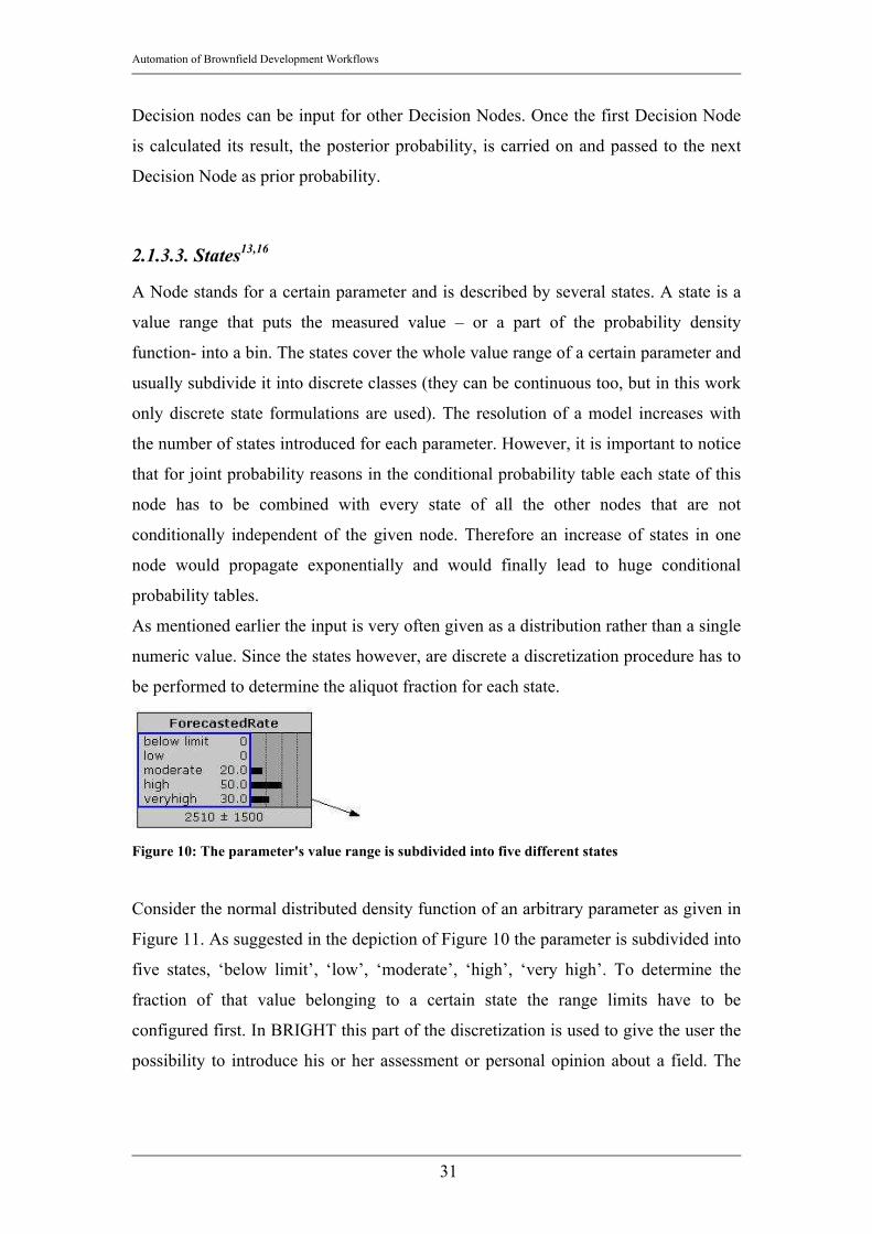
2.1.3.3. States13,16
A Node stands for a certain parameter and is described by several states. A state is a
value range that puts the measured value – or a part of the probability density
function- into a bin. The states cover the whole value range of a certain parameter and
usually subdivide it into discrete classes (they can be continuous too, but in this work
only discrete state formulations are used). The resolution of a model increases with
the number of states introduced for each parameter. However, it is important to notice
that for joint probability reasons in the conditional probability table each state of this
node has to be combined with every state of all the other nodes that are not
conditionally independent of the given node. Therefore an increase of states in one
node would propagate exponentially and would finally lead to huge conditional
probability tables.
As mentioned earlier the input is very often given as a distribution rather than a single
numeric value. Since the states however, are discrete a discretization procedure has to
be performed to determine the aliquot fraction for each state.
Figure 10: The parameter's value range is subdivided into five different states
Consider the normal distributed density function of an arbitrary parameter as given in
Figure 11. As suggested in the depiction of Figure 10 the parameter is subdivided into
five states, ‘below limit’, ‘low’, ‘moderate’, ‘high’, ‘very high’. To determine the
fraction of that value belonging to a certain state the range limits have to be
configured first. In BRIGHT this part of the discretization is used to give the user the
possibility to introduce his or her assessment or personal opinion about a field. The

Automation of Brownfield Development Workflows
32
density function is then integrated within the given limits. The fraction or probability
that a certain state is encountered is given by:
∫=∈
xUpper
xLoweverj dxxioninputfunctStateinputp )()( Equation 7
This equation is repeated for each state for any given parameter. If the integral over
the whole value range of the input parameter does not exceed one, the sum of all
discretizised parts of the function will certainly also not exceed unity.
By choosing the limits of the range e.g. more towards the low end of the value range
most of the highest fraction will be in the range ‘high’ and ‘very high’, whereas
choosing range limits in the higher part of the value range will lead to a more
conservative classification with most of the density function binned into the bins such
as ‘very low’ and ‘low’.
0
0.002
0.004
0.006
0.008
0.01
0.012
0 50 100 150 200 250 300
Parameter Value
Frac
tion
[1]
Figure 11: Normal distributed density function for an arbitrary parameter
Case (a): The range limits are set almost evenly distributed in the parameter’s value
range.
from to Fraction [-] very low 0 30 0.02 low 30 90 0.36 moderate 90 165 0.58 high 165 235 0.03 very high 235 270 0.00
Table 1: Range Setup

Automation of Brownfield Development Workflows
33
In the diagram in Figure 12 an almost normal distribution can be recognized that
somehow resembles a very discretizised density function as in Figure 11.
0.02
0.36
0.58
0.030.00
0.00
0.10
0.20
0.30
0.40
0.50
0.60
0.70
0.80
0.90
1.00
very low low moderate high very high
Parameter State
Frac
tion
[-]
Figure 12: Evenly distributed range limits
Case (b): A more pessimistic approach is chosen to describe the density function in
Case b. Therefore the range limits are set towards the upper end of the value range,
thus increasing the ranges for ‘very low’ and ‘low’ and therefore increasing the
aliquot fractions of the density function in these states.
from to Fraction [-] very low 0 75 0.24 low 75 185 0.75 moderate 185 220 0.01 high 220 245 0.00 very high 245 270 0.00
Table 2: Pessimistic Range setup
Automation of Brownfield Development Workflows
34
0.24
0.75
0.01 0.00 0.000.00
0.10
0.20
0.30
0.40
0.50
0.60
0.70
0.80
0.90
1.00
very low low moderate high very high
Parameter State
Frac
tion
[-]
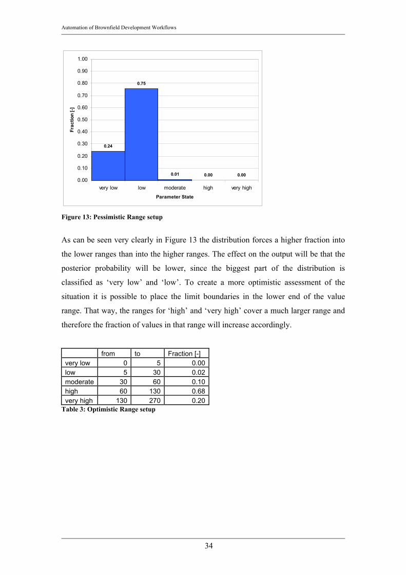
Figure 13: Pessimistic Range setup
As can be seen very clearly in Figure 13 the distribution forces a higher fraction into
the lower ranges than into the higher ranges. The effect on the output will be that the
posterior probability will be lower, since the biggest part of the distribution is
classified as ‘very low’ and ‘low’. To create a more optimistic assessment of the
situation it is possible to place the limit boundaries in the lower end of the value
range. That way, the ranges for ‘high’ and ‘very high’ cover a much larger range and
therefore the fraction of values in that range will increase accordingly.
from to Fraction [-] very low 0 5 0.00 low 5 30 0.02 moderate 30 60 0.10 high 60 130 0.68 very high 130 270 0.20
Table 3: Optimistic Range setup

Automation of Brownfield Development Workflows
35
0.00 0.02
0.10
0.68
0.20
0.00
0.10
0.20
0.30
0.40
0.50
0.60
0.70
0.80
0.90
1.00
very low low moderate high very high
Parameter State
Frac
tion
[-]
Figure 14: Optimistic Range Setup Due to the different range setup the fractions in the higher parameter ranges increase
and the posterior probability calculated with Baye’s theorem increases accordingly.
Therefore, by shifting the ranges, somebody who has not been involved in the setup of
the Conditional Probability Tables has an excellent chance to bring in her or his own
assessment of the situation. In BRIGHT it was concluded that external persons should
not have the chance to change the Conditional Probability Tables. Therefore this
mentioned approach has been implemented to allow an alteration of the assessment
according to the personal preferences without touching the underlying algorithm.
2.1.3.4. Edges Edges from one Node to the other indicate that the two connected parameters are not
conditionally independent. Vice versa two nodes that are not connected by a node are
said to be conditionally independent regarding another set of nodes.
Automation of Brownfield Development Workflows
36
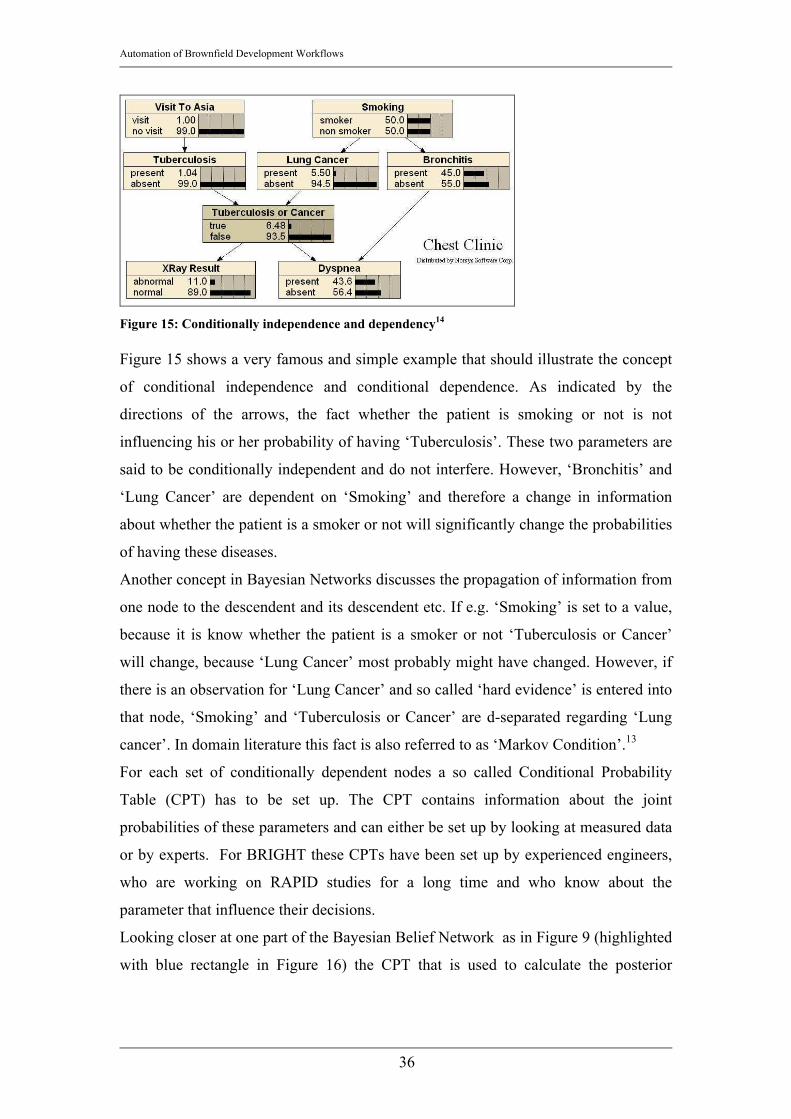
Figure 15: Conditionally independence and dependency14 Figure 15 shows a very famous and simple example that should illustrate the concept
of conditional independence and conditional dependence. As indicated by the
directions of the arrows, the fact whether the patient is smoking or not is not
influencing his or her probability of having ‘Tuberculosis’. These two parameters are
said to be conditionally independent and do not interfere. However, ‘Bronchitis’ and
‘Lung Cancer’ are dependent on ‘Smoking’ and therefore a change in information
about whether the patient is a smoker or not will significantly change the probabilities
of having these diseases.
Another concept in Bayesian Networks discusses the propagation of information from
one node to the descendent and its descendent etc. If e.g. ‘Smoking’ is set to a value,
because it is know whether the patient is a smoker or not ‘Tuberculosis or Cancer’
will change, because ‘Lung Cancer’ most probably might have changed. However, if
there is an observation for ‘Lung Cancer’ and so called ‘hard evidence’ is entered into
that node, ‘Smoking’ and ‘Tuberculosis or Cancer’ are d-separated regarding ‘Lung
cancer’. In domain literature this fact is also referred to as ‘Markov Condition’.13
For each set of conditionally dependent nodes a so called Conditional Probability
Table (CPT) has to be set up. The CPT contains information about the joint
probabilities of these parameters and can either be set up by looking at measured data
or by experts. For BRIGHT these CPTs have been set up by experienced engineers,
who are working on RAPID studies for a long time and who know about the
parameter that influence their decisions.
Looking closer at one part of the Bayesian Belief Network as in Figure 9 (highlighted
with blue rectangle in Figure 16) the CPT that is used to calculate the posterior

Automation of Brownfield Development Workflows
37
probability for ‘Drill Infill’ out of the a priori probabilities of ‘Viability’, ‘Inference’
and ‘Already Swept’ will look like depicted below.
Figure 16: Part of the Bayesian Belief Network described in Figure 9 Drill Infill Viability Interference Already swept true false high yes yes 0 1 high yes no 0.6 0.4 high no yes 0.2 0.8 high no no 1 0 low yes yes 0 1 low yes no 0 1 low no yes 0.1 0.9 low no no 0 1
Table 4: CPT 'Drill Infill' Table 4 shows the CPT for the node ‘Drill Infill’. It is clear that the number of lines in
the CPT increases with the number of states. The number of lines can be calculated
as:
Number of Lines in CPT =∏j
jatesNumberOfSt
Equation 8

Automation of Brownfield Development Workflows
38
Equation 8 shows the main limitation in setting up these CPTs. For example the node
‘Economics’ is calculated out of three precedent nodes with five states respectively.
The CPT that stores the information about the joint probabilities for economics
therefore contains of 125 lines that were set up manually. It would be difficult to add
another node or another state, because that would lead to a manifold increase in the
number of lines and therefore the consistent population of the CPTs becomes more
and more questionable.
The Markov Condition16 facilitates in setting up the CPTs. According to the Markov
Condition it is not necessary to define how e.g. ‘Forecasted Rate’ is influencing
‘Viability’, since there is another node ‘Economics’ in between that can be evaluated
first. Therefore the number of CPTs and subsequently the number of lines in the CPTs
is reduced significantly. This enables the creator of the Bayesian Network to see each
conglomerate of a few converging nodes as a self containing entity. Only the posterior
probability e.g. calculated in ‘Economics’ is passed on to ‘Viability’ and will there be
used as input, regardless of the values or density functions used to describe
‘Forecasted Rate’, ‘Estimated Recovery’ and ‘Decline Rate’.
2.1.4. Marginalization and Evaluation of Posterior Probability Once the Bayesian Network has been set up the calculation of the final posterior
probability can be started. To compute the final probability value all possible state
combinations have to be evaluated and its joint probability have to be calculated.
Moreover all the precedent nodes before the final node have to be fully evaluated
before the final posterior probability can be calculated.
According to the already mentioned Markov Condition, each set of nodes can be
evaluated separately and independent of the descendent nodes. The posterior
probability – the output – of one set of nodes is then used as an input in the
descendent nodes.
Below a simplified scheme of how the solution is obtained is presented:

Automation of Brownfield Development Workflows
39
Figure 17: Workflow to determine the posterior probability in a Bayesian Network
Step 1: A set of nodes that feed into the same child node has to be selected.
The set of nodes chosen has to be complete and all the nodes that feed into that same
child node have to be considered.
Step 2: For each parent node in that set, the input values or input density
functions are entered. If there is neither a value nor a density function known that can
be entered, the input can be left blank and the Bayesian Network will use the most
probable values in determining the posterior probability in the child node.
The discretization procedure explained earlier in this document (Equation 7) has to be
applied in order to come up with the correct values of fraction per state per parameter.
Step 3: All parent nodes that feed into the same child node are now defined by
some value or density function. They are combined in the child nodes by regarding
the Conditional Probability table in the following procedure:
Present states for ‘Forecasted Rate’ are ‘moderate’, ‘high’ and ‘very high’. For
‘Estimated Recovery’ the available states are ‘low’, ‘moderate’ and ‘high’. For the
Decline Rate ‘very low’ and ‘low’ are indicated.
1
2
3 4

Automation of Brownfield Development Workflows
40
All possible state combinations have to be created. In the example case a total of 18
different state combinations are possible. For each of these state combinations the
joint probability value for ‘Economics’ has to be looked up in the Conditional
Probability table.
Figure 18: Conditional Probability Table – Economics Node in Infill Location Selection Workflow
Comparing the Conditional Probability table to the combinations of possible states the
table reduces to:
Economics
Forecasted Rate
Estimated Recovery
Decline Rate true false
moderate low very low 0.79 0.21 moderate low low 0.77 0.23 moderate moderate very low 0.84 0.16 moderate moderate low 0.82 0.18 moderate high very low 0.89 0.11 moderate high low 0.87 0.13

Automation of Brownfield Development Workflows
41
high low very low 0.82 0.18 high low low 0.8 0.2 high moderate very low 0.87 0.13 high moderate low 0.85 0.15 high high very low 0.92 0.08 high high low 0.9 0.1
very high low very low 0.85 0.15 very high low low 0.83 0.17 very high moderate very low 0.9 0.1 very high moderate low 0.88 0.12 very high high very low 0.95 0.05 very high high low 0.93 0.07
Table 5: Conditional Probability Table for selection
Step 4: The posterior probability for the node ‘Economics’ has to be
calculated. The equation that is applied to compute the posterior probability for the
sample set of nodes is given below. The explanation of the terms follows after the
equations.
)(
)Re()(
,covRe,
,,covRe
k
jj
Statesk
j
i
StateeDeclineRatpStatecvoeryEstimatedpStateRateForecastedp
StateeDeclineRatStateeryEstimated
StateRateForecastedtrueEconomicsp
trueEconomicseDeclineRatRateForecasted
eryEstimatedp
=××=×=×
×
==
==
=
=
∑
Equation 9
The posterior probability that has to be determined is given by
= trueEconomics
eDeclineRatRateForecasted
eryEstimatedp ,
,covRe. The expert knowledge that is stored in the
Conditional Probability tables in terms of joint probabilities is looked up from the
Conditional Probability table as in Figure 18 or Table 5 and is used in Equation 9
as ∑
==
==
Statesk
j
i
StateeDeclineRatStateeryEstimated
StateRateForecastedtrueEconomicsp ,covRe
,. The values for
)()covRe()( kjj StateeDeclineRatpStateeryEstimatedpStateRateForecastedp =×=×= have
to be computed during the pre-processing and forecasting workflows. Since they are
input parameters into that particular Network, they are not dependent on any other
node in that particular Bayesian Network.

Automation of Brownfield Development Workflows
42
The resulting value in Equation 9 is subsequently used for the next set of nodes as an
input value (it will be used the same way as e.g. p(ForecastedRate=Statei) in
Equation 9). This procedure is repeated for each set of nodes until the final posterior
probability is calculated (in analogy to the Bayesian Network in Figure 17 the final
posterior probability would be the value in the node ‘Drill Infill’).
2.2. Production Forecasting Techniques used in BRIGHT
2.2.1 Decline Curve Analysis8
The only forecasting technique used in BRIGHT so far is the Decline Curve Analysis.
In BRIGHT an automatic decline curve analysis is implemented that generates the
decline curve for each well in the field in a very short time (a few seconds). Arps’
equation is used as the underlying equation for the Decline Curves:
nqKqdt
dq⋅−= Equation 10
dtdq is the change of production rate regarding time [STB/d2] or [Mscf/d2], q is the
production rate [STB/d], [Mscf/d]. K and n are the decline constant, where K is
referred to as the Decline rate [1/d] and n is the decline exponent [-].
Due to the difficulties in optimizing the other decline curve types, it was decided to
only use Exponential Decline curves in BRIGHT. For exponential decline curves, n is
set to zero and after rearranging the equation to a more convenient form Equation 10
simplifies to Equation 11. The advantage from a software implementation and
automatic curve fit optimization point of view is that Equation 11 has only one
parameter that has to be optimized – the Decline Rate K -, whereas hyperbolic decline
curves have two parameters to be optimized – the Decline Rate K as well as the
Decline Exponent n.
)exp()( dtKqtq i ⋅−⋅= Equation 11
Harmonic Decline curves are a special case of the Decline curves and should only be
implemented if there is no apparent straight line in a semi log plot of Production rate
vs. Cumulative Production. Therefore it was not regarded in BRIGHT. However, the

Automation of Brownfield Development Workflows
43
user of BRIGHT has the possibility to chose a more appropriate Decline curve,
generate this decline curves in an external application and copy the values into
BRIGHT.
The experience with other cases however has shown that in fields, where BRIGHT is
considered to be an applicable software tool, the automatic decline curve analysis
gives very satisfying results.
BRIGHT optimizes the decline curve by altering the decline rate until the best fit is
achieved. The best fit is the curve with the lowest RMS error in the fit range. RMS
stands for ‘Root mean square’ error and is given by:
( )∑=
−=
n
iicurvefitimeasured qqRMS
1
2,, Equation 12
qmeasured is the rate as measured and given in the data for any given time point [STB/d]
or [Mscf/d], qcurvefit is the rate as calculated according to the fitted curve at the same
time point [STB/d] or [Mscf/d]. This square root of the squared difference between
the measured and the fitted rate is summed up to get one RMS value in each iteration.
While iterating, BRIGHT is modifying the decline curve coefficient K in order to
minimize the RMS error. This essentially leads to the lowest deviations from the
measured data of the fitted curve and hence to the best fit. .
However, the quality of fit is measured with the easier to compare correlation
coefficient r2. The correlation coefficient is a very frequently used mathematical tool
that allows to determine the dependency of two sets of values X=(x1, x2, …, xn) and
Y=(y1, y2, …, yn). The range of values for the correlation coefficient is -1 ≤ r2 ≤1, 0
indicating that there is no dependency between X and Y, 1 indicating that there is a
positive linear dependency of 100% (100% directly proportional), -1 indicating that
the dependency between X and Y is 100% negative (100% inversely proportional).
Thus the advantage of indicating the quality of curve fit with the correlation
coefficient lies in the comparability of the correlation coefficients, since they always
stay between zero and one.
The correlation coefficient is calculated as17:

Automation of Brownfield Development Workflows
44
( )( )2
1 1
22
12
)()(
−⋅−
−−=
∑ ∑∑
= =
=
n
i
n
iii
n
iii
xy
yyxx
yyxxr Equation 13
Where the numerator stands for the covariance of X and Y, and the denominator
denotes the variances of X and Y respectively.
The user has then the chance to go through the list of highlighted wells with a too low
correlation coefficient and to either improve their decline curve fit manually or to
mark the well as an outlier and therefore ban it for the further forecasting workflows.
2.3. Geologic Interpolation10, 22 In BRIGHT ordinary Kriging is used in many different workflows in order to
interpolate the values for any given parameter at locations, where the value is not
known (e.g. Infill locations, locations without measurement). Kriging is an
interpolation method especially suitable for spatially dependent variables. That means
in contrast to e.g. random dice throws, geologic parameters such as e.g. porosity are
not totally random but spatially related to one another. That means that geologic
samples are spatially distributed with the constraining assumption that a value for a
parameter at one location is similar to values at close locations and less similar to
locations far away. Therefore, to estimate a value for a not sampled location Kriging
uses a weighting system that - to compute an expected value - weights sampled
locations nearby more and regards locations far away less. The underlying basic
equation that is applied by Kriging is:
∑=
⋅=
n
iii uEwuE
1)()( Equation 14
E(u) is the expected value for the parameter at the unsampled location, E(ui) is the
expected value at the sampled location (i.e. the measured value), wi is the weight that
is individually determined for each given location. n is the number of samples that are
used to calculate the interpolated value. wi is a function of the distance. In contrast to
linear weighted interpolation methods ordinary Kriging does not simply take the
inverse Euclidian distance between the unsampled and the sampled locations, but it is
regarding spatial trends and clusters of sampled locations. Caers demonstrates this
advantage of Kriging with an example similar as the one depicted below. Instead of
determining the weights solely based on the inverse linear distance to the unsampled
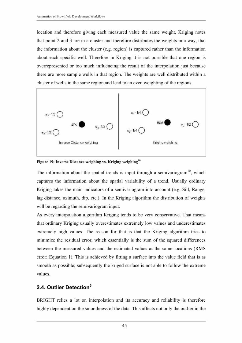
Automation of Brownfield Development Workflows
45
location and therefore giving each measured value the same weight, Kriging notes
that point 2 and 3 are in a cluster and therefore distributes the weights in a way, that
the information about the cluster (e.g. region) is captured rather than the information
about each specific well. Therefore in Kriging it is not possible that one region is
overrepresented or too much influencing the result of the interpolation just because
there are more sample wells in that region. The weights are well distributed within a
cluster of wells in the same region and lead to an even weighting of the regions.
Figure 19: Inverse Distance weighing vs. Kriging weighing10 The information about the spatial trends is input through a semivariogram10, which
captures the information about the spatial variability of a trend. Usually ordinary
Kriging takes the main indicators of a semivariogram into account (e.g. Sill, Range,
lag distance, azimuth, dip, etc.). In the Kriging algorithm the distribution of weights
will be regarding the semivariogram input.
As every interpolation algorithm Kriging tends to be very conservative. That means
that ordinary Kriging usually overestimates extremely low values and underestimates
extremely high values. The reason for that is that the Kriging algorithm tries to
minimize the residual error, which essentially is the sum of the squared differences
between the measured values and the estimated values at the same locations (RMS
error; Equation 1). This is achieved by fitting a surface into the value field that is as
smooth as possible; subsequently the kriged surface is not able to follow the extreme
values.
2.4. Outlier Detection5
BRIGHT relies a lot on interpolation and its accuracy and reliability is therefore
highly dependent on the smoothness of the data. This affects not only the outlier in the

Automation of Brownfield Development Workflows
46
time series of production rate data, but also the outliers regarding the geologic model
(e.g. which well’s measured porosity is significant higher than the porosity of all its
surrounding wells). Outliers impose a significant change in the trend of the dataset
and have therefore to be identified. Outliers will not be used for further interpolations
in BRIGHT, since they disturb the data trends and falsify the interpolated response
surface.
2.4.1. Definition Outlier An outlier in BRIGHT is defined as a well that performs significantly worse or
significantly better than the surrounding wells. Moreover in BRIGHT it is desired to
find wells with significantly different values for Porosity, Net pay, water saturation
and Sweep Efficiency, since these parameters play an important role in the decision
for a field development plan. A detailed information about the parameters that are
used for the outlier search as well as the criteria to define an outlier is given in
Chapter 3. In this chapter the procedure how an outlier is detected is explained in
more detail.
2.4.2. ‘Leave-one-out’ Cross validation12 The difficulty in finding outlier is to identify abnormal behavior due to a strange value
or an erroneous measurement. It was important that BRIGHT can distinguish between
a change in trend due to normal heterogeneity and a change due to unreasonably high
or unreasonably low values.
In statistics there are several different methods to test a hypothesis that has been
created out of measured data, against these measured data. The reason to apply a
check of the hypothesis is to determine whether the hypothesis is correct and good
enough to be applied to estimate values for new, arbitrary samples. In machine
learning this hypothesis evaluation techniques are very important, because they are
indicating the quality of the learning algorithm. In BRIGHT these evaluation
algorithms where used to detect errors and in contrast to learning algorithms,
BRIGHT does not try to change the hypothesis to include erroneous values but first
highlights the places where these values appear.
The hypothesis evaluation algorithm used in BRIGHT is a special form of the “k-Fold
Cross validation”. In the k-Fold Cross validation the dataset is divided into k arbitrary
Automation of Brownfield Development Workflows
47
sub samples. Each one of these k groups is once left out of the dataset and not used to
create or train the hypothesis. After the hypothesis is defined, these k samples are used
to evaluate them according to the new hypothesis and test its accuracy. BRIGHT uses
a k-Fold Cross validation method, where k is equal to the number of available
datasets, which is also known as “Leave-one-out”-Cross validation (LOOCV).
In LOOCV a single sample is left out while training the hypothesis with all the other
data. Then, the created hypothesis is tested or validated against this single sample.
This procedure is repeated for each single sample in the set.
The hypothesis in BRIGHT is represented by the kriged surface. As mentioned in the
chapter about Kriging, in Kriging the smoothest possible surface is found that satisfies
all constraints given be the measurements at the wells by simultaneously minimizing
the occurring residuals. In BRIGHT the “Leave-one-out”-Cross Validation equivalent
operation is applied to generate several kriged maps of a certain parameter. Each of
these maps does not consider one of the wells, but only all the others. For example in
a field with 120 sampled wells, 120 maps for the same parameter are generated each
one of these lacking one well respectively. As mentioned in the previous chapter the
residual is the sum of deviations from a fitted curve or surface. If an outlier is left out,
the kriged surface is supposed to be a lot smoother thus reducing the residuals.
Whereas when a well is removed, which’s value follows the trend of its neighboring
wells, the residual will not be significantly different than the residuals for the kriged
maps for most of the other runs.
A list is generated with the well name and the according value for the residual, when
this well is left out from generating the kriged surface for one parameter. Thus, the
wells with significantly lower associated values can be regarded as outliers.
This procedure is demonstrated with two examples. At first a very simple two
dimensional problem has been set up with a series of data that generally follow the
trend of a sinusoidal curve.
The x-Axis represents the distance to an arbitrary reference point and the y-Axis
represents the values. As can be seen very clearly the red point is far off the trend of
all the other points and should therefore be identified as an outlier.

Automation of Brownfield Development Workflows
48
Figure 20: Sinusoidal distribution of values
The best fit curve will be generated in multiple runs; in each of those runs one of the
points is left out and not regarded in finding this best curve. When the red point is left
out an almost sinusoidal shaped curve will be identified as a trend line, reducing the
relative distances of all other points to that curve. The sum of all deviations (the
residual) will be the smallest and therefore the red point identified as an outlier.
Figure 21: Outlier is identified as having a very large relative distance to the best fit curve The same approach is now demonstrated in a three dimensional example as it is also
applied in BRIGHT. The example problem shows a field with porosity measurements
for all wells. The porosity values for all wells in a field are given. The porosity value
for one well was increased intentionally. One well therefore has a significantly higher
porosity value of about 25 [%] whereas all other wells have porosity values in the
-1
-0.5
0
0.5
1
1.5
2
2.5
0 50 100 150 200 250 300 350 400 450 500
-1
-0.5
0
0.5
1
1.5
2
2.5
0 50 100 150 200 250 300 350 400 450 500

Automation of Brownfield Development Workflows
49
range of 12 [%] to 16 [%]. The kriged map of the porosity looks as depicted in Figure
22.
Figure 22: Kriged map of Porosity
It is clearly visible that one well in the lower left corner of this reservoir depiction has
a significantly higher value. When removing any other well from the dataset and
determining the residual it will be in the range of about 2.1 [-].
However, when the obvious outlier well is removed from that example reservoir, the
kriged map will looked as depicted in Figure 23.
Figure 23: Kriged map of Porosity without outlier

Automation of Brownfield Development Workflows
50
The value for the residual when the outlier well is removed is 0.21 [-], which is
significantly higher than the values around 2.1 [-] as seen with the other kriged maps
for the porosity in that field. Moreover, 0.21 is a very satisfying value in terms of
reservoir modeling and increases the reliability in the forecast and in further spatial
interpolations significantly. It is therefore clear that the well that has been removed in
Figure 23 is an outlier and should not be used for any further interpolation work.
2.4.3. Severity and Reliability The described approach is intended to find outliers due to erroneous measurements,
yet it should still consider variations in the data due to reservoir heterogeneity as valid
as far as possible. It is clear that for highly heterogeneous reservoirs this demand is
very hard to fulfill. The problem is that all interpolation algorithms - and certainly
also ordinary Kriging - depend on a smoothness or steadiness of the data. In highly
heterogeneous reservoirs (e.g. highly fractured reservoirs, high variation in
permeability and porosity due to meandering reservoir systems, etc.) it is very
questionable whether the presented reservoir model as well as the presented list of
outliers matches the real reservoir.
By decreasing the search radius in the Kriging algorithm its interpolation resolution
will be much higher and heterogeneities will be captured better. However, the search
radius should not be too low, since a few wells should be within the circle to be
included in the interpolation computation for the missing value.
It is impossible to find the optimum search radius, since this would imply to know
about the optimum and real reservoir representation. It is therefore much more
important that the user of BRIGHT knows about the reservoir heterogeneity and
decides, whether BRIGHT can be used with a reasonable amount of reliability. The
interview screen that will be explained later is intended to make the user aware of
whether BRIGHT is the applicable software tool for any given reservoir.
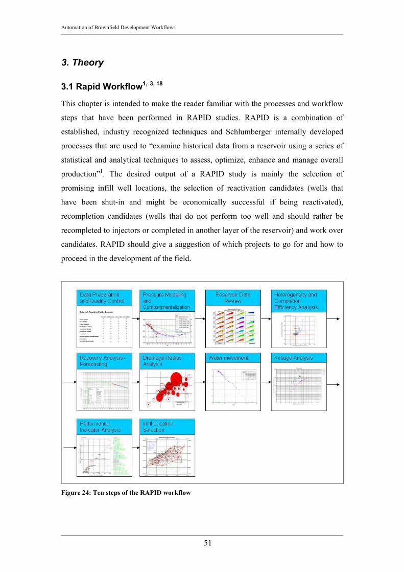
Automation of Brownfield Development Workflows
51
3. Theory
3.1 Rapid Workflow1, 3, 18
This chapter is intended to make the reader familiar with the processes and workflow
steps that have been performed in RAPID studies. RAPID is a combination of
established, industry recognized techniques and Schlumberger internally developed
processes that are used to “examine historical data from a reservoir using a series of
statistical and analytical techniques to assess, optimize, enhance and manage overall
production”1. The desired output of a RAPID study is mainly the selection of
promising infill well locations, the selection of reactivation candidates (wells that
have been shut-in and might be economically successful if being reactivated),
recompletion candidates (wells that do not perform too well and should rather be
recompleted to injectors or completed in another layer of the reservoir) and work over
candidates. RAPID should give a suggestion of which projects to go for and how to
proceed in the development of the field.
Figure 24: Ten steps of the RAPID workflow

Automation of Brownfield Development Workflows
52
The individual steps of the RAPID workflow as depicted in Figure 24 were defined in
the Schlumberger DCS office in Calgary, AB, Canada. As already mentioned the
main reason for defining the RAPID workflows is to deliver a guideline for engineers
to evaluate a Brownfield and to ensure that a consistent and high quality product is
delivered to Schlumberger DCS’ customers. Important constraints for a RAPID study
are time and money. RAPID studies never took more than 8 weeks; no matter how
large the field to be investigated is and the production of how many wells is to be
analyzed.
3.1.1 Data Preparation and Quality Control Data Preparation and Quality Control is the first step in a RAPID study and is
probably also the step that takes the longest time. The main objective for this step is to
make sure all necessary data have been gathered and are ready to be analyzed. The
minimum data requirement for a RAPID study is production volumes, injection
volumes and some pressure data on a monthly basis for each individual well.
Since RAPID’s concept is concentrating on the Canadian working environment,
production data usually are easy to obtain since they are publicly available. Data that
are available in public domain usually cover:
• Production and Injection volumes
• Pressure data
• Bottom hole locations
• Well status (active or shut-in)
• Operator (company that is operating the well)
Sometimes available, but usually not found in public domain databases are the
following parameters.
• KB elevation (Kelly Bushing elevation)
• Formation tops (top depths of reservoir formation), Formation net pay
thicknesses, Water saturations, Porosities, Permeabilities, Volume percent of
shale
• Completion history (perforations that have been shot, plugs that have been
taken, stimulation jobs, etc.)
• Drill stem test summaries
Automation of Brownfield Development Workflows
53
• AOF summaries (Absolute Open Flow Potential determination)
• Deviation surveys
These data are very important for the workflow though. That is why RAPID engineers
usually need to obtain some of these parameters from the client companies. Usually
MS Access macros have been used to organize the data and keep track of the various
data sources.
The purpose of this step is to gather all data and to perform a quick screening to
decide whether a RAPID study is possible and how to proceed regarding the data
availability and reliability. A location/status map is generated to see whether the given
Bottom hole locations are correct and to get a first impression of the field. The status
map gives a good overview, which wells are producing, which wells are shut-in and
which wells are injecting fluids. Moreover compartments might already be visible.
Compartments are certain areas in the reservoir that include wells that have a very
similar pressure signature. This similar pressure behavior indicates a pressure and/or
fluid communication between the wells in that part of the field and allows to analyze
these similar wells together and independently from another compartment, which
might have (has) its own pressure system. As can be seen in Figure 25 at least three
compartments might be identified in the given field. Of course this assumption has to
be checked with the pressure data, which will be described in the next step.

Automation of Brownfield Development Workflows
54
Figure 25: Status map for an oil field18
3.1.2 Reservoir Compartmentalization and Analysis Once the location and the pressure data are available the compartmentalization step
can be started. The main reason to compartmentalize the field is to analyze only these
parts of a field that behave similarly regarding pressure and production performance.
That makes the whole procedure more consistent and comparative.
The first step in compartmentalizing a reservoir is to check the map for very probable
compartments. In Figure 25 it is very probable that three compartments will be
encountered (the green and black wells in the north, the blue wells in the center part
and the red wells in the south).
This geographical compartmentalization has to be checked and validated using
pressure data. The problem in this step is that usually only a few pressure
measurements per well are available.
At first the pressures have to be corrected to datum depth. The reason for that
correction is that the pressure measurements are usually taken at the perforation depth

Automation of Brownfield Development Workflows
55
but to make them comparable a reservoir datum depth has to be determined to which
all measured pressures are corrected. This datum depth is very simply calculated by:
∑ −⋅=
sActiveWellferenceDepthnMidpoPerforationDatumDepth )Reint(1 Equation 15
where DatumDepth is the datum depth in [ft], n is the number of active wells [-],
Perforation Midpoint is the depth to the perforation midpoint of the formation of
interest in [ft] and DepthReference is the Reference Depth in [ft]. Reference Depths
are usually Kelly Bushing Elevation or offshore sea level.
The pressure at datum depth is then calculated for each well as:
int)(int nMidpoPerforatioDatumDepthdDdppp nMidpoperforatio −⋅+= Equation 16
where pperforationMidpoint is the well shut-in pressure at perforation midpoint depth in
[psia], dp/dD is the well shut-in pressure gradient in [psia/ft], DatumDepth is the
datum depth that has been determined in Equation 15 in [ft] and PerforationMidpoint
denotes the depth to the perforation midpoint in [ft].
The pressure correction to datum depth has to be done for each given pressure
measurement in the dataset. Afterwards the calculated pressures are plotted versus
time for each well.
Figure 26: Pressure profile of a well18 In Figure 26 the problem of very rare available data is demonstrated. The well in this
figure is producing since 1998 and the analysis was done in 2004. During these six
years only five pressure measurements were performed as indicated by the red squares

Automation of Brownfield Development Workflows
56
in the depiction. Sometimes the situation is even worse as demonstrated in the
pressure plot in Figure 27.
Figure 27: Pressure profile for a well with only two measurements18
Only two pressure measurements have been performed in almost 16 years of
production.
The way to find a pressure curve during a RAPID study is to use wells with a couple
of pressure measurements together in one plot and fit a curve that fits the pressure
distribution. This is of course not the most accurate way of determining pressure
points for wells. However, considering the constraint due to time and due to lack of
adequate measurements, this is probably as accurate as a pressure modeling can get
(without applying time consuming Material Balance or numerical flow simulation).
Figure 28: Pressure profile compartment18
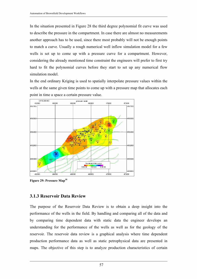
Automation of Brownfield Development Workflows
57
In the situation presented in Figure 28 the third degree polynomial fit curve was used
to describe the pressure in the compartment. In case there are almost no measurements
another approach has to be used, since there most probably will not be enough points
to match a curve. Usually a rough numerical well inflow simulation model for a few
wells is set up to come up with a pressure curve for a compartment. However,
considering the already mentioned time constraint the engineers will prefer to first try
hard to fit the polynomial curves before they start to set up any numerical flow
simulation model.
In the end ordinary Kriging is used to spatially interpolate pressure values within the
wells at the same given time points to come up with a pressure map that allocates each
point in time a space a certain pressure value.
Figure 29: Pressure Map18
3.1.3 Reservoir Data Review The purpose of the Reservoir Data Review is to obtain a deep insight into the
performance of the wells in the field. By handling and comparing all of the data and
by comparing time dependent data with static data the engineer develops an
understanding for the performance of the wells as well as for the geology of the
reservoir. The reservoir data review is a graphical analysis where time dependent
production performance data as well as static petrophysical data are presented in
maps. The objective of this step is to analyze production characteristics of certain

Automation of Brownfield Development Workflows
58
areas in the field as well as of specific wells. It is desired to find abnormalities in the
field, e.g. areas or wells in the reservoir that are performing well, even though they
are in a geologically unfavorable part of the reservoir (‘Best Practice Wells’) or vice
versa.
An example of some of the created diagrams can be seen in Figure 30 and Figure 31.
Figure 30: Production Performance Maps18
Figure 30 shows the production key performance indicators in a specific time range.
Lower values are marked red whereas higher values are blue or violet. The presented

Automation of Brownfield Development Workflows
59
key performance indicators are oil rate at the time point defined on the left hand side
of the line, water rate, water cut and pressure at the same time point.
Figure 31: Log Data Maps18
Figure 31 shows maps of different log data in different layers of the reservoir. The
layer changes from line to line in the given Figure. The parameters presented from left
to right are Formation Tops [ft], Net Hydrocarbon pore thickness [ft], net to gross
ratio [-], net porosity [-], net water saturation [-] and net pay [ft]. Again low values are
highlighted red, whereas high values are marked blue or violet.
Automation of Brownfield Development Workflows
60
These diagrams are usually plotted on very big papers in order to hang them next to
each other and to analyze them simultaneously. The objective is to obtain an
integrated view on the field, to understand whether good performance is due to good
geologic areas or due to better completion, etc.
3.1.4 Heterogeneity Index Analysis3, 19
The objective of the Heterogeneity Analysis is to compare the performance of a well
with the average performance of a group of surrounding wells. The basic information
gain out of this kind of analysis is, which well is producing better or worse than its
neighbors.
According to Reference 19 the Heterogeneity Analysis enables the investigator to
analyze the well performance based on completion method and efficiency and
reservoir quality and ‘tank size’ (= Hydrocarbons initially in place (HCIIP)). The
wells are therefore all normalized regarding their time on production and regarding
the reservoir pressure. This allows the comparison of well performances of different
wells can be compared without falsifying the results by not considering the impact of
different time ranges of historical production.
In RAPID studies a slightly modified equation than given in Reference 19 was used:
1)(
1)(Pr)(Pr
)(Re
−
⋅=
tntoductionFluidcumulativetoductionFluidcumulative
tHIservoir
WellFluid Equation 17
HIFluid denotes the dimensionless time dependent parameter Heterogeneity Index [-]
for any given fluid. This parameter can be calculated for oil, gas, barrel of oil
equivalent, condensate, etc. cumulativeFluidProductionWell(t) is the cumulative
production of the fluid to be analyzed for a certain well at a time point t ([STB] of
[Mscf]). cumulativeFluidProductionReservoir(t) is the cumulative production volume of
the same fluid for the whole field or the whole peer group of wells at a certain time
point t, that are used as a reference group ([STB] or [Mscf]). n(t) is the number of
active wells at a certain time point t.
The values for the Heterogeneity Index are usually in the range of negative one to
one. Sometimes wells behave significantly better thus the value for HI exceeds
positive one. A well that performs exactly as the average performance of all the wells

Automation of Brownfield Development Workflows
61
in the peer group will have a HI value of zero. The advantage of the slight
modification (subtracting 1 from the original HI equation) is that a well that behaves
exactly as the average of the surrounding wells has a HI value of zero instead of one
as it would be with the original equation.
It is important to notice that this analysis can only be performed if the wells have a
somehow similar performance. If there are one or two wells that exceed the well
performance of the other wells by far, the average peer group cumulative production
volume might be too high to obtain reasonable HI values for the other wells leaving
other good wells with too low HI values.
Reese presents a set of type curves in his paper19. The basic idea is that a well
completion and reservoir performance can be classified according to the features in a
plot of HI of the main producing phase (e.g. oil) versus time. For example, a well that
starts off with a very low HI (smaller than zero), but later during production shows HI
values of larger than zero can be classified as a well with a bad completion but a good
performance due to reservoir properties. On the other hand decreasing values of HI
indicate that the performance is restricted due to the reservoir size. The completion of
a well that starts off with a HI value of much larger than zero can be regarded as
exceptionally good.
The following depiction shows the heterogeneity index for oil of a well in the earlier
presented field. As apparent in Figure 32 the well is a rather good producer with
some slight problems in the beginning. Its completion should be compared to the
neighboring wells to see, whether a larger initial HI value would have been possible.

Automation of Brownfield Development Workflows
62
Heterogeneity Index Oil
-1.5
-1
-0.5
0
0.5
1
1.5
5/7/90 6/15/94 7/24/98 9/1/02 10/10/06
Date
HI [-
]
Figure 32: Heterogeneity Index Oil for a well Figure 33 shows the HI oil versus time plot of a bad performing well. This well starts
off with a HI oil value of smaller than one, which indicates a poor completion. The
well never recovers and stays below zero all the time. This indicates that not only has
the completion been suboptimal also the reservoir performance cannot make up what
the mechanics (completion and well installations) have set up badly.

Automation of Brownfield Development Workflows
63
Heterogeneity Index Oil
-1
-0.9
-0.8
-0.7
-0.6
-0.5
-0.4
-0.3
-0.2
-0.1
05/7/90 6/15/94 7/24/98 9/1/02 10/10/06
Date
HI [-
]
Figure 33: Heterogeneity Index Oil for a well - Bad Performer In RAPID studies the Heterogeneity Indices of several parameters have been used
simultaneously to analyze the performance of a well in an integrated way. The main
concern is that a well that is producing more oil than its neighbors should not
automatically be identified as a very well completed well, since the water production
of the same well can be significantly higher than the average too. A ‘best practice’
well should therefore have a HI oil of larger than zero and e.g. a HI water value of
smaller than zero, which indicates a higher than the average oil production and a
lower than the average water production. RAPID engineers plot HI water versus HI
oil to analyze the wells.
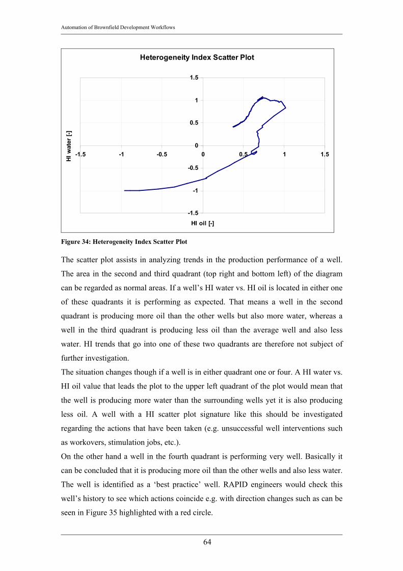
Automation of Brownfield Development Workflows
64
Heterogeneity Index Scatter Plot
-1.5
-1
-0.5
0
0.5
1
1.5
-1.5 -1 -0.5 0 0.5 1 1.5
HI oil [-]
HI w
ater
[-]
Figure 34: Heterogeneity Index Scatter Plot The scatter plot assists in analyzing trends in the production performance of a well.
The area in the second and third quadrant (top right and bottom left) of the diagram
can be regarded as normal areas. If a well’s HI water vs. HI oil is located in either one
of these quadrants it is performing as expected. That means a well in the second
quadrant is producing more oil than the other wells but also more water, whereas a
well in the third quadrant is producing less oil than the average well and also less
water. HI trends that go into one of these two quadrants are therefore not subject of
further investigation.
The situation changes though if a well is in either quadrant one or four. A HI water vs.
HI oil value that leads the plot to the upper left quadrant of the plot would mean that
the well is producing more water than the surrounding wells yet it is also producing
less oil. A well with a HI scatter plot signature like this should be investigated
regarding the actions that have been taken (e.g. unsuccessful well interventions such
as workovers, stimulation jobs, etc.).
On the other hand a well in the fourth quadrant is performing very well. Basically it
can be concluded that it is producing more oil than the other wells and also less water.
The well is identified as a ‘best practice’ well. RAPID engineers would check this
well’s history to see which actions coincide e.g. with direction changes such as can be
seen in Figure 35 highlighted with a red circle.

Automation of Brownfield Development Workflows
65
Heterogeneity Index Scatter Plot
-1
-0.5
0
0.5
1
-1.5 -1 -0.5 0 0.5 1 1.5 2 2.5 3
HI oil [-]
HI w
ater
[-]
Figure 35: Heterogeneity Index Scatter Plot - well performing well
Finally a comparison on field level will be done to quickly find good and bad
performers. To compare the wells on a field level either the whole HI water vs. HI oil
plot is used for each individual well, or – as presented in Figure 36 only the last
calculated HI oil and HI water values are used.
Heterogeneity Index Field Level
-1.5
-1
-0.5
0
0.5
1
1.5
2
-1.5 -1 -0.5 0 0.5 1 1.5 2 2.5 3 3.5 4
last HI oil [-]
last
HI w
ater
[-]
Figure 36: Heterogeneity Index on a field level
Best performing wells
Bad performing wells
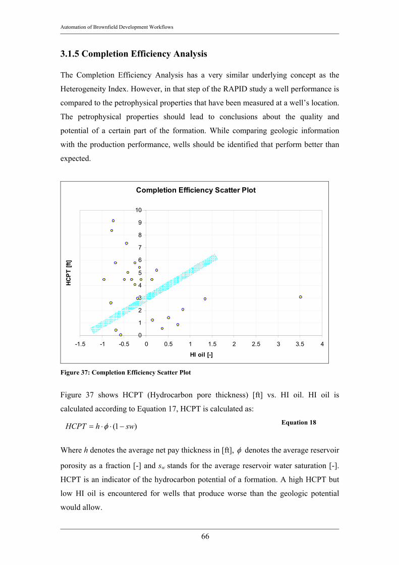
Automation of Brownfield Development Workflows
66
3.1.5 Completion Efficiency Analysis The Completion Efficiency Analysis has a very similar underlying concept as the
Heterogeneity Index. However, in that step of the RAPID study a well performance is
compared to the petrophysical properties that have been measured at a well’s location.
The petrophysical properties should lead to conclusions about the quality and
potential of a certain part of the formation. While comparing geologic information
with the production performance, wells should be identified that perform better than
expected.
Completion Efficiency Scatter Plot
0
1
2
3
4
5
6
7
8
9
10
-1.5 -1 -0.5 0 0.5 1 1.5 2 2.5 3 3.5 4
HI oil [-]
HCPT
[ft]
Figure 37: Completion Efficiency Scatter Plot
Figure 37 shows HCPT (Hydrocarbon pore thickness) [ft] vs. HI oil. HI oil is
calculated according to Equation 17, HCPT is calculated as:
)1( swhHCPT −⋅⋅= φ Equation 18
Where h denotes the average net pay thickness in [ft], φ denotes the average reservoir
porosity as a fraction [-] and sw stands for the average reservoir water saturation [-].
HCPT is an indicator of the hydrocarbon potential of a formation. A high HCPT but
low HI oil is encountered for wells that produce worse than the geologic potential
would allow.
Automation of Brownfield Development Workflows
67
The blue bar divides the good performers (below the blue bar) from the bad
performers (above the blue bar). Wells below the blue bar, especially those towards
the right end (high values for HI oil) should be subject to deeper investigation of
actions that have been taken in the life time of the well. Since they are performing
very well their completion technique should be investigated as well as all well
interventions during the life time of the well (e.g. stimulation jobs, workovers, etc.).
Especially the Heterogeneity Index Analysis and the Completion Efficiency Analysis
should give a good overview of which wells need intervention. It should furthermore
indicate which well interventions have been more successful than others. Therefore a
good database of interventions and their impact as well as a good outline of what
actions have to be taken in future should be available to the engineer.
3.1.6 Recovery Analysis To estimate the production potential for each well production decline techniques
(Decline Curve Analysis, Water cut prediction, etc.) are employed. With the help of
Decline Curve Analysis the engineers determine the following key performance
indicators:
• Estimated Ultimate Recovery (EUR) ([STB] for oil wells and [Mscf] for gas
wells): EUR is the well’s cumulative production to the end of forecast life
(e.g. date at which production rate is equal zero)
• Forecast Life [days] or [months]: The production rates in the DCA plots are
extrapolated until the production rate is equal to zero. The first day at which
this condition is true is the last day in the production of a well. The time until
this date is calculated and mapped as ‘Forecast Life’.
• Estimated three/five year recovery in [STB] or [Mscf]: Even though in many
fields the production decline allows production forecasts for another 15 or 20
years it is not very accurate to predict the production for more than three or
five years. RAPID engineers usually predict the well’s future performance
with a discrepancy of 1% within a year. However, the longer the forecasting
time range the less reliable the forecasted volumes are and the higher the
expected discrepancy between forecast and actual values.

Automation of Brownfield Development Workflows
68
• Remaining Reserves in [STB] or [Mscf]: This value is describing the
remaining production potential of a well. It is calculated as:
QEURRR −= Equation 19
Where RR denotes the Remaining Reserves in [STB] or [Mscf], EUR denotes
the Estimated Ultimate Recovery as described earlier in this chapter and Q is
the cumulative hydrocarbon production until the forecast start date.
• Decline Rate in [1/d]: The decline rate is an indicator of how fast the
production rate is depleting and therefore combined with the available values
for ‘Estimated three or five year recovery’ or ‘Remaining Reserves’ is a good
indication of how much of a production potential is in a certain area.
• Initial Production Rate [STB/d] or [Mscf/d]: The initial production rate is the
production rate encountered at the forecast start date. E.g. if the last day in the
production history of a field is 3/1/2004, then ‘Initial Production Rate’ would
be the forecasted production rate at 4/1/2004. An analysis of ‘Initial
Production Rate’ gives a good overview on how well certain wells are doing
in terms of production rates and reservoir pressure.
Figure 38: Forecast Key Performance Indicators
During that step of the RAPID analysis the team of engineers wants to get an outlook
on field performance in the nearer future. The six mentioned parameters are
determined for each well and are spatially interpolated (ordinary Kriging) and mapped
to compare them on a field level.
Initial rate
Estimated 3 Year Recovery
Decline Rate
Estimated Ultimate Recovery
Remaining Reserves

Automation of Brownfield Development Workflows
69

Automation of Brownfield Development Workflows
70
Figure 39: Maps of Forecasted Parameters18
Apparent in Figure 39 is a rather promising central area of that field. The EUR as well
as the Remaining Reserves show rather good values as well as the Decline Rate as
interpolated is expected to stay below 0.05 [1/d]. This information will be used
especially for the recommendation of infill candidates and reactivation candidates.
3.1.7 Drainage Radius Analysis24 The main purpose of this step in the analysis is to allocate a certain area around the
well as the drainage area of that particular well and to plot this drainage area on a
bubble plot for each well. Hence it will be very easy to find parts of the field that are
not drained yet; this assists in the picking of infill locations.
Precondition in order that this step can be accomplished is the availability of
petrophysical information such as average net pay, average reservoir porosity and
average reservoir water saturation). It is very important not to confuse the drainage
radius calculated here with drainage radius used in transient well testing. The drainage
radius here is calculated based on production data and volumetric calculations and
will show areas that have been drained and not, as is the case in well testing and
simulation, the areas contributing to flow. Depending on the drive depletion
mechanism the drainage radius is calculated as presented:
• If the production of hydrocarbons for the reservoir is assumed to be steady
state ( 0=∂∂
tp , e.g. due to water influx, water drive, etc.), the drainage radius
is defined as:
Automation of Brownfield Development Workflows
71
• If the production is in a semi-steady state ( consttp =∂∂ ), the drainage radius
can be calculated as:
In Equation 20 as well as Equation 21 the parameters are: re is the drainage radius in
[ft], Q is the cumulative hydrocarbon production in [STB], h is the average reservoir
net pay thickness in [ft], φ is the average reservoir porosity given as a fraction [-], sw
is the average reservoir water saturation at current conditions [-], sg is the average
reservoir gas saturation at current conditions [-], sor is the residual oil saturation [-], Bo
is the formation volume factor for oil at current condition [bbl/STB] and Boi is the
formation volume factor for oil at initial conditions.
The drainage radii are presented in a bubble map where the bubble size is proportional
to the drainage radius size. That way it is easy to find undrained areas in the reservoir.
For gas reservoirs interference radii are calculated rather than drainage radii; the latter
are more associated with oil wells since they present swept areas. The interference
areas show the area around a well, where the pressure is affected by a certain gas well.
It is therefore very possible that interference areas of several wells overlap, which
indicates that these wells might have a decreased performance. Areas that are not part
of the interference area of any well, are potentially good infill locations.
3.1.8 Secondary Phase Movement Analysis This analysis step should provide information about swept and unswept areas due to
water movement in the reservoir. If secondary phase (e.g. water) production is tracked
spatially over time, it is possible to generate maps of e.g. equal water cut, thus getting
a good estimation about the sweep in the reservoir. The engineers usually generate a
set of maps displaying the movement of water (e.g. last 5 year cumulative water
production in a map, cumulative water cut in a map, etc.). The output of this analysis
step is identification of swept areas and of permeability trends.
)1(775843560
orw
oe ssh
BQr
−−⋅⋅⋅⋅
⋅⋅= φπ Equation 20
−−−−⋅⋅⋅⋅
⋅=o
w
oi
wie
Bsgs
Bs
h
Qr11
7758
43560
φπ
Equation 21

Automation of Brownfield Development Workflows
72
3.1.9 Vintage Analysis Vintage Analysis is another important step in the RAPID workflow. Its purpose is to
group wells by specific events to compare the characteristics of groups of wells in
time. Very often the events to classify the wells into time groups are either found in a
plot of initial production rate of the wells versus time or number of active wells versus
time. The idea of both plots is to reliably define time ranges in the development of the
field’s life. For example in Figure 40 several development stages in the life of the
field can be distinguished.
First Oil Production Rate
0
10000
20000
30000
40000
50000
60000
70000
80000
90000
100000
10/1/
1988
10/1/
1989
10/1/
1990
10/1/
1991
10/1/
1992
10/1/
1993
10/1/
1994
10/1/
1995
10/1/
1996
10/1/
1997
10/1/
1998
10/1/
1999
10/1/
2000
10/1/
2001
10/1/
2002
Date
Avg.
Firs
t Oil
Prod
uctio
n Ra
te [S
TB/d
]
Figure 40: Vintaging - Event Identification
After the vintage groups have been determined the analysis starts. With Vintage
Analysis engineers try to see how a new well will be performing and to verify their
forecasts. The visual tool to do this is the Cumulative Frequency Plot (CFD Plot). An
example of a CFD plot is shown in the next depiction.
The figure shows a plot of a common key performance indicator versus cumulative
frequency on a semi logarithmic plot. Best 12 month oil production in [STB] is
determined by computing the 12 month moving average of the oil rate and the
maximum value is the value used as ‘Best 12 month oil production’. The way to
calculate the cumulative frequency CFD is presented in the artificial example below:
Exploration phase
First development Phase
Next development phases
Latest development phase
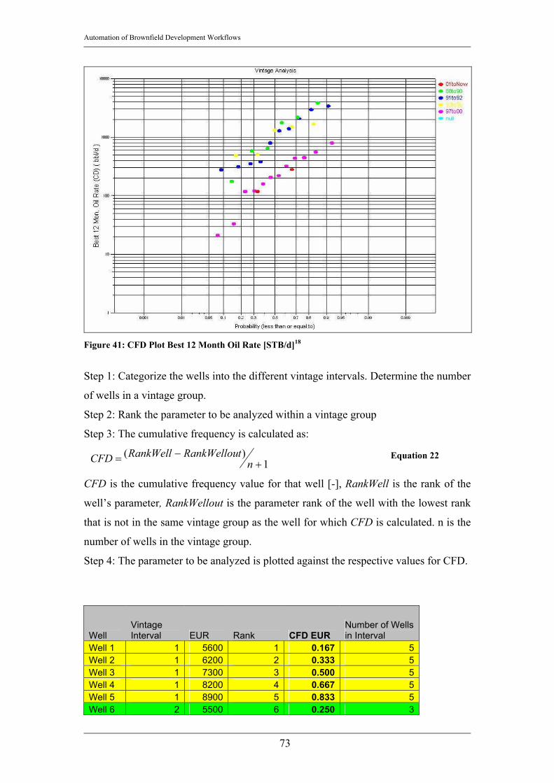
Automation of Brownfield Development Workflows
73
Figure 41: CFD Plot Best 12 Month Oil Rate [STB/d]18
Step 1: Categorize the wells into the different vintage intervals. Determine the number
of wells in a vintage group.
Step 2: Rank the parameter to be analyzed within a vintage group
Step 3: The cumulative frequency is calculated as:
1)(
+−= n
tRankWellouRankWellCFD Equation 22
CFD is the cumulative frequency value for that well [-], RankWell is the rank of the
well’s parameter, RankWellout is the parameter rank of the well with the lowest rank
that is not in the same vintage group as the well for which CFD is calculated. n is the
number of wells in the vintage group.
Step 4: The parameter to be analyzed is plotted against the respective values for CFD.
Well Vintage Interval EUR Rank CFD EUR
Number of Wells in Interval
Well 1 1 5600 1 0.167 5 Well 2 1 6200 2 0.333 5 Well 3 1 7300 3 0.500 5 Well 4 1 8200 4 0.667 5 Well 5 1 8900 5 0.833 5 Well 6 2 5500 6 0.250 3

Automation of Brownfield Development Workflows
74
Well 7 2 5900 7 0.500 3 Well 8 2 7900 8 0.750 3 Well 9 3 3800 9 0.100 9 Well 10 3 3900 10 0.200 9 Well 11 3 4200 11 0.300 9 Well 12 3 4800 12 0.400 9 Well 13 3 4900 13 0.500 9 Well 14 3 5300 14 0.600 9 Well 15 3 5900 15 0.700 9 Well 16 3 6200 16 0.800 9 Well 17 3 7000 17 0.900 9 Well 18 4 2100 18 0.111 8 Well 19 4 2400 19 0.222 8 Well 20 4 2600 20 0.333 8 Well 21 4 2700 21 0.444 8 Well 22 4 2900 22 0.556 8 Well 23 4 3200 23 0.667 8 Well 24 4 3600 24 0.778 8 Well 25 4 4000 25 0.889 8 Well 26 5 1800 26 0.167 5 Well 27 5 1900 27 0.333 5 Well 28 5 2000 28 0.500 5 Well 29 5 2100 29 0.667 5 Well 30 5 2200 30 0.833 5
Table 6: CFD calculation
Cumulative Frequency Plot
1000
2000
3000
4000
5000
6000
7000
8000
9000
10000
0.000 0.200 0.400 0.600 0.800 1.000
Cumulative Frequency (less than or equal to) [-]
EUR
[MST
B]
Vintage 1Vintage 2Vintage 3Vintage 4Vintage 5
Figure 42: Cumulative Frequency Plot
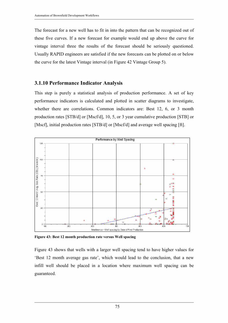
Automation of Brownfield Development Workflows
75
The forecast for a new well has to fit in into the pattern that can be recognized out of
these five curves. If a new forecast for example would end up above the curve for
vintage interval three the results of the forecast should be seriously questioned.
Usually RAPID engineers are satisfied if the new forecasts can be plotted on or below
the curve for the latest Vintage interval (in Figure 42 Vintage Group 5).
3.1.10 Performance Indicator Analysis
This step is purely a statistical analysis of production performance. A set of key
performance indicators is calculated and plotted in scatter diagrams to investigate,
whether there are correlations. Common indicators are: Best 12, 6, or 3 month
production rates [STB/d] or [Mscf/d], 10, 5, or 3 year cumulative production [STB] or
[Mscf], initial production rates [STB/d] or [Mscf/d] and average well spacing [ft].
Figure 43: Best 12 month production rate versus Well spacing
Figure 43 shows that wells with a larger well spacing tend to have higher values for
‘Best 12 month average gas rate’, which would lead to the conclusion, that a new
infill well should be placed in a location where maximum well spacing can be
guaranteed.

Automation of Brownfield Development Workflows
76
3.1.11 Infill selection The last step in the RAPID process is to identify potentially good infill locations.
“Infill location” in this document is a possible well location in the reservoir that is
analyzed for its probable hydrocarbon production. A series of key performance
indicators is calculated for the existing wells and by using ordinary Kriging these key
performance indicators are spatially interpolated for the infill locations. The key
performance indicators used are:
• Initial Production Rate [STB/d] or [Mscf/d]: As defined in the Chapter about
Recovery Analysis, the ‘initial production rate’ is the hydrocarbon
production rate at the forecast start date.
• 4 months average oil/gas rate [STB/d] or [Mscf/d]: This is the four months
moving average of the rate. The major idea to use the 4 months moving
average in addition to the rate is that the last rate value might not be
representative for the recent production history. A four months moving
average however rules out the chance of a wrong result due to an outlier as a
last value.
• Productivity Index hydrocarbon phase: [STB/psi d] or [Mscf/psi d]
• Productivity Index total liquid [STB/psi d]
For each location four different values for initial rate are given, two from the above
rates and the other two calculated from the Productivity indices. The spread of these
four values is proportional to the associated uncertainty; the larger the four values are
apart from each other the lower is the reliability of the forecast.
The team of engineers tries to incorporate all of this information to find spots in the
map that could be good infill locations. The difficulty is to rank the large amount of
wells considering the multidimensional data space. Once the ranking is done, the best
wells will be suggested as promising locations for infill wells.
The list of the infill locations will then be presented to the client, together with a list
of work over candidates from earlier workflow steps. This is the point, where the
RAPID study ends.

Automation of Brownfield Development Workflows
77
3.2. BRIGHT Workflow
3.2.1. Introduction The workflow in BRIGHT basically follows a very similar structure as just discussed
for the RAPID workflow. In this introduction chapter the workflow steps will be
introduced. The details about the individual workflow steps can be found in the
following chapters.
Figure 44: BRIGHT's Workflow
The main objective in BRIGHT’s development was to simplify the working steps thus
minimizing the necessary user intervention. The software is set up in a way that the
user is guided in a correct order through the individual steps.
Due to the highly automated nature of BRIGHT the user is not required to work
intensively on data preparation anymore (except for preparing the database to be used
in BRIGHT). Associated problems are that the user is not that familiar with the data
as she or he would be after a rigorous and long ‘Data Analysis and Quality Control’
step in RAPID. Therefore an ‘Interview Screen’ was introduced to make sure that the
user is familiar with the given field. The interview asks general questions about the
reservoir and automatically determines whether BRIGHT is an applicable software
tool for the given problem.
In BRIGHT as well as in RAPID a lot of interpolation work and forecasting is done
and so BRIGHT as well as RAPID relies heavily on having very smooth and reliable
data. If the interview screen logic concludes that this cannot be guaranteed, BRIGHT
is most probable not a suitable software tool for the given problem.
Automation of Brownfield Development Workflows
78
3.3. Interview Screen
The purpose of the interview screen is to check, whether BRIGHT is the applicable
software tool for a given situation. The main concern in the development of BRIGHT
is that the users, who use BRIGHT do not have to work a lot with the data. This
situation is even more severe, if the data are already prepared in a well organized
database. The user only has to retrieve the data from that database and is not bound to
check the data before the analysis. The interview screen therefore asks questions
about the reservoir to make sure whether the person, who is using BRIGHT is familiar
with the situation - or motivated by the questions in the interview screen - starts to
make himself or herself familiar with the reservoir and the environment of the
BRIGHT study.
The questions are divided into several categories, each of which is covering a certain
aspect of the study:
• Project Info: The project info contains general information about the project
which is very useful to organize the project. It contains information about the
field name, the Client Company, contact persons, regions, etc.
BRIGHT will ask here whether the production and injection rate data are
reliable. If ‘No’ is clicked here, BRIGHT will explicitly warn the user to use
BRIGHT and in case the user wants go on, she or he is strongly advised to
proceed carefully.
Moreover the Project Info screen is querying very important information
about the fluid system. There are question about what is the primary
producing phase (e.g. Oil or Gas), what is the most important secondary phase
(e.g. Water, Condensate, Sand, etc.), if there is free gas evolvement in the
reservoir, etc.
The Project info tab of the interview screen will result in a basic
recommendation about whether BRIGHT is applicable in the given situation.
Problems arise if the given data are not reliable, if the gas oil ratio (GOR) is
significantly higher than the initial GOR (indication of free gas evolvement
and therefore a complicated three phase recovery mechanism) and if an
injected phase other than water is selected.
• Reservoir Characterization: The questions in the ‘Reservoir Characterization’
mainly gather information about boundary conditions and about the “degree

Automation of Brownfield Development Workflows
79
of unconventionality”; e.g. BRIGHT is asking about Dual Porosity or Dual
Permeability behavior, which is mainly encountered in highly fractured
reservoirs or whether the given reservoir is an unconventional gas reservoir
(which in general behaves a lot different than a ‘usual’ reservoir in terms of
production). Other important questions are whether more than one layer is
present in the reservoir and whether commingled production takes place.
Commingled production means that a well is completed and producing in
several layers simultaneously, sometimes without multiple completions (only
one production tubing is installed; therefore it is very difficult to back allocate
the total production volumes to the respective layers). BRIGHT (as well as
RAPID analysis) is only capable of analyzing a single layer or a multilayer
system with communication between the layers. If more than one layer is
present and the layers are isolated, an accurate allocation of the production
volumes to the respective layers has to be assured and the layers should be
analyzed individually. Otherwise the consistency of the analysis is not given
and production performances in one layer are compared with production
performances in a probably completely differently behaving layer.
• Operating Strategy: As the name says, the ‘Operating Strategy’ tab is focusing
on how the reservoir is being produced. It has to be pointed out here, that
BRIGHT right now can only be applied in a water flood reservoir. Due to
very complex flow physics other EOR projects (e.g. gas injection, Steam
injection, polymer injection, etc.) would lead to a too complex flow behavior
and therefore the interview screen issues a recommendation to not use
BRIGHT.
BRIGHT checks for the existence of highly deviated or horizontal wells. The
problem with highly deviated or horizontal wells is that their drainage area is
different than the drainage are of an (almost) vertical well. It is rather
elliptical with the larger half-axis along the deviated section of the well8.
However, in the calculation of many performance indicators (e.g.
Hydrocarbons in place, sweep efficiency, etc.) BRIGHT is using a drainage
area determined solely based on the geographic location of the completions
(see chapter about Voronoi Grid). BRIGHT does not take into account the

Automation of Brownfield Development Workflows
80
different drainage shape due to a specific well geometry and therefore the
interview screen warns in case highly deviated or horizontal wells are present.
Moreover BRIGHT checks whether there was no recent change in the
operating strategy. A recent change in operating strategy would be the
installation of pumps in several wells, the change of surface installation
pressure or generally the change in any production performance relevant
parameter. Changes in operating strategy introduce transient behavior of
production rates and pressure to the performance of the wells and therefore
one of the main constraints for the forecasting engine in BRIGHT is not
fulfilled; steady state or pseudo state production.
• Data Availability: The Data Availability check is intended to give the user a
feeling of what data are necessary and to give BRIGHT a chance to check,
whether enough data for a statistically sound analysis are available. BRIGHT
will compute a score according to an internal logic to evaluate the data
availability. It is important that there is a statistically reasonable amount of
wells and of production volume data history.
Minimum Data requirement for a BRIGHT study in the current version is:
Time dependent data:
o Production data (e.g. monthly oil production volumes [STB] or
monthly gas production volumes [Mscf], monthly water production
volumes [STB])
o Injection data (monthly water injection volumes [STB])
Static data:
o Average net reservoir thickness [ft]
o Average net reservoir porosity [-]
o Average net reservoir water saturation [-]
However, the user has the chance to acquire much more data for the sake of
organization or to use the data in other applications that can access the
database.
An internal scoring algorithm will determine a score for the individual steps in the
interview and will come up with a final score. According to that score the output will
be OK, Warning or Problem. The associated recommendation is, whether to go on

Automation of Brownfield Development Workflows
81
with the study, to go on with the study with increased caution or to reconsider the
application of BRIGHT for the given situation.
3.4. Petrophysical Data
One of the cornerstones in BRIGHT is to not only look at production rates and
mechanical performance indicators but also set them into relation to the geologic
environment. To be able to analyze the geologic surrounding of a well or an infill
location, a geologic model has to be set up. Of course, the geologic model in BRIGHT
will be rather simple, but considering the usually very limited data availability a
simple model is generally a very good representation of the project reservoirs; the
correctness of a highly sophisticated geologic model cannot be guaranteed given the
lack of available data.
3.4.1. Petrophysical Data Requirement In the current version of BRIGHT several workflow steps need a calculated
hydrocarbon in place volume (HCIP). Especially of interest is the initial hydrocarbon
in place, since e.g. Recovery Factors are calculated by using the initial HCIP. The
equation used for the HCIP is:
( )i
wi
BshA
HCIP−⋅⋅⋅
=1φ
Equation 23
HCIP is the hydrocarbon in place volume, usually given in [STB] or in [MSTB] or for
gas fields [Mscf] or rather [MMscf]. A is the drainage area of the well that is
determined from the Voronoi grid [acres]. φ is the porosity as a fraction [-], swi is the
average initial reservoir water saturation for the given Voronoi grid block. Bi is the
formation volume factor of the phase that is being analyzed in the given BRIGHT
study.
An accurate representation of the HCIP is very important, since the calculation of a
representative recovery factor value is based on a good HCIP value. The recovery
factor will later on be used to determine wells that behave significantly better or
worse than the surrounding wells and that should therefore be excluded from further
workflows. So, the more accurate the geologic model can be set up, the more reliable
all these parameter values can be determined and the more sound the outlier
identification and subsequently the analysis will be.

Automation of Brownfield Development Workflows
82
3.4.2. Interpolation Techniques The problem is that usually (especially old) fields do not have petrophysical
measurements (e.g. core analysis, well logs, etc.) for each well. Figure 45 shows in a
map, which wells have petrophysical measurements in general (e.g. no information
about whether the data (e.g. porosity) were obtained by well logging or out of core
measurements). The green squares denote all wells with petrophysical data, whereas
the wells represented by the blue dots – the majority - are without any measurement
of petrophysical parameters and thus the values for these wells have to be computed.
Figure 45: Petrophysical Data Availability
Therefore in the ‘Petrophysical Data Interpolation’ BRIGHT basically can get the
petrophysical data at each location through three different techniques.
• Averaging
• Ordinary Kriging
• User Input
3.4.2.1. Averaging Averaging is a very simple way of filling the gaps with a single value. Especially in a
situation, when only very few measurements are available Averaging would be the

Automation of Brownfield Development Workflows
83
technique to use rather than ordinary Kriging, which needs a certain spatial sample
density in order to reliably interpolate in arbitrary locations within the field. The
assumption behind the Averaging procedure is that the few measurements of the
respective petrophysical parameters are independent and randomly taken (mutually
exclusive) – this is generally not the case but regarding the lack of a for this problem
suitable interpolation routine, this is a reasonable assumption. Therefore, according to
the Central Limit Theorem12 their values are approximately normally distributed.
Thus, the best estimator for each parameter is the expected value, which for any given
Normal distribution is the arithmetic mean of all sample values. Given a number of n
different measurements the estimated value E(x) for any parameter will therefore be
given as:
∑=
⋅=
n
iix
nxE
1
1)( Equation 24
3.4.2.2. Ordinary Kriging As mentioned in Chapter 2.3. BRIGHT uses ordinary Kriging as its main interpolation
technique. Kriging is used for every performance and forest interpolation step, since it
is one of the cornerstones of BRIGHT that a statistically sound number of wells and
therefore of production data is available. In the ‘Petrophysical Data’ interpolation
step, BRIGHT has to offer ‘Averaging’ and ‘user input’ in addition to ordinary
Kriging since the petrophysical data are usually not as readily and numerously
available as the production data.
The details about Kriging can be found in Reference 10 and Reference 22 and in
Chapter 2.3 of this work. In this chapter ordinary Kriging is presented on a real
example. The maps in Figure 46 show maps of interpolated average net pay thickness
in [ft] for a Turkish oil field. The left depiction in Figure 46 is the map obtained by
ordinary Kriging the right map is the map as obtained after filling the gap values with
the field average as described in Chapter 3.4.2.1.

Automation of Brownfield Development Workflows
84
Figure 46: ordinary Kriging for gaps (left) compared to averaging for gaps (right) Since the data availability was rather high, the two maps do not differ too much from
each other, which shows that ordinary Kriging delivers a - considering the given
purpose of the study - sound and reliable map.
BRIGHT further on employs Kriging whenever a parameter is to be interpolated
within the wells into the infill locations. For example the forecasts of the existing
wells are kriged into the infill locations to obtain a forecast at that location.
3.4.2.3 User Input The user can also input values that she or he assumes to be the best approximation for
the given petrophysical parameter. This is especially a good idea if a geologic model
for the given reservoir already exists in a different application and the values at the
well locations are therefore known. The user would want to import these data and this
is possible with the user input function. Moreover, sometimes no petrophysical data
exist at all (e.g. there were no measurements or more probable the company
performing the study has not yet received any petrophysical parameters). If that is the
case the engineer has to go with her or his best guess, which can also be a very good
approximation, if the engineer is familiar with the specific region in general.
3.6 Gridding In BRIGHT two types of grids are used for two different purposes. (1) The Voronoi
grid is used to obtain a good estimate for the drainage area of a well and therefore to
be able to obtain values for hydrocarbons in place that can be allocated to a certain
well and subsequently sweep efficiency. (2) A Delaunay Triangulation grid is then
used to (a) come up with infill locations, which are always located in the center of a

Automation of Brownfield Development Workflows
85
triangle’s block inner circle and (b) to find an infill location’s most relevant neighbors
(see Chapter 3.9. on calculation of uncertainty).
3.6.1 Voronoi The Voronoi Grid is a flexible grid that is also known as PEBI grid in flow simulation
models. The grid creates flexible polygons around the points, which is given by the
well locations. The Voronoi Polygons represent the area surrounding a well that is
closer to it than to any other well. This is achieved by drawing an imaginary linear
connection between two wells and setting the grid edge perpendicular to the
connection line exactly in the center of the line (therefore the name PEBI, which
means perpendicular bisection).
The grid is depicted in Figure 47. Since the algorithm itself does not consider
reservoir boundaries, the edge wells are given too large areas. Therefore BRIGHT
offers the so called bounding radius function.
Figure 47: Voronoi Grid Diagram

Automation of Brownfield Development Workflows
86
Bounding Radius basically draws an imaginary circle around each well with the
radius that can be input by the user. If the Voronoi area of a well exceeds the
boundary of this imaginary circle, the grid area will be cropped and the area that is
outside of the circle area will not be regarded as Voronoi area for the specific well.
Figure 48: Bounding Radius
The cropping of the much too large Voronoi areas of the reservoir’s edge wells is very
important since the Voronoi area will be used later in the workflow to determine the
area of the reservoir and therefore the hydrocarbons in place allocated to the well.
Subsequently this value is used in the denominator in the Equation for the Recovery
Factor:
( )go
wi BshA
Q
,
11 ⋅−⋅⋅⋅
=
φη
Equation 25
η is the recovery factor [-], Q is the cumulative production (either oil [STB] or gas
[Mscf], A is the drainage area as determined with the Voronoi grid, h is the average
reservoir net pay thickness in [ft] in the grid block defined by the Voronoi area, φ is
the average porosity in the grid block [-], sw the average reservoir water saturation [-]
and Bo,g is the formation volume factor of either oil [bbl/STB] or gas [bbl/Mscf].
If the Voronoi area is too large as apparent for the wells at the reservoir edge in
Figure 47, the denominator in Equation 25 would be too large, thus underestimating
the recovery factors of the edge wells significantly.
Bounding Radius
A
B
C
D
E
G
F
Well A Voronoi Area
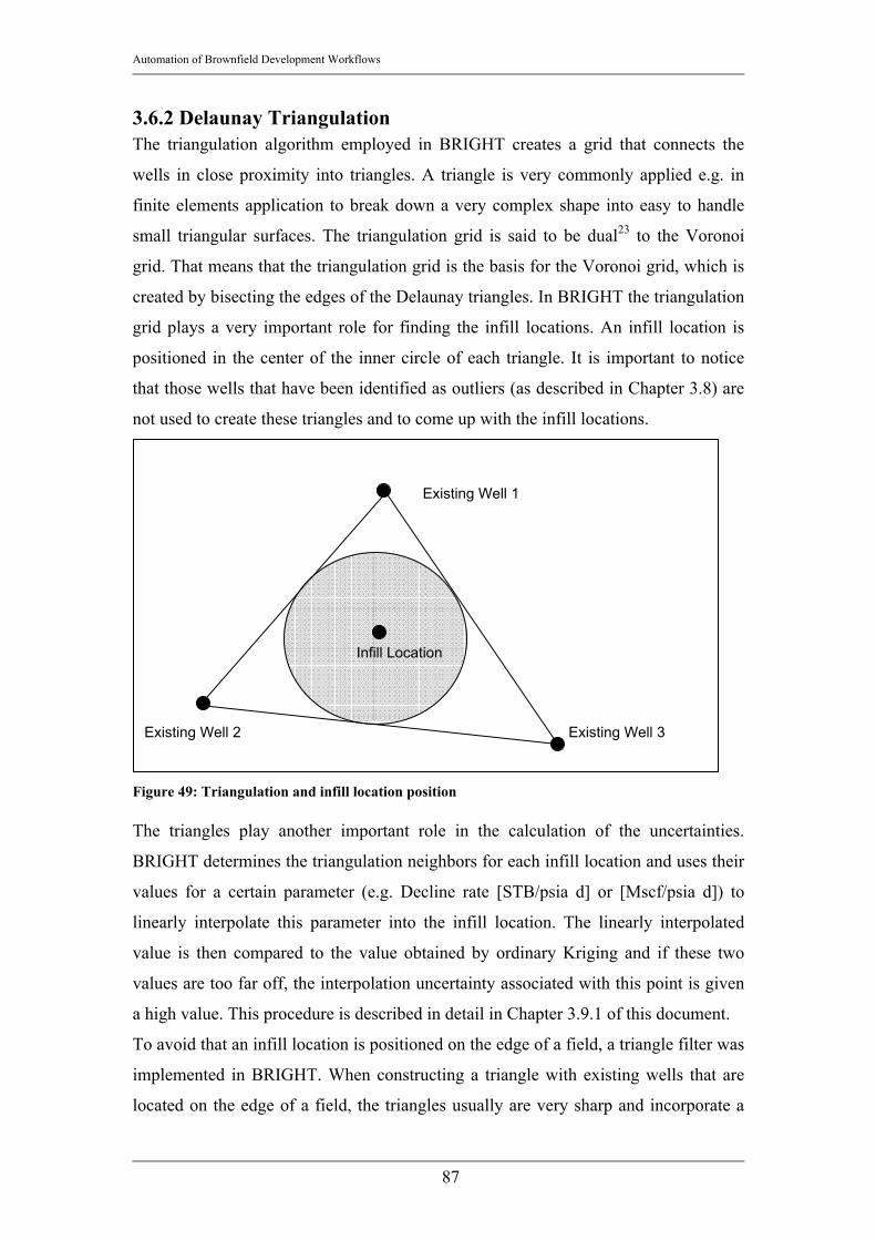
Automation of Brownfield Development Workflows
87
3.6.2 Delaunay Triangulation The triangulation algorithm employed in BRIGHT creates a grid that connects the
wells in close proximity into triangles. A triangle is very commonly applied e.g. in
finite elements application to break down a very complex shape into easy to handle
small triangular surfaces. The triangulation grid is said to be dual23 to the Voronoi
grid. That means that the triangulation grid is the basis for the Voronoi grid, which is
created by bisecting the edges of the Delaunay triangles. In BRIGHT the triangulation
grid plays a very important role for finding the infill locations. An infill location is
positioned in the center of the inner circle of each triangle. It is important to notice
that those wells that have been identified as outliers (as described in Chapter 3.8) are
not used to create these triangles and to come up with the infill locations.
Figure 49: Triangulation and infill location position The triangles play another important role in the calculation of the uncertainties.
BRIGHT determines the triangulation neighbors for each infill location and uses their
values for a certain parameter (e.g. Decline rate [STB/psia d] or [Mscf/psia d]) to
linearly interpolate this parameter into the infill location. The linearly interpolated
value is then compared to the value obtained by ordinary Kriging and if these two
values are too far off, the interpolation uncertainty associated with this point is given
a high value. This procedure is described in detail in Chapter 3.9.1 of this document.
To avoid that an infill location is positioned on the edge of a field, a triangle filter was
implemented in BRIGHT. When constructing a triangle with existing wells that are
located on the edge of a field, the triangles usually are very sharp and incorporate a
Existing Well 3
Existing Well 1
Existing Well 2
Infill Location

Automation of Brownfield Development Workflows
88
very small angle. This information can be used to filter for triangles with angles e.g.
below 10 [degrees], hence eliminating all the infill locations that would be created on
the edge or even outside of the area of interest.
Figure 50 shows the triangulated grid and in the center of each triangle the dot
representing the infill location.
Figure 50: Triangulation Grid with infill locations
3.7 Automatic Decline Curve Analysis
As mentioned in Chapter 2.2.1 BRIGHT uses exponential decline curves to forecast
he production rates. As mentioned in Chapter 2.2.1 the DCA module in BRIGHT
aims to minimize the RMS error (Equation 12) of the fitted curve regarding the
measured data.
The automatic decline curve analysis module uses several different input parameters
to make the application more flexible for applications in many different fields no
matter whether it is a gas or an oilfield. The two main input parameters are the ‘Fit
Range’ and the ‘Max. time back’ parameter.

Automation of Brownfield Development Workflows
89
The main target for the DCA module in BRIGHT is to minimize the RMS error of the
fit. ‘Fit Range’ therefore defines the number of data point BRIGHT should find with
the best fit. E.g. if the use enters 10, BRIGHT is iterating to find the best fit (i.e.
lowest RMS error) with ten data points. ‘Max time back’ defines the search space for
this best fit. That means that the user can restrict how far the iteration algorithm can
go back in production history to find the best fit. E.g. if the user enters 36, BRIGHT
has a search space of 36 months (3 years) and iterates to find the best fit with ten data
points in the last 36 months. To define the search space for the automatic decline
curve analysis is very important. Not only because CPU time is decreased
significantly the shorter the search space, but also the assumptions for a reliable
decline curve analysis have to be fulfilled. If for example a water injection project
was started four years before the last date of production the engineer might want to
restrict the search space to a time range where the transients in rates and pressures due
to the water flooding project are not that apparent anymore and steady state
production or semi-steady state production can be assumed.
The user can also decide, which correlation coefficients should be highlighted red
(e.g. 0.50 and below) and she or he can go through each of these decline curves and
decide whether it is necessary to manually improve the curve fit.
In the current version of BRIGHT it is possible that the best fit for a decline curve has
a positive slope, which would mean an increasing production rate in the future. Of
course this is not possible and wells like that are (a) highlighted red, so subject of
revision and (b) identified by the outlier search algorithm and therefore not being
taken into account for any further performance interpolations in subsequent
workflows.

Automation of Brownfield Development Workflows
90
Figure 51: Decline Curve Analysis screen
It is very important to point out that this forecasting technique has to be used very
carefully. Arps’ equation uses a lot of assumptions that are reasonable yet have to be
fulfilled in order to use the decline curve analysis with certain reliability. It is
therefore important to notice, that Arps’ considers steady state or pseudo steady state
well flow under constant flowing pressure. New fields with a lot of wells in a transient
flow regime can therefore not be forecasted reliably. Therefore BRIGHT is always
promoted as a tool for Brownfields where the transient period is generally assumed to
be over and the wells are all producing with a certain steadiness. Also it has to be
clear that fields in which the operating strategy has significantly changed only a short
time before the BRIGHT study are also subject to increased uncertainty. A new water
flood project or new pumps in several wells would falsify the extrapolated decline
curves and would not give a reliable forecast.
The stopping criterion for the forecast is either a maximum date that can be entered by
the user or a minimum rate, which also can be entered manually according to
economic considerations.

Automation of Brownfield Development Workflows
91
3.8 Outlier Detection
The outlier detection is a very important step in BRIGHT’s workflow as well as in
RAPID’s workflow. As described in Chapter 2.4 the outliers are detected by the
‘leave-one-out’-cross validation technique. In BRIGHT this analysis step is called
exclusion mapping, since in each iteration step a map is generated excluding the well
that is being analyzed in the respective iteration step.
There have been a lot of discussions of which parameters should be used to reliably
find outliers. The main concern was to not only be focus on performance parameters
but also to come up with a technique that takes into account geologic differences.
After several attempts the most reliable and stable results were obtained by using the
following three parameters in the Exclusion mapping procedure:
• Forecasted Rate [STB/d] or [Mscf/d]: BRIGHT uses a new parameter, the
‘Forecasted Rate’ to investigate the uncertainty of its interpolation and
forecasting.
34moavgDCAInitial
Forecast
qqqq
++= Equation 26
qForecast is the ‘Forecasted Rate’ [STB/d or Mscf/d], qInitial is the initial
production rate as defined in Chapter 3.1.6., qDCA is the Production Rate at
forecast start date determined by the decline curve analysis and q4moavg is the
production rate given by the 4 months moving average at the forecast start
date. The reason for calculating the average of three rates at the same day is
that by using ‘forecasted rates’ calculated out of various sources, individual
outliers in the wells performance do not influence the determination of
‘Forecasted Rate’ too much. The forecasted rate for infill locations is therefore
calculated by interpolating this parameter instead of just e.g. qinitial. This will
lead to a more robust and reliable forecast for all infill locations throughout
the field. Figure 52 shows the three components of ‘Forecasted Rate’.

Automation of Brownfield Development Workflows
92
Figure 52: Forecasted Rate and its three components
• Decline Rate [1/day]: as determined by the decline curve analysis.
• Recovery Factor 3Y Cum [-]: The Recovery Factor 3Y Cum is the recovery
factor after the first three forecasted years of hydrocarbon production. This
parameter is therefore defined as:
Y3η
i
where Y3η is the three year future recovery factor [-], Q3Y is the forecasted
cumulative hydrocarbon production in the upcoming three years. The
denominator stands for the initial hydrocarbons in place, A is the area as
determined from the Voronoi grid [acre], φ is the porosity [-], h is the average
reservoir net pay [ft], swi is the average initial reservoir water saturation in the
drainage area defined by the Voronoi grid [-] and Bi is the formation volume
factor of the phase that is being analyzed in the given study [RB/STB] or
[RB/Mscf].
Equation 27 is therefore introducing the geologic properties, which leads to a
more integrated view when looking at the performances of the well and the
identification of the outliers.
( )Bi
shA
Q
iw
YY 11
33
⋅−⋅⋅⋅
=
φη Equation 27

Automation of Brownfield Development Workflows
93
The main reason for choosing these parameters is obvious when looking at the way
BRIGHT is forecasting the well performance of the infill locations. BRIGHT is
calculating the Estimated Recovery for an infill location using the Forecasted Rate at
the infill location and the decline rate at the infill location. No spatial interpolation for
the Estimated Recovery itself is being performed. Therefore special care has to be
taken that these parameters have been prepared thoroughly. The Recovery factor is
used as the control parameter that is taken into account well performance as well as
geology.
BRIGHT calculates the absolute difference between the parameter as computed in the
forecasting workflow and the value for the same parameter as obtained by ordinary
Kriging in the same point. A cut off value that can be modified by the user is applied
to highlight the wells that have an absolute difference to the computed value that is
higher in percent (given by the cut off value) as the highest occurring difference.
For example if the highest occurring difference for decline rate is e.g. 0.56 [1/day]
given a cut off value of 60% each well that has a difference to the computed decline
rate of higher than 0.56 [1/day] x 60% = 0.336 [1/day] and lower than – 0.336 [1/d] is
highlighted as an outlier regarding decline rate.
A well is identified as an outlier as soon as the absolute difference in two of those
three parameters is larger than the cut-off value. As can be seen in Figure 54 the well
is then checked in the table and highlighted red.
Another criterion that defines a well as an outlier is the shut-in time. BRIGHT is
determining the last date of production. If this date is longer back than the by the user
tolerated shut-in time in [months], the well is automatically identified as an outlier
and will not be regarded in any forecasting workflow.
Figure 53: Decline curve with negative slope

Automation of Brownfield Development Workflows
94
The third criterion that identifies a well as an outlier is a negative decline rate (Figure
53). A negative decline rate exists because the automatic decline curve analysis tries
to find the best fit (lowest RMS error between fit curve and measured production rate
values) even if this would mean an increasing decline curve. Of course this has to be
changed in further versions of BRIGHT. However, for the first release the work
around is to immediately define a well that has an increasing decline curve slope as an
outlier.
Figure 54: Outlier Detection Screen
The ‘Outlier Identification’ screen in BRIGHT presents all the information and all the
values in a grid. Additionally BRIGHT informs about the reason, why a specific well
has been identified as an outlier in the ‘Reason’ column. As mentioned earlier, wells
that have been identified as outliers are tossed out and not regarded for forecasting of
any parameter.
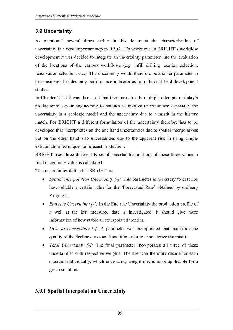
Automation of Brownfield Development Workflows
95
3.9 Uncertainty
As mentioned several times earlier in this document the characterization of
uncertainty is a very important step in BRIGHT’s workflow. In BRIGHT’s workflow
development it was decided to integrate an uncertainty parameter into the evaluation
of the locations of the various workflows (e.g. infill drilling location selection,
reactivation selection, etc.). The uncertainty would therefore be another parameter to
be considered besides only performance indicator as in traditional field development
studies.
In Chapter 2.1.2 it was discussed that there are already multiple attempts in today’s
production/reservoir engineering techniques to involve uncertainties; especially the
uncertainty in a geologic model and the uncertainty due to a misfit in the history
match. For BRIGHT a different formulation of the uncertainty therefore has to be
developed that incorporates on the one hand uncertainties due to spatial interpolations
but on the other hand also uncertainties due to the apparent risk in using simple
extrapolation techniques to forecast production.
BRIGHT uses three different types of uncertainties and out of these three values a
final uncertainty value is calculated.
The uncertainties defined in BRIGHT are:
• Spatial Interpolation Uncertainty [-]: This parameter is necessary to describe
how reliable a certain value for the ‘Forecasted Rate’ obtained by ordinary
Kriging is.
• End rate Uncertainty [-]: In the End rate Uncertainty the production profile of
a well at the last measured date is investigated. It should give more
information of how stable an extrapolated trend is.
• DCA fit Uncertainty [-]: A parameter was incorporated that quantifies the
quality of the decline curve analysis fit in order to characterize the misfit.
• Total Uncertainty [-]: The final parameter incorporates all three of these
uncertainties with respective weights. The user can therefore decide for each
situation individually, which uncertainty weight mix is more applicable for a
given situation.
3.9.1 Spatial Interpolation Uncertainty

Automation of Brownfield Development Workflows
96
The ‘Spatial Interpolation Uncertainty’ is a description of how reliable a certain value
obtained by ordinary Kriging is. It is important to not misunderstand this value as a
description of the quality of fit of the kriged surface (as for example the residuals are).
The ‘Spatial Interpolation Uncertainty’ should rather warn if discrepancies between
the interpolated and the real value are very probable.
The ‘Spatial Interpolation Uncertainty’ is calculated by comparing the value obtained
by ordinary Kriging at an infill location with the value obtained by linear interpolation
of the kriged parameter of the three surrounding triangle wells.
Figure 55: Linear Interpolation vs. ordinary Kriging
Figure 55 is a simplified presentation of this discrepancy. The depiction shows an
artificial, highly simplified, one dimensional version of the approach. The values for
Forecasted Rate in [STB/d] are given for each well, indicated by the light blue dots in
the diagram. The probable kriged response surface is displayed by the thicker, curved
line. As apparent in Figure 55 the linear interpolation of the value for Estimated
Forecasted Rate for the Infill Location 1 between Well B and Well C computes a
fairly different value as the value determined by ordinary Kriging. However, the
linear interpolation between Well D and Well E is not significantly different than the
kriged surface and therefore the discrepancy between the kriged value and the value
obtained by linear interpolation in Infill Location 2 is rather small. This will lead to

Automation of Brownfield Development Workflows
97
the conclusion that the spatial interpolation in Infill Location 1 is less reliable then the
spatial interpolation in Infill Location 2, which will be quantified as shown in
Equation 31.
The linear interpolation of the value in the infill location located in the middle of the
triangle of existing wells is always done by applying the equation for a plain surface
for each existing well:
333
222
111
PCyBxAPCyBxAPCyBxA
=+⋅+⋅
=+⋅+⋅
=+⋅+⋅
Equation 28
Where x1, x2 and x3 are the x-coordinates for Wells 1, 2 and 3 in the triangle and y1, y2
and y3 are the y-coordinates respectively. P1, P2 and P3 are the values for the
parameter that is to be interpolated (in BRIGHT: ‘Forecasted Rate’). A, B and C are
coefficients that are equal for each point located on the plain surface defined by these
three equations.
Rearranging Equation 28 to solve for the coefficients A, B and C leads to:
( ) ( )( ) ( )
( )( )
333
32
3232
32
313231
3232
3131
yBxAPCyy
xxAPPB
yyyy
xxxx
PPyyyy
PPA
⋅−⋅−=−
−⋅−−=
−−⋅−−−
−⋅
−−−−
=
Equation 29
Once the coefficients A, B and C have been determined, the value for the linearly
interpolated parameter at the infill location is given by:
CyBxAP InfillInfillInfill +⋅+⋅= Equation 30
PInfill is the value for the interpolated parameter (‘Forecasted Rate’) in the infill
location that is given by its x-coordinate xInfill and its y-coordinate yInfill
This interpolation is repeated for each infill location. Once the linearly interpolated
value for ‘Forecasted Rate’ is computed for each infill location it is compared with the
value obtained by ordinary Kriging. The spatial interpolation uncertainty (IU) is
calculated as:

Automation of Brownfield Development Workflows
98
ngFRordKrigi
ngFRordKrigiFRlinear
q
qqIU
−= Equation 31
IU is the spatial interpolation uncertainty [-], qFRlinear is the forecasted rate obtained by
linear interpolation [STB/d], qFRordKriging is the forecasted rate determined by ordinary
Kriging [STB/d].
The depiction below shows the ‘Spatial Interpolation Uncertainty’ on a map for each
infill location. The depiction shows a map (x-coordinate on x-Axis, y-coordinate on y-
Axis) and the result value for Spatial Interpolation Uncertainty as bubble size (the
larger the bubble the larger the Spatial Interpolation Uncertainty).
The result is very comprehensible since the wells between the northern part of the
field and the central part of the field (compare with status map in Figure 25) show a
high uncertainty. This is because their neighboring wells are too far away to provide a
guidance of what the value in the infill location should be. In the northern part of the
field there are also a few infill locations with high uncertainty. A very possible reason
is that the variation of the values for ‘Forecasted Rate’ in this area is very high. This
should be investigated in more detail in order to make a good decision whether an
infill location is worth of being drilled.
Figure 56: Spatial Interpolation Uncertainty Map

Automation of Brownfield Development Workflows
99
3.9.2 End rate Uncertainty The dimensionless ‘End rate Uncertainty’ is a parameter that has been introduced to
characterize the stability of the trend that is followed by the decline curve. This is an
important investigation since the decline curve fitting procedure tries to minimize the
fitting error throughout the whole fit range (see Chapter 3.7) and does not especially
concentrate on the later part of the production history or the fit range. In order to
make a judgment about how accurately the later part of the trend is modeled and
therefore how accurately the short term forecast can be, the latest rate value before the
forecast start date has to be compared to the decline curve value at the same date.
Additionally BRIGHT compares those two values to the value of the four months
moving average, in order to have a more stable and less varying value as a reference
value.
The larger the spread of these three values is, the higher is the End rate Uncertainty. A
depiction of a real case is given in the two depictions below. It is to be noted that in
the two depictions only the production rate [STB/d] and the decline curve fit rate
[STB/d] are displayed. However, the four months moving average rate will also be
taken into account when calculating the ‘End rate Uncertainty’, but it will not be
displayed in BRIGHT.
Figure 57: Low End rate Uncertainty Figure 57 shows an example, where the last measured rate is very much alike the rate
that is determined by the decline curve at the last date of the fit. This leads to the

Automation of Brownfield Development Workflows
100
conclusion that especially for a short term forecast the decline curve can be given a
high reliability thus a low value for the End rate uncertainty.
Figure 58: High End rate Uncertainty
Figure 58 shows a different situation. The last measured rate is significantly different
than the computed rate by the fitted decline curve. Therefore the reliability of the
forecast should be downgraded to account for the discrepancy.
The End rate uncertainty is then calculated as:
( )
qqq
ERU
qqqq
qqqqqqqq
DCAmoavg
DCAmoavg
DCAmoavg
minmax
4
4min
4max
3
),,min(,,max
−=
++=
=
=
Equation 32
Where qmax is the maximum value of the three rates measured at the forecast start date
[STB/d] or [Mscf/d], qmin is the minimum value of the three rates measured at the
forecast start date [STB/d] or [Mscf/d] and q is the mean value of the same three rates
[STB/d] or [Mscf/d]. The End rate uncertainty (denoted as ERU in Equation 32) is
calculating the ratio between the difference of maximum and minimum value and the
mean value for the production rate. The idea is to capture the spread of these three
values as good as possible.
Earlier versions of BRIGHT calculated the End rate uncertainty as:

Automation of Brownfield Development Workflows
101
( )
qUER
qqi
i
σ
σ
=′
−= ∑=
3
1
2
31
Equation 33
Again q denotes the mean value calculated out of the three rates measured at the
forecast start date. σ is the standard deviation of the three values [STB/d] or [Mscf/d].
In Equation 33 the idea was also to characterize the spread of the three rate values
measured at the forecast start date.
However, when looking at the diagram of End rate uncertainty versus Well the
advantages of an End rate uncertainty calculation as in Equation 32 is apparent.
Especially for higher End rate uncertainties the first equation leads to much more
severe values thus penalizing bigger spreads more than Equation 33. Therefore the
prior is the better choice, which is not that sensible to larger spreads.
Figure 59: Comparison of Formulations for Endrate Uncertainty
The value for the End rate Uncertainty is calculated for each existing well location.
Afterwards the values are kriged into the infill locations to gain information on how
stable the forecasts were around the infill locations, which subsequently lead to the

Automation of Brownfield Development Workflows
102
information of how reliable the interpolation of the Forecasted Rate in the infill
location can be.
Figure 60 shows a bubble map (x-coordinate on x-Axis, y-coordinate on y-Axis) of
the End rate Uncertainty (the larger the bubble the higher the End rate Uncertainty).
Comparing this map with the map in Figure 56 it is obvious that the Distribution of
uncertainties looks significantly different. The reason for that is that the End rate
Uncertainty is not dependent on the distance of the neighboring wells but only on the
spread between the rates measured at the forecast start date. Therefore the wells in the
middle part of the field show a much lower End rate Uncertainty than Spatial
Interpolation Uncertainty.
Figure 60: Endrate Uncertainty Map
3.9.3 DCA Uncertainty The purpose of the DCA uncertainty is to capture the quality of the DCA fit and
subsequently the reliability in its extrapolated curve. The main idea behind his
parameter is to determine the quality of the DCA fit in the surrounding wells and thus
indicating the reliability of the forecast in the infill location. In earlier versions of
BRIGHT the Root mean square error (Equation 1) was used to define the quality of

Automation of Brownfield Development Workflows
103
the decline curve fit. However, during testing the software it became obvious that the
application of the correlation coefficient (Equation 13) is more beneficial for the user.
The advantage of the correlation coefficient is, that it is normalized between negative
one (strong indirect proportionality; not of importance for BRIGHT), zero (no
dependency at all) and positive one (strong direct proportionality). The user can
therefore compare several cases easier, since the values are always in the well known
range of negative one to positive one.
The values for the correlation coefficients of the decline curve fits of the surrounding
wells are linearly interpolated in the infill locations to present a value that informs
about the reliability of the forecasts that were used to come up with the probable
production of the infill locations to the user. The closer the value is to one, the better.
Vice versa, to calculate the uncertainty associated with a decline curve forecast at a
certain infill location the following equation is applied: 21 rDCU −= Equation 34
DCU stands for the uncertainty connected to the decline curve forecast; r2 is the
correlation coefficient as determined for the existing wells. A high value for DCU at a
certain infill location therefore indicates that the reliability in the forecast at this
location is rather low and should therefore be investigated before going ahead.
Figure 61: DCA Uncertainty Map

Automation of Brownfield Development Workflows
104
Figure 61 shows that especially the southern part of the field shows high uncertainties
associated with the decline curve forecasts. The user should therefore investigate that
part of the field (especially their decline curves) in more detail before going on with
the study.
3.9.4 Total Uncertainty The total uncertainty combines the three uncertainty values to come up with a single,
final uncertainty value. The user can assign weights to each type of uncertainty in
case she or he wants the influence of a certain type of uncertainty to be more severe
than the influence of another uncertainty type.
After entering the weights for the Spatial Interpolation uncertainty (w1), the End rate
uncertainty (w2) and the DCA Uncertainty (w3), the total uncertainty (TU) is
calculated as:
321 wDCUwERUwIUTU ⋅+⋅+⋅= Equation 35
IU, ERU and DCU are the uncertainties as defined in Equation 31, Equation 32 and
Equation 34. The condition that has to be applied to use this equation is:
13
1=∑
=iiw Equation 36
Since the values for TU can be larger than one, the final step in calculating TU is to
normalize TU by dividing each TU value with the maximum occurring TU value. The
values will therefore stay between zero and one.
Figure 62 helps to get an overview over the uncertainty values and over the severity
of the specific types of uncertainty on certain wells. Moreover Figure 62 helps to find
specific locations with high uncertainties. For example Location 40 seems to have
three surrounding wells with high End rate uncertainties. Location 77 and Location
118 seem to have a general problem with their forecasts, since all three uncertainty
values are high.
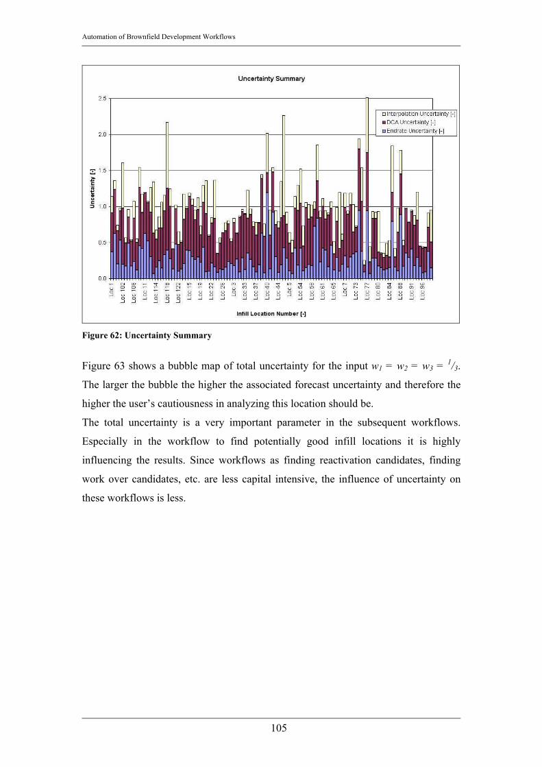
Automation of Brownfield Development Workflows
105
Figure 62: Uncertainty Summary
Figure 63 shows a bubble map of total uncertainty for the input w1 = w2 = w3 = 1/3.
The larger the bubble the higher the associated forecast uncertainty and therefore the
higher the user’s cautiousness in analyzing this location should be.
The total uncertainty is a very important parameter in the subsequent workflows.
Especially in the workflow to find potentially good infill locations it is highly
influencing the results. Since workflows as finding reactivation candidates, finding
work over candidates, etc. are less capital intensive, the influence of uncertainty on
these workflows is less.

Automation of Brownfield Development Workflows
106
Figure 63: Total Uncertainty Map
3.10 Reasoning
All workflows in BRIGHT described so far are preprocessing the data so that they can
be used in the reasoning workflow that finally applies the expert knowledge to
evaluate the projects. The purpose of the reasoning in BRIGHT is to process the
multidimensional and maybe probabilistic input data that are generated in the
precedent workflows (e.g. all forecasted performance indicators that have been
created for an infill location) and output a single numeric score between zero and 100.
The reasoning’s underlying algorithm is the marginalization algorithm and the
Bayesian network evaluation algorithm as described in Chapter 2.1.4. The conditional
probability tables (CPT) that are used for the reasoning procedure have been set up
together with experienced RAPID engineers in the Schlumberger office in Calgary,
Canada. The objective of this knowledge capturing procedure was to create a
Bayesian Belief network that is able to draw conceptually the same conclusions as the
engineers involved in RAPID studies. After setting up the CPT the reasoning
algorithm was checked by comparing its result to former RAPID studies.

Automation of Brownfield Development Workflows
107
This Chapter presents the reasoning procedure as applied in the infill location
selection workflow. The Bayesian Belief network applied to the infill location
selection workflow, the associated knowledge capturing process, the parameters and
their origin and the way how the algorithm can be modified to obtain the desired
results are introduced to the reader.
3.10.1 Infill location selection
The purpose of the infill location selection workflow is to process the multiple
forecasts for the infill locations, as generated in the previously explained workflow
steps and determine an output score between zero and 100. Zero denotes an infill
location that when drilled will very likely not be a successful project, whereas a score
of 100 attributes a very good chance of success for and infill project. The Bayesian
Belief network used for the infill location selection workflow is depicted below in
Figure 64.
Figure 64: Infill location selection Bayesian Belief Network The parameters used for the infill location selection workflow are: • Forecasted Rate [STB/d] or [Mscf/d]: As given in Equation 26 forecasted rate
summarizes the initial rate determined by interpolating on the last measured

Automation of Brownfield Development Workflows
108
daily rate [STB/d] or [Mscf/d], the last calculated average 4 months daily rate
[STB/d] or [Mscf/d] and the rate given by the decline curve at forecast start
date [STB/d] or [Mscf/d].
• Estimated Recovery [STB] or [Mscf]: As determined in the automatic decline
curve module the forecasted rate and the decline rate are spatially interpolated
in the infill locations and used in the equation for exponential decline to
determine the Estimated Recovery in the next three years. This value is a good
performance indicator for the upcoming forecasted production profile.
• Decline Rate [1/d]: The decline rate for each existing well’s decline curve has
been determined in the automatic decline curve module and is here used as a
performance indicator for the future performance. The smaller the value for
the decline rate, the better, since this allows longer production.
• Average Distance to drained area [ft]: This parameter expresses the average
distance of the infill location to the drained areas of the existing wells that are
given in the corners of the triangle as described in Chapter 3.6.2. The drained
areas for the existing wells are determined by calculating their drainage radius
as defined in Equation 20. A schematic diagram of the average distance to the
drained area of the neighboring, existing wells is depicted below:
Figure 65: Average Distance to Drainage Area
The value for ‘Average Distance Drained’ is thus calculated as:
3321 ddd
d++
= Equation 37
Automation of Brownfield Development Workflows
109
Where d is the average distance to the drained areas [ft]; d1, d2, and d3 are the
distances to the respective neighboring wells [ft].
• Average distance to swept area [ft]: In concept this parameter refers to the
same idea as the parameter ‘average distance to drained area’. Since water
movement cannot yet be modeled in BRIGHT, the average distance to the
injectors sweep radii is used as an indicator of whether the area around the
infill location might already be swept (i.e. oil saturation reduced to residual oil
saturation due to displacement of oil by water). The average distance to the
swept area is calculated as given by Equation 37.
• Uncertainty [-]: Especially for the infill location selection the associated
confidence at a certain location is a very important parameter. Since drilling
costs are usually higher than the costs for any other common Brownfield
operation, a high uncertainty would significantly downgrade the score of an
infill location. The uncertainty calculation has been described in detail in
chapter 3.9 and is normalized regarding the maximum total uncertainty value
in order to only obtain values between zero (no uncertainty) and one (very
high uncertainty).
The current version of BRIGHT does not allow multiple forecasts, however this
feature will be implemented soon. Multiple forecasts would gain several values for
the same parameter (e.g. three different forecasting techniques give three different
values for decline rate, forecasted rate, etc.). As explained, Bayesian Belief networks
can cope with probabilistic input and would process that information to an output that
would still be a single numeric value. The advantage of this approach would be that
the uncertainty is not only captured through the presented ‘uncertainty’ parameter but
also in the standard deviation of the respective forecast parameter due to the different
forecasting techniques.
3.10.2 Implementation in BRIGHT After calculating the numeric score for each infill location a bubble map is presented
as shown in Figure 66. Each black dot represents an infill location, the larger and the
greener the bubbles, the higher the score and therefore the higher the estimated
probability of success if a well is drilled in an area with a lot of green bubbles (e.g. as
the northern edge of the presented field). This screen is mainly an analytical tool that
presents the results as well as gives the user the opportunity to perform a simple

Automation of Brownfield Development Workflows
110
sensitivity analysis by modifying the slider settings on the bottom of the screen. For
each parameter presented in Chapter 3.10.1 a slider exists that is preset to the value as
determined in the precedent forecasting steps. The score is presented in the pie chart
to left of the sliders, where the green area is proportional to the score. If the user
decides to change the sliders in order to investigate the influence of an e.g. changing
Estimated Recovery, the score will be updated simultaneously and the pie chart will
be altered accordingly.
Figure 66: Analysis Screen In the boxes below the sliders the user has the option to enter a standard deviation. If
the user decides to enter a deviation, the score will most probably change, since the
input is not a numeric value but a probability density function for a normal
distribution; the mean is the calculated forecast value and the standard deviation is the
value entered in the box. The final score will change, since this function will most
probably range over several states (as discussed in Chapter 2.1.3.3) and the
discretization of the function will therefore lead to different results.

Automation of Brownfield Development Workflows
111
Below an example has been set up to demonstrate the influence of the deviation on
the result. The analysis of an infill location has resulted in the following forecasted
values:
Expected Value Deviation Forecasted Rate 108.5 [STB/d] 42.5 [STB/d]
Estimated Recovery 79 [MSTB] 30.9 [MSTB] Decline Rate 0.0136 [1/d] 0 [1/d] Uncertainty 0.35 [-] 0 [-]
Average distance to drained Area 116.98 [ft] 10 [ft] Average distance to swept Area no injectors [ft] 0 [ft]
Table 7: Infill Location, Forecasted Values In the current version of BRIGHT only the expected values are used in the analysis.
The values for the deviation were determined manually in individual forecast runs. If
no deviation is taken into account the final result score would be 63 [%], thus giving
that particular location a rather good chance of being a successful infill location. It
has to be noticed that if the deviation is not considered, the discretization procedure
that has been described in Chapter 2.1.3.3 would only lead to one state that is
encountered by hundred percent and all other states are set to zero [%].

Automation of Brownfield Development Workflows
112
Figure 67: Score without deviation If the deviation is taken into account that situation changes. The inputfunction(x) in
Equation 7 would be a normal distribution density function with the mean at the value
that is given in the column ‘Expected Value’ in Table 7, and the standard deviation
given in the column ‘deviation’. The application of Equation 7 would lead to a state
distribution that follows the normal distribution density function according to the state
limits. Therefore several states will be encountered with fractions between 0 and 100
[%] which would change the result score significantly. The example well in Table 7
would gain a result score of 54 [%] when the deviation is taken into account in
contrast to 61 [%] if the expected values are taken as numerical values rather than as
parameter of a density function.

Automation of Brownfield Development Workflows
113
Figure 68: Score with deviation
A sensitivity study in Crystal Ball, a statistical tool that performs Monte Carlo
simulations, has been performed to investigate (a) the effect of the deviation on the
score and (b) the sensitivities of the score on ‘Forecasted Rate’ and ‘Estimated
Recovery’. The input were the values given in Table 7 as a normal distribution’s
mean (column: Expected Value) and standard deviation (Column: Deviation).
As expected, the deviation leads to a higher spread in the results. Figure 69 shows the
scores on the x-Axis and the respective frequencies of the individual scores on the y-
axis. The mode in the diagram below is around 58 [%]. The minimum occurring score
value is zero [%] and the maximum value is 69 [%], which is a very large spread.

Automation of Brownfield Development Workflows
114
Figure 69: Monte Carlo Analysis, Score
By reducing the deviation of ‘Estimated Recovery’ from 42.5 [MSTB] to 20 [MSTB],
the frequency plot looks as depicted below. All other forecasted values for the infill
locations stayed the same. Again the scores are depicted on the x-axis and the
frequencies on the y-Axis. It can be seen that the resulting mode is at 63 [%], which
already is much closer to the value obtained in the very first calculation, where the
score was computed without regarding the deviations at all. The spread is lower with
decreasing deviation; the minimum value in that case is at approximately 20 [%],
which is closer to the maximum score of 70 [%] than in the prior case.
Figure 70: Monte Carlo Analysis, Scenario 2 The reduction of deviation leads to a change in sensitivities. It has to be noted, that a
change of state for ‘Estimated Recovery’ leads to the largest change of the multiplier
in Baye’s Theorem as applied in BRIGHT (e.g.
Automation of Brownfield Development Workflows
115
∑
==
==
Statesk
j
i
StateeDeclineRatStateeryEstimated
StateRateForecastedtrueEconomicsp ,covRe
, in Equation 9). Therefore all changes in
influence on the score are mainly dependent on the behavior of ‘Estimated Recovery’.
The ‘Estimated Recovery’ did not have too much influence on the output in the first
case. However, in the second example the influence of ‘Estimated Recovery’ on the
score was rather high. The change in the influence of ‘Forecasted Rate’ was even
more severe. In the first case it was highly influencing the result whereas in the
second case its influence decreased to almost zero. The reason for that is, that due to
the higher deviation of the ‘Estimated Recovery’ in the first case, the multiple
possible parameter combinations lead to a lot of different score results, thus leaving
the parameter ‘Forecasted Rate’ with a rather high influence on the score. However,
in the second case, ‘Estimated Recovery’ did not fluctuate too much between the
states since its deviation was a lot lower. Therefore, not as many different parameter
combinations with ‘Forecasted Rate’ were possible. Therefore the influence of
‘Forecasted Rate’ was decreased.
It is apparent that the evaluation of a Bayesian Belief Network is generally similar to
a Monte Carlo analysis. The main differences is that Monte Carlo Analysis use the
classical statistical approach of using frequencies but BRIGHT is using Baye’s
Theorem. Moreover in BRIGHT’s case the marginalization technique leads to a single
numeric value as an output, which makes it a lot easier to rank the values instead of
ranking density functions. The computational time is reduced significantly. The above
investigations have been performed with 10,000 iteration runs. In a field with hundred
or more potential infill location that would lead to more than ten million iterations.
The Bayesian Belief network incorporates the deviations already in the first
computation run, thus making iterations because of deviations obsolete.
3.10.3 Range setup It has been mentioned several times that the conditional probability tables have been
set up together with experienced engineers in the field of Brownfield studies. Since
the CPTs have a very critical influence on the result and its soundness it was decided
that in BRIGHT the user should not have the option to modify the value in the CPT.
That lead to another issue about how an engineer in an arbitrary field can modify the
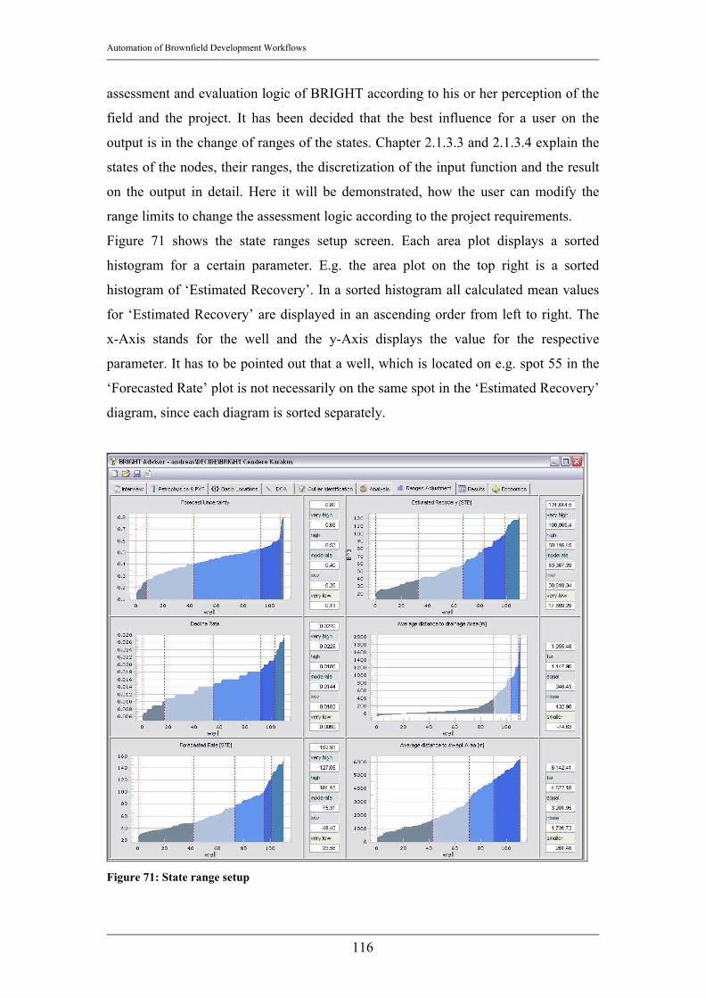
Automation of Brownfield Development Workflows
116
assessment and evaluation logic of BRIGHT according to his or her perception of the
field and the project. It has been decided that the best influence for a user on the
output is in the change of ranges of the states. Chapter 2.1.3.3 and 2.1.3.4 explain the
states of the nodes, their ranges, the discretization of the input function and the result
on the output in detail. Here it will be demonstrated, how the user can modify the
range limits to change the assessment logic according to the project requirements.
Figure 71 shows the state ranges setup screen. Each area plot displays a sorted
histogram for a certain parameter. E.g. the area plot on the top right is a sorted
histogram of ‘Estimated Recovery’. In a sorted histogram all calculated mean values
for ‘Estimated Recovery’ are displayed in an ascending order from left to right. The
x-Axis stands for the well and the y-Axis displays the value for the respective
parameter. It has to be pointed out that a well, which is located on e.g. spot 55 in the
‘Forecasted Rate’ plot is not necessarily on the same spot in the ‘Estimated Recovery’
diagram, since each diagram is sorted separately.
Figure 71: State range setup

Automation of Brownfield Development Workflows
117
As explained in Equation 7 the upper and lower limit of the state determine what
fraction of the input distribution can be assigned to a certain state. A larger range for a
state will most probably lead to a higher fraction for that state. This will have direct
consequences on the computation of the output score as can be seen in Equation 9,
since the values for p(‘Parameter’=statej) change. Since it is a fact, that ‘good’
parameter states (e.g. ‘Estimated Recovery’ = ‘high’, ‘Forecasted Rate’ = ‘high’, etc.)
are given a high score, the user can generally increase the score by increasing the
range of the ‘good’ parameter states. Vice versa the user can take a more pessimistic
look on the field by reducing the range of the ‘good’ states and increasing the ‘bad’
parameter states, such as e.g. ‘Estimated Recovery’ = ‘very low’, ‘Forecasted Rate’ =
‘low’, etc. Hence, the user has a tool to change the weight and the influence of
specific parameters. By changing the parameter range limits to his or her
understanding. The effect of the parameter state ranges is demonstrated for the
northern part of the example field:
(a) Pessimistic view on the reservoir:
Figure 72: Pessimistic Range setup

Automation of Brownfield Development Workflows
118
The parameter range setup as presented in Figure 72 is a rather pessimistic view on
the reservoir. The ranges for ‘Estimated Rate’ = ‘very low’ and ‘Forecasted Rate’ =
‘very low’ are rather large thus increasing the number of inputs that are classified in
these two states. An infill location with one of these to parameters classified as ‘very
low’ is automatically given a score of zero [%], because they are not assumed to be
economically producible. A lot of infill locations will therefore be given a score of
zero [%] or otherwise a very low score. An infill location that is determined to be a
good location even though the parameter range setup is making it really hard for an
infill location to be evaluated with a good score, is very probable a good infill location
to go for.
Figure 73: Infill Location map
Figure 73 shows an infill location bubble map, with the x-coordinate of the infill
location on the x-axis and the y-coordinate of the infill location on the y-axis. The
bubble size and the greenness is proportional to the score; the larger and the greener
the bubble the better. According to Figure 73 only three wells correspond to the high
standards set by the parameter range setup.
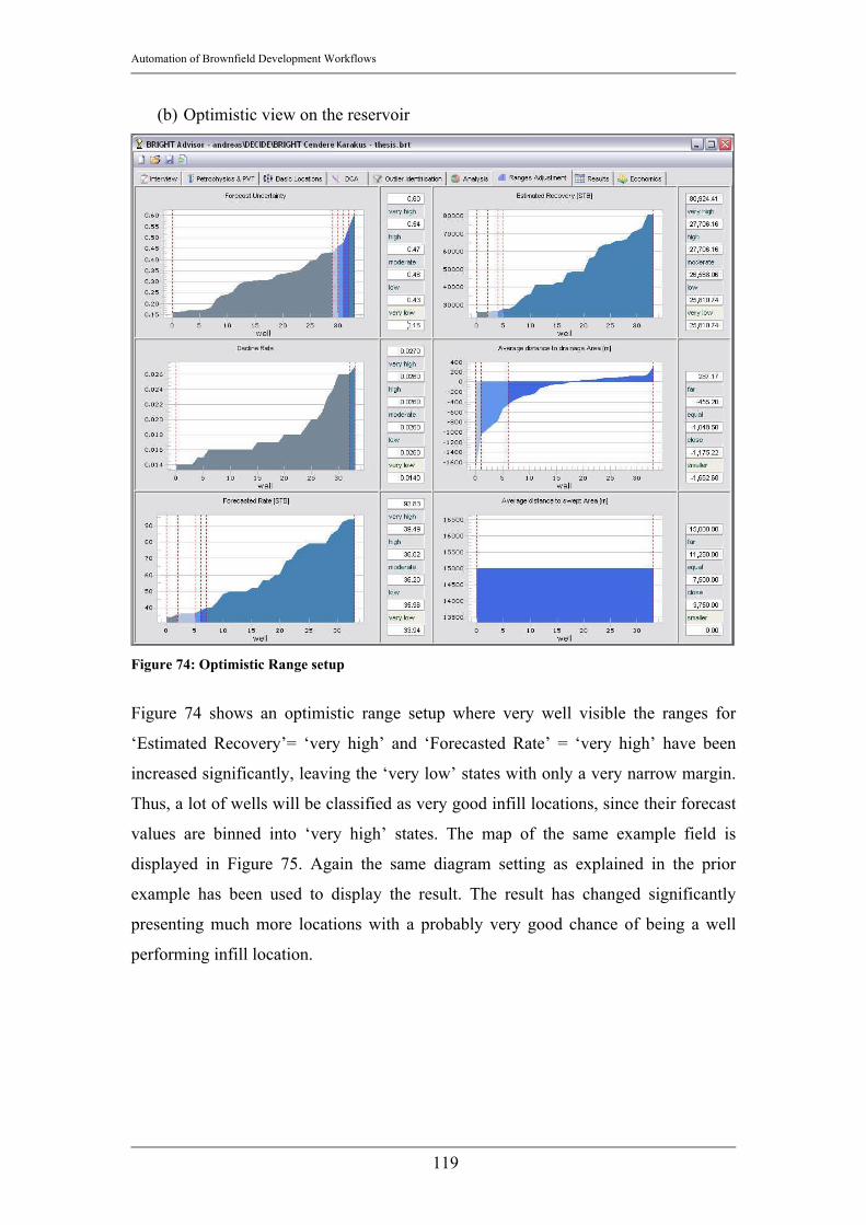
Automation of Brownfield Development Workflows
119
(b) Optimistic view on the reservoir
Figure 74: Optimistic Range setup
Figure 74 shows an optimistic range setup where very well visible the ranges for
‘Estimated Recovery’= ‘very high’ and ‘Forecasted Rate’ = ‘very high’ have been
increased significantly, leaving the ‘very low’ states with only a very narrow margin.
Thus, a lot of wells will be classified as very good infill locations, since their forecast
values are binned into ‘very high’ states. The map of the same example field is
displayed in Figure 75. Again the same diagram setting as explained in the prior
example has been used to display the result. The result has changed significantly
presenting much more locations with a probably very good chance of being a well
performing infill location.

Automation of Brownfield Development Workflows
120
Figure 75: Infill location map
3.11 Workflows The only workflow that will be implemented in BRIGHT’s first version is the infill
drilling location selection workflow. In this chapter the workflow schematic is
presented and all processes are summarized and integrated. Chapter 3.11 will also
inform about how BRIGHT accounts for interference of selected infill well projects
with existing wells.
All steps in the process have been described in the earlier chapter. In this chapter they
shall be integrated and presented in the process flow so that the reader gets an insight
into the workflow.
1. Monthly production rates for the phase to be investigated are retrieved from
the database as well as the x and y coordinate for each well. These three
parameters are mandatory and cannot be left without values.
2. All available petrophysical parameter (Porosity φ [-], Water saturation sw [-],
average net pay thickness h [-])
Automation of Brownfield Development Workflows
121
3. Voronoi Grid: To allocate an amount of hydrocarbons in place (HCIP) [STB]
or [Mscf/d] to a certain well the Voronoi grid is applied (as explained in
Chapter 3.6.1). It is very important to notice, that the calculation of the
hydrocarbons in place is only based on geographic information of the well
locations and not on actual drainage areas. Therefore a rather elliptical
drainage area of an inclined well cannot be modeled adequately in BRIGHT’s
first version (remark: that is the reason why BRIGHT claims to not be yet
applicable for reservoirs with many inclined or horizontal wells). Also another
restriction applies: The differences in pressure drop from reservoir to Wellbore
among the wells cannot yet be regarded in the calculation of allocated
hydrocarbons in place. Therefore a well with a higher pressure drop from
reservoir to Wellbore is not necessarily allocated a larger drainage area and
subsequently a larger amount of allocated HCIP, as would be the case when
strictly using Darcy’s equation.
4. Spatial Interpolation of Petrophysical Data: The petrophysical values for
unsampled wells are determined through a method that can be chosen by the
user (either averaging, ordinary Kriging or user input). The user has to decide,
which method is the most applicable based on the number and of the spatial
density of the locations with petrophysical measurements.
5. Automatic Decline Curve Analysis: As explained in Chapter 3.7 the automatic
decline curve procedure is applied to determine Forecasted Rate [STB/d], 3
Year estimated recovery [STB], Decline Rate [1/d] and – incorporating the
petrophysical data – ‘Recovery Factor’ [-] for existing wells.
6. Outlier Identification through Exclusion Mapping: In Chapter 3.8 the term
outlier was defined and the procedure to detect outliers was introduced. In the
process workflow the outlier detection is a precedent step prior to the
generation of infill locations, to make sure that the outliers are not regarded in
the infill location selection workflow.
7. Generation of Infill Locations: In Chapter 3.6.2 the Delaunay Triangulation
procedure was presented that is applied here to – after the outlier detection has
tossed out significantly different behaving wells – the remaining existing
wells. The coordinates of the inner circle center point of each triangle are
stored as the infill location’s coordinates.

Automation of Brownfield Development Workflows
122
Figure 76: Infill Location Selection Workflow schematic

Automation of Brownfield Development Workflows
123
8. Spatial Interpolation of Forecasts in Infill Locations: After the automatic
decline curve analysis module has determined the forecast for all wells and the
outlier wells have been removed from the workflow, the production
performance forecasts can be interpolated in the infill locations. In the spatial
interpolation step for the petrophysical data, the user had to choose the type of
estimation technique BRIGHT should apply. Since the availability of a
statistically reasonable amount of well data is one of the prerequisites for a
BRIGHT study, it is now safe to go on with ordinary Kriging by default.
Interpolated parameters are Forecasted Rate [STB/d] or [Mscf/d] (see
Equation 26) and Decline Rate [1/d]. The other performance indicators (e.g. 3
Year estimated recovery [STB] or [Mscf], estimated ultimate recovery [STB]
or [Mscf]) are calculated based on Forecasted Rate and Decline Rate using the
equation for the exponential decline of the production rate as given in
Equation 11on page 42.
9. Calculation of Distances: Based on the coordinates of the existing wells
(without outliers) and the coordinates of the infill locations the average
distance to drained area and the average distance to swept area is calculated
(see Equation 20 and Equation 37).
10. Calculation of Uncertainties: Now that all forecasts and spatial interpolations
for the infill locations have been performed the uncertainties as described in
Chapter 3.9 are calculated for the infill locations.
11. Reasoning with Bayesian Belief networks: Every infill location has now been
assigned their coordinates, their forecasted values and their uncertainties. The
reasoning part of BRIGHT now has to combine all the information process it
according to the captured expert knowledge in the Conditional probability
tables and the rages setup for the states of the parameters and compute a single
numeric value as the output score for each location. The results are presented
(1) in a bubble map, where the x- and y-axis correspond to the respective
coordinates and the bubble color and bubble size correspond to the score and
(2) in a table that is sorted according to a descending score (i.e. best scores are
on the top of the table).
12. The user now has to select the infill locations that should be drilled. By doing
that BRIGHT of course has to account for interference of the potentially infill
well with the surrounding existing wells. The interference effect is calculated
Automation of Brownfield Development Workflows
124
with a very basic principle in mind: There are no new reserves added. An infill
well therefore can only increase production rates but not add any new
reserves. This is a valid assumption for Brownfields since the well density is
usually very high.
BRIGHT therefore calculates the total estimated ultimate recovery (EUR) of
the three existing wells that have been used in the Delaunay triangle for the
selected infill location. Since the infill location is selected and therefore going
to be drilled, the EUR of all three wells is now redistributed among all four
wells, including the new well to be drilled. This consequently leads to lower
values for the EUR for the three Delaunay triangle wells, which in turn
increases their decline rates. BRIGHT calculates this reduction in EUR and
increase of Decline rate and starts a new interpolation (ordinary Kriging) of
the Decline rate for the infill location. The value for the Decline rate in the
infill location will thus also be a little higher, which reduces the estimated
recovery for the infill location. BRIGHT will use the new forecasted values
again in the Bayesian Belief Network and reevaluates the well giving it a new
score, which will most probably be slightly lower than the score given at first.
The user can now take well production interference into account when
deciding whether that infill location should still be drilled or not.
13. A Field Development Plan is automatically generated based on a project
ranking logic that evaluates basic economic parameters and ranks the selected
projects according to their positive economic impact on the field development.

Automation of Brownfield Development Workflows
125
4. Examples
In this chapter the introduced workflow is presented on the basis of a real field
example. The presented field is a gas field in the north eastern part of Alberta,
Canada. Most of the wells in that region are operated by BP Canada. This field was
one of the fields to test the applicability of BRIGHT.
The field contains more than thousand completions, however only 472 have been
brought on stream to produce gas. The project scope contained 178 of these 472 wells.
The field was discovered in 1967 and started production in the late seventies. A
summary plot about the number of producing wells and the cumulative gas production
is depicted below.
Figure 77: Production Plot BP is interested to know about the best infill drilling locations.
4.1. Application of BRIGHT The named conditions indicate a good application area of BRIGHT. However, the
interview screen questions are answered in order to have confirmation.

Automation of Brownfield Development Workflows
126
The production data are reliable. They are obtained from a public domain database,
which are used in North America to store and query the production volumes of
national oil and gas companies. The primary produced phase is gas and the secondary
phase is water. The fluid check is therefore OK and it is safe to go on. The Reservoir
Characterization check also is OK, since the reservoir is neither unconventional nor is
a complex reservoir system apparent. The ‘Operating Strategy’ check was OK since
the operating conditions have not changed recently (e.g. installation of compression
units) and there were no recent new fracturing jobs performed. This is important to
know, because recent changes in the operating strategy would introduce a transient
production profile, which is currently not manageable with BRIGHT. The data
availability check was OK as well, since the production history of 178 wells is given
in a monthly time increment over 30 years. This is enough to justify the application of
statistical techniques and extrapolation techniques as used routinely in BRIGHT.
All of the wells have values for average reservoir porosity, average reservoir
permeability (which is currently not used in BRIGHT), average reservoir net pay
thickness and average reservoir water saturation. This indicates that probably a
numerical reservoir simulation model has already been set up and the data might
come from a geologic model that has been used as an input for that simulation model.
Therefore no interpolation of geophysical properties is necessary.
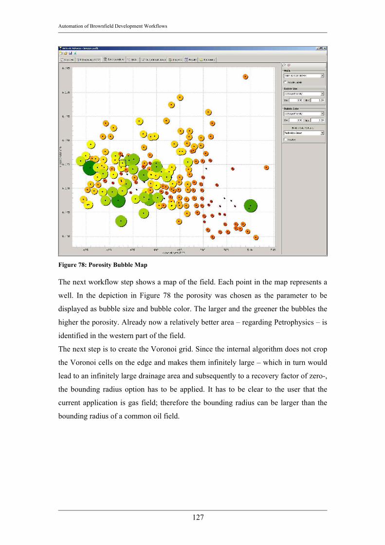
Automation of Brownfield Development Workflows
127
Figure 78: Porosity Bubble Map The next workflow step shows a map of the field. Each point in the map represents a
well. In the depiction in Figure 78 the porosity was chosen as the parameter to be
displayed as bubble size and bubble color. The larger and the greener the bubbles the
higher the porosity. Already now a relatively better area – regarding Petrophysics – is
identified in the western part of the field.
The next step is to create the Voronoi grid. Since the internal algorithm does not crop
the Voronoi cells on the edge and makes them infinitely large – which in turn would
lead to an infinitely large drainage area and subsequently to a recovery factor of zero-,
the bounding radius option has to be applied. It has to be clear to the user that the
current application is gas field; therefore the bounding radius can be larger than the
bounding radius of a common oil field.

Automation of Brownfield Development Workflows
128
Figure 79: Voronoi Grid
Now that the drainage area is determined and the area of interest is located the
automatic decline curve analysis can be started. Since a lot of production rate data are
available the user can expect a good performance of the decline curve algorithm.
When browsing through the decline curves, there are a lot of wells that have stopped
production long before the forecast start date, which is in 10/1/2001. These wells have
to be identified in the outlier detection workflow steps. In later versions of BRIGHT
these wells will be analyzed separately for work over and recompletion potential. The
user is advised to browse through all decline curves in order to find misfits due to
severe outliers. The better the forecast of the decline curve analysis the more accurate
the field development plan is.

Automation of Brownfield Development Workflows
129
Figure 80: Decline Curve Analysis
After a few corrections for several decline curves it is possible to go on to the outlier
detection workflow step. In the list of the outlier it is obvious that most of the 71
outliers are outliers because of their too long shut-in time. About 51 of the 71 outliers
can therefore for sure be tossed out for further performance interpolation operations.
The remaining 20 wells either have a positive decline curve slope (15 wells) or are
outliers because two of their performance indicators are significantly different than
their surrounding well’s performance indicators (5 wells). The user can now chose if
she or he wants to go back to the DCA step and manually correct those 15 decline
curves. For the purpose of this work the decline curve of these 15 wells have been
corrected.
The analysis of the results is the next step. Before having a look on the result values,
the advanced setup of the range limits has to be done. BRIGHT automatically finds
suitable range limits, however it should be checked, whether the automatic limits
correspond with the engineer’s perception of the situation. As can be seen in Figure
81 the range setup looks very reasonable and will therefore not be changed manually.
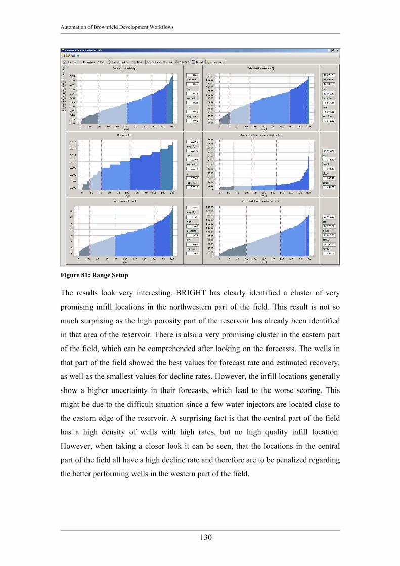
Automation of Brownfield Development Workflows
130
Figure 81: Range Setup The results look very interesting. BRIGHT has clearly identified a cluster of very
promising infill locations in the northwestern part of the field. This result is not so
much surprising as the high porosity part of the reservoir has already been identified
in that area of the reservoir. There is also a very promising cluster in the eastern part
of the field, which can be comprehended after looking on the forecasts. The wells in
that part of the field showed the best values for forecast rate and estimated recovery,
as well as the smallest values for decline rates. However, the infill locations generally
show a higher uncertainty in their forecasts, which lead to the worse scoring. This
might be due to the difficult situation since a few water injectors are located close to
the eastern edge of the reservoir. A surprising fact is that the central part of the field
has a high density of wells with high rates, but no high quality infill location.
However, when taking a closer look it can be seen, that the locations in the central
part of the field all have a high decline rate and therefore are to be penalized regarding
the better performing wells in the western part of the field.

Automation of Brownfield Development Workflows
131
Figure 82: Infill Locations Scoring
Figure 82 shows a bubble map of the scoring. The x and y axis correspond to the x
and y coordinates, respectively. The bubble size and the bubble color correspond to
the score (the larger, the higher the score and the greener, the higher the score). It can
be seen very clearly that the main cluster is in the western end of the field and an also
promising cluster is to be found on the eastern side of the field. The most probable
suggestion the engineer will make to the executive board will be to drill a well in the
western region of the reservoir.

Automation of Brownfield Development Workflows
132
5. Conclusions and Future Outlook The first version of BRIGHT is about to be released to Schlumberger internally in
December 2006. The main concern of BRIGHT’s development team is to distribute a
stable and effective BRIGHT version. However, there is still a lot to do to improve
the quality and the applicability of BRIGHT. The current version is capable of
suggesting the best infill locations in a mature oil or gas field; it is able to process a
sparsely populated dataset (minimum data requirement: geographical well locations,
monthly production rates) and to suggest the best infill locations. This is achieved by
a series of geologic interpolations, recovery predictions and forecast interpolations on
an automatically quality controlled well data set. Moreover BRIGHT - in the current
state - can identify outlier wells, which in general are wells that are either performing
significantly better or significantly worse than the surrounding wells. It is not yet
possible to process that information to automatically suggest work over or stimulation
candidates; however, it can be used as a guideline or as a suggestion as of which wells
should be investigated manually in more detail.
In the end of a BRIGHT study, a field development plan will be presented based on
the expected performance of the field after the suggested projects have been
performed. A rough economic evaluation will calculate the main economic project
parameters, such as Net Present Value or the Internal Rate of Return to roughly
estimate the economic potential of a proposed field development plan.
5.1. Current Limitations BRIGHT is a tool that has its place in the Brownfield development process as a
screening tool and a quick evaluation tool. Within the current scope of its capabilities,
it performs extremely well and can finish an analysis very quickly. In the current state
it is neither replacing numerical reservoir simulation nor analytical material balance
equations. It is intended to quickly evaluate whether a field is worthy of being fully
and thoroughly investigated; therefore it will essentially give a guideline about which
fields bear a development potential and which fields should not be further developed.
This is especially of interest for Schlumberger clients that are about to take over
mature fields and want to know about the production potential of their probable
acquisition.

Automation of Brownfield Development Workflows
133
The main limitations of the first release are:
• The other RAPID workflows such as finding the best reactivation candidates,
suggesting better completion intervals or suggesting work over candidates
have not yet been implemented. This is due to the fact that the four workflows
are very similar and it was determined that the best way to expand the
workflow selection offered by BRIGHT is to guarantee a single, very stable
workflow implementation that can be used as a basis for the other workflows.
Most probably the reactivation candidate workflow will be implemented next,
since its forecasting and parameter requirements are very similar to the infill
location workflow presented in this work. Moreover, the identified outliers in
the infill location selection process can be used to automatically suggest work
over candidates and present ‘best practice’ wells.
• A big concern among BRIGHT’s developers is to provide the workflows for
multiphase cases (especially if a second phase, e.g. water, is present). Of
course the relative permeabilities of the hydrocarbon phase and water will play
an important role in determining the expected hydrocarbon recovery. The
forecasts in a multiphase environment will most probably decrease the
expected hydrocarbon recovery (due to the non linear relative permeability
functions of hydrocarbons and water) to account for increasing water
production during the life of a field.
• Horizontal or deviated wells cannot be handled by the current implementation
of BRIGHT. The reason is that in evaluating drainage areas BRIGHT is only
using the geographic information of the bottom hole locations. Therefore the
Voronoi grid cells that are used to determine the reservoir aerial cross-section
that can be allocated to a specific well and subsequently the Hydrocarbons in
Place for that well are created solely based on the coordinates of the bottom
hole locations. In order to process horizontal wells or highly deviated wells,
the well path would have to be loaded and the Voronoi areas would have to be
modified in order to account for the elliptical rather than circular drainage area
of a horizontal well.
• Transient behavior of the well’s production bears a high degree of uncertainty
and would lead to less reliable results of BRIGHT. This is especially true
when looking at the forecasting techniques BRIGHT is using. The decline

Automation of Brownfield Development Workflows
134
curve analysis depends heavily on the steady state-ness or pseudo steady state-
ness of the well’s production profiles and since this is the only forecasting
technique in BRIGHT, it would severely downgrade the reliability of
BRIGHT’s results. To deal with transients in the production profile, the user
should use an analytical formulation (e.g. Tarner’s formulation of the Material
Balance equations) or a numerical tool (e.g. Numerical Reservoir Simulation).
• Multi Layered systems with commingled production systems are not handled
by BRIGHT. It is compulsory to accurately allocate the production to each
layer prior to starting the BRIGHT analysis, to avoid comparing wells that
produce in highly productive layers with wells that are perforated in less
productive reservoir layers. As long as Multi Layer systems cannot be
handled, BRIGHT will not be able to suggest the perforation in another layer.
5.2. Future Developments The future development plans are set to meet the requirements imposed by the
mentioned limitations. The most important next development steps are:
• It is compulsory to implement the other RAPID workflows as soon as possible.
The basis for the workflow to identify reactivation candidates is already
present since this workflow basically uses the same forecasting techniques as
the infill drilling workflow. The other workflows such as identifying
recompletion candidates or work over candidates need further modifications of
the workflow (e.g. handling of multi layered systems, incorporating work over
data, etc.). The conditional probability tables however are already provided
and can be used as soon as the forecasting workflow is delivering the
necessary parameters for the other workflows.
• Secondary phase analysis BRIGHT has to be able to analyze the performance
of a well in the presence of a second phase (as for example water). A set of
key performance indicators has to be identified to be able to evaluate the
performance of a well that is producing more than one phase. The computation
of Estimated Ultimate Recovery has to be adjusted as well, since in a
multiphase environment the production profiles do not behave as calculable as
for single phase production profiles. In water flooded reservoirs Ershagi’s X-
plot of the natural logarithm of Water oil ratio versus cumulative oil

Automation of Brownfield Development Workflows
135
production30 could be an excellent tool to predict oil production in the
presence of a mobile water phase. Also the simultaneous solution of
multiphase flow equations for the Voronoi grid blocks incorporating the
relative permeability functions of oil, water and gas could be an applicable
tool. This has to be tested and developed in future BRIGHT versions.
• Since BRIGHT is applying forecasting methods, an automated history match
procedure has to be implemented in order to validate the forecasts and to
increase the confidence of users of the tool. A method to meet that
requirement could be the CFD plot mentioned in Chapter 3.1.9. Another
possible technique is to perform a BRIGHT run disregarding the latest three
wells and verify the accuracy of the forecasts for those wells.
• Another very important point is the handling of horizontal and highly deviated
wells. Future versions of BRIGHT will be able to handle horizontal and highly
deviated wells and allocate the Hydrocarbons in Place considering the
modified drainage area of a horizontal well. This requires a modification of
the Voronoi algorithm to account for the respective well paths and irregular
drainage area. A deep investigation of available unstructured grid techniques
has to precede the implementation of a solution for that problem.

Automation of Brownfield Development Workflows
136
References 1. Morrish Iain: “BRIGHT Introduction”, internal presentation held at the Beta
Test meeting, Denver, CO, USA, July 2006
2. Morrish Iain: “BRIGHT Development Plan”, internal presentation held at the
Beta Test meeting, Denver, CO, USA, July 2006
3. Hollinger Blaine, Morrish Iain: “RAPID Field Analysis – On Time, On
Budget! , Process Overview”, presentation held in front of several clients,
Calgary, AB, Canada, 2005
4. Morrish Iain, Al-Kinani Andreas: “BRIGHT - Beta Test Manual”, manual
distributed during the Beta Test meeting, Denver, CO, USA, July 2006
5. Mitchell Tom: “Machine Learning”, International Edition, McGraw-Hill,
Singapore, 1997
6. Korb Kevin, Nicholson Ann: “Bayesian Artificial Intelligence”, Chapman &
Hall/CRC Press UK, London, United Kingdom, 2004
7. Zangl Georg, Harrer Josef: “Data Mining in the Petroleum Industry”,
8. Economides Michael, Hill Daniel, Ehlig-Economides Christine: “Petroleum
Production Systems”, Prentice-Hall International (UK) Limited, London,
United Kingdom, 1994
9. Newendorp Paul, Schuyler John: “Decision Analysis for Petroleum
Exploration”, 2nd edition, Planning Press, Aurora, USA, 2002
10. Caers Jef: “Petroleum Geostatistics”, Society of Petroleum Engineers,
Richardson, TX, USA, 2005
11. Bilen Canan, Huzurbazar S.: “Wavelet-Based Detection of Outliers in Time
Series”, American Statistical Association, Journal of Computational and
Graphical Statistics, Volume 11, Number 2, Pages 311-327
12. URL: http://www.wikipedia.org
13. Jensen Finn: “Bayesian Networks and Decision Graphs”, Statistics for
Engineering and Information Science, Springer, New York, NY, USA , 2001
14. URL: http://www.norsys.com
15. URL: http://dspc11.cs.ccu.edu.tw/ml93/lecture6-bayesian-belief-networks.pdf
16. Neapolitan Richard: “Learning Bayesian Networks”, Pearson Prentice Hall,
Upper Saddle River, NJ, USA, 2004

Automation of Brownfield Development Workflows
137
17. Bartsch Hans-Jochen: “Taschenbuch Mathematischer Formeln”,
Fachbuchverlag Leipzig im Carl Hanser Verlag, Muenchen, Germany, 2001
18. Hollinger Blaine, Morrish Iain: „TPAO RAPID Evaluation Study – Process
Overview”, confidential presentation held in front of TPAO engineers,
Ankara, Turkey, July 2004
19. Reese R.D.: “Completion Ranking using Production Heterogeneity Indexing”,
SPE 36604, presented at the 1996 SPE Annual Technical Conference and
Exhibition, Denver, CO, USA, 1996
20. Palagi Cesar Luiz, Aziz Khalid: “Use of Voronoi Grid in Reservoir
Simulation”, SPE 22889, SPE Advanced Technology Series, Vol. 2, No. 2,
Richardson, TX, USA, 1994
21. Palagi Cesar Luiz, Aziz Khalid: “Use of Voronoi Grid in Reservor Simulation,
Appendices A, B and C”, Supplement to SPE 22889, SPE Advanced
Technology Series, Vol. 2, No. 2, Richardson, TX, USA, 1994
22. Boling Geoff: “Kriging”, Lecture Notes C&PE 940, Kansas Geological
Survey, Kansas, USA, October 2005
23. Weisstein Eric: "Voronoi Diagram." From MathWorld--A Wolfram Web
Resource. http://mathworld.wolfram.com/VoronoiDiagram.html
24. Hollinger Blaine, Morrish Iain: “Processes for RAPID Projects”, Data and
Consulting Services, internal Document, Calgary, AB, Canada, December
2003
25. Decisioneering, Inc., “Crystal Ball - Online product description”: URL:
http://www.decisioneering.com/crystal_ball/, Denver, CO, USA
26. Gaskari R., Mohaghegh S.D., Jalali J.: “An Integrated Technique For
Production Data Analysis With Application to Mature Fields”, SPE 100562,
SPE Paper presented at the 2006 SPE Gas Technology Symposium, Calgary,
AB, Canada, May 2006
27. Stefanescu D.P., Serrano G., Wegemer K., Stolk W.: “Applying New
Technology to Optimize Mature Oil and Gas Fields”, SPE 94075, SPE Paper
presented at the SPE/EAGE Annual Conference, Madrid, Spain, June 2005
28. Balnaves C., Bangkong S., Herweijer J., Irrgang H.R., Khurana A.K.,
Lammerink W., Palmer I.D.: ”Adding Value to Oil and Gas Fields Through
Systematic Full Field Reviews”, SPE 101011, SPE Paper presented at the

Automation of Brownfield Development Workflows
138
2006 SPE Asia Pacific Oil and Gas Conference and Exhibition, Adelaide,
Australia, September 2006
29. Flores J.G., Gaviria W., Lorenzon J., Alvarez J.L., Presser A.: ”New Life for a
Mature Oil Province via a Massive Infill Drilling Program”, SPE 104034, SPE
Paper presented at the 2006 First International Oil Conference and Exhibition
in Mexico, Cancun, Mexiko, September 2006
30. Yortsos Y.C., Youngmin C., Zhengming Y., Shah P.C.: “Analysis and
Interpretation of Water/Oil Ratio in Waterfloods”, SPE 59477, SPE Journal,
Vol. 4, No. 4, December 1999
Related Documents