Brand Guidelines

Welcome message from author
This document is posted to help you gain knowledge. Please leave a comment to let me know what you think about it! Share it to your friends and learn new things together.
Transcript
Brand Guidelines

INTRODUCTION
We have a great story. It’s time to share it.Whether you’re a student, alumni, community partner, or staff or faculty member at Ontario Tech University, you know there is something very special about this place. These guidelines ensure all aspects of our refreshed brand are clear, and that tools are shared to help articulate, express and evaluate the brand in every aspect of our daily work.
Creating and maintaining a strong brand image is critical to the continued success and growth of the university. We all have a role to play in managing it. These easy-to-use brand guidelines introduce the necessary protocols required to effectively leverage the Masterbrand and Spirit Brand identities. Presenting Ontario Tech University in a consistent, professional way will reinforce the importance and distinctiveness of our message. That’s why it’s extremely important that these standards are respected and adhered to. If you have any questions regarding these guidelines, contact [email protected].

29 BRAND PATTERNS
33 GRAPHS AND CHARTS
35 USE OF COLOUR BARS AND BLOCKS
4 OUR BRAND NAME
5 OUR BRAND MANIFESTO
6 OUR BRAND VOICE
7 OUR IDENTITY
8 LOGO FORMATS
11 LOGO VERSIONS
12 LOGO USAGE
13 INCORRECT LOGO USAGE
14 LOGO ELEMENTS
18 OUR FONTS
24 OUR COLOURS
26 ONEBRAND ARCHITECTURE
28 SIGNATURE IDENTITIES
38 PRINT APPLICATIONS
61 DIGITAL APPLICATIONS
64 ROLE OF SPIRIT BRAND
65 SYMBOL FORMATS
66 WORDMARK FORMATS
67 LOGO VERSIONS
69 WORDMARK VERSIONS
70 LOGO USAGE
71 WORDMARK USAGE
72 INCORRECT USE
73 ATHLETIC TEAM NAMES
74 ATHLETIC NUMBERS
75 APPLICATION
77 GLOSSARY OF TERMS
78 CONTACT INFORMATION
Ontario Tech University
MASTERBRAND APPLICATIONS SUPPORTDESIGN ELEMENTS SPIRIT BRAND
ContentsINTERACTIVE PDF CLICK A TITLE BELOW TO JUMP
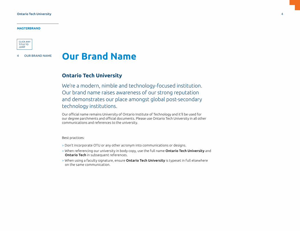
Our Brand Name
Ontario Tech University
We’re a modern, nimble and technology-focused institution. Our brand name raises awareness of our strong reputation and demonstrates our place amongst global post-secondary technology institutions.Our official name remains University of Ontario Institute of Technology and it’ll be used for our degree parchments and official documents. Please use Ontario Tech University in all other communications and references to the university.
Best practices:
> Don’t incorporate OTU or any other acronym into communications or designs.
> When referencing our university in body copy, use the full name Ontario Tech University and Ontario Tech in subsequent references.
> When using a faculty signature, ensure Ontario Tech University is typeset in full elsewhere on the same communication.
Ontario Tech University 4
MASTERBRAND APPLICATIONS SUPPORTDESIGN ELEMENTS SPIRIT BRAND
4 OUR BRAND NAME
5 OUR BRAND MANIFESTO
6 OUR BRAND VOICE
7 OUR IDENTITY
8 LOGO FORMATS
11 LOGO VERSIONS
12 LOGO USAGE
13 INCORRECT LOGO USAGE
14 LOGO ELEMENTS
18 OUR FONTS
24 OUR COLOURS
26 ONEBRAND ARCHITECTURE
28 SIGNATURE IDENTITIES
MASTERBRAND
CLICK ANY TITLE TO JUMP

Our Brand Manifesto
We have an important story to share.
Our world is changing rapidly and given the demanding times we live in, it’s crucial that we step up now and search for solutions. At Ontario Tech University, we’re serious about success. We believe that with smart, focused thinking and a drive toward finding innovative, modern results to real-life challenges, we can help chart the way forward.
We strive for a better future and we’re always open to new emerging possibilities. And we do it all with a no-nonsense attitude that recognizes that being too traditional, or too formal, are not prerequisites for being great.
Technology is a driving force in society, bringing advances that improve our lives and well-being. At Ontario Tech, we’re not only at the forefront of the possibilities, but also exploring the questions that guide a consideration of tech with a conscience.
Ontario Tech University
MASTERBRAND
5
APPLICATIONS SUPPORTDESIGN ELEMENTS SPIRIT BRAND
4 OUR NAME
5 OUR BRAND MANIFESTO
6 OUR BRAND VOICE
7 OUR IDENTITY
8 LOGO FORMATS
11 LOGO VERSIONS
12 LOGO USAGE
13 INCORRECT LOGO USAGE
14 LOGO ELEMENTS
18 OUR FONTS
24 OUR COLOURS
26 ONEBRAND ARCHITECTURE
28 SIGNATURE IDENTITIES
MASTERBRAND

Our Brand VoiceOur voice needs to embody and represent our diverse student body and faculty. The way we communicate and convey information should mirror the values that we uphold throughout our campus. Our brand voice should humanize our brand and elevate our reputation. Our tone should be consistent and authentic through all points of communication.
Our tone and manner in design and content writing are:
> Smart
> Focused
> Grounded
> Down to earth
> Pragmatic
> Inclusive
> ‘Don’t take ourselves too seriously’
Ontario Tech University 6
MASTERBRAND APPLICATIONS SUPPORTDESIGN ELEMENTS SPIRIT BRAND
4 OUR BRAND NAME
5 OUR BRAND MANIFESTO
6 OUR BRAND VOICE
7 OUR IDENTITY
8 LOGO FORMATS
11 LOGO VERSIONS
12 LOGO USAGE
13 INCORRECT LOGO USAGE
14 LOGO ELEMENTS
18 OUR FONTS
24 OUR COLOURS
26 ONEBRAND ARCHITECTURE
28 SIGNATURE IDENTITIES
MASTERBRAND

Our IdentityOur identity signals the start of an exciting new era and reflects a stronger, emboldened campus spirit.
It’s a strategic evolution of the university’s old mark and is now simple, unique and identifiable. The iconic Shield was simplified and modernized to represent a commitment to openness and possibilities. The Arrow was introduced to reflect tech-forward momentum, always pointing towards a better future.
Our updated colour palette includes an infusion of orange to differentiate ourselves. A modern, customized Wordmark complements a versatile typography system.
Our brand identity instills every university touch point including merchandise, website, printed collateral, way-finding and building signage, and social media. More than just a logo, the identity helps to tell our story with consistency, unity, and pride.
For more information contact [email protected]
> Directional
> Forward-thinking
> Progressive
SHIELD
> Leverages heritage
> Open to new ideas
> Strength and safety
ARC
> Emerging ideas
> Possibilities
> Represents the O in Ontario
Ontario Tech University 7
MASTERBRAND APPLICATIONS SUPPORTDESIGN ELEMENTS SPIRIT BRAND
4 OUR BRAND NAME
5 OUR BRAND MANIFESTO
6 OUR BRAND VOICE
7 OUR IDENTITY
8 LOGO FORMATS
11 LOGO VERSIONS
12 LOGO USAGE
13 INCORRECT LOGO USAGE
14 LOGO ELEMENTS
18 OUR FONTS
24 OUR COLOURS
26 ONEBRAND ARCHITECTURE
28 SIGNATURE IDENTITIES
MASTERBRAND

Logo FormatsOUR LOGOThe primary logo is the preferred format and it should be used wherever possible. We’ve developed a stacked version of the logo for instances where space may be limited.
OUR WORDMARKThe Wordmark logo versions should be used sparingly and only in circumstances where the Shield Symbol is used as a graphic element.
OUR SYMBOLThe Symbol can be used on its own. See the next page for more information.
PRIMARY LOGO STACKED LOGO
WORDMARK STACKED WORDMARK
SYMBOL
Ontario Tech University 8
MASTERBRAND APPLICATIONS SUPPORTDESIGN ELEMENTS SPIRIT BRAND
4 OUR BRAND NAME
5 OUR BRAND MANIFESTO
6 OUR BRAND VOICE
7 OUR IDENTITY
8 LOGO FORMATS
11 LOGO VERSIONS
12 LOGO USAGE
13 INCORRECT LOGO USAGE
14 LOGO ELEMENTS
18 OUR FONTS
24 OUR COLOURS
26 ONEBRAND ARCHITECTURE
28 SIGNATURE IDENTITIES
MASTERBRAND
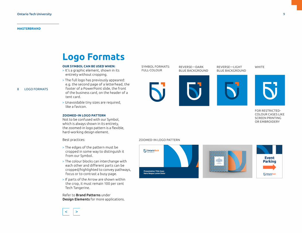
Logo FormatsOUR SYMBOL CAN BE USED WHEN:> It’s a graphic element, shown in its
entirety without cropping.
> The full logo has previously appeared: e.g. the second page of a letterhead, the footer of a PowerPoint slide, the front of the business card, on the header of a tent card.
> Unavoidable tiny sizes are required, like a favicon.
ZOOMED-IN LOGO PATTERNNot to be confused with our Symbol, which is always shown in its entirety, the zoomed-in logo pattern is a flexible, hard-working design element.
Best practices:
> The edges of the pattern must be cropped in some way to distinguish it from our Symbol.
> The colour blocks can interchange with each other and different parts can be cropped/highlighted to convey pathways, focus or to contrast a busy page.
> If parts of the Arrow are shown within the crop, it must remain 100 per cent Tech Tangerine.
Refer to Brand Patterns under Design Elements for more applications.
ZOOMED-IN LOGO PATTERN
SYMBOL FORMATS:FULL-COLOUR
REVERSE—DARK BLUE BACKGROUND
REVERSE—LIGHT BLUE BACKGROUND
WHITE
FOR RESTRICTED-COLOUR CASES LIKE SCREEN PRINTING OR EMBROIDERY
Presentation Title Goes Here Neque Lorem Dolor
Ontario Tech University 9
MASTERBRAND APPLICATIONS SUPPORTDESIGN ELEMENTS SPIRIT BRAND
4 OUR BRAND NAME
5 OUR BRAND MANIFESTO
6 OUR BRAND VOICE
7 OUR IDENTITY
8 LOGO FORMATS
11 LOGO VERSIONS
12 LOGO USAGE
13 INCORRECT LOGO USAGE
14 LOGO ELEMENTS
18 OUR FONTS
24 OUR COLOURS
26 ONEBRAND ARCHITECTURE
28 SIGNATURE IDENTITIES
MASTERBRAND
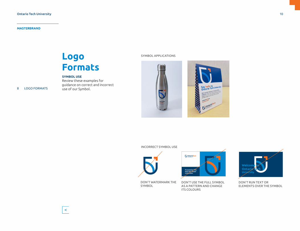
Logo FormatsSYMBOL USEReview these examples for guidance on correct and incorrect use of our Symbol.
Welcome to Ontario Tech University
Presentation Title Goes Here Neque Lorem Dolor
DON’T USE THE FULL SYMBOL AS A PATTERN AND CHANGE ITS COLOURS
DON’T RUN TEXT OR ELEMENTS OVER THE SYMBOL
DON’T WATERMARK THE SYMBOL
SYMBOL APPLICATIONS
INCORRECT SYMBOL USE
Ontario Tech University 10
MASTERBRAND APPLICATIONS SUPPORTDESIGN ELEMENTS SPIRIT BRAND
4 OUR BRAND NAME
5 OUR BRAND MANIFESTO
6 OUR BRAND VOICE
7 OUR IDENTITY
8 LOGO FORMATS
11 LOGO VERSIONS
12 LOGO USAGE
13 INCORRECT LOGO USAGE
14 LOGO ELEMENTS
18 OUR FONTS
24 OUR COLOURS
26 ONEBRAND ARCHITECTURE
28 SIGNATURE IDENTITIES
MASTERBRAND
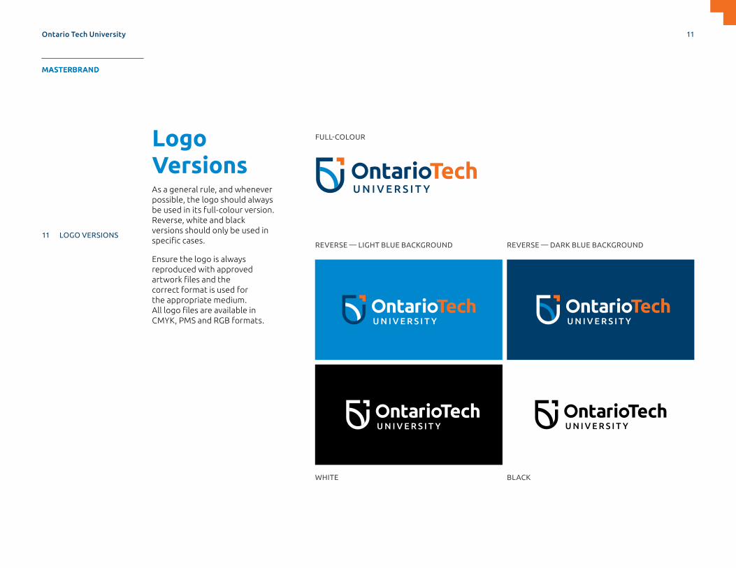
Logo VersionsAs a general rule, and whenever possible, the logo should always be used in its full-colour version. Reverse, white and black versions should only be used in specific cases.
Ensure the logo is always reproduced with approved artwork files and the correct format is used for the appropriate medium. All logo files are available in CMYK, PMS and RGB formats.
FULL-COLOUR
REVERSE — LIGHT BLUE BACKGROUND
WHITE
REVERSE — DARK BLUE BACKGROUND
BLACK
Ontario Tech University 11
MASTERBRAND APPLICATIONS SUPPORTDESIGN ELEMENTS SPIRIT BRAND
4 OUR BRAND NAME
5 OUR BRAND MANIFESTO
6 OUR BRAND VOICE
7 OUR IDENTITY
8 LOGO FORMATS
11 LOGO VERSIONS
12 LOGO USAGE
13 INCORRECT LOGO USAGE
14 LOGO ELEMENTS
18 OUR FONTS
24 OUR COLOURS
26 ONEBRAND ARCHITECTURE
28 SIGNATURE IDENTITIES
MASTERBRAND
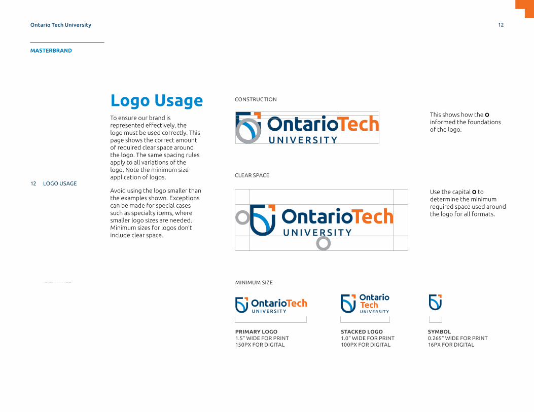
Use the capital O to determine the minimum required space used around the logo for all formats.
CLEAR SPACE
CONSTRUCTION
PRIMARY LOGO 1.5" WIDE FOR PRINT 150PX FOR DIGITAL
MINIMUM SIZE
STACKED LOGO 1.0" WIDE FOR PRINT 100PX FOR DIGITAL
SYMBOL 0.265" WIDE FOR PRINT 16PX FOR DIGITAL
Logo UsageTo ensure our brand is represented effectively, the logo must be used correctly. This page shows the correct amount of required clear space around the logo. The same spacing rules apply to all variations of the logo. Note the minimum size application of logos.
Avoid using the logo smaller than the examples shown. Exceptions can be made for special cases such as specialty items, where smaller logo sizes are needed. Minimum sizes for logos don’t include clear space.
This shows how the O informed the foundations of the logo.
Ontario Tech University 12
MASTERBRAND APPLICATIONS SUPPORTDESIGN ELEMENTS SPIRIT BRAND
4 OUR BRAND NAME
5 OUR BRAND MANIFESTO
6 OUR BRAND VOICE
7 OUR IDENTITY
8 LOGO FORMATS
11 LOGO VERSIONS
12 LOGO USAGE
13 INCORRECT LOGO USAGE
14 LOGO ELEMENTS
18 OUR FONTS
24 OUR COLOURS
26 ONEBRAND ARCHITECTURE
28 SIGNATURE IDENTITIES
MASTERBRAND
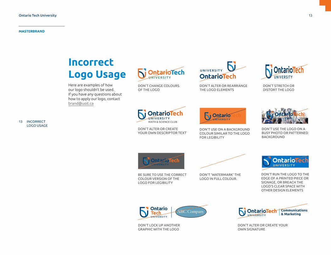
Incorrect Logo UsageHere are examples of how our logo shouldn’t be used. If you have any questions about how to apply our logo, contact [email protected]
DON’T CHANGE COLOURS OF THE LOGO
DON’T ALTER OR REARRANGE THE LOGO ELEMENTS
DON’T STRETCH OR DISTORT THE LOGO
DON’T ALTER OR CREATE YOUR OWN DESCRIPTOR TEXT
DON’T USE THE LOGO ON A BUSY PHOTO OR PATTERNED BACKGROUND
BE SURE TO USE THE CORRECT COLOUR VERSION OF THE LOGO FOR LEGIBILITY
MATH & SCIENCE CLUB
DON’T ‘WATERMARK’ THE LOGO IN FULL COLOUR.
DON’T RUN THE LOGO TO THE EDGE OF A PRINTED PIECE OR SIGNAGE, OR BREACH THE LOGO’S CLEAR SPACE WITH OTHER DESIGN ELEMENTS
DON’T LOCK UP ANOTHER GRAPHIC WITH THE LOGO
DON’T ALTER OR CREATE YOUR OWN SIGNATURE
DON’T USE ON A BACKGROUND COLOUR SIMILAR TO THE LOGO FOR LEGIBILITY
ABC Company Communications & Marketing
Ontario Tech University 13
MASTERBRAND APPLICATIONS SUPPORTDESIGN ELEMENTS SPIRIT BRAND
4 OUR BRAND NAME
5 OUR BRAND MANIFESTO
6 OUR BRAND VOICE
7 OUR IDENTITY
8 LOGO FORMATS
11 LOGO VERSIONS
12 LOGO USAGE
13 INCORRECT LOGO USAGE
14 LOGO ELEMENTS
18 OUR FONTS
24 OUR COLOURS
26 ONEBRAND ARCHITECTURE
28 SIGNATURE IDENTITIES
MASTERBRAND

Logo ElementsARROWYou can use the Arrow on its own, across brand applications to bring visual impact or structure to the layout. In order to maintain consistency and balance, it must be used carefully.
Best practices:
> The Arrow must always be used in 100 per cent Tech Tangerine.
> Use of the Arrow is preferred to be flush to the edge of the document, not inset.
> Ensure the Arrow isn’t overused within a layout.
> Proportion and clear space is important to make sure the device is not crowded or adding to visual clutter.
> Where possible, the Arrow should point to the top right to reinforce forward direction.
ARROW PATTERNOne of our Brand Patterns is created from the Arrow.
The Arrow Brand Pattern has the flexibility to change to other colours or be used monochromatically as tone-on-tone, as opposed to the Arrow above, which should stay 100 per cent Tech Tangerine.
DEVICE
PATTERN
ARROW
Preferred Acceptable
Ontario Tech University 14
MASTERBRAND APPLICATIONS SUPPORTDESIGN ELEMENTS SPIRIT BRAND
4 OUR BRAND NAME
5 OUR BRAND MANIFESTO
6 OUR BRAND VOICE
7 OUR IDENTITY
8 LOGO FORMATS
11 LOGO VERSIONS
12 LOGO USAGE
13 INCORRECT LOGO USAGE
14 LOGO ELEMENTS
18 OUR FONTS
24 OUR COLOURS
26 ONEBRAND ARCHITECTURE
28 SIGNATURE IDENTITIES
MASTERBRAND

Logo ElementsARROW FRAMEThe Arrow Frame can highlight content contained within the frame. There should be generous white space around the frame, and there shouldn’t be too much content. i.e. short, punchy facts where both corners of the frame are not too far apart from one another. The Arrow Frame is helpful as a typographic tool such as highlighting big-number callouts.
FRAME
ARROW
18k+Degrees
conferred
10k+Graduate and
undergraduate students
DegreesBachelor’sMaster’s
PhDsDiplomas
ENSURE THAT CLEAR SPACE OF AT LEAST HALF THE WIDTH OF THE ARROW ISN’T ENCROACHED UPON BY TEXT ELEMENTS
Ontario Tech University 15
MASTERBRAND APPLICATIONS SUPPORTDESIGN ELEMENTS SPIRIT BRAND
4 OUR BRAND NAME
5 OUR BRAND MANIFESTO
6 OUR BRAND VOICE
7 OUR IDENTITY
8 LOGO FORMATS
11 LOGO VERSIONS
12 LOGO USAGE
13 INCORRECT LOGO USAGE
14 LOGO ELEMENTS
18 OUR FONTS
24 OUR COLOURS
26 ONEBRAND ARCHITECTURE
28 SIGNATURE IDENTITIES
MASTERBRAND
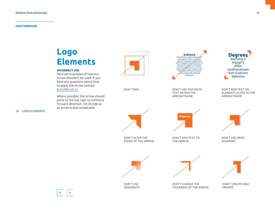
Logo ElementsINCORRECT USEHere are examples of how our Arrow shouldn’t be used. If you have any questions about how to apply the Arrow contact [email protected]
Where possible, the Arrow should point to the top right to reinforce forward direction. On its side as an arrow is also acceptable.
DON’T BOX DON’T USE TOO MUCH TEXT WITHIN THE ARROW FRAME
DON’T RUN TEXT OR ELEMENTS CLOSE TO THE ARROW FRAME
DON’T ALTER THE EDGES OF THE ARROW
DON’T ADD TEXT TO THE ARROW
DON’T USE DROP SHADOWS
DON’T USE GRADIENTS
DON’T CHANGE THE THICKNESS OF THE ARROW
DON’T CREATE NEW FRAMES
Degrees
DegreesBachelor’sMaster’s
PhDsUndergraduate and Graduate
diplomas
SubheadDa evel ipsus maionsequia cum
consequiae velibus, sum ium que pre nemquae cullaciatem
archil expligenihit poreperem hit ad maioreic teturei umquodit. Onsere, seque essunt, omniet
auda simin et quis. Lecaerro eos doluptati ommolescil illacea taecae latquodit molorio
reremque.
Ontario Tech University 16
MASTERBRAND APPLICATIONS SUPPORTDESIGN ELEMENTS SPIRIT BRAND
4 OUR BRAND NAME
5 OUR BRAND MANIFESTO
6 OUR BRAND VOICE
7 OUR IDENTITY
8 LOGO FORMATS
11 LOGO VERSIONS
12 LOGO USAGE
13 INCORRECT LOGO USAGE
14 LOGO ELEMENTS
18 OUR FONTS
24 OUR COLOURS
26 ONEBRAND ARCHITECTURE
28 SIGNATURE IDENTITIES
MASTERBRAND

Logo ElementsARROW—EXTENSIONThe Arrow can be used as positive or negative space to mask images.
Ensure there’s generous uncluttered space around the image frame. Avoid placing text too close.
It can be extended as an opening pull-quote. Ensure there’s generous uncluttered space around the pull-quote.
Note: The pull-quote can be used in any of our primary or secondary colours.
The university’s curriculum helped me achieve my career goals. The professors provide a comfortable learning environment and treat students with respect.
— STUDENT NAME
Quote as serchic to to eos volupti venimus sum qui doluptaes est et ante volum seruntoreped qui nos et rem fugiam, sam quia vel iniae explibus arios sunt rat aciis eost, quatio et officia seque liquam.
—SOURCE NAME, Explibus arios sunt rat acis eost, quatio et officia sequePresentation Title Goes Here Neque Lorem Dolor
NEGATIVE
PULL QUOTE POWERPOINTBROCHURE
POSITIVE
Ontario Tech University 17
MASTERBRAND APPLICATIONS SUPPORTDESIGN ELEMENTS SPIRIT BRAND
4 OUR BRAND NAME
5 OUR BRAND MANIFESTO
6 OUR BRAND VOICE
7 OUR IDENTITY
8 LOGO FORMATS
11 LOGO VERSIONS
12 LOGO USAGE
13 INCORRECT LOGO USAGE
14 LOGO ELEMENTS
18 OUR FONTS
24 OUR COLOURS
26 ONEBRAND ARCHITECTURE
28 SIGNATURE IDENTITIES
MASTERBRAND

Our FontsPRIMARY FONT: UBUNTUOur Wordmark incorporates a new font, Ubuntu. It’s versatile, approachable, comes in a variety of weights and is also designed for digital use. Ubuntu can be used for all of our communication, marketing and digital materials.
Welcome
добро пожаловать
FEATURE
> 1,200 glyphs
> 200 to 250 languages
FEATURE
> Free and open-source font.
> This means it can be used in all software programs once installed. If sharing a file with an outside vendor, make sure they download and install Ubuntu (available on Google Fonts).
FEATURE
> Rounded letterforms are friendly and modern.
Ontario Tech University 18
MASTERBRAND APPLICATIONS SUPPORTDESIGN ELEMENTS SPIRIT BRAND
4 OUR BRAND NAME
5 OUR BRAND MANIFESTO
6 OUR BRAND VOICE
7 OUR IDENTITY
8 LOGO FORMATS
11 LOGO VERSIONS
12 LOGO USAGE
13 INCORRECT LOGO USAGE
14 LOGO ELEMENTS
18 OUR FONTS
24 OUR COLOURS
26 ONEBRAND ARCHITECTURE
28 SIGNATURE IDENTITIES
MASTERBRAND

Curriculumemboldened campus spirit
strategic Simplified & Modernized openness and possibilities
POINTING TOWARDS A BETTER FUTURE
Brand Evolution1234567890?/!#
Our FontsPRIMARY FONT: UBUNTUAll documents should incorporate the primary font within the material to ensure it relates to our brand.
In good typography practice, it’s important to consider the size, style and weight of the font in your document. Adding contrast to the typography setting helps your reader understand emphasis and hierarchy within the communication. Consider keeping consistent typographic styles within your document to ensure visual aesthetic is simple and clean.
Light
Light Italic
Regular
Italic
MediumMedium ItalicBoldBold ItalicCondensed
AVAILABLE WEIGHTS
UBUNTU
Ontario Tech University 19
MASTERBRAND APPLICATIONS SUPPORTDESIGN ELEMENTS SPIRIT BRAND
4 OUR BRAND NAME
5 OUR BRAND MANIFESTO
6 OUR BRAND VOICE
7 OUR IDENTITY
8 LOGO FORMATS
11 LOGO VERSIONS
12 LOGO USAGE
13 INCORRECT LOGO USAGE
14 LOGO ELEMENTS
18 OUR FONTS
24 OUR COLOURS
26 ONEBRAND ARCHITECTURE
28 SIGNATURE IDENTITIES
MASTERBRAND

Curriculumemboldened campus spirit
strategic Simplified & Modernized openness and possibilities
POINTING TOWARDS A BETTER FUTUREBrand Evolution1234567890?/!#
Our FontsSECONDARY FONT: ITC FRANKLIN GOTHIC STDStrong brands usually employ more than one typeface. Different typefaces have differing attributes and can be applied in applications and communication hierarchies to create distinct tones and emphasis.
Our secondary font is ITC Franklin Gothic STD. It features a robust type family that is extremely versatile and flexible for any potential application. It can be used in all marketing and digital materials.
Franklin Gothic was selected because it works to complement our primary font (Ubuntu).
Book
Book Italic
Medium
Medium Italic
DemiDemi Italic
HeavyHeavy Italic
Book Condensed
Book Condensed Italic
Medium Condensed
Medium Condensed Italic
Demi Condensed
Demi Condensed Italic
Book Extra Compressed
Demi Extra Compressed
ITC FRANKLIN GOTHIC STD
AVAILABLE WEIGHTS
Ontario Tech University 20
MASTERBRAND APPLICATIONS SUPPORTDESIGN ELEMENTS SPIRIT BRAND
4 OUR BRAND NAME
5 OUR BRAND MANIFESTO
6 OUR BRAND VOICE
7 OUR IDENTITY
8 LOGO FORMATS
11 LOGO VERSIONS
12 LOGO USAGE
13 INCORRECT LOGO USAGE
14 LOGO ELEMENTS
18 OUR FONTS
24 OUR COLOURS
26 ONEBRAND ARCHITECTURE
28 SIGNATURE IDENTITIES
MASTERBRAND
Curriculumemboldened campus spirit
strategic Simplified & Modernized openness and possibilities
A BETTER FUTUREBrand Evolution1234567890?/!#
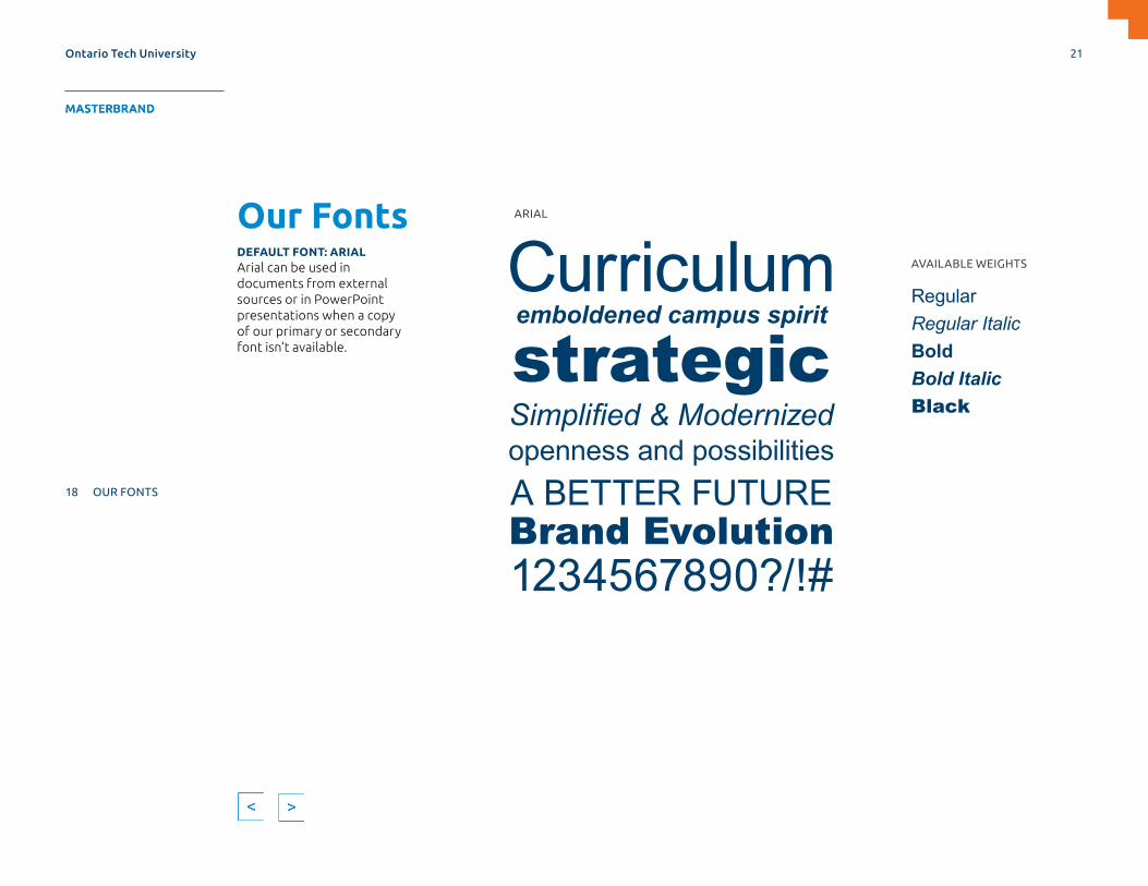
Our FontsDEFAULT FONT: ARIALArial can be used in documents from external sources or in PowerPoint presentations when a copy of our primary or secondary font isn’t available.
RegularRegular ItalicBoldBold ItalicBlack
AVAILABLE WEIGHTS
ARIAL
Ontario Tech University 21
MASTERBRAND APPLICATIONS SUPPORTDESIGN ELEMENTS SPIRIT BRAND
4 OUR BRAND NAME
5 OUR BRAND MANIFESTO
6 OUR BRAND VOICE
7 OUR IDENTITY
8 LOGO FORMATS
11 LOGO VERSIONS
12 LOGO USAGE
13 INCORRECT LOGO USAGE
14 LOGO ELEMENTS
18 OUR FONTS
24 OUR COLOURS
26 ONEBRAND ARCHITECTURE
28 SIGNATURE IDENTITIES
MASTERBRAND

Our FontsTYPOGRAPHIC APPLICATION CORRECT USEOur marketing and design pieces should feel connected to the same brand. Consistency in typography application signifies that the communication comes from Ontario Tech University.
Aim to use our primary font, Ubuntu, as primary headline/display, intro paragraphs and subheads to show off its unique letterforms. Upper and lower case Ubuntu is preferred.
Our secondary font, ITC Franklin Gothic STD, is well suited to smaller support copy like body text, also as subheads, and eyebrow headlines. All caps, title or upper/lowercase combinations work.
Connections for the Future
Rum iumquisin eum que inctur. Da evel ipsus maionsequia cum consequiae velibus, sum ium que pre nemquae cullaciatem archil expligenihit poreperem hit ad maioreic teturei umquodit. Onsere, seque essunt, omniet auda simin et quis. Lecaerro eos doluptati ommolescil illacea taecae latquodit molorio reremque.
WHAT’S NEXT?Students are invited to meet alumni and potential employers to gain insights about industry, learn what companies are looking for in new talent and obtain practical guidance.
HEADLINE/DISPLAY: UBUNTU-TITLE CASE
SUBHEADS: UBUNTU OR ITC FRANKLIN GOTHIC STD, ALL CAPS OR UPPER/LOWERCASE
EYEBROW HEADLINES: UBUNTU OR ITC FRANKLIN GOTHIC STD, ALL CAPS OR TITLE CASEINTRODUCTORY PARAGRAPHS: UBUNTU UPPER-/LOWER-CASE
BODY/SUPPORT TEXT: ITC FRANKLIN GOTHIC STD
LOCATIONBusiness and Information Technology Building, Atrium and Mezzanine
LOCATIONBusiness and Information Technology Building, Atrium and Mezzanine
Ontario Tech University 22
MASTERBRAND APPLICATIONS SUPPORTDESIGN ELEMENTS SPIRIT BRAND
4 OUR BRAND NAME
5 OUR BRAND MANIFESTO
6 OUR BRAND VOICE
7 OUR IDENTITY
8 LOGO FORMATS
11 LOGO VERSIONS
12 LOGO USAGE
13 INCORRECT LOGO USAGE
14 LOGO ELEMENTS
18 OUR FONTS
24 OUR COLOURS
26 ONEBRAND ARCHITECTURE
28 SIGNATURE IDENTITIES
MASTERBRAND
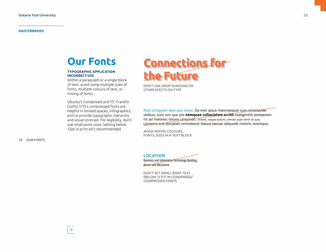
Our FontsTYPOGRAPHIC APPLICATION INCORRECT USEWithin a paragraph or a single block of text, avoid using multiple sizes of fonts, multiple colours of text, or mixing of fonts.
Ubuntu’s Condensed and ITC Franklin Gothic STD’s compressed fonts are helpful in limited spaces, infographics, and to provide typographic hierarchy and visual contrast. For legibility, don’t use small point sizes. Setting below 12pt in print isn’t recommended.
Connections for the Future
Rum iumquisin eum que inctur. Da evel ipsus maionsequia cum consequiae velibus, sum ium que pre nemquae cullaciatem archil expligenihit poreperem hit ad maioreic teturei umquodit. Onsere, seque essunt, omniet auda simin et quis. Lecaerro eos doluptati ommolescil illacea taecae latquodit molorio reremque.
DON’T USE DROP SHADOWS OR OTHER EFECTS ON TYPE
AVOID MIXING COLOURS, FONTS, SIZES IN A TEXT BLOCK
DON’T SET SMALL BODY TEXT (BELOW 12 PT) IN CONDENSED/COMPRESSED FONTS
LOCATIONBusiness and Information Technology Building, Atrium and Mezzanine
Ontario Tech University 23
MASTERBRAND APPLICATIONS SUPPORTDESIGN ELEMENTS SPIRIT BRAND
4 OUR BRAND NAME
5 OUR BRAND MANIFESTO
6 OUR BRAND VOICE
7 OUR IDENTITY
8 LOGO FORMATS
11 LOGO VERSIONS
12 LOGO USAGE
13 INCORRECT LOGO USAGE
14 LOGO ELEMENTS
18 OUR FONTS
24 OUR COLOURS
26 ONEBRAND ARCHITECTURE
28 SIGNATURE IDENTITIES
MASTERBRAND
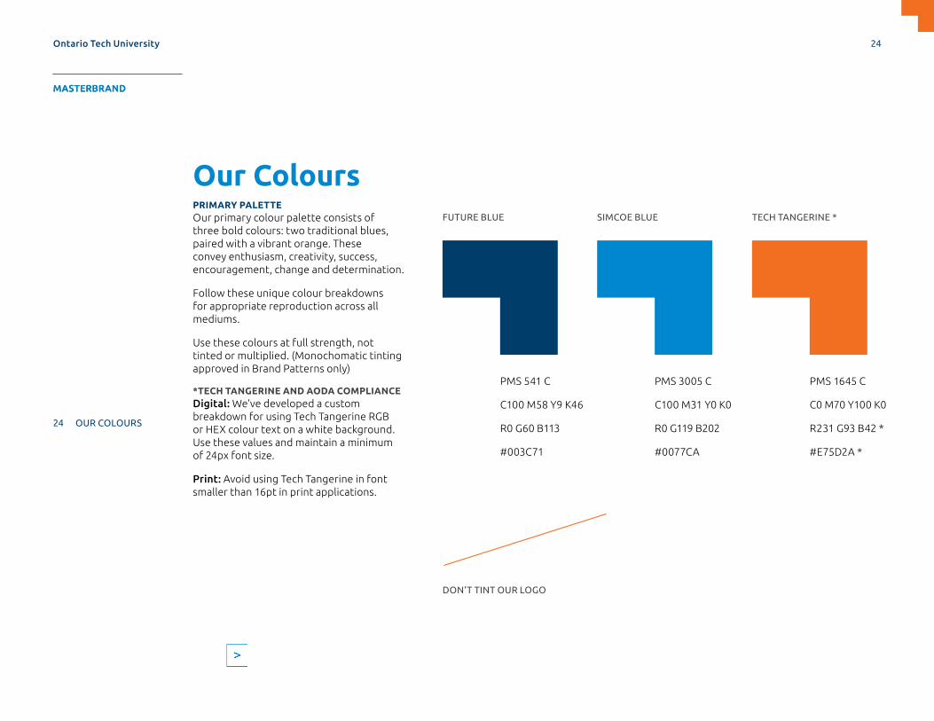
Our ColoursPRIMARY PALETTEOur primary colour palette consists of three bold colours: two traditional blues, paired with a vibrant orange. These convey enthusiasm, creativity, success, encouragement, change and determination.
Follow these unique colour breakdowns for appropriate reproduction across all mediums.
Use these colours at full strength, not tinted or multiplied. (Monochomatic tinting approved in Brand Patterns only)
*TECH TANGERINE AND AODA COMPLIANCEDigital: We’ve developed a custom breakdown for using Tech Tangerine RGB or HEX colour text on a white background. Use these values and maintain a minimum of 24px font size.
Print: Avoid using Tech Tangerine in font smaller than 16pt in print applications.
DON’T TINT OUR LOGO
FUTURE BLUE
PMS 541 C
C100 M58 Y9 K46
R0 G60 B113
#003C71
SIMCOE BLUE
PMS 3005 C
C100 M31 Y0 K0
R0 G119 B202
#0077CA
TECH TANGERINE *
PMS 1645 C
C0 M70 Y100 K0
R231 G93 B42 *
#E75D2A *
Ontario Tech University 24
MASTERBRAND APPLICATIONS SUPPORTDESIGN ELEMENTS SPIRIT BRAND
4 OUR BRAND NAME
5 OUR BRAND MANIFESTO
6 OUR BRAND VOICE
7 OUR IDENTITY
8 LOGO FORMATS
11 LOGO VERSIONS
12 LOGO USAGE
13 INCORRECT LOGO USAGE
14 LOGO ELEMENTS
18 OUR FONTS
24 OUR COLOURS
26 ONEBRAND ARCHITECTURE
28 SIGNATURE IDENTITIES
MASTERBRAND
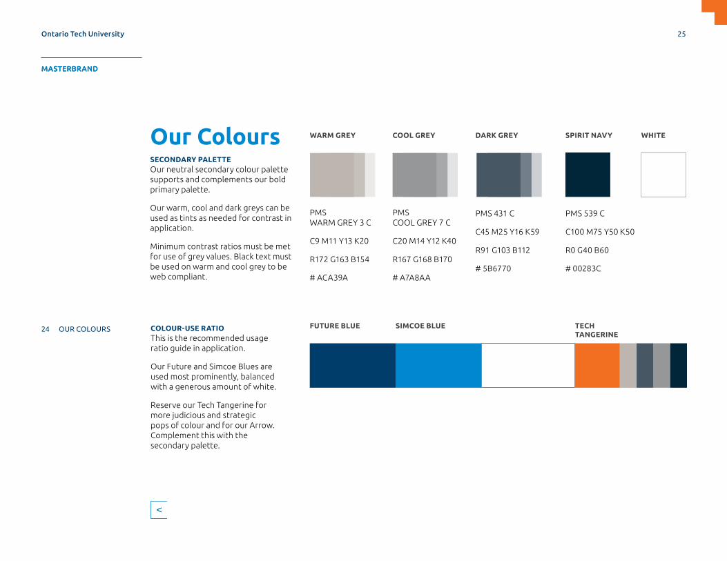
Our ColoursSECONDARY PALETTEOur neutral secondary colour palette supports and complements our bold primary palette.
Our warm, cool and dark greys can be used as tints as needed for contrast in application.
Minimum contrast ratios must be met for use of grey values. Black text must be used on warm and cool grey to be web compliant.
COLOUR-USE RATIOThis is the recommended usage ratio guide in application.
Our Future and Simcoe Blues are used most prominently, balanced with a generous amount of white.
Reserve our Tech Tangerine for more judicious and strategic pops of colour and for our Arrow. Complement this with the secondary palette.
WARM GREY
PMS WARM GREY 3 C
C9 M11 Y13 K20
R172 G163 B154
# ACA39A
COOL GREY
PMS COOL GREY 7 C
C20 M14 Y12 K40
R167 G168 B170
# A7A8AA
DARK GREY SPIRIT NAVY WHITE
PMS 431 C
C45 M25 Y16 K59
R91 G103 B112
# 5B6770
PMS 539 C
C100 M75 Y50 K50
R0 G40 B60
# 00283C
FUTURE BLUE SIMCOE BLUE TECH TANGERINE
Ontario Tech University 25
MASTERBRAND APPLICATIONS SUPPORTDESIGN ELEMENTS SPIRIT BRAND
4 OUR BRAND NAME
5 OUR BRAND MANIFESTO
6 OUR BRAND VOICE
7 OUR IDENTITY
8 LOGO FORMATS
11 LOGO VERSIONS
12 LOGO USAGE
13 INCORRECT LOGO USAGE
14 LOGO ELEMENTS
18 OUR FONTS
24 OUR COLOURS
26 ONEBRAND ARCHITECTURE
28 SIGNATURE IDENTITIES
MASTERBRAND

ONEbrand ArchitectureOur brand is MORE than a logo Our brand has a completely new visual identity and includes many new creative elements to use in all of our communications. You will see more visuals instead of words, and a new tone and voice in the way we communicate.
ONEBRAND STRATEGYThe success of our brand relies on having one unified brand: Ontario Tech University. We’ll achieve this with our ONEbrand strategy.
WHAT IS A ONEBRAND STRATEGY?Our ONEbrand strategy brings our campus community together as one by using only:
> The Ontario Tech University logo system.
> Consistent messages.
> Pantone colours from the logo.
BENEFITS OF A ONEBRAND STRATEGY
> Improved brand presence.
> Integrated communications.
> Simple, easy to navigate.
> Cost effective.
> Leverages brand investment.
Our Brand Architecture on the following page describes how units within the university fit into the ONEbrand strategy.
Ontario Tech University 26
MASTERBRAND APPLICATIONS SUPPORTDESIGN ELEMENTS SPIRIT BRAND
4 OUR BRAND NAME
5 OUR BRAND MANIFESTO
6 OUR BRAND VOICE
7 OUR IDENTITY
8 LOGO FORMATS
11 LOGO VERSIONS
12 LOGO USAGE
13 INCORRECT LOGO USAGE
14 LOGO ELEMENTS
18 OUR FONTS
24 OUR COLOURS
26 ONEBRAND ARCHITECTURE
28 SIGNATURE IDENTITIES
MASTERBRAND

MASTERBRAND (The university’s primary identity.)
SIGNATUREIDENTITIES(Used to highlight faculties and units to place them within the brand hierarchy. Only units specified are permitted. See Page 28 for a full list of approved identities.)
SPIRIT BRAND (The university’s identity for Spirit and Athletics.)
ONEbrand ArchitectureONEbrand Architecture is a system that categorizes the various units of our brand. Review the previous page for more information regarding our ONEbrand strategy.
Ontario Tech University 27
MASTERBRAND APPLICATIONS SUPPORTDESIGN ELEMENTS SPIRIT BRAND
4 OUR BRAND NAME
5 OUR BRAND MANIFESTO
6 OUR BRAND VOICE
7 OUR IDENTITY
8 LOGO FORMATS
11 LOGO VERSIONS
12 LOGO USAGE
13 INCORRECT LOGO USAGE
14 LOGO ELEMENTS
18 OUR FONTS
24 OUR COLOURS
26 ONEBRAND ARCHITECTURE
28 SIGNATURE IDENTITIES
MASTERBRAND
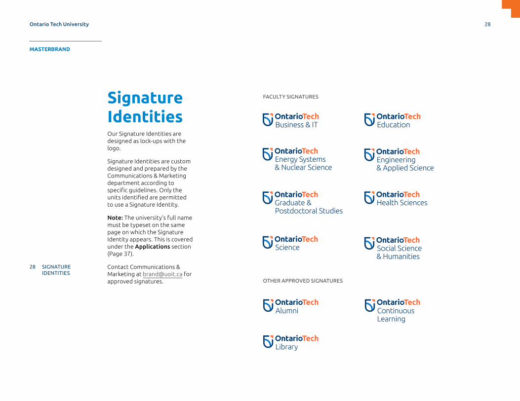
Signature IdentitiesOur Signature Identities are designed as lock-ups with the logo.
Signature Identities are custom designed and prepared by the Communications & Marketing department according to specific guidelines. Only the units identified are permitted to use a Signature Identity.
Note: The university’s full name must be typeset on the same page on which the Signature Identity appears. This is covered under the Applications section (Page 37).
Contact Communications & Marketing at [email protected] for approved signatures.
FACULTY SIGNATURES
OTHER APPROVED SIGNATURES
Ontario Tech University 28
MASTERBRAND APPLICATIONS SUPPORTDESIGN ELEMENTS SPIRIT BRAND
4 OUR BRAND NAME
5 OUR BRAND MANIFESTO
6 OUR BRAND VOICE
7 OUR IDENTITY
8 LOGO FORMATS
11 LOGO VERSIONS
12 LOGO USAGE
13 INCORRECT LOGO USAGE
14 LOGO ELEMENTS
18 OUR FONTS
24 OUR COLOURS
26 ONEBRAND ARCHITECTURE
28 SIGNATURE IDENTITIES
MASTERBRAND

Brand PatternsOur playful series of patterns complement the brand and extend its visual language. Inspired
by elements of the Symbol, they express energy, direction, connectedness, and spirit.
Ontario Tech University
MASTERBRAND
29
APPLICATIONS SUPPORTDESIGN ELEMENTS SPIRIT BRAND SUPPORTMASTERBRAND DESIGN ELEMENTS APPLICATIONS SPIRIT BRAND
29 BRAND PATTERNS
33 GRAPHS AND CHARTS
35 USE OF COLOUR BARS AND BLOCKS
DESIGN ELEMENTS

Divider Slide TitleSubtitle if needed
Ontario Tech University Running Footer Presentation Name
Image and Text Slide Option 1 Title Goes Here
• Text here Ficipiet quam eiciant ut qui occaborro te ne acium eum faciandi cos ex et hit lam poristium quiae minullamIbus intist opturiatecae
• Text here Ficipiet quam eiciant ut qui occaborro te ne acium eum
• Faciandi cos e ex et hit lam poristium quiae minull amIbus intist opturiate caent
• Text here Ficipiet quam eiciant ut qui occaborro te ne acium eum faciandi cos ex et hit lam oristium quiae minullamIbus intist opturiatecae
• Text here Ficipiet quam eiciant ut qui occaborro te ne acium eum faciandi cos ex et hit lam
• Pristium quiae minullamIbus intist opturiatecae
6 Ontario Tech University Running Footer Presentation Name
Image and Text Slide Option 1 Title Goes Here
• Text here Ficipiet quam eiciant ut qui occaborro te ne acium eum faciandi cos ex et hit lam poristium quiae minullamIbus intist opturiatecae
• Text here Ficipiet quam eiciant ut qui occaborro te ne acium eum
• Faciandi cos e ex et hit lam poristium quiae minull amIbus intist opturiate caent
• Text here Ficipiet quam eiciant ut qui occaborro te ne acium eum faciandi cos ex et hit lam oristium quiae minullamIbus intist opturiatecae
• Text here Ficipiet quam eiciant ut qui occaborro te ne acium eum faciandi cos ex et hit lam
• Pristium quiae minullamIbus intist opturiatecae
6
Brand PatternsWe have patterns for use in your documents. Patterns should be used selectively and without visual conflict. They should add visual impact to your layout and reinforce the brand in a subtle way by showcasing brand colours and recognizable elements in an interesting way. Choosing the right pattern can make your material look distinct and reinforce the tone of your communication.
Patterns can be used monochromatically as subtle textures (e.g. a divider slide in a presentation, the inside of a tent card, specialty merchandise, environmental graphics, a high-impact graphic spread or in place of an image or header in collateral.)
Contact Communications & Marketing at [email protected] to request these patterns.
Ontario Tech University
MASTERBRAND
30
APPLICATIONS SUPPORTDESIGN ELEMENTS SPIRIT BRAND SUPPORTMASTERBRAND DESIGN ELEMENTS APPLICATIONS SPIRIT BRAND
29 BRAND PATTERNS
33 GRAPHS AND CHARTS
35 USE OF COLOUR BARS AND BLOCKS
DESIGN ELEMENTS

Brand PatternsSYMBOL VS ZOOMED-IN LOGO PATTERNNot to be confused with our Symbol, which is always shown in its entirety, the zoomed-in logo pattern is a flexible, hard-working design element. The colour blocks can interchange and different parts can be cropped/highlighted to convey pathways or to contrast a busy page. The edges of the pattern must be cropped in some way to distinguish it from our Symbol.
Ontario Tech University
MASTERBRAND
31
APPLICATIONS SUPPORTDESIGN ELEMENTS SPIRIT BRAND SUPPORTMASTERBRAND DESIGN ELEMENTS APPLICATIONS SPIRIT BRAND
29 BRAND PATTERNS
33 GRAPHS AND CHARTS
35 USE OF COLOUR BARS AND BLOCKS
DESIGN ELEMENTS

Brand PatternsBest practices:
> Avoid layering text directly over the busy areas of the patterns.
> Avoid pairing with imagery.
> Avoid using multiple patterns on the same page.
> Playing with the scale or crop of the pattern can impact the effect they have in your layout.
> Adjusting colour and stroke lines within the patterns is not recommended.
Contact Communications & Marketing at [email protected] to request these patterns.
Ontario Tech University
MASTERBRAND
32
APPLICATIONS SUPPORTDESIGN ELEMENTS SPIRIT BRAND SUPPORTMASTERBRAND DESIGN ELEMENTS APPLICATIONS SPIRIT BRAND
29 BRAND PATTERNS
33 GRAPHS AND CHARTS
35 USE OF COLOUR BARS AND BLOCKS
DESIGN ELEMENTS

82%of students employed within six months of
graduation
82%of students employed within six months of
graduation
PIE CHARTS PERCENTAGE CHARTS
Undergraduate part-time
Graduate part-time
Graduate full-time
Undergraduate full-time
2017–2018
Undergraduate and Graduate Students Status
Undergraduate part-time
Graduate part-time
Graduate full-time
Undergraduate full-time
2017–2018
Undergraduate and Graduate Students Status
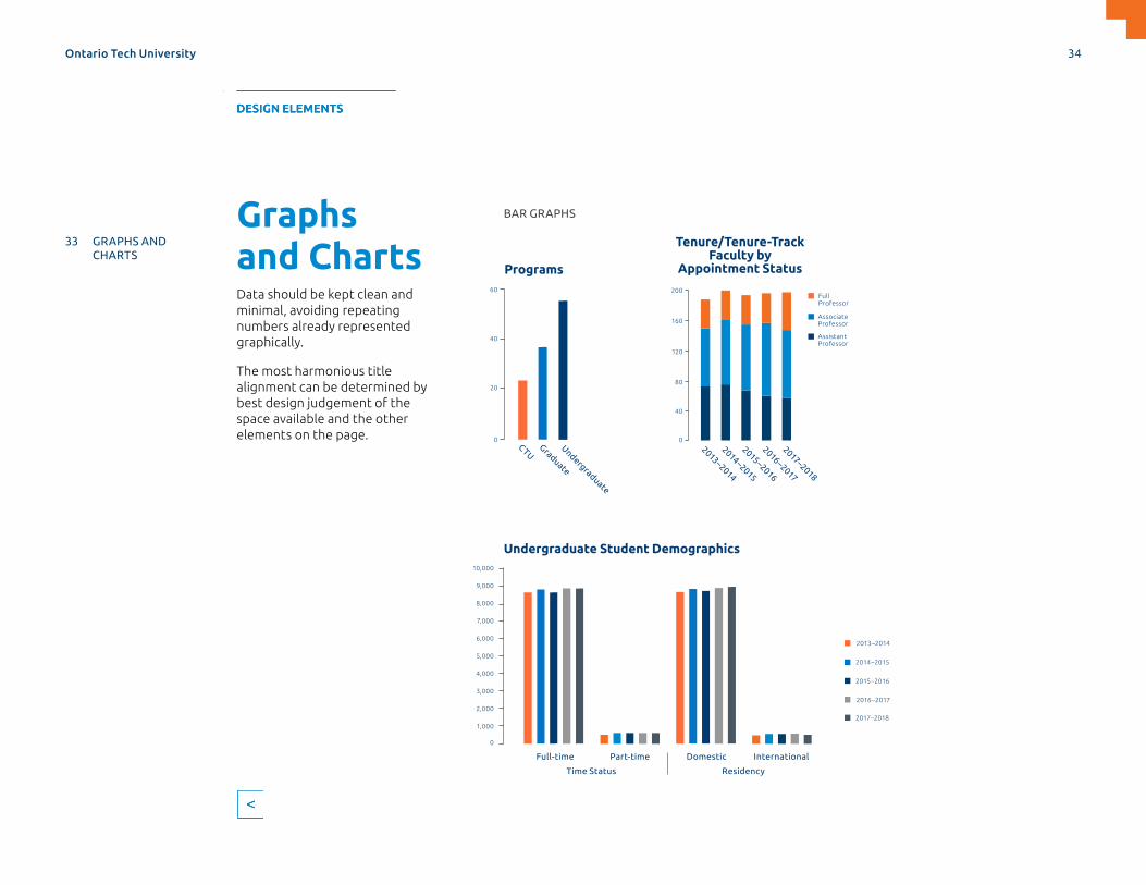
Graphs and ChartsGraphs and charts should only use our primary colour palette, supported by our secondary palette. Don’t introduce new colours for multiple fields: instead stripes can be utilized for differentiation.
Although not required, a subtle pattern can be used within a large container, as long as there is no text overlap.
Ontario Tech University 33
MASTERBRAND APPLICATIONS SUPPORTDESIGN ELEMENTS SPIRIT BRAND
29 BRAND PATTERNS
33 GRAPHS AND CHARTS
35 USE OF COLOUR BARS AND BLOCKS
DESIGN ELEMENTS
BAR GRAPHS
9,000
10,000
0
1,000
3,000
5,000
7,000
2,000
4,000
6,000
8,000
Undergraduate Student Demographics
Full-time Domestic
Time Status Residency
Part-time International
CTUGraduate
Undergraduate
60
0
20
40
Programs
Full Professor
Associate Professor
Assistant Professor
Tenure/Tenure-Track Faculty by
Appointment Status
200
120
0
80
160
40
2013–2014
2014–2015
2015–2016
2016–2017
2017–2018
2013–2014
2014–2015
2015–2016
2016–2017
2017–2018
Graphs and ChartsData should be kept clean and minimal, avoiding repeating numbers already represented graphically.
The most harmonious title alignment can be determined by best design judgement of the space available and the other elements on the page.
Ontario Tech University 34
MASTERBRAND APPLICATIONS SUPPORTDESIGN ELEMENTS SPIRIT BRAND
29 BRAND PATTERNS
33 GRAPHS AND CHARTS
35 USE OF COLOUR BARS AND BLOCKS
DESIGN ELEMENTS

Use of Colour Bars and BlocksCOLOUR BARSYou can use bars as a graphic element within your layout to anchor and frame your communication. Consistency is important to ensure the element is recognized as a part of our brand.
Best practices:
> Height of the Colour Bar should be 1" for 11" x 17" posters and 0.75" for letter and postcard size: a good rule of thumb for other sizes is the height of the logo used within the document.
> Colour Bars should bleed off the bottom of your layout and should mirror the margin spacing within your grid.
> Don’t insert content and graphics within the bar except for including Ontario Tech University when a Signature Identity is used.
> Colour Bars separate information within a document. They shouldn’t be used as a decorative border or stroke beneath an image.
> Avoid using thin or multiple Colour Bars within a document layout as they become decorative and not functional.
> Colour Bars should only use primary colour palette.
The Career Centre invites students to meet alumni and potential employers to gain insights about industry, learn what companies are looking for in new talent and obtain practical guidance from alumni to help uncover your career path.
RSVP to ontariotechu.ca/classtocareer
UPCOMING EVENTSLOCATION TIME
From Classroom to Career: Connections for the Future
WHAT’S NEXT?
Computer Science: January 22Math/Physics: January 24Biology: January 29Chemistry: January 31
Business and Information Technology Building, Atrium and Mezzanine
6 to 9 p.m.Refreshments will be provided.
Ontario Tech University
The Career Centre invites students to meet alumni and potential employers to gain insights about industry, learn what companies are looking for in new talent and obtain practical guidance from alumni to help uncover your career path.
UPCOMING EVENTSComputer Science: January 22Math/Physics: January 24Biology: January 29Chemistry: January 31
LOCATIONBusiness and Information Technology Building, Atrium and Mezzanine
TIME6 to 9 p.m.Refreshments will be provided.
From Classroom to Career: Connections for the Future
What’s Next?
RSVP to ontariotechu.ca/classtocareer
COLOUR BARS
In this program, you’ll learn fundamental radiation science, technological methods and applications. You will prepare for a successful and rewarding career in the multidisciplinary
Take advantage of our co-op and internship options to gain valuable workplace experience while completing your degree.
For an alternative format of this information, contact [email protected]
©UOIT 2018. UNIVERSITY OF ONTARIO INSTITUTE OF TECHNOLOGY and
protected under Section 9 of the Trade-marks Act. D6104
ontariotechu.ca/programs
WANT MORE INFORMATION?Faculty of Energy Systems and Nuclear Science2000 Simcoe Street NorthOshawa, Ontario L1G 0C5Canada
WHAT WILL I STUDY?Courses include:Environmental Effects of RadiationIndustrial Applications and Radiation Techniques
Medical ImagingNuclear PhysicsRadiation Biophysics and DosimetryRadiation Detection and MeasurementRadioisotopes and Radiation MachinesTherapeutic Applications of Radiation Techniques
WHAT CAN I DO WITH MY DEGREE?Environmental safetyNon-destructive material testingRadiation applications in health care
Radiation protection> nuclear power plants> nuclear waste management> regulation> resource extraction
and mining
Ontario Tech University 35
MASTERBRAND APPLICATIONS SUPPORTDESIGN ELEMENTS SPIRIT BRAND
29 BRAND PATTERNS
33 GRAPHS AND CHARTS
35 USE OF COLOUR BARS AND BLOCKS
DESIGN ELEMENTS

Use of Colour Bars and BlocksCOLOUR BLOCKSCopy and text can be inserted into Colour Blocks to separate content and highlight information. Colour Blocks can visually add importance and hierarchy to your layout by guiding the reader’s eye on the page. Arrows can also add dimension and brand interest within your document. See Pages 14 to 17.
Best practices:
> Height of the Colour Block is flexible but the width should align with the document’s design grid.
> Colour Blocks can use both primary and secondary colour palette as long as the colour ratio and proper contrast is considered within your layout.
> Shapes including circles, arrows and rectangles can be used within the Colour Blocks.
> How do we ensure the safety of scientists and technologists working with radiation in medical research, health care, and nuclear science?
> How do we ensure appropriate government regulation of industries and activities using nuclear and atomic radiations?
> How do we ensure the safe operation of nuclear power plants?
Study advanced science for radiation protection of humans and the environment, as well as the safe application of radiation technologies in science, health care, and government regulation.
Health Physics and Radiation Science
Ontario Tech University
DATE
Tuesday, October 23, 2018 LOCATION61 Charles Street BuildingRoom 219
TIME11:15 a.m. to 12:30 p.m.Reception to follow
The HonourableFrank Iacobucci
Toward a New Relationship with Indigenous People
Legal Studies Distinguished Visitor Lecture Series presents
C.C., Q.C., L.S.M. > Former Justice of the Supreme Court of Canada
Registration and information: ontariotechu.ca/Iacobucci
Ontario Tech University
Presentation Title Goes Here Neque Lorem Dolor
PreparingGraduates forTomorrow’sWorkplace
ontariotechu.ca
PreparingGraduates forTomorrow’sWorkplace
COLOUR BLOCKS
Ontario Tech University 36
MASTERBRAND APPLICATIONS SUPPORTDESIGN ELEMENTS SPIRIT BRAND
29 BRAND PATTERNS
33 GRAPHS AND CHARTS
35 USE OF COLOUR BARS AND BLOCKS
DESIGN ELEMENTS

Applications
Ontario Tech University 37
MASTERBRAND APPLICATIONS SUPPORTDESIGN ELEMENTS SPIRIT BRAND
38 PRINT APPLICATIONS
61 DIGITAL APPLICATIONS
APPLICATIONS

FRONT
BACK
on
tariote
chu
.ca
Print ApplicationsSTATIONERY: BUSINESS CARDSOur business cards embody our vibrant colours.
Richard Seres Executive DirectorCommunications & Marketing
T. 905.721.8668 ext. 6736 M. 905.261.1705 [email protected] 2000 Simcoe Street North, Oshawa, Ontario, Canada L1G 0C5
Ontario Tech University 38
MASTERBRAND APPLICATIONS SUPPORTDESIGN ELEMENTS SPIRIT BRAND
38 PRINT APPLICATIONS
61 DIGITAL APPLICATIONS
APPLICATIONS
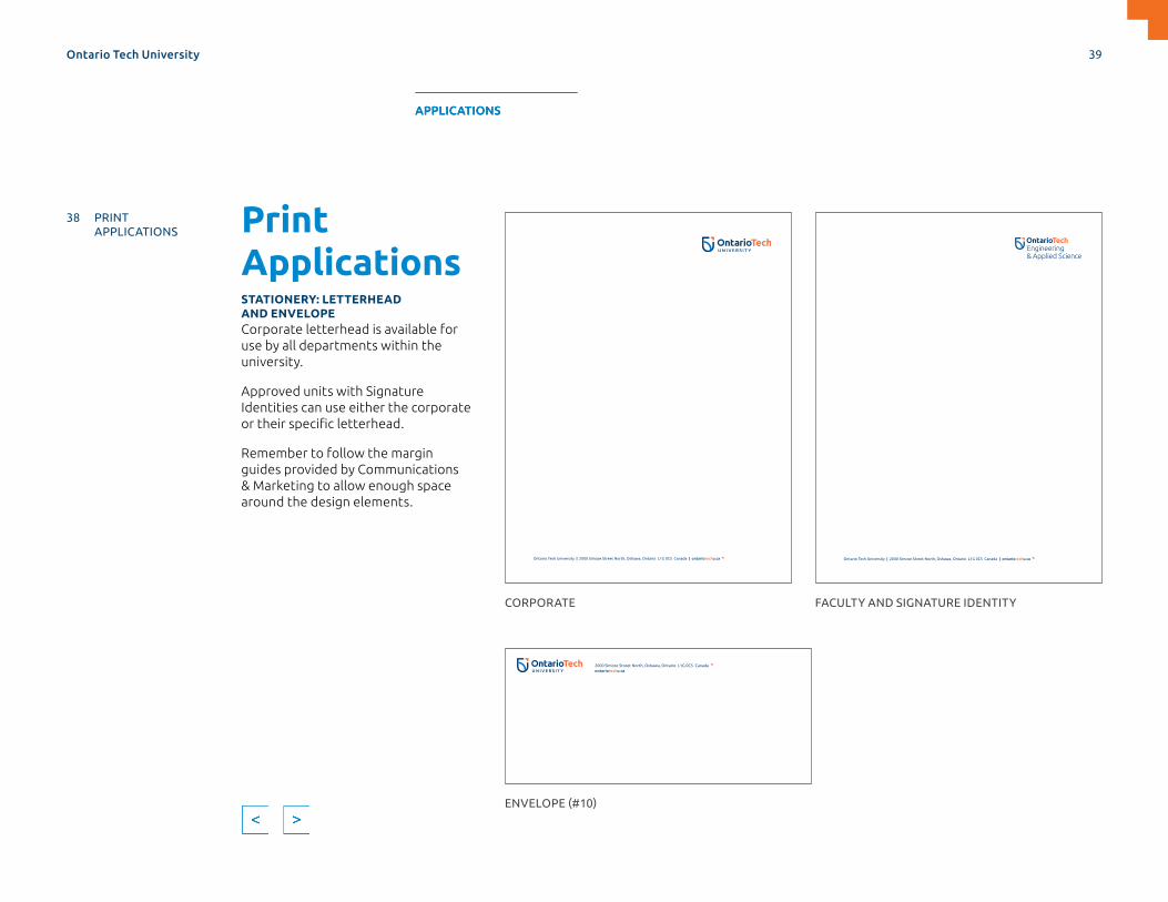
Print ApplicationsSTATIONERY: LETTERHEAD AND ENVELOPECorporate letterhead is available for use by all departments within the university.
Approved units with Signature Identities can use either the corporate or their specific letterhead.
Remember to follow the margin guides provided by Communications & Marketing to allow enough space around the design elements.
Ontario Tech University | 2000 Simcoe Street North, Oshawa, Ontario L1G 0C5 Canada | ontariotechu.ca Ontario Tech University | 2000 Simcoe Street North, Oshawa, Ontario L1G 0C5 Canada | ontariotechu.ca
CORPORATE
ENVELOPE (#10)
FACULTY AND SIGNATURE IDENTITY
2000 Simcoe Street North, Oshawa, Ontario L1G 0C5 Canadaontariotechu.ca
Ontario Tech University 39
MASTERBRAND APPLICATIONS SUPPORTDESIGN ELEMENTS SPIRIT BRAND
38 PRINT APPLICATIONS
61 DIGITAL APPLICATIONS
APPLICATIONS

The Career Centre invites students to meet alumni and potential employers to gain insights about industry, learn what companies are looking for in new talent and obtain practical guidance from alumni to help uncover your career path.
RSVP to ontariotechu.ca/classtocareer
UPCOMING EVENTSLOCATION TIME
From Classroom to Career: Connections for the Future
WHAT’S NEXT?
Computer Science: January 22Math/Physics: January 24Biology: January 29Chemistry: January 31
Business and Information Technology Building, Atrium and Mezzanine
6 to 9 p.m.Refreshments will be provided.
Ontario Tech University
POSTER (11” X 17”)—EXAMPLE USING OUR IMAGE ASSETSPrint ApplicationsPOSTERS 11" X 17"This template option keeps the Signature Identity at the top near the Arrow and Ontario Tech University in the Colour Bar.
When using the Primary logo on your poster, the Colour Bar remains free of text.
The Colour Bar can be in any of our primary colours while considering contrast and colour ratio within the design.
Image chosen from photo library.
Arrow surrounded by white space.
Colour Bar anchors poster and mirrors margin spacing.
Retain 1" height.
Colour Bar remains free of text with the exception of Ontario Tech University, ranged right, when a Signature Identity is used (see Page 35).
Negative Arrow notches photo for ownable and easily implemented element.
Consistent 1” wide margin important for brand, mirrors margin spacing, looks considered.
Call to action ranged left
1" 1"
Headline, eyebrow headline, intro paragraph, event details follow Typographic Application guidelines on Page 22.
1"
Ontario Tech University 40
MASTERBRAND APPLICATIONS SUPPORTDESIGN ELEMENTS SPIRIT BRAND
38 PRINT APPLICATIONS
61 DIGITAL APPLICATIONS
APPLICATIONS

The Career Centre invites students to meet alumni and potential employers to gain insights about industry, learn what companies are looking for in new talent and obtain practical guidance from alumni to help uncover your career path.
RSVP to ontariotechu.ca/classtocareer
UPCOMING EVENTSLOCATION TIME
From Classroom to Career: Connections for the Future
WHAT’S NEXT?
Computer Science: January 22Math/Physics: January 24Biology: January 29Chemistry: January 31
Business and Information Technology Building, Atrium and Mezzanine
6 to 9 p.m.Refreshments will be provided.
Ontario Tech University
POSTER (11” X 17”)—EXAMPLE USING OUR IMAGE ASSETSPrint ApplicationsPOSTERS 11" X 17" CONTINUED
Best practices:
> Select image from our professionally shot, on-campus image assets, if possible.
> Don’t reduce the width of the margins below 1”. Don’t reduce the height of the Colour Bars below 1”.
> Don’t fill Colour Bars with text with the exception of Ontario Tech University, when a Signature Identity is used.
> Remove Colour Bar if full bleed isn’t possible.
> Limit text to small, digestible chunks of information—daunting amounts of type are less likely to be read.
> Don’t use drop shadows, gradients or other effects on text or design elements.
> Restrain information hierarchy to three–four levels to maintain clean typography and orderly layouts.
Keep this area free of other elements. Stacking other lines of type above the colour bar with Ontario Tech University will look cluttered and reduce communication of call-to-action message.
Keep area between the logo and Arrow free of other elements. Filling with other pieces of information will look cluttered and reduce communication effectiveness.
Ontario Tech University 41
MASTERBRAND APPLICATIONS SUPPORTDESIGN ELEMENTS SPIRIT BRAND
38 PRINT APPLICATIONS
61 DIGITAL APPLICATIONS
APPLICATIONS
DATE
Tuesday, October 23, 2018 LOCATION61 Charles Street BuildingRoom 219
TIME11:15 a.m. to 12:30 p.m.Reception to follow
The HonourableFrank Iacobucci
Toward a New Relationship with Indigenous People
Legal Studies Distinguished Visitor Lecture Series presents
C.C., Q.C., L.S.M. > Former Justice of the Supreme Court of Canada
Registration and information: ontariotechu.ca/Iacobucci
Ontario Tech University
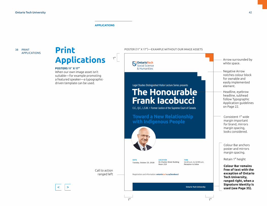
Print ApplicationsPOSTERS 11" X 17"When our own image asset isn’t suitable—for example promoting a featured speaker—a typographic-driven template can be used.
POSTER (11” X 17”)—EXAMPLE WITHOUT OUR IMAGE ASSETS
Headline, eyebrow headline, subhead follow Typographic Application guidelines on Page 22.
Arrow surrounded by white space.
Colour Bar anchors poster and mirrors margin spacing.
Retain 1" height
Colour Bar remains free of text with the exception of Ontario Tech University, ranged right, when a Signature Identity is used (see Page 35).
Negative Arrow notches colour block for ownable and easily implemented element.
Consistent 1” wide margin important for brand, mirrors margin spacing, looks considered.
Call to action ranged left
1" 1"
1"
Ontario Tech University 42
MASTERBRAND APPLICATIONS SUPPORTDESIGN ELEMENTS SPIRIT BRAND
38 PRINT APPLICATIONS
61 DIGITAL APPLICATIONS
APPLICATIONS

DATE
Tuesday, October 23, 2018 LOCATION61 Charles Street BuildingRoom 219
TIME11:15 a.m. to 12:30 p.m.Reception to follow
The HonourableFrank Iacobucci
Toward a New Relationship with Indigenous People
Legal Studies Distinguished Visitor Lecture Series presents
C.C., Q.C., L.S.M. > Former Justice of the Supreme Court of Canada
Registration and information: ontariotechu.ca/Iacobucci
Ontario Tech University
POSTER (11” X 17”)—EXAMPLE WITHOUT OUR IMAGE ASSETSPrint ApplicationsPOSTERS 11" X 17" CONTINUED
Best practices:
> Limit text to small, digestible chunks of information—daunting amounts of type are less likely to be read.
> Don’t use drop shadows, gradients or other effects on text or design elements.
> Restrain information hierarchy to three–four levels to maintain clean typography and orderly layouts.
> Don’t reduce the width of the margins below 1”. Don’t reduce the height of the Colour Bars below 1”.
> Don’t fill Colour Bars with text with the exception of Ontario Tech University, when a Signature Identity is used.
> Remove Colour Bar if full bleed isn’t possible.
Keep this area free from other elements. Stacking other lines of type above the colour bar with Ontario Tech University will look cluttered and reduce communication of call-to-action message.
Keep area between the logo and Arrow free of other elements. Filling with other pieces of information will look cluttered and reduce communication effectiveness.
Ontario Tech University 43
MASTERBRAND APPLICATIONS SUPPORTDESIGN ELEMENTS SPIRIT BRAND
38 PRINT APPLICATIONS
61 DIGITAL APPLICATIONS
APPLICATIONS
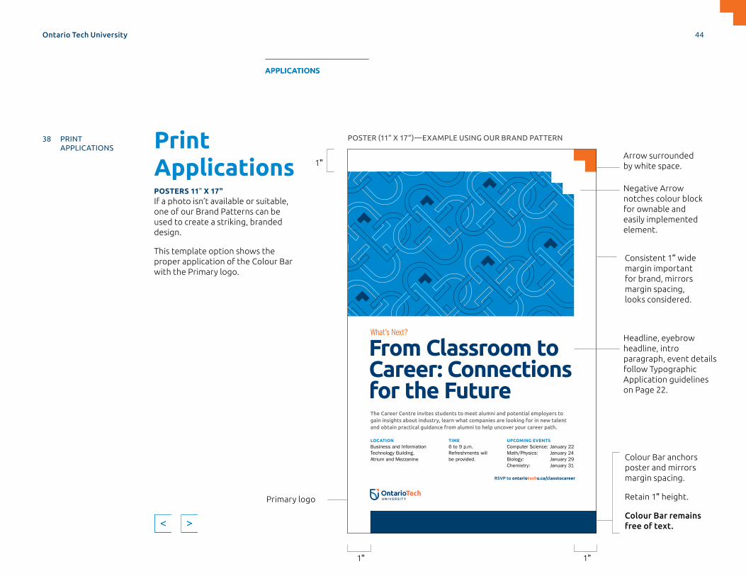
Print ApplicationsPOSTERS 11" X 17"If a photo isn’t available or suitable, one of our Brand Patterns can be used to create a striking, branded design.
This template option shows the proper application of the Colour Bar with the Primary logo.
The Career Centre invites students to meet alumni and potential employers to gain insights about industry, learn what companies are looking for in new talent and obtain practical guidance from alumni to help uncover your career path.
UPCOMING EVENTSComputer Science: January 22Math/Physics: January 24Biology: January 29Chemistry: January 31
LOCATIONBusiness and Information Technology Building, Atrium and Mezzanine
TIME6 to 9 p.m.Refreshments will be provided.
From Classroom to Career: Connections for the Future
What’s Next?
RSVP to ontariotechu.ca/classtocareer
Arrow surrounded by white space.
Colour Bar anchors poster and mirrors margin spacing.
Retain 1" height.
Colour Bar remains free of text.
Negative Arrow notches colour block for ownable and easily implemented element.
Consistent 1” wide margin important for brand, mirrors margin spacing, looks considered.
Primary logo
1"
1" 1"
POSTER (11” X 17”)—EXAMPLE USING OUR BRAND PATTERN
Headline, eyebrow headline, intro paragraph, event details follow Typographic Application guidelines on Page 22.
Ontario Tech University 44
MASTERBRAND APPLICATIONS SUPPORTDESIGN ELEMENTS SPIRIT BRAND
38 PRINT APPLICATIONS
61 DIGITAL APPLICATIONS
APPLICATIONS

The Career Centre invites students to meet alumni and potential employers to gain insights about industry, learn what companies are looking for in new talent and obtain practical guidance from alumni to help uncover your career path.
UPCOMING EVENTSComputer Science: January 22Math/Physics: January 24Biology: January 29Chemistry: January 31
LOCATIONBusiness and Information Technology Building, Atrium and Mezzanine
TIME6 to 9 p.m.Refreshments will be provided.
From Classroom to Career: Connections for the Future
What’s Next?
RSVP to ontariotechu.ca/classtocareer
POSTER (11” X 17”)—EXAMPLE USING OUR BRAND PATTERN
Keep this area free of other elements. Stacking other lines of type above the Colour Bar will look cluttered and reduce communication of messaging.
Print ApplicationsPOSTERS 11" X 17" CONTINUED
Best practices:
> Never pair a brand pattern with a photo.
> Limit text to small, digestible chunks of information—daunting amounts of type are less likely to be read.
> Don’t use drop shadows, gradients or other effects on text or design elements.
> Restrain information hierarchy to three–four levels to maintain clean typography and orderly layouts.
> Don’t reduce the width of the margins below 1”. Don’t reduce the height of the Colour Bars below 1”.
> Don’t fill Colour Bars with text with the exception of Ontario Tech University, when a Signature Identity is used.
> Remove Colour Bar if full bleed isn’t possible.
Ontario Tech University 45
MASTERBRAND APPLICATIONS SUPPORTDESIGN ELEMENTS SPIRIT BRAND
38 PRINT APPLICATIONS
61 DIGITAL APPLICATIONS
APPLICATIONS

Print ApplicationsPOSTERS 11" X 17"This template makes use of the Arrow in its positive version.
The Career Centre invites students to meet alumni and potential employers to gain insights about industry, learn what companies are looking for in new talent and obtain practical guidance from alumni to help uncover your career path.
UPCOMING EVENTSComputer Science: January 22Math/Physics: January 24Biology: January 29Chemistry: January 31
LOCATIONBusiness and Information Technology Building, Atrium and Mezzanine
TIME6 to 9 p.m.Refreshments will be provided.
From Classroom to Career: Connections for the Future
What’s Next?
RSVP to ontariotechu.ca/classtocareer
POSTER (11” X 17”)—EXAMPLE USING OUR IMAGE ASSETS
Image chosen from photo library.
Colour Bar anchors poster and mirrors margin spacing.
Retain 1" height.
Colour Bar remains free of text.
Positive Arrow masks/frames photo for ownable and easily implemented element.
Consistent 1" wide margin important for brand, mirrors margin spacing, looks considered.
Primary logo
1" 1"
1"
Headline, eyebrow headline, intro paragraph, event details follow Typographic Application guidelines on Page 22.
Ontario Tech University 46
MASTERBRAND APPLICATIONS SUPPORTDESIGN ELEMENTS SPIRIT BRAND
38 PRINT APPLICATIONS
61 DIGITAL APPLICATIONS
APPLICATIONS

Print ApplicationsPOSTERS 11" X 17" CONTINUED
Best practices:
> Limit text to small, digestible chunks of information. Daunting amounts of type are less likely to be read.
> Don’t use drop shadows, gradients or other effects on text or design elements.
> Restrain information hierarchy to three–four levels to maintain clean typography and orderly layouts.
> Don’t reduce the width of the margins below 1”. Don’t reduce the height of the Colour Bars below 1”.
> Don’t fill Colour Bars with text with the exception of Ontario Tech University, when a Signature Identity is used.
> Don’t use Colour Bars when full bleed isn’t possible.
The Career Centre invites students to meet alumni and potential employers to gain insights about industry, learn what companies are looking for in new talent and obtain practical guidance from alumni to help uncover your career path.
UPCOMING EVENTSComputer Science: January 22Math/Physics: January 24Biology: January 29Chemistry: January 31
LOCATIONBusiness and Information Technology Building, Atrium and Mezzanine
TIME6 to 9 p.m.Refreshments will be provided.
From Classroom to Career: Connections for the Future
What’s Next?
RSVP to ontariotechu.ca/classtocareer
POSTER (11” X 17”)—EXAMPLE USING OUR IMAGE ASSETS
Keep this area free of other elements. Stacking other lines of type above the Colour Bar will look cluttered and reduce communication of messaging.
This represents the maximum area that type may take up in the hollow of the Arrow. Running type too close to the Arrow will disrupt design and create visual tension.
Ontario Tech University 47
MASTERBRAND APPLICATIONS SUPPORTDESIGN ELEMENTS SPIRIT BRAND
38 PRINT APPLICATIONS
61 DIGITAL APPLICATIONS
APPLICATIONS
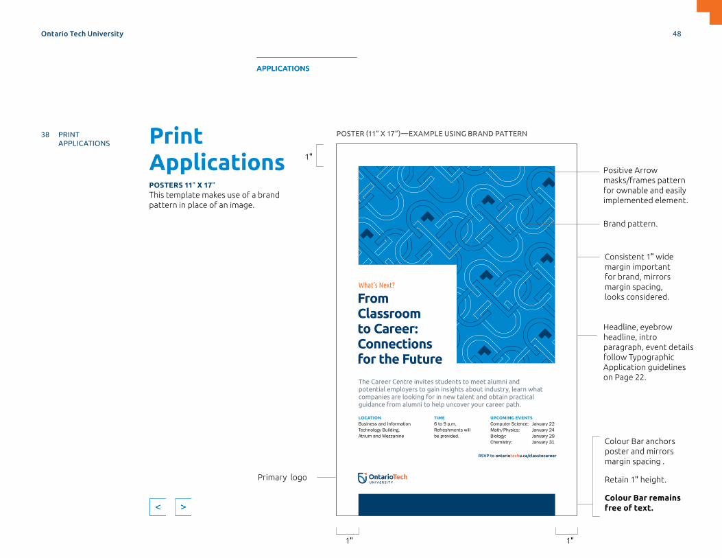
Print ApplicationsPOSTERS 11" X 17"This template makes use of a brand pattern in place of an image.
UPCOMING EVENTSComputer Science: January 22Math/Physics: January 24Biology: January 29Chemistry: January 31
LOCATIONBusiness and Information Technology Building, Atrium and Mezzanine
RSVP to ontariotechu.ca/classtocareer
TIME6 to 9 p.m.Refreshments will be provided.
What’s Next?
From Classroom to Career: Connections for the Future
The Career Centre invites students to meet alumni and potential employers to gain insights about industry, learn what companies are looking for in new talent and obtain practical guidance from alumni to help uncover your career path.
POSTER (11” X 17”)—EXAMPLE USING BRAND PATTERN
Brand pattern.
Colour Bar anchors poster and mirrors margin spacing .
Retain 1" height.
Colour Bar remains free of text.
Positive Arrow masks/frames pattern for ownable and easily implemented element.
Consistent 1" wide margin important for brand, mirrors margin spacing, looks considered.
Primary logo
1" 1"
1"
Headline, eyebrow headline, intro paragraph, event details follow Typographic Application guidelines on Page 22.
Ontario Tech University 48
MASTERBRAND APPLICATIONS SUPPORTDESIGN ELEMENTS SPIRIT BRAND
38 PRINT APPLICATIONS
61 DIGITAL APPLICATIONS
APPLICATIONS

Print ApplicationsPOSTERS 11" X 17" CONTINUED
Best practices:
> Limit text to small, digestible chunks of information. Daunting amounts of type are less likely to be read.
> Don’t use drop shadows, gradients or other effects on text or design elements.
> Restrain information hierarchy to three–four levels to maintain clean typography and orderly layouts.
> Don’t reduce the width of the margins below 1”. Don’t reduce the height of the Colour Bars below 1”.
> Don’t fill Colour Bars with text with the exception of Ontario Tech University, when a Signature Identity is used.
> Don’t use Colour Bars when full bleed isn’t possible.
UPCOMING EVENTSComputer Science: January 22Math/Physics: January 24Biology: January 29Chemistry: January 31
LOCATIONBusiness and Information Technology Building, Atrium and Mezzanine
RSVP to ontariotechu.ca/classtocareer
TIME6 to 9 p.m.Refreshments will be provided.
What’s Next?
From Classroom to Career: Connections for the Future
The Career Centre invites students to meet alumni and potential employers to gain insights about industry, learn what companies are looking for in new talent and obtain practical guidance from alumni to help uncover your career path.
POSTER (11” X 17”)—EXAMPLE USING OUR BRAND PATTERN
Keep this area free of other elements. Stacking other lines of type above the Colour Bar will look cluttered and reduce communication of messaging.
This represents the maximum area that type may take up in the hollow of the Arrow. Running type too close to the Arrow will disrupt design and create visual tension.
Ontario Tech University 49
MASTERBRAND APPLICATIONS SUPPORTDESIGN ELEMENTS SPIRIT BRAND
38 PRINT APPLICATIONS
61 DIGITAL APPLICATIONS
APPLICATIONS
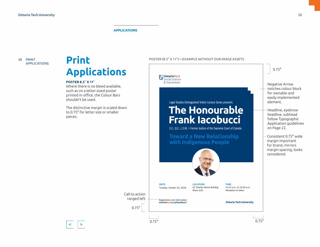
Print ApplicationsPOSTER 8.5" X 11"Where there is no bleed available, such as on a letter-sized poster printed in-office, the Colour Bars shouldn’t be used.
The distinctive margin is scaled down to 0.75" for letter size or smaller pieces.
DATE
Tuesday, October 23, 2018
LOCATION61 Charles Street BuildingRoom 219
Registration and information: ontariotechu.ca/Iacobucci
TIME11:15 a.m. to 12:30 p.m.Reception to follow
The HonourableFrank IacobucciToward a New Relationship with Indigenous People
Legal Studies Distinguished Visitor Lecture Series presents
C.C., Q.C., L.S.M. > Former Justice of the Supreme Court of Canada
Ontario Tech University
0.75"
0.75" 0.75"
0.75"
POSTER (8.5” X 11”)—EXAMPLE WITHOUT OUR IMAGE ASSETS
Headline, eyebrow headline, subhead follow Typographic Application guidelines on Page 22.
Call to action ranged left
Negative Arrow notches colour block for ownable and easily implemented element.
Consistent 0.75" wide margin important for brand, mirrors margin spacing, looks considered.
Ontario Tech University 50
MASTERBRAND APPLICATIONS SUPPORTDESIGN ELEMENTS SPIRIT BRAND
38 PRINT APPLICATIONS
61 DIGITAL APPLICATIONS
APPLICATIONS

Print ApplicationsPOSTER 8.5" X 11" CONTINUED
Best practices:
> Limit text to small, digestible chunks of information. Daunting amounts of type are less likely to be read.
> Don’t use drop shadows, gradients or other effects on text or design elements.
> Restrain information hierarchy to three–four levels to maintain clean typography and orderly layouts.
> Don’t reduce the width of the margins below 0.75".
> Don’t use Colour Bars where full bleed isn’t possible.
DATE
Tuesday, October 23, 2018
LOCATION61 Charles Street BuildingRoom 219
Registration and information: ontariotechu.ca/Iacobucci
TIME11:15 a.m. to 12:30 p.m.Reception to follow
The HonourableFrank IacobucciToward a New Relationship with Indigenous People
Legal Studies Distinguished Visitor Lecture Series presents
C.C., Q.C., L.S.M. > Former Justice of the Supreme Court of Canada
Ontario Tech University
POSTER (8.5” X 11”)—EXAMPLE WITHOUT OUR IMAGE ASSETS
Keep the margin of 0.75" free of other elements.
Ontario Tech University 51
MASTERBRAND APPLICATIONS SUPPORTDESIGN ELEMENTS SPIRIT BRAND
38 PRINT APPLICATIONS
61 DIGITAL APPLICATIONS
APPLICATIONS

Print ApplicationsONE-PAGER 8.5" X 11"This template makes use of the big-number callout style to demonstrate a large number of facts. 2,200+
Faculty and staff
20Pathways
diploma-to-degree
7Faculties
Degreesbachelor’smaster’s
PhDsundergraduate and graduate
diplomas
22College-to-university transfer programs
10Canada Research
Chairs
55Undergraduate
programs
18k+Degrees conferred
38Graduate programs
16Ridgebacks
varsity teams
10k+Graduate and undergraduate
students
Graduates
consistently find
employment
in their chosen
field at a rate
higher than the
Ontario system
average
Fast Facts
ONE-PAGER (8.5” X 11”)— FRONT EXAMPLE
0.75"
0.75" 0.75"
0.75"
Negative Arrow notches Colour Block for ownable and easily implemented element.
Consistent 0.75" wide margin important for brand, mirrors margin spacing, looks considered.
Ontario Tech University 52
MASTERBRAND APPLICATIONS SUPPORTDESIGN ELEMENTS SPIRIT BRAND
38 PRINT APPLICATIONS
61 DIGITAL APPLICATIONS
APPLICATIONS
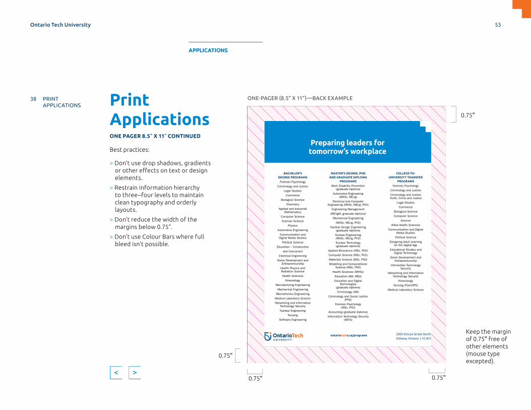
Print ApplicationsONE PAGER 8.5" X 11" CONTINUED
Best practices:
> Don’t use drop shadows, gradients or other effects on text or design elements.
> Restrain information hierarchy to three–four levels to maintain clean typography and orderly layouts.
> Don’t reduce the width of the margins below 0.75”.
> Don’t use Colour Bars where full bleed isn’t possible.
BACHELOR’S DEGREE PROGRAMS
Forensic Psychology
Criminology and Justice
Legal Studies
Commerce
Biological Science
Chemistry
Applied and Industrial Mathematics
Computer Science
Forensic Science
Physics
Automotive Engineering
Communication and Digital Media Studies
Political Science
Education – Consecutive
and Concurrent
Electrical Engineering
Game Development and Entrepreneurship
Health Physics and Radiation Science
Health Sciences
Kinesiology
Manufacturing Engineering
Mechanical Engineering
Mechatronics Engineering
Medical Laboratory Science
Networking and Information Technology Security
Nuclear Engineering
Nursing
Software Engineering
MASTER’S DEGREE, PHD AND GRADUATE DIPLOMA
PROGRAMS
Work Disability Prevention (graduate diploma)
Automotive Engineering (MASc, MEng)
Electrical and Computer Engineering (MASc, MEng, PhD)
Engineering Management
(MEngM, graduate diploma)
Mechanical Engineering
(MASc, MEng, PhD)
Nuclear Design Engineering (graduate diploma)
Nuclear Engineering (MASc, MEng, PhD)
Nuclear Technology (graduate diploma)
Applied Bioscience (MSc, PhD)
Computer Science (MSc, PhD)
Materials Science (MSc, PhD)
Modelling and Computational Science (MSc, PhD)
Health Sciences (MHSc)
Education (MA, MEd)
Education and Digital Technologies
(graduate diploma)
Criminology (MA)
Criminology and Social Justice (PhD)
Forensic Psychology (MSc, PhD)
Accounting (graduate diploma)
Information Technology Security (MITS)
COLLEGE-TO-UNIVERSITY TRANSFER
PROGRAMS
Forensic Psychology
Criminology and Justice
Criminology and Justice Youth, Crime and Justice
Legal Studies
Commerce
Biological Science
Computer Science
Science
Allied Health Sciences
Communication and Digital Media Studies
Political Science
Designing Adult Learning for the Digital Age
Educational Studies and Digital Technology
Game Development and Entrepreneurship
Information Technology Security
Networking and Information Technology Security
Kinesiology
Nursing (Post-RPN)
Medical Laboratory Science
Preparing leaders for tomorrow’s workplace
2000 Simcoe Street North,
Oshawa, Ontario L1G 0C5
For an alternative format of this information, contact [email protected]
ontariotechu.ca/programs
© University of Ontario Institute of Technology 2019. ONTARIO TECH UNIVERSITY and Design are trademarks of the University of Ontario Institute of Technology.
ONE-PAGER (8.5” X 11”)—BACK EXAMPLE
0.75"
0.75" 0.75"
0.75"
Keep the margin of 0.75" free of other elements (mouse type excepted).
Ontario Tech University 53
MASTERBRAND APPLICATIONS SUPPORTDESIGN ELEMENTS SPIRIT BRAND
38 PRINT APPLICATIONS
61 DIGITAL APPLICATIONS
APPLICATIONS
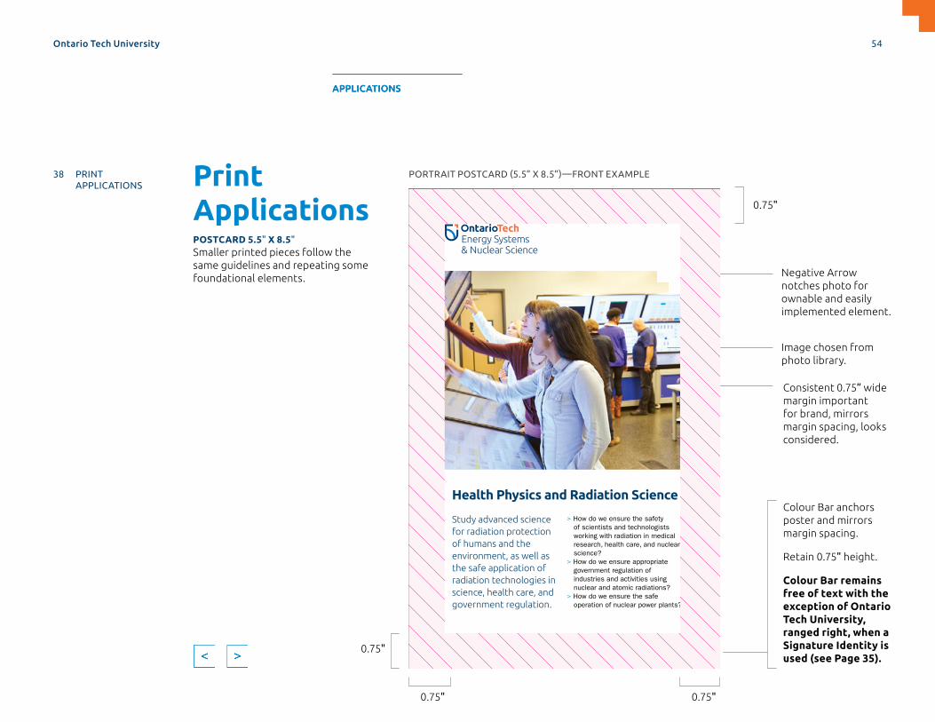
Print ApplicationsPOSTCARD 5.5" X 8.5"Smaller printed pieces follow the same guidelines and repeating some foundational elements.
> How do we ensure the safety of scientists and technologists working with radiation in medical research, health care, and nuclear science?
> How do we ensure appropriate government regulation of industries and activities using nuclear and atomic radiations?
> How do we ensure the safe operation of nuclear power plants?
Study advanced science for radiation protection of humans and the environment, as well as the safe application of radiation technologies in science, health care, and government regulation.
Health Physics and Radiation Science
Ontario Tech University
PORTRAIT POSTCARD (5.5” X 8.5”)—FRONT EXAMPLE
0.75" 0.75"
0.75"
0.75"
Colour Bar anchors poster and mirrors margin spacing.
Retain 0.75" height.
Colour Bar remains free of text with the exception of Ontario Tech University, ranged right, when a Signature Identity is used (see Page 35).
Image chosen from photo library.
Negative Arrow notches photo for ownable and easily implemented element.
Consistent 0.75” wide margin important for brand, mirrors margin spacing, looks considered.
Ontario Tech University 54
MASTERBRAND APPLICATIONS SUPPORTDESIGN ELEMENTS SPIRIT BRAND
38 PRINT APPLICATIONS
61 DIGITAL APPLICATIONS
APPLICATIONS
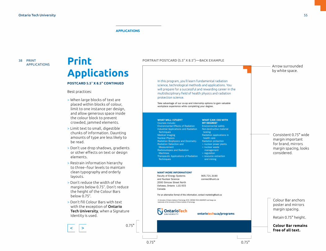
Print ApplicationsPOSTCARD 5.5" X 8.5" CONTINUED
Best practices:
> When large blocks of text are placed within blocks of colour, limit to one instance per design, and allow generous space inside the colour block to prevent crowded, jammed elements.
> Limit text to small, digestible chunks of information. Daunting amounts of type are less likely to be read.
> Don’t use drop shadows, gradients or other effects on text or design elements.
> Restrain information hierarchy to three–four levels to maintain clean typography and orderly layouts.
> Don’t reduce the width of the margins below 0.75”. Don’t reduce the height of the Colour Bars below 0.75”.
> Don’t fill Colour Bars with text with the exception of Ontario Tech University, when a Signature Identity is used.
In this program, you’ll learn fundamental radiation science, technological methods and applications. You will prepare for a successful and rewarding career in the
protection science.
Take advantage of our co-op and internship options to gain valuable workplace experience while completing your degree.
For an alternative format of this information, contact [email protected]
ontariotechu.ca/programs
WANT MORE INFORMATION?Faculty of Energy Systems and Nuclear Science2000 Simcoe Street NorthOshawa, Ontario L1G 0C5Canada
WHAT WILL I STUDY?Courses include:Environmental Effects of RadiationIndustrial Applications and Radiation Techniques
Medical ImagingNuclear PhysicsRadiation Biophysics and DosimetryRadiation Detection and Measurement
Radioisotopes and Radiation Machines
Therapeutic Applications of Radiation Techniques
WHAT CAN I DO WITH MY DEGREE?Environmental safetyNon-destructive material testing
Radiation applications in health care
Radiation protection> nuclear power plants> nuclear waste
management> regulation> resource extraction
and mining
© University of Ontario Institute of Technology 2019. ONTARIO TECH UNIVERSITY and Design are trademarks of the University of Ontario Institute of Technology.
PORTRAIT POSTCARD (5.5” X 8.5”)—BACK EXAMPLE
0.75" 0.75"
0.75"
Colour Bar anchors poster and mirrors margin spacing.
Retain 0.75" height.
Colour Bar remains free of all text.
Arrow surrounded by white space.
Consistent 0.75” wide margin important for brand, mirrors margin spacing, looks considered.
Ontario Tech University 55
MASTERBRAND APPLICATIONS SUPPORTDESIGN ELEMENTS SPIRIT BRAND
38 PRINT APPLICATIONS
61 DIGITAL APPLICATIONS
APPLICATIONS
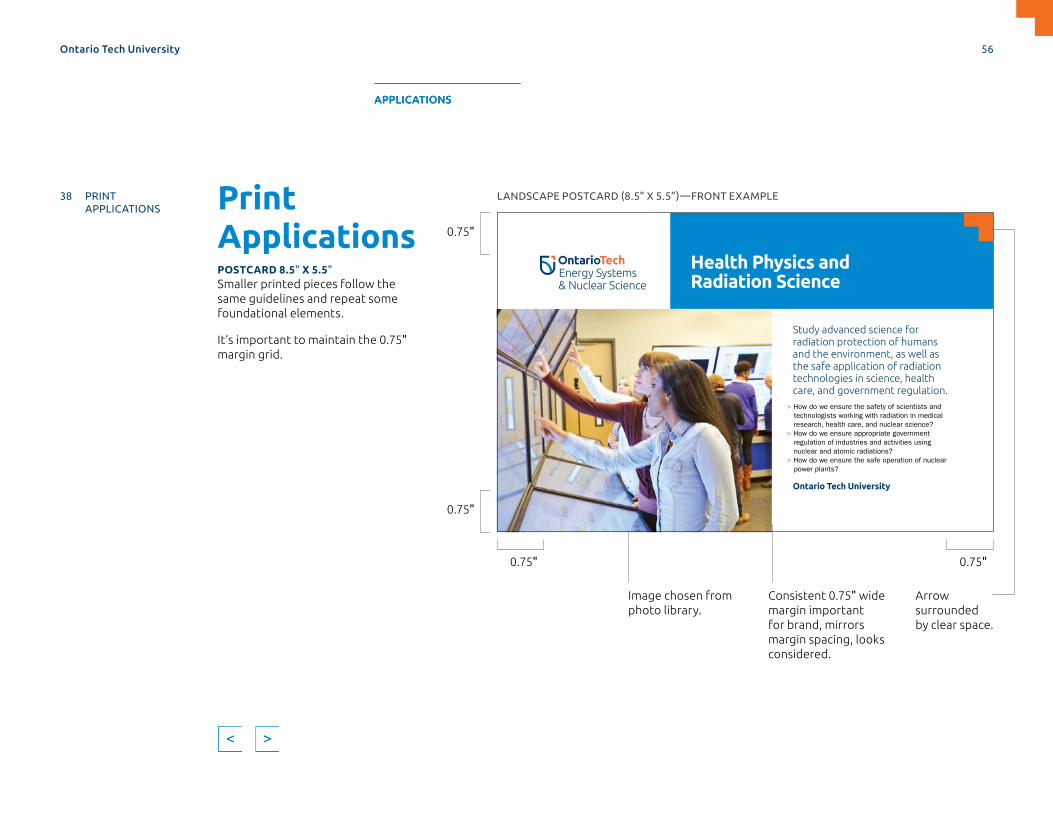
Print ApplicationsPOSTCARD 8.5" X 5.5"Smaller printed pieces follow the same guidelines and repeat some foundational elements.
It’s important to maintain the 0.75" margin grid.
LANDSCAPE POSTCARD (8.5” X 5.5”)—FRONT EXAMPLE
Image chosen from photo library.
Consistent 0.75" wide margin important for brand, mirrors margin spacing, looks considered.
> How do we ensure the safety of scientists and technologists working with radiation in medical research, health care, and nuclear science?
> How do we ensure appropriate government regulation of industries and activities using nuclear and atomic radiations?
> How do we ensure the safe operation of nuclear power plants?
Study advanced science for radiation protection of humans and the environment, as well as the safe application of radiation technologies in science, health care, and government regulation.
Health Physics and Radiation Science
Ontario Tech University
0.75" 0.75"
0.75"
0.75"
Arrow surrounded by clear space.
Ontario Tech University 56
MASTERBRAND APPLICATIONS SUPPORTDESIGN ELEMENTS SPIRIT BRAND
38 PRINT APPLICATIONS
61 DIGITAL APPLICATIONS
APPLICATIONS

LANDSCAPE POSTCARD (8.5” X 5.5”)—BACK EXAMPLE
In this program, you’ll learn fundamental radiation science, technological methods and applications. You will prepare for a successful and rewarding career in the multidisciplinary
Take advantage of our co-op and internship options to gain valuable workplace experience while completing your degree.
For an alternative format of this information, contact [email protected]
© University of Ontario Institute of Technology 2019. ONTARIO TECH UNIVERSITY and Design are trademarks of the University of Ontario Institute of Technology.
ontariotechu.ca/programs
WANT MORE INFORMATION?Faculty of Energy Systems and Nuclear Science2000 Simcoe Street NorthOshawa, Ontario L1G 0C5Canada
WHAT WILL I STUDY?Courses include:Environmental Effects of RadiationIndustrial Applications and Radiation Techniques
Medical ImagingNuclear PhysicsRadiation Biophysics and DosimetryRadiation Detection and MeasurementRadioisotopes and Radiation MachinesTherapeutic Applications of Radiation Techniques
WHAT CAN I DO WITH MY DEGREE?Environmental safetyNon-destructive material testingRadiation applications in health care
Radiation protection> nuclear power plants> nuclear waste management> regulation> resource extraction
and mining
0.75"
0.75"
0.75"
Print ApplicationsPOSTCARD 8.5" X 5.5" CONTINUED
Best practices:
> Limit text to small, digestible chunks of information. Daunting amounts of type are less likely to be read.
> Don’t use drop shadows, gradients or other effects on text or design elements.
> Restrain information hierarchy to three–four levels to maintain clean typography and orderly layouts.
> Don’t reduce the width of the margins below 0.75”. Don’t reduce the height of the Colour Bars below 0.75”.
> Don’t fill Colour Bars with text with the exception of Ontario Tech University, when a Signature Identity is used.
Ontario Tech University 57
MASTERBRAND APPLICATIONS SUPPORTDESIGN ELEMENTS SPIRIT BRAND
38 PRINT APPLICATIONS
61 DIGITAL APPLICATIONS
APPLICATIONS
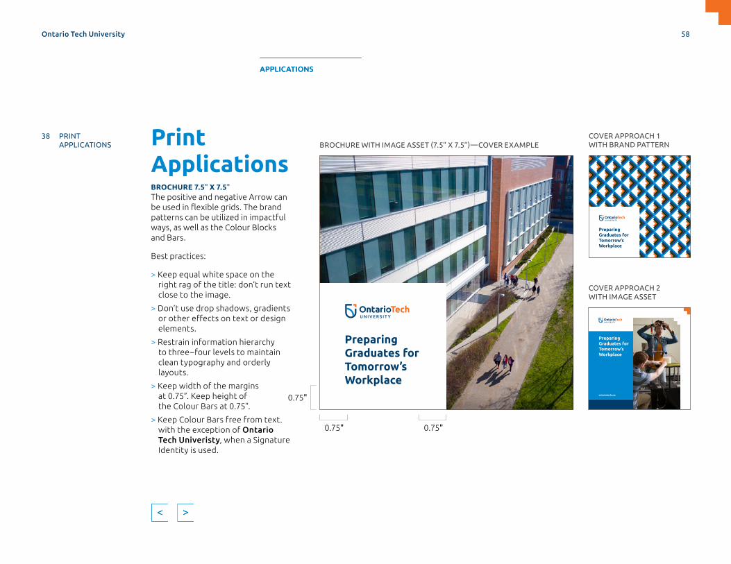
Print ApplicationsBROCHURE 7.5" X 7.5"The positive and negative Arrow can be used in flexible grids. The brand patterns can be utilized in impactful ways, as well as the Colour Blocks and Bars.
Best practices:
> Keep equal white space on the right rag of the title: don’t run text close to the image.
> Don’t use drop shadows, gradients or other effects on text or design elements.
> Restrain information hierarchy to three–four levels to maintain clean typography and orderly layouts.
> Keep width of the margins at 0.75”. Keep height of the Colour Bars at 0.75”.
> Keep Colour Bars free from text. with the exception of Ontario Tech Univeristy, when a Signature Identity is used.
PreparingGraduates forTomorrow’sWorkplace
PreparingGraduates forTomorrow’sWorkplace
ontariotechu.ca
PreparingGraduates forTomorrow’sWorkplace
PreparingGraduates forTomorrow’sWorkplace
OntarioTechU.ca
PreparingGraduates forTomorrow’sWorkplace
BROCHURE WITH IMAGE ASSET (7.5” X 7.5”)—COVER EXAMPLE
COVER APPROACH 2 WITH IMAGE ASSET
COVER APPROACH 1 WITH BRAND PATTERN
0.75" 0.75"
0.75"
Ontario Tech University 58
MASTERBRAND APPLICATIONS SUPPORTDESIGN ELEMENTS SPIRIT BRAND
38 PRINT APPLICATIONS
61 DIGITAL APPLICATIONS
APPLICATIONS
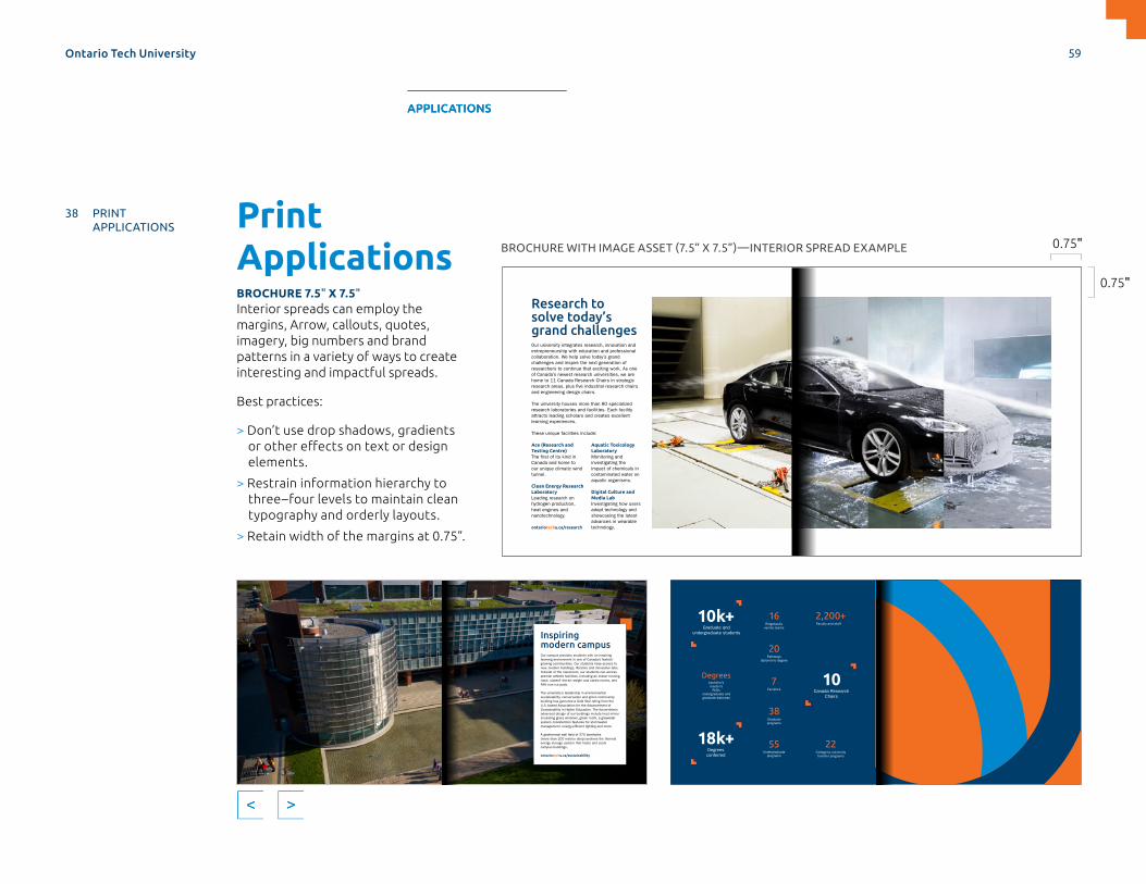
Print ApplicationsBROCHURE 7.5" X 7.5"Interior spreads can employ the margins, Arrow, callouts, quotes, imagery, big numbers and brand patterns in a variety of ways to create interesting and impactful spreads.
Best practices:
> Don’t use drop shadows, gradients or other effects on text or design elements.
> Restrain information hierarchy to three–four levels to maintain clean typography and orderly layouts.
> Retain width of the margins at 0.75”.
Research to solve today’s grand challengesOur university integrates research, innovation and entrepreneurship with education and professional collaboration. We help solve today’s grand challenges and inspire the next generation of researchers to continue that exciting work. As one of Canada’s newest research universities, we are home to 11 Canada Research Chairs in strategic
and engineering design chairs.
The university houses more than 80 specialized research laboratories and facilities. Each facility attracts leading scholars and creates excellent learning experiences.
These unique facilities include:
Ace (Research and Testing Centre)
Canada and home to our unique climatic wind tunnel.
Clean Energy Research LaboratoryLeading research on hydrogen production, heat engines and nanotechnology.
Aquatic Toxicology LaboratoryMonitoring and investigating the impact of chemicals in contaminated water on aquatic organisms.
Digital Culture and Media LabInvestigating how users adopt technology and showcasing the latest advances in wearable technology.ontariotechu.ca/research
Inspiring modern campusOur campus provides students with an inspiring learning environment in one of Canada’s fastest-growing communities. Our students have access to new, modern buildings, libraries and innovative labs.Outside of the classroom, our students can access premier athletic facilities, including an indoor running track, stateof- the-art weight and cardio rooms, and NHL-size ice pads.
The university’s leadership in environmental sustainability, conservation and green community-building has garnered a Gold Star rating from the U.S.-based Association for the Advancement of Sustainability in Higher Education. The future-drivenadvanced design of our buildings include heat mirror insulating glass windows, green roofs, a greywater system, bioretention features for stormwater
(more than 200 metres deep) anchors the thermal energy storage system that heats and cools campus buildings.
ontariotechu.ca/sustainability
Degrees
10k+Graduate and
undergraduate students
18k+Degrees conferred
2,200+Faculty and staff
20Pathways
diploma-to-degree
7Faculties
bachelor’smaster’s
PhDsundergraduate and graduate diplomas
22College-to-university transfer programs
55Undergraduate
programs
38Graduate programs
16Ridgebacks
varsity teams
10Canada Research
Chairs
0.75"
0.75"
BROCHURE WITH IMAGE ASSET (7.5” X 7.5”)—INTERIOR SPREAD EXAMPLE
Ontario Tech University 59
MASTERBRAND APPLICATIONS SUPPORTDESIGN ELEMENTS SPIRIT BRAND
38 PRINT APPLICATIONS
61 DIGITAL APPLICATIONS
APPLICATIONS
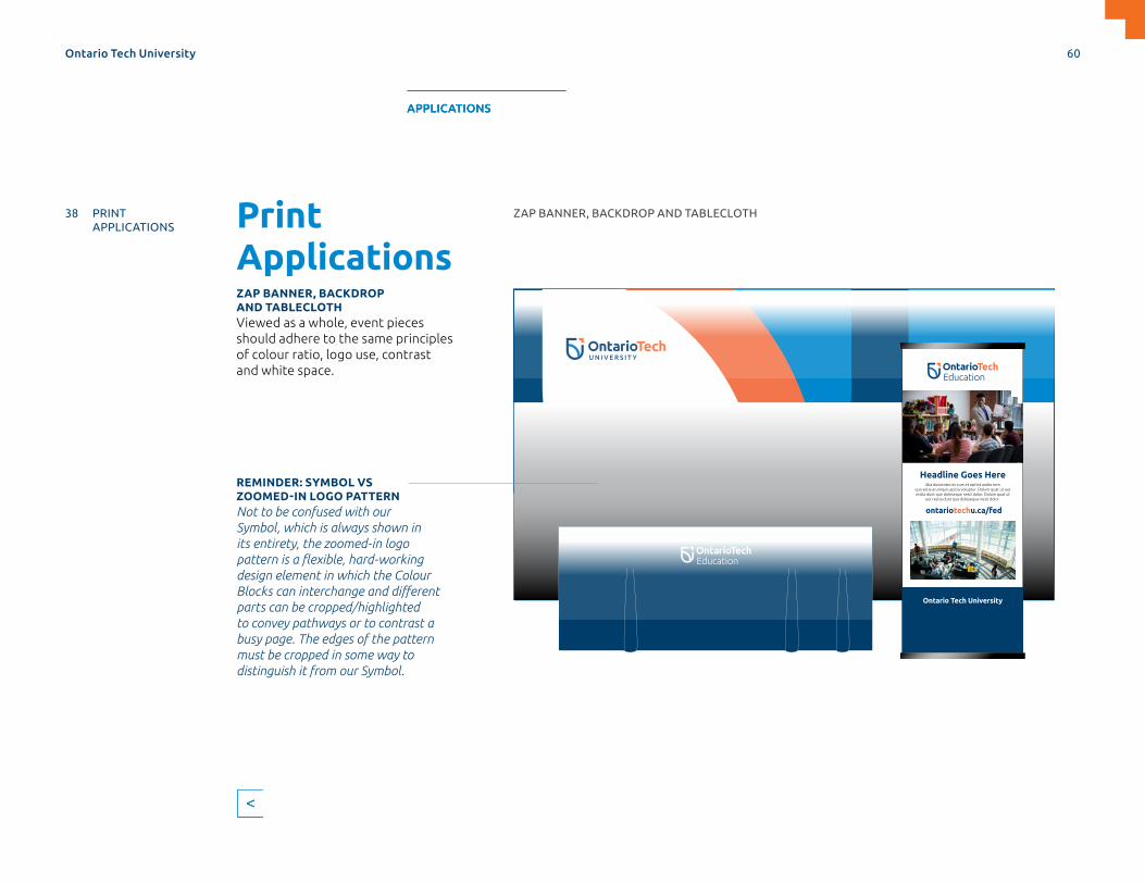
Print ApplicationsZAP BANNER, BACKDROP AND TABLECLOTHViewed as a whole, event pieces should adhere to the same principles of colour ratio, logo use, contrast and white space.
Headline Goes Here
Ontario Tech University
Alia duscimaio es cum et optint andio tem quo estia arumquis apicia voluptur. Dolum quat ut aut restia dunt que doleseque nesti dolor. Dolum quat ut
aut restia dunt que doleseque nesti dolor.
ontariotechu.ca/fed
REMINDER: SYMBOL VS ZOOMED-IN LOGO PATTERNNot to be confused with our Symbol, which is always shown in its entirety, the zoomed-in logo pattern is a flexible, hard-working design element in which the Colour Blocks can interchange and different parts can be cropped/highlighted to convey pathways or to contrast a busy page. The edges of the pattern must be cropped in some way to distinguish it from our Symbol.
ZAP BANNER, BACKDROP AND TABLECLOTH
Ontario Tech University 60
MASTERBRAND APPLICATIONS SUPPORTDESIGN ELEMENTS SPIRIT BRAND
38 PRINT APPLICATIONS
61 DIGITAL APPLICATIONS
APPLICATIONS
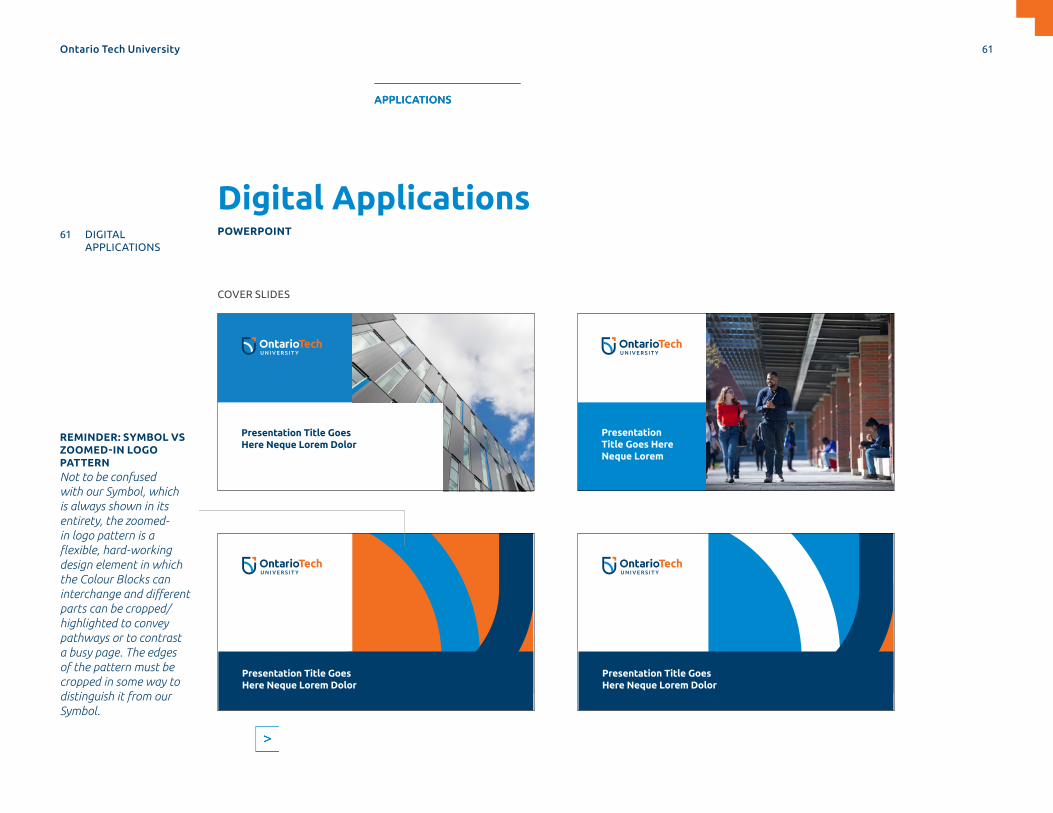
Presentation Title Goes Here Neque Lorem
Presentation Title Goes Here Neque Lorem Dolor
Presentation Title Goes Here Neque Lorem Dolor
Presentation Title Goes Here Neque Lorem Dolor
Digital ApplicationsPOWERPOINT
COVER SLIDES
REMINDER: SYMBOL VS ZOOMED-IN LOGO PATTERNNot to be confused with our Symbol, which is always shown in its entirety, the zoomed-in logo pattern is a flexible, hard-working design element in which the Colour Blocks can interchange and different parts can be cropped/highlighted to convey pathways or to contrast a busy page. The edges of the pattern must be cropped in some way to distinguish it from our Symbol.
Ontario Tech University 61
MASTERBRAND APPLICATIONS SUPPORTDESIGN ELEMENTS SPIRIT BRAND
38 PRINT APPLICATIONS
61 DIGITAL APPLICATIONS
APPLICATIONS
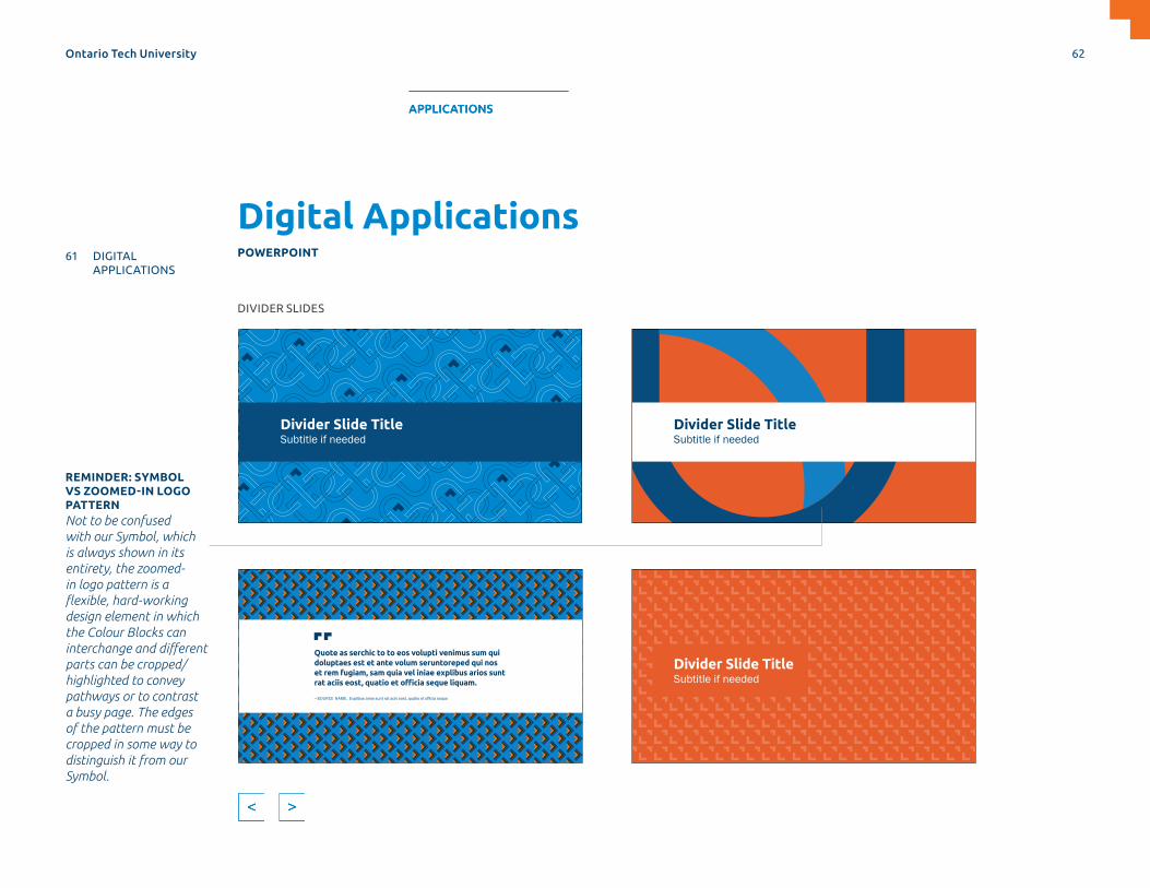
REMINDER: SYMBOL VS ZOOMED-IN LOGO PATTERNNot to be confused with our Symbol, which is always shown in its entirety, the zoomed-in logo pattern is a flexible, hard-working design element in which the Colour Blocks can interchange and different parts can be cropped/highlighted to convey pathways or to contrast a busy page. The edges of the pattern must be cropped in some way to distinguish it from our Symbol.
Divider Slide TitleSubtitle if needed
Divider Slide TitleSubtitle if needed
Divider Slide TitleSubtitle if needed
Quote as serchic to to eos volupti venimus sum qui doluptaes est et ante volum seruntoreped qui nos et rem fugiam, sam quia vel iniae explibus arios sunt rat aciis eost, quatio et officia seque liquam.
—SOURCE NAME, Explibus arios sunt rat acis eost, quatio et officia seque
DIVIDER SLIDES
Digital ApplicationsPOWERPOINT
Ontario Tech University 62
MASTERBRAND APPLICATIONS SUPPORTDESIGN ELEMENTS SPIRIT BRAND
38 PRINT APPLICATIONS
61 DIGITAL APPLICATIONS
APPLICATIONS
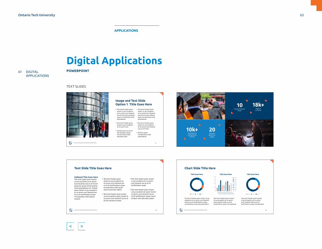
10k+Graduate and undergraduate
students
18k+Degrees
conferred
10Canada Research
Chairs
12
20Pathways
diploma-to-degree
Chart Slide Title Here
Text here Ficipiet quam eiciant ut qui occaborro te ne acium eum faciandi coOs ex et hit lamPoristium quiae minullamIbus intist opturiatecaeEnt
8
Text here Ficipiet quam eiciant ut qui occaborro te ne acium eum faciandi coOs ex et hit lamPoristium quiae minullamIbus
Text here Ficipiet quam eiciant ut qui occaborro te ne acium eum faciandi coOs ex et hit lamPoristium quiae minullamIbus
Field A Field B Field C Field A Field B Field C
Title Goes Here Title Goes Here
Descriptor
Descriptor
Descriptor
Descriptor
Descriptor
Descriptor
Descriptor
Descriptor
Descriptor
Field G
Field D
Field A100
0
50
25
75
Field H
Field E
Field B
Field I
Field F
Field C
Title Goes Here
8Ontario Tech University Running Footer Presentation Name
Ontario Tech University Running Footer Presentation Name
Image and Text Slide Option 1 Title Goes Here
• Text here Ficipiet quam eiciant ut qui occaborro te ne acium eum faciandi cos ex et hit lam poristium quiae minullamIbus intist opturiatecae
• Text here Ficipiet quam eiciant ut qui occaborro te ne acium eum
• Faciandi cos e ex et hit lam poristium quiae minull amIbus intist opturiate caent
• Text here Ficipiet quam eiciant ut qui occaborro te ne acium eum faciandi cos ex et hit lam oristium quiae minullamIbus intist opturiatecae
• Text here Ficipiet quam eiciant ut qui occaborro te ne acium eum faciandi cos ex et hit lam
• Pristium quiae minullamIbus intist opturiatecae
6
Text Slide Title Goes Here
• Text here ficipiet quam eiciant ut qui occaborro te ne acium eum faciandi cos ex et hit lamPoristium quiae minullamIbus intist quam eiciant opturiate caeent
• Text here ficipiet quam eiciant ut qui occaborro quam eiciant te ne acium eum faciandi cos ex et hit lam poristium quiae
• Text here ficipiet quam eiciant ut qui occaborro te ne acium eum faciandi cos ex et hit lamPoristium quiae
• Text here ficipiet quam eiciant ut qui occaborro te quam eiciant ne acium eum faciandi cos ex et hit lamPoristium quiae minull amIbus intist opturiate caeent
Subhead Title Goes HereText here icipiet quam eiciant ut qui occa borro te ne acium eum faciandi coos ex et hit lam poristium quiae minull amIbus intist opturiatecae ent. Ficipiet quam eiciant ut qui occaborro te ne acium eum faciandi cos ex et hit lamPoristium quiae minullamIbus intist opturia tecaent.
10Ontario Tech University Running Footer Presentation Name
TEXT SLIDES
Digital ApplicationsPOWERPOINT
Ontario Tech University 63
MASTERBRAND APPLICATIONS SUPPORTDESIGN ELEMENTS SPIRIT BRAND
38 PRINT APPLICATIONS
61 DIGITAL APPLICATIONS
APPLICATIONS

Role of Spirit BrandWe’ve updated our Spirit Brand to complement the Masterbrand with refreshed Ridgebacks athletic Symbols and Wordmarks. Our Spirit Brand was developed to celebrate the tradition and pursuit of high standards for extra-curricular programming.
Our Ridgebacks Paw symbolizes power, speed and a mark of excellence amongst its competition. Our Ridgebacks Dog reflects the tenacity and focus of our athletes. Ridgeback dogs are notorious for their loyalty, strong will, confidence and are relentless defenders.
Examples of when to use our Spirit Brand:
> Official team uniforms.
> Recreation programs.
> Athletic playing fields, like the basketball court or hockey rink.
> Formal department communication.
> Merchandise and spirit wear.
> Signage.
Ontario Tech University 64
SUPPORTMASTERBRAND DESIGN ELEMENTS APPLICATIONS SPIRIT BRAND
64 ROLE OF SPIRIT BRAND
65 SYMBOL FORMATS
66 WORDMARK FORMATS
67 LOGO VERSIONS
69 WORDMARK VERSIONS
70 LOGO USAGE
71 WORDMARK USAGE
72 INCORRECT USE
73 ATHLETIC TEAM NAMES
74 ATHLETIC NUMBERS
75 APPLICATION
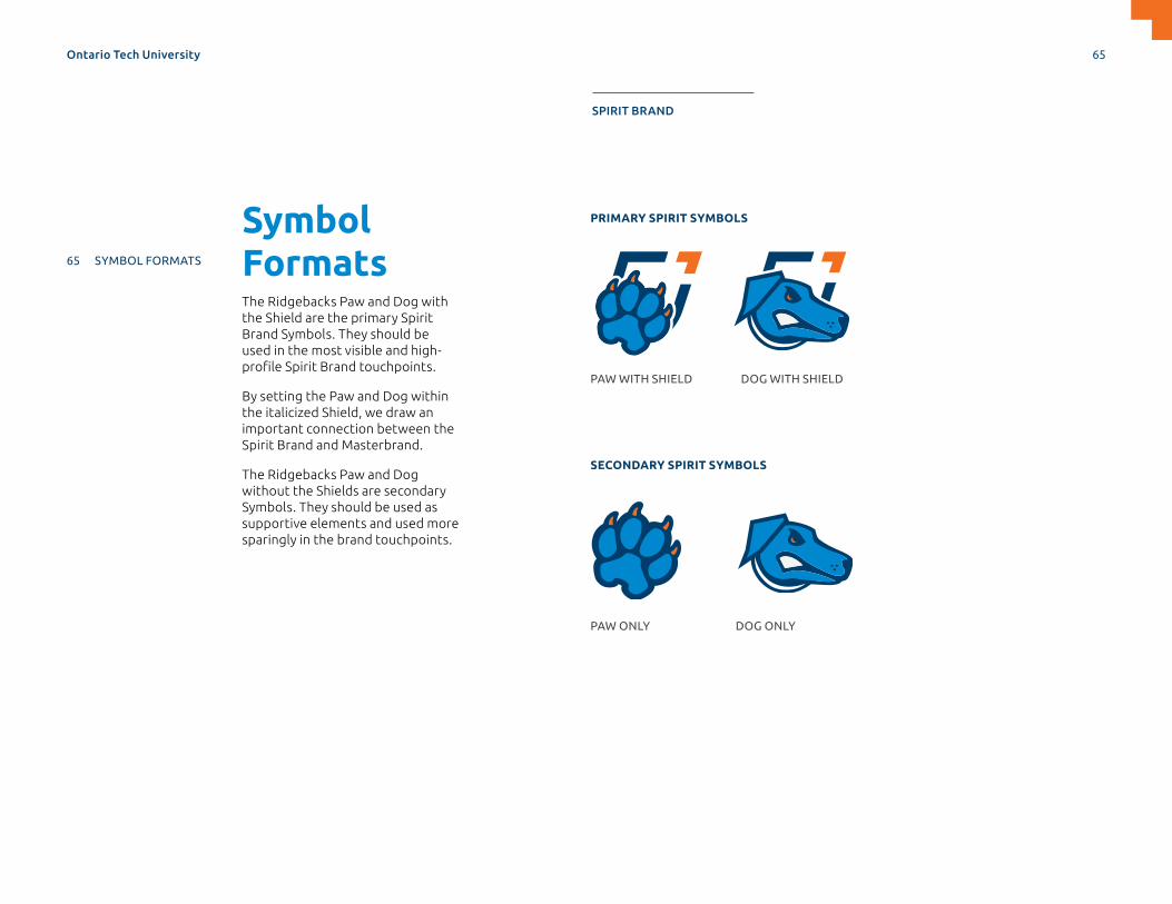
Symbol FormatsThe Ridgebacks Paw and Dog with the Shield are the primary Spirit Brand Symbols. They should be used in the most visible and high-profile Spirit Brand touchpoints.
By setting the Paw and Dog within the italicized Shield, we draw an important connection between the Spirit Brand and Masterbrand.
The Ridgebacks Paw and Dog without the Shields are secondary Symbols. They should be used as supportive elements and used more sparingly in the brand touchpoints.
PRIMARY SPIRIT SYMBOLS
SECONDARY SPIRIT SYMBOLS
PAW WITH SHIELD
PAW ONLY
DOG WITH SHIELD
DOG ONLY
Ontario Tech University 65
MASTERBRAND APPLICATIONS SUPPORTDESIGN ELEMENTS SPIRIT BRAND
64 ROLE OF SPIRIT BRAND
65 SYMBOL FORMATS
66 WORDMARK FORMATS
67 SYMBOL VERSIONS
69 WORDMARK VERSIONS
70 SYMBOL USAGE
71 WORDMARK USAGE
72 INCORRECT USE
73 ATHLETIC TEAM NAMES
74 ATHLETIC NUMBERS
75 APPLICATION

Wordmark FormatsOntario Tech and Ridgebacks Wordmarks can be used to establish recognition of our university.
These Wordmarks protect and improve the university’s athletics brand equity, and it’s important to apply them in a consistent manner across all platforms.
The incorporation of the Wordmark with the Spirit Symbols depends on the application and space available.
RIDGEBACKS PRIMARY WORDMARK ONTARIO TECH SPIRIT WORDMARK
PRIMARY PAW SYMBOL AND WORDMARK PRIMARY DOG SYMBOL AND WORDMARK
Ontario Tech University 66
MASTERBRAND APPLICATIONS SUPPORTDESIGN ELEMENTS SPIRIT BRAND
64 ROLE OF SPIRIT BRAND
65 SYMBOL FORMATS
66 WORDMARK FORMATS
67 SYMBOL VERSIONS
69 WORDMARK VERSIONS
70 SYMBOL USAGE
71 WORDMARK USAGE
72 INCORRECT USE
73 ATHLETIC TEAM NAMES
74 ATHLETIC NUMBERS
75 APPLICATION

Symbol VersionsCOLOURAs a general rule, and whenever possible, the Symbol should always be used in its full-colour version. Greyscale and black versions should only be used in specific cases.
Ensure the Symbol is always reproduced with approved artwork files and the correct format is used for the appropriate medium.
FULL-COLOUR
REVERSE—LIGHT BLUE BACKGROUND
REVERSE—LIGHT BLUE BACKGROUND
WHITE WHITE
REVERSE—DARK BLUE BACKGROUND
REVERSE—DARK BLUE BACKGROUND
GREYSCALE BLACK
FULL-COLOUR
PAW DOG
Ontario Tech University 67
MASTERBRAND APPLICATIONS SUPPORTDESIGN ELEMENTS SPIRIT BRAND
64 ROLE OF SPIRIT BRAND
65 SYMBOL FORMATS
66 WORDMARK FORMATS
67 SYMBOL VERSIONS
69 WORDMARK VERSIONS
70 SYMBOL USAGE
71 WORDMARK USAGE
72 INCORRECT USE
73 ATHLETIC TEAM NAMES
74 ATHLETIC NUMBERS
75 APPLICATION

Symbol VersionsCOLOURAs a general rule, and whenever possible, the Symbol should always be used in its full-colour version. Greyscale and black versions should only be used in specific cases.
Ensure the logo is always reproduced with approved artwork files and the correct format is used for the appropriate medium.
FULL-COLOUR
REVERSE—LIGHT BLUE BACKGROUND
REVERSE—LIGHT BLUE BACKGROUND
WHITE WHITE
REVERSE—DARK BLUE BACKGROUND
REVERSE—DARK BLUE BACKGROUND
GREYSCALE BLACK
FULL-COLOUR
PAW DOG
Ontario Tech University 68
MASTERBRAND APPLICATIONS SUPPORTDESIGN ELEMENTS SPIRIT BRAND
64 ROLE OF SPIRIT BRAND
65 SYMBOL FORMATS
66 WORDMARK FORMATS
67 SYMBOL VERSIONS
69 WORDMARK VERSIONS
70 SYMBOL USAGE
71 WORDMARK USAGE
72 INCORRECT USE
73 ATHLETIC TEAM NAMES
74 ATHLETIC NUMBERS
75 APPLICATION

Wordmark VersionsCOLOURAs a general rule, and whenever possible, the Wordmark should always be used in its full-colour version. Greyscale and black versions should only be used in specific cases.
Ensure the Wordmark is always reproduced with approved artwork files and the correct format is used for the appropriate medium.
FULL-COLOUR
REVERSE—LIGHT BLUE BACKGROUND REVERSE—LIGHT BLUE BACKGROUND
WHITE WHITE
REVERSE—DARK BLUE BACKGROUND REVERSE—DARK BLUE BACKGROUND
GREYSCALE BLACK
FULL-COLOUR
PRIMARY SPIRIT
Ontario Tech University 69
MASTERBRAND APPLICATIONS SUPPORTDESIGN ELEMENTS SPIRIT BRAND
64 ROLE OF SPIRIT BRAND
65 SYMBOL FORMATS
66 WORDMARK FORMATS
67 SYMBOL VERSIONS
69 WORDMARK VERSIONS
70 SYMBOL USAGE
71 WORDMARK USAGE
72 INCORRECT USE
73 ATHLETIC TEAM NAMES
74 ATHLETIC NUMBERS
75 APPLICATION

Symbol UsageTo ensure our brand is represented effectively, the Symbols must be used correctly. This page shows the correct amount of clear space around the Spirit Brand Symbols.
The same spacing rules apply to all variations of the Symbols. Note: the minimum size application of Symbols.
Use ⅓ of the Spirit Symbol width to determine the minimum clear space.
3X
X
X
X
X
X
X
X
X
3X
SYMBOL WITHOUT SHIELD 0.265" WIDE FOR PRINT 16PX FOR DIGITAL
SYMBOL WITH SHIELD 0.364" WIDE FOR PRINT 25PX FOR DIGITAL
Avoid using the Symbol smaller than the examples shown. Exceptions can be made for special cases such as specialty items, where smaller Symbol sizes are needed.
CLEAR SPACE
MINIMUM SIZE
Ontario Tech University 70
MASTERBRAND APPLICATIONS SUPPORTDESIGN ELEMENTS SPIRIT BRAND
64 ROLE OF SPIRIT BRAND
65 SYMBOL FORMATS
66 WORDMARK FORMATS
67 SYMBOL VERSIONS
69 WORDMARK VERSIONS
70 SYMBOL USAGE
71 WORDMARK USAGE
72 INCORRECT USE
73 ATHLETIC TEAM NAMES
74 ATHLETIC NUMBERS
75 APPLICATION

Wordmark UsageTo ensure our brand is represented effectively, the Wordmark must be used correctly. This page shows the correct amount of clear space around the Spirit Brand Wordmark. The same spacing rules apply to all variations of the Wordmark. Note: The minimum size application of Wordmarks.
Use the width of TECH to determine the minimum clear space.
CLEAR SPACE
MINIMUM SIZE
1.0" WIDE FOR PRINT 70PX FOR DIGITAL
1.0” WIDE FOR PRINT 70PX FOR DIGITAL
1.0” WIDE FOR PRINT 70PX FOR DIGITAL
Use the O from Ontario to determine the minimum clear space.
Avoid using the Wordmark smaller than the examples shown. Exceptions can be made for special cases such as specialty items, where smaller Wordmark sizes are needed.
Ontario Tech University 71
MASTERBRAND APPLICATIONS SUPPORTDESIGN ELEMENTS SPIRIT BRAND
64 ROLE OF SPIRIT BRAND
65 SYMBOL FORMATS
66 WORDMARK FORMATS
67 SYMBOL VERSIONS
69 WORDMARK VERSIONS
70 SYMBOL USAGE
71 WORDMARK USAGE
72 INCORRECT USE
73 ATHLETIC TEAM NAMES
74 ATHLETIC NUMBERS
75 APPLICATION

Incorrect UseHere are some examples of how our Spirit Brand Symbols and Wordmarks should not be used. The same rules apply to all variations of the Symbols and Wordmarks.
DON’T CHANGE COLOURS IN ANY WAY
DON’T ALTER OR REARRANGE THE ELEMENTS
DON’T STRETCH OR DISTORT
USE THE CORRECT COLOUR VERSION FOR LEGIBILITY
DON’T ALTER OR CREATE YOUR OWN DESCRIPTOR TEXT
DON’T BREAK THE CLEARSPACE BY PRINTING TOO CLOSE TO EDGES, OR ALLOWING OTHER ELEMENTS TO BREACH
DEBATE CLUB
DON’T USE ON A BUSY PHOTO OR PATTERNED BACKGROUND
Welcomes you
Ontario Tech University 72
MASTERBRAND APPLICATIONS SUPPORTDESIGN ELEMENTS SPIRIT BRAND
64 ROLE OF SPIRIT BRAND
65 SYMBOL FORMATS
66 WORDMARK FORMATS
67 SYMBOL VERSIONS
69 WORDMARK VERSIONS
70 SYMBOL USAGE
71 WORDMARK USAGE
72 INCORRECT USE
73 ATHLETIC TEAM NAMES
74 ATHLETIC NUMBERS
75 APPLICATION

Athletic Team NamesWe’ve created a set of official Wordmarks for each of our teams. Please use the appropriate one.
If you require another team name version, contact [email protected]
This page shows the clear space and minimum size appropriate for each.
CLEARSPACE MINIMUM SIZE
MEASURED TO ONTARIO 1.0” WIDE FOR PRINT 70PX FOR DIGITAL
Ontario Tech University 73
MASTERBRAND APPLICATIONS SUPPORTDESIGN ELEMENTS SPIRIT BRAND
64 ROLE OF SPIRIT BRAND
65 SYMBOL FORMATS
66 WORDMARK FORMATS
67 SYMBOL VERSIONS
69 WORDMARK VERSIONS
70 SYMBOL USAGE
71 WORDMARK USAGE
72 INCORRECT USE
73 ATHLETIC TEAM NAMES
74 ATHLETIC NUMBERS
75 APPLICATION
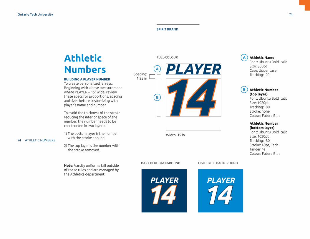
Athletic NumbersBUILDING A PLAYER NUMBERTo create personalized jerseys: Beginning with a base measurement where PLAYER = 15” wide, review these specs for proportions, spacing and sizes before customizing with player’s name and number.
To avoid the thickness of the stroke reducing the interior space of the number, the number needs to be constructed in two layers:
1) The bottom layer is the number with the stroke applied.
2) The top layer is the number with the stroke removed.
Note: Varsity uniforms fall outside of these rules and are managed by the Athletics department.
1414PLAYER
1414PLAYER
1414PLAYER
1414PLAYER
1414PLAYER
1414PLAYER
1414PLAYER
1414PLAYER
1414PLAYER
Athletic Name Font: Ubuntu Bold Italic Size: 300pt Case: Upper case Tracking: -20
Athletic Number (top layer) Font: Ubuntu Bold Italic Size: 1020pt Tracking: -80 Stroke: none Colour: Future Blue
Athletic Number (bottom layer) Font: Ubuntu Bold Italic Size: 1020pt Tracking: -80 Stroke: 40pt, Tech Tangerine Colour: Future Blue
Width: 15 in
Spacing: 1.25 in
A
A
B
B
FULL-COLOUR
DARK BLUE BACKGROUND LIGHT BLUE BACKGROUND
Ontario Tech University 74
MASTERBRAND APPLICATIONS SUPPORTDESIGN ELEMENTS SPIRIT BRAND
64 ROLE OF SPIRIT BRAND
65 SYMBOL FORMATS
66 WORDMARK FORMATS
67 SYMBOL VERSIONS
69 WORDMARK VERSIONS
70 SYMBOL USAGE
71 WORDMARK USAGE
72 INCORRECT USE
73 ATHLETIC TEAM NAMES
74 ATHLETIC NUMBERS
75 APPLICATION
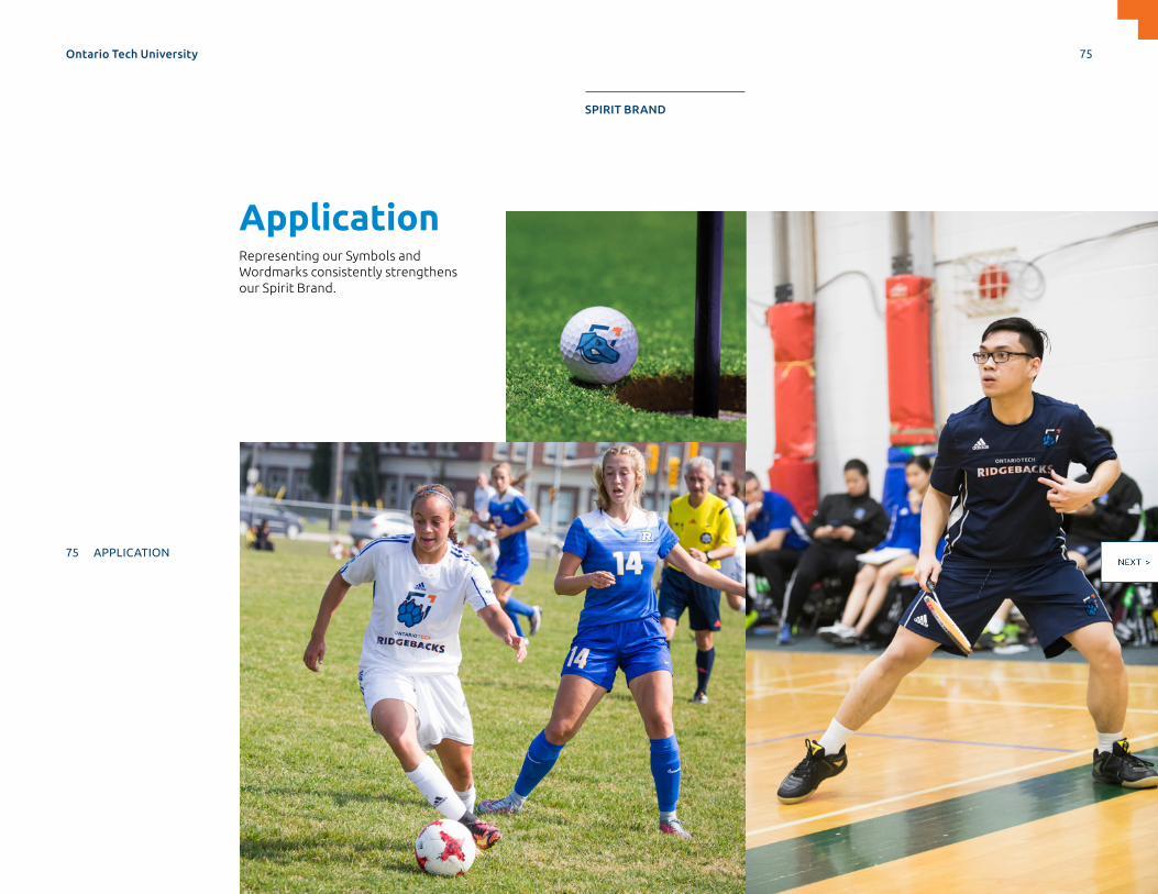
ApplicationRepresenting our Symbols and Wordmarks consistently strengthens our Spirit Brand.
Ontario Tech University 75
MASTERBRAND APPLICATIONS SUPPORTDESIGN ELEMENTS SPIRIT BRAND
64 ROLE OF SPIRIT BRAND
65 SYMBOL FORMATS
66 WORDMARK FORMATS
67 SYMBOL VERSIONS
69 WORDMARK VERSIONS
70 SYMBOL USAGE
71 WORDMARK USAGE
72 INCORRECT USE
73 ATHLETIC TEAM NAMES
74 ATHLETIC NUMBERS
75 APPLICATION

ApplicationRepresenting our Symbols and Wordmarks consistently strengthens our Spirit Brand.
Ontario Tech University 76
MASTERBRAND APPLICATIONS SUPPORTDESIGN ELEMENTS SPIRIT BRAND
64 ROLE OF SPIRIT BRAND
65 SYMBOL FORMATS
66 WORDMARK FORMATS
67 SYMBOL VERSIONS
69 WORDMARK VERSIONS
70 SYMBOL USAGE
71 WORDMARK USAGE
72 INCORRECT USE
73 ATHLETIC TEAM NAMES
74 ATHLETIC NUMBERS
75 APPLICATION
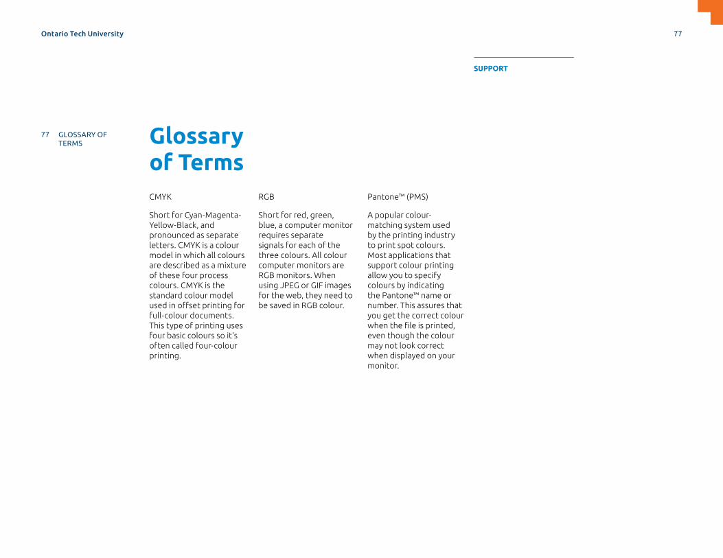
Glossary of TermsCMYK
Short for Cyan-Magenta-Yellow-Black, and pronounced as separate letters. CMYK is a colour model in which all colours are described as a mixture of these four process colours. CMYK is the standard colour model used in offset printing for full-colour documents. This type of printing uses four basic colours so it’s often called four-colour printing.
RGB
Short for red, green, blue, a computer monitor requires separate signals for each of the three colours. All colour computer monitors are RGB monitors. When using JPEG or GIF images for the web, they need to be saved in RGB colour.
Pantone™ (PMS)
A popular colour-matching system used by the printing industry to print spot colours. Most applications that support colour printing allow you to specify colours by indicating the Pantone™ name or number. This assures that you get the correct colour when the file is printed, even though the colour may not look correct when displayed on your monitor.
Ontario Tech University 77
MASTERBRAND APPLICATIONS SUPPORTDESIGN ELEMENTS SPIRIT BRAND
77 GLOSSARY OF TERMS
78 CONTACT INFORMATION
SUPPORT

Contact Information
COMMUNICATIONS & MARKETING
Ontario Tech University
brand.ontariotechu.ca
905.721.8668 ext. 5660
© University of Ontario Institute of Technology 2019. ONTARIO TECH UNIVERSITY and Design are trademarks of the University of Ontario Institute of Technology. D5050. June 2019.
Ontario Tech University 78
MASTERBRAND APPLICATIONS SUPPORTDESIGN ELEMENTS SPIRIT BRAND
77 GLOSSARY OF TERMS
78 CONTACT INFORMATION
SUPPORT

Related Documents