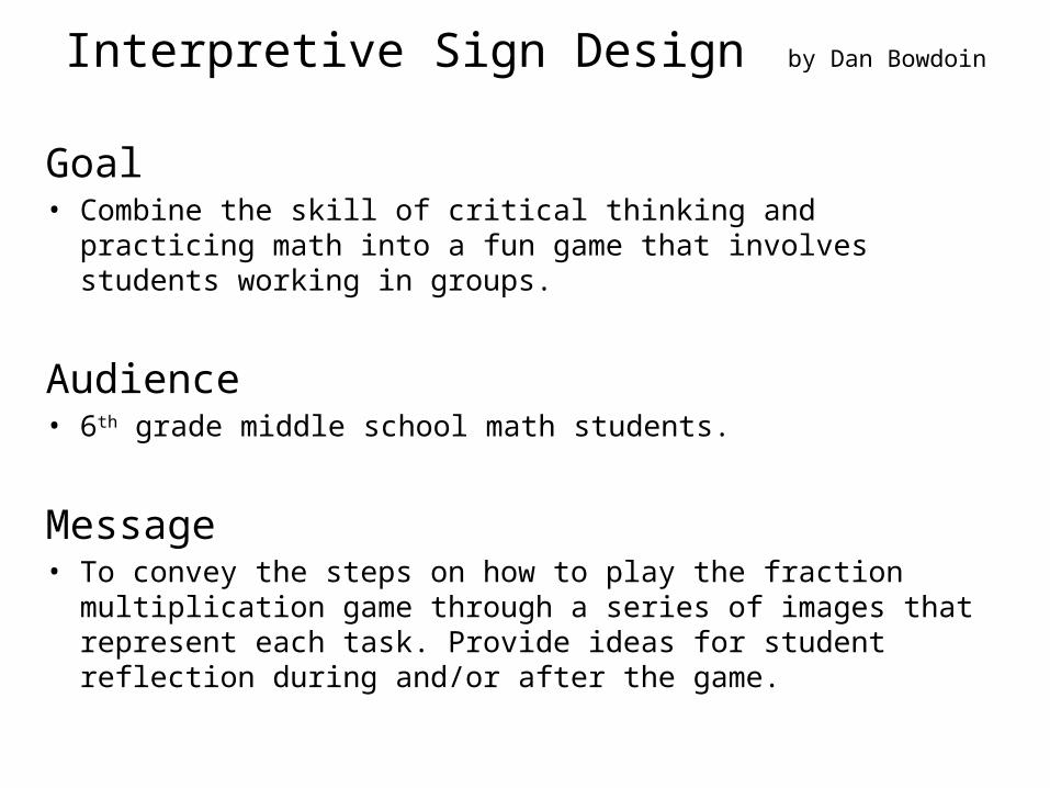
Interpretive Sign Design by Dan Bowdoin Goal • Combine the skill of critical thinking and practicing math into a fun game that involves students working in groups. Audience •6 th grade middle school math students. Message • To convey the steps on how to play the fraction multiplication game through a series of images that represent each task. Provide ideas for student reflection during and/or after the game.

Welcome message from author
This document is posted to help you gain knowledge. Please leave a comment to let me know what you think about it! Share it to your friends and learn new things together.
Transcript
Interpretive Sign Design by Dan Bowdoin
Goal• Combine the skill of critical thinking and practicing math into a fun
game that involves students working in groups.
Audience• 6th grade middle school math students.
Message• To convey the steps on how to play the fraction multiplication game
through a series of images that represent each task. Provide ideas for student reflection during and/or after the game.

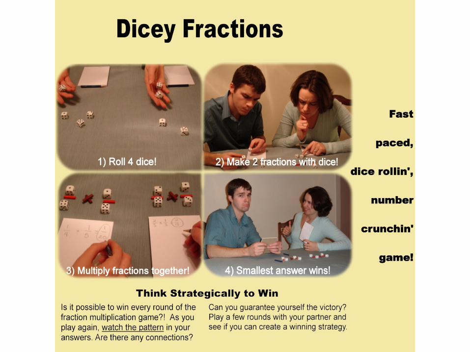
First Design

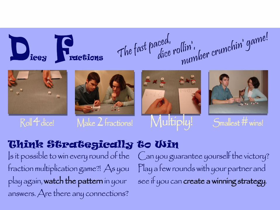
Intermediate Designs

Key Changes
1) I switched from using PowerPoint to Paint Shop Pro. Using the photo editing program allowed me to manipulate and control many additional features.
2) The entire layout was changed, real pictures used, a relevant title created, and body text was added (instead of just a series of questions).

Key Changes
1) In an attempt to make the pictures stand out more, I increased the size and made them a focal point of the design.
2) Placed the captions within the pictures, to treat them as secondary information on the game directions.
3) Developed a two column approach for my text body. This was dumped for a bit, but then brought back in later designs.
Key Changes
1) Contrast and Style were major focuses of this design. The style was meant to be more fun and game like (eventually I thought it was too hard to read).
2) In this design, only two font types are used.
3) Focused on bringing attention to my catch phrase.
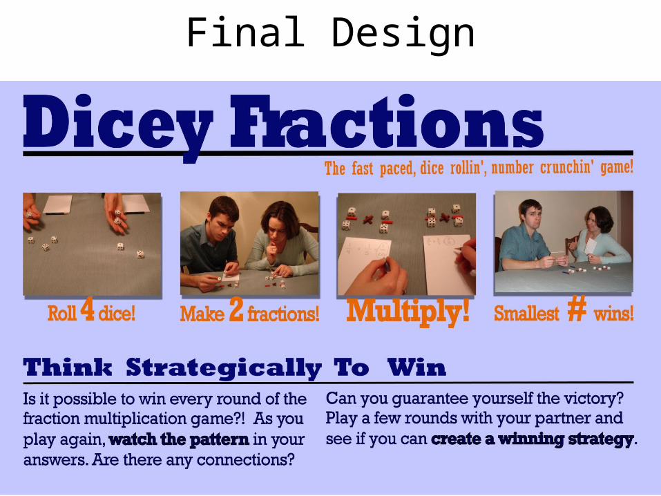
Final Design
Key Changes
1) Simplified text choice for ease of reading.
2) Added lines to strengthen the alignment that the pictures had in relation to the text. Lines also connect with the fraction concept.
3) Moved pictures down, and also moved the title so that it was smashed against the top.
4) Changed color of caption text to stand by itself.
Related Documents