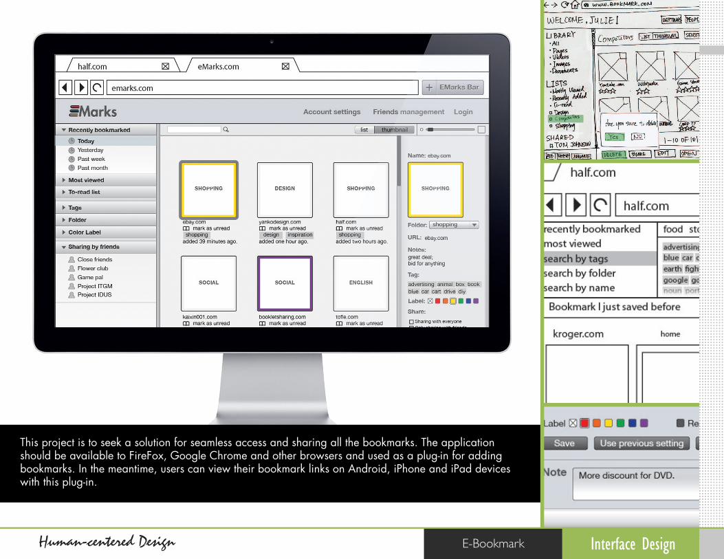
This project is to seek a solution for seamless access and sharing all the bookmarks. The application should be available to FireFox, Google Chrome and other browsers and used as a plug-in for adding bookmarks. In the meantime, users can view their bookmark links on Android, iPhone and iPad devices with this plug-in. E-Bookmark Human-centered Design Interface Design

bookmark
Mar 23, 2016
bookmark interface process
Welcome message from author
This document is posted to help you gain knowledge. Please leave a comment to let me know what you think about it! Share it to your friends and learn new things together.
Transcript
01
This project is to seek a solution for seamless access and sharing all the bookmarks. The application should be available to FireFox, Google Chrome and other browsers and used as a plug-in for adding bookmarks. In the meantime, users can view their bookmark links on Android, iPhone and iPad devices with this plug-in.
E-BookmarkHuman-centered Design Interface Design

01Interface Design
RESEARCH
Human-centered Design E-Bookmark
Problem Finding

01Interface Design
RESEARCH
Human-centered Design E-Bookmark
Concept Feature

01Interface Design
RESEARCH
Human-centered Design E-Bookmark
Competitors
Target Group Inspiration
Delicious.comDelicious.com allows users to share and save their favorite bookmarks in one centralized place.
I interviewed several people who are from different ages and different way of using current bookmarks
StudentsDesignerBusiness peopleHousewivesThe senior
Help these group of people move up here.
FirefoxFrom Firefox, user can easily and quickly save bookmarks, but it takes time to organize.
SafariTop sites view in Safari can provide thumbnail and screenshot to preview the bookmarks.
Reddit.comThe site lists a huge collection of unique websites within a variety of diverse and entertaining category options.
Browser
Website
Less Frequently on Internet
More Frequentlyon Internet
Organizing Well
Not Organized
01Interface DesignHuman-centered Design E-Bookmark
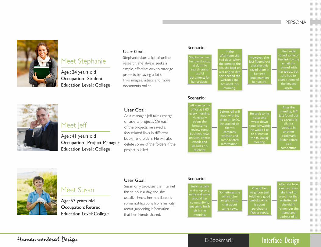
Meet Stephanie
Meet Jeff
Meet Susan
User Goal:Stephanie does a lot of online research; she always seeks a simple, effective way to manage projects by saving a lot of links, images, videos and more documents online.
User Goal:As a manager, Jeff takes charge of several projects. On each of the projects, he saved a few related links in different bookmark folders. He will also delete some of the folders if the project is killed.
User Goal:Susan only browses the Internet for an hour a day, and she usually checks her email, reads some notifications from her city about gardening information that her friends shared.
Scenario:
Scenario:
Scenario:
Age : 24 years oldOccupation : StudentEducation Level : College
Age : 41 years oldOccupation : Project ManagerEducation Level : College
Age: 67 years oldOccupation: RetiredEducation Level: College
PERSONA

01Interface DesignHuman-centered Design E-Bookmark
Meet Stephanie
Meet Jeff
Meet Susan
User Goal:Stephanie does a lot of online research; she always seeks a simple, effective way to manage projects by saving a lot of links, images, videos and more documents online.
User Goal:As a manager, Jeff takes charge of several projects. On each of the projects, he saved a few related links in different bookmark folders. He will also delete some of the folders if the project is killed.
User Goal:Susan only browses the Internet for an hour a day, and she usually checks her email, reads some notifications from her city about gardening information that her friends shared.
Scenario:
Scenario:
Scenario:
Age : 24 years oldOccupation : StudentEducation Level : College
Age : 41 years oldOccupation : Project ManagerEducation Level : College
Age: 67 years oldOccupation: RetiredEducation Level: College
PERSONA
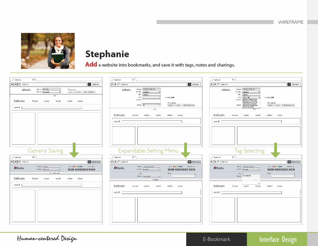
Add
Find
Share

01Interface DesignHuman-centered Design E-Bookmark
PAPER PROTOTYPE

01Interface DesignHuman-centered Design E-Bookmark
PAPER PROTOTYPE

01Interface Design
PAPER PROTOTYPE
Human-centered Design E-Bookmark

01Interface DesignHuman-centered Design E-Bookmark
Iteration 1 - Initial Wireframe
Concept Development
Iteration 2 - Developing in Process Iteration 3 - Refined Wireframe
Major change is focus on the whole concept, how to help users easily save the bookmarks when they browse the website, instead of designing a website to let users organized their saved bookmarks.
Here is the process of E-Bookmarks developing. After paper prototype, I tried to change the concept more focus on how users can quickly save the bookmark in less steps. As a result of user testing, I got a lot of valuable feedback, so I tried to analysis them by categories of content, navigation, action and features, and followed those comments to enhance E-Bookmarks more usability.
Following the user feedback, re-layout several pages for search, saving the setting of bookmark. Adding feature of reviewing offline screenshot. Also, friends sharing is enhanced, which means users in a group can edit the same bookmark folders for recommendation.
Adding search bar by selecting the categories, and offering more spaces for searching results. Another featured changed is to review the details of each saved bookmark by pop-up windows when mouse is over.
USER TESTING
01
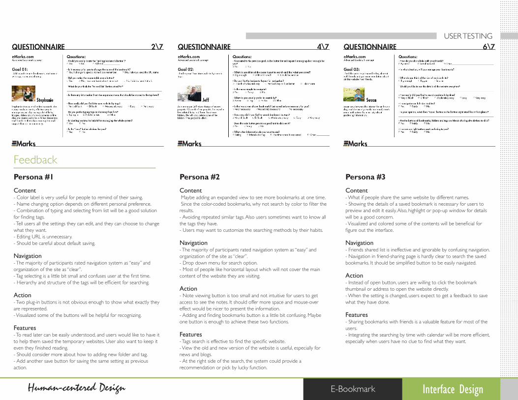
Persona #1
Content- Color label is very useful for people to remind of their saving.- Name changing option depends on different personal preference. - Combination of typing and selecting from list will be a good solution for finding tags.- Tell users all the settings they can edit, and they can choose to change what they want.- Editing URL is unnecessary.- Should be careful about default saving. Navigation- The majority of participants rated navigation system as “easy” and organization of the site as “clear”.- Tag selecting is a little bit small and confuses user at the first time. - Hierarchy and structure of the tags will be efficient for searching. Action- Two plug-in buttons is not obvious enough to show what exactly they are represented.- Visualized some of the buttons will be helpful for recognizing. Features- To read later can be easily understood, and users would like to have it to help them saved the temporary websites. User also want to keep it even they finished reading.- Should consider more about how to adding new folder and tag.- Add another save button for saving the same setting as previous action.
Persona #2
Content Maybe adding an expanded view to see more bookmarks at one time. Since the color-coded bookmarks, why not search by color to filter the results.- Avoiding repeated similar tags. Also users sometimes want to know all the tags they have.- Users may want to customize the searching methods by their habits. Navigation- The majority of participants rated navigation system as “easy” and organization of the site as “clear”.- Drop down menu for search option.- Most of people like horizontal layout which will not cover the main content of the website they are visiting. Action- Note viewing button is too small and not intuitive for users to get access to see the notes. It should offer more space and mouse-over effect would be nicer to present the information.- Adding and finding bookmarks button is a little bit confusing. Maybe one button is enough to achieve these two functions. Features- Tags search is effective to find the specific website.- View the old and new version of the website is useful, especially for news and blogs.- At the right side of the search, the system could provide a recommendation or pick by lucky function.
Persona #3
Content- What if people share the same website by different names.- Showing the details of a saved bookmark is necessary for users to preview and edit it easily. Also, highlight or pop-up window for details will be a good concern.- Visualized and colored some of the contents will be beneficial for figure out the interface. Navigation- Friends shared list is ineffective and ignorable by confusing navigation.- Navigation in friend-sharing page is hardly clear to search the saved bookmarks. It should be simplified button to be easily navigated. Action- Instead of open button, users are willing to click the bookmark thumbnail or address to open the website directly.- When the setting is changed, users expect to get a feedback to save what they have done. Features- Sharing bookmarks with friends is a valuable feature for most of the users.- Integrating the searching by time with calendar will be more efficient, especially when users have no clue to find what they want.
Feedback
Interface DesignHuman-centered Design E-Bookmark
USER TESTING
01Interface DesignHuman-centered Design E-Bookmark
General Saving Expandable Setting Menu Tag Selecting
WIREFRAME

01Interface DesignHuman-centered Design E-Bookmark
General Saving
- Add another save button for saving the same setting as previous action. - Color label is very useful for people to remind of their saving. - Visualized some of the buttons will be helpful for recognizing. - Tell users all the settings they can edit, and they can choose to change what they want.
WIREFRAME
01Interface DesignHuman-centered Design E-Bookmark
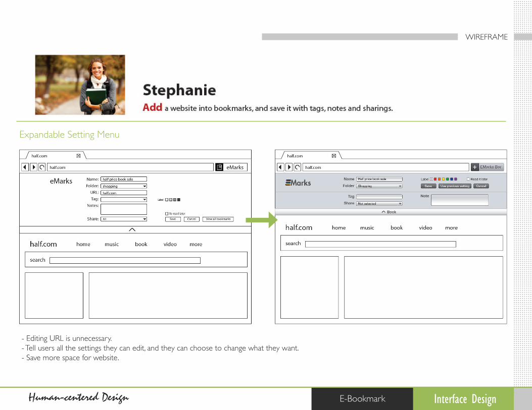
Expandable Setting Menu
- Editing URL is unnecessary. - Tell users all the settings they can edit, and they can choose to change what they want. - Save more space for website.
WIREFRAME

01Interface DesignHuman-centered Design E-Bookmark
Tag Selecting
- Combination of typing and selecting from list will be a good solution for finding tags.
WIREFRAME

01Interface DesignHuman-centered Design E-Bookmark
Search Menu Results Layout offline screenshot
WIREFRAME

01Interface DesignHuman-centered Design E-Bookmark
Search Menu
- Drop down menu for search option. - Maybe adding an expanded view to see more bookmarks at one time.
WIREFRAME

01Interface Design
Wireframe
Human-centered Design E-Bookmark
Results Layout
- Note viewing button is too small and not intuitive for users to get access to see the notes. It should offer more space and mouse-over effect would be nicer to present the information.- Drop down menu for search option. - Maybe adding an expanded view to see more bookmarks at one time.

01Interface DesignHuman-centered Design E-Bookmark
Offline Screenshot
- Find a solution to avoid saving the same website repeatedly.- View the old and new version of the website is useful, especially for news and blogs.
WIREFRAME

01Interface DesignHuman-centered Design E-Bookmark
Saved Bookmark Reviewing Details Editing Bookmarks Sharing
WIREFRAME

01Interface Design
WIREFRAME
Human-centered Design E-Bookmark
Saved Bookmark Reviewing
- Integrating the searching by time with calendar will be more efficient, especially when users have no clue to find what they want.

01Interface DesignHuman-centered Design E-Bookmark
Details Editing
- Visualized and colored some of the contents will be beneficial for figure out the interface.- When the setting is changed, users expect to get a feedback to save what they have done.- Navigation in friend-sharing page is hardly clear to search the saved bookmarks. It should be simplified button to be easily navigated.
WIREFRAME

01Interface DesignHuman-centered Design E-Bookmark
Bookmarks Sharing
- Note viewing button is too small and not intuitive for users to get access to see the notes. It should offer more space and mouse-over effect would be nicer to present the information.- Instead of open button, users are willing to click the bookmark thumbnail or address to open the website directly.
WIREFRAME
Related Documents