UX LUNCH & LEARN SEESION 1 JULY 10, 2015

Bmo ux-lunch learn-session1
Aug 15, 2015
Welcome message from author
This document is posted to help you gain knowledge. Please leave a comment to let me know what you think about it! Share it to your friends and learn new things together.
Transcript

UX LUNCH & LEARN SEESION 1 JULY 10, 2015

agenda ux: BMO business advantage industry ux standards & practices BMO ux + q&a ux training
July 17, 2015
UX as a Business Advantage

Footer goes here 4

5
UX Process: Competitive & Holistic
Research & Discovery ü Competitive analysis ü Interviews ü Testing ü Product heuristic audit ü Industry research ü Client interviews ü Marketing research
UX Strategy ü Develop usability
objectives ü Create & document user profiles
and scenarios ü Conduct task analysis ü Define screen flow &
navigation model ü Establish method of development
UX Exploration & Development ü Define scenarios ü Build flows, map out tasks
and experiences ü Build wireframes ü Create fast low fidelity interactive
prototypes ü Run validation sessions
Interaction & UI Design ü Draft conceptual models ü Document UI standards
and guidelines ü Conduct usability tests ü Create design specifications
and documentation
Implementation ü Conduct heuristic
evaluations ü Run usability tests ü QA ü Deployment ü Run user surveys ü Deploy reiterations
BEFORE NOW
Interaction & UI Design ü Draft conceptual
models
Implementation ü QA ü Deployment

6
UX Process - DISCOVERY: Output Examples
PERSONAS
FLOWS
SITEMAP COMPETTIVE AUDIT

7

8
UX Process-PROTOTYPING: Responsive Prototyping Tool (Axure)

9
UX Process - PROTOTYPING: Presentation Deck

10
UX Process: Asset Library (filecamp.com)

11
COMING SOON
UX Process: BMO Digital Guidelines

July 17, 2015
INDUSTRY UX Standards & Practices HOW TO INFLUENCE USER BEHAVIOUR – Part 1

13
DEFINITION: A property in which the physical characteristics of an object or environment influence its function. DIGITAL: Plays a major role on how we define interfaces to visually indicate their purpose.
HOW TO INFLUENCE USER BEHAVIOUR:
Affordance Principle

14
DEFINITION: The placement of elements such that edges line up along common rows or columns. DIGITAL: It creates a sense of unity and cohesion and helps the user follow the established journey and make a decision faster.
HOW TO INFLUENCE USER BEHAVIOUR:
Alignment Principle

15
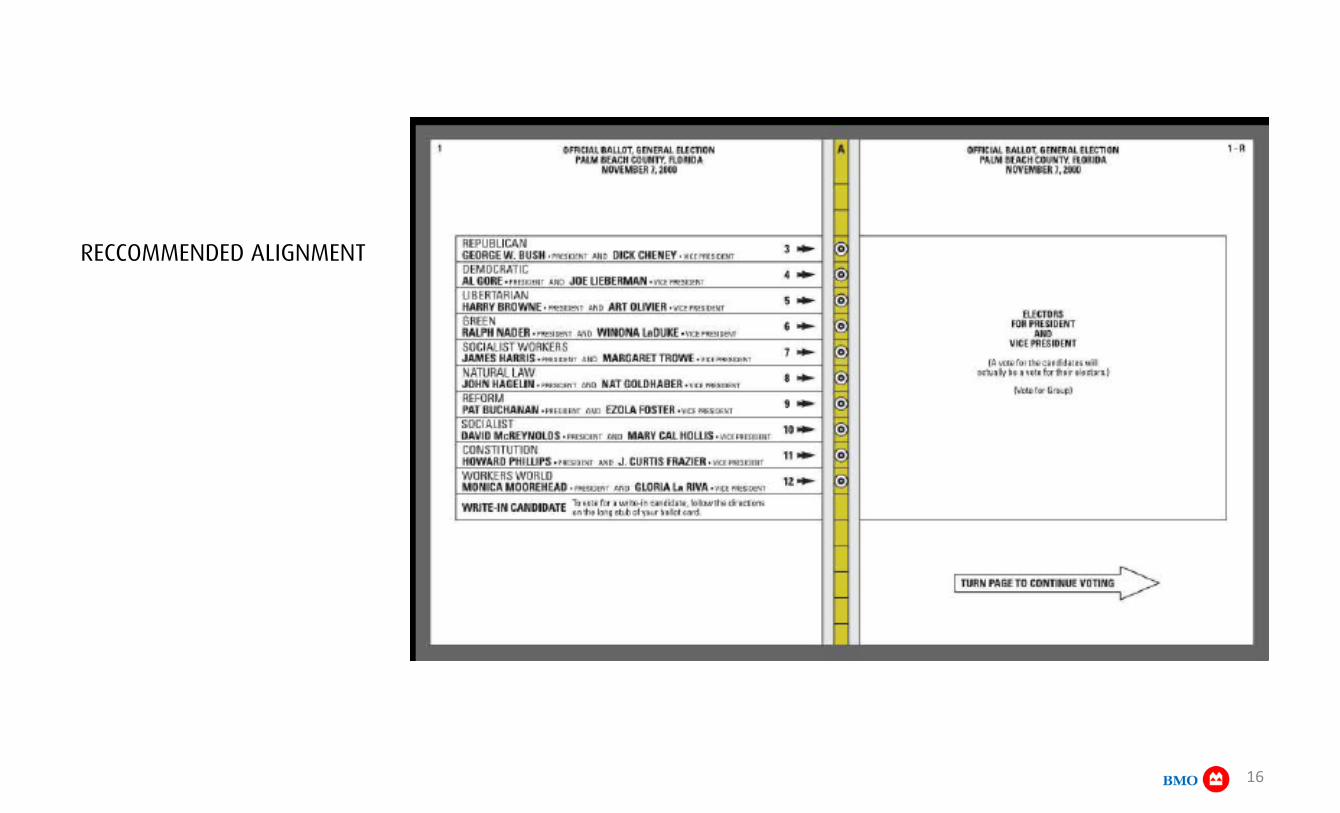
REAL LIFE EXAMPLE: Voting ballot alignment blamed for the 2000 Florida presidential elections results.
16
RECCOMMENDED ALIGNMENT

17
DESCRIPTION: Tendency to perceive a set of individual elements as a single, recognizable pattern, rather than multiple individual elements due to human tendency to look for patterns. DIGITAL: Helps lead the user through the experience and indicates next steps towards completion of a task. Part of Gestalt principles of Design These principles are organized into six categories: 1. Proximity 2. Similarity 3. Closure 4. Good Continuation 5. Common Fate, and 6. Good Form.
HOW TO INFLUENCE USER BEHAVIOUR:
Closure Principle

July 17, 2015
BMO UX
19
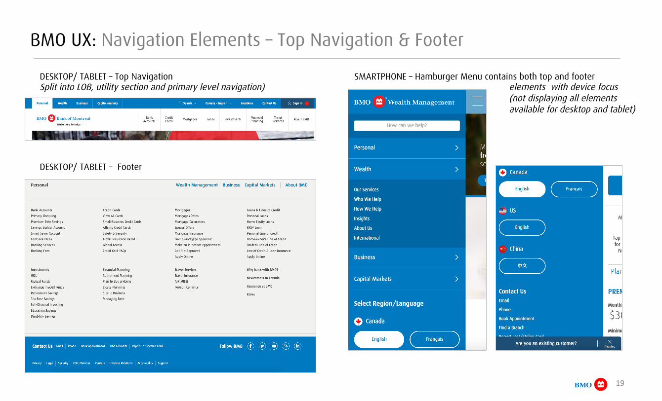
BMO UX: Navigation Elements – Top Navigation & Footer
DESKTOP/ TABLET – Top Navigation Split into LOB, utility section and primary level navigation)
SMARTPHONE – Hamburger Menu contains both top and footer elements with device focus
(not displaying all elements available for desktop and tablet)
DESKTOP/ TABLET – Footer
20
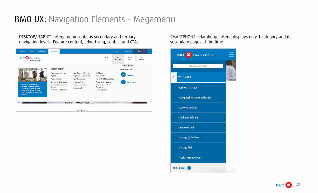
BMO UX: Navigation Elements – Megamenu
DESKTOP/ TABLET – Megamenu contains secondary and tertiary navigation levels, Feature content, advertising, contact and CTAs
SMARTPHONE – Hamburger Menu displays only 1 category and its secondary pages at the time

21
BMO UX: Navigation Elements – Sticky Navigation
DESKTOP/ TABLET – “Sticky Navigation” supports discoverability and navigation of the page and has two elements: 1. index
2. Docked index available once user scrolls beyond the 1000 pixel mark – allows user the jump between page sections in 1 click
SMARTPHONE – reproduces the same experience for the smaller device real estate

July 17, 2015
UX Training

23
hRp://www.lynda.com/Web-‐Mobile-‐Web-‐tutorials/FoundaYons-‐UX-‐MulYdevice-‐Design/165610-‐2.html
UX Training: Foundations of UX
Multi-device design - part 1

Thank you Contact the UXDX team at anytime: Nora Cocan Sr. Manager - UX & Creative Services [email protected]
Related Documents