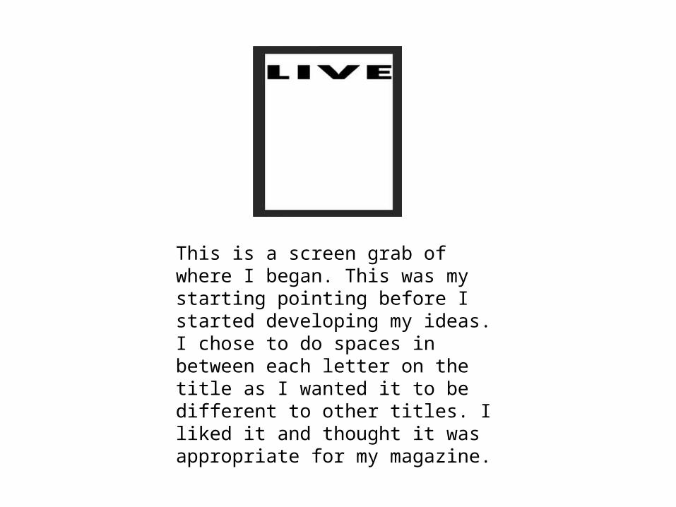
This is a screen grab of where I began. This was my starting pointing before I started developing my ideas. I chose to do spaces in between each letter on the title as I wanted it to be different to other titles. I liked it and thought it was appropriate for my magazine.

Welcome message from author
This document is posted to help you gain knowledge. Please leave a comment to let me know what you think about it! Share it to your friends and learn new things together.
Transcript
This is a screen grab of where I began. This was my starting pointing before I started developing my ideas. I chose to do spaces in between each letter on the title as I wanted it to be different to other titles. I liked it and thought it was appropriate for my magazine.
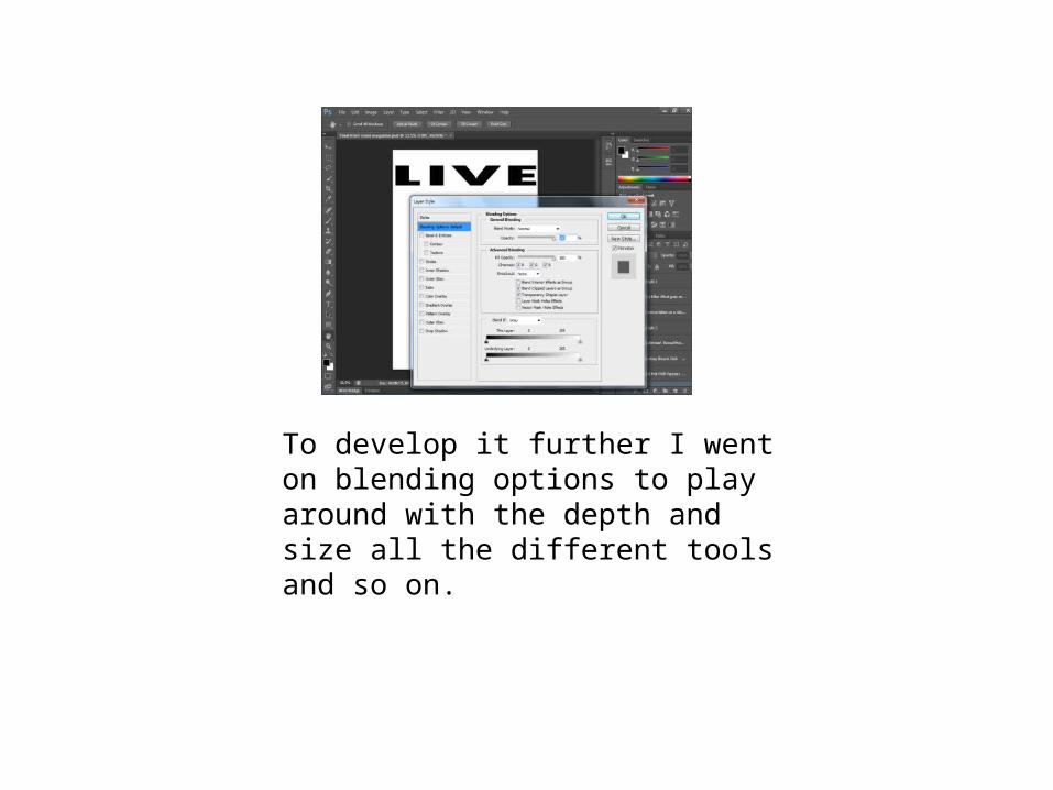
To develop it further I went on blending options to play around with the depth and size all the different tools and so on.
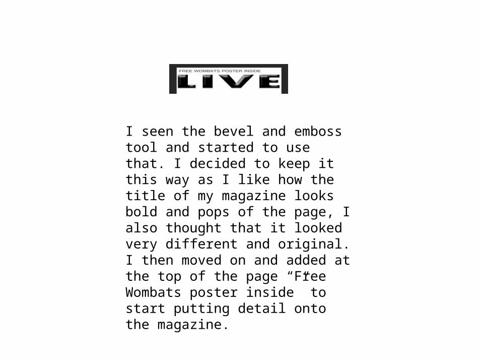
I seen the bevel and emboss tool and started to use that. I decided to keep it this way as I like how the title of my magazine looks bold and pops of the page, I also thought that it looked very different and original. I then moved on and added at the top of the page “Free Wombats poster inside” to start putting detail onto the magazine.
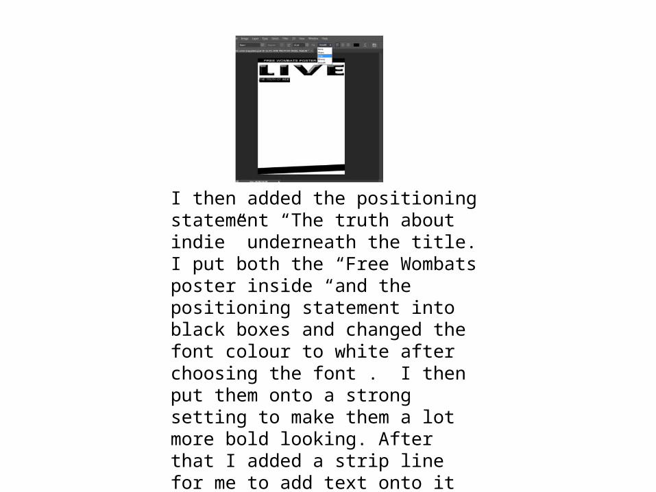
I then added the positioning statement “The truth about indie” underneath the title. I put both the “Free Wombats poster inside “and the positioning statement into black boxes and changed the font colour to white after choosing the font . I then put them onto a strong setting to make them a lot more bold looking. After that I added a strip line for me to add text onto it further on.
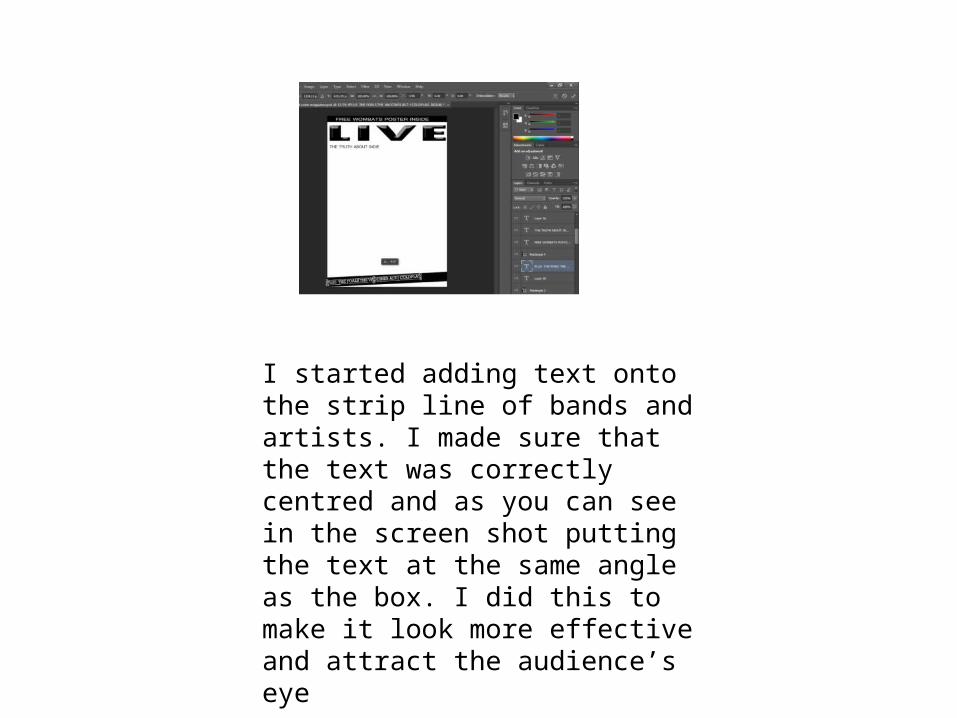
I started adding text onto the strip line of bands and artists. I made sure that the text was correctly centred and as you can see in the screen shot putting the text at the same angle as the box. I did this to make it look more effective and attract the audience’s eye
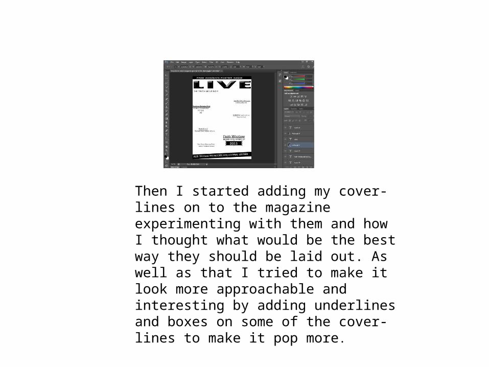
Then I started adding my cover-lines on to the magazine experimenting with them and how I thought what would be the best way they should be laid out. As well as that I tried to make it look more approachable and interesting by adding underlines and boxes on some of the cover-lines to make it pop more.
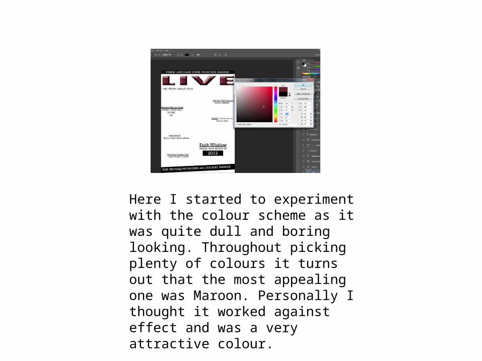
Here I started to experiment with the colour scheme as it was quite dull and boring looking. Throughout picking plenty of colours it turns out that the most appealing one was Maroon. Personally I thought it worked against effect and was a very attractive colour.
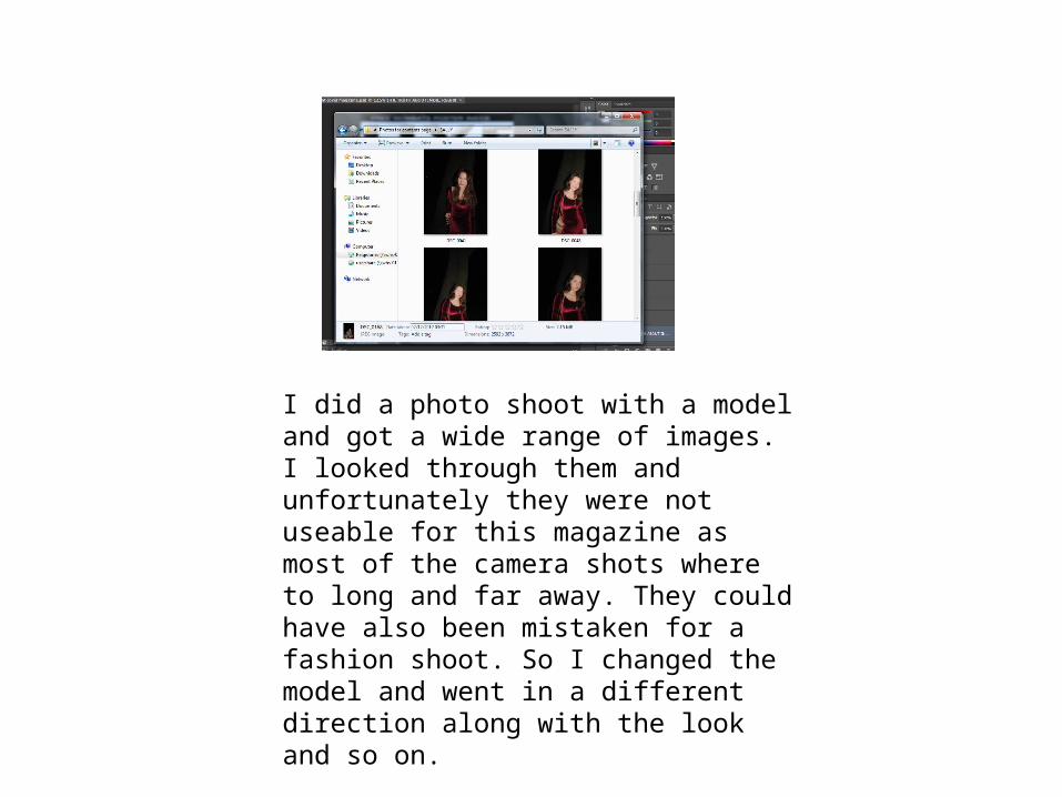
I did a photo shoot with a model and got a wide range of images. I looked through them and unfortunately they were not useable for this magazine as most of the camera shots where to long and far away. They could have also been mistaken for a fashion shoot. So I changed the model and went in a different direction along with the look and so on.
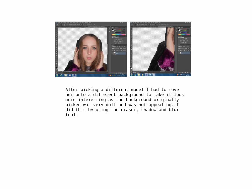
After picking a different model I had to move her onto a different background to make it look more interesting as the background originally picked was very dull and was not appealing. I did this by using the eraser, shadow and blur tool.
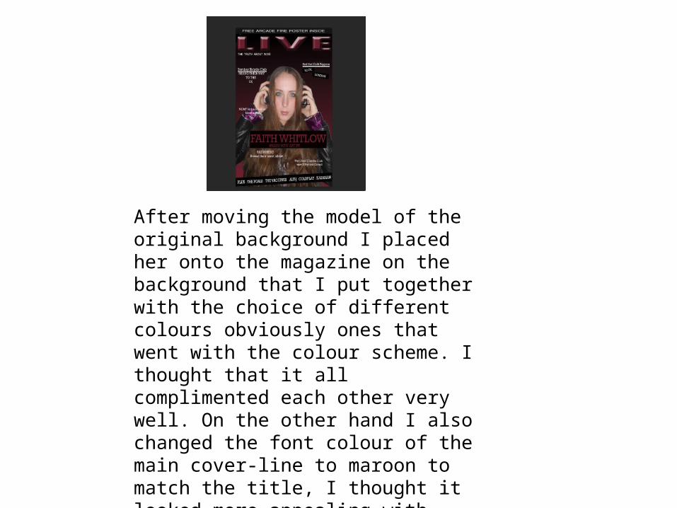
After moving the model of the original background I placed her onto the magazine on the background that I put together with the choice of different colours obviously ones that went with the colour scheme. I thought that it all complimented each other very well. On the other hand I also changed the font colour of the main cover-line to maroon to match the title, I thought it looked more appealing with that colour.
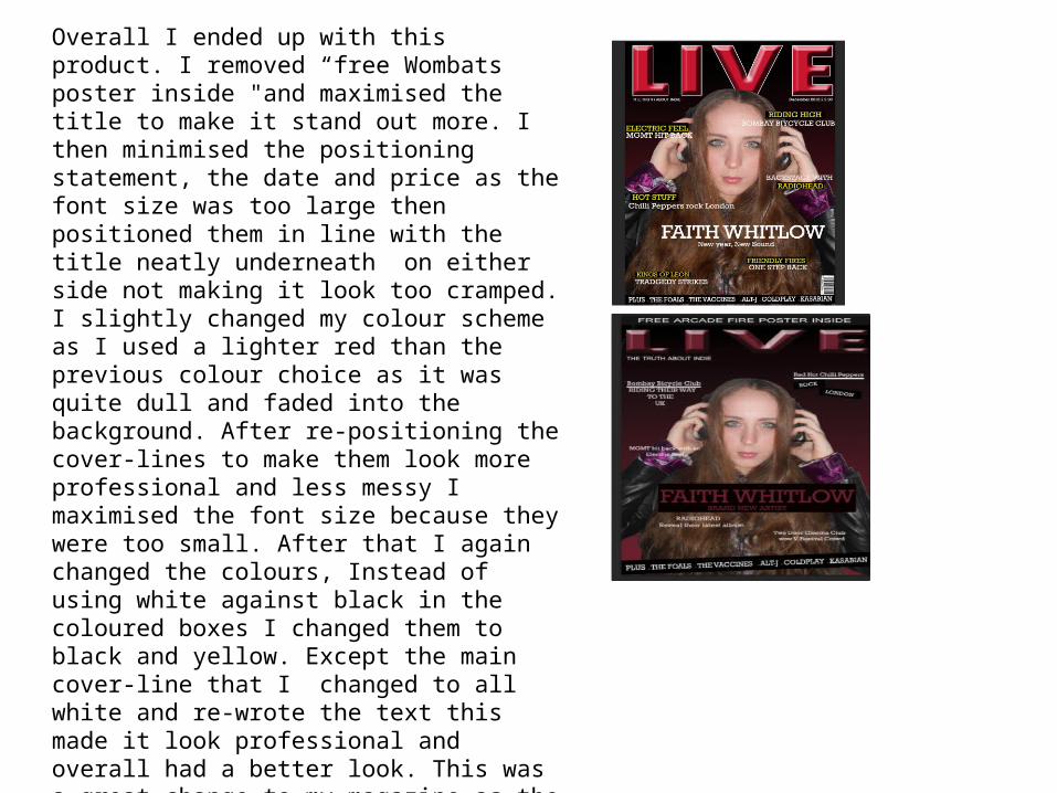
Overall I ended up with this product. I removed “free Wombats poster inside "and maximised the title to make it stand out more. I then minimised the positioning statement, the date and price as the font size was too large then positioned them in line with the title neatly underneath on either side not making it look too cramped. I slightly changed my colour scheme as I used a lighter red than the previous colour choice as it was quite dull and faded into the background. After re-positioning the cover-lines to make them look more professional and less messy I maximised the font size because they were too small. After that I again changed the colours, Instead of using white against black in the coloured boxes I changed them to black and yellow. Except the main cover-line that I changed to all white and re-wrote the text this made it look professional and overall had a better look. This was a great change to my magazine as the text is a lot more attractive and eye catching. Looking at the Image previously, the model sort of faded in with the back ground so I made her larger and she was now a lot more noticeable to the audience. I the decided to straighten my strip line to across the bottom as again it looked quite messy compared to the transaction. To complete my few changes I added the bar code to the bottom of the magazine.
Related Documents