Trompet, M., R. Parasram, and R.J. Anderson 1 BENCHMARKING DISAGGREGATE CUSTOMER SATISFACTION SCORES BETWEEN BUS OPERATORS IN DIFFERENT CITIES AND COUNTRIES Paper submitted for presentation at the (2013) Transportation Research Board 92 st Annual Meeting and publication in the Transportation Research Record Date submitted: 1 st August 2012 Date resubmitted: 5 th November 2012 Date submitted for TRR: 7 th March 2013 Corresponding author: Mark Trompet Railway and Transport Strategy Centre, Centre for Transport Studies, Department of Civil and Environmental Engineering, Imperial College London Project Manager of the International Bus Benchmarking Group Skempton Building, SW7 2AZ London; Tel +(20)75941519; Fax +(20)75946107 E-mail: [email protected] Richard Parasram Railway and Transport Strategy Centre, Centre for Transport Studies, Department of Civil and Environmental Engineering, Imperial College London Skempton Building, SW7 2AZ London; Tel +(20)75945924; Fax +(20)75946107 E-mail: [email protected] Richard J. Anderson Railway and Transport Strategy Centre, Centre for Transport Studies, Department of Civil and Environmental Engineering, Imperial College London Skempton Building, SW7 2AZ London; Tel +(20)75946092; Fax +(20)75946107 E-mail: [email protected] Words: 5237 Figures: 4 Tables: 2 Box: 1

Welcome message from author
This document is posted to help you gain knowledge. Please leave a comment to let me know what you think about it! Share it to your friends and learn new things together.
Transcript
Trompet, M., R. Parasram, and R.J. Anderson
1
BENCHMARKING DISAGGREGATE CUSTOMER SATISFACTION
SCORES BETWEEN BUS OPERATORS IN DIFFERENT CITIES AND
COUNTRIES
Paper submitted for presentation at the (2013) Transportation Research Board 92st Annual
Meeting and publication in the Transportation Research Record
Date submitted: 1st August 2012
Date resubmitted: 5th
November 2012
Date submitted for TRR: 7th
March 2013
Corresponding author: Mark Trompet Railway and Transport Strategy Centre, Centre for Transport Studies, Department of Civil and Environmental
Engineering, Imperial College London
Project Manager of the International Bus Benchmarking Group
Skempton Building, SW7 2AZ London; Tel +(20)75941519; Fax +(20)75946107
E-mail: [email protected]
Richard Parasram Railway and Transport Strategy Centre, Centre for Transport Studies, Department of Civil and Environmental
Engineering, Imperial College London
Skempton Building, SW7 2AZ London; Tel +(20)75945924; Fax +(20)75946107
E-mail: [email protected]
Richard J. Anderson Railway and Transport Strategy Centre, Centre for Transport Studies, Department of Civil and Environmental
Engineering, Imperial College London
Skempton Building, SW7 2AZ London; Tel +(20)75946092; Fax +(20)75946107
E-mail: [email protected]
Words: 5237
Figures: 4
Tables: 2
Box: 1
Trompet, M., R. Parasram, and R.J. Anderson
2
ABSTRACT
Directly comparing the satisfaction of customers of urban bus operators in different cities and
countries is methodologically challenging due to the different surveys used, different sample
frames, different response collection methods and the possibility of cultural bias. Nonetheless,
due to the importance of customer satisfaction, the members of the International Bus
Benchmarking Group started a research project in 2009 to overcome these challenges. The
objective was for bus operators to understand the relative performance in meeting their
customer‟s expectations and to be able to target those areas in which they relatively
underperform. Between 2009-2012, eight to ten participating organizations annually posted
identical surveys on their website homepages in the same period. This paper describes the survey
and data normalization methodology developed within the International Bus Benchmarking
Group that provides managers of these organizations with a comparable view of their customer
satisfaction. The described methodology has been successfully tested in the bus industry but can
also be applied to other industries where there is a wish to benchmark customer satisfaction
amongst other national and international peers.
KEYWORDS: Customer Satisfaction, Benchmarking, Bus Operators, Normalization

Trompet, M., R. Parasram, and R.J. Anderson
3
1. INTRODUCTION
The satisfaction of customers, or in other words the extent to which organizations meet their
customers‟ expectations, is an important indication of an organization‟s success and
sustainability. Customer satisfaction should therefore be included in any benchmarking exercise
through which participants aim to understand their relative performance. Directly comparing the
satisfaction of customers in different cities and countries is methodologically challenging due to
the different surveys used, different sample frames, time frames and different response collection
methods. Furthermore there are socio-political, structural and cultural differences that exist
between cities in different countries, which can lead to „cultural bias‟ when comparing
satisfaction directly. Nonetheless, due to the importance of customer satisfaction, the members of
the International Bus Benchmarking Group (IBBG) started a research project in 2009 to
overcome these challenges.
Member organizations agreed to annually post identical customer satisfaction surveys
(CSS) on their website homepages during the same agreed time and period. After collection, the
responses are cleaned and a normalization process is used to allow direct comparison of
disaggregate CSS scores. The objective of the IBBG CSS work is not to directly compare overall
(aggregated) customer satisfaction between organizations in different cities. The objective is for
bus operators to understand the relative performance in meeting their customer‟s expectations in
multiple service quality areas (e.g. disaggregated). This allows operators to target those areas in
which they relatively underperform. This paper describes the developed data normalization
process and other lessons learned through this international customer satisfaction benchmarking
project which should be useful for benchmarking practitioners, managers and policymakers.
The remainder of this paper is structured as follows. Section 2 reviews literature with
regards to CSS comparisons across countries. Furthermore, previous and other on-going bus
public transport benchmarking initiatives have been reviewed to understand whether and how
customer satisfaction performance is benchmarked. Section 3 describes the IBBG customer
satisfaction data collection process by discussing the survey methodology, the sample frame, and
data cleaning process which is used for this analysis. Section 4 describes the normalization
methodology used to provide comparable customer satisfaction perspectives and Section 5
provides a description on how the normalized data can be presented to facilitate decision making
and to set priority targets. Conclusions are drawn in Section 6.
2. LITERATURE REVIEW ON BENCHMARKING CUSTOMER SATISFACTION
Over the last twenty years, customer satisfaction data has been collected by a number of
countries on an aggregate level. The Swedish Customer Satisfaction Barometer (Fornell, 1), the
German Kundenbarometer (Meyer, 2) and the American Customer Satisfaction Index (Fornell et
al. 3) can be considered the first efforts towards satisfaction comparisons. These barometers
allowed for broad based satisfaction and customer loyalty benchmarks on different levels:
product categories within an industry, different industries within a country and satisfaction
between different countries. Grigoroudis and Siskos (4) provide a useful overview of these
national customer barometers. A number of researchers, including Ölander (5), question the
usefulness and comparability of these aggregate international comparisons. Main concerns are
cultural differences and differences in measures and collection methods used. Johnson et al. (6)

Trompet, M., R. Parasram, and R.J. Anderson
4
investigated the systematic differences in aggregate CSS scores across both industries and
countries. They indeed quote the concerns of Ölander (5) and also Elster and Roemer (7) who
justifiably discuss the issue of „adaptation‟, and related „expectation‟ differences between
countries as a reason why direct comparisons can be problematic. However, Johnson et al. (6)
did conclude that at an aggregate level, customer satisfaction is more comparable than many ever
imagined since aggregation of multiple measures cancels out unique effects and reduces
measurement error. However, for benchmarking to be truly useful, distinct areas of improvement
need to be identified alongside related best practices by peer organizations. A disaggregate (e.g.
measure by measure) level of customer satisfaction understanding is therefore necessary.
Ölander (5) also questioned the usefulness of aggregated measures, since they are inherently
problematic and will not reveal meaningful differences. This paper is therefore focused on a
methodology for benchmarking CSS results at a disaggregate level.
An overview of public transport benchmarking initiatives has been provided in a variety
of reports and papers (e.g. TCRP 141(8), Urban Transport Benchmarking Initiative (9,10),
EQUIP (11), Geerlings et al. (12), and Gudmundsson et al. (13)). A review of these
benchmarking initiatives shows that, apart from the IBBG initiative described in this paper, only
the Scandinavian BEST project (14,15) currently performs customer satisfaction benchmarking
amongst peer operators. The Scandinavian BEST project stands for Benchmarking European
Service of public Transport and is a project that started in 1999 with the overall objective to
increase the use of public transport in European urban areas. Every year 1,000 citizens in each of
the participating cities are interviewed by telephone during one week in March about their
attitudes to public transport. BEST asks twenty-eight questions over nine „quality dimensions‟
and one overall „citizen satisfaction‟ question, plus demographics.
A number of other projects and papers theoretically propose benchmarking customer
satisfaction amongst public transport operators. TCRP 47: A Handbook for Measuring Customer
Satisfaction and Service Quality (16) provides a recommended set of standardized questions that
transit agencies could incorporate into their customer surveying activities. They conclude that if
more agencies adopted a standard core set of questions, customer satisfaction survey results
could be added to the mix of potential comparisons in a benchmarking exercise.
EQUIP (17) suggest in its handbook that customer satisfaction data should be collected
for benchmarking purposes. They suggest a minimum annual sample size of 400 surveys,
collected via on-board face-to-face interviews over a period of at least one week. They express
the importance of collecting survey responses through similar methods between benchmarking
partners. Furthermore, the timing of the survey is deemed important as seasonal and holiday
variations are common and time of day / day of week differences can lead to a sample bias with
regard to variations in age, sex, ethnic, socio economic status and mobility level. However,
EQUIP states that customer satisfaction is generally suitable for international benchmarking,
although caution must be taken in making comparisons as cultural differences exist.
Whilst providing useful frameworks for customer satisfaction measurement, neither
Scandinavian BEST, EQUIP nor TCRP discuss a methodology to overcome the challenges of
socio-political, cultural bias and different levels of adaptation in benchmarking customer
satisfaction. This paper aims to contribute to this area.

Trompet, M., R. Parasram, and R.J. Anderson
5
3. THE INTERNATIONAL BUS BENCHMARKING GROUP CUSTOMER
SATISFACTION SURVEY AND DATA
The data used for this study have been collected through four annual series (2009-2012) of
identical Customer Satisfaction Surveys (CSS) initiated by the International Bus Benchmarking
Group (IBBG), which is facilitated by the Railway and Transport Strategy Centre at Imperial
College London. More detailed information on the IBBG and its benchmarking methodology can
be found in Trompet, et al. (18) and Trompet and Graham (19). The IBBG organizations that
have participated in the CSS are TMB Barcelona, STIB Brussels, Dublin Bus, Carris Lisbon,
London Buses, STM Montreal, RATP Paris, STA Sydney Buses, SMRT Singapore and CMBC
Vancouver.
The first part of the questionnaire, as shown in Box 1, contains 19 statements in relation
to the 8 customer service areas as defined by the European Norm 13816 (20) and one general
question on overall satisfaction. The objective is to understand cumulative satisfaction of bus
customers, defined by Johnson et al. (21) as a customer‟s overall experience with a product or
service over time, rather than transaction specific (e.g. satisfaction in relation to one recent
journey).
Respondents were asked to provide their opinions with regards to normal service
operations, filtering out the effect of charter, tourist bus, paratransit and school bus services. In
the first section answers are given on a scale from “1 – agree strongly” to “5 – disagree strongly”
with also “don‟t know” as an option. The second section of the survey asks respondents to select,
in order, the top three customer service areas that are most important to them. Finally there are
four demographic questions to understand the sample frame.
The questionnaires are produced and hosted via an online survey building and hosting
tool. Where necessary, translations of the survey were provided by individual operators into their
home languages. For example, for multi-language cities such as Brussels, there are separate
surveys produced for each major language; in Brussels‟ case French, Dutch and English.
Via the online tool individual survey links were created for all different cities and
languages. Participating operators posted the link(s) to their own survey(s) on their homepage for
the same period of four weeks.
Table 1 shows for each year the survey was executed, the average number of cumulative
responses received per city on the first day, and by the end of each of the four weeks that the
survey was „live‟ online. The last column shows the range of responses received per city in each
of the four years. Generally, the more visible the link was placed on the homepage, the more
responses were received. The operators that used a „pop-up‟ to invite people to respond to the
survey generally received more responses.
TABLE 1 Average Cumulative Number of Responses to the Online IBBG CSS per City
Year N Day 1 Week 1 Week 2 Week 3 Week 4 Range of Total Responses
2009 8 81 499 695 873 1060 333 - 2748
2010 10 139 617 917 1030 1134 214 - 3743
2011 10 167 760 1212 1682 1944 242 - 4568
2012 9 136 931 1620 2076 2337 593 - 8092
N = Number of bus organizations participating in the CSS

Trompet, M., R. Parasram, and R.J. Anderson
6
Box 1 International Bus Benchmarking Group Customer Satisfaction Survey Questions
Respondents were asked to best describe their reaction on a scale from “1 – disagree strongly” to “5 –
agree strongly” to each of the following nineteen statements:
1. Availability
1.1 The bus service is usually reliable
1.2 The buses are frequent
1.3 The bus routes are convenient for me
2. Accessibility
2.4 It is easy for me to get on and off the bus
2.5 It is easy to move around inside the bus
2.6 It is convenient to pay for the bus / buy tickets
3. Information
3.7 It is easy to get information about the bus services
3.8 It is easy to find out how well the buses are running
3.9 If there are problems, I can easily find an alternative route
4. Time
4.10 The bus gets me to my destination on time
5. Customer Care
5.11 Staff are well dressed
5.12 Staff are helpful
5.13 It is easy to resolve problems or complaints
6. Comfort
6.14 The seats are comfortable and there is enough space
6.15 The bus is well driven and gives a comfortable ride
6.16 The bus is clean
6.17 The bus is quiet, well lit, ventilated and at an adequate temperature
7. Security
7.18 The bus is a secure place for me
8. Environmental Impact
8.19 The bus does not cause too much pollution
9. Overall Satisfaction (on a scale from “1 – very dissatisfied” to “5 – very satisfied”)
9.20 How satisfied are you overall with the bus services in the city?
10. What are the 3 most important areas of service for you as a user of public transport?
(Respondents selected a 1st, 2
nd and 3
rd priority)
Availability (frequency and reliability of the service, hours of operation)
Accessibility (ease of getting on and off the bus)
Information (availability and quality of maps, timetables and information on delays)
Time (travel time and on-time running)
Customer Care (helpful staff, responding to your suggestions or complaints)
Comfort (temperature, ventilation, comfortable journey, cleanliness, crowding)
Security (feeling safe and secure)
Environment (effect on pollution, noise, congestion, etc)

Trompet, M., R. Parasram, and R.J. Anderson
7
EQUIP (17) suggest in their handbook that samples of at least 400 surveys, collected over
at least one week, are generally sufficiently representative of the opinions of the population
within a 95% confidence interval. The IBBG objective was to collect at least 1000 responses per
city, a sample size closer to those collected by IBBG operators‟ for their internal customer
satisfaction analyses. A major advantage of an online survey is that larger samples sizes can be
collected with minimal additional resources. This minimum annual sample size of 1000 is also
used by BEST (15).
Table 1 shows that in order to collect a minimum of 1000 responses via an online survey
posted on a bus organization‟s website, the link typically needs to be active for at least three
weeks. Keeping the survey „live‟ for an extra week does provide the flexibility of only using a
subset of the responses when special events have occurred during the survey period, as described
below. Four weeks has proven to be sufficient in all cities where the link to the survey was
placed prominently on the homepage. From Table 1 can also be seen that the actual number of
responses received per week decreases, especially after the second week. Hence, a fifth week
will therefore likely not provide a worthwhile number of additional responses. The total number
of average responses per city has increased each year. This can be explained by the fact that due
to the success of the 2009 and 2010 surveys, operators gave the link to the survey more
prominent visibility on their websites. In 2011 and 2012 some organizations also posted the
link(s) to the survey on their Facebook page and Twitter account, which especially on the day of
posting led to an increased number of responses.
The range of total (uncleaned) responses received per city does show that in all years of
the IBBG CSS there has been at least one city in which the minimum sample of 1000 could not
be collected. This is unfortunate as in principle comparisons are served best by equal or near
equal sample sizes for all cities (Verma, 22).
Apart from the duration of the survey, the actual timing of the survey is also an important
element to consider with regards to comparability of the results. For consistency reasons the
IBBG survey is held each year for four weeks in the spring (for Sydney Buses this equivalent
timing means autumn due to Sydney‟s southern hemisphere location). Each year the start date of
the survey changes by one to four weeks as efforts are made to avoid the Easter holiday within
the survey period. However, even if the same period and duration is observed by all participating
organizations, it remains important to record any unusual events (e.g. strikes, severe weather,
riots etc) that occur during the survey period. These events likely have an effect on the customer
satisfaction scores.
For example a one day strike was announced in one of the participating cities which
caused responses to become non-representative for the normal bus satisfaction levels. To analyse
the impact of this strike, the overall average satisfaction (question 9 of the survey) on a scale of
5= very satisfied, 1 = very dissatisfied was compared in different key time periods:
April 1st – 17th
, before a strike announcement: 2.64
April 18th – 27th
, after the strike announcement: 2.36
April 26th – 27th
, during the day of the strike: 2.22
It becomes clear that the announcement of the strike and the strike itself had a negative effect on
the overall customer satisfaction. Furthermore, 17.5% of all responses collected were received
during the 36 hour strike period, e.g. a much higher response rate than in a „normal‟ period. The
link to the survey was also posted on an external internet forum where users were „encouraged‟

Trompet, M., R. Parasram, and R.J. Anderson
8
to provide negative responses. In such cases only responses received in the „normal‟ period were
used for further analysis.
Due to the uncontrolled nature of an online CSS, responses need to be quality checked
before being included in the random equal sample generation. Datasets were cleaned for:
incomplete responses,
responses with too many „don‟t knows‟,
multiple identical responses from the same IP address and the same time period,
responses that were unnaturally fast (<2 seconds per question),
responses in patterns, pattern responses (e.g. 1,1,1,1, 2,2,2,2, 3,3,3,3, or 1,2,3,4,5,
1,2,3,4,5, etc),
responses that were only very satisfied/very dissatisfied on all questions and were
answered quickly.
In all years approximately only 3% - 6% of responses were removed per city, indicating that also
online customer satisfaction survey questions are generally answered seriously.
After the cleaning process, the „lowest common denominator‟ above the minimum
sample size was determined. For example, for eight out of ten cities in 2011, at least 1,100 useful
(e.g. cleaned) responses were collected. For these cities random equal samples were generated
(using the random function in Excel) of 1,100. The two cities that did not meet this sample size
were still included in the analysis, however the confidence level of their results would be lower
due to the smaller sample.
A concern that needed addressing was the fact that the IBBG survey would attract an
unstructured sample of respondents due to its uncontrolled online nature, and that each
unstructured sample would likely not be comparable between organisations, and/or within
organisations over time. Incomparable sample frames would limit the usefulness of results for
benchmarking purposes; even when results are normalised. To understand to what extent this
was indeed true, the age, sex, frequency of travel and main journey purpose were recorded per
respondent. An interesting lesson from the IBBG CSS is that although the sample frames were
unstructured, the sample frames were actually comparable between cities. This was true in all
four years that the IBBG survey was executed. Furthermore, consistency over time of the sample
frame within organisations makes trend analysis possible. Figure 1 represents both the
segmentation of all 18,692 respondents within ten cities in 2011 and the 20,398 respondents in
2012 within nine different cities, showing very little change between the two years.
FIGURE 1 Demographics of the 2011 and 2012 IBBG CSS sample frame
<18
19<>29
30<>39
40<>4950<>65
>65
Male
Female
Very often
Often
Sometimes
RarelyVery rarely
Work / Education
Shopping
Leisure / Social
Doctor
Other
-
2,000
4,000
6,000
8,000
10,000
12,000
14,000
16,000 Segmentation of total number (18,692) of respondents
2011 survey
Age Gender Frequency Purpose
<18
19<>29
30<>39
40<>49
50<>65
>65
Male
Female
Very often
Often
Sometimes
Rarely
Very rarely
Work / Education
Shopping
Leisure / Social
Doctor
Other
-
2,000
4,000
6,000
8,000
10,000
12,000
14,000
16,000 Segmentation of total number (20,398) of respondents
2012 survey
Age Gender Frequency Purpose

Trompet, M., R. Parasram, and R.J. Anderson
9
Especially in frequency and journey purpose no significant differences in demographics
were observed between all eight to ten participating cities. Some variety between cities was
observed with respect to the proportion of females versus males responding. For example, in
2012 the gender of respondents ranged from 40% male - 60% female to 53% male – 47% female.
The other diversity observed was with regards to the age groups of respondents. In all cities „19-
29‟ year olds were the highest proportion apart from one city where 50-65 year olds were
represented 1% more than the 19-29 group. Furthermore, in three cities the age profile was more
balanced than the average shown in Figure 1. This could be explained by the fact that a
proportion of their responses were collected through an already existing pre-selected customer
satisfaction panel that was contacted through direct emails.
Ultimately, the sample collected consists of Internet users that are open towards
providing feedback. Although the demographics show that the majority are frequent bus
customers, it is yet unclear if this sample is sufficiently representative of the demographics of the
general population of bus customers. However, due to the low cost and relatively easy execution
of an online survey this methodology remains the preferred option for the IBBG operators.
The graphs and tables in the remainder of this paper have been anonymized. Trompet et
al. (18) describe the necessary conditions for successful benchmarking exercises. One of the
main key success factors is data confidentiality which in combination with the willingness to
help and learn from each other creates an open and honest information sharing environment. The
IBBG confidentiality agreement also applies to the customer satisfaction data used for this study.
4. NORMALIZATION OF CUSTOMER SATISFACTION SCORES
The objective of the IBBG CSS work is not to directly compare overall customer satisfaction
between organizations in different cities. The objective is to understand which cities perform
better in meeting their own passengers‟ expectations in the different service quality areas than
other organizations do. This information will subsequently help managers to focus their attention
to those areas where it is most needed, or where there is most potential for positive change. In
order to achieve this, customer satisfaction needs to be analyzed at a detailed, disaggregate, level.
While Johnson et al. (6) mentions that aggregated satisfaction scores can generally be compared
between industries and countries, at a disaggregate level, this is not directly possible due to
socio-political, structural, cultural and adaptation differences (Elster and Roemer, 7) that exist
between cities in different countries. A normalization methodology needs to be applied that
overcomes the problems of „cultural bias‟ and differing customer expectations.
To describe the process of normalizing customer satisfaction scores and to show the
impact this has on the relative satisfaction performance between bus operators, first an example
of absolute average scores is discussed. Figure 2 can be interpreted as follows: operators are
ranked from A to J in order of the absolute customer satisfaction with respect to the level of
reliability of the bus services in their city (question 1 in the survey). On average, passengers are
satisfied with the level of reliability of the bus services in their city as six out of ten bus
organizations have reasonably good >3 scores. The overall average score is 3.25, represented by
the line. For an indication on how well each organization is satisfying their own customers‟ bus
reliability expectations, the score for bus reliability satisfaction is positioned next to the average
satisfaction score over all questions (questions 1-19) and the average overall satisfaction score
(question 20) within their city.

Trompet, M., R. Parasram, and R.J. Anderson
10
FIGURE 2 Ranked Absolute Average Customer Satisfaction Scores for Bus Reliability
By visually comparing these absolute scores it is possible to see that relatively to their own
overall average scores, not six, but four operators are performing well. Operators E to J all score
(slightly) less on bus reliability satisfaction than their average score over all questions.
Respondents in these cities are not as satisfied with bus reliability as they are on average with
other service quality areas.
From Figure 2 it is not easily identifiable which operator performs best in meeting their
own passengers‟ expectations. The next step is therefore to normalize, per city, the average score
for a particular question by dividing it by the average of the scores of all questions to create
Satisfaction index:
(1)
Where is the question (i.e. 1 to 19), the bus operator (i.e. A to J), the respondant, is the
number of individuals answering question for operator and is the total number
of responses for all questions for operator . Due to the fact that respondents had the option of choosing „Don‟t know‟ as an option to
answer a question, will differ to some extent between organizations. This is even the case
when all samples are the same size. In 2011, for the cities with equal samples of 1100, between
Trompet, M., R. Parasram, and R.J. Anderson
11
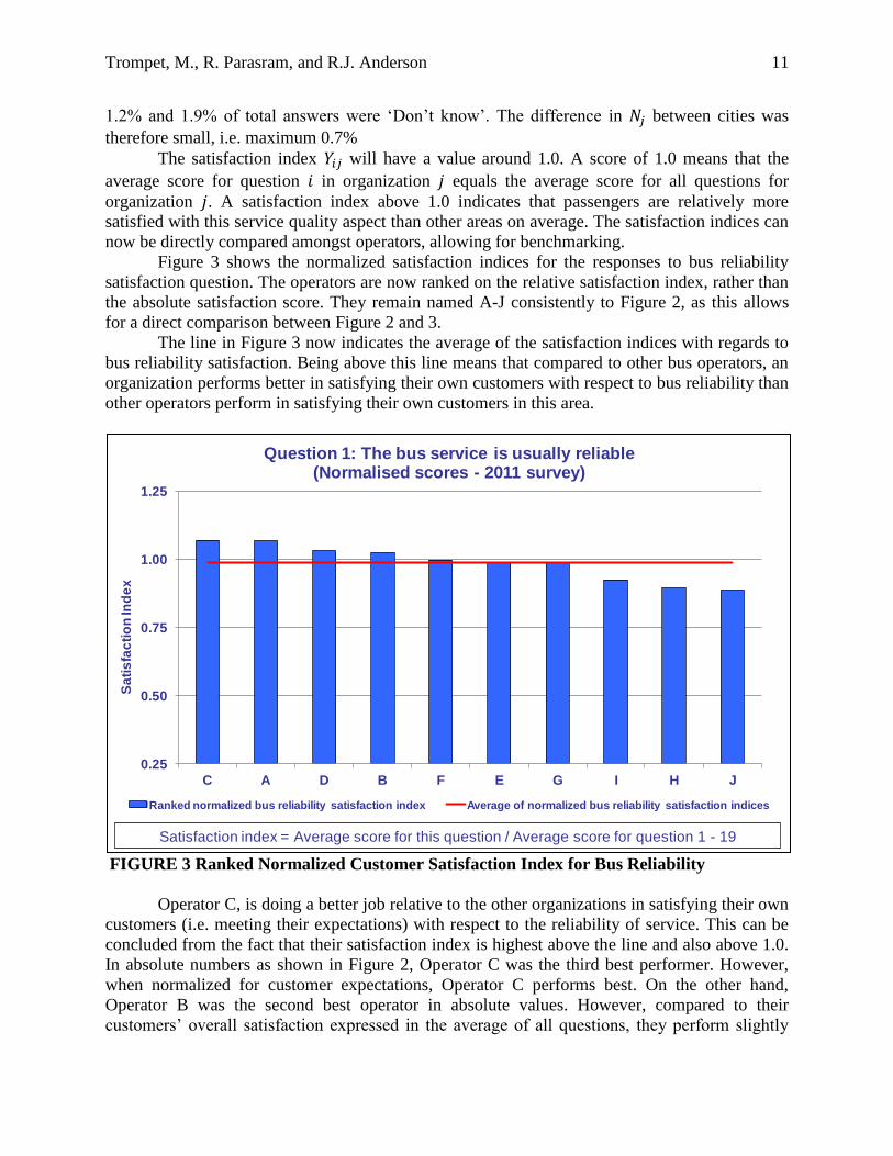
1.2% and 1.9% of total answers were „Don‟t know‟. The difference in between cities was
therefore small, i.e. maximum 0.7%
The satisfaction index will have a value around 1.0. A score of 1.0 means that the
average score for question in organization equals the average score for all questions for
organization . A satisfaction index above 1.0 indicates that passengers are relatively more
satisfied with this service quality aspect than other areas on average. The satisfaction indices can
now be directly compared amongst operators, allowing for benchmarking.
Figure 3 shows the normalized satisfaction indices for the responses to bus reliability
satisfaction question. The operators are now ranked on the relative satisfaction index, rather than
the absolute satisfaction score. They remain named A-J consistently to Figure 2, as this allows
for a direct comparison between Figure 2 and 3.
The line in Figure 3 now indicates the average of the satisfaction indices with regards to
bus reliability satisfaction. Being above this line means that compared to other bus operators, an
organization performs better in satisfying their own customers with respect to bus reliability than
other operators perform in satisfying their own customers in this area.
FIGURE 3 Ranked Normalized Customer Satisfaction Index for Bus Reliability
Operator C, is doing a better job relative to the other organizations in satisfying their own
customers (i.e. meeting their expectations) with respect to the reliability of service. This can be
concluded from the fact that their satisfaction index is highest above the line and also above 1.0.
In absolute numbers as shown in Figure 2, Operator C was the third best performer. However,
when normalized for customer expectations, Operator C performs best. On the other hand,
Operator B was the second best operator in absolute values. However, compared to their
customers‟ overall satisfaction expressed in the average of all questions, they perform slightly
0.25
0.50
0.75
1.00
1.25
C A D B F E G I H J
Sa
tis
fac
tio
n In
de
x
Question 1: The bus service is usually reliable(Normalised scores - 2011 survey)
Ranked normalized bus reliability satisfaction index Average of normalized bus reliability satisfaction indices
Satisfaction index = Average score for this question / Average score for question 1 - 19

Trompet, M., R. Parasram, and R.J. Anderson
12
worse and are ranked fourth amongst the ten operators. Operator B‟s customers are still
relatively satisfied, indicated by a satisfaction index of > 1.0, however there are three other
organizations that have relatively succeeded more in satisfying their own customers with regards
to bus reliability. To be a good performer, an operator should have both a satisfaction index
higher than 1.0 and be above the benchmark, i.e. the satisfaction index group average.
One type of survey results did not need further normalization to be comparable between
operators: the customer service quality area priorities. As stated earlier, respondents selected
their first, second and third priority from the eight service quality areas outlined by the European
Norm 13816 (20). The average results have been calculated per organization, which are quite
similar between organizations each year. Table 2 shows that customer priorities are relatively
consistent over time. Availability and Time are clearly the main priorities for customers. One
interesting observation is that the service quality area „environment‟ seems to lose some
„priority‟ each year. In 2009 and 2010 it was the 6th
highest priority, while in 2011 and 2010 it is
the 8th
and last priority. This could imply that passengers are less concerned about the
environmental impact of their bus services, but could equally reflect the effort bus organization
have put into making bus services more environmentally friendly. Passengers may therefore well
be more reassured that bus organizations take their environmental impact seriously and see
environment less as a priority for improvement.
TABLE 2 Percentage of Respondents Selecting a Service Quality Area as a Top Three
Priority
5. A PRESENTION TOOL FOR ACTION PRIORITIZATION
In the IBBG survey, nineteen different satisfaction indices were created, representing the
nineteen different service quality aspects. These individual satisfaction indices can be compared
over time to identify trends. Apart from trend information per service quality aspect, it is also
very useful for organizations to obtain the overall view of their organization‟s relative
performance in satisfying their customers. To facilitate this process, two types of „summaries‟
are created: The satisfaction performance dashboard and the satisfaction priority quad map.
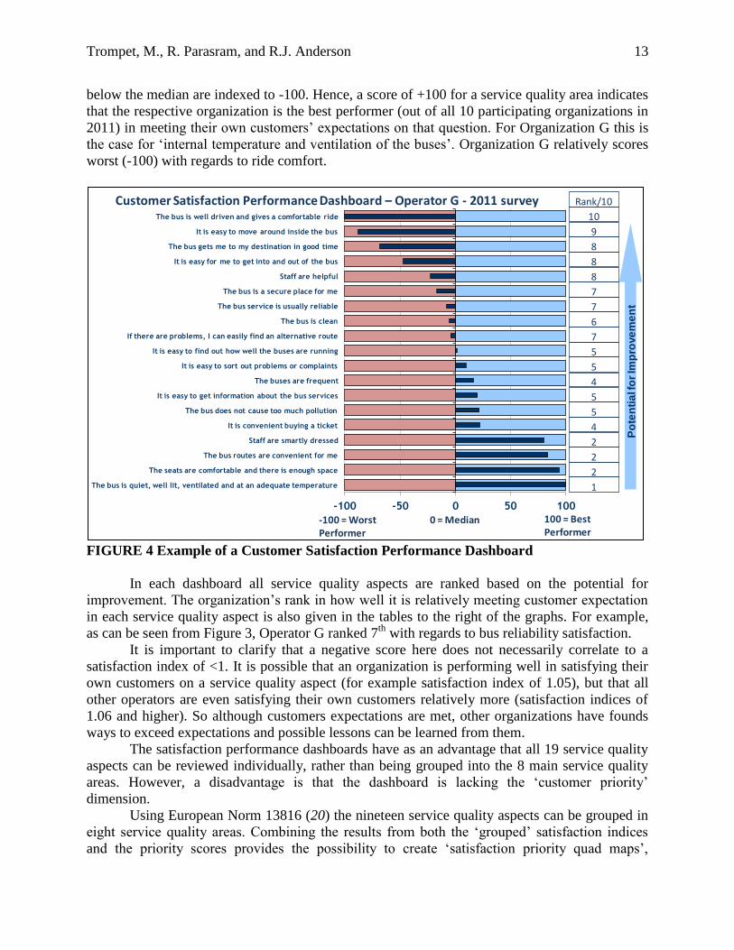
Figure 4 provides an example of the performance dashboard using the results from
Operator G in 2011. For all nineteen indicators, the „relative‟ satisfaction performance
(satisfaction index) of „G‟ is shown in relation to the best and worst performers and the median
value. For each service quality aspect the median satisfaction index amongst the participating
cities is set at 0. Scores above the median are indexed to +100 on the dashboard, while scores
Service Quality Area 2009 2010 2011 2012 Range across cities 2012
Availability 90.9 89.1 89.6 92.2 86.2 - 98.1
Time 71.5 69.3 67.1 70.9 65.6 - 77.7
Information 39.2 39.0 40.5 41.1 31.6 - 50.3
Comfort 31.8 33.6 34.7 32.5 24.6 - 42.1
Security 26.1 24.7 27.8 27.7 18.7 - 33.5
Customer Care 13.3 12.8 14.2 12.5 6.0 - 19.6
Accessibility 12.0 13.0 13.9 11.9 8.2 - 17.4
Environment 15.1 13.5 11.9 11.0 4.8 - 17.4
Trompet, M., R. Parasram, and R.J. Anderson
13
below the median are indexed to -100. Hence, a score of +100 for a service quality area indicates
that the respective organization is the best performer (out of all 10 participating organizations in
2011) in meeting their own customers‟ expectations on that question. For Organization G this is
the case for „internal temperature and ventilation of the buses‟. Organization G relatively scores
worst (-100) with regards to ride comfort.
FIGURE 4 Example of a Customer Satisfaction Performance Dashboard
In each dashboard all service quality aspects are ranked based on the potential for
improvement. The organization‟s rank in how well it is relatively meeting customer expectation
in each service quality aspect is also given in the tables to the right of the graphs. For example,
as can be seen from Figure 3, Operator G ranked 7th
with regards to bus reliability satisfaction.
It is important to clarify that a negative score here does not necessarily correlate to a
satisfaction index of <1. It is possible that an organization is performing well in satisfying their
own customers on a service quality aspect (for example satisfaction index of 1.05), but that all
other operators are even satisfying their own customers relatively more (satisfaction indices of
1.06 and higher). So although customers expectations are met, other organizations have founds
ways to exceed expectations and possible lessons can be learned from them.
The satisfaction performance dashboards have as an advantage that all 19 service quality
aspects can be reviewed individually, rather than being grouped into the 8 main service quality
areas. However, a disadvantage is that the dashboard is lacking the „customer priority‟
dimension.
Using European Norm 13816 (20) the nineteen service quality aspects can be grouped in
eight service quality areas. Combining the results from both the „grouped‟ satisfaction indices
and the priority scores provides the possibility to create „satisfaction priority quad maps‟,
-100 -50 0 50 100
The bus is quiet, well lit, ventilated and at an adequate temperature
The seats are comfortable and there is enough space
The bus routes are convenient for me
Staff are smartly dressed
It is convenient buying a ticket
The bus does not cause too much pollution
It is easy to get information about the bus services
The buses are frequent
It is easy to sort out problems or complaints
It is easy to find out how well the buses are running
If there are problems, I can easily find an alternative route
The bus is clean
The bus service is usually reliable
The bus is a secure place for me
Staff are helpful
It is easy for me to get into and out of the bus
The bus gets me to my destination in good time
It is easy to move around inside the bus
The bus is well driven and gives a comfortable ride 10
1
2
2
2
4
5
5
4
5
5
7
6
7
7
8
8
8
9
Rank/10
Po
ten
tia
l fo
r Im
pro
ve
me
nt
0 = Median 100 = Best Performer
-100 = Worst Performer
Customer Satisfaction Performance Dashboard – Operator G - 2011 survey

Trompet, M., R. Parasram, and R.J. Anderson
14
identifying those areas which need most attention. As can be seen in Figure 5 priority maps plot
passenger priorities against satisfaction. Priorities are based on the percentages of respondents
placing service areas in their top three, and have then been ranked discretely from 1 – 8.
Passenger satisfaction is illustrated using the normalized „satisfaction index‟ as described in
section 4.
FIGURE 5 Example of a Service Quality Area Satisfaction Priority Quad Map
Quadrant 1 in the top right corner of the map illustrates areas where passengers are
relatively less satisfied, or even dissatisfied, with service levels in areas they hold as high
priorities. Service areas in this quadrant require management attention. In the above case for
Operator F, especially „Information‟ and to some lesser extend „Availability‟ are priority areas
where satisfaction is relatively low(er), marking them out as focus areas for improvement. Note
that 1 on the satisfaction index represents the average satisfaction score, not the boundary
between satisfied and dissatisfied. In the case of Operator F, with an average score of 3.25, a
satisfaction index of 0.92, represents the border, so only with respect to „Information‟
respondents are actually dissatisfied.
Quadrant 2 and 3 show areas fewer respondents placed within their top three priorities.
In the case of Operator F, respondents have been very satisfied with service quality areas such as
Security, Environment, Customer care and Accessibility. Possibly because of their satisfaction
with them, respondents have given these service quality areas currently a lower priority rating.
Quadrant 4 shows areas of high priority and above average passenger satisfaction. These
are areas where the operator is already performing well. In Operator F‟s case, „Security‟ and
„Time‟ fall into this category.
Availability
Time
Information
Security
Comfort
Accessibility
Customer Care
Environment
0.80
0.90
1.00
1.10
1.20
12345678
Sati
sfac
tio
n In
de
x : 1
=
Ave
rage
sat
isfa
ctio
n s
core
= 3
.25
Passenger Priorities
Customer Satisfaction Priority Map Operator F - 2011 Survey
0.92 = 3 'neutral'
1
43
2

Trompet, M., R. Parasram, and R.J. Anderson
15
6. CONCLUSIONS
From 2009 to 2012 the International Bus Benchmarking Group has successfully executed
annual surveys involving eight to ten bus operators in different countries to benchmark customer
satisfaction in eight different service quality areas. This paper illustrates to benchmarking
practitioners, senior management and policy makers that customer satisfaction scores can be
normalized to overcome the challenge of cultural bias and different levels of adaptation, allowing
for direct comparison between organizations, at a disaggregate level. Through a process of
standardizing the score for each individual question in the survey by dividing it by the average
score for all questions asked per organization, normalized satisfaction indices are created. This
allows for peer organizations, in different cities and countries, to understand their relative
performance in meeting their own customers‟ expectations with respect to a variety of service
quality areas. The paper further presents two methods to present these satisfaction indices in a
way that assists management and policymakers to prioritize targets for improvements: the
satisfaction performance dashboard and the satisfaction priority quad map.
Interesting lessons have also been learned with respect to executing identical online
customer satisfaction surveys in different cities and countries simultaneously. In cities that make
the link to the survey reasonably visible on their homepage, a period of three weeks was
sufficient to collect 1000 or more responses per city. A collection period of four weeks remains
advisable to allow for data to be omitted from analyses that was collected during unforeseen
abnormal conditions such as strikes and severe weather.
Methodologically, the unstructured sample of the online survey responses was an initial
concern. Fortunately, during all four years the survey has been executed, the demographics of the
sample have been both very consistent between cities and between years within cities. A valid
question remaining is if this sample frame, likely that of internet users that are open towards
completing online surveys, is sufficiently representative of the demographics of the general
population of bus customers. The members of the International Bus Benchmarking Group do
believe it is, as the findings generally correlate to the results of their own internal CSS, which are
created using a structured sample. However, more research is necessary to confirm this. The
IBBG therefore intend to continue this survey for the following years, complementary to the
operators‟ own surveys, and create trend information for further analyses.
ACKNOWLEDGEMENTS
The authors thank the members of the International Bus Benchmarking Group, and especially
those who participated in the international customer satisfaction surveys used for this research,
for their willingness to share the lessons learned. We also thank Thomas Lyscom and Ramin
Moradi for their support in cleaning and analysing the data and Ruben Brage-Ardao and Niovi
Karathodorou for their assistance with equation notation.

Trompet, M., R. Parasram, and R.J. Anderson
16
REFERENCES (1) Fornell, C. (1992). A national customer satisfaction barometer: The Swedish experience. Journal of Marketing,
56, 6–21.
(2) Meyer, A. (1996). The German customer satisfaction barometer: Quality and satisfaction 1995. Düsseldorf,
Germany: German Marketing Association.
(3) Fornell, C. Johnson, M. D., Anderson, E. W., Cha, J., & Bryant, B. E. (1996). The American Customer
Satisfaction Index: Nature, purpose and findings. Journal of Marketing, 60, 7–18.
(4) Grigoroudis, E. And Y. Siskos (2004). A survey of customer satisfaction barometer: Some results from the
transportation-communications sector European Journal of Operational Research, 152, 334–353.
(5) Ölander, F. (1988). Consumer satisfaction/dissatisfaction and the consumer interest. In E. S. Maynes (Ed.), The
frontier of research in the consumer interest (pp. 753–759). Columbia, MO: American Council on Consumer
Interests.
(6) Johnson, M., Herrmann, A., Gustafson, A. (2002). Comparing customer satisfaction across industries and
countries. Journal of Economic Psychology, 23, 749–769.
(7) Elster, J., & Roemer, J. E. (1991). Introduction. In J. Elster & J. E. Roemer (Eds.), Interpersonal comparisons
of well-being (pp. 1–16). Cambridge: Cambridge University Press.
(8) The Transit Cooperative Research Program (TCRP). Report 141: A Methodology for Performance
Measurement and Peer Comparison in the Public Transportation Industry, Transportation Research Board of
the National Academies, Washington, D.C., 2010.
(9) Urban Transport Benchmarking Initiative, Annex A1: Review of the Common Indicators from the Urban
Transport Benchmarking Initiative. Report delivered to the DG TREN, Brussels, July 2004.
(10) Urban Transport Benchmarking Initiative, Annex A1.2: Review of previous initiatives. Report delivered to the
DG TREN, Brussels, July 2004.
(11) EQUIP (Extending the Quality of Public Transport) consortium. State-of-the-art in Benchmarking of Quality in
Public Transport. Report delivered to the DGTREN, Brussels, March 2000.
(12) Geerlings, H., R. Klementschitz and C. Mulley. Development of a methodology for benchmarking public
transportation organisations: a practical tool based on an industry sound methodology. Journal of Cleaner
Production, 14, 2006, pp.113-123.
(13) Gudmundsson, H., A. Wyatt and L. Gordon. Benchmarking and Sustainable Transport Policy: Learning from
the BEST Network. Transport Reviews, Vol 25, No. 6, November 2005, pp. 669-690.
(14) BEST Consortium website, http://best2005.net/This-is-BEST, accessed 13-7-2012
(15) BEST (Benchmarking in European Service of Public Transport) consortium. BEST, Results of the 2011 survey,
Helsinki, May 2011.
(16) The Transit Cooperative Research Program (TCRP). Report 47: A Handbook for Measuring Customer
Satisfaction and Service Quality. Transportation Research Board of the National Academies, Washington, D.C.,
1999.
(17) EQUIP consortium. The Benchmarking Handbook. Transport Programme Project No. UR-98-RS.3076,
Contract Report 4, Report delivered to the DGTREN, Brussels, August 2000 .
(18)Trompet, M., R.J. Anderson and D.J. Graham. Variability in Comparable Performance of Urban Bus
Operations. In Transportation Research Record: Journal of the Transportation Research Board, No. 2111,
Transportation Research Board of the National Academies, D.C., 2009, pp.177-184.
(19)Trompet, M., and D.J. Graham. A Balanced Approach to Normalizing Bus Operational Data for Performance
Benchmarking Purposes, Proceedings of the 91st Transportation Research Board Annual Meeting, Washington,
January 2012
(20)CEN, European Committee for Standardisation, European Norm EN 13816:2002 – Transportation – Logistics
and services – Public passenger transport service quality definition, targeting and measuring, Brussels, April
2002
(21) Johnson, M. D., Anderson, E. W., & Fornell, C. (1995). Rational and adaptive performance expectations in a
customer satisfaction framework. Journal of Consumer Research, 21, 128–140.
(22) Verma, V. (1999). Combining National Surveys for the European Union, Proceedings of the Bulletin of the
International Statistical Institute, 52nd Session. Finland 1999
Related Documents