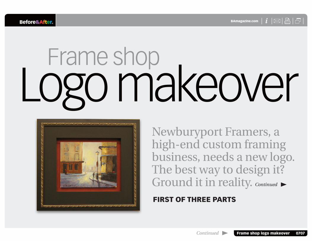
® X Frame shop logo makeover 0707 Before&After BAmagazine.com i U X Logo makeover Frame shop Newburyport Framers, a high-end custom framing business, needs a new logo. The best way to design it? Ground it in reality. Continued FIRST OF THREE PARTS Continued

Welcome message from author
This document is posted to help you gain knowledge. Please leave a comment to let me know what you think about it! Share it to your friends and learn new things together.
Transcript
® X
Frame shop logo makeover 0707
Before&After BAmagazine.com i U X
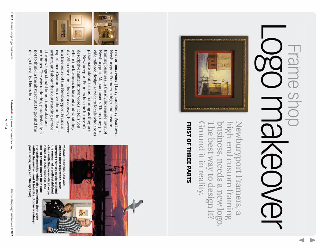
Logo makeoverFrame shop
Newburyport Framers, a high-end custom framing business, needs a new logo. The best way to design it? Ground it in reality. Continued first of three pArts
Continued

® X
Frame shop logo makeover 0707
Before&After BAmagazine.com i U XFrame shop logo makeover 2 of 8
2 of 8
frame shop logo makeoverTo create a new logo for a high-end custom-framing business, we turn abstract attributes into real images.
first of three pArts | Larry and Sherry Pearl own Newburyport Framers, a high-end custom framing business in the idyllic seaside town of Newburyport, Massachusetts. There, they pro-vide tailored design service to locals who are as passionate about art and framing as they are.
Newburyport Framers has the luxury of a descriptive name: in two words, it tells you where the business is located and what they do. What the name does not convey, however, is a true sense of the Newburyport Framers’ experience. Customers rave about the Pearls’ artistry, and about their outstanding service. The new logo should honor these abstract attributes. The way to do this, paradoxically, is not to think in the abstract but to ground the design in reality. Here’s how.
to boost their business and expand their reputation, New-buryport framers needs to blend the renown of a well-established chain with the personalized expe-rience of a local business. the design should convey their supe-rior craftsmanship while also anchoring their work within the environment it inhabits. (Above: Newbury-port harbor, Larry and sherry pearl)
® X
Frame shop logo makeover 0707
Before&After BAmagazine.com i U XFrame shop logo makeover 3 of 8
3 of 8
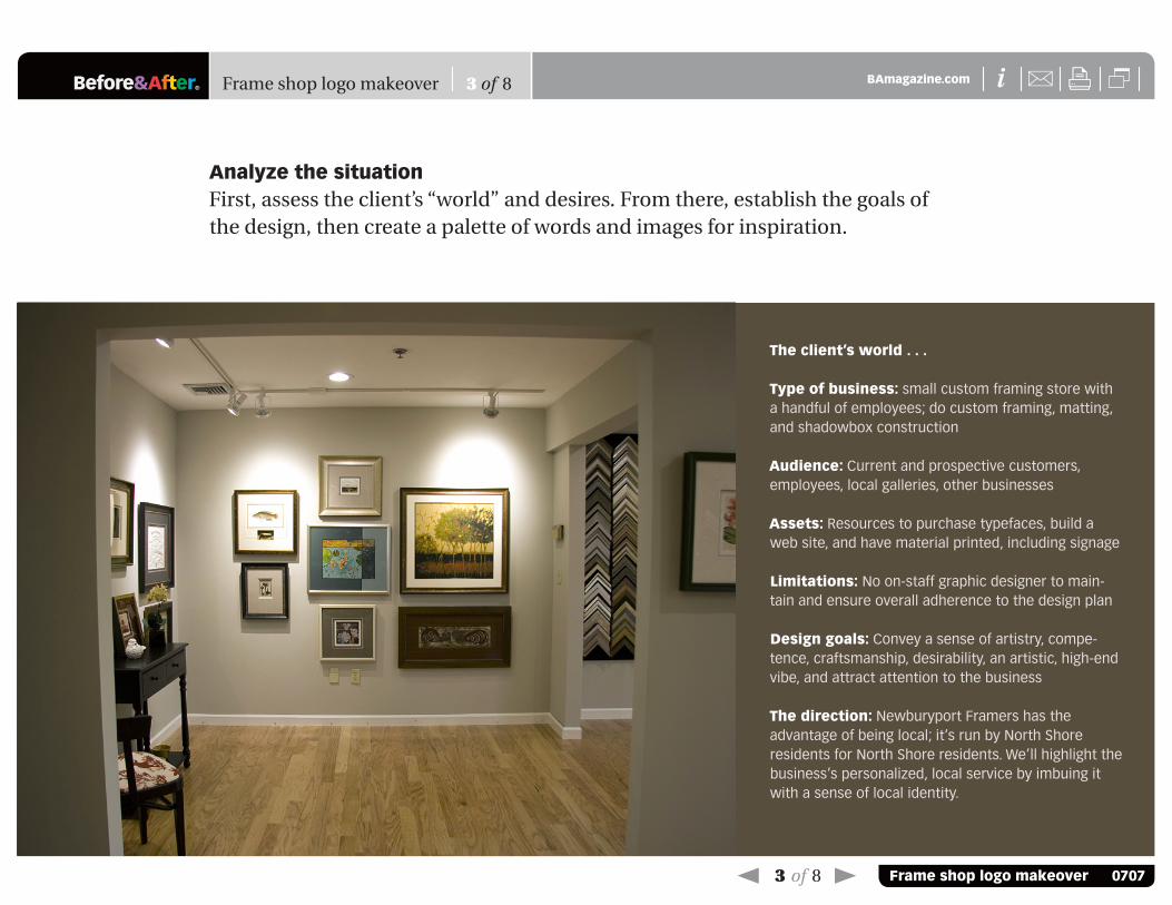
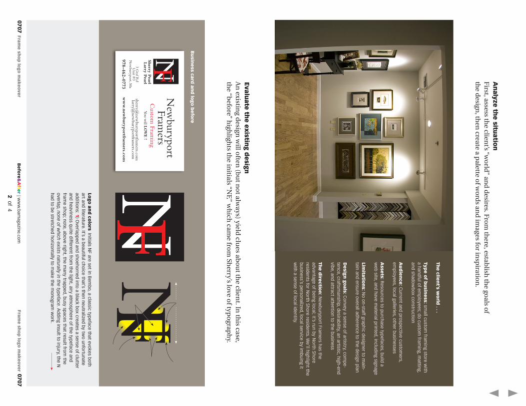
Analyze the situationFirst, assess the client’s “world” and desires. From there, establish the goals of the design, then create a palette of words and images for inspiration.
the client’s world . . .
type of business: small custom framing store with a handful of employees; do custom framing, matting, and shadowbox construction
Audience: Current and prospective customers, employees, local galleries, other businesses
Assets: Resources to purchase typefaces, build a web site, and have material printed, including signage
Limitations: No on-staff graphic designer to main-tain and ensure overall adherence to the design plan
Design goals: Convey a sense of artistry, compe-tence, craftsmanship, desirability, an artistic, high-end vibe, and attract attention to the business
the direction: Newburyport Framers has the advantage of being local; it’s run by North Shore residents for North Shore residents. We’ll highlight the business’s personalized, local service by imbuing it with a sense of local identity.

® X
Frame shop logo makeover 0707
Before&After BAmagazine.com i U XFrame shop logo makeover 4 of 8
4 of 8
evaluate the existing designAn existing design will often (but not always) yield clues about the client. In this case, the “before” highlights the initials “NF,” which came from Sherry’s love of typography.
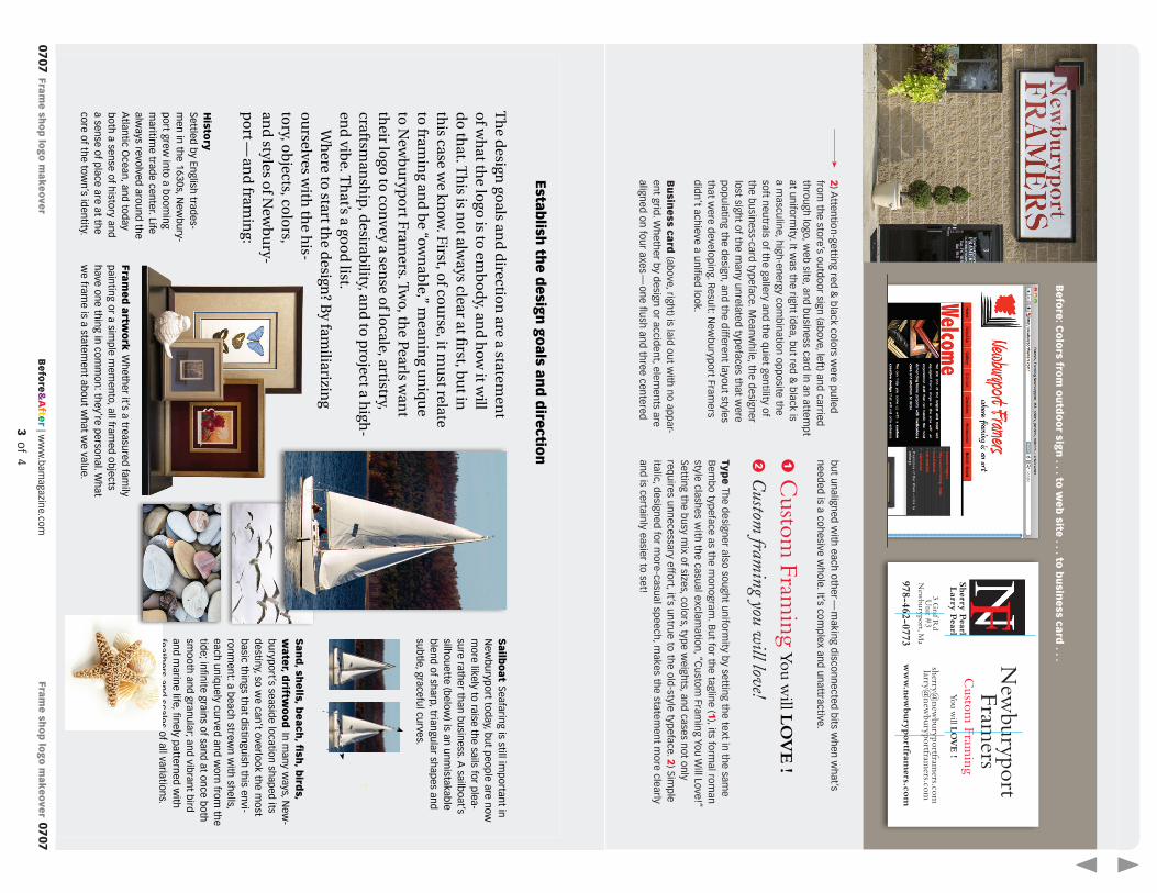
Logo and colors Initials NF are set in Bembo, a classic typeface that evokes both art and literature. It’s a beautiful choice that’s then neutralized by two unfortunate additions: 1) Overlapped and shoehorned into a black box creates a sense of clutter and heaviness quite different from the light, airy atmosphere of the typeface and frame shop; note, above right, the many trapped, busy spaces that result from the overlap, none of which exists naturally in the typeface. Adding insult to injury, the N had to be stretched horizontally to make the monogram work.
Business card and logo before
Newburyport Framers
Custom Framing You will LOVE !
[email protected] [email protected]
www.newburyportframers.com
3 Graf Rd Unit #3
Newburyport, Ma
978-462-0773
Sherry Pearl Larry Pearl

® X
Frame shop logo makeover 0707
Before&After BAmagazine.com i U XFrame shop logo makeover 5 of 8
5 of 8
but unaligned with each other — making disconnected bits when what’s needed is a cohesive whole. It’s complex and unattractive.
type The designer also sought uniformity by setting the text in the same Bembo typeface as the monogram. But for the tagline (1), its formal roman style clashes with the casual exclamation, “Custom Framing You Will Love!” Setting the busy mix of sizes, colors, type weights, and cases not only requires unnecessary effort, it’s untrue to the old-style typeface. 2) Simple italic, designed for more-casual speech, makes the statement more clearly and is certainly easier to set!
2) Attention-getting red & black colors were pulled from the store’s outdoor sign (above, left) and carried through logo, web site, and business card in an attempt at uniformity. It was the right idea, but red & black is a masculine, high-energy combination opposite the soft neutrals of the gallery and the quiet gentility of the business-card typeface. Meanwhile, the designer lost sight of the many unrelated typefaces that were populating the design, and the different layout styles that were developing. Result: Newburyport Framers didn’t achieve a unified look.
Business card (above, right) is laid out with no appar-ent grid. Whether by design or accident, elements are aligned on four axes — one flush and three centered
Before: Colors from outdoor sign . . . to web site . . . to business card . . .
Custom Framing You will LOVE !
Custom framing you will love!
1
2
Newburyport Framers
Custom Framing You will LOVE !
[email protected] [email protected]
www.newburyportframers.com
3 Graf Rd Unit #3
Newburyport, Ma
978-462-0773
Sherry Pearl Larry Pearl

® X
Frame shop logo makeover 0707
Before&After BAmagazine.com i U XFrame shop logo makeover 6 of 8
6 of 8
history Settled by English trades-men in the 1630s, Newbury-port grew into a booming maritime trade center. Life always revolved around the Atlantic Ocean, and today both a sense of history and a sense of place are at the core of the town’s identity.
sailboat Seafaring is still important in Newburyport today, but people are now more likely to raise the sails for plea-sure rather than business. A sailboat’s silhouette (below) is an unmistakable blend of sharp, triangular shapes and subtle, graceful curves.
sand, shells, beach, fish, birds, water, driftwood In many ways, New-buryport’s seaside location shaped its destiny, so we can’t overlook the most basic things that distinguish this envi-ronment: a beach strewn with shells, each uniquely curved and worn from the tide; infinite grains of sand at once both smooth and granular; and vibrant bird and marine life, finely patterned with feathers and scales of all variations.
framed artwork Whether it’s a treasured family painting or a simple memento, all framed objects have one thing in common: they’re personal. What we frame is a statement about what we value.
establish the design goals and direction
The design goals and direction are a statement of what the logo is to embody, and how it will do that. This is not always clear at first, but in this case we know. First, of course, it must relate to framing and be “ownable,” meaning unique to Newburyport Framers. Two, the Pearls want their logo to convey a sense of locale, artistry, craftsmanship, desirability, and to pro ject a high-end vibe. That’s a good list.
Where to start the design? By familiarizing ourselves with the his-tory, ob jects, colors, and styles of Newbury-port — and framing:

® X
Frame shop logo makeover 0707
Before&After BAmagazine.com i U XFrame shop logo makeover 7 of 8
7 of 8
Colors Black, gold, and woods like cherry and walnut are classic frame choices, while the clients recently repainted their shop interior (left) a sand color with undertones of gray. They also expressed a preference for soft grays and other pale tones, like the color of bleached driftwood (below, left).
BLACKSMITH
Architecture As the name sug-gests, New England bears many resemblances to Old England, partic-ularly in terms of architecture. New-buryport’s stately brick buildings and cobblestone streets make the down-town area feel suspended in time. In addition, the signs in the town’s
old port area are unique to each business, and recall ancient shop signs (anchors for blacksmiths,
bread for bakers, and so on). Their dynamic use of three-dimensional figures and creative, non-rectangular shapes indicate that they not only tell customers what the business does; they speak volumes about the character of the business itself.
frames (modern, vintage, corners) Frames come in nearly every design, color, shape, and size. Whether ornate or simplistic, bright primary colors or demure shades of brown, rectangular or oval, or big or small, the frame corner is any framing store’s most distinctive silhouette.
Coming in part 2 With creative brief and research in hand, next will come the fun of working out the design, from concept to sketch to final rendering.
typography Because Newburyport is such a storied town, we should look to the past for typographical inspira-tion. Here we’ve pulled examples from wood carvings, his-torical signs, manuscripts, and lithographs. Each typeface has serifs, is easy to read, and has stood the test of time.
® X
Frame shop logo makeover 0707
Before&After BAmagazine.com i U X
8 of 8 | Printing formats
Frame shop logo makeover 8 of 8
Before & After magazine Before & After has been sharing its practical approach to graphic design since 1990. Because our modern world has made designers of us all (ready or not), Before & After is dedicated to making graphic design understand-able, useful and even fun for everyone.
John McWade Publisher and creative directorGaye McWade Associate publisherDexter Mark Abellera Senior designerKristine fuangtharnthip Writer, summer intern Before & After magazine323 Lincoln Street, Roseville, CA 95678 Telephone 916-784-3884 Fax 916-784-3995E-mail [email protected] www http://www.bamagazine.com
Copyright ©2014 Before & After magazine issN 1049-0035. All rights reserved
You may pass along a free copy of this article to others by clicking here. You may not alter this article, and you may not charge for it. You may quote brief sections for review; please credit Before & After magazine, and let us know. To link Before & After magazine to your Web site, use this URL: http://www.bamagazine.com. For all other permissions, please contact us.
subscribe to Before & After
Subscribe to Before & After, and become a
more capable, confident designer for pennies
per article. To learn more, go to
http://www.bamagazine.com/Subscribe
e-mail this article
To pass along a free copy of this article to
others, click here.
Join our e-list
To be notified by e-mail of new articles as
they become available, go to
http://www.bamagazine.com/email
® XBefore&After BAmagazine.com i U X
Back | Paper-saver format
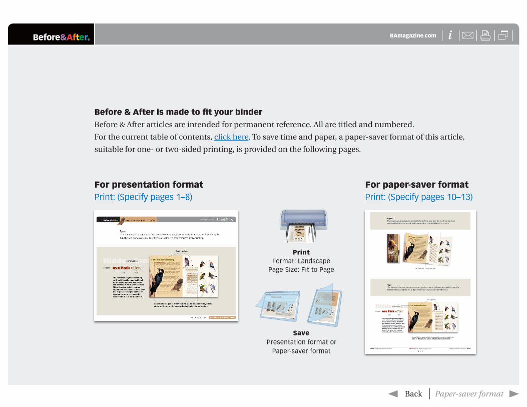
for paper-saver format Print: (Specify pages 10–13)
for presentation format Print: (Specify pages 1–8)
print Format: Landscape
Page Size: Fit to Page
savePresentation format or
Paper-saver format
Before & After is made to fit your binder
Before & After articles are intended for permanent reference. All are titled and numbered.
For the current table of contents, click here. To save time and paper, a paper-saver format of this article,
suitable for one- or two-sided printing, is provided on the following pages.
Be
fore
&A
fter | w
ww
.bamagazine.com
1 of 4
Fra
me
sho
p lo
go
ma
ke
ove
r 07070707
Fra
me
sho
p lo
go
ma
ke
ove
r
®X
Frame
sho
p lo
go
mak
eo
ver
0707
Befo
re&A
fter B
Am
agazin
e.com
iUX
Logo makeover
Frame shopN
ewb
uryp
ort Framers, a
high
-end
custom
framin
g b
usin
ess, need
s a new
logo. T
he b
est way to d
esign it?
Grou
nd
it in reality. C
ontin
ued
�
FIR
ST O
F THR
EE
PAR
TS
Con
tinu
ed �
®X
Frame
sho
p lo
go
mak
eo
ver
0707
Befo
re&A
fter B
Am
agazin
e.com
iUX
�
2 of 8 | P
rintin
g formats �
Frame sh
op
logo
makeover
2 of 8
Frame sh
op logo
makeover
To create a new logo for a high-end, custom
-framing business,
we turn abstract attributes into real im
ages.
FIRS
T OF TH
RE
E PA
RTS
| Larry and
Sherry Pearl ow
n
New
bu
rypo
rt Framers, a h
igh-en
d cu
stom
fram
ing b
usin
ess in th
e idyllic seasid
e town
of
New
bu
rypo
rt, Massach
usetts. T
here, th
ey pro
-vid
e tailored
design
service to lo
cals wh
o are as
passio
nate ab
ou
t art and
framin
g as they are.
New
bu
rypo
rt Framers h
as the lu
xury o
f a d
escriptive n
ame: in
two
wo
rds, it tells yo
u
wh
ere the b
usin
ess is located
and
wh
at they
do. W
hat th
e nam
e do
es no
t con
vey, how
ever, is a tru
e sense o
f the N
ewb
uryp
ort Fram
ers’ exp
erience. C
usto
mers rave ab
ou
t the Pearls’
artistry, and
abo
ut th
eir ou
tstand
ing service.
Th
e new
logo
sho
uld
ho
no
r these ab
stract attrib
utes. T
he w
ay to d
o th
is, parad
oxically, is n
ot to
thin
k in th
e abstract b
ut to
grou
nd
the
design
in reality. H
ere’s how
.
To b
oo
st the
ir bu
sine
ss an
d
ex
pa
nd
the
ir rep
uta
tion
, Ne
w-
bu
rypo
rt Fra
me
rs ne
ed
s to b
len
d
the
ren
ow
n o
f a w
ell-e
stab
lishe
d
cha
in w
ith th
e p
erso
na
lized
ex
pe
-rie
nce
of a
loca
l bu
sine
ss. The
d
esig
n sh
ou
ld co
nve
y the
ir sup
e-
rior cra
ftsma
nsh
ip w
hile
also
an
cho
ring
the
ir wo
rk
with
in th
e e
nviro
nm
en
t it inh
ab
its. (Ab
ove
: Ne
wb
ury-
po
rt Ha
rbo
r, Larry a
nd
Sh
erry P
ea
rl)
Be
fore
&A
fter | w
ww
.bamagazine.com
2 of 4
Fra
me
sho
p lo
go
ma
ke
ove
r 07070707
Fra
me
sho
p lo
go
ma
ke
ove
r
®X
Frame
sho
p lo
go
mak
eo
ver
0707
Befo
re&A
fter B
Am
agazin
e.com
iUX
Frame sh
op
logo
makeover
3 of 8
�
3 of 8 �
An
alyze th
e situ
ation
First, assess th
e client’s “w
orld
” and
desires. Fro
m th
ere, establish
the go
als of
the d
esign, th
en create a p
alette of w
ord
s and
images fo
r insp
iration
.
The
clien
t’s wo
rld . . .
Type
of b
usin
ess: sm
all custom fram
ing store with
a handful of employees; do custom
framing, m
atting, and shadow
box construction
Au
die
nce
: Current and prospective custom
ers, em
ployees, local galleries, other businesses
Asse
ts: Resources to purchase typefaces, build a
web site, and have m
aterial printed, including signage
Limita
tion
s: No on-staff graphic designer to m
ain-tain and ensure overall adherence to the design plan
De
sign
go
als: C
onvey a sense of artistry, compe-
tence, craftsmanship, desirability, an artistic, high-end
vibe, and attract attention to the business
The
dire
ction
: New
buryport Framers has the
advantage of being local; it’s run by North Shore
residents for North Shore residents. W
e’ll highlight the business’s personalized, local service by im
buing it w
ith a sense of local identity.
®X
Frame
sho
p lo
go
mak
eo
ver
0707
Befo
re&A
fter B
Am
agazin
e.com
iUX
Frame sh
op
logo
makeover
4 of 8
�
4 of 8 �
Evalu
ate th
e e
xistin
g d
esig
nA
n existin
g design
will o
ften (b
ut n
ot alw
ays) yield clu
es abo
ut th
e client. In
this case,
the “b
efore” h
ighligh
ts the in
itials “NF,” w
hich
came fro
m Sh
erry’s love of typ
ograp
hy.
Log
o a
nd
colo
rs Initials NF are set in B
embo, a classic typeface that evokes both
art and literature. It’s a beautiful choice that’s then neutralized by two unfortunate
additions: 1) O
verlapped and shoehorned into a black box creates a sense of clutter and heaviness quite different from
the light, airy atmosphere of the typeface and
frame shop; note, above right, the m
any trapped, busy spaces that result from the
overlap, none of which exists naturally in the typeface. A
dding insult to injury, the N
had to be stretched horizontally to make the m
onogram w
ork.
Bu
sine
ss card
an
d lo
go
be
fore
New
buryportFram
ersC
ustom Fram
ingYou w
ill LO
VE !
sherry@new
buryportframers.com
larry@new
buryportframers.com
ww
w.n
ewburyp
ortfram
ers.com
3 Graf R
dU
nit #3
New
buryport, Ma
978-462-0773
Sherry P
earlLarry P
earl
Be
fore
&A
fter | w
ww
.bamagazine.com
3 of 4
Fra
me
sho
p lo
go
ma
ke
ove
r 07070707
Fra
me
sho
p lo
go
ma
ke
ove
r
®X
Frame
sho
p lo
go
mak
eo
ver
0707
Befo
re&A
fter B
Am
agazin
e.com
iUX
�
5 of 8 | P
rintin
g formats �
Frame sh
op
logo
makeover
5 of 8
but unaligned with each other —
making disconnected bits w
hen what’s
needed is a cohesive whole. It’s com
plex and unattractive.
Type
The designer also sought uniformity by setting the text in the sam
e B
embo typeface as the m
onogram. B
ut for the tagline (1), its form
al roman
style clashes with the casual exclam
ation, “Custom
Framing You W
ill Love!” Setting the busy m
ix of sizes, colors, type weights, and cases not only
requires unnecessary effort, it’s untrue to the old-style typeface. 2) Sim
ple italic, designed for m
ore-casual speech, makes the statem
ent more clearly
and is certainly easier to set!
2) A
ttention-getting red & black colors w
ere pulled from
the store’s outdoor sign (above, left) and carried through logo, w
eb site, and business card in an attempt
at uniformity. It w
as the right idea, but red & black is
a masculine, high-energy com
bination opposite the soft neutrals of the gallery and the quiet gentility of the business-card typeface. M
eanwhile, the designer
lost sight of the many unrelated typefaces that w
ere populating the design, and the different layout styles that w
ere developing. Result: N
ewburyport Fram
ers didn’t achieve a unifi ed look.
Bu
sine
ss card
(above, right) is laid out with no appar-
ent grid. Whether by design or accident, elem
ents are aligned on four axes —
one fl ush and three centered
Be
fore
: Co
lors fro
m o
utd
oo
r sign
. . . to w
eb
site . . . to
bu
sine
ss card
. . .
Custom
Framing You w
ill LO
VE !
Custom
framing you w
ill love!
12
New
buryportFram
ersC
ustom Fram
ingYou w
ill LO
VE !
sherry@new
buryportframers.com
larry@new
buryportframers.com
ww
w.n
ewburyp
ortfram
ers.com
3 Graf R
dU
nit #3
New
buryport, Ma
978-462-0773
Sherry P
earlLarry P
earl
®X
Frame
sho
p lo
go
mak
eo
ver
0707
Befo
re&A
fter B
Am
agazin
e.com
iUX
Frame sh
op
logo
makeover
6 of 8
�
6 of 8 �
Histo
ry Settled by English trades-m
en in the 1630s, New
bury-port grew
into a booming
maritim
e trade center. Life alw
ays revolved around the A
tlantic Ocean, and today
both a sense of history and a sense of place are at the core of the tow
n’s identity.
Sa
ilbo
at Seafaring is still im
portant in N
ewburyport today, but people are now
m
ore likely to raise the sails for plea-sure rather than business. A
sailboat’s silhouette (below
) is an unmistakable
blend of sharp, triangular shapes and subtle, graceful curves.
Sa
nd
, she
lls, be
ach
, fi sh, b
irds,
wa
ter, d
riftwo
od
In many w
ays, New
-buryport’s seaside location shaped its destiny, so w
e can’t overlook the most
basic things that distinguish this envi-ronm
ent: a beach strewn w
ith shells, each uniquely curved and w
orn from the
tide; infi nite grains of sand at once both sm
ooth and granular; and vibrant bird and m
arine life, fi nely patterned with
feathers and scales of all variations.
Fra
me
d a
rtwo
rk W
hether it’s a treasured family
painting or a simple m
emento, all fram
ed objects have one thing in com
mon: they’re personal. W
hat w
e frame is a statem
ent about what w
e value.
Estab
lish th
e d
esig
n g
oals an
d d
irectio
n
Th
e design
goals an
d d
irection
are a statemen
t o
f wh
at the lo
go is to
emb
od
y, and
how
it will
do
that. T
his is n
ot alw
ays clear at fi rst, bu
t in
this case w
e know
. First, of co
urse, it m
ust relate
to fram
ing an
d b
e “own
able,” m
eanin
g un
iqu
e to
New
bu
rypo
rt Framers. Tw
o, the Pearls w
ant
their lo
go to
con
vey a sense o
f locale, artistry,
craftsman
ship, d
esirability, an
d to
pro
ject a high
-en
d vib
e. Th
at’s a goo
d list.
Wh
ere to start th
e design
? By fam
iliarizing
ou
rselves with
the h
is-to
ry, ob
jects, colo
rs, an
d styles o
f New
bu
ry-p
ort —
and
framin
g:

Be
fore
&A
fter | w
ww
.bamagazine.com
4 of 4
Fra
me
sho
p lo
go
ma
ke
ove
r 07070707
Fra
me
sho
p lo
go
ma
ke
ove
r
®X
Frame
sho
p lo
go
mak
eo
ver
0707
Befo
re&A
fter B
Am
agazin
e.com
iUX
Frame sh
op
logo
makeover
7 of 8
�
7 of 8 �
Co
lors B
lack, gold, and woods like cherry and
walnut are classic fram
e choices, while the
clients recently repainted their shop interior (left) a sand color w
ith undertones of gray. They also expressed a preference for soft grays and other pale tones, like the color of bleached driftw
ood (below, left).
BL
AC
KS
MIT
H
Arch
itectu
re A
s the name sug-
gests, New
England bears many
resemblances to O
ld England, partic-ularly in term
s of architecture. New
-buryport’s stately brick buildings and cobblestone streets m
ake the down-
town area feel suspended in tim
e. In addition, the signs in the tow
n’s old port area are unique to each business, and recall ancient shop signs (anchors for blacksm
iths, bread for bakers, and so on). Their dynam
ic use of three-dimensional
fi gures and creative, non-rectangular shapes indicate that they not only tell custom
ers what the business
does; they speak volumes about the
character of the business itself.
Fra
me
s (mo
de
rn, vin
tag
e, co
rne
rs) Frames com
e in nearly every design, color, shape, and size. W
hether ornate or simplistic,
bright primary colors or dem
ure shades of brow
n, rectangular or oval, or big or sm
all, the frame
corner is any framing store’s
most distinctive silhouette.
Co
min
g in
Pa
rt 2W
ith creative brief and research in hand, next w
ill com
e the fun of working out
the design, from concept to
sketch to fi nal rendering.
Typo
gra
ph
y Because N
ewburyport is such a storied
town, w
e should look to the past for typographical inspira-tion. H
ere we’ve pulled exam
ples from w
ood carvings, his-torical signs, m
anuscripts, and lithographs. Each typeface has serifs, is easy to read, and has stood the test of tim
e.
®X
Frame
sho
p lo
go
mak
eo
ver
0707
Befo
re&A
fter B
Am
agazin
e.com
iUX
�
8 of 8 | P
rintin
g formats �
Frame sh
op
logo
makeover
8 of 8
Be
fore
& A
fter m
ag
azin
e
Befo
re & A
fter has b
een sh
aring its p
ractical app
roach
to grap
hic d
esign sin
ce 1990. Becau
se ou
r mo
dern
wo
rld h
as mad
e design
ers of u
s all (ready o
r no
t), Befo
re &
After is d
edicated
to m
aking grap
hic d
esign u
nd
erstand
-ab
le, usefu
l and
even fu
n fo
r everyon
e.
Joh
n M
cWa
de
Pu
blish
er and
creative directo
rG
ay
e M
cWa
de
Asso
ciate pu
blish
erD
ex
ter M
ark
Ab
elle
ra Sen
ior d
esigner
Kristin
e F
ua
ng
tha
rnth
ip W
riter, sum
mer in
tern
Be
fore
& A
fter m
ag
azin
e323 Lin
coln
Street, Ro
seville, CA
95678 Te
lep
ho
ne
916-784-3884 Fax 916-784-3995E
-mail m
ailbo
x@b
amagazin
e.com
w
ww
http
://ww
w.b
amagazin
e.com
Co
py
righ
t ©2014 B
efo
re &
Afte
r ma
ga
zine
ISS
N 1049-0035. A
ll righ
ts rese
rve
d
You
may p
ass alon
g a free cop
y of th
is article to o
thers
by clickin
g here. Yo
u m
ay no
t alter this article, an
d yo
u m
ay no
t charge fo
r it. You
may q
uo
te brief sectio
ns
for review
; please cred
it Befo
re & A
fter magazin
e, and
let us kn
ow
. To lin
k Befo
re & A
fter magazin
e to yo
ur
Web
site, use th
is UR
L: http
://ww
w.b
amagazin
e.com
. Fo
r all oth
er perm
ission
s, please co
ntact u
s.
Su
bscrib
e to
Be
fore
& A
fter
Sub
scribe to
Befo
re & A
fter, and
beco
me a
mo
re capab
le, con
fi den
t design
er for p
enn
ies
per article. To
learn m
ore, go
to
http
://ww
w.b
amagazin
e.com
/Sub
scribe
E-m
ail this article
To p
ass alon
g a free cop
y of th
is article to
oth
ers, click here.
Join
ou
r e-list
To b
e no
tifi ed b
y e-mail o
f new
articles as
they b
ecom
e available, go
to
http
://ww
w.b
amagazin
e.com
Related Documents