Basics of Web Design Chapter 3 Web Design Basics Key Concepts 1

Basics of Web Design Chapter 3 Web Design Basics Key Concepts 1.
Dec 23, 2015
Welcome message from author
This document is posted to help you gain knowledge. Please leave a comment to let me know what you think about it! Share it to your friends and learn new things together.
Transcript
Basics of Web Design
Chapter 3Web Design Basics
Key Concepts
1
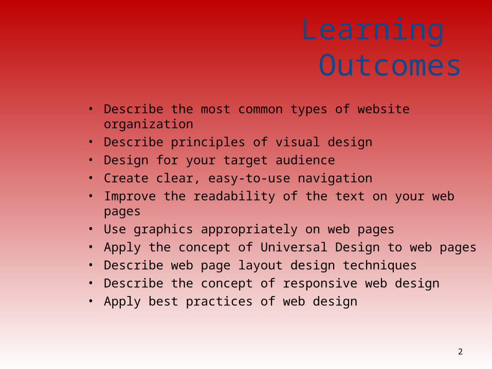
Learning Outcomes
• Describe the most common types of website organization• Describe principles of visual design • Design for your target audience• Create clear, easy-to-use navigation• Improve the readability of the text on your web pages• Use graphics appropriately on web pages• Apply the concept of Universal Design to web pages• Describe web page layout design techniques• Describe the concept of responsive web design• Apply best practices of web design
2
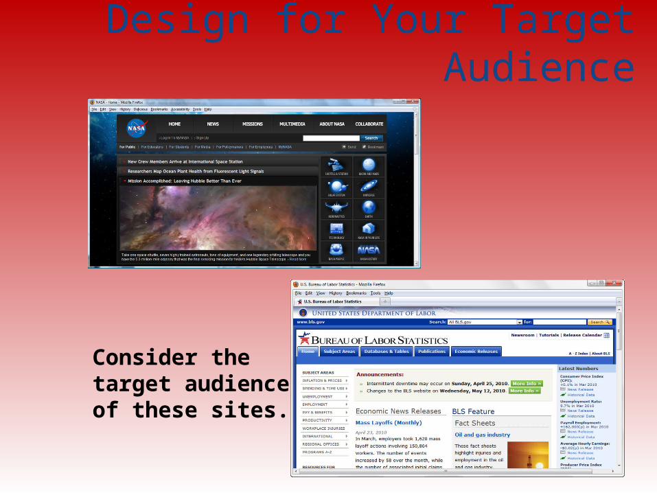
Design for Your Target Audience
3
Consider the target audienceof these sites.
Web Page Design Browser Compatibility
Web pages do NOT look the same in all the major browsers
Test with current and recent versions of: ◦ Internet Explorer◦ Firefox, Mozilla◦ Opera◦ Safari
Progressive Enhancement: Website functions well in browsers commonly used by your target audience Add enhancements with CSS3 and/or HTML5 for display in modern browsers
4
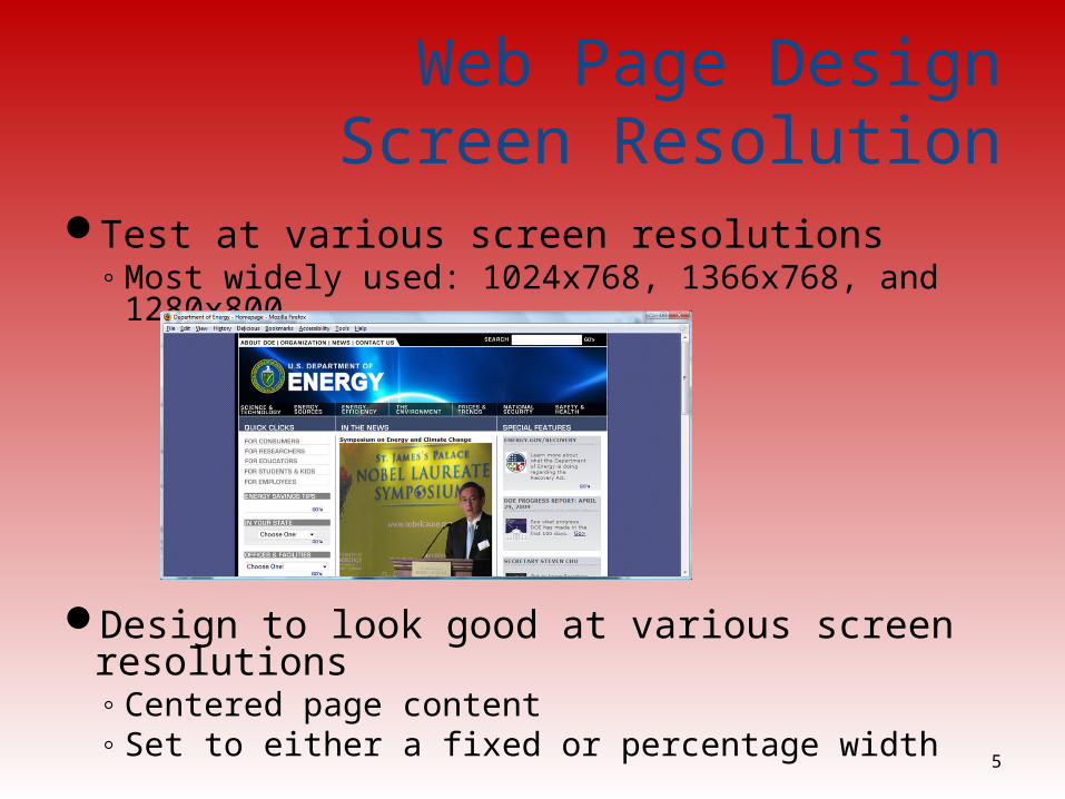
Web Page Design Screen Resolution
Test at various screen resolutions◦ Most widely used: 1024x768, 1366x768, and 1280x800
Design to look good at various screen resolutions◦ Centered page content ◦ Set to either a fixed or percentage width
5
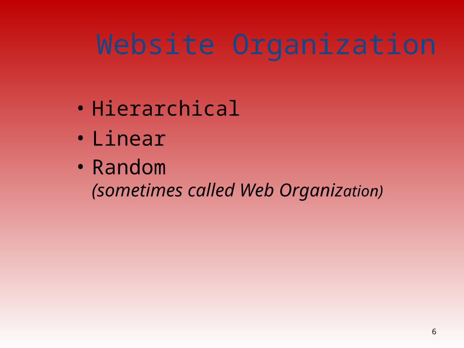
Website Organization
• Hierarchical• Linear• Random
(sometimes called Web Organization)
6
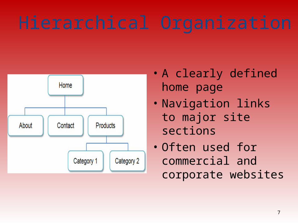
Hierarchical Organization
• A clearly defined home page
• Navigation links to major site sections
• Often used for commercial and corporate websites
7

Hierarchical: Too Shallow
• Be careful that the organization is not too shallow.• Too many immediate choices a confusing and less usable website.• Group, or “chunk”, related areas
8
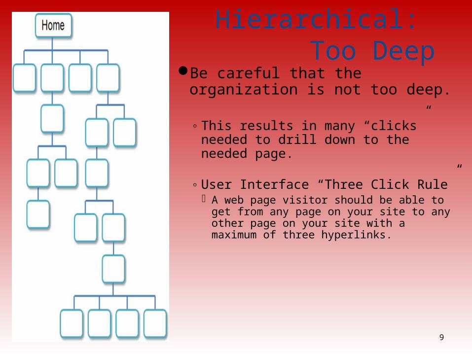
Hierarchical: Too Deep
Be careful that the organization is not too deep.
◦ This results in many “clicks” needed to drill down to the needed page.
◦ User Interface “Three Click Rule” A web page visitor should be able to get
from any page on your site to any other page on your site with a maximum of three hyperlinks.
9
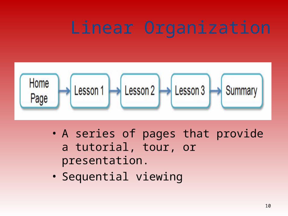
Linear Organization
• A series of pages that provide a tutorial, tour, or presentation.
• Sequential viewing
10
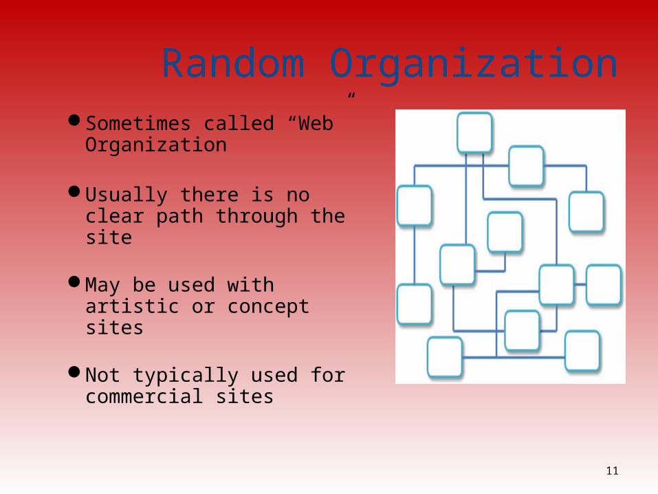
Random OrganizationSometimes called “Web”
Organization
Usually there is no clear path through the site
May be used with artistic or concept sites
Not typically used for commercial sites
11
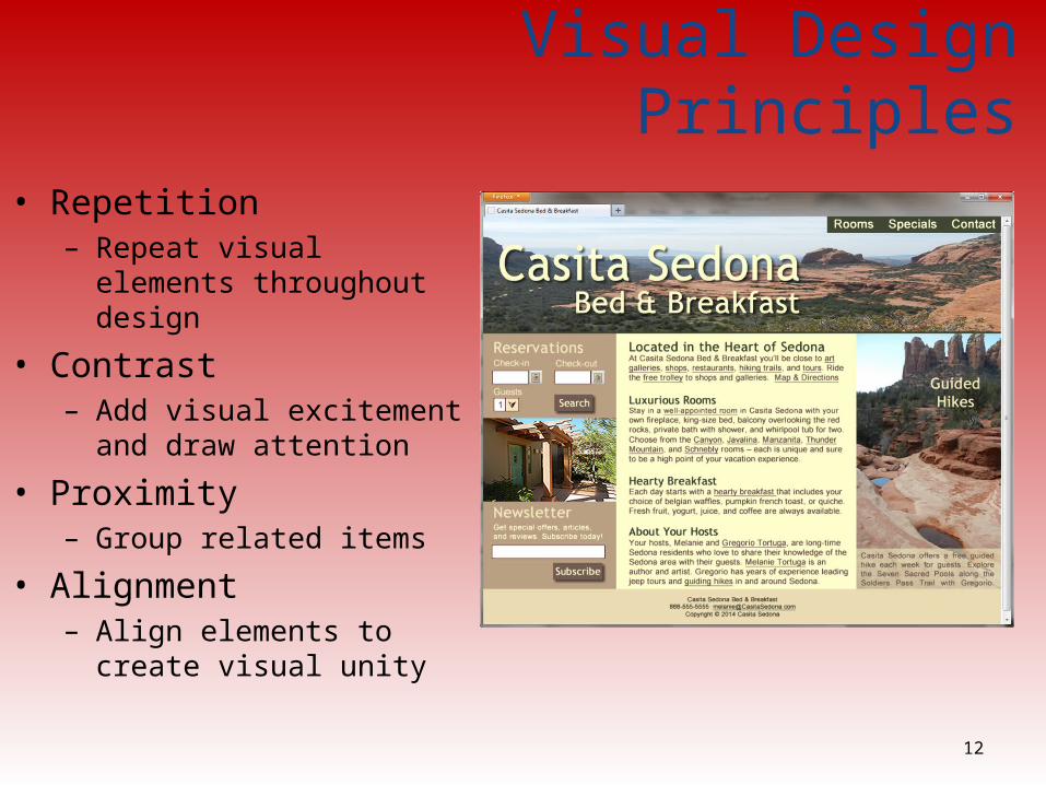
Visual Design Principles
• Repetition– Repeat visual elements
throughout design
• Contrast– Add visual excitement and
draw attention
• Proximity– Group related items
• Alignment– Align elements to create visual
unity
12
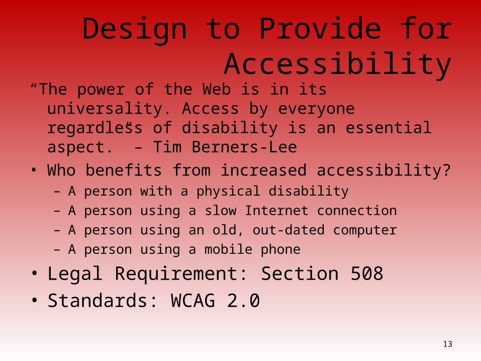
Design to Provide for Accessibility“The power of the Web is in its universality. Access by everyone
regardless of disability is an essential aspect.” – Tim Berners-Lee
• Who benefits from increased accessibility? – A person with a physical disability– A person using a slow Internet connection– A person using an old, out-dated computer– A person using a mobile phone
• Legal Requirement: Section 508• Standards: WCAG 2.0
13
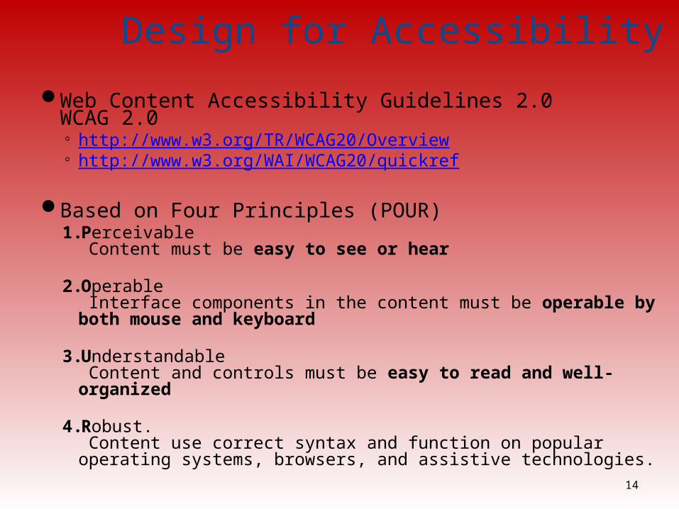
Design for Accessibility
Web Content Accessibility Guidelines 2.0WCAG 2.0◦ http://www.w3.org/TR/WCAG20/Overview◦ http://www.w3.org/WAI/WCAG20/quickref
Based on Four Principles (POUR)1. Perceivable
Content must be easy to see or hear
2. Operable Interface components in the content must be operable by both mouse and keyboard
3. Understandable Content and controls must be easy to read and well-organized
4. Robust. Content use correct syntax and function on popular operating systems, browsers, and assistive technologies.
14
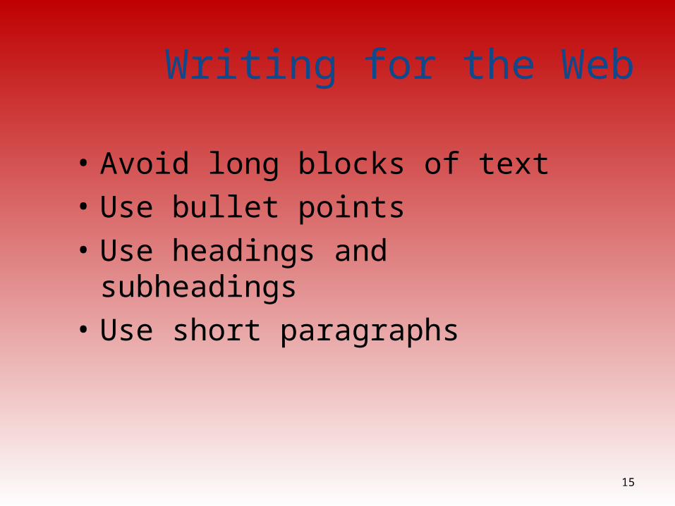
Writing for the Web
• Avoid long blocks of text • Use bullet points • Use headings and subheadings• Use short paragraphs
15
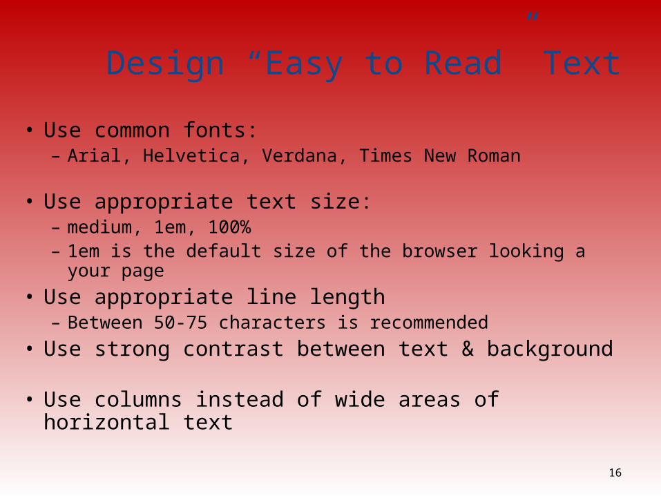
Design “Easy to Read” Text
• Use common fonts:– Arial, Helvetica, Verdana, Times New Roman
• Use appropriate text size: – medium, 1em, 100%– 1em is the default size of the browser looking a your page
• Use appropriate line length – Between 50-75 characters is recommended
• Use strong contrast between text & background
• Use columns instead of wide areas of horizontal text 16
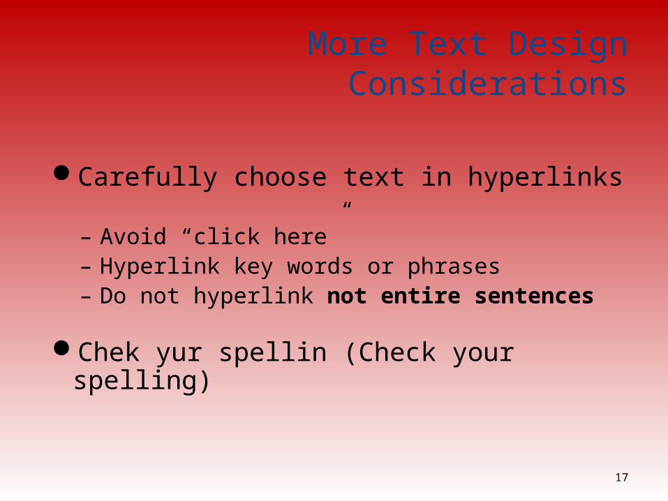
More Text Design Considerations
Carefully choose text in hyperlinks
– Avoid “click here” – Hyperlink key words or phrases– Do not hyperlink not entire sentences
Chek yur spellin (Check your spelling)
17
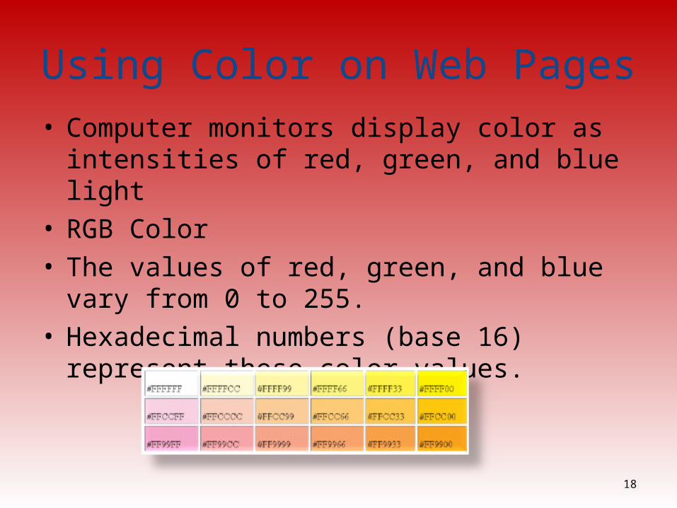
Using Color on Web Pages• Computer monitors display color as intensities of red,
green, and blue light• RGB Color• The values of red, green, and blue
vary from 0 to 255.• Hexadecimal numbers (base 16) represent these color
values.
18
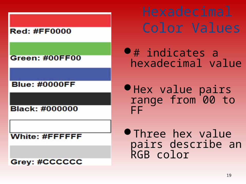
Hexadecimal Color Values
# indicates a hexadecimal value
Hex value pairs range from 00 to FF
Three hex value pairs describe an RGB color
19
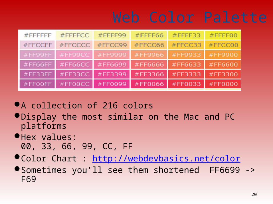
Web Color Palette
A collection of 216 colors Display the most similar on the Mac and PC platformsHex values:
00, 33, 66, 99, CC, FFColor Chart : http://webdevbasics.net/colorSometimes you’ll see them shortened FF6699 -> F69
20

Making Color Choices• How to choose a color scheme?– Monochromatic
• http://meyerweb.com/eric/tools/color-blend• http://www.0to255.com
– Choose from a photograph or other image• http://www.colr.org
– Begin with a favorite color• Use one of the sites below to choose other colors
– http://www.colorschemedesigner.com– http://www.colorsontheweb.com/colorwizard.asp
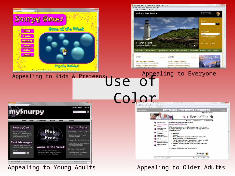
Use of ColorAppealing to Kids & Preteens
22Appealing to Young Adults
Appealing to Everyone
Appealing to Older Adults
Use of Graphics & Multimedia
File size and dimension matterProvide for robust navigationAntialiased/aliased text considerationsProvide alternate textUse only necessary multimedia
23
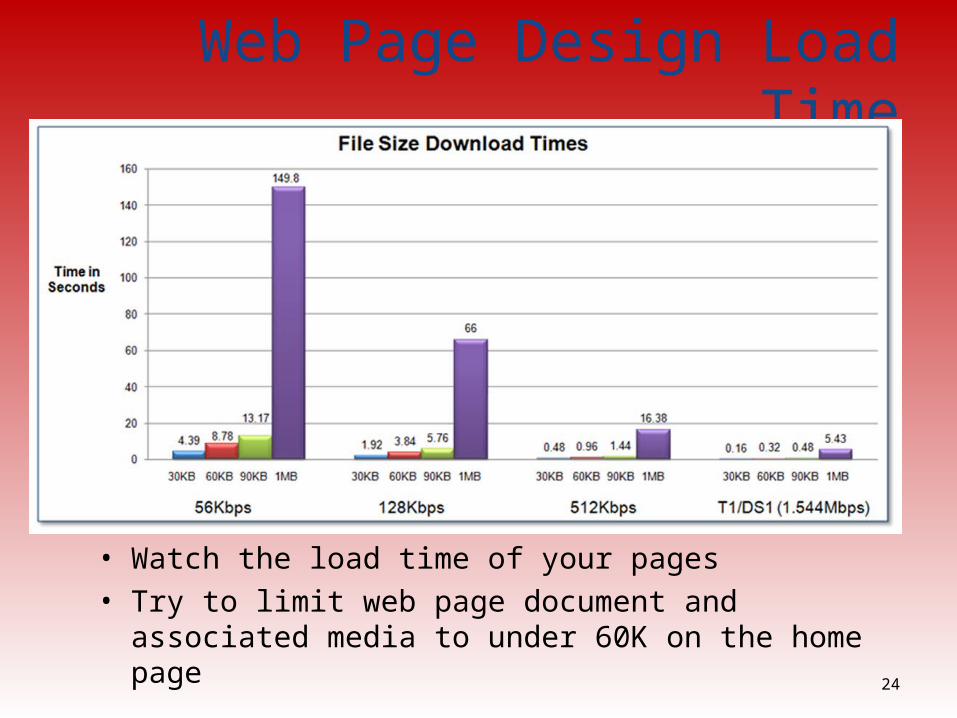
Web Page Design Load Time
• Watch the load time of your pages• Try to limit web page document and associated media to
under 60K on the home page24
Navigation Design• Make your site easy to navigate– Provide clearly labeled navigation in the same location on
each page– Most common – across top or down left side
• Consider:– Navigation Bars– Breadcrumb Navigation– Using Graphics for Navigation– Dynamic Navigation– Site Map– Site Search Feature
25
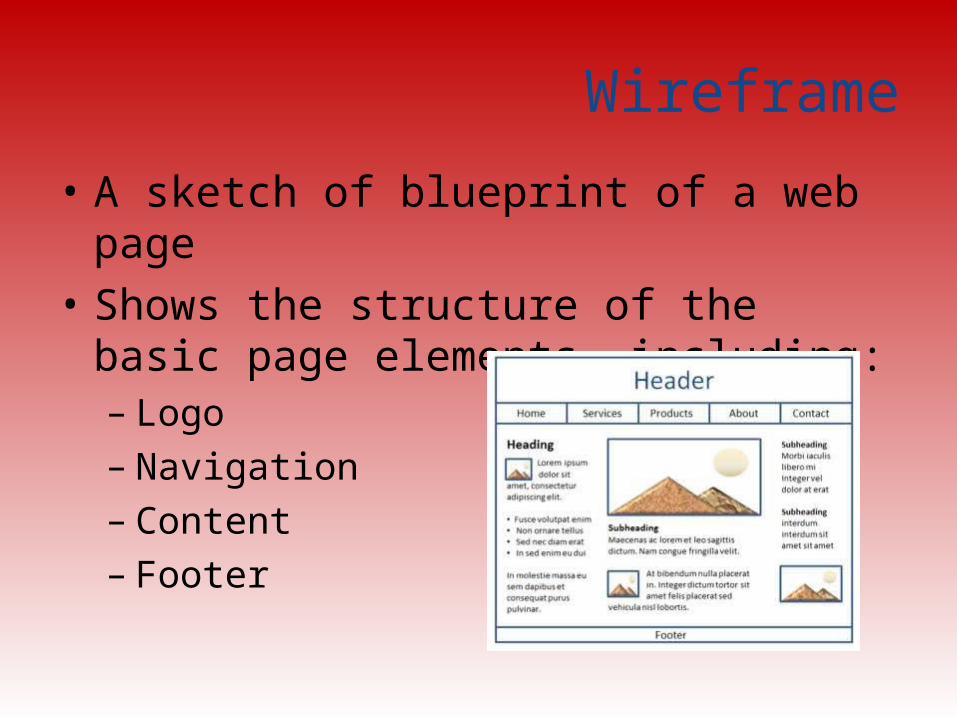
Wireframe
• A sketch of blueprint of a web page• Shows the structure of the basic page
elements, including:– Logo– Navigation– Content– Footer
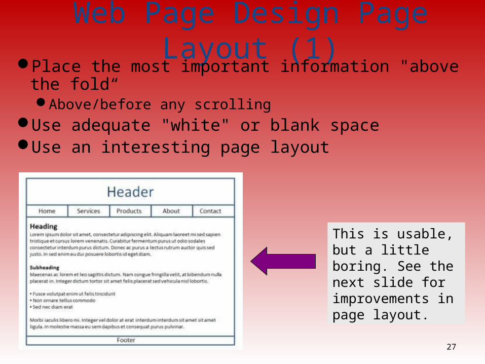
Web Page Design Page Layout (1)Place the most important information "above the fold“
Above/before any scrollingUse adequate "white" or blank space Use an interesting page layout
27
This is usable, but a little boring. See the next slide for improvements in page layout.
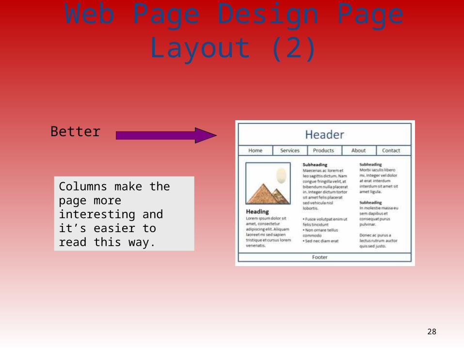
Web Page Design Page Layout (2)
Better
28
Columns make the page more interesting and it’s easier to read this way.
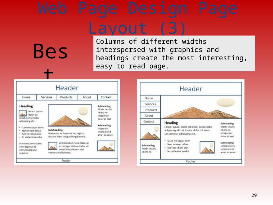
Web Page Design Page Layout (3)
29
BestColumns of different widths interspersed with graphics and headings create the most interesting, easy to read page.
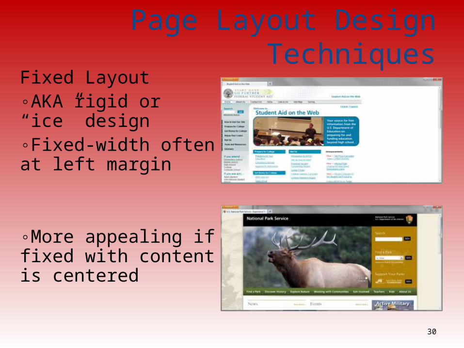
Page Layout Design TechniquesFixed Layout◦AKA rigid or “ice” design◦Fixed-width often at left margin
◦More appealing if fixed with content is centered
30
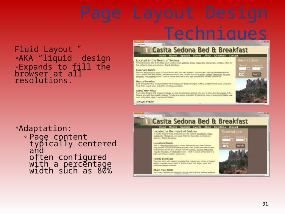
Page Layout Design TechniquesFluid Layout◦AKA “liquid” design◦Expands to fill the browser at all resolutions.
◦Adaptation: ◦ Page content typically
centered andoften configured with a percentage width such as 80%
31
Design for the Mobile Web
32
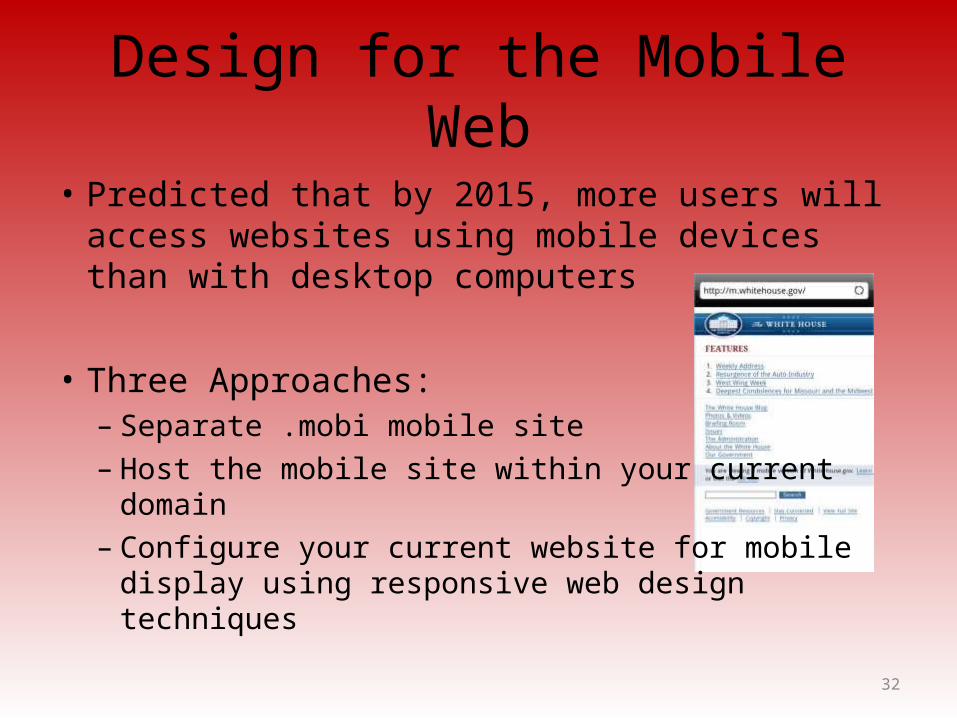
• Predicted that by 2015, more users will access websites using mobile devices than with desktop computers
• Three Approaches:– Separate .mobi mobile site– Host the mobile site within your current domain– Configure your current website for mobile display
using responsive web design techniques
Mobile Design Quick Checklist
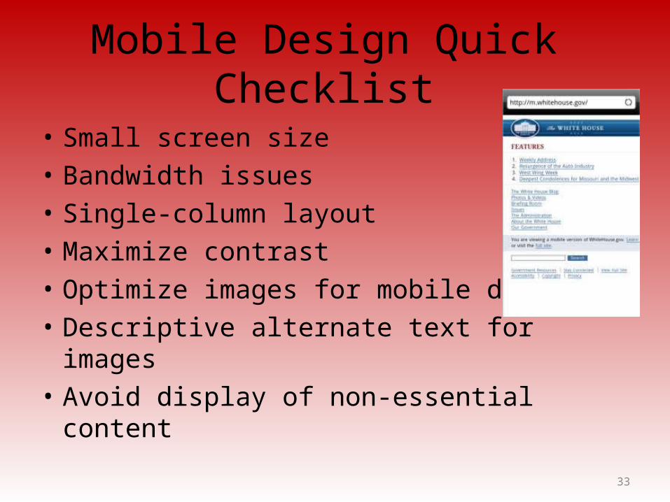
• Small screen size • Bandwidth issues• Single-column layout• Maximize contrast• Optimize images for mobile display• Descriptive alternate text for images• Avoid display of non-essential content
33

Responsive Web Design
• Ethan Marcotte, noted web developerhttp://www.alistapart.com/articles/responsive-web-design
• Progressively enhancing a web page for different viewing contexts (such as smartphones and tablets) through the use of coding techniques, including flexible layouts and media queries.
• Examples: http://mediaqueri.es/
34
Web Design Best Practices Checklist
http://terrymorris.net/bestpractices (author’s site)
35
•Page Layout•Browser Compatibility•Navigation•Color and Graphics•Multimedia•Content Presentation•Functionality•Accessibility
Summary
• This chapter introduced you to best practices of web design.
• The choices you make in the use of color, graphics, and text should be based on your particular target audience.
36
Related Documents