Basic Design Considerations Intention of the piece __________ Color Proportion Hierarchy Grouping __________ Consistency

Basic Design Considerations Intention of the piece __________ Color Proportion Hierarchy Grouping __________ Consistency.
Dec 15, 2015
Welcome message from author
This document is posted to help you gain knowledge. Please leave a comment to let me know what you think about it! Share it to your friends and learn new things together.
Transcript
Basic Design Considerations
Intention of the piece__________
Color
Proportion
Hierarchy
Grouping__________
Consistency
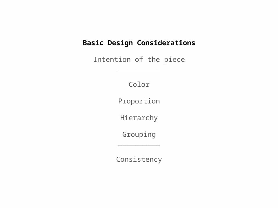
http://www.mariaclaudiacortes.com/colors/Colors.html
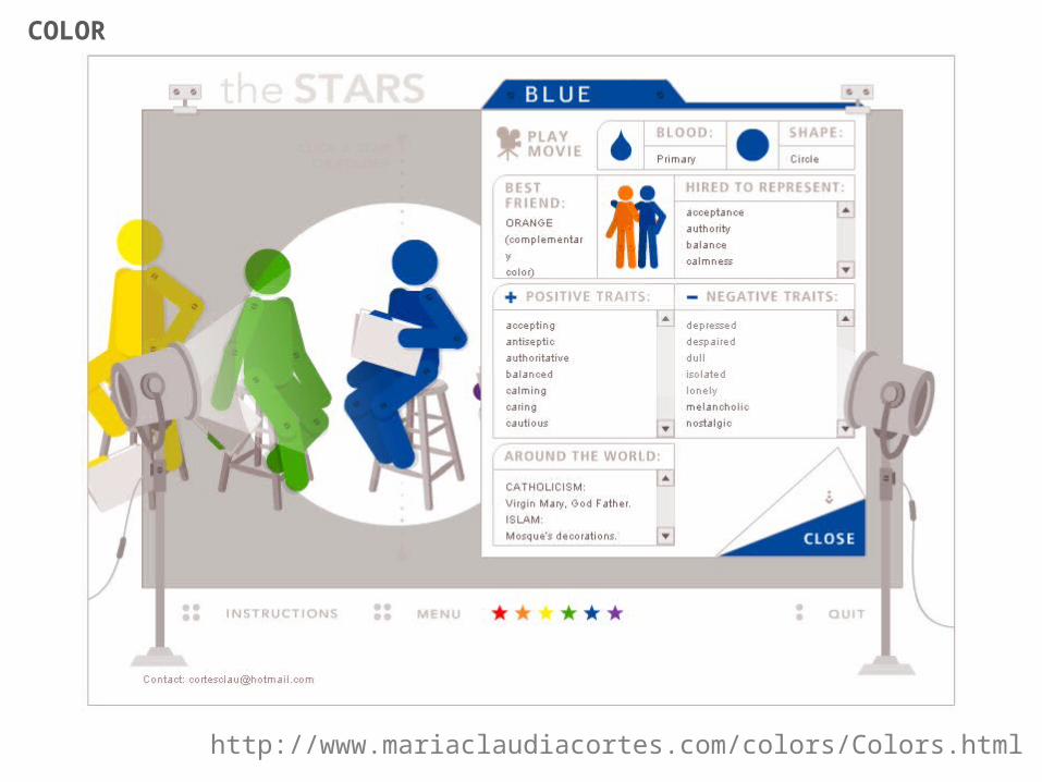
COLOR
COLOR
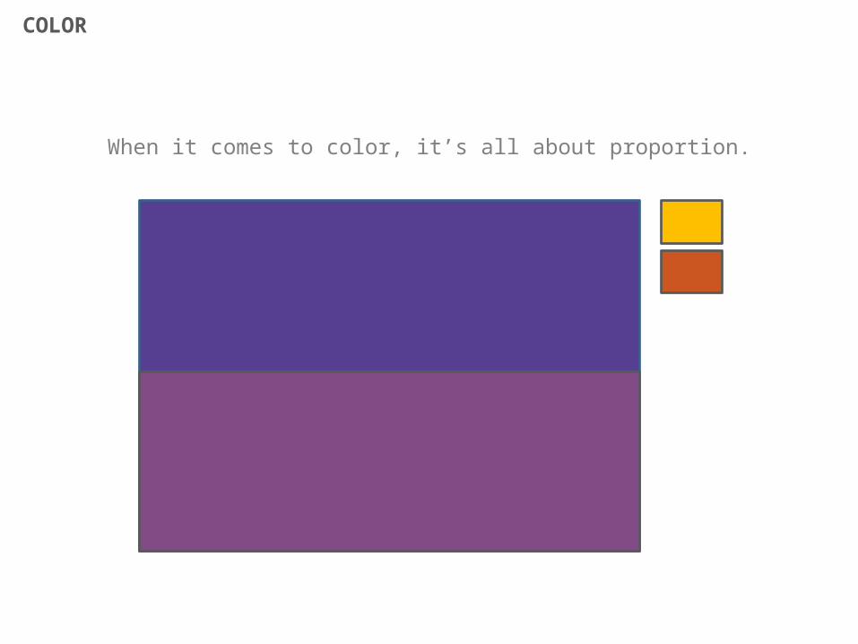
When it comes to color, it’s all about proportion.
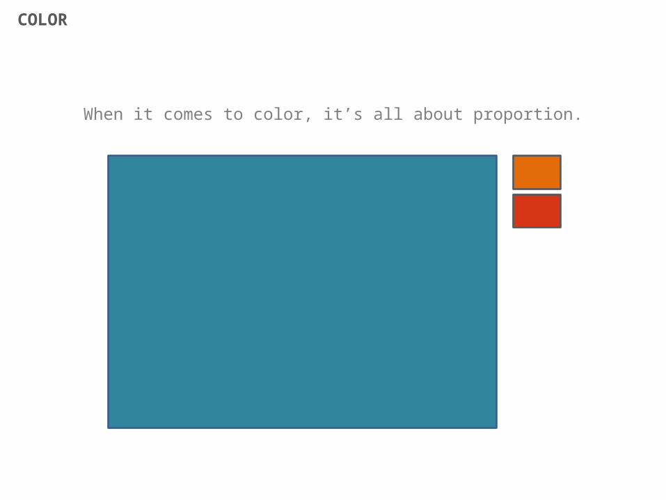
COLOR
When it comes to color, it’s all about proportion.
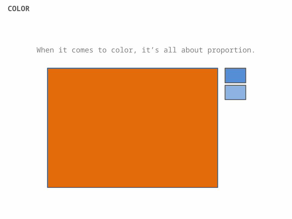
COLOR
When it comes to color, it’s all about proportion.
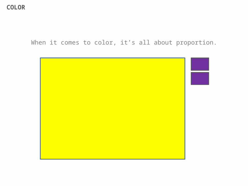
COLOR
When it comes to color, it’s all about proportion.
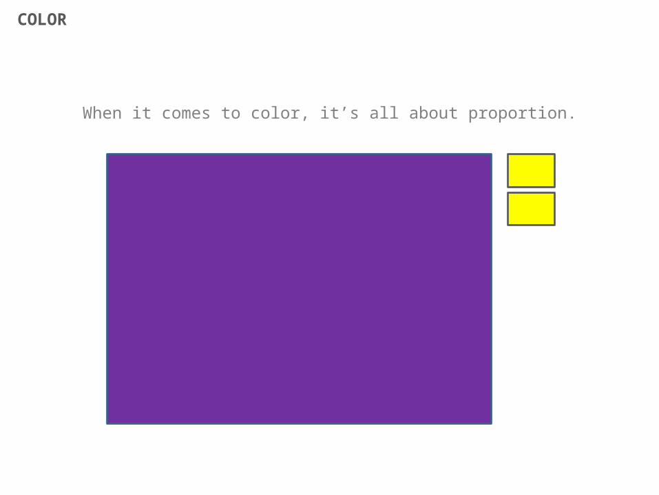
COLOR
When it comes to color, it’s all about proportion.
COLOR
When it comes to color, it’s all about proportion.
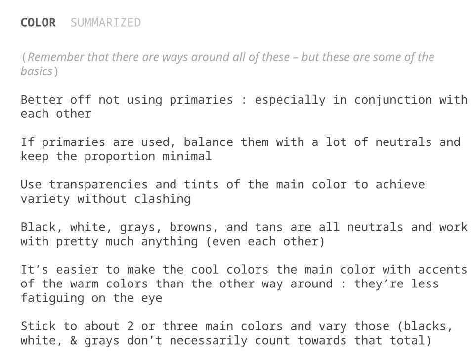
COLOR SUMMARIZED
(Remember that there are ways around all of these – but these are some of the basics)
Better off not using primaries : especially in conjunction with each other
If primaries are used, balance them with a lot of neutrals and keep the proportion minimal
Use transparencies and tints of the main color to achieve variety without clashing
Black, white, grays, browns, and tans are all neutrals and work with pretty much anything (even each other)
It’s easier to make the cool colors the main color with accents of the warm colors than the other way around : they’re less fatiguing on the eye
Stick to about 2 or three main colors and vary those (blacks, white, & grays don’t necessarily count towards that total)
It’s best to stick to predominantly white, black, grays when it comes to font color. Accent headers and different sections with color if you want.
http://veerle.duoh.com/blog/comments/choosing_color_combinations
http://adampolselli.com/2002/03/01/get-the-look-corporate/
http://adampolselli.com/2002/05/02/get-the-look-ultrahip/
http://adampolselli.com/2001/11/03/get-the-look-vintage/
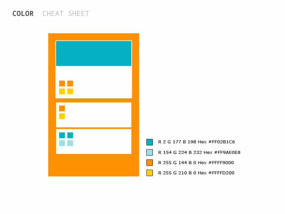
COLOR CHEAT SHEET

COLOR CHEAT SHEET
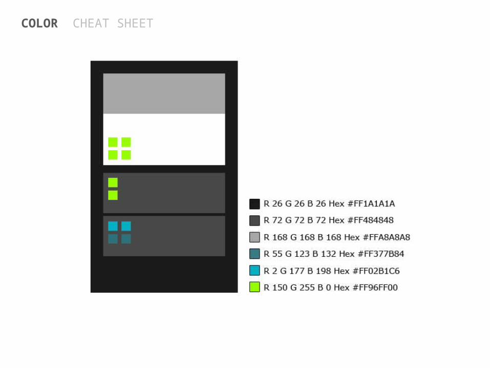
COLOR CHEAT SHEET
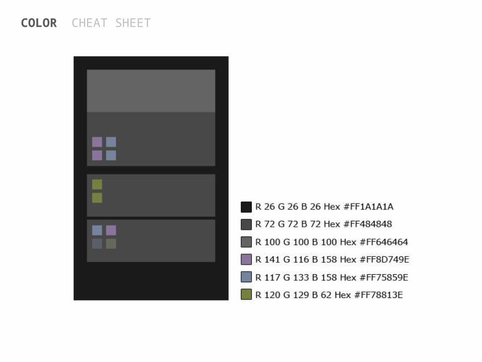
COLOR CHEAT SHEET
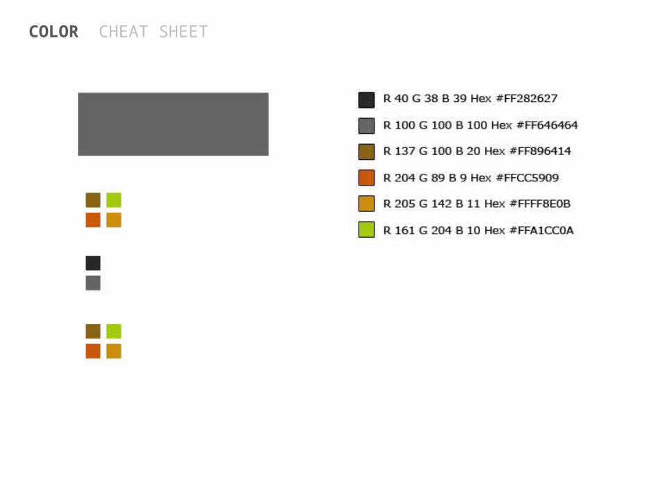
COLOR CHEAT SHEET
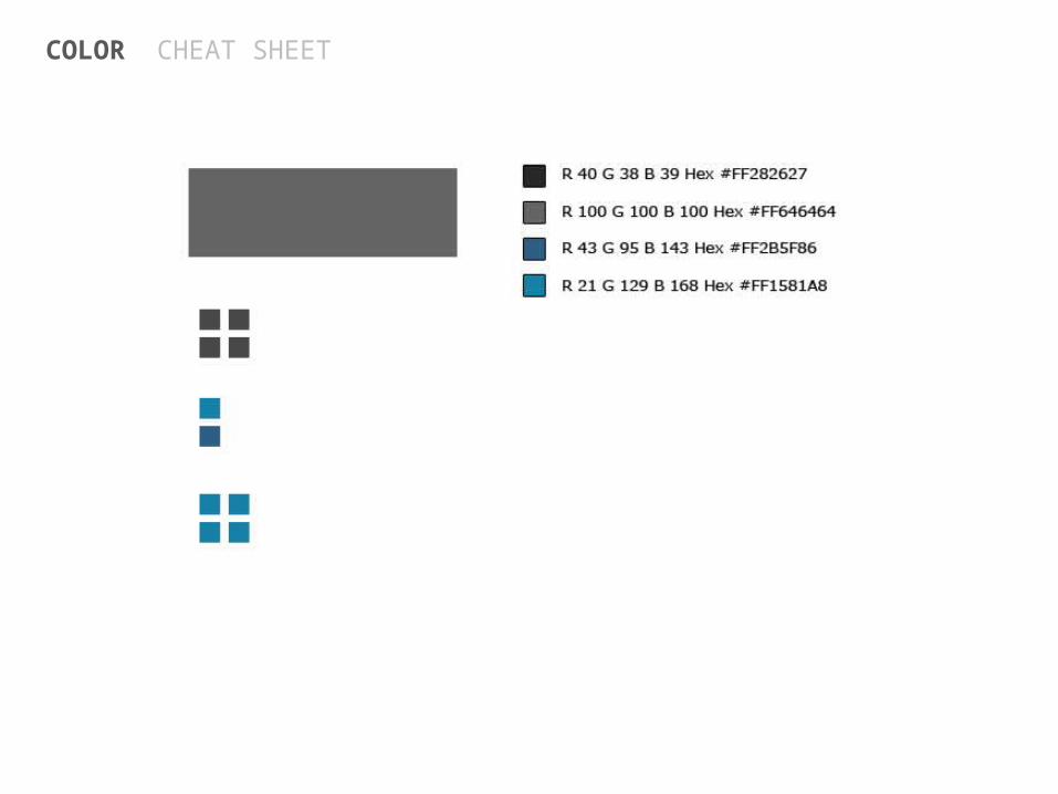
COLOR CHEAT SHEET
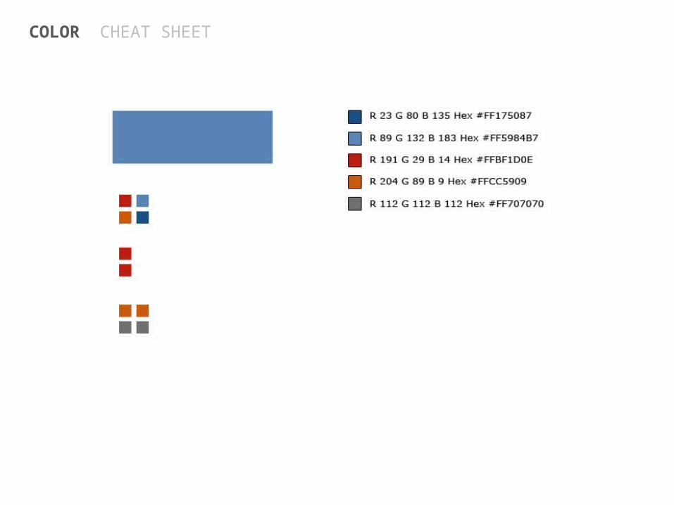
COLOR CHEAT SHEET
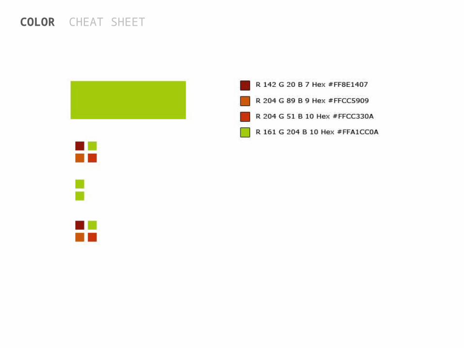
COLOR CHEAT SHEET
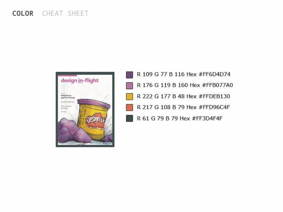
COLOR CHEAT SHEET
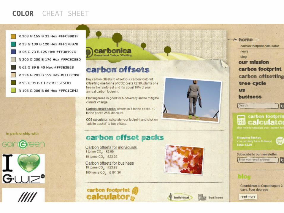
COLOR CHEAT SHEET
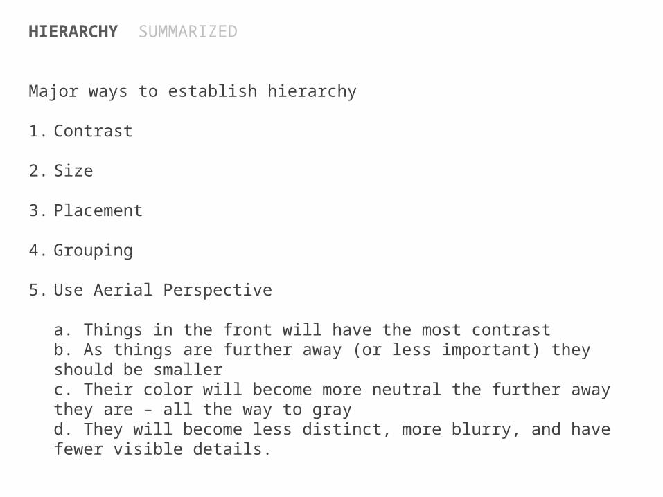
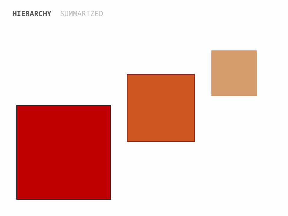
HIERARCHY SUMMARIZED
Major ways to establish hierarchy
1. Contrast
2. Size
3. Placement
4. Grouping
5. Use Aerial Perspective
a. Things in the front will have the most contrastb. As things are further away (or less important) they should be smallerc. Their color will become more neutral the further away they are – all the way to grayd. They will become less distinct, more blurry, and have fewer visible details.
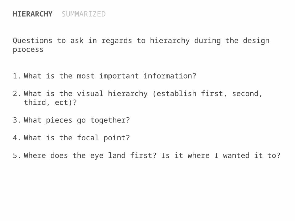
HIERARCHY SUMMARIZED
Questions to ask in regards to hierarchy during the design process
1. What is the most important information?
2. What is the visual hierarchy (establish first, second, third, ect)?
3. What pieces go together?
4. What is the focal point?
5. Where does the eye land first? Is it where I wanted it to?
HIERARCHY SUMMARIZED

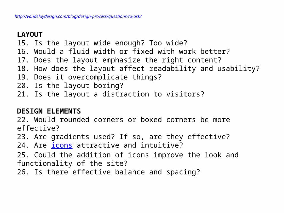
http://vandelaydesign.com/blog/design-process/questions-to-ask/
COLORS1. Is the color scheme effective?2. Are there enough different colors used?3. Are too many different colors used?4. Is there effective color contrast?5. Do the colors allow for maximum readability?6. Do the colors work well with images and photos used throughout the design?7. Do the colors accurately create the mood and present the message that you are after?
TYPOGRAPHY8. Are the fonts effective?9. Are too many different fonts used?10. Are not enough fonts used?11. Would additional experimentation with different fonts be helpful?12. Are the key words, phrases, and headers effectively emphasized and standing out?13. Is there proper spacing between letters, words and lines?14. Are the colors and typography used well together?
http://vandelaydesign.com/blog/design-process/questions-to-ask/
LAYOUT15. Is the layout wide enough? Too wide?16. Would a fluid width or fixed with work better?17. Does the layout emphasize the right content?18. How does the layout affect readability and usability?19. Does it overcomplicate things?20. Is the layout boring?21. Is the layout a distraction to visitors?
DESIGN ELEMENTS22. Would rounded corners or boxed corners be more effective?23. Are gradients used? If so, are they effective?24. Are icons attractive and intuitive?25. Could the addition of icons improve the look and functionality of the site?26. Is there effective balance and spacing?
http://vandelaydesign.com/blog/design-process/questions-to-ask/
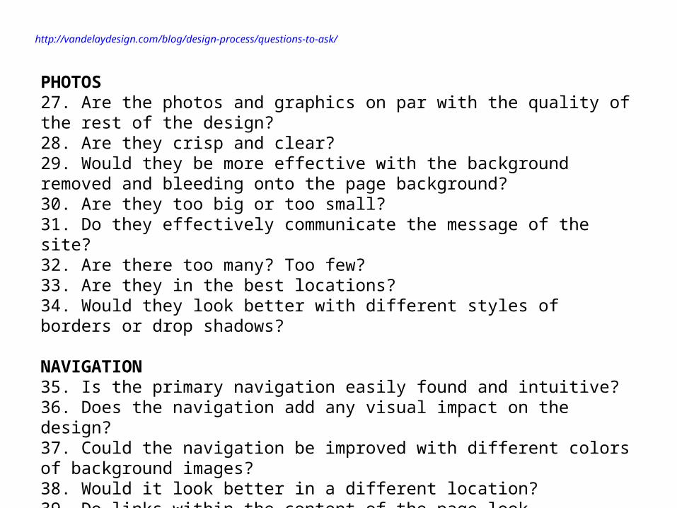
PHOTOS27. Are the photos and graphics on par with the quality of the rest of the design?28. Are they crisp and clear?29. Would they be more effective with the background removed and bleeding onto the page background?30. Are they too big or too small?31. Do they effectively communicate the message of the site?32. Are there too many? Too few?33. Are they in the best locations?34. Would they look better with different styles of borders or drop shadows?
NAVIGATION35. Is the primary navigation easily found and intuitive?36. Does the navigation add any visual impact on the design?37. Could the navigation be improved with different colors of background images?38. Would it look better in a different location?39. Do links within the content of the page look attractive?
http://vandelaydesign.com/blog/design-process/questions-to-ask/
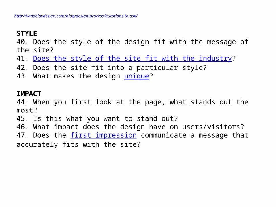
STYLE40. Does the style of the design fit with the message of the site?41. Does the style of the site fit with the industry?42. Does the site fit into a particular style?43. What makes the design unique?
IMPACT44. When you first look at the page, what stands out the most?45. Is this what you want to stand out?46. What impact does the design have on users/visitors?47. Does the first impression communicate a message that accurately fits with the site?
Related Documents
![Factors Affecting Consumers’ Intention to Use Online Music ...1471131/...Korea subscribe to an online music service which is the largest proportion globally [14]. In Korea, domestic](https://static.cupdf.com/doc/110x72/603c94692921bb675a1d52d7/factors-affecting-consumersa-intention-to-use-online-music-1471131-korea.jpg)