«1» “ Bamboofonts”–Culturalstereotypesvisualisedbydisplayfonts MarikoTakagi Abstract To visualise relation to the Japanese culture (and in some cases the Chinese as well) by Latin letters, Western as well as Japanese designers are using “Japanese style fonts”; which are also called “bamboo fonts” or “brush fonts”. The route of the so called “Japanese style fonts” can be tracked back to the be- ginning of graphic poster design in Europe in the late 19th century. This development – which can be seen as the foundation of contemporary poster design – happened at the same time as the movement in art Japonism. In some poster designs for product advertisments, Japanese motifs were shown along with lettering styles which translated brush strokes inspired by Japa- nese calligraphy and applied to the shape of Latin letters. In colloquial speech, typefaces with these attributes are also known as “bamboo fonts”. This stereotypical style of typefaces – used to represent Japanese culture and products – was not only selected by Western graphic designers. Japanese designers themselves applied those fonts for graphics on packages of tea and other products back in the 19th century, to address and attract Western consumers. Until today “bamboo fonts” are used to represent the idea of Japanese culture with typographic means, moreover Asian culture in general. Keywords culture, visual identity, stereotypes, typography

Welcome message from author
This document is posted to help you gain knowledge. Please leave a comment to let me know what you think about it! Share it to your friends and learn new things together.
Transcript
«1»
“�Bamboo�fonts”�–�Cultural�stereotypes�visualised�by�display�fonts�
�
Mariko�Takagi
Abstract
To visualise relation to the Japanese culture (and in some cases the Chinese as well) by Latin
letters, Western as well as Japanese designers are using “Japanese style fonts”; which are also
called “bamboo fonts” or “brush fonts”.
The route of the so called “Japanese style fonts” can be tracked back to the be-
ginning of graphic poster design in Europe in the late 19th century. This development – which
can be seen as the foundation of contemporary poster design – happened at the same time as
the movement in art Japonism. In some poster designs for product advertisments, Japanese
motifs were shown along with lettering styles which translated brush strokes inspired by Japa-
nese calligraphy and applied to the shape of Latin letters. In colloquial speech, typefaces with
these attributes are also known as “bamboo fonts”.
This stereotypical style of typefaces – used to represent Japanese culture and
products – was not only selected by Western graphic designers. Japanese designers themselves
applied those fonts for graphics on packages of tea and other products back in the 19th century,
to address and attract Western consumers. Until today “bamboo fonts” are used to represent the
idea of Japanese culture with typographic means, moreover Asian culture in general.
Keywords
culture, visual identity, stereotypes, typography
«2» Mariko Takagi: “Bamboo fonts”. Typography Day 2013, Guwahati, India.
Aim�and�Objectives
This paper is about analysing the typical characteristics of so called “bamboo fonts”, which are
used in Western but even Asian countries to visualise a Japanese or Chinese look and feel through
Latin typography. It will give an insight into the context of use and look and show the differen-
ce in perception in the Western and Japanese design culture.
Methodology�
Examples of typefaces and typographic designs, showing variations of “bamboo fonts” from
Western as well as from Japanese origins and from historical to current designs will be selected,
described and analysed according to their similarities and differences.
Introduction
Japonism�–�Historical�coherence
After more than two hundred years of self chosen isolation, Japan was forced by America 1854
to open the country. This was not only the beginning of an intensive trade relationship between
Western countries and Japan, but part of the intercultural meeting affected and inspired Western
artists of that time.
From the end of the 19th till the early 20th century, European artists such as
Monet, Manet, Van Gogh and Toulouse-Lautrec (just to name a few), architectures (Walter Gro-
pius and Bruno Taut) and designer (Christopher Dresser) were inspired by Japanese culture and
art. Japonism is the name of this movement.
The perception of Japan or the Japanese inspiration in the work of Western ar-
tist can be mainly defined into two categories. The term Japonism is used to describe artworks
which originated in an intensive involvement with the visual characteristics of Japanese art and
craft (mainly Ukiyoe-prints). Western artist analysed and translated “Japanese design principles”
(as the the translation of three- to two-dimensional visualisation, light and shadow, structure
of a layout and proportion of a format, use of ornaments, silhouettes, grid-structures, emphasis
of the diagonal and image section) (S. Wichmann, 1980, p. 6) into an individual artwork.
While the Japanese source of inspiration is not necessarily obvious in artworks
of the Japonism, this is different in case of Japonaiserie. In Japonaiserie, Western artists enhan-
ced the exotic effect of Japanese culture and it‘s attributes. Kimono, fan and other stereotypical
accessories together with ornaments were used as decorative elements to underline the exotic
characteristic of a “Japan fashion” in the late 19th century. In this regard Japonaiserie can be
described as part of Exotism and Orientalism movement in Western art history.
Observations/Results
Japonism�and�typography/poster�design
Still Japonism is not accepted as a full art epoche but as part of different art movements such as
Jugendstil (Art Deco), Modernism and Bauhaus (Klaus Berger). Klaus Berger and Claudia Delank
claim, that Japonism had a strong influence on the development of the design discipline and in
particular in the development of poster design in the late 19th century in Europe.
Jules Chéret and Toulouse-Lautrec were the pioneers of graphic poster design in
Europe. Their design released the former solely typographic monochrome poster and established
a new style combining typographic and illustrative elements in one layout. This development –
which can be seen as the foundation of contemporary poster design – happened at the same
time as the Japonism movement in art. Inspired by Japanese woodcuts (Ukiyoe), Chéret and
Toulouse-Lautrec let their lettering and images interact and show a connection between the two
elements. While Chéret and Toulouse-Lautrec referred to current typographic trends (Sans Serif
typefaces or Slab Serifs), other poster designers of that time (mostly working on advertisement
«3» Mariko Takagi: “Bamboo fonts”. Typography Day 2013, Guwahati, India.
posters) preferred a design in the tradition of Japonaiserie. Along with illustrations showing
decorative Japanese pieces of scenery, the advertising designers used lettering styles, which
translated brush strokes inspired by Chinese and Japanese calligraphy to the shape of Latin let-
ters. Common features are the segmented shape of the Latin letters, the in- and decreasing
stroke strength (similar to brush strokes) and angular or almost rectangular outline of the let-
ters. In colloquial speech, typefaces with these attributes are also known as “bamboo fonts”.
This stereotypical style of typefaces – used to represent Japanese products and
at the same time the culture (and nowadays also restaurants logo types) – where not only selec-
ted by Western graphic designers. Japanese designers themselves applied those fonts for graphics
on packages of tea and other products back in the 19th century to address and attract Western
consumers.1
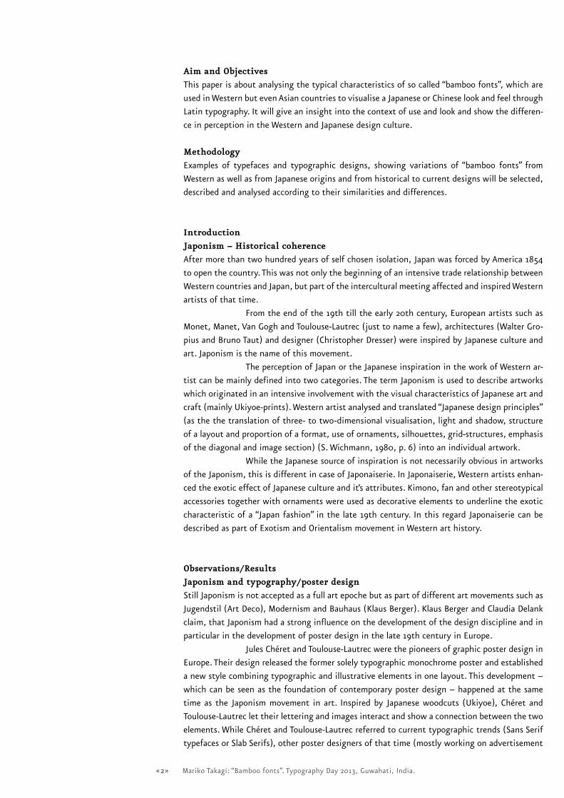
Typeface�classification
Models of typeface classifications are one of the main discussion topics in Western typography.
Classification systems for type should support different groups of users e.g. in design education,
design practice as well as in the area of research with a defined nomenclature, which enables us
1 ThisexoticismandatthesametimevalidationofstereotypesbyJapaneseartistcanbeobservedin
theartmovementJaponismaswell.JapanwasnotonlyvisualisedbyWesternartists,buttookactivelypartin
portrayingitselffromtheendofthe19thcentury.WhileClaudiaDelankdescribesinherresearchtheinvolve-
mentofthephotographystudiosbasedinNagasakiwhocapturedandproducedimagesofthe“oldJapan”forthe
Westernmarket.TheworkofJapanesephotographerssupportedandencouragedthedevelopmentofstereotypi-
calimagesofJapan,suchasGeisha,SamuraiandFujiyamaintheWesternmind.
Mincho Gothic Brush Mix
Old
Minchotai
+
Angular Goshikku (Gothic)
Standard
Minchotai
+
Rounded Goshikku (Gothic)
Modern
–/– Mix Design Type:
combining more than two components
Design
Serif/with contrast in stroke Serifen/less contrast Sans serif/with contrast Sans serif/less contrast Handwriting
Dynamic Aa a Aa a Aa a Aa a AaStatic Aa a Aa a Aa a Aa Aa
Geometric
–/–
Aa a–/–
Aa a Aa
Decorative A A Aa Aa a Aa a
Mincho Gothic Brush Mix
Old
Minchotai
+
Angular Goshikku (Gothic)
Standard
Minchotai
+
Rounded Goshikku (Gothic)
Modern
–/– Mix Design Type:
combining more than two components
Design
Serif/with contrast in stroke Serifen/less contrast Sans serif/with contrast Sans serif/less contrast Handwriting
Dynamic Aa a Aa a Aa a Aa a AaStatic Aa a Aa a Aa a Aa Aa
Geometric
–/–
Aa a–/–
Aa a Aa
Decorative A A Aa Aa a Aa a[Fig.1]
Typefaceclassificationmatrix
byKupferschmid,visualisedby
MarikoTakagi.
[Fig.2]
Typefaceclassification
byKomiyama,visualised
byMarikoTakagi.
«4» Mariko Takagi: “Bamboo fonts”. Typography Day 2013, Guwahati, India.
to discuss characteristics of typefaces on an abstract level. Before the digital era, when most of
the production of type was limited to print media, the number of available fonts was reasonab-
le and the usage of Non-Latin typefaces was an exceptional case. Classification systems were
developed in Europe which reflects the historical context of a typeface such as the system by
Maximilian Vox (1894–1974) and the DIN-classification 16518 from 1964. Nowadays these classi-
fication systems are criticised as being inflexible to be extended towards new font styles on the
one hand and more importantly towards Non-Latin scripts.
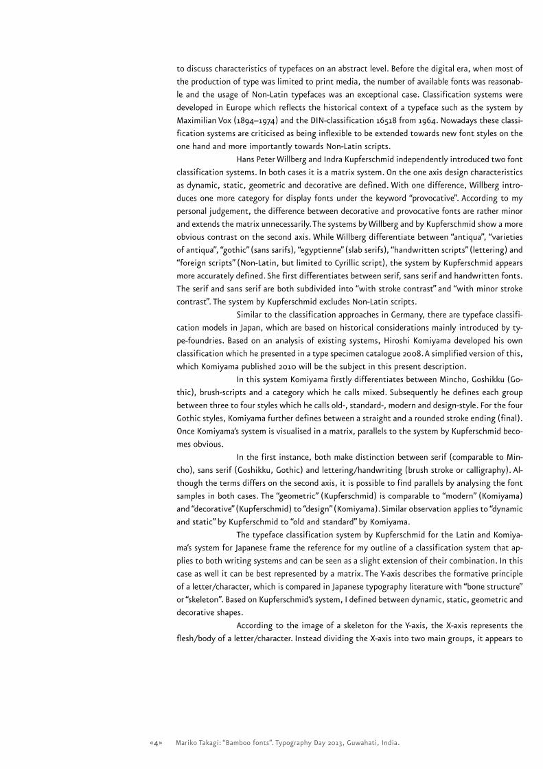
Hans Peter Willberg and Indra Kupferschmid independently introduced two font
classification systems. In both cases it is a matrix system. On the one axis design characteristics
as dynamic, static, geometric and decorative are defined. With one difference, Willberg intro-
duces one more category for display fonts under the keyword “provocative”. According to my
personal judgement, the difference between decorative and provocative fonts are rather minor
and extends the matrix unnecessarily. The systems by Willberg and by Kupferschmid show a more
obvious contrast on the second axis. While Willberg differentiate between “antiqua”, “varieties
of antiqua”, “gothic” (sans sarifs), “egyptienne” (slab serifs), “handwritten scripts” (lettering) and
“foreign scripts” (Non-Latin, but limited to Cyrillic script), the system by Kupferschmid appears
more accurately defined. She first differentiates between serif, sans serif and handwritten fonts.
The serif and sans serif are both subdivided into “with stroke contrast” and “with minor stroke
contrast”. The system by Kupferschmid excludes Non-Latin scripts.
Similar to the classification approaches in Germany, there are typeface classifi-
cation models in Japan, which are based on historical considerations mainly introduced by ty-
pe-foundries. Based on an analysis of existing systems, Hiroshi Komiyama developed his own
classification which he presented in a type specimen catalogue 2008. A simplified version of this,
which Komiyama published 2010 will be the subject in this present description.
In this system Komiyama firstly differentiates between Mincho, Goshikku (Go-
thic), brush-scripts and a category which he calls mixed. Subsequently he defines each group
between three to four styles which he calls old-, standard-, modern and design-style. For the four
Gothic styles, Komiyama further defines between a straight and a rounded stroke ending (final).
Once Komiyama‘s system is visualised in a matrix, parallels to the system by Kupferschmid beco-
mes obvious.
In the first instance, both make distinction between serif (comparable to Min-
cho), sans serif (Goshikku, Gothic) and lettering/handwriting (brush stroke or calligraphy). Al-
though the terms differs on the second axis, it is possible to find parallels by analysing the font
samples in both cases. The “geometric” (Kupferschmid) is comparable to “modern” (Komiyama)
and “decorative” (Kupferschmid) to “design” (Komiyama). Similar observation applies to “dynamic
and static” by Kupferschmid to “old and standard” by Komiyama.
The typeface classification system by Kupferschmid for the Latin and Komiya-
ma‘s system for Japanese frame the reference for my outline of a classification system that ap-
plies to both writing systems and can be seen as a slight extension of their combination. In this
case as well it can be best represented by a matrix. The Y-axis describes the formative principle
of a letter/character, which is compared in Japanese typography literature with “bone structure”
or “skeleton”. Based on Kupferschmid‘s system, I defined between dynamic, static, geometric and
decorative shapes.
According to the image of a skeleton for the Y-axis, the X-axis represents the
flesh/body of a letter/character. Instead dividing the X-axis into two main groups, it appears to
«5» Mariko Takagi: “Bamboo fonts”. Typography Day 2013, Guwahati, India.
make sense to consider a slightly changed segmentation towards “serif”, “semi serif”2 and “sans
serif”. A fourth group collects fonts based on styles as hand writing, calligraphy (brush stroke) and
seal engraving.
In each group there are subgroups that define the stroke strength, to distingu-
ish between fonts with a significant change in stroke strength (behaviour) from fonts with ad-
justed stroke strength (the stroke behaviour is visually adjusted to demonstrate constant stroke
strength).
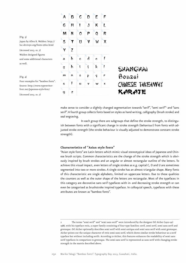
Characteristics�of�“Asian�style�fonts”
“Asian style fonts” are Latin letters which mimic visual stereotypical ideas of Japanese and Chin-
ese brush scripts. Common characteristics are the change of the stroke strength which is obvi-
ously inspired by brush strokes and an angular or almost rectangular outline of the letters. To
achieve this visual impact, even letters of single strokes as e.g. capital C, O and U are sometimes
segmented into two or more strokes. A single stroke has an almost triangular shape. Many fonts
of this characteristic are single alphabets, limited on uppercase letters. Due to these qualities
the counters as well as the outer shape of the letters are rectangular. Most of the typefaces in
this category are decorative sans serif typefaces with in- and decreasing stroke strength or can
even be categorised as brushstroke inspired typeface. In colloquial speech, typefaces with these
attributes are known as “bamboo fonts”.
2 Theterms“semiserif”and“semisansserif”wereintroducedbythedesignerOtlAicher(1922–91)
1988,withhistypefacerotis,asuperfamilyconsistingoffourtypefamilies:serif,semiserif,semisansserifand
grotesque.OtlAicheroptionallydescribessemiserifwithsemiantiquaandsemisansserifwithsemigrotesque.
Aicherpointsouttheuniquecharacterofrotissemisansserif,whichshowssimilarstrokebehaviourasaserif
typefacebutwithoutincludingserifs.AccordingtoAicher,thisfeaturesenhancesthereadabilityofsemisans
seriftypefacesincomparisontogrotesque.Thesemisansserifisrepresentedassansserifwithchangingstroke
strengthinthematrixdescribedabove.
[Fig.3]
JapanbyAllenR.Walden:http://
luc.devroye.org/fonts-27621.html
(Accessed2013.01.7)
Waldendesignedfigures
andsomeadditionalcharacters
aswell.
[Fig.4]
Fourexamplesfor“bamboofonts”.
Source:http://www.typewriter-
font.net/japanese-style-font/
(Accessed2013.01.7)
«6» Mariko Takagi: “Bamboo fonts”. Typography Day 2013, Guwahati, India.
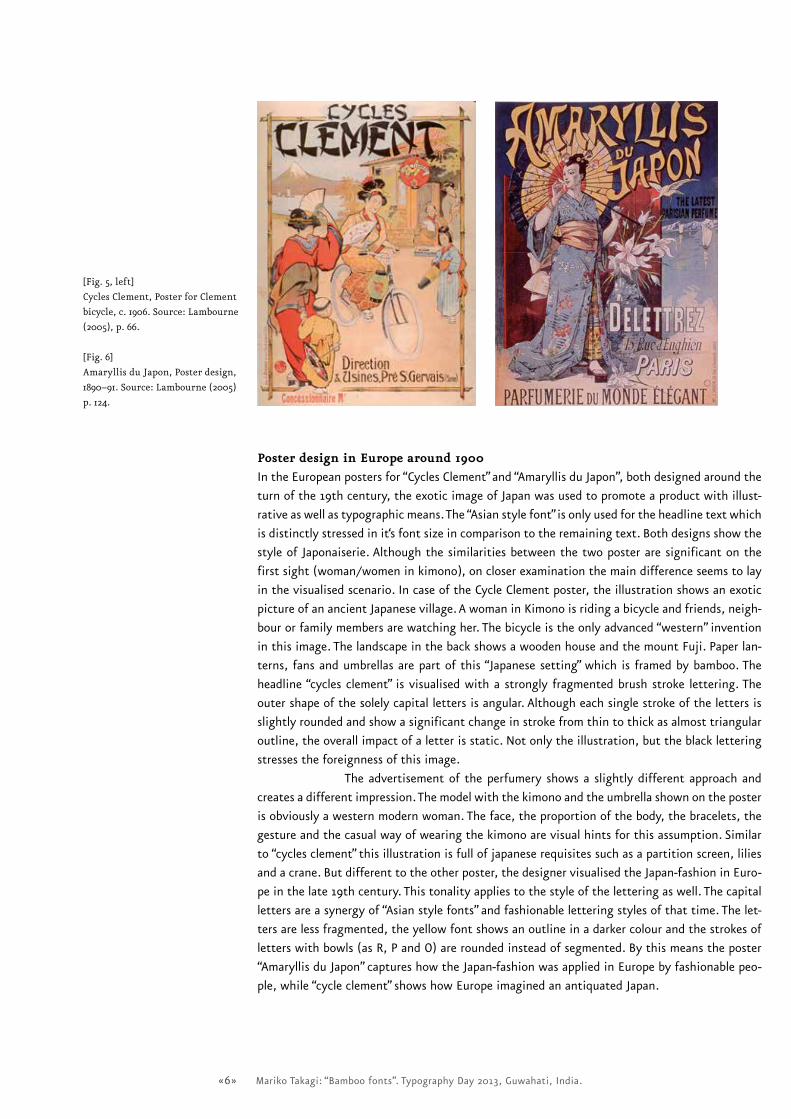
Poster�design�in�Europe�around�1900
In the European posters for “Cycles Clement” and “Amaryllis du Japon”, both designed around the
turn of the 19th century, the exotic image of Japan was used to promote a product with illust-
rative as well as typographic means. The “Asian style font” is only used for the headline text which
is distinctly stressed in it‘s font size in comparison to the remaining text. Both designs show the
style of Japonaiserie. Although the similarities between the two poster are significant on the
first sight (woman/women in kimono), on closer examination the main difference seems to lay
in the visualised scenario. In case of the Cycle Clement poster, the illustration shows an exotic
picture of an ancient Japanese village. A woman in Kimono is riding a bicycle and friends, neigh-
bour or family members are watching her. The bicycle is the only advanced “western” invention
in this image. The landscape in the back shows a wooden house and the mount Fuji. Paper lan-
terns, fans and umbrellas are part of this “Japanese setting” which is framed by bamboo. The
headline “cycles clement” is visualised with a strongly fragmented brush stroke lettering. The
outer shape of the solely capital letters is angular. Although each single stroke of the letters is
slightly rounded and show a significant change in stroke from thin to thick as almost triangular
outline, the overall impact of a letter is static. Not only the illustration, but the black lettering
stresses the foreignness of this image.
The advertisement of the perfumery shows a slightly different approach and
creates a different impression. The model with the kimono and the umbrella shown on the poster
is obviously a western modern woman. The face, the proportion of the body, the bracelets, the
gesture and the casual way of wearing the kimono are visual hints for this assumption. Similar
to “cycles clement” this illustration is full of japanese requisites such as a partition screen, lilies
and a crane. But different to the other poster, the designer visualised the Japan-fashion in Euro-
pe in the late 19th century. This tonality applies to the style of the lettering as well. The capital
letters are a synergy of “Asian style fonts” and fashionable lettering styles of that time. The let-
ters are less fragmented, the yellow font shows an outline in a darker colour and the strokes of
letters with bowls (as R, P and O) are rounded instead of segmented. By this means the poster
“Amaryllis du Japon” captures how the Japan-fashion was applied in Europe by fashionable peo-
ple, while “cycle clement” shows how Europe imagined an antiquated Japan.
[Fig.5,left]
CyclesClement,PosterforClement
bicycle,c.1906.Source:Lambourne
(2005),p.66.
[Fig.6]
AmaryllisduJapon,Posterdesign,
1890–91.Source:Lambourne(2005)
p.124.
«7» Mariko Takagi: “Bamboo fonts”. Typography Day 2013, Guwahati, India.
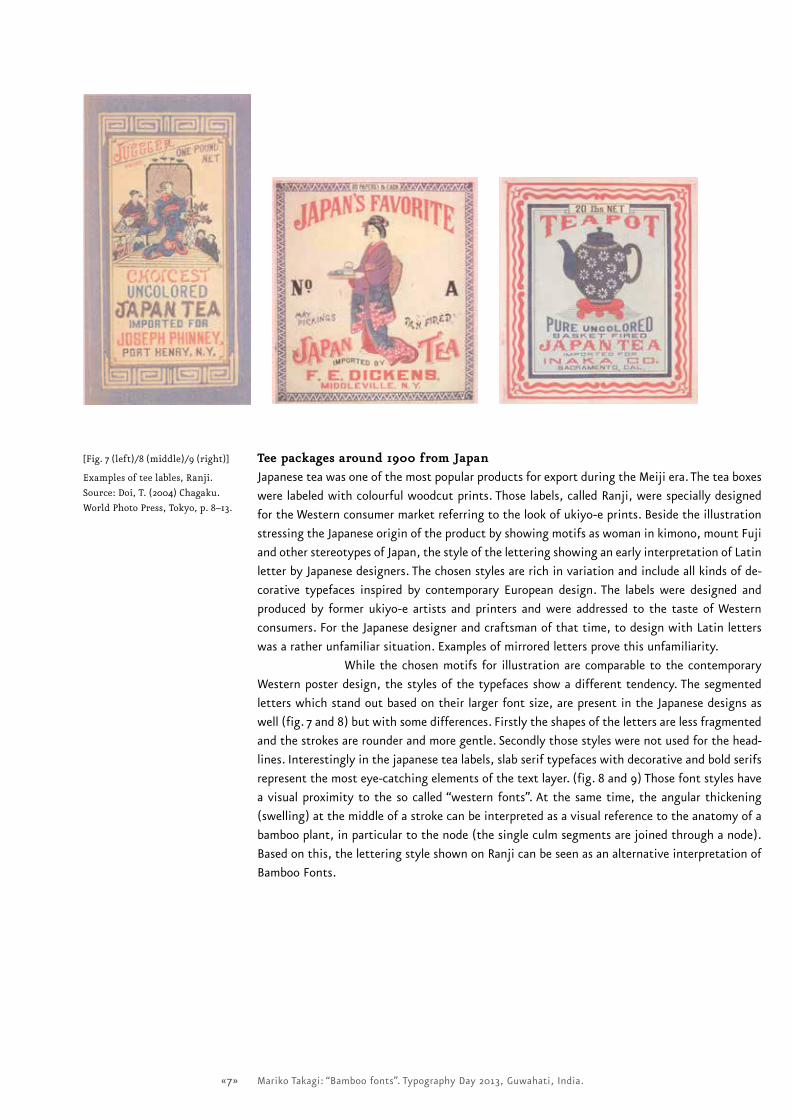
Tee�packages�around�1900�from�Japan
Japanese tea was one of the most popular products for export during the Meiji era. The tea boxes
were labeled with colourful woodcut prints. Those labels, called Ranji, were specially designed
for the Western consumer market referring to the look of ukiyo-e prints. Beside the illustration
stressing the Japanese origin of the product by showing motifs as woman in kimono, mount Fuji
and other stereotypes of Japan, the style of the lettering showing an early interpretation of Latin
letter by Japanese designers. The chosen styles are rich in variation and include all kinds of de-
corative typefaces inspired by contemporary European design. The labels were designed and
produced by former ukiyo-e artists and printers and were addressed to the taste of Western
consumers. For the Japanese designer and craftsman of that time, to design with Latin letters
was a rather unfamiliar situation. Examples of mirrored letters prove this unfamiliarity.
While the chosen motifs for illustration are comparable to the contemporary
Western poster design, the styles of the typefaces show a different tendency. The segmented
letters which stand out based on their larger font size, are present in the Japanese designs as
well (fig. 7 and 8) but with some differences. Firstly the shapes of the letters are less fragmented
and the strokes are rounder and more gentle. Secondly those styles were not used for the head-
lines. Interestingly in the japanese tea labels, slab serif typefaces with decorative and bold serifs
represent the most eye-catching elements of the text layer. (fig. 8 and 9) Those font styles have
a visual proximity to the so called “western fonts”. At the same time, the angular thickening
(swelling) at the middle of a stroke can be interpreted as a visual reference to the anatomy of a
bamboo plant, in particular to the node (the single culm segments are joined through a node).
Based on this, the lettering style shown on Ranji can be seen as an alternative interpretation of
Bamboo Fonts.
[Fig.7(left)/8(middle)/9(right)]
Examplesofteelables,Ranji.
Source:Doi,T.(2004)Chagaku.
WorldPhotoPress,Tokyo,p.8–13.
«8» Mariko Takagi: “Bamboo fonts”. Typography Day 2013, Guwahati, India.
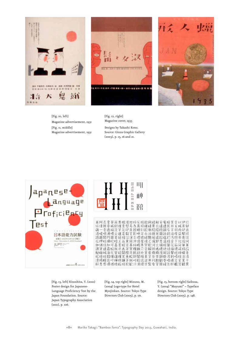
[Fig.10,left]
Magazineadvertisement,1931
[Fig.11,middle]
Magazineadvertisement,1931
[Fig.12,right]
Magazinecover,1935
DesignsbyTakashiKono.
Source:GinzaGraphicGallery
(2003),p.15,16and21.
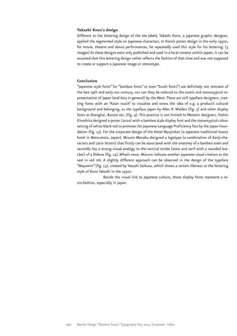
[Fig.13,left]Kinoshita,Y.(2010)
PosterdesignforJapanese-
LanguageProficiencyTestbythe
JapanFoundation.Source:
JapanTypographyAssociation
(2011),p.106.
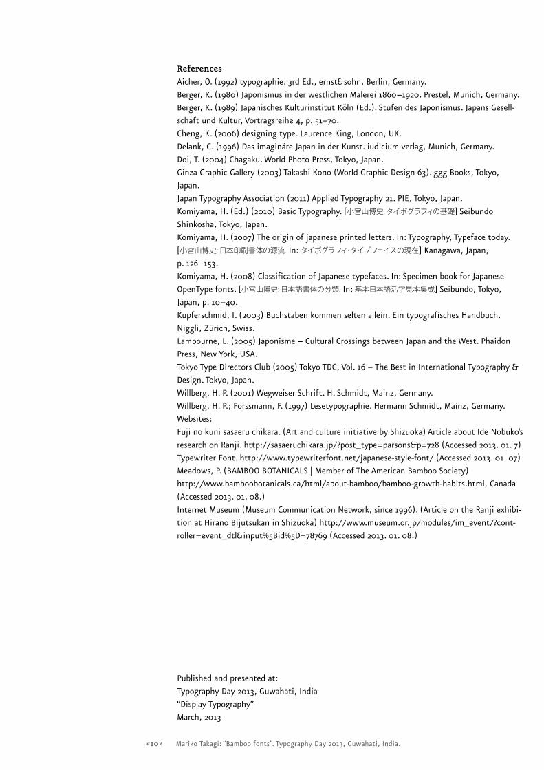
[Fig.14,topright]Mizuno,M.
(2004)Logo-typeforHotel
Myojinkan.Source:TokyoType
DirectorsClub(2005),p.171.
[Fig.15,bottomright]Saikusa,
Y.(2004)“Mayumi”–Typeface
design.Source:TokyoType
DirectorsClub(2005),p.148.
«9» Mariko Takagi: “Bamboo fonts”. Typography Day 2013, Guwahati, India.
Takashi�Kono‘s�design
Different to the lettering design of the tee labels, Takashi Kono, a japanese graphic designer,
applied the segmented style on Japanese characters. In Kono‘s poster design in the early 1930s,
for movie, theatre and dance performances, he repeatedly used this style for his lettering. (3
images) As these designs were only published and used in a local context within Japan, it can be
assumed that this lettering design rather reflects the fashion of that time and was not supposed
to create or support a Japanese image or stereotype.
Conclusion
“Japanese style fonts” (or “bamboo fonts” or even “brush fonts”) are definitely not remnant of
the late 19th and early 20s century, nor can they be reduced to the exotic and stereotypical re-
presentation of Japan (and Asia in general) by the West. There are still typeface designers, crea-
ting fonts with an “Asian touch” to visualise and stress the idea of e.g. a product‘s cultural
background and belonging, as the typeface Japan by Allen R. Walden (fig. 3) and other display
fonts as Shanghai, Bonzai etc. (fig. 4). This practice is not limited to Western designers. Yoshio
Kinoshita designed a poster (2010) with a bamboo style display font and the stereotypical colour
setting of white-black-red to promote the Japanese-Language Proficiency Test by the Japan Foun-
dation (fig. 13). For the corporate design of the Hotel Myojinkan (a Japanese traditional luxury
hotel in Matsumoto, Japan), Mizuno Manabu designed a logotype (a combination of Kanji-cha-
racters and Latin letters) that firstly can be associated with the anatomy of a bamboo stem and
secondly has a strong visual analogy to the vertical stroke (stem and serif with a rounded bra-
cket) of a Didone (fig. 14). What‘s more, Mizuno indicate another Japanese visual citation as the
seal in red ink. A slightly different approach can be observed in the design of the typeface
“Mayumin” (fig. 15), created by Yasushi Saikusa, which shows a certain likeness to the lettering
style of Kono Takashi in the 1930s.
Beside the visual link to Japanese culture, those display fonts represent a re-
tro-fashion, especially in Japan.
«10» Mariko Takagi: “Bamboo fonts”. Typography Day 2013, Guwahati, India.
References
Aicher, O. (1992) typographie. 3rd Ed., ernst&sohn, Berlin, Germany.
Berger, K. (1980) Japonismus in der westlichen Malerei 1860–1920. Prestel, Munich, Germany.
Berger, K. (1989) Japanisches Kulturinstitut Köln (Ed.): Stufen des Japonismus. Japans Gesell-
schaft und Kultur, Vortragsreihe 4, p. 51–70.
Cheng, K. (2006) designing type. Laurence King, London, UK.
Delank, C. (1996) Das imaginäre Japan in der Kunst. iudicium verlag, Munich, Germany.
Doi, T. (2004) Chagaku. World Photo Press, Tokyo, Japan.
Ginza Graphic Gallery (2003) Takashi Kono (World Graphic Design 63). ggg Books, Tokyo,
Japan.
Japan Typography Association (2011) Applied Typography 21. PIE, Tokyo, Japan.
Komiyama, H. (Ed.) (2010) Basic Typography. [小宮山博史: タイポグラフィの基礎] Seibundo
Shinkosha, Tokyo, Japan.
Komiyama, H. (2007) The origin of japanese printed letters. In: Typography, Typeface today.
[小宮山博史: 日本印刷書体の源流. In: タイポグラフィ・タイプフェイスの現在] Kanagawa, Japan,
p. 126–153.
Komiyama, H. (2008) Classification of Japanese typefaces. In: Specimen book for Japanese
OpenType fonts. [小宮山博史: 日本語書体の分類. In: 基本日本語活字見本集成] Seibundo, Tokyo,
Japan, p. 10–40.
Kupferschmid, I. (2003) Buchstaben kommen selten allein. Ein typografisches Handbuch.
Niggli, Zürich, Swiss.
Lambourne, L. (2005) Japonisme – Cultural Crossings between Japan and the West. Phaidon
Press, New York, USA.
Tokyo Type Directors Club (2005) Tokyo TDC, Vol. 16 – The Best in International Typography &
Design. Tokyo, Japan.
Willberg, H. P. (2001) Wegweiser Schrift. H. Schmidt, Mainz, Germany.
Willberg, H. P.; Forssmann, F. (1997) Lesetypographie. Hermann Schmidt, Mainz, Germany.
Websites:
Fuji no kuni sasaeru chikara. (Art and culture initiative by Shizuoka) Article about Ide Nobuko‘s
research on Ranji. http://sasaeruchikara.jp/?post_type=parsons&p=728 (Accessed 2013. 01. 7)
Typewriter Font. http://www.typewriterfont.net/japanese-style-font/ (Accessed 2013. 01. 07)
Meadows, P. (BAMBOO BOTANICALS | Member of The American Bamboo Society)
http://www.bamboobotanicals.ca/html/about-bamboo/bamboo-growth-habits.html, Canada
(Accessed 2013. 01. 08.)
Internet Museum (Museum Communication Network, since 1996). (Article on the Ranji exhibi-
tion at Hirano Bijutsukan in Shizuoka) http://www.museum.or.jp/modules/im_event/?cont-
roller=event_dtl&input%5Bid%5D=78769 (Accessed 2013. 01. 08.)
Published and presented at:
Typography Day 2013, Guwahati, India
“Display Typography”
March, 2013
Related Documents