Austin and Doust’s New Media Design Designing for New Media II

Austin and Doust’s New Media Design. In our excerpt from their book New Media Design, Tricia Austin and Richard Doust add nine more terms to our growing.
Dec 25, 2015
Welcome message from author
This document is posted to help you gain knowledge. Please leave a comment to let me know what you think about it! Share it to your friends and learn new things together.
Transcript

Austin and Doust’s New Media Design
Designing for New Media II
More New Media Design
VocabularyIn our excerpt from their book New Media Design, Tricia Austin and Richard
Doust add nine more terms to our growing vocabulary
of new media design.

More New Media Design
VocabularyOn Tuesday, we began with
Williams’ terms:
• Contrast
• Repetition
• Alignment
• Proximity

More New Media Design
VocabularyToday Austin and Doust add nine more design terms to
our list: layout, navigation, images,
color, sequence, continuity, sound,
movement, narrative.
More New Media Design
Vocabulary
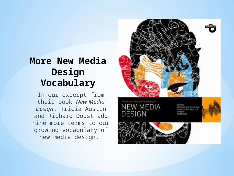
Layout:
• “concerned with how words and images are
organized on the page”
• Utilizes an “invisible grid” that can be used to “control the alignment and proximity of text or images and create an
overall rhythm” and also to define the “position of
elements that are repeated on every page”

More New Media Design
Vocabulary
Navigation:
• To help users sort through information and
to help users remain aware of where they are
in the website
• “Information Design”

More New Media Design
Vocabulary
Images:
• Self-explanatory, but, as rhetors with awareness of the power of images and of an ethical use of
images, we should reflect carefully on our
images choices

More New Media Design
Vocabulary
Color:
• We already talked about the value of designing a color palette, but as A+D note, color can also work as a visual way to code information and assist your users to navigate
through it
More New Media Design
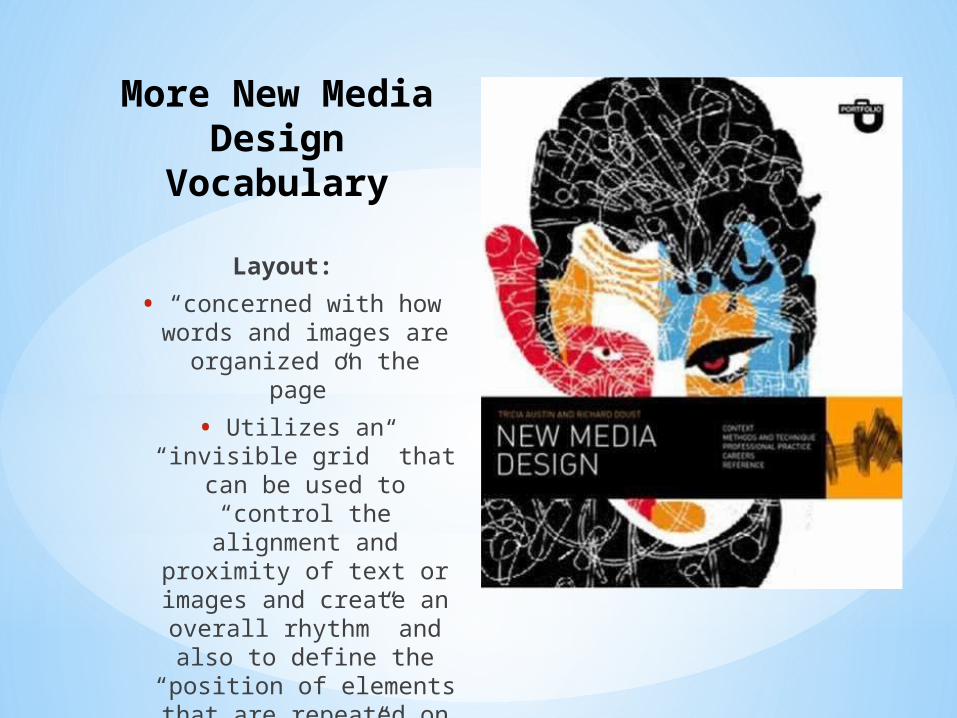
VocabularySequence:
• In terms of media design, the order in
which the text progresses can “affect the message and the
mood”
• “Storyboarding” as a valuable technique in
design as a way to “get an overview of the
structure”—this can be applied to website
design too
More New Media Design
VocabularyContinuity:
• Similar to Williams’ idea of “repetition”, but A+G
aim to avoid “mere repetition” because that
can get dull
• “Elements of action or change can be
introduced while building a coherent, progressive
order and conclusion to a sequence”
More New Media Design
VocabularySound:
• Sound design as a way to “reinforce actions” of users (ie. the sound of
departing email)
• “Sounds can evoke physical materials, weight, speed and
spatial context, and change mood and suggest irony.”

More New Media Design
VocabularyMovement:
• Like sound, “can be used to structure, dramatize,
inform, create mood, and evoke associations”
• But, as we saw yesterday (ie. the creepy backwards walking cat), too much of this is not a
good thing!

More New Media Design
VocabularyNarrative:
• “involves developing a plot that propels the story forwards and
structuring events that unfold over time”
• For us, our narrative is in the text, since we’re
unfolding B+G’s arguments to our audience, but this
progression can also be demonstrated visually as well (via use of the other
elements of design)

Web Writing Style Guide 1.0
“The Rhetorics of Web Pages”

Web Writing Style Guide 1.0In this chapter of the Style Guide, the authors aim to remind us of the role of rhetoric in the design of webpages (or any digital
text for that matter).
Web Writing Style Guide 1.0
“Contextual Hyperlinks”:
• Helping your users understand why they
should click on the link
• “we can better assist readers by putting the
links in context” and this well help “create
effective transitions” for them

Web Writing Style Guide 1.0
Titles and Headlines:
• this takes us back to the rhetorical canon of
arrangement
• “Your headline is the first, and perhaps only,
impression you make on a prospective reader. Without a compelling promise that turns a
browser into a reader, the rest of your words may as well not even
exist. . . .”

Web Writing Style Guide 1.0
Lists:
• “Lists, both numbered and bulleted lists, are
another form of subheaders in that they
make the underlying structure of your content visible to your readers. A good list can make clear the steps in a process, the advantages of an
option, or the requirements of a
program.”
• (or help clarify B+G’s text for your audience)

Web Writing Style Guide 1.0
“White Space”:
• Your friend
• The background of your page
• Effective use of white space allows the text to “breathe”, making the web page more user-
friendly and accessible
Web Writing Style Guide 1.0
Images:
• Make sure your visuals are appropriate and
relevant
• Make sure your images are good quality
• Crop images to remove unnecessary info
• Beware of stretching images
• Provide captions
• Reduce very large images using a graphics
program

Web Writing Style Guide 1.0
Fonts:
“However, if you. . .have the option of choosing
different fonts, start by first considering your rhetorical
situation: Who is the audience? What is your purpose for designing? What is the context? Do
you want to be humorous? Serious? Are you
announcing an event? There are a million things to take into consideration,
but the most important thing to consider is
readability.”

Web Writing Style Guide 1.0
Another thing to keep in mind: we’ve all selected different mediums, some that provide more control over design than others.
Although some of you are working with templates,
these rhetorical principles still apply, just in a different
way.
“Different genres of web writing offer different
degrees of control over the rhetoric of your pages, but
these issues are always present to one degree or
another.”

Remediation 3.0 Projects
The rest of the class will be devoted to continuing your
work on your Project 2.
However, as you do so, I would like each group to
select three of Austin and Doust’s nine design terms that you see being used in
your own projects and write three or four sentences
telling me:
1)What design principle you are using and whether it is effective as is or needs
revision
2) If it is effective, why and how; if it needs revision,
why and how

Designing for New Media II
Related Documents