The double page spreads of music magazines By Jake Broad

Welcome message from author
This document is posted to help you gain knowledge. Please leave a comment to let me know what you think about it! Share it to your friends and learn new things together.
Transcript
The double page spreads of music magazines
By Jake Broad

Most of the two pages is dominated by pictures relating to the main article on that spread. Which in this case is My chemical Romance. They have a single page dominated by a picture of the lead singer Gerard Way as well as the bands guitarist. This allows the writers to take up unnecessary space and fill up the magazine. Since if they added more text which is already quite small to the magazine then they would end up loosing the attention of the readers. They would also of had to try and fill that extra area with information they do not have since they cover all the information that they MCR gave them.
In the top corner you have an indication of which section you are reading (in this case news) allowing those who bought the magazine to find what they came to read a lot easier. The Arrow sticking from it also shows that it’s a world exclusive. Further informing people that they cant find the info anywhere else
To break from the main article they have a thing on the side to inform fans of MCR about the new tracks they plan on releasing. By not including it in the main article it clears things up a bit and allows the writers to focus to go into more detail about what they feel the song sounds like and highlight what they feel are prominent lyrics in them. They make it separate since it is the writers opinion on the song rather than that of the bands or just general information and so wouldn’t find a place in the main article.
The article is written in third person to be able to focus more on the band rather than the interviewer and to be able put in as much information on the new songs and album as well as the bands personal opinion on what they have created rather than the interviers.
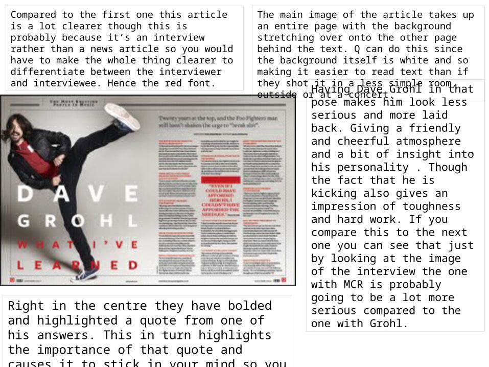
Compared to the first one this article is a lot clearer though this is probably because it’s an interview rather than a news article so you would have to make the whole thing clearer to differentiate between the interviewer and interviewee. Hence the red font.
The main image of the article takes up an entire page with the background stretching over onto the other page behind the text. Q can do this since the background itself is white and so making it easier to read text than if they shot it in a less simple room, outside or at a concert.
Having Dave Grohl in that pose makes him look less serious and more laid back. Giving a friendly and cheerful atmosphere and a bit of insight into his personality . Though the fact that he is kicking also gives an impression of toughness and hard work. If you compare this to the next one you can see that just by looking at the image of the interview the one with MCR is probably going to be a lot more serious compared to the one with Grohl.
Right in the centre they have bolded and highlighted a quote from one of his answers. This in turn highlights the importance of that quote and causes it to stick in your mind so you don’t forget that article.
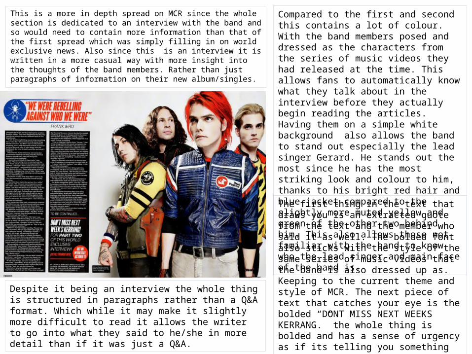
This is a more in depth spread on MCR since the whole section is dedicated to an interview with the band and so would need to contain more information than that of the first spread which was simply filling in on world exclusive news. Also since this is an interview it is written in a more casual way with more insight into the thoughts of the band members. Rather than just paragraphs of information on their new album/singles.
Compared to the first and second this contains a lot of colour. With the band members posed and dressed as the characters from the series of music videos they had released at the time. This allows fans to automatically know what they talk about in the interview before they actually begin reading the articles. Having them on a simple white background also allows the band to stand out especially the lead singer Gerard. He stands out the most since he has the most striking look and colour to him, thanks to his bright red hair and blue jacket compared to the slightly more muted yellow and green of the other two behind him. This also allows those not familiar with the band to know who the lead singer and main face of the band is.
The first thing in the text that draws you is an extracted quote from the text and the member who said it as well. The bolded font also sticks with the style of the same series of music videos that the band is also dressed up as. Keeping to the current theme and style of MCR. The next piece of text that catches your eye is the bolded “DONT MISS NEXT WEEKS KERRANG.” the whole thing is bolded and has a sense of urgency as if its telling you something incredibly important. In this case telling the reader that they have to get the next issue if they want to find out more about what the band has to say.
Despite it being an interview the whole thing is structured in paragraphs rather than a Q&A format. Which while it may make it slightly more difficult to read it allows the writer to go into what they said to he/she in more detail than if it was just a Q&A.

Related Documents