Art in Extremis • Damon Davis in Ferguson • Dresden 1945 • Erwin Fabian & Ludwig Hirschfeld Mack • León Ferrari in Exile Japanese American Internment • Love and Labor Under Apartheid • Mail Art and Surveillance • Prix de Print • News The Global Journal of Prints and Ideas September – October 2015 Volume 5, Number 3 US $25

Welcome message from author
This document is posted to help you gain knowledge. Please leave a comment to let me know what you think about it! Share it to your friends and learn new things together.
Transcript
Art in Extremis • Damon Davis in Ferguson • Dresden 1945 • Erwin Fabian & Ludwig Hirschfeld Mack • León Ferrari in Exile Japanese American Internment • Love and Labor Under Apartheid • Mail Art and Surveillance • Prix de Print • News
The Global Journal of Prints and Ideas September – October 2015
Volume 5, Number 3
US $25
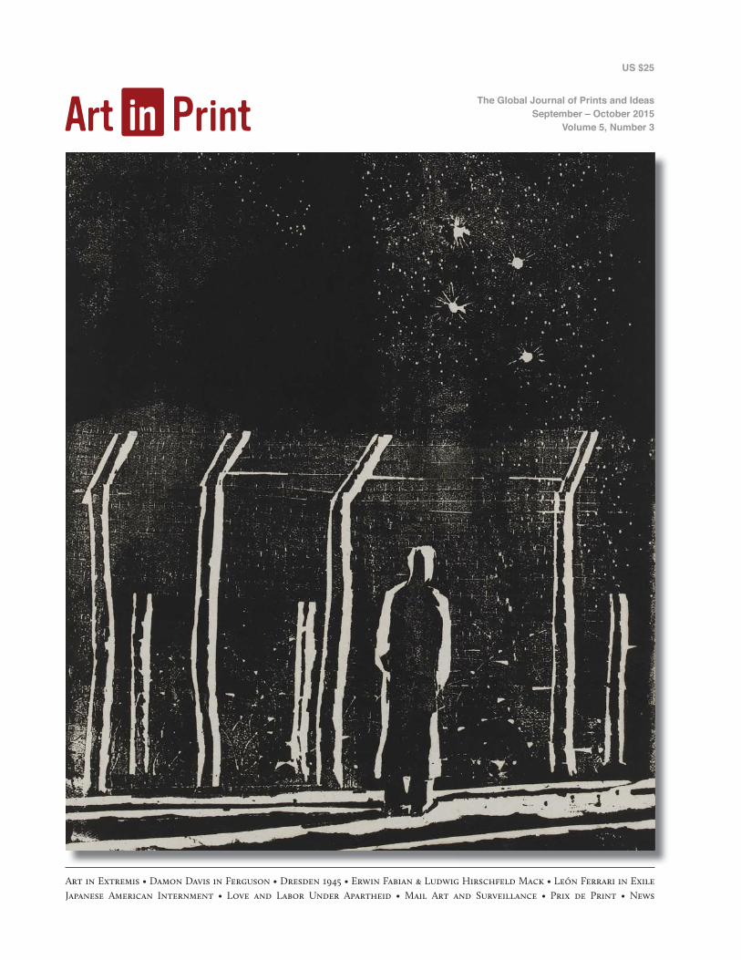
artists’ books, and multiples
The Tunnel NYC269 11th Avenue (b/w 27th and 28th Streets)
212.673.5390 [email protected] www.eabfair.org
@eabfair @eabfair@eabfair
Editor-in-ChiefSusan Tallman
Associate PublisherJulie Bernatz
Managing EditorIsabella Kendrick
Associate EditorJulie Warchol
Manuscript EditorPrudence Crowther
Online ColumnistSarah Kirk Hanley
Editor-at-LargeCatherine Bindman
Design DirectorSkip Langer
WebmasterDana Johnson
September – October 2015Volume 5, Number 3
In This Issue
Susan Tallman 2On Survival
Art in Art in Print Number 2 4Damon Davis: All Hands On Deck (2015)
Johannes Schmidt 10Dresden 1945: Wilhelm Rudolph’s Compulsive Inventory
Stephen Coppel 16Behind Barbed Wire: Printmaking in Australian Internment Camps by Erwin Fabian and Ludwig Hirschfeld Mack
Charles M. Schultz 22Paper Planes: Art from Japanese American Internment Camps
Elizabeth C. DeRose 29León Ferrari’s Heliografias
Daniel Hewson 32Love and Labor Under Apartheid: An Interview with Yvette Mutumba
Zanna Gilbert 36Art in Contact: The Mail Art Exchange of Paulo Bruscky and Robert Rehfeldt
Prix de Print, No. 13 42Katherine Alcauskas Rebuilding the Unbuilt [Y Block] by Sumi Perera
Exhibition ReviewPaul Coldwell 44Bruce Nauman Prints
Book ReviewsElleree Erdos 46Syria: Frontlines and Online
Peter S. Briggs 48Underground Art and Commerce
News of the Print World 50
Contributors 68 Guide to Back Issues 69
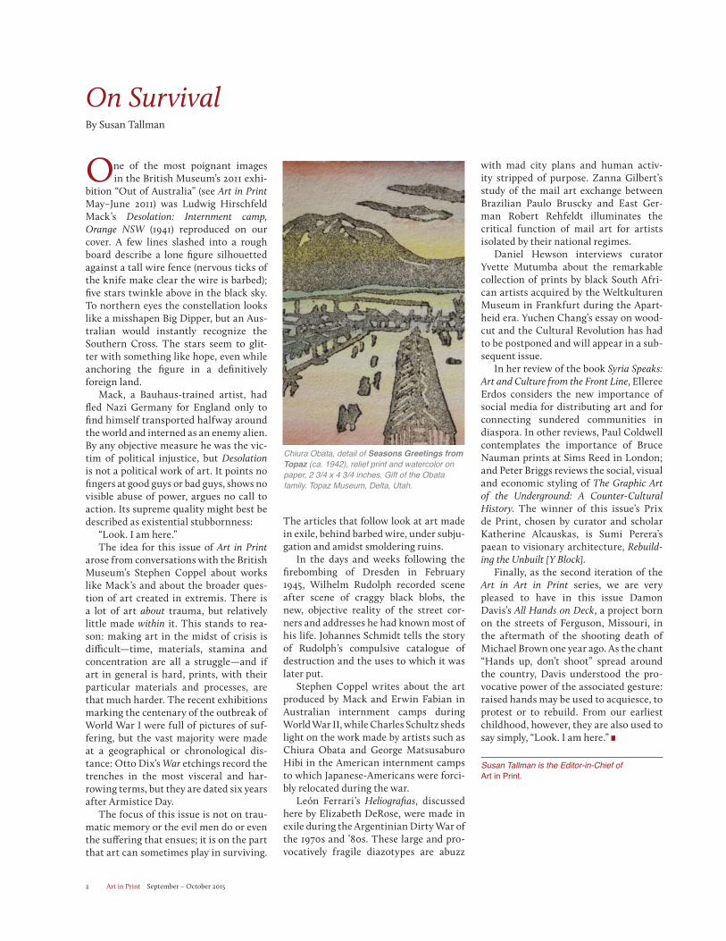
On the Cover: Ludwig Hirschfeld Mack, detail of Desolation: Internment camp, Orange NSW (1941), woodcut on thin paper. British Museum, London. Purchased with funds from the Friends of Prints and Drawings. 2010,7075.1. ©Trustees of the British Museum. Reproduced by permission of the artist’s estate.
This Page: Robert Rehfeldt, detail of “ART-WORKERS UNITE” (1977), one sheet com-muniqué posted from the German Democratic Republic (East Germany).
Art in Print3500 N. Lake Shore DriveSuite 10AChicago, IL 60657-1927www.artinprint.org [email protected] (1.844.278.4677)No part of this periodical may be published without the written consent of the publisher.
Art in Print is supported in part by an award from the
National Endowment for the Arts. Art Works.
Art in Print September – October 20152
On SurvivalBy Susan Tallman
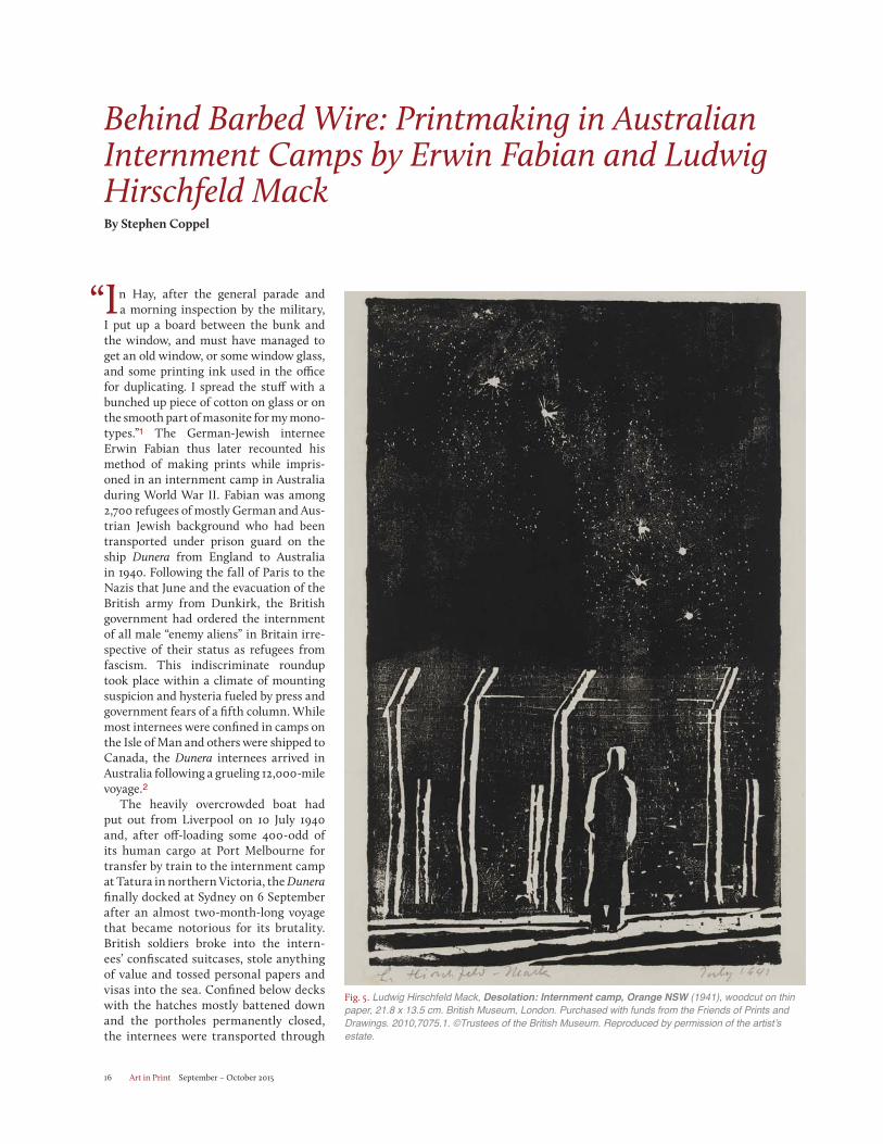
One of the most poignant images in the British Museum’s 2011 exhi-
bition “Out of Australia” (see Art in PrintMay–June 2011) was Ludwig Hirschfeld Mack’s Desolation: Internment camp, Orange NSW (1941) reproduced on our cover. A few lines slashed into a rough board describe a lone figure silhouetted against a tall wire fence (nervous ticks of the knife make clear the wire is barbed); five stars twinkle above in the black sky. To northern eyes the constellation looks like a misshapen Big Dipper, but an Aus-tralian would instantly recognize the Southern Cross. The stars seem to glit-ter with something like hope, even while anchoring the figure in a definitively foreign land.
Mack, a Bauhaus-trained artist, had fled Nazi Germany for England only to find himself transported halfway around the world and interned as an enemy alien. By any objective measure he was the vic-tim of political injustice, but Desolationis not a political work of art. It points no fingers at good guys or bad guys, shows no visible abuse of power, argues no call to action. Its supreme quality might best be described as existential stubbornness:
“Look. I am here.”The idea for this issue of Art in Print
arose from conversations with the British Museum’s Stephen Coppel about works like Mack’s and about the broader ques-tion of art created in extremis. There is a lot of art about trauma, but relatively little made within it. This stands to rea-son: making art in the midst of crisis is difficult—time, materials, stamina and concentration are all a struggle—and if art in general is hard, prints, with their particular materials and processes, are that much harder. The recent exhibitions marking the centenary of the outbreak of World War I were full of pictures of suf-fering, but the vast majority were made at a geographical or chronological dis-tance: Otto Dix’s War etchings record the trenches in the most visceral and har-rowing terms, but they are dated six years after Armistice Day.
The focus of this issue is not on trau-matic memory or the evil men do or even the suffering that ensues; it is on the part that art can sometimes play in surviving.
The articles that follow look at art made in exile, behind barbed wire, under subju-gation and amidst smoldering ruins.
In the days and weeks following the firebombing of Dresden in February 1945, Wilhelm Rudolph recorded scene after scene of craggy black blobs, the new, objective reality of the street cor-ners and addresses he had known most of his life. Johannes Schmidt tells the story of Rudolph’s compulsive catalogue of destruction and the uses to which it was later put.
Stephen Coppel writes about the art produced by Mack and Erwin Fabian in Australian internment camps during World War II, while Charles Schultz sheds light on the work made by artists such as Chiura Obata and George Matsusaburo Hibi in the American internment camps to which Japanese-Americans were forci-bly relocated during the war.
León Ferrari’s Heliografias, discussed here by Elizabeth DeRose, were made in exile during the Argentinian Dirty War of the 1970s and ’80s. These large and pro-vocatively fragile diazotypes are abuzz
with mad city plans and human activ-ity stripped of purpose. Zanna Gilbert’s study of the mail art exchange between Brazilian Paulo Bruscky and East Ger-man Robert Rehfeldt illuminates the critical function of mail art for artists isolated by their national regimes.
Daniel Hewson interviews curator Yvette Mutumba about the remarkable collection of prints by black South Afri-can artists acquired by the Weltkulturen Museum in Frankfurt during the Apart-heid era. Yuchen Chang’s essay on wood-cut and the Cultural Revolution has had to be postponed and will appear in a sub-sequent issue.
In her review of the book Syria Speaks: Art and Culture from the Front Line, Elleree Erdos considers the new importance of social media for distributing art and for connecting sundered communities in diaspora. In other reviews, Paul Coldwell contemplates the importance of Bruce Nauman prints at Sims Reed in London; and Peter Briggs reviews the social, visual and economic styling of The Graphic Art of the Underground: A Counter-Cultural History. The winner of this issue’s Prix de Print, chosen by curator and scholar Katherine Alcauskas, is Sumi Perera’s paean to visionary architecture, Rebuild-ing the Unbuilt [Y Block].
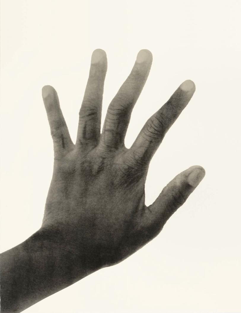
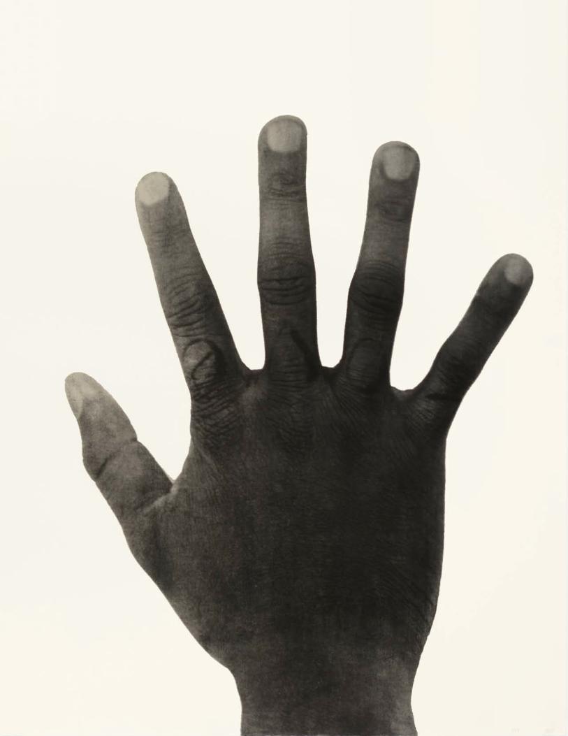
Finally, as the second iteration of the Art in Art in Print series, we are very pleased to have in this issue Damon Davis’s All Hands on Deck, a project born on the streets of Ferguson, Missouri, in the aftermath of the shooting death of Michael Brown one year ago. As the chant “Hands up, don’t shoot” spread around the country, Davis understood the pro-vocative power of the associated gesture: raised hands may be used to acquiesce, to protest or to rebuild. From our earliest childhood, however, they are also used to say simply, “Look. I am here.”
Susan Tallman is the Editor-in-Chief of Art in Print.
Chiura Obata, detail of Seasons Greetings from Topaz (ca. 1942), relief print and watercolor on paper, 2 3/4 x 4 3/4 inches. Gift of the Obata family. Topaz Museum, Delta, Utah.
THE ARION PRESS1802 Hays Street, The Presidio, San Francisco, California 94129
415-668-2542 • [email protected] • www.arionpress.com
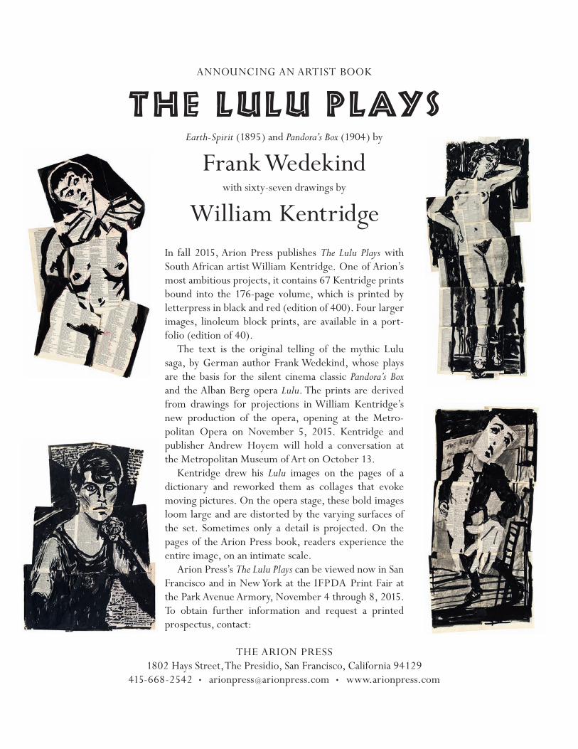
In fall 2015, Arion Press publishes The Lulu Plays with South African artist William Kentridge. One of Arion’s most ambitious projects, it contains 67 Kentridge prints bound into the 176-page volume, which is printed by letterpress in black and red (edition of 400). Four larger images, linoleum block prints, are available in a port- folio (edition of 40).
The text is the original telling of the mythic Lulu saga, by German author Frank Wedekind, whose plays are the basis for the silent cinema classic Pandora’s Box and the Alban Berg opera Lulu. The prints are derived from drawings for projections in William Kentridge’s new production of the opera, opening at the Metro-politan Opera on November 5, 2015. Kentridge and publisher Andrew Hoyem will hold a conversation at the Metropolitan Museum of Art on October 13.
Kentridge drew his Lulu images on the pages of a dictionary and reworked them as collages that evoke moving pictures. On the opera stage, these bold images loom large and are distorted by the varying surfaces of the set. Sometimes only a detail is projected. On the pages of the Arion Press book, readers experience the entire image, on an intimate scale.
Arion Press’s The Lulu Plays can be viewed now in San Francisco and in New York at the IFPDA Print Fair at the Park Avenue Armory, November 4 through 8, 2015. To obtain further information and request a printed prospectus, contact:
ANNOuNCING AN ARTIST BOOK
THE LuLu PLAYSEarth-Spirit (1895) and Pandora’s Box (1904) by
Frank Wedekindwith sixty-seven drawings by
William Kentridge
Art in Art in Print Number 2
Damon Davis:All Hands On Deck (2015)
The cry became a chant in Ferguson, MO, after Michael Brown was shot to death by police on 9 August 2014. In the days and weeks after the unarmed teen-ager’s death, initially non-violent protest escalated into exchanges of tear gas, rub-ber bullets and Molotov cocktails. Images of burning cars and of police armed and armored like ground forces in Iraq flashed around the world.
Brown’s death came just three weeks after Eric Garner was choked to death by police on a Staten Island sidewalk. It was followed by the deaths of 12-year-old Tamir Rice, shot by police in Cleveland on 22 November; Walter Scott, shot in the back by a police officer in North Charles-ton on 4 April; and Freddie Gray, who died in a police van in Baltimore eight days later. They joined the long, sad ros-ter of unarmed black Americans killed by those who swore to protect and defend.
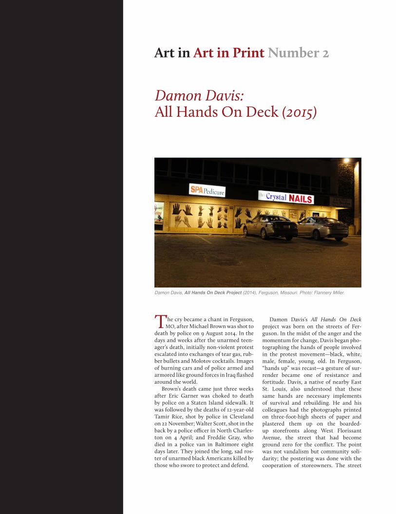
Damon Davis’s All Hands On Deck project was born on the streets of Fer-guson. In the midst of the anger and the momentum for change, Davis began pho-tographing the hands of people involved in the protest movement—black, white, male, female, young, old. In Ferguson, “hands up” was recast—a gesture of sur-render became one of resistance and fortitude. Davis, a native of nearby East St. Louis, also understood that these same hands are necessary implements of survival and rebuilding. He and his colleagues had the photographs printed on three-foot-high sheets of paper and plastered them up on the boarded-up storefronts along West Florissant Avenue, the street that had become ground zero for the conflict. The point was not vandalism but community soli-darity; the postering was done with the cooperation of storeowners. The street
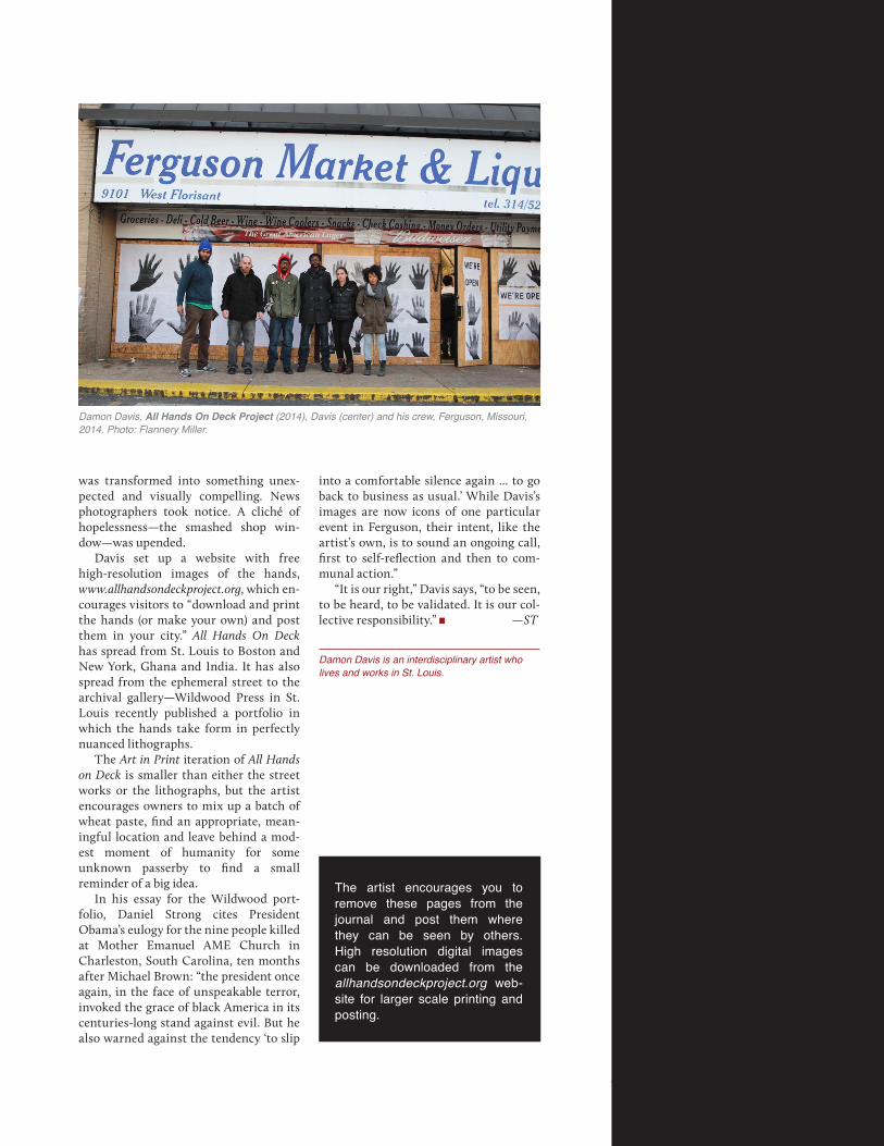
Damon Davis, All Hands On Deck Project (2014), Ferguson, Missouri. Photo: Flannery Miller.
allhandsondeckproject.org
Art in Print September – October 20158
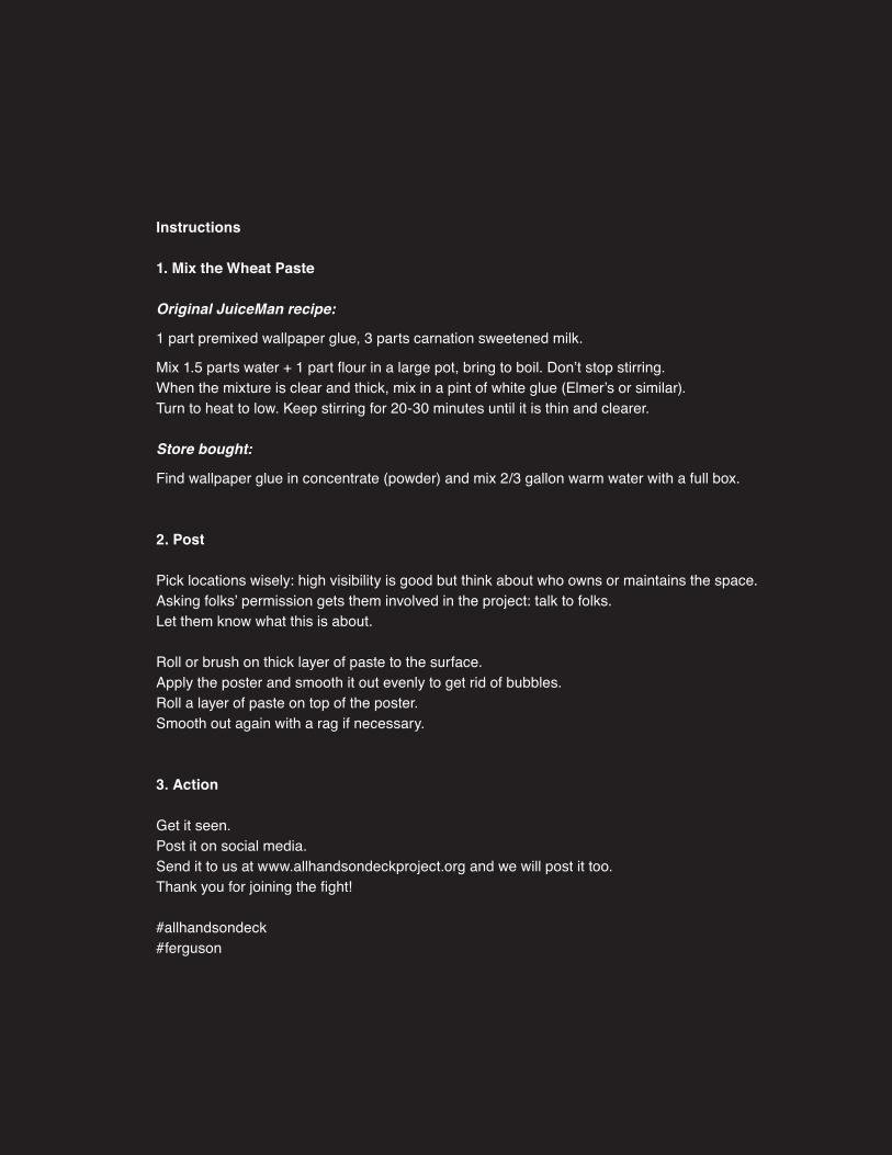
Instructions
1. Mix the Wheat Paste
Original JuiceMan recipe:
1 part premixed wallpaper glue, 3 parts carnation sweetened milk.
Mix 1.5 parts water + 1 part flour in a large pot, bring to boil. Don’t stop stirring.When the mixture is clear and thick, mix in a pint of white glue (Elmer’s or similar).Turn to heat to low. Keep stirring for 20-30 minutes until it is thin and clearer.
Store bought:
Find wallpaper glue in concentrate (powder) and mix 2/3 gallon warm water with a full box.
2. Post
Pick locations wisely: high visibility is good but think about who owns or maintains the space. Asking folks’ permission gets them involved in the project: talk to folks. Let them know what this is about.
Roll or brush on thick layer of paste to the surface. Apply the poster and smooth it out evenly to get rid of bubbles. Roll a layer of paste on top of the poster. Smooth out again with a rag if necessary.
3. Action
Get it seen. Post it on social media. Send it to us at www.allhandsondeckproject.org and we will post it too. Thank you for joining the fight!
#allhandsondeck#ferguson
Art in Print September – October 2015 9
Damon Davis, All Hands On Deck Project (2014), Davis (center) and his crew, Ferguson, Missouri, 2014. Photo: Flannery Miller.
was transformed into something unex-pected and visually compelling. News photographers took notice. A cliché of hopelessness—the smashed shop win-dow—was upended.
Davis set up a website with free high-resolution images of the hands, www.allhandsondeckproject.org, which en- courages visitors to “download and print the hands (or make your own) and post them in your city.” All Hands On Deck has spread from St. Louis to Boston and New York, Ghana and India. It has also spread from the ephemeral street to the archival gallery—Wildwood Press in St. Louis recently published a portfolio in which the hands take form in perfectly nuanced lithographs.
The Art in Print iteration of All Hands on Deck is smaller than either the street works or the lithographs, but the artist encourages owners to mix up a batch of wheat paste, find an appropriate, mean-ingful location and leave behind a mod- est moment of humanity for some unknown passerby to find a small reminder of a big idea.
In his essay for the Wildwood port-folio, Daniel Strong cites President Obama’s eulogy for the nine people killed at Mother Emanuel AME Church in Charleston, South Carolina, ten months after Michael Brown: “the president once again, in the face of unspeakable terror, invoked the grace of black America in its centuries-long stand against evil. But he also warned against the tendency ‘to slip
into a comfortable silence again ... to go back to business as usual.’ While Davis’s images are now icons of one particular event in Ferguson, their intent, like the artist’s own, is to sound an ongoing call, first to self-reflection and then to com-munal action.”
“It is our right,” Davis says, “to be seen, to be heard, to be validated. It is our col-lective responsibility.” —ST
Damon Davis is an interdisciplinary artist who lives and works in St. Louis.
The artist encourages you to remove these pages from the journal and post them where they can be seen by others. High resolution digital images can be downloaded from the allhandsondeckproject.org web-site for larger scale printing and posting.
Art in Print September – October 201510
Dresden 1945: Wilhelm Rudolph’s Compulsive InventoryBy Johannes Schmidt
The artistic life of Wilhelm Rudolph(1889–1982) was lived almost entirely
in the city of Dresden. He left his home-town of Chemnitz in 1908 to study at the Königlich Sächsische Kunstakad-emie (Royal Saxon Academy of Art), and though his studies were interrupted by World War I he returned to Dresden to finish his degree. Thereafter, apart from occasional short trips, Rudolph remained in the city until his death in 1982. Both a painter and printmaker, he began mak-ing woodcuts around 1920 and over the following six decades created some 750 works in the medium, which undoubtedly
constitute his most significant artistic achievement.1 He spoke of printmaking as
the balance to my painting. Print gave me greater opportunities for a range of topics than the painted pic-ture did . . . The lapidary brevity that is the essential nature of the woodcut requires a clear, forceful presenta-tion of the subject. I hoped to address people of all different classes, and found that my impressions of ani-mals, landscapes, people, etc.—made in reluctant wood—were able to do so. I used every type of wood for my
purpose: pine, basswood, alder, oak, spruce, and poplar or plywood of various kinds when I had nothing else. From all these woods, life awoke.2
Rudolph’s earliest prints showed the influences of Jugendstil and Expression-ism, but by the mid-1920s his persistent study of nature had fostered a more objec-tive approach and his woodcuts took on their characteristic cutting style of short superimposed lines and hatchings; he seems to have used the gouges and chis-els almost as freely as if they were draw-ing utensils. Through multiple diagonal
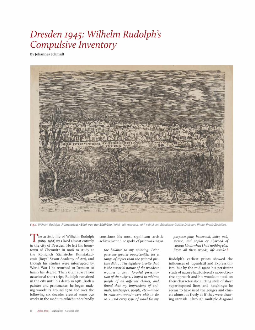
Fig. 1. Wilhelm Rudolph, Ruinenstadt / Blick von der Südhöhe (1945–46), woodcut, 49.7 x 64.8 cm. Städtische Galerie Dresden. Photo: Franz Zadniček.
Art in Print September – October 2015 11
overlaps he created fine, almost painterly effects, which enabled him to describe surface differences and spatial depths with great precision. He would work the entire surface—few areas are either fully black or fully white—with shallow inci-sions, avoiding the kind of deep cuts that might make the block difficult to print.
Following regional representational traditions that dated back to the 19th century, Rudolph painted, drew and cut in wood that which he saw around him: human figures, animals in the zoo, Saxon landscapes and urban views of Dresden.
His choice of artistic means was deter-mined by a radical struggle for autonomy. Rudolph almost never printed editions. In the lower left margin of his woodcuts, in place of an edition number, one usually finds the statement Handdruck (hand- printed) or, more rarely, Selbstdruck (self-printed). Rudolph did not usually employ a press, instead hand rubbing his large-format prints with a bone folder, and producing just a few copies of each. He frequently reworked the blocks after the first printing, so many of his prints exist in multiple states. In his graphic work, which he separated completely from his painting, he devoted himself to the strict discipline of the black and white woodcut.
Despite the economic difficul-ties in Germany in the 1920s, Rudolph enjoyed increasing success as an artist.
Museums in Chemnitz, Dresden and Ber-lin acquired his works; he was part of the leadership of the International Art Exhi-bition in Dresden in 1926 and in Novem-ber 1932 he was appointed lecturer at the Dresden Art Academy. Three years later he was awarded the title of professor, but was fired in early 1939 after ongoing disputes with the school’s Nazi adminis-tration. Rudolph’s political biography is complicated and contradictory: during the Weimar Republic he briefly joined the Communist Party (KPD, 1923–25) and the National Socialist German Workers Party (NSDAP or Nazi Party, 1931–32), resigning from the latter when it proved to be less Socialist than he hoped. After the Nazis came to power in 1933, Rudolph attempted to rejoin the NSDAP, prob-ably to protect his job, but was rebuffed. His position was tenuous: his work was included in the first “Entartete Kunst” (Degenerate Art) exhibition in Dresden in 1933, and in 1938 some of his works held by Dresden museums were confiscated as “degenerate.” He remained in Dresden throughout the war, working as a free-lance artist.
The transformative event of Rudolph’s life occurred on 13 and 14 February 1945, when Allied forces dropped bombs and incendiary devices on Dresden, destroy-ing 15 square kilometers of the city cen-ter. Some 12,000 buildings were in ruins
and more than 25,000 people were killed. Rudolph’s work and living space, located just across on the northern bank of the Elbe, burned to the ground. Except for a few large paintings that were being stored elsewhere and a handful of smaller printing blocks that Rudolph was able to save from the burning building, his work was completely destroyed. He later esti-mated the loss at about 70 paintings and 200 woodblocks worked on both sides.3
At the time of the bombing Rudolph was nearly 56 years old. Because of his age he had been spared military service in World War II, but he knew the hor-rors of war from his time on the front lines during World War I. In February 1945 the fires burned for days, but once they were extinguished Rudolph went out and began drawing. He recorded the apocalyptic backdrop of the ruined city as well as the human tragedies of those last months of the war. The first of these drawings pictured the ruined Körner-Haus building that had been his home.4Rudolph and his wife found accommoda-tions with friends and relatives as well as in various emergency shelters, but every day he went out into the destroyed city center to draw. He later recalled:
There was no time for mourning. In 1945 no one mourned; it was survival. I drew, I drew obsessively. It was all still there, that’s the unimaginable thing. Dresden still stood. The fire had left the sandstone of the buildings stand-ing like skeletons. Only later did it all collapse or was blasted away.5
This work in the ruins was an adven-turous undertaking. Initially the city was patrolled by the Wehrmacht to prevent looting; Rudolph was issued a permit for the purpose of documenting destroyed cultural buildings. As the end of the war approached it became a virtually lawless zone where dazed, bombed-out residents roamed, searching for their remaining possessions, and refugees passed through gathering firewood. While Rudolph sat concentrating on his drawing board, his wife would stand lookout for potential dangers. On 7 May 1945—the day before the Red Army took control of the city—he reported:
The Russian artillery was already fir-ing on the city; it was dangerous in the rubble. There were also defensive positions in the ruins, which one did
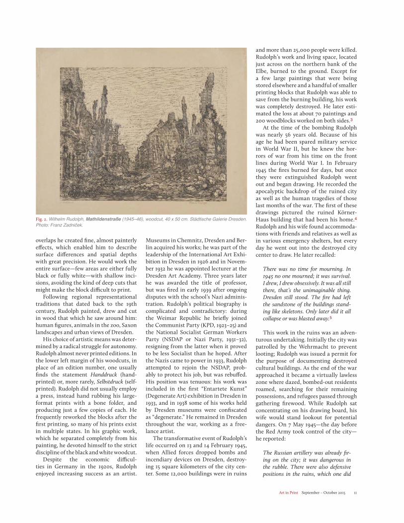
Fig. 2. Wilhelm Rudolph, Mathildenstraße (1945–46), woodcut, 40 x 50 cm. Städtische Galerie Dresden. Photo: Franz Zadniček.
Art in Print September – October 201512
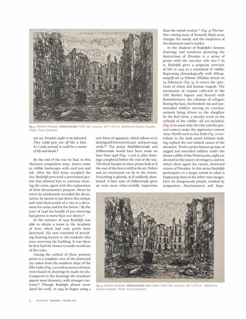
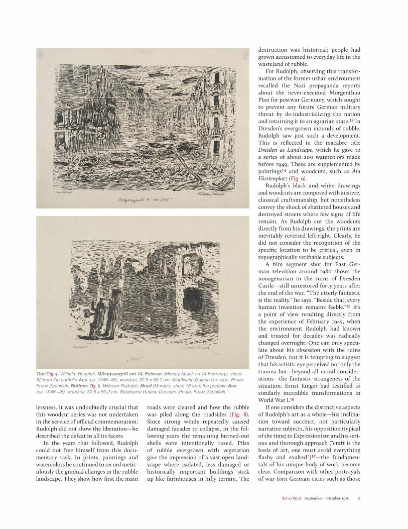
new form of signature, which allows us to distinguish between his pre- and post-1945 work.10 The prints Mathildenstraße and Zöllnerstraße would have been made no later than 1946 (Figs. 2 and 3), after draw-ings completed before the end of the war. The black facades in these prints look as if the soot of the fires is still in the air. Debris and an overturned car lie in the streets. Everything is ghostly, as if suddenly aban-doned. A later state of Zöllnerstraße gives an even more other-worldly impression
than the initial version.11 (Fig. 4) The fur-ther cutting away of formerly black areas changes the mood, and the emptiness of the destroyed road is starker.
In the shadows of Rudolph’s famous drawings and woodcuts picturing the destruction of Dresden is a series of prints with the succinct title Aus.12 In it, Rudolph gives a poignant overview of life in 1945 in a wasteland of rubble. Beginning chronologically with Mittag-sangriff am 14 Februar (Midday attack on 14 February) (Fig. 5), it covers the spec-trum of chaos and human tragedy. The mountains of corpses collected in the Old Market Square and burned with flamethrowers, the columns of refugees fleeing the East, the bombed-out and war-wounded soldiers moving on crutches, animals being driven to the slaughter by the Red Army, a murder scene in the solitude of the rubble—all are included. (Fig. 6) In some only the title and the gen-eral context make the oppressive content clear. Motifs such as Das Ende (Fig. 7) con-tribute to the dark mood without mak-ing explicit the war-related causes of the situation. Twelve prints feature groups of ragged and wounded soldiers under the theme rubble of the Wehrmacht, eight are devoted to the misery of refugees, and ten others show again the vacant, destroyed streets of Dresden. In this series Rudolph participates to a larger extent in what is happening than in his other ruin images. Here he foregrounds people, marked by resignation, disorientation and hope-
not see; Dresden ought to be defended. They could pick you off like a hare. So I crept around; it could be a matter of life and death.6
By the end of the war he had, in this obsessive-compulsive state, drawn some 50 rubble landscapes with reed pen and ink. After the Red Army occupied the city, Rudolph procured a provisional per-mit that allowed him to continue draw-ing the ruins, again with the explanation of their documentary purpose. Street by street he assiduously recorded the devas-tation; he meant to put down this unique and total destruction of a city as a docu-ment for today and for the future.7 By the start of 1946 his bundle of pen drawings had grown to more than 200 sheets.8
In the summer of 1945 Rudolph was able to obtain a room in the Academy of Arts, which had only partly been destroyed. His rent consisted of provid-ing drawing lessons to the students who were restoring the building. It was there he first had the chance to make woodcuts of the ruins.
Among the earliest of these postwar prints is a complete view of the destroyed city taken from the southern slope of the Elbe Valley (Fig. 1) as well as a series of street views based on drawings he made on-site. Compared to the drawings the woodcuts appear more dramatic, with stronger con-trasts.9 Though Rudolph almost never dated his work, in 1945 he began using a
Fig. 3. Wilhelm Rudolph, Zöllnerstraße (1945–46), woodcut, 48.7 x 65 cm. Städtische Galerie Dresden. Photo: Franz Zadniček.
Fig. 4. Wilhelm Rudolph, Zöllnerstraße (later state) (1945–56), woodcut, 48.7 x 65 cm. Städtische Galerie Dresden. Photo: Franz Zadniček.
Art in Print September – October 2015 13
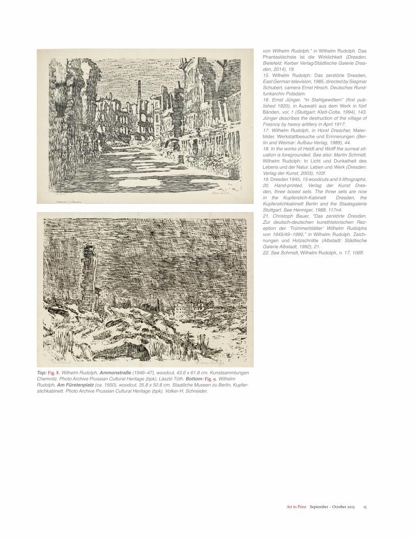
roads were cleared and how the rubble was piled along the roadsides (Fig. 8). Since strong winds repeatedly caused damaged facades to collapse, in the fol-lowing years the remaining burned-out shells were intentionally razed. Piles of rubble overgrown with vegetation give the impression of a vast open land- scape where isolated, less damaged or historically important buildings stick up like farmhouses in hilly terrain. The
destruction was historical; people had grown accustomed to everyday life in the wasteland of rubble.
For Rudolph, observing this transfor-mation of the former urban environment recalled the Nazi propaganda reports about the never-executed Morgenthau Plan for postwar Germany, which sought to prevent any future German military threat by de-industrializing the nation and returning it to an agrarian state.13 In Dresden’s overgrown mounds of rubble, Rudolph saw just such a development. This is reflected in the macabre title Dresden as Landscape, which he gave to a series of about 200 watercolors made before 1949. These are supplemented by paintings14 and woodcuts, such as Am Fürstenplatz (Fig. 9).
Rudolph’s black and white drawings and woodcuts are composed with austere, classical craftsmanship, but nonetheless convey the shock of shattered houses and destroyed streets where few signs of life remain. As Rudolph cut the woodcuts directly from his drawings, the prints are inevitably reversed left-right. Clearly, he did not consider the recognition of the specific location to be critical, even in topographically verifiable subjects.
A film segment shot for East Ger-man television around 1980 shows the nonagenarian in the ruins of Dresden Castle—still unrestored forty years after the end of the war. “The utterly fantastic is the reality,” he says. “Beside that, every human invention remains feeble.”15 It’s a point of view resulting directly from the experience of February 1945, when the environment Rudolph had known and trusted for decades was radically changed overnight. One can only specu-late about his obsession with the ruins of Dresden, but it is tempting to suggest that his artistic eye perceived not only the trauma but—beyond all moral consider-ations—the fantastic strangeness of the situation. Ernst Jünger had testified to similarly incredible transformations in World War I.16
If one considers the distinctive aspects of Rudolph’s art as a whole—his inclina-tion toward succinct, not particularly narrative subjects, his opposition (typical of the time) to Expressionism and his seri-ous and thorough approach (“craft is the basis of art, one must avoid everything flashy and exalted”)17—the fundamen-tals of his unique body of work become clear. Comparison with other portrayals of war-torn German cities such as those
lessness. It was undoubtedly crucial that this woodcut series was not undertaken in the service of official commemoration: Rudolph did not show the liberation—he described the defeat in all its facets.
In the years that followed, Rudolph could not free himself from this docu-mentary task. In prints, paintings and watercolors he continued to record metic-ulously the gradual changes in the rubble landscape. They show how first the main
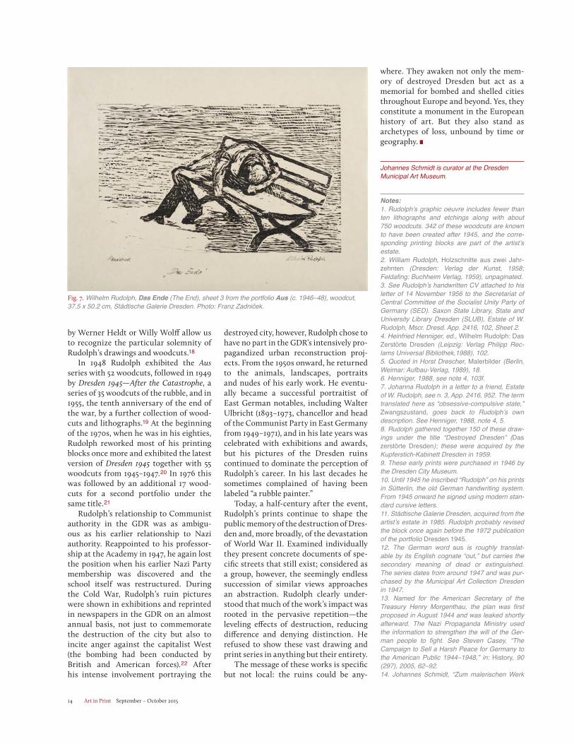
Top: Fig. 5. Wilhelm Rudolph, Mittagsangriff am 14. Februar (Midday Attack on 14 February), sheet 32 from the portfolio Aus (ca. 1946–48), woodcut, 37.5 x 50.2 cm. Städtische Galerie Dresden. Photo: Franz Zadniček. Bottom: Fig. 6. Wilhelm Rudolph, Mord (Murder), sheet 18 from the portfolio Aus (ca. 1946–48), woodcut, 37.5 x 50.2 cm. Städtische Galerie Dresden. Photo: Franz Zadniček.
Art in Print September – October 201514
by Werner Heldt or Willy Wolff allow us to recognize the particular solemnity of Rudolph’s drawings and woodcuts.18
In 1948 Rudolph exhibited the Ausseries with 52 woodcuts, followed in 1949 by Dresden 1945 —After the Catastrophe, a series of 35 woodcuts of the rubble, and in 1955, the tenth anniversary of the end of the war, by a further collection of wood-cuts and lithographs.19 At the beginning of the 1970s, when he was in his eighties, Rudolph reworked most of his printing blocks once more and exhibited the latest version of Dresden 1945 together with 55 woodcuts from 1945–1947.20 In 1976 this was followed by an additional 17 wood-cuts for a second portfolio under the same title.21
Rudolph’s relationship to Communist authority in the GDR was as ambigu-ous as his earlier relationship to Nazi authority. Reappointed to his professor-ship at the Academy in 1947, he again lost the position when his earlier Nazi Party membership was discovered and the school itself was restructured. During the Cold War, Rudolph’s ruin pictures were shown in exhibitions and reprinted in newspapers in the GDR on an almost annual basis, not just to commemorate the destruction of the city but also to incite anger against the capitalist West (the bombing had been conducted by British and American forces).22 After his intense involvement portraying the
destroyed city, however, Rudolph chose to have no part in the GDR’s intensively pro-pagandized urban reconstruction proj-ects. From the 1950s onward, he returned to the animals, landscapes, portraits and nudes of his early work. He eventu-ally became a successful portraitist of East German notables, including Walter Ulbricht (1893–1973, chancellor and head of the Communist Party in East Germany from 1949–1971), and in his late years was celebrated with exhibitions and awards, but his pictures of the Dresden ruins continued to dominate the perception of Rudolph’s career. In his last decades he sometimes complained of having been labeled “a rubble painter.”
Today, a half-century after the event, Rudolph’s prints continue to shape the public memory of the destruction of Dres-den and, more broadly, of the devastation of World War II. Examined individually they present concrete documents of spe-cific streets that still exist; considered as a group, however, the seemingly endless succession of similar views approaches an abstraction. Rudolph clearly under-stood that much of the work’s impact was rooted in the pervasive repetition—the leveling effects of destruction, reducing difference and denying distinction. He refused to show these vast drawing and print series in anything but their entirety.
The message of these works is specific but not local: the ruins could be any-
where. They awaken not only the mem-ory of destroyed Dresden but act as a memorial for bombed and shelled cities throughout Europe and beyond. Yes, they constitute a monument in the European history of art. But they also stand as archetypes of loss, unbound by time or geography.
Johannes Schmidt is curator at the Dresden Municipal Art Museum.
Notes:1. Rudolph’s graphic oeuvre includes fewer than ten lithographs and etchings along with about 750 woodcuts. 342 of these woodcuts are known to have been created after 1945, and the corre-sponding printing blocks are part of the artist’s estate.2. William Rudolph, Holzschnitte aus zwei Jahr-zehnten (Dresden: Verlag der Kunst, 1958; Feldafing: Buchheim Verlag, 1959), unpaginated.3. See Rudolph’s handwritten CV attached to his letter of 14 November 1956 to the Secretariat of Central Committee of the Socialist Unity Party of Germany (SED). Saxon State Library, State and University Library Dresden (SLUB), Estate of W. Rudolph, Mscr. Dresd. App. 2416, 102, Sheet 2.4. Heinfried Henniger, ed., Wilhelm Rudolph: Das Zerstörte Dresden (Leipzig: Verlag Philipp Rec-lams Universal Bibliothek,1988), 102.5. Quoted in Horst Drescher, Malerbilder (Berlin, Weimar: Aufbau-Verlag, 1989), 18.6. Henniger, 1988, see note 4, 103f.7. Johanna Rudolph in a letter to a friend, Estate of W. Rudolph, see n. 3, App. 2416, 952. The term translated here as “obsessive-compulsive state,” Zwangszustand, goes back to Rudolph’s own description. See Henniger, 1988, note 4, 5.8. Rudolph gathered together 150 of these draw-ings under the title “Destroyed Dresden” (Das zerstörte Dresden); these were acquired by the Kupferstich-Kabinett Dresden in 1959.9. These early prints were purchased in 1946 by the Dresden City Museum. 10. Until 1945 he inscribed “Rudolph” on his prints in Sütterlin, the old German handwriting system. From 1945 onward he signed using modern stan-dard cursive letters.11. Städtische Galerie Dresden, acquired from the artist’s estate in 1985. Rudolph probably revised the block once again before the 1972 publication of the portfolio Dresden 1945.12. The German word aus is roughly translat-able by its English cognate “out,” but carries the secondary meaning of dead or extinguished. The series dates from around 1947 and was pur-chased by the Municipal Art Collection Dresden in 1947.13. Named for the American Secretary of the Treasury Henry Morgenthau, the plan was first proposed in August 1944 and was leaked shortly afterward. The Nazi Propaganda Ministry used the information to strengthen the will of the Ger-man people to fight. See Steven Casey, “The Campaign to Sell a Harsh Peace for Germany to the American Public 1944–1948,” in: History, 90 (297), 2005, 62–92.14. Johannes Schmidt, “Zum malerischen Werk
Fig. 7. Wilhelm Rudolph, Das Ende (The End), sheet 3 from the portfolio Aus (c. 1946–48), woodcut, 37.5 x 50.2 cm, Städtische Galerie Dresden. Photo: Franz Zadniček.
Art in Print September – October 2015 15
von Wilhelm Rudolph,” in Wilhelm Rudolph. Das Phantastischste ist die Wirklichkeit (Dresden, Bielefeld: Kerber Verlag/Städtische Galerie Dres-den, 2014), 19.15. Wilhelm Rudolph: Das zerstörte Dresden, East German television, 1985, directed by Siegmar Schubert, camera Ernst Hirsch, Deutsches Rund-funkarchiv Potsdam.16. Ernst Jünger, “In Stahlgewittern” (first pub-lished 1920), in Auswahl aus dem Werk in fünf Bänden, vol. 1 (Stuttgart: Klett-Cotta, 1994), 143. Jünger describes the destruction of the village of Fresnoy by heavy artillery in April 1917. 17. Wilhelm Rudolph, in Horst Drescher, Maler-bilder. Werkstattbesuche und Erinnerungen (Ber-lin and Weimar: Aufbau-Verlag, 1989), 44.18. In the works of Heldt and Wolff the surreal sit-uation is foregrounded. See also: Martin Schmidt, Wilhelm Rudolph: In Licht und Dunkelheit des Lebens und der Natur. Leben und Werk (Dresden: Verlag der Kunst, 2003), 103f.19. Dresden 1945, 15 woodcuts and 5 lithographs.20. Hand-printed, Verlag der Kunst Dres-den, three boxed sets. The three sets are now in the Kupferstich-Kabinett Dresden, the Kupferstichkabinett Berlin and the Staatsgalerie Stuttgart. See Henniger, 1988, 117n4.21. Christoph Bauer, “Das zerstörte Dresden. Zur deutsch-deutschen kunsthistorischen Rez-eption der ‘Trümmerblätter’ Wilhelm Rudolphs von 1945/49–1990,” in Wilhelm Rudolph. Zeich-nungen und Holzschnitte (Albstadt: Städtische Galerie Albstadt, 1992), 21. 22. See Schmidt, Wilhelm Rudolph, n. 17, 106ff.
Top: Fig. 8. Wilhelm Rudolph, Ammonstraße (1946–47), woodcut, 43.6 x 61.8 cm. Kunstsammlungen Chemnitz. Photo Archive Prussian Cultural Heritage (bpk), László Tóth. Bottom: Fig. 9. Wilhelm Rudolph, Am Fürstenplatz (ca. 1950), woodcut, 35.8 x 50.8 cm. Staatliche Museen zu Berlin, Kupfer-stichkabinett. Photo Archive Prussian Cultural Heritage (bpk), Volker-H. Schneider.
Art in Print September – October 201516
Behind Barbed Wire: Printmaking in Australian Internment Camps by Erwin Fabian and Ludwig Hirschfeld Mack By Stephen Coppel
In Hay, after the general parade and a morning inspection by the military,
I put up a board between the bunk and the window, and must have managed to get an old window, or some window glass, and some printing ink used in the office for duplicating. I spread the stuff with a bunched up piece of cotton on glass or on the smooth part of masonite for my mono-types.”1 The German-Jewish internee Erwin Fabian thus later recounted his method of making prints while impris-oned in an internment camp in Australia during World War II. Fabian was among 2,700 refugees of mostly German and Aus-trian Jewish background who had been transported under prison guard on the ship Dunera from England to Australia in 1940. Following the fall of Paris to the Nazis that June and the evacuation of the British army from Dunkirk, the British government had ordered the internment of all male “enemy aliens” in Britain irre-spective of their status as refugees from fascism. This indiscriminate roundup took place within a climate of mounting suspicion and hysteria fueled by press and government fears of a fifth column. While most internees were confined in camps on the Isle of Man and others were shipped to Canada, the Dunera internees arrived in Australia following a grueling 12,000-mile voyage.2
The heavily overcrowded boat had put out from Liverpool on 10 July 1940 and, after off-loading some 400-odd of its human cargo at Port Melbourne for transfer by train to the internment camp at Tatura in northern Victoria, the Dunerafinally docked at Sydney on 6 September after an almost two-month-long voyage that became notorious for its brutality. British soldiers broke into the intern-ees’ confiscated suitcases, stole anything of value and tossed personal papers and visas into the sea. Confined below decks with the hatches mostly battened down and the portholes permanently closed, the internees were transported through
“
Fig. 5. Ludwig Hirschfeld Mack, Desolation: Internment camp, Orange NSW (1941), woodcut on thin paper, 21.8 x 13.5 cm. British Museum, London. Purchased with funds from the Friends of Prints and Drawings. 2010,7075.1. ©Trustees of the British Museum. Reproduced by permission of the artist’s estate.
Art in Print September – October 2015 17
the tropics in cramped, grossly unhy-gienic conditions, dependent on weak electric light and air through ventilators; the upper parts of the ship with its access to fresh air were out of bounds, closed off by barbed wire and sentries with bayonets, except when forced walks were decreed under military supervision. One inmate committed suicide out of desper-ation; two others died of natural causes. For the remaining internees, the arrival in Sydney marked the end of a voyage in hell and the start of a new incarceration in the remote Australian outback.3
The internment camp at Hay was located several hundred miles inland in southwestern New South Wales. The nineteen-hour train trip from Sydney was the first experience of Australia for the internees; they travelled under Australian military guard, which, in contrast to that on the Dunera, was minimal and lenient. One Dunera internee later recalled: “Few of us knew anything about the country … generally speaking, we knew of it as the place ‘bottom right’ on the map, or, more disrespectfully, as the arse of the world.”4
Fabian remembered passing deserted rail-way sidings with unfamiliar names and kangaroos running alongside the train—“the only living things that could be seen in an endless landscape with occasional trees and ochrey-yellow soil, flat and
empty.”5 The internment camp itself was located on a vast flat treeless plain and consisted of two compounds, Camp 7 and Camp 8, each housing about 1,000 men in 36 huts surrounded by a high, triple fence of barbed wire and overlooked by armed watchtowers and searchlights. Camp 7
held only Jewish refugees while Camp 8 contained a mixture of anti-fascist Cath-olics, Protestants, Communists and a few Jews. Despite their proximity, the author-ities forbade communication between the two camps. It was to be the internees’ abode for the next nine months, until May 1941.
Behind barbed wire, the inmates in both compounds organized themselves into groups, teaching each other a wide range of topics, including languages, mathematics, the sciences as well as art and art history. Here the young Erwin Fabian, a Berliner born in 1915 (his cente-nary occurs this year) and the son of the German painter Max Fabian, attended drawing classes given by the surrealist painter and stage designer Hein Heck-roth in Camp 7. Nazi legislation had pro-hibited Fabian, who came from a secular Jewish background, from applying to the Berlin Academy of Arts; he had attended life classes at night where his swastika-wearing instructor had warned him to leave Germany as soon as possible; he had arrived as a refugee in London a few weeks before the Nazi annexation of Austria in March 1938. At Hay Heckroth did not offer formal training; instead, as Fabian recalled, “he just suggested things, which appealed to me, and he discussed the drawings and watercolours people had done. There was no compulsion to show him, or anyone else, what you had
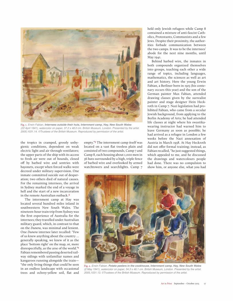
Fig. 1. Erwin Fabian, Internees outside their huts, Internment camp, Hay, New South Wales (22 April 1941), watercolor on paper, 37.2 x 48.0 cm. British Museum, London. Presented by the artist. 2005,1031.14. ©Trustees of the British Museum. Reproduced by permission of the artist.
Fig. 2. Erwin Fabian, Potato peelers in the cookhouse, Internment camp, Hay, New South Wales (2 May 1941), watercolor on paper, 34.3 x 46.1 cm. British Museum, London. Presented by the artist. 2005,1031.13. ©Trustees of the British Museum. Reproduced by permission of the artist.
Art in Print September – October 201518
Left: Fig. 3. Erwin Fabian, Night 1 (1941), transfer monotype, 19.6 x 24.5 cm. British Museum, London. 1999, 1128.1. ©Trustees of the British Museum. Reproduced by permission of the artist. Right: Fig. 4. Erwin Fabian, Coffin (1941), transfer monotype, 25.8 x 20.0 cm. National Gallery of Australia, Canberra. Gordon Darling Australasian Print Fund. 1997, 97.1022. ©Erwin Fabian.
done, it was very easy-going.”6 At these classes Fabian made several life studies of seated and standing figures in gray wash and pencil. He also produced watercolors with the wet-on-wet technique recording the routine activities of camp life (Figs. 1 and 2): working parties shifting sand and gravel in the shimmering heat; the shal-low trenches dug for pipe laying and the straggly garden plots tilled outside the huts; the internees peeling potatoes or playing football.
At this point he also produced his first monotypes, and although Fabian does not recall how he learned the technique, it is possible it was being practiced by other artists in the camp. In contrast to his drawings and watercolors of camp life, his monotypes reveal the anguish of internment in a highly charged, expres-sionistic manner. In Night 1 (Fig. 3) an abject figure—naked and crawling—turns his face upwards in desperate appeal, his hands clawing in distress. His predicament is indicated at left and right by the barbed wire fence and the patrol-ling Aussie soldiers with slouch hats and bayonets. Behind him looms a spectral vision of the Europe left behind—dark and claustrophobic, with its luridly lit old buildings and narrow blind streets now overtaken by monstrous birds of prey. The image was clearly significant to Fabian as two other variants of this com-position in monotype were also made.7
The light and dark contrasts achieved by monotype printing evoke the nightmare of incarceration and the sense of power-lessness.
Other monotypes made by Fabian at Hay in 1941, and later that year at the Tatura internment camp, express the same isolation and alienation. The bar-ren Australian landscape populated with stark, ring-barked trees presented a surrealistic vision to the internees; Fabian deployed it to express confusion and apocalyptic horror. The monotype Coffin (Fig. 4) depicts a wild beast fused with a ravaged dead tree holding down the lid of a container through which can be seen an outline of the Hay camp with its rows of huts, barbed wire and sentry watchtowers; beyond the beast-tree, the ruined buildings of war-torn Europe coalesce with the dead ring-barked trees of the Australian interior.
Fabian made about 15 monotypes in the internment camps at Hay (Septem-ber 1940 to May 1941), Orange, New South Wales (May to July 1941) and Tatura, Victoria (July 1941 to January 1942).8 While not always apocalyptic in theme, they were all produced in the same way. Ink pilfered from the camp’s duplicating machine was mixed with black boot polish to make it tacky. This was applied to a piece of window glass or Masonite board picked up from the debris lying around in the camp. A thin
sheet of plain paper was placed over it and drawn upon in pencil. The pres-sure of the pencil and any rubbing from the ball of the hand immediately trans-ferred ink to the underside of the paper as a soft, hairy line and tones of varying strength. The simplicity of the materials was a necessity under camp conditions, while the technique itself appealed to Fabian for the degree of accident and uncertainty it offered. An image could be created that allowed for spontaneity; it was neither entirely drawn nor printed and could be achieved without recourse to a press.
Fabian’s monotype method was a variation of the technique devised by Paul Klee at the Bauhaus in the early 1920s. Klee’s “press-through drawing” technique (Durchdruckzeichnung) used a piece of inked paper as a carbon sand-wiched between an upper sheet on which the drawing was made in pencil and a lower sheet onto which the drawing was transferred as a monotype. By a curious twist of fate, Ludwig Hirschfeld Mack—a former apprentice and instructor in the Bauhaus Printing Workshop who had been a close friend of Klee and Lyonel Feininger—was a fellow internee at Hay in Camp 8.9 Born in Frankfurt-am-Main in 1893, Mack had turned 47 the day after the Dunera departed England for Austra-lia. His family was attached to the Evan-gelical Reformed Church, though one
Art in Print September – October 2015 19
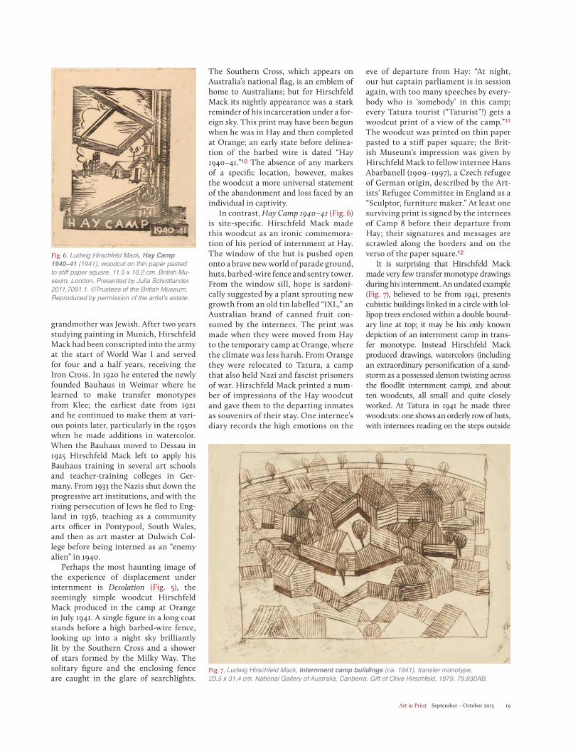
grandmother was Jewish. After two years studying painting in Munich, Hirschfeld Mack had been conscripted into the army at the start of World War I and served for four and a half years, receiving the Iron Cross. In 1920 he entered the newly founded Bauhaus in Weimar where he learned to make transfer monotypes from Klee; the earliest date from 1921 and he continued to make them at vari-ous points later, particularly in the 1950s when he made additions in watercolor. When the Bauhaus moved to Dessau in 1925 Hirschfeld Mack left to apply his Bauhaus training in several art schools and teacher-training colleges in Ger-many. From 1933 the Nazis shut down the progressive art institutions, and with the rising persecution of Jews he fled to Eng-land in 1936, teaching as a community arts officer in Pontypool, South Wales, and then as art master at Dulwich Col-lege before being interned as an “enemy alien” in 1940.
Perhaps the most haunting image of the experience of displacement under internment is Desolation (Fig. 5), the seemingly simple woodcut Hirschfeld Mack produced in the camp at Orange in July 1941. A single figure in a long coat stands before a high barbed-wire fence, looking up into a night sky brilliantly lit by the Southern Cross and a shower of stars formed by the Milky Way. The solitary figure and the enclosing fence are caught in the glare of searchlights.
The Southern Cross, which appears on Australia’s national flag, is an emblem of home to Australians; but for Hirschfeld Mack its nightly appearance was a stark reminder of his incarceration under a for-eign sky. This print may have been begun when he was in Hay and then completed at Orange; an early state before delinea-tion of the barbed wire is dated “Hay 1940–41.”10 The absence of any markers of a specific location, however, makes the woodcut a more universal statement of the abandonment and loss faced by an individual in captivity.
In contrast, Hay Camp 1940–41 (Fig. 6) is site-specific. Hirschfeld Mack made this woodcut as an ironic commemora-tion of his period of internment at Hay. The window of the hut is pushed open onto a brave new world of parade ground, huts, barbed-wire fence and sentry tower. From the window sill, hope is sardoni-cally suggested by a plant sprouting new growth from an old tin labelled “IXL,” an Australian brand of canned fruit con-sumed by the internees. The print was made when they were moved from Hay to the temporary camp at Orange, where the climate was less harsh. From Orange they were relocated to Tatura, a camp that also held Nazi and fascist prisoners of war. Hirschfeld Mack printed a num-ber of impressions of the Hay woodcut and gave them to the departing inmates as souvenirs of their stay. One internee’s diary records the high emotions on the
eve of departure from Hay: “At night, our hut captain parliament is in session again, with too many speeches by every-body who is ‘somebody’ in this camp; every Tatura tourist (“Taturist”!) gets a woodcut print of a view of the camp.”11
The woodcut was printed on thin paper pasted to a stiff paper square; the Brit-ish Museum’s impression was given by Hirschfeld Mack to fellow internee Hans Abarbanell (1909–1997), a Czech refugee of German origin, described by the Art-ists’ Refugee Committee in England as a “Sculptor, furniture maker.” At least one surviving print is signed by the internees of Camp 8 before their departure from Hay; their signatures and messages are scrawled along the borders and on the verso of the paper square.12
It is surprising that Hirschfeld Mack made very few transfer monotype drawings during his internment. An undated example (Fig. 7), believed to be from 1941, presents cubistic buildings linked in a circle with lol-lipop trees enclosed within a double bound-ary line at top; it may be his only known depiction of an internment camp in trans-fer monotype. Instead Hirschfeld Mack produced drawings, watercolors (including an extraordinary personification of a sand-storm as a possessed demon twisting across the floodlit internment camp), and about ten woodcuts, all small and quite closely worked. At Tatura in 1941 he made three woodcuts: one shows an orderly row of huts, with internees reading on the steps outside
Fig. 6. Ludwig Hirschfeld Mack, Hay Camp 1940–41 (1941), woodcut on thin paper pasted to stiff paper square, 11.5 x 10.2 cm. British Mu-seum, London. Presented by Julia Schottlander. 2011,7091.1. ©Trustees of the British Museum. Reproduced by permission of the artist’s estate.
Fig. 7. Ludwig Hirschfeld Mack, Internment camp buildings (ca. 1941), transfer monotype, 23.5 x 31.4 cm. National Gallery of Australia, Canberra. Gift of Olive Hirschfeld, 1979. 79.830AB.
Art in Print September – October 201520
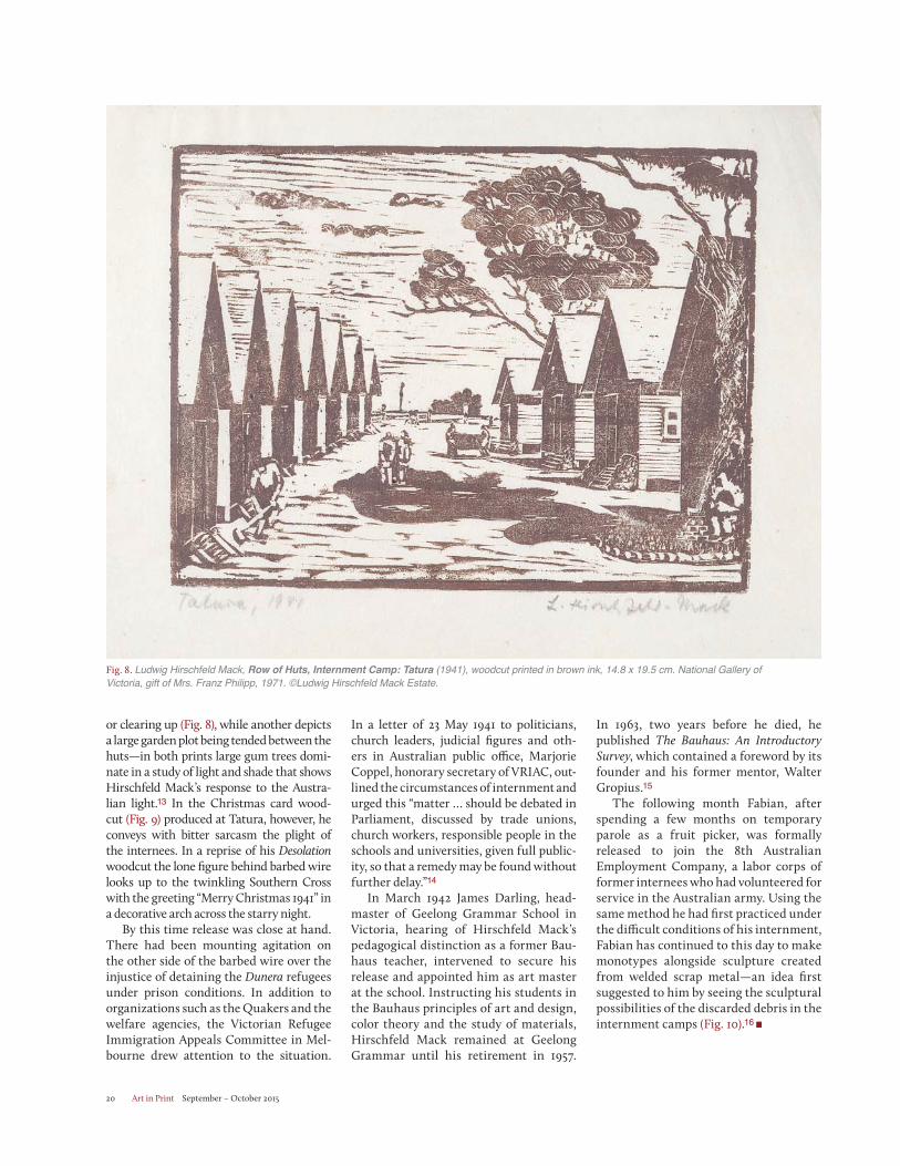
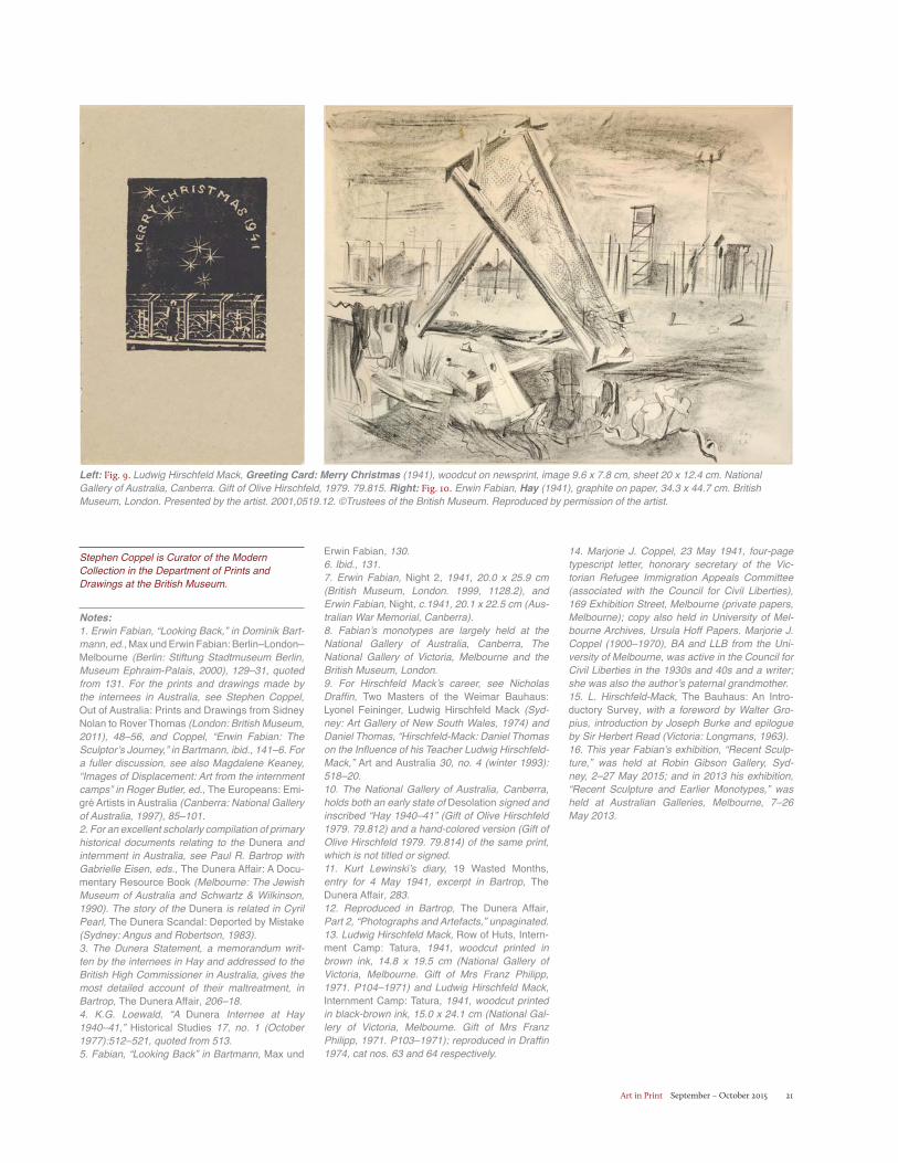
or clearing up (Fig. 8), while another depicts a large garden plot being tended between the huts—in both prints large gum trees domi-nate in a study of light and shade that shows Hirschfeld Mack’s response to the Austra-lian light.13 In the Christmas card wood-cut (Fig. 9) produced at Tatura, however, he conveys with bitter sarcasm the plight of the internees. In a reprise of his Desolationwoodcut the lone figure behind barbed wire looks up to the twinkling Southern Cross with the greeting “Merry Christmas 1941” in a decorative arch across the starry night.
By this time release was close at hand. There had been mounting agitation on the other side of the barbed wire over the injustice of detaining the Dunera refugees under prison conditions. In addition to organizations such as the Quakers and the welfare agencies, the Victorian Refugee Immigration Appeals Committee in Mel-bourne drew attention to the situation.
In a letter of 23 May 1941 to politicians, church leaders, judicial figures and oth-ers in Australian public office, Marjorie Coppel, honorary secretary of VRIAC, out-lined the circumstances of internment and urged this “matter … should be debated in Parliament, discussed by trade unions, church workers, responsible people in the schools and universities, given full public-ity, so that a remedy may be found without further delay.”14
In March 1942 James Darling, head-master of Geelong Grammar School in Victoria, hearing of Hirschfeld Mack’s pedagogical distinction as a former Bau-haus teacher, intervened to secure his release and appointed him as art master at the school. Instructing his students in the Bauhaus principles of art and design, color theory and the study of materials, Hirschfeld Mack remained at Geelong Grammar until his retirement in 1957.
In 1963, two years before he died, he published The Bauhaus: An Introductory Survey, which contained a foreword by its founder and his former mentor, Walter Gropius.15
The following month Fabian, after spending a few months on temporary parole as a fruit picker, was formally released to join the 8th Australian Employment Company, a labor corps of former internees who had volunteered for service in the Australian army. Using the same method he had first practiced under the difficult conditions of his internment, Fabian has continued to this day to make monotypes alongside sculpture created from welded scrap metal—an idea first suggested to him by seeing the sculptural possibilities of the discarded debris in the internment camps (Fig. 10).16
Fig. 8. Ludwig Hirschfeld Mack, Row of Huts, Internment Camp: Tatura (1941), woodcut printed in brown ink, 14.8 x 19.5 cm. National Gallery of Victoria, gift of Mrs. Franz Philipp, 1971. ©Ludwig Hirschfeld Mack Estate.
Art in Print September – October 2015 21
Stephen Coppel is Curator of the Modern Collection in the Department of Prints and Drawings at the British Museum.
Notes:1. Erwin Fabian, “Looking Back,” in Dominik Bart-mann, ed., Max und Erwin Fabian: Berlin–London–Melbourne (Berlin: Stiftung Stadtmuseum Berlin, Museum Ephraim-Palais, 2000), 129–31, quoted from 131. For the prints and drawings made by the internees in Australia, see Stephen Coppel, Out of Australia: Prints and Drawings from Sidney Nolan to Rover Thomas (London: British Museum, 2011), 48–56, and Coppel, “Erwin Fabian: The Sculptor’s Journey,” in Bartmann, ibid., 141–6. For a fuller discussion, see also Magdalene Keaney, “Images of Displacement: Art from the internment camps” in Roger Butler, ed., The Europeans: Emi-gré Artists in Australia (Canberra: National Gallery of Australia, 1997), 85–101. 2. For an excellent scholarly compilation of primary historical documents relating to the Dunera and internment in Australia, see Paul R. Bartrop with Gabrielle Eisen, eds., The Dunera Affair: A Docu-mentary Resource Book (Melbourne: The Jewish Museum of Australia and Schwartz & Wilkinson, 1990). The story of the Dunera is related in Cyril Pearl, The Dunera Scandal: Deported by Mistake(Sydney: Angus and Robertson, 1983). 3. The Dunera Statement, a memorandum writ-ten by the internees in Hay and addressed to the British High Commissioner in Australia, gives the most detailed account of their maltreatment, in Bartrop, The Dunera Affair, 206–18.4. K.G. Loewald, “A Dunera Internee at Hay 1940–41,” Historical Studies 17, no. 1 (October 1977):512–521, quoted from 513.5. Fabian, “Looking Back” in Bartmann, Max und
Erwin Fabian, 130.6. Ibid., 131.7. Erwin Fabian, Night 2, 1941, 20.0 x 25.9 cm (British Museum, London. 1999, 1128.2), and Erwin Fabian, Night, c.1941, 20.1 x 22.5 cm (Aus-tralian War Memorial, Canberra).8. Fabian’s monotypes are largely held at the National Gallery of Australia, Canberra, The National Gallery of Victoria, Melbourne and the British Museum, London.9. For Hirschfeld Mack’s career, see Nicholas Draffin, Two Masters of the Weimar Bauhaus: Lyonel Feininger, Ludwig Hirschfeld Mack (Syd-ney: Art Gallery of New South Wales, 1974) and Daniel Thomas, “Hirschfeld-Mack: Daniel Thomas on the Influence of his Teacher Ludwig Hirschfeld-Mack,” Art and Australia 30, no. 4 (winter 1993): 518–20.10. The National Gallery of Australia, Canberra, holds both an early state of Desolation signed and inscribed “Hay 1940–41” (Gift of Olive Hirschfeld 1979. 79.812) and a hand-colored version (Gift of Olive Hirschfeld 1979. 79.814) of the same print, which is not titled or signed. 11. Kurt Lewinski’s diary, 19 Wasted Months, entry for 4 May 1941, excerpt in Bartrop, The Dunera Affair, 283.12. Reproduced in Bartrop, The Dunera Affair, Part 2, “Photographs and Artefacts,” unpaginated.13. Ludwig Hirschfeld Mack, Row of Huts, Intern-ment Camp: Tatura, 1941, woodcut printed in brown ink, 14.8 x 19.5 cm (National Gallery of Victoria, Melbourne. Gift of Mrs Franz Philipp, 1971. P104–1971) and Ludwig Hirschfeld Mack, Internment Camp: Tatura, 1941, woodcut printed in black-brown ink, 15.0 x 24.1 cm (National Gal-lery of Victoria, Melbourne. Gift of Mrs Franz Philipp, 1971. P103–1971); reproduced in Draffin 1974, cat nos. 63 and 64 respectively.
Left: Fig. 9. Ludwig Hirschfeld Mack, Greeting Card: Merry Christmas (1941), woodcut on newsprint, image 9.6 x 7.8 cm, sheet 20 x 12.4 cm. National Gallery of Australia, Canberra. Gift of Olive Hirschfeld, 1979. 79.815. Right: Fig. 10. Erwin Fabian, Hay (1941), graphite on paper, 34.3 x 44.7 cm. British Museum, London. Presented by the artist. 2001,0519.12. ©Trustees of the British Museum. Reproduced by permission of the artist.
14. Marjorie J. Coppel, 23 May 1941, four-page typescript letter, honorary secretary of the Vic-torian Refugee Immigration Appeals Committee (associated with the Council for Civil Liberties), 169 Exhibition Street, Melbourne (private papers, Melbourne); copy also held in University of Mel-bourne Archives, Ursula Hoff Papers. Marjorie J. Coppel (1900–1970), BA and LLB from the Uni-versity of Melbourne, was active in the Council for Civil Liberties in the 1930s and 40s and a writer; she was also the author’s paternal grandmother.15. L. Hirschfeld-Mack, The Bauhaus: An Intro-ductory Survey, with a foreword by Walter Gro-pius, introduction by Joseph Burke and epilogue by Sir Herbert Read (Victoria: Longmans, 1963).16. This year Fabian’s exhibition, “Recent Sculp-ture,” was held at Robin Gibson Gallery, Syd-ney, 2–27 May 2015; and in 2013 his exhibition, “Recent Sculpture and Earlier Monotypes,” was held at Australian Galleries, Melbourne, 7–26 May 2013.
Art in Print September – October 201522
Paper Planes: Art from Japanese American Internment Camps By Charles M. Schultz
In the aftermath of the attack on Pearl Harbor, fear of Japanese covert action
spread through the United States, giv-ing rise to President Roosevelt’s Execu-tive Order 9066 of 19 February 1942. Designed to protect the nation from sabotage and espionage, the order autho-rized the secretary of war to designate “military areas … from which any or all persons may be excluded.”1 The order did not specify who was to be excluded from which parts of the country, but its primary effect was to authorize the forced relocation of 110,000 persons of Japanese ancestry—both citizens and
resident aliens—from their homes on the West Coast to internment camps inland. Forty-six years later, in 1988, Congress passed Public Law 100-383, acknowledg-ing the “fundamental injustice of the evacuation, relocation, and internment,” and apologized on behalf of the American people.2
One measure of this bill provides funding to educate the public about the internment; today a number of the camps (variously referred to as relocation camps, internment camps and concen-tration camps)3 are designated National Historic Sites and have been at least par-
tially restored under the auspices of the National Park Service. As more informa-tion about life in the camps has become public, the role that art played for detain-ees is becoming increasingly visible.4
In January of this year the Topaz Museum opened at the site of the Topaz War Relocation Center in Utah with an inaugural exhibition of works on paper. Organized by curator Scotti Hill, “When Words Weren’t Enough: Works on Paper from Topaz, 1942–1945” included more than 60 works by artists Miné Okubo, Chiura Obata, Charles Erabu Mikami, George Matsusaburo Hibi and Setsuko
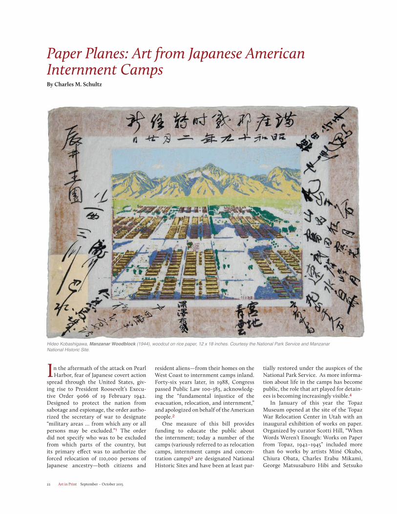
Hideo Kobashigawa, Manzanar Woodblock (1944), woodcut on rice paper, 12 x 18 inches. Courtesy the National Park Service and Manzanar National Historic Site.
Art in Print September – October 2015 23
Kenehara. While most of these works are drawings, remarkably Hibi and Obata managed to produce woodblock prints of exceptional quality despite the dearth of facilities within the camp. Hill observes that the artists were “extremely creative and industrious about crafting mediums/tools from found materials.”5 (More research is needed to know what their printing process was.)6
In her book “The Art of Gaman: Arts and Crafts from the Japanese Ameri-can Internment Camps, 1942–1946,”7
Delphine Hirasuna explains the Zen Buddhist word gaman as conveying endurance, patience and dignity. She writes: “The objects made in the camp by first and second generation Japanese are a physical manifestation of the art of gaman. The things they made from scrap and found materials are testaments to their perseverance, their resourcefulness, their spirit and humanity.”8 Reviewing the exhibition “The View From Within: Japanese American Art from the Intern-ment Camps, 1942–1945” for the Los Angeles Times William Willson wrote, “the ensemble [of work] functions as tes-tament to the persistence of grace under the most corrosive sort of pressure.”9
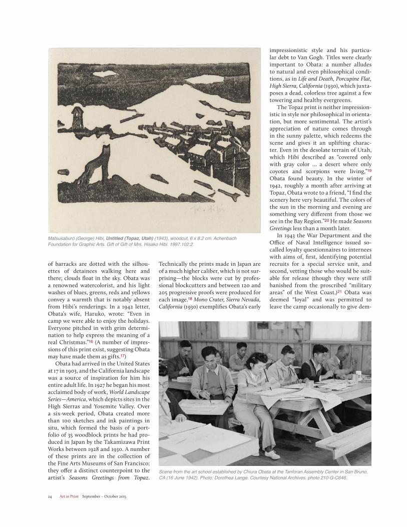
The art programs in which these works were produced were largely detainee-run. In the catalog for “The View From Within,” Karen Higa describes how detainees organized art classes and exhibitions. Nearly every camp had some form of art school, but the most prolific flourished under the guidance of profes-sional artists such as Obata and Hibi. Even at the Tanforan Assembly Center in San Bruno, CA, one of the ad hoc holding sites where detainees were temporarily kept before being sent to a camp, Obata and Hibi organized an art program that included more than 25 subjects and 95 weekly classes for roughly 900 students.10
Initially there was no material support for such programs in any of the Assembly or Relocation Centers and detainees had to scavenge for supplies. Obata, who had been a professor of art at the University of California Berkeley, was instrumental in securing donated supplies for Tanforan and later Topaz—Dorothea Lange was among those who sent packages of art materials—and in coordinating classes and instructors.11 Eventually detainees were able to order from Sears Roebuck catalogs and some were allowed to travel to nearby towns to purchase supplies.12
By and large camp administrators sup-
ported the art programs, which gave the detainees a productive way to deal with the abrasive boredom of camp life.13
For Hibi, who had immigrated to the United States in 1906 when he was 20 years old, art helped keep bitterness at bay. He moved to San Francisco from Seattle in 1919 and enrolled at the Cali-fornia School of Fine Arts.14 Three years later he and Obata helped cofound the East West Art Society, an organization of young artists, musicians and writers committed to promoting cross-cultural understanding through their work. Hibi wrote of his time in Topaz:
In the midst of this desert, we art-ists’ job is not to discuss the war, nor waste time by gossiping and foment uneasiness among our residents. But our utmost efforts should be given to develop culture and soften the people’s hearts, which somehow seem to have a tendency to harden under the circum-stances. Existence of an art school now is more necessary and essential than ever before, especially in such a place as Topaz, where it is like a lone beau-tiful flower with a sweet fragrance in bloom … it is not for the mere existence of teaching technique, but also to fos-ter infinite inspirations, emotions, and peaceful thoughts in the people, young and old.15
Nonetheless, the four Hibi relief prints exhibited in “When Words Weren’t
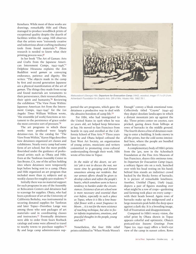
Enough” convey a bleak emotional tone. Collectively titled “Coyote” (1942–45) they depict desolate landscapes in which a distant mountain juts up against the sky. Three prints center on coyotes, ears pricked, gazing down from hilltops at rows of barracks in the middle ground. The fourth shows a line of detainees wait-ing to enter a building. It looks snowy in all the prints, but the cold seems intensi-fied here, where the people are bundled under heavy coats.
A complementary body of Hibi’s prints from the ’40s, now in the Achenbach Foundation at the Fine Arts Museum of San Francisco, shares this ominous tone. In Departure for Evacuation Camp (1942), a solitary figure sits on a rock, hunched over with his head resting on his hand; behind him stands an indistinct crowd backed by the blocky forms of barracks. It is picture of remarkable loneliness. Another, Untitled (Topaz, Utah) (1943), depicts a pair of figures standing over what might be a row of crops—gardening and farming took place on every camp—with their heads bowed. Again rows of barracks make up the midground and a large mountain peak holds the deep space against a dark sky. It is a brooding image, full of frustration and disappointment.
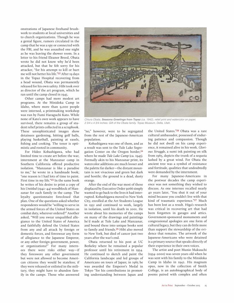
Compared to Hibi’s weary vision, the relief print by Obata shown in Topaz appears colorful and optimistic. Obata’s postcard-size Seasons Greetings From Topaz (ca. 1942–1945) offers a bird’s-eye view of the camp in sunset colors. Rows
Matsusaburō (George) Hibi, Departure for Evacuation Camp (1942), woodcut, image 17.1 x 21.3 cm. Achenbach Foundation for Graphic Arts. Gift of Mrs. Hisako Hibi. 1962.78.1.
Art in Print September – October 201524
impressionistic style and his particu-lar debt to Van Gogh. Titles were clearly important to Obata: a number alludes to natural and even philosophical condi-tions, as in Life and Death, Porcupine Flat, High Sierra, California (1930), which juxta-poses a dead, colorless tree against a few towering and healthy evergreens.
The Topaz print is neither impression-istic in style nor philosophical in orienta-tion, but more sentimental. The artist’s appreciation of nature comes through in the sunny palette, which redeems the scene and gives it an uplifting charac-ter. Even in the desolate terrain of Utah, which Hibi described as “covered only with gray color … a desert where only coyotes and scorpions were living,”19
Obata found beauty. In the winter of 1942, roughly a month after arriving at Topaz, Obata wrote to a friend, “I find the scenery here very beautiful. The colors of the sun in the morning and evening are something very different from those we see in the Bay Region.”20 He made Seasons Greetings less than a month later.
In 1943 the War Department and the Office of Naval Intelligence issued so-called loyalty questionnaires to internees with aims of, first, identifying potential recruits for a special service unit, and second, vetting those who would be suit-able for release (though they were still banished from the proscribed “military areas” of the West Coast.)21 Obata was deemed “loyal” and was permitted to leave the camp occasionally to give dem-
of barracks are dotted with the silhou-ettes of detainees walking here and there; clouds float in the sky. Obata was a renowned watercolorist, and his light washes of blues, greens, reds and yellows convey a warmth that is notably absent from Hibi’s renderings. In a 1942 letter, Obata’s wife, Haruko, wrote: “Even in camp we were able to enjoy the holidays. Everyone pitched in with grim determi-nation to help express the meaning of a real Christmas.”16 (A number of impres-sions of this print exist, suggesting Obata may have made them as gifts.17)
Obata had arrived in the United States at 17 in 1903, and the California landscape was a source of inspiration for him his entire adult life. In 1927 he began his most acclaimed body of work, World Landscape Series—America, which depicts sites in the High Sierras and Yosemite Valley. Over a six-week period, Obata created more than 100 sketches and ink paintings in situ, which formed the basis of a port-folio of 35 woodblock prints he had pro-duced in Japan by the Takamizawa Print Works between 1928 and 1930. A number of these prints are in the collection of the Fine Arts Museums of San Francisco; they offer a distinct counterpoint to the artist’s Seasons Greetings from Topaz.
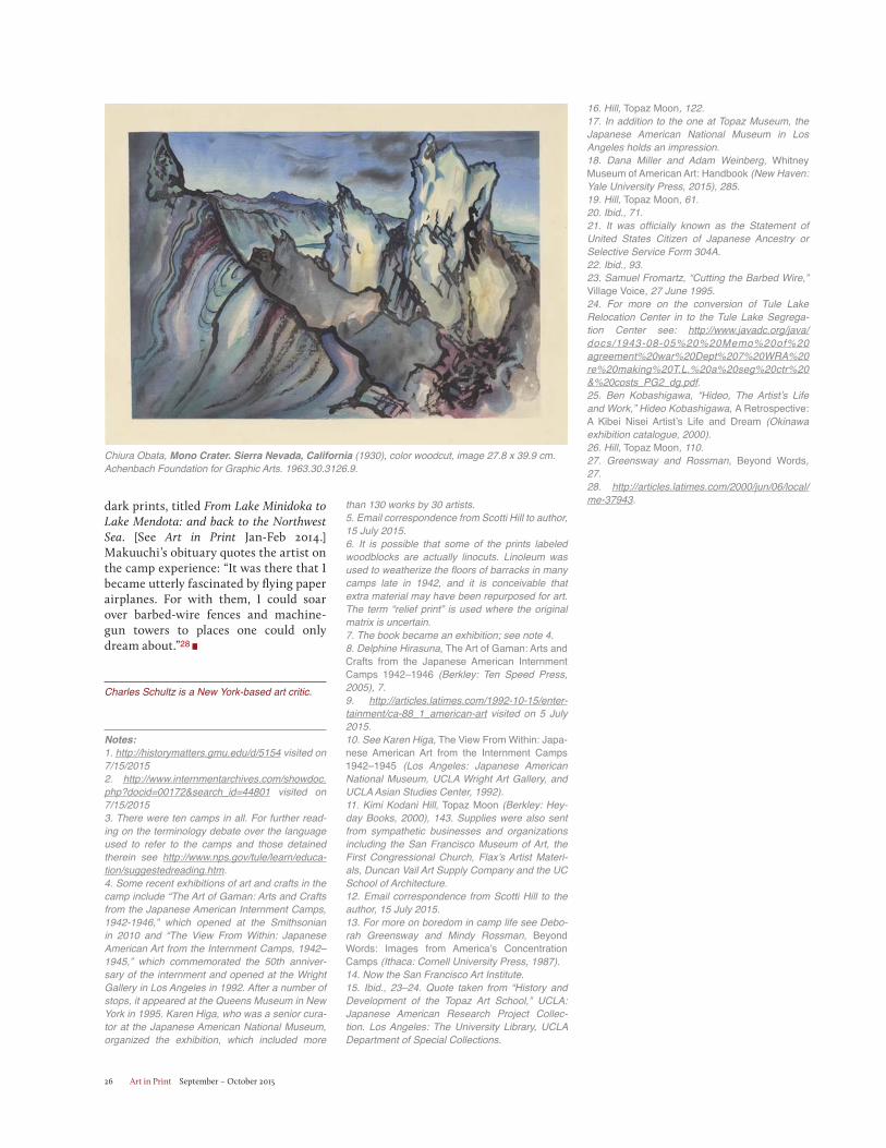
Technically the prints made in Japan are of a much higher caliber, which is not sur-prising—the blocks were cut by profes-sional blockcutters and between 120 and 205 progressive proofs were produced for each image.18 Mono Crater, Sierra Nevada, California (1930) exemplifies Obata’s early
Matsusaburō (George) Hibi, Untitled (Topaz, Utah) (1943), woodcut, 6 x 8.2 cm. Achenbach Foundation for Graphic Arts. Gift of Gift of Mrs. Hisako Hibi. 1997.102.2.
Scene from the art school established by Chiura Obata at the Tanforan Assembly Center in San Bruno, CA (16 June 1942). Photo: Dorothea Lange. Courtesy National Archives, photo 210-G-C646.
Art in Print September – October 2015 25
onstrations of Japanese freehand brush-work to students at local universities and to church organizations. Though he was a genial figure, rumors circulated in the camp that he was a spy or connected with the FBI, and he was assaulted one night as he was leaving the shower room. In a letter to his friend Eleanor Breed, Obata wrote he did not know why he’d been attacked, but that he felt sorry for his attacker, “for his attempt to kill or hurt me will not better his life.”22 After 19 days in the Topaz Hospital recovering from a head wound, Obata was permanently released for his own safety. Hibi took over as director of the art program, which he ran until the camp closed in 1945.
Other camps had more modest art programs. At the Minidoka Camp in Idaho, where more than 9,000 people were interned, a printmaking workshop was run by Fumi Haraguchi Kato. While none of Kato’s own work appears to have survived, there remains a group of stu-dent relief prints collected in a scrapbook. These unsophisticated images show detainees gardening, hitting golf balls, playing basketball, painting at easels, fishing and cooking. The tenor is opti-mistic and rooted in community.
For Hideo Kobashigawa, who had limited time to create art before the war, internment at the Manzanar camp in Southern California offered productive isolation. “Manzanar is like a paradise to me,” he wrote in a handmade book; “one reason is I had lots of time to paint. First time in my life.”23 In the same book he writes of his desire to print a copy of his Untitled (1942–44) woodblock of Man-zanar for each family in the camp. The loyalty questionnaire foreclosed that plan. One of the questions asked whether respondents would be “willing to serve in the armed forces of the United States on combat duty, wherever ordered?” Another asked, “Will you swear unqualified alle-giance to the United States of America and faithfully defend the United States from any and all attack by foreign or domestic forces, and foreswear any form of allegiance to the Japanese Emperor, or any other foreign government, power, or organizations?” For many intern-ees there were risks either way—if they foreswore any other government but were not allowed to become Ameri-can citizens they would be stateless; if they were released or enlisted in the mili-tary, they might have to abandon fam-ily in the camps. Those who answered
“no,” however, were to be segregated from the rest of the Japanese-American population.
Kobashigawa was one of them, and as a result was sent to the Tule Lake Segre-gation Center on the Oregon border,24 where he made Tule Lake Camp (ca. 1945). Formally akin to his Manzanar print, its watercolor additions are much looser and the palette far darker—the distant moun-tain is not vivacious and green but dark and hostile; the ground is a dead, dusty orange.
After the end of the war most of those displaced by Executive Order 9066 simply wanted to go back to the lives it had inter-rupted. Kobashigawa moved to New York City, enrolled at the Art Students League in 1951 and continued to work, largely in isolation, until his death in 2001. He wrote about his memories of the camps on many of the drawings and paintings he’d made at Tule Lake and Manzanar, and bound these into unique books sent to family and friends.25 Hibi also moved to New York, but died of cancer just two years after the war’s end.
Obata returned to his post at UC Berkeley where he remained a popular professor until his retirement in 1954. He continued to sketch and paint the California landscape and led groups of Americans on tours of Japan; in 1965 he was awarded the Emperor’s Medal in Tokyo “for his contributions in promot-ing understanding between Japan and
the United States.”26 Obata was a rare cultural ambassador, possessed of endur-ing patience and compassion. Though he did not dwell on his camp experi-ence, it remained alive in his work. Glori-ous Struggle, a sumi ink painting on silk from 1965, depicts the trunk of a sequoia lashed by a great wind. For Obata the ancient tree was a symbol of resistance and fortitude, qualities that undoubtedly were demanded by the internment.
For many Japanese-Americans in the postwar decades the camp experi-ence was not something they wished to discuss. As one internee recalled nearly 40 years later, “You shut it out of your mind because you couldn’t live with that kind of traumatic experience.”27 Much has been lost as a result. Higa’s research was critical in recovering art that had been forgotten in garages and attics. Government-sponsored monuments and congressional apologies are one form of cultural legacy, but they can do little more than support the stewardship of the evi-dence that remains. The artwork of the Japanese-Americans who were detained is a primary source that speaks directly of their experience in their own voices.
The artist and poet Munio Makuuchi (1934–2000) was seven years old when he was sent with his family to the Minidoka Camp in Idaho in 1942. His magnum opus, now in the collection of Smith College, is an autobiographical body of poems paired with complex and often
Chiura Obata, Seasons Greetings from Topaz (ca. 1942), relief print and watercolor on paper, 2 3/4 x 4 3/4 inches. Gift of the Obata family. Topaz Museum, Delta, Utah.
Art in Print September – October 201526
dark prints, titled From Lake Minidoka to Lake Mendota: and back to the Northwest Sea. [See Art in Print Jan-Feb 2014.]Makuuchi’s obituary quotes the artist on the camp experience: “It was there that I became utterly fascinated by flying paper airplanes. For with them, I could soar over barbed-wire fences and machine-gun towers to places one could only dream about.”28
Charles Schultz is a New York-based art critic.
Notes:1. http://historymatters.gmu.edu/d/5154 visited on 7/15/20152. http://www.internmentarchives.com/showdoc.php?docid=00172&search_id=44801 visited on 7/15/20153. There were ten camps in all. For further read-ing on the terminology debate over the language used to refer to the camps and those detained therein see http://www.nps.gov/tule/learn/educa-tion/suggestedreading.htm.4. Some recent exhibitions of art and crafts in the camp include “The Art of Gaman: Arts and Crafts from the Japanese American Internment Camps, 1942-1946,” which opened at the Smithsonian in 2010 and “The View From Within: Japanese American Art from the Internment Camps, 1942–1945,” which commemorated the 50th anniver-sary of the internment and opened at the Wright Gallery in Los Angeles in 1992. After a number of stops, it appeared at the Queens Museum in New York in 1995. Karen Higa, who was a senior cura-tor at the Japanese American National Museum, organized the exhibition, which included more
than 130 works by 30 artists. 5. Email correspondence from Scotti Hill to author, 15 July 2015. 6. It is possible that some of the prints labeled woodblocks are actually linocuts. Linoleum was used to weatherize the floors of barracks in many camps late in 1942, and it is conceivable that extra material may have been repurposed for art. The term “relief print” is used where the original matrix is uncertain.7. The book became an exhibition; see note 4.8. Delphine Hirasuna, The Art of Gaman: Arts and Crafts from the Japanese American Internment Camps 1942–1946 (Berkley: Ten Speed Press, 2005), 7. 9. http://articles.latimes.com/1992-10-15/enter-tainment/ca-88_1_american-art visited on 5 July 2015.10. See Karen Higa, The View From Within: Japa-nese American Art from the Internment Camps 1942–1945 (Los Angeles: Japanese American National Museum, UCLA Wright Art Gallery, and UCLA Asian Studies Center, 1992). 11. Kimi Kodani Hill, Topaz Moon (Berkley: Hey-day Books, 2000), 143. Supplies were also sent from sympathetic businesses and organizations including the San Francisco Museum of Art, the First Congressional Church, Flax’s Artist Materi-als, Duncan Vail Art Supply Company and the UC School of Architecture. 12. Email correspondence from Scotti Hill to the author, 15 July 2015.13. For more on boredom in camp life see Debo-rah Greensway and Mindy Rossman, Beyond Words: Images from America’s Concentration Camps (Ithaca: Cornell University Press, 1987).14. Now the San Francisco Art Institute.15. Ibid., 23–24. Quote taken from “History and Development of the Topaz Art School,” UCLA: Japanese American Research Project Collec-tion. Los Angeles: The University Library, UCLA Department of Special Collections.
16. Hill, Topaz Moon, 122.17. In addition to the one at Topaz Museum, the Japanese American National Museum in Los Angeles holds an impression.18. Dana Miller and Adam Weinberg, Whitney Museum of American Art: Handbook (New Haven: Yale University Press, 2015), 285.19. Hill, Topaz Moon, 61. 20. Ibid., 71. 21. It was officially known as the Statement of United States Citizen of Japanese Ancestry or Selective Service Form 304A. 22. Ibid., 93. 23. Samuel Fromartz, “Cutting the Barbed Wire,” Village Voice, 27 June 1995.24. For more on the conversion of Tule Lake Relocation Center in to the Tule Lake Segrega-tion Center see: http://www.javadc.org/java/docs/1943-08-05%20%20Memo%20of%20agreement%20war%20Dept%207%20WRA%20re%20making%20T.L.%20a%20seg%20ctr%20&%20costs_PG2_dg.pdf.25. Ben Kobashigawa, “Hideo, The Artist’s Life and Work,” Hideo Kobashigawa, A Retrospective: A Kibei Nisei Artist’s Life and Dream (Okinawa exhibition catalogue, 2000). 26. Hill, Topaz Moon, 110.27. Greensway and Rossman, Beyond Words, 27.28. http://articles.latimes.com/2000/jun/06/local/me-37943.
Chiura Obata, Mono Crater. Sierra Nevada, California (1930), color woodcut, image 27.8 x 39.9 cm. Achenbach Foundation for Graphic Arts. 1963.30.3126.9.
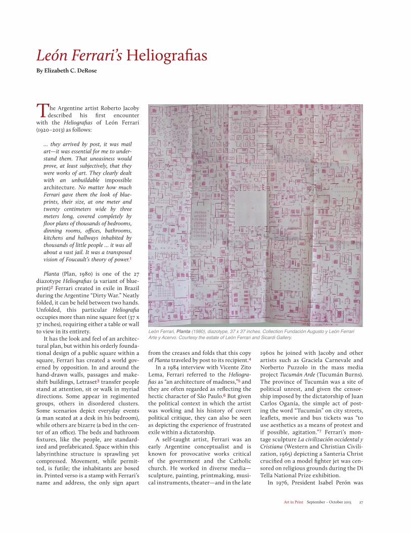
Art in Print September – October 2015 27
León Ferrari’s HeliografiasBy Elizabeth C. DeRose
The Argentine artist Roberto Jacoby described his first encounter
with the Heliografias of León Ferrari (1920–2013) as follows:
… they arrived by post, it was mail art—it was essential for me to under-stand them. That uneasiness would prove, at least subjectively, that they were works of art. They clearly dealt with an unbuildable impossible architecture. No matter how much Ferrari gave them the look of blue-prints, their size, at one meter and twenty centimeters wide by three meters long, covered completely by floor plans of thousands of bedrooms, dinning rooms, offices, bathrooms, kitchens and hallways inhabited by thousands of little people … it was all about a vast jail. It was a transposed vision of Foucault’s theory of power.1
Planta (Plan, 1980) is one of the 27 diazotype Heliografias (a variant of blue-print)2 Ferrari created in exile in Brazil during the Argentine “Dirty War.” Neatly folded, it can be held between two hands. Unfolded, this particular Heliografiaoccupies more than nine square feet (37 x 37 inches), requiring either a table or wall to view in its entirety.
It has the look and feel of an architec-tural plan, but within his orderly founda-tional design of a public square within a square, Ferrari has created a world gov-erned by opposition. In and around the hand-drawn walls, passages and make-shift buildings, Letraset3 transfer people stand at attention, sit or walk in myriad directions. Some appear in regimented groups, others in disordered clusters. Some scenarios depict everyday events (a man seated at a desk in his bedroom), while others are bizarre (a bed in the cen-ter of an office). The beds and bathroom fixtures, like the people, are standard-ized and prefabricated. Space within this labyrinthine structure is sprawling yet compressed. Movement, while permit-ted, is futile; the inhabitants are boxed in. Printed verso is a stamp with Ferrari’s name and address, the only sign apart
from the creases and folds that this copy of Planta traveled by post to its recipient.4
In a 1984 interview with Vicente Zito Lema, Ferrari referred to the Heliogra-fias as “an architecture of madness,”5 and they are often regarded as reflecting the hectic character of São Paulo.6 But given the political context in which the artist was working and his history of covert political critique, they can also be seen as depicting the experience of frustrated exile within a dictatorship.
A self-taught artist, Ferrari was an early Argentine conceptualist and is known for provocative works critical of the government and the Catholic church. He worked in diverse media—sculpture, painting, printmaking, musi-cal instruments, theater—and in the late
1960s he joined with Jacoby and other artists such as Graciela Carnevale and Norberto Puzzolo in the mass media project Tucumán Arde (Tucumán Burns). The province of Tucumán was a site of political unrest, and given the censor-ship imposed by the dictatorship of Juan Carlos Oganía, the simple act of post-ing the word “Tucumán” on city streets, leaflets, movie and bus tickets was “to use aesthetics as a means of protest and if possible, agitation.”7 Ferrari’s mon-tage sculpture La civilización occidental y Cristiana (Western and Christian Civili-zation, 1965) depicting a Santeria Christ crucified on a model fighter jet was cen-sored on religious grounds during the Di Tella National Prize exhibition.
In 1976, President Isabel Perón was
León Ferrari, Planta (1980), diazotype, 37 x 37 inches. Collection Fundación Augusto y León Ferrari Arte y Acervo. Courtesy the estate of León Ferrari and Sicardi Gallery.
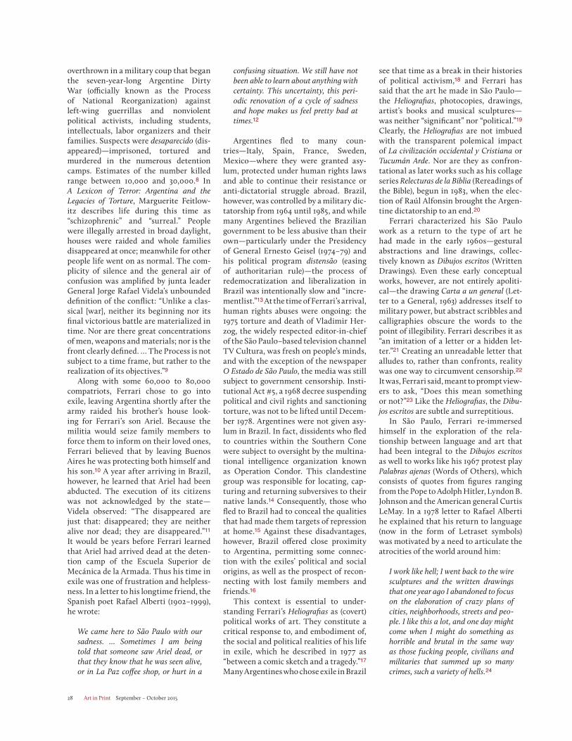
Art in Print September – October 201528
overthrown in a military coup that began the seven-year-long Argentine Dirty War (officially known as the Process of National Reorganization) against left-wing guerrillas and nonviolent political activists, including students, intellectuals, labor organizers and their families. Suspects were desaparecido (dis-appeared)—imprisoned, tortured and murdered in the numerous detention camps. Estimates of the number killed range between 10,000 and 30,000.8 In A Lexicon of Terror: Argentina and the Legacies of Torture, Marguerite Feitlow-itz describes life during this time as “schizophrenic” and “surreal.” People were illegally arrested in broad daylight, houses were raided and whole families disappeared at once; meanwhile for other people life went on as normal. The com-plicity of silence and the general air of confusion was amplified by junta leader General Jorge Rafael Videla’s unbounded definition of the conflict: “Unlike a clas-sical [war], neither its beginning nor its final victorious battle are materialized in time. Nor are there great concentrations of men, weapons and materials; nor is the front clearly defined. … The Process is not subject to a time frame, but rather to the realization of its objectives.”9
Along with some 60,000 to 80,000 compatriots, Ferrari chose to go into exile, leaving Argentina shortly after the army raided his brother’s house look-ing for Ferrari’s son Ariel. Because the militia would seize family members to force them to inform on their loved ones, Ferrari believed that by leaving Buenos Aires he was protecting both himself and his son.10 A year after arriving in Brazil, however, he learned that Ariel had been abducted. The execution of its citizens was not acknowledged by the state—Videla observed: “The disappeared are just that: disappeared; they are neither alive nor dead; they are disappeared.”11
It would be years before Ferrari learned that Ariel had arrived dead at the deten-tion camp of the Escuela Superior de Mecánica de la Armada. Thus his time in exile was one of frustration and helpless-ness. In a letter to his longtime friend, the Spanish poet Rafael Alberti (1902–1999), he wrote:
We came here to São Paulo with our sadness. … Sometimes I am being told that someone saw Ariel dead, or that they know that he was seen alive, or in La Paz coffee shop, or hurt in a
confusing situation. We still have not been able to learn about anything with certainty. This uncertainty, this peri-odic renovation of a cycle of sadness and hope makes us feel pretty bad at times.12
Argentines fled to many coun-tries—Italy, Spain, France, Sweden, Mexico—where they were granted asy-lum, protected under human rights laws and able to continue their resistance or anti-dictatorial struggle abroad. Brazil, however, was controlled by a military dic-tatorship from 1964 until 1985, and while many Argentines believed the Brazilian government to be less abusive than their own—particularly under the Presidency of General Ernesto Geisel (1974–79) and his political program distensão (easing of authoritarian rule)—the process of redemocratization and liberalization in Brazil was intentionally slow and “incre-mentlist.”13 At the time of Ferrari’s arrival, human rights abuses were ongoing: the 1975 torture and death of Vladimir Her-zog, the widely respected editor-in-chief of the São Paulo–based television channel TV Cultura, was fresh on people’s minds, and with the exception of the newspaper O Estado de São Paulo, the media was still subject to government censorship. Insti-tutional Act #5, a 1968 decree suspending political and civil rights and sanctioning torture, was not to be lifted until Decem-ber 1978. Argentines were not given asy-lum in Brazil. In fact, dissidents who fled to countries within the Southern Cone were subject to oversight by the multina-tional intelligence organization known as Operation Condor. This clandestine group was responsible for locating, cap-turing and returning subversives to their native lands.14 Consequently, those who fled to Brazil had to conceal the qualities that had made them targets of repression at home.15 Against these disadvantages, however, Brazil offered close proximity to Argentina, permitting some connec-tion with the exiles’ political and social origins, as well as the prospect of recon-necting with lost family members and friends.16
This context is essential to under-standing Ferrari’s Heliografias as (covert) political works of art. They constitute a critical response to, and embodiment of, the social and political realities of his life in exile, which he described in 1977 as “between a comic sketch and a tragedy.”17 Many Argentines who chose exile in Brazil
see that time as a break in their histories of political activism,18 and Ferrari has said that the art he made in São Paulo—the Heliografias, photocopies, drawings, artist’s books and musical sculptures—was neither “significant” nor “political.”19
Clearly, the Heliografias are not imbued with the transparent polemical impact of La civilización occidental y Cristiana or Tucumán Arde. Nor are they as confron-tational as later works such as his collage series Relecturas de la Biblia (Rereadings of the Bible), begun in 1983, when the elec-tion of Raúl Alfonsin brought the Argen-tine dictatorship to an end.20
Ferrari characterized his São Paulo work as a return to the type of art he had made in the early 1960s—gestural abstractions and line drawings, collec-tively known as Dibujos escritos (Written Drawings). Even these early conceptual works, however, are not entirely apoliti-cal—the drawing Carta a un general (Let-ter to a General, 1963) addresses itself to military power, but abstract scribbles and calligraphies obscure the words to the point of illegibility. Ferrari describes it as “an imitation of a letter or a hidden let-ter.”21 Creating an unreadable letter that alludes to, rather than confronts, reality was one way to circumvent censorship.22
It was, Ferrari said, meant to prompt view-ers to ask, “Does this mean something or not?”23 Like the Heliografias, the Dibu-jos escritos are subtle and surreptitious.
In São Paulo, Ferrari re-immersed himself in the exploration of the rela-tionship between language and art that had been integral to the Dibujos escritosas well to works like his 1967 protest play Palabras ajenas (Words of Others), which consists of quotes from figures ranging from the Pope to Adolph Hitler, Lyndon B. Johnson and the American general Curtis LeMay. In a 1978 letter to Rafael Alberti he explained that his return to language (now in the form of Letraset symbols) was motivated by a need to articulate the atrocities of the world around him:
I work like hell; I went back to the wire sculptures and the written drawings that one year ago I abandoned to focus on the elaboration of crazy plans of cities, neighborhoods, streets and peo-ple. I like this a lot, and one day might come when I might do something as horrible and brutal in the same way as those fucking people, civilians and militaries that summed up so many crimes, such a variety of hells.24
Art in Print September – October 2015 29
Ferrari began using Letraset dry trans-fer elements in 1980 in intimate drawings and small books such as Xadrez (Chess) and Poesias (Poems), which he published under his imprint Edições Licopodio.25
Originally created for architects and graphic designers, Letraset was inexpen-sive, readily available and—according to an advertisement picturing a salesman, housewife, football player and computer specialist—“Anyone can do professional-looking ‘printed’ lettering instantly. … No
talent needed … just rub it down … and you can print on practically anything!”26 Ferrari must have been drawn to its standardized lettering and graphic sig-nage, its connection to industrial design (rather than fine art)27 and its readymade vocabulary.
In the Dibujos escritos Ferrari had dis-torted letters to the point of indecipher-ability; in the Heliografias he manipulated his Letraset people and walls through jux-taposition, repetition and serialization.
“He begins with structures we all con-sider examples of order,” observed Néstor García Canclini, “and meddles with their rules. … While other works by Ferrari find warmth in poetical or ironical humour, here the limitless reproduction of cars or figurine-people suggests the maddening confusion produced by unending expan-sion ‘strategies,’ which annihilate both diversity and sense.”28
When the Heliografias were exhibited along with photocopies and artists’ books
León Ferrari, Planta (1980), diazotype, 37 x 37 inches. Collection Fundación Augusto y León Ferrari Arte y Acervo. Courtesy the estate of León Ferrari and Sicardi Gallery.
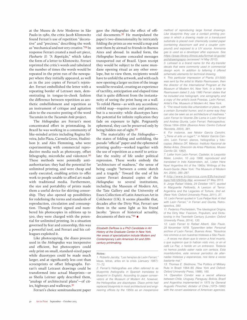
Art in Print September – October 201530
at the Museu de Arte Moderno in São Paulo in 1980, the critic Jacob Klintowitz found Ferrari’s use of repetition “decora-tive” and “precious,” describing the work as “mechanical and not very creative.”29 In response Ferrari created a mail-art piece, Flasharte II: “A Repetição,” which takes the form of a letter to Klintowitz. Ferrari reprinted the critic’s words and tabulated the number of times the words would be repeated in the print run of the newspa-per where they initially appeared, as well as in the 200 copies of Ferrari’s rejoin-der. Ferrari embellished the letter with a repeating border of Letraset men, dem-onstrating in tongue-in-cheek fashion the difference between repetition as aes-thetic embellishment and repetition as an instrument of critique and agitation akin to the excessive posting of the word Tucumán in the Tucumán Arde project.
The Heliografias are Ferrari’s most concentrated effort in printmaking. In Brazil he was working in a community of like-minded artists including Regina Sil-veira, Julio Plaza, Carmela Gross, Hudini-lson Jr. and Alex Flemming, who were experimenting with commercial repro-ductive media such as photocopy, offset lithography, microfiche and videotext.30
These methods were pointedly anti-authoritarian: they had the potential for unlimited printing, and were cheap and easily executed, enabling artists to offer work to people unable to afford art made with traditional media. Furthermore, the size and portability of prints made them a useful device for skirting censor-ship. They also opened up possibilities for redefining the terms and standards of reproduction, circulation and consump-tion. Though Ferrari signed and num-bered his photocopies in editions up to 500, they were charged with the poten-tial for unlimited printing. In a situation governed by fear and censorship, this was a powerful tool, and Ferrari and his col-leagues exploited it.
Like photocopying, the diazo process used in the Heliografias was inexpensive and efficient, but photocopiers could only print on small, standard-sized paper while diazotypes could be made much larger, and at significantly less cost than screenprints or offset lithographs. Fer-rari’s small Letraset drawings could be transformed into actual blueprints—or as Sheila Leirner aptly described them, “analogs of architectural plans”—of cit-ies, highways and walkways.31
Ferrari’s choice semitranslucent paper
gave the Heliografias the effect of offi-cial documents.32 He manipulated the paper’s two-dimensionality by intricately folding the prints as one would a map and sent them by airmail to friends in Buenos Aires and abroad. In mailed form, the Heliografias became concealed messages transported out of Brazil. Upon receipt they would be subject to the same mun-dane opening ritual as any other enve-lope, but to view them, recipients would have to unfold the artwork, and with each new opening a larger section of the image would be revealed, creating an experience of tactility, anticipation and elapsed time that is quite different from the instanta-neity of seeing the print hung on a wall. To refold Planta—as with any accordion/trifold map—requires care and patience, but is a necessity: while diazotypes have the potential for infinite replication they fade on exposure to light. Poignantly ephemeral, they can be preserved only by being hidden out of sight.33
The materiality of the Heliografias—the states of folding and unfolding, the pseudo “official” paper and the ephemeral printing quality—worked together with the use of repetition as a motif to articu-late the reality of life under political repression. These works embody the “architecture of madness,” the sense of being caught “between a comic sketch and a tragedy.” Toward the end of his career Ferrari donated copies of the Heliografias to several institutions, including the Museum of Modern Art, the Tate Gallery and the University of Essex Collection of Latin American Art in Colchester (UK). It seems plausible that, decades after the Dirty War, Ferrari saw them in the same light as his friend Jacoby: “pieces of historical actuality, documents of their era.”34
Elizabeth DeRose is a PhD Candidate in Art History at the Graduate Center in New York. Her areas of specialization include Modern and Contemporary Latin American Art and 20th-century printmaking.
Notes:1. Roberto Jacoby, “Las herejías de León Ferrari,” Ideas, letras, artes en la crisis (January 1987): 71–72. 2. Ferrari’s Heliografias are often referred to as blueprints (heliografia in Spanish translates to blueprint in English). According to paper conser-vators at the Museum of Modern Art, however, the Heliografias are diazotypes. Diazo prints had replaced blueprints in most architectural and engi-neering offices by the 1950s as an inexpensive
method of reproducing large format drawings. Like blueprints they use a contact printing pro-cess in which a drawing made on a translucent substrate is placed over chemically coated paper (containing diazonium salt and a coupler com-pound) and exposed to a UV source. Ammonia gas is used as a developer after exposure. See https://psap.library.illinois.edu/format-id-guide/archdrawingrepro (accessed 14 May 2015).3. Letraset is a brand name for the dry-transfer decals that were commonly used in commercial design work. In addition to lettering it offered schematic elements for technical drawing.4. This particular impression of Planta (51/500) was sent by the artist to Waldo Rasmussen, then the director of the International Program at the Museum of Modern Art, New York. In a letter to Rasmussen dated 3 July 1980 Ferrari states that he included one heliograph, one xerography and a copy of the artist’s book Poesias. León Ferrari, Artist’s File, Museum of Modern Art, New York. 5. “The result looks like urbanization or plans, with a certain Surrealist humor, and in some way they can also be seen as an architecture of madness.” León Ferrari to Vicente Zito Lema in León Ferrari and Andrea Giunta, León Ferrari: Retrospectiva: Obras 1954–2004 (Buenos Aires: Centro Cultural Recoleta, 2004), 381. 6. For instance, see Néstor García Canclini, “¿Tiene el arte un lugar?,” in Néstor García Can-clini, León Ferrari: planos, heliografías y foto-copias (México DF, México: Instituto Nacional de Bellas Artes, Dirección de Artes Plásticas, Museo Carrillo Gil, 1982). 7. Letter from León Ferrari, Castelar, to Leopoldo Maler, London, 10 July 1968, reproduced and translated in Inés Katzenstein, ed., Listen Here Now! Argentine Art of the 1960s: Writings of the Avant-Garde (New York: The Museum of Modern Art, 2004), 285–287. 8.ht tp : / /www.br i tannica.com/EBchecked/topic/165129/Dirty-War, accessed 27 May 2015. 9. Jorge Rafael Videla, 24 October 1977, quoted in Marguerite Feitlowitz, A Lexicon of Terror: Argentina and the Legacies of Torture, 2nd ed. (New York: Oxford University Press, 2011), 37.10. León Ferrari quoted in “Luis Felipe Noé: A Visit with León Ferrari,” in Ferrari and Giunta, Retro-spectiva, 350. 11. Federico Finchelstein, The Ideological Origins of the Dirty War: Fascism, Populism, and Dicta-torship in the Twentieth Century (London: Oxford University Press, 2014), 133. 12. León Ferrari to Rafael Alberti, São Paulo, 25 November 1978. Typewritten letter. Personal archive of León Ferrari, Buenos Aires. “Nosotros nos vinimos a con nuestras tristesas a São Paulo. … A veces me dicen que lo vieron a Ariel muerto, o que supieron que lo habían visto vivo, or en el café La Paz, o herido en un entrevero. Todavía no hemos podido saber nada con certeza. Esta incertidumbre, este renovar períodico de alter-nadas tristezas y esperanzas, nos tiene a veces bastante mal.”13. Thomas E. Skidmore, The Politics of Military Rule in Brazil 1964–85 (New York and Oxford: Oxford University Press, 1988), 165.14. Operation Condor was a secret alliance between Chile, Uruguay, Paraguay, Bolivia, Brazil and Argentina implemented in 1975 by General Augusto Pinochet, dictator of Chile (1973–1990) with the covert assistance of American agencies.
Art in Print September – October 2015 31
See John Dinges, The Condor Years: How Pino-chet and His Allies Brought Terrorism to Three Continents (New York and London: The New Press, 2004).15. Desiree Azevedo and Liliana Sanjurjo, “Between Dictatorships and Revolutions: Narra-tives of Argentine and Brazilian Exiles,” Vibrant [online] 10, no. 2 (Migration and Exile), 2014: 332. Accessed 14 February 2015 http://vibrant.revues.org/1604. 16. Ibid., 326. 17. León Ferrari to Eduardo Jonquières, São Paulo, 1 June 1977. Typewritten letter. Personal archive of León Ferrari, Buenos Aires. “El clima en São Paulo es buena en lo que se refiere a los fenómenos celestes; el otro, el político y social juege a las esquinitas entre el sainete y la traga-dia.” 18. Ibid., 331.19. León Ferrari in Ferrari and Giunta, Retrospec-tiva (2004), 351. “I don’t know what happened but I didn’t make political art from 1976 until 1983 … the majority of the works from this period are not significant, they’re similar in conception to those from the period 1961–1964.”20. In 1982 Ferrari briefly returned to Argentina in the hope of learning more about the disap-pearance of his son. Two years later, in 1984 he had his first exhibition in more than eight years in Buenos Aires. While he would travel between Brazil and Argentina, it was not until 1991 that Ferrari permanently relocated to Buenos Aires. 21. León Ferrari quoted in Luis Pérez Oramas, León Ferrari, Mira Schendel, Andrea Giunta and Rodrigo Naves. León Ferrari and Mira Schendel: Tangled Alphabets (New York, N.Y.: Museum of Modern Art, 2009), 50. 22. Andrea Giunta describes Ferrari’s written paintings and drawings as “abstractions with allu-sions to reality” in contrast to La civilización occi-dental y Cristiana as the artist’s “confrontation” with reality. Andrea Giunta, Avant-Garde, Interna-tionalism, and Politics: Argentine Art in the Sixties(Durham: Duke University Press, 2007), 258. 23. Ibid., 50. 24. “Nosotros nos vinimos a con nuestras triste-zas a São Paulo. … Trabajo como un condenado, volvi a las esculturas de alambre y los dibujos que hace un año abandoné para dedicarme a hacer planos locos de ciudades, barrios, calles y gente. Me gusta mucho esto, puede que pueda llegar a algún dia a hacer algo que sea tan horrible y bestial como toda esa gente de mierda, civiles y militares que sumaron tantos crímenes, tal varie-dad de infiernos.” León Ferrari to Rafael Alberti, São Paulo, 25 November 1978. Typewritten letter. Personal archive of León Ferrari, Buenos Aires.25. In Portuguese, the word xadrez can mean “chess” or “jail.”26. Advertisement accessed 14 February 2015 http://www.creativepro.com/content/scanning-around-gene-getting-things-done-1961.27. León Ferrari, 1980, quoted in Ferrari and Giunta, Restrospective (2004), 377. “I am inter-ested in the non-aesthetic, in supports that are not valued, in a kind of art considered anti-art … I have to use supports and processes from indus-trial society. I have to consider these things at the moment I think of creating something new. Oil paintings and performance carry the same value.”28. Néstor García Canclini, “León Ferrari’s Strange Case,” in León Ferrari and Andrea
Giunta, Leon Ferrari: obras/works, 1976–2008 (México, D.F.: Instituto Nacional de Bellas Artes, 2008), 26.29. León Ferrari, Flasharte II: “A Repetição,” 26 May 1980 (São Paulo: Edições Licopodio, 1980). Edition 200.30. In 1982, Brazilian artists Regina Silveira and Rafael França began a project called “microfiche” that culminated in the exhibition “Artemicro” held at the Museu do Imagen e do Som (Museum of Image and Sound). It consisted of ten graphic works by 32 invited artists, including León Ferrari, Julio Plaza and Hudinilson Jr. The works were transferred to microfiche, lining the images up in a series of ten so they could later be “read” via a microfiche reader rented by the organizers of the exhibit. For more information see Ferrari and Giunta, Retrospectiva, 357, and Regina Silveira, “Artemicro: a microfiche como suporte de arte,” Arte em São Paulo (São Paulo, Brazil), May 1982. 31. Sheila Leirner, “Técnica heliográfica: arte ou simples apropriação?” O Estado de São Paulo, 14 April 1981: 24. 32. Coletiva de heliografia na Pinacoteca, O Estado de São Paulo, 31 May 1981: 38. 33. Some of the heliografias are numbered x/infinity, creating the possibility of endless cop-ies. In actuality, in order to further edition any of the Heliografias, one would need the original mylar matrix. The Blanton Museum of Art in Aus-tin, Texas, has the mylar for Planta. 34. Roberto Jacoby, “Las herejías de León Fer-rari,” Ideas, letras, artes en la crisis, January 1987: 71–72.
PurchaseBack Issuesof Art in Print.
Did you know you can purchase any issue of Art in Print?
Miss the New Editions issue?
Need the Stanley William Hayter issue for your library?
Want to give the Arcadia issue to a friend?
All issues of Art in Printare available on MagCloud at www.magcloud.com/user/established-2011.
If you have any questions, please contact us at [email protected].
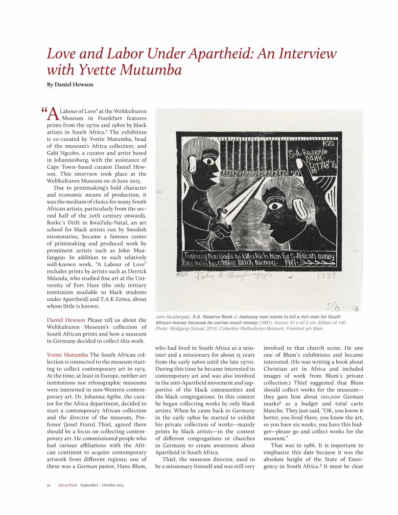
Art in Print September – October 201532
Love and Labor Under Apartheid: An Interview with Yvette MutumbaBy Daniel Hewson
A Labour of Love” at the Weltkulturen Museum in Frankfurt features
prints from the 1970s and 1980s by black artists in South Africa.1 The exhibition is co-curated by Yvette Mutumba, head of the museum’s Africa collection, and Gabi Ngcobo, a curator and artist based in Johannesburg, with the assistance of Cape Town–based curator Daniel Hew-son. This interview took place at the Weltkulturen Museum on 16 June 2015.
Due to printmaking’s bold character and economic means of production, it was the medium of choice for many South African artists, particularly from the sec-ond half of the 20th century onwards.Rorke s Drift in KwaZulu-Natal, an art school for black artists run by Swedish missionaries, became a famous center of printmaking and produced work by prominent artists such as John Mua-fangejo. In addition to such relatively well-known work, “A Labour of Love” includes prints by artists such as Derrick Mdanda, who studied fine art at the Uni-versity of Fort Hare (the only tertiary institution available to black students under Apartheid) and T.A.K Zziwa, about whom little is known.
Daniel Hewson Please tell us about the Weltkulturen Museum’s collection of South African prints and how a museum in Germany decided to collect this work.
Yvette Mutumba The South African col-lection is connected to the museum start-ing to collect contemporary art in 1974. At the time, at least in Europe, neither art institutions nor ethnographic museums were interested in non-Western contem-porary art. Dr. Johanna Agthe, the cura-tor for the Africa department, decided to start a contemporary African collection and the director of the museum, Pro-fessor [Josef Franz] Thiel, agreed there should be a focus on collecting contem-porary art. He commissioned people who had various affiliations with the Afri-can continent to acquire contemporary artwork from different regions; one of these was a German pastor, Hans Blum,
who had lived in South Africa as a min-ister and a missionary for about 15 years from the early 1960s until the late 1970s. During this time he became interested in contemporary art and was also involved in the anti-Apartheid movement and sup-portive of the black communities and the black congregations. In this context he began collecting works by only black artists. When he came back to Germany in the early 1980s he started to exhibit his private collection of works—mainly prints by black artists—in the context of different congregations or churches in Germany to create awareness about Apartheid in South Africa.
Thiel, the museum director, used to be a missionary himself and was still very
involved in that church scene. He saw one of Blum s exhibitions and became interested. (He was writing a book about Christian art in Africa and included images of work from Blum s private collection.) Thiel suggested that Blum should collect works for the museum—they gave him about 100,000 German marks2 as a budget and total carte blanche. They just said, “OK, you know it better, you lived there, you know the art, so you have six weeks, you have this bud-get—please go and collect works for the museum.”
That was in 1986. It is important to emphasize this date because it was the absolute height of the State of Emer-gency in South Africa.3 It must be clear
“
John Muafangejo, S.A. Reserve Bank or Jealousy man wants to kill a rich man for South African money because he carries much money (1981), linocut, 61 x 42.5 cm. Edition of 100. Photo: Wolfgang Günzel, 2015. Collection Weltkulturen Museum, Frankfurt am Main.
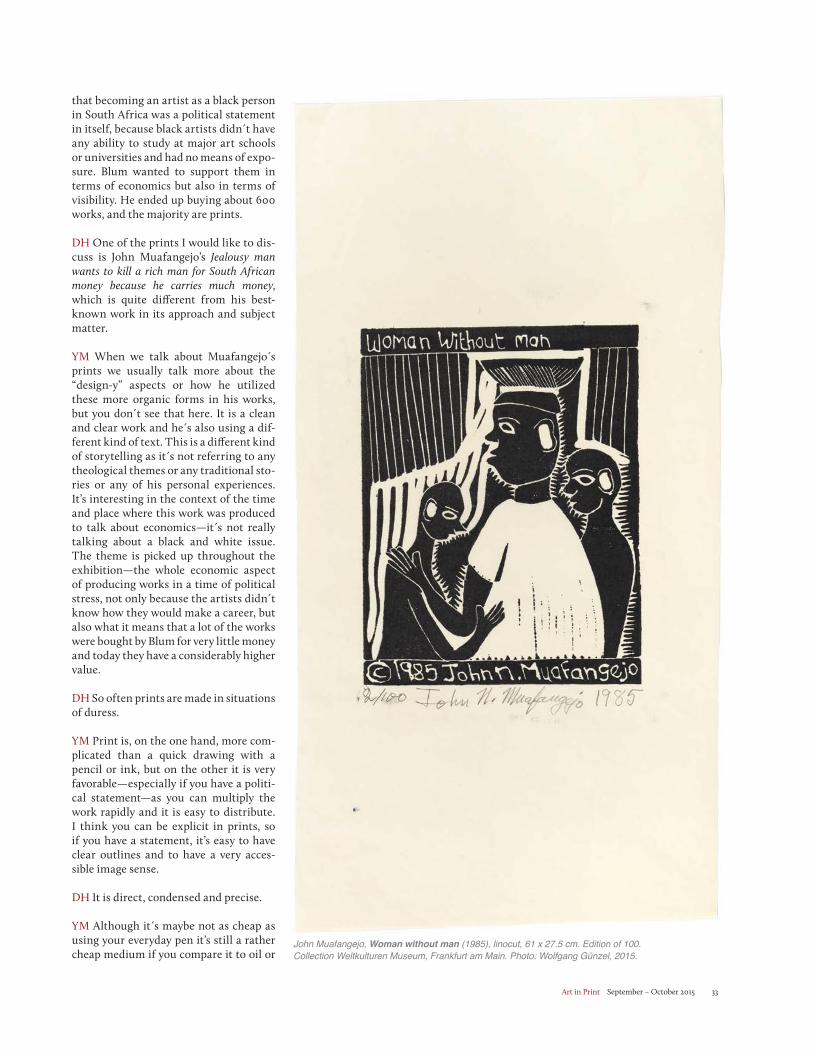
Art in Print September – October 2015 33
that becoming an artist as a black person in South Africa was a political statement in itself, because black artists didn t have any ability to study at major art schools or universities and had no means of expo-sure. Blum wanted to support them in terms of economics but also in terms of visibility. He ended up buying about 600 works, and the majority are prints.
DH One of the prints I would like to dis-cuss is John Muafangejo’s Jealousy man wants to kill a rich man for South African money because he carries much money, which is quite different from his best-known work in its approach and subject matter.
YM When we talk about Muafangejo s prints we usually talk more about the “design-y” aspects or how he utilized these more organic forms in his works, but you don t see that here. It is a clean and clear work and he s also using a dif-ferent kind of text. This is a different kind of storytelling as it s not referring to any theological themes or any traditional sto-ries or any of his personal experiences. It’s interesting in the context of the time and place where this work was produced to talk about economics—it s not really talking about a black and white issue. The theme is picked up throughout the exhibition—the whole economic aspect of producing works in a time of political stress, not only because the artists didn t know how they would make a career, but also what it means that a lot of the works were bought by Blum for very little money and today they have a considerably higher value.
DH So often prints are made in situations of duress.
YM Print is, on the one hand, more com-plicated than a quick drawing with a pencil or ink, but on the other it is very favorable—especially if you have a politi-cal statement—as you can multiply the work rapidly and it is easy to distribute. I think you can be explicit in prints, so if you have a statement, it’s easy to have clear outlines and to have a very acces-sible image sense.
DH It is direct, condensed and precise.
YM Although it s maybe not as cheap as using your everyday pen it’s still a rather cheap medium if you compare it to oil or
John Muafangejo, Woman without man (1985), linocut, 61 x 27.5 cm. Edition of 100. Collection Weltkulturen Museum, Frankfurt am Main. Photo: Wolfgang Günzel, 2015.
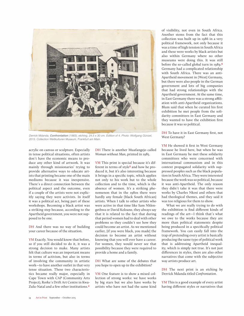
Art in Print September – October 201534
acrylic on canvas or sculpture. Especially in tense political situations, often artists don t have the economic means to pro-duce any other kind of artwork. It was mainly through missionaries’ trying to provide alternative ways to educate art-ists that printing became one of the main mediums because it was inexpensive. There s a direct connection between the political aspect and the outcome, even if a couple of the artists were not explic-itly saying they were activists. In itself it was a political act, being part of these workshops. Becoming a black artist was a striking step because, according to the Apartheid government, you were not sup-posed to be one.
DH And there was no way of building your career because of the situation.
YM Exactly. You would know that before, so if you still decided to do it, it was a strong decision to make. Many artists felt that culture was an important means in terms of activism, but also in terms of involving the community in artistic work—to have another outlet in that very tense situation. These two characteris-tics became really major, especially in Cape Town with CAP (Community Arts Project), Rorke s Drift Art Centre in Kwa-Zulu-Natal and a few other institutions.4
DH There is another Muafangejo called Woman without Man, printed in 1985.
YM This print is special because it’s dif-ferent in terms of style5 and how he pro-duced it, but it’s also interesting because it brings in a specific topic, which applies not only to his work but to the whole collection and to the time, which is the absence of women. It’s a striking phe-nomenon that in the 1980s there were hardly any female [black South African] artists. When I talk to other artists who were active in that time like Sam Nhlen-gethwa or David Koloane, they always say that it is related to the fact that during that period women had to deal with other problems so they couldn t see how they could become an artist. As we mentioned earlier, [if you were black, you made] the decision to become an artist without knowing that you will ever have a career. For women, they would never see that possibility because they were required to provide a home and a family.
DH What are some of the debates that you hope to open up in the exhibition?
YM One feature is to show a mixed col-lection of strong works: we have works by big stars but we also have works by artists who have not had the same kind
of visibility, not even in South Africa. Another stems from the fact that this collection was built up in 1986 in a very political framework, not only because it was a time of high tension in South Africa and these were works by black artists but also within Germany where no other museums were doing this. It was still before the so-called global turn in 1989.6Germany had a complicated relationship with South Africa. There was an anti-Apartheid movement in [West] Germany, but there were also people in the German government and lots of big companies that had strong relationships with the Apartheid government. At the same time, in East Germany there was a strong affili-ation with anti-Apartheid organizations. Blum said that when he curated his first exhibition he met people from the soli-darity committees in East Germany and they wanted to have the exhibition first because it was so political.
DH To have it in East Germany first, not West Germany?
YM He showed it first in West Germany because he lived here, but when he was in East Germany he met these solidarity committees who were concerned with international communism and in this context propagated solidarity with sup-pressed peoples such as the black popula-tion in South Africa. They were interested because the work was so political, because it was anti-Apartheid. The only reason they didn t take it was that there were works by Charles Nkosi and others that had theological themes, and they said it was too religious for them to show. What we are really trying to do with the exhibition is find different kinds of readings of the art—I think that s what we owe to the works because they are more than political statements despite being produced in a specifically political framework. You can easily fall into the trap of pretending every artist is basically producing the same type of political work that is addressing Apartheid inequal-ity, which is simply not true. It’s not just differences in styles, there are also other narratives that come with the subjective way artists produce art.
DH The next print is an etching by Derrick Mdanda titled Confrontation.
YM This is a good example of every artist having different styles or narratives that
Derrick Mdanda, Confrontation (1983), etching, 24.5 x 30 cm. Edition of 4. Photo: Wolfgang Günzel, 2015. Collection Weltkulturen Museum, Frankfurt am Main.
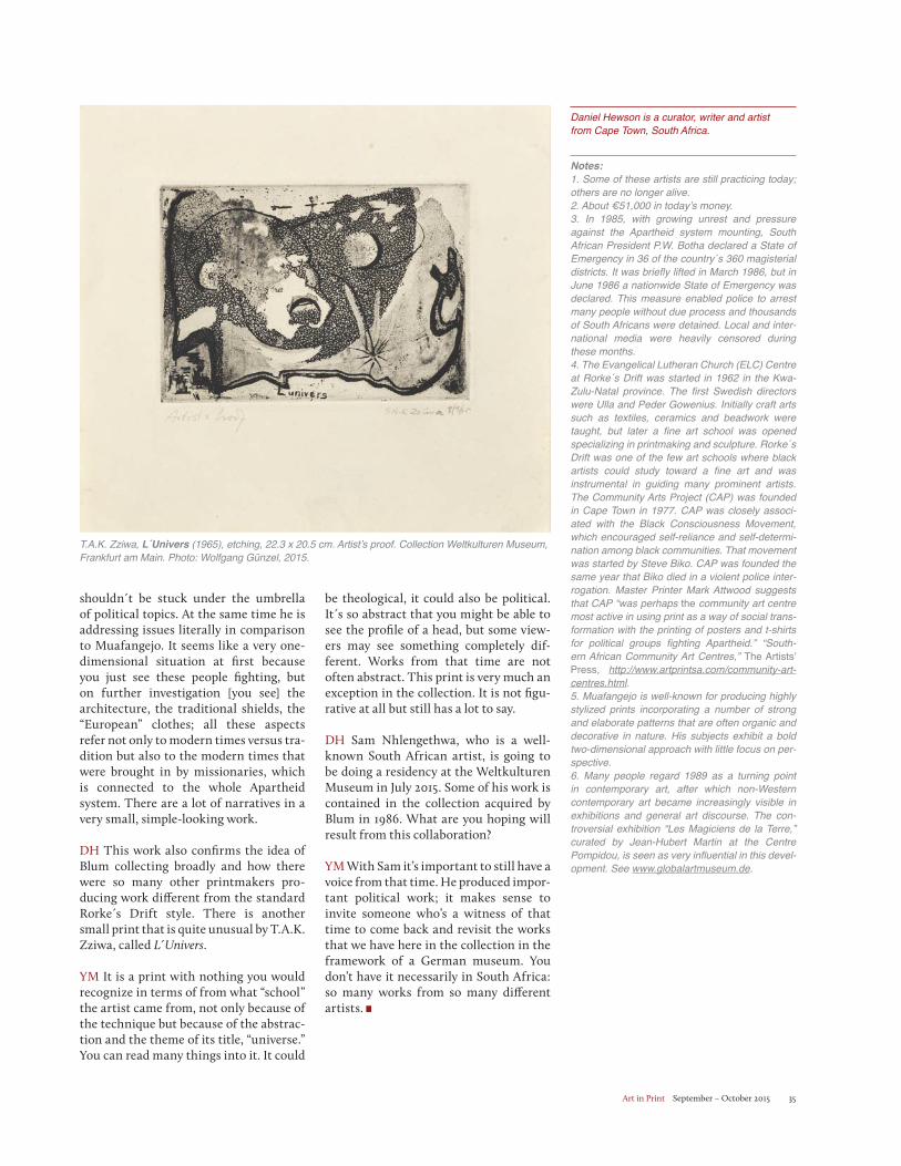
Art in Print September – October 2015 35
shouldn t be stuck under the umbrella of political topics. At the same time he is addressing issues literally in comparison to Muafangejo. It seems like a very one-dimensional situation at first because you just see these people fighting, but on further investigation [you see] the architecture, the traditional shields, the “European” clothes; all these aspects refer not only to modern times versus tra-dition but also to the modern times that were brought in by missionaries, which is connected to the whole Apartheid system. There are a lot of narratives in a very small, simple-looking work.
DH This work also confirms the idea of Blum collecting broadly and how there were so many other printmakers pro-ducing work different from the standard Rorke s Drift style. There is another small print that is quite unusual by T.A.K. Zziwa, called L Univers.
YM It is a print with nothing you would recognize in terms of from what “school” the artist came from, not only because of the technique but because of the abstrac-tion and the theme of its title, “universe.” You can read many things into it. It could
be theological, it could also be political. It s so abstract that you might be able to see the profile of a head, but some view-ers may see something completely dif-ferent. Works from that time are not often abstract. This print is very much an exception in the collection. It is not figu-rative at all but still has a lot to say. DH Sam Nhlengethwa, who is a well-known South African artist, is going to be doing a residency at the Weltkulturen Museum in July 2015. Some of his work is contained in the collection acquired by Blum in 1986. What are you hoping will result from this collaboration?
YM With Sam it’s important to still have a voice from that time. He produced impor-tant political work; it makes sense to invite someone who’s a witness of that time to come back and revisit the works that we have here in the collection in the framework of a German museum. You don’t have it necessarily in South Africa: so many works from so many different artists.
Daniel Hewson is a curator, writer and artist from Cape Town, South Africa.
Notes:1. Some of these artists are still practicing today; others are no longer alive. 2. About €51,000 in today’s money. 3. In 1985, with growing unrest and pressure against the Apartheid system mounting, South African President P.W. Botha declared a State of Emergency in 36 of the country´s 360 magisterial districts. It was briefly lifted in March 1986, but in June 1986 a nationwide State of Emergency was declared. This measure enabled police to arrest many people without due process and thousands of South Africans were detained. Local and inter-national media were heavily censored during these months. 4. The Evangelical Lutheran Church (ELC) Centre at Rorke´s Drift was started in 1962 in the Kwa-Zulu-Natal province. The first Swedish directors were Ulla and Peder Gowenius. Initially craft arts such as textiles, ceramics and beadwork were taught, but later a fine art school was opened specializing in printmaking and sculpture. Rorke´s Drift was one of the few art schools where black artists could study toward a fine art and was instrumental in guiding many prominent artists. The Community Arts Project (CAP) was founded in Cape Town in 1977. CAP was closely associ-ated with the Black Consciousness Movement, which encouraged self-reliance and self-determi-nation among black communities. That movement was started by Steve Biko. CAP was founded the same year that Biko died in a violent police inter-rogation. Master Printer Mark Attwood suggests that CAP “was perhaps the community art centre most active in using print as a way of social trans-formation with the printing of posters and t-shirts for political groups fighting Apartheid.” “South-ern African Community Art Centres,” The Artists’ Press, http://www.artprintsa.com/community-art-centres.html.5. Muafangejo is well-known for producing highly stylized prints incorporating a number of strong and elaborate patterns that are often organic and decorative in nature. His subjects exhibit a bold two-dimensional approach with little focus on per-spective. 6. Many people regard 1989 as a turning point in contemporary art, after which non-Western contemporary art became increasingly visible in exhibitions and general art discourse. The con-troversial exhibition “Les Magiciens de la Terre,” curated by Jean-Hubert Martin at the Centre Pompidou, is seen as very influential in this devel-opment. See www.globalartmuseum.de.
T.A.K. Zziwa, L´Univers (1965), etching, 22.3 x 20.5 cm. Artist’s proof. Collection Weltkulturen Museum, Frankfurt am Main. Photo: Wolfgang Günzel, 2015.
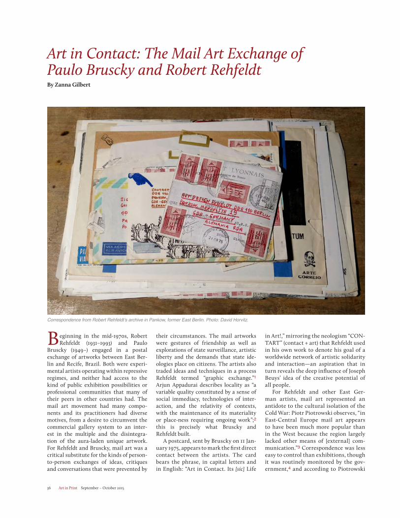
Art in Print September – October 201536
Art in Contact: The Mail Art Exchange of Paulo Bruscky and Robert RehfeldtBy Zanna Gilbert
Beginning in the mid-1970s, Robert Rehfeldt (1931–1993) and Paulo
Bruscky (1949–) engaged in a postal exchange of artworks between East Ber-lin and Recife, Brazil. Both were experi-mental artists operating within repressive regimes, and neither had access to the kind of public exhibition possibilities or professional communities that many of their peers in other countries had. The mail art movement had many compo-nents and its practitioners had diverse motives, from a desire to circumvent the commercial gallery system to an inter-est in the multiple and the disintegra-tion of the aura-laden unique artwork. For Rehfeldt and Bruscky, mail art was a critical substitute for the kinds of person-to-person exchanges of ideas, critiques and conversations that were prevented by
their circumstances. The mail artworks were gestures of friendship as well as explorations of state surveillance, artistic liberty and the demands that state ide-ologies place on citizens. The artists also traded ideas and techniques in a process Rehfeldt termed “graphic exchange.”1 Arjun Appadurai describes locality as “a variable quality constituted by a sense of social immediacy, technologies of inter-action, and the relativity of contexts, with the maintenance of its materiality or place-ness requiring ongoing work”;2 this is precisely what Bruscky and Rehfeldt built.
A postcard, sent by Bruscky on 11 Jan-uary 1975, appears to mark the first direct contact between the artists. The card bears the phrase, in capital letters and in English: “Art in Contact. Its [sic] Life
in Art!,” mirroring the neologism “CON-TART” (contact + art) that Rehfeldt used in his own work to denote his goal of a worldwide network of artistic solidarity and interaction—an aspiration that in turn reveals the deep influence of Joseph Beuys’ idea of the creative potential of all people.
For Rehfeldt and other East Ger-man artists, mail art represented an antidote to the cultural isolation of the Cold War: Piotr Piotrowski observes, “in East-Central Europe mail art appears to have been much more popular than in the West because the region largely lacked other means of [external] com-munication.”3 Correspondence was less easy to control than exhibitions, though it was routinely monitored by the gov-ernment,4 and according to Piotrowski
Correspondence from Robert Rehfeldt’s archive in Pankow, former East Berlin. Photo: David Horvitz.
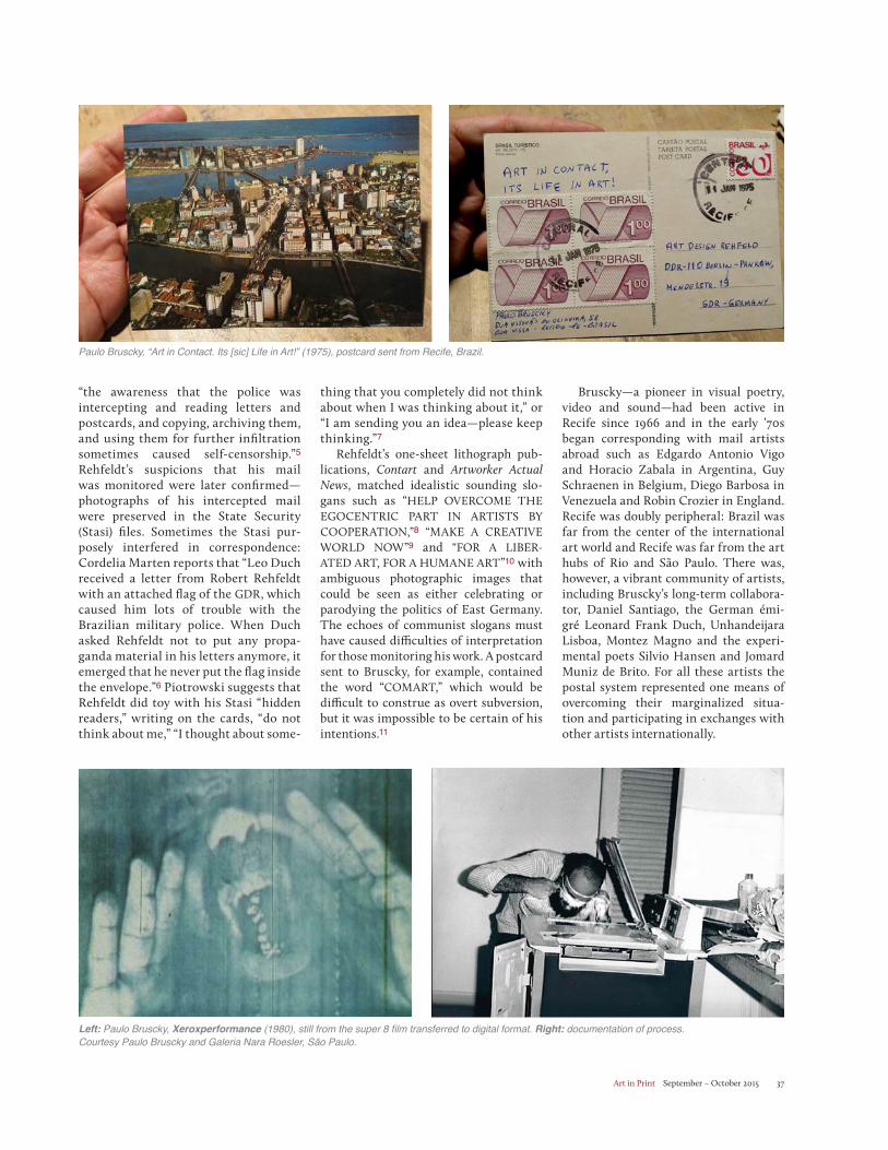
Art in Print September – October 2015 37
“the awareness that the police was intercepting and reading letters and postcards, and copying, archiving them, and using them for further infiltration sometimes caused self-censorship.”5
Rehfeldt’s suspicions that his mail was monitored were later confirmed—photographs of his intercepted mail were preserved in the State Security (Stasi) files. Sometimes the Stasi pur-posely interfered in correspondence: Cordelia Marten reports that “Leo Duch received a letter from Robert Rehfeldt with an attached flag of the GDR, which caused him lots of trouble with the Brazilian military police. When Duch asked Rehfeldt not to put any propa-ganda material in his letters anymore, it emerged that he never put the flag inside the envelope.”6 Piotrowski suggests that Rehfeldt did toy with his Stasi “hidden readers,” writing on the cards, “do not think about me,” “I thought about some-
thing that you completely did not think about when I was thinking about it,” or “I am sending you an idea—please keep thinking.”7
Rehfeldt’s one-sheet lithograph pub-lications, Contart and Artworker Actual News, matched idealistic sounding slo-gans such as “HELP OVERCOME THE EGOCENTRIC PART IN ARTISTS BY COOPERATION,”8 “MAKE A CREATIVE WORLD NOW”9 and “FOR A LIBER-ATED ART, FOR A HUMANE ART”10 with ambiguous photographic images that could be seen as either celebrating or parodying the politics of East Germany. The echoes of communist slogans must have caused difficulties of interpretation for those monitoring his work. A postcard sent to Bruscky, for example, contained the word “COMART,” which would be difficult to construe as overt subversion, but it was impossible to be certain of his intentions.11
Bruscky—a pioneer in visual poetry, video and sound—had been active in Recife since 1966 and in the early ’70s began corresponding with mail artists abroad such as Edgardo Antonio Vigo and Horacio Zabala in Argentina, Guy Schraenen in Belgium, Diego Barbosa in Venezuela and Robin Crozier in England. Recife was doubly peripheral: Brazil was far from the center of the international art world and Recife was far from the art hubs of Rio and São Paulo. There was, however, a vibrant community of artists, including Bruscky’s long-term collabora-tor, Daniel Santiago, the German émi-gré Leonard Frank Duch, Unhandeijara Lisboa, Montez Magno and the experi-mental poets Silvio Hansen and Jomard Muniz de Brito. For all these artists the postal system represented one means of overcoming their marginalized situa-tion and participating in exchanges with other artists internationally.
Paulo Bruscky, “Art in Contact. Its [sic] Life in Art!” (1975), postcard sent from Recife, Brazil.
Left: Paulo Bruscky, Xeroxperformance (1980), still from the super 8 film transferred to digital format. Right: documentation of process. Courtesy Paulo Bruscky and Galeria Nara Roesler, São Paulo.
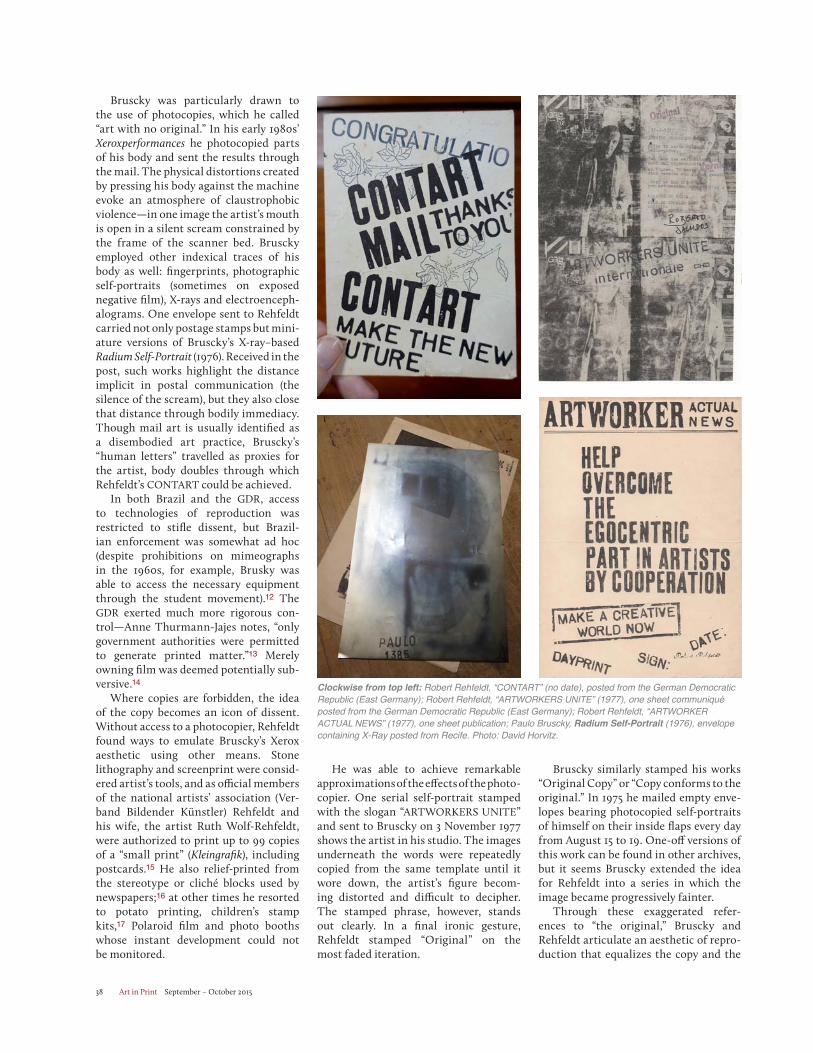
Art in Print September – October 201538
Bruscky was particularly drawn to the use of photocopies, which he called “art with no original.” In his early 1980s’ Xeroxperformances he photocopied parts of his body and sent the results through the mail. The physical distortions created by pressing his body against the machine evoke an atmosphere of claustrophobic violence—in one image the artist’s mouth is open in a silent scream constrained by the frame of the scanner bed. Bruscky employed other indexical traces of his body as well: fingerprints, photographic self-portraits (sometimes on exposed negative film), X-rays and electroenceph-alograms. One envelope sent to Rehfeldt carried not only postage stamps but mini-ature versions of Bruscky’s X-ray–based Radium Self-Portrait (1976). Received in the post, such works highlight the distance implicit in postal communication (the silence of the scream), but they also close that distance through bodily immediacy. Though mail art is usually identified as a disembodied art practice, Bruscky’s “human letters” travelled as proxies for the artist, body doubles through which Rehfeldt’s CONTART could be achieved.
In both Brazil and the GDR, access to technologies of reproduction was restricted to stifle dissent, but Brazil-ian enforcement was somewhat ad hoc (despite prohibitions on mimeographs in the 1960s, for example, Brusky was able to access the necessary equipment through the student movement).12 The GDR exerted much more rigorous con-trol—Anne Thurmann-Jajes notes, “only government authorities were permitted to generate printed matter.”13 Merely owning film was deemed potentially sub-versive.14
Where copies are forbidden, the idea of the copy becomes an icon of dissent. Without access to a photocopier, Rehfeldt found ways to emulate Bruscky’s Xerox aesthetic using other means. Stone lithography and screenprint were consid-ered artist’s tools, and as official members of the national artists’ association (Ver-band Bildender Künstler) Rehfeldt and his wife, the artist Ruth Wolf-Rehfeldt, were authorized to print up to 99 copies of a “small print” (Kleingrafik), including postcards.15 He also relief-printed from the stereotype or cliché blocks used by newspapers;16 at other times he resorted to potato printing, children’s stamp kits,17 Polaroid film and photo booths whose instant development could not be monitored.
He was able to achieve remarkable approximations of the effects of the photo- copier. One serial self-portrait stamped with the slogan “ARTWORKERS UNITE” and sent to Bruscky on 3 November 1977 shows the artist in his studio. The images underneath the words were repeatedly copied from the same template until it wore down, the artist’s figure becom-ing distorted and difficult to decipher. The stamped phrase, however, stands out clearly. In a final ironic gesture, Rehfeldt stamped “Original” on the most faded iteration.
Bruscky similarly stamped his works “Original Copy” or “Copy conforms to the original.” In 1975 he mailed empty enve-lopes bearing photocopied self-portraits of himself on their inside flaps every day from August 15 to 19. One-off versions of this work can be found in other archives, but it seems Bruscky extended the idea for Rehfeldt into a series in which the image became progressively fainter.
Through these exaggerated refer-ences to “the original,” Bruscky and Rehfeldt articulate an aesthetic of repro-duction that equalizes the copy and the
Clockwise from top left: Robert Rehfeldt, “CONTART” (no date), posted from the German Democratic Republic (East Germany); Robert Rehfeldt, “ARTWORKERS UNITE” (1977), one sheet communiqué posted from the German Democratic Republic (East Germany); Robert Rehfeldt, “ARTWORKER ACTUAL NEWS” (1977), one sheet publication; Paulo Bruscky, Radium Self-Portrait (1976), envelope containing X-Ray posted from Recife. Photo: David Horvitz.
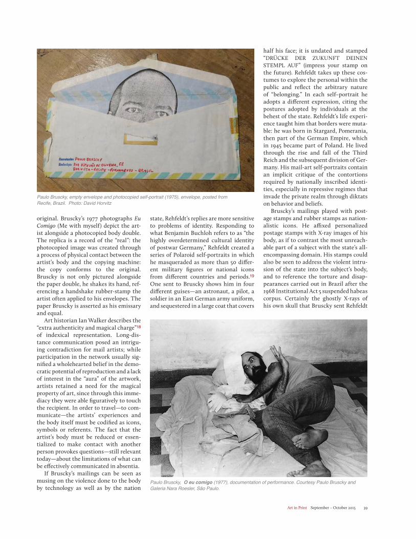
Art in Print September – October 2015 39
original. Bruscky’s 1977 photographs Eu Comigo (Me with myself) depict the art-ist alongside a photocopied body double. The replica is a record of the “real”: the photocopied image was created through a process of physical contact between the artist’s body and the copying machine: the copy conforms to the original. Bruscky is not only pictured alongside the paper double, he shakes its hand, ref-erencing a handshake rubber-stamp the artist often applied to his envelopes. The paper Bruscky is asserted as his emissary and equal.
Art historian Ian Walker describes the “extra authenticity and magical charge”18
of indexical representation. Long-dis-tance communication posed an intrigu-ing contradiction for mail artists; while participation in the network usually sig-nified a wholehearted belief in the demo-cratic potential of reproduction and a lack of interest in the “aura” of the artwork, artists retained a need for the magical property of art, since through this imme-diacy they were able figuratively to touch the recipient. In order to travel—to com-municate—the artists’ experiences and the body itself must be codified as icons, symbols or referents. The fact that the artist’s body must be reduced or essen-tialized to make contact with another person provokes questions—still relevant today—about the limitations of what can be effectively communicated in absentia.
If Bruscky’s mailings can be seen as musing on the violence done to the body by technology as well as by the nation
half his face; it is undated and stamped “DRÜCKE DER ZUKUNFT DEINEN STEMPL AUF” (impress your stamp on the future). Rehfeldt takes up these cos-tumes to explore the personal within the public and reflect the arbitrary nature of “belonging.” In each self–portrait he adopts a different expression, citing the postures adopted by individuals at the behest of the state. Rehfeldt’s life experi-ence taught him that borders were muta-ble: he was born in Stargard, Pomerania, then part of the German Empire, which in 1945 became part of Poland. He lived through the rise and fall of the Third Reich and the subsequent division of Ger-many. His mail-art self-portraits contain an implicit critique of the contortions required by nationally inscribed identi-ties, especially in repressive regimes that invade the private realm through diktats on behavior and beliefs.
Bruscky’s mailings played with post-age stamps and rubber stamps as nation-alistic icons. He affixed personalized postage stamps with X-ray images of his body, as if to contrast the most unreach-able part of a subject with the state’s all-encompassing domain. His stamps could also be seen to address the violent intru-sion of the state into the subject’s body, and to reference the torture and disap-pearances carried out in Brazil after the 1968 Institutional Act 5 suspended habeas corpus. Certainly the ghostly X-rays of his own skull that Bruscky sent Rehfeldt
Paulo Bruscky, empty envelope and photocopied self-portrait (1975), envelope, posted from Recife, Brazil. Photo: David Horvitz
Paulo Bruscky, O eu comigo (1977), documentation of performance. Courtesy Paulo Bruscky and Galeria Nara Roesler, São Paulo.
state, Rehfeldt’s replies are more sensitive to problems of identity. Responding to what Benjamin Buchloh refers to as “the highly overdetermined cultural identity of postwar Germany,” Rehfeldt created a series of Polaroid self-portraits in which he masqueraded as more than 50 differ-ent military figures or national icons from different countries and periods.19 One sent to Bruscky shows him in four different guises—an astronaut, a pilot, a soldier in an East German army uniform, and sequestered in a large coat that covers
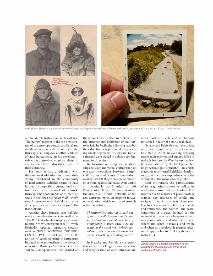
Art in Print September – October 201540
on 20 March 1976 evoke such violence. The stamps’ position in the top-right cor-ner of the envelope contrasts official and unofficial representations of the state. Bruscky also employs another emblem of state bureaucracy on his envelopes—rubber stamps—but employs them in chaotic overdrive, divesting them of their authority.
For both artists, disaffection with their national affiliations motivated their strong investment in the community of mail artists. Rehfeldt seems to have located his hope for a postnational cul-tural identity in the mail art network; Bruscky sent photographs of dismantled walls in the hope his Fallen Wall (1977)20
would resonate with Rehfeldt’s dreams of a postnational politics beyond the Iron Curtain.
Another sheet Bruscky sent Rehfeldt reads as an advertisement for mail art—“The Post Office has 6000 agencies for you to send Art by Correspondence”21—while Rehfeldt’s repeated imperative slogans, such as “HELP OVERCOME THE EGO-CENTRIC PART IN ARTISTS BY COOP-ERATION,” cajole recipients to participate. But mail art was nonetheless the object of repression. Bruscky’s “advertisement” for “Art by Correspondence” was printed on
the verso of an invitation to contribute to the “International Exhibition of Mail Art” to be held in Recife the following year, but the exhibition was prevented from open-ing and its organizers (Bruscky and Daniel Santiago) were placed in solitary confine-ment for three days.
By focusing on reciprocal relation-ships between individuals rather than on one-way interactions between “periph-eral” artists and “central” institutions, mail artists felt they were able to “travel” on a more egalitarian basis, even within an inequitable world order. In 1968 French artist Robert Filliou articulated the idea of an “Eternal Network” of art-ists participating in an ongoing festival or celebration, which resonated strongly with mail artists:
The network is everlasting . . . each one of us artistically functions in the net-work which has replaced the notion of avant-garde. It means there is no art center in the world now, nobody can tell us . . . where the place is, where “we are” is, where things are taking place.22
In Bruscky and Rehfeldt’s correspon-dence—with its long-distance reflection and reciprocation of work, situation and
ideas—notions of center and periphery are jettisoned in favor of a translocal ideal. x Brusky and Rehfeldt met face to face only once, in 1982, when Bruscky visited East Berlin. After an evening drinking together, Bruscky passed out and failed to make it back to the West before curfew; he was chastised by the GDR police but let go without punishment.23 The artists stayed in touch until Rehfeldt’s death in 1993, but their correspondence was the strongest in the 1970s and early 1980s.
Mail art reflects the particularities of its originating context as well as its operation across national borders. It is inscribed with markers of place (postage stamps, the addresses of sender and recipient), but it transports these mar-kers to a new location. It both documents and transcends the political and social conditions of a place. In mail art the moment of the artwork happens at vari-ous points: where and when it is made, where and when it travels, and where and when it is received. It requires alter-native approaches to thinking about art’s histories.
Zanna Gilbert is a postdoctoral fellow in the Department of Drawings and Prints at the Museum of Modern Art.
Left: Robert Rehfeldt, self-portraits (no date), postcard. Right: Paulo Bruscky, Fallen Wall (1977), photograph, 4 x 6 inches. Photo: David Horvitz.

Art in Print September – October 2015 41
Notes:1. Anne Thurmann-Jajes, “Robert Rehfeldt and Ruth Wolf-Rehfeldt: Their GDR-Based Interna-tional Network,” Setup4 No. 1 (2013). http://www.setup4.de/ausgabe-1/themen-und-beitraege/anne-thurmann-jajesrobert-rehfeldt-and-ruth-wolf-rehfeldt/.2. Arjun Appadurai, “The Production of Locality,” in Counterworks: Managing the Diversity of Knowl-edge, ed. R. Fardon (London: Routledge, 1995), 204.3. Piotr Piotrowski, In the Shadow of Yalta: Art and the Avant-Garde in Eastern Europe, 1945–1989 (London: Reaktion Books, 2011), 268.4. Ibid. 5. Ibid, 269.6. Marten also writes: “Most of Rehfeldt’s letters
were intercepted, opened, photographed, docu-mented and saved in the folders of the so called ‘post-control-files’. In the GDR, more than 90,000 private letters were read secretly every day. After German Re-Union, many Mail-Artists took the opportunity to inspect their Stasi files. They noticed that many addresses on foreign letters had been ripped off the envelopes and were pre-served while the rest of it was destroyed.” Cordelia Marten, “Conceptual Art in East Germany: Robert Rehfeldt and His Network of Artists,” Vivid [Radi-cal] Memory, September 2007, http://www.vivi-dradicalmemory.org/htm/workshop/stu_essays/marten_en.pdf, 9–10.7. Piotrowski, In the Shadow of Yalta, 269. 8. Robert Rehfeldt, ARTWORKER ACTUAL
NEWS (1977).9. Ibid.10. Robert Rehfeldt, ART IN CONTACT (1978).11. Piotrowski notes: “Eugen Blume observed that the East German STASI studied communiqués sent out by Robert Rehfeldt, with great scru-pulousness and seriousness Piotrowski, In the Shadow of Yalta, 269. 12. Cristina Freire and Ana Longoni, eds., Con-ceitualismos do Sul (São Paulo: Annablume, 2009), 78.13. Thurmann-Jajes, “Robert Rehfeldt and Ruth Wolf-Rehfeldt.”14. “In the GDR the medium of film in particular was considered to harbour potential as a sub-versive medium that might well be successful in spreading criticism of the state in unforeseen dimensions. Artists frequently developed their films themselves in order to avoid detection by the Ministry for State Security at the DEFA film laboratory in the Johannisthal district of Berlin.” Anne Thurmann Jajes, “Playing with the System: Artistic Strateges in the GDR from 1970 to 1990,” in Subversive Practices: Art under the Conditions of Political Repression/60s–80s/South America-Europe, ed. Iris Dressler et al. (Stuttgart: Hatje Cantz, 2011), 512.15. Thurmann-Jajes, “Robert Rehfeldt and Ruth Wolf-Rehfeldt.”16. Stereotypes (also called clichés or electro-types) are relief blocks that reproduce set type or image plates; they were commonly used in 20th-century commercial printing until was displaced by offset lithography.17. Marten, “Conceptual Art in East Germany,” 10.18. Ian Walker, City Gorged with Dreams: Sur-real Documentary Photography in Interwar Paris (Manchester: Manchester University Press, 2002), 12. 19. Marten argues that Rehfeldt’s interest in dis-guises arose from the double identities he had to adopt as a child in Nazi Germany and an adult in the GDR. Forced to join the mountain infantry in 1945 (when he was 14), Rehfeldt was pleased when the United States helped bring an end to the war. Marten maintains that despite being an “avowed socialist” Rehfeldt was also an admirer of the United States and a collector of American steel helmets. She writes, “in 1982, Rehfeldt was permitted to visit his mother in Hamburg for the first time. Also, he wanted to seize the opportu-nity to attend the Documenta 7 in Kassel. Unfor-tunately, at that time, he physically resembled a member of the RAF (Red Army Faction). When Rehfeldt arrived at the station, the whole area was blocked and crowded with policemen who arrested him immediately.” Marten, “Conceptual Art in East Germany,” 5, 10.20. The work is inscribed “O Muro Caído” on the back. Robert Rehfeldt archive, Berlin..21. In the original Portuguese: “Os Correios tem 6000 agencias para você mandar Arte por Corre-spondencia.” Printed on the reverse of an invita-tion to send work to the International Exhibition of Mail Art held in 1976. Robert Rehfeldt archive.22. Robert Filliou, “Robert Filliou Defines the Eternal Network,” YouTube video, 3:07, posted by Clive Robertson, 16 January 2013, http://youtu.be/9BgOfsG7J0Q.23. Author’s interview with the artist, February 2010.
Paulo Bruscky, “The Post Office has 6000 agencies for you to send Art by Correspondence” (1976), one sheet photocopy sent from Recife, Brazil. Photo: David Horvitz
Art in Print September – October 201542
PRIX de PRINT
Prix de Print No. 13
Rebuilding the Unbuilt [Y Block] by Sumi PereraJuried by Katherine Alcauskas
This iteration of the Art in Print Prix de Print has been judged by Kather-ine Alcauskas. The Prix de Print is a bimonthly competition, open to all subscribers, in which a single work is selected by an outside juror to be the sub-ject of a brief essay. For further informa-tion on entering the Prix de Print, please go to our website: http://artinprint.org/about-art-in-print/#competitions.
Sumi Perera, Rebuilding the Unbuilt [Y Block] (2014)Etching, aquatint and stitching, 46 1/2 x 15 1/2 inches. Edition of 3. Printed and published by the artist. SuPerPress Editions, Redhill, Surrey, UK. $1,050.
T he disciplines of printmaking and architecture have been bound
together nearly since the invention of movable type, when woodcuts were uti-lized by publishers as a way to illustrate architectural treatises such as the 1511 printing of Vitruvius’s De architectura orSebastiano Serlio’s General Rules of Archi-tecture (1537). Contemporary artist Sumi Perera’s interest is in paper architecture—drawings of theoretical structures not necessarily intended to be built. There is a long tradition of capricci, architectural fantasies, in printmaking. The master of this realm, of course, was Giovanni Bat-tista Piranesi (1720–1778), whom Perera credits as an inspiration. Piranesi’s imag-ined dungeons, Carceri d’invenzione (1749–50; 1761), present shadowy, labyrinthine interiors that refer to Baroque stage design and architectural theory. The overlapping elements, heightened contrast and skewed planar orientation of Perera’s stitched etching Rebuilding the Unbuilt [Y Block] Sumi Perera, detail from Rebuilding the Unbuilt [Y Block] (i) (2014).
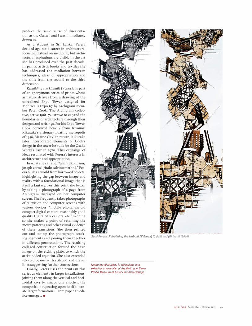
Art in Print September – October 2015 43
produce the same sense of disorienta-tion as the Carceri, and I was immediately drawn in.
As a student in Sri Lanka, Perera decided against a career in architecture, focusing instead on medicine, but archi-tectural aspirations are visible in the art she has produced over the past decade. In prints, artist’s books and textiles she has addressed the mediation between techniques, ideas of appropriation and the shift from the second to the third dimension.
Rebuilding the Unbuilt [Y Block] is part of an eponymous series of prints whose armature derives from a drawing of the unrealized Expo Tower designed for Montreal’s Expo 67 by Archigram mem-ber Peter Cook. The Archigram collec-tive, active 1961–74, strove to expand the boundaries of architecture through their designs and writings. For his Expo Tower, Cook borrowed heavily from Kiyonori Kikutake’s visionary floating metropolis of 1958, Marine City; in return, Kikutake later incorporated elements of Cook’s design in the tower he built for the Osaka World’s Fair in 1970. This exchange of ideas resonated with Perera’s interests in architecture and appropriation.
In what she calls her “emily dickinson/joseph cornell/italo calvino method,” Per-era builds a world from borrowed objects, highlighting the gap between image and reality with a foundational image that is itself a fantasy. For this print she began by taking a photograph of a page from Archigram displayed on her computer screen. She frequently takes photographs of television and computer screens with various devices: “mobile phone, an old compact digital camera, reasonably good quality Digital SLR camera, etc.” In doing so she makes a point of retaining the moiré patterns and other visual evidence of these transitions. She then printed out and cut up the photograph, stack-ing segments and joining them together in different permutations. The resulting collaged construction formed the basic image on the etching plate, to which the artist added aquatint. She also extended selected beams with stitched and drawn lines suggesting further connections.
Finally, Perera uses the prints in this series as elements in larger installations, joining them along the vertical and hori-zontal axes to mirror one another, the composition repeating upon itself to cre-ate larger formations. From paper an edi-fice emerges.
Katherine Alcauskas is collections and exhibitions specialist at the Ruth and Elmer Wellin Museum of Art at Hamilton College.
Sumi Perera, Rebuilding the Unbuilt [Y Block] (i) (left) and (ii) (right) (2014).
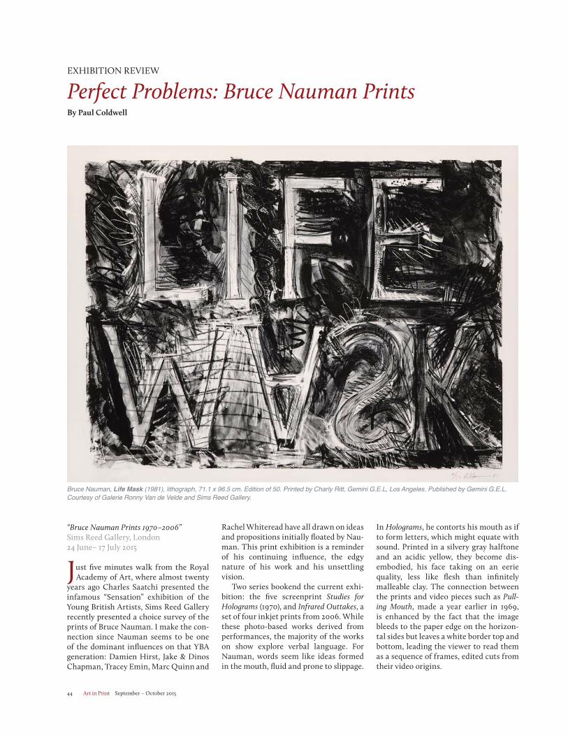
Art in Print September – October 201544
“Bruce Nauman Prints 1970–2006” Sims Reed Gallery, London24 June– 17 July 2015
Just five minutes walk from the Royal Academy of Art, where almost twenty
years ago Charles Saatchi presented the infamous “Sensation” exhibition of the Young British Artists, Sims Reed Gallery recently presented a choice survey of the prints of Bruce Nauman. I make the con-nection since Nauman seems to be one of the dominant influences on that YBA generation: Damien Hirst, Jake & Dinos Chapman, Tracey Emin, Marc Quinn and
Rachel Whiteread have all drawn on ideas and propositions initially floated by Nau-man. This print exhibition is a reminder of his continuing influence, the edgy nature of his work and his unsettling vision.
Two series bookend the current exhi-bition: the five screenprint Studies for Holograms (1970), and Infrared Outtakes, a set of four inkjet prints from 2006. While these photo-based works derived from performances, the majority of the works on show explore verbal language. For Nauman, words seem like ideas formed in the mouth, fluid and prone to slippage.
In Holograms, he contorts his mouth as if to form letters, which might equate with sound. Printed in a silvery gray halftone and an acidic yellow, they become dis-embodied, his face taking on an eerie quality, less like flesh than infinitely malleable clay. The connection between the prints and video pieces such as Pull-ing Mouth, made a year earlier in 1969, is enhanced by the fact that the image bleeds to the paper edge on the horizon-tal sides but leaves a white border top and bottom, leading the viewer to read them as a sequence of frames, edited cuts from their video origins.
EXHIBITION REVIEW
Perfect Problems: Bruce Nauman PrintsBy Paul Coldwell
Bruce Nauman, Life Mask (1981), lithograph, 71.1 x 96.5 cm. Edition of 50. Printed by Charly Ritt, Gemini G.E.L, Los Angeles. Published by Gemini G.E.L. Courtesy of Galerie Ronny Van de Velde and Sims Reed Gallery.
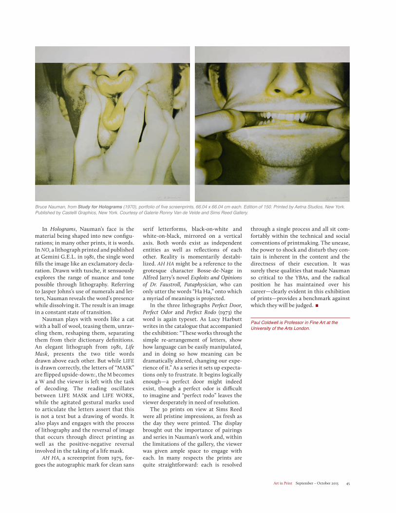
Art in Print September – October 2015 45
serif letterforms, black-on-white and white-on-black, mirrored on a vertical axis. Both words exist as independent entities as well as reflections of each other. Reality is momentarily destabi-lized. AH HA might be a reference to the grotesque character Bosse-de-Nage in Alfred Jarry’s novel Exploits and Opinions of Dr. Faustroll, Pataphysician, who can only utter the words “Ha Ha,” onto which a myriad of meanings is projected.
In the three lithographs Perfect Door, Perfect Odor and Perfect Rodo (1973) the word is again typeset. As Lucy Harbutt writes in the catalogue that accompanied the exhibition: “These works through the simple re-arrangement of letters, show how language can be easily manipulated, and in doing so how meaning can be dramatically altered, changing our expe-rience of it.” As a series it sets up expecta-tions only to frustrate. It begins logically enough—a perfect door might indeed exist, though a perfect odor is difficult to imagine and “perfect rodo” leaves the viewer desperately in need of resolution.
The 30 prints on view at Sims Reed were all pristine impressions, as fresh as the day they were printed. The display brought out the importance of pairings and series in Nauman’s work and, within the limitations of the gallery, the viewer was given ample space to engage with each. In many respects the prints are quite straightforward: each is resolved
through a single process and all sit com-fortably within the technical and social conventions of printmaking. The unease, the power to shock and disturb they con-tain is inherent in the content and the directness of their execution. It was surely these qualities that made Nauman so critical to the YBAs, and the radical position he has maintained over his career—clearly evident in this exhibition of prints—provides a benchmark against which they will be judged.
Paul Coldwell is Professor in Fine Art at the University of the Arts London.
In Holograms, Nauman’s face is the material being shaped into new configu-rations; in many other prints, it is words. In NO, a lithograph printed and published at Gemini G.E.L. in 1981, the single word fills the image like an exclamatory decla-ration. Drawn with tusche, it sensuously explores the range of nuance and tone possible through lithography. Referring to Jasper Johns’s use of numerals and let-ters, Nauman reveals the word’s presence while dissolving it. The result is an image in a constant state of transition.
Nauman plays with words like a cat with a ball of wool, teasing them, unrav-eling them, reshaping them, separating them from their dictionary definitions. An elegant lithograph from 1981, Life Mask, presents the two title words drawn above each other. But while LIFEis drawn correctly, the letters of “MASK” are flipped upside-down:, the M becomes a W and the viewer is left with the task of decoding. The reading oscillates between LIFE MASK and LIFE WORK, while the agitated gestural marks used to articulate the letters assert that this is not a text but a drawing of words. It also plays and engages with the process of lithography and the reversal of image that occurs through direct printing as well as the positive-negative reversal involved in the taking of a life mask.
AH HA, a screenprint from 1975, for-goes the autographic mark for clean sans
Bruce Nauman, from Study for Holograms (1970), portfolio of five screenprints, 66.04 x 66.04 cm each. Edition of 150. Printed by Aetna Studios, New York. Published by Castelli Graphics, New York. Courtesy of Galerie Ronny Van de Velde and Sims Reed Gallery.
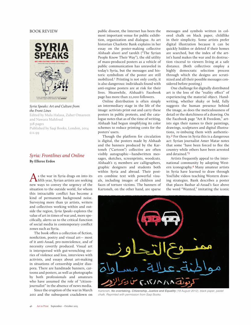
Art in Print September – October 201546
Syria Speaks: Art and Culture from the Front LinesEdited by Malu Halasa, Zaher Omareen and Nawara Mahfoud328 pages Published by Saqi Books, London, 2014£12.99
Syria: Frontlines and Online By Elleree Erdos
A s the war in Syria drags on into itsfifth year, Syrian artists are seeking
new ways to convey the urgency of the situation to the outside world, for whom this intractable conflict has become a kind of permanent background noise. Surveying more than 50 artists, writers and collectives working within and out-side the region, Syria Speaks explores the value of art in times of war and, more spe-cifically, alerts us to the critical function of social media in contemporary conflict zones such as Syria.
The book offers a collection of fiction, nonfiction, poetry and visual art— most of it anti-Assad, pro-nonviolence, and of necessity covertly produced. Visual art is interspersed with gut-wrenching sto-ries of violence and loss, interviews with activists, and essays about art-making in situations of censorship and/or dias-pora. There are handmade banners, car-toons and posters, as well as photographs by both professionals and amateurs who have assumed the role of “citizen-journalist” in the absence of news media.
Since the eruption of the war in March 2011 and the subsequent crackdown on
public dissent, the Internet has been the most important venue for public exhibi-tion, organization and dialogue. As art historian Charlotte Bank explains in her essay on the poster-making collective Alshaab alsori aref tarekh (“The Syrian People Know Their Way”), the old utility of mass-produced posters as a vehicle of public communication has unraveled in today’s Syria, but the messages and his-toric symbolism of the poster are still mobilized.1 Printing is not only costly, it is also dangerous: individuals found with anti-regime posters are at risk for their lives. Meanwhile, Alshaab’s Facebook page has more than 22,000 followers.
Online distribution is often simply an intermediary stage in the life of the image: activists print out and carry these posters in public protests, and the cata-logue notes that as of the time of writing, Alshaab had begun simplifying its color schemes to reduce printing costs for the posters’ users.
Though the platform for circulation is digital, the posters made by Alshaab and the banners produced by the Kar-toneh (“Cartoon”) collective are often visibly autographic—handwritten mes-sages, sketches, screenprints, woodcuts. Alshaab’s 15 members are calligraphers, graphic designers and students both within Syria and abroad. Their post-ers combine text with powerful visu-als, including images of children and faces of torture victims. The banners of Kartoneh, on the other hand, are sparse
BOOK REVIEW messages and symbols written in col-ored chalk on black paper, childlike in their simplicity. Some artists prefer digital illustration because it can be quickly hidden or deleted if their homes are searched, but the index of the art-ist’s hand makes the war and its destruc-tion visceral to viewers living at a safe distance. (Both collectives employ a highly democratic selection process through which the designs are scruti-nized and all their possible messages con-sidered before posting.)
One challenge for digitally distributed art is the loss of the “reality effect” of experiencing the material object. Hand-writing, whether shaky or bold, fully suggests the human presence behind the image, as does the meticulousness of detail or the sketchiness of a drawing. On the Facebook page “Art & Freedom,” art-ists sign their names to their paintings, drawings, sculptures and digital illustra-tions, re-imbuing them with authentic-ity.2 For those in Syria this is a dangerous act: Syrian journalist Amer Matar notes that some “have been forced to flee the country while others have been arrested and detained.”3
Artists frequently appeal to the inter-national community by adopting West-ern iconography.4 Many amateur artists in Syria have learned to draw through YouTube videos teaching Western draw-ing strategies. Bank describes a poster that places Bashar al-Assad’s face above the word “Wanted,” imitating the iconic
Kartoneh, No overtaking. Citizenship, Justice and Equality (18 August 2012), black paper, pastel chalk. Reprinted with permission from Saqi Books.
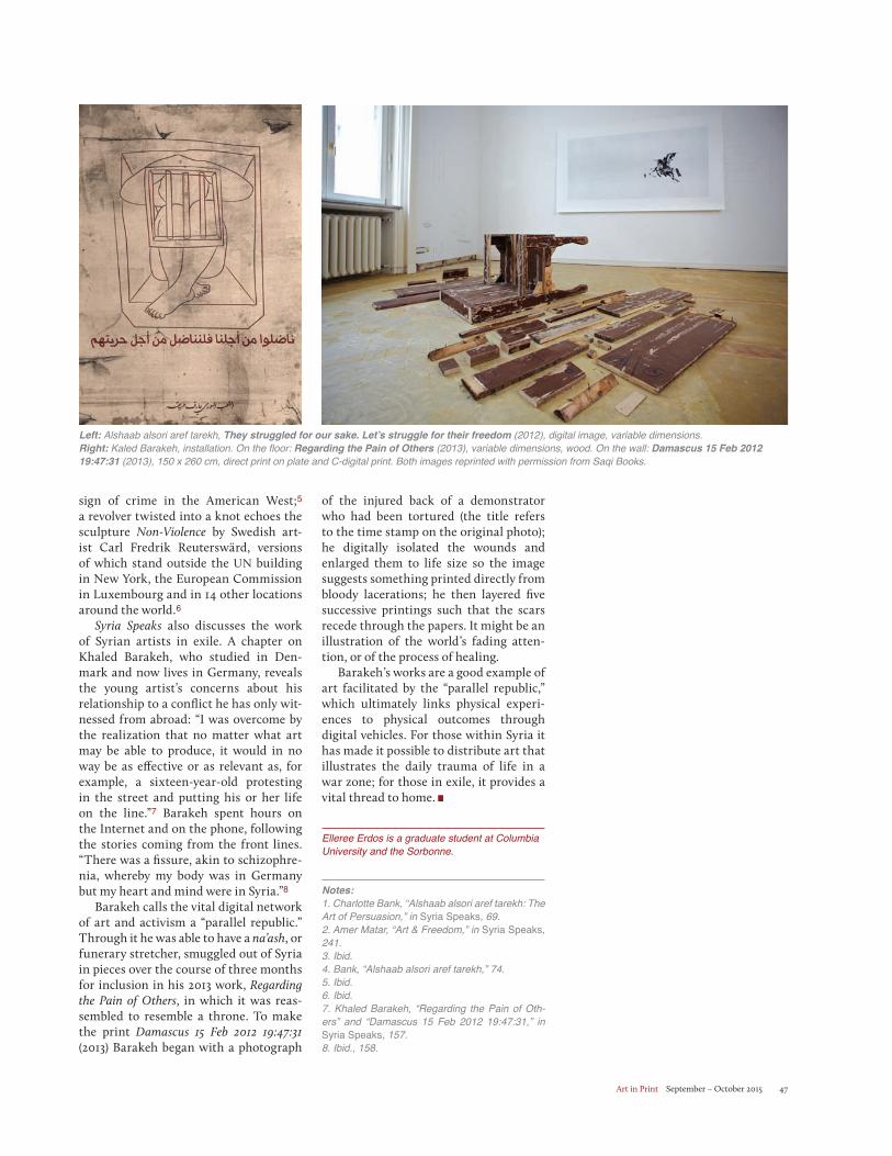
Art in Print September – October 2015 47
sign of crime in the American West;5
a revolver twisted into a knot echoes the sculpture Non-Violence by Swedish art-ist Carl Fredrik Reuterswärd, versions of which stand outside the UN building in New York, the European Commission in Luxembourg and in 14 other locations around the world.6
Syria Speaks also discusses the work of Syrian artists in exile. A chapter on Khaled Barakeh, who studied in Den-mark and now lives in Germany, reveals the young artist’s concerns about his relationship to a conflict he has only wit-nessed from abroad: “I was overcome by the realization that no matter what art may be able to produce, it would in no way be as effective or as relevant as, for example, a sixteen-year-old protesting in the street and putting his or her life on the line.”7 Barakeh spent hours on the Internet and on the phone, following the stories coming from the front lines. “There was a fissure, akin to schizophre-nia, whereby my body was in Germany but my heart and mind were in Syria.”8
Barakeh calls the vital digital network of art and activism a “parallel republic.” Through it he was able to have a na’ash, or funerary stretcher, smuggled out of Syria in pieces over the course of three months for inclusion in his 2013 work, Regarding the Pain of Others, in which it was reas-sembled to resemble a throne. To make the print Damascus 15 Feb 2012 19:47:31(2013) Barakeh began with a photograph
of the injured back of a demonstrator who had been tortured (the title refers to the time stamp on the original photo); he digitally isolated the wounds and enlarged them to life size so the image suggests something printed directly from bloody lacerations; he then layered five successive printings such that the scars recede through the papers. It might be an illustration of the world’s fading atten-tion, or of the process of healing.
Barakeh’s works are a good example of art facilitated by the “parallel republic,” which ultimately links physical experi-ences to physical outcomes through digital vehicles. For those within Syria it has made it possible to distribute art that illustrates the daily trauma of life in a war zone; for those in exile, it provides a vital thread to home.
Elleree Erdos is a graduate student at Columbia University and the Sorbonne.
Notes:1. Charlotte Bank, “Alshaab alsori aref tarekh: The Art of Persuasion,” in Syria Speaks, 69.2. Amer Matar, “Art & Freedom,” in Syria Speaks, 241. 3. Ibid. 4. Bank, “Alshaab alsori aref tarekh,” 74. 5. Ibid. 6. Ibid. 7. Khaled Barakeh, “Regarding the Pain of Oth-ers” and “Damascus 15 Feb 2012 19:47:31,” in Syria Speaks, 157. 8. Ibid., 158.
Left: Alshaab alsori aref tarekh, They struggled for our sake. Let’s struggle for their freedom (2012), digital image, variable dimensions. Right: Kaled Barakeh, installation. On the floor: Regarding the Pain of Others (2013), variable dimensions, wood. On the wall: Damascus 15 Feb 2012 19:47:31 (2013), 150 x 260 cm, direct print on plate and C-digital print. Both images reprinted with permission from Saqi Books.
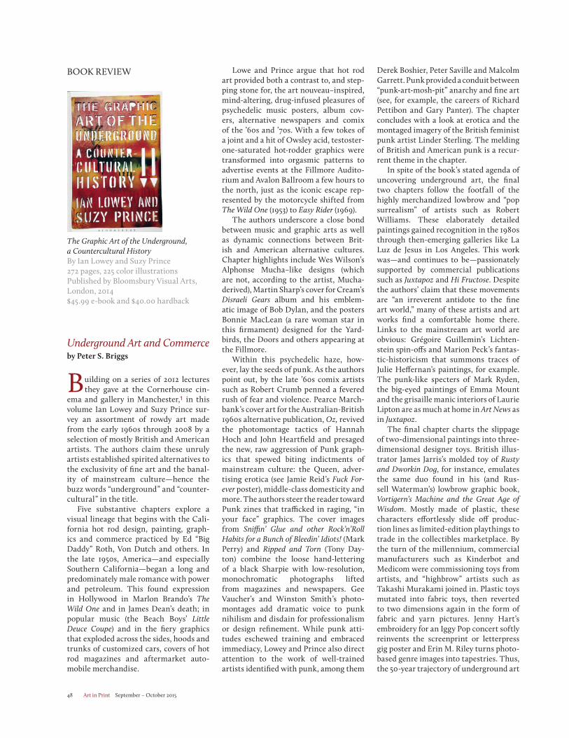
Art in Print September – October 201548
The Graphic Art of the Underground, a Countercultural HistoryBy Ian Lowey and Suzy Prince272 pages, 225 color illustrationsPublished by Bloomsbury Visual Arts, London, 2014$45.99 e-book and $40.00 hardback
Underground Art and Commerceby Peter S. Briggs
Building on a series of 2012 lectures they gave at the Cornerhouse cin-
ema and gallery in Manchester,1 in this volume Ian Lowey and Suzy Prince sur-vey an assortment of rowdy art made from the early 1960s through 2008 by a selection of mostly British and American artists. The authors claim these unruly artists established spirited alternatives to the exclusivity of fine art and the banal-ity of mainstream culture—hence the buzz words “underground” and “counter-cultural” in the title.
Five substantive chapters explore a visual lineage that begins with the Cali-fornia hot rod design, painting, graph-ics and commerce practiced by Ed “Big Daddy” Roth, Von Dutch and others. In the late 1950s, America—and especially Southern California—began a long and predominately male romance with power and petroleum. This found expression in Hollywood in Marlon Brando’s The Wild One and in James Dean’s death; in popular music (the Beach Boys’ Little Deuce Coupe) and in the fiery graphics that exploded across the sides, hoods and trunks of customized cars, covers of hot rod magazines and aftermarket auto-mobile merchandise.
Lowe and Prince argue that hot rod art provided both a contrast to, and step-ping stone for, the art nouveau–inspired, mind-altering, drug-infused pleasures of psychedelic music posters, album cov-ers, alternative newspapers and comix of the ’60s and ’70s. With a few tokes of a joint and a hit of Owsley acid, testoster-one-saturated hot-rodder graphics were transformed into orgasmic patterns to advertise events at the Fillmore Audito-rium and Avalon Ballroom a few hours to the north, just as the iconic escape rep-resented by the motorcycle shifted from The Wild One (1953) to Easy Rider (1969).
The authors underscore a close bond between music and graphic arts as well as dynamic connections between Brit-ish and American alternative cultures. Chapter highlights include Wes Wilson’s Alphonse Mucha–like designs (which are not, according to the artist, Mucha-derived), Martin Sharp’s cover for Cream’s Disraeli Gears album and his emblem-atic image of Bob Dylan, and the posters Bonnie MacLean (a rare woman star in this firmament) designed for the Yard-birds, the Doors and others appearing at the Fillmore.
Within this psychedelic haze, how-ever, lay the seeds of punk. As the authors point out, by the late ’60s comix artists such as Robert Crumb penned a fevered rush of fear and violence. Pearce March-bank’s cover art for the Australian-British 1960s alternative publication, Oz, revived the photomontage tactics of Hannah Hoch and John Heartfield and presaged the new, raw aggression of Punk graph-ics that spewed biting indictments of mainstream culture: the Queen, adver-tising erotica (see Jamie Reid’s Fuck For-ever poster), middle-class domesticity and more. The authors steer the reader toward Punk zines that trafficked in raging, “in your face” graphics. The cover images from Sniffin’ Glue and other Rock’n’Roll Habits for a Bunch of Bleedin’ Idiots! (Mark Perry) and Ripped and Torn (Tony Day-ton) combine the loose hand-lettering of a black Sharpie with low-resolution, monochromatic photographs lifted from magazines and newspapers. Gee Vaucher’s and Winston Smith’s photo- montages add dramatic voice to punk nihilism and disdain for professionalism or design refinement. While punk atti-tudes eschewed training and embraced immediacy, Lowey and Prince also direct attention to the work of well-trained artists identified with punk, among them
BOOK REVIEW Derek Boshier, Peter Saville and Malcolm Garrett. Punk provided a conduit between “punk-art-mosh-pit” anarchy and fine art (see, for example, the careers of Richard Pettibon and Gary Panter). The chapter concludes with a look at erotica and the montaged imagery of the British feminist punk artist Linder Sterling. The melding of British and American punk is a recur-rent theme in the chapter.
In spite of the book’s stated agenda of uncovering underground art, the final two chapters follow the footfall of the highly merchandized lowbrow and “pop surrealism” of artists such as Robert Williams. These elaborately detailed paintings gained recognition in the 1980s through then-emerging galleries like La Luz de Jesus in Los Angeles. This work was—and continues to be—passionately supported by commercial publications such as Juxtapoz and Hi Fructose. Despite the authors’ claim that these movements are “an irreverent antidote to the fine art world,” many of these artists and art works find a comfortable home there. Links to the mainstream art world are obvious: Grégoire Guillemin’s Lichten-stein spin-offs and Marion Peck’s fantas-tic-historicism that summons traces of Julie Heffernan’s paintings, for example. The punk-like specters of Mark Ryden, the big-eyed paintings of Emma Mount and the grisaille manic interiors of Laurie Lipton are as much at home in Art News as in Juxtapoz.
The final chapter charts the slippage of two-dimensional paintings into three-dimensional designer toys. British illus-trator James Jarris’s molded toy of Rusty and Dworkin Dog, for instance, emulates the same duo found in his (and Rus-sell Waterman’s) lowbrow graphic book, Vortigern’s Machine and the Great Age of Wisdom. Mostly made of plastic, these characters effortlessly slide off produc-tion lines as limited-edition playthings to trade in the collectibles marketplace. By the turn of the millennium, commercial manufacturers such as Kinderbot and Medicom were commissioning toys from artists, and “highbrow” artists such as Takashi Murakami joined in. Plastic toys mutated into fabric toys, then reverted to two dimensions again in the form of fabric and yarn pictures. Jenny Hart’s embroidery for an Iggy Pop concert softly reinvents the screenprint or letterpress gig poster and Erin M. Riley turns photo-based genre images into tapestries. Thus, the 50-year trajectory of underground art
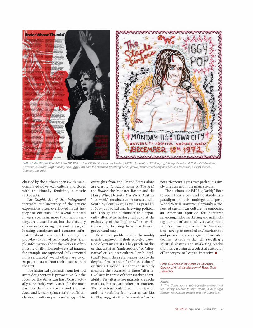
Art in Print September – October 2015 49
charted by the authors opens with male-dominated power-car culture and closes with traditionally feminine, domestic textile arts.
The Graphic Art of the Undergroundincreases our inventory of the artistic expressions often overlooked in art his-tory and criticism. The several hundred images, spanning more than half a cen-tury, are a visual treat, but the difficulty of cross-referencing text and image, or locating consistent and accurate infor-mation about the art works is enough to provoke a litany of punk expletives. Sim-ple information about the works is often missing or ill-informed—several images, for example, are captioned, “silk screened mini serigraphs”!—and others are 10 or 20 pages distant from their discussion in the text.
The historical synthesis from hot rod art to designer toys is provocative. But the focus on the American East Coast (actu-ally New York), West Coast (for the most part Southern California and the Bay Area) and London (plus a little bit of Man-chester) results in problematic gaps. The
oversights from the United States alone are glaring: Chicago, home of The Seed, the Reader, the Monster Roster and the Hairy Who; Detroit’s Free Press; Austin’s “flat work” renaissance in concert with South by Southwest; as well as pan-U.S. 1960s–70s radical and left-wing political art. Though the authors of this appar-ently alternative history rail against the exclusivity of the “highbrow” art world, they seem to be using the same well-worn geocultural map.
Even more problematic is the muddy metric employed in their selective eleva-tion of certain artists. They proclaim this or that artist as “underground” or “alter-native” or “counter-cultural” or “subcul-tural”; terms they set in opposition to the despised “mainstream” or “mass culture” or “fine art world.” But they consistently measure the successes of these “alterna-tive” arts in terms of their market adapt-ability. Yes, alternative markets are niche markets, but so are other art markets. The tenacious push of commoditization and marketability from custom car kits to Etsy suggests that “alternative” art is
not a river cutting its own path but is sim-ply one current in the main stream.
The authors use Ed “Big Daddy” Roth to open their story, and he stands as a paradigm of this underground post–World War II universe. Certainly a pio-neer of custom car culture, he embodied an American aptitude for bootstrap financing, niche marketing and unflinch-ing pursuit of commodity development. Roth’s ultimate conversion to Mormon-ism—a religion founded on American soil and possessing a keen grasp of manifest destiny—stands as the tell, revealing a spiritual destiny and marketing resolve that has cast him as a celestial custodian of “underground” capital incentive.
Peter S. Briggs is the Helen DeVitt Jones Curator of Art at the Museum of Texas Tech University.
Notes:1. The Cornerhouse subsequently merged with the Library Theater to form Home, a new orga-nization for cinema, theater and the visual arts.
Left: “Under Whose Thumb?” from OZ 37 (London: OZ Publications Ink Limited, 1971). University of Wollongong Library Historical & Cultural Collections, Keiraville, Australia. Right: Jenny Hart, Iggy Pop from the Sublime Stitching series (2004), hand embroidery and sequins on cotton, 16 x 24 inches. Courtesy the artist.
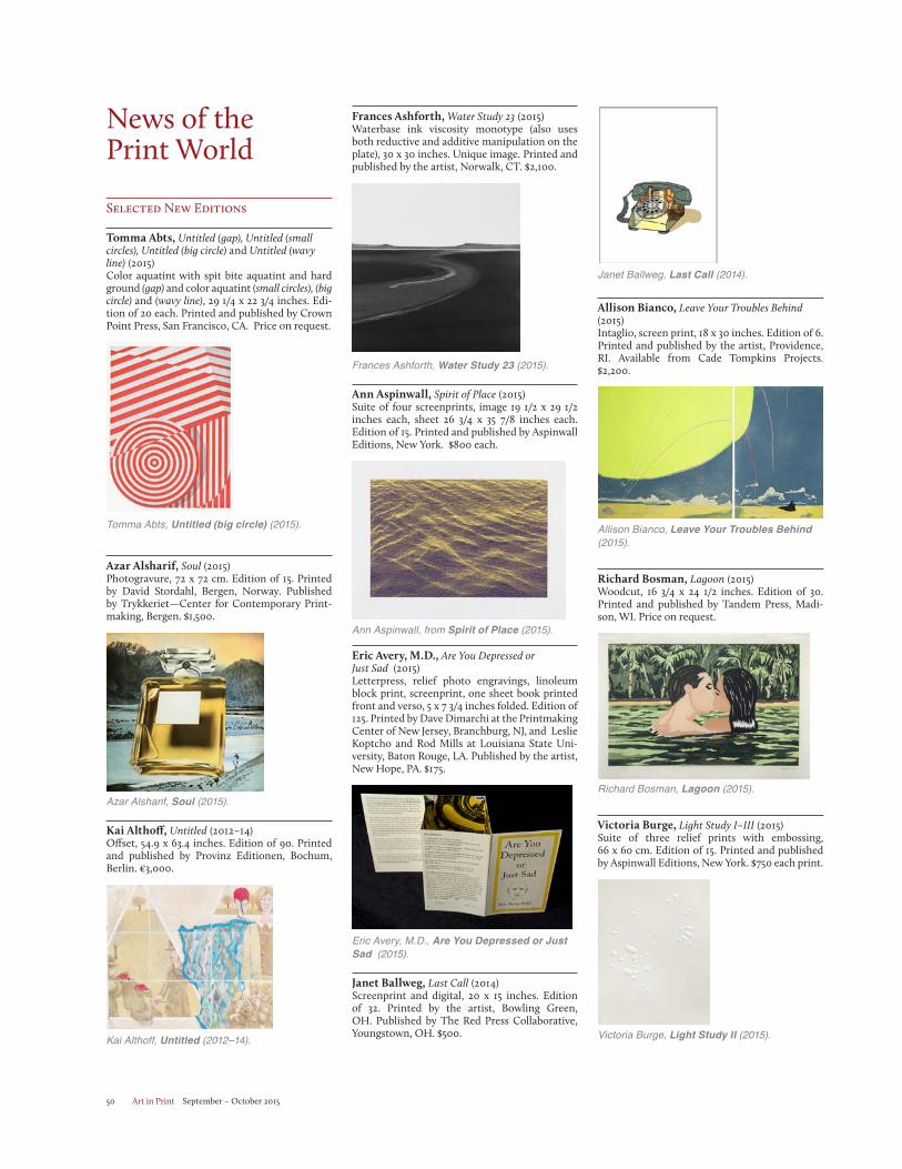
Art in Print September – October 201550
News of the Print World
Selected New Editions
Tomma Abts, Untitled (gap), Untitled (small circles), Untitled (big circle) and Untitled (wavy line) (2015)Color aquatint with spit bite aquatint and hard ground (gap) and color aquatint (small circles), (big circle) and (wavy line), 29 1/4 x 22 3/4 inches. Edi-tion of 20 each. Printed and published by Crown Point Press, San Francisco, CA. Price on request.
Tomma Abts, Untitled (big circle) (2015).
Azar Alsharif, Soul (2015)Photogravure, 72 x 72 cm. Edition of 15. Printed by David Stordahl, Bergen, Norway. Published by Trykkeriet—Center for Contemporary Print-making, Bergen. $1,500.
Azar Alsharif, Soul (2015).
Kai Althoff, Untitled (2012–14)Offset, 54.9 x 63.4 inches. Edition of 90. Printed and published by Provinz Editionen, Bochum, Berlin. €3,000.
Kai Althoff, Untitled (2012–14).
Frances Ashforth, Water Study 23 (2015)Waterbase ink viscosity monotype (also uses both reductive and additive manipulation on the plate), 30 x 30 inches. Unique image. Printed and published by the artist, Norwalk, CT. $2,100.
Frances Ashforth, Water Study 23 (2015).
Ann Aspinwall, Spirit of Place (2015)Suite of four screenprints, image 19 1/2 x 29 1/2 inches each, sheet 26 3/4 x 35 7/8 inches each. Edition of 15. Printed and published by Aspinwall Editions, New York. $800 each.
Ann Aspinwall, from Spirit of Place (2015).
Eric Avery, M.D., Are You Depressed or Just Sad (2015)Letterpress, relief photo engravings, linoleum block print, screenprint, one sheet book printed front and verso, 5 x 7 3/4 inches folded. Edition of 125. Printed by Dave Dimarchi at the Printmaking Center of New Jersey, Branchburg, NJ, and Leslie Koptcho and Rod Mills at Louisiana State Uni-versity, Baton Rouge, LA. Published by the artist, New Hope, PA. $175.
Eric Avery, M.D., Are You Depressed or Just Sad (2015).
Janet Ballweg, Last Call (2014)Screenprint and digital, 20 x 15 inches. Edition of 32. Printed by the artist, Bowling Green, OH. Published by The Red Press Collaborative, Youngstown, OH. $500.
Published by The Red Press Collaborative, Youngstown, OH. $500.
Janet Ballweg, Last Call (2014).
Allison Bianco, Leave Your Troubles Behind (2015)Intaglio, screen print, 18 x 30 inches. Edition of 6. Printed and published by the artist, Providence, RI. Available from Cade Tompkins Projects. $2,200.
Allison Bianco, Leave Your Troubles Behind (2015).
Richard Bosman, Lagoon (2015)Woodcut, 16 3/4 x 24 1/2 inches. Edition of 30. Printed and published by Tandem Press, Madi-son, WI. Price on request.
Richard Bosman, Lagoon (2015).
Victoria Burge, Light Study I–III (2015)Suite of three relief prints with embossing, 66 x 60 cm. Edition of 15. Printed and published by Aspinwall Editions, New York. $750 each print.
Victoria Burge, Light Study II (2015).
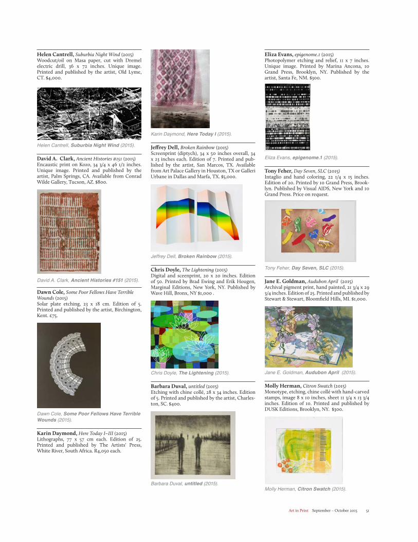
Art in Print September – October 2015 51
Eliza Evans, epigenome.1 (2015)Photopolymer etching and relief, 11 x 7 inches. Unique image. Printed by Marina Ancona, 10 Grand Press, Brooklyn, NY. Published by the artist, Santa Fe, NM. $300.
Eliza Evans, epigenome.1 (2015).
Tony Feher, Day Seven, SLC (2015)Intaglio and hand coloring, 22 1/4 x 15 inches. Edition of 20. Printed by 10 Grand Press, Brook-lyn. Published by Visual AIDS, New York and 10 Grand Press. Price on request.
Tony Feher, Day Seven, SLC (2015).
Jane E. Goldman, Audubon April (2015)Archival pigment print, hand painted, 21 3/4 x 29 3/4 inches. Edition of 25. Printed and published by Stewart & Stewart, Bloomfield Hills, MI. $1,000.
Jane E. Goldman, Audubon April (2015).
Molly Herman, Citron Swatch (2015)Monotype, etching, chine collé with hand-carved stamps, image 8 x 10 inches, sheet 11 3/4 x 13 3/4 inches. Edition of 10. Printed and published by DUSK Editions, Brooklyn, NY. $300.
Molly Herman, Citron Swatch (2015).
Karin Daymond, Here Today I (2015).
Jeffrey Dell, Broken Rainbow (2015)Screenprint (diptych), 34 x 50 inches overall, 34 x 23 inches each. Edition of 7. Printed and pub-lished by the artist, San Marcos, TX. Available from Art Palace Gallery in Houston, TX or Galleri Urbane in Dallas and Marfa, TX. $5,000.
Jeffrey Dell, Broken Rainbow (2015).
Chris Doyle, The Lightening (2015)Digital and sceenprint, 20 x 20 inches. Edition of 50. Printed by Brad Ewing and Erik Hougen, Marginal Editions, New York, NY. Published by Wave Hill, Bronx, NY $1,000 .
Chris Doyle, The Lightening (2015).
Barbara Duval, untitled (2015)Etching with chine collé, 28 x 34 inches. Edition of 5. Printed and published by the artist, Charles-ton, SC. $400.
Barbara Duval, untitled (2015).
Helen Cantrell, Suburbia Night Wind (2015)Woodcut/oil on Masa paper, cut with Dremel electric drill, 36 x 72 inches. Unique image. Printed and published by the artist, Old Lyme, CT. $4,000.
Helen Cantrell, Suburbia Night Wind (2015).
David A. Clark, Ancient Histories #151 (2015)Encaustic print on Kozo, 34 3/4 x 46 1/2 inches. Unique image. Printed and published by the artist, Palm Springs, CA. Available from Conrad Wilde Gallery, Tucson, AZ. $800.
David A. Clark, Ancient Histories #151 (2015).
Dawn Cole, Some Poor Fellows Have Terrible Wounds (2015)Solar plate etching, 23 x 18 cm. Edition of 5. Printed and published by the artist, Birchington, Kent. £75.
Dawn Cole, Some Poor Fellows Have Terrible Wounds (2015).
Karin Daymond, Here Today I–III (2015)Lithographs, 77 x 57 cm each. Edition of 25. Printed and published by The Artists' Press, White River, South Africa. R4,050 each.
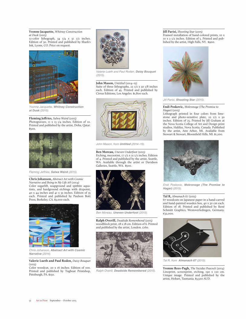
Art in Print September – October 201552
Jill Parisi, Shooting Star (2015)Framed installation of hand-colored prints, 10 x 10 x 2 1/2 inches. Edition of 5. Printed and pub-lished by the artist, High Falls, NY. $900.
Jill Parisi, Shooting Star (2015).
Endi Poskovic, Mokronoge (The Promise to Hagar) (2015)Lithograph printed in four colors from lime-stone and photo-sensitive plate, 22 1/2 x 30 inches. Edition of 25. Printed by Jill Graham at the Nova Scotia College of Art and Design print studios, Halifax, Nova Scotia, Canada. Published by the artist, Ann Arbor, MI. Available from Stewart & Stewart, Bloomfield Hills, MI. $1,200.
Endi Poskovic, Mokronoge (The Promise to Hagar) (2015).
Tal R, Almanach 67 (2015)67 woodcuts on Japanese paper in a hand-carved and hand-painted wooden box, 40 x 30 cm each. Edition of 18. Printed and published by René Schmitt Graphics, Westoverledingen, Germany. €32,000.
Tal R, from Almanach 67 (2015).
Yvonne Rees-Pagh, The Yazidas Peacock (2014)Linoprint, screenprint, etching, 190 x 120 cm. Unique image. Printed and published by the artist, Hobart, Tasmania. $3,500 AUD.
Valerie Lueth and Paul Roden, Daisy Bouquet (2015).
John Mason, Untitled (2014–15)Suite of three lithographs, 22 1/2 x 30 1/8 inches each. Edition of 45. Printed and published by Cirrus Editions, Los Angeles. $1,800 each.
John Mason, from Untitled (2014–15).
Ben Moreau, Uneven Underfoot (2015)Etching, mezzotint, 17 1/2 x 21 1/2 inches. Edition of 4. Printed and published by the artist, Seattle, WA. Available through the artist or Davidson Galleries, Seattle, WA. $500.
Ben Moreau, Uneven Underfoot (2015).
Ralph Overill, Deadside Remembered (2015)woodblock print, 28 x 18 cm. Edition of 6. Printed and published by the artist, London. £160.
Ralph Overill, Deadside Remembered (2015).
Yvonne Jacquette, Whitney Construction at Dusk (2015)12-color lithograph, 34 1/4 x 31 1/2 inches. Edition of 30. Printed and published by Shark's Ink, Lyons, CO. Price on request.
Yvonne Jacquette, Whitney Construction at Dusk (2015).
Fleming Jeffries, Salwa Weird (2015)Photogravure, 11 x 13 1/4 inches. Edition of 10. Printed and published by the artist, Doha, Qatar. $500.
Fleming Jeffries, Salwa Weird (2015).
Chris Johanson, Abstract Art with Cosmic Narrative and Being in My Life #8 (2014)Color sugarlift, soapground and spitbite aqua-tints, and hardground etchings with drypoint, 40 x 44 inches and 41 x 32 inches. Edition of 35 each. Printed and published by Paulson Bott Press, Berkeley, CA. $3,000 each.
Chris Johanson, Abstract Art with Cosmic Narrative (2014).
Valerie Lueth and Paul Roden, Daisy Bouquet(2015)Color woodcut, 20 x 16 inches. Edition of 100. Printed and published by Tugboat Printshop, Pittsburgh, PA. $150.
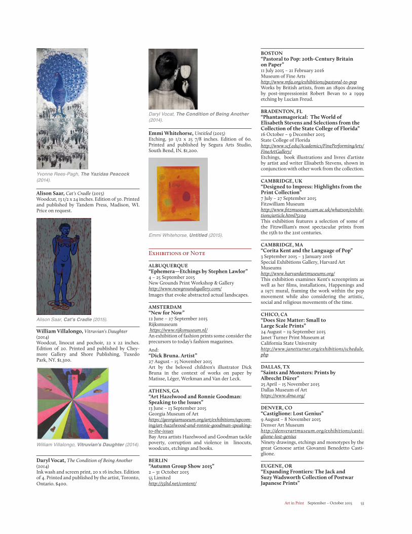
Art in Print September – October 2015 53
BOSTON“Pastoral to Pop: 20th-Century Britain on Paper”11 July 2015 – 21 February 2016Museum of Fine Artshttp://www.mfa.org/exhibitions/pastoral-to-popWorks by British artists, from an 1890s drawing by post-impressionist Robert Bevan to a 1999 etching by Lucian Freud.
BRADENTON, FL“Phantasmagorical: The World of Elisabeth Stevens and Selections from the Collection of the State College of Florida”16 October – 9 December 2015State College of Floridahttp://www.scf.edu/Academics/FinePerformingArts/FineArtGallery/Etchings, book illustrations and livres d’artiste by artist and writer Elisabeth Stevens, shown in conjunction with other work from the collection.
CAMBRIDGE, UK“Designed to Impress: Highlights from the Print Collection”7 July – 27 September 2015Fitzwilliam Museumhttp://www.fitzmuseum.cam.ac.uk/whatson/exhibi-tions/article.html?5109This exhibition features a selection of some of the Fitzwilliam's most spectacular prints from the 15th to the 21st centuries.
CAMBRIDGE, MA“Corita Kent and the Language of Pop”3 September 2015 – 3 January 2016Special Exhibitions Gallery, Harvard Art Museumshttp://www.harvardartmuseums.org/This exhibition examines Kent's screenprints as well as her films, installations, Happenings and a 1971 mural, framing the work within the pop movement while also considering the artistic, social and religious movements of the time.
CHICO, CA“Does Size Matter: Small to Large Scale Prints”24 August – 19 September 2015Janet Turner Print Museum at California State Universityhttp://www.janetturner.org/exhibitions/schedule.php
DALLAS, TX“Saints and Monsters: Prints by Albrecht Dürer”25 April – 15 November 2015Dallas Museum of Arthttps://www.dma.org/
DENVER, CO“Castiglione: Lost Genius”9 August – 8 November 2015Denver Art Museumhttp://denverartmuseum.org/exhibitions/casti-glione-lost-geniusNinety drawings, etchings and monotypes by the great Genoese artist Giovanni Benedetto Casti-glione.
EUGENE, OR“Expanding Frontiers: The Jack and Suzy Wadsworth Collection of Postwar Japanese Prints”
Daryl Vocat, The Condition of Being Another (2014).
Emmi Whitehorse, Untitled (2015)Etching, 30 1/2 x 25 7/8 inches. Edition of 60. Printed and published by Segura Arts Studio, South Bend, IN. $1,200.
Emmi Whitehorse, Untitled (2015).
Exhibitions of Note
ALBUQUERQUE“Ephemera—Etchings by Stephen Lawlor”4 – 25 September 2015New Grounds Print Workshop & Galleryhttp://www.newgroundsgallery.com/Images that evoke abstracted actual landscapes.
AMSTERDAM“New for Now”12 June – 27 September 2015Rijksmuseum https://www.rijksmuseum.nl/An exhibition of fashion prints some consider the precursors to today’s fashion magazines.
And:“Dick Bruna. Artist”27 August – 15 November 2015Art by the beloved children's illustrator Dick Bruna in the context of works on paper by Matisse, Léger, Werkman and Van der Leck.
ATHENS, GA“Art Hazelwood and Ronnie Goodman: Speaking to the Issues”13 June – 13 September 2015Georgia Museum of Arthttps://georgiamuseum.org/art/exhibitions/upcom-ing/art-hazelwood-and-ronnie-goodman-speaking-to-the-issuesBay Area artists Hazelwood and Goodman tackle poverty, corruption and violence in linocuts, woodcuts, etchings and books.
BERLIN“Autumn Group Show 2015”2 – 31 October 201555 Limitedhttp://55ltd.net/content/
Yvonne Rees-Pagh, The Yazidas Peacock (2014).
Alison Saar, Cat's Cradle (2015)Woodcut, 13 1/2 x 24 inches. Edition of 30. Printed and published by Tandem Press, Madison, WI. Price on request.
Alison Saar, Cat's Cradle (2015).
William Villalongo, Vitruvian's Daughter (2014)Woodcut, linocut and pochoir, 22 x 22 inches. Edition of 20. Printed and published by Chey-more Gallery and Shore Publishing, Tuxedo Park, NY. $1,300.
William Villalongo, Vitruvian's Daughter (2014).
Daryl Vocat, The Condition of Being Another (2014)Ink wash and screen print, 20 x 16 inches. Edition of 4. Printed and published by the artist, Toronto, Ontario. $400.
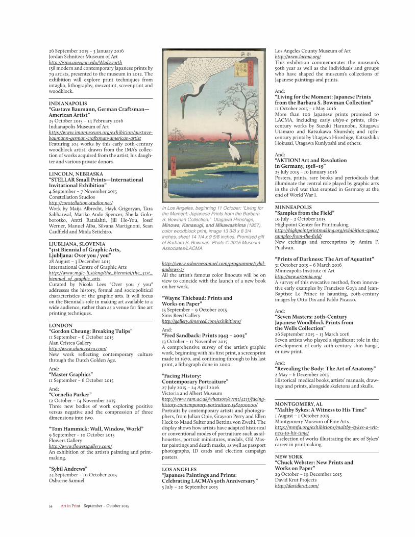
Art in Print September – October 201554
Los Angeles County Museum of Arthttp://www.lacma.org/This exhibition commemorates the museum’s 50th year as well as the individuals and groups who have shaped the museum’s collections of Japanese paintings and prints.
And:“Living for the Moment: Japanese Prints from the Barbara S. Bowman Collection”11 October 2015 – 1 May 2016More than 100 Japanese prints promised to LACMA, including early ukiyo-e prints, 18th-century works by Suzuki Harunobu, Kitagawa Utamaro and Katsukawa Shunshō; and 19th-century prints by Utagawa Hiroshige, Katsushika Hokusai, Utagawa Kuniyoshi and others.
And:“AKTION! Art and Revolution in Germany, 1918–19”25 July 2015 – 10 January 2016Posters, prints, rare books and periodicals that illuminate the central role played by graphic arts in the civil war that erupted in Germany at the end of World War I.
MINNEAPOLIS“Samples from the Field”10 July – 2 October 2015Highpoint Center for Printmakinghttp://highpointprintmaking.org/exhibition-space/samples-from-the-field/New etchings and screenprints by Amira F. Pualwan.
“Prints of Darkness: The Art of Aquatint”31 October 2015 – 6 March 2016Minneapolis Institute of Arthttp://new.artsmia.org/A survey of this evocative method, from innova-tive early examples by Francisco Goya and Jean-Baptiste Le Prince to haunting, 20th-century images by Otto Dix and Pablo Picasso.
And:“Seven Masters: 20th-Century Japanese Woodblock Prints from the Wells Collection”26 September 2015 – 13 March 2016Seven artists who played a significant role in the development of early 20th-century shin hanga, or new print.
And:“Revealing the Body: The Art of Anatomy”2 May – 6 December 2015Historical medical books, artists’ manuals, draw-ings and prints, alongside skeletons and skulls.
MONTGOMERY, AL“Maltby Sykes: A Witness to His Time”1 August – 1 October 2015Montgomery Museum of Fine Artshttp://mmfa.org/exhibitions/maltby-sykes-a-wit-ness-to-his-time/A selection of works illustrating the arc of Sykes’ career in printmaking.
NEW YORK“Chuck Webster: New Prints and Works on Paper”29 October – 19 December 2015David Krut Projectshttp://davidkrut.com/
http://www.osbornesamuel.com/programme/sybil-andrews-2/All the artist's famous color linocuts will be on view to coincide with the launch of a new book on her work.
“Wayne Thiebaud: Prints and Works on Paper”15 September – 9 October 2015Sims Reed Galleryhttp://gallery.simsreed.com/exhibitions/
And:“Fred Sandback: Prints 1943 – 2003”13 October – 11 November 2015A comprehensive survey of the artist's graphic work, beginning with his first print, a screenprint made in 1970, and continuing through to his last print, a lithograph done in 2000.
“Facing History: Contemporary Portraiture”27 July 2015 – 24 April 2016Victoria and Albert Museumhttp://www.vam.ac.uk/whatson/event/4213/facing-history-contemporary-portraiture-1582300000/Portraits by contemporary artists and photogra-phers, from Julian Opie, Grayson Perry and Ellen Heck to Maud Sulter and Bettina von Zwehl. The display shows how artists have adapted historical or conventional modes of portraiture such as sil-houettes, portrait miniatures, medals, Old Mas-ter paintings and death masks, as well as passport photographs, ID cards and election campaign posters.
LOS ANGELES“Japanese Paintings and Prints: Celebrating LACMA’s 50th Anniversary”5 July – 20 September 2015
26 September 2015 – 3 January 2016Jordan Schnitzer Museum of Arthttp://jsma.uoregon.edu/Wadsworth158 modern and contemporary Japanese prints by 79 artists, presented to the museum in 2012. The exhibition will explore print techniques from intaglio, lithography, mezzotint, screenprint and woodblock.
INDIANAPOLIS“Gustave Baumann, German Craftsman—American Artist”25 October 2015 – 14 February 2016Indianapolis Museum of Arthttp://www.imamuseum.org/exhibition/gustave-baumann-german-craftsman-american-artistFeaturing 104 works by this early 20th-century woodblock artist, drawn from the IMA’s collec-tion of works acquired from the artist, his daugh-ter and various private donors.
LINCOLN, NEBRASKA“STELLAR Small Prints—International Invitational Exhibition”4 September – 7 November 2015Constellation Studioshttp://constellation-studios.net/Work by Maija Albrecht, Hayk Grigoryan, Tara Sabharwal, Mariko Ando Spencer, Sheila Golo-borotko, Antti Ratalahti, Jill Ho-You, Josef Werner, Manuel Alba, Silvana Martignoni, Sean Caulfield and Miida Seiichiro.
LJUBLJANA, SLOVENIA“31st Biennial of Graphic Arts, Ljubljana: Over you / you”28 August – 3 December 2015International Centre of Graphic Artshttp://www.mglc-lj.si/eng/the_biennial/the_31st_biennial_of_graphic_artsCurated by Nicola Lees "Over you / you" addresses the history, formal and sociopolitical characteristics of the graphic arts. It will focus on the Biennial's role in making art available to a wide audience, rather than as a venue for fine art printing techniques.
LONDON“Gordon Cheung: Breaking Tulips”11 September – 6 October 2015Alan Cristea Galleryhttp://www.alancristea.com/New work reflecting contemporary culture through the Dutch Golden Age.
And:“Master Graphics”11 September – 6 October 2015
And:“Cornelia Parker”12 October – 14 November 2015Three new bodies of work exploring positive versus negative and the compression of three dimensions into two.
“Tom Hammick: Wall, Window, World”9 September – 10 October 2015Flowers Galleryhttp://www.flowersgallery.com/An exhibition of the artist's painting and print-making.
“Sybil Andrews”24 September – 10 October 2015Osborne Samuel
In Los Angeles, beginning 11 October: “Living for the Moment: Japanese Prints from the Barbara S. Bowman Collection.” Utagawa Hiroshige, Minowa, Kanasugi, and Mikawashima (1857), color woodblock print, image 13 3/8 x 8 3/4 inches, sheet 14 1/4 x 9 5/8 inches. Promised gift of Barbara S. Bowman. Photo © 2015 Museum Associates/LACMA.
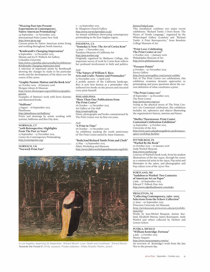
Art in Print September – October 2015 55
bitions/Default.aspxThis installation combines two major recent exhibitions: “Richard Tuttle: I Don’t Know. The Weave of Textile Language,” organized by the Whitechapel Gallery (London) and “Richard Tuttle: A Print Retrospective,” from Bowdoin College Museum of Art.
“Print Love: Celebrating The Print Center at 100”2 October 2015 – 3 January 2016Philadelphia Museum of Arthttp://www.philamuseum.org/
“Pressure Points”9 October – 20 November 2015Savery Galleryhttp://www.saverygallery.com/current-exhibit/Part of The Print Center 100 celebrations, this exhibition examines dynamic approaches to printmaking and poses questions about the cur-rent definition of what constitutes a print.
“The Print Center 100”18 September – 19 December 2015The Print Centerhttp://printcenter.org/100/Acting as the physical nexus of The Print Cen-ter’s 100 Centennial celebration, this exhibition includes art, ephemera and objects illustrating the organization’s history, mission and future.
“Shelley Thorstensen: Print Center Centennial Celebration Exhibition”14 September – 9 October 2015University of the Artshttp://www.uarts.edu/about/galleries-performance-spaces-workshop-facilities
PITTSBURGH, PA“Warhol By the Book”10 October 2015 – 10 January 2016Andy Warhol Museumhttp://www.warhol.org/A survey of Warhol’s book work, from his student illustrations of the late 1940s, through his career as a commercial artist in the 1950s, Pop artist and filmmaker in the 1960s, and photographer and Pop culture icon of the 1970s–80s.
PORTLAND, ME“Audubon to Warhol: Two Centuries of American Art on Paper”3 July – 26 September 2015Edward T. Pollock Fine Artshttp://www.edpollackfinearts.com/index
PRINCETON, NJ“Collecting Contemporary, 1960–2015: Selections from the Schorr Collection”27 June – 20 September 2015Princeton University Art Museumhttp://artmuseum.princeton.edu/art/exhibi-tions/1657Works by Jean-Michel Basquiat, Justine Kur-land, Elizabeth Murray, James Rosenquist, Andy Warhol and others collected by Herbert and Lenore Schorr.
PUEBLA, MEXICO“William Kentridge: Fortuna”4 July – 5 October 2015Museo Amparohttp://www.museoamparo.com/en/An overview of Kentridge’s work from the late ’80s to the present day.
7 – 19 September 2015St. Margarets Church Galleryhttp://www.norwichprintfair.co.uk/An annual exhibition showcasing contemporary printmaking in the East Anglian region.
PASADENA, CA“Someday is Now: The Art of Corita Kent”14 June – 1 November 2015Pasadena Museum of California Arthttp://pmcaonline.org/Originally organized by Skidmore College, this important survey of work by Corita Kent reflects her profound involvement in faith and politics. And: “The Nature of William S. Rice: Arts and Crafts Painter and Printmaker”15 November 2015 – 3 April 2016A prolific painter of the California landscape, Rice is now best known as a printmaker who authored two books on the process and executed every print himself.
PHILADELPHIA“More Than One: Publications from The Print Center”16 October – 11 December 2015Art Gallery at City Hallhttp://creativephl.orgPrints, photographs and books commissioned by The Print Center over its first 100 years.
And:“A Print in Time”16 October – 11 December 2015An exhibition marking the 100th anniversary of The Print Center juried by Amze Emmons.
“Both/And Richard Tuttle Print and Cloth”15 May – 13 September 2015Fabric Workshop and Museumhttp://www.fabricworkshopandmuseum.org/Exhi-
“Weaving Past into Present: Experiments in Contemporary Native American Printmaking”24 September – 10 November 2015International Print Center New Yorkhttp://www.ipcny.org/Current prints by Native American artists living and working throughout North America.
“Rembrandt’s Changing Impressions”9 September – 12 December 2015Miriam and Ira D. Wallach Art Gallery, Columbia University http://www.columbia.edu/cu/wallach/exhibitions/Rembrandts-Changing-Impressions.htmlA selection of important prints by Rembrandt showing the changes he made to his particular works and the development of his ideas over the course of his career.
“Graphic Passion: Matisse and the Book Arts”30 October 2015 – 18 January 2016Morgan Library & Museumhttp://www.themorgan.org/exhibitions/graphic-passionExamples of Matisse’s work with livres d’artiste and illustrated books.
“Halftone”3 August – 16 September 2015Planthousehttp://planthouse.net/halftone/Prints and drawings by artists working with systems, halftones and Ben-Day dots.
NORWALK, CT“20th Retrospective: Highlights From The Past 20 Years”12 September – 13 December 2015Center for Contemporary Printmakinghttp://contemprints.org/
NORWICH, UK“Norwich Print Fair”
In Los Angeles, beginning 25 September: “Edvard Munch: Love, Death and Loneliness.” Edvard Munch. Towards the Forest II (1915), woodcut. Private collection. ©Reto Rodolfo Pedrini, Zurich.
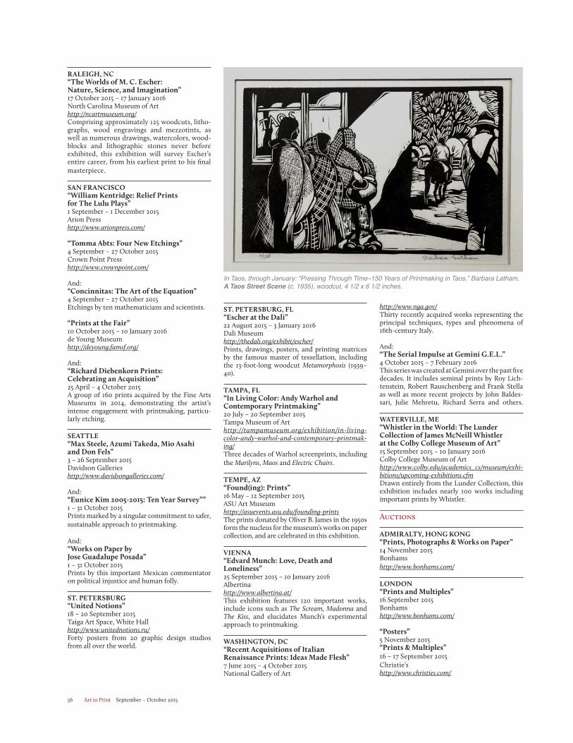
Art in Print September – October 201556
http://www.nga.gov/Thirty recently acquired works representing the principal techniques, types and phenomena of 16th-century Italy.
And:“The Serial Impulse at Gemini G.E.L.”4 October 2015 – 7 February 2016This series was created at Gemini over the past five decades. It includes seminal prints by Roy Lich-tenstein, Robert Rauschenberg and Frank Stella as well as more recent projects by John Baldes-sari, Julie Mehretu, Richard Serra and others.
WATERVILLE, ME“Whistler in the World: The Lunder Collection of James McNeill Whistler at the Colby College Museum of Art”15 September 2015 – 10 January 2016Colby College Museum of Arthttp://www.colby.edu/academics_cs/museum/exhi-bitions/upcoming-exhibitions.cfmDrawn entirely from the Lunder Collection, this exhibition includes nearly 100 works including important prints by Whistler.
Auctions
ADMIRALTY, HONG KONG“Prints, Photographs & Works on Paper”14 November 2015Bonhamshttp://www.bonhams.com/
LONDON“Prints and Multiples”16 September 2015Bonhamshttp://www.bonhams.com/
“Posters”5 November 2015“Prints & Multiples”16 – 17 September 2015Christie’shttp://www.christies.com/
ST. PETERSBURG, FL“Escher at the Dali”22 August 2015 – 3 January 2016Dali Museumhttp://thedali.org/exhibit/escher/Prints, drawings, posters, and printing matrices by the famous master of tessellation, including the 13-foot-long woodcut Metamorphosis (1939–40).
TAMPA, FL“In Living Color: Andy Warhol and Contemporary Printmaking”20 July – 20 September 2015Tampa Museum of Arthttp://tampamuseum.org/exhibition/in-living-color-andy-warhol-and-contemporary-printmak-ing/Three decades of Warhol screenprints, including the Marilyns, Maos and Electric Chairs.
TEMPE, AZ“Found(ing): Prints”16 May – 12 September 2015ASU Art Museumhttps://asuevents.asu.edu/founding-printsThe prints donated by Oliver B. James in the 1950s form the nucleus for the museum’s works on paper collection, and are celebrated in this exhibition.
VIENNA“Edvard Munch: Love, Death and Loneliness”25 September 2015 – 10 January 2016Albertinahttp://www.albertina.at/This exhibition features 120 important works, include icons such as The Scream, Madonna and The Kiss, and elucidates Munch’s experimental approach to printmaking.
WASHINGTON, DC“Recent Acquisitions of Italian Renaissance Prints: Ideas Made Flesh”7 June 2015 – 4 October 2015National Gallery of Art
RALEIGH, NC“The Worlds of M. C. Escher: Nature, Science, and Imagination”17 October 2015 – 17 January 2016North Carolina Museum of Arthttp://ncartmuseum.org/Comprising approximately 125 woodcuts, litho-graphs, wood engravings and mezzotints, as well as numerous drawings, watercolors, wood-blocks and lithographic stones never before exhibited, this exhibition will survey Escher’s entire career, from his earliest print to his final masterpiece.
SAN FRANCISCO“William Kentridge: Relief Prints for The Lulu Plays”1 September – 1 December 2015Arion Presshttp://www.arionpress.com/
“Tomma Abts: Four New Etchings”4 September – 27 October 2015Crown Point Presshttp://www.crownpoint.com/
And:“Concinnitas: The Art of the Equation”4 September – 27 October 2015Etchings by ten mathematicians and scientists.
“Prints at the Fair”10 October 2015 – 10 January 2016de Young Museumhttp://deyoung.famsf.org/
And:“Richard Diebenkorn Prints: Celebrating an Acquisition”25 April – 4 October 2015A group of 160 prints acquired by the Fine Arts Museums in 2014, demonstrating the artist’s intense engagement with printmaking, particu-larly etching.
SEATTLE“Max Steele, Azumi Takeda, Mio Asahi and Don Fels”3 – 26 September 2015Davidson Gallerieshttp://www.davidsongalleries.com/
And:“Eunice Kim 2005-2015: Ten Year Survey””1 – 31 October 2015Prints marked by a singular commitment to safer, sustainable approach to printmaking.
And:“Works on Paper by Jose Guadalupe Posada”1 – 31 October 2015Prints by this important Mexican commentator on political injustice and human folly.
ST. PETERSBURG“United Notions”18 – 20 September 2015Taiga Art Space, White Hallhttp://www.unitednotions.ru/Forty posters from 20 graphic design studios from all over the world.
In Taos, through January: “Pressing Through Time–150 Years of Printmaking in Taos.” Barbara Latham, A Taos Street Scene (c. 1935), woodcut, 4 1/2 x 6 1/2 inches.
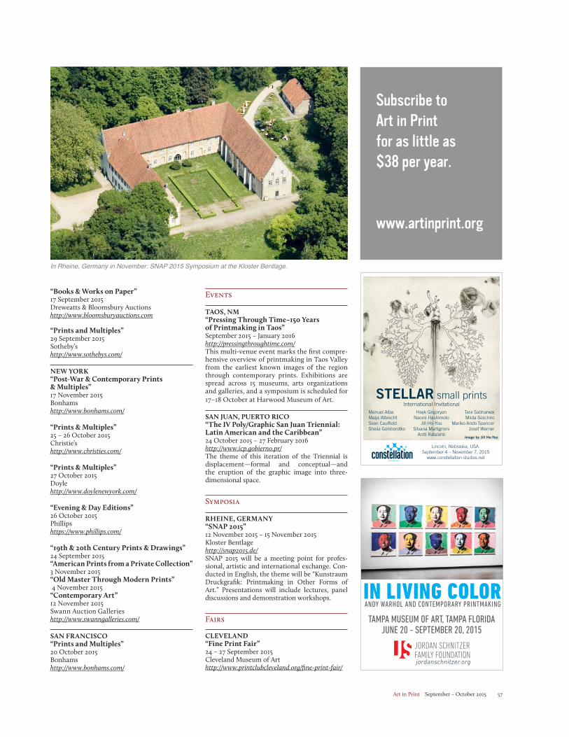
Art in Print September – October 2015 57
Events
TAOS, NM“Pressing Through Time–150 Years of Printmaking in Taos”September 2015 – January 2016http://pressingthroughtime.com/This multi-venue event marks the first compre-hensive overview of printmaking in Taos Valley from the earliest known images of the region through contemporary prints. Exhibitions are spread across 15 museums, arts organizations and galleries, and a symposium is scheduled for 17–18 October at Harwood Museum of Art. SAN JUAN, PUERTO RICO“The IV Poly/Graphic San Juan Triennial: Latin American and the Caribbean”24 October 2015 – 27 February 2016http://www.icp.gobierno.pr/The theme of this iteration of the Triennial is displacement—formal and conceptual—and the eruption of the graphic image into three- dimensional space.
Symposia
RHEINE, GERMANY“SNAP 2015”12 November 2015 – 15 November 2015Kloster Bentlagehttp://snap2015.de/SNAP 2015 will be a meeting point for profes-sional, artistic and international exchange. Con-ducted in English, the theme will be “Kunstraum Druckgrafik: Printmaking in Other Forms of Art.” Presentations will include lectures, panel discussions and demonstration workshops.
Fairs
CLEVELAND“Fine Print Fair”24 – 27 September 2015Cleveland Museum of Arthttp://www.printclubcleveland.org/fine-print-fair/
“Books & Works on Paper”17 September 2015Dreweatts & Bloomsbury Auctionshttp://www.bloomsburyauctions.com
“Prints and Multiples”29 September 2015Sotheby’shttp://www.sothebys.com/
NEW YORK“Post-War & Contemporary Prints & Multiples”17 November 2015Bonhamshttp://www.bonhams.com/
“Prints & Multiples”25 – 26 October 2015Christie’shttp://www.christies.com/
“Prints & Multiples”27 October 2015Doylehttp://www.doylenewyork.com/
“Evening & Day Editions”26 October 2015Phillipshttps://www.phillips.com/
“19th & 20th Century Prints & Drawings”24 September 2015“American Prints from a Private Collection”3 November 2015“Old Master Through Modern Prints” 4 November 2015“Contemporary Art”12 November 2015Swann Auction Gallerieshttp://www.swanngalleries.com/
SAN FRANCISCO“Prints and Multiples”20 October 2015Bonhamshttp://www.bonhams.com/
In Rheine, Germany in November: SNAP 2015 Symposium at the Kloster Bentlage.
STELLAR small printsInternational Invitational
Manuel AlbaMaija AlbrechtSean CaulfieldSheila Goloborotko
Tara SabharwalMiida Seiichiro
Mariko Ando SpencerJosef Werner
Lincoln, Nebraska, USA.September 4 – November 7, 2015
www.constellation-studios.net
Hayk GrigoryanNaomi Hashimoto
Jill Ho-YouSilvana Martignoni
Antti Ratalahtiimage by Jill Ho-You
Subscribe to Art in Print for as little as $38 per year.
www.artinprint.org
Art in Print September – October 201558
LONDON“Multiplied”16 – 18 October 2015Christie’s South Kensingtonhttp://www.christies.com/multiplied#about-section
“London Art Book Fair””10 – 13 September 2015Whitechapel Galleryhttp://www.whitechapelgallery.org/events/london-art-book-fair/
NEW YORK“New York Art Book Fair”18 – 20 September 2015MoMA PS1http://nyartbookfair.com/
“IFPDA Print Fair”4 – 8 November 2015Park Avenue Armoryhttp://www.ifpda.org/content/print-fair
“Editions/Artists’ Books Fair”5 – 8 November 2015The Tunnel NYChttp://eabfair.org/
Lectures
NEW YORK“Why Study Prints Now?”25 September 2015The Graduate Center, City University of New York https://printscholars.org/save-the-date-aps-inaugu-ral-lecture-by-dr-peter-parshall-why-study-prints-now/The Association of Print Scholars’ inaugural lecture will be given by Peter Parshall, former Curator of Old Master Prints at the National Gallery of Art, Washington, DC. He will address the history and historiography of print studies.
PHILADELPHIA“Printmaking Now"1 November 2015Philadelphia Museum of Arthttp://www.philamuseum.org/Sarah Suzuki (Associate Curator, the Museum of Modern Art) will lead a discussion on inventive uses of print with some of today’s most intriguing artists. Presented as part of The Print Center 100.
The Art in Print Prix de Print
PRIX de PRINT
Art in Print is pleased to offer an open call competition, the Art in Print Prix de Print. Each bi-monthly issue of Art in Print will feature a full-page reproduction and brief essay about the work of one artist, chosen by an outside juror. Jurors will include artists, curators, printers, publishers and dealers from around the world.
Who can enter?You, your organization or your library must be an Art in Print subscriber to enter. We can accept one submission per subscription per issue. The subscriber can be an artist, publisher, printshop, gallery or other organization.
How do I submit?Submit your image along with the required information using our online form: https://artinprint.org/prix-submit/.
Deadlines:Deadlines are the 15th of every odd-numbered month: 15 January, 15 March, 15 May, 15 July, 15 September and 15 November
To find out more, please contact us at [email protected].
Prix de Print No. 14 DEADLINE 15 September 2015...
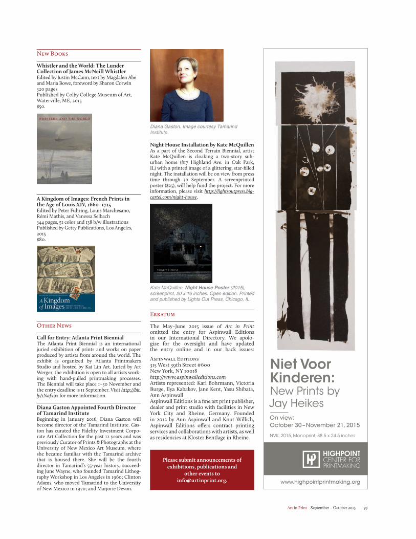
Art in Print September – October 2015 59
Diana Gaston. Image courtesy Tamarind Institute.
Night House Installation by Kate McQuillenAs a part of the Second Terrain Biennial, artist Kate McQuillen is cloaking a two-story sub-urban home (817 Highland Ave. in Oak Park, IL) with a printed image of a glittering, star-filled night. The installation will be on view from press time through 30 September. A screenprinted poster ($25), will help fund the project. For more information, please visit http://lightsoutpress.big-cartel.com/night-house.
New Books
Whistler and the World: The Lunder Collection of James McNeill WhistlerEdited by Justin McCann, text by Magdalen Abe and Maria Bowe, foreword by Sharon Corwin320 pagesPublished by Colby College Museum of Art, Waterville, ME, 2015$50.
A Kingdom of Images: French Prints in the Age of Louis XIV, 1660–1715Edited by Peter Fuhring, Louis Marchesano, Rémi Mathis, and Vanessa Selbach344 pages, 51 color and 138 b/w illustrationsPublished by Getty Publications, Los Angeles, 2015$80.
Other News
Call for Entry: Atlanta Print Biennial The Atlanta Print Biennial is an international juried exhibition of prints and works on paper produced by artists from around the world. The exhibit is organized by Atlanta Printmakers Studio and hosted by Kai Lin Art. Juried by Art Werger, the exhibition is open to all artists work-ing with hand-pulled printmaking processes. The Biennial will take place 1–30 November and the entry deadline is 11 September. Visit http://bit.ly/1Nafx9x for more information.
Diana Gaston Appointed Fourth Director of Tamarind Institute Beginning in January 2016, Diana Gaston will become director of the Tamarind Institute. Gas-ton has curated the Fidelity Investment Corpo-rate Art Collection for the past 12 years and was previously Curator of Prints & Photographs at the University of New Mexico Art Museum, where she became familiar with the Tamarind archive that is housed there. She will be the fourth director in Tamarind’s 55-year history, succeed-ing June Wayne, who founded Tamarind Lithog-raphy Workshop in Los Angeles in 1960; Clinton Adams, who moved Tamarind to the University of New Mexico in 1970; and Marjorie Devon.
Please submit announcements of exhibitions, publications and
other events to [email protected].
Kate McQuillen, Night House Poster (2015), screenprint, 20 x 16 inches. Open edition. Printed and published by Lights Out Press, Chicago, IL.
www.highpointprintmaking.org
NVK, 2015, Monoprint, 88.5 x 24.5 inches
On view:October 30 – November 21, 2015
Niet Voor Kinderen:New Prints by Jay Heikes
Erratum
The May–June 2015 issue of Art in Print omitted the entry for Aspinwall Editions in our International Directory. We apolo-gize for the oversight and have updated the entry online and in our back issues: Aspinwall Editions315 West 39th Street #600New York, NY 10018http://www.aspinwalleditions.com Artists represented: Karl Bohrmann, Victoria Burge, Ilya Kabakov, Jane Kent, Yasu Shibata, Ann AspinwallAspinwall Editions is a fine art print publisher, dealer and print studio with facilities in New York City and Rheine, Germany. Founded in 2012 by Ann Aspinwall and Knut Willich, Aspinwall Editions offers contract printing services and collaborations with artists, as well as residencies at Kloster Bentlage in Rheine.
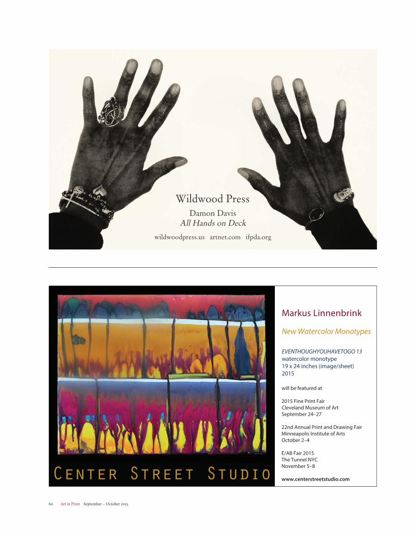
Art in Print September – October 201560
Wildwood PressDamon Davis
All Hands on Deck
wildwoodpress.us artnet.com ifpda.org
Center Street Studio
Markus Linnenbrink
New Watercolor Monotypes
EVENTHOUGHYOUHAVETOGO 13watercolor monotype19 x 24 inches (image/sheet)2015
will be featured at
2015 Fine Print FairCleveland Museum of ArtSeptember 24–27
22nd Annual Print and Drawing FairMinneapolis Institute of ArtsOctober 2–4
E/AB Fair 2015The Tunnel NYCNovember 5–8
www.centerstreetstudio.com
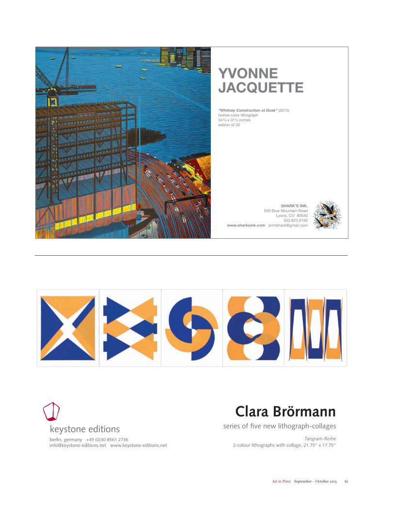
Art in Print September – October 2015 61
berlin, germany +49 (0)30 8561 2736 [email protected] www.keystone-editions.net
fine art printmakingkeystone editions
Clara Brörmannseries of five new lithograph-collages
Tangram-Reihe 2-colour lithographs with collage, 21.75” x 17.75”
SHARK’S INK. 550 Blue Mountain Road
Lyons, CO 80540 303.823.9190
www.sharksink.com [email protected]
YVONNE JACQUETTE“Whitney Construction at Dusk” (2015)twelve-color lithograph34¼ x 31½ inchesedition of 30
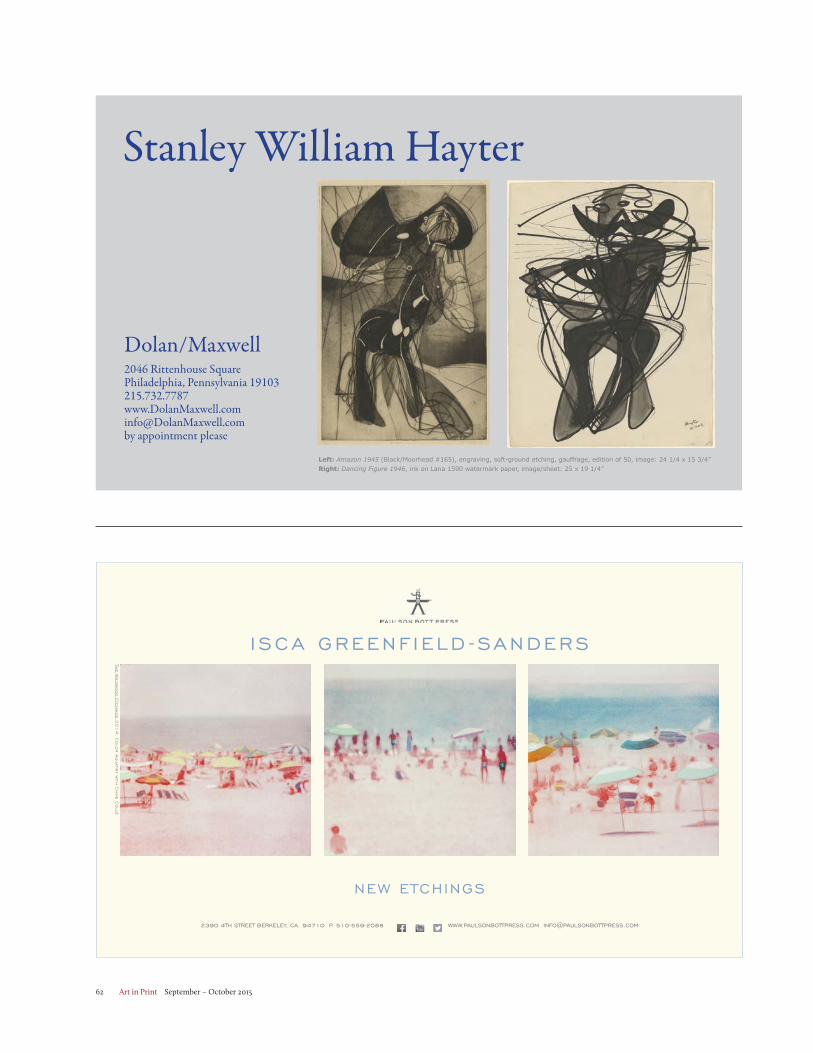
Art in Print September – October 201562
Stanley William Hayter
Dolan/Maxwell2046 Rittenhouse SquarePhiladelphia, Pennsylvania [email protected] appointment please
Left: Amazon 1945 (Black/Moorhead #165), engraving, soft-ground etching, gauffrage, edition of 50, image: 24 1/4 x 15 3/4”Right: Dancing Figure 1946, ink on Lana 1590 watermark paper, image/sheet: 25 x 19 1/4”
I SCA GREENF IELD -SANDERS
2390 4TH STREET BERKELEY, CA. 94710 P. 510-559-2088 WWW.PAULSONBOTTPRESS.COM [email protected]
The W
ildwood E
tching
s,20
14
: Colo
r A
quatint w
ith C
hine C
ollé
NEW ETCHINGS
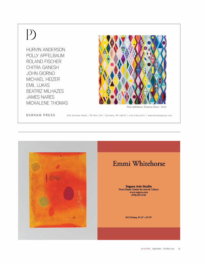
Art in Print September – October 2015 63
Segura Arts StudioNotre Dame Center for Arts & Culture
www.segura.com(574) 631-3143
2015 Etching, 30 1/2” x 25 7/8”
Emmi Whitehorse
HURVIN ANDERSONPOLLY APFELBAUMROLAND FISCHERCHITRA GANESHJOHN GIORNOMICHAEL HEIZEREMIL LUKASBEATRIZ MILHAZESJAMES NARESMICKALENE THOMAS
Polly Apfelbaum, Empress Shout | 2015
D UR H A M P R E S S 892 Durham Road | PO Box 159 | Durham, PA 18039 | 610.346.6133 | www.durhampress.com
Art in Print September – October 201564
if FOUNDATIONTHE HEALY
FOUNDATION
pressingthroughtime.com
International Print Center New York • 508 West 26th Street 5th Floor NYC • 212-989-5090 • www.ipcny.org
WEAVING PAST INTO PRESENT Experiments in Contemporary Native American Printmaking
Artists: Lynne Allen, Rick Bartow, Joe Feddersen, John Hitchcock, Brad Kahlhamer, Jason Lujan, Alan Michelson, Jaune Quick-to-See Smith, Jewel Shaw, Marie Watt, Emmi Whitehorse, Melanie Yazzie.
Jaune Quick-to-See Smith, Avec-vous [sic] un Cachet d’ Aspirine, 2003, M
onotype. Edition: Unique, 30 x 22 ¼
inches, printed by Lee Turner; published by Tamarind Institute. 15TH ANNIVERSARY
On View: September 24-November 10, 2015Reception: Thursday, September 24, 6-8 pm Preview for Artists & Members: 5-6 pm
Art in Print September – October 2015 65
The Boston Printmakers 2015 North American Print Biennial
November 8th – December 12th
Lunder Arts CenterLesley University1801 Massachusetts AvenueCambridge, MA 02140
Opening: SSunday, November 8th, 2 – 5pm
Gallery Hours: Daily 11am – 6pm
www.bostonprintmakers.org
Juror: Willie Cole
Masaaki Sato, Apple No.8- RR, Screen Print
State College of Florida, 5840 26th Street, Bradenton, Florida 34207
Joseph Loccisano, Gallery Director, (941)752-5225, [email protected]
PHANTASMAGORICAL: THE WORLD OF ELISABETH STEVENS & SELECTIONS FROM THE COLLECTION OF THE STATE COLLEGE OF FLORIDA
OCTOBER 16-DECEMBER 9, 2015
Elisabeth Stevens, “Circus Sarasota” (2012)Etching with aquatintImage 16”x18”; sheet 22’’x29’Printed by Bleu Acier, Tampa, Florida
CROWN POINT PRESS 20 HAWTHORNE STREET SAN FRANCISCO, CA 94105
CROWNPOINT.COM 415-974-6273
TOMMA ABTSFOUR NEW ETCHINGSOn view in the gallerySeptember 4-October 27, 2015
Untitled (wavy line), 2015. Color aquatint. 29¼ x 22¾", edition 20. Navy Pier
September 17-20
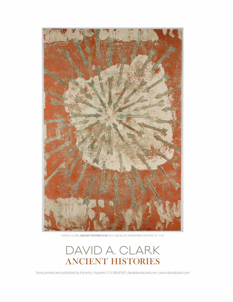
DAVID A. CLARKANCIENT HISTORIES
Series printed and published by the artist. Inquiries: 213-280-6165 | [email protected] | www.davidaclark.com
DAVID A. CLARK, ANCIENT HISTORIES #150, 2015, ENCAUSTIC MONOPRINT ON KOZO, 37" × 25"
Art in Print September – October 201568
Contributors to this Issue
Katherine Alcauskas is collections and exhibitions specialist at the Ruth and Elmer Wellin Museum of Art at Hamilton College. Previously, she worked in the Department of Drawings and Prints of the Museum of Modern Art and the Department of Prints, Drawings and Photographs at the Yale Univer-sity Art Gallery, where she curated “The Pull of Experiment: Postwar American Printmaking” (2009). She was educated at Wellesley College and Williams College / Clark Art Institute. She was a contributor to MoMA Highlights: 350 Works from the Museum of Modern Art, revised edition (2013).
Peter S. Briggs is the Helen DeVitt Jones Curator of Art at the Museum of Texas Tech University, developer and director of the Artist Printmaker/Photographer Research Collection, and a member of graduate faculty in the Museum Science program where he teaches curatorial methodology.
Paul Coldwell is Professor in Fine Art at the University of the Arts London. As an artist his work includes prints, sculpture and installation. He has written widely, particularly on printmaking and is the author of Printmaking: A Contemporary Perspective from Black Dog Publishers.
Stephen Coppel is Curator of the Modern Collection in the Department of Prints and Drawings at the British Museum. His publications include Linocuts of the Machine Age: Claude Flight and the Gros-venor School (1995), Imaging Ulysses: Richard Hamilton’s Illustrations to James Joyce (2002), The American Scene: Prints from Hopper to Pollock (2008), Out of Australia: Prints and Drawings from Sidney Nolan to Rover Thomas (2011) and Picasso Prints: The Vollard Suite (2012). He is presently working on an exhibition and catalogue of American prints from 1960 to the present.
Damon Davis is an interdisciplinary artist who lives and works in St. Louis. He is a co-founder of the art and clothing design collective Civil Ape and principle of the music and art imprint Farfetched. A documentary about Davis won the 2013 Emmy Mid-America award for Best Short Form Program.
Elizabeth DeRose is a PhD Candidate in Art History at the Graduate Center in New York. Her areas of specialization include Modern and Contemporary Latin American Art and 20th-century printmak-ing. She is currently working on her dissertation “Defying Graphic Tradition: Printmaking Strategies of Latin American Conceptualists (1963 – 1984).” As assistant curator in the Department of Prints, Draw-ings and Photographs at the Yale University Art Gallery she curated “Jasper Johns: From Plate to Print” and “Making a Mark: Four Contemporary Artists in Print.”
Elleree Erdos is a graduate student at Columbia University and the Sorbonne. She holds a BA in art history from Williams College and has worked in the print departments at The Museum of Modern Art and the Sterling and Francine Clark Art Institute, as well as in the American Wing at the Metropolitan Museum of Art.
Zanna Gilbert is a postdoctoral fellow in the Department of Drawings and Prints at the Museum of Modern Art, where she is co-editor of post.at.moma.org. Her research focuses on artists’ networks and the transnational circulation of art through the mail. She has curated exhibitions with artists Felipe Ehrenberg, Daniel Santiago, Paulo Bruscky, Robert Rehfeldt and Edgardo Antonio Vigo, and on the themes of object circulation and networks.
Daniel Hewson is a curator, writer and artist from Cape Town, South Africa, with a particular focus on printmaking. He has recently completed a curatorial residency at the Weltkulturen Museum in Frank-furt where he worked on the exhibition, “A Labour of Love.”
Johannes Schmidt is curator at the Dresden Municipal Art Museum (Städtische Galerie Dresden). His research interests center on German 20th-century and contemporary artists. In the last ten years he has been responsible for many exhibitions about artists from Ludwig Meidner to A.R. Penck.
Charles Schultz is a New York-based art critic. He is an Associate Art Editor at The Brooklyn Rail and the City Editor of New York and Miami for ArtSlant. His writing has appeared in Art in America, Modern Painters, ArtSlant and The Brooklyn Rail. Schultz is currently working on a book about the legacy of industry in American Art.
Susan Tallman is the Editor-in-Chief of Art in Print. She has written extensively about prints, issues of multiplicity and authenticity, and other aspects of contemporary art.
Open Gate Press
www.opengatepress.com
FRANCES B. ASHFORTHWATERBASE MONOTYPES
Pyrocumulus, Carbon Black15x16, unique, 2014francesbashforth.com
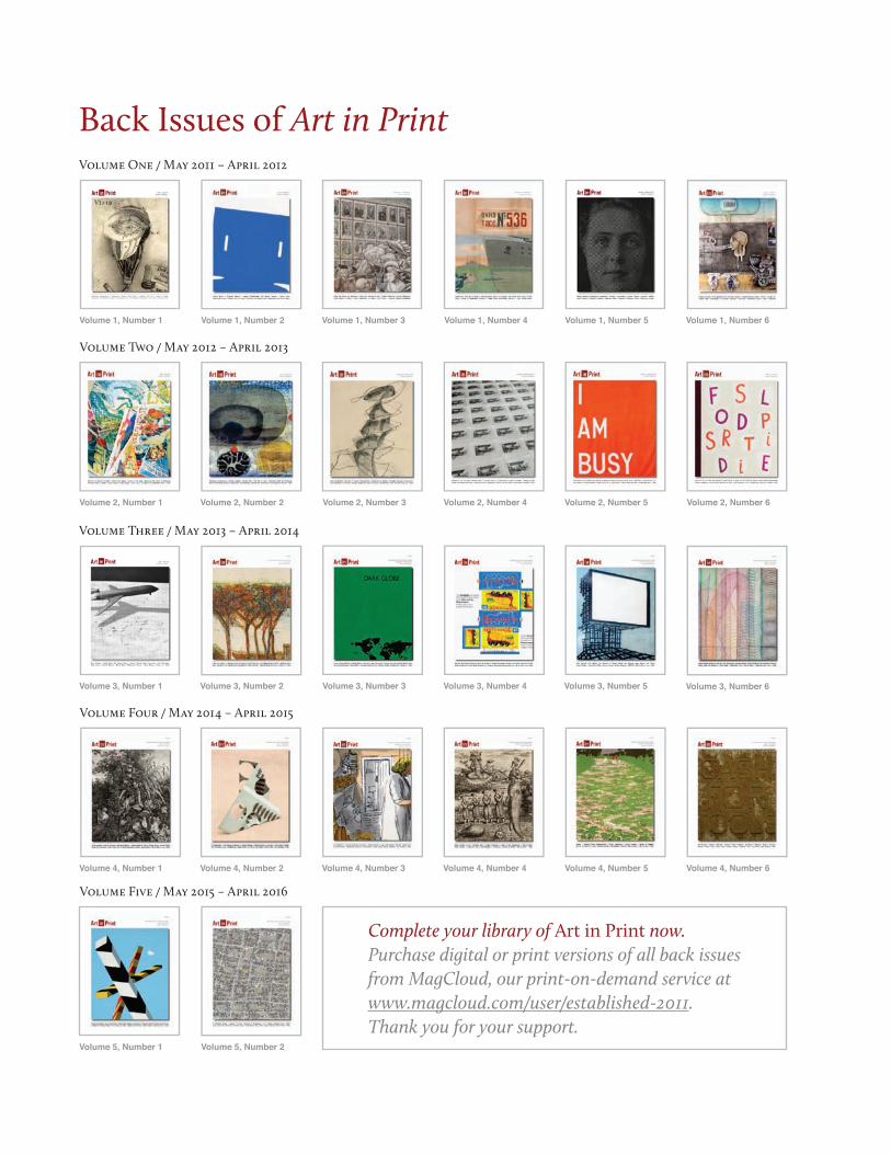
Complete your library of Art in Print now. Purchase digital or print versions of all back issues from MagCloud, our print-on-demand service at www.magcloud.com/user/established-2011. Thank you for your support.
Back Issues of Art in Print
Volume Two / May 2012 – April 2013
Volume One / May 2011 – April 2012
Volume 1, Number 1 Volume 1, Number 2 Volume 1, Number 3 Volume 1, Number 4 Volume 1, Number 5 Volume 1, Number 6
Volume 2, Number 1 Volume 2, Number 2 Volume 2, Number 3 Volume 2, Number 4 Volume 2, Number 5 Volume 2, Number 6
Volume Three / May 2013 – April 2014
Volume 3, Number 1 Volume 3, Number 2 Volume 3, Number 3 Volume 3, Number 4 Volume 3, Number 5 Volume 3, Number 6
Volume Four / May 2014 – April 2015
Volume 4, Number 2Volume 4, Number 1 Volume 4, Number 3 Volume 4, Number 4 Volume 4, Number 5 Volume 4, Number 6
Volume Five / May 2015 – April 2016
Volume 5, Number 1 Volume 5, Number 2
Related Documents