University of Pennsylvania From the SelectedWorks of Amy Hillier January 2011 Manual for working with ArcGIS 10 Contact Author Start Your Own SelectedWorks Notify Me of New Work Available at: http://works.bepress.com/amy_hillier/24

Welcome message from author
This document is posted to help you gain knowledge. Please leave a comment to let me know what you think about it! Share it to your friends and learn new things together.
Transcript
University of Pennsylvania
From the SelectedWorks of Amy Hillier
January 2011
Manual for working with ArcGIS 10
ContactAuthor
Start Your OwnSelectedWorks
Notify Meof New Work
Available at: http://works.bepress.com/amy_hillier/24

Working With
Amy HillierUniversity of PennsylvaniaSchool of Design
ArcVieW 10

This manual is intended for undergraduate and graduate students
learning to use ArcGIS 10 in a classroom setting. It is meant to be a
complement, rather than substitute, for ArcGIS software manuals, Esri
training products, or the ArcGIS help options. It reflects the order and
emphasis of topics that I have found most helpful while teaching in-
troductory GIS classes in urban studies, social work, and city planning. I
expect that it will be particularly helpful to people new to GIS who may
be intimidated by conventional software manuals. It may also be helpful
as a resource to those who have completed a course in ArcGIS but don’t
always remember how to perform particular tasks. This manual does not
try to be comprehensive, focusing instead on the basic tools and functions
that users new to GIS should know how to use. Those who master these
basic functions should have the skills to learn about additional tools, using
the ArcGIS help menus, or just exploring additional menu options, tool-
bards, and buttons.
Each section in the manual introduces a general group of functions in
ArcGIS, providing step by step instructions for using a set of tools with
screen captures and a video showing those steps through screen captures.
One of the most difficult parts of learning how to use GIS is matching
what you know you want to do in layman’s or conceptual terms to the
specific tool and technical language of ArcGIS. The table of contents
provides an overview of the tools and functions covered, but you may
find it just as helpful to use Adobe Acrobat’s “find” function.
The other challenge is trouble-shooting. ArcGIS products include an
enormous range of functionality which allows it to meet the needs of a
wide range of users. But this wide range also results in what can be an
overwhelming and sometimes temperamental product. Figuring out
why things don’t work is key to getting ArcGIS to do what you want it
to do and minimizing your frustration. The section on trouble-shooting
at the end of this manual is intended to help identify common problems
and solutions.
This manual is intended to be shared. You do not need my permission
to share this with a friend or even post it on a course website. Because
I am continually updating it, I always appreciate feedback, whether
you found a typo or spelling mistake or want to suggest a better way of
explaining particular concepts and techniques. The best way to succeed
with GIS is to make learning how to use it a collective process, so please
join me in making GIS work for us.
Amy HillierUniversity of [email protected]
IntroductIon to thIs Manual
H I l l I E r | U S I n G A r c v I E w 1 0
Graphic Design by caitlin Bowler, McP ‘08
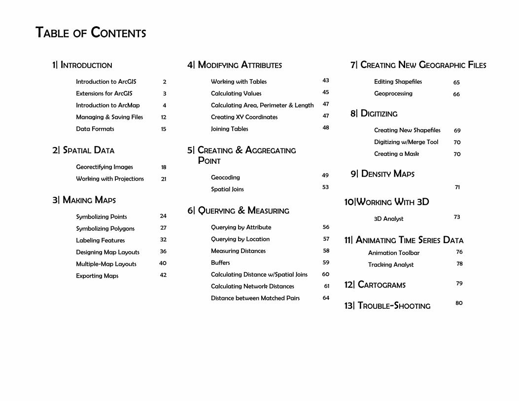
table of contents
1| IntroductIon
Introduction to ArcGIS
Extensions for ArcGIS
Introduction to ArcMap
Managing & Saving Files
Data Formats
2| spatIal data
Georectifying Images
working with Projections
3| MakIng Maps
Symbolizing Points
Symbolizing Polygons
labeling Features
Designing Map layouts
Multiple-Map layouts
Exporting Maps
4| ModIfyIng attrIbutes
working with Tables
calculating values
calculating Area, Perimeter & length
creating XY coordinates
Joining Tables
5| creatIng & aggregatIng poInt
Geocoding
Spatial Joins
6| QueryIng & MeasurIng
Querying by Attribute
Querying by location
Measuring Distances
Buffers
calculating Distance w/Spatial Joins
calculating network Distances
Distance between Matched Pairs
7| creatIng new geographIc fIles
Editing Shapefiles
Geoprocessing
8| dIgItIzIng
creating new Shapefiles
Digitizing w/Merge Tool
creating a Mask
9| densIty Maps
2
3
4
12
15
18
21
24
27
32
36
40
42
43
45
47
47
48
49
53
56
57
58
59
60
61
64
65
66
69
70
70
71
10|workIng wIth 3d
3D Analyst
11| anIMatIng tIMe serIes data
Animation Toolbar
Tracking Analyst
12| cartograMs
13| trouble-shootIng
73
76
78
79
80

2
ArcGIS is a collection of software products created by Environmental Systems
research Institute (Esri)--the Microsoft of GIS software--that includes desktop,
server, mobile, hosted, and online GIS products. This introduction provides an
overview of all of the products, but this manual focuses on the desktop applica-
tions, only.
1| IntroductIon to ArcGIS
ArcviewArcview is the desktop version of ArcGIS meant for a general (non-professional)
audience. It is the most popular desktop GIS software program, but it is not the
only one. Even though it is the “baby” desktop GIS product within the Esri family
of products, it is still over-kill for most basic GIS projects. Some people will call
this “ArcGIS” rather than “Arcview.” They are one in the same; Arcview is part of
the ArcGIS collection, so it is a more specific way to describe the software.
ArcEditorArcEditor includes all the functionality of ArcGIS, adding the ability to edit
features in a multiuser geodatabase so that multiuser editing and versioning are
possible. ArcEditor also adds the ability to edit topologically integrated features
in a geodatabase. The student version of ArcGIS that Esri provides is usually
ArcEditor rather than Arcview.
ArcInfoArcInfo is Esri’s professional GIS software. It includes all of the functionality in
ArcGIS and ArcEditor, adding some advanced geoprocessing and data conver-
sion capabilities. If you make a living as a GIS specialist, you’ll want access to
ArcInfo.
ArcreaderArcreader is a free product for viewing maps. You can explore and query map
layers, but you cannot change symbology or create new data like you can in
ArcGIS. Arcreader is a good way to share the maps you created in ArcGIS with
people who don’t have access to the software.
desktop gIs products
The desktop GIS products allow users to integrate and edit data, create new
map layers, and author maps. ArcGIS desktop includes a series of scaleable
products. They are all based on the same architecture, but the more expensive
products have more functionality. A matrix describing what functionality is
available for each product can be found at http://www.esri.com/library/bro-
chures/pdfs/arcgis10-functionality-matrix.pdf.
with the jump from ArcGIS 3.2 to ArcGIS 8, Esri brought ArcGIS into its ArcGIS
system so that it uses the same structure as its more sophisticated GIS products.
ArcGIS 3.x has similar functionality to ArcGIS 8, 9 and 10, but the products work
in very different ways. That means that if you learned GIS using ArcGIS 3.x, you
will probably need to do some work to be able to use ArcGIS 10. ArcGIS 10 adds
some functionality to ArcGIS 9, but those two versions work in a very similar
way, so if you learned how to use ArcGIS 8 or ArcGIS 9, you should have no
trouble switching to ArcGIS 10.
Map made by Shimrit Keddem
H I l l I E r | U S I n G A r c v I E w 1 0
3 I n T r O D U c T I O n
extensIons for arcgIs desktopwhile the basic ArcGIS desktop products include an enormous amount of
functionality, extensions can also be purchased (some are free) that extend this
functionality. Many of these are specific to particular industries or data formats.
The following are some of the more frequently used extensions.
Spatial AnalystAllows for modeling and analysis with raster (cell-based) data. This includes
creating density surfaces and conducting map algebra.
3D AnalystIncludes ArcGlobe. Allows users to view visualize and analyze spatial data in 3D.
This includes extruding polygons (such as parcels and building footprints) and
draping surfaces (such as orthophotos) on elevation models. You can also create
video animations that simulate flying through your study area.
Geostatistical AnalystThis sophisticated tool allows users to analyze raster (cell-based) and point
data using advanced statistical methods. Methods include Kriging and inverse
distance-weighting.
network AnalystAllows for network-based analysis such as routing, determining closest facility,
and service areas. Unlike simple representations of street networks that can be
manipulated without this extension, networks can store information about traffic
flow, one-way streets, and travel time.
Tracking Analyst
Makes it possible to animate point data representing events at discrete times
and places. You can view events happening across time and space using the
“playback” feature.
Business AnalystDesigned to support business decisions through a series of advanced tools and
extensive collection of industry data.
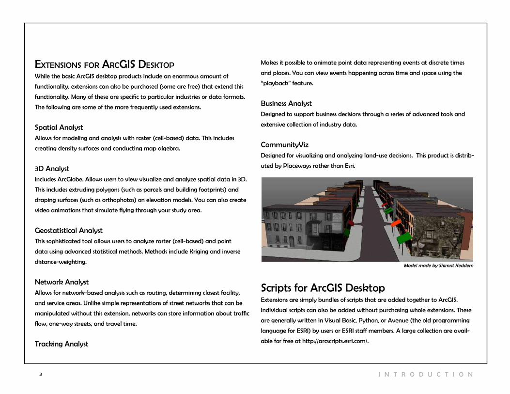
communityvizDesigned for visualizing and analyzing land-use decisions. This product is distrib-
uted by Placeways rather than Esri.
Scripts for ArcGIS DesktopExtensions are simply bundles of scripts that are added together to ArcGIS.
Individual scripts can also be added without purchasing whole extensions. These
are generally written in visual Basic, Python, or Avenue (the old programming
language for ESrI) by users or ESrI staff members. A large collection are avail-
able for free at http://arcscripts.esri.com/.
Model made by Shimrit Keddem
4
IntroductIon to arcMap
ArcMap is where you create maps and access most of the ArcGIS functionality.
You can add and edit data, query and symbolize map layers, and create map
layouts for printing.
Starting ArcMapYou can launch ArcMap in more than one way. The most common way is to
click on the start menu and go to “All Programs,” then the ArcGIS folder, then
ArcMap 10. If you don’t see ArcGIS in the list of programs, don’t worry, it might
still be intstalled on your computer. look in c:\\Program Files for a ArcGIS folder.
Open the ArcGIS folder, then the Desktop 10.0 folder, then the Bin folder inside
that. Double-click on the ArcMap.exe file to start ArcMap. If it’s not there then
ArcGIS is not installed on your computer.
If you want to create a desktop icon for ArcMap (so you don’t have to go
through all of that again), right click on the ArcMap.exe file and choose “create
shortcut.” Then copy and paste the shortcut to your desktop.
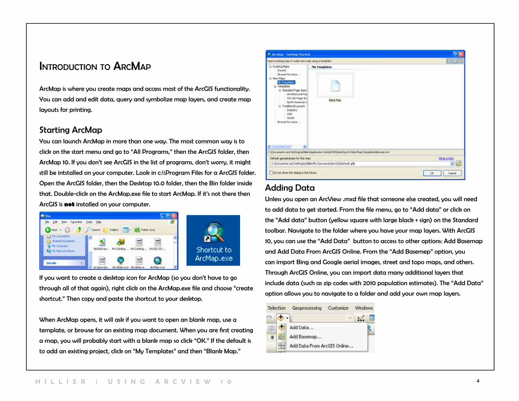
when ArcMap opens, it will ask if you want to open an blank map, use a
template, or browse for an existing map document. when you are first creating
a map, you will probably start with a blank map so click “OK.” If the default is
to add an existing project, click on “My Templates” and then “Blank Map.”
Adding DataUnless you open an Arcview .mxd file that someone else created, you will need
to add data to get started. From the file menu, go to “Add data” or click on
the “Add data” button (yellow square with large black + sign) on the Standard
toolbar. navigate to the folder where you have your map layers. with ArcGIS
10, you can use the “Add Data” button to access to other options: Add Basemap
and Add Data From ArcGIS Online. From the “Add Basemep” option, you
can import Bing and Google aerial images, street and topo maps, and others.
Through ArcGIS Online, you can import data many additional layers that
include data (such as zip codes with 2010 population estimates). The “Add Data”
option allows you to navigate to a folder and add your own map layers.
H I l l I E r | U S I n G A r c v I E w 1 0
5 I n T r O D U c T I O n
catalog wIndow
Arccatalog is a system for managing and organizing map files. One big differ-
ence with ArcGIS 10 is that a version of it (called “catalog window”) is integrat-
ed into ArcMap. You can still open Arccatalog without opening ArcMap but it
is much easier to use from inside ArcMap. To launch Arccatalog within ArcMap,
click on the catalog window. Arccatalog will open on the far right.
You can add map layers from Arccatalog, but you can also view and add
toolboxes, create geocoding services, edit and view metadata among other im-
portant “housekeeping” tasks. The tree within the catalog window will include
a number of folders that are commonly used with ArcGIS. In order to add your
own map layers, you will need to “connect to Folder” to show ArcMap where
those other important folders reside. To create a connection to a new folder,
click on the “connect To Folder” icon at the top of the catalog window or right
when you view map layers within Arccatalog, you see them the way ArcGIS
sees them. Some of the types of files used in ArcGIS, including shapefiles,
coverages, and grids, are made up of multiple files that only together create
a map layer. If you viewed them outside of Arccatalog (in My computer, for
example), you would see all of the files listed with extensions such as .dbf, .shp,
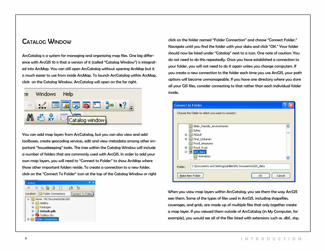
click on the folder named “Folder connection” and choose “connect Folder.”
navigate until you find the folder with your data and click “OK.” Your folder
should now be listed under “catalog” next to a icon. One note of caution: You
do not need to do this repeatedly. Once you have established a connection to
your folder, you will not need to do it again unless you change computers. If
you create a new connection to the folder each time you use ArcGIS, your path
options will become unmanageable. If you have one directory where you store
all your GIS files, consider connecting to that rather than each individual folder
inside.

6
.shx. within Arccatalog, you will see only a single file. This is especially helpful
when you are moving or copying data.
View from Catalog Window View from My Computer
You can add data to ArcMap by dragging and dropping files from Arcwindow.
The icons used to represent the data indicate the type of data. A light green icon
with lines (broad_street_line.shp) indicates a line shapefile; a light green icon
with three dots (highspeed_stations.shp) indicates a point shapefile; a light green
icon with a square cut into three pieces is a polygon shapefile. An icon with a
white square and two columns of lines (BusStop_Totallines.dbf) is a table.
You can view and edit the metadata for any of your files. right click on a file
and go to “item description.” In most cases, the metadata will probably be
empty. If you get into the habit of filling in at least a basic description about
what the data are, who created them and when, you will make it much easier
to keep track of and share your files. click on the “Edit” button to add or change
the metadata.
Other Arccatalog FunctionsArccatalog also has extensive search capabilities, making it possible to locate
files based on name, location on your computer, geographic location, and date.
You can create new shapefiles in Arccatalog. This will be described in the section
“creating new Shapefiles.”
H I l l I E r | U S I n G A r c v I E w 1 0

7 I n T r O D U c T I O n
You can move a toolbar by double-clicking on it to the left of the buttons
(where there is a sort of handle at the edge). You can “dock” it by moving it
over any of the gray areas on the screen. To add or remove a toolbar, go to the
customize menu, then “Toolbars” or double-click on an empty gray part of the
screen. Anything with a check mark next to it will be displayed.
You can add new buttons to existing toolbars from the “customize” option. click
on the “commands” button to see your options. One especially helpful button
allows you to zoom continuously. Scroll down to the category on the left called
“pan/zoom,” then left click on the “continuous Pan and Zoom” button on the
right and drag it to your tools toolbar (the toolbar with the outline of a hand
and an image of a globe in the middle) and release (see image on previous
page). You can also add new buttons and tools by importing scripts. That process
is explained in a later section called “working with scripts.”
customizing the InterfaceArcMap is made up of many different windows and (dock-able) toolbars that
you can resize and move around, so don’t be surprised if ArcMap looks slightly
different each time you open it.
The window on the left that lists your map layers is the Table of contents; the
window on the right that shows your map is the map display. You can close the
table of contents by clicking on the “X.” To bring your table of contents back,
go to the window menu, then Table of contents. By clicking on the tack symbol
next to the “X” you can hide the Table of contents; to bring it back, click on the
word “table of contents” which will be running vertically on the far left. resize
it by holding your cursor over the right edge until it changes to a two-headed
arrow, then left-click and drag the edge to resize this window.
The map layers you add will draw in the order in which they appear in the
Table of contents--so the layer at the top will draw on top and the layer at the
bottom will draw on the bottom. You can change the order by left clicking on
the layer you wish to move and dragging it to a new position. The icons at the
top of the Table of contents allow for different views on your data--by source
(so you can see where each file exists on your compute), by visibility (layers
turned on will be listed first), and by selection (indicating whether any features
are selected). You can only change the order of your layers from the first option,
“list by Drawing Order” which is the default when you open ArcMap.

8H I l l I E r | U S I n G A r c v I E w 1 0
navigating a MapThere are several tools available for zooming in and out of your map.
The fixed zoom in/fixed zoom out tools
give you the least control but also may
keep you from zooming in or out too much
and losing your map. Each time you click,
you will zoom in or out a fixed amount.
The pan tool works like the continu-
ous zoom tool when you right click on it.
Think of the pan tool as a sticky hand you
set down on a piece of paper. You use it
to move your map up, down, left or right
without changing the extent (the degree to
which you are zoomed in or out).
You can also pan by using the scroll bars
on the right and bottom of your map.
However, these are not the best way to
navigate since they are really designed for
scrolling in word document or image.
The continuous zoom tool gives you the
greatest amount of control, but you have
to add this by customizing your toolbar (see
“customizing the Interface” above). click
on the continuous zoom tool, then left click
on your map, hold down the mouse button,
and move your mouse away from you to
zoom in and toward you to zoom out. If
you right click and hold down, this becomes
a tool for panning (moving map around
without changing the extent).
Using the non-continuous zoom tools,
you can click on your map to zoom in or out
at a fixed amount or to draw a box around
the area that you want to see in more or less
detail. The new map will be drawn so that
the area you drew the box around is in the
middle of the map display.
The full extent button will zoom in or out
so that all of your active (checked) map
layers can be viewed. This is very helpful
when you zoom in or out too much and
can’t see your map layers. You can also
zoom in to a single layer by right clicking
on the layer in the table of contents and
choosing “zoom to layer.”
The previous extent button allow you
to return to the extent you had before
zooming in or out. The next extent button
allows you to jump forward an extent (after
you have used the previous extent button).
This is a sort of “undo” button in regard to
navigation.

9 I n T r O D U c T I O n
Identifying Attributes of FeaturesThe points, lines, and polygons that make up vector map layers are all map
features that have attributes stored in a table. This is part of what makes
GIS unique, that it can connect attributes of a location to that location.
You can access this information in several different ways. Using the identify
(“i”) tool, click on a map feature in the map display. An “identify results”
box will display all of the information known about that feature. notice
the layers dropdown menu. The default in ArcMap is to display information
only about the top-most layer. You can change this using the dropdown
menu at the top of the identify pop-up box.
Showing Map TipsMap tips are small text boxes that appear when you hold the cursor over a
map feature. You can only see one attribute at a time (unlike the identify
tool, which allows you to see all the attributes know for that map feature),
but using map tips is much simpler and allows you to get a quick idea of the
attributes. To turn on map tips, double click on your shapefile name in the
table of contents and, from the layer Properties, make the Display tab active.
Put a check mark in the “Show Map Tips using the display expression” box. To
change the “display expression,” use the dropdown menu just above.

10
Selecting FeaturesYou can also use the select features tool to identify attributes, either by clicking
on a particular map feature or by drawing a rectangle, polygon, cirle, line or
using the lasso selection tool. The selected features should become highlighted
with a blue outline. right click on the map layer that contains the feature(s)
that you wish to investigate and go to “open attribute table.” This table includes
all the attributes of all the features in that layer. In order to view just the
selected feature(s), click on the “Show Selected Features” button at the bottom
of the table. notice that there will be an indication of how many records out of
the total have been selected.
You can also highlight a feature on the map by clicking on a row in the table
(you need to click in the gray area on the far left). This way, you can find a
specific place (such as cyprus) on your map. You can change the selection color
from “options…” in the Selection menu. It is also possible to use different selection
colors for each layer. Double click on a map layer, or right click and go to “prop-
erties.” choose the selection tab and then select the last radio button, “Show
selected features with this color.” This will only change the selection color for this
map layer.
To unselect records (and get rid of the blue highlight), you can do one of several
things:
1. Open the attribute table (right click on the name in the Table of contents and
go to “Open Attribute Table”) and then click on the “clear Selected Features”
button at the top;
2. with the attribute table open, click on the “Table Options” button on the top
left and go to “clear Selection” ;
3. From the Selection menu in ArcMap, choose “clear Selected Features;
4. From the Table of contents, click on the “list by Selection” button to see
which map layer has selected features, then right click on the one with selected
features and go to “clear Selected Features.”
H I l l I E r | U S I n G A r c v I E w 1 0

11 I n T r O D U c T I O n
changing Map SymbolsArcMap has many options for changing the way your data are displayed. Some
of the simplest options involve the choice of color, fill pattern, and shape (for
point data). To make changes, click on the map symbol in the table of contents.
The symbol selector window that opens will look different depending upon
the type of layer: point, line, or polygon. For points, you can choose a differ-
ent marker from the default (which is a circle with a black outline). when you
choose a new marker, the default size jumps from 4 point (quite small) to 18
point (quite large). You can find many more symbols by clicking on “Style refer-
ences...” button (for example, there is a transportation, crime analysis and civic
symbol pallette). You can change the color, size, and angle using the options
on the right of the window. The “reset” button will undo any changes you have
made to the symbol since opening the symbol selector window.
For lines, you can choose from a variety of patterns, thicknesses, and colors. There
are industry standards for things like highways, expressways, and railroads.
For polygons, you have choices about the fill pattern, fill color, and outline color.
The properties button will give you additional options (and often too many
options) but may be helpful in fine-tuning the crosshatch and ordered stipple
patterns.
You can also symbolize your layers based on different values for each map
feature. For example, you might use different size points to represent different
cities around the world according to their population or use differ color markers
to represent different types of hospitals. These are considered “thematic” maps
and they will be discussed in the sections on displaying points, lines, and polygons.

12
ManagIng & savIng data
Many of the frustrations of new GIS users relate to saving files. ArcGIS works
differently from most software, so if you do not take care in naming and saving
your files, you will not be able to find or open your work.
Saving ArcMap Documents (.mxd)An ArcMap document is made up of all the map layers you have added and
all of the functions you have applied to them. It is best to only save an ArcMap
document when you have spent a significant amount of time.when you open ArcMap, you are prompted to specify whether you wish to
open an existing map document or create a new one. Most of the time when
you are learning to use Arcview, you can create a new ArcMap document. If
you will need to return to your work once you start symbolizing your map layers
and designing a layout for printing, you will probably want to save an ArcMap
document. You do this by going to the File menu and choosing save. This file will
save all of the work you have done, including the list of data you have added
and the changes you have made to layer properties, symbology, and the layout.
The .mxd file does nOT save all of the data you included in your map. Instead,
it includes information about the location of those files on your computer (or
network, or Internet) and the formatting changes you made. This means that
you cannot move the data files you’ve included in a map document or just
put your .mxd file on a thumb drive to open on a different computer without
running into problems. It also means that map documents can be difficult to
transfer from one computer to another. If you do move one of the files used in
your map document, that layer will be shown with a ! next to it and will not
draw when you open your map document. If you click on the grayed out check
mark beside the layer name, ArcMap will bring up a dialog asking where you
moved the file. navigating to the file in its new location and clicking “add” will
solve the problem.
Saving relative Pathsrelative paths can help you avoid the red exclamation points some of the time.
If you have all of the files belonging to a map document in a single folder, you
can move it to a new location and still open it with relative paths. From the File
menu, go to “Map Document.” and check the box next to “Pathnames” that
says “Save relative pathnames to data sources.”
H I l l I E r | U S I n G A r c v I E w 1 0

13 I n T r O D U c T I O n
Saving Map layersIn addition to saving the entire workspace with a map document, you can save
an individual map layer (.lyr). This file will store all the formatting changes you
have made to the layer. This is particularly helpful if you want to use the same
layer, with the same symbology, in another map document. As with the .mxd
file, the .lyr file only includes information about the formatting and the path to
the original data (generally a shapefile). Moving your original data, or moving
the .lyr file to another computer, will create problems.
naming Filesnaming your files in a clear and consistent manner will make working with
ArcMap much easier. You need to develop your own naming convention that
makes sense to you. You may create multiple versions of the same shapefile that
are only slightly different, so your naming convention should reflect those differ-
ences (in year, projection, attributes, geographic level, etc.). For example:
ArcGIS can work with file names that are more than 8 characters, but really long
names can be difficult to work with. ArcGIS can also work with files that have
spaces in their name (such as Phila tracts.shp), but this can create problems (es-
pecially with attribute names) so it is best to avoid by using underscores ( _ ).
Phila_tracts_2000_UTM.shp
Phila_tracts_1990_UTM.shp
Phila_bgroups_2000_stateplane.shp
nYc_tracts_1990_UTM.shp
nYc_tracts_1990_StatePlane.shp
PA_tracts_2000_StatePlane.shp
creating Map PackagesArcGIS 10 includes an option to package up your .mxd file with all the data used
to create the map document on the model of Adobe products. This is especially
useful for moving your files for a specific project from one computer (or location
on a computer) to another or sharing the files with someone else. From the
File menu, go to “create a Map Package.” You must save the map document
(.mdx) file first, then the map package.You will also need to give the map
document a description (title, summary and other information are optional) and
indicate where you want to save the map package. Once you have identified
the location where the package should be saved, click the “validate” button to
make sure all of the associated files can be found. Then click “Share” to create
the map package. Map packages have the extension .mpk.

14
Saving and Storing FilesThe most important thing in storing files for ArcMap is to think through a system
BEFOrE you start, so you can avoid moving files and disabling your map docu-
ments and layers. consider creating a new directory for each new mapping
project. Keep all map documents, map layers, and tables in that directory. Even
though it will require more storage space, you may want to keep separate
copies of the same map layer, such as a streets layer, in each project folder
where you will be using it. As you work with ArcGIS, you will also be creating
new tables and shapefiles. whenever ArcGIS is creating a new file, you will be
given an opportunity to give it a name and specify a location with a dialogue
box like this:
click on the folder icon to show Arcview exactly where you want the new file
and then give the file a new name. Otherwise you will end up with files called
“Export_Output.shp” and other unhelpful things like that. no one can help you
if you don’t know where your files are or what you called them (trust me, this is
about the worst problem you can have with ArcGIS).
As you create new versions of old layers, delete the old layers to keep your files
neat. And remember, it’s best to delete files from the catalog window.
H I l l I E r | U S I n G A r c v I E w 1 0

15 I n T r O D U c T I O n
data forMats ArcGIS can work with many different types of data, only some of which are de-
scribed in this section. ArcGIS 10 can work with more different data formats than
previous versions of ArcGIS.
Tabular dataTabular data includes things like comma delimited or fixed width text files,
Excel worksheets, AccESS files, and dbase files. This is where you store attribute
data, which includes any information you have about a location. For example,
you might know the types of programs offered at a recreation center or the
total population of a zip code. In order to be mapped, tabular data generally needs to be linked to spatial/
geographic data. Unlike
some earlier versions (8 and
earlier), ArcGIS 10 can work
with Excel files. when you add
an Excell file to ArcMap, you
must specify which work-
sheet you wish to add, so try
to remember to name your
worksheets in Excel (no spaces
in the name). when you add
data, double-click on the
name of the .xls file to see
the names of the worsheets.
Highlight a worksheet and
click “add.”
Adding XY DataSome tabular data include XY coordinates. For example, data might be col-
lected using a GPS device or a data vendor might sell the names and addresses
of supermarkets and include XY coordinates for mapping. converting lists of
addresses to points on a map usually involves a process called geocoding and
is explained later in this manual. You do not need to geocode if your table
already includes XY coordinates. From the File menu, go to “Add Data” and
“Add XY Data.” From the “Display
XY Data window,” choose the field
that contains the X (longitude)
and Y (latitude) coordinates. If you
know the projection used to collect
or create the data, click on the
Edit button and set the projection
(projections will be described later
so don’t worry if this doesn’t make
sense at this point).

16
.dbf - the dBASE file that stores the attribute information of features.
when ashapefile is added as a theme to a view, this file is displayed as a
feature table.
.sbn and .sbx - the files that store the spatial index of the features.
These two files may not exist until you perform theme on theme selec
tion, spatial join, or create an index on a theme’s shape field.
.pjr – the file that stores information about the projection. This will only
exist for shapefiles with defined projections.
The shapefile stores information about the shape of the map features, describ-
ing them in the “shape” field of the attribute table as point, line, or polygon. It
also stores information about the real world location of each vertex that makes
up the map features. Using this information, Arcview can calculate area and
perimeter for polygon features.
TopologyOn of the biggest complaints about the shapefile format is that it does not
contain information about topology. Topologic formats (like coverages used in
ArcInfo) contain detailed information about the relationships among features
in the same map layer. This allows for a variety of operations to ensure the
integrity of lines and polygons and to carefully edit and create new geographic
features. In creating the shapefile format, ESrI intentionally created something
that is simpler than existing topologic formats for desktop (rather than profes-
sional) GIS users.
Geographic dataThe tabular data you use in ArcGIS can be used in other programs like Excel,
SPSS, SAS, and STATA, but the geographic data you use can only be used in GIS
programs. Geographic data store information about location so that they can
be represented as map layers. Geographic data can be categorized as vector or
raster. This manual deals primarily with vector data.
ShapefilesShapefiles are the most common format for vector data in ArcGIS. vector data
use points, lines, and polygons to represent map features. vector GIS is excel-
lent for representing discrete objects, such as parcels, streets, and administrative
boundaries. vector GIS is not as good for representing things that vary continu-
ously over space, such as temperature and elevation.
Esri created the shapefile format in order to represent vector GIS data in a
simpler format than their coverage format used in ArcInfo. As with other formats
of geographic data, shapefiles link information about the location and shape
of the map features to their attributes. Other GIS programs will allow you to
use shapefiles, but geographic files from other GIS programs must be converted
to shapefiles before ArcGIS can read them. Shapefiles are made up of three or
more files that need to be stored in the same directory in order for ArcGIS to
recognize them as shapefiles. when you look at your shapefiles through ArcMap
or Arccatalog, you will only see one file, but if you look at them directly on your
hard drive or thumb drive, you will see multiple files with the following exten-
sions:
.shp - the file that stores the feature geometry (point, line, or polygon)
.shx - the file that stores the index of the feature geometry
ImagesArcGIS allows you to import and export many different types of images. The
images you import may be scanned paper maps, aerial photos, or other pictures
or photos that you “hot link” to your map features. ArcMap can import a wide
H I l l I E r | U S I n G A r c v I E w 1 0
17 I n T r O D U c T I O n
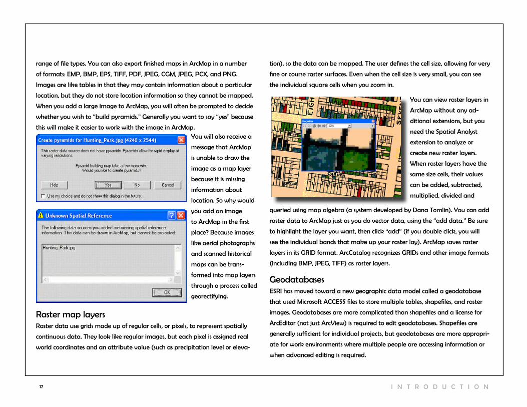
You will also receive a
message that ArcMap
is unable to draw the
image as a map layer
because it is missing
information about
location. So why would
you add an image
to ArcMap in the first
place? Because images
like aerial photographs
and scanned historical
maps can be trans-
formed into map layers
through a process called
georectifying.
range of file types. You can also export finished maps in ArcMap in a number
of formats: EMP, BMP, EPS, TIFF, PDF, JPEG, cGM, JPEG, PcX, and PnG.
Images are like tables in that they may contain information about a particular
location, but they do not store location information so they cannot be mapped.
when you add a large image to ArcMap, you will often be prompted to decide
whether you wish to “build pyramids.” Generally you want to say “yes” because
this will make it easier to work with the image in ArcMap.
raster map layersraster data use grids made up of regular cells, or pixels, to represent spatially
continuous data. They look like regular images, but each pixel is assigned real
world coordinates and an attribute value (such as precipitation level or eleva-
You can view raster layers in
ArcMap without any ad-
ditional extensions, but you
need the Spatial Analyst
extension to analyze or
create new raster layers.
when raster layers have the
same size cells, their values
can be added, subtracted,
multiplied, divided and
queried using map algebra (a system developed by Dana Tomlin). You can add
raster data to ArcMap just as you do vector data, using the “add data.” Be sure
to highlight the layer you want, then click “add” (if you double click, you will
see the individual bands that make up your raster lay). ArcMap saves raster
layers in its GrID format. Arccatalog recognizes GrIDs and other image formats
(including BMP, JPEG, TIFF) as raster layers.
GeodatabasesESrI has moved toward a new geographic data model called a geodatabase
that used Microsoft AccESS files to store multiple tables, shapefiles, and raster
images. Geodatabases are more complicated than shapefiles and a license for
ArcEditor (not just Arcview) is required to edit geodatabases. Shapefiles are
generally sufficient for individual projects, but geodatabases are more appropri-
ate for work environments where multiple people are accessing information or
when advanced editing is required.
tion), so the data can be mapped. The user defines the cell size, allowing for very
fine or course raster surfaces. Even when the cell size is very small, you can see
the individual square cells when you zoom in.
18
georectIfyIng IMages
Georefectifying allows you to convert a paper map into a GIS map layer. Es-
sentially, the process assigns X and Y coordinates to points on your digital map
image, shifting, rotating, and scaling your map so that you can view it as a map
layer along with your shapefiles. The simplest form of this, using onscreen tools, is
explained below. This is especially value for incorporating historical maps to GIS.
create a raster imageScan your paper map. The higher resolution, the better. ArcMap can handle
pretty big files, and it can work with lots of file types (.jpg, .tif, .bmp). If you have
a choice, go with .tif and 300 dpi or better.
Add reference layers (shapefiles)Before you add your scanned image, add a shapefile that covers the same geo-
graphic area. This might be a street centerline file, city boundaries, or something
similar. Be sure that you can identify a few places on your scanned maps on this
shapefile (such as a landmark or street intersection). Otherwise, you will not be
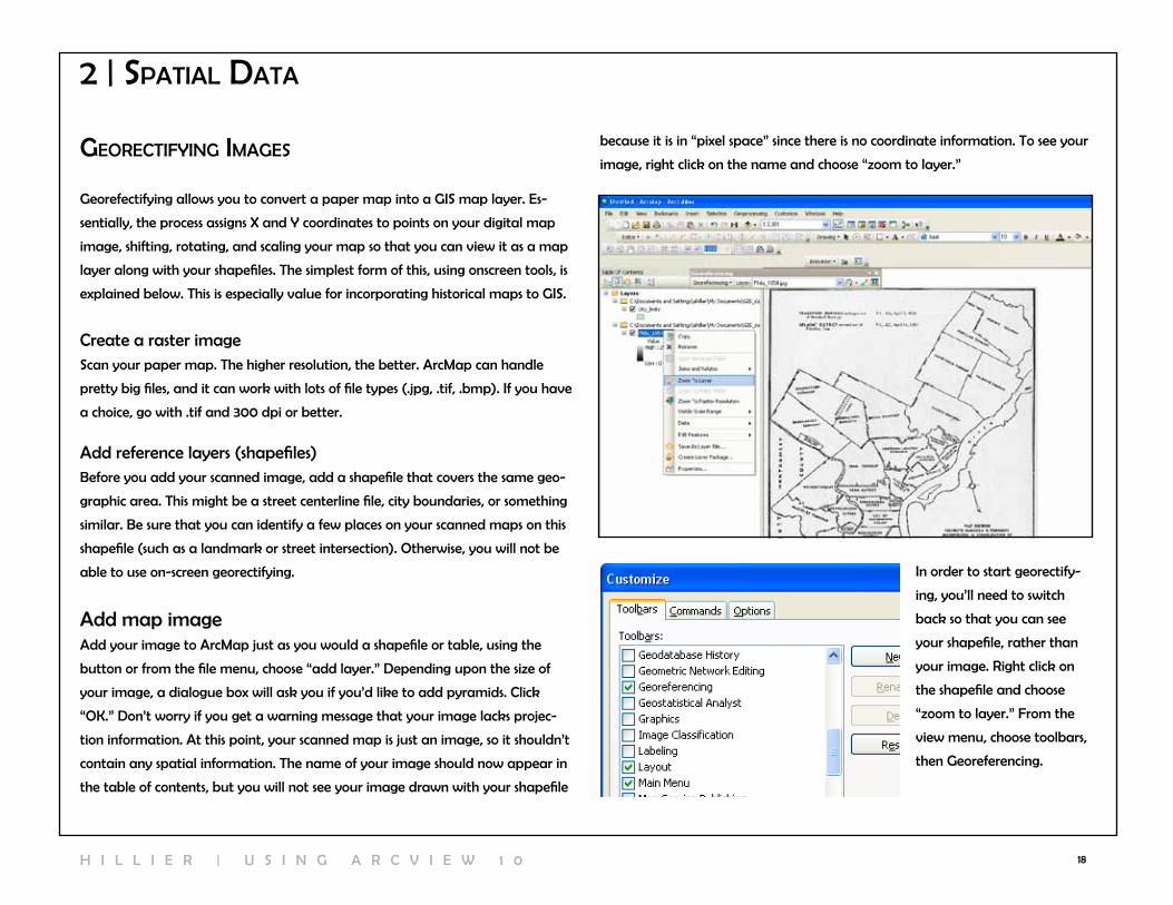
able to use on-screen georectifying. In order to start georectify-
ing, you’ll need to switch
back so that you can see
your shapefile, rather than
your image. right click on
the shapefile and choose
“zoom to layer.” From the
view menu, choose toolbars,
then Georeferencing.
Add map imageAdd your image to ArcMap just as you would a shapefile or table, using the
button or from the file menu, choose “add layer.” Depending upon the size of
your image, a dialogue box will ask you if you’d like to add pyramids. click
“OK.” Don’t worry if you get a warning message that your image lacks projec-
tion information. At this point, your scanned map is just an image, so it shouldn’t
contain any spatial information. The name of your image should now appear in
the table of contents, but you will not see your image drawn with your shapefile
2 | spatIal data
because it is in “pixel space” since there is no coordinate information. To see your
image, right click on the name and choose “zoom to layer.”
H I l l I E r | U S I n G A r c v I E w 1 0
19
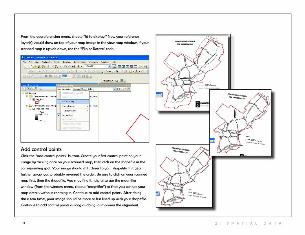
From the georeferencing menu, choose “fit to display.” now your reference
layer(s) should draw on top of your map image in the view map window. If your
scanned map is upside down, use the “Flip or rotate” tools.
Add control pointsclick the “add control points” button. create your first control point on your
image by clicking once on your scanned map, then click on the shapefile in the
corresponding spot. Your image should shift closer to your shapefile. If it gets
further away, you probably reversed the order. Be sure to click on your scanned
map first, then the shapefile. You may find it helpful to use the magnifier
window (from the window menu, choose “magnifier”) so that you can see your
map details without zooming in. continue to add control points. After doing
this a few times, your image should be more or less lined up with your shapefile.
continue to add control points as long as doing so improves the alignment.
2 | S P A T I A l D A T A
20
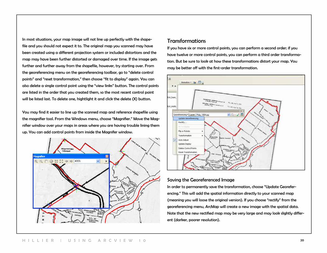
In most situations, your map image will not line up perfectly with the shape-
file and you should not expect it to. The original map you scanned may have
been created using a different projection system or included distortions and the
map may have been further distorted or damaged over time. If the image gets
further and further away from the shapefile, however, try starting over. From
the georeferencing menu on the georeferencing toolbar, go to “delete control
points” and “reset transformation,” then choose “fit to display” again. You can
also delete a single control point using the “view links” button. The control points
are listed in the order that you created them, so the most recent control point
will be listed last. To delete one, hightlight it and click the delete (X) button.
You may find it easier to line up the scanned map and reference shapefile using
the magnifier tool. From the windows menu, choose “Magnifier.” Move the Mag-
nifier window over your maps in areas where you are having trouble lining them
up. You can add control points from inside the Magnifer window.
TransformationsIf you have six or more control points, you can perform a second order; if you
have twelve or more control points, you can perform a third order transforma-
tion. But be sure to look at how these transformations distort your map. You
may be better off with the first-order transformation.
Saving the Georeferenced ImageIn order to permanently save the transformation, choose “Update Georefer-
encing.” This will add the spatial information directly to your scanned map
(meaning you will loose the original version). If you choose “rectify” from the
georeferencing menu, ArcMap will create a new image with the spatial data.
note that the new rectified map may be very large and may look slightly differ-
ent (darker, poorer resolution).
H I l l I E r | U S I n G A r c v I E w 1 0
21 2 | S P A T I A l D A T A
workIng wIth projectIons
Projections are probably the trickiest part of working with spatial data. The
stakes are high because if data are not projected properly, you might not even
get your map layers to draw together. Don’t be afraid to ask someone for help
or to start over (download the original data again). Hopefully there is some
consulation in knowing that most people have a hard time with this stuff.
Projections manage the distortion that is inevitable when a spherical (okay,
ellipsoid) earth is viewed as a flat map. All projection systems distort geography
in some way—either by distorting area, shape, distance, direction, or scale. There
are dozens of different projection systems in use because different systems work
best in different parts of the world and, even within the same parts of the world,
GIS users have different priorities and needs. when you are looking at a relative-
ly small area, such as a single city, there is relatively little distortion because the
curve of the earth is slight. But knowing and setting projections properly is also
important for getting your may layers to draw together, distance units to make
sense, and some of Arcview’s tools to work. So in the end, it’s practical to take
care in projecting your data.
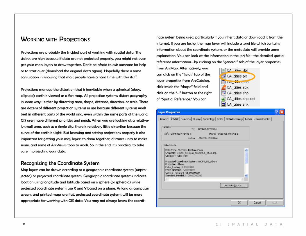
recognizing the coordinate SystemMap layers can be drawn according to a geographic coordinate system (unpro-
jected) or projected coordinate system. Geographic coordinate systems indicate
location using longitude and latitude based on a sphere (or spheroid) while
projected coordinate systems use X and Y based on a plane. As long as computer
screens and printed maps are flat, projected coordinate systems will be more
appropriate for working with GIS data. You may not always know the coordi-
nate system being used, particularly if you inherit data or download it from the
Internet. If you are lucky, the map layer will include a .proj file which contains
information about the coordinate system, or the metadata will provide some
explanation. You can look at the information in the .prj file—the detailed spatial
reference information—by clicking on the “general” tab of the layer properties
from ArcMap. Alternatively, you
can click on the “fields” tab of the
layer properties from Arccatalog,
click inside the “shape” field and
click on the “…” button to the right
of “Spatial reference.” You can

22
working with “Unprojected” layers
In most cases, you will want to convert unprojected map layers—those with a
geographic coordinate system—to projected map layers. Any of the files you
download from the US census website or Esri TIGEr files site will be in this “un-
projected” format. There are two steps involved in this process. First, you must
create a .proj file by “defining” the map layer as unprojected; then you can
“project” the map layer using the projection of your choice. You can access the
tools for doing this by clicking on the ArcToolbox icon inside ArcMap. click on
“data management tools” and then “projections and transformations.”
Defining projectionsDefining a projection registers the current coordinate system of your map layer.
It involves reporting to Arcview the nature of the data that you have, not
changing that data. To “define” the coordinate system for your unprojected map
layer, click on the “Define Projection” wizard. First you will be asked to choose
a data layer. If you added the relevant map layer to ArcMap, you will be able
to find it in the dropdown menu. Otherwise you will need to click on the folder
icon to locate your map layer. Then you can choose the coordinate system using
the button. click the “select” button on the Spatial reference Properties. In most
cases, you can choose “Geographic coordinate Systems,” “north America,” and
“nAD 1983 Datum,” then click “okay.” You should not notice a difference in how
the map layer is drawn as a result of defining the coordinate system. But as a
result of defining it, there is now a .proj file associated with your map layer and
you can look at the detailed spatial reference information. Before you define a
layer as unprojected, Arcview will refer to it as “assumed geographic.”
H I l l I E r | U S I n G A r c v I E w 1 0

23
working with Projected Map layersSometimes the map layers you acquire will already be projected but won’t carry
a .proj file so you won’t know the projection. The best thing to do in this situa-
tion is to look at the original source for information about the projection system,
either on a website, in metadata that came with the file, or by calling the person
who created the data. If these approaches all fail to reveal the projection, map
the data in order to guess the projection. You may recognize the projection by
the units showing in the gray bar below the map. If they are not in longitude
and latitude, they are probably projected. As you work with a particular projec-
tion system, you will come to recognize the map units and range of coordinate
values. For example, State Plane coordinates for Philadelphia are generally in
feet and look like 2691607.78, 246268.98. UTM coordinates will be in meters and
look like 486850.72, 4430095.19.
Projecting shapefilesProjecting a shapefile changes the projection system. You can only do this if you
have defined (registered) the existing projection. You can project map layers
that are unprojected (geographic coordinate system) or change the projection
on layers that already have a projected coordinate system. In order to project
the map layer, click on the “Project” wizard. If you are projecting a shapefile, use
the “Project” wizard listed under “Features.” If you are projecting a raster image,
use the “project” wizard listed under “raster.”
As with the “define” wizard, you will be asked to specify the map layer. next, because you will be changing
the original layer, you are asked
to name the new layer that
will be created. By default,
Arcview will add “_Project” to
the original name. You may
wish to give your layer a differ-
ent name. click on the button
to the right of “Output coordinate System” to choose your projection. click on
the “select” button on the Spatial reference Properties, then choose “Projected
coordinate Systems.” now you need to choose your projection. For relatively
small areas like Philadelphia, the differences in projection systems (the distor-
tion in shape, area, distance, direction, and scale) are minimal. You are best off
choosing whatever projection system is most commonly used. In Philadelphia,
that is State Plane 1983 (feet) Pennsylvania South. For the Philadelphia MSA,
consider UTM zone 18n. After making your selection, click “okay.” Arcview will
indicate that there is a “Datum conflict between map and output.” In order to
map your newly projected layer, create a new ArcMap document and add the
new (projected) layer. You should notice a change in the coordinates that show
in the bottom right of the map.
2 | S P A T I A l D A T A
24
3 | MakIng Maps
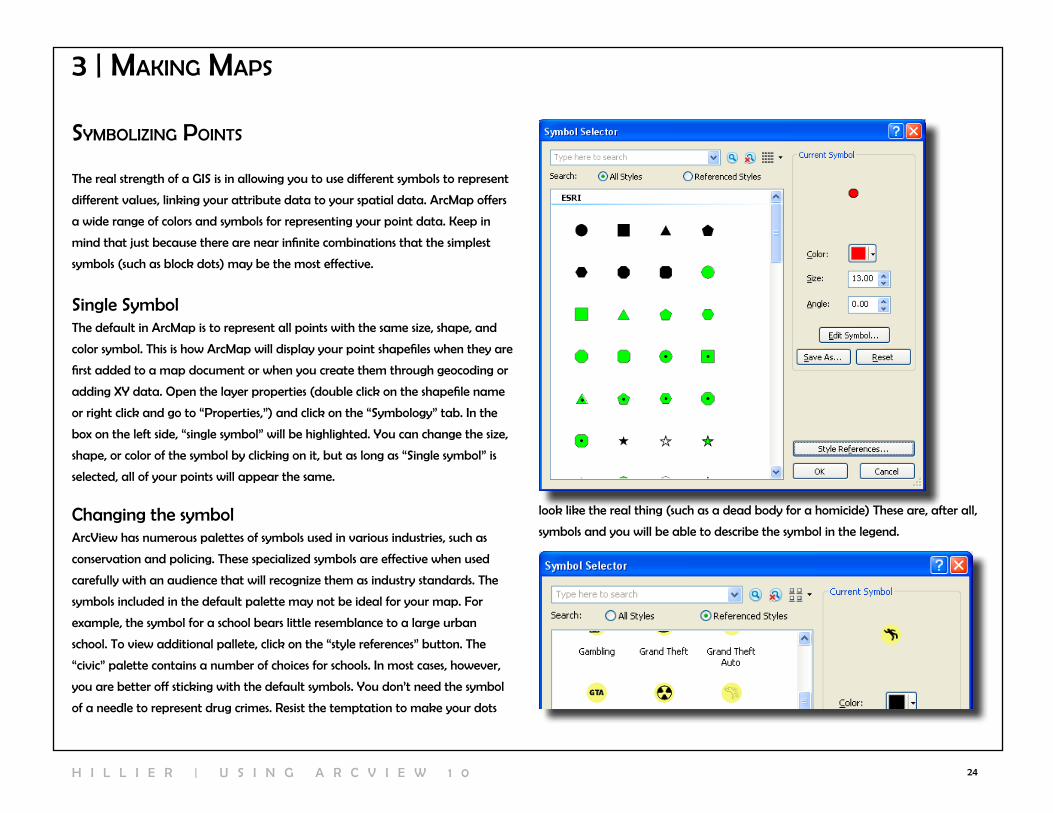
syMbolIzIng poInts
The real strength of a GIS is in allowing you to use different symbols to represent
different values, linking your attribute data to your spatial data. ArcMap offers
a wide range of colors and symbols for representing your point data. Keep in
mind that just because there are near infinite combinations that the simplest
symbols (such as block dots) may be the most effective.
Single SymbolThe default in ArcMap is to represent all points with the same size, shape, and
color symbol. This is how ArcMap will display your point shapefiles when they are
first added to a map document or when you create them through geocoding or
adding XY data. Open the layer properties (double click on the shapefile name
or right click and go to “Properties,”) and click on the “Symbology” tab. In the
box on the left side, “single symbol” will be highlighted. You can change the size,
shape, or color of the symbol by clicking on it, but as long as “Single symbol” is
selected, all of your points will appear the same.
changing the symbolArcview has numerous palettes of symbols used in various industries, such as
conservation and policing. These specialized symbols are effective when used
carefully with an audience that will recognize them as industry standards. The
symbols included in the default palette may not be ideal for your map. For
example, the symbol for a school bears little resemblance to a large urban
school. To view additional pallete, click on the “style references” button. The
“civic” palette contains a number of choices for schools. In most cases, however,
you are better off sticking with the default symbols. You don’t need the symbol
of a needle to represent drug crimes. resist the temptation to make your dots
look like the real thing (such as a dead body for a homicide) These are, after all,
symbols and you will be able to describe the symbol in the legend.
H I l l I E r | U S I n G A r c v I E w 1 0

25
categoriescategorical variables classify data into unique categories so that each obser-
vation (event, person, building, etc.) fits in only one category. For example, a
hospital might be managed by a non-profit, church, federal government, state
government, or for-profit entitity. The unique values option listed under “cate-
gories” in the symbology tab allows you to use a different symbol for each of the
points in a shapefile based on a categorical variable. This can work well for small
files (10 or fewer points) but can quickly be overwhelming for larger files. choose
the field with the values you wish to use to represent your points, then click the
“Add All values” button in order to bring up all the categories. If you want to
show only a few categories (for example, bus stops for a subset of routes), click
the “Add values” button, highlight the values you want, and clik “OK.”
ArcMap will list a symbol for “<all other values>” that you can remove by taking
away the check mark. You can change the individual symbols by clicking on
them. You can make changes to all of the symbols, or selected symbols (hold
down the shift key to select two or more) by right clicking. To remove a value,
right click on it and choose “remove value(s).” Use the black arrows on the far
right to move values up and down (the order here will be the order your values
appear in the legend on your map).
choose colors that communicate that these are separate categories. Don’t use a
graduated color ramp with light to dark shades of the same color. This implies
that one category is more or less than another when, in reality, they are just
different. In addition to different colors, you can use different sizes and symbols...
but don’t go too crazy.
2 | S P A T I A l D A T A

26
Quantitiescategorical variables correspond to categories and are generally represented
using text variables (or numbers used as codes for individual categories). Quanti-
ties, such as the population of a city or air emissions, are continuous and must
be presented with numbers. Graduated symbols and proportional symbols are
the best choices to show different quantitative values for points. Graduated
symbols allow you to have different size symbols to represent different attribute
values. with the symbology tab active, click on “Quantities” and then “Gradu-
ated symbols.” From the “values:” dropdown menu, select the field with the
values you wish to use. Use the “classes” dropdown menu to change the number
of categories. There are many ways to break up value ranges into categories.
To change the classification system, click on the “classify” button and use the
Method dropdown menu to choose a different classification system. There is no
one “right” classification system. Your choice should be based on the distribution
of your values and the goals of your map. In the end, you want to make sure
that you have a map that shows variability, so you don’t want a classification
system that groups everything together.
• Natural Breaks (Jenks): This is the default in ArcGIS. It uses a formal
(Jenks Optimization) to minimize the variance within classes and maximize
the variance between classes. It usually works well, but be sure to round off
the values manually.
• Equal Interval: This sounds like a good idea because it breaks your
data into classes of equal size. The problem is, most data are not distributed
evenly so this usually makes maps with lots of observations (map features)
in only one or two classes.
• Quantile: This divides the observations (map features) into even groups of
4 (quartile) or 5 (quintile). By definition, it does a good job of showing vari-
ability.
• Standard Deviation: This shows how far values are from the mean. It
works well when you want to show how extreme high and low values are,
but you’ll probably want to modify the legend to show actual values and
not standard deviations which don’t make sense to most audiences.
You can also adjust the cutoff points by moving the blue vertical lines in the his-
togram below that show the frequency of values. Alternatively, you can change
values manually on the previous screen by clicking on them (you will only be
able to change the ending value).
Proportional symbols are similar to graduated symbols, but the size of the
symbol reflects the relative size of the quantity. For example, a hospital that has
100 beds would be represented with a symbol that is twice as large as a hospital
with 50 beds. Proportional symbols are preferable except in situations where the
symbols become too large and obscure other points.
H I l l I E r | U S I n G A r c v I E w 1 0
27 3 | M A K I n G M A P S
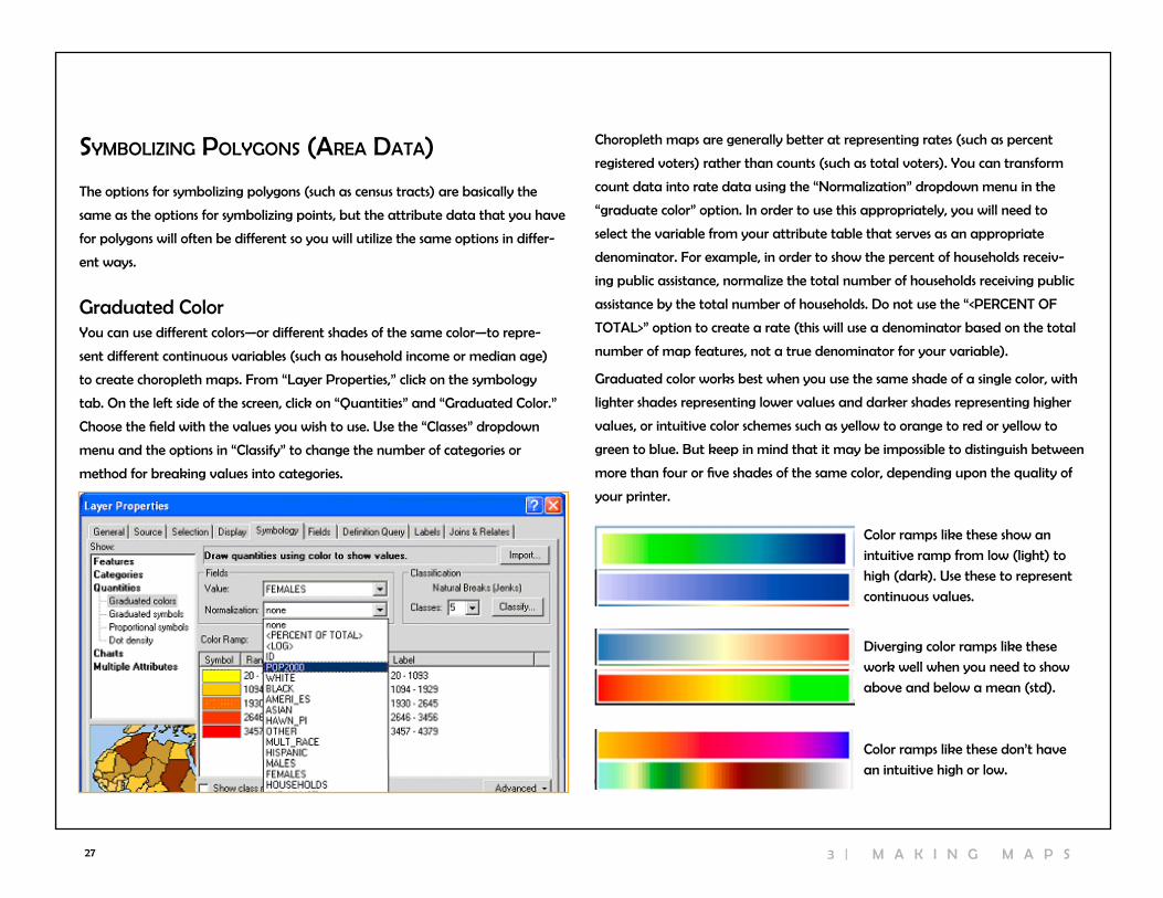
syMbolIzIng polygons (area data)
The options for symbolizing polygons (such as census tracts) are basically the
same as the options for symbolizing points, but the attribute data that you have
for polygons will often be different so you will utilize the same options in differ-
ent ways.
Graduated colorYou can use different colors—or different shades of the same color—to repre-
sent different continuous variables (such as household income or median age)
to create choropleth maps. From “layer Properties,” click on the symbology
tab. On the left side of the screen, click on “Quantities” and “Graduated color.”
choose the field with the values you wish to use. Use the “classes” dropdown
menu and the options in “classify” to change the number of categories or
method for breaking values into categories.
choropleth maps are generally better at representing rates (such as percent
registered voters) rather than counts (such as total voters). You can transform
count data into rate data using the “normalization” dropdown menu in the
“graduate color” option. In order to use this appropriately, you will need to
select the variable from your attribute table that serves as an appropriate
denominator. For example, in order to show the percent of households receiv-
ing public assistance, normalize the total number of households receiving public
assistance by the total number of households. Do not use the “<PErcEnT OF
TOTAl>” option to create a rate (this will use a denominator based on the total
number of map features, not a true denominator for your variable).
Graduated color works best when you use the same shade of a single color, with
lighter shades representing lower values and darker shades representing higher
values, or intuitive color schemes such as yellow to orange to red or yellow to
green to blue. But keep in mind that it may be impossible to distinguish between
more than four or five shades of the same color, depending upon the quality of
your printer.
color ramps like these show an
intuitive ramp from low (light) to
high (dark). Use these to represent
continuous values.
Diverging color ramps like these
work well when you need to show
above and below a mean (std).
color ramps like these don’t have
an intuitive high or low.

28
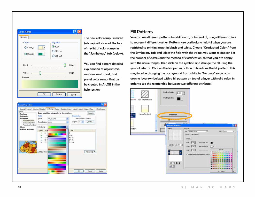
You can fine tune your colors by going to “more colors” when choosing a color
from the symbol selector. Here you can play with the hue(H), saturation(S), and
value(v).
customizing a color rampYou can create your own color ramp if you are not happy with any of the
default choices. To do so, go to the “customize” menu and choose “Style
Manager.” Expand the folder on the top left and click on the “color ramps”
folder right click in the empty space on the right, choose “new,” and select Algo-
rithmic color ramp. Select a color for color 1 (the beginning of the color ramp),
then a second color for color 2. Give your new color ramp a name and close the
Type the name of the new color in the contents window. Your new color ramps
should appear at the top of the dropdown list of color ramps in the Symbology
tab.
3
H I l l I E r | U S I n G A r c v I E w 1 0
29
The new color ramp I created
(above) will show at the top
of my list of color ramps in
the “Symbology” tab (below).
You can find a more detailed
explanation of algorithmic,
random, multi-part, and
preset color ramps that can
be created in ArcGIS in the
help section.
Fill PatternsYou can use different patterns in addition to, or instead of, using different colors
to represent different values. Patterns are particularly helpful when you are
restricted to printing maps in black and white. choose “Graduated colors” from
the Symbology tab and select the field with the values you want to display. Set
the number of classes and the method of classification, so that you are happy
with the value ranges. Then click on the symbols and change the fill using the
symbol selector. click on the Properties button to fine-tune the fill pattern. This
may involve changing the background from white to “no color” so you can
draw a layer symbolized with a fill pattern on top of a layer with solid colors in
order to see the relationship between two different attributes.
3 | M A K I n G M A P S
30
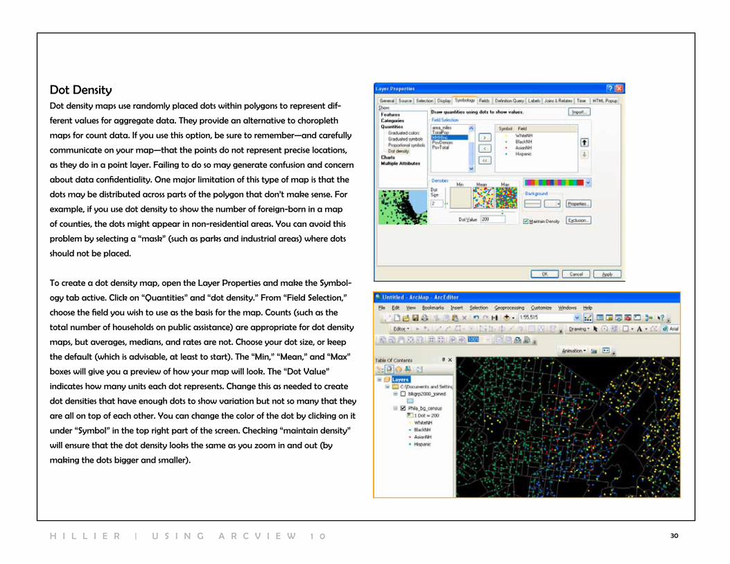
Dot DensityDot density maps use randomly placed dots within polygons to represent dif-
ferent values for aggregate data. They provide an alternative to choropleth
maps for count data. If you use this option, be sure to remember—and carefully
communicate on your map—that the points do not represent precise locations,
as they do in a point layer. Failing to do so may generate confusion and concern
about data confidentiality. One major limitation of this type of map is that the
dots may be distributed across parts of the polygon that don’t make sense. For
example, if you use dot density to show the number of foreign-born in a map
of counties, the dots might appear in non-residential areas. You can avoid this
problem by selecting a “mask” (such as parks and industrial areas) where dots
should not be placed.
To create a dot density map, open the layer Properties and make the Symbol-
ogy tab active. click on “Quantities” and “dot density.” From “Field Selection,”
choose the field you wish to use as the basis for the map. counts (such as the
total number of households on public assistance) are appropriate for dot density
maps, but averages, medians, and rates are not. choose your dot size, or keep
the default (which is advisable, at least to start). The “Min,” “Mean,” and “Max”
boxes will give you a preview of how your map will look. The “Dot value”
indicates how many units each dot represents. change this as needed to create
dot densities that have enough dots to show variation but not so many that they
are all on top of each other. You can change the color of the dot by clicking on it
under “Symbol” in the top right part of the screen. checking “maintain density”
will ensure that the dot density looks the same as you zoom in and out (by
making the dots bigger and smaller).
H I l l I E r | U S I n G A r c v I E w 1 0

31
Pie chartscharts are good for showing multiple values and the relationship between
values on different variables. Pie charts are especially good for showing propor-
tions. For example, individual pie pieces can be used to show the breakdown in
race for the population in a census tract. For the pies to work, you must be able
to put every person into a racial group, or you must use an “other” category.
Pies contain a lot of information, so it can be difficult to display them clearly. To
create pie charts, click on “charts” and “Pie” from the Symbology tab. Holding
down the shift key, select the fields that you want to include. Make sure that
together, they add up to 100 percent (you may need to create and calculate
a new “other” field in your attribute table before using charts). click on the
“Background” button to change the color or fill (“Hollow” or white backgrounds
might be best, so that you don’t have too many colors in your map). If you check
“Prevent chart Overlap,” Arcview will use “leader lines” to indicate where the
pie charts belong if there is no room to display them within the map feature.
click on the Properties button to make adjustments to the look of the pie (3D,
rotation, height).
click on the Size button if you want to have different size pie charts depend-
ing upon the total (such as total population). If you choose to “vary size using
a field,” you may need to exclude records with a zero value. To do this, click on
the Exclusion button and, using the appropriate field name, create an expression
such as “[TotalPop] = 0.” You may need to play with the minimum size on the
previous screen to make the maximum size pie chart a reasonable size.
3 | M A K I n G M A P S

32
Bar/column chartsBar charts can be used to compare values on two or more variables that do not
represent proportions (they don’t have to be subsets that add to 100 percent).
For example, the map on the right compares the total population by block
group to the total number of households. To switch from column (vertical) to bar
(horizontal) charts, go to Properties on the Symbology tab of layer Properties
and switch the radio button under “Orientation.”
Stacked chartsStacked charts can be used to compare values on two or more variables (such as
race) that are subsets of a larger variable (such as total population) when you
don’t know, or don’t want to display, all of the subsets. You have many of the
same options for formatting (size, color) that you have with the other types of
charts.
labelIng features
labeling features can be frustrating and tedious, but labeling features well is
important to making your maps readable and communicating their meaning,
so it’s worth the effort to learn.
Using Text Boxes to label FeaturesYou can place text on a map in order to label map features. The text tools
require that you type the feature name yourself while the label tools take ad-
vantage of feature names stored in the attribute table. The text tool can work
well if you only have a few map features to label.
click on the large letter “A” on the drawing
toolbar. This will bring up seven different
text and label options. click on the “A.” click
on your map where you want your text to
appear and type your label in the text box.
Hit the enter key, or click your cursor outside
the text box to complete. You can move
the text around using the “Select Elements”
tool. Double clicking on the text will bring up
the Properties, where you can change the
size and font (using the “change Symbol”
button).
The callout text tool works similarly, except that it allows you to place your
text away from the map feature while still indicating what is being labeled. click
on the tool and then click on your map feature. Before letting go, you can move
H I l l I E r | U S I n G A r c v I E w 1 0

33
the cursor to where you would like the label to be. Type your label. Using the
“Select Items” tool, you can move the text box so that it is closer or further from
the map feature. The yellow background with black text may not be what you
want (actually, it probably won’t be what you want).
From the “text properties” dialogue box, choose “change symbol,” then
“properties,” then the “advanced text” tab, then the “properties” button below
“text background”. From here, you can choose between two different style
callouts. click on the “symbol” button to change the background color.
A third option is the spline text tool. This allows you to write text along a
curved line. This works well for labeling rivers and curvy roads. click on the spline
tool, then click on the starting point for your label. continue to click along the
curve (you don’t need to make many clicks) and double click to finish. Then
type your label in the text box. You will probably need to try this several times
to get a label with which you are happy (just click on the label with the “Select
Elements” tool and hit the “delete” key to delete a label).
H i l l i e r | U s i n g A r c v i e w 1 03 | M A K I n G M A P S
34
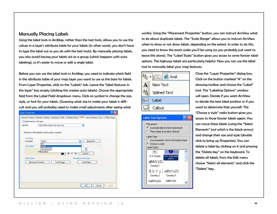
Manually Placing labelsUsing the label tools in ArcMap, rather than the text tools, allows you to use the
values in a layer’s attribute table for your labels (in other words, you don’t have
to type the label out as you do with the text tools). By manually placing labels,
you also avoid having your labels act as a group (which happens with auto
labeling), so it’s easier to move or edit a single label.
Before you can use the label tools in ArcMap, you need to indicate which field
in the attribute table of your map layer you want to use as the basis for labels.
From layer Properties, click on the “labels” tab. leave the “label features in
this layer” box empty (clicking this creates auto labels). choose the appropriate
field from the label Field dropdown menu. click on symbol to change the size,
style, or font for your labels. (Guessing what size to make your labels is diffi-
cult and you will probably need to make small adjustments after seeing what
works). Using the “Placement Properties” button, you can instruct Arcview what
to do about duplicate labels. The “Scale range” allows you to instruct Arcview
when to draw or not draw labels, depending on the extent. In order to do this,
you need to know the exact scales you’ll be using (so you probably just want to
leave this alone). The “label Styles” button gives you access to some fancier label
options. The highway labels are particularly helpful. now you can use the label
tool to manually label your map features.
close the “layer Properties” dialog box.
click on the button marked “A” on the
drawing toolbar and choose the “label”
tool. The “labeling Options” window
will open. Decide if you want Arcview
to decide the best label position or if you
want to determine that yourself. The
“choose a style” radio button gives you
access to those fancier labels again. You
can move these labels (using the “Select
Elements” tool which is the black arrow)
and change their size and style (double
click to bring up Properties). You can
delete a label by clicking on it and pressing
the “Delete key” on the keyboard. To
delete all labels, from the Edit menu
choose “Select all elements” and click the
“Delete” key.
H I l l I E r | U S I n G A r c v I E w 1 0

35
Auto labelingYou may find it easier to automatically label all of your features. This saves time
if you are happy with the way the labels look, but it offers you much less control
over the label placement. when you automatically label features, the labels
are “dynamic” so changes you make to one (moving it, changing the style) are
made to all. To label your map features automatically, go to layer Proper-
ties, click on the label tab, and put a check mark in the “label Features in this
layer” box. You can also label automatically by right clicking a map layer and
going to “label Features.” To delete your labels, you’ll need to return to the
label Properties box and remove the check mark from “label Features in this
layer” box or right click and go to “label Features.” You can select “In the map”
as a place to store the annotation.
converting labels to AnnotationOne solution to the problem that auto labeling presents with groups of labels is
to convert them to annota-
tion. This allows them to
function as individual text
boxes so you can change the
style for a single label. To do
this, right click on your map
layer after labeling it and go
to “convert labels to An-
notation.”
Using a Halo with labelsSometimes labels are difficult to see on top of a map that includes many differ-
ent shades and colors. By creating a halo around the label, it will stand out. To
create a halo, double-click on the label text to bring up the “Properties” dialog
box, then click “change symbol,” “properties,” and select the “mask” tab. choose
the “halo” radio button. You can select a halo color other than white and adjust
the thickness (1.5 point may be enough).
3 | M A K I n G M A P S

36
desIgnIng Map layouts
Displaying data so that you can analyze spatial patterns on a computer screen
is one thing; printing out a map for other people to look at is quite another.
ArcMap thinks of these as distinct functions and makes available a series of tools
for designing map layouts that you don’t need until you are ready to print.
layout viewwhen you open ArcMap, you are in “Data view” and use the Tools toolbar to
navigate your map. when you switch to the layout view, you have access to
a different range of tools and use the layout toolbar to navigate. To switch to
“layout view,” click on the icon at the bottom of your map display that looks
like a piece of paper (next to the globe icon) or, from the view menu, go to
layout view.
To make your map larger or smaller
on the page, you can use the zoom
tools on the Tools toolbar or on the
layout toolbar. The layout toolbar
also includes a pan tool that you
can use to move your whole layout.
To move just your map (and not
the whole page), use the pan tool
in the Tools toolbar. The fixed zoom
tools in the layout toolbar work
like the ones on the Tools toolbar.
The “Zoom to whole page” button is
especially useful.
One of the biggest differences in layout view is that many more options in the
“Insert” menu become active. These options allow you to add elements—includ-
ing a title, legend, north arrow, scale bar, and image—to your layout. Each of
these will be separate objects in your layout that can be moved and resized
through their Properties. You won’t see any of them if you switch back to Data
view since they are meant to clarify printed maps, not help you interpret your
map on screen (in fact, the layout view is probably more confusing to look at
from the screen because it adds so many elements and usually shrinks your
map). You can add text in the layout view, but you are better off trying to
label features from the Data view, using the label or text tools.
In layout view, you get a much better idea of how your map will look when
it’s printed. ArcMap will automatically place a border (“neat line”) around your
map. You can remove this by right clicking on the border (so the line is turquoise
and perforated) and going to “Properties.” click on the “Frame” tab. From here
you can choose a different style or color frame (to get rid of it altogether, choose
“no color” from the color selector). You can also change the background color
and add a shadow (to add a shadow, you’ll need to change the X and Y offset
to something other than 0).
H I l l I E r | U S I n G A r c v I E w 1 0

37
working with Grids and rulersYou can bring up a number of options aimed
at helping you to place the objects within your
layout by right clicking in your layout outside
of the neat lines. From “Options,” you can
specify ruler units and turn on and off rulers
and grids when the “layout Options” tab is
highlighted. choosing to “snap” to the grid or
rulers will help you to line up objects, but it
will also limit your ability to make fine-level
adjustments.
Adding a TitleTo add a title, from the Insert menu go to
“Title.” Type your title in the text box and hit
the enter key or click the cursor outside the
text box. Double click on the title to bring up
the Properties where you can make changes to the text and formatting.
Adding a legendUnless your labels are able to fully explain your map features, you will want a
legend on your layout. ArcMap gives you great flexibility in formatting your
legend, and all the choices can be overwhelming. To add a legend, from the
Insert menu go to “legend.” Your first choice is what map layers you want
included. Arcview will guess that you want to include all active layers. This may
not be the case if you have layers such as a county boundary, rivers, or other
obvious features that don’t need to be included in the legend. To remove a layer
from the legend, click on its name on the right side of this first screen and click
on the “<” button. The order your layers are listed under “legend Items” will cor-
respond to the order in which they appear in your legend. To change the order,
click on the name and hit the up or down arrows (don’t worry; this won’t affect
the order in which they are drawn).
If you want more than one column in your legend, make the adjustment here.
To see what your legend will look like (before working your way through
the rest of the screens), click the “Preview” button. If you are satisfied with it,
you can click the Finish button and skip the other steps. Otherwise, click the
“Preview” button again and click “next.” On the second screen of the legend
3 | M A K I n G M A P S

38
wizard, you can give your legend a title or leave the word “legend” as the
title (or just leave it blank). The third screen allows you to create a frame and
shadow around your legend (not necessary, but depending upon your layout it
may be helpful, particularly if you gave your layout a background color). On
the fourth screen, you can change the symbols and symbol size used to represent
lines and polygons in your layout. On the final screen, you can make adjustments
to the spacing between items in your legend. click “Finish.” To make changes
after you have created your legend, double click on it to bring up Properties.
cleaning up your map legendchances are that you’ll need to clean up your legend at this point. Some of your
map layer names may have underscores or other cryptic notations. The legend
will use the same names that appear in the table of contents. You can change
the label names in the table of contents without changing the name of the
shapefiles on your computer. From the table of contents, click once on the map
layer name, then click again (but not quickly). The label name should become
highlighted, allowing you to make changes. You can also change the map label
names from the “layer Properties” dialog box, from the “General” tab.
You may also need to translate some of the values that appear in your legend.
For example, you may choose to symbolize a parcel shapefile with two different
colors for the codes “1000” and “9999” which represent streets and sidewalks,
respectively. From the “Symbology” tab, type in “street” and “sidewalk” under
the labels. Be careful not to change the numbers listed under “value” because
this will change your map.
For maps symbolized using graduate
colors, you may also want to make ad-
justments using the “label” section. For
income, be sure to add $ and commas.
For percentages, click on the word
“label” in the “Symbology” tab, choose
“format labels” and select “percentage.”
If your number looks like a decimal (0.15
for 15%), choose the second radio button
and click on “numeric option.” Here you
can change the number of decimals (in
most cases, choose 0 or 1).
H I l l I E r | U S I n G A r c v I E w 1 0
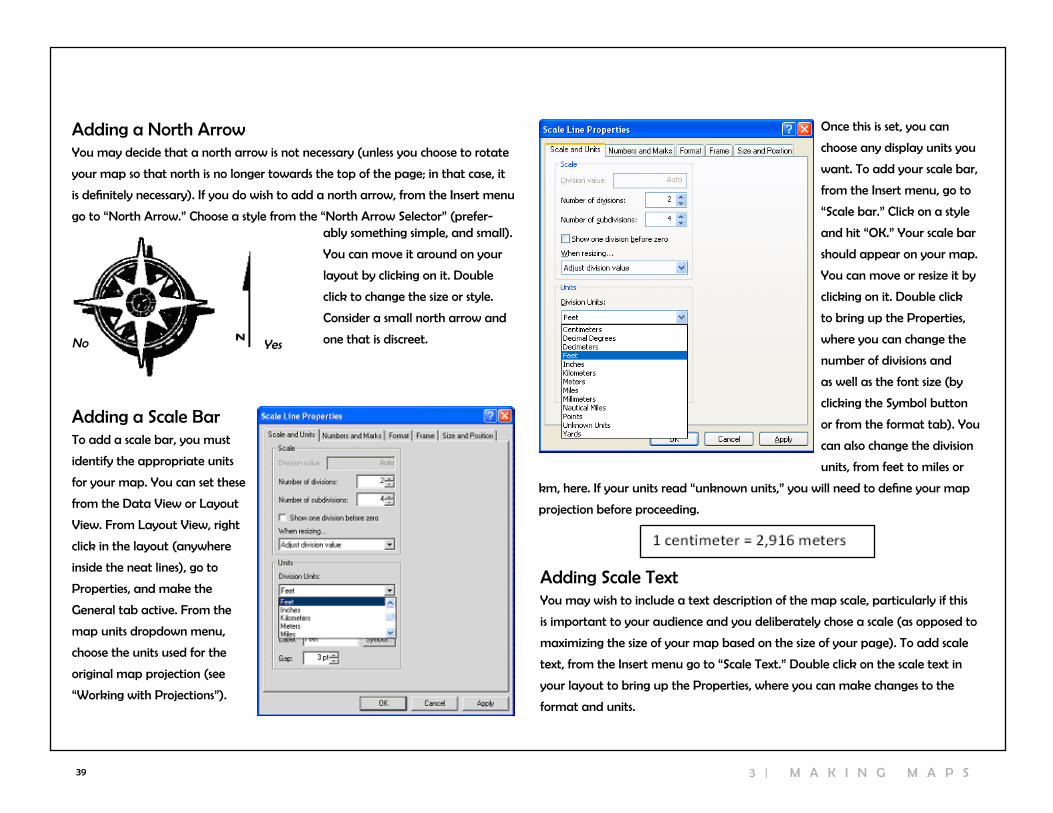
39
Adding a north ArrowYou may decide that a north arrow is not necessary (unless you choose to rotate
your map so that north is no longer towards the top of the page; in that case, it
is definitely necessary). If you do wish to add a north arrow, from the Insert menu
go to “north Arrow.” choose a style from the “north Arrow Selector” (prefer-
Adding a Scale BarTo add a scale bar, you must
identify the appropriate units
for your map. You can set these
from the Data view or layout
view. From layout view, right
click in the layout (anywhere
inside the neat lines), go to
Properties, and make the
General tab active. From the
map units dropdown menu,
choose the units used for the
original map projection (see
“working with Projections”).
Adding Scale TextYou may wish to include a text description of the map scale, particularly if this
is important to your audience and you deliberately chose a scale (as opposed to
maximizing the size of your map based on the size of your page). To add scale
text, from the Insert menu go to “Scale Text.” Double click on the scale text in
your layout to bring up the Properties, where you can make changes to the
format and units.
Once this is set, you can
choose any display units you
want. To add your scale bar,
from the Insert menu, go to
“Scale bar.” click on a style
and hit “OK.” Your scale bar
should appear on your map.
You can move or resize it by
clicking on it. Double click
to bring up the Properties,
where you can change the
number of divisions and
as well as the font size (by
clicking the Symbol button
or from the format tab). You
can also change the division
units, from feet to miles or
km, here. If your units read “unknown units,” you will need to define your map
projection before proceeding.
Yesno
ably something simple, and small).
You can move it around on your
layout by clicking on it. Double
click to change the size or style.
consider a small north arrow and
one that is discreet.
3 | M A K I n G M A P S
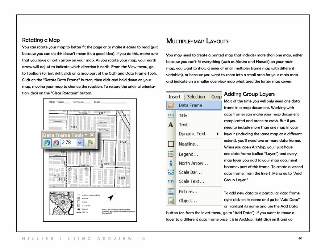
40
MultIple-Map layouts
You may need to create a printed map that includes more than one map, either
because you can’t fit everything (such as Alaska and Hawaii) on your main
map, you want to show a series of small multiples (same map with different
variables), or because you want to zoom into a small area for your main map
and indicate on a smaller overview map what area the larger map covers.
Adding Group layersMost of the time you will only need one data
frame in a map document. working with
data frames can make your map document
complicated and prone to crash. But if you
need to include more than one map in your
layout (including the same map at a different
extent), you’ll need two or more data frames.
when you open ArcMap, you’ll just have
one data frame (called “layer”) and every
map layer you add to your map document
becomes part of this frame. To create a second
data frame, from the Insert Menu go to “Add
Group layer.”
To add new data to a particular data frame,
right click on its name and go to “Add Data”
or highlight its name and use the Add Data
button (or, from the Insert menu, go to “Add Data”). If you want to move a
layer to a different data frame once it is in ArcMap, right click on it and go
rotating a MapYou can rotate your map to better fit the page or to make it easier to read (just
because you can do this doesn’t mean it’s a good idea). If you do this, make sure
that you have a north arrow on your map. As you rotate your map, your north
arrow will adjust to indicate which direction is north. From the view menu, go
to Toolbars (or just right click on a gray part of the GUI) and Data Frame Tools.
click on the “rotate Data Frame” button, then click and hold down on your
map, moving your map to change the rotation. To restore the original orienta-
tion, click on the “clear rotation” button.
H I l l I E r | U S I n G A r c v I E w 1 0
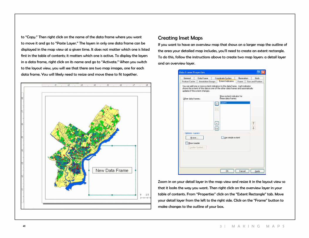
41
creating Inset MapsIf you want to have an overview map that shows on a larger map the outline of
the area your detailed map includes, you’ll need to create an extent rectangle.
To do this, follow the instructions above to create two map layers: a detail layer
and an overview layer.
Zoom in on your detail layer in the map view and resize it in the layout view so
that it looks the way you want. Then right click on the overview layer in your
table of contents. From “Properties” click on the “Extent rectangle” tab. Move
your detail layer from the left to the right side. click on the “Frame” button to
make changes to the outline of your box.
to “copy.” Then right click on the name of the data frame where you want
to move it and go to “Paste layer.” The layers in only one data frame can be
displayed in the map view at a given time. It does not matter which one is listed
first in the table of contents; it matters which one is active. To display the layers
in a data frame, right click on its name and go to “Activate.” when you switch
to the layout view, you will see that there are two map images, one for each
data frame. You will likely need to resize and move these to fit together.
3 | M A K I n G M A P S
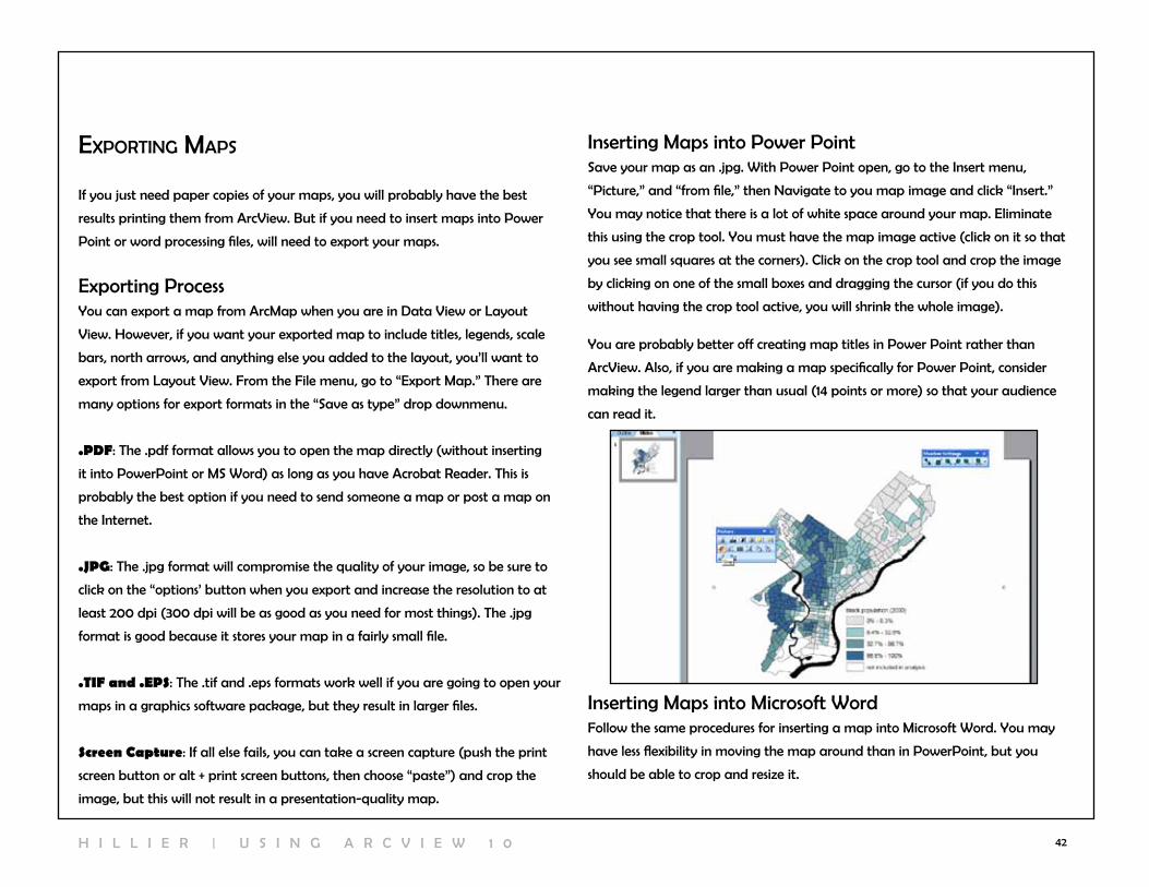
42
exportIng Maps
If you just need paper copies of your maps, you will probably have the best
results printing them from Arcview. But if you need to insert maps into Power
Point or word processing files, will need to export your maps.
Exporting ProcessYou can export a map from ArcMap when you are in Data view or layout
view. However, if you want your exported map to include titles, legends, scale
bars, north arrows, and anything else you added to the layout, you’ll want to
export from layout view. From the File menu, go to “Export Map.” There are
many options for export formats in the “Save as type” drop downmenu.
.PDF: The .pdf format allows you to open the map directly (without inserting
it into PowerPoint or MS word) as long as you have Acrobat reader. This is
probably the best option if you need to send someone a map or post a map on
the Internet.
.JPG: The .jpg format will compromise the quality of your image, so be sure to
click on the “options’ button when you export and increase the resolution to at
least 200 dpi (300 dpi will be as good as you need for most things). The .jpg
format is good because it stores your map in a fairly small file.
.TIF and .EPS: The .tif and .eps formats work well if you are going to open your
maps in a graphics software package, but they result in larger files.
Screen Capture: If all else fails, you can take a screen capture (push the print
screen button or alt + print screen buttons, then choose “paste”) and crop the
image, but this will not result in a presentation-quality map.
Inserting Maps into Power PointSave your map as an .jpg. with Power Point open, go to the Insert menu,
“Picture,” and “from file,” then navigate to you map image and click “Insert.”
You may notice that there is a lot of white space around your map. Eliminate
this using the crop tool. You must have the map image active (click on it so that
you see small squares at the corners). click on the crop tool and crop the image
by clicking on one of the small boxes and dragging the cursor (if you do this
without having the crop tool active, you will shrink the whole image).
You are probably better off creating map titles in Power Point rather than
Arcview. Also, if you are making a map specifically for Power Point, consider
making the legend larger than usual (14 points or more) so that your audience
can read it.
Inserting Maps into Microsoft wordFollow the same procedures for inserting a map into Microsoft word. You may
have less flexibility in moving the map around than in PowerPoint, but you
should be able to crop and resize it.
H I l l I E r | U S I n G A r c v I E w 1 0

43 4 | M O D i F Y i n g A T T r i B U T e s
workIng wIth tables
Attribute Tables for ShapefilesEvery shapefile has an attribute table associated with it. You can open the table
by right clicking on the shapefile name and going to “open attribute table.”
The table will have as many rows, or records, as it does map features. The total
number of records will be shown at the bottom of your table. There can be any
number of columns (fields). Two columns are standard: FID, the feature ID, and
Shape, which can be point, polyline, or polygon. The rest of the fields will vary. In
most cases, there will also be a column that identifies each map feature with a
unique name, such as a census tract number or neighborhood name. There may
be additional fields identifying attributes of the map feature (type of crime at a
particular address, number of people living in a census tract).
Other Attribute TablesOften you will have attribute data in a table separate from your shapefile. For
example, you may have a census tract shapefile with no attribute information
and a table with all of the 2000 census tract data. ArcMap can read Excel (.xls),
dBase (.dbf), comma-delimited (.txt or .csv) and tab-delimited (.tab) text tables
but will only allow editing for .dbf tables (you can convert .txt tables to .dbf in
EXcEl, SPSS, AccESS, or in ArcMap). You can add attribute tables to ArcMap
just as you do shapefiles, using the “add data” button, from the file menu, “Add
Data.” or from catalog window. You must have the Table of contents set for
“list by Sources” in order to see tables listed. Open these attribute tables the
same way: right click on the name and go to “Open.”
You can work with tables—sort values, freeze columns, generate summary statis-
tics, select records, and export tables—without worrying about messing up your
original data the way you can in Excel if you are not careful. You cannot change
any of the data in your table unless you go to “start editing” from the editor
toolbar… except to add or delete fields.
4 | ModIfyIng attrIbutes

44
Sorting recordsYou can sort values in an attribute table by right clicking on the field name and
going to “sort ascending” or “sort descending.”
Freezing columnsFreeze a column (meaning that it will remain in view even as you scroll) by right
clicking on the field name and going to “Freeze/Unfreeze column.”
Summary StatisticsYou can bring up summary statistics for any numeric field (numeric fields will be
justified right) by right clicking on the field name and choosing “Statistics.” You
can obtain summary statistics on additional fields from the drop down menu.
Selecting recordsYou can select a subset of your records to look at more closely in a number of
different ways. You can highlight an individual record (row) by clicking in the
gray area at the far left side of the table. To highlight multiple records, hold the
control key down. At the bottom of the table, ArcMap will indicate how many
of the total records are highlighted. click on the “Selected” button to view only
the selected records. You can switch the selection, so that all of the highlighted
records become un-highlighted and all un-highlighted records become high-
lighted. From the options menu, choose “Switch Selection.” You can also select all
records or clear selection from the options menu.
H I l l I E r | U S I n G A r c v I E w 1 0

45
Exporting TablesYou may need to export your table from ArcMap, because you have made
changes, need to convert a .txt table to .dbf, or for any other reason. with your
table open, go to the options menu and “Export.” If you have some records high-
lighted, you can choose to export just the selected records or all of the records.
Delete FieldYou can delete a field by right clicking on its name and going to “Delete Field.”
ArcMap will give you a warning that the deletion is permanent and not revers-
ible. Do this with caution. changes will be permanent not just within your map
document, but in your original file on your hard drive, as well.
calculatIng values In tables
You may find it easier to edit your attribute tables outside of Arcview, but
Arcview has fairly sophisticated tools for calculating values. In Arcview, you can
edit values in an existing field or create a new field and calculate new values.
Keep in mind that you cannot change the format (text, integer, long integer) of
an existing column, so if you need to transform the format of a column, you will
need to create a new field.
creating a new FieldTo create a new field, open your table in ArcMap (you can also add fields from
Arccatalog). This can be a free-standing table or one that is associated with a
map layer, but only .dbf tables can be edited. click on the Table Options menu
(top left corner of the attribute table) and go to “Add Field.” If this option is
grayed out, you do not have permission to edit the table. Most likely, this is
because your table is in .xls format. If this is the case, export the table (an option
within that same menu) and save it as a .dbf. Add the .dbf version back in and
try again.
From “Add Field,” give your field a name. Do not use ?,&,$,#,@,*,!,~ or spaces
and keep your field name to 10 or fewer characters. From the dropdown menu,
choose the type of field. Different field types allow different types of values:
Short integer: numeric, no decimal place, up to 19 characters
Long integer: numeric, no decimal place, up to 19 characters
Float: numeric, with decimal places, (default 1 before decimal and 11 after)
Double: numeric, with decimal place (default 7 before decimal and 11 after)
4 | M O D i F Y i n g A T T r i B U T e s

46
calculating values Outside an Edit SessionTo calculate the value of your new field (or an old field), right click on its name
and go to “calculate values.” ArcMap will ask you if you are sure that you want
to calculate values outside an edit session, warning that you will not be able to
undo your results. Say “yes.”
ArcMap will bring up the Field calculator. If your value is a constant, you can
simply type the value in the box at the bottom. More likely, your new value will
be based on values in other fields, so you will need to use the calculator. You
can create an expression by double clicking on the field names. For example, to
calculate the percent of the population 65 and up, click on the field name with
the total 65 and up, click on the “/” button, and click on the field name with
the total population. If any of the records in your table are highlighted, ArcMap
will only perform calculations on the highlighted records. You can also calculate
values from ArcToolbox (under “Data Management Tools”, then “calculate
Field”).
calculating values on Selected recordsYou can get an error while calculating values for many different reasons.
ArcMap will not allow you to divide by zero, so if the denominator (total
population in example above) is zero for any of your records, ArcMap will not
calculate any of the values.
To get around this problem, you need to select only the records where the
denominator is something other than zero. Start by selecting the records with
a zero in the denominator (because there are fewer of these). Do this by right
clicking the field with your denominator and sorting ascending. Hold down the
control key and highlight all the records with a zero. From the options menu,
choose “Switch Selection” so that all of the records with non-zero values are
highlighted. now you should be able to proceed with calculating values.
calculating values Inside an Edit Sessionwhen you need to calculate a new variable, the best approach is to calculate
a value outside an edit session, just described. But when you need to change
the value on just one or two values, you may want to try editing inside an edit
session. Go the Edit toolbar and, from the edit menu, choose “start editing.” You
can only edit the contents of one directory at a time in an edit session, so you
need to identify the directory that contains the table you wish to edit.
Open your table and double-click on the value in your table you wish to edit.
when you are finished, go to “stop editing” in the edit toolbar and say “yes” to
saving edits.
H I l l I E r | U S I n G A r c v I E w 1 0

47
calculatIng area, perIMeter & length
calculating AreaUsually there will be a field called “area” in a shapefile when you receive it that
indicates the area of each polygon map feature. If your shapefile is missing this
field or if you have edited the shape and size of the map features, you will need
to calculate area, yourself. Area can be especially helpful when you are trying
to normalize values and create densities (calculating persons per square mile, for
example).
create a new field called “area” and format it as a double. right click on your
new field and go to “calculate Geometry.” From the “Property” menu, choose
“Area.” note the projection and map units. You can change the units as long as
the projection is defined (known).
You can also calculate area using ArcToolbox. “calculate Area” can be found in
the Spatial Statistics Tools section, under “Utilities.” choose the polygon layer for
which you want to calculate area, then determine a name and location for the
new shapefile you will create. The new layer will be added automatically to the
table of contents when Arcview is done calculating the area. The units will be
what is used by the projection system for that map layer.
creatIng xy coordInates
Adding XY coordinates to a Point layerJust as you may need to convert a table with XY data into a map layer, you
may need to add XY coordinates to an existing layer containing points. The
easiest way to do this is by using “Add XY coordinates” in ArcToolbox (under
“Data Management Tools” go to “Features” to fine “Add XY coordinates”).
Simply choose the point layer you want to assign XY coordinates and click “OK.”
The coordinates will be in whatever units are defined by your projection (often
feet or meters). You can also do this using the “calculate geometry” option.
4 | M O D i F Y i n g A T T r i B U T e s
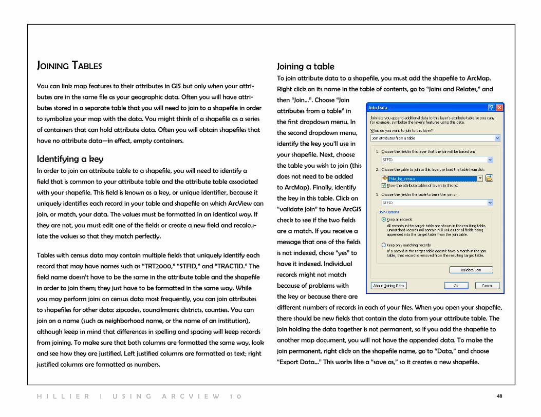
48
joInIng tables
You can link map features to their attributes in GIS but only when your attri-
butes are in the same file as your geographic data. Often you will have attri-
butes stored in a separate table that you will need to join to a shapefile in order
to symbolize your map with the data. You might think of a shapefile as a series
of containers that can hold attribute data. Often you will obtain shapefiles that
have no attribute data—in effect, empty containers.
Identifying a keyIn order to join an attribute table to a shapefile, you will need to identify a
field that is common to your attribute table and the attribute table associated
with your shapefile. This field is known as a key, or unique identifier, because it
uniquely identifies each record in your table and shapefile on which Arcview can
join, or match, your data. The values must be formatted in an identical way. If
they are not, you must edit one of the fields or create a new field and recalcu-
late the values so that they match perfectly.
Tables with census data may contain multiple fields that uniquely identify each
record that may have names such as “TrT2000,” “STFID,” and “TrAcTID.” The
field name doesn’t have to be the same in the attribute table and the shapefile
in order to join them; they just have to be formatted in the same way. while
you may perform joins on census data most frequently, you can join attributes
to shapefiles for other data: zipcodes, councilmanic districts, counties. You can
join on a name (such as neighborhood name, or the name of an institution),
although keep in mind that differences in spelling and spacing will keep records
from joining. To make sure that both columns are formatted the same way, look
and see how they are justified. left justified columns are formatted as text; right
justified columns are formatted as numbers.
Joining a tableTo join attribute data to a shapefile, you must add the shapefile to ArcMap.
right click on its name in the table of contents, go to “Joins and relates,” and
then “Join…”. choose “Join
attributes from a table” in
the first dropdown menu. In
the second dropdown menu,
identify the key you’ll use in
your shapefile. next, choose
the table you wish to join (this
does not need to be added
to ArcMap). Finally, identify
the key in this table. click on
“validate join” to have ArcGIS
check to see if the two fields
are a match. If you receive a
message that one of the fields
is not indexed, chose “yes” to
have it indexed. Individual
records might not match
because of problems with
the key or because there are
different numbers of records in each of your files. when you open your shapefile,
there should be new fields that contain the data from your attribute table. The
join holding the data together is not permanent, so if you add the shapefile to
another map document, you will not have the appended data. To make the
join permanent, right click on the shapefile name, go to “Data,” and choose
“Export Data…” This works like a “save as,” so it creates a new shapefile.
H I l l I E r | U S I n G A r c v I E w 1 0

49
5 | creatIng & aggregatIng poInts
geocodIngGeocoding refers to the process of transforming street addresses into map
features. In order to geocode, you need to have a table with addresses and an
address locator based on a street centerline file that matches the geographic
extent of your addresses. Through the geocoding process, ArcGIS will create a
new point shapefile by matching each street name and number in your table to
a place along a line segment in your streets shapefile that represents a certain
range of house numbers. The image here shows how each section of a street cen-
terline file has a known street name (ST_nAME) and address range (l_F_ADD
and r_F_ADD). Arcview uses this information to locate the addresses in your
table (called Foodsite_addresses here).
Finding or creating a Geocoding Service
ArcGIS 10 comes with an address locator for the entire country. with earlier
versions of ArcGIS, you had to purchase Esri’s StreetMap extension in order to
match addresses for the whole country or create individual address locators for
one county at a time using your own street centerline file.
Preparing Tabular Data
In order to geocode, you need a table (.dbf, .xls, or comma-delimited .txt) that
has a field with street addresses. If the parts of the street address—house number,
street direction, street name, and designation/ type—are in separate fields,
you will need to collapse these into a single field. You need separate fields for
zip code, city, and state. Intersections can be used (lehigh Avenue & n Broad
Street) but house ranges (123-127 n Broad Street) and PO boxes will not, so
make sure you change these to addresses with a single house number before you
try to geocode.
5 | c r e A T i n g & A g g r e g A T i n g p O i n T l A Y e r s
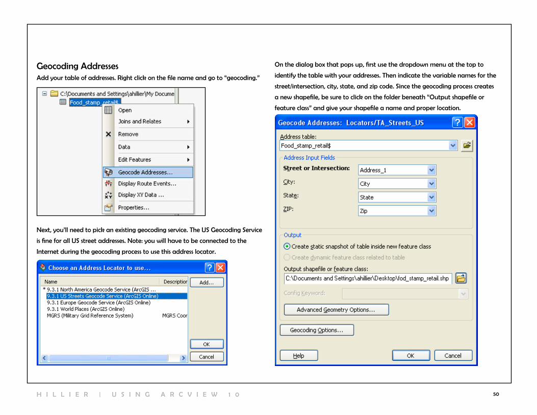
50
Geocoding AddressesAdd your table of addresses. right click on the file name and go to “geocoding.”
next, you’ll need to pick an existing geocoding service. The US Geocoding Service
is fine for all US street addresses. note: you will have to be connected to the
Internet during the geocoding process to use this address locator.
On the dialog box that pops up, first use the dropdown menu at the top to
identify the table with your addresses. Then indicate the variable names for the
street/intersection, city, state, and zip code. Since the geocoding process creates
a new shapefile, be sure to click on the folder beneath “Output shapefile or
feature class” and give your shapefile a name and proper location.
H I l l I E r | U S I n G A r c v I E w 1 0

51
The “Geocoding Options” allow you to indicate the level of sensitivity for the
matching process. Essentially, Arcview needs to match the house numbers and
street names in your tabular data with information in the streets shapefile. If the
spelling of the street name is slightly different or an appropriate range of house
numbers cannot be located, Arcview will assign the match a less than perfect
score (100 is a perfect match). Arcview can geocode based on street intersec-
tions in addition to
specific house numbers.
In the “Intersections”
section you can identify
symbols (or “AnD”)
used in your tabular
data to indicate in-
tersections. The “Side
Offset” option allows
you to place points
slightly away from the
middle of the street
centerline file. while
Arcview will know
what side of the street
your address falls on,
your points will appear
to fall directly on the
centerline unless you
specify an offset. 15-20 feet is adequate. Under “Output Fields,” if you check “X
and Y coordinates,” Arcview will add X and Y fields to the point shapefile with
your addresses. be listed under “Address locators” in the catalog. Once you have
created an address locator, you don’t need to do it again (unless you go to a
new computer).
The “Advanced geometric options” allows you to make a choice about projec-
tion (“spatial reference”). The default is to use the same projection (Geographic
coordinate System: GcS_wGS_1984) as the US Geocoding Service. If you do that,
your projection will be defied (as geographic, meaning it hasn’t been projected)
but you will need to project it. Alternatively, you can add a shapefile to ArcGIS
with the desired projection and then use the geometric options to choose “use
map’s spatial reference” or you identify the projection system you want to use.
click “OK” to to start the automatic geocoding process. After a few seconds
(longer if you have thousands of records), Arcview will give you a report showing
how many matches were made. You can either click “close” to look at the ad-
dresses that did map or “rematch” to review the unmateched records.
5 | c r e A T i n g & A g g r e g A T i n g p O i n T l A Y e r s
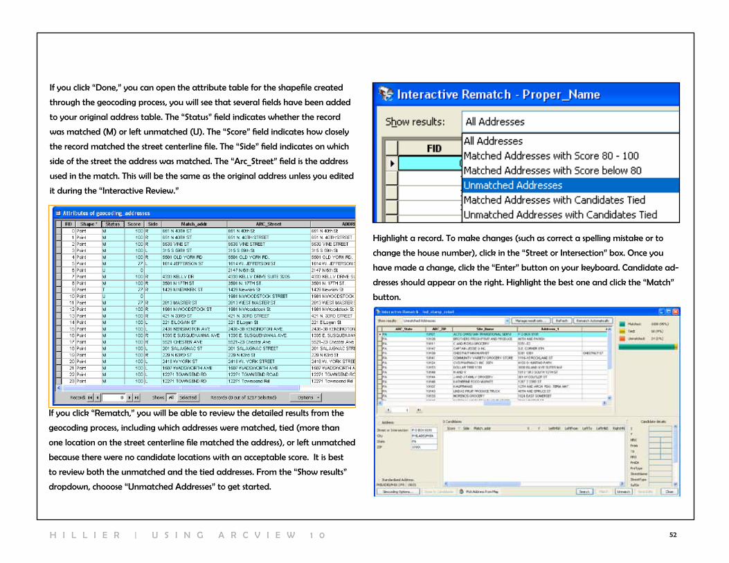
52
If you click “Done,” you can open the attribute table for the shapefile created
through the geocoding process, you will see that several fields have been added
to your original address table. The “Status” field indicates whether the record
was matched (M) or left unmatched (U). The “Score” field indicates how closely
the record matched the street centerline file. The “Side” field indicates on which
side of the street the address was matched. The “Arc_Street” field is the address
used in the match. This will be the same as the original address unless you edited
it during the “Interactive review.”
If you click “rematch,” you will be able to review the detailed results from the
geocoding process, including which addresses were matched, tied (more than
one location on the street centerline file matched the address), or left unmatched
because there were no candidate locations with an acceptable score. It is best
to review both the unmatched and the tied addresses. From the “Show results”
dropdown, chooose “Unmatched Addresses” to get started.
Highlight a record. To make changes (such as correct a spelling mistake or to
change the house number), click in the “Street or Intersection” box. Once you
have made a change, click the “Enter” button on your keyboard. candidate ad-
dresses should appear on the right. Highlight the best one and click the “Match”
button.
H I l l I E r | U S I n G A r c v I E w 1 0
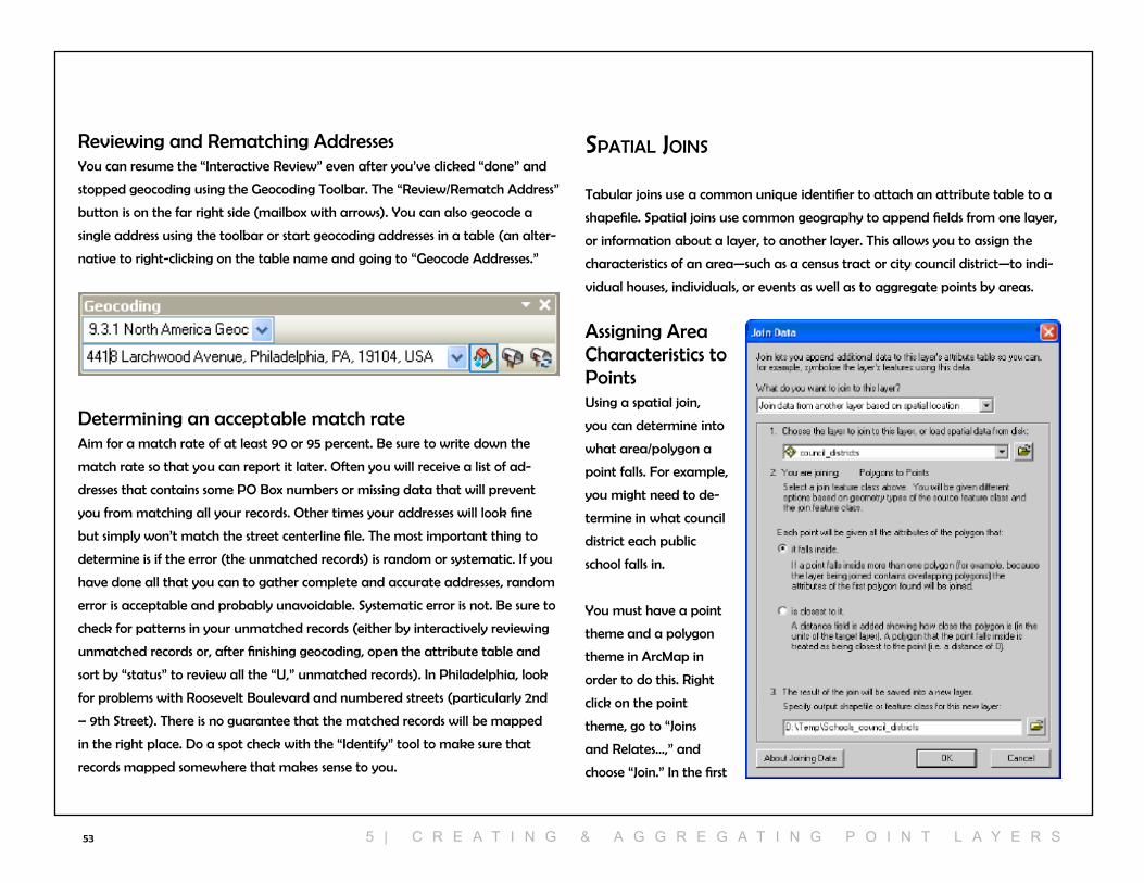
53
reviewing and rematching AddressesYou can resume the “Interactive review” even after you’ve clicked “done” and
stopped geocoding using the Geocoding Toolbar. The “review/rematch Address”
button is on the far right side (mailbox with arrows). You can also geocode a
single address using the toolbar or start geocoding addresses in a table (an alter-
native to right-clicking on the table name and going to “Geocode Addresses.”
Determining an acceptable match rateAim for a match rate of at least 90 or 95 percent. Be sure to write down the
match rate so that you can report it later. Often you will receive a list of ad-
dresses that contains some PO Box numbers or missing data that will prevent
you from matching all your records. Other times your addresses will look fine
but simply won’t match the street centerline file. The most important thing to
determine is if the error (the unmatched records) is random or systematic. If you
have done all that you can to gather complete and accurate addresses, random
error is acceptable and probably unavoidable. Systematic error is not. Be sure to
check for patterns in your unmatched records (either by interactively reviewing
unmatched records or, after finishing geocoding, open the attribute table and
sort by “status” to review all the “U,” unmatched records). In Philadelphia, look
for problems with roosevelt Boulevard and numbered streets (particularly 2nd
– 9th Street). There is no guarantee that the matched records will be mapped
in the right place. Do a spot check with the “Identify” tool to make sure that
records mapped somewhere that makes sense to you.
spatIal joIns
Tabular joins use a common unique identifier to attach an attribute table to a
shapefile. Spatial joins use common geography to append fields from one layer,
or information about a layer, to another layer. This allows you to assign the
characteristics of an area—such as a census tract or city council district—to indi-
vidual houses, individuals, or events as well as to aggregate points by areas.
Assigning Area characteristics to PointsUsing a spatial join,
you can determine into
what area/polygon a
point falls. For example,
you might need to de-
termine in what council
district each public
school falls in.
You must have a point
theme and a polygon
theme in ArcMap in
order to do this. right
click on the point
theme, go to “Joins
and relates…,” and
choose “Join.” In the first
5 | c r e A T i n g & A g g r e g A T i n g p O i n T l A Y e r s
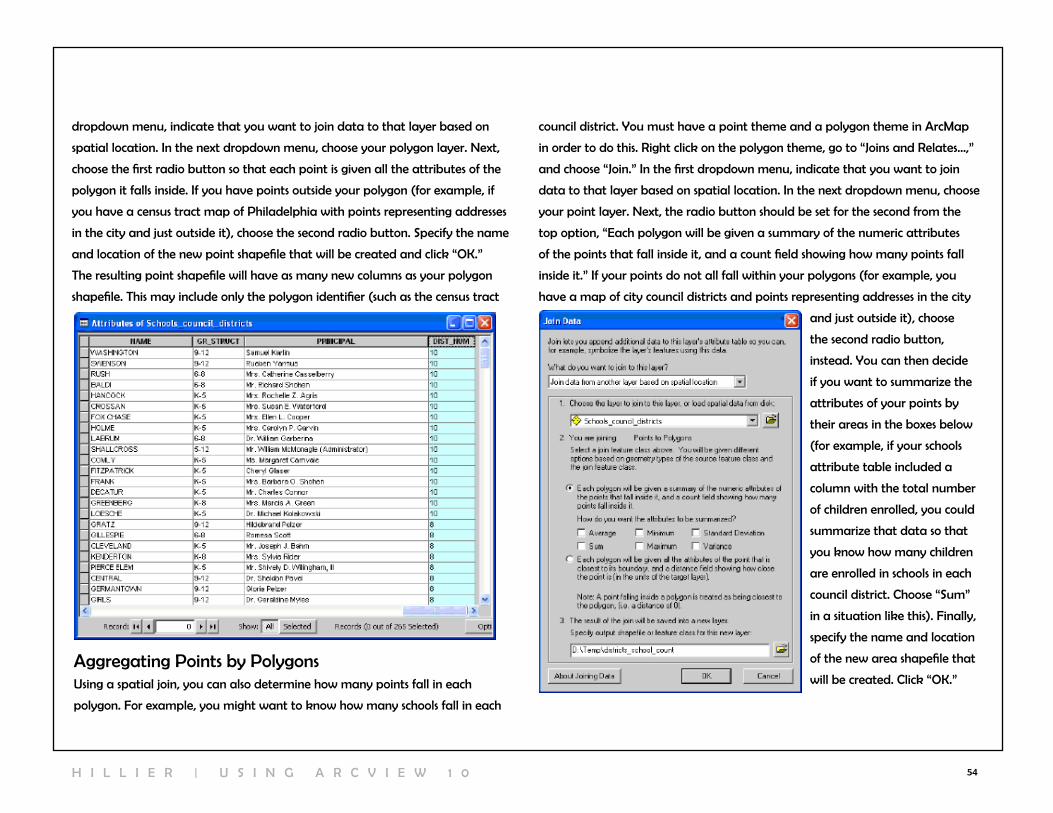
54
Aggregating Points by PolygonsUsing a spatial join, you can also determine how many points fall in each
polygon. For example, you might want to know how many schools fall in each
council district. You must have a point theme and a polygon theme in ArcMap
in order to do this. right click on the polygon theme, go to “Joins and relates…,”
and choose “Join.” In the first dropdown menu, indicate that you want to join
data to that layer based on spatial location. In the next dropdown menu, choose
your point layer. next, the radio button should be set for the second from the
top option, “Each polygon will be given a summary of the numeric attributes
of the points that fall inside it, and a count field showing how many points fall
inside it.” If your points do not all fall within your polygons (for example, you
have a map of city council districts and points representing addresses in the city
and just outside it), choose
the second radio button,
instead. You can then decide
if you want to summarize the
attributes of your points by
their areas in the boxes below
(for example, if your schools
attribute table included a
column with the total number
of children enrolled, you could
summarize that data so that
you know how many children
are enrolled in schools in each
council district. choose “Sum”
in a situation like this). Finally,
specify the name and location
of the new area shapefile that
will be created. click “OK.”
dropdown menu, indicate that you want to join data to that layer based on
spatial location. In the next dropdown menu, choose your polygon layer. next,
choose the first radio button so that each point is given all the attributes of the
polygon it falls inside. If you have points outside your polygon (for example, if
you have a census tract map of Philadelphia with points representing addresses
in the city and just outside it), choose the second radio button. Specify the name
and location of the new point shapefile that will be created and click “OK.”
The resulting point shapefile will have as many new columns as your polygon
shapefile. This may include only the polygon identifier (such as the census tract
H I l l I E r | U S I n G A r c v I E w 1 0

55
From the first dropdown menu, choose “join data from another layer based on
spatial location.” Then choose the library shapefile as the basis for the spatial
join. notice that Arcview will recognize that you are joining Points to Points.
If you did not check any of the boxes to summarize the attributes of the points,
your new shapefile will have only one new field called “count.” This will indicate
how many points fall into each polygon. You will probably want to change
the name to something that you will remember (by creating a new field called
“Schoolcount,” for example, and calculating it as equal to “count”). now you
can use this count value as the basis of a thematic map.
Depending upon the type of file you start with (right click on), the spatial join
dialog box will give you different options. If you use a spatial join between two
point shapefiles, you can calculate the distance between the points in one file to
the closest point in the other file. For example, if you have a shapefile for public
schools and for libraries, you can determine which public library is closest to each
school and how far that school is. Add both point shapefiles to ArcMap. right
click on the shapefile to which you want to join information (so in this example,
the public schools), choose “Joins and relates” and then “Joins...”
From the first dropdown menu, choose “join data from another layer based on
spatial location.” Then choose the library shapefile as the basis for the spatial
join. notice that Arcview will recognize that ou are joining Points to Points.
The first radio button allows you to summarize the attribute for the points
closest to each point in your first shapefile and gives you a count of how many
points from the second shapefile are closest to each point in the first shapefile.
The second radio button (more helpful for our example) allows you to identify
the point in the second shapefile (library) that is closest to each point in the first
shapefile (schools) as well as a distance field indicating how far apart they are.
notice in the table below that the Andoraa library is the closest library to the
Shawmont School 4328 feet away).
5 | c r e A T i n g & A g g r e g A T i n g p O i n T l A Y e r s

56
6 | QueryIng & MeasurIng
QueryIng by attrIbute
with GIS, you can identify a subset of map features based on their attributes or
their location. You may use queries as an intermediary step, as part of getting to
know your data, to create new values, or to answer your research questions.
Select by AttributeTo start a query, from the Selection menu go to “Select by Attributes.” Your first
choice is what layer in your map you wish to query (attribute queries are limited
to a single layer). In the Method drop down menu, you need to decide whether
you are building on a previous query or starting fresh.
From here, the query dialog is similar to the Field calculator. Build an expression
using the field names and functions, connecting statements with “AnD” or “Or”
as necessary. If you want help working through these steps, click on the Query
wizard button. click “verify” to make sure ArcMap likes your expression. You
can import (load) and save expressions (using the buttons Or using ctrl + c and
ctrl + v with a word processing file). note that if the values you input are text,
rather than numbers, you need to put single quotes around them (for example,
‘BrOAD’). when you click “Apply,” the map features that satisfy your query will
be highlighted with a bright blue outline.
To review the selected records, right click on the map layer and go to “Open At-
tribute Table.” click on the Select button at the bottom to view only the selected
records. You can calculate values on an existing or new field for only the selected
records. You can also look at summary statistics for only the selected records
by right clicking on a column name and going to “Statistics.” By looking at the
statistics for the length field on the selected southbound one-way streets, we can
see that there are 3,462,432 feet (655.7 miles) of southbound one-way streets in
Philadelphia.
To see all of the selected records, from the Selection menu, go to “Zoom to
Selected records.” You can create a new shapefile that only includes your
selected map features by
right clicking on its name
in the Table of contents,
going to “Data” and “Export
Data.” choose the radio
button regarding coordinate
systems (you’ll probably
want the default). Make
sure you have “Selected
records” chosen in the
Export drop down menu. To
un-select all records, from
the Selection menu choose
“clear Selected Features.”
You can perform an ad-
ditional query (adding,
removing, or selecting from
this selected group) or close
the query dialog.
H I l l I E r | U S I n G A r c v I E w 1 0
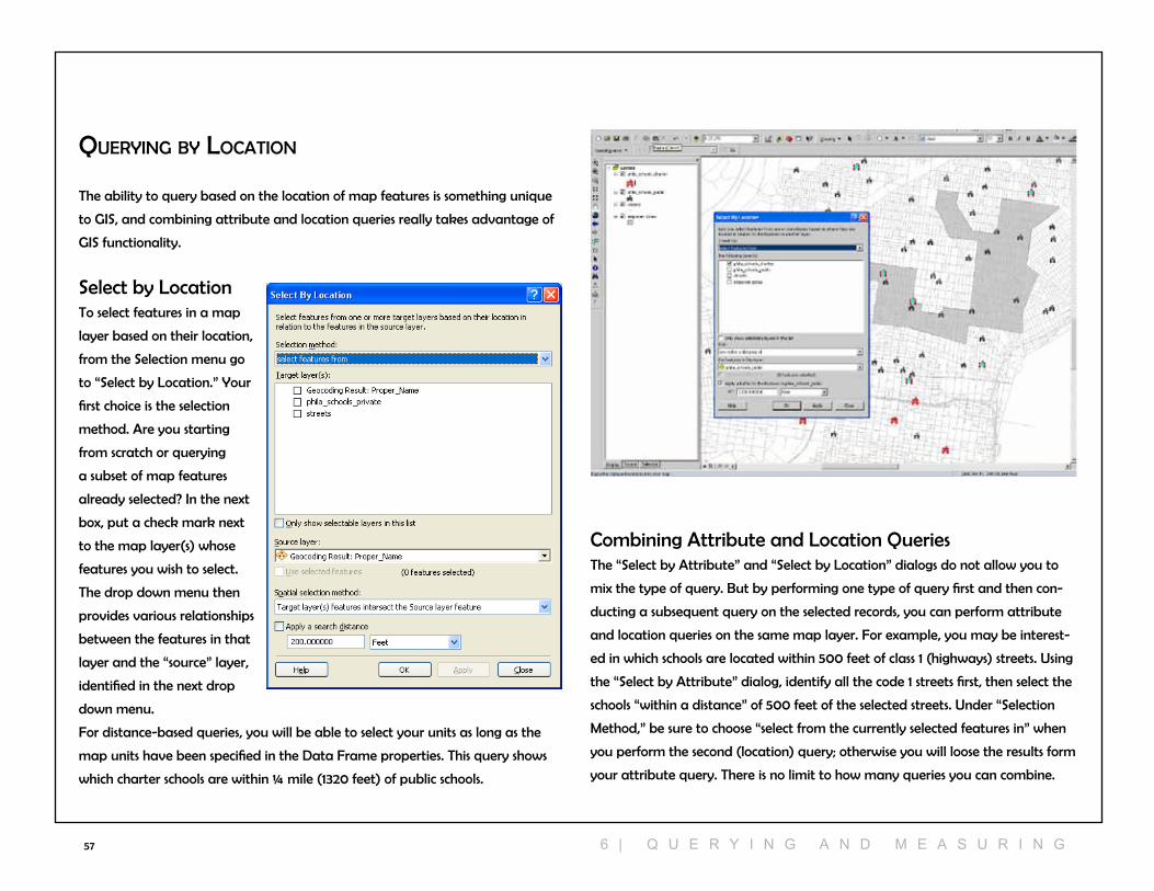
57
QueryIng by locatIon
The ability to query based on the location of map features is something unique
to GIS, and combining attribute and location queries really takes advantage of
GIS functionality.
Select by locationTo select features in a map
layer based on their location,
from the Selection menu go
to “Select by location.” Your
first choice is the selection
method. Are you starting
from scratch or querying
a subset of map features
already selected? In the next
box, put a check mark next
to the map layer(s) whose
features you wish to select.
The drop down menu then
provides various relationships
between the features in that
layer and the “source” layer,
identified in the next drop
down menu.
For distance-based queries, you will be able to select your units as long as the
map units have been specified in the Data Frame properties. This query shows
which charter schools are within ¼ mile (1320 feet) of public schools.
combining Attribute and location QueriesThe “Select by Attribute” and “Select by location” dialogs do not allow you to
mix the type of query. But by performing one type of query first and then con-
ducting a subsequent query on the selected records, you can perform attribute
and location queries on the same map layer. For example, you may be interest-
ed in which schools are located within 500 feet of class 1 (highways) streets. Using
the “Select by Attribute” dialog, identify all the code 1 streets first, then select the
schools “within a distance” of 500 feet of the selected streets. Under “Selection
Method,” be sure to choose “select from the currently selected features in” when
you perform the second (location) query; otherwise you will loose the results form
your attribute query. There is no limit to how many queries you can combine.
6 | Q U e r Y i n g A n D M e A s U r i n g

58
Using Query results The turquoise highlight feature is meant to help you visualize relationships, but it
is not meant for final maps. Once you have identified a subset of records, create
a new variable and symbolize it properly using the symbology tab. For example,
if you want to create a map showing the schools that are located within 500
feet of highways, complete the query and then use the query results to create
a dummy variable indicating which schools meet the query definition. Do this
by opening the attribute table for the schools. create a new variable called
“class1500” (for 500 feet within class 1 street) that is formatted as an integer.
right click on the new column, then go to “Field calculator.” Set class1500 = 1.
Only the highlighted records will be assigned this value. Assign the other records
= 0 by going to “switch selection” from the “option” button on the bottom of the
table.
MeasurIng dIstances
Using the Measure ToolThe measure tool (on the Tools tooldbar; it looks like a ruler) allows you to draw
a line, or a series of connected lines, to roughly measure the Euclidean (as the
crow flies) distance between points.
click on it and then click on your map at the starting point. Move your cursor to
your end point, or next point, repeating until you are done. Double click to finish.
The measure tool will use the map units particular to that map layers projection
or the display units you specified in the Data Frame Properties. You can change
this from the Data Frame Properties (right click on the name of the Data
Frame, go to Properties, and the General tab) or in the Measure pop-up box.
The black triangle pointing
down includes various
distance units to choose
from.
You can also calculate Area
using the tool shaped like
a polygon. Simply draw a
polygon and double click to
finish.
H I l l I E r | U S I n G A r c v I E w 1 0

59
Measuring with Attribute DataIf you need more accurate measures of distance than you can get using the
measure tool, you can use the values in the perimeter (polygons) and length
(line) fields of the shapefile attribute tables. Select the features of interest, then right click on the perimeter or length
field and go to “Summary.” The “sum”
field will indicate the total distance. For
example, if you need to know the total
length of Broad and Market Streets, go
to “Select by Attributes” and select all
line segments in the street centerline file
called “BrOAD” or “MArKET.” Then
open the attribute table associated with
the street centerline file, right click on
the “length” column heading, and go to
“Summary.” The “sum” should indicate
how long Broad and Market Streets are.
buffers
Buffers allow you to visualize zones around map features. If you are interested
in seeing which schools fall within 500 feet of class 1 (highways), you can create a
500 foot buffer around class 1 streets. For analysis purposes, queries by location
may be more helpful because they will allow you to actually select the schools
within 500 feet of class 1 roads. But you may want to create buffers, as well, so
that you can visualize this relationship.
The easiest way to create buffers is using the Buffer wizard. You’ll need to add
this to one of your toolbars (from the view menu, go to Toolbards, then cus-
tomize, then click on the “commands” tab, then click on the “Tools” category.
click on “Buffer wizard” and drag it to one of your toolbars. click on the new
tool to launch the wizard. Select the map layer you wish to buffer using the first
dropdown menu. You
can choose to buffer all
features or just the cur-
rently selected features
in a map layer. click
“next.” Determine the
distance for your buffer
(adjust the distance
units at the bottom). If
you want to have more
than one buffer, choose
“As multiple buffer
rings.” click “next.”
6 | Q U e r Y i n g A n D M e A s U r i n g

60
On the final screen of the Buffer wizard, choose whether you want to dissolve
the boundaries between buffers--since in many cases, your buffers will overlap.
In the next section, you will choose “only outside polygon(s)” in most cases. Your
final choice is whether to make your buffers graphics, which are temporary, or as
a new shapefile, which is permanent. If you are just playing around to figure out
what size your buffer should be, use graphics. If you plan to use the buffers for
any analysis, be sure to save it as a shapefile. If you choose to make a shapefile,
click on the folder icon, indicate where the shapefile should be stored, and give it
a name. Then click “Finish.”
calculating Distances with Spatial Joins
The spatial join tool allows you to determine the relationship between two
shapefiles. This is helpful if you need to determine in what polygon (such as
neighborhood) a point (such as a
school) falls. But you can also use it
to calculate the distance between
the closest features in two differ-
ent shapefiles. For example, you
might want to know the distance
between each of your clients’ home
and the closest health clinic or
supermarket.
Add both shapefiles to ArcMap.
right click on the shapefile to which
you want to calculate the distance,
then go to “Joins and relates” and
then “Joins.” choose the spatial join
option, then indicate the second
shapefile, and choose the second
radio button which will calculate a distance field indicating how far features are
from your first shapefile to the closest feature in this second shapefile. Indicate
the location and name of the new shapefile and click “OK.” Your new shapefile
will look like the original shapefile but will have a new field in the attribute
table indicating distance to the closest feature in the second shapefile.
H I l l I E r | U S I n G A r c v I E w 1 0

61
calculating network Distances
The measuring tool, buffers, and spatial join tools all calculate Euclidean, or
straight line (“as the crow flies”) distance. This can be useful to get a general idea
of how far apart geographic features are, but Euclidean distance does little to
show how people move from one place to another. ArcGIS’s network Analyst
allows you to calculate distance along a network--such as a street network.
creating a network DatabaseMost street centerline files can be used with network Analyst, but you must go
through a series of steps to convert it into a network dataset. First, make sure
that the network Analyst Extension is turned on. From the customize menu in
Arccatalog, go to “Extensions” and put a
check mark next to “network Analyst.”
If it is grayed out, you do not have access
to this Exension (meaning your license
doesn’t include it or you neglected to
choose to load extensions when you
first installed ArcGIS). Open Arccatalog
and navigate to the folder with your
street centerline file. right click on the
file name and go to “new network
Dataset...”. Give your street network a name; it must end with “_nD.” click
“next” and say “Yes” to modeling turns. click “next,” “next,” and “next” again.
On the screen “Specify attributes for network dataset,” click “next.” A dialog
box will pop up indicating that you need at least one “cost attribute.” The
default is to base the “cost” on the length of the street segments. Ideally, you
would have additional information such as how long it takes to travel along
certain streets, or how much it costs (tolls, fares, etc.) Say “OK” then “next” (yes,
you want to be able to generate driving directions), and then “Finish.” ArcGIS
will then need to build the network which could take a minute.
Using a network DatabaseIn order to use your network, you’ll need to add it to ArcMap. First, make sure
the network Analyst Extension is turned on in ArcMap. From the customize
menu, go to “Extensions” and put a check mark next to “network Analyst.” Then
add your network database into ArcMap--the same way you add a shapefile.
Be sure to add the network file, not the junctions. The network file will have a
special icon and the extension “.nd.”
ArcGIS will ask if you want to add all the related features. You can say “no”
to avoid having lots of extra data on the map (if you say “Yes,” you’ll see all
the junctions which are shown as points at every intersection). The network file
will look just like a street centerline file when it’s mapped. next, turn on the
network Analyst toolbar (from the customize menu, go to “Toolbars” and select
“network Analyst.” The toolbar includes a menu on the far left. click on the
button beside that, “Hide/Show network Analyst window.” A new window will
appear beside the Table of contents.
6 | Q U e r Y i n g A n D M e A s U r i n g
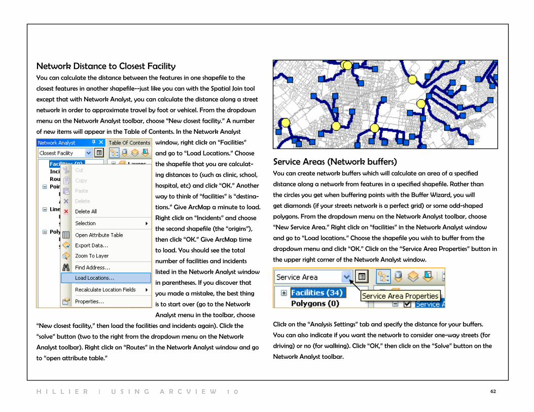
62
network Distance to closest FacilityYou can calculate the distance between the features in one shapefile to the
closest features in another shapefile--just like you can with the Spatial Join tool
except that with network Analyst, you can calculate the distance along a street
network in order to approximate travel by foot or vehicel. From the dropdown
menu on the network Analyst toolbar, choose “new closest facility.” A number
of new items will appear in the Table of contents. In the network Analyst
window, right click on “Facilities”
and go to “load locations.” choose
the shapefile that you are calculat-
ing distances to (such as clinic, school,
hospital, etc) and click “OK.” Another
way to think of “facilities” is “destina-
tions.” Give ArcMap a minute to load.
right click on “Incidents” and choose
the second shapefile (the “origins”),
then click “OK.” Give ArcMap time
to load. You should see the total
number of facilities and incidents
listed in the network Analyst window
in parentheses. If you discover that
you made a mistake, the best thing
is to start over (go to the network
Analyst menu in the toolbar, choose
“new closest facility,” then load the facilities and incidents again). click the
“solve” button (two to the right from the dropdown menu on the network
Analyst toolbar). right click on “routes” in the network Analyst window and go
to “open attribute table.”
Service Areas (network buffers)You can create network buffers which will calculate an area of a specified
distance along a network from features in a specified shapefile. rather than
the circles you get when buffering points with the Buffer wizard, you will
get diamonds (if your streets network is a perfect grid) or some odd-shaped
polygons. From the dropdown menu on the network Analyst toolbar, choose
“new Service Area.” right click on “facilities” in the network Analyst window
and go to “load locations.” choose the shapefile you wish to buffer from the
dropdown menu and click “OK.” click on the “Service Area Properties” button in
the upper right corner of the network Analyst window.
click on the “Analysis Settings” tab and specify the distance for your buffers.
You can also indicate if you want the network to consider one-way streets (for
driving) or no (for walking). click “OK,” then click on the “Solve” button on the
network Analyst toolbar.
H I l l I E r | U S I n G A r c v I E w 1 0

63
notice how different the shapes of the service area are based on the street
network. Also, look at what happens on the edges of your network. This is a
verion of the broader class of problems called “boundary effects.” Street bound-
aries do not actually stop at the edge of a city the way data files do.
network routesYou can determine the short-
ened network route from two or
more points--just the way you
do with online applications like
GoogleMaps or MapQuest. Add in
the points along the route. From
the network Analyst toolbar
dropdown menu, choose, “new
route.” In the network Analyst
window, right click on “Stops” and
go to “load locations.” choose the
point shapefile with your loca-
tions and click “OK.” Then click the
“solve” button on the network Analyst toolbar. notice that the default route is
to travel to the locations in the order in which they are listed in your shapefile.
This might be necessary (for example, if the stops are listed in the order in which
you make them during the day such as coffee shop, work, lunch, car wash, food
store, home), but in other cases, you may want to maximize your efficiency
(imagine you are running errands or making home visits). click on the “route
properties” button (on the network Analyst window) and go to the “Analysis
Settings” tab . check “reorder Stops to Find Optimal route” and decide if you
need to preserve the First or last stops. click “OK” and then click the “Solve”
button again.
In order to generate driving directions for your route, click on the “Directions
window” button next to the “Solve” button. notice how similar they look to
what you get from one of the mapping websites (they use the same technology).
6 | Q U e r Y i n g A n D M e A s U r i n g

64
Distance between Matched Pairs
when you calculate the distance between two sets of points using the Spatial
Join or network Analyst, you can only calculate the distance between the closest
facilities. If you want to calculate the distance between points in one file to
matched points in another, you need to use a script. Imagine, for example, that
you have patient addresses and their health care provider. You can download
cripts to extend ArcGIS functionality from the Esri website or you can create
them, yourself.
The Point Distance script (http://arcscripts.esri.com/details.asp?dbid=13523)
allows you to calculate
the distance between
matched points. After
downloading it from the
website, you need to
add it to ArcMap. From
the customize menu in
ArcMap, go to “Toolbars”
and “customize.” click on
the “commands” tab and
click on the “Add from
File” button. Search for
the script (it will have the
extension .dll) and then
click “Open.” A new category, “cOSTools,” will appear under “categories” and a
“Point Distance” tool will appear under “commands.” Drag and drop the Point
Distance tool to one of your toolbars.
In order to work with the Point Distance tool, you will need to add a table or
shapefile that has fields corresponding to the X and Y coordinates for both points.
You can create a file like this using the “calculate Geometry” feature, to calcu-
late the X and Y coordinates of a point. You’ll need to join the tables from the
two separate (matched) shapefiles using some sort of common unique identifier.
click on the Point Distance tool to open the dialog. choose “Matched_pairs.
shp” from the dropdown. You will generate a new line shapefile connected the
matched points; give this new file a name under “Output line Shapefile.” Select
the X and Y values for the first set of points for the “From” fields and the second
set of X and Y values for the
“To” fields. Then click “Process.”
Say “yes” to adding the new
shapefile to ArcMap. right click
on the new shapefile and go to
“Open Attribute Table.” The
distances will appear in the
variables “Distances_2D” (these
will be in feet because of the
projection settings for the shape-
files). The new line shapefile will
connect the location of the first
point to its matched pair.
H I l l I E r | U S I n G A r c v I E w 1 0

65
7 | creatIng new geographIc fIles
edItIng shapefIlesEditing shapefiles is tricky—and a bit dangerous—territory. If possible, use the
geoprocessing tools such as clip, union, intersect, and dissolve to make changes to
your shapefiles rather than using the editing tools described below. The directions
provided here are very minimal. If you need to do much editing of shapefiles,
you should seek out additional resources (such as the Esri virtual campus course
on digitizing).
Deleting and Modifying FeaturesIn order to make changes to a shapefile, you must start an edit session. From
the Editor toolbar, choose “start editing.” If you have multiple shapefiles in your
map document
that are from
different sub-
directories on
your computer,
you will need
to specify which
directory will be
part of the edit
session (you can
only edit the files
in a single folder
at one time).
A new window
will appear on
the far right
side of your screen, next to the catalog window if you have that open. To save
edits, from the Editor menu on the Editor toolbar, choose “Stop Editing” and
say “yes” to saving edits. notice that
you do not have a “save as” option.
You may want to make a backup
of your original data before editing.
click on the name of your shapefile in
the top section so that options appear
under “construction Tools.” You can
use any of these to add features to
your shapefile. You can “snap” a new
feature to an existing feature to avoid
small “sliver” polygons between two
map features. The snapping options
are available in the Edit menu.
You can also edit existing features by clicking on the edit tool (looks like the
head of a black arrow) and double-clicking on a feature. notice that green
squares appear at ever vertex of your feature. You can add or delete features
using the “Edit vertices” toolbar
that appeared when you double-
clicked on the map feature. You
can also split a polygon in half. To
do this, highlight the feature you
wish to split (this involves a single
click, not a double-click; you want
to see the blue highlight but not
all the vertices). click on the “cut Polygons Tool.” Draw a line across the polygon
and double click to complete the spit.
7 | c r e A T i n g n e w g e O g r A p H i c F i e s
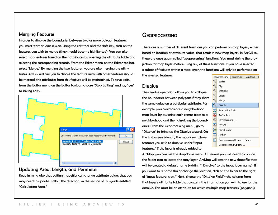
66
Merging FeaturesIn order to dissolve the boundaries between two or more polygon features,
you must start an edit session. Using the edit tool and the shift key, click on the
features you wish to merge (they should become highlighted). You can also
select map features based on their attributes by opening the attribute table and
selecting the corresponding records. From the Editor menu on the Editor toolbar,
select “Merge.” By merging the two features, you are also merging the attri-
butes. ArcGIS will ask you to choose the feature with with other features should
be merged; the attributes from this feature will be maintained. To save edits,
from the Editor menu on the Editor toolbar, choose “Stop Editing” and say “yes”
to saving edits.
Updating Area, length, and PerimeterKeep in mind also that editing shapefiles can change attribute values that you
may need to update. Follow the directions in the section of this guide entitled
“calculating Area.”
geoprocessIng
There are a number of different functions you can perform on map layers, either
based on location or attribute value, that result in new map layers. In ArcGIS 10,
these are once again called “geoprocessing” functions. You must define the pro-
jection for map layers before using any of these functions. If you have selected
a subset of features within a map layer, the functions will only be performed on
the selected features.
DissolveThe dissolve operation allows you to collapse
the boundaries between polygons if they share
the same value on a particular attribute. For
example, you could create a neighborhood
map layer by assigning each census tract to a
neighborhood and then dissolving the bound-
aries. From the Geoprocessing menu, go to
“Dissolve” to bring up the Dissolve wizard. On
the first screen, identify the map layer whose
features you wish to dissolve under “input
features.” If the layer is already added to
ArcMap, you can use the dropdown menu. Otherwise you will need to click on
the folder icon to locate the may layer. ArcMap will give the new shapefile that
will be created a default name (adding “_Dissolve” to the input layer name). If
you want to rename this or change the location, click on the folder to the right
of “input feature class.” next, choose the “Dissolve Field”--the column from
that layer’s attribute table that contains the information you wish to use for the
dissolve. This must be an attribute for which multiple map features (polygons)
H I l l I E r | U S I n G A r c v I E w 1 0

67
have the exact same value (numbers or text). ArcGIS will create a new shape-
file that combines all of the map features (census tracts) into a single polygon
(neighborhood). You can aggregate data for the original geographic units to the
new (dissolved) geographic units using the optional “Statistics Field.”
them all at once). A new layer will be created containing all of the features of all
of the shapefiles. Specify the location and name for this new shapefile and click
“OK.” After a few seconds, you will see “Merge... Merge...Merge” appear at the
bottom right of your screen. when ArcGIS has completed this process, the new
shapefile will appear at the top of the top of the Table of contents.
MergeAppending allows you to incorporate two or more non-overlapping layers
into a single map layer without changing their map features. You can append
point, line, and polygon layers. Appending can save you time when it comes to
symbolizing features and lead to more consistent symbology. For example, you
can merge census tract files from several counties so that when you display the
percent of homeowners, you don’t have to repeat the process of classifying your
data for each county.
From ArcToolbox, you can find “Append” under “Data Management Tools” and
“General.” Under “input features,” list all the map layers you wish to merge. You
can use the dropdown menu if you have added the map layers to ArcMap, but
you will need to add them one at a time (if you add them directly from your
computer, not from ArcMap, you can highlight multiple shapefiles and add
7 | c r e A T i n g n e w g e O g r A p H i c F i e s
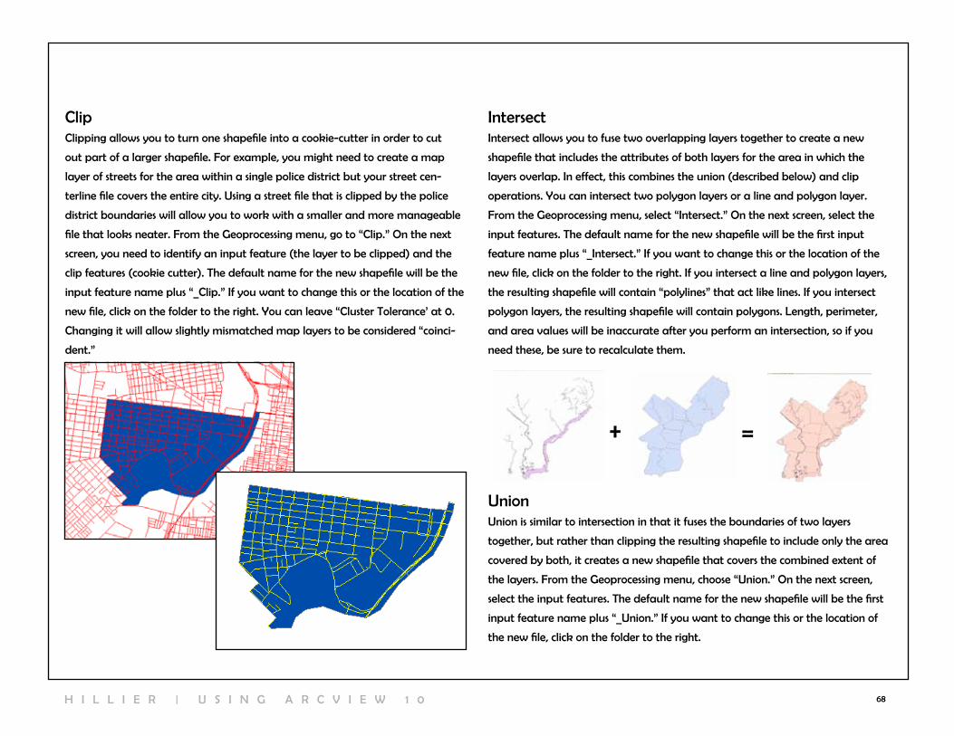
68
clipclipping allows you to turn one shapefile into a cookie-cutter in order to cut
out part of a larger shapefile. For example, you might need to create a map
layer of streets for the area within a single police district but your street cen-
terline file covers the entire city. Using a street file that is clipped by the police
district boundaries will allow you to work with a smaller and more manageable
file that looks neater. From the Geoprocessing menu, go to “clip.” On the next
screen, you need to identify an input feature (the layer to be clipped) and the
clip features (cookie cutter). The default name for the new shapefile will be the
input feature name plus “_clip.” If you want to change this or the location of the
new file, click on the folder to the right. You can leave “cluster Tolerance’ at 0.
changing it will allow slightly mismatched map layers to be considered “coinci-
dent.”
IntersectIntersect allows you to fuse two overlapping layers together to create a new
shapefile that includes the attributes of both layers for the area in which the
layers overlap. In effect, this combines the union (described below) and clip
operations. You can intersect two polygon layers or a line and polygon layer.
From the Geoprocessing menu, select “Intersect.” On the next screen, select the
input features. The default name for the new shapefile will be the first input
feature name plus “_Intersect.” If you want to change this or the location of the
new file, click on the folder to the right. If you intersect a line and polygon layers,
the resulting shapefile will contain “polylines” that act like lines. If you intersect
polygon layers, the resulting shapefile will contain polygons. length, perimeter,
and area values will be inaccurate after you perform an intersection, so if you
need these, be sure to recalculate them.
UnionUnion is similar to intersection in that it fuses the boundaries of two layers
together, but rather than clipping the resulting shapefile to include only the area
covered by both, it creates a new shapefile that covers the combined extent of
the layers. From the Geoprocessing menu, choose “Union.” On the next screen,
select the input features. The default name for the new shapefile will be the first
input feature name plus “_Union.” If you want to change this or the location of
the new file, click on the folder to the right.
+ =
H I l l I E r | U S I n G A r c v I E w 1 0

69
8 | dIgItIzIng
Most of the time you will use shapefiles that someone else created. Using existing
shapefiles saves time and generally results in more accurate map layers. But
if you need a line or polygon file that doesn’t exist—such as a boundary for
your study area—you will need to create it yourself. Digitizing is the process
of drawing or tracing map features to create a new geographic file. Before
on-screen digitizing was available, this process involved tracing a paper map
on a digitizing tablet and then assigning real world coordinates to certain parts
(like georectifying). But Arcview has on-screen digitizing tools that allow you to
create new shapefiles without additional hardware or software.
creating new ShapefilesYou’ll need to create a new empty shapefile to get started. You can make
a copy of an existing shape-
file, delete all of its features
(start editing, highlight all the
features, and click the “Delete”
key on your keyboard) and then
create new features. Alterna-
tively, you can create a brand
new shapefile. To create a new
shapefile, right click in a folder
within the catalog window and
go to “new” and “Shapefile.”
Decide what kind of shapefile
you need (point, line, polygon),
give it a name, and set the pro-
jection if you know what you’ll
be using.
next, open ArcMap and add your new shapefile, along with other map layers
that may help you draw your new features. Start an edit session: from the Editor
menu in the Editor toolbar, choose
“Start Edit Session,” and indicate
which directory contains the
shapefile (shell) you just created.
click on your new shapefile name
in the “create Features” window
that should appear on the far
right, next to the catalog window,
to bring up the construction tools.
create one or more features
(remember, the snap options in
the Editor menu will allow you
to make much neater shapefiles)
and then go to “Stop Editing” and
say “Yes” to saving changes. Open
the attribute table for your new
shapefile. notice that there are FID and Shape fields but nothing else. You can
add attributes
manually,
by creating
new fields
and filling in
the values or
by joining an
existing at-
tribute table
to the new
shapefile.
8 | D i g i T i Z i n g
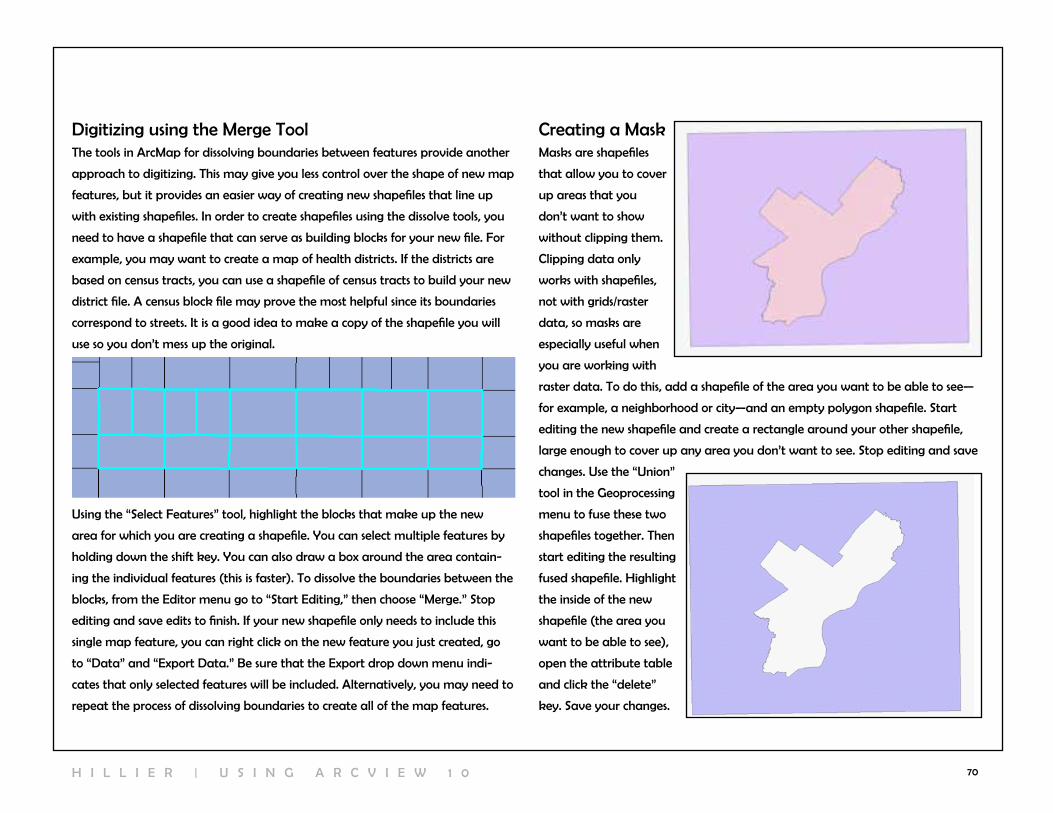
70
Digitizing using the Merge ToolThe tools in ArcMap for dissolving boundaries between features provide another
approach to digitizing. This may give you less control over the shape of new map
features, but it provides an easier way of creating new shapefiles that line up
with existing shapefiles. In order to create shapefiles using the dissolve tools, you
need to have a shapefile that can serve as building blocks for your new file. For
example, you may want to create a map of health districts. If the districts are
based on census tracts, you can use a shapefile of census tracts to build your new
district file. A census block file may prove the most helpful since its boundaries
correspond to streets. It is a good idea to make a copy of the shapefile you will
use so you don’t mess up the original.
Using the “Select Features” tool, highlight the blocks that make up the new
area for which you are creating a shapefile. You can select multiple features by
holding down the shift key. You can also draw a box around the area contain-
ing the individual features (this is faster). To dissolve the boundaries between the
blocks, from the Editor menu go to “Start Editing,” then choose “Merge.” Stop
editing and save edits to finish. If your new shapefile only needs to include this
single map feature, you can right click on the new feature you just created, go
to “Data” and “Export Data.” Be sure that the Export drop down menu indi-
cates that only selected features will be included. Alternatively, you may need to
repeat the process of dissolving boundaries to create all of the map features.
creating a MaskMasks are shapefiles
that allow you to cover
up areas that you
don’t want to show
without clipping them.
clipping data only
works with shapefiles,
not with grids/raster
data, so masks are
especially useful when
you are working with
raster data. To do this, add a shapefile of the area you want to be able to see—
for example, a neighborhood or city—and an empty polygon shapefile. Start
editing the new shapefile and create a rectangle around your other shapefile,
large enough to cover up any area you don’t want to see. Stop editing and save
changes. Use the “Union”
tool in the Geoprocessing
menu to fuse these two
shapefiles together. Then
start editing the resulting
fused shapefile. Highlight
the inside of the new
shapefile (the area you
want to be able to see),
open the attribute table
and click the “delete”
key. Save your changes.
H I l l I E r | U S I n G A r c v I E w 1 0
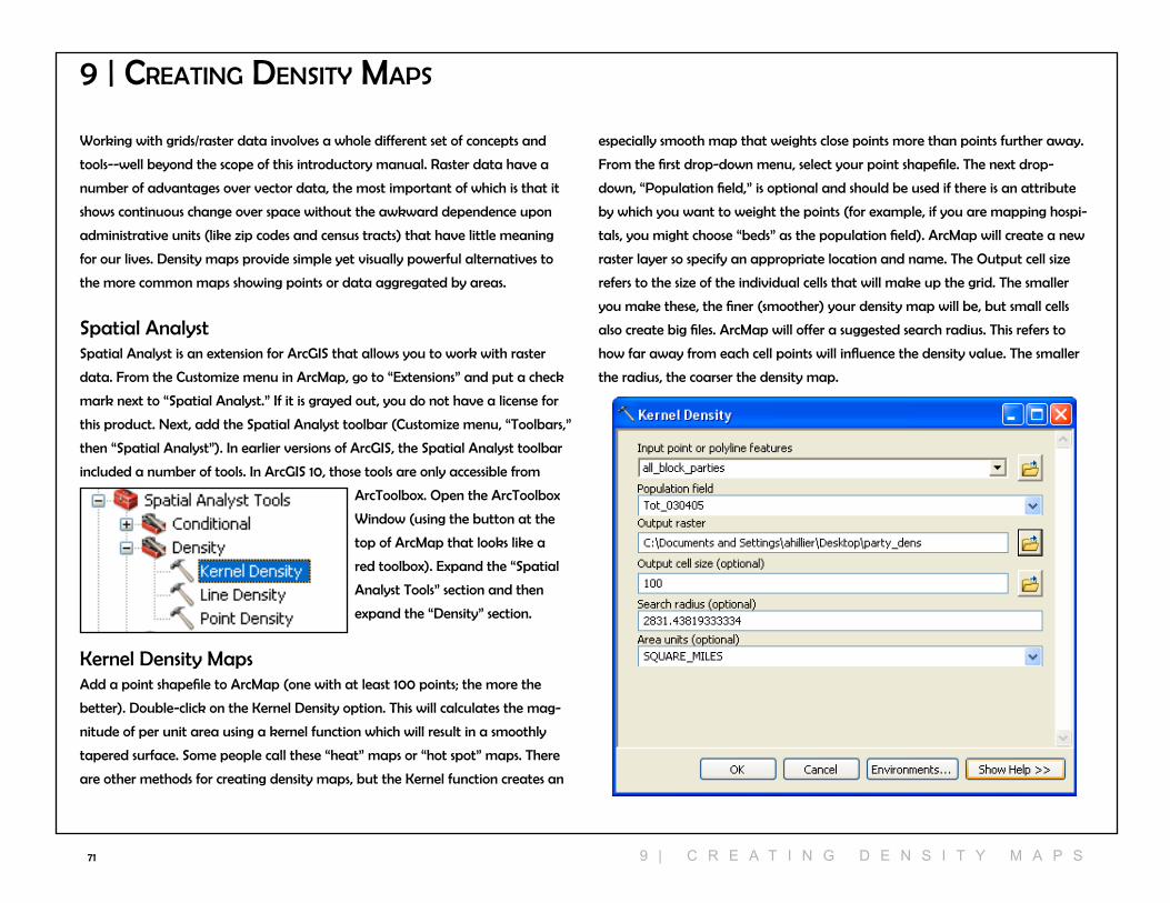
71
working with grids/raster data involves a whole different set of concepts and
tools--well beyond the scope of this introductory manual. raster data have a
number of advantages over vector data, the most important of which is that it
shows continuous change over space without the awkward dependence upon
administrative units (like zip codes and census tracts) that have little meaning
for our lives. Density maps provide simple yet visually powerful alternatives to
the more common maps showing points or data aggregated by areas.
Spatial AnalystSpatial Analyst is an extension for ArcGIS that allows you to work with raster
data. From the customize menu in ArcMap, go to “Extensions” and put a check
mark next to “Spatial Analyst.” If it is grayed out, you do not have a license for
this product. next, add the Spatial Analyst toolbar (customize menu, “Toolbars,”
then “Spatial Analyst”). In earlier versions of ArcGIS, the Spatial Analyst toolbar
included a number of tools. In ArcGIS 10, those tools are only accessible from
ArcToolbox. Open the ArcToolbox
window (using the button at the
top of ArcMap that looks like a
red toolbox). Expand the “Spatial
Analyst Tools” section and then
expand the “Density” section.
Kernel Density MapsAdd a point shapefile to ArcMap (one with at least 100 points; the more the
better). Double-click on the Kernel Density option. This will calculates the mag-
nitude of per unit area using a kernel function which will result in a smoothly
tapered surface. Some people call these “heat” maps or “hot spot” maps. There
are other methods for creating density maps, but the Kernel function creates an
9 | creatIng densIty Maps
especially smooth map that weights close points more than points further away.
From the first drop-down menu, select your point shapefile. The next drop-
down, “Population field,” is optional and should be used if there is an attribute
by which you want to weight the points (for example, if you are mapping hospi-
tals, you might choose “beds” as the population field). ArcMap will create a new
raster layer so specify an appropriate location and name. The Output cell size
refers to the size of the individual cells that will make up the grid. The smaller
you make these, the finer (smoother) your density map will be, but small cells
also create big files. ArcMap will offer a suggested search radius. This refers to
how far away from each cell points will influence the density value. The smaller
the radius, the coarser the density map.
9 | c r e A T i n g D e n s i T Y M A p s
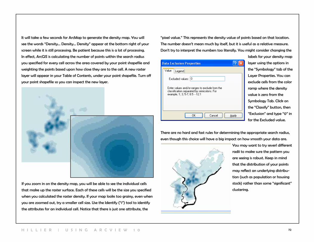
72
It will take a few seconds for ArcMap to generate the density map. You will
see the words “Density... Density... Density” appear at the bottom right of your
screen while it is still processing. Be patient because this is a lot of processing.
In effect, ArcGIS is calculating the number of points within the search radius
you specified for every cell across the area covered by your point shapefile and
weighting the points based upon how close they are to the cell. A new raster
layer will appear in your Table of contents, under your point shapefile. Turn off
your point shapefile so you can inspect the new layer.
If you zoom in on the density map, you will be able to see the individual cells
that make up the raster surface. Each of these cells will be the size you specified
when you calculated the raster density. If your map looks too grainy, even when
you are zoomed out, try a smaller cell size. Use the Identify (“i”) tool to identify
the attributes for an individual cell. notice that there is just one attribute, the
“pixel value.” This represents the density value of points based on that location.
The number doesn’t mean much by itself, but it is useful as a relative measure.
Don’t try to interpret the numbers too literally. You might consider changing the
labels for your density map
layer using the options in
the “Symbology” tab of the
layer Properties. You can
exclude cells from the color
ramp where the density
value is zero from the
Symbology Tab. click on
the “classify” button, then
“Exclusion” and type “0” in
for the Excluded value.
There are no hard and fast rules for determining the appropriate search radius,
even though this choice will have a big impact on how smooth your data are.
You may want to try severl different
radii to make sure the pattern you
are seeing is robust. Keep in mind
that the distribution of your points
may reflect an underlying distribu-
tion (such as population or housing
stock) rather than some “significant”
clustering.
H I l l I E r | U S I n G A r c v I E w 1 0

73
3D Models of vector Data3D modeling happens in ArcScene rather than ArcMap. ArcScene is a separate
application (.exe file) that you can launch from the Start Menu (Programs,
ArcGIS, then ArcScene). Once open, it looks similar to ArcMap with a Table of
contents in the left, where the names of your map layers will appear, and a big
space to the right where your map layers will draw. You add map layers into
ArcScene just like ArcMap, with the “Add Data” button or from the File menu,
“Add Data.” Don’t worry if your map layers look funny when you first add them.
vector polygons layers will draw as solid fill colors without any outlines. Points
and lines will look more similar to the way they draw in ArcMap. It is possible to
make points and lines 3D, but polygons work better.
Most of the buttons on the tools toolbar for navigating your map layers are the
same in ArcScene as ArcMap, but a few are new.
The navigate button is the most useful. when you hold down the right
mouse button, you can spin and twist your map layers, looking above
or below them and from any angle. If you click the left mouse button, you will
be able to zoom in and out continuously. If you hold both buttons down, you
can pan your map layers (move them around without zoom in or out or tilting
them). The zoom in/out button allows you to zoom in and out continuously (like
the continuous zoom tool in ArcMap). It is even easier in ArcScene to loose track
of where you are than it is in ArcMap. click on the full extent button to
bring your map layers back. The fly tool allows you to swoop in and
around your model (caution: this may cause motion sickness). Hit “Esc” to stop.
In order to make
your polygons 3D,
double click on the
map layer. Most
of the tabs under
“layer Properties”
are the same as
ArcMap, but some
are new. click on
the “Extrusion” tab.
Here you can enter
a constant value
under “Extrusion
value or Expres-
sion” in order to
make the entire layer the same height. This makes sense in some situations, such
as when extruding streets and sidewalks in an impervious surface layer.
10 | workIng wIth 3d
1 0 | w O r K i n g w i T H 3 D

74
More
often, you
will want
to extrude
the
polygons
based on
an attri-
bute. For
example, if
you have
a height
variable, you can extrude the polygons to reflect this. click on the little calcula-
tor to the right of the “Extrusion value or expression” box and use the “Expres-
sion Builder” to create a formula for the height of the building. You may need
to adjust the formula later to
make your relative heights work,
but don’t worry too much at this
point. click “OK” and then click
“OK” again. now your buildings
should be different heights. You
can use attributes other than
height or elevation as the basis of
the extrusion. For example, you
can extrude neighborhoods based
on the amount of crime.
In order to see the differences in
the height more clearly, use the
options under the Symbology tab (use this just the way you do in ArcMap) to
make different heights different colors (graduated color map based on height
variable). You can use different variables for the basis of your extrusion and
symbology, especially when you are extruding based on height or elevation. For
example, you can use the extrusion option to make buildings different heights
and then use the symbology options to use different colors to show which proper-
ties are vacant.
Scene PropertiesInstead of having “Data Frames,” like in ArcMap, ArcScene has “scenes.” You
can change the properties of the scene--including the background color, vertical
exaggeration, and illumination--from the Scene properties. Double-click on
the word “Scene Properties” at the top of your table of contents or go to the
view menu and “Scene Properties.” From the General tab, you can change the
background color (black looks pretty cool). You can also change the vertical
exaggeration. This is especially helpful when your layers look too flat or way too
tall after extrusion. click on “calculate extent” for ArcScene’s suggestion for how
much you should exaggerate the vertical extent.
H I l l I E r | U S I n G A r c v I E w 1 0
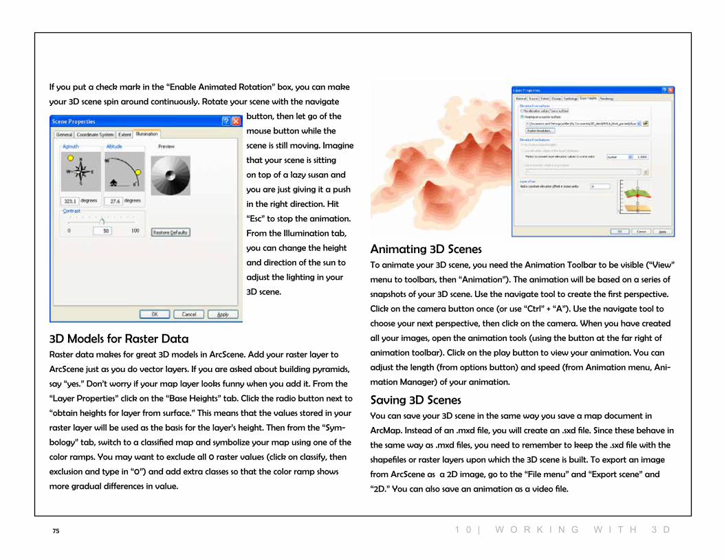
75
If you put a check mark in the “Enable Animated rotation” box, you can make
your 3D scene spin around continuously. rotate your scene with the navigate
button, then let go of the
mouse button while the
scene is still moving. Imagine
that your scene is sitting
on top of a lazy susan and
you are just giving it a push
in the right direction. Hit
“Esc” to stop the animation.
From the Illumination tab,
you can change the height
and direction of the sun to
adjust the lighting in your
3D scene.
3D Models for raster Dataraster data makes for great 3D models in ArcScene. Add your raster layer to
ArcScene just as you do vector layers. If you are asked about building pyramids,
say “yes.” Don’t worry if your map layer looks funny when you add it. From the
“layer Properties” click on the “Base Heights” tab. click the radio button next to
“obtain heights for layer from surface.” This means that the values stored in your
raster layer will be used as the basis for the layer’s height. Then from the “Sym-
bology” tab, switch to a classified map and symbolize your map using one of the
color ramps. You may want to exclude all 0 raster values (click on classify, then
exclusion and type in “0”) and add extra classes so that the color ramp shows
more gradual differences in value.
Animating 3D ScenesTo animate your 3D scene, you need the Animation Toolbar to be visible (“view”
menu to toolbars, then “Animation”). The animation will be based on a series of
snapshots of your 3D scene. Use the navigate tool to create the first perspective.
click on the camera button once (or use “ctrl” + “A”). Use the navigate tool to
choose your next perspective, then click on the camera. when you have created
all your images, open the animation tools (using the button at the far right of
animation toolbar). click on the play button to view your animation. You can
adjust the length (from options button) and speed (from Animation menu, Ani-
mation Manager) of your animation.
Saving 3D ScenesYou can save your 3D scene in the same way you save a map document in
ArcMap. Instead of an .mxd file, you will create an .sxd file. Since these behave in
the same way as .mxd files, you need to remember to keep the .sxd file with the
shapefiles or raster layers upon which the 3D scene is built. To export an image
from ArcScene as a 2D image, go to the “File menu” and “Export scene” and
“2D.” You can also save an animation as a video file.
1 0 | w O r K i n g w i T H 3 D

76
11 | anIMatIng tIMe serIes data
ArcGIS has two tools for representing time series data--the Animation Toolbar
and the Tracking Analyst. Both require that each record in your shapefile is
“time-stamped” meaning that one of the attributes is a date. This could be in
the format of seconds:minutes:hours such as the data generated by GPS devices
or simply a year or decade associated with census data. Tracking Analyst works
best with GPS data while the Animation Toolbar works well with area data that
are part of a time series and point data that have start and end dates.
Animation ToolbarMake the animation toolbar active (from
the customize menu, go toToolbars, then
Animation). Add in the shapefile that you
want to animate, for example, a point
shapefile with all the theaters in Philadelphia that operated between 1880 and
2009. From the layer Properties, go to the “Time” tab and enable time on this
layer. choose the appropirate drop-down option under “layer Time” indicating
whether you have a start and end date or just single point in time. Indicate the
fields with the start and end times and make sure the “Time Step Interval” is set.
click “OK.” From the menu on the Animation Toolbar, go to “create Time Ani-
mation.” Use the “Animation controls” to decide how long the animation should
run. Then click the play button to watch the animation.
Under “Start Time,” choose the variable
that includes the opening date, then
choose the format. If you have an End
Time, fill in those fields the same way.
Then click “create.” click on the button
the far right side of the Animation
toolbar to access the animation controls.
Press the “Play” button. Your points
should begin appearing and disap-
pearing. You can also view the change
over time using the Time Slider. when
temporal data are present, the time slider button on the Tools toolbar is acti-
vated. click on it to open the Time Slider.
You can export the animation as a video from the Animation menu on the Ani-
mation toolbar. note: these files can become large very quickly.
You can also animate areal (polygon) data such as US census data, although
this involves some considerable reformatting to work. In order to animate, you
need to have a separate row for each record (polygon, such as a census tract)
for each time period. In order for this polygon shapefile to work with the Ani-
mation toolbar, you must create a new record (representing a state) for each
time period. You can do this by merging multiple copies of the same shapefile
together using the Merge toolbar. In the end, your table should list each of your
H I l l I E r | U S I n G A r c v I E w 1 0
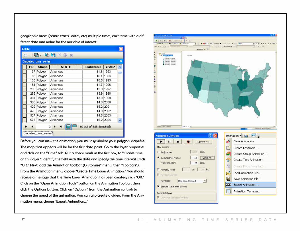
77
Before you can view the animation, you must symbolize your polygon shapefile.
The map that appears will be for the first data point. Go to the layer properties
and click on the “Time” tab. Put a check mark in the first box, to “Enable time
on this layer.” Identify the field with the date and specify the time interval. click
“OK.” next, add the Animation toolbar (customize” menu, then “Toolbars”).
From the Animation menu, choose “create Time layer Animation.” You should
receive a message that the Time layer Animation has been created; click “OK.”
click on the “Open Animation Tools” button on the Animation Toolbar, then
click the Options button. click on “Options” from the Animation controls to
change the speed of the animation. You can also create a video. From the Ani-
mation menu, choose “Export Animation...”
geographic areas (census tracts, states, etc) multiple times, each time with a dif-
ferent date and value for the variable of interest.
1 1 | A n i M A T i n g T i M e s e r i e s D A T A
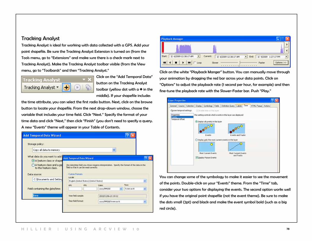
78
Tracking AnalystTracking Analyst is ideal for working with data collected with a GPS. Add your
point shapefile. Be sure the Tracking Analyst Extension is turned on (from the
Tools menu, go to “Extensions” and make sure there is a check mark next to
Tracking Analyst). Make the Tracking Analyst toolbar visible (from the view
menu, go to “Toolbards” and then “Tracking Analyst.”
click on the “Add Temporal Data”
button on the Tracking Analyst
toolbar (yellow dot with a + in the
middle). If your shapefile includes
the time attribute, you can select the first radio button. next, click on the browse
button to locate your shapefile. From the next drop-down window, choose the
variable that includes your time field. click “next.” Specify the format of your
time data and click “next,” then click “Finish” (you don’t need to specify a query.
A new “Events” theme will appear in your Table of contents.
click on the white “Playback Manger” button. You can manually move through
your animation by dragging the red bar across your data points. click on
“Options” to adjust the playback rate (1 second per hour, for example) and then
fine-tune the playback rate with the Slower-Faster bar. Push “Play.”
You can change some of the symbology to make it easier to see the movement
of the points. Double-click on your “Events” theme. From the “Time” tab,
consider your two options for displaying the events. The second option works well
if you have the original point shapefile (not the event theme). Be sure to make
the dots small (2pt) and black and make the event symbol bold (such as a big
red circle).
H I l l I E r | U S I n G A r c v I E w 1 0

79
12 | cartograMs
cartograms are the quintessential “un-GIS” map in that they deliberately distort
area in order to better represent some attribute value. The best cartograms are
hand-drawn, but in recent years, automated computer routines for reshaping
maps have become better and better. The cartogram script written by Tom
Gross for ArcGIS based on the methodology developed by Mark newman and
Michael Gastner at the University of Michigan works quite well and is avail-
able for free download at http://arcscripts.esri.com/details.asp?dbid=15638. The
file you download will be an .exe and will add a “read Me” file and ArcMap
document demo to your Start menu, under “Programs.”
cartograms work with areal (polygon) data. This cartogram script requires that
your data be in the form of a geodatabase, which take the form of Access da-
tabases and can incorporate multiple shapefiles. You can create a personal geo-
database in Arccatalog. To add the cartogram script, launch ArcToolbox (click
on the red toolbox at the top of the screen). right click in an empty area and go
to “add toolbox.” From the cartogram folder, add the cartogram toolbox. You
should see it listed in your ArcToolbox favorites. If you have trouble, it is probably
because you do not have permission to add new programs to your computer.
Add the shapefile in that will be the basis of your cartogram. The cartogram
tool will only work with non-zero and positive attribute values, so be sure to
recode the variable(s) of interest as necessary. From ArcToolbox, double click
“create a cartogram.” In the first dropdown menu, choose your map layer. In
the second, choose the attribute that will be the basis for the cartogram (counts
work better than rates). In the third dropdown, click on the folder on the right,
navigate to your geodatabase. Give your cartogram a name and click “Save.”
leave the remaining dropdown menus blank or leave the default values if they
appear. Put a check mark in “copy the Original Polygon Features table to the
Output cartogram Features.” click OK.
Symbolize your resulting cartogram by double-clicking on the new shapefile and
going to the symbology tab. Graduated colors will likely be the best choice.
1 2 | c A r T O g r A M s

80
13 | troubleshootIng
I can’t save my files...Are you saving to a write-able drive (you can’t save to a cd)? If so, change the
location where you are trying to save the file. Have you run out of room on your
drive? Try deleting some old files (if you are deleting map layers, be sure to use
Arccatalog).
My scale bar isn’t right...Are the units “unknown”? You need to define the projection for one or more
of your map layers. Do the units show up but not make sense? For example,
does it show that center city Philadelphia is 30 miles wide? Your projection was
probably defined incorrectly. Start over with your original map layer and work
through the projection steps again.
My map looks skewed...Did you export the map in import it into MS word, PowerPoint or other file?
You may have skewed it here, while resizing. Export the map again. resize only
from the corners, not the sides (resizing from the sides squishes the map). Are
your data projected? check the coordinates in the bottom right of your map in
the map view. If you see longitude/latitude coordinates, that’s the problem. Be
sure to define, then project the data.
I can’t join my attribute table...Are you starting with the shapefile? Be sure to right click on the shapefile you
are joining your data to, then choose “join.” Have you identified an identical join
field in both tables? Open both tables. Sort them both ascending to descending
to make sure they are the same. count the number of digits. Make sure both are
formatted as string (left justified) or number (right justified).
I can’t open the attribute table after the join...right click on the shapefile to which you were trying to join the attribute table,
go to “Data” and “Export Data” to save the file under new name, then add it
back in. Are there spaces in names of any of your variables? Make the changes
outside ArcMap (in Excel, for example) or in ArcMap, by creating a new column
with a new variable name, then set it equal to the old variable, then delete the
column with the space in the name.
I can’t add/open my table to Arcview...Is it open anywhere else (like in Excel)? If so, close and re-try. Are there spaces
in the names of any of your variables? If so, correct this in Excel, re-save, and try
again.
I can’t see my table in the table of contents...click on the “list by Source” button on the top left corner of the Table of
contents.
I can’t move my layers up or down in the Table of contentsclick on the “list by Drawing Order” button on the top left corner of the Table
of contents, then retry.
I made a change, but I don’t see it on the screen...refresh the graphics (arrows in a circle next to map view and layout view
buttons).
I get an error message when I calculate values...Are you dividing by zero? Sort the column with your denominator to look for
zeros. Highlight every row with a zero, switch the selection so that all non-zero
rows as highlighted, then try your calculation again.
I just get 0 and 1 when I’m trying to calculate a percent...You probably formatted your column as a short integer rather than double.
Delete the column (right click on column name, delete) and create a new one.
Still stuck?close Arcview, re-start and try again. Try a new computer somewhere else (dif-
ferent lab). Ask for help. Don’t worry, pretty much everyone does at some point
(or at least they should).
H I l l I E r | U S I n G A r c v I E w 1 0
Related Documents