What Is Quality?

Welcome message from author
This document is posted to help you gain knowledge. Please leave a comment to let me know what you think about it! Share it to your friends and learn new things together.
Transcript

What Is Quality?

Evolution of Quality as a discipline
Juran`s Quality Handbook, Fifth edition”Juran and Godfrey
Chapter 2.5- Pg- 24-36

Quality Management
• Q.M is a system of establishing defect prevention actions and attitudes within a company or organization for the purpose of assuring conforming products or services.
• Q.M treats the company as a process and the various management systems within that process as the variables that require measurement and control.

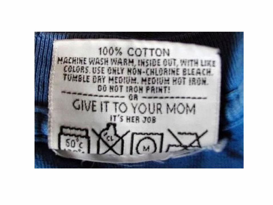
Care Labelling
Unit 4
Ref- Mehta and Bhardwaj Ch.4 &11
Ref. mat.- Ms. Divya Satyan

Care Labeling
• A tag attached to textile or clothing products, showing instructions for proper care of the products.
• Different care labeling systems for various countries.
• Some systems are mandatory as required in national regulations,
• Others are adopted on a voluntary basis.

American
• The Federal Trade Commission (FTC) - care labeling regulation requiring care labels to be permanently affixed or attached to the products, with regular care information and instructions distinctly specified and remaining legible as long as the products last.
• Labels should be attached so they can be seen or easily found by consumers at point of sale. If labels cannot be easily seen or found due to packaging, care information should also appear on the outside of the package or on a hang tag fastened to the product.
• In developing care instructions, the ASTM standard D-3136 provides the terminology for permanent care labels for consumer textile and leather products other than carpets and upholstery.
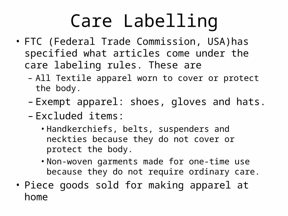
Care Labelling• FTC (Federal Trade Commission, USA)has
specified what articles come under the care labeling rules. These are– All Textile apparel worn to cover or protect the body.
– Exempt apparel: shoes, gloves and hats. – Excluded items:
• Handkerchiefs, belts, suspenders and neckties because they do not cover or protect the body.
• Non-woven garments made for one-time use because they do not require ordinary care.
• Piece goods sold for making apparel at home
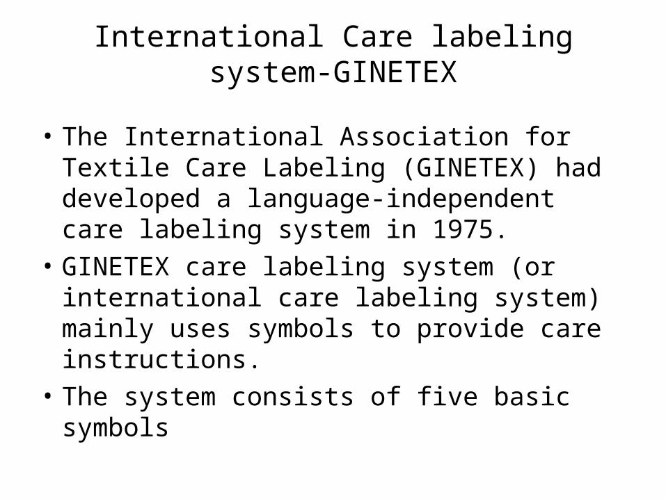
International Care labeling system-GINETEX
• The International Association for Textile Care Labeling (GINETEX) had developed a language-independent care labeling system in 1975.
• GINETEX care labeling system (or international care labeling system) mainly uses symbols to provide care instructions.
• The system consists of five basic symbols
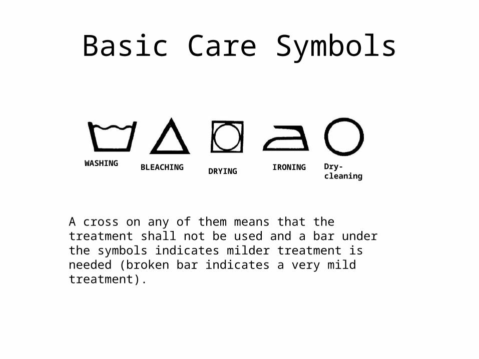
Basic Care Symbols
A cross on any of them means that the treatment shall not be used and a bar under the symbols indicates milder treatment is needed (broken bar indicates a very mild treatment).
WASHING BLEACHING IRONING Dry-cleaningDRYING
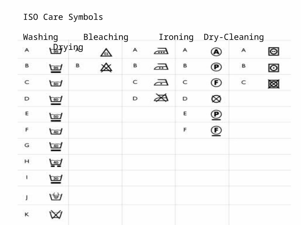
ISO Care Symbols Washing Bleaching Ironing Dry-Cleaning Drying
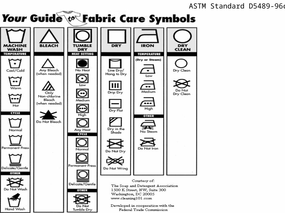
ASTM Standard D5489-96c
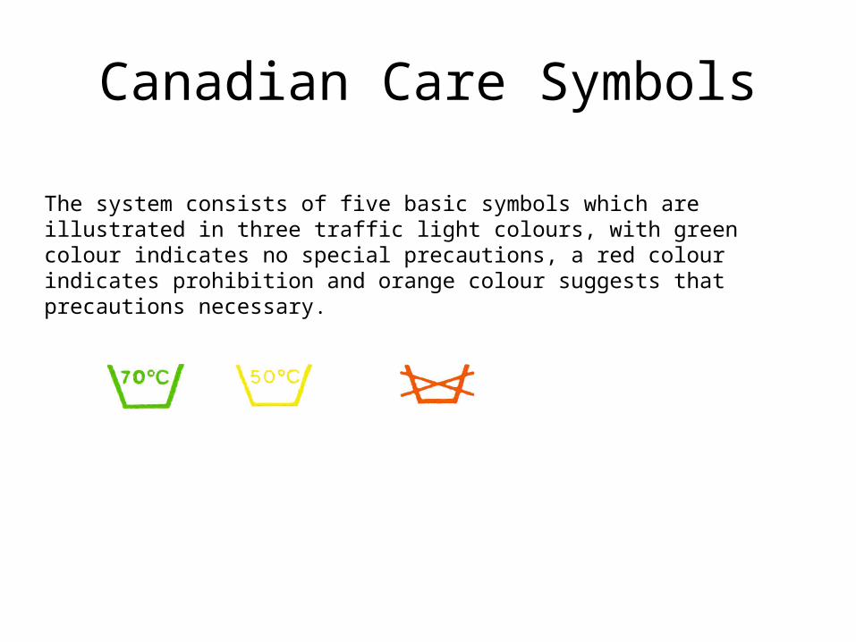
Canadian Care Symbols
The system consists of five basic symbols which are illustrated in three traffic light colours, with green colour indicates no special precautions, a red colour indicates prohibition and orange colour suggests that precautions necessary.

Japanese Care Labeling systemThe Japanese care labelling system has symbols grouped in six categories: washing, possibility of chlorine-based bleaching, ironing, dry-cleaning, wringing and drying. Based on JIS L 0217 (1995)
WASHING (with water) Chlorine-based bleaching May be ironed at 180 - 210 C if a cloth is placed between iron and garment
DRY-CLEANING
WRINGINGDRYING
Product Safety
Unit 5
Ref: Mehta and Bhardwaj Ch. 4 & 11
Ref Mat. Ms. Divya Satyan
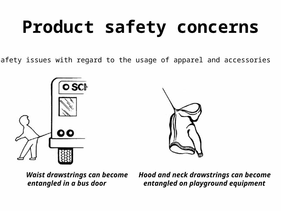
Product safety concerns
Waist drawstrings can become Hood and neck drawstrings can becomeentangled in a bus door entangled on playground equipment
Safety issues with regard to the usage of apparel and accessories

January 9, 2004Alert #04-529
Manufacturer: Susan Bristol Inc., of Boston, Mass. Hazard: The marabou feather trim on the sweaters is dangerously flammable.
February 23, 2006Alert #06-530
Retailer: Victoria's Secret Direct, of Columbus, Ohio
Hazard: The kimono tops are made of fabric that fails to meet mandatory standards of fabric flammability. The sheer outer shell fabric of the kimono top can readily ignite and present a risk of burn injuries
Products recalled from stores

Product safety concerns
Reebok received a report of a death caused by lead poisoning of a 4-year-old child from Minneapolis. The child reportedly swallowed a piece from one of these charm bracelets sold by Reebok.
Products recalled from stores
June 11, 2009Release # 09-241
Blair has received reports of six deaths due to the robes catching on fire. Five of the six victims were female, and all five were cooking at the time of the incidents. Three of the victims were in their 80s.
Product- Charm Bracelet Product- Chenille Robes

SAFE product
• A “safe product” is any product which under normal or reasonably foreseeable conditions of use presents no risk or only the minimum risk compatible with the product’s use and which is consistent with a high level of protection for consumers.
• This can take the form of being protected from the event or from exposure to something that causes health or economical losses. It can include protection of people or of possessions.
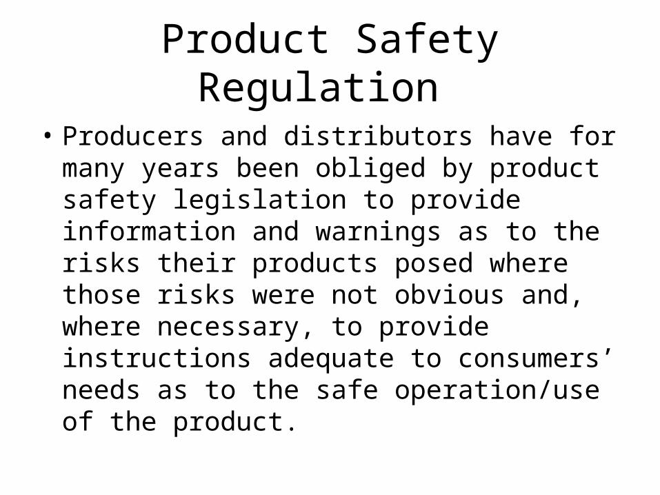
Product Safety Regulation
• Producers and distributors have for many years been obliged by product safety legislation to provide information and warnings as to the risks their products posed where those risks were not obvious and, where necessary, to provide instructions adequate to consumers’ needs as to the safe operation/use of the product.

Product Safety assessment
• The safety of a product is assessed with regard to a number of matters, in particular:
• The product’s characteristics;• Packaging;• Instructions for assembly and maintenance, use and
disposal;• The effect on other products with which it might be used;• Labeling and other information provided for the
consumer; and• The categories of consumers at risk when using the
product, particularly Children and the elderly.

Drawstring Hazards
• The U.S. Consumer Product Safety Commission (CPSC) & ASTM F1816-97, “Standard Safety Specification for Drawstrings on Children’s Upper Outerwear” – remove the hood and neck drawstrings from all children’s upper
outerwear, including jackets and sweatshirts, sized 2T to 12.
• "Choking Risks to Children“- a reserch report evaluated the effectiveness of the ‘small parts cylinder’ test in preventing choking accidents to children under four from small toys or parts Garments and recommended a maximum size for the same.
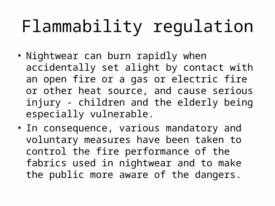
Flammability regulation
• Nightwear can burn rapidly when accidentally set alight by contact with an open fire or a gas or electric fire or other heat source, and cause serious injury - children and the elderly being especially vulnerable.
• In consequence, various mandatory and voluntary measures have been taken to control the fire performance of the fabrics used in nightwear and to make the public more aware of the dangers.
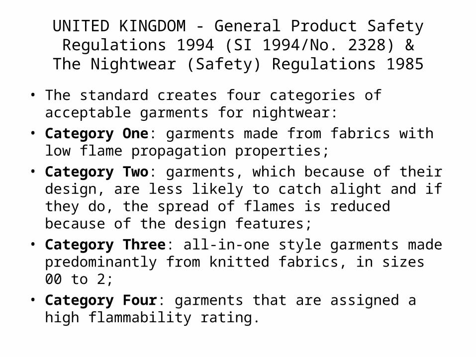
UNITED KINGDOM - General Product Safety Regulations 1994 (SI 1994/No. 2328) &
The Nightwear (Safety) Regulations 1985
• The standard creates four categories of acceptable garments for nightwear:
• Category One: garments made from fabrics with low flame propagation properties;
• Category Two: garments, which because of their design, are less likely to catch alight and if they do, the spread of flames is reduced because of the design features;
• Category Three: all-in-one style garments made predominantly from knitted fabrics, in sizes 00 to 2;
• Category Four: garments that are assigned a high flammability rating.
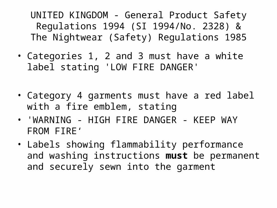
UNITED KINGDOM - General Product Safety Regulations 1994 (SI 1994/No. 2328) &
The Nightwear (Safety) Regulations 1985
• Categories 1, 2 and 3 must have a white label stating 'LOW FIRE DANGER'
• Category 4 garments must have a red label with a fire emblem, stating
• 'WARNING - HIGH FIRE DANGER - KEEP WAY FROM FIRE‘
• Labels showing flammability performance and washing instructions must be permanent and securely sewn into the garment

http://www.textileschool.com/School/Apparel/ApparelManufacturing/ProductLiability.aspx
Read Article on product safety and regulations

Managing Quality In decentralized Manufacturing
Unit 6-7
Ref: Dr. Rajesh Bheda

Quality assurance for standard product
• Dedicated facility for the product is must
• can plan detailed Q.A procedures and train people in specialist jobs
• Processes are well planned in advance and control parameters are in place
• Random sampling inspection at the end can be used to assess product quality
• Planners are different from implementers

Managing quality in decentralized manufacturing (Dr. Bheda)
Q.Why do you face quality problems?
A.We have no problems at our end but our suppliers don`t understand quality.
A. Subcontractors are not bothered about quality, we do all we can
…………..
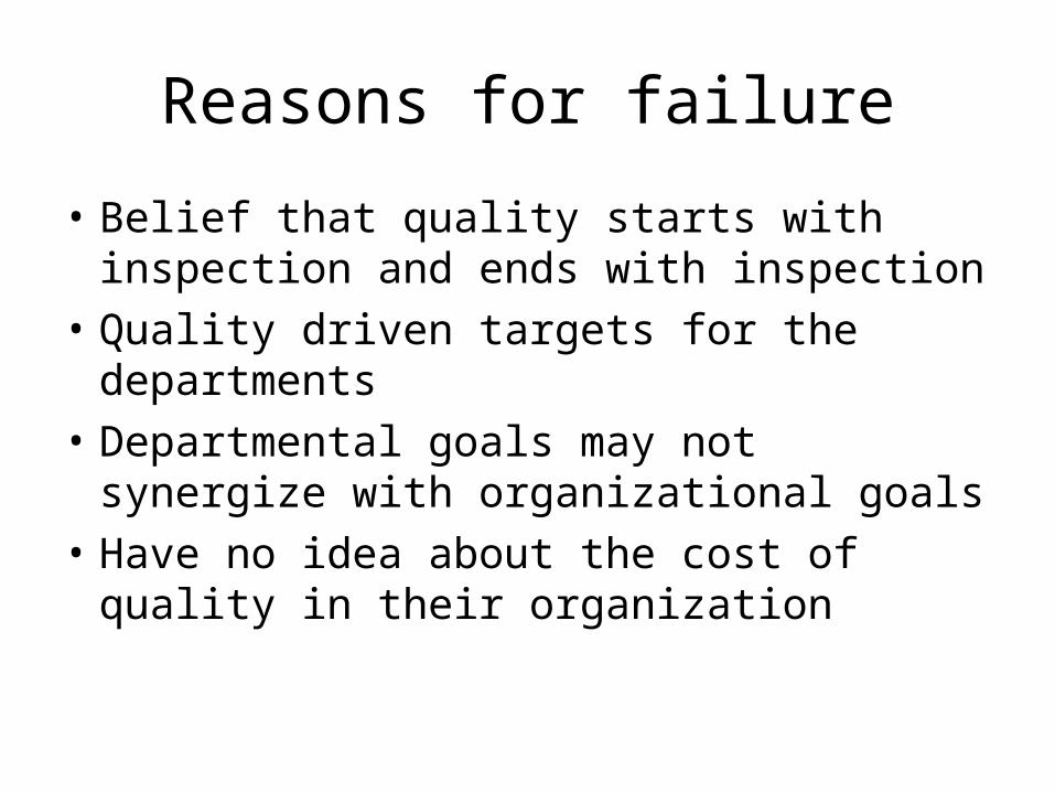
Reasons for failure
• Belief that quality starts with inspection and ends with inspection
• Quality driven targets for the departments
• Departmental goals may not synergize with organizational goals
• Have no idea about the cost of quality in their organization

Role of fabricators
1. Flexible manufacturing capacity
2. Good at manual value addition
3. Adapt at working on low volume, complex styles
4. Provide additional capacities at times of excess booking or rush orders.

Process capability- key to quality in fashion apparel manufacturing
• Without Process capability ,Quality cannot be expected
• It is the responsibility of the top management to ensure the process capability of different process groups

Process model for sewing
MOTIVATED PEOPLE
KNOW-HOW
SKILLS
TRAINING
PLANT & MACHINERY
QUALITYINPUT
=
RAW MATERIAL+
SPECIFICATIONS
QUALITYOUTPUT
=
PROCESSEDCOMPONENTS
ORGARMENTS
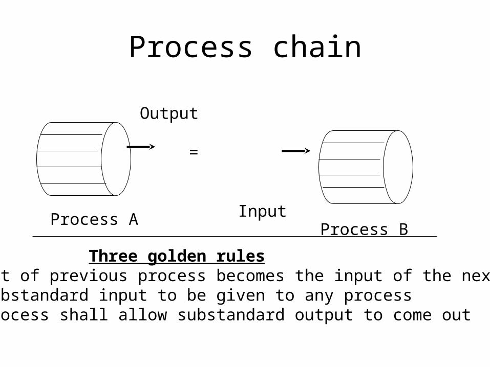
Process chain
Output
=
InputProcess AProcess B
Three golden rules•Output of previous process becomes the input of the next process•No substandard input to be given to any process•No process shall allow substandard output to come out

Is average fabricator process capable
• No, but they can be made process capable
• we need to identify the deficiencies
• to get the solutions, we need to think non-traditionally
• also check the quality of inputs to the fabricators
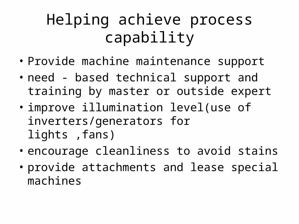
Helping achieve process capability
• Provide machine maintenance support
• need - based technical support and training by master or outside expert
• improve illumination level(use of inverters/generators for lights ,fans)
• encourage cleanliness to avoid stains
• provide attachments and lease special machines
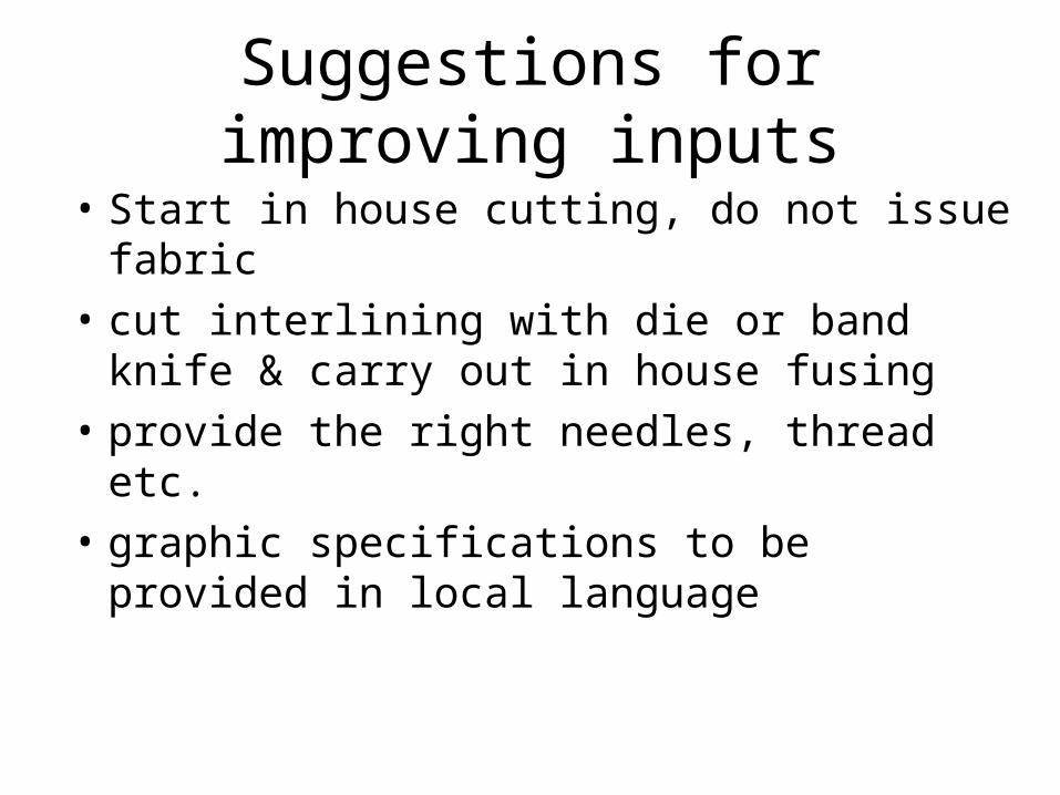
Suggestions for improving inputs
• Start in house cutting, do not issue fabric
• cut interlining with die or band knife & carry out in house fusing
• provide the right needles, thread etc.
• graphic specifications to be provided in local language
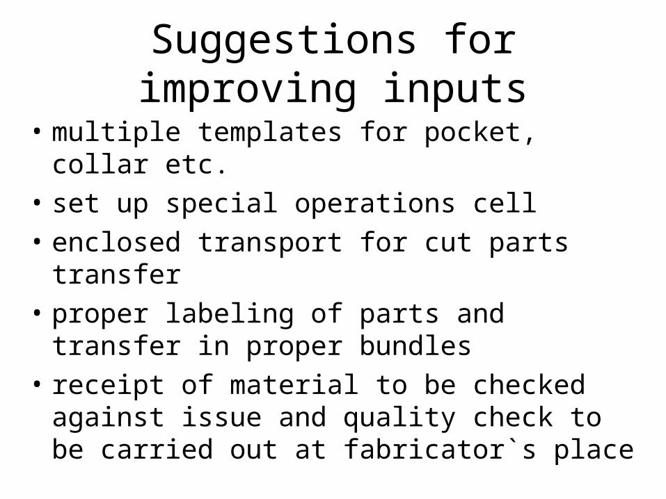
Suggestions for improving inputs
• multiple templates for pocket, collar etc.
• set up special operations cell
• enclosed transport for cut parts transfer
• proper labeling of parts and transfer in proper bundles
• receipt of material to be checked against issue and quality check to be carried out at fabricator`s place
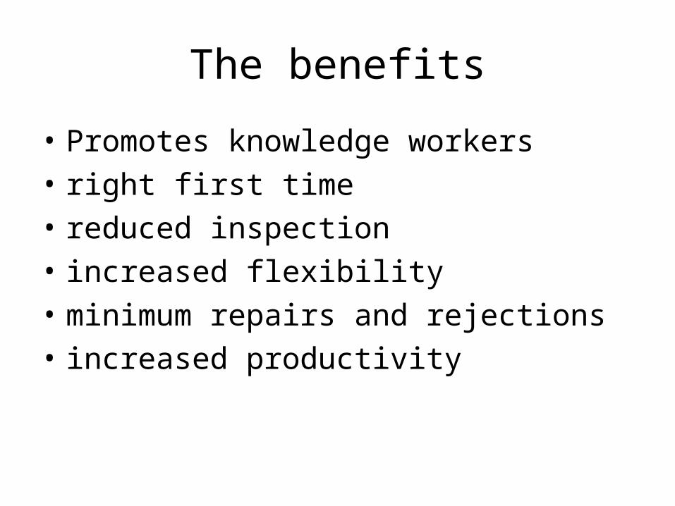
The benefits
• Promotes knowledge workers
• right first time
• reduced inspection
• increased flexibility
• minimum repairs and rejections
• increased productivity
Statistical Quality Control
Unit 8
Re: Mehta and Bhardwaj Ch.13 and Sara Kadolph Ch 15
SPC
• Statistical process control (SPC) involves using statistical techniques to measure and analyze the variation in processes.
• Most often used for manufacturing processes
• SPC is used to monitor product quality and maintain processes to fixed targets.

SPC
• Statistical quality control (SQC)refers to using statistical techniques for measuring and improving the quality of processes and includes SPC in addition to other techniques, such as sampling plans, experimental design, variation reduction, process capability analysis, and process improvement plans.

STATISTICAL PROCESS CONTROL
Commonly used tools in SPC include
– Flow charts
– Run charts
– Pareto charts and analysis
– Cause and effect diagram
– Frequency histograms
– Control charts
– Process capability studies
– Scatter diagrams
– Acceptance sampling plans

Control Charts• Control chart -statistical tool for monitoring and
improving quality.• Originated by Walter Shewhart in 1924 for the
manufacturing environment-later extended by W. Edward Deming to quality improvement in all areas of an organization.
• No matter how well the process is designed, there exists a certain amount of nature variability in output measurements.
• When the variation in process quality is due to random causes alone, the process is said to be in-control.
• If the process variation includes both random and special causes of variation, the process is said to be out-of-control.
• Control charts differentiates between the two types of variations-
• 1 -that is normally expected of the process due chance or common causes
• 2- that change over time due to special causes
• 1.Variations due to common causes – have small effect on the process
– are inherent to the process because of:
– the nature of the system
– the way the system is managed – the way the process is organized and operated
– can only be removed by – making modifications to the process
– changing the process

2. Variations due to special causes are · localized in nature
· exceptions to the system
· considered abnormalities
· often specific to a o certain operator
o certain machine
o certain batch of material, etc.
Investigation and removal of variations due to special causes are key to process improvement
Control Charts
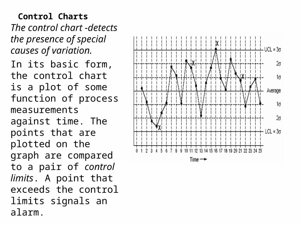
The control chart -detects the presence of special causes of variation.
In its basic form, the control chart is a plot of some function of process measurements against time. The points that are plotted on the graph are compared to a pair of control limits. A point that exceeds the control limits signals an alarm.
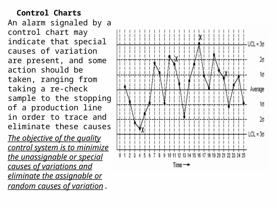
Control ChartsAn alarm signaled by a control chart may indicate that special causes of variation are present, and some action should be taken, ranging from taking a re-check sample to the stopping of a production line in order to trace and eliminate these causes
The objective of the quality control system is to minimize the unassignable or special causes of variations and eliminate the assignable or random causes of variation.
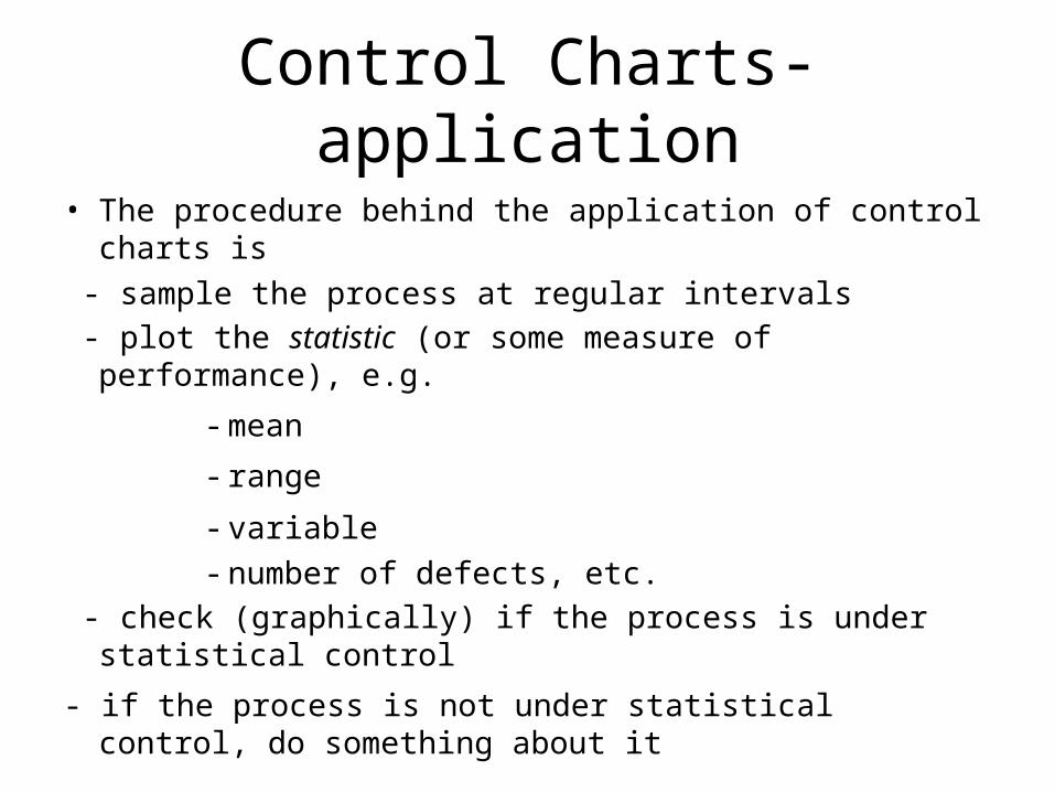
Control Charts- application
• The procedure behind the application of control charts is
- sample the process at regular intervals
- plot the statistic (or some measure of performance), e.g.
- mean
- range
- variable
- number of defects, etc.
- check (graphically) if the process is under statistical control
- if the process is not under statistical control, do something about it
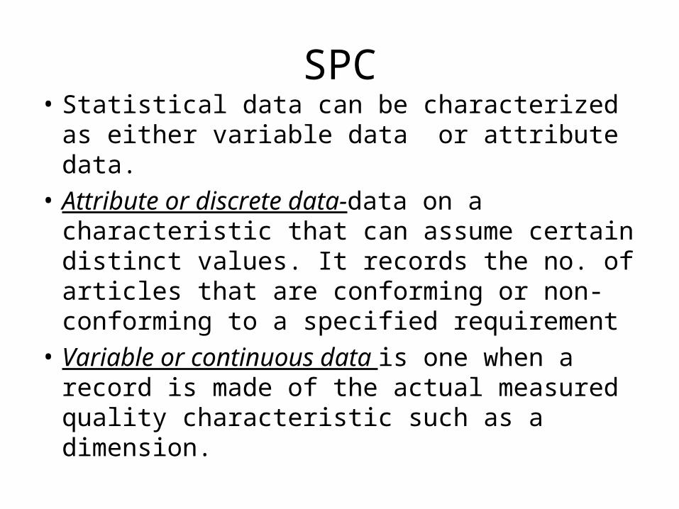
SPC• Statistical data can be characterized as
either variable data or attribute data.
• Attribute or discrete data-data on a characteristic that can assume certain distinct values. It records the no. of articles that are conforming or non-conforming to a specified requirement
• Variable or continuous data is one when a record is made of the actual measured quality characteristic such as a dimension.
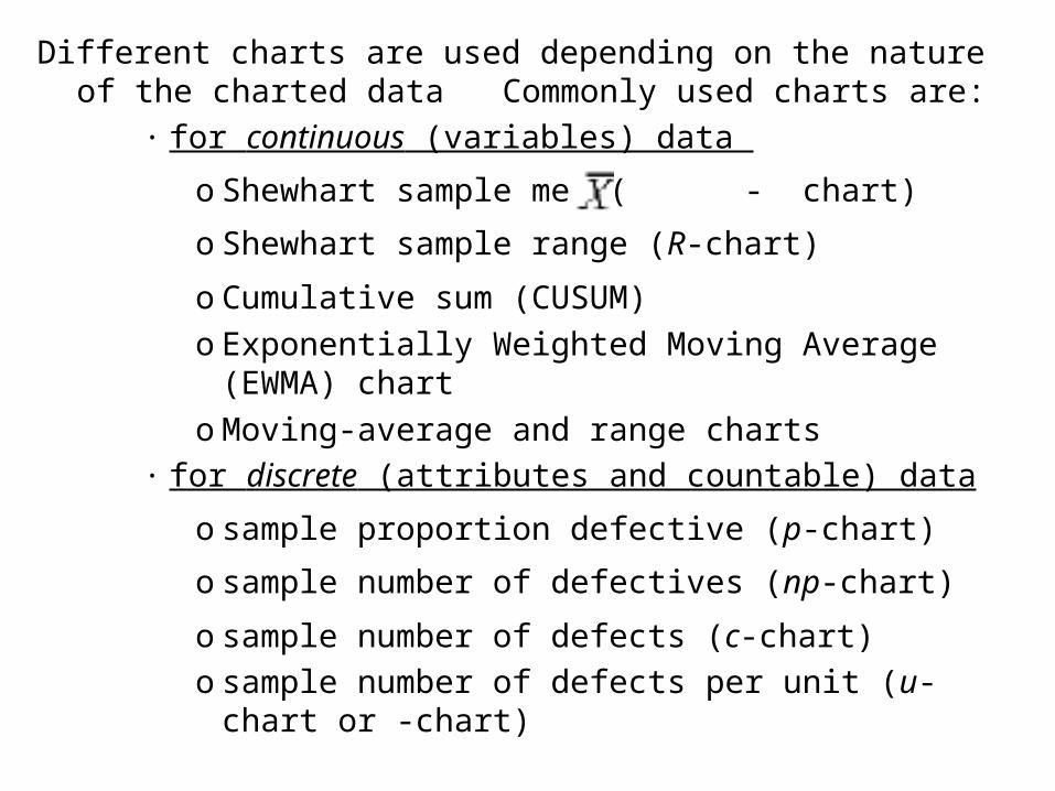
Different charts are used depending on the nature of the charted data Commonly used charts are:
· for continuous (variables) data
o Shewhart sample mean( - chart)
o Shewhart sample range (R-chart)
o Cumulative sum (CUSUM)
o Exponentially Weighted Moving Average (EWMA) chart
o Moving-average and range charts
· for discrete (attributes and countable) data
o sample proportion defective (p-chart)
o sample number of defectives (np-chart)
o sample number of defects (c-chart)
o sample number of defects per unit (u-chart or -chart)
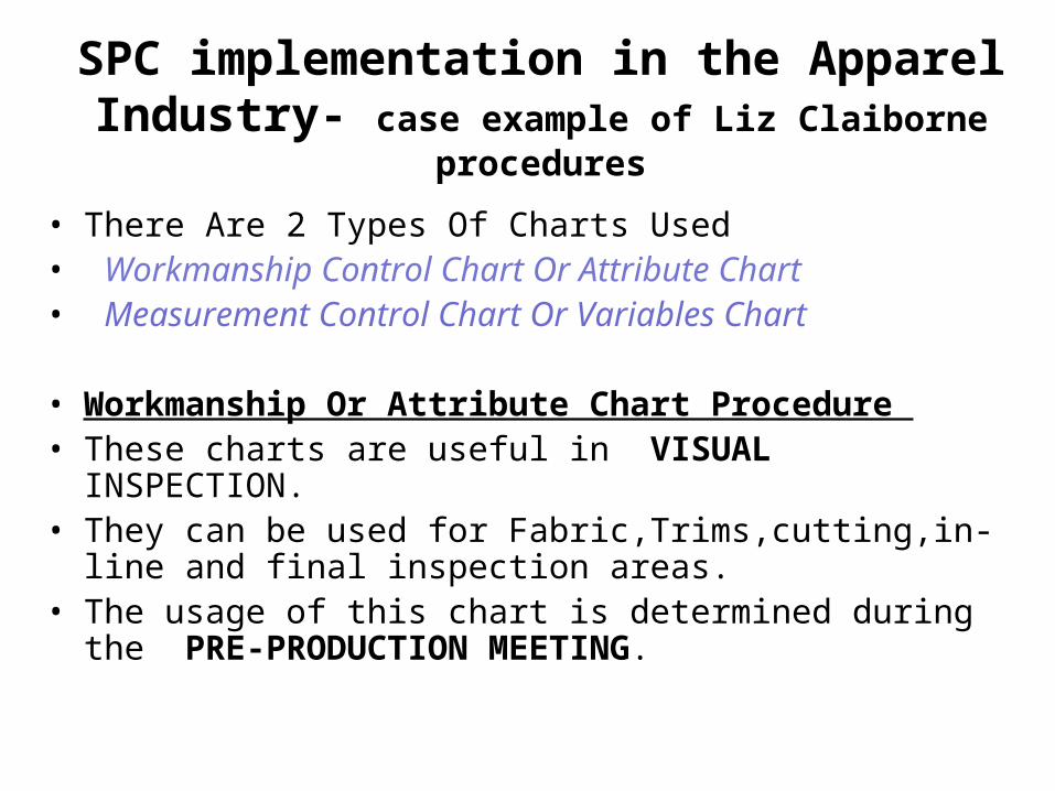
SPC implementation in the Apparel Industry- case example of Liz Claiborne procedures
• There Are 2 Types Of Charts Used • Workmanship Control Chart Or Attribute Chart• Measurement Control Chart Or Variables Chart
• Workmanship Or Attribute Chart Procedure • These charts are useful in VISUAL INSPECTION. • They can be used for Fabric,Trims,cutting,in-line and final
inspection areas.• The usage of this chart is determined during the PRE-
PRODUCTION MEETING.

SPC• WORKMANSHIP OR ATTRIBUTE CHART
PROCEDURE (contd.)-
• During the PPM- the QA manager and the QA team will decide about where the charts will be positioned based on the CRITICAL OPERATIONS of the garment. Critical operations are locations of a garment where the quality team predicts having potential problems due to difficulty in construction etc.
• The locations of measurements or variable charts are also determined at this meeting.
• The Auditor must have ACCEPTABLE STANDARDS set by the manager in order to conduct an audit.
• The SEALED SAMPLE can be used as a standard. If necessary a mock up of the operation can be established at the critical operation point.
SPC
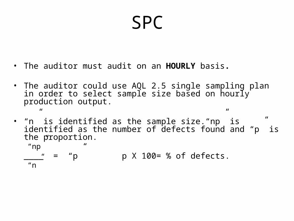
• The auditor must audit on an HOURLY basis.
• The auditor could use AQL 2.5 single sampling plan in order to select sample size based on hourly production output.
• “n” is identified as the sample size.“np” is identified as the number of defects found and “p” is the proportion.“np”
____ = “p” p X 100= % of defects.“n”
SPC
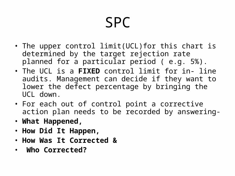
• The upper control limit(UCL)for this chart is determined by the target rejection rate planned for a particular period ( e.g. 5%).
• The UCL is a FIXED control limit for in- line audits. Management can decide if they want to lower the defect percentage by bringing the UCL down.
• For each out of control point a corrective action plan needs to be recorded by answering-
• What Happened,• How Did It Happen, • How Was It Corrected &• Who Corrected?
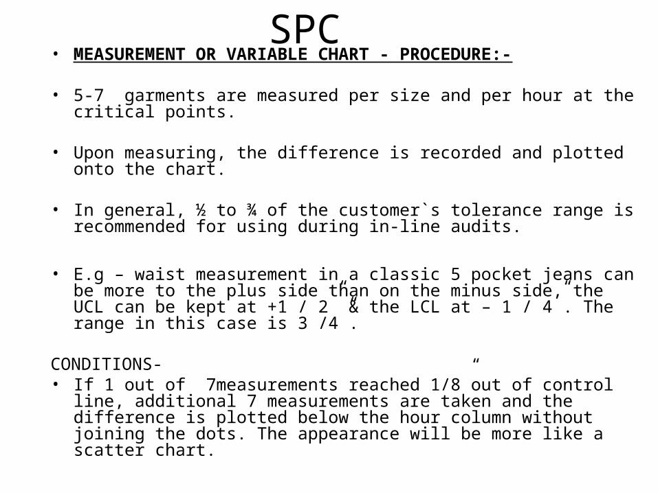
SPC• MEASUREMENT OR VARIABLE CHART - PROCEDURE:-
• 5-7 garments are measured per size and per hour at the critical points.
• Upon measuring, the difference is recorded and plotted onto the chart.
• In general, ½ to ¾ of the customer`s tolerance range is recommended for using during in-line audits.
• E.g – waist measurement in a classic 5 pocket jeans can be more to the plus side than on the minus side, the UCL can be kept at +1 / 2” & the LCL at – 1 / 4”. The range in this case is 3 /4”.
CONDITIONS-• If 1 out of 7measurements reached 1/8”out of control line, additional
7 measurements are taken and the difference is plotted below the hour column without joining the dots. The appearance will be more like a scatter chart.
SPC
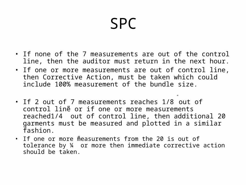
• If none of the 7 measurements are out of the control line, then the auditor must return in the next hour.
• If one or more measurements are out of control line, then Corrective Action, must be taken which could include 100% measurement of the bundle size.
• If 2 out of 7 measurements reaches 1/8” out of control line or if one or more measurements reached1/4” out of control line, then additional 20 garments must be measured and plotted in a similar fashion.
• If one or more measurements from the 20 is out of tolerance by ¼” or more then immediate corrective action should be taken.
Seven tools of Quality control
Unit 9-10
Ref:Mehta and Bhardwaj Ch 13
Sara Kadolph ch 15
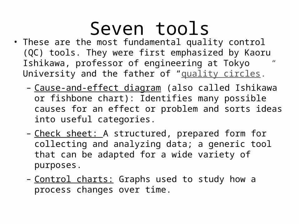
Seven tools• These are the most fundamental quality control (QC) tools.
They were first emphasized by Kaoru Ishikawa, professor of engineering at Tokyo University and the father of “quality circles.”
– Cause-and-effect diagram (also called Ishikawa or fishbone chart): Identifies many possible causes for an effect or problem and sorts ideas into useful categories.
– Check sheet: A structured, prepared form for collecting and analyzing data; a generic tool that can be adapted for a wide variety of purposes.
– Control charts: Graphs used to study how a process changes over time.

Seven tools– Histogram: The most commonly used graph for
showing frequency distributions, or how often each different value in a set of data occurs.
– Pareto chart: Shows on a bar graph which factors are more significant.
– Scatter diagram: Graphs pairs of numerical data, one variable on each axis, to look for a relationship.
– Flow chart: A technique that separates data gathered from a variety of sources so that patterns can be seen
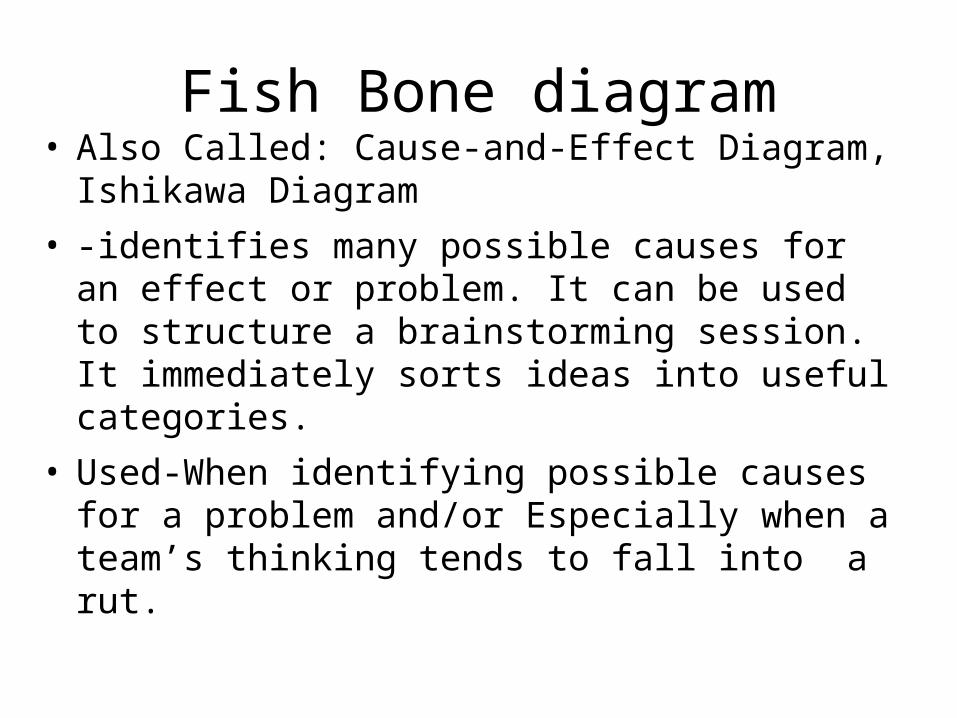
Fish Bone diagram• Also Called: Cause-and-Effect Diagram, Ishikawa
Diagram
• -identifies many possible causes for an effect or problem. It can be used to structure a brainstorming session. It immediately sorts ideas into useful categories.
• Used-When identifying possible causes for a problem and/or Especially when a team’s thinking tends to fall into a rut.
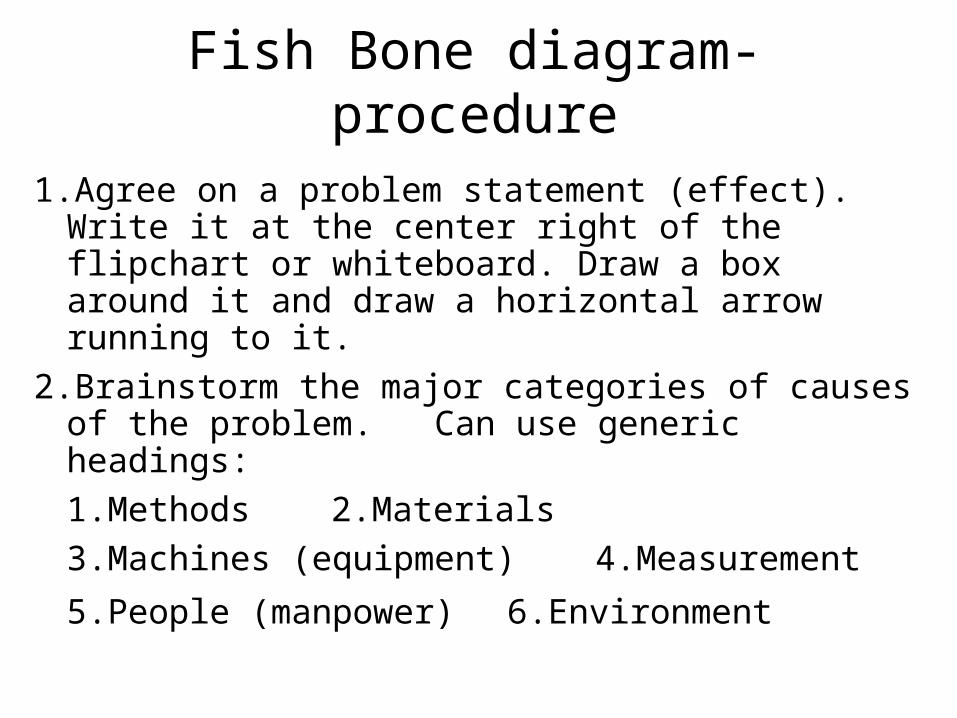
Fish Bone diagram- procedure
1.Agree on a problem statement (effect). Write it at the center right of the flipchart or whiteboard. Draw a box around it and draw a horizontal arrow running to it.
2.Brainstorm the major categories of causes of the problem. Can use generic headings:
1.Methods 2.Materials
3.Machines (equipment) 4.Measurement
5.People (manpower) 6.Environment
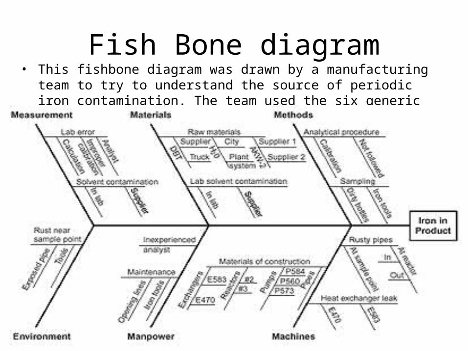
Fish Bone diagram• This fishbone diagram was drawn by a manufacturing team to try to
understand the source of periodic iron contamination. The team used the six generic headings to prompt ideas.

Check sheet• Also called: defect concentration diagram
• A check sheet is a structured, prepared form for collecting and analyzing data. This is a generic tool that can be adapted for a wide variety of purposes.
• When to Use
When data can be observed and collected repeatedly by the same person or at the same location.
When collecting data on the frequency or patterns of events, problems, defects, defect location, defect causes, etc.
When collecting data from a production process.

Check sheet• Procedure
– Decide what event or problem will be observed. Develop operational definitions.
– Decide when data will be collected and for how long.
– Design the form. Set it up so that data can be recorded simply by making check marks or Xs or similar symbols and so that data do not have to be recopied for analysis.
– Label all spaces on the form.
– Test the check sheet for a short trial period to be sure it collects the appropriate data and is easy to use.
– Each time the targeted event or problem occurs, record data on the check sheet.
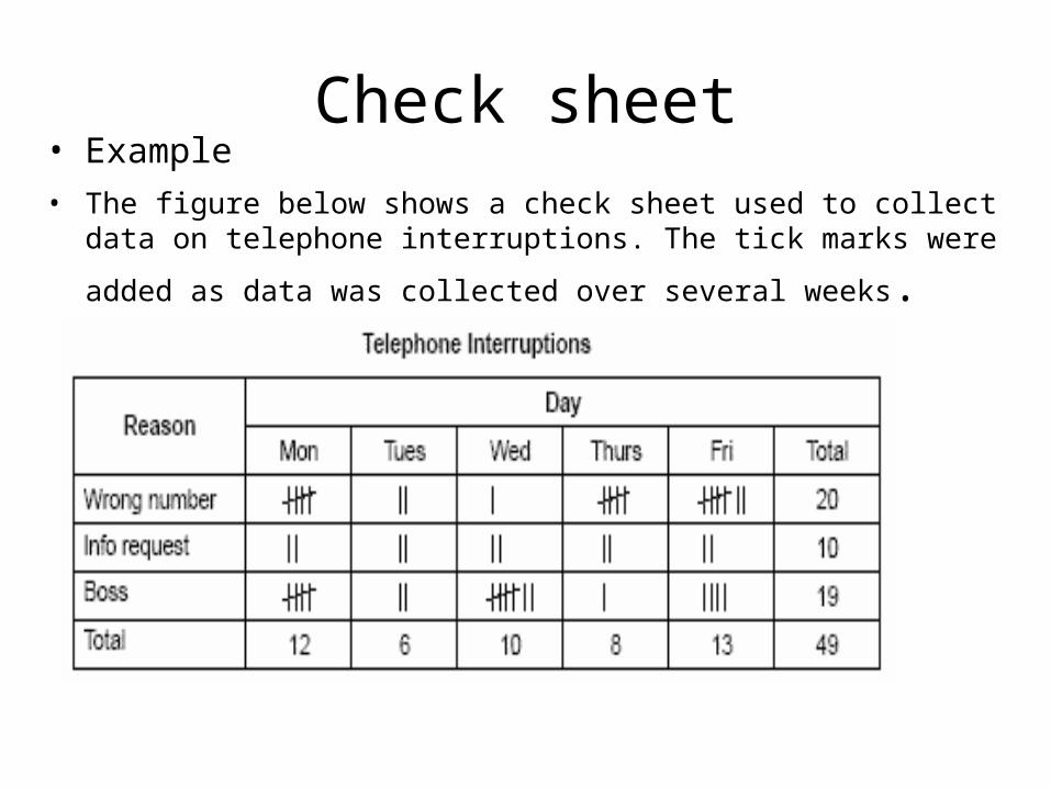
Check sheet• Example
• The figure below shows a check sheet used to collect data on telephone interruptions. The tick marks were added as data was
collected over several weeks.
Control Chart• Also called: statistical process control chart
• Different types of control charts can be used, depending upon the type of data. The two broadest groupings are for variable data and attribute data.
• Variable data are measured on a continuous scale. For example: time, weight, distance or temperature can be measured in fractions or decimals. The possibility of measuring to greater precision defines variable data.
• Attribute data are counted and cannot have fractions or decimals. Attribute data arise when you are determining only the presence or absence of something: success or failure, accept or reject, correct or not correct. For example, a report can have four errors or five errors, but it cannot have four and a half errors.

Control ChartVariables charts
–X and R chart (also called averages and range chart)
–X and s chart
chart of individuals (also called X chart, X-R chart, IX-MR chart, Xm R chart, moving range chart)
moving average–moving range chart (also called MA–MR chart)
target charts (also called difference charts, deviation charts and nominal charts)
CUSUM (also called cumulative sum chart)
EWMA (also called exponentially weighted moving average chart)
multivariate chart (also called Hotelling T2)
Attributes charts
p chart (also called proportion chart)
np chart
c chart (also called count chart)
u chart
Control Chart• When to Use
When controlling ongoing processes by finding and correcting problems as they occur.
When predicting the expected range of outcomes from a process.
When determining whether a process is stable (in statistical control).
When analyzing patterns of process variation from special causes (non-routine events) or common causes (built into the process).
When determining whether your quality improvement project should aim to prevent specific problems or to make fundamental changes to the process.
Histogram• A frequency distribution shows how often each different value in a set of
data occurs. A histogram is the most commonly used graph to show frequency distributions. It looks very much like a bar chart, but there are important differences between them.
• When to Use
When the data are numerical.
When you want to see the shape of the data’s distribution, especially when determining whether the output of a process is distributed approximately normally.
When analyzing whether a process can meet the customer’s requirements.
When analyzing what the output from a supplier’s process looks like.
When seeing whether a process change has occurred from one time period to another.
When determining whether the outputs of two or more processes are different.
When you wish to communicate the distribution of data quickly and easily to others.
Histogram
• Analysis Before drawing any conclusions from your histogram,
satisfy yourself that the process was operating normally during the time period being studied. If any unusual events affected the process during the time period of the histogram, your analysis of the histogram shape probably cannot be generalized to all time periods.
Analyze the meaning of your histogram’s shape.

Histogram• Normal. A common pattern is the bell-shaped curve known as the “normal
distribution.” In a normal distribution, points are as likely to occur on one side of the average as on the other. Be aware, however, that other distributions look similar to the normal distribution. Statistical calculations must be used to prove a normal distribution.

Histogram• Skewed- The skewed distribution is asymmetrical because a natural limit
prevents outcomes on one side. The distribution’s peak is off center toward the limit and a tail stretches away from it. For example, a distribution of analyses of a very pure product would be skewed, because the product cannot be more than 100 percent pure. Other examples of natural limits are holes that cannot be smaller than the diameter of the drill bit or call-handling times that cannot be less than zero. These distributions are called right- or left-skewed according to the direction of the tail.
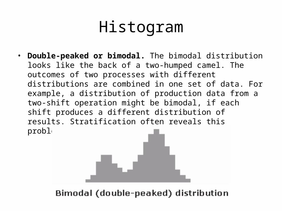
Histogram
• Double-peaked or bimodal. The bimodal distribution looks like the back of a two-humped camel. The outcomes of two processes with different distributions are combined in one set of data. For example, a distribution of production data from a two-shift operation might be bimodal, if each shift produces a different distribution of results. Stratification often reveals this problem.
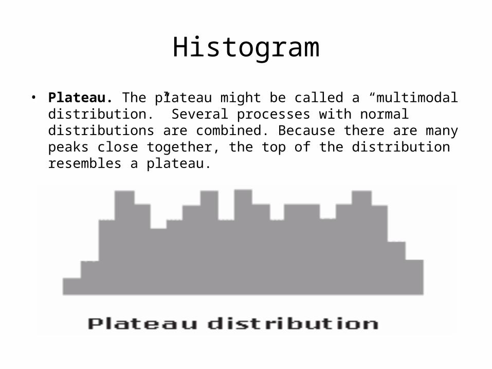
Histogram
• Plateau. The plateau might be called a “multimodal distribution.” Several processes with normal distributions are combined. Because there are many peaks close together, the top of the distribution resembles a plateau.

Histogram
• Edge peak. The edge peak distribution looks like the normal distribution except that it has a large peak at one tail. Usually this is caused by faulty construction of the histogram, with data lumped together into a group labeled “greater than…”
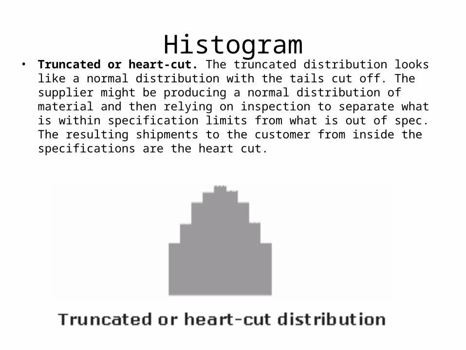
Histogram• Truncated or heart-cut. The truncated distribution looks like a normal
distribution with the tails cut off. The supplier might be producing a normal distribution of material and then relying on inspection to separate what is within specification limits from what is out of spec. The resulting shipments to the customer from inside the specifications are the heart cut.
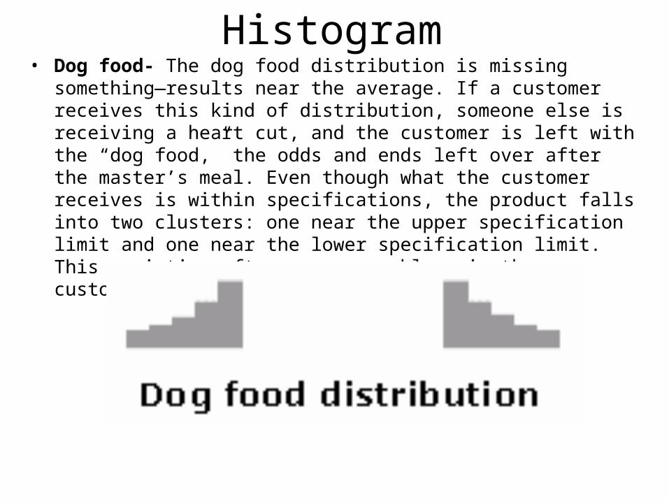
Histogram• Dog food- The dog food distribution is missing something—results
near the average. If a customer receives this kind of distribution, someone else is receiving a heart cut, and the customer is left with the “dog food,” the odds and ends left over after the master’s meal. Even though what the customer receives is within specifications, the product falls into two clusters: one near the upper specification limit and one near the lower specification limit. This variation often causes problems in the customer’s process.
Bar Chart• Also called: Pareto diagram, Pareto analysis
• A Pareto chart is a bar graph. The lengths of the bars represent frequency or cost (time or money), and are arranged with longest bars on the left and the shortest to the right. In this way the chart visually depicts which situations are more significant.
When to Use
When analyzing data about the frequency of problems or causes in a process.
When there are many problems or causes and you want to focus on the most significant.
When analyzing broad causes by looking at their specific components.
When communicating with others about your data.
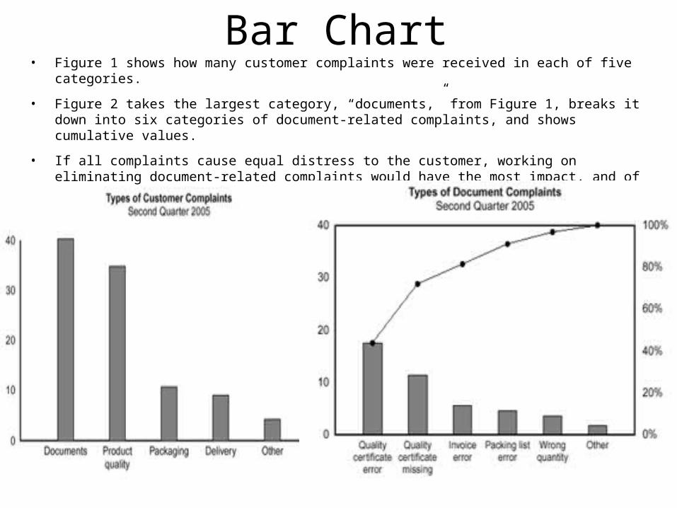
Bar Chart• Figure 1 shows how many customer complaints were received in each of five categories.
• Figure 2 takes the largest category, “documents,” from Figure 1, breaks it down into six categories of document-related complaints, and shows cumulative values.
• If all complaints cause equal distress to the customer, working on eliminating document-related complaints would have the most impact, and of those, working on quality certificates should be most fruitful.

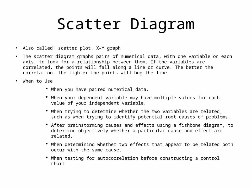
Scatter Diagram• Also called: scatter plot, X–Y graph
• The scatter diagram graphs pairs of numerical data, with one variable on each axis, to look for a relationship between them. If the variables are correlated, the points will fall along a line or curve. The better the correlation, the tighter the points will hug the line.
• When to Use
When you have paired numerical data.
When your dependent variable may have multiple values for each value of your independent variable.
When trying to determine whether the two variables are related, such as when trying to identify potential root causes of problems.
After brainstorming causes and effects using a fishbone diagram, to determine objectively whether a particular cause and effect are related.
When determining whether two effects that appear to be related both occur with the same cause.
When testing for autocorrelation before constructing a control chart.
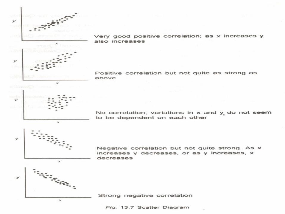

Scatter Diagram- some facts Even if the scatter diagram shows a relationship, do not assume that one
variable caused the other. Both may be influenced by a third variable. When the data are plotted, the more the diagram resembles a straight line,
the stronger the relationship. If a line is not clear, statistics (N and Q) determine whether there is
reasonable certainty that a relationship exists. If the statistics say that no relationship exists, the pattern could have occurred by random chance.
If the scatter diagram shows no relationship between the variables, consider whether the data might be stratified.
If the diagram shows no relationship, consider whether the independent (x-axis) variable has been varied widely. Sometimes a relationship is not apparent because the data don’t cover a wide enough range.
Think creatively about how to use scatter diagrams to discover a root cause. Drawing a scatter diagram is the first step in looking for a relationship
between variables.
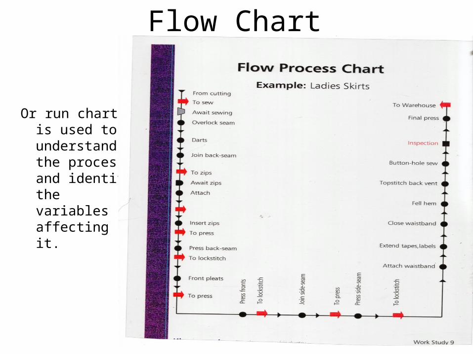
Flow Chart
Or run chart is used to understand the process and identify the variables affecting it.
New Tools of Quality
Material from-www.asq.org
The Quality Toolbox, Nancy R. Tague Second Edition,
ASQ Quality Press, 2004.

Quality Tools
Cause Analysis Tools• Fishbone (Ishikawa) diagram: identifies many
possible causes for an effect or problem and sorts ideas into useful categories.
• Pareto chart: shows on a bar graph which factors are more significant.
• Scatter diagram: graphs pairs of numerical data, with one variable on each axis, to help you look for a relationship.
Quality Tools
Evaluation and Decision-Making Tools
• Decision matrix: Evaluates and prioritizes a list of options, using pre-determined weighted criteria.
• Multivoting: Narrows a large list of possibilities to a smaller list of the top priorities or to a final selection; allows an item that is favored by all, but not the top choice of any, to rise to the top.

Quality Tools
Process Analysis Tools• Flowchart: A picture of the separate steps of a process in sequential
order, including materials or services entering or leaving the process (inputs and outputs), decisions that must be made, people who become involved, time involved at each step and/or process measurements.
• Failure modes and effects analysis (FMEA): A step-by-step approach for identifying all possible failures in a design, a manufacturing or assembly process, or a product or service; studying the consequences, or effects, of those failures; and eliminating or reducing failures, starting with the highest-priority ones.
• Mistake-proofing: The use of any automatic device or method that either makes it impossible for an error to occur or makes the error immediately obvious once it has occurred.
Quality Tools
Data Collection and Analysis Tools• Box and Whisker Plot: A tool used to display and analyze
multiple sets of variation data on a single graph. • Check sheet: A generic tool that can be adapted for a
wide variety of purposes, the check sheet is a structured, prepared form for collecting and analyzing data.
• Control chart: A graph used to study how a process changes over time. Comparing current data to historical control limits leads to conclusions about whether the process variation is consistent (in control) or is unpredictable (out of control, affected by special causes of variation).

Box and Whisker Plot

Quality Tools
Data Collection and Analysis Tools• Design of experiments: A method for carrying out carefully planned
experiments on a process. Usually, design of experiments involves a series of experiments that start by looking broadly at a great many variables and then focus on the few critical ones.
• Histogram: The most commonly used graph for showing frequency distributions, or how often each different value in a set of data occurs.
• Scatter diagram: A diagram that graphs pairs of numerical data, one variable on each axis, to look for a relationship.
• Stratification: A technique that separates data gathered from a variety of sources so that patterns can be seen.
• Survey: Data collected from targeted groups of people about their opinions, behavior or knowledge.
Quality Tools
Idea Creation Tools• Affinity diagram: Organizes a large number of ideas into
their natural relationships.• Benchmarking: A structured process for comparing your
organization’s work practices to the best similar practices you can identify in other organizations, and then incorporating the best ideas into your own processes.
• Brainstorming: A method for generating a large number of creative ideas in a short period of time.
• Nominal group technique: A structured method for group brainstorming that encourages contributions from everyone.

Quality Tools
Project Planning and Implementing Tools• Gantt chart: a bar chart that shows the tasks of
a project, when each must take place, how long each will take and completion status.
• PDCA Cycle (plan-do-check-act) or PDSA (plan-do-study-act): a four-step model for carrying out change that can be repeated again and again for continuous improvement.

Gnatt Chart
Seven New Management and Planning Tools
• In 1976, the Union of Japanese Scientists and Engineers (JUSE) saw the need for tools to promote innovation, communicate information and successfully plan major projects.
• A team researched and developed the seven new quality control tools, often called the seven management and planning (MP) tools, or simply the seven management tools.
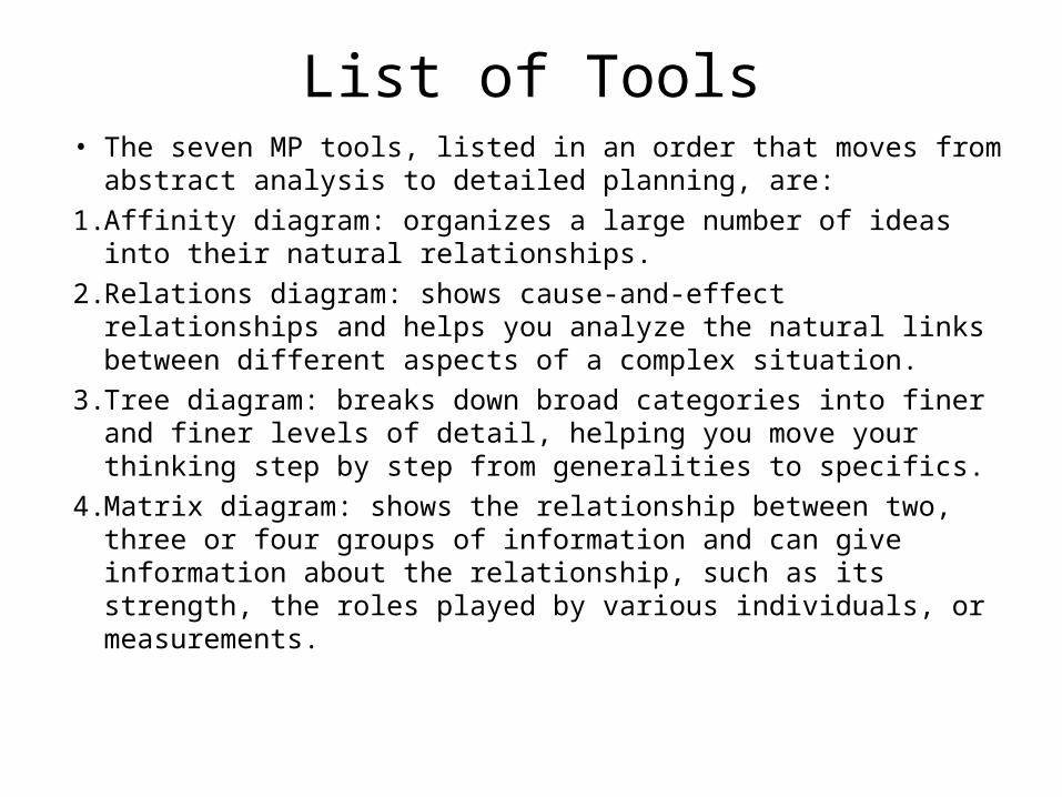
List of Tools• The seven MP tools, listed in an order that moves from abstract
analysis to detailed planning, are:
1. Affinity diagram: organizes a large number of ideas into their natural relationships.
2. Relations diagram: shows cause-and-effect relationships and helps you analyze the natural links between different aspects of a complex situation.
3. Tree diagram: breaks down broad categories into finer and finer levels of detail, helping you move your thinking step by step from generalities to specifics.
4. Matrix diagram: shows the relationship between two, three or four groups of information and can give information about the relationship, such as its strength, the roles played by various individuals, or measurements.

5 . Matrix data analysis: a complex mathematical technique for analyzing matrices, often replaced in this list by the similar prioritization matrix. One of the most rigorous, careful and time-consuming of decision-making tools, a prioritization matrix is an L-shaped matrix that uses pair wise comparisons of a list of options to a set of criteria in order to choose the best option(s).
6. Arrow diagram: shows the required order of tasks in a project or process, the best schedule for the entire project, and potential scheduling and resource problems and their solutions.
7. Process decision program chart (PDPC): systematically identifies what might go wrong in a plan under development.
List of Tools
Affinity Diagram
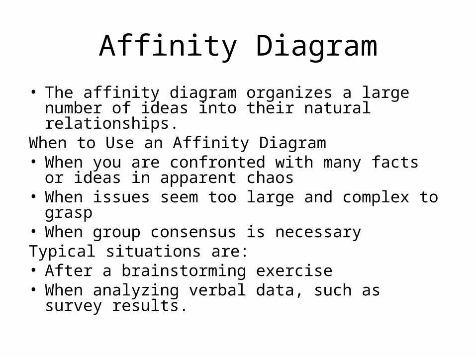
• The affinity diagram organizes a large number of ideas into their natural relationships.
When to Use an Affinity Diagram• When you are confronted with many facts or ideas
in apparent chaos• When issues seem too large and complex to
grasp • When group consensus is necessaryTypical situations are:• After a brainstorming exercise • When analyzing verbal data, such as survey
results.

Affinity Diagram
• The Affinity Diagram Method clarifies important but unresolved problem by collecting verbal data from disordered and confused situations and analyzing that data by mutual affinity.
• After ideas are brainstormed and written on cards, they are grouped together with similar ideas.
• It is typically represented graphically as nested squared (concept) which have smaller and smaller sub-groupings of concepts. A header card is created which capture the meaning of each group of ideas.

Brainstorming for Affinity Diagram
Affinity Diagram

Functions of an Affinity Diagram
• Establish a quality control (QC) policy for a new company or a new factory to implement that plan.
• Establish a QC policy concerning new projects, new products, or new technology and to implement that plan.
• Conduct quality assurance market surveys when entering a new untested policy.
• Find a starting point for a new TQC promotion by creating a consensus among people with varying opinions regarding the problems that arise within each department.
• Invigorate project teams within various groups.

Relations Diagram
• The relations diagram shows cause-and-effect relationships.
• A Relations Diagram is used for persistent, complex problems that have no apparent solutions.
• Data teams explore a problem by first thinking of all the possible causes and then use a “Key Driver” process to determine which causes are driving most of the others.
• The key driver process reveals which cause to address first with a solution.
Relations Diagram
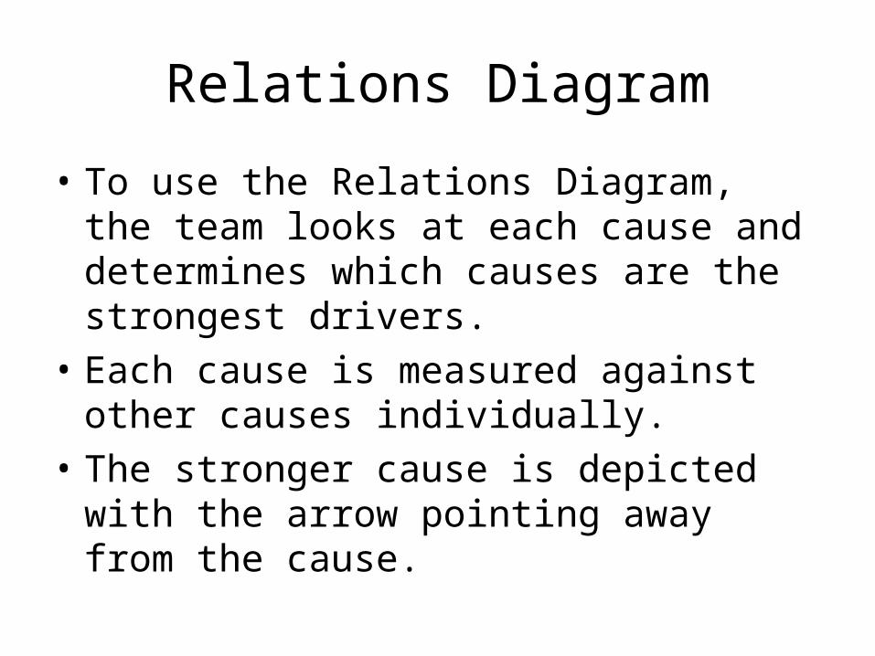
• To use the Relations Diagram, the team looks at each cause and determines which causes are the strongest drivers.
• Each cause is measured against other causes individually.
• The stronger cause is depicted with the arrow pointing away from the cause.
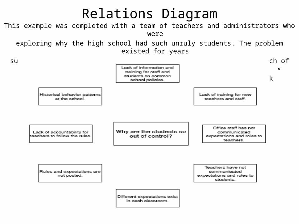
Relations DiagramThis example was completed with a team of teachers and administrators who were
exploring why the high school had such unruly students. The problem existed for years
surviving several different administrations and staff changes. Each of the causes below
was identified and grouped together through a “Think, Ink, Link” activity.
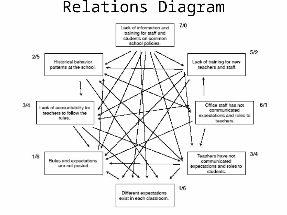
Relations Diagram

Relations Diagram
• The stronger cause is depicted with the arrow pointing away from the cause.
• In this example, “Lack of information and training for staff and students on common school policies” is the number one driver (7/0) followed by “office staff not communicating expectations and roles to teachers” (6/1).
• Using this tool will help teams know what action they need to take first to solve the problem they are facing.
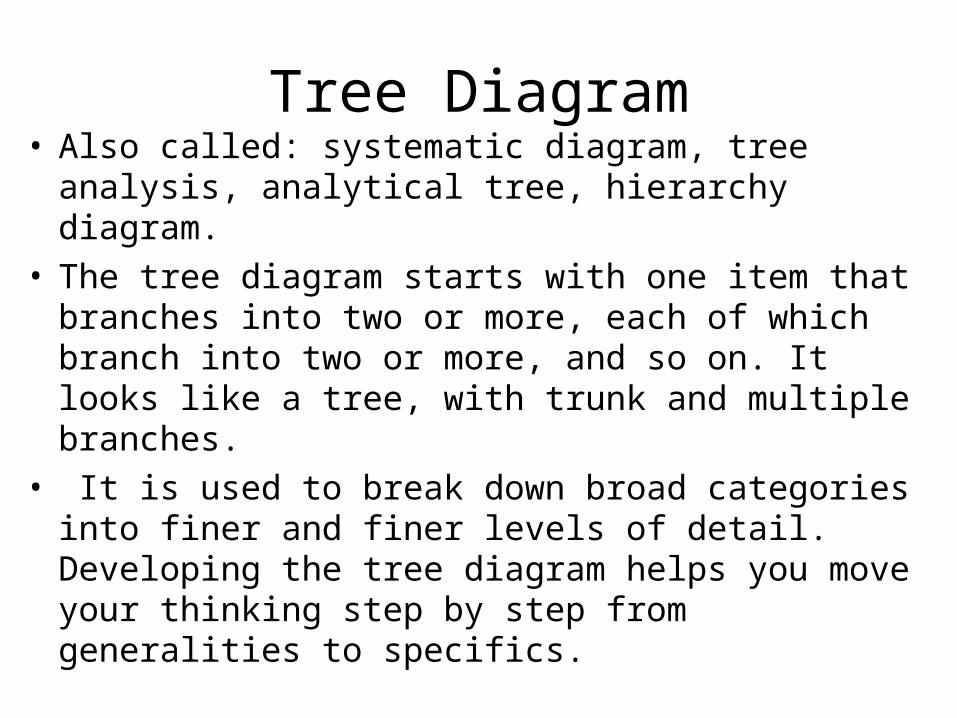
Tree Diagram• Also called: systematic diagram, tree analysis,
analytical tree, hierarchy diagram.• The tree diagram starts with one item that branches
into two or more, each of which branch into two or more, and so on. It looks like a tree, with trunk and multiple branches.
• It is used to break down broad categories into finer and finer levels of detail. Developing the tree diagram helps you move your thinking step by step from generalities to specifics.
Tree Diagram
• When to Use a Tree Diagram • When an issue is known or being addressed in broad generalities
and you must move to specific details, such as when developing logical steps to achieve an objective.
• When developing actions to carry out a solution or other plan. • When analyzing processes in detail. • When probing for the root cause of a problem. • When evaluating implementation issues for several potential
solutions. • After an affinity diagram or relations diagram has uncovered key
issues. • As a communication tool, to explain details to others.
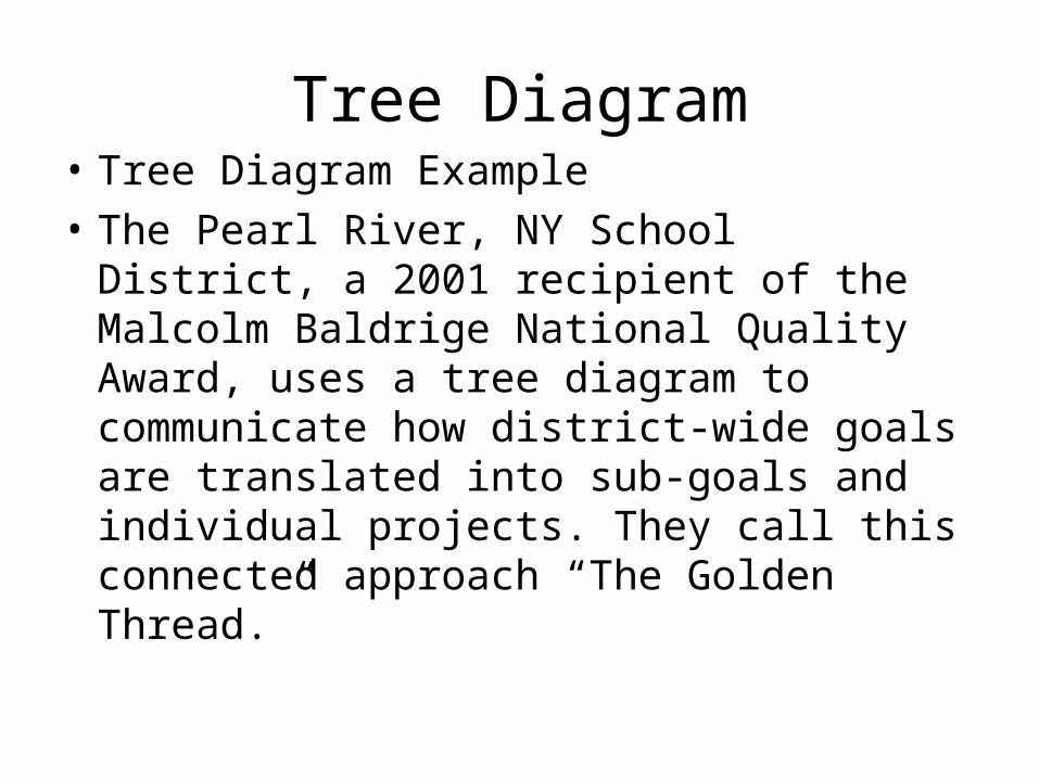
Tree Diagram• Tree Diagram Example
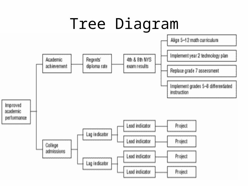
• The Pearl River, NY School District, a 2001 recipient of the Malcolm Baldrige National Quality Award, uses a tree diagram to communicate how district-wide goals are translated into sub-goals and individual projects. They call this connected approach “The Golden Thread.”
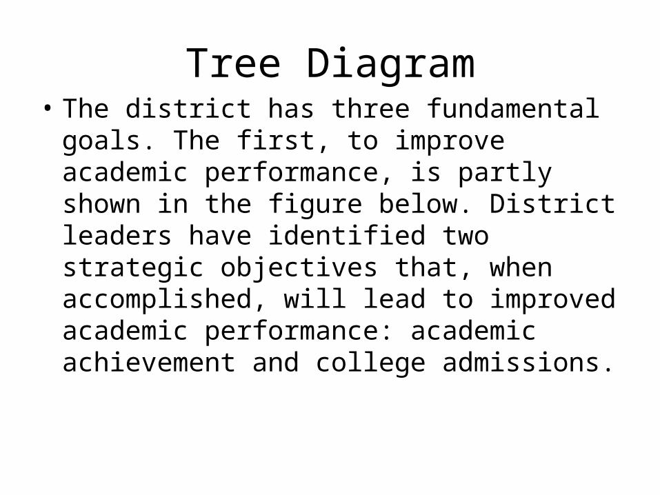
Tree Diagram• The district has three fundamental goals.
The first, to improve academic performance, is partly shown in the figure below. District leaders have identified two strategic objectives that, when accomplished, will lead to improved academic performance: academic achievement and college admissions.
Tree Diagram

Tree Diagram• Lag indicators are long-term and results-
oriented. The lag indicator for academic achievement is Regents’ diploma rate: the percent of students receiving a state diploma by passing eight Regents’ exams.
• Lead indicators are short-term and process-oriented. Starting in 2000, the lead indicator for the Regents’ diploma rate was performance on new fourth and eighth grade state tests.
Tree Diagram• Finally, annual projects are defined, based on
cause-and-effect analysis, that will improve performance. In 2000–2001, four projects were accomplished to improve academic achievement.
• Thus this tree diagram is an interlocking series of goals and indicators, tracing the causes of system wide academic performance first through high school diploma rates, then through lower grade performance, and back to specific improvement projects.
Matrix Diagram
• The matrix diagram shows the relationship between two, three or four groups of information. It also can give information about the relationship, such as its strength, the roles played by various individuals or measurements.
• Six differently shaped matrices are possible: L, T, Y, X, C and roof-shaped, depending on how many groups must be compared

Matrix Diagram• An L-shaped matrix relates two groups of
items to each other (or one group to itself).
• A T-shaped matrix relates three groups of items: groups B and C are each related to A. Groups B and C are not related to each other.
• A Y-shaped matrix relates three groups of items. Each group is related to the other two in a circular fashion.

Matrix Diagram• A C-shaped matrix relates three groups of
items all together simultaneously, in 3-D.
• An X-shaped matrix relates four groups of items. Each group is related to two others in a circular fashion.
• A roof-shaped matrix relates one group of items to itself. It is usually used along with an L- or T-shaped matrix.
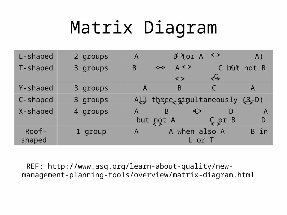
Matrix Diagram
L-shaped 2 groups A B (or A A)
T-shaped 3 groups B A C but not B C
Y-shaped 3 groups A B C A
C-shaped 3 groups All three simultaneously (3-D)
X-shaped 4 groups A B C D A but not A C or B D
Roof-shaped
1 group A A when also A B in L or T
REF: http://www.asq.org/learn-about-quality/new-management-planning-tools/overview/matrix-diagram.html
Arrow Diagram
• Also called: activity network diagram, network diagram, activity chart, node diagram, CPM (critical path method) chart.
• The arrow diagram shows the required order of tasks in a project or process, the best schedule for the entire project, and potential scheduling and resource problems and their solutions. The arrow diagram lets you calculate the “critical path” of the project. This is the flow of critical steps where delays will affect the timing of the entire project and where addition of resources can speed up the project.

Arrow Diagram
• When to Use an Arrow Diagram • When scheduling and monitoring tasks within a
complex project or process with interrelated tasks and resources.
• When you know the steps of the project or process, their sequence and how long each step takes, and.
• When project schedule is critical, with serious consequences for completing the project late or significant advantage to completing the project early.


Process Decision Program Chart
• The process decision program chart systematically identifies what might go wrong in a plan under development. Countermeasures are developed to prevent or offset those problems. By using PDPC, you can either revise the plan to avoid the problems or be ready with the best response when a problem occurs.
Process Decision Program Chart
• When to Use PDPC
• Before implementing a plan, especially when the plan is large and complex.
• When the plan must be completed on schedule.
• When the price of failure is high.
Process Decision Program Chart
• PDPC Example • A medical group is planning to improve the
care of patients with chronic illnesses such as diabetes and asthma through a new chronic illness management program (CIMP). They have defined four main elements and, for each of these elements, key components. The information is laid out in the process decision program chart- next slide

Process Decision Program Chart

Process Decision Program Chart
• Dotted lines represent sections of the chart that have been omitted. Only some of the potential problems and countermeasures identified by the planning team are shown on this chart.

Process Decision Program Chart
• For example, one of the possible problems with patients’ goal-setting is backsliding.
• The team liked the idea of each patient having a buddy or sponsor and will add that to the program design.
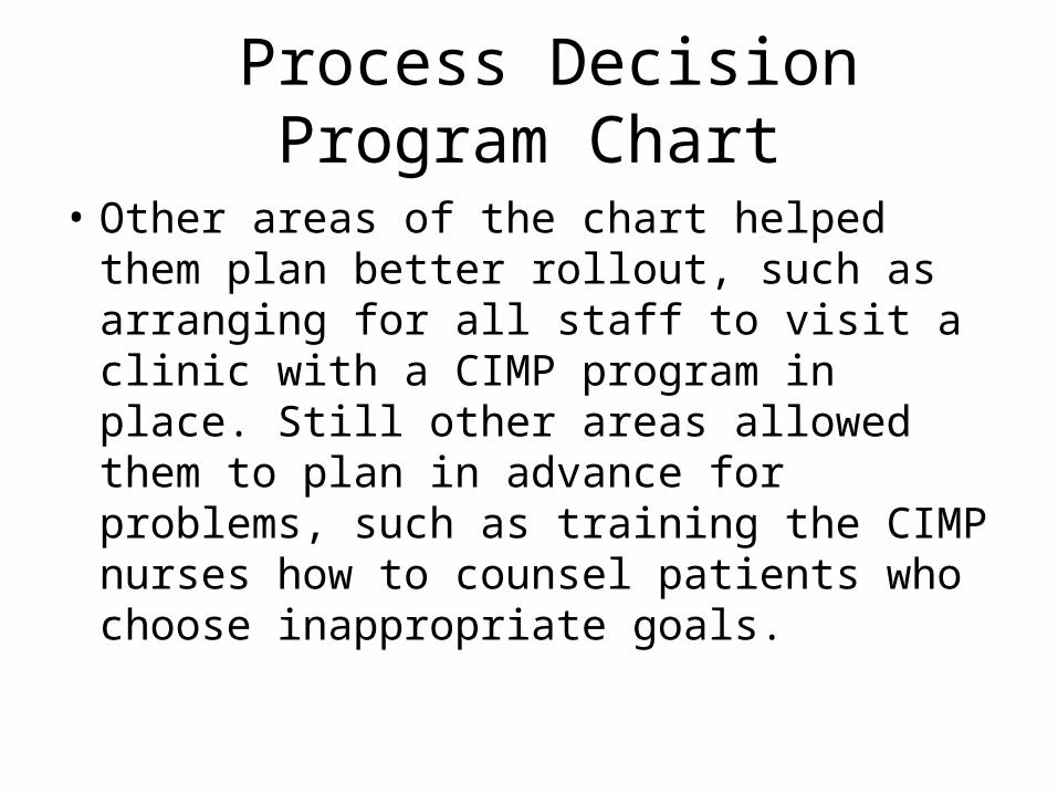
Process Decision Program Chart
• Other areas of the chart helped them plan better rollout, such as arranging for all staff to visit a clinic with a CIMP program in place. Still other areas allowed them to plan in advance for problems, such as training the CIMP nurses how to counsel patients who choose inappropriate goals.

Cost Of Quality and Quality Maturity Grid
Unit 11-12
Ref. Philip Crosby-Quality is free.
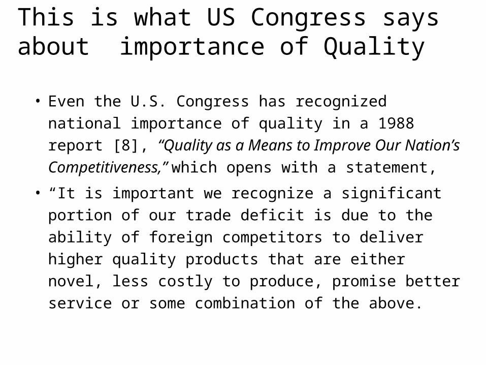
This is what US Congress says about importance of Quality
• Even the U.S. Congress has recognized national
importance of quality in a 1988 report [8],
“Quality as a Means to Improve Our Nation’s
Competitiveness,” which opens with a statement,
• “It is important we recognize a significant portion
of our trade deficit is due to the ability of foreign
competitors to deliver higher quality products that
are either novel, less costly to produce, promise
better service or some combination of the above.

This is what US Congress says about importance of Quality
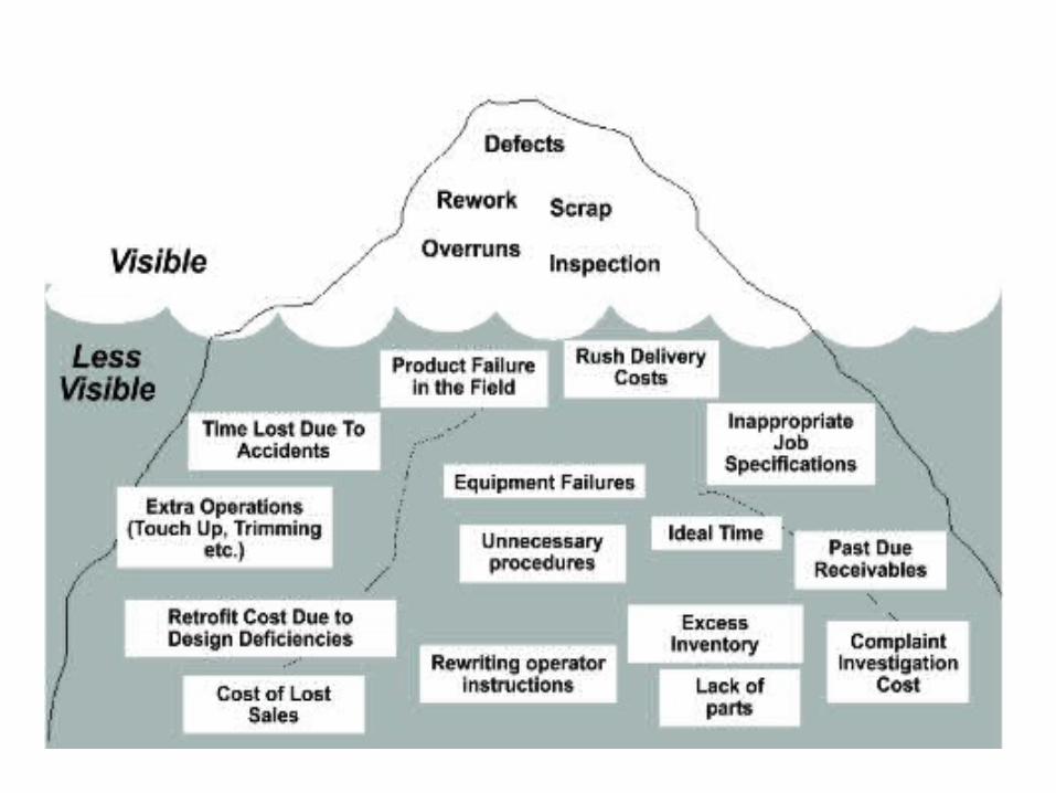
• What finally sank into US industry is the tremendous cost of ignoring quality. In most traditional factories that cost is probably the biggest item on their list of expenses, and it is always bigger than gross profit. But because the cost of quality is rarely broken out in gory detail, management has no idea of its true dimensions. When quality audits are performed, they invariably uncover huge “hidden plants” staffed and equipped just to find and fix defective products.
Why Quality?
• Quality related costs can be as high as 25%
of sales.
• One fourth of the people employed do not
produce but re-do and re-inspect & re-re-do.
• Quality costs are greater than gross profit.
• In world class companies these costs can be
brought down to 2.5%.

Quality : DefinitionQuality : Definition
Offering product or services that a customer has never dreamt of, forget alone specifying the need for it. But having received the product the customer feels that he always needed it

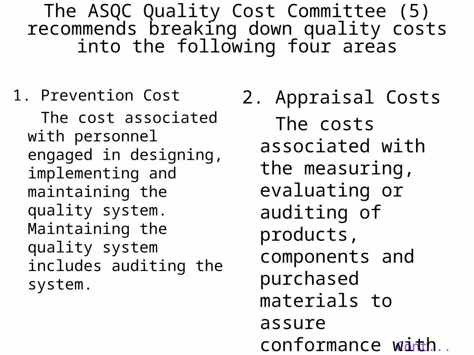
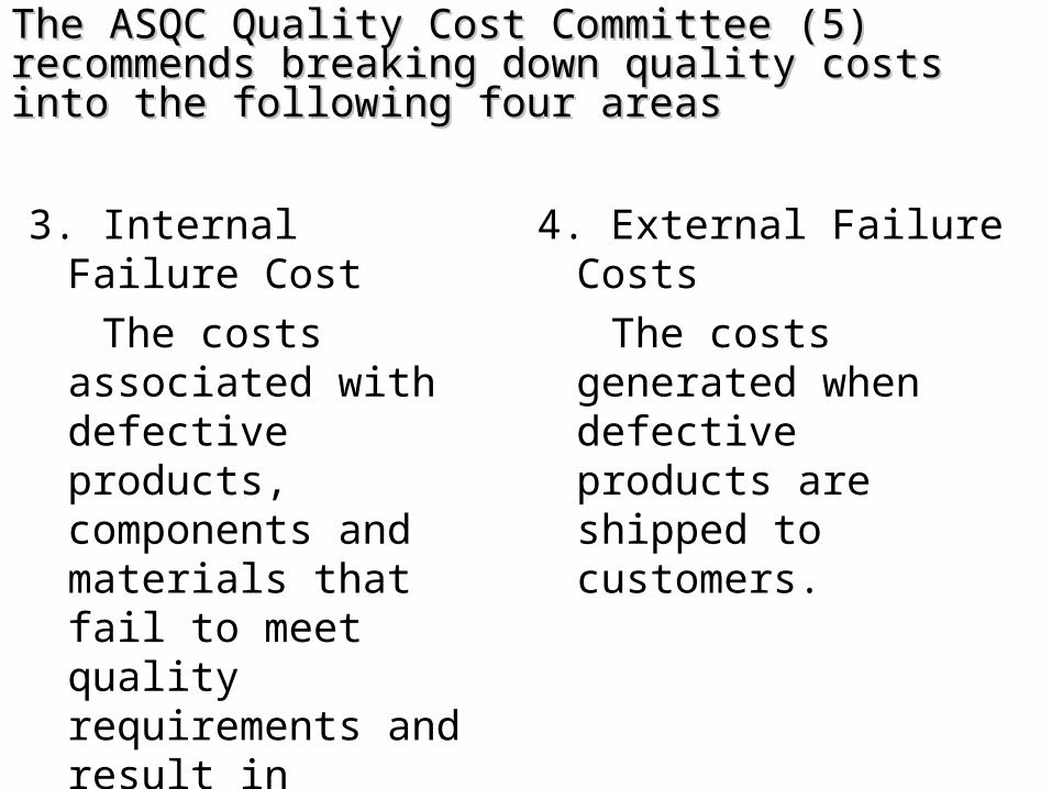
The ASQC Quality Cost Committee (5) recommends breaking down quality costs into the following four areas
1. Prevention Cost
The cost associated with personnel engaged in designing, implementing and maintaining the quality system. Maintaining the quality system includes auditing the system.
Cont...
2. Appraisal Costs
The costs associated with the measuring, evaluating or auditing of products, components and purchased materials to assure conformance with quality standards and performance requirements.
The ASQC Quality Cost Committee (5) The ASQC Quality Cost Committee (5) recommends breaking down quality costs into the recommends breaking down quality costs into the following four areasfollowing four areas
3. Internal Failure Cost
The costs associated with defective products, components and materials that fail to meet quality requirements and result in manufacturing losses.
4. External Failure Costs
The costs generated when defective products are shipped to customers.

Failure CostsExternalExternal
• Repair• Warranty Claims• Complaints• Returns• Liability
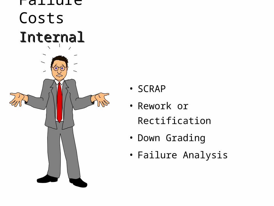
Failure CostsInternalInternal
• SCRAP
• Rework or Rectification
• Down Grading
• Failure Analysis

Appraisal Costs
• Inspection and Test
• Quality Audits
• Inspection Equipment
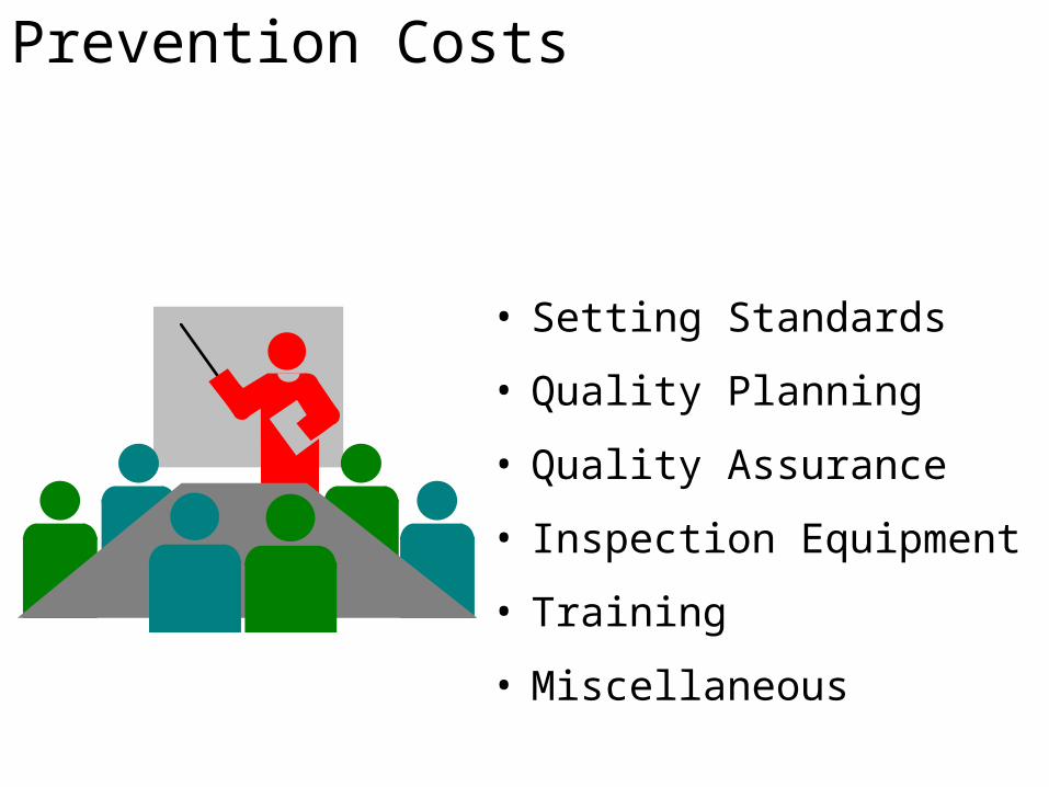
Prevention Costs
• Setting Standards
• Quality Planning
• Quality Assurance
• Inspection Equipment
• Training
• Miscellaneous
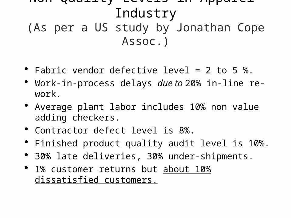
Non Quality Levels in Apparel Industry(As per a US study by Jonathan Cope Assoc.)
Fabric vendor defective level = 2 to 5 %. Work-in-process delays due to 20% in-line re-work. Average plant labor includes 10% non value adding
checkers. Contractor defect level is 8%. Finished product quality audit level is 10%. 30% late deliveries, 30% under-shipments. 1% customer returns but about 10% dissatisfied
customers.
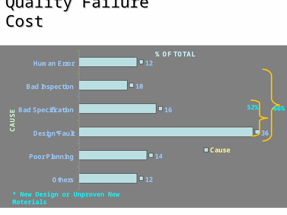
Quality Failure CostQuality Failure Cost
12
10
16
36
14
12
Human Error
Bad Inspection
Bad Specification
Design*Fault
Poor Planning
Others
CA
US
E
% OF TOTAL
Cause
* New Design or Unproven New Materials
52% 66%

MEASUREMENT CATEGORIESMEASUREMENT CATEGORIES
• Management Understanding and Attitude
• Quality Organization Status
• Cost of Quality as percentage of Sales
• Quality Improvement Actions
• Summation of Company Quality Posture
Stage-IStage-IUNCERTAINTYUNCERTAINTY
Stage-IIStage-IIAWAKENINGAWAKENING
Stage-IIIStage-IIIENLIGHTENMENTENLIGHTENMENT
Stage-IVStage-IVWISDOMWISDOM
Stage-VStage-VCERTAINTYCERTAINTY
Source: Quality is Free by Philip B. Crosby
Cost of Quality: The objective Indicator of Cost of Quality: The objective Indicator of the Quality Maturity of Organisationsthe Quality Maturity of Organisations
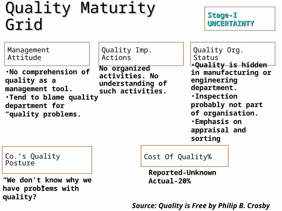
Stage-IStage-IUNCERTAINTYUNCERTAINTY
Management Attitude Quality Org. Status
Cost Of Quality%
Quality Imp. Actions
Co.’s Quality Posture
•No comprehension of quality as a management tool. •Tend to blame quality department for “quality problems.
•Quality is hidden in manufacturing or engineering department. •Inspection probably not part of organisation.•Emphasis on appraisal and sorting
Reported-Unknown Actual-20%“We don’t know why we
have problems with quality?”
No organized activities. No understanding of such activities.
Source: Quality is Free by Philip B. Crosby
Quality Maturity Grid Quality Maturity Grid

Stage-IIStage-IIAWAKENINGAWAKENING
Management Attitude Quality Org. Status
Cost Of Quality%
Quality Imp. Actions
Co.’s Quality Posture
•Recognizing that quality management may be of value but not willing to provide money or time to make it all happen.
Reported-3%Actual-18%
“Is it absolutely necessary to always have problems with quality?”
Trying obvious “motivational” short-range efforts.
•A stronger quality leader is appointed but main emphasis is still on appraisal and moving the product. Still part of manufacturing or other
Source: Quality is Free by Philip B. Crosby
Quality Maturity Grid Quality Maturity Grid
Stage-IIIStage-IIIENLIGHTENMENTENLIGHTENMENT
Management Attitude Quality Org. Status
Cost Of Quality%
Quality Imp. Actions
Co.’s Quality Posture
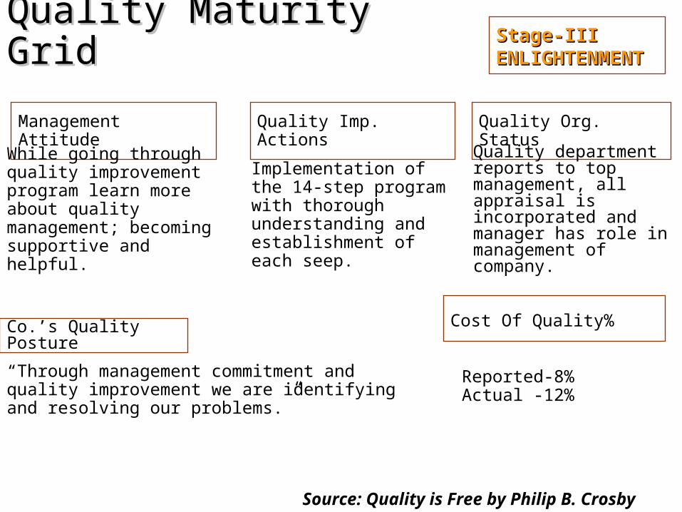
While going through quality improvement program learn more about quality management; becoming supportive and helpful.
Reported-8%Actual -12%
“Through management commitment and quality improvement we are identifying and resolving our problems.”
Implementation of the 14-step program with thorough understanding and establishment of each seep.
Quality department reports to top management, all appraisal is incorporated and manager has role in management of company.
Source: Quality is Free by Philip B. Crosby
Quality Maturity Grid Quality Maturity Grid
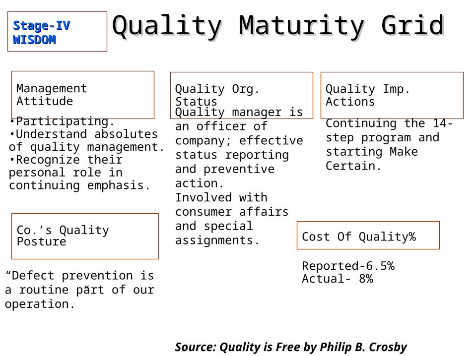
Stage-IVStage-IVWISDOMWISDOM
Management Attitude Quality Org. Status
Cost Of Quality%
Quality Imp. Actions
Co.’s Quality Posture
•Participating. •Understand absolutes of quality management.•Recognize their personal role in continuing emphasis.
Reported-6.5%Actual- 8%“Defect prevention is a
routine part of our operation.”
Continuing the 14-step program and starting Make Certain.
Quality manager is an officer of company; effective status reporting and preventive action. Involved with consumer affairs and special assignments.
Source: Quality is Free by Philip B. Crosby
Quality Maturity Grid Quality Maturity Grid
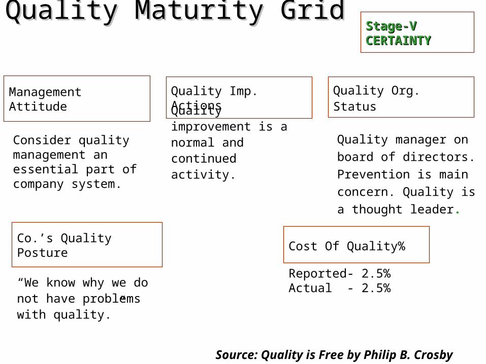
Stage-VStage-VCERTAINTYCERTAINTY
Management Attitude Quality Org. Status
Cost Of Quality%
Quality Imp. Actions
Co.’s Quality Posture
Consider quality management an essential part of company system.
Reported- 2.5%Actual - 2.5%“We know why we do not
have problems with quality.”
Quality improvement is a normal and continued activity.
Quality manager on board
of directors.
Prevention is main
concern. Quality is a
thought leader.
Source: Quality is Free by Philip B. Crosby
Quality Maturity Grid Quality Maturity Grid

Interrelationship of Quality Costs
Distribution of Quality Costs
Maturity of the Quality System
Qu
alit
y C
os
ts
% of Sales
20
18
16
14
12
10
8
6
4
2
0
Total
Internal Failure
Appraisal Prevention
External Failure


Quality & ProfitabilityQuality & Profitability
IMPROVED IMPROVED CONFORMANCECONFORMANCE
BETTER OUTGOING BETTER OUTGOING QUALITYQUALITY LOWER REWORK LOWER REWORK
AND SECONDS AND SECONDS COSTSCOSTS
LOWER COSTS OF LOWER COSTS OF RETURNSRETURNS
INCREASED INCREASED PRODUCTIVITYPRODUCTIVITY
LOWER PRODUCTION LOWER PRODUCTION COSTSCOSTS
INCREASED PROFITSINCREASED PROFITS
Related Documents