Applied Time Series Analysis SS 2013 Dr. Marcel Dettling Institute for Data Analysis and Process Design Zurich University of Applied Sciences CH-8401 Winterthur

Welcome message from author
This document is posted to help you gain knowledge. Please leave a comment to let me know what you think about it! Share it to your friends and learn new things together.
Transcript

Applied Time Series Analysis
SS 2013
Dr. Marcel Dettling
Institute for Data Analysis and Process Design
Zurich University of Applied Sciences
CH-8401 Winterthur


Table of Contents

ATSA 1 Introduction
Page 1
1 Introduction
1.1 Purpose
Time series data, i.e. records which are measured sequentially over time, are extremely common. They arise in virtually every application field, such as e.g.:
Business Sales figures, production numbers, customer frequencies, ...
Economics Stock prices, exchange rates, interest rates, ...
Official Statistics Census data, personal expenditures, road casualties, ...
Natural Sciences Population sizes, sunspot activity, chemical process data, ...
Environmetrics Precipitation, temperature or pollution recordings, ...
In contrast to basic data analysis where the iid assumption usually is key, time series are dependent. The purpose of time series analysis is to visualize and understand these dependences in past data, and to exploit them for forecasting future values. While some simple descriptive techniques do often considerably enhance the understanding of the data, a full analysis usually involves modeling the stochastic mechanism that is assumed to be the generator of the observed time series.
ATSA 1 Introduction
Page 2
Once a good model is found and fitted to data, the analyst can use that model to forecast future values and produce prediction intervals, or he can generate simulations, for example to guide planning decisions. Moreover, fitted models are used as a basis for statistical tests: they allow determining whether fluctuations in monthly sales provide evidence of some underlying change, or whether they are still within the range of usual random variation.
The dominant main features of many time series are trend and seasonal variation. These can either be modeled deterministically by mathematical functions of time, or are estimated using non-parametric smoothing approaches. Yet another key feature of most time series is that adjacent observations tend to be correlated, i.e. serially dependent. Much of the methodology in time series analysis is aimed at explaining this correlation using appropriate statistical models.
While the theory on mathematically oriented time series analysis is vast and may be studied without necessarily fitting any models to data, the focus of our course will be applied and directed towards data analysis. We study some basic properties of time series processes and models, but mostly focus on how to visualize and describe time series data, on how to fit models to data correctly, on how to generate forecasts, and on how to adequately draw conclusions from the output that was produced.
1.2 Examples
1.2.1 Air Passenger Bookings
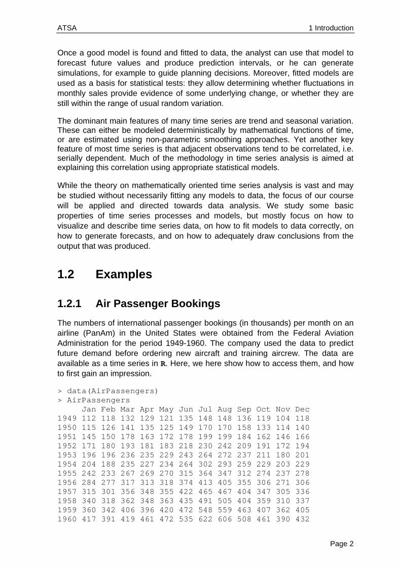
The numbers of international passenger bookings (in thousands) per month on an airline (PanAm) in the United States were obtained from the Federal Aviation Administration for the period 1949-1960. The company used the data to predict future demand before ordering new aircraft and training aircrew. The data are available as a time series in R. Here, we here show how to access them, and how to first gain an impression.
> data(AirPassengers) > AirPassengers Jan Feb Mar Apr May Jun Jul Aug Sep Oct Nov Dec 1949 112 118 132 129 121 135 148 148 136 119 104 118 1950 115 126 141 135 125 149 170 170 158 133 114 140 1951 145 150 178 163 172 178 199 199 184 162 146 166 1952 171 180 193 181 183 218 230 242 209 191 172 194 1953 196 196 236 235 229 243 264 272 237 211 180 201 1954 204 188 235 227 234 264 302 293 259 229 203 229 1955 242 233 267 269 270 315 364 347 312 274 237 278 1956 284 277 317 313 318 374 413 405 355 306 271 306 1957 315 301 356 348 355 422 465 467 404 347 305 336 1958 340 318 362 348 363 435 491 505 404 359 310 337 1959 360 342 406 396 420 472 548 559 463 407 362 405 1960 417 391 419 461 472 535 622 606 508 461 390 432
ATSA 1 Introduction
Page 3
Some further information about this dataset can be obtained by typing ?AirPassengers in R. The data are stored in an R-object of class ts, which is the specific class for time series data. However, for further details on how time series are handled in R, we refer to section 3.
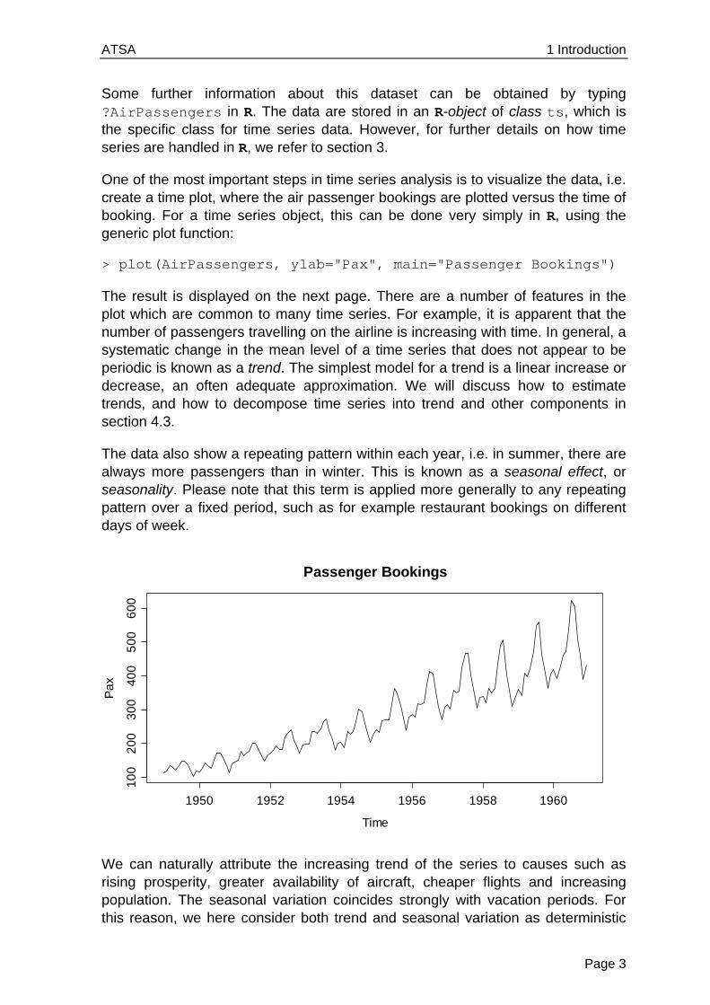
One of the most important steps in time series analysis is to visualize the data, i.e. create a time plot, where the air passenger bookings are plotted versus the time of booking. For a time series object, this can be done very simply in R, using the generic plot function:
> plot(AirPassengers, ylab="Pax", main="Passenger Bookings")
The result is displayed on the next page. There are a number of features in the plot which are common to many time series. For example, it is apparent that the number of passengers travelling on the airline is increasing with time. In general, a systematic change in the mean level of a time series that does not appear to be periodic is known as a trend. The simplest model for a trend is a linear increase or decrease, an often adequate approximation. We will discuss how to estimate trends, and how to decompose time series into trend and other components in section 4.3.
The data also show a repeating pattern within each year, i.e. in summer, there are always more passengers than in winter. This is known as a seasonal effect, or seasonality. Please note that this term is applied more generally to any repeating pattern over a fixed period, such as for example restaurant bookings on different days of week.
We can naturally attribute the increasing trend of the series to causes such as rising prosperity, greater availability of aircraft, cheaper flights and increasing population. The seasonal variation coincides strongly with vacation periods. For this reason, we here consider both trend and seasonal variation as deterministic
Passenger Bookings
Time
Pa
x
1950 1952 1954 1956 1958 1960
10
02
00
30
04
00
50
06
00
ATSA 1 Introduction
Page 4
components. As mentioned before, section 4.3 discusses visualization and estimation of these components, while in section 7, time series regression models will be specified to allow for underlying causes like these, and finally section 9 discusses exploiting these for predictive purposes.
1.2.2 Lynx Trappings
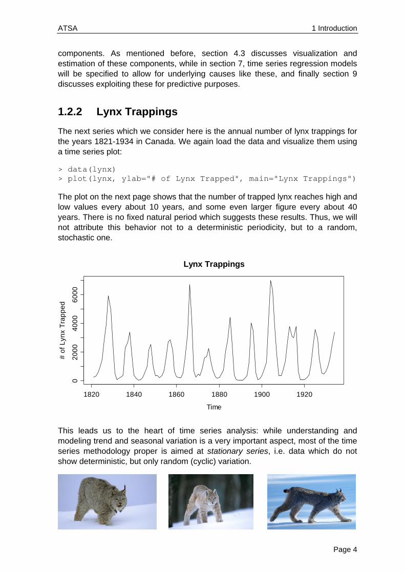
The next series which we consider here is the annual number of lynx trappings for the years 1821-1934 in Canada. We again load the data and visualize them using a time series plot:
> data(lynx) > plot(lynx, ylab="# of Lynx Trapped", main="Lynx Trappings")
The plot on the next page shows that the number of trapped lynx reaches high and low values every about 10 years, and some even larger figure every about 40 years. There is no fixed natural period which suggests these results. Thus, we will not attribute this behavior not to a deterministic periodicity, but to a random, stochastic one.
This leads us to the heart of time series analysis: while understanding and modeling trend and seasonal variation is a very important aspect, most of the time series methodology proper is aimed at stationary series, i.e. data which do not show deterministic, but only random (cyclic) variation.
Lynx Trappings
Time
# o
f L
ynx
Tra
pp
ed
1820 1840 1860 1880 1900 1920
02
00
04
00
06
00
0

ATSA 1 Introduction
Page 5
1.2.3 Luteinizing Hormone Measurements
One of the key features of the above lynx trappings series is that the observations apparently do not stem from independent random variables, but there is some serial correlation. If the previous value was high (or low, respectively), the next one is likely to be similar to the previous one. To explore, model and exploit such dependence lies at the root of time series analysis.
We here show another series, where 48 luteinizing hormone levels were recorded from blood samples that were taken at 10 minute intervals from a human female. This hormone, also called lutropin, triggers ovulation.
> data(lh) > lh Time Series: Start = 1; End = 48; Frequency = 1 [1] 2.4 2.4 2.4 2.2 2.1 1.5 2.3 2.3 2.5 2.0 1.9 1.7 2.2 1.8 [15] 3.2 3.2 2.7 2.2 2.2 1.9 1.9 1.8 2.7 3.0 2.3 2.0 2.0 2.9 [29] 2.9 2.7 2.7 2.3 2.6 2.4 1.8 1.7 1.5 1.4 2.1 3.3 3.5 3.5 [43] 3.1 2.6 2.1 3.4 3.0 2.9
Again, the data themselves are of course needed to perform analyses, but provide little overview. We can improve this by generating a time series plot:
> plot(lh, ylab="LH level", main="Luteinizing Hormone")
For this series, given the way the measurements were made (i.e. 10 minute intervals), we can almost certainly exclude any deterministic seasonal variation. But is there any stochastic cyclic behavior? This question is more difficult to answer. Normally, one resorts to the simpler question of analyzing the correlation of subsequent records, called autocorrelations. The autocorrelation for lag 1 can be visualized by producing a scatterplot of adjacent observations:
Luteinizing Hormone
Time
LH
leve
l
0 10 20 30 40
1.5
2.0
2.5
3.0
3.5
ATSA 1 Introduction
Page 6
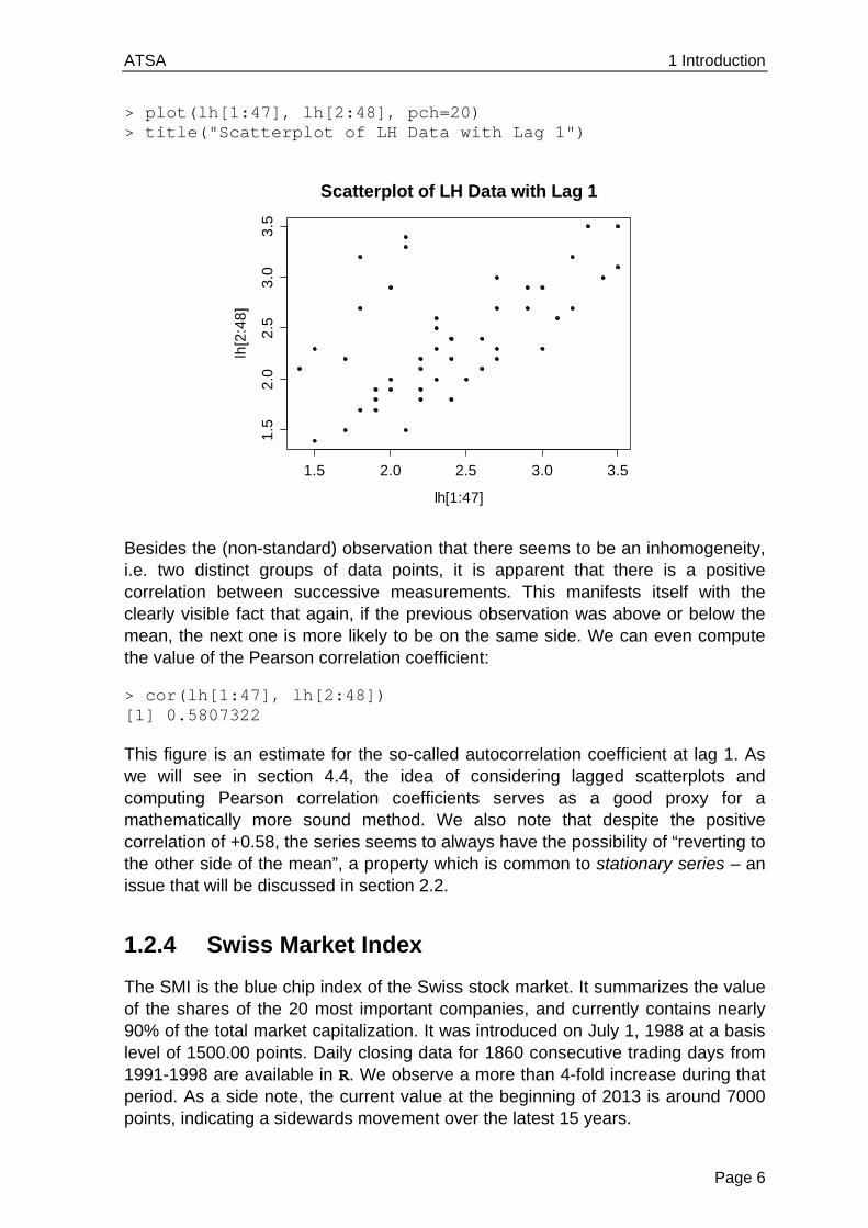
> plot(lh[1:47], lh[2:48], pch=20) > title("Scatterplot of LH Data with Lag 1")
Besides the (non-standard) observation that there seems to be an inhomogeneity, i.e. two distinct groups of data points, it is apparent that there is a positive correlation between successive measurements. This manifests itself with the clearly visible fact that again, if the previous observation was above or below the mean, the next one is more likely to be on the same side. We can even compute the value of the Pearson correlation coefficient:
> cor(lh[1:47], lh[2:48]) [1] 0.5807322
This figure is an estimate for the so-called autocorrelation coefficient at lag 1. As we will see in section 4.4, the idea of considering lagged scatterplots and computing Pearson correlation coefficients serves as a good proxy for a mathematically more sound method. We also note that despite the positive correlation of +0.58, the series seems to always have the possibility of “reverting to the other side of the mean”, a property which is common to stationary series – an issue that will be discussed in section 2.2.
1.2.4 Swiss Market Index
The SMI is the blue chip index of the Swiss stock market. It summarizes the value of the shares of the 20 most important companies, and currently contains nearly 90% of the total market capitalization. It was introduced on July 1, 1988 at a basis level of 1500.00 points. Daily closing data for 1860 consecutive trading days from 1991-1998 are available in R. We observe a more than 4-fold increase during that period. As a side note, the current value at the beginning of 2013 is around 7000 points, indicating a sidewards movement over the latest 15 years.
1.5 2.0 2.5 3.0 3.5
1.5
2.0
2.5
3.0
3.5
lh[1:47]
lh[2
:48
]
Scatterplot of LH Data with Lag 1
ATSA 1 Introduction
Page 7
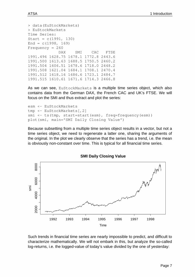
> data(EuStockMarkets) > EuStockMarkets Time Series: Start = c(1991, 130) End = c(1998, 169) Frequency = 260 DAX SMI CAC FTSE 1991.496 1628.75 1678.1 1772.8 2443.6 1991.500 1613.63 1688.5 1750.5 2460.2 1991.504 1606.51 1678.6 1718.0 2448.2 1991.508 1621.04 1684.1 1708.1 2470.4 1991.512 1618.16 1686.6 1723.1 2484.7 1991.515 1610.61 1671.6 1714.3 2466.8
As we can see, EuStockMarkets is a multiple time series object, which also contains data from the German DAX, the French CAC and UK’s FTSE. We will focus on the SMI and thus extract and plot the series:
esm <- EuStockMarkets tmp <- EuStockMarkets[,2] smi <- ts(tmp, start=start(esm), freq=frequency(esm)) plot(smi, main="SMI Daily Closing Value")
Because subsetting from a multiple time series object results in a vector, but not a time series object, we need to regenerate a latter one, sharing the arguments of the original. In the plot we clearly observe that the series has a trend, i.e. the mean is obviously non-constant over time. This is typical for all financial time series.
Such trends in financial time series are nearly impossible to predict, and difficult to characterize mathematically. We will not embark in this, but analyze the so-called log-returns, i.e. the logged-value of today’s value divided by the one of yesterday:
SMI Daily Closing Value
Time
smi
1992 1993 1994 1995 1996 1997 1998
20
00
40
00
60
00
80
00

ATSA 1 Introduction
Page 8
> lret.smi <- diff (log(smi) > plot(lret.smi, main="SMI Log-Returns")
The SMI log-returns are a close approximation to the relative change (percent values) with respect to the previous day. As can be seen above, they do not exhibit a trend anymore, but show some of the stylized facts that most log-returns of financial time series share. Using lagged scatterplots or the correlogram (to be discussed later in section 4.4), you can convince yourself that there is no serial correlation. Thus, there is no dependency which could be exploited to predict tomorrows return based on the one of today and/or previous days.
However, it is visible that large changes, i.e. log-returns with high absolute values, imply that future log-returns tend to be larger than normal, too. This feature is also known as volatility clustering, and financial service providers are trying their best to exploit this property to make profit. Again, you can convince yourself of the volatility clustering effect by taking the squared log-returns and analyzing their serial correlation, which is different from zero.
1.3 Goals in Time Series Analysis
A first impression of the purpose and goals in time series analysis could be gained from the previous examples. We conclude this introductory section by explicitly summarizing the most important goals.
1.3.1 Exploratory Analysis
Exploratory analysis for time series mainly involves visualization with time series plots, decomposition of the series into deterministic and stochastic parts, and studying the dependency structure in the data.
SMI Log-Returns
Time
lre
t.sm
i
1992 1993 1994 1995 1996 1997 1998
-0.0
8-0
.04
0.0
00
.04

ATSA 1 Introduction
Page 9
1.3.2 Modeling
The formulation of a stochastic model, as it is for example also done in regression, can and does often lead to a deeper understanding of the series. The formulation of a suitable model usually arises from a mixture between background knowledge in the applied field, and insight from exploratory analysis. Once a suitable model is found, a central issue remains, i.e. the estimation of the parameters, and subsequent model diagnostics and evaluation.
1.3.3 Forecasting
An often-heard motivation for time series analysis is the prediction of future observations in the series. This is an ambitious goal, because time series forecasting relies on extrapolation, and is generally based on the assumption that past and present characteristics of the series continue. It seems obvious that good forecasting results require a very good comprehension of a series’ properties, be it in a more descriptive sense, or with respect to the fitted model.
1.3.4 Time Series Regression
Rather than just forecasting by extrapolation, we can try to understand the relation between a so-identified response time series, and one or more explanatory series. If all of these are observed at the same time, we can in principle employ the usual regression framework. However, the all-to-common assumption of (serially) uncorrelated errors is usually violated in a time series framework. We will illustrate how to properly deal with this situation, in order to generate correct confidence and prediction intervals.
1.3.5 Process Control
Many production or other processes are measured quantitatively for the purpose of optimal management and quality control. This usually results in time series data, to which a stochastic model is fit. This allows understanding the signal in the data, but also the noise: it becomes feasible to monitor which fluctuations in the production are normal, and which ones require intervention.


ATSA 2 Mathematical Concepts
Page 11
2 Mathematical Concepts For performing anything else than very basic exploratory time series analysis, even from a much applied perspective, it is necessary to introduce the mathematical notion of what a time series is, and to study some basic probabilistic properties, namely the moments and the concept of stationarity.
2.1 Definition of a Time Series
As we have explained in section 1.2, observations that have been collected over fixed sampling intervals form a time series. Following a statistical approach, we consider such series as realizations of random variables. A sequence of random variables, defined at such fixed sampling intervals, is sometimes referred to as a discrete-time stochastic process, though the shorter names time series model or time series process are more popular and will mostly be used in this scriptum. It is very important to make the distinction between a time series, i.e. observed values, and a process, i.e. a probabilistic construct.
Definition: A time series process is a set of random variables ,tX t T , where T is the set of times at which the process was, will or can be observed. We assume that each random variable tX is distributed according some univariate distribution function tF . Please note that for our entire course and hence scriptum, we exclusively consider time series processes with equidistant time intervals, as well as real-valued random variables tX . This allows us to enumerate the set of times, so that we can write {1,2,3, }T .
An observed time series, on the other hand, is seen as a realization of the random vector 1 2( , , , )nX X X X , and is denoted with small letters 1 2( , , ), nx x x x . It is important to note that in a multivariate sense, a time series is only one single realization of the n -dimensional random variable X , with its multivariate, n -dimensional distribution function F . As we all know, we cannot do statistics with just a single observation. As a way out of this situation, we need to impose some conditions on the joint distribution function F .
2.2 Stationarity
The aforementioned condition on the joint distribution F will be formulated as the concept of stationarity. In colloquial language, stationarity means that the probabilistic character of the series must not change over time, i.e. that any section of the time series is “typical” for every other section with the same length. More mathematically, we require that for any indices ,s t and k , the observations
, ,t t kx x could have just as easily occurred at times , ,s s k . If that is not the case practically, then the series is hardly stationary.
ATSA 2 Mathematical Concepts
Page 12
Imposing even more mathematical rigor, we introduce the concept of strict stationarity. A time series is said to be strictly stationary if and only if the ( 1)k -dimensional joint distribution of , ,t t kX X coincides with the joint distribution of , ,s s kX X for any combination of indices t , s and k . For the special case of 0k and t s , this means that the univariate distributions tF of all
tX are equal. For strictly stationary time series, we can thus leave off the index t on the distribution. As the next step, we will define the moments:
Expectation [ ]tE X , Variance 2 ( )tVar X , Covariance ( )h ( , )t t hCov X X .
In other words, strictly stationary series have constant (unconditional expectation), constant (unconditional) variance , and the covariance, i.e. the dependency structure, depends only on the lag h , which is the time difference between the two observations. However, the covariance terms are generally different from 0, and thus, the tX are usually dependent. Moreover, the conditional expectation given the past of the series, 1 2[ | , ,...]t t tE X X X is typically non-constant, denoted as t . In some (rarer, e.g. for financial time series) cases, even the conditional variance
1 2( | , ,...)t t tVar X X X can be non-constant.
In practice however, except for simulation studies, we usually have no explicit knowledge of the latent time series process. Since strict stationarity is defined as a property of the process’ joint distributions (all of them), it is impossible to verify from a single data realization, i.e. an observed time series. We can, however, try to verify whether a time series process shows constant unconditional mean and variance, and whether the dependency only depends on the lag h . This much less rigorous property is known as weak stationarity.
In order to do well-founded statistical analyses with time series, weak stationarity is a necessary condition. It’s obvious that if a series’ observations do not have common properties such as constant mean/variance and a stable dependency structure, it will be impossible to statistically learn from it. On the other hand, it can be shown that weak stationarity, along with the additional property of ergodicity (i.e. the mean of a time series realization converges to the expected value, independent of the starting point), is sufficient for most practical purposes such as model fitting, forecasting, etc.. We will, however, not further embark in this subject.
Remarks:
From now on, when we speak of stationarity, we strictly mean weak stationarity. The motivation is that weak stationarity is sufficient for applied time series analysis, and strict stationarity is a practically useless concept.
When we analyze time series data, we need to verify whether it might have arisen from a stationary process or not. Be careful with the wording: stationarity is always a property of the process, and never of the data.

ATSA 2 Mathematical Concepts
Page 13
Moreover, bear in mind that stationarity is a hypothesis, which needs to be evaluated for every series. We may be able to reject this hypothesis with quite some certainty if the data strongly speak against it. However, we can never prove stationarity with data. At best, it is plausible that a series originated from a stationary process.
Some obvious violations of stationarity are trends, non-constant variance, deterministic seasonal variation, as well as apparent breaks in the data, which are indicators for changing dependency structure.
2.3 Testing Stationarity
If, as explained above, stationarity is a hypothesis which is tested on data, students and users keep asking if there are any formal tests. The answer to this question is yes, and there are even quite a number of tests. This includes the Augmented Dickey-Fuller Test, the Phillips-Perron Test, the KPSS Test, which are all available in R’s tseries package. The urca package includes further tests such as the Elliott-Rothenberg-Stock, Schmidt-Phillips und Zivot-Andrews.
However, we will not discuss any of these tests here for a variety of reasons. First and foremost, they all focus on some very specific non-stationarity aspects, but do not test stationarity in a broad sense. While they may reasonably do their job in the narrow field they are aimed for, they have low power to detect general non-stationarity and in practice often fail to do so. Additionally, theory and formalism of these tests is quite complex, and thus beyond the scope of this course. In summary, these tests are to be seen as more of a pastime for the mathematically interested, rather than a useful tool for the practitioner.
Thus, we here recommend assessing stationarity by visual inspection. The primary tool for this is the time series plot, but also the correlogram (see section 4.4) can be helpful as a second check. For long time series, it can also be useful to split up the series into several parts for checking whether mean, variance and dependency are similar over the blocks.

ATSA 3 Time Series in R
Page 15
3 Time Series in R
3.1 Time Series Classes
In R, there are objects, which are organized in a large number of classes. These classes e.g. include vectors, data frames, model output, functions, and many more. Not surprisingly, there are also several classes for time series. We start by presenting ts, the basic class for regularly spaced time series. This class is comparably simple, as it can only represent time series with fixed interval records, and only uses numeric time stamps, i.e. (sophistically) enumerates the index set. However, it will still be sufficient for most, if not all, of what we do in this course. Then, we also provide an outlook to more complicated concepts.
3.1.1 The ts Class
For defining a time series of class ts, we of course need to provide the data, but also the starting time as argument start, and the frequency of measurements as argument frequency. If no starting time is supplied, R uses its default value of 1, i.e. enumerates the times by the index set 1, ..., n , where n is the length of the series. The frequency is the number of observations per unit of time, e.g. 1 for yearly, 4 for quarterly, or 12 for monthly recordings. Instead of the start, we could also provide the end of the series, and instead of the frequency, we could supply argument deltat, the fraction of the sampling period between successive observations. The following example will illustrate the concept.
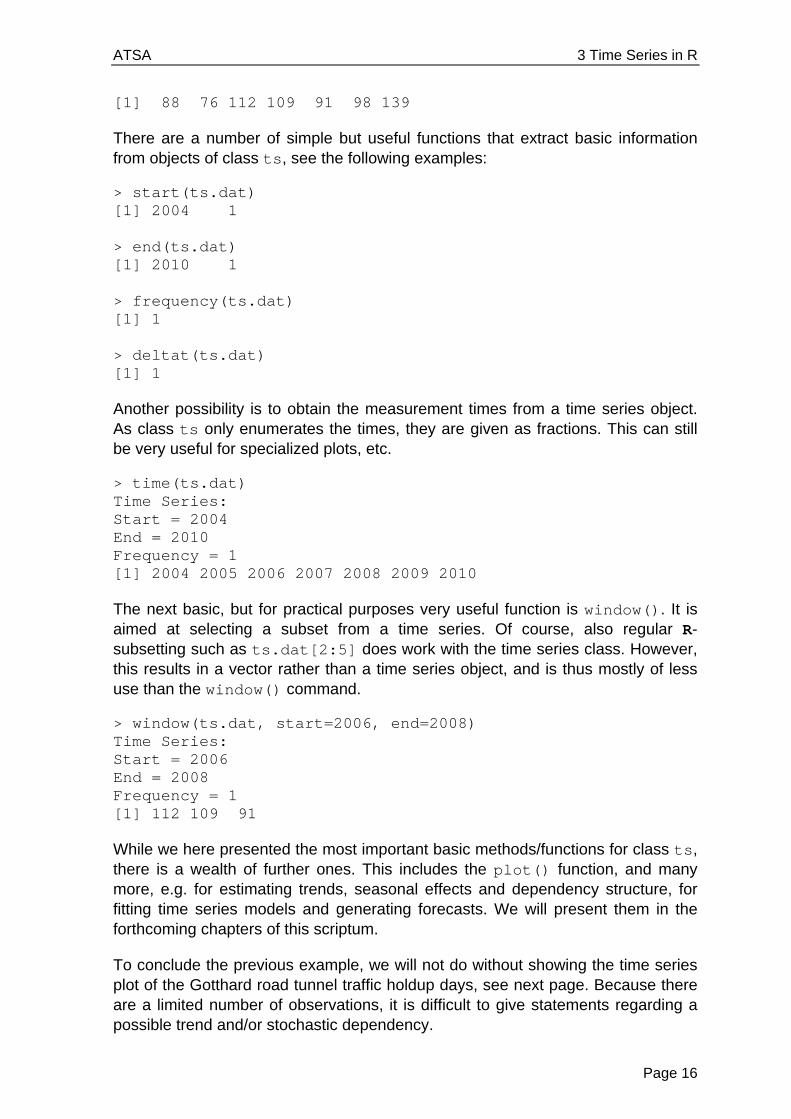
Example: We here consider a simple and short series that holds the number of days per year with traffic holdups in front of the Gotthard road tunnel north entrance in Switzerland. The data are available from the Federal Roads Office.
2004 2005 2006 2007 2008 2009 2010
88 76 112 109 91 98 139
The start of this series is in 2004. The time unit is years, and since we have just one record per year, the frequency of this series is 1. This tells us that while there may be a trend, there will not be a seasonal effect, which can only appear with periodic series, i.e. series with frequency > 1. We now define a ts object in in R.
> rawdat <- c(88, 76, 112, 109, 91, 98, 139) > ts.dat <- ts(rawdat, start=2004, freq=1) > ts.dat Time Series: Start = 2004 End = 2010 Frequency = 1
ATSA 3 Time Series in R
Page 16
[1] 88 76 112 109 91 98 139
There are a number of simple but useful functions that extract basic information from objects of class ts, see the following examples:
> start(ts.dat) [1] 2004 1 > end(ts.dat) [1] 2010 1 > frequency(ts.dat) [1] 1 > deltat(ts.dat) [1] 1
Another possibility is to obtain the measurement times from a time series object. As class ts only enumerates the times, they are given as fractions. This can still be very useful for specialized plots, etc.
> time(ts.dat) Time Series: Start = 2004 End = 2010 Frequency = 1 [1] 2004 2005 2006 2007 2008 2009 2010
The next basic, but for practical purposes very useful function is window(). It is aimed at selecting a subset from a time series. Of course, also regular R-subsetting such as ts.dat[2:5] does work with the time series class. However, this results in a vector rather than a time series object, and is thus mostly of less use than the window() command.
> window(ts.dat, start=2006, end=2008) Time Series: Start = 2006 End = 2008 Frequency = 1 [1] 112 109 91
While we here presented the most important basic methods/functions for class ts, there is a wealth of further ones. This includes the plot() function, and many more, e.g. for estimating trends, seasonal effects and dependency structure, for fitting time series models and generating forecasts. We will present them in the forthcoming chapters of this scriptum.
To conclude the previous example, we will not do without showing the time series plot of the Gotthard road tunnel traffic holdup days, see next page. Because there are a limited number of observations, it is difficult to give statements regarding a possible trend and/or stochastic dependency.
ATSA 3 Time Series in R
Page 17
> plot(ts.dat, ylab="# of Days", main="Traffic Holdups")
3.1.2 Other Classes
Besides the basic ts class, there are several more which offer a variety of additional options, but will rarely to never be required during our course. Most prominently, this includes the zoo package, which provides infrastructure for both regularly and irregularly spaced time series using arbitrary classes for the time stamps. It is designed to be as consistent as possible with the ts class. Coercion from and to zoo is also readily available.
Some further packages which contain classes and methods for time series include xts, its, tseries, fts, timeSeries and tis. Additional information on their content and philosophy can be found on CRAN.
3.2 Dates and Times in R
While for the ts class, the handling of times has been solved very simply and easily by enumerating, doing time series analysis in R may sometimes also require to explicitly dealing with date and time. There are several options for dealing with date and date/time data. The built-in as.Date() function handles dates that come without times. The contributed package chron handles dates and times, but does not control for different time zones, whereas the sophisticated but complex POSIXct and POSIXlt classes allow for dates and times with time zone control.
As a general rule for date/time data in R, we suggest to use the simplest technique possible. Thus, for date only data, as.Date() will mostly be the optimal choice. If handling dates and times, but without time-zone information, is required, the
Traffic Holdups
Time
# o
f D
ays
2004 2005 2006 2007 2008 2009 2010
80
90
10
01
20
14
0

ATSA 3 Time Series in R
Page 18
chron package is the choice. The POSIX classes are especially useful in the relatively rare cases when time-zone manipulation is important.
Apart for the POSIXlt class, dates/times are internally stored as the number of days or seconds from some reference date. These dates/times thus generally have a numeric mode. The POSIXlt class, on the other hand, stores date/time values as a list of components (hour, min, sec, mon, etc.), making it easy to extract these parts. Also the current date is accessible by typing Sys.Date() in the console, and returns an object of class Date.
3.2.1 The Date Class
As mentioned above, the easiest solution for specifying days in R is with the as.Date() function. Using the format argument, arbitrary date formats can be read. The default, however, is four-digit year, followed by month and then day, separated by dashes or slashes:
> as.Date("2012-02-14") [1] "2012-02-14" > as.Date("2012/02/07") [1] "2012-02-07"
If the dates are in non-standard appearance, we require defining their format using some codes. While the most important ones are shown below, we reference to the R help file of function strptime for the full list.
Code Value
%d Day of the month (decimal number) %m Month (decimal number) %b Month (character, abbreviated) %B Month (character, full name) %y Year (decimal, two digit) %Y Year (decimal, four digit)
The following examples illustrate the use of the format argument:
> as.Date("27.01.12", format="%d.%m.%y") [1] "2012-01-27" > as.Date("14. Februar, 2012", format="%d. %B, %Y") [1] "2012-02-14"
Internally, Date objects are stored as the number of days passed since the 1st of January in 1970. Earlier dates receive negative numbers. By using the as.numeric() function, we can easily find out how many days are past since the reference date. Also back-conversion from a number of past days to a date is straightforward:
> mydat <- as.Date("2012-02-14")

ATSA 3 Time Series in R
Page 19
> ndays <- as.numeric(mydat) > ndays [1] 15384 > tdays <- 10000 > class(tdays) <- "Date" > tdays [1] "1997-05-19"
A very useful feature is the possibility of extracting weekdays, months and quarters from Date objects, see the examples below. This information can be converted to factors, as which they serve for purposes as visualization, for decomposition, or for time series regression.
> weekdays(mydat) [1] "Dienstag" > months(mydat) [1] "Februar" > quarters(mydat) [1] "Q1"
Furthermore, some very useful summary statistics can be generated from Date objects: median, mean, min, max, range, ... are all available. We can even subtract two dates, which results in a difftime object, i.e. the time difference in days.
> dat <- as.Date(c("2000-01-01","2004-04-04","2007-08-09")) > dat [1] "2000-01-01" "2004-04-04" "2007-08-09" > min(dat) [1] "2000-01-01" > max(dat) [1] "2007-08-09" > mean(dat) [1] "2003-12-15" > median(dat) [1] "2004-04-04" > dat[3]-dat[1] Time difference of 2777 days
Another option is generating time sequences. For example, to generate a vector of 12 dates, starting on August 3, 1985, with an interval of one single day between them, we simply type:
> seq(as.Date("1985-08-03"), by="days", length=12) [1] "1985-08-03" "1985-08-04" "1985-08-05" "1985-08-06" [5] "1985-08-07" "1985-08-08" "1985-08-09" "1985-08-10" [9] "1985-08-11" "1985-08-12" "1985-08-13" "1985-08-14"
ATSA 3 Time Series in R
Page 20
The by argument proves to be very useful. We can supply various units of time, and even place an integer in front of it. This allows creating a sequence of dates separated by two weeks:
> seq(as.Date("1992-04-17"), by="2 weeks", length=12) [1] "1992-04-17" "1992-05-01" "1992-05-15" "1992-05-29" [5] "1992-06-12" "1992-06-26" "1992-07-10" "1992-07-24" [9] "1992-08-07" "1992-08-21" "1992-09-04" "1992-09-18"
3.2.2 The chron Package
The chron() function converts dates and times to chron objects. The dates and times are provided separately to the chron() function, which may well require some inital pre-processing. For such parsing, R-functions such as substr() and strsplit() can be of great use. In the chron package, there is no support for time zones and daylight savings time, and chron objects are internally stored as fractional days since the reference date of January 1st, 1970. By using the function as.numeric(), these internal values can be accessed. The following example illustrates the use of chron:
> library(chron) > dat <- c("2007-06-09 16:43:20", "2007-08-29 07:22:40", "2007-10-21 16:48:40", "2007-12-17 11:18:50") > dts <- substr(dat, 1, 10) > tme <- substr(dat, 12, 19) > fmt <- c("y-m-d","h:m:s") > cdt <- chron(dates=dts, time=tme, format=fmt) > cdt [1] (07-06-09 16:43:20) (07-08-29 07:22:40) [3] (07-10-21 16:48:40) (07-12-17 11:18:50)
As before, we can again use the entire palette of summary statistic functions. Of some special interest are time differences, which can now be obtained as either fraction of days, or in weeks, hours, minutes, seconds, etc.:
> cdt[2]-cdt[1] Time in days: [1] 80.61065 > difftime(cdt[2], cdt[1], units="secs") Time difference of 6964760 secs
3.2.3 POSIX Classes
The two classes POSIXct and POSIXlt implement date/time information, and in contrast to the chron package, also support time zones and daylight savings time. We recommend utilizing this functionality only when urgently needed, because the handling requires quite some care, and may on top of that be system dependent. Further details on the use of the POSIX classes can be found on CRAN.
ATSA 3 Time Series in R
Page 21
As explained above, the POSIXct class also stores dates/times with respect to the internal reference, whereas the POSIXlt class stores them as a list of components (hour, min, sec, mon, etc.), making it easy to extract these parts.
3.3 Data Import
We can safely assume that most time series data are already present in electronic form; however, not necessarily in R. Thus, some knowledge on how to import data into R is required. It is be beyond the scope of this scriptum to present the uncounted options which exist for this task. Hence, we will restrict ourselves to providing a short overview and some useful hints.
The most common form for sharing time series data are certainly spreadsheets, or in particular, Microsoft Excel files. While library(ROBDC) offers functionality to directly import data from Excel files, we discourage its use. First of all, this only works on Windows systems. More importantly, it is usually simpler, quicker and more flexible to export comma- or tab-separated text files from Excel, and import them via the ubiquitous read.table() function, respectively the tailored version read.csv() (for comma separation) and read.delim() (for tab separation).
With packages ROBDC and RMySQL, R can also communicate with SQL databases, which is the method of choice for large scale problems. Furthermore, after loading library(foreign), it is also possible to read files from Stata, SPSS, Octave and SAS.

ATSA 4 Descriptive Analysis
Page 23
4 Descriptive Analysis As always when working with “a pile of numbers”, also known as “data”, it is important to first gain an overview. In the field of time series analysis, this encompasses several aspects:
understanding the context of the problem and the data source making suitable plots, looking for general structure and outliers thinking about data transformations, e.g. to reduce skewness judging stationarity and potentially achieve it by decomposition
We start by discussing time series plots, then discuss transformations, focus on the decomposition of time series into trend, seasonal effect and stationary random part and conclude by discussing methods for visualizing the dependency structure.
4.1 Visualization
4.1.1 Time Series Plot
The most important means of visualization is the time series plot, where the data are plotted versus time/index. There are several examples in section 1.2, where we also got acquainted with R’s generic plot() function. As a general rule, the data points are joined by lines in time series plots. An exception is when there are missing values. Moreover, the reader expects that the axes are well-chosen, labeled and the measurement units are given.
Another issue is the correct aspect ratio for time series plots: if the time axis gets too much compressed, it can become difficult to recognize the behavior of a series. Thus, we recommend choosing the aspect ratio appropriately. However, there are no hard and simple rules on how to do this. As a rule of the thumb, use the “banking to 45 degrees” paradigm: increase and decrease in periodic series should not be displayed at angles much higher or lower than 45 degrees. For very long series, this can become difficult on either A4 paper or a computer screen. In this case, we recommend splitting up the series and display it in different frames.
For illustration, we here show an example, the monthly unemployment rate in the US state of Maine, from January 1996 until August 2006. The data are available from a text file on the web. We can read it directly into R, define the data as an object of class ts and then do the time series plot:
> www <- "http://staff.elena.aut.ac.nz/Paul-Cowpertwait/ts/" > dat <- read.table(paste(www,"Maine.dat",sep="", header=T) > tsd <- ts(dat, start=c(1996,1), freq=12) > plot(tsd, ylab="(%)", main="Unemployment in Maine")

ATSA 4 Descriptive Analysis
Page 24
Not surprisingly for monthly economic data, the series shows both seasonal variation and a non-linear trend. Since unemployment rates are one of the main economic indicators used by politicians/decision makers, this series poses a worthwhile forecasting problem.
4.1.2 Multiple Time Series Plots
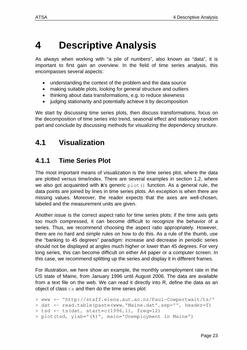
In applied problems, one is often provided with multiple time series. Here, we illustrate some basics on import, definition and plottingy. Our example exhibits the monthly supply of electricity (millions of kWh), beer (millions of liters) and chocolate-based production (tonnes) in Australia over the period from January 1958 to December 1990. These data are available from the Bureau of Australian Statistics and are, in pre-processed form, accessible as a text-file online.
www <- "http://staff.elena.aut.ac.nz/Paul-Cowpertwait/ts/" dat <- read.table(paste(www,"cbe.dat",sep="", header=T) tsd <- ts(dat, start=1958, freq=12) plot(tsd, main="Chocolate, Beer & Electricity")
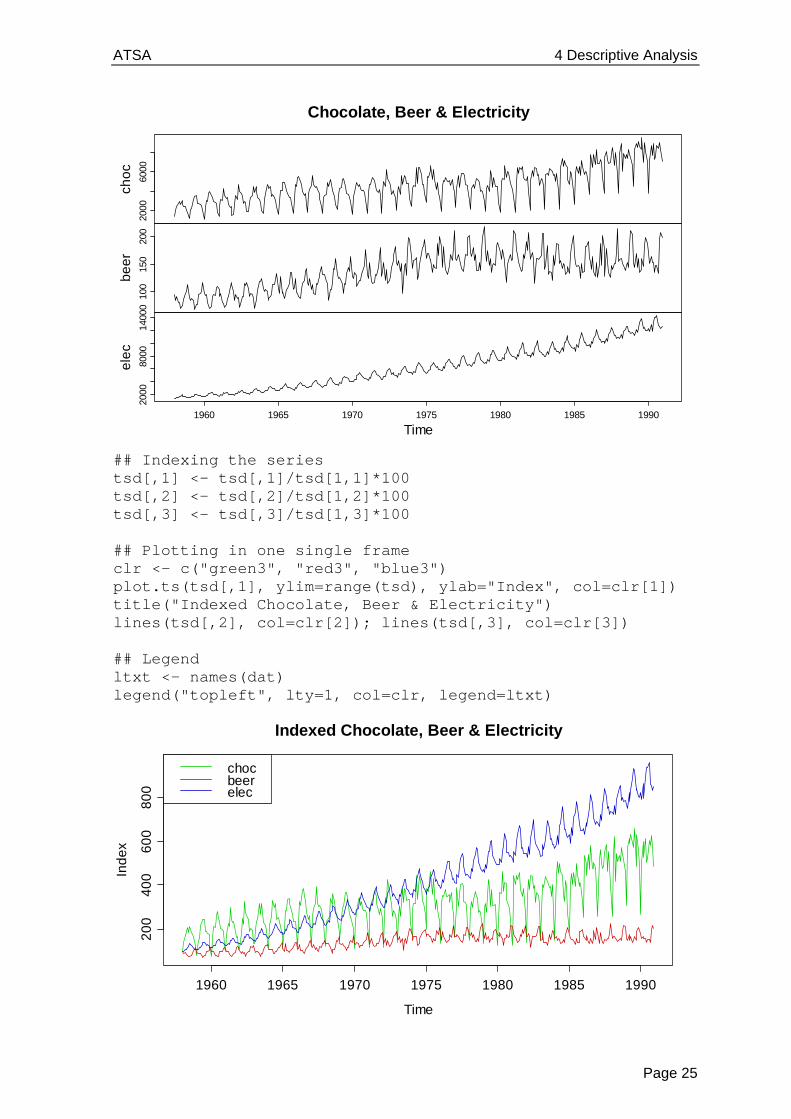
All three series show a distinct seasonal pattern, along with a trend. It also instructive to know that the Australian population increased by a factor of 1.8 during the period where these three series were observed. As visible in the bit of code above, plotting multiple series into different panels is straightforward. As a general rule, using different frames for multiple series is the most recommended means of visualization. However, sometimes it can be more instructive to have them in the same frame. Of course, this requires that the series are either on the same scale, or have been indexed, resp. standardized to be so. While R offers function ts.plot() to include multiple series in the same frame, that function does not allow color coding. For this reason, we prefer doing some manual work.
Unemployment in Maine
Time
(%)
1996 1998 2000 2002 2004 2006
34
56
ATSA 4 Descriptive Analysis
Page 25
## Indexing the series tsd[,1] <- tsd[,1]/tsd[1,1]*100 tsd[,2] <- tsd[,2]/tsd[1,2]*100 tsd[,3] <- tsd[,3]/tsd[1,3]*100 ## Plotting in one single frame clr <- c("green3", "red3", "blue3") plot.ts(tsd[,1], ylim=range(tsd), ylab="Index", col=clr[1]) title("Indexed Chocolate, Beer & Electricity") lines(tsd[,2], col=clr[2]); lines(tsd[,3], col=clr[3]) ## Legend ltxt <- names(dat) legend("topleft", lty=1, col=clr, legend=ltxt)
2000
6000
cho
c10
015
020
0
be
er
2000
8000
1400
0
1960 1965 1970 1975 1980 1985 1990
ele
c
Time
Chocolate, Beer & Electricity
Time
Ind
ex
1960 1965 1970 1975 1980 1985 1990
20
04
00
60
08
00
Indexed Chocolate, Beer & Electricity
chocbeerelec
ATSA 4 Descriptive Analysis
Page 26
In the indexed single frame plot above, we can very well judge the relative development of the series over time. Due to different scaling, this was nearly impossible with the multiple frames on the previous page. We observe that electricity production increased around 8x during 1958 and 1990, whereas for chocolate the multiplier is around 4x, and for beer less than 2x. Also, the seasonal variation is most pronounced for chocolate, followed by electricity and then beer.
4.2 Transformations
Many popular time series models are based on the Gaussian distribution and linear relations between the variables. However, data may exhibit different behavior. In such cases, we can often improve the fit by not using the original data
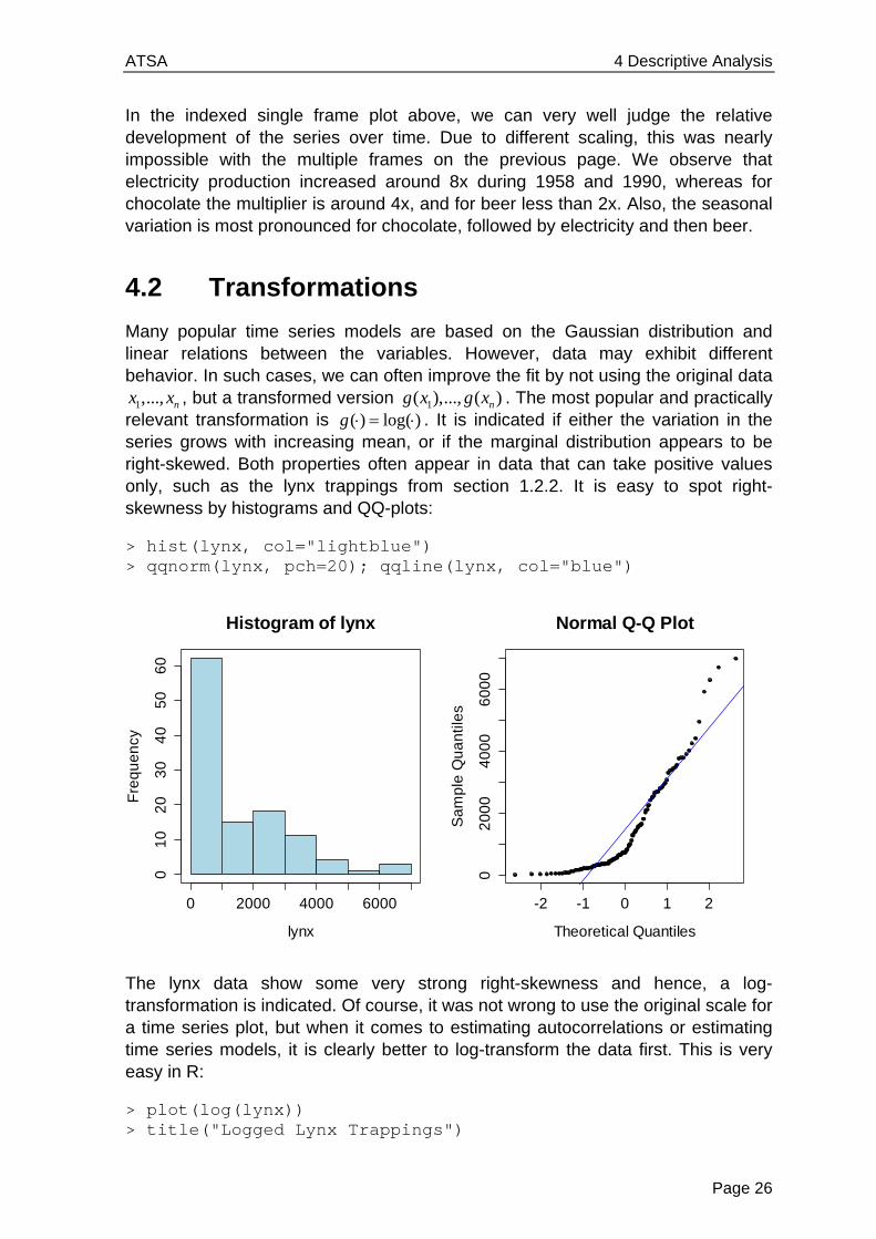
1,..., nx x , but a transformed version 1( ),..., ( )ng x g x . The most popular and practically relevant transformation is ( ) log( )g . It is indicated if either the variation in the series grows with increasing mean, or if the marginal distribution appears to be right-skewed. Both properties often appear in data that can take positive values only, such as the lynx trappings from section 1.2.2. It is easy to spot right-skewness by histograms and QQ-plots:
> hist(lynx, col="lightblue") > qqnorm(lynx, pch=20); qqline(lynx, col="blue")
The lynx data show some very strong right-skewness and hence, a log-transformation is indicated. Of course, it was not wrong to use the original scale for a time series plot, but when it comes to estimating autocorrelations or estimating time series models, it is clearly better to log-transform the data first. This is very easy in R:
> plot(log(lynx)) > title("Logged Lynx Trappings")
Histogram of lynx
lynx
Fre
qu
en
cy
0 2000 4000 6000
01
02
03
04
05
06
0
-2 -1 0 1 2
02
00
04
00
06
00
0
Normal Q-Q Plot
Theoretical Quantiles
Sa
mp
le Q
ua
ntil
es

ATSA 4 Descriptive Analysis
Page 27
The data now follow a more symmetrical pattern; the extreme upward spikes are all gone. We will use these transformed data to determine the dependency in the numbers and to generate forecasts. However, please be aware of the fact that back-transforming fitted or predicted (model) values to the original scale by just taking exp( ) usually leads to biased results, unless a correction factor is used. An in-depth discussion of that issue is contained in chapter 9.
4.3 Decomposition
4.3.1 The Basics
We have learned in section 2.2 that stationarity is an important prerequisite for being able to statistically learn from time series data. However, many of the example series exhibit either trend and/or seasonal effect, and thus are non-stationary. In this section, we will learn how to deal with that. It is achieved by using decomposition models, the easiest of which is the simple additive one:
t t t tX m s R ,
where tX is the time series process at time t , tm is the trend, ts is the seasonal effect, and tR is the remainder, i.e. a sequence of usually correlated random variables with mean zero. The goal is to find a decomposition such that tR is a stationary time series process. Such a model might be suitable for all the monthly-data series we got acquainted with so far: air passenger bookings, unemployment in Maine and Australian production. However, closer inspection of all these series exhibits that the seasonal effect and the random variation increase as the trend increases. In such cases, a multiplicative decomposition model is better:
t t t tX m s R
Time
log
(lyn
x)
1820 1840 1860 1880 1900 1920
45
67
89
Logged Lynx Trappings

ATSA 4 Descriptive Analysis
Page 28
Empirical experience says that taking logarithms is beneficial for such data. Also, some basic math shows that this brings us back to the additive case:
log( ) log( ) log( ) log( )t t t t t t tX m s R m s R
For illustration, we carry out the log-transformation on the air passenger bookings:
> plot(log(AirPassengers), ylab="log(Pax)")
Indeed, seasonal effect and random variation now seem to be independent of the level of the series. Thus, the multiplicative model is much more appropriate than the additive one. However, a further snag is that the seasonal effect seems to alter over time rather than being constant. That issue will be addressed later.
4.3.2 Differencing
A simple approach for removing deterministic trends and/or seasonal effects from a time series is by taking differences. A practical interpretation of taking differences is that then the changes in the data will be monitored, rather than the series itself. While this is conceptually simple and quick to implement, the main disadvantage is that it does not result in explicit estimates of trend component tm and seasonal component ts . We will first turn our attention to series with an additive trend, but without seasonal variation. By taking first-order differences with lag 1, and assuming a trend with little short-term changes, i.e. 1t tm m , we have:
1 1
t t t
t t t t t
X m R
Y X X R R
Logged Passenger Bookings
Time
log
(Pa
x)
1950 1952 1954 1956 1958 1960
5.0
5.5
6.0
6.5
ATSA 4 Descriptive Analysis
Page 29
In practice, this kind of differencing approach “mostly works”, i.e. manages to reduce the trend presence in the series in a satisfactory manner. However, the trend is only fully removed if it is exactly linear, i.e. tm t . Then, we obtain:
1 1t t t t tY X X R R
Another somewhat disturbing property of the differencing approach is that strong, artificial new dependencies are created, meaning that the autocorrelation in tY is different from the one in tR . For illustration, consider a stochastically independent remainder tR : the differenced process tY has autocorrelation!
1 1 1 2
1 1
( , ) ( , )
( , )
0
t t t t t t
t t
Cov Y Y Cov R R R R
Cov R R
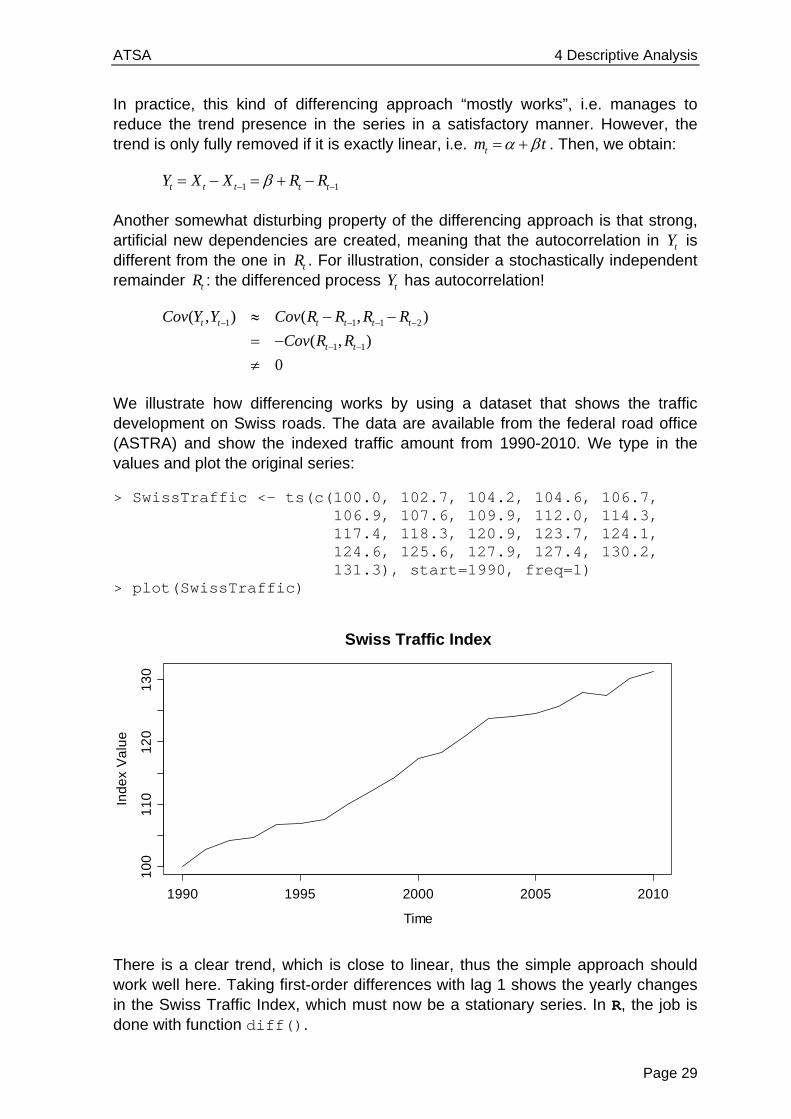
We illustrate how differencing works by using a dataset that shows the traffic development on Swiss roads. The data are available from the federal road office (ASTRA) and show the indexed traffic amount from 1990-2010. We type in the values and plot the original series:
> SwissTraffic <- ts(c(100.0, 102.7, 104.2, 104.6, 106.7, 106.9, 107.6, 109.9, 112.0, 114.3, 117.4, 118.3, 120.9, 123.7, 124.1, 124.6, 125.6, 127.9, 127.4, 130.2, 131.3), start=1990, freq=1) > plot(SwissTraffic)
There is a clear trend, which is close to linear, thus the simple approach should work well here. Taking first-order differences with lag 1 shows the yearly changes in the Swiss Traffic Index, which must now be a stationary series. In R, the job is done with function diff().
Swiss Traffic Index
Time
Ind
ex
Va
lue
1990 1995 2000 2005 2010
10
01
10
12
01
30
ATSA 4 Descriptive Analysis
Page 30
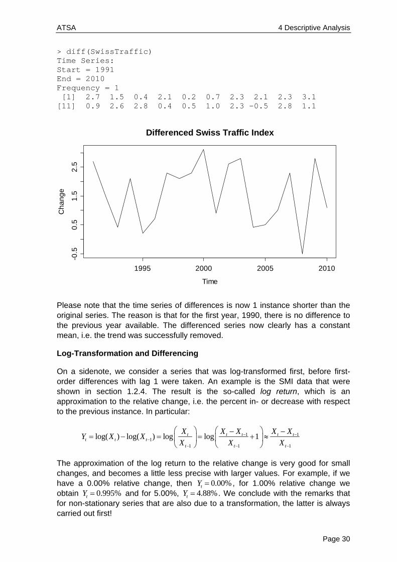
> diff(SwissTraffic) Time Series: Start = 1991 End = 2010 Frequency = 1 [1] 2.7 1.5 0.4 2.1 0.2 0.7 2.3 2.1 2.3 3.1 [11] 0.9 2.6 2.8 0.4 0.5 1.0 2.3 -0.5 2.8 1.1
Please note that the time series of differences is now 1 instance shorter than the original series. The reason is that for the first year, 1990, there is no difference to the previous year available. The differenced series now clearly has a constant mean, i.e. the trend was successfully removed.
Log-Transformation and Differencing
On a sidenote, we consider a series that was log-transformed first, before first-order differences with lag 1 were taken. An example is the SMI data that were shown in section 1.2.4. The result is the so-called log return, which is an approximation to the relative change, i.e. the percent in- or decrease with respect to the previous instance. In particular:
1 11
1 1 1
log( ) log( ) log log 1t t t t tt t t
t t t
X X X X XY X X
X X X
The approximation of the log return to the relative change is very good for small changes, and becomes a little less precise with larger values. For example, if we have a 0.00% relative change, then 0.00%tY , for 1.00% relative change we obtain 0.995%tY and for 5.00%, 4.88%tY . We conclude with the remarks that for non-stationary series that are also due to a transformation, the latter is always carried out first!
Differenced Swiss Traffic Index
Time
Ch
an
ge
1995 2000 2005 2010
-0.5
0.5
1.5
2.5

ATSA 4 Descriptive Analysis
Page 31
The Backshift Operator
We here introduce the backshift operator B because it allows for convenient notation. When the operator B is applied to tX it returns the instance at lag 1, i.e.
1( )t tB X X .
Less mathematically, we can also say that applying B means “go back one step”, or “increment the time series index t by -1”. The operation of taking first-order differences at lag 1 as above can be written using the backshift operator:
1(1 )t t t tY B X X X
However, the main aim of the backshift operator is to deal with more complicated forms of differencing, as will be explained below.
Higher-Order Differencing
We have seen that taking first-order differences is able to remove linear trends from time series. What has differencing to offer for polynomial trends, i.e. quadratic or cubic ones? We here demonstrate that it is possible to take higher order differences to remove also these, for example, in the case of a quadratic trend.
21 2
2
1 1 2
1 2 2
,
(1 )
( ) ( )
2 2
t t t
t t
t t t t
t t t
X t t R R stationary
Y B X
X X X X
R R R
We see that the operator 2(1 )B means that after taking “normal” differences, the resulting series is again differenced “normally”. This is a discretized variant of taking the second derivative, and thus it is not surprising that it manages to remove a quadratic trend from the data. As we can see, tY is an additive combination of the stationary tR ’s terms, and thus itself stationary. Again, if tR was an independent process, that would clearly not hold for tY , thus taking higher-order differences (strongly!) alters the dependency structure.
Moreover, the extension to cubic trends and even higher orders d is straightforward. We just use the (1 )dB operator applied to series tX . In R, we can employ function diff(), but have to provide argument differences=d for indicating the order of the difference d .
Removing Seasonal Effects by Differencing
For time series with monthly measurements, seasonal effects are very common. Using an appropriate form of differencing, it is possible to remove these, as well as potential trends. We take first-order differences with lag p :
(1 )pt t t t pY B X X X ,

ATSA 4 Descriptive Analysis
Page 32
Here, p is the period of the seasonal effect, or in other words, the frequency of series, which is the number of measurements per time unit. The series tY then is made up of the changes compared to the previous period’s value, e.g. the previous year’s value. Also, from the definition, with the same argument as above, it is evident that not only the seasonal variation, but also a strictly linear trend will be removed.
Usually, trends are not exactly linear. We have seen that taking differences at lag 1 removes slowly evolving (non-linear) trends well due to 1t tm m . However, here the relevant quantities are tm and t pm , and especially if the period p is long, some trend will be remaining in the data. Then, further action is required. We are illustrating seasonal differencing using the Mauna Loa atmospheric 2CO concentration data. This is a time series with monthly records from January 1959 to December 1997. It exhibits both a trend and a distinct seasonal pattern. We first load the data and do a time series plot:
> data(co2) > plot(co2, main="Mauna Loa CO2 Concentrations")
Seasonal differencing is very conveniently available in R. We use function diff(), but have to set argument lag=.... For the Mauna Loa data with monthly measurements, the correct lag is 12. This results in the series shown on the next page. Because we are comparing every record with the one from the previous year, the resulting series is 12 observations shorter than the original one. It is pretty obvious that some trend is remaining and thus, the result from seasonal differencing cannot be considered as stationary. As the seasonal effect is gone, we could try to add some first-order differencing at lag 1.
> sd.co2 <- diff(co2, lag=12) > plot(sd.co2, main="Differenced Mauna Loa Data (p=12)")
Mauna Loa CO2 Concentrations
Time
co2
1960 1970 1980 1990
32
03
30
34
03
50
36
0

ATSA 4 Descriptive Analysis
Page 33
The second differencing step indeed managems to produce a stationary series, as can be seen below. The equation for the final series is:
12(1 ) (1 )(1 )t t tZ B Y B B X .
The next step would be to analyze the autocorrelation of the series below and fit an ( , )ARMA p q model. Due to the two differencing steps, such constructs are also named SARIMA models. They will be discussed in chapter 8.2.
We conclude this section by emphasizing that while differencing is quick and simple, and (rightly done) manages to remove any trend and/or seasonality, we do not obtain explicit estimates for trend tm , seasonal effect ts and remainder tR .
Differenced Mauna Loa Data (p=12)
Time
sd.c
o2
1960 1970 1980 1990
0.0
1.0
2.0
3.0
Twice Differenced Mauna Loa Data (p=12, p=1)
Time
d1
.sd
.co
2
1960 1970 1980 1990
-1.0
-0.5
0.0
0.5
1.0
ATSA 4 Descriptive Analysis
Page 34
4.3.3 Smoothing, Filtering
Our next goal is to define a decomposition procedure that yields explicit trend, seasonality and remainder estimates ˆ tm , t̂s and ˆ
tR . In the absence of a seasonal effect, the trend of a time series can simply be obtained by applying an additive linear filter:
ˆq
t i t ii p
m a X
This definition is general, as it allows for arbitrary weights and asymmetric windows. The most popular implementation, however, relies on p q and
1/ (2 1)ia p , i.e. a running mean estimator with symmetric window and uniformly distributed weights. The window width is the smoothing parameter.
Example: Trend Estimation with Running Mean
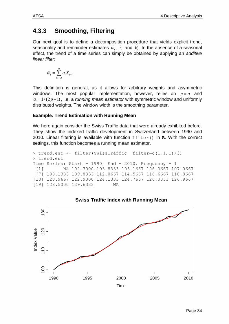
We here again consider the Swiss Traffic data that were already exhibited before. They show the indexed traffic development in Switzerland between 1990 and 2010. Linear filtering is available with function filter() in R. With the correct settings, this function becomes a running mean estimator.
> trend.est <- filter(SwissTraffic, filter=c(1,1,1)/3) > trend.est Time Series: Start = 1990, End = 2010, Frequency = 1 [1] NA 102.3000 103.8333 105.1667 106.0667 107.0667 [7] 108.1333 109.8333 112.0667 114.5667 116.6667 118.8667 [13] 120.9667 122.9000 124.1333 124.7667 126.0333 126.9667 [19] 128.5000 129.6333 NA
Time
Ind
ex
Va
lue
1990 1995 2000 2005 2010
10
01
10
12
01
30
Swiss Traffic Index with Running Mean
ATSA 4 Descriptive Analysis
Page 35
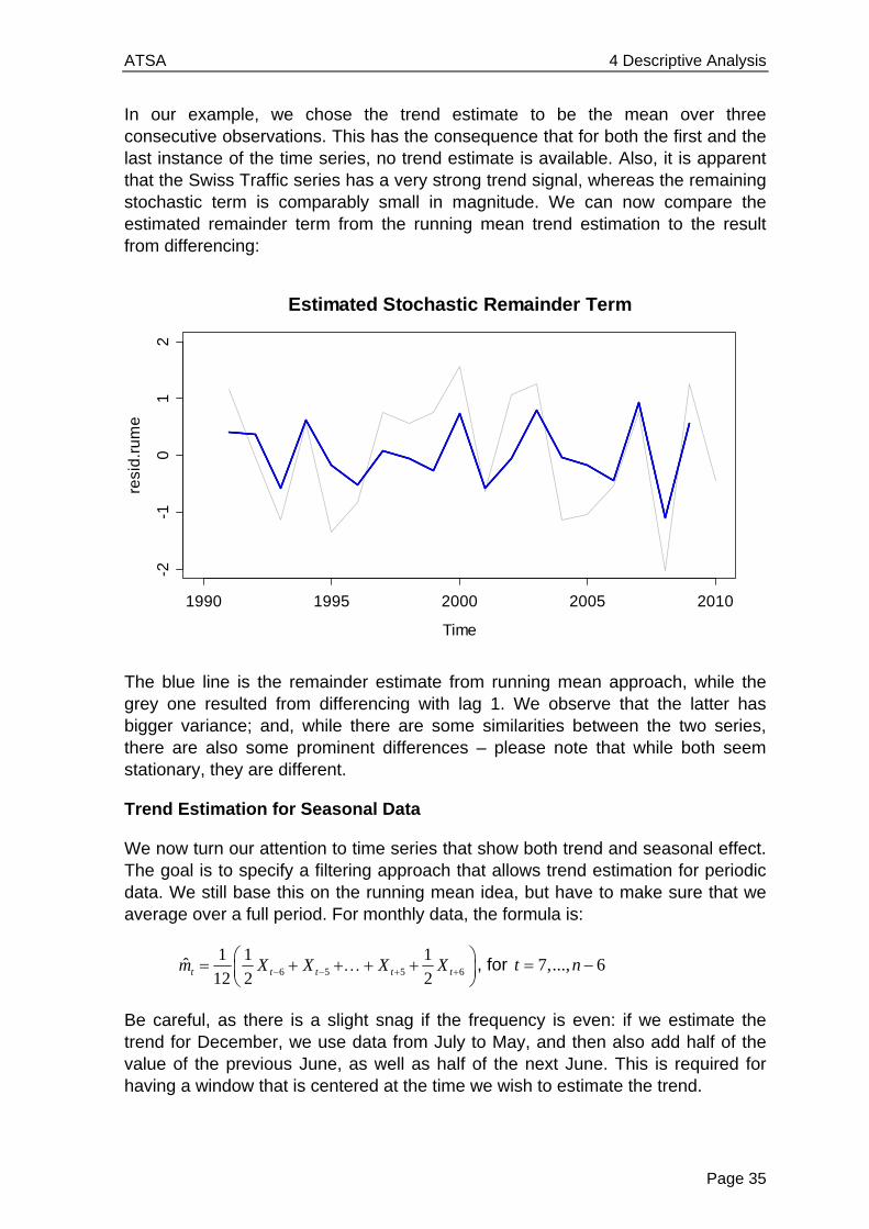
In our example, we chose the trend estimate to be the mean over three consecutive observations. This has the consequence that for both the first and the last instance of the time series, no trend estimate is available. Also, it is apparent that the Swiss Traffic series has a very strong trend signal, whereas the remaining stochastic term is comparably small in magnitude. We can now compare the estimated remainder term from the running mean trend estimation to the result from differencing:
The blue line is the remainder estimate from running mean approach, while the grey one resulted from differencing with lag 1. We observe that the latter has bigger variance; and, while there are some similarities between the two series, there are also some prominent differences – please note that while both seem stationary, they are different.
Trend Estimation for Seasonal Data
We now turn our attention to time series that show both trend and seasonal effect. The goal is to specify a filtering approach that allows trend estimation for periodic data. We still base this on the running mean idea, but have to make sure that we average over a full period. For monthly data, the formula is:
6 5 5 6
1 1 1
12 2 2ˆ t t t t tX Xm X X
, for 7,..., 6t n
Be careful, as there is a slight snag if the frequency is even: if we estimate the trend for December, we use data from July to May, and then also add half of the value of the previous June, as well as half of the next June. This is required for having a window that is centered at the time we wish to estimate the trend.
Time
resi
d.r
um
e
1990 1995 2000 2005 2010
-2-1
01
2
Estimated Stochastic Remainder Term

ATSA 4 Descriptive Analysis
Page 36
Using R’s function filter(), with appropriate choice of weights, we can compute the seasonal running mean. We illustrate this with the Mauna Loa 2CO data.
> wghts <- c(.5,rep(1,11),.5)/12 > trend.est <- filter(co2, filter=wghts, sides=2) > plot(co2, main="Mauna Loa CO2 Concentrations") > lines(trend.est, col="red")
We obtain a trend which fits well to the data. It is not a linear trend, rather it seems to be slightly progressively increasing, and it has a few kinks, too.
We finish this section about trend estimation using linear filters by stating that other smoothing approaches, e.g. running median estimation, the loess smoother and many more are valid choices for trend estimation, too.
Estimation of the Seasonal Effect
For fully decomposing periodic series such as the Mauna Loa data, we also need to estimate the seasonal effect. This is done on the basis of the trend adjusted data: simple averages over all observations from the same seasonal entity are taken. The following formula shows the January effect estimation for the Mauna Loa data, a monthly series which starts in January and has 39 years of data.
38
1 13 12 1 12 10
1ˆ ˆ ˆ ˆ... ( )
39Jan j jj
s s s x m
In R, a convenient way of estimating such seasonal effects is by generating a factor for the months, and then using the tapply() function. Please note that the seasonal running mean naturally generates NA values at the start and end of the series, which we need to remove in the seasonal averaging process.
Mauna Loa CO2 Concentrations
Time
co2
1960 1970 1980 1990
32
03
30
34
03
50
36
0

ATSA 4 Descriptive Analysis
Page 37
> trend.adj <- co2-trend.est > month <- factor(rep(1:12,39)) > seasn.est <- tapply(trend.adj, month, mean, na.rm=TRUE) > plot(seasn.est, type="h", xlab="Month") > title("Seasonal Effects for Mauna Loa Data") > abline(h=0, col="grey")
In the plot above, we observe that during a period, the highest values are usually observed in May, whereas the seasonal low is in October. The estimate for the remainder at time t is simply obtained by subtracting estimated trend and seasonality from the observed value
ˆ ˆ ˆt t t tR x m s
2 4 6 8 10 12
-3-2
-10
12
3
Month
sea
sn.e
st
Seasonal Effects for Mauna Loa Data
Estimated Stochastic Remainder Term
Time
rma
in.e
st
1960 1970 1980 1990
-0.5
0.0
0.5
ATSA 4 Descriptive Analysis
Page 38
It seems as if the estimated remainder still has some periodicity and thus it is questionable whether it is stationary. The periodicity is due to the fact that the seasonal effect is not constant but slowly evolving over time. In the beginning, we tend to overestimate it for most months, whereas in the end, we underestimate. We will address the issue on how to visualize evolving seasonality below in section 4.3.4 about STL-decomposition.
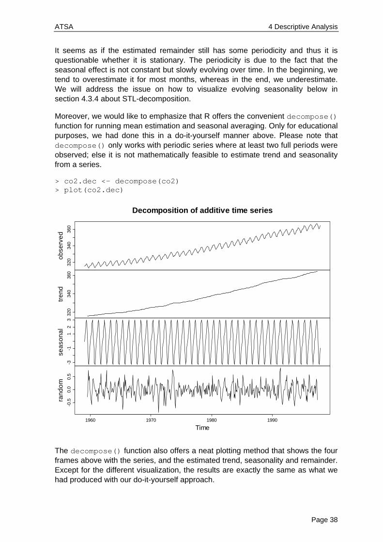
Moreover, we would like to emphasize that R offers the convenient decompose() function for running mean estimation and seasonal averaging. Only for educational purposes, we had done this in a do-it-yourself manner above. Please note that decompose() only works with periodic series where at least two full periods were observed; else it is not mathematically feasible to estimate trend and seasonality from a series.
> co2.dec <- decompose(co2) > plot(co2.dec)
The decompose() function also offers a neat plotting method that shows the four frames above with the series, and the estimated trend, seasonality and remainder. Except for the different visualization, the results are exactly the same as what we had produced with our do-it-yourself approach.
320
340
360
ob
serv
ed
320
340
360
tre
nd
-3-1
12
3
sea
son
al
-0.5
0.0
0.5
1960 1970 1980 1990
ran
do
m
Time
Decomposition of additive time series
ATSA 4 Descriptive Analysis
Page 39
4.3.4 Seasonal-Trend Decomposition with LOESS
It is well known that the running mean is not the best smoother around. Thus, potential for improvement exists. While there is a dedicated R procedure for decomposing periodic series into trend, seasonal effect and remainder, we have to do some handwork in non-periodic cases.
Trend Estimation with LOESS
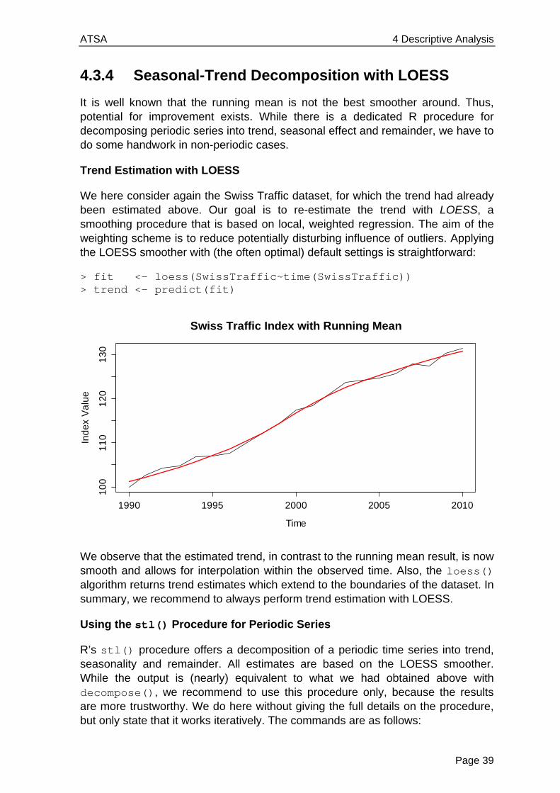
We here consider again the Swiss Traffic dataset, for which the trend had already been estimated above. Our goal is to re-estimate the trend with LOESS, a smoothing procedure that is based on local, weighted regression. The aim of the weighting scheme is to reduce potentially disturbing influence of outliers. Applying the LOESS smoother with (the often optimal) default settings is straightforward:
> fit <- loess(SwissTraffic~time(SwissTraffic)) > trend <- predict(fit)
We observe that the estimated trend, in contrast to the running mean result, is now smooth and allows for interpolation within the observed time. Also, the loess() algorithm returns trend estimates which extend to the boundaries of the dataset. In summary, we recommend to always perform trend estimation with LOESS.
Using the stl() Procedure for Periodic Series
R’s stl() procedure offers a decomposition of a periodic time series into trend, seasonality and remainder. All estimates are based on the LOESS smoother. While the output is (nearly) equivalent to what we had obtained above with decompose(), we recommend to use this procedure only, because the results are more trustworthy. We do here without giving the full details on the procedure, but only state that it works iteratively. The commands are as follows:
Time
Ind
ex
Va
lue
1990 1995 2000 2005 2010
10
01
10
12
01
30
Swiss Traffic Index with Running Mean

ATSA 4 Descriptive Analysis
Page 40
> co2.stl <- stl(co2, s.window="periodic") > plot(co2.stl, main="STL-Decomposition of CO2 Data")
The graphical output is similar to the one from decompose() The grey bars on the right hand side facilitate interpretation of the decomposition: they show the relative magnitude of the effects, i.e. cover the same span on the y-scale in all of the frames. The two principal arguments in function stl() are t.window and s.window. The first one, t.window, controls the amount of smoothing for the trend, and has a default value which often yields good results. The value used can be inferred with:
> co2.stl$win[2] t 19
The result is the number of lags used as a window for trend extraction in LOESS. Increasing it means the trend becomes smoother; lowering it makes the trend rougher, but more adapted to the data. The second argument, s.window, controls the smoothing for the seasonal effect. When set to “periodic” as above, the seasonality is obtained as a constant value from simple (monthly) averaging, as presented in section 4.3.3.
However, stl() offers better functionality. If s.window is set to a numeric value, the procedure can accommodate for evolving seasonality. The assumption behind is that the change in the seasonal effect happens slowly and smoothly. We visualize what is meant with the logged air passenger data. For quick illustration, we estimate the trend with a running mean filter, subtract it from the observed series and display all March and all August values of the trend adjusted series:
STL-Decomposition of CO2 Data32
034
036
0
da
ta
-3-1
13
sea
son
al
320
340
360
tre
nd
-0.5
0.5
1960 1970 1980 1990
rem
ain
de
r
time

ATSA 4 Descriptive Analysis
Page 41
When assuming a non-changing seasonal effect, the standard procedure would be to take the mean of the data points in the above scatterplots and declare that as the seasonal effect for March and August, respectively. This is a rather crude way of data analysis, and can of course be improved. We achieve a better decomposition of the logged air passenger bookings by employing the stl() function and setting s.window=13. The resulting graphical output is displayed below.
> fit.05 <- stl(lap, s.window= 5) > fit.13 <- stl(lap, s.window=13) > plot(fit.13, main="STL-Decomposition ...")
-0.0
50
.00
0.0
50
.10
1949 1952 1955 1958
Effect of March
0.1
50
.20
0.2
5
1949 1952 1955 1958
Effect of August
STL-Decomposition of Logged Air Passenger Bookings
5.0
6.0
da
ta
-0.2
0.0
0.2
sea
son
al
4.8
5.4
6.0
tre
nd
-0.0
50.
05
1950 1952 1954 1956 1958 1960
rem
ain
de
r
time
ATSA 4 Descriptive Analysis
Page 42
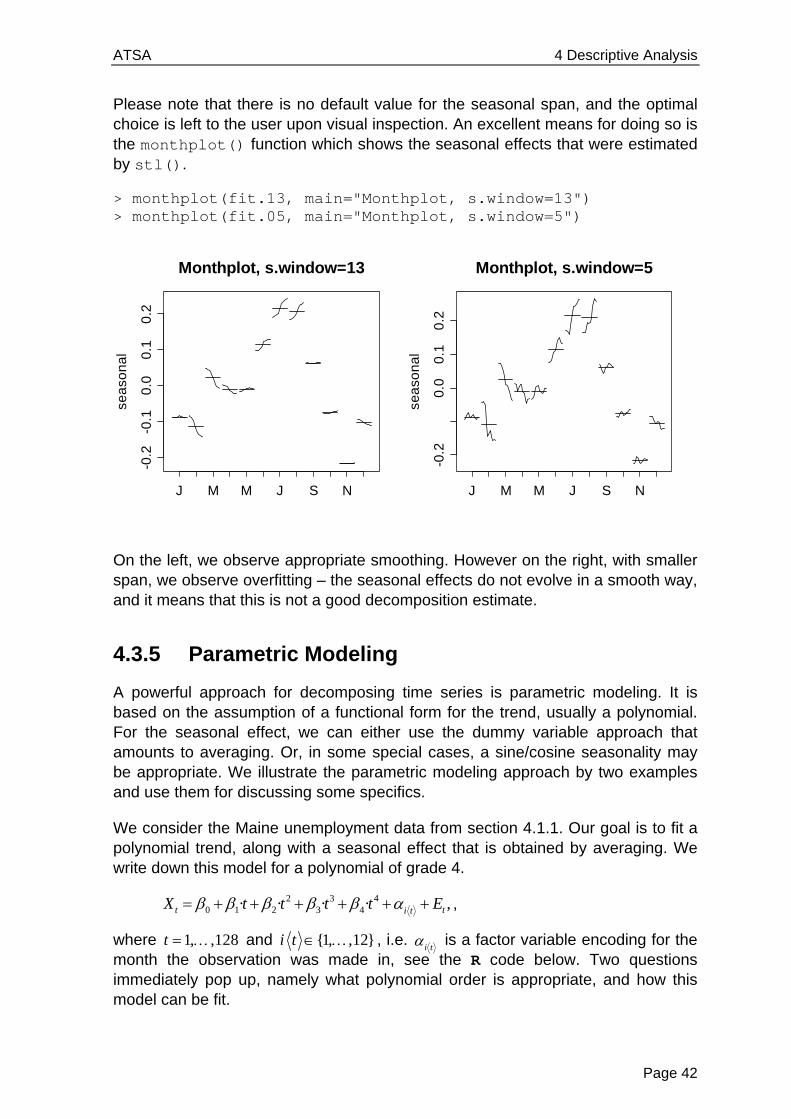
Please note that there is no default value for the seasonal span, and the optimal choice is left to the user upon visual inspection. An excellent means for doing so is the monthplot() function which shows the seasonal effects that were estimated by stl().
> monthplot(fit.13, main="Monthplot, s.window=13") > monthplot(fit.05, main="Monthplot, s.window=5")
On the left, we observe appropriate smoothing. However on the right, with smaller span, we observe overfitting – the seasonal effects do not evolve in a smooth way, and it means that this is not a good decomposition estimate.
4.3.5 Parametric Modeling
A powerful approach for decomposing time series is parametric modeling. It is based on the assumption of a functional form for the trend, usually a polynomial. For the seasonal effect, we can either use the dummy variable approach that amounts to averaging. Or, in some special cases, a sine/cosine seasonality may be appropriate. We illustrate the parametric modeling approach by two examples and use them for discussing some specifics.
We consider the Maine unemployment data from section 4.1.1. Our goal is to fit a polynomial trend, along with a seasonal effect that is obtained by averaging. We write down this model for a polynomial of grade 4.
2 3 40 1 2 3 4· · ,· ·t ti tX t t t t E ,
where 1, ,128t and {1, ,12}i t , i.e. i t is a factor variable encoding for the
month the observation was made in, see the R code below. Two questions immediately pop up, namely what polynomial order is appropriate, and how this model can be fit.
Monthplot, s.window=13
sea
son
al
J M M J S N
-0.2
-0.1
0.0
0.1
0.2
Monthplot, s.window=5
sea
son
al
J M M J S N
-0.2
0.0
0.1
0.2
ATSA 4 Descriptive Analysis
Page 43
As for the fitting, this will be done with the least squares algorithm. This requires some prudence, because we assume a remainder term tE which is not necessarily stochastically independent. Thus, we have some violated assumption for the ordinary least squares (OLS) estimation. Since the estimated coefficients are still unbiased, OLS is a valid approach. However, be careful with the standard errors, as well as tests and confidence intervals derived from them, because they can be grossly misleading.
For the grade of the polynomial, we determine by eyeballing from the time series plot that the hypothesized trend in the unemployment series has at least 3 minima. This means that a polynomial with grade below 4 will not result in a sensible trend estimate. Thus, we try orders 4, 5 and 6, and discuss how an appropriate choice can be made from residual analysis. However, we first focus on the R code for fitting such models:
> maine <- ts(dat, start=c(1996,1), freq=12) > tr <- as.numeric(time(maine)) > tc <- tr-mean(tr) > mm <- rep(c("Jan", "Feb", "Mar", "Apr", "May", "Jun", "Jul", "Aug", "Sep", "Oct", "Nov", "Dec")) > mm <- factor(rep(mm,11),levels=mm)[1:128]
In a first step, we lay the basics. From time series maine, we extract the times of observation as the predictor. As always when fitting polynomial regression models, it is crucial to center the x-values to mitigate potential collinearity among the terms. Furthermore, we define a factor variable for modeling the seasonality.
> fit04 <- lm(maine~tc+I(tc^2)+I(tc^3)+I(tc^4)+mm) > cf <- coef(fit04) > t.est.04 <- cf[1]+cf[2]*tc+cf[3]*tc^2+cf[4]*tc^3+cf[5]*tc^4 > t04.adj <- t.est.04-mean(t.est.04)+mean(maine)
We can obtain an OLS-fit of the decomposition model with R’s lm() procedure. The I() notation in the formula assures that the “^” are interpreted as arithmetical operators, i.e. powers of the predictor, rather than as formula operators. Thereafter, we can use the estimated coefficients for determining the trend estimate t.est.04. Because the seasonal factor uses the month of January as a reference, and thus generally has a mean different from zero, we need to shift the trend to make run through “the middle of the data” – this is key if we aim for visualizing the trend.
> plot(maine, ylab="(%)", main="Unemployment in Maine") > lines(tr, t.04.adj)
The time series plot on the next page is enhanced with polynomial trend lines of order 4 (blue), 5 (red) and 6 (green). From this visualization, it is hard to decide which of the polynomials is most appropriate as a trend estimate. Because there are some boundary effects for orders 5 and 6, we might guess that their additional flexibility is not required. As we will see below, this is treacherous.

ATSA 4 Descriptive Analysis
Page 44
A better way for judging the fit of a parametric model is by residual analysis. We plot the remainder term ˆ
tE versus time and add a LOESS smoother.
> re.est <- maine-fitted(fit04) > plot(re.est, ylab="", main="Residuals vs. Time, O(4)") > fit <- loess(re.est~tr) > lines(tr, fitted(fit), col="red") > abline(h=0, col="grey")
The above plot shows some, but not severe, lack of fit, i.e. the remainder term still seems to have a slight trend, owing to a too low polynomial grade. The picture becomes clearer when we produce the equivalent plots for grade 5 and 6 polynomials. These are displayed on the next page.
Unemployment in Maine
Time
(%)
1996 1998 2000 2002 2004 2006
34
56
O(4)O(5)O(6)
Residuals vs. Time, O(4)
Time
1996 1998 2000 2002 2004 2006
-0.6
-0.2
0.2
0.6

ATSA 4 Descriptive Analysis
Page 45
The residuals look best in the last plot for order 6, which would be the method of choice for this series. It is also striking that the remainder is not an i.i.d. series, the serial correlation is clearly standing out. In the next section, we will address the estimation and visualization of such autocorrelations.
We conclude this chapter on parametric modeling by issuing a warning: while the explicit form of the trend can be useful, it shall never be interpreted as causal for the evolvement of the series. Also, much care needs to be taken if forecasting is the goal. Extrapolating high-order polynomials beyond the range of observed times can yield very poor results. We will discuss some simple methods for trend extrapolation later in section 9 about forecasting.
Residuals vs. Time, O(5)
Time
1996 1998 2000 2002 2004 2006
-0.6
-0.2
0.2
0.6
Residuals vs. Time, O(6)
Time
1996 1998 2000 2002 2004 2006
-0.4
-0.2
0.0
0.2
0.4
ATSA 4 Descriptive Analysis
Page 46
4.4 Autocorrelation
An important feature of time series is their serial correlation. This section aims at analyzing and visualizing these correlations. We first display the autocorrelation between two random variables t kX and tX , which is defined as:
( ,Cor( ,
( )
)
()
)t k t
t k t
t k t
Cov X XX X
Var X Var X
This is a dimensionless measure for the linear association between the two random variables. Since for stationary series, we require the moments to be non-changing over time, we can drop the index t for these, and write the autocorrelation as a function of the lag k :
( ) ( , )t k tk Cor X X
The goals in the forthcoming sections are estimating these autocorrelations from observed time series data, and to study the estimates’ properties. The latter will prove useful whenever we try to interpret sample autocorrelations in practice.
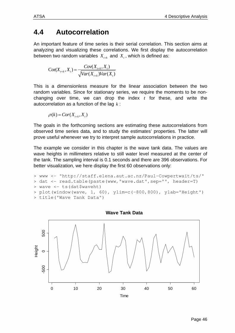
The example we consider in this chapter is the wave tank data. The values are wave heights in millimeters relative to still water level measured at the center of the tank. The sampling interval is 0.1 seconds and there are 396 observations. For better visualization, we here display the first 60 observations only:
> www <- "http://staff.elena.aut.ac.nz/Paul-Cowpertwait/ts/" > dat <- read.table(paste(www,"wave.dat",sep="", header=T) > wave <- ts(dat$waveht) > plot(window(wave, 1, 60), ylim=c(-800,800), ylab="Height") > title("Wave Tank Data")
Time
He
igh
t
0 10 20 30 40 50 60
-50
00
50
0
Wave Tank Data

ATSA 4 Descriptive Analysis
Page 47
These data show some pronounced cyclic behavior. This does not come as a surprise, as we all know from personal experience that waves do appear in cycles. The series shows some very clear serial dependence, because the current value is quite closely linked to the previous and following ones. But very clearly, it is also a stationary series.
4.4.1 Lagged Scatterplot
An appealing idea for analyzing the correlation among consecutive observations in the above series is to produce a scatterplot of 1( , )t tx x for all 1,..., 1t n . There is a designated function lag.plot() in R. The result is as follows:
> lag.plot(wave, do.lines=FALSE, pch=20) > title("Lagged Scatterplot, k=1")
The association seems linear and is positive. The Pearson correlation coefficient turns out to be 0.47, thus moderately strong. How to interpret this value from a practical viewpoint? Well, the square of the correlation coefficient, 20.47 0.22 , is the percentage of variability explained by the linear association between tx and its respective predecessor. Here in this case, 1tx explains roughly 22% of the variability observed in tx .
We can of course extend the very same idea to higher lags. We here analyze the lagged scatterplot correlations for lags 2,...5k , see below. When computed, the estimated Pearson correlations turn out to be -0.27, -0.50, -0.39 and -0.22, respectively. The formula for computing them is:
( ) (1)1
2 2( ) (1)
1 1
( )( )( )
( ) ( )
n k
s k k ss
n n k
s k ts k t
x x x xk
x x x x
for 1,..., 2k n ,
-1000 -500 0 500 1000
-50
00
50
0
lag 1
wa
ve
Lagged Scatterplot, k=1
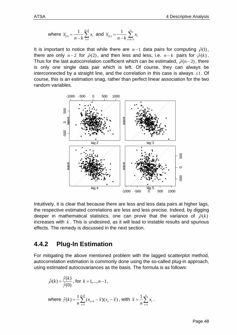
ATSA 4 Descriptive Analysis
Page 48
where (1)1
1 n k
ii
x xn k
and ( )
1
1 n
k ii k
x xn k
It is important to notice that while there are 1n data pairs for computing (1) , there are only 2n for (2) , and then less and less, i.e. n k pairs for ( )k . Thus for the last autocorrelation coefficient which can be estimated, ( 2)n , there is only one single data pair which is left. Of course, they can always be interconnected by a straight line, and the correlation in this case is always 1 . Of course, this is an estimation snag, rather than perfect linear association for the two random variables.
Intuitively, it is clear that because there are less and less data pairs at higher lags, the respective estimated correlations are less and less precise. Indeed, by digging deeper in mathematical statistics, one can prove that the variance of ( )k increases with k . This is undesired, as it will lead to instable results and spurious effects. The remedy is discussed in the next section.
4.4.2 Plug-In Estimation
For mitigating the above mentioned problem with the lagged scatterplot method, autocorrelation estimation is commonly done using the so-called plug-in approach, using estimated autocovariances as the basis. The formula is as follows:
ˆ( )
ˆ( )ˆ(0)
kk
, for 1,..., 1k n ,
where 1
1ˆ( ) ( )( )
n k
s k ss
k x x x xn
, with 1
1 n
tt
x xn
.
lag 2
wav
e-5
000
500
-1000 -500 0 500 1000
lag 3
wav
e
lag 4
wav
e
lag 5
wav
e
-500
050
0
-1000 -500 0 500 1000

ATSA 4 Descriptive Analysis
Page 49
Note that here, n is used as a denominator irrespective of the lag and thus the number of summands. This has the consequence that ˆ(0) is not an unbiased estimator for 2(0) X , but as explained above, there are good reasons to do so. When plugging in the above terms, the estimate for the k th autocorrelation coefficient turns out to be:
1
2
1
( )( )ˆ( )
( )
n k
s k ss
n
tt
x x x xk
x x
, for 1,..., 1k n .
It is straightforward to compute these in R, function acf() does the job, and we below do so for the wave tank data. As for the moment, we are interested in the numerical results, we set argument plot=FALSE. However, as we will see below, it is usually better to visualize the estimated autocorrelation coefficients graphically, as it will be explained below in section 4.4.3. Also note that R by default does not return all autocorrelations which are estimable in this series with 396 observations, but only the first 25.
> acf(wave, plot=FALSE) Autocorrelations of series ‘wave’, by lag 0 1 2 3 4 5 6 7 1.000 0.470 -0.263 -0.499 -0.379 -0.215 -0.038 0.178 8 9 10 11 12 13 14 15 0.269 0.130 -0.074 -0.079 0.029 0.070 0.063 -0.010 16 17 18 19 20 21 22 23 -0.102 -0.125 -0.109 -0.048 0.077 0.165 0.124 0.049 24 25 -0.005 -0.066
Next, we compare the autocorrelations from lagged scatterplot estimation vs. the ones from the plug-in approach. These are displayed on the next page. While for the first 50 lags, there is not much of a difference, the plug-in estimates are much more damped for higher lags. As claimed above, the lagged scatterplot estimate shows a value of 1 for lag 394, and some generally very erratic behavior in the few lags before.
We can “prove”, or rather, provide evidence that this is an estimation artifact only if we restrict the series to the first 60 observations and then repeat the estimation of autocorrelations. Again, for the highest few legs which are estimable, the lagged scatterplot approach shows erratic behavior – and this was not present at the same lags, when the series was still longer. We do not observe this kind of effect with the plug-in based autocorrelations, thus this is clearly the method of choice.
We finish this chapter by repeating that the bigger the lag, the fewer data pairs remain for estimating the autocorrelation coefficient. We discourage of the use of the lagged scatterplot approach. While the preferred plug-in approach is biased
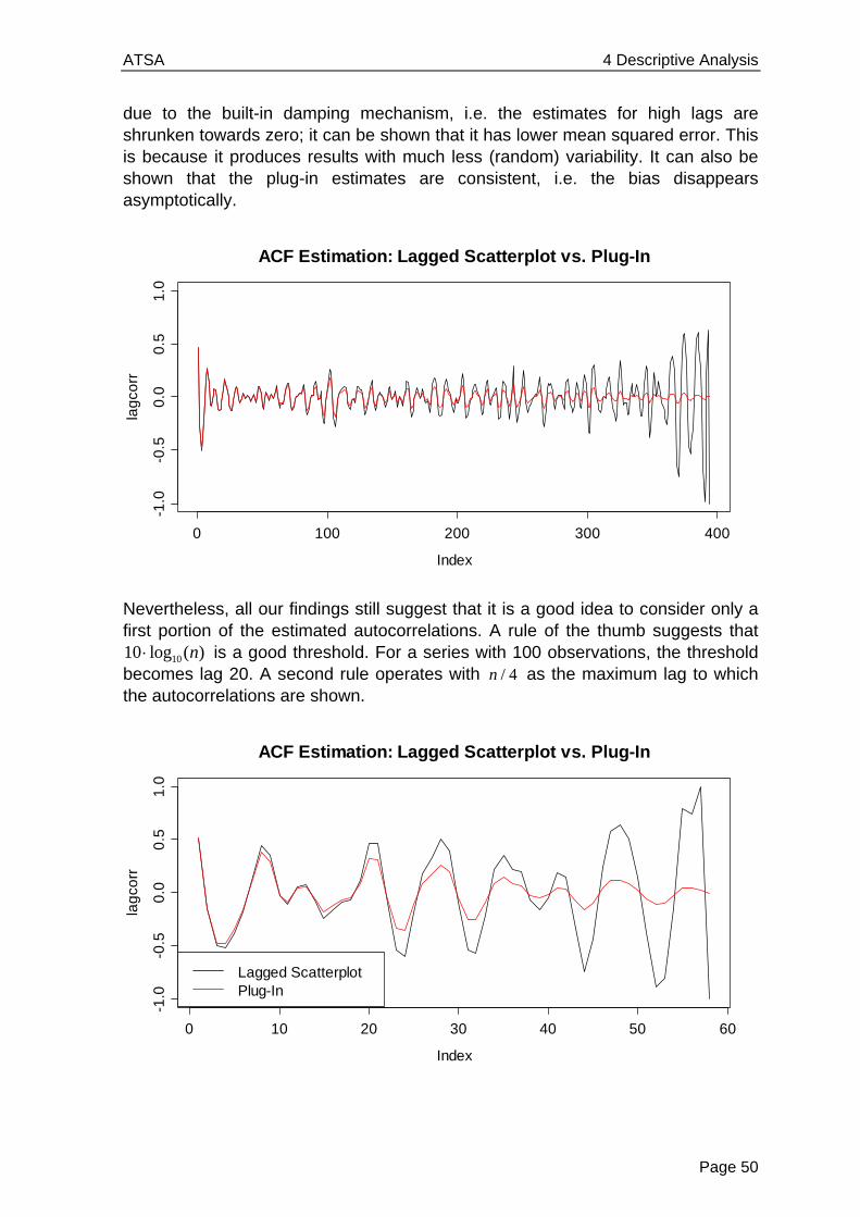
ATSA 4 Descriptive Analysis
Page 50
due to the built-in damping mechanism, i.e. the estimates for high lags are shrunken towards zero; it can be shown that it has lower mean squared error. This is because it produces results with much less (random) variability. It can also be shown that the plug-in estimates are consistent, i.e. the bias disappears asymptotically.
Nevertheless, all our findings still suggest that it is a good idea to consider only a first portion of the estimated autocorrelations. A rule of the thumb suggests that
1010 log ( )n is a good threshold. For a series with 100 observations, the threshold becomes lag 20. A second rule operates with / 4n as the maximum lag to which the autocorrelations are shown.
0 100 200 300 400
-1.0
-0.5
0.0
0.5
1.0
Index
lag
corr
ACF Estimation: Lagged Scatterplot vs. Plug-In
0 10 20 30 40 50 60
-1.0
-0.5
0.0
0.5
1.0
Index
lag
corr
Lagged ScatterplotPlug-In
ACF Estimation: Lagged Scatterplot vs. Plug-In

ATSA 4 Descriptive Analysis
Page 51
4.4.3 Correlogram
Now, we know how to estimate the autocorrelation function (ACF) for any lag k . Here, we introduce the correlogram, the standard means of visualization for the ACF. We will then also study the properties of the ACF estimator. We employ R and obtain:
> acf(wave, ylim=c(-1,1))
It has become a widely accepted standard to use vertical spikes for displaying the estimated autocorrelations. Also note that the ACF starts with lag 0, which always takes the value 1. For better judgment, we also recommend setting the y -range to the interval [ 1,1] . Apart from these technicalities, the ACF reflects the properties of the series. We also observe a cyclic behavior with a period of 8, as it is apparent in the time series plot of the original data. Moreover, the absolute value of the correlations attenuates with increasing lag. Next, we will discuss the interpretation of the correlogram.
Confidence Bands
It is obvious that even for an iid series without any serial correlation, and thus ( ) 0k for all k , the estimated autocorrelations ˆ ( )k will generally not be zero.
Hopefully, they will be close, but the question is how close. An answer is indicated by the confidence bands, i.e. the blue dashed lines in the plot above.
These so-called confidence bands are obtained from an asymptotic result: for long iid time series it can be shown that the ˆ ( )k approximately follow a (0,1/ )N n distribution. Thus, each ( )k lies within the interval of 1.96 / n with a probability of approximately 95%. This leads us to the following statement that facilitates interpretation of the correlogram: “for any stationary time series, sample autocorrelation coefficients ˆ ( )k that fall within the confidence band 2 / n are
0 5 10 15 20 25
-1.0
-0.5
0.0
0.5
1.0
Lag
AC
F
Correlogram of Wave Tank Data
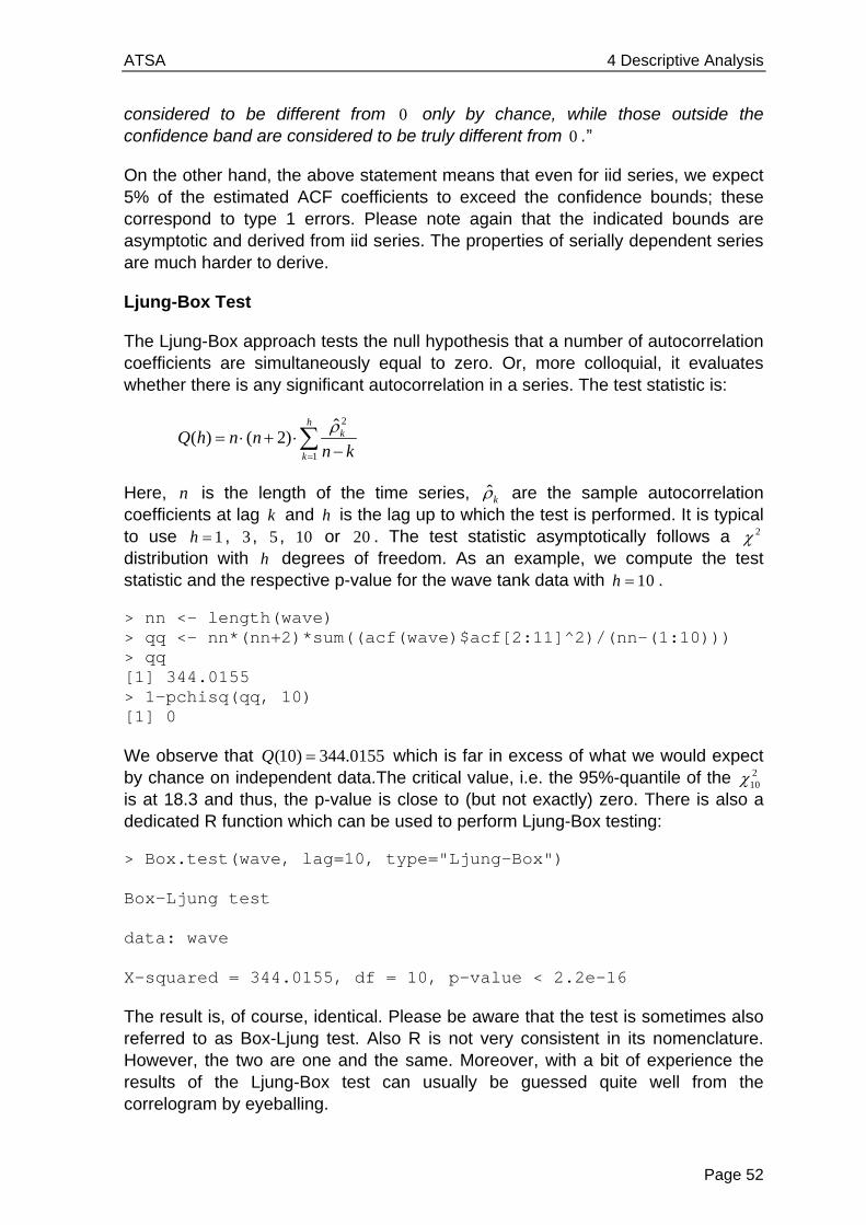
ATSA 4 Descriptive Analysis
Page 52
considered to be different from 0 only by chance, while those outside the confidence band are considered to be truly different from 0 .”
On the other hand, the above statement means that even for iid series, we expect 5% of the estimated ACF coefficients to exceed the confidence bounds; these correspond to type 1 errors. Please note again that the indicated bounds are asymptotic and derived from iid series. The properties of serially dependent series are much harder to derive.
Ljung-Box Test
The Ljung-Box approach tests the null hypothesis that a number of autocorrelation coefficients are simultaneously equal to zero. Or, more colloquial, it evaluates whether there is any significant autocorrelation in a series. The test statistic is:
2
1
ˆ( ) ( 2)
hk
k
Q h n nn k
Here, n is the length of the time series, ˆk are the sample autocorrelation coefficients at lag k and h is the lag up to which the test is performed. It is typical to use 1h , 3 , 5 , 10 or 20 . The test statistic asymptotically follows a 2 distribution with h degrees of freedom. As an example, we compute the test statistic and the respective p-value for the wave tank data with 10h .
> nn <- length(wave) > qq <- nn*(nn+2)*sum((acf(wave)$acf[2:11]^2)/(nn-(1:10))) > qq [1] 344.0155 > 1-pchisq(qq, 10) [1] 0
We observe that (10) 344.0155Q which is far in excess of what we would expect by chance on independent data.The critical value, i.e. the 95%-quantile of the 2
10 is at 18.3 and thus, the p-value is close to (but not exactly) zero. There is also a dedicated R function which can be used to perform Ljung-Box testing:
> Box.test(wave, lag=10, type="Ljung-Box") Box-Ljung test data: wave X-squared = 344.0155, df = 10, p-value < 2.2e-16
The result is, of course, identical. Please be aware that the test is sometimes also referred to as Box-Ljung test. Also R is not very consistent in its nomenclature. However, the two are one and the same. Moreover, with a bit of experience the results of the Ljung-Box test can usually be guessed quite well from the correlogram by eyeballing.
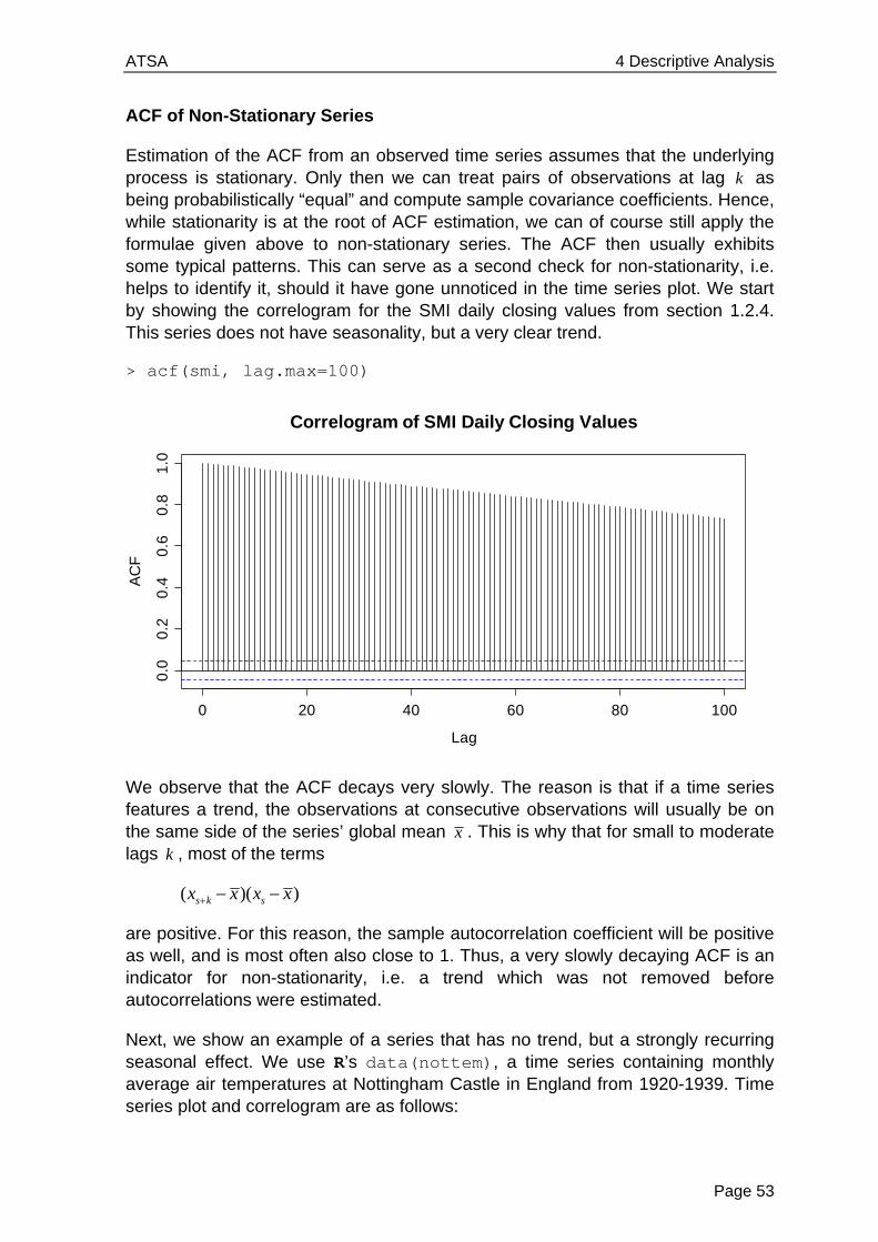
ATSA 4 Descriptive Analysis
Page 53
ACF of Non-Stationary Series
Estimation of the ACF from an observed time series assumes that the underlying process is stationary. Only then we can treat pairs of observations at lag k as being probabilistically “equal” and compute sample covariance coefficients. Hence, while stationarity is at the root of ACF estimation, we can of course still apply the formulae given above to non-stationary series. The ACF then usually exhibits some typical patterns. This can serve as a second check for non-stationarity, i.e. helps to identify it, should it have gone unnoticed in the time series plot. We start by showing the correlogram for the SMI daily closing values from section 1.2.4. This series does not have seasonality, but a very clear trend.
> acf(smi, lag.max=100)
We observe that the ACF decays very slowly. The reason is that if a time series features a trend, the observations at consecutive observations will usually be on the same side of the series’ global mean x . This is why that for small to moderate lags k , most of the terms
( )( )s k sx x x x
are positive. For this reason, the sample autocorrelation coefficient will be positive as well, and is most often also close to 1. Thus, a very slowly decaying ACF is an indicator for non-stationarity, i.e. a trend which was not removed before autocorrelations were estimated.
Next, we show an example of a series that has no trend, but a strongly recurring seasonal effect. We use R’s data(nottem), a time series containing monthly average air temperatures at Nottingham Castle in England from 1920-1939. Time series plot and correlogram are as follows:
0 20 40 60 80 100
0.0
0.2
0.4
0.6
0.8
1.0
Lag
AC
F
Correlogram of SMI Daily Closing Values
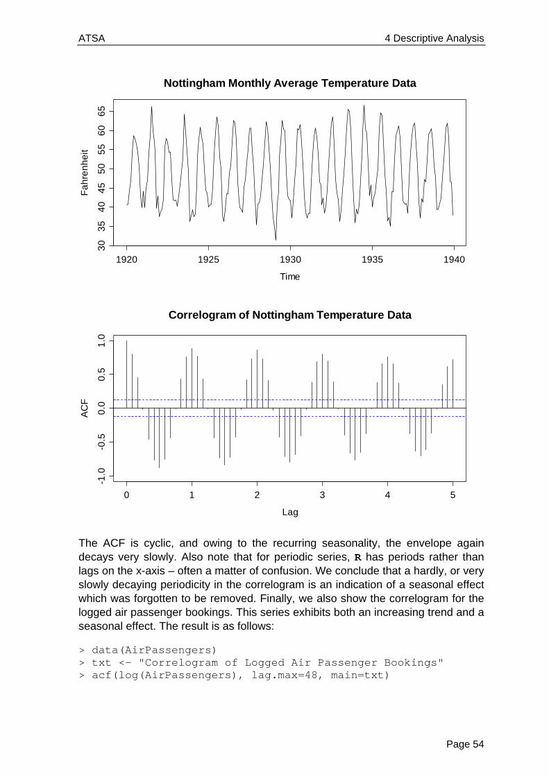
ATSA 4 Descriptive Analysis
Page 54
The ACF is cyclic, and owing to the recurring seasonality, the envelope again decays very slowly. Also note that for periodic series, R has periods rather than lags on the x-axis – often a matter of confusion. We conclude that a hardly, or very slowly decaying periodicity in the correlogram is an indication of a seasonal effect which was forgotten to be removed. Finally, we also show the correlogram for the logged air passenger bookings. This series exhibits both an increasing trend and a seasonal effect. The result is as follows:
> data(AirPassengers) > txt <- "Correlogram of Logged Air Passenger Bookings" > acf(log(AirPassengers), lag.max=48, main=txt)
Time
Fa
hre
nh
eit
1920 1925 1930 1935 1940
30
35
40
45
50
55
60
65
Nottingham Monthly Average Temperature Data
0 1 2 3 4 5
-1.0
-0.5
0.0
0.5
1.0
Lag
AC
F
Correlogram of Nottingham Temperature Data

ATSA 4 Descriptive Analysis
Page 55
Here, the two effects described above are interspersed. We have a (here dominating) slow decay in the general level of the ACF, plus some periodicity. Again, this is an indication for a non-stationary series. It needs to be decomposed, before the serial correlation in the stationary remainder term can be studied.
The ACF and Outliers
If a time series has an outlier, it will appear twice in any lagged scatterplot, and will thus potentially have “double” negative influence on the ˆ ( )k . As an example, we consider variable temp from data frame beaver1, which can be found in R’s data(beavers). This is the body temperature of a female beaver, measured by telemetry in 10 minute intervals. We first visualize the data with a time series plot.
0 1 2 3 4
-0.2
0.0
0.2
0.4
0.6
0.8
1.0
Lag
AC
FCorrelogram of Logged Air Passenger Bookings
Beaver Body Temperature Data
Time
be
ave
r
0 20 40 60 80 100
36
.43
6.8
37
.2
ATSA 4 Descriptive Analysis
Page 56
Observation 80 is a moderate, but distinct outlier. It is unclear to the author whether this actually is an error, or whether the reported value is correct. But because the purpose of this section is showing the potential influence of erroneous values, that is not important. Neither the Pearson correlation coefficient, nor the plug-in autocorrelation estimator is robust, thus the appearance of the correlogram can be altered quite strongly due to the presence of just one single outlier.
> plot(beaver[1:113], beaver[2:114], pch=20,) > title("Lagged Scatterplot for Beaver Temperature")
The two data points where the outlier is involved are highlighted. The Pearson correlation coefficients with and without these two observations are 0.86 and 0.91. Depending on the outliers severity, the difference can be much bigger. The next page shows the entire correlogram for the beaver data, computed with (black) and without (red) the outlier. Also here, the difference may seem small and rather academic, but it could easily be severe if the outlier was just pronounced enough.
36.4 36.6 36.8 37.0 37.2 37.4
36
.43
6.8
37
.2
Lagged Scatterplot for Beaver Temperature
0 5 10 15 20
-0.2
0.0
0.2
0.4
0.6
0.8
1.0
Lag
AC
F
Correlogram of Beaver Temperature Data
with outlierwithout outlier
ATSA 4 Descriptive Analysis
Page 57
The question is, how do we handle missing values in time series? In principle, we cannot just omit them without breaking the time structure. And breaking it means going away from our paradigm of equally spaced points in time. A popular choice is thus replacing the missing value. This can be done with various degrees of sophistication:
a) replacing the value with the global mean
b) using a local mean, i.e. +/- 3 observations
c) model based imputation by forecasting
The best strategy depends upon the case at hand. And in fact, there is a fourth alternative: while R’s acf() function by default does not allow for missing values, it still offers the option to proceed without imputation. If argument is set as na.action=na.pass, the covariances are computed from the complete cases, and the correlogram is shown as usual. However, having missed values in the series has the consequence that the estimates produced may well not be a valid (i.e. positive definite) autocorrelation sequence, and may contain missing values. From a practical viewpoint, these drawbacks can often be neglected, though.
4.4.4 Quality of ACF Estimates
In this section we will deal with the quality of the information that is contained in the correlogram. We will not do this from a very theoretical viewpoint, but rather focus on the practical aspects. We have already learned that the ACF estimates are generally biased, i.e. shrunken towards zero for higher lags. This means that it is better to cut off the correlogram at a certain lag. Furthermore, non-stationarities in the series can hamper the interpretation of the correlogram and we have also seen that outliers can have a quite strong impact. But there are even more aspects in ACF estimation that are problematic...
The Compensation Issue
One can show that the sum of all autocorrelations which can be estimated from a time series realization, the sum over all ˆ ( )k for lags 1,..., 1k n , adds up to -1/2. Or, written as a formula:
1
1
1ˆ ( )
2
n
k
k
We omit the proof here. It is clear that the above condition will lead to quite severe artifacts, especially when a time series process has only positive correlations. We here show both the true, theoretical ACF of an (1)AR process with 1 0.7 , which, as we will see in section 5, has ( ) 0k for all k , and the sample correlogram for a realization of that process with a length 200 observations.
ATSA 4 Descriptive Analysis
Page 58
The respective R-commands for producing these plots are as follows:
## True ACF true.acf <- ARMAacf(ar=0.7, lag.max=200) plot(0:200, true.acf, type="h", xlab="Lag", ylim=c(-1,1)) title("True ACF of an AR(1) Process with alpha=0.7") abline(h=0, col="grey") ## Simulation and Generating the ACF set.seed(25) ts.simul <- arima.sim(list(ar=0.7), 200) acf(ts.simul, lag=200, main="Correlogram ...")
0 50 100 150 200
-1.0
-0.5
0.0
0.5
1.0
Lag
AC
FTrue ACF of an AR(1) Process with alpha=0.7
0 50 100 150 200
-0.2
0.0
0.2
0.4
0.6
0.8
1.0
Lag
AC
F
Correlogram for a Realization from an AR(1) Process
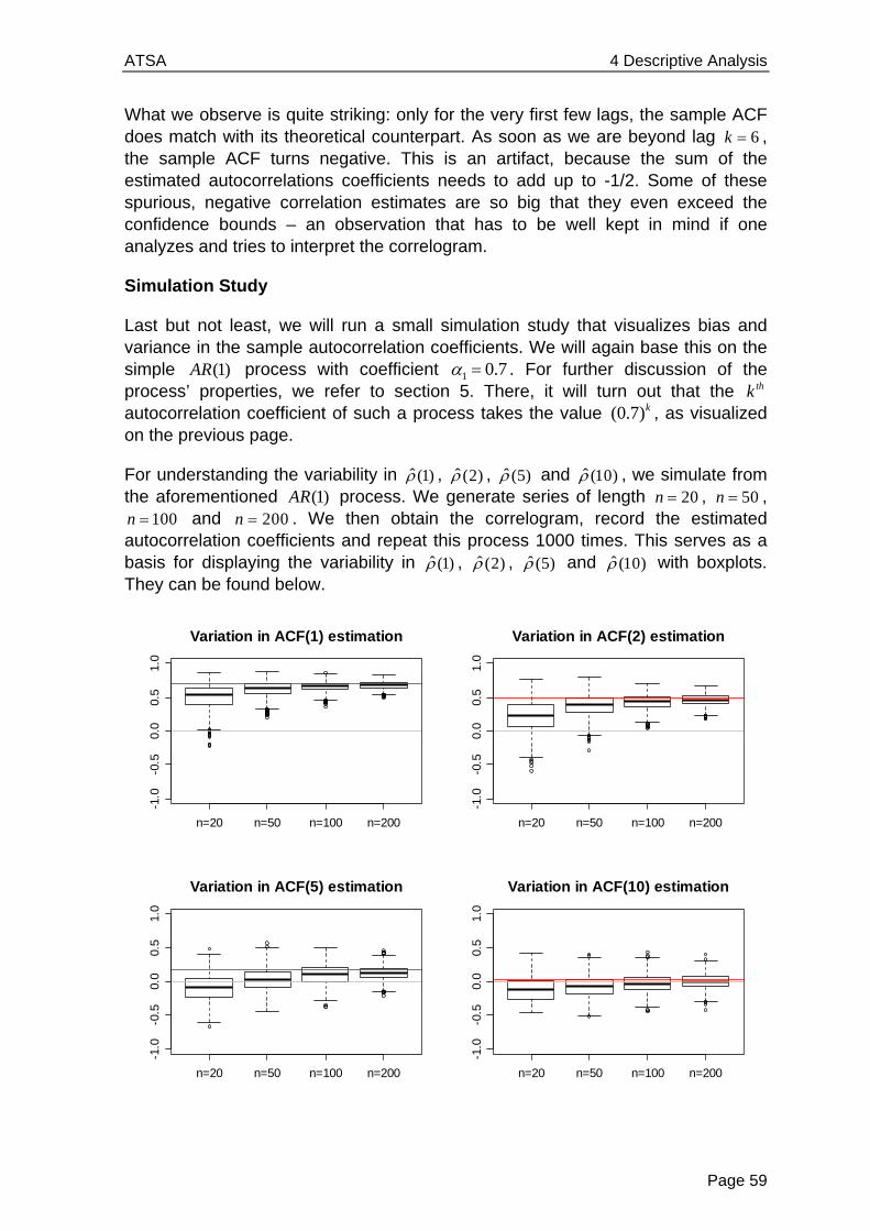
ATSA 4 Descriptive Analysis
Page 59
What we observe is quite striking: only for the very first few lags, the sample ACF does match with its theoretical counterpart. As soon as we are beyond lag 6k , the sample ACF turns negative. This is an artifact, because the sum of the estimated autocorrelations coefficients needs to add up to -1/2. Some of these spurious, negative correlation estimates are so big that they even exceed the confidence bounds – an observation that has to be well kept in mind if one analyzes and tries to interpret the correlogram.
Simulation Study
Last but not least, we will run a small simulation study that visualizes bias and variance in the sample autocorrelation coefficients. We will again base this on the simple (1)AR process with coefficient 1 0.7 . For further discussion of the process’ properties, we refer to section 5. There, it will turn out that the thk autocorrelation coefficient of such a process takes the value (0.7)k , as visualized on the previous page.
For understanding the variability in ˆ (1) , ˆ (2) , ˆ (5) and ˆ (10) , we simulate from the aforementioned (1)AR process. We generate series of length 20n , 50n ,
100n and 200n . We then obtain the correlogram, record the estimated autocorrelation coefficients and repeat this process 1000 times. This serves as a basis for displaying the variability in ˆ (1) , ˆ (2) , ˆ (5) and ˆ (10) with boxplots. They can be found below.
Variation in ACF(1) estimation
n=20 n=50 n=100 n=200
-1.0
-0.5
0.0
0.5
1.0
Variation in ACF(2) estimation
n=20 n=50 n=100 n=200
-1.0
-0.5
0.0
0.5
1.0
Variation in ACF(5) estimation
n=20 n=50 n=100 n=200
-1.0
-0.5
0.0
0.5
1.0
Variation in ACF(10) estimation
n=20 n=50 n=100 n=200
-1.0
-0.5
0.0
0.5
1.0
ATSA 4 Descriptive Analysis
Page 60
We observe that for “short” series with less than 100 observations, estimating the ACF is difficult: the ˆ ( )k are strongly biased, and there is huge variability. Only for longer series, the consistency of the estimator “kicks in”, and yields estimates which are reasonably precise. For lag 10k , on the other hand, we observe less bias, but the variability in the estimate remains large, even for “long” series.
We conclude this situation by summarizing: by now, we have provided quite a bit of evidence that the correlogram can be tricky to interpret at best, sometimes even misleading, or plain wrong. However, it is the best means we have for understanding the dependency in a time series. And we will base many if not most of our decisions in the modeling process on the correlogram. However, please be aware of the bias and the estimation variability there is.
4.5 Partial Autocorrelation
For the above (1)AR process, with its strong positive correlation at lag 1, it is somehow “evident” that the autocorrelation for lags 2 and higher will be positive as well – just by propagation: if A is highly correlated to B, and B is highly correlated to C, then A is usually highly correlated to C as well. It would now be very instructive to understand the direct relation between A and C, i.e. exploring what dependency there is in excess to the one associated to B. In a time series context, this is exactly what the partial autocorrelations do. The mathematical definition is the one of a conditional correlation:
1 1 1 1( ) ( , | , , )t k t t t t k t kk Cor X X X x X x
In other words, we can also say that the partial autocorrelation is the association between tX and t kX with the linear dependence of 1tX through 1t kX removed. Another instructive analogy can be drawn to linear regression. The autocorrelation coefficient ( )k measures the simple dependence between tX and t kX , whereas the partial autocorrelation ( )k measures the contribution to the multiple dependence, with the involvement of all intermediate instances 1 1,...,t t kX X as explanatory variables. There is a (theoretical) relation between the partial autocorrelations ( )k and the plain autocorrelations (1),..., ( )k , i.e. they can be derived from each other, e.g.:
(1) (1) and 2 2(2) ( (2) (1) ) / (1 (1) )
The formula for higher lags k exists, but get complicated rather quickly, so we do without displaying them. However, another absolutely central property of the partial autocorrelations ( )p is that the thk coefficent of the AR(p) model, denoted as p , is equal to ( )p . While there is an in depth discussion of AR(p) models in section 5, we here briefly sketch the idea, because it makes the above property seem rather logical. An autoregressive model of order p , i.e. an AR(p) is:
1 1t t k t p tX X X E ,
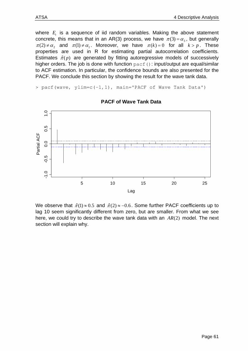
ATSA 4 Descriptive Analysis
Page 61
where tE is a sequence of iid random variables. Making the above statement concrete, this means that in an AR(3) process, we have 3(3) , but generally
2(2) and 1(1) . Moreover, we have ( ) 0k for all k p . These properties are used in R for estimating partial autocorrelation coefficients. Estimates ˆ( )p are generated by fitting autoregressive models of successively higher orders. The job is done with function pacf(): input/output are equal/similar to ACF estimation. In particular, the confidence bounds are also presented for the PACF. We conclude this section by showing the result for the wave tank data.
> pacf(wave, ylim=c(-1,1), main="PACF of Wave Tank Data")
We observe that ˆ(1) 0.5 and ˆ(2) 0.6 . Some further PACF coefficients up to lag 10 seem significantly different from zero, but are smaller. From what we see here, we could try to describe the wave tank data with an (2)AR model. The next section will explain why.
5 10 15 20 25
-1.0
-0.5
0.0
0.5
1.0
Lag
Pa
rtia
l AC
F
PACF of Wave Tank Data


ATSA 5 Stationary Time Series Models
Page 63
5 Stationary Time Series Models Rather than simply describing observed time series data, we now aim for fitting models. This will prove useful for a deeper understanding of the data, but is especially beneficial when forecasting is the main goal. We here focus on parametric models for stationary time series, namely the broad class of autoregressive moving average (ARMA) processes – these have shown great importance in modeling real-world data.
5.1 White Noise
As the most basic stochastic process, we introduce discrete white noise. A time series 1 2( , ,..., )nW W W is called white noise if the random variables 1 2, ,...W W are independent and identically distributed with mean zero. This also implies that all random variables tW have identical variance, and there are no autocorrelations and partial autocorrelations either: ( ) 0k and ( ) 0k for all lags k . If in addition, the variables also follow a Gaussian distribution, i.e. 2~ (0, )t WW N , the series is called Gaussian white noise.
Before we show a realization of a white noise process, we state that the term “white noise” was coined in an article on heat radiation published in Nature in April 1922. There, it was used to refer to series time series that contained all frequencies in equal proportions, analogous to white light. It is possible to show that i.i.d. sequences of random variables do contain all frequencies in equal proportions, and hence, here we are.
Time
0 50 100 150 200
-3-2
-10
12
3
Gaussian White Noise
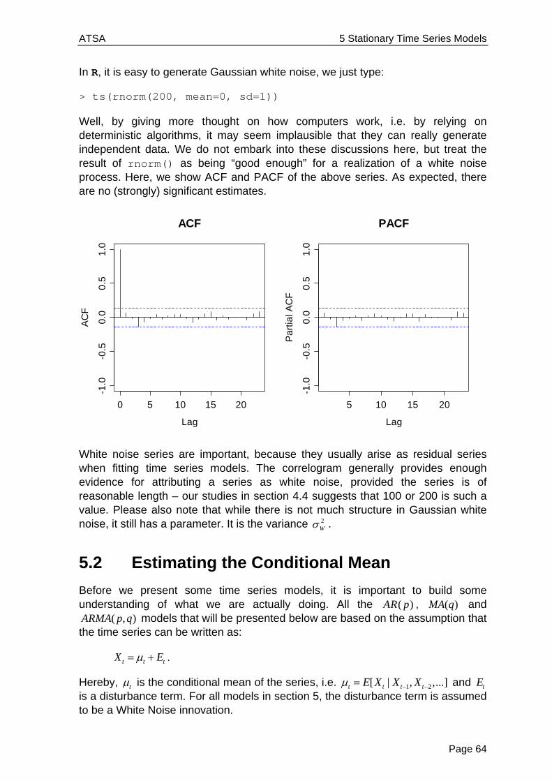
ATSA 5 Stationary Time Series Models
Page 64
In R, it is easy to generate Gaussian white noise, we just type:
> ts(rnorm(200, mean=0, sd=1))
Well, by giving more thought on how computers work, i.e. by relying on deterministic algorithms, it may seem implausible that they can really generate independent data. We do not embark into these discussions here, but treat the result of rnorm() as being “good enough” for a realization of a white noise process. Here, we show ACF and PACF of the above series. As expected, there are no (strongly) significant estimates.
White noise series are important, because they usually arise as residual series when fitting time series models. The correlogram generally provides enough evidence for attributing a series as white noise, provided the series is of reasonable length – our studies in section 4.4 suggests that 100 or 200 is such a value. Please also note that while there is not much structure in Gaussian white noise, it still has a parameter. It is the variance 2
W .
5.2 Estimating the Conditional Mean
Before we present some time series models, it is important to build some understanding of what we are actually doing. All the ( )AR p , ( )MA q and
( , )ARMA p q models that will be presented below are based on the assumption that the time series can be written as:
t t tX E .
Hereby, t is the conditional mean of the series, i.e. 1 2[ | , ,...]t t t tE X X X and tE is a disturbance term. For all models in section 5, the disturbance term is assumed to be a White Noise innovation.
0 5 10 15 20
-1.0
-0.5
0.0
0.5
1.0
Lag
AC
F
ACF
5 10 15 20
-1.0
-0.5
0.0
0.5
1.0
Lag
Pa
rtia
l AC
F
PACF
ATSA 5 Stationary Time Series Models
Page 65
It is very important to notice that while stationary series feature a constant marginal expectation , the conditional mean t is non-constant and time-dependent. Or in other words, there is some short-term memory in the series. The
( , )ARMA p q processes that will be discussed here in this section are built on the following notion:
1 2 1 2( , ,..., , , ,..., )t t t t p t t t qf X X X E E E .
In words, the conditional mean is a function of past instances of the series as well as past innovations. We will see that usually, a selection of the involved terms is made, and that the function ( )f is linear.
5.3 Autoregressive Models
5.3.1 Definition and Properties
The most natural formulation of a time series model is a linear regression approach on the past instances, i.e. a regression on the series itself. This coined the term autoregressive. In practice, such models prove to be very important; they are the most popular way of describing time series.
Model and Terms
An autoregressive model of order p , abbreviated as ( )AR p , is based on a linear combination of past observations according to the following equation:
1 1 2 2 ...t t t p t p tX X X X E .
Hereby, the disturbance term tE comes from a White Noise process, i.e. is iid. Moreover, we require that it is an innovation, i.e. that it is stochastically independent of 1 2, ,...t tX X . The term innovation is illustrative, because (under suitable conditions), it has the power to drive the series into a new direction, meaning that it is strong enough so that it can overplay the dependence from the past. An alternative notation for ( )AR p models is possible with the backshift operator:
21 2(1 ... )p
p t tB B B X E , or short ( ) t tB X E
Hereby, ( )B is called the characteristic polynomial. It determines all the relevant properties of the process. The most important questions that we will deal with in this chapter are of course the choice of the order p and the estimation of the coefficients 1,..., p . But first, a very important point:
( )AR p models must only be fitted to stationary time series. Any potential trends and/or seasonal effects need to be removed first. We will also make sure that the ( )AR p processes are stationary.
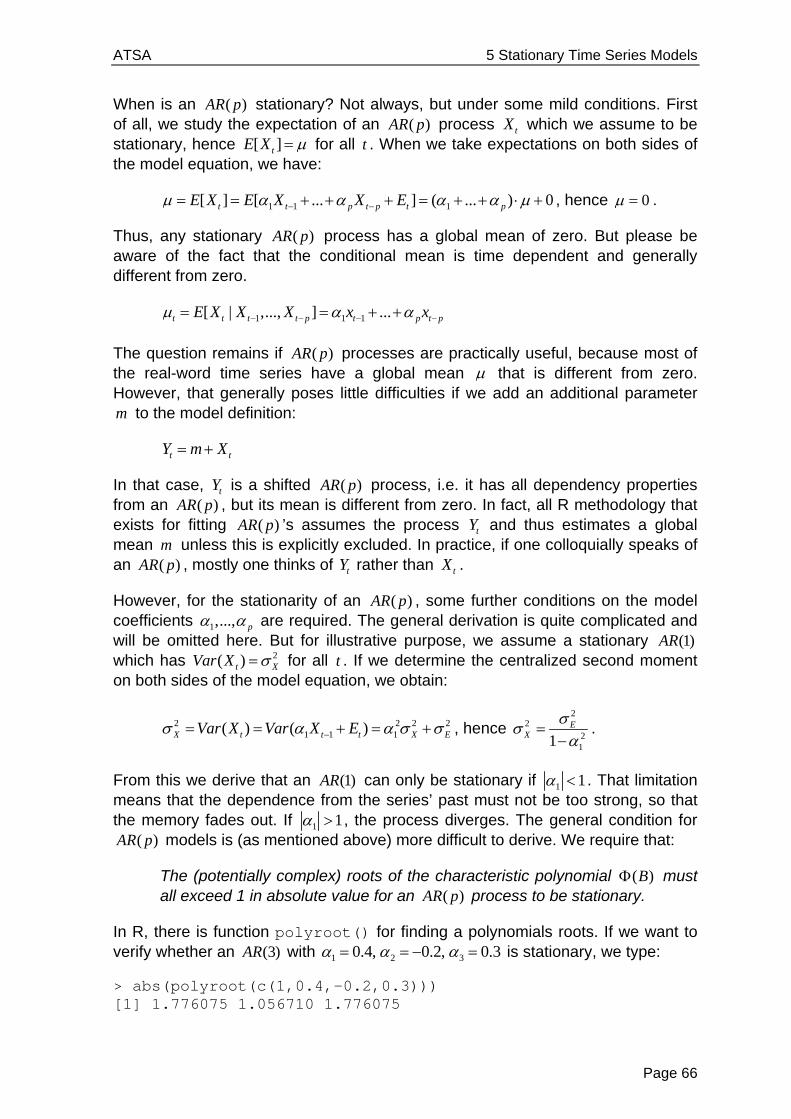
ATSA 5 Stationary Time Series Models
Page 66
When is an ( )AR p stationary? Not always, but under some mild conditions. First of all, we study the expectation of an ( )AR p process tX which we assume to be stationary, hence [ ]tE X for all t . When we take expectations on both sides of the model equation, we have:
1 1 1[ ] [ ... ] ( ... ) 0t t p t p t pE X E X X E , hence 0 .
Thus, any stationary ( )AR p process has a global mean of zero. But please be aware of the fact that the conditional mean is time dependent and generally different from zero.
1 1 1[ | ,..., ] ...t t t t p t p t pE X X X x x
The question remains if ( )AR p processes are practically useful, because most of the real-word time series have a global mean that is different from zero. However, that generally poses little difficulties if we add an additional parameter m to the model definition:
t tY m X
In that case, tY is a shifted ( )AR p process, i.e. it has all dependency properties from an ( )AR p , but its mean is different from zero. In fact, all R methodology that exists for fitting ( )AR p ’s assumes the process tY and thus estimates a global mean m unless this is explicitly excluded. In practice, if one colloquially speaks of an ( )AR p , mostly one thinks of tY rather than tX .
However, for the stationarity of an ( )AR p , some further conditions on the model coefficients 1,..., p are required. The general derivation is quite complicated and will be omitted here. But for illustrative purpose, we assume a stationary (1)AR which has 2( )t XVar X for all t . If we determine the centralized second moment on both sides of the model equation, we obtain:
2 2 2 21 1 1( ) ( )X t t t X EVar X Var X E , hence
22
211
EX
.
From this we derive that an (1)AR can only be stationary if 1 1 . That limitation means that the dependence from the series’ past must not be too strong, so that the memory fades out. If 1 1 , the process diverges. The general condition for
( )AR p models is (as mentioned above) more difficult to derive. We require that:
The (potentially complex) roots of the characteristic polynomial ( )B must all exceed 1 in absolute value for an ( )AR p process to be stationary.
In R, there is function polyroot() for finding a polynomials roots. If we want to verify whether an (3)AR with 1 2 30.4, 0.2, 0.3 is stationary, we type:
> abs(polyroot(c(1,0.4,-0.2,0.3))) [1] 1.776075 1.056710 1.776075

ATSA 5 Stationary Time Series Models
Page 67
Thus, the (3)AR we specified is stationary. We will proceed by studying the dependency in ( )AR p processes. For illustration, we first simulate from an (1)AR with 1 0.8 . The model equation is:
10.8t t tX X E
So far, we had only required that tE is a White Noise innovation, but not a distribution. We use the Gaussian in this example and set 1 1x E as the starting value.
> set.seed(24) > E <- rnorm(200, 0, 1) > x <- numeric() > x[1] <- E[1] > for(i in 2:200) x[i] <- 0.8*x[i-1] + E[i] > plot(ts(x), main= "AR(1) with...")
We observe some cycles with exclusively positive and others with only negative values. That is not surprising: if the series takes a large value, then the next one is determined as 0.8 times that large value plus the innovation. Thus, it is more likely that the following value has the same sign as its predecessor. On the other hand, the innovation is powerful enough so that jumping to the other side of the global mean zero is always a possibility. Given that behavior, it is evident that the autocorrelation at lag 1 is positive. We can compute it explicitly from the model equation:
1 1 1 1 1( , ) ( , )t t t t tCor X X Cor X E X
Thus we have (1) 0.8 here, or in general 1(1) . The correlation for higher lags can be determined similarly by repeated plug-in of the model equation. It is:
1( ) kk .
AR(1) with 1=0.8
Time
ts(x
)
0 50 100 150 200
-4-2
02
4
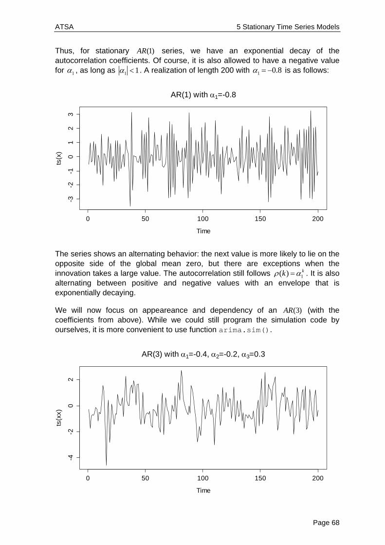
ATSA 5 Stationary Time Series Models
Page 68
Thus, for stationary (1)AR series, we have an exponential decay of the autocorrelation coefficients. Of course, it is also allowed to have a negative value for 1 , as long as 1 1 . A realization of length 200 with 1 0.8 is as follows:
The series shows an alternating behavior: the next value is more likely to lie on the opposite side of the global mean zero, but there are exceptions when the innovation takes a large value. The autocorrelation still follows 1( ) kk . It is also alternating between positive and negative values with an envelope that is exponentially decaying.
We will now focus on appeareance and dependency of an (3)AR (with the coefficients from above). While we could still program the simulation code by ourselves, it is more convenient to use function arima.sim().
AR(1) with 1=-0.8
Time
ts(x
)
0 50 100 150 200
-3-2
-10
12
3
AR(3) with 1=-0.4, 2=-0.2, 3=0.3
Time
ts(x
x)
0 50 100 150 200
-4-2
02
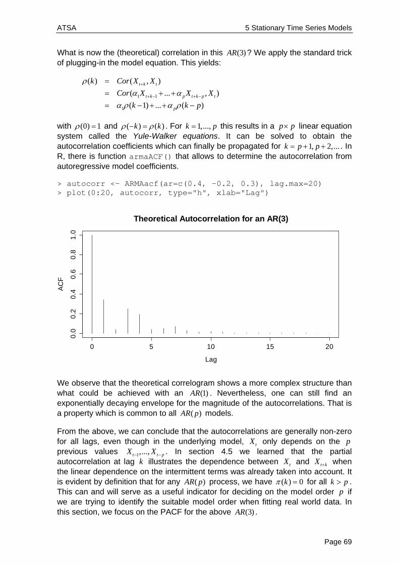
ATSA 5 Stationary Time Series Models
Page 69
What is now the (theoretical) correlation in this (3)AR ? We apply the standard trick of plugging-in the model equation. This yields:
1 1
1
( ) ( , )
( ... , )
( 1) ... ( )
t k t
t k p t k p t
p
k Cor X X
Cor X X X
k k p
with (0) 1 and ( ) ( )k k . For 1,...,k p this results in a p p linear equation system called the Yule-Walker equations. It can be solved to obtain the autocorrelation coefficients which can finally be propagated for 1, 2,...k p p . In R, there is function armaACF() that allows to determine the autocorrelation from autoregressive model coefficients.
> autocorr <- ARMAacf(ar=c(0.4, -0.2, 0.3), lag.max=20) > plot(0:20, autocorr, type="h", xlab="Lag")
We observe that the theoretical correlogram shows a more complex structure than what could be achieved with an (1)AR . Nevertheless, one can still find an exponentially decaying envelope for the magnitude of the autocorrelations. That is a property which is common to all ( )AR p models.
From the above, we can conclude that the autocorrelations are generally non-zero for all lags, even though in the underlying model, tX only depends on the p previous values 1,...,t t pX X . In section 4.5 we learned that the partial autocorrelation at lag k illustrates the dependence between tX and t kX when the linear dependence on the intermittent terms was already taken into account. It is evident by definition that for any ( )AR p process, we have ( ) 0k for all k p . This can and will serve as a useful indicator for deciding on the model order p if we are trying to identify the suitable model order when fitting real world data. In this section, we focus on the PACF for the above (3)AR .
0 5 10 15 20
0.0
0.2
0.4
0.6
0.8
1.0
Lag
AC
F
Theoretical Autocorrelation for an AR(3)
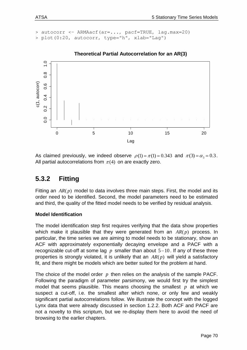
ATSA 5 Stationary Time Series Models
Page 70
> autocorr <- ARMAacf(ar=..., pacf=TRUE, lag.max=20) > plot(0:20, autocorr, type="h", xlab="Lag")
As claimed previously, we indeed observe (1) (1) 0.343 and 3(3) 0.3 . All partial autocorrelations from (4) on are exactly zero.
5.3.2 Fitting
Fitting an ( )AR p model to data involves three main steps. First, the model and its order need to be identified. Second, the model parameters need to be estimated and third, the quality of the fitted model needs to be verified by residual analysis.
Model Identification
The model identification step first requires verifying that the data show properties which make it plausible that they were generated from an ( )AR p process. In particular, the time series we are aiming to model needs to be stationary, show an ACF with approximately exponentially decaying envelope and a PACF with a recognizable cut-off at some lag p smaller than about 5 10 . If any of these three properties is strongly violated, it is unlikely that an ( )AR p will yield a satisfactory fit, and there might be models which are better suited for the problem at hand.
The choice of the model order p then relies on the analysis of the sample PACF. Following the paradigm of parameter parsimony, we would first try the simplest model that seems plausible. This means choosing the smallest p at which we suspect a cut-off, i.e. the smallest after which none, or only few and weakly significant partial autocorrelations follow. We illustrate the concept with the logged Lynx data that were already discussed in section 1.2.2. Both ACF and PACF are not a novelty to this scriptum, but we re-display them here to avoid the need of browsing to the earlier chapters.
0 5 10 15 20
0.0
0.2
0.4
0.6
0.8
1.0
Lag
c(1
, a
uto
corr
)
Theoretical Partial Autocorrelation for an AR(3)
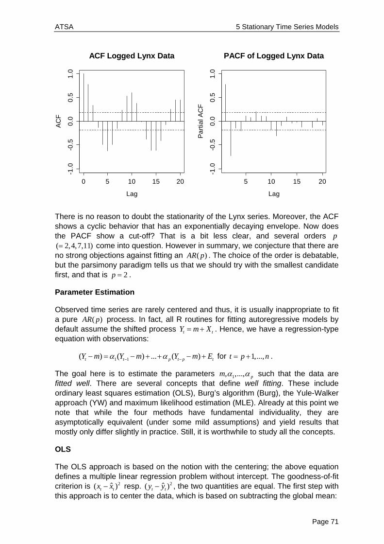
ATSA 5 Stationary Time Series Models
Page 71
There is no reason to doubt the stationarity of the Lynx series. Moreover, the ACF shows a cyclic behavior that has an exponentially decaying envelope. Now does the PACF show a cut-off? That is a bit less clear, and several orders p ( 2,4,7,11) come into question. However in summary, we conjecture that there are no strong objections against fitting an ( )AR p . The choice of the order is debatable, but the parsimony paradigm tells us that we should try with the smallest candidate first, and that is 2p .
Parameter Estimation
Observed time series are rarely centered and thus, it is usually inappropriate to fit a pure ( )AR p process. In fact, all R routines for fitting autoregressive models by default assume the shifted process t tY m X . Hence, we have a regression-type equation with observations:
1 1( ) ( ) ... ( )t t p t p tY m Y m Y m E for 1,...,t p n .
The goal here is to estimate the parameters 1, ,..., pm such that the data are fitted well. There are several concepts that define well fitting. These include ordinary least squares estimation (OLS), Burg’s algorithm (Burg), the Yule-Walker approach (YW) and maximum likelihood estimation (MLE). Already at this point we note that while the four methods have fundamental individuality, they are asymptotically equivalent (under some mild assumptions) and yield results that mostly only differ slightly in practice. Still, it is worthwhile to study all the concepts.
OLS
The OLS approach is based on the notion with the centering; the above equation defines a multiple linear regression problem without intercept. The goodness-of-fit criterion is 2ˆ( )t tx x resp. 2ˆ( )t ty y , the two quantities are equal. The first step with this approach is to center the data, which is based on subtracting the global mean:
0 5 10 15 20
-1.0
-0.5
0.0
0.5
1.0
Lag
AC
FACF Logged Lynx Data
5 10 15 20
-1.0
-0.5
0.0
0.5
1.0
LagP
art
ial A
CF
PACF of Logged Lynx Data
ATSA 5 Stationary Time Series Models
Page 72
Estimate 1
ˆn
ttm y y
and then compute ˆt tx y m for all 1,...,t n .
On the tx , an OLS (auto)regression without intercept is performed. Note that this regression is (technically) conditional on the first p observations 1,..., px x , which are only used as predictors, but not as response terms. In other words, the goodness-of-fit of the model is only evaluated for the last n p observations. The following code chunk implements the procedure for the logged lynx data:
> llc <- log(lynx)-mean(log(lynx)) > resp <- llc[3:114] > pred1 <- llc[2:113] > pred2 <- llc[1:112] > fit.ols <- lm(resp ~ -1 + pred1 + pred2) > summary(fit.ols) Coefficients: Estimate Std. Error t value Pr(>|t|) pred1 1.38435 0.06359 21.77 <2e-16 *** pred2 -0.74793 0.06364 -11.75 <2e-16 *** --- Residual standard error: 0.528 on 110 degrees of freedom Multiple R-squared: 0.8341, Adjusted R-squared: 0.8311 F-statistic: 276.5 on 2 and 110 DF, p-value: < 2.2e-16
We can extract ˆ 6.686m , 1ˆ 1.384 , 2ˆ 0.748 and ˆ 0.528E . But while this is an instructive way of estimating ( )AR p models, it is a bit cumbersome and time consuming. Not surprisingly, there are procedures that are dedicated to fitting such models in R. We here display the use of function ar.ols(). To replicate the hand-produced result, we type:
> f.ar.ols <- ar.ols(log(lynx), aic=F, intercept=F, order=2) > f.ar.ols Coefficients: 1 2 1.3844 -0.7479 Order selected 2 sigma^2 estimated as 0.2738
Note that for producing the result, we need to avoid AIC-based model fitting with aic=FALSE. The shift m is automatically estimated, and thus we need to exclude an intercept term in the regression model using intercept=FALSE. We observe that the estimated AR -coefficients 1 2ˆ ˆ, take exactly the same values as with the hand-woven procedure above. The estimated shift m̂ can be extracted via
> fit.ar.ols$x.mean [1] 6.685933
and corresponds to the global mean of the series. Finally, the estimate for the innovation variance requires some prudence. The lm() summary output yields an

ATSA 5 Stationary Time Series Models
Page 73
estimate of E that was computed as / ( )RSS n p , whereas the value in the ar.ols() output is an estimate of 2
E that was computed as /RSS n . The former is intended to be an unbiased estimate (though it should use the denominator
1n p due to the estimation of the shift m ), and the latter is the MLE-estimator for the innovation variance. In practice, the numerical difference between the two is neglectable for any series that has reasonable length for fitting an AR model.
> sum(na.omit(fit.ar.ols$resid)^2)/112 [1] 0.2737594
Burg’s Algorithm
While the OLS approach works, its downside is the asymmetry: the first p terms are never evaluated as responses. That is cured by Burg’s Algorithm, an alternative approach for estimating ( )AR p models. It is based on the notion that any ( )AR p process is also an ( )AR p if the time is run in reverse order. Under this property, minimizing the forward and backward 1-step squared prediction errors makes sense:
2 2
1 1 1
p pn
t k t k t p k t p kt p k k
X X X X
In contrast to OLS, there is no explicit solution and numerical optimization is required. This is done with a recursive method called the Durbin-Levison algorithm. We do not explain its details here, but refer to the R implementation ar.burg().
> f.ar.burg <- ar.burg(log(lynx), aic=FALSE, order.max=2) > f.ar.burg Call: ar.burg.default(x = log(lynx), aic = FALSE, order.max = 2) Coefficients: 1 2 1.3831 -0.7461 Order selected 2 sigma^2 estimated as 0.2707 > f.ar.burg$x.mean [1] 6.685933 > sum(na.omit(f.ar.burg$resid)^2)/112 [1] 0.2737614
There are a few interesting points which require commenting. First and foremost, Burg’s algorithm also uses the arithmetic mean to estimate the global mean m̂ . The fitting procedure is then done on the centered observations tx . On a side remark, note that assuming centered observations is possible. If argument demean=FALSE is set, the global mean is assumed to be zero and not estimated.

ATSA 5 Stationary Time Series Models
Page 74
The two coefficients 1 2ˆ ˆ, take some slightly different values than with OLS estimation. While often, the difference between the two methods is practically neglectable, it is nowadays generally accepted that the Burg solution is better for finite samples. Asymptotically, the two methods are equivalent. Finally, we observe that the ar.burg() output specifies 2ˆ 0.2707E . This is different from the MLE estimate of 0.27376 on the residuals. The explanation is that for Burg’s Algorithm, the innovation variance is estimated from the Durbin-Levinson updates; see the R help file for further reference.
Yule-Walker Equations
A third option for estimating ( )AR p models is to plugging-in the sample ACF into the Yule-Walker equations. In section 5.3.1 we had learned that there is a p p linear equation system 1( ) ( 1) ... ( )pk k k p for 1,...,k p . Hence we can and will explicitly determine ˆ ˆ(0),..., ( )k and then solve the linear equation system for the coefficients 1,..., p . The procedure is implemented in R function ar.yw().
> f.ar.yw <- ar.yw(log(lynx), aic=FALSE, order.max=2) > f.ar.yw Call: ar.yw.default(x=log(lynx), aic=FALSE, order.max=2) Coefficients: 1 2 1.3504 -0.7200 Order selected 2 sigma^2 estimated as 0.3109
Again, the two coefficients 1 2ˆ ˆ, take some slightly different values than compared to the two methods before. Mostly this difference is practically neglectable and Yule-Walker is asymptotically equivalent to OLS and Burg. Nevertheless, for finite samples, the estimates from the Yule-Walker method are often worse in the sense that their (Gaussian) likelihood is lower. Thus, we recommend to prefer Burg’s algorithm. We conclude this section by noting that the Yule-Walker method also involves estimating the global mean m with the arithmetic mean as the first step. The innovation variance is estimated from the fitted coefficients and the autocovariance of the series and thus again takes a different value than before.
Maximum-Likelihood Estimation (MLE)
The MLE is based on determining the model coefficients such that the likelihood given the data is maximized, i.e. the density function takes its maximal value under the present observations. This requires assuming a distribution for the ( )AR p process, which comes quite naturally if one assumes that for the innovations, we have 2~ (0, )t EE N , i.e. they are iid Gaussian random variables. With some theory (which we omit), one can then show that an ( )AR p process 1,..., nX X is a random vector with a multivariate Gaussian distribution.
ATSA 5 Stationary Time Series Models
Page 75
MLE then provides a simultaneous estimation of the shift m , the innovation variance 2
E and the model coefficients 1,..., p . The criterion that is optimized can, in a simplified version, be written as:
2 2
1
ˆ( , ) exp ( )n
E t tt
L m x x
The details are quite complex and several constants are part of the equation, too. But we here note that the MLE derived from the Gaussian distribution is based on minimizing the sum of squared errors and thus equivalent to the OLS approach. Due to the simultaneous estimation of model parameters and innovation variance, a recursive algorithm is required. There is an implementation in R:
> f.ar.mle Call: arima(x = log(lynx), order = c(2, 0, 0)) Coefficients: ar1 ar2 intercept 1.3776 -0.7399 6.6863 s.e. 0.0614 0.0612 0.1349 sigma^2 = 0.2708: log likelihood = -88.58, aic = 185.15
We observe estimates which are again slightly different from the ones computed previously. Again, those differences are mostly neglectable for practical data analysis. What is known from theory is that the MLE is (under mild assumptions) asymptotically normal with minimum variance among all asymptotically normal estimators. Note that the MLE based on Gaussian distribution still works reasonably well if that assumption is not met, as long as we do not have strongly skewed data (apply a transformation in that case) or extreme outliers.
Practical Aspects
We presented four different methods for fitting ( )AR p models. How to make a choice in practice? We explained that all methods are asymptotically equivalent and even on finite samples; the differences among them are little. Also, all methods are non-robust with respect to outliers and perform best on data which are approximately Gaussian. There is one practical aspect linked to the fitting routines that are available in R, though. Function arima() yields standard errors for m and 1,..., p . Approximate 95% confidence intervals can be obtained by taking the point estimate +/- twice the standard error. Hence, statements about the significance of the estimates can be made.
On the other hand, ar.ols(), ar.yw() und ar.burg() do not provide standard errors, but allow for convenient determination of the model order p with the AIC statistic. While we still recommend investigating on the suitable order by analyzing ACF and PACF, the parsimonity paradigm and inspecting residual plots, using AIC as a second opinion is still recommended. It works as follows:

ATSA 5 Stationary Time Series Models
Page 76
> fit.aic <- ar.burg(log(lynx)) > plot(0:fit.aic$order.max, fit.aic$aic)
We observe that already 2p yields a good AIC value. Then there is little further improvement until 11p , and a just slightly lower value is found at 12p . Hence, we will evaluate 2p and 11p as two competing models with some further tools in the next section.
5.3.3 Residual Analysis
When comparing different models, a simple approach is to plot the original series along with the fitted model values. However, one has to keep in mind that this is an insample analysis, i.e. the bigger model has an advantage which does not necessarily persist once analyzes out-of-sample data. Please note that the residuals are estimates of the innovations tE . Thus, a good model yields residuals that resemble a White Noise process. We require mean zero, constant variance and no autocorrelation. If these properties are not met, the model is not adequate.
> fit.ar02 <- ar.burg(log(lynx), aic=FALSE, order.max=2) > fit.ar11 <- ar.burg(log(lynx), aic=FALSE, order.max=11) > plot(log(lynx), main="Logged Lynx Data with ...") > lines(log(lynx)-fit.ar02$resid, col="red") > lines(log(lynx)-fit.ar11$resid, col="blue")
The output is displayed on the next page. While some differences are visible, it is not easy to judge from the fitted values which of the two models is preferable. A better focus on the quality of the fit is obtained when the residuals and their dependance are inspected with time series plots as well as ACF/PACF correlograms. The graphical output is again displayed on the next page. We observe that the (2)AR residuals are not iid. Hence they do not form a White
0 5 10 15 20
05
01
00
15
02
00
0:fit.ar.aic$order.max
fit.a
r.a
ic$
aic
AIC-Values for AR(p)-Models on the Logged Lynx Data

ATSA 5 Stationary Time Series Models
Page 77
Noise process and thus, we conclude that the (11)AR model yields a better description of the logged lynx data.
> acf(fit.ar02$resid, na.action=na.pass, ylim=c(-1,1)) > pacf(fit.ar02$resid, na.action=na.pass, ylim=c(-1,1)) > acf(fit.ar11$resid, na.action=na.pass, ylim=c(-1,1)) > pacf(fit.ar11$resid, na.action=na.pass, ylim=c(-1,1))
Logged Lynx Data with AR(2) and AR(11)
Time
log
(lyn
x)
1820 1840 1860 1880 1900 1920
45
67
89
AR(2) AR(11)
0 5 10 15 20
-1.0
-0.5
0.0
0.5
1.0
Lag
AC
F
ACF of AR(2)
5 10 15 20
-1.0
-0.5
0.0
0.5
1.0
Lag
Par
tial A
CF
PACF of AR(2)
0 5 10 15 20
-1.0
-0.5
0.0
0.5
1.0
Lag
AC
F
ACF of AR(11)
5 10 15 20
-1.0
-0.5
0.0
0.5
1.0
Lag
Par
tial A
CF
PACF of AR(11)
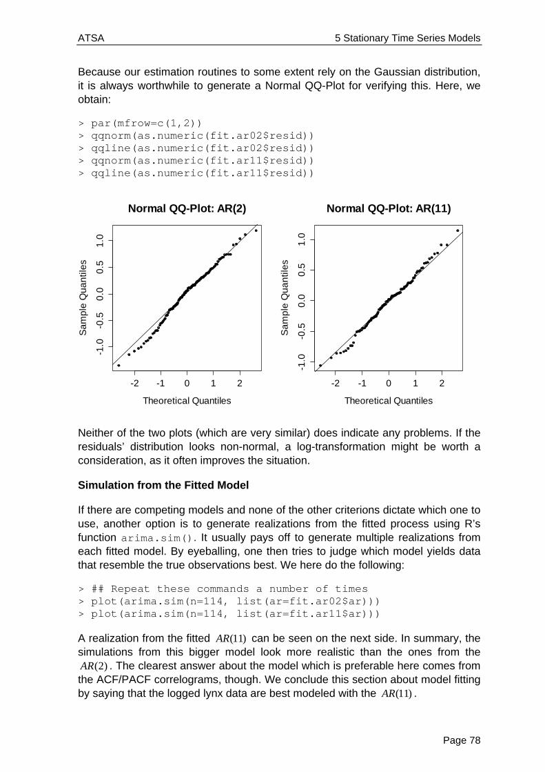
ATSA 5 Stationary Time Series Models
Page 78
Because our estimation routines to some extent rely on the Gaussian distribution, it is always worthwhile to generate a Normal QQ-Plot for verifying this. Here, we obtain:
> par(mfrow=c(1,2)) > qqnorm(as.numeric(fit.ar02$resid)) > qqline(as.numeric(fit.ar02$resid)) > qqnorm(as.numeric(fit.ar11$resid)) > qqline(as.numeric(fit.ar11$resid))
Neither of the two plots (which are very similar) does indicate any problems. If the residuals’ distribution looks non-normal, a log-transformation might be worth a consideration, as it often improves the situation.
Simulation from the Fitted Model
If there are competing models and none of the other criterions dictate which one to use, another option is to generate realizations from the fitted process using R’s function arima.sim(). It usually pays off to generate multiple realizations from each fitted model. By eyeballing, one then tries to judge which model yields data that resemble the true observations best. We here do the following:
> ## Repeat these commands a number of times > plot(arima.sim(n=114, list(ar=fit.ar02$ar))) > plot(arima.sim(n=114, list(ar=fit.ar11$ar)))
A realization from the fitted (11)AR can be seen on the next side. In summary, the simulations from this bigger model look more realistic than the ones from the
(2)AR . The clearest answer about the model which is preferable here comes from the ACF/PACF correlograms, though. We conclude this section about model fitting by saying that the logged lynx data are best modeled with the (11)AR .
-2 -1 0 1 2
-1.0
-0.5
0.0
0.5
1.0
Normal QQ-Plot: AR(2)
Theoretical Quantiles
Sa
mp
le Q
ua
ntil
es
-2 -1 0 1 2
-1.0
-0.5
0.0
0.5
1.0
Normal QQ-Plot: AR(11)
Theoretical Quantiles
Sa
mp
le Q
ua
ntil
es
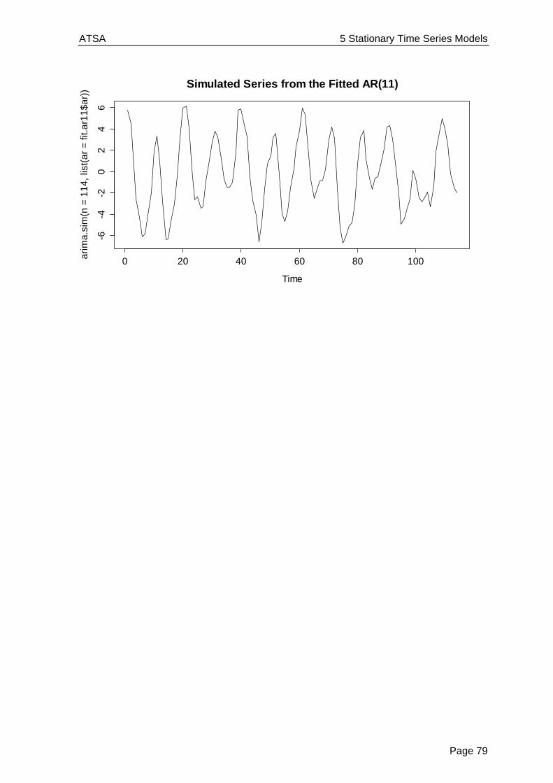
ATSA 5 Stationary Time Series Models
Page 79
Time
ari
ma
.sim
(n =
11
4,
list(
ar
= f
it.a
r11
$a
r))
0 20 40 60 80 100
-6-4
-20
24
6
Simulated Series from the Fitted AR(11)

ATSA 5 Stationary Time Series Models
Page 80
5.4 Moving Average Models
Here, we will discuss moving average models. These can be seen as an extension of the white noise process, i.e. tX can be written as a linear combination of the current plus a few of the most recent innovation terms. As we will see, this leads to a time series process that is stationary, but not iid. Furthermore, we will see that in many respects, moving average models are complementary to autoregressive models.
5.4.1 Model Equation
As we had mentioned above, a moving average model of order q , or abbreviated, an ( )MA q model for a series tX is a linear combination of the current innovation term tE , plus the q most recent ones 1,...,t t qE E . The model equation is:
1 1· ·t t t q t qX E E E
We require that tE is an innovation, which means independent and identically distributed, and also independent of any sX where s t . We make use of the backshift operator that was defined above for rewriting the model:
1(1 ) ( )qt q t tX B B E B E
Please note that some other textbooks also define this model with negative signs for the j . While this is mathematically equivalent, we prefer our notation with the ‘+’ signs, because this is also how things are defined in R. Please also note that we can always enhance this model by adding a constant m that accounts for non-zero expectation of a time series, i.e. we can consider the shifted ( )MA q process
t tY m X .
Why such MA(q) models? They have been applied successfully in many applied fields, particularly in econometrics. Time series such as economic indicators are affected by a variety of random events such as strikes, government decision, referendums, shortages of key commodities and so on. Such events will not only have an immediate effect, but may also affect the value (to a lesser extent) in several of the consecutive periods. Thus, it is plausible that moving average processes appear in practice. Moreover, some of their theoretical properties are in a nice way complementary to the ones of AR processes. This will become clear if we closely study the MA(1) model.
5.4.2 The MA(1) Process
For proofing stationarity and deriving the moments of moving average processes, we first consider the simple model of order 1:
1 1·t t tX E E

ATSA 5 Stationary Time Series Models
Page 81
where tE is a white noise process with ( ) 0tE E and 2( )tVar E . It is straightforward to show that tX has mean zero, since it is the sum of two random variables with each mean zero. The variance is also easy to derive:
2 21( ) (1 )t EVar X
The ACF is special because only the coefficient at lag 1 is different from zero, and there is no further autocorrelation:
12
1
(1)(1 )
, and ( ) 0k for 1k .
Also, we have (1) 0.5 , no matter what the choice for 1 is. Thus if in practice we observe a series where the first-order autocorrelation coefficient clearly exceeds this value, we have counterevidence to a MA(1) process.
For illustration, we generate a realization consisting of 500 observations, from such a process with 1 0.7 , and display time series plot, along with both estimated and true ACF/PACF.
> set.seed(21) > ts.ma1 <- arima.sim(list(ma=0.7), n=500) > > plot(ts.ma1, ylab="", ylim=c(-4,4)) > title("Simulation from a MA(1) Process")
> acf.true <- ARMAacf(ma=0.7, lag.max=20) > pacf.true <- ARMAacf(ma=0.7, pacf=TRUE, lag.max=20)
Time
0 100 200 300 400 500
-4-2
02
4
Simulation from a MA(1) Process

ATSA 5 Stationary Time Series Models
Page 82
We observe that the estimates are pretty accurate: the ACF has a clear cut-off, whereas the PACF shows some alternating behavior with an exponential decay in absolute value – completely contrary to the stylized facts an AR process shows.
Invertibility
The first autocorrelation coefficient (1) can be written in standard form, or also as follows:
1 12 2
1 1
1 /(1)
1 1 (1/ )
Apparently, a MA(1) process with coefficient 1 has exactly the same ACF as the one with 11 / . Thus, for example, the two processes 10.5·t t tX E E and
12·t t tY E E have the same dependency structure. This problem of ambiguity leads to the concept of invertibility.
To be continued…
5.5 ARMA Models
To be continued…
0 5 10 15 20 25
-1.0
-0.5
0.0
0.5
1.0
Lag
AC
FEstimated ACF
0 5 10 15 20 25
-1.0
-0.5
0.0
0.5
1.0
Lag
Par
tial A
CF
Estimated PACF
0 5 10 15 20
-1.0
-0.5
0.0
0.5
1.0
lag
acf.
true
True ACF
5 10 15 20
-1.0
-0.5
0.0
0.5
1.0
lag
pacf
.tru
e
True PACF
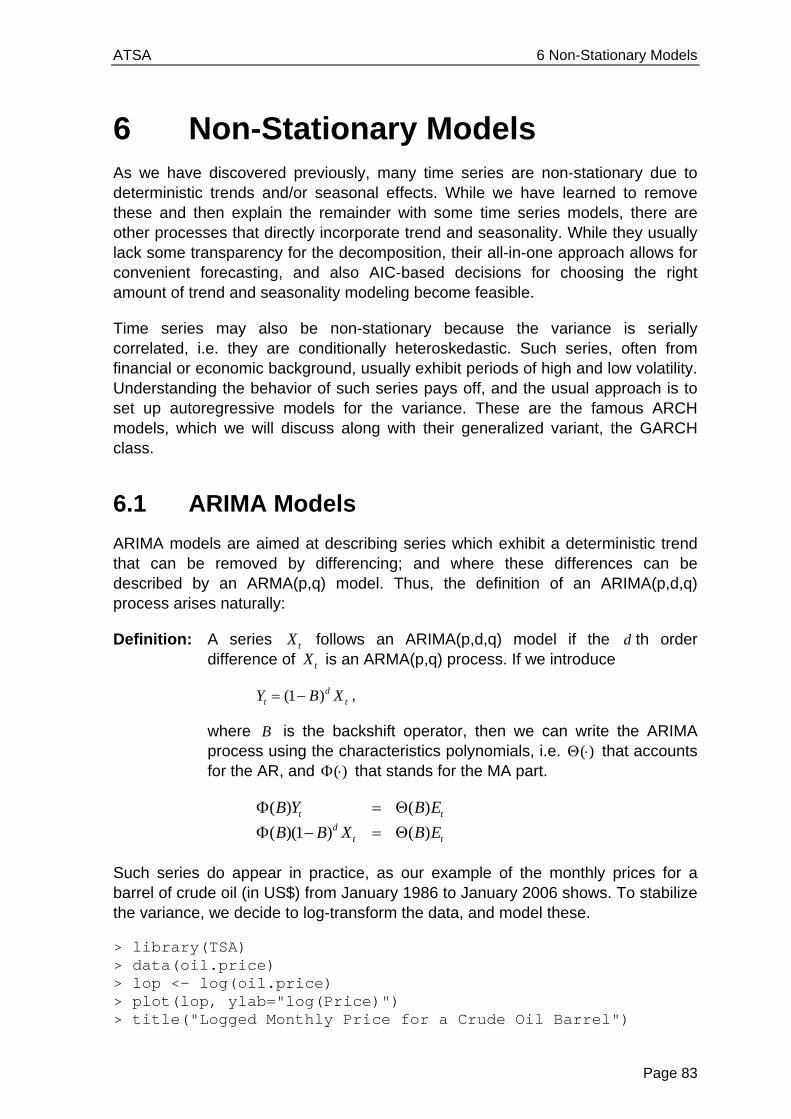
ATSA 6 Non-Stationary Models
Page 83
6 Non-Stationary Models As we have discovered previously, many time series are non-stationary due to deterministic trends and/or seasonal effects. While we have learned to remove these and then explain the remainder with some time series models, there are other processes that directly incorporate trend and seasonality. While they usually lack some transparency for the decomposition, their all-in-one approach allows for convenient forecasting, and also AIC-based decisions for choosing the right amount of trend and seasonality modeling become feasible.
Time series may also be non-stationary because the variance is serially correlated, i.e. they are conditionally heteroskedastic. Such series, often from financial or economic background, usually exhibit periods of high and low volatility. Understanding the behavior of such series pays off, and the usual approach is to set up autoregressive models for the variance. These are the famous ARCH models, which we will discuss along with their generalized variant, the GARCH class.
6.1 ARIMA Models
ARIMA models are aimed at describing series which exhibit a deterministic trend that can be removed by differencing; and where these differences can be described by an ARMA(p,q) model. Thus, the definition of an ARIMA(p,d,q) process arises naturally:
Definition: A series tX follows an ARIMA(p,d,q) model if the d th order difference of tX is an ARMA(p,q) process. If we introduce
(1 )dt tY B X ,
where B is the backshift operator, then we can write the ARIMA process using the characteristics polynomials, i.e. ( ) that accounts for the AR, and ( ) that stands for the MA part.
( ) ( )
( )(1 ) ( )t t
dt t
B Y B E
B B X B E
Such series do appear in practice, as our example of the monthly prices for a barrel of crude oil (in US$) from January 1986 to January 2006 shows. To stabilize the variance, we decide to log-transform the data, and model these.
> library(TSA) > data(oil.price) > lop <- log(oil.price) > plot(lop, ylab="log(Price)") > title("Logged Monthly Price for a Crude Oil Barrel")
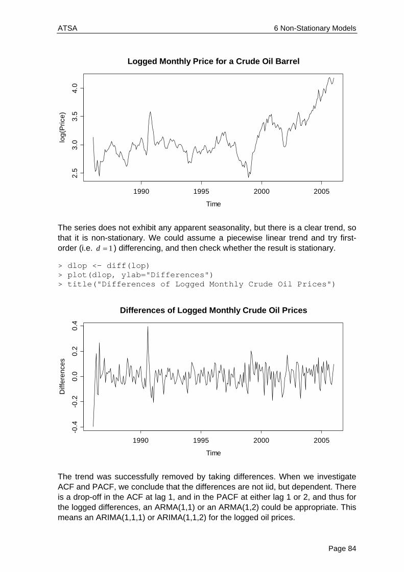
ATSA 6 Non-Stationary Models
Page 84
The series does not exhibit any apparent seasonality, but there is a clear trend, so that it is non-stationary. We could assume a piecewise linear trend and try first-order (i.e. 1d ) differencing, and then check whether the result is stationary.
> dlop <- diff(lop) > plot(dlop, ylab="Differences") > title("Differences of Logged Monthly Crude Oil Prices")
The trend was successfully removed by taking differences. When we investigate ACF and PACF, we conclude that the differences are not iid, but dependent. There is a drop-off in the ACF at lag 1, and in the PACF at either lag 1 or 2, and thus for the logged differences, an ARMA(1,1) or an ARMA(1,2) could be appropriate. This means an ARIMA(1,1,1) or ARIMA(1,1,2) for the logged oil prices.
Time
log
(Pri
ce)
1990 1995 2000 2005
2.5
3.0
3.5
4.0
Logged Monthly Price for a Crude Oil Barrel
Time
Diff
ere
nce
s
1990 1995 2000 2005
-0.4
-0.2
0.0
0.2
0.4
Differences of Logged Monthly Crude Oil Prices

ATSA 6 Non-Stationary Models
Page 85
> par(mfrow=c(1,2)) > acf(dlop, main="ACF", ylim=c(-1,1), lag.max=24) > pacf(dlop, main="ACF", ylim=c(-1,1), lag.max=24)
The fitting can be done with the arima() procedure that (by default) estimates the coefficients using Maximum Likelihood with starting values obtained from the Conditional Sum of Squares method. We can either let the procedure do the differencing:
> arima(lop, order=c(1,1,2)) Call: arima(x = lop, order = c(1, 1, 2)) Coefficients: ar1 ma1 ma2 0.8429 -0.5730 -0.3104 s.e. 0.1548 0.1594 0.0675 sigma^2 = 0.006598: log likelihood = 261.88, aic = -515.75
Or, we can use the differenced series dlop as input and fit an ARMA(1,2). However, we need to tell R to not include an intercept – this is not appropriate when a piecewise linear trend was removed by taking differences. The command is:
> arima(dlop, order=c(1,0,2), include.mean=FALSE)
The output from this is exactly the same as above. The next step is to perform residual analysis – if the model is appropriate, they must look like white noise. This is (data not shown here) more or less the case. For decisions on the correct model order, also the AIC statistics can provide valuable information.
0.0 0.5 1.0 1.5 2.0
-1.0
-0.5
0.0
0.5
1.0
Lag
AC
F
ACF
0.5 1.0 1.5 2.0-1
.0-0
.50
.00
.51
.0
Lag
Pa
rtia
l AC
F
PACF
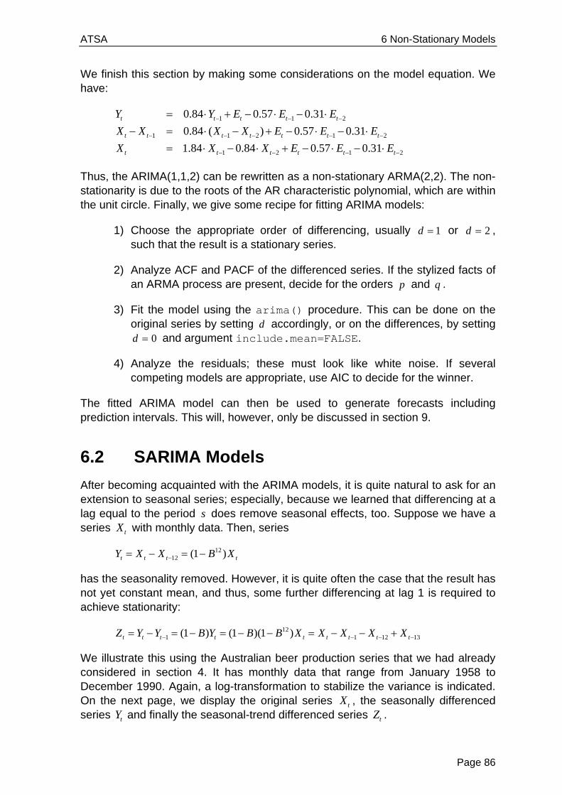
ATSA 6 Non-Stationary Models
Page 86
We finish this section by making some considerations on the model equation. We have:
1 1 2
1 1 2 1 2
1 2 1 2
0.84 0.57 0.31
0.84 ( ) 0.57 0.31
1.84 0.84 0.57 0.31
t t t t t
t t t t t t t
t t t t t t
Y Y E E E
X X X X E E E
X X X E E E
Thus, the ARIMA(1,1,2) can be rewritten as a non-stationary ARMA(2,2). The non-stationarity is due to the roots of the AR characteristic polynomial, which are within the unit circle. Finally, we give some recipe for fitting ARIMA models:
1) Choose the appropriate order of differencing, usually 1d or 2d , such that the result is a stationary series.
2) Analyze ACF and PACF of the differenced series. If the stylized facts of an ARMA process are present, decide for the orders p and q .
3) Fit the model using the arima() procedure. This can be done on the original series by setting d accordingly, or on the differences, by setting
0d and argument include.mean=FALSE.
4) Analyze the residuals; these must look like white noise. If several competing models are appropriate, use AIC to decide for the winner.
The fitted ARIMA model can then be used to generate forecasts including prediction intervals. This will, however, only be discussed in section 9.
6.2 SARIMA Models
After becoming acquainted with the ARIMA models, it is quite natural to ask for an extension to seasonal series; especially, because we learned that differencing at a lag equal to the period s does remove seasonal effects, too. Suppose we have a series tX with monthly data. Then, series
1212 (1 )t t t tY X X B X
has the seasonality removed. However, it is quite often the case that the result has not yet constant mean, and thus, some further differencing at lag 1 is required to achieve stationarity:
121 1 12 13(1 ) (1 )(1 )t t t t t t t t tZ Y Y B Y B B X X X X X
We illustrate this using the Australian beer production series that we had already considered in section 4. It has monthly data that range from January 1958 to December 1990. Again, a log-transformation to stabilize the variance is indicated. On the next page, we display the original series tX , the seasonally differenced series tY and finally the seasonal-trend differenced series tZ .

ATSA 6 Non-Stationary Models
Page 87
> www <- "http://staff.elena.aut.ac.nz/Paul-Cowpertwait/ts/" > dat <- read.table(paste(www,"cbe.dat",sep="", header=T) > beer <- ts(dat$beer, start=1958, freq=12) > d12.lbeer <- diff(log(beer), lag=12) > d.d12.lbeer <- diff(d12.lbeer) > plot(log(beer)) > plot(d12.lbeer) > plot(d.d12.lbeer))
Logged Australian Beer Production
Time
log(
beer
)
1960 1965 1970 1975 1980 1985 1990
4.2
4.4
4.6
4.8
5.0
5.2
5.4
Seasonally Differenced log(Beer) Series
Time
d12.
lbee
r
1960 1965 1970 1975 1980 1985 1990
-0.2
-0.1
0.0
0.1
0.2
Additional Trend Removal Step
Time
d.d1
2.lb
eer
1960 1965 1970 1975 1980 1985 1990
-0.2
0.0
0.2
0.4
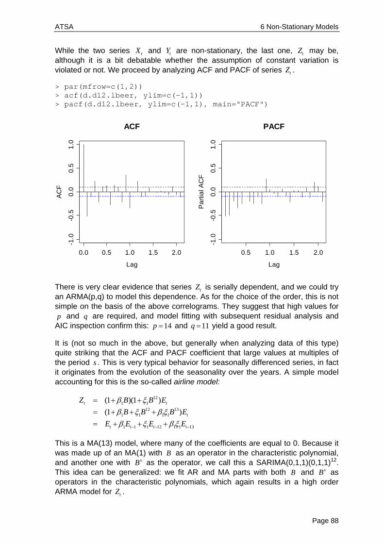
ATSA 6 Non-Stationary Models
Page 88
While the two series tX and tY are non-stationary, the last one, tZ may be, although it is a bit debatable whether the assumption of constant variation is violated or not. We proceed by analyzing ACF and PACF of series tZ .
> par(mfrow=c(1,2)) > acf(d.d12.lbeer, ylim=c(-1,1)) > pacf(d.d12.lbeer, ylim=c(-1,1), main="PACF")
There is very clear evidence that series tZ is serially dependent, and we could try an ARMA(p,q) to model this dependence. As for the choice of the order, this is not simple on the basis of the above correlograms. They suggest that high values for p and q are required, and model fitting with subsequent residual analysis and
AIC inspection confirm this: 14p and 11q yield a good result.
It is (not so much in the above, but generally when analyzing data of this type) quite striking that the ACF and PACF coefficient that large values at multiples of the period s . This is very typical behavior for seasonally differenced series, in fact it originates from the evolution of the seasonality over the years. A simple model accounting for this is the so-called airline model:
121 1
12 131 1 1 1
1 1 1 12 1 1 13
(1 )(1 )
(1 )t t
t
t t t t
Z B B E
B B B E
E E E E
This is a MA(13) model, where many of the coefficients are equal to 0. Because it was made up of an MA(1) with B as an operator in the characteristic polynomial, and another one with sB as the operator, we call this a SARIMA(0,1,1)(0,1,1)12. This idea can be generalized: we fit AR and MA parts with both B and sB as operators in the characteristic polynomials, which again results in a high order ARMA model for tZ .
0.0 0.5 1.0 1.5 2.0
-1.0
-0.5
0.0
0.5
1.0
Lag
AC
F
ACF
0.5 1.0 1.5 2.0
-1.0
-0.5
0.0
0.5
1.0
Lag
Pa
rtia
l AC
F
PACF
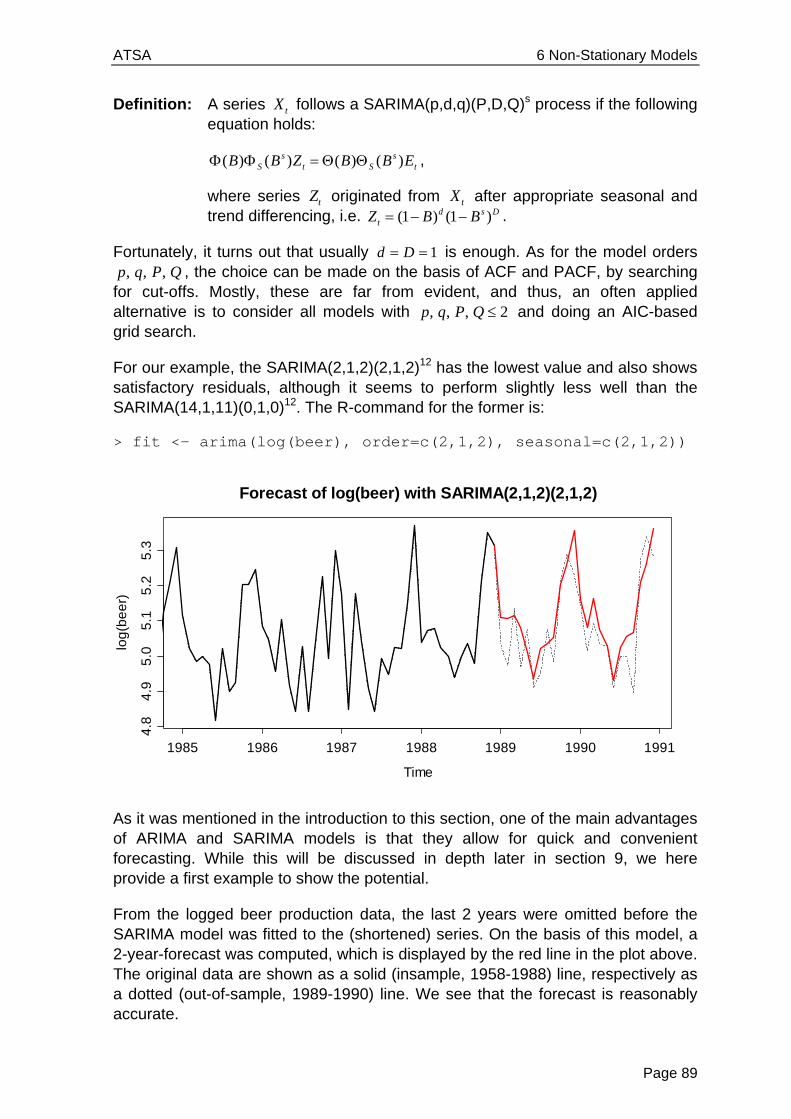
ATSA 6 Non-Stationary Models
Page 89
Definition: A series tX follows a SARIMA(p,d,q)(P,D,Q)s process if the following equation holds:
( ) ( ) ( ) ( )s sS t S tB B Z B B E ,
where series tZ originated from tX after appropriate seasonal and trend differencing, i.e. (1 ) (1 )d s D
tZ B B .
Fortunately, it turns out that usually 1d D is enough. As for the model orders , , ,p q P Q , the choice can be made on the basis of ACF and PACF, by searching
for cut-offs. Mostly, these are far from evident, and thus, an often applied alternative is to consider all models with , , , 2p q P Q and doing an AIC-based grid search.
For our example, the SARIMA(2,1,2)(2,1,2)12 has the lowest value and also shows satisfactory residuals, although it seems to perform slightly less well than the SARIMA(14,1,11)(0,1,0)12. The R-command for the former is:
> fit <- arima(log(beer), order=c(2,1,2), seasonal=c(2,1,2))
As it was mentioned in the introduction to this section, one of the main advantages of ARIMA and SARIMA models is that they allow for quick and convenient forecasting. While this will be discussed in depth later in section 9, we here provide a first example to show the potential.
From the logged beer production data, the last 2 years were omitted before the SARIMA model was fitted to the (shortened) series. On the basis of this model, a 2-year-forecast was computed, which is displayed by the red line in the plot above. The original data are shown as a solid (insample, 1958-1988) line, respectively as a dotted (out-of-sample, 1989-1990) line. We see that the forecast is reasonably accurate.
Time
log
(be
er)
1985 1986 1987 1988 1989 1990 1991
4.8
4.9
5.0
5.1
5.2
5.3
Forecast of log(beer) with SARIMA(2,1,2)(2,1,2)
ATSA 6 Non-Stationary Models
Page 90
To facilitate the fitting of SARIMA models, we finish this chapter by providing some guidelines:
1) Perform seasonal differencing on the data. The lag s is determined by the periodicity of the data, for the order, in most cases 1D is sufficient.
2) Do a time series plot of the output of the above step. Decide whether it is stationary, or whether additional differencing at lag 1 is required to remove a potential trend. If not, then 0d , and proceed. If yes, 1d is enough for most series.
3) From the output of step 2, i.e. series tZ , generate ACF and PACF plots to study the dependency structure. Look for coefficients/cut-offs at low lags that indicate the direct, short-term dependency and determine orders p and q . Then, inspect coefficients/cut-offs at multiples of the period s , which imply seasonal dependency and determine P and Q .
4) Fit the model using procedure arima(). In contrast to ARIMA fitting, this is now exclusively done on the original series, with setting the two arguments order=c(p,d,q) and seasonal=c(P,D,Q) accordingly.
5) Check the accuracy of the fitted model by residual analysis. These must look like white noise. If thus far, there is ambiguity in the model order, AIC analysis can serve to come to a final decision.
Next, we turn our attention to series that have neither trend nor seasonality, but show serially dependent variance.
6.3 ARCH/GARCH Models
In this chapter, we consider the SMI log-returns that were already presented in section 1.2.4. By closer inspection of the time series plot, we observe some long-tailedness, and also, the series exhibits periods of increased variability, which is usually termed volatility in the (financial) literature. We had previously observed series with non-constant variance, such as the oil prices and beer production in the previous sections. Such series, where the variance increases with increasing level of the series, are called heteroskedastic, and can often be stabilized using a log-transformation.
However, that matter is different with the SMI log-returns: here, there are periods of increased variation, and thus the variance of the series is serially correlated, a phenomenon that is called conditional heteroskedasticity. This is a violation of the stationarity assumption, and thus, some special treatment for this type of series is required. Furthermore, the ACF of such series typically does not differ significantly from white noise. Still, the data are not iid, which can be shown with the ACF of the squared observations. With the plots on the next page, we illustrate the presence of these stylized facts for the SMI log-returns:

ATSA 6 Non-Stationary Models
Page 91
6.3.1 The ARCH and GARCH Models
In order to account for volatility, we require a model that allows for conditional changes in the variance. The most simple and intuitive way of doing this is to use an autoregressive model for the variance process. Thus, a series tE is first-order autoregressive conditional heteroskedastic, denoted as ARCH(1), if:
20 1 1t t tE W E .
Here, tW is a white noise process with mean zero and unit variance. The two parameters 0 1, are the model coefficients. An ARCH(1) process shows volatility, as can easily be derived:
2
2 20 1 12
0 1 1
0 1 1
( ) [ ]
[ ] [ ]
[ ]
( )
t t
t t
t
t
Var E E E
E W E E
E E
Var E
Note that this derivation is based on 2[ ] 1tE W and [ ] [ ] 0t tE E E W . As we had aimed for, the variance of an ARCH(1) process behaves just like an AR(1) model. Hence, the decay in the autocorrelations of the squared residuals should indicate whether an ARCH(1) is appropriate or not.
SMI Log-Returns
Time
lret
.sm
i
2500 3000 3500 4000
-0.0
8-0
.04
0.00
0.04
++
+++
+ ++
++++ ++++
+++ ++++ +
++++ +
+ + +++
+
+ +
++++
++++++ ++++ ++ +
++
+++++++
+++ +
++++++
++++
++
++++
+
++++ +++++
+
++
+ ++
++
++++
+
+ +++
++
++ +
++++
+++++ +
+
++
++
+++
++
++
++
++
+
++++++ +
++
++ +++
++++ ++ +
+++
++
+ ++
++ ++ ++++
+ +++
++
++ ++
+++++
++++
+++
++
++
+ +++++
+++ ++
++++
+ ++ ++
+++
+
++
++++++ + ++ +
++++
++++
++
+++
+++
++
+++
+ ++++
+++ +
++
++
+
+
++ + +
+
++ ++ +
+++ +++++
+++
+
++
+
+
++++ +
++
+++ +
+
+
++++
+++ +
+
++ ++
+
+++++ +
+++
++
++ +++
++ + +++++++
++
++++
++++++
++++ + + +
+ ++++
++
+ ++ ++++
++
+++ +++
+
++
+
++
+++
++
++
++
+ + +++ +++++
+++++
+++
+
++
+++++++
+++
+
+
+++ +
++
+ +
+++++ +++
+ +++++ + +++++++ +
++
++
++++++++ +++
++ ++++ ++++
++ + +
++
++++
+ ++
+++
++ ++++++
+
+
++++
++ ++
+
++
++
+++ ++
+++++
+
+ ++ +
++
+++ ++
++++
+ ++
+
++++
++
+
+++
++
+ + ++ +
+++
++
+ + ++ ++ ++
+ + +++
+++++ ++
++
++
++
++++ +++
+ ++ +++
++ ++
+ +++ +++
++++ +++ +
++ +
++
+ ++ ++
++
+
++++++ +++
+++
++
++
+
+
+++
+
++
+
++ +
+
++++
+
+++
++
++
++
++
++
+ +++
+
+++
++ + + ++++++
++
+ ++
++
++++
++
++
++
+
++
+++++
+++
++ + +
+++ +
+
++
+ ++ ++++
+
+
++
++
++
++
+
+ +++
+
++
+
++
+ +++++
+
+ ++
+
++++
+++++
+++++
+ +++
+
+ ++
++
+++
++ +
+ +++
++ ++
+ + ++ ++
+
+
+ +
++
++
+++
+ ++
+
+ ++
++++
++ +
+
++
++ + ++ ++
+ +
++++ +
++
+
++ +
++ + +++++ ++++
+++
++++
++++ + ++++++
++
++
+++ +
++
+++
++
++ ++++ + +++
++ ++
+++
++
+
++
++++ ++ +
+
+
+++
+
++
++
++++++++++
+++ + ++
++
++
++++ ++++++++
+
++
++
+ ++ ++++ +
+++++ +
+
++ + +
+++
+ ++
+ +++
++ + +++
++++
+++++ ++ ++
+++++
+++
+ ++ ++ +++ ++ +
++ +
++ ++ ++ +
++ +
++
+ +
+
+ +
++
+ +++ + +++
++ ++++
+ +
+
+++
+
+ ++
+ ++
++ ++ + ++
+++
+ ++++
++++ +++
++ ++
++ +
++
++
+++
+
+ +++
+
++ ++
+ ++
+
+
+
+++
+++++
++ +
++
++
+ + +++++++++
++ +
+
+++
++
+
++
++++
+++ ++ ++
++
++++
++++ ++
++++++ +
+++
+
++ ++++ +
++
++ +
+ + ++ +
++
++ +
+++
+++ +
+
++
+++ + +++ ++++
++
+++ +
++
+++
+++
+ + +
+
+
+
++ +
++ +
+
+++
++++ +
++
++
++++ +
+ ++
++
++ ++
++ + +
++
++++
+ +++
++ +++
++++ +++
++++++
++++ + + ++
++++ +++
+ ++ +++
++++
+++
+
+ +
+
++
+++
++
++++ +++++
+++++ + +++
++++++ +
++
++
++
+ +++++
+++ ++
+ ++
++++
+++++
++ ++ +++
+
+
++
+
+
++
+++++
+
+++
+
++
++++
+++++ + +
+
+++
++ +
++++
++++++
+
+
++ +++
+
+
++++
+++
+
++++
++
+++
++ +
+
++
++
++
+++
++
+
+++
+
+
+ ++
+
+
+ +
+
++
+
+ + +
+ +++
++
+
+
+
+
+
+
++
+
+++
+++++
++ +
+
+
+++
+
+++
++ +
++ ++
+
++
+++
++
++
+
+
+
+
+
++
+
+
++
+++ + +
+
++++
+
++++
++
+++
++
++ ++
+++
+
+++++
++
+++
+
+ +++
+
+
+ +
+++
+++++
++ +
+++
+ +
++ +
+
+++
++ +++
+++
+
++
+
+
+++++
+ ++
+
++ ++
+
++ +++
++
++
+++ ++
++
+
++++
+
++
+
+
+
++
+
+ +
+++++
+++ +
++
++
+++ +
+
++
+++
+++
+
+++
++
++ +
+
+
+ +++
++++
+++
+++
+++
+
++
++
++
++
+
++
+
+
+
-3 -2 -1 0 1 2 3
-0.0
8-0
.04
0.00
0.04
Normal Plot
Theoretical Quantiles
Sam
ple
Qua
ntile
s
0 5 10 15 20 25 30
0.0
0.2
0.4
0.6
0.8
1.0
Lag
AC
F
ACF of SMI Log-Returns
0 5 10 15 20 25 30
0.0
0.2
0.4
0.6
0.8
1.0
Lag
AC
F
ACF of Squared Log-Returns

ATSA 6 Non-Stationary Models
Page 92
In our case, the analysis of ACF and PACF of the squared log-returns suggests that the variance may be well described by an AR(2) process. This is not what we had discussed above, but the extension exists. An ARCH(p) process is defined by:
20
1
p
t t p t ii
E W E
Fitting in R can be done using procedure garch(). This is a more flexible tool, which also allows for fitting GARCH processes, as discussed below. The command in our case is as follows:
> fit <- garch(lret.smi, order = c(0,2), trace=FALSE) > fit Call: garch(x = lret.smi, order = c(0, 2), trace = FALSE) Coefficient(s): a0 a1 a2 6.568e-05 1.309e-01 1.074e-01
For verifying appropriate fit of the ARCH(2), we need to check the residuals of the fitted model. This includes inspecting ACF and PACF for both the “normal” and the squared residuals. We here do without showing plots, but the ARCH(2) is OK.
A nearby question is whether we can also use an ARMA(p,q) process for describing the dependence in the variance of the process. The answer is yes. This is what a GARCH(q,p) model does. A series t t tE W H is GARCH(q,p) if:
20
1 1
p q
t i t i j t ji j
H E H
0 5 10 15 20 25 30
0.0
0.2
0.4
0.6
0.8
1.0
Lag
AC
FACF of Squared Log-Returns
0 5 10 15 20 25 30
0.0
0.2
0.4
0.6
0.8
1.0
LagP
art
ial A
CF
PACF of Squared Log-Returns

ATSA 6 Non-Stationary Models
Page 93
6.3.2 Use of GARCH Models
GARCH models are useless for the prediction of the level of a series, i.e. for the SMI log-returns, they do not provide any idea whether the stocks’ value will increase or decrease on the next day. However, they allow for a more precise understanding in the (up or down) changes that might be expected during the next day(s). This allows stockholders to adjust their position, so that they do not take any unduly risks.
Related Documents