Welcome message from author
This document is posted to help you gain knowledge. Please leave a comment to let me know what you think about it! Share it to your friends and learn new things together.
Transcript


page4-63
page64-89
PackagingBrandingSHAP’S CAMERALAND
OPTIMAL ENERGY & JOULE
HI-FI CORPORATION
BARNEY BARNATO
CENTREFOLD
IMOYA
MAGNA CARTA
DE ROUW
COPPER CLASSIQUE
KHOISAN TEA
MEADOWSWEET

paperworkcontact page 119
contributors page 118
page90-111
page113-117
Brand Activation Logo’sSANDISK
MIO
AFRICAN MISHALE
IMOYA
VARIOUS LOGO’SAND CORPORATE IDENTITIES

2008-2010
Branding does not merely consist of a basic CI. Aside from creating the face of the brand, true
branding has to convey the voice and personality thereof and establish a platform for consumers to interact with the product.
The following collection of branding projects ranges from basic logo designs to custom
typography, ad templates, spatial branding and consumer interaction platforms.

Corporate ID. Inspiration for the Shap’s Cameraland corporate identity was primarily taken from objects associated with the art of photography, such as lenses, camera markings, light boxes, studio lighting and more. As such the design palette consisted of black and white (associated with both early- and art photography), silver, red (especially in terms of light), matt and gloss, as well as transparency and refl ective surfaces. The intent was to communicate the value of ‘less is more’ in a modern and friendly manner that did not discount the history associated with the brand.
Logo: The type used is more modern, rendering the brand more approachable, yet retaining the business’ classic core.
Corporate ID. Inspiration ffor ththee Shap’s Cameraland corporate identity was primarily taken from objects associated with the art of photography, such as lenses,
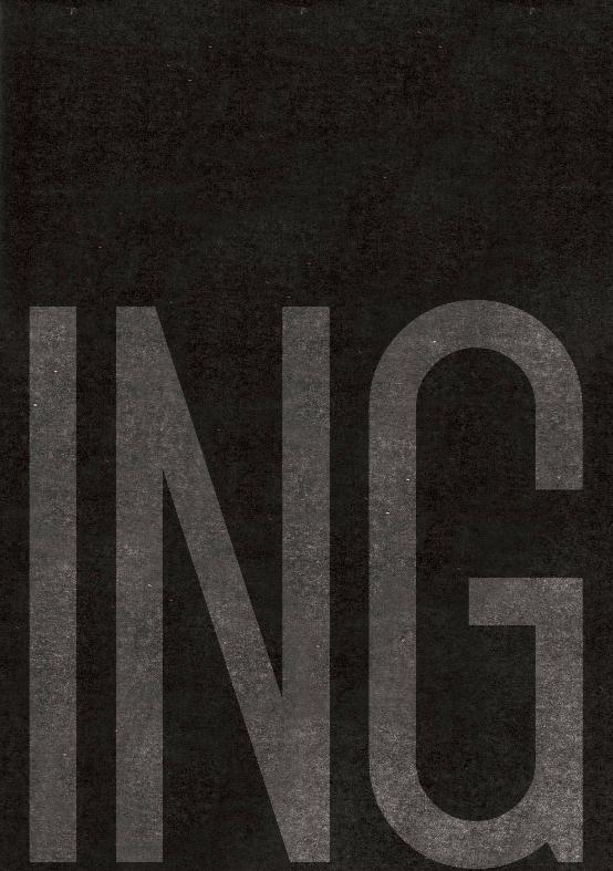
RESTORING A CLASSIC Reviving the Shap’s Cameraland image to bring the
business into the 21st century, while still retaining the historical essence of the brand, was an exercise
in sensitive design and conceptual thinking that culminated in a space ‘where subjects matter’.
SHAP’S CAMERALAND

The intent was to create an inviting and interactive, yet decidedly professional,
space that was user-friendly for both camera enthusiasts
and employees alike, allowing sales personnel to easily exhibit wares
and the functioning thereof. .
A clear signage system was devised to show up all the facets of the business, highlighting certain areas that had previously suff ered due to a lack of signage, as well as improper advertising and client awareness

TOP:
Digital photo frames and print frames form part of the 3D brand space, allowing for impromptu exhibitions, as well creating a potential space for professional photographers to give lectures/talks etc.
ABOVE:
An extensive retouch- and print area allows customers the opportunity to either drop-off and collect their images later, or to watch as it is altered.


Canon EOS 1D MK III24-105 Lens21.1-megapixelR 54000.00
Nikon Coolpix P6004X zoom Lens Nikkor Lens13.5-megapixelR 6260.00
Nikon Coolpix S2203X zoom Lens Nikkor Lens10-megapixelR 2360.00
new arrival
Tel : 021- 423 4150 / [email protected]. z a / Cameraland 70 Long Street Cape Town 80 0 0
Strong elements from the corporate identity were used alongside basic product- and price
information to create a basic advert template that can easily be adapted to any format or
corporate communication application.

BRAND STANDS:
Problems identifi ed with existing in-store brand stands included insuffi cient grouping of products, a lack of storage space and inequality where the brand presence of individual manufacturers were concerned. Clean and functional modules were designed to serve both as storage- and display space.
PLINTHS:
A stacked appearance allows for interesting display combinations that may serve to highlight and diff erentiate products as per individual promotional requirements and/or general display hierarchy.

PRICE POINTERS:
The red dot that forms part of the corporate identity was used to design highly functional, aff ordable and adaptable price pointers that may be
altered in-house as the need arises with the simple addition of relevant A5
In order to maintain the look and feel put in place by the established corporate
identity, Point of sale material was designed according to the theme of
photographic elements.
where subject matters
Canon EOS 1D MK III24-105 Lens21.1-megapixelR 54000.00


shop frontFrom the outset we wanted the
historical essence of the building to be kept intact and added to in a
sensitive manner that did not distract from its importance as a heritage
element. Base colours were selected from the corporate identity palette and used alongside large fl at panel
displays that could be used to project images, advertisements, products
and prices to passersby.
Further photographic elementsused included red light and light
boxes; the latter recommended as pillar fi ttings that could enhance the visibility of the building at night and attract attention to the shop outside
of business hours.
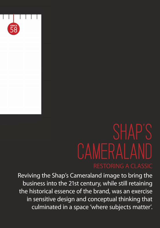
OPTIMAL ENERGYThe technology required to produce affordable electrical vehicles is available right now.. One South African based company has embraced it and is ready to provide
THE SOLUTION the world has been waiting for. Meet the future of human mobility, today.
CREATIVE DIRECTOR: TYRONE BECK // MICHEL BRINKCOPY WRITER: TERRI ANNE LATEGANWORDS: ANNA-BET BESTER

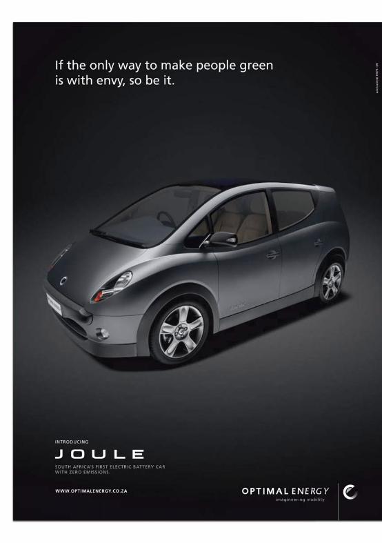

THE TEAM’S COLLECTIVE PASSION FOR RENEWABLE, CLEAN ENERGY IS MANIFESTED IN JOULE,
THE COMPANY’S FIRST PRODUCT OFFERING – A SILENT PASSENGER MPV AND BATTERY ELECTRICAL
ENGINEERING MARVEL WHICH IS SET TO TRANSFORM THE FACE OF THE URBAN TRANSPORTATION LANDSCAPE.
Optimal Energy is a privately-owned South African holding company that seeks to eradicate the squandering of Earth’s fi nite resources by changing
the face of urban transport through establishing and leading the electric vehicle industry in South Africa and expanding it globally.
The company is run by CEO Kobus Meiring who was previously programme manager of a number of prestigious high-tech projects in South Africa. He founded Optimal Energy in 2005 with Mike Lomberg,
Jian Swiegers and Gerhard Swart, funded with an investment from the Innovation Fund, an instrument of the Department of Science and Technology of the South African Government. The founders together
with Diana Blake and Ratilal Rowji today form the executive management team of Optimal Energy. Among the team’s individual accolades number
involvement with the development and design of SALT (Southern African Large Telescope), as well as the Rooivalk Attack Helicopter.
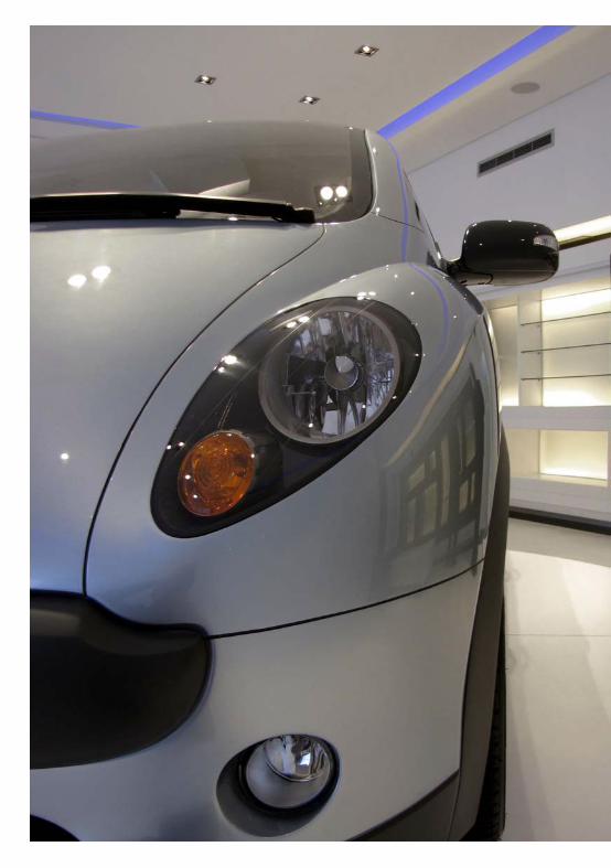
Developed from the outset as an electric vehicle, Joule comprises a decidedly stylish exterior combined with a highly fl exible interior with up to 6 seats which complies with UN-ECE safety standards and provides an
optimal, no-compromise, and zero emission urban driving experience.

LOGOTYPEThe aim was to communicate a sense of movement/progression, modernity and stability through the logo. Bringing these dissimilar elements together in a coherent fashion proved quite the challenge. The solution lay in a typographical interpretation of the key elements that produced a strong, yet subliminal, logo type that was strong enough to carry the varied nuances of the key concept. The fi nal version of the logo is a progress type that moves from a perfect static and modern circular ‘o’, to an italicized, serif ‘y’ – eloquently communicating the principles of progress, movement and evolution. Due to the singular nature of the font design the logo would be instantly recognizable and diff erentiated from standard font types.
CORPORATE IDENTITYThe team was approached to create a corporate identity that would communicate clean, modern, simplistic and innovative values underpinned by cost eff ectiveness and an environmentally friendly attitude.
Each element of the Optimal Energy project was very carefully considered and intricately wrought in order to establish a launching platform and brand that could carry all future projects. Imagination, engineering and movement were the main concepts and formed thebaseof a CI that encompassed both modernity and traditional values; movement and stability.
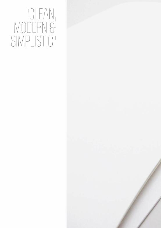
"CLEAN, MODERN &
SIMPLISTIC"
OPTIM
AL EN
ERGY
STAT
IONER
Y

ALSO PICTURED ON PREVIOUS PAGE

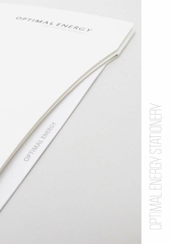
A generic folder was created that could be customized as the need arose for occasions such as client meetings, proposals, etc. Clean, modern and simplistic, a unique die line was added to the right of the folder that would show insert headers and/or other content added to the folder. Both functional and aesthetically off -beat, this device was chosen to coincide with OE’s brand philosophy of seamlessly combining the functional with the visually striking. Other elements that spoke to this philosophy included the recycled and uncoated paper the folder was manufactured from, as well the fact that no glue was used in its binding. The layout of the inside inserts were designed to be typographically strong and communicate in an eff ective and interactive manner.
STATIONERYWholly inspired by the corporate identity, the stationary was kept
clean and low key with minimal design elements to distract the reader from the content of any given document.

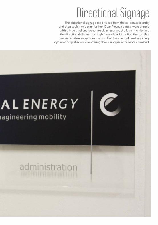
Directional Signage The directional signage took its cue from the corporate identity
and then took it one step further. Clear Perspex panels were printed with a blue gradient (denoting clean energy), the logo in white and the directional elements in high gloss silver. Mounting the panels a few millimetres away from the wall had the eff ect of creating a very
dynamic drop shadow – rendering the user experience more animated.

South Africa’s First Electric Car
MAXIMIZING YOUR DRIVING EXPERIENCE WHILE MINIMIZING YOUR CARBON FOOTPRINT. Designed from the outset as a next generation electric vehicle, Joule combines environmentally-friendly technology and beauty to ensure that neither one quality compromises the other.?
CREATIVE DIRECTOR: TYRONE BECK & MICHEL BRINKCOPY WRITER: TERRI-ANNE LATEGAN
Joule


Logo & Electric Type:The team was tasked to create a generic logotype that alludes to movement that does not strive to reinvent the wheel as such. As the logo was put together for the express purpose
of being displayed at the Geneva Motor show it had to communicate the electric nature of the vehicle at once, without any further visual prompts.
The team set to work and took their main cues from the existing OE corporate identity, as well as the corporate identity of Joule itself (which is still currently in its crucial
development phase).The logo and type was put together in order to clearly convey the essence of the modern car brand without lessening the impact of the car’s
unique selling point.


Print advertisement:Client brief: An advertisement was to be created to be printed in
the African Investment Annual, a publication aimed at enticing international investment. It was to communicate the launch
of the brand, as well as the key aspects of the OE- and Joule brand philosophies.
Execution: Seeing as though the advert was to introduce Joule, care was taken to add as little as possible elements that would distract
from the brand promise and the vehicle itself.
Tag line: “It has been said that the wheel cannot be reinvented. So we
focused on inventing a new way to make it move.” Straight to the point and without any semantic gimmicks, the tag line was chosen to indicate that Joule was not just another variation on an existing
theme, but completely in a class of its own and therefore did not need fancy language to infl uence the consumer favourably.
Photography: Strong, clean, aggressive angles were used to best highlight
the shape and design of the vehicle.


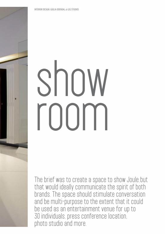
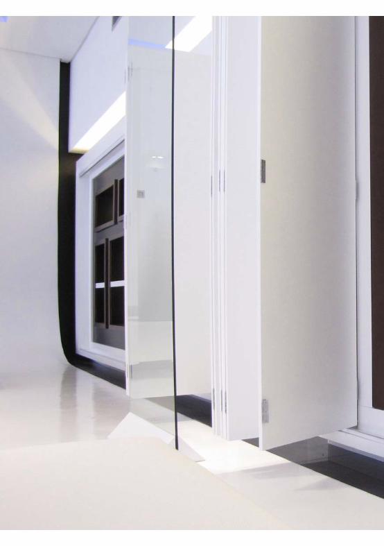
showroomThe brief was to create a space to show Joule, but that would ideally communicate the spirit of both brands. The space should stimulate conversation and be multi-purpose to the extent that it could be used as an entertainment venue for up to 30 individuals, press conference location, photo studio and more.
INTERIOR DESIGN: GIULIA ODENDAL @ LEG STUDIOS

A relatively small commercial space was
adapted to suit client requirements while still
remaining visually appealing and user-friendly. Key brand
concepts were addressed and incorporated in both
the functioning and decoration of the show
room. This included self-sustainable energy sources,
recycled furniture, organic architectural elements
and a clear guideline with regard to personnel profiles.
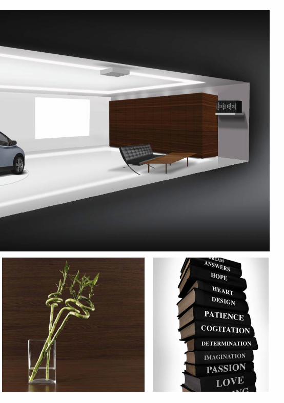


Wall Unit: The wall unit was designed
to house a sound system, full audiovisual unit, refreshment stand as well as storage- and
cleaning space in one unassuming wooden structure with collapsible
doors. The thinking behind the unit was that a morning meeting
could potentially follow a cocktail evening without the hassle of a rushed early-morning cleanup.
Textures & Finishes: Textures and fi nishes were chosen
to coincide with the key brand philosophy of sustainable living
and as such were mostly organic and recycled. Bespoke furniture pieces were commissioned that
could be stacked in various ways to create conversation nooks,
provide extra seating, etc.
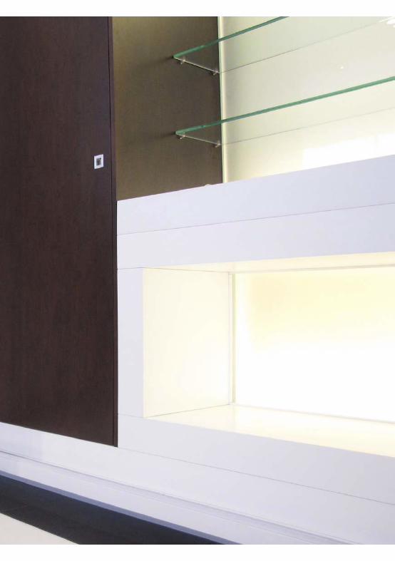
Book Case: Put in place as a conceptual communication device, the bookcase was fi lled with recycled contemporary, African-inspired books that were rebound with brand keywords on the spines (imagination, hope, transformation, etc).
Photography-friendly Elements:Due to the fact that the space would also be used as a press conference venue and a studio where the media could photograph the vehicle, it was important that it be photography-friendly. This was achieved by including an infi nity curve against the one wall, soft box lighting, as well as a light strip that may be dimmed in order to pick up highlights on the vehicle. The light strip can also change colour to the recognizable ‘Optimal Energy blue’.


POTENTIAL DIFFERENCE VS MUTUAL BENEFIT
Zagato/Joule Geneva Stand
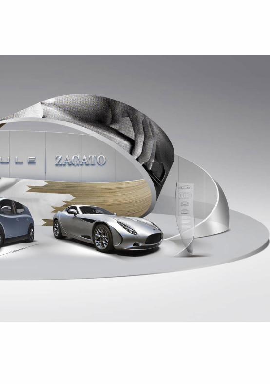


STRUCTURE:
The two entities will be showcased through contrasting elements in the exhibition stand so that the idea comes across at first glance. A section of a Möbius Strip rises from the floor, acting as part platform to the vehicles. The two sides distinguish one another by using different materials. The shape of the Möbius Strip communicates movement, speed, free flowing design and natural form. Through this contradiction, similarities between the brands are highlighted such as design, expression, advancement and integrity.
Materials: In the initial rendering that was presented to the client the one side of the Möbius Strip covered in a vertical garden to express the “Reason” element of the Joule, while the opposite side is a glossy acrylic, communicating passion. The idea could potentially be elaborated upon ton include a structure of entwined LED screens displaying juxtaposed information.
LIGHTING EFFECTS:
The lighting used was designed to create an impressive visual impact and, as such, it was decided to illuminate the vehicles with the purest of white light, while the lines thereof were to be accentuated by concealed- and strip lighting. The rest of the stand was to be a clean, crisp white space that would not distract from the vehicles.
INFORMATION STANDS:
It was recommended that information be displayed on the actual platform around the vehicles in order to draw passersby closer to the vehicle, from which vantage point they would then be able enjoy an interactive experience and multiple viewpoints of the vehicle in question. Alternatively, smaller strips of Perspex could be used to display the information in a format that would allowthe user to interact with the communication platform by means of touch screens.

The conceptual device that was chosen to convey this infi nitely simple, yet comprehensive, concept was the Möbius Strip. This infi nity strip, which apparently has two sides, but in reality only has one, was the perfect metaphor to communicate the similar, yet contradicting brand identities of Joule and Zagato in a cohesive manner.
A stand was to be created to promote the partnership between Zagato (a radical sports car brand) and Joule (in essence family transport) at the Geneva Motor Show. The stand was to establish the brand promise of the conjoined companies, namely innovation, albeit at diff erent ends of the consumer spectrum), while simultaneously launching Joule on the international market.
The main concept was to illustrate that although Zagato and Joule had very distinct brand philosophies, aspects thereof overlapped, creating an area of dynamic ‘potential diff erence’ (a scientifi c term that is used to describe the potential energy that is the result of the negative and positive ends of a standard lithium battery). The sum of this partnership was to be clearly indicated as being more signifi cant than the sum of its parts.
THE MÖBIUS STRIP

P
UNVEILING The massive veil is reversible, with the one side being blue and the other side silver.
The veil is pulled over both cars, but a definite divide can be seen as the veil is twisted and each car is covered in a different colour. This shows that the two cars live under one notion, but are, at the same time, different.
potential
diff erence
Dynamic
Effi cient
Refi ned
Knowledgeable
Progressive
Understated
Unique
Passion
Innovation
Individualism
Craftsmanship
Focus
Exclusivity
Art cars driven by emotion
The power to move you in new ways
Zagato and Joule had very distinct brand philosophiesAspects thereof overlapped, creating an area of
dynamic ‘potential difference’

PROMOTIONAL WEB BANNER
A web banner was designed for placement on the Geneva Motor Show website to create hype around the Joule/Zagato stand. The web banner incorporates the Möbius strip concept alongside basic mouse-over interactivity. Clicking on the banner would take consumers to a dedicated mini-site that explains the Joule/Zagato partnership in depth.

PROMOTIONAL ITEM The simple, yet effective promotion wristband was designed to further support the Möbius strip concept. The wristband would be printed with writing on either side that would not make sense until the band was twisted and secured with a press clip to form a Möbius strip. These wristbands would be distributed prior to and during the exhibition to encourage conversation about the brand.
Let your soul exalt your reason to the height of passion Let it direct your
passion with reason, that your passion may live through its own daily resurrection
Kahlil Gibran on Passion and Reason
CREATIVE DIRECTOR TYRONE BECK
HI-FI CORPflagship store

ORATION

POINTING THE WAY
Partnering with TDC (The Design Company), the design team was asked to come up with graphics to suit the three new Hi-fi Corp concept/ flagship stores opening countrywide. The modern "industrial warehouse" interior look and feel inspired a whole visual language consisting of imagery, iconography and signage.
HI-FI CORPORATION //FLAGSHIP STORE

«LEFTThe intent with the signage system was to create bold and highly visible directional signage that would allow the consumer to navigate the substantial space independently and be completely self-reliant while browsing
» RIGHT
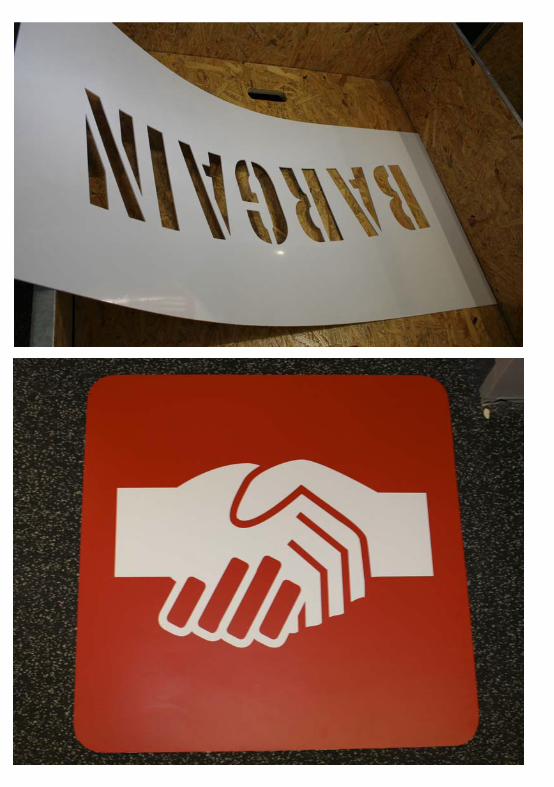
The eye-catching red square was inspired by industrial tape dispensers and, alongside bold type and gray scale images, provided a wealth of design- and communication possibilities. The product photography not only served to communicate the products available, but also the services provided in-store.

THE SPACEThe general look and feel of the in-store space was inspired by large, industrial shipping locations. To reinforce this atmosphere we made use of various ‘shipping crate’ elements, which included rough, untreated surfaces and spray-painted stencils (see above right).
The Gondola headers were designed to provide easy reference for in-store customers, while remaining true to the core look and feel (see above). Communication within the space was further simplified by iconographic header boards (see right below) in strategic location.

HI-FI CORPORATION I
CCCustomer Care
APPAppliances
CACar Audio
ACCAccesories
GGaming
TV2TV/LCD
TV1TV/Lcd LCD
TV2TV/LCD
ICONOGRAPHYTo further support the visual
communication concept, a set of icons was designed for use as header boards,
price tags and sale cards.
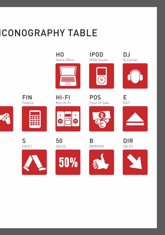
ICONOGRAPHY TABLE
FINFinance
POSPoint Of Sale
DJDj Corner
HOHome Office
IPODIPOD Sound
EEXIT
SSALE1
50SALE2
DIRSALE3
BBARGAIN
HI-FIMini Hi-Fi
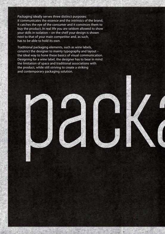
packaPackaging ideally serves three distinct purposes: it communicates the essence and the intrinsics of the brand, it catches the eye of the consumer and it convinces them to buy the product. In real life you are seldom allowed to show your skills in isolation – on the shelf your design is shown next to that of your main competitor and, as such, has to be able to hold its own.
Traditional packaging elements, such as wine labels, constrict the designer to mainly typography and layout – the ideal way to hone these basics of visual communication. Designing for a wine label, the designer has to bear in mind the limitation of space and traditional associations with the product, while still striving to create a striking and contemporary packaging solution.
aging


BARNEY BARNATO
KIMBERLEY “BARNEY BANATO”, MIDDLE TIER LOCAL, TOURISM-BASED RANGEThe client requested that the packaging express the multi-faceted life
of erstwhile diamond magnate Barney Banato, a contemporary and direct competitor of the enigmatic Cycil John Rhodes.
It was decided that each cultivar would be assigned a character trait of Barney Banato (i.e. entrepreneur and entertainer), while the bowler hat and logo type would serve as a conceptual link
between the individual products. This spoke directly to the historical fi gure’s public persona as a jack of all trades.


centre foldCENTRE FOLD VINEYARDS“CENTRE FOLD”TOP TIER NEW ZEALAND WINE
Inspiration was taken directly from the name given to both the winery and their product. Several design methods were used to create the illusion of a literal fold on the label, including subtle shadows and color variations, as well as text ‘tucked’ beneath the ‘fold’.


IMOYAKWV “IMOYA”, ICON BRANDY
The client requested a redesign and new branding strategy that would serve to defi ne the essence of Africa for the overseas market. The chosen concept placed
Imoya (‘instinct’) as the fi fth element alongside wind, water, fi re and earth, bringing the quintessential essence of the brand into the tangible realm.

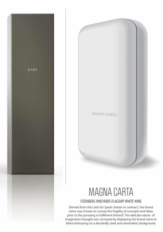
MAGNA CARTASTEENBERG VINEYARDS FLAGSHIP WHITE WINE
Derived from the Latin for ‘great charter or contract’, the brand name was chosen to convey the fragility of concepts and ideas
prior to the pursuing or fulfi lment thereof. The delicate nature of imaginative thought was conveyed by displaying the brand name in blind embossing on a decidedly stark and minimalists background.

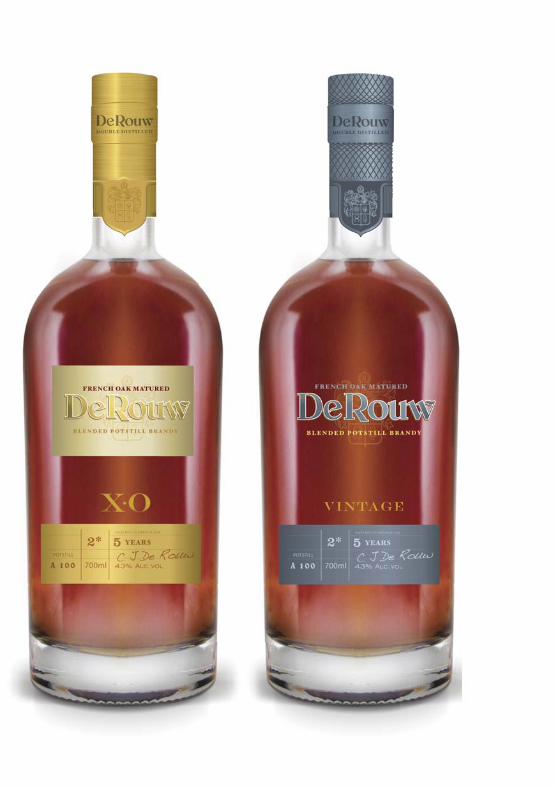
De Rouw KWV “DE ROUX”, RANGE OF EXPORT BRANDIES
The client requested that the look and feel of the labels and packaging convey a sense of authenticity and heritage. To achieve this, the team created a fictional family name that was supported by design elements taken from traditional family crests and reproduced in an etching style. The name signified a strong familial bond, as well as the skills of coopers and winemakers that were traditionally passed on from one generation to the next. As such, the tools of the cooper trade also formed part of the design elements used on the labels and packaging. The concept of a family trade also provided inspiration for the typeface that forms part of the logo, which looks as though it may originally have been penned with ink and quill, only to gain modern traits further down the line.
PACKAGING:
Diff erentiation between the various brandies in the range was achieved by reducing the complexity of the packaging design incrementally, while simultaneously increasing the quality of the materials used in the production thereof. As such, the three-year old brandy was boxed in a very colorful container, whereas that of the fi ve-, ten- and 15-year old brandies became increasingly simpler with richer fi nishes; ending up in a solid gold fi nish and real ribbon for the highest tier product.
a sense of authenticity & heritage


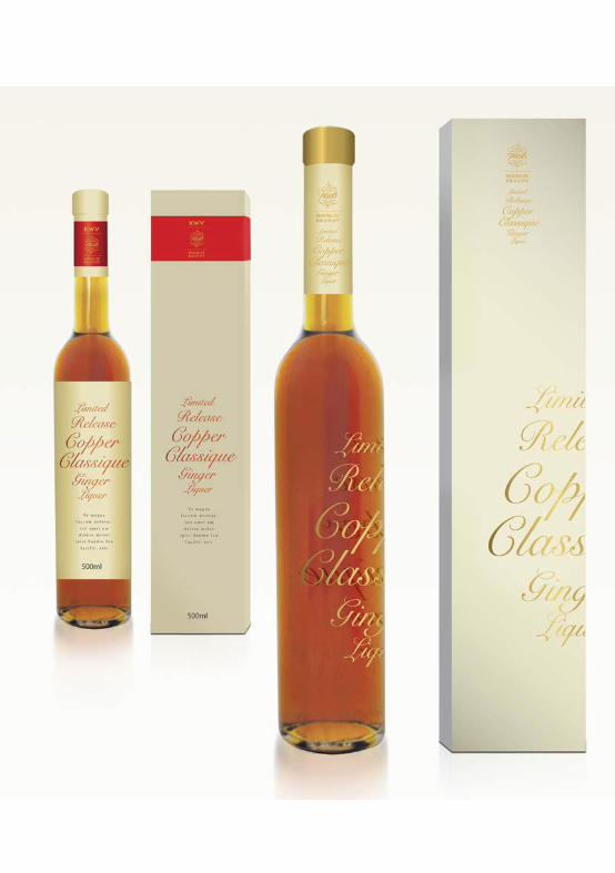
KWV HOUSE OF BRANDY COPPER CLASSIQUEThe limited release ginger liquer had to portray a sense of exclusivity and also refl ect the uniqueness of the liquid. The KWV HOUSE OF BRANDY corporate identity could be used to crete a look and feel for the packaging that was diff erent to the standard KWV estetic
copper classique

Khoisan Tea The productA trusted local supplier and exporter of indigenous herbal teas to the overseas market since 1997, Khoisan Tea produces and distributes conventional, as well as 100% organic, Rooibos- and Honeybush teas to a diverse market that have grown to trust the brand explicitly. The company oversees every aspect of the production process, from planting to harvesting, cutting, fermenting and packaging of their wide variety of Rooibos tea products.
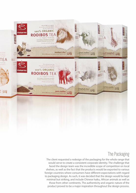
The PackagingThe client requested a redesign of the packaging for the whole range that
would serve to create a consistent corporate identity. The challenge that faced the design team was the incredible scope of competition on local
shelves, as well as the fact that the products would be exported to various foreign countries where consumers have diff erent expectations with regard to packaging design. As such, it was decided that the design would be kept
minimal but striking, and include Chinese haiku, African animals as well as those from other continents. The authenticity and organic nature of the
product proved to be a major inspiration throughout the design process.

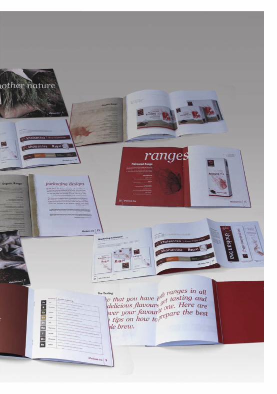
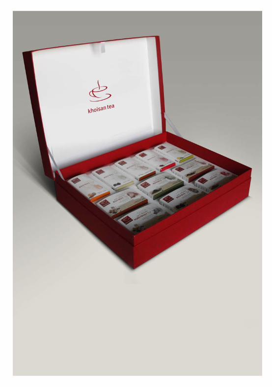
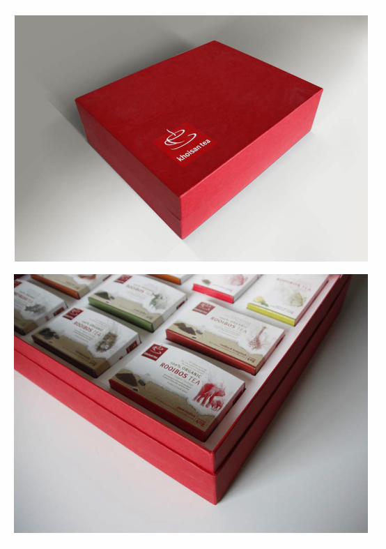
Khoisan TeaBrochure and Trade PresenterThe trade presenter was to be distributed to potential buyers in the retail environment to introduce the product range and encourage purchase thereof. Essentially a large product sampler, the trade presenter consisted of a large branded box and brochure that served to showcase all the packaging, as well as promotional- and point of sale items that make up the Khoisan Tea range.

MEADOWSWEETORGANIC, HANDMADE BODY TREATMENT PRODUCTS
The client requested a complete redesign on the entire range of handmade organic body treatment products. It was to be positioned in a way that would appeal to a niche upper market clientele, while still being affordable in terms of printing costs and instantly recognizable among similar products on a commercial shelf.
Inspiration for the logo was taken from the organic shape of the Meadowsweet flower (also known as ‘Lady of the Meadow’) and combined with a heart to allude to flowering of the female
body with the proper care and nurturing.
Due to the fact that the Meadowsweet range is quite extensive and provides the consumer with a variety of sizes and flavors in which a given product may be purchased, a basic design language was created that would solve all basic design requirements. The logo and corporate identity was carried over to the packaging, and basic layouts were created that could be easily adapted to differentiate between various products simply by reversing certain design
elements or changing a color scheme.
Please visit: http://www.meadowsweet.co.za/meadowsweet-products-are-natural.html for the full range

When working on an activation project, the perimeters set by the brand guide and -strategy are only successfully breached when the designer ventures outside the box and explores the limits of the design style and -language provided.


dependable storage technology for a
knowledgeable publicTHE TARGET MARKET:After studying consumer demographics, the following groups were identifi ed as segments of the main target market that were considered both individually and as a whole: The corporate community, with special emphasis on the accounting- and fi nancing sectors. Technically savvy students and young adults who realize the value of purchasing recognizable brands. Digital artists and photographers, a rapidly expanding sector that require diverse and reliable storage solutions.
The captive, undecided audience in malls and specialty stores that can be persuaded by devices such as interac-tive point of sale items, etc.
The South African industry as a whole – a dynamic sec-tor that is constantly expanding and developing, yet lacks support from big, international brands.
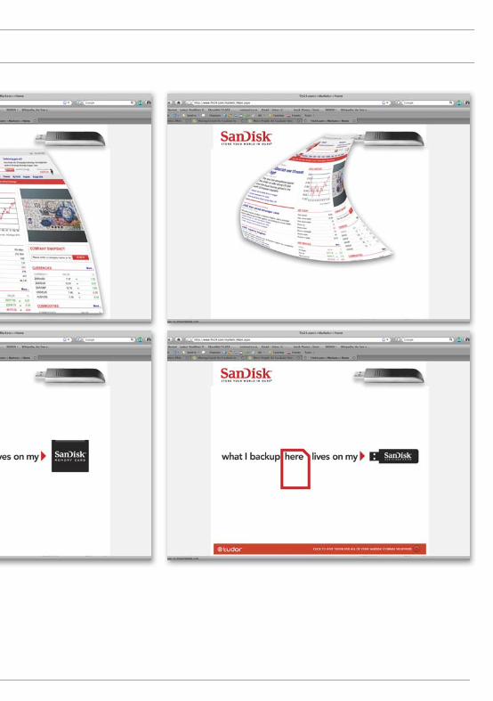
activation* STORE YOUR WORLD IN OURS
An ever-growing segment of society relies on technology every day. SanDisk empow-ers consumers to make the most of their ideas and potential by providing products and information that are truly useful. The company ethos is rooted in the knowledge that consumers trust the brand with their information, memories and ideas. As such, they constantly strive to improve their prod-uct and challenge their competition.


activation* STORE YOUR WORLD IN OURS

Ambient Airport Conveyor BeltsIn the baggage collection of major airports actual luggage is interspersed with
massive props made to resemble digital folders. Where the baggage exits to re-circulate the exit is branded to look like a SanDisk USB fl ash drive.

Ambient sign. In order to make this concept work it would be necessary to partner with large corporate companies in selected South African cities’ CBDs, such as ABSA and the CTICC in Cape Town. The targeted companies should ideally have large buildings that dominate the city skyline and, as such, function as landmarks. Giant UBS fl ash drives are to be ‘plugged into’ the building and bear the SanDisk logo as well as the payoff line
activation* STORE YOUR WORLD IN OURS

Print advertisement. Ads will be placed between the stock pages of prominent daily newspapers such as the Cape Times and Die Burger, and made to look like a page of stock results that is being ‘sucked into’ a SanDisk USB fl ash drive in the bottom right hand corner of the page – bringing to life the payoff line of ‘store your world in ours’. This concept could be adapted for use across various publications.
TV and Web Banners. A SanDisk USB fl ash drive appears in the bottom right hand corner of the tele-vision screen while the news is on. The headlines and economic indicators which cross the bottom of the screen all disappear into the fl ash drive.

Tactical Bookmarks
Web BannerThe SanDisk USB fl ash drive is included in a web banner on a given site. A few seconds after a given page on the site is opened the content on the page is ‘sucked into’ the fl ash drive and replaced with a headline that reads ‘what I back up here lives on my SanDisk’.
activation* STORE YOUR WORLD IN OURS

Modern navigation for the urban explorerMio as a company wanted to position itself as a satellite navigation brand that cuts through the superfl uous tech speak to bring the consumer a fun, user-friendly product that is easy and, most importantly, fun to use and encourages exploration.
Only 35km this way
MioMoov s500
OutdoorBillboards. Billboards are to be positioned on bridges above high traffi c areas and busy intersections, such as the Milnerton turnoff , where traffi c is known to come to a standstill. These billboards would either display thought bubbles that show a variety of places where drivers would rather be, or specifi c images (such as a serene West Coast vista) with its particular coordinates and a payoff line like ‘Only 35km this way’.
EXPLORE MOREactivation*

AmbientAmbient elements. Signposts pointing to famous landmarks and visitors’ attractions will be placed in malls, shopping centers and other locations that experience large volumes of foot traffi c. The exact coordinates of its location of the destination will appear alongside, the reasoning being that you could fi nd your way there without eff ort if you owned a Mio.

Try these
33 25’ 12”
22 12’ 26”
Find
childhoodPoint of SaleShop stoppers that show how easy it is to use a Mio GPS will be placed on shelves to trigger consumer interest.
Till wobbler that show coordinates to popular visitors’ attractions alongside the words ‘Try these’ will be used to entice shoppers to explore unknown places.
Ambient/PosBig spots will be stuck on the fl oor of malls and other venues that house Mio outlets, within close proximity of the stockist. It will simply read ‘You are here’ and lead the inquisitive consumers to the desired point of sale by means of a dotted line, thereby creating a giant ‘map’ for shoppers.
EXPLORE MOREactivation*
My Mio PlaceMy Mio PlaceMy Mio PlacePlaceMMMMMMMyMyMyMy Mio PMM laMy Mio Place
My Mio Place
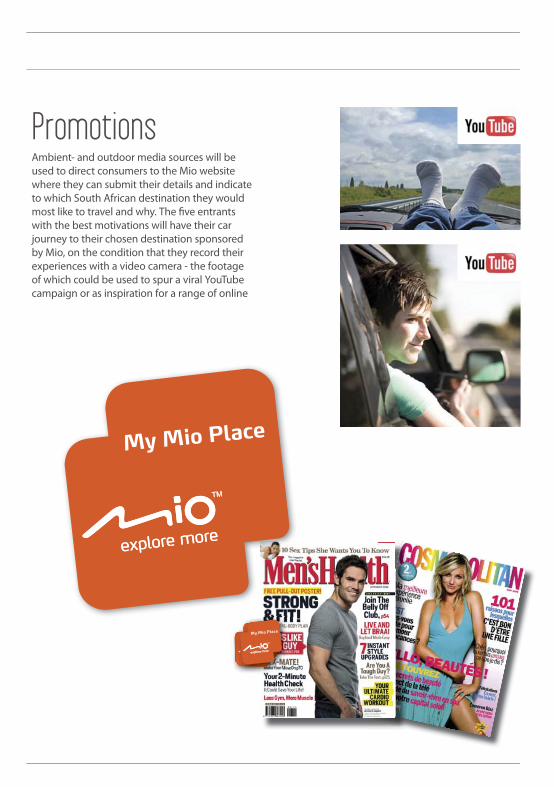
PromotionsAmbient- and outdoor media sources will be used to direct consumers to the Mio website where they can submit their details and indicate to which South African destination they would most like to travel and why. The fi ve entrants with the best motivations will have their car journey to their chosen destination sponsored by Mio, on the condition that they record their experiences with a video camera - the footage of which could be used to spur a viral YouTube campaign or as inspiration for a range of online
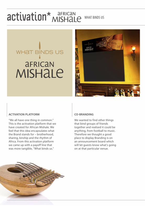
WHAT BINDS USactivation*
CO-BRANDING
We wanted to find other things that bind groups of friends together and realised it could be anything, from football to music. Therefore we thought a good place to display Branding is on an announcement board which will let guests know what’s going on at that particular venue.
ACTIVATION PLATFORM
“We all have one thing in common.” This is the activation platform that we have created for African Mishale. We feel that this idea encapsulates what the Brand stands for – brotherhood, sharing, kinship and the rhythm of Africa. From this activation platform we came up with a payoff line that was more tangible, “What binds us.”

Wind Up Ritual
Everyone has a glass of African Mishale in front of them. Each person holds their glass and moves it to the left then right, then left and right again. On the third movement everyone passes their glass
to the person on their left and receives a new glass on their right. This movement happens again and again, until someone makes a mistake, this
person sits out. The game continues until only one person is left, this person wins the title of chief.
You probably think
you don’t know any Swahili,
but in fact you do. Hakuna Matata means
“There are no worries” in Swahili.
In Swahili the word safari means “journey”.
again, until someone make continues until only one person
wins the title of chief.
The Swahili language is decorated with many idioms and puns. This one can be the
motto of your tribe.
“Umoja ni nguvu”
It means “Unity is strength.”
Mishale, pronounced “mi-sha-lay”, is Swahili for “spear”
them. Eachright, then left
sses their glass their right. This kes a mistake this
You probably
you don’t
b t i f t
in front of o the left then
ent everyone paseives a new glass on
gain until someone mak
but in fact
In
A FUSIO
N OF T
RADI
TION
AL B
RAN
DY A
ND
CO
NTE
MPO
RARY
AFR
ICAN FL
AIR A FUSION OF TRADITIONAL B
RANDY AN
D CO
NTEM
PORARY AFRICAN FLAIR
ON CONSUMPTION COASTER
Coasters will be used to convey African Mishale drinks. We could for instance create a brandy cocktail and give it an African name. This could prompt a new way to drink brandy, but African Mishale will own the mix – think what Jagerbombs have done for Jagermeister.
GIVE AWAYS
A simple ‘leather’ bracelet will come with instructions. To receive the beads for the bracelet the consumer must go to an on consumption promotion. They will receive a bead with every African Mishale they purchase.

PRODUCT &PRICE POSTER
WHAT BINDS USactivation*
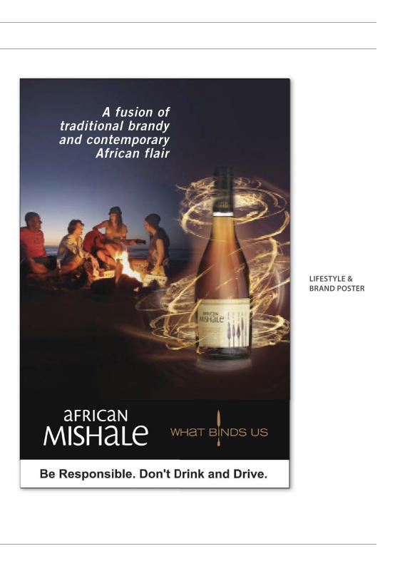
LIFESTYLE &BRAND POSTER
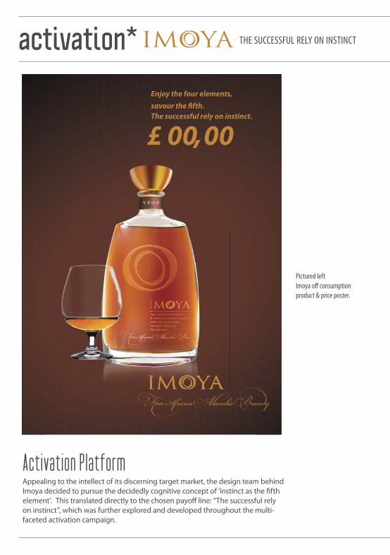
£ 00,00The successful rely on instinct.
Enjoy the four elements, savour the fi fth.
Activation PlatformAppealing to the intellect of its discerning target market, the design team behind Imoya decided to pursue the decidedly cognitive concept of ‘instinct as the fi fth element’. This translated directly to the chosen payoff line: “The successful rely on instinct”, which was further explored and developed throughout the multi-faceted activation campaign.
Pictured leftImoya off consumption product & price poster.
THE SUCCESSFUL RELY ON INSTINCTactivation*
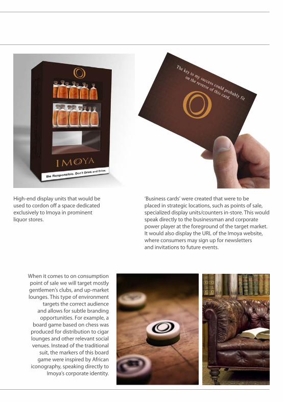
‘Business cards’ were created that were to be placed in strategic locations, such as points of sale, specialized display units/counters in-store. This would speak directly to the businessman and corporate power player at the foreground of the target market. It would also display the URL of the Imoya website, where consumers may sign up for newsletters and invitations to future events.
When it comes to on consumption point of sale we will target mostly gentlemen’s clubs, and up-market lounges. This type of environment
targets the correct audience and allows for subtle branding
opportunities. For example, a board game based on chess was
produced for distribution to cigar lounges and other relevant social venues. Instead of the traditional
suit, the markers of this board game were inspired by African
iconography, speaking directly to Imoya’s corporate identity.
High-end display units that would be used to cordon off a space dedicated exclusively to Imoya in prominent liquor stores.

THE SUCCESSFUL RELY ON INSTINCTactivation*

On Consumption Imoya Coffee Table BookA brand book was to be created in the format of a coff ee table publication, showcasing South African- and African photography and writing in fi ve chapters dedicated to earth, air, fi re, water and instinct respectively. These were to be placed on bar counters and lounge tables at selected venues, as well as being sold at the KWV House of Brandy.


Creating a logo from scratch allows the designer to explore the very depth and
breadth of their conceptual creativity. This has always been a personal favourite
of mine. Establishing the basic DNA of a brand in terms of look and feel, and in essence providing the distillate thereof,
provides a design challenge like no other.
KHOISAN TEA //08
GEMINI INFLATABLES AND G2 DEVICE//07
FAT BARREL WINE IMPORT COMPANY//07

BIKE BOOKINGS ADVENTURE EVENT & TRAINING PORTAL//09
OPTIMAL ENERGY//08
DE ROUW EXPORT BRANDY//09
JOULE ELECTRIC VEHICLE // 08
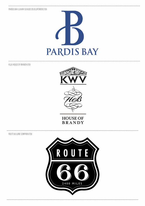
PARDIS BAY LUXARY SEASIDE DEVELOPEMENT//09
KWV HOUSE OF BRANDY//09
ROUTE 66 WINE COMPANY//08
SHAP’S CAMERALAND PHOTOGRAPHY STORE//08
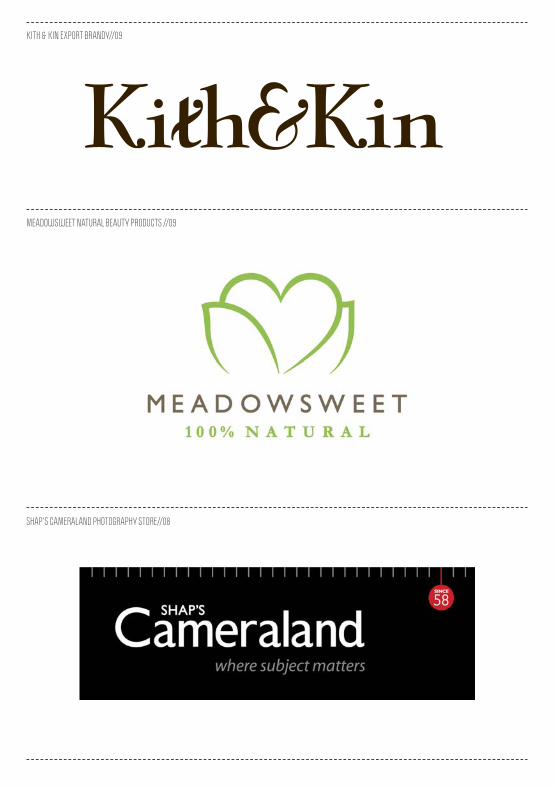
MEADOWSWEET NATURAL BEAUTY PRODUCTS //09
KITH & KIN EXPORT BRANDY//09
contributors Haumann Smal Design Studio Edduard Hauman (creative director) Jhon Smit (creative director) Linda Smal (creative director)
Arctic Circle Strategic Brand Agency Tyrone Beck (creative director) Michele Brink (creative director) Giles Lord (studio head) Andre le Roux (strategic director) Terri-Anne Lategan (copy writing) All content in this magazine written by Anna Bet Bester and Andries van Jaarsveld All rendering, visualisations and design by Andries van Jaarsveld
EXCEPT: Joule “Pack” Shots: Retouching, Jean Paul @ still Photography JAN VERBOOM @ Roodebloem studios Joule and Zugato stand fi nal renderings Michel Brink (Arctic Circle) Joule/Optimal Energy interior design Giulia Odendal Leg Studios Optimal Energy fi nal Ci render Michel Brink (Arctic Circle) Barney Barnato Final logotype by Jhon Smit ( Haumann Smal Design Studio ) KWV Imoya Render Jean Paul @ still Magna Carta fi nal render Michel Brink (Arctic Circle) Khoisan Tea Full Range rendering by Marco Desusa (Arctic Circle) Kwv African Mishale Retouching Jean Paul @ Still

Hi my name is Andries Van Jaarsveld, I am a graphic designer/ art director working in Cape Town South Africa.This “publication” is a collection of my work done between 2006 till 2010.
Feel Free to contact me [email protected]
DISCLAIMERAll the design work in this publication is not necessarily the client, agency or design studio’s approved version(s), the work rather refl ects my personal taste, opinion and/or preferred concept level.
me
Related Documents