My piece of A2 constructed ancillary 1 conforms to the conventions of genre theorists Chandler and Neale. Whilst using theorist Lacey’s “repertoire of elements” which can be broken down into 5 areas: setting, character, narrative, iconography and style. My work conforms to Chandlers conventions of content through the technical and audio codes and the design and layout. An example of this is the use of black and white photography which brings out the complex tones of the image and subject. This is a convention to the genre content because the main focus is not on a character; it’s more about the eye catching abstract photography. The type face I used, for both the back and front of the CD digi pack, is also a convention of the genre as its alternative rock/Indi the type face is simple, bold and clear. I found in my research that this bold type face is found more in my genre than typefaces such as: In terms of the mise en scene of the CD, the main focus is on the surreal subject not the location the picture has been taken, which is unknown. This is a convention of the genre as the quirky subject is the main focus not a conventional band or artist for genres such as pop. One of Neale’s theories is about instances of repetition and difference in genre, which I have applied to ancillary for the CD digi pack. I have done this through the subject of my cover which could be regarded as the “character” from Lacey’s theory of repertoire of elements. Similar to other work I’ve analysed there is a connection made between the audience and the artwork on CD’s which is created mostly by the eye contact of the character in the

Welcome message from author
This document is posted to help you gain knowledge. Please leave a comment to let me know what you think about it! Share it to your friends and learn new things together.
Transcript
My piece of A2 constructed ancillary 1 conforms to the conventions of genre theorists Chandler and Neale. Whilst using theorist Lacey’s “repertoire of elements” which can be broken down into 5 areas: setting, character, narrative, iconography and style.
My work conforms to Chandlers conventions of content through the technical and audio codes and the design and layout. An example of this is the use of black and white photography which brings out the complex tones of the image and subject. This is a convention to the genre content because the main focus is not on a character; it’s more about the eye catching abstract photography. The type face I used, for both the back and front of the CD digi pack, is also a convention of the genre as its alternative rock/Indi the type face is simple, bold and clear. I found in my research that this bold type face is found more in my genre than typefaces such as:
In terms of the mise en scene of the CD, the main focus is on the surreal subject not the location the picture has been taken, which is unknown. This is a convention of the genre as the quirky subject is the main focus not a conventional band or artist for genres such as pop.
One of Neale’s theories is about instances of repetition and difference in genre, which I have applied to ancillary for the CD digi pack. I have done this through the subject of my cover which could be regarded as the “character” from Lacey’s theory of repertoire of elements. Similar to other work I’ve analysed there is a connection made between the audience and the artwork on CD’s which is created mostly by the eye contact of the character in the picture. However in my work I don’t have a conventional character therefore the attention of my audience has been captured and drawn in by the abstract photography which the audience question what they are looking at. Some examples of how to draw in the audience’s attention:
How I have tried to replicate this in my own work:
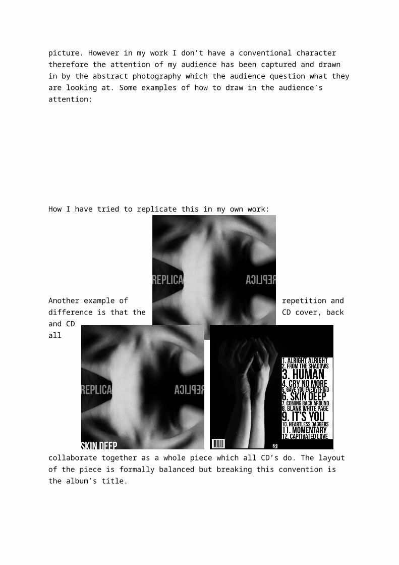
Another example of repetition and difference is that the CD cover, back and CD all collaborate together as a whole piece which all CD’s do. The layout of the piece is formally balanced but breaking this convention is the album’s title.
I have also applied Neale’s theory of mental machinery to my work as I have recognised what my audience want and produced my work to fit this predisposed idea the alternative rock/Indi audience have. Design conventions include: the bold type face, simple layout and the unconventional surreal imagery, these all are directed at my target audience and would appeal to them. My genre doesn’t have a generic character as other genre’s CD’s may have. Therefore my subject on the cover is more open to interpretation of what it is and for future posters or adverts they will recognise the imagery just as people would recognise a band or artist.
Related Documents