Analysis of professional magazine cover

Welcome message from author
This document is posted to help you gain knowledge. Please leave a comment to let me know what you think about it! Share it to your friends and learn new things together.
Transcript

Analysis of professional magazine cover

Masthead• The magazine ‘Classic Rock’ masthead is covered up by the
heads of those in the main image, this suggests that the magazine is popular and well-known and can be covered up because of this. It is also the biggest text on the magazine and has its own font, this helps it to standout and become a well-known magazine because of this. This masthead is also at the top of the magazine and stretches all the way along the page, this again helps it to stand out as there is a lot of other text that can be distracting on the page, thus the size helps it to be easily seen, also it is at the top so there is room for the main image and sub headings to fit around the magazine also.

Main image• The main image is of three well-known celebrities, two
singers Joe Perry and Alice Cooper, and actor Johnny Depp. Many people know of these artists, and have many fans therefore this will attract a wider audience as they are all known for different work, especially Johnny Depp as he is an actor, not known for singing. A long shot is used to see the whole group and fit them all in. They all use direct address also, this could be to establish a relationship with the reader through the people on the main image, and then they will buy the magazine.

Sub lines and cover lines• Their are sub lines and cover lines on both the far left side
and right side of the magazine, they reveal information of what will be found in the magazine but not too much. Also, they have names of other artists, therefore if the artists on the main cover line do not appeal to someone, the other artists may do.

Barcode, date, price and website• They are in the bottom right corner of the magazine, so that
it can be visibly noticed and leave enough room for the rest of the more important front cover features.

Puff• This puff is there to emphasise something important in the
magazine and make it stand out to the other things on the magazine, on this magazine it is about a drinking club.

Name of artists• On this magazine it is the biggest writing on the page and
has its own font to stand out. This magazine has ‘Hollywood Vampires’ as the name of the group, however it also has next to the celebrities faces their names, as they are less recognisable as their group name, for example ‘Johnny Depp’. This allows the audience to be more appealed to the magazine as if they did not realise who was in the magazine they now can, as their names are there.

Colour scheme• The magazine has a simple colour scheme of four colours,
pink, black, white and grey. These colours do not clash, therefore this is a good colour scheme and is appealing to look at, but it is also eye-catching by adding the pink in there. These colours could have also been used so that it is gender neutral, as pink is stereotypically a girls colour, black is more masculine, whereas grey and white can be well-liked by both genders, therefore attracting both genders.

Main cover line and sub line• The main cover line is ‘Hollywood Vampires’ and the sub
line is ‘The unlikeliest, starriest, soberest super group ever!’, this entices the audience to read on by using a catchy sub line, that has some humour in it, because the audience will know of the celebrities personal life already, so get the joke.
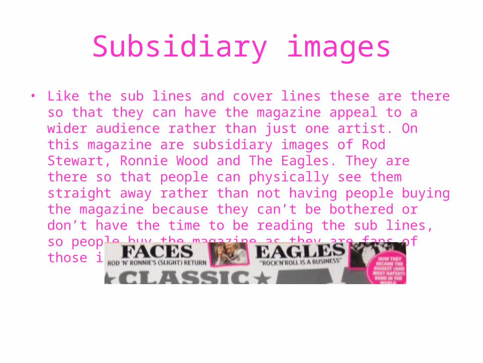
Subsidiary images• Like the sub lines and cover lines these are there so that
they can have the magazine appeal to a wider audience rather than just one artist. On this magazine are subsidiary images of Rod Stewart, Ronnie Wood and The Eagles. They are there so that people can physically see them straight away rather than not having people buying the magazine because they can’t be bothered or don’t have the time to be reading the sub lines, so people buy the magazine as they are fans of those in the subsidiary images.

Strap line• This is a subsidiary heading or caption on the magazine, on
this magazines strap line has a puff reading “Free CD!” and also has subsidiary images on. These are their to help sell magazine, as the free CD might have artists on the audience may like, therefore buy the magazine to listen to the free music provided and then find it worthwhile to pay so much for the magazine.
Related Documents