Q magazine:

Welcome message from author
This document is posted to help you gain knowledge. Please leave a comment to let me know what you think about it! Share it to your friends and learn new things together.
Transcript
Q magazine:
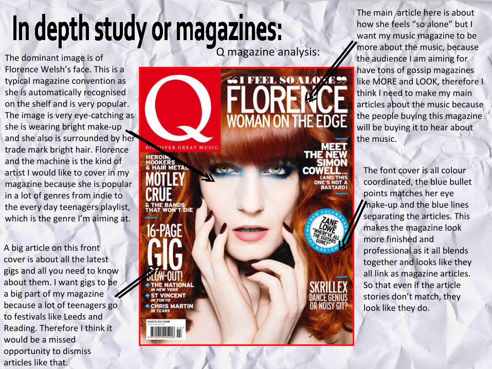
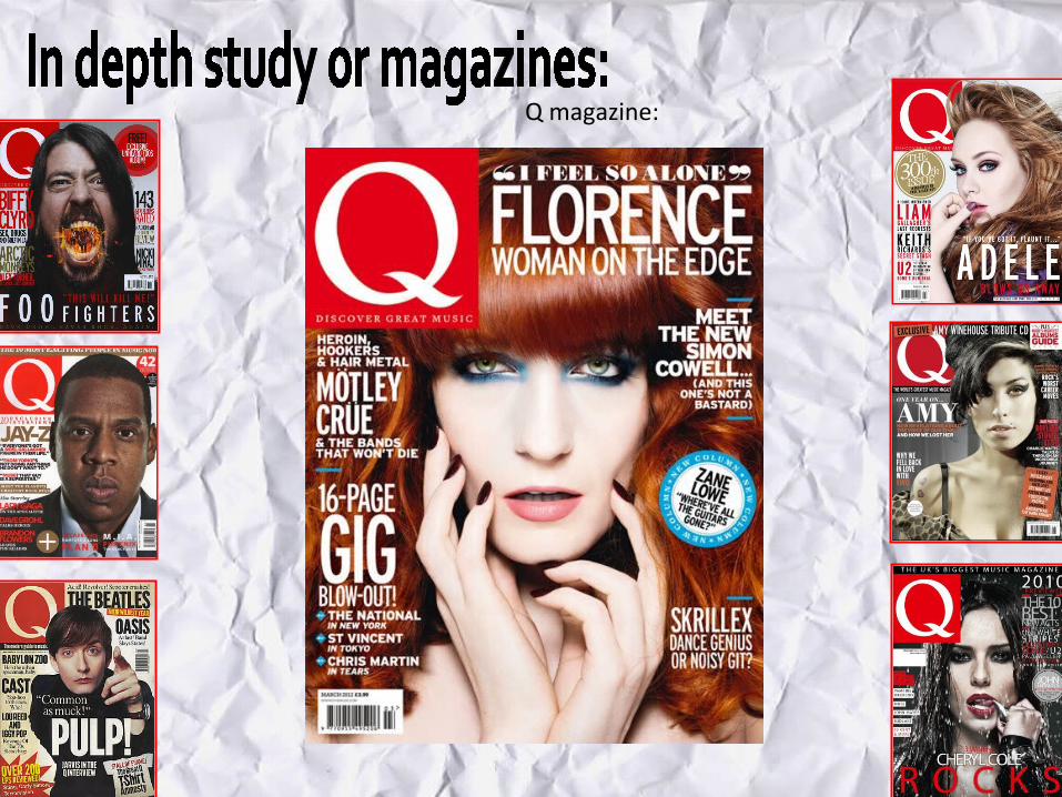
Q magazine analysis:The dominant image is of Florence Welsh’s face. This is a typical magazine convention as she is automatically recognised on the shelf and is very popular. The image is very eye-catching as she is wearing bright make-up and she also is surrounded by her trade mark bright hair. Florence and the machine is the kind of artist I would like to cover in my magazine because she is popular in a lot of genres from indie to the every day teenagers playlist, which is the genre I’m aiming at.
The main article here is about how she feels “so alone” but I want my music magazine to be more about the music, because the audience I am aiming for have tons of gossip magazines like MORE and LOOK, therefore I think I need to make my main articles about the music because the people buying this magazine will be buying it to hear about the music.
The font cover is all colour coordinated, the blue bullet points matches her eye make-up and the blue lines separating the articles. This makes the magazine look more finished and professional as it all blends together and looks like they all link as magazine articles. So that even if the article stories don’t match, they look like they do.
A big article on this front cover is about all the latest gigs and all you need to know about them. I want gigs to be a big part of my magazine because a lot of teenagers go to festivals like Leeds and Reading. Therefore I think it would be a missed opportunity to dismiss articles like that.
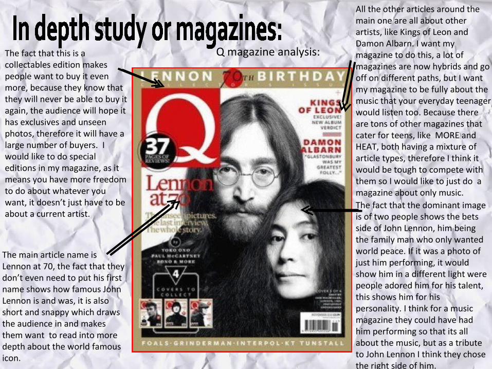
Q magazine analysis:The fact that this is a collectables edition makes people want to buy it even more, because they know that they will never be able to buy it again, the audience will hope it has exclusives and unseen photos, therefore it will have a large number of buyers. I would like to do special editions in my magazine, as it means you have more freedom to do about whatever you want, it doesn’t just have to be about a current artist.
The main article name is Lennon at 70, the fact that they don’t even need to put his first name shows how famous John Lennon is and was, it is also short and snappy which draws the audience in and makes them want to read into more depth about the world famous icon.
All the other articles around the main one are all about other artists, like Kings of Leon and Damon Albarn. I want my magazine to do this, a lot of magazines are now hybrids and go off on different paths, but I want my magazine to be fully about the music that your everyday teenager would listen too. Because there are tons of other magazines that cater for teens, like MORE and HEAT, both having a mixture of article types, therefore I think it would be tough to compete with them so I would like to just do a magazine about only music.The fact that the dominant image is of two people shows the bets side of John Lennon, him being the family man who only wanted world peace. If it was a photo of just him performing, it would show him in a different light were people adored him for his talent, this shows him for his personality. I think for a music magazine they could have had him performing so that its all about the music, but as a tribute to John Lennon I think they chose the right side of him.
Top of the Pops magazine analysis:
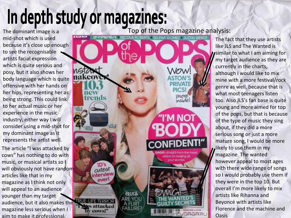
Top of the Pops magazine analysis:The dominant image is a mid-shot which is used because it’s close up enough to see the recognisable artists facial expression which is quite serious and posy, but it also shows her body language which is quite offensive with her hands on her hips, representing her as being strong. This could link to her actual music or her experience in the music industry, either way I will consider using a mid-shot for my dominant image as it represents the artist well.
The article “I was attacked by cows” has nothing to do with music, or musical artists so I will obviously not have random articles like that in my magazine as I think not only will appeal to an audience younger than my target audience, but it also makes the magazine less serious when I aim to make it professional.
The fact that they use artists like JLS and The Wanted is similar to what I am aiming for my target audience as they are currently in the charts, although I would like to mix mine with a more festival/rock genre as well, because that is what most teenagers listen too. Also JLS’s fan base is quite young and more aimed for top of the pops, but that is because of the type of music they sing about, if they did a more serious song or just a more mature song, I would be more likely to use them in my magazine. The wanted however appeal to most ages with there wide range of songs so I would probably use them if they were in the top 10. But overall I’m more likely to mix artists like Rihanna and Beyoncé with artists like Florence and the machine and Oasis
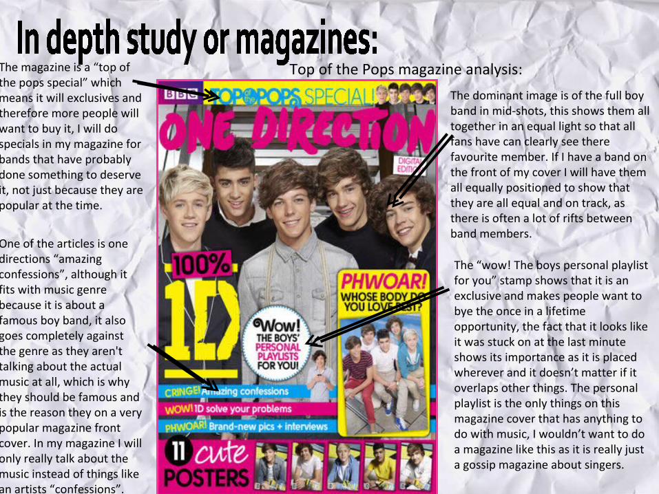
Top of the Pops magazine analysis:The magazine is a “top of the pops special” which means it will exclusives and therefore more people will want to buy it, I will do specials in my magazine for bands that have probably done something to deserve it, not just because they are popular at the time.
One of the articles is one directions “amazing confessions”, although it fits with music genre because it is about a famous boy band, it also goes completely against the genre as they aren't talking about the actual music at all, which is why they should be famous and is the reason they on a very popular magazine front cover. In my magazine I will only really talk about the music instead of things like an artists “confessions”.
The dominant image is of the full boy band in mid-shots, this shows them all together in an equal light so that all fans have can clearly see there favourite member. If I have a band on the front of my cover I will have them all equally positioned to show that they are all equal and on track, as there is often a lot of rifts between band members.
The “wow! The boys personal playlist for you” stamp shows that it is an exclusive and makes people want to bye the once in a lifetime opportunity, the fact that it looks like it was stuck on at the last minute shows its importance as it is placed wherever and it doesn’t matter if it overlaps other things. The personal playlist is the only things on this magazine cover that has anything to do with music, I wouldn’t want to do a magazine like this as it is really just a gossip magazine about singers.
Related Documents