Kerrang!

Analyse of two front covers
Jul 14, 2015
Welcome message from author
This document is posted to help you gain knowledge. Please leave a comment to let me know what you think about it! Share it to your friends and learn new things together.
Transcript
Kerrang!

Introduction To Kerrang! Magazine.
• Kerrang! Magazine is published by Bauer MediaGroup
• First published on the 6th June 1981.• UK based magazine - Mainstream• Devoted to rock music.• It’s target audience is around the ages of 15-24 and
the median age is 19 years.

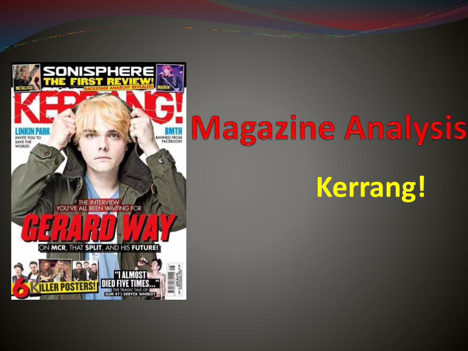
The masthead is bold, a strong bright colour and is at the top of the cover which means it can be seen clearly amongst other magazines. Due to the strong bright colour of the masthead, the magazine will attract the right audience. The masthead looks like it has been cracked. This connotes that the music genre the magazine is based on is loud and carefree which tells the reader what is included in the magazine. The ‘!’mark at the end of Kerrang! also connotes that the magazine is loud and action packed.

The coverlines are spread out evenly on the cover. Two of the coverlines are either side of the central image. This will attract the readers eyes to the coverlinesbecause the central image is the main aspect of the cover. Also above the masthead there isanother coverline, but in capitals with images. This suggests that this article is something the target audience must read. One of the coverlines is a quotation taken from one of the articles. “I almost died five times...” would make readers buy the magazine to find out more. These coverlines put forward that the magazine contains interesting and must read articles, reviews and interviews.

There is a free giveaway which is ‘6 killer posters’. They have really emphasised the 6 so it stands out. In addition to this they have put the word ‘killer’ which connotes that the posters are cool and awesome which might give a reader another reason to buy the magazine. The colours that are used also fit into the house style of the magazine (yellow and red).
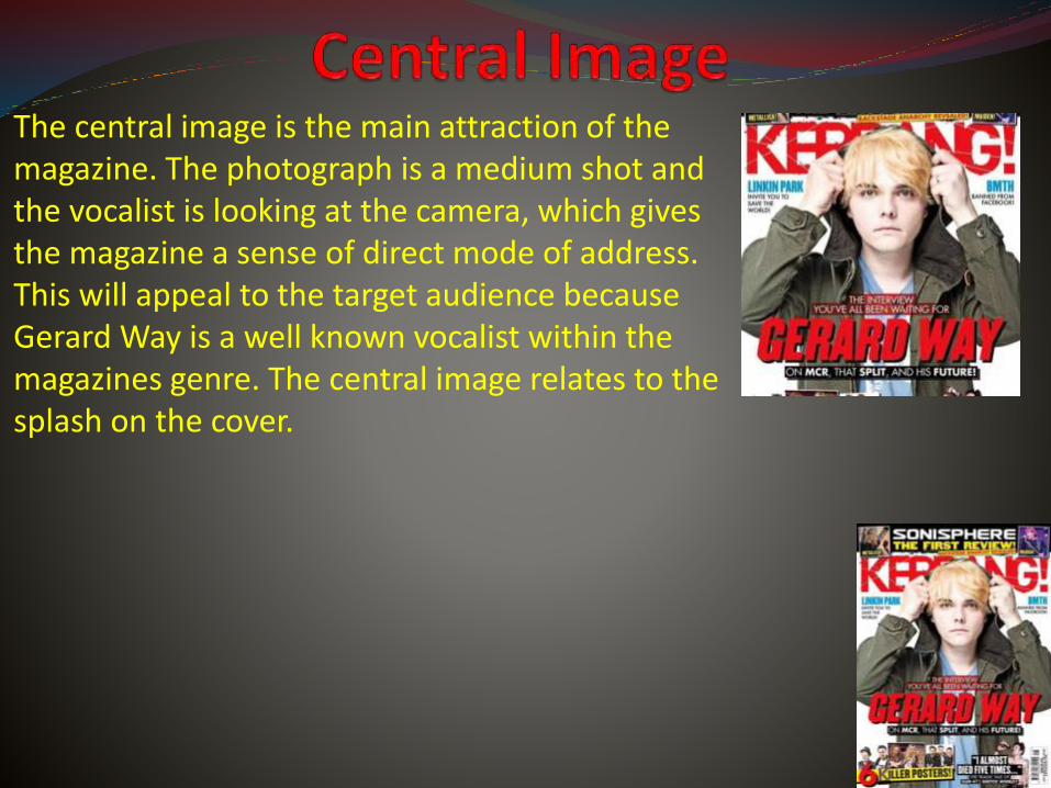
The central image is the main attraction of the magazine. The photograph is a medium shot andthe vocalist is looking at the camera, which givesthe magazine a sense of direct mode of address. This will appeal to the target audience because Gerard Way is a well known vocalist within the magazines genre. The central image relates to the splash on the cover.

The house style palette colours of Kerrang! magazine are yellow, red, black and white. They use these colours throughout the magazine and on every issue. This gives the magazine brand identity. However, small parts of the housestylechange on each issue depending on what the central image is. Most of the text is bold and ‘all in your face’.

Rock Sound

• Rock Sound is a British magazine that is based on rock music.• Concentrates on the pop, punk, pop-punk, emo, hardcore, post-hardcore, heavy metal and extreme areas of rock music.• The magazine is also sold in Australia, Canada and the United States. • Originally published by French publishing company ‘Editions Freeway’. However, in 2004, the director Patrick Napier brought the magazine.

The Rock Sound masthead is similar to Kerrang!’s masthead. Like Kerrang!, the masthead is bold, positioned at the top of the cover and is a bright colour. The name of the magazine itself connotes that the magazine covers rock music. The masthead is a little bit more sophisticated compared to Kerrang! which suggests that Rock Sound magazine aims for a slightly older audience.

The coverlines are evenly spreadout on the magazine cover. The coverlines don’t give much away about what the articles contain. The coverlines are usually just the name of the band that the article is about. Which would attract the right audience to the magazine if they are a fan of a certain band that the magazine say that’s inside. The main article included in the magazine is the biggest and boldest. This suggests that the article is a must read for fans, and would attract them to the magazine.

There is a free giveaway within each Rock Sound issue. In this issue there are free ‘Mega Posters’. Using the word ‘Mega’ connotes that these posters are exciting and a ‘must have’. The magazine also includes a free CD with ‘13 Killer Tracks’. Using the word ‘Killer’ also connote that the songs are going to be amazing, big and loud. Including these free giveaways will encourage the target audience to purchase the magazine.

The central image is the background of the cover with the coverlines and masthead working around it. The central image is of Pierce The Veil who are a well known band within the magazines music genre and are the main aspect of the issue. The photo isn’t formal which presents youth and fun which would relate to the target audience.

The housestye palette colours for Rock Sound are usually red and yellow. However, the colours sometimes do change depending on the central image. The fonts are all similar and aren’t messy which gives the magazine a sense of maturity. The masthead is always in the same place. All of these give Rock Sound a sense of identity, even though the colour scheme isn’t always the same.
Related Documents


