Copyright By Mark Lindsey Van Stone 2005

Welcome message from author
This document is posted to help you gain knowledge. Please leave a comment to let me know what you think about it! Share it to your friends and learn new things together.
Transcript
Copyright By
Mark Lindsey Van Stone 2005
The Dissertation Committee for Mark Lindsey Van Stone certifies that this is the approved version of the following dissertation:
Aj-Ts’ib, Aj-Uxul, Itz’aat, & Aj-K’uhu’n: Classic Maya Schools of
Carvers and Calligraphers in Palenque After the Reign of Kan-Bahlam
Committee: ____________________________ Brian Stross, Supervisor ____________________________ David Stuart ____________________________ F. Kent Reilly, III ____________________________ Julia Guernsey ____________________________ Steve Bourget

AjAjAjAj----Ts’ibTs’ibTs’ibTs’ib, , , , AjAjAjAj----UxulUxulUxulUxul, , , , Itz’aatItz’aatItz’aatItz’aat, & , & , & , & AjAjAjAj----K’uhu’nK’uhu’nK’uhu’nK’uhu’n: Classic Maya Schools of Carvers and : Classic Maya Schools of Carvers and : Classic Maya Schools of Carvers and : Classic Maya Schools of Carvers and
Calligraphers in Palenque After the Reign of KanCalligraphers in Palenque After the Reign of KanCalligraphers in Palenque After the Reign of KanCalligraphers in Palenque After the Reign of Kan----BahlamBahlamBahlamBahlam
by
Mark Lindsey Van Stone, B. A., M. A.
DissertationDissertationDissertationDissertation
Presented to the Faculty of the Graduate School of
the University of Texas at Austin
in partial fulfillment
of the Requirements
for the degree of
Doctor of Philosophy
The University of Texas at Austin
December 2005
To Mom and Dad, who have always been proud of me.
v
AjAjAjAj----Ts’ibTs’ibTs’ibTs’ib, , , , AjAjAjAj----UxulUxulUxulUxul, , , , Itz’aatItz’aatItz’aatItz’aat, & , & , & , & AjAjAjAj----K’uhu’nK’uhu’nK’uhu’nK’uhu’n: Classic Maya Schools of Carvers and : Classic Maya Schools of Carvers and : Classic Maya Schools of Carvers and : Classic Maya Schools of Carvers and
Calligraphers in Palenque After the Reign of KanCalligraphers in Palenque After the Reign of KanCalligraphers in Palenque After the Reign of KanCalligraphers in Palenque After the Reign of Kan----BahlamBahlamBahlamBahlam
Publication No. ________
Mark Lindsey Van Stone, Ph. D.
The University of Texas at Austin, 2005
Supervisor: Brian Stross
Ancient Maya inscription carvers at the city of Palenque in what is now Chiapas, Mexico
worked in teams to complete large and complex stone tablets. Like artists everywhere, they each
had developed idiosyncratic habits which the modern connoisseur can learn to discern, in order to
identify which parts of a particular monument were sculpted by one or another artist. The author
scrutinized several eighth-century CE inscriptions, panels in stucco and limestone, analyzing how
many artists worked on each, to wit: the Temple XVIII Stuccos, the Temple XIX Platform, the
Temple XIX Stuccos, the Temple XIX Panel, the Panel of the 96 Glyphs, the Lápida de la Creación
and associated fragments, the Palace Tablet and its associated fragmentary panels, and the Tablet
of the Slaves. The ensemble whose main components are the Panel of the 96 Glyphs and the
Lápida de la Creación are all by one hand, and the Tablet of the Slaves was the work of four
carvers, but the Temple XIX Platform surprisingly employed fourteen carvers, and the Palace
Tablet over a score. Their territories were not divided textually, and display idiosyncratic
spellings of glyph compounds as well as carving habits. The conclusion discusses possible
reasons for these findings, relating them to the unusual Maya practice of never correcting mistakes
in monumental inscriptions. A likely reason seems to be that the ancient Maya considered these

vi
texts not merely as a permanent record, but as ongoing, living repetitions of the ritual in question,
and had to be completed in a very short time.
vii
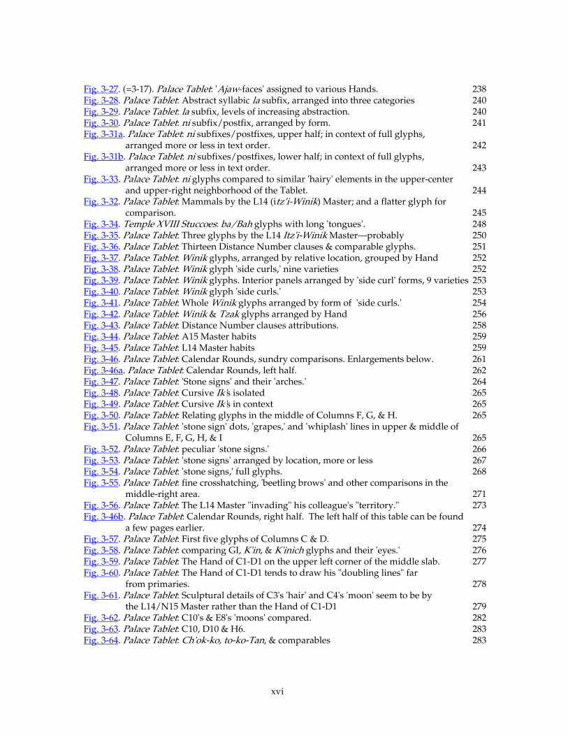
Table of ContentsTable of ContentsTable of ContentsTable of Contents List of Figures x Introduction & Chapter 1Introduction & Chapter 1Introduction & Chapter 1Introduction & Chapter 1 1 0.1. Introduction 1 0.2. Acknowledgements 5 0.3. Author’s note on punctuation and other conventions 6 1.1. The Idea: Temple XVIII Stucco Glyphs 11 1.2. Temple XIX Stuccos 18 1.3. Stone Inscription Sculptors 25 1.4. Temple XIX Platform 38 1.5. Comparisons with other inscription-carving traditions 60 1.6. Temple XIX Limestone Panel 74 1.7. The Palace North Gallery Tablets 81 1.7.1. Overview: The Palace Tablet and its cohorts 81 1.7.2. The Artists of the North Gallery Panels 83 1.7.3. Artists who got around 86 1.7.4. Further comparisons 89 1.7.5. Finally, the Palace Tablet 93 1.7.6. A clear initial example 93 1.7.7. Comparing Initial Series full-figure coefficients 94 1.7.8. Comparing Ajaw superfixes 94 1.7.9. Comparing phonetic spellings of Janab Pakal 96 1.7.10. Comparing ‘dark spots’ and ears 97 1.7.11. So why the big crowds? 100
Chapter 2Chapter 2Chapter 2Chapter 2 — Criteria for Distinguishing Maya Artists' Hands 102 2.1 Scope of this Inquiry 102 2.2. Background of Connoisseurship 103 2.2.1. Morelli, Oriental Experts, Beazley 103 2.2.2. Layout-Artists & Sculptors in an Egyptian Tomb 104 2.2.3. Hellenistic Inscriptions & European Medieval Manuscripts 106 2.3. Connoisseurship Applied to Maya Script 109 2.3.1. Zimmermann & the Dresden Codex 109 2.3.2. Styles and Materials Peculiar to Locales 110 2.3.3. A Tentative Morellian Approach; Hints of a ‘Style Manual’ 111 2.4. Maya Writing Technique and its Relevance to Form 121 2.4.1. European Writing Technique 121 2.4.2 Scribal Self-Consciousness and its Expressions: Chinese, Muslim,
and European Examples 123 2.4.3 Maya Scribal Self-Consciousness and its Expressions 126 2.5. Criteria for Distinguishing/Identifying Maya Hands 127 2.5.1. Identifying Distinctive Characteristics of a Maya Artist Despite
Deliberate Variation: Panel of the 96 Glyphs group 127 2.5.2. Tz’ak / DNIG Glyphs on the Palace Tablet by Different Artists: Six Elements
or Aspects of Comparison 135 2.5.2.1. Introductory, "sign form" 135 2.5.2.2. 'Band width' 136
viii
2.5.2.3. Favorite allographs 137 2.5.2.4. Modeling 137 2.5.2.5. 'Swastikas' 137 2.5.2.6. More favorite allographs 138 2.5.2.7. Caveats 138 2.5.3. Two u-Tz’ak-aj Glyphs by the Same Artist… maybe 139 2.5.4. Assumptions About Scribal Methods 141 2.5.5. The Glyphs Carved by One Artist: E15 and Its Neighbors 146 2.5.5.1. Method 146 2.5.5.2. F15, E16, … to the End of the Double Column 148 2.5.5.3. F14, E14, … Upwards to the Next Artist’s Territory 149 2.5.5.4. Different Artist Continues Text at Top of Next Column;
Same Artist Carves Lower Part of This Next Column 152 2.5.6. Another Artist Whose Work Abuts the E15 Hand 155 2.5.6.1. The Hand at H14 and Up 155 2.5.7. General observations on Palenque carving practice 159 2.6. The Full-Figure Initial Series Hand(s) 163 2.6.0. Introduction 163 2.6.1 From the Top 163 2.6.2. The Full-Figure Initial Series Hand(s)' Other Glyphs: Columns C & D 182 2.6.3. Summary of Initial Series Attributions (See also Section 3.07) 182 2.7. The Artists of the Tablet of the Slaves 185 2.7.1 Description and Statistics 185 2.7.2. Carving process 187 2.7.3. Hand 1 188 2.7.4. Hand 4 196 2.7.5. Hands 2 and 3 199 2.7.6. Attribution of Central Panel Glyphs to Hands 2 and 3, and the figures below
to Hands 1, 2, 3, and 4 202 2.7.7. Details of Attributions 205 2.7.7.1. D2 205 2.7.7.2. ya and other 'curls' 206 2.7.7.3. Hand 4 at work on the 'drum major' headdress and
glyphs associated with it. 206 2.7.7.4. Hand 1's image of the Father, Hand 4's Mother. 207 2.7.7.5 Details of Attributions: Hand C's image of Ahkal, 'Slave' 2, etc. 208
2.7.8. Some Problems With my Attributions 209 2.8. Technical Matters 211
2.8.1. The Style Manual for the Tablet of the Slaves 211 2.8.2. The Tablet of the Slaves’ production process 212 Chapter 3Chapter 3Chapter 3Chapter 3 — Commentaries on Tables and Figures comparing similar glyphs,
assembled for the purpose of identifying individual Hands in the Palace Tablet 215 3.1.1. Lunar Series 215
3.1.2. Lunar Series Conclusions 220 3.1.3 Characteristics of the artist of the N16-M17 Lunar Series fragment 225
3.1.4 Surprising result 226 3.1.5 Characteristics of the artist of the R9-R12 Lunar Series fragment 227
3.2. Assign the 30 glyphs with -la or other 'Ajaw faces' 228 3.2.1. Four -la-ta suffixes 229
ix
3.2.1.1. -la-ta suffixes, Hand M6-N6 229 3.2.1.2. -la-ta suffixes, The J14 and M13 Hands 231 3.2.2. Different elements identify different Hands: Return to the 96 Glyphs 233 3.2.3. Hand M6-N6's other 'faces' 236 3.2.4. The other 'Ajaw face' Hands 237 3.2.5. Abstract la's (Fig. 3-28). 239 3.3 -ni suffixes 240 3.4. Some Animal Heads of the L14 Itz'i-Winik Master 244 3.5. Distance Numbers 250 3.5.1 Hand-assignments according to the Winik glyphs 250 3.5.2. Assigning some other DN glyphs, the Tz'ak (or DNIG) glyphs 256 3.5.3. Assigning other DN glyphs 258 3.6. Calendar Rounds, etc. 261 3.6.1. The first three CR's 261 3.6.1.1. Standard 'Stone sign' 263 3.6.1.2. Various evidence grouping various other glyphs: ti's at E6, H9, and I9;
the Ik' glyph (I11, C1 and D9);… 268 3.6.2. K6, M8, N9, and M15: Intrusion of One Hand Into Another's 'Territory 269 3.6.2.1. Agreement 269 3.6.2.2. Conflict 270 3.6.2.3. Abrupt change 272 3.6.2.4. M15-N15 273 3.6.3. A Look Back: C1-D1 and F16-F17 275
3.6.4. Hand C1-D1's 'Territory' 277 3.6.5. The K7 "Fat/Flat" Master 286 3.6.6. Return of the L14 "Itz'i-Winik" Master 290 3.6.7. Hands' Individual Repertoires of Line-Qualities 292 3.7. 'Jawbones' and 'Skulls': … 293 3.7.1. 293 3.7.2 'Skull Headdresses' in The Full-Figure Glyphs 304 3.8. ti's and u's 312 3.9. Nal, Nal + li?, Naab, & related signs 314 3.10. Royal Names, EG's, Mat 'Birds,' 323
3.10.1 Introduction 323 3.10.2. Phonetic spelling of K'inich Janab Pakal 326 3.10.3. Kan-Bahlam's name 329 3.10.4. K'an-Joy-Chitam's name 331 3.10.5. 337 3.11. Workshop practice 337 3.12. Te' 338 Chapter 4.Chapter 4.Chapter 4.Chapter 4. — Summary, Conclusions, etc. — What do we do with this information? 342 4.0. Introductory 342 4.1. We can better estimate/imagine the pool of high-quality artists in Palenque. 343 4.1.1. Production during a golden age 343 4.1.2. Modern carvers in Palenque 346 4.1.3. Why? 347 4.2 We can better estimate the production time of a major inscription. 349 4.2.1. Assumptions 350 4.2.2. How much was actually produced 350
x
4.2.3. Color painted on these reliefs 352 4.3 We can better understand the relationship between the artistic Master
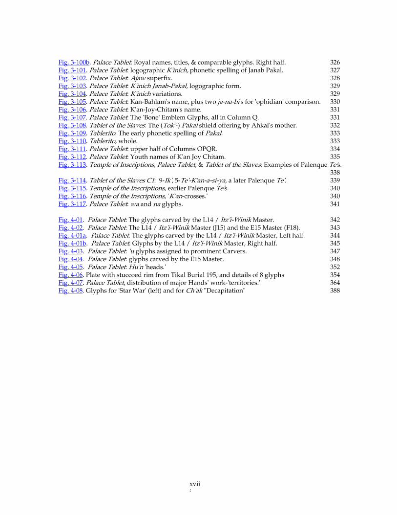
of the project and his Carvers. 355 4.3.1. The Palenque form of the ‘daysing cartouche 355 4.3.2. Artists enjoyed some freedom 358 4.3.3. Individual spelling styles 360 4.4. We can better understand the Carvers' attitude toward their texts. 361 4.4.1. Trying to read minds across gulfs of time and culture 361 4.4.2. The Palace Tablet Carvers 363 4.4.2.1 A closer estimate of the time required 367 4.4.3. Artists’ territories are generally contiguous 368 4.4.4. Limstone not in infinite supply 368 4.4.5. K’an Joy Chitam’s capture 369 4.4.6. Falling through the cracks 370 4.4.7. Carving in situ 371 4.5. A word about errors and corrections. 372 4.5.1. The European tradition 372 4.5.2. Maya scribes made no corrections 374 4.5.3. Deliberate “errors” 375 4.5.4. Jewish and Chinese scribal corrections 380 4.5.5. Guided by forces beyond oneself 381 4.5.6. Motiviation for artists’ signatures 382 4.5.7. Patronage versus authorship 386 4.5.8. Complete erasures and other destruction of inscriptions. 386 4.5.8.1. Unlike correction, erasure was frequent 386 4.5.8.2. Aztec destruction of art 387 4.5.8.3. Maya destruction of art during “star wars” 387 4.5.8.4. Yaxchilan Hieroglyphic Stairway 1 388 4.5.8.5. Olmec ritual destruction and monument recycling 389 4.5.8.6. Maya ritual defacement of monuments 395 4.5.8.7. Mesomerican ritual art-sacrifice 397 4.5.8.8. Patterns (or lack of them) in reconstruction of pyramids 398 4.5.8.9. Late Preclassic inscription-erasure 399 BibliographyBibliographyBibliographyBibliography 401 Author's Vita 406
xi
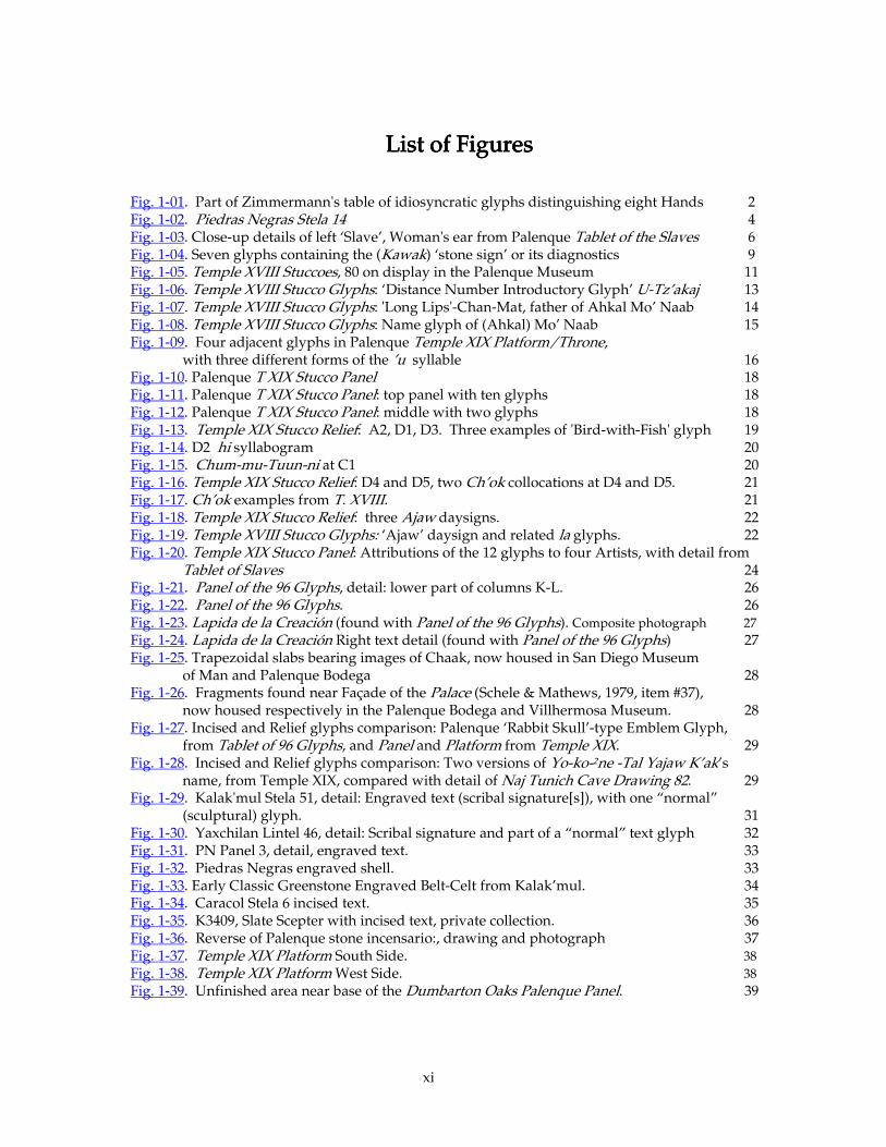
List of FiguresList of FiguresList of FiguresList of Figures Fig. 1-01. Part of Zimmermann's table of idiosyncratic glyphs distinguishing eight Hands 2 Fig. 1-02. Piedras Negras Stela 14 4 Fig. 1-03. Close-up details of left ‘Slave’, Woman's ear from Palenque Tablet of the Slaves 6 Fig. 1-04. Seven glyphs containing the (Kawak) ‘stone sign’ or its diagnostics 9 Fig. 1-05. Temple XVIII Stuccoes, 80 on display in the Palenque Museum 11 Fig. 1-06. Temple XVIII Stucco Glyphs: ‘Distance Number Introductory Glyph’ U-Tz’akaj 13 Fig. 1-07. Temple XVIII Stucco Glyphs: 'Long Lips'-Chan-Mat, father of Ahkal Mo’ Naab 14 Fig. 1-08. Temple XVIII Stucco Glyphs: Name glyph of (Ahkal) Mo’ Naab 15 Fig. 1-09. Four adjacent glyphs in Palenque Temple XIX Platform/Throne,
with three different forms of the ’u syllable 16 Fig. 1-10. Palenque T XIX Stucco Panel 18 Fig. 1-11. Palenque T XIX Stucco Panel: top panel with ten glyphs 18 Fig. 1-12. Palenque T XIX Stucco Panel: middle with two glyphs 18 Fig. 1-13. Temple XIX Stucco Relief: A2, D1, D3. Three examples of 'Bird-with-Fish' glyph 19 Fig. 1-14. D2 hi syllabogram 20 Fig. 1-15. Chum-mu-Tuun-ni at C1 20 Fig. 1-16. Temple XIX Stucco Relief: D4 and D5, two Ch’ok collocations at D4 and D5. 21 Fig. 1-17. Ch’ok examples from T. XVIII. 21 Fig. 1-18. Temple XIX Stucco Relief: three Ajaw daysigns. 22 Fig. 1-19. Temple XVIII Stucco Glyphs: ‘Ajaw’ daysign and related la glyphs. 22 Fig. 1-20. Temple XIX Stucco Panel: Attributions of the 12 glyphs to four Artists, with detail from
Tablet of Slaves 24 Fig. 1-21. Panel of the 96 Glyphs, detail: lower part of columns K-L. 26 Fig. 1-22. Panel of the 96 Glyphs. 26 Fig. 1-23. Lapida de la Creación (found with Panel of the 96 Glyphs). Composite photograph 27
Fig. 1-24. Lapida de la Creación Right text detail (found with Panel of the 96 Glyphs) 27 Fig. 1-25. Trapezoidal slabs bearing images of Chaak, now housed in San Diego Museum
of Man and Palenque Bodega 28 Fig. 1-26. Fragments found near Façade of the Palace (Schele & Mathews, 1979, item #37),
now housed respectively in the Palenque Bodega and Villhermosa Museum. 28 Fig. 1-27. Incised and Relief glyphs comparison: Palenque ‘Rabbit Skull’-type Emblem Glyph,
from Tablet of 96 Glyphs, and Panel and Platform from Temple XIX. 29 Fig. 1-28. Incised and Relief glyphs comparison: Two versions of Yo-ko-2ne -Tal Yajaw K’ak’s
name, from Temple XIX, compared with detail of Naj Tunich Cave Drawing 82. 29 Fig. 1-29. Kalak'mul Stela 51, detail: Engraved text (scribal signature[s]), with one “normal”
(sculptural) glyph. 31 Fig. 1-30. Yaxchilan Lintel 46, detail: Scribal signature and part of a “normal” text glyph 32 Fig. 1-31. PN Panel 3, detail, engraved text. 33 Fig. 1-32. Piedras Negras engraved shell. 33 Fig. 1-33. Early Classic Greenstone Engraved Belt-Celt from Kalak’mul. 34 Fig. 1-34. Caracol Stela 6 incised text. 35 Fig. 1-35. K3409, Slate Scepter with incised text, private collection. 36 Fig. 1-36. Reverse of Palenque stone incensario:, drawing and photograph 37 Fig. 1-37. Temple XIX Platform South Side. 38 Fig. 1-38. Temple XIX Platform West Side. 38
Fig. 1-39. Unfinished area near base of the Dumbarton Oaks Palenque Panel. 39
xii
Fig. 1-40. Glyphs from 96 Glyphs and T. XIX Platform at the same scale. 40 Fig. 1-41. T. XIX Platform - Eight examples of the god G1 — C6, H1, Label 4 gl. 2, J1, P5, T3 [sans
title], V1 [sans title], W7. 41 Fig. 1-42. T. XIX Platform/Throne - Four examples of the Sajal collocation. 43 Fig. 1-42. T. XIX Platform/Throne - Four examples of the Sajal collocation. 43 Fig. 1-43. Details of the four Sajal glyphs in 1-42, showing four different sets of tools. 44 Fig. 1-44. T. XIX Platform/Throne with delineation of work areas 47 Fig. 1-45. T. XIX Platform/Throne: work of the “Fine Hatching Master”, Columns UVWX &
Label 11 (Stuart’s West Columns EFGH & N). 49 Fig. 1-46. Temple XIX Platform: Glyphs of the “Fine Hatching Master”. 50 Fig. 1-47. Temple XIX Platform: More glyphs of the “Fine Hatching Master”. 51 Fig. 1-48. Temple XIX Platform under excavation, South Side. 52 Fig. 1-49. T. XIX Platform: Heads of the three figures on West side (Personages 8, 9, and 10)
with pentimenti. 52 Fig. 1-50. Temple XIX Platform: hands, purses of three figures on West side. 54 Fig. 1-51. Hands and purses (incense-bags?) of Personages 1, 2, and 3 of
Temple XIX Platform’s South side. 55 Fig. 1-52. Temple XIX Platform: Labels of three figures on West side… 57 Fig. 1-53. Temple XIX Platform: faces of seven figures on South side. 58 Fig. 1-54. Labels of seven figures on South side. 59 Fig. 1-55. Roman inscription, carved calligraphic lettering. 60 Fig. 1-56. Rubbing-exemplar of carved calligraphic writing. Chinese, Tang Dynasty. 61 Fig. 1-57. Egyptian drawing for carving, unfinished 18th-Dynasty tomb TT92. 62 Fig. 1-58. Xcalumk'in Monkey-Vessel. Fort Worth, Kimbell Museum. 64 Fig. 1-59. Xcalumk'in Monkey-Vessel, detail of monkey in headdress. 65 Fig. 1-60. El Peru Stela 34, three of the eight Yuxul(?) signatures. Cleveland Museum. 66 Fig. 1-61. El Peru Stela 34, a Yuxul(?) signature inside the mouth of the Lady’s Xok-belt-mask. 67 Fig. 1-62. T. XIX Platform/Throne: Table of idiosyncratic glyphs distinguishing fourteen Hands. 68 Fig. 1-63. T. XIX Platform/Throne: Table of idiosyncratic glyphs, upper left corner. 69 Fig. 1-64. T. XIX Platform/Throne: Table of idiosyncratic glyphs, upper right corner. 70 Fig. 1-65. T. XIX Platform/Throne: Table of idiosyncratic glyphs, lower left corner. 71 Fig. 1-66. T. XIX Platform/Throne: Table of idiosyncratic glyphs, lower right corner. 72 Fig. 1-67. Temple XIX Limestone Panel. Drawing of whole. Inset: portrait of Ahkal Mo’ Naab. 73 Fig. 1-68. Temple XIX Limestone Panel. Details of face with ‘eccentric obsidian’ earflare of, and
‘purse’ of, Personage 3 (Yok-Nen-Tal-Yajaw-K’ak’). 74 Fig. 1-69. Temple XIX Limestone Panel. Detail of headdress of Personage 3 (Yok-Nen-Tal-
Yajaw-K’ak’). 75 Fig. 1-70. Temple XIX Limestone Panel. Photo-montage of Yok-Nen-Tal-Yajaw-K’ak’, with
his name label, just after excavation. 76 Fig. 1-71. Ahkal Mo’ Naab's unusually-spelled name from Temple XIX Throne & Panel. 77 Fig. 1-72. T. XIX Panel: ch'o-ko title, from uppermost text and lower label. 77 Fig. 1-73. T. XIX Panel: Initial series and part of a name and Ajaw title from lower label. 78 Fig. 1-74. Temple XIX Panel: peculiar glyphs, from centered upper text. 79 Fig. 1-75. Temple XIX Panel, Emblem Glyphs. Three different Hands. 79 Fig. 1-76. Temple XIX Panel, faces of the three figures; two different Hands. 80 Fig. 1-77. Temple XIX Panel, comparison of glyphic ‘faces.’ 80 Fig. 1-78. Palace Tablet, Drawing by Merle Greene Robertson. 81 Fig. 1-79. Palace Tablet, Detail of upper portion showing parents (?) presenting
the ‘Drum-Major Headdress’ and Took’-Pakal. 82
xiii
Fig. 1-80. Palace North Gallery Tablets. 83 Fig. 1-81. Palace North Gallery Tablet #39, DN & i-u-ti glyphs. 84 Fig. 1-82. Palace North Gallery Tablets #39, 40 & 44. 85 Fig. 1-83. Palace North Gallery Fragments surrounded by details of upper Temple XIX. 86 Fig. 1-84. Temple XIX Tablet. Comparison of the ‘pierced leaves’ seen in Figs. 1-83 and 1-85. 87 Fig. 1-85. Temple XIX Tablet. ‘Xok fish’ at top of the backrack that dominates this sculpture 88 Fig. 1-86. North Gallery Panel #40, Temple XIX Tablet, Palace Tablet. Three ‘Xok fish’ by
the same Artist 89 Fig. 1-87. North Gallery Panel #44, Temple XIX Tablet, Palace Tablet: Foliage and foliate-like ja
glyphs from Temple XIX Tablet’s “Xok Monster Master” … 90 Fig. 1-88. Palace Tablet, The four heads of Jaguar, Xok, Xok and Snake on the three ‘Thrones of
Creation.’ 91 Fig. 1-89. Palace Tablet, The heads of Jaguar and Snake projecting from the first and third
‘Thrones of Creation.’ 91 Fig. 1-90. Temple XIX Panel and Palace Tablet. Glyphs by the “Xok-Monster Master” of
Temple XIX Panel…. 92 Fig. 1-91. Palace Tablet, Tz’ak glyphs differentiating hands. 93 Fig. 1-92. Palace Tablet, Initial Series glyphs by different Hands. 94 Fig. 1-93. Palace Tablet, six selected Ajaw superfixes. 95 Fig. 1-94. Palace Tablet, all Ajaw superfixes. 96 Fig. 1-95. Palace Tablet, phonetic spelling of Janab Pakal’s name. 96 Fig. 1-96. Faces of various figures carved in Palenque reliefs. 99 Fig. 1-97. Palace Tablet, Various treatments of ‘dark areas’ such as bands or ‘spots.’ 98 Fig. 2-01. Two Ancient Greek inscriptions by same carver, 194-147 BC. 107 Fig. 2-02. Colophon page of Codex Amiatinus, top seven lines. 108 Fig. 2.03. (= Fig. 1.01). Upper part of Zimmermann, plate 5; characteristic glyphs
of his designated scribes 109 Fig. 2-04. Ears from various Palenque monuments. 111 Fig. 2-05. Ears from two Palenque monuments, enlarged 112 Fig. 2-06. Feet from various Palenque monuments. 113 Fig. 2-07. Eyes from various Palenque monuments. 114 Fig. 2-08. Profiles, and especially mouths, from three Palenque monuments. 114 Fig. 2-09a. Hands carved on Palenque Figures and on glyphs: Palace Tablet. 115 Fig. 2-09b. Hands carved on Temple XIX Platform and Tablet of the Slaves. 116 Fig. 2-10. Palenque Palace Tablet, God GI (Jun-ye-Nal Chaak[?]). 117 Fig. 2-11. Varied Spellings of name of Copan lord Yax-Pasah-Chan-Yopaat. 118 Fig. 2-12. Part of Full-Figure Inscription on Quirigua Monument 2 (Zoomorph P). 119 Fig. 2-13. u-Tz’ak-aj from Panel of 96 Glyphs. 120 Fig. 2-14. Painted ceramic glyphs reveal the order and direction of brush-strokes. 121 Fig. 2-15. Stroke-direction for letter A, E, S, G, HA, E, S, G, HA, E, S, G, HA, E, S, G, H through history. 122 Fig. 2-16. Cataneo Copy-Book, folio 2v. Written by Bennardino Cataneo of Siena, 1545. 125 Fig. 2-17. Ni suffixes of the 96 Glyphs Master 128 Fig. 2-18. Three ba 'gophers' carved by the Master of the 96 Glyphs. 129 Fig. 2-19. u-Kab-ji-ya “agency” collocation on the Tablet of the 96 Glyphs and the Creación Panel,
respectively 130 Fig. 2-20. Tablet of the 96 Glyphs: five 'skull'-type Emblem glyphs. 131 Fig. 2-21. Tablet of the 96 Glyphs: : : : K’inich Ahkal Mo’ Naab’s name. 132 Fig. 2-22. Tablet of the 96 Glyphs: Sak nu-ku Nah "house event" collocation. 133 Fig. 2-23. (=Fig. 1-91). Eight Tz’ak collocations, and a similar glyph, from the Palace Tablet. 135
xiv
Fig. 2-24. Tz’ak collocations, highlighted to emphasize the "sign form," from the Palace Tablet. 136 Fig. 2-25. Palace Tablet. Three "identical" u-prefixes from the above collocations. 137 Fig. 2-26. (right). The same collocations scrutinized for details of carving finishes. 137 Fig. 2-27. (detail of 2-23). Two pairs satisfy criteria for attribution to the same Hand. 139 Fig. 2-28. Palace Tablet: Aj’s, see also Fig. 2-23. 140 Fig. 2-29. Cursive slanted sign-forms in painted glyphs, echoed in E15 Master. 146 Fig. 2-30. Palace Tablet, E15 Master: His distinctive slant and cursive "sign-forms."
Also his distinctive form of the wawawawa-syllable. 148 Fig. 2-31. Palace Tablet, E15 Master: Glyphs E13-F15. 149 Fig. 2-32. Palace Tablet, E15 Master and other(s): Glyphs E12, F12, F10. 150 Fig. 2-33. Palace Tablet, E15 Master and other(s): Comparing the width of the arched forms
in Glyph E15 (wide, slanted) with those in E12, O13, and O15 (narrow, vertical). 150 Fig. 2-34. Palace Tablet, E15 Master and other(s): Crosshatched 'dark' areas on glyphs in
E15's neighborhood. 151 Fig. 2-35. Palace Tablet. Comparing Ajaw superfixes F13 & H7, E17 and G10 12-Ajaw
dates; F10 & H10 earflares, E19 Ch’ok ‘scattering’ & G15 K’uh. 152 Fig. 2-36. Palace Tablet: G15 u-K’uhul-li cf E19 ‘scattering’ & F14 K’uhul. 153 Fig. 2-37. Palace Tablet: H15 & E10 Hun-ye-Nal, and li's, 153 Fig. 2-38. H14 & F9 Yichnal, other Nals and Naabs, and comparable glyphs. 155 Fig. 2-39. Palace Tablet: EG's at H13, H7 & K11. … the "Blunt Corner Master." 157 Fig. 2-40. Palace Tablet: Edge-molding details of H14 & H7 & E15 & neighbors. 158 Fig. 2-41. T12 ‘a or ‘Aj glyphs from Tablet of the 96 Glyphs, Palace Tablet, Tablet of the Slaves,
and the Temple XIX Platform. 160 Fig. 2-42. Palace Tablet: Four rare la-ta suffixes on Distance Numbers (counting
toward death dates), and a comparable calendric. 162 Fig. 2-43. Palace Tablet, The ‘Initial Series Introductory Glyph’ A1-B2. 164 Fig. 2-44. Palace Tablet, The Second Initial Series Glyph, “9 ‘Bak’tun’ (9 Pih)” A3-B4. 167 Fig. 2-45. Palace Tablet, Third Initial Series Glyph, “11 ‘K’atuns,’” A5-B6. 169 Fig. 2-46. Palace Tablet, Initial Series 'Birds' and 'claws.' Three different artists… 170 Fig. 2-47. Palace Tablet, Initial Series 'Bird heads.' Three different artists. 171 Fig. 2-48. Palace Tablet, Fourth Initial Series glyph, ‘Tun’ (Haab) glyph & coefficient 11, A7-B8. 172 Fig. 2-49. Palace Tablet Initial Series 'mandibles' on K'atun coefficient and on
‘Tun Bird' (Haab): glyphs A5, B7. 174 Fig. 2-50. Palace Tablet, The fifth IS glyph, A9-B10, '17 Winal.' 175 Fig. 2-51. Palace Tablet, Comparison of 'skull' headdresses on numerical coefficient figures. 177 Fig. 2-52. Palace Tablet: Sixth IS glyph, “Zero K’in,” A11-B12. 178 Fig. 2-53. Palace Tablet: Seventh IS glyph, 11 Ajaw, A13-B14 179 Fig. 2-54. Palace Tablet: Initial Series and adjacent columns with attributed territories. 182 Fig. 2-55. Tablet of the Slaves. 184 Fig. 2-56. Tablet of the Slaves, Hand 1: first column of glyphs, head of left Personage. 188 Fig. 2-57. Tablet of the Slaves: 'Moons.' 189 Fig. 2-58. Tablet of the Slaves: Spirals, ya and 'spacers.' 190 Fig. 2-59. Tablet of the Slaves: Hand 1's carving of Ahkal Mo'Naab's Father & the
'Slave' supporting him. 191 Fig. 2-60. Tablet of the Slaves: Details of the 'Drum-Major headdress' and associated glyphs 192 Fig. 2-61. Temple XIX Panel & Tablet of the Slaves: Comparing serpentine feathers. 193 Fig. 2-62. Tablet of the Slaves: Glyphs by Hand 4. 193 Fig. 2-63. Tablet of the Slaves: Ahkal's Mother by Hand 4. 194 Fig. 2-64. Tablet of the Slaves: Faces of the three main Figures. 196 Fig. 2-65. Tablet of the Slaves: Faces of three 'slaves.' 196
xv
Fig. 2-66. Tablet of the Slaves: Name of Ahkal's Father. 197 Fig. 2-67. Tablet of the Slaves: Comparison glyphs, Hands 1 and 4. 195 Fig. 2-68. Tablet of the Slaves: 4 Ajaw & 6 Ajaw, adjacent titles by Hands 3 and 4. 198 Fig. 2-69. Tablet of the Slaves: 'Hand' glyphs (K'al and Tzutz) by Hands 1, 2, & 3. 198 Fig. 2-70. Tablet of the Slaves: Chak-Zutz's name by Hands 2 & 3. With comparable 'small-
mammal' heads and indented bars. 199 Fig. 2-71. Tablet of the Slaves: Kab glyphs, Hands 2 & 3 (& yet another Hand?). 199 Fig. 2-72. Tablet of the Slaves: Chak and ko glyphs and related 'bars' in sa. 200 Fig. 2-73. Tablet of the Slaves, Ahkal Mo' Naab, Slave 2, and Slave 3: their faces, hands, feet. 201 Fig. 2-74. Tablet of the Slaves, Temple XIX Panel: 'incense purses,' Bodega Fragment #45. 202 Fig. 2-75. Drawing of Tablet of Slaves with attributions. 203 Fig. 2-76. Tablet of the Slaves. The 'Shell-Wing Dragons' atop the head of Ahkal's Parents 206 Fig. 2-77. Tablet of the Slaves. Carving details on the 'Drum Major Headdress 206 Fig. 2-78. Tablet of the Slaves. Comparable glyphs by Hand 2: K'ayab, Ik', 'a, ya 209 Fig. 3-01a. Comparison: Three Lunar Series. (M16-N17, A15-B17, & R9-R12.)
First part: Glyphs G, F, E, (Y?), D, & C 213 Fig. 3-01b. Comparison: Three Lunar Series. (M16-N17, A15-B17, & R9-R12.)
Second part: Glyphs X, B, and A. 214 Fig. 3-02. Comparison: Glyph X of the Lunar Series. A K'uh within a 'jaguar' mouth,
both within the mouth of an 'ophidian monster.' 215 Fig. 3-03. Comparison: The Palace Tablet Lunar Series A15 – B17, characteristic details. 215 Fig. 3-04. Palace Tablet: The second Lunar Series. (M16-N17) 216 Fig. 3-05. Palace Tablet: na glyphs. 216 Fig. 3-06. Palace Tablet: 'Bubble' element of some glyphs. 216 Fig. 3-07. Palace Tablet: 'Jaguar spots' elements of some glyphs. 217 Fig. 3-08. Palace Tablet: 'Jaguar spots' elements 217 Fig. 3-09. Nah affix and comparable elements of some glyphs. 217 Fig. 3-10. Temple XIV Tablet, glyph B3: -ja suffix with crosshatching 219 Fig. 3-11. Palace Tablet: 'K'uh heads'. 220 Fig. 3-12. Palace Tablet: (u-Ch'ok-ko-) K'aba 'elbows.' 221 Fig. 3-13a. Palace Tablet: Royal names, Mat-'bird,' 'Skull,' and comparable Emblem Glyphs. 221 Fig. 3-14. Palace Tablet: 'K'an Crosses' in context. 222 Fig. 3-15a. Palace Tablet: Royal names, Mat-'bird,' 'Skull,' and comparable Emblem Glyphs. 223 Fig. 3-15b. Palace Tablet: Royal names, Mat-'bird,' 'Skull,' and comparable Emblem Glyphs. 224 Fig. 3-16. Palace Tablet: careful, fine lines skillfully paralleling bolder lines. 226 Fig. 3-17. Palace Tablet: 'Ajaw-faces': daysign Ajaw, syllabic la, and "son of father," assigned to
various Hands. 228 Fig. 3-18. Palace Tablet: Four la-ta subfixes, and a comparable calendric, by three Hands. 230 Fig. 3-19. Palace Tablet: 'Ajaw-face' glyphs with wide, round 'eyes,' concave triangular 'nose,'
characteristic of the Hand of M6. 231 Fig. 3-20. Palace Tablet: 'inverted-Ajaw-face' -la glyphs. The first three are by the Hand of M6,
the others by two different Hands. 231 Fig. 3-21. Palace Tablet: some numerals and 'god-marks.' 232 Fig. 3-22. Palace Tablet: Details of Winik glyphs. 232 Fig. 3-23. Palace Tablet: Details of ta glyphs. 232 Fig. 3-24. Panel of the 96 Glyphs: Four "poetic" U-Tz'akaj glyphs. 234 Fig. 3-25. Panel of the 96 Glyphs, Palace Tablet, and Tablet of the Slaves: Aj glyphs. 235 Fig. 3-26. 'Bone beads' by the Master of 96 Glyphs from Throne Legs and Lapida de la Creación.
236
xvi
Fig. 3-27. (=3-17). Palace Tablet: 'Ajaw-faces' assigned to various Hands. 238 Fig. 3-28. Palace Tablet: Abstract syllabic la subfix, arranged into three categories 240 Fig. 3-29. Palace Tablet: la subfix, levels of increasing abstraction. 240 Fig. 3-30. Palace Tablet: ni subfix/postfix, arranged by form. 241 Fig. 3-31a. Palace Tablet: ni subfixes/postfixes, upper half; in context of full glyphs,
arranged more or less in text order. 242 Fig. 3-31b. Palace Tablet: ni subfixes/postfixes, lower half; in context of full glyphs,
arranged more or less in text order. 243 Fig. 3-33. Palace Tablet: ni glyphs compared to similar 'hairy' elements in the upper-center
and upper-right neighborhood of the Tablet. 244 Fig. 3-32. Palace Tablet: Mammals by the L14 (itz’i-Winik) Master; and a flatter glyph for
comparison. 245 Fig. 3-34. Temple XVIII Stuccoes: ba/Bah glyphs with long 'tongues'. 248 Fig. 3-35. Palace Tablet: Three glyphs by the L14 Itz'i-Winik Master—probably 250 Fig. 3-36. Palace Tablet: Thirteen Distance Number clauses & comparable glyphs. 251 Fig. 3-37. Palace Tablet: Winik glyphs, arranged by relative location, grouped by Hand 252 Fig. 3-38. Palace Tablet: Winik glyph 'side curls,' nine varieties 252 Fig. 3-39. Palace Tablet: Winik glyphs. Interior panels arranged by 'side curl' forms, 9 varieties 253 Fig. 3-40. Palace Tablet: Winik glyph 'side curls.' 253 Fig. 3-41. Palace Tablet: Whole Winik glyphs arranged by form of 'side curls.' 254 Fig. 3-42. Palace Tablet: Winik & Tzak glyphs arranged by Hand 256 Fig. 3-43. Palace Tablet: Distance Number clauses attributions. 258 Fig. 3-44. Palace Tablet: A15 Master habits 259 Fig. 3-45. Palace Tablet: L14 Master habits 259 Fig. 3-46. Palace Tablet: Calendar Rounds, sundry comparisons. Enlargements below. 261 Fig. 3-46a. Palace Tablet: Calendar Rounds, left half. 262 Fig. 3-47. Palace Tablet: 'Stone signs' and their 'arches.' 264 Fig. 3-48. Palace Tablet: Cursive Ik's isolated 265 Fig. 3-49. Palace Tablet: Cursive Ik's in context 265 Fig. 3-50. Palace Tablet: Relating glyphs in the middle of Columns F, G, & H. 265 Fig. 3-51. Palace Tablet: 'stone sign' dots, 'grapes,' and 'whiplash' lines in upper & middle of
Columns E, F, G, H, & I 265 Fig. 3-52. Palace Tablet: peculiar 'stone signs.' 266 Fig. 3-53. Palace Tablet: 'stone signs' arranged by location, more or less 267 Fig. 3-54. Palace Tablet: 'stone signs,' full glyphs. 268 Fig. 3-55. Palace Tablet: fine crosshatching, 'beetling brows' and other comparisons in the
middle-right area. 271 Fig. 3-56. Palace Tablet: The L14 Master "invading" his colleague's "territory." 273 Fig. 3-46b. Palace Tablet: Calendar Rounds, right half. The left half of this table can be found
a few pages earlier. 274 Fig. 3-57. Palace Tablet: First five glyphs of Columns C & D. 275 Fig. 3-58. Palace Tablet: comparing GI, K'in, & K'inich glyphs and their 'eyes.' 276 Fig. 3-59. Palace Tablet: The Hand of C1-D1 on the upper left corner of the middle slab. 277 Fig. 3-60. Palace Tablet: The Hand of C1-D1 tends to draw his "doubling lines" far
from primaries. 278 Fig. 3-61. Palace Tablet: Sculptural details of C3's 'hair' and C4's 'moon' seem to be by
the L14/N15 Master rather than the Hand of C1-D1 279 Fig. 3-62. Palace Tablet: C10's & E8's 'moons' compared. 282 Fig. 3-63. Palace Tablet: C10, D10 & H6. 283 Fig. 3-64. Palace Tablet: Ch'ok-ko, to-ko-Tan, & comparables 283
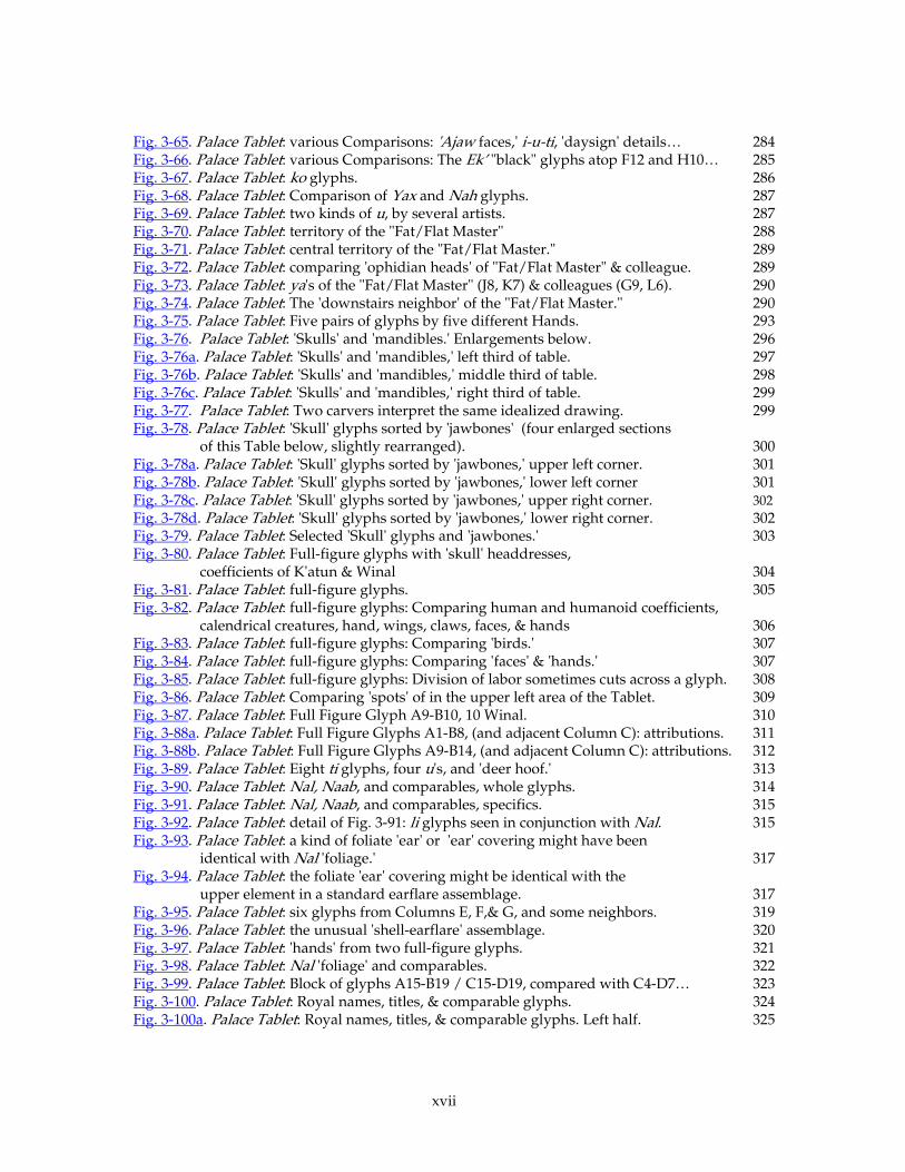
xvii
Fig. 3-65. Palace Tablet: various Comparisons: 'Ajaw faces,' i-u-ti, 'daysign' details… 284 Fig. 3-66. Palace Tablet: various Comparisons: The Ek’ "black" glyphs atop F12 and H10… 285 Fig. 3-67. Palace Tablet: ko glyphs. 286 Fig. 3-68. Palace Tablet: Comparison of Yax and Nah glyphs. 287 Fig. 3-69. Palace Tablet: two kinds of u, by several artists. 287 Fig. 3-70. Palace Tablet: territory of the "Fat/Flat Master" 288 Fig. 3-71. Palace Tablet: central territory of the "Fat/Flat Master." 289 Fig. 3-72. Palace Tablet: comparing 'ophidian heads' of "Fat/Flat Master" & colleague. 289 Fig. 3-73. Palace Tablet: ya's of the "Fat/Flat Master" (J8, K7) & colleagues (G9, L6). 290 Fig. 3-74. Palace Tablet: The 'downstairs neighbor' of the "Fat/Flat Master." 290 Fig. 3-75. Palace Tablet: Five pairs of glyphs by five different Hands. 293 Fig. 3-76. Palace Tablet: 'Skulls' and 'mandibles.' Enlargements below. 296 Fig. 3-76a. Palace Tablet: 'Skulls' and 'mandibles,' left third of table. 297 Fig. 3-76b. Palace Tablet: 'Skulls' and 'mandibles,' middle third of table. 298 Fig. 3-76c. Palace Tablet: 'Skulls' and 'mandibles,' right third of table. 299 Fig. 3-77. Palace Tablet: Two carvers interpret the same idealized drawing. 299 Fig. 3-78. Palace Tablet: 'Skull' glyphs sorted by 'jawbones' (four enlarged sections
of this Table below, slightly rearranged). 300 Fig. 3-78a. Palace Tablet: 'Skull' glyphs sorted by 'jawbones,' upper left corner. 301 Fig. 3-78b. Palace Tablet: 'Skull' glyphs sorted by 'jawbones,' lower left corner 301 Fig. 3-78c. Palace Tablet: 'Skull' glyphs sorted by 'jawbones,' upper right corner. 302 Fig. 3-78d. Palace Tablet: 'Skull' glyphs sorted by 'jawbones,' lower right corner. 302 Fig. 3-79. Palace Tablet: Selected 'Skull' glyphs and 'jawbones.' 303 Fig. 3-80. Palace Tablet: Full-figure glyphs with 'skull' headdresses,
coefficients of K'atun & Winal 304 Fig. 3-81. Palace Tablet: full-figure glyphs. 305 Fig. 3-82. Palace Tablet: full-figure glyphs: Comparing human and humanoid coefficients,
calendrical creatures, hand, wings, claws, faces, & hands 306 Fig. 3-83. Palace Tablet: full-figure glyphs: Comparing 'birds.' 307 Fig. 3-84. Palace Tablet: full-figure glyphs: Comparing 'faces' & 'hands.' 307 Fig. 3-85. Palace Tablet: full-figure glyphs: Division of labor sometimes cuts across a glyph. 308 Fig. 3-86. Palace Tablet: Comparing 'spots' of in the upper left area of the Tablet. 309 Fig. 3-87. Palace Tablet: Full Figure Glyph A9-B10, 10 Winal. 310 Fig. 3-88a. Palace Tablet: Full Figure Glyphs A1-B8, (and adjacent Column C): attributions. 311 Fig. 3-88b. Palace Tablet: Full Figure Glyphs A9-B14, (and adjacent Column C): attributions. 312 Fig. 3-89. Palace Tablet: Eight ti glyphs, four u's, and 'deer hoof.' 313 Fig. 3-90. Palace Tablet: Nal, Naab, and comparables, whole glyphs. 314 Fig. 3-91. Palace Tablet: Nal, Naab, and comparables, specifics. 315 Fig. 3-92. Palace Tablet: detail of Fig. 3-91: li glyphs seen in conjunction with Nal. 315 Fig. 3-93. Palace Tablet: a kind of foliate 'ear' or 'ear' covering might have been
identical with Nal 'foliage.' 317 Fig. 3-94. Palace Tablet: the foliate 'ear' covering might be identical with the
upper element in a standard earflare assemblage. 317 Fig. 3-95. Palace Tablet: six glyphs from Columns E, F,& G, and some neighbors. 319 Fig. 3-96. Palace Tablet: the unusual 'shell-earflare' assemblage. 320 Fig. 3-97. Palace Tablet: 'hands' from two full-figure glyphs. 321 Fig. 3-98. Palace Tablet: Nal 'foliage' and comparables. 322 Fig. 3-99. Palace Tablet: Block of glyphs A15-B19 / C15-D19, compared with C4-D7… 323 Fig. 3-100. Palace Tablet: Royal names, titles, & comparable glyphs. 324 Fig. 3-100a. Palace Tablet: Royal names, titles, & comparable glyphs. Left half. 325
xviii
Fig. 3-100b. Palace Tablet: Royal names, titles, & comparable glyphs. Right half. 326 Fig. 3-101. Palace Tablet: logographic K'inich, phonetic spelling of Janab Pakal. 327 Fig. 3-102. Palace Tablet: Ajaw superfix. 328 Fig. 3-103. Palace Tablet: K'inich Janab-Pakal, logographic form. 329 Fig. 3-104. Palace Tablet: K'inich variations. 329 Fig. 3-105. Palace Tablet: Kan-Bahlam's name, plus two ja-na-bi's for 'ophidian' comparison. 330 Fig. 3-106. Palace Tablet: K'an-Joy-Chitam's name. 331 Fig. 3-107. Palace Tablet: The 'Bone' Emblem Glyphs, all in Column Q. 331 Fig. 3-108. Tablet of the Slaves: The (Tok’-) Pakal shield offering by Ahkal's mother. 332 Fig. 3-109. Tablerito: The early phonetic spelling of Pakal. 333 Fig. 3-110. Tablerito, whole. 333 Fig. 3-111. Palace Tablet: upper half of Columns OPQR. 334 Fig. 3-112. Palace Tablet: Youth names of K'an Joy Chitam. 335 Fig. 3-113. Temple of Inscriptions, Palace Tablet, & Tablet of the Slaves: Examples of Palenque Te's.
338 Fig. 3-114. Tablet of the Slaves C1: 9-Ik', 5-Te'-K'an-a-si-ya, a later Palenque Te'. 339 Fig. 3-115. Temple of the Inscriptions, earlier Palenque Te's. 340 Fig. 3-116. Temple of the Inscriptions, 'K'an-crosses.' 340 Fig. 3-117. Palace Tablet: wa and na glyphs. 341 Fig. 4-01. Palace Tablet: The glyphs carved by the L14 / Itz'i-Winik Master. 342 Fig. 4-02. Palace Tablet: The L14 / Itz'i-Winik Master (J15) and the E15 Master (F18). 343 Fig. 4-01a. Palace Tablet: The glyphs carved by the L14 / Itz'i-Winik Master, Left half. 344 Fig. 4-01b. Palace Tablet: Glyphs by the L14 / Itz'i-Winik Master, Right half. 345 Fig. 4-03. Palace Tablet: 'u glyphs assigned to prominent Carvers. 347 Fig. 4-04. Palace Tablet: glyphs carved by the E15 Master. 348 Fig. 4-05. Palace Tablet: Hu'n 'heads.' 352 Fig. 4-06. Plate with stuccoed rim from Tikal Burial 195, and details of 8 glyphs 354 Fig. 4-07. Palace Tablet, distribution of major Hands' work-'territories.' 364 Fig. 4-08. Glyphs for 'Star War' (left) and for Ch'ak "Decapitation" 388
1
Aj-Ts’ib, Aj-Uxul, Itz’aat, & Aj-K’uhu’n: Classic Maya Schools of Carvers
and Calligraphers in Palenque After the Reign of Kan-Bahlam
by Mark Van Stone
Chapter 1: Chapter 1: Chapter 1: Chapter 1: IntroductionIntroductionIntroductionIntroduction
0.1 Introduction & 0.1 Introduction & 0.1 Introduction & 0.1 Introduction & AcknowledgementsAcknowledgementsAcknowledgementsAcknowledgements
In the history of art and especially of art-making, it goes without saying that an individual
artist will have produced a substantial body of work in his or her lifetime. Any masterpiece
from any age invites comparison with other pieces from the same context, and art-historians
dealing with the Renaissance on commonly (figuratively) collect several pieces from the same
artist to help their analyses. The body of work thus collected is far more useful to the scholar
than the individual work. The group reflects upon itself, each individual piece enhanced by
comparison to its siblings. Often works of art are unsigned, or forged, and need the eye of an
expert to determine whether they ought to be included in one of these groups. The process of
identifying the artist of a particular piece is called connoisseurship, from the French connaître,
"to know, to recognize."
Applying connoisseurship principles to Medieval or Ancient or non-Western art provides
more general insights. Nearly all this work is unsigned, and often unsung —one rarely reads
about art-making and individual artists in, say, Babylonian literature— and in many contexts the
original people have not vouchsafed us a single word of explanation. I am thinking here of the
art of non-literate peoples, the awesome stones of Rapanui and Zimbabwe, the pottery and
textiles of the Mimbres or Moche. In these cases, art-historians draw more broadly, collect the
artifacts of a whole style and draw less-specific conclusions from this corpus. Rarely in the
Mesoamerican field do we have the opportunity to examine the collected works of a particular
individual, partly because of the simple accidents of survival: when one deals with a period from
which only a hundredth of a percent of what once was still survives, the likelihood of finding
two works by the same hand becomes negligible, and the exercise moot.
Even so, in certain ancient cultural contexts, we have enough well-preserved items to venture
to identify works by individual artists. This is true, for example, of Ancient Greek vase-painting
and sculpture. A few researchers have attempted this with individual Maya artists who appear
2
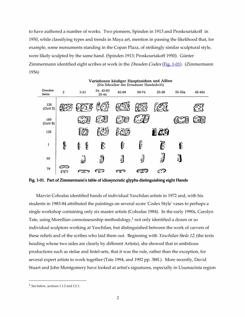
to have authored a number of works. Two pioneers, Spinden in 1913 and Proskouriakoff in
1950, while classifying types and trends in Maya art, mention in passing the likelihood that, for
example, some monuments standing in the Copan Plaza, of strikingly similar sculptural style,
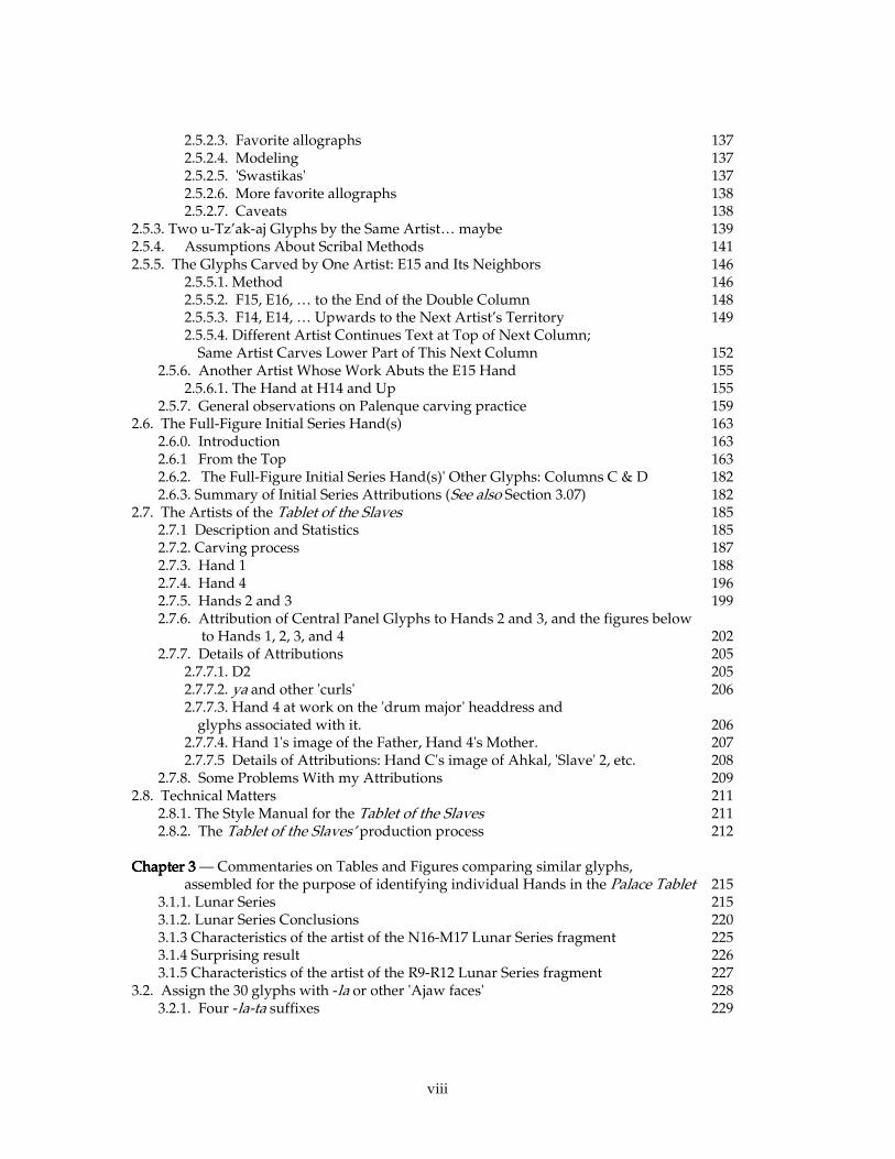
were likely sculpted by the same hand. (Spinden 1913; Proskouriakoff 1950). Günter
Zimmermann identified eight scribes at work in the Dresden Codex (Fig. 1-01). (Zimmermann
1956)
Fig. 1Fig. 1Fig. 1Fig. 1----01. Part of Zimmermann's table of idiosyncratic glyphs distinguishing eight Hands01. Part of Zimmermann's table of idiosyncratic glyphs distinguishing eight Hands01. Part of Zimmermann's table of idiosyncratic glyphs distinguishing eight Hands01. Part of Zimmermann's table of idiosyncratic glyphs distinguishing eight Hands
Marvin Cohodas identified hands of individual Yaxchilan artists in 1972 and, with his
students in 1983-84 attributed the paintings on several score 'Codex Style' vases to perhaps a
single workshop containing only six master artists (Cohodas 1984). In the early 1990s, Carolyn
Tate, using Morellian connoisseurship methodology,1 not only identified a dozen or so
individual sculptors working at Yaxchilan, but distinguished between the work of carvers of
these reliefs and of the scribes who laid them out. Beginning with Yaxchilan Stela 12, (the texts
heading whose two sides are clearly by different Artists), she showed that in ambitious
productions such as stelae and lintel-sets, that it was the rule, rather than the exception, for
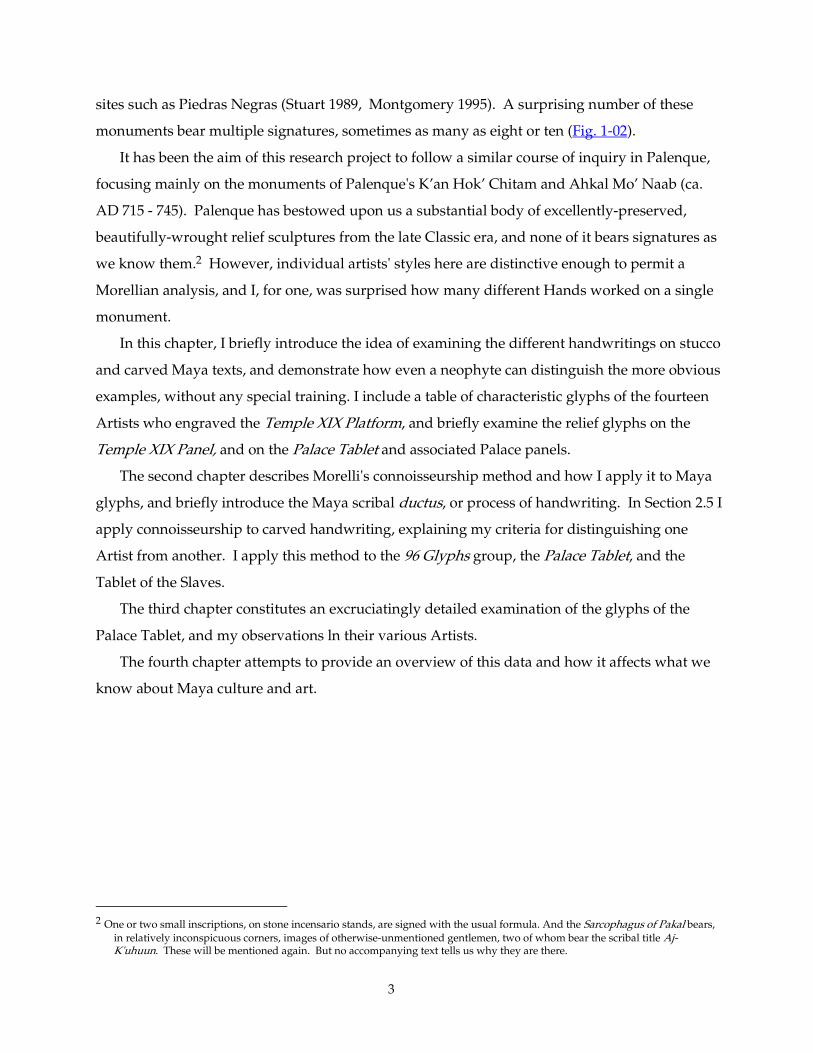
several expert artists to work together (Tate 1994, and 1992 pp. 38ff.). More recently, David
Stuart and John Montgomery have looked at artist's signatures, especially in Usumacinta region
1 See below, sections 1.1.2 and 2.2.1.
3
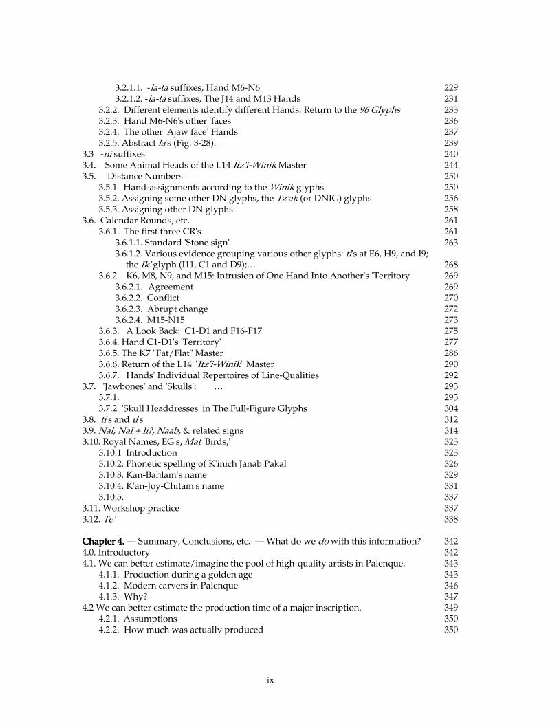
sites such as Piedras Negras (Stuart 1989, Montgomery 1995). A surprising number of these
monuments bear multiple signatures, sometimes as many as eight or ten (Fig. 1-02).
It has been the aim of this research project to follow a similar course of inquiry in Palenque,
focusing mainly on the monuments of Palenque's K’an Hok’ Chitam and Ahkal Mo’ Naab (ca.
AD 715 - 745). Palenque has bestowed upon us a substantial body of excellently-preserved,
beautifully-wrought relief sculptures from the late Classic era, and none of it bears signatures as
we know them.2 However, individual artists' styles here are distinctive enough to permit a
Morellian analysis, and I, for one, was surprised how many different Hands worked on a single
monument.
In this chapter, I briefly introduce the idea of examining the different handwritings on stucco
and carved Maya texts, and demonstrate how even a neophyte can distinguish the more obvious
examples, without any special training. I include a table of characteristic glyphs of the fourteen
Artists who engraved the Temple XIX Platform, and briefly examine the relief glyphs on the
Temple XIX Panel, and on the Palace Tablet and associated Palace panels.
The second chapter describes Morelli's connoisseurship method and how I apply it to Maya
glyphs, and briefly introduce the Maya scribal ductus, or process of handwriting. In Section 2.5 I
apply connoisseurship to carved handwriting, explaining my criteria for distinguishing one
Artist from another. I apply this method to the 96 Glyphs group, the Palace Tablet, and the
Tablet of the Slaves.
The third chapter constitutes an excruciatingly detailed examination of the glyphs of the
Palace Tablet, and my observations ln their various Artists.
The fourth chapter attempts to provide an overview of this data and how it affects what we
know about Maya culture and art.
2 One or two small inscriptions, on stone incensario stands, are signed with the usual formula. And the Sarcophagus of Pakal bears,
in relatively inconspicuous corners, images of otherwise-unmentioned gentlemen, two of whom bear the scribal title Aj-K'uhuun. These will be mentioned again. But no accompanying text tells us why they are there.
4
Fig. 1Fig. 1Fig. 1Fig. 1----02. 02. 02. 02. Piedras Negras Stela 14Piedras Negras Stela 14Piedras Negras Stela 14Piedras Negras Stela 14:::: Upper signatures (Morley's glyphs 1Upper signatures (Morley's glyphs 1Upper signatures (Morley's glyphs 1Upper signatures (Morley's glyphs 1----4, 54, 54, 54, 5----10), 10), 10), 10), Lower signatures (Morley's glyphs 11Lower signatures (Morley's glyphs 11Lower signatures (Morley's glyphs 11Lower signatures (Morley's glyphs 11----14, 1514, 1514, 1514, 15----18, 1918, 1918, 1918, 19----20 [missing 2120 [missing 2120 [missing 2120 [missing 21----22], 2322], 2322], 2322], 23----26). 26). 26). 26). University Museum, Philadelphia. Photo by author.
5
0.2.0.2.0.2.0.2. Acknowledgements Acknowledgements Acknowledgements Acknowledgements
I am grateful for generous sponsorship and support from Joel Skidmore and from the
Foundation for the Advancement of Mesoamerican Studies, Inc. Joel and his employees
digitized five thousand or so photographs for me. These digital files (a small portion of which
can be seen in the "Resources" area at Mesoweb.comMesoweb.comMesoweb.comMesoweb.com) truly made my hundreds of comparative
illustrations possible. Without his generous contribution, my dissertation would look very
different.
I am also especially indebted to the crucial and enthusiastic personal sponsorship of Alfonso
Morales in Palenque and of Sofia Paredes, former Acting Directora of the Instituto de
Antropología e Historia in Guatemala City. At more fundamental levels, Norberto Tesucun at
the Museo Sylvanus Morley and Don Florentino in the bodega of the Museo Nacional in
Guatemala City cheerfully accompanied me for the duration of my study, and tirelessly fetched
scores of priceless objects in their charge. This assistance allowed me to take some 5000 detail
photographs of inscriptions, comprising nearly every surviving glyph and relief fragment from
Palenque (and Tikal) within my purview.
Although I accomplished this task with the simplest of equipment —35 mm camera, close-up
lenses, tripod, and a hand-held high-intensity camera floodlight— the resulting photographs
reveal sculptural and technical details to a degree never heretofore published. Most previous
photographs of inscriptions have aimed to capture an entire monument in a single image, and
even detail photographs tended to be wide-angle, such as a half-length figure or a column of
glyphs. Fine details such as individual carving-strokes or other micro-idiosyncrasies almost
never showed. Further, due to inevitable compromises inherent in photography of large
complex sculptures, almost no single glyph can be lit ideally. My photographs complement the
existing corpus of inscriptional images because I restricted my efforts mainly to individual
glyphs or glyph-pairs —each with optimal lighting. These photographs, most for the first time,
specifically reveal the small-scale peculiarities and tool-strokes, subtle details of carving
technique, the complex of tiny habitual behaviors which define the personality of an individual
artist's handwriting.
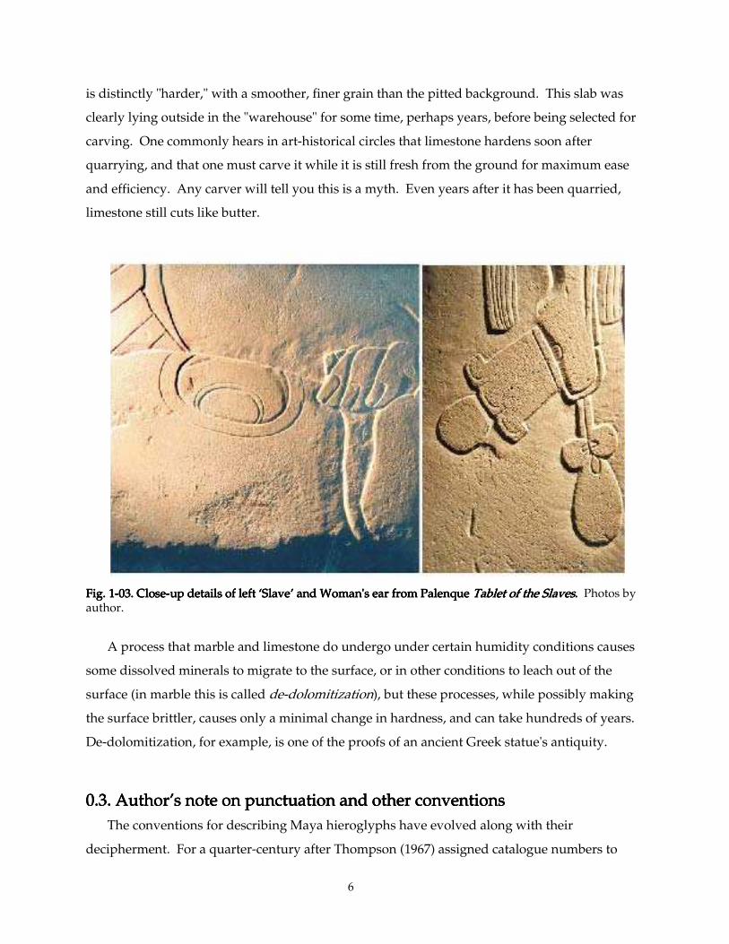
The Slaves panel (Fig. 2-55) was preserved in virtually pristine condition, and one can readily
discern here the marks of the carver's tools. For some reason the artist never got around to final-
smoothing the sloping surface around the woman's face. One can also see that the original
planed surface of the Tablet had slightly weathered before carving; the texture of the carved area
6
is distinctly "harder," with a smoother, finer grain than the pitted background. This slab was
clearly lying outside in the "warehouse" for some time, perhaps years, before being selected for
carving. One commonly hears in art-historical circles that limestone hardens soon after
quarrying, and that one must carve it while it is still fresh from the ground for maximum ease
and efficiency. Any carver will tell you this is a myth. Even years after it has been quarried,
limestone still cuts like butter.
Fig. 1Fig. 1Fig. 1Fig. 1----03. Close03. Close03. Close03. Close----uuuup details of left ‘Slave’ and Woman's ear from Palenque p details of left ‘Slave’ and Woman's ear from Palenque p details of left ‘Slave’ and Woman's ear from Palenque p details of left ‘Slave’ and Woman's ear from Palenque Tablet of the SlavesTablet of the SlavesTablet of the SlavesTablet of the Slaves. . . . Photos by author.
A process that marble and limestone do undergo under certain humidity conditions causes
some dissolved minerals to migrate to the surface, or in other conditions to leach out of the
surface (in marble this is called de-dolomitization), but these processes, while possibly making
the surface brittler, causes only a minimal change in hardness, and can take hundreds of years.
De-dolomitization, for example, is one of the proofs of an ancient Greek statue's antiquity.
0.3. Author’s note on punctuation0.3. Author’s note on punctuation0.3. Author’s note on punctuation0.3. Author’s note on punctuation and other conventionsand other conventionsand other conventionsand other conventions
The conventions for describing Maya hieroglyphs have evolved along with their
decipherment. For a quarter-century after Thompson (1967) assigned catalogue numbers to
7
every glyph he could distinguish, any detailed discussion of a glyphic text necessarily involved
referring to each element by its “T-number.”3 But many glyphs, particularly those which
portray identifiable items such as hands, heads, birds, etc., rapidly acquired nicknames, which
Thompson himself duly recorded: T519 he calls “Chuen with dots,” T227 is “seated man,” T74
“Down Balls,” T77 “Bird Wing,” T110 “Bone,” T539 “Half-spotted Ahau,” T684 “Toothache,”
T713 “Flat Hand,” etc. Some of his nicknames were tentative Maya readings, such as T17 “Yax,”
T59 “ti,” and T748 “Muan bird,” which readings have turned out to be correct, or at least to have
stood the test of time till now.4
Then, with the cavalcade of translations and firm phonetic readings in the 1970’s and 1980’s,
epigraphers found it easier to remember glyphs by their readings, like Ch’ok, ha (later ja), tzu
and lu, than by their T-numbers. Leading epigrapher David Stuart, for instance, prefers not to
refer to T-numbers at all if he can help it.5 The generation of decipherers who entered the field
since the mid-1980’s (including myself) have been able to get along without learning more than a
handful of T-numbers. But not every reading is firm, and many glyphs remain undeciphered,
either in their Maya pronunciation or their translated meaning, or both. For these, we still use
nicknames, such as the T628b ‘Casper glyph’ (so dubbed by Linda Schele and associates), which
resembles a ghost, and constitutes the “main sign” of the name of a legendary Palenque ruler on
the Tablet of the Cross.
In this investigation, I frequently need to refer to specific elements of hieroglyphic
collocations, many of which are easily described, such as dots, ‘mirror,’ ‘hand,’ ‘eye,’ and inline.
When I refer to a part of a collocation which constitutes a well-known glyph, I shall refer to it by
its reading, such as ti, K’al, Way, or –ja suffix, italicizing the Maya pronunciation. A capitalized
italic word refers to a logogram such as Way or Balam, uncapitalized is a syllabic reading like u
or ta. English letters I render in boldface to distinguish them from Maya syllables (e.g., “a sound
like short aaaa” or “retroflex bbbb”); likewise, English and other non-Maya words used as examples I
shall also render bold (as Hawai’iHawai’iHawai’iHawai’i below). I give ordinary descriptive terms (e.g., “outline” or
“inline” or “row of dots”) no distinguishing treatment.
3 Zimmermann (1956) led Thompson in this; he catalogued every glyph in the Dresden Codex, assigning each a “Z-number.” His
system, however, found limited use in Classic monuments. Thompson used Zimmermann’s system as a template for his own, much more comprehensive A Catalogue of Maya Hieroglyphs (1967).
4 Others, instead of nicknaming, he translated, such as T644 “Seating,” T95 “Black,” T112 “Flint Knife,” T561 “Sky,” T181 “Moon,” and T568, “Sacrifice.” The first four of these turned out to be correct translations, but though T181 (and its whole analogue T683) indeed appear to portray the crescent moon, its slight variations read K’AL (the number 20), part of HUL (“arrive”) and syllabic ja. These appear to have nothing at all to do with the moon or any lunar metaphor, as far as we can discover. Last on this list, T568, is simply syllabic lu and has no greater affinity for sacrifice texts than any other syllable.
8
Epigraphers employ a fairly strict convention to distinguish logograms (single signs such as
our numerals which stand for a whole word) from phonograms (also known as “syllabic
glyphs,” “syllables,” or “phonetic characters”): They italicize both, but spell phonograms
entirely in lowercase letters, and logograms entirely in uppercase or capital letters. Thus CHUMCHUMCHUMCHUM----
wawawawa----n(i)n(i)n(i)n(i), and (ka)(ka)(ka)(ka)----KANKANKANKAN----BALAMBALAMBALAMBALAM----m(a)m(a)m(a)m(a), etc. At this moment, however, controversy about the
existence of “morphosyllables” leads some epigraphers to render syllabic glyphs in certain
contexts as if they were logograms: UUUU----TZ’APTZ’APTZ’APTZ’AP----AWAWAWAW vs. uuuu----TZ’APTZ’APTZ’APTZ’AP----wawawawa, or tutututu----papapapa----(A)J(A)J(A)J(A)J vs. . . . tutututu----papapapa----j(a)j(a)j(a)j(a).
The distinction between a syllabic sign’s function as a phonetic or logographic role is, to my eye,
pettifogging; it is a distinction which the ancient Maya themselves did not recognize. It is like
arguing that the letter ssss at the end of English nouns is not strictly a letter, but a logographic sign
indicating plural. By this logic, any meaningful prefix or suffix is actually logographic rather
than phonetic. It’s both, okay? For this reason, I here prefer to refer to any collocation by the
names of its glyphs as far as possible. Those glyphs which normally have a phonetic function
(and which are invariably CV, or consonant-vowel) I shall spell entirely in lowercase italics (titititi,
nananana, bibibibi, etc.), and those which are clearly logograms (almost always CVC or CVCVC) I shall
italicize and capitalize (thus Te’Te’Te’Te’, K’inK’inK’inK’in, BalamBalamBalamBalam, Ak’Ak’Ak’Ak’, and Hu’unHu’unHu’unHu’un). As all logograms are already
distinguished from phonograms by their 3- or 5-letter structure, for aesthetic reasons I prefer
only to capitalize the first letter to emphasize its logographicity (K’inK’inK’inK’in rather than the strictly
correct K’INK’INK’INK’IN). To capitalize a whole word seems too much like shouting.
Also, there are no “pure” vowels. The strictly-accurate prevocalic glottal stop (in words like
‘Ek’‘Ek’‘Ek’‘Ek’, ‘Ak’bal‘Ak’bal‘Ak’bal‘Ak’bal, and ‘ut‘ut‘ut‘ut, and in syllabic “vowel” glyphs ‘a‘a‘a‘a, ‘e‘e‘e‘e, ‘i‘i‘i‘i, ‘o‘o‘o‘o, ‘u ‘u ‘u ‘u) and the apostrophe
indicating retroflex bbbb (thus, B’ALAMB’ALAMB’ALAMB’ALAM and b’eb’eb’eb’e) is routinely dropped by all but the most technical
linguistic literature. I shall follow the popular convention and omit the apostrophes after bbbb and
before syllabic “vowel” glyphs, again for aesthetic reasons (that is, I shall write BalamBalamBalamBalam, bebebebe, and aaaa,
eeee, iiii, oooo, uuuu, just as we conventionally write HawaiiHawaiiHawaiiHawaii rather than the strictly-correct Hawai’iHawai’iHawai’iHawai’i). Most of
us cannot even hear the prevocalic glottal stop, nor do the Mayan languages possess a non-
retroflex bbbb, so eliminating these apostrophes need not cloud our understanding at all. Mayan
languages do, however, distinguish between glottalized and non-glottalized consonants, so I
shall of course retain them. (KanKanKanKan, “snake,” is a completely different word from K’anK’anK’anK’an, “precious”
or “yellow.”)
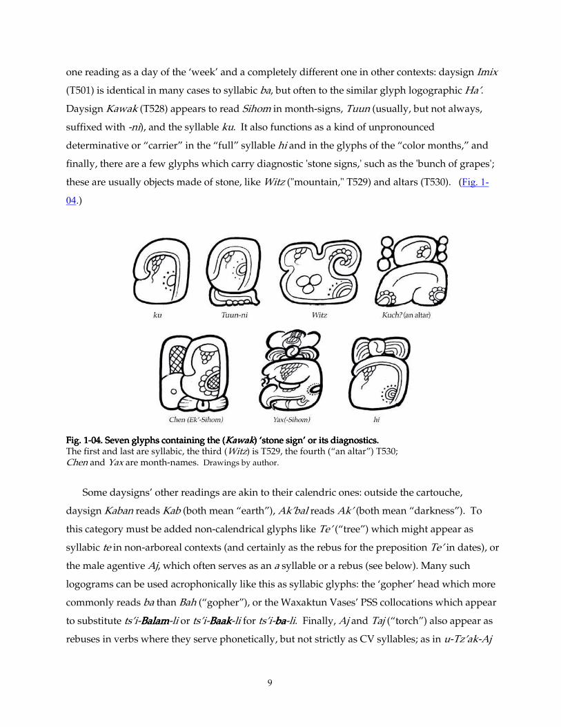
In Maya glyphs there exist several species of polyvalence. Most daysigns, for example have
5 Personal communication, 1999.
9
one reading as a day of the ‘week’ and a completely different one in other contexts: daysign Imix
(T501) is identical in many cases to syllabic ba, but often to the similar glyph logographic Ha’.
Daysign Kawak (T528) appears to read Sihom in month-signs, Tuun (usually, but not always,
suffixed with -ni), and the syllable ku. It also functions as a kind of unpronounced
determinative or “carrier” in the “full” syllable hi and in the glyphs of the “color months,” and
finally, there are a few glyphs which carry diagnostic 'stone signs,' such as the 'bunch of grapes';
these are usually objects made of stone, like Witz ("mountain," T529) and altars (T530). (Fig. 1-
04.)
Fig. 1Fig. 1Fig. 1Fig. 1----04. Seven glyphs containing the (04. Seven glyphs containing the (04. Seven glyphs containing the (04. Seven glyphs containing the (KawakKawakKawakKawak) ‘stone sign’ or its diagnostics. ) ‘stone sign’ or its diagnostics. ) ‘stone sign’ or its diagnostics. ) ‘stone sign’ or its diagnostics. The first and last are syllabic, the third (Witz) is T529, the fourth (“an altar”) T530; Chen and Yax are month-names. Drawings by author.
Some daysigns’ other readings are akin to their calendric ones: outside the cartouche,
daysign Kaban reads Kab (both mean “earth”), Ak’bal reads Ak’ (both mean “darkness”). To
this category must be added non-calendrical glyphs like Te’ (“tree”) which might appear as
syllabic te in non-arboreal contexts (and certainly as the rebus for the preposition Te’ in dates), or
the male agentive Aj, which often serves as an a syllable or a rebus (see below). Many such
logograms can be used acrophonically like this as syllabic glyphs: the ‘gopher’ head which more
commonly reads ba than Bah (“gopher”), or the Waxaktun Vases’ PSS collocations which appear
to substitute ts’i-BalamBalamBalamBalam-li or ts’i-BaakBaakBaakBaak-li for ts’i-babababa-li. Finally, Aj and Taj (“torch”) also appear as
rebuses in verbs where they serve phonetically, but not strictly as CV syllables; as in u-Tz’ak-Aj
10
or Ak’-Taj. There are differences, some very subtle, between these logographic signs-used-
phonetically and purely phonetic signs. The linguistic categorization of these types of glyphs is
the realm of another paper, and I shall avoid it as much as possible here. When a glyph such as
Aj or Te’ 6 appears to be logographic, referring to a person or to a tree, I shall render it as a
capitalized word, but otherwise I shall treat it as a phonetic syllable: a or te.
When I wish to refer to a glyph or part of a glyph which appears to portray a real item, such
as ‘finger’ or ‘nose,’ I shall enclose it in single quotes ( ‘ ’ —also known as inverted commas).
Single quotes also indicate the use of a nickname for a glyph, such as ‘propeller’ (T627) or
‘Casper’ or the ‘checkered shield’ of GIII. When I use double quotes (“ ”), it means I am directly
quoting another author (e.g., Coe’s “sign-forms”) or referring to the translation of a specific
glyph (e.g., T561 “sky” or T624(d)7 “shield”). A single quote or apostrophe is also used for the
glottal stop, as in the vowel syllables ‘a and ‘e, and in glottalized consonants, such as k’ and ch’.
The possessive form of nouns also uses an apostrophe (as in the panel’s carvers), and
occasionally I shall need to put a nickname in the possessive (e.g., the ‘hand’s modeling). This
need cause no confusion, even though the second inverted comma is playing both roles.
Occasionally, a Maya word ending with a glottalized consonant will need to be enclosed in
inverted commas or put into the possessive (e.g., the K’ak’s 'nose,' or the 'Te’-like element).
Again, I will not add a second apostrophe after the glottal stop, as context almost always makes
the proper spelling clear.
In keeping with the attitudes of the Maya themselves (and of most pre-modern cultures), I
shall use the terms artist, artisan, craftsman and craftswoman interchangeably. Specific art-
trades like weaver, painter, calligrapher, scribe, and carver will apply only to the artisans
working in particular media, though I present evidence that some scribes were also sculptors.
As far as we know, the Maya word tz'ib and its derivatives refer to both painting and
writing. This evidence suggests that, as in China, a Maya painter was expected to be a
calligrapher as well, and vice versa. There may yet appear, however, textual and other evidence
that they distinguished between the two arts after all. Certinly some artists were better at one of
these arts than the other. For example, a number of "glyphoid"-adorned ceramic vessels display
very competent illustrations. And, ironically, of the score or more surviving ceramic paintings
6 For example, the royal titles Kalom-Te’, Yok-Te’ and ya-Ajaw-Te’, have something to do with family trees, and therefore their Te’s
should be rendered as logograms. Nikolai Grube presented a paper on the topic of tree-metaphor in Classic Maya lineage titles at the “New Edgewalkers” Conference in San Antonio, Texas, Nov. 3, 2001, and is readying it for publication at this writing.
7 Which technically has no T-number, though it constitutes part of T624.
11
illustrating scribes at work, very few have any inscription at all. (see Robicsek and Hales 1981 or
Coe and Kerr 1997, passim., and the Kerr Vase Database)
Finally, this is an investigation into the work of individual nameless artists. I shall have to
bestow upon them appellations of some sort, just to be able to refer to them. Whether I call them
by a nickname, such as the "Fine Hatching Master" or "Hand B" or even just refer to this "Hand"
or that "Artist" or the other "Scribe," I shall capitalize whatever word or nickname I use at that
moment, partly as a nod to their individuality, but particularly to indicate to you, dear Reader,
that I am speaking in that instance of a specific Individual.
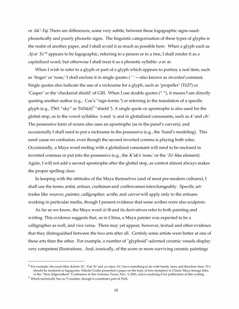
1.1. 1.1. 1.1. 1.1. The IdeaThe IdeaThe IdeaThe Idea
1.1.11.1.11.1.11.1.1. . . . The unique arrangement of the The unique arrangement of the The unique arrangement of the The unique arrangement of the Temple XVIIITemple XVIIITemple XVIIITemple XVIII Stucco Glyphs Stucco Glyphs Stucco Glyphs Stucco Glyphs
Fig. 1Fig. 1Fig. 1Fig. 1----05. 05. 05. 05. Temple XVIII StuccoesTemple XVIII StuccoesTemple XVIII StuccoesTemple XVIII Stuccoes:::: 80 glyphs mounted in wall of Palenque Museum. Photo by author
The peerless stucco sculptors of ancient Palenque produced abundant glyphic inscriptions
during the Late Classic. The artists formed the glyphs individually, allowed them to harden,
and then set them into a wet stucco substrate on walls, piers and roofcombs of various
12
structures.8 This procedure differs from their method of sculpting stucco figures, which they
formed directly on the walls. The imperfect bond between glyph and substrate allowed the
glyphs over the centuries eventually to fall to the floor. Very few of these glyphs remain in situ.
The longest stucco text yet found hung originally in Palenque Temple XVIII, on the
southeast corner of the long plaza before the Group of the Cross. Some of these beautiful glyphs
were first excavated by Blom and La Farge in 1925 (Blom and La Farge 1926-7). Later, in 1954,
Ruz and Férnandez (Ruz 1958) fully excavated the Temple and found many more, bringing the
total to a hundred or so. In that less sophisticated age, the archaeologists neglected to collect
and save the interstitial fragments of the substrate, and the glyphs, found in disarray, have never
been put into proper reading order. Though some glyphs can be paired by context, the
repetitive formulaic discourse structure of this inscription will almost certainly forestall any full
reconstruction of the text's original order by context and syntax clues alone.
The glyphs' faces are about five by six inches; each is about an inch thick. They balance
charming individuality and liveliness with formality and strength of design. They are sculpted
in fairly high relief (roughly half their thickness, or half an inch deep), considerably higher than
any of the stone inscriptions at Palenque, approaching that of the later glyphs at Copan. The
sculptors had to work fast, and a good part of the charm of these objects derives from the
immediacy of their construction. One can see the individual strokes left by the tools. One can
sense the deft motions of the artists' hands, the graceful, rapid dance of his tools as he expertly
punched and patted the material into shape; its crevices and bulges retain some of the life of the
plaster as it sprang back slightly after each forming stroke.
To display this collection of fine miniature sculptures in the Museo, curators and restorers
arranged 80 of them by type, and mounted them together9 into a large wall panel: the numerous
distance numbers in the first row, calendrical glyphs in the next, then signs containing the
8 One can conclude this from examination of what remains on the walls which once held these long stucco texts. For example, on
the Temple of the Inscriptions (Robertson 1983, pll. 18-20), the Olvidado, Temple XVIII, and the Temple of the Sun (Robertson 1991, pl. 120), one can see the indentations in the plaster where individual glyphs once hung. In many of these cases one or more of the glyphs remain in situ (or did so, up until modern times). I also had the opportunity to examine the reconstruction of the stucco panel from Temple XIX, and examined closely the individual glyph-blocks, front and back, before they were mounted into their present configuration. The back side of any of these is flattened by the table on which it was fashioned, often slightly and deliberately roughed so it would adhere better to its position on the wall. These glyphs must have been allowed to harden before mounting, because they have been sunk into the surface of the panel. The figural relief in the same panel, by contrast, was not sunk into the surface, but rather built up wet directly on the wall. Merle Greene Robertson describes this process is in detail in her Sculpture of Palenque, particularly the first volume on the Temple of the Inscriptions. The same process can be seen to have obtained throughout Palenque's construction period, including on Temple XIX, as can be deduced from the many remaining stucco reliefs in various states of repair. (Images in Robertson, all volumes, passim)
9 In addition to my Figures, see Robertson 1991, pll. 274-276, and Schele and Mathews 1979, nos. 395-548. Also, a pretty image of 48 of these can be seen in Stierlin 1981, pll. 113, and three details pll. 114-116. Early editions of Stierlin enlarged this image for the endpapers. It was this book, in 1983, that first exposed me to the visual beauty of Maya calligraphy; Thank you, Henri.
13
'Moon', signs containing face-profiles together, and so forth (Fig. 1-05). This arrangement
fortuitously allows the observer to compare various examples of the same glyph, side by side. It
was there that I first noticed the variety of styles juxtaposed in a single inscription.
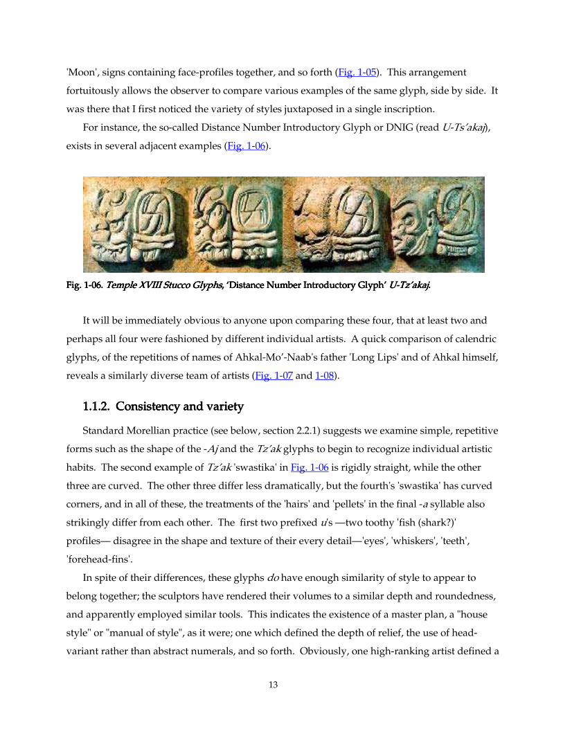
For instance, the so-called Distance Number Introductory Glyph or DNIG (read U-Ts’akaj),
exists in several adjacent examples (Fig. 1-06).
Fig. 1Fig. 1Fig. 1Fig. 1----06. 06. 06. 06. Temple XVIII Stucco GlyphsTemple XVIII Stucco GlyphsTemple XVIII Stucco GlyphsTemple XVIII Stucco Glyphs, ‘Distance Number Introductory Glyph’ , ‘Distance Number Introductory Glyph’ , ‘Distance Number Introductory Glyph’ , ‘Distance Number Introductory Glyph’ UUUU----Tz’akajTz’akajTz’akajTz’akaj. . . .
It will be immediately obvious to anyone upon comparing these four, that at least two and
perhaps all four were fashioned by different individual artists. A quick comparison of calendric
glyphs, of the repetitions of names of Ahkal-Mo’-Naab's father 'Long Lips' and of Ahkal himself,
reveals a similarly diverse team of artists (Fig. 1-07 and 1-08).
1.1.21.1.21.1.21.1.2. Consistency and variety. Consistency and variety. Consistency and variety. Consistency and variety
Standard Morellian practice (see below, section 2.2.1) suggests we examine simple, repetitive
forms such as the shape of the -Aj and the Tz’ak glyphs to begin to recognize individual artistic
habits. The second example of Tz’ak 'swastika' in Fig. 1-06 is rigidly straight, while the other
three are curved. The other three differ less dramatically, but the fourth's 'swastika' has curved
corners, and in all of these, the treatments of the 'hairs' and 'pellets' in the final -a syllable also
strikingly differ from each other. The first two prefixed u's —two toothy 'fish (shark?)'
profiles— disagree in the shape and texture of their every detail—'eyes', 'whiskers', 'teeth',
'forehead-fins'.
In spite of their differences, these glyphs do have enough similarity of style to appear to
belong together; the sculptors have rendered their volumes to a similar depth and roundedness,
and apparently employed similar tools. This indicates the existence of a master plan, a "house
style" or "manual of style", as it were; one which defined the depth of relief, the use of head-
variant rather than abstract numerals, and so forth. Obviously, one high-ranking artist defined a
14
format, and made certain that the work of every member of the team followed this format. Even
so, he tolerated a rather wide range of interpretations. The graceful style of the third example
stands out: this artist preferred to sculpt tiny, 'laughing' eyes and subtly modeled features.
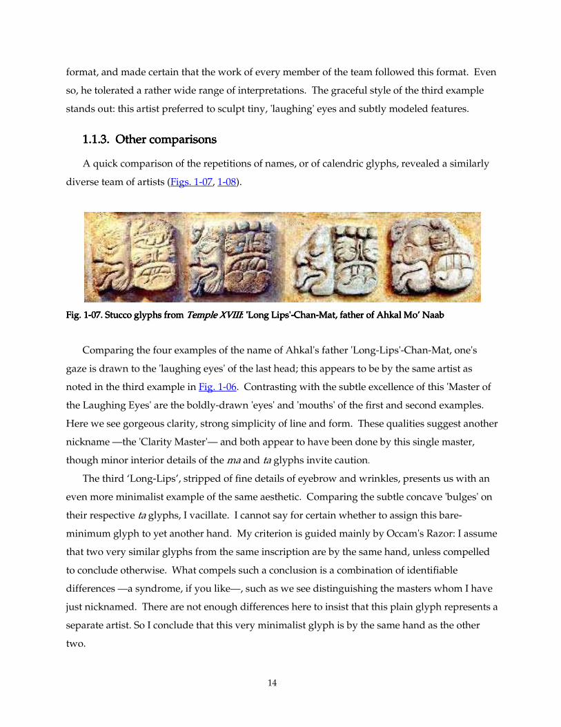
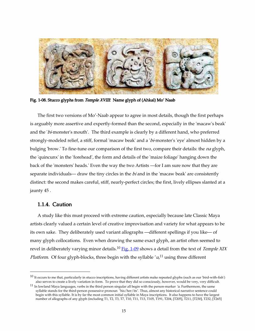
1.1.31.1.31.1.31.1.3. Other comparisons. Other comparisons. Other comparisons. Other comparisons
A quick comparison of the repetitions of names, or of calendric glyphs, revealed a similarly
diverse team of artists (Figs. 1-07, 1-08).
Fig. 1Fig. 1Fig. 1Fig. 1----07. Stucco glyphs from 07. Stucco glyphs from 07. Stucco glyphs from 07. Stucco glyphs from Temple XVIIITemple XVIIITemple XVIIITemple XVIII: 'Long Lips': 'Long Lips': 'Long Lips': 'Long Lips'----ChanChanChanChan----Mat, father of Ahkal Mo’ NaabMat, father of Ahkal Mo’ NaabMat, father of Ahkal Mo’ NaabMat, father of Ahkal Mo’ Naab
Comparing the four examples of the name of Ahkal's father 'Long-Lips'-Chan-Mat, one's
gaze is drawn to the 'laughing eyes' of the last head; this appears to be by the same artist as
noted in the third example in Fig. 1-06. Contrasting with the subtle excellence of this 'Master of
the Laughing Eyes' are the boldly-drawn 'eyes' and 'mouths' of the first and second examples.
Here we see gorgeous clarity, strong simplicity of line and form. These qualities suggest another
nickname —the 'Clarity Master'— and both appear to have been done by this single master,
though minor interior details of the ma and ta glyphs invite caution.
The third ‘Long-Lips’, stripped of fine details of eyebrow and wrinkles, presents us with an
even more minimalist example of the same aesthetic. Comparing the subtle concave 'bulges' on
their respective ta glyphs, I vacillate. I cannot say for certain whether to assign this bare-
minimum glyph to yet another hand. My criterion is guided mainly by Occam's Razor: I assume
that two very similar glyphs from the same inscription are by the same hand, unless compelled
to conclude otherwise. What compels such a conclusion is a combination of identifiable
differences —a syndrome, if you like—, such as we see distinguishing the masters whom I have
just nicknamed. There are not enough differences here to insist that this plain glyph represents a
separate artist. So I conclude that this very minimalist glyph is by the same hand as the other
two.
15
Fig. 1Fig. 1Fig. 1Fig. 1----08. Stucco glyphs from 08. Stucco glyphs from 08. Stucco glyphs from 08. Stucco glyphs from Temple XVIIITemple XVIIITemple XVIIITemple XVIII: Name glyph of (Ahkal) Mo’ Naab: Name glyph of (Ahkal) Mo’ Naab: Name glyph of (Ahkal) Mo’ Naab: Name glyph of (Ahkal) Mo’ Naab
The first two versions of Mo’-Naab appear to agree in most details, though the first perhaps
is arguably more assertive and expertly-formed than the second, especially in the 'macaw's beak'
and the 'bi-monster's mouth'. The third example is clearly by a different hand, who preferred
strongly-modeled relief, a stiff, formal 'macaw beak' and a 'bi-monster's 'eye' almost hidden by a
bulging 'brow.' To fine-tune our comparison of the first two, compare their details: the na glyph,
the 'quincunx' in the 'forehead', the form and details of the 'maize foliage' hanging down the
back of the 'monsters' heads.' Even the way the two Artists —for I am sure now that they are
separate individuals— draw the tiny circles in the bi and in the 'macaw beak' are consistently
distinct: the second makes careful, stiff, nearly-perfect circles; the first, lively ellipses slanted at a
jaunty 45°.
1.1.1.1.1.1.1.1.4444. Caution. Caution. Caution. Caution
A study like this must proceed with extreme caution, especially because late Classic Maya
artists clearly valued a certain level of creative improvisation and variety for what appears to be
its own sake. They deliberately used variant allographs —different spellings if you like— of
many glyph collocations. Even when drawing the same exact glyph, an artist often seemed to
revel in deliberately varying minor details.10 Fig. 1-09 shows a detail from the text of Temple XIX
Platform. Of four glyph-blocks, three begin with the syllable ’u,11 using three different
10 It occurs to me that, particularly in stucco inscriptions, having different artists make repeated glyphs (such as our 'bird-with-fish')
also serves to create a lively variation in form. To prove that they did so consciously, however, would be very, very difficult. 11 In lowland Maya languages, verbs in the third person singular all begin with the person-marker ’u. Furthermore, the same
syllable stands for the third-person possessive pronoun "his/her/its". Thus, almost any historical narrative sentence could begin with this syllable. It is by far the most common initial syllable in Maya inscriptions. It also happens to have the largest number of allographs of any glyph (including T1, T2, T3, T7, T10, T11, T13, T105, T191, T204, [T205], T211, [T230], T232, [T265]
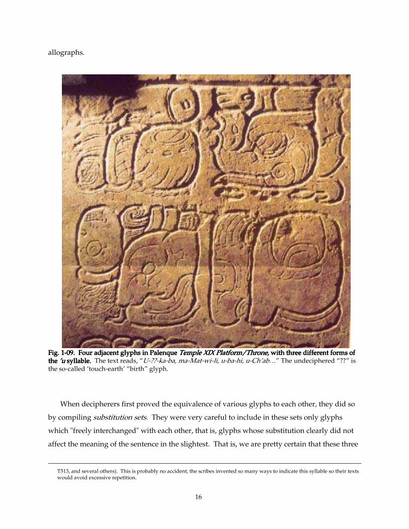
16
allographs.
Fig. 1Fig. 1Fig. 1Fig. 1----09. Four adjacent glyphs in Palenque 09. Four adjacent glyphs in Palenque 09. Four adjacent glyphs in Palenque 09. Four adjacent glyphs in Palenque Temple XIX Platform/ThroneTemple XIX Platform/ThroneTemple XIX Platform/ThroneTemple XIX Platform/Throne, with three different forms of , with three different forms of , with three different forms of , with three different forms of the the the the ’u ’u ’u ’u syllsyllsyllsyllable. able. able. able. The text reads, “U-??-ka-ba, ma-Mat-wi-li, u-ba-hi, u-Ch’ab…” The undeciphered “??” is the so-called ‘touch-earth’ “birth” glyph.
When decipherers first proved the equivalence of various glyphs to each other, they did so
by compiling substitution sets. They were very careful to include in these sets only glyphs
which "freely interchanged" with each other, that is, glyphs whose substitution clearly did not
affect the meaning of the sentence in the slightest. That is, we are pretty certain that these three
T513, and several others). This is probably no accident; the scribes invented so many ways to indicate this syllable so their texts would avoid excessive repetition.

17
allographs were literally equivalent in the minds of their makers. If there existed a connotation
to the use of the 'fish' glyph which colored the interpretation of the "bloodletting" verb to which
it is here attached, or any subtle specific reason they chose in this case the 'inverted-skull-on-a-
rope' glyph for the U-Bah collocation, it is so insignificant that it flies beneath our radar.
Temple XVIII's stucco texts comprise more than a hundred glyphs; lengthy but by no means
extraordinarily so. A single artist could easily have made them all in the space of a few days.
Possibly there may have existed some yet-unknown or -unguessed ritual or technical motive for
rapid production —some religious requirement that the whole text be completed between sunup
and sundown, for example. Or, perhaps to achieve a better bond between partly-cured glyph
and stucco bed, the artisans might have wanted all of the glyphs curing relatively
simultaneously.
But the technical circumstances of their assembly into a text —prefabrication, drying, then
insertion into place in a bed of fresh stucco— does not on the face of it demand such alacrity.
Further, the bond between glyph and matrix was not decidedly strong, or the glyph-blocks
would not have fallen off and become jumbled in the first place. The realization dawned on me
that, possibly the large team of stucco artists working on Temple XVIII simply reflected the large
pool of available talent. Obviously there was a sizeable number of first-rate stucco sculptors
working at Palenque at this time. The Palace alone had 48 exterior piers —presumably all
decorated as gloriously as those that survive— and uncounted stucco reliefs on a comparable
number of interior piers, and on walls, soffits, lintels, jambs, mansard roofs, and and roof-combs.
Creating and maintaining such a display would occupy full-time an army of first-rate stucco
craftsmen. With such a pool of talent to draw on, to imagine an example, an architect or priest
could have had the means to decide in the morning to install a 100-glyph inscription in his new
temple, and have it done by nightfall.
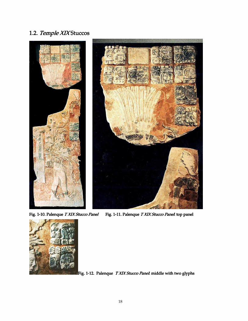
18
1.2. 1.2. 1.2. 1.2. Temple XIXTemple XIXTemple XIXTemple XIX Stuccos Stuccos Stuccos Stuccos
Fig. 1Fig. 1Fig. 1Fig. 1----10. Palenque 10. Palenque 10. Palenque 10. Palenque T XIX Stucco PanelT XIX Stucco PanelT XIX Stucco PanelT XIX Stucco Panel Fig. 1 Fig. 1 Fig. 1 Fig. 1----11. Palenque 11. Palenque 11. Palenque 11. Palenque T XIX Stucco PanelT XIX Stucco PanelT XIX Stucco PanelT XIX Stucco Panel: top panel: top panel: top panel: top panel
Fig. 1Fig. 1Fig. 1Fig. 1----12. Palenque 12. Palenque 12. Palenque 12. Palenque T XIX T XIX T XIX T XIX Stucco PanelStucco PanelStucco PanelStucco Panel: middle with two glyphs: middle with two glyphs: middle with two glyphs: middle with two glyphs
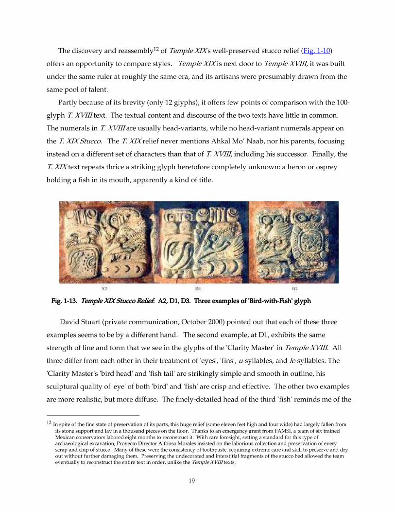
19
The discovery and reassembly12 of Temple XIX's well-preserved stucco relief (Fig. 1-10)
offers an opportunity to compare styles. Temple XIX is next door to Temple XVIII, it was built
under the same ruler at roughly the same era, and its artisans were presumably drawn from the
same pool of talent.
Partly because of its brevity (only 12 glyphs), it offers few points of comparison with the 100-
glyph T. XVIII text. The textual content and discourse of the two texts have little in common.
The numerals in T. XVIII are usually head-variants, while no head-variant numerals appear on
the T. XIX Stucco. The T. XIX relief never mentions Ahkal Mo’ Naab, nor his parents, focusing
instead on a different set of characters than that of T. XVIII, including his successor. Finally, the
T. XIX text repeats thrice a striking glyph heretofore completely unknown: a heron or osprey
holding a fish in its mouth, apparently a kind of title.
Fig. 1 Fig. 1 Fig. 1 Fig. 1----13. 13. 13. 13. TemTemTemTemple XIX Stucco Reliefple XIX Stucco Reliefple XIX Stucco Reliefple XIX Stucco Relief: A2, D1, D3. Three examples of 'Bird: A2, D1, D3. Three examples of 'Bird: A2, D1, D3. Three examples of 'Bird: A2, D1, D3. Three examples of 'Bird----withwithwithwith----Fish' glyph Fish' glyph Fish' glyph Fish' glyph
David Stuart (private communication, October 2000) pointed out that each of these three
examples seems to be by a different hand. The second example, at D1, exhibits the same
strength of line and form that we see in the glyphs of the 'Clarity Master' in Temple XVIII. All
three differ from each other in their treatment of 'eyes', 'fins', u-syllables, and le-syllables. The
'Clarity Master's 'bird head' and 'fish tail' are strikingly simple and smooth in outline, his
sculptural quality of 'eye' of both 'bird' and 'fish' are crisp and effective. The other two examples
are more realistic, but more diffuse. The finely-detailed head of the third 'fish' reminds me of the
12 In spite of the fine state of preservation of its parts, this huge relief (some eleven feet high and four wide) had largely fallen from
its stone support and lay in a thousand pieces on the floor. Thanks to an emergency grant from FAMSI, a team of six trained Mexican conservators labored eight months to reconstruct it. With rare foresight, setting a standard for this type of archaeological excavation, Proyecto Director Alfonso Morales insisted on the laborious collection and preservation of every scrap and chip of stucco. Many of these were the consistency of toothpaste, requiring extreme care and skill to preserve and dry out without further damaging them. Preserving the undecorated and interstitial fragments of the stucco bed allowed the team eventually to reconstruct the entire text in order, unlike the Temple XVIII texts.
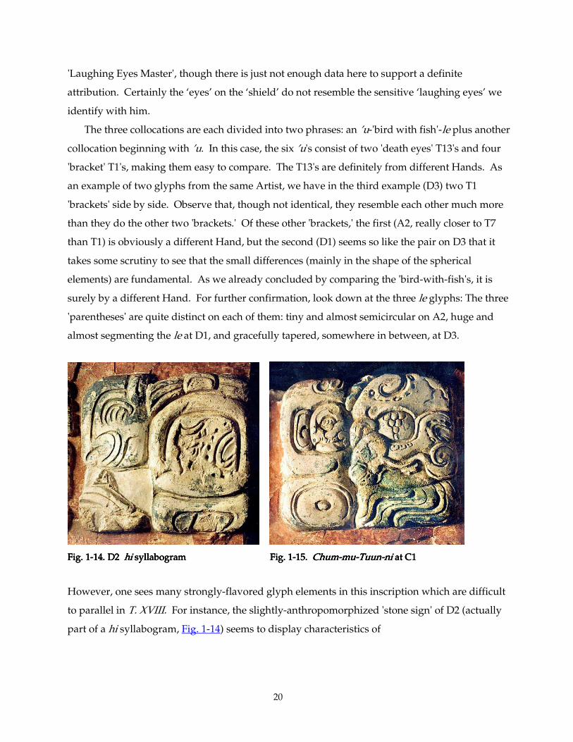
20
'Laughing Eyes Master', though there is just not enough data here to support a definite
attribution. Certainly the ‘eyes’ on the ‘shield’ do not resemble the sensitive ‘laughing eyes’ we
identify with him.
The three collocations are each divided into two phrases: an ’u-'bird with fish'-le plus another
collocation beginning with ’u. In this case, the six ’u's consist of two 'death eyes' T13's and four
'bracket' T1's, making them easy to compare. The T13's are definitely from different Hands. As
an example of two glyphs from the same Artist, we have in the third example (D3) two T1
'brackets' side by side. Observe that, though not identical, they resemble each other much more
than they do the other two 'brackets.' Of these other 'brackets,' the first (A2, really closer to T7
than T1) is obviously a different Hand, but the second (D1) seems so like the pair on D3 that it
takes some scrutiny to see that the small differences (mainly in the shape of the spherical
elements) are fundamental. As we already concluded by comparing the 'bird-with-fish's, it is
surely by a different Hand. For further confirmation, look down at the three le glyphs: The three
'parentheses' are quite distinct on each of them: tiny and almost semicircular on A2, huge and
almost segmenting the le at D1, and gracefully tapered, somewhere in between, at D3.
Fig. 1Fig. 1Fig. 1Fig. 1----14. D2 14. D2 14. D2 14. D2 hihihihi syllabogram syllabogram syllabogram syllabogram Fig. 1Fig. 1Fig. 1Fig. 1----15. 15. 15. 15. ChumChumChumChum----mumumumu----TuunTuunTuunTuun----nininini at C1 at C1 at C1 at C1
However, one sees many strongly-flavored glyph elements in this inscription which are difficult
to parallel in T. XVIII. For instance, the slightly-anthropomorphized 'stone sign' of D2 (actually
part of a hi syllabogram, Fig. 1-14) seems to display characteristics of
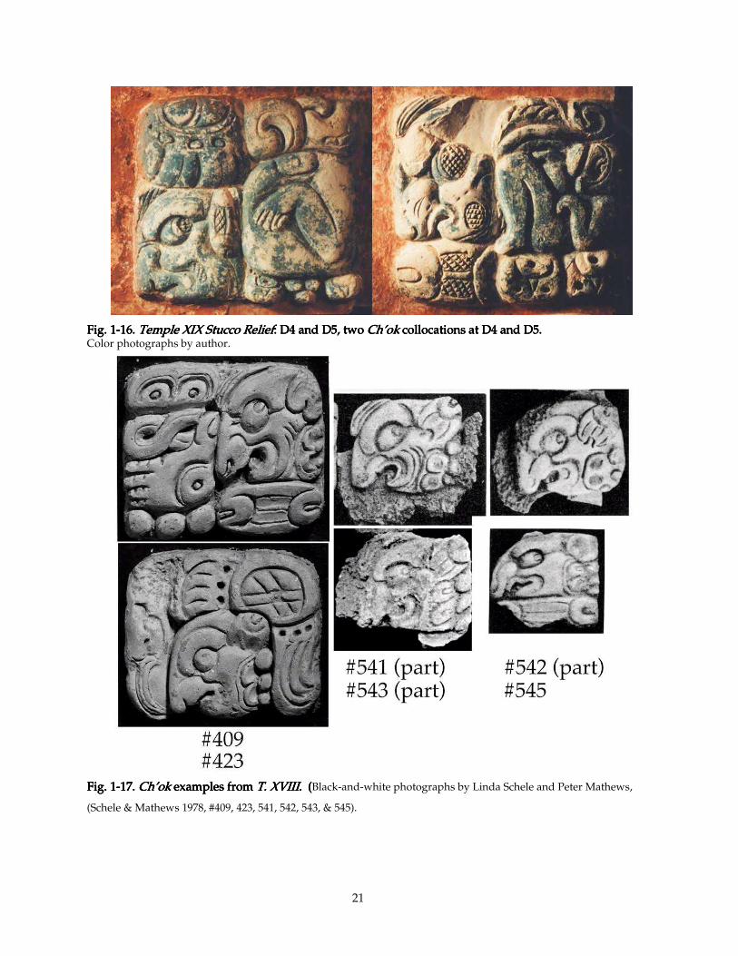
21
Fig. 1Fig. 1Fig. 1Fig. 1----16. 16. 16. 16. Temple XIX Stucco ReliefTemple XIX Stucco ReliefTemple XIX Stucco ReliefTemple XIX Stucco Relief: D4 and D5, two : D4 and D5, two : D4 and D5, two : D4 and D5, two Ch’okCh’okCh’okCh’ok collocations collocations collocations collocations at D4 and D5.at D4 and D5.at D4 and D5.at D4 and D5. Color photographs by author.
Fig. 1Fig. 1Fig. 1Fig. 1----17.17.17.17. Ch’okCh’okCh’okCh’ok examples from examples from examples from examples from T. XVIII. T. XVIII. T. XVIII. T. XVIII. ( ( ( (Black-and-white photographs by Linda Schele and Peter Mathews,
(Schele & Mathews 1978, #409, 423, 541, 542, 543, & 545).
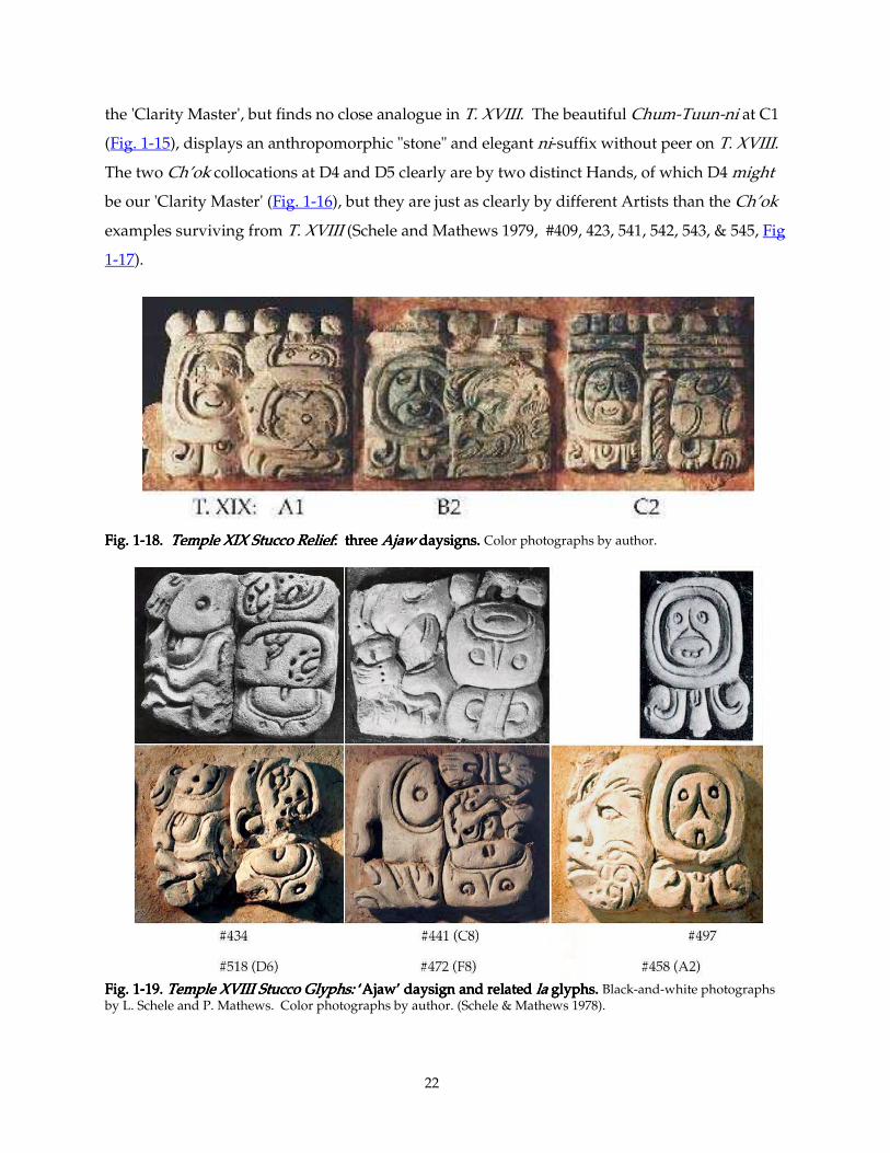
22
the 'Clarity Master', but finds no close analogue in T. XVIII. The beautiful Chum-Tuun-ni at C1
(Fig. 1-15), displays an anthropomorphic "stone" and elegant ni-suffix without peer on T. XVIII.
The two Ch’ok collocations at D4 and D5 clearly are by two distinct Hands, of which D4 might
be our 'Clarity Master' (Fig. 1-16), but they are just as clearly by different Artists than the Ch’ok
examples surviving from T. XVIII (Schele and Mathews 1979, #409, 423, 541, 542, 543, & 545, Fig
1-17).
Fig. 1Fig. 1Fig. 1Fig. 1----18. 18. 18. 18. Temple XIX Stucco ReliefTemple XIX Stucco ReliefTemple XIX Stucco ReliefTemple XIX Stucco Relief: three : three : three : three Ajaw Ajaw Ajaw Ajaw daysigns. daysigns. daysigns. daysigns. Color photographs by author.
Fig. 1Fig. 1Fig. 1Fig. 1----19. 19. 19. 19. Temple XVIII Stucco Glyphs: Temple XVIII Stucco Glyphs: Temple XVIII Stucco Glyphs: Temple XVIII Stucco Glyphs: ‘Ajaw’ ‘Ajaw’ ‘Ajaw’ ‘Ajaw’ daysign and related daysign and related daysign and related daysign and related lalalala glyphs. glyphs. glyphs. glyphs. Black-and-white photographs by L. Schele and P. Mathews. Color photographs by author. (Schele & Mathews 1978).
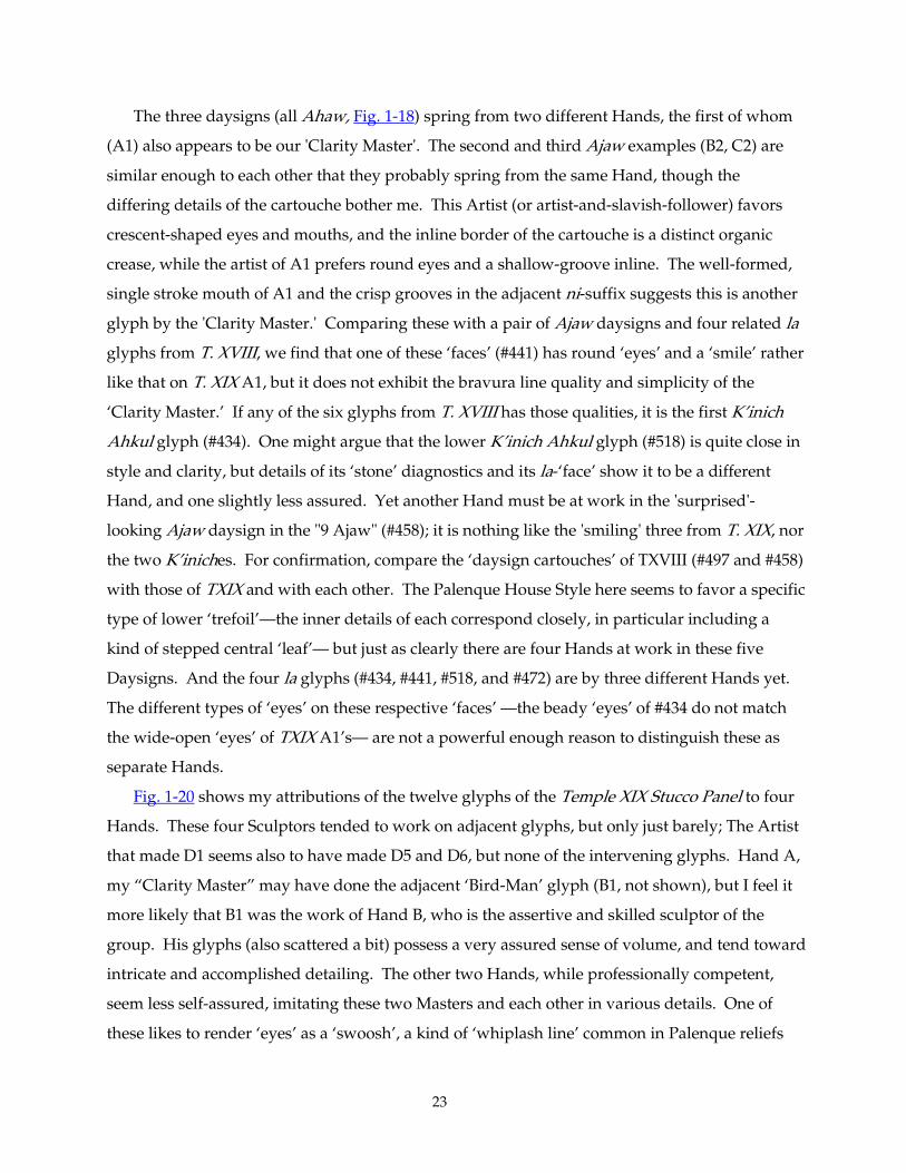
23
The three daysigns (all Ahaw, Fig. 1-18) spring from two different Hands, the first of whom
(A1) also appears to be our 'Clarity Master'. The second and third Ajaw examples (B2, C2) are
similar enough to each other that they probably spring from the same Hand, though the
differing details of the cartouche bother me. This Artist (or artist-and-slavish-follower) favors
crescent-shaped eyes and mouths, and the inline border of the cartouche is a distinct organic
crease, while the artist of A1 prefers round eyes and a shallow-groove inline. The well-formed,
single stroke mouth of A1 and the crisp grooves in the adjacent ni-suffix suggests this is another
glyph by the 'Clarity Master.' Comparing these with a pair of Ajaw daysigns and four related la
glyphs from T. XVIII, we find that one of these ‘faces’ (#441) has round ‘eyes’ and a ‘smile’ rather
like that on T. XIX A1, but it does not exhibit the bravura line quality and simplicity of the
‘Clarity Master.’ If any of the six glyphs from T. XVIII has those qualities, it is the first K’inich
Ahkul glyph (#434). One might argue that the lower K’inich Ahkul glyph (#518) is quite close in
style and clarity, but details of its ‘stone’ diagnostics and its la-‘face’ show it to be a different
Hand, and one slightly less assured. Yet another Hand must be at work in the 'surprised'-
looking Ajaw daysign in the "9 Ajaw" (#458); it is nothing like the 'smiling' three from T. XIX, nor
the two K’iniches. For confirmation, compare the ‘daysign cartouches’ of TXVIII (#497 and #458)
with those of TXIX and with each other. The Palenque House Style here seems to favor a specific
type of lower ‘trefoil’—the inner details of each correspond closely, in particular including a
kind of stepped central ‘leaf’— but just as clearly there are four Hands at work in these five
Daysigns. And the four la glyphs (#434, #441, #518, and #472) are by three different Hands yet.
The different types of ‘eyes’ on these respective ‘faces’ —the beady ‘eyes’ of #434 do not match
the wide-open ‘eyes’ of TXIX A1’s— are not a powerful enough reason to distinguish these as
separate Hands.
Fig. 1-20 shows my attributions of the twelve glyphs of the Temple XIX Stucco Panel to four
Hands. These four Sculptors tended to work on adjacent glyphs, but only just barely; The Artist
that made D1 seems also to have made D5 and D6, but none of the intervening glyphs. Hand A,
my “Clarity Master” may have done the adjacent ‘Bird-Man’ glyph (B1, not shown), but I feel it
more likely that B1 was the work of Hand B, who is the assertive and skilled sculptor of the
group. His glyphs (also scattered a bit) possess a very assured sense of volume, and tend toward
intricate and accomplished detailing. The other two Hands, while professionally competent,
seem less self-assured, imitating these two Masters and each other in various details. One of
these likes to render ‘eyes’ as a ‘swoosh’, a kind of ‘whiplash line’ common in Palenque reliefs
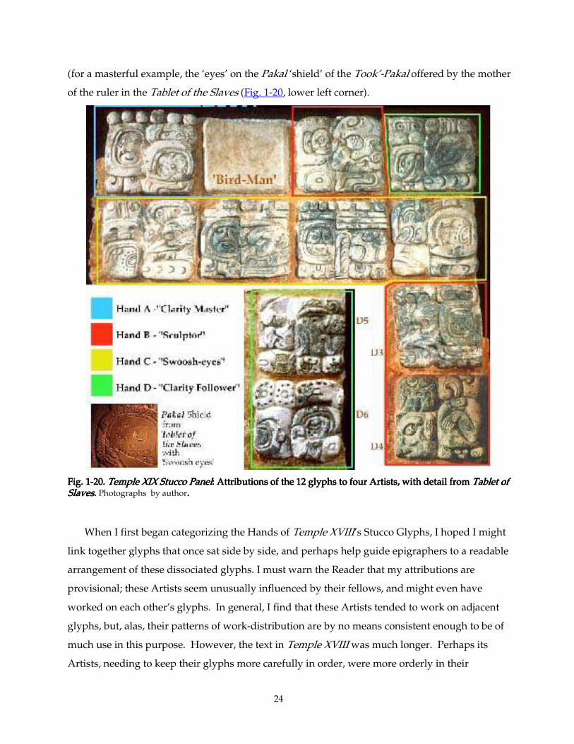
24
(for a masterful example, the ‘eyes’ on the Pakal ‘shield’ of the Took’-Pakal offered by the mother
of the ruler in the Tablet of the Slaves (Fig. 1-20, lower left corner).
Fig. 1Fig. 1Fig. 1Fig. 1----20. 20. 20. 20. Temple XIX Stucco Temple XIX Stucco Temple XIX Stucco Temple XIX Stucco PanelPanelPanelPanel: Attributions of the 12 glyphs to four Artists, with detail from : Attributions of the 12 glyphs to four Artists, with detail from : Attributions of the 12 glyphs to four Artists, with detail from : Attributions of the 12 glyphs to four Artists, with detail from Tablet of Tablet of Tablet of Tablet of SlavesSlavesSlavesSlaves. . . . Photographs by author....
When I first began categorizing the Hands of Temple XVIII’s Stucco Glyphs, I hoped I might
link together glyphs that once sat side by side, and perhaps help guide epigraphers to a readable
arrangement of these dissociated glyphs. I must warn the Reader that my attributions are
provisional; these Artists seem unusually influenced by their fellows, and might even have
worked on each other’s glyphs. In general, I find that these Artists tended to work on adjacent
glyphs, but, alas, their patterns of work-distribution are by no means consistent enough to be of
much use in this purpose. However, the text in Temple XVIII was much longer. Perhaps its
Artists, needing to keep their glyphs more carefully in order, were more orderly in their
25
distribution, and such an attribution can be of service after all. However, I shall leave that
analysis for a later project; the usefulness of such an analysis will be better to assess once I have
examined a number of intact inscriptions.
1.3. Stone Inscription Sculptors 1.3. Stone Inscription Sculptors 1.3. Stone Inscription Sculptors 1.3. Stone Inscription Sculptors
1.3.1.1.3.1.1.3.1.1.3.1.
The foregoing examples should suffice to show that even in a short 12-glyph text, the
foreman working for Ahkal Mo’ Naab saw fit to employ three or four expert stucco sculptors.
One of these appears also to have worked on the inscription in Temple XVIII. But stucco text
production was done piecemeal: Glyphs were formed individually, like cookies, dried, and then
inserted into a bed of wet stucco on the wall. The drawback to this procedure is that the bond
between glyph and substrate is rather weak, and the glyphs later fall off onto the floor. The
advantage from a production standpoint is that it is not necessary for any glyph to be made in
proximity to any other; one can distribute the work among several artists, and get the job done
much more rapidly.
But what about stone inscriptions? Every carver needs a minimum of elbow room. Many
stone inscriptions are monolithic, and one would expect any of these that are smaller than, say,
the size of a grown man, to have been the work of a single artist.
Indeed, this is clearly the case with the celebrated Panel of the 96 Glyphs (124 cm long, made
AD 783 for K’inich K’uk’-Balam and found in the Court of the Tower, Figs. 1-21 & 1-22). The
unique work of its brilliant and flamboyant artist is instantly recognizable. Other pieces by the
'96 Glyphs Master' are the Lapida de la Creación (Figs. 1-23 & 1-24, found with the Panel of the
96 Glyphs), two matching trapezoidal slabs bearing images of Chaak (Fig. 1-25), and two
fragments found around the corner, near the North Façade of the Palace (Schele & Mathews,
1979, item #37, my Fig. 1-26). All of these seem to have once been part of a single throne or
platform ensemble.
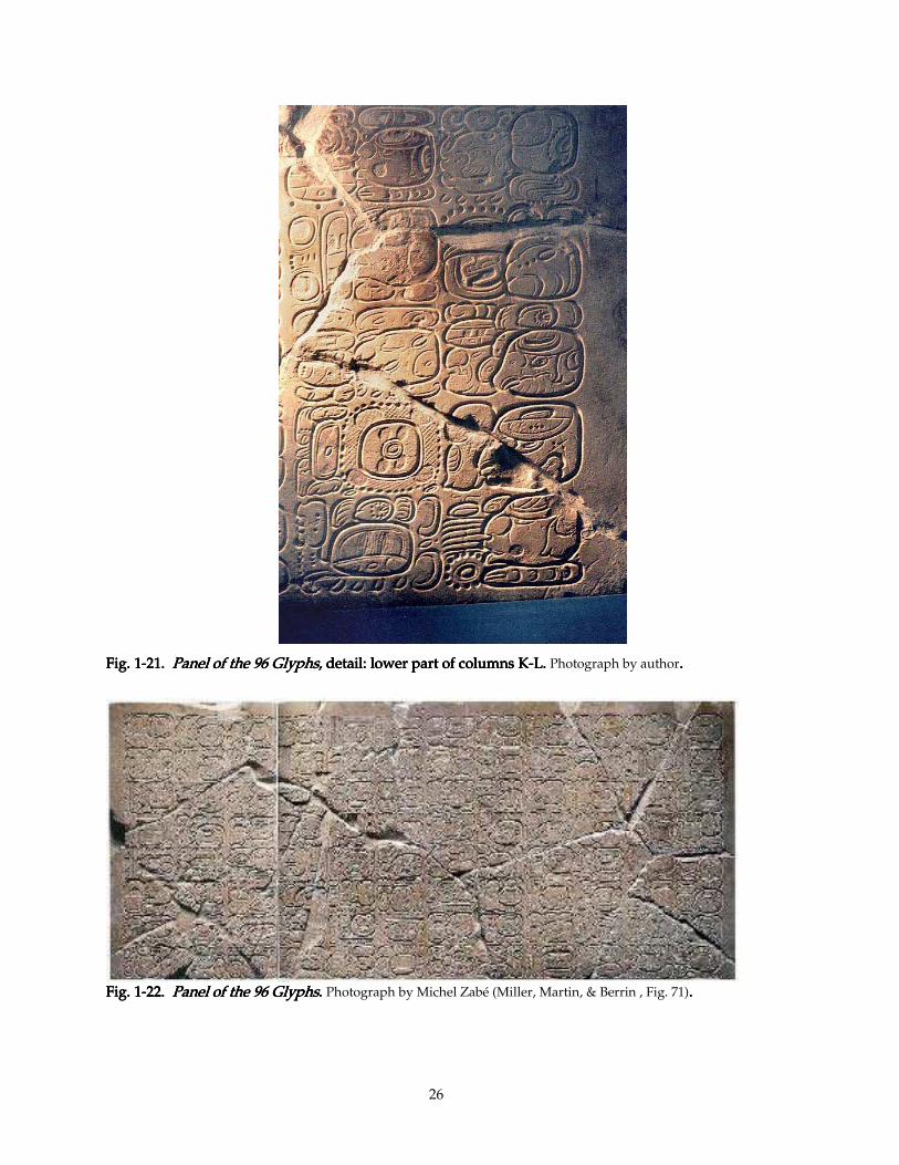
26
Fig. 1Fig. 1Fig. 1Fig. 1----21212121. . . . Panel of the 96 GlyphsPanel of the 96 GlyphsPanel of the 96 GlyphsPanel of the 96 Glyphs, detail: lower part of c, detail: lower part of c, detail: lower part of c, detail: lower part of columns Kolumns Kolumns Kolumns K----L. L. L. L. Photograph by author....
Fig. 1Fig. 1Fig. 1Fig. 1----22222222. . . . Panel of the 96 GlyphsPanel of the 96 GlyphsPanel of the 96 GlyphsPanel of the 96 Glyphs. . . . Photograph by Michel Zabé (Miller, Martin, & Berrin , Fig. 71)....
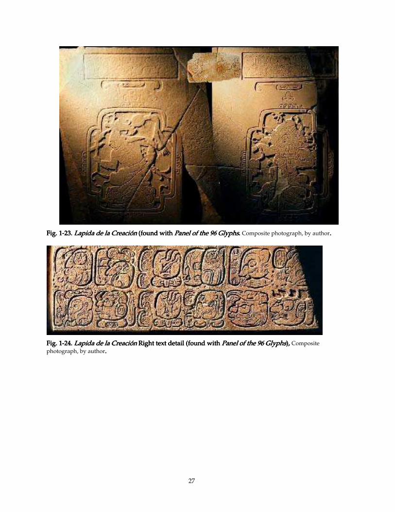
27
Fig. 1Fig. 1Fig. 1Fig. 1----23232323.... Lapida de la Creación Lapida de la Creación Lapida de la Creación Lapida de la Creación (found with (found with (found with (found with Panel of the 96 GlyphsPanel of the 96 GlyphsPanel of the 96 GlyphsPanel of the 96 Glyphs. . . . Composite photograph, by author....
Fig. 1Fig. 1Fig. 1Fig. 1----24242424.... Lapida de la CreaciónLapida de la CreaciónLapida de la CreaciónLapida de la Creación Right text detail (found with Right text detail (found with Right text detail (found with Right text detail (found with Panel of the 96 GlyphsPanel of the 96 GlyphsPanel of the 96 GlyphsPanel of the 96 Glyphs), ), ), ), Composite photograph, by author....
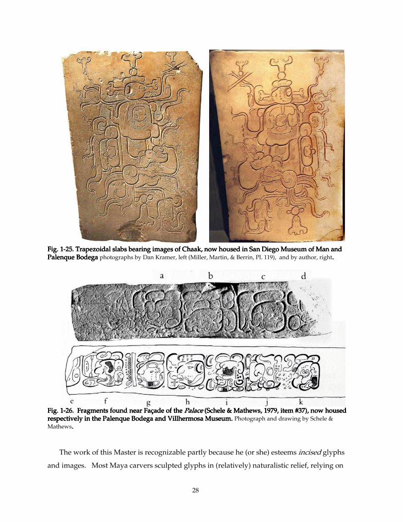
28
Fig. 1Fig. 1Fig. 1Fig. 1----25252525. Trapezoidal slabs bearing images of Chaak, now housed in San Diego Museum of Man and . Trapezoidal slabs bearing images of Chaak, now housed in San Diego Museum of Man and . Trapezoidal slabs bearing images of Chaak, now housed in San Diego Museum of Man and . Trapezoidal slabs bearing images of Chaak, now housed in San Diego Museum of Man and Palenque Bodega Palenque Bodega Palenque Bodega Palenque Bodega photographs by Dan Kramer, left (Miller, Martin, & Berrin, Pl. 119), and by author, right....
Fig. 1Fig. 1Fig. 1Fig. 1----26. Fragment26. Fragment26. Fragment26. Fragments found near Façade of the s found near Façade of the s found near Façade of the s found near Façade of the Palace Palace Palace Palace (Schele & Mathews, 1979, item #37), now housed (Schele & Mathews, 1979, item #37), now housed (Schele & Mathews, 1979, item #37), now housed (Schele & Mathews, 1979, item #37), now housed respectively in the Palenque Bodega and Villhermosa Museum. respectively in the Palenque Bodega and Villhermosa Museum. respectively in the Palenque Bodega and Villhermosa Museum. respectively in the Palenque Bodega and Villhermosa Museum. Photograph and drawing by Schele & Mathews....
The work of this Master is recognizable partly because he (or she) esteems incised glyphs
and images. Most Maya carvers sculpted glyphs in (relatively) naturalistic relief, relying on
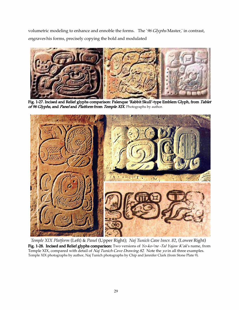
29
volumetric modeling to enhance and ennoble the forms. The '96 Glyphs Master,' in contrast,
engraves his forms, precisely copying the bold and modulated
Fig. 1Fig. 1Fig. 1Fig. 1----27. Incised and Relief glyphs comparison: Palenque ‘Rabbit Skull’27. Incised and Relief glyphs comparison: Palenque ‘Rabbit Skull’27. Incised and Relief glyphs comparison: Palenque ‘Rabbit Skull’27. Incised and Relief glyphs comparison: Palenque ‘Rabbit Skull’----type Emblem Glyph, from type Emblem Glyph, from type Emblem Glyph, from type Emblem Glyph, from Tablet Tablet Tablet Tablet of 96 Glyphsof 96 Glyphsof 96 Glyphsof 96 Glyphs, and , and , and , and PanelPanelPanelPanel and and and and PlatformPlatformPlatformPlatform from from from from Temple Temple Temple Temple XIXXIXXIXXIX. . . . Photographs by author.
Fig. 1Fig. 1Fig. 1Fig. 1----28. Incised and Relief glyphs comparison: 28. Incised and Relief glyphs comparison: 28. Incised and Relief glyphs comparison: 28. Incised and Relief glyphs comparison: Two versions of Yo-ko-2ne -Tal Yajaw K’ak’s name, from Temple XIX, compared with detail of Naj Tunich Cave Drawing 82. Note the yo in all three examples. Temple XIX photographs by author, Naj Tunich photographs by Chip and Jennifer Clark (from Stone Plate 9).
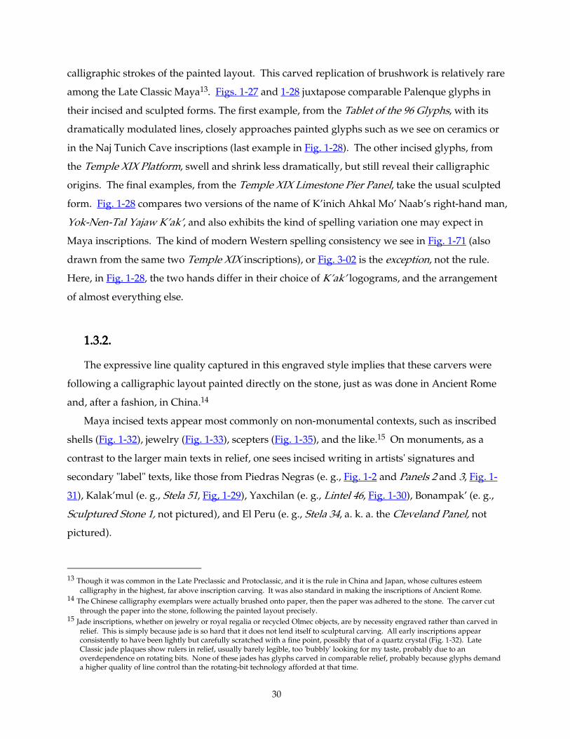
30
calligraphic strokes of the painted layout. This carved replication of brushwork is relatively rare
among the Late Classic Maya13. Figs. 1-27 and 1-28 juxtapose comparable Palenque glyphs in
their incised and sculpted forms. The first example, from the Tablet of the 96 Glyphs, with its
dramatically modulated lines, closely approaches painted glyphs such as we see on ceramics or
in the Naj Tunich Cave inscriptions (last example in Fig. 1-28). The other incised glyphs, from
the Temple XIX Platform, swell and shrink less dramatically, but still reveal their calligraphic
origins. The final examples, from the Temple XIX Limestone Pier Panel, take the usual sculpted
form. Fig. 1-28 compares two versions of the name of K’inich Ahkal Mo’ Naab’s right-hand man,
Yok-Nen-Tal Yajaw K’ak’, and also exhibits the kind of spelling variation one may expect in
Maya inscriptions. The kind of modern Western spelling consistency we see in Fig. 1-71 (also
drawn from the same two Temple XIX inscriptions), or Fig. 3-02 is the exception, not the rule.
Here, in Fig. 1-28, the two hands differ in their choice of K’ak’ logograms, and the arrangement
of almost everything else.
1.3.2.1.3.2.1.3.2.1.3.2.
The expressive line quality captured in this engraved style implies that these carvers were
following a calligraphic layout painted directly on the stone, just as was done in Ancient Rome
and, after a fashion, in China.14
Maya incised texts appear most commonly on non-monumental contexts, such as inscribed
shells (Fig. 1-32), jewelry (Fig. 1-33), scepters (Fig. 1-35), and the like.15 On monuments, as a
contrast to the larger main texts in relief, one sees incised writing in artists' signatures and
secondary "label" texts, like those from Piedras Negras (e. g., Fig. 1-2 and Panels 2 and 3, Fig. 1-
31), Kalak’mul (e. g., Stela 51, Fig, 1-29), Yaxchilan (e. g., Lintel 46, Fig. 1-30), Bonampak’ (e. g.,
Sculptured Stone 1, not pictured), and El Peru (e. g., Stela 34, a. k. a. the Cleveland Panel, not
pictured).
13 Though it was common in the Late Preclassic and Protoclassic, and it is the rule in China and Japan, whose cultures esteem
calligraphy in the highest, far above inscription carving. It was also standard in making the inscriptions of Ancient Rome. 14 The Chinese calligraphy exemplars were actually brushed onto paper, then the paper was adhered to the stone. The carver cut
through the paper into the stone, following the painted layout precisely. 15 Jade inscriptions, whether on jewelry or royal regalia or recycled Olmec objects, are by necessity engraved rather than carved in
relief. This is simply because jade is so hard that it does not lend itself to sculptural carving. All early inscriptions appear consistently to have been lightly but carefully scratched with a fine point, possibly that of a quartz crystal (Fig. 1-32). Late Classic jade plaques show rulers in relief, usually barely legible, too 'bubbly' looking for my taste, probably due to an overdependence on rotating bits. None of these jades has glyphs carved in comparable relief, probably because glyphs demand a higher quality of line control than the rotating-bit technology afforded at that time.
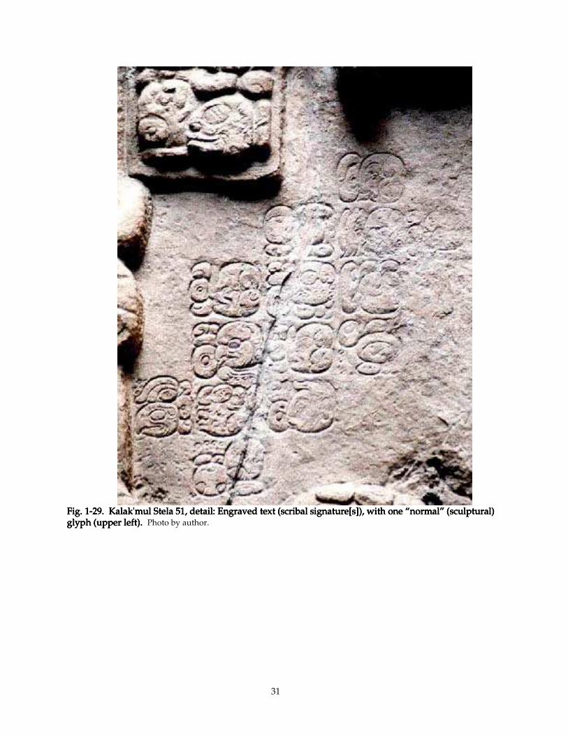
31
Fig. Fig. Fig. Fig. 1111----29. Kalak'mul29. Kalak'mul29. Kalak'mul29. Kalak'mul Stela 51, detail: Engraved text (scribal signature[s Stela 51, detail: Engraved text (scribal signature[s Stela 51, detail: Engraved text (scribal signature[s Stela 51, detail: Engraved text (scribal signature[s]), with one “normal” (sculptural) ]), with one “normal” (sculptural) ]), with one “normal” (sculptural) ]), with one “normal” (sculptural) glyph (upper left). glyph (upper left). glyph (upper left). glyph (upper left). Photo by author.
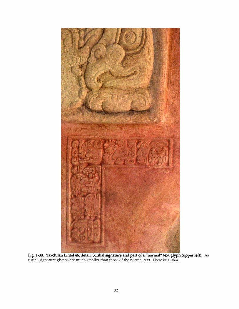
32
Fig. 1Fig. 1Fig. 1Fig. 1----30303030. Yaxchilan Lintel . Yaxchilan Lintel . Yaxchilan Lintel . Yaxchilan Lintel 46464646, detail: Scribal signature and part of a “normal” text glyph (upper left). , detail: Scribal signature and part of a “normal” text glyph (upper left). , detail: Scribal signature and part of a “normal” text glyph (upper left). , detail: Scribal signature and part of a “normal” text glyph (upper left). As usual, signature glyphs are much smaller than those of the normal text. Photo by author.
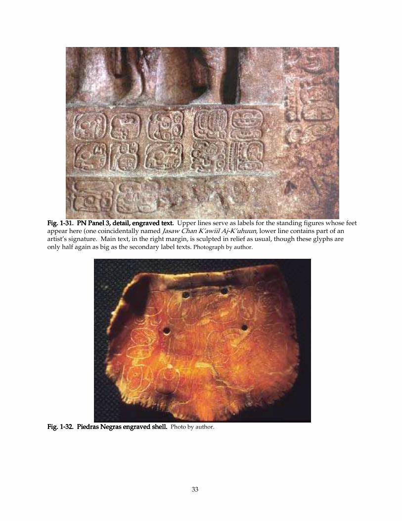
33
Fig. 1Fig. 1Fig. 1Fig. 1----31.31.31.31. PN Panel 3, detail, engraved text. PN Panel 3, detail, engraved text. PN Panel 3, detail, engraved text. PN Panel 3, detail, engraved text. Upper lines serve as labels for the standing figures whose feet appear here (one coincidentally named Jasaw Chan K’awiil Aj-K’uhuun, lower line contains part of an artist’s signature. Main text, in the right margin, is sculpted in relief as usual, though these glyphs are only half again as big as the secondary label texts. Photograph by author.
Fig. 1Fig. 1Fig. 1Fig. 1----32.32.32.32. Piedras Negras engraved shell. Piedras Negras engraved shell. Piedras Negras engraved shell. Piedras Negras engraved shell. Photo by author.
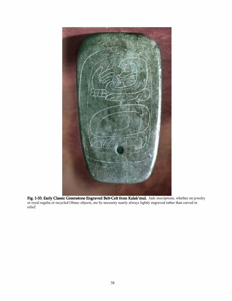
34
FigFigFigFig. 1. 1. 1. 1----33. Early 33. Early 33. Early 33. Early Classic Greenstone Engraved BeltClassic Greenstone Engraved BeltClassic Greenstone Engraved BeltClassic Greenstone Engraved Belt----Celt from Kalak’mul. Celt from Kalak’mul. Celt from Kalak’mul. Celt from Kalak’mul. Jade inscriptions, whether on jewelry
or royal regalia or recycled Olmec objects, are by necessity nearly always lightly engraved rather than carved in
relief.
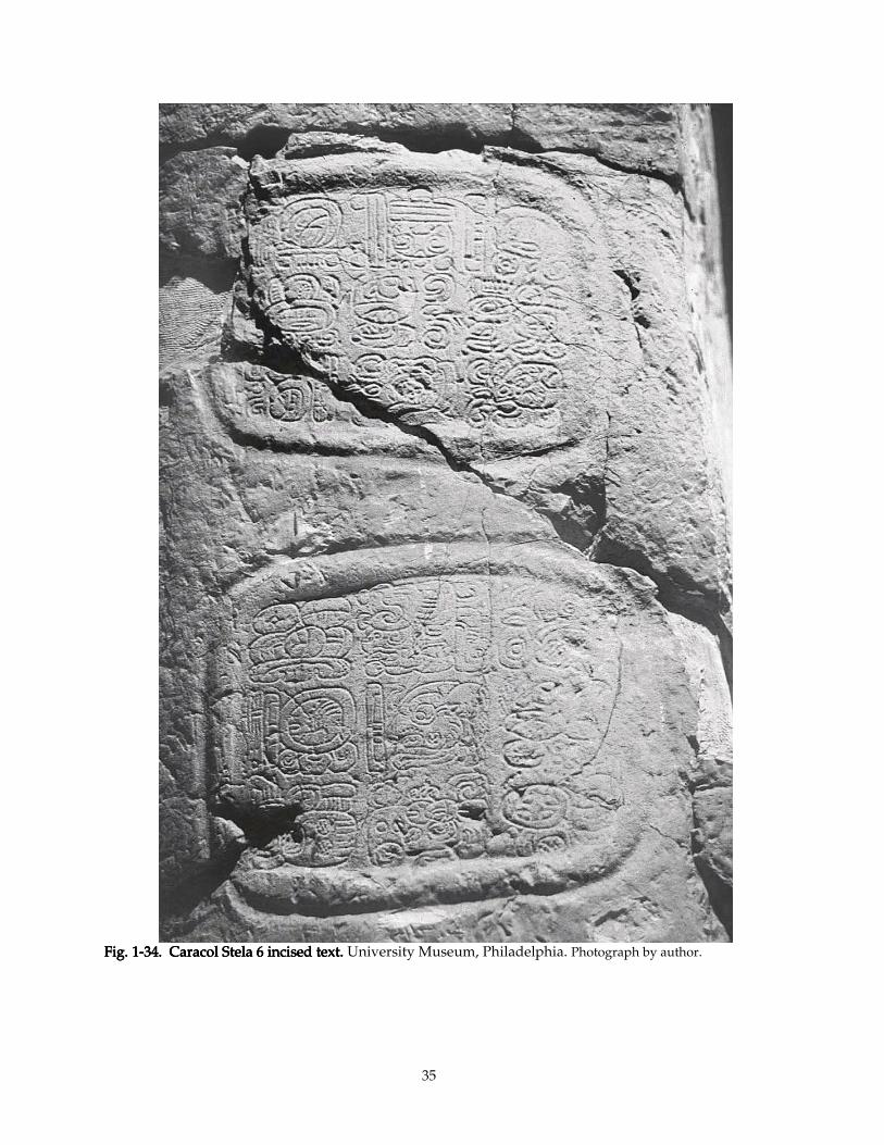
35
Fig. 1Fig. 1Fig. 1Fig. 1----34. Caracol Stela 634. Caracol Stela 634. Caracol Stela 634. Caracol Stela 6 incised incised incised incised text.text.text.text. University Museum, Philadelphia. Photograph by author.
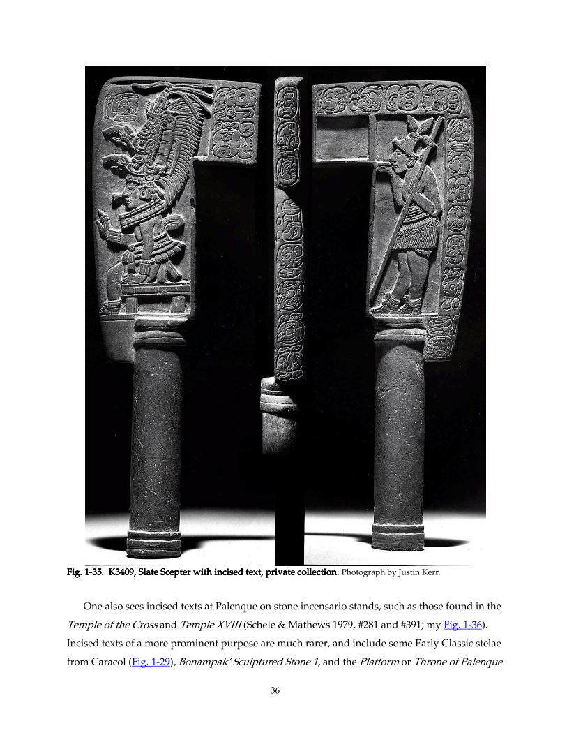
36
Fig. 1Fig. 1Fig. 1Fig. 1----35. K3409, Slate Scepter with incised text, private collection. 35. K3409, Slate Scepter with incised text, private collection. 35. K3409, Slate Scepter with incised text, private collection. 35. K3409, Slate Scepter with incised text, private collection. Photograph by Justin Kerr.
One also sees incised texts at Palenque on stone incensario stands, such as those found in the
Temple of the Cross and Temple XVIII (Schele & Mathews 1979, #281 and #391; my Fig. 1-36).
Incised texts of a more prominent purpose are much rarer, and include some Early Classic stelae
from Caracol (Fig. 1-29), Bonampak’ Sculptured Stone 1, and the Platform or Throne of Palenque
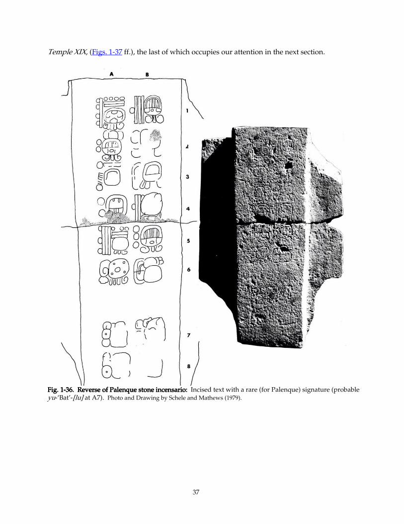
37
Temple XIX, (Figs. 1-37 ff.), the last of which occupies our attention in the next section.
Fig. 1Fig. 1Fig. 1Fig. 1----36.36.36.36. Reverse of Palenque stone incen Reverse of Palenque stone incen Reverse of Palenque stone incen Reverse of Palenque stone incensario: sario: sario: sario: Incised text with a rare (for Palenque) signature (probable yu-‘Bat’-[lu] at A7). Photo and Drawing by Schele and Mathews (1979).
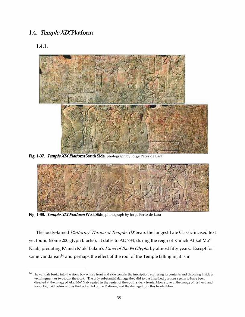
38
1.4. 1.4. 1.4. 1.4. Temple XIXTemple XIXTemple XIXTemple XIX Platform Platform Platform Platform
1.4.1.1.4.1.1.4.1.1.4.1.
Fig. 1Fig. 1Fig. 1Fig. 1----37. 37. 37. 37. Temple XIX PlatformTemple XIX PlatformTemple XIX PlatformTemple XIX Platform South Side South Side South Side South Side, photograph by Jorge Perez de Lara
Fig. 1Fig. 1Fig. 1Fig. 1----38. 38. 38. 38. Temple XIX Platform Temple XIX Platform Temple XIX Platform Temple XIX Platform West SideWest SideWest SideWest Side, photograph by Jorge Perez de Lara
The justly-famed Platform/ Throne of Temple XIX bears the longest Late Classic incised text
yet found (some 200 glyph blocks). It dates to AD 734, during the reign of K’inich Ahkal Mo’
Naab, predating K’inich K’uk’ Balam's Panel of the 96 Glyphs by almost fifty years. Except for
some vandalism16 and perhaps the effect of the roof of the Temple falling in, it is in
16 The vandals broke into the stone box whose front and side contain the inscription, scattering its contents and throwing inside a
text fragment or two from the front. The only substantial damage they did to the inscribed portions seems to have been directed at the image of Akal Mo’ Nab, seated in the center of the south side: a frontal blow stove in the image of his head and torso. Fig. 1-47 below shows the broken lid of the Platform, and the damage from this frontal blow.
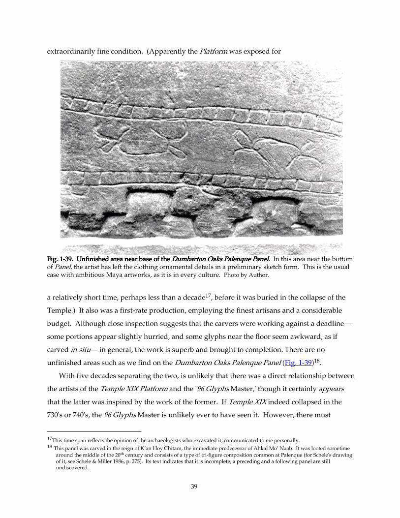
39
extraordinarily fine condition. (Apparently the Platform was exposed for
Fig. 1Fig. 1Fig. 1Fig. 1----39. Unfinished area near base of the 39. Unfinished area near base of the 39. Unfinished area near base of the 39. Unfinished area near base of the Dumbarton Oaks Palenque PanelDumbarton Oaks Palenque PanelDumbarton Oaks Palenque PanelDumbarton Oaks Palenque Panel.... In this area near the bottom of Panel, the artist has left the clothing ornamental details in a preliminary sketch form. This is the usual case with ambitious Maya artworks, as it is in every culture. Photo by Author.
a relatively short time, perhaps less than a decade17, before it was buried in the collapse of the
Temple.) It also was a first-rate production, employing the finest artisans and a considerable
budget. Although close inspection suggests that the carvers were working against a deadline —
some portions appear slightly hurried, and some glyphs near the floor seem awkward, as if
carved in situ— in general, the work is superb and brought to completion. There are no
unfinished areas such as we find on the Dumbarton Oaks Palenque Panel (Fig. 1-39)18.
With five decades separating the two, is unlikely that there was a direct relationship between
the artists of the Temple XIX Platform and the '96 Glyphs Master,' though it certainly appears
that the latter was inspired by the work of the former. If Temple XIX indeed collapsed in the
730's or 740's, the 96 Glyphs Master is unlikely ever to have seen it. However, there must
17This time span reflects the opinion of the archaeologists who excavated it, communicated to me personally. 18 This panel was carved in the reign of K’an Hoy Chitam, the immediate predecessor of Ahkal Mo’ Naab. It was looted sometime
around the middle of the 20th century and consists of a type of tri-figure composition common at Palenque (for Schele's drawing of it, see Schele & Miller 1986, p. 275). Its text indicates that it is incomplete; a preceding and a following panel are still undiscovered.
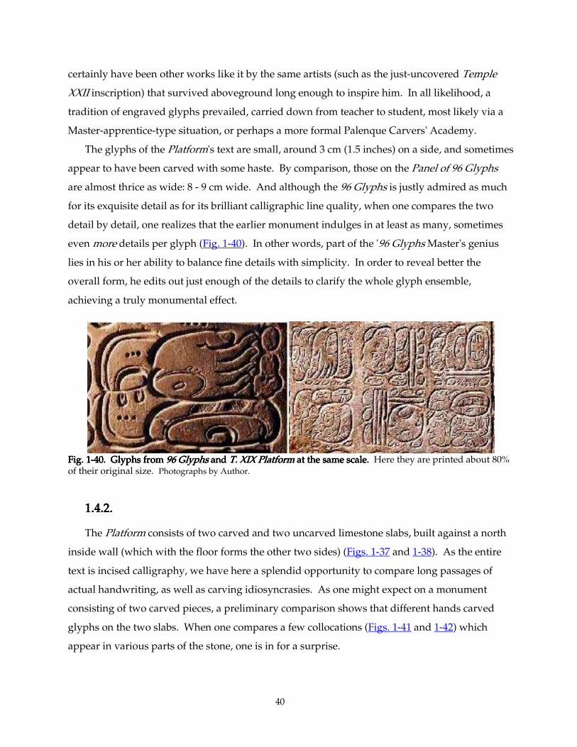
40
certainly have been other works like it by the same artists (such as the just-uncovered Temple
XXII inscription) that survived aboveground long enough to inspire him. In all likelihood, a
tradition of engraved glyphs prevailed, carried down from teacher to student, most likely via a
Master-apprentice-type situation, or perhaps a more formal Palenque Carvers' Academy.
The glyphs of the Platform's text are small, around 3 cm (1.5 inches) on a side, and sometimes
appear to have been carved with some haste. By comparison, those on the Panel of 96 Glyphs
are almost thrice as wide: 8 - 9 cm wide. And although the 96 Glyphs is justly admired as much
for its exquisite detail as for its brilliant calligraphic line quality, when one compares the two
detail by detail, one realizes that the earlier monument indulges in at least as many, sometimes
even more details per glyph (Fig. 1-40). In other words, part of the '96 Glyphs Master's genius
lies in his or her ability to balance fine details with simplicity. In order to reveal better the
overall form, he edits out just enough of the details to clarify the whole glyph ensemble,
achieving a truly monumental effect.
Fig. 1Fig. 1Fig. 1Fig. 1----40. Glyphs from 40. Glyphs from 40. Glyphs from 40. Glyphs from 96 Glyphs96 Glyphs96 Glyphs96 Glyphs and and and and T. XIX PlatformT. XIX PlatformT. XIX PlatformT. XIX Platform at the same scale. at the same scale. at the same scale. at the same scale. Here they are printed about 80% of their original size. Photographs by Author.
1.4.2.1.4.2.1.4.2.1.4.2.
The Platform consists of two carved and two uncarved limestone slabs, built against a north
inside wall (which with the floor forms the other two sides) (Figs. 1-37 and 1-38). As the entire
text is incised calligraphy, we have here a splendid opportunity to compare long passages of
actual handwriting, as well as carving idiosyncrasies. As one might expect on a monument
consisting of two carved pieces, a preliminary comparison shows that different hands carved
glyphs on the two slabs. When one compares a few collocations (Figs. 1-41 and 1-42) which
appear in various parts of the stone, one is in for a surprise.
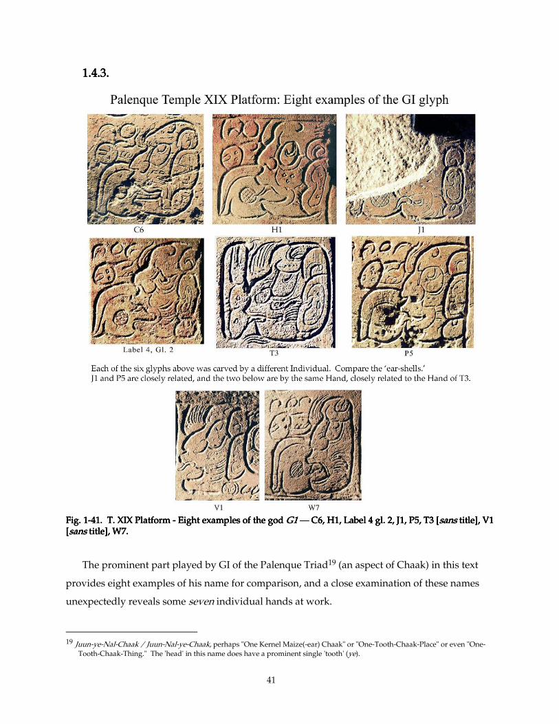
41
1.4.3.1.4.3.1.4.3.1.4.3.
Fig. 1Fig. 1Fig. 1Fig. 1----41. T. XIX Platform 41. T. XIX Platform 41. T. XIX Platform 41. T. XIX Platform ---- Eight examples of the god Eight examples of the god Eight examples of the god Eight examples of the god G1G1G1G1 ———— C6, H1, Label 4 gl. 2, J1, P5, T3 [C6, H1, Label 4 gl. 2, J1, P5, T3 [C6, H1, Label 4 gl. 2, J1, P5, T3 [C6, H1, Label 4 gl. 2, J1, P5, T3 [sanssanssanssans title], V1 title], V1 title], V1 title], V1 [[[[sanssanssanssans title], W7. title], W7. title], W7. title], W7.
The prominent part played by GI of the Palenque Triad19 (an aspect of Chaak) in this text
provides eight examples of his name for comparison, and a close examination of these names
unexpectedly reveals some seven individual hands at work.
19 Juun-ye-Nal-Chaak / Juun-Nal-ye-Chaak, perhaps "One Kernel Maize(-ear) Chaak" or "One-Tooth-Chaak-Place" or even "One-
Tooth-Chaak-Thing." The 'head' in this name does have a prominent single 'tooth' (ye).
42
The Artist responsible for J1 (broken 3rd example) favored lightly-incised details such as the
dot on ye and the beard-like 'cheek fin'; he also carved uniquely-symmetric 'ear-shells.' The
Artist of H1 (2nd example) preferred to render his glyphs in bold, clear, simple lines — hardly a
trace of hairy 'barbels'; his ye is almost square, but his 'ear-shell' is rather awkwardly drawn.
The Artist of C6 (first example) renders a powerfully-outlined ye, and gives his god a
Neanderthal 'brow' and sharp 'nose', with delicate 'barbels' and 'ear-shell.' The Artist who
carved Label 4 (5th ex.) gave the god a bulbous 'nose' and a furrowed 'brow'; his ye is yet distinct
from the previous three. The Artist of P5 (6th ex.), in the final column of the south side, has
many features in common with the Artist of J1; their 'ear-shells' look alike, for example. Also
like the first Artist, he favors round 'eye' and 'ear-shell,' but when closely comparing P5's and J1's
'ear-shells', their outlines of ye, and the god's 'profile', we find they have strongly different
characters.20
The last three examples (T3, V1, W7) come from the West Side, and all feature a distinctly
receding 'brow', giving the god a more fish-like appearance. T3 (6th ex.) is from the left text-
block of the slab, and the details of its eyebrow and under-eye suggest it may spring from a
Hand distinct from that which carved the other two (on the right text-block). (However, it does
resemble the other two (V1, W7) in flavor, and in many details. Perhaps scribe-carvers chose —
or were assigned— to work together whose style was similar, or working together inspired them
to imitate one another a bit.) V1 and W7, despite different 'eye'- and 'barbel'-shapes, are very
much in the same style. The two come from the last four columns of the monument, a block of
what I take to be glyphs of homogeneous, distinctive style. These glyphs all display lilting
outlines and very fine, very dense hatching; quite different from the style on the rest of the
Platform. These glyphs are so finely-crafted, so appealingly distinctive that they were the first
on this monument to inspire a nickname: the 'Fine Hatching Master'. (See below, Sections 1.4.5
and 1.4.6.)
Caution: One is rarely certain of every attribution on a complex work such as this. When a
group of artists work as a team, they influence each other and the boundaries blur. It is entirely
possible that, say, Artist A carved his own layouts, and also painted the texts for Artist B and
Artist C, or that Artist C carved the 'face' glyphs for his less-competent colleagues Artist B and
20 I earlier suggested that these two (J1 and P5) might be by the same Hand (Van Stone 2000:
<http://www.famsi.org/reports/99027/section04.htm>), but I no longer believe that possible.
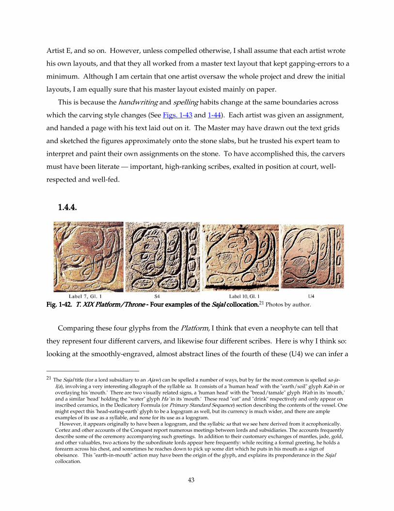
43
Artist E, and so on. However, unless compelled otherwise, I shall assume that each artist wrote
his own layouts, and that they all worked from a master text layout that kept gapping-errors to a
minimum. Although I am certain that one artist oversaw the whole project and drew the initial
layouts, I am equally sure that his master layout existed mainly on paper.
This is because the handwriting and spelling habits change at the same boundaries across
which the carving style changes (See Figs. 1-43 and 1-44). Each artist was given an assignment,
and handed a page with his text laid out on it. The Master may have drawn out the text grids
and sketched the figures approximately onto the stone slabs, but he trusted his expert team to
interpret and paint their own assignments on the stone. To have accomplished this, the carvers
must have been literate — important, high-ranking scribes, exalted in position at court, well-
respected and well-fed.
1.4.4.1.4.4.1.4.4.1.4.4.
Fig. 1Fig. 1Fig. 1Fig. 1----42. 42. 42. 42. T. XIX Platform/TT. XIX Platform/TT. XIX Platform/TT. XIX Platform/Thronehronehronehrone ---- Four examples of the Four examples of the Four examples of the Four examples of the SajalSajalSajalSajal collocation. collocation. collocation. collocation.21 Photos by author.
Comparing these four glyphs from the Platform, I think that even a neophyte can tell that
they represent four different carvers, and likewise four different scribes. Here is why I think so:
looking at the smoothly-engraved, almost abstract lines of the fourth of these (U4) we can infer a
21 The Sajal title (for a lord subsidiary to an Ajaw) can be spelled a number of ways, but by far the most common is spelled sa-ja-
l(a), involving a very interesting allograph of the syllable sa. It consists of a 'human head' with the "earth/soil" glyph Kab in or overlaying his 'mouth.' There are two visually related signs, a 'human head' with the "bread/tamale" glyph Wah in its 'mouth,' and a similar 'head' holding the "water" glyph Ha' in its 'mouth.' These read "eat" and "drink" respectively and only appear on inscribed ceramics, in the Dedicatory Formula (or Primary Standard Sequence) section describing the contents of the vessel. One might expect this 'head-eating-earth' glyph to be a logogram as well, but its currency is much wider, and there are ample examples of its use as a syllable, and none for its use as a logogram.
However, it appears originally to have been a logogram, and the syllabic sa that we see here derived from it acrophonically. Cortez and other accounts of the Conquest report numerous meetings between lords and subsidiaries. The accounts frequently describe some of the ceremony accompanying such greetings. In addition to their customary exchanges of mantles, jade, gold, and other valuables, two actions by the subordinate lords appear here frequently: while reciting a formal greeting, he holds a forearm across his chest, and sometimes he reaches down to pick up some dirt which he puts in his mouth as a sign of obeisance. This "earth-in-mouth" action may have been the origin of the glyph, and explains its preponderance in the Sajal collocation.
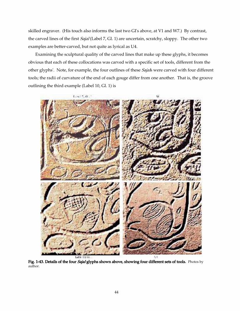
44
skilled engraver. (His touch also informs the last two GI's above, at V1 and W7.) By contrast,
the carved lines of the first Sajal (Label 7, Gl. 1) are uncertain, scratchy, sloppy. The other two
examples are better-carved, but not quite as lyrical as U4.
Examining the sculptural quality of the carved lines that make up these glyphs, it becomes
obvious that each of these collocations was carved with a specific set of tools, different from the
other glyphs'. Note, for example, the four outlines of these Sajals were carved with four different
tools; the radii of curvature of the end of each gouge differ from one another. That is, the groove
outlining the third example (Label 10, Gl. 1) is
Fig. 1Fig. 1Fig. 1Fig. 1----43. Details of the four 43. Details of the four 43. Details of the four 43. Details of the four SajalSajalSajalSajal glyphs shown above, showing four different sets of tools. glyphs shown above, showing four different sets of tools. glyphs shown above, showing four different sets of tools. glyphs shown above, showing four different sets of tools. Photos by author.
45
wider and shallower than that outlining S4, and S4's outline-groove is slightly wider in turn than
that on U4. The clumsy outline of the first example (Label 7, Gl. 1) could conceivably been done
with one of the three gouges we've described, but as a carver I know how jealous we are of our
tools. I doubt that any of his fellow sculptors would entrust their fine gouges to the hands of
such a clumsy Scratcher.
Let us look at the detail strokes. The hatching on U4 is done with a much finer tool than
appears in any of the other examples. The first example has no hatching at all, but the other two
each apparently employ a fine point specific to them. I think it safe to say that we are dealing
with four different carvers, with varying skill levels and their own personal toolkits.
1.4.4.1. A note about the layout and carving process1.4.4.1. A note about the layout and carving process1.4.4.1. A note about the layout and carving process1.4.4.1. A note about the layout and carving process
In Section 2.8.2, I detail the process by which I believe workers achieved panels such as these.
In short, I think that carving projects in Palenque followed much the same patterns as did panel-
carvers in Assyria, Egypt, Europe, and China:
A Master Artisan assembled a group of artisans under his authority, and distributed the
work-assignments.
The Master produced the overall plan (guided by priests, if a sacred text was involved),
drawn to scale on a piece of paper, papyrus or ostraka.
The Master transferred a minimal sketch of the master plan onto the panel. This sketch was
usually guided by a scaled grid (as in Fig. 1-57), then painted freely, (although ancient Chinese
artisans made the paper master precisely to scale on a very thin piece of paper, glued it directly
to their stone or wooden panel, and carved right through the paper). The Maya appear to have
followed the practice of Egypt (see Fig. 1-59), depending on the skill and taste of the final Carver
to position the elements tastefully.
The Carver would complete the painted layout in his assigned area, adding whatever details
he felt necessary. Maya carvers —who apparently were also trained artists and calligraphers—
enjoyed considerable technical freedom to modify their layouts, since the paint with which they
laid out the designs was easily wiped clean. (Ancient Roman ordinators were not so lucky; the
minium which they used soaked into the marble or travertine, and could only be erased by
"dishing out" —carving the surface down a millimeter or so.)
Within certain parameters, each Carver could employ his own spelling preferences and
drawing conventions. He also had his own personal toolkit, consisting of gravers, chisels, and a
gouge or two. Blunt gravers would carve bold lines, sharp ones fine lines. Some carvers
46
restricted themselves to two line widths: thick or thin. (A few seem to have used one graver for
everything.) Many used three or more: broad, medium, and thin gravers, and they were free to
employ them in various proportions. (The Artist who carved the bottom of Columns ABCD on
the Palace Tablet relied mostly on his finest graving tool, while his Colleague at OP 12-19 had an
opposite temperament, carving most details quite boldly.)
If we were then to assume that these four carvers were working from a calligraphic Master
Layout painted onto the stone by a single individual, we should have to explain why these four
'heads' have such differently-shaped 'profiles', and differently-shaped 'eyes', and why the ja
suffixes are so differently-drawn in every detail, and so forth. Obviously, not only do we have
four different carvers here, but each worked from his own layout, in handwriting peculiar to his
own territory.
I think it very unlikely that each carver had a personal secretary. It is only slightly more
credible to suggest the situation were reversed, that four calligraphers each worked with a
personal carver.22 Occam's Razor demands that we conclude that each carver was also a each carver was also a each carver was also a each carver was also a
calligraphercalligraphercalligraphercalligrapher, and that he or she brushed his or her own section of text onto the stone before
incising it. This situation also demands that a Master probably laid out the whole text on paper,
and then assigned each carver-calligrapher a specific section of it. (Or, if there were no official
Master, an egalitarian committee of carver-calligraphers all agreed how to distribute the work.
They, too, probably worked from one or more paper master-copies of the whole.) Without such
a master copy on paper, the text could not have flowed smoothly from one section to the next.
1.4.5.1.4.5.1.4.5.1.4.5.
Fig. 1-44 is a chart showing my interpretations of how the carving assignments were
distributed about the throne.23 The changes in style tend to follow natural divisions of the
layout: Hand A took the first four columns of text, Hand B the second four, Hands F, G, H, and I
the labels of the figures (and were probably responsible for the figures themselves), and Hand C
22 It was the case, by the way, in ancient Roman lettercutting shops: an ordinator laid out the text, and his partner, a sculptor or
marmorius, cut it. See below, section 1.5.1. 23 By the way, one other work by one of these artists can be found in Schele and Mathews’ 1979 Bodega Book, (item 553) a fragment
of a slab, perhaps the seat of a throne, found in Temple XXI, another of Ahkal Mo’ Naab’s constructions round the Plaza de la Templo de la Cruz. Its edge is engraved with several glyphs by one of our artists. At this writing (2004), excavators at Palenque have just discovered the entire Temple XXI Panel from which this fragment came. It is comparable to the Temple XIX Platform in style and scale, and I think employed some of the same carvers, but appeared too late to be included in this Dissertation.
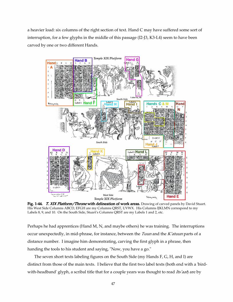
47
a heavier load: six columns of the right section of text. Hand C may have suffered some sort of
interruption, for a few glyphs in the middle of this passage (I2-J3, K3-L4) seem to have been
carved by one or two different Hands.
Fig. 1Fig. 1Fig. 1Fig. 1----44444444. . . . T. XIX Platform/ThroneT. XIX Platform/ThroneT. XIX Platform/ThroneT. XIX Platform/Throne with delineation of work areas. with delineation of work areas. with delineation of work areas. with delineation of work areas. Drawing of carved panels by David Stuart. His West Side Columns ABCD, EFGH are my Columns QRST, UVWX. His Columns IJKLMN correspond to my Labels 8, 9, and 10. On the South Side, Stuart’s Columns QRST are my Labels 1 and 2, etc.
Perhaps he had apprentices (Hand M, N, and maybe others) he was training. The interruptions
occur unexpectedly, in mid-phrase, for instance, between the Tuun and the K’atuun parts of a
distance number. I imagine him demonstrating, carving the first glyph in a phrase, then
handing the tools to his student and saying, "Now, you have a go."
The seven short texts labeling figures on the South Side (my Hands F, G, H, and I) are
distinct from those of the main texts. I believe that the first two label texts (both end with a 'bird-
with-headband' glyph, a scribal title that for a couple years was thought to read Its’aat) are by
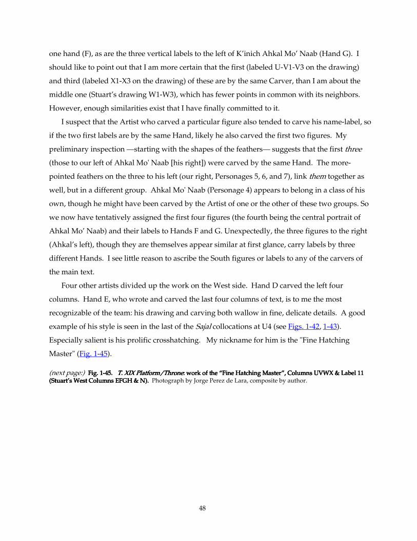
48
one hand (F), as are the three vertical labels to the left of K’inich Ahkal Mo’ Naab (Hand G). I
should like to point out that I am more certain that the first (labeled U-V1-V3 on the drawing)
and third (labeled X1-X3 on the drawing) of these are by the same Carver, than I am about the
middle one (Stuart’s drawing W1-W3), which has fewer points in common with its neighbors.
However, enough similarities exist that I have finally committed to it.
I suspect that the Artist who carved a particular figure also tended to carve his name-label, so
if the two first labels are by the same Hand, likely he also carved the first two figures. My
preliminary inspection —starting with the shapes of the feathers— suggests that the first three
(those to our left of Ahkal Mo' Naab [his right]) were carved by the same Hand. The more-
pointed feathers on the three to his left (our right, Personages 5, 6, and 7), link them together as
well, but in a different group. Ahkal Mo' Naab (Personage 4) appears to belong in a class of his
own, though he might have been carved by the Artist of one or the other of these two groups. So
we now have tentatively assigned the first four figures (the fourth being the central portrait of
Ahkal Mo’ Naab) and their labels to Hands F and G. Unexpectedly, the three figures to the right
(Ahkal’s left), though they are themselves appear similar at first glance, carry labels by three
different Hands. I see little reason to ascribe the South figures or labels to any of the carvers of
the main text.
Four other artists divided up the work on the West side. Hand D carved the left four
columns. Hand E, who wrote and carved the last four columns of text, is to me the most
recognizable of the team: his drawing and carving both wallow in fine, delicate details. A good
example of his style is seen in the last of the Sajal collocations at U4 (see Figs. 1-42, 1-43).
Especially salient is his prolific crosshatching. My nickname for him is the "Fine Hatching
Master" (Fig. 1-45).
(next page:) Fig. 1Fig. 1Fig. 1Fig. 1----45. 45. 45. 45. T. XIX Platform/ThroneT. XIX Platform/ThroneT. XIX Platform/ThroneT. XIX Platform/Throne: work of the “Fine Hatching Master”, Columns UVWX & La: work of the “Fine Hatching Master”, Columns UVWX & La: work of the “Fine Hatching Master”, Columns UVWX & La: work of the “Fine Hatching Master”, Columns UVWX & Label 11 bel 11 bel 11 bel 11 (Stuart’s West Columns EFGH & N). (Stuart’s West Columns EFGH & N). (Stuart’s West Columns EFGH & N). (Stuart’s West Columns EFGH & N). Photograph by Jorge Perez de Lara, composite by author.
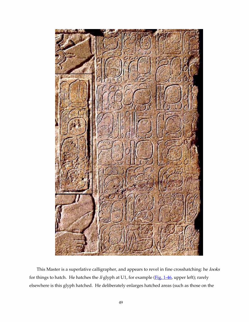
49
This Master is a superlative calligrapher, and appears to revel in fine crosshatching: he looks
for things to hatch. He hatches the li glyph at U1, for example (Fig. 1-46, upper left); rarely
elsewhere is this glyph hatched. He deliberately enlarges hatched areas (such as those on the
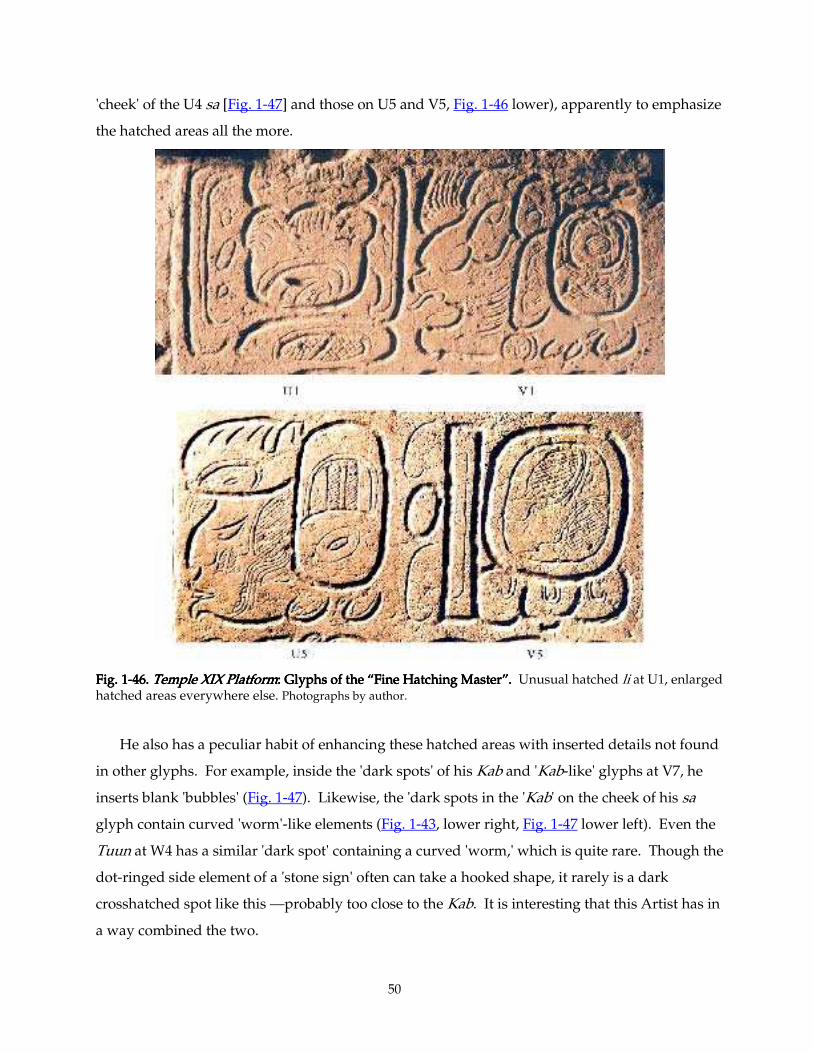
50
'cheek' of the U4 sa [Fig. 1-47] and those on U5 and V5, Fig. 1-46 lower), apparently to emphasize
the hatched areas all the more.
Fig. 1Fig. 1Fig. 1Fig. 1----46. 46. 46. 46. Temple XIX PlatformTemple XIX PlatformTemple XIX PlatformTemple XIX Platform: Glyphs of the “Fine Hatching Master”. : Glyphs of the “Fine Hatching Master”. : Glyphs of the “Fine Hatching Master”. : Glyphs of the “Fine Hatching Master”. Unusual hatched li at U1, enlarged hatched areas everywhere else. Photographs by author.
He also has a peculiar habit of enhancing these hatched areas with inserted details not found
in other glyphs. For example, inside the 'dark spots' of his Kab and 'Kab-like' glyphs at V7, he
inserts blank 'bubbles' (Fig. 1-47). Likewise, the 'dark spots in the 'Kab' on the cheek of his sa
glyph contain curved 'worm'-like elements (Fig. 1-43, lower right, Fig. 1-47 lower left). Even the
Tuun at W4 has a similar 'dark spot' containing a curved 'worm,' which is quite rare. Though the
dot-ringed side element of a 'stone sign' often can take a hooked shape, it rarely is a dark
crosshatched spot like this —probably too close to the Kab. It is interesting that this Artist has in
a way combined the two.
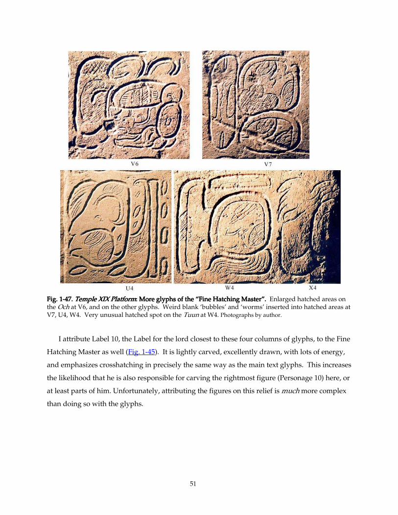
51
Fig. 1Fig. 1Fig. 1Fig. 1----47. 47. 47. 47. Temple XIX PlatformTemple XIX PlatformTemple XIX PlatformTemple XIX Platform: More glyphs of the “Fine Hatching Master”. : More glyphs of the “Fine Hatching Master”. : More glyphs of the “Fine Hatching Master”. : More glyphs of the “Fine Hatching Master”. Enlarged hatched areas on the Och at V6, and on the other glyphs. Weird blank ‘bubbles’ and ‘worms’ inserted into hatched areas at V7, U4, W4. Very unusual hatched spot on the Tuun at W4. Photographs by author.
I attribute Label 10, the Label for the lord closest to these four columns of glyphs, to the Fine
Hatching Master as well (Fig. 1-45). It is lightly carved, excellently drawn, with lots of energy,
and emphasizes crosshatching in precisely the same way as the main text glyphs. This increases
the likelihood that he is also responsible for carving the rightmost figure (Personage 10) here, or
at least parts of him. Unfortunately, attributing the figures on this relief is much more complex
than doing so with the glyphs.
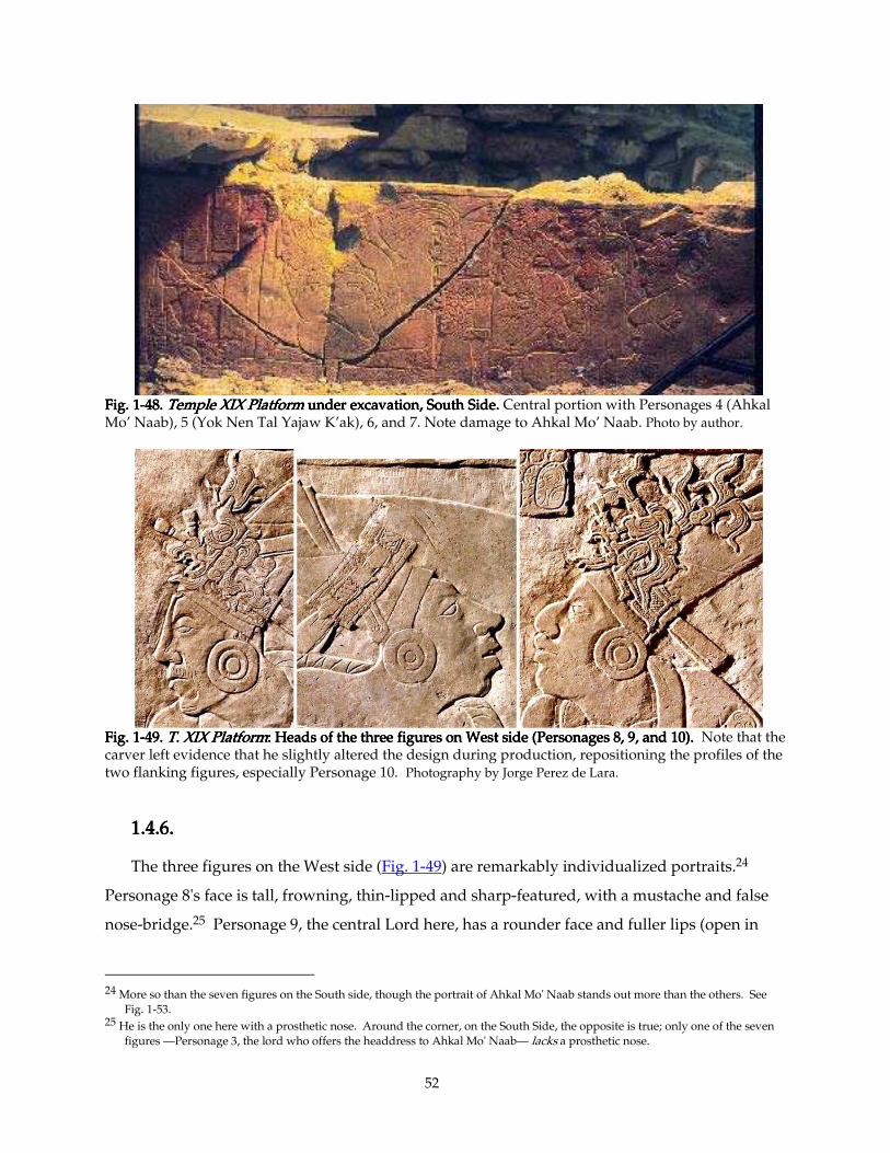
52
Fig. 1Fig. 1Fig. 1Fig. 1----48484848. . . . Temple XIX PlatformTemple XIX PlatformTemple XIX PlatformTemple XIX Platform under excavation, South Side. under excavation, South Side. under excavation, South Side. under excavation, South Side. Central portion with Personages 4 (Ahkal Mo’ Naab), 5 (Yok Nen Tal Yajaw K’ak), 6, and 7. Note damage to Ahkal Mo’ Naab. Photo by author.
Fig. 1Fig. 1Fig. 1Fig. 1----49494949. . . . T. XIX PlatformT. XIX PlatformT. XIX PlatformT. XIX Platform: Heads of the three figures on West side (Personages 8, 9, and 10). : Heads of the three figures on West side (Personages 8, 9, and 10). : Heads of the three figures on West side (Personages 8, 9, and 10). : Heads of the three figures on West side (Personages 8, 9, and 10). Note that the carver left evidence that he slightly altered the design during production, repositioning the profiles of the two flanking figures, especially Personage 10. Photography by Jorge Perez de Lara.
1.4.6.1.4.6.1.4.6.1.4.6.
The three figures on the West side (Fig. 1-49) are remarkably individualized portraits.24
Personage 8's face is tall, frowning, thin-lipped and sharp-featured, with a mustache and false
nose-bridge.25 Personage 9, the central Lord here, has a rounder face and fuller lips (open in
24 More so than the seven figures on the South side, though the portrait of Ahkal Mo' Naab stands out more than the others. See
Fig. 1-53. 25 He is the only one here with a prosthetic nose. Around the corner, on the South Side, the opposite is true; only one of the seven
figures —Personage 3, the lord who offers the headdress to Ahkal Mo' Naab— lacks a prosthetic nose.
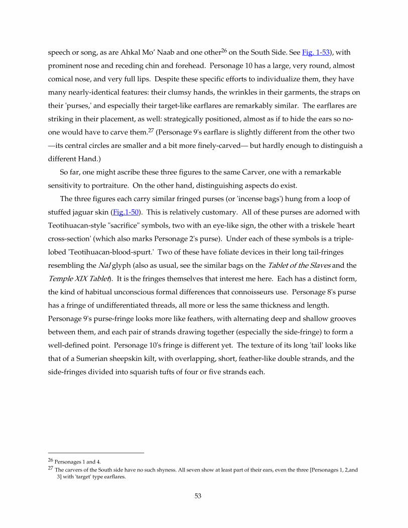
53
speech or song, as are Ahkal Mo’ Naab and one other26 on the South Side. See Fig. 1-53), with
prominent nose and receding chin and forehead. Personage 10 has a large, very round, almost
comical nose, and very full lips. Despite these specific efforts to individualize them, they have
many nearly-identical features: their clumsy hands, the wrinkles in their garments, the straps on
their 'purses,' and especially their target-like earflares are remarkably similar. The earflares are
striking in their placement, as well: strategically positioned, almost as if to hide the ears so no-
one would have to carve them.27 (Personage 9's earflare is slightly different from the other two
—its central circles are smaller and a bit more finely-carved— but hardly enough to distinguish a
different Hand.)
So far, one might ascribe these three figures to the same Carver, one with a remarkable
sensitivity to portraiture. On the other hand, distinguishing aspects do exist.
The three figures each carry similar fringed purses (or 'incense bags') hung from a loop of
stuffed jaguar skin (Fig.1-50). This is relatively customary. All of these purses are adorned with
Teotihuacan-style "sacrifice" symbols, two with an eye-like sign, the other with a triskele 'heart
cross-section' (which also marks Personage 2's purse). Under each of these symbols is a triple-
lobed 'Teotihuacan-blood-spurt.' Two of these have foliate devices in their long tail-fringes
resembling the Nal glyph (also as usual, see the similar bags on the Tablet of the Slaves and the
Temple XIX Tablet). It is the fringes themselves that interest me here. Each has a distinct form,
the kind of habitual unconscious formal differences that connoisseurs use. Personage 8's purse
has a fringe of undifferentiated threads, all more or less the same thickness and length.
Personage 9's purse-fringe looks more like feathers, with alternating deep and shallow grooves
between them, and each pair of strands drawing together (especially the side-fringe) to form a
well-defined point. Personage 10's fringe is different yet. The texture of its long 'tail' looks like
that of a Sumerian sheepskin kilt, with overlapping, short, feather-like double strands, and the
side-fringes divided into squarish tufts of four or five strands each.
26 Personages 1 and 4. 27 The carvers of the South side have no such shyness. All seven show at least part of their ears, even the three [Personages 1, 2,and
3] with 'target' type earflares.
54
Fig. 1Fig. 1Fig. 1Fig. 1----50505050. . . . Temple XIX PlatformTemple XIX PlatformTemple XIX PlatformTemple XIX Platform: hand: hand: hand: hands, purses of three figures on West side.s, purses of three figures on West side.s, purses of three figures on West side.s, purses of three figures on West side. Top: Personage 8, Bottom left: Personage 9; right: 10. Photography by Jorge Perez de Lara, artificial coloration by author.
While it is possible that a single artist —capable of differentiating three individuals by
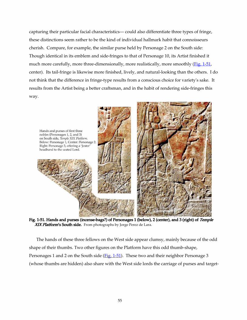
55
capturing their particular facial characteristics— could also differentiate three types of fringe,
these distinctions seem rather to be the kind of individual hallmark habit that connoisseurs
cherish. Compare, for example, the similar purse held by Personage 2 on the South side:
Though identical in its emblem and side-fringes to that of Personage 10, its Artist finished it
much more carefully, more three-dimensionally, more realistically, more smoothly (Fig. 1-51,
center). Its tail-fringe is likewise more finished, lively, and natural-looking than the others. I do
not think that the difference in fringe-type results from a conscious choice for variety's sake. It
results from the Artist being a better craftsman, and in the habit of rendering side-fringes this
way.
FigFigFigFig. 1. 1. 1. 1----51. Hands51. Hands51. Hands51. Hands and purses (incense and purses (incense and purses (incense and purses (incense----bags?) of Personages 1 (below), 2 (center), and 3 (right) of bags?) of Personages 1 (below), 2 (center), and 3 (right) of bags?) of Personages 1 (below), 2 (center), and 3 (right) of bags?) of Personages 1 (below), 2 (center), and 3 (right) of Temple Temple Temple Temple XIX PlatformXIX PlatformXIX PlatformXIX Platform’s South side. ’s South side. ’s South side. ’s South side. From photographs by Jorge Perez de Lara.
The hands of these three fellows on the West side appear clumsy, mainly because of the odd
shape of their thumbs. Two other figures on the Platform have this odd thumb-shape,
Personages 1 and 2 on the South side (Fig. 1-51). These two and their neighbor Personage 3
(whose thumbs are hidden) also share with the West side lords the carriage of purses and target-
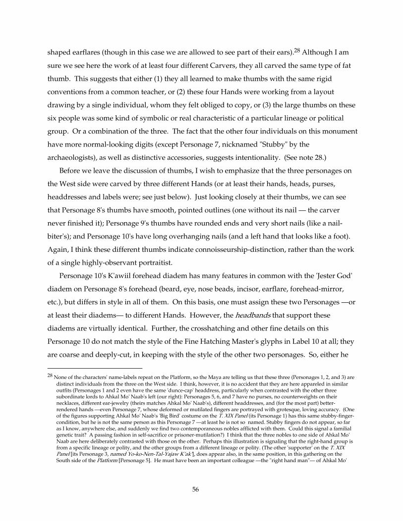
56
shaped earflares (though in this case we are allowed to see part of their ears).28 Although I am
sure we see here the work of at least four different Carvers, they all carved the same type of fat
thumb. This suggests that either (1) they all learned to make thumbs with the same rigid
conventions from a common teacher, or (2) these four Hands were working from a layout
drawing by a single individual, whom they felt obliged to copy, or (3) the large thumbs on these
six people was some kind of symbolic or real characteristic of a particular lineage or political
group. Or a combination of the three. The fact that the other four individuals on this monument
have more normal-looking digits (except Personage 7, nicknamed "Stubby" by the
archaeologists), as well as distinctive accessories, suggests intentionality. (See note 28.)
Before we leave the discussion of thumbs, I wish to emphasize that the three personages on
the West side were carved by three different Hands (or at least their hands, heads, purses,
headdresses and labels were; see just below). Just looking closely at their thumbs, we can see
that Personage 8's thumbs have smooth, pointed outlines (one without its nail — the carver
never finished it); Personage 9's thumbs have rounded ends and very short nails (like a nail-
biter's); and Personage 10's have long overhanging nails (and a left hand that looks like a foot).
Again, I think these different thumbs indicate connoisseurship-distinction, rather than the work
of a single highly-observant portraitist.
Personage 10's K'awiil forehead diadem has many features in common with the 'Jester God'
diadem on Personage 8's forehead (beard, eye, nose beads, incisor, earflare, forehead-mirror,
etc.), but differs in style in all of them. On this basis, one must assign these two Personages —or
at least their diadems— to different Hands. However, the headbands that support these
diadems are virtually identical. Further, the crosshatching and other fine details on this
Personage 10 do not match the style of the Fine Hatching Master's glyphs in Label 10 at all; they
are coarse and deeply-cut, in keeping with the style of the other two personages. So, either he
28 None of the characters' name-labels repeat on the Platform, so the Maya are telling us that these three (Personages 1, 2, and 3) are
distinct individuals from the three on the West side. I think, however, it is no accident that they are here appareled in similar outfits (Personages 1 and 2 even have the same 'dunce-cap' headdress, particularly when contrasted with the other three subordinate lords to Ahkal Mo' Naab's left (our right): Personages 5, 6, and 7 have no purses, no counterweights on their necklaces, different ear-jewelry (theirs matches Ahkal Mo' Naab's), different headdresses, and (for the most part) better-rendered hands —even Personage 7, whose deformed or mutilated fingers are portrayed with grotesque, loving accuracy. (One of the figures supporting Ahkal Mo' Naab's 'Big Bird' costume on the T. XIX Panel (its Personage 1) has this same stubby-finger-condition, but he is not the same person as this Personage 7 —at least he is not so named. Stubby fingers do not appear, so far as I know, anywhere else, and suddenly we find two contemporaneous nobles afflicted with them. Could this signal a familial genetic trait? A passing fashion in self-sacrifice or prisoner-mutilation?) I think that the three nobles to one side of Ahkal Mo' Naab are here deliberately contrasted with those on the other. Perhaps this illustration is signaling that the right-hand group is from a specific lineage or polity, and the other groups from a different lineage or polity. (The other 'supporter' on the T. XIX Panel [its Personage 3, named Yo-ko-Nen-Tal-Yajaw K’ak’], does appear also, in the same position, in this gathering on the South side of the Platform [Personage 5]. He must have been an important colleague —the "right hand man"— of Ahkal Mo'
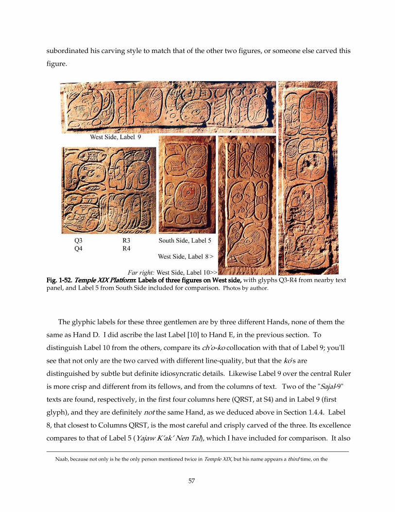
57
subordinated his carving style to match that of the other two figures, or someone else carved this
figure.
Fig. 1Fig. 1Fig. 1Fig. 1----52. 52. 52. 52. Temple XIX PlatformTemple XIX PlatformTemple XIX PlatformTemple XIX Platform: Labels of three figures on West side,: Labels of three figures on West side,: Labels of three figures on West side,: Labels of three figures on West side, with glyphs Q3-R4 from nearby text panel, and Label 5 from South Side included for comparison. Photos by author.
The glyphic labels for these three gentlemen are by three different Hands, none of them the
same as Hand D. I did ascribe the last Label [10] to Hand E, in the previous section. To
distinguish Label 10 from the others, compare its ch'o-ko collocation with that of Label 9; you'll
see that not only are the two carved with different line-quality, but that the ko's are
distinguished by subtle but definite idiosyncratic details. Likewise Label 9 over the central Ruler
is more crisp and different from its fellows, and from the columns of text. Two of the "Sajal-9"
texts are found, respectively, in the first four columns here (QRST, at S4) and in Label 9 (first
glyph), and they are definitely not the same Hand, as we deduced above in Section 1.4.4. Label
8, that closest to Columns QRST, is the most careful and crisply carved of the three. Its excellence
compares to that of Label 5 (Yajaw K’ak’ Nen Tal), which I have included for comparison. It also
Naab, because not only is he the only person mentioned twice in Temple XIX, but his name appears a third time, on the
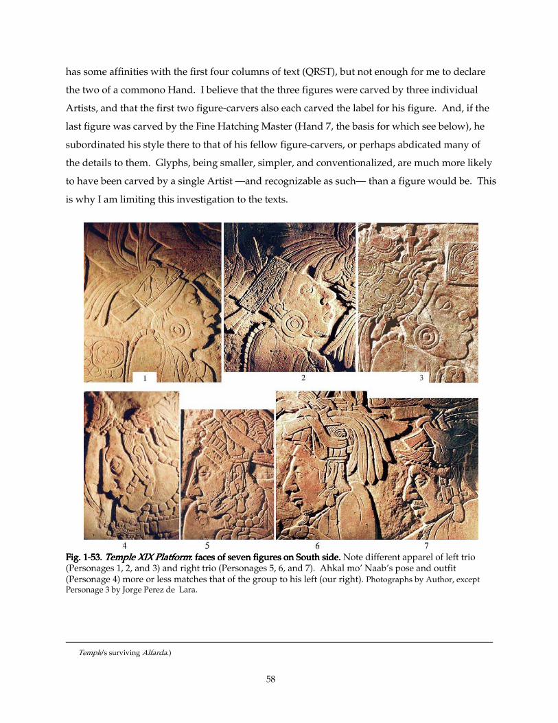
58
has some affinities with the first four columns of text (QRST), but not enough for me to declare
the two of a commono Hand. I believe that the three figures were carved by three individual
Artists, and that the first two figure-carvers also each carved the label for his figure. And, if the
last figure was carved by the Fine Hatching Master (Hand 7, the basis for which see below), he
subordinated his style there to that of his fellow figure-carvers, or perhaps abdicated many of
the details to them. Glyphs, being smaller, simpler, and conventionalized, are much more likely
to have been carved by a single Artist —and recognizable as such— than a figure would be. This
is why I am limiting this investigation to the texts.
Fig. 1Fig. 1Fig. 1Fig. 1----53535353. . . . Temple XIX PlatformTemple XIX PlatformTemple XIX PlatformTemple XIX Platform: faces of seven figures on Sou: faces of seven figures on Sou: faces of seven figures on Sou: faces of seven figures on South side. th side. th side. th side. Note different apparel of left trio (Personages 1, 2, and 3) and right trio (Personages 5, 6, and 7). Ahkal mo’ Naab’s pose and outfit (Personage 4) more or less matches that of the group to his left (our right). Photographs by Author, except Personage 3 by Jorge Perez de Lara.
Temple's surviving Alfarda.)
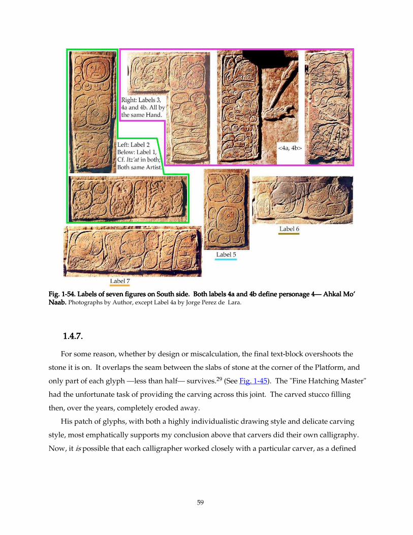
59
Fig. 1Fig. 1Fig. 1Fig. 1----54. Labels of seven figures on South side. Both labels 4a and 4b define personage 454. Labels of seven figures on South side. Both labels 4a and 4b define personage 454. Labels of seven figures on South side. Both labels 4a and 4b define personage 454. Labels of seven figures on South side. Both labels 4a and 4b define personage 4———— Ahkal Mo’ Ahkal Mo’ Ahkal Mo’ Ahkal Mo’ NaabNaabNaabNaab. . . . Photographs by Author, except Label 4a by Jorge Perez de Lara.
1.4.7.1.4.7.1.4.7.1.4.7.
For some reason, whether by design or miscalculation, the final text-block overshoots the
stone it is on. It overlaps the seam between the slabs of stone at the corner of the Platform, and
only part of each glyph —less than half— survives.29 (See Fig. 1-45). The "Fine Hatching Master"
had the unfortunate task of providing the carving across this joint. The carved stucco filling
then, over the years, completely eroded away.
His patch of glyphs, with both a highly individualistic drawing style and delicate carving
style, most emphatically supports my conclusion above that carvers did their own calligraphy.
Now, it is possible that each calligrapher worked closely with a particular carver, as a defined
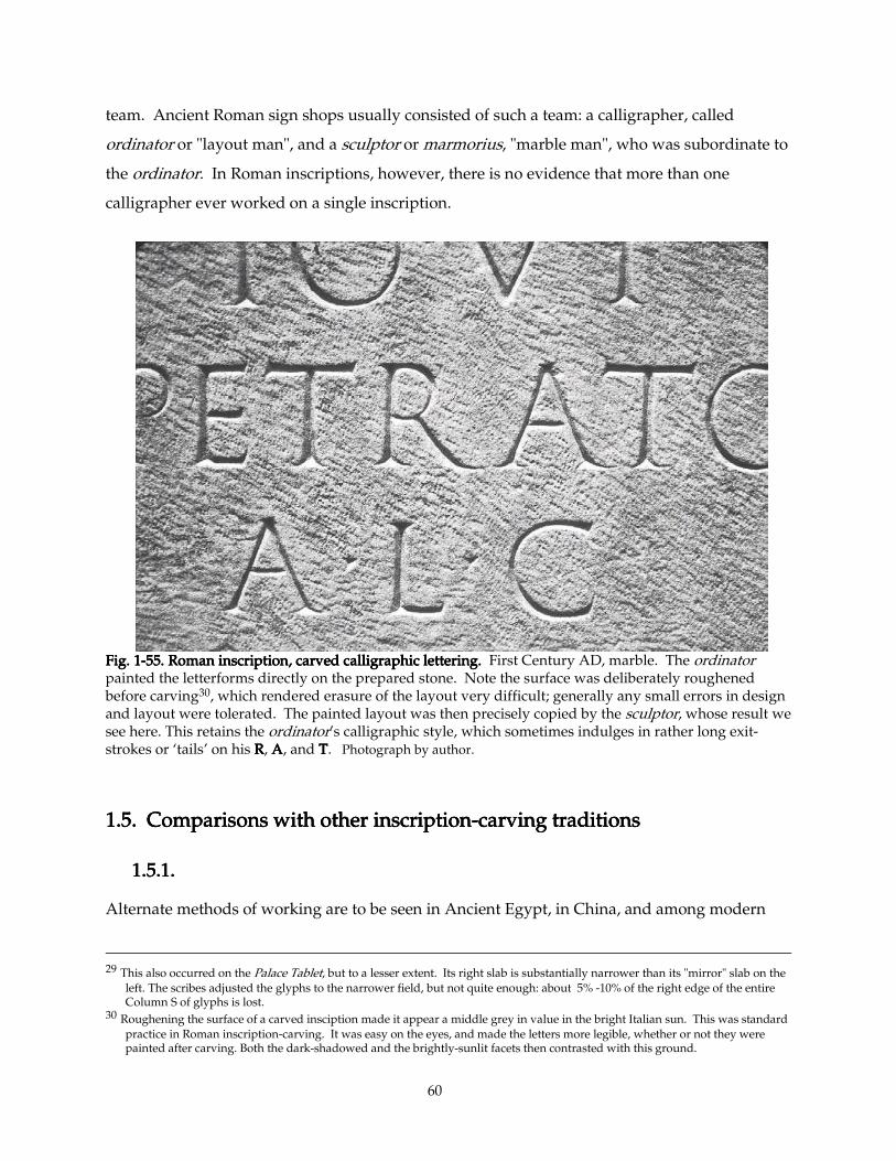
60
team. Ancient Roman sign shops usually consisted of such a team: a calligrapher, called
ordinator or "layout man", and a sculptor or marmorius, "marble man", who was subordinate to
the ordinator. In Roman inscriptions, however, there is no evidence that more than one
calligrapher ever worked on a single inscription.
Fig. 1Fig. 1Fig. 1Fig. 1----55. Roman inscription, carved calligraphic lettering.55. Roman inscription, carved calligraphic lettering.55. Roman inscription, carved calligraphic lettering.55. Roman inscription, carved calligraphic lettering. First Century AD, marble. The ordinator painted the letterforms directly on the prepared stone. Note the surface was deliberately roughened before carving30, which rendered erasure of the layout very difficult; generally any small errors in design and layout were tolerated. The painted layout was then precisely copied by the sculptor, whose result we see here. This retains the ordinator’s calligraphic style, which sometimes indulges in rather long exit-strokes or ‘tails’ on his RRRR, AAAA, and TTTT. Photograph by author.
1.5. Comparisons with other inscription1.5. Comparisons with other inscription1.5. Comparisons with other inscription1.5. Comparisons with other inscription----carving traditions carving traditions carving traditions carving traditions
1.5.1.1.5.1.1.5.1.1.5.1.
Alternate methods of working are to be seen in Ancient Egypt, in China, and among modern
29 This also occurred on the Palace Tablet, but to a lesser extent. Its right slab is substantially narrower than its "mirror" slab on the
left. The scribes adjusted the glyphs to the narrower field, but not quite enough: about 5% -10% of the right edge of the entire Column S of glyphs is lost.
30 Roughening the surface of a carved insciption made it appear a middle grey in value in the bright Italian sun. This was standard practice in Roman inscription-carving. It was easy on the eyes, and made the letters more legible, whether or not they were painted after carving. Both the dark-shadowed and the brightly-sunlit facets then contrasted with this ground.
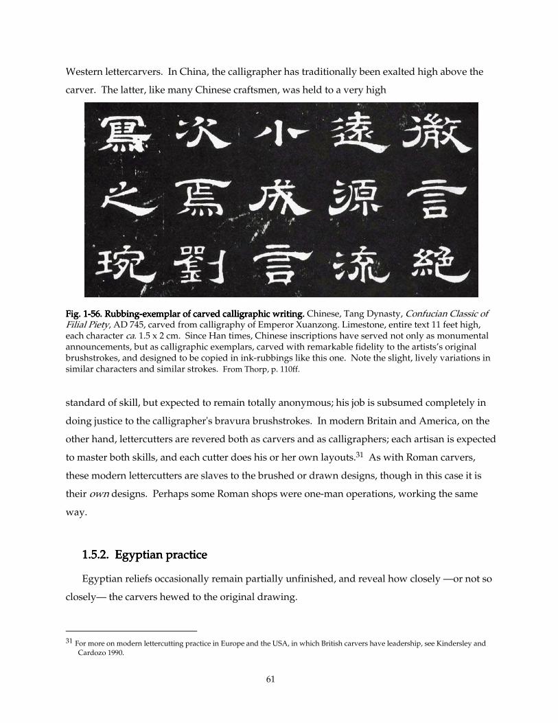
61
Western lettercarvers. In China, the calligrapher has traditionally been exalted high above the
carver. The latter, like many Chinese craftsmen, was held to a very high
Fig. 1Fig. 1Fig. 1Fig. 1----56. Rubbing56. Rubbing56. Rubbing56. Rubbing----exemplar of carved calligraphic writing. exemplar of carved calligraphic writing. exemplar of carved calligraphic writing. exemplar of carved calligraphic writing. Chinese, Tang Dynasty, Confucian Classic of Filial Piety, AD 745, carved from calligraphy of Emperor Xuanzong. Limestone, entire text 11 feet high, each character ca. 1.5 x 2 cm. Since Han times, Chinese inscriptions have served not only as monumental announcements, but as calligraphic exemplars, carved with remarkable fidelity to the artists’s original brushstrokes, and designed to be copied in ink-rubbings like this one. Note the slight, lively variations in similar characters and similar strokes. From Thorp, p. 110ff.
standard of skill, but expected to remain totally anonymous; his job is subsumed completely in
doing justice to the calligrapher's bravura brushstrokes. In modern Britain and America, on the
other hand, lettercutters are revered both as carvers and as calligraphers; each artisan is expected
to master both skills, and each cutter does his or her own layouts.31 As with Roman carvers,
these modern lettercutters are slaves to the brushed or drawn designs, though in this case it is
their own designs. Perhaps some Roman shops were one-man operations, working the same
way.
1.5.2. Egyptian practice1.5.2. Egyptian practice1.5.2. Egyptian practice1.5.2. Egyptian practice
Egyptian reliefs occasionally remain partially unfinished, and reveal how closely —or not so
closely— the carvers hewed to the original drawing.
31 For more on modern lettercutting practice in Europe and the USA, in which British carvers have leadership, see Kindersley and
Cardozo 1990.
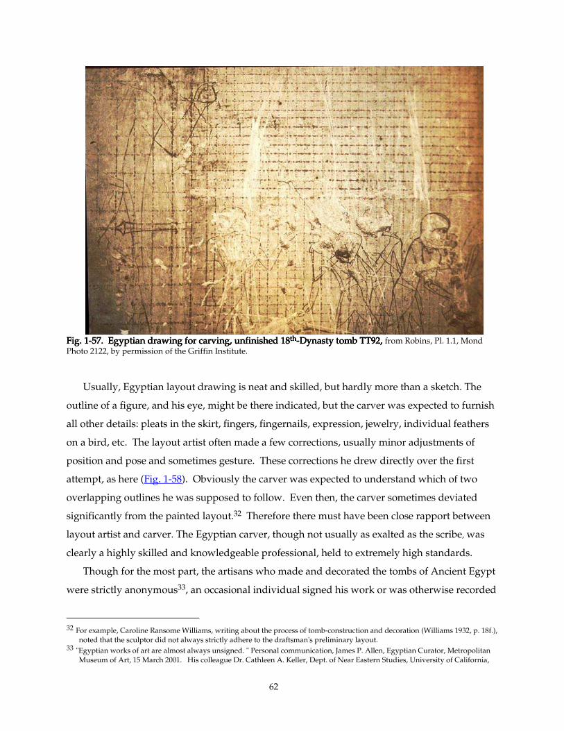
62
Fig. 1Fig. 1Fig. 1Fig. 1----57. Egyptian drawing for carving,57. Egyptian drawing for carving,57. Egyptian drawing for carving,57. Egyptian drawing for carving, unfinished 18 unfinished 18 unfinished 18 unfinished 18thththth----Dynasty tomb TT92, Dynasty tomb TT92, Dynasty tomb TT92, Dynasty tomb TT92, from Robins, Pl. 1.1, Mond Photo 2122, by permission of the Griffin Institute.
Usually, Egyptian layout drawing is neat and skilled, but hardly more than a sketch. The
outline of a figure, and his eye, might be there indicated, but the carver was expected to furnish
all other details: pleats in the skirt, fingers, fingernails, expression, jewelry, individual feathers
on a bird, etc. The layout artist often made a few corrections, usually minor adjustments of
position and pose and sometimes gesture. These corrections he drew directly over the first
attempt, as here (Fig. 1-58). Obviously the carver was expected to understand which of two
overlapping outlines he was supposed to follow. Even then, the carver sometimes deviated
significantly from the painted layout.32 Therefore there must have been close rapport between
layout artist and carver. The Egyptian carver, though not usually as exalted as the scribe, was
clearly a highly skilled and knowledgeable professional, held to extremely high standards.
Though for the most part, the artisans who made and decorated the tombs of Ancient Egypt
were strictly anonymous33, an occasional individual signed his work or was otherwise recorded
32 For example, Caroline Ransome Williams, writing about the process of tomb-construction and decoration (Williams 1932, p. 18f.),
noted that the sculptor did not always strictly adhere to the draftsman's preliminary layout. 33 "Egyptian works of art are almost always unsigned. " Personal communication, James P. Allen, Egyptian Curator, Metropolitan
Museum of Art, 15 March 2001. His colleague Dr. Cathleen A. Keller, Dept. of Near Eastern Studies, University of California,
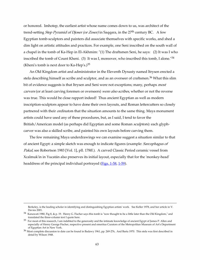
63
or honored. Imhotep, the earliest artist whose name comes down to us, was architect of the
trend-setting Step Pyramid of Djoser (or Zoser) in Saqqara, in the 27th century BC. A few
Egyptian tomb-sculptors and painters did associate themselves with specific works, and shed a
dim light on artistic attitudes and practices. For example, one Seni inscribed on the south wall of
a chapel in the tomb of Ka-Hep in El-Akhmim: "(1) The draftsmen Seni, he says: (2) It was I who
inscribed the tomb of Count Kheni. (3) It was I, moreover, who inscribed this tomb, I alone."34
(Kheni's tomb is next door to Ka-Hep's.)35
An Old Kingdom artist and administrator in the Eleventh Dynasty named Itrysen erected a
stela describing himself as scribe and sculptor, and as an overseer of craftsmen.36 What this slim
bit of evidence suggests is that Itrysen and Seni were not exceptions; many, perhaps most
carvers (or at least carving foremen or overseers) were also scribes, whether or not the reverse
was true. This would be close rapport indeed! Thus ancient Egyptian as well as modern
inscription-sculptors appear to have done their own layouts, and Roman lettercutters so closely
partnered with their ordinators that the situation amounts to the same thing. Maya monument
artists could have used any of these procedures, but, as I said, I tend to favor the
British/American model (as perhaps did Egyptian and some Roman sculptors): each glyph-
carver was also a skilled scribe, and painted his own layouts before carving them.
The few remaining Maya underdrawings we can examine suggest a situation similar to that
of ancient Egypt: a simple sketch was enough to indicate figures (example: Sarcophagus of
Pakal, see Robertson 1983 [Vol. 1], pll. 178ff.). A carved Classic Period ceramic vessel from
Xcalmuk'in in Yucatán also preserves its initial layout, especially that for the 'monkey-head'
headdress of the principal individual portrayed (Figs. 1-58, 1-59).
Berkeley, is the leading scholar in identifying and distinguishing Egyptian artists' work. See Keller 1978, and her article in V. Davies 2001.
34 Kanawati 1980, Fig 8, & p. 19. Henry G. Fischer says this tomb is "now thought to be a little later than the Old Kingdom," and translated the three-column text I quote here.
35 For most of this research, I am indebted to the generosity and the intimate knowledge of ancient Egypt of James P. Allen and especially of Henry George Fischer, respective present and emeritus Curators of the Metropolitan Museum of Art's Department of Egyptian Art in New York.
36 Most complete discussion to date can be found in Badawy 1961, pp. 269-276, And Barta 1970. This stela was first described in detail by Wilson 1948.
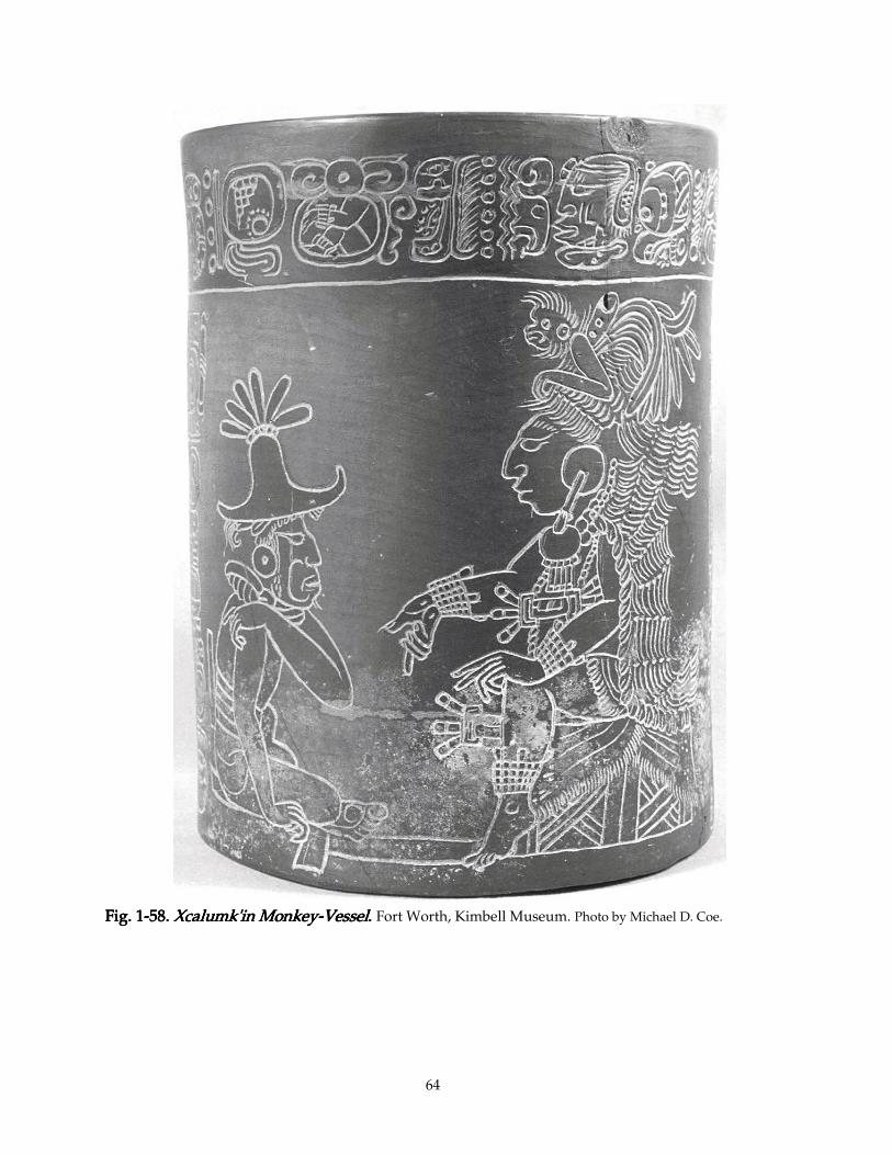
64
Fig. 1Fig. 1Fig. 1Fig. 1----58585858. . . . Xcalumk'in MonkeyXcalumk'in MonkeyXcalumk'in MonkeyXcalumk'in Monkey----VesselVesselVesselVessel. . . . Fort Worth, Kimbell Museum. Photo by Michael D. Coe.
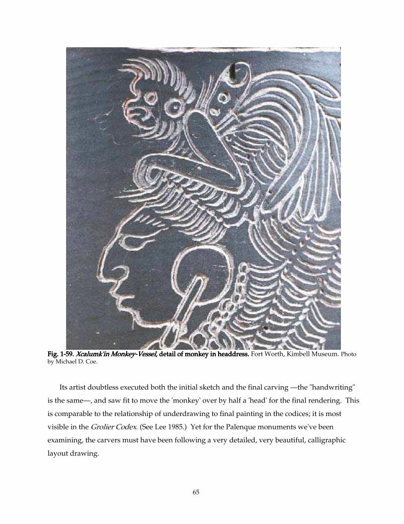
65
Fig. 1Fig. 1Fig. 1Fig. 1----59. 59. 59. 59. Xcalumk'in MonkeyXcalumk'in MonkeyXcalumk'in MonkeyXcalumk'in Monkey----VesselVesselVesselVessel, detail of monkey in headdress. , detail of monkey in headdress. , detail of monkey in headdress. , detail of monkey in headdress. Fort Worth, Kimbell Museum. Photo by Michael D. Coe. Its artist doubtless executed both the initial sketch and the final carving —the "handwriting"
is the same—, and saw fit to move the 'monkey' over by half a 'head' for the final rendering. This
is comparable to the relationship of underdrawing to final painting in the codices; it is most
visible in the Grolier Codex. (See Lee 1985.) Yet for the Palenque monuments we've been
examining, the carvers must have been following a very detailed, very beautiful, calligraphic
layout drawing.
66
1.5.3.1.5.3.1.5.3.1.5.3.
There is another bit of evidence that remains unexplained. The artists' signatures on
ceramics and monuments almost invariably distinguish the medium of writing. That is, if the
writing is painted, the signature says U-ts’ib, "his writing" or "his painting," followed by the
name of the artist (See Kerr Archives). If it happens to be engraved or carved, the sentence
begins with a collocation that perhaps reads, yuxul, and certainly means "his carving."37 We
never see a signature that says, "Written by so-and-so, carved by such-and-such," nor, "Written
and carved by so-and-so."
Fig. 1Fig. 1Fig. 1Fig. 1----60. 60. 60. 60. El Peru StEl Peru StEl Peru StEl Peru Stela 34ela 34ela 34ela 34, three of the eight , three of the eight , three of the eight , three of the eight Yuxul(?)Yuxul(?)Yuxul(?)Yuxul(?) signatures. signatures. signatures. signatures. Cleveland Museum. Relative scale roughly accurate; these signatures are really different sizes. Note that, as expected, comparing the yu-‘Bat’-lu glyphs shows that these are by three different Hands. The first of these is discreetly positioned on the Lady’s Shield, perhaps indicating which area of the stela this artist was responsible for carving. Photographs by author.
That is, although the calligrapher was a highly esteemed member of court, apparently what
mattered most in the making of a monumental text was only the carved, final rendering.
Perhaps this means that the carver, too, was esteemed, perhaps as highly as the calligrapher —or
higher—, or it may have nothing to do with the relative status of carvers and scribes, but rather
emphasize the status of the final performance of rendering ritual in a permanent form.
Alternately, one could claim that it suggests that a text-carver was, like a modern lettercutter,
also expected to be a master calligrapher. In other words, to mention that the carver was also the
scribe might have always been superfluous. Perhaps the glyph collocation that we take to mean
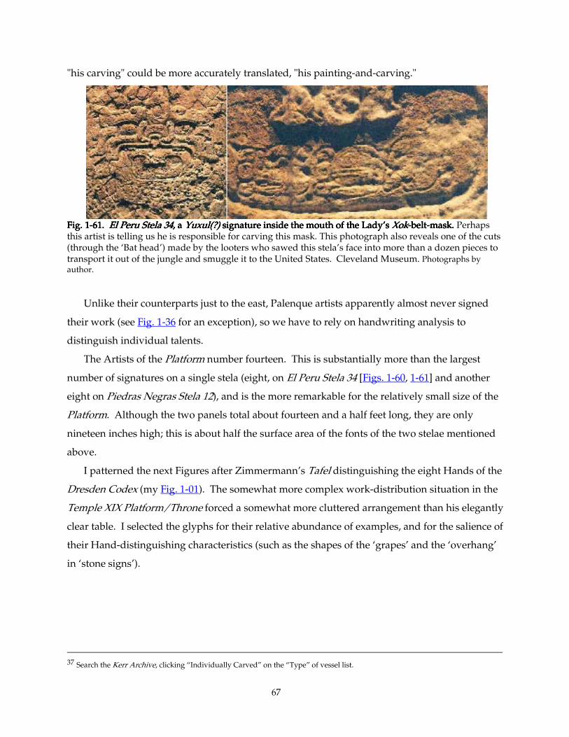
67
"his carving" could be more accurately translated, "his painting-and-carving."
Fig. 1Fig. 1Fig. 1Fig. 1----61. 61. 61. 61. El PeruEl PeruEl PeruEl Peru Stela 34 Stela 34 Stela 34 Stela 34, a , a , a , a Yuxul(?)Yuxul(?)Yuxul(?)Yuxul(?) signature inside the mouth of the Lady’s signature inside the mouth of the Lady’s signature inside the mouth of the Lady’s signature inside the mouth of the Lady’s XokXokXokXok----beltbeltbeltbelt----mask. mask. mask. mask. Perhaps this artist is telling us he is responsible for carving this mask. This photograph also reveals one of the cuts (through the ‘Bat head’) made by the looters who sawed this stela’s face into more than a dozen pieces to transport it out of the jungle and smuggle it to the United States. Cleveland Museum. Photographs by author.
Unlike their counterparts just to the east, Palenque artists apparently almost never signed
their work (see Fig. 1-36 for an exception), so we have to rely on handwriting analysis to
distinguish individual talents.
The Artists of the Platform number fourteen. This is substantially more than the largest
number of signatures on a single stela (eight, on El Peru Stela 34 [Figs. 1-60, 1-61] and another
eight on Piedras Negras Stela 12), and is the more remarkable for the relatively small size of the
Platform. Although the two panels total about fourteen and a half feet long, they are only
nineteen inches high; this is about half the surface area of the fonts of the two stelae mentioned
above.
I patterned the next Figures after Zimmermann’s Tafel distinguishing the eight Hands of the
Dresden Codex (my Fig. 1-01). The somewhat more complex work-distribution situation in the
Temple XIX Platform/Throne forced a somewhat more cluttered arrangement than his elegantly
clear table. I selected the glyphs for their relative abundance of examples, and for the salience of
their Hand-distinguishing characteristics (such as the shapes of the ‘grapes’ and the ‘overhang’
in ‘stone signs’).
37 Search the Kerr Archive, clicking “Individually Carved” on the “Type” of vessel list.
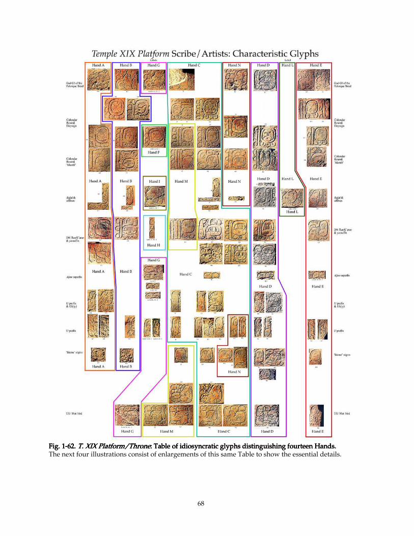
68
Fig. 1Fig. 1Fig. 1Fig. 1----62. 62. 62. 62. T. XIX Platform/ThroneT. XIX Platform/ThroneT. XIX Platform/ThroneT. XIX Platform/Throne: Table of idiosyncratic glyphs di: Table of idiosyncratic glyphs di: Table of idiosyncratic glyphs di: Table of idiosyncratic glyphs distinguishing fourteen Hands.stinguishing fourteen Hands.stinguishing fourteen Hands.stinguishing fourteen Hands. The next four illustrations consist of enlargements of this same Table to show the essential details.
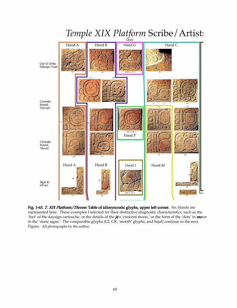
69
Fig. 1Fig. 1Fig. 1Fig. 1----63. 63. 63. 63. T. XIX Platform/ThroneT. XIX Platform/ThroneT. XIX Platform/ThroneT. XIX Platform/Throne: Table of idiosyncratic glyphs, upper left corner. : Table of idiosyncratic glyphs, upper left corner. : Table of idiosyncratic glyphs, upper left corner. : Table of idiosyncratic glyphs, upper left corner. Six Hands are represented here. These examples I selected for their distinctive diagnostic characteristics, such as the ‘feet’ of the daysign cartouche, or the details of the jajajaja’s ‘crescent moon,’ or the form of the ‘dots’ in momomomo or in the ‘stone signs.’ The comparable glyphs (GI, CR, ‘month’ glyphs, and Sajal) continue in the next Figure. All photographs by the author.
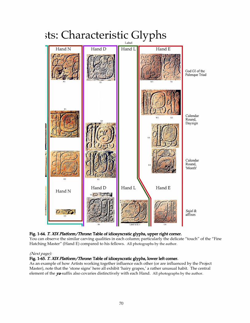
70
Fig. 1Fig. 1Fig. 1Fig. 1----64. 64. 64. 64. T. XIX Platform/ThroneT. XIX Platform/ThroneT. XIX Platform/ThroneT. XIX Platform/Throne: Table of idiosyncratic glyphs, upper right corner.: Table of idiosyncratic glyphs, upper right corner.: Table of idiosyncratic glyphs, upper right corner.: Table of idiosyncratic glyphs, upper right corner. You can observe the similar carving qualities in each column; particularly the delicate “touch” of the “Fine Hatching Master” (Hand E) compared to his fellows. All photographs by the author. (Next page): Fig. 1Fig. 1Fig. 1Fig. 1----65. 65. 65. 65. T. XIX Platform/ThroneT. XIX Platform/ThroneT. XIX Platform/ThroneT. XIX Platform/Throne: Table of idiosyncratic glyphs, lower left corner.: Table of idiosyncratic glyphs, lower left corner.: Table of idiosyncratic glyphs, lower left corner.: Table of idiosyncratic glyphs, lower left corner. As an example of how Artists working together influence each other (or are influenced by the Project Master), note that the ‘stone signs’ here all exhibit ‘hairy grapes,’ a rather unusual habit. The central element of the yayayaya-suffix also covaries distinctively with each Hand. All photographs by the author.
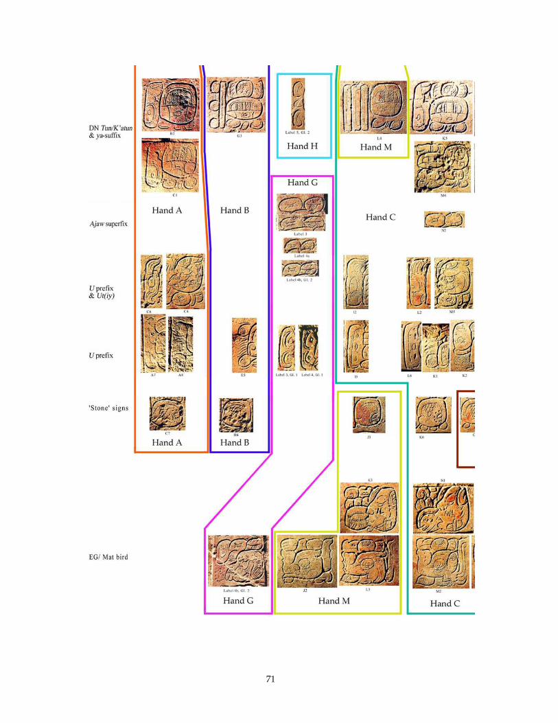
71
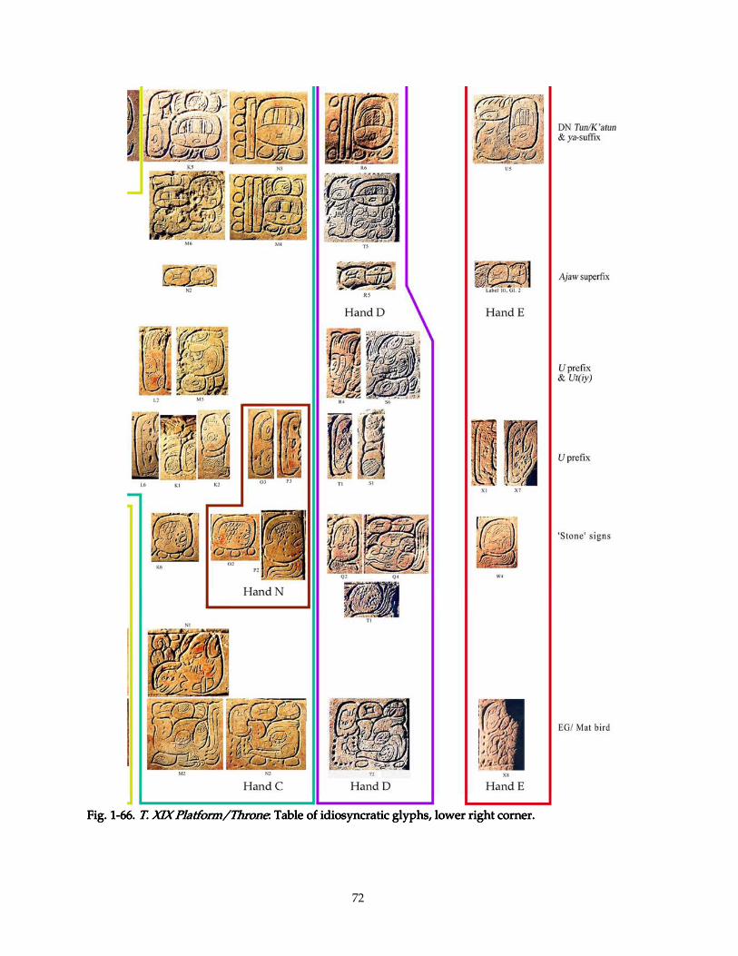
72
Fig. 1Fig. 1Fig. 1Fig. 1----66. 66. 66. 66. T. XIX Platform/ThroneT. XIX Platform/ThroneT. XIX Platform/ThroneT. XIX Platform/Throne: Table of idiosyncratic glyphs, lower right corner.: Table of idiosyncratic glyphs, lower right corner.: Table of idiosyncratic glyphs, lower right corner.: Table of idiosyncratic glyphs, lower right corner.
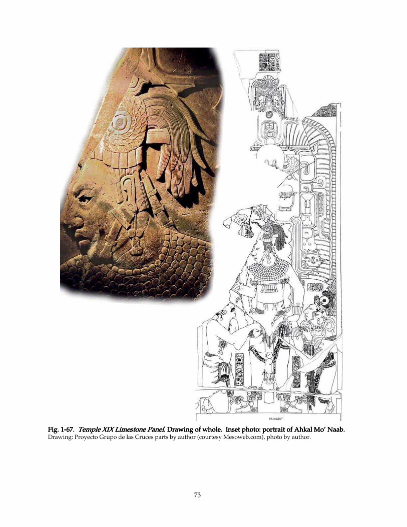
73
Fig. 1Fig. 1Fig. 1Fig. 1----67. 67. 67. 67. Temple XIX Limestone PanelTemple XIX Limestone PanelTemple XIX Limestone PanelTemple XIX Limestone Panel. Drawing of whole. Inset photo: portrait of Ahkal Mo’ Naab. . Drawing of whole. Inset photo: portrait of Ahkal Mo’ Naab. . Drawing of whole. Inset photo: portrait of Ahkal Mo’ Naab. . Drawing of whole. Inset photo: portrait of Ahkal Mo’ Naab. Drawing: Proyecto Grupo de las Cruces parts by author (courtesy Mesoweb.com), photo by author.
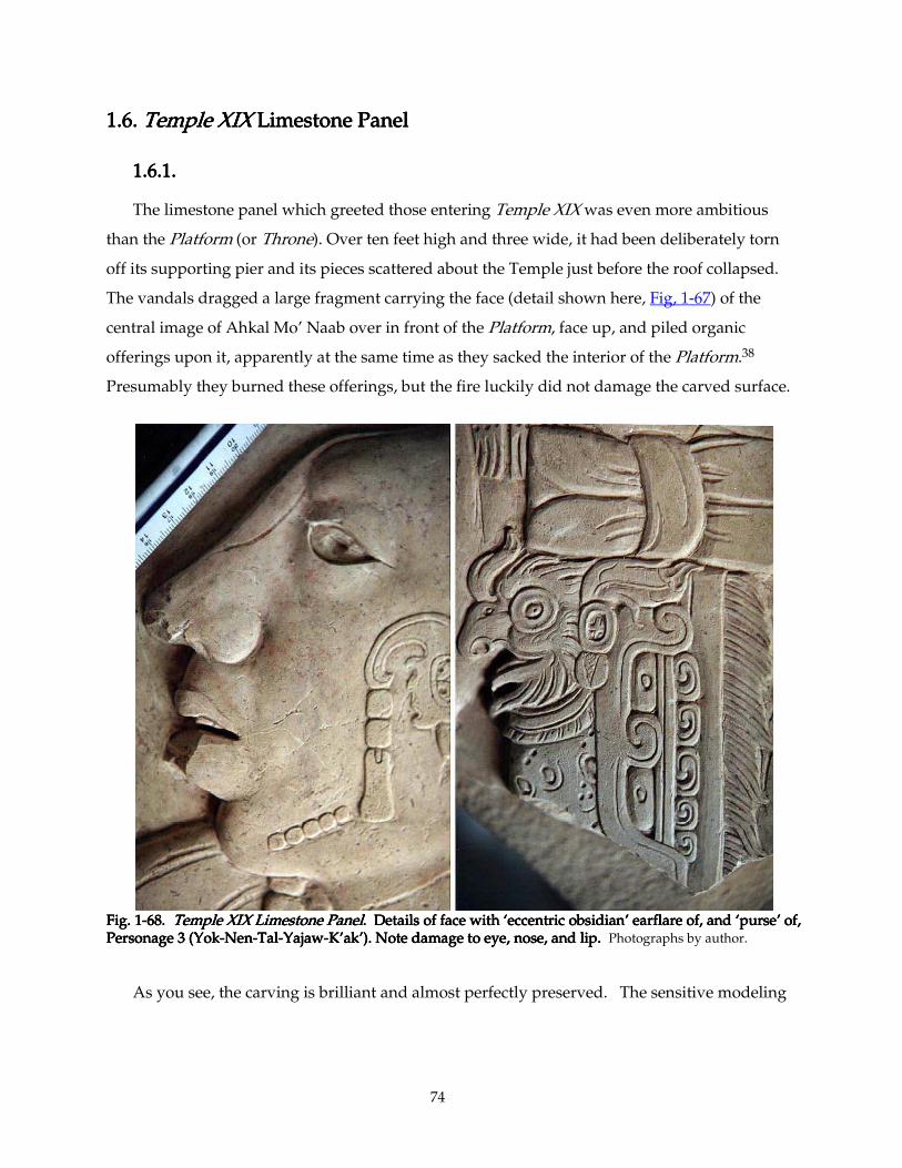
74
1.6. 1.6. 1.6. 1.6. Temple XIXTemple XIXTemple XIXTemple XIX Limestone Panel Limestone Panel Limestone Panel Limestone Panel
1.6.1. 1.6.1. 1.6.1. 1.6.1.
The limestone panel which greeted those entering Temple XIX was even more ambitious
than the Platform (or Throne). Over ten feet high and three wide, it had been deliberately torn
off its supporting pier and its pieces scattered about the Temple just before the roof collapsed.
The vandals dragged a large fragment carrying the face (detail shown here, Fig, 1-67) of the
central image of Ahkal Mo’ Naab over in front of the Platform, face up, and piled organic
offerings upon it, apparently at the same time as they sacked the interior of the Platform.38
Presumably they burned these offerings, but the fire luckily did not damage the carved surface.
Fig.Fig.Fig.Fig. 1 1 1 1----68. 68. 68. 68. Temple XIX Limestone PanelTemple XIX Limestone PanelTemple XIX Limestone PanelTemple XIX Limestone Panel. Details of face with ‘eccentric obsidian’ earflare of, and ‘purse’ of, . Details of face with ‘eccentric obsidian’ earflare of, and ‘purse’ of, . Details of face with ‘eccentric obsidian’ earflare of, and ‘purse’ of, . Details of face with ‘eccentric obsidian’ earflare of, and ‘purse’ of, Personage 3 (YokPersonage 3 (YokPersonage 3 (YokPersonage 3 (Yok----NenNenNenNen----TalTalTalTal----YajawYajawYajawYajaw----K’ak’). Note damage to eye, nose, and lip. K’ak’). Note damage to eye, nose, and lip. K’ak’). Note damage to eye, nose, and lip. K’ak’). Note damage to eye, nose, and lip. Photographs by author.
As you see, the carving is brilliant and almost perfectly preserved. The sensitive modeling
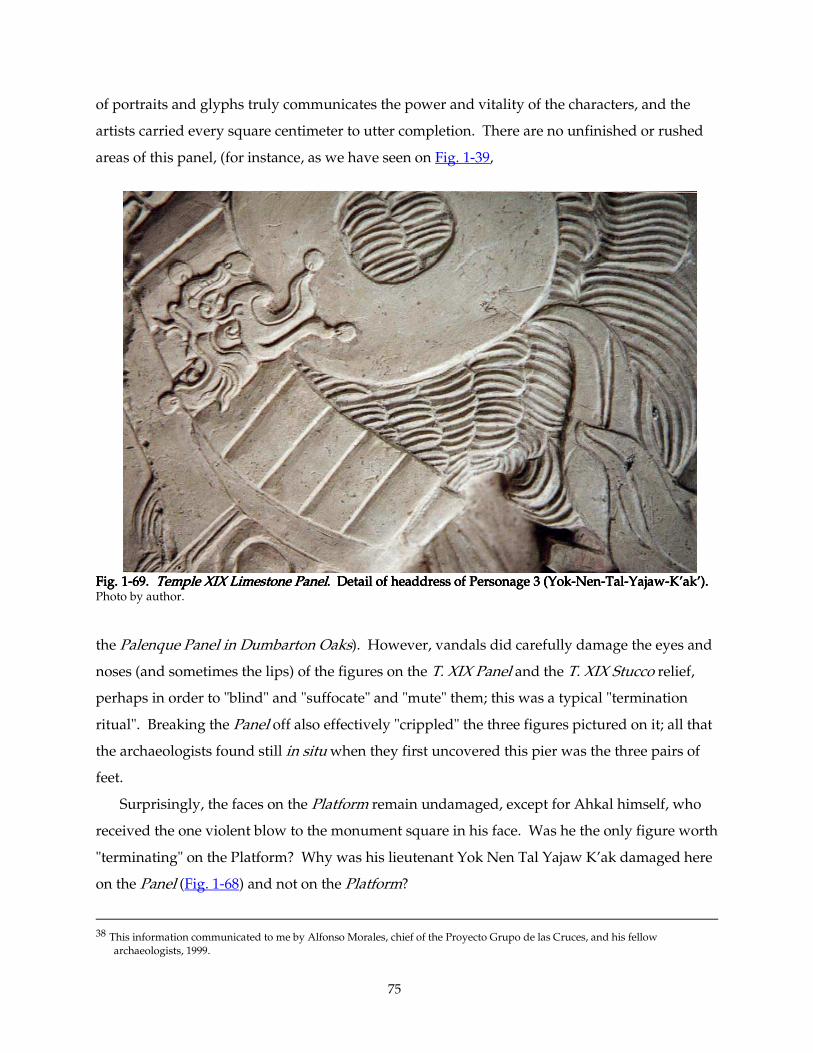
75
of portraits and glyphs truly communicates the power and vitality of the characters, and the
artists carried every square centimeter to utter completion. There are no unfinished or rushed
areas of this panel, (for instance, as we have seen on Fig. 1-39,
Fig. 1Fig. 1Fig. 1Fig. 1----69. 69. 69. 69. Temple XIX Limestone PanelTemple XIX Limestone PanelTemple XIX Limestone PanelTemple XIX Limestone Panel. Detail of headdress of Personage 3 (Yok. Detail of headdress of Personage 3 (Yok. Detail of headdress of Personage 3 (Yok. Detail of headdress of Personage 3 (Yok----NenNenNenNen----TalTalTalTal----YajawYajawYajawYajaw----K’ak’). K’ak’). K’ak’). K’ak’). Photo by author.
the Palenque Panel in Dumbarton Oaks). However, vandals did carefully damage the eyes and
noses (and sometimes the lips) of the figures on the T. XIX Panel and the T. XIX Stucco relief,
perhaps in order to "blind" and "suffocate" and "mute" them; this was a typical "termination
ritual". Breaking the Panel off also effectively "crippled" the three figures pictured on it; all that
the archaeologists found still in situ when they first uncovered this pier was the three pairs of
feet.
Surprisingly, the faces on the Platform remain undamaged, except for Ahkal himself, who
received the one violent blow to the monument square in his face. Was he the only figure worth
"terminating" on the Platform? Why was his lieutenant Yok Nen Tal Yajaw K’ak damaged here
on the Panel (Fig. 1-68) and not on the Platform?
38 This information communicated to me by Alfonso Morales, chief of the Proyecto Grupo de las Cruces, and his fellow
archaeologists, 1999.
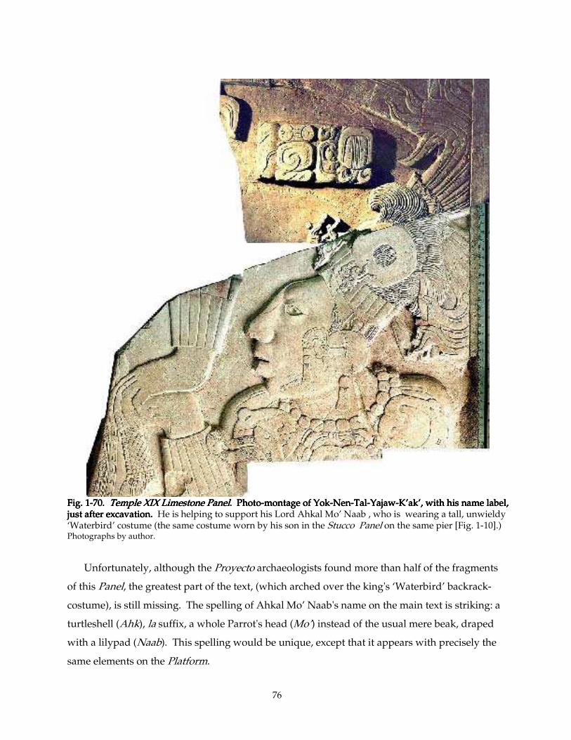
76
Fig. 1Fig. 1Fig. 1Fig. 1----70. 70. 70. 70. Temple XIX Limestone PanelTemple XIX Limestone PanelTemple XIX Limestone PanelTemple XIX Limestone Panel. Photo. Photo. Photo. Photo----montage of Yokmontage of Yokmontage of Yokmontage of Yok----NenNenNenNen----TalTalTalTal----YajawYajawYajawYajaw----K’ak’, with his name label, K’ak’, with his name label, K’ak’, with his name label, K’ak’, with his name label, just after excavation. just after excavation. just after excavation. just after excavation. He is helping to support his Lord Ahkal Mo’ Naab , who is wearing a tall, unwieldy ‘Waterbird’ costume (the same costume worn by his son in the Stucco Panel on the same pier [Fig. 1-10].) Photographs by author.
Unfortunately, although the Proyecto archaeologists found more than half of the fragments
of this Panel, the greatest part of the text, (which arched over the king's ‘Waterbird’ backrack-
costume), is still missing. The spelling of Ahkal Mo’ Naab's name on the main text is striking: a
turtleshell (Ahk), la suffix, a whole Parrot's head (Mo’) instead of the usual mere beak, draped
with a lilypad (Naab). This spelling would be unique, except that it appears with precisely the
same elements on the Platform.
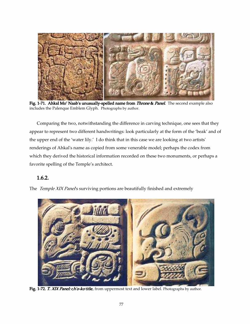
77
Fig. 1Fig. 1Fig. 1Fig. 1----71. Ahkal Mo’71. Ahkal Mo’71. Ahkal Mo’71. Ahkal Mo’ Naab's unusuallyNaab's unusuallyNaab's unusuallyNaab's unusually----spelled name from spelled name from spelled name from spelled name from ThroneThroneThroneThrone & & & & PanelPanelPanelPanel. . . . The second example also includes the Palenque Emblem Glyph. Photographs by author.
Comparing the two, notwithstanding the difference in carving technique, one sees that they
appear to represent two different handwritings: look particularly at the form of the ‘beak’ and of
the upper end of the ‘water lily.’ I do think that in this case we are looking at two artists'
renderings of Ahkal's name as copied from some venerable model; perhaps the codex from
which they derived the historical information recorded on these two monuments, or perhaps a
favorite spelling of the Temple’s architect.
1.6.2. 1.6.2. 1.6.2. 1.6.2.
The Temple XIX Panel's surviving portions are beautifully finished and extremely
Fig. 1Fig. 1Fig. 1Fig. 1----72. 72. 72. 72. T. XIX Panel:T. XIX Panel:T. XIX Panel:T. XIX Panel: c c c ch'oh'oh'oh'o----kokokoko title title title title, from uppermost text and lower label. Photographs by author.
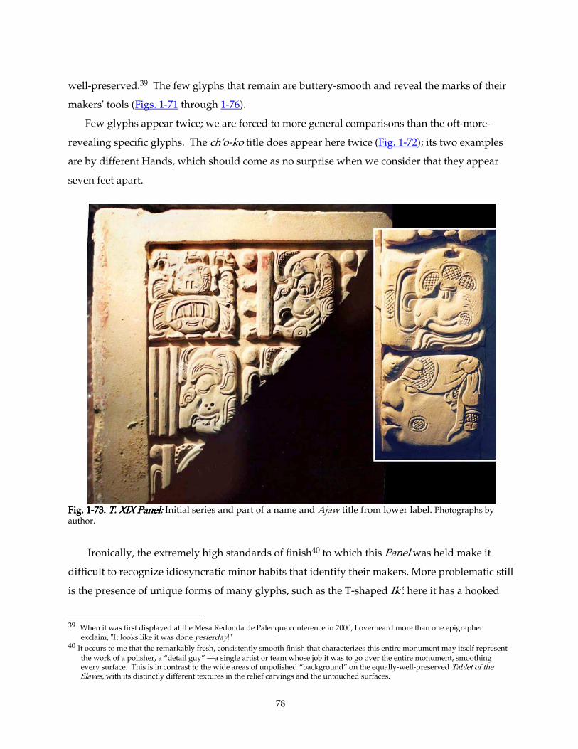
78
well-preserved.39 The few glyphs that remain are buttery-smooth and reveal the marks of their
makers' tools (Figs. 1-71 through 1-76).
Few glyphs appear twice; we are forced to more general comparisons than the oft-more-
revealing specific glyphs. The ch'o-ko title does appear here twice (Fig. 1-72); its two examples
are by different Hands, which should come as no surprise when we consider that they appear
seven feet apart.
Fig. 1Fig. 1Fig. 1Fig. 1----73. 73. 73. 73. T. XIX Panel:T. XIX Panel:T. XIX Panel:T. XIX Panel: Initial series and part of a name and Ajaw title from lower label. Photographs by author.
Ironically, the extremely high standards of finish40 to which this Panel was held make it
difficult to recognize idiosyncratic minor habits that identify their makers. More problematic still
is the presence of unique forms of many glyphs, such as the T-shaped Ik': here it has a hooked
39 When it was first displayed at the Mesa Redonda de Palenque conference in 2000, I overheard more than one epigrapher
exclaim, "It looks like it was done yesterday!" 40 It occurs to me that the remarkably fresh, consistently smooth finish that characterizes this entire monument may itself represent
the work of a polisher, a “detail guy” —a single artist or team whose job it was to go over the entire monument, smoothing every surface. This is in contrast to the wide areas of unpolished “background” on the equally-well-preserved Tablet of the Slaves, with its distinctly different textures in the relief carvings and the untouched surfaces.
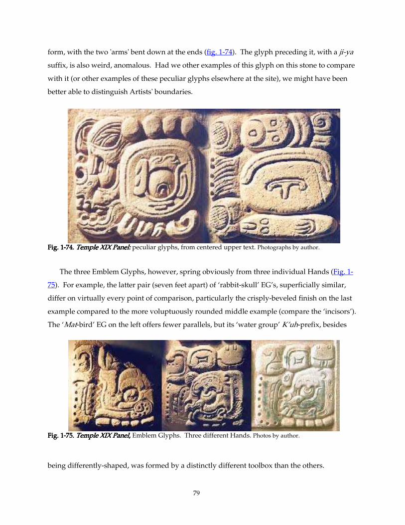
79
form, with the two 'arms' bent down at the ends (fig. 1-74). The glyph preceding it, with a ji-ya
suffix, is also weird, anomalous. Had we other examples of this glyph on this stone to compare
with it (or other examples of these peculiar glyphs elsewhere at the site), we might have been
better able to distinguish Artists' boundaries.
Fig. 1Fig. 1Fig. 1Fig. 1----74. 74. 74. 74. Temple XIX Panel:Temple XIX Panel:Temple XIX Panel:Temple XIX Panel: peculiar glyphs, from centered upper text. Photographs by author.
The three Emblem Glyphs, however, spring obviously from three individual Hands (Fig. 1-
75). For example, the latter pair (seven feet apart) of ‘rabbit-skull’ EG’s, superficially similar,
differ on virtually every point of comparison, particularly the crisply-beveled finish on the last
example compared to the more voluptuously rounded middle example (compare the ‘incisors’).
The ‘Mat-bird’ EG on the left offers fewer parallels, but its ‘water group’ K’uh-prefix, besides
Fig. 1Fig. 1Fig. 1Fig. 1----75. 75. 75. 75. Temple XIX PanelTemple XIX PanelTemple XIX PanelTemple XIX Panel, , , , Emblem Glyphs. Three different Hands. Photos by author.
being differently-shaped, was formed by a distinctly different toolbox than the others.
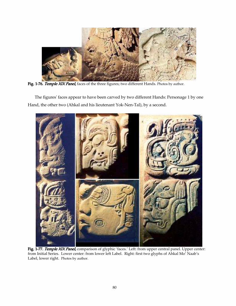
80
Fig. 1Fig. 1Fig. 1Fig. 1----76. 76. 76. 76. TempTempTempTemple XIX Panelle XIX Panelle XIX Panelle XIX Panel, , , , faces of the three figures; two different Hands. Photos by author.
The figures' faces appear to have been carved by two different Hands: Personage 1 by one
Hand, the other two (Ahkal and his lieutenant Yok-Nen-Tal), by a second.
Fig. 1Fig. 1Fig. 1Fig. 1----77777. 7. 7. 7. Temple XIX PanelTemple XIX PanelTemple XIX PanelTemple XIX Panel, , , , comparison of glyphic ‘faces.’ Left: from upper central panel. Upper center: from Initial Series. Lower center: from lower left Label. Right: first two glyphs of Ahkal Mo’ Naab’s Label, lower right. Photos by author.
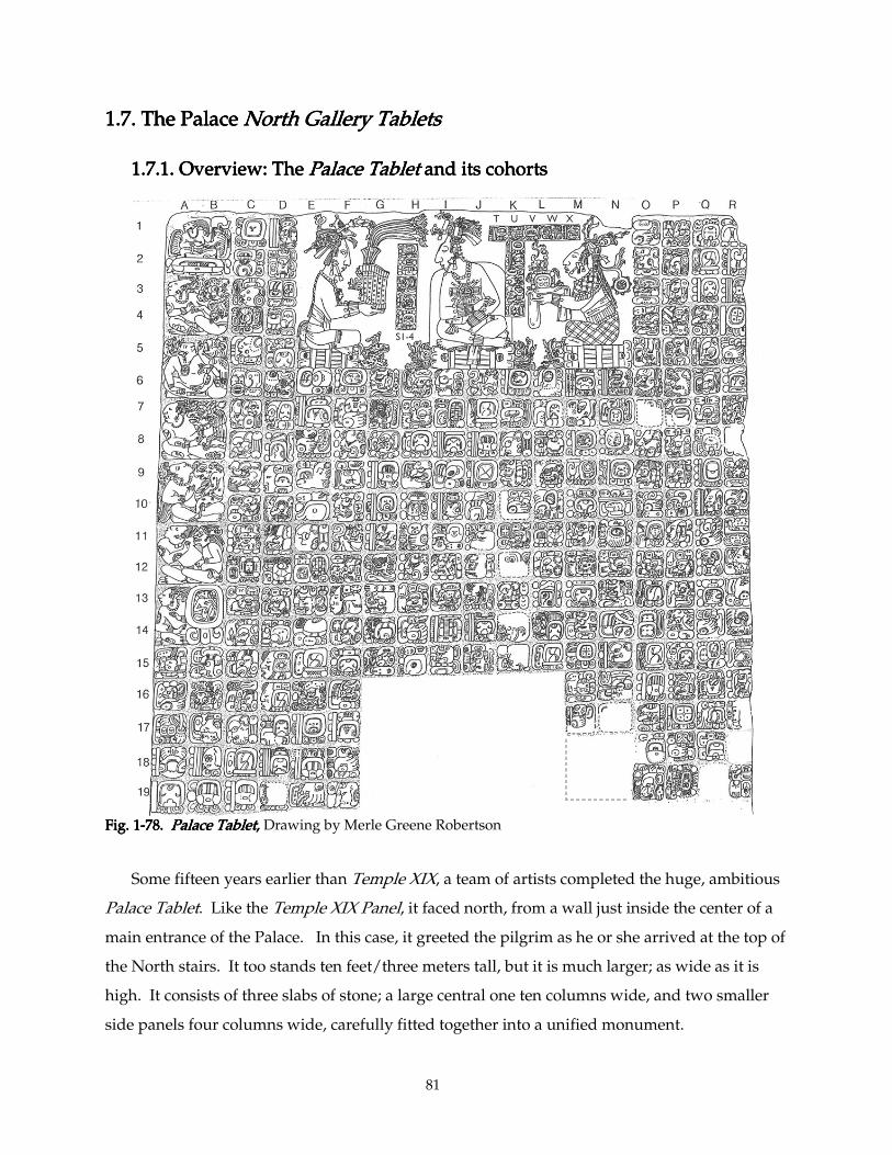
81
1.7. The Palac1.7. The Palac1.7. The Palac1.7. The Palace e e e North Gallery TabletsNorth Gallery TabletsNorth Gallery TabletsNorth Gallery Tablets
1.7.1. Overview: The 1.7.1. Overview: The 1.7.1. Overview: The 1.7.1. Overview: The Palace TabletPalace TabletPalace TabletPalace Tablet and its cohorts and its cohorts and its cohorts and its cohorts
Fig. 1Fig. 1Fig. 1Fig. 1----78. 78. 78. 78. Palace TabletPalace TabletPalace TabletPalace Tablet,,,, Drawing by Merle Greene Robertson
Some fifteen years earlier than Temple XIX, a team of artists completed the huge, ambitious
Palace Tablet. Like the Temple XIX Panel, it faced north, from a wall just inside the center of a
main entrance of the Palace. In this case, it greeted the pilgrim as he or she arrived at the top of
the North stairs. It too stands ten feet/three meters tall, but it is much larger; as wide as it is
high. It consists of three slabs of stone; a large central one ten columns wide, and two smaller
side panels four columns wide, carefully fitted together into a unified monument.
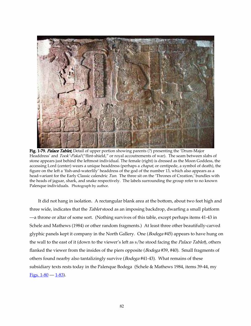
82
Fig. 1Fig. 1Fig. 1Fig. 1----79. 79. 79. 79. Palace Tablet,Palace Tablet,Palace Tablet,Palace Tablet, Detail of upper portion showing parents (?) presenting the ‘Drum-Major Headdress’ and Took’-Pakal (“flint-shield,” or royal accoutrements of war). The seam between slabs of stone appears just behind the leftmost individual. The female (right) is dressed as the Moon Goddess, the accessing Lord (center) wears a unique headdress (perhaps a chapat, or centipede, a symbol of death), the figure on the left a ‘fish-and-waterlily’ headdress of the god of the number 13, which also appears as a head-variant for the Early Classic calendric Tun. The three sit on the ‘Thrones of Creation,’ bundles with the heads of jaguar, shark, and snake respectively. The labels surrounding the group refer to no known Palenque individuals. Photograph by author.
It did not hang in isolation. A rectangular blank area at the bottom, about two feet high and
three wide, indicates that the Tablet stood as an imposing backdrop, dwarfing a small platform
—a throne or altar of some sort. (Nothing survives of this table, except perhaps items 41-43 in
Schele and Mathews (1984) or other random fragments.) At least three other beautifully-carved
glyphic panels kept it company in the North Gallery. One (Bodega #45) appears to have hung on
the wall to the east of it (down to the viewer’s left as s/he stood facing the Palace Tablet), others
flanked the viewer from the insides of the piers opposite (Bodega #39, #40). Small fragments of
others found nearby also tantalizingly survive (Bodega #41-43). What remains of these
subsidiary texts rests today in the Palenque Bodega (Schele & Mathews 1984, items 39-44, my
Figs. 1-80 — 1-83).
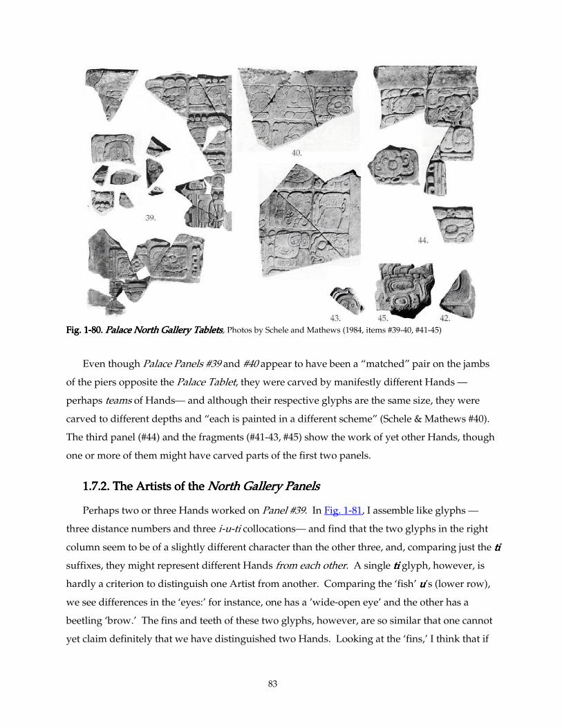
83
Fig. 1Fig. 1Fig. 1Fig. 1----80. 80. 80. 80. Palace North Gallery TabletsPalace North Gallery TabletsPalace North Gallery TabletsPalace North Gallery Tablets, Photos by Schele and Mathews (1984, items #39-40, #41-45)
Even though Palace Panels #39 and #40 appear to have been a “matched” pair on the jambs
of the piers opposite the Palace Tablet, they were carved by manifestly different Hands —
perhaps teams of Hands— and although their respective glyphs are the same size, they were
carved to different depths and “each is painted in a different scheme” (Schele & Mathews #40).
The third panel (#44) and the fragments (#41-43, #45) show the work of yet other Hands, though
one or more of them might have carved parts of the first two panels.
1.7.2. The1.7.2. The1.7.2. The1.7.2. The Artists of the Artists of the Artists of the Artists of the North Gallery PanelsNorth Gallery PanelsNorth Gallery PanelsNorth Gallery Panels
Perhaps two or three Hands worked on Panel #39. In Fig. 1-81, I assemble like glyphs —
three distance numbers and three i-u-ti collocations— and find that the two glyphs in the right
column seem to be of a slightly different character than the other three, and, comparing just the titititi
suffixes, they might represent different Hands from each other. A single titititi glyph, however, is
hardly a criterion to distinguish one Artist from another. Comparing the ‘fish’ uuuu’s (lower row),
we see differences in the ‘eyes:’ for instance, one has a ’wide-open eye’ and the other has a
beetling ‘brow.’ The fins and teeth of these two glyphs, however, are so similar that one cannot
yet claim definitely that we have distinguished two Hands. Looking at the ‘fins,’ I think that if
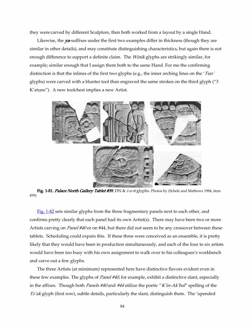
84
they were carved by different Sculptors, then both worked from a layout by a single Hand.
Likewise, the yayayaya-suffixes under the first two examples differ in thickness (though they are
similar in other details), and may constitute distinguishing characteristics, but again there is not
enough difference to support a definite claim. The Winik glyphs are strikingly similar, for
example; similar enough that I assign them both to the same Hand. For me the confirming
distinction is that the inlines of the first two glyphs (e.g., the inner arching lines on the ‘Tun’
glyphs) were carved with a blunter tool than engraved the same strokes on the third glyph (“3
K’atuns”). A new toolchest implies a new Artist.
Fig. 1Fig. 1Fig. 1Fig. 1----81. 81. 81. 81. Palace North Gallery Tablet #39Palace North Gallery Tablet #39Palace North Gallery Tablet #39Palace North Gallery Tablet #39, DN & i-u-ti glyphs. Photos by (Schele and Mathews 1984, item
#39)
Fig. 1-82 sets similar glyphs from the three fragmentary panels next to each other, and
confirms pretty clearly that each panel had its own Artist(s). There may have been two or more
Artists carving on Panel #40 or on #44, but there did not seem to be any crossover between these
tablets. Scheduling could expain this. If these three were conceived as an ensemble, it is pretty
likely that they would have been in production simultaneously, and each of the four to six artists
would have been too busy with his own assignment to walk over to his colleagues’s workbench
and carve out a few glyphs.
The three Artists (at minimum) represented here have distinctive flavors evident even in
these few examples. The glyphs of Panel #40, for example, exhibit a distinctive slant, especially
in the affixes. Though both Panels #40 and #44 utilize the poetic “K’in-Ak’bal” spelling of the
Tz’ak glyph (first row), subtle details, particularly the slant, distinguish them. The ‘upended
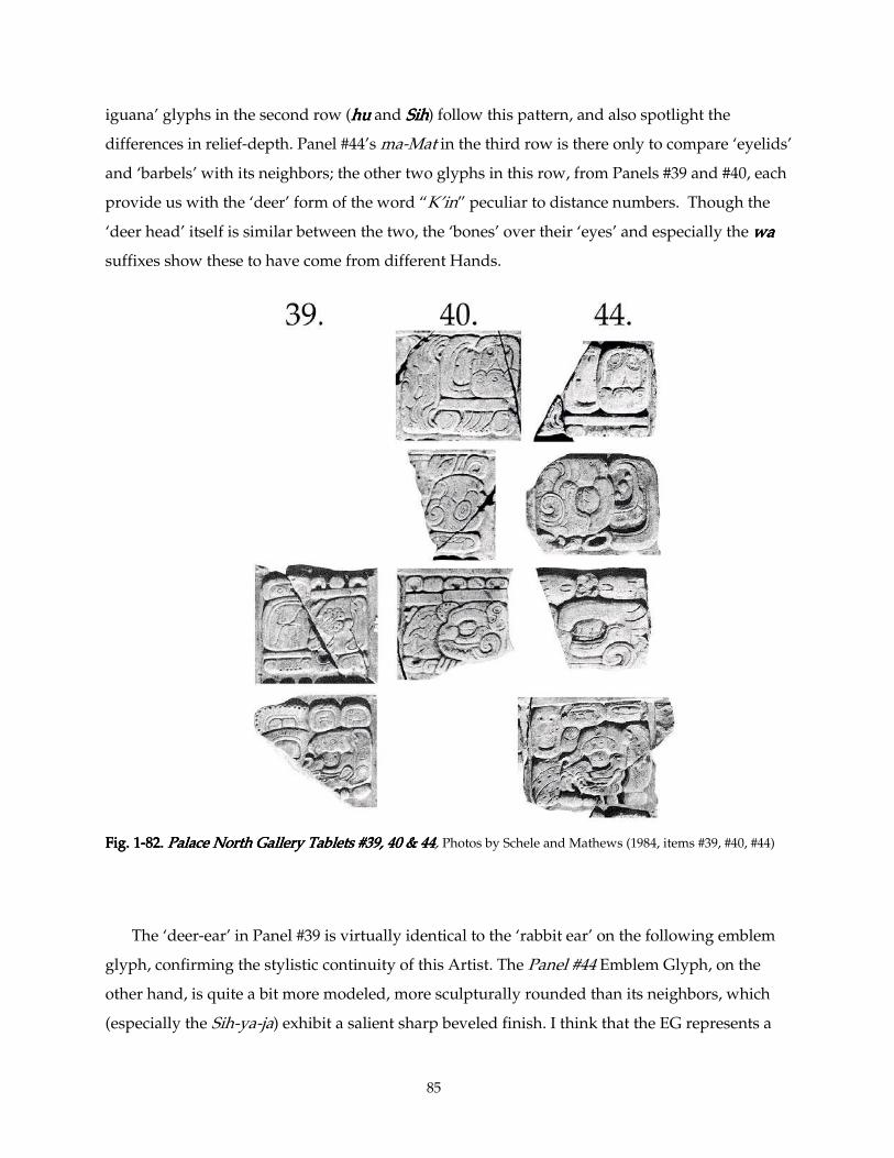
85
iguana’ glyphs in the second row (huhuhuhu and SihSihSihSih) follow this pattern, and also spotlight the
differences in relief-depth. Panel #44’s ma-Mat in the third row is there only to compare ‘eyelids’
and ‘barbels’ with its neighbors; the other two glyphs in this row, from Panels #39 and #40, each
provide us with the ‘deer’ form of the word “K’in” peculiar to distance numbers. Though the
‘deer head’ itself is similar between the two, the ‘bones’ over their ‘eyes’ and especially the wawawawa
suffixes show these to have come from different Hands.
Fig. 1Fig. 1Fig. 1Fig. 1----82. 82. 82. 82. Palace North Gallery Tablets #39, 40 & 44Palace North Gallery Tablets #39, 40 & 44Palace North Gallery Tablets #39, 40 & 44Palace North Gallery Tablets #39, 40 & 44, Photos by Schele and Mathews (1984, items #39, #40, #44)
The ‘deer-ear’ in Panel #39 is virtually identical to the ‘rabbit ear’ on the following emblem
glyph, confirming the stylistic continuity of this Artist. The Panel #44 Emblem Glyph, on the
other hand, is quite a bit more modeled, more sculpturally rounded than its neighbors, which
(especially the Sih-ya-ja) exhibit a salient sharp beveled finish. I think that the EG represents a
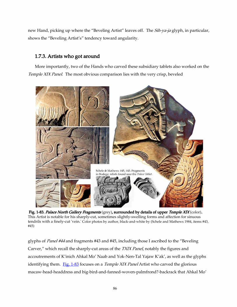
86
new Hand, picking up where the “Beveling Artist” leaves off. The Sih-ya-ja glyph, in particular,
shows the “Beveling Artist’s” tendency toward angularity.
1.7.3. Artist1.7.3. Artist1.7.3. Artist1.7.3. Artistssss who got around who got around who got around who got around
More importantly, two of the Hands who carved these subsidiary tablets also worked on the
Temple XIX Panel. The most obvious comparison lies with the very crisp, beveled
Fig. 1Fig. 1Fig. 1Fig. 1----83. 83. 83. 83. Palace North Gallery Fragments Palace North Gallery Fragments Palace North Gallery Fragments Palace North Gallery Fragments (grey),,,, surrounded by details of uppersurrounded by details of uppersurrounded by details of uppersurrounded by details of upper Temple XIX Temple XIX Temple XIX Temple XIX (color). . . . This Artist is notable for his sharply-cut, sometimes slightly-swelling forms and affection for sinuous tendrils with a finely-cut 'vein.' Color photos by author, black-and-white by (Schele and Mathews 1984, items #43, #45)
glyphs of Panel #44 and fragments #43 and #45, including those I ascribed to the “Beveling
Carver,” which recall the sharply-cut areas of the TXIX Panel, notably the figures and
accoutrements of K’inich Ahkal Mo’ Naab and Yok-Nen-Tal Yajaw K’ak’, as well as the glyphs
identifying them. Fig. 1-83 focuses on a Temple XIX Panel Artist who carved the glorious
macaw-head-headdress and big-bird-and-fanned-woven-palmfrond?-backrack that Ahkal Mo’
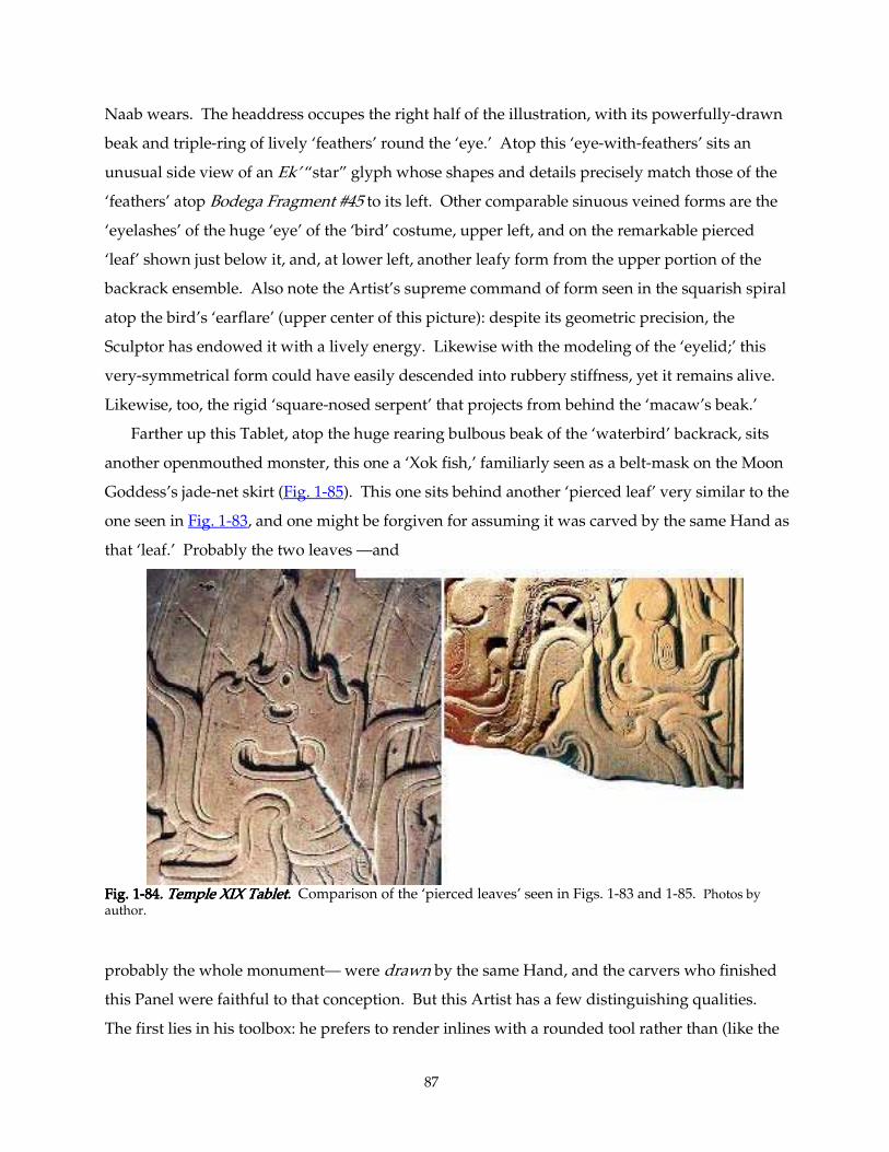
87
Naab wears. The headdress occupes the right half of the illustration, with its powerfully-drawn
beak and triple-ring of lively ‘feathers’ round the ‘eye.’ Atop this ‘eye-with-feathers’ sits an
unusual side view of an Ek’ “star” glyph whose shapes and details precisely match those of the
‘feathers’ atop Bodega Fragment #45 to its left. Other comparable sinuous veined forms are the
‘eyelashes’ of the huge ‘eye’ of the ‘bird’ costume, upper left, and on the remarkable pierced
‘leaf’ shown just below it, and, at lower left, another leafy form from the upper portion of the
backrack ensemble. Also note the Artist’s supreme command of form seen in the squarish spiral
atop the bird’s ‘earflare’ (upper center of this picture): despite its geometric precision, the
Sculptor has endowed it with a lively energy. Likewise with the modeling of the ‘eyelid;’ this
very-symmetrical form could have easily descended into rubbery stiffness, yet it remains alive.
Likewise, too, the rigid ‘square-nosed serpent’ that projects from behind the ‘macaw’s beak.’
Farther up this Tablet, atop the huge rearing bulbous beak of the ‘waterbird’ backrack, sits
another openmouthed monster, this one a ‘Xok fish,’ familiarly seen as a belt-mask on the Moon
Goddess’s jade-net skirt (Fig. 1-85). This one sits behind another ‘pierced leaf’ very similar to the
one seen in Fig. 1-83, and one might be forgiven for assuming it was carved by the same Hand as
that ‘leaf.’ Probably the two leaves —and
Fig. 1Fig. 1Fig. 1Fig. 1----84848484. Temple XIX Tablet.. Temple XIX Tablet.. Temple XIX Tablet.. Temple XIX Tablet. Comparison of the ‘pierced leaves’ seen in Figs. 1-83 and 1-85. Photos by author.
probably the whole monument— were drawn by the same Hand, and the carvers who finished
this Panel were faithful to that conception. But this Artist has a few distinguishing qualities.
The first lies in his toolbox: he prefers to render inlines with a rounded tool rather than (like the
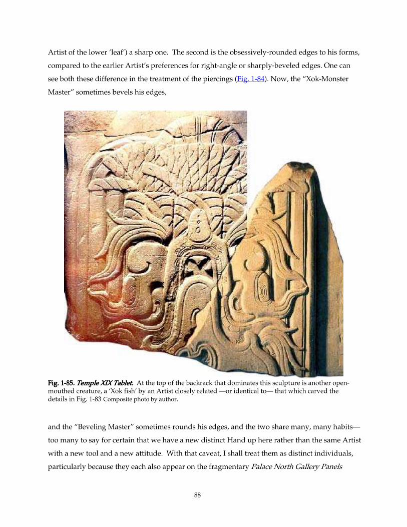
88
Artist of the lower ‘leaf’) a sharp one. The second is the obsessively-rounded edges to his forms,
compared to the earlier Artist’s preferences for right-angle or sharply-beveled edges. One can
see both these difference in the treatment of the piercings (Fig. 1-84). Now, the “Xok-Monster
Master” sometimes bevels his edges,
Fig. 1Fig. 1Fig. 1Fig. 1----85858585. Temple XIX Tablet.. Temple XIX Tablet.. Temple XIX Tablet.. Temple XIX Tablet. At the top of the backrack that dominates this sculpture is another open-mouthed creature, a ‘Xok fish’ by an Artist closely related —or identical to— that which carved the details in Fig. 1-83 Composite photo by author. and the “Beveling Master” sometimes rounds his edges, and the two share many, many habits—
too many to say for certain that we have a new distinct Hand up here rather than the same Artist
with a new tool and a new attitude. With that caveat, I shall treat them as distinct individuals,
particularly because they each also appear on the fragmentary Palace North Gallery Panels
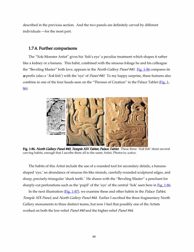
89
described in the previous section. And the two panels are definitely carved by different
individuals —for the most part.
1.7.4. Further comparisons1.7.4. Further comparisons1.7.4. Further comparisons1.7.4. Further comparisons
The “Xok-Monster Artist” gives his ‘fish’s eye’ a peculiar treatment which shapes it rather
like a kidney or a banana. This habit, combined with the sinuous foliage he and his colleague
the “Beveling Master” both love, appears in the North Gallery Panel #40. Fig. 1-86 compares its
uuuu-prefix (also a ‘Xok fish’) with the ‘eye’ of Panel #40. To my happy surprise, these features also
combine in one of the four heads seen on the “Thrones of Creation” in the Palace Tablet (Fig. 1-
86).
Fig. 1Fig. 1Fig. 1Fig. 1----86.86.86.86. North Gallery Pa North Gallery Pa North Gallery Pa North Gallery Panel #40, Temple XIX Tablet, Palace Tablet.nel #40, Temple XIX Tablet, Palace Tablet.nel #40, Temple XIX Tablet, Palace Tablet.nel #40, Temple XIX Tablet, Palace Tablet. These three ‘Xok fish’ share several carving habits, enough that I ascribe them all to the same Artist. Photos by author.
The habits of this Artist include the use of a rounded tool for secondary details, a banana-
shaped ‘eye,’ an abundance of sinuous fin-like strands, carefully-rounded sculptural edges, and
sharp, precisely-triangular ‘shark teeth.’ He shares with the “Beveling Master” a penchant for
sharply-cut perforations such as the ‘pupil’ of the ‘eye’ of the central ‘Xok’ seen here in Fig. 1-86.
In the next illustration (Fig. 1-87), we examine these and other habits in the Palace Tablet,
Temple XIX Panel, and North Gallery Panel #44. Earlier I ascribed the three fragmentary North
Gallery monuments to three distinct teams, but now I feel that possibly one of the Artists
worked on both the low-relief Panel #40 and the higher-relief Panel #44.
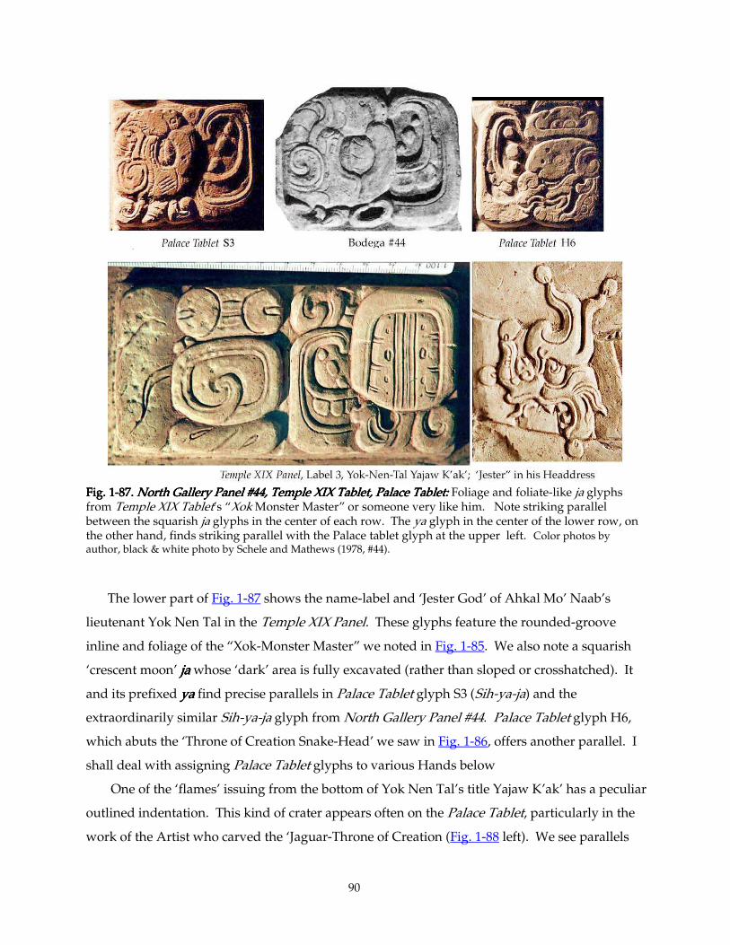
90
Fig. 1Fig. 1Fig. 1Fig. 1----87.87.87.87. North Gallery Panel #44, Temple XIX Table North Gallery Panel #44, Temple XIX Table North Gallery Panel #44, Temple XIX Table North Gallery Panel #44, Temple XIX Tablet, Palace Tablet:t, Palace Tablet:t, Palace Tablet:t, Palace Tablet: Foliage and foliate-like ja glyphs from Temple XIX Tablet’s “Xok Monster Master” or someone very like him. Note striking parallel between the squarish ja glyphs in the center of each row. The ya glyph in the center of the lower row, on the other hand, finds striking parallel with the Palace tablet glyph at the upper left. Color photos by author, black & white photo by Schele and Mathews (1978, #44). The lower part of Fig. 1-87 shows the name-label and ‘Jester God’ of Ahkal Mo’ Naab’s
lieutenant Yok Nen Tal in the Temple XIX Panel. These glyphs feature the rounded-groove
inline and foliage of the “Xok-Monster Master” we noted in Fig. 1-85. We also note a squarish
‘crescent moon’ jajajaja whose ‘dark’ area is fully excavated (rather than sloped or crosshatched). It
and its prefixed yayayaya find precise parallels in Palace Tablet glyph S3 (Sih-ya-ja) and the
extraordinarily similar Sih-ya-ja glyph from North Gallery Panel #44. Palace Tablet glyph H6,
which abuts the ‘Throne of Creation Snake-Head’ we saw in Fig. 1-86, offers another parallel. I
shall deal with assigning Palace Tablet glyphs to various Hands below
One of the ‘flames’ issuing from the bottom of Yok Nen Tal’s title Yajaw K’ak’ has a peculiar
outlined indentation. This kind of crater appears often on the Palace Tablet, particularly in the
work of the Artist who carved the ‘Jaguar-Throne of Creation (Fig. 1-88 left). We see parallels
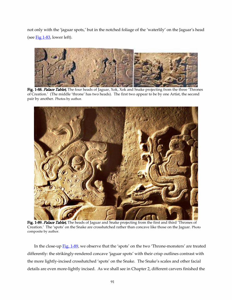
91
not only with the ‘jaguar spots,’ but in the notched foliage of the ‘waterlily’ on the Jaguar’s head
(see Fig 1-83, lower left).
Fig. 1Fig. 1Fig. 1Fig. 1----88.88.88.88. Palace Tablet, Palace Tablet, Palace Tablet, Palace Tablet, The four heads of Jaguar, Xok, Xok and Snake projecting from the three ‘Thrones of Creation.’ (The middle ‘throne’ has two heads). The first two appear to be by one Artist, the second pair by another. Photos by author.
Fig. 1Fig. 1Fig. 1Fig. 1----89.89.89.89. Palace Tablet, Palace Tablet, Palace Tablet, Palace Tablet, The heads of Jaguar and Snake projecting from the first and third ‘Thrones of Creation.’ The ‘spots’ on the Snake are crosshatched rather than concave like those on the Jaguar. Photo composite by author. In the close-up Fig. 1-89, we observe that the ‘spots’ on the two ‘Throne-monsters’ are treated
differently: the strikingly-rendered concave ‘jaguar spots’ with their crisp outlines contrast with
the more lightly-incised crosshatched ‘spots’ on the Snake. The Snake’s scales and other facial
details are even more-lightly incised. As we shall see in Chapter 2, different carvers finished the
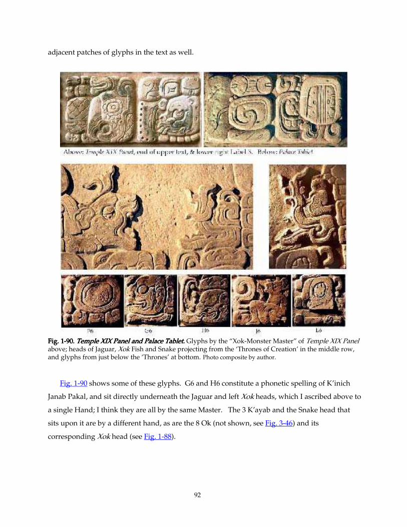
92
adjacent patches of glyphs in the text as well.
Fig. 1Fig. 1Fig. 1Fig. 1----90.90.90.90. Temple XIX Panel and Palace Tablet. Temple XIX Panel and Palace Tablet. Temple XIX Panel and Palace Tablet. Temple XIX Panel and Palace Tablet. Glyphs by the “Xok-Monster Master” of Temple XIX Panel above; heads of Jaguar, Xok Fish and Snake projecting from the ‘Thrones of Creation’ in the middle row, and glyphs from just below the ‘Thrones’ at bottom. Photo composite by author. Fig. 1-90 shows some of these glyphs. G6 and H6 constitute a phonetic spelling of K’inich
Janab Pakal, and sit directly underneath the Jaguar and left Xok heads, which I ascribed above to
a single Hand; I think they are all by the same Master. The 3 K’ayab and the Snake head that
sits upon it are by a different hand, as are the 8 Ok (not shown, see Fig. 3-46) and its
corresponding Xok head (see Fig. 1-88).
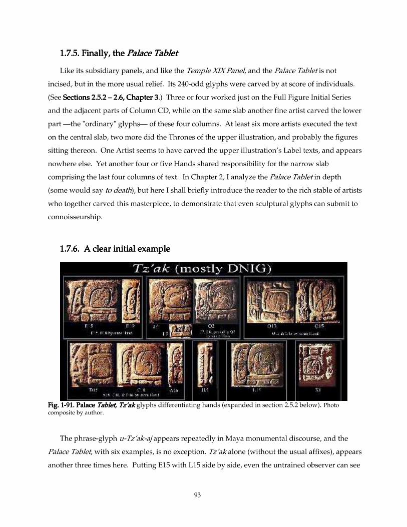
93
1.7.5. Finally, the 1.7.5. Finally, the 1.7.5. Finally, the 1.7.5. Finally, the Palace TabletPalace TabletPalace TabletPalace Tablet
Like its subsidiary panels, and like the Temple XIX Panel, and the Palace Tablet is not
incised, but in the more usual relief. Its 240-odd glyphs were carved by at score of individuals.
(See Sections 2.5.2 Sections 2.5.2 Sections 2.5.2 Sections 2.5.2 –––– 2.6, Chapter 3 2.6, Chapter 3 2.6, Chapter 3 2.6, Chapter 3.) Three or four worked just on the Full Figure Initial Series
and the adjacent parts of Column CD, while on the same slab another fine artist carved the lower
part —the "ordinary" glyphs— of these four columns. At least six more artists executed the text
on the central slab, two more did the Thrones of the upper illustration, and probably the figures
sitting thereon. One Artist seems to have carved the upper illustration’s Label texts, and appears
nowhere else. Yet another four or five Hands shared responsibility for the narrow slab
comprising the last four columns of text. In Chapter 2, I analyze the Palace Tablet in depth
(some would say to death), but here I shall briefly introduce the reader to the rich stable of artists
who together carved this masterpiece, to demonstrate that even sculptural glyphs can submit to
connoisseurship.
1.7.6. A clear initial example1.7.6. A clear initial example1.7.6. A clear initial example1.7.6. A clear initial example
Fig. 1Fig. 1Fig. 1Fig. 1----99991.1.1.1. PalacePalacePalacePalace Tablet Tablet Tablet Tablet, , , , Tz’akTz’akTz’akTz’ak glyphs differentiating hands (expanded in section 2.5.2 below). Photo composite by author. The phrase-glyph u-Tz’ak-aj appears repeatedly in Maya monumental discourse, and the
Palace Tablet, with six examples, is no exception. Tz’ak alone (without the usual affixes), appears
another three times here. Putting E15 with L15 side by side, even the untrained observer can see
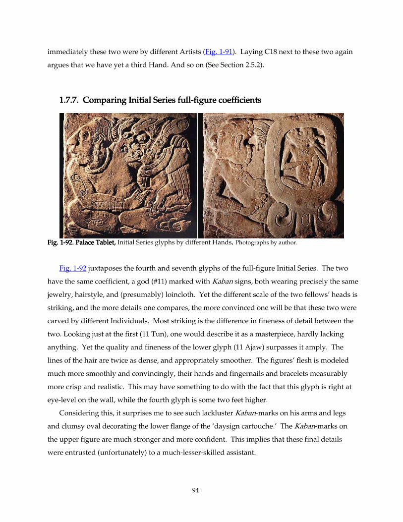
94
immediately these two were by different Artists (Fig. 1-91). Laying C18 next to these two again
argues that we have yet a third Hand. And so on (See Section 2.5.2).
1.7.7.1.7.7.1.7.7.1.7.7. Comparing Initial Series full Comparing Initial Series full Comparing Initial Series full Comparing Initial Series full----figure coefficientsfigure coefficientsfigure coefficientsfigure coefficients
Fig. 1Fig. 1Fig. 1Fig. 1----92. Palace Tablet,92. Palace Tablet,92. Palace Tablet,92. Palace Tablet, Initial Series glyphs by different Hands.... Photographs by author. Fig. 1-92 juxtaposes the fourth and seventh glyphs of the full-figure Initial Series. The two
have the same coefficient, a god (#11) marked with Kaban signs, both wearing precisely the same
jewelry, hairstyle, and (presumably) loincloth. Yet the different scale of the two fellows’ heads is
striking, and the more details one compares, the more convinced one will be that these two were
carved by different Individuals. Most striking is the difference in fineness of detail between the
two. Looking just at the first (11 Tun), one would describe it as a masterpiece, hardly lacking
anything. Yet the quality and fineness of the lower glyph (11 Ajaw) surpasses it amply. The
lines of the hair are twice as dense, and appropriately smoother. The figures’ flesh is modeled
much more smoothly and convincingly, their hands and fingernails and bracelets measurably
more crisp and realistic. This may have something to do with the fact that this glyph is right at
eye-level on the wall, while the fourth glyph is some two feet higher.
Considering this, it surprises me to see such lackluster Kaban-marks on his arms and legs
and clumsy oval decorating the lower flange of the ‘daysign cartouche.’ The Kaban-marks on
the upper figure are much stronger and more confident. This implies that these final details
were entrusted (unfortunately) to a much-lesser-skilled assistant.
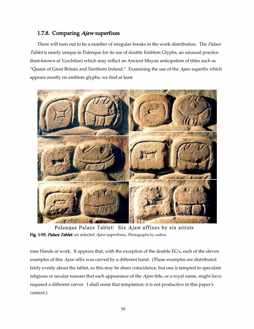
95
1.7.8.1.7.8.1.7.8.1.7.8. Comparing Comparing Comparing Comparing AjawAjawAjawAjaw superfixes superfixes superfixes superfixes
There will turn out to be a number of irregular breaks in the work-distribution. The Palace
Tablet is nearly unique in Palenque for its use of double Emblem Glyphs, an unusual practice
(best-known at Yaxchilan) which may reflect an Ancient Mayan anticipation of titles such as
“Queen of Great Britain and Northern Ireland.” Examining the use of the Ajaw superfix which
appears mostly on emblem glyphs, we find at least
Fig. 1Fig. 1Fig. 1Fig. 1----93.93.93.93. Palace Tablet Palace Tablet Palace Tablet Palace Tablet, six selected Ajaw superfixes. . . . Photographs by author.
nine Hands at work. It appears that, with the exception of the double EG's, each of the eleven
examples of this Ajaw affix was carved by a different hand. (These examples are distributed
fairly evenly about the tablet, so this may be sheer coincidence, but one is tempted to speculate
religious or secular reasons that each appearance of the Ajaw title, or a royal name, might have
required a different carver. I shall resist that temptation; it is not productive in this paper's
context.)
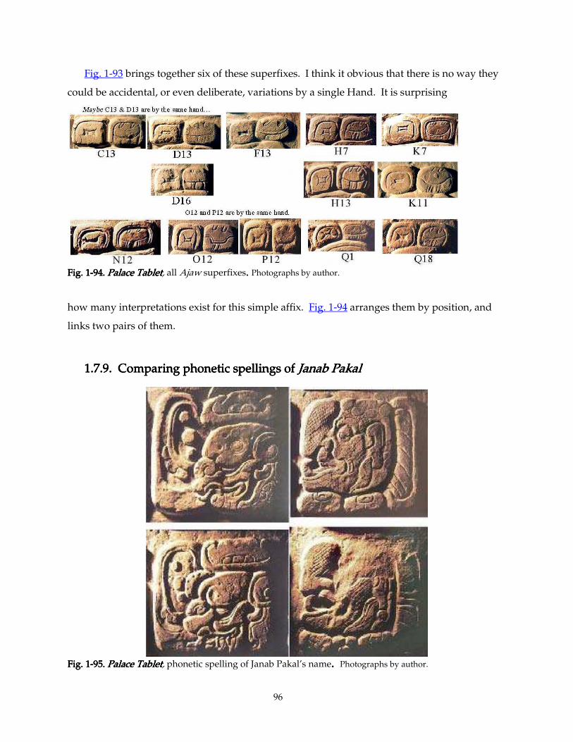
96
Fig. 1-93 brings together six of these superfixes. I think it obvious that there is no way they
could be accidental, or even deliberate, variations by a single Hand. It is surprising
Fig. 1Fig. 1Fig. 1Fig. 1----94.94.94.94. Palace TabletPalace TabletPalace TabletPalace Tablet, all Ajaw superfixes.... Photographs by author.
how many interpretations exist for this simple affix. Fig. 1-94 arranges them by position, and
links two pairs of them.
1.7.9.1.7.9.1.7.9.1.7.9. Comparing phonetic spellings of Comparing phonetic spellings of Comparing phonetic spellings of Comparing phonetic spellings of Janab PakalJanab PakalJanab PakalJanab Pakal
Fig. 1Fig. 1Fig. 1Fig. 1----95.95.95.95. Palace TabletPalace TabletPalace TabletPalace Tablet, phonetic spelling of Janab Pakal’s name. . . . Photographs by author.
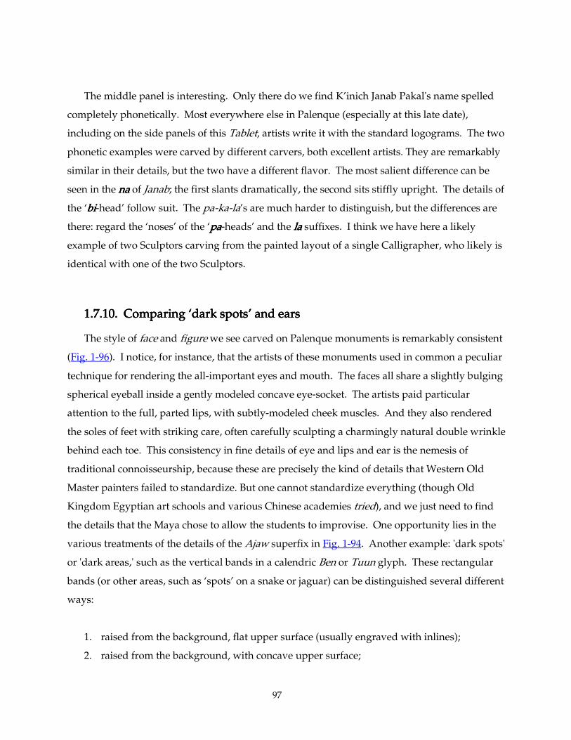
97
The middle panel is interesting. Only there do we find K’inich Janab Pakal's name spelled
completely phonetically. Most everywhere else in Palenque (especially at this late date),
including on the side panels of this Tablet, artists write it with the standard logograms. The two
phonetic examples were carved by different carvers, both excellent artists. They are remarkably
similar in their details, but the two have a different flavor. The most salient difference can be
seen in the nananana of Janab; the first slants dramatically, the second sits stiffly upright. The details of
the ‘bibibibi-head’ follow suit. The pa-ka-la’s are much harder to distinguish, but the differences are
there: regard the ‘noses’ of the ‘papapapa-heads’ and the lalalala suffixes. I think we have here a likely
example of two Sculptors carving from the painted layout of a single Calligrapher, who likely is
identical with one of the two Sculptors.
1.7.10. 1.7.10. 1.7.10. 1.7.10. Comparing ‘dark spots’ and earsComparing ‘dark spots’ and earsComparing ‘dark spots’ and earsComparing ‘dark spots’ and ears
The style of face and figure we see carved on Palenque monuments is remarkably consistent
(Fig. 1-96). I notice, for instance, that the artists of these monuments used in common a peculiar
technique for rendering the all-important eyes and mouth. The faces all share a slightly bulging
spherical eyeball inside a gently modeled concave eye-socket. The artists paid particular
attention to the full, parted lips, with subtly-modeled cheek muscles. And they also rendered
the soles of feet with striking care, often carefully sculpting a charmingly natural double wrinkle
behind each toe. This consistency in fine details of eye and lips and ear is the nemesis of
traditional connoisseurship, because these are precisely the kind of details that Western Old
Master painters failed to standardize. But one cannot standardize everything (though Old
Kingdom Egyptian art schools and various Chinese academies tried), and we just need to find
the details that the Maya chose to allow the students to improvise. One opportunity lies in the
various treatments of the details of the Ajaw superfix in Fig. 1-94. Another example: 'dark spots'
or 'dark areas,' such as the vertical bands in a calendric Ben or Tuun glyph. These rectangular
bands (or other areas, such as ‘spots’ on a snake or jaguar) can be distinguished several different
ways:
1. raised from the background, flat upper surface (usually engraved with inlines);
2. raised from the background, with concave upper surface;
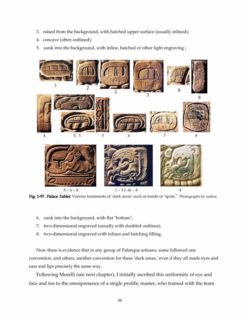
98
3. raised from the background, with hatched upper surface (usually inlined);
4. concave (often outlined);
5. sunk into the background, with inline, hatched or other light engraving ;
Fig. 1Fig. 1Fig. 1Fig. 1----97.97.97.97. Palace Tablet Palace Tablet Palace Tablet Palace Tablet, Various treatments of ‘dark areas’ such as bands or ‘spots.’ Photographs by author.
6. sunk into the background, with flat "bottom";
7. two-dimensional engraved (usually with doubled outlines);
8. two-dimensional engraved with inlines and hatching filling.
Now there is evidence that in any group of Palenque artisans, some followed one
convention, and others, another convention for these ‘dark areas,’ even if they all made eyes and
ears and lips precisely the same way.
Following Morelli (see next chapter), I initially ascribed this uniformity of eye and
face and toe to the omnipresence of a single prolific master, who trained with the team
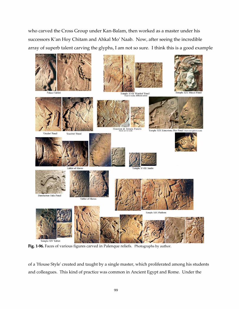
99
who carved the Cross Group under Kan-Balam, then worked as a master under his
successors K’an Hoy Chitam and Ahkal Mo’ Naab. Now, after seeing the incredible
array of superb talent carving the glyphs, I am not so sure. I think this is a good example
Fig. 1Fig. 1Fig. 1Fig. 1----96.96.96.96. Faces of various figures carved in Palenque reliefs. Photographs by author.
of a 'House Style' created and taught by a single master, which proliferated among his students
and colleagues. This kind of practice was common in Ancient Egypt and Rome. Under the
100
Caesars, for instance, the official procedure was to create a standard, idealized, politically correct
portrait of the emperor, make several official standard copies, then send them to licensed
sculpture studios throughout the empire, where it would be available for reference by anyone
wishing to portray the Emperor for any work of art.
When one looks at the ears of the figures from Palenque during this period, they all share a
simplified linear style, with certain specific lines incised in a certain way. This is true not only of
the stone figures, but those sculpted in stucco as well. One is tempted to see a specialist in faces
or figures, or even in ears, going about finishing the figures being carved in various temples. In
the next two chapters, we shall scrutinize the Palace Tablet and other monuments to see if we
can discern such specialization. In general, it seems safe to begin by assuming that a single
glyph was all carved by one Artist. We shall have our hands full just trying to figure out where
one Hand left off and another began
1.7.11. 1.7.11. 1.7.11. 1.7.11. So why the big crowds? So why the big crowds? So why the big crowds? So why the big crowds?
The question remains: why did the monuments of Palenque (and Piedras Negras and San
Jose de Motul) employ such a jostling crowd of artists? Were they just interested in cranking
these stones out rapidly? With seven or ten artists at work, the Temple XIX Platform could have
been conceived and completed in a week or two; perhaps there were so many celebrations to
commemorate, the busy Maya craftsmen’s guilds had to produce monuments on a tight
schedule. We have no idea, for example, what other objects of display were painted, woven,
carved in wood, or constructed of more perishable materials (such as the altars we see erected in
modern village ceremonies). The astonishing corpus of carved lintels preserved at Yaxchilan is
some indication of the vast wealth of wooden monuments lost to us, which the surviving lintels
at Tikal confirm. There are hundreds of doorways just at Palenque, for example. Perhaps there
were wooden stelae as well, and no doubt the buildings were hung with decorated textiles.
Allen Christenson and David Stuart suggested to me another reason. Large monuments
were costly, and certain types were erected only once every five or ten years. It seems possible
to have been the custom for each lineage head to endow a portion of such a monument, not only
to enable large communal works to be erected, but to allow each of several lineages to share the
honor of having produced them.
In the Primary Standard Sequence on ceramic vessels, one notes that a critical part of the text
101
states that the process of painting or of carving the vessel sanctifies it. Occasionally the painter
or carver is honored(?) by the mention of his or her name. Now the action of patronage, of
causing someone to do something, is often recorded on monuments: "Sajal So and So conquers
the city of Whatzit, U-Kab-hi / “By order of” his Ajaw Such and Such." Nowhere do we find on
a pot or monument that it was painted or carved u-Kab-hi Such and Such. What is recorded is
the actual act of painting or carving, u-ts’ib So and So. It apparently would not do merely to
provide the money to erect a monument, the real honor came from providing the carving itself.
My guess is that each carver-calligrapher working on the Palace Tablet and on the Temple
XIX Platform might have been the actual scion of a participating lineage. Michael Coe (1997) has
shown that Maya calligraphers and associated craftspeople were highly esteemed members of
court, on par with Japanese and Chinese calligraphers. Some were possibly members of the
royal family itself, and clearly the arts of calligraphy and carving were considered honourable
callings for nobles. I have no doubt that any lineage of high rank was well-supplied with skilled
scribes and artisans in its own members, which their Ajaw could assign to contribute to a given
monument. This situation prevails today, according to Christenson, among the lineages of a
cofradía which each contribute to decorating a specific portion of the building on feast days.
Although this practice of distributing work among several artists seems less widespread in
the Early Classic (when population centers were smaller), there is some evidence that it goes
back to the Middle Preclassic. Susan Gillespie (1994) analyzed unfinished Olmec monuments at
Llano del Jacaro. Her analysis suggests that one group of artisans did the initial roughing out of
the sculptures, another brought the figures nearly to their final state, then fine details were
added by a third group. This could be an entirely practical kind of craft specialization, or it
could have had a basis in religious or political considerations like those I am tentatively positing.
The large number of signatures on monuments from El Peru and Piedras Negras suggests
similar divisions of sponsorship there. I am anxious to apply this connoisseurship analysis
there, and to Early Tikal and other sites and eras, to determine whether this multiple-artist
procedure was the rule. Whether it turns out to have been more or less universal (early
indications suggest it was), or whether one finds spatial or temporal distinctions in Maya
monument-creation practice, I believe it can shed a little more light on the political
microeconomy of Ancient Maya cities.
102
Chapter 2Chapter 2Chapter 2Chapter 2. . . . Criteria for Distinguishing Maya Artists' HandsCriteria for Distinguishing Maya Artists' HandsCriteria for Distinguishing Maya Artists' HandsCriteria for Distinguishing Maya Artists' Hands
2.12.12.12.1.... Scope of this Inquiry Scope of this Inquiry Scope of this Inquiry Scope of this Inquiry
As we shall demonstrate in great detail in this and the next chapter, the exquisite carving of
the ambitious Palace Tablet, and that of the smaller Temple XIX Platform, were accomplished by
a surprisingly large group of highly-skilled Palenque sculptors. Fourteen (perhaps more) worked
on the Platform (with a sculpted area of about 2800 square inches, less than two square meters),
and a score in the case of the Palace Tablet (ten feet square, or nine square meters). Questions
arise immediately as we examine these apparent group projects: How sure are we that two parts
of the same work are by different artists, or that one inscription was worked on by the same
artist as another inscription?
Further, in carved inscriptions, was the carver of a glyph the same as the scribe who laid out
that particular glyph on the stone? Was one of these roles more highly esteemed than the other?
Were artists cross-trained like Michelangelo, expected to be both calligrapher and sculptor, or
were the two fields separated? Were such distinctions universally held across the Maya realm,
or did each city's artistic community have its own peculiar categories and ranks? Artists’
signatures are not at all ubiquitous; how did that practice arise, and what does its heterogeneous
distribution tell us about the individuality of Maya polities’ attitudes toward scribes?
How unified were each city's artists? Were individuals attached to specific lineages, fiercely
and jealously competitive, never to share technical secrets? Or were scribes, sculptors and other
artisans trained in university-like centers of learning, and able to communicate freely among
their own?
Although scribes were highly-ranked, highly-regarded individuals, recent scholarship
suggests that they might have been considered a kind of chattel, a commodity that could be
traded, or a prize to be captured in battle, either to enter service of new masters or be sacrificed41
along with a conquered polity's rulers and monuments.
This investigation cannot address but a small fraction of these issues. We can begin,
however, by establishing definitive criteria by which we might judge whether a pair of objects
41 Johnston, Kevin J., “Broken fingers: Classic Maya scribe capture and polity consolidation,” Antiquity 75, June 2001, pp. 71-81.
Also reported and reviewed by Wilford, John Noble, “Live by the Pen, Die by the Sword,” in The New York Times’ Science Times section, 17 July 2001, pp. 1-2.
103
issued from the same hand or not; these criteria may begin to provide some insights. The
foundations of this methodology were laid in a series of letters written 1866-1872 by art historian
and connoisseur Giovanni Morelli to two of his colleagues42. Dealing with similar issues
regarding Italian Renaissance painters, he determined the parts of a painting in which an artist
revealed his individuality. This art of connoisseurship provided a major occupation for art
historians for the next half century, and is a critical central task of dealer-experts who sell
paintings, antiques, and objets d’art to this day.
2.2.2.2.2.2.2.2. Background of ConnoisseurshipBackground of ConnoisseurshipBackground of ConnoisseurshipBackground of Connoisseurship
2.2.1. Morelli, Oriental Experts, Beazley2.2.1. Morelli, Oriental Experts, Beazley2.2.1. Morelli, Oriental Experts, Beazley2.2.1. Morelli, Oriental Experts, Beazley
Morelli’s problem resulted from the widespread practice during the Renaissance and later
eras of well-known artists training numerous apprentices, who usually, with greater or lesser
skill, imitated their masters’ styles, subjects and individual masterpieces. The flourishing art
market from that day to this also cultivated a thriving production of copies and outright fakes,
the latter often painted by hungry but very skilled artists, who strove to emulate a master’s style
in every detail. Collectors willingly pay shocking sums for works by an acknowledged name,
and Morelli’s methodology provided some assurance that they were receiving the genuine
article.
His observation is as simple as it is ingenious. A copyist or imitator can easily master the
most familiar characteristics of a particular artist —the surprised expression of a Pontormo, the
vivid musculature of a Michelangelo, the creamy skin texture of a Da Vinci, or the choppy
brushstrokes of Van Gogh—, and with work can ferret out a hundred other habits peculiar to
that master. But he cannot ever learn them all. The “follower” invariably develops his or her
own “handwriting,” a collection of habits and features that distinguish copyist from master.
Morelli noted that humble, oft-repeated and little-noted features of these paintings —ears,
fingernails, textiles, spurs, the kinds of details whose form and technique were never specifically
articulated by teachers, but were expected to be mastered without tuition—, displayed style
distinctive to the individual. One could refer to “Botticelli lips” or the “elongated toes of a
Michelangelo” or the “assured, bold, left-handed hatching of a Leonardo drawing.”
42 Morelli, Giovanni (1816-1891), Collecting connoisseurship and the art market in Risorgimento Italy: Giovanni Morelli's letters to
Giovanni Melli and Pietro Zavaritt (1866-1872). Jaynie Anderson, editor. Venezia, Istituto veneto di scienze, lettere, ed …, 1999
104
This same methodology is more or less applied by experts in every field of art scholarship.
Tibetan calligraphy specialists, for instance, identify each artist’s specific brushstroke qualities
with imaginative allegorical phrases.43 In this they follow Chinese painting connoisseurship
practice.44 In the middle of the last century John Davidson Beazley exploited this approach to
identify Greek vase painters, publishing dozens of titles attributing a massive corpus of objects
to individual artists.45 Though usually much less compendious, similar efforts can be found
sprinkled throughout the literature of every field of art history.
Beazley’s work was aided considerably by the unusual (for ancient peoples) Greek practice of
signing pots. Although a minority, a substantial number of Attic vases carry signatures of the
potter and/or the painter. This evidence provides a check on an expert’s attribution which is
absent in many other fields.
However, most ancient and traditional peoples do not share our modern reverence for the
individual artist. The paintings and sculpture of ancient Egypt, of Africa, of Polynesia, of the
Andes, of the Alpine Celts, and a hundred other nations are, as a rule, anonymous. Likewise for
the brilliant carvers of European cathedral sculpture, of Chinese inscriptions, of Assyrian reliefs,
and so forth. The only method we have of determining whether, for example, two figures on the
jambs of Rheims Cathedral issue from the same hand, is by a careful visual analysis whose
essential practice follows Morelli.
2.2.2. Layout2.2.2. Layout2.2.2. Layout2.2.2. Layout----Artists & Sculptors in an Egyptian TombArtists & Sculptors in an Egyptian TombArtists & Sculptors in an Egyptian TombArtists & Sculptors in an Egyptian Tomb
Egyptian scribes and the painters who decorated tombs, palaces, and temples earned high
regard in their society. They had undergone an arduous education, roughly equivalent to
43 The calligraphy of Thonmi Sambhota, founder of Tibetan Buddhism in the seventh century AD, was described as sBal-nag na-la
bgrad-‘dra, “like a frog crawling on a meadow.” His successor Changar Richenbar’s style was called Sa-phag gShibs-‘dra, “like close bricks.” Genyen Knochogbang’s style is termed Nas-sngon-po phying dkar gyi steng-du-dkram-pa ‘dra-wa, “like blue barley corn scattered over felt.” Eight-century Tsepong Jangchub’s work earned the accolade sBur-nag bdrad-pa ‘dra-wa, “like straddled ants.” Droyatri, a reformer of the early 11th century, injected new life into Tibetan calligraphy with a revival of the styles of these earlier scribes, under the humble name Bar-gSar. “lately new.” And so on. Quoting T. Tsepal Taikhang, The Vaidura G. Ya’sel of Sde-srid Sangs-rgyas-rgya-mtsho, 1683-1685 from The History of Tibetan Scripts,.Vol. II, New Delhi, 1971
44 The most well-known Chinese work in the West is by Cao Zhao, translated by David, Percival Victor, Sir, bart., Chinese connoisseurship: the Ko Ku Yao Lun, the essential criteria of antiquities (With a facsimile of the Chinese text of 1388). London 1971. Zhao, Qimei (1563-1624) set standards for expertising calligraphy that Chinese scholars follow to this day (e. g., the 8-volume Zhao shi tie wang shan hu, published by Shang wu (yin shu guan) Taipei, Taiwan, 1979). The Dept. of Asian Art of the Metropolitan Museum of Art in New York published Issues of authenticity in Chinese art, edited by Judith G. Smith and Wen C. Fong, in 1999.
45 For a single instance, Beazley, John Davidson, 1885-1970, The Kleophrades Painter. Rev. 1944 & 1948, Mainz 1974. An example of his more compendious volumes is Attic red-figure vase-painters. 2d ed. Oxford, 1963.
105
modern medical school, and generally enjoyed rewards roughly equivalent to those proffered
our medical experts. From their ranks were chosen the powerful administrators and priests who
ruled Egypt.
A number of semi-finished tomb reliefs provide us a glimpse of the division of labor between
layout artists and finish sculptors.46 (See Fig. 1-57.) The “outline-draftsmen” who laid out
designs to be sculpted rarely indicated internal details such as fingers or feathers or clothes
(though they usually drew in the eyes of figures); the sculptors who completed reliefs were
expected to supply these details. Indeed, as is obvious from even a casual examination of these
partly-finished reliefs, the sculptor who completed the work did not adhere too closely to the
layout drawing,47 this despite the strict canons of proportion and gridded layouts provided by
the outline-draftsmen.48 For this reason, it is obvious that the finish sculptors themselves had to
undergo training almost as extensive as that of the layout scribes, though apparently they were
not so highly esteemed —after all, they did not necessarily have to be totally literate. Doubtless,
however, many of these finish artists did achieve literacy.
Professor Cathleen Keller at University of California at Berkeley works on distinguishing
individual hands of painters working at the Egyptian New Kingdom artisans’ village of Deir el-
Medina. Since much of the population of this village was literate, we are blessed with a
somewhat more complete written record of the work, lives, and relationships between these
artists than survives for other groups. In a few instances, some even signed their work, giving
Keller and her colleagues, as Greek vase-painters gave Beazley, a check on conclusions derived
from Morellian analysis.49
One remarkable “outline-draftsman” at the end of the Old Kingdom signed his work (which
fills the walls of two rooms) thus: "The draftsmen Seni, he says: It was I who inscribed the tomb
of Count Kheni. It was I, moreover, who inscribed this tomb, I alone."50 As a rule, however,
46 See, for instance, examples of layouts illustrated in Robins, Gay, Proportion and Style in Ancient Egyptian Art, University of
Texas Press 1994. 47 Williams, Caroline Ransome, Decoration of the Tomb of Per-Neb, p. 18f. points out that the sculptors did not always adhere very
strictly to the preliminary work of the draftsman, as quoted by Henry G. Fischer (see n. 10 below). This also can be seen in illustrations in Robins, n. 6. above.
48 See Robins, n. 6 above. 49 Keller, Cathleen, “,” in Newsletter of American Research Center in Egypt (Vol. 125?, 1981), and “,”Davies, W. Vivian, ed., Color
and Painting in Ancient Egypt. London, British Museum Press, 2001, the proceedings of a colloquium at the British Museum. Dr. Keller is carrying on the work initiated by Jaroslav Cherny on the draftsmen of the New Kingdom, and that of Benedict Davies, who wrote Who's Who at Deir el-Medina: A Prosopographic Study of the Royal Workmen's Community. Egyptologische Uitgaven (EU) XIII. Leiden, Nederlands, Instituut voor het Nabije Oosten te Leiden, 1999 …
50 Translated by Henry George Fischer, emeritus curator of Egyptian Antiquities at the Metropolitan Museum of Art, New York. The inscription in question, on the south wall of the Chapel of Ka-Hep (east of entrance), is cited in Fig. 8 & p. 19 of Kanawati,
106
Egyptian finish sculptors (probably including Seni’s finishers) worked in rather large teams.
One Leeuwenberg scrutinized a tomb chamber now in the Leiden Antiquities Museum, and
claimed to have identified the hands of several different sculptors at work, though Henry Fischer
doubts “that so many workers could worked on a single chamber of modest size.”51
2.2.3. Hellenistic Insc2.2.3. Hellenistic Insc2.2.3. Hellenistic Insc2.2.3. Hellenistic Inscriptions & European Medieval Manuscriptsriptions & European Medieval Manuscriptsriptions & European Medieval Manuscriptsriptions & European Medieval Manuscripts
Professor Stephen V. Tracy of Ohio State University has essentially used this method for his
extraordinary study assigning some thousand surviving fragments of Hellenistic Attic
inscriptions to 38 individual inscription-carvers.52 These artists never signed their work. His
work is aided by large samples. The surviving corpus of inscriptions preserved in Greek
collections is enormous, due in large part to the prolific output of ancient Attic letter-cutters.
Also, individual Attic monuments were remarkably prolix, often consisting of dozens of
sentences; it is not unusual to find over a thousand letters surviving on a single fragment.
This uniquely voluminous production compelled carvers to develop a uniquely efficient and
quick carving method. Indeed, long-winded texts were only possible because they did so. The
carvers worked small, with letters usually less than half a centimeter in height —comparable to
the size of ordinary handwriting. They also usually cut most of their letter-strokes (which
happen to be straight) with one or two direct blows into the stone, often employing a set of
chisels of standard widths, to create short, medium, and long strokes. An alpha or tau —six and
four blows respectively— might take ten seconds to cut. This technique compares with that of,
say, contemporary Latin or Etruscan or Sanskrit lettercutters, who carefully tapped a V-shaped
groove for each stroke of each letter, requiring two to ten minutes for comparable letterforms.
Thus, a Greek working all day could carve easily ten to forty times as many words as his
colleague in Italy or India. The speed with which these carvers worked approaches that of
handwriting in pen and ink, and encourages sloppiness, exacerbating the individuality of Greek
lettercutters, for precisely the same reason that modern handwriting is unique to each
Naguib, The Rock Tombs of El-Hawawish: The Cemetery of Akhmim, Vol. I. The Macquarie Ancient History Association, Sydney, 1980. Fischer states that the tomb is “now thought to be a little later than the Old Kingdom.” (personal correspondence)
51 Leeuwenberg, "Un groupe de sculpteurs égyptiens à Leiden", published in Bulletin van de Vereeniging tot Bevordering der Kennis van de Antieke Beschaving te ’s-Gravenhage - Alexandro Guilielmo Byvanck, Jaargang XXXIX 1964. Comments by Dr. Fischer transmitted privately.
52 Tracy, Stephen V., Attic Letter-Cutters of 229 – 86 B.C., Berkeley, University of California Press, 1990. Of approximately 1200 inscriptions dated from this era, he was able to assign approximately 1000 to these 38 individuals; the remaining 200 represent probable unique surviving examples of their makers’ work. In this book, Tracy acknowledges the work of his forebears, such as
A. Wilhelm and S. Dow, who in the early 20th century began making lists of attributions. For instance, Tracy attributes 72 works
to his second cutter, and lists another eleven which seem to be by him, but differ somewhat from his main style. Wilhem in 1906 identified six of these works; Dow in 1936 had expanded the list to 36.
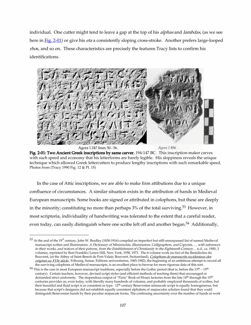
107
individual. One cutter might tend to leave a gap at the top of his alphas and lambdas, (as we see
here in Fig. 2-01) or give his eta a consistently sloping cross-stroke. Another prefers large-looped
rhos, and so on. These characteristics are precisely the features Tracy lists to confirm his
identifications.
Fig. 2Fig. 2Fig. 2Fig. 2----01: Two Ancient Greek inscriptions by same carver01: Two Ancient Greek inscriptions by same carver01: Two Ancient Greek inscriptions by same carver01: Two Ancient Greek inscriptions by same carver, 194-147 BC. This inscription-maker carves with such speed and economy that his letterforms are barely legible. His sloppiness reveals the unique technique which allowed Greek lettercutters to produce lengthy inscriptions with such remarkable speed. Photos from (Tracy 1990 Fig. 12 & Pl. 15)
In the case of Attic inscriptions, we are able to make firm attibutions due to a unique
confluence of circumstances. A similar situation exists in the attribution of hands in Medieval
European manuscripts. Some books are signed or attributed in colophons, but these are deeply
in the minority; constituting no more than perhaps 3% of the total surviving.53 However, in
most scriptoria, individuality of handwriting was tolerated to the extent that a careful reader,
even today, can easily distinguish where one scribe left off and another began.54 Additionally,
53 At the end of the 19
th century, John W. Bradley (1830-1916) compiled an imperfect but still-unsurpassed list of named Medieval
manuscript scribes and illuminators: A Dictionary of Miniaturists, Illuminators, Calligraphers, and Copyists, … with references to their works, and notices of their patrons, from the Establishment of Christianity to the Eighteenth Century… n.d., ca. 1900, 3 volumes, reprinted by Burt Franklin/Lenox Hill, New York, 1958, 1973. The 6-volume work (so far) of the Benedictins du Bouveret, (at the Abbey of Saint-Benoit de Port-Valais: Bouveret, Switzerland), Colophons de manuscrits occidentaux des origines au XVIe siècle. Fribourg, Suisse, Editions universitaires, 1965-1982), the beginning of an ambitious attempt to record all the surviving colophons of Medieval manuscripts, is an excellent place to browse for more rigorous data of this sort.
54 This is the case in most European manuscript traditions, especially before the Gothic period (that is, before the 13th – 15th century). Certain teachers, however, devised script styles (and efficient methods of teaching them) that encouraged or demanded strict conformity. The stupendous output of “Paris” Book-of-Hours factories from the late 14th through the 15th centuries provides us, even today, with literally many hundreds of volumes, and probably employed thousands of scribes, but their beautiful and fluid script is as consistent as type. 12th century Beneventan minuscule script is equally homogeneous, but because that script’s designers did not establish equally consistent alphabets of majuscules; scholars found that they could distinguish Beneventan hands by their peculiar majuscule forms. The continuing uncertainty over the number of hands at work
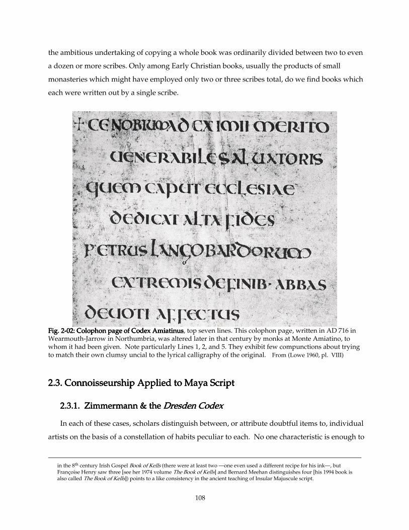
108
the ambitious undertaking of copying a whole book was ordinarily divided between two to even
a dozen or more scribes. Only among Early Christian books, usually the products of small
monasteries which might have employed only two or three scribes total, do we find books which
each were written out by a single scribe.
Fig. 2Fig. 2Fig. 2Fig. 2----02: Colophon page of Codex Amiatinus02: Colophon page of Codex Amiatinus02: Colophon page of Codex Amiatinus02: Colophon page of Codex Amiatinus, top seven lines. This colophon page, written in AD 716 in Wearmouth-Jarrow in Northumbria, was altered later in that century by monks at Monte Amiatino, to whom it had been given. Note particularly Lines 1, 2, and 5. They exhibit few compunctions about trying to match their own clumsy uncial to the lyrical calligraphy of the original. From (Lowe 1960, pl. VIII)
2.3. Connoisseurship Applied to Maya Script2.3. Connoisseurship Applied to Maya Script2.3. Connoisseurship Applied to Maya Script2.3. Connoisseurship Applied to Maya Script
2.3.1. Zimmermann & the 2.3.1. Zimmermann & the 2.3.1. Zimmermann & the 2.3.1. Zimmermann & the Dresden CodexDresden CodexDresden CodexDresden Codex
In each of these cases, scholars distinguish between, or attribute doubtful items to, individual
artists on the basis of a constellation of habits peculiar to each. No one characteristic is enough to
in the 8th century Irish Gospel Book of Kells (there were at least two —one even used a different recipe for his ink—, but Françoise Henry saw three [see her 1974 volume The Book of Kells] and Bernard Meehan distinguishes four [his 1994 book is also called The Book of Kells]) points to a like consistency in the ancient teaching of Insular Majuscule script.
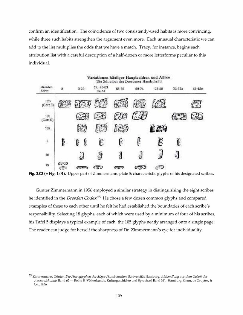
109
confirm an identification. The coincidence of two consistently-used habits is more convincing,
while three such habits strengthen the argument even more. Each unusual characteristic we can
add to the list multiplies the odds that we have a match. Tracy, for instance, begins each
attribution list with a careful description of a half-dozen or more letterforms peculiar to this
individual.
Fig. 2.03 (= Fig. 1.01).Fig. 2.03 (= Fig. 1.01).Fig. 2.03 (= Fig. 1.01).Fig. 2.03 (= Fig. 1.01). Upper part of Zimmermann, plate 5; characteristic glyphs of his designated scribes.
Günter Zimmermann in 1956 employed a similar strategy in distinguishing the eight scribes
he identified in the Dresden Codex.55 He chose a few dozen common glyphs and compared
examples of these to each other until he felt he had established the boundaries of each scribe’s
responsibility. Selecting 18 glyphs, each of which were used by a minimum of four of his scribes,
his Tafel 5 displays a typical example of each, the 105 glyphs neatly arranged onto a single page.
The reader can judge for herself the sharpness of Dr. Zimmermann’s eye for individuality.
55 Zimmermann, Günter, Die Hieroglyphen der Maya-Handschriften. (Universität Hamburg, Abhandlung aus dem Gebeit der
Auslandskunde, Band 62 — Reihe B [Völkerkunde, Kulturgeschichte und Sprachen] Band 34). Hamburg, Cram, de Gruyter, & Co., 1956
110
2.3.2. Styles and Materials Peculiar to Locales2.3.2. Styles and Materials Peculiar to Locales2.3.2. Styles and Materials Peculiar to Locales2.3.2. Styles and Materials Peculiar to Locales
In our attempt to distinguish between individuals working on a Maya monument,
we are forced to make several adjustments to the standard technique, the better to tune
our analysis to the character and habits of Maya artists. To begin with, although some
individuality of carving and calligraphy was tolerated, each locale had a distinctive style
—a collection of characteristics shared by every artist working there at a certain time.
The differences between the local styles in Maya City-states reflect, among other things,
adaptations to the local stones. Copan, for instance, like many Maya cities, focussed
much of their public texts onto huge upright stelae, but Copan’s were carved from fine-
grained volcanic tuff, which uniquely allowed Copanec artists to sculpt ornately baroque
high-relief and in-the-round figures.56 Virtually the entire vast corpus of late-Classic
Copan stone sculpture —architectural reliefs, altars, stelae, and all— is carved in high
relief; the highest in the entire Maya realm. The stone itself — common near Copan,
consistent, fine-grained, tough, and isotropic— encouraged it. It is not found elsewhere
in the Maya region. Quirigua, but a few leagues away, exploited nearby beds of ruddy
sandstone, whose depth and superior longitudinal tensile strength allowed the
Quiriguanecs to erect the tallest stelae —Stela E stands 35 feet above the ground— of any
Maya city. Again, this kind of sandstone was not available to other Maya polities. Kings
elsewhere generally erected monuments carved of limestone, which abounds
throughout the rest of the Maya lands, though it varies in quality. The tragically-eroded
state of the hundred-plus stelae of Calakmul resulted entirely from the low-quality stone
from which they were cut. Palenque’s quarries, on the other hand, produced a strongly
laminar, exceptionally fine-grained limestone —some experts claim it to be of
lithographic quality57— which was unsuitable for stelae (too flaky), but exceptionally
well-suited to large thin panels (often approximately the size of a school blackboard)
carved in low relief. The fine, buttery quality of this limestone invited artists to indulge
in the finest detail, and its large panels encouraged lengthy texts. The limestone
56 The tendency to high relief and flamboyantly sculpted ornament reached its height under the powerful Waxaklahun-Ubaah-
K’awiil (according to Dr. Elizabeth Newsome, probably “18 Are His Images”) around 9.15.0.0.0, the mid-eighth century AD. See Stelae A, B, C, D, F, 4, and Altars G1, G2, G3.
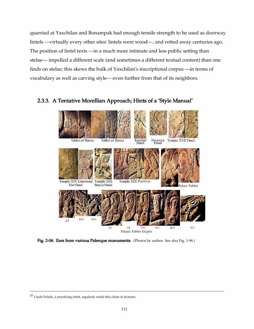
111
quarried at Yaxchilan and Bonampak had enough tensile strength to be used as doorway
lintels —virtually every other sites' lintels were wood—, and rotted away centuries ago.
The position of lintel texts —in a much more intimate and less public setting than
stelae— impelled a different scale (and sometimes a different textual content) than one
finds on stelae; this skews the bulk of Yaxchilan's inscriptional corpus —in terms of
vocabulary as well as carving style— even further from that of its neighbors.
2.3.3. A Tentative Morellian Approach; Hints of a ‘Style Manual’2.3.3. A Tentative Morellian Approach; Hints of a ‘Style Manual’2.3.3. A Tentative Morellian Approach; Hints of a ‘Style Manual’2.3.3. A Tentative Morellian Approach; Hints of a ‘Style Manual’
Fig. 2Fig. 2Fig. 2Fig. 2----04. Ears from various Palenque monuments04. Ears from various Palenque monuments04. Ears from various Palenque monuments04. Ears from various Palenque monuments. (Photos by author. See also Fig. 1-96.)
57 Linda Schele, a practicing artist, regularly made this claim in lectures.
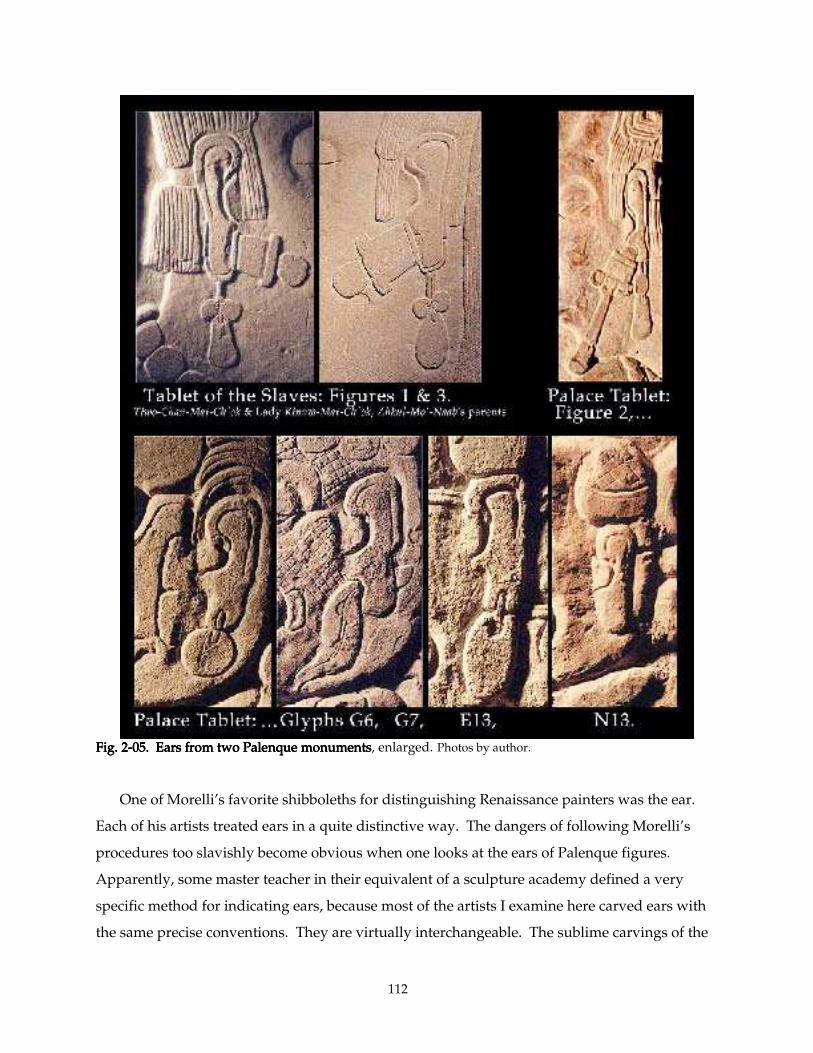
112
Fig. 2Fig. 2Fig. 2Fig. 2----05. Ears from two Palenque monuments05. Ears from two Palenque monuments05. Ears from two Palenque monuments05. Ears from two Palenque monuments, enlarged. Photos by author. One of Morelli’s favorite shibboleths for distinguishing Renaissance painters was the ear.
Each of his artists treated ears in a quite distinctive way. The dangers of following Morelli’s
procedures too slavishly become obvious when one looks at the ears of Palenque figures.
Apparently, some master teacher in their equivalent of a sculpture academy defined a very
specific method for indicating ears, because most of the artists I examine here carved ears with
the same precise conventions. They are virtually interchangeable. The sublime carvings of the
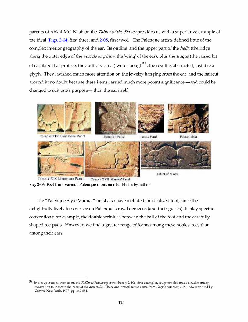
113
parents of Ahkal-Mo'-Naab on the Tablet of the Slaves provides us with a superlative example of
the ideal (Figs. 2-04, first three, and 2-05, first two). The Palenque artists defined little of the
complex interior geography of the ear. Its outline, and the upper part of the helix (the ridge
along the outer edge of the auricle or pinna, the 'wing' of the ear), plus the tragus (the raised bit
of cartilage that protects the auditory canal) were enough58; the result is abstracted, just like a
glyph. They lavished much more attention on the jewelry hanging from the ear, and the haircut
around it; no doubt because these items carried much more potent significance —and could be
changed to suit one's purpose— than the ear itself.
Fig. 2Fig. 2Fig. 2Fig. 2----06. Feet from various Palenque monuments.06. Feet from various Palenque monuments.06. Feet from various Palenque monuments.06. Feet from various Palenque monuments. Photos by author. The “Palenque Style Manual” must also have included an idealized foot, since the
delightfully lively toes we see on Palenque’s royal denizens (and their guests) display specific
conventions: for example, the double wrinkles between the ball of the foot and the carefully-
shaped toe-pads. However, we find a greater range of forms among these nobles’ toes than
among their ears.
58 In a couple cases, such as on the T. Slaves Father's portrait here (x2-10a, first example), sculptors also made a rudimentary
excavation to indicate the fossa of the anti-helix. These anatomical terms come from Gray's Anatomy, 1901 ed., reprinted by Crown, New York, 1977, pp. 849-851.
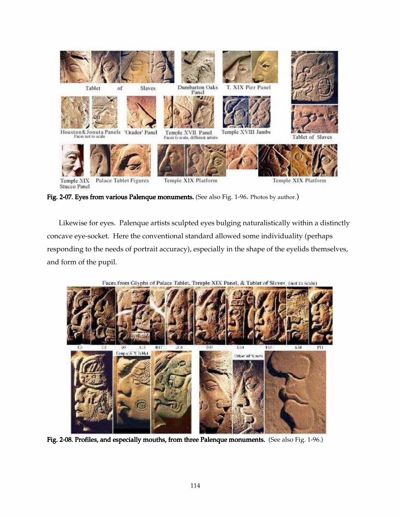
114
Fig. 2Fig. 2Fig. 2Fig. 2----07. Eyes from various Palenque monuments.07. Eyes from various Palenque monuments.07. Eyes from various Palenque monuments.07. Eyes from various Palenque monuments. (See also Fig. 1-96. Photos by author.) Likewise for eyes. Palenque artists sculpted eyes bulging naturalistically within a distinctly
concave eye-socket. Here the conventional standard allowed some individuality (perhaps
responding to the needs of portrait accuracy), especially in the shape of the eyelids themselves,
and form of the pupil.
Fig. 2Fig. 2Fig. 2Fig. 2----08. Profiles, and especially mouths, from three Palenque monuments.08. Profiles, and especially mouths, from three Palenque monuments.08. Profiles, and especially mouths, from three Palenque monuments.08. Profiles, and especially mouths, from three Palenque monuments. (See also Fig. 1-96.)
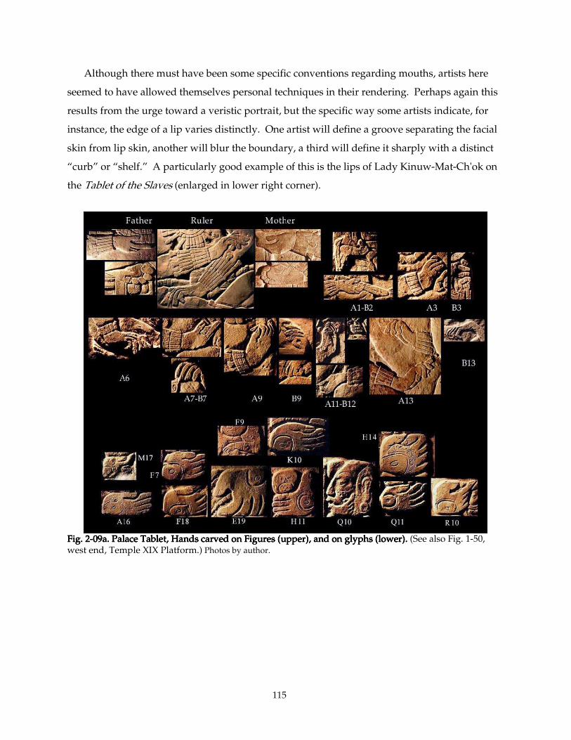
115
Although there must have been some specific conventions regarding mouths, artists here
seemed to have allowed themselves personal techniques in their rendering. Perhaps again this
results from the urge toward a veristic portrait, but the specific way some artists indicate, for
instance, the edge of a lip varies distinctly. One artist will define a groove separating the facial
skin from lip skin, another will blur the boundary, a third will define it sharply with a distinct
“curb” or “shelf.” A particularly good example of this is the lips of Lady Kinuw-Mat-Ch'ok on
the Tablet of the Slaves (enlarged in lower right corner).
Fig. 2Fig. 2Fig. 2Fig. 2----09a. 09a. 09a. 09a. Palace Tablet, Hands carved on Figures (upper), and on glyphs (lower).Palace Tablet, Hands carved on Figures (upper), and on glyphs (lower).Palace Tablet, Hands carved on Figures (upper), and on glyphs (lower).Palace Tablet, Hands carved on Figures (upper), and on glyphs (lower). (See also Fig. 1-50, west end, Temple XIX Platform.) Photos by author.
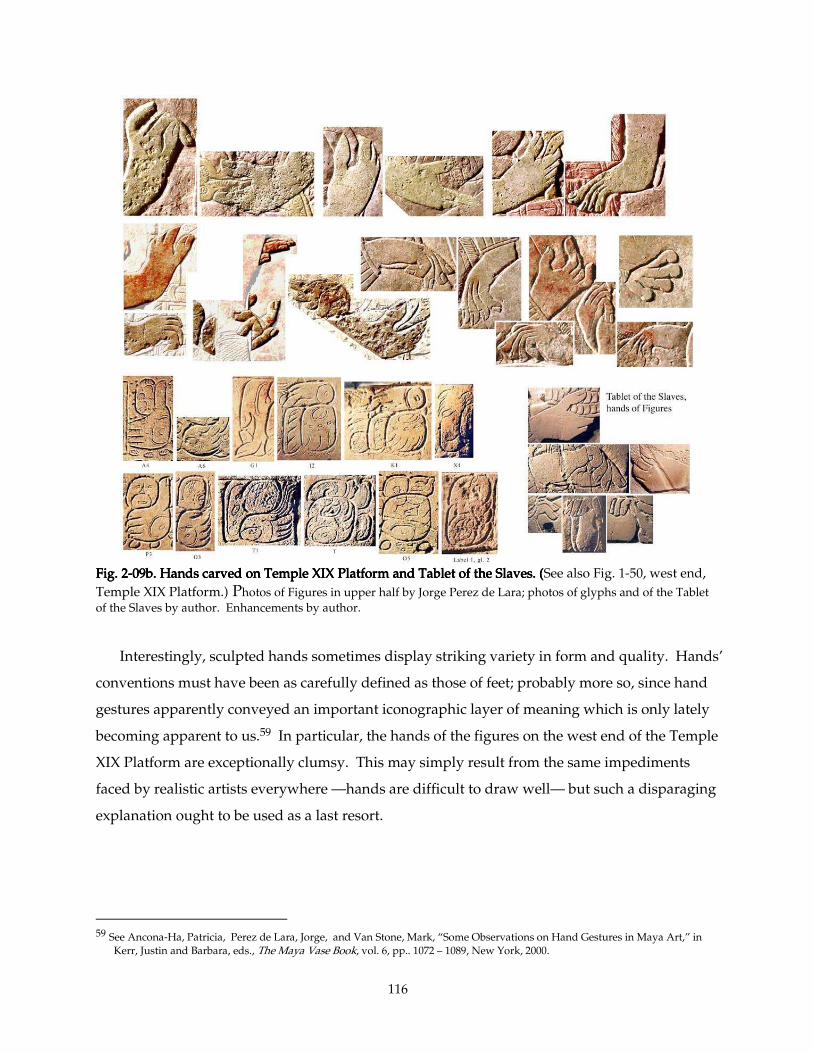
116
Fig. 2Fig. 2Fig. 2Fig. 2----09b. Hands carved on Temple XIX Platform and Tablet of the Slaves. (09b. Hands carved on Temple XIX Platform and Tablet of the Slaves. (09b. Hands carved on Temple XIX Platform and Tablet of the Slaves. (09b. Hands carved on Temple XIX Platform and Tablet of the Slaves. (See also Fig. 1-50, west end,
Temple XIX Platform.) Photos of Figures in upper half by Jorge Perez de Lara; photos of glyphs and of the Tablet of the Slaves by author. Enhancements by author.
Interestingly, sculpted hands sometimes display striking variety in form and quality. Hands’
conventions must have been as carefully defined as those of feet; probably more so, since hand
gestures apparently conveyed an important iconographic layer of meaning which is only lately
becoming apparent to us.59 In particular, the hands of the figures on the west end of the Temple
XIX Platform are exceptionally clumsy. This may simply result from the same impediments
faced by realistic artists everywhere —hands are difficult to draw well— but such a disparaging
explanation ought to be used as a last resort.
59 See Ancona-Ha, Patricia, Perez de Lara, Jorge, and Van Stone, Mark, “Some Observations on Hand Gestures in Maya Art,” in
Kerr, Justin and Barbara, eds., The Maya Vase Book, vol. 6, pp.. 1072 – 1089, New York, 2000.
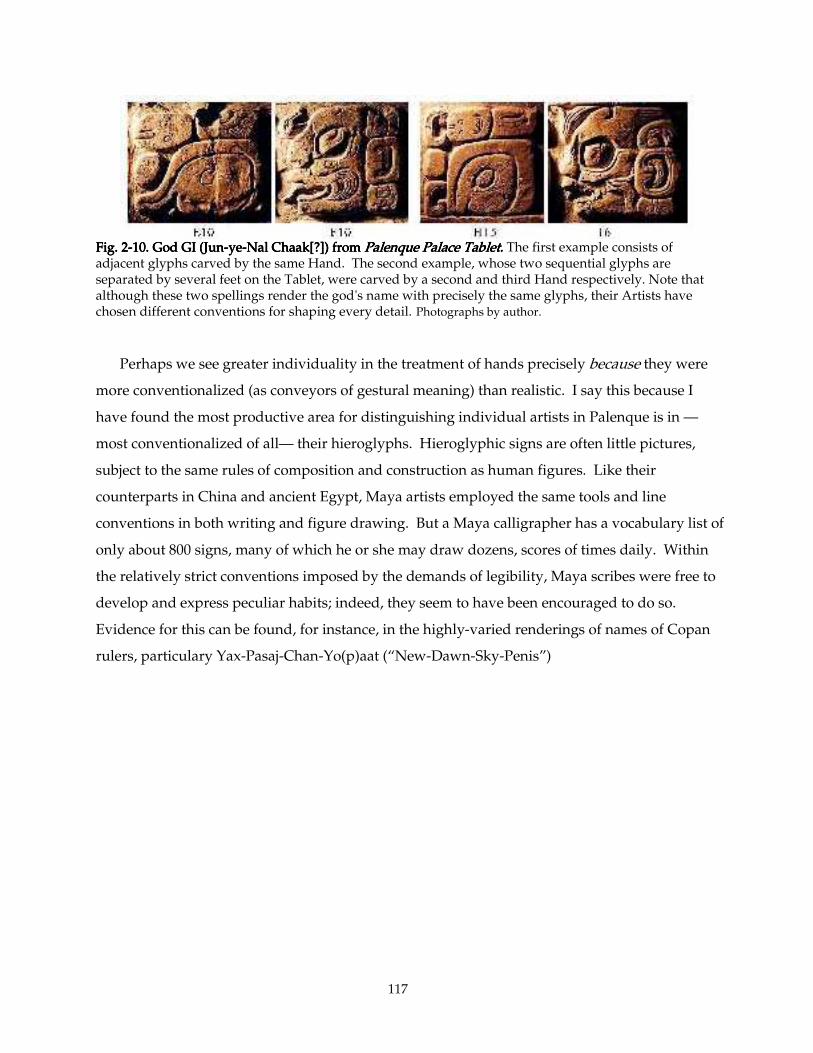
117
Fig. 2Fig. 2Fig. 2Fig. 2----10. God GI (Jun10. God GI (Jun10. God GI (Jun10. God GI (Jun----yeyeyeye----Nal Chaak[?]) from Nal Chaak[?]) from Nal Chaak[?]) from Nal Chaak[?]) from Palenque Palace Tablet.Palenque Palace Tablet.Palenque Palace Tablet.Palenque Palace Tablet. The first example consists of adjacent glyphs carved by the same Hand. The second example, whose two sequential glyphs are separated by several feet on the Tablet, were carved by a second and third Hand respectively. Note that although these two spellings render the god's name with precisely the same glyphs, their Artists have chosen different conventions for shaping every detail. Photographs by author. Perhaps we see greater individuality in the treatment of hands precisely because they were
more conventionalized (as conveyors of gestural meaning) than realistic. I say this because I
have found the most productive area for distinguishing individual artists in Palenque is in —
most conventionalized of all— their hieroglyphs. Hieroglyphic signs are often little pictures,
subject to the same rules of composition and construction as human figures. Like their
counterparts in China and ancient Egypt, Maya artists employed the same tools and line
conventions in both writing and figure drawing. But a Maya calligrapher has a vocabulary list of
only about 800 signs, many of which he or she may draw dozens, scores of times daily. Within
the relatively strict conventions imposed by the demands of legibility, Maya scribes were free to
develop and express peculiar habits; indeed, they seem to have been encouraged to do so.
Evidence for this can be found, for instance, in the highly-varied renderings of names of Copan
rulers, particulary Yax-Pasaj-Chan-Yo(p)aat (“New-Dawn-Sky-Penis”)
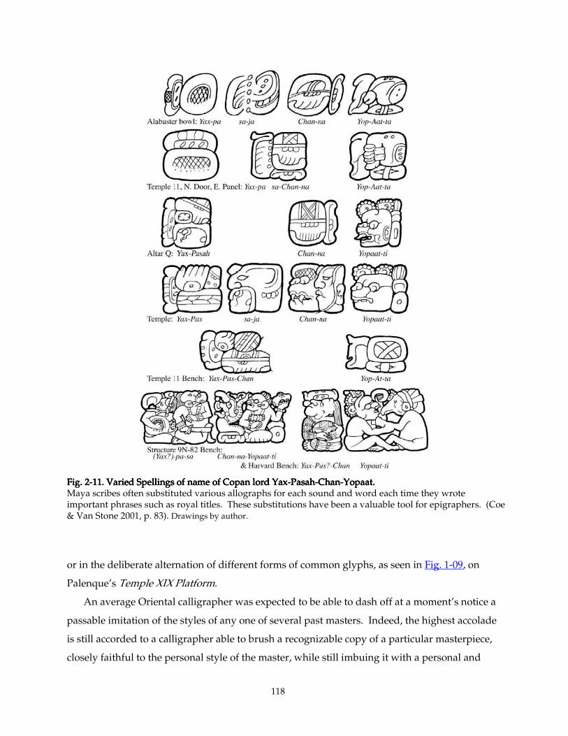
118
Fig. 2Fig. 2Fig. 2Fig. 2----11. Varied Spellings of name of Copan lord Yax11. Varied Spellings of name of Copan lord Yax11. Varied Spellings of name of Copan lord Yax11. Varied Spellings of name of Copan lord Yax----PasahPasahPasahPasah----ChanChanChanChan----Yopaat. Yopaat. Yopaat. Yopaat. Maya scribes often substituted various allographs for each sound and word each time they wrote important phrases such as royal titles. These substitutions have been a valuable tool for epigraphers. (Coe & Van Stone 2001, p. 83). Drawings by author.
or in the deliberate alternation of different forms of common glyphs, as seen in Fig. 1-09, on
Palenque’s Temple XIX Platform.
An average Oriental calligrapher was expected to be able to dash off at a moment’s notice a
passable imitation of the styles of any one of several past masters. Indeed, the highest accolade
is still accorded to a calligrapher able to brush a recognizable copy of a particular masterpiece,
closely faithful to the personal style of the master, while still imbuing it with a personal and
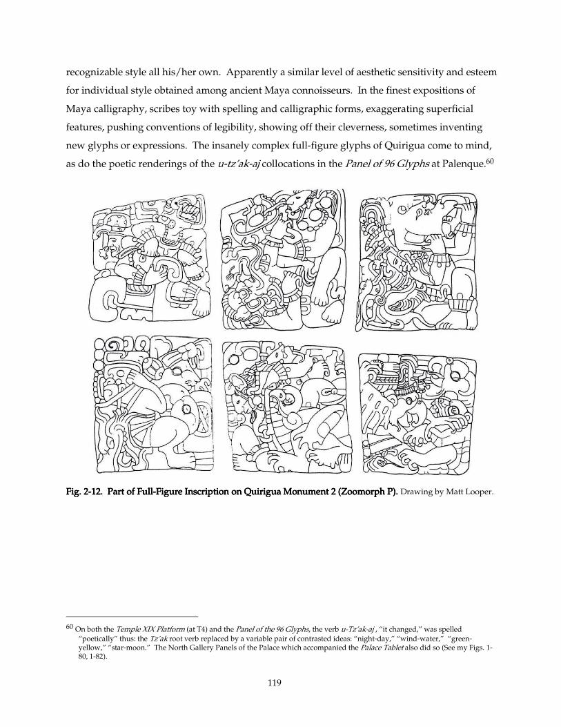
119
recognizable style all his/her own. Apparently a similar level of aesthetic sensitivity and esteem
for individual style obtained among ancient Maya connoisseurs. In the finest expositions of
Maya calligraphy, scribes toy with spelling and calligraphic forms, exaggerating superficial
features, pushing conventions of legibility, showing off their cleverness, sometimes inventing
new glyphs or expressions. The insanely complex full-figure glyphs of Quirigua come to mind,
as do the poetic renderings of the u-tz’ak-aj collocations in the Panel of 96 Glyphs at Palenque.60
Fig. 2Fig. 2Fig. 2Fig. 2----12. Part of Full12. Part of Full12. Part of Full12. Part of Full----Figure InscriptionFigure InscriptionFigure InscriptionFigure Inscription on Quirigua Monument 2 (Zoomorph P). on Quirigua Monument 2 (Zoomorph P). on Quirigua Monument 2 (Zoomorph P). on Quirigua Monument 2 (Zoomorph P). Drawing by Matt Looper.
60 On both the Temple XIX Platform (at T4) and the Panel of the 96 Glyphs, the verb u-Tz’ak-aj , “it changed,” was spelled
“poetically” thus: the Tz’ak root verb replaced by a variable pair of contrasted ideas: “night-day,” “wind-water,” “green-yellow,” “star-moon.” The North Gallery Panels of the Palace which accompanied the Palace Tablet also did so (See my Figs. 1-80, 1-82).
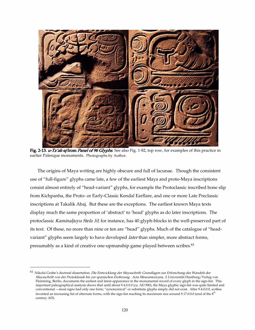
120
Fig. 2Fig. 2Fig. 2Fig. 2----13. 13. 13. 13. uuuu----Tz’akTz’akTz’akTz’ak----ajajajaj from from from from Panel of 96 GlyphsPanel of 96 GlyphsPanel of 96 GlyphsPanel of 96 Glyphs. See also Fig. 1-82, top row, for examples of this practice in earlier Palenque monuments. Photographs by Author.
The origins of Maya writing are highly obscure and full of lacunae. Though the consistent
use of “full-figure” glyphs came late, a few of the earliest Maya and proto-Maya inscriptions
consist almost entirely of “head-variant” glyphs, for example the Protoclassic inscribed bone slip
from Kichpanha, the Proto- or Early-Classic Kendal Earflare, and one or more Late Preclassic
inscriptions at Takalik Abaj. But these are the exceptions. The earliest known Maya texts
display much the same proportion of ‘abstract’ to ‘head’ glyphs as do later inscriptions. The
protoclassic Kaminaljuyu Stela 10, for instance, has 40 glyph-blocks in the well-preserved part of
its text. Of these, no more than nine or ten are “head” glyphs. Much of the catalogue of “head-
variant” glyphs seem largely to have developed later than simpler, more abstract forms,
presumably as a kind of creative one-upmanship game played between scribes.61
61 Nikolai Grube’s doctoral dissertation, Die Entwicklung der Mayaschrift: Grundlagen zur Erforschung des Wandels der
Mayaschrift von der Protoklassik bis zur spanischen Eroberung. Acta Mesoamericana, 3, Universität Hamburg/Verlag von Flemming, Berlin, documents the earliest and latest appearance in the monumental record of every glyph in the sign-list. This important paleographical analysis shows that until about 9.4.0.0.0 (ca. AD 500), the Maya glyphic sign-list was quite limited and conventional —most signs had only one form; “synonymical” or substitute glyphs simply did not exist. After 9.4.0.0.0, scribes
invented an increasing list of alternate forms, with the sign-list reaching its maximum size around 9.17.0.0.0 (end of the 8th
century AD).
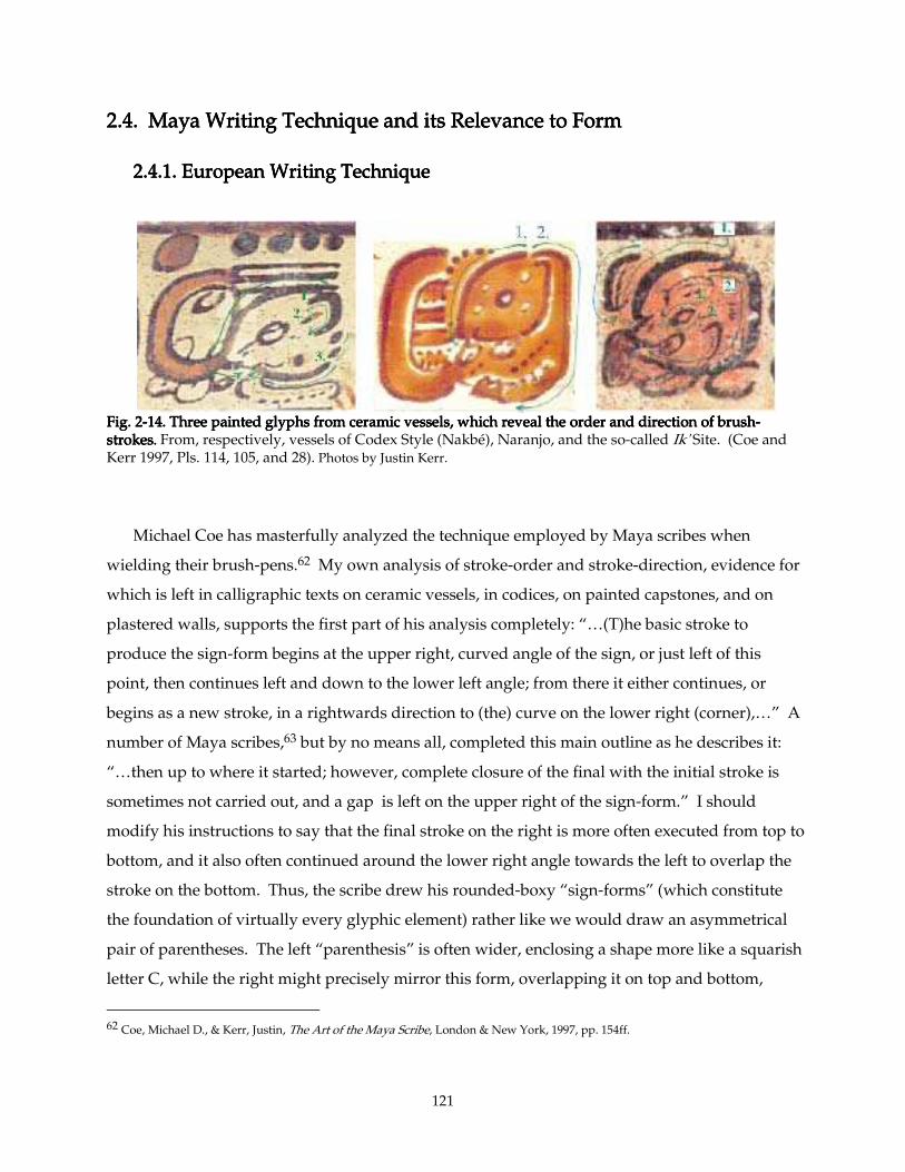
121
2.4. Maya Writing Technique and its Relevance to Form2.4. Maya Writing Technique and its Relevance to Form2.4. Maya Writing Technique and its Relevance to Form2.4. Maya Writing Technique and its Relevance to Form
2.4.1. European Writing Technique 2.4.1. European Writing Technique 2.4.1. European Writing Technique 2.4.1. European Writing Technique
Fig. 2Fig. 2Fig. 2Fig. 2----14141414. Three painted glyphs. Three painted glyphs. Three painted glyphs. Three painted glyphs from ceramic vessels, which reveal the order and direction of brush from ceramic vessels, which reveal the order and direction of brush from ceramic vessels, which reveal the order and direction of brush from ceramic vessels, which reveal the order and direction of brush----strokesstrokesstrokesstrokes.... From, respectively, vessels of Codex Style (Nakbé), Naranjo, and the so-called Ik' Site. (Coe and Kerr 1997, Pls. 114, 105, and 28). Photos by Justin Kerr.
Michael Coe has masterfully analyzed the technique employed by Maya scribes when
wielding their brush-pens.62 My own analysis of stroke-order and stroke-direction, evidence for
which is left in calligraphic texts on ceramic vessels, in codices, on painted capstones, and on
plastered walls, supports the first part of his analysis completely: “…(T)he basic stroke to
produce the sign-form begins at the upper right, curved angle of the sign, or just left of this
point, then continues left and down to the lower left angle; from there it either continues, or
begins as a new stroke, in a rightwards direction to (the) curve on the lower right (corner),…” A
number of Maya scribes,63 but by no means all, completed this main outline as he describes it:
“…then up to where it started; however, complete closure of the final with the initial stroke is
sometimes not carried out, and a gap is left on the upper right of the sign-form.” I should
modify his instructions to say that the final stroke on the right is more often executed from top to
bottom, and it also often continued around the lower right angle towards the left to overlap the
stroke on the bottom. Thus, the scribe drew his rounded-boxy “sign-forms” (which constitute
the foundation of virtually every glyphic element) rather like we would draw an asymmetrical
pair of parentheses. The left “parenthesis” is often wider, enclosing a shape more like a squarish
letter C, while the right might precisely mirror this form, overlapping it on top and bottom,
62 Coe, Michael D., & Kerr, Justin, The Art of the Maya Scribe, London & New York, 1997, pp. 154ff.
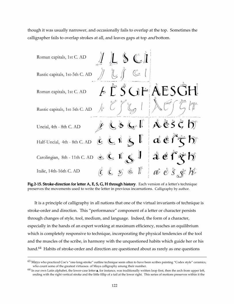
122
though it was usually narrower, and occasionally fails to overlap at the top. Sometimes the
calligrapher fails to overlap strokes at all, and leaves gaps at top and bottom.
Fig.2Fig.2Fig.2Fig.2----15. Stroke15. Stroke15. Stroke15. Stroke----direction for letter A, E, S, G, H through historydirection for letter A, E, S, G, H through historydirection for letter A, E, S, G, H through historydirection for letter A, E, S, G, H through history. Each version of a letter's technique preserves the movements used to write the letter in previous incarnations. Calligraphy by author.
It is a principle of calligraphy in all nations that one of the virtual invariants of technique is
stroke-order and direction. This “performance” component of a letter or character persists
through changes of style, tool, medium, and language. Indeed, the form of a character,
especially in the hands of an expert working at maximum efficiency, reaches an equilibrium
which is completely responsive to technique, incorporating the physical tendencies of the tool
and the muscles of the scribe, in harmony with the unquestioned habits which guide her or his
hand.64 Habits of stroke-order and direction are questioned about as rarely as one questions
63 Maya who practiced Coe’s “one-long-stroke” outline technique seem often to have been scribes painting “Codex style” ceramics,
who count some of the greatest virtuosos of Maya calligraphy among their number. 64 In our own Latin alphabet, the lower-case letter aaaa, for instance, was traditionally written loop first, then the arch from upper left,
ending with the right vertical stroke and the little fillip of a tail at the lower right. This series of motions preserves within it the
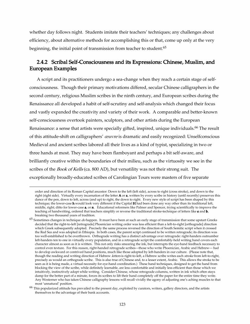
123
whether day follows night. Students imitate their teachers’ techniques; any challenges about
efficiency, about alternative methods for accomplishing this or that, come up only at the very
beginning, the initial point of transmission from teacher to student.65
2.4.2 Scribal2.4.2 Scribal2.4.2 Scribal2.4.2 Scribal Self Self Self Self----Consciousness and its Expressions: Chinese, Muslim, and Consciousness and its Expressions: Chinese, Muslim, and Consciousness and its Expressions: Chinese, Muslim, and Consciousness and its Expressions: Chinese, Muslim, and European Examples European Examples European Examples European Examples
A script and its practitioners undergo a sea-change when they reach a certain stage of self-
consciousness. Though their primary motivations differed, secular Chinese calligraphers in the
second century, religious Muslim scribes in the ninth century, and European scribes during the
Renaissance all developed a habit of self-scrutiny and self-analysis which changed their focus
and vastly expanded the creativity and variety of their work. A comparable and better-known
self-consciousness overtook painters, sculptors, and other artists during the European
Renaissance: a sense that artists were specially gifted, inspired, unique individuals.66 The result
of this attitude-shift on calligraphers’ œuvre is dramatic and easily recognized: Unselfconscious
Medieval and ancient scribes labored all their lives as a kind of typist, specializing in two or
three hands at most. They may have been flamboyant and perhaps a bit self-aware, and
brilliantly creative within the boundaries of their milieu, such as the virtuosity we see in the
scribes of the Book of Kells (ca. 800 AD), but versatility was not their strong suit. The
exceptionally broadly-educated scribes of Carolingian Tours were masters of five separate
order and direction of its Roman Capital ancestor: Down to the left (left side), across to right (cross stroke), and down to the right (right side). Virtually every incarnation of the letter AAAA or aaaa, written by every scribe in history (until recently) preserves this dance of the pen, down to left, across (and up) to right, the down to right. Every new style of script has been shaped by this technique; the lower-case hhhh would look very different if the Capital HHHH had been done any way other than its traditional left, middle, right; ditto for lower-case aaaa, or nnnn. Educational reformers like Palmer and Spencer, trying scientifically to improve the teaching of handwriting, ordered that teachers simplify or reverse the traditional stroke-technique of letters like eeee and bbbb, breaking two thousand years of tradition.
65 Sometimes changes in technique do happen. It must have been at such an early stage of transmission that some upstart Greeks decided that the right-to-left [retrograde] Phoenician writing order was less efficient than a left-to-right [orthograde] direction which Greek subsequently adopted. Precisely the same process reversed the direction of South Semitic script when it crossed the Red Sea and was adopted in Ethiopia. In both cases, the parent script continued to be written retrograde; its direction was too well-established to be overthrown. Orthograde writing has a distinct advantage over retrograde: right-handers outnumber left-handers ten to one in virtually every population, and in a retrograde script the comfortably-held writing hand covers each character almost as soon as it is written. This not only risks smearing the ink, but interrupts the eye-hand feedback necessary to control even texture. For this reason, right-handed retrograde scribes—those who write Phoenician, Arabic and Hebrew— had to develop awkward or contrived hand positions, much like those adopted by left-handers in our culture. (Please note that, though the reading and writing direction of Hebrew letters is right-to-left, a Hebrew scribe writes each stroke from left-to-right, precisely as would an orthograde scribe. This is also true of Chinese and, to a lesser extent, Arabic. This allows the stroke to be seen as it is being made, a virtual necessity for eye-hand coordination.) These hand techniques, designed to get the hand from blocking the view of the scribe, while definitely learnable, are less comfortable and initially less efficient than those which we intuitively, instinctively adopt while writing. Consider Chinese, whose retrograde columns, written in ink which often stays damp for the better part of a minute, forces its scribes to lift their hand completely off the paper for the entire time they write. Any Westerner who has taken Chinese calligraphy lessons will recall vividly the agony of adjusting one’s aching muscles to that most ‘unnatural’ position.
66 This popularized attitude has prevailed to the present day, exploited by curators, writers, gallery directors, and the artists themselves to the advantage of their bank accounts.
124
hands, which they used in a strict hierarchy, but they were an extraordinary and short-lived
exception.67 By contrast, Renaissance Humanist calligraphers might boast that they were experts
at a dozen scripts, or a hundred.68
The Medieval European scribe was also slave to his or her text: their product was always
economically written on both sides of the page, and generally each volume would contain a
single continuous work, or series of works, ordered by the abbot or other customer. By contrast,
the self-conscious scribe of the 16th century and later chose his or her own text, often short pithy
quotes whose only function was to showcase the scribe’s bravura skill. Often among these
quotations would be one or more of the abecedarian or “quick brown fox” sort, a common
scribal exercise contrived to include every letter of the alphabet. A single short volume would
often contain works in a variety of styles and layouts, and be written on one side of the page
only.69
67 See Rand, Edward Kennard (1871-1945), A Survey of the Manuscripts of Tours. Cambridge, Mass., Mediaeval Academy of
America, 1929. These scribes, as reformed under Alcuin, Charlemagne’s minister of education, employed their five scripts in a
strict hierarchy: 1. Roman Square Capital (revived from Roman imperial carved monumental lettering of the 1st and 2
nd centuries
AD) was used for the large initial letters beginning books and chapters. 2. Late Uncial (based on 6th -century Italian luxury
manuscripts, usually Christian) usually stood as a transition between the large Capital initials and the small Minuscule of the main texts. Uncial, written with a larger pen than the minuscules, also emphasized minor initials throughout the text, beginning verses or sentences, much as we use Capital letters today. 3. Carolingian Minuscule (the direct ancestor of our modern lower-case letters), a stately-but-simple script modified from a local bookhand of nearby Corbie, formed the bulk of the text, precisely as we use lower-case type. 4. They employed “Tours Half Uncial,” a more stately version of the local minuscule, with distinct forms for three letters, for prefatory texts. It was never easily distinguished from the Tours Carolingian Minuscule, and died out
within a generation. 5. They wrote Roman Rustic Capital (revived from 4th - and 5
th -century Late Antique manuscripts, usually
pagan) with the same pen as their Minuscule bookhand, and used it for running titles across the tops of pages. Sometimes Rustic also appeared in rubric texts (“Here ends Chapter 2, and begins Chapter 3”), and later became the standard letterform for rapid initial letters. This hierarchy of scripts, which combined a “modern” bookhand with a venerable predecessor playing a ceremonial role in initials and titles, evolved into our modern “duplex” alphabet, which combines Imperial Roman Capitals and Carolingian Minuscules into a single script design. Even at Tours, scribes who practiced no more than two or three hands became the rule again in less than a century.
68 At the beginning of the 16th century, German calligrapher Leonhard Wagner wrote Proba Centum Scripturarum, displaying his virtuosity in writing a hundred variants of Gothic and Renaissance scripts current in his day (published in facsimile: Wagner, Leonhard (1454-1522), Proba centum scripturarum; ein Augsburger Schriftmusterbuch aus dem Beginn des 16. Jahrhunderts. Faksimile-Ausg. mit einem Begleittext von Carl Wehmer. Leipzig, Insel-Verlag, 1963.).
69 Italian calligrapher Bennardino Cataneo, in 1545, wrote a series of poems and quotations in a showpiece manuscript now in the Houghton Library of Harvard University (see facsimile: Harvard 1981). In 1561-2 Georg Bocskay, Imperial Secretary for the Holy Roman Emperor Ferdinand I Hapsburg, displayed his extraordinary calligraphic virtuosity in Mira calligraphiæ monumenta, now in the Getty Museum (see their facsimile: Hendrix, Lee, and Vignau-Willberg, Thea, eds., Mira calligraphiæ monumenta, a Sixteenth-Century Manuscript Inscribed by Georg Bocskay amd Illuminated by Joris Hofnaegel, The Getty Museum, Malibu, 1992). In both the latter manuscripts, each scribe chose the whitest, finest vellum available, and wrote on one side of the page only, so as not to muddy the impact of each of his masterpieces with the ghost of a show-through from the other side. In both of these, the texts themselves were a collection of brief quotations, obviously selected merely as vehicles for brilliant calligraphic display. This is particularly apparent in the gilt running text along the bottom of the pages of the Cataneo: a contrived sentence, perhaps a mere list of words, each beginning with a successive letter of the alphabet, the better to exercise and display the calligrapher’s mastery of each letter.

125
Fig. 2Fig. 2Fig. 2Fig. 2----16. 16. 16. 16. Cataneo CopyCataneo CopyCataneo CopyCataneo Copy----Book, Book, Book, Book, folio 2v.folio 2v.folio 2v.folio 2v. Written by Bennardino Cataneo of Siena, 1545. Photo by Stephen Harvard (Harvard 1981, f. 2v), enhanced by author.
Precisely the same sort of calligraphic showpieces began to appear in China at the end of the
Han Dynasty.70 Likewise, in eighth-century Kufa and Medina, and especially in ‘Abbasid
Baghdad during the next century, Muslim calligraphers established standardized methods of
constructing “perfect” letterforms, designed the “Six Cursives,” and wrote copiously on the topic
of the nobility of Calligraphy and its practitioners. This from a nomadic, oral culture who were
largely illiterate before the Qur’an appeared. This shift in attitude can be attributed to the
Qur'an itself which extols the virtues of writing from its second sentence on. Another hallmark
of this sea-change of self-awareness is the identification of individual artists, the better to praise
them. Calligraphers in these three cultures signed their work; their “unselfconscious”
predecessors did not. As far as art-history is concerned, their self-awareness brought them to our
attention. They thought, therefore they came to be.
70 In the eyes of Chinese scholars, the traditional watershed event was the creation of the first “Stone Forest” copy of the entire
corpus of Chinese Classic literature onto limestone stelae, in AD 177-184, masterminded by Ts’ai Yung, an official in the Imperial Court. He set up a massive training academy, in order to develop the calligraphic skills in a large pool of artisans to accomplish this ambitious undertaking. The nobility of this enterprise demanded a noble calligraphy, and a conscious effort to copy this noble standard with accuracy. In the centuries immediately following this event, calligraphers began exhibiting the self-consciousness symptoms described above: mastery of dozens of styles, the production of revered masterpieces whose textual content was relatively inconsequential, contrived, and so forth; instruction manuals extolling the virtues of various exotic types of brushes, made from mouse-hairs, wolf-tail, Mongolian marten shot in the spring, etc.; even the production of calligraphic masterpieces designed specifically to be cut into blocks of stone so students could make rubbings therefrom to take home as exemplars. See Chen Chih-Mai, Chinese Calligraphers and their Art, p. 40 f.
126
2.4.3 Maya Scribal Self2.4.3 Maya Scribal Self2.4.3 Maya Scribal Self2.4.3 Maya Scribal Self----Consciousness and its Expressions Consciousness and its Expressions Consciousness and its Expressions Consciousness and its Expressions
The Maya also express this dawning of self-awareness during that efflorescence which marks
for us the beginning of their Late Classic period. At the height of the Early Classic, they slowly
began displaying their virtuosity and creativity by inventing new spellings, new glyphs and
variant forms of established glyphs around 9.4.0.0.0 (ca. AD 500). But it was not until around
9.10.0.0.0 or 9.11.0.0.0 (ca. 650) that they began signing their work, first on pottery (Tepeu / Ik
phases in Waxaktun and Tik'al respectively71), later on monuments (e.g., Figs. 1-60 and 1-61. El
Peru Stela 34, dated 9.12.10.0.0 /682). Soon after, they also established a hierarchy of scripts: full-
figure, head-variants, and “ordinary” glyphs. As mentioned above, "head variant" calendrical
glyphs appear from earliest times (e. g. the dates on the Leiden Plaque and Tikal St. 29), but "full
figure" glyphs are extremely rare before Palenque's Palace Tablet (9.14.8.14.15 / AD 720). Maya
painted vases (those illustrating Court life nearly all date from the Late Classic) regularly portray
scribes as nobles, as successful courtiers, as masters of ceremonies, always present at (and
perhaps organizing) royal events.
Classic Maya scribes apparently enjoyed some freedom to improvise with their religious
stories. We know precious little of the Maya mythic literature which inspired their abundant
vase-painting, a point driven home when Robicsek and Hales first collated their initial corpus of
Codex-style vases.72 However, the most accomplished vase-painters and their patrons appear
sometimes to exhibit a kind of sophisticated irreverence. The substitution of animals or
unexpected characters into the main roles in popular scenes suggests the existence of satirical or
comic literature.73 This sophistication in our own day may be seen in stories like John Gardner’s
novel Grendel, which recasts the Beowulf epic sympathetic to the monster’s point of view, or to
Tom Stoppard’s play, Rosencratz and Guildenstern Are Dead, played by two minor characters in
Hamlet. Or it might be compared to the European fashion in 18th and 19th century portraiture, of
casting the subject as a figure in Greek mythology —Lady So-and-so as Diana a-hunting, for
71 See Stuart, David, The Maya Artist, an Epigraphic and Iconographic Study, Submitted to the Department of Art and
Archaeology, Princeton University in Partial Fulfillment of the Requirements for the Degree of Bachelor of Arts, Princeton, N. J., 1989 (Unpublished), p. 37.
72 As mentioned above, n. 20, Robicsek, Francis, & Hales, Donald, The Maya Book of the Dead – The Ceramic Codex (Charlottesville, 1981). Justin Kerr, the photographer whose pioneering work made the book possible, has added considerably to his corpus of photographs in the past decades. Many of these photographs can be viewed at his unparallelled Internet database: http://famsi.saiph.com:9500/dataSpark/maya or http://www.famsi.org/mayavase/.
73 Linda Schele, private communication, 1997
127
instance. Whatever the precise meaning of these variations-on-a-theme, they suggest a rich
aesthetic life at the Maya courts, one in which educated scribes played a leading part.
We unfortunately possess no teaching manuals, no literature whatever concerning attitudes
toward courtiers or craftsmen, from this period, but enough hints survive in ancient images and
in ethnographic survivals to give us an idea. Professor Coe, in The Art of the Maya Scribe, and
Dorie Reents-Budet, Barbara MacLeod, et al., in Painting the Maya Universe collected the most
salient of these, and my summary here is mostly thanks to their research.74
2.5. Criteria for Distinguishing/Identifying Maya Hands2.5. Criteria for Distinguishing/Identifying Maya Hands2.5. Criteria for Distinguishing/Identifying Maya Hands2.5. Criteria for Distinguishing/Identifying Maya Hands
2.5.1. Identifying Distinctive Characteristics of a Maya Artist Despite 2.5.1. Identifying Distinctive Characteristics of a Maya Artist Despite 2.5.1. Identifying Distinctive Characteristics of a Maya Artist Despite 2.5.1. Identifying Distinctive Characteristics of a Maya Artist Despite Deliberate Variation: Deliberate Variation: Deliberate Variation: Deliberate Variation: Panel of the 96 GlyphsPanel of the 96 GlyphsPanel of the 96 GlyphsPanel of the 96 Glyphs group group group group (See (See (See (See Figs. 1-21 through through through through 1-25.).).).)
As an example of the kind of variation expected in the work of a single artist, we turn to the
famed Panel of the 96 Glyphs and its relatives. The Panel of the 96 Glyphs is almost certainly the
work of one very distinctive artist.75 A few inscribed slabs found in its vicinity appear also to
have sprung from the same hand. In fact, all the surviving work of this powerful personality (six
pieces) may have come from a single ensemble, an inscribed throne, which stood on the north
side of the Tower. The 96 Glyphs constituted the seat, while its two legs (one in the Palenque
bodega, one now in San Diego California’s Museum of Man) carry mirror images of a baroquely-
drawn, engraved head of Chaak. The Lapida de la Creación is the throne's back-support, while
two separated fragments (an inscribed edge of a slab, found on the steps of the Palace outside the
Court of the Tower76), may have been part of the ensemble, or may constitute bits of another
monument. This throne is dated 783, and is the penultimate dated inscription found so far at
Palenque.77
When making a claim that a certain group of objects were made by the same artist, a scholar
relies foremost on a gut feeling. This instinct is as difficult to articulate as the diagnostic
74 Coe, Michael, Op. cit.: The Art of the Maya Scribe (New York and London, 1995), Reents-Budet, Dorie, et al., Painting the Maya
Universe: Royal Ceramics of the Classic Period, (Durham, NC, & London, 1994), passim. 75 Linda Schele, who executed the definitive drawing of this demandingly calligraphic inscription, frequently asserted (usually in
class) that she believed it to have been both written out and carved by the same person. The source of this hunch appears to have been that the carving appeared to be unusually faithful to the assertive calligraphic qualities of the layout. In any case, some other scholars (personal communication) defer to her judgement, noting the very distinctive style of this artist, and accept that the whole panel was carved by the same artist.
76 One fragment resides in the Palenque Bodega. The other, which retains some of its original red coloring, is in the municipal museum of nearby Villhermosa.
77 The final known inscription, a small ceramic vessel, is dated 799. Very soon thereafter the city was abandoned to the jungle.
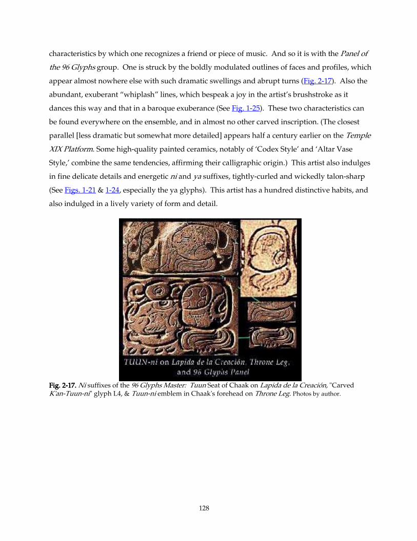
128
characteristics by which one recognizes a friend or piece of music. And so it is with the Panel of
the 96 Glyphs group. One is struck by the boldly modulated outlines of faces and profiles, which
appear almost nowhere else with such dramatic swellings and abrupt turns (Fig. 2-17). Also the
abundant, exuberant “whiplash” lines, which bespeak a joy in the artist’s brushstroke as it
dances this way and that in a baroque exuberance (See Fig. 1-25). These two characteristics can
be found everywhere on the ensemble, and in almost no other carved inscription. (The closest
parallel [less dramatic but somewhat more detailed] appears half a century earlier on the Temple
XIX Platform. Some high-quality painted ceramics, notably of ‘Codex Style’ and ‘Altar Vase
Style,’ combine the same tendencies, affirming their calligraphic origin.) This artist also indulges
in fine delicate details and energetic ni and ya suffixes, tightly-curled and wickedly talon-sharp
(See Figs. 1-21 & 1-24, especially the ya glyphs). This artist has a hundred distinctive habits, and
also indulged in a lively variety of form and detail.
Fig. 2Fig. 2Fig. 2Fig. 2----17.17.17.17. Ni suffixes of the 96 Glyphs Master: Tuun Seat of Chaak on Lapida de la Creación, "Carved K'an-Tuun-ni" glyph L4, & Tuun-ni emblem in Chaak's forehead on Throne Leg. Photos by author.
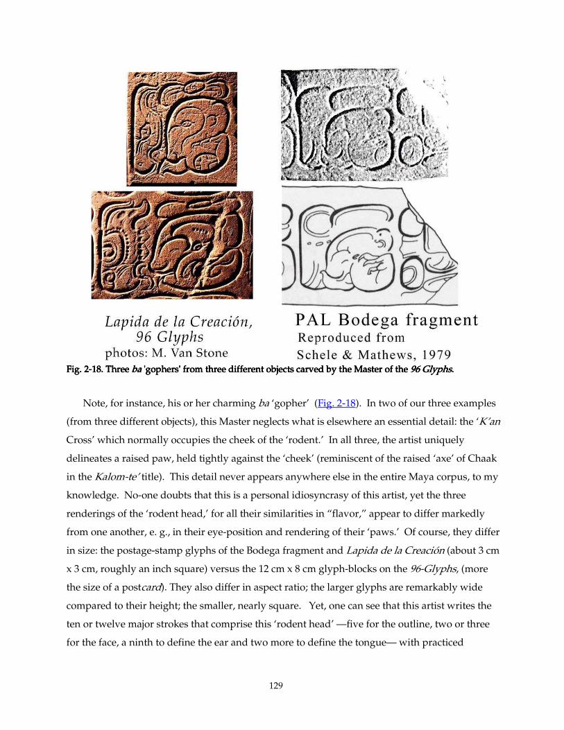
129
Fig. 2Fig. 2Fig. 2Fig. 2----18. Three 18. Three 18. Three 18. Three babababa 'gophers' from three different objects carved by the Master of the 'gophers' from three different objects carved by the Master of the 'gophers' from three different objects carved by the Master of the 'gophers' from three different objects carved by the Master of the 99996 Glyphs6 Glyphs6 Glyphs6 Glyphs. . . .
Note, for instance, his or her charming ba ‘gopher’ (Fig. 2-18). In two of our three examples
(from three different objects), this Master neglects what is elsewhere an essential detail: the ‘K’an
Cross’ which normally occupies the cheek of the ‘rodent.’ In all three, the artist uniquely
delineates a raised paw, held tightly against the ‘cheek’ (reminiscent of the raised ‘axe’ of Chaak
in the Kalom-te’ title). This detail never appears anywhere else in the entire Maya corpus, to my
knowledge. No-one doubts that this is a personal idiosyncrasy of this artist, yet the three
renderings of the ‘rodent head,’ for all their similarities in “flavor,” appear to differ markedly
from one another, e. g., in their eye-position and rendering of their ‘paws.’ Of course, they differ
in size: the postage-stamp glyphs of the Bodega fragment and Lapida de la Creación (about 3 cm
x 3 cm, roughly an inch square) versus the 12 cm x 8 cm glyph-blocks on the 96-Glyphs, (more
the size of a postcard). They also differ in aspect ratio; the larger glyphs are remarkably wide
compared to their height; the smaller, nearly square. Yet, one can see that this artist writes the
ten or twelve major strokes that comprise this ‘rodent head’ —five for the outline, two or three
for the face, a ninth to define the ear and two more to define the tongue— with practiced
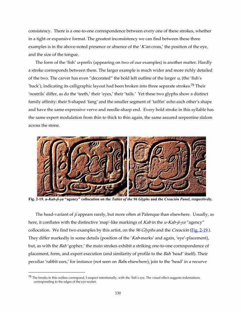
130
consistency. There is a one-to-one correspondence between every one of these strokes, whether
in a tight or expansive format. The greatest inconsistency we can find between these three
examples is in the above-noted presence or absence of the ‘K’an cross,’ the position of the eye,
and the size of the tongue.
The form of the ‘fish’ u-prefix (appearing on two of our examples) is another matter. Hardly
a stroke corresponds between them. The larger example is much wider and more richly detailed
of the two. The carver has even “decorated” the bold left outline of the larger u, (the ‘fish’s
’back’), indicating its calligraphic layout had been broken into three separate strokes.78 Their
‘nostrils’ differ, as do the ‘teeth,’ their ‘eyes,’ their ‘tails.’ Yet these two glyphs show a distinct
family affinity: their S-shaped ‘fang’ and the smaller segment of ‘tailfin’ echo each other’s shape
and have the same expressive verve and needle-sharp end. Every bold stroke in this syllable has
the same expert modulation from thin to thick to thin again, the same assured serpentine slalom
across the stone.
Fig. 2-19. u-Kab-ji-ya “agency” collocation on the Tablet of the 96 Glyphs and the Creación Panel, respectively.
The head-variant of ji appears rarely, but more often at Palenque than elsewhere. Usually, as
here, it conflates with the distinctive 'map'-like markings of Kab in the u-Kab-ji-ya “agency”
collocation. We find two examples by this artist, on the 96 Glyphs and the Creación (Fig. 2-19.).
They differ markedly in some details (position of the ‘Kab-marks’ and again, ‘eye’-placement),
but, as with the Bah ‘gopher,’ the main strokes exhibit a striking one-to-one correspondence of
placement, form, and expert execution (and similarity of profile to the Bah ‘head’ itself). Their
peculiar ‘rabbit ears,’ for instance (not seen on Bahs elsewhere), join to the ‘head’ in a recurve
78 The breaks in this outline correspond, I suspect intentionally, with the ‘fish’s eye. The visual effect suggests indentations
corresponding to the edges of the eye-socket.
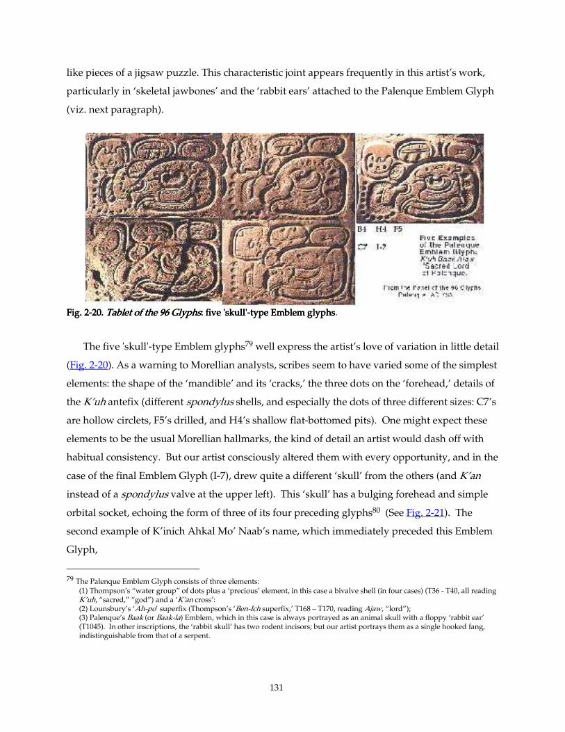
131
like pieces of a jigsaw puzzle. This characteristic joint appears frequently in this artist’s work,
particularly in ‘skeletal jawbones’ and the ‘rabbit ears’ attached to the Palenque Emblem Glyph
(viz. next paragraph).
Fig. 2Fig. 2Fig. 2Fig. 2----20. 20. 20. 20. Tablet of the 96 GTablet of the 96 GTablet of the 96 GTablet of the 96 Glyphslyphslyphslyphs: five 'skull': five 'skull': five 'skull': five 'skull'----type Emblem glyphstype Emblem glyphstype Emblem glyphstype Emblem glyphs. The five 'skull'-type Emblem glyphs79 well express the artist’s love of variation in little detail
(Fig. 2-20). As a warning to Morellian analysts, scribes seem to have varied some of the simplest
elements: the shape of the ‘mandible’ and its ‘cracks,’ the three dots on the ‘forehead,’ details of
the K’uh antefix (different spondylus shells, and especially the dots of three different sizes: C7’s
are hollow circlets, F5’s drilled, and H4’s shallow flat-bottomed pits). One might expect these
elements to be the usual Morellian hallmarks, the kind of detail an artist would dash off with
habitual consistency. But our artist consciously altered them with every opportunity, and in the
case of the final Emblem Glyph (I-7), drew quite a different ‘skull’ from the others (and K’an
instead of a spondylus valve at the upper left). This ‘skull’ has a bulging forehead and simple
orbital socket, echoing the form of three of its four preceding glyphs80 (See Fig. 2-21). The
second example of K’inich Ahkal Mo’ Naab’s name, which immediately preceded this Emblem
Glyph,
79 The Palenque Emblem Glyph consists of three elements:
(1) Thompson’s “water group” of dots plus a ‘precious’ element, in this case a bivalve shell (in four cases) (T36 - T40, all reading K’uh, “sacred,” “god”) and a ‘K’an cross’: (2) Lounsbury’s ‘Ah-po’ superfix (Thompson’s ‘Ben-Ich superfix,’ T168 – T170, reading Ajaw, “lord”); (3) Palenque’s Baak (or Baak-la) Emblem, which in this case is always portrayed as an animal skull with a floppy ‘rabbit ear’ (T1045). In other inscriptions, the ‘rabbit skull’ has two rodent incisors; but our artist portrays them as a single hooked fang, indistinguishable from that of a serpent.
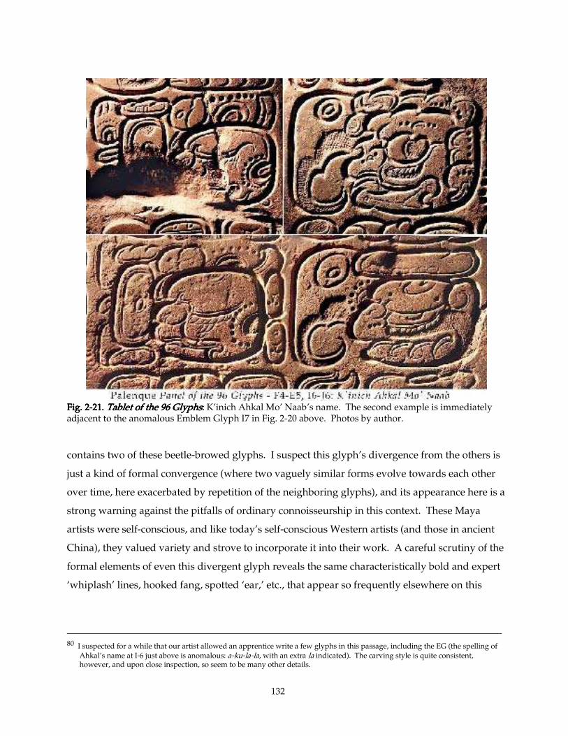
132
Fig. 2Fig. 2Fig. 2Fig. 2----21. 21. 21. 21. Tablet of the 96 GlyphsTablet of the 96 GlyphsTablet of the 96 GlyphsTablet of the 96 Glyphs: : : : K’inich Ahkal Mo’ Naab’s name. The second example is immediately adjacent to the anomalous Emblem Glyph I7 in Fig. 2-20 above. Photos by author.
contains two of these beetle-browed glyphs. I suspect this glyph’s divergence from the others is
just a kind of formal convergence (where two vaguely similar forms evolve towards each other
over time, here exacerbated by repetition of the neighboring glyphs), and its appearance here is a
strong warning against the pitfalls of ordinary connoisseurship in this context. These Maya
artists were self-conscious, and like today’s self-conscious Western artists (and those in ancient
China), they valued variety and strove to incorporate it into their work. A careful scrutiny of the
formal elements of even this divergent glyph reveals the same characteristically bold and expert
‘whiplash’ lines, hooked fang, spotted ‘ear,’ etc., that appear so frequently elsewhere on this
80 I suspected for a while that our artist allowed an apprentice write a few glyphs in this passage, including the EG (the spelling of
Ahkal’s name at I-6 just above is anomalous: a-ku-la-la, with an extra la indicated). The carving style is quite consistent, however, and upon close inspection, so seem to be many other details.
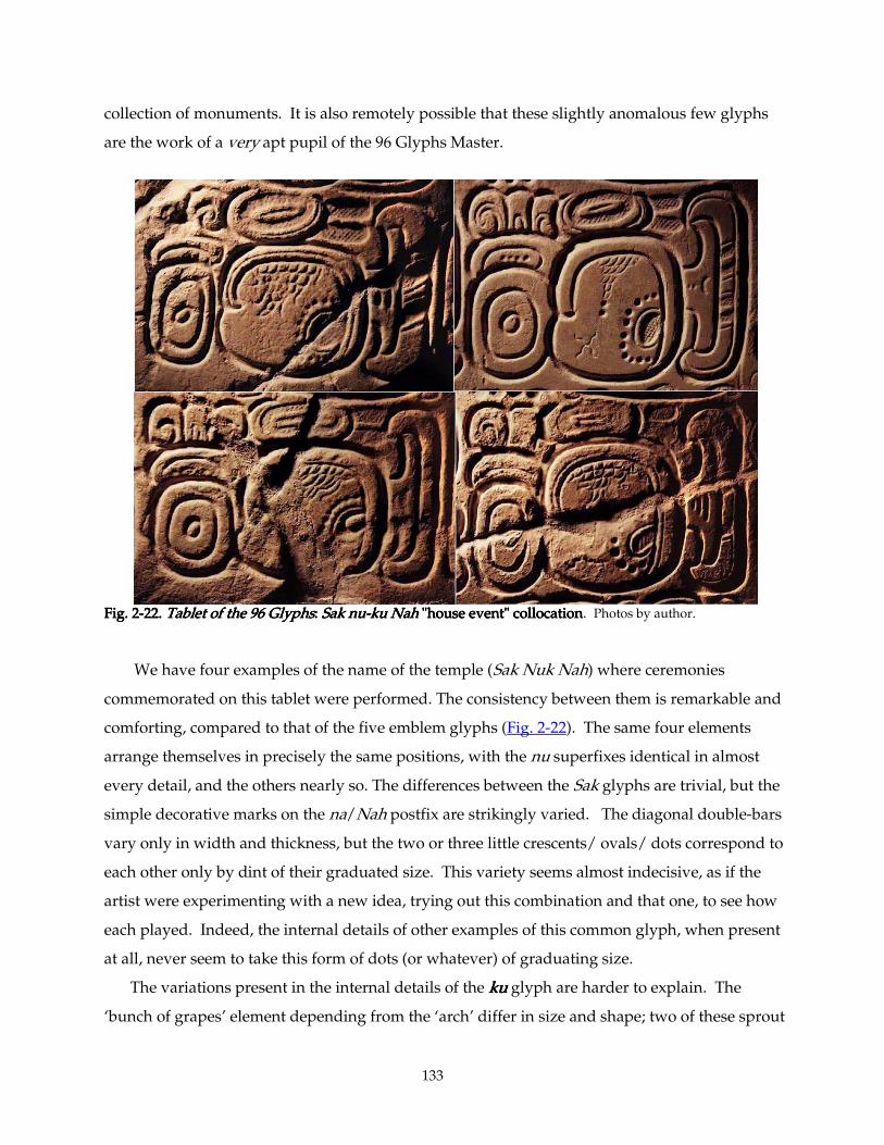
133
collection of monuments. It is also remotely possible that these slightly anomalous few glyphs
are the work of a very apt pupil of the 96 Glyphs Master.
Fig. 2Fig. 2Fig. 2Fig. 2----22.22.22.22. Tablet of the 96 GlyphsTablet of the 96 GlyphsTablet of the 96 GlyphsTablet of the 96 Glyphs:::: Sak nu Sak nu Sak nu Sak nu----ku Nah ku Nah ku Nah ku Nah "house event" collocation"house event" collocation"house event" collocation"house event" collocation. Photos by author.
We have four examples of the name of the temple (Sak Nuk Nah) where ceremonies
commemorated on this tablet were performed. The consistency between them is remarkable and
comforting, compared to that of the five emblem glyphs (Fig. 2-22). The same four elements
arrange themselves in precisely the same positions, with the nu superfixes identical in almost
every detail, and the others nearly so. The differences between the Sak glyphs are trivial, but the
simple decorative marks on the na/Nah postfix are strikingly varied. The diagonal double-bars
vary only in width and thickness, but the two or three little crescents/ ovals/ dots correspond to
each other only by dint of their graduated size. This variety seems almost indecisive, as if the
artist were experimenting with a new idea, trying out this combination and that one, to see how
each played. Indeed, the internal details of other examples of this common glyph, when present
at all, never seem to take this form of dots (or whatever) of graduating size.
The variations present in the internal details of the kukukuku glyph are harder to explain. The
‘bunch of grapes’ element depending from the ‘arch’ differ in size and shape; two of these sprout
134
wild ‘hairs,’ two do not, and so forth. It could be that this artist’s mood changed (more than a
scientific analyst should like) from hour to hour, day to day. I believe that these differences can
be accounted for in the artist’s simple variations from one instance to the next, but I say this with
less conviction than usual. One thing these ‘stone’ signs have in common is their “sign-form” or
outline: each one here, and in the multitude of other examples of ‘stone’ signs throughout this
ensemble (whether reading kukukuku, Tuun-ni, doubled in pipipipi, or as part of many calendric glyphs, see
Fig. 1-04), is distinctly indented about half way up the left side, where the overhanging ‘arch’
curls in to terminate to the left of the the ’grapes.’ The thickness and curvature of this arch is
remarkably consistent.
One notes this consistent form of the ‘stone’ sign in Fig. 2Fig. 2Fig. 2Fig. 2----17171717, of three other examples of
Tuun-ni (including two iconic rather than glyphic), but our artist’s unique personality shines
more clearly in her/his unusual form of the nininini suffix. Terminating in four or five big, drilled
dots, the long sinuous strokes of this ‘ponytail’ consists usually of a very bold pair of outlines,
bracketing some five or seven alternating thick and delicate parallel inlines. In most other
inscriptions, the nininini suffix is quite asymmetrical and made up of lines of equal weight, like the
first of our examples, a glyphic-illustration/icon (i. e., not necessarily strictly a text) from the
Lapida de la Creación.
The flavor, the artistic character I have been trying so hard to describe and define — from
omnipresent themes such as the boldly modulated and dramatically-bent calligraphic ‘whiplash’
strokes and the ‘ear-joints,’ to specific characteristic glyphs like the bbbba ‘gopher,’ ‘stone’ signs,
Na(h) and nininini suffixes— is consistent throughout the six inscribed objects I have selected here.
Even the way this artist consciously strives for variety in minor details —in wavy ‘bone lines’ of
differing frequencies, in graduated rows of dots, crescents, etc. — fall into distinctive,
recognizable patterns and categories. Ultimately, this artist has such a distinctive personality,
has so many rare or unique habits, such extraordinary skill and graphic power, that his or her
works are relatively easy to identify. The fact that s/he chose to honor the calligraphic layout by
carving it precisely makes this identification all the easier; the direct strokes of the hand and
brush are much more individualistic and inimitable —literally a signature— than the multiple
movements inherent in scraping a three-dimensional relief in stone. It is partly because I believe
that Maya carvers followed their own written layouts that I am able to undertake the main part
of this project at all.
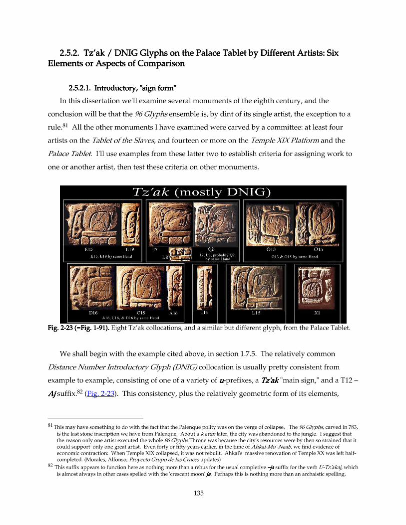
135
2.5.2. 2.5.2. 2.5.2. 2.5.2. Tz’akTz’akTz’akTz’ak / DNIG Glyphs on the Palace Tablet by Different Artists: Six / DNIG Glyphs on the Palace Tablet by Different Artists: Six / DNIG Glyphs on the Palace Tablet by Different Artists: Six / DNIG Glyphs on the Palace Tablet by Different Artists: Six Elements or Aspects of Comparison Elements or Aspects of Comparison Elements or Aspects of Comparison Elements or Aspects of Comparison
2.5.2.1. Introductory, "sign form"2.5.2.1. Introductory, "sign form"2.5.2.1. Introductory, "sign form"2.5.2.1. Introductory, "sign form"
In this dissertation we'll examine several monuments of the eighth century, and the
conclusion will be that the 96 Glyphs ensemble is, by dint of its single artist, the exception to a
rule.81 All the other monuments I have examined were carved by a committee: at least four
artists on the Tablet of the Slaves, and fourteen or more on the Temple XIX Platform and the
Palace Tablet. I'll use examples from these latter two to establish criteria for assigning work to
one or another artist, then test these criteria on other monuments.
Fig. 2Fig. 2Fig. 2Fig. 2----23 (=Fig. 123 (=Fig. 123 (=Fig. 123 (=Fig. 1----91).91).91).91). Eight Tz’ak collocations, and a similar but different glyph, from the Palace Tablet.
We shall begin with the example cited above, in section 1.7.5. The relatively common
Distance Number Introductory Glyph (DNIG) collocation is usually pretty consistent from
example to example, consisting of one of a variety of uuuu-prefixes, a Tz'akTz'akTz'akTz'ak "main sign," and a T12 –
AjAjAjAj suffix.82 (Fig. 2-23). This consistency, plus the relatively geometric form of its elements,
81 This may have something to do with the fact that the Palenque polity was on the verge of collapse. The 96 Glyphs, carved in 783, is the last stone inscription we have from Palenque. About a k'atun later, the city was abandoned to the jungle. I suggest that the reason only one artist executed the whole 96 Glyphs Throne was because the city's resources were by then so strained that it could support only one great artist. Even forty or fifty years earlier, in the time of Ahkal-Mo'-Naab, we find evidence of economic contraction: When Temple XIX collapsed, it was not rebuilt. Ahkal's massive renovation of Temple XX was left half-completed. (Morales, Alfonso, Proyecto Grupo de las Cruces updates)
82 This suffix appears to function here as nothing more than a rebus for the usual completive ––––jajajaja suffix for the verb U-Tz'akaj, which is almost always in other cases spelled with the 'crescent moon' jjjjaaaa. Perhaps this is nothing more than an archaistic spelling,
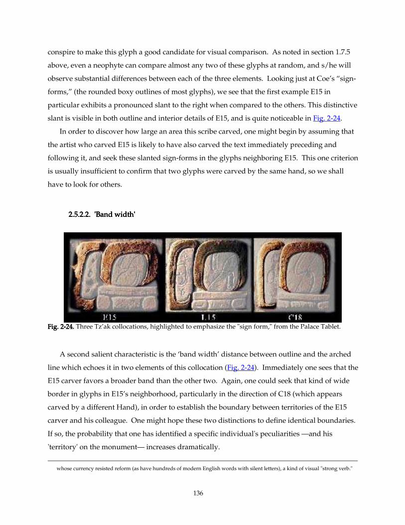
136
conspire to make this glyph a good candidate for visual comparison. As noted in section 1.7.5
above, even a neophyte can compare almost any two of these glyphs at random, and s/he will
observe substantial differences between each of the three elements. Looking just at Coe’s “sign-
forms,” (the rounded boxy outlines of most glyphs), we see that the first example E15 in
particular exhibits a pronounced slant to the right when compared to the others. This distinctive
slant is visible in both outline and interior details of E15, and is quite noticeable in Fig. 2-24.
In order to discover how large an area this scribe carved, one might begin by assuming that
the artist who carved E15 is likely to have also carved the text immediately preceding and
following it, and seek these slanted sign-forms in the glyphs neighboring E15. This one criterion
is usually insufficient to confirm that two glyphs were carved by the same hand, so we shall
have to look for others.
2.5.2.2. 'Band width'2.5.2.2. 'Band width'2.5.2.2. 'Band width'2.5.2.2. 'Band width'
FiFiFiFig. 2g. 2g. 2g. 2----24.24.24.24. Three Tz’ak collocations, highlighted to emphasize the "sign form," from the Palace Tablet.
A second salient characteristic is the ‘band width’ distance between outline and the arched
line which echoes it in two elements of this collocation (Fig. 2-24). Immediately one sees that the
E15 carver favors a broader band than the other two. Again, one could seek that kind of wide
border in glyphs in E15’s neighborhood, particularly in the direction of C18 (which appears
carved by a different Hand), in order to establish the boundary between territories of the E15
carver and his colleague. One might hope these two distinctions to define identical boundaries.
If so, the probability that one has identified a specific individual's peculiarities —and his
'territory' on the monument— increases dramatically.
whose currency resisted reform (as have hundreds of modern English words with silent letters), a kind of visual "strong verb."
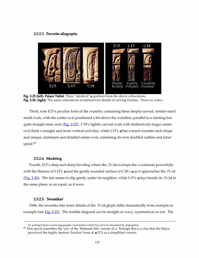
137
2.5.2.3. Favorite allographs2.5.2.3. Favorite allographs2.5.2.3. Favorite allographs2.5.2.3. Favorite allographs
Fig. 2Fig. 2Fig. 2Fig. 2----25 (left).25 (left).25 (left).25 (left). Palace TabletPalace TabletPalace TabletPalace Tablet. Three "identical" uuuu-prefixes from the above collocations. Fig. 2Fig. 2Fig. 2Fig. 2----26 26 26 26 (right).right).right).right). The same collocations scrutinized for details of carving finishes. Photos by author.
Third, note E15’s peculiar form of the u-prefix: containing three deeply-carved, similar-sized
small ovals, with the center oval positioned a bit above the waistline, parallel to a slanting but
quite straight inner arch (Fig. 2-25). C18’s lightly-carved ovals with distinctively-larger center
oval flank a straight and more vertical arch-line, while L15’s uuuu has a much rounder arch-shape
and unique, dominant and detailed center oval, containing its own doubled outline and inner
spiral.83
2.5.2.4. Modeling2.5.2.4. Modeling2.5.2.4. Modeling2.5.2.4. Modeling
Fourth, E15’s deep and sharp beveling where the Tz’ak overlaps the u contrasts powerfully
with the flatness of L15’s uuuu and the gently-rounded surface of C18’s uuuu as it approaches the Tz’ak
(Fig. 2-26). The last seems to slip gently under its neighbor, while L15’s uuuu lays beside its Tz’ak in
the same plane; as an equal, as it were.
2.5.2.5. 'Swastikas'2.5.2.5. 'Swastikas'2.5.2.5. 'Swastikas'2.5.2.5. 'Swastikas'
Fifth, the swastika-like inner details of the Tz’ak glyph differ dramatically from example to
example (see Fig. 2-23). The middle diagonal can be straight or wavy, symmetrical or not. The
Or, perhaps there is some logographic connotation which has yet to be discerned by epigraphers.
83 This spiral resembles the 'eye' of the 'flattened fish' variety of u. Perhaps this is a clue that the Maya perceived the highly abstract 'bracket' form of uuuu (T1) as a simplified version
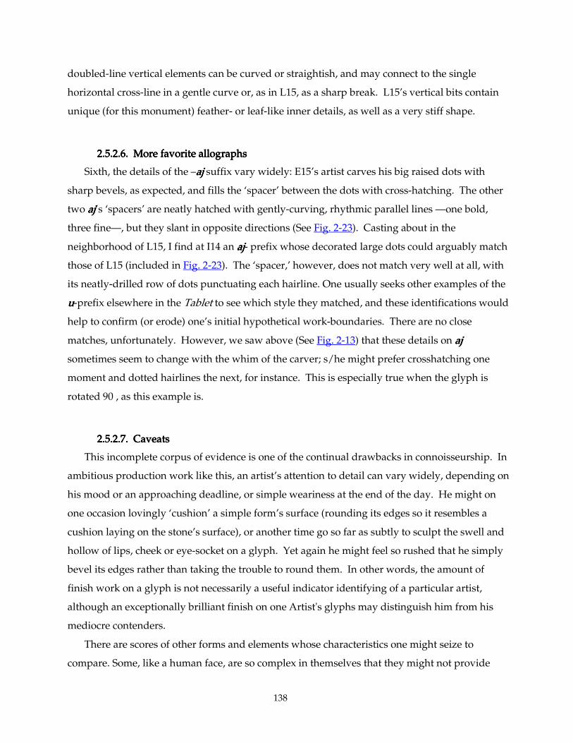
138
doubled-line vertical elements can be curved or straightish, and may connect to the single
horizontal cross-line in a gentle curve or, as in L15, as a sharp break. L15’s vertical bits contain
unique (for this monument) feather- or leaf-like inner details, as well as a very stiff shape.
2.5.2.6. More favorite allographs2.5.2.6. More favorite allographs2.5.2.6. More favorite allographs2.5.2.6. More favorite allographs
Sixth, the details of the –ajajajaj suffix vary widely: E15’s artist carves his big raised dots with
sharp bevels, as expected, and fills the ‘spacer’ between the dots with cross-hatching. The other
two ajajajaj’s ‘spacers’ are neatly hatched with gently-curving, rhythmic parallel lines —one bold,
three fine—, but they slant in opposite directions (See Fig. 2-23). Casting about in the
neighborhood of L15, I find at I14 an ajajajaj- prefix whose decorated large dots could arguably match
those of L15 (included in Fig. 2-23). The ‘spacer,’ however, does not match very well at all, with
its neatly-drilled row of dots punctuating each hairline. One usually seeks other examples of the
uuuu-prefix elsewhere in the Tablet to see which style they matched, and these identifications would
help to confirm (or erode) one’s initial hypothetical work-boundaries. There are no close
matches, unfortunately. However, we saw above (See Fig. 2-13) that these details on ajajajaj
sometimes seem to change with the whim of the carver; s/he might prefer crosshatching one
moment and dotted hairlines the next, for instance. This is especially true when the glyph is
rotated 90°, as this example is.
2.5.2.7. Caveats2.5.2.7. Caveats2.5.2.7. Caveats2.5.2.7. Caveats
This incomplete corpus of evidence is one of the continual drawbacks in connoisseurship. In
ambitious production work like this, an artist’s attention to detail can vary widely, depending on
his mood or an approaching deadline, or simple weariness at the end of the day. He might on
one occasion lovingly ‘cushion’ a simple form’s surface (rounding its edges so it resembles a
cushion laying on the stone’s surface), or another time go so far as subtly to sculpt the swell and
hollow of lips, cheek or eye-socket on a glyph. Yet again he might feel so rushed that he simply
bevel its edges rather than taking the trouble to round them. In other words, the amount of
finish work on a glyph is not necessarily a useful indicator identifying of a particular artist,
although an exceptionally brilliant finish on one Artist's glyphs may distinguish him from his
mediocre contenders.
There are scores of other forms and elements whose characteristics one might seize to
compare. Some, like a human face, are so complex in themselves that they might not provide
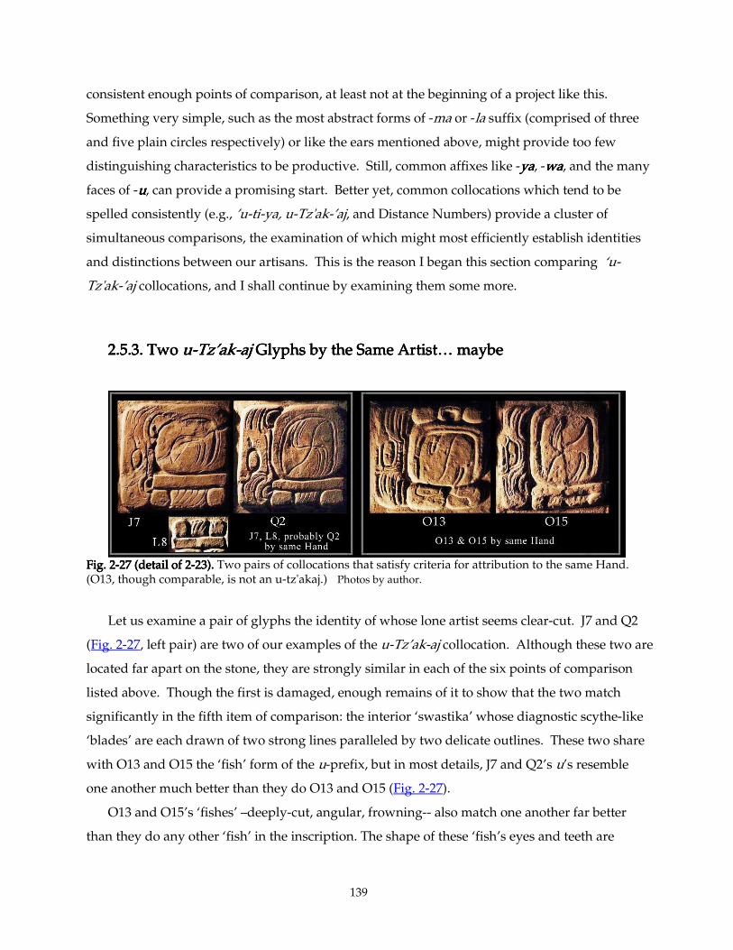
139
consistent enough points of comparison, at least not at the beginning of a project like this.
Something very simple, such as the most abstract forms of -ma or -la suffix (comprised of three
and five plain circles respectively) or like the ears mentioned above, might provide too few
distinguishing characteristics to be productive. Still, common affixes like -yayayaya, -wawawawa, and the many
faces of -uuuu, can provide a promising start. Better yet, common collocations which tend to be
spelled consistently (e.g., ’u-ti-ya, u-Tz'ak-’aj, and Distance Numbers) provide a cluster of
simultaneous comparisons, the examination of which might most efficiently establish identities
and distinctions between our artisans. This is the reason I began this section comparing ‘u-
Tz'ak-’aj collocations, and I shall continue by examining them some more.
2.5.3. Two 2.5.3. Two 2.5.3. Two 2.5.3. Two uuuu----Tz’akTz’akTz’akTz’ak----ajajajaj Glyphs by the Same Artist… maybe Glyphs by the Same Artist… maybe Glyphs by the Same Artist… maybe Glyphs by the Same Artist… maybe
Fig. 2Fig. 2Fig. 2Fig. 2----27 (detail of 227 (detail of 227 (detail of 227 (detail of 2----23).23).23).23). Two pairs of collocations that satisfy criteria for attribution to the same Hand. (O13, though comparable, is not an u-tz'akaj.) Photos by author.
Let us examine a pair of glyphs the identity of whose lone artist seems clear-cut. J7 and Q2
(Fig. 2-27, left pair) are two of our examples of the u-Tz’ak-aj collocation. Although these two are
located far apart on the stone, they are strongly similar in each of the six points of comparison
listed above. Though the first is damaged, enough remains of it to show that the two match
significantly in the fifth item of comparison: the interior ‘swastika’ whose diagnostic scythe-like
‘blades’ are each drawn of two strong lines paralleled by two delicate outlines. These two share
with O13 and O15 the ‘fish’ form of the u-prefix, but in most details, J7 and Q2’s u’s resemble
one another much better than they do O13 and O15 (Fig. 2-27).
O13 and O15’s ‘fishes’ –deeply-cut, angular, frowning-- also match one another far better
than they do any other ‘fish’ in the inscription. The shape of these ‘fish’s eyes and teeth are
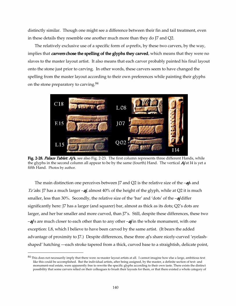
140
distinctly similar. Though one might see a difference between their fin and tail treatment, even
in these details they resemble one another much more than they do J7 and Q2.
The relatively exclusive use of a specific form of u-prefix, by these two carvers, by the way,
implies that carverscarverscarverscarvers chose the spelling of the glyphs they carved chose the spelling of the glyphs they carved chose the spelling of the glyphs they carved chose the spelling of the glyphs they carved, which means that they were no
slaves to the master layout artist. It also means that each carver probably painted his final layout
onto the stone just prior to carving. In other words, these carvers seem to have changed the
spelling from the master layout according to their own preferences while painting their glyphs
on the stone preparatory to carving.84
Fig. 2Fig. 2Fig. 2Fig. 2----28.28.28.28. Palace Tabl Palace Tabl Palace Tabl Palace Tablet: Aj’et: Aj’et: Aj’et: Aj’ssss, see also Fig. 2-23. The first column represents three different Hands, while the glyphs in the second column all appear to be by the same (fourth) Hand. The vertical AjAjAjAj at I4 is yet a fifth Hand. Photos by author.
The main distinction one perceives between J7 and Q2 is the relative size of the –ajajajajs and
Tz’aks: J7 has a much larger –ajajajaj, almost 40% of the height of the glyph, while at Q2 it is much
smaller, less than 30%. Secondly, the relative size of the ‘bar’ and ‘dots’ of the –ajajajaj differ
significantly here: J7 has a larger (and squarer) bar, almost as thick as its dots; Q2’s dots are
larger, and her bar smaller and more curved, than J7’s. Still, despite these differences, these two
–ajajajaj’s are much closer to each other than to any other –ajajajaj in the whole monument, with one
exception: L8, which I believe to have been carved by the same artist. (It bears the added
advantage of proximity to J7.) Despite differences, these three aj’s share nicely-curved ‘eyelash-
shaped’ hatching —each stroke tapered from a thick, curved base to a straightish, delicate point,
84 This does not necessarily imply that there were no master layout artists at all. I cannot imagine how else a large, ambitious text
like this could be accomplished. But the individual artists, after being assigned, by the master, a definite section of text- and monument-real estate, were apparently free to rewrite the specific glyphs according to their own taste. There exists the distinct possibility that some carvers relied on their colleagues to brush their layouts for them, or that there existed a whole category of
141
with a single, tiny, drilled dot dripping off its tip. The ‘hairs’ within other aj’s are quite unlike
this (with the possible exception of I14, whose drilled holes are bigger).
It is also true that the profile, the ‘sign-form’ of J7 leans slightly to the right, and is a touch
more rounded, when compared to Q2 (see Fig. 2-23). These differences raise the fundamental
question: When shall we say that two glyphs exhibit enough difference to be said to have come
from different hands? What tolerances did their artists work within? What were their standards
for variations on a theme? Some artists are always more creative than others; some scribes will
obviously enjoy more freedom than others. Some seem to have positively reveled in deliberate
variety. How sure can we be of our conclusions? I shall begin by setting an arbitrary standard:
When we can discern an When we can discern an When we can discern an When we can discern an identityidentityidentityidentity between more than half of a group of comparison c between more than half of a group of comparison c between more than half of a group of comparison c between more than half of a group of comparison criteria (say, riteria (say, riteria (say, riteria (say,
three or more out of six), we shall define the two glyphs as three or more out of six), we shall define the two glyphs as three or more out of six), we shall define the two glyphs as three or more out of six), we shall define the two glyphs as by the same Handby the same Handby the same Handby the same Hand. Likewise, if more . Likewise, if more . Likewise, if more . Likewise, if more
than half a number of characteristics than half a number of characteristics than half a number of characteristics than half a number of characteristics distinctly differdistinctly differdistinctly differdistinctly differ between two glyphs, we shall define them between two glyphs, we shall define them between two glyphs, we shall define them between two glyphs, we shall define them
as as as as by different Handsby different Handsby different Handsby different Hands....85 In practice, as we have already seen, there are few grey comparisons;
two examples of a glyph collocation usually look very much alike or quite different.
2.5.4.2.5.4.2.5.4.2.5.4. Assumptions About Scribal MethodsAssumptions About Scribal MethodsAssumptions About Scribal MethodsAssumptions About Scribal Methods
I shall begin to establish a set of rules by stating my assumptions.
1. Maya sMaya sMaya sMaya scribal artists were competent craftsmen and craftswomen.cribal artists were competent craftsmen and craftswomen.cribal artists were competent craftsmen and craftswomen.cribal artists were competent craftsmen and craftswomen. (On the gender of scribes
and artists, see #13 below.) They worked expertly, efficiently, directly, rapidly. Any skilled
artisan can make substantial progress in his/her medium at a rate far faster than the ordinary
person. Calligraphers in every culture build their characters from a relatively small
vocabulary of well-practiced, direct strokes. I estimate that characters such as we see on the
Palace Tablet each took on the order of thirty seconds to a minute or two to write, and half an
hour to an hour (each) to carve. (Layout time —sketches, roughs, revisions, text-distribution,
etc.— could multiply this number considerably.) Though there exists no living Maya glyph
calligrapher using the proper tools against whose rate of production I can calibrate my
guesses, I am comparing this rate with that of expert Chinese calligraphers, writing signs of
approximately equal complexity.
“outline draftsmen” who stood between the Master Layout and the flock of carvers, which would considerably complicate matters.
142
2. Either through unconscious habit, or conscious choice, there always exist some combination
of relatively invariant features peculiar to any given artist. Despite their sophistication and
conscious striving for creative variety, the work of individual Maya artists, like all other
artists worldwide, can be recognized by these peculiar habits and characteristics. In other
words, one can apply a connoisseurship methodology to this workone can apply a connoisseurship methodology to this workone can apply a connoisseurship methodology to this workone can apply a connoisseurship methodology to this work .
3. Maya scribal artists and their customers valued visual consistency. Any text must have a
consistent “typographic color”consistent “typographic color”consistent “typographic color”consistent “typographic color” (evenness of texture, such that, seen from afar, there be no
“hot spots” of too-light or too-dark texture) to be comfortably legible. Despite extreme
variety of outline and complexity from glyph to glyph, Maya texts exhibit a pleasing textural
uniformity. This aesthetic demands some consistency between personal styles of any group
compelled to work together on a particular text. In such a case, team members were
expected to adjust their work to harmonize with that of their colleagues, or the Master
selected them from a large pool for their harmonious styles, much as actors for a Broadway
play are selected by a casting director.
4. At the same time the same audience (including fellow scribes) appreciated the “life” given to
a text by a lively variety in the replively variety in the replively variety in the replively variety in the repeated formseated formseated formseated forms. Even in works which seem clearly to have
issued from a single hand, one never finds a glyph written precisely the same way twice (viz.
the examples given above in the 96 Glyphs Panel). The standard of consistency from one
character to another that we find in, say, Chinese li shu (Fig 1-56, the central character in the
bottom row and the right end of the second row), or better, Classic Roman Litterae
Quadratae (Fig. 1-55, compare the AAAA’s), is much more severe than that manifested in, say,
Palenque’s Panel of the 96 Glyphs (Figs. 2-18 through 2-22). Yet if any carving in Palenque
can be said to be the work of one hand, this is it; its distinctly flamboyant calligraphic style is
quite distinct from anything else (see section 2.5.1 above).86 In other words, we should
expect and tolerate some deliberate variation in details, choice of allographs, even in
85 I base this on the physical-science criterion for resolving two overlapping light sources: When the amplitude of light in the space
between two amplitude maxima is less than half that of the maxima, the two light sources are defined as resolved. 86 Linda Schele, whose unequaled drawing of this inscription most accurately captures its calligraphic exuberance, was fond of
saying that she felt this artist both wrote and carved this inscription, since his engraving was so faithful to the calligraphic layout. (personal communication 1986, 1994)
143
habitual, simple forms such as outlines, hatching, etc.
5. TextTextTextText----carvers tend to work sequentiallycarvers tend to work sequentiallycarvers tend to work sequentiallycarvers tend to work sequentially. If two or more artists are working on a monument at
the same time, they tend to stay in a certain territory. Thus, in any given monument,
proximal or adjacent glyphs are more likely to have been made by the same hand than
glyphs far apart. If I find two examples of a glyph which, though far apart, exhibit a similar
set of characteristics, then I conclude they might be by the same artist. But a pair with the
same degree of similarity located near each other on the stone have an extra argument for the
identity of their maker.
6. Large, ambitious, and intricately-carved monuments such as the wall-panels of Palenque and
the stelae of Copan and Quirigua may have been roughed out in the quarry or in off-site
workshops, but final carving was almost always done final carving was almost always done final carving was almost always done final carving was almost always done in situin situin situin situ. Transporting a multi-ton stone
is hard enough without having to worry about chipping a hundred corners.
7. I assume some continuity of religious attitude and mental preparation I assume some continuity of religious attitude and mental preparation I assume some continuity of religious attitude and mental preparation I assume some continuity of religious attitude and mental preparation from Classic times to from Classic times to from Classic times to from Classic times to
at least the Conquest.at least the Conquest.at least the Conquest.at least the Conquest. Landa reports that Maya sculptors of wooden “idols” were
quarantined during their work. They lived apart in specially-blessed workshops, fasted,
prayed abundantly, abstained from sex and apparently from bathing during the several days
it took to hew out a new statue.87 Few doubt that practices and attitudes like these also
prevailed centuries earlier.
8. The precise reading of scribal signatures is not yet fully known, but I believe that their
meanings are more or less accepted.88 (See the first glyph in Figs 1-29 and 1-30, and glyph
L4a in the Tablet of the 96 Glyphs in Fig. 2-17.) For the purposes of this inquiry, I shall I shall I shall I shall
assuassuassuassume that me that me that me that the T65:756a:568the T65:756a:568the T65:756a:568the T65:756a:568 collocation found on stelae and other sculpted stones, when collocation found on stelae and other sculpted stones, when collocation found on stelae and other sculpted stones, when collocation found on stelae and other sculpted stones, when
followed by a name, probably reads followed by a name, probably reads followed by a name, probably reads followed by a name, probably reads yuyuyuyu----xuxuxuxu----lulululu = = = = yuxulyuxulyuxulyuxul = “his carving” and identifies that = “his carving” and identifies that = “his carving” and identifies that = “his carving” and identifies that
name as the carver of the text. name as the carver of the text. name as the carver of the text. name as the carver of the text. There exist a few painted ceramic texts (as on K635, K2784?
And K6020)89, in which an apparent equivalent collocation T1:563:585a likewise precedes a
87 Landa, pp. 76 f. 88 As established by David Stuart, (Stuart 1989), and expanded by John Montgomery in his Master’s thesis (1994). 89 In the PSS, this same collocation appears frequently but has a different, verbal reading, something like “written/painted (upon).”
It almost never is used as an identifying phrase in this context. There exist a few ceramic non-PSS texts, however, where this
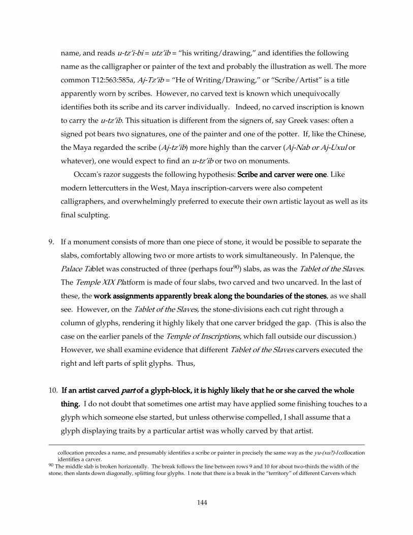
144
name, and reads u-tz’i-bi = utz’ib = “his writing/drawing,” and identifies the following
name as the calligrapher or painter of the text and probably the illustration as well. The more
common T12:563:585a, Aj-Tz’ib = “He of Writing/Drawing,” or “Scribe/Artist” is a title
apparently worn by scribes. However, no carved text is known which unequivocally
identifies both its scribe and its carver individually. Indeed, no carved inscription is known
to carry the u-tz’ib. This situation is different from the signers of, say Greek vases: often a
signed pot bears two signatures, one of the painter and one of the potter. If, like the Chinese,
the Maya regarded the scribe (Aj-tz’ib) more highly than the carver (Aj-Nab or Aj-Uxul or
whatever), one would expect to find an u-tz’ib or two on monuments.
Occam's razor suggests the following hypothesis: Scribe and carver were oneScribe and carver were oneScribe and carver were oneScribe and carver were one. Like
modern lettercutters in the West, Maya inscription-carvers were also competent
calligraphers, and overwhelmingly preferred to execute their own artistic layout as well as its
final sculpting.
9. If a monument consists of more than one piece of stone, it would be possible to separate the
slabs, comfortably allowing two or more artists to work simultaneously. In Palenque, the
Palace Tablet was constructed of three (perhaps four90) slabs, as was the Tablet of the Slaves.
The Temple XIX Platform is made of four slabs, two carved and two uncarved. In the last of
these, the work assignments apparently break along the boundaries of the stoneswork assignments apparently break along the boundaries of the stoneswork assignments apparently break along the boundaries of the stoneswork assignments apparently break along the boundaries of the stones, as we shall
see. However, on the Tablet of the Slaves, the stone-divisions each cut right through a
column of glyphs, rendering it highly likely that one carver bridged the gap. (This is also the
case on the earlier panels of the Temple of Inscriptions, which fall outside our discussion.)
However, we shall examine evidence that different Tablet of the Slaves carvers executed the
right and left parts of split glyphs. Thus,
10. If an artist carved If an artist carved If an artist carved If an artist carved partpartpartpart of a glyph of a glyph of a glyph of a glyph----block, it is highly likely that he or she carved the whole block, it is highly likely that he or she carved the whole block, it is highly likely that he or she carved the whole block, it is highly likely that he or she carved the whole
thing.thing.thing.thing. I do not doubt that sometimes one artist may have applied some finishing touches to a
glyph which someone else started, but unless otherwise compelled, I shall assume that a
glyph displaying traits by a particular artist was wholly carved by that artist.
collocation precedes a name, and presumably identifies a scribe or painter in precisely the same way as the yu-(xu?)-l collocation identifies a carver.
90 The middle slab is broken horizontally. The break follows the line between rows 9 and 10 for about two-thirds the width of the stone, then slants down diagonally, splitting four glyphs. I note that there is a break in the “territory” of different Carvers which
145
11. If two glyphs in an inscription appear strongly to be by the same hand, intervening glyphs If two glyphs in an inscription appear strongly to be by the same hand, intervening glyphs If two glyphs in an inscription appear strongly to be by the same hand, intervening glyphs If two glyphs in an inscription appear strongly to be by the same hand, intervening glyphs
are rather likely to have bare rather likely to have bare rather likely to have bare rather likely to have been by the same hand.een by the same hand.een by the same hand.een by the same hand. If two such glyphs are adjacent but one
(that is, if they flank or surround a single glyph), then the intervening glyph is very likely to
have been carved by the same hand.
12. I presume, unless otherwise compelled, that for every I presume, unless otherwise compelled, that for every I presume, unless otherwise compelled, that for every I presume, unless otherwise compelled, that for every important hieroglyphic panel, there important hieroglyphic panel, there important hieroglyphic panel, there important hieroglyphic panel, there
was a single Master scribe who dictated the text and layout of the whole project.was a single Master scribe who dictated the text and layout of the whole project.was a single Master scribe who dictated the text and layout of the whole project.was a single Master scribe who dictated the text and layout of the whole project. He was
probably also responsible for the schedule and the work-distribution, making sure that none
of the several calligraphers/sculptors on the project made any spelling, transcription, or
computational errors. He may have been a calligrapher, carver, priest, architect, court
minister; some or all or none of these. In all likelihood, he played more than one of these
roles. This is the usual practice in every comparable cultural activity, from ancient Egypt to
T'ang China to the Vietnam War Memorial. Considering the consistent high quality across
the large teams of artisans who executed these inscriptions, these Masters certainly were
excellent judges of talent.
13. Nearly all artists' signatures seem to have been men. Though one calligrapher refers to his
mother as a scribe, and women appear in scribal garb in ceramic illustrations of Court life
(see Coe & Kerr 1992, passim) evidence of power-hierarchies in Maya life suggest that only a
few women attained scribal rank. Accordingly, I shall refer to scribes with male pronounsI shall refer to scribes with male pronounsI shall refer to scribes with male pronounsI shall refer to scribes with male pronouns. I
acknowledge that this is the wrong gender in an unknown (small) percentage of cases, and I
beg the reader's indulgence for my smoothing out the prose by eliminating all those
awkward "her or his"s and "he/she"s.
14. Many glyphs have two or more allographs which substitute freely with each other in many
contexts. There exist about a dozen distinct glyphs which read as syllabic 'u'u'u'u, for example.
Although there may be as-yet-undetected subtle connotations to the use of this or that
allograph, ('u'u'u'u---- can indicate third person singular or possessive pronouns, for instance; certain
Maya scribes may have preferred to correlate one or another allograph with each meaning), I
shall assume unless compelled otherwise that when an artist elects to use two different
happens to follow this break for four columns, and maybe six. This could be a coincidence, or the stone might have suffered an
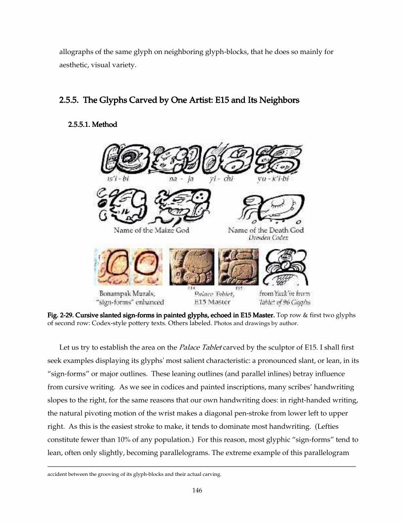
146
allographs of the same glyph on neighboring glyph-blocks, that he does so mainly for
aesthetic, visual variety.
2.5.5. The Glyphs Carved by One Artist: E15 and Its Neighbors2.5.5. The Glyphs Carved by One Artist: E15 and Its Neighbors2.5.5. The Glyphs Carved by One Artist: E15 and Its Neighbors2.5.5. The Glyphs Carved by One Artist: E15 and Its Neighbors
2.5.5.1. Method2.5.5.1. Method2.5.5.1. Method2.5.5.1. Method
Fig. 2Fig. 2Fig. 2Fig. 2----29.29.29.29. Cursive slanted signCursive slanted signCursive slanted signCursive slanted sign----forms in painted glyphs, echoed in E15 Master.forms in painted glyphs, echoed in E15 Master.forms in painted glyphs, echoed in E15 Master.forms in painted glyphs, echoed in E15 Master. Top row & first two glyphs of second row: Codex-style pottery texts. Others labeled. Photos and drawings by author.
Let us try to establish the area on the Palace Tablet carved by the sculptor of E15. I shall first
seek examples displaying its glyphs' most salient characteristic: a pronounced slant, or lean, in its
“sign-forms” or major outlines. These leaning outlines (and parallel inlines) betray influence
from cursive writing. As we see in codices and painted inscriptions, many scribes’ handwriting
slopes to the right, for the same reasons that our own handwriting does: in right-handed writing,
the natural pivoting motion of the wrist makes a diagonal pen-stroke from lower left to upper
right. As this is the easiest stroke to make, it tends to dominate most handwriting. (Lefties
constitute fewer than 10% of any population.) For this reason, most glyphic “sign-forms” tend to
lean, often only slightly, becoming parallelograms. The extreme example of this parallelogram
accident between the grooving of its glyph-blocks and their actual carving.
147
distortion is seen in the Dresden Codex, whose "main signs" all tend to exhibit a pronounced
proboscis
Furthermore, this artist’s “sign-forms” are asymmetrical: the bottom tends to bulge
downwards, the right side tends to greater curvature than the left, and the lower left corner is
often distinctly sharper than the others. Again, these tendencies are persistent cursivisms, found
to lesser or greater degrees in most Maya calligraphy, but the artist of E15 gives in to it more
than his colleagues.
Assuming that an artist concentrated his work in an area at least roughly defined by the
space he needs to work comfortably, I expect that the most productive place to look for more
glyphs by a given artist is within his reach — directly adjacent to the area we have defined
already as his ‘territory.’ My methodology here shall be to try first to establish a connection
between my core area of glyphs and one of its neighbors, using as an arbitrary first criterion their
“sign-forms.” (My criteria can change according to the character of the artist in question; I have
chosen "sign-forms" here simply because it seems to be a most salient characteristic of the E15
artist.) If this next adjacent glyph meets the first criterion of comparison, I shall assume
tentatively that, coupled with its proximity, this glyph is by our artist. I shall also check to see if
it matches any of the other qualities we discern in this artist’s work —wide ‘band-width,’ sharp
beveling, and other details. If they match, this further corroborates the hypothesis that the glyph
in question is by the same artist. If this adjacent glyph fails to meet the first criterion, but matches
several other criteria, I shall still conclude that the glyph in question is by the same artist. Just as
one matching characteristic is not enough to establish the identity of the artist of two glyphs, one
mismatch cannot rule out that a pair issue from the same hand, if other characteristics do
correlate. Without pretending to set a rigid or rigorous set of criteria for declaring this or that
glyph to have been carved or written by one or another artist identified on an inscription, I shall
assign glyphs firmly only when their matches strongly outweigh their mismatches. Those with a
weaker claim I shall assign tentatively, conditionally, or not at all.
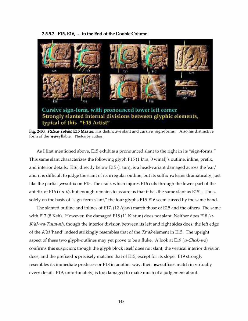
148
2.5.5.2. F15, E16, … to the End of the Double Column2.5.5.2. F15, E16, … to the End of the Double Column2.5.5.2. F15, E16, … to the End of the Double Column2.5.5.2. F15, E16, … to the End of the Double Column
Fig. 2Fig. 2Fig. 2Fig. 2----30. 30. 30. 30. Palace TabletPalace TabletPalace TabletPalace Tablet, E15 Ma, E15 Ma, E15 Ma, E15 Master: ster: ster: ster: His distinctive slant and cursive "sign-forms." Also his distinctive form of the wawawawa-syllable. Photos by author.
As I first mentioned above, E15 exhibits a pronounced slant to the right in its “sign-forms.”
This same slant characterizes the following glyph F15 (1 k’in, 0 winal)’s outline, inline, prefix,
and interior details. E16, directly below E15 (1 tun), is a head-variant damaged across the 'ear,'
and it is difficult to judge the slant of its irregular outline, but its suffix ya leans dramatically, just
like the partial yayayaya-suffix on F15. The crack which injures E16 cuts through the lower part of the
antefix of F16 (i-u-ti), but enough remains to assure us that it has the same slant as E15’s. Thus,
solely on the basis of “sign-form-slant,” the four glyphs E15-F16 seem carved by the same hand.
The slanted outline and inlines of E17, (12 Ajaw) match those of E15 and the others. The same
with F17 (8 Keh). However, the damaged E18 (11 K’atun) does not slant. Neither does F18 (u-
K’al-wa-Tuun-ni), though the interior division between its left and right sides does; the left edge
of the K’al ‘hand’ indeed strikingly resembles that of the Tz’ak element in E15. The upright
aspect of these two glyph-outlines may yet prove to be a fluke. A look at E19 (u-Chok-wa)
confirms this suspicion: though the glyph block itself does not slant, the vertical interior division
does, and the prefixed uuuu precisely matches that of E15, except for its slope. E19 strongly
resembles its immediate predecessor F18 in another way: their wawawawa suffixes match in virtually
every detail. F19, unfortunately, is too damaged to make much of a judgement about.
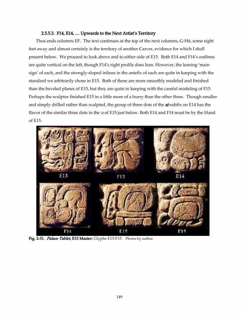
149
2.5.5.3. F14, E14, … Upwards to the Next Artist’s Territory2.5.5.3. F14, E14, … Upwards to the Next Artist’s Territory2.5.5.3. F14, E14, … Upwards to the Next Artist’s Territory2.5.5.3. F14, E14, … Upwards to the Next Artist’s Territory
Thus ends columns EF. The text continues at the top of the next columns, G-H6, some eight
feet away and almost certainly is the territory of another Carver, evidence for which I shall
present below. We proceed to look above and to either side of E15. Both E14 and F14’s outlines
are quite vertical on the left, though F14’s right profile does lean. However, the leaning ‘main
sign’ of each, and the strongly-sloped inlines in the antefix of each are quite in keeping with the
standard we arbitrarily chose in E15. Both of these are more smoothly modeled and finished
than the beveled planes of E15, but they are quite in keeping with the careful modeling of F15.
Perhaps the sculptor finished E15 in a little more of a hurry than the other three. Though smaller
and simply drilled rather than sculpted, the group of three dots of the sisisisi-subfix on E14 has the
flavor of the similar three dots in the u of E15 just below. Both E14 and F14 must be by the Hand
of E15.
Fig. 2Fig. 2Fig. 2Fig. 2----31. 31. 31. 31. Palace TabletPalace TabletPalace TabletPalace Tablet, E15 Master: , E15 Master: , E15 Master: , E15 Master: Glyphs E13-F15. Photos by author.
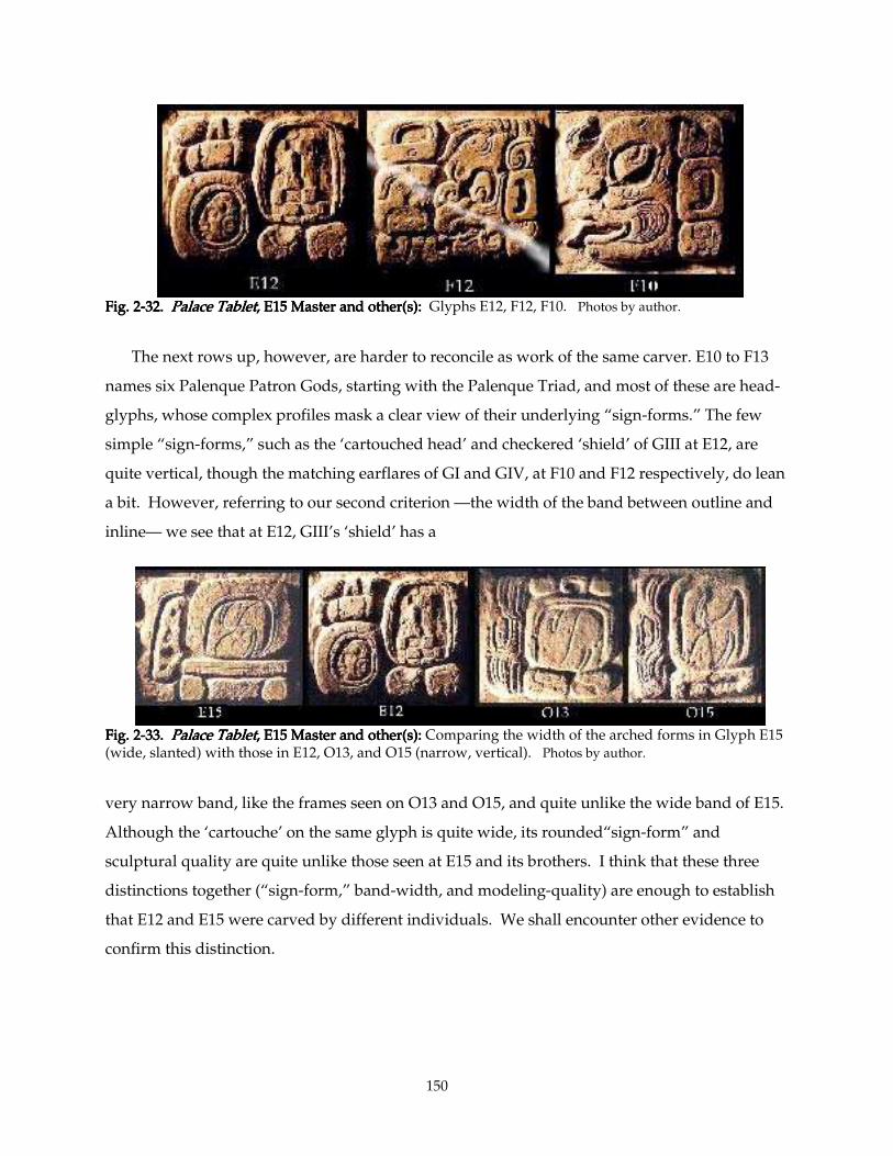
150
Fig. 2Fig. 2Fig. 2Fig. 2----32. 32. 32. 32. Palace TabletPalace TabletPalace TabletPalace Tablet, E15 Master, E15 Master, E15 Master, E15 Master and other(s): and other(s): and other(s): and other(s): Glyphs E12, F12, F10. Photos by author.
The next rows up, however, are harder to reconcile as work of the same carver. E10 to F13
names six Palenque Patron Gods, starting with the Palenque Triad, and most of these are head-
glyphs, whose complex profiles mask a clear view of their underlying “sign-forms.” The few
simple “sign-forms,” such as the ‘cartouched head’ and checkered ‘shield’ of GIII at E12, are
quite vertical, though the matching earflares of GI and GIV, at F10 and F12 respectively, do lean
a bit. However, referring to our second criterion —the width of the band between outline and
inline— we see that at E12, GIII’s ‘shield’ has a
Fig. 2Fig. 2Fig. 2Fig. 2----33. 33. 33. 33. Palace TabletPalace TabletPalace TabletPalace Tablet, E15 Master and other(s): , E15 Master and other(s): , E15 Master and other(s): , E15 Master and other(s): Comparing the width of the arched forms in Glyph E15 (wide, slanted) with those in E12, O13, and O15 (narrow, vertical). Photos by author.
very narrow band, like the frames seen on O13 and O15, and quite unlike the wide band of E15.
Although the ‘cartouche’ on the same glyph is quite wide, its rounded“sign-form” and
sculptural quality are quite unlike those seen at E15 and its brothers. I think that these three
distinctions together (“sign-form,” band-width, and modeling-quality) are enough to establish
that E12 and E15 were carved by different individuals. We shall encounter other evidence to
confirm this distinction.
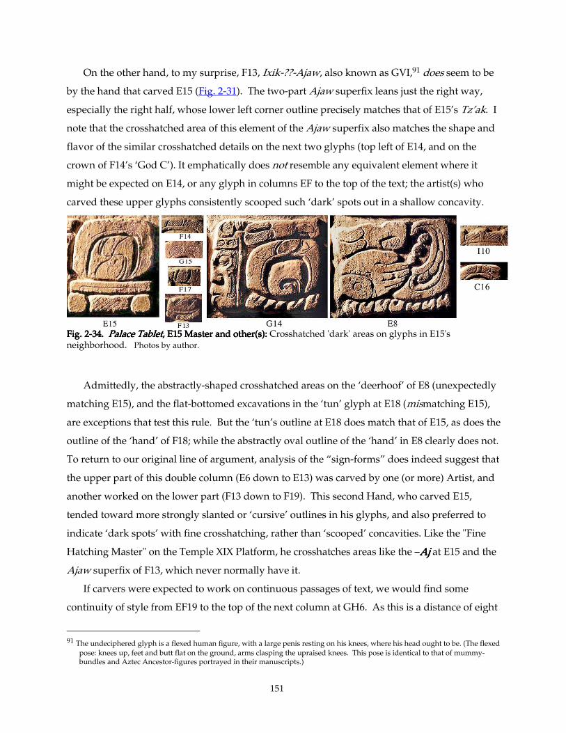
151
On the other hand, to my surprise, F13, Ixik-??-Ajaw, also known as GVI,91 does seem to be
by the hand that carved E15 (Fig. 2-31). The two-part Ajaw superfix leans just the right way,
especially the right half, whose lower left corner outline precisely matches that of E15’s Tz’ak. I
note that the crosshatched area of this element of the Ajaw superfix also matches the shape and
flavor of the similar crosshatched details on the next two glyphs (top left of E14, and on the
crown of F14’s ‘God C’). It emphatically does not resemble any equivalent element where it
might be expected on E14, or any glyph in columns EF to the top of the text; the artist(s) who
carved these upper glyphs consistently scooped such ‘dark’ spots out in a shallow concavity.
Fig. 2Fig. 2Fig. 2Fig. 2----34. 34. 34. 34. Palace TabletPalace TabletPalace TabletPalace Tablet, E15 Master and other(s): , E15 Master and other(s): , E15 Master and other(s): , E15 Master and other(s): Crosshatched 'dark' areas on glyphs in E15's neighborhood. Photos by author.
Admittedly, the abstractly-shaped crosshatched areas on the ‘deerhoof’ of E8 (unexpectedly
matching E15), and the flat-bottomed excavations in the ‘tun’ glyph at E18 (mismatching E15),
are exceptions that test this rule. But the ‘tun’s outline at E18 does match that of E15, as does the
outline of the ‘hand’ of F18; while the abstractly oval outline of the ‘hand’ in E8 clearly does not.
To return to our original line of argument, analysis of the “sign-forms” does indeed suggest that
the upper part of this double column (E6 down to E13) was carved by one (or more) Artist, and
another worked on the lower part (F13 down to F19). This second Hand, who carved E15,
tended toward more strongly slanted or ‘cursive’ outlines in his glyphs, and also preferred to
indicate ‘dark spots’ with fine crosshatching, rather than ‘scooped’ concavities. Like the "Fine
Hatching Master" on the Temple XIX Platform, he crosshatches areas like the –AjAjAjAj at E15 and the
Ajaw superfix of F13, which never normally have it.
If carvers were expected to work on continuous passages of text, we would find some
continuity of style from EF19 to the top of the next column at GH6. As this is a distance of eight
91 The undeciphered glyph is a flexed human figure, with a large penis resting on his knees, where his head ought to be. (The flexed
pose: knees up, feet and butt flat on the ground, arms clasping the upraised knees. This pose is identical to that of mummy-bundles and Aztec Ancestor-figures portrayed in their manuscripts.)
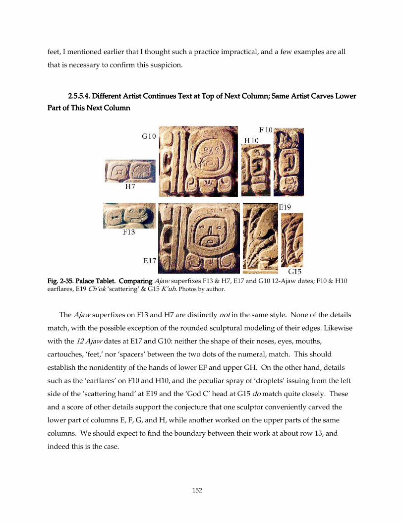
152
feet, I mentioned earlier that I thought such a practice impractical, and a few examples are all
that is necessary to confirm this suspicion.
2.5.5.4. Different Artist Continues Text at Top of Next Column; Same Artist Carves Lower 2.5.5.4. Different Artist Continues Text at Top of Next Column; Same Artist Carves Lower 2.5.5.4. Different Artist Continues Text at Top of Next Column; Same Artist Carves Lower 2.5.5.4. Different Artist Continues Text at Top of Next Column; Same Artist Carves Lower
Part of This Next ColumnPart of This Next ColumnPart of This Next ColumnPart of This Next Column
Fig. 2Fig. 2Fig. 2Fig. 2----35. Palace Tablet. Comparing 35. Palace Tablet. Comparing 35. Palace Tablet. Comparing 35. Palace Tablet. Comparing Ajaw superfixes F13 & H7, E17 and G10 12-Ajaw dates; F10 & H10 earflares, E19 Ch’ok ‘scattering’ & G15 K’uh. Photos by author. The Ajaw superfixes on F13 and H7 are distinctly not in the same style. None of the details
match, with the possible exception of the rounded sculptural modeling of their edges. Likewise
with the 12 Ajaw dates at E17 and G10: neither the shape of their noses, eyes, mouths,
cartouches, ‘feet,’ nor ‘spacers’ between the two dots of the numeral, match. This should
establish the nonidentity of the hands of lower EF and upper GH. On the other hand, details
such as the ‘earflares’ on F10 and H10, and the peculiar spray of ‘droplets’ issuing from the left
side of the ‘scattering hand’ at E19 and the ‘God C’ head at G15 do match quite closely. These
and a score of other details support the conjecture that one sculptor conveniently carved the
lower part of columns E, F, G, and H, while another worked on the upper parts of the same
columns. We should expect to find the boundary between their work at about row 13, and
indeed this is the case.
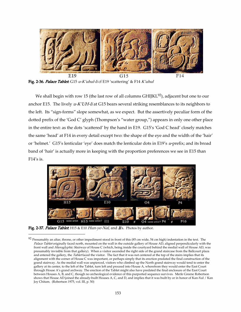
153
Fig. 2Fig. 2Fig. 2Fig. 2----36. 36. 36. 36. Palace TabletPalace TabletPalace TabletPalace Tablet:::: G15 u-K’uhul-li cf E19 ‘scattering’ & F14 K’uhul
We shall begin with row 15 (the last row of all columns GHIJKL92), adjacent but one to our
anchor E15. The lively u-K’UH-li at G15 bears several striking resemblances to its neighbors to
the left. Its “sign-forms” slope somewhat, as we expect. But the assertively peculiar form of the
dotted prefix of the ‘God C’ glyph (Thompson’s “water group,”) appears in only one other place
in the entire text: as the dots ‘scattered’ by the hand in E19. G15’s ‘God C head’ closely matches
the same ‘head’ at F14 in every detail except two: the shape of the eye and the width of the ‘hair’
or ‘helmet.’ G15’s lenticular ‘eye’ does match the lenticular dots in E19’s u-prefix; and its broad
band of ‘hair’ is actually more in keeping with the proportion preferences we see in E15 than
F14’s is.
Fig. 2Fig. 2Fig. 2Fig. 2----37. 37. 37. 37. Palace TabletPalace TabletPalace TabletPalace Tablet:::: H15 & E10 Hun-ye-Nal, and lililili's. Photos by author.
92 Presumably an altar, throne, or other impediment stood in front of this (85 cm wide, 54 cm high) indentation in the text. The
Palace Tablet originally faced north, mounted on the wall in the outside gallery of House AD, aligned perpendicularly with the front wall and Hieroglyphic Stairway of House C (which, being inside the courtyard behind the medial wall of House AD, was presumably invisible from that gallery). When a visitor ascended the right side of the grand staircase from the Ballcourt plaza and entered the gallery, the Tablet faced the visitor. The fact that it was not centered at the top of the stairs implies that its alignment with the corner of House C was important, or perhaps simply that its erection predated the final construction of the grand stairway. As the medial wall was unpierced, visitors who climbed up the North grand stairway would tend to enter the gallery at its center, to the left of the Tablet, turn left and proceed into House A, wherefrom they would enter the East Court through House A’s grand archway. The erection of the Tablet might also have predated the final enclosure of the East Court between Houses A, B, and C, though no archeological evidence of this purported sequence survives. Merle Greene Robertson shows that House AD joined the already-built Houses A, C, and D, and implies that it was built by or in honor of Kan-Xul / Kan Joy Chitam. (Robertson 1975, vol. III, p. 50)
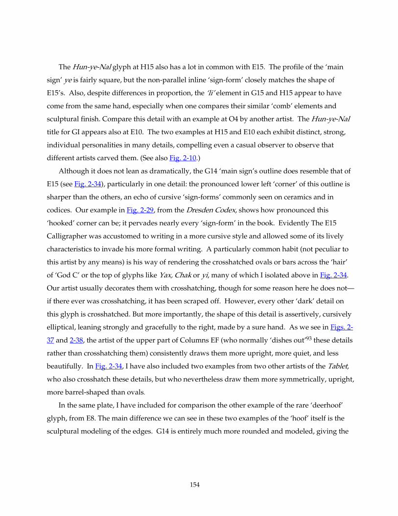
154
The Hun-ye-Nal glyph at H15 also has a lot in common with E15. The profile of the ‘main
sign’ ye is fairly square, but the non-parallel inline ‘sign-form’ closely matches the shape of
E15’s. Also, despite differences in proportion, the ‘li’ element in G15 and H15 appear to have
come from the same hand, especially when one compares their similar ‘comb’ elements and
sculptural finish. Compare this detail with an example at O4 by another artist. The Hun-ye-Nal
title for GI appears also at E10. The two examples at H15 and E10 each exhibit distinct, strong,
individual personalities in many details, compelling even a casual observer to observe that
different artists carved them. (See also Fig. 2-10.)
Although it does not lean as dramatically, the G14 ‘main sign’s outline does resemble that of
E15 (see Fig. 2-34), particularly in one detail: the pronounced lower left ‘corner’ of this outline is
sharper than the others, an echo of cursive ‘sign-forms’ commonly seen on ceramics and in
codices. Our example in Fig. 2-29, from the Dresden Codex, shows how pronounced this
‘hooked’ corner can be; it pervades nearly every ‘sign-form’ in the book. Evidently The E15
Calligrapher was accustomed to writing in a more cursive style and allowed some of its lively
characteristics to invade his more formal writing. A particularly common habit (not peculiar to
this artist by any means) is his way of rendering the crosshatched ovals or bars across the ‘hair’
of ‘God C’ or the top of glyphs like Yax, Chak or yi, many of which I isolated above in Fig. 2-34.
Our artist usually decorates them with crosshatching, though for some reason here he does not—
if there ever was crosshatching, it has been scraped off. However, every other ‘dark’ detail on
this glyph is crosshatched. But more importantly, the shape of this detail is assertively, cursively
elliptical, leaning strongly and gracefully to the right, made by a sure hand. As we see in Figs. 2-
37 and 2-38, the artist of the upper part of Columns EF (who normally ‘dishes out’93 these details
rather than crosshatching them) consistently draws them more upright, more quiet, and less
beautifully. In Fig. 2-34, I have also included two examples from two other artists of the Tablet,
who also crosshatch these details, but who nevertheless draw them more symmetrically, upright,
more barrel-shaped than ovals.
In the same plate, I have included for comparison the other example of the rare ‘deerhoof’
glyph, from E8. The main difference we can see in these two examples of the ‘hoof’ itself is the
sculptural modeling of the edges. G14 is entirely much more rounded and modeled, giving the
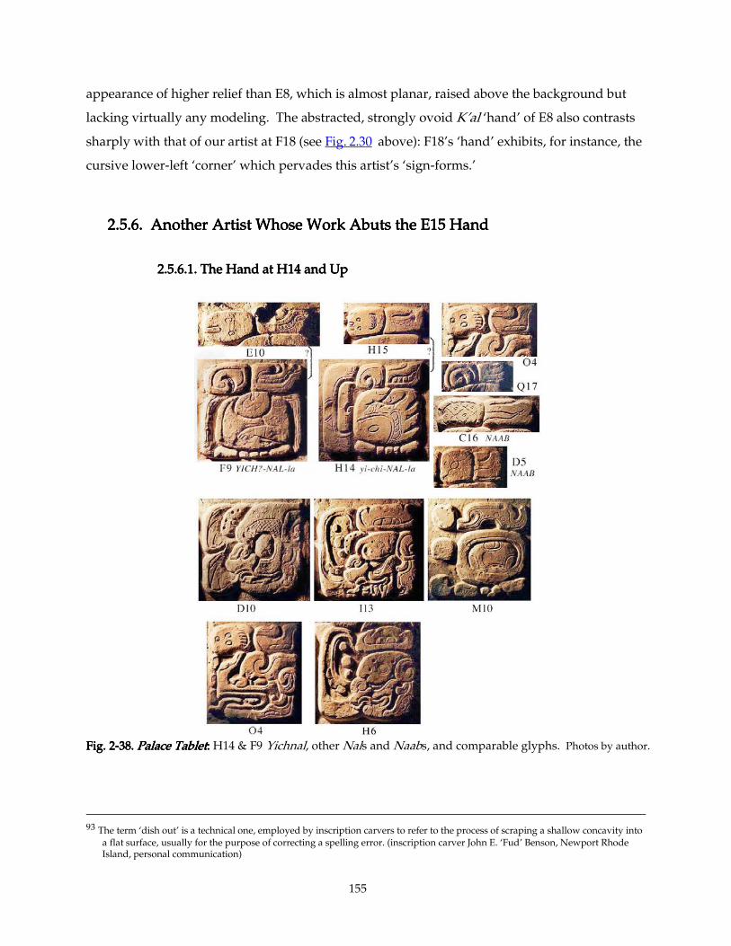
155
appearance of higher relief than E8, which is almost planar, raised above the background but
lacking virtually any modeling. The abstracted, strongly ovoid K’al ‘hand’ of E8 also contrasts
sharply with that of our artist at F18 (see Fig. 2.30 above): F18’s ‘hand’ exhibits, for instance, the cursive lower-left ‘corner’ which pervades this artist’s ‘sign-forms.’
2.5.6. Another Artist Whose Wo2.5.6. Another Artist Whose Wo2.5.6. Another Artist Whose Wo2.5.6. Another Artist Whose Worrrrk Abuts the E15 Hand k Abuts the E15 Hand k Abuts the E15 Hand k Abuts the E15 Hand
2.5.6.1.2.5.6.1.2.5.6.1.2.5.6.1. The Hand at H14 and UpThe Hand at H14 and UpThe Hand at H14 and UpThe Hand at H14 and Up
Fig. 2Fig. 2Fig. 2Fig. 2----38. 38. 38. 38. Palace TabletPalace TabletPalace TabletPalace Tablet:::: H14 & F9 Yichnal, other Nals and Naabs, and comparable glyphs. Photos by author.
93 The term ‘dish out’ is a technical one, employed by inscription carvers to refer to the process of scraping a shallow concavity into
a flat surface, usually for the purpose of correcting a spelling error. (inscription carver John E. ‘Fud’ Benson, Newport Rhode Island, personal communication)
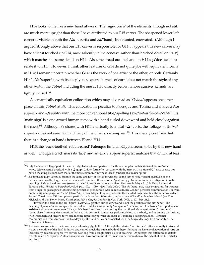
156
H14 looks to me like a new hand at work. The ‘sign-forms’ of the elements, though not stiff,
are much more upright than those I have attributed to our E15 carver. The sharpened lower left
corner is visible in both the Nal superfix and chichichichi ‘hand,’ but blunted, enervated. (Although I
argued strongly above that our E15 carver is responsible for G14, it appears this new carver may
have at least touched up G14, most saliently in the concave-rather-than-hatched detail on its yiyiyiyi,
which matches the same detail on H14. Also, the broad outline band on H14’s yiyiyiyi does seem to
relate it to E15.) However, I think other features of G14 do not quite jibe with equivalent forms
in H14; I remain uncertain whether G14 is the work of one artist or the other, or both. Certainly
H14’s Nal superfix, with its deeply-cut, square ‘kernels of corn’ does not match the style of any
other Nal on the Tablet, including the one at H15 directly below, whose cursive ‘kernels’ are
lightly incised.94
A semantically equivalent collocation which may also read as Yichnal appears one other
place on this Tablet, at F9. This collocation is peculiar to Palenque and Tonina and shares a Nal
superfix and –lalalala subfix with the more conventional title/spelling (yi-chi-Nal/yi-chi-Nal-la). Its
‘main sign’ is a one-armed human torso with a hand curled downward and held closely against
the chest.95 Although F9 shares with H14 a virtually identical –lalalala subfix, the ‘foliage’ of its Nal
superfix does not seem to match any of the other six examples’.96 This merely confirms that
there is a change of hands between F9 and H14.
H13, the ‘buck-toothed, rabbit-eared’ Palenque Emblem Glyph, seems to be by this new hand
as well. Though a crack mars its ‘face’ and antefix, its Ajaw superfix matches that on H7, at least
94 Only the ‘maize foliage’ part of these two glyphs brooks comparison. The three examples on this Tablet of the Nal superfix
whose left element is overlaid with a ‘lililili’ glyph (which form often covaries with the Hun-ye-‘Nal’ title of GI) may or may not have a meaning distinct from that of the more common Nal whose ‘head’ consists of a ‘maize spiral.’
95 This unusual glyph seems to fall into the same category of ‘clever inventions’ as the yuk’ib head-variant discussed above. Patricia, Ancona-Ha, Jorge Perez de Lara, and I examined this and other ‘gestural’ glyphs in our initial investigation into the meaning of Maya hand gestures (see our article “Some Observations on Hand Gestures in Maya Art,” in Kerr, Justin and Barbara, eds., The Maya Vase Book, vol. 6, pp.. 1072 – 1089, New York, 2000.) The chi ‘hand’ may have originated, for instance, from a sign for ‘just a pinch’ of something, which is pronounced chih in Tzeltal (Marc Zender, personal communcation), or from hunters’ sign-language for “deer” (also chih, in most Mayan tongues), wherein their curled fingers imitate the antlers of a deer. Several Classic vase PSS inscriptions, particularly those from Waxaktun, replace the chi ‘hand’ with a deer’s head (see Coe, Michael, and Van Stone, Mark, Reading the Maya Glyphs, London & New York, 2001, p. 101, last line).
However, the hand in the ‘full figure’ Yich(Nal)? glyph is curled down, and is not the position of the chichichichi ‘hand.’ The meaning of yichnal is not completely understood, but it seems to imply ‘companion’ or ‘someone close to one,’ as it pertains to assistance at certain ceremonies. This glyph’s ‘hand’ and ‘arm’ may portray the traditional Maya gesture for “come here” or “come close.” Among Mesoamerican Indians, this gesture is sometimes performed close to the body, and as among east Asians, with wrist high and fingers down and moving repeatedly toward the chest as if miming a scooping action. (Personal communication from Antonio Cuxil, a Maya speaker and educator associated with the Maya Meetings held annually at the University of Texas).
96 The closest we come is to the immediately following glyph, E10. Although the interior ‘corn kernels’ differ markedly in size and shape, the outline of the ‘leaf’ is drawn and carved much the same in both of these. Perhaps we have a collaboration of sorts on these nearly-adjacent glyphs; two carvers working from a single artist’s layout drawing. Or perhaps this difference in details reflects an artist’s caprice. A closer analysis will have to wait until we finish our determination of the extent of the E15 artist’s ‘territory.’
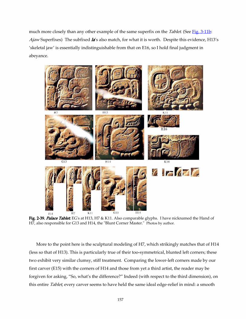
157
much more closely than any other example of the same superfix on the Tablet. (See Fig. 3-11b:
Ajaw Superfixes) The subfixed lalalala’s also match, for what it is worth. Despite this evidence, H13’s
‘skeletal jaw’ is essentially indistinguishable from that on E16, so I hold final judgment in
abeyance.
Fig. 2Fig. 2Fig. 2Fig. 2----39. 39. 39. 39. Palace TabletPalace TabletPalace TabletPalace Tablet:::: EG's at H13, H7 & K11. Also comparable glyphs. I have nicknamed the Hand of H7, also responsible for G13 and H14, the "Blunt Corner Master." Photos by author.
More to the point here is the sculptural modeling of H7, which strikingly matches that of H14
(less so that of H13). This is particularly true of their too-symmetrical, blunted left corners; these
two exhibit very similar clumsy, stiff treatment. Comparing the lower-left corners made by our
first carver (E15) with the corners of H14 and those from yet a third artist, the reader may be
forgiven for asking, “So, what’s the difference?” Indeed (with respect to the third dimension), on
this entire Tablet, every carver seems to have held the same ideal edge-relief in mind: a smooth
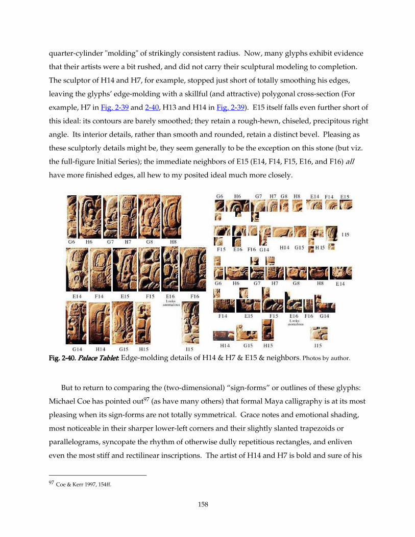
158
quarter-cylinder "molding" of strikingly consistent radius. Now, many glyphs exhibit evidence
that their artists were a bit rushed, and did not carry their sculptural modeling to completion.
The sculptor of H14 and H7, for example, stopped just short of totally smoothing his edges,
leaving the glyphs’ edge-molding with a skillful (and attractive) polygonal cross-section (For
example, H7 in Fig. 2-39 and 2-40, H13 and H14 in Fig. 2-39). E15 itself falls even further short of
this ideal: its contours are barely smoothed; they retain a rough-hewn, chiseled, precipitous right
angle. Its interior details, rather than smooth and rounded, retain a distinct bevel. Pleasing as
these sculptorly details might be, they seem generally to be the exception on this stone (but viz.
the full-figure Initial Series); the immediate neighbors of E15 (E14, F14, F15, E16, and F16) all
have more finished edges, all hew to my posited ideal much more closely.
Fig. 2Fig. 2Fig. 2Fig. 2----40. 40. 40. 40. Palace TabletPalace TabletPalace TabletPalace Tablet:::: Edge-molding details of H14 & H7 & E15 & neighbors. Photos by author.
But to return to comparing the (two-dimensional) “sign-forms” or outlines of these glyphs:
Michael Coe has pointed out97 (as have many others) that formal Maya calligraphy is at its most
pleasing when its sign-forms are not totally symmetrical. Grace notes and emotional shading,
most noticeable in their sharper lower-left corners and their slightly slanted trapezoids or
parallelograms, syncopate the rhythm of otherwise dully repetitious rectangles, and enliven
even the most stiff and rectilinear inscriptions. The artist of H14 and H7 is bold and sure of his
97 Coe & Kerr 1997, 154ff.
159
work, deeply cutting every detail. He does indeed incorporate a few slanted formlines, such as
the three elements at the top of the EG (H7) and the ‘head’ of the Nal and the inner spiral and the
‘bar’ across the left outer border of yiyiyiyi. But the lower left corner of these glyphs is perfectly
geometrical, a quarter-circle rounding a strict right angle, unlike the corners of E16, F15, and the
like. On both elements of the K'uh ‘water group’ prefix of the EG, on the yiyiyiyi, even on the obtuse
angle of the ‘hand’ and acute angle of the Nal, this overly-symmetrical corner reminds me of a
fully-inflated air-mattress. The temper of this artist’s carving might be described as “stolid” or
“competent” rather than “graceful” or “lyrical.” Compare his corners with those of other artists
in this illustration (Fig. 2-40). All of the others exhibit some (usually pleasing) asymmetry, an
echo of the cursive motions of less formal calligraphy.
This Stolid artist's territory is, however, gerrymandered. We have attributed to his Hand
H14, H13, and H7; the first two of these are in an island of six glyphs surrounded by two other
Artists' more extensive territories. (These are the L14 Master [see below] and the
abovementioned E15 Master [see Figs. 4-01 and 4-04 respectively]). Interestingly, H7 and H13
abut the two identical phonetic spellings of Pakal's name (at G6-H6-G7 and J12-I13-J13, see Fig.
1-95, Fig. 3-104). H7 is even his EG title. The L14 Master carved the K'inich title at J12, but he
certainly did not carve the rest of the name. And a brilliant Artist —perhaps the Master of the
whole project98— carved the "Jaguar Throne of Creation" and its facing "Snake Throne" head,
resting directly on G6 and H6. However, the style of G6 and H6 does not much resemble his
delicately-detailed glyphs at A15-B19 and C14-D19. I think that this Master did indeed carve the
three glyphs of Pakal's name at G6-G7. And I have always been suspicious of the almost-
identical big-nosed papapapa's in both these renderings. The affixes and crosshatching do not match
(and the Janabs are certainly distinct Hands), but the two papapapa's are otherwise almost identical, too
close to discern with assurance, using my criteria. Perhaps the "Stolid Master" who carved
Pakal's archaistic name and titles up at G6-H7 also did part of the Pakal down at J13—or at least
laid the glyph out. It is just possible that he shaped both big-nosed heads, but left the detailing
and the affixes (of at least one of them) to someone else.
In a section 2.6 below I examine the evidence of the range of Artists who carved the Full-
Figure Initial Series. For scrutiny of the other Hands (such as the L14 "Itz'i-Winik" Master) who
rubbed elbows (literally) with the E15 Master, see Chapter 3. Close, detailed examinations there
98 I attribute to him not only this Jaguar and the left Snake head of the middle Throne, but the last and finest of the Full-Figure
Glyphs and the block of twenty glyphs below it. See below.
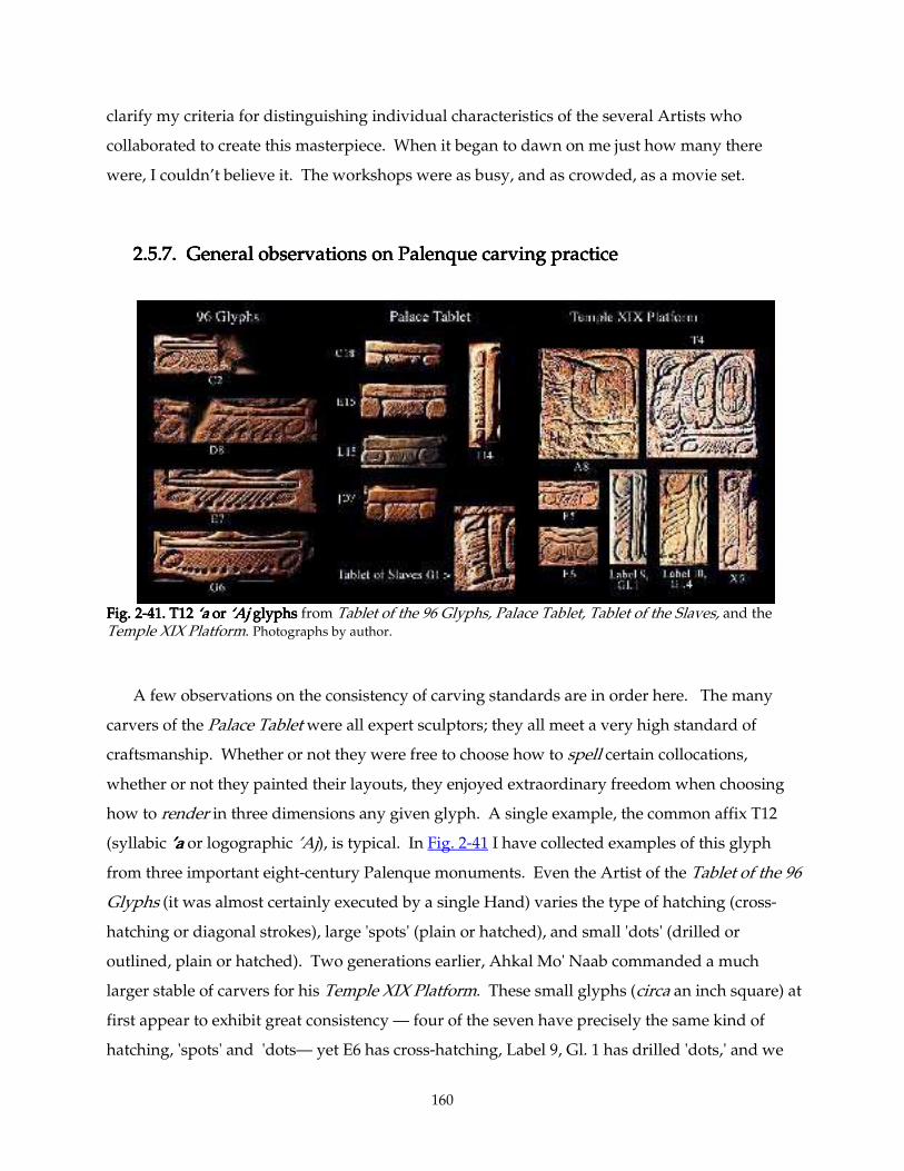
160
clarify my criteria for distinguishing individual characteristics of the several Artists who
collaborated to create this masterpiece. When it began to dawn on me just how many there
were, I couldn’t believe it. The workshops were as busy, and as crowded, as a movie set.
2.5.7. General observations on Palenque carving practice2.5.7. General observations on Palenque carving practice2.5.7. General observations on Palenque carving practice2.5.7. General observations on Palenque carving practice
Fig. 2Fig. 2Fig. 2Fig. 2----41. T12 41. T12 41. T12 41. T12 ‘a‘a‘a‘a or or or or ‘A‘A‘A‘Ajjjj glyphs glyphs glyphs glyphs from Tablet of the 96 Glyphs, Palace Tablet, Tablet of the Slaves, and the Temple XIX Platform. Photographs by author.
A few observations on the consistency of carving standards are in order here. The many
carvers of the Palace Tablet were all expert sculptors; they all meet a very high standard of
craftsmanship. Whether or not they were free to choose how to spell certain collocations,
whether or not they painted their layouts, they enjoyed extraordinary freedom when choosing
how to render in three dimensions any given glyph. A single example, the common affix T12
(syllabic ’a’a’a’a or logographic ’Aj), is typical. In Fig. 2-41 I have collected examples of this glyph
from three important eight-century Palenque monuments. Even the Artist of the Tablet of the 96
Glyphs (it was almost certainly executed by a single Hand) varies the type of hatching (cross-
hatching or diagonal strokes), large 'spots' (plain or hatched), and small 'dots' (drilled or
outlined, plain or hatched). Two generations earlier, Ahkal Mo' Naab commanded a much
larger stable of carvers for his Temple XIX Platform. These small glyphs (circa an inch square) at
first appear to exhibit great consistency — four of the seven have precisely the same kind of
hatching, 'spots' and 'dots— yet E6 has cross-hatching, Label 9, Gl. 1 has drilled 'dots,' and we
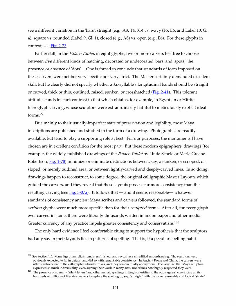
161
see a different variation in the 'bars': straight (e.g., A8, T4, X5) vs. wavy (F5, E6, and Label 10, G.
4), square vs. rounded (Label 9, Gl. 1), closed (e.g., A8) vs. open (e.g., E6). For these glyphs in
context, see Fig. 2-23.
Earlier still, in the Palace Tablet, in eight glyphs, five or more carvers feel free to choose
between five different kinds of hatching, decorated or undecorated 'bars' and 'spots,' the
presence or absence of 'dots'… One is forced to conclude that standards of form imposed on
these carvers were neither very specific nor very strict. The Master certainly demanded excellent
skill, but he clearly did not specify whether a ko-syllable's longitudinal bands should be straight
or curved, thick or thin, outlined, raised, sunken, or crosshatched (Fig. 2-41). This tolerant
attitude stands in stark contrast to that which obtains, for example, in Egyptian or Hittite
hieroglyph carving, whose sculptors were extraordinarily faithful to meticulously explicit ideal
forms.99
Due mainly to their usually-imperfect state of preservation and legibility, most Maya
inscriptions are published and studied in the form of a drawing. Photographs are readily
available, but tend to play a supporting role at best. For our purposes, the monuments I have
chosen are in excellent condition for the most part. But these modern epigraphers' drawings (for
example, the widely-published drawings of the Palace Tablet by Linda Schele or Merle Greene
Robertson, Fig. 1-78) minimize or eliminate distinctions between, say, a sunken, or scooped, or
sloped, or merely outlined area, or between lightly-carved and deeply-carved lines. In so doing,
drawings happen to reconstruct, to some degree, the original calligraphic Master Layouts which
guided the carvers, and they reveal that these layouts possess far more consistency than the
resulting carving (see Fig. 3-07a). It follows that — and it seems reasonable— whatever
standards of consistency ancient Maya scribes and carvers followed, the standard forms of
written glyphs were much more specific than for their sculpted forms. After all, for every glyph
ever carved in stone, there were literally thousands written in ink on paper and other media.
Greater currency of any practice impels greater consistency and conservatism.100
The only hard evidence I feel comfortable citing to support the hypothesis that the sculptors
had any say in their layouts lies in patterns of spelling. That is, if a peculiar spelling habit
99 See Section 1.5. Many Egyptian reliefs remain unfinished, and reveal very simplified underdrawing. The sculptors were
obviously expected to fill in details, and did so with remarkable consistency. In Ancient Rome and China, the carvers were utterly subservient to the calligrapher's brushstrokes, and they remain totally anonymous. The very fact that Maya sculptors expressed so much individuality, even signing their work in many sites, underlines how highly respected they were.
100 The presence of so many "silent letters" and other archaic spellings in English testifies to the odds against convincing all its hundreds of millions of literate speakers to replace the spelling of, say, "straight" with the more reasonable and logical "strate."
162
covaries with a specific carver's work (consistent choice of, say, T232 versus its allographs T1 or
T13 for ’u’u’u’u), I believe one is then justified in claiming that that artist was given a Master layout on
paper, but painted his own layouts —changing spellings or other minor details here and there—
onto the stone before carving. I originally included the unusual spellings of Janab Pakal at H6-
G7 and at I13-J13 (Fig. 1-95) or the rare la-ta suffixes at M6, N6, J14 and M13 (Fig. 2-42), to
support a hypothesis that one a Hand might lay out a text that his buddy ended up carving. But
we cannot rule out the possibility of a yet-undistinguished connotation to the use of an "archaic"
spelling of Janab Pakal or to the -la-ta suffix, so I am forced to withdraw them from evidence. If
some future epigrapher demonstrates that these unusual spellings are indeed random, that they
have no hidden connotation and fully substitute with other spellings, then we may cite their
distribution as evidence to define more specifically the carvers' design-and-execution
procedures.
Fig. 2Fig. 2Fig. 2Fig. 2----44442. 2. 2. 2. Palace TabletPalace TabletPalace TabletPalace Tablet: Four rare : Four rare : Four rare : Four rare lalalala----tatatata suffixes on Distance Numbers (counting toward death dates), and a suffixes on Distance Numbers (counting toward death dates), and a suffixes on Distance Numbers (counting toward death dates), and a suffixes on Distance Numbers (counting toward death dates), and a comparable calendric. comparable calendric. comparable calendric. comparable calendric. Three different Artists. Photographs by author.
2.6. 2.6. 2.6. 2.6. The FullThe FullThe FullThe Full----Figure Initial Series Hand(s)Figure Initial Series Hand(s)Figure Initial Series Hand(s)Figure Initial Series Hand(s)
2.6.0. Introduction2.6.0. Introduction2.6.0. Introduction2.6.0. Introduction
In this section we'll come to the surprising conclusion that at least three Hands worked on
three successive full-figure glyphs (the ‘Bak'tun,’ ‘K'atun,’ and ‘Tun’). Further, one of these
crowded Artists carved parts of two adjacent glyphs (Figs. 2-47 through 2-50, 3-78). Now, these
163
intricate glyphs are less than a square foot in size; it is hard to imagine all this happening at once;
the masters and apprentices must have taken turns or worked different shifts, and perhaps one
or more of the most-highly-skilled masters kept busy, flitting about like a hummingbird,
correcting here, encouraging there, filling in a face or a hand or other more sophisticated detail
for this or that colleague. The workshop must have been an intense scene, filled with activity
and very close collaboration among a large, highly-skilled, and motivated team.
2.6.1 From the Top (See also section 32.6.1 From the Top (See also section 32.6.1 From the Top (See also section 32.6.1 From the Top (See also section 3----07, for comparisons in greater detail.)07, for comparisons in greater detail.)07, for comparisons in greater detail.)07, for comparisons in greater detail.)
The ‘Initial Series’ of the Palace Tablet is the only known full-figure glyph text at Palenque.101
Its use here, combined with its location and size, underscores the extreme importance invested in
this Tablet as an expression of Palenque royal power. This most impressive part of this most
impressive inscription is arguably the part that would be assigned to a most respected artist, a
senior, ranking artist, perhaps the director of the entire project. And certainly its execution, its
style, its flavor, is powerful and consistent (at least through the 12thth row, on which more later).
In particular, these full-figure glyphs are simpler and more legible than those carved (a bit later)
at Copan and especially at Quirigua; our artist has arranged the interlocked figures simply
seated quietly side by side, rather than (as at Quirigua) locked in a violent, contorted struggle
which renders the protagonists almost indistinguishably tangled. (Fig. 2-12)
101 Full-figure glyphs are a rarity in the Maya corpus. We find their most consistent employment at Copan and Quirigua, (e.g.,
Stela D at both sites). One lesser-known example closer to Palenque is a throne inscription at Yaxchilan (Mathews, Peter, private communication),, and occasionally a full-figure will drift into an otherwise normal text. A hybrid of this sort is the IS of Yaxchilan Lintel 48, whose ‘head-variant’ IS has a full-figure ‘k’in monkey,’ holding ‘head-variant’ forms of the numerals 10 and 6 which form its coefficient 16. The standard format for a full-figure glyph collocation is rather limited. Each block usually consists of a pair of figures representing two glyphs. Phonetic affixes, which commonly complement the ‘bak’tun,’ ‘k’atun’, and ‘winal’ glyphs in their abstract form, are universally absent in full-figure variants, and almost so with head-variants. Since most full-figure texts are Initial Series Long Counts, the glyphs are nearly all calendric, of the formula ISIG, X ‘bak’tun’, Y ‘k’atun,’ Z ‘tun,’ A ‘winal,’ B ‘k’in,’ C (daysign); where numerical coefficients are represented by the X, Y, … C letters. The numerals are usually humanoid figures, often marked with ‘god-signs’ on legs and arms, with diagnostic heads more or less identical with the commoner ‘head-variant’ glyphs for the numerals For example, the number 9 is the Hero Twin Xbalanque, a young man wearing patches of jaguar skin on his upper arms, legs, and around his mouth. The ‘head-variant’ for 9 is the head of the same fellow, with the diagnostic patch of fur on his mouth. Another example: The ‘Tun Bird’ is a chimerical combination of raptor, human skull, and jaguar; its usual head-form is a beaked, feathered head with a jaguar’s eye and a human jawbone replacing the lower beak. The ‘full-figure’ form of this creature has the usual head, but on a humanoid body with feathered wings, and bird-clawed hands and feet. The Palace Tablet’s ‘Tun Bird’ also wears a fancy earring, pectoral and collar, the latter of woven-fiber supporting ‘death-eyes’ and a cropped fringe.
In the case of collocations where more than two glyphs combine, such as the ISIG or, on Copan Stela D, in the ‘Supplementary Series,’ usually the third and fourth elements appear in their simple or abstract form, for example the ‘combs’ flanking the ‘patron,’ or the Haab ‘drum’ on the ISIG.
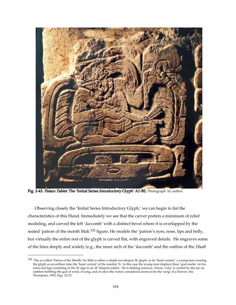
164
Fig. 2Fig. 2Fig. 2Fig. 2----43. 43. 43. 43. Palace TabletPalace TabletPalace TabletPalace Tablet. The ‘Initial Series Introductory Gly. The ‘Initial Series Introductory Gly. The ‘Initial Series Introductory Gly. The ‘Initial Series Introductory Glyph’ A1ph’ A1ph’ A1ph’ A1----B2. B2. B2. B2. Photograph by author.
Observing closely the ‘Initial Series Introductory Glyph,’ we can begin to list the
characteristics of this Hand. Immediately we see that the carver prefers a minimum of relief
modeling, and carved the left ‘ka-comb’ with a distinct bevel where it is overlapped by the
seated ‘patron of the month Mak’102 figure. He models the ‘patron’s eyes, nose, lips and belly,
but virtually the entire rest of the glyph is carved flat, with engraved details. He engraves some
of the lines deeply and widely (e.g., the inner arch of the ‘ka-comb’ and the outline of the Haab
102 The so-called ‘Patron of the Month’ for Mak is either a simple tau-shaped Ik’ glyph, or its ‘head variant,’ a young man wearing
the glyph as an earflare (also the ‘head variant’ of the number 3). In this case the young man displays three ‘god-marks’ on his arms and legs consisting of the Ik’ sign in an Ik’-shaped outline. He is shaking maracas, whose ‘voice’ is carried by the air; an emblem befitting the god of wind, of song, and of odor (the Aztecs considered aroma to be the ‘song’ of a flower). See Thompson, 1950, Figs. 22-23
165
‘drum’), so widely as to create the illusion of modeling. This Hand distinguishes the glyphic
elements of the collocation with bold outlines or with planar foreground-background
distinctions. A good example of the latter is the recessed background area round the head and
torso of the ‘patron.’ The damaged tripartite tzi that surmounts the ISIG is essentially flat, but
carved sloping toward the background, so that its lower area essentially becomes background
behind the ‘patron.’ Likewise the right ‘ka-comb’ sinks downward toward the left, becoming the
background plane behind the ‘patron’s arm and torso. Where the ‘patron’s left ‘hand’ (our right)
and ‘instrument’ overlaps the ‘ka-comb,’ the artist has subtly sunk the surface of the ‘comb’ in
order to place it visually on a more recessed plane, to bring the ‘hand’ and ‘wand’/’rattle’
forward.
In other words, this carver perceives the glyph as a collection of overlapping graphic planar
shapes, rather than as overlapping sculptural objects.
His right ‘ka-comb’ alternates deeply- with lightly-engraved ‘teeth,’ curved in the usual way.
Its matching ‘comb’ to the left seems unfinished,103 both in its abruptly-beveled planes and in its
tentative secondary ‘teeth.’ The ‘combs’ both exhibit a powerfully calligraphic form, especially
the left ’comb’s unmistakable lean to the right. This same lean or slant can be seen, more subtly,
in the asymmetric ends of the otherwise sausage-shaped Haab ‘drum.’ This Hand expunges
extraneous details and decorative touches from his glyphs, which is a key element in their clarity
and legibility. However, someone (maybe a colleague) added a surprisingly delicate touch,
carving tiny knuckle-wrinkles just behind the god’s left big toenail. (Other "fine" details, such as
the crosshatching just below, seem Gargantuan by comparison.) Details like toenails and
fingernails, where present, are skillful and accurate, though his right hand, across his chest, is
noticeably awkward, particularly around the thumb. We see the same sort of awkwardly-drawn
hands on many figures at Palenque, such as the Father and Mother on the Tablet of the Slaves
(see Fig. 2-60), and the figures on the West side of the Temple XIX Platform (see Figs. 1-28, 1-
49ff). His left hand seems more natural, despite the unnatural grip with the little finger lifted
daintily. This effetely-lifted pinky is actually a meaningful gesture, common in portrayals of
Maya handling sacred objects.104 His Ik'-shaped 'god-marks' are simply delineated, unlike the
peculiar Ik' daysign directly adjacent at C1. (The Haab ‘drum’ on which he sits does more or less
103 This 'unfinished' state comes as a surprise, particluarly of the very first glyph. It suggests that this glyph was carved near the
end of the project, as deadlines loomed large. This supports my hypothesis that the last 'full-figure' glyph (A13-B14) was carved first.
104 Its precise meaning, however, eludes us. It is gesture #15 in Ancona-Ha, Perez de Lara, and Van Stone (2000), and appears again
on the numerical coefficient figure of the ‘Winal’ at A9-10.
166
match a smaller example in the upper part of adjacent C2: its vertical 'bars,' too small for
crosshatching, the artist merely scooped concave; but he did crosshatch its supporting 'split-yi.')
The god leans far to our left, and parts his sensitively-carved lips in an expression of awe as
he tilts his head back to regard, with heavy-lidded eyes, whatever awe-inspiring vision confronts
him. He has exaggerated cranial deformation and his hair is divided subtly into four ‘locks’
which, unadorned, arch backwards and hang precisely like corn-tassels. The engraved lines
which define the strands of his hair seem rushed, a bit shaky (like the secondary lines engraved
on the left ‘comb’). He wears a single strand of large jade beads round his neck and a flori-form
earflare with a long ‘pistil’ counterweighted by a heavy jade bead (or perhaps more, this area is
damaged) hanging down behind the earlobe. His loincloth is simple and neatly carved, as are
his cloth-tasseled maracas. The ‘patron’s figure is well-proportioned, agile, and very skillfully
delineated, and surrounded by simple, careful, calligraphic abstract glyphic elements. The ISIG
Artist is indeed a masterful draftsman and, probably, a masterfully subtle if impatient —or
rushed— carver.
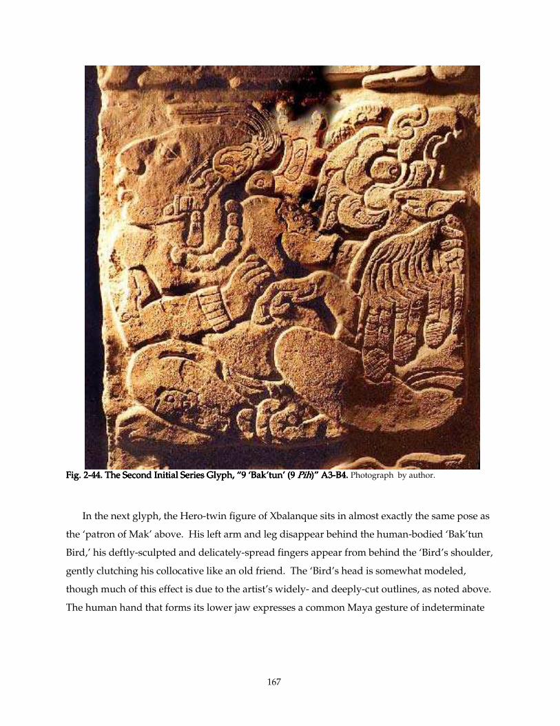
167
Fig. 2Fig. 2Fig. 2Fig. 2----44. The Second In44. The Second In44. The Second In44. The Second Initial Series Glyph, “9 ‘Bak’tun’ (9 itial Series Glyph, “9 ‘Bak’tun’ (9 itial Series Glyph, “9 ‘Bak’tun’ (9 itial Series Glyph, “9 ‘Bak’tun’ (9 PihPihPihPih)”)”)”)” A3A3A3A3----B4. B4. B4. B4. Photograph by author.
In the next glyph, the Hero-twin figure of Xbalanque sits in almost exactly the same pose as
the ‘patron of Mak’ above. His left arm and leg disappear behind the human-bodied ‘Bak’tun
Bird,’ his deftly-sculpted and delicately-spread fingers appear from behind the ‘Bird’s shoulder,
gently clutching his collocative like an old friend. The ‘Bird’s head is somewhat modeled,
though much of this effect is due to the artist’s widely- and deeply-cut outlines, as noted above.
The human hand that forms its lower jaw expresses a common Maya gesture of indeterminate
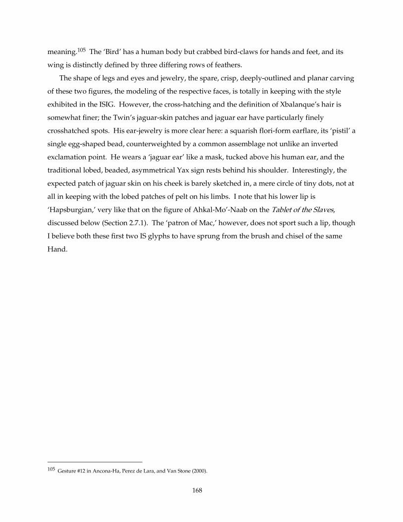
168
meaning.105 The ‘Bird’ has a human body but crabbed bird-claws for hands and feet, and its
wing is distinctly defined by three differing rows of feathers.
The shape of legs and eyes and jewelry, the spare, crisp, deeply-outlined and planar carving
of these two figures, the modeling of the respective faces, is totally in keeping with the style
exhibited in the ISIG. However, the cross-hatching and the definition of Xbalanque’s hair is
somewhat finer; the Twin’s jaguar-skin patches and jaguar ear have particularly finely
crosshatched spots. His ear-jewelry is more clear here: a squarish flori-form earflare, its ‘pistil’ a
single egg-shaped bead, counterweighted by a common assemblage not unlike an inverted
exclamation point. He wears a ‘jaguar ear’ like a mask, tucked above his human ear, and the
traditional lobed, beaded, asymmetrical Yax sign rests behind his shoulder. Interestingly, the
expected patch of jaguar skin on his cheek is barely sketched in, a mere circle of tiny dots, not at
all in keeping with the lobed patches of pelt on his limbs. I note that his lower lip is
‘Hapsburgian,’ very like that on the figure of Ahkal-Mo’-Naab on the Tablet of the Slaves,
discussed below (Section 2.7.1). The ‘patron of Mac,’ however, does not sport such a lip, though
I believe both these first two IS glyphs to have sprung from the brush and chisel of the same
Hand.
105 Gesture #12 in Ancona-Ha, Perez de Lara, and Van Stone (2000).
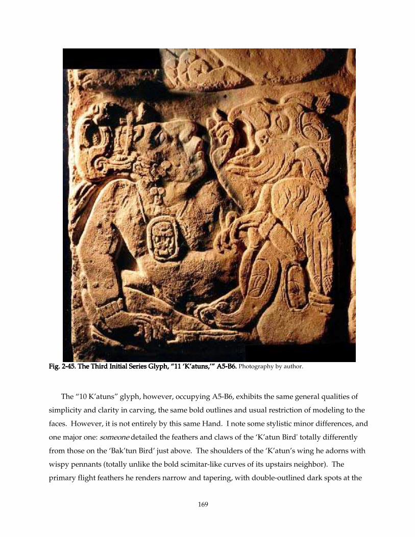
169
Fig. 2Fig. 2Fig. 2Fig. 2----45. The Third 45. The Third 45. The Third 45. The Third Initial Series Glyph, “11 ‘K’atuns,’”Initial Series Glyph, “11 ‘K’atuns,’”Initial Series Glyph, “11 ‘K’atuns,’”Initial Series Glyph, “11 ‘K’atuns,’” A5A5A5A5----B6. B6. B6. B6. Photography by author.
The “10 K’atuns” glyph, however, occupying A5-B6, exhibits the same general qualities of
simplicity and clarity in carving, the same bold outlines and usual restriction of modeling to the
faces. However, it is not entirely by this same Hand. I note some stylistic minor differences, and
one major one: someone detailed the feathers and claws of the ‘K’atun Bird' totally differently
from those on the ‘Bak’tun Bird’ just above. The shoulders of the ‘K’atun’s wing he adorns with
wispy pennants (totally unlike the bold scimitar-like curves of its upstairs neighbor). The
primary flight feathers he renders narrow and tapering, with double-outlined dark spots at the
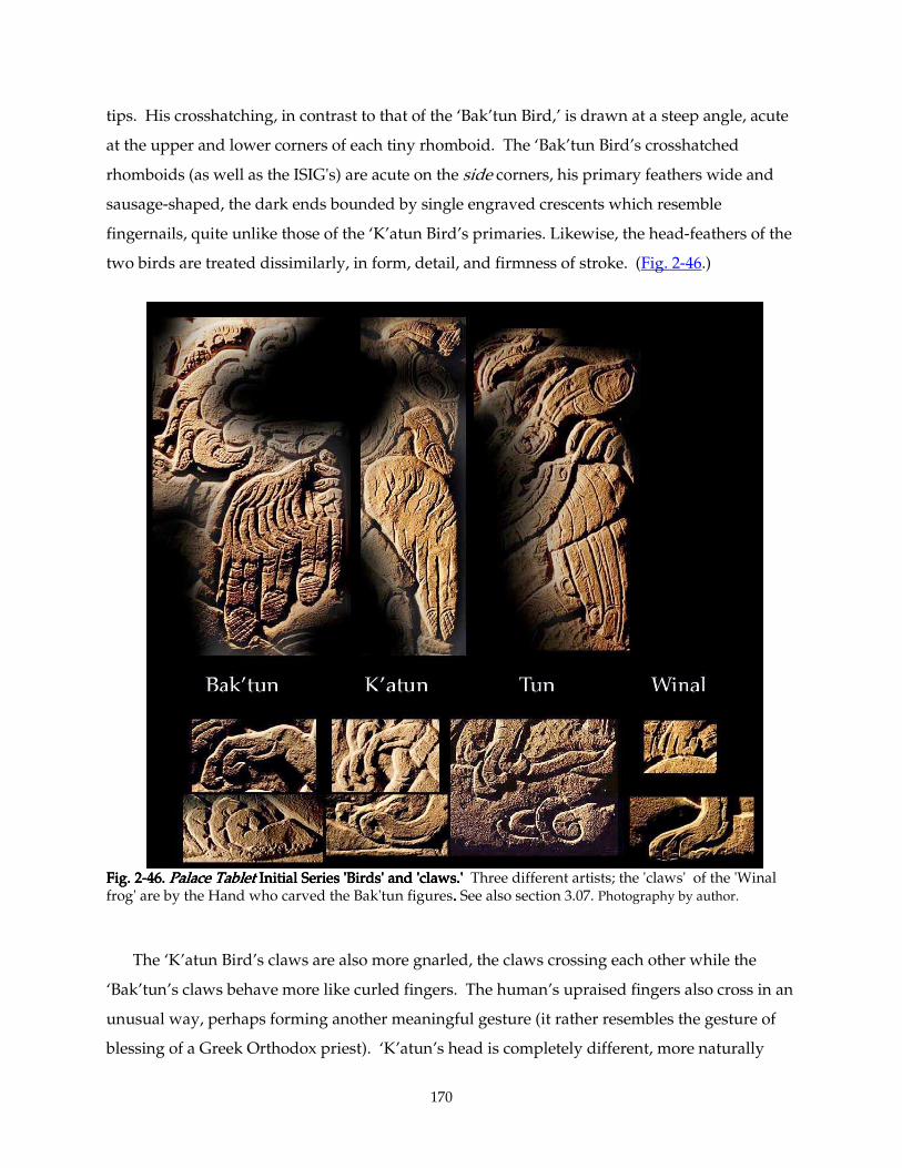
170
tips. His crosshatching, in contrast to that of the ‘Bak’tun Bird,’ is drawn at a steep angle, acute
at the upper and lower corners of each tiny rhomboid. The ‘Bak’tun Bird’s crosshatched
rhomboids (as well as the ISIG's) are acute on the side corners, his primary feathers wide and
sausage-shaped, the dark ends bounded by single engraved crescents which resemble
fingernails, quite unlike those of the ‘K’atun Bird’s primaries. Likewise, the head-feathers of the
two birds are treated dissimilarly, in form, detail, and firmness of stroke. (Fig. 2-46.)
Fig. 2Fig. 2Fig. 2Fig. 2----46. 46. 46. 46. Palace TabletPalace TabletPalace TabletPalace Tablet Initial Series 'Birds' and 'claws.' Initial Series 'Birds' and 'claws.' Initial Series 'Birds' and 'claws.' Initial Series 'Birds' and 'claws.' Three different artists; the 'claws' of the 'Winal frog' are by the Hand who carved the Bak'tun figures.... See also section 3.07. Photography by author.
The ‘K’atun Bird’s claws are also more gnarled, the claws crossing each other while the
‘Bak’tun’s claws behave more like curled fingers. The human’s upraised fingers also cross in an
unusual way, perhaps forming another meaningful gesture (it rather resembles the gesture of
blessing of a Greek Orthodox priest). ‘K’atun’s head is completely different, more naturally
171
avian than the ‘Bak’tun’s, though its eye is rendered as if it were a human eye. The lackluster
sculpting of the ‘K’atun’s wing and cheek feathers presents a surprising contrast, however, to the
masterful assurance of the rest of its head, its clawed feet and ‘hands,’ especially the ‘mirror’ on
its cranium (Fig. 2-47). I am tempted to suggest that the artist who carved the wings and body of
this ‘Bird’ might have been a lowly apprentice to the master who sculpted its face, its claws, and
the human figure.
Fig. 2Fig. 2Fig. 2Fig. 2----47. 47. 47. 47. Palace TabletPalace TabletPalace TabletPalace Tablet Initial Series 'Bird heads.' Initial Series 'Bird heads.' Initial Series 'Bird heads.' Initial Series 'Bird heads.' Three different artists. Photography by author.
Yet the ‘K’atun’s human coefficient (he is not ‘god-marked’), the full-figure numeral 10, also
might be a different Hand than that of the first two glyphs. His nose and pectoral muscles are
more carefully modeled. His jade-bar bracelet is different; especially it is too tight for his
corpulent wrist (though the rest of his body seems trim). His earring assemblage seems more
carefully detailed, quite a different portrayal than the apparently similar earflare and ‘pistil’ on
the ‘Bak’tun’ just above. The head-variant of the numeral 10 usually takes the form of a skull, of
the Death God A, but here it appears as a human wearing a skull headdress. Our Hand has
carved that skull quite lovingly and in comparatively high relief; its deep-set, bulging eye has a
large crosshatched pupil, its cranium is well-rounded, its jaws bold and ferocious. The man also
wears a narrow striped headband holding a flame-like diadem against his forehead; this too is in
unprecedentedly high relief.
All in all, parts of this glyph exhibit a slightly more volumetric, expert sculptural quality than
the glyphs above, while other parts (the wings) seem tentative and less skilled. The man’s face
has a somewhat different eye-shape (as well as earflare-shape) and more assertive expression,
though this could be due to an artist's wish to express a different intention. The artist did
portray this man earnestly conversing with the 'K'atun Bird,' in contrast to the 'Bak'tun Bird' and
its coefficient, who steadfastly focus their attention in opposite directions. The fingers and claws
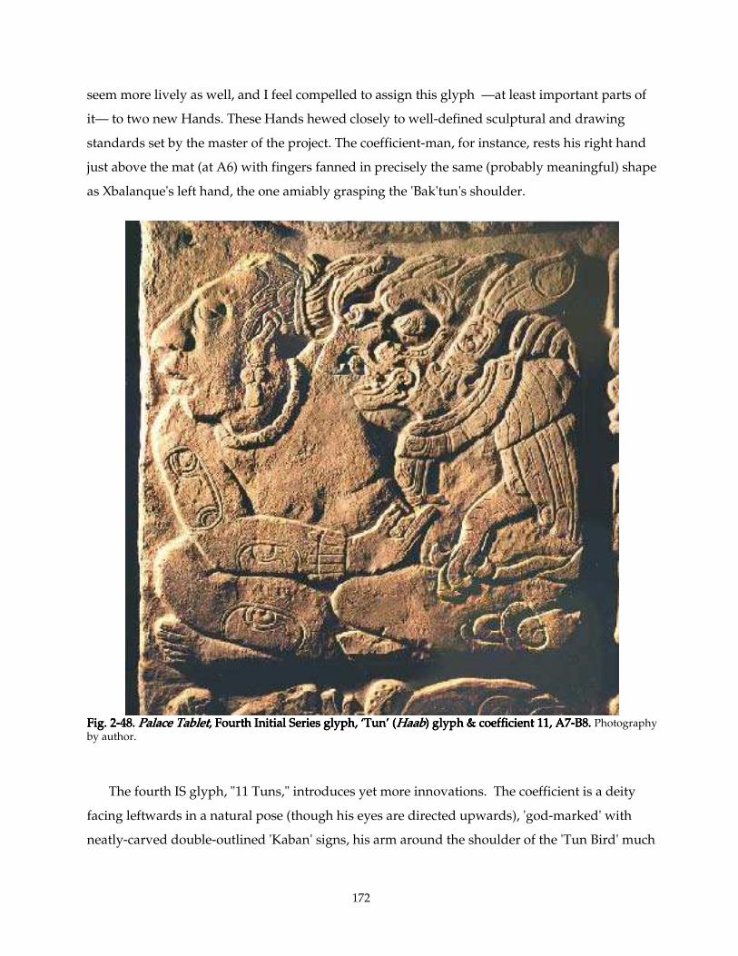
172
seem more lively as well, and I feel compelled to assign this glyph —at least important parts of
it— to two new Hands. These Hands hewed closely to well-defined sculptural and drawing
standards set by the master of the project. The coefficient-man, for instance, rests his right hand
just above the mat (at A6) with fingers fanned in precisely the same (probably meaningful) shape
as Xbalanque's left hand, the one amiably grasping the 'Bak'tun's shoulder.
FigFigFigFig. 2. 2. 2. 2----48. 48. 48. 48. Palace TabletPalace TabletPalace TabletPalace Tablet, Fourth Initial Series glyph, ‘Tun’ (, Fourth Initial Series glyph, ‘Tun’ (, Fourth Initial Series glyph, ‘Tun’ (, Fourth Initial Series glyph, ‘Tun’ (HaabHaabHaabHaab) glyph & coefficient 11, A7) glyph & coefficient 11, A7) glyph & coefficient 11, A7) glyph & coefficient 11, A7----B8. B8. B8. B8. Photography by author.
The fourth IS glyph, "11 Tuns," introduces yet more innovations. The coefficient is a deity
facing leftwards in a natural pose (though his eyes are directed upwards), 'god-marked' with
neatly-carved double-outlined 'Kaban' signs, his arm around the shoulder of the 'Tun Bird' much
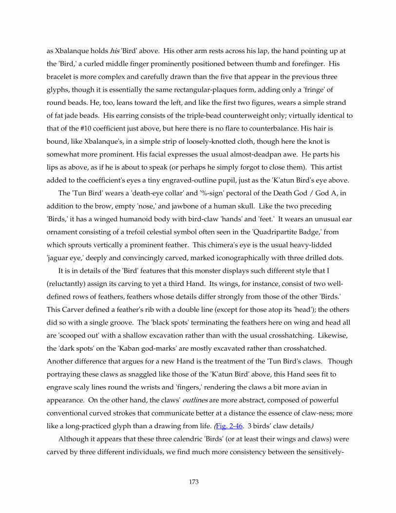
173
as Xbalanque holds his 'Bird' above. His other arm rests across his lap, the hand pointing up at
the 'Bird,' a curled middle finger prominently positioned between thumb and forefinger. His
bracelet is more complex and carefully drawn than the five that appear in the previous three
glyphs, though it is essentially the same rectangular-plaques form, adding only a 'fringe' of
round beads. He, too, leans toward the left, and like the first two figures, wears a simple strand
of fat jade beads. His earring consists of the triple-bead counterweight only; virtually identical to
that of the #10 coefficient just above, but here there is no flare to counterbalance. His hair is
bound, like Xbalanque's, in a simple strip of loosely-knotted cloth, though here the knot is
somewhat more prominent. His facial expresses the usual almost-deadpan awe. He parts his
lips as above, as if he is about to speak (or perhaps he simply forgot to close them). This artist
added to the coefficient's eyes a tiny engraved-outline pupil, just as the 'K'atun Bird's eye above.
The 'Tun Bird' wears a 'death-eye collar' and '%-sign' pectoral of the Death God / God A, in
addition to the brow, empty 'nose,' and jawbone of a human skull. Like the two preceding
'Birds,' it has a winged humanoid body with bird-claw 'hands' and 'feet.' It wears an unusual ear
ornament consisting of a trefoil celestial symbol often seen in the 'Quadripartite Badge,' from
which sprouts vertically a prominent feather. This chimera's eye is the usual heavy-lidded
'jaguar eye,' deeply and convincingly carved, marked iconographically with three drilled dots.
It is in details of the 'Bird' features that this monster displays such different style that I
(reluctantly) assign its carving to yet a third Hand. Its wings, for instance, consist of two well-
defined rows of feathers, feathers whose details differ strongly from those of the other 'Birds.'
This Carver defined a feather's rib with a double line (except for those atop its 'head'); the others
did so with a single groove. The 'black spots' terminating the feathers here on wing and head all
are 'scooped out' with a shallow excavation rather than with the usual crosshatching. Likewise,
the 'dark spots' on the 'Kaban god-marks' are mostly excavated rather than crosshatched.
Another difference that argues for a new Hand is the treatment of the 'Tun Bird's claws. Though
portraying these claws as snaggled like those of the 'K'atun Bird' above, this Hand sees fit to
engrave scaly lines round the wrists and 'fingers,' rendering the claws a bit more avian in
appearance. On the other hand, the claws' outlines are more abstract, composed of powerful
conventional curved strokes that communicate better at a distance the essence of claw-ness; more
like a long-practiced glyph than a drawing from life. (Fig. 2-46. 3 birds’ claw details)
Although it appears that these three calendric 'Birds' (or at least their wings and claws) were
carved by three different individuals, we find much more consistency between the sensitively-
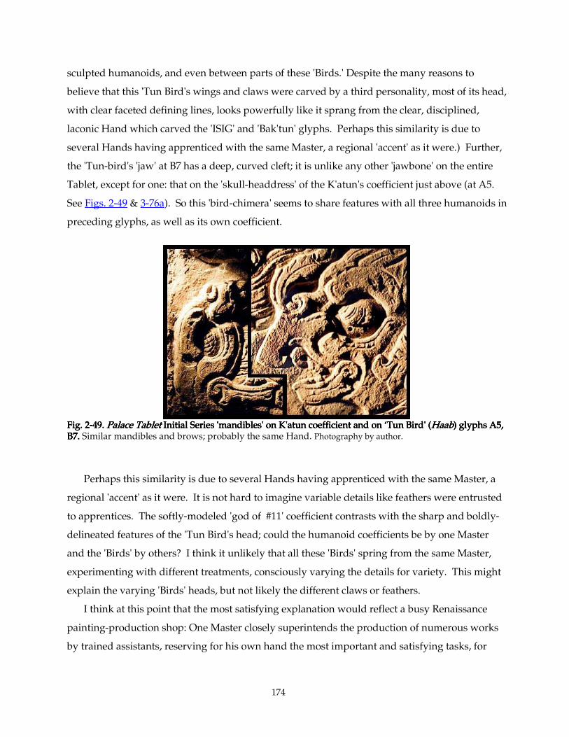
174
sculpted humanoids, and even between parts of these 'Birds.' Despite the many reasons to
believe that this 'Tun Bird's wings and claws were carved by a third personality, most of its head,
with clear faceted defining lines, looks powerfully like it sprang from the clear, disciplined,
laconic Hand which carved the 'ISIG' and 'Bak'tun' glyphs. Perhaps this similarity is due to
several Hands having apprenticed with the same Master, a regional 'accent' as it were.) Further,
the 'Tun-bird's 'jaw' at B7 has a deep, curved cleft; it is unlike any other 'jawbone' on the entire
Tablet, except for one: that on the 'skull-headdress' of the K'atun's coefficient just above (at A5.
See Figs. 2-49 & 3-76a). So this 'bird-chimera' seems to share features with all three humanoids in
preceding glyphs, as well as its own coefficient.
Fig. 2Fig. 2Fig. 2Fig. 2----49. 49. 49. 49. Palace TabletPalace TabletPalace TabletPalace Tablet Initial Series 'mandibles' on K'atun coefficient and on ‘Tun Bird' ( Initial Series 'mandibles' on K'atun coefficient and on ‘Tun Bird' ( Initial Series 'mandibles' on K'atun coefficient and on ‘Tun Bird' ( Initial Series 'mandibles' on K'atun coefficient and on ‘Tun Bird' (HaabHaabHaabHaab) glyphs A5, ) glyphs A5, ) glyphs A5, ) glyphs A5, B7. B7. B7. B7. Similar mandibles and brows; probably the same Hand. Photography by author.
Perhaps this similarity is due to several Hands having apprenticed with the same Master, a
regional 'accent' as it were. It is not hard to imagine variable details like feathers were entrusted
to apprentices. The softly-modeled 'god of #11' coefficient contrasts with the sharp and boldly-
delineated features of the 'Tun Bird's head; could the humanoid coefficients be by one Master
and the 'Birds' by others? I think it unlikely that all these 'Birds' spring from the same Master,
experimenting with different treatments, consciously varying the details for variety. This might
explain the varying 'Birds' heads, but not likely the different claws or feathers.
I think at this point that the most satisfying explanation would reflect a busy Renaissance
painting-production shop: One Master closely superintends the production of numerous works
by trained assistants, reserving for his own hand the most important and satisfying tasks, for
175
example portrait faces. In our case, the Master's work would more likely be found in the Initial
Series and the master layout of the whole Tablet than anywhere else. Under this scenario, the
parameters for sculpting human figures seem to be much more closely standardized than that for
birds and chimeras. And, as we shall see, at least some of the artists were free to employ their
own preferred spelling for some glyphs, which indicates that the master layout was more of a
sketch than a rigidly-followed fully-detailed drawing.
Fig.Fig.Fig.Fig. 2 2 2 2----50. 50. 50. 50. Palace TabletPalace TabletPalace TabletPalace Tablet, The fifth IS glyph, A9, The fifth IS glyph, A9, The fifth IS glyph, A9, The fifth IS glyph, A9----B10, '17 Winal.' B10, '17 Winal.' B10, '17 Winal.' B10, '17 Winal.' Photography by author.
On the fifth IS glyph, one discerns at first glance many similarities between the 'Winal Frog'
(B9-B10) and the 'Tun Bird' (B7-B8): their heavy eyelids and flat brow ridges, the 'Frog's belly
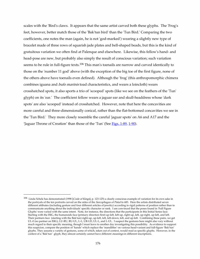
176
scales with the 'Bird's claws. It appears that the same artist carved both these glyphs. The 'Frog's
feet, however, better match those of the 'Bak'tun bird' than the 'Tun Bird.' Comparing the two
coefficients, one notes the man (again, he is not 'god-marked') wearing a slightly new type of
bracelet made of three rows of squarish jade plates and bell-shaped beads, but this is the kind of
gratuitous variation we often find at Palenque and elsewhere. Likewise, this fellow's hand- and
head-pose are new, but probably also simply the result of conscious variation; such variation
seems to be rule in full-figure texts.106 This man's toenails are narrow and carved identically to
those on the 'number 11 god' above (with the exception of the big toe of the first figure, none of
the others above have toenails even defined). Although the 'frog' (this anthropomorphic chimera
combines iguana and bufo marinis toad characteristics, and wears a loincloth) wears
crosshatched spots, it also sports a trio of 'scooped' spots (like we see on the feathers of the 'Tun'
glyph) on its 'ear.' The coefficient fellow wears a jaguar ear and skull-headdress whose 'dark
spots' are also 'scooped' instead of crosshatched. However, note that here the concavities are
more careful and three-dimensionally conical, rather than the flat-bottomed concavities we see in
the 'Tun Bird.' They more closely resemble the careful 'jaguar spots' on A6 and A17 and the
‘Jaguar Throne of Creation’ than those of the 'Tun' (See Figs. 1-89, 1-90).
106 Linda Schele has demonstrated (1998 [Code of Kings], p. 123-125) a clearly conscious example of variation for its own sake in
the portryals of the ten portraits carved on the sides of the Sarcophagus of Pakal in 683. Here the artists distributed seven different attibutes (including gesture and four different articles of jewelry) according to rigid patterns of position rather than to communicate anything about the individuals' specific character or rank. I am convinced that the poses found in 'Full Figure Glyphs' were varied with the same intent. Note, for instance, the directions that the participants in this Initial Series face: Starting with the ISIG, the humanoids face (primary direction first) up-left, left-up, right-up, left, up-right, up-left, and left. Their partners face (starting with the Bak'tun) right-up, up-left, left, left-down, left, and up-left. Combining these pairs, we get UL-0 (no partner on ISIG), LU-RU, RU-UL, L-L, UR-LD, UL-L, and L-UL. I suspect the gestures here might also vary without much regard to their specific meaning, though I must leave to another day investigating this possibility. As evidence to support this suspicion, compare the position of ‘hands’ which replace the ‘mandibles’ on various head-variant and full-figure ‘Bak’tun’ glyphs. They assume a variety of gestures, some of which, taken out of context, would read as specific glyphs. However, in the context of a ‘Bak’tun’ glyph, they almost certainly cannot have different meanings in different inscriptions.
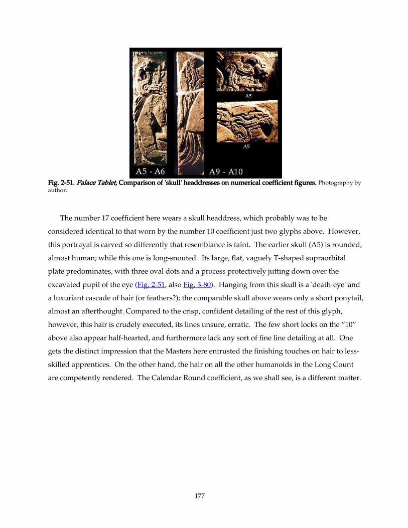
177
Fig.Fig.Fig.Fig. 2 2 2 2----55551. 1. 1. 1. Palace TabletPalace TabletPalace TabletPalace Tablet, Comparison of 'skull' headdresses on numerical coefficient figures. , Comparison of 'skull' headdresses on numerical coefficient figures. , Comparison of 'skull' headdresses on numerical coefficient figures. , Comparison of 'skull' headdresses on numerical coefficient figures. Photography by author.
The number 17 coefficient here wears a skull headdress, which probably was to be
considered identical to that worn by the number 10 coefficient just two glyphs above. However,
this portrayal is carved so differently that resemblance is faint. The earlier skull (A5) is rounded,
almost human; while this one is long-snouted. Its large, flat, vaguely T-shaped supraorbital
plate predominates, with three oval dots and a process protectively jutting down over the
excavated pupil of the eye (Fig. 2-51, also Fig. 3-80). Hanging from this skull is a 'death-eye' and
a luxuriant cascade of hair (or feathers?); the comparable skull above wears only a short ponytail,
almost an afterthought. Compared to the crisp, confident detailing of the rest of this glyph,
however, this hair is crudely executed, its lines unsure, erratic. The few short locks on the “10”
above also appear half-hearted, and furthermore lack any sort of fine line detailing at all. One
gets the distinct impression that the Masters here entrusted the finishing touches on hair to less-
skilled apprentices. On the other hand, the hair on all the other humanoids in the Long Count
are competently rendered. The Calendar Round coefficient, as we shall see, is a different matter.
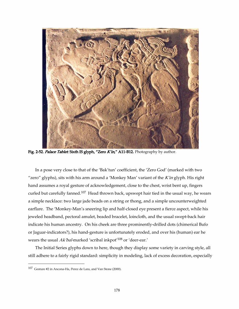
178
Fig. 2Fig. 2Fig. 2Fig. 2----52. 52. 52. 52. Palace TabletPalace TabletPalace TabletPalace Tablet: Sixth IS glyph, “Zero : Sixth IS glyph, “Zero : Sixth IS glyph, “Zero : Sixth IS glyph, “Zero K’inK’inK’inK’in,” A11,” A11,” A11,” A11----B12B12B12B12. . . . Photography by author.
In a pose very close to that of the ‘Bak’tun’ coefficient, the ‘Zero God’ (marked with two
“zero” glyphs), sits with his arm around a ‘Monkey Man’ variant of the K’in glyph. His right
hand assumes a royal gesture of acknowledgement, close to the chest, wrist bent up, fingers
curled but carefully fanned.107 Head thrown back, upswept hair tied in the usual way, he wears
a simple necklace: two large jade beads on a string or thong, and a simple uncounterweighted
earflare. The ‘Monkey-Man’s sneering lip and half-closed eye present a fierce aspect, while his
jeweled headband, pectoral amulet, beaded bracelet, loincloth, and the usual swept-back hair
indicate his human ancestry. On his cheek are three prominently-drilled dots (chimerical Bufo
or Jaguar-indicators?), his hand-gesture is unfortunately eroded, and over his (human) ear he
wears the usual Ak’bal-marked ‘scribal inkpot’108 or ‘deer-ear.’
The Initial Series glyphs down to here, though they display some variety in carving style, all
still adhere to a fairly rigid standard: simplicity in modeling, lack of excess decoration, especially
107 Gesture #2 in Ancona-Ha, Perez de Lara, and Van Stone (2000).
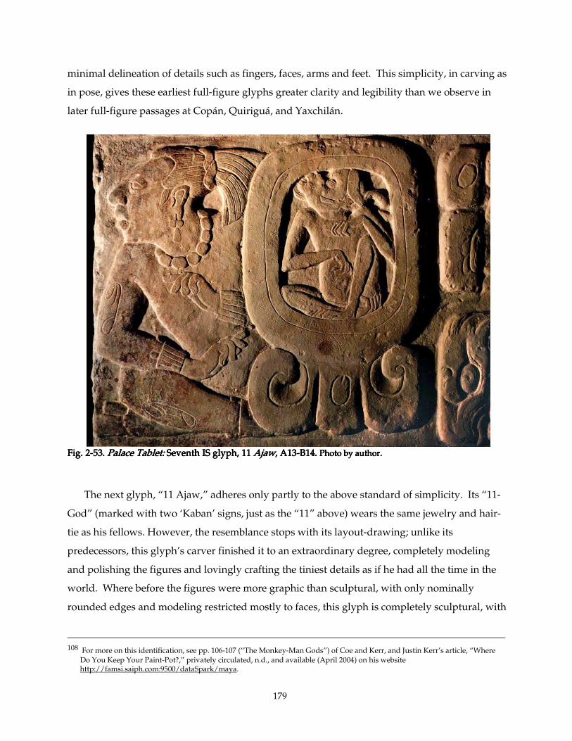
179
minimal delineation of details such as fingers, faces, arms and feet. This simplicity, in carving as
in pose, gives these earliest full-figure glyphs greater clarity and legibility than we observe in
later full-figure passages at Copán, Quiriguá, and Yaxchilán.
Fig.Fig.Fig.Fig. 2 2 2 2----53.53.53.53. Palace Tablet:Palace Tablet:Palace Tablet:Palace Tablet: Seventh IS glyph, 11 Seventh IS glyph, 11 Seventh IS glyph, 11 Seventh IS glyph, 11 AjawAjawAjawAjaw, A13, A13, A13, A13----B14. B14. B14. B14. Photo by author.Photo by author.Photo by author.Photo by author.
The next glyph, “11 Ajaw,” adheres only partly to the above standard of simplicity. Its “11-
God” (marked with two ‘Kaban’ signs, just as the “11” above) wears the same jewelry and hair-
tie as his fellows. However, the resemblance stops with its layout-drawing; unlike its
predecessors, this glyph’s carver finished it to an extraordinary degree, completely modeling
and polishing the figures and lovingly crafting the tiniest details as if he had all the time in the
world. Where before the figures were more graphic than sculptural, with only nominally
rounded edges and modeling restricted mostly to faces, this glyph is completely sculptural, with
108 For more on this identification, see pp. 106-107 (“The Monkey-Man Gods”) of Coe and Kerr, and Justin Kerr’s article, “Where
Do You Keep Your Paint-Pot?,” privately circulated, n.d., and available (April 2004) on his website http://famsi.saiph.com:9500/dataSpark/maya.
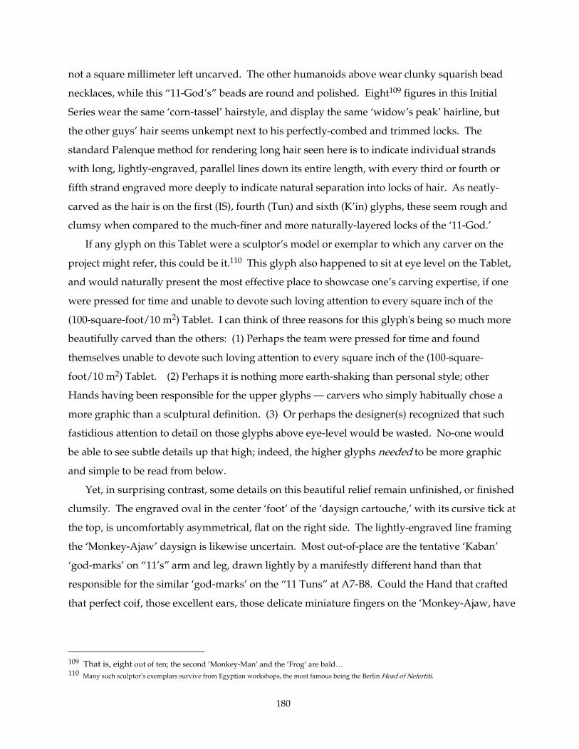
180
not a square millimeter left uncarved. The other humanoids above wear clunky squarish bead
necklaces, while this “11-God’s” beads are round and polished. Eight109 figures in this Initial
Series wear the same ‘corn-tassel’ hairstyle, and display the same ‘widow’s peak’ hairline, but
the other guys’ hair seems unkempt next to his perfectly-combed and trimmed locks. The
standard Palenque method for rendering long hair seen here is to indicate individual strands
with long, lightly-engraved, parallel lines down its entire length, with every third or fourth or
fifth strand engraved more deeply to indicate natural separation into locks of hair. As neatly-
carved as the hair is on the first (IS), fourth (Tun) and sixth (K’in) glyphs, these seem rough and
clumsy when compared to the much-finer and more naturally-layered locks of the ‘11-God.’
If any glyph on this Tablet were a sculptor’s model or exemplar to which any carver on the
project might refer, this could be it.110 This glyph also happened to sit at eye level on the Tablet,
and would naturally present the most effective place to showcase one’s carving expertise, if one
were pressed for time and unable to devote such loving attention to every square inch of the
(100-square-foot/10 m2) Tablet. I can think of three reasons for this glyph's being so much more
beautifully carved than the others: (1) Perhaps the team were pressed for time and found
themselves unable to devote such loving attention to every square inch of the (100-square-
foot/10 m2) Tablet. (2) Perhaps it is nothing more earth-shaking than personal style; other
Hands having been responsible for the upper glyphs — carvers who simply habitually chose a
more graphic than a sculptural definition. (3) Or perhaps the designer(s) recognized that such
fastidious attention to detail on those glyphs above eye-level would be wasted. No-one would
be able to see subtle details up that high; indeed, the higher glyphs needed to be more graphic
and simple to be read from below.
Yet, in surprising contrast, some details on this beautiful relief remain unfinished, or finished
clumsily. The engraved oval in the center ‘foot’ of the ‘daysign cartouche,’ with its cursive tick at
the top, is uncomfortably asymmetrical, flat on the right side. The lightly-engraved line framing
the ‘Monkey-Ajaw’ daysign is likewise uncertain. Most out-of-place are the tentative ‘Kaban’
‘god-marks’ on “11’s” arm and leg, drawn lightly by a manifestly different hand than that
responsible for the similar ‘god-marks’ on the “11 Tuns” at A7-B8. Could the Hand that crafted
that perfect coif, those excellent ears, those delicate miniature fingers on the ‘Monkey-Ajaw, have
109 That is, eight out of ten; the second ‘Monkey-Man’ and the ‘Frog’ are bald… 110 Many such sculptor’s exemplars survive from Egyptian workshops, the most famous being the Berlin Head of Nefertiti.
181
also scraped these tyros’ exercises?’ The answer is simple: it was not the same Hand, it was
some beginner.
I think it quite likely that this glyph does represent a master sculptor’s standard, a model for
the rest of the carvers on the project, should they have any questions as to depth of cut, radius of
edge-molding, how to render hair, faces, or fingers, etc. At the same time it represents the
teamwork and apprenticeship training congruent with a project of this magnitude: Whether
pressed for time (looming dedication date?) or some other reason, many fine artists, and a few
with less-developed skill, worked together closely on this inscription, even to the point of
finishing each others’ glyphs. In the case of the Initial Series, the Project Master painted the
layout on the slab for the entire Initial Series and then probably carved the last glyph, the 11 K'in,
as an example. Perhaps he also painted a sketch of the layout text on the whole slab. (But
probably only in outline, like Egyptian layouts; I believe most carvers repainted their own
layouts before carving.) Then the carving team got to work. If the Project Master carved any of
the other full-figure glyphs, he must have felt rushed (and, with the glyphs reaching far
overhead, able to get away with less-finished characters), or perhaps he was so busy overseeing
the project that he was only able to finish a hand or face here and there for his colleagues.
2.6.2.2.6.2.2.6.2.2.6.2. The FullThe FullThe FullThe Full----Figure Initial Series Hand(s)' Other Glyphs: Columns C & DFigure Initial Series Hand(s)' Other Glyphs: Columns C & DFigure Initial Series Hand(s)' Other Glyphs: Columns C & DFigure Initial Series Hand(s)' Other Glyphs: Columns C & D
The Palace Tablet, you will recall, was constructed from three limestone slabs ten feet tall:
two 4-column-wide side panels flanking a central panel 10 columns wide. On the left slab, the
Initial Series occupies only the upper 60% of the left two columns (down to AB-14). It seems
likely that the artists working on the IS also cut the neighboring glyphs in Columns C and D, and
indeed this seems to have been the case. The separate slab carrying Columns E-F through M-N,
and that with O-P-Q-R, were probably concurrently being carved at nearby tables — under the
same thatched roof, but some distance away. Although it is likely that some of the artists from
Columns C-D also lent a hand on the other two slabs, we have no good reason to suppose that
their other passages should have ended up adjacent to their work on C-D.
182
2.6.3. Summary of Initial Series Attributi2.6.3. Summary of Initial Series Attributi2.6.3. Summary of Initial Series Attributi2.6.3. Summary of Initial Series Attributions (ons (ons (ons (See alsoSee alsoSee alsoSee also Section 3.07) Section 3.07) Section 3.07) Section 3.07)
Fig. 2Fig. 2Fig. 2Fig. 2----54. 54. 54. 54. Palace TabletPalace TabletPalace TabletPalace Tablet: Initial Series and adjacent columns with attributed territories. : Initial Series and adjacent columns with attributed territories. : Initial Series and adjacent columns with attributed territories. : Initial Series and adjacent columns with attributed territories. Photography by author.
183
So, the reader now has many, too many, connections and distinctions to juggle, just in the
Initial Series. To summarize:
(1) The first two glyphs, the ISIG (A1-B2) and the 'Bak'tun' (A3-B4), are by the same Hand,
apparently the C1-D1 Master (Sections 3.6.5, 3.7Sections 3.6.5, 3.7Sections 3.6.5, 3.7Sections 3.6.5, 3.7). Another Hand may have inserted details
around the 'toenail' of the ISIG 'Patron of Mak.'
(2) The 'K'atun Bird' is mostly by a second Hand, except for its 'cranial mirror' and perhaps
its 'eye' and 'beak.' A third Hand carved its coefficient "10" as well as the 'jawbone' on the 'Tun
bird' in the next glyph. He manifestly did not carve the unique 'jawbone' at D7, which was
probably carved by the C1-D1 Master.
(3) This third Hand (not the C1-D1 Master) also carved the entire "17 Tuns" glyph (A7-B8).
Its flat concavities don't match C1-D1's, but rather those of the neighboring Hand who carved
C8.
(4) The 'Winal' coefficient (A9-A10) is not by the Hand who carved the K'atun (A5-A6) and
Tun (A7-A8) coefficients just above. He may represent a fourth Hand, but he more likely is
identical with the C1-D1 Master(s). Certainly his 'skull headdress' and the 'feathers' dangling
from it have much in common with C3, and his 'jaguar ear' matches that at F8, which I assign
tentatively to the same Hand. His 'toes' match those of the A7-A8 'Tun' coefficient, but little else
does. Likewise the 'Winal toad-iguana' (B9-B10) has some features in common with the 'Tun
bird' above (B7-B8, the 'eye,' for example), but it finds a closer comparison at A16 (whose
'ophidian eye' also matches, raising the possibility that an "eye expert" carved all three). The
'Winal' creature also shares some qualities with the 'Bak'tun' glyph and with F9, both of which I
assigned to the C1-D1 Master. Thus A9-B10 appears to represent a return of the C1-D1 Master,
but with insertions ('toenails,' 'belly-scales,' 'eye'?) by other artists.
(5) The 'K'in' glyph has much in common with its predecessors, though it is even more
simplified and graphic than before (the 'hair,' for example). In this, it resembles C10. Its artist,
however, has taken the trouble to model the figures' bodies a bit more than above, perhaps
because this glyph is close to eye-level. It seems to have been carved by the same Hand as the
'Winal coefficient' glyph preceding it; I base this primarily on the 'lips' and 'eyes.'
(6) The 'Tzolk'in' date at A13-B14 has an entirely different character from the others.
Certainly its amateurish 'Kaban god marks' are not by the Hand of A7-A8, because its otherwise
superlative modeling sets a standard high above not only that Hand but by any of the other IS
glyphs. Another Hand with comparably superior modeling is the L14 Itz'i-Winik Master, but his
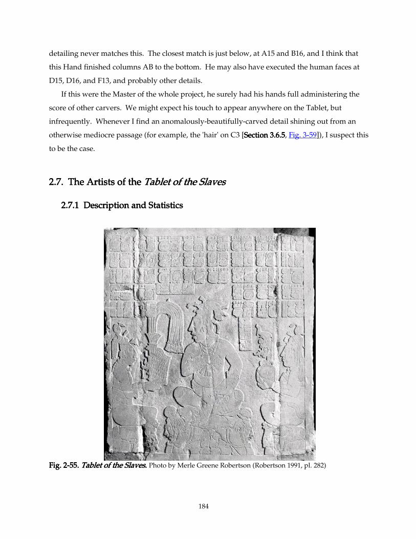
184
detailing never matches this. The closest match is just below, at A15 and B16, and I think that
this Hand finished columns AB to the bottom. He may also have executed the human faces at
D15, D16, and F13, and probably other details.
If this were the Master of the whole project, he surely had his hands full administering the
score of other carvers. We might expect his touch to appear anywhere on the Tablet, but
infrequently. Whenever I find an anomalously-beautifully-carved detail shining out from an
otherwise mediocre passage (for example, the 'hair' on C3 [Section Section Section Section 3.6.53.6.53.6.53.6.5, Fig. 3-59]), I suspect this
to be the case.
2.7. The Artists of the 2.7. The Artists of the 2.7. The Artists of the 2.7. The Artists of the Tablet of the SlavesTablet of the SlavesTablet of the SlavesTablet of the Slaves
2.7.1 Description and Statistics2.7.1 Description and Statistics2.7.1 Description and Statistics2.7.1 Description and Statistics
Fig. Fig. Fig. Fig. 2222----55. 55. 55. 55. Tablet of the SlavesTablet of the SlavesTablet of the SlavesTablet of the Slaves. . . . Photo by Merle Greene Robertson (Robertson 1991, pl. 282)
185
The Tablet of the Slaves (160cm x 140cm) was discovered in 1950 in Group IV as a result of
work on the road to the present entrance of the Archaeological Park (Robertson 1991, 66). Group
IV is 300 meters WNW of the main Plaza (that bounded by Temple XI, the Palace, and Temple of
the Inscriptions), and comprises a small plaza bounded by a U-shaped group of buildings, which
contained several burials (Robertson 1991, 7). The content of the Tablet and its location suggest
that Group IV may have been an elite but non-royal residence, perhaps that of Lord Chak-Sutz',
who is mentioned five times on the Tablet111, (though the personage portrayed thereon is his
younger half-brother and liege Ahkal Mo' Naab, crowned by his father and their mother (R.
Wald, personal communication, 1999). The Tablet is superbly carved in very low relief (no more
than 3mm between highest and lowest planes). It carries a tri-figure image of an accession
ceremony, common at Palenque112, framed by a main inscription of 34 glyphs and two 3-glyph
identification labels arranged in an inverted-U around the head of the central figure.
It derives its nickname from the fact that Ahkal is seated, frontally but with his head facing to
the left113, on a unique "throne": a cushion resting on two bound, kneeling, bent-over captives.
His mother and father are likewise seated (in profile) on humbled figures, though these are
unbound (presumably volunteers) and clearly supernatural: A toothy, long-lipped, 'mirror'-
marked figure (a wind diety?) supports its namesake, Ahkal's father (labeled here "Ti-wo-Chan-
na ma-Mat ch'o-ko"); while a deer-headed and -hoofed humanoid supports the mother (labeled
here "Lady Ki-nu-wi ma-ta ch'o-ko"). The deer and the long-lipped character wear identical
segmented belts. Aside from the disturbing furniture, the arrangement is quite conventional in
111The text begins with the accession of their father K'inich Janab Pakal on 5 Lamat 1 Mol (9.9.2.4.8 / AD 615), mentions his "tuun-
seatings" and those of the succeeding K'uhul Ajaws ("sacred lords") Kan-Balam and K'an-Joy-Chitam, then the birth of Chak-Sutz' (called he-Sutz in his youth) on 7 Kaban 15 K'ayab (9.11.18.9.17/ AD 671) at A4-B4. This is followed by the royal accession ("headdress-tying") of Ahkal Mo' Naab III on 9 Ik' 5 K'ayab and, soon after, the accession ("flaming-headdress-tying") of Chak Sutz' as Bah-Ajaw ("first lord" under Ahkal) on 8 Ix 7 Yaxk'in (9.14.10.4.2 and 9.14.11.12.14 / AD 722 and 723) at C1-D2. This is followed two years later by an 'axe' war event (Ch'ak-K'in-'a / "sun-chopping") by Chak-Sutz' (7 Ik' 5 Sek, 9.14.13.11.12 / AD 725), now described as a Yajaw-K'ak ("his lord of fire"). He captured one Ta-Aj-chih Aj-la-Ajaw Aj-Ch'een on 9 Kimi 19 Sek (9.14.11.17.6 / AD 723), and performs another 'axe' war event (Ch’ak-ko-la / "ko'ol-chopping") on 2 Kawak 2 Xul (9.14.17.12.19 / AD 729). These bellicose acts he follows with an undeciphered event on 7 Imix 4 Keh (9.14.18.1.1 / AD 729), and carries these titles: a "stone-ballplayer," a 4-Ajaw, 6-Ajaw, ya-ja-mo-lo-na (?), and a Sajal ("subordinate lord"). The text wraps up by anchoring its chronology to the period-ending 9.15.0.0.0 4 Ajaw 13 Yax ("8 te-1 tun in the future" / AD 731), dedicates the tablet (or its house) on 5 Lamat 6 Wo (9.14.18.9.8 / AD 730), and links that event to his 60th birthday, nine days later on 1 Kaban 15 Wo (9.14.18.9.17 / AD 730). Thus the Tablet of the Slaves was carved in 730, eight years into the reign of Ahkal Mo' Naab, and marks the significant rites and war-events of his older half-brother. This monument provides evidence that rulership descended matrilinearly; though Chak-Sutz' is apparently a son of Pakal the Great, and older than his half-brother, it is Ahkal who acceded to the K'uhul-Ajawship.
112 See Schele 1979. 113 In about 90% of Maya images of court scenes, the ruler or main figure faces to our left, presumably echoing the customary
direction of glyphic faces. The Maya distinction between "writing" and "picture" was blurred (the word tz'ib is used for both), just as it was in Sumerian, Egyptian, and Hittite, whose asymmetrical glyphs also consistently "face" the reader, presenting their "front" to the eye first, as we read along the line.
186
Palenque: the parents present their son with the accoutrements of accession: a shell-mosaic
'drum-major' headdress (whose feather panache carefully brushes Ahkal's name in the text)
carrying the royal 'Jester god' diadem, and a personified Took'-Pakal or "Flint-Shield," symbol of
war-chieftainship.
The three each wear a fringed wraparound skirt, jade necklace, and jade cuffs. The father's
skirt (typically) covers his navel and extends to mid-calf, the mother's outfit covers her breasts
and apparently reaches her ankles, but Ahkal's loincloth hangs low: it reaches his knees and
(atypically) exposes his navel. He also wears a complex jade pectoral carved with the frontal
open-mouthed face of a snarling beast (usually jaguar or snake), partially hidden behind his
gesturing right hand.114 The three each wear their hair bound atop their heads with a knotted
cloth strip, their cascading locks contrived to imitate the tassel of an ear of corn. In addition, the
parents each wear a fillet made from a fresh waterlily tied round the forehead, and perched atop
each of their heads sits a small, strange creature nicknamed "shell-winged dragon," a two-legged
ophidian chimera whose "wings" are the valves of a clam or oyster. Ahkal wears neither dragon
nor lily, but a fillet of disks (presumably shell) adorns his forehead, and two locks of his hair are
pulled through bell-shaped jade beads, one in front and one behind.
All three wear flower-shaped earspools, counterweighted by a triple-beaded drop hanging
out the back of their respective earlobes.115 Ahkal's loincloth, the only one facing us, reveals a
textile ornament: centered in the front is a pierced "portal" glyph, containing within it a woven
"royal mat" knot, seen frequently in the royal clothing of the Maya West. Ahkal, finally, holds in
his left hand the spotted-pelt strap of an 'incense purse' decorated with the figure of an owl and a
long shell(?)-adorned tassel. An identical 'purse' is carried by a few subsidiary characters in the
reliefs of Temple XIX (q.v.).
114 His gesture is a common royal gesture, appearing on a dozen or so court scenes portrayed on ceramics. It is never returned by a
subordinate. It is a variant of "Gesture No. 2" in the categorization found in Ancona-Ha, Patricia, Perez de Lara, Jorge, and Van Stone, Mark, "Some Observations on Hand Gestures in Maya Art," pp. 1072-1089 in Kerr, Justin and Barbara, The Maya Vase Book, Vol. 6, New York, 2000.
115 This triple-bead counterweight was rather fashionable at this time in Palenque. It hangs from the earlobes of several (but not all)
of the heads in all the monuments discussed in this paper, but is quite rare elsewhere.
187
2.7.2. Carving process2.7.2. Carving process2.7.2. Carving process2.7.2. Carving process
This Tablet was composed from three separate slabs of fine-grained limestone, a middle slab
ca. 100 cm wide x 159 cm high, flanked by two narrow slabs approximately 27cm wide each116.
In general the larger the monument —in any culture—, the more likely it was carved in situ.
Once finished, the flamboyant Late Classic stelae of Copan, for example, would be impossible to
transport any distance without damaging hundreds of details, even with today's technology.
This panel, however, presents evidence that its glyphs and figures were more or less completely
carved before being assembled on the wall. There are large gaps (often a centimeter or more)
between the carved surfaces of the panels as they survive today. No doubt the artists filled the
gaps with stucco while installing the panels, which was then sculpted in situ to bridge the gaps
once the panels were set in place. (This patchwork practice was actually rather common at
Palenque, the large texts in the Temple of Inscriptions providing the most complex examples.)
What makes this monument different from the Palace Tablet (and like the middle panel of
the Temple of Inscriptions) is the way that the separation between slabs cuts right through
columns B and G of the main text. Ten glyphs (out of forty) are thus affected, and an analysis of
their handwriting shows that different artists apparently carved the right and left parts of these
'split' glyphs. This is not so obvious on Column B, but it is fairly clear in Column G. One might
imagine that the project director laid out the whole text on the three slabs, and that the three
stones were then distributed to three adjacent work tables (or easels) to be cut simultaneously
(by four artists, it turns out; two different hands worked on the central slab). The side-panel
Artists, however, crossed over to the central slab to complete their figure carvings. Presumably,
the sculptors of the (now-lost) stuccoed gaps also touched up the connecting carving on the
adjacent slabs. These artists did not work on the text sequentially.
116 Dimensions (from Robertson 1985a): Whole Tablet: 159 cm wide, 180 cm high, or an aspect ratio of about 1 to 1.13. Carved area: 141 cm wide, 157-159 cm high (the panel is not perfectly square), aspect ratio about 1 to 1.12. Left and right slabs: ca. 27 cm wide, carved areas 20.5 cm wide; aspect ratio about 1 to 6.6667 (whole) or
1 to 7.71 (carved area) Central slab: 99-100 cm wide (a.r. 1 to 1.6 or 1.8); cracks between slabs ca. 0.5 cm. The carved area of the
central slab is approximately a golden rectangle (1 to 1.62) Glyphs' aspect ratio is about 16.5cm x 11cm, or 1.5 to 1.
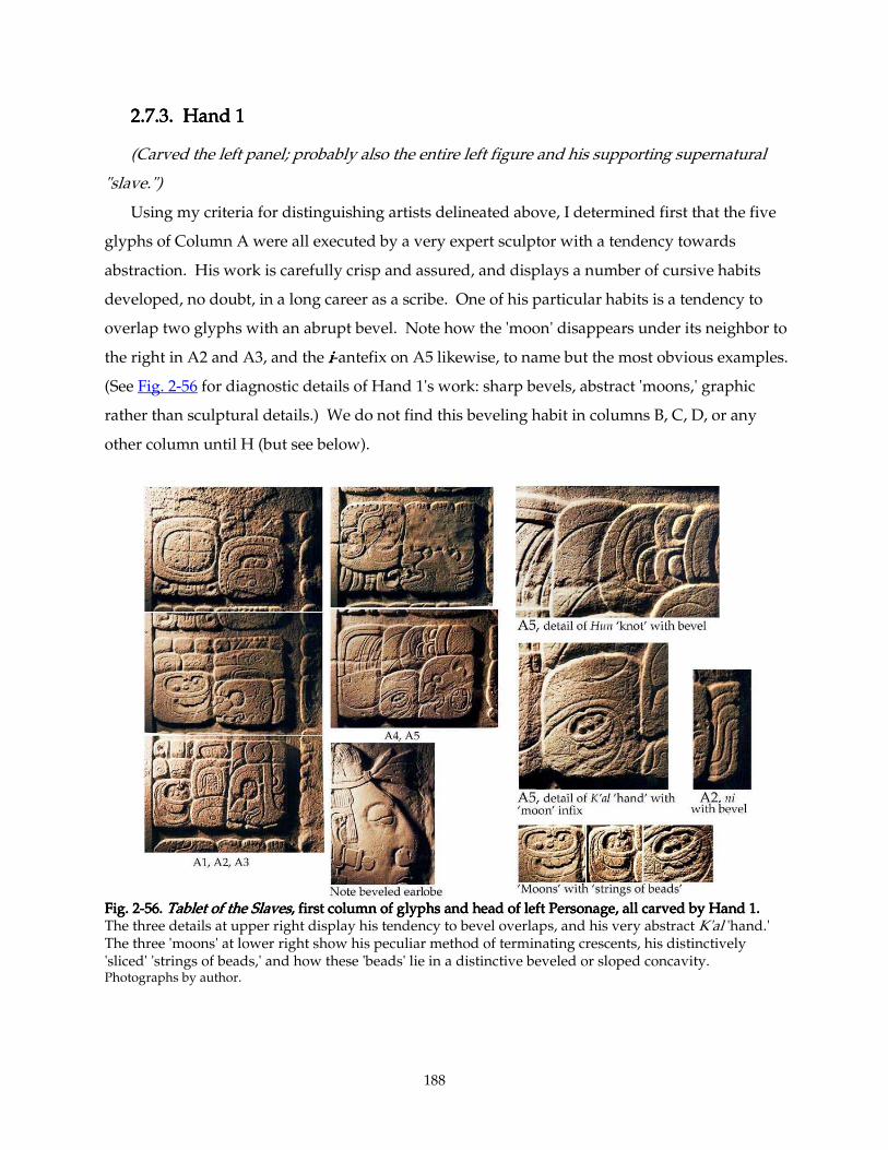
188
2.7.3. Hand 1 2.7.3. Hand 1 2.7.3. Hand 1 2.7.3. Hand 1
(Carved the left panel; probably also the entire left figure and his supporting supernatural
"slave.")
Using my criteria for distinguishing artists delineated above, I determined first that the five
glyphs of Column A were all executed by a very expert sculptor with a tendency towards
abstraction. His work is carefully crisp and assured, and displays a number of cursive habits
developed, no doubt, in a long career as a scribe. One of his particular habits is a tendency to
overlap two glyphs with an abrupt bevel. Note how the 'moon' disappears under its neighbor to
the right in A2 and A3, and the iiii-antefix on A5 likewise, to name but the most obvious examples.
(See Fig. 2-56 for diagnostic details of Hand 1's work: sharp bevels, abstract 'moons,' graphic
rather than sculptural details.) We do not find this beveling habit in columns B, C, D, or any
other column until H (but see below).
Fig. 2Fig. 2Fig. 2Fig. 2----56. 56. 56. 56. Tablet of the SlavesTablet of the SlavesTablet of the SlavesTablet of the Slaves, first column of glyphs and head of left Personage, all carve, first column of glyphs and head of left Personage, all carve, first column of glyphs and head of left Personage, all carve, first column of glyphs and head of left Personage, all carved by Hand 1.d by Hand 1.d by Hand 1.d by Hand 1. The three details at upper right display his tendency to bevel overlaps, and his very abstract K'al 'hand.' The three 'moons' at lower right show his peculiar method of terminating crescents, his distinctively 'sliced' 'strings of beads,' and how these 'beads' lie in a distinctive beveled or sloped concavity. Photographs by author.
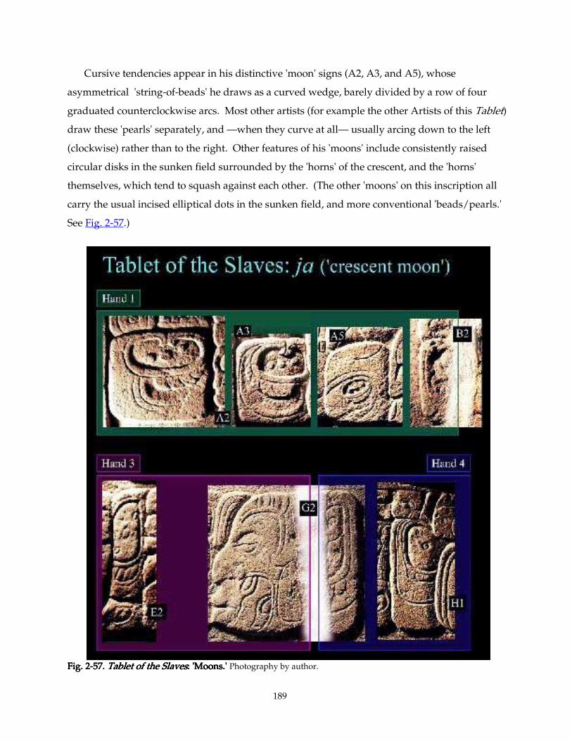
189
Cursive tendencies appear in his distinctive 'moon' signs (A2, A3, and A5), whose
asymmetrical 'string-of-beads' he draws as a curved wedge, barely divided by a row of four
graduated counterclockwise arcs. Most other artists (for example the other Artists of this Tablet)
draw these 'pearls' separately, and —when they curve at all— usually arcing down to the left
(clockwise) rather than to the right. Other features of his 'moons' include consistently raised
circular disks in the sunken field surrounded by the 'horns' of the crescent, and the 'horns'
themselves, which tend to squash against each other. (The other 'moons' on this inscription all
carry the usual incised elliptical dots in the sunken field, and more conventional 'beads/pearls.'
See Fig. 2-57.)
Fig. 2Fig. 2Fig. 2Fig. 2----57. 57. 57. 57. Tablet of the SlavesTablet of the SlavesTablet of the SlavesTablet of the Slaves: 'Moons.' : 'Moons.' : 'Moons.' : 'Moons.' Photography by author.
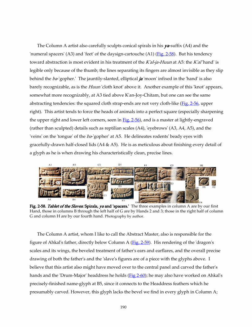
190
The Column A artist also carefully sculpts conical spirals in his yayayaya-suffix (A4) and the
'numeral spacers' (A3) and 'feet' of the daysign-cartouche (A1) (Fig. 2-58). But his tendency
toward abstraction is most evident in his treatment of the K'al-ja-Huun at A5: the K'al 'hand' is
legible only because of the thumb; the lines separating its fingers are almost invisible as they slip
behind the ba-'gopher.' The jauntily-slanted, elliptical jajajaja 'moon' infixed in the 'hand' is also
barely recognizable, as is the Huun 'cloth knot' above it. Another example of this 'knot' appears,
somewhat more recognizably, at A3 tied above K'an-Joy-Chitam, but one can see the same
abstracting tendencies: the squared cloth strap-ends are not very cloth-like (Fig. 2-56, upper
right). This artist tends to force the heads of animals into a perfect square (especially sharpening
the upper right and lower left corners, seen in Fig. 2-56), and is a master at lightly-engraved
(rather than sculpted) details such as reptilian scales (A4), 'eyebrows' (A3, A4, A5), and the
'veins' on the 'tongue' of the ba-'gopher' at A5. He delineates rodents' beady eyes with
gracefully-drawn half-closed lids (A4 & A5). He is as meticulous about finishing every detail of
a glyph as he is when drawing his characteristically clean, precise lines.
Fig. 2Fig. 2Fig. 2Fig. 2----58. 58. 58. 58. Tablet of the SlavesTablet of the SlavesTablet of the SlavesTablet of the Slaves: Spirals, : Spirals, : Spirals, : Spirals, yayayaya and 'spacers.' and 'spacers.' and 'spacers.' and 'spacers.' The three examples in column A are by our first Hand, those in columns B through the left half of G are by Hands 2 and 3; those in the right half of column G and column H are by our fourth hand. Photography by author.
The Column A artist, whom I like to call the Abstract Master, also is responsible for the
figure of Ahkal's father, directly below Column A (Fig. 2-59). His rendering of the 'dragon's
scales and its wings, the beveled treatment of father's ears and earflares, and the overall precise
drawing of both the father's and the 'slave's figures are of a piece with the glyphs above. I
believe that this artist also might have moved over to the central panel and carved the father's
hands and the 'Drum-Major' headdress he holds (Fig 2-60); he may also have worked on Ahkal's
precisely-finished name-glyph at B5, since it connects to the Headdress feathers which he
presumably carved. However, this glyph lacks the bevel we find in every glyph in Column A;
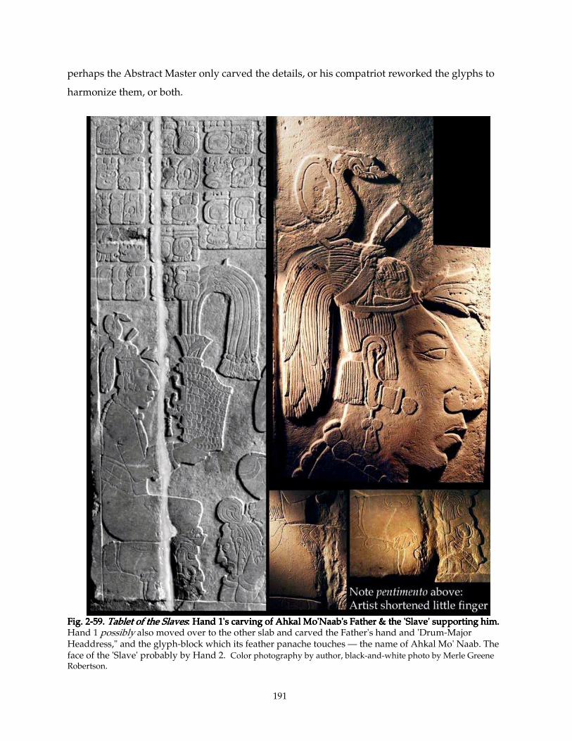
191
perhaps the Abstract Master only carved the details, or his compatriot reworked the glyphs to
harmonize them, or both.
Fig. 2Fig. 2Fig. 2Fig. 2----59. 59. 59. 59. Tablet of the SlavesTablet of the SlavesTablet of the SlavesTablet of the Slaves: Hand 1's carving of Ahkal Mo'Naab's Father & the 'Slave' supporting him.: Hand 1's carving of Ahkal Mo'Naab's Father & the 'Slave' supporting him.: Hand 1's carving of Ahkal Mo'Naab's Father & the 'Slave' supporting him.: Hand 1's carving of Ahkal Mo'Naab's Father & the 'Slave' supporting him. Hand 1 possibly also moved over to the other slab and carved the Father's hand and 'Drum-Major Headdress," and the glyph-block which its feather panache touches — the name of Ahkal Mo' Naab. The face of the 'Slave' probably by Hand 2. Color photography by author, black-and-white photo by Merle Greene Robertson.
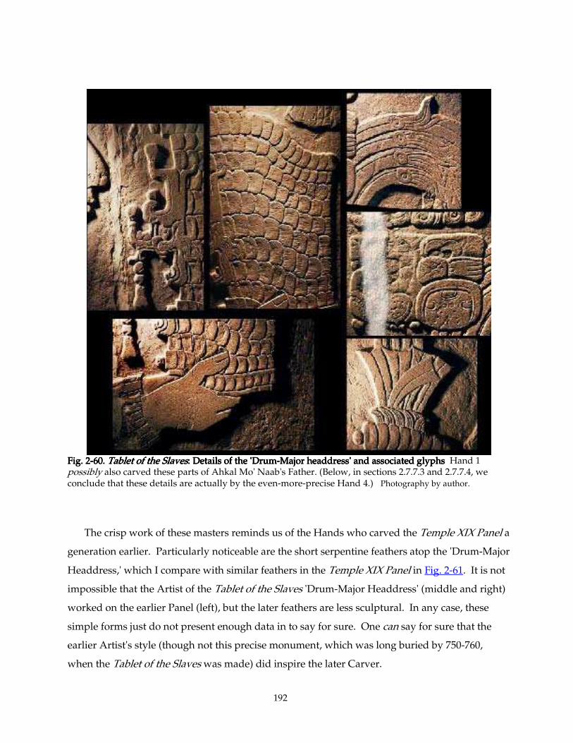
192
Fig. 2Fig. 2Fig. 2Fig. 2----60. 60. 60. 60. Tablet of the SlavesTablet of the SlavesTablet of the SlavesTablet of the Slaves: Details of the 'Drum: Details of the 'Drum: Details of the 'Drum: Details of the 'Drum----Major headdress' and associatMajor headdress' and associatMajor headdress' and associatMajor headdress' and associated glyphsed glyphsed glyphsed glyphs Hand 1 possibly also carved these parts of Ahkal Mo' Naab's Father. (Below, in sections 2.7.7.3 and 2.7.7.4, we conclude that these details are actually by the even-more-precise Hand 4.) Photography by author.
The crisp work of these masters reminds us of the Hands who carved the Temple XIX Panel a
generation earlier. Particularly noticeable are the short serpentine feathers atop the 'Drum-Major
Headdress,' which I compare with similar feathers in the Temple XIX Panel in Fig. 2-61. It is not
impossible that the Artist of the Tablet of the Slaves 'Drum-Major Headdress' (middle and right)
worked on the earlier Panel (left), but the later feathers are less sculptural. In any case, these
simple forms just do not present enough data in to say for sure. One can say for sure that the
earlier Artist's style (though not this precise monument, which was long buried by 750-760,
when the Tablet of the Slaves was made) did inspire the later Carver.
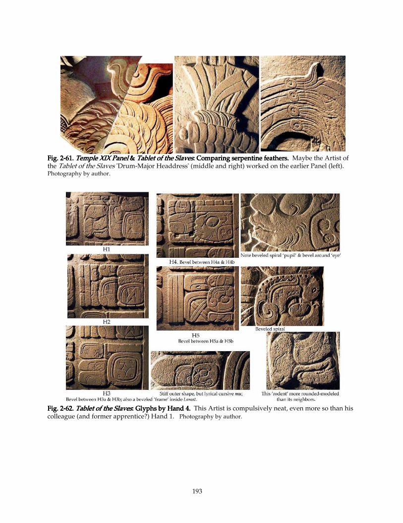
193
Fig. 2Fig. 2Fig. 2Fig. 2----61. 61. 61. 61. Temple XIX PaTemple XIX PaTemple XIX PaTemple XIX Panelnelnelnel & & & & Tablet of the SlavesTablet of the SlavesTablet of the SlavesTablet of the Slaves: Comparing serpentine feathers.: Comparing serpentine feathers.: Comparing serpentine feathers.: Comparing serpentine feathers. Maybe the Artist of the Tablet of the Slaves 'Drum-Major Headdress' (middle and right) worked on the earlier Panel (left). Photography by author.
Fig. 2Fig. 2Fig. 2Fig. 2----62. 62. 62. 62. Tablet of the SlavesTablet of the SlavesTablet of the SlavesTablet of the Slaves: Glyphs by H: Glyphs by H: Glyphs by H: Glyphs by Hand 4.and 4.and 4.and 4. This Artist is compulsively neat, even more so than his colleague (and former apprentice?) Hand 1. Photography by author.
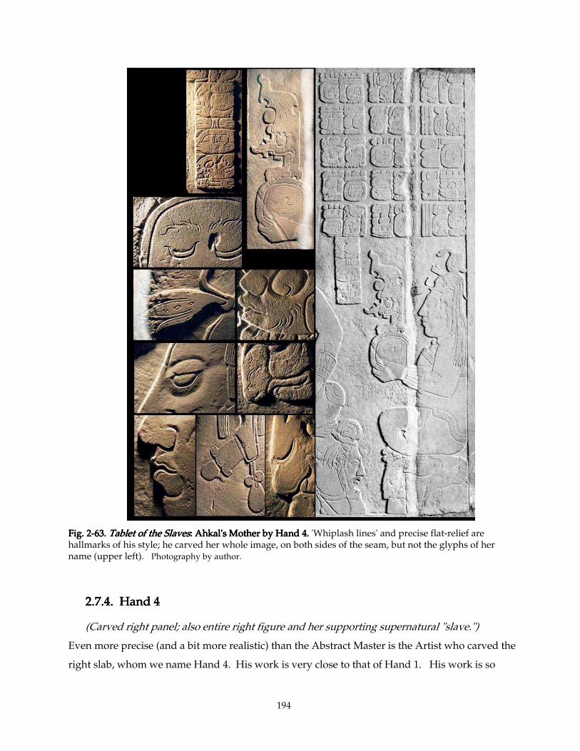
194
Fig. 2Fig. 2Fig. 2Fig. 2----63. 63. 63. 63. Tablet of the SlavesTablet of the SlavesTablet of the SlavesTablet of the Slaves: Ahkal's Mother by Hand 4.: Ahkal's Mother by Hand 4.: Ahkal's Mother by Hand 4.: Ahkal's Mother by Hand 4. 'Whiplash lines' and precise flat-relief are hallmarks of his style; he carved her whole image, on both sides of the seam, but not the glyphs of her name (upper left). Photography by author.
2.7.4. Hand 42.7.4. Hand 42.7.4. Hand 42.7.4. Hand 4
(Carved right panel; also entire right figure and her supporting supernatural "slave.")
Even more precise (and a bit more realistic) than the Abstract Master is the Artist who carved the
right slab, whom we name Hand 4. His work is very close to that of Hand 1. His work is so
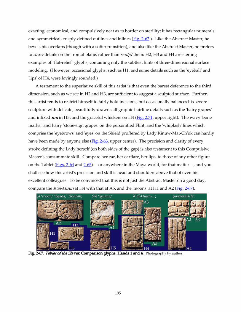
195
exacting, economical, and compulsively neat as to border on sterility; it has rectangular numerals
and symmetrical, crisply-defined outlines and inlines (Fig. 2-62.). Like the Abstract Master, he
bevels his overlaps (though with a softer transition), and also like the Abstract Master, he prefers
to draw details on the frontal plane, rather than sculpt them: H2, H3 and H4 are sterling
examples of "flat-relief" glyphs, containing only the subtlest hints of three-dimensional surface
modeling. (However, occasional glyphs, such as H1, and some details such as the 'eyeball' and
'lips' of H4, were lovingly rounded.)
A testament to the superlative skill of this artist is that even the barest deference to the third
dimension, such as we see in H2 and H3, are sufficient to suggest a sculpted surface. Further,
this artist tends to restrict himself to fairly bold incisions, but occasionally balances his severe
sculpture with delicate, beautifully-drawn calligraphic hairline details such as the 'hairy grapes'
and infixed mumumumu in H3, and the graceful whiskers on H4 (Fig. 2.71, upper right). The wavy 'bone
marks,' and hairy 'stone-sign grapes' on the personified Flint, and the 'whiplash' lines which
comprise the 'eyebrows' and 'eyes' on the Shield proffered by Lady Kinuw-Mat-Ch'ok can hardly
have been made by anyone else (Fig. 2-63, upper center). The precision and clarity of every
stroke defining the Lady herself (on both sides of the gap) is also testament to this Compulsive
Master's consummate skill. Compare her ear, her earflare, her lips, to those of any other figure
on the Tablet (Figs. 2-64 and 2-65) —or anywhere in the Maya world, for that matter—, and you
shall see how this artist's precision and skill is head and shoulders above that of even his
excellent colleagues. To be convinced that this is not just the Abstract Master on a good day,
compare the K'al-Huun at H4 with that at A5, and the 'moons' at H1 and A2 (Fig. 2-67).
FFFFig. 2ig. 2ig. 2ig. 2----67. 67. 67. 67. Tablet of the SlavesTablet of the SlavesTablet of the SlavesTablet of the Slaves: Comparison glyphs, Hands 1 and 4: Comparison glyphs, Hands 1 and 4: Comparison glyphs, Hands 1 and 4: Comparison glyphs, Hands 1 and 4. Photography by author.
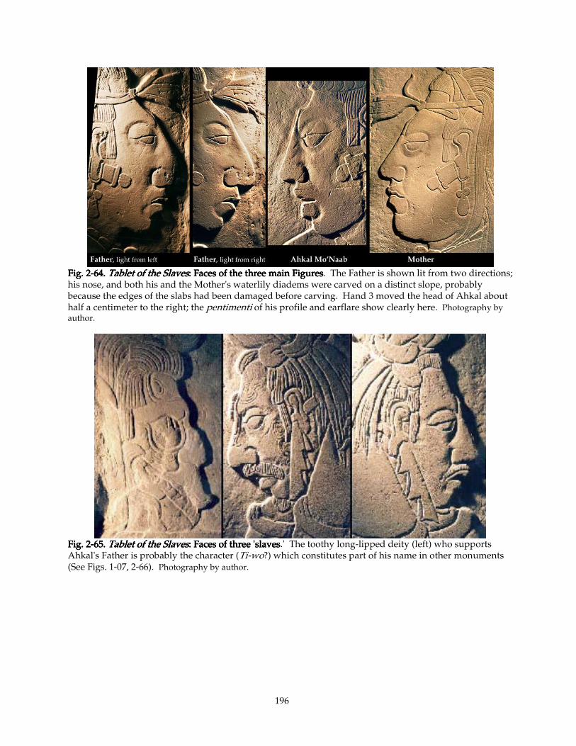
196
Fig. 2Fig. 2Fig. 2Fig. 2----64. 64. 64. 64. Tablet of the SlavesTablet of the SlavesTablet of the SlavesTablet of the Slaves: Faces of the three main Figures: Faces of the three main Figures: Faces of the three main Figures: Faces of the three main Figures. The Father is shown lit from two directions; his nose, and both his and the Mother's waterlily diadems were carved on a distinct slope, probably because the edges of the slabs had been damaged before carving. Hand 3 moved the head of Ahkal about half a centimeter to the right; the pentimenti of his profile and earflare show clearly here. Photography by author.
Fig. 2Fig. 2Fig. 2Fig. 2----65. 65. 65. 65. Tablet of the SlavesTablet of the SlavesTablet of the SlavesTablet of the Slaves: Faces of three 'slaves: Faces of three 'slaves: Faces of three 'slaves: Faces of three 'slaves.' The toothy long-lipped deity (left) who supports Ahkal's Father is probably the character (Ti-wo?) which constitutes part of his name in other monuments (See Figs. 1-07, 2-66). Photography by author.
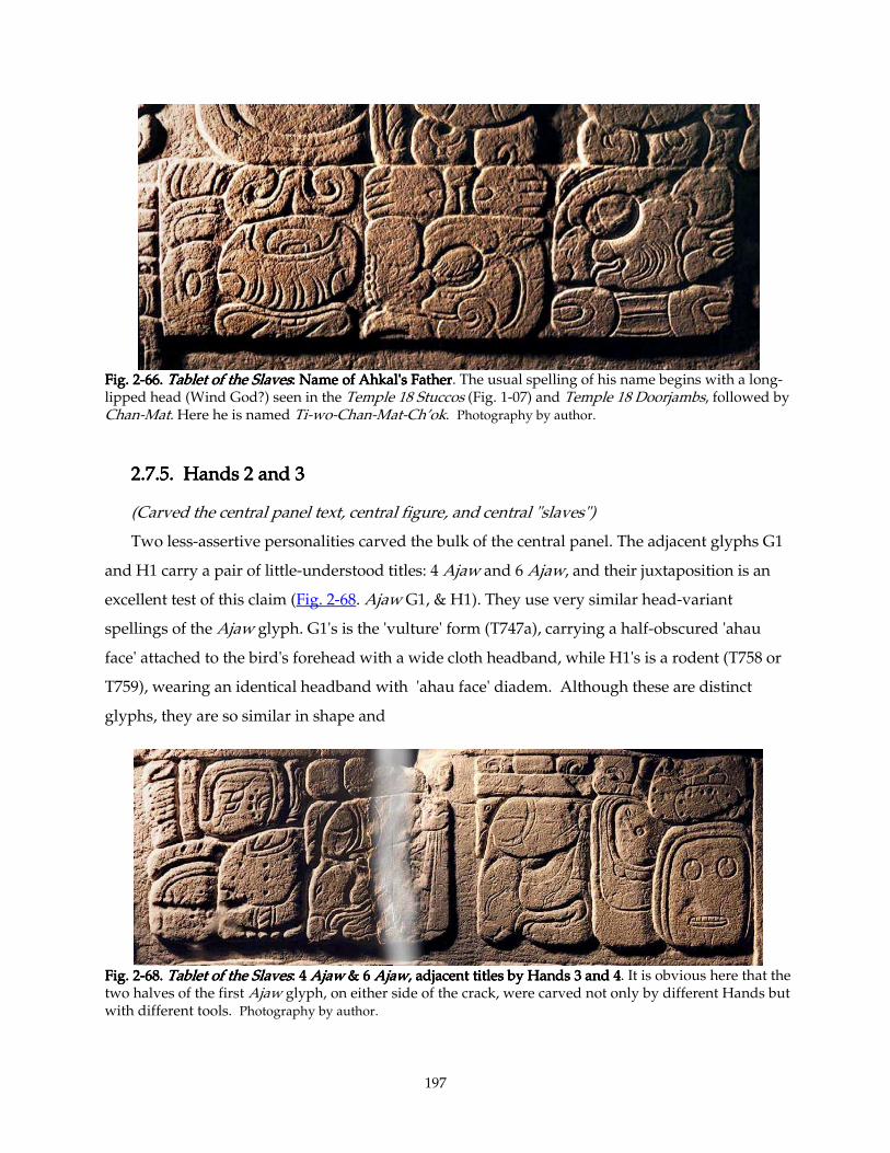
197
Fig. 2Fig. 2Fig. 2Fig. 2----66. 66. 66. 66. Tablet of the SlavesTablet of the SlavesTablet of the SlavesTablet of the Slaves: Name of Ahkal's Father: Name of Ahkal's Father: Name of Ahkal's Father: Name of Ahkal's Father. The usual spelling of his name begins with a long-lipped head (Wind God?) seen in the Temple 18 Stuccos (Fig. 1-07) and Temple 18 Doorjambs, followed by Chan-Mat. Here he is named Ti-wo-Chan-Mat-Ch’ok. Photography by author.
2.7.5. Hands 2 and 32.7.5. Hands 2 and 32.7.5. Hands 2 and 32.7.5. Hands 2 and 3
(Carved the central panel text, central figure, and central "slaves")
Two less-assertive personalities carved the bulk of the central panel. The adjacent glyphs G1
and H1 carry a pair of little-understood titles: 4 Ajaw and 6 Ajaw, and their juxtaposition is an
excellent test of this claim (Fig. 2-68. Ajaw G1, & H1). They use very similar head-variant
spellings of the Ajaw glyph. G1's is the 'vulture' form (T747a), carrying a half-obscured 'ahau
face' attached to the bird's forehead with a wide cloth headband, while H1's is a rodent (T758 or
T759), wearing an identical headband with 'ahau face' diadem. Although these are distinct
glyphs, they are so similar in shape and
Fig. 2Fig. 2Fig. 2Fig. 2----68. 68. 68. 68. Tablet of the SlavesTablet of the SlavesTablet of the SlavesTablet of the Slaves: 4 : 4 : 4 : 4 AjawAjawAjawAjaw & 6 & 6 & 6 & 6 AjawAjawAjawAjaw,,,, adjacent titles by Hands 3 and 4 adjacent titles by Hands 3 and 4 adjacent titles by Hands 3 and 4 adjacent titles by Hands 3 and 4. It is obvious here that the two halves of the first Ajaw glyph, on either side of the crack, were carved not only by different Hands but with different tools. Photography by author.
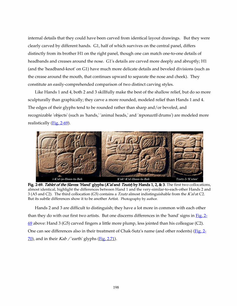
198
internal details that they could have been carved from identical layout drawings. But they were
clearly carved by different hands. G1, half of which survives on the central panel, differs
distinctly from its brother H1 on the right panel, though one can match one-to-one details of
headbands and creases around the nose. G1's details are carved more deeply and abruptly; H1
(and the 'headband-knot' on G1) have much more delicate details and beveled divisions (such as
the crease around the mouth, that continues upward to separate the nose and cheek). They
constitute an easily-comprehended comparison of two distinct carving styles.
Like Hands 1 and 4, both 2 and 3 skillfully make the best of the shallow relief, but do so more
sculpturally than graphically; they carve a more rounded, modeled relief than Hands 1 and 4.
The edges of their glyphs tend to be rounded rather than sharp and/or beveled, and
recognizable 'objects' (such as 'hands,' 'animal heads,' and 'teponaztli drums') are modeled more
realistically (Fig. 2-69).
Fig. 2Fig. 2Fig. 2Fig. 2----69. 69. 69. 69. Tablet of the SlavesTablet of the SlavesTablet of the SlavesTablet of the Slaves: 'Hand' glyphs (: 'Hand' glyphs (: 'Hand' glyphs (: 'Hand' glyphs (K'alK'alK'alK'al and and and and TzutzTzutzTzutzTzutz) by Hands 1, 2, & 3) by Hands 1, 2, & 3) by Hands 1, 2, & 3) by Hands 1, 2, & 3. The first two collocations, almost identical, highlight the differences between Hand 1 and the very-similar-to-each-other Hands 2 and 3 (A5 and C2). The third collocation (G5) contains a Tzutz almost indistinguishable from the K'al at C2. But its subtle differences show it to be another Artist. Photography by author.
Hands 2 and 3 are difficult to distinguish; they have a lot more in common with each other
than they do with our first two artists. But one discerns differences in the 'hand' signs in Fig. 2-
69 above: Hand 3 (G5) carved fingers a little more plump, less jointed than his colleague (C2).
One can see differences also in their treatment of Chak-Sutz's name (and other rodents) (Fig. 2-
70), and in their Kab / 'earth' glyphs (Fig. 2.71).
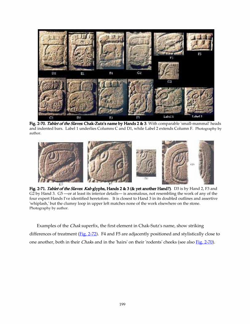
199
Fig. 2Fig. 2Fig. 2Fig. 2----70. 70. 70. 70. TTTTablet of the Slavesablet of the Slavesablet of the Slavesablet of the Slaves: Chak: Chak: Chak: Chak----Zutz's name by Hands 2 & 3Zutz's name by Hands 2 & 3Zutz's name by Hands 2 & 3Zutz's name by Hands 2 & 3. With comparable 'small-mammal' heads and indented bars. Label 1 underlies Columns C and D1, while Label 2 extends Column F. Photography by author.
Fig. 2Fig. 2Fig. 2Fig. 2----71. 71. 71. 71. Tablet of the SlavesTablet of the SlavesTablet of the SlavesTablet of the Slaves: : : : KabKabKabKab glyphs, Hands glyphs, Hands glyphs, Hands glyphs, Hands 2 & 3 (& yet another Hand?)2 & 3 (& yet another Hand?)2 & 3 (& yet another Hand?)2 & 3 (& yet another Hand?). D3 is by Hand 2, F3 and G2 by Hand 3. G5 —or at least its interior details— is anomalous, not resembling the work of any of the four expert Hands I've identified heretofore. It is closest to Hand 3 in its doubled outlines and assertive 'whiplash,' but the clumsy loop in upper left matches none of the work elsewhere on the stone. Photography by author.
Examples of the Chak superfix, the first element in Chak-Sutz's name, show striking
differences of treatment (Fig. 2-72). F4 and F5 are adjacently positioned and stylistically close to
one another, both in their Chaks and in the 'hairs' on their 'rodents' cheeks (see also Fig. 2-70).
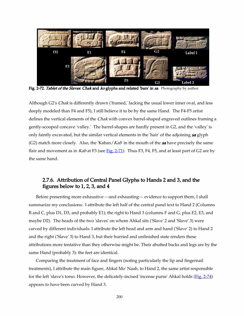
200
Fig. 2Fig. 2Fig. 2Fig. 2----72. 72. 72. 72. Tablet of the SlavesTablet of the SlavesTablet of the SlavesTablet of the Slaves: : : : ChakChakChakChak and and and and kokokoko glyphs and related 'bars' in glyphs and related 'bars' in glyphs and related 'bars' in glyphs and related 'bars' in sasasasa. Photography by author.
Although G2's Chak is differently drawn ('framed,' lacking the usual lower inner oval, and less
deeply modeled than F4 and F5), I still believe it to be by the same Hand. The F4-F5 artist
defines the vertical elements of the Chak with convex barrel-shaped engraved outlines framing a
gently-scooped concave 'valley.' The barrel-shapes are hardly present in G2, and the 'valley' is
only faintly excavated, but the similar vertical elements in the 'hair' of the adjoining sasasasa glyph
(G2) match more closely. Also, the 'Kaban/Kab' in the mouth of the sasasasa have precisely the same
flair and movement as in Kab at F3 (see Fig. 2-71). Thus F3, F4, F5, and at least part of G2 are by
the same hand.
2.7.62.7.62.7.62.7.6. Attribution of Central Panel Glyphs to Hands 2 and 3, and the . Attribution of Central Panel Glyphs to Hands 2 and 3, and the . Attribution of Central Panel Glyphs to Hands 2 and 3, and the . Attribution of Central Panel Glyphs to Hands 2 and 3, and the figures below to 1, 2, 3, and 4figures below to 1, 2, 3, and 4figures below to 1, 2, 3, and 4figures below to 1, 2, 3, and 4
Before presenting more exhaustive —and exhausting— evidence to support them, I shall
summarize my conclusions: I attribute the left half of the central panel text to Hand 2 (Columns
B and C, plus D1, D3, and probably E1); the right to Hand 3 (columns F and G, plus E2, E3, and
maybe D2). The heads of the two 'slaves' on whom Ahkal sits ('Slave' 2 and 'Slave' 3) were
carved by different individuals: I attribute the left head and arm and hand ('Slave' 2) to Hand 2
and the right ('Slave' 3) to Hand 3, but their hurried and unfinished state renders these
attributions more tentative than they otherwise might be. Their abutted backs and legs are by the
same Hand (probably 3): the feet are identical.
Comparing the treatment of face and fingers (noting particularly the lip and fingernail
treatments), I attribute the main figure, Ahkal Mo' Naab, to Hand 2, the same artist responsible
for the left 'slave's torso. However, the delicately-incised 'incense purse' Ahkal holds (Fig. 2-74)
appears to have been carved by Hand 3.
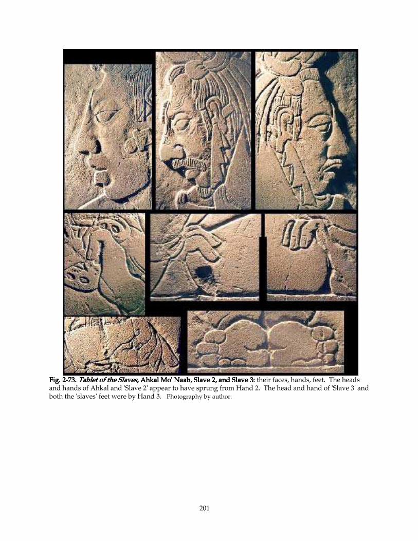
201
Fig. 2Fig. 2Fig. 2Fig. 2----73. 73. 73. 73. Tablet of the SlavesTablet of the SlavesTablet of the SlavesTablet of the Slaves, Ahkal Mo' Naab, Slave 2, and Slave 3:, Ahkal Mo' Naab, Slave 2, and Slave 3:, Ahkal Mo' Naab, Slave 2, and Slave 3:, Ahkal Mo' Naab, Slave 2, and Slave 3: their faces, hands, feet. The heads and hands of Ahkal and 'Slave 2' appear to have sprung from Hand 2. The head and hand of 'Slave 3' and both the 'slaves' feet were by Hand 3. Photography by author.
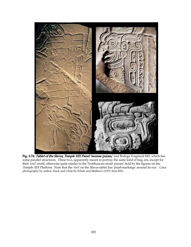
202
Fig. 2Fig. 2Fig. 2Fig. 2----74. 74. 74. 74. Tablet of the SlavesTablet of the SlavesTablet of the SlavesTablet of the Slaves, , , , Temple XIX Panel:Temple XIX Panel:Temple XIX Panel:Temple XIX Panel: 'incense purse 'incense purse 'incense purse 'incense purses,'s,'s,'s,' and Bodega Fragment #45, which has some parallel structures. These two, apparently meant to portray the same kind of bag, are, except for their 'owl' motif, otherwise quite similar to the Teotihuacan-motif 'purses' held by the figures on the Temple XIX Platform. Note that the 'owl' on the Slaves tablet has 'janab markings' around its eye. Color photography by author, black and white by Schele and Mathews (1979, item #45).
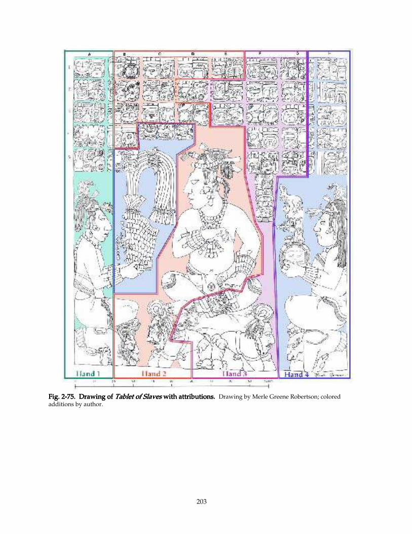
203
Fig. 2Fig. 2Fig. 2Fig. 2----75.75.75.75. Drawing ofDrawing ofDrawing ofDrawing of Tablet of Slaves Tablet of Slaves Tablet of Slaves Tablet of Slaves with attributions.with attributions.with attributions.with attributions. Drawing by Merle Greene Robertson; colored additions by author.
204
2.7.7. De2.7.7. De2.7.7. De2.7.7. Dettttails of Attributionsails of Attributionsails of Attributionsails of Attributions
2.7.7.1. D22.7.7.1. D22.7.7.1. D22.7.7.1. D2
D2 is an anomaly. It shares several qualities with Hand 2 (e. g., 'nose' and 'ear' shape [like E1,
unlike F4]), yet its severe ba 'gopher' is strikingly different from its neighbor C2, and its virtually
unmodelled (unfinished?) Chak and gracefully-drawn Ajaw superfix are strikingly different
from those on E1, which look rather awkward. Its flat Chak is peculiar to itself, as is its stern ba
'gopher,' with its long-tongue and sharp-cornered 'K'an cross.' Comparable to Hand 3, rather
than 2, are its 'cheek hairs' (like E3 and L3, but unlike E1 and K), yet the 'cheek hairs' on Hand 3's
F4 and F5 are finer and more precise. I have attributed D1 and D3 to Hand 2, so if I group D2
with Hand 3, I thereby surround it on three sides with the work of a colleague. This suggestion
strains Occam's razor, yet D2 has too many distinctive personality traits to explain away. I
group it with Hand 3 with many reservations. To attribute it to the intrusion of a fifth Hand is
even less likely.
2.7.7.2. 2.7.7.2. 2.7.7.2. 2.7.7.2. yayayaya and other 'curls' and other 'curls' and other 'curls' and other 'curls'
When I attempted to attribute areas of the middle panel only on the basis of the -yayayaya affixes
(and glyphs of similar form), I came at first to disquietingly different conclusions. These affixes
include the syllable yayayaya (A4, B3, B4, C1, D3, E1, F3) the curling 'flames' of K'ak' (C2, E1, F2, G4),
the 'spacers' on numerals (A3, B2?, B3, D1, C3, E3, G4, G5, H1), the syllable wowowowo (I), the curls on
Sak (F1) and huhuhuhu (H5) and MAT (J), and the spiral 'feet' of the 'daysign cartouche' (A1) (Fig. 2-58).
The yayayaya's support my attribution of the edge panels to Hands 1 and 4, but divide up the central
panel somewhat differently, and demand an explanation.
The deep conical excavation in the spiral on A4 yayayaya is the most assertive example of Hand A's
style with this form. The cavity within, rimmed closely by a precise, fine engraved line, contrasts
boldly with the squarish planar exterior of the same curl, both here and on the 'feet' of A1's
'cartouche.' An exactly similar treatment of the 'spacers' flanking the numeral 1 dot at A3 are
somewhat disguised by their beveled edges as they crowd their neighboring glyphs. (This
treatment, stretched broader, is also accorded the asymmetrical excavation in surface markings
of the 'crescent moon,' just below in A3. See Figs. 2-62 and 2-58).
205
2.7.7.3. Hand 4 at work on the 'drum major' headdress and glyphs2.7.7.3. Hand 4 at work on the 'drum major' headdress and glyphs2.7.7.3. Hand 4 at work on the 'drum major' headdress and glyphs2.7.7.3. Hand 4 at work on the 'drum major' headdress and glyphs associated with it. associated with it. associated with it. associated with it.
Hand 4's treatment of similar 'curls' at H1 ('spacer'), H2 (to), and H5 ('breath-curl' issuing
from the 'mouth' of the 'upended frog') are even more precise and gracefully carved than Hand
1's (See Figs. 2-56 and 2-62). A similar treatment of the wowowowo -'curls' at I1 (the first glyph of the first
'label') conspires with other details ('whiskers' on K1 and H4, for example, or the identical
cursive nananana's of H5 and I1) urging me to attribute the Father's name (I, J, K) also to this Hand. On
the other hand, one could argue that the artist who carved the figure of the Father (Hand 1)
might have been more likely also to have cut Father's name than Hand 4. Adding to this doubt
are the 'curl' and 'oval dot' details in the lower part of the Naab of Ahkal-Mo'-Naab's name at B5.
B5's precise, flat carving seems out of place here, and these details would be more at home with
the comparable elements at H2 (and the eye of the 'Jester' on the 'Drum-Major Headdress'). I am
led inescapably back to my first hunch, that the artist responsible for the Headdress (or at least
the feather panache overlapped by B5), B5 itself, and the nearby glyphs I, J, K (the Father's
Label), seems to be Hand 4.
2.7.72.7.72.7.72.7.7.4. Hand 1's image of the Father, Hand 4's Mother. .4. Hand 1's image of the Father, Hand 4's Mother. .4. Hand 1's image of the Father, Hand 4's Mother. .4. Hand 1's image of the Father, Hand 4's Mother.
Confirming this identification is the identical treatment of the Father's and Mother's fingers
(Figs. 2-60 and 2-63); I have already attributed the Took'-Pakal (and presumably the Lady's
hands), to Hand 4 in 2.7.3 above. However, I still feel that the Father's figure was carved by
Hand 1, after the five glyphs on the same slab. The finishing of his face and garment is very
distinct from that of the Mother, particularly when one compares the lips and sculptural
modeling: The compulsive crystalline perfection of the modeling of Mother's face and ears is
quite in keeping with the similarly precision exhibited the glyphs in Column H.
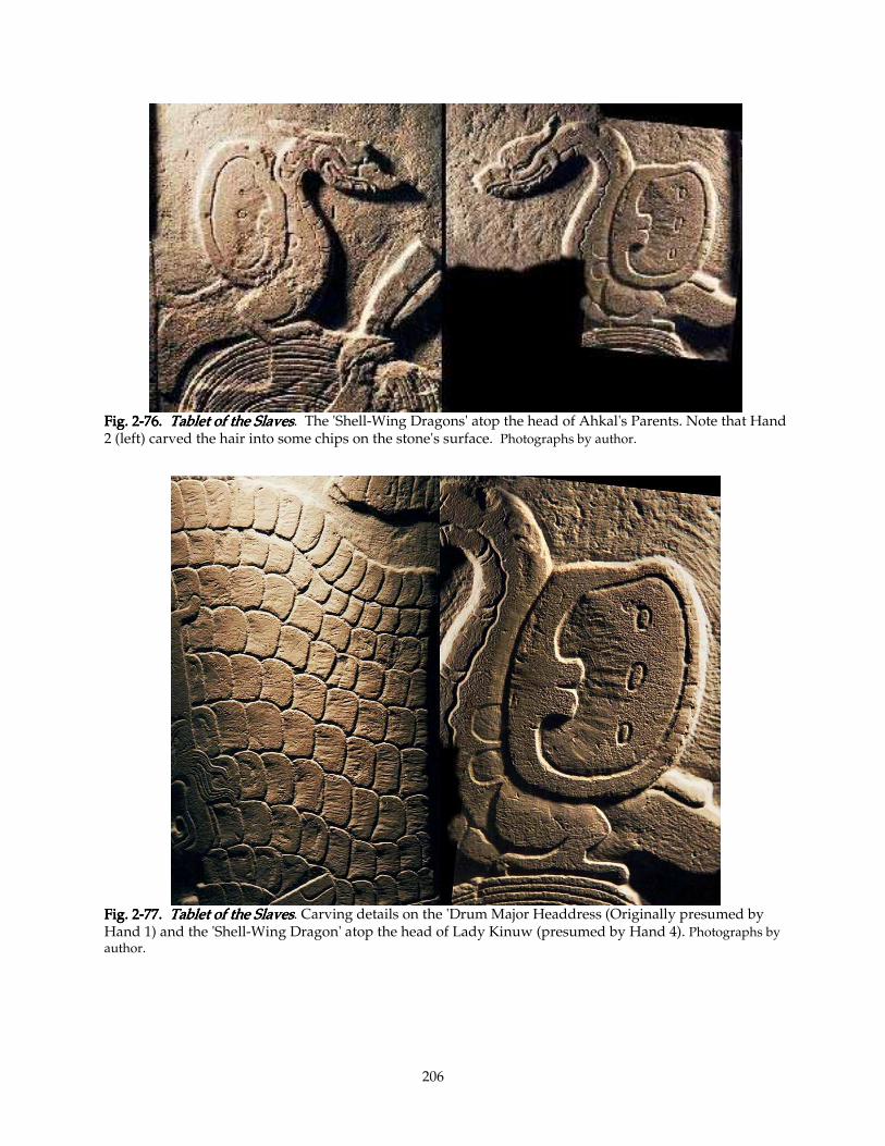
206
Fig. 2Fig. 2Fig. 2Fig. 2----76767676. . . . TaTaTaTablet of the Slavesblet of the Slavesblet of the Slavesblet of the Slaves. The 'Shell-Wing Dragons' atop the head of Ahkal's Parents. Note that Hand 2 (left) carved the hair into some chips on the stone's surface. Photographs by author.
Fig. 2Fig. 2Fig. 2Fig. 2----77777777. . . . Tablet of the SlavesTablet of the SlavesTablet of the SlavesTablet of the Slaves. Carving details on the 'Drum Major Headdress (Originally presumed by Hand 1) and the 'Shell-Wing Dragon' atop the head of Lady Kinuw (presumed by Hand 4). Photographs by author.
207
Likewise, comparing the 'shell-wing dragons' perched on the parents' heads, one is
immediately struck by the difference between the 'shell-wings:' their overall shape, their
modeling (or lack), and the shape of the dots within. The 'dragons' heads at first appear virtually
indistinguishable, but differ in several subtle ways. Note that, in contrast to his high-polish
finish of the rest of this Lady and her Took-Pakal offering, the concavity of the 'shell-wing'
retains the gouge-marks of its making, and these toolmarks compare closely to the those on the
overlapping shell-platelet 'scales' of the 'Drum-Major Headdress' (Figs. 2-76 and 2-77). This
detail supports my attribution of the headdress, and attached glyph B5, to Hand 4.
2.7.7.5 Details of Attributions: Hand C's image of Ahkal, 'Slave' 2, etc. 2.7.7.5 Details of Attributions: Hand C's image of Ahkal, 'Slave' 2, etc. 2.7.7.5 Details of Attributions: Hand C's image of Ahkal, 'Slave' 2, etc. 2.7.7.5 Details of Attributions: Hand C's image of Ahkal, 'Slave' 2, etc.
I believe Hand C carved Ahkal's head and hands. He has a "Hapsburg lip:" his lower lip
turns outward, showing its inner membrane. This lip, and his precise eye-shape, are repeated on
the face of 'Slave' 2, the leftward of the two unfortunates supporting Ahkal. His Mother shares
the "Hapsburg" pout, but Hand B carves her lip in a distinctively different and more precise way,
defining the upper lip as well, and enhancing her expression with a kind of sneer. Five 'face'
glyphs also display this type of lip, as well. H4, J and K show a rather soft version of it; not
unlike the lip of Lady Kinuw-Mat; I attribute all of these to Hand 4. I attribute the Lady's Name
Label (Column L) to Hand 3, even though the 'lips' we see on L1 and L2 closely compare to those
on Ahkal. The 'eyes' do not; they are half-closed like those of Hand 3's G2, and of Hand 4's Lady
Kinuw. (See Figs. 2-64 and 2-65.)
2.7.8. Some Problems With my Attributions2.7.8. Some Problems With my Attributions2.7.8. Some Problems With my Attributions2.7.8. Some Problems With my Attributions
The left 'spacer' curl at G5 (and its awkward 'Kaban curls'), seem a bit anomalous (its
engraved line is far from the edge of the conical cavity—elsewhere it is closely parallel), but it
precisely matches the curled ornaments on Ahkal's 'incense purse' (Figs. 2-58 and 2-74).
Although I am still convinced that Ahkal was carved by Hand 2, I think his 'purse' (as well as the
'slave' directly below it) was the work of Hand 3. Scrutinizing details like this, I sometimes see a
small cluster of anomalous details which seem to form a pattern consistent enough to tempt me
to introduce a fifth artist, here a Hand E, carver of the purse and of G5. This introduction of a
new artist would be supported by G5's clumsy Kaban daysign, which is unparallelled anywhere
on this Tablet. Though I am at a loss to posit a credible explanation for this distinct treatment of
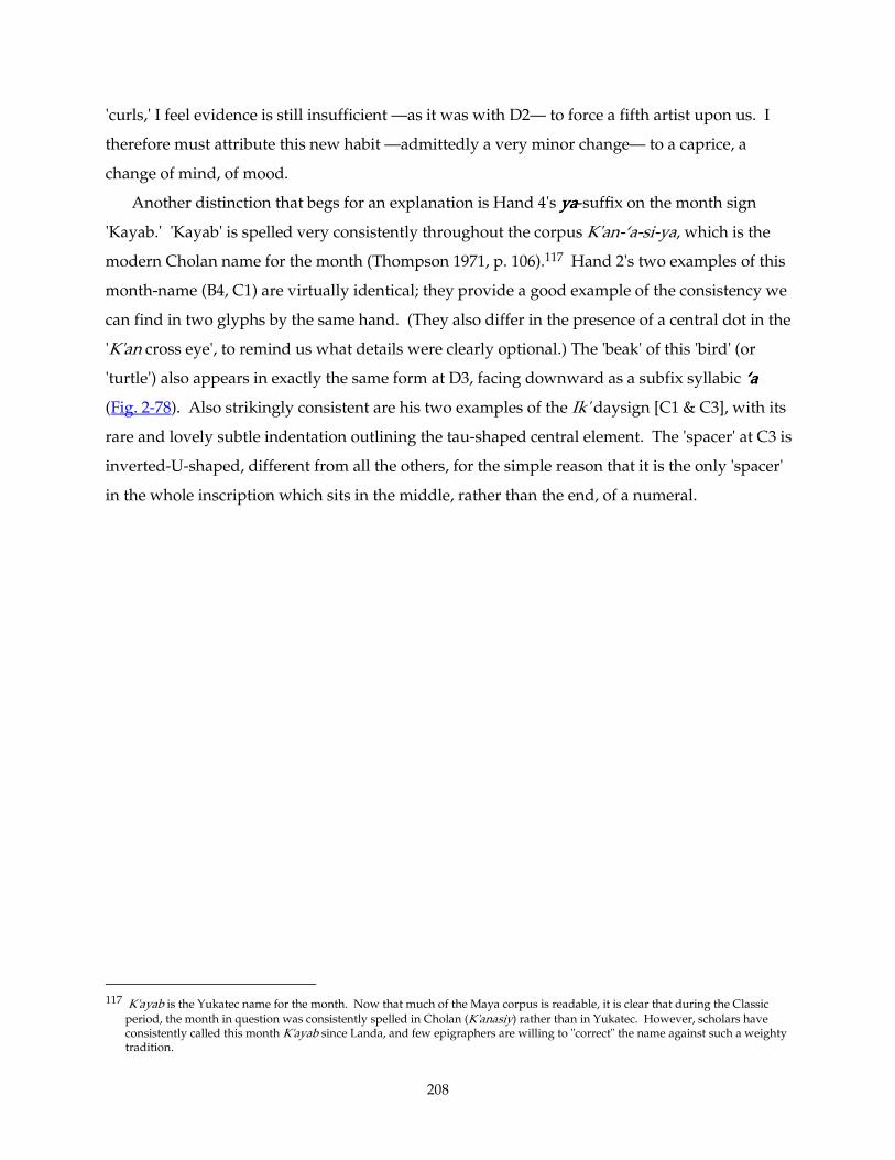
208
'curls,' I feel evidence is still insufficient —as it was with D2— to force a fifth artist upon us. I
therefore must attribute this new habit —admittedly a very minor change— to a caprice, a
change of mind, of mood.
Another distinction that begs for an explanation is Hand 4's yayayaya-suffix on the month sign
'Kayab.' 'Kayab' is spelled very consistently throughout the corpus K'an-‘a-si-ya, which is the
modern Cholan name for the month (Thompson 1971, p. 106).117 Hand 2's two examples of this
month-name (B4, C1) are virtually identical; they provide a good example of the consistency we
can find in two glyphs by the same hand. (They also differ in the presence of a central dot in the
'K'an cross eye', to remind us what details were clearly optional.) The 'beak' of this 'bird' (or
'turtle') also appears in exactly the same form at D3, facing downward as a subfix syllabic ‘a‘a‘a‘a
(Fig. 2-78). Also strikingly consistent are his two examples of the Ik' daysign [C1 & C3], with its
rare and lovely subtle indentation outlining the tau-shaped central element. The 'spacer' at C3 is
inverted-U-shaped, different from all the others, for the simple reason that it is the only 'spacer'
in the whole inscription which sits in the middle, rather than the end, of a numeral.
117 K'ayab is the Yukatec name for the month. Now that much of the Maya corpus is readable, it is clear that during the Classic
period, the month in question was consistently spelled in Cholan (K'anasiy) rather than in Yukatec. However, scholars have consistently called this month K'ayab since Landa, and few epigraphers are willing to "correct" the name against such a weighty tradition.
209
Fig. 2Fig. 2Fig. 2Fig. 2----78787878. . . . Tablet of the SlavesTablet of the SlavesTablet of the SlavesTablet of the Slaves. Comparable glyphs by Hand 2: . Comparable glyphs by Hand 2: . Comparable glyphs by Hand 2: . Comparable glyphs by Hand 2: K'ayab, Ik', 'a, yaK'ayab, Ik', 'a, yaK'ayab, Ik', 'a, yaK'ayab, Ik', 'a, ya. Photographs by author.
The problem is that the form yayayaya takes everywhere else in the inscription is composed of a
pair of rather squashed spirals flanking a fairly realistic 'penis.'118 The 'penis' has an indentation
in the end and a transverse curve indicating the 'glans' (e.g., at A4, B3, D3, F3; Fig. 2-58). Yet in
this collocation —and in this collocation only— the 'penis' is abstracted, lacking indication of a
'glans,' with a central groove to match those on its neighboring 'curls.' This conflicts with the
other yayayaya-syllables drawn by Hand C (B3, D3), which are of the more realistic type. Do we see yet
another personality at work here? Or just a wild hair? Or some peculiar (ancient?) allograph
traditionally associated with the K'ayab collocation (see note 79)?
Comparing D3 with provides an excellent example of the Maya scribal practice of
'overlapping' collocated glyphic elements, a habit so common that examples of the 'overlapped'
or 'partial' forms of many glyphs far outnumber the 'full forms.' (Examples include K'ak', hihihihi, jajajaja,
118 The source of this glyph was apparently acrophonic: the central element a clear image of a penis (yat in Mayan). In most Late
Classic inscriptions, the graphic (too-graphic?) central element was replaced by three dots, probably derived from cursive rendering of the original form. (Linda Schele, personal communication, 1995)
210
K'uh, Ajaw, and many others.) This 'full form' of the ‘a‘a‘a‘a-'beak' is in fact quite rare outside the
K'an-‘a-si-ya /'Kayab' collocation.119
2.8. Technical Matters2.8. Technical Matters2.8. Technical Matters2.8. Technical Matters
2.8.1. The Style Manual for the Tablet of the Slaves2.8.1. The Style Manual for the Tablet of the Slaves2.8.1. The Style Manual for the Tablet of the Slaves2.8.1. The Style Manual for the Tablet of the Slaves
Despite personality differences which I have tried to define above, the four artists who
carved this Tablet hewed closely to a consistent style which is distinct from other monuments
carved at Palenque. This I attribute to the Project Director, who laid out the text and probably
set the standards of fidelity to it. Qualities shared by these four artists which are not universal at
Palenque include the following:
1. Extremely low relief. Palenque's laminar limestone encouraged low-relief designs
(particularly on the huge and early text panels in the Temple of Inscriptions, which doubtless set
a standard for future inscriptions), but the 3-mm depth of this panel is extremely shallow even
by these standards. Only engraved texts such as the Temple XIX Platform and the Panel of the
96 Glyphs are lower (q.v. Figs. 1-21 through 1-27; 1-45 through 1-54).
2. Wide aspect ratio. Most glyphs at Palenque are more or less square, their heights equaling
their widths for the most part. On certain monuments such as the Cross Group Tablets and
Temple XIX Stucco Panel, we see glyphs whose widths are consistently wider than their heights,
with an aspect ratio (height:width) from approximately 9:10 up to about 5:6 or at most 4:5. The
glyph-blocks here are very wide, at least 2:3. This is so wide that the Maya reader could be
forgiven for thinking that a single glyph-block contained both glyphs of a double column (as we
see in the Initial Series of the Cross Group), since indeed most glyph-blocks do divide more or
less in half (for example, all the glyphs in Columns C, D, E, and F).
119 I consider that the 'Kayab' collocation, like many common glyphic 'words' both calendric and non-calendric (e. g., Tuun-ni, the
month 'Xul,' the so-called 'lu-'Bat' or yu-‘Bat’-lu "carving" glyph, the 'fish-wa' spelling of kakaw, etc.), early acquired a "canonical" form which took on a logographic life of its own. This process is quite common in writing system evolution. The most common examples in our writing system are abbreviations: we commonly spell the titles Dr.Dr.Dr.Dr., Mr.Mr.Mr.Mr., and Mrs.Mrs.Mrs.Mrs. in abbreviated form; so commonly that one almost never sees the word "missus" spelled out. A more closely analogous example in European languages is the ampersand (&&&&), which originated in a cursive rendering of the Latin word et (Fig. 2.7-33: origin & development of &&&&). In common cursive handwriting this ligatured form of the letters eeee and tttt was so deeply rooted that it became what one might call a post-phonetic logogram; it transferred with the alphabet from Latin into every European language, most of whose words for "and" are not spelled anything like etetetet. This is to say that perhaps the 'Kayab' collocation developed its own cursive form, developed along its own evolutionary path, slightly divergent from the paths of its consituentconsituentconsituentconsituent syllabic signs, just as &&&& evolved away from eeee and tttt. 'Kayab' thus retained the convention of writing out the "full form" of the ‘a syllable, which disappears almost everywhere else, and perhaps (at least in the scribal school where Hand C learned his trade), acquired a peculiar abstracted, convergent version of ya suffix.
211
3. The use of 'daysign cartouches' which lack 'feet.' While the very first glyph in the
inscription (5 Lamat) sits on the customary three 'feet' at the bottom of daysigns, none of the
other ten dates do. Now, while such minimal cartouches do crop up in many circumstances
(especially Postclassic codices), they are during the Classic a distinct minority. To find three
artists all using them consistently smacks of outside compulsion. This compulsion could easily
take the form of a single layout cartoon —more detailed than usual— designed by one high-
ranking (and opinionated) art director.
4. An extremely common group of visually-related Maya glyphs are the 'stone' signs
(including Tuun, kukukuku, pipipipi, Witz, several calendrical glyphs, and glyphs for "altar" and others). The
diagnostic elements these signs hold in common are a dot-outlined loop projecting from the
lower right side, and a 'bunch of grapes' in the upper left (See Fig. 1-04). This 'bunch of grapes'
usually 'hangs' from the 'ceiling' of the glyph, that is, projects downward directly from its inner
border (just as the dotted loop attaches to the 'wall' of this inner border). Some artists, however,
saw fit to 'hang' the 'grapes' from a flourished 'whiplash line' which gives the impression of a
frowning eyebrow. While this conceit is uncommon elsewhere, it is the unvarying rule for all
four of our calligrapher-carvers (Fig. 3-51. 'stone sign' 'bunches of grapes' & 'dotted curls'). This
kind of consistency can be adequately explained by presuming an externally-imposed standard.
The most likely explanation for this peculiar consistency seems to be, again, that the four were
following a single master-artist's layout.
2.8.2. The 2.8.2. The 2.8.2. The 2.8.2. The Tablet of the Slaves’ Tablet of the Slaves’ Tablet of the Slaves’ Tablet of the Slaves’ production processproduction processproduction processproduction process
I imagine the process to have proceeded roughly thus: The patron orders a panel to be carved
to adorn the Group IV compound. This monument is a sacred one, and can be put up only with
the proper authority from Lord Ahkal Mo' Naab, and from the priests, at an astrologically
auspicious time. The artists, like those described by Landa (See Chapter 4), prepared themselves
with fasting and prayer, and likely abstained from sex and other profane activities for the
duration of the work. The Tablet was possibly too large to fit on a single slab of the best stone, or
perhaps there was a geomantic reason to divide the Tablet across three slabs of stone. (The
aspect ratio of the carved area of the middle panel is 1:1.6, approximately a Golden Section. See
Chapter 2, note 116.) I note that the original planed surface of the stone weathered slightly
before carving (Fig. 1-03), so it must have lain outside for some months or years after quarrying,
before it was selected for this monument.

212
The edges of the slabs were substantially damaged along the seams from the start: the
Father's nose, for instance, was carved 'down' the slope of one of these chipped edges (Fig. 2-64).
(This suggests that the slabs were shifted about quite a bit while awaiting customers.) Along the
seams a rather large gap existed. They must have chosen not to plane down the rough edges of
this gap for some reason —it would have been easy enough for such expert sculptors to fit them
more closely— or, even more puzzling, they chose deliberately to insert this large gap, perhaps
again for some geomantic reason. The slabs were assembled by the Project Master, and the
image and text painted carefully thereon. The Master, an expert calligrapher, drew a careful
layout of every glyph and figure on the Tablet in relatively permanent paint. He preferred
'daysign cartouches' that lack feet, and a distinctive type of 'stone sign' whose 'grapes' depend
from a calligraphic flourish, and other distinctive characteristics which he sternly warned his
carving team —four expert carvers, one of whom was presumably the Master himself— to
follow precisely. I presume he so carefully defined every detail of the Tablet so that the glyphs
cut by the seams would match up. On other monuments, individual cutters sometimes had
some editorial choice over the glyphs they carved, but here they seem to have had unusually
short leashes.
Then the Master separated the three slabs onto adjacent tables or easels, and the teams set to
work. Only on the central slab was there any likelihood of the artists' getting in one another's
way. Four experts cutting simultaneously made short work of the Tablet, perhaps as little as a
single week.
After the slabs were carved, the artists (or perhaps only the Art Director) assembled the
Tablet, set it into a wall, smoothed the gaps with stucco, and one or two artists sculpted the
stucco, connecting the glyph fragments carved on Columns B and G. Very likely, the artists
responsible for this stucco clean-up work also touched up some of the glyphs' stone carving as
they connected them up. This might explain some of the puzzling style details of such glyphs as
B2 and G5. Then the whole Tablet was painted, perhaps red glyphs on blue background, or vice
versa. Not a trace of this paint remains, but evidence from other monuments at Palenque (such
as the Stucco glyphs from Temples XVIII and XIX) and elsewhere make it virtually certain that
the Tablet of the Slaves once had rich polychromy.
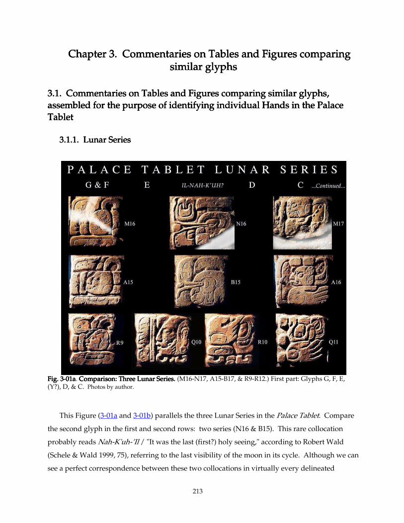
213
Chapter 3Chapter 3Chapter 3Chapter 3. . . . Commentaries on Tables and Figures comparing Commentaries on Tables and Figures comparing Commentaries on Tables and Figures comparing Commentaries on Tables and Figures comparing similar glyphssimilar glyphssimilar glyphssimilar glyphs
3.13.13.13.1. . . . Commentaries on Tables and Figures comparing similar glyphs, Commentaries on Tables and Figures comparing similar glyphs, Commentaries on Tables and Figures comparing similar glyphs, Commentaries on Tables and Figures comparing similar glyphs,
assembled for the purpose of identifying individual Hands in the Palace assembled for the purpose of identifying individual Hands in the Palace assembled for the purpose of identifying individual Hands in the Palace assembled for the purpose of identifying individual Hands in the Palace
TabletTabletTabletTablet
3.1.13.1.13.1.13.1.1. Lunar Series. Lunar Series. Lunar Series. Lunar Series
Fig. 3Fig. 3Fig. 3Fig. 3----01a01a01a01a. Comparison: Three Lunar Series.Comparison: Three Lunar Series.Comparison: Three Lunar Series.Comparison: Three Lunar Series. (M16-N17, A15-B17, & R9-R12.) First part: Glyphs G, F, E, (Y?), D, & C. Photos by author.
This Figure (3-01a and 3-01b) parallels the three Lunar Series in the Palace Tablet. Compare
the second glyph in the first and second rows: two series (N16 & B15). This rare collocation
probably reads Nah-K'uh-’Il / "It was the last (first?) holy seeing," according to Robert Wald
(Schele & Wald 1999, 75), referring to the last visibility of the moon in its cycle. Although we can
see a perfect correspondence between these two collocations in virtually every delineated
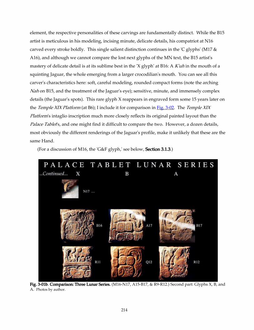
214
element, the respective personalities of these carvings are fundamentally distinct. While the B15
artist is meticulous in his modeling, incising minute, delicate details, his compatriot at N16
carved every stroke boldly. This single salient distinction continues in the 'C glyphs' (M17 &
A16), and although we cannot compare the lost next glyphs of the MN text, the B15 artist's
mastery of delicate detail is at its sublime best in the 'X glyph' at B16: A K'uh in the mouth of a
squinting Jaguar, the whole emerging from a larger crocodilian's mouth. You can see all this
carver's characteristics here: soft, careful modeling, rounded compact forms (note the arching
Nah on B15, and the treatment of the Jaguar's eye); sensitive, minute, and immensely complex
details (the Jaguar's spots). This rare glyph X reappears in engraved form some 15 years later on
the Temple XIX Platform (at B6); I include it for comparison in Fig. 3-02. The Temple XIX
Platform's intaglio inscription much more closely reflects its original painted layout than the
Palace Tablet's, and one might find it difficult to compare the two. However, a dozen details,
most obviously the different renderings of the Jaguar's profile, make it unlikely that these are the
same Hand.
(For a discussion of M16, the 'G&F glyph,' see below, Section 3.1.3Section 3.1.3Section 3.1.3Section 3.1.3.)
Fig. 3Fig. 3Fig. 3Fig. 3----01b01b01b01b. Comparison: Three Lunar Series.Comparison: Three Lunar Series.Comparison: Three Lunar Series.Comparison: Three Lunar Series. (M16-N17, A15-B17, & R9-R12.) Second part: Glyphs X, B, and A. Photos by author.
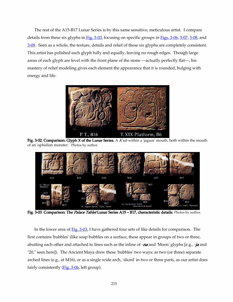
215
The rest of the A15-B17 Lunar Series is by this same sensitive, meticulous artist. I compare
details from these six glyphs in Fig. 3-03, focusing on specific groups in Figs. 3-06, 3-07, 3-08, and
3-09. Seen as a whole, the texture, details and relief of these six glyphs are completely consistent.
This artist has polished each glyph fully and equally, leaving no rough edges. Though large
areas of each glyph are level with the front plane of the stone —actually perfectly flat—, his
mastery of relief modeling gives each element the appearance that it is rounded, bulging with
energy and life.
Fig. 3Fig. 3Fig. 3Fig. 3----02020202. Comparison: Glyph X of the Lunar Series.Comparison: Glyph X of the Lunar Series.Comparison: Glyph X of the Lunar Series.Comparison: Glyph X of the Lunar Series. A K'uh within a 'jaguar' mouth, both within the mouth of an 'ophidian monster.' Photos by author.
Fig. 3Fig. 3Fig. 3Fig. 3----03030303. Comparison: The Comparison: The Comparison: The Comparison: The Palace TabletPalace TabletPalace TabletPalace Tablet Lunar Series A15 Lunar Series A15 Lunar Series A15 Lunar Series A15 –––– B17, characteristic details. B17, characteristic details. B17, characteristic details. B17, characteristic details. Photos by author.
In the lower area of Fig. 3-03, I have gathered four sets of like details for comparison. The
first contains 'bubbles' (like soap bubbles on a surface, these appear in groups of two or three,
abutting each other and attached to lines such as the inline of -nananana and 'Moon' glyphs [e.g., -jajajaja and
"20," seen here]). The Ancient Maya drew these 'bubbles' two ways: as two (or three) separate
arched lines (e.g., at M16), or as a single wide arch, 'sliced' in two or three parts, as our artist does
fairly consistently (Fig. 3-06, left group).
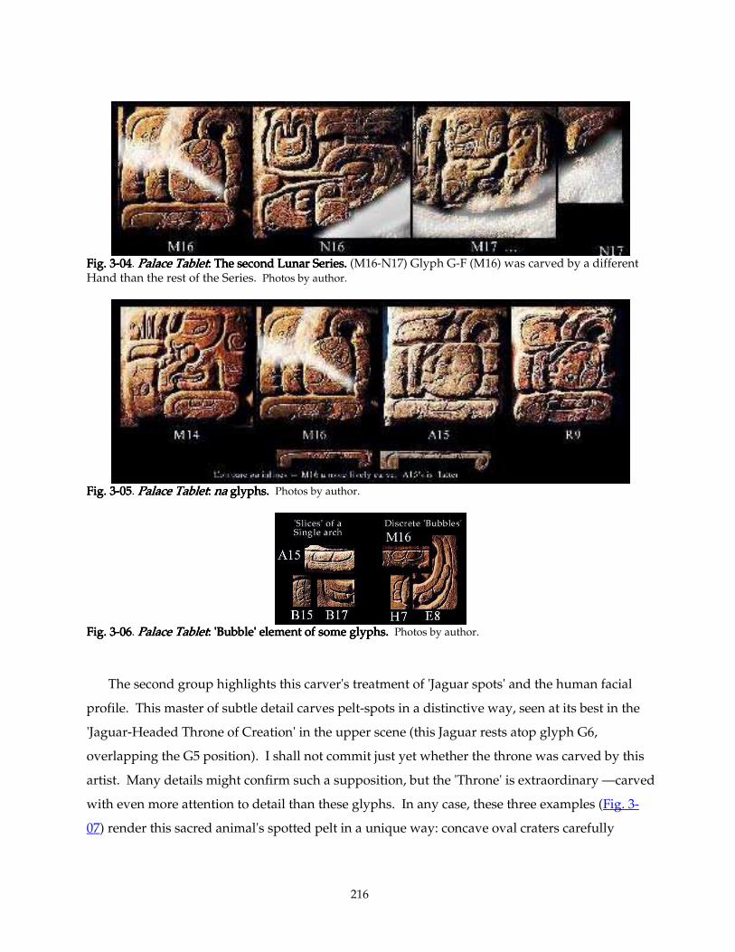
216
Fig. 3Fig. 3Fig. 3Fig. 3----04040404. Palace TabletPalace TabletPalace TabletPalace Tablet: The second Lunar Series.: The second Lunar Series.: The second Lunar Series.: The second Lunar Series. (M16-N17) Glyph G-F (M16) was carved by a different Hand than the rest of the Series. Photos by author.
Fig. 3Fig. 3Fig. 3Fig. 3----05050505. Palace TabletPalace TabletPalace TabletPalace Tablet: : : : nananana glyphs. glyphs. glyphs. glyphs. Photos by author.
Fig. 3Fig. 3Fig. 3Fig. 3----06060606. Palace TabletPalace TabletPalace TabletPalace Tablet: : : : 'Bubble' element of some glyphs.'Bubble' element of some glyphs.'Bubble' element of some glyphs.'Bubble' element of some glyphs. Photos by author.
The second group highlights this carver's treatment of 'Jaguar spots' and the human facial
profile. This master of subtle detail carves pelt-spots in a distinctive way, seen at its best in the
'Jaguar-Headed Throne of Creation' in the upper scene (this Jaguar rests atop glyph G6,
overlapping the G5 position). I shall not commit just yet whether the throne was carved by this
artist. Many details might confirm such a supposition, but the 'Throne' is extraordinary —carved
with even more attention to detail than these glyphs. In any case, these three examples (Fig. 3-
07) render this sacred animal's spotted pelt in a unique way: concave oval craters carefully
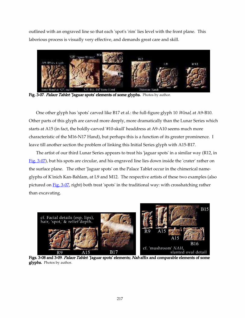
217
outlined with an engraved line so that each 'spot's 'rim' lies level with the front plane. This
laborious process is visually very effective, and demands great care and skill.
Fig. 3Fig. 3Fig. 3Fig. 3----00007777. Palace TabletPalace TabletPalace TabletPalace Tablet: : : : 'Jaguar spots' elements of some glyphs.'Jaguar spots' elements of some glyphs.'Jaguar spots' elements of some glyphs.'Jaguar spots' elements of some glyphs. Photos by author.
One other glyph has 'spots' carved like B17 et al.: the full-figure glyph 10 Winal, at A9-B10.
Other parts of this glyph are carved more deeply, more dramatically than the Lunar Series which
starts at A15 (in fact, the boldly-carved '#10-skull' headdress at A9-A10 seems much more
characteristic of the M16-N17 Hand), but perhaps this is a function of its greater prominence. I
leave till another section the problem of linking this Initial Series glyph with A15-B17.
The artist of our third Lunar Series appears to treat his 'jaguar spots' in a similar way (R12, in
Fig. 3-07), but his spots are circular, and his engraved line lies down inside the 'crater' rather on
the surface plane. The other 'Jaguar spots' on the Palace Tablet occur in the chimerical name-
glyphs of K'inich Kan-Bahlam, at L9 and M12. The respective artists of these two examples (also
pictured on Fig. 3-07, right) both treat 'spots' in the traditional way: with crosshatching rather
than excavating.
Figs. 3Figs. 3Figs. 3Figs. 3----08 and 308 and 308 and 308 and 3----09090909. Palace TabletPalace TabletPalace TabletPalace Tablet: : : : 'Jaguar spots' elements; 'Jaguar spots' elements; 'Jaguar spots' elements; 'Jaguar spots' elements; NahNahNahNah affix and comparable elements of some affix and comparable elements of some affix and comparable elements of some affix and comparable elements of some glyphs.glyphs.glyphs.glyphs. Photos by author.
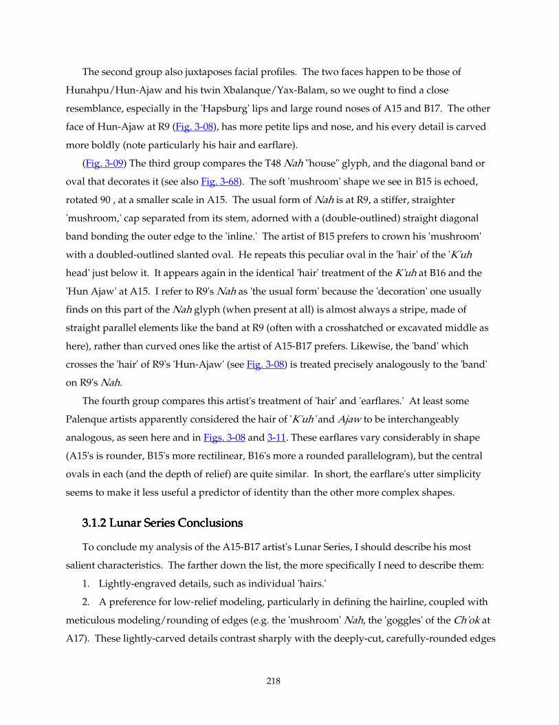
218
The second group also juxtaposes facial profiles. The two faces happen to be those of
Hunahpu/Hun-Ajaw and his twin Xbalanque/Yax-Balam, so we ought to find a close
resemblance, especially in the 'Hapsburg' lips and large round noses of A15 and B17. The other
face of Hun-Ajaw at R9 (Fig. 3-08), has more petite lips and nose, and his every detail is carved
more boldly (note particularly his hair and earflare).
(Fig. 3-09) The third group compares the T48 Nah "house" glyph, and the diagonal band or
oval that decorates it (see also Fig. 3-68). The soft 'mushroom' shape we see in B15 is echoed,
rotated 90°, at a smaller scale in A15. The usual form of Nah is at R9, a stiffer, straighter
'mushroom,' cap separated from its stem, adorned with a (double-outlined) straight diagonal
band bonding the outer edge to the 'inline.' The artist of B15 prefers to crown his 'mushroom'
with a doubled-outlined slanted oval. He repeats this peculiar oval in the 'hair' of the 'K'uh
head' just below it. It appears again in the identical 'hair' treatment of the K'uh at B16 and the
'Hun Ajaw' at A15. I refer to R9's Nah as 'the usual form' because the 'decoration' one usually
finds on this part of the Nah glyph (when present at all) is almost always a stripe, made of
straight parallel elements like the band at R9 (often with a crosshatched or excavated middle as
here), rather than curved ones like the artist of A15-B17 prefers. Likewise, the 'band' which
crosses the 'hair' of R9's 'Hun-Ajaw' (see Fig. 3-08) is treated precisely analogously to the 'band'
on R9's Nah.
The fourth group compares this artist's treatment of 'hair' and 'earflares.' At least some
Palenque artists apparently considered the hair of 'K'uh' and Ajaw to be interchangeably
analogous, as seen here and in Figs. 3-08 and 3-11. These earflares vary considerably in shape
(A15's is rounder, B15's more rectilinear, B16's more a rounded parallelogram), but the central
ovals in each (and the depth of relief) are quite similar. In short, the earflare's utter simplicity
seems to make it less useful a predictor of identity than the other more complex shapes.
3.1.2 Lunar Seri3.1.2 Lunar Seri3.1.2 Lunar Seri3.1.2 Lunar Series Conclusionses Conclusionses Conclusionses Conclusions
To conclude my analysis of the A15-B17 artist's Lunar Series, I should describe his most
salient characteristics. The farther down the list, the more specifically I need to describe them:
1. Lightly-engraved details, such as individual 'hairs.'
2. A preference for low-relief modeling, particularly in defining the hairline, coupled with
meticulous modeling/rounding of edges (e.g. the 'mushroom' Nah, the 'goggles' of the Ch'ok at
A17). These lightly-carved details contrast sharply with the deeply-cut, carefully-rounded edges
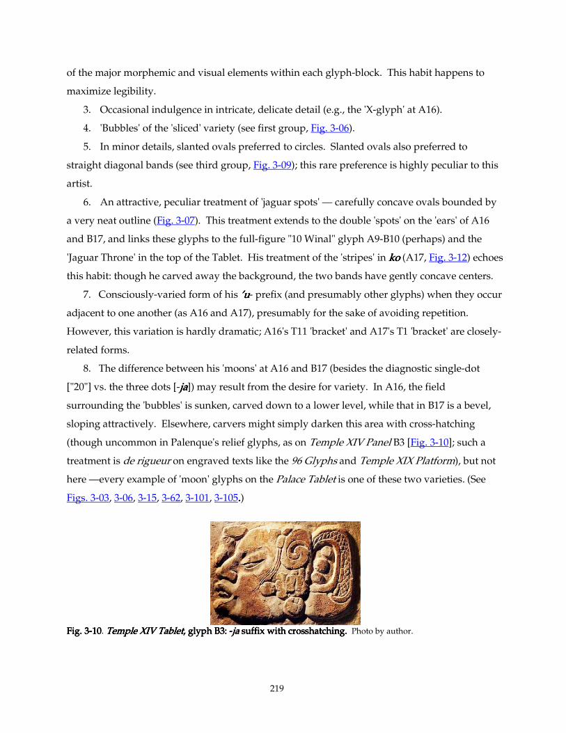
219
of the major morphemic and visual elements within each glyph-block. This habit happens to
maximize legibility.
3. Occasional indulgence in intricate, delicate detail (e.g., the 'X-glyph' at A16).
4. 'Bubbles' of the 'sliced' variety (see first group, Fig. 3-06).
5. In minor details, slanted ovals preferred to circles. Slanted ovals also preferred to
straight diagonal bands (see third group, Fig. 3-09); this rare preference is highly peculiar to this
artist.
6. An attractive, peculiar treatment of 'jaguar spots' — carefully concave ovals bounded by
a very neat outline (Fig. 3-07). This treatment extends to the double 'spots' on the 'ears' of A16
and B17, and links these glyphs to the full-figure "10 Winal" glyph A9-B10 (perhaps) and the
'Jaguar Throne' in the top of the Tablet. His treatment of the 'stripes' in kokokoko (A17, Fig. 3-12) echoes
this habit: though he carved away the background, the two bands have gently concave centers.
7. Consciously-varied form of his ’u’u’u’u- prefix (and presumably other glyphs) when they occur
adjacent to one another (as A16 and A17), presumably for the sake of avoiding repetition.
However, this variation is hardly dramatic; A16's T11 'bracket' and A17's T1 'bracket' are closely-
related forms.
8. The difference between his 'moons' at A16 and B17 (besides the diagnostic single-dot
["20"] vs. the three dots [-jajajaja]) may result from the desire for variety. In A16, the field
surrounding the 'bubbles' is sunken, carved down to a lower level, while that in B17 is a bevel,
sloping attractively. Elsewhere, carvers might simply darken this area with cross-hatching
(though uncommon in Palenque's relief glyphs, as on Temple XIV Panel B3 [Fig. 3-10]; such a
treatment is de rigueur on engraved texts like the 96 Glyphs and Temple XIX Platform), but not
here —every example of 'moon' glyphs on the Palace Tablet is one of these two varieties. (See
Figs. 3-03, 3-06, 3-15, 3-62, 3-101, 3-105....)
Fig. 3Fig. 3Fig. 3Fig. 3----10101010. TTTTemple XIV Tabletemple XIV Tabletemple XIV Tabletemple XIV Tablet, glyph B3, glyph B3, glyph B3, glyph B3: : : : ----jajajaja suffix with crosshatching. suffix with crosshatching. suffix with crosshatching. suffix with crosshatching. Photo by author.
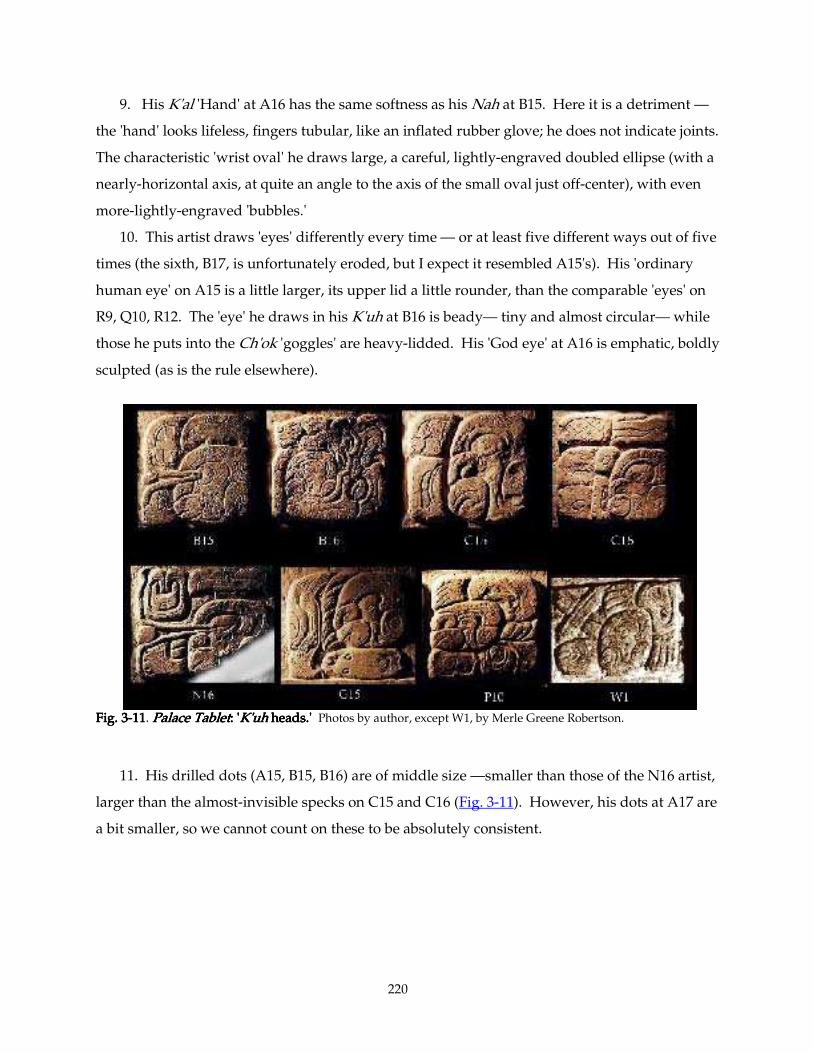
220
9. His K'al 'Hand' at A16 has the same softness as his Nah at B15. Here it is a detriment —
the 'hand' looks lifeless, fingers tubular, like an inflated rubber glove; he does not indicate joints.
The characteristic 'wrist oval' he draws large, a careful, lightly-engraved doubled ellipse (with a
nearly-horizontal axis, at quite an angle to the axis of the small oval just off-center), with even
more-lightly-engraved 'bubbles.'
10. This artist draws 'eyes' differently every time — or at least five different ways out of five
times (the sixth, B17, is unfortunately eroded, but I expect it resembled A15's). His 'ordinary
human eye' on A15 is a little larger, its upper lid a little rounder, than the comparable 'eyes' on
R9, Q10, R12. The 'eye' he draws in his K'uh at B16 is beady— tiny and almost circular— while
those he puts into the Ch'ok 'goggles' are heavy-lidded. His 'God eye' at A16 is emphatic, boldly
sculpted (as is the rule elsewhere).
Fig. 3Fig. 3Fig. 3Fig. 3----11111111. Palace TabletPalace TabletPalace TabletPalace Tablet: ': ': ': 'K'uhK'uhK'uhK'uh heads.' heads.' heads.' heads.' Photos by author, except W1, by Merle Greene Robertson.
11. His drilled dots (A15, B15, B16) are of middle size —smaller than those of the N16 artist,
larger than the almost-invisible specks on C15 and C16 (Fig. 3-11). However, his dots at A17 are
a bit smaller, so we cannot count on these to be absolutely consistent.
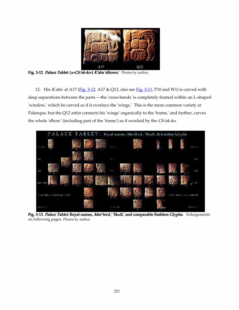
221
Fig. 3Fig. 3Fig. 3Fig. 3----12121212. Palace TabletPalace TabletPalace TabletPalace Tablet: (: (: (: (uuuu----Ch'okCh'okCh'okCh'ok----kokokoko----) ) ) ) K'abaK'abaK'abaK'aba 'elbows.' 'elbows.' 'elbows.' 'elbows.' Photos by author.
12. His K'aba at A17 (Fig. 3-12. A17 & Q12, also see Fig. 3-11, P10 and W1) is carved with
deep separations between the parts —the 'cross-bands' is completely framed within an L-shaped
'window,' which he carved as if it overlays the 'wings.' This is the more common variety at
Palenque, but the Q12 artist connects his 'wings' organically to the 'frame,' and further, carves
the whole 'elbow' (including part of the 'frame') as if overlaid by the Ch'ok-ko.
Fig. 3Fig. 3Fig. 3Fig. 3----13131313. PaPaPaPalace Tabletlace Tabletlace Tabletlace Tablet: Royal names, : Royal names, : Royal names, : Royal names, MatMatMatMat----'bird,' 'Skull,' and comparable Emblem Glyphs. 'bird,' 'Skull,' and comparable Emblem Glyphs. 'bird,' 'Skull,' and comparable Emblem Glyphs. 'bird,' 'Skull,' and comparable Emblem Glyphs. Enlargements on following pages. Photos by author.
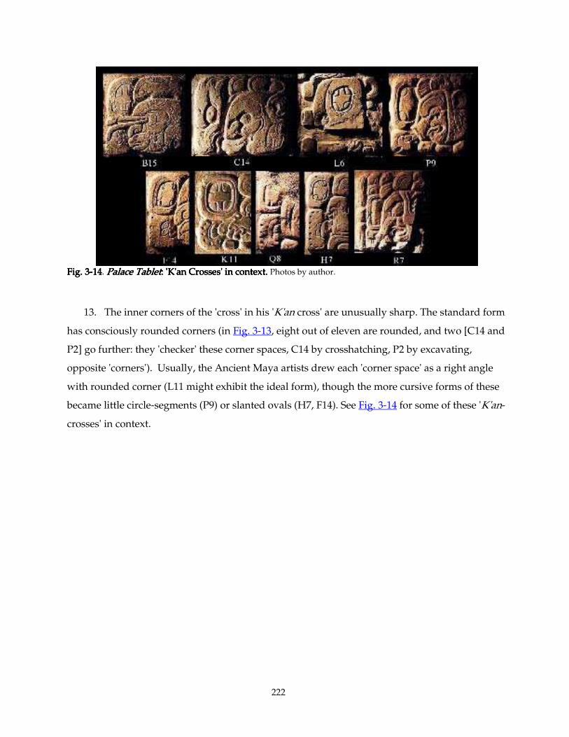
222
Fig. 3Fig. 3Fig. 3Fig. 3----14141414. Palace TabletPalace TabletPalace TabletPalace Tablet: 'K'an Crosses' in context.: 'K'an Crosses' in context.: 'K'an Crosses' in context.: 'K'an Crosses' in context. Photos by author.
13. The inner corners of the 'cross' in his 'K'an cross' are unusually sharp. The standard form
has consciously rounded corners (in Fig. 3-13, eight out of eleven are rounded, and two [C14 and
P2] go further: they 'checker' these corner spaces, C14 by crosshatching, P2 by excavating,
opposite 'corners'). Usually, the Ancient Maya artists drew each 'corner space' as a right angle
with rounded corner (L11 might exhibit the ideal form), though the more cursive forms of these
became little circle-segments (P9) or slanted ovals (H7, F14). See Fig. 3-14 for some of these 'K'an-
crosses' in context.
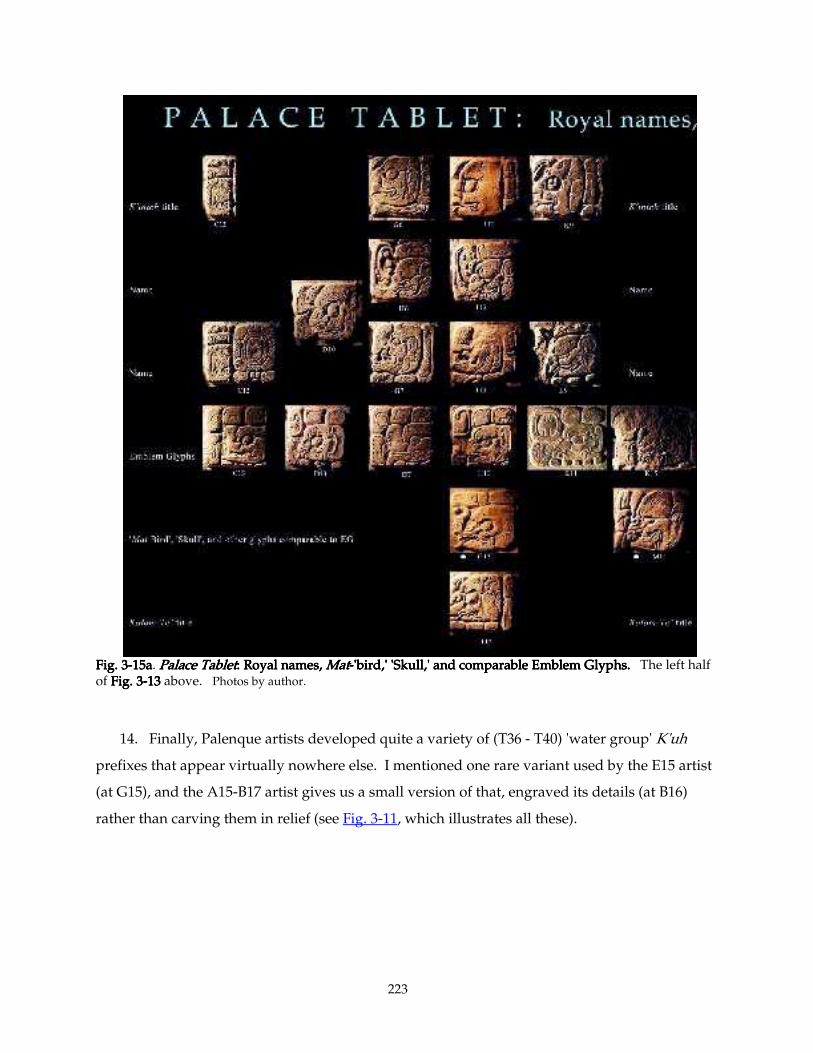
223
Fig. 3Fig. 3Fig. 3Fig. 3----15a15a15a15a. Palace TabletPalace TabletPalace TabletPalace Tablet: Royal names, : Royal names, : Royal names, : Royal names, MatMatMatMat----'bird,' 'Skull,' and comparable Emblem Glyphs. 'bird,' 'Skull,' and comparable Emblem Glyphs. 'bird,' 'Skull,' and comparable Emblem Glyphs. 'bird,' 'Skull,' and comparable Emblem Glyphs. The left half of Fig. 3Fig. 3Fig. 3Fig. 3----13131313 above. Photos by author.
14. Finally, Palenque artists developed quite a variety of (T36 - T40) 'water group' K'uh
prefixes that appear virtually nowhere else. I mentioned one rare variant used by the E15 artist
(at G15), and the A15-B17 artist gives us a small version of that, engraved its details (at B16)
rather than carving them in relief (see Fig. 3-11, which illustrates all these).
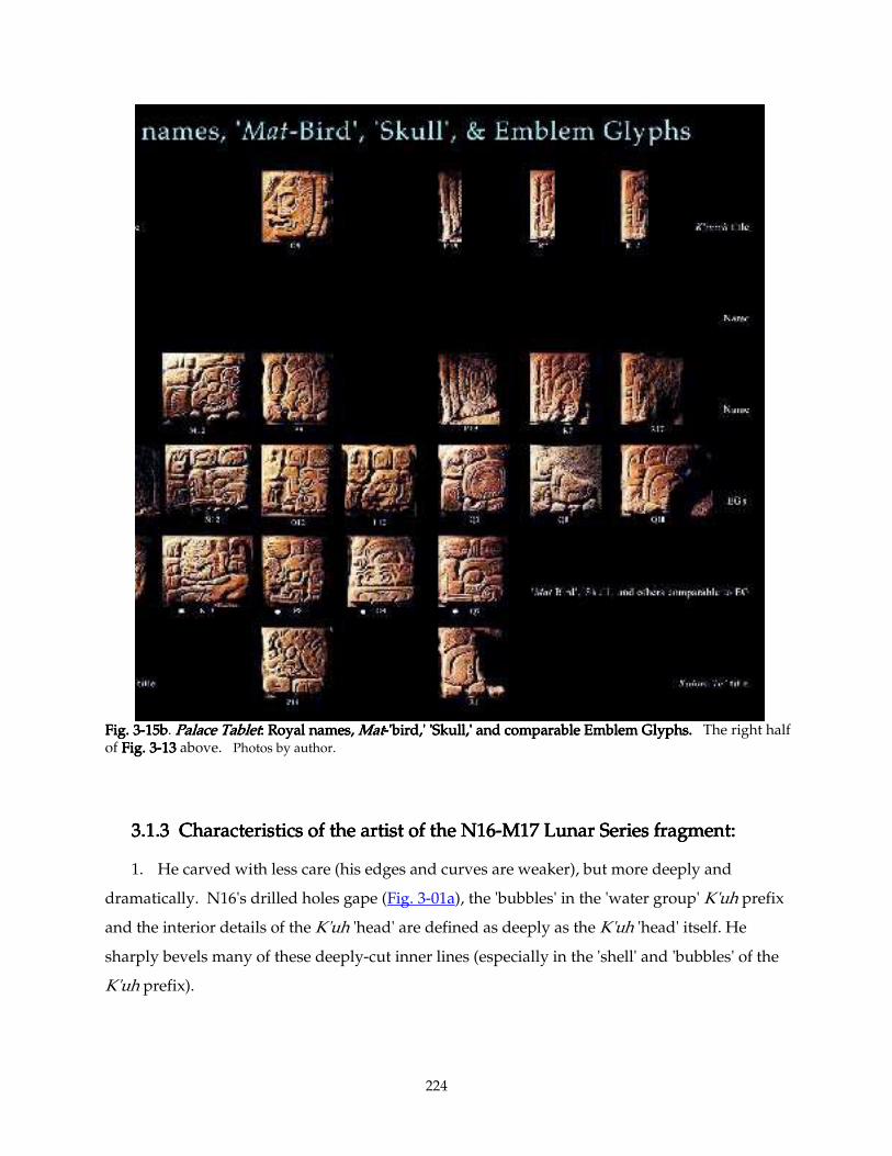
224
Fig. 3Fig. 3Fig. 3Fig. 3----15b15b15b15b. Palace TabletPalace TabletPalace TabletPalace Tablet: Royal names, : Royal names, : Royal names, : Royal names, MatMatMatMat----'bird,' 'Skull,' and comparable Emblem Glyphs. 'bird,' 'Skull,' and comparable Emblem Glyphs. 'bird,' 'Skull,' and comparable Emblem Glyphs. 'bird,' 'Skull,' and comparable Emblem Glyphs. The right half of Fig. 3Fig. 3Fig. 3Fig. 3----13131313 above. Photos by author.
3.1.3 C3.1.3 C3.1.3 C3.1.3 Characteristics of the artist of the N16haracteristics of the artist of the N16haracteristics of the artist of the N16haracteristics of the artist of the N16----M17 Lunar Series fragment:M17 Lunar Series fragment:M17 Lunar Series fragment:M17 Lunar Series fragment:
1. He carved with less care (his edges and curves are weaker), but more deeply and
dramatically. N16's drilled holes gape (Fig. 3-01a), the 'bubbles' in the 'water group' K'uh prefix
and the interior details of the K'uh 'head' are defined as deeply as the K'uh 'head' itself. He
sharply bevels many of these deeply-cut inner lines (especially in the 'shell' and 'bubbles' of the
K'uh prefix).
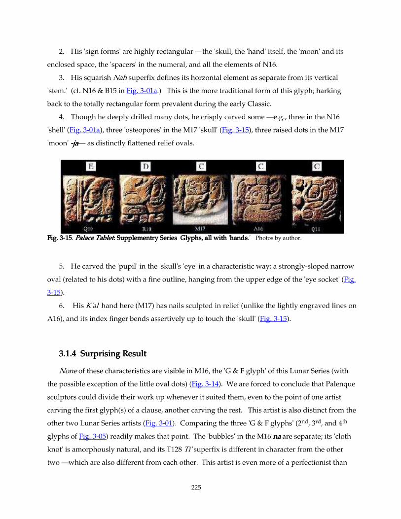
225
2. His 'sign forms' are highly rectangular —the 'skull, the 'hand' itself, the 'moon' and its
enclosed space, the 'spacers' in the numeral, and all the elements of N16.
3. His squarish Nah superfix defines its horzontal element as separate from its vertical
'stem.' (cf. N16 & B15 in Fig. 3-01a.) This is the more traditional form of this glyph; harking
back to the totally rectangular form prevalent during the early Classic.
4. Though he deeply drilled many dots, he crisply carved some —e.g., three in the N16
'shell' (Fig. 3-01a), three 'osteopores' in the M17 'skull' (Fig. 3-15), three raised dots in the M17
'moon' ----jajajaja— as distinctly flattened relief ovals.
Fig. 3Fig. 3Fig. 3Fig. 3----15151515. Palace TabletPalace TabletPalace TabletPalace Tablet: Supplementry Series Glyphs, all with 'hands: Supplementry Series Glyphs, all with 'hands: Supplementry Series Glyphs, all with 'hands: Supplementry Series Glyphs, all with 'hands.' Photos by author.
5. He carved the 'pupil' in the 'skull's 'eye' in a characteristic way: a strongly-sloped narrow
oval (related to his dots) with a fine outline, hanging from the upper edge of the 'eye socket' (Fig.
3-15).
6. His K'al' hand here (M17) has nails sculpted in relief (unlike the lightly engraved lines on
A16), and its index finger bends assertively up to touch the 'skull' (Fig. 3-15).
3.1.43.1.43.1.43.1.4 Surprising Result Surprising Result Surprising Result Surprising Result
None of these characteristics are visible in M16, the 'G & F glyph' of this Lunar Series (with
the possible exception of the little oval dots) (Fig. 3-14). We are forced to conclude that Palenque
sculptors could divide their work up whenever it suited them, even to the point of one artist
carving the first glyph(s) of a clause, another carving the rest. This artist is also distinct from the
other two Lunar Series artists (Fig. 3-01). Comparing the three 'G & F glyphs' (2nd, 3rd, and 4th
glyphs of Fig. 3-05) readily makes that point. The 'bubbles' in the M16 nananana are separate; its 'cloth
knot' is amorphously natural, and its T128 Ti' superfix is different in character from the other
two —which are also different from each other. This artist is even more of a perfectionist than
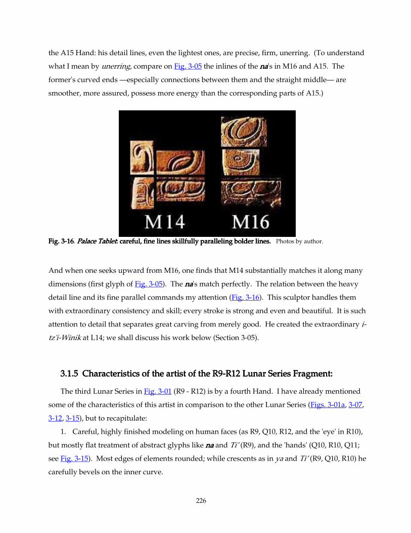
226
the A15 Hand: his detail lines, even the lightest ones, are precise, firm, unerring. (To understand
what I mean by unerring, compare on Fig. 3-05 the inlines of the nananana's in M16 and A15. The
former's curved ends —especially connections between them and the straight middle— are
smoother, more assured, possess more energy than the corresponding parts of A15.)
Fig. 3Fig. 3Fig. 3Fig. 3----16161616. Palace TabletPalace TabletPalace TabletPalace Tablet: careful, fine lines skillfully paralleling bolder lines.: careful, fine lines skillfully paralleling bolder lines.: careful, fine lines skillfully paralleling bolder lines.: careful, fine lines skillfully paralleling bolder lines. Photos by author.
And when one seeks upward from M16, one finds that M14 substantially matches it along many
dimensions (first glyph of Fig. 3-05). The nananana's match perfectly. The relation between the heavy
detail line and its fine parallel commands my attention (Fig. 3-16). This sculptor handles them
with extraordinary consistency and skill; every stroke is strong and even and beautiful. It is such
attention to detail that separates great carving from merely good. He created the extraordinary i-
tz'i-Winik at L14; we shall discuss his work below (Section 3-05).
3.1.53.1.53.1.53.1.5 Characteristics of the artist of the R9 Characteristics of the artist of the R9 Characteristics of the artist of the R9 Characteristics of the artist of the R9----R12 Lunar Series Fragment:R12 Lunar Series Fragment:R12 Lunar Series Fragment:R12 Lunar Series Fragment:
The third Lunar Series in Fig. 3-01 (R9 - R12) is by a fourth Hand. I have already mentioned
some of the characteristics of this artist in comparison to the other Lunar Series (Figs. 3-01a, 3-07,
3-12, 3-15), but to recapitulate:
1. Careful, highly finished modeling on human faces (as R9, Q10, R12, and the 'eye' in R10),
but mostly flat treatment of abstract glyphs like nananana and Ti’ (R9), and the 'hands' (Q10, R10, Q11;
see Fig. 3-15). Most edges of elements rounded; while crescents as in ya and Ti’ (R9, Q10, R10) he
carefully bevels on the inner curve.
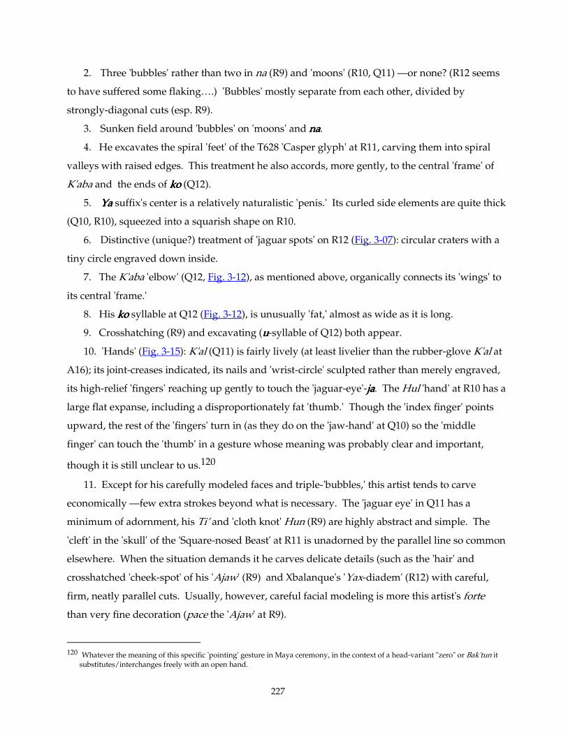
227
2. Three 'bubbles' rather than two in na (R9) and 'moons' (R10, Q11) —or none? (R12 seems
to have suffered some flaking….) 'Bubbles' mostly separate from each other, divided by
strongly-diagonal cuts (esp. R9).
3. Sunken field around 'bubbles' on 'moons' and nananana.
4. He excavates the spiral 'feet' of the T628 'Casper glyph' at R11, carving them into spiral
valleys with raised edges. This treatment he also accords, more gently, to the central 'frame' of
K'aba and the ends of kokokoko (Q12).
5. YaYaYaYa suffix's center is a relatively naturalistic 'penis.' Its curled side elements are quite thick
(Q10, R10), squeezed into a squarish shape on R10.
6. Distinctive (unique?) treatment of 'jaguar spots' on R12 (Fig. 3-07): circular craters with a
tiny circle engraved down inside.
7. The K'aba 'elbow' (Q12, Fig. 3-12), as mentioned above, organically connects its 'wings' to
its central 'frame.'
8. His kokokoko syllable at Q12 (Fig. 3-12), is unusually 'fat,' almost as wide as it is long.
9. Crosshatching (R9) and excavating (uuuu-syllable of Q12) both appear.
10. 'Hands' (Fig. 3-15): K'al (Q11) is fairly lively (at least livelier than the rubber-glove K'al at
A16); its joint-creases indicated, its nails and 'wrist-circle' sculpted rather than merely engraved,
its high-relief 'fingers' reaching up gently to touch the 'jaguar-eye'-jajajaja. The Hul 'hand' at R10 has a
large flat expanse, including a disproportionately fat 'thumb.' Though the 'index finger' points
upward, the rest of the 'fingers' turn in (as they do on the 'jaw-hand' at Q10) so the 'middle
finger' can touch the 'thumb' in a gesture whose meaning was probably clear and important,
though it is still unclear to us.120
11. Except for his carefully modeled faces and triple-'bubbles,' this artist tends to carve
economically —few extra strokes beyond what is necessary. The 'jaguar eye' in Q11 has a
minimum of adornment, his Ti’ and 'cloth knot' Hun (R9) are highly abstract and simple. The
'cleft' in the 'skull' of the 'Square-nosed Beast' at R11 is unadorned by the parallel line so common
elsewhere. When the situation demands it he carves delicate details (such as the 'hair' and
crosshatched 'cheek-spot' of his 'Ajaw' (R9) and Xbalanque's 'Yax-diadem' (R12) with careful,
firm, neatly parallel cuts. Usually, however, careful facial modeling is more this artist's forte
than very fine decoration (pace the 'Ajaw' at R9).
120 Whatever the meaning of this specific 'pointing' gesture in Maya ceremony, in the context of a head-variant "zero" or Bak'tun it
substitutes/interchanges freely with an open hand.
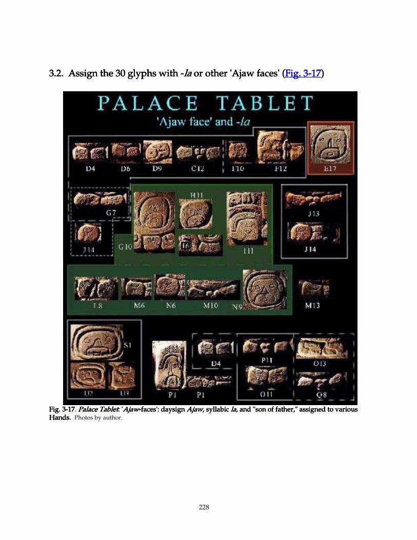
228
3.2. Assign the 30 glyphs with 3.2. Assign the 30 glyphs with 3.2. Assign the 30 glyphs with 3.2. Assign the 30 glyphs with ----lalalala or other 'Ajaw faces' ( or other 'Ajaw faces' ( or other 'Ajaw faces' ( or other 'Ajaw faces' (Fig. 3Fig. 3Fig. 3Fig. 3----17171717))))
Fig. 3Fig. 3Fig. 3Fig. 3----17171717. Palace TabletPalace TabletPalace TabletPalace Tablet: ': ': ': 'AjawAjawAjawAjaw----faces': daysign faces': daysign faces': daysign faces': daysign AjawAjawAjawAjaw, syllabic , syllabic , syllabic , syllabic lalalala, and "son of father," assigned to various , and "son of father," assigned to various , and "son of father," assigned to various , and "son of father," assigned to various Hands. Hands. Hands. Hands. Photos by author.
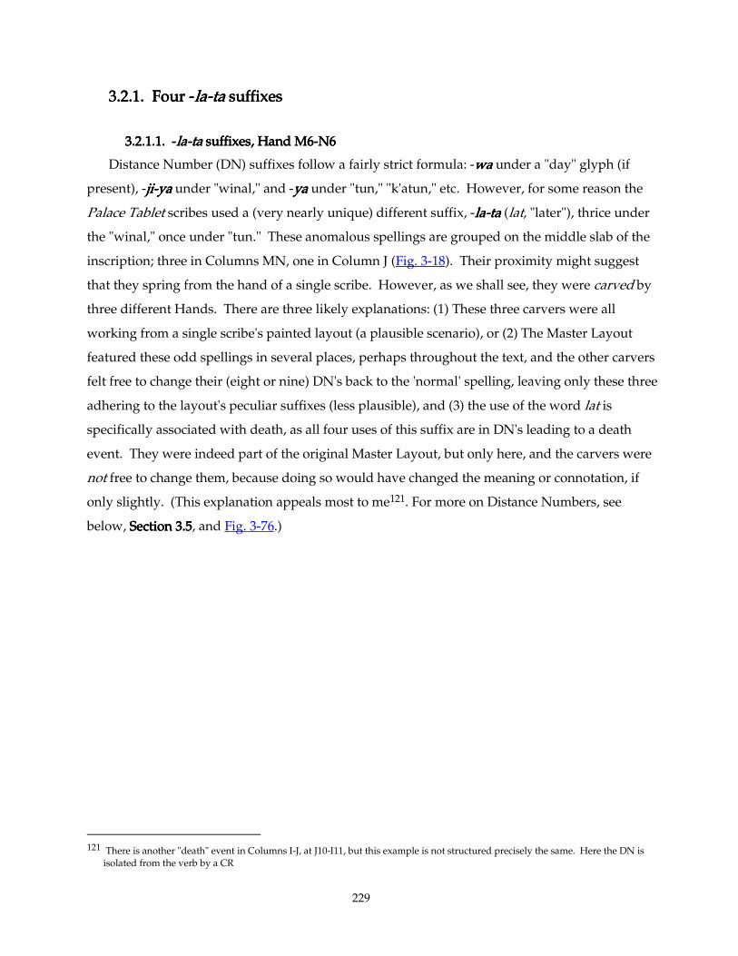
229
3.2.1. Four 3.2.1. Four 3.2.1. Four 3.2.1. Four ----lalalala----tttta a a a suffixessuffixessuffixessuffixes
3.2.1.1. 3.2.1.1. 3.2.1.1. 3.2.1.1. ----lalalala----ta ta ta ta suffixes, Hand M6suffixes, Hand M6suffixes, Hand M6suffixes, Hand M6----N6 N6 N6 N6
Distance Number (DN) suffixes follow a fairly strict formula: -wawawawa under a "day" glyph (if
present), -jijijiji----yayayaya under "winal," and -yayayaya under "tun," "k'atun," etc. However, for some reason the
Palace Tablet scribes used a (very nearly unique) different suffix, -lalalala----tatatata (lat, "later"), thrice under
the "winal," once under "tun." These anomalous spellings are grouped on the middle slab of the
inscription; three in Columns MN, one in Column J (Fig. 3-18). Their proximity might suggest
that they spring from the hand of a single scribe. However, as we shall see, they were carved by
three different Hands. There are three likely explanations: (1) These three carvers were all
working from a single scribe's painted layout (a plausible scenario), or (2) The Master Layout
featured these odd spellings in several places, perhaps throughout the text, and the other carvers
felt free to change their (eight or nine) DN's back to the 'normal' spelling, leaving only these three
adhering to the layout's peculiar suffixes (less plausible), and (3) the use of the word lat is
specifically associated with death, as all four uses of this suffix are in DN's leading to a death
event. They were indeed part of the original Master Layout, but only here, and the carvers were
not free to change them, because doing so would have changed the meaning or connotation, if
only slightly. (This explanation appeals most to me121. For more on Distance Numbers, see
below, SectioSectioSectioSection 3.5n 3.5n 3.5n 3.5, and Fig. 3-76.)
121 There is another "death" event in Columns I-J, at J10-I11, but this example is not structured precisely the same. Here the DN is
isolated from the verb by a CR
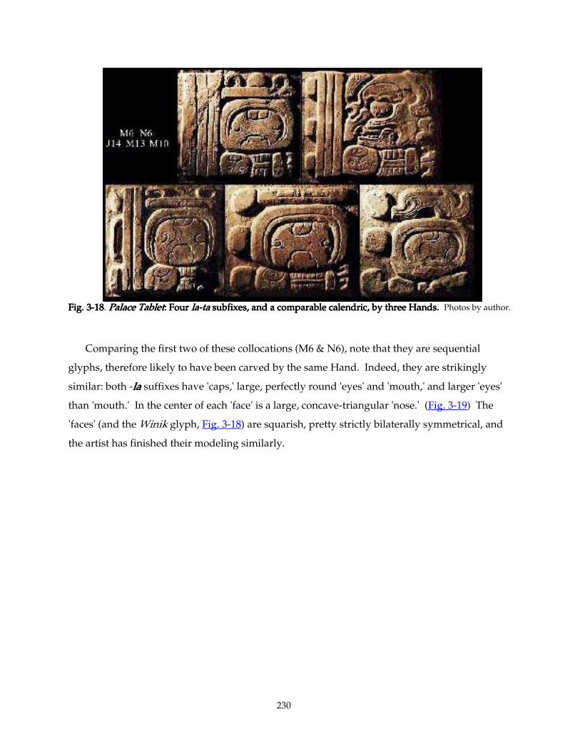
230
Fig. 3Fig. 3Fig. 3Fig. 3----18181818. Palace TabletPalace TabletPalace TabletPalace Tablet: Four : Four : Four : Four lalalala----tatatata subfixes, and a comparable calendric, by three Hands. subfixes, and a comparable calendric, by three Hands. subfixes, and a comparable calendric, by three Hands. subfixes, and a comparable calendric, by three Hands. Photos by author.
Comparing the first two of these collocations (M6 & N6), note that they are sequential
glyphs, therefore likely to have been carved by the same Hand. Indeed, they are strikingly
similar: both -lalalala suffixes have 'caps,' large, perfectly round 'eyes' and 'mouth,' and larger 'eyes'
than 'mouth.' In the center of each 'face' is a large, concave-triangular 'nose.' (Fig. 3-19) The
'faces' (and the Winik glyph, Fig. 3-18) are squarish, pretty strictly bilaterally symmetrical, and
the artist has finished their modeling similarly.
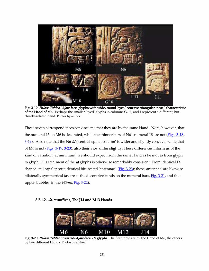
231
Fig. 3Fig. 3Fig. 3Fig. 3----19191919. Palace TabletPalace TabletPalace TabletPalace Tablet: ': ': ': 'AjawAjawAjawAjaw----face' glyphs with wide, round 'eyes,' concave triangular 'nose,' characteristic face' glyphs with wide, round 'eyes,' concave triangular 'nose,' characteristic face' glyphs with wide, round 'eyes,' concave triangular 'nose,' characteristic face' glyphs with wide, round 'eyes,' concave triangular 'nose,' characteristic of the Hand of M6. of the Hand of M6. of the Hand of M6. of the Hand of M6. Perhaps the smaller-'eyed' glyphs in columns G, H, and I represent a different, but closely-related hand. Photos by author.
These seven correspondences convince me that they are by the same Hand. Note, however, that
the numeral 15 on M6 is decorated, while the thinner bars of N6's numeral 18 are not (Figs. 3-18,
3-19). Also note that the N6 tatatata's central 'spinal column' is wider and slightly concave, while that
of M6 is not (Figs. 3-19, 3-23); also their 'ribs' differ slightly. These differences inform us of the
kind of variation (at minimum) we should expect from the same Hand as he moves from glyph
to glyph. His treatment of the tatatata glyphs is otherwise remarkably consistent. From identical D-
shaped 'tail caps' sprout identical bifurcated 'antennae' (Fig. 3-23); these 'antennae' are likewise
bilaterally symmetrical (as are as the decorative bands on the numeral bars, Fig. 3-21, and the
upper 'bubbles' in the Winik, Fig. 3-22).
3.2.1.2. 3.2.1.2. 3.2.1.2. 3.2.1.2. ----lalalala----tatatata suffixes, The J14 and M13 Handssuffixes, The J14 and M13 Handssuffixes, The J14 and M13 Handssuffixes, The J14 and M13 Hands
Fig. 3Fig. 3Fig. 3Fig. 3----20202020. Palace TabletPalace TabletPalace TabletPalace Tablet: 'inverted: 'inverted: 'inverted: 'inverted----AjawAjawAjawAjaw----face' face' face' face' ----lalalala glyphs. glyphs. glyphs. glyphs. The first three are by the Hand of M6, the others by two different Hands. Photos by author.
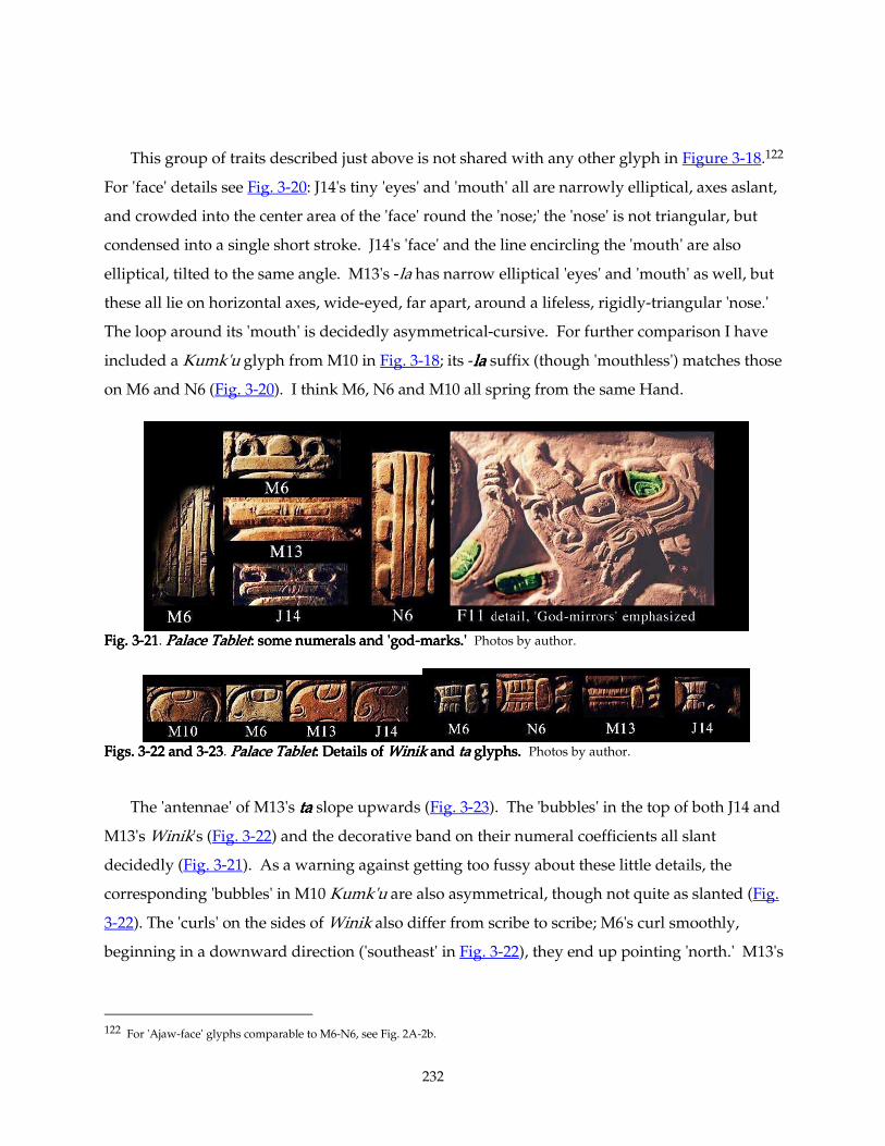
232
This group of traits described just above is not shared with any other glyph in Figure 3-18.122
For 'face' details see Fig. 3-20: J14's tiny 'eyes' and 'mouth' all are narrowly elliptical, axes aslant,
and crowded into the center area of the 'face' round the 'nose;' the 'nose' is not triangular, but
condensed into a single short stroke. J14's 'face' and the line encircling the 'mouth' are also
elliptical, tilted to the same angle. M13's -la has narrow elliptical 'eyes' and 'mouth' as well, but
these all lie on horizontal axes, wide-eyed, far apart, around a lifeless, rigidly-triangular 'nose.'
The loop around its 'mouth' is decidedly asymmetrical-cursive. For further comparison I have
included a Kumk'u glyph from M10 in Fig. 3-18; its -lalalala suffix (though 'mouthless') matches those
on M6 and N6 (Fig. 3-20). I think M6, N6 and M10 all spring from the same Hand.
Fig. 3Fig. 3Fig. 3Fig. 3----21212121. Palace TabletPalace TabletPalace TabletPalace Tablet: some numerals and 'god: some numerals and 'god: some numerals and 'god: some numerals and 'god----marks.' marks.' marks.' marks.' Photos by author.
Figs. 3Figs. 3Figs. 3Figs. 3----22 and 322 and 322 and 322 and 3----23232323. PPPPalace Tabletalace Tabletalace Tabletalace Tablet: Details of : Details of : Details of : Details of WinikWinikWinikWinik and and and and tatatata glyphs. glyphs. glyphs. glyphs. Photos by author.
The 'antennae' of M13's tatatata slope upwards (Fig. 3-23). The 'bubbles' in the top of both J14 and
M13's Winik's (Fig. 3-22) and the decorative band on their numeral coefficients all slant
decidedly (Fig. 3-21). As a warning against getting too fussy about these little details, the
corresponding 'bubbles' in M10 Kumk'u are also asymmetrical, though not quite as slanted (Fig.
3-22). The 'curls' on the sides of Winik also differ from scribe to scribe; M6's curl smoothly,
beginning in a downward direction ('southeast' in Fig. 3-22), they end up pointing 'north.' M13's
122 For 'Ajaw-face' glyphs comparable to M6-N6, see Fig. 2A-2b.
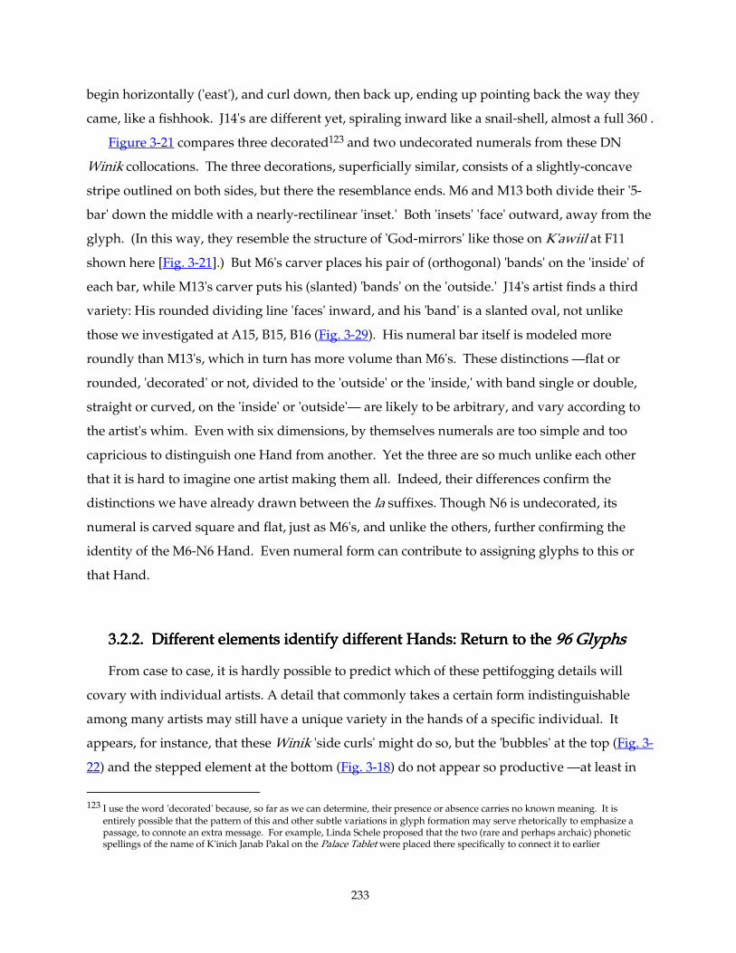
233
begin horizontally ('east'), and curl down, then back up, ending up pointing back the way they
came, like a fishhook. J14's are different yet, spiraling inward like a snail-shell, almost a full 360°.
Figure 3-21 compares three decorated123 and two undecorated numerals from these DN
Winik collocations. The three decorations, superficially similar, consists of a slightly-concave
stripe outlined on both sides, but there the resemblance ends. M6 and M13 both divide their '5-
bar' down the middle with a nearly-rectilinear 'inset.' Both 'insets' 'face' outward, away from the
glyph. (In this way, they resemble the structure of 'God-mirrors' like those on K'awiil at F11
shown here [Fig. 3-21].) But M6's carver places his pair of (orthogonal) 'bands' on the 'inside' of
each bar, while M13's carver puts his (slanted) 'bands' on the 'outside.' J14's artist finds a third
variety: His rounded dividing line 'faces' inward, and his 'band' is a slanted oval, not unlike
those we investigated at A15, B15, B16 (Fig. 3-29). His numeral bar itself is modeled more
roundly than M13's, which in turn has more volume than M6's. These distinctions —flat or
rounded, 'decorated' or not, divided to the 'outside' or the 'inside,' with band single or double,
straight or curved, on the 'inside' or 'outside'— are likely to be arbitrary, and vary according to
the artist's whim. Even with six dimensions, by themselves numerals are too simple and too
capricious to distinguish one Hand from another. Yet the three are so much unlike each other
that it is hard to imagine one artist making them all. Indeed, their differences confirm the
distinctions we have already drawn between the la suffixes. Though N6 is undecorated, its
numeral is carved square and flat, just as M6's, and unlike the others, further confirming the
identity of the M6-N6 Hand. Even numeral form can contribute to assigning glyphs to this or
that Hand.
3.2.2. Different elements ide3.2.2. Different elements ide3.2.2. Different elements ide3.2.2. Different elements identify different Hands: Return to the ntify different Hands: Return to the ntify different Hands: Return to the ntify different Hands: Return to the 96 Glyphs96 Glyphs96 Glyphs96 Glyphs
From case to case, it is hardly possible to predict which of these pettifogging details will
covary with individual artists. A detail that commonly takes a certain form indistinguishable
among many artists may still have a unique variety in the hands of a specific individual. It
appears, for instance, that these Winik 'side curls' might do so, but the 'bubbles' at the top (Fig. 3-
22) and the stepped element at the bottom (Fig. 3-18) do not appear so productive —at least in
123 I use the word 'decorated' because, so far as we can determine, their presence or absence carries no known meaning. It is
entirely possible that the pattern of this and other subtle variations in glyph formation may serve rhetorically to emphasize a passage, to connote an extra message. For example, Linda Schele proposed that the two (rare and perhaps archaic) phonetic spellings of the name of K'inich Janab Pakal on the Palace Tablet were placed there specifically to connect it to earlier
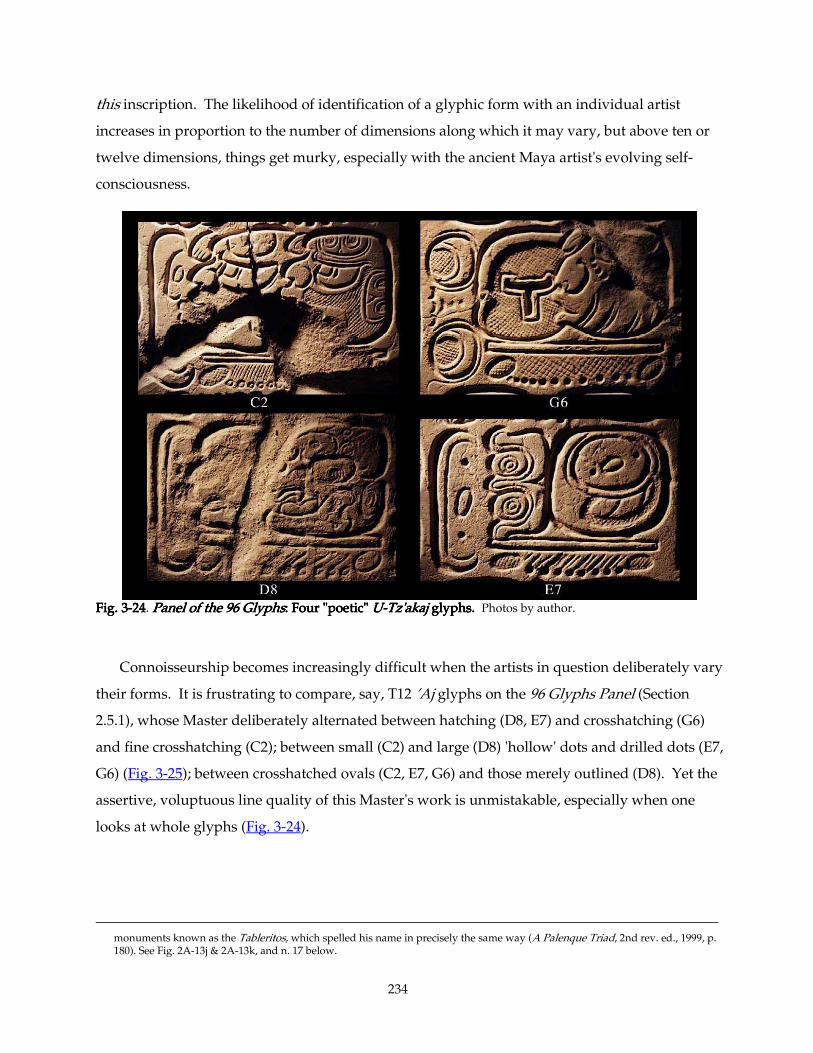
234
this inscription. The likelihood of identification of a glyphic form with an individual artist
increases in proportion to the number of dimensions along which it may vary, but above ten or
twelve dimensions, things get murky, especially with the ancient Maya artist's evolving self-
consciousness.
Fig. 3Fig. 3Fig. 3Fig. 3----24242424. Panel of the 96 GlyphsPanel of the 96 GlyphsPanel of the 96 GlyphsPanel of the 96 Glyphs: Four "poetic" : Four "poetic" : Four "poetic" : Four "poetic" UUUU----Tz'akajTz'akajTz'akajTz'akaj glyphs. glyphs. glyphs. glyphs. Photos by author.
Connoisseurship becomes increasingly difficult when the artists in question deliberately vary
their forms. It is frustrating to compare, say, T12 ’Aj glyphs on the 96 Glyphs Panel (Section
2.5.1), whose Master deliberately alternated between hatching (D8, E7) and crosshatching (G6)
and fine crosshatching (C2); between small (C2) and large (D8) 'hollow' dots and drilled dots (E7,
G6) (Fig. 3-25); between crosshatched ovals (C2, E7, G6) and those merely outlined (D8). Yet the
assertive, voluptuous line quality of this Master's work is unmistakable, especially when one
looks at whole glyphs (Fig. 3-24).
monuments known as the Tableritos, which spelled his name in precisely the same way (A Palenque Triad, 2nd rev. ed., 1999, p. 180). See Fig. 2A-13j & 2A-13k, and n. 17 below.

235
Fig. 3Fig. 3Fig. 3Fig. 3----25252525. Panel of the 96 Glyphs, Palace TabletPanel of the 96 Glyphs, Palace TabletPanel of the 96 Glyphs, Palace TabletPanel of the 96 Glyphs, Palace Tablet, and, and, and, and Tablet of the Slaves Tablet of the Slaves Tablet of the Slaves Tablet of the Slaves: : : : AjAjAjAj glyphs. glyphs. glyphs. glyphs. Photos by author.
The T-shaped or 'bone'-shaped 'jewels' which dangle ubiquitously from headdresses,
garments, and noses (an Ankh-like sign of breath/life?) in portrayals of Maya ritual take on an
eccentric trifurcate shape —and a rich variety— in this Artist's hands. Three of his most
elaborate such 'jewels' from the Lapida de la Creación comprise the bottom row of Fig 3-26.
These three bear 'faces' like the common 'Ajaw face' I scrutinized in Section 3.2.1.
Analyzing the earlier Palace Tablet, a connoisseur can count on the shapes of the 'eye,' of the
'nose,' and of the 'mouth' as characteristics peculiar to various specific artists. However, here,
sixty-years later, our Artist has reached such a level of sophistication that he uses all three 'nose'
types, two different shapes (and three sizes) of 'eye,' and two types of 'mouth.' The first 'face' in
the bottom row, with closed 'eyes,' is more like the 'Xipe Totec' or 'sacrifice victim' mask seen on
'shields,' an identification emphasized by the protruding 'tongue.' Though these are strikingly
consistent in form (especially when compared to other artists' 'beads') the last of these 'jewels'
has an odd extra bend on one of its head-protuberances. However, these three do have matching
236
'teeth.' Two also sprout a glorious pair of S-shaped flourishes —also identical to one another—
from their cleft crowns.
Fig. 3Fig. 3Fig. 3Fig. 3----26262626. 'Bone beads' by the Master of'Bone beads' by the Master of'Bone beads' by the Master of'Bone beads' by the Master of 96 Glyphs 96 Glyphs 96 Glyphs 96 Glyphs from the from the from the from the Throne LegsThrone LegsThrone LegsThrone Legs and the and the and the and the Lapida de la CreaciónLapida de la CreaciónLapida de la CreaciónLapida de la Creación.... Photos by author.
Yet, looking at the lush range of ten 'jewels' that the artist carved just on the 'Throne Legs'
and the Lapida de la Creación, it is yet evident that they were all drawn by the same expert
Hand. Why? This Master asserts his individuality with every virtuoso stroke of his brush. The
calligraphic 'flourishes' in particular exemplify the energetic, so-called 'whiplash line' seen on the
finest painted ceramics. He frequently emphasizes major curves by paralleling them with a fine,
lively, thread-like line; he does so here on both sides of each 'whiplash' flourish, and along the
concave curves of the 'jewel.' He masterfully constructs his 'whiplash' and the outlines of his
'jewels' with consistently-modulated strokes —bold along broad outside curves, tapering down
to thin at corners —the sharper the turn, the more abrupt the modulation, the thinner the stroke
as it pauses and changes direction. We can feel, we can read the decisions, the changing speed,
the hesitations and accelerations of his brush as it lay down its stroke of ink.
237
3.2.3. Hand M63.2.3. Hand M63.2.3. Hand M63.2.3. Hand M6----N6N6N6N6's other 'faces' ('s other 'faces' ('s other 'faces' ('s other 'faces' (Fig. 3Fig. 3Fig. 3Fig. 3----19191919))))
Fig. 3-19 above collects together all the 'faces' that substantially match those on M6-N6. They
all have triangular 'noses' and round, staring 'eyes.' Some have open mouths, one a tiny grin (I-
11). One (M10) has no 'mouth' at all, another (I6, an iconic drop-earring, not a glyph) lacks an
outline around the 'mouth' area. Three (M6, N6, I11) wear 'caps.' Some do not match quite as
well: The 'eyes' of the last three (G10, H11, I11) are smaller and less circular, and their 'mouths'
are significantly larger. These three are also less strictly symmetrical than the others; they might
be by a distinct Hand. Note also that they group closely together; they might still be by the M6-
N6 Hand, but simply made some days or weeks earlier — an artist's work habits and whims can
evolve daily. In any case, these examples all occur in the upper and middle rows of the central
slab of the inscription.
3.2.4. The other 'Ajaw face' Hands (Fig. 33.2.4. The other 'Ajaw face' Hands (Fig. 33.2.4. The other 'Ajaw face' Hands (Fig. 33.2.4. The other 'Ajaw face' Hands (Fig. 3----27 = Fig. 327 = Fig. 327 = Fig. 327 = Fig. 3----17)17)17)17)
In Fig. 3-27, I have arranged thirty similar 'Ajaw face glyphs' in text-sequence order. The top
row, from Columns CDEF, match one another pretty well except for the very last one (E17), the
territory of whose Hand we established in Section 2.5.5Section 2.5.5Section 2.5.5Section 2.5.5. These 'Ajaw faces' (D4, D6, D9, C12,
F10, and F12) all have smallish wide 'eyes' and a distinct type of 'nose' shaped rather like a
finger—perfectly parallel sides with a rounded 'bridge.' All 'noses' but F10's are distinctly
narrow. D4 and D6 have smiling 'mouths,' D9 and F10 the usual tiny circle, as if whistling; C12's
have no 'mouths' at all. F12's Way-bi and iconic 'drop-earring' are so damaged that it is hard to
judge whether they fit in this category or not; but they display nothing to bar their membership.
By contrast, E17's Ajaw daysign has an obelisk-shaped 'nose' and distinctly-oval 'mouth' and
'eyes' in keeping with its distinctive cursive character. Within the limits of this evidence, we
might hypothetically assign the area from D4 to F10 (or F12) to a single Hand. Note that this
requires our Hand to work on two separate slabs; Column CD is on one stone, EF on another.
The core of the second and third rows consist of the G10-N6 group we scrutinized just above.
They might yet resolve into two Hands. G7, at the beginning of our second row, has 'mouths'
exactly matching D4's and D6's, to whose Hand I tentatively assigned its near neighbors F10 and
F12. Its 'nose' is reduced to a single slanted stroke, though, which links it faintly with J14 (a copy
of which I juxtapose just below it). We need more evidence to attribute this glyph.
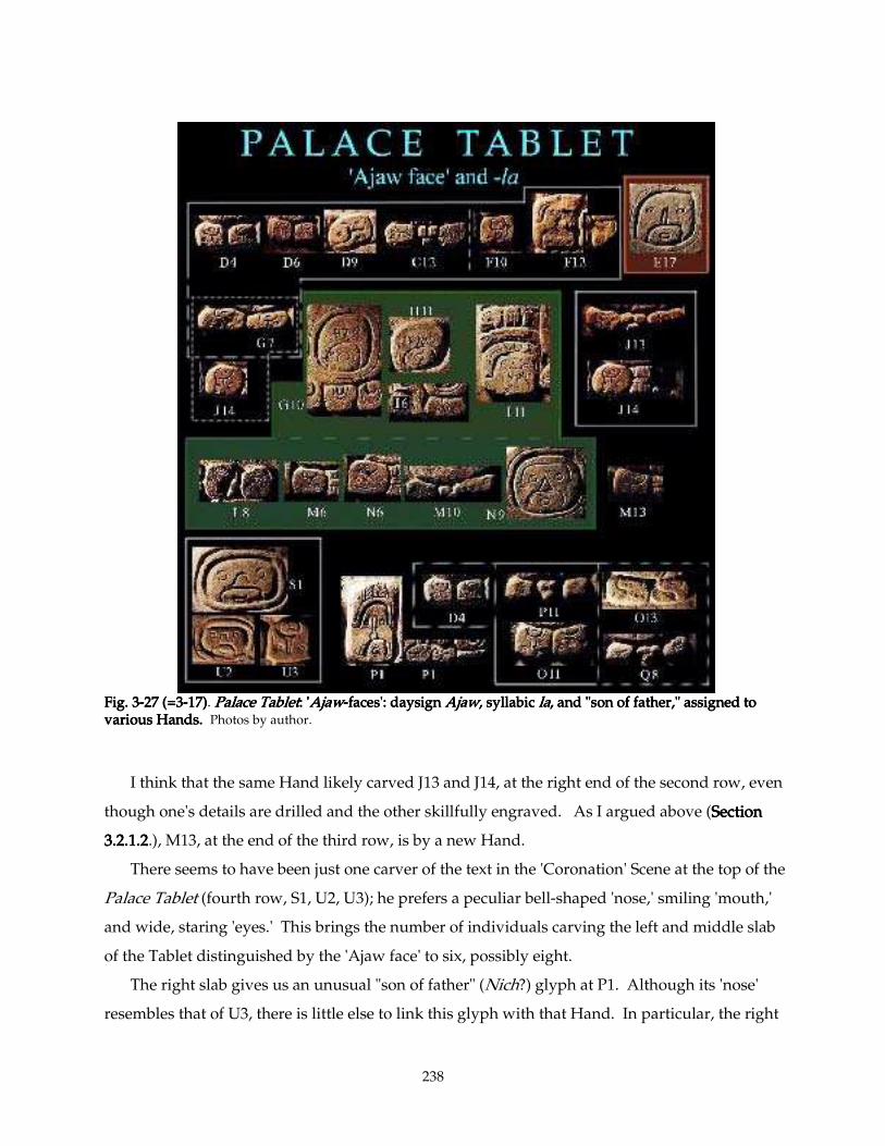
238
Fig. 3Fig. 3Fig. 3Fig. 3----27 (=327 (=327 (=327 (=3----17)17)17)17). Palace TabletPalace TabletPalace TabletPalace Tablet: ': ': ': 'AjawAjawAjawAjaw----faces': daysign faces': daysign faces': daysign faces': daysign AjawAjawAjawAjaw, syllabic , syllabic , syllabic , syllabic lalalala, and "son of father," assigned to , and "son of father," assigned to , and "son of father," assigned to , and "son of father," assigned to various Hands. various Hands. various Hands. various Hands. Photos by author.
I think that the same Hand likely carved J13 and J14, at the right end of the second row, even
though one's details are drilled and the other skillfully engraved. As I argued above (Section Section Section Section
3.2.1.23.2.1.23.2.1.23.2.1.2.), M13, at the end of the third row, is by a new Hand.
There seems to have been just one carver of the text in the 'Coronation' Scene at the top of the
Palace Tablet (fourth row, S1, U2, U3); he prefers a peculiar bell-shaped 'nose,' smiling 'mouth,'
and wide, staring 'eyes.' This brings the number of individuals carving the left and middle slab
of the Tablet distinguished by the 'Ajaw face' to six, possibly eight.
The right slab gives us an unusual "son of father" (Nich?) glyph at P1. Although its 'nose'
resembles that of U3, there is little else to link this glyph with that Hand. In particular, the right
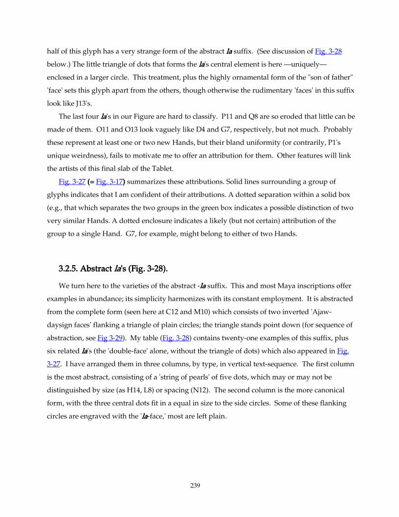
239
half of this glyph has a very strange form of the abstract lalalala suffix. (See discussion of Fig. 3-28
below.) The little triangle of dots that forms the lalalala's central element is here —uniquely—
enclosed in a larger circle. This treatment, plus the highly ornamental form of the "son of father"
'face' sets this glyph apart from the others, though otherwise the rudimentary 'faces' in this suffix
look like J13's.
The last four lalalala's in our Figure are hard to classify. P11 and Q8 are so eroded that little can be
made of them. O11 and O13 look vaguely like D4 and G7, respectively, but not much. Probably
these represent at least one or two new Hands, but their bland uniformity (or contrarily, P1's
unique weirdness), fails to motivate me to offer an attribution for them. Other features will link
the artists of this final slab of the Tablet.
Fig. 3-27 (= (= (= (= Fig. 3-17)))) summarizes these attributions. Solid lines surrounding a group of
glyphs indicates that I am confident of their attributions. A dotted separation within a solid box
(e.g., that which separates the two groups in the green box indicates a possible distinction of two
very similar Hands. A dotted enclosure indicates a likely (but not certain) attribution of the
group to a single Hand. G7, for example, might belong to either of two Hands.
3.2.5. Abstract 3.2.5. Abstract 3.2.5. Abstract 3.2.5. Abstract lalalala's (Fig. 3's (Fig. 3's (Fig. 3's (Fig. 3----28). 28). 28). 28).
We turn here to the varieties of the abstract -lalalala suffix. This and most Maya inscriptions offer
examples in abundance; its simplicity harmonizes with its constant employment. It is abstracted
from the complete form (seen here at C12 and M10) which consists of two inverted 'Ajaw-
daysign faces' flanking a triangle of plain circles; the triangle stands point down (for sequence of
abstraction, see Fig 3-29). My table (Fig. 3-28) contains twenty-one examples of this suffix, plus
six related lalalala's (the 'double-face' alone, without the triangle of dots) which also appeared in Fig.
3-27. I have arranged them in three columns, by type, in vertical text-sequence. The first column
is the most abstract, consisting of a 'string of pearls' of five dots, which may or may not be
distinguished by size (as H14, L8) or spacing (N12). The second column is the more canonical
form, with the three central dots fit in a equal in size to the side circles. Some of these flanking
circles are engraved with the 'lalalala-face,' most are left plain.
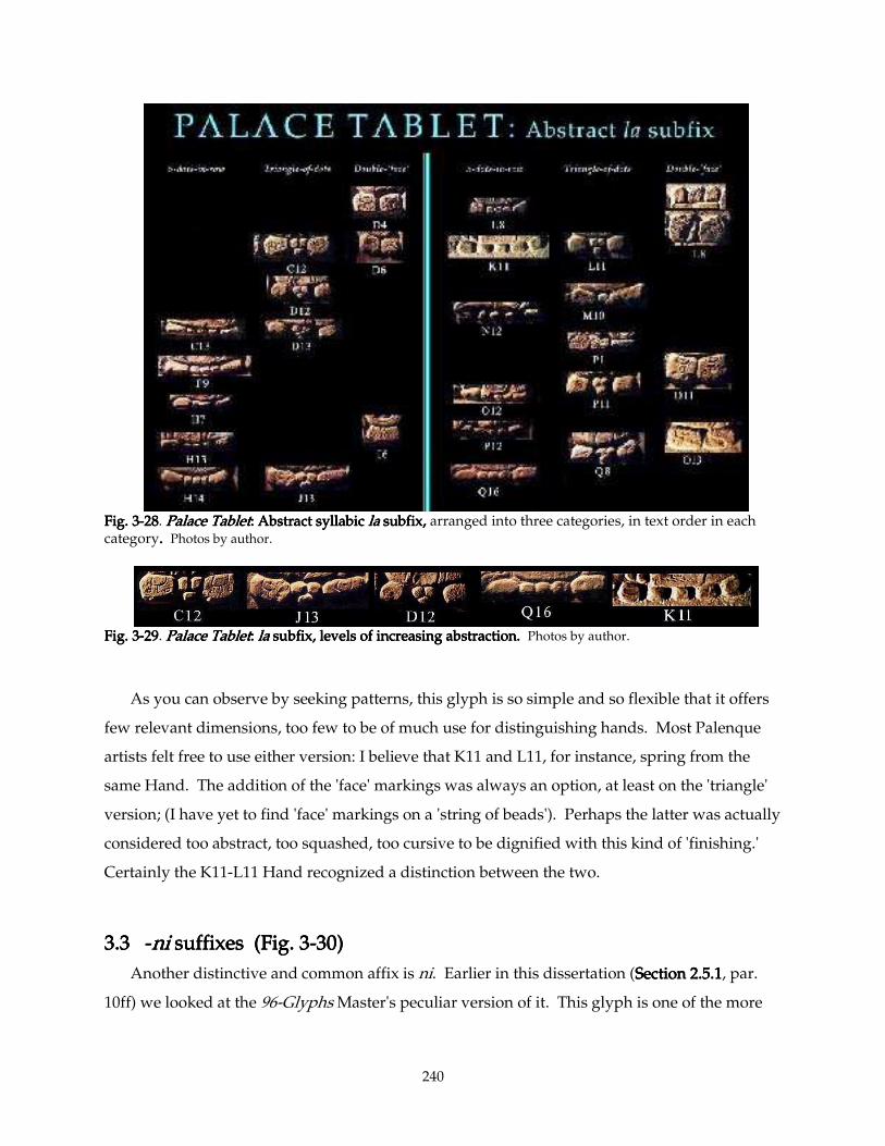
240
Fig. 3Fig. 3Fig. 3Fig. 3----28282828. Palace TabletPalace TabletPalace TabletPalace Tablet: Abstract syllabic : Abstract syllabic : Abstract syllabic : Abstract syllabic lalalala subfix, subfix, subfix, subfix, arranged into three categories, in text order in each category. . . . Photos by author.
Fig. 3Fig. 3Fig. 3Fig. 3----29292929. Palace TabletPalace TabletPalace TabletPalace Tablet: : : : lalalala subfix, levels of increasi subfix, levels of increasi subfix, levels of increasi subfix, levels of increasing abstraction. ng abstraction. ng abstraction. ng abstraction. Photos by author.
As you can observe by seeking patterns, this glyph is so simple and so flexible that it offers
few relevant dimensions, too few to be of much use for distinguishing hands. Most Palenque
artists felt free to use either version: I believe that K11 and L11, for instance, spring from the
same Hand. The addition of the 'face' markings was always an option, at least on the 'triangle'
version; (I have yet to find 'face' markings on a 'string of beads'). Perhaps the latter was actually
considered too abstract, too squashed, too cursive to be dignified with this kind of 'finishing.'
Certainly the K11-L11 Hand recognized a distinction between the two.
3.3 3.3 3.3 3.3 ----ni ni ni ni suffixes (Fig. 3suffixes (Fig. 3suffixes (Fig. 3suffixes (Fig. 3----30)30)30)30)
Another distinctive and common affix is ni. Earlier in this dissertation (Section 2.5.1Section 2.5.1Section 2.5.1Section 2.5.1, par.
10ff) we looked at the 96-Glyphs Master's peculiar version of it. This glyph is one of the more
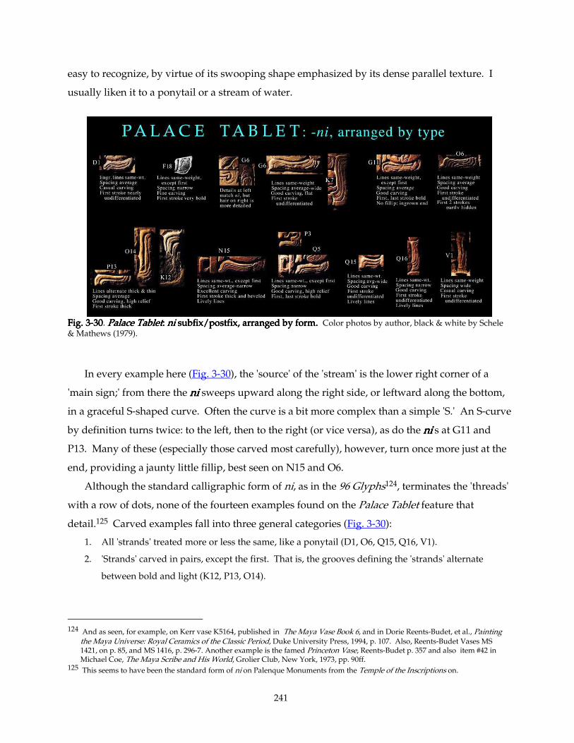
241
easy to recognize, by virtue of its swooping shape emphasized by its dense parallel texture. I
usually liken it to a ponytail or a stream of water.
Fig. 3Fig. 3Fig. 3Fig. 3----30303030. Palace TabletPalace TabletPalace TabletPalace Tablet: : : : nininini subfix/postfix, arranged by form. subfix/postfix, arranged by form. subfix/postfix, arranged by form. subfix/postfix, arranged by form. Color photos by author, black & white by Schele & Mathews (1979).
In every example here (Fig. 3-30), the 'source' of the 'stream' is the lower right corner of a
'main sign;' from there the nininini sweeps upward along the right side, or leftward along the bottom,
in a graceful S-shaped curve. Often the curve is a bit more complex than a simple 'S.' An S-curve
by definition turns twice: to the left, then to the right (or vice versa), as do the nininini's at G11 and
P13. Many of these (especially those carved most carefully), however, turn once more just at the
end, providing a jaunty little fillip, best seen on N15 and O6.
Although the standard calligraphic form of ni, as in the 96 Glyphs124, terminates the 'threads'
with a row of dots, none of the fourteen examples found on the Palace Tablet feature that
detail.125 Carved examples fall into three general categories (Fig. 3-30):
1. All 'strands' treated more or less the same, like a ponytail (D1, O6, Q15, Q16, V1).
2. 'Strands' carved in pairs, except the first. That is, the grooves defining the 'strands' alternate
between bold and light (K12, P13, O14).
124 And as seen, for example, on Kerr vase K5164, published in The Maya Vase Book 6, and in Dorie Reents-Budet, et al., Painting
the Maya Universe: Royal Ceramics of the Classic Period, Duke University Press, 1994, p. 107. Also, Reents-Budet Vases MS 1421, on p. 85, and MS 1416, p. 296-7. Another example is the famed Princeton Vase, Reents-Budet p. 357 and also item #42 in Michael Coe, The Maya Scribe and His World, Grolier Club, New York, 1973, pp. 90ff.
125 This seems to have been the standard form of ni on Palenque Monuments from the Temple of the Inscriptions on.
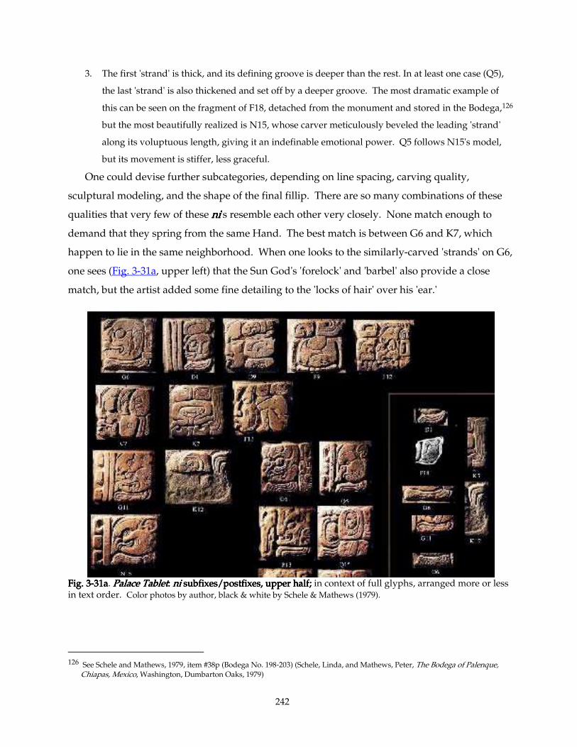
242
3. The first 'strand' is thick, and its defining groove is deeper than the rest. In at least one case (Q5),
the last 'strand' is also thickened and set off by a deeper groove. The most dramatic example of
this can be seen on the fragment of F18, detached from the monument and stored in the Bodega,126
but the most beautifully realized is N15, whose carver meticulously beveled the leading 'strand'
along its voluptuous length, giving it an indefinable emotional power. Q5 follows N15's model,
but its movement is stiffer, less graceful.
One could devise further subcategories, depending on line spacing, carving quality,
sculptural modeling, and the shape of the final fillip. There are so many combinations of these
qualities that very few of these nininini's resemble each other very closely. None match enough to
demand that they spring from the same Hand. The best match is between G6 and K7, which
happen to lie in the same neighborhood. When one looks to the similarly-carved 'strands' on G6,
one sees (Fig. 3-31a, upper left) that the Sun God's 'forelock' and 'barbel' also provide a close
match, but the artist added some fine detailing to the 'locks of hair' over his 'ear.'
Fig. 3Fig. 3Fig. 3Fig. 3----31a31a31a31a. Palace TabletPalace TabletPalace TabletPalace Tablet: : : : nininini subfixes/postfixes, upper half; subfixes/postfixes, upper half; subfixes/postfixes, upper half; subfixes/postfixes, upper half; in context of full glyphs, arranged more or less in text order. Color photos by author, black & white by Schele & Mathews (1979).
126 See Schele and Mathews, 1979, item #38p (Bodega No. 198-203) (Schele, Linda, and Mathews, Peter, The Bodega of Palenque,
Chiapas, Mexico, Washington, Dumbarton Oaks, 1979)
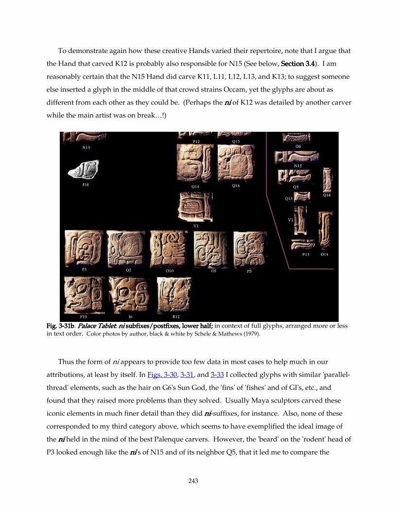
243
To demonstrate again how these creative Hands varied their repertoire, note that I argue that
the Hand that carved K12 is probably also responsible for N15 (See below, SectionSectionSectionSection 3.43.43.43.4). I am
reasonably certain that the N15 Hand did carve K11, L11, L12, L13, and K13; to suggest someone
else inserted a glyph in the middle of that crowd strains Occam, yet the glyphs are about as
different from each other as they could be. (Perhaps the nininini of K12 was detailed by another carver
while the main artist was on break…!)
Fig. 3Fig. 3Fig. 3Fig. 3----31b31b31b31b. Palace TabletPalace TabletPalace TabletPalace Tablet: : : : nininini subfixes/postfixes, lower half; subfixes/postfixes, lower half; subfixes/postfixes, lower half; subfixes/postfixes, lower half; in context of full glyphs, arranged more or less in text order. Color photos by author, black & white by Schele & Mathews (1979).
Thus the form of ni appears to provide too few data in most cases to help much in our
attributions, at least by itself. In Figs. 3-30, 3-31, and 3-33 I collected glyphs with similar 'parallel-
thread' elements, such as the hair on G6's Sun God, the 'fins' of 'fishes' and of GI's, etc., and
found that they raised more problems than they solved. Usually Maya sculptors carved these
iconic elements in much finer detail than they did nininini-suffixes, for instance. Also, none of these
corresponded to my third category above, which seems to have exemplified the ideal image of
the nininini held in the mind of the best Palenque carvers. However, the 'beard' on the 'rodent' head of
P3 looked enough like the nininini's of N15 and of its neighbor Q5, that it led me to compare the
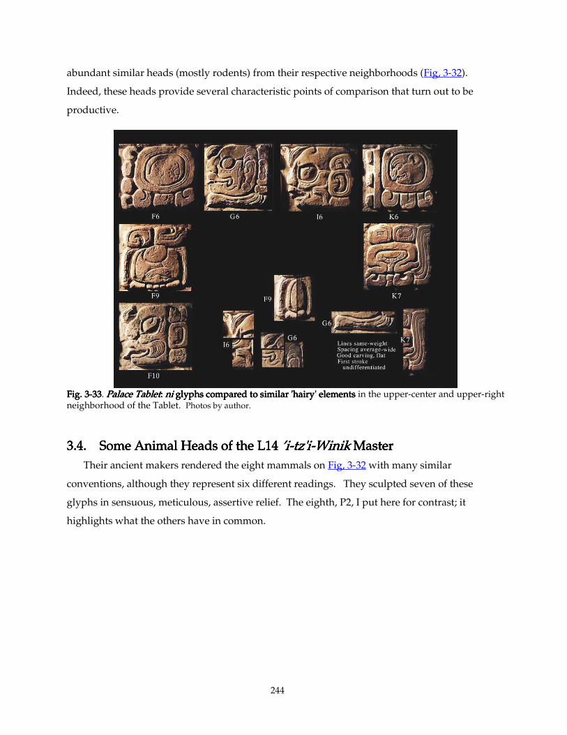
244
abundant similar heads (mostly rodents) from their respective neighborhoods (Fig, 3-32).
Indeed, these heads provide several characteristic points of comparison that turn out to be
productive.
Fig. 3Fig. 3Fig. 3Fig. 3----33333333. Palace TabletPalace TabletPalace TabletPalace Tablet: : : : nininini glyphs compared to similar 'hairy' elements glyphs compared to similar 'hairy' elements glyphs compared to similar 'hairy' elements glyphs compared to similar 'hairy' elements in the upper-center and upper-right neighborhood of the Tablet. Photos by author.
3.4. Som3.4. Som3.4. Som3.4. Someeee Animal Heads of the L14 Animal Heads of the L14 Animal Heads of the L14 Animal Heads of the L14 ’i’i’i’i----tz'itz'itz'itz'i----WinikWinikWinikWinik Master Master Master Master
Their ancient makers rendered the eight mammals on Fig, 3-32 with many similar
conventions, although they represent six different readings. They sculpted seven of these
glyphs in sensuous, meticulous, assertive relief. The eighth, P2, I put here for contrast; it
highlights what the others have in common.
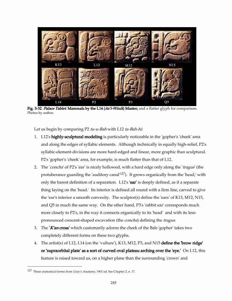
245
Fig. 3Fig. 3Fig. 3Fig. 3----32323232. Palace TabletPalace TabletPalace TabletPalace Tablet: : : : Mammals by the L14 (Mammals by the L14 (Mammals by the L14 (Mammals by the L14 (itz’iitz’iitz’iitz’i----WinikWinikWinikWinik) Master) Master) Master) Master; ; ; ; and a flatter glyph for comparison. Photos by author.
Let us begin by comparing P2 tu-u-Bah with L12 ta-Bah-hi:
1. L12's highlyhighlyhighlyhighly----sculptural modelingsculptural modelingsculptural modelingsculptural modeling is particularly noticeable in the 'gopher's 'cheek' area
and along the edges of syllabic elements. Although technically in equally high-relief, P2's
syllabic-element-divisions are more hard-edged and linear, more graphic than sculptural.
P2's 'gopher's 'cheek' area, for example, is much flatter than that of L12.
2. The 'concha' of P2's 'ear' is nicely hollowed, with a hard edge only along the 'tragus' (the
protuberance guarding the 'auditory canal'127). It grows organically from the 'head,' with
only the barest definition of a separation. L12's 'ear''ear''ear''ear' is deeply defined, as if a separate
thing laying on the 'head.' Its interior is defined all round with a firm line, carved to give
the 'ear's interior a smooth convexity. The sculptor(s) define the 'ears' of K13, M12, N15,
and Q5 in much the same way. On the other hand, P3's 'rabbit ear' corresponds much
more closely to P2's, in the way it connects organically to its 'head' and with its less-
pronounced crescent-shaped excavation (the concha) defining the tragus.
3. The ''''K'anK'anK'anK'an cross' cross' cross' cross' which customarily adorns the cheek of the Bah-'gopher' takes two
completely different forms on these two glyphs.
4. The artist(s) of L12, L14 (on the 'vulture'), K13, M12, P3, and N15 define the 'brow ridge' define the 'brow ridge' define the 'brow ridge' define the 'brow ridge'
or 'supraorbital plate' as a sort of curved oval plateau arching over the 'eye.'or 'supraorbital plate' as a sort of curved oval plateau arching over the 'eye.'or 'supraorbital plate' as a sort of curved oval plateau arching over the 'eye.'or 'supraorbital plate' as a sort of curved oval plateau arching over the 'eye.' On L12, this
feature is raised toward us, on a higher plane than the surrounding 'crown' and
127 These anatomical terms from Gray's Anatomy, 1901 ed. See Chapter 2, n. 17.
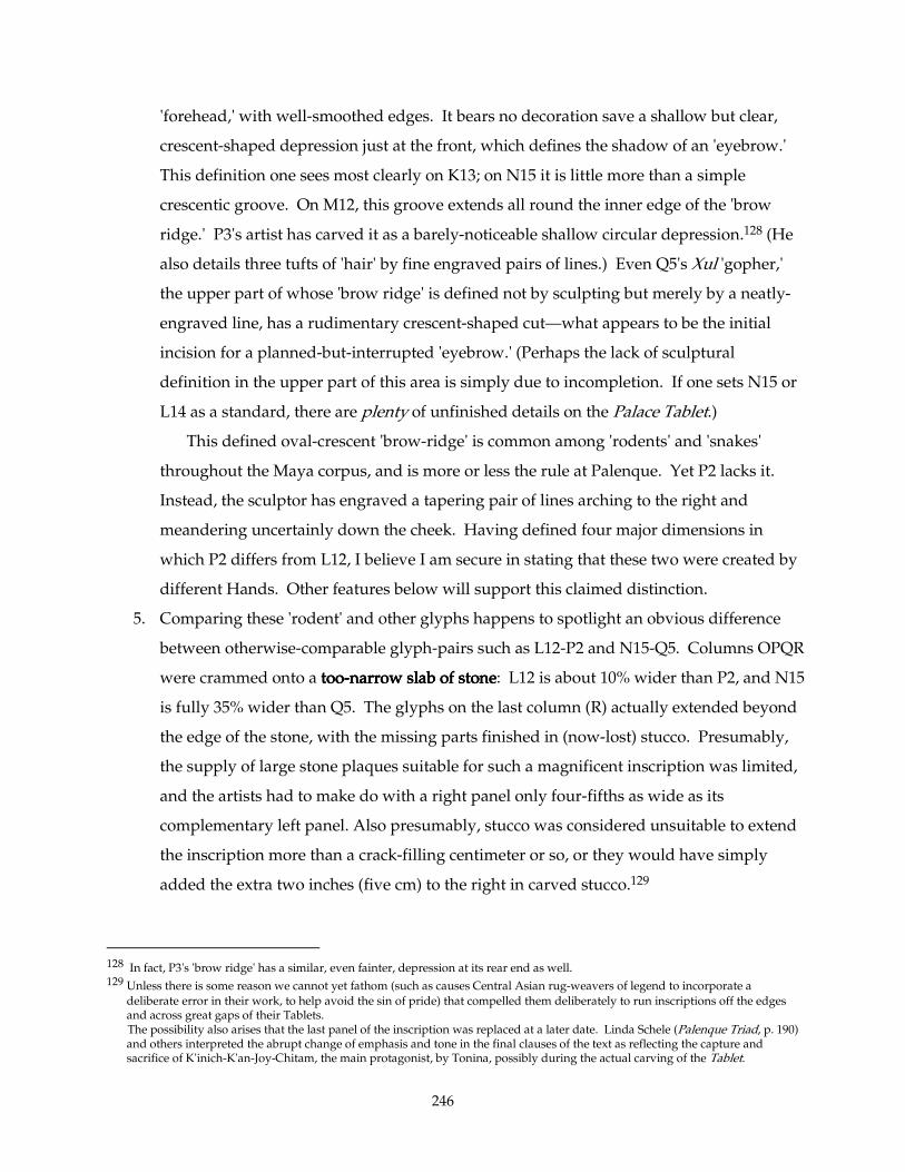
246
'forehead,' with well-smoothed edges. It bears no decoration save a shallow but clear,
crescent-shaped depression just at the front, which defines the shadow of an 'eyebrow.'
This definition one sees most clearly on K13; on N15 it is little more than a simple
crescentic groove. On M12, this groove extends all round the inner edge of the 'brow
ridge.' P3's artist has carved it as a barely-noticeable shallow circular depression.128 (He
also details three tufts of 'hair' by fine engraved pairs of lines.) Even Q5's Xul 'gopher,'
the upper part of whose 'brow ridge' is defined not by sculpting but merely by a neatly-
engraved line, has a rudimentary crescent-shaped cut—what appears to be the initial
incision for a planned-but-interrupted 'eyebrow.' (Perhaps the lack of sculptural
definition in the upper part of this area is simply due to incompletion. If one sets N15 or
L14 as a standard, there are plenty of unfinished details on the Palace Tablet.)
This defined oval-crescent 'brow-ridge' is common among 'rodents' and 'snakes'
throughout the Maya corpus, and is more or less the rule at Palenque. Yet P2 lacks it.
Instead, the sculptor has engraved a tapering pair of lines arching to the right and
meandering uncertainly down the cheek. Having defined four major dimensions in
which P2 differs from L12, I believe I am secure in stating that these two were created by
different Hands. Other features below will support this claimed distinction.
5. Comparing these 'rodent' and other glyphs happens to spotlight an obvious difference
between otherwise-comparable glyph-pairs such as L12-P2 and N15-Q5. Columns OPQR
were crammed onto a tootootootoo----narrow slab of stonenarrow slab of stonenarrow slab of stonenarrow slab of stone: L12 is about 10% wider than P2, and N15
is fully 35% wider than Q5. The glyphs on the last column (R) actually extended beyond
the edge of the stone, with the missing parts finished in (now-lost) stucco. Presumably,
the supply of large stone plaques suitable for such a magnificent inscription was limited,
and the artists had to make do with a right panel only four-fifths as wide as its
complementary left panel. Also presumably, stucco was considered unsuitable to extend
the inscription more than a crack-filling centimeter or so, or they would have simply
added the extra two inches (five cm) to the right in carved stucco.129
128 In fact, P3's 'brow ridge' has a similar, even fainter, depression at its rear end as well. 129 Unless there is some reason we cannot yet fathom (such as causes Central Asian rug-weavers of legend to incorporate a
deliberate error in their work, to help avoid the sin of pride) that compelled them deliberately to run inscriptions off the edges and across great gaps of their Tablets.
The possibility also arises that the last panel of the inscription was replaced at a later date. Linda Schele (Palenque Triad, p. 190) and others interpreted the abrupt change of emphasis and tone in the final clauses of the text as reflecting the capture and sacrifice of K'inich-K'an-Joy-Chitam, the main protagonist, by Tonina, possibly during the actual carving of the Tablet.
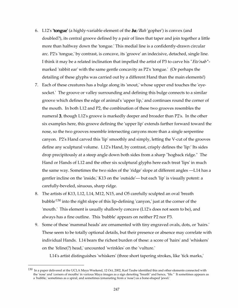
247
6. L12's 'tongue''tongue''tongue''tongue' (a highly-variable element of the babababa/Bah 'gopher') is convex (and
doubled?), its central groove defined by a pair of lines that taper and join together a little
more than halfway down the 'tongue.' This medial line is a confidently-drawn circular
arc. P2's 'tongue,' by contrast, is concave, its 'groove' an indecisive, detached, single line.
I think it may be a related inclination that impelled the artist of P3 to carve his "Etz'nab'"-
marked 'rabbit ear' with the same gentle concavity as P2's 'tongue.' (Or perhaps the
detailing of these glyphs was carried out by a different Hand than the main elements!)
7. Each of these creatures has a bulge along its 'snout,' whose upper end touches the 'eye-
socket.' The groove or valley surrounding and defining this bulge connects to a similar
groove which defines the edge of animal's 'upper lip,' and continues round the corner of
the mouth. In both L12 and P2, the combination of these two grooves resembles the
numeral 3333, though L12's groove is markedly deeper and broader than P2's. In the other
six examples here, this groove defining the 'upper lip' extends farther forward toward the
nose, so the two grooves resemble intersecting canyons more than a single serpentine
canyon. P2's Hand carved this 'lip' smoothly and simply, letting the V-cut of the grooves
define any sculptural volume. L12's Hand, by contrast, crisply defines the 'lip:' Its sides
drop precipitously at a steep angle down both sides from a sharp "hogback ridge." The
Hand or Hands of L12 and the other six sculptural glyphs here each treat 'lips' in much
the same way. Sometimes the two sides of the 'ridge' slope at different angles —L14 has a
gentler incline on the 'inside,' K13 on the 'outside'— but each 'lip' is visually potent: a
carefully-beveled, sinuous, sharp ridge.
8. The artists of K13, L12, L14, M12, N15, and O5 carefully sculpted an oval 'breath
bubble'130 into the right slope of this lip-defining 'canyon,' just at the corner of the
'mouth.' This element is usually shallowly concave (L12's does not seem to be), and
always has a fine outline. This 'bubble' appears on neither P2 nor P3.
9. Some of these 'mammal heads' are ornamented with tiny engraved ovals, dots, or 'hairs.'
These seem to be totally optional details, but their presence or absence may correlate with
individual Hands. L14 bears the richest burden of these: a score of 'hairs' and 'whiskers'
on the 'feline(?) head,' uncounted 'wrinkles' on the 'vulture.'
L14's artist distinguishes 'whiskers' (three short tapering strokes, like 'tick marks,'
130 In a paper delivered at the UCLA Maya Weekend, 12 Oct, 2002, Karl Taube identified this and other elements connected with
the 'nose' and 'corners of mouths' in various Maya images as a sign denoting "breath" and hence, "life." It sometimes appears as a 'bubble,' sometimes as a spiral, and sometimes (emanating from a 'nose') as a bone-shaped 'jewel.'
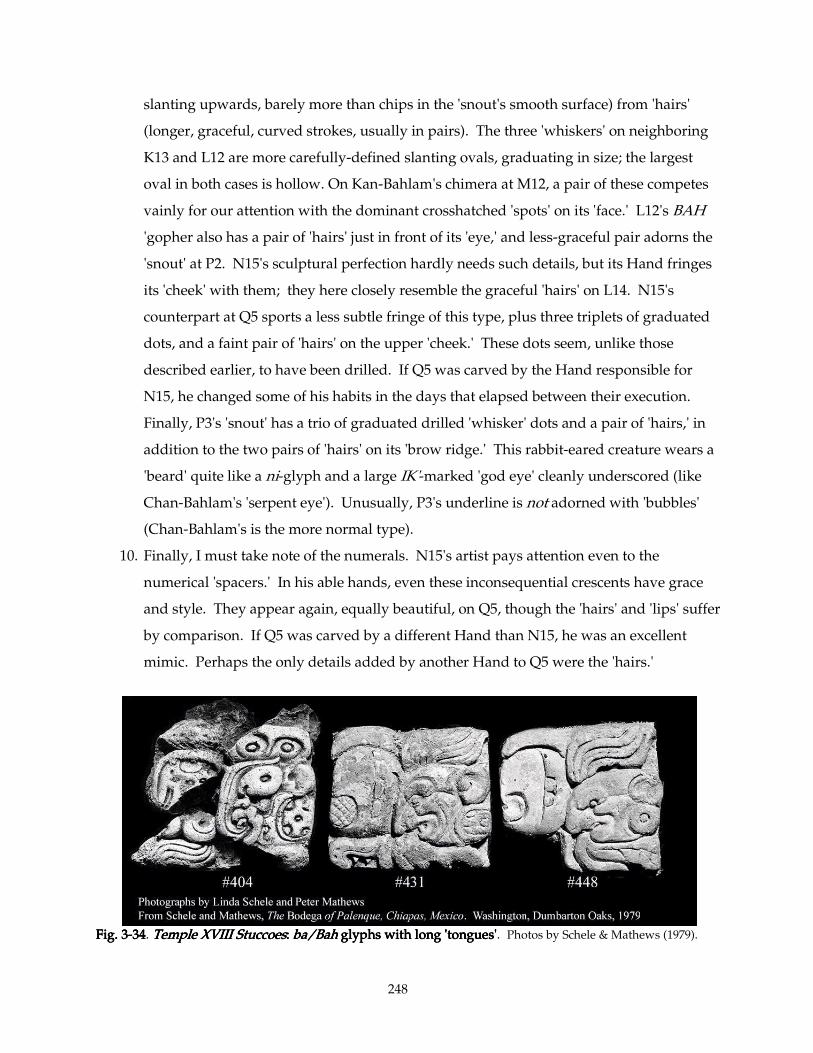
248
slanting upwards, barely more than chips in the 'snout's smooth surface) from 'hairs'
(longer, graceful, curved strokes, usually in pairs). The three 'whiskers' on neighboring
K13 and L12 are more carefully-defined slanting ovals, graduating in size; the largest
oval in both cases is hollow. On Kan-Bahlam's chimera at M12, a pair of these competes
vainly for our attention with the dominant crosshatched 'spots' on its 'face.' L12's BAH
'gopher also has a pair of 'hairs' just in front of its 'eye,' and less-graceful pair adorns the
'snout' at P2. N15's sculptural perfection hardly needs such details, but its Hand fringes
its 'cheek' with them; they here closely resemble the graceful 'hairs' on L14. N15's
counterpart at Q5 sports a less subtle fringe of this type, plus three triplets of graduated
dots, and a faint pair of 'hairs' on the upper 'cheek.' These dots seem, unlike those
described earlier, to have been drilled. If Q5 was carved by the Hand responsible for
N15, he changed some of his habits in the days that elapsed between their execution.
Finally, P3's 'snout' has a trio of graduated drilled 'whisker' dots and a pair of 'hairs,' in
addition to the two pairs of 'hairs' on its 'brow ridge.' This rabbit-eared creature wears a
'beard' quite like a ni-glyph and a large IK'-marked 'god eye' cleanly underscored (like
Chan-Bahlam's 'serpent eye'). Unusually, P3's underline is not adorned with 'bubbles'
(Chan-Bahlam's is the more normal type).
10. Finally, I must take note of the numerals. N15's artist pays attention even to the
numerical 'spacers.' In his able hands, even these inconsequential crescents have grace
and style. They appear again, equally beautiful, on Q5, though the 'hairs' and 'lips' suffer
by comparison. If Q5 was carved by a different Hand than N15, he was an excellent
mimic. Perhaps the only details added by another Hand to Q5 were the 'hairs.'
Fig. 3Fig. 3Fig. 3Fig. 3----34343434. Temple XVIII StuccoesTemple XVIII StuccoesTemple XVIII StuccoesTemple XVIII Stuccoes: : : : ba/Bahba/Bahba/Bahba/Bah glyphs with lo glyphs with lo glyphs with lo glyphs with long 'tongues'ng 'tongues'ng 'tongues'ng 'tongues'. Photos by Schele & Mathews (1979).
249
Despite considerable freedom of interpretation and cross-infection, certain conventions
existed for depicting various species of glyphic 'rodents.' Their 'snouts' were virtually
interchangeable, but they had distinctive 'eyes' and other features. The chochochocho (K13), for example,
has a huge round eye glaring backwards. The Bah 'gopher' has a tiny squinty eye, suitable for a
burrowing creature.131 The Bah also features a long, flourishing 'tongue' —on some examples it
curls halfway round the head (as Fig. 3-34).132 The 'Xul gopher' has here a small eye very like
that of the Bah (here carved slightly more open); it also lacks the long 'tongue' and 'K'an Cross.'
The 'rabbit' and "snake-jaguar" both have prominent, distinctive 'god-eyes.' For a more general
comparison of animal heads, see next section.
This scrutiny helps me group most of these glyphs under one Hand. I have already
separated P2 from the rest. It shares a few details with P3, including proximity, lack of a corner-
of-'mouth' 'bubble,' and their 'ears.' P3 and Q5 both distinguish themselves from the lot in the
top row by their fine details (less-elegant 'hairs,' drilled 'whiskers'), and Q5's carving (e.g., the
'lip'-definition) is just not as careful as that of L12 and N15. Still, these differences might be
accounted for by artistic caprice or weariness; I am more impressed with the qualities they have
in common than with those in which they differ.
My conclusionsMy conclusionsMy conclusionsMy conclusions: For the glyphs I ascribe to this compulsively-sculptural Master, see Fig. 4-01.
This Hand, which carved N15 also gave us at least the 'heads' of L12 and K13 (the abstract
glyphs —kokokoko, lelelele, tatatata— seem rushed, incomplete) and the whole of M12 and L14. P3 is less likely
his, but its sculptural excellence and attention to detail also argue for inclusion here. Q5 may
also be admitted —that 'snout,' that 'cheek,' that nininini— though its 'hairy fringe' seem to come from
somewhere or someone else. The decoration on Q5's numeral 5 is also identical with that on
M13. So I assign to the N15 Hand a substantial part of the lower right portion of the central slab,
and he probably worked on (or at least influenced) the upper part of the right slab. The Winik of
L14, by the way, is linked to that at M13 (which we examined in Section 3.2.1.23.2.1.23.2.1.23.2.1.2 above [Fig. 3-35],
and which we exhaustively scrutinize in the next Section). They are adjacent (they touch
corners), and they share the same kind of fishhook-shapes curling inwards from the sides.
Though the 'trefoil ornaments' at the bottom lean in opposite directions, they both share a spiky
energy in their corners.
131 Likewise the 'vulture' has a similar 'eye,' no doubt for similar reasons —it has to reach into cavities of carrion. 132 Stucco glyphs from Temple XVIII, illustrated in Schele & Mathews, 1979, nos. 404, 431, 448, and 449. The last three are on
display in the Palenque Museum.
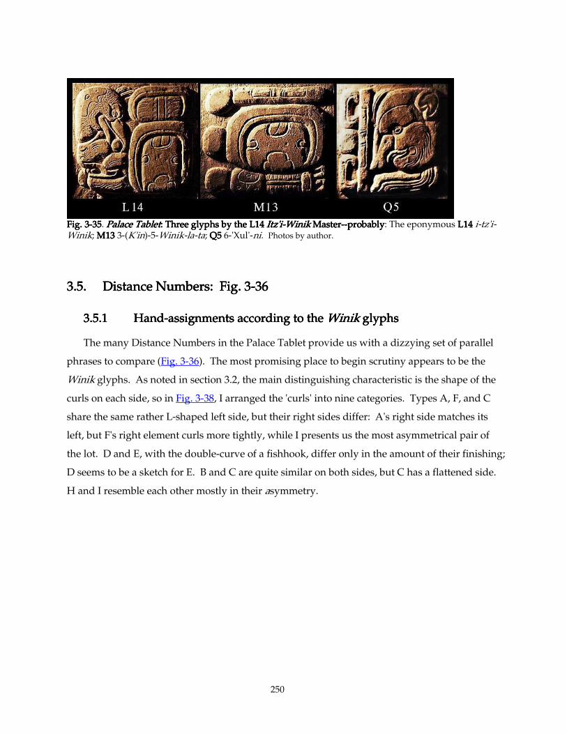
250
Fig. 3Fig. 3Fig. 3Fig. 3----35353535. Palace TabletPalace TabletPalace TabletPalace Tablet: : : : Three glyphs by the L14Three glyphs by the L14Three glyphs by the L14Three glyphs by the L14 Itz'i Itz'i Itz'i Itz'i----Winik Winik Winik Winik MasterMasterMasterMaster--------probablyprobablyprobablyprobably: The eponymous L14L14L14L14 i-tz'i-Winik; M13M13M13M13 3-(K'in)-5-Winik-la-ta; Q5Q5Q5Q5 6-'Xul'-ni. Photos by author.
3.5. Distance Numbers: Fig. 33.5. Distance Numbers: Fig. 33.5. Distance Numbers: Fig. 33.5. Distance Numbers: Fig. 3----36363636
3.5.13.5.13.5.13.5.1 HandHandHandHand----assignments according to the assignments according to the assignments according to the assignments according to the WinikWinikWinikWinik glyphs glyphs glyphs glyphs
The many Distance Numbers in the Palace Tablet provide us with a dizzying set of parallel
phrases to compare (Fig. 3-36). The most promising place to begin scrutiny appears to be the
Winik glyphs. As noted in section 3.2, the main distinguishing characteristic is the shape of the
curls on each side, so in Fig. 3-38, I arranged the 'curls' into nine categories. Types A, F, and C
share the same rather L-shaped left side, but their right sides differ: A's right side matches its
left, but F's right element curls more tightly, while I presents us the most asymmetrical pair of
the lot. D and E, with the double-curve of a fishhook, differ only in the amount of their finishing;
D seems to be a sketch for E. B and C are quite similar on both sides, but C has a flattened side.
H and I resemble each other mostly in their asymmetry.
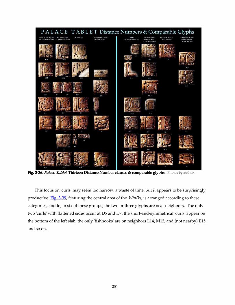
251
Fig. 3Fig. 3Fig. 3Fig. 3----36363636. Palace TabletPalace TabletPalace TabletPalace Tablet: Thirteen : Thirteen : Thirteen : Thirteen Distance Number clauses & comparable glyphsDistance Number clauses & comparable glyphsDistance Number clauses & comparable glyphsDistance Number clauses & comparable glyphs. Photos by author.
This focus on 'curls' may seem too narrow, a waste of time, but it appears to be surprisingly
productive. Fig. 3-39, featuring the central area of the Winiks, is arranged according to these
categories, and lo, in six of these groups, the two or three glyphs are near neighbors. The only
two 'curls' with flattened sides occur at D5 and D7, the short-and-symmetrical 'curls' appear on
the bottom of the left slab, the only 'fishhooks' are on neighbors L14, M13, and (not nearby) E15,
and so on.
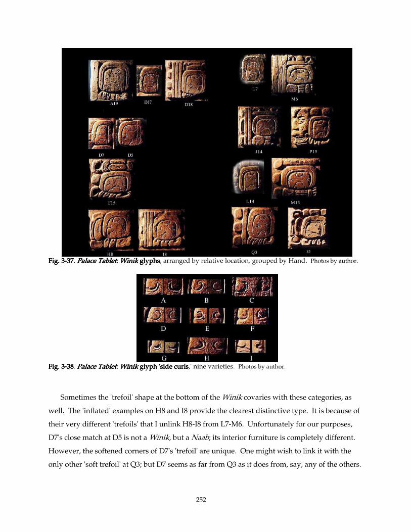
252
Fig. 3Fig. 3Fig. 3Fig. 3----37373737. Palace TabletPalace TabletPalace TabletPalace Tablet: : : : WinikWinikWinikWinik glyphs glyphs glyphs glyphs, arranged by relative location, grouped by Hand. Photos by author.
Fig. 3Fig. 3Fig. 3Fig. 3----38383838. Palace TabletPalace TabletPalace TabletPalace Tablet: : : : WinikWinikWinikWinik glyph 'side curls glyph 'side curls glyph 'side curls glyph 'side curls,' nine varieties. Photos by author.
Sometimes the 'trefoil' shape at the bottom of the Winik covaries with these categories, as
well. The 'inflated' examples on H8 and I8 provide the clearest distinctive type. It is because of
their very different 'trefoils' that I unlink H8-I8 from L7-M6. Unfortunately for our purposes,
D7's close match at D5 is not a Winik, but a Naab; its interior furniture is completely different.
However, the softened corners of D7's 'trefoil' are unique. One might wish to link it with the
only other 'soft trefoil' at Q3; but D7 seems as far from Q3 as it does from, say, any of the others.
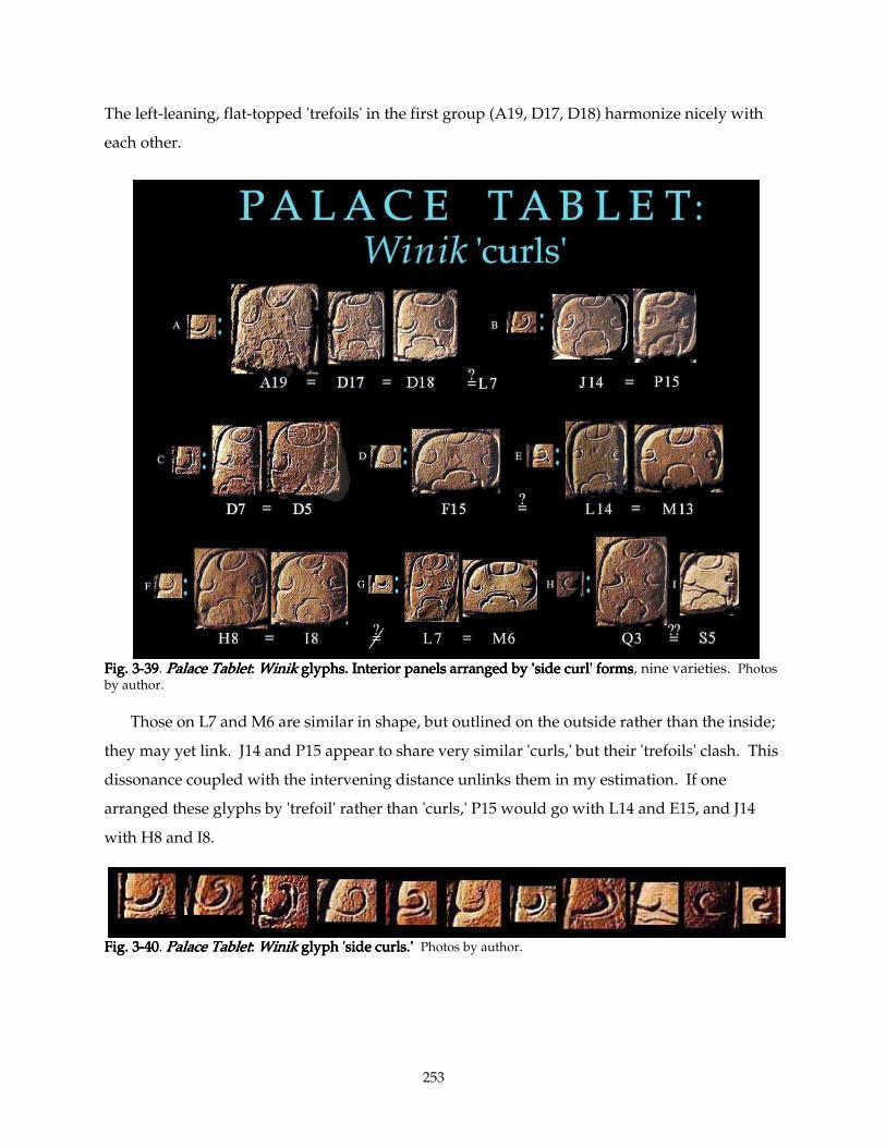
253
The left-leaning, flat-topped 'trefoils' in the first group (A19, D17, D18) harmonize nicely with
each other.
Fig. 3Fig. 3Fig. 3Fig. 3----39393939. Palace TabletPalace TabletPalace TabletPalace Tablet: : : : WinikWinikWinikWinik glyphs. Interior panels arranged by 'side curl' forms glyphs. Interior panels arranged by 'side curl' forms glyphs. Interior panels arranged by 'side curl' forms glyphs. Interior panels arranged by 'side curl' forms, nine varieties. Photos by author.
Those on L7 and M6 are similar in shape, but outlined on the outside rather than the inside;
they may yet link. J14 and P15 appear to share very similar 'curls,' but their 'trefoils' clash. This
dissonance coupled with the intervening distance unlinks them in my estimation. If one
arranged these glyphs by 'trefoil' rather than 'curls,' P15 would go with L14 and E15, and J14
with H8 and I8.
Fig. 3Fig. 3Fig. 3Fig. 3----40404040. Palace TabletPalace TabletPalace TabletPalace Tablet: : : : WinikWinikWinikWinik glyph 'side curls.' glyph 'side curls.' glyph 'side curls.' glyph 'side curls.' Photos by author.
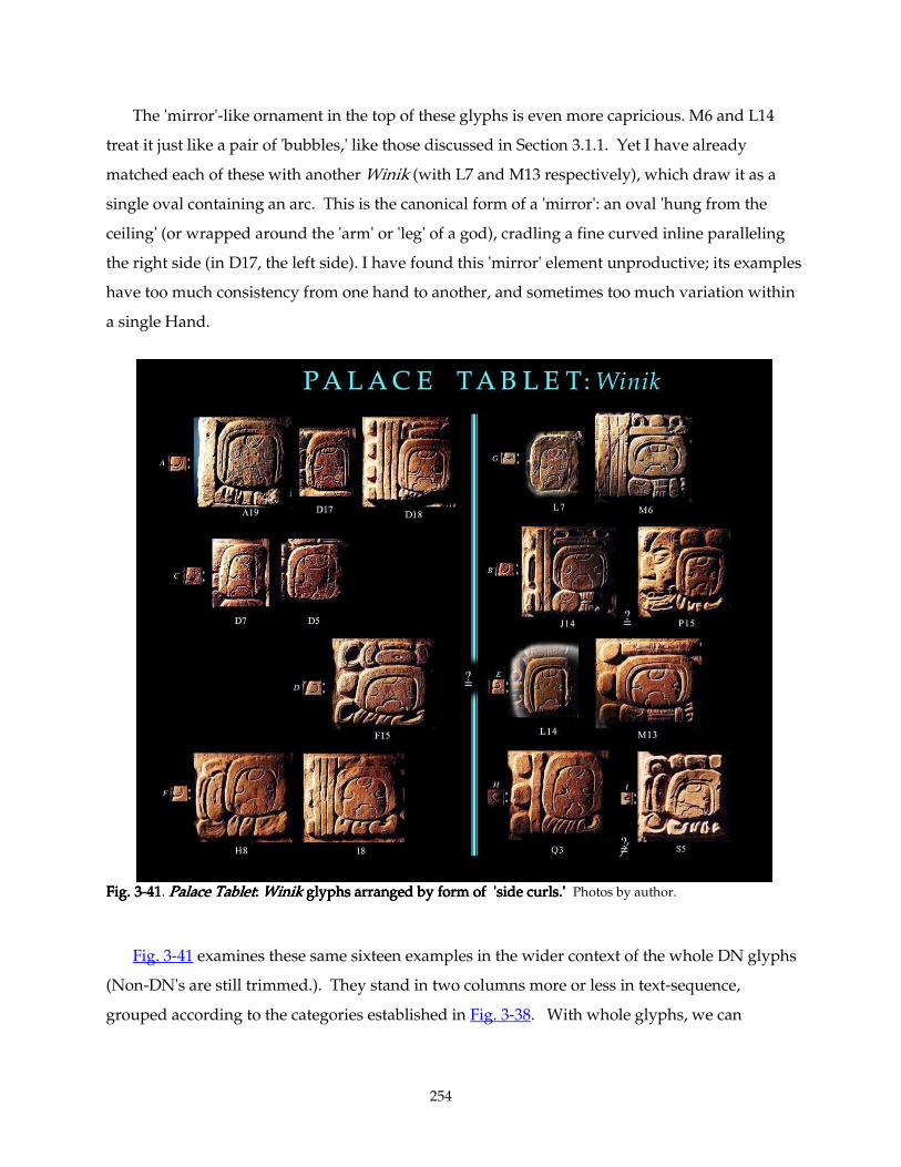
254
The 'mirror'-like ornament in the top of these glyphs is even more capricious. M6 and L14
treat it just like a pair of 'bubbles,' like those discussed in Section 3.1.1. Yet I have already
matched each of these with another Winik (with L7 and M13 respectively), which draw it as a
single oval containing an arc. This is the canonical form of a 'mirror': an oval 'hung from the
ceiling' (or wrapped around the 'arm' or 'leg' of a god), cradling a fine curved inline paralleling
the right side (in D17, the left side). I have found this 'mirror' element unproductive; its examples
have too much consistency from one hand to another, and sometimes too much variation within
a single Hand.
Fig. 3Fig. 3Fig. 3Fig. 3----41414141. Palace TabletPalace TabletPalace TabletPalace Tablet: : : : WinikWinikWinikWinik glyphs arranged by form of 'side curls.' glyphs arranged by form of 'side curls.' glyphs arranged by form of 'side curls.' glyphs arranged by form of 'side curls.' Photos by author.
Fig. 3-41 examines these same sixteen examples in the wider context of the whole DN glyphs
(Non-DN's are still trimmed.). They stand in two columns more or less in text-sequence,
grouped according to the categories established in Fig. 3-38. With whole glyphs, we can
255
compare 'sign-form,' sculptural character, and similar suffixes. For the most part, this broader
view confirms what I had decided at the micro-level.
For example, H8 and its neighbor I8 both exhibit a distinct 'flat-and fat' quality: the relief
modeling of the glyphs definitely has a lower relief flavor than the others. This is partly because
this Hand carves economically, cutting away as little as he can: his numerals are board-like,
unmodeled, his jijijiji----yayayaya suffixes in particular have very thick elements; their negative spaces are
positively tiny. The main difference between these two collocations is that H8 has a slanting
'sign-form,' while I8's is strictly upright. The jijijiji----yyyyaaaa suffixes, on the other hand, lean at about the
same angle. This Artist is given to shallowly hollowing our the 'petals' of the "Zero" coefficient,
quite a distinct treatment from the "Zero" of F15 and the deeply-carved "Zeros" of D18 and S5.
The compulsively-square 'arch' on A19 is repeated, a bit more softly, on D17 and D18. This
inclination is more visible inside the 'arch' than outside; and he echoes this upright stance in his
columnar jijijiji----yayayaya and the 'trefoil.' The 'arches' in L7 and M6 both have a wider 'bandwidth' than
A19's group, and M6's surprising asymmetric curve on the inside of this 'arch' firmly
distinguishes this pair from the A19 group. F15's well-modeled and assertively-leaning jijijiji----yayayaya
suffix distinguishes it from every other suffix except that on Q3, which it strikingly resembles.
However, very little else of these two glyphs can be said to match, not sculptural quality and
finish, not sign-form, not Winik details. Q3 and S5 look a lot less alike when one examines their
affixes, especially the yayayaya's.
Though F15 (and the E15 group in general) has many qualities that resemble the L14-M13
group —e.g., highly sculptural finish, attention to fine detail— there are a number of
idiosyncrasies that the E15 Hand seems to employ with some consistency (particularly the
slanted 'sign-form,'), which do not appear in the area of L14. In order to claim that these two
areas of the main slab of the Palace Tablet were carved by a single Hand, we would have to
argue that the Hand carved the EFGH patch with a cursive-flavored 'sign-form,' then repented,
carving the L14 area (lower KLM) with much more upright aspect (viz. L14, M13).
Thus, to recapitulate Hand-assignments according to the Winik glyphs:
Group A:Group A:Group A:Group A: Lower rows of Columns ABCD (A19, D17, D18)
Group B:Group B:Group B:Group B: J14 and possibly P15
Group C:Group C:Group C:Group C: Upper rows of Columns CD (D7, D5)
Group D:Group D:Group D:Group D: The E15 Master (F15), bearing some close affinities with:
Group E:Group E:Group E:Group E: The L14/Itzi-Winik Master (lower Columns KLM) (L14, M13)
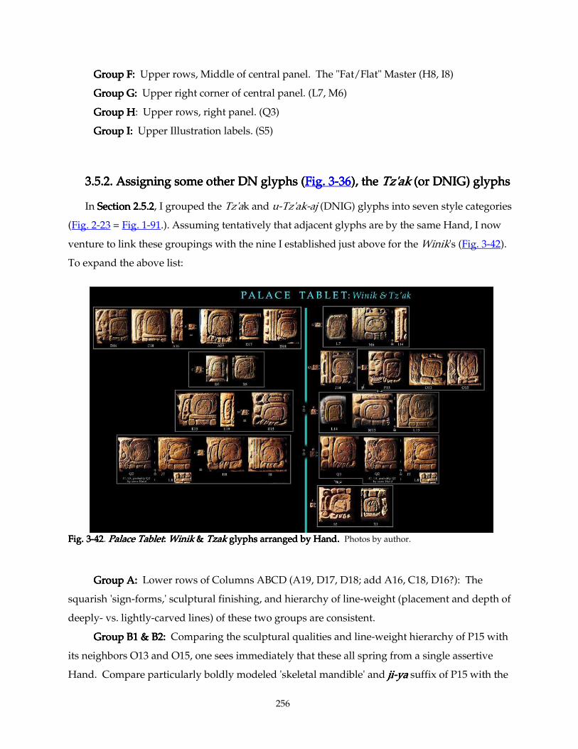
256
Group F:Group F:Group F:Group F: Upper rows, Middle of central panel. The "Fat/Flat" Master (H8, I8)
Group G:Group G:Group G:Group G: Upper right corner of central panel. (L7, M6)
Group HGroup HGroup HGroup H: Upper rows, right panel. (Q3)
Group I: Group I: Group I: Group I: Upper Illustration labels. (S5)
3.5.2. Assigning some other DN glyphs (3.5.2. Assigning some other DN glyphs (3.5.2. Assigning some other DN glyphs (3.5.2. Assigning some other DN glyphs (Fig. 3Fig. 3Fig. 3Fig. 3----36363636), the ), the ), the ), the Tz'akTz'akTz'akTz'ak (or DNIG) glyphs (or DNIG) glyphs (or DNIG) glyphs (or DNIG) glyphs
In Section 2.5.2Section 2.5.2Section 2.5.2Section 2.5.2, I grouped the Tz'ak and u-Tz'ak-aj (DNIG) glyphs into seven style categories
(Fig. 2-23 = Fig. 1-91.). Assuming tentatively that adjacent glyphs are by the same Hand, I now
venture to link these groupings with the nine I established just above for the Winik's (Fig. 3-42).
To expand the above list:
Fig. 3Fig. 3Fig. 3Fig. 3----42424242. Palace TabletPalace TabletPalace TabletPalace Tablet: : : : WinikWinikWinikWinik & & & & Tzak Tzak Tzak Tzak glyphs arranged by Hand.glyphs arranged by Hand.glyphs arranged by Hand.glyphs arranged by Hand. Photos by author.
Group A:Group A:Group A:Group A: Lower rows of Columns ABCD (A19, D17, D18; add A16, C18, D16?): The
squarish 'sign-forms,' sculptural finishing, and hierarchy of line-weight (placement and depth of
deeply- vs. lightly-carved lines) of these two groups are consistent.
Group B1 & B2: Group B1 & B2: Group B1 & B2: Group B1 & B2: Comparing the sculptural qualities and line-weight hierarchy of P15 with
its neighbors O13 and O15, one sees immediately that these all spring from a single assertive
Hand. Compare particularly boldly modeled 'skeletal mandible' and jijijiji----yayayaya suffix of P15 with the
257
'fish' u-prefixes of O13 and O15; or the very square 'main signs.' The jaunty, energetic shape of
the 'trefoil' element at the bottom of P15's Winik matches that of L14 exactly, and a closer
comparison of the side-'curls' on M13, L14, and P15 reveals that they have more in common than
first appeared. Could there be a connection? L14 (the i-tz'i-Winik) and its neighbors display
much more sensitive carving technique than P15 and its neighbors; I would have to reconcile
that powerful distinction to convince myself that these were by the same Hand.
It becomes apparent that the flatter-carved, more cursive J14 is by a different Hand (Group Group Group Group
B2B2B2B2); its rounder 'sign-forms,' details of its la suffix, and many other stylistic details offer a very
distinct flavor.
Group C: Group C: Group C: Group C: Upper rows of Columns CD (D7, D5): no DN's here, so no new members.
Group D:Group D:Group D:Group D: The E15 Master (F15), whose members I already established in Section 2.5.5,
bearing some close affinities with:
Group E: Group E: Group E: Group E: The L14/Itzi-Winik Master (lower Columns KLM) (L14, M13). Does L15
harmonize with the surrounding glyphs by this highly-sculptural Hand? Although finished
very carefully, it is much lower-relief than all its neighbors. All three of its elements, uuuu- and
Tz'ak and -ajajajaj, have highly unique forms, not only unlike any on this Tablet, but unlike perhaps
any versions of these glyphs anywhere in the entire corpus of Maya inscriptions, and therefore
very difficult to assign. However, M16 nearby is also uncharacteristically low-relief (see Fig. 3-
43), and as we have seen, distinct from the Hand of N16 and M17 (SectiSectiSectiSectionsonsonsons 3.1.3 3.1.3 3.1.3 3.1.3 –––– 3.1.4 3.1.4 3.1.4 3.1.4).
Therefore, it seems likely to have been the last glyph in the neighborhood carved by the Hand of
M15-N15, which I showed (Section 3Section 3Section 3Section 3----4444) to be the same "Itz'i-Winik Master." Circumstantial
evidence inclines toward assigning these two as well to that versatile Master, but I do so with
firm reservations.
Group F: Group F: Group F: Group F: Upper rows, Middle of central panel. The "Fat/Flat" Master (H8, I8). I believe
we are secure assigning J7 to the Hand of H8-I8; its flat relief and line quality match closely. Q2
still seems likely to spring from this Hand, though the three form a group with closer affinities to
each other than to Q2.
Group G: Group G: Group G: Group G: Upper right corner of central panel. (L7, M6). Perhaps the ajajajaj- prefix of I14 goes
with these two, though my reasons for this assignment are more instinctive than articulable.
Group H:Group H:Group H:Group H: Upper rows, right panel. (Q3). I see no reason to think that Q2 does not belong
to this flattish Hand. The possibility of identity with Group F (H8-I8-J7) is still strong.
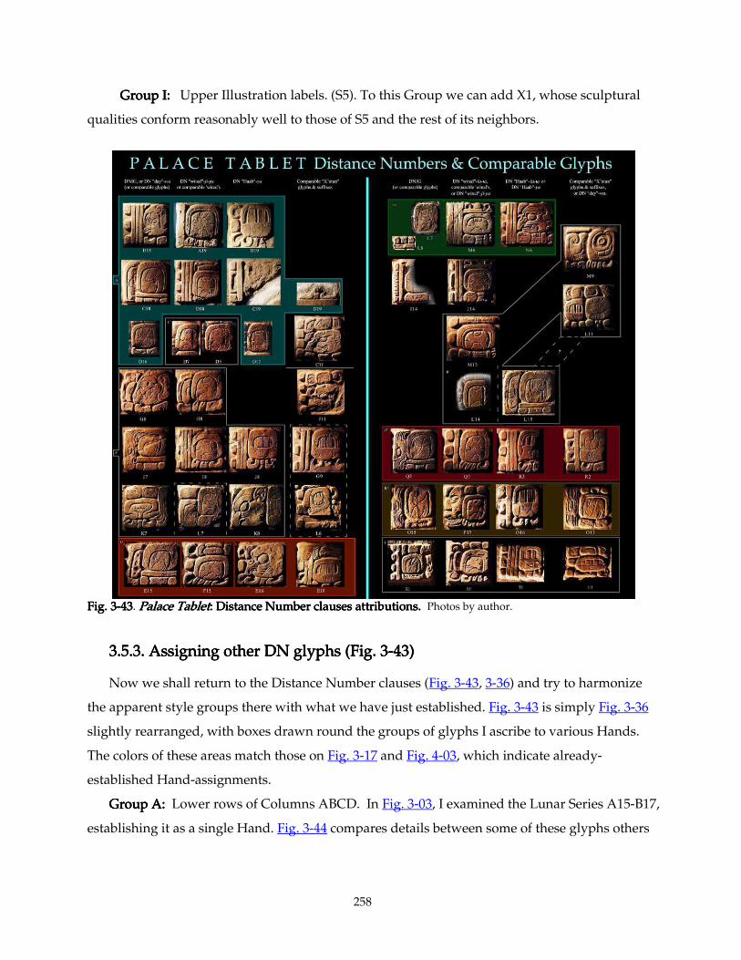
258
Group I: Group I: Group I: Group I: Upper Illustration labels. (S5). To this Group we can add X1, whose sculptural
qualities conform reasonably well to those of S5 and the rest of its neighbors.
Fig. 3Fig. 3Fig. 3Fig. 3----43434343. Palace TabletPalace TabletPalace TabletPalace Tablet: : : : Distance Number clausesDistance Number clausesDistance Number clausesDistance Number clauses attributions.attributions.attributions.attributions. Photos by author.
3.5.3. Ass3.5.3. Ass3.5.3. Ass3.5.3. Assigning other DN glyphs (Fig. 3igning other DN glyphs (Fig. 3igning other DN glyphs (Fig. 3igning other DN glyphs (Fig. 3----43)43)43)43)
Now we shall return to the Distance Number clauses (Fig. 3-43, 3-36) and try to harmonize
the apparent style groups there with what we have just established. Fig. 3-43 is simply Fig. 3-36
slightly rearranged, with boxes drawn round the groups of glyphs I ascribe to various Hands.
The colors of these areas match those on Fig. 3-17 and Fig. 4-03, which indicate already-
established Hand-assignments.
Group A:Group A:Group A:Group A: Lower rows of Columns ABCD. In Fig. 3-03, I examined the Lunar Series A15-B17,
establishing it as a single Hand. Fig. 3-44 compares details between some of these glyphs others
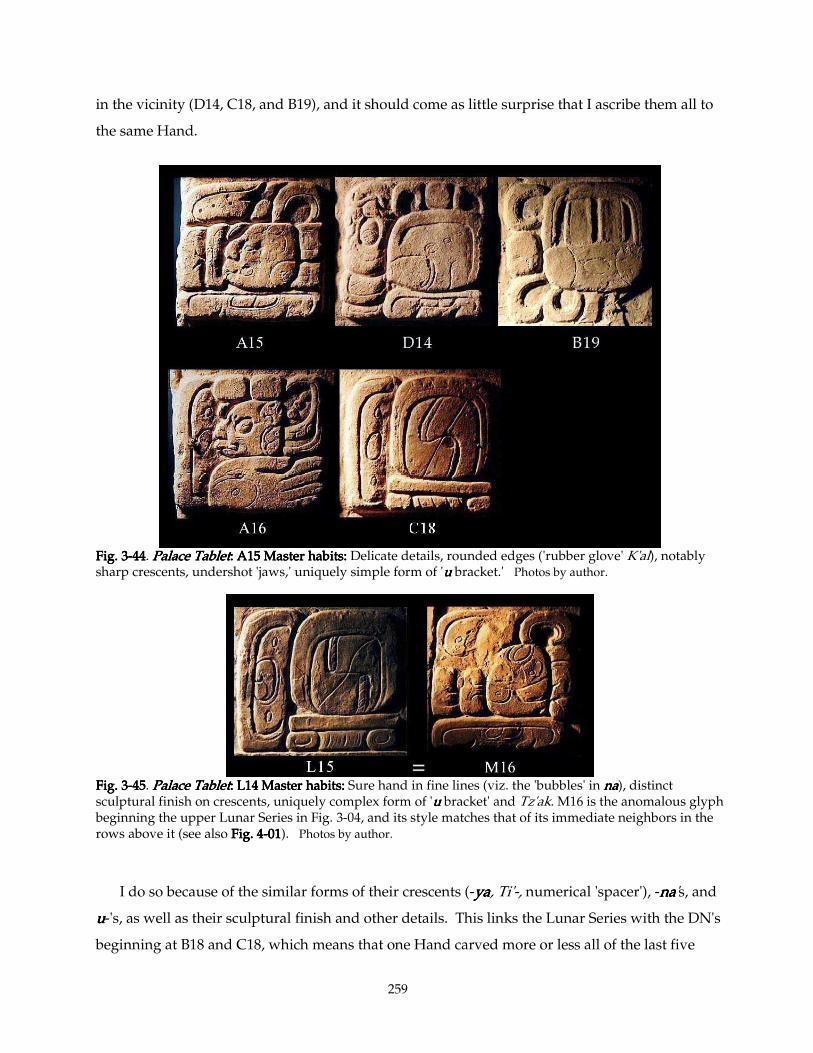
259
in the vicinity (D14, C18, and B19), and it should come as little surprise that I ascribe them all to
the same Hand.
Fig. 3Fig. 3Fig. 3Fig. 3----44444444. Palace TabletPalace TabletPalace TabletPalace Tablet: : : : A15 MasterA15 MasterA15 MasterA15 Master habits: habits: habits: habits: Delicate details, rounded edges ('rubber glove' K'al), notably sharp crescents, undershot 'jaws,' uniquely simple form of 'uuuu bracket.' Photos by author.
Fig. 3Fig. 3Fig. 3Fig. 3----45454545. Palace TabletPalace TabletPalace TabletPalace Tablet: : : : L14 MasterL14 MasterL14 MasterL14 Master habits: habits: habits: habits: Sure hand in fine lines (viz. the 'bubbles' in nananana), distinct sculptural finish on crescents, uniquely complex form of 'uuuu bracket' and Tz'ak. M16 is the anomalous glyph beginning the upper Lunar Series in Fig. 3-04, and its style matches that of its immediate neighbors in the rows above it (see also Fig. 4Fig. 4Fig. 4Fig. 4----01010101). Photos by author.
I do so because of the similar forms of their crescents (-yayayaya, Ti'-, numerical 'spacer'), -nananana's, and
uuuu-'s, as well as their sculptural finish and other details. This links the Lunar Series with the DN's
beginning at B18 and C18, which means that one Hand carved more or less all of the last five
260
rows of the left slab of the Palace Tablet. A few anomalous details here and there may have been
added by other Hands, but in general I think that we can safely ascribe to one expert Hand this
whole section of 20 glyphs. It remains to be seen which other glyphs he carved. Certainly not the
adjacent rows of Columns E and F (see Section 2.5.5Section 2.5.5Section 2.5.5Section 2.5.5), but D14 and perhaps C14, D13, and maybe
the full-figure glyph A13-B14.
Group B1: Group B1: Group B1: Group B1: Jumping to the lower area of Columns O and P, this assertive carver seems to be
responsible for at least O13-P16, and probably glyphs above and below this. The DN forms half
this area, but the nininini's we inspected in Fig. 3-30, and the related glyph at O13 here (Fig. 3-43), are
all of a piece with this character.
Group C: Group C: Group C: Group C: Upper rows of Columns CD (D7, D5): no new members.
Group D: Group D: Group D: Group D: The E15 Master, carving the most slanted glyphs in the Palace Tablet, responsible
for the lower areas of Columns EF, plus a handful of adjacent glyphs in the last row(s) of
Columns G, H, I and perhaps J (F13 -E19, G14, G15, H15, I15, J15 [part?]).
Group E: Group E: Group E: Group E: The L14/Itzi-Winik Master (lower Columns KLM) Nothing new yet. (See Fig. 4-
01)
Group F: Group F: Group F: Group F: The "Fat/Flat" Master, Rows 7 and 8 of Columns GHIJK, and probably several
other adjacent glyphs. (See Fig. 3-70.)
Group G: Group G: Group G: Group G: Upper right corner of central panel. Fig. 3-17 assigns the 'Ajaw face' glyphs with
wide, circular 'eyes' (L8, M6, N6, N9 and M10) to one Hand. (A similar Hand, which gives these
'faces' smaller, more closely-set 'eyes,' occupies the upper parts of Columns GHI nearby, but I
believe this Hand to be distinct.) To the first list we added L7 in the previous Section. Though I
am sure that the "Fat/Flat Master" carved glyphs K7 and K8, I am equally sure that his colleague
the "Staring 'Ajaw-Face' Master" executed Glyphs L7 and L8, which interrupt the flow of text (K7
- L7 - K8 - L8). In other words, as was hinted at in Section 3.1.4 of this chapter, Maya carvers
were not compelled to proceed linearly, from start to finish of clauses. They picked up and left
off with little regard for the content of their texts, perhaps at random. We saw this earlier on the
Temple XIX Platform text, wherein the work of one expert Hand was interrupted by a few
glyphs by a decidedly inferior artist(s). It thus seems increasingly likely to me that we will find
the odd occasion where two (or more!) Hands contribute to a single glyph. With each glyph no
more than six inches square, this could only have happened occasionally, when a second Hand
added finishing touches to his colleague's work. No doubt the most common scenario was a
single Hand carving a given glyph from start to finish.
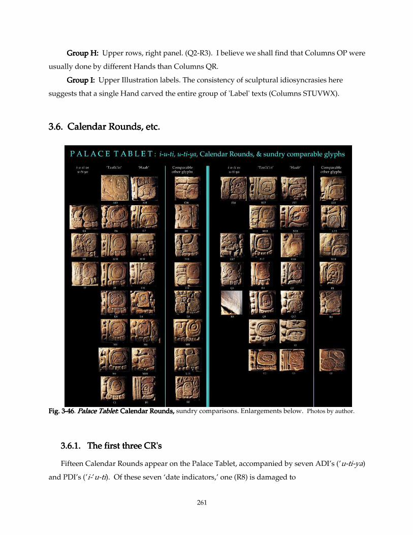
261
Group H:Group H:Group H:Group H: Upper rows, right panel. (Q2-R3). I believe we shall find that Columns OP were
usually done by different Hands than Columns QR.
Group I: Group I: Group I: Group I: Upper Illustration labels. The consistency of sculptural idiosyncrasies here
suggests that a single Hand carved the entire group of 'Label' texts (Columns STUVWX).
3.6. 3.6. 3.6. 3.6. Calendar Rounds, etc.Calendar Rounds, etc.Calendar Rounds, etc.Calendar Rounds, etc.
Fig. 3Fig. 3Fig. 3Fig. 3----46464646. Palace TabletPalace TabletPalace TabletPalace Tablet: : : : Calendar Rounds, Calendar Rounds, Calendar Rounds, Calendar Rounds, sundry comparisons. Enlargements below. Photos by author.
3.6.1. The first three CR's3.6.1. The first three CR's3.6.1. The first three CR's3.6.1. The first three CR's
Fifteen Calendar Rounds appear on the Palace Tablet, accompanied by seven ADI’s (’u-ti-ya)
and PDI’s (’i-’u-ti). Of these seven ‘date indicators,’ one (R8) is damaged to
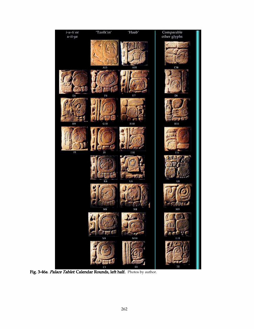
262
Fig. 3Fig. 3Fig. 3Fig. 3----46a46a46a46a. Palace TabletPalace TabletPalace TabletPalace Tablet: : : : Calendar Rounds, left haCalendar Rounds, left haCalendar Rounds, left haCalendar Rounds, left half.lf.lf.lf. Photos by author.
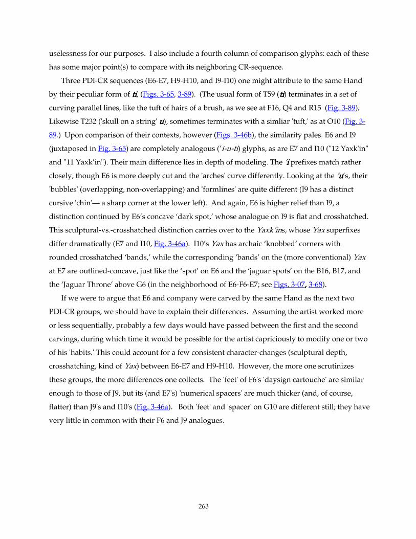
263
uselessness for our purposes. I also include a fourth column of comparison glyphs: each of these
has some major point(s) to compare with its neighboring CR-sequence.
Three PDI-CR sequences (E6-E7, H9-H10, and I9-I10) one might attribute to the same Hand
by their peculiar form of titititi, (Figs. 3-65, 3-89). (The usual form of T59 (titititi) terminates in a set of
curving parallel lines, like the tuft of hairs of a brush, as we see at F16, Q4 and R15 (Fig. 3-89)....
Likewise T232 ('skull on a string' uuuu), sometimes terminates with a simliar 'tuft,' as at O10 (Fig. 3-
89.) Upon comparison of their contexts, however (Figs. 3-46b), the similarity pales. E6 and I9
(juxtaposed in Fig. 3-65) are completely analogous (’i-u-ti) glyphs, as are E7 and I10 ("12 Yaxk'in"
and "11 Yaxk’in"). Their main difference lies in depth of modeling. The ’iiii prefixes match rather
closely, though E6 is more deeply cut and the 'arches' curve differently. Looking at the ’uuuu’s, their
'bubbles' (overlapping, non-overlapping) and 'formlines' are quite different (I9 has a distinct
cursive 'chin'— a sharp corner at the lower left). And again, E6 is higher relief than I9, a
distinction continued by E6’s concave ‘dark spot,’ whose analogue on I9 is flat and crosshatched.
This sculptural-vs.-crosshatched distinction carries over to the Yaxk’ins, whose Yax superfixes
differ dramatically (E7 and I10, Fig. 3-46a). I10’s Yax has archaic ‘knobbed’ corners with
rounded crosshatched ‘bands,’ while the corresponding ‘bands’ on the (more conventional) Yax
at E7 are outlined-concave, just like the ‘spot’ on E6 and the ‘jaguar spots’ on the B16, B17, and
the ‘Jaguar Throne’ above G6 (in the neighborhood of E6-F6-E7; see Figs. 3-07, , , , 3-68).
If we were to argue that E6 and company were carved by the same Hand as the next two
PDI-CR groups, we should have to explain their differences. Assuming the artist worked more
or less sequentially, probably a few days would have passed between the first and the second
carvings, during which time it would be possible for the artist capriciously to modify one or two
of his 'habits.' This could account for a few consistent character-changes (sculptural depth,
crosshatching, kind of Yax) between E6-E7 and H9-H10. However, the more one scrutinizes
these groups, the more differences one collects. The 'feet' of F6's 'daysign cartouche' are similar
enough to those of J9, but its (and E7's) 'numerical spacers' are much thicker (and, of course,
flatter) than J9's and I10's (Fig. 3-46a). Both 'feet' and 'spacer' on G10 are different still; they have
very little in common with their F6 and J9 analogues.
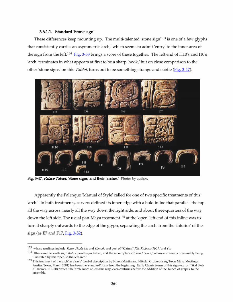
264
3.6.1.1. Standard 'Stone sign'3.6.1.1. Standard 'Stone sign'3.6.1.1. Standard 'Stone sign'3.6.1.1. Standard 'Stone sign'
These differences keep mounting up. The multi-talented 'stone sign'133 is one of a few glyphs
that consistently carries an asymmetric 'arch,' which seems to admit 'entry' to the inner area of
the sign from the left.134 Fig. 3-53 brings a score of these together. The left end of H10's and I10's
'arch' terminates in what appears at first to be a sharp 'hook,' but on close comparison to the
other 'stone signs' on this Tablet, turns out to be something strange and subtle (Fig. 3-47).
Fig. 3Fig. 3Fig. 3Fig. 3----47474747. Palace TabletPalace TabletPalace TabletPalace Tablet: : : : 'Stone signs' and their 'arches.''Stone signs' and their 'arches.''Stone signs' and their 'arches.''Stone signs' and their 'arches.' Photos by author.
Apparently the Palenque 'Manual of Style' called for one of two specific treatments of this
'arch.' In both treatments, carvers defined its inner edge with a bold inline that parallels the top
all the way across, nearly all the way down the right side, and about three-quarters of the way
down the left side. The usual pan-Maya treatment135 at the 'open' left end of this inline was to
turn it sharply outwards to the edge of the glyph, separating the 'arch' from the 'interior' of the
sign (as E7 and F17, Fig. 3-52).
133 whose readings include Tuun, Haab, ku, and Kawak, and part of "K'atun," Pih, Kaloom-Te', hi and t'u. 134 Others are the 'earth sign' Kab /month sign Kaban, and the sacred place Ch’een / "cave," whose entrance is presumably being
illustrated by this 'open-to-the-left arch.' 135 This treatment of the 'arch' as a'cave' (verbal description by Simon Martin and Nikolai Grube during Texas Maya Meetings,
Austin, Texas, March 2001) has been the 'standard' form from the beginning. Early Classic forms of this sign (e.g. on Tikal Stela 31, from 9.0.10.0.0) present the 'arch' more or less this way, even centuries before the addition of the 'bunch of grapes' to the ensemble.
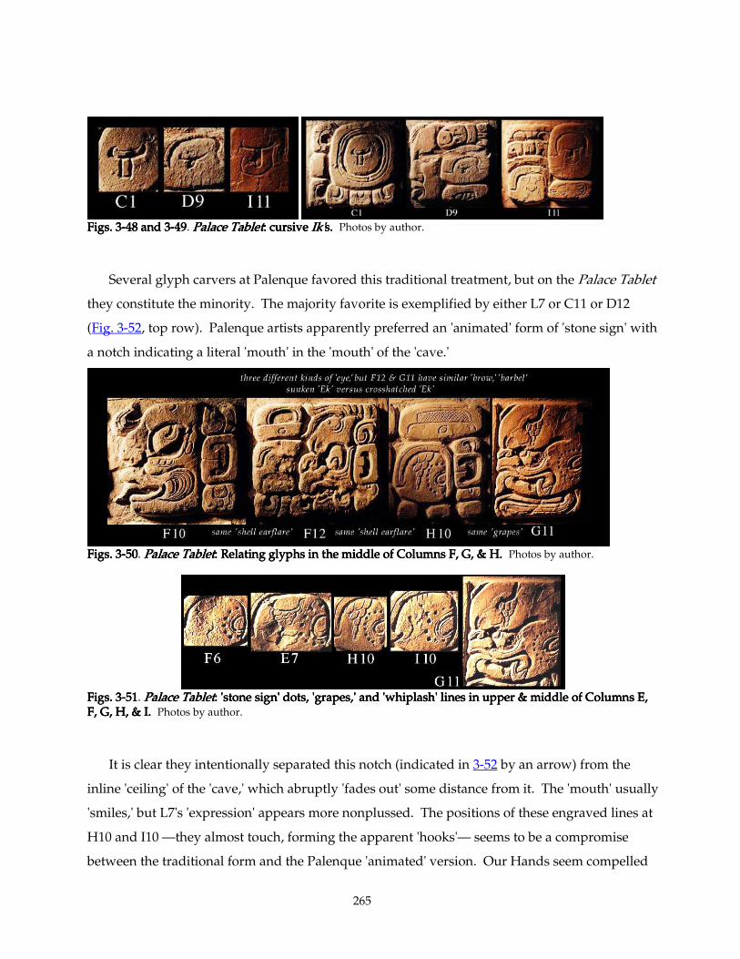
265
Figs. 3Figs. 3Figs. 3Figs. 3----48 and 348 and 348 and 348 and 3----49494949. Palace TabletPalace TabletPalace TabletPalace Tablet: cursive : cursive : cursive : cursive Ik'Ik'Ik'Ik's.s.s.s. Photos by author.
Several glyph carvers at Palenque favored this traditional treatment, but on the Palace Tablet
they constitute the minority. The majority favorite is exemplified by either L7 or C11 or D12
(Fig. 3-52, top row). Palenque artists apparently preferred an 'animated' form of 'stone sign' with
a notch indicating a literal 'mouth' in the 'mouth' of the 'cave.'
Figs. 3Figs. 3Figs. 3Figs. 3----50505050. Palace TabletPalace TabletPalace TabletPalace Tablet: Relating glyphs in the middle of Columns F, G, & H: Relating glyphs in the middle of Columns F, G, & H: Relating glyphs in the middle of Columns F, G, & H: Relating glyphs in the middle of Columns F, G, & H.... Photos by author.
Figs. 3Figs. 3Figs. 3Figs. 3----51515151. Palace TabletPalace TabletPalace TabletPalace Tablet: 'stone sign' dots, 'grapes,: 'stone sign' dots, 'grapes,: 'stone sign' dots, 'grapes,: 'stone sign' dots, 'grapes,' and 'whiplash' lines ' and 'whiplash' lines ' and 'whiplash' lines ' and 'whiplash' lines in upper & middle of Columns E, in upper & middle of Columns E, in upper & middle of Columns E, in upper & middle of Columns E, F, G, H, & IF, G, H, & IF, G, H, & IF, G, H, & I.... Photos by author.
It is clear they intentionally separated this notch (indicated in 3-52 by an arrow) from the
inline 'ceiling' of the 'cave,' which abruptly 'fades out' some distance from it. The 'mouth' usually
'smiles,' but L7's 'expression' appears more nonplussed. The positions of these engraved lines at
H10 and I10 —they almost touch, forming the apparent 'hooks'— seems to be a compromise
between the traditional form and the Palenque 'animated' version. Our Hands seem compelled
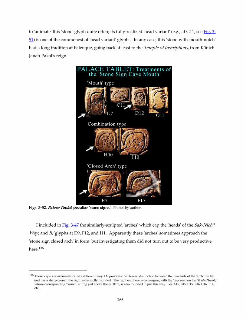
266
to 'animate' this 'stone' glyph quite often; its fully-realized 'head variant' (e.g., at G11, see Fig. 3-
51) is one of the commonest of 'head variant' glyphs. In any case, this 'stone-with-mouth-notch'
had a long tradition at Palenque, going back at least to the Temple of Inscriptions, from K'inich
Janab-Pakal's reign.
Figs. 3Figs. 3Figs. 3Figs. 3----52525252. Palace TabletPalace TabletPalace TabletPalace Tablet: peculiar 'stone signs.': peculiar 'stone signs.': peculiar 'stone signs.': peculiar 'stone signs.' Photos by author.
I included in Fig. 3-47 the similarly-sculpted 'arches' which cap the 'heads' of the Sak-Nich'?
Way, and Ik' glyphs at D9, F12, and I11. Apparently these 'arches' sometimes approach the
'stone sign closed arch' in form, but investigating them did not turn out to be very productive
here.136
136 These 'caps' are asymmetrical in a different way. D9 provides the clearest distinction between the two ends of the 'arch: the left
end has a sharp corner, the right is distinctly rounded. The right end here is converging with the 'cap' seen on the 'K'uhul head,' whose corresponding 'corner,' sitting just above the earflare, is also rounded in just this way. See A15, B15, C15, B16, C16, F14, etc.
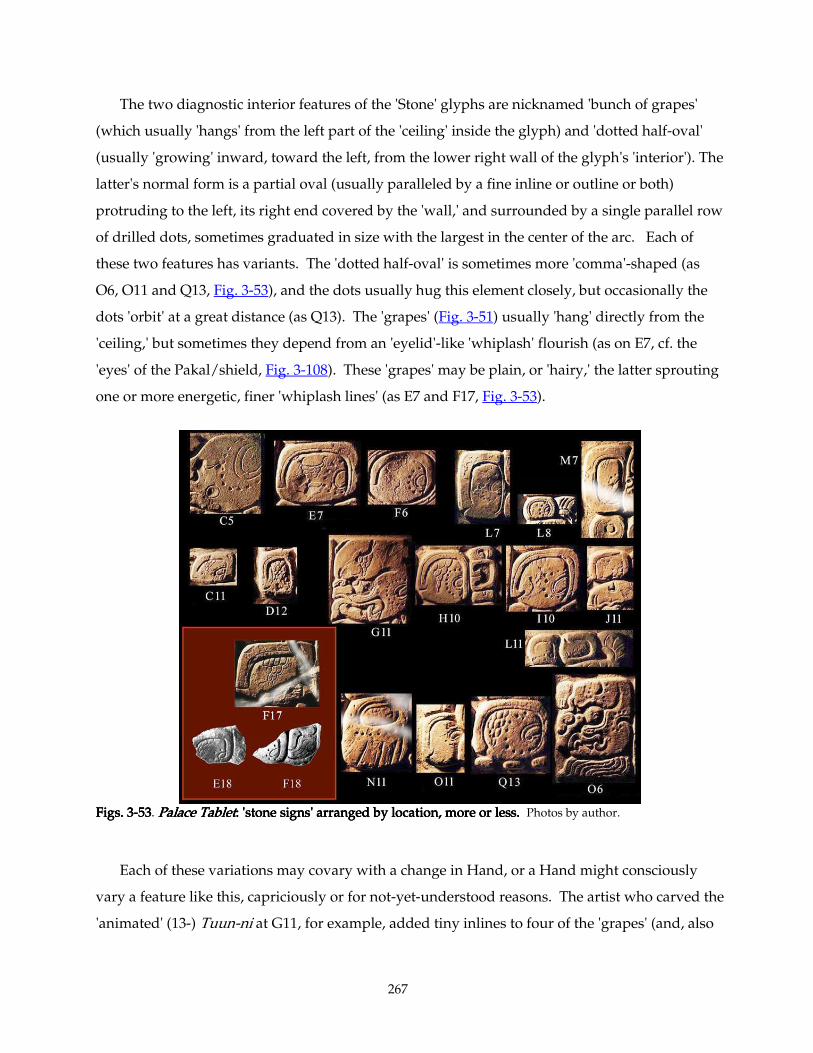
267
The two diagnostic interior features of the 'Stone' glyphs are nicknamed 'bunch of grapes'
(which usually 'hangs' from the left part of the 'ceiling' inside the glyph) and 'dotted half-oval'
(usually 'growing' inward, toward the left, from the lower right wall of the glyph's 'interior'). The
latter's normal form is a partial oval (usually paralleled by a fine inline or outline or both)
protruding to the left, its right end covered by the 'wall,' and surrounded by a single parallel row
of drilled dots, sometimes graduated in size with the largest in the center of the arc. Each of
these two features has variants. The 'dotted half-oval' is sometimes more 'comma'-shaped (as
O6, O11 and Q13, Fig. 3-53), and the dots usually hug this element closely, but occasionally the
dots 'orbit' at a great distance (as Q13). The 'grapes' (Fig. 3-51) usually 'hang' directly from the
'ceiling,' but sometimes they depend from an 'eyelid'-like 'whiplash' flourish (as on E7, cf. the
'eyes' of the Pakal/shield, Fig. 3-108). These 'grapes' may be plain, or 'hairy,' the latter sprouting
one or more energetic, finer 'whiplash lines' (as E7 and F17, Fig. 3-53).
Figs. 3Figs. 3Figs. 3Figs. 3----53535353. Palace TabletPalace TabletPalace TabletPalace Tablet: 'stone signs' arran: 'stone signs' arran: 'stone signs' arran: 'stone signs' arranged by location, more or less.ged by location, more or less.ged by location, more or less.ged by location, more or less. Photos by author.
Each of these variations may covary with a change in Hand, or a Hand might consciously
vary a feature like this, capriciously or for not-yet-understood reasons. The artist who carved the
'animated' (13-) Tuun-ni at G11, for example, added tiny inlines to four of the 'grapes' (and, also
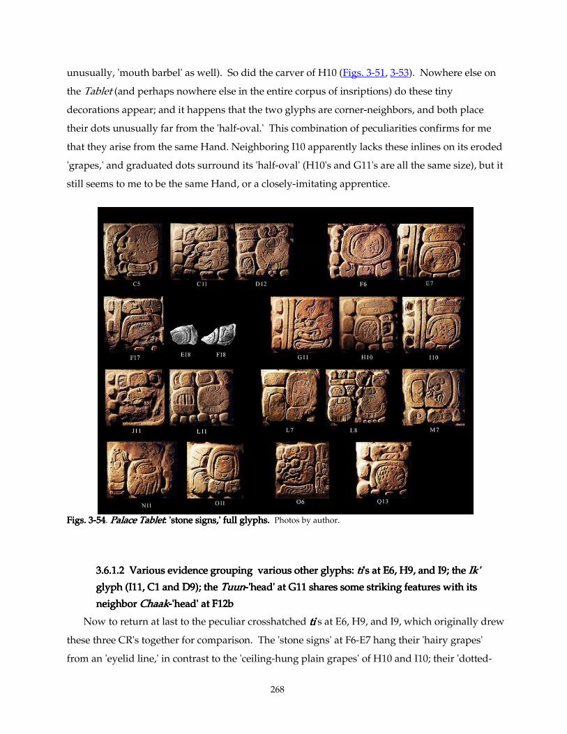
268
unusually, 'mouth barbel' as well). So did the carver of H10 (Figs. 3-51, 3-53). Nowhere else on
the Tablet (and perhaps nowhere else in the entire corpus of insriptions) do these tiny
decorations appear; and it happens that the two glyphs are corner-neighbors, and both place
their dots unusually far from the 'half-oval.' This combination of peculiarities confirms for me
that they arise from the same Hand. Neighboring I10 apparently lacks these inlines on its eroded
'grapes,' and graduated dots surround its 'half-oval' (H10's and G11's are all the same size), but it
still seems to me to be the same Hand, or a closely-imitating apprentice.
Figs. 3Figs. 3Figs. 3Figs. 3----54545454. Palace TabletPalace TabletPalace TabletPalace Tablet: 'stone signs,' full glyphs.: 'stone signs,' full glyphs.: 'stone signs,' full glyphs.: 'stone signs,' full glyphs. Photos by author.
3.6.1.2 Various evidence grouping various other glyphs: 3.6.1.2 Various evidence grouping various other glyphs: 3.6.1.2 Various evidence grouping various other glyphs: 3.6.1.2 Various evidence grouping various other glyphs: titititi's at E6, H9, and I9; the 's at E6, H9, and I9; the 's at E6, H9, and I9; the 's at E6, H9, and I9; the Ik' Ik' Ik' Ik'
glyph (I11, C1 and D9); the glyph (I11, C1 and D9); the glyph (I11, C1 and D9); the glyph (I11, C1 and D9); the TuunTuunTuunTuun----'head' at G11 shares some stri'head' at G11 shares some stri'head' at G11 shares some stri'head' at G11 shares some striking features with its king features with its king features with its king features with its
neighbor neighbor neighbor neighbor ChaakChaakChaakChaak----'head' at F12b'head' at F12b'head' at F12b'head' at F12b
Now to return at last to the peculiar crosshatched titititi's at E6, H9, and I9, which originally drew
these three CR's together for comparison. The 'stone signs' at F6-E7 hang their 'hairy grapes'
from an 'eyelid line,' in contrast to the 'ceiling-hung plain grapes' of H10 and I10; their 'dotted-
269
half-ovals' are more circular; and their 'arches' are the 'closed' type, as opposed to the
'combination mouth' on H10 and I10. With so many discrepancies, I must discard the hypothesis
that E6-F6-E7 are by the same Hand as the others, but there are strong reasons to group H9-G10-
H10 and I9-1J9-I10 under one Hand. We already examined their neighboring 'Ajaw faces'
(Section 3.2), and grouped G10, H11 and I11 together (see Figs. 3-17 and 3-65). Also, the peculiar
'shell earflares' of F10, F12, and H10 link these to this Hand (see Fig. 3-50). We thus establish a
fairly large patch of glyphs carved by one master, covering much of the 9th to the 11th/12th
rows of Columns F, G, H, and I. D10, over on the left slab, may also prove to belong to this
Master.
All three examples of the Ik' glyph (I11, C1 and D9) take a very peculiar form, even for
Palenque (Figs. 3-48, 3-49). Instead of the normal rectilinear tau-shaped sign found abundantly in
Palace windows and in Palenque inscriptions137, they all feature a calligraphic top stroke like the
'eyelid'-like 'whiplash' flourish in F6 and E7's 'stone signs.' Both strokes of this 'tau' at D9 are
purely calligraphic, while the vertical members of C1 and I11 stand upright, as if aspiring toward
formal symmetry. Now these three Ik's are probably by three different Hands, so this odd semi-
calligraphic form constitutes a convention peculiar to this monument. That is, the set of carving
conventions, the standard forms that I invoke as an imaginary Palenque Manual of Style, was
flexible enough to entertain fads like this one. Is this a reflection of a graphically consistent
Master Layout? A sincerest-form-of-flattery imitation of some respected forebear's peculiar
habit? Some yet-to-be-deciphered connotation? I shall leave these unanswered for the time
being.
Before leaving this group, note that the Tuun-'head' at G11 shares some striking features with
its neighbor Chaak-'head' at F12b (Fig. 3-50). The sculpting of their frowning 'brows' is
identically peculiar with a single slight concavity, and the 'barbels' issuing from their 'mouths'
both have an unusual engraved axial line. Those plus a number of other similar carving
conventions, strengthen my conviction that they arise from the same Hand.
137 Palenque has more than its share of examples of the Ik' glyph because both the birth of the patron god GI and the accession of
his mother 'Lady Beastie' or Matan occurred on a 9 Ik'. God GI (patron particularly of the Temple of the Cross) 'touched the Earth' on 9 Ik' 15 Keh, 1.18.5.3.2, while his mother's accession is recorded at 9 Ik' 0 Yax, 2.1.0.14.2, when she was some 820 years old. A few years after the dedication of the Palace Tablet, Ahkal-Mo'-Naab chose to accede on a 9 Ik' as well.
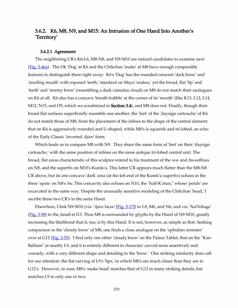
270
3.6.2. K6, M8, N9, and3.6.2. K6, M8, N9, and3.6.2. K6, M8, N9, and3.6.2. K6, M8, N9, and M15: An Intrusion of One Hand Into Another's M15: An Intrusion of One Hand Into Another's M15: An Intrusion of One Hand Into Another's M15: An Intrusion of One Hand Into Another's 'Territory''Territory''Territory''Territory'
3.6.2.13.6.2.13.6.2.13.6.2.1 Agreement Agreement Agreement Agreement
The neighboring CR's K6-L6, M8-N8, and N9-M10 are natural candidates to examine next
(Fig. 3-46a). The Ok 'Dog' at K6 and the Chikchan 'snake' at M8 have enough comparable
features to distinguish them right away: K6's 'Dog' has the rounded-crescent 'dark brow' and
'snarling mouth' with exposed 'teeth,' standard on Maya 'snakes,' yet the broad, flat 'lip' and
'teeth' and 'stormy brow' (resembling a dark cumulus cloud) on M8 do not match their analogues
on K6 at all. K6 also has a concave 'breath bubble' at the corner of its 'mouth' (like K13, L12, L14,
M12, N15, and O5, which we scrutinized in Section 3.4Section 3.4Section 3.4Section 3.4), and M8 does not. Finally, though their
broad flat surfaces superficially resemble one another, the 'feet' of the 'daysign cartouche' of K6
do not match those of M8, from the placement of the inlines to the shape of the central element:
that on K6 is aggressively rounded and U-shaped, while M8's is squarish and tri-lobed, an echo
of the Early Classic 'inverted Ajaw' form.
Which leads us to compare M8 with N9. They share the same form of 'feet' on their 'daysign
cartouche,' with the same position of inlines on the same antique tri-lobed central unit. The
broad, flat areas characteristic of this sculptor extend to his treatment of the wa- and bu-suffixes
on N8, and the superfix on M10's Kumk'u. This latter CR appears much flatter than the M8-N8
CR above, but its one concave 'dark' area (at the left end of the Kumk'u superfix) echoes in the
three 'spots' on N8's bu. This concavity also echoes on N10, the "half-K'atun," whose 'petals' are
excavated in the same way. Despite the unusually sensitive modeling of the Chikchan 'head,' I
ascribe these two CR's to the same Hand.
Elsewhere, I link N9-M10 (via 'Ajaw faces' [Fig. 3-17]) to L8, M6, and N6; and via 'Nal foliage'
(Fig. 3-98) to the Janab at I13. Thus M8 is surrounded by glyphs by the Hand of N9-M10, greatly
increasing the likelihood that it, too, is by this Hand. It is not, however, as simple as that. Seeking
comparison to the 'cloudy brow' of M8, one finds a close analogue on the 'ophidian monster'
over at G12 (Fig. 3-55). I find only one other 'cloudy brow' on the Palace Tablet, that on the "Kan-
Bahlam" at nearby L9, and it is entirely different in character: carved more assertively and
coarsely, with a very different shape and detailing to the 'brow.' One striking similarity does call
for our attention: the flat carving of L9's 'lips,' to which M8's are much closer than they are to
G12's. However, in sum, M8's 'snake head' matches that of G12 in many striking details, but
matches L9 in only one or two.
271
3.6.2.23.6.2.23.6.2.23.6.2.2 Con Con Con Conflictflictflictflict
Linking M8-N8 to N9-M10 to I13, however, brings us into conflict with our linking of M8 to
G12. On Fig. 3-55, I13 Janab sits just below G12, and it is clear that G12 and J13 are manifestly
carved by different Hands . Their 'Nal foliage' does not match at all. Nor do their 'teeth,' 'chin
scales,' 'noses,' nor 'forehead diadems.' This leads to the very uncomfortable conclusion that the
Hand of M8-N8 is responsible only partly for N9, or vice versa, or partly for G12…. Which part?
Perhaps only the underdrawing? In truth, the most telling similarity between M8 and G12 lie in
their eyes and their finely-crosshatched, cumuloid 'brows.' Especially around the mouth, G12's
ophidian is much more boldly sculptural than M8's (which happens to resemble that of L9).
G12's 'cloth knot' subfix, on the other hand, is rather flat, and certainly none would object to its
being ascribed to the Hand of M8. So again, only part of this glyph can be said to resemble M8.
Figs. 3Figs. 3Figs. 3Figs. 3----55555555. Palace Palace Palace Palace TabletTabletTabletTablet: fine crosshatching, : fine crosshatching, : fine crosshatching, : fine crosshatching, (top row and I13) 'beetling brows' and other comparisons in the middle-right area. Photos by author.
The fine crosshatching of M8 and G12 are strikingly similar, not least because such fine
hatching is rare here; most of the other examples thereof are much coarser (viz. L9, I13-J13, M12
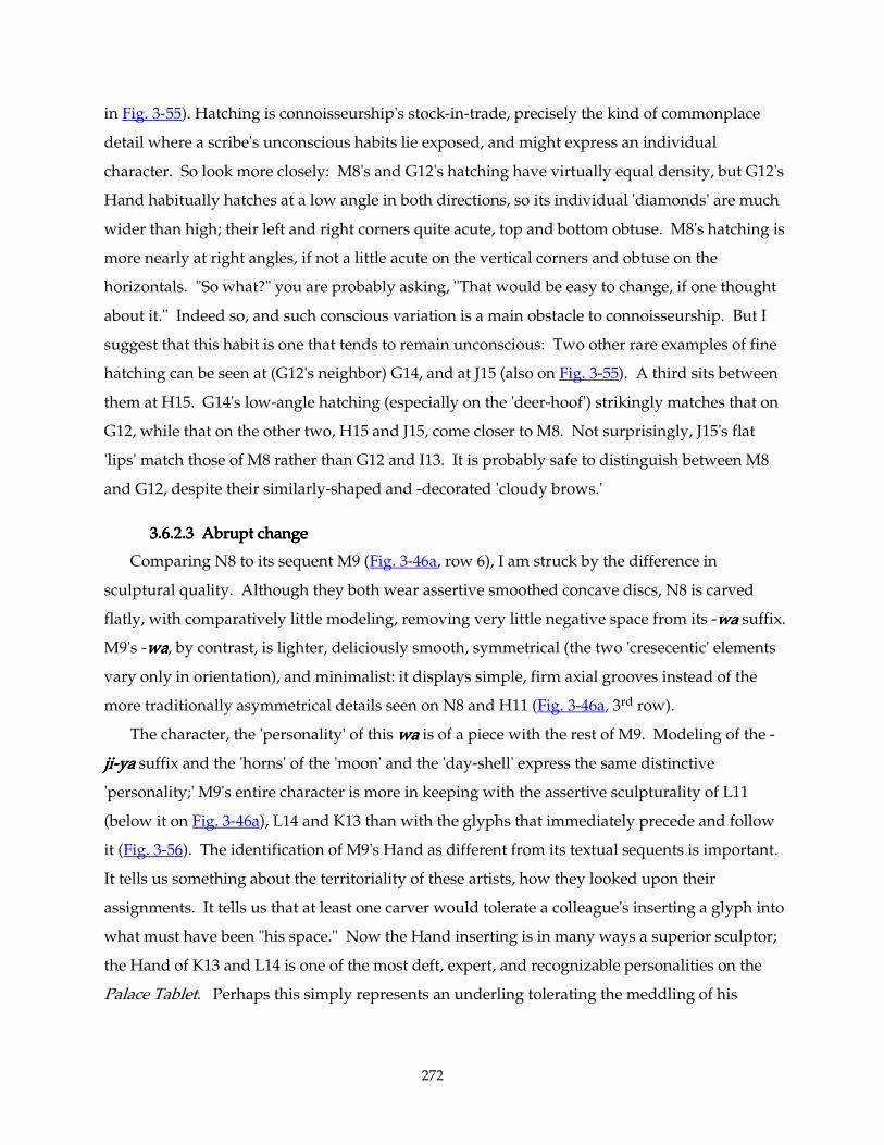
272
in Fig. 3-55). Hatching is connoisseurship's stock-in-trade, precisely the kind of commonplace
detail where a scribe's unconscious habits lie exposed, and might express an individual
character. So look more closely: M8's and G12's hatching have virtually equal density, but G12's
Hand habitually hatches at a low angle in both directions, so its individual 'diamonds' are much
wider than high; their left and right corners quite acute, top and bottom obtuse. M8's hatching is
more nearly at right angles, if not a little acute on the vertical corners and obtuse on the
horizontals. "So what?" you are probably asking, "That would be easy to change, if one thought
about it." Indeed so, and such conscious variation is a main obstacle to connoisseurship. But I
suggest that this habit is one that tends to remain unconscious: Two other rare examples of fine
hatching can be seen at (G12's neighbor) G14, and at J15 (also on Fig. 3-55). A third sits between
them at H15. G14's low-angle hatching (especially on the 'deer-hoof') strikingly matches that on
G12, while that on the other two, H15 and J15, come closer to M8. Not surprisingly, J15's flat
'lips' match those of M8 rather than G12 and I13. It is probably safe to distinguish between M8
and G12, despite their similarly-shaped and -decorated 'cloudy brows.'
3.6.2.33.6.2.33.6.2.33.6.2.3 Abrupt change Abrupt change Abrupt change Abrupt change
Comparing N8 to its sequent M9 (Fig. 3-46a, row 6), I am struck by the difference in
sculptural quality. Although they both wear assertive smoothed concave discs, N8 is carved
flatly, with comparatively little modeling, removing very little negative space from its -wawawawa suffix.
M9's -wawawawa, by contrast, is lighter, deliciously smooth, symmetrical (the two 'cresecentic' elements
vary only in orientation), and minimalist: it displays simple, firm axial grooves instead of the
more traditionally asymmetrical details seen on N8 and H11 (Fig. 3-46a, 3rd row).
The character, the 'personality' of this wawawawa is of a piece with the rest of M9. Modeling of the -
jijijiji----yayayaya suffix and the 'horns' of the 'moon' and the 'day-shell' express the same distinctive
'personality;' M9's entire character is more in keeping with the assertive sculpturality of L11
(below it on Fig. 3-46a), L14 and K13 than with the glyphs that immediately precede and follow
it (Fig. 3-56). The identification of M9's Hand as different from its textual sequents is important.
It tells us something about the territoriality of these artists, how they looked upon their
assignments. It tells us that at least one carver would tolerate a colleague's inserting a glyph into
what must have been "his space." Now the Hand inserting is in many ways a superior sculptor;
the Hand of K13 and L14 is one of the most deft, expert, and recognizable personalities on the
Palace Tablet. Perhaps this simply represents an underling tolerating the meddling of his
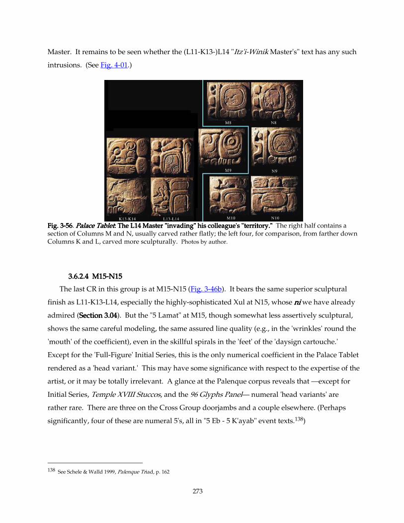
273
Master. It remains to be seen whether the (L11-K13-)L14 "Itz'i-Winik Master's" text has any such
intrusions. (See Fig. 4-01.)
Fig. 3Fig. 3Fig. 3Fig. 3----56565656. Palace TabletPalace TabletPalace TabletPalace Tablet: : : : The L14 Master "invading" his colleague'The L14 Master "invading" his colleague'The L14 Master "invading" his colleague'The L14 Master "invading" his colleague's "territory."s "territory."s "territory."s "territory." The right half contains a section of Columns M and N, usually carved rather flatly; the left four, for comparison, from farther down Columns K and L, carved more sculpturally. Photos by author.
3.6.2.43.6.2.43.6.2.43.6.2.4 M15 M15 M15 M15----N15N15N15N15
The last CR in this group is at M15-N15 (Fig. 3-46b). It bears the same superior sculptural
finish as L11-K13-L14, especially the highly-sophisticated Xul at N15, whose nininini we have already
admired (Section 3.04Section 3.04Section 3.04Section 3.04). But the "5 Lamat" at M15, though somewhat less assertively sculptural,
shows the same careful modeling, the same assured line quality (e.g., in the 'wrinkles' round the
'mouth' of the coefficient), even in the skillful spirals in the 'feet' of the 'daysign cartouche.'
Except for the 'Full-Figure' Initial Series, this is the only numerical coefficient in the Palace Tablet
rendered as a 'head variant.' This may have some significance with respect to the expertise of the
artist, or it may be totally irrelevant. A glance at the Palenque corpus reveals that —except for
Initial Series, Temple XVIII Stuccos, and the 96 Glyphs Panel— numeral 'head variants' are
rather rare. There are three on the Cross Group doorjambs and a couple elsewhere. (Perhaps
significantly, four of these are numeral 5's, all in "5 Eb - 5 K'ayab" event texts.138)
138 See Schele & Walld 1999, Palenque Triad, p. 162
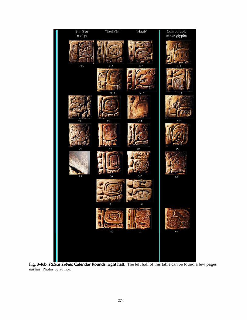
274
Fig. 3Fig. 3Fig. 3Fig. 3----46b46b46b46b. Palace TabletPalace TabletPalace TabletPalace Tablet: : : : Calendar Rounds, right half.Calendar Rounds, right half.Calendar Rounds, right half.Calendar Rounds, right half. The left half of this table can be found a few pages earlier. Photos by author.
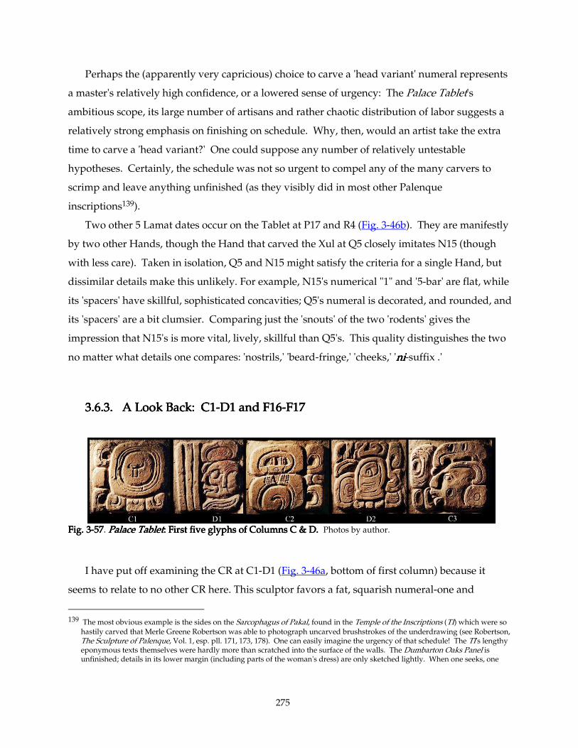
275
Perhaps the (apparently very capricious) choice to carve a 'head variant' numeral represents
a master's relatively high confidence, or a lowered sense of urgency: The Palace Tablet's
ambitious scope, its large number of artisans and rather chaotic distribution of labor suggests a
relatively strong emphasis on finishing on schedule. Why, then, would an artist take the extra
time to carve a 'head variant?' One could suppose any number of relatively untestable
hypotheses. Certainly, the schedule was not so urgent to compel any of the many carvers to
scrimp and leave anything unfinished (as they visibly did in most other Palenque
inscriptions139).
Two other 5 Lamat dates occur on the Tablet at P17 and R4 (Fig. 3-46b). They are manifestly
by two other Hands, though the Hand that carved the Xul at Q5 closely imitates N15 (though
with less care). Taken in isolation, Q5 and N15 might satisfy the criteria for a single Hand, but
dissimilar details make this unlikely. For example, N15's numerical "1" and '5-bar' are flat, while
its 'spacers' have skillful, sophisticated concavities; Q5's numeral is decorated, and rounded, and
its 'spacers' are a bit clumsier. Comparing just the 'snouts' of the two 'rodents' gives the
impression that N15's is more vital, lively, skillful than Q5's. This quality distinguishes the two
no matter what details one compares: 'nostrils,' 'beard-fringe,' 'cheeks,' 'nininini-suffix .'
3.6.3. A Look Back: C13.6.3. A Look Back: C13.6.3. A Look Back: C13.6.3. A Look Back: C1----D1 and F16D1 and F16D1 and F16D1 and F16----F17F17F17F17
Fig. 3Fig. 3Fig. 3Fig. 3----57575757. Palace TabletPalace TabletPalace TabletPalace Tablet: : : : First five glyphs of Columns C & D.First five glyphs of Columns C & D.First five glyphs of Columns C & D.First five glyphs of Columns C & D. Photos by author.
I have put off examining the CR at C1-D1 (Fig. 3-46a, bottom of first column) because it
seems to relate to no other CR here. This sculptor favors a fat, squarish numeral-one and
139 The most obvious example is the sides on the Sarcophagus of Pakal, found in the Temple of the Inscriptions (TI) which were so
hastily carved that Merle Greene Robertson was able to photograph uncarved brushstrokes of the underdrawing (see Robertson, The Sculpture of Palenque, Vol. 1, esp. pll. 171, 173, 178). One can easily imagine the urgency of that schedule! The TI's lengthy eponymous texts themselves were hardly more than scratched into the surface of the walls. The Dumbarton Oaks Panel is unfinished; details in its lower margin (including parts of the woman's dress) are only sketched lightly. When one seeks, one
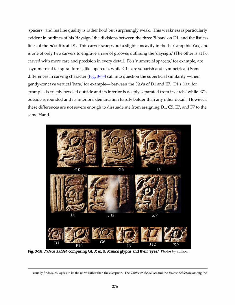
276
'spacers,' and his line quality is rather bold but surprisingly weak. This weakness is particularly
evident in outlines of his 'daysign,' the divisions between the three '5-bars' on D1, and the listless
lines of the nininini-suffix at D1. This carver scoops out a slight concavity in the 'bar' atop his Yax, and
is one of only two carvers to engrave a pair of grooves outlining the 'daysign.' (The other is at F6,
carved with more care and precision in every detail. F6's 'numercial spacers,' for example, are
asymmetrical fat spiral forms, like opercula, while C1's are squarish and symmetrical.) Some
differences in carving character (Fig. 3-68) call into question the superficial similarity —their
gently-concave vertical 'bars,' for example— between the Yax's of D1 and E7. D1's Yax, for
example, is crisply beveled outside and its interior is deeply separated from its 'arch,' while E7's
outside is rounded and its interior's demarcation hardly bolder than any other detail. However,
these differences are not severe enough to dissuade me from assigning D1, C5, E7, and F7 to the
same Hand.
Fig. 3Fig. 3Fig. 3Fig. 3----58585858. Palace TabletPalace TabletPalace TabletPalace Tablet: comparing GI, : comparing GI, : comparing GI, : comparing GI, K'inK'inK'inK'in, & , & , & , & K'inichK'inichK'inichK'inich glyphs and their 'eyes.' glyphs and their 'eyes.' glyphs and their 'eyes.' glyphs and their 'eyes.' Photos by author.
usually finds such lapses to be the norm rather than the exception. The Tablet of the Slaves and the Palace Tablet are among the
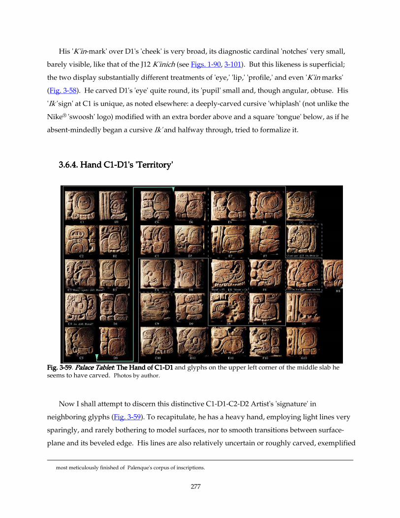
277
His 'K'in-mark' over D1's 'cheek' is very broad, its diagnostic cardinal 'notches' very small,
barely visible, like that of the J12 K'inich (see Figs. 1-90, 3-101). But this likeness is superficial;
the two display substantially different treatments of 'eye,' 'lip,' 'profile,' and even 'K'in marks'
(Fig. 3-58). He carved D1's 'eye' quite round, its 'pupil' small and, though angular, obtuse. His
'Ik' sign' at C1 is unique, as noted elsewhere: a deeply-carved cursive 'whiplash' (not unlike the
Nike® 'swoosh' logo) modified with an extra border above and a square 'tongue' below, as if he
absent-mindedly began a cursive Ik' and halfway through, tried to formalize it.
3.6.4.3.6.4.3.6.4.3.6.4. Hand C1 Hand C1 Hand C1 Hand C1----D1's 'Territory'D1's 'Territory'D1's 'Territory'D1's 'Territory'
Fig. 3Fig. 3Fig. 3Fig. 3----59595959. Palace TabletPalace TabletPalace TabletPalace Tablet: The Hand of C1: The Hand of C1: The Hand of C1: The Hand of C1----D1 D1 D1 D1 and glyphs on the upper left corner of the middle slab he seems to have carved. Photos by author.
Now I shall attempt to discern this distinctive C1-D1-C2-D2 Artist's 'signature' in
neighboring glyphs (Fig. 3-59). To recapitulate, he has a heavy hand, employing light lines very
sparingly, and rarely bothering to model surfaces, nor to smooth transitions between surface-
plane and its beveled edge. His lines are also relatively uncertain or roughly carved, exemplified
most meticulously finished of Palenque's corpus of inscriptions.
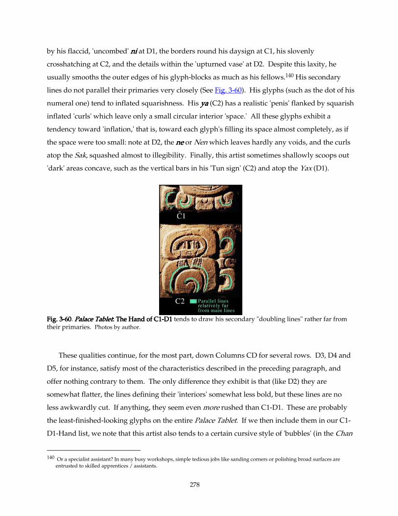
278
by his flaccid, 'uncombed' nininini at D1, the borders round his daysign at C1, his slovenly
crosshatching at C2, and the details within the 'upturned vase' at D2. Despite this laxity, he
usually smooths the outer edges of his glyph-blocks as much as his fellows.140 His secondary
lines do not parallel their primaries very closely (See Fig. 3-60). His glyphs (such as the dot of his
numeral one) tend to inflated squarishness. His yayayaya (C2) has a realistic 'penis' flanked by squarish
inflated 'curls' which leave only a small circular interior 'space.' All these glyphs exhibit a
tendency toward 'inflation,' that is, toward each glyph's filling its space almost completely, as if
the space were too small: note at D2, the nenenene or Nen which leaves hardly any voids, and the curls
atop the Sak, squashed almost to illegibility. Finally, this artist sometimes shallowly scoops out
'dark' areas concave, such as the vertical bars in his 'Tun sign' (C2) and atop the Yax (D1).
Fig. 3Fig. 3Fig. 3Fig. 3----60606060. Palace TabletPalace TabletPalace TabletPalace Tablet: The Hand of C1: The Hand of C1: The Hand of C1: The Hand of C1----D1 D1 D1 D1 tends to draw his secondary "doubling lines" rather far from their primaries. Photos by author.
These qualities continue, for the most part, down Columns CD for several rows. D3, D4 and
D5, for instance, satisfy most of the characteristics described in the preceding paragraph, and
offer nothing contrary to them. The only difference they exhibit is that (like D2) they are
somewhat flatter, the lines defining their 'interiors' somewhat less bold, but these lines are no
less awkwardly cut. If anything, they seem even more rushed than C1-D1. These are probably
the least-finished-looking glyphs on the entire Palace Tablet. If we then include them in our C1-
D1-Hand list, we note that this artist also tends to a certain cursive style of 'bubbles' (in the Chan
140 Or a specialist assistant? In many busy workshops, simple tedious jobs like sanding corners or polishing broad surfaces are
entrusted to skilled apprentices / assistants.
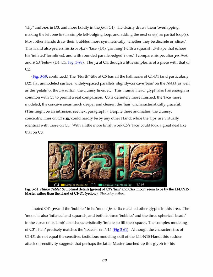
279
"sky" and nananana's in D3, and more boldly in the jajajaja of C4). He clearly draws them 'overlapping,'
making the left one first, a simple left-bulging loop, and adding the next one(s) as partial loop(s).
Most other Hands draw their 'bubbles' more symmetrically, whether they be discrete or 'slices.'
This Hand also prefers his lalalala or Ajaw 'face' (D4) 'grinning' (with a squarish U-shape that echoes
his 'inflated' formlines), and with rounded parallel-edged 'nose.' I compare his peculiar yoyoyoyo, Nal,
and K'ak' below (D4, D5, Fig. 3-98). The yayayaya at C4, though a little simpler, is of a piece with that of
C2.
(Fig. 3-59. . . . continued:) The "North" title at C5 has all the hallmarks of C1-D1 (and particularly
D2): flat unmodeled surface, widely-spaced parallels, slightly-concave 'bars' on the NAH (as well
as the 'petals' of the mi suffix), the clumsy lines, etc. This 'human head' glyph also has enough in
common with C3 to permit a real comparison. C3 is definitely more finished, the 'face' more
modeled, the concave areas much deeper and clearer, the 'hair' uncharacteristically graceful.
(This might be an intrusion; see next paragraph.) Despite these anomalies, the clumsy,
concentric lines on C3's nunununu could hardly be by any other Hand; while the 'lips' are virtually
identical with those on C5. With a little more finish work C5's 'face' could look a great deal like
that on C3.
Fig. 3Fig. 3Fig. 3Fig. 3----61616161. Palace TabletPalace TabletPalace TabletPalace Tablet: Sculptural details (green) of C3's 'hair' and C4's 'moon' seem to be by the L14/N15 : Sculptural details (green) of C3's 'hair' and C4's 'moon' seem to be by the L14/N15 : Sculptural details (green) of C3's 'hair' and C4's 'moon' seem to be by the L14/N15 : Sculptural details (green) of C3's 'hair' and C4's 'moon' seem to be by the L14/N15 Master rather than the HandMaster rather than the HandMaster rather than the HandMaster rather than the Hand of C1 of C1 of C1 of C1----D1 (yellow)D1 (yellow)D1 (yellow)D1 (yellow). Photos by author.
I noted C4's yayayaya and the 'bubbles' in its 'moon' jajajaja-suffix matched other glyphs in this area. The
'moon' is also 'inflated' and squarish, and both its three 'bubbles' and the three spherical 'beads'
in the curve of its 'limb' also characteristically 'inflate' to fill their spaces. The complex modeling
of C3's 'hair' precisely matches the 'spacers' on N15 (Fig 3-61). Although the characteristics of
C1-D1 do not equal the sensitive, fastidious modeling skill of the L14-N15 Hand, this sudden
attack of sensitivity suggests that perhaps the latter Master touched up this glyph for his
280
colleague. This could account for its unusually deep and finished concave areas. Some similarly
fine carving appears on C4 as well: the peculiar concave 'inner rim' of the 'moon's crescent also
recalls the 'hair cap' on C3 (Fig 3-61 - green outlines), though it is not quite so fine. The 'upended
frog/iguana' Sih is also uncharacteristically sensitive. Its many delicate details bespeak a ligher
touch with the chisel. It might be the C1-D1 Hand in a delicate mood, or it might be an
intrusion. (To summarize: some details in the 'heads' and 'moon' of C3 and C4 might represent
an intrusion by a more sensitive Hand.)
(Fig. 3-59. . . . continued:) One can compare C5's lines, widely spaced and a bit uncertain, to
features in C1-D2. The concavities match C1-D2's as well, and the nose and 'lips,' as mentioned
above, match those on C3. The only new detail here is the large ring of dots, the coarseness of
whose carving reflects the line quality we associate with this Hand.
C6 as well has many comparable features: the totototo dots and Nah prefix compatible with those
of C5; nananana like D3's, and casually-concave 'bands' on kokokoko like those on the 'tun' of C2. However,
the details of C6's tatatata or Tan take forms strikingly unlike those of D4, though the lines themselves
are carved with equivalent artlessness. One might argue that this last difference could be simply
capricious, but it is worth noting nonetheless. D6's yoyoyoyo and lalalala link it with D4 and D5, as noted in
Section 3.3Section 3.3Section 3.3Section 3.3, and its Ha's coarse row of dots and casual concavity strengthen this conclusion.
Though carved much more tentatively and flatly, D6's 'jaguar head' shares many features with
N15's 'rodent;' perhaps this Hand was a friend or apprentice, or merely an emulator, of the L14-
N15 Master. The finer details of this 'jaguar' have a lighter touch than we tend to associate with
this carver.
C7 is a puzzle. Its mumumumu-'curl' fits right in with this Hand's undisciplined carving, but the
strange titititi and the 'head' part of the mumumumu have a much more delicate quality than the rest of the
glyph. However, most details of the two 'heads' in this glyph ('barbel' or 'breath-curl,' 'lip,'
'nose') match one another. The 'fishhook' shape of the mumumumu-'curl' also matches D7's and D5's
Winik-'curls.' I attribute D7's 'dotted-eye-skull'-Winik-ki to the C1-D2 Hand, mainly on the basis
of three features: its squarish Winik, coarse ki, and the peculiar cursive 'swoosh' in the 'skull's
eye' (which strikingly resembles C1's Ik'). Elsewhere (Section 3.5.1Section 3.5.1Section 3.5.1Section 3.5.1), I attributed its Winik to the
same Hand as D5's (Fig. 3-41), with similarities (again) to the L14/M13 Master (also Fig. 3-46),
though the differences in carving quality suggests that we perceive the C1-D1 hand as student or
'follower' of the L14/M13 Hand. Also, in Section 3.7Section 3.7Section 3.7Section 3.7 (Figs. 3-78, 3-79), I determine that D7's
sculptural treatment of its 'jawbone' matches no other 'jawbones' in the Tablet (though it does
281
harmonize with the assertive flat inlines on many of the C1-D2 Hand's glyphs). These non-
matching 'jawbones' include C11's and D13's, so we should expect to reach the lower boundary
of this artist's 'territory' shortly.
If one skips ahead to D9 for a more easy comparison, one finds a completely cursive Ik'
comparable to that of C1, and an 'Ajaw face' (Nich?) of the same type as those on D4 and D6 (I
ascribed them to the same Hand in Fig. 3-17). Though rather less assertive, there is little about
the carving of the 'lips' and 'nose' that argues D9's 'face' to have been by a different Hand than
those we've seen at D1, C3, C5, C7, etc. However, D9's lililili is entirely different in character from
D4's. The close-paralleled fine inline both on D9's lililili and on the 'capped Ik' above it, plus the
broad 'frames' and small interior spaces of these glyphs (rather like E15's) contrasts strongly with
the casually-carved, flattish li at D4, and the wide spacing of parallel inlines seen up to now in
this group. I shall provisionally distinguish between D9 and the C1-D2 Hand we've been
focusing on.
The full-figure 'bird' at C9 also looks like a Hand different from C1-D2. Its peculiarity might
be seen in its very finely-carved details, both around the 'eye' and in its 'feathers.' Its tiny 'teeth'
contrast with those of C4 (whose 'chin scales' and 'breath spiral,' though lightly carved, seem to
follow the conventions of the neighbors). In particular, the interior of its 'breath spiral' is
carefully concave (much more carefully than the concavities of the C1-D2 Hand seen so far.)
Compare, for example, the 'breath spiral' here with the totally two-dimensional ones on C4's
'upended frog,' or on the C7 'mumumumu-head.'
Now, we look upwards to C8. Its 'Ch'ok head' is minimally carved, with a few wispy
'whiskers' (like D6's but more sparsely distributed), sharply beveled 'ear' and 'lip' area, and
generally finer, more assured carving technique than we have seen in the C1-D2 artist. C8 and
D7 do share a peculiar broken outline at the front of their 'brow plate,' suggesting that D7 (or at
least its 'skull') might belong to the C1-D2 Hand after all. C8's kokokoko postfix, however, is carved in a
style completely different from C6's (and from C17's below; again see Fig. 3-64). We can
conclude that C8 and perhaps the 'skull' of D7 — I am sure D7's Winik-ki is by the C1-D2
Hand— marks the advent of a new Hand: one capable of stronger lines, with deeply beveled
edges (as around C8's 'mouth'). D8's simplicity and strong line quality (and its unique na postfix)
compel me to assign it, too, to this new Hand. The proximity of C9 and D9 argues for identity
with this Hand as well, but C9's carver is capable of great precision: fine 'teeth,' fine 'feathers,'
fine details round the 'eye' and 'breath curl'/'barbel.' He favors broad 'frames' (as on the Ik' and
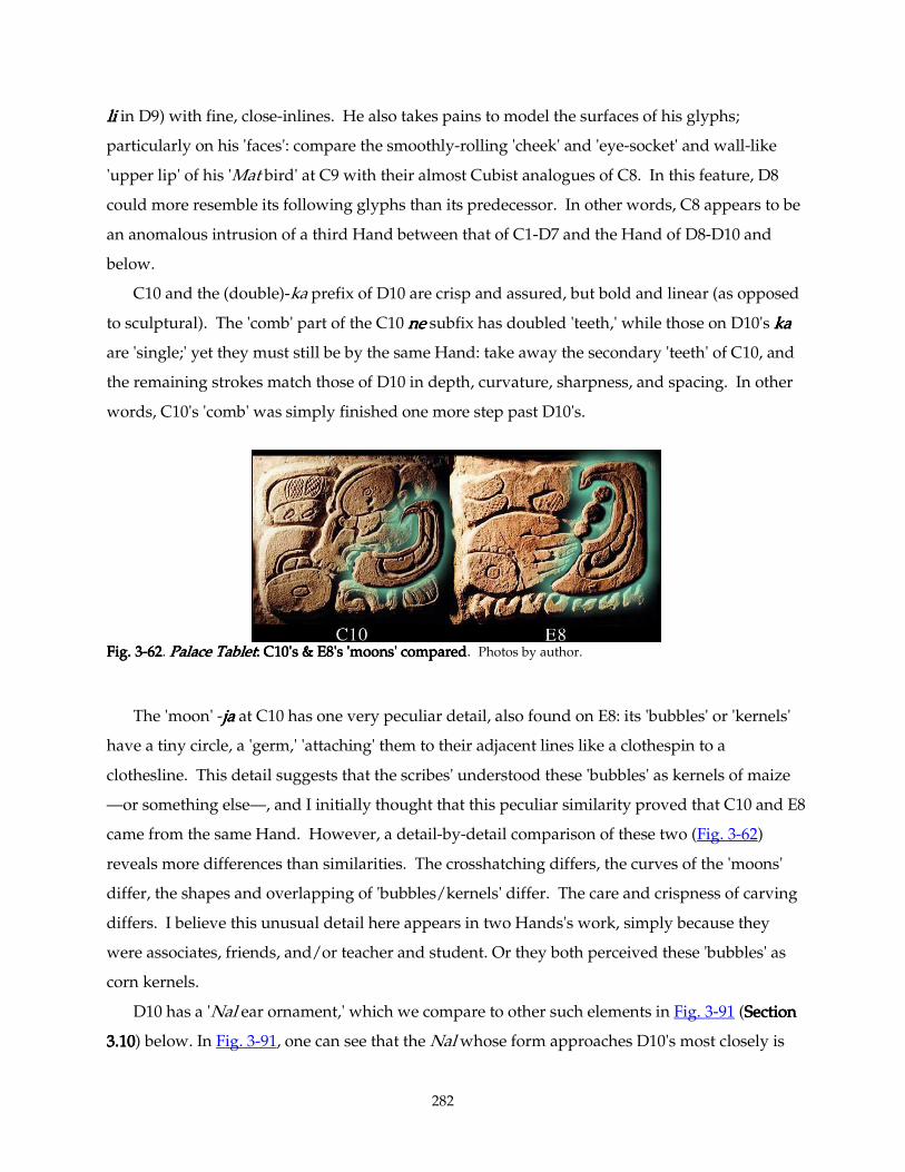
282
lililili in D9) with fine, close-inlines. He also takes pains to model the surfaces of his glyphs;
particularly on his 'faces': compare the smoothly-rolling 'cheek' and 'eye-socket' and wall-like
'upper lip' of his 'Mat bird' at C9 with their almost Cubist analogues of C8. In this feature, D8
could more resemble its following glyphs than its predecessor. In other words, C8 appears to be
an anomalous intrusion of a third Hand between that of C1-D7 and the Hand of D8-D10 and
below.
C10 and the (double)-ka prefix of D10 are crisp and assured, but bold and linear (as opposed
to sculptural). The 'comb' part of the C10 nenenene subfix has doubled 'teeth,' while those on D10's kakakaka
are 'single;' yet they must still be by the same Hand: take away the secondary 'teeth' of C10, and
the remaining strokes match those of D10 in depth, curvature, sharpness, and spacing. In other
words, C10's 'comb' was simply finished one more step past D10's.
Fig. 3Fig. 3Fig. 3Fig. 3----62626262. Palace TabletPalace TabletPalace TabletPalace Tablet: C10's & E8's 'moons' com: C10's & E8's 'moons' com: C10's & E8's 'moons' com: C10's & E8's 'moons' comparedparedparedpared. Photos by author.
The 'moon' -jajajaja at C10 has one very peculiar detail, also found on E8: its 'bubbles' or 'kernels'
have a tiny circle, a 'germ,' 'attaching' them to their adjacent lines like a clothespin to a
clothesline. This detail suggests that the scribes' understood these 'bubbles' as kernels of maize
—or something else—, and I initially thought that this peculiar similarity proved that C10 and E8
came from the same Hand. However, a detail-by-detail comparison of these two (Fig. 3-62)
reveals more differences than similarities. The crosshatching differs, the curves of the 'moons'
differ, the shapes and overlapping of 'bubbles/kernels' differ. The care and crispness of carving
differs. I believe this unusual detail here appears in two Hands's work, simply because they
were associates, friends, and/or teacher and student. Or they both perceived these 'bubbles' as
corn kernels.
D10 has a 'Nal ear ornament,' which we compare to other such elements in Fig. 3-91 (Section Section Section Section
3.103.103.103.10) below. In Fig. 3-91, one can see that the Nal whose form approaches D10's most closely is
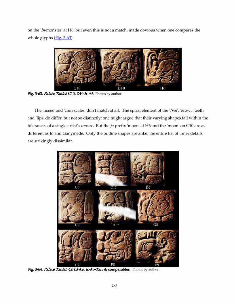
283
on the 'bi-monster' at H6, but even this is not a match, made obvious when one compares the
whole glyphs (Fig. 3-63).
Fig. 3Fig. 3Fig. 3Fig. 3----63636363. Palace TabletPalace TabletPalace TabletPalace Tablet: C10, D10 & H6. : C10, D10 & H6. : C10, D10 & H6. : C10, D10 & H6. Photos by author.
The 'noses' and 'chin scales' don't match at all. The spiral element of the 'Nal', 'brow,' 'teeth'
and 'lips' do differ, but not so distinctly; one might argue that their varying shapes fall within the
tolerances of a single artist's œuvre. But the ja-prefix 'moon' at H6 and the 'moon' on C10 are as
different as Io and Ganymede. Only the outline shapes are alike; the entire list of inner details
are strikingly dissimilar.
Fig. 3Fig. 3Fig. 3Fig. 3----64646464. Palace TabletPalace TabletPalace TabletPalace Tablet: : : : Ch'okCh'okCh'okCh'ok----ko, toko, toko, toko, to----kokokoko----TanTanTanTan, & comparables, & comparables, & comparables, & comparables. Photos by author.
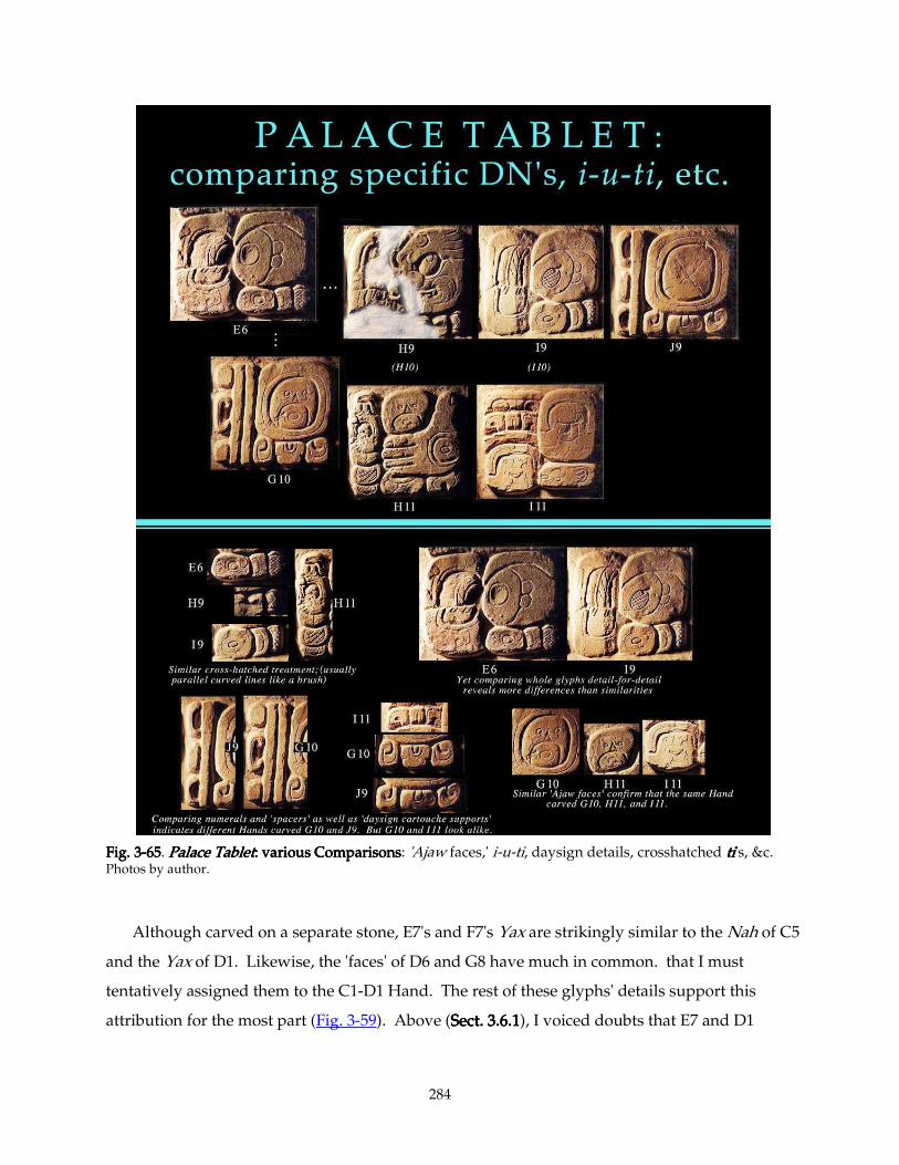
284
Fig. 3Fig. 3Fig. 3Fig. 3----65656565. Palace TabletPalace TabletPalace TabletPalace Tablet: : : : various Comparisonsvarious Comparisonsvarious Comparisonsvarious Comparisons: 'Ajaw faces,' i-u-ti, daysign details, crosshatched titititi's, &c. Photos by author.
Although carved on a separate stone, E7's and F7's Yax are strikingly similar to the Nah of C5
and the Yax of D1. Likewise, the 'faces' of D6 and G8 have much in common. that I must
tentatively assigned them to the C1-D1 Hand. The rest of these glyphs' details support this
attribution for the most part (Fig. 3-59). Above (Sect. 3.6.1Sect. 3.6.1Sect. 3.6.1Sect. 3.6.1), I voiced doubts that E7 and D1
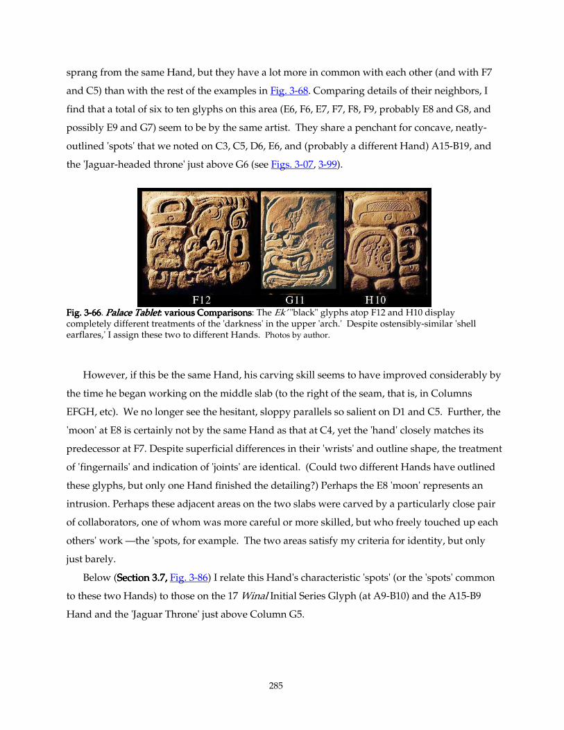
285
sprang from the same Hand, but they have a lot more in common with each other (and with F7
and C5) than with the rest of the examples in Fig. 3-68. Comparing details of their neighbors, I
find that a total of six to ten glyphs on this area (E6, F6, E7, F7, F8, F9, probably E8 and G8, and
possibly E9 and G7) seem to be by the same artist. They share a penchant for concave, neatly-
outlined 'spots' that we noted on C3, C5, D6, E6, and (probably a different Hand) A15-B19, and
the 'Jaguar-headed throne' just above G6 (see Figs. 3-07, 3-99).
Fig. 3Fig. 3Fig. 3Fig. 3----66666666. Palace TabletPalace TabletPalace TabletPalace Tablet: : : : various Comparisonsvarious Comparisonsvarious Comparisonsvarious Comparisons: The Ek’ "black" glyphs atop F12 and H10 display completely different treatments of the 'darkness' in the upper 'arch.' Despite ostensibly-similar 'shell earflares,' I assign these two to different Hands. Photos by author.
However, if this be the same Hand, his carving skill seems to have improved considerably by
the time he began working on the middle slab (to the right of the seam, that is, in Columns
EFGH, etc). We no longer see the hesitant, sloppy parallels so salient on D1 and C5. Further, the
'moon' at E8 is certainly not by the same Hand as that at C4, yet the 'hand' closely matches its
predecessor at F7. Despite superficial differences in their 'wrists' and outline shape, the treatment
of 'fingernails' and indication of 'joints' are identical. (Could two different Hands have outlined
these glyphs, but only one Hand finished the detailing?) Perhaps the E8 'moon' represents an
intrusion. Perhaps these adjacent areas on the two slabs were carved by a particularly close pair
of collaborators, one of whom was more careful or more skilled, but who freely touched up each
others' work —the 'spots, for example. The two areas satisfy my criteria for identity, but only
just barely.
Below (Section 3.7, Section 3.7, Section 3.7, Section 3.7, Fig. 3-86) I relate this Hand's characteristic 'spots' (or the 'spots' common
to these two Hands) to those on the 17 Winal Initial Series Glyph (at A9-B10) and the A15-B9
Hand and the 'Jaguar Throne' just above Column G5.
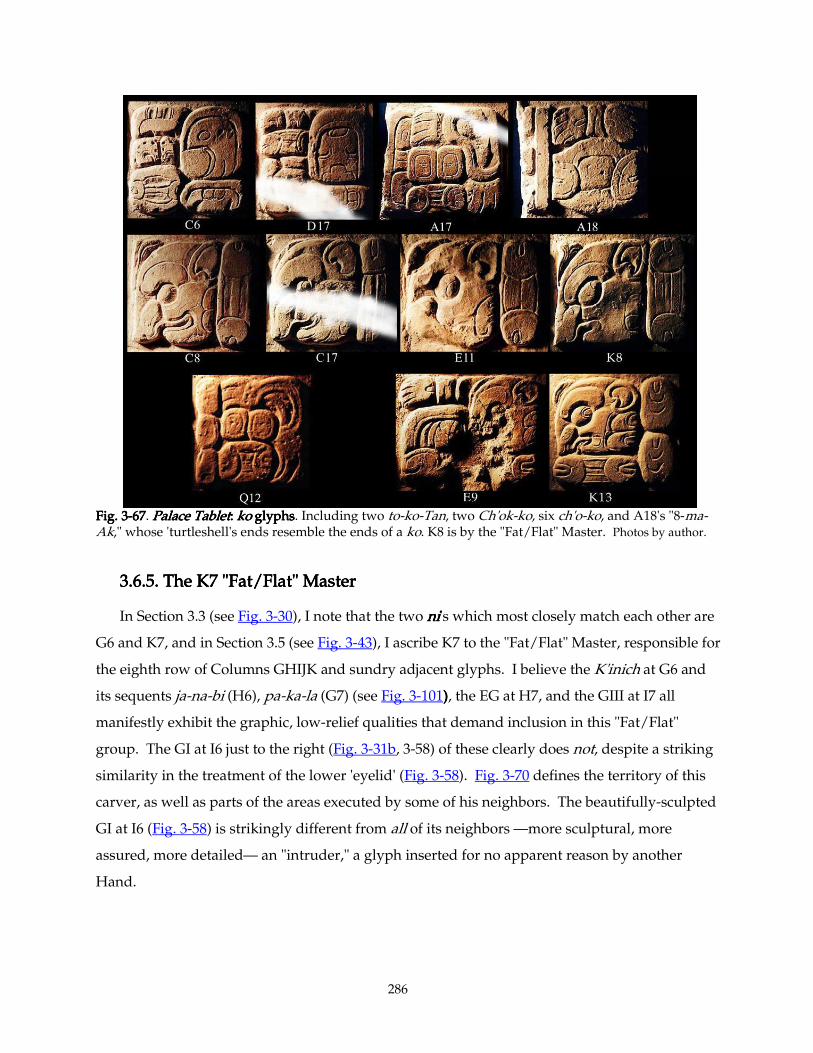
286
Fig. 3Fig. 3Fig. 3Fig. 3----67676767. Palace TabletPalace TabletPalace TabletPalace Tablet: : : : kokokoko glyphs glyphs glyphs glyphs. Including two to-ko-Tan, two Ch'ok-ko, six ch'o-ko, and A18's "8-ma-Ak," whose 'turtleshell's ends resemble the ends of a ko. K8 is by the "Fat/Flat" Master. Photos by author.
3.6.5.3.6.5.3.6.5.3.6.5. The K7 "Fat/Flat" Master The K7 "Fat/Flat" Master The K7 "Fat/Flat" Master The K7 "Fat/Flat" Master
In Section 3.3 (see Fig. 3-30), I note that the two nininini's which most closely match each other are
G6 and K7, and in Section 3.5 (see Fig. 3-43), I ascribe K7 to the "Fat/Flat" Master, responsible for
the eighth row of Columns GHIJK and sundry adjacent glyphs. I believe the K'inich at G6 and
its sequents ja-na-bi (H6), pa-ka-la (G7) (see Fig. 3-101)))), the EG at H7, and the GIII at I7 all
manifestly exhibit the graphic, low-relief qualities that demand inclusion in this "Fat/Flat"
group. The GI at I6 just to the right (Fig. 3-31b, 3-58) of these clearly does not, despite a striking
similarity in the treatment of the lower 'eyelid' (Fig. 3-58). Fig. 3-70 defines the territory of this
carver, as well as parts of the areas executed by some of his neighbors. The beautifully-sculpted
GI at I6 (Fig. 3-58) is strikingly different from all of its neighbors —more sculptural, more
assured, more detailed— an "intruder," a glyph inserted for no apparent reason by another
Hand.
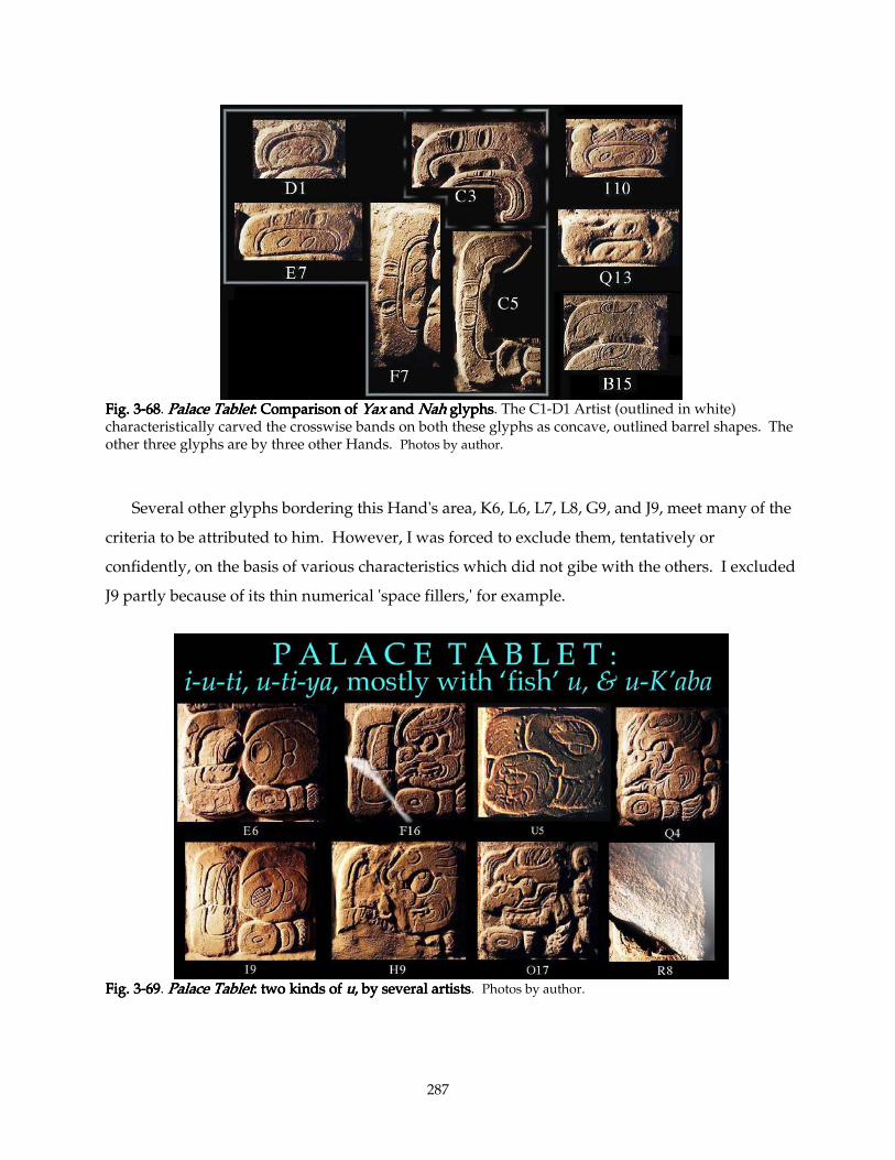
287
Fig. 3Fig. 3Fig. 3Fig. 3----68686868. Palace TabletPalace TabletPalace TabletPalace Tablet: Comparison of : Comparison of : Comparison of : Comparison of Yax Yax Yax Yax and and and and NahNahNahNah glyphs glyphs glyphs glyphs. The C1-D1 Artist (outlined in white) characteristically carved the crosswise bands on both these glyphs as concave, outlined barrel shapes. The other three glyphs are by three other Hands. Photos by author.
Several other glyphs bordering this Hand's area, K6, L6, L7, L8, G9, and J9, meet many of the
criteria to be attributed to him. However, I was forced to exclude them, tentatively or
confidently, on the basis of various characteristics which did not gibe with the others. I excluded
J9 partly because of its thin numerical 'space fillers,' for example.
Fig. 3Fig. 3Fig. 3Fig. 3----69696969. Palace TabletPalace TabletPalace TabletPalace Tablet: two kinds of : two kinds of : two kinds of : two kinds of uuuu, by several artists, by several artists, by several artists, by several artists. Photos by author.
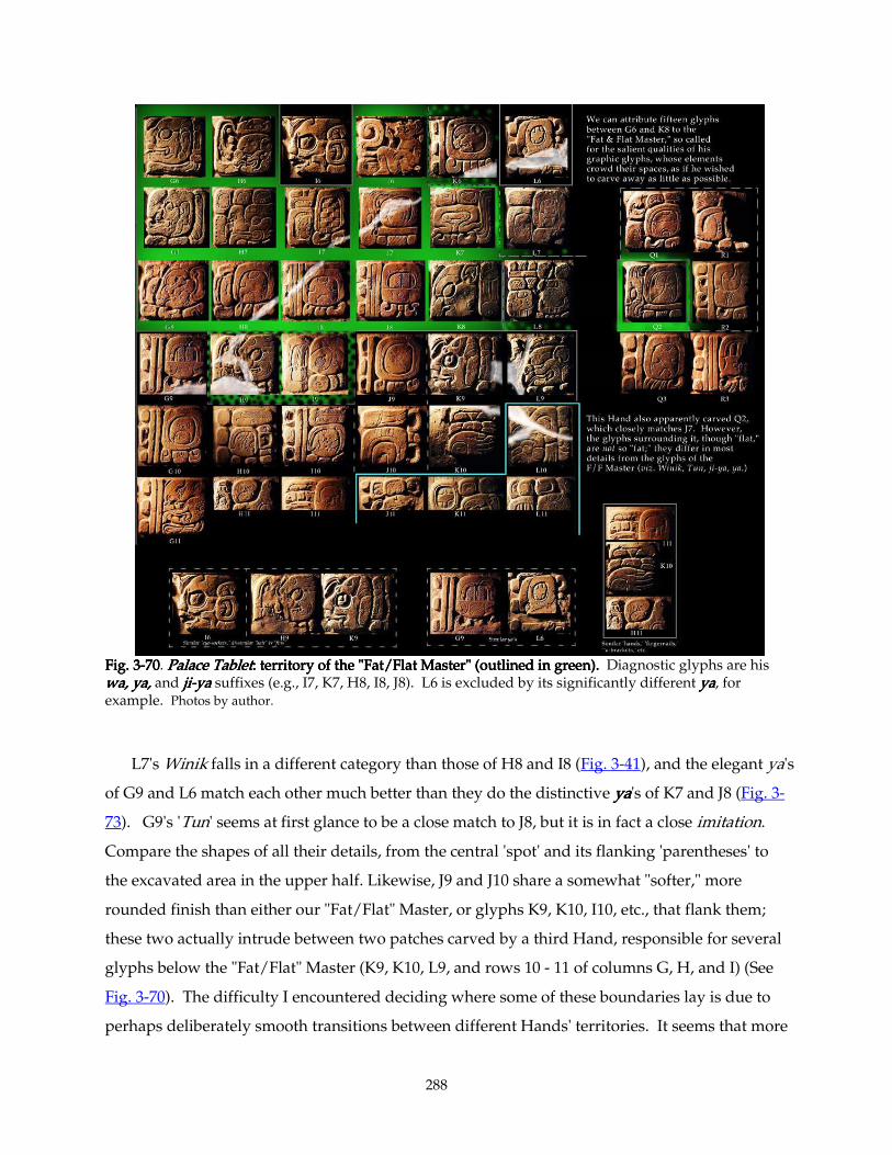
288
Fig. 3Fig. 3Fig. 3Fig. 3----70707070. Palace TabletPalace TabletPalace TabletPalace Tablet: territory of the "Fat/Flat Master" (outlined in green).: territory of the "Fat/Flat Master" (outlined in green).: territory of the "Fat/Flat Master" (outlined in green).: territory of the "Fat/Flat Master" (outlined in green). Diagnostic glyphs are his wa, ya,wa, ya,wa, ya,wa, ya, and jijijiji----yayayaya suffixes (e.g., I7, K7, H8, I8, J8). L6 is excluded by its significantly different yayayaya, for example. Photos by author.
L7's Winik falls in a different category than those of H8 and I8 (Fig. 3-41), and the elegant ya's
of G9 and L6 match each other much better than they do the distinctive yayayaya's of K7 and J8 (Fig. 3-
73). G9's 'Tun' seems at first glance to be a close match to J8, but it is in fact a close imitation.
Compare the shapes of all their details, from the central 'spot' and its flanking 'parentheses' to
the excavated area in the upper half. Likewise, J9 and J10 share a somewhat "softer," more
rounded finish than either our "Fat/Flat" Master, or glyphs K9, K10, I10, etc., that flank them;
these two actually intrude between two patches carved by a third Hand, responsible for several
glyphs below the "Fat/Flat" Master (K9, K10, L9, and rows 10 - 11 of columns G, H, and I) (See
Fig. 3-70). The difficulty I encountered deciding where some of these boundaries lay is due to
perhaps deliberately smooth transitions between different Hands' territories. It seems that more
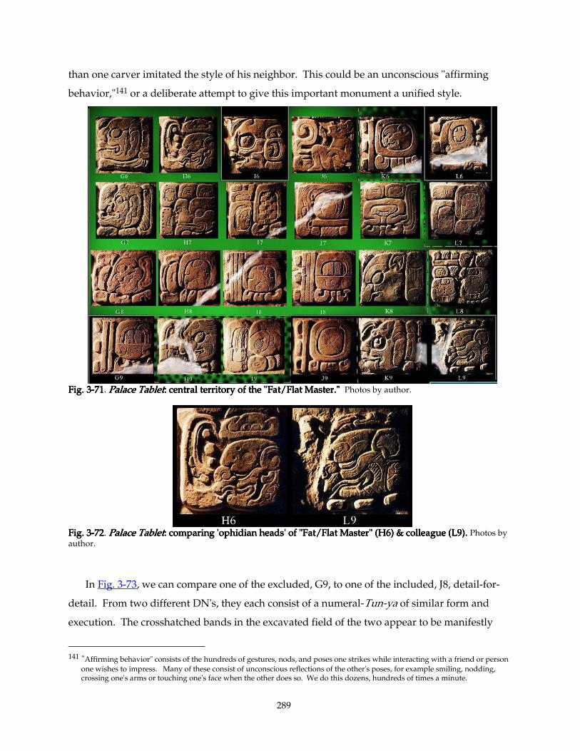
289
than one carver imitated the style of his neighbor. This could be an unconscious "affirming
behavior,"141 or a deliberate attempt to give this important monument a unified style.
Fig. 3Fig. 3Fig. 3Fig. 3----71717171. Palace TabletPalace TabletPalace TabletPalace Tablet: central territory of the "Fat/Flat Master.": central territory of the "Fat/Flat Master.": central territory of the "Fat/Flat Master.": central territory of the "Fat/Flat Master." Photos by author.
Fig. 3Fig. 3Fig. 3Fig. 3----72727272. Palace TabletPalace TabletPalace TabletPalace Tablet: comparing 'ophidian heads' of "Fat/Flat Master" (H6) & colleague (L9).: comparing 'ophidian heads' of "Fat/Flat Master" (H6) & colleague (L9).: comparing 'ophidian heads' of "Fat/Flat Master" (H6) & colleague (L9).: comparing 'ophidian heads' of "Fat/Flat Master" (H6) & colleague (L9). Photos by author.
In Fig. 3-73, we can compare one of the excluded, G9, to one of the included, J8, detail-for-
detail. From two different DN's, they each consist of a numeral-Tun-ya of similar form and
execution. The crosshatched bands in the excavated field of the two appear to be manifestly
141 "Affirming behavior" consists of the hundreds of gestures, nods, and poses one strikes while interacting with a friend or person
one wishes to impress. Many of these consist of unconscious reflections of the other's poses, for example smiling, nodding, crossing one's arms or touching one's face when the other does so. We do this dozens, hundreds of times a minute.
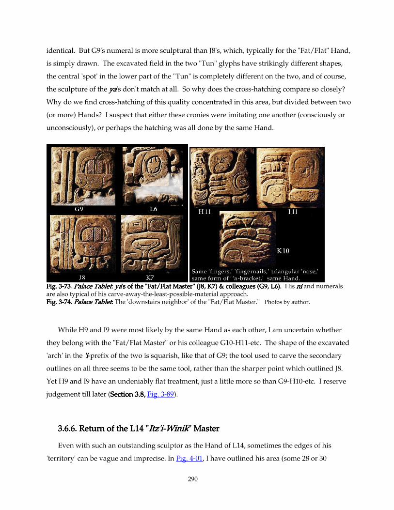
290
identical. But G9's numeral is more sculptural than J8's, which, typically for the "Fat/Flat" Hand,
is simply drawn. The excavated field in the two "Tun" glyphs have strikingly different shapes,
the central 'spot' in the lower part of the "Tun" is completely different on the two, and of course,
the sculpture of the yayayaya's don't match at all. So why does the cross-hatching compare so closely?
Why do we find cross-hatching of this quality concentrated in this area, but divided between two
(or more) Hands? I suspect that either these cronies were imitating one another (consciously or
unconsciously), or perhaps the hatching was all done by the same Hand.
Fig. 3Fig. 3Fig. 3Fig. 3----73737373. Palace TabletPalace TabletPalace TabletPalace Tablet: : : : yayayaya's of the "Fat/Flat Master" (J8's of the "Fat/Flat Master" (J8's of the "Fat/Flat Master" (J8's of the "Fat/Flat Master" (J8, K7) & colleagues (G9, L6). , K7) & colleagues (G9, L6). , K7) & colleagues (G9, L6). , K7) & colleagues (G9, L6). His nininini and numerals are also typical of his carve-away-the-least-possible-material approach. Fig. 3Fig. 3Fig. 3Fig. 3----74.74.74.74. Palace TabletPalace TabletPalace TabletPalace Tablet: : : : The 'downstairs neighbor' of the "Fat/Flat Master." Photos by author.
While H9 and I9 were most likely by the same Hand as each other, I am uncertain whether
they belong with the "Fat/Flat Master" or his colleague G10-H11-etc. The shape of the excavated
'arch' in the 'i'i'i'i-prefix of the two is squarish, like that of G9; the tool used to carve the secondary
outlines on all three seems to be the same tool, rather than the sharper point which outlined J8.
Yet H9 and I9 have an undeniably flat treatment, just a little more so than G9-H10-etc. I reserve
judgement till later (Section 3.8, Section 3.8, Section 3.8, Section 3.8, Fig. 3-89).
3.6.6.3.6.6.3.6.6.3.6.6. Return of the L14 " Return of the L14 " Return of the L14 " Return of the L14 "Itz'iItz'iItz'iItz'i----WinikWinikWinikWinik" Master" Master" Master" Master
Even with such an outstanding sculptor as the Hand of L14, sometimes the edges of his
'territory' can be vague and imprecise. In Fig. 4-01, I have outlined his area (some 28 or 30
291
glyphs) in Maya blue, but the reader will note that three glyphs —J10, J15, and N13— have only
a dashed outline, indicating I am uncertain about this particular glyph's authorship. In the case
of J15, the elegant 'death eyes' ’u’u’u’u is identical to that at F18 (Fig. 4-01, placed in margin below J15
for comparison), which I firmly established as a product of the E15 Master in SectionSectionSectionSection 2.5.5.2. 2.5.5.2. 2.5.5.2. 2.5.5.2. (For
a table assigning the ’u’u’u’u's to various Hands, see Fig. 4-03. For the E15 Master's 'territory,' see Fig.
4-04.) Yet J15's Huun and nananana are identical to those at M14, which I assign indubitably to the L14
Master (Figs. 4-01, 4-05). Further, the fine cross-hatching on the 'death eyes' is rather unusual on
this Tablet; and nearly every example of it can be ascribed to the E15 Master, for example on
G14, H15 and I15. When the L14 master cross-hatches, as at L13, he tends to treat its 'net' pattern
in his usual highly-sculptural way, carving the grooves deeply, sparsely, and with a wide
'gauge,' completely unlike the 'nets' at G14, H15 and I15. The many idiosyncrasies of the E15
Master establishes him as quite a distinct personality from his L14 colleague. Yet here they are
sharing a glyph; working together in an area about five by six inches (12 x 14 cm). This and
other examples force me to the reluctant conclusion that this team occasionally (perhaps often)
tolerated two carvers collaborating even at the most basic levels. This opens a can of worms.
Did some of these sculptors specialize in, say, carving backgrounds, or sensitive faces, or
rodents, or fine cross-hatching? (Certainly no one person specialized in Emblem Glyphs or
Daysign Cartouches; there are hardly two to be found by the same Hand!) Perhaps reluctance
to admit the existence of such a complex microstructure blinded me to an unexpectedly
collaborative artistic community, a richly fertile environment where one person could finish
another's sentences, as it were.
The same situation obtains when one compares E16 (by the E15 Hand) with G13 (by the L14
Hand). The differences in their 'jawbone' treatment distinguish them, but only barely (see Fig. 3-
76 below); many of their other qualities resemble each other. In sum, I think that these glyphs'
similarities again reflect close collaboration and mutual influence; the kind that inevitably occurs
in this kind of situation. Even if we exclude the three doubtful glyphs, this Master's 26 glyphs
are not all grouped in a compact area. At least one (M9) is an 'island,' for instance; it is obvious
that even this superlative carver was not working on a continuous section of text. This implies
that the Palenque workshop enjoyed a deeply communal attitude: each artist contributing
whatever he could, carving on whatever glyphs happened to be in front of him.
Fig. 4-05 compares the six examples of the 'Jester God' allograph of Hu'n or Hu'un
("amate/bark paper," "headdress," "book"), together with glyphs abutting the two examples in
292
the third slab of the Tablet (columns OPQR). In one of these cases, two adjacent glyphs (O2 and
O3) are certainly from different artists (O3 is strikingly individualistic, with an eccentric form of -
nananana suffix); in the other, R15 and R16 have similar style, but very different yoyoyoyo-'leaves.' I
tentatively distinguish their Hand(s). And it will come as small surprise to find that O2 and R16,
two glyphs eight feet apart, are also by different Hands. Surprisingly, S4 and U6, both from the
'Label' texts of the illustration in the top area, also have so many distinguishing features —'eye,'
'nose,' 'leaf,' depth of carving— that I am forced to conclude that there are at least two Hands at
work here, as well. This is surprising because the carving style and scale of the texts of this area
are quite distinct from the rest of the Tablet, and seem (perhaps by contrast) to possess strong
stylistic unity.
3.6.7.3.6.7.3.6.7.3.6.7. Hands' Individual Repertoires of Line Hands' Individual Repertoires of Line Hands' Individual Repertoires of Line Hands' Individual Repertoires of Line----QualitiesQualitiesQualitiesQualities
All in all, this Hand has some very distinctive qualities, which I shall exploit in the next
section. On Fig. 3-46a, I put D2 into the third column for comparison. Like C1, some of its lines
seem awkward, angular, due to their relatively casual or sloppy execution. Also, each carver
seems to have had his own personal set of line-thicknesses and -qualities. I have alluded briefly
to this above; the particular combination of bold strokes, light strokes, beveling, and modeling
gives each artist's work a distinct flavor and character. In Fig. 3-75, I compare five pairs of
glyphs from five different Hands to illustrate this.
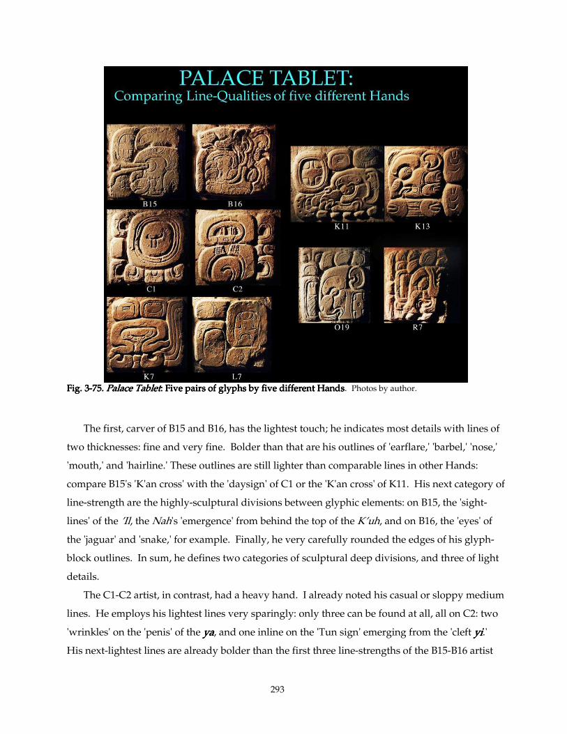
293
Fig. 3Fig. 3Fig. 3Fig. 3----75757575.... Palace TabletPalace TabletPalace TabletPalace Tablet: : : : Five pairs of glyphs by five different HandsFive pairs of glyphs by five different HandsFive pairs of glyphs by five different HandsFive pairs of glyphs by five different Hands. Photos by author.
The first, carver of B15 and B16, has the lightest touch; he indicates most details with lines of
two thicknesses: fine and very fine. Bolder than that are his outlines of 'earflare,' 'barbel,' 'nose,'
'mouth,' and 'hairline.' These outlines are still lighter than comparable lines in other Hands:
compare B15's 'K'an cross' with the 'daysign' of C1 or the 'K'an cross' of K11. His next category of
line-strength are the highly-sculptural divisions between glyphic elements: on B15, the 'sight-
lines' of the ’Il, the Nah's 'emergence' from behind the top of the K’uh, and on B16, the 'eyes' of
the 'jaguar' and 'snake,' for example. Finally, he very carefully rounded the edges of his glyph-
block outlines. In sum, he defines two categories of sculptural deep divisions, and three of light
details.
The C1-C2 artist, in contrast, had a heavy hand. I already noted his casual or sloppy medium
lines. He employs his lightest lines very sparingly: only three can be found at all, all on C2: two
'wrinkles' on the 'penis' of the yayayaya, and one inline on the 'Tun sign' emerging from the 'cleft yiyiyiyi.'
His next-lightest lines are already bolder than the first three line-strengths of the B15-B16 artist
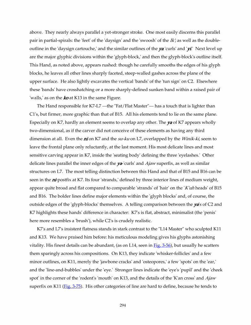
294
above. They nearly always parallel a yet-stronger stroke. One most easily discerns this parallel
pair in partial-spirals: the 'feet' of the 'daysign' and the 'swoosh' of the Ik'; as well as the double-
outline in the 'daysign cartouche,' and the similar outlines of the yayayaya 'curls' and 'yiyiyiyi.' Next level up
are the major glyphic divisions within the 'glyph-block,' and then the glyph-block's outline itself.
This Hand, as noted above, appears rushed: though he carefully smooths the edges of his glyph
blocks, he leaves all other lines sharply faceted, steep-walled gashes across the plane of the
upper surface. He also lightly excavates the vertical 'bands' of the 'tun sign' on C2. Elsewhere
these 'bands' have crosshatching or a more sharply-defined sunken band within a raised pair of
'walls,' as on the kokokoko at K13 in the same Figure.
The Hand responsible for K7-L7 —the "Fat/Flat Master"— has a touch that is lighter than
C1's, but firmer, more graphic than that of B15. All his elements tend to lie on the same plane.
Especially on K7, hardly an element seems to overlap any other. The yayayaya of K7 appears wholly
two-dimensional, as if the carver did not conceive of these elements as having any third
dimension at all. Even the nininini on K7 and the su-ku on L7, overlapped by the Winik-ki, seem to
leave the frontal plane only reluctantly, at the last moment. His most delicate lines and most
sensitive carving appear in K7, inside the 'seating body' defining the three 'eyelashes.' Other
delicate lines parallel the inner edges of the yayayaya-'curls' and Ajaw superfix, as well as similar
structures on L7. The most telling distinction between this Hand and that of B15 and B16 can be
seen in the nininini-postfix at K7. Its four 'strands,' defined by three interior lines of medium weight,
appear quite broad and flat compared to comparable 'strands' of 'hair' on the 'K'uh heads' of B15
and B16. The bolder lines define major elements within the 'glyph blocks' and, of course, the
outside edges of the 'glyph-blocks' themselves. A telling comparison between the yayayaya's of C2 and
K7 highlights these hands' difference in character: K7's is flat, abstract, minimalist (the 'penis'
here more resembles a 'brush'), while C2's is crudely realistic.
K7's and L7's insistent flatness stands in stark contrast to the "L14 Master" who sculpted K11
and K13. We have praised him before: his meticulous modeling gives his glyphs astonishing
vitality. His finest details can be abundant, (as on L14, seen in Fig. 3-56), but usually he scatters
them sparingly across his compositions. On K13, they indicate 'whisker-follicles' and a few
minor outlines, on K11, merely the 'jawbone cracks' and 'osteopores,' a few 'spots' on the 'ear,'
and the 'line-and-bubbles' under the 'eye.' Stronger lines indicate the 'eye's 'pupil' and the 'cheek
spot' in the corner of the 'rodent's 'mouth' on K13, and the details of the 'K'an cross' and Ajaw
superfix on K11 (Fig. 3-75). His other categories of line are hard to define, because he tends to
295
think sculpturally rather than to draw outlines. In contrast to the planar K7 and L7, he hardly
leaves a square millimeter of the stone's original flat surface. This is particularly evident in the
bulging interior and inflated frame of K11's 'K'an cross' and the K'uh 'water group' below it. His
'lip' on K11's 'skull' has a particular elegance: this striking sculptural ribbon's curving planes set
off the bulging volumes around it. Likewise with the 'skull's 'eyebrow,' and the 'lip' of the
'rodent' on K13. Finally, this Hand tends to prefer shallow excavation to cross-hatching: the
concavity of K11's large 'ear-spot', and the Chok's 'cheek-spot' and the longitudinal 'bands' on the
ko of K13 all show this.
The final pair of glyphs in Fig. 3-75 strike a nice balance between flat and rounded form,
exhibiting elegant restraint both in decorative detail and sculptured modeling. Note this Artist
actually carved a sequential text passage, finishing the bottom of Columns OP, he continued
(presumably) up at the top of Columns QR, carving several glyphs, down at least to R7.
Thus we can conclude that at this time the 'Palenque Manual of Style' did not specify a strict
hierarchy of line-thickness, nor even distinguish between sculptural or graphic glyphs. As long
as the glyphs rose to the same relief level from the background plane, artists were relatively free
to be flat as a printing plate or bulging with life.
3.7. 'Jawbones' and 'Skulls': Figs. 33.7. 'Jawbones' and 'Skulls': Figs. 33.7. 'Jawbones' and 'Skulls': Figs. 33.7. 'Jawbones' and 'Skulls': Figs. 3----76, 376, 376, 376, 3----77, 377, 377, 377, 3----78, 378, 378, 378, 3----77779 9 9 9
3.7.13.7.13.7.13.7.1 A rich variety A rich variety A rich variety A rich variety
The intimate presence of Death in Maya culture reflects in how often we encounter 'bones',
'skulls,' 'death-eyes,' 'jawbones' and so on. The Palace Tablet's score of 'skeletal' glyphs
(particularly the Palenque Emblem Glyph itself) provide a potentially rich source of glyph
comparisons. Even the 'jawbone,' though highly conventionalized, has many alternative
treatments of various details: the diagnostic Y-shaped meandering axial line (a surface crack?)
and 'osteopores,' for example, are highly sensitive to an artist's 'handwriting.' The 'jawbone' or
'mandible' might be sculpted convex, concave, with an engraved or raised outline, etc. This very
variety suggests no strict sculptural conventions existed, though the very consistent outline and
repertory of engraved details does suggest that strict drawing guidelines obtained.
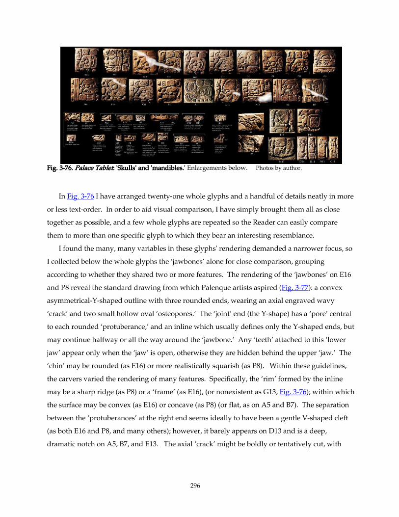
296
Fig. 3Fig. 3Fig. 3Fig. 3----76.76.76.76. Palace TabletPalace TabletPalace TabletPalace Tablet: : : : 'Skulls' and 'mandibles.''Skulls' and 'mandibles.''Skulls' and 'mandibles.''Skulls' and 'mandibles.' Enlargements below. Photos by author.
In Fig. 3-76 I have arranged twenty-one whole glyphs and a handful of details neatly in more
or less text-order. In order to aid visual comparison, I have simply brought them all as close
together as possible, and a few whole glyphs are repeated so the Reader can easily compare
them to more than one specific glyph to which they bear an interesting resemblance.
I found the many, many variables in these glyphs' rendering demanded a narrower focus, so
I collected below the whole glyphs the ‘jawbones’ alone for close comparison, grouping
according to whether they shared two or more features. The rendering of the ‘jawbones’ on E16
and P8 reveal the standard drawing from which Palenque artists aspired (Fig. 3-77): a convex
asymmetrical-Y-shaped outline with three rounded ends, wearing an axial engraved wavy
‘crack’ and two small hollow oval ‘osteopores.’ The ‘joint’ end (the Y-shape) has a ‘pore’ central
to each rounded ‘protuberance,’ and an inline which usually defines only the Y-shaped ends, but
may continue halfway or all the way around the ‘jawbone.’ Any ‘teeth’ attached to this ‘lower
jaw’ appear only when the ‘jaw’ is open, otherwise they are hidden behind the upper ‘jaw.’ The
‘chin’ may be rounded (as E16) or more realistically squarish (as P8). Within these guidelines,
the carvers varied the rendering of many features. Specifically, the ‘rim’ formed by the inline
may be a sharp ridge (as P8) or a ‘frame’ (as E16), (or nonexistent as G13, Fig. 3-76); within which
the surface may be convex (as E16) or concave (as P8) (or flat, as on A5 and B7). The separation
between the ‘protuberances’ at the right end seems ideally to have been a gentle V-shaped cleft
(as both E16 and P8, and many others); however, it barely appears on D13 and is a deep,
dramatic notch on A5, B7, and E13. The axial ‘crack’ might be boldly or tentatively cut, with
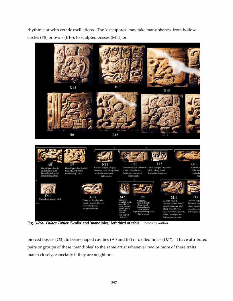
297
rhythmic or with erratic oscillations. The ‘osteopores’ may take many shapes, from hollow
circles (P8) or ovals (E16), to sculpted bosses (M11) or
Fig. 3Fig. 3Fig. 3Fig. 3----76a.76a.76a.76a. Palace TabletPalace TabletPalace TabletPalace Tablet: : : : 'Skulls' and 'mandibles,' left third of table'Skulls' and 'mandibles,' left third of table'Skulls' and 'mandibles,' left third of table'Skulls' and 'mandibles,' left third of table. Photos by author.
pierced bosses (O3), to bean-shaped cavities (A5 and B7) or drilled holes (D7?). I have attributed
pairs or groups of these ‘mandibles’ to the same artist whenever two or more of these traits
match closely, especially if they are neighbors.
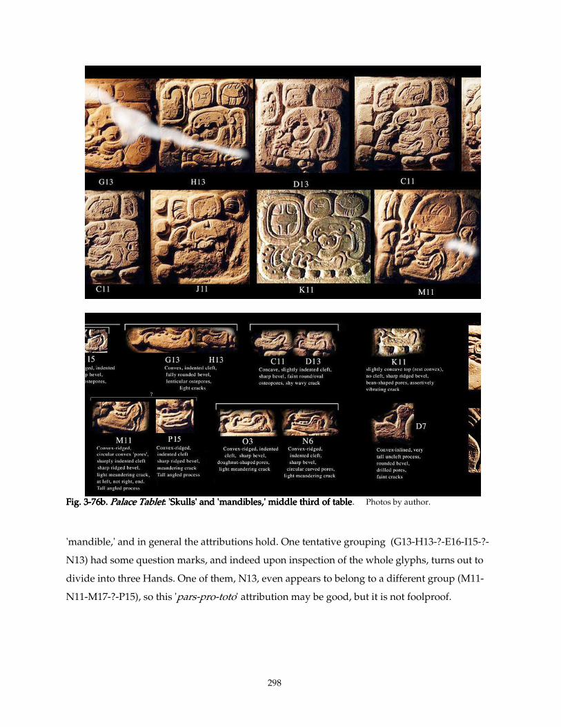
298
Fig. 3Fig. 3Fig. 3Fig. 3----76b.76b.76b.76b. Palace TabletPalace TabletPalace TabletPalace Tablet: : : : 'Skulls' and 'mandibles,' middle third of table'Skulls' and 'mandibles,' middle third of table'Skulls' and 'mandibles,' middle third of table'Skulls' and 'mandibles,' middle third of table. Photos by author.
'mandible,' and in general the attributions hold. One tentative grouping (G13-H13-?-E16-I15-?-
N13) had some question marks, and indeed upon inspection of the whole glyphs, turns out to
divide into three Hands. One of them, N13, even appears to belong to a different group (M11-
N11-M17-?-P15), so this 'pars-pro-toto' attribution may be good, but it is not foolproof.
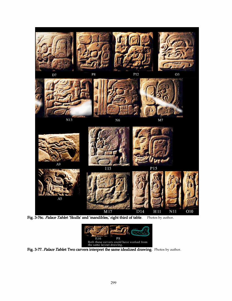
299
Fig. 3Fig. 3Fig. 3Fig. 3----76c.76c.76c.76c. Palace TabletPalace TabletPalace TabletPalace Tablet: : : : 'Skulls' and 'mandibles,' right third of table'Skulls' and 'mandibles,' right third of table'Skulls' and 'mandibles,' right third of table'Skulls' and 'mandibles,' right third of table. Photos by author.
Fig. 3Fig. 3Fig. 3Fig. 3----77.77.77.77. Palace TabletPalace TabletPalace TabletPalace Tablet: : : : Two carvers interpret the same idealized drawingTwo carvers interpret the same idealized drawingTwo carvers interpret the same idealized drawingTwo carvers interpret the same idealized drawing. Photos by author.
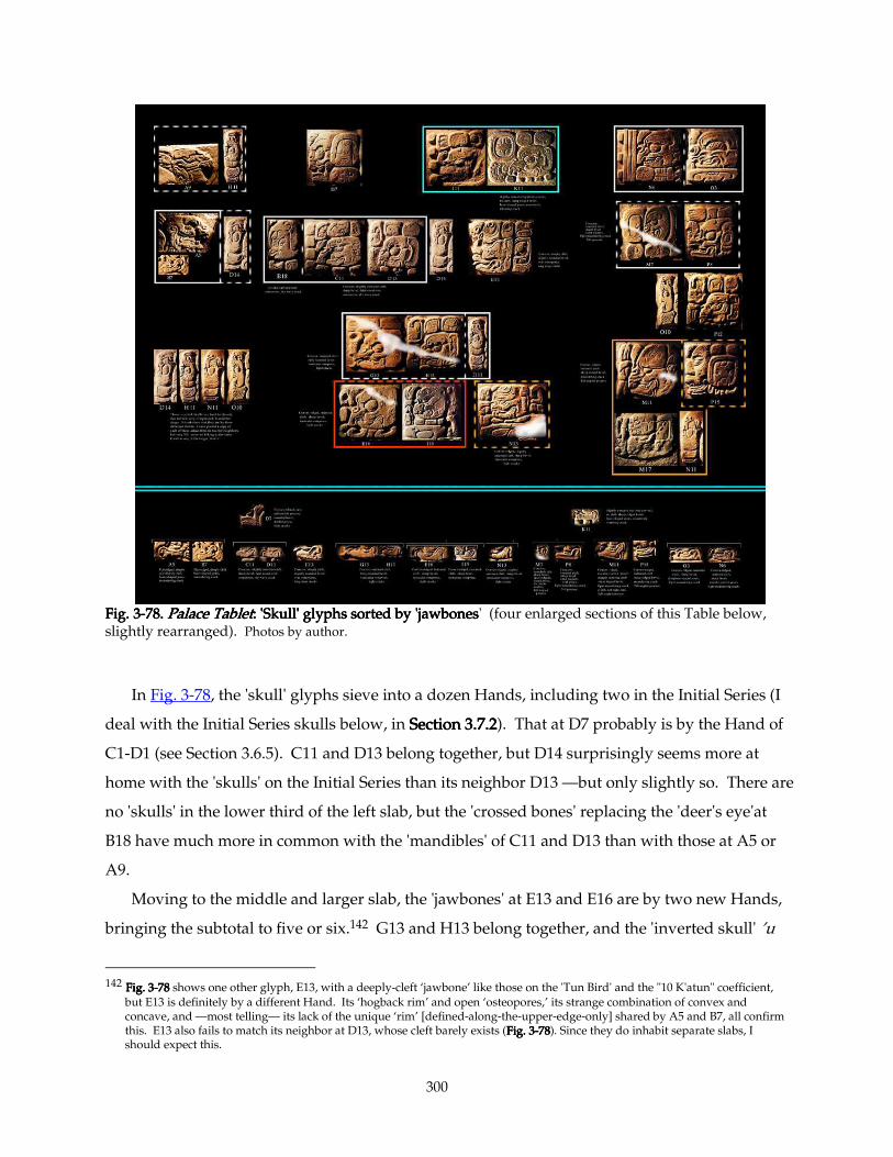
300
Fig. 3Fig. 3Fig. 3Fig. 3----78787878.... Palace TabletPalace TabletPalace TabletPalace Tablet: : : : 'Skull' glyphs sorted by 'jawbones'Skull' glyphs sorted by 'jawbones'Skull' glyphs sorted by 'jawbones'Skull' glyphs sorted by 'jawbones' (four enlarged sections of this Table below, slightly rearranged). Photos by author.
In Fig. 3-78, the 'skull' glyphs sieve into a dozen Hands, including two in the Initial Series (I
deal with the Initial Series skulls below, in SectionSectionSectionSection 3.7.23.7.23.7.23.7.2). That at D7 probably is by the Hand of
C1-D1 (see Section 3.6.5). C11 and D13 belong together, but D14 surprisingly seems more at
home with the 'skulls' on the Initial Series than its neighbor D13 —but only slightly so. There are
no 'skulls' in the lower third of the left slab, but the 'crossed bones' replacing the 'deer's eye'at
B18 have much more in common with the 'mandibles' of C11 and D13 than with those at A5 or
A9.
Moving to the middle and larger slab, the 'jawbones' at E13 and E16 are by two new Hands,
bringing the subtotal to five or six.142 G13 and H13 belong together, and the 'inverted skull' ’u
142 Fig. 3Fig. 3Fig. 3Fig. 3----78 78 78 78 shows one other glyph, E13, with a deeply-cleft ‘jawbone’ like those on the 'Tun Bird' and the "10 K'atun" coefficient,
but E13 is definitely by a different Hand. Its ‘hogback rim’ and open ‘osteopores,’ its strange combination of convex and concave, and —most telling— its lack of the unique ‘rim’ [defined-along-the-upper-edge-only] shared by A5 and B7, all confirm this. E13 also fails to match its neighbor at D13, whose cleft barely exists (Fig. 3Fig. 3Fig. 3Fig. 3----78787878). Since they do inhabit separate slabs, I should expect this.
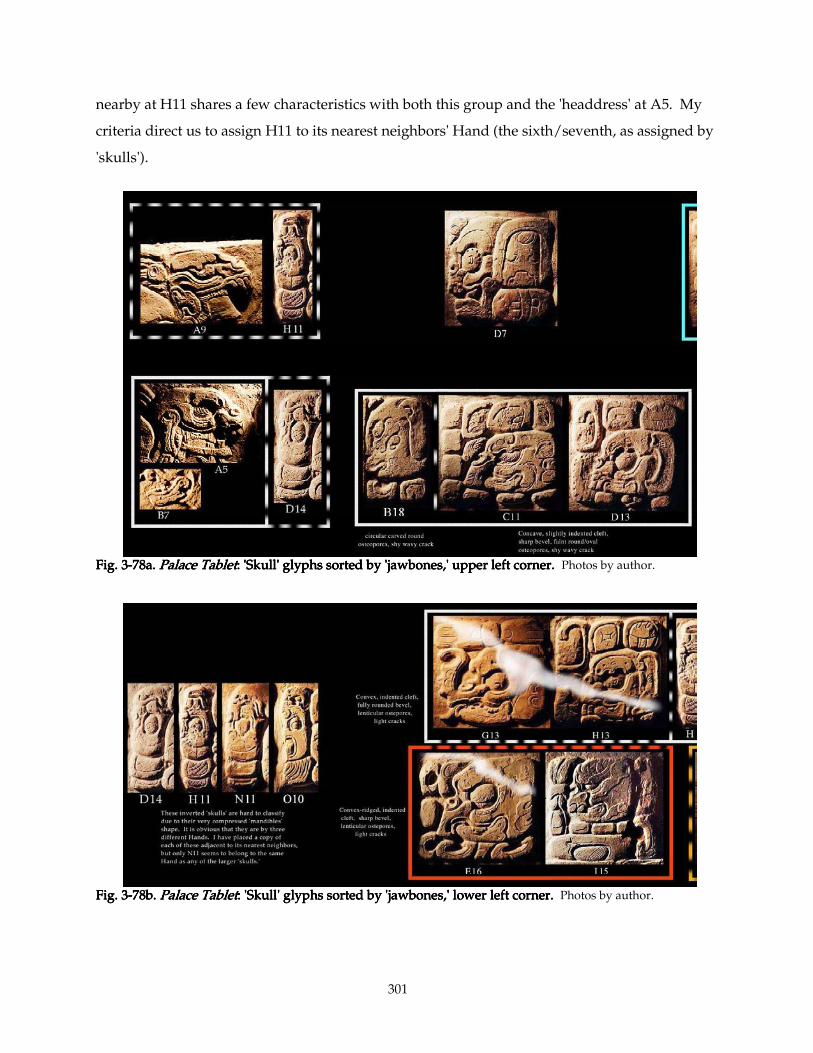
301
nearby at H11 shares a few characteristics with both this group and the 'headdress' at A5. My
criteria direct us to assign H11 to its nearest neighbors' Hand (the sixth/seventh, as assigned by
'skulls').
Fig. 3Fig. 3Fig. 3Fig. 3----78a.78a.78a.78a. Palace TabletPalace TabletPalace TabletPalace Tablet: : : : 'Skull' glyphs sorted by 'jawbones,' upper left corner.'Skull' glyphs sorted by 'jawbones,' upper left corner.'Skull' glyphs sorted by 'jawbones,' upper left corner.'Skull' glyphs sorted by 'jawbones,' upper left corner. Photos by author.
Fig. 3Fig. 3Fig. 3Fig. 3----78b.78b.78b.78b. Palace TPalace TPalace TPalace Tabletabletabletablet: : : : 'Skull' glyphs sorted by 'jawbones,' lower left corner.'Skull' glyphs sorted by 'jawbones,' lower left corner.'Skull' glyphs sorted by 'jawbones,' lower left corner.'Skull' glyphs sorted by 'jawbones,' lower left corner. Photos by author.
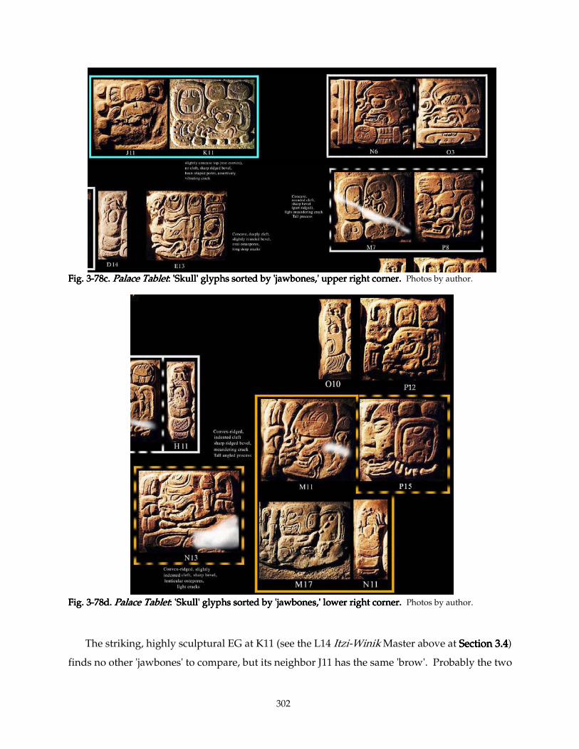
302
Fig. 3Fig. 3Fig. 3Fig. 3----78c.78c.78c.78c. Palace TabletPalace TabletPalace TabletPalace Tablet: : : : 'Skull' glyphs sorted by 'jawbones,' upper right corner.'Skull' glyphs sorted by 'jawbones,' upper right corner.'Skull' glyphs sorted by 'jawbones,' upper right corner.'Skull' glyphs sorted by 'jawbones,' upper right corner. Photos by author.
Fig. 3Fig. 3Fig. 3Fig. 3----78d.78d.78d.78d. Palace TabletPalace TabletPalace TabletPalace Tablet: : : : 'Skull' glyphs sorted by 'jawbones,' 'Skull' glyphs sorted by 'jawbones,' 'Skull' glyphs sorted by 'jawbones,' 'Skull' glyphs sorted by 'jawbones,' lower right corner.lower right corner.lower right corner.lower right corner. Photos by author.
The striking, highly sculptural EG at K11 (see the L14 Itzi-Winik Master above at Section 3.4Section 3.4Section 3.4Section 3.4)
finds no other 'jawbones' to compare, but its neighbor J11 has the same 'brow'. Probably the two
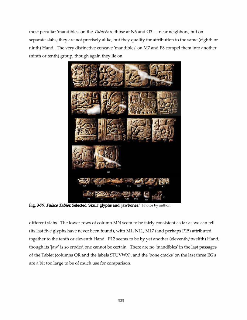
303
most peculiar 'mandibles' on the Tablet are those at N6 and O3 — near neighbors, but on
separate slabs; they are not precisely alike, but they qualify for attribution to the same (eighth or
ninth) Hand. The very distinctive concave 'mandibles' on M7 and P8 compel them into another
(ninth or tenth) group, though again they lie on
Fig. 3Fig. 3Fig. 3Fig. 3----79.79.79.79. Palace TabletPalace TabletPalace TabletPalace Tablet: Selected : Selected : Selected : Selected 'Skull' glyphs and 'jawbones.''Skull' glyphs and 'jawbones.''Skull' glyphs and 'jawbones.''Skull' glyphs and 'jawbones.' Photos by author.
different slabs. The lower rows of column MN seem to be fairly consistent as far as we can tell
(its last five glyphs have never been found), with M1, N11, M17 (and perhaps P15) attributed
together to the tenth or eleventh Hand. P12 seems to be by yet another (eleventh/twelfth) Hand,
though its 'jaw' is so eroded one cannot be certain. There are no 'mandibles' in the last passages
of the Tablet (columns QR and the labels STUVWX), and the 'bone cracks' on the last three EG's
are a bit too large to be of much use for comparison.
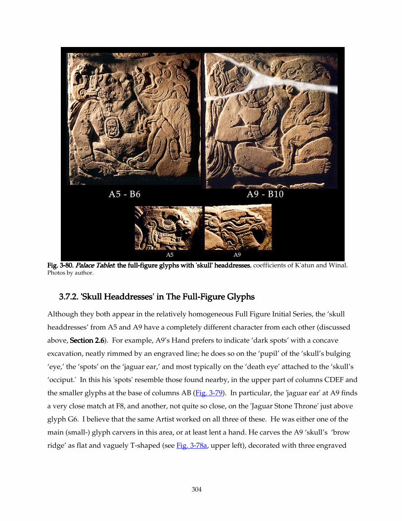
304
Fig. 3Fig. 3Fig. 3Fig. 3----80.80.80.80. Palace TabletPalace TabletPalace TabletPalace Tablet: the full: the full: the full: the full----figure glyphs with figure glyphs with figure glyphs with figure glyphs with 'skull' headdresses'skull' headdresses'skull' headdresses'skull' headdresses, coefficients of K'atun and Winal. Photos by author.
3.7.2.3.7.2.3.7.2.3.7.2. 'Skull Headdresses' in The Full 'Skull Headdresses' in The Full 'Skull Headdresses' in The Full 'Skull Headdresses' in The Full----Figure GlyphsFigure GlyphsFigure GlyphsFigure Glyphs
Although they both appear in the relatively homogeneous Full Figure Initial Series, the ‘skull
headdresses’ from A5 and A9 have a completely different character from each other (discussed
above, Section 2.6Section 2.6Section 2.6Section 2.6). For example, A9’s Hand prefers to indicate ‘dark spots’ with a concave
excavation, neatly rimmed by an engraved line; he does so on the ‘pupil’ of the ‘skull’s bulging
‘eye,’ the ‘spots’ on the ‘jaguar ear,’ and most typically on the ‘death eye’ attached to the ‘skull’s
‘occiput.' In this his 'spots' resemble those found nearby, in the upper part of columns CDEF and
the smaller glyphs at the base of columns AB (Fig. 3-79). In particular, the 'jaguar ear' at A9 finds
a very close match at F8, and another, not quite so close, on the 'Jaguar Stone Throne' just above
glyph G6. I believe that the same Artist worked on all three of these. He was either one of the
main (small-) glyph carvers in this area, or at least lent a hand. He carves the A9 ‘skull’s ‘brow
ridge’ as flat and vaguely T-shaped (see Fig. 3-78a, upper left), decorated with three engraved
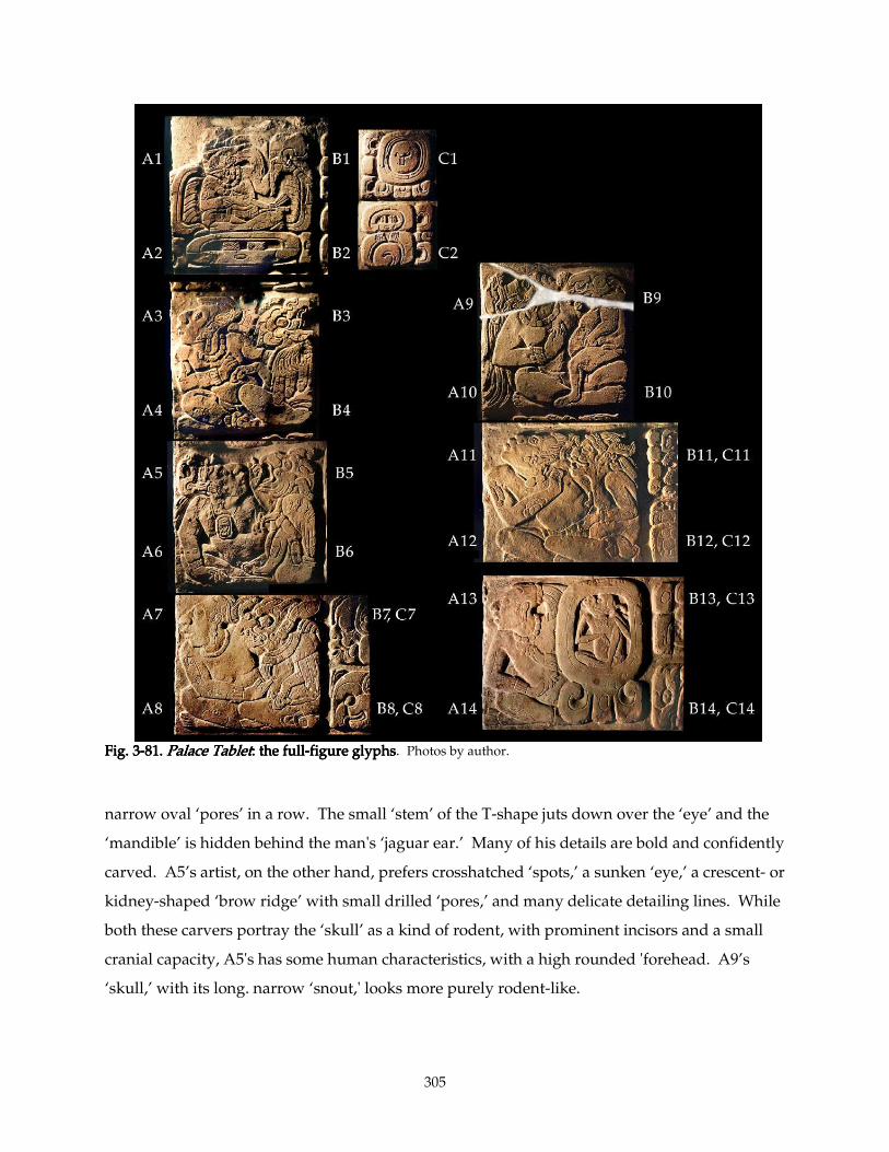
305
Fig. 3Fig. 3Fig. 3Fig. 3----81.81.81.81. Palace TabletPalace TabletPalace TabletPalace Tablet: the full: the full: the full: the full----figure glfigure glfigure glfigure glyphsyphsyphsyphs. Photos by author.
narrow oval ‘pores’ in a row. The small ‘stem’ of the T-shape juts down over the ‘eye’ and the
‘mandible’ is hidden behind the man's ‘jaguar ear.’ Many of his details are bold and confidently
carved. A5’s artist, on the other hand, prefers crosshatched ‘spots,’ a sunken ‘eye,’ a crescent- or
kidney-shaped ‘brow ridge’ with small drilled ‘pores,’ and many delicate detailing lines. While
both these carvers portray the ‘skull’ as a kind of rodent, with prominent incisors and a small
cranial capacity, A5's has some human characteristics, with a high rounded 'forehead. A9’s
‘skull,’ with its long. narrow ‘snout,' looks more purely rodent-like.
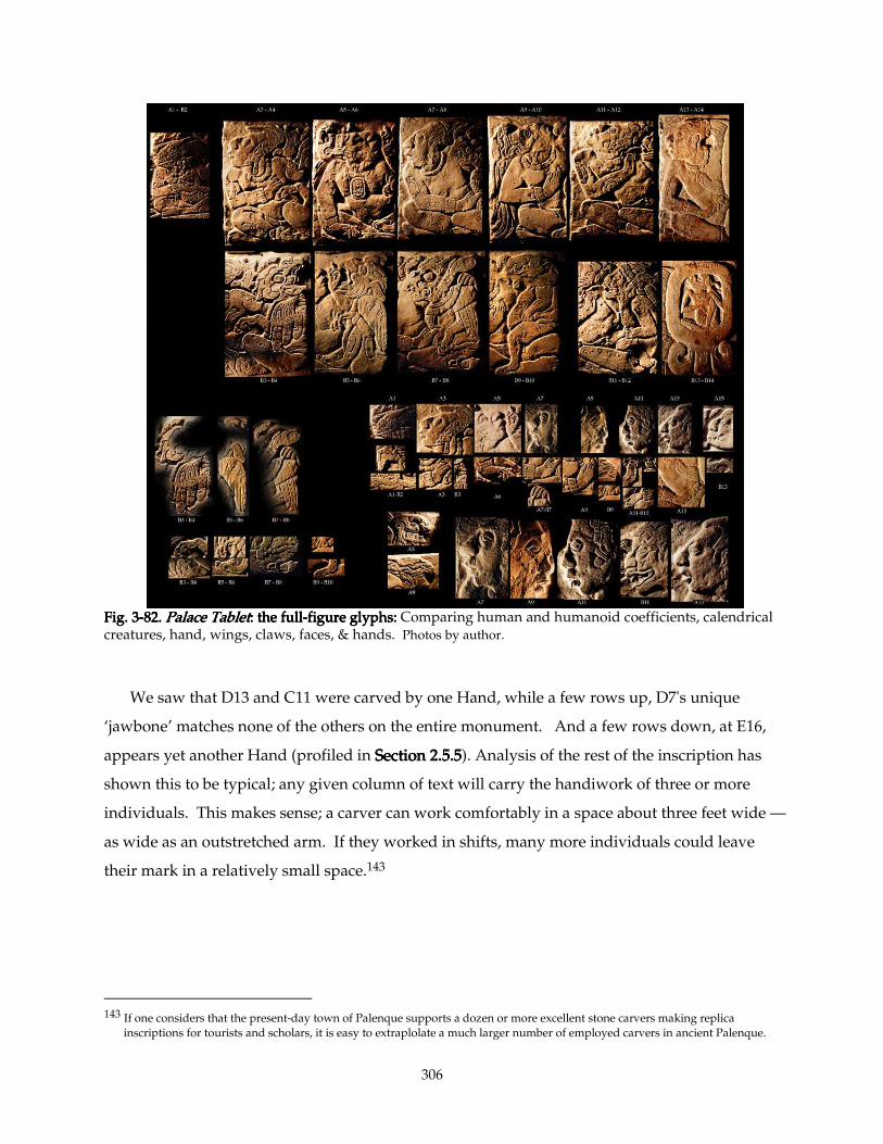
306
Fig. 3Fig. 3Fig. 3Fig. 3----82.82.82.82. Palace TabletPalace TabletPalace TabletPalace Tablet: the full: the full: the full: the full----figure glyphs: figure glyphs: figure glyphs: figure glyphs: Comparing human and humanoid coefficients, calendrical creatures, hand, wings, claws, faces, & hands. Photos by author.
We saw that D13 and C11 were carved by one Hand, while a few rows up, D7's unique
‘jawbone’ matches none of the others on the entire monument. And a few rows down, at E16,
appears yet another Hand (profiled in Section 2Section 2Section 2Section 2.5.5.5.5.5.5.5.5). Analysis of the rest of the inscription has
shown this to be typical; any given column of text will carry the handiwork of three or more
individuals. This makes sense; a carver can work comfortably in a space about three feet wide —
as wide as an outstretched arm. If they worked in shifts, many more individuals could leave
their mark in a relatively small space.143
143 If one considers that the present-day town of Palenque supports a dozen or more excellent stone carvers making replica
inscriptions for tourists and scholars, it is easy to extraplolate a much larger number of employed carvers in ancient Palenque.
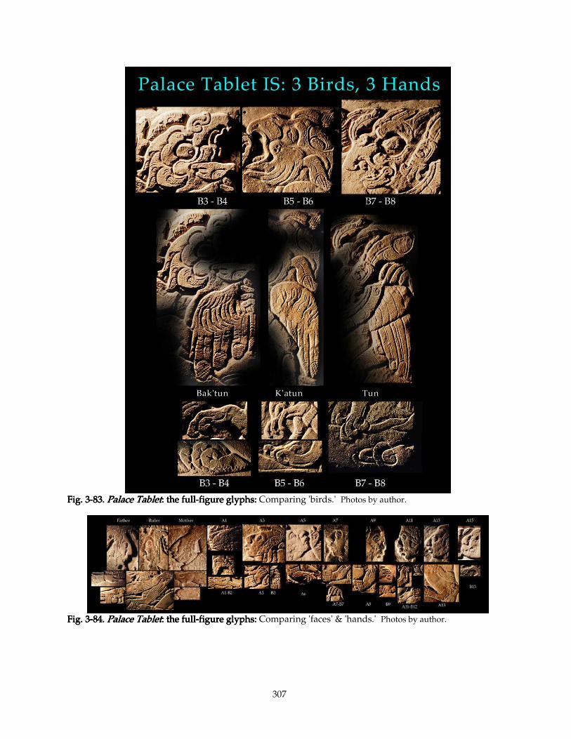
307
Fig. 3Fig. 3Fig. 3Fig. 3----83.83.83.83. Palace TabletPalace TabletPalace TabletPalace Tablet: the full: the full: the full: the full----figure glyphs: figure glyphs: figure glyphs: figure glyphs: Comparing 'birds.' Photos by author.
Fig. 3Fig. 3Fig. 3Fig. 3----84.84.84.84. Palace TabletPalace TabletPalace TabletPalace Tablet: the full: the full: the full: the full----figure glyphs: figure glyphs: figure glyphs: figure glyphs: Comparing 'faces' & 'hands.' Photos by author.
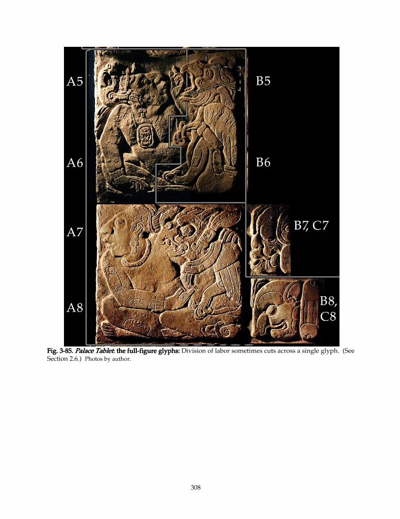
308
Fig. 3Fig. 3Fig. 3Fig. 3----85.85.85.85. Palace TabletPalace TabletPalace TabletPalace Tablet: the full: the full: the full: the full----figure glyphs: figure glyphs: figure glyphs: figure glyphs: Division of labor sometimes cuts across a single glyph. (See Section 2.6.) Photos by author.
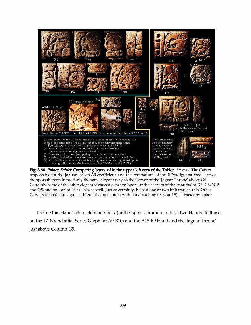
309
Fig. 3Fig. 3Fig. 3Fig. 3----86.86.86.86. Palace TabletPalace TabletPalace TabletPalace Tablet: : : : Comparing 'spots' of in the upper left area of the Tablet.Comparing 'spots' of in the upper left area of the Tablet.Comparing 'spots' of in the upper left area of the Tablet.Comparing 'spots' of in the upper left area of the Tablet. 3rd row: The Carver responsible for the 'jaguar ear' on A9 coefficient, and the 'tympanum' of the Winal 'iguana-toad,' carved the spots thereon in precisely the same elegant way as the Carver of the 'Jaguar Throne' above G6. Certainly some of the other elegantly-carved concave 'spots' at the corners of the 'mouths' at D6, G8, N15 and Q5, and on 'ear' at F8 are his, as well. Just as certainly, he had one or two imitators in this. Other Carvers treated 'dark spots' differently, most often with crosshatching (e.g., at L9). Photos by author.
I relate this Hand's characteristic 'spots' (or the 'spots' common to these two Hands) to those
on the 17 Winal Initial Series Glyph (at A9-B10) and the A15-B9 Hand and the 'Jaguar Throne'
just above Column G5.
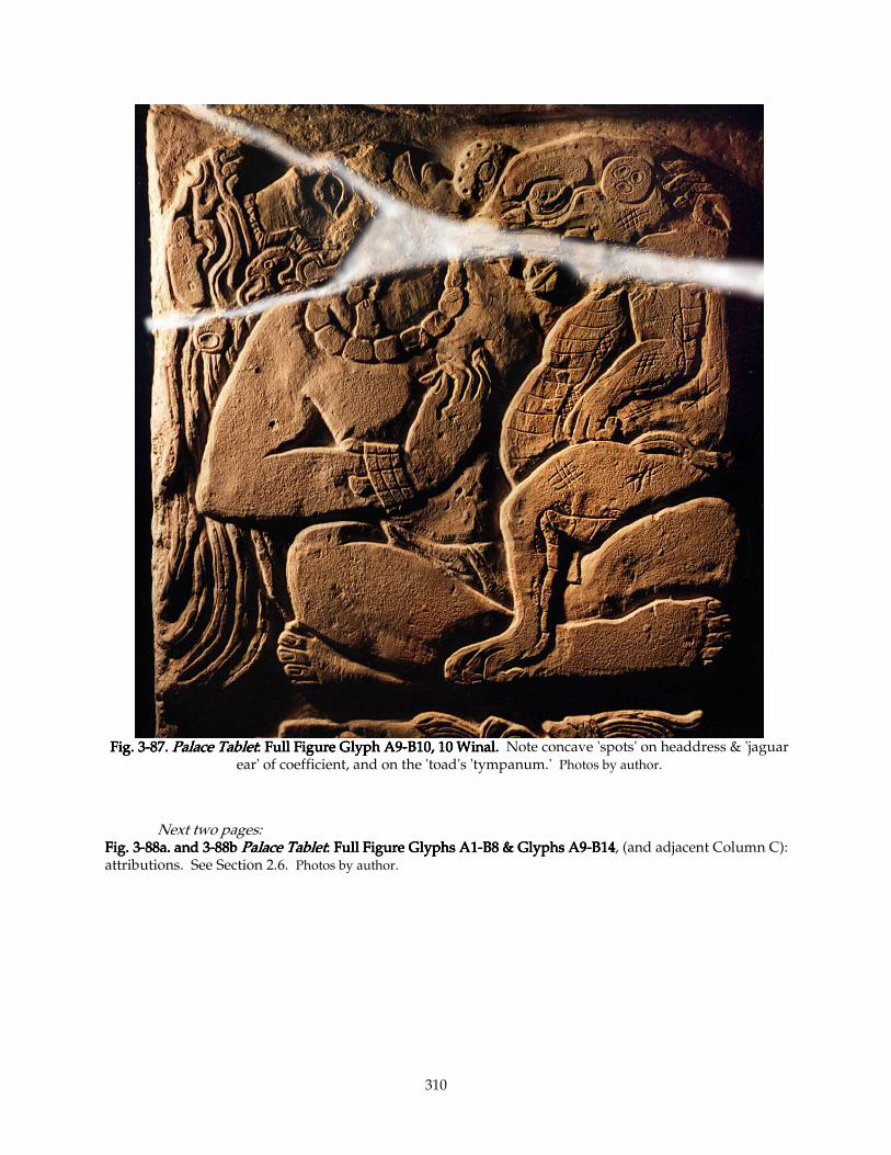
310
Fig. 3Fig. 3Fig. 3Fig. 3----87.87.87.87. Palace TabletPalace TabletPalace TabletPalace Tablet: : : : Full Figure Glyph A9Full Figure Glyph A9Full Figure Glyph A9Full Figure Glyph A9----B10, 10 Winal.B10, 10 Winal.B10, 10 Winal.B10, 10 Winal. Note concave 'spots' on headdress & 'jaguar
ear' of coefficient, and on the 'toad's 'tympanum.' Photos by author.
Next two pages: Fig. 3Fig. 3Fig. 3Fig. 3----88a. and 388a. and 388a. and 388a. and 3----88b88b88b88b Palace TabletPalace TabletPalace TabletPalace Tablet: : : : Full Figure Glyphs A1Full Figure Glyphs A1Full Figure Glyphs A1Full Figure Glyphs A1----B8 & Glyphs A9B8 & Glyphs A9B8 & Glyphs A9B8 & Glyphs A9----B14B14B14B14, (and adjacent Column C): attributions. See Section 2.6. Photos by author.
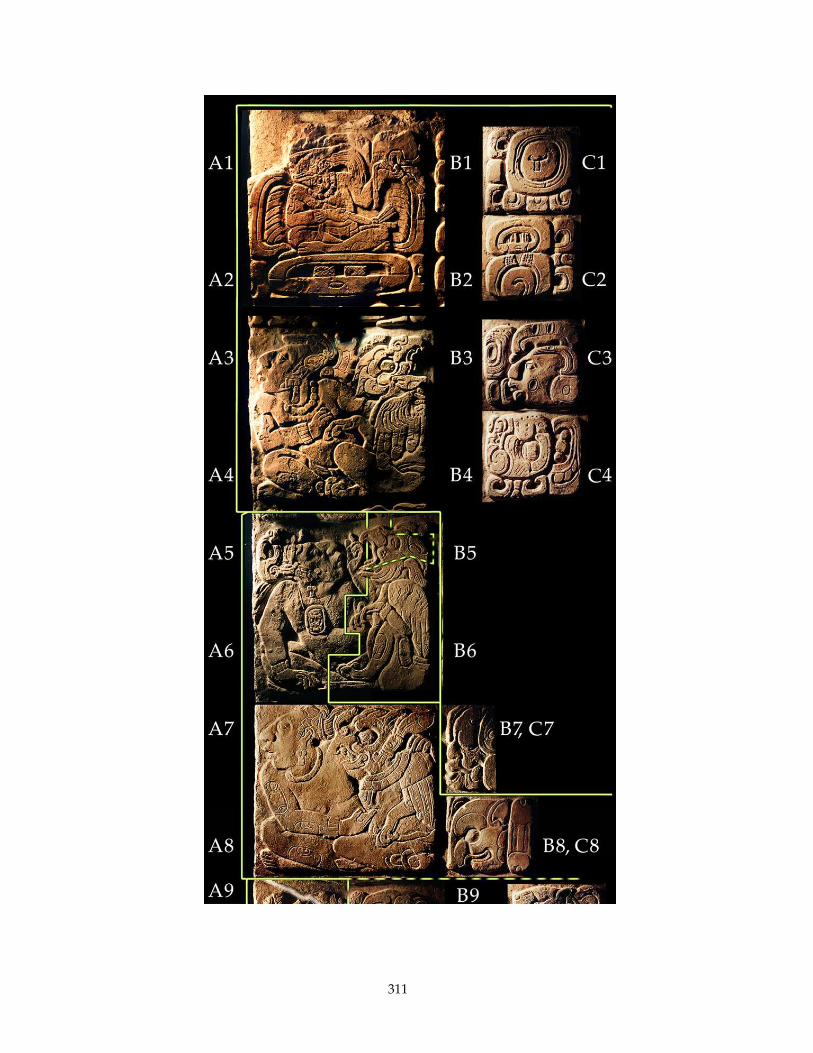
311
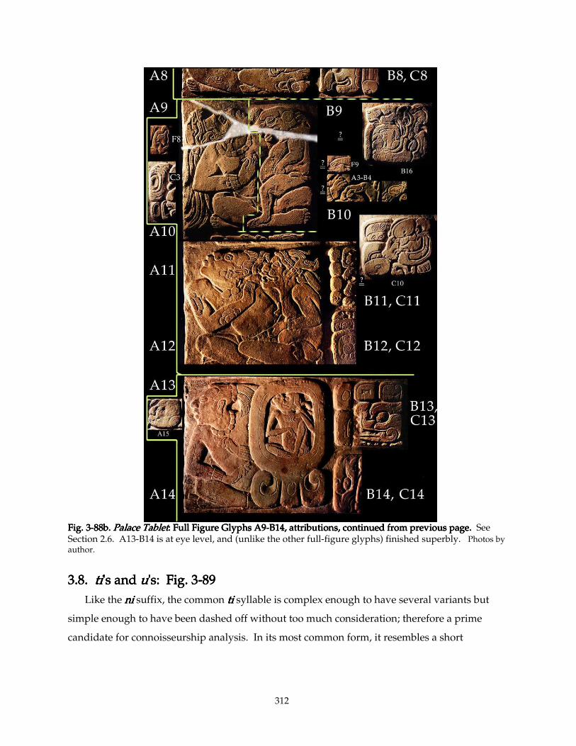
312
Fig. 3Fig. 3Fig. 3Fig. 3----88b.88b.88b.88b. Palace TabletPalace TabletPalace TabletPalace Tablet: : : : Full Figure Glyphs A9Full Figure Glyphs A9Full Figure Glyphs A9Full Figure Glyphs A9----B14, attributioB14, attributioB14, attributioB14, attributions, continued from previous page.ns, continued from previous page.ns, continued from previous page.ns, continued from previous page. See Section 2.6. A13-B14 is at eye level, and (unlike the other full-figure glyphs) finished superbly. Photos by author.
3.8.3.8.3.8.3.8. titititi's and 's and 's and 's and uuuu's: Fig. 3's: Fig. 3's: Fig. 3's: Fig. 3----89898989
Like the nininini suffix, the common titititi syllable is complex enough to have several variants but
simple enough to have been dashed off without too much consideration; therefore a prime
candidate for connoisseurship analysis. In its most common form, it resembles a short
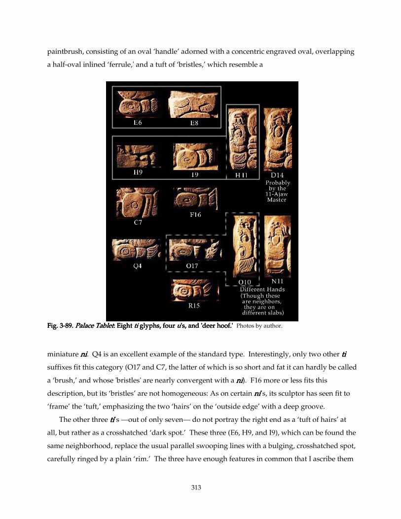
313
paintbrush, consisting of an oval ‘handle’ adorned with a concentric engraved oval, overlapping
a half-oval inlined ‘ferrule,' and a tuft of ‘bristles,’ which resemble a
Fig. 3Fig. 3Fig. 3Fig. 3----89.89.89.89. Palace TabletPalace TabletPalace TabletPalace Tablet: Eight : Eight : Eight : Eight titititi glyphs, four glyphs, four glyphs, four glyphs, four uuuu's, and 'deer hoof.''s, and 'deer hoof.''s, and 'deer hoof.''s, and 'deer hoof.' Photos by author.
miniature nininini. Q4 is an excellent example of the standard type. Interestingly, only two other titititi
suffixes fit this category (O17 and C7, the latter of which is so short and fat it can hardly be called
a ‘brush,’ and whose 'bristles' are nearly convergent with a nininini). F16 more or less fits this
description, but its ‘bristles’ are not homogeneous: As on certain nininini’s, its sculptor has seen fit to
‘frame’ the ‘tuft,’ emphasizing the two ‘hairs’ on the ‘outside edge’ with a deep groove.
The other three titititi’s —out of only seven— do not portray the right end as a ‘tuft of hairs’ at
all, but rather as a crosshatched ‘dark spot.’ These three (E6, H9, and I9), which can be found the
same neighborhood, replace the usual parallel swooping lines with a bulging, crosshatched spot,
carefully ringed by a plain ‘rim.’ The three have enough features in common that I ascribe them
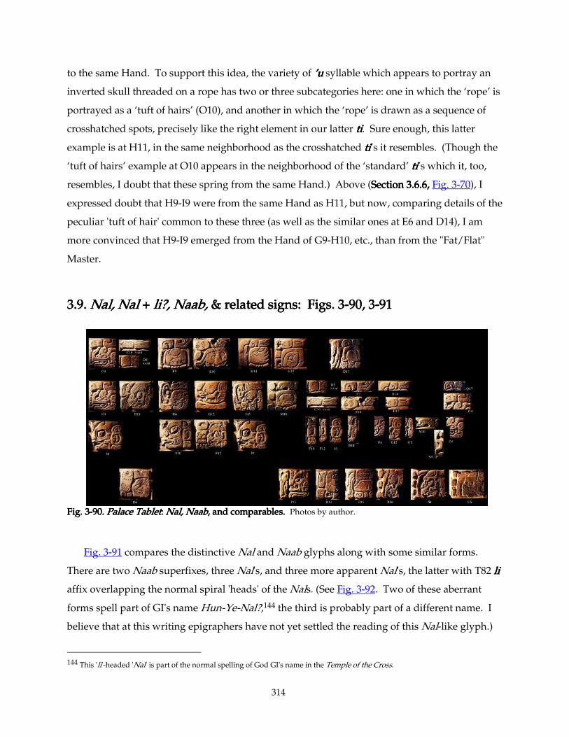
314
to the same Hand. To support this idea, the variety of ’u’u’u’u syllable which appears to portray an
inverted skull threaded on a rope has two or three subcategories here: one in which the ‘rope’ is
portrayed as a ‘tuft of hairs’ (O10), and another in which the ‘rope’ is drawn as a sequence of
crosshatched spots, precisely like the right element in our latter titititi. Sure enough, this latter
example is at H11, in the same neighborhood as the crosshatched titititi’s it resembles. (Though the
‘tuft of hairs’ example at O10 appears in the neighborhood of the ‘standard’ titititi’s which it, too,
resembles, I doubt that these spring from the same Hand.) Above (Section 3.6.6, Section 3.6.6, Section 3.6.6, Section 3.6.6, Fig. 3-70), I
expressed doubt that H9-I9 were from the same Hand as H11, but now, comparing details of the
peculiar 'tuft of hair' common to these three (as well as the similar ones at E6 and D14), I am
more convinced that H9-I9 emerged from the Hand of G9-H10, etc., than from the "Fat/Flat"
Master.
3.9. 3.9. 3.9. 3.9. Nal, Nal Nal, Nal Nal, Nal Nal, Nal ++++ li?, Naab, li?, Naab, li?, Naab, li?, Naab, & related signs: Figs. 3 & related signs: Figs. 3 & related signs: Figs. 3 & related signs: Figs. 3----90, 390, 390, 390, 3----91 91 91 91
Fig. 3Fig. 3Fig. 3Fig. 3----90.90.90.90. Palace TabletPalace TabletPalace TabletPalace Tablet: : : : Nal, NaabNal, NaabNal, NaabNal, Naab, and comparables., and comparables., and comparables., and comparables. Photos by author.
Fig. 3-91 compares the distinctive Nal and Naab glyphs along with some similar forms.
There are two Naab superfixes, three Nal's, and three more apparent Nal's, the latter with T82 lililili
affix overlapping the normal spiral 'heads' of the Nals. (See Fig. 3-92. Two of these aberrant
forms spell part of GI's name Hun-Ye-Nal?,144 the third is probably part of a different name. I
believe that at this writing epigraphers have not yet settled the reading of this Nal-like glyph.)
144 This 'li'-headed 'Nal' is part of the normal spelling of God GI's name in the Temple of the Cross.
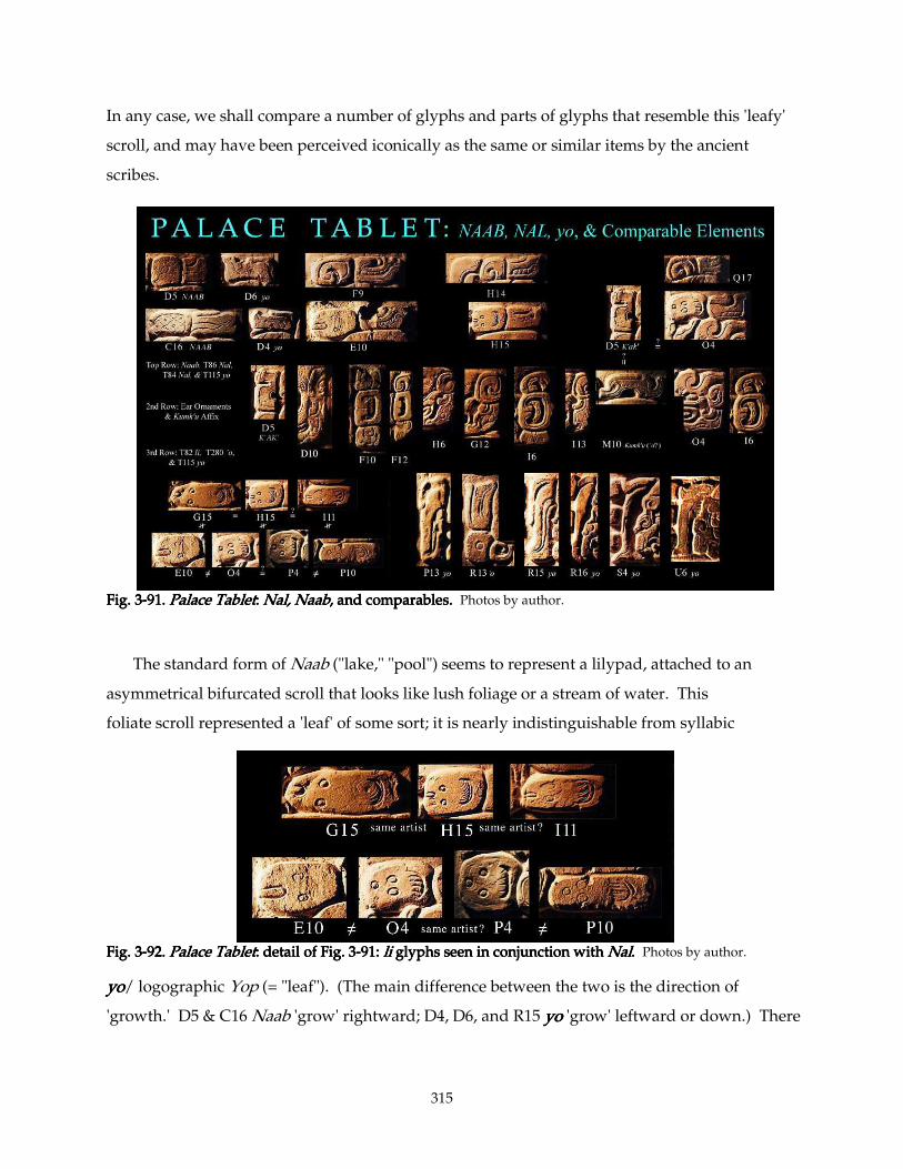
315
In any case, we shall compare a number of glyphs and parts of glyphs that resemble this 'leafy'
scroll, and may have been perceived iconically as the same or similar items by the ancient
scribes.
Fig. 3Fig. 3Fig. 3Fig. 3----91.91.91.91. Palace TabletPalace TabletPalace TabletPalace Tablet: : : : Nal, NaabNal, NaabNal, NaabNal, Naab, and comparables., and comparables., and comparables., and comparables. Photos by author.
The standard form of Naab ("lake," "pool") seems to represent a lilypad, attached to an
asymmetrical bifurcated scroll that looks like lush foliage or a stream of water. This
foliate scroll represented a 'leaf' of some sort; it is nearly indistinguishable from syllabic
Fig. 3Fig. 3Fig. 3Fig. 3----92.92.92.92. Palace TabletPalace TabletPalace TabletPalace Tablet:::: detail of Fig. 3 detail of Fig. 3 detail of Fig. 3 detail of Fig. 3----91: 91: 91: 91: li li li li glyphs seen in conjunction withglyphs seen in conjunction withglyphs seen in conjunction withglyphs seen in conjunction with Nal Nal Nal Nal.... Photos by author.
yoyoyoyo/ logographic Yop (= "leaf"). (The main difference between the two is the direction of
'growth.' D5 & C16 Naab 'grow' rightward; D4, D6, and R15 yoyoyoyo 'grow' leftward or down.) There
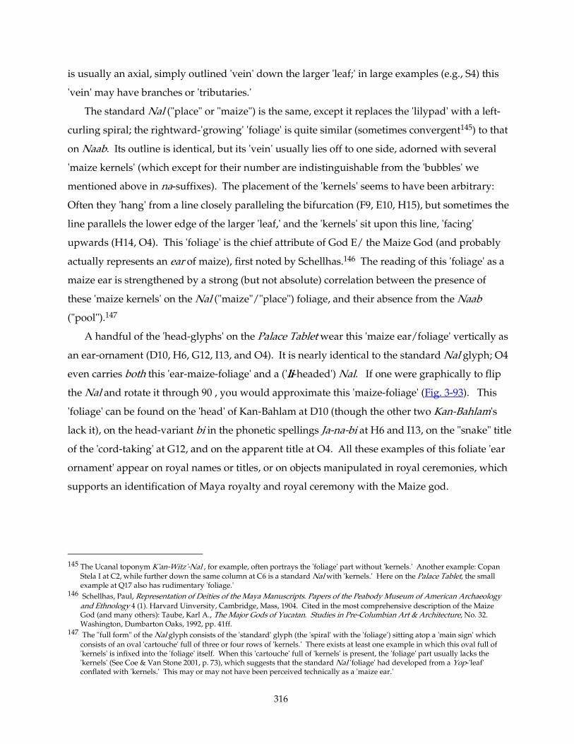
316
is usually an axial, simply outlined 'vein' down the larger 'leaf;' in large examples (e.g., S4) this
'vein' may have branches or 'tributaries.'
The standard Nal ("place" or "maize") is the same, except it replaces the 'lilypad' with a left-
curling spiral; the rightward-'growing' 'foliage' is quite similar (sometimes convergent145) to that
on Naab. Its outline is identical, but its 'vein' usually lies off to one side, adorned with several
'maize kernels' (which except for their number are indistinguishable from the 'bubbles' we
mentioned above in na-suffixes). The placement of the 'kernels' seems to have been arbitrary:
Often they 'hang' from a line closely paralleling the bifurcation (F9, E10, H15), but sometimes the
line parallels the lower edge of the larger 'leaf,' and the 'kernels' sit upon this line, 'facing'
upwards (H14, O4). This 'foliage' is the chief attribute of God E/ the Maize God (and probably
actually represents an ear of maize), first noted by Schellhas.146 The reading of this 'foliage' as a
maize ear is strengthened by a strong (but not absolute) correlation between the presence of
these 'maize kernels' on the Nal ("maize"/"place") foliage, and their absence from the Naab
("pool").147
A handful of the 'head-glyphs' on the Palace Tablet wear this 'maize ear/foliage' vertically as
an ear-ornament (D10, H6, G12, I13, and O4). It is nearly identical to the standard Nal glyph; O4
even carries both this 'ear-maize-foliage' and a ('lililili-headed') Nal. If one were graphically to flip
the Nal and rotate it through 90°, you would approximate this 'maize-foliage' (Fig. 3-93). This
'foliage' can be found on the 'head' of Kan-Bahlam at D10 (though the other two Kan-Bahlam's
lack it), on the head-variant bi in the phonetic spellings Ja-na-bi at H6 and I13, on the "snake" title
of the 'cord-taking' at G12, and on the apparent title at O4. All these examples of this foliate 'ear
ornament' appear on royal names or titles, or on objects manipulated in royal ceremonies, which
supports an identification of Maya royalty and royal ceremony with the Maize god.
145 The Ucanal toponym K'an-Witz'-Nal , for example, often portrays the 'foliage' part without 'kernels.' Another example: Copan
Stela I at C2, while further down the same column at C6 is a standard Nal with 'kernels.' Here on the Palace Tablet, the small example at Q17 also has rudimentary 'foliage.'
146 Schellhas, Paul, Representation of Deities of the Maya Manuscripts. Papers of the Peabody Museum of American Archaeology and Ethnology 4 (1). Harvard Uinversity, Cambridge, Mass, 1904. Cited in the most comprehensive description of the Maize God (and many others): Taube, Karl A., The Major Gods of Yucatan. Studies in Pre-Columbian Art & Architecture, No. 32. Washington, Dumbarton Oaks, 1992, pp. 41ff.
147 The "full form" of the Nal glyph consists of the 'standard' glyph (the 'spiral' with the 'foliage') sitting atop a 'main sign' which consists of an oval 'cartouche' full of three or four rows of 'kernels.' There exists at least one example in which this oval full of 'kernels' is infixed into the 'foliage' itself. When this 'cartouche' full of 'kernels' is present, the 'foliage' part usually lacks the 'kernels' (See Coe & Van Stone 2001, p. 73), which suggests that the standard Nal 'foliage' had developed from a Yop-'leaf' conflated with 'kernels.' This may or may not have been perceived technically as a 'maize ear.'
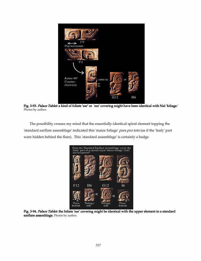
317
Fig. 3Fig. 3Fig. 3Fig. 3----93.93.93.93. Palace TabletPalace TabletPalace TabletPalace Tablet: a kind of foliate 'ear' or 'ear' covering might have been identical with Nal 'foliage.': a kind of foliate 'ear' or 'ear' covering might have been identical with Nal 'foliage.': a kind of foliate 'ear' or 'ear' covering might have been identical with Nal 'foliage.': a kind of foliate 'ear' or 'ear' covering might have been identical with Nal 'foliage.' Photos by author.
The possibility crosses my mind that the essentially-identical spiral element topping the
'standard earflare assemblage' indicated this 'maize foliage' pars pro toto (as if the 'leafy' part
were hidden behind the flare). This 'standard assemblage' is certainly a badge
Fig. 3Fig. 3Fig. 3Fig. 3----94.94.94.94. Palace TabletPalace TabletPalace TabletPalace Tablet: the foliate 'ear' covering might be identical with the upper element in a: the foliate 'ear' covering might be identical with the upper element in a: the foliate 'ear' covering might be identical with the upper element in a: the foliate 'ear' covering might be identical with the upper element in a standard standard standard standard earflare assemblage. earflare assemblage. earflare assemblage. earflare assemblage. Photos by author.
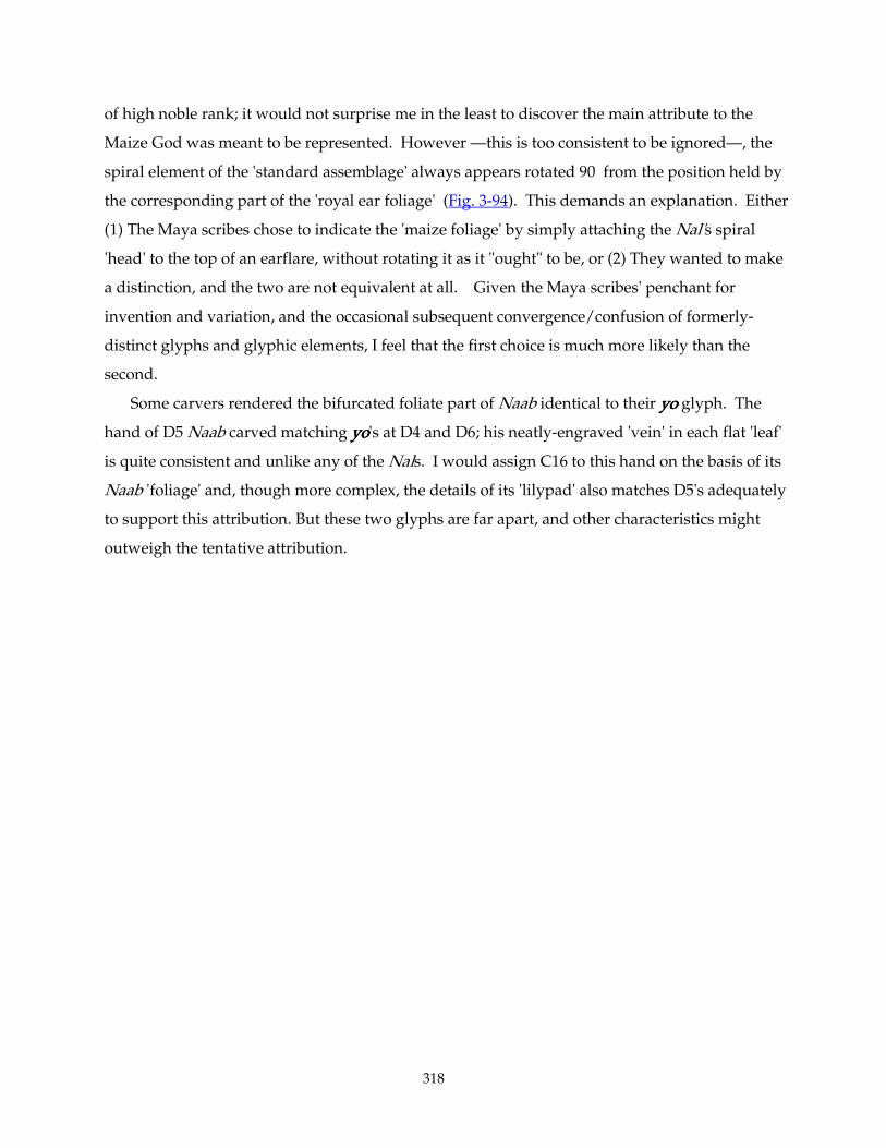
318
of high noble rank; it would not surprise me in the least to discover the main attribute to the
Maize God was meant to be represented. However —this is too consistent to be ignored—, the
spiral element of the 'standard assemblage' always appears rotated 90° from the position held by
the corresponding part of the 'royal ear foliage' (Fig. 3-94). This demands an explanation. Either
(1) The Maya scribes chose to indicate the 'maize foliage' by simply attaching the Nal's spiral
'head' to the top of an earflare, without rotating it as it "ought" to be, or (2) They wanted to make
a distinction, and the two are not equivalent at all. Given the Maya scribes' penchant for
invention and variation, and the occasional subsequent convergence/confusion of formerly-
distinct glyphs and glyphic elements, I feel that the first choice is much more likely than the
second.
Some carvers rendered the bifurcated foliate part of Naab identical to their yoyoyoyo glyph. The
hand of D5 Naab carved matching yoyoyoyo's at D4 and D6; his neatly-engraved 'vein' in each flat 'leaf'
is quite consistent and unlike any of the Nals. I would assign C16 to this hand on the basis of its
Naab 'foliage' and, though more complex, the details of its 'lilypad' also matches D5's adequately
to support this attribution. But these two glyphs are far apart, and other characteristics might
outweigh the tentative attribution.
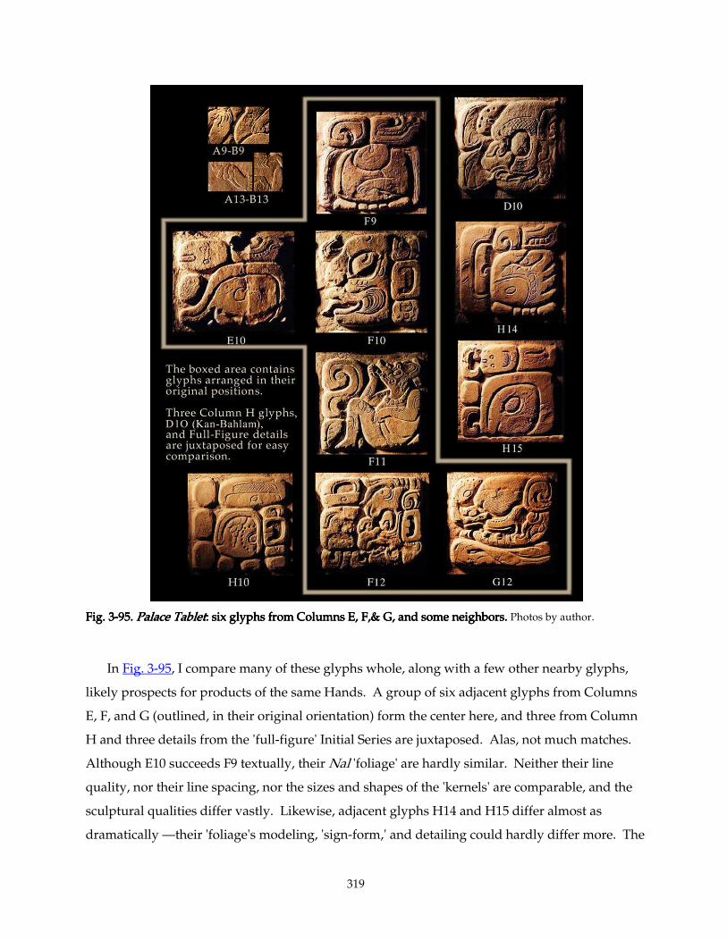
319
Fig. 3Fig. 3Fig. 3Fig. 3----95.95.95.95. Palace TabletPalace TabletPalace TabletPalace Tablet: six glyphs from Columns E, F,& G, and some neighbors. : six glyphs from Columns E, F,& G, and some neighbors. : six glyphs from Columns E, F,& G, and some neighbors. : six glyphs from Columns E, F,& G, and some neighbors. Photos by author.
In Fig. 3-95, I compare many of these glyphs whole, along with a few other nearby glyphs,
likely prospects for products of the same Hands. A group of six adjacent glyphs from Columns
E, F, and G (outlined, in their original orientation) form the center here, and three from Column
H and three details from the 'full-figure' Initial Series are juxtaposed. Alas, not much matches.
Although E10 succeeds F9 textually, their Nal 'foliage' are hardly similar. Neither their line
quality, nor their line spacing, nor the sizes and shapes of the 'kernels' are comparable, and the
sculptural qualities differ vastly. Likewise, adjacent glyphs H14 and H15 differ almost as
dramatically —their 'foliage's modeling, 'sign-form,' and detailing could hardly differ more. The
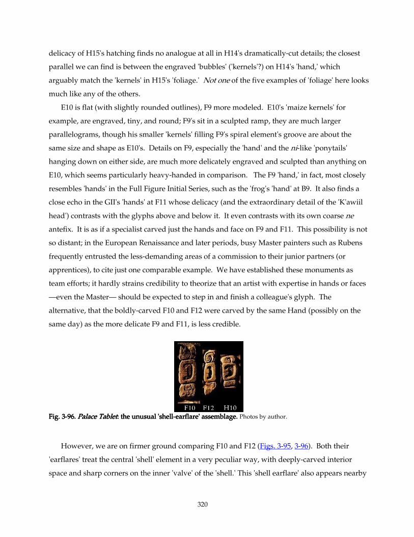
320
delicacy of H15's hatching finds no analogue at all in H14's dramatically-cut details; the closest
parallel we can find is between the engraved 'bubbles' ('kernels'?) on H14's 'hand,' which
arguably match the 'kernels' in H15's 'foliage.' Not one of the five examples of 'foliage' here looks
much like any of the others.
E10 is flat (with slightly rounded outlines), F9 more modeled. E10's 'maize kernels' for
example, are engraved, tiny, and round; F9's sit in a sculpted ramp, they are much larger
parallelograms, though his smaller 'kernels' filling F9's spiral element's groove are about the
same size and shape as E10's. Details on F9, especially the 'hand' and the ni-like 'ponytails'
hanging down on either side, are much more delicately engraved and sculpted than anything on
E10, which seems particularly heavy-handed in comparison. The F9 'hand,' in fact, most closely
resembles 'hands' in the Full Figure Initial Series, such as the 'frog's 'hand' at B9. It also finds a
close echo in the GII's 'hands' at F11 whose delicacy (and the extraordinary detail of the 'K'awiil
head') contrasts with the glyphs above and below it. It even contrasts with its own coarse ne
antefix. It is as if a specialist carved just the hands and face on F9 and F11. This possibility is not
so distant; in the European Renaissance and later periods, busy Master painters such as Rubens
frequently entrusted the less-demanding areas of a commission to their junior partners (or
apprentices), to cite just one comparable example. We have established these monuments as
team efforts; it hardly strains credibility to theorize that an artist with expertise in hands or faces
—even the Master— should be expected to step in and finish a colleague's glyph. The
alternative, that the boldly-carved F10 and F12 were carved by the same Hand (possibly on the
same day) as the more delicate F9 and F11, is less credible.
Fig. 3Fig. 3Fig. 3Fig. 3----96.96.96.96. Palace TabletPalace TabletPalace TabletPalace Tablet: the unusual 'shell: the unusual 'shell: the unusual 'shell: the unusual 'shell----earflare' assemblage. earflare' assemblage. earflare' assemblage. earflare' assemblage. Photos by author.
However, we are on firmer ground comparing F10 and F12 (Figs. 3-95, 3-96). Both their
'earflares' treat the central 'shell' element in a very peculiar way, with deeply-carved interior
space and sharp corners on the inner 'valve' of the 'shell.' This 'shell earflare' also appears nearby
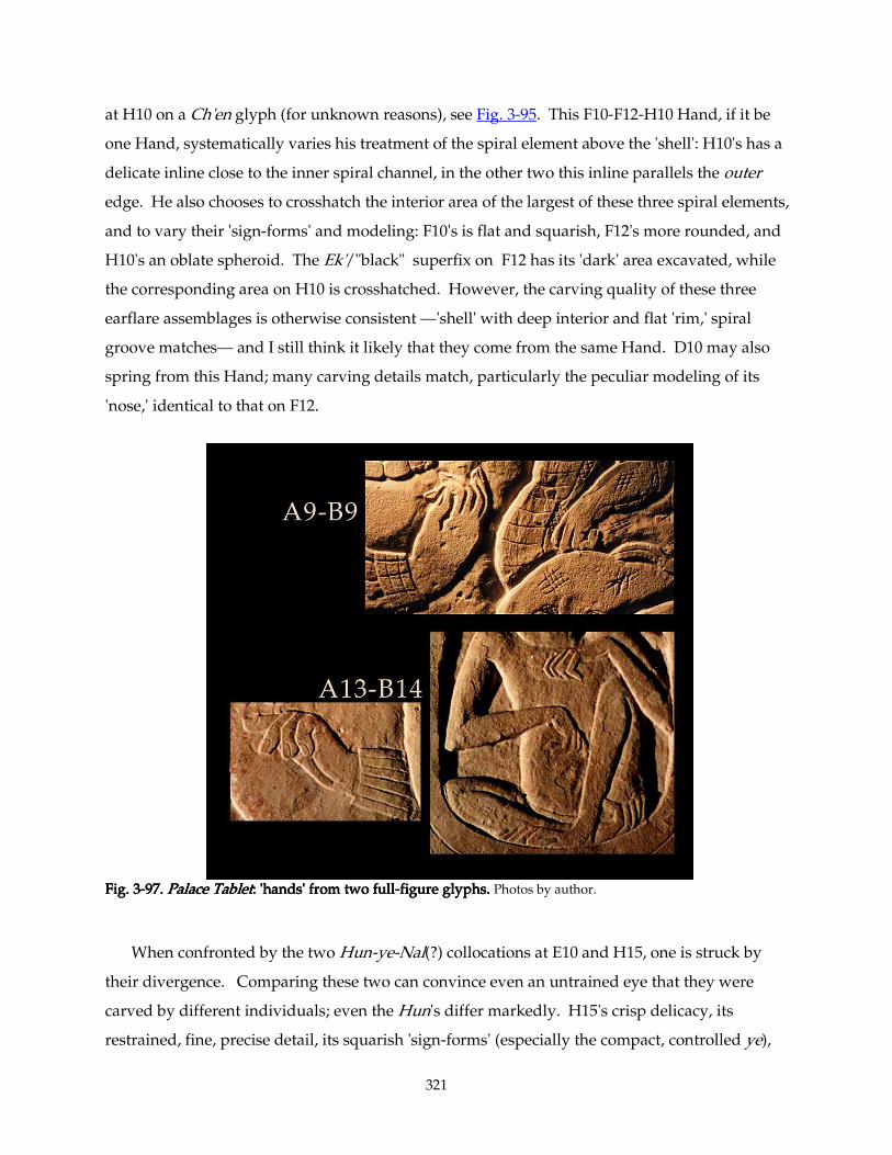
321
at H10 on a Ch'en glyph (for unknown reasons), see Fig. 3-95. This F10-F12-H10 Hand, if it be
one Hand, systematically varies his treatment of the spiral element above the 'shell': H10's has a
delicate inline close to the inner spiral channel, in the other two this inline parallels the outer
edge. He also chooses to crosshatch the interior area of the largest of these three spiral elements,
and to vary their 'sign-forms' and modeling: F10's is flat and squarish, F12's more rounded, and
H10's an oblate spheroid. The Ek'/"black" superfix on F12 has its 'dark' area excavated, while
the corresponding area on H10 is crosshatched. However, the carving quality of these three
earflare assemblages is otherwise consistent —'shell' with deep interior and flat 'rim,' spiral
groove matches— and I still think it likely that they come from the same Hand. D10 may also
spring from this Hand; many carving details match, particularly the peculiar modeling of its
'nose,' identical to that on F12.
Fig. 3Fig. 3Fig. 3Fig. 3----97.97.97.97. Palace TabletPalace TabletPalace TabletPalace Tablet: 'hands' from two full: 'hands' from two full: 'hands' from two full: 'hands' from two full----figure glyphs. figure glyphs. figure glyphs. figure glyphs. Photos by author.
When confronted by the two Hun-ye-Nal(?) collocations at E10 and H15, one is struck by
their divergence. Comparing these two can convince even an untrained eye that they were
carved by different individuals; even the Hun's differ markedly. H15's crisp delicacy, its
restrained, fine, precise detail, its squarish 'sign-forms' (especially the compact, controlled ye),
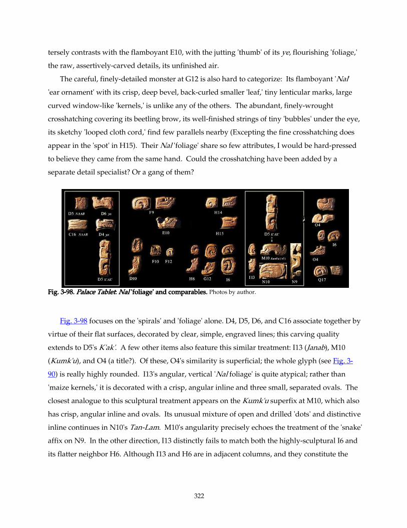
322
tersely contrasts with the flamboyant E10, with the jutting 'thumb' of its ye, flourishing 'foliage,'
the raw, assertively-carved details, its unfinished air.
The careful, finely-detailed monster at G12 is also hard to categorize: Its flamboyant 'Nal'
'ear ornament' with its crisp, deep bevel, back-curled smaller 'leaf,' tiny lenticular marks, large
curved window-like 'kernels,' is unlike any of the others. The abundant, finely-wrought
crosshatching covering its beetling brow, its well-finished strings of tiny 'bubbles' under the eye,
its sketchy 'looped cloth cord,' find few parallels nearby (Excepting the fine crosshatching does
appear in the 'spot' in H15). Their Nal 'foliage' share so few attributes, I would be hard-pressed
to believe they came from the same hand. Could the crosshatching have been added by a
separate detail specialist? Or a gang of them?
Fig. 3Fig. 3Fig. 3Fig. 3----98.98.98.98. Palace TabletPalace TabletPalace TabletPalace Tablet: : : : NalNalNalNal 'foliage' and comparables. 'foliage' and comparables. 'foliage' and comparables. 'foliage' and comparables. Photos by author.
Fig. 3-98 focuses on the 'spirals' and 'foliage' alone. D4, D5, D6, and C16 associate together by
virtue of their flat surfaces, decorated by clear, simple, engraved lines; this carving quality
extends to D5's K'ak'. A few other items also feature this similar treatment: I13 (Janab), M10
(Kumk'u), and O4 (a title?). Of these, O4's similarity is superficial; the whole glyph (see Fig. 3-
90) is really highly rounded. I13's angular, vertical 'Nal foliage' is quite atypical; rather than
'maize kernels,' it is decorated with a crisp, angular inline and three small, separated ovals. The
closest analogue to this sculptural treatment appears on the Kumk'u superfix at M10, which also
has crisp, angular inline and ovals. Its unusual mixture of open and drilled 'dots' and distinctive
inline continues in N10's Tan-Lam. M10's angularity precisely echoes the treatment of the 'snake'
affix on N9. In the other direction, I13 distinctly fails to match both the highly-sculptural I6 and
its flatter neighbor H6. Although I13 and H6 are in adjacent columns, and they constitute the
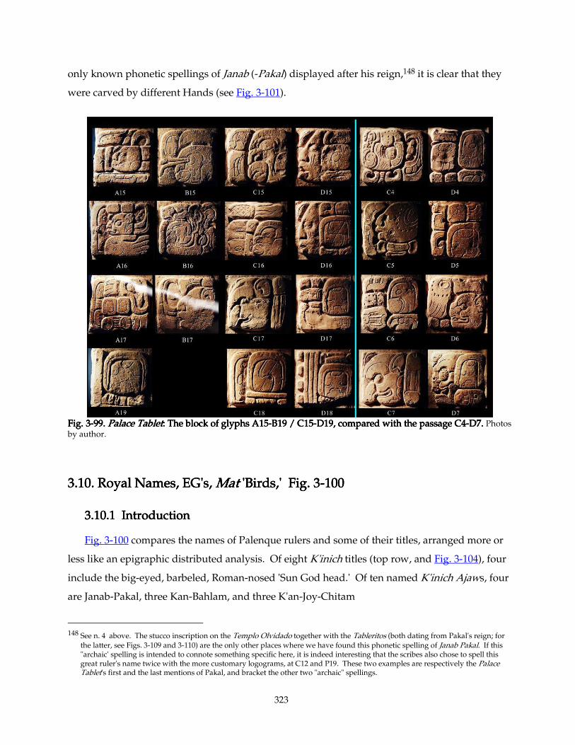
323
only known phonetic spellings of Janab (-Pakal) displayed after his reign,148 it is clear that they
were carved by different Hands (see Fig. 3-101).
Fig. 3Fig. 3Fig. 3Fig. 3----99.99.99.99. Palace TabletPalace TabletPalace TabletPalace Tablet: The block of glyphs A15: The block of glyphs A15: The block of glyphs A15: The block of glyphs A15----B19 / C15B19 / C15B19 / C15B19 / C15----D19, compared with the passage C4D19, compared with the passage C4D19, compared with the passage C4D19, compared with the passage C4----D7. D7. D7. D7. Photos by author.
3.10.3.10.3.10.3.10. Royal NamRoyal NamRoyal NamRoyal Names, Ees, Ees, Ees, EGGGG's, 's, 's, 's, MatMatMatMat 'Birds,' Fig. 3 'Birds,' Fig. 3 'Birds,' Fig. 3 'Birds,' Fig. 3----100100100100
3.10.1 Introduction3.10.1 Introduction3.10.1 Introduction3.10.1 Introduction
Fig. 3-100 compares the names of Palenque rulers and some of their titles, arranged more or
less like an epigraphic distributed analysis. Of eight K'inich titles (top row, and Fig. 3-104), four
include the big-eyed, barbeled, Roman-nosed 'Sun God head.' Of ten named K'inich Ajaws, four
are Janab-Pakal, three Kan-Bahlam, and three K'an-Joy-Chitam
148 See n. 4 above. The stucco inscription on the Templo Olvidado together with the Tableritos (both dating from Pakal's reign; for
the latter, see Figs. 3-109 and 3-110) are the only other places where we have found this phonetic spelling of Janab Pakal. If this "archaic' spelling is intended to connote something specific here, it is indeed interesting that the scribes also chose to spell this great ruler's name twice with the more customary logograms, at C12 and P19. These two examples are respectively the Palace Tablet's first and the last mentions of Pakal, and bracket the other two "archaic" spellings.
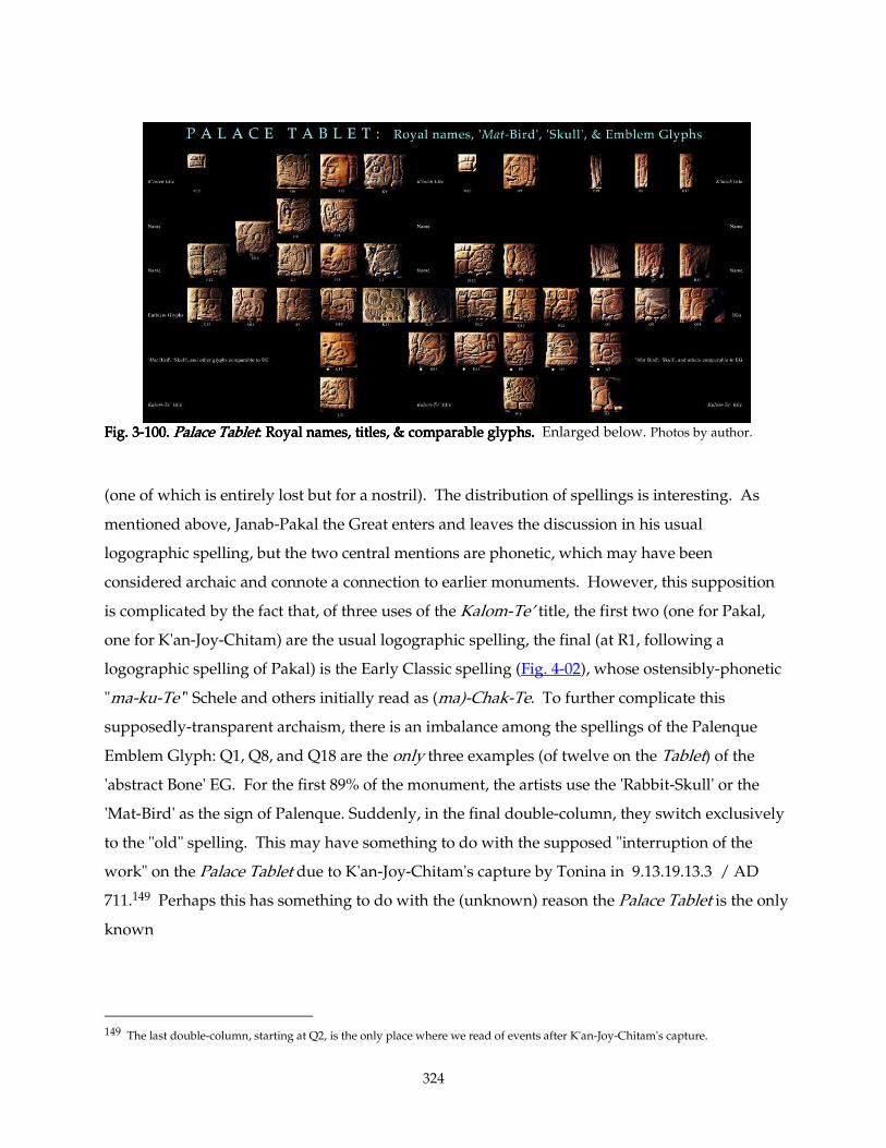
324
Fig. 3Fig. 3Fig. 3Fig. 3----100.100.100.100. Palace TabletPalace TabletPalace TabletPalace Tablet: Royal names, titl: Royal names, titl: Royal names, titl: Royal names, titles, & comparable glyphs.es, & comparable glyphs.es, & comparable glyphs.es, & comparable glyphs. Enlarged below. Photos by author.
(one of which is entirely lost but for a nostril). The distribution of spellings is interesting. As
mentioned above, Janab-Pakal the Great enters and leaves the discussion in his usual
logographic spelling, but the two central mentions are phonetic, which may have been
considered archaic and connote a connection to earlier monuments. However, this supposition
is complicated by the fact that, of three uses of the Kalom-Te’ title, the first two (one for Pakal,
one for K'an-Joy-Chitam) are the usual logographic spelling, the final (at R1, following a
logographic spelling of Pakal) is the Early Classic spelling (Fig. 4-02), whose ostensibly-phonetic
"ma-ku-Te'" Schele and others initially read as (ma)-Chak-Te. To further complicate this
supposedly-transparent archaism, there is an imbalance among the spellings of the Palenque
Emblem Glyph: Q1, Q8, and Q18 are the only three examples (of twelve on the Tablet) of the
'abstract Bone' EG. For the first 89% of the monument, the artists use the 'Rabbit-Skull' or the
'Mat-Bird' as the sign of Palenque. Suddenly, in the final double-column, they switch exclusively
to the "old" spelling. This may have something to do with the supposed "interruption of the
work" on the Palace Tablet due to K'an-Joy-Chitam's capture by Tonina in 9.13.19.13.3 / AD
711.149 Perhaps this has something to do with the (unknown) reason the Palace Tablet is the only
known
149 The last double-column, starting at Q2, is the only place where we read of events after K'an-Joy-Chitam's capture.
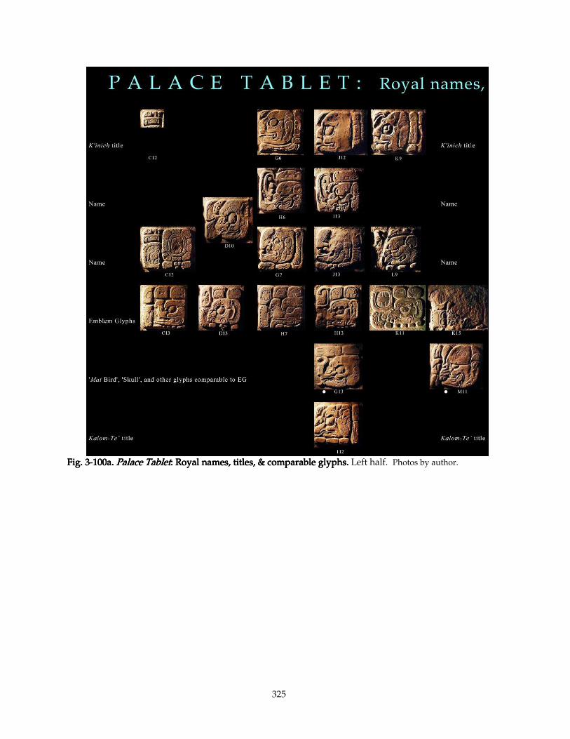
325
Fig. 3Fig. 3Fig. 3Fig. 3----100a.100a.100a.100a. Palace TabletPalace TabletPalace TabletPalace Tablet: : : : Royal names, titles, & comparable glyphs.Royal names, titles, & comparable glyphs.Royal names, titles, & comparable glyphs.Royal names, titles, & comparable glyphs. Left half. Photos by author.
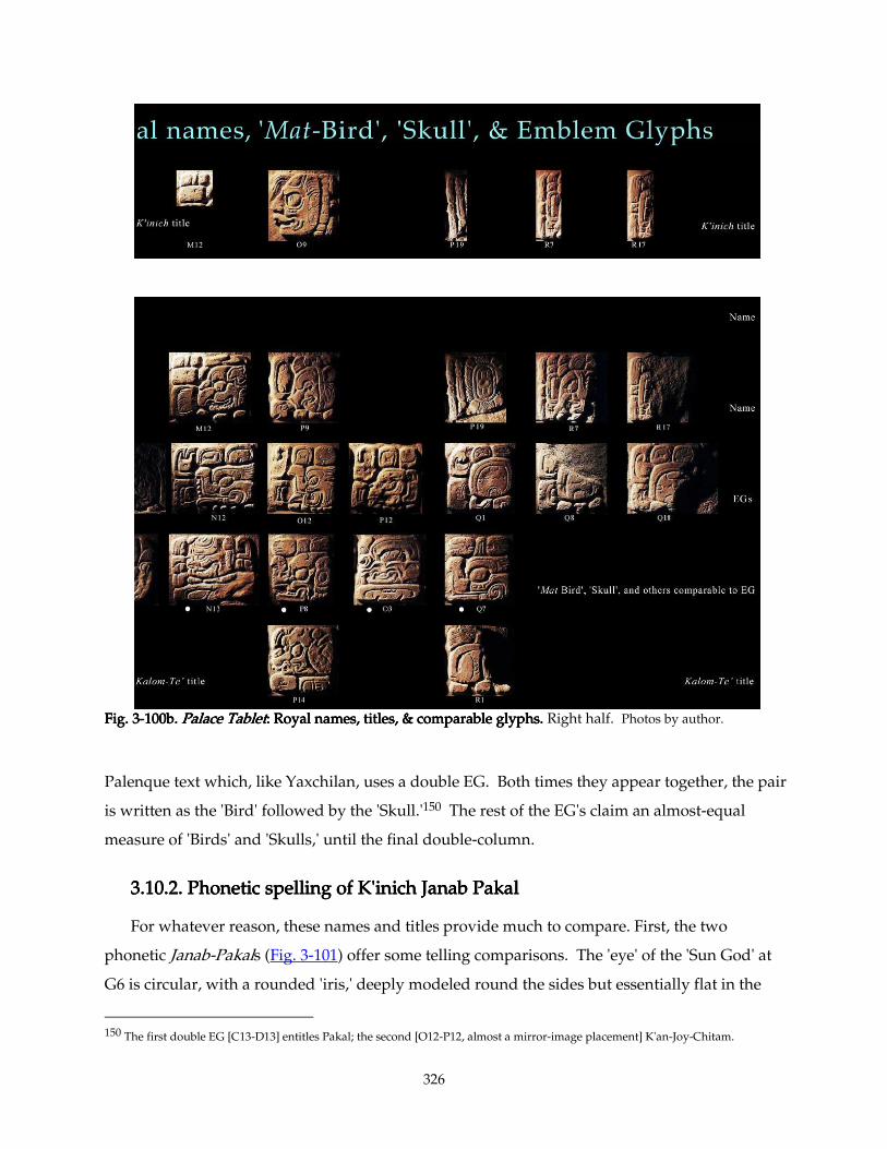
326
Fig. 3Fig. 3Fig. 3Fig. 3----100b.100b.100b.100b. Palace TabletPalace TabletPalace TabletPalace Tablet: Royal names, titles, & comparable glyphs.: Royal names, titles, & comparable glyphs.: Royal names, titles, & comparable glyphs.: Royal names, titles, & comparable glyphs. Right half. Photos by author.
Palenque text which, like Yaxchilan, uses a double EG. Both times they appear together, the pair
is written as the 'Bird' followed by the 'Skull.'150 The rest of the EG's claim an almost-equal
measure of 'Birds' and 'Skulls,' until the final double-column.
3.10.2. 3.10.2. 3.10.2. 3.10.2. PPPPhonetic spelling of K'inich Janab Pakalhonetic spelling of K'inich Janab Pakalhonetic spelling of K'inich Janab Pakalhonetic spelling of K'inich Janab Pakal
For whatever reason, these names and titles provide much to compare. First, the two
phonetic Janab-Pakals (Fig. 3-101) offer some telling comparisons. The 'eye' of the 'Sun God' at
G6 is circular, with a rounded 'iris,' deeply modeled round the sides but essentially flat in the
150 The first double EG [C13-D13] entitles Pakal; the second [O12-P12, almost a mirror-image placement] K'an-Joy-Chitam.
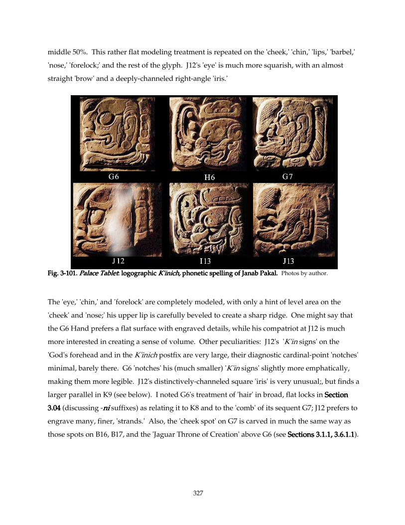
327
middle 50%. This rather flat modeling treatment is repeated on the 'cheek,' 'chin,' 'lips,' 'barbel,'
'nose,' 'forelock;' and the rest of the glyph. J12's 'eye' is much more squarish, with an almost
straight 'brow' and a deeply-channeled right-angle 'iris.'
Fig. 3Fig. 3Fig. 3Fig. 3----101.101.101.101. Palace TabletPalace TabletPalace TabletPalace Tablet: logographic : logographic : logographic : logographic K'inich,K'inich,K'inich,K'inich, phonetic spelling of Janab Pakal. phonetic spelling of Janab Pakal. phonetic spelling of Janab Pakal. phonetic spelling of Janab Pakal. Photos by author.
The 'eye,' 'chin,' and 'forelock' are completely modeled, with only a hint of level area on the
'cheek' and 'nose;' his upper lip is carefully beveled to create a sharp ridge. One might say that
the G6 Hand prefers a flat surface with engraved details, while his compatriot at J12 is much
more interested in creating a sense of volume. Other peculiarities: J12's 'K'in signs' on the
'God's forehead and in the K'inich postfix are very large, their diagnostic cardinal-point 'notches'
minimal, barely there. G6 'notches' his (much smaller) 'K'in signs' slightly more emphatically,
making them more legible. J12's distinctively-channeled square 'iris' is very unusual;, but finds a
larger parallel in K9 (see below). I noted G6's treatment of 'hair' in broad, flat locks in Section Section Section Section
3.043.043.043.04 (discussing -nininini suffixes) as relating it to K8 and to the 'comb' of its sequent G7; J12 prefers to
engrave many, finer, 'strands.' Also, the 'cheek spot' on G7 is carved in much the same way as
those spots on B16, B17, and the 'Jaguar Throne of Creation' above G6 (see Sections 3.1.1, 3.6.1.1Sections 3.1.1, 3.6.1.1Sections 3.1.1, 3.6.1.1Sections 3.1.1, 3.6.1.1).
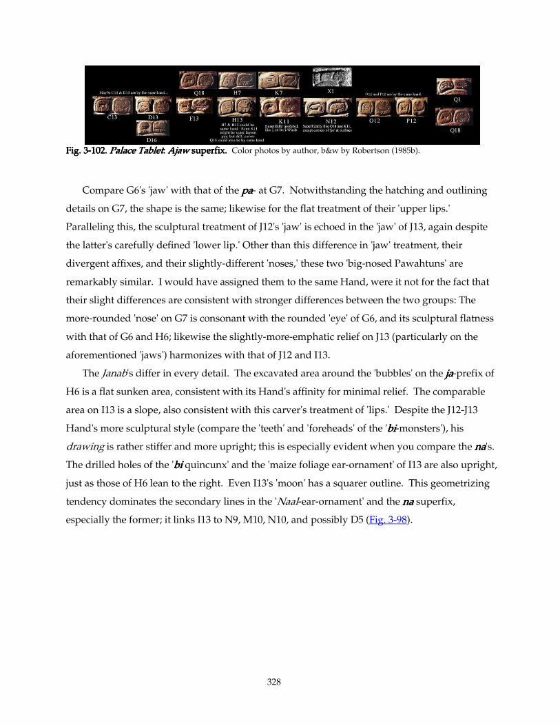
328
Fig. 3Fig. 3Fig. 3Fig. 3----102.102.102.102. Palace TabletPalace TabletPalace TabletPalace Tablet: : : : AjawAjawAjawAjaw superfix. superfix. superfix. superfix. Color photos by author, b&w by Robertson (1985b).
Compare G6's 'jaw' with that of the papapapa- at G7. Notwithstanding the hatching and outlining
details on G7, the shape is the same; likewise for the flat treatment of their 'upper lips.'
Paralleling this, the sculptural treatment of J12's 'jaw' is echoed in the 'jaw' of J13, again despite
the latter's carefully defined 'lower lip.' Other than this difference in 'jaw' treatment, their
divergent affixes, and their slightly-different 'noses,' these two 'big-nosed Pawahtuns' are
remarkably similar. I would have assigned them to the same Hand, were it not for the fact that
their slight differences are consistent with stronger differences between the two groups: The
more-rounded 'nose' on G7 is consonant with the rounded 'eye' of G6, and its sculptural flatness
with that of G6 and H6; likewise the slightly-more-emphatic relief on J13 (particularly on the
aforementioned 'jaws') harmonizes with that of J12 and I13.
The Janab's differ in every detail. The excavated area around the 'bubbles' on the jajajaja-prefix of
H6 is a flat sunken area, consistent with its Hand's affinity for minimal relief. The comparable
area on I13 is a slope, also consistent with this carver's treatment of 'lips.' Despite the J12-J13
Hand's more sculptural style (compare the 'teeth' and 'foreheads' of the 'bibibibi-monsters'), his
drawing is rather stiffer and more upright; this is especially evident when you compare the nananana's.
The drilled holes of the 'bibibibi quincunx' and the 'maize foliage ear-ornament' of I13 are also upright,
just as those of H6 lean to the right. Even I13's 'moon' has a squarer outline. This geometrizing
tendency dominates the secondary lines in the 'Naal-ear-ornament' and the nananana superfix,
especially the former; it links I13 to N9, M10, N10, and possibly D5 (Fig. 3-98).
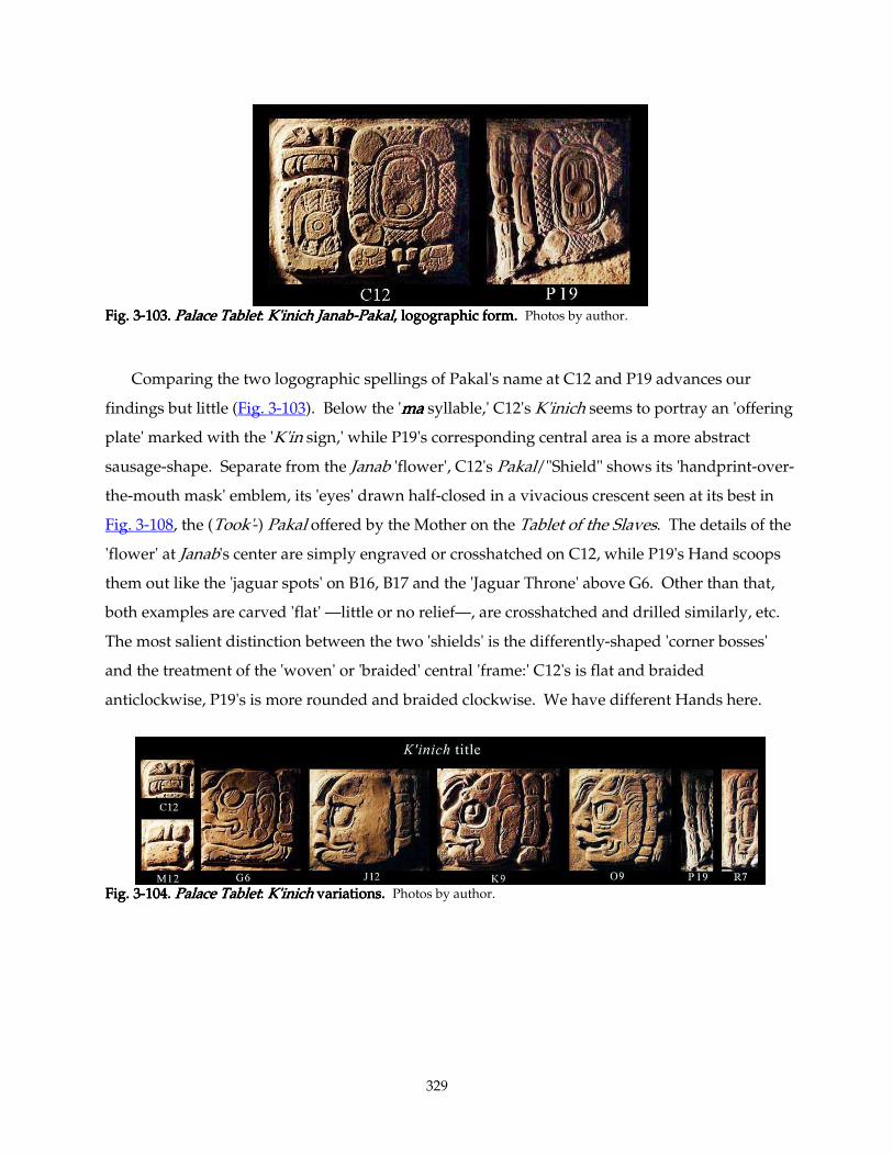
329
Fig. 3Fig. 3Fig. 3Fig. 3----103.103.103.103. Palace TabletPalace TabletPalace TabletPalace Tablet: : : : K'inich JanabK'inich JanabK'inich JanabK'inich Janab----PakalPakalPakalPakal, logographic form, logographic form, logographic form, logographic form.... Photos by author.
Comparing the two logographic spellings of Pakal's name at C12 and P19 advances our
findings but little (Fig. 3-103). Below the 'mamamama syllable,' C12's K'inich seems to portray an 'offering
plate' marked with the 'K'in sign,' while P19's corresponding central area is a more abstract
sausage-shape. Separate from the Janab 'flower', C12's Pakal/"Shield" shows its 'handprint-over-
the-mouth mask' emblem, its 'eyes' drawn half-closed in a vivacious crescent seen at its best in
Fig. 3-108, the (Took'-) Pakal offered by the Mother on the Tablet of the Slaves. The details of the
'flower' at Janab's center are simply engraved or crosshatched on C12, while P19's Hand scoops
them out like the 'jaguar spots' on B16, B17 and the 'Jaguar Throne' above G6. Other than that,
both examples are carved 'flat' —little or no relief—, are crosshatched and drilled similarly, etc.
The most salient distinction between the two 'shields' is the differently-shaped 'corner bosses'
and the treatment of the 'woven' or 'braided' central 'frame:' C12's is flat and braided
anticlockwise, P19's is more rounded and braided clockwise. We have different Hands here.
Fig. 3Fig. 3Fig. 3Fig. 3----104.104.104.104. Palace TabletPalace TabletPalace TabletPalace Tablet: : : : K'inich K'inich K'inich K'inich variations.variations.variations.variations. Photos by author.
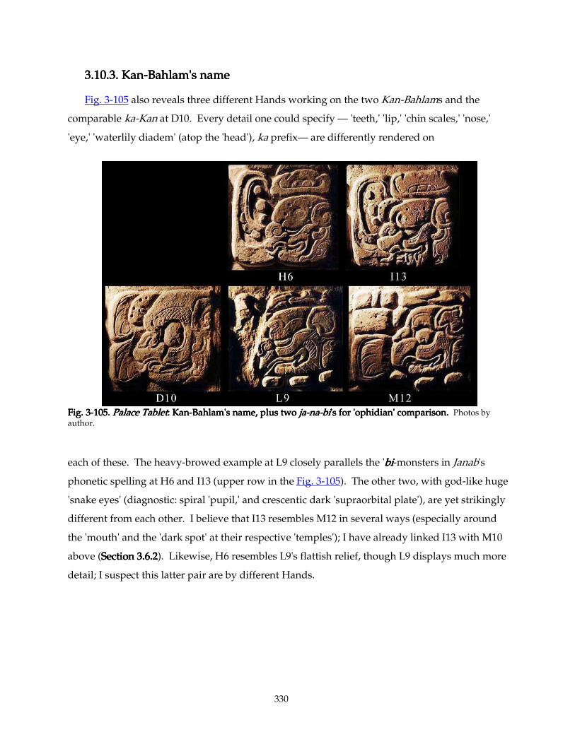
330
3.10.3. Kan3.10.3. Kan3.10.3. Kan3.10.3. Kan----Bahlam's nameBahlam's nameBahlam's nameBahlam's name
Fig. 3-105 also reveals three different Hands working on the two Kan-Bahlams and the
comparable ka-Kan at D10. Every detail one could specify — 'teeth,' 'lip,' 'chin scales,' 'nose,'
'eye,' 'waterlily diadem' (atop the 'head'), ka prefix— are differently rendered on
Fig. 3Fig. 3Fig. 3Fig. 3----105.105.105.105. Palace TabletPalace TabletPalace TabletPalace Tablet: : : : KanKanKanKan----BahlaBahlaBahlaBahlam's name, plus two m's name, plus two m's name, plus two m's name, plus two jajajaja----nananana----bibibibi's for 'ophidian' comparison.'s for 'ophidian' comparison.'s for 'ophidian' comparison.'s for 'ophidian' comparison. Photos by author.
each of these. The heavy-browed example at L9 closely parallels the 'bibibibi-monsters in Janab's
phonetic spelling at H6 and I13 (upper row in the Fig. 3-105). The other two, with god-like huge
'snake eyes' (diagnostic: spiral 'pupil,' and crescentic dark 'supraorbital plate'), are yet strikingly
different from each other. I believe that I13 resembles M12 in several ways (especially around
the 'mouth' and the 'dark spot' at their respective 'temples'); I have already linked I13 with M10
above (Section 3.6.2Section 3.6.2Section 3.6.2Section 3.6.2). Likewise, H6 resembles L9's flattish relief, though L9 displays much more
detail; I suspect this latter pair are by different Hands.
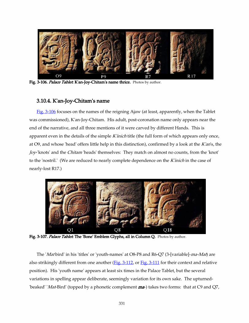
331
Fig. 3Fig. 3Fig. 3Fig. 3----106106106106.... Palace TabletPalace TabletPalace TabletPalace Tablet: : : : K'anK'anK'anK'an----JoyJoyJoyJoy----Chitam's name thrice.Chitam's name thrice.Chitam's name thrice.Chitam's name thrice. Photos by author.
3.10.4. K'an3.10.4. K'an3.10.4. K'an3.10.4. K'an----JoyJoyJoyJoy----Chitam's nameChitam's nameChitam's nameChitam's name
Fig. 3-106 focuses on the names of the reigning Ajaw (at least, apparently, when the Tablet
was commissioned), K'an-Joy-Chitam. His adult, post-coronation name only appears near the
end of the narrative, and all three mentions of it were carved by different Hands. This is
apparent even in the details of the simple K'inich title (the full form of which appears only once,
at O9, and whose 'head' offers little help in this distinction), confirmed by a look at the K'an's, the
Joy-'knots' and the Chitam 'heads' themselves: They match on almost no counts, from the 'knot'
to the 'nostril.' (We are reduced to nearly complete dependence on the K'inich in the case of
nearly-lost R17.)
Fig. 3Fig. 3Fig. 3Fig. 3----107.107.107.107. Palace TabletPalace TabletPalace TabletPalace Tablet: : : : The 'Bone' Emblem Glyphs, all in Column Q.The 'Bone' Emblem Glyphs, all in Column Q.The 'Bone' Emblem Glyphs, all in Column Q.The 'Bone' Emblem Glyphs, all in Column Q. Photos by author.
The 'Mat bird' in his 'titles' or 'youth-names' at O8-P8 and R6-Q7 (3-[variable]-ma-Mat) are
also strikingly different from one another (Fig. 3-112, or Fig. 3-111 for their context and relative
position). His 'youth name' appears at least six times in the Palace Tablet, but the several
variations in spelling appear deliberate, seemingly variation for its own sake. The upturned-
'beaked' 'Mat-Bird' (topped by a phonetic complement mamamama-) takes two forms: that at C9 and Q7,
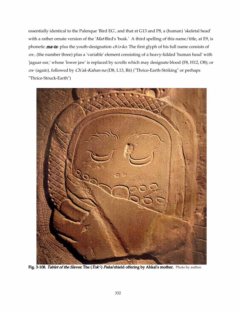
332
essentially identical to the Palenque 'Bird EG', and that at G13 and P8, a (human) 'skeletal head'
with a rather ornate version of the 'Mat-Bird's 'beak.' A third spelling of this name/title, at E9, is
phonetic mamamama----tatatata- plus the youth-designation ch'o-ko. The first glyph of his full name consists of
ox-, (the number three) plus a 'variable' element consisting of a heavy-lidded 'human head' with
'jaguar ear,' whose 'lower jaw' is replaced by scrolls which may designate blood (F8, H12, O8); or
ox- (again), followed by Ch'ak-Kaban-na (D8, L13, R6) ("Thrice-Earth-Striking" or perhaps
"Thrice-Struck-Earth")
Fig. 3Fig. 3Fig. 3Fig. 3----108.108.108.108. Tablet of the SlavesTablet of the SlavesTablet of the SlavesTablet of the Slaves: : : : The (The (The (The (Tok’Tok’Tok’Tok’----) ) ) ) PakalPakalPakalPakal shield offering by Ahkal's mother. shield offering by Ahkal's mother. shield offering by Ahkal's mother. shield offering by Ahkal's mother. Photo by author.
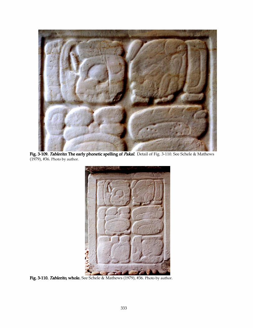
333
Fig. 3Fig. 3Fig. 3Fig. 3----109.109.109.109. TableritoTableritoTableritoTablerito: : : : The early phonetic spelling of The early phonetic spelling of The early phonetic spelling of The early phonetic spelling of PakalPakalPakalPakal. . . . Detail of Fig. 3-110. See Schele & Mathews (1979), #36. Photo by author.
Fig. 3Fig. 3Fig. 3Fig. 3----110.110.110.110. TableritoTableritoTableritoTablerito, , , , whole.whole.whole.whole. See Schele & Mathews (1979), #36. Photo by author.
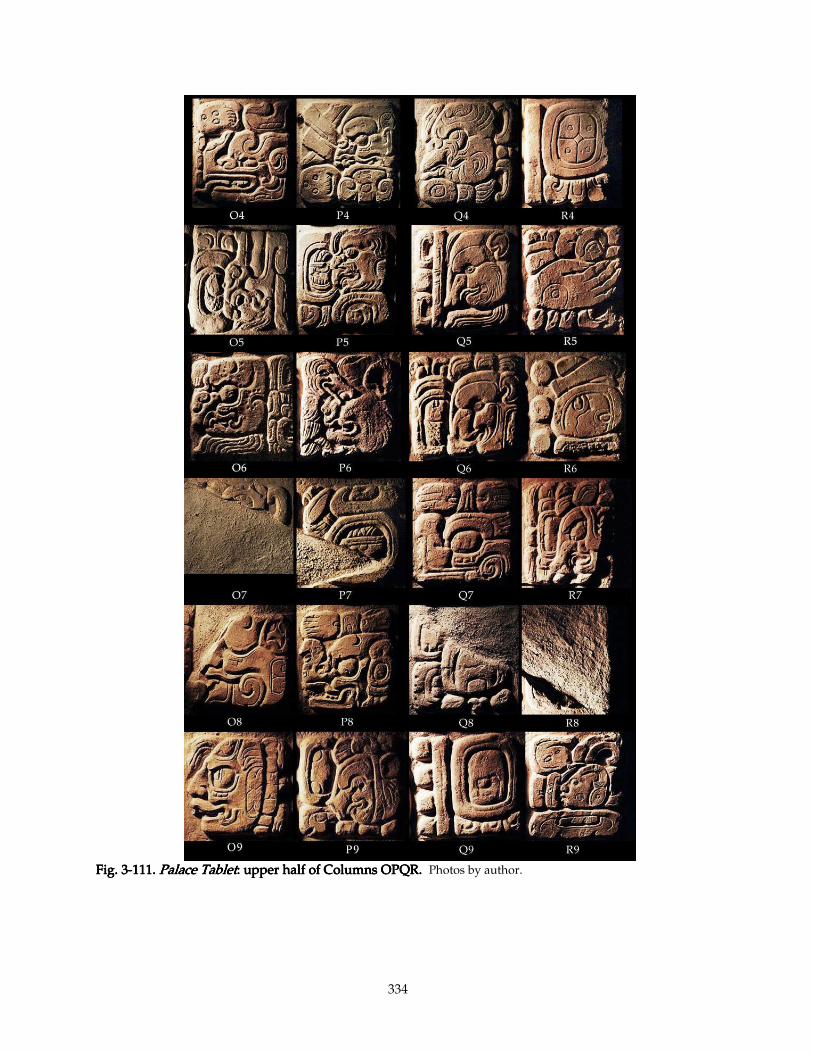
334
Fig. 3Fig. 3Fig. 3Fig. 3----111.111.111.111. Palace TabletPalace TabletPalace TabletPalace Tablet: : : : upper half of Columns OPQR.upper half of Columns OPQR.upper half of Columns OPQR.upper half of Columns OPQR. Photos by author.
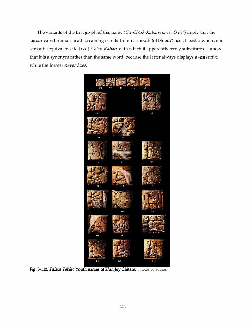
335
The variants of the first glyph of this name (Ox-Ch'ak-Kaban-na vs. Ox-??) imply that the
jaguar-eared-human-head-streaming-scrolls-from-its-mouth (of blood?) has at least a synonymic
semantic equivalence to (Ox-) Ch'ak-Kaban, with which it apparently freely substitutes. I guess
that it is a synonym rather than the same word, because the latter always displays a -nananana suffix,
while the former never does.
Fig. 3Fig. 3Fig. 3Fig. 3----112.112.112.112. Palace TabletPalace TabletPalace TabletPalace Tablet: : : : Youth names of K'an Joy Chitam.Youth names of K'an Joy Chitam.Youth names of K'an Joy Chitam.Youth names of K'an Joy Chitam. Photos by author.
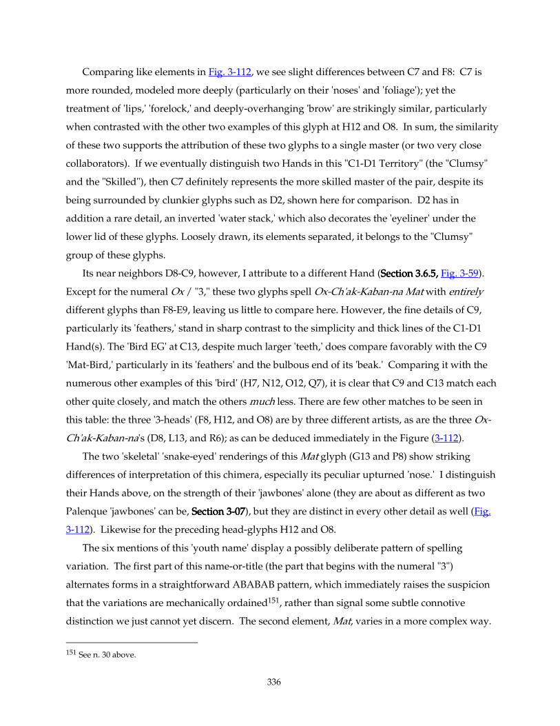
336
Comparing like elements in Fig. 3-112, we see slight differences between C7 and F8: C7 is
more rounded, modeled more deeply (particularly on their 'noses' and 'foliage'); yet the
treatment of 'lips,' 'forelock,' and deeply-overhanging 'brow' are strikingly similar, particularly
when contrasted with the other two examples of this glyph at H12 and O8. In sum, the similarity
of these two supports the attribution of these two glyphs to a single master (or two very close
collaborators). If we eventually distinguish two Hands in this "C1-D1 Territory" (the "Clumsy"
and the "Skilled"), then C7 definitely represents the more skilled master of the pair, despite its
being surrounded by clunkier glyphs such as D2, shown here for comparison. D2 has in
addition a rare detail, an inverted 'water stack,' which also decorates the 'eyeliner' under the
lower lid of these glyphs. Loosely drawn, its elements separated, it belongs to the "Clumsy"
group of these glyphs.
Its near neighbors D8-C9, however, I attribute to a different Hand (Section 3.6.5, Section 3.6.5, Section 3.6.5, Section 3.6.5, Fig. 3-59).
Except for the numeral Ox / "3," these two glyphs spell Ox-Ch'ak-Kaban-na Mat with entirely
different glyphs than F8-E9, leaving us little to compare here. However, the fine details of C9,
particularly its 'feathers,' stand in sharp contrast to the simplicity and thick lines of the C1-D1
Hand(s). The 'Bird EG' at C13, despite much larger 'teeth,' does compare favorably with the C9
'Mat-Bird,' particularly in its 'feathers' and the bulbous end of its 'beak.' Comparing it with the
numerous other examples of this 'bird' (H7, N12, O12, Q7), it is clear that C9 and C13 match each
other quite closely, and match the others much less. There are few other matches to be seen in
this table: the three '3-heads' (F8, H12, and O8) are by three different artists, as are the three Ox-
Ch'ak-Kaban-na's (D8, L13, and R6); as can be deduced immediately in the Figure (3-112).
The two 'skeletal' 'snake-eyed' renderings of this Mat glyph (G13 and P8) show striking
differences of interpretation of this chimera, especially its peculiar upturned 'nose.' I distinguish
their Hands above, on the strength of their 'jawbones' alone (they are about as different as two
Palenque 'jawbones' can be, Section 3Section 3Section 3Section 3----07070707), but they are distinct in every other detail as well (Fig.
3-112). Likewise for the preceding head-glyphs H12 and O8.
The six mentions of this 'youth name' display a possibly deliberate pattern of spelling
variation. The first part of this name-or-title (the part that begins with the numeral "3")
alternates forms in a straightforward ABABAB pattern, which immediately raises the suspicion
that the variations are mechanically ordained151, rather than signal some subtle connotive
distinction we just cannot yet discern. The second element, Mat, varies in a more complex way.
151 See n. 30 above.
337
Only one pair (G13 and P8, ma-Mat) can really be said to have precisely the same spelling, since
there seem to be two distinct allographs of the 'Mat Bird.' The similar ma-Mat at Q7 employs the
more purely-avian 'Bird.' C9 is a full-figure 'Bird,' and like most full-figure glyphs it carries no
phonetic complements. E9 is wholly phonetic (ma-ta-ch'o-ko), and K14 appears to be phonetic as
well, but with a head-variant -tatatata prefixed, inexplicably, by a nunununu- rather than any proven form of
mamamama-. Thus the variation pattern for the second part of this Ch'ok name is ABCA'CC' (or
ABCDCE). Yet the neat explanation that these artists conspired to introduce every possible
variation into these six versions of K'an-Joy-Chitam's 'Ch'ok-name' is maimed by the coincidence
that (unlike the situation on the sides of the Sarcophagus of Pakal) H12-G13 and O8-P8 appear to
exhibit precisely the same spelling.
3.10.5. Trust me3.10.5. Trust me3.10.5. Trust me3.10.5. Trust me
At this point, I think the need to articulate my comparisons of each and every detail of every
pair of glyphs becomes less critical. The reader understands my methodology and decision-
process well enough that to continue belaboring these images with a flood of verbiage is
unnecessary and mind-numbing. I shall henceforth in this section simply summarize my
attributions. Those items that present particularly illuminating comparisons or particularly
difficult problems I shall note in detail, but I beg the reader's confidence that I have analyzed
each further attribution as exhaustively below as above.
3.11.3.11.3.11.3.11. Workshop practice Workshop practice Workshop practice Workshop practice
Historians and National Geographic artists often portray ancient Maya carvers sitting on
scaffolds, chiseling away on a stela already set in place. In the case of large and unwieldy
monuments, such as we see at Copán and Quiriguá, it is quite likely that this was the case; it is
much easier to muscle a huge stone into place in a roughed-out, unfinished state than to have to
do so while worrying about damaging fragile carvings on every surface. Smaller stones, like the
panels at Palenque and Piedras Negras, however, could have afforded more flexibility. They
could be carved in a more comfortable situation —propped at an angle or laying on a
workbench— and carefully carried and set into place by a few laborers. The low-relief surfaces
of these panels also contributes to their safety and ease of handling.
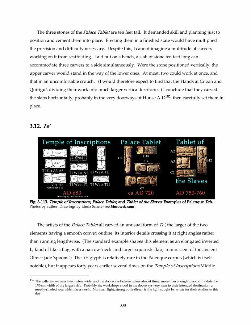
338
The three stones of the Palace Tablet are ten feet tall. It demanded skill and planning just to
position and cement them into place. Erecting them in a finished state would have multiplied
the precision and difficulty necessary. Despite this, I cannot imagine a multitude of carvers
working on it from scaffolding. Laid out on a bench, a slab of stone ten feet long can
accommodate three carvers to a side simultaneously. Were the stone positioned vertically, the
upper carver would stand in the way of the lower ones. At most, two could work at once, and
that in an uncomfortable crouch. (I would therefore expect to find that the Hands at Copán and
Quiriguá dividing their work into much larger vertical territories.) I conclude that they carved
the slabs horizontally, probably in the very doorways of House A-D152, then carefully set them in
place.
3.12.3.12.3.12.3.12. Te'Te'Te'Te'
Fig. 3Fig. 3Fig. 3Fig. 3----113.113.113.113. Temple of InscriptionsTemple of InscriptionsTemple of InscriptionsTemple of Inscriptions,,,, Palace TabletPalace TabletPalace TabletPalace Tablet, , , , andandandand Tablet of the Slaves Tablet of the Slaves Tablet of the Slaves Tablet of the Slaves: : : : Examples of Palenque Examples of Palenque Examples of Palenque Examples of Palenque Te'Te'Te'Te's.s.s.s. Photos by author. Drawings by Linda Schele (see Mesoweb.comMesoweb.comMesoweb.comMesoweb.com).
The artists of the Palace Tablet all carved an unusual form of Te', the larger of the two
elements having a smooth convex outline, its interior details crossing it at right angles rather
than running lengthwise. (The standard example shapes this element as an elongated inverted
LLLL, kind of like a flag, with a narrow 'neck' and larger squarish 'flap,' reminiscent of the ancient
Olmec jade 'spoons.') The Te' glyph is relatively rare in the Palenque corpus (which is itself
notable), but it appears forty years earlier several times on the Temple of Inscriptions Middle
152 The galleries are over two meters wide, and the doorways between piers almost three, more than enough to accommodate the
170-cm width of the largest slab. Probably the workshops stood in the doorways very near to their intended destination, a mostly-shaded area which faces north. Northern light, strong but indirect, is the light sought by artists for their studios to this day.
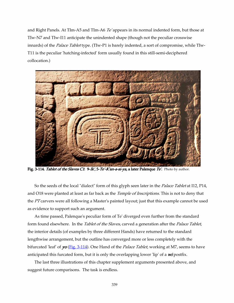
339
and Right Panels. At TIm-A5 and TIm-A6 Te' appears in its normal indented form, but those at
TIw-N7 and TIw-I11 anticipate the unindented shape (though not the peculiar crosswise
innards) of the Palace Tablet type. (TIw-P1 is barely indented, a sort of compromise, while TIw-
T11 is the peculiar 'hatching-infected' form usually found in this still-semi-deciphered
collocation.)
Fig. 3Fig. 3Fig. 3Fig. 3----114.114.114.114. Tablet of the Slaves C1Tablet of the Slaves C1Tablet of the Slaves C1Tablet of the Slaves C1: 9: 9: 9: 9----Ik'Ik'Ik'Ik', , , , 5555----Te'Te'Te'Te'----K'anK'anK'anK'an----aaaa----sisisisi----ya,ya,ya,ya, a later Palenque a later Palenque a later Palenque a later Palenque Te'Te'Te'Te'.... Photo by author.
So the seeds of the local "dialect" form of this glyph seen later in the Palace Tablet at I12, P14,
and O18 were planted at least as far back as the Temple of Inscriptions. This is not to deny that
the PT carvers were all following a Master's painted layout; just that this example cannot be used
as evidence to support such an argument.
As time passed, Palenque's peculiar form of Te' diverged even further from the standard
form found elsewhere. In the Tablet of the Slaves, carved a generation after the Palace Tablet,
the interior details (of examples by three different Hands) have returned to the standard
lengthwise arrangement, but the outline has converged more or less completely with the
bifurcated 'leaf' of yoyoyoyo (Fig. 3-114). One Hand of the Palace Tablet, working at M7, seems to have
anticipated this furcated form, but it is only the overlapping lower 'lip' of a wiwiwiwi postfix.
The last three illustrations of this chapter supplement arguments presented above, and
suggest future comparisons. The task is endless.
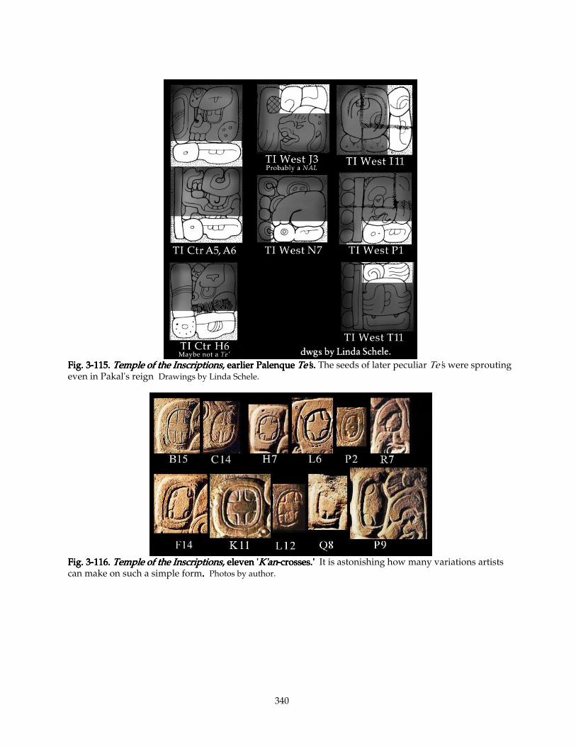
340
Fig. 3Fig. 3Fig. 3Fig. 3----115.115.115.115. Temple of the InscriptionsTemple of the InscriptionsTemple of the InscriptionsTemple of the Inscriptions, earlier, earlier, earlier, earlier Palenque Palenque Palenque Palenque Te'Te'Te'Te's.s.s.s. The seeds of later peculiar Te's were sprouting even in Pakal's reign Drawings by Linda Schele.
Fig. 3Fig. 3Fig. 3Fig. 3----116.116.116.116. Temple of the InscriptionsTemple of the InscriptionsTemple of the InscriptionsTemple of the Inscriptions, eleven ', eleven ', eleven ', eleven 'K'anK'anK'anK'an----crosses.'crosses.'crosses.'crosses.' It is astonishing how many variations artists can make on such a simple form.... Photos by author.
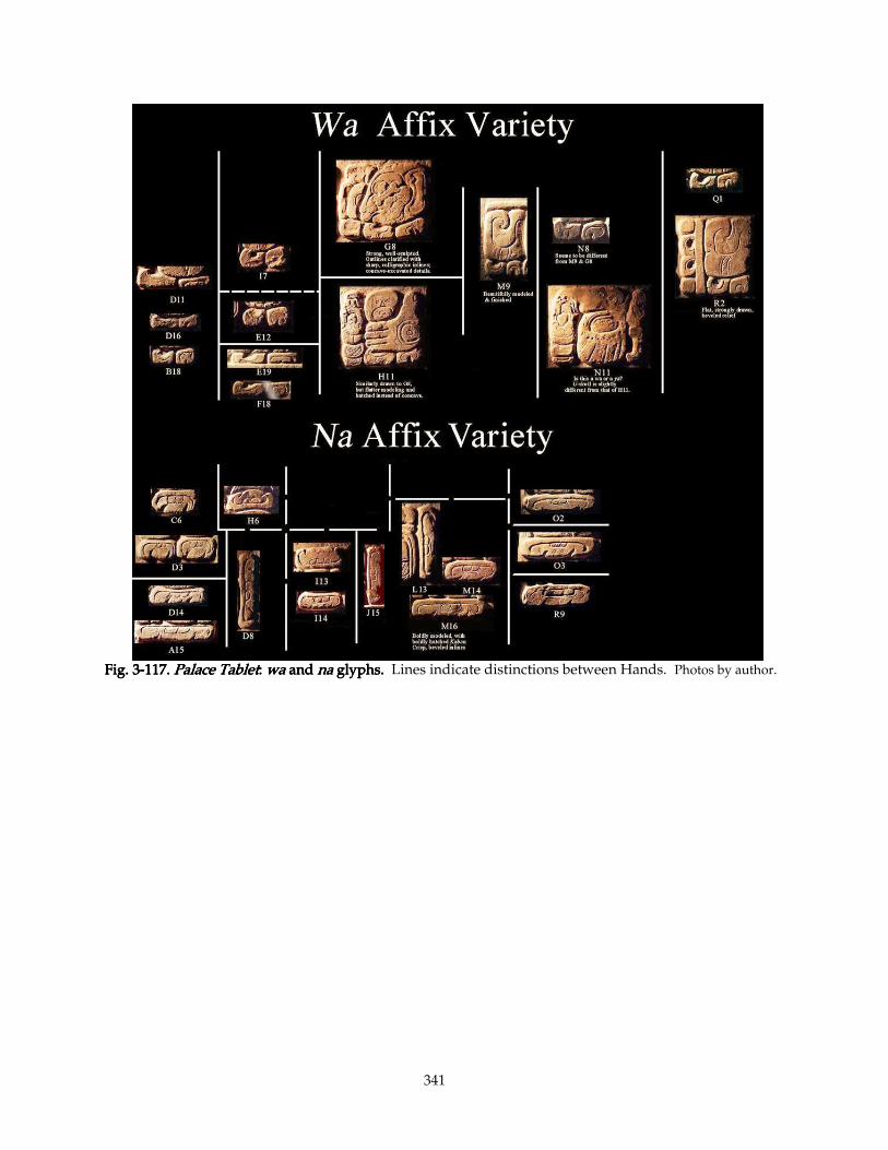
341
Fig. 3Fig. 3Fig. 3Fig. 3----117.117.117.117. Palace TabletPalace TabletPalace TabletPalace Tablet: : : : wawawawa and and and and nananana glyphs glyphs glyphs glyphs.... Lines indicate distinctions between Hands. Photos by author.
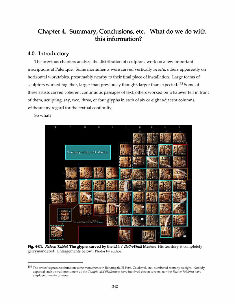
342
Chapter 4. Summary, Conclusions, etc. Chapter 4. Summary, Conclusions, etc. Chapter 4. Summary, Conclusions, etc. Chapter 4. Summary, Conclusions, etc. What do we do with What do we do with What do we do with What do we do with this information?this information?this information?this information?
4444....0. Introductory0. Introductory0. Introductory0. Introductory
The previous chapters analyze the distribution of sculptors' work on a few important
inscriptions at Palenque. Some monuments were carved vertically in situ, others apparently on
horizontal worktables, presumably nearby to their final place of installation. Large teams of
sculptors worked together, larger than previously thought, larger than expected.153 Some of
these artists carved coherent continuous passages of text, others worked on whatever fell in front
of them, sculpting, say, two, three, or four glyphs in each of six or eight adjacent columns,
without any regard for the textual continuity.
So what?
Fig. 4Fig. 4Fig. 4Fig. 4----01. 01. 01. 01. Palace TabletPalace TabletPalace TabletPalace Tablet: The glyphs carved by the L14 / : The glyphs carved by the L14 / : The glyphs carved by the L14 / : The glyphs carved by the L14 / Itz'iItz'iItz'iItz'i----WinikWinikWinikWinik Master: Master: Master: Master: His territory is completely gerrymandered. Enlargements below. Photos by author.
153 The artists' signatures found on some monuments in Bonampak, El Peru, Calakmul, etc., numbered as many as eight. Nobody
expected such a small monument as the Temple XIX Platform to have involved eleven carvers, nor the Palace Tablet to have employed twenty or more.
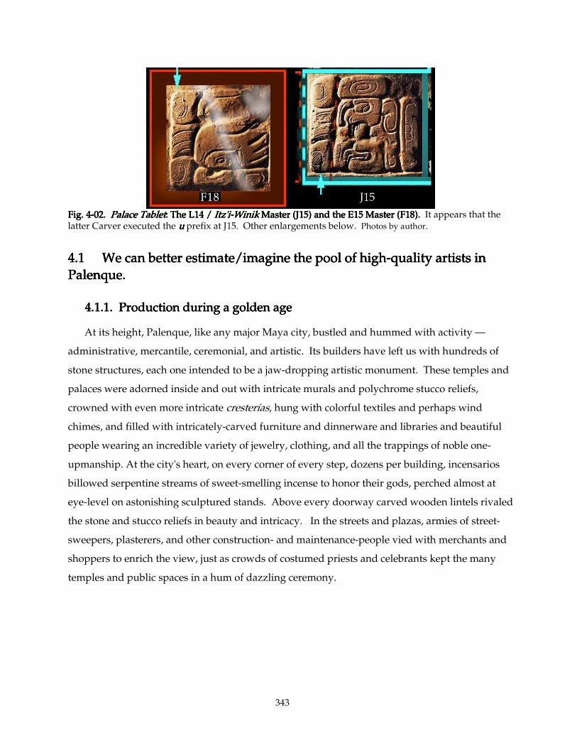
343
Fig. 4Fig. 4Fig. 4Fig. 4----02. 02. 02. 02. PalacePalacePalacePalace Tablet Tablet Tablet Tablet: The L14 / : The L14 / : The L14 / : The L14 / Itz'iItz'iItz'iItz'i----WinikWinikWinikWinik Master (J15) and the E15 Master (F18). Master (J15) and the E15 Master (F18). Master (J15) and the E15 Master (F18). Master (J15) and the E15 Master (F18). It appears that the latter Carver executed the uuuu prefix at J15. Other enlargements below. Photos by author.
4.14.14.14.1 We can better estimate/imagine the pool of highWe can better estimate/imagine the pool of highWe can better estimate/imagine the pool of highWe can better estimate/imagine the pool of high----quality artists in quality artists in quality artists in quality artists in
PalPalPalPalenque.enque.enque.enque.
4.1.1. Production during a golden age4.1.1. Production during a golden age4.1.1. Production during a golden age4.1.1. Production during a golden age
At its height, Palenque, like any major Maya city, bustled and hummed with activity —
administrative, mercantile, ceremonial, and artistic. Its builders have left us with hundreds of
stone structures, each one intended to be a jaw-dropping artistic monument. These temples and
palaces were adorned inside and out with intricate murals and polychrome stucco reliefs,
crowned with even more intricate cresterías, hung with colorful textiles and perhaps wind
chimes, and filled with intricately-carved furniture and dinnerware and libraries and beautiful
people wearing an incredible variety of jewelry, clothing, and all the trappings of noble one-
upmanship. At the city's heart, on every corner of every step, dozens per building, incensarios
billowed serpentine streams of sweet-smelling incense to honor their gods, perched almost at
eye-level on astonishing sculptured stands. Above every doorway carved wooden lintels rivaled
the stone and stucco reliefs in beauty and intricacy. In the streets and plazas, armies of street-
sweepers, plasterers, and other construction- and maintenance-people vied with merchants and
shoppers to enrich the view, just as crowds of costumed priests and celebrants kept the many
temples and public spaces in a hum of dazzling ceremony.
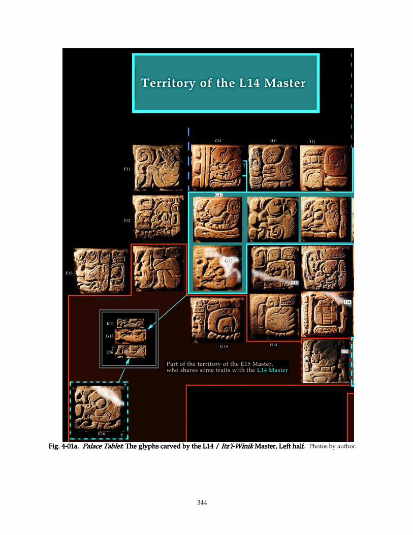
344
Fig. 4Fig. 4Fig. 4Fig. 4----01a. 01a. 01a. 01a. Palace TabletPalace TabletPalace TabletPalace Tablet: The glyphs carved by the L14 / : The glyphs carved by the L14 / : The glyphs carved by the L14 / : The glyphs carved by the L14 / Itz'iItz'iItz'iItz'i----WinikWinikWinikWinik Master, Left half. Master, Left half. Master, Left half. Master, Left half. Photos by author.
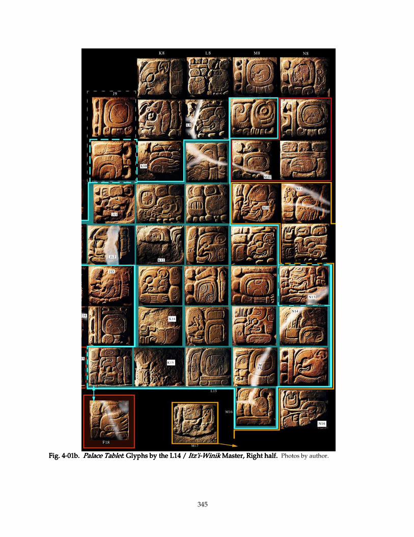
345
Fig. 4Fig. 4Fig. 4Fig. 4----01b. 01b. 01b. 01b. Palace TabletPalace TabletPalace TabletPalace Tablet: Glyphs by the L14 / : Glyphs by the L14 / : Glyphs by the L14 / : Glyphs by the L14 / Itz'iItz'iItz'iItz'i----WinikWinikWinikWinik Master, Right half. Master, Right half. Master, Right half. Master, Right half. Photos by author.
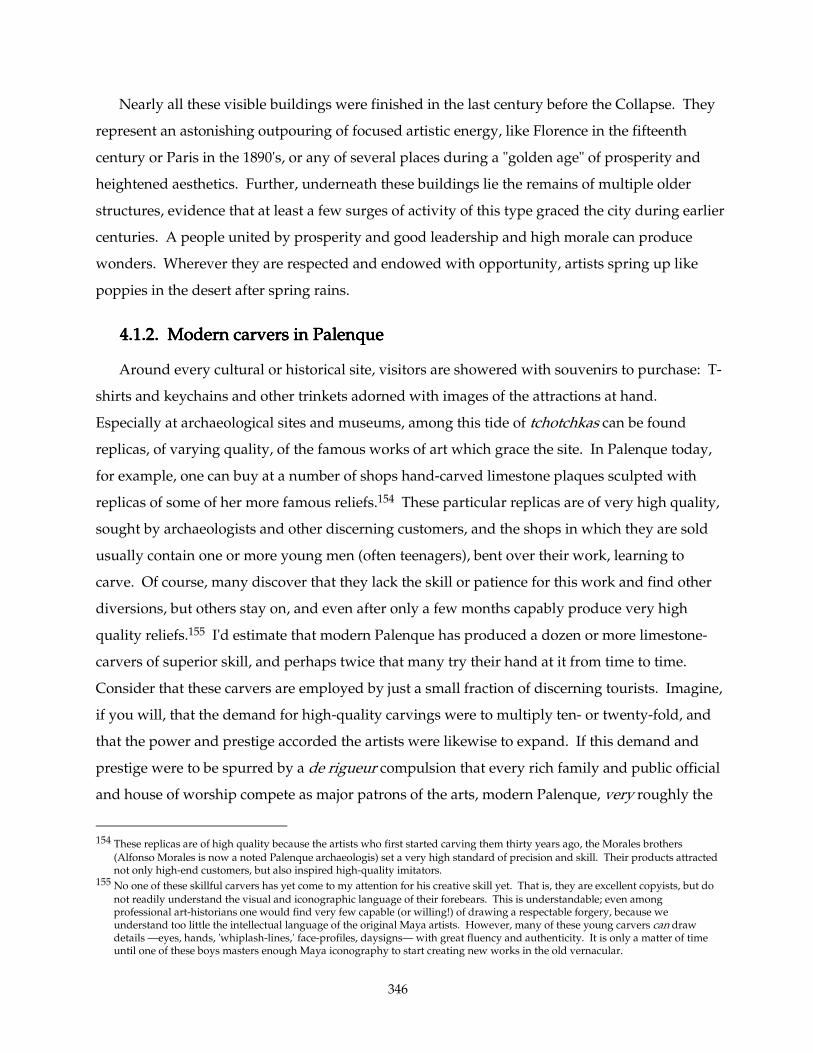
346
Nearly all these visible buildings were finished in the last century before the Collapse. They
represent an astonishing outpouring of focused artistic energy, like Florence in the fifteenth
century or Paris in the 1890's, or any of several places during a "golden age" of prosperity and
heightened aesthetics. Further, underneath these buildings lie the remains of multiple older
structures, evidence that at least a few surges of activity of this type graced the city during earlier
centuries. A people united by prosperity and good leadership and high morale can produce
wonders. Wherever they are respected and endowed with opportunity, artists spring up like
poppies in the desert after spring rains.
4.1.2. 4.1.2. 4.1.2. 4.1.2. Modern carvers in Palenque Modern carvers in Palenque Modern carvers in Palenque Modern carvers in Palenque
Around every cultural or historical site, visitors are showered with souvenirs to purchase: T-
shirts and keychains and other trinkets adorned with images of the attractions at hand.
Especially at archaeological sites and museums, among this tide of tchotchkas can be found
replicas, of varying quality, of the famous works of art which grace the site. In Palenque today,
for example, one can buy at a number of shops hand-carved limestone plaques sculpted with
replicas of some of her more famous reliefs.154 These particular replicas are of very high quality,
sought by archaeologists and other discerning customers, and the shops in which they are sold
usually contain one or more young men (often teenagers), bent over their work, learning to
carve. Of course, many discover that they lack the skill or patience for this work and find other
diversions, but others stay on, and even after only a few months capably produce very high
quality reliefs.155 I'd estimate that modern Palenque has produced a dozen or more limestone-
carvers of superior skill, and perhaps twice that many try their hand at it from time to time.
Consider that these carvers are employed by just a small fraction of discerning tourists. Imagine,
if you will, that the demand for high-quality carvings were to multiply ten- or twenty-fold, and
that the power and prestige accorded the artists were likewise to expand. If this demand and
prestige were to be spurred by a de rigueur compulsion that every rich family and public official
and house of worship compete as major patrons of the arts, modern Palenque, very roughly the
154 These replicas are of high quality because the artists who first started carving them thirty years ago, the Morales brothers
(Alfonso Morales is now a noted Palenque archaeologis) set a very high standard of precision and skill. Their products attracted not only high-end customers, but also inspired high-quality imitators.
155 No one of these skillful carvers has yet come to my attention for his creative skill yet. That is, they are excellent copyists, but do
not readily understand the visual and iconographic language of their forebears. This is understandable; even among professional art-historians one would find very few capable (or willing!) of drawing a respectable forgery, because we understand too little the intellectual language of the original Maya artists. However, many of these young carvers can draw details —eyes, hands, 'whiplash-lines,' face-profiles, daysigns— with great fluency and authenticity. It is only a matter of time until one of these boys masters enough Maya iconography to start creating new works in the old vernacular.
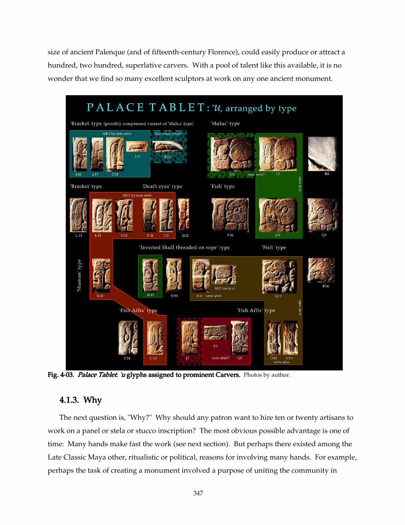
347
size of ancient Palenque (and of fifteenth-century Florence), could easily produce or attract a
hundred, two hundred, superlative carvers. With a pool of talent like this available, it is no
wonder that we find so many excellent sculptors at work on any one ancient monument.
Fig. 4Fig. 4Fig. 4Fig. 4----03. 03. 03. 03. Palace TabletPalace TabletPalace TabletPalace Tablet: : : : 'u'u'u'u glyphs assigned to prominent Carvers. glyphs assigned to prominent Carvers. glyphs assigned to prominent Carvers. glyphs assigned to prominent Carvers. Photos by author.
4.1.3.4.1.3.4.1.3.4.1.3. Why Why Why Why
The next question is, "Why?" Why should any patron want to hire ten or twenty artisans to
work on a panel or stela or stucco inscription? The most obvious possible advantage is one of
time: Many hands make fast the work (see next section). But perhaps there existed among the
Late Classic Maya other, ritualistic or political, reasons for involving many hands. For example,
perhaps the task of creating a monument involved a purpose of uniting the community in
348
common service; the honor of contributing the work of one's family artist added to the prestige
of that lineage.
Fig. 4Fig. 4Fig. 4Fig. 4----04. 04. 04. 04. Palace TabletPalace TabletPalace TabletPalace Tablet: : : : glyphs carved by the E15 Masterglyphs carved by the E15 Masterglyphs carved by the E15 Masterglyphs carved by the E15 Master.... Photos by author.
To support this idea, observe that a number of artists' signatures include designations such as
Yajaw Kaloomte'Yajaw Kaloomte'Yajaw Kaloomte'Yajaw Kaloomte' (one such signed Stela 12, Stela 13, and Panel 3 at Piedras Negras156), a title
implying that he was "owned" by the Ajaw Kaloomte'. However, this title is not very common;
most of these signatures seem to be simply nominal rather than titular, only a few carry any such
156 Stuart, D., The Maya Artist, an Epigraphic and Iconographic Study, Princeton University senior honors thesis 1989, p. 47.
349
"ownership" titles. If the use of certain artists reflected on their family associations, one might
expect to see more explicit connections in the signatures.
Or perhaps, (and frankly more likely in my opinion) the schedule of creating such a
monument was dictated by astrological parameters which brooked no delay. Why the
astrologers did not give the artists and patrons more lead time for their monuments remains a
mystery. Perhaps the large pool of artisans set a standard for speed that allowed and
encouraged the prognosticators to impose a tight schedule; the two reasons thus could spur each
other.
Another question: "Why not?" Any advantage gained would have to offset the
disadvantages of assembling and orchestrating a large team. One major problem is stylistic
unity: each sculptor has to submerge his own preferences to a "house style" in order that the final
product have stylistic unity. Within this unity there is some room for individual variation, of
course (or this whole dissertation would not be possible). But the peculiarities shared by all four
artists of the Tablet of the Slaves (noted in Section 2.7 above) point to a project director who kept
his team on a short leash. My own experience as a member of a similarly-motivated team of
animators, however, shows that it is relatively easy for a good sculptor to assume a "house style"
of this type.157 And it is true that on some monuments, such as the Palace Tablet, individual
styles vary much more broadly than one might expect to find in, say, an animated film. But a
large team of experts also concentrates many egos in a small place; petty differences must have
made many a project director wish for long-gone good old days of one-man or two-man shops.
157 In 1990-1991, I worked for Will Vinton Studios, a Claymation
® film animation studio in Portland, Oregon, on a CBS television
project featuring the California Raisins®. The first task before me upon joining the Will Vinton team was to learn the "house
style": with seventy animators employed there, we all had to submit our sculpting proclivities to a very strict set of parameters. "We make hands like this, with this proportion of finger-thickness to length, and with this kind of cuff on the hand," I was told by my trainer as he deftly shaped the plasticine. "Legs have just enough mucle to be believable without their looking like Betty Grable's. You don't need to worry about the eyes; they're all manufactured in our 'eye unit,' but each Raisin has different colored irises, and Be-Bop (the drummer)'s irises are two millimeters larger than the others, so don't mix the eyes up and put them in the wrong character. The bodies/faces are even more exacting, but luckily for you we have standard casts for each of the guys; you don't even have to clean off the casting-flanges. That's the job of the animator to whom you are delivering the fresh Raisins…." With trwenty scenes from our project being filmed simultaneously, it was crucial to the film's continuity that we adhere to these parameters strictly. Even so, with constant exposure we became adept at recognizing the hand of certain animators, especially the masters: "Oh, nobody does sadness like Sarah," one of my colleagues admiringly commented after viewing the rushes of a particularly emotional closeup scene.
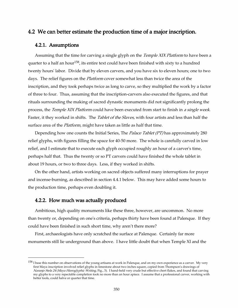
350
4.2 4.2 4.2 4.2 We can better estimate the production time of a major inscription.We can better estimate the production time of a major inscription.We can better estimate the production time of a major inscription.We can better estimate the production time of a major inscription.
4.2.1.4.2.1.4.2.1.4.2.1. Assumptions Assumptions Assumptions Assumptions
Assuming that the time for carving a single glyph on the Temple XIX Platform to have been a
quarter to a half an hour158, its entire text could have been finished with sixty to a hundred
twenty hours' labor. Divide that by eleven carvers, and you have six to eleven hours; one to two
days. The relief figures on the Platform cover somewhat less than twice the area of the
inscription, and they took perhaps twice as long to carve, so they multiplied the work by a factor
of three to four. Thus, assuming that the inscription-carvers also executed the figures, and that
rituals surrounding the making of sacred dynastic monuments did not significantly prolong the
process, the Temple XIX Platform could have been executed from start to finish in a single week.
Faster, it they worked in shifts. The Tablet of the Slaves, with four artists and less than half the
surface area of the Platform, might have taken as little as half that time.
Depending how one counts the Initial Series, The Palace Tablet (PT) has approximately 280
relief glyphs, with figures filling the space for 40-50 more. The whole is carefully carved in low
relief, and I estimate that to execute each glyph occupied roughly an hour of a carver's time,
perhaps half that. Thus the twenty or so PT carvers could have finished the whole tablet in
about 19 hours, or two to three days. Less, if they worked in shifts.
On the other hand, artists working on sacred objects suffered many interruptions for prayer
and incense-burning, as described in section 4.4.1 below. This may have added some hours to
the production time, perhaps even doubling it.
4.2.2.4.2.2.4.2.2.4.2.2. How much was actually produced How much was actually produced How much was actually produced How much was actually produced
Ambitious, high quality monuments like these three, however, are uncommon. No more
than twenty or, depending on one's criteria, perhaps thirty have been found at Palenque. If they
could have been finished in such short time, why aren’t there more?
First, archaeologists have only scratched the surface at Palenque. Certainly far more
monuments still lie underground than above. I have little doubt that when Temple XI and the
158 I base this number on observations of the young artisans at work in Palenque, and on my own experience as a carver. My very
first Maya inscription involved relief glyphs in limestone about two inches square, copied from Thompson's drawings of Naranjo Stela 24 (Maya Hieroglyphic Writing, Fig., 3). I hand-held very crude but effective chert flakes, and found that carving my glyphs to a very repectable completion took no more than an hour apiece. I assume that a professional carver, working with better tools, could halve or quarter that time.
351
residential compound "Temple" XXII, etc., are properly excavated (soon, one hopes), that more
such reliefs will come to light.
Second, many buildings already excavated lacked major stone carving; they were decorated
almost exclusively in paint and stucco, such as Temples XII, XIII, and XVIII. Every building
carried far more stucco than stone decoration, on its piers, crestería (roof comb), mansard roofs,
balustrades, etc. It is probable that some, perhaps many, of Palenque's limestone carvers also
worked in stucco, particularly when one reflects that the Temple XIX Platform, the Tablet of the
Slaves, and especially the Temple of Inscriptions reliefs possess major lacunae which were
undoubtedly corrected with stucco. Once can hardly imagine a situation in which the strokes
carried over onto these stucco fill-ins were not carved by the same artists as the stone bits that
flanked them. However, it is likely that many stucco sculptors worked exclusively in that
medium; probably more than worked in stone, since the demand would have been greater.
Third, every doorway had hardwood lintels. Some of these were certainly carved (Those
spanning the inner shrines of the Cross Group, for example, would have continued the surviving
flanking texts.). Many, perhaps most, of the rest were also carved intricately, if remaining lintels
in neighboring Yaxchilan and distant Tikal are any indication. Sapodilla wood is quite hard;
techniques of carving were largely identical to those for carving limestone. It is more likely that
a panel-carver also did lintels than that he would work plaster.
These carvers also no doubt found work carving decorative furniture, palanquins, masks,
book-covers, room-divider screens, and perhaps facades and cresterías on some of the nicer
wooden homes (that far outnumbered surviving stone buildings). The work that has been lost
staggers the imagination.
352
Fig. 4Fig. 4Fig. 4Fig. 4----05. 05. 05. 05. Palace TabletPalace TabletPalace TabletPalace Tablet: : : : Hu'nHu'nHu'nHu'n 'heads.' 'heads.' 'heads.' 'heads.' . Photos by author.
4.2.3. Color painted on these reliefs4.2.3. Color painted on these reliefs4.2.3. Color painted on these reliefs4.2.3. Color painted on these reliefs
These inscriptions were painted after carving, though not usually in detailed polychrome.
Some surviving fragments of the reliefs once mounted near the PT still retain much of their color,
and reveal that they were painted simply. 159 The glyphs and their background were
consistently painted solid red, including a part of the background frame, out an inch or so from
159 See the Frontispiece to Schele & Mathews The Bodega of Palenque, which includes at center right a color plate of Bodega
fragment #210 (Schele & Mathews item 44). Descriptions of Bodega items 39, 40, and 44, despite some small inconsistencies in color placement, show that in each case, the entire glyphic area was solid red, while the rims of the frames surrounding these glyphs were turquoise blue (just as shown in the frontispiece). In other areas of the Palace, glyphs were painted solid blue with red frames (Frontispiece left center, no. 84, from the Northwest Court). Schele and Mathews do not specify the color distribution on item 42, from the gallery near the Palace Tablet, but imply that, unlike its neighboring reliefs, it is painted more intricately: the glyphs are red and the ground around them blue, or vice versa.
Stucco glyphs also tend to be monochrome, as seen from the Stucco Reliefs of Temple XIX and XVIII. For example, those from Temple XIX still bear their vivid solid blue, and were placed on a red ground. Likewise, Temple XVIII's glyphs (Schele and Mathews items 395 - 548) tended to be blue "on top," with red "edges" or "sides" and red ground. A couple of these have a single glyphic element picked out in red: item 404, contains T212, the 'stingray spine,' followed by T501:130?:116 (HA’/ba-wa?-ni) and T1:757-1017?:missing (U-Bah). The authors specify, "The T212 glyphic element is painted red; the remaining surface is blue. This single glyph (a stingray spine) is the only element in the entire Temple XVIII stucco inscription that was painted red on the front surface. All other glyphs were painted blue with red in the ground." (italics mine).
(Possibly the ground was painted incautiously enough that some of the red paint slopped up onto the edges/sides of the glyph 'cookies.' Also possibly, the artists may have had some aesthetic or other reason to paint the edges of the 'troughs' between glyphs red. Schele and Mathews do not specify whether the red paint ever continues round onto the reverse. If so, that would prove that the artists had painted the glyphs before installing them in the wall, which I think unlikely. I did examine the stuccoes from Temple XIX while under restoration, and I saw no evidence of paint on their back sides.)
In contrast to the Temple XVIII and XIX stuccos, all ten stucco glyphs found in or near the Palace's North Façade were, consistent with nearby stone reliefs, painted solid red on a blue ground. As with the one exception in Temple XVIII, there exists one polychrome emblem glyph from the North Façade (Schele & Mathews item 51) whose BAAK "bone" is red and blue, whose T38 'drops'/ 'water group' affix is blue, and whose T168 AJAW is red. In general, however, the glyphs were monochrome for the most part, which adds little significant time to their hourly budget.
353
the carved area. The outermost part of the frames —a band a couple inches wide— were blue.
This apparently was also the case on the Palace Tablet itself.160
This practice may surprise us, particularly because carefully-placed color can improve
legibility and definitely enhances visual appeal (a fact not lost on the T-shirt designers whose
sellers swarm around Mexican archaeological tourist areas). Particularly unexpected is the
practice of picking out only one glyphic element in (apparently) an entire long inscription. The
spotlighting of a stingray spine in Temple XVIII's otherwise blue inscription has an appealing
explanation: the instrument of bloodletting is appropriately red. The Palace's North Façade
Emblem Glyph (Item 51 in Schele & Mathews 1979) is also apparently unique among its red
fellows in having true polychrome: the "bone" Baak is "red and blue," the K'uh prefix blue
(inappropriate if the drops were conceived of as blood or incense, but appropriate for water),
and the Ajaw superfix red. Why only one glyph in an entire inscription should merit this
treatment, however, is still a complete mystery.
The mystery deepens when one examines polychrome vases, which frequently exhibit
multicolor glyphs, so much so that one might discern relatively standardized patterns.161 Even
"monochrome" codex-style vases sometimes color 'daysign cartouches' red, as in K6751, K1371,
K1372, K1302, etc. the "Site Q Dynastic Sequence Vases."162 Though uncommon, they are not
hard to find, especially in vases from the Petén region, such as Naranjo and Waxaktun.163
160 Traces of this background color are preserved under a layer of calcification on the extreme lower left of the Tablet 161 The extraordinarily research-useful website of the Foundation for the Advancement of Mesoamerican Sciences, Inc.,
<FAMSI.org> exhibits hundreds of Justin Kerr's justly-famed rollout photographs of Classic Maya vases, in the sub-site < http://research.famsi.org/kerrmaya.html>.
162 Kerr, Justin The Maya Vase Book, Vol. V, New York, 1997, pp. 846ff. 163 Vessels presumed to be from Waxaktun with multicolored glyphs include (using Kerr's designation):
K4552 K4552 K4552 K4552 with very large glyphs (Kerr Vol. 3), K4692K4692K4692K4692 / MS1432, a rather spherical bowl from around the year AD 600 (Reents-Budet 316), K1379K1379K1379K1379 (Kerr Vol.1), K1901K1901K1901K1901 (Kerr Vol.1), K3996K3996K3996K3996 (Kerr Vol. 3), K3459K3459K3459K3459 (Kerr Vol. 3), K3881K3881K3881K3881 (Kerr Vol. 3), K4143K4143K4143K4143 (Kerr Vol. 3), K4922K4922K4922K4922 (Kerr Vol 4), K4962K4962K4962K4962 (Kerr Vol 4), K5637K5637K5637K5637, K7525K7525K7525K7525 PSS on lower rim, K7727K7727K7727K7727 (Kerr Vol. 6), K8526K8526K8526K8526.
An example from Naranjo: MS0285MS0285MS0285MS0285, a Middle Classic spherical bowl, (Reents-Budet 78 & 206). From Motul de San Jose, a vase depicting the Ballgame: K2803 / MS1526K2803 / MS1526K2803 / MS1526K2803 / MS1526, (Reents-Budet 250).
Several of the Altun Ha' type:
K2993K2993K2993K2993 K3034K3034K3034K3034 / MS0253MS0253MS0253MS0253 MS0108MS0108MS0108MS0108 K5446K5446K5446K5446 / MSC091MSC091MSC091MSC091 "The Quetzal Vase" (Reents-Budet 98, Cat. #57) K4681K4681K4681K4681
A few others of uncertain origin:
K5458 K5458 K5458 K5458 / MS0040 Early Classic plate (Reents-Budet 82, Cat. #23) K8089K8089K8089K8089 "Painted Underarm" series of Court scene vases. (Kerr Vol. 6) K1183K1183K1183K1183 / MS1126 November Collection yellow (Middle Classic?) "Itzamnaaj & Hero Twins Vase" (Kerr Vol. 1)
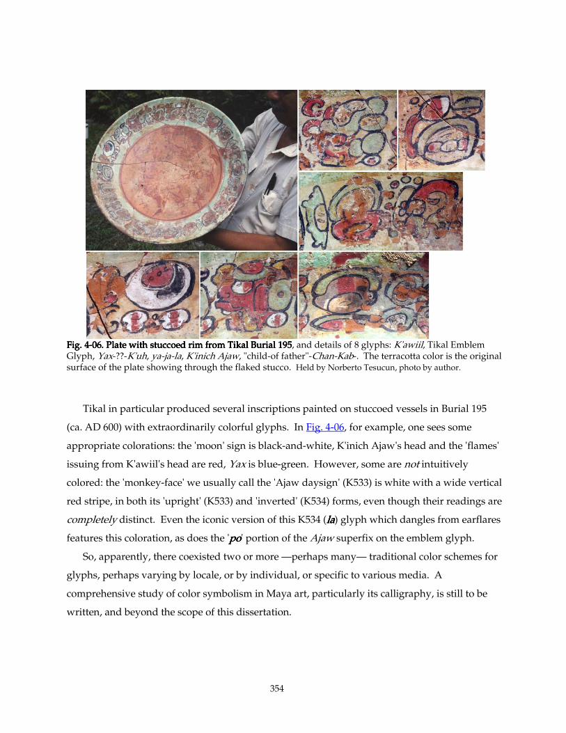
354
Fig. 4Fig. 4Fig. 4Fig. 4----06. Plate with stuccoed rim from Tikal Burial 19506. Plate with stuccoed rim from Tikal Burial 19506. Plate with stuccoed rim from Tikal Burial 19506. Plate with stuccoed rim from Tikal Burial 195, and details of 8 glyphs: K'awiil, Tikal Emblem Glyph, Yax-??-K'uh, ya-ja-la, K'inich Ajaw, "child-of father"-Chan-Kab-. The terracotta color is the original surface of the plate showing through the flaked stucco. Held by Norberto Tesucun, photo by author.
Tikal in particular produced several inscriptions painted on stuccoed vessels in Burial 195
(ca. AD 600) with extraordinarily colorful glyphs. In Fig. 4-06, for example, one sees some
appropriate colorations: the 'moon' sign is black-and-white, K'inich Ajaw's head and the 'flames'
issuing from K'awiil's head are red, Yax is blue-green. However, some are not intuitively
colored: the 'monkey-face' we usually call the 'Ajaw daysign' (K533) is white with a wide vertical
red stripe, in both its 'upright' (K533) and 'inverted' (K534) forms, even though their readings are
completely distinct. Even the iconic version of this K534 (lalalala) glyph which dangles from earflares
features this coloration, as does the 'popopopo' portion of the Ajaw superfix on the emblem glyph.
So, apparently, there coexisted two or more —perhaps many— traditional color schemes for
glyphs, perhaps varying by locale, or by individual, or specific to various media. A
comprehensive study of color symbolism in Maya art, particularly its calligraphy, is still to be
written, and beyond the scope of this dissertation.
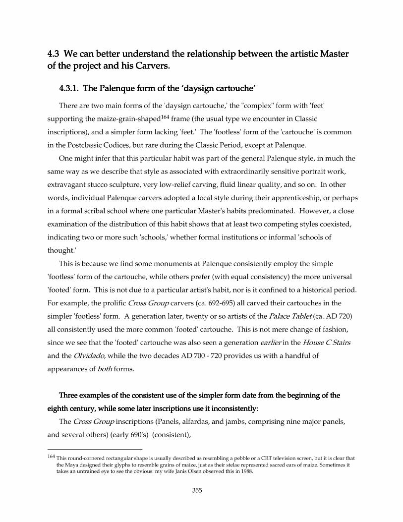
355
4.3 4.3 4.3 4.3 We can better understand the relationship between the artistic Master We can better understand the relationship between the artistic Master We can better understand the relationship between the artistic Master We can better understand the relationship between the artistic Master
of the project and his Carvers.of the project and his Carvers.of the project and his Carvers.of the project and his Carvers.
4.3.1. The Palenque form of the ‘daysign cartouche’4.3.1. The Palenque form of the ‘daysign cartouche’4.3.1. The Palenque form of the ‘daysign cartouche’4.3.1. The Palenque form of the ‘daysign cartouche’
There are two main forms of the 'daysign cartouche,' the "complex" form with 'feet'
supporting the maize-grain-shaped164 frame (the usual type we encounter in Classic
inscriptions), and a simpler form lacking 'feet.' The 'footless' form of the 'cartouche' is common
in the Postclassic Codices, but rare during the Classic Period, except at Palenque.
One might infer that this particular habit was part of the general Palenque style, in much the
same way as we describe that style as associated with extraordinarily sensitive portrait work,
extravagant stucco sculpture, very low-relief carving, fluid linear quality, and so on. In other
words, individual Palenque carvers adopted a local style during their apprenticeship, or perhaps
in a formal scribal school where one particular Master's habits predominated. However, a close
examination of the distribution of this habit shows that at least two competing styles coexisted,
indicating two or more such 'schools,' whether formal institutions or informal 'schools of
thought.'
This is because we find some monuments at Palenque consistently employ the simple
'footless' form of the cartouche, while others prefer (with equal consistency) the more universal
'footed' form. This is not due to a particular artist's habit, nor is it confined to a historical period.
For example, the prolific Cross Group carvers (ca. 692-695) all carved their cartouches in the
simpler 'footless' form. A generation later, twenty or so artists of the Palace Tablet (ca. AD 720)
all consistently used the more common 'footed' cartouche. This is not mere change of fashion,
since we see that the 'footed' cartouche was also seen a generation earlier in the House C Stairs
and the Olvidado, while the two decades AD 700 - 720 provides us with a handful of
appearances of both forms.
Three examThree examThree examThree examples of the consistent use of the simpler form date from the beginning of the ples of the consistent use of the simpler form date from the beginning of the ples of the consistent use of the simpler form date from the beginning of the ples of the consistent use of the simpler form date from the beginning of the
eighth century, while some later inscriptions use it inconsistently:eighth century, while some later inscriptions use it inconsistently:eighth century, while some later inscriptions use it inconsistently:eighth century, while some later inscriptions use it inconsistently:
The Cross Group inscriptions (Panels, alfardas, and jambs, comprising nine major panels,
and several others) (early 690's) (consistent),
164 This round-cornered rectangular shape is usually described as resembling a pebble or a CRT television screen, but it is clear that
the Maya designed their glyphs to resemble grains of maize, just as their stelae represented sacred ears of maize. Sometimes it takes an untrained eye to see the obvious: my wife Janis Olsen observed this in 1988.
356
The Panel of Temple XVII (ca. 700, reign of Kan Bahlam) (consistent),
The Panel of Temple XIV (ca. 705) (consistent),
The Temple XVIII Jambs (ca. AD 730) (mixed, only a few dates),
The Tablet of the Slaves (ca. AD 750-760) (consistent after the first glyph)
The Initial Series Vase, an inscribed ceramic blackware vessel bearing Palenque's final
recorded date (799). These latter three inscriptions, like the Temple of Inscriptions texts, mix
both forms (see below).
But thBut thBut thBut those consistently ose consistently ose consistently ose consistently withwithwithwith 'feet' also appear in the earliest and the latest periods: 'feet' also appear in the earliest and the latest periods: 'feet' also appear in the earliest and the latest periods: 'feet' also appear in the earliest and the latest periods:
The House C Hieroglyphic Stairs (ca AD 654?),
The Olvidado stucco inscription (perhaps ca. 660-682),
The Del Rio Throne (702-709),
The Dumbarton Oaks Panel (ca. 715?) (either pre-accession or post-mortem K’an Joy
Chitam),
The Palace Tablet (ca. 720),
The Emiliano Zapata Panel (ca. 720),
The inscriptions from Temple XIX (ca. 736),
Kan-Tok’ Panel, Temple XVI (ca. 775),
The Tablet of the 96 Glyphs (783),
Several stone incensario stands,
all stucco glyphs,
and apparently nearly all minor inscriptions, with the exception of the blackware vessel
mentioned above.165
Then there are the four inscriptions that employ Then there are the four inscriptions that employ Then there are the four inscriptions that employ Then there are the four inscriptions that employ bothbothbothboth forms. forms. forms. forms.
The highly important (and early) texts from the Temple of Inscriptions (AD 683) mix the two
styles. The 'footless' form predominates in the Sarcophagus (the first two daysigns include 'feet,'
but the rest all lack them).166 And the three long text panels in the Temple itself mix the two
165 Not rated ‘Jonuta Panel’‘Jonuta Panel’‘Jonuta Panel’‘Jonuta Panel’ ensemble (Mexico City, California & Houston collections): ca. 700 (Reign of Kan Bahlam) 166 We also see this, the use of 'feet' on the opening clause or clauses, and leaving them off everywhere else, in the Tablet of the
Slaves sixty years later, and in the Initial Series Vase, the very last date recorded at Palenque. This might constitute a pattern, comparable to that of the use of more formal 'head-variant' numerals in the opening dates of the Cross Group inscriptions,
357
types without apparent pattern. For example, the first TI Panel, that on the east, has twelve
cartouches with 'feet' and three without. The Middle Panel's three dates all wear 'feet,' and the
third, West Panel, has nine with 'feet' and fifteen without. Neither form predominates in any
particular area, except on the Middle Panel, which could be due to chance.
One might suggest, considering the rather hurried aspect of the Sarcophagus-lid inscription,
that the sculptors consciously chose, after the first few glyphs, to carve the daysigns without
'feet' to save time. But no such pattern can be seen in the long texts upstairs in the same Temple.
Obviously, the text compresses as it approaches the end —in the West Panel there are about 113
glyph-elements in the last double column (S-T), compared to 67 in the first (A-B) and 75 in the
second (C-D)— yet of the three daysigns in the last double-column, two lack 'feet' while one (S1)
is the more complicated form. One might infer from this that the strict separation of the two
types of cartouches had not yet hardened at this early date.
But then there are the Temple XVIII Jambs (ca. AD 730) and the Tablet of the Slaves (ca. AD
750-760). Three of the latter's four artists all made their 'daysign cartouches' without 'feet' (B4a,
C1a, C3a, D1a, E3a, F1a, F4b, G3a, G5b, and H3b). The first daysign, however, (glyph A1a), uses
the more fancy type. The former, thetall inscription flanking Temple XVIII's entrance also uses
both types of cartouche in its few dates. It was made at the behest of Ahkal Mo' Naab, not long
before he built neighboring Temple XIX. This and the Temple of Inscriptions' apparently-
indiscriminate use of the two varieties has been taken to imply that Palenque scribes generally
made no distinction between the two types. Yet the other fifteen or twenty inscriptions
(depending on how you count) offer overwhelming evidence to the contrary. At least some
Palenque artists very consistently distinguished the two.
Finally, the Initial Series Vase, carrying the final date recorded at Palenque (799), has two
surviving daysigns, one of each type. Stephen Houston and others have observed167 that
spelling rules —distinctions between simple and complex vowel-spellings, and between the
three allographs of Chan/Kan meaning "four," "snake" and "sky," for example— break down in
the Terminal Classic.168 Perhaps some Palenque artists made a distinction between the
allographs of the daysign cartouche, but only for a few decades.
wherein the artists see fit to open the text with more complex allographs than the rest of the text displays. This might constitute a third concurrent 'school' of inscription design, but the examples are too few to be sure.
167 Personal communication in several conversations, 1998-2005. 168 As seen in the Temple XVIII Stuccos' spellings of 'Long-Lips' Chan-Mat, the father of Ahkal Mo' Naab (ca. 731-736) and the
Copan spellings of Yax Pasaj Chan Yopaat's name (after 763).
358
It is entirely possible that some individual carvers did not distinguish between the two types,
and had no preference for one type of cartouche over another. It is even possible that some
artists deliberately alternated between the two forms, for variety's sake, just as they surely
alternated between allographs of the syllable 'u'u'u'u.169 It appears that artists of this persuasion
worked on the Temple of Inscriptions and the jamb inscriptions of Temple XVIII. They, however
form a distinct minority compared to those working on a score of other inscriptions. There, the
artists working on a particular project submerged personal preferences in this matter to the
Master Designer. (Or, perhaps the Master chose to hire carvers only from his own "school.")
And the design preferences of these Masters fell into two camps. Likely there are other, subtler
differences of style that will be discovered to distinguish "schools" of carvers within various
cities, just as we already see styles distinguishing artists of one city versus another.
For the time being, suffice it to note that although wide stylistic variances were tolerated
between individual carvers' preferences —for spelling, for use of cross-hatching or concave
'dark' areas, for line quality and for simplicity/complexity of glyph-design— at least some artists
preferences were overruled by the Master Design in certain areas. Yet these Master Designers'
preferences, in turn, were not universally held, not within the same city, or apparently, even the
same court.
4.3.2.4.3.2.4.3.2.4.3.2. Artists enjoyed some freedom Artists enjoyed some freedom Artists enjoyed some freedom Artists enjoyed some freedom
This observation confirms another: While some of these sculptors carefully followed the
painted master layout, at least in their choice of certain allographs, other Hands were
independent enough to draw or re-draw an individual glyph's under-layout, and insert their
own idiosyncratic spellings. These were, after all, expert, seasoned carvers, with habits and
opinions of their own. This implies a design situation on even a major monument, where several
expert Carvers working under a Master are each given paper copies of the Master's layout, and
are expected to put specific words in specific spaces — but not necessarily specific spellings of
those words. Perhaps the Master sketched a light cursive drawing of each glyph in their proper
169 It is also possible that they chose specific allographs for subtle reasons not yet visible to our crudely-discerning consciousness.
These choices would not affect the literal reading of texts, but might convey some other, more poetic meaning.
359
places, but it must have been either erasable, or faint enough to cover effectively with the
Carver's more formal redrawing.170
We see this in the distribution of certain spellings in the Palace Tablet. Of the four examples
of the name K'inich Janahb Pakal (C12, G6-G7, J12-J13, and P19), the first and the last are
compressed into one glyph-block. The other two are precisely the same peculiar phonetic
spelling, found, in a slightly simpler version, only twice elsewhere (the much earlier Tableritos
and Olvidado stuccos, Schele & Mathews #36, & #617-#618 [+#623?]). Schele supposed once in a
lecture171 that these unusual Palace Tablet spellings might have been a conscious archaism,
referring to the Olvidado, Tableritos, or other Pakal-contemporary inscriptions of a half-century
earlier. Whatever their motivation, the two examples on the Palace Tablet are carved by
different Hands, suggesting that the Carvers here felt compelled to follow their Master's layout,
though why the other two spellings are different remain a mystery. Perhaps Schele's conjecture
holds part of the answer.
The various Palenque Emblem Glyphs also distribute in a surprising pattern. The Palace
Tablet is the only known text which gives the king a double EG like Yaxchilan's: twice (at C13-
D13 and at O12-P12) we find the lord titled "K'ul Ajaw Mat-la, K'ul Ajaw Baak-la," or "sacred
Mat king and sacred Bone king." The Mat is always portrayed as the head of a toothy sea-bird,
the Bone as a rabbit-like skull, complete with ears and buck teeth. Elsewhere in the Palace
Tablet, the several Emblem Glyphs appear as either the 'bird' alone (four times) or the 'rabbit
skull' (once) —until the final double-column. (See Fig. 3-100). Suddenly, starting at R1, and
repeating twice more at R8 and R18, we find the last three EG's in the text have as their main sign
the simpler, more common 'wavy bone' glyph T570 (See Fig. 3-107). This striking departure is at
present incomprehensible. Was the last double-column carved under a different Master? Did
the two or three Carvers responsible for the last double-column of text just happen to have
conservative taste in Emblem Glyphs and both happened to end up on the last patch of text? Or
is there some as-yet-undetected subtle connotation to the 'wavy bone' Emblem Glyph that
demanded its use in the final mentions of Lords Pakal, K'an-Joy-Chitam, and Ox-Yo-Hun, —and
its avoidance the first nine times?
170 One sees evidence of similar delegation in Egyptian monuments. Where incomplete carving reveals still-preserved
underdrawing in Egyptian reliefs, the figures are only sketched out rudimentarily. The carver is trusted to fill iun all details of clothing, feathers, musculature, etc. And some figures' positions are altered in the final carving, usually only adjusted a little to the left or right.
171 Maya Meetings at Texas, March 1986
360
At present, lacking any new insights into the subtle logic of Palenque scribes, it appears to
me that my second proposal is the most plausible: The artists who carved the final long columns
of text were allowed to use their own preferred spellings of the Emblem Glyphs (and
presumably of other things), and thus must have been free to some degree to design their own
underdrawing. This leads inescapably to the conclusion that there must have been a grid
painted on the stone, and a Master version of the text — but only on a paper cartoon. Individual
glyphs were indicated on the stone, if at all, by a brief sketch which afforded the artist freedom
to design a much bolder and more careful final underdrawing (with perhaps entirely different
allographs than the original.) Perhaps the paint that they used for layouts was as easily erased
as that in the cave at Naj Tunich.172
The Carvers did not work on continuous texts. Many clauses are begun by one Hand and
continued by another, sometimes to be concluded by a third. They seem to have been able to
step in anywhere, and did. The distribution of work by a single Artist crosses columns; usually a
patch by one Hand is only four or five glyphs high but six or eight glyphs wide. Obviously this
suggests that they worked on scaffolds, standing or sitting at a particular height for several
hours. Just as obviously, their layout must have specified which words went into which blocks.
4.3.3. Individual spelling styles4.3.3. Individual spelling styles4.3.3. Individual spelling styles4.3.3. Individual spelling styles
The Temple XIX Platform inscription gives us the clearest evidence that individual Hands
painted their own layouts before engraving them in stone. Their individual handwriting styles
are here petrified, brushstrokes engraved into stone. It is obvious where one Hand leaves off
and another begins, more than on any other monument, because the drawing style, as well as the
carving style, changes.
The Platform carries an interesting rendering of Ahkal Mo' Naab's name, spelled with a half
turtleshell and a whole 'macaw-head' draped with a 'lilypad.' The many, many other examples
of his name vary dramatically, and only one other spelling like this occurs in the entire Corpus:
also in Temple XIX, in the final line of the limestone Tablet inscription on the Temple's central
pier. David Stuart was so struck by this duplication that he suggested the two inscriptions might
be by the same Hand.173 But they are clearly not so; despite the difference in carving technique
172 In 1989, vandals succeeded in completely destroying two dozen paintings in the cave, simply by smearing them with their
fingers. Stone, Andrea, Images from the Underworld, Naj Tunich and the Tradition of Maya Cave Painting, Austin, University of Texas Press, 1995, pp. 110-111.
173 Private communication, 2000.
361
— one is engraved and the other in relief— the drawing of the macaw's head (especially the
beak) and details like the turtleshell show the two certainly followed different scribal drawings,
and the carved line-quality of the two is quite distinct (Fig. 3-02). The fact that they both use the
same peculiar spelling suggests rather that they once had the same teacher, or worked from the
same copy-book, or copied each other's spellings.
4.4. We can better understand the Carvers' attitude toward their texts.4.4. We can better understand the Carvers' attitude toward their texts.4.4. We can better understand the Carvers' attitude toward their texts.4.4. We can better understand the Carvers' attitude toward their texts.
4.4.1. Trying to read minds across gulfs of time and culture4.4.1. Trying to read minds across gulfs of time and culture4.4.1. Trying to read minds across gulfs of time and culture4.4.1. Trying to read minds across gulfs of time and culture
While analyzing the Temple XIX Platform, I noted that the number of Carvers seemed to
match the number of nobles illustrated. The idea entered my head that each of these nobles
could represent a different lineage, and that perhaps each lineage supplied an artist, kind of a
tithe, perhaps, to the completion of the monument. It also occurred to me that being asked to
contribute a significant portion of the carving of such a monument could be a signal honor,
rather than an onerous tithe.
Then, while making up the 'Ajaw superfix' table for the Palace Tablet (Fig. 1-94), I noted that
every one of them appeared (at first) to be by a different Hand. If a lineage gained honor or
ch'ulel by contributing the labor of their family Carver, perhaps certain glyphs (such as Ajaw)
might bestow more honor than others, and the carving assignments for the text might be
distributed —gerrymandered— so that each Carver had the honor of executing one K'uhul Ajaw
glyph. This would be comparable to the practice of carefully cutting a child's birthday cake so
that each celebrant receives a piece with a strawberry on top, and no-one feels unfairly treated.
I no longer subscribe to either of these hypotheses, but they highlight how many unknown
variables exist in ancient artists' choices. There are many things that we may never know, that
we cannot know, about these works of art and their makers and their motivations.
De Landa describes the making of "idols" as routinely accompanied by much ceremony:
"Among the occupations of the Indians were pottery and wood-working; they made
much profit from forming idols of clay and wood, in doing which they fasted much and
followed many rites." (De Landa 37)174
174 De Landa, Diego, Relación de las Cosas de Yucatán, translated by William Gates as Yucatan Before and After the Conquest,
Baltimore, the Maya Society publ. #20, 1937. Dover Reprint 1978.
362
(Referring to ordinary people:) "In some of the fasts observed for their fiestas they neither
ate meat nor knew their wives. They always fasted when receiving duties in connection with
their festivals, and likewise on undertaking duties of the State, which at times lasted as long
as three years; those who violated their abstinence were great sinners." (De Landa 46)
"One of the most arduous and difficult things these poor people had to do was the
making of images of wood, which they called their gods. Thus they had a particular month
designated for this work, and this was the month of Mol, or some other if the priest said it
was right. … The chacs whom they had chosen to serve in the matter, together with the
priest and the artisan, began their fasts." (The patron ordering the idols then collected cedar
wood from the forest.) When the wood arrived they built a small fenced-in hut of thatch, in
which they put the wood and a large urn into which to put the idols, and to keep them
covered up while they were working." (They also supplied the house with incense and
statues of the four Acantuns, gods of the cardinal directions.) "They also brought the
instruments with which to scarify themselves or draw blood from their ears; and also the
tools for carving their black gods. When all these were ready in the hut, the priest, the chacs,
and the artisan shut themselves in the hut, and they began making the gods, from time to
time cutting their ears and anointing the statues herewith, and burning the incense. Thus
they worked until they were finished, their families bringing them their food and needs;
during this period they were not to consort with their wives, even in thought; nor could any
one enter that place where they worked.
"They worked in much reverence and fear, as they say, making the gods. When they
were finished and the idols perfected, the owner made them the finest present he was able, of
birds, game, and their money, to pay for the labor of those who had made them. Then they
removed them from the hut and set them in another enclosure of branches prepared for them
in the court, where the priest blessed them with great solemnity, and an abundance of
devout prayers; but first the priest and the artisans removed the soot with which they had
covered themselves during their fasting. Then having exorcised the evil one and burned the
sanctified incense, they put the images wrapped in a cloth in a chest and delivered them to
their owner, who very devoutedly received them. Afterwards the good priest preached a
little on the excellence of the artisans' profession, or making new images of the gods, and on
the ills that would have attended them had they not been faithful to the precepts of
abstinence and fasting. After that they ate much and drank more." (De Landa 76-77)
363
I have little doubt that such reverence and ceremony attended the making of these
inscriptions during the Classic period, though there seems to be no physical evidence that the
makers of stucco glyphs were covered head to foot in soot. My feeling at this point is that the
carvers, though reverent and doubtless bound by many complicated and perhaps
incomprehensible procedures, worked freely and rather improvisedly on their respective areas
of the stone. They may have been given specific assignments, but the irregular shapes of their
territories on the Palace Tablet suggests that they began and ended their work arbitrarily. The
boundaries of their work seem to have been governed by convenience rather than any ritual or
political reason.
4.4.2. 4.4.2. 4.4.2. 4.4.2. The The The The Palace TabletPalace TabletPalace TabletPalace Tablet Carvers Carvers Carvers Carvers
Palace Tablet List of Carvers as delineated in Fig. 4-07, (next page):
Left slab (A1-D19):
1. ISIG MasterISIG MasterISIG MasterISIG Master (Dark Blue): ISIG & Bak'tun collocation, and the neighboring glyphs C1-D7.
Also Winal coefficient, whole of K'in glyph, D9, C11, D11, C15-D15, D16 and part of C16 and
perhaps the Winal toad, C9, C12-D12. He carves boldly and rather simply, successfully
rendering the many details of his glyphs capable of reading at a distance — appropriate to their
placement high on the Tablet. Some details appear a bit shaky or rushed.
2. FullFullFullFull----FigureFigureFigureFigure----Tun Master Tun Master Tun Master Tun Master (Halloween Orange): Full Figure Tun glyph, K'atun coefficient,
C8-D8, and perhaps the Winal toad and C9. Like his colleague, he carves details confidently,
boldly, and with restraint.
2a. The ''''WinalWinalWinalWinal toad' and the ' toad' and the ' toad' and the ' toad' and the 'MatMatMatMat bird' bird' bird' bird' next to it at C9 displays characteristics of both the ISIG
Master and the Full-Figure-Tun Master. Both Artists may have worked here, or one of them
could be imitating the other, or an expert associate imitated them both.
3. C10C10C10C10----D10 intruderD10 intruderD10 intruderD10 intruder (Violet): C10 and D10. His flat, engraved glyphs are closely related to
the three-glyph patches over at P18-P19 and Q1-R1 and R2, especially the latter. He may be
identical to this Hand or Hands.
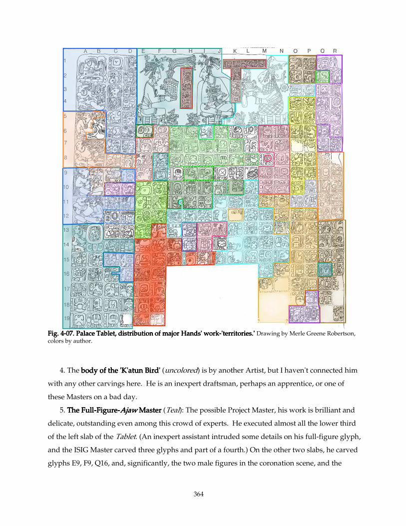
364
Fig. 4Fig. 4Fig. 4Fig. 4----07. Palace Tablet, distribution of major Hands' work07. Palace Tablet, distribution of major Hands' work07. Palace Tablet, distribution of major Hands' work07. Palace Tablet, distribution of major Hands' work----'territories.' 'territories.' 'territories.' 'territories.' Drawing by Merle Greene Robertson, colors by author.
4. The body of the 'K'atun Bird' body of the 'K'atun Bird' body of the 'K'atun Bird' body of the 'K'atun Bird' (uncolored) is by another Artist, but I haven't connected him
with any other carvings here. He is an inexpert draftsman, perhaps an apprentice, or one of
these Masters on a bad day.
5. The FullThe FullThe FullThe Full----FigureFigureFigureFigure----AjawAjawAjawAjaw Master Master Master Master (Teal): The possible Project Master, his work is brilliant and
delicate, outstanding even among this crowd of experts. He executed almost all the lower third
of the left slab of the Tablet. (An inexpert assistant intruded some details on his full-figure glyph,
and the ISIG Master carved three glyphs and part of a fourth.) On the other two slabs, he carved
glyphs E9, F9, Q16, and, significantly, the two male figures in the coronation scene, and the
365
jaguar-head and left snake-head on their thrones. This Master's work appears on all three stones,
which further supports the argument that he was Project Master.
5a. C12C12C12C12----D13D13D13D13, containing the name and some of the titles of K'inich Janab Pakal, remains
unattributed, though the first two of these glyphs display some characteristics of the ISIG
Master.
Middle panel:
6. & 6a. 'Coronation' Text Master'Coronation' Text Master'Coronation' Text Master'Coronation' Text Master and AssociateAssociateAssociateAssociate (Brick Red): The fifteen glyphs labeling the
(typical Palenque) tri-figure scene occupying the top five rows of Columns E through N (a
double square) are by two Hands. The main Artist accomplished twelve of these, and an
associate carved the last three glyphs in Column U. These two Hands appear nowhere else on
the Palace Tablet. I see no evidence that these anomalous labels were recarved at a later time;
they stand up from the background as high as the figures do.
7. A minor Master (Light Pink) carved F6F6F6F6----E8 and E9E8 and E9E8 and E9E8 and E9, at the top of Columns E-F, (including
the mysterious events of K'an Joy Chitam's childhood on 2 Kawak 12 Yax, described as "tying the
'deerhoof'" and the "new tying" of something else). Glyphs by two different Hands (one of them
the Full-Figure Ajaw Master) intrude into the beginning and end of this clause.
8. Another minor Master (Jade Green) carved, at E10E10E10E10----E13, E13, E13, E13, some of the supernatural witnesses
to this event. His work is flattish, like that of the upper glyphs of Columns Q-R, and he favors
'shell earflares' with distinctively angular interior details (F10 and F12).
9. The E15 Master E15 Master E15 Master E15 Master (Red)))) carried on, finishing Columns E-F (F13-F19) and continuing
horizontally with glyphs G4, G15, and parts of H15, I15, and J15.
10. The K7 Fat/Flat MasterK7 Fat/Flat MasterK7 Fat/Flat MasterK7 Fat/Flat Master (Green) carved most of the upper middle texts of this slab (G6-
H8, J7-J8, K7, K8, and perhaps L8, H9 and I9). His hand also appears in a single glyph, Q2, over
on the right slab. His work is characterized by large planar surfaces, notably on his -ya suffixes
(K7, J6, H8 and I8). A highly sculptural I6 intrudes, by the L14 Itz'i Winik Master (below).
11. The H11H11H11H11----I11 MasterI11 MasterI11 MasterI11 Master (Dark Green), working just below and closely related to the Fat/Flat
Master, is responsible for G10-H11, I10, I11, most of J10 and K10, and perhaps H9 and I9. These
last two share characteristics with the Fat/Flat Master, even more than usual. (Part of H11 also
may have been finished by the Itz'i-Winik Master.) Hallmarks of this Hand are staring circular
'eyes' of his 'Ajaw'-type glyphs (G10, H11, I11) and a peculiar 'shadowed' form of 'the 'bunch of
grapes' diagnostic in his 'stone signs.' His abstract 13-Ch'en, uniquely, wears a 'shell earflare' not
366
unlike those by the E10-E13 Master.
12. A minor contributor, but by no means a minor Artist (Dark Violet), sculpted H13 & H14H13 & H14H13 & H14H13 & H14
with a sure, bold, angular hand. His work resembles that at O4, with whom he might be
identified.
13. Another superlative sculptor is the L14 L14 L14 L14 Itz'iItz'iItz'iItz'i----WinikWinikWinikWinik Master Master Master Master (Sky Blue). Responsible for
much of the right area of the middle slab, his work is the most dramatic and skillfully three-
dimensional modeling of any Hands on this Tablet. He carved the 'Mother' figure and her Took'-
Pakal above, her 'shark throne' and the right 'snake head' of the middle 'throne,' glyphs G12-G13,
I6, J11-J12, L9-L15 [except K12], M12, M13, M14-M16, parts of H15 and J15, and perhaps parts of
N13 and G11. Also, on the third slab, he carved glyphs O3-P3, which touch the 'Mother's
'lilypad' headdress. This Artist appears to me to have been the second-most important
participant in this project. At the very least, his skill as a sculptor is on par with the Full-Figure-
Ajaw Master, the only carver I would describe so.
14. The M6M6M6M6----N6 MasterN6 MasterN6 MasterN6 Master (Hot Pink) is responsible for ten glyphs at the top of Columns M-N
(M6-N10, with the probable exception of the 'daysign cartouche' at M8) and three more at I13-
I14, dead center at eye level. His style seems to imitate that of his neighbor the Itz'i-Winik
Master.
15. The M12 & O15 MasterM12 & O15 MasterM12 & O15 MasterM12 & O15 Master (Ochre) worked on adjacent areas of two slabs (M11-N11, N12,
N16-N17 [and maybe the rest of the now-lost M-N column], possibly N13, and on the right slab,
O12-O18). His work-distribution and that of his close neighbor the Itz'i-Winik Master both
bridge the gap between the middle and right slabs, the only evidence that the slabs may have
been sculpted after assembly, which I still think highly unlikely. He employs a limited toolbox,
preferring bold lines even for internal details which other hands engrave lightly (as seen on his
uuuu-'fish,' O13 and O15 in Fig. 1-91).
Right slab (O1-R19): This stone is a good 15% narrower than the left slab, and its carvers,
unlike those elsewhere on the Palace Tablet, appear to have tried to distribute their work
in continuous texts.
16. The O1O1O1O1----P2 & Closing MasterP2 & Closing MasterP2 & Closing MasterP2 & Closing Master (Brown): He began and ended the text on the right slab (O1-
P2 and Q13-R19, except Q16), with one intruding glyph by the Full-Figure-Ajaw Master.
17. – 18. The O19 & Q6 MasterO19 & Q6 MasterO19 & Q6 MasterO19 & Q6 Master (Light Purple) carved a continuous text from P18 to R2, three
more glyphs (Q6, Q7-R7), and may have been responsible for the intervening glyphs (Q3-R5, R6).
367
If these latter seven (the Q4 MasterQ4 MasterQ4 MasterQ4 Master) were indeed by a different Hand, he was a close imitator of
his colleague.
19. The Q8Q8Q8Q8----R12 /Second Supplementary SeriesR12 /Second Supplementary SeriesR12 /Second Supplementary SeriesR12 /Second Supplementary Series MasterMasterMasterMaster (Light Orange) carved the eponymous
ten glyphs. His work is bold and confident, though not of the finest skill, and he excavates flat-
bottomed troughs where others crosshatch or carve slopes (such as the 'dark' areas on 'moon
signs').
20. – 22. I have left ten glyphs unattributed. (C13-D13, G9, J9, J14, K6-L6, L7, K9-L9. The
body of the Tun 'bird' I deal with in #4 above.) Some of these may eventually find kinship with
some of the above-described Artist territories, but they remain homeless because each had some
significant anomalous features which denied it membership in any other glyph groups. I am
sure that adjacent glyphs like C13 and D13 are by the same Hand; likewise for K6-L6 and L7.
However, for example, the daysign cartouches at K6, J9, and M8 are all unique, unlike any others
on the Tablet, including each other. So these ten unattributed glyphs suggest the appearance of
two or three more Hands here.
4.4.2.14.4.2.14.4.2.14.4.2.1. A closer estimate of the time required. A closer estimate of the time required. A closer estimate of the time required. A closer estimate of the time required
So, despite uncertainties about whether some Hands are identical or distinct, we can
confidently say that about a score of expert Carver-Artists carved the Palace Tablet. The most
accomplished of them, the Full-Figure-Ajaw Master, carved an area equivalent to about sixty
glyphs. If each glyph took two or three hours' carving, he put in 120 to 200 man-hours, just
carving. Layout, ritual, and administrative work might roughly double this total, to a maximum
of ten 40-hour weeks, with a minimum of perhaps two-thirds that. However, Bishu Saito, my
netsuke-carving sensei in Japan, has worked seventy hours a week all his long life, and the
young limestone carvers in Palenque put in similar hours, so our estimate could be reduced
another third.
As his colleagues almost certainly worked concurrently, this constitutes an estimate for the
whole Project, minus installation and painting. (This would not take much time, as the text of the
Palace Tablet was [almost?] entirely monochrome red with a blue frame. The three figures were
probably polychromed like those on the 'Warrior Panel' of Temple XVII. The possibility of
multicolored full-figure glyphs is charming to contemplate, but I know of no evidence for it). So
the total time to complete this masterpiece was, very roughly, about five to eight weeks.
368
4.4.3. Artists’ territories are generally contiguous4.4.3. Artists’ territories are generally contiguous4.4.3. Artists’ territories are generally contiguous4.4.3. Artists’ territories are generally contiguous
One thing surprised me about these Artists' 'territories': few Carvers on any of these
monuments worked in two separate places on the same stone. They exist, particularly the three
lead sculptors (ISIG Master, Full-Figure-Ajaw Master, Itz'i-Winik Master), but even these tend to
have one or two main areas and only a glyph or two elsewhere.
If an artist were working till he dropped, then picking up the next morning, one might
expect that while he slept another Carver might step in and continue where he left off, and the
next morning the first Hand would pick up somewhere else. In other words, we should expect to
find two or several disparate patches of one Hand's work, separated by other Hands' work. But
we hardly ever do. The only example of a distribution that we would expect from this scenario
is the patchwork carved by the ISIG Master, whose territory is interrupted by the Full-Figure-
Tun Master. Usually, we find that a particular Artist carved some 10 or 20 glyphs, all in a
connected area, as if he had staked out a spot on the stone (or on the scaffold) and returned to it
day after day. It would be possible for a carver to finish his allotted 20 glyphs in a single sitting
(circa 20-40 hours), but I find it highly unlikely. The task of engraving in buttery limestone is
pleasant, but backbreaking over long periods.
4.4.4.4.4.4.4.4.4.4.4.4. Limestone not i Limestone not i Limestone not i Limestone not in infinite supplyn infinite supplyn infinite supplyn infinite supply
The right panel of the Palace Tablet (columns OPQR) is some fifteen percent narrower than
its "mirror" on the left (Columns ABCD). I can think of no plausible reason for such asymmetry
except that they did not have a big enough slab of limestone to match the left panel. I have little
doubt that similar motivation accounts for the tripartite division of the Tablet of the Slaves, and
for the many inserted blocks in the Temple of Inscriptions panels. This tells us several things,
not the least of which is that, though blessed with an abundance of excellent-quality limestone to
make into their famous reliefs, the Palenque artisans did not have an infinite supply of it.
Further, one presumes that these panels were laid out with geometric "sacred" ratios such as
the Golden Section and root-two rectangles, as Maya houses and milpas are laid out even today.
The upper illustration of the Palace tablet, for example, is a double-square. Yet there is no way
that the left and the right slabs of the Palace Tablet were laid out according to the same
geometric proportion, despite the fact that they are visually symmetrical and contain the same
number of (apparently) same-size glyphs. Obviously the acceptable set of geometric ratios for
369
inscriptions was wide and tolerant indeed. Perhaps the left panel was larger to showcase the full-
figure glyphs.
4.4.5.4.4.5.4.4.5.4.4.5. K’an Joy Chitam’s capture K’an Joy Chitam’s capture K’an Joy Chitam’s capture K’an Joy Chitam’s capture
The idea that work on the Palace Tablet was interrupted by the capture of K'an Joy Chitam
has floated around the Texas Maya Meetings for many years. I heard it as an offhand remark
from Linda Schele in 1986, but the observation was presented even then as an accepted and well-
known proposition. In any case, the idea is that in the final columns of the main text, and
concluding in the captions of the upper illustration, the text suddenly change rhetorical course,
leaving behind mention of K'an Joy Chitam (who presumably had commissioned the Tablet, and
focusing on the character of an otherwise unknown personage named Ox-Yop-Huun ("Three-
Leaf-Headdress"). Now, if the last slab had suddenly had to be replaced at the last minute, in
order to alter the text to fit the new situation, one might expect that they might not just happen
to have an extra ten-foot-by-two-foot slab handy lying around the warehouse, suitable to carry a
corrected text, and had to make do with one a few inches too narrow. This modified final text, or
simply an interruption, could also explain somewhat the sudden difference in the use of the
'Bone' Emblem glyphs, which only occur in Columns Q-R.
What of the supposed final inscription, that surrounding the figures at the top of the Tablet?
It is definitely carved by different Hands than the rest of the Tablet, but I have measured it
carefully, and I believe it has never been erased and recarved — its upper surface is level with
that of the figures and the main text below. It therefore did not have to be modified to
accommodate this supposed new information, replacing K'an Joy Chitam with Ox-Yop-Huun.
In other words, if work was interrupted and the text altered by the king's capture, this text lay
unfinished, which increases the likelihood that the final paragraphs of the main text also lay
unfinished. The interruption also is likely not have been very long, because at least two Hands
worked on both the main slab (glyphs N11 and N12) and the right slab (glyphs O12-P12 through
O18-P18). Another Hand continued O19-P19 and also Q1-R1, including the first of the 'Bone'
emblem glyphs. The non-sequential process of carving this monument means that if the
monument was in the midst of being carved when K'an Joy Chitam went on his ill-fated raid, we
cannot know which part of it was undone. True, the final slab could to have been carved more
or less sequentially, but the diagonal symmetry between the Hands at its top and bottom again
370
suggests a non-sequential process. It is possible that the purported interruption occurred at
O19, but I doubt it, and here's the main reason why:
My calculations indicate that the whole Tablet could have been completed in a month, even
including delays due to censing, sacrifice, and prayer. Although a war event might come at any
time, this is a small window during which to send off a royal raiding party on an ill-fated junket
to Tonina. The probability that such an event happened during this particular month is small
compared to the likelihood of its happening between projects. Also the Palace Tablet was the
most ambitious and high-profile inscription of its time. After the Cross Group inscriptions, it is
the most sumptuous and well-carved inscription ever found in Palenque. (The Temple of
Inscriptions texts are longer but carved relatively carelessly.) I think it rather unlikely that its
dedicating king would choose to go adventuring off to war in the middle of such an important
project, but, in the words of Julie Guernsey, when has politics (or a religious war) ever taken "a
backseat to art making" (even politico-religious art)?
4.4.6. Falling through the cracks4.4.6. Falling through the cracks4.4.6. Falling through the cracks4.4.6. Falling through the cracks
A greater mystery is why the artists of the Platform of Temple XIX felt the necessity to design
the final column of text to fall on the crack-seam near the corner. It could have been easily
avoided. Surely if they wished not to leave an inch-wide blank space there, they could, with little
extra effort, have joined the corner of the stones at an angle or with a step-shaped joint, and not
have had to cut through a column of glyphs. Likewise, the crack-spanning missing parts of
glyphs in the Tablet of the Slaves and the Temple of Inscriptions panels are substantial, often
more than a centimeter wide. Their artists apparently were completely comfortable with the
way fill-in stucco matched the carved limestone. A coat of paint no doubt concealed any
difference in color or texture.
The Artists of the Palace Tablet, however, carefully designed the texts to fall on either side of
the cracks between Columns D and E and between N and O. This tells me that they did perceive
some advantage to avoiding carving glyphs across breaks between slabs. It could have been the
difference in quality, or of maintenance —the fact that not a shred of stucco survives in these
interstices today suggests that the stucco deteriorated with some rapidity. Possibly these patches
needed patching within a few years.
371
On the other hand, the last half-centimeter or so of Column T is missing, and was likely also
filled in with stucco, just as on the Temple XIX Platform. This lack is slight but definite. They
obviously had little compunction about completing a stone inscription with stucco, but to me the
greater mystery is why they should so often have designed inscriptions that were just a half-
centimeter or so too large for the stone at hand. Perhaps some rule of geometric proportion
applied to glyphs and inscriptions, but not necessarily to the stones that carried them.
There are many possible motivations, having to do with custom and ritual, that we will likely
never learn about. I can guess one more: Maya mathematics, sophisticated and subtle as it was,
did not deal well with fractions. Maybe their methods of dividing up a stone into text-columns
was approximate, and they sometimes under- or overestimated the width of a column of glyphs,
and the accumulated error caused the last column to spill over the edge a bit. In my own
experience as a calligrapher, I often have to divide up a given sheet of paper into a specific
number of lines, and the arithmetic involved in fitting, say, nineteen lines of text 3/16 of an inch
high into an eighteen-inch high piece of paper— I will usually guess that an interlinear space,
say about 7/16 of an inch, will do, and begin to mark out the guides for ruling the lines… and
find that I have underestimated. I'll then add a tiny fraction to the interlinear space, say, a
sixteenth of an inch, and find that the text now takes up too much space. The result is a lot of
erasing and resetting of guide marks, until I feel satisfied. Though I could do the entire
calculation mathematically, I prefer to see it on paper to know whether it will work or not.
Perhaps some Maya scribes worked the same way, but were not allowed to correct their work
after a miscalculation of this type. On the correction of errors, see below, section 4.5.
4.4.7. Carving 4.4.7. Carving 4.4.7. Carving 4.4.7. Carving in situin situin situin situ
While it is clear that the Palace Tablet was carved while laying horizontal, it is just as clear
that some other monuments were carved in situ, in a vertical position. When one examines
closely the inscription of the Temple XIX Platform, one marvels at the delicacy of the glyphs,
each scarcely over an inch high. One also notices that pitting and other damage increases near
the bottom of the monument, especially on the long "front" side, as if careless janitors had
banged cleaning equipment against it. Most importantly for my purposes, some of the glyphs
near the bottom of the text, particularly M8-N8 and W8-X8, are less skillfully-carved than the
others. I attribute this to the fact that the glyphs are a few inches from the floor, and that the
carvers were working in situ, after the Platform had been installed, and the bottom edge of the
372
monument forced them into an awkward position. This accords with the fact that the plaster
seam, now lost, that once completed the right half of Column X, could only have been carved in
situ. It seems impractical to have carved the stone half-glyphs of Column X before the stucco
patch was in place. The most likely way the carvers accomplished this would be to have carved
the whole thing —or at least the last column— after assembly in Temple XIX. This would have
been true also of the Temple of Inscriptions Panels whose many major seams crossing through
glyphs also would have had to be filled with carved-to-match stucco.
On the other hand, one might expect that the big gaps in the first and last columns of Tablet
of the Slaves also demand that it had been sculpted in situ, but the fact that the glyphs that
straddle the breaks are executed by different Hands on either side of the break argues the
opposite. Like the Palace Tablet, the Tablet of the Slaves was carved horizontally, four Carvers
gathered round three worktables, and the stucco filling was carved later, in situ, to match the
layouts. The Temple XIX Platform might indeed have enjoyed the same treatment, though we
then must come up with another explanation for the lower quality of the last-row glyphs.
Perhaps the Artists were simply trying to get it over with, rushing wearily toward the finish line,
or driven by a looming deadline. Many other monuments, such as the Dumbarton Oaks Tablet,
show distinctly unfinished details near the bottom of the slab (Fig. 1-39), which scholars usually
attribute to the Artists' having run out of time.
Maya artists were no strangers to sculpting vertical surfaces. Though individual stucco
glyphs were probably made comfortably on a horizontal table, pier figure sculptures at
Palenque, for example, were certainly built directly upon the wall. Just as certainly most large
stelae were carved —at least the fragile details— after erection.
4.5. A wor4.5. A wor4.5. A wor4.5. A word about errors and corrections.d about errors and corrections.d about errors and corrections.d about errors and corrections.
4.5.1. The European tradition4.5.1. The European tradition4.5.1. The European tradition4.5.1. The European tradition
In European Medieval manuscripts, one commonly finds letters or words or whole phrases
(in the Book of Kells, a whole page) canceled and corrected, after the scribe (or a proofreader) has
discovered he or she made an error. Likewise, if a letter or word or passage is skipped and the
omission discovered, we often find a contemporary insertion, using various strategies. Since
Medieval ink bonds indelibly to vellum, European scribes were rather nonchalant about these
373
many unavoidable corrections. Erasures exist, but erasing changes the surface texture of the
vellum, and are often more unsightly than crossouts or marginal insertions.
Roman inscriptions before this also contain their share of corrections, and even more often
than corrected errors we find variations in spacing, crowding the final letters of a line, or
allowing the end of a text to spill over onto the inscription's carved frame. This is also because of
limitations of the media: Classical stone inscriptions were carved mainly on marble, travertine,
and sometimes limestone (other stones, mainly granite and slate, they inscribed rarely). These
media are absorbent, and the paint of choice, minium (cinnabar), permanent. Correcting the
layout apparently was not worth the bother to them.
Roman, Greek, and Egyptian deletions usually take the form of simply chiseling out the
offending words, leaving an obvious channeled gap in the design. (In ancient Rome, these
channels were often filled with plaster, leaving a slightly-less-unsightly blank space.) Sometimes
the corrector would simply carve a correct letter directly over the incorrect one, and fill in the
mistake with plaster. Over the centuries, these plaster corrections erode away, leaving what
appear to be "double exposures" here and there.
Insertions require a more laborious "dishing out" of a part of the inscription. The carver
simply lowers the surface of the stone a centimeter or so in a shallow "saucer" shape, erasing
anywhere from twenty to fifty letters before recarving. This subtle dip in the surface of the stone
is only perceptible in raking light.
Ancient European scribes blithely made these corrections to carved and written texts, rarely
bothering to disguise them, even in obvious deluxe manuscripts such as the Lindisfarne Gospels
(ca. AD 700) . This last example even had a full Anglo-Saxon translation inserted (some150 years
later) between the lines in a tiny, not-so-tidy minuscule script.
Occasional manuscripts were so highly regarded as visual showpieces as to demand
elaborate procedures to achieve invisible corrections. Skilled correctors would carefully erase
three or four lines of text, and laboriously re-prepare the vellum surface, in order to rewrite text
in a slightly denser format to insert accidentally-skipped words. This was the case with the
sumptuous Trés Riches Heures du Duc de Berry around 1412. Other scribes simply chose never
to fix textual errors at all, so as not to disturb the lovely texture of the richly-wrought
calligraphy. The Book of Kells is such a work; its text is corrupt, with errors on virtually every
page, including an entire page duplicated (although this page —f. 218r— was "canceled" by a
number of discreet red crosses placed round the margins). Only one page carries proofreaders'
374
corrections, as if to test how distracting they might appear; apparently the Master decided them
too unappealing, and banned corrections elsewhere in the Book.
4.5.2. Maya scrib4.5.2. Maya scrib4.5.2. Maya scrib4.5.2. Maya scribes made no correctionses made no correctionses made no correctionses made no corrections
This last practice is what we find to be universal in Maya inscriptions. Not one shows any
evidence of having been corrected by erasing, 'dishing out,' recarving, retouching, or rewriting.
And there are plenty of errors, including obvious ones. Likewise with their books; not a single
correction can be found in any of the four extant Codices.175 (For Mesoamerican erasures
without correction, see below, section 4.5.8.4.5.8.4.5.8.4.5.8.)
This is remarkable. This practice is probably unprecedented, unique. F. Kent Reilly
(personal communication, 11 Aug 2004) explains it: "A card laid is a card played." Calling
monuments "ritual moments set in stone," he proposes that the Maya (and other Mesoamerican
cultures) appeared to believe that their hands were guided by the gods, and that any "error" was
an intentional message from On High. This would explain why some apparent errors at Copan
are repeated on more than one monument.176 Linda Schele and Mary Miller concluded likewise
in 1986:
"Mistakes in computation, drawing, and execution provide interesting information about
the artist. At Palenque, Dos Pilas, and elsewhere, blatant errors of mathematical
computation or in the use of signs were not corrected. Either the Maya did not proofread the
first drafts made by the masters, or errors were considered to be divine intervention and
protected from correction. The frequency of such mistakes also suggests that the process of
creating the master drawing was a ritual occasion of major importance that included fasting,
bloodletting, and, perhaps, heavy drinking of Maya beer, called balche. If so, the masters
were probably not at their best when they drew the master painting."177
Schele goes on:
"The kind of errors are those that should have been caught with even casual
proofreading: for example, the Long Count date on Dos Pilas Stela 8 does not match the
recorded Calendar Round date although subsequent calculations on this monument are
175 Bruce Love observed that scribes added "correction numbers" (not for scribal errors, though) in the Paris CodexParis CodexParis CodexParis Codex, (Love, Paris
Codex, pp. 90, 99-100) and the corrections are obviously squeezed in, but the obsolete numbers are in no way crossed out or erased.
176 This also could account for some of the more incomprehensible "exceptions" and other weird spellings that have bedeviled epigraphers who are at this writing still working out Maya patterns of indicating vowel-complexity, tense, aspect, and such.
177 Schele, Linda, and Miller, Mary, The Blood of Kings, Fort Worth, the Kimbell Art Museum, 1986; p. 39.
375
made from the correct position, rather than from the erroneous one. The inscriptions of the
Group of the Cross at Palenque are particularly notable for this kind of error. The Distance
Number used to establish the 819-day Count station for the Long Count date of the Temple
of the Foliated Cross is correctly calculated, but is incorrectly used in the inscription. It is
likely that a master scribe calculated the correct Distance Number, then turned the
information over to someone of lesser skill, who was to calculate the Calendar Round date of
the 819-day Count. This secondary craftsman mistakenly added the Distance Number rather
than subtracting it, as he should have. Since the 819-day Count is always earlier than the
main date, the scribe should have caught the mistake with the most superficial check — he
did not.
"The most revealing error, however, is on the Tablet of the Cross. The first clause of the
text records the birth of the mother of the Palenque Triad gods before the beginning of the
current era. This important date was recorded in the Long Count format, along with the
Lord of the Night, the age of the moon and its 819-day Count station. Later in the text, the
scribe recorded her accession 815 years later; in calculating that date, however, he made two
errors: he counted the Distance Number from the 819-day Count station, rather than the date
of the birth, and, in using tables of 1.0.4.0 (twenty computing years) to find the name of the
day in the Calendar Round system, he stopped one line short, obtaining the wrong month
position: he wrote 0 Zac, but he wanted 0 Yax. Furthermore, we know that the scribe was
aware that he had made these errors, because in the next clause he used the correct date
rather than the erroneous one. Furthermore, he used very unusual syntax in that clause to
call the reader's attention to the presence of the error. In other words, the scribe of the
Temple of the Cross knew he had made an error; he could easily have corrected it by simply
washing off the paint of the master's drawing and redrawing the correct glyphs before the
text was carved in relief —yet the erroneous date and Distance Number were deliberately left
in the text.
"A later king, Chaacal III (our Ahkal-Mo'-Naab III—m.v.), used the same date on the
doorjambs of Temple 18, in order to establish the date of his own accession and to sanctify
that event by linking it to the accession of the Mother of the Gods. In this situation, the scribe
of Temple 18 chose to use the erroneous date as it was written on the Tablet of the Cross,
rather than the arithmetically correct date. If scribes allow such easily corrected errors to be
retained in a text of such critical political and religious importance as the Tablet of the Cross,
376
especially when we know they had caught the error by the time they wrote the very next
sentence, then it is possible that the Maya considered such errors to be the result of divine
intervention. If in sanctifying so important an event as the accession of King Chaacal by
linking it to the accession of this Mother Goddess, the scribe chose to use the incorrect date
instead of the corrected one, then the Maya may have considered the written record to be
more important than the arithmetically correct one. History as recorded in stone became the
truth, even when the Maya themselves knew it to be in error."178
4.5.3.4.5.3.4.5.3.4.5.3. Deliberate Deliberate Deliberate Deliberate “errors”“errors”“errors”“errors”
Floyd Lounsbury, Bruce Frumker, and others have also demonstrated that Maya scribes
likely made some deliberate "errors" (at least in calendrical information), sometimes simply by
skipping information which we hadn't yet caught, or perhaps for the sake of better auguries or
political reasons.179 Joyce Marcus takes this a step further. She claims that such calendric errors
178 Schele and Miller, Op. cit., p. 59, n. 47. I should add that the great Linda Schele herself was notorious for her sloppy spelling, the result of the furious pace with which
she typed when in the grip of her muses. Her Texas Notes series of decipherment notices are rife with these errors. See the Texas Notes Archive at <www.utexas.edu/research/chaaac/txnotes_archive.html<www.utexas.edu/research/chaaac/txnotes_archive.html<www.utexas.edu/research/chaaac/txnotes_archive.html<www.utexas.edu/research/chaaac/txnotes_archive.html> (July 2005). A few weeks before her death, she honored me with the commission to carve her epitaph on her burial urn. She calculated (under sedation) her birth date as 12.16.8.15.7 7 Ajaw G3, deleting the month. Even a total neophyte glypher knows that Ajaw only falls on Long Count dates ending in zero; a date ending in seven must be a Manik'. The point is that even a first-rate Maya scribe is capable of such errors, especially (as she noted) under the influence of drugs. And, just like a Maya carver guided by a Higher Power, I dutifully carved the error into her urn. (Fig. xyzz)
179 Lounsbury demonstrated that Palenque's Tablet of the Cross date was not in error, just that the origin point of the next DN was suppressed. See: Lounsbury, Floyd, "Some Problems in the Interpretation of the Mythological Portion of the Hieroglyphic Text of the Temple of the Cross at Palenque," in Third Palenque Round Table, 1978, ed. Merle Greene Robertson, Part 2. Austin & London, University of Texas Press, 1980. As our understanding of Maya inscriptions improves, doubtless some other "errors" will be explained in similar ways.
Frumker, Bruce, "Nights Errant: A Look at Wayward Lords of the Night," #43 in Research Reports on Ancient Maya Writing, #42, 43 44, Washington DC, August 1999. Frumker lists the following G-glyph "errors:" Tikal St. 31Tikal St. 31Tikal St. 31Tikal St. 31 F8-F9: 10 Kaban G4G4G4G4 10 Yaxk'in (should be G8should be G8should be G8should be G8, but they apparently wished to harmonize with the G4 who ruled on Nuun Yax Ahiin's inauguration)
Palenque TFC DoorjambPalenque TFC DoorjambPalenque TFC DoorjambPalenque TFC Doorjamb records a "house event" on 9.12.19.14.12 5Eb G3G3G3G3 5 K'ayab; should be G4should be G4should be G4should be G4. Schele noted Kan Bahlam's heir apparency date (9.10.8.9.3) was also a G3, and suggested that they wanted the two dates to "harmonize…".
Yaxchilan Lintel 1Yaxchilan Lintel 1Yaxchilan Lintel 1Yaxchilan Lintel 1 records Bird Jaguar's accession as falling on the Tun-ending (9.16.1.0.0) 11 Ajaw G5G5G5G5 8 Tzek. Obviously the
date demands ademands ademands ademands a G9G9G9G9,not G5. The 3rd, 4
th, and 5
th rulers of Yaxchilan all acceded on a G5 day, as did Jaguar Paw of Calak'mul
and Jasaw Chan K'awiil of Tikal. (However, Yaxchilan Stela 11 Yaxchilan Stela 11 Yaxchilan Stela 11 Yaxchilan Stela 11 records the same accession correctly, as 9.6.1.0.0, 11 Ajaw, G9G9G9G9, 8 Tzek.)
Tikal MarcadorTikal MarcadorTikal MarcadorTikal Marcador records the conquest of Waxaktun on 8.17.1.4.12 G5G5G5G5 11 Eb, 15 Mak (should be G2should be G2should be G2should be G2). Copan Stela PCopan Stela PCopan Stela PCopan Stela P dated 9.9.10.0.0 G8G8G8G8 (should be G9should be G9should be G9should be G9, of course) The reigning ruler Butz' Chan acceded on a G8 day (9.7.5.0.8), though on the Hieroglyphic Stairway, this date is called a G4G4G4G4 day(!) (p. 24)
Copan Stela 5Copan Stela 5Copan Stela 5Copan Stela 5 dated 9.11.15.0.0 G3G3G3G3 (should be, of course, G9should be, of course, G9should be, of course, G9should be, of course, G9) and again this matches 'Smoke-Imix'’s accession day (9.9.14.17.5 G3). However, "Smoke Imix had an erroneous Lord of the Night written for his accession date, G7G7G7G7." (p. 24) There is a pattern here, but damned if Frumker knows what it means… .
Frumker notes that the augury of G4 and G7 are Maize God (very good) and Love Goddess (bad[!]) respectively, and these are the most common Lords of the Night, once you bar births, deaths, PE's, anniversaries, and some "obvious astronomical associations." G9, the reigning monarch of period-endings, has the augury Quiauitecutli/Tlaloc, the Lady/Lord of Rain (good).
Frumker mentions the long count on Quirigua Stela EQuirigua Stela EQuirigua Stela EQuirigua Stela E is carved as 9.14.12.4.17 9.14.12.4.17 9.14.12.4.17 9.14.12.4.17 but should be 13 tuns should be 13 tuns should be 13 tuns should be 13 tuns to arrive at 12 Caban 5 Kayab. This error appears to be a simple carver's slip, replacing a dot with a hollow 'space filler.' Frumker also refers to Dos Dos Dos Dos PilaPilaPilaPilas Stela 8s Stela 8s Stela 8s Stela 8 (as did Schele), whose IS reads 9.12.6.156.156.156.15.11 13 Chuwen 19 K'ayab; it should read 9.12.0.100.100.100.10.11 13 Chuwen 19
377
are part of a larger, Orwellian pattern of falsification of Maya "history" for cynical political ends.
She argues that Maya decipherment offers little value to the archaeologist or historian, since we
cannot trust what they say.180
An exhaustive list of calendrical and other unexplained errors in Maya inscriptions seems to
be enormous. A sampling of some notable examples suggested by my colleagues:
Quirigua Stela E WestQuirigua Stela E WestQuirigua Stela E WestQuirigua Stela E West:::: 9.14.12121212.4.17 12 Caban 5 Kayab … Tun coefficient should be 13131313. (noted
by many, see n. 27)
Dos Pilas Stela 8Dos Pilas Stela 8Dos Pilas Stela 8Dos Pilas Stela 8:::: Initial Series reads 9.12.6.156.156.156.15.11 13 Chuwen 19 K'ayab; should read
9.12.0.100.100.100.10.11 13 Chuwen 19 K'ayab. (mentioned above).
Tikal MarcadorTikal MarcadorTikal MarcadorTikal Marcador records the conquest of Waxaktun on 8.(17).1.4.12 G5 11 Eb, 15 Mak (sort
of). It has 3 errors just in the Initial series: there is no coefficient for K'atun, "10 Mak" should be
"15 Mak" & G number is wrong (see n. 179).
Tikal Stela 8Tikal Stela 8Tikal Stela 8Tikal Stela 8:::: "7 Ahau 8 Kankin7 Ahau 8 Kankin7 Ahau 8 Kankin7 Ahau 8 Kankin date should really be (9.7.0.0.0) 7 Ahau 3 Kankin 7 Ahau 3 Kankin 7 Ahau 3 Kankin 7 Ahau 3 Kankin (AD 573)."
Nakum Stela CNakum Stela CNakum Stela CNakum Stela C:::: "has a 9.19.5555.0.0 date recorded as 2 Ahau 14 Kankin 14 Kankin 14 Kankin 14 Kankin (should be 2 Ahau 13 13 13 13
YaxkinYaxkinYaxkinYaxkin), and even records 10 tuns in place of the proper 5."
Copan Copan Copan Copan Stela 63Stela 63Stela 63Stela 63:::: "makes a similar mistake." (that is, a 10 for a 5)181
Frumker's list of Lords of the Night "errors" (see n. 27 for complete data):
Tikal Stela 31Tikal Stela 31Tikal Stela 31Tikal Stela 31 F8-F9: 10 Kaban G4G4G4G4 10 Yaxk'in (should be G8should be G8should be G8should be G8)
Palenque Temple of the Foliated Cross DoorjambPalenque Temple of the Foliated Cross DoorjambPalenque Temple of the Foliated Cross DoorjambPalenque Temple of the Foliated Cross Doorjamb: : : : 9.12.19.14.12 5Eb G3G3G3G3 5 K'ayab; (should should should should
be G4be G4be G4be G4).
Yaxchilan Lintel 1Yaxchilan Lintel 1Yaxchilan Lintel 1Yaxchilan Lintel 1: : : : (9.16.1.0.0) 11 Ajaw G5G5G5G5 8 Tzek. (Should beShould beShould beShould be G9G9G9G9)
K'ayab. Marc Zender conjectures that this date was deliberately falsified —shifted over six years— so the ruler could be "born" in a free Dos Pilas.
180 Marcus, Joyce, Mesoamerican Writing Systems - Propaganda, Myth and History in Four Ancient Civilizations. Princeton University Press, 1992. Three quotations suffice to elucidate her point of view:
"The story of how the Mexica achieved their independence (1426-1428) by overthrowing the yoke of Azcapotzalco exists in different versions, each having been recorded by a different ethnic group with different propaganda goals." (p. 144)
"One of our most important points, however, is this: because cultures like the Maya could calculate dates that were accurate to the day, scholars and laymen alike have often assumed that their goal was to record accurate 'history.' As we shall see…this is not the case. We will see cases of rulers with implausible reigns of 80 years and life spans of 95 years, royal women who were said to have given birth at age 700, and ancestors who supposedly were alive before humans entered the New World. To believe these ages and dates would be to miss the point. The calendar was a tool of the ruling class to be manipulated for propaganda purposes, by linking actual rulers to renowned mythical ancestors, selecting names that ensured good fortune for rulers, and removing blame for nobles' bad decisions by attributing it to the inevitability of fate. If an important 'historic' event took place on an inauspicious day, the rulers did not hesitate to move it to a more favorable date." (p. 142)
"Mesoamerican rulers were not attempting to write truthful and objective history, but to communicate official propaganda. Their writings have historic content, but it is a manipulated history in which the facts are altered to meet successive rulers' changing political and ideological needs. Past events were fabricated to suit current policies, conquests were exaggerated, lies were told about genealogical relationships, and secondary centers claimed independence from primary centers even when such control had never been relinquished." (p. 143)
378
Yaxchilan Stela 11Yaxchilan Stela 11Yaxchilan Stela 11Yaxchilan Stela 11: : : : records the same accession correctly, as 9.6.1.0.0, 11 Ajaw, G9G9G9G9, 8
Tzek.)
Copan Stela PCopan Stela PCopan Stela PCopan Stela P: : : : 9.9.10.0.0 … G8G8G8G8 (should be G9should be G9should be G9should be G9)
Copan Hieroglyphic StairwayCopan Hieroglyphic StairwayCopan Hieroglyphic StairwayCopan Hieroglyphic Stairway: 9.7.5.0.8 … G4G4G4G4 (should be G8should be G8should be G8should be G8)
Copan Stela 5Copan Stela 5Copan Stela 5Copan Stela 5: dated 9.11.15.0.0 … G3G3G3G3 (should be G9should be G9should be G9should be G9)
Dresden CodexDresden CodexDresden CodexDresden Codex:::: Examining the Dresden Codex, I found several items that appear to be
genuine errors in just a few pages182:
P. 18cP. 18cP. 18cP. 18c: The text describes the three burdens of the Moon Goddess as:
2-YaxYaxYaxYax----K'an, uK'an, uK'an, uK'an, u----kukukuku----chu, Itzamnaahchu, Itzamnaahchu, Itzamnaahchu, Itzamnaah----nananana, "Moon Goddess;"
mumumumu----yu , uyu , uyu , uyu , u----kukukuku----chu, uchu, uchu, uchu, u----Mut?Mut?Mut?Mut?----kakakaka, "Moon Goddess;"
SakSakSakSak----ChakChakChakChak-'death-head', uuuu----kukukuku----chuchuchuchu*, "Moon Goddess," wa-'death-head'-la. (*Notably, the third
chuchuchuchu is incomplincomplincomplincompletely drawnetely drawnetely drawnetely drawn; it is missing its 'spoon,' as is the adjacent one on p. 19c(1) (and
possibly 19c(3)).)
The first burden (in her tumpline) is nothing more than the glyphs YaxYaxYaxYax and K'anK'anK'anK'an;
The second burden is a MutMutMutMut?-headed, 'death-eye-collared skeleton.' His head-glyph here
sometimes substitutes for the first glyph in these "burden" texts… But here it is named named named named mumumumu----y(uy(uy(uy(u))));
where the yuyuyuyu suffix is pretty close to the titititi suffix we are used to seeing in the word mut
"bird/burden."183 I believe this to be a scribal error: a substitution of yu yu yu yu for titititi.
The third burden is a 'skull-in-a-bundle' or 'bound-up skull.'
The difference between kuch burdens and mut / Mut?-ka burdens is that the latter perch
bird-like on the head or neck/shoulder of the goddess, while the former are always in a
tumpline under her arm…. Note: The second text has both terms, u-ku-chu, u-Mut?-ka.
Presumably one can infer that the Maya made some (meaning) distinction between these two
words for "burden."
Page 19c(3)'s text is out of orderout of orderout of orderout of order, if you read it the usual way, A1-B1-A2-B2. It makes sense,
follows the pattern, if you read it as single-columns: A1-A2-B1-B2.
Page 23c(1 & 3) begin with the same glyph, but in the latter the superfix is missing its
outlines of tiny dots.
181 These three courtesy of Stan Guenter. 182 A high-resolution downloadable facsimile of the entire Dresden Codex in .pdf format is available online (as of Nov 2005) at
http://www.famsi.org/mayawriting/codices/dresden.html.
379
In this fairly superficial examination of what is clearly the work of one of the better Dresden
calligraphers, chosen at random, I found at least three minor errors, and maybe a couple more.
The Dresden must be full of little errors. None of them seem to have been corrected. What a
problem for text-transmission! Maybe they had Priests' Councils from time to time where they
issued Authorized Standard Versions of their almanacs, complete with footnotes citing variant
forms, like an RSV Bible, or the texts would have become incredibly corrupt. Perhaps it already
is; perhaps these many variations represent very careful copies of copies of earlier versions of
this almanac, containing the accumulated "errors" of a thousand years' transmission.
In the Paris CodexParis CodexParis CodexParis Codex: Bruce Love observed that scribes added "correction numbers" (not for
scribal errors, though) in the Paris Codex.184 There, in a section of astronomical movements,
some of the numbers had become obsolete, and a later scribe has obviously squeezed in numbers
to bring the tables up-to-date. However, the obsolete numbers are in no way crossed out or
erased.
If some or all of the "Lord of the Night" errors Frumker notes are indeed intentional, and
likewise the falsification of the birth date on Stela 8 of Dos Pilas, then we get a glimpse of the
Mayas' regard for historical precision. The desire for rigorous modern academic accuracy was
subservient in some way to political and religious needs. They seem to have believed that
deliberately changing the text to say that, for example, G4 instead of G9 presided on a particular
day, actually made a difference to the gods; gods who could see right through their subterfuge.
They must have really believed in the power of the written word. Or perhaps they were simply,
as Marcus believes, totally cynical, like Karl Rove, only expecting to fool the hoi polloi. Or, more
likely, something else entirely. Or, even more likely, a mixture of these motivations.
Finally, Bob Wald offers an example of a non-calendric error at Palenque:
"I have also thought for several years and still think that there is an error in the birth glyph on the
Palenque Temple of the Cross at P11. Throughout that whole text there is an alternation between
SIY-ya-ha (or if you prefer SIH-ya-ja) siyaj and SIY-ya-ji-ya siyajiy (or if you prefer: siyajiiy) .
Siyaj occurs after a calendar round date and siyajiy after a distance number. This is as it should be
since the past enclitic signals a counting away from a previous event in the past (more accurately
stated: a back reference). But in the narration about "Casper" (or whatever his real name is), both of
the birth verbs have the enclitic attached. This is to me clearly an error. A comparison with the other
183 He also appears as her kuch on the next page 19c, named by a portrait head with a black 'ear-ornament' prefixed by a coefficient
10. On the next page, 20c(1), this same death-god is named by the usual God A name ['mirror'-'God A'] 184 Love, Bruce, Paris Codex, pp. 90, 99-100
380
passages gives a hint that something is wrong here since the syntax is otherwise the same or very
similar. But most important, the first verb (at P11) is not making a back reference which would allow
the enclitic to make sense. Instead, they used the same form as at two rows below it (at P13) where it
makes perfect sense."185
4.5.4. Jewish and Chinese scribal corrections4.5.4. Jewish and Chinese scribal corrections4.5.4. Jewish and Chinese scribal corrections4.5.4. Jewish and Chinese scribal corrections
Two other scribal cultures offer comparison. Jewish sofrim (scribes) are charged with writing
sacred texts according to rather complicated rules. One of these dictates that each letter in a
Torah scroll stand alone, close to but not touching its neighbors. In some cases, if a scribe
accidentally allows two adjacent letters to touch, the scroll is thereby made void, and must be
discarded (in a specific ritual way) and begun again. No erasing or correction is allowed. But
neither are errors tolerated.
Chinese and Japanese calligraphers have similar strictures, but applied to any aesthetic
writing —secular or sacred—as well. In East Asian calligraphy, each character is made with a
well-established technique, a specific series of strokes, within which expressive variation is
expected. However, each stroke can be done once and once only. One is never allowed to "touch
up" or to go over a stroke a second time. If one slips or errs, the entire work is ruined and must
be done over. Legends abound about famed calligraphers making hundreds or thousands of
attempts before achieving a particular masterpiece.
An exception that tests the rule is illustrative. The greatest masterpiece by the most
renowned Chinese calligrapher is reputed to be The Lan T'ing Hsü or "Orchid Pavilion Preface"
by Wang Hsi-Chih of April 353.186 This spontaneously-written piece contained a slight error, a
connection between two characters that Wang felt improper. He wrote it over, again and again,
trying to capture the balance of spontaneity, balance, and skill, and to correct the error, but he
acknowledged that none of his later attempts equaled the sublime balance and all-round
excellence of the first. So his initial essay, error and all, became the Holy Grail of Chinese
calligraphy. Today, though the original has disappeared, some 117 copies, mostly made during
the T'ang Dynasty, survive.
185 Personal communication, 16 August 2004 186 Chen Chih-Mai, Chinese Calligraphers and Their Art, London, New York, Melbourne, Melbourne University Press and
Cambridge University Press, 1966, p. 62
381
4444.5.5. Guided by forces beyond oneself.5.5. Guided by forces beyond oneself.5.5. Guided by forces beyond oneself.5.5. Guided by forces beyond oneself
Both these traditions suggest an aspect of how the Maya might have regarded scribal errors:
the act of writing was inspired and guided by forces outside the scribe (in Jewish tradition, God;
in China, something less deistic but equally extra-intellectual). The act was itself sacred, was at
least as important as its tangible, visible product. The recording of a ceremony was itself an
essential part of the ceremony. This would help to explain why so many Maya monuments are
self-referential.
This is also in accord with the most oft-repeated phrase in Maya literature, the opening
words of Michael Coe's "Primary Standard Sequence" (which David Stuart prefers to call the
"Dedicatory Formula"). The usual first two glyphs Alay t'abay "Here ascends…/Here is
presented…" are followed by the type of vessel ("plate," "drinking cup," etc.) which itself is very
often described as u-tz'ib /tz'ibnaj or yuxul(?) "painted/written" or "carved/engraved." The act
of decorating the vessel sanctified it as much as any prayer or incensing. This would also go a
long way to explain the abundance of "pseudo-glyphic inscriptions." The gibberish or repetitive
words scrawled on the sides of "illiterate" vases mean nothing to us as texts, but the act of
"writing" them meant enough as a sanctifying act, a dedicatory act, to compel hundreds of
"unschooled" Classic painters to try.
One more mysterious piece if evidence might be explained by this attitude. The process of
inscribing a monument or a vessel not only sanctified it, it was important enough an act that the
scribe/carver in some contexts signed his (or her) work. This act —signing one's name— is
extremely rare in any ancient art, and occurs in Ancient Mesoamerica only in a very narrow
window of time and in a few sites, all of them Maya. These signatures on ceramic vessels
usually consist of the phrase u-tz'ib… "the writing/painting of…" followed by what is evidently
the artist's name. Likewise, and much more commonly, on monuments we find the formula
Yuxul(?)187… "his carving/engraving…" followed by the artist's name. Many monuments
display two or more signatures, and some monuments carry as many as eight.188 Knowing that
187 The particular glyphic combination that translates as "his carving" is not completely understood. The first and last glyphs are
the syllables yu and lu, but the ('bat head') middle one's reading (T756) is not at all established. In some contexts it (or something very like it) apparently reads ts'its'its'its'i, but here it likely does not. The Maya word uxuluxuluxuluxul means "carving" and if T756 in the context of "signatures" conveniently reads xu, then we would have yuxulyuxulyuxulyuxul, "his carving. Firther, the Yaxchilan king nicknamed 'Bird-Jaguar' spells his name yayayaya-T756-na Balamna Balamna Balamna Balam, and this xuxuxuxu reading produces the name of the 'Bird': yaxuunyaxuunyaxuunyaxuun, which happens to be the Maya name for the Lovely Cotinga, a brilliant blue bird. If we substitute ts'its'its'its'i for xuxuxuxu in these readings, we get yuts'iil and yats'iin
188 El Peru Stela 34, now in the Cleveland Museum, and Piedras Negras Stela 12, now in the Guatemala Museo Nacional, have eight signatures each. These signatures carry names of otherwise unknown individuals, and all are in different handwriting styles. Surprisingly, El Peru Stela 33, now in the Kimbell Museum in Fort Worth, Texas, was clearly made at the same time as Stela 34
382
major works such as the Palace Tablet (which, like all Palenque tablets, is unsigned) had
upwards of twenty artists carving on them at one time, this is not so surprising.
4.5.6. Motivation for artists’ signatures4.5.6. Motivation for artists’ signatures4.5.6. Motivation for artists’ signatures4.5.6. Motivation for artists’ signatures
What is surprising to our modern sensibilities is the fact that the carvers signed the work, but
apparently the Master of the project, the boss who laid it out, did not. We like to think of a
signature as a means to give credit where it's due, and of course the Master of a major project
deserves more credit than his hired lackeys. Obviously the Ancient Maya's motivations for
"signing" their work was substantially different from ours, and we must take great care in
interpreting the meanings of these "signatures." Keep in mind that the body of "signed" work is
anomalous, only a tiny fraction of the corpus of Maya inscriptions. Many cities with important
bodies of inscriptions never adopted this practice, and even the ones who did, did so
erratically189, and only during a relatively short era, barely a century during the Late Classic.190
This suggests that whatever confluence of beliefs and attitudes these "signatures" represent, it
was not at all universal among the Maya.
As to why we find no "Project Director credits" in these "signatures," several possible
explanations arise, none of them particularly satisfying:
1. The Project Master was himself a carver, a kind of "first among equals;" his signature as
simply one of the carvers was perceived as acknowledgment enough.
2. The Project Master was obliged to remain anonymous for ritualistic or other reasons
unknown (as were the priests who cast the auguries to determine the auspicious dates for
dedication of the monument, and who —at least in part— composed the monument's
text).
3. The final execution of the painting/writing (on vessels) or carving (on stone, wood, and
carved vessels) was the most important step in a sanctification-by-inscription process.
This final step alone was worthy of recording in a "signature." The author of the
preliminary spoken and painted work, which the carver made permanent, was below
(the two were set up as a pair), but carries no signatures on its surviving face. Monuments from Calakmul (Stela 51 for example), Yaxchilan, Bonampak, El Peru. and several other western Maya cities have signatures. At Palenque, no major objects carry "signatures," with the possible atypical examples of the Aj-K'uhu'n portraits on the Pakal's Sarcophagus. The two surviving "signatures" appear on minor objects such as stone incensario stands (e.g., Item 282 in Schele and Mathews). .
189 See previous note. 190 At Piedras Negras, the earliest and latest dates for these"signatures" are 687 (Stela 6) and 795 AD (Stela 12)
383
some threshold, not worthy-to-be-carved. This reason could overlap that of the previous
suggestion.
4. The so-called lu-'Bat' verb yuyuyuyu-'Bat'-lulululu or yuyuyuyu----lulululu-'Bat', found exclusively on carved objects,
may indeed read yuxulyuxulyuxulyuxul "his carving",191 but this word might in Ancient times have had a
more complex meaning; something more like "his painting-and-carving."192
5. It is possible that some title in the latter portion of the "signatures" denotes mastership,
though there are few likely prospects for this. We should expect to find ba-u-'Bat'-lu, ba-
tz'i-bi ("first carver" or first scribe"), or some such. Many titles that we do find, for
example, Aj-bi-k'i-la, (PNG Stela12), frequently occur in two or three "signatures" on the
same monument, so they cannot be a Master's title.
6. Possibly the Maya monument-carvers' workshop was organized so differently from ours
that there existed no official master. Somehow the committee of scribe-carvers decided
amongst themselves the layout of the monument and the distribution of labor.
Comments:
1. If indeed "acknowledgment" was even the purpose of Maya "signatures." This
explanation depends on the assumption that the Western concepts of "fame" or "respect"
provided the main motivations for the existence of these "signatures;" which may or
(more likely) may not have been the case. In my estimate, the motivation for them could
have included some facet of what we understand as "acknowledgement," but certainly
the situation was more complex and alien than that.
2. Despite the fact that even captives were so immortalized. There must have been some
overlap between carver, calligrapher, noble, and priest/shaman. The king and other
noble celebrants who were recorded performing the event were apparently assuming the
role of priest/shamans. Yet Landa asserts that in Terminal Postclassic Yucatan the roles
of ruler and priest were separate. We may safely assume that although in Classic times it
is possible that all rulers were shaman-priests, it is highly unlikely that all shaman-priests
were rulers. If a lulululu----'Bat' list of carvers (such as that on El Peru St. 34) does not include
the Project Director specifically, as seems the case, then it is possible that he may have
191 Nikolai Grube some years ago published the reading yuyuyuyu----xuxuxuxu----l(u)l(u)l(u)l(u) / yuxul yuxul yuxul yuxul / "his carving…," offering what amounted to
circumstantial evidence for the reading of the 'Bat head' as xuxuxuxu. Partly because there is strong evidence that an apparently identical glyph reads ts'its'its'its'i in certain contexts, and uncomfortable with the idea of polyvalent Maya glyphs, the epigraphical community has since retracted support for the xuxuxuxu reading for the 'Bat head.'
192 This was suggested by Michael Coe in Coe & Kerr 1997, p. 133f.
384
been seen as a mere facilitator, a mid-level intermediary between the sacred celebrants
and the sacred makers-of-permanency.
3. This proposal compares to our "ribbon-cutting" ceremonies, or the "Driving of the Golden
Spike" which marked the completion of the American Transcontinental Railroad.
4. This implies that the typical carver executed his own painted layouts. A comparable
example: among the small community of inscription carvers working in America and
Europe today, this is precisely the case. For example, Ieuan Rees in Wales, Kristoffel
Boudens in Belgium, David Kindersley (carver of monuments in Westminster and
Coventry Cathedrals in England), and John Benson of Newport, Rhode Island (carver of
the Kennedy and Franklin D. Roosevelt Memorials in Arlington Cemetery near
Washington, DC)193, all are famed calligraphers as well as carvers, and work at least as
hard on their layouts as on their final product. Yet all are known primarily as inscription
carvers; their skill as calligraphers hardly acknowledged.
However, in China and in Ancient Rome, the situation was reversed: The carver was
totally anonymous, though it took extraordinary skill to cut the layout artist's calligraphy
precisely. In Rome, this calligrapher (ordinator or "layout man") was usually the boss of
his shop, though he was accorded hardly higher status than his carver(s) (sculptor or
marmorius): neither ordinator nor sculptor ever signed their work. The Chinese
calligrapher, respected as a practitioner of the most-esteemed artform, invariably signed
his pieces or was celebrated elsewhere, but his meticulous carver(s) remain totally
unremarked.
In Medieval Europe, both layout artist and carver, who were most likely separate —
even belonging to distinct craft guilds —, were respected no more than any other
craftsman. Many Medieval books, on the other hand, name their scribe in their colophon,
often alongside the name of the binder, illustrator, and patron. Payment records indicate
that the scribe was valued no more than any of the other craftsmen who contributed to
the work. Usually the cost of the vellum was the largest item in the budget, far above the
salaries of the scribes and artists.
193 These artists and many other great carvers: the other members of the Boudens family, Father Edward Catich of Iowa, Other
members of the Benson family, Brenda Berman of London, and many other carvers, are personal friends of the author. John E. "Fud" Benson was my first calligraphy and carving instructor, and I recall vividly his telling me that I had already taught myself what I needed to know about carving, but I had a great deal to learn about Roman Capitals. In other words, learning to be a good calligrapher is considerably harder and longer than mastering carving.
385
Ancient Greek artists, on the other hand, were better known, though through literature
and word-of-mouth more than physical signatures seen on their paintings or statues.
Painted Greek vases frequently honor their makers (in the modern sense): they carry the
signatures of painter and, almost as often, the potter. This, too, is different from modern
attitude, which never esteems the lowly potter-craftsman in the same category as the
painter. Even the Greek appreciation of the individual artist, linked to their invention of
democracy, and ancestor to our own attitude, has its mysteries.
5. One Piedras Negras carver signed both Stelae 13 and 14: yuyuyuyu----'Bat'----lu, kolu, kolu, kolu, ko----totototo----lo, tz'ilo, tz'ilo, tz'ilo, tz'i----babababa,
(undeciphered title), John Montgomery's Kotol Tz'ib.194 His title "Tz'iib-something"
means "writing/painting - something." This sounds suspiciously like a carver who is also
a scribe, but his is virtually unique among "signatures." The more common title Aj-Bik'il
means something like "scribbler," in 16th -century Maya as it does today, which hardly
connotes a highly-regarded calligrapher!
6. A situation like this I frankly find hardly conceivable, especially considering the highly-
stratified arrangement of every other aspect of Maya society. I think we understand so
little of the meaning of these "sculptors' signatures" that we need to remain very, very
circumspect about what we infer from them about Maya culture.
4.5.7. Patronage versus authorship4.5.7. Patronage versus authorship4.5.7. Patronage versus authorship4.5.7. Patronage versus authorship
Art historians and various cultures through history have often metaphorically applied the
term "built" or "made" to the patrons of, say, castles (as "William the Conqueror built the Tower
of London") or simply attached a patron's name to major works of art (as "Nebuchadnezzar's
Hanging Gardens," "The Libri Carolini" or "The Henry the Lion Gospels"), but yuyuyuyu----lulululu-'Bat'
signatures never seem to carry this metaphorical meaning. If that were the case here, we would
expect sometimes to read a patron's name after the yuyuyuyu----lulululu-'Bat'. But we never have. The closest
are the "signatures" which identify the sculptor only by his association with his "owner."
Whoever these signatories were, they were not ever mentioned in other contexts, such as royal
194 John Montgomery, Piedras Negras, Austin, Texas Maya Workshop Foundation, n.d. See also his Master's Thesis.
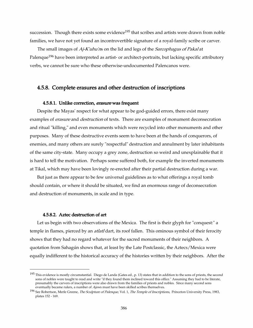
386
succession. Though there exists some evidence195 that scribes and artists were drawn from noble
families, we have not yet found an incontrovertible signature of a royal-family scribe or carver.
The small images of Aj-K'uhu'ns on the lid and legs of the Sarcophagus of Pakal at
Palenque196 have been interpreted as artist- or architect-portraits, but lacking specific attributory
verbs, we cannot be sure who these otherwise-undocumented Palencanos were.
4.5.8. 4.5.8. 4.5.8. 4.5.8. Complete erasures and other destruction of inscriptionsComplete erasures and other destruction of inscriptionsComplete erasures and other destruction of inscriptionsComplete erasures and other destruction of inscriptions
4.5.8.1.4.5.8.1.4.5.8.1.4.5.8.1. Unlike correction, Unlike correction, Unlike correction, Unlike correction, erasureerasureerasureerasure was frequent was frequent was frequent was frequent
Despite the Mayas' respect for what appear to be god-guided errors, there exist many
examples of erasure and destruction of texts. There are examples of monument deconsecration
and ritual "killing," and even monuments which were recycled into other monuments and other
purposes. Many of these destructive events seem to have been at the hands of conquerors, of
enemies, and many others are surely "respectful" destruction and annulment by later inhabitants
of the same city-state. Many occupy a grey zone, destruction so weird and unexplainable that it
is hard to tell the motivation. Perhaps some suffered both, for example the inverted monuments
at Tikal, which may have been lovingly re-erected after their partial destruction during a war.
But just as there appear to be few universal guidelines as to what offerings a royal tomb
should contain, or where it should be situated, we find an enormous range of deconsecration
and destruction of monuments, in scale and in type.
4.5.8.24.5.8.24.5.8.24.5.8.2. Aztec destruction of art. Aztec destruction of art. Aztec destruction of art. Aztec destruction of art
Let us begin with two observations of the Mexica. The first is their glyph for "conquest:" a
temple in flames, pierced by an atlatl dart, its roof fallen. This ominous symbol of their ferocity
shows that they had no regard whatever for the sacred monuments of their neighbors. A
quotation from Sahagún shows that, at least by the Late Postclassic, the Aztecs/Mexica were
equally indifferent to the historical accuracy of the histories written by their neighbors. After the
195 This evidence is mostly circumstantial. Diego de Landa (Gates ed., p. 13) states that in addition to the sons of priests, the second
sons of nobles were taught to read and write "if they found them inclined toward this office." Assuming they had to be literate, presumably the carvers of inscriptions were also drawn from the families of priests and nobles. Since many second sons eventually became rulers, a number of Ajaws must have been skilled scribes themselves.
196 See Robertson, Merle Greene, The Sculpture of Palenque, Vol. 1, The Temple of Inscriptions, Princeton University Press, 1983, plates 152 - 169.
387
pacification of Azcapotzalco and Tlatelolco in 1428, the conqueror Itzcoatl found extensive
histories in their libraries, but
"… it was burned at the time that Itzcoatl reigned in Mexico. The Aztecs (led by his
advisor Tlacaelel) decided it, saying, 'it is not wise that all the people should know the
paintings. The commoners would be driven to ruin and there would be trouble because
the paintings contain many lies, for many in the pictures have been hailed as gods.' "197
4.5.8.34.5.8.34.5.8.34.5.8.3. Maya destruction of art during “star wars”. Maya destruction of art during “star wars”. Maya destruction of art during “star wars”. Maya destruction of art during “star wars”
This ungentlemanly behavior towards one's enemies' sacred art appears, from archaeological
evidence, to have been the rule rather than the exception throughout Mesoamerican history.
While many wars among the Maya appear to have been little more than ritualistic, captive-
taking raids, not unlike the later Aztec "flowery wars," some qualified as genuine wars of
conquest. There was a specific Maya glyph for this type of warfare, (Fig. 4-08, left half), in which
a "star" glyph appears to 'rain' down something onto the emblem of some city-state. The outcome
of this type of war usually involved the Ch'akCh'akCh'akCh'aking ("decapitation") of some major temple, or the
king, or the entire city. The logogram for Ch'akCh'akCh'akCh'ak (T333) consists of an 'axe' (often accompanied
with a -kakakaka phonetic complement) penetrating, 'chopping' the glyph for whatever is being
decapitated (Fig. 4-08, right half). Linda Schele describes the Ch'akCh'akCh'akCh'aking of a building as "cutting a
trench through the floor, knocking down the roof-vaults, and often burning the remains." She
called this kind of offensive, with her customary wit, a "Star War."198 Clearly, the Maya often
showed no respect for the sacred buildings of a rival city, even though their rivals worshipped
the same gods, honored the same holy days, and wrote the same sacred glyphs.
197 This chilling passage, sounding ominously like Landa, comes from Códice Matritense de la Real Academia de Historia [in Paso
y Troncoso, Fray Bernardino de Sahagún: Historia de las Cosas de Nueva España, 8:192. Vol. 8 of the Códice Matritense de la Real Academia de Historia. Madrid: Hauser y Menet, 1907], cited in Marcus, p. 144.
198 Lecture, fall 1996. The "star" in question appears usually to have been Venus, the brightest star-like object in the heavens, whom
the Maya considered their War Portent, and there is some evidence that Maya wars were scheduled according to the movements of Venus.
388
Fig. 4Fig. 4Fig. 4Fig. 4----08. Glyphs for 'Star War' (left) and for 08. Glyphs for 'Star War' (left) and for 08. Glyphs for 'Star War' (left) and for 08. Glyphs for 'Star War' (left) and for Ch'akCh'akCh'akCh'ak "Decapitation" (right) "Decapitation" (right) "Decapitation" (right) "Decapitation" (right). Drawings and photos by author.
4.5.8.44.5.8.44.5.8.44.5.8.4. Yaxchilan . Yaxchilan . Yaxchilan . Yaxchilan Hieroglyphic Stairway 1Hieroglyphic Stairway 1Hieroglyphic Stairway 1Hieroglyphic Stairway 1
There is a single monument at Yaxchilan, Hieroglyphic Stairway #1 (before Structure 33), in
which large glyphic cartouches have been carved directly across an older(?), smaller text.
Unfortunately, the inscription is in medium-poor condition, and it is difficult to determine
whether the cartouched texts were meant to supersede or enhance the original inscription. I am
of the opinion that the cartouches are meant to supersede the older inscriptions, and that
perhaps the old inscription was even "erased," filled with stucco by the later cutters. If these
later glyphs were carved by conquerors, as Erik Boot conjectured199, one would think they
would have done more damage to the statue inside Structure 33, than just to decapitate it. Its
head was found not far from the body; almost as if the decapitators were behaving respectfully.
Also at Yaxchilan is a recycled stela, first erected in AD 514 and reworked around the mid-8th
century. According to Simon Martin (Martin & Grube 2000, p. 120), "Stela 27 is of particular
interest since it was clearly damaged at some point and subsequently restored. Reworking is
evident over much of the lower third of the stone and can be dated by style to the reign of Bird
Jaguar IV (the crudity of the restored left hand led to this figure being nicknamed the wooden
soldier')." Apparently the first to notice this reworking was Linda Schele in 1991.200
199 Personal communication, summer 2004. 200 Cited in Maya Chronicles Synopsis (last paragraph) on the Mesoweb website. Stephen Houston discusses the Late Classic
recarving of this and other monuments in (Houston 2000)
389
At Palenque can be seen three fragments of inscribed stone recycled as building material.201
Though they are fairly prominently placed —two in front walls of Temple IV of the North
Group, one as a threshold of a main entrance into (residential) Group A—, one of these is
mounted upside-down, partly covered by a crosswise wall, and all are fragmentary. I find it
difficult to believe that Maya viewers were meant to see these re-uses as ritually respectful, or
that they were meant to communicate the texts' original meaning.
There are a few examples of Maya monuments being recycled, cut down to smaller size:
Uaxactun Stela 10 and Uolantun Stela 1 were each reshaped to serve as an altar.202 The texts and
pictures were preserved as far as possible, which suggests that this recycling had been done
respectfully. Perhaps the texts had been "whitewashed," filled in with stucco which has since
fallen out, but I think that the writing and carving on them made them more powerful, and it
was displayed, in a way that emphasized its inscription. Despite many examples of inscriptional
recycling and even destruction, we still have never found any texts corrected.
4.5.8.54.5.8.54.5.8.54.5.8.5. Olmec ritual destruction and monument recycling. Olmec ritual destruction and monument recycling. Olmec ritual destruction and monument recycling. Olmec ritual destruction and monument recycling
The recycling of an old monument into something else has a very long history in
Mesoamerica. As early as the late Early Preclassic (ca. 1200 - 900 BC), at San Lorenzo, Olmec
Colossal Head 7 seems to have been made from a much larger "tabletop altar" or throne.203 Most
of the seventeen known Olmec Colossal Heads are distinctly flat on the rear side204, and San
Lorenzo Head 7 bears two deep cavities on its right ear that match the shape of the "ruler-in-
niche/ruler-emerging-from-cave" on the sides of surviving Thrones. The prevailing hypothesis
posits that a Throne was made specifically for an individual, and upon his death, his Throne
would be recarved into his portrait as a funeral monument.205
201 As at Palenque, where a fragment of inscription is used as a step in Group A [at the bottom of the steep trail downhill behind
the North Group], and two Pakal-era fragments re-used in North Group Temple IV, [Robertson, Merle Greene, The Sculpture of Palenque, Vol. IV, Princeton University Press, 1991, pll. 214-216]."
202 Marcus, p. 151f. 203 "According to some specialists, the two sunken arches on the right side are the remains of the front niche of the throne this head
was made from." Of the ten Heads found at San Lorenzo, nine are distinctively flattened on the occiput, which would correspond to the flattened bottom or top of the "tabletop altar" thrones they were presumably carved from. This is also true of two of the four Heads from La Venta. The one San Lorenzo exception, Head 8, also happens to be the best preserved of the seventeen Colossal Heads found to date. The Heads from Tres Zapotes/La Cobata the two remaining La Venta Heads are rounded on their backs. Cyphers, Ann, "Catalogue of Olmec Heads," Arqueología Mexicana Special Edition, México, D.F., n.d. (ca. 1993) inside front cover.
204 Though this flattening might have been nothing more than an expedience to ease the transport of these heads. It might in addition have evinced contemporary comparisons with cranial deformation practices.
205 Reilly, Kent, and others, Personal communications, 2001-2004
390
This idea also suggests an alternative explanation for the puzzling effort to which some
destroyers of Olmec monuments went. Michael Coe and Richard Diehl thus describe the
vandalism subjected a Throne: "Monument 20 exhibits the scars of massive flakes that were
struck off by gigantic hammerblows. In our bewilderment, we have postulated large tree trunks
being lashed together into huge tripods, from which great pieces of already shattered
monuments could be suspended by ropes and sent oscillating to smash into their appointed
targets. In no other way can we account for the power of these blows."206 Later, Coe says, "The
fury of the destructive force visited upon these stones astounded us, for in some respects it
matched the labor and ingenuity of which went into their creation. Civilizations went out with a
bang, not a whimper, in early Mesoamerica."207 Perhaps these "gigantic hammerblows" were
controlled, large-scale stone-tool technology, simply the first steps in chipping off the corners of
a large rectangular stone to rough out a Colossal Head "blank." Despite the work, this might
involve substantially less effort than sawing or grinding off the large corners. Certainly these
artisans were experts in the principles of controlled flaking, they simply applied them here on a
larger scale.
I hasten to add that Coe and Diehl do not subscribe to this hypothesis. As Coe points out, this
destruction happened at the end of San Lorenzo's Olmec phase, and that there was probably
little interest at that time in carving new Heads or Altars. Also, other kinds of defacement,
involving equally bewildering effort, ravaged these monuments.208
The inhabitants (or perhaps conquerors?) of San Lorenzo had, in a final ritual act, moved a
substantial number of large basalt monuments —many already substantially damaged— to be
buried along one or more of the city's major axes (particularly the Group D Ridge), which
pattern allowed Coe's team to find more than they otherwise might have.209
"Destruction of monuments was not a one-time act. It was, rather, something which
apparently took place regularly. With a few exceptions, every portrait monument in the
206 Coe, Michael D., and Diehl, Richard A., In the Land of the Olmec. Vol. I. The Archaeology of San Lorenzo Tenochtitlán,
University of Texas Press, Austin, 1980, pp. 297-298. 207 Coe, Michael D.. Mexico, revised and enlarged edition, London, Thames & Hudson, 1984, p. 71. 208 "Your argument sounds good, except for one thing: the monuments at San Lorenzo show abundant mutilation of other kinds,
apart from the smashing. These include the pitted "negative breasts", axe-grinding marks, etc. When all this happened, San Lorenzo was at the end of its great Olmec phase, ca. 900 BC (radiocarbon years). I think it's unlikely that they were much interested in making altars* at such a time. I still think that the destruction was by the invaders or revolutionaries. …Dick Diehl and I are in agreement about this." Personal communication, 12 July 2005. (*MV comment: For "altars" here I think Mike means "any monuments," specifically "heads.")
209 Coe, Mexico, p. 71; Coe and Diehl, p. 298
391
[Olmec] heartland was mutilated. This means that monuments personifying each and every
ruler over a long time-span were destroyed."210
Coe, Diehl, Grove, Clewlow211, and others have contemplated this mysterious destruction,
which, besides the violent breaking off of huge chips from the Thrones, falls into these
categories:
1.1.1.1. BeheadingBeheadingBeheadingBeheading of statues and other fracturing: "Few figures are found with their heads and,
for the broken-off heads that are recovered (such as San Lorenzo Monument 6), one never
finds the bodies. Incidentally, bodies greatly outnumber heads, which must have been
disposed of elsewhere."212
2. "SlottingSlottingSlottingSlotting…oblong compartments pecked out of the monument surface."213
3. "PoundingPoundingPoundingPounding — the surfaces of most monuments show some signs of pounding with stones
to obliterate features; this is the way, for instance, that the seated figure in the niche of …
Monument 20 was made almost unrecognizable."214
4.4.4.4. Sharpening groovesSharpening groovesSharpening groovesSharpening grooves, as termed by Clewlow, which are "longitudinal grooves or boat-
shaped channels, carved into stone as an apparent result of the grinding or sharpening of
axes or celts." 215 Coe and Diehl: "This is quite rare at San Lorenzo Tenochtitlán but can be
seen, for example, on the front of … Monument 14."216
5.5.5.5. PittingPittingPittingPitting, which comes in two forms: smooth, shallow, and relatively rare "ground pits" and
the distinctive and common "dimpled pits," "cup-shaped depressions with central deeper
"nipple or dimple-like concavities,"217 which Coe, noting they often come in pairs, calls
"negative breasts."218 The former were formed by simple grinding of any small object
against the surface of the monument, and appear infrequently at San Lorenzo, perhaps
suggesting that this type of damage was too time-consuming to bother with much. The
210 Grove, David, "Olmec Monuments: Mutilation as a Clue to Meaning," pp. 48-68 in Benson, Elizabeth P., The Olmec and Their
Neighbors: Essays in Memory of Matthew W. Stirling, Washington,. Dumbarton Oaks, 1981, p. 59 211 Clewlow, C. William Jr., "A Stylistic and Chronological Study of Olmec Monumental Sculpture," University of California,
Archeological Research Facility, Contributions 19, 1974, pp 13 ff. 212 Coe, Michael D., and Diehl, Richard A., In the Land of the Olmec. Vol. I. The Archaeology of San Lorenzo Tenochtitlán,
University of Texas Press, Austin, 1980, p. 297. 213 Coe and Diehl, p. 298. They continue, "Good examples… right end of SL Monument14, where an entire surface has been slotted
with multiple depressions to largely obliterate the relief figure of a captive, and the back of Monument 20, a complex production which almost suggests a bar-and-dot numeral . Possibly the celt-shaped depressions of SL Monument 8 are a case of slotting, although they look original."
214 Coe and Diehl, p. 298. 215 Clewlow p. 13, cited in Coe and Diehl, p. 298. 216 Coe and Diehl, p. 298 217 Clewlow p. 13, cited in Coe and Diehl, p. 298. 218 Coe and Diehl, p. 298.
392
latter, on the other hand, are so common and consistent and distribution-patterned, that
they must have had very specific meaning. Unfortunately, the logic of their distribution-
patterns is tantalizingly erratic:
A. Not only are these nippled pits rare outside of San Lorenzo, they rarely occur on
any type of monument except the Colossal Heads. (A possible exception is San
Lorenzo Mon. 21.) With few exceptions, this damage is confined to the face and
front part of the headdress, as if to achieve maximum visual (or, more likely,
magical) effect.
B. San Lorenzo Head 3 has 27 such pits in its headdressheaddressheaddressheaddress, and no substantial damage
anywhere else. Other monuments with dimpled pits in the headdress also have
them elsewhere: SL Head 2 (a dozen or so on the headdress), SL Head 5 (five), SL
Head 6 (two or more, at the cardinal points), SL Head 7 (three or more; pounding-
damage makes it hard to see others), ), SL Head 9 (half a dozen or more), SL Head
10 (one or two only, with one more on his left nostril, maybe another elsewhere),
La Venta Monument 3 (ten or twelve on headdress, along with many grooves and
pounding mutilation), perhaps La Venta Monument 2 (maybe four or more, much
disguised by extensive pounding). None of the two Tres Zapotes Heads nor the
La Cobata Head show these dimpled pits, nor any substantial damage, save
chipping to the noses of TZ Mon. A and the La Cobata Head. See below for more
on TZ Mon. A.
C. SL Head 1 has two on the nosenosenosenose, one on the upper curve of each nostril. Others on
the nose: SL Head 2 (with three on the point of the nose and dozens more all over
the face and headdress), SL Head 6 and Head 7 (one on the bridge of the nose of
each), SL Head 9 has one on the bridge of the nose, and another on the tip. SL
Head 10 has one on the upper curve of his left nostril. La Venta Monuments 3
and 4 are so pounding-damaged that the noses have been obliterated.
D.D.D.D. EyesEyesEyesEyes. SL Head 1 has a large dimpled pit below his right eye. SL Head 2's many
pits avoid the eyes themselves, but more than half a dozen cluster round the
lower outer corners, like flies on an African refugee. Likewise, SL Heads 5 and 6
have two or three pits at the outer corner of the right eye (our left), and SL Head 5
also has one precisely at the outer corner of his left eye. One of these pits on Head
6 lays, uniquely, half on the lid and half on the eye itself. SL Head 7 has one below
393
the outer corner of each eye, and two or more on the upper lid of his right eye. SL
Head 9 has one above the corner of his right eye, and there appears to be a couple
below the eyes of La Venta Monument 3.
E.E.E.E. LipsLipsLipsLips. SL Head 2's lower lip has at least five pits, with another handful of smaller
ones concentrated on the right half of his upper lip (our left). SL Head 5 has one
centered on his upper lip. SL Head 7 has one definite pit on his right lower lip,
and one more below the right corner of his mouth, and probably others
obliterated by the pounding. La Venta Monument 3 has a deep un-dimpled drill
hole in the right corner of his mouth that is likely to have been original, defining
the corner of his mouth (as do the two drill-holes on La Venta Monument 4's
mouth.)
F.F.F.F. ChinChinChinChin. SL Head 2's chin is completely covered with seven overlapping pits. SL
Head 5 has but one carefully centered. SL Head 7 appears to have at least one; SL
Head 9 one also, well to the right (our left). La Venta Monument 3 has two or
three deep grooves rather than pits, though we appear to have one off to the far
right (our left).
G.G.G.G. CheeksCheeksCheeksCheeks. Three monuments with dimpled pits on the cheeks seem to be ones with
many pits (SL Head 2) or severe pounding (SL Head 7, La Venta Mon. 3). The
only other pit is found on a cheek in SL Head 9.
H. Other damage of note: TZ Mon. A seems to have suffered intentional, severe
blows to the left eye, left lips, and nose. Likewise with SL Head 9's lip and bridge
of his nose. As mentioned above, La Venta Monuments 2, and especially 3 and 4,
suffered severe pounding and grooving.
The distribution pattern emphatically implies that these nippled or dimpled pits had potent
meaning. These pits are no mere vandalism; they were carefully made, and must have taken an
hour or two apiece to accomplish. Despite variations in where they cluster, they are confined to
the faces of Colossal Heads (and fronts of headdresses) with remarkable consistency. They
almost never intrude into the eyes, though they cluster round them, as they do on lips, chins,
and noses.
The reasons for the variation in their quantity, and in where they cluster (twenty-seven on SL
Head 3's headdress and nowhere else, one under the eye and on each nostril on SL Head 1 and
394
nowhere else), remain a mystery. Perhaps Head 1 was renowned for his life/breath and vision,
Head 3 for his thinking, or perhaps —as in Maya times— damaging the nose and eyes was
understood as a way of severely limiting the power of the carved figure to see or breathe (or,
having a similar notion to the Japanese concept of self, which resides focussed in the nose, priests
sought to deconsecrate or "kill" monuments with this careful destruction.)
Grove and others have suggested that these pits result from some ritual "tapping" or
"controlling" the sacred life-power of these monuments.219 In this scenario, these pits were made
respectfully by the San Lorenzans, in sacred rituals that sought to distribute a portion of the
power in these monuments to other purposes. The basalt from which they were made was itself
sacred, the carving (and recarving from a Throne into a Head) rituals added sacred power, the
rites celebrated with the king seated thereon and the subsequent rituals which the Head
witnessed, all added still more power to these sculptures. If the San Lorenzo Olmec believed
that this accumulated energy might reach unmanageable or unstable levels, they may have
tapped a bit of the energy by way of this drilling to keep the monument "safe." Or perhaps they
felt they needed some of this Head's power to use somewhere else, and they could collect and
transport it in the form of ritually-collected dust. Possibly the "sharpening" grooves represent a
form of this belief, in a ritual which imbued weapons and tools with this power.
Stan Guenter suggests that they represent a long-term effort by conquerors to dispel the
power of the dead kings installed in these stones:
" I like Dave Stuart's article on stone monuments220 and how stelae were imbued with
part of the spirit of the portrayed individual; very similar to the way ancient Egyptians had
their ka statues that, in the case the mummy itself was destroyed, would function as a stand-
in for the actual body. Thus I see the desecration of the Olmec monuments as likely
occurring by enemies living in the same cultural world where the huge heads were thought
to embody the spirits of past rulers. The conquering enemy was trying to prevent the spirits
of these ancient kings from remaining in the monuments at the defeated city."221
219 Grove, pp. 59 ff. 220 Stuart, David , "Kings of Stone: a Consideration of Ancient Stelae in Maya Ritual and Representation," in Res 29-30 (1996),
Cambridge, MA, pp 148-171 221 Personal communication, July 2004
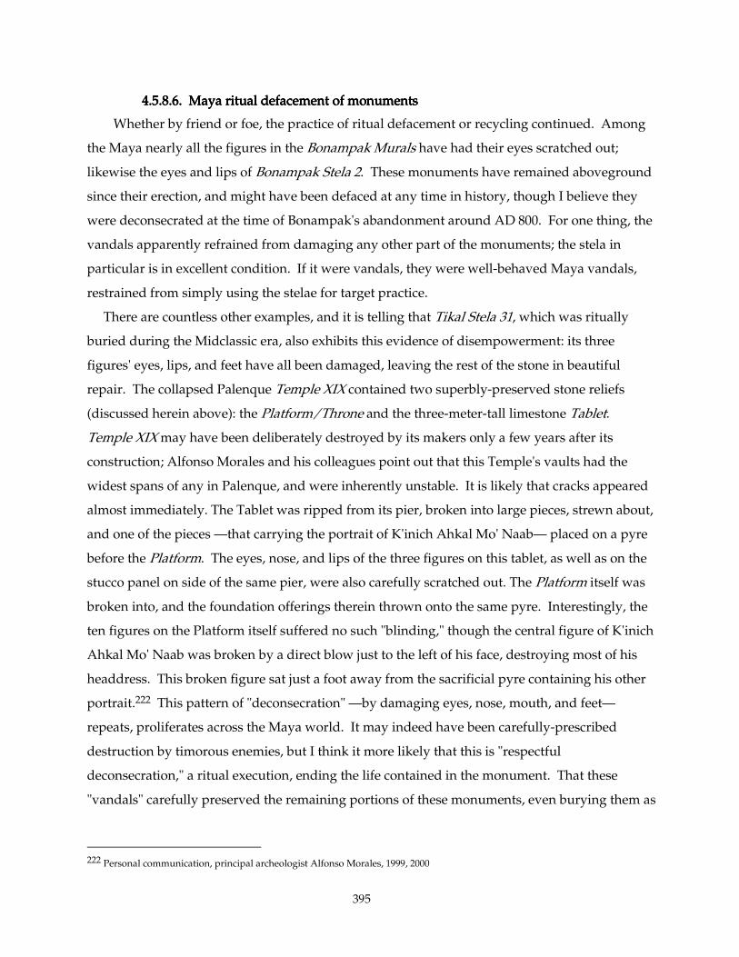
395
4.5.8.64.5.8.64.5.8.64.5.8.6. Maya ritual defacement of monuments. Maya ritual defacement of monuments. Maya ritual defacement of monuments. Maya ritual defacement of monuments
Whether by friend or foe, the practice of ritual defacement or recycling continued. Among
the Maya nearly all the figures in the Bonampak Murals have had their eyes scratched out;
likewise the eyes and lips of Bonampak Stela 2. These monuments have remained aboveground
since their erection, and might have been defaced at any time in history, though I believe they
were deconsecrated at the time of Bonampak's abandonment around AD 800. For one thing, the
vandals apparently refrained from damaging any other part of the monuments; the stela in
particular is in excellent condition. If it were vandals, they were well-behaved Maya vandals,
restrained from simply using the stelae for target practice.
There are countless other examples, and it is telling that Tikal Stela 31, which was ritually
buried during the Midclassic era, also exhibits this evidence of disempowerment: its three
figures' eyes, lips, and feet have all been damaged, leaving the rest of the stone in beautiful
repair. The collapsed Palenque Temple XIX contained two superbly-preserved stone reliefs
(discussed herein above): the Platform/Throne and the three-meter-tall limestone Tablet.
Temple XIX may have been deliberately destroyed by its makers only a few years after its
construction; Alfonso Morales and his colleagues point out that this Temple's vaults had the
widest spans of any in Palenque, and were inherently unstable. It is likely that cracks appeared
almost immediately. The Tablet was ripped from its pier, broken into large pieces, strewn about,
and one of the pieces —that carrying the portrait of K'inich Ahkal Mo' Naab— placed on a pyre
before the Platform. The eyes, nose, and lips of the three figures on this tablet, as well as on the
stucco panel on side of the same pier, were also carefully scratched out. The Platform itself was
broken into, and the foundation offerings therein thrown onto the same pyre. Interestingly, the
ten figures on the Platform itself suffered no such "blinding," though the central figure of K'inich
Ahkal Mo' Naab was broken by a direct blow just to the left of his face, destroying most of his
headdress. This broken figure sat just a foot away from the sacrificial pyre containing his other
portrait.222 This pattern of "deconsecration" —by damaging eyes, nose, mouth, and feet—
repeats, proliferates across the Maya world. It may indeed have been carefully-prescribed
destruction by timorous enemies, but I think it more likely that this is "respectful
deconsecration," a ritual execution, ending the life contained in the monument. That these
"vandals" carefully preserved the remaining portions of these monuments, even burying them as
222 Personal communication, principal archeologist Alfonso Morales, 1999, 2000
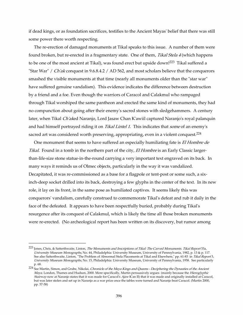
396
if dead kings, or as foundation sacrifices, testifies to the Ancient Mayas' belief that there was still
some power there worth respecting.
The re-erection of damaged monuments at Tikal speaks to this issue. A number of them were
found broken, but re-erected in a fragmentary state. One of them, Tikal Stela 4 (which happens
to be one of the most ancient at Tikal), was found erect but upside down!223 Tikal suffered a
"Star War" / Ch'ak conquest in 9.6.8.4.2 / AD 562, and most scholars believe that the conquerors
smashed the visible monuments at that time (nearly all monuments older than the "star war"
have suffered genuine vandalism). This evidence indicates the difference between destruction
by a friend and a foe. Even though the warriors of Caracol and Calakmul who rampaged
through Tikal worshiped the same pantheon and erected the same kind of monuments, they had
no compunction about going after their enemy's sacred stones with sledgehammers. A century
later, when Tikal Ch'aked Naranjo, Lord Jasaw Chan K'awiil captured Naranjo's royal palanquin
and had himself portrayed riding it on Tikal Lintel 1. This indicates that some of an enemy's
sacred art was considered worth preserving, appropriating, even in a violent conquest.224
One monument that seems to have suffered an especially humiliating fate is El Hombre de
Tikal. Found in a tomb in the northern part of the city, El Hombre is an Early Classic larger-
than-life-size stone statue-in-the-round carrying a very important text engraved on its back. In
many ways it reminds us of Olmec objects, particularly in the way it was vandalized.
Decapitated, it was re-commissioned as a base for a flagpole or tent-post or some such, a six-
inch-deep socket drilled into its back, destroying a few glyphs in the center of the text. In its new
role, it lay on its front, in the same pose as humiliated captives. It seems likely this was
conquerors' vandalism, carefully construed to commemorate Tikal's defeat and rub it daily in the
face of the defeated. It appears to have been respectfully buried, probably during Tikal's
resurgence after its conquest of Calakmul, which is likely the time all those broken monuments
were re-erected. (No archeological report has been written on its discovery, but rumor among
223 Jones, Chris, & Satterthwaite, Linton, The Monuments and Inscriptions of Tikal: The Carved Monuments. Tikal Report 33a,
University Museum Monographs, No. 44, Philadelphia: University Museum, University of Pennsylvania, 1982, p. 13 & p. 117. See also Satterthwaite, Linton, "The Problem of Abnormal Stela Placements at Tikal and Elsewhere," pp. 61-83 in Tikal Report 3, University Museum Monographs, No. 15, Philadelphia: University Museum, University of Pennsylvania, 1958. See particularly p. 68.
224 See Martin, Simon, and Grube, Nikolai, Chronicle of the Maya Kings and Queens - Deciphering the Dynasties of the Ancient Maya. London, Thames and Hudson, 2000. More specifically, Martin persuasively argues (mainly because the Hieroglyphic Stairway now at Naranjo states that it was made for Caracol's Ajaw K'an II) that it was made and originally installed at Caracol, but was later stolen and set up in Naranjo as a war prize once the tables were turned and Naranjo beat Caracol. (Martin 2000, pp. 57-58)
397
the guides and archeologists there describe it as having been found in the tomb's antechamber,
surrounded by offerings.)225
Despite many examples of inscriptional recycling and destruction, we still have never found
any texts corrected, in the sense of proofreaders working on the same side as the author. The
overlaid texts on Yaxchlan's Stairway do not appear to modify the old text so much as to
supplant it.
4.5.8.74.5.8.74.5.8.74.5.8.7. Mesoamerican ritual art. Mesoamerican ritual art. Mesoamerican ritual art. Mesoamerican ritual art----sacrificesacrificesacrificesacrifice
Mesoamerica has a long and noble tradition of ritual art-sacrifice. Copal (and rubber and corn
meal and no doubt a dozen other sacred materials) was burned copiously as grains (ch’aj) or
shaped into little balls, but also, on occasion, it was shaped into more elaborate forms, some no
doubt quite fantastic and representing much time, skill and creativity, before being burned or
buried. This is not unlike the astonishingly complex, ephemeral offerings of Balinese festivals,
artfully-sculpted food items which are thrown into the sea or burned upon altars. Examples of
such temporary-art sacrifice can be found in every culture, in every era. From the Olmec rubber
balls and wooden sculptures cast into the waterhole at El Manatí and the burned jade masks
thrown into the spring at Rio Pesquero, to the crumpled embossed gold disks and jades and
wooden objects and who knows what else in the Cenote of Chichén Itzá, to the foundation-
deposits of every era, sacred and beautiful objects have been given to the gods, destroyed so that
they may be reborn in the Next World. I have little doubt that the Maya also sacrificed many
elaborate constructions made from paper, perhaps some covered with hieroglyphs as well as the
frequently-illustrated strips of blood-spattered paper. This form of respectful destruction may
shed light on the Mayas' attitude toward erasure of sacred texts.
The Maya shared with other Mesoamerican and even North American peoples the practice of
"killing" vessels. Plates and shallow bowls often are found in tombs with a "kill-hole" carefully
drilled (or not-so-carefully punched with a sharp object) in the center. Though the phrase
implies that the bowl itself has a spirit which must be released, a crucial item of information
explains a very important distinction. The "killed" Maya vessels are nearly all plate-like objects
which were placed upside-down over the face of a deceased person. This is also true of the
beautiful Mimbres bowls of the Early Postclassic Mogollon people of New Mexico, a thousand
225 Personal communications, officials and guides at Tikal, 2000
398
miles to the north: they were "killed" before placing over the face of the dead. Here we see that
the spirit which must be released was that of the dead person, not the bowl. The many other
vessels found in Maya and other Mesoamerican tombs were left "alive," so they could carry the
offerings of food, drink, copal, etc., into the Afterworld, however long that might take. The fact
that most Maya "kill holes" were carefully drilled suggests that the artwork painted or carved
into the plates was highly valued —or still retained some power.
4.5.8.84.5.8.84.5.8.84.5.8.8. Patterns (or lack of them) in reconstruction of pyramids. Patterns (or lack of them) in reconstruction of pyramids. Patterns (or lack of them) in reconstruction of pyramids. Patterns (or lack of them) in reconstruction of pyramids
Mesoamericans are well-known for their unique pyramids, built on geomantically-sacred sites
and rebuilt-enlarged repeatedly over the centuries, until they are layered like an onion. The
Great Pyramid of Cholula compelled archeologists to dig seven kilometers of tunnels inside it,
exploring all the layers. The stump of the Aztec Templo Mayor in Tenochtitlán shows seven
layers built in just a century. The Acropolis of Tikal revealed over a dozen expansions, between
50 BC and the eighth century AD. The way the Maya built a new temple over an old one is
revealing. Nearly all these renovations can be assumed to be relatively respectful, at least as
respectful as Donald Trump's construction of Trump Tower over the old Tiffany's jewelry
house.226
For the most part, the construction process as revealed at Tikal's Acropolis might be
considered typical.227 When the rulers and priests initiated a new construction phase over an
older pyramid, usually they would first raze the temple capping the pyramid. This "respectful"
destruction was as total as any visited by enemies. The rubble from the old structure was used
as part of the fill to support the new construction. Sometimes archeologists discover bits of
decorated stone and stucco from these older phases while exploring inside pyramids. So in
certain contexts, Maya elite showed no respect at all for preserving even their own sacred art.
Yet at other times they lovingly preserved certain buildings, packing a façade or an entire
building in fine sand before entombing it inside a later structure. Such was the treatment
afforded the renowned Early Classic Rosalila structure inside Temple 26 at Copan, and one of
the older temples inside the Temple of the Warriors at Chichén Itzá, and the tiny four-stairwayed
late Preclassic pyramid E-Sub-VII at Waxaktun, and the throne room inside Chichén's Castillo.
226 Trump is renowned for ignoring the guidelines of the New York architectural heritage commission, and destroying an
important architectural relief. He did build a new, grand Tiffany's in the base of his Tower, but many consider his destruction of the old landmark an act of artistic sacrilege.
227 See the Pennsylvania University Museum Tikal Reports, particularly No. 12.
399
The Marcador was likewise carefully dismantled and preserved inside its shrine in the "Mundo
Perdido" Complex at Tikal. So, for reasons yet unclear, the Maya showed extraordinary respect
for certain "obsolete" buildings. Waxaktun E-Sub-VII is an omphalos, a symbolic center-of-the-
world, and probably the first such building at Waxaktun; perhaps its preservation has something
to do with that role. Likewise with Rosalila, a building dedicated to the fifth-century Founder of
Copan Yax-K'uk'-Mo. But this pattern is not at all consistent.
4.5.8.94.5.8.94.5.8.94.5.8.9. Late Preclassic inscription. Late Preclassic inscription. Late Preclassic inscription. Late Preclassic inscription----erasureerasureerasureerasure
Relative to the Classic period228, somewhat less is known of the Late Preclassic Maya
florescence, which peaked in the short period 50 BC - AD 100, and in some places lasted until the
third century. Cities like Kaminaljuyu, El Baul, and Takalik' Abaj in the southern Guatemalan
Highlands, Cerros in northern Belize, and El Mirador and Nakbe in the Petén enjoyed
extraordinary growth and art-production.229 However, Kaminaljuyu's monuments suffered
ferocious destruction not unlike that seen at San Lorenzo several centuries earlier, and the
known stelae from El Mirador and Nakbe were all damaged as well. However, as more than one
investigator has observed, the texts from Mirador/Nakbe seem to have been particularly
targeted for destruction. Glyphs in those days were not large and boldly sculpted in relief like
we see later, in Early Classic stelae such as Tikal's Stela 29 and Stela 4. All surviving late
Preclassic inscriptions in stone are small and lightly incised (including Kaminaljuyu Stela 10 and
surviving bits from El Mirador), and would be easy to erase, should one have the notion. And
apparently someone did. Whether by friend or foe, respectful or vengeful, every known
hieroglyphic inscription from the mighty cities of El Mirador and Nakbe has been carefully
scraped from its panel.230 El Mirador Stela 2, discovered in 1962 by Ian Graham, is informative
in that the vandals failed to complete the erasure: traces of four or five glyphs remain. The
glyphs' small size (about five cm / two inches wide) and light incision make them very similar in
technique to contemporary jade inscriptions and to the glyphs on Kaminaljuyu Stela 10 and the
228 A major contributor to this imbalance was the prosperity of Late Classic cities, whose ambitious urban renewal programs razed
or buried almost all Preclassic and Early Classic construction. Luckily, a substantial portion of this was preserved inside pyramids, and can be recoverd by tunneling.
229 As did their neighbors at Izapa, Monte Alto, Tres Zapotes, Chiapa de Corso, and La Mojarra. More distant Monte Albán II, the
copious production of Colima ceramics, and the foundation of Teotihuacan also occurred at this time. There must have been a long run of benign weather coupled with governmental and economic innovations all across Mesoamerica, to bring about such sudden prosperity.
230 Richard Hansen, principal excavator there, personal communication, 2001
400
La Mojarra Stela. Richard Hansen dates El Mirador Stela 2 to ca. 8.0.0.0.0 / mid-first-century
AD.231
Although this dissertation focuses for convenience on glyphic connoisseurship, its analytical
method readily applies to illustrative, decorative and other non-glyphic (and non-Maya)
artforms. Therefore, despite a relative lack of known texts from the period, the method could
shed some light on the process of Preclassic art-making, and through that on the cultures of the
time.
We see that at least during this earlier stage, Maya felt it necessary to deconsecrate at least
some of their own (or perhaps their enemies') hieroglyphic texts by erasing them, rather like the
way they later destroyed the vision and voice of Classic stone effigies. Their neighbors to the
west, in the Isthmus of Tehuantepec, left us very few inscriptions: the La Mojarra Stela and
perhaps the two earliest monuments carrying a Long Count date, remained aboveground,
subject to deconsecration or vandalism, but their texts show no signs of erasure, for what it's
worth.
231 Hansen, Richard D., "An Early Maya Text from El Mirador, Guatemala," Research Reports on Early Maya Writing, no. 37,
August 1991. Center for Maya Research, Washington DC.
401
Bibliography / Works citedBibliography / Works citedBibliography / Works citedBibliography / Works cited
Print references:Print references:Print references:Print references: Ancona-Ha, Patricia, Perez de Lara, Jorge, and Van Stone, Mark, "Some Observations on Hand Gestures
in Maya Art" pp. 1072-1089 in Kerr & Kerr (2000), The Maya Vase Book, Vol. VI, New York, 2000. Beazley, John Davidson, 1885-1970
1963. Attic red-figure vase-painters. 2d ed. Oxford, 1963 1974. The Kleophrades Painter. Rev. 1944 & 1948, Mainz 1974.
Benedictins du Bouveret, (at the Abbey of Saint-Benoît de Port-Valais: Bouveret, Switzerland), Colophons
de manuscrits occidentaux des origines au XVIe siècle. Fribourg, Suisse, Editions universitaires, 1965-1982.
Blom, Frans F., and LaFarge, Oliver, Tribes and Temples: A Record of the Expedition to Middle America
Conducted by the Tulane University of Louisiana in 1925. New Orleans, Tulane University, Department of Middle American Research. 2 vols. 1926 - 1927
Bradley, John W. (1830-1916), A Dictionary of Miniaturists, Illuminators, Calligraphers, and Copyists,
… with references to their works, and notices of their patrons, from the Establishment of Christianity to the Eighteenth Century… n.d., ca. 1900, 3 volumes, reprinted by Burt Franklin/Lenox Hill, New York, 1958, 1973.
Cao Zhao (14th century), trans. by David, Percival Victor, Sir, bart.: Chinese connoisseurship: the Ko Ku
Yao Lun, the essential criteria of antiquities (With a facsimile of the Chinese text of 1388). London 1971
Chen Chih-Mai, Chinese Calligraphers and Their Art, London, New York, Melbourne, Melbourne
University Press and Cambridge University Press, 1966 Clewlow, C. William Jr., "A Stylistic and Chronological Study of Olmec Monumental Sculpture,"
University of California, Archeological Research Facility, Contributions 19, 1974 Coe, Michael D.
1973. The Maya Scribe and His World, Grolier Club, New York 1984. Mexico, revised and enlarged edition, London, Thames & Hudson,
Coe, Michael D., and Diehl, Richard A., In the Land of the Olmec. Vol. I. The Archaeology of San Lorenzo
Tenochtitlán, University of Texas Press, Austin, 1980
Coe, Michael D., and Kerr, Justin, The Art of the Maya Scribe, Thames & Hudson, New York and London,
1997 Coe, Michael D., & Van Stone, Mark, Reading the Maya Glyphs. London, Thames & Hudson, 2001 Coe, William R., Tikal Reports Number 14. Excavations in the Great Plaza, North Terrace and North
Acropolis at Tikal. University of Pennsylvania Museum Monograph 61, 5 Vols., Philadelphia 1990. Cohodas, Marvin, "Transformations: Relationships Between Image and Text in the Ceramic Paintings of
the Metropolitan Master," in William Hanks, ed., Text and Image in Ancient Mesoamerican Art, Oxford, 1984
402
Cyphers, Ann, "Catalogue of Olmec Heads," Arqueología Mexicana Special Edition, México, D.F., n.d. (ca.
1993) David, Percival Victor, 1971, see Cao Zhao Davies, Benedict G., Who's Who at Deir el-Medina: A Prosopographic Study of the Royal Workmen's
Community. Egyptologische Uitgaven (EU) XIII. Leiden, Nederlands, Instituut voor het Nabije Oosten te Leiden, 1999
Davies, W. Vivian, ed., Color and Painting in Ancient Egypt. London, British Museum Press, 2001 Davoust, Michel, "The Glyphic Names for Some Maya Scribes and Sculptors of the Classic Period," pp.
105-112 of Fields, Virginia, Volume Ed., Robertson, Merle Greene, General Ed., Seventh Palenque Round Table, 1989. San Francisco, The Pre-Columbian Art Research Institute, 1994.
de Landa, Diego, see Landa, Diego de Fischer, Henry George, The Orientation of Hieroglyphs, Part I: Reversals. The Metropolitan Museum of
Art, Egyptian Studies II. The Metropolitan Museum of Art, New York, 1977 Frumker, Bruce, "Nights Errant: A Look at Wayward Lords of the Night," #43 in Research Reports on
Ancient Maya Writing, #42, 43 44, Washington DC, August 1999 Gates, William, see Landa, Diego de Gillespie, Susan D., “Llano del Jícaro: an Olmec monument workshop,” pp. 231-242 in Ancient
Mesoamerica 5(2), Cambridge, England, 1994 Gray's Anatomy, 1901 ed., reprinted by Crown, New York, 1977 Grube, Nikolai, Die Entwicklung der Mayaschrift: Grundlagen zur Erforschung des Wandels der
Mayaschrift von der Protoklassik bis zur spanischen Eroberung. Acta Mesoamericana, 3, Universität Hamburg/Verlag von Flemming, Berlin, 1990. Doctoral dissertation
Grove, David, "Olmec Monuments: Mutilation as a Clue to Meaning," pp. 48-68 in Benson, Elizabeth P.,
The Olmec and Their Neighbors: Essays in Memory of Matthew W. Stirling, Washington,. Dumbarton Oaks, 1981
Hansen, Richard D., "An Early Maya Text from El Mirador, Guatemala," Research Reports on Early Maya
Writing, no. 37, August 1991. Center for Maya Research, Washington DC Harvard, Stephen, An Italic Copybook : the Cataneo Manuscript. Published for the Dept. of Printing and
Graphic Arts of the Houghton Library, Harvard University and the Newberry Library, by Taplinger Pub. Co., New York, N.Y., 1981
Hendrix, Lee, and Vignau-Willberg, Thea, eds., Mira calligraphiæ monumenta, a Sixteenth-Century
Manuscript Inscribed by Georg Bocskay amd Illuminated by Joris Hofnaegel, The Getty Museum, Malibu, 1992
Henry, Françoise, The Book of Kells. New York, Knopf, 1974
403
Houston, Stephen D., "Into the Minds of Ancients: Advances in Maya Glyph Studies," pp. 121-201 of Journal of World Prehistory, Volume 14, Number 2, June 2000. Published by Springer Science+Business Media B.V.,
Iverson, E., Canon and Proportion in Egyptian Art, London 1955 Johnston, Kevin J., “Broken fingers: Classic Maya scribe capture and polity consolidation,” Antiquity 75,
June 2001, pp. 71-81. Reviewed by Wilford, John Noble, “Live by the Pen, Die by the Sword,” in The New York Times’ Science Times section, 17 July 2001, pp. 1-2
Jones, Chris, & Satterthwaite, Linton, The Monuments and Inscriptions of Tikal: The Carved Monuments.
Tikal Report 33a, University Museum Monographs, No. 44, Philadelphia: University Museum, University of Pennsylvania, 1982
Kanawati, Naguib, The Rock Tombs of El-Hawawish: The Cemetery of Akhmim, Vol. I. The Macquarie
Ancient History Association, Sydney, 1980 Keller, Cathleen Anne, The Painters of Deir el-Medina in the Ramesside Period. Dissertation submitted in
partial satisfaction of the requirements for the degree of Doctor of Philosophy in Ancient History and Archaeology in the Graduate Division of the University of California, Berkeley, 1978
Kerr, Justin, “Where Do You Keep Your Paint-Pot?,” privately circulated, n.d., and available on his website
http://famsi.saiph.com:9500/dataSpark/maya. (consulted June 2004) Kerr, Justin and Barbara
1997. The Maya Vase Book, Vol. V, New York, 1997 2000. The Maya Vase Book, Vol. VI, New York, 2000
Kindersley, David, with Cardozo, Linda Lopes, Letters Slate Cut. Cambridge, Cardozo Kindersley
Editions, 1990 Landa, Diego de, Relación de las Cosas de Yucatán, translated by William Gates as Yucatan Before and
After the Conquest, Baltimore, the Maya Society publ. #20, 1937. Dover Reprint 1978 Lee, Thomas A., Jr.,Los Códices Mayas. Universidad Autonoma de Chiapas, 1985 Leeuwenberg, "Un groupe de sculpteurs égyptiens à Leiden", published in Bulletin van de Vereeniging tot
Bevordering der Kennis van de Antieke Beschaving te ’s-Gravenhage - Alexandro Guilielmo Byvanck, Jaargang XXXIX 1964
Lhuillier, Alberto Ruz, see Ruz Lhuillier, Alberto Lounsbury, Floyd, "Some Problems in the Interpretation of the Mythological Portion of the Hieroglyphic
Text of the Temple of the Cross at Palenque," in Third Palenque Round Table, 1978, ed. Merle Greene Robertson, Part 2. Austin & London, University of Texas Press, 1980
Love, Bruce, The Paris Codex: Handbook for a Maya Priest. Austin, University of Texas Press, 1994 Lowe, Elias Avery, English Uncial, Oxford, the Clarendon Press, 1960 Marcus, Joyce, Mesoamerican Writing Systems - Propaganda, Myth and History in Four Ancient
Civilizations. Princeton University Press, 1992
404
Martin, Simon, "At the Periphery: The Movement, Modification and Reuse of Early Monuments in the Environs of Tikal," pp. 51-62 in The Sacred and the Profane: Architecture and Identity in the Southern Maya Lowlands. Ed. by Colas, P. R., Delvendahl, K., Kuhnert, M., and Schubart, A., (Acta Mesoamerica 10) Markt Schwaben, Germany, 2000
Martin, Simon, and Grube, Nikolai, Chronicle of the Maya Kings and Queens - Deciphering the Dynasties
of the Ancient Maya. London, Thames and Hudson, 2000
Mathews, Peter, drawing of throne inscription from Yaxchilan
Meehan, Bernard, The Book of Kells. London, Thames & Hudson, 1994 “Mesoweb.com/Palenque” Skidmore, Joel, et al.,
<http://www.mesoweb.com/ > (main site) <http://www.mesoweb.com/palenque/dig/report/sub7/XIX_tablet_comp_z.html> (source of Fig. 1-67)
Miller, Mary, Martin, Simon, & Berrin, Kathleen, Courtly Art of the Ancient Maya, Fine Arts Museum of
San Francisco, Thames & Hudson, 2004 Montgomery, John Elias
1993 Piedras Negras, Drawing by John Montgomery, Austin, Texas Maya Workshop Foundation 1995 Sculptors of the Realm: Classic Maya Artists' Signatures and Sculptural Style During the Reign of
Piedras Negras Ruler 7. Master's Thesis, New Mexico Morelli, Giovanni (1816-1891), Collecting connoisseurship and the art market in Risorgimento Italy:
Giovanni Morelli's letters to Giovanni Melli and Pietro Zavaritt (1866-1872). Jaynie Anderson, editor. Venezia, Istituto veneto di scienze, lettere, ed …, 1999
Proskouriakoff, Tatiana, A Study of Classic Maya Sculpture. Carnegie Institute Publication No. 558,
Washington, DC, 1950. Rand, Edward Kennard (1871-1945), A Survey of the Manuscripts of Tours. Cambridge, Mass., Mediaeval
Academy of America, 1929. Reents-Budet, Dorie, et al., Painting the Maya Universe: Royal Ceramics of the Classic Period, Duke
University Press, 1994 Robertson, Merle Greene,
1983. The Sculpture of Palenque, Vol. I, The Temple of Inscriptions, Princeton University Press. 1985a. The Sculpture of Palenque, Vol. II, The Early Buildings of the Palace and the Wall Paintings,
Princeton University Press. 1985b. The Sculpture of Palenque, Vol. III, The Late Buildings of the Palace, Princeton University
Press. 1991. The Sculpture of Palenque, Vol. IV, The Cross Group, the North Group, the Olvidado, and Other
Pieces, Princeton University Press Robicsek, Francis, & Hales, Donald, The Maya Book of the Dead – The Ceramic Codex. Charlottesville,
1981 Robins, Gay, Proportion and Style in Ancient Egyptian Art, University of Texas Press 1994.
405
Ruz Lhuillier, Alberto, "Exploraciones arqueológicas en Palenque: 1954" and "Exploraciones arqueológicas en Palenque: 1955," in Anales del Instituto Nacional de Antropología e Historia 10(39):117-184 and 185-240. México, 1958.
Sahagún, Fray Bernardino de, Códice Matritense de la Real Academia de Historia [in Paso y Troncoso,
Fray Bernardino de Sahagún: Historia de las Cosas de Nueva España, 8:192. Vol. 8 of the Códice Matritense de la Real Academia de Historia. Madrid: Hauser y Menet, 1907
Schele, Linda
1979. "Genealogical Documentation on the Tri-Figure Panels at Palenque," in Tercera Mesa Redonda de Palenque 4:41-70. Ed. by Robertson, Merle Greene, and Jeffers, Donnan Call. Monterey, California, Pre-Columbian Art Research Center .
1988. … Schele, Linda, and Mathews, Peter
1979. The Bodega of Palenque, Chiapas, Mexico. Washington, Dumbarton Oaks 1998. The Code of Kings, The Language of Seven Sacred Maya Temples and Tombs. New York,
Scribner Schele, Linda, and Miller, Mary, The Blood of Kings, Fort Worth, the Kimbell Art Museum, 1986 Schele, Linda, and Wald, Bob, A Palenque Triad, 2nd rev. ed. Austin, Texas, Workshops on Maya
Hieroglyphic Writing, 1999 Schellhas, Paul, Representation of Deities of the Maya Manuscripts. Papers of the Peabody Museum of
American Archaeology and Ethnology 4 (1). Harvard University, Cambridge, Mass, 1904. Skidmore, Joel, et al., see “Mesoweb.com/Palenque”
Smith, Judith G., & Fong, Wen C., eds., Issues of authenticity in Chinese art. The Dept. of Asian Art of the
Metropolitan Museum of Art in New York, 1999. Spinden, Herbert, A Study of Maya Art, Its Subject Matter and Historical Development. From the series
Memoirs of the Peabody Museum of American Archaeology and Ethnology, Vol. VI. Harvard University, Cambridge, MA, 1913
Stierlin, Henri, The Art of Maya. Fribourg, Office du Livre, 1981. Reprint Taschen 1994. Stuart, David,
1989. The Maya Artist, an Epigraphic and Iconographic Study. Princeton University senior honors thesis.
1996. "Kings of Stone: a Consideration of Ancient Stelae in Maya Ritual and Representation," in Res 29-30 (1996), Cambridge, MA, pp 148-171
Stone, Andrea, Images from the Underworld, Naj Tunich and the Tradition of Maya Cave Painting,
Austin, University of Texas Press, 1995 Taikhang, T. Tsepal, The Vaidura G. Ya’sel of Sde-srid Sangs-rgyas-rgya-mtsho, 1683-1685 from The
History of Tibetan Scripts,.Vol. II, New Delhi, 1971 Tate, Carolyn
1992 Yaxchilan, The Design of a Maya Ceremonial City, Austin, Texas, University of Texas Press
406
1994 "Ah Ts'ib: Scribal Hands and Sculpture Workshops at Yaxchilán," pp. 95-104 of Fields, Virginia, Volume Ed., Robertson, Merle Greene, General Ed., Seventh Palenque Round Table, 1989. San Francisco, The Pre-Columbian Art Research Institute.
Taube, Karl A.
1992 The Major Gods of Yucatan. Studies in Pre-Columbian Art & Architecture, No. 32. Washington, Dumbarton Oaks
2002 "," paper delivered at the UCLA Maya Weekend, Los Angeles, 12 Oct, 2002 Thompson, J. Eric S., Sir
1950 Maya Hieroglyphic Writing. Norman, University of Oklahoma Press 1962 A Catalogue of Maya Hieroglyphs. Norman, University of Oklahoma Press
Thorp, Robert L., Son of Heaven. Imperial Arts of China. Seattle, Son of Heaven Press, 1988. Tracy, Stephen V., Attic Letter-Cutters of 229 – 86 B.C., Berkeley, University of California Press, 1990 Van Stone, Mark, "Identifying Individual Hands in the Monuments of K'inich Ahkal Mo' Naab of
Palenque," Report submitted to FAMSI, 2000: http://www.famsi.org/reports/99027/ consulted 8 August 2005
Wagner, Leonhard (1454-1522), Proba centum scripturarum; ein Augsburger Schriftmusterbuch aus dem
Beginn des 16. Jahrhunderts. Faksimile-Ausg. mit einem Begleittext von Carl Wehmer. Leipzig, Insel-Verlag, 1963
Wilkinson, Charles K., Nishapur: Pottery of the Early Islamic Period. Metropolitan Museum, NY, n.d.
(1972-1998) Williams, Caroline Ransome, Decoration of the Tomb of Per-Neb. Edited by Ludlow Bull, Vol. III, New York,
The Metropolitan Museum of Art, Department of Egyptian Art, 1932
Wilson, J. A., Journal of Near Eastern Studies 6 (1948), pp. 246-248
Zhao, Qimei (1563-1624), Zhao shi tie wang shan hu. Published by Shang wu (yin shu guan), 8 volumes,
Taipei, Taiwan, 1979 Zimmermann, Günter, Die Hieroglyphen der Maya-Handschriften. (Universität Hamburg, Abhandlung
aus dem Gebeit der Auslandskunde, Band 62 — Reihe B [Völkerkunde, Kulturgeschichte und Sprachen] Band 34). Hamburg, Cram, de Gruyter, & Co., 1956
Electronic references:Electronic references:Electronic references:Electronic references: Kerr Vase Database
2004 <http://www.famsi.org/mayavase> Consulted April 2004 2005 < http://research.famsi.org/kerrmaya.html> Consulted August 2005
Maya Chronicles Synopsis, by Joel Skidmore: 2005 (consulted Nov 2005, cached in Google search engine):
http://66.102.7.104/search?q=cache:soj4Gqilvo4J:www.mesoweb.com/encyc/view.asp%3Fact%3Dviewdata%26i%3D512%26s%3D%26ext%3Dn%26sit%3D8%26id%3D519%26expert%3Dy%26sAND%3D%26sANDNOT%3D+Yaxchilan+stela+recarved&hl=en
407
Grupo de las Cruces Updates. Morales, Alfonso, et al., Proyecto Grupo de las Cruces excavation updates (Consulted August 2005): 1999: <http://www.mesoweb.com/palenque/dig/report/report_99_04.html>
2000: <http://www.mesoweb.com/palenque/dig/report/report_00_01.html> 2001: <http://www.mesoweb.com/palenque/dig/report/report_01_01.html>
Texas Notes Archive < http://www.utexas.edu/research/chaaac/txnotes_archive.html> consulted
August 2005
408
V I T AV I T AV I T AV I T A
Mark Van Stone was born in Pasadena, California on 21 June 1951, the child of James Earl
Van Stone and Ruth Luster Van Stone. After graduating from Arcadia High School in Arcadia,
California, in 1969, he attended Occidental College in Los Angeles, where he received a
Bachelor of Arts degree magna cum laude in 1973. He worked for the next two decades as an
independent scholar, calligrapher and carver, until entering the University of Texas. In 1988 he
received a John Simon Guggenheim Fellowship to study History of Calligraphy, and
matriculated at the University of Texas in 1994 to study History of Art. He received his Master's
Degree from the Art Department in December 1996 and entered the Institute of Latin American
Studies the next fall as a Ph. D. candidate. While working on his dissertation, he co-authored a
book with Michael Coe, Reading the Maya Glyphs, published by Thames and Hudson in 2001.
In his last years as a doctoral candidate, he has taught History of Art at Southwestern College in
Chula Vista, California.
Permanent Address: 1111 Seacoast Drive, #53, Imperial Beach, CA 91932
This dissertation was typed by the author.
Related Documents

![[2015] CCJ 15 (AJ) IN THE CARIBBEAN COURT OF JUSTICE ... · Maya customary land tenure gave rise to property rights protected by the Constitution. However, in his written submissions](https://static.cupdf.com/doc/110x72/5c66ff8409d3f2e4308d09aa/2015-ccj-15-aj-in-the-caribbean-court-of-justice-maya-customary-land.jpg)