M. Brattinga, Advertising in the Dutch East Indies 1-20 1 Original article ADVERTISING IN THE DUTCH EAST INDIES IN SEARCH OF A TROPICAL STYLE Maartje BRATTINGA Guest curator Dutch Poster Museum [email protected] ABSTRACT This paper discusses advertising in Indonesia in the first half of the twentieth century. A period in which modern life started to emerge and when advertising professionalized. The Dutch colonizer was prominently involved in advertising and founded numerous advertising agencies. Dutch illustrators travelled to the Dutch East Indies to work as advertising artists. Under influence of the Indonesian arts and crafts, and the tropical surroundings they developed a specific Dutch- Indonesian style. Keywords: Indonesian poster design, advertising history, illustration, colonial period

Welcome message from author
This document is posted to help you gain knowledge. Please leave a comment to let me know what you think about it! Share it to your friends and learn new things together.
Transcript

M. Brattinga, Advertising in the Dutch East Indies 1-20
1
Original article
ADVERTISING IN THE DUTCH EAST INDIES
IN SEARCH OF A TROPICAL STYLE
Maartje BRATTINGA
Guest curator Dutch Poster Museum
ABSTRACT
This paper discusses advertising in Indonesia in the first half of the twentieth century. A period in
which modern life started to emerge and when advertising professionalized. The Dutch colonizer
was prominently involved in advertising and founded numerous advertising agencies. Dutch
illustrators travelled to the Dutch East Indies to work as advertising artists. Under influence of the
Indonesian arts and crafts, and the tropical surroundings they developed a specific Dutch-
Indonesian style.
Keywords: Indonesian poster design, advertising history, illustration, colonial period

Wimba, Jurnal Komunikasi Visual & Multimedia. Vol. 6 No. 2 Tahun 2014
2
1. INTRODUCTION
In the first half of the twentieth century
advertising in colonial Indonesia had a
major impact on the outward
appearance of cities. Jakarta for instance,
changed dramatically in the twenties and
thirties. Numerous posters, enamel
plates, painted wall-ads and other signs
changed the city and made it more
vibrant and colorful. Moreover, the
trams, trains, movie theatres and even
swimming pools all bore signs of a new
and modern world, filled with colorful,
luxurious consumer goods.
Figure 1.Pasar Baroe Batavia. 1920-36
Source: Royal Tropical Institute of the
Netherlands
This was also the period modern life
began in Indonesia. Life became faster,
with the introduction of new ways of
transportation, such as bicycles, cars and
trams. Luxuries became readily available,
with cigarettes affordable for all, movie
theatres and bars to go to and household
appliances and products that made
domestic life. Advertising emphasized
this modern life, not only by depicting
the new modern products, but also in the
way it depicted these products. The style
that advertising illustrators used,
especially the art deco style, was a very
modern one. But in the advertising
posters we can also see Indonesia’s
cultural heritage. The influence of
traditional crafts such as batik is very
visible in the poster art of this period.
In the prewar period, advertising
professionalized. Under the influence of
the United States and other western
countries, especially the Netherlands, the
way newspaper ads, posters and enamel
plates looked changed. But not only
westerners influenced the style of
Indonesian advertising. The unique
composition of the society of colonial
Indonesia, with its western, Indo-
European, Indonesian and Chinese
inhabitants (to name only a few), made a
special mark on advertising posters as
well.
This article sheds light on advertising in
the first half of the twentieth century.
Who were in charge of advertising? Who
were the illustrators of the advertising
posters? How did they adjust their
advertisements to the different cultural
groups living in the Dutch East Indies.
Was there a specific Indonesian style?
2. ADVERTISING AGENCIES
Around the turn of the century, special
advertising agencies were founded in the
Dutch East Indies. These agencies
originally started with organizing

M. Brattinga, Advertising in the Dutch East Indies 1-20
3
advertisements in newspapers for their
clients. Over time they expanded their
activities and in the 1920’s these
agencies were in charge of whole
advertising campaigns. They hired
copywriters and illustrators; they
arranged newspaper ads, made poster
campaigns, imported enamel plates and
made radio commercials.
The advertisements that these agencies
placed in the newspapers of the Dutch
East Indies changed dramatically over
the course of the twentieth century.
When we look at the newspaper ads
from 1900 and compare these with the
ads from the 1930’s, we can easily see
that a lot has changed. The
advertisements at the start of the
century contained more or less only text,
in the 1930’s new printing techniques
allowed the advertising professionals to
introduce illustrations, and sometimes
even color.
Advertising agencies were mainly run by
the Dutch. But the Indonesians, Indo-
Europeans and Chinese also played an
important part in this process. There are
several Chinese advertising agencies, for
instance those of Yap Goan Ho, TjonkHok
Lange, Lauw Advertising Bureau Djin, and
Liem Thjang & Co. The indigenous
Indonesians are also actively involved in
advertising. At the start of the century
Raden Mas Tirtodisoerjo opens his
agency; other agencies are NV Hardjo
Soediro, NV Soesman, Clear and NV
Doenia Bergerak [1]. Those run by the
Dutch are named Albrecht & Co,
Excelsior, De la Mar, N.V. De Reclame,
Litjen’s Reclame Bureau, and the
Soerabaiasch Administratieen Reclame
Kantoor. Even the Americans are present
in the Dutch East Indies, in 1930 J. Walter
Thompson opens an office in Batavia,
probably without much success, the
office closes only a year later [2].
The Dutch merchants that want to
advertise in Indonesia can also use one
of the Dutch advertising agencies. Most
of the big agencies in the Netherlands
had a specialized ‘Indië-afdeling’, an
Indonesia department. But using one of
these in Holland based agencies is risky,
the advertising press warns. The text, the
illustration or the overall atmosphere of
a newspaper ad or poster can easily
show whether it was made in the Dutch
East Indies, Europe or America [3].
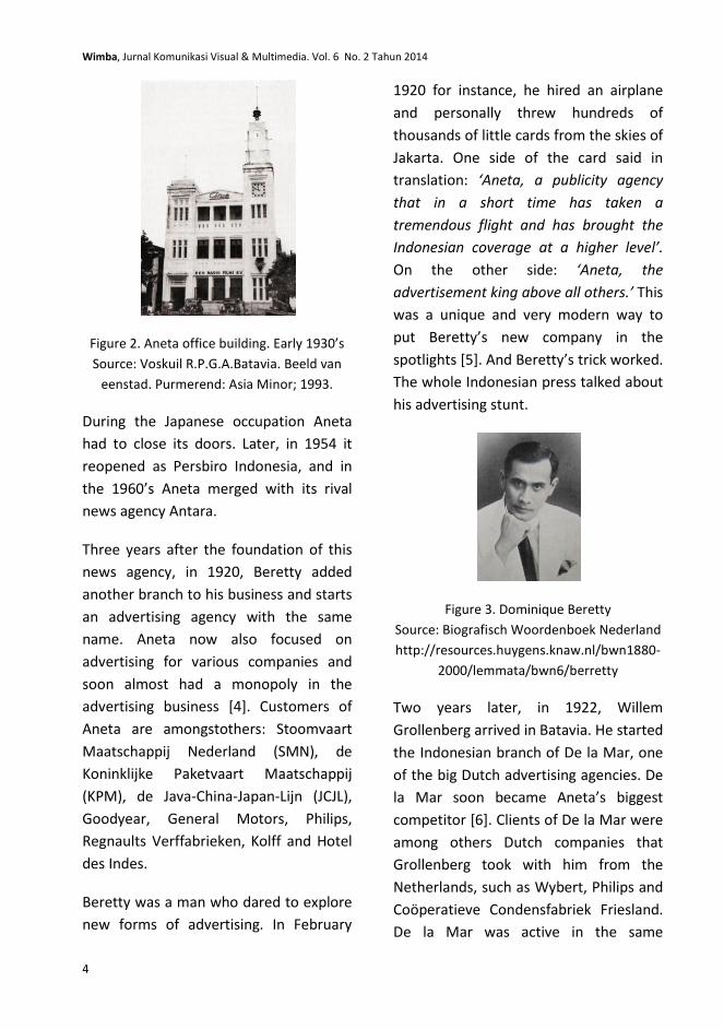
The best known advertising agency in the
Dutch East Indies was Aneta, Algemeen
Nieuws-en Telegraaf- Agentschap
(General News and Telegraph Agency). It
was founded in 1917 as the first news
agency of the Dutch East Indies by the
flamboyant Indo European business man
and media tycoon Dominique Beretty.
Aneta provided numerous newspapers
and other organizations with news that
he obtained (among others) from the
captains of the steamboat company
KPM. In the Netherlands, newspaper De
Telegraaf used Aneta’s Indonesian news
for its news section.
Wimba, Jurnal Komunikasi Visual & Multimedia. Vol. 6 No. 2 Tahun 2014
4
Figure 2. Aneta office building. Early 1930’s
Source: Voskuil R.P.G.A.Batavia. Beeld van
eenstad. Purmerend: Asia Minor; 1993.
During the Japanese occupation Aneta
had to close its doors. Later, in 1954 it
reopened as Persbiro Indonesia, and in
the 1960’s Aneta merged with its rival
news agency Antara.
Three years after the foundation of this
news agency, in 1920, Beretty added
another branch to his business and starts
an advertising agency with the same
name. Aneta now also focused on
advertising for various companies and
soon almost had a monopoly in the
advertising business [4]. Customers of
Aneta are amongstothers: Stoomvaart
Maatschappij Nederland (SMN), de
Koninklijke Paketvaart Maatschappij
(KPM), de Java-China-Japan-Lijn (JCJL),
Goodyear, General Motors, Philips,
Regnaults Verffabrieken, Kolff and Hotel
des Indes.
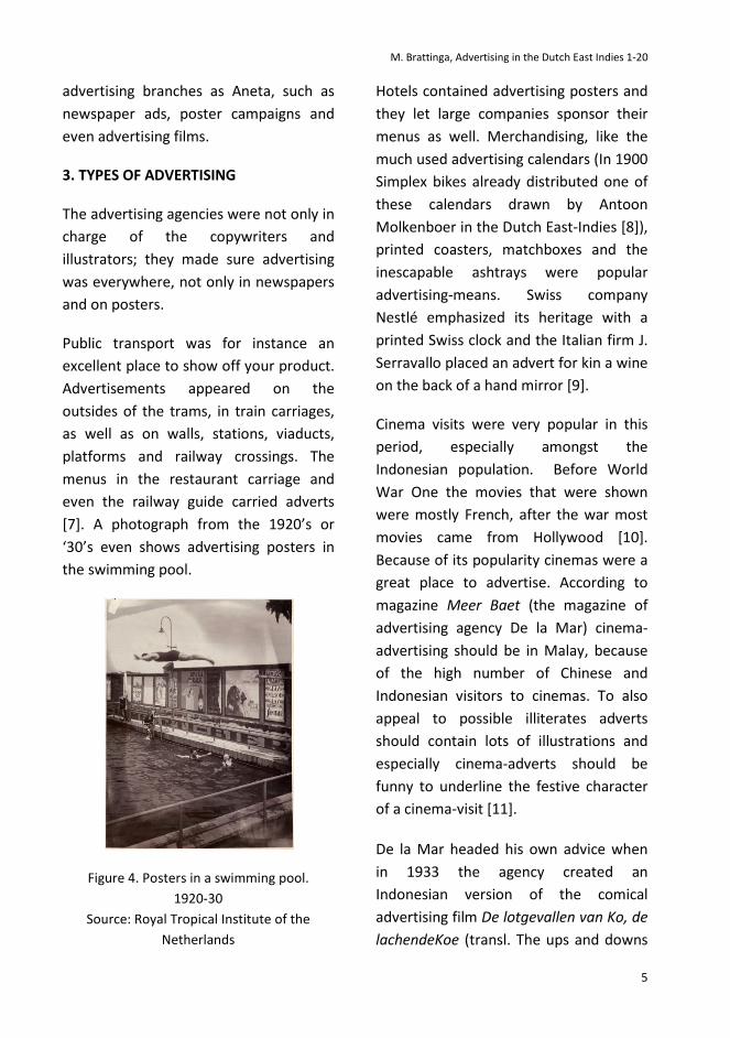
Beretty was a man who dared to explore
new forms of advertising. In February
1920 for instance, he hired an airplane
and personally threw hundreds of
thousands of little cards from the skies of
Jakarta. One side of the card said in
translation: ‘Aneta, a publicity agency
that in a short time has taken a
tremendous flight and has brought the
Indonesian coverage at a higher level’.
On the other side: ‘Aneta, the
advertisement king above all others.’ This
was a unique and very modern way to
put Beretty’s new company in the
spotlights [5]. And Beretty’s trick worked.
The whole Indonesian press talked about
his advertising stunt.
Figure 3. Dominique Beretty
Source: Biografisch Woordenboek Nederland
http://resources.huygens.knaw.nl/bwn1880-
2000/lemmata/bwn6/berretty
Two years later, in 1922, Willem
Grollenberg arrived in Batavia. He started
the Indonesian branch of De la Mar, one
of the big Dutch advertising agencies. De
la Mar soon became Aneta’s biggest
competitor [6]. Clients of De la Mar were
among others Dutch companies that
Grollenberg took with him from the
Netherlands, such as Wybert, Philips and
Coöperatieve Condensfabriek Friesland.
De la Mar was active in the same
M. Brattinga, Advertising in the Dutch East Indies 1-20
5
advertising branches as Aneta, such as
newspaper ads, poster campaigns and
even advertising films.
3. TYPES OF ADVERTISING
The advertising agencies were not only in
charge of the copywriters and
illustrators; they made sure advertising
was everywhere, not only in newspapers
and on posters.
Public transport was for instance an
excellent place to show off your product.
Advertisements appeared on the
outsides of the trams, in train carriages,
as well as on walls, stations, viaducts,
platforms and railway crossings. The
menus in the restaurant carriage and
even the railway guide carried adverts
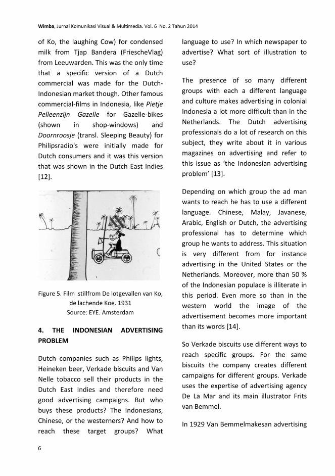
[7]. A photograph from the 1920’s or
‘30’s even shows advertising posters in
the swimming pool.
Figure 4. Posters in a swimming pool.
1920-30
Source: Royal Tropical Institute of the
Netherlands
Hotels contained advertising posters and
they let large companies sponsor their
menus as well. Merchandising, like the
much used advertising calendars (In 1900
Simplex bikes already distributed one of
these calendars drawn by Antoon
Molkenboer in the Dutch East-Indies [8]),
printed coasters, matchboxes and the
inescapable ashtrays were popular
advertising-means. Swiss company
Nestlé emphasized its heritage with a
printed Swiss clock and the Italian firm J.
Serravallo placed an advert for kin a wine
on the back of a hand mirror [9].
Cinema visits were very popular in this
period, especially amongst the
Indonesian population. Before World
War One the movies that were shown
were mostly French, after the war most
movies came from Hollywood [10].
Because of its popularity cinemas were a
great place to advertise. According to
magazine Meer Baet (the magazine of
advertising agency De la Mar) cinema-
advertising should be in Malay, because
of the high number of Chinese and
Indonesian visitors to cinemas. To also
appeal to possible illiterates adverts
should contain lots of illustrations and
especially cinema-adverts should be
funny to underline the festive character
of a cinema-visit [11].
De la Mar headed his own advice when
in 1933 the agency created an
Indonesian version of the comical
advertising film De lotgevallen van Ko, de
lachendeKoe (transl. The ups and downs
Wimba, Jurnal Komunikasi Visual & Multimedia. Vol. 6 No. 2 Tahun 2014
6
of Ko, the laughing Cow) for condensed
milk from Tjap Bandera (FriescheVlag)
from Leeuwarden. This was the only time
that a specific version of a Dutch
commercial was made for the Dutch-
Indonesian market though. Other famous
commercial-films in Indonesia, like Pietje
Pelleenzijn Gazelle for Gazelle-bikes
(shown in shop-windows) and
Doornroosje (transl. Sleeping Beauty) for
Philipsradio's were initially made for
Dutch consumers and it was this version
that was shown in the Dutch East Indies
[12].
Figure 5. Film stillfrom De lotgevallen van Ko,
de lachende Koe. 1931
Source: EYE. Amsterdam
4. THE INDONESIAN ADVERTISING
PROBLEM
Dutch companies such as Philips lights,
Heineken beer, Verkade biscuits and Van
Nelle tobacco sell their products in the
Dutch East Indies and therefore need
good advertising campaigns. But who
buys these products? The Indonesians,
Chinese, or the westerners? And how to
reach these target groups? What
language to use? In which newspaper to
advertise? What sort of illustration to
use?
The presence of so many different
groups with each a different language
and culture makes advertising in colonial
Indonesia a lot more difficult than in the
Netherlands. The Dutch advertising
professionals do a lot of research on this
subject, they write about it in various
magazines on advertising and refer to
this issue as ‘the Indonesian advertising
problem’ [13].
Depending on which group the ad man
wants to reach he has to use a different
language. Chinese, Malay, Javanese,
Arabic, English or Dutch, the advertising
professional has to determine which
group he wants to address. This situation
is very different from for instance
advertising in the United States or the
Netherlands. Moreover, more than 50 %
of the Indonesian populace is illiterate in
this period. Even more so than in the
western world the image of the
advertisement becomes more important
than its words [14].
So Verkade biscuits use different ways to
reach specific groups. For the same
biscuits the company creates different
campaigns for different groups. Verkade
uses the expertise of advertising agency
De La Mar and its main illustrator Frits
van Bemmel.
In 1929 Van Bemmelmakesan advertising

M. Brattinga, Advertising in the Dutch East Indies 1-20
7
poster voor Verkade Biskoewit. It depicts
a young man with a petji, a typical
Islamic hat. The text reads (translated):
‘Biscuits of the brand ‘The four boys’ are
fully halal and are for every muslim safe
to eat’ [15]. With this poster the
company tries to reach a specific
Indonesian moslem group.
Figure 6. Frits van Bemmel, advertising
poster. 1929
Source: Grafisch tijdschrift (9) 1929; June.
But a few years later the same company
makes an advertising campaign directed
at the Dutch living in the Dutch East
Indies. Now Verkade focuses not on the
fact that the biscuits are halal, but on the
fact that the biscuits are ‘From the
motherland’. Illustrator Van Bemmel
draws a typical Dutch boy, in traditional
clothes from Volendam (a fisherman’s
town in Holland). The text says that these
biscuits taste just as good as those in
Holland [16].
Figure 7. Frits van Bemmel advertisement.
1932.
Source: De reclame (11) 1932; March.
With the boy in traditional Dutch clothes
and the text ‘From the motherland’ the
advertising professionals try to reach the
Dutch society in colonial Indonesia. This
specific Dutch product will be extra
appealing to them because of its Dutch
origins. With this campaign Verkade
follows the advice from the advertising
press that to reach the Dutch group, who
feel a little homesick in the tropics, one
should focus on the Dutch origins of a
product. Moreover, focusing on the
Dutch origins will give the companies
from Holland a head start to companies
from Australia, the United States and

Wimba, Jurnal Komunikasi Visual & Multimedia. Vol. 6 No. 2 Tahun 2014
8
Britain. The Dutch consumers that live in
the Dutch East Indies are more likely to
buy products from their home country,
so companies such as Verkade should
emphasize this aspect; the advertising
press suggests [17].
To appeal to the Indonesian populace
the ad men use various typical
Indonesian scenes. For Dobbelman
tobacco the Indonesian illustrator T.
Roesjan for instance depicts a slematan,
a feast meal. The text reads (translated)
‘After a feast meal, you smoke
Dobbelman’. But also ‘djempol’, the
typical Indonesian ‘thumbs up’, used for
‘great’, ‘fine’, is used in advertising.
For Van Nelle tobacco the Dutch
illustrator Menno van Meeteren Brouwer
makes a series of advertisements with
various typical scenes from colonial
Indonesia. These are scenes from daily
life, such as a scene in a shop, students
smoking, a soccer game and work on the
sawa’s. All very recognizable scenes for
everybody living in the Dutch East Indies.
5. STYLE
From the start of the twentieth century
illustrators from the Netherlands travel
to the Dutch East Indies to stay and work
there for a short period, or sometimes to
stay there indefinitely. Some of them,
such as Simon Admiraal, Dirk Homberg
and Isidorus van Mens are artist and
create paintings, next to their work as
advertising illustrators. Others, such as
Menno van Meeteren Brouwer and Frits
van Bemmel combine their advertising
work with work as political illustrators for
newspapers or magazines.
These illustrators don’t all work in the
same style. We can roughly distinguish
three different styles in the advertising
illustrations. Some, such as Menno van
Meeteren Brouwer and Frits van Bemmel
use more or less realistic scenes. Others,
such as Pieter Ducro, base their
advertisements on the specific
Indonesian batik art. The third style,
with Jan Lavies as its main
representative, is more stylized, art deco,
and distinguishes itself by the use of
bright, tropical colors.
4.1 Realistic style
Menno van Meeteren Brouwer (1882-
1974) arrives in 1910 in Medan. He
becomes well known because of his
political illustrations and his drawings of
daily life. His work is published in
Dutch/Indonesian magazines such as
Nieuws van den Dag, De Indische Post
and De Zweep. Van MeeterenBrouwer
also works as a painter; he illustrates
children’s books and publishes his own
books, such as Indische Penkrabbels
(1912). His work is considered typical
‘Indisch’, depicting life in the Dutch East
Indies as it was. He stays in the Dutch
colony for 11 years, during which he
travels and paints on Java, Sumatra and
Bali. After his return to the Netherlands
in 1921 he continues to make
M. Brattinga, Advertising in the Dutch East Indies 1-20
9
illustrations of daily life in the Dutch East
Indies [18].
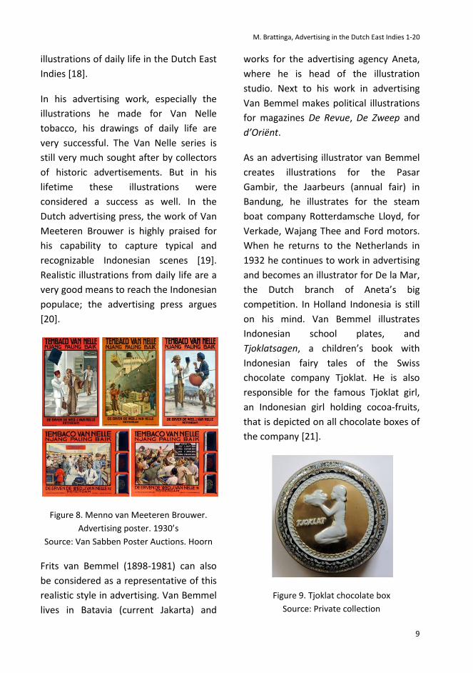
In his advertising work, especially the
illustrations he made for Van Nelle
tobacco, his drawings of daily life are
very successful. The Van Nelle series is
still very much sought after by collectors
of historic advertisements. But in his
lifetime these illustrations were
considered a success as well. In the
Dutch advertising press, the work of Van
Meeteren Brouwer is highly praised for
his capability to capture typical and
recognizable Indonesian scenes [19].
Realistic illustrations from daily life are a
very good means to reach the Indonesian
populace; the advertising press argues
[20].
Figure 8. Menno van Meeteren Brouwer.
Advertising poster. 1930’s
Source: Van Sabben Poster Auctions. Hoorn
Frits van Bemmel (1898-1981) can also
be considered as a representative of this
realistic style in advertising. Van Bemmel
lives in Batavia (current Jakarta) and
works for the advertising agency Aneta,
where he is head of the illustration
studio. Next to his work in advertising
Van Bemmel makes political illustrations
for magazines De Revue, De Zweep and
d’Oriënt.
As an advertising illustrator van Bemmel
creates illustrations for the Pasar
Gambir, the Jaarbeurs (annual fair) in
Bandung, he illustrates for the steam
boat company Rotterdamsche Lloyd, for
Verkade, Wajang Thee and Ford motors.
When he returns to the Netherlands in
1932 he continues to work in advertising
and becomes an illustrator for De la Mar,
the Dutch branch of Aneta’s big
competition. In Holland Indonesia is still
on his mind. Van Bemmel illustrates
Indonesian school plates, and
Tjoklatsagen, a children’s book with
Indonesian fairy tales of the Swiss
chocolate company Tjoklat. He is also
responsible for the famous Tjoklat girl,
an Indonesian girl holding cocoa-fruits,
that is depicted on all chocolate boxes of
the company [21].
Figure 9. Tjoklat chocolate box
Source: Private collection
Wimba, Jurnal Komunikasi Visual & Multimedia. Vol. 6 No. 2 Tahun 2014
10
4.2 Tropical style
For some of his advertising posters Van
Bemmel uses a more colorful, more
stylized style. For instance is his
advertising poster in 1926 for the Pasar
Gambir, the annual fair that is held since
1906 at the Koningsplein in Batavia. For
the design of this advertising poster in
1926 a completion is held. Thirteen
illustrators send their designs and four of
these are awarded a prize. Among the
designs is one of Simon Admiraal (1903-
1992), a teacher in drawing, illustrator
and advertising illustrator, who after
World War II founded the University for
Art Teachers in Bandung (the later ASRI).
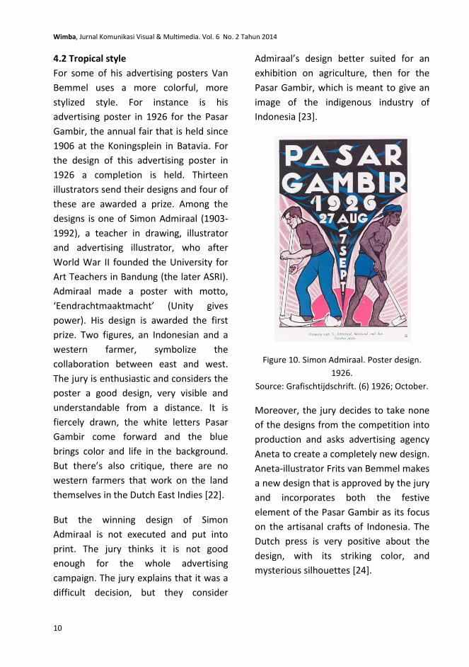
Admiraal made a poster with motto,
‘Eendrachtmaaktmacht’ (Unity gives
power). His design is awarded the first
prize. Two figures, an Indonesian and a
western farmer, symbolize the
collaboration between east and west.
The jury is enthusiastic and considers the
poster a good design, very visible and
understandable from a distance. It is
fiercely drawn, the white letters Pasar
Gambir come forward and the blue
brings color and life in the background.
But there’s also critique, there are no
western farmers that work on the land
themselves in the Dutch East Indies [22].
But the winning design of Simon
Admiraal is not executed and put into
print. The jury thinks it is not good
enough for the whole advertising
campaign. The jury explains that it was a
difficult decision, but they consider
Admiraal’s design better suited for an
exhibition on agriculture, then for the
Pasar Gambir, which is meant to give an
image of the indigenous industry of
Indonesia [23].
Figure 10. Simon Admiraal. Poster design.
1926.
Source: Grafischtijdschrift. (6) 1926; October.
Moreover, the jury decides to take none
of the designs from the competition into
production and asks advertising agency
Aneta to create a completely new design.
Aneta-illustrator Frits van Bemmel makes
a new design that is approved by the jury
and incorporates both the festive
element of the Pasar Gambir as its focus
on the artisanal crafts of Indonesia. The
Dutch press is very positive about the
design, with its striking color, and
mysterious silhouettes [24].
M. Brattinga, Advertising in the Dutch East Indies 1-20
11
Figure 11. Frits van Bemmel. Advertising
poster. 1926
Source: Stadsarchief Rotterdam
Both designs, the one of Admiraal and
the one of Van Bemmel can be
considered drawn in the third style of
illustrating in the Dutch East Indies,
which is more stylized, more art deco.
But the most prominent advocator of
this style would be Jan Lavies. He is
considered the best illustrator in the
Dutch East Indies in this period.
The 23-year old Jan Lavies arrives in the
Dutch East Indies in 1925. He starts
working in Batavia as an advertising
illustrator for General Motors, various
hotels, different steamboat companies
and consumer products. His style is
colorful, humoristic and very
recognizable.
The advertising press is very impressed
by his work and they write a lot about
Lavies and his work in Het Grafisch
Tijdschriftvoor Nederlandsch - Indië, a
magazine founded in 1917 for people
working in the printing business. The
magazine is two-languaged, with articles
in Dutch and Malay.
The Dutch advertising press considers
Lavies' work very well suited for the
tropics because of his use of bright
colors. The bright tropical sun makes
even brighter colors necessary.
Moreover, bright colors are especially
appealing to the Indonesian populace;
writes Het Grafisch Tijdschrift. They also
appreciate humoristic advertisements,
an element that the work of Lavies also
incorporates [25]. G. G. van der Kop
writes on this matter in the colorful
language of his day in De reclame:
‘In het algemeen is de inlander (…) van
huis uit artistiek aangelegd en (…) is hij
zeer gevoelig voor kleuren en tevens
voldoende kinderlijk om het pompeuze en
schitterende te appreciëren.
Begrijpelijkerwijze is vooralsnog
naturalistische voorstelling der dingen
voor hem gewenscht, aangezien de zeer
moderne tendenzen die in de
Hollandschereclameteekeningen dikwijls
tot uiting komen boven zijn
bevattingsvermogen gaan.’ [26]
[translation: ‘In general the indigenous
person is naturally artistic and very
sensitive to colors, yet childlike enough to
appreciate the bombastic and shining.
Understandably for now a naturalistic
performance of matters is needed,
because the very modernistic tendencies
in Dutch advertising perhaps go above its
understanding.]
Wimba, Jurnal Komunikasi Visual & Multimedia. Vol. 6 No. 2 Tahun 2014
12
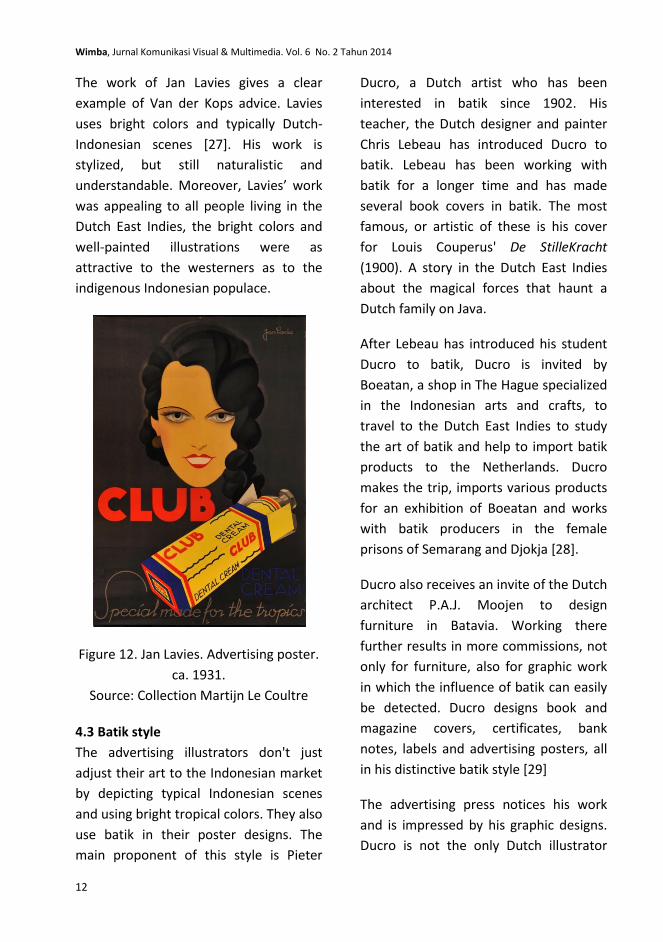
The work of Jan Lavies gives a clear
example of Van der Kops advice. Lavies
uses bright colors and typically Dutch-
Indonesian scenes [27]. His work is
stylized, but still naturalistic and
understandable. Moreover, Lavies’ work
was appealing to all people living in the
Dutch East Indies, the bright colors and
well-painted illustrations were as
attractive to the westerners as to the
indigenous Indonesian populace.
Figure 12. Jan Lavies. Advertising poster.
ca. 1931.
Source: Collection Martijn Le Coultre
4.3 Batik style
The advertising illustrators don't just
adjust their art to the Indonesian market
by depicting typical Indonesian scenes
and using bright tropical colors. They also
use batik in their poster designs. The
main proponent of this style is Pieter
Ducro, a Dutch artist who has been
interested in batik since 1902. His
teacher, the Dutch designer and painter
Chris Lebeau has introduced Ducro to
batik. Lebeau has been working with
batik for a longer time and has made
several book covers in batik. The most
famous, or artistic of these is his cover
for Louis Couperus' De StilleKracht
(1900). A story in the Dutch East Indies
about the magical forces that haunt a
Dutch family on Java.
After Lebeau has introduced his student
Ducro to batik, Ducro is invited by
Boeatan, a shop in The Hague specialized
in the Indonesian arts and crafts, to
travel to the Dutch East Indies to study
the art of batik and help to import batik
products to the Netherlands. Ducro
makes the trip, imports various products
for an exhibition of Boeatan and works
with batik producers in the female
prisons of Semarang and Djokja [28].
Ducro also receives an invite of the Dutch
architect P.A.J. Moojen to design
furniture in Batavia. Working there
further results in more commissions, not
only for furniture, also for graphic work
in which the influence of batik can easily
be detected. Ducro designs book and
magazine covers, certificates, bank
notes, labels and advertising posters, all
in his distinctive batik style [29]
The advertising press notices his work
and is impressed by his graphic designs.
Ducro is not the only Dutch illustrator

M. Brattinga, Advertising in the Dutch East Indies 1-20
13
using batik. We can see the batik
influence for instance on an advertising
poster designed by Wiemans for a
convention of the Java Institute in
Soerabaja in 1926, but also on the
packaging and advertising calendars of
the Java Cigarettes in the same year. The
director of this company, A. Mac Gillavry,
explains that he wants to give the brand
a certain cachet and considers the batik
motive in different colors most suited.
The advertising press is very enthusiastic
about this idea, since batik is an
indigenous art that all Indonesians,
young and old, literate and illiterate
know and understand [30].
Figure 13. Pieter Ducro. Advertising poster.
1924.
Source: Collection FransHelling
But batik is also appealing to the
Europeans that have been living for some
time in the Dutch East Indies. Since the
1850’s Dutch and Indo-European women
have been interested in batik and have
opened their own batik studio for
European customers [31]. One of these
women is Suze Beynon, a painter,
adverting illustrator and book cover
designer [32].
Later, in the 1920’s modern European
ladies practice batik using modern
patterns. Batik has now become
‘fashionable’ advertising magazine Het
Grafisch Tijdschrift van Nederlands-Indië
concludes in 1926 [33].
Batik is also influential in the
Netherlands, amongst advertising artists
as well. N.P. de Koo and Samuel L.
Schwartz for instance occasionally use
the Indonesian crafts as a source of
inspiration. For the design of the
advertising poster for the colonial
exhibition in 1914 Albert Hahn Sr. uses
the Indonesian arts and crafts as well.
For this design Hahn uses a photo of a
Javanese bride by Kassian Céphas, the
Javanese photographer who worked at
the court of the Yogyakarta Sultanate.
Hahn was one of three advertising artists
that were asked to make a design for this
poster. The other two were Antoon
Molkenboer and Jan Rotgans. The design
of Hahn was selected and put into print.
Moreover, it was very well received by
the advertising press and chosen as he
best poster design of the year [34]. The
journalists are impressed by the Javanese
bride, because she personifies on the
one hand the old traditional Indonesia,
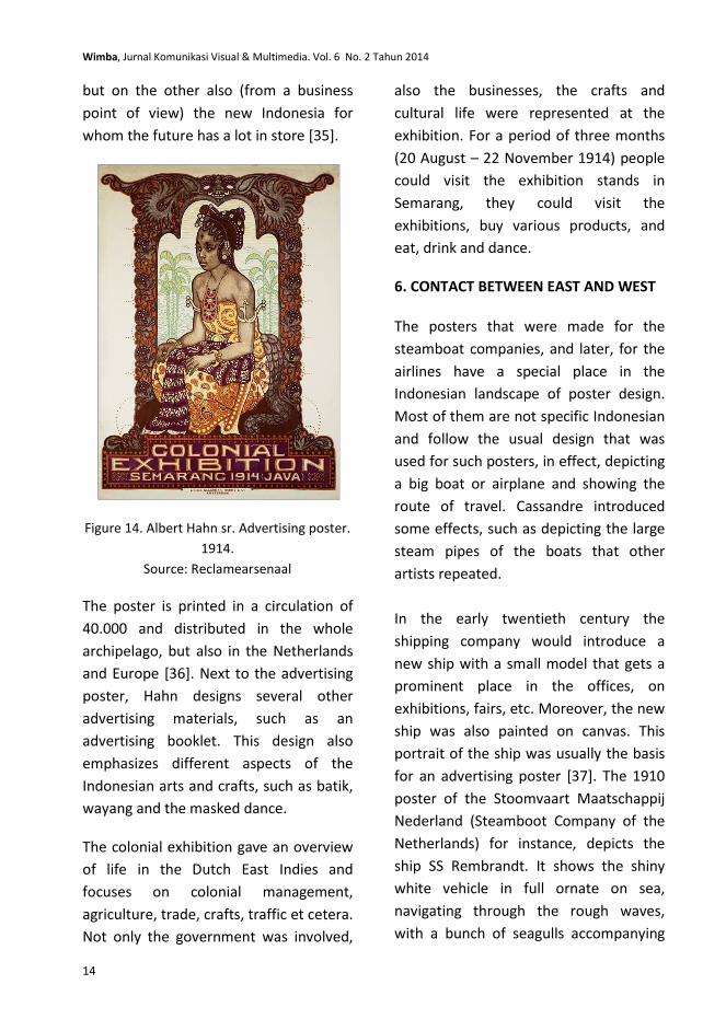
Wimba, Jurnal Komunikasi Visual & Multimedia. Vol. 6 No. 2 Tahun 2014
14
but on the other also (from a business
point of view) the new Indonesia for
whom the future has a lot in store [35].
Figure 14. Albert Hahn sr. Advertising poster.
1914.
Source: Reclamearsenaal
The poster is printed in a circulation of
40.000 and distributed in the whole
archipelago, but also in the Netherlands
and Europe [36]. Next to the advertising
poster, Hahn designs several other
advertising materials, such as an
advertising booklet. This design also
emphasizes different aspects of the
Indonesian arts and crafts, such as batik,
wayang and the masked dance.
The colonial exhibition gave an overview
of life in the Dutch East Indies and
focuses on colonial management,
agriculture, trade, crafts, traffic et cetera.
Not only the government was involved,
also the businesses, the crafts and
cultural life were represented at the
exhibition. For a period of three months
(20 August – 22 November 1914) people
could visit the exhibition stands in
Semarang, they could visit the
exhibitions, buy various products, and
eat, drink and dance.
6. CONTACT BETWEEN EAST AND WEST
The posters that were made for the
steamboat companies, and later, for the
airlines have a special place in the
Indonesian landscape of poster design.
Most of them are not specific Indonesian
and follow the usual design that was
used for such posters, in effect, depicting
a big boat or airplane and showing the
route of travel. Cassandre introduced
some effects, such as depicting the large
steam pipes of the boats that other
artists repeated.
In the early twentieth century the
shipping company would introduce a
new ship with a small model that gets a
prominent place in the offices, on
exhibitions, fairs, etc. Moreover, the new
ship was also painted on canvas. This
portrait of the ship was usually the basis
for an advertising poster [37]. The 1910
poster of the Stoomvaart Maatschappij
Nederland (Steamboot Company of the
Netherlands) for instance, depicts the
ship SS Rembrandt. It shows the shiny
white vehicle in full ornate on sea,
navigating through the rough waves,
with a bunch of seagulls accompanying
M. Brattinga, Advertising in the Dutch East Indies 1-20
15
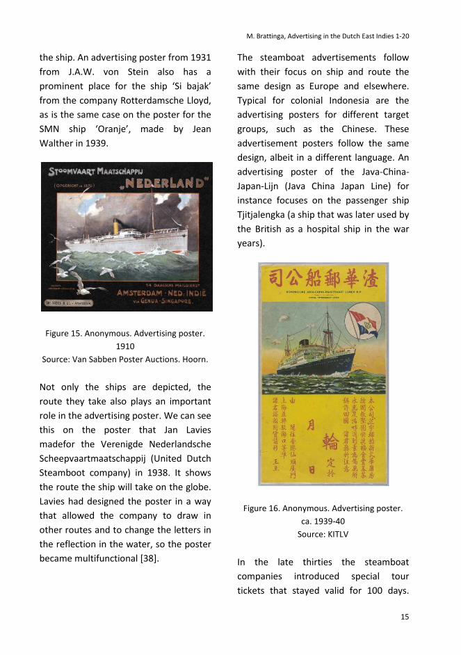
the ship. An advertising poster from 1931
from J.A.W. von Stein also has a
prominent place for the ship ‘Si bajak’
from the company Rotterdamsche Lloyd,
as is the same case on the poster for the
SMN ship ‘Oranje’, made by Jean
Walther in 1939.
Figure 15. Anonymous. Advertising poster.
1910
Source: Van Sabben Poster Auctions. Hoorn.
Not only the ships are depicted, the
route they take also plays an important
role in the advertising poster. We can see
this on the poster that Jan Lavies
madefor the Verenigde Nederlandsche
Scheepvaartmaatschappij (United Dutch
Steamboot company) in 1938. It shows
the route the ship will take on the globe.
Lavies had designed the poster in a way
that allowed the company to draw in
other routes and to change the letters in
the reflection in the water, so the poster
became multifunctional [38].
The steamboat advertisements follow
with their focus on ship and route the
same design as Europe and elsewhere.
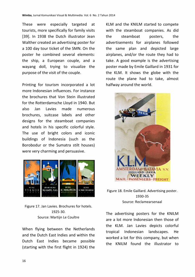
Typical for colonial Indonesia are the
advertising posters for different target
groups, such as the Chinese. These
advertisement posters follow the same
design, albeit in a different language. An
advertising poster of the Java-China-
Japan-Lijn (Java China Japan Line) for
instance focuses on the passenger ship
Tjitjalengka (a ship that was later used by
the British as a hospital ship in the war
years).
Figure 16. Anonymous. Advertising poster.
ca. 1939-40
Source: KITLV
In the late thirties the steamboat
companies introduced special tour
tickets that stayed valid for 100 days.
Wimba, Jurnal Komunikasi Visual & Multimedia. Vol. 6 No. 2 Tahun 2014
16
These were especially targeted at
tourists, more specifically for family visits
[39]. In 1938 the Dutch illustrator Jean
Walther created an advertising poster for
a 100 day tour ticket of the SMN. On the
poster he combined several elements:
the ship, a European couple, and a
wayang doll, trying to visualize the
purpose of the visit of the couple.
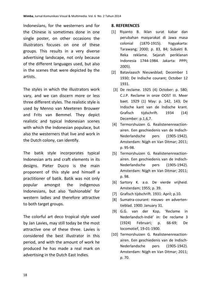
Printing for tourism incorporated a lot
more Indonesian influences. For instance
the brochures that Von Stein illustrated
for the Rotterdamsche Lloyd in 1940. But
also Jan Lavies made numerous
brochures, suitcase labels and other
designs for the steamboat companies
and hotels in his specific colorful style.
The use of bright colors and iconic
buildings of Indonesia (such as the
Borobodur or the Sumatra stilt houses)
were very charming and persuasive.
Figure 17. Jan Lavies. Brochures for hotels.
1925-30.
Source: Martijn Le Coultre
When flying between the Netherlands
and the Dutch East Indies and within the
Dutch East Indies became possible
(starting with the first flight in 1924) the
KLM and the KNILM started to compete
with the steamboat companies. As did
the steamboat posters, the
advertisements for airplanes followed
the same plan and depicted large
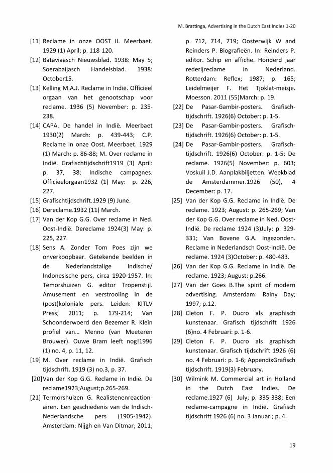
airplanes, and/or the route they had to
take. A good example is the advertising
poster made by Emile Gaillard in 1931 for
the KLM. It shows the globe with the
route the plane had to take, almost
halfway around the world.
Figure 18. Emile Gaillard. Advertising poster.
1930-35
Source: Reclamearsenaal
The advertising posters for the KNILM
are a lot more Indonesian then those of
the KLM. Jan Lavies depicts colorful
tropical Indonesian landscapes. He
worked a lot for this company, but when
the KNILM found the illustrator to

M. Brattinga, Advertising in the Dutch East Indies 1-20
17
expensive, Lavies was satisfied with the
offer of flying for free as payment [40].
Contact between the Netherlands and
the Dutch East Indies did not only take
place by plane and steamboat. From
1928 onward it became possible to make
phone calls. These calls at first had to be
made from a special telephone studio in
the Hague, later different ‘cells’ became
available in the larger cities of the
Netherlands and from 1930 it became
also possible to make phone calls from
your own house [41].
For this new service advertising played
an important role on both sides of the
world. Most of the time the advertising
poster visualized the connection itself
and the distance it had to make.
Indonesian elements were used
frequently, but also the globe was a
prominent means (just as in the
steamboat and airplane advertisements)
to emphasize the distance between the
Netherlands and its colony.
The advertising poster of Leo Visser is
different. In a collage-type way he
combined various typical Dutch and
typical Indonesian elements. On the left
side we can distinguish tulips, a wind
mill, a cow and a church tower. On the
right side a wayang doll, palm trees,
Indonesian houses and a crocodile. The
radio tower that made it possible to
communicate between the two worlds
has a prominent place in the center.
Figure 19. Leo Visser. Advertising poster.
1933
Source: Van Sabben Poster Auctions. Hoorn.
7. CONCLUSION
There is a lot of contact between the
Netherlands and the Dutch East Indies.
Various Dutch artists move (for a shorter
or longer period) to the Dutch East Indies
to work there as an advertising
illustrator. Moreover, Dutch advertising
agents and other advertising
professionals consider the Dutch colony
a good opportunity to do business. Dutch
brands such as Verkade, Heineken and
Philips invest a lot of money in
advertising campaigns for the Indonesian
public.
In the advertising press, the Indonesian
advertising problem is discussed at large.
A lot is written on this subject, and the
advertising journalists clearly struggle
with the difficulty of such a culturally
diverse society. The advertising
professionals turn this problem around
and treat it with tremendous creativity
and artistry. Advertising for the
Wimba, Jurnal Komunikasi Visual & Multimedia. Vol. 6 No. 2 Tahun 2014
18
Indonesians, for the westerners and for
the Chinese is sometimes done in one
single poster, on other occasions the
illustrators focuses on one of these
groups. This results in a very diverse
advertising landscape, not only because
of the different languages used, but also
in the scenes that were depicted by the
artists.
The styles in which the illustrators work
vary, and we can discern more or less
three different styles. The realistic style is
used by Menno van Meeteren Brouwer
and Frits van Bemmel. They depict
realistic and typical Indonesian scenes
with which the Indonesian populace, but
also the westerners that live and work in
the Dutch colony, can identify.
The batik style incorporates typical
Indonesian arts and craft elements in its
designs. Pieter Ducro is the main
proponent of this style and himself a
practitioner of batik. Batik was not only
popular amongst the indigenous
Indonesians, but also ‘fashionable’ for
western ladies and therefore attractive
to both target groups.
The colorful art deco tropical style used
by Jan Lavies, may still today be the most
attractive one of these three. Lavies is
considered the best illustrator in this
period, and with the amount of work he
produced he has made a real mark on
advertising in the Dutch East Indies.
8. REFERENCES
[1] Riyanto B. Iklan surat kabar dan
perubahan masyarakat di Jawa masa
colonial (1870-1915). Yogyakarta:
Tarawang; 2000; p. 83, 84; Subakti B.
Reka reklame. Sejarah periklanan
Indonesia 1744-1984. Jakarta: PPPI;
2005).
[2] Bataviaasch Nieuwsblad; December 1
1930; De Indische courant; October 12
1931.
[3] De reclame. 1925 (4) October: p. 580;
C.J.P. Reclame in onze OOST III. Meer
baet. 1929 (1) May: p. 142, 143; De
Indische kant van de Indische krant.
Grafisch tijdschrift. 1934 (14)
December: p.1,6,7.
[4] Termorshuizen G. Realistenenreaction-
airen. Een geschiedenis van de Indisch-
Nederlandsche pers (1905-1942).
Amsterdam: Nijgh en Van Ditmar; 2011;
p. 95-98.
[5] Termorshuizen G. Realistenenreaction-
airen. Een geschiedenis van de Indisch-
Nederlandsche pers (1905-1942).
Amsterdam: Nijgh en Van Ditmar; 2011;
p. 98.
[6] Sartory K. a.o. De vierde vrijheid.
Amsterdam; 1955; p. 39.
[7] Grafisch tijdschrift. 1931: April; p.10.
[8] Sumatra-courant: nieuws- en adverten-
tieblad. 1900: January 31.
[9] G.G. van der Kop, ‘Reclame in
Nederlandsch-Indië’ in: De reclame 3
(1924) Februari; p. 66-69; De
locomotief, 19-01-1900.
[10] Termorshuizen G. Realistenenreaction-
airen. Een geschiedenis van de Indisch-
Nederlandsche pers (1905-1942).
Amsterdam: Nijgh en Van Ditmar; 2011;
p. 70.
M. Brattinga, Advertising in the Dutch East Indies 1-20
19
[11] Reclame in onze OOST II. Meerbaet.
1929 (1) April; p. 118-120.
[12] Bataviaasch Nieuwsblad. 1938: May 5;
Soerabaijasch Handelsblad. 1938:
October15.
[13] Kelling M.A.J. Reclame in Indië. Officieel
orgaan van het genootschap voor
reclame. 1936 (5) November: p. 235-
238.
[14] CAPA. De handel in Indië. Meerbaet
1930(2) March: p. 439-443; C.P.
Reclame in onze Oost. Meerbaet. 1929
(1) March: p. 86-88; M. Over reclame in
Indië. Grafischtijdschrift1919 (3) April:
p. 37, 38; Indische campagnes.
Officieelorgaan1932 (1) May: p. 226,
227.
[15] Grafischtijdschrift.1929 (9) June.
[16] Dereclame.1932 (11) March.
[17] Van der Kop G.G. Over reclame in Ned.
Oost-Indië. Dereclame 1924(3) May: p.
225, 227.
[18] Sens A. Zonder Tom Poes zijn we
onverkoopbaar. Getekende beelden in
de Nederlandstalige Indische/
Indonesische pers, circa 1920-1957. In:
Temorshuizen G. editor Tropenstijl.
Amusement en verstrooiing in de
(post)koloniale pers. Leiden: KITLV
Press; 2011; p. 179-214; Van
Schoonderwoerd den Bezemer R. Klein
profiel van… Menno (van Meeteren
Brouwer). Ouwe Bram leeft nog!1996
(1) no. 4, p. 11, 12.
[19] M. Over reclame in Indië. Grafisch
tijdschrift. 1919 (3) no.3, p. 37.
[20] Van der Kop G.G. Reclame in Indië. De
reclame1923;August;p.265-269.
[21] Termorshuizen G. Realistenenreaction-
airen. Een geschiedenis van de Indisch-
Nederlandsche pers (1905-1942).
Amsterdam: Nijgh en Van Ditmar; 2011;
p. 712, 714, 719; Oosterwijk W and
Reinders P. Biografieën. In: Reinders P.
editor. Schip en affiche. Honderd jaar
rederijreclame in Nederland.
Rotterdam: Reflex; 1987; p. 165;
Leidelmeijer F. Het Tjoklat-meisje.
Moesson. 2011 (55)March: p. 19.
[22] De Pasar-Gambir-posters. Grafisch-
tijdschrift. 1926(6) October: p. 1-5.
[23] De Pasar-Gambir-posters. Grafisch-
tijdschrift. 1926(6) October: p. 1-5.
[24] De Pasar-Gambir-posters. Grafisch-
tijdschrift. 1926(6) October: p. 1-5; De
reclame. 1926(5) November: p. 603;
Voskuil J.D. Aanplakbiljetten. Weekblad
de Amsterdammer.1926 (50), 4
December: p. 17.
[25] Van der Kop G.G. Reclame in Indië. De
reclame. 1923; August: p. 265-269; Van
der Kop G.G. Over reclame in Ned. Oost-
Indië. De reclame 1924 (3)July: p. 329-
331; Van Bovene G.A. Ingezonden.
Reclame in Nederlandsch Oost-Indië. De
reclame. 1924 (3)October: p. 480-483.
[26] Van der Kop G.G. Reclame in Indië. De
reclame. 1923; August: p.266.
[27] Van der Goes B.The spirit of modern
advertising. Amsterdam: Rainy Day;
1997; p.12.
[28] Cleton F. P. Ducro als graphisch
kunstenaar. Grafisch tijdschrift 1926
(6)no. 4 Februari: p. 1-6.
[29] Cleton F. P. Ducro als graphisch
kunstenaar. Grafisch tijdschrift 1926 (6)
no. 4 Februari: p. 1-6; AppendixGrafisch
tijdschrift. 1919(3) February.
[30] Wilmink M. Commercial art in Holland
in the Dutch East Indies. De
reclame.1927 (6) July; p. 335-338; Een
reclame-campagne in Indië. Grafisch
tijdschrift 1926 (6) no. 3 Januari; p. 4.
Wimba, Jurnal Komunikasi Visual & Multimedia. Vol. 6 No. 2 Tahun 2014
20
[31] Groot M. Vrouwen in de vormgeving in
Nederland 1880-1940.Rotterdam:
Uitgeverij 010; 2007; p. 277-282.
[32] Haks L. and Maris G.Lexicon of foreign
artists who visualized Indonesia (1600-
1950. Utrecht: Bestebreurtje; 1995; p.
33.
[33] Een reclame-campagne in Indië.
Grafisch tijdschrift. 1926 (6) no.3
Januari; p. 4.
[34] Van Heel M.G. Gedenkboek van de
koloniale tentoonstelling Semarang.
Eerste deel.Batavia; 1914; p. 16-20.
[35] De bedrijfsreklame.1917 (2)August; p.
7-9.
[36] Van Heel M.G. Gedenkboek van de
koloniale tentoonstelling Semarang.
Eerste deel.Batavia; 1914; p. 16-20.
[37] Reinders P. Nederlandse scheepva-
artreclame. Een verkenning. In:
Reinders P. editor. Schip en affiche.
Honderd jaar rederijreclame in
Nederland. Rotterdam: Reflex; 1987; p.
15-50.
[38] Reinders P. Nederlandse scheepva-
artreclame. Een verkenning. In:
Reinders P. editor. Schip en affiche.
Honderd jaar rederijreclame in
Nederland. Rotterdam: Reflex; 1987; p.
15-50.
[39] Reinders P. Nederlandse scheepva-
artreclame. Een verkenning. In:
Reinders P. editor. Schip en affiche.
Honderd jaar rederijreclame in
Nederland. Rotterdam: Reflex; 1987;
p.45.
[40] Postmaa C. Heimwee naar de bars van
Soerabaja. Haagsche Courant. 2002; July
13.
[41] Vles H. Hallo Bandoeng. Nederlandse
radiopioniers (1900-1945). Zutphen:
WalburgPers; 2008; p. 137-141.
Related Documents