Advert evaluation shane payn
Aug 12, 2015
Welcome message from author
This document is posted to help you gain knowledge. Please leave a comment to let me know what you think about it! Share it to your friends and learn new things together.
Transcript

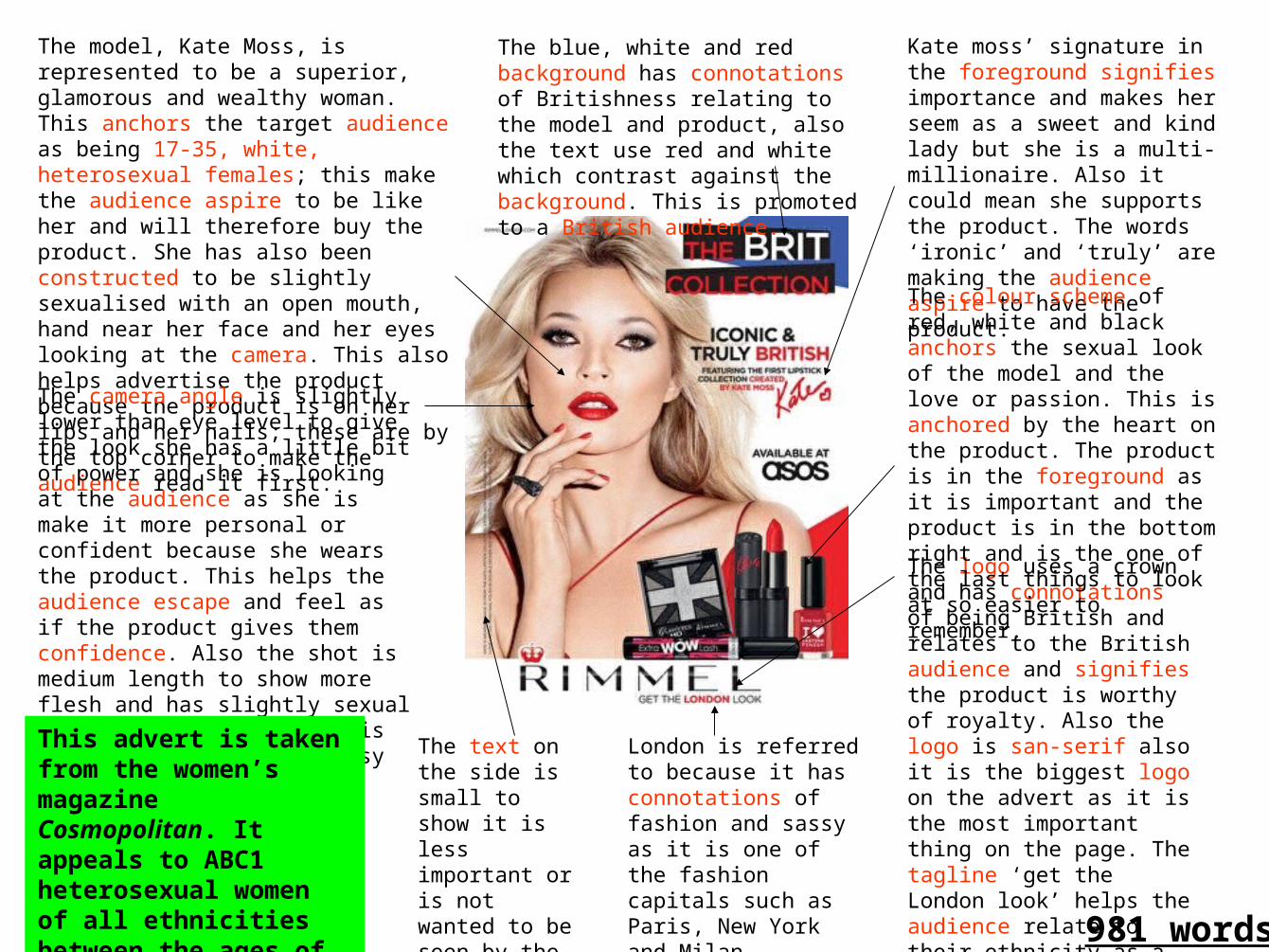
The model, Kate Moss, is represented to be a superior, glamorous and wealthy woman. This anchors the target audience as being 17-35, white, heterosexual females; this make the audience aspire to be like her and will therefore buy the product. She has also been constructed to be slightly sexualised with an open mouth, hand near her face and her eyes looking at the camera. This also helps advertise the product because the product is on her lips and her nails; these are by the top corner to make the audience read it first.
The logo uses a crown and has connotations of being British and relates to the British audience and signifies the product is worthy of royalty. Also the logo is san-serif also it is the biggest logo on the advert as it is the most important thing on the page. The tagline ‘get the London look’ helps the audience relate to their ethnicity as a British Londoner also ‘get’ is an imperative verb to instruct the audience
The blue, white and red background has connotations of Britishness relating to the model and product, also the text use red and white which contrast against the background. This is promoted to a British audience.
Kate moss’ signature in the foreground signifies importance and makes her seem as a sweet and kind lady but she is a multi-millionaire. Also it could mean she supports the product. The words ‘ironic’ and ‘truly’ are making the audience aspire to have the product.
The colour scheme of red, white and black anchors the sexual look of the model and the love or passion. This is anchored by the heart on the product. The product is in the foreground as it is important and the product is in the bottom right and is the one of the last things to look at so easier to remember.
The camera angle is slightly lower than eye level to give the look she has a little bit of power and she is looking at the audience as she is make it more personal or confident because she wears the product. This helps the audience escape and feel as if the product gives them confidence. Also the shot is medium length to show more flesh and has slightly sexual connotations; however, this will anchor her as a classy and confident person.
The text on the side is small to show it is less important or is not wanted to be seen by the audience.
This advert is taken from the women’s magazine Cosmopolitan. It appeals to ABC1 heterosexual women of all ethnicities between the ages of 18 and 35
London is referred to because it has connotations of fashion and sassy as it is one of the fashion capitals such as Paris, New York and Milan
981 words
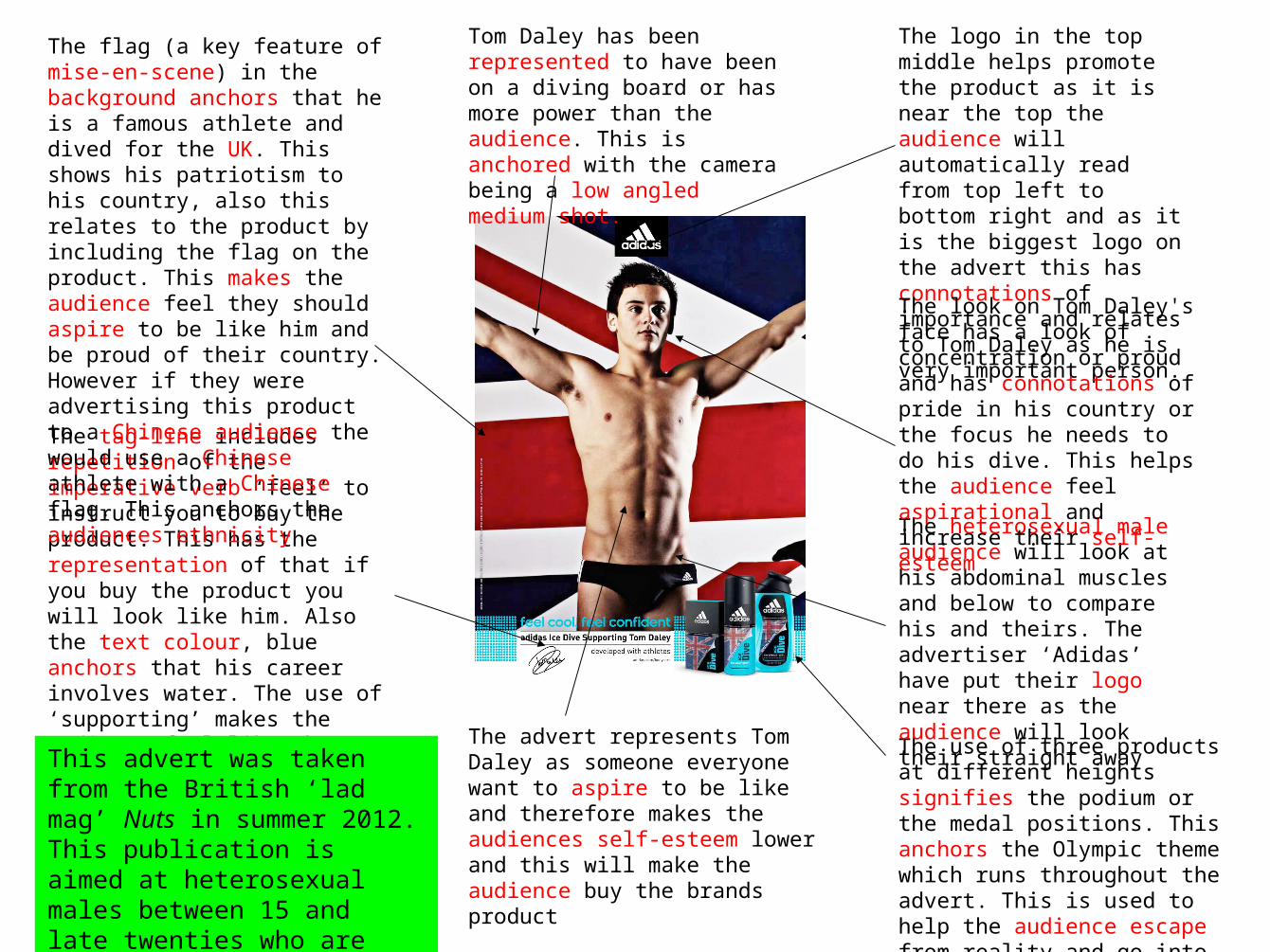
The tag-line includes repetition of the imperative verb ‘feel’ to instruct you to buy the product. This has the representation of that if you buy the product you will look like him. Also the text colour, blue anchors that his career involves water. The use of ‘supporting’ makes the audience feel like they are helping him in his career. This is used to inform and educate the heterosexual male target audience.
The flag (a key feature of mise-en-scene) in the background anchors that he is a famous athlete and dived for the UK. This shows his patriotism to his country, also this relates to the product by including the flag on the product. This makes the audience feel they should aspire to be like him and be proud of their country. However if they were advertising this product to a Chinese audience the would use a Chinese athlete with a Chinese flag. This anchors the audiences ethnicity
Tom Daley has been represented to have been on a diving board or has more power than the audience. This is anchored with the camera being a low angled medium shot.
The use of three products at different heights signifies the podium or the medal positions. This anchors the Olympic theme which runs throughout the advert. This is used to help the audience escape from reality and go into being an Olympic athlete.
The logo in the top middle helps promote the product as it is near the top the audience will automatically read from top left to bottom right and as it is the biggest logo on the advert this has connotations of importance and relates to Tom Daley as he is very important person.
The heterosexual male audience will look at his abdominal muscles and below to compare his and theirs. The advertiser ‘Adidas’ have put their logo near there as the audience will look their straight away
The look on Tom Daley's face has a look of concentration or proud and has connotations of pride in his country or the focus he needs to do his dive. This helps the audience feel aspirational and increase their self- esteem
The advert represents Tom Daley as someone everyone want to aspire to be like and therefore makes the audiences self-esteem lower and this will make the audience buy the brands product
This advert was taken from the British ‘lad mag’ Nuts in summer 2012. This publication is aimed at heterosexual males between 15 and late twenties who are unsure about their appearance
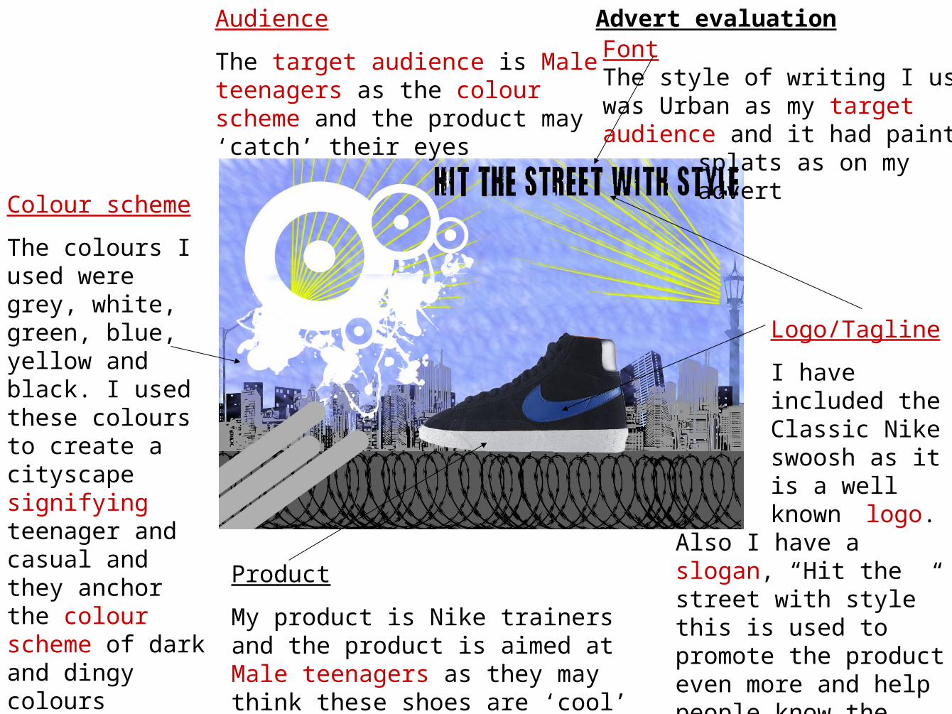
FontThe style of writing I usedwas Urban as my targetaudience and it had paint
splats as on myadvert
Logo/Tagline
I have included the Classic Nike swoosh as it
is a well known logo. Also I have
a slogan, “Hit the street with style” this is used to promote the product even more and help people know the target audience
Colour scheme
The colours I used were grey, white, green, blue, yellow and black. I used these colours to create a cityscape signifying teenager and casual and they anchor the colour scheme of dark and dingy colours
Product
My product is Nike trainers and the product is aimed at Male teenagers as they may think these shoes are ‘cool’
Audience
The target audience is Male teenagers as the colour scheme and the product may ‘catch’ their eyes
Advert evaluation
Related Documents