A QRIS Practical Data User’s Guide The findings of a Quality Rating and Improvement System Community of Practice on using data effectively OCTOBER 2017

Welcome message from author
This document is posted to help you gain knowledge. Please leave a comment to let me know what you think about it! Share it to your friends and learn new things together.
Transcript

A QRIS Practical Data User’s Guide
The findings of a Quality Rating and Improvement System Community of
Practice on using data effectively
O C T O B E R 2 0 1 7

2
A QRIS Practical Data User’s Guide
Table of ContentsSetting the Stage ................................3Data Communities as Ecosystems ................ 4
What are Data, Anyway? ................................... 5
Ten Key Data Considerations .......................... 6
But What are Good Data? ................................. 8
Using Quality Data for ..................................... 10Quality Improvement The Main Acts ...................................13Data Impact ......................................................... 14
Data Literacy ...................................................... 21
Building Data Capacity ................................... 31 One-Act Vignettes ...........................37Developing a Data Focus and ....................... 37 Making Decisions about Metrics
Selecting Variables and .................................. 38 Tailoring Training
Improving Coaching Quality .......................... 39and Consistency through Coaching Reports Curtain Call ........................................40
Using this Guide This guide describes a collection of data practices and strategies useful for more effectively implementing any Quality Rating and Improvement System (QRIS).
As a practical user guide, it doesn’t delve too deeply into numbers, statistics, or database language. Rather, it offers easy-to-grasp concepts and ready-to-use resources.
There are links to articles, training documents, agenda templates, and meeting
activities, as well as case examples to ground the information in practice. In addition, you may click on the Table of Contents to access pages, and each page includes a link back to the Table of Contents.
This guide is organized so that it can be read from cover to cover in less than an hour or be used as reference.
Making this GuideA QRIS Data Community of Practice collaboratively developed this guide during monthly meetings held over the course of one year. Participants shared examples of promising data-use practices as well as current challenges they face. The guide contains the strategies for increasing data capacity, literacy, and impact that were discussed in these meetings.
The BUILD Initiative, which helps states build systems to improve early childhood learning, supported this work.
3
A QRIS Practical Data User’s Guide
Back to Table of Contents
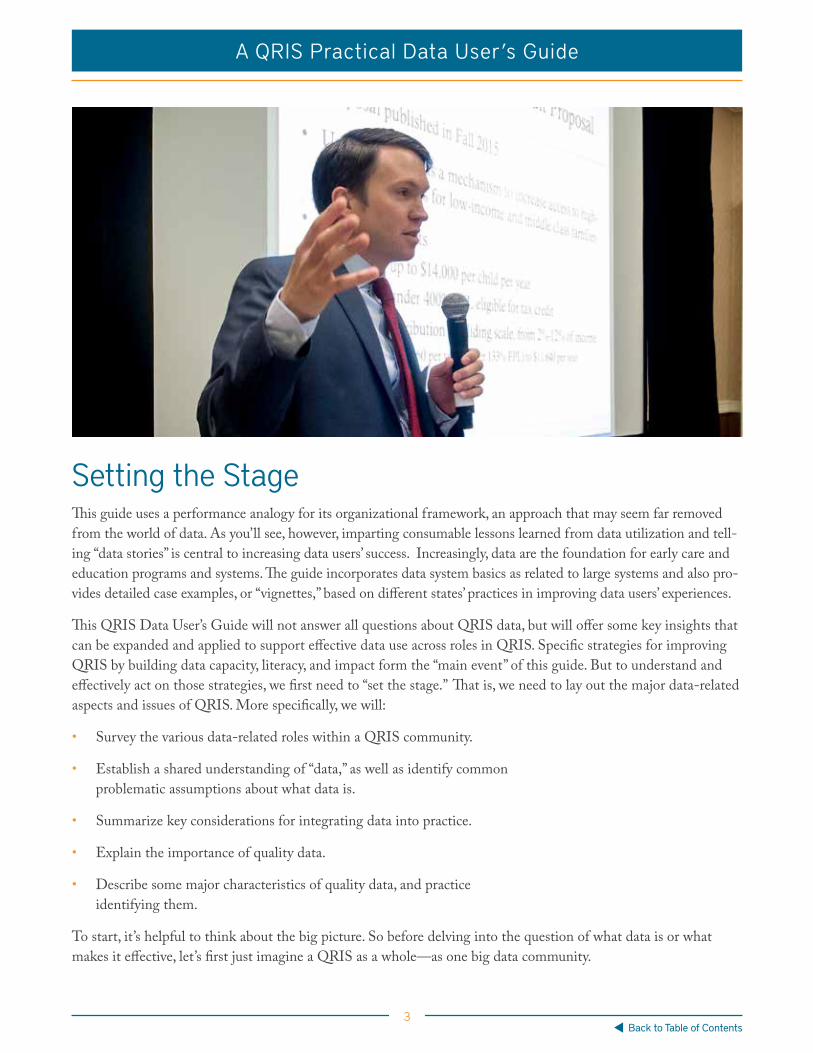
Setting the StageThis guide uses a performance analogy for its organizational framework, an approach that may seem far removed from the world of data. As you’ll see, however, imparting consumable lessons learned from data utilization and tell-ing “data stories” is central to increasing data users’ success. Increasingly, data are the foundation for early care and education programs and systems. The guide incorporates data system basics as related to large systems and also pro-vides detailed case examples, or “vignettes,” based on different states’ practices in improving data users’ experiences.
This QRIS Data User’s Guide will not answer all questions about QRIS data, but will offer some key insights that can be expanded and applied to support effective data use across roles in QRIS. Specific strategies for improving QRIS by building data capacity, literacy, and impact form the “main event” of this guide. But to understand and effectively act on those strategies, we first need to “set the stage.” That is, we need to lay out the major data-related aspects and issues of QRIS. More specifically, we will:
• Survey the various data-related roles within a QRIS community.
• Establish a shared understanding of “data,” as well as identify common problematic assumptions about what data is.
• Summarize key considerations for integrating data into practice.
• Explain the importance of quality data.
• Describe some major characteristics of quality data, and practice identifying them.
To start, it’s helpful to think about the big picture. So before delving into the question of what data is or what makes it effective, let’s first just imagine a QRIS as a whole—as one big data community.

4
A QRIS Practical Data User’s Guide
Back to Table of Contents
Data Communities as Ecosystems Good data are only as good as their systems allow them to be. The concept of an ecosystem offers a simple, use-ful model for understanding QRIS communities in terms of their members’ data-related roles. An ecosystem is essentially a community of interconnected actors and resources. In healthy ecosystems, actors thrive because they interact in dedicated, sustainable ways. When even one of these actors ceases to play his or her role, the system breaks down. As a result, the environment and those who share it suffer. As ecosystems, QRIS communities con-tain actors who “produce,” “consume,” and “decompose” data generated from “material resources.” In reality, actors in QRIS communities may play more than one of these roles.
Four important points from the QRIS-community ecosystem analogy:
MATERIAL RESOURCES
Material resources are those that enable and constrain the actors of an ecosystem. Computer hardware, software, data management systems, governance policies, and teaching practices are all resources on which QRIS communities are built. Data trans-mission capabilities, though dynamic, are also important non-living aspects. When running well, transmission capacity can be a resource. Transmission challenges, such as lack of broadband communications in rural areas, can be a constraint.
PRODUCERS The largest group within an ecosystem, producers use and transform resources. Within QRIS communities, producers include ECE providers, whose practices are observed, documented, and rated, as well as technical assistance specialists and coaches who generate case notes using tools for gathering and managing data.
CONSUMERS Consumers depend on what producers create. In a QRIS community, consumers are those who are, or could be, using data to improve the work that they do. This includes field staff members, supervisors, managers and directors who use data to guide their practices and deliver on strategic goals. Ideally, early care and education providers who produce data also act as consumers by using feedback from coaching and tech-nical assistance sessions.
DECOMPOSERS Decomposers break down elements of an ecosystem into usable products that sup-port the whole. The decomposers of a QRIS community are those who break down data into usable analyses and interpretations that can be acted upon. It is both easy and perilous to overlook this aspect in a QRIS community—or any data network for that matter. Without active efforts to break down data into consumable reports, back-logs of unused information clog the cycle and leave individuals in all QRIS data-relat-ed roles without enough actionable information to make good decisions. Aggregating data is another example of how the data system can transform input from producers into consumable information for producers and other actors in the system.
5
A QRIS Practical Data User’s Guide
Back to Table of Contents
The ecosystem analogy suggests four important points that help set the stage for this user’s guide.
1. Everyone working within a QRIS community has a data-related role.
2. All data-related roles involve the gathering, transformation, consumption, and analysis of information.
3. As ecosystems, QRIS communities can be improved through more coopera-tive and informed interaction among all those in data-related roles.
4. Understanding the limits and intersections of these data related roles is crucial to the kind of cooperative and informed interaction necessary to a healthy QRIS ecosystem.
This guide can be used as an effective tool for maintaining a healthy QRIS ecosystem. Before going further, though, let’s clarify the key term of the guide: data. How one understands data determines how one interacts with it, so it’s important to be clear about what it means. As it turns out, it depends on whom you ask. So, what are data, anyway?
What are Data, Anyway? Despite the complexity of data use as a topic, the term “data” itself simply refers to information gathered and used on purpose. We arrived at this definition of data after many QRIS field-staff training sessions on effective data use. During these sessions, we asked multiple groups of field-staff members one simple question: “What are data?”
Though after sorting through staff members’ responses we reached the data definition above, the responses also revealed three common but problematic assumptions about data:
• Data are numbers.
• Data are objective, or true.
• Data are someone else’s job.
Each of these assumptions undermines effective data use in a QRIS community, so it’s important to challenge each one of them:
• Data are numbers: Data can be more than numbers and statistics. Data gathered through qualitative methods, such as interviews, questionnaires, and written case notes are important sources of information that can be used to improve QRIS programs and systems. The chal-lenge is in learning to gather and analyze good qualitative data.
• Data are objective, or true: Neither quantitative nor qualitative data can ever be considered “perfectly objective.” It is inevitable that the perspective and performance of those gather-ing and analyzing the data have influenced it in ways that reduce its usefulness to others. Therefore, not all data are good, usable data.
• Data are someone else’s job: Individuals in all QRIS roles are focused on improving the quality of early care and education systems in ways that count, and can be counted. It’s every-body’s job to support the effective use of good data.

6
A QRIS Practical Data User’s Guide
Back to Table of Contents
It’s helpful to combine our challenges to these assumptions with our definition of data as information gathered on purpose. In so doing, we recognize that, within a QRIS community, data is qualitative or quantitative information that reflects the perspective and performance of the many various actors who gather it on purpose.
Even with this working definition of data in mind, effective data use is still a broad and complex topic! It’s helpful to organize our thinking around several big ideas, or key considerations, relevant to everyone in the early learning field.
Ten Key Data Considerations The Departments of Education and Health and Human Services (DOE and DHHS) offered 10 key considerations for integrating and linking early childhood data in a state profiles report. This report was designed to support states’ early childhood integrated data systems. Although the DOE and DHHS authors focused specifically on state-level data networks, their key considerations offer guidance relevant to early learning organizations of all sizes.
It’s clear, from our perspective, that there’s no such thing as “data people.” Everyone in a QRIS community is a data person because everyone plays a role in the community’s data ecosystem. So instead of asking whom these considerations concern, it is better to ask, in what ways should these considerations concern everyone?
Below, we’ve summarized the 10 key considerations in the form of advice. In reflecting on them, we found that they can be grouped into three basic steps for creating and maintaining a healthy QRIS data ecosystem:
1. Developing Direction and Capacity;
2. Integrating People and Data; and
3. Ensuring Quality and Security.
Developing Direction and Capacity
1. Develop a Purpose & Vision: Craft a forward-looking statement on how data will improve services and inform policy.
2. Create Data Governance Processes: Include a body of stakeholders representing a broad range of researchers, program officials, and policy experts in the develop-ment of procedures for collecting, managing, using, and securing data.
3. Build Capacity to Analyze and Use Data: Equip actors at all levels with resources needed to access, analyze, and make decisions upon available data. Analysts must develop data summaries that are meaningful for stakeholders. Actors at all levels need access to actionable information. Access includes training to increase their ability to understand reporting conclusions.

7
A QRIS Practical Data User’s Guide
Back to Table of Contents
Integrating People and Data
4. Engage Stakeholders—Maintain meaningful, ongoing conversations among interested parties about issues of privacy, access, and use. Ongoing and meaningful involvement in the access to and purpose, development, and use of data and connections among the people in the early childhood system is fundamental. Stakeholders’ support and use of the data are the system’s lifeblood.
5. Integrate Multiple Types of Early Childhood Education (ECE) Data—Combine different kinds and sources of ECE data: for instance, consider data related to preschool programs, childcare, early intervention initiatives, K-12 education, public health and screening, homelessness, and workforce development. These are all elements of amalgamated state-level systems that are still emerging.
6. Build on Other Data Initiatives—Connect efforts to develop and improve early childhood data with lessons learned in other states’ early childhood initiatives as well as related initiatives in the healthcare, childcare, and workforce development fields.
Ensuring Data Quality and Security
7. Ensure Quality and Comparability Across Systems—Establish guidelines and technical assistance capacity for maintaining effective, compatible practices of data collection and use among various stakeholders. Technical assistance and guidelines for various stakeholders and programs help to ensure that data collection and use are compatible.
8. Ensure Data Security—Implement training and procedures to avoid data breaches and comprising confidentiality. Shared or integrated data requires quality standards and data definitions.
9. Define Data Ownership—Articulate definitions and guidelines for data ownership in agency policy and vendor contracts. The articulation of data ownership in agency policy and vendor contracts is critical to the trust in and security of systems that are sharing or integrating data. Data security is a feature that is relevant to all actors in a data system. Implement training and procedures to see that data are not breached and confidentiality is not compromised. The locus of security begins when personally identifiable information is obtained from a program participant.
10. Clarify Rights to Privacy—Understand and comply with laws and best practices for ensuring data access and protection. Federal and state laws such as HIPAA (Health Information Portability and Accountability Act) include provisions to protect individuals’ data privacy. Personally identifiable information collected by other actors cannot be disclosed to other organizations or individuals unless specifically authorized by law or by consent of the individual. Actors in a data system must understand and comply with these laws and practices.
For more detailed suggestions on how to implement these 10 considerations, see the original DOE and DHH report, The Integration of Early Childhood Data.
8
A QRIS Practical Data User’s Guide
Back to Table of Contents
These ten considerations represent extensive policies, practices and protocol. As we’ve emphasized, all professionals working in QRIS programs and systems share responsibility for them as they gather, manage, and use data in their day-to-day work.
With these broad considerations for data use in mind, we can now think more specifically about how to effectively gather and use data. To start, let’s ask an important follow-up question: “But what are good data?”
But What are Good Data? By “good data” we don’t mean information that we like to hear. Rather, “good data” means information that can be trusted, communicated, and acted upon to make decisions that matter. Ultimately, good data help us answer critical questions and achieve important goals. It’s for this reason that the continuous improvement of data is essential to our vision of a comprehensive, multi-state QRIS.
Why do good data matter? We know the work we do counts. We also need to make sure that our work can be counted. That is, we need to make sure that it’s legible—that it can be understood and trusted by others. Having reliable, easily communicable data makes this possible. For this reason, improving the quality of our data is crucial if our work is to be counted, and if QRIS’s are to be counted on.
Good data matter for decision makingGood data are essential to making the decisions necessary for enacting the comprehensive Theory of Change underlying a QRIS. The 2016 QRIS 3.0 Report, published by The BUILD Initiative, explained this comprehensive Theory of Change through which a QRIS operates within and across states:
“The vision of the comprehensive QRIS is that once it is built, adequate and continued resources will be allocated on a regular basis to ensure data are used as part of a continuous quality improvement process. Theoretically, resources will be targeted to activities that have been evaluated and have been shown to be effective. Moreover, data will be used to determine the adjustments that are needed to the system and resources are allocated to make needed adjustments.” (QRIS Stakeholder Theories of Change and Models of Practice, page 10)
Clearly, effective data usage is central to this Theory of Change. But why exactly? The answer is that the quality of a QRIS’s inputs, activities, outputs, and impacts all depend on individuals from across QRIS roles using data effectively. To get a sense of how and why this is the case, let’s look at each of these components of a QRIS:
Inputs — The financial and human capital, infrastructure, and time invested into building and growing a QRIS. Smart decisions about how and where these resources are spent requires analysis of good data regarding programs’ actual and potential impacts.
Activities —The ways in which professionals in all QRIS roles produce and consume data every day. Good data gathered from these activities allow us to make needed adjustments in the QRIS overall. For instance, in addition to enabling us to evaluate program quality, good data let us identify and address workforce trends, care capacity shortage areas, and demands for professional learning supports to improve providers’ practice.

9
A QRIS Practical Data User’s Guide
Back to Table of Contents
Outputs—The results of a QRIS community delivered to other audiences. Good QRIS data are a major asset to policymakers, advocates, and funding organizations interested in enhancing ECE quality. These are quantified, short-term results from programs, projects or services. Outputs can be counts of activities’ products or achieve-ments. In a QRIS, they can be number of higher levels of education achieved by workforce professionals, number of hours received by children in a program or intervention, number of training materials distributed to early care staff or number of high-level ratings for child-care providers.
Impacts—Ultimately, it’s the impacts of a QRIS that we care about. Improving children’s socio-emotional, health, and development outcomes depends on good data. Providing more seamless family services does too. Improved socio-emotional health of child participants and increased numbers of children “on-track” in their developmental trajectories are examples of QRIS impacts. Impacts are longer-term effects of QRIS efforts. Data, often in com-bination, are used to show impacts for those to whom QRIS services or programs are directed.
At every level of a QRIS, then, good data are useful to both informing individual provider decisions and improving the overall quality of the whole system. The individual provider decisions include how parents choose care for their children; how field staff members help providers improve the quality of their programs; how policy makers develop and implement coaching and training frameworks; and how agency and legislative budget allocations are deter-mined. Of course, though, such decisions won’t necessarily be good simply because they’re based on good data.
Good data don’t guarantee good decisions, but they help. Good data won’t guarantee good decisions, but the absence of good data guarantees insubstantial decisions. So although it’s impossible to ensure high-quality data all the time, improving data quality is still essential. Improving data quality is about being attentive to the ways in which information is collected, interpreted, and shared. Data-related work is, therefore, not just about the conclusions that we reach, but also about how we reach them. Although there’s no single surefire way to gather, interpret, and use data well, having some shared understanding of what qualifies as good data is a helpful first step to improving our practical use of it.
How do we measure the quality of data?
1. Completeness—How much of the data is missing? This includes empty values but also includes, for example, how often the coach forgets to enter a coaching session.
2. Timeliness—How up-to-date is the data? Are we capturing data at the right frequency to see change?
3. Precision and Detail—How precisely are we measuring? Can we distinguish meaningful differences? Have we captured enough detail?
4. Accuracy—How true is the data? How sure are we that the person who answered the question or entered the data was the most knowledgeable source? How sure are we that there wasn’t a mistake when entering the data?
As we’ve discussed, it’s common to assume data is cut-and-dried and objective. However, this is not usually the case because the data we have often fail to describe their subjects accurately and completely. Moreover, different individuals often interpret the same data differently. It’s therefore helpful to think of data not as objective, but

10
A QRIS Practical Data User’s Guide
Back to Table of Contents
as on a continuum of quality. The quality of a given set of data depends on how useful it is to accomplishing the following goals within a QRIS community:
• Accurately describe and evaluate early learning programs relative to the QRIS framework.
• Guide implementation efforts towards QRIS health and growth.
• Legibly explain implementation efforts to others.
• Fuel rigorous evaluation studies that lead to system improvements.
• Inform policy and decisions to support QRIS.
• Enable continuous improvement of QRIS provider support services.
With these basic indicators of data quality in mind, we’re ready to consider how more specific characteristics of quality data allow for QRIS improvement.
Using Quality Data for Quality ImprovementQuality data needed for improving a QRIS are all relevant, fair, valid, and reliable. Though not exhaustive, this list of characteristics provides a strong starting point for improving our data-use practices.
Relevant—Relevant data include information on significant events, trends, and details that:
• Guides progress toward meaningful goals.
• Keeps the focus on what matters most.
• Leads to improvements in work process or progress.
• Gives practitioners, policymakers, and researchers common ground to make decisions.
Fair—Fair data treat the subject of the data equitably, with minimal bias or judgment, through:
• Protection of privacy and ethical data use.
• Respect for the people and the places described or represented.
• Accounting for diversity in language and culture.
• Avoidance of ambiguous, presumptuous, and judgmental language.
Relevant Fair Valid Reliable
Quality Counts... What are Good Data?

11
A QRIS Practical Data User’s Guide
Back to Table of Contents
Valid—Valid data record trustable, accurate, appropriately detailed information by:
• Avoiding errors in observation and recording.
• Precisely measuring or describing the subject.
• Continuing long enough over time to create large-scale estimates and provide insight into changes.
• Demonstrating enough consistency over time for use in designing interventions, building skills, guiding strategies, and improving outcomes.
Reliable—By being gathered and recorded regularly over time among field staff and programs, reliable data:
• Enable confidence in the overall consultation and coaching process because information has been gathered and recorded in consistent ways.
• Provide useful information that can be relied upon for making decisions.
• Marshal support for QRIS development from policy makers, advocates, and funding organizations.
So in order to achieve the best outcomes for all stakeholders, a QRIS community must work to improve its data’s relevance, fairness, validity, and reliability. The following activity clarifies how these characteristics of data quality can be integrated in practice.

12
A QRIS Practical Data User’s Guide
Back to Table of Contents
Quality data for quality improvement field notes activity.
The recording and use of field notes from TA and coaching sessions is one area of QRIS practice in which quality data are critical, yet difficult to achieve. Supporting high-quality data entry and field notes is especial-ly important for two reasons. First, a QRIS simply generates a great deal of this kind of information—so it’s important to get it right. Second, providers rely on this information to make decisions for improving direct care quality and a whole QRIS through broad data analysis. Supporting field staff members’ note-taking practices is an important lever for making data more useful in a QRIS. The following activity can be used or adapted for this purpose in training contexts.
1. Read the Quality Data for Quality Improvement hand-out and the Quality Field Data Activity.
2. Contemplate the hypothetical examples and non-examples of effective field notes.
3. Consider what makes the examples effective, and the non-examples ineffective.
4. Collaborate in groups on improving the non-examples.
5. Share the changes made in the notes.
6. Conclude with thoughts about practical changes you could make in your daily work to improve the relevance, fairness, validity, or reliability of the data you use.
The Stage is Set This section has explained the roles, importance, and hindrances of good data in a QRIS community. Summing up, we can say that everyone in a QRIS community—not just a few select people—has a data-related role to play. When everyone in a QRIS community understands what counts as quality data and how each person ensures it, the system improves. We can also say that while good data benefits programs and the people they serve, low-quality data, on the other hand, can be harmful as they misrepresent the people and places they describe and lead to inaccurate conclusions that don’t bring programs closer to their goals. With this in mind, let’s turn to the “main event” of this guide: practical strategies for using data more effectively.
13
A QRIS Practical Data User’s Guide
Back to Table of Contents
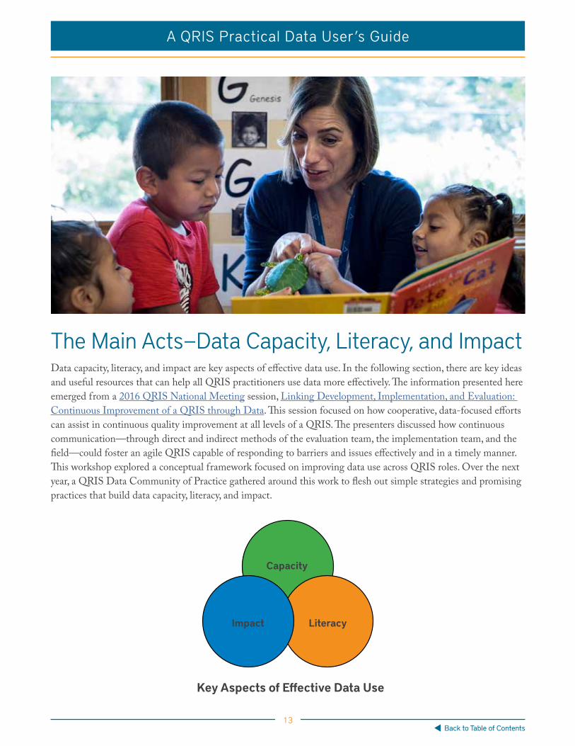
The Main Acts—Data Capacity, Literacy, and ImpactData capacity, literacy, and impact are key aspects of effective data use. In the following section, there are key ideas and useful resources that can help all QRIS practitioners use data more effectively. The information presented here emerged from a 2016 QRIS National Meeting session, Linking Development, Implementation, and Evaluation: Continuous Improvement of a QRIS through Data. This session focused on how cooperative, data-focused efforts can assist in continuous quality improvement at all levels of a QRIS. The presenters discussed how continuous communication—through direct and indirect methods of the evaluation team, the implementation team, and the field—could foster an agile QRIS capable of responding to barriers and issues effectively and in a timely manner. This workshop explored a conceptual framework focused on improving data use across QRIS roles. Over the next year, a QRIS Data Community of Practice gathered around this work to flesh out simple strategies and promising practices that build data capacity, literacy, and impact.
Capacity
Impact Literacy
Key Aspects of Effective Data Use

14
A QRIS Practical Data User’s Guide
Back to Table of Contents
Before diving into some strategies for increasing data impact, let’s pause to consider three basic modes of using data effectively: data management, data-to-practice, and practice-to-data. These modes are relevant to all of the data impact, literacy, and capacity-building strategies in this guide:
• Data Management and Reporting: The process of compiling, storing, transforming, and sharing data. We need data management and reporting in order to use data to inform practice. QRIS practice generates data that is then managed in the databases.
• Data to Practice: The process of using information to make decisions about practice. These decisions will affect the focus, goals, and sequence of what to do. This data can also inform the procedure and technique involved in how to take action. As well, steps can be made to ensure that the actions taken are legible and can be used to develop more actionable data.
• Practice to Data: The process of engaging in practice in ways that generate actionable data. Ideally, the practice is informed by data insights and is tracked and documented using accurate and reliable measures and methods. Inputting this data into the management and reporting system completes the cycle.
The arrows in this image are bi-directional because this process can also be thought of in reverse: in order to guide what kinds of data to record through practice, we need to know what types of fields and reports the data management databases can store and compute. And, in order to add data to practice, we have to understand what data are available.
Data ImpactWe are in this QRIS work to make an impact. Stakeholders have a right to know the impact of our work. We need to know how where our work is headed if we keep doing what we’ve been doing. And we need to know where to steer when we’re headed in the wrong direction.
Moving in the right direction by making stronger impacts is not possible without effective data use by individuals across QRISs. It’s only when everyone plays his or her data-role that we can reach the relevant people and create
DataManagement& Reporting
Data toPractice
Practiceto Data
Three Interactive Modes of Effective Data Use
15
A QRIS Practical Data User’s Guide
Back to Table of Contents
change in the most effective ways possible. This focus on impact through effective data use can help QRISs achieve goals and benefit ECE programs and systems.
You need to know where you want to go before you can get there. In order to design and implement an effective QRIS, it’s necessary to be clear about intended outcomes. Three potential sets of QRIS outcomes are described in the Establishing an Ecosystem for High-Quality Early Learning resource, which emerged from the 2016 BUILD National Meeting. Each of these three different sets of QRIS outcomes is based on a different model of practice. Understanding these three distinct models can help build clarity about the QRIS you work with, where it is going, and how it is getting there.
“Clarity about the QRIS goals and outcomes is critical. It seems too obvious to say, but if designers and implementers of QRIS neglect to clearly articulate ex-pected outcomes, it is hard to back map to the requisite activities, partnerships, and resources necessary to attain the outcomes. Different expected outcomes have an impact on design, implementation, communication and financing” (page 2).
The three models of QRIS practice are based on the quantitative and qualitative data gathered from 13 states by the BUILD Initiative’s 2016 QRIS 3.0 Report in which the authors described a general Theory of Change behind all QRISs. This theory identified a number of major, intended impacts of a comprehensive QRIS that represent all stakeholders:
• More seamless services for families.
• Children achieve positive socio-emotional, health and development outcomes and are academically and socially prepared for school (and life).
• Children achieve academic proficiency by third grade.
• Achievement gap is reduced and ultimately eliminated.
The impacts that matter most to each of the following three models of practice depend on the systems in which they’re embedded. The different impacts also inform the different kinds of data variables and measures used.
Impacts of Three Models of QRIS Practice
Model 1: Improving Child Outcomes Across Sectors
• More seamless services for families.
• Data on children’s socio-emotional, health, and development outcomes.
Model 2: Supporting Child and Family Services
• More comprehensible, accessible, and seamless services for families.
• More two-way engagement between ECE providers and families.

16
A QRIS Practical Data User’s Guide
Back to Table of Contents
Model 3: Raising the Floor for Child Care
• Enhanced physical environment among child-care providers.
• Improved group sizes and staff-children ratios.
• Higher child-care licensing standards.
• Increased provider knowledge.
• Greater understanding among public, policymakers, advocates, and funders of the impor-tance of structural indicators of quality as a first step in ultimately providing the quality of care that will lead to improved child outcomes.
These models differ based on the type of impact upon which they focus. Each QRIS does not fit neatly into one of these models; in practice, systems are more unique. However, considering how each system is similar and different from these models can focus efforts for improvement by clarifying barriers and limitations. These models of prac-tice emphasize different outcome data points; however, various types of data points can be used to show impact.
What Types of Data Matter to Show Impact? There are at least five key data types that help us show impact. These five data types relate to system inputs, pro-cesses, outputs, outcomes, and satisfaction. Each of these data types has many applications, examples of which appear below.
Input data—Information about resources or people entering the system. We might use input data about the characteristics of a population of children, providers, or field staff members joining the system to identify program needs and enhance guide outreach and recruitment efforts.
Process data—Information about interactions in the daily work of a QRIS. For example, we may want to understand how the process of enrollment and orientation is proceeding in order to know how to continue expanding the number of participants. Or, one may wonder how the process of onsite coaching varies among field staff members in an effort to understand service performance and reliability.
Output data—Information about what activities have been completed. We can more easily adapt our own efforts if we know, for example, how many outreach calls were made, hours of coaching were delivered, or ECE program ratings were conducted.
Outcome data—Information about how well the results of our efforts achieve important goals. Outcome measures include the number of participants who joined after receiving outreach calls and improvement in providers’ quality ratings.
Satisfaction data—Information about how a person or group felt or thought about an experience. A direct method for obtaining feedback, this information may be gathered through surveys, post-data collection, or coaching feedback forms.
Each of these types of data can help you to describe the impact of a QRIS. Of course, you can combine multiple data types for a fuller description of QRIS impact. Regardless of which data types you use, you need to think about what your data actually measure.

17
A QRIS Practical Data User’s Guide
Back to Table of Contents
What kinds of measures?The first question to ask when thinking about measures is: “Do my data measure population, or do they measure performance?” In other words, do your data describe the condition of a group of people, or do they describe an activity, or how well a program or agency functions?
This approach to measuring outcomes and performance was adapted from Mark Friedman’s work on Results-Based Accountability. Whether you use population-based measures or performance-based ones, you might struggle to know which specific variables to track, or exactly how to track them. In thinking through your options, consider these data sources:
• Legislative priorities and contract mandates (first source).
• Providers and populations served.
• Types and quantities of service provided.
• Challenges that will emerge, and changes needed to overcome them. Collecting data that speak to these issues and provide insights into growth potential can create a stock of useful information for when those challenges emerge.
As you consider these data source(s), it can be useful to focus on the questions of what’s required, what’s simple, and what leads to learning and growth. The following case examples model how you might select variables to track and use data to develop goals.
What kindof measuresdo you have?
Per
form
ance
Pop
ulat
ion
Results or Outcome
A condition of well-being for children, adults, families or communities
Indicator or Benchmark
A measure which helps quantify the achievement of a result
Performance Measure
A measure of how well a program, agency or service system is working
• Three Types:
• How much did we do?• How well did we do it?• Is anyone better off?
18
A QRIS Practical Data User’s Guide
Back to Table of Contents
Case Example—Developing a Data Focus and Making Decisions About MetricsA QRIS non-profit organization implements a multi-county QRIS in partnership with the county office of education as well as QRIS programs in four adjacent counties. The counties vary in terms of demographic characteristics, population density, and languages spoken. The same regional service hub will support service delivery, data tracking, and reporting in all four counties, although each county’s system will vary slightly. Each county will select its own data management system but report a common set of data fields to the state. While it is clear that the counties’ systems will vary, it is not certain how this variance will affect data gathering and training practices in each county. These differences will impact which data are collected, how staff members are trained, and how the QRIS will be messaged to the community. Read the expanded case example for more on how this organization identified which variables to track and how to train staff to do that tracking in order to tell a data-driven story of QRIS program impact.
Noticing Trend Lines and Turning the CurveImpact measures of results and outcomes often show a trend line with either a positive or negative slope of change over time. Focusing on the trend line, or curve, of a particular outcome measure is a great way to develop strategies to impact that trend line. The Turn the Curve activity is an exercise for practicing this kind of thinking applied in a meeting or workshop context.
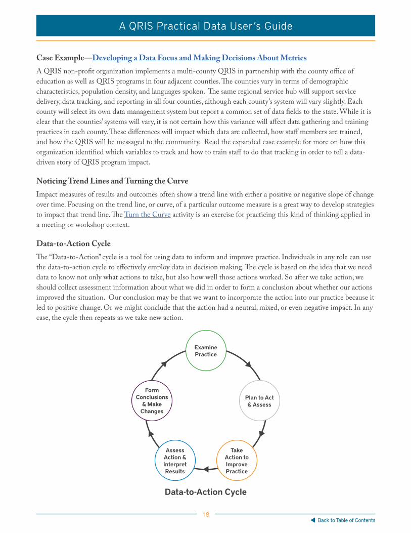
Data-to-Action CycleThe “Data-to-Action” cycle is a tool for using data to inform and improve practice. Individuals in any role can use the data-to-action cycle to effectively employ data in decision making. The cycle is based on the idea that we need data to know not only what actions to take, but also how well those actions worked. So after we take action, we should collect assessment information about what we did in order to form a conclusion about whether our actions improved the situation. Our conclusion may be that we want to incorporate the action into our practice because it led to positive change. Or we might conclude that the action had a neutral, mixed, or even negative impact. In any case, the cycle then repeats as we take new action.
Data-to-Action Cycle
ExaminePractice
AssessAction & InterpretResults
TakeAction toImprovePractice
Plan to Act& Assess
Form Conclusions
& Make Changes

19
A QRIS Practical Data User’s Guide
Back to Table of Contents
Major points and questions relating to each stage of the cycle are described below:
1. Examine Practice—The first step in the cycle is to examine practice with the goal of un-derstanding who and what’s involved, what needs improvement, and why that improvement matters. When we are clear about what needs to be addressed and why, we are in a position to plan a response to it.
Key QuestionsWhat exactly are we trying to improve?Who is closely and remotely involved? Why is it important? How is it limiting our impact?
2. Plan to Act and Assess—It is not enough to plan what we would like to do to make improve-ment. We also have to think about how we will know if our plan is working. Having a clear idea of what better might look like helps us decide what actions to take, and which types of assessments will measure those actions’ effectiveness.
Key Questions What might better look like? What steps could we take to get there? How will we observe and measure different kinds of improvement?
3. Take Action to Improve Practice—Once we have a plan for taking and assessing action, we try it!
Key QuestionsWho will do what?When will they do it?
4. Assess Action & Interpreting Results—There are two types of assessment we can use to gauge the effectiveness of our actions: formative and summative. Formative assessments are those that take place while we take action. Summative assessments take place afterward. Common types of assessments include: thresholds; cut scores; checklists; change tracking over time, across settings, or among individuals; percentage counts; and ratios. It’s important to re-alize that the type of assessments you use will determine what meanings you can make out of the actions you took. Ultimately, the goal of interpreting assessment results is to find out what stories they are telling us.
Key Questions Which data will you collect? Which assessments will collect it?How will you review assessment results?

20
A QRIS Practical Data User’s Guide
Back to Table of Contents
5. Form Conclusions & Make Changes—If assessing our improvement activities tells us what, and interpreting tells us so what, forming conclusions and making changes tells us now what. Based on the findings of our assessments we will know how well our strategy for improve-ment has worked. If it went very well, we may directly incorporate the strategy into our ongoing practice and share our findings with others. If results were mixed, we may use our assessment data to change part of our practice and repeat the Data-to-Action cycle.
The Data-to Action Cycle is a continuous improvement cycle that takes into account any type of impact-related measure and focuses on next-step practices that can lead to improvement. Making these improvements does not require waiting for the results of a summative QRIS evaluation. Data are produced within the data ecosystem in an ongoing way that can be used to make mid-stream course corrections and guide emergent practices and deci-sion making. The Data-to-Action Cycle materials can help with that.
To use the Data-to-Action Cycle in your own work, download these resources and apply them to your context. The Data-to-Action Cycle Questions Handout can be used to focus on the key questions in each stage and then to apply your answers to build a clear plan for continuous, data-informed learning. The repeating sequence of rec-ognizing problems and taking data-informed actions toward goals is one way to tell the story of QRIS work.
Stories and dataQRIS data and impact are incomplete without the story connecting people, decisions, actions, and outcomes. The 2013 Practical Outreach Guide for a Quality Rating and Improvement Systems is an excellent companion resource to this guide because it offers concrete strategies and next-steps practices for sharing QRIS importance more widely. The most important area of overlap between these two resources is the intersection of data and stories. Data efforts are improved by stories that bring them to life in the imagination; stories are improved by data that make the details more precise and set within a familiar context. In order to tell data-driven stories about our impacts, we need to be data-literate.
Th e Quality Rating and Improvement System (QRIS) National Learning Network was formed by a coalition of states and organizations. Network members are united in the desire to use rating and improvement strategies to elevate the quality of care in state early care and education systems and to support and improve children’s development. We provide information, learning opportunities and direct technical assistance to states that have a QRIS or that are interested in developing one.
Kelly Swanson, Communications and Public Policy Director, Pennsylvania Key (www.pakeys.org) for the
BUILD Initiative’s ORIS National Learning Network
June 2013
A Practical Outreach Guide for a
Quality Rating and Improvement System (QRIS)

21
A QRIS Practical Data User’s Guide
Back to Table of Contents
Data LiteracyData literacy is the ability to gain actionable insight by reading, writing about, and discussing data. Data litera-cy is vital: having all the data in the world is of no help if users struggle to understand, display, and talk about it. Certainly, there are beginning and advanced levels of data literacy and the more expertise we develop in research methods, mathematics, and statistics, the more data-literate we can be. However, this does not mean that we need a PhD or a background in mathematics or statistics to become data-literate. This section of the guide focuses on mapping, reporting, and discussing data as three key strategies for building data literacy that do not require advanced training or knowledge and can be used by anyone working in a QRIS. Before diving into each of these strategies, though, let’s briefly discuss the foundation of data literacy.
Legibility Data literacy rests on the readability of the system that the data describe. In his 1989 Seeing Like a State, James Scott defines this readability, or legibility, as a central problem in statecraft and public policy. As Woods put it, “...the legibility of a society provides the capacity for large-scale social engineering” (p. 5). QRIS are examples of intentional social engineering to improve long-term economic, health, and educational outcomes through enhanced early learning guided by research-based standards and collective effort. When QRIS and other policy systems become more legible through common terminology, classifications, standards, and well-defined priorities, data literacy becomes more important. Without data literacy, it’s difficult to know whether those standards are being met and those priorities upheld. The following strategies are for enhancing data literacy within increasingly legible early-care and education systems.
Data Mapping Data mapping is the process of using data to describe environments, efforts, outcomes, and goals.
Mapping is a key strategy for making policy systems more legible. Members of the BUILD QRIS Community of Practice on Effective Data Use described multiple data mapping strategies. One is to map the environment—including both data management systems and interactions between individuals—to determine what work needs to be done and where. Another strategy is to map outcomes of QRIS work to determine whether the system is moving towards overall goals. We provide several examples of these and other types of mapping below.
System MappingMapping the overall goals of a data project can take on several forms. First, consider a system map for understand-ing the myriad needs, activities, and deliverables involved in a large-scale data project.
System mapping is important for three reasons. First, it makes the central goal as clear and prominent as possible. Second, system mapping identifies important action areas. And third, it shows important action areas near the activities to which they are related. Having a system map can make it easier for groups to prioritize their activities and decide who will take what next steps and how.

22
A QRIS Practical Data User’s Guide
Back to Table of Contents
Although this map, and others like it, highlight the central goal and action areas, it is important not to overlook the links that connect them. Consider how action areas relate to one another, how each of those areas relates to the goal, and the roles of persons involved in both the action areas and the goal.
Mapping the Misunderstood Mapping is key. It helps to make easily misunderstood aspects of a QRIS more legible. Data management systems and relational databases are a clear example of an important but misunderstood aspect of a QRIS. Even though most individuals in a QRIS interact with many related databases, few understand how they work.
Mapping Data Management SystemsMapping the data management systems can lead to better understanding of the databases we use to manage our data and, importantly, the roles and goals of various individuals in that process. The better ECE providers, field staff, and administrators understand their software for managing QRIS data, the more easily they can enter regis-try information, coaching data, access reports, and otherwise navigate their data system.
Mapping data management systems also makes for easier translation among data management, use, and reporting. Although it is not necessary for every manager or field-staff member to understand precisely how and why the da-tabases work, it is important that everyone share an understanding of the big picture of how they work. Mapping data systems with simple diagrams can help perform the crucial work of informing statewide and regional teams how these databases operate and interact.
Mapping the data management systems can improve data literacy by making the system more legible. Information management can seem abstract, yet how we store and share the information that we need really matters. With so many different individuals cooperating to gather, manage, and use the same data, it can be helpful to create a visual representation of the data systems and how they relate to each other. A QRIS team focused on clarifying and advancing data systems drew out a map to show the overlap of information among the databases. There are also arrows showing outputs of the databases and who accesses the information.
Another team also mapped its databases and the connections between them using a few simple images to show how the data management system worked. This team used a more interactive technique to share the information. By clicking on any of the boxes representing the databases and the individuals who employ them, the user was linked to more information about the data in each system, how it can be used, and the roles of those using it. A resource like this makes a useful onboarding exercise and a resource for ongoing reference.
System Mapping: Myriad Needs, Activities
& Deliverables
DevelopCommon Outcomes
AssessNeeds
BuildCapacity
StaffAdvisory
Group
Create aSystem to
ReportOutcomes
LinkData
EstablishCommonMeasures

23
A QRIS Practical Data User’s Guide
Back to Table of Contents
Mapping is an ongoing process. When changes in data entry processes or data management systems occur, it’s helpful to re-map the new data system. Comparing the new map with the old map can also be helpful in clarifying the changes in data ecosystems. Mapping can also be used to perform a data check-up to identify breakdowns in data management, information sharing, or data-informed decision making.
Making a Map Making a map like the examples is simple:
1. Begin by creating two lists: one of the databases used, and one of individuals who enter and extract data from them.
2. Sketch the databases and connect the ones with shared data fields that “feed” each other.
3. Add individuals to the map.
Guiding questions that can lead to making a useful data management system map include:
• Which databases need to be included?
• Which individuals need to be included?
• Which databases feed each other?
• Who enters data into each system?
• Who extracts data from each system?
• What permissions, privacy, and access issues need to be considered?
• Where are the weak links?
NACCRR Aware Provider Registry
Service “A” Database QRIS OnlineTraining LCMS
RatingData
Service “B” Database
Coaches
TechnicalAssistance
Specialists &Rating
ReadinessConsultants
Child CareProviders
Mapping Databases and Connections
Image Credit: Sarah Kelley

24
A QRIS Practical Data User’s Guide
Back to Table of Contents
This type of mapping does not solve all data management problems. But such mapping does increase data literacy by making a complicated system more legible to its users. Another type of mapping that can be used to increase data literacy involves the ways in which individuals share information with each other. Also, making a map like this likely also will reveal weak linkages and may help strategize improvements.
Mapping Information Sharing—Feedback LoopsIn early stages of data ecosystems development, an information-sharing system map can be useful for considering processes and protocols for sharing information. Maps like this are not important because they include every-thing, but because they highlight essential connections in a data ecosystem for those who need to understand it. Information-sharing maps can be used to identify areas in need of attention and support. Examining these maps—and any QRIS data system map for that matter— can help one understand how the connections within the system have broken or could break down. Clarifying breakdown points is essential to continuous quality im-provement of healthy QRIS data ecosystems.
Let’s look at the information-sharing map below. This map shows four types of actors: early learning programs, Quality Improvement Specialists (QIS), and QRIS Administrators and Evaluators. All of these actors, who are labeled at the center of the map, produce, consume and decompose data. On the left side of the map, arrows show the actions that each type of actor takes to produce data. Providers in programs prepare portfolios for QRIS Administrators (gold) and surveys for Evaluators (orange). Quality Improvement Specialists coach providers and document their work in TA logs (green) which are reviewed by Evaluators (blue).
*TA = Technical Assistance; QIS = Quality Improvement Specialist.
The right hand side of the image shows how individuals in these roles use, decompose, and re-generate the information that they consume. Evaluators analyze data and report findings to QRIS Administrators (blue) and provide data updates to Quality Improvement Specialists (purple). QRIS Administrators provide technical assistance to Quality Improvement Specialists (green) and portfolio feedback to programs (gold). Quality Improvement Specialists and programs provide coaching and feedback to one another (purple).
QRIS Data Feedback Loop
Evaluator
QRIS Administrators
Programs
TA Logs
Surveys
Portfolio
Data Updates
Technical Assistance
Portfolio Feedback
Analysis
FeedbackCoaching
Review
QIS
Image Credit: Pat Aldrich

25
A QRIS Practical Data User’s Guide
Back to Table of Contents
Notice that the map doesn’t include all the stakeholders in the system. For example, it excludes policy makers, licensing officers, and special interest groups. Instead, it includes only the actors most relevant to the people and context in which the map was produced. Also notice that the map shows more than just the relevant actors in-volved in the day-to-day QRIS work. It also shows ongoing information cycles, or data feedback loops.
Feedback loops are closed chains of causal connections in which outputs become inputs. Feedback loops start from a “stock” of something, in this case—a stock of data about programs and QRIS services. The stock always under-goes transformation by some set of rules and actions. Data producers’ implementation of programs and provision of services counts as the rules and actions that transform a QRIS’s data stock. This transformed data stock be-comes the new input for another cycle of the feedback loop.
It’s crucial to maintain balance in a feedback loop. In our example, if the exchange of information from one actor to another is intermittent, incomplete, inaccurate, or untimely, balance degrades. Balanced, stable feedback loops are essential to the health of a data ecosystem. Mapping data feedback loops can help to identify imbalances—to see where there are breakdowns, which is necessary to continually assessing and improving data ecosystem health
The Mapping Data Feedback Loops resource is a tool for assessing data feedback loops in your context. You can use this handout individually or in a group to think about what positive changes in process could result if you identified key data ecosystem interaction breakdowns.
Ideally, mapping makes our work and environment more legible. To increase legibility and support data literacy, making simple maps is helpful. Unfortunately, QRISs are complicated, so when a map needs to communicate complex information about multiple variables simultaneously, it can be useful to gradually build the audience’s understanding by simply mapping one variable at a time. Using mocked-data, a contributor shared such a layered mapping strategy to clarify training needs in a particular state.
Layer 1The first layer shows regions by color. The darkest colors indicate the highest percentages of ECE providers (workers) who have completed a particular training and the lightest colors show the regions where providers have completed the least training.

26
A QRIS Practical Data User’s Guide
Back to Table of Contents
Layer 2In the second layer of the map, already completed training in regions is set aside, and upcoming available training is highlighted. Different-sized circles show how much training is available. The circles represent the ratio of up-coming scheduled trainings within each region per 100 workers in each region. The largest circles show 4-5 train-ings available per 100 providers; the smallest circle shows 0-1 trainings per 100 providers. So while the first layer of the map shows the percentage of providers needing training, the second layer shows how much was available.
Combining Both LayersThe third layer combines these data points to make a more complex map showing the training needs and availabil-ity by region in one image:
This layering strategy resulted from the observation that when shown all map layers at once, the audience had trouble making sense of them. So in the case of complex maps showing multiple variables, layering has proven an effective strategy for promoting data literacy.

27
A QRIS Practical Data User’s Guide
Back to Table of Contents
Sharing Information Through GraphicsUnderstanding basic principles of graphic design is an important component of data literacy. After all, graphics are one of the most common ways we consume data. When crafted and presented well, informational graphics convey complex information in clear, pointed ways. Yet graphics are sometimes so complicated or downright misleading that they’re ineffective. The following example highlights some of the ways that graphics can go wrong.
These two graphics mislead in a number of ways. First, even though both graphics use the same title—Growth in QRIS Participation—they represent two very different types of data (counts and percentages). Similarly, both graphic uses the same four colors, but they represent different groups. Finally, both graphics have too much “noise”—too much information (trend lines) that isn’t relevant to the question at hand.
Let’s take a look at how these two graphics could be improved.
These revised graphics are clearer and more focused. Titles specifically state the units (counts and percentages) used. Colors consistently display the same information in both graphics. Less relevant information has been removed. Consider the following list of principles for creating effective graphics.

28
A QRIS Practical Data User’s Guide
Back to Table of Contents
Principles for Effective Graphics
• Always consider the audience you are trying to reach.
• Define the purpose: determine what in particular you want the reader to take away from the graphic.
• Write or say the takeaways explicitly.
• Distill and synthesize takeaways to form guidelines.
• Specify: use clear, specific titles, data labels, and data points.
• Be consistent: use the same colors, fonts, and other design features to refer to the same types of information.
• Simplify, simplify, simplify: graphics can be overwhelming, so simplify them by removing less relevant information.
• If you can’t simplify, build understanding gradually by presenting layered information sequentially.
• Use follow-up questions that ask audiences to interpret and speak about what they are seeing.
• Prior to presenting, offer the graph to co-workers to see if they can clearly understand it the way you do. Listen to feedback about what is confusing, and alter the graphics to make things easier to understand.
Using Data ReportsCreating data reports is an important strategy for building data literacy across the system. Regular reporting cycles and the capability to read reports on demand both support the kind of active, continuous engagement with data necessary to maintaining literacy. Whether your system has a fully automated report system, or is just beginning to pull together its first data report, it is important to think about what information is shared, with whom, and how it is disseminated.
QRIS data ecosystems produce a massive amount of data. So deciding what data to report can be overwhelming. As a first step, consider reporting data related to policy or contract mandates. When developing additional reports to build data literacy across the system, consider including data about target populations, the work and activities of implementation, and additional information that may serve continuous quality improvement. In all these cases, define and prioritize what specific information you want to share and why.

29
A QRIS Practical Data User’s Guide
Back to Table of Contents
Understanding Target Populations
• Who are the populations we are aiming to serve?
• How is the progress of the whole population we serve?
• Who are the particular sub-populations we serve?
• How is the progress of the sub-populations we serve?
• Where are the providers we serve?
• What trends do we see in enrollment?
• What gaps emerge?
• What needs do we see?
Understanding Implementation Activities
• What are we working on?
• Where?
• Who are the provider groups we are working with?
• How much?
• How often?
• With what intensity?
Examples of Additional Information That May Serve Continuous Quality Improvement
• Information on all providers – characteristics, cost, trends by region.
• Information on families looking for childcare & referral services—what are they looking for and where? How does capacity relate with demand and QRIS participation by region?
• Information on scholarships or subsidies – how many, to whom, where, and for what?
• Information on provider data quality – updates on pace by region or provider type, error rates by phase of QRIS process, region, or provider group.
Case Example—Improving Quality and Consistency Through Coaching Reports QRIS implementers noticed that providers were not receiving the same amount of coaching. The number of hours per provider looked low and inconsistent. A little digging showed that a small percentage of providers were getting the projected number of hours. Meanwhile, some providers reported dissatisfaction with their experience in the QRIS and field staff members were vocal about large caseloads. In a review, there were inconsistencies in training and data entry. The group decided to focus on learning and accountability to monitor more carefully the service outputs and offer trainings based on best practices gleaned from across the system.

30
A QRIS Practical Data User’s Guide
Back to Table of Contents
Coaching reports became the mechanism for providing reliable measures for more careful monitoring and for identifying where best practices were taking place. The reporting system provided clear information to multiple data consumers who could use it to adjust service quality and consistency. As the reporting process went on, new variables were added to the report and less useful ones were removed.
The implementation team automatized the report so that it was self-generating and self-distributing. The result was a monthly report that was sent out (basically) error-free. This increased accountability over time, with a higher percentage of coaches meeting the prescribed hours.
Making and disseminating data reports is an essential component of data literacy. However, those data reports won’t do much good unless they are discussed. Teams need to discuss data if they are to develop a shared under-standing that leads to collaborative action.
Discussing Data In addition to data reporting and mapping, discussing data regularly among colleagues in a QRIS can foster data literacy. These discussions can be embedded within regular meetings or called to focus on an emergent issue. This section provides a few ideas to guide these informal conversations as well as several templates for data-focused meetings.
Data Advisory Groups Data advisory groups get together to consider what data to collect, what their data mean, and ways to improve data collection and use. Depending on their goals, these groups can be composed of individuals with the same roles or ones working across different roles. By meeting regularly, these groups can spot issues before they become problems. They can also focus on existing problems, discussing data efforts for solving them. Group members can develop data-driven stories to share with other stakeholders and team members. With regular chances to meet, data advisory groups build practice and skill, making their meetings more intentional and useful over time.
Data-Dive Meetings Whereas a data advisory group forms to work through data concerns, data dives take place within regular, general meetings. Diving into data for a few moments during regular meetings can help a group clarify a problem and brainstorm solutions. In terms of data literacy, data dives help a group build and maintain its ability to fluent-ly read and talk about data practices. The chance for participants to share interpretations and ask questions also builds data literacy. This Data-Dive Meeting Template provides some key questions with which to start.
Data-Dive Meeting Agenda
• Choose a focus area.
• Analyze the data and find the stories.
• Display the data.
• Draw attention to critical comparisons.
• Compare performance of groups.
• Display trends.
• Talk about what the data means.
• Brainstorm how to act on the meaning.

31
A QRIS Practical Data User’s Guide
Back to Table of Contents
There is no right way to incorporate data dives into meetings, but there are definitely less productive ways that do not lead to a shared understanding or collaborative action. In facilitating a productive conversation about data, it’s helpful to remember that data literacy is not a contest. The goal of data meetings is not to determine who has the best grasp of the data. Rather, the goal is to share perspectives and questions from the group about what data mean in order to build shared understanding. When approached in this way, data meetings can be a potent brew for making decisions and brainstorming solutions to vexing problems.
Mapping, reporting, and discussing data are complementary, mutually reinforcing strategies for promoting data literacy in a QRIS. Though they take time to establish, these strategies become increasingly effective with practice. Maintaining data literacy through regular, continuous practice helps ensure that the QRIS is using data to make the best decisions possible. While increasing data literacy is one important way to improve the data capacity of a QRIS, it’s not the only one. In the next section, we’ll consider a number of other strategies for building data capacity.
Building Data Capacity“Our ability to generate information now far exceeds our capacity to understand it. Finding patterns and making meaningful connection inside complex data networks has emerged as one of the biggest challenges of the twen-ty-first century. In recent years, designers, researchers, and scientists have begun employing an innovative mix of colors, symbols, graphics, algorithms, and interactivity to clarify and often beautify the clutter.”1
There are many types of data capacity that could be increased within QRIS data ecosystems. In the case of a data ecosystem’s material resources, suffice it to say that more resources could always be added. For example, hardware and software’s storage and processing power could be increased. Here we’ll focus not on the data capacity of ma-terial resources, but on that of data producers, consumers, and decomposers. Though there are many strategies for increasing data capacity among these groups, we’ll focus on the following four:
1. Increasing the amount of data-work that each individual can do by increasing the time, resources, or technologies available for doing it.
2. Increasing the number of people who are focused on using data on a regular basis in their work.
3. Building individual and team skills for using and communicating about data related to their work.
4. Adding additional types of data roles to assemble or interpret data that are gathered and analyzed by others.
The following case example offers a clear illustration of these strategies.
1 Book review—Visual Complexity, Mapping Patterns in Information. (n.d.). Retrieved September 22, 2016.

32
A QRIS Practical Data User’s Guide
Back to Table of Contents
Case Example – Statewide Capacity Building ProjectA team combined the above strategies throughout its statewide project to increase data capacity. The Smart Start Data Project ( January 2013-December), which was funded through a Race to the Top—Early Learning Challenge grant, aimed to:
1. Oversee the comprehensive assessment of 75 local partnerships’ capacity to collect, manage, and use data.
2. Enhance capacities for partnerships’ in this data work.
3. Establish and staff a Data Advisory Group.
4. Recommend common outcomes and common measures for local partner-ships to use in assessing their Smart-Start-funded activities.
5. Create a data reporting system for local partnerships to report statewide common outcomes.
6. Link the new systems to the state Early Childhood Integrated Data System.
This work involved a great many people and activities, including:
• Upgrading software, hardware, and databases.
• Developing and using transmission equipment.
• Reliably collecting and analyzing data from standard assessments.
• Supplying time, training, and software for improved reporting and analysis.
• Implementing ongoing training and consultation on data collection, data management, and analysis.

33
A QRIS Practical Data User’s Guide
Back to Table of Contents
One strategy this team used was to provide micro-grants to ECE providers to support their ability to use data to improve their practice with children and families. As part of this work, the team created Data Capacity Micro-grant Data Fables. These short stories illustrated cases of local partners in need of data support. These providers’ situations were familiar and the strategies used to support data are simple, effective, and approachable.
A Data Fable in which a Partnership and Local Programs Make Regular Use of Information on Outcomes.
This and other data fables developed through the Smart Start data project illustrated how focusing on data capaci-ty at a system level involves support for individuals at every level. These fables also described how creating inten-tional opportunities to collaborate across roles and use data for specific purposes improved the system as a whole.
“Opportunity is missed by most people because it is dressed in overalls and looks like work.” –Thomas Edison
After 20 years, Skyland County Partnership took a breath and considered all it had done. From the day it opened its doors in a small rented office until now, many goals had been realized. A collaborative community system of early childhood partners was convened. A Smart Start Partnership for Children infrastructure was created and a community early childhood advocacy organization was flourishing. Moreover, thousands of children and families had received support and services through Smart Start and its partners. Most civic leaders understood the impor-tance of the first 2000 days of a child’s life and elementary school teachers and principals supported Smart Start’s efforts as they felt more children were coming to kindergarten prepared to learn.
In these first 20 years, the partnership had accomplished its initial mission to provide and support quality early childhood services that benefitted young children and their families. Now it was time to move ahead. The partner-ship wanted to be sure shrinking funds were dedicated to the most effective services and to activities with a track record for producing outcomes associated with school readiness.
The partnership’s focus for the next six months would be on creating a three-county regional network of Smart Start outcomes-measurement resources. One member took the lead in investigating outcomes assessment and measurement methods for typical core service programs. Another one checked out ways the three partnerships could combine resources for training and implementation. A third looked at potential regional partners to par-ticipate in the effort. A plan was created to collectively implement a new system of two core-services outcomes assessments in the network’s first year. Sharing resources with a lead partnership reduced the potential cost of a separately implemented model by 37 percent. Other early childhood partners serving as trainers and assessors reduced it even more in the second year of implementation.
Data from outcomes assessments were now regularly used to guide interventions with clients. An analysis of a year’s worth of data illustrated strengths and needs for improvement that allowed the partnership to plan for program modifications that could generate better outcomes. Looking toward the next 20 years, these needs for improvement were set as new goals. This data-driven planning was exactly the kind of opportunity to keep Skyland partnership thriving.

34
A QRIS Practical Data User’s Guide
Back to Table of Contents
TAP-IT Data Team Framework
The Smart Start Data Project fables showed how increasing data capacity across systems could result from tak-ing strategic action at the program level. Another team demonstrated this in its work developing a framework for teaming up to improve data capacity. The Center for Technology in Education at Johns Hopkins University’s School of Education developed a tool to help collaborators meet intentionally to make data-informed decisions about teaching and learning.
The TAP-IT framework helps teams set up sequential steps for developing understanding and take action on data. The foundation of the TAP-IT model is built on strong literature based on educators using student data (e.g. longitudinal and formative) along with teacher fidelity implementation results to:
1) Inform instructional decision making.
2) Monitor student progress.
3) Promote improved teacher performance.
4) Advance student learning.
TAP-IT consists of the following stepwise series of activities:
Team – Make explicit agreements to review individual/group data to solve problems using protocols with built-in steps to collaborate and consider data.
Analyze – Identify a focus and use formative and longitudinal data to uncover actionable insights.
Plan – Use timely and relevant data from multiple sources for planning action steps and evaluation procedures.
TAP-IT & Essential Features
35
A QRIS Practical Data User’s Guide
Back to Table of Contents
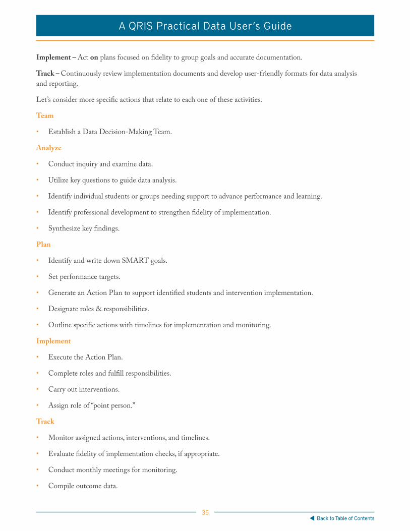
Implement – Act on plans focused on fidelity to group goals and accurate documentation.
Track – Continuously review implementation documents and develop user-friendly formats for data analysis and reporting.
Let’s consider more specific actions that relate to each one of these activities.
Team
• Establish a Data Decision-Making Team.
Analyze
• Conduct inquiry and examine data.
• Utilize key questions to guide data analysis.
• Identify individual students or groups needing support to advance performance and learning.
• Identify professional development to strengthen fidelity of implementation.
• Synthesize key findings.
Plan
• Identify and write down SMART goals.
• Set performance targets.
• Generate an Action Plan to support identified students and intervention implementation.
• Designate roles & responsibilities.
• Outline specific actions with timelines for implementation and monitoring.
Implement
• Execute the Action Plan.
• Complete roles and fulfill responsibilities.
• Carry out interventions.
• Assign role of “point person.”
Track
• Monitor assigned actions, interventions, and timelines.
• Evaluate fidelity of implementation checks, if appropriate.
• Conduct monthly meetings for monitoring.
• Compile outcome data.

36
A QRIS Practical Data User’s Guide
Back to Table of Contents
When combined, all of these activities form a valuable strategy for building a team’s data capacity through informed decision making. Of course, though, no one strategy for enhancing data capacity, literacy, or impact will prevent challenges from arising in a QRIS. Even so, data is an effective tool for recognizing, responding to, and even foreseeing those challenges.
Challenges within Established SystemsEffective data use is not the magical solution to all of the challenges that occur in dynamic, evolving QRIS. However, effective data use can make entrenched challenges more understandable, present challenges more solvable, and emergent challenges more foreseeable. Constant evaluation of data use processes, policies, systems, and capabilities are critical for multiple reasons:
• Goals shift.
• Needs change.
• Data system limitations emerge.
• Variables become more important.
• Other variables become less important.
Validation studies of QRIS programs and policies are critical for raising the quality of early care and education systems and programs. In order for these programs and policies to be effective, it’s essential to improve data capacity, literacy, and impact among all persons involved.

37
A QRIS Practical Data User’s Guide
Back to Table of Contents
One-Act VignettesMembers of the QRIS Data Community of Practice share examples of their experiences with data challenges and solutions. The contents of this guide reflect their approaches to addressing these challenges using data-focused solutions. The following examples provide an insight into the kinds of challenges and questions that emerged through a yearlong conversation about using data effectively in QRIS. In order to stay focused on the common challenges and approaches that participants shared, these case stories do not identify the states, systems, or teams they describe.
Developing a Data Focus and Making Decisions about MetricsAn organization implementing the expanding QRIS is sharpening its focus on collecting and using data to guide and report on its programs and services. As the QRIS expands statewide, there are many possibilities for tracking and sharing data. Stakeholders within the organization need clear data reports to inform them about the amount, types, and impacts of the services provided. These individuals also need to be able to effectively communicate with external stakeholders, such as community organizations and state agencies, about their programs and outcomes. They are excited about gathering the data and telling the stories. However, there has been no clear consensus about which metrics to focus on and exactly how to report out to internal and external stakeholders. These colleagues are looking to better understand:
Their Questions
1. What metrics and reporting practices should be focused on in order to best inform internal stakeholders about the organization’s progress and services?
2. What metrics and reporting practices should be focused on in order to inform external partners and community members?
In response to these questions of data practice, over time, these colleagues developed a data management and reporting system and data-focused meetings, and continued developing a comprehensive data dashboard. In the absence of a state data system for monitoring service delivery, the agency implemented an internal data system to capture service delivery information for each participating childcare provider. The metrics were vetted with a team approach as part of a larger dashboard development project. Using this system, they have been able to generate reports that produce basic output information and then use that information through regular reports and data meetings. The reports inform service providers and are used to frame discussions among senior staff about what the data show and what further data are needed to answer the questions that emerge. The team plans to add more service-delivery metrics over time, and as capacity allows, because they recognize that greater detail will generate more interest in, and ability to use, finer-grained information about coaching practice, providers’ characteristics, and quality ratings. Next steps include developing a presentation and regular training cycle to help staff streamline data entry and understand its connection to big-picture goals. The team also plans to conduct case studies and quantitative analyses to understand providers’ experiences and to investigate relationships among providers’ char-acteristics, rating assessments, coaching services, and program outcomes to better understand what it takes to help providers move up a star level.
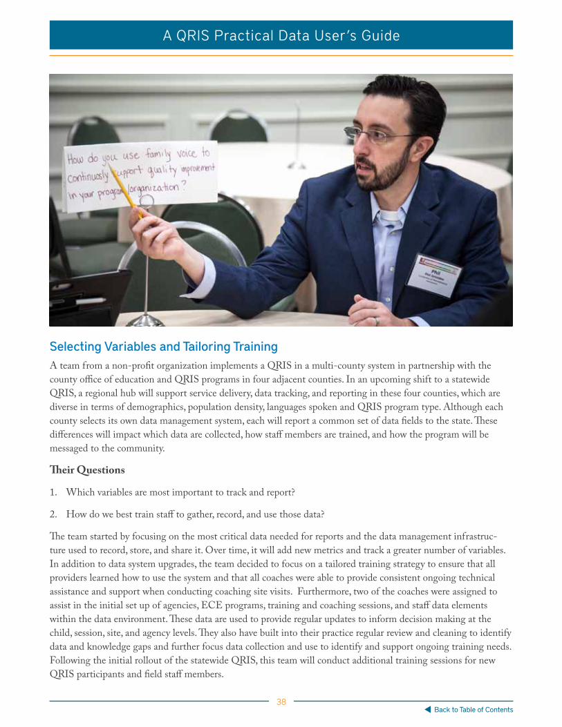
38
A QRIS Practical Data User’s Guide
Back to Table of Contents
Selecting Variables and Tailoring TrainingA team from a non-profit organization implements a QRIS in a multi-county system in partnership with the county office of education and QRIS programs in four adjacent counties. In an upcoming shift to a statewide QRIS, a regional hub will support service delivery, data tracking, and reporting in these four counties, which are diverse in terms of demographics, population density, languages spoken and QRIS program type. Although each county selects its own data management system, each will report a common set of data fields to the state. These differences will impact which data are collected, how staff members are trained, and how the program will be messaged to the community.
Their Questions
1. Which variables are most important to track and report?
2. How do we best train staff to gather, record, and use those data?
The team started by focusing on the most critical data needed for reports and the data management infrastruc-ture used to record, store, and share it. Over time, it will add new metrics and track a greater number of variables. In addition to data system upgrades, the team decided to focus on a tailored training strategy to ensure that all providers learned how to use the system and that all coaches were able to provide consistent ongoing technical assistance and support when conducting coaching site visits. Furthermore, two of the coaches were assigned to assist in the initial set up of agencies, ECE programs, training and coaching sessions, and staff data elements within the data environment. These data are used to provide regular updates to inform decision making at the child, session, site, and agency levels. They also have built into their practice regular review and cleaning to identify data and knowledge gaps and further focus data collection and use to identify and support ongoing training needs. Following the initial rollout of the statewide QRIS, this team will conduct additional training sessions for new QRIS participants and field staff members.

39
A QRIS Practical Data User’s Guide
Back to Table of Contents
Improving Coaching Quality and Consistency Through Coaching ReportsNot all ECE providers enrolled in a state QRIS were receiving the same amount of coaching. A minimal percentage of providers were getting the required hours, which led to providers quitting the QRIS because they sensed they were not getting full value from the service. Field staff members were vocal about large caseloads; however, caseload data compared to service hours was not supporting that as the primary reason. There were also inconsistencies in training and data entry.
Their Questions
1. What accounts for the service delivery shortfall?
2. How can we support field staff members’ learning?
The group decided to focus on learning and accountability to monitor more carefully the service outputs and offer trainings based on best practices gleaned from across the system. Coaching reports became the mechanism for providing reliable measures for more careful monitoring and for identifying where best practices were taking place. The result of the reporting system was improved service quality and consistency. The percentage of coaches meet-ing the requirements increased and the number of providers dissatisfied with coaching decreased. As the reporting process went on, new variables were added to the report and less useful ones were removed. Finally, the colleagues automatized the report so that it was self-generating and self-distributing. The result was monthly reports that are sent out basically error-free.

40
A QRIS Practical Data User’s Guide
Back to Table of Contents
Mary Payson
Chris Swanson
Nick Gillon
Tabitha Isner
Curtain Call Thank you to those who participated in this project:
Nick GillonPatrick AldrichKatherine BellPeter Gillon
Sarah KellyAmy LeisRajni LopezCoral Manning
Heather MooreMolly O’DohertyMary PaysonTabitha Isner
Lyn RhodesKaren SampsonChris SwansonKristi Van Heule
Tabitha Isner discovered her love for data and CQI as a Researcher at Child Trends and then put those skills to work for the State of Minnesota. She is now a Project Manager for New World Now LLC where she helps states to design and implement QRIS and Workforce Registry data systems.
Nick Gillon has experience in early learning practice, policy and research. Currently, he manages K-12 educator preparation program effectiveness for Washington State’s Professional Educator Standards Board, is completing a PhD at the University of Washington, and collaborates on early learning initiatives with Johns Hopkins University.
Mary Payson is a consultant focused on data systems, workforce TA standards, grants for infrastructure and data literacy, data governance and eLearning content development. Her recent experience Data Project Manager for the NC Partnership for Children building data use capacity for serving vulnerable populations informed her work on this project.
Dr. Chris Swanson leads a team at Johns Hopkins University focused on improving outcomes for young children. They focus on QRIS, competency-based workforce development, inclusive practices, and engaging all stakeholders around the importance of quality.
Related Documents