A Conversation Between Trees: What Data Feels Like In The Forest Rachel Jacobs 1 , Steve Benford 1 , Mark Selby 1 , Mike Golembewski 1 , Dominic Price 1 , Gabriella Giannachi 2 1 Mixed reality Laboratory & Horizon University of Nottingham Nottingham, UK {firstname.lastname}@nottingham.ac.uk 2 Centre for Intermedia University of Exeter Exeter, UK [email protected] ABSTRACT A study of an interactive artwork shows how artists engaged the public with scientific climate change data. The artwork visualised live environmental data collected from remote trees, alongside both historical and forecast global CO 2 data. Visitors also took part in a mobile sensing experience in a nearby forest. Our study draws on the perspectives of the artists, visitors and a climate scientist to reveal how the work was designed and experienced. We show that the artists adopted a distinct approach that fostered an emotional engagement with data rather than an informative or persuasive one. We chart the performative strategies they used to achieve this including sensory engagement with data, a temporal structure that balanced liveness with slowness, and the juxtaposition of different treatments of the data to enable interpretation and dialogue. Author Keywords Environmentally engaged art, sustainability, climate, slowness, liveness, sensory, embodied, performance ACM Classification Keywords H.5.2 [Information Interfaces And Presentation]: User Interfaces - Interaction styles INTRODUCTION Climate change is now a major topic of public concern and discussion. It is also a deeply challenging and politically charged issue, raising heated debate over whether it is happening, why it might be happening, and what we might do about it. Part of the problem is that the global and long- term nature of climate change data defies easy or immediate comprehension. Thus, while some parties furiously discuss the veracity and meaning of scientific data, there is a risk of the wider public becoming disenfranchised, unwilling or unable to engage with the underlying data, and therefore increasingly distanced from the debate [20]. From an HCI perspective, a recent survey of the burgeoning field of sustainable HCI identified a variety of research ‘genres’ including persuasive technologies, sustainable interaction design, and citizen science, with each embodying different issues and underlying approaches [5]. Of particular relevance here is the potential of ‘ecologically engaged art’ to open up, stimulate and frame public debate around sustainability [4]; by engaging the public in emotional experiences on a human scale, artists may open up new opportunities for analysis and debate [10]. Against this broad backdrop, we study the distinctive role played by a particular group of artists in engaging the public with climate change data. We present the design and study of our touring artwork called A Conversation Between Trees that juxtaposed different sources of scientific data in a novel and unusual manner. Our study contributes to HCI’s knowledge of artistic approaches to sustainable HCI in three ways. First, we focus on how this group of artists interpreted and presented scientific data as part of an artwork. Second, we present a detailed account of the design of this artwork from the ground up as well as how it was experienced by the public as it toured. Third, we draw on three different perspectives within the study, those of the artists, the public, but also of a climate scientist. We begin with a brief overview of related work, followed by a general overview of A Conversation Between Trees before turning to our study and findings. These subsequently inform a discussion of the general role of artists in engaging the public with scientific data, relating the strategies observed within the work to ongoing concerns and discussions in HCI. RELATED WORK A growing community of ‘environmentally engaged artists’ is working with environmental data as a tool or medium to trigger conceptualizations of the environment in response to socio-political issues around climate and environmental change [1, 3, 10]. This work is unfolding alongside a growing interest in data visualisation within contemporary design and broader new media practices, responding to the increasing availability of public data and cheap mobile sensing devices. Artists have for some time explored how to visualise and interpret environmental and locative data Permission to make digital or hard copies of all or part of this work for personal or classroom use is granted without fee provided that copies are not made or distributed for profit or commercial advantage and that copies bear this notice and the full citation on the first page. To copy otherwise, or republish, to post on servers or to redistribute to lists, requires prior specific permission and/or a fee. CHI’13, May, 2013, Paris, France. Copyright 2013 ACM 978-1-4503-1015-4/12/05...$10.00.

Welcome message from author
This document is posted to help you gain knowledge. Please leave a comment to let me know what you think about it! Share it to your friends and learn new things together.
Transcript
A Conversation Between Trees: What Data Feels Like In The Forest
Rachel Jacobs1, Steve Benford1, Mark Selby1, Mike Golembewski1, Dominic Price1, Gabriella Giannachi2
1Mixed reality Laboratory & Horizon University of Nottingham
Nottingham, UK {firstname.lastname}@nottingham.ac.uk
2Centre for Intermedia University of Exeter
Exeter, UK [email protected]
ABSTRACT A study of an interactive artwork shows how artists engaged the public with scientific climate change data. The artwork visualised live environmental data collected from remote trees, alongside both historical and forecast global CO2 data. Visitors also took part in a mobile sensing experience in a nearby forest. Our study draws on the perspectives of the artists, visitors and a climate scientist to reveal how the work was designed and experienced. We show that the artists adopted a distinct approach that fostered an emotional engagement with data rather than an informative or persuasive one. We chart the performative strategies they used to achieve this including sensory engagement with data, a temporal structure that balanced liveness with slowness, and the juxtaposition of different treatments of the data to enable interpretation and dialogue.
Author Keywords Environmentally engaged art, sustainability, climate, slowness, liveness, sensory, embodied, performance
ACM Classification Keywords H.5.2 [Information Interfaces And Presentation]: User Interfaces - Interaction styles
INTRODUCTION Climate change is now a major topic of public concern and discussion. It is also a deeply challenging and politically charged issue, raising heated debate over whether it is happening, why it might be happening, and what we might do about it. Part of the problem is that the global and long-term nature of climate change data defies easy or immediate comprehension. Thus, while some parties furiously discuss the veracity and meaning of scientific data, there is a risk of the wider public becoming disenfranchised, unwilling or unable to engage with the underlying data, and therefore increasingly distanced from the debate [20].
From an HCI perspective, a recent survey of the burgeoning field of sustainable HCI identified a variety of research ‘genres’ including persuasive technologies, sustainable interaction design, and citizen science, with each embodying different issues and underlying approaches [5]. Of particular relevance here is the potential of ‘ecologically engaged art’ to open up, stimulate and frame public debate around sustainability [4]; by engaging the public in emotional experiences on a human scale, artists may open up new opportunities for analysis and debate [10]. Against this broad backdrop, we study the distinctive role played by a particular group of artists in engaging the public with climate change data. We present the design and study of our touring artwork called A Conversation Between Trees that juxtaposed different sources of scientific data in a novel and unusual manner. Our study contributes to HCI’s knowledge of artistic approaches to sustainable HCI in three ways. First, we focus on how this group of artists interpreted and presented scientific data as part of an artwork. Second, we present a detailed account of the design of this artwork from the ground up as well as how it was experienced by the public as it toured. Third, we draw on three different perspectives within the study, those of the artists, the public, but also of a climate scientist. We begin with a brief overview of related work, followed by a general overview of A Conversation Between Trees before turning to our study and findings. These subsequently inform a discussion of the general role of artists in engaging the public with scientific data, relating the strategies observed within the work to ongoing concerns and discussions in HCI.
RELATED WORK A growing community of ‘environmentally engaged artists’ is working with environmental data as a tool or medium to trigger conceptualizations of the environment in response to socio-political issues around climate and environmental change [1, 3, 10]. This work is unfolding alongside a growing interest in data visualisation within contemporary design and broader new media practices, responding to the increasing availability of public data and cheap mobile sensing devices. Artists have for some time explored how to visualise and interpret environmental and locative data
Permission to make digital or hard copies of all or part of this work for personal or classroom use is granted without fee provided that copies are not made or distributed for profit or commercial advantage and that copies bear this notice and the full citation on the first page. To copy otherwise, or republish, to post on servers or to redistribute to lists, requires prior specific permission and/or a fee. CHI’13, May, 2013, Paris, France. Copyright 2013 ACM 978-1-4503-1015-4/12/05...$10.00.
through playful, visual and sensory interactive experiences, while at the same time, interaction designers have been developing ‘eco-visualisations’ to help communicate environmental concerns such as energy usage [13]. Holmes has extended the term ‘eco-visualisation’ to artists focusing on ‘good environmental stewardship’, laying the groundwork for a discussion of activism and the value of alternative interpretations of environmental data within an interdisciplinary context, and specifically within HCI [12]. Contemporary artists such as Sacks [10], Polli [1], Jeremijenko [4] (to name but a few) have sought new approaches to environmentally engaged art that focus on a more conceptual ‘syntheses of science, action and art’ [25]. Giannachi suggests that these new approaches embrace an aesthetic that is ‘experienced by audiences as traces and footprint representations’, bringing together scientific perspectives, critical theory and artistic intervention. [10] Within this context, Bunting [3] argues for a clearer perspective on our expectations of the role of artists in terms of what she calls the ‘environmental crisis’. In discussing a series of exhibitions that focus specifically on climate change she suggests that artists are creating opportunities for a powerful thematic narrative around climate change, but questions whether it is the role of artists to inform the public about science. Bindi, in her essay about the work of the environmental artist Polli, suggests that artists’ distinctive interpretations of scientific data can create new ways to communicate science. Looking back at the history of hybrid artworks that span science and art, she reflects that current artworks dealing with climate can offer new interpretations of the assumptions of scientific data, opening up a perspective that looks to the ‘community and the future’ [1]. Our study extends this body of work by revealing in detail how artists can provoke a powerful emotional engagement with data. We document an approach that can be broadly termed as performative, drawing on sensory engagement, a distinctive temporal structure that balances slowness and liveness, and the deliberate juxtaposition of contrasting clearly related elements, in order to invite the public into interpretation and dialogue. We also reveal how in following this approach artists have to walk a line between the artistic and scientific treatment of data.
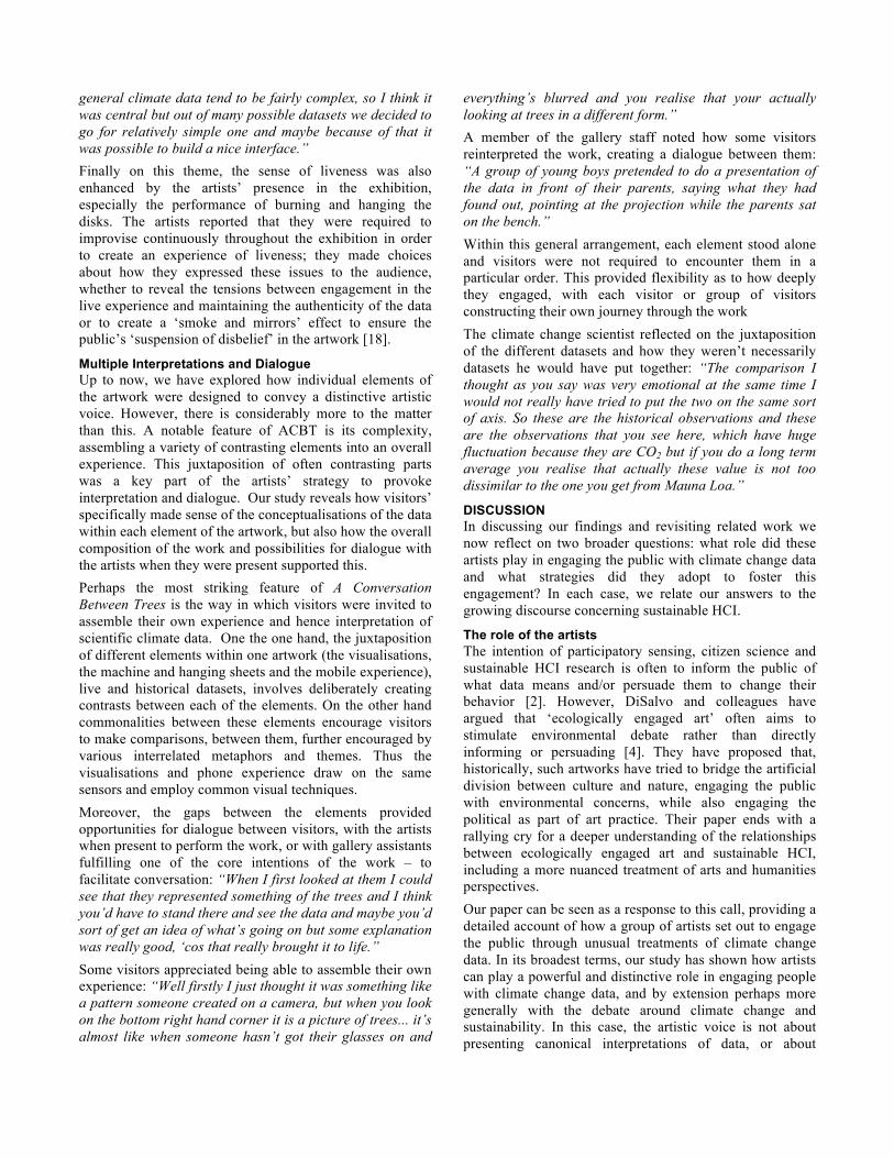
THE ARTWORK – A CONVERSATION BETWEEN TREES The artwork A Conversation Between Trees (ACBT) was created by the artists Active Ingredient in collaboration with a Senior Climate Change Scientist from the UK Met Office Hadley Centre and researchers at the University of Nottingham. It was first inspired by a visit to the Atlantic Forest around Rio de Janeiro, Brazil as part of a larger arts and schools exchange project and subsequently developed during a series of artist residencies in Brazil and the UK. ACBT toured to three public arts centres that were located in different UK forests. Further information, including documentary video, can be found at: http://hello-tree.com.
The overall intent of the work is to establish a live connection – or conversation – between a distant tree in the Atlantic forest and a local tree at each venue in the UK. This involves arranging three key elements within an overall exhibition:
• Environmental sensor data is captured and streamed live from each tree, to be visualized on two large displays that face each other across the gallery.
• Juxtaposed between these visualizations is located the ‘climate machine’, an unusual device that visualizes recorded and predicted global CO2 levels by slowly burning circular graphs onto large circular disks of recycled paper. These are subsequently hung up and displayed in the gallery space.
• Visitors can also elect to experience a walk in the local UK forest during which they enact being a sensor, using a mobile phone to capture and visualize images of the forest and answering questions about their sensation of being in the forest.
The resulting experience is therefore a complex juxtaposition of different locations (gallery, local forest and remote forest), datasets (live environmental data and official scientific CO2 data), and technologies (sensors, phones, projections and climate machine) that comes together as one coherent artwork. We now describe each of the major elements of the artwork in further detail.
Figure 1: The two visualisations in a gallery with the climate
machine between them.
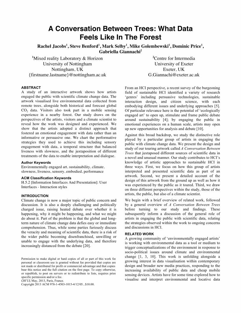
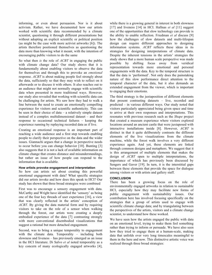
The instrumented trees and visualisations In order to capture live environmental data from the chosen trees the team developed a bespoke Arduino sensor hub connected to an Android Nexus One phone via USB. This equipment is housed in a robust and waterproof wooden casing ready for mounting in a tree. Once a minute this sensor kit takes a photograph looking up into the tree and simultaneously measures local temperature, humidity, decibel and CO2 levels, all of which are transmitted via 3G to a server in the UK. The data from each tree is then pulled into an animated 3D visualisation. Each visualisation responds dynamically to the light and colour content of the images captured by the mobile phone camera, and the temperature, humidity, decibels and CO2 levels captured by the sensors. Each change in the data triggers a change in the image, causing it to blur, move, change hue, colour and
shape in response to the dynamic environment around the tree. The aim is to create visual representations of the changes in the environment around the tree to suggest the sensation of standing under it (e.g. the image becoming blurry and watery as humidity increases around the tree).
Figure 2: Visualisations of a Mango tree in the Atlantic Forest,
Brazil (left) and Ash tree in the UK (right).
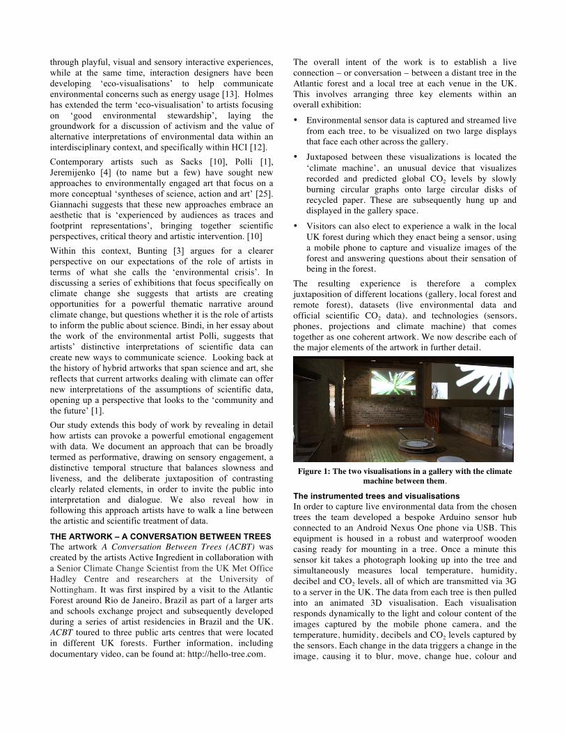
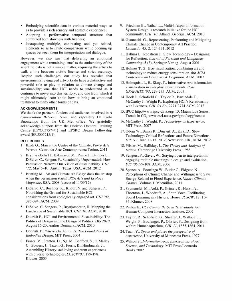
The climate machine In the centre of the gallery space, placed between the two projections, the Climate Machine slowly visualizes annual changes in global CO2 levels according to a freely available scientific dataset that was recommended by the climate change scientist who advised on the project.
Figure 3: the Climate Machine
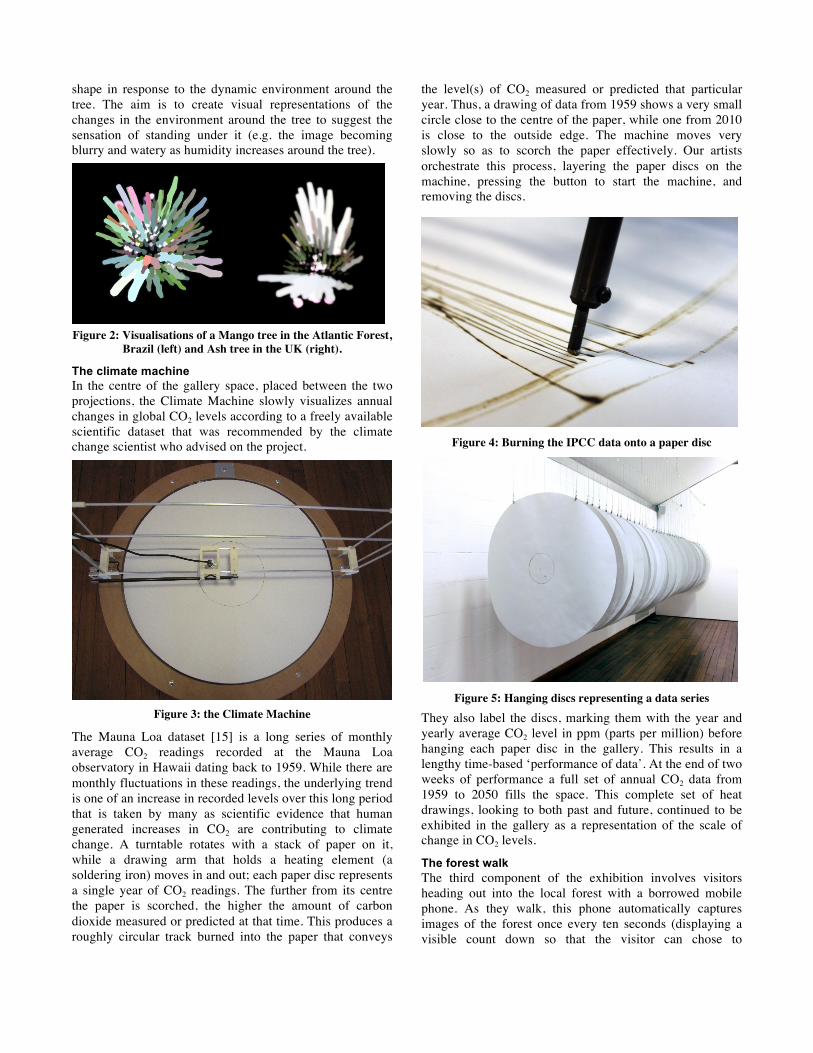
The Mauna Loa dataset [15] is a long series of monthly average CO2 readings recorded at the Mauna Loa observatory in Hawaii dating back to 1959. While there are monthly fluctuations in these readings, the underlying trend is one of an increase in recorded levels over this long period that is taken by many as scientific evidence that human generated increases in CO2 are contributing to climate change. A turntable rotates with a stack of paper on it, while a drawing arm that holds a heating element (a soldering iron) moves in and out; each paper disc represents a single year of CO2 readings. The further from its centre the paper is scorched, the higher the amount of carbon dioxide measured or predicted at that time. This produces a roughly circular track burned into the paper that conveys
the level(s) of CO2 measured or predicted that particular year. Thus, a drawing of data from 1959 shows a very small circle close to the centre of the paper, while one from 2010 is close to the outside edge. The machine moves very slowly so as to scorch the paper effectively. Our artists orchestrate this process, layering the paper discs on the machine, pressing the button to start the machine, and removing the discs.
Figure 4: Burning the IPCC data onto a paper disc
Figure 5: Hanging discs representing a data series
They also label the discs, marking them with the year and yearly average CO2 level in ppm (parts per million) before hanging each paper disc in the gallery. This results in a lengthy time-based ‘performance of data’. At the end of two weeks of performance a full set of annual CO2 data from 1959 to 2050 fills the space. This complete set of heat drawings, looking to both past and future, continued to be exhibited in the gallery as a representation of the scale of change in CO2 levels.
The forest walk The third component of the exhibition involves visitors heading out into the local forest with a borrowed mobile phone. As they walk, this phone automatically captures images of the forest once every ten seconds (displaying a visible count down so that the visitor can chose to
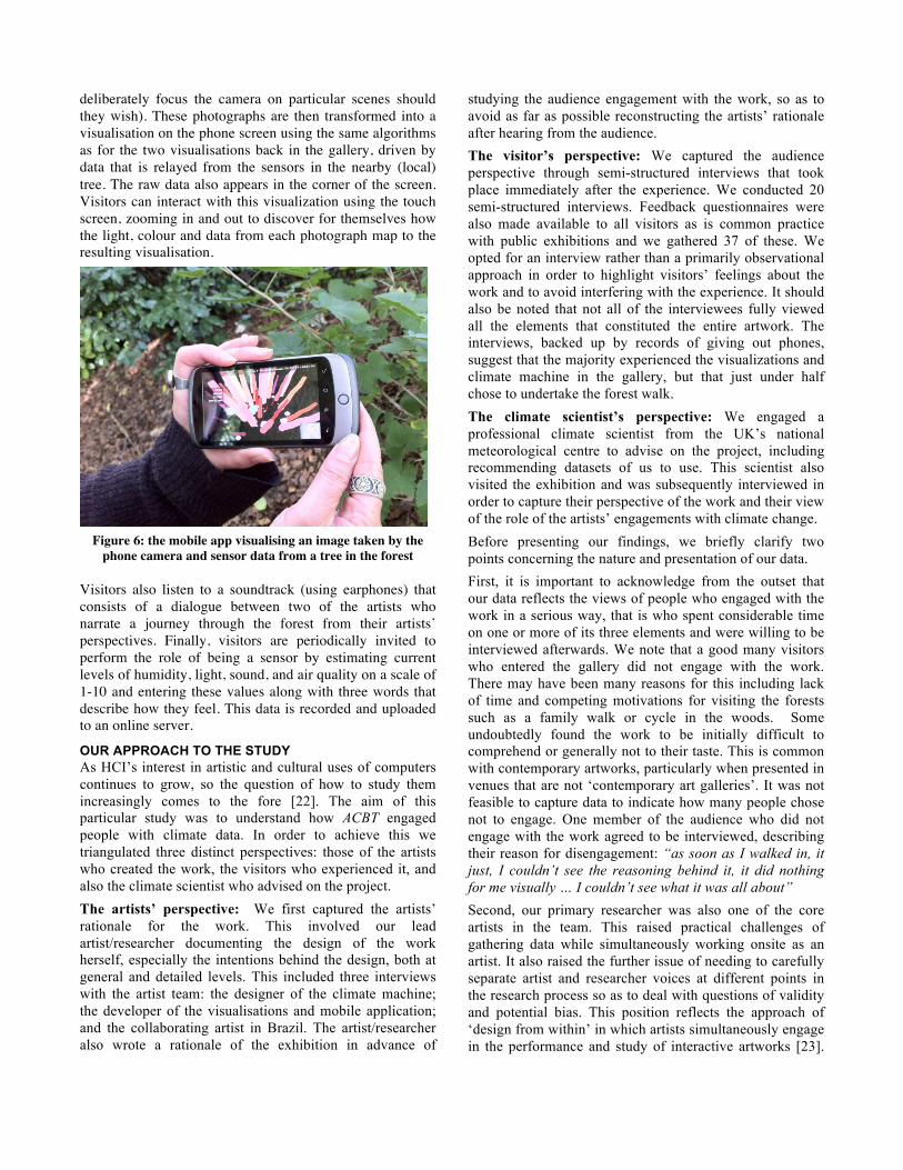
deliberately focus the camera on particular scenes should they wish). These photographs are then transformed into a visualisation on the phone screen using the same algorithms as for the two visualisations back in the gallery, driven by data that is relayed from the sensors in the nearby (local) tree. The raw data also appears in the corner of the screen. Visitors can interact with this visualization using the touch screen, zooming in and out to discover for themselves how the light, colour and data from each photograph map to the resulting visualisation.
Figure 6: the mobile app visualising an image taken by the
phone camera and sensor data from a tree in the forest Visitors also listen to a soundtrack (using earphones) that consists of a dialogue between two of the artists who narrate a journey through the forest from their artists’ perspectives. Finally, visitors are periodically invited to perform the role of being a sensor by estimating current levels of humidity, light, sound, and air quality on a scale of 1-10 and entering these values along with three words that describe how they feel. This data is recorded and uploaded to an online server.
OUR APPROACH TO THE STUDY As HCI’s interest in artistic and cultural uses of computers continues to grow, so the question of how to study them increasingly comes to the fore [22]. The aim of this particular study was to understand how ACBT engaged people with climate data. In order to achieve this we triangulated three distinct perspectives: those of the artists who created the work, the visitors who experienced it, and also the climate scientist who advised on the project. The artists’ perspective: We first captured the artists’ rationale for the work. This involved our lead artist/researcher documenting the design of the work herself, especially the intentions behind the design, both at general and detailed levels. This included three interviews with the artist team: the designer of the climate machine; the developer of the visualisations and mobile application; and the collaborating artist in Brazil. The artist/researcher also wrote a rationale of the exhibition in advance of
studying the audience engagement with the work, so as to avoid as far as possible reconstructing the artists’ rationale after hearing from the audience. The visitor’s perspective: We captured the audience perspective through semi-structured interviews that took place immediately after the experience. We conducted 20 semi-structured interviews. Feedback questionnaires were also made available to all visitors as is common practice with public exhibitions and we gathered 37 of these. We opted for an interview rather than a primarily observational approach in order to highlight visitors’ feelings about the work and to avoid interfering with the experience. It should also be noted that not all of the interviewees fully viewed all the elements that constituted the entire artwork. The interviews, backed up by records of giving out phones, suggest that the majority experienced the visualizations and climate machine in the gallery, but that just under half chose to undertake the forest walk. The climate scientist’s perspective: We engaged a professional climate scientist from the UK’s national meteorological centre to advise on the project, including recommending datasets of us to use. This scientist also visited the exhibition and was subsequently interviewed in order to capture their perspective of the work and their view of the role of the artists’ engagements with climate change. Before presenting our findings, we briefly clarify two points concerning the nature and presentation of our data. First, it is important to acknowledge from the outset that our data reflects the views of people who engaged with the work in a serious way, that is who spent considerable time on one or more of its three elements and were willing to be interviewed afterwards. We note that a good many visitors who entered the gallery did not engage with the work. There may have been many reasons for this including lack of time and competing motivations for visiting the forests such as a family walk or cycle in the woods. Some undoubtedly found the work to be initially difficult to comprehend or generally not to their taste. This is common with contemporary artworks, particularly when presented in venues that are not ‘contemporary art galleries’. It was not feasible to capture data to indicate how many people chose not to engage. One member of the audience who did not engage with the work agreed to be interviewed, describing their reason for disengagement: “as soon as I walked in, it just, I couldn’t see the reasoning behind it, it did nothing for me visually … I couldn’t see what it was all about” Second, our primary researcher was also one of the core artists in the team. This raised practical challenges of gathering data while simultaneously working onsite as an artist. It also raised the further issue of needing to carefully separate artist and researcher voices at different points in the research process so as to deal with questions of validity and potential bias. This position reflects the approach of ‘design from within’ in which artists simultaneously engage in the performance and study of interactive artworks [23].
In our case, given that the term ‘artists’ defines a group of collaborators (and not solely one artist/researcher), we have chosen to talk about the artists’ perspective in the third person when presenting our data below so as to maintain a clear separation between the roles of artist and researcher (even though this may sometimes feel a little artificial).
FINDINGS In analyzing our data, we were keen to explore the distinctive role played by our artists in engaging the public with climate change data: what did they set out to do, how was this made manifest in their design, how was it experienced by visitors, and what were the challenges and tensions between the different perspectives involved in the work? This led us to identify four key themes that appear to be critical to the work and that frame the presentation of our findings in what follows: • How the artists adopted a distinctive perspective or
‘voice’ when engaging audiences with climate data;
• How they embedded data into an embodied experience;
• How they performed data as a way of conveying the long timescales involved;
• How they juxtaposed different elements so as to enable multiple interpretations and dialogue.
Engaging audiences with climate data We begin by considering the different experiences and uses of the data within the artwork from the perspective of the ‘distinctive voice’ of our artists, meaning how the artists framed their relationship to climate change science and how this was understood by visitors. The artists talked of aiming for a distinct approach to conceptualizing climate change data that was separate from that of scientists, stating that it was not their intention to express an overt interpretation of the data, but rather to subtly engage the public in reflection and dialogue, without attempting to tell them what to do or what to think. This idea was evident from the very start in the title of the work as well as in its description on the website as “a playful conversation about forest environments, building public understanding of climate science.” As artists, rather than scientists, they were aware of being on their own trajectory of learning about climate change and interpreting data and wanted to inspire visitors to do the same. Interviews with visitors revealed that many experienced a strong emotional reaction to the artists’ portrayal of scientific data, often using words such as ‘scary’, ‘shocking’, ‘emotional’ and ‘depressing’. For example: “It’s not good for nature is it? What man’s done to it really... slowly and surely, scary really.” Visitors noted how the subtlety of the visualizations and the climate machine helped them understand and engage with climate data in ways that they had not previously been able to through mainstream media or scientific education and/or information sources: “I think you were trying to make
visual some scientific data that’s usually inaccessible to normal people… I look at figures and graphs and things and I just have a shutdown.” Other visitors emphasized the importance of provoking curiosity without directly trying to nudge behavioral change: “I don't think you’ve touched on how our behavior might affect climate change and I think in a way that’s quite a good thing because people don't necessarily come and engage in these type of exhibitions and then be kind of guilted into changing behavior.”
Rather, visitors were clear about the importance of enabling people to make their own interpretations of climate data: “In some ways the artist is trying to make people who come to see it make their own judgment, make their own interpretation of what they see” In turn, the climate scientist was clear that collaborating with artists introduced a distinct sensitivity with the potential to compliment a scientific perspective: “In climate science especially it’s quite important engaging with the public, interacting, not necessarily to trigger action ... in a sense I want to be sure it is understood and is useful to the wider possible communication and in that sense having a connection or an interaction with artists I think can help with that process ... scientists should not have (and largely don't have) a political agenda. Still some of their conclusions are politically relevant.” In particular, he appreciated the focus on encouraging the public to ‘observe’ the data, rather than delivering a fixed narrative: “I think people like the fact that it wasn’t the usual narrative around climate change, doom and so on, it was, its observation. Put to you in way that we think is interesting, but basically observation.”
Embedded and embodied experience Having seen that the artists adopted a distinctive voice in ACBT, we now begin to consider how this was made manifest in the various details of its design. One of the key ways of expressing this artistic voice was through the distinctive aesthetics embedded in each component of the artwork, and in particular how the climate change data was embedded into the experience by being embodied in various material and sensory forms. The artists described in particular how the visualisations were inspired by their sensory experience of walking in forests in both the UK and Brazil, further influenced by the patterns they found in nature and their own sensations of standing under the canopy of trees: “What the data was and where it was from, you know often it had creative influences in the sense that you know we were thinking about things like pollen spores and forests and woods and trees and branches and leaves and all those sorts of things, and simple ways to visualise things like temperature.” Our interviews revealed how visitors responded strongly to the distinctive aesthetic of the artwork. This was sometimes revealed as an immediate and basic response to the visual
aesthetics, in terms of the visualizations: “I didn't know what they represented in terms of you look for meaning in shape and colour and I couldn't work that out without some external explanation, but even though, if I hadn’t of had that I would have found them quite beautiful to look at” Others picked up on how this also extended beyond the images to the embedded design of the technology of the Climate Machine: “It’s visualising through the scorch mark on the paper the data that is fed through … I think sometimes if things are a bit too slick they tend to alienate people but it’s got a nice handmade hand assembled quality to it, and you know it rotates and scorches, a circular pattern in the circular paper, there’s something really... quite kind of a fundamental image that circular form, is kind of, understand it quite intuitively.” Key to these embedded experiences were several metaphors that ran throughout the artwork. The artists described how The Climate Machine was intended to make metaphorical connections between wood, burning, trees, paper and carbon dioxide, revealing layers of meaning embedded in the data and demanding questions of the viewer that pure statistics might not do on their own. They drew attention to the visual metaphor of burning the circular graphs as being ‘tree rings’ and the set of hanging paper discs as a sliced ‘tree trunk’. They referred to the general circular motif that was repeated throughout the artwork as being an organic shape linking to nature and natural forms [24]. The deliberate burning of data and damaging of paper was a further important reference to climate change as the artist who designed the machine noted: “You’ve got this dataset that goes back 60 years or whatever and then physicalising in a way that is meaningful I think is really interesting. So you know the stuff with the paper and kind of accumulation and like the way it marks the paper, the damage of it and then the kind of record of all these bits of paper.... This creates a tangible and sensory metaphor (it smelt of burning) for climate change and the increase in CO2 in the earth’s atmosphere.” Visitors referred back to these visual and conceptual metaphors in their interviews suggesting, that they had a level of universality or ability to connect with a wide variety of visitors. Descriptions of the Climate Machine often expressed these metaphors such as “the tree ringer”, “like a seismograph of trees” and “ it’s like a giant etch-a-sketch of trees.” The smell of the burning as well as the visual metaphor connected the data to universally understood temporal representation of changes in carbon dioxide enabling the visitors to embody the experience of this data. The climate change scientist also expressed excitement about how the artists’ conceptualizations could engage the non-scientific public with climate data in new ways: “The fact that you made the CO2 trend from Mauna Loa so evident in something people can relate to, I think was really exciting. I mean some of the comment of the people who came to the
Haldon Hill (forest) exhibition about the fact that you know the dataset suddenly made sense to them, you know really, interesting to hear, because for me an x, y plot or some numbers are as exciting as your very nice plot but I thought totally acknowledge that for other people it can be totally different.” We have already considered the tangibility of The Climate Machine and the sensory nature of burning data onto physical paper, even extending to its smell. However, it was in the design of the forest walk that this commitment to a sensory aesthetic was perhaps most evident. The artists described how the mobile phone experience was intended to enable visitors to re-enact and ‘humanise’ their experience of the sensors in the trees. For them, the mobile phone became a device to mediate a sensory experience of the forest in which visitors would directly embody and enact the sensor technology, moving through the environment and regularly sampling images, light levels, sound, temperature, humidity and air quality while also commenting on their feelings. The regular and enforced timing of taking photographs once every ten seconds placed visitors in a position of being part of an automated sensing system Some visitors described how this experience pushed them into a new form of sensory engagement with the forest, ‘tuning in’ and focusing on details that they might normally have missed: “I could hear the sounds more and I could see the some of the forest like really clearly, and really it was almost like a I walked into the forest just kind of a bit shut off really, and in 2D and I walked back in 3D, it was like Avatar. I was walking back, it was quite bonkers, I could see some of the leaves, I just really noticed how amazing the forest was… I had shamefully been tuned out.”
However, visitors also reported that this aspect of the experience could sometimes interfere with their interactions with one another when participating in groups, a finding that has been reported in previous studies of museum interactions [21], suggesting that this approach to embodied sensory engagement may work best when visitors are alone and are able to inwardly reflect on the sensations of the forest revealed through the devices.
Performing data One of the most challenging aspects of engaging with climate change data is to appreciate the long timescales that are involved. The artists’ response to this was to give the work a distinctive temporal structure, one that involved a ‘performance of data’ that combined slowness with liveness in an attempt to encourage visitors to relate their immediate experience of a forest to data series that had been gathered or projected over many decades.
Slowness The artwork was intended to evolve over time to reflect the incremental nature of change in the datasets and engage visitors in a slow reflection. This slowness was most striking in the overall performance of burning the discs of data that unfolded over several weeks. However, the artists
described how slowness was also deliberately incorporated into The Climate Machine that took twenty-five minutes to scorch each paper disc with data, and also into the projected visualisations that slowly rotated and changed in response to data that was captured from the trees once a minute. The forest walk also had an unusual temporal rhythm with photographs being captured every ten seconds. Many visitors were observed sitting on benches placed in the gallery, watching the live visualizations and the machine whilst engaging in discussions about CO2, deforestation and climate change. One stayed as long as eighty minutes. Several visitors indicated that the slow movement of The Climate Machine and slow changes over time of the dynamic visualisations opened up these opportunities for reflection noting a sense of the data representing changes in global CO2 over the past, present and future in both the visualizations and The Climate Machine: “... it allows you to condense time and see what’s happening in the real world within a shorter space, that you could actually see what was, the change in CO2 across years or either past or future.” Visitors were also observed searching through the hanging circular sheets for their birth year in order to establish a personal sense of the scale of climate change in relation to their own lifespan. Some also related the slow movement of the visualisations back to their wider experiences of nature: “… kind of slow abstract compositions that are, they’re kind of slowly spiraling or slowly turning, they’re made up of spokes of different colours … what I was really intrigued by is the fact that they look a bit like spores or kind of natural forms not in a kind of lens based realistic way but they refer to more forms that you would find in nature.” The scientist observed that a key part of understanding the challenge of human perception of climate change is to find ways to engage with slow processes: “Understanding how we behave or how we cope with slow processes is a very interesting question because it is the centre of the problem as well, so how should we shut down our emotional fear, response and let intervene another process that is based on something else, or develop an emotional response to something that is completely on a different time scale and it is interesting because strangely enough this is happening also on the, how do we deal with risk or how have we dealt with risk over the course of our existence as a species.” However, this unusual temporal structure also raised significant challenges for the artists. First, slowness demands an unusually high level of commitment from visitors; several minutes are needed to see changes in the projected visualizations, tens of minutes to see a cycle of operation of The Climate Machine, and the best part of an hour to engage in the forest walk. Consequently, it was felt to be important that there were several different elements to the work, each requiring a different commitment of time from visitors. This flexible structure enabled visitors to engage at their own pace according to available time.
Liveness In contrast to slowness, the artists also emphasized how it was vital that the work should make a live connection between two remote forests in order to support a localized and viscerally real experience. This aspect of the work was appreciated by many visitors: “I think I will go away today with that feeling that I haven’t just been to Haldon today, I’ve experienced another forest, a very long way away. You know and the great similarities as well as the differences, and I am going away thinking why? I feel like it’s brought up a lot of questions, all this.”
However, our study also revealed significant challenges in maintaining this crucial sense of liveness when working with ‘scientific’ data in an artistic context. Specifically, there were times when the artists needed to make decisions over whether to prioritize public experience of the artwork or strict accuracy of the data. For example, there were occasional problems with the mobile sensors in the trees or dropouts in network connectivity with the result that live sensor data became temporarily unavailable. At these times, the artists decided to replay prerecorded data as if it were live in order to maintain the experience of liveness, although at the expense of strict accuracy. Our artists recognized the tension between maintaining liveness versus accuracy, but on balance felt that, in this case, the occasional use of recorded data was sufficiently ‘real’ and their presentation of it sufficiently ambiguous, to justify a degree of artistic license, certainly when the alternative was not to show any data at all. In short, it was felt appropriate to emotionally engage new visitors rather than adhering to the data being strictly live (in the sense of ‘right now’). The climate change scientist also reflected on this tension by questioning the artists’ decisions: “From my personal view its absolutely fundamental the data is live, it would actually alter my perception very significantly because while I do understand the reasons... it can be some sort of augmented or distorted reality, you take reality, you change it according to a metric, but it’s an artistic metric somehow, but its related to reality... if you break that then what’s the point.” However, he also recognized a tension between the value of provoking an immediate ‘gut’ reaction versus a desire for rational consideration of complex data, revealing the key challenge of working with scientific data in such an artwork:“...it’s a problem that is beyond human scale we do not perceive it, so you reach it only through rational thinking, you see the data you make your judgment and then you plan your response based on your thinking” and “… feeling doesn't quite help, because it’s not, you shouldn't base your response to your gut feeling.” This tension between accuracy and experience also extended to the choice of data to be used. At one point during development the climate scientist had suggested working with a richer multi-dimensional dataset, although in the end it was a joint decision to opt for the simpler data: “I would say from a scientific point of view it was quite an easy dataset, it was a monodimensional time series while in
general climate data tend to be fairly complex, so I think it was central but out of many possible datasets we decided to go for relatively simple one and maybe because of that it was possible to build a nice interface.” Finally on this theme, the sense of liveness was also enhanced by the artists’ presence in the exhibition, especially the performance of burning and hanging the disks. The artists reported that they were required to improvise continuously throughout the exhibition in order to create an experience of liveness; they made choices about how they expressed these issues to the audience, whether to reveal the tensions between engagement in the live experience and maintaining the authenticity of the data or to create a ‘smoke and mirrors’ effect to ensure the public’s ‘suspension of disbelief’ in the artwork [18].
Multiple Interpretations and Dialogue Up to now, we have explored how individual elements of the artwork were designed to convey a distinctive artistic voice. However, there is considerably more to the matter than this. A notable feature of ACBT is its complexity, assembling a variety of contrasting elements into an overall experience. This juxtaposition of often contrasting parts was a key part of the artists’ strategy to provoke interpretation and dialogue. Our study reveals how visitors’ specifically made sense of the conceptualisations of the data within each element of the artwork, but also how the overall composition of the work and possibilities for dialogue with the artists when they were present supported this. Perhaps the most striking feature of A Conversation Between Trees is the way in which visitors were invited to assemble their own experience and hence interpretation of scientific climate data. One the one hand, the juxtaposition of different elements within one artwork (the visualisations, the machine and hanging sheets and the mobile experience), live and historical datasets, involves deliberately creating contrasts between each of the elements. On the other hand commonalities between these elements encourage visitors to make comparisons, between them, further encouraged by various interrelated metaphors and themes. Thus the visualisations and phone experience draw on the same sensors and employ common visual techniques. Moreover, the gaps between the elements provided opportunities for dialogue between visitors, with the artists when present to perform the work, or with gallery assistants fulfilling one of the core intentions of the work – to facilitate conversation: “When I first looked at them I could see that they represented something of the trees and I think you’d have to stand there and see the data and maybe you’d sort of get an idea of what’s going on but some explanation was really good, ‘cos that really brought it to life.” Some visitors appreciated being able to assemble their own experience: “Well firstly I just thought it was something like a pattern someone created on a camera, but when you look on the bottom right hand corner it is a picture of trees... it’s almost like when someone hasn’t got their glasses on and
everything’s blurred and you realise that your actually looking at trees in a different form.” A member of the gallery staff noted how some visitors reinterpreted the work, creating a dialogue between them: “A group of young boys pretended to do a presentation of the data in front of their parents, saying what they had found out, pointing at the projection while the parents sat on the bench.” Within this general arrangement, each element stood alone and visitors were not required to encounter them in a particular order. This provided flexibility as to how deeply they engaged, with each visitor or group of visitors constructing their own journey through the work The climate change scientist reflected on the juxtaposition of the different datasets and how they weren’t necessarily datasets he would have put together: “The comparison I thought as you say was very emotional at the same time I would not really have tried to put the two on the same sort of axis. So these are the historical observations and these are the observations that you see here, which have huge fluctuation because they are CO2 but if you do a long term average you realise that actually these value is not too dissimilar to the one you get from Mauna Loa.”
DISCUSSION In discussing our findings and revisiting related work we now reflect on two broader questions: what role did these artists play in engaging the public with climate change data and what strategies did they adopt to foster this engagement? In each case, we relate our answers to the growing discourse concerning sustainable HCI.
The role of the artists The intention of participatory sensing, citizen science and sustainable HCI research is often to inform the public of what data means and/or persuade them to change their behavior [2]. However, DiSalvo and colleagues have argued that ‘ecologically engaged art’ often aims to stimulate environmental debate rather than directly informing or persuading [4]. They have proposed that, historically, such artworks have tried to bridge the artificial division between culture and nature, engaging the public with environmental concerns, while also engaging the political as part of art practice. Their paper ends with a rallying cry for a deeper understanding of the relationships between ecologically engaged art and sustainable HCI, including a more nuanced treatment of arts and humanities perspectives. Our paper can be seen as a response to this call, providing a detailed account of how a group of artists set out to engage the public through unusual treatments of climate change data. In its broadest terms, our study has shown how artists can play a powerful and distinctive role in engaging people with climate change data, and by extension perhaps more generally with the debate around climate change and sustainability. In this case, the artistic voice is not about presenting canonical interpretations of data, or about
informing, or even about persuasion. Nor is it about activism. Rather, we have documented how our artists worked with scientific data recommended by a climate scientist, questioning it through different presentations but without adopting an explicit scientific or political position (as might be the case with more activist artworks [6]). The artists therefore positioned themselves as questioning the data more than knowing what it meant, with the intention of encouraging public visitors to do the same So what then is the role of ACBT in engaging the public with climate change data? Our study shows that it is fundamentally about enabling visitors to observe the data for themselves and through this to provoke an emotional response. ACBT is about making people feel strongly about the data, sufficiently so that they may wish to reflect on it afterwards or to discuss it with others. It also reaches out to an audience that might not normally engage with scientific data when presented in more traditional ways. However, our study also revealed that working with scientific data can be challenging for artists. We saw how they had to walk a line between the need to create an emotionally compelling experience for visitors and scientific authenticity. This can be seen in their choice of data – a relatively simple dataset instead of a complex multidimensional dataset – and their response to occasional technical failures – keeping the experience running by replaying recorded data as if live. Creating an emotional response is an important part of reaching a wide audience and a first step towards enabling people to clarify their perspective on the data and the wider issues. Giannachi argues that a change in perspective needs to occur before you can change behavior [10]. Bunting [3] also suggests that it is not a lack of available information on climate change that creates distance and misunderstandings, but rather an issue of how people can respond to the information that is available.
How artists provoke engagement and interpretation So how can artists set about creating this powerful emotional engagement with data? What specific strategies did our artists invoke and how does this speak to HCI? Our study has shown that three broad strategies were combined First was to encourage a sensory engagement with data. McCarthy and Wright have identified the ‘sensory’ as being one of the four key threads of user experience [16], a view that was clearly reflected in the artists’ conception of ACBT. By giving the data material form and by requiring visitors to take on the role of a sensor when walking through the forest, our artists were creating a deeply embodied experience of the data [7] contrasting strongly with more conventional disembodied visualizations that suggest a rational but more detached engagement. Second, was to bring a unique temporality to engagement with the climate data. Temporality – including both slowness and liveness – has previously emerged as an issue in the HCI literature. Di Salvo et al noted temporality as a key concern of many ecologically engaged artworks [4],
while there is a growing general in interest in both slowness [17] and liveness [14] in HCI. Hallnas et al [11] suggest one of the opportunities that slow technology can provide is the ability to enable reflection. Friedman et al discuss [9] how the challenges of slow datasets and multi-lifespan design can require different approaches to designing information systems. ACBT reflects these ideas in its strategies for designing interpretations of climate data. Despite the inherent tensions in the artists’ strategies the study shows that a more human scale perspective was made possible by shifting focus away from veridical representation towards more emotional and personal engagements with the data. Key to the temporal structure is that the data is ‘performed’. Not only does the painstaking nature of this slow performance direct attention to the temporal character of the data, but it also demands an extended engagement from the viewer, which is important to engaging their emotions. The third strategy is the juxtaposition of different elements that present contrasting datasets – live, recorded and predicted – in various different ways. Our study noted that visitors particularly appreciated being given space and time to arrive at their own responses and interpretations. This resonates with previous research such as the Shape project that created a museum experience where visitors explored locations around an ancient castle that were juxtaposed with interactive installations inside [8]. However, ACBT is distinct in that it quite deliberately contrasts the different elements of the live visualizations from the climate machine, while the forest walk involves a very different experience again. And yet, these elements are linked through common designs and metaphors. We suggest that it is this arrangement of multiple elements that makes the design of ACBT open to multiple interpretations, the importance of which has previously been discussed by Sengers and Gaver [19]. In turn, it is the interstitial gaps between these elements that provide the space for dialogue among visitors or with artists and gallery staff.
CONCLUSION There has been a growing focus on the role of environmentally engaged artworks in relation to sustainable HCI, especially how they may facilitate new forms of public engagement with sustainability issues. Our contribution here has involved focusing specifically on the strategies that a group of artists used to engage with scientific climate change data; and by triangulating between the perspectives of the artists, visitors and a climate change scientist, to understand how these worked. We have seen how the artists engaged the public with data on an emotional level, trying to make them feel something rather than trying to inform or persuade. We have also seen how they tried to engage them at a human-scale, making data that unfolds over very long timescales meaningful to them in the here and now. This distinctive artistic voice was realized through three broad strategies:
• Embodying scientific data in various material ways so as to provide a rich sensory and aesthetic experience;
• Adopting a performative temporal structure that combined both slowness with liveness;
• Juxtaposing multiple, contrasting and yet related, elements so as to invite comparisons while opening up spaces between them for interpretation and dialogue.
However, we also saw that delivering an emotional engagement while remaining ‘true’ to the authenticity of the scientific data is not a simple matter, requiring the artists to walk a line between artistic license and strict accuracy. Despite such challenges, our study has revealed that environmentally engaged artworks do have a distinctive and powerful role to play in relation to climate change and sustainability; one that HCI needs to understand as it continues to move into this territory, and one from which it might ultimately learn about how to bring an emotional treatment to many other forms of data.
ACKNOWLEDGMENTS We thank the partners, funders and audiences involved in A Conversation Between Trees, and especially Dr Carlo Buontempo from the UK Met office. We gratefully acknowledge support from the Horizon Doctoral Training Centre (EP/G037574/1) and EPSRC Dream Fellowship award (EP/J005215/1).
REFERENCES 1. Bindi G., Man at the Centre of the Climate, Parco Arte
Vivente, Centro de Arte Contemporanea Torino, 2011 2. Brynjarsdóttir H., Håkansson M., Pierce J., Baumer E.,
DiSalvo C., Sengers P., Sustainably Unpersuaded: How Persuasion Narrows Our Vision of Sustainability, CHI ‘12, May 5–10, Austin, Texas, USA, ACM, 2012
3. Bunting M., Art and Climate An Essay: does the art stop when the persuasion starts?, RSA Arts and Ecology Magazine, RSA, 2008 (accessed 11/09/12)
4. DiSalvo, C., Boehner, K., Knouf, N. and Sengers, P., Nourishing the Ground for Sustainable HCI: considerations from ecologically engaged art, CHI ’09, 385-394, ACM, 2009
5. DiSalvo, C. Sengers, P., Brynjarsdóttir, H. Mapping the Landscape of Sustainable HCI, CHI '10. ACM, 2010
6. Dourish P., HCI and Environmental Sustainability: The Politics of Design and the Design of Politics, DIS 2010, August 16-20, Aarhus Denmark, ACM, 2010
7. Dourish, P., Where The Action Is: The Foundations of Embodied Design, MIT Press, 2004
8. Fraser, M., Stanton, D., Ng, M., Benford, S., O’Malley, C., Bowers, J., Taxen, G., Ferris, K., Hindmarsh, J., Assembling History: achieving coherent experiences with diverse technologies, ECSCW'03, 179-198, Kluwer, 2003
9. Friedman B., Nathan L., Multi-lifespan Information System Design: a research initiative for the HCI community, CHI ’10, Atlanta, Georgia, ACM, 2010
10. Giannachi, G., Representing, Performing and Mitigating Climate Change in Contemporary Art Practice, Leonardo, 45: 2, 124-131, 2012
11. Hallnas L., Redstrom J., Slow Technology – Designing for Reflection, Journal of Personal and Ubiquitous Computing, 5 (3), Springer-Verlag, August 2001
12. Holmes T. G., Eco-visualization: combining art and technology to reduce energy consumption, 6th ACM Conference on Creativity & Cognition, ACM, 2007
13. Holmquist, L. E., Skog, T., Informative Art: information visualization in everyday environments, Proc GRAPHITE ‘03, 229-235, ACM, 2003.
14. Hook J., Schofield G., Taylor R., Bartindale T., McCarthy J., Wright P., Exploring HCI’s Relationship with Liveness, CHI ‘04 EA, 2771-2774 ACM, 2012
15. IPCC http://www.ipcc-data.org/ 13. Mauna Loa Series, Trends in CO2 www.esrl.noaa.gov/gmd/ccgg/trends/
16. McCarthy J., Wright, P., Technology as Experience, MIT Press, 2007
17. Odom W., Banks R., Durrant, A., Kirk, D., Slow Technology: Critical Reflections and Future Directions, DIS ‘12, June 11-15, 2012, Newcastle, UK, ACM, 2012
18. Pfister, M., Halliday, J., The Theory and Analysis of Drama, Cambridge University Press, 1988
19. Sengers, P., Gaver, W., Staying open to interpretation: engaging multiple meanings in design and evaluation, DIS ‘06, 99-108, ACM, 2006
20. Spence A., Poortinga W., Butler C., Pidgeon N., Perceptions of Climate Change and Willingness to Save Energy Related to Flood Experience, Nature Climate Change, Volume 1, Macmillan, 2011
21. Szymanski, M., Aoki, P., Grinter, R., Hurst, A., Thornton, J., Woodruff, A., Sotto Voce: Facilitating Social Learning in a Historic House, JCSCW, 17, 1 5- 34, Klumer, 2008
22. Paulos E., HCI Cannot Be Used To Evaluate Art, Human-Computer Interaction Institute, 2007
23. Taylor, R., Schofield, G., Shearer, J., Wallace, J., Wright, P., Boulanger, P., Olivier, P., Designing from within: Humanaquarium, CHI '11, 1855-1864, 2011
24. Tuan, Y., Space and place: the perspective of experience, University of Minnesota Press, 1977
25. Wilson S., Information Arts: Intersections of Art, Science, and Technology, MIT Press/Leonardo Books 2002
Related Documents

![Feels So Good [PVG]](https://static.cupdf.com/doc/110x72/577cda0e1a28ab9e78a4bf40/feels-so-good-pvg.jpg)