7-7 Choosing an Appropriate Display Course 1 Warm Up Warm Up Lesson Presentation Lesson Presentation Problem of the Day Problem of the Day

7-7 Choosing an Appropriate Display Course 1 Warm Up Warm Up Lesson Presentation Lesson Presentation Problem of the Day Problem of the Day.
Dec 30, 2015
Welcome message from author
This document is posted to help you gain knowledge. Please leave a comment to let me know what you think about it! Share it to your friends and learn new things together.
Transcript
7-7 Choosing an Appropriate Display
Course 1
Warm UpWarm Up
Lesson PresentationLesson Presentation
Problem of the DayProblem of the Day
Learn to select and use appropriate representations for displaying data.
Course 1
7-7 Choosing an Appropriate Display

Course 1
7-7 Choosing an Appropriate Display
Use a bar graph to display and compare data.
There are several ways to display data. Some types of displays are more appropriate than others, depending on how the data is to be analyzed.
x x x x x x
Use a line plot to show the frequency of values.
1 7 9 2 5 3 6 1
Use a stem-and-leaf plot to show how often data values occur and how they are distributed.
Course 1
7-7 Choosing an Appropriate Display
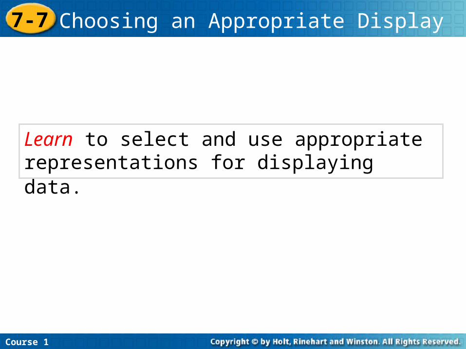
Use a line graph to show how data change over a time period.
Use a Venn Diagram to show relationships between two or more data sets.
Use a circle graph to show how a set of data is divided into parts.
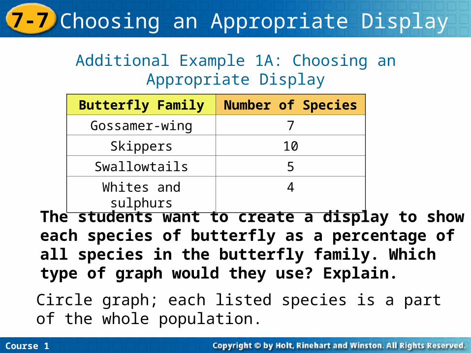
Additional Example 1A: Choosing an Appropriate Display
The students want to create a display to show each species of butterfly as a percentage of all species in the butterfly family. Which type of graph would they use? Explain.
Course 1
7-7 Choosing an Appropriate Display
Butterfly Family Number of Species
Gossamer-wing 7
Skippers 10
Swallowtails 5
Whites and sulphurs 4
Circle graph; each listed species is a part of the whole population.
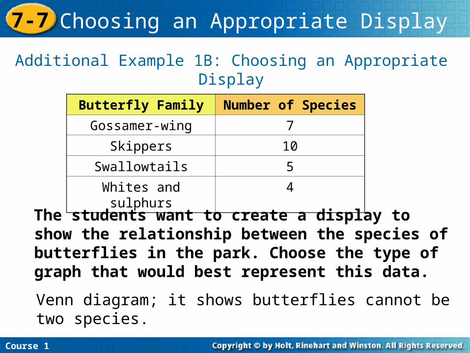
Additional Example 1B: Choosing an Appropriate Display
The students want to create a display to show the relationship between the species of butterflies in the park. Choose the type of graph that would best represent this data.
Course 1
7-7 Choosing an Appropriate Display
Butterfly Family Number of Species
Gossamer-wing 7
Skippers 10
Swallowtails 5
Whites and sulphurs 4
Venn diagram; it shows butterflies cannot be two species.
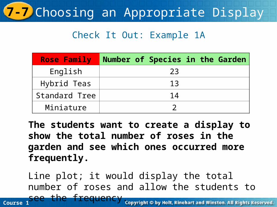
Check It Out: Example 1A
The students want to create a display to show the total number of roses in the garden and see which ones occurred more frequently.
Course 1
7-7 Choosing an Appropriate Display
Rose Family Number of Species in the Garden
English 23
Hybrid Teas 13
Standard Tree 14
Miniature 2
Line plot; it would display the total number of roses and allow the students to see the frequency.
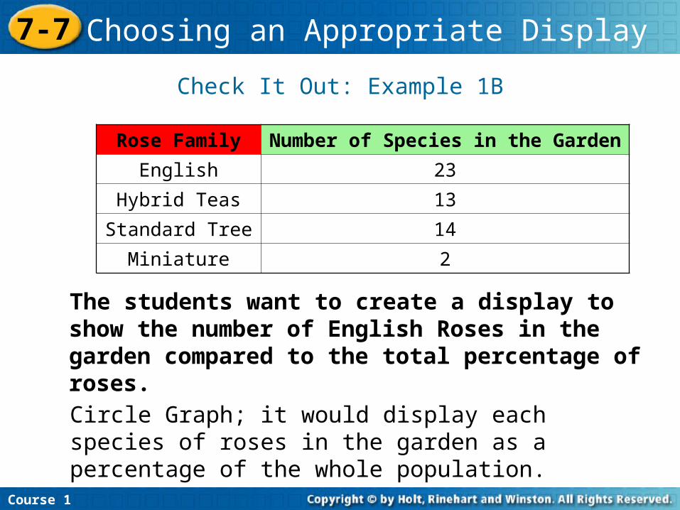
Check It Out: Example 1B
The students want to create a display to show the number of English Roses in the garden compared to the total percentage of roses.
Course 1
7-7 Choosing an Appropriate Display
Rose Family Number of Species in the Garden
English 23
Hybrid Teas 13
Standard Tree 14
Miniature 2
Circle Graph; it would display each species of roses in the garden as a percentage of the whole population.
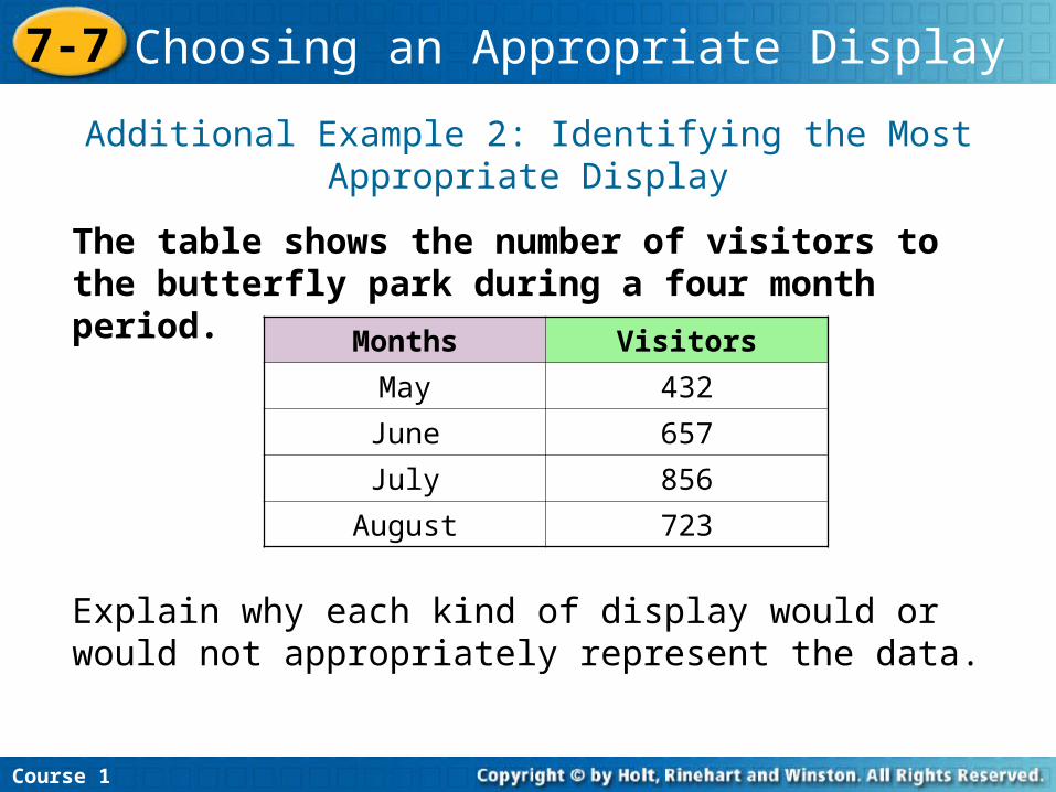
Additional Example 2: Identifying the Most Appropriate Display
The table shows the number of visitors to the butterfly park during a four month period.
Course 1
7-7 Choosing an Appropriate Display
Months Visitors
May 432
June 657
July 856
August 723
Explain why each kind of display would or would not appropriately represent the data.
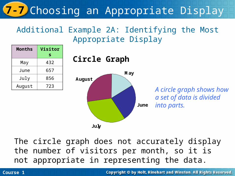
Additional Example 2A: Identifying the Most Appropriate Display
Circle Graph
Course 1
7-7 Choosing an Appropriate Display
Months Visitors
May 432
June 657
July 856
August 723
The circle graph does not accurately display the number of visitors per month, so it is not appropriate in representing the data.
May
June
July
August
A circle graph shows how a set of data is divided into parts.
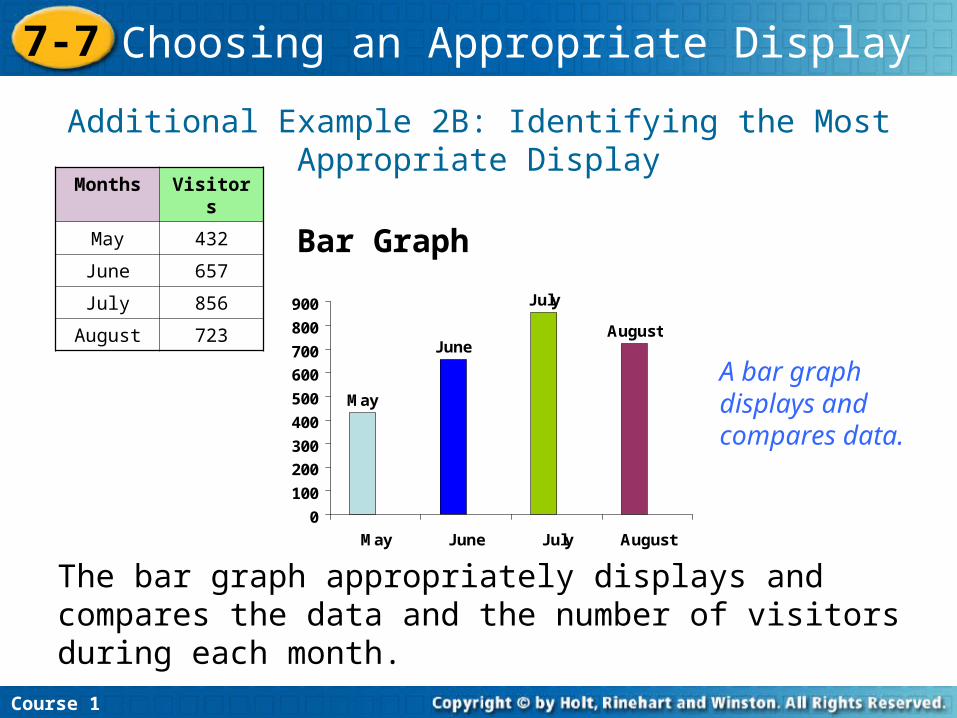
Additional Example 2B: Identifying the Most Appropriate Display
Bar Graph
Course 1
7-7 Choosing an Appropriate Display
Months Visitors
May 432
June 657
July 856
August 723
The bar graph appropriately displays and compares the data and the number of visitors during each month.
May
June
July
August
0
100
200
300
400
500
600
700
800
900
May June July August
A bar graph displays and compares data.
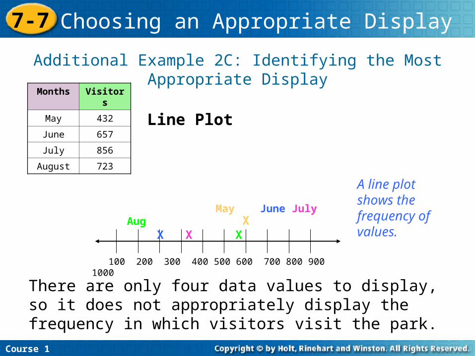
Additional Example 2C: Identifying the Most Appropriate Display
Line Plot
Course 1
7-7 Choosing an Appropriate Display
Months Visitors
May 432
June 657
July 856
August 723
There are only four data values to display, so it does not appropriately display the frequency in which visitors visit the park.
A line plot shows the frequency of values.
100 200 300 400 500 600 700 800 900 1000
X X X X May June July Aug
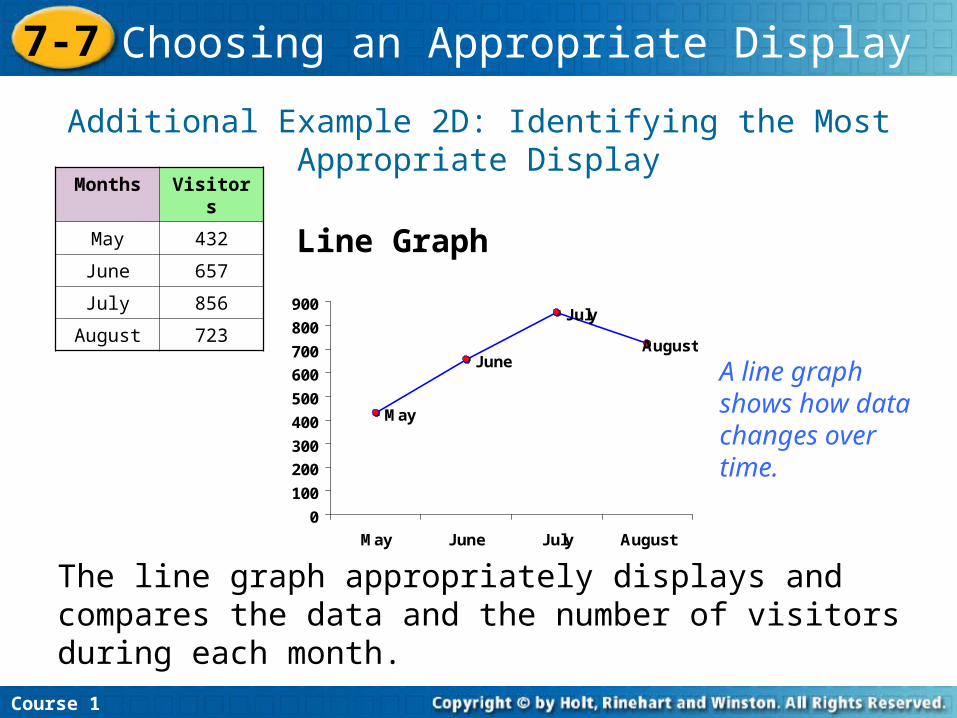
Additional Example 2D: Identifying the Most Appropriate Display
Line Graph
Course 1
7-7 Choosing an Appropriate Display
Months Visitors
May 432
June 657
July 856
August 723
The line graph appropriately displays and compares the data and the number of visitors during each month.
May
June
July
August
0
100
200
300
400
500
600
700
800
900
May June July August
A line graph shows how data changes over time.
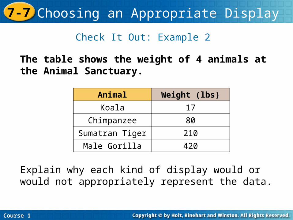
Check It Out: Example 2
The table shows the weight of 4 animals at the Animal Sanctuary.
Course 1
7-7 Choosing an Appropriate Display
Animal Weight (lbs)
Koala 17
Chimpanzee 80
Sumatran Tiger 210
Male Gorilla 420
Explain why each kind of display would or would not appropriately represent the data.
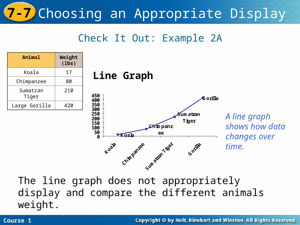
Check It Out: Example 2A
Line Graph
Course 1
7-7 Choosing an Appropriate Display
The line graph does not appropriately display and compare the different animals weight.
Koala
Chimpanzee
Sumatran Tiger
Gorilla
050
100150200250300350400450
A line graph shows how data changes over time.
Animal Weight (lbs)
Koala 17
Chimpanzee 80
Sumatran Tiger 210
Large Gorilla 420
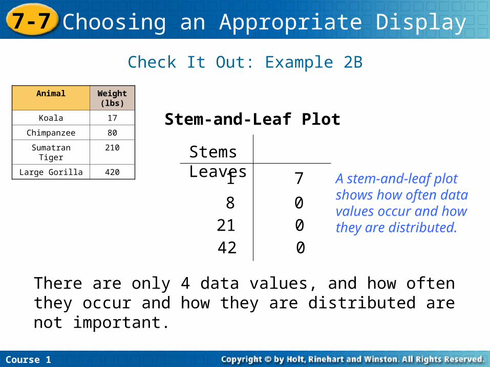
Check It Out: Example 2B
Course 1
7-7 Choosing an Appropriate Display
There are only 4 data values, and how often they occur and how they are distributed are not important.
Stem-and-Leaf Plot
Animal Weight (lbs)
Koala 17
Chimpanzee 80
Sumatran Tiger 210
Large Gorilla 420Stems Leaves
1 7
8 021 042 0
A stem-and-leaf plot shows how often data values occur and how they are distributed.
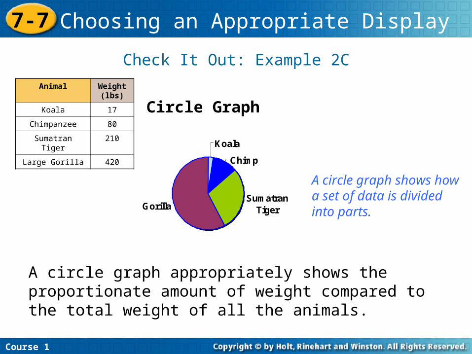
Check It Out: Example 2C
Circle Graph
Course 1
7-7 Choosing an Appropriate Display
A circle graph appropriately shows the proportionate amount of weight compared to the total weight of all the animals.
Koala
Chimp
Sumatran TigerGorilla
Animal Weight (lbs)
Koala 17
Chimpanzee 80
Sumatran Tiger 210
Large Gorilla 420
A circle graph shows how a set of data is divided into parts.
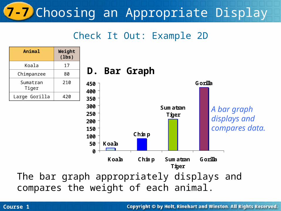
Check It Out: Example 2D
D. Bar Graph
Course 1
7-7 Choosing an Appropriate Display
Koala
Chimp
Sumatran Tiger
Gorilla
050
100150200250300350400450
Koala Chimp SumatranTiger
Gorilla
Animal Weight (lbs)
Koala 17
Chimpanzee 80
Sumatran Tiger 210
Large Gorilla 420
The bar graph appropriately displays and compares the weight of each animal.
A bar graph displays and compares data.
Related Documents