Depicting Frequency Tables • Qualitative (nominal or maybe ordinal) data – Histogram, bar charts and pareto charts – Pie chart • Quantitative (interval or ratio, maybe ordinal) Data – Histograms and Bar Charts • Absolute and relative frequency • Quickly spot distribution, trends and “hot-spots” – Frequency Polygon – Ogive • Cumulative frequency – Dotplots • Frequency encoded in the vertical bar – Stem and Leaf Plots

Welcome message from author
This document is posted to help you gain knowledge. Please leave a comment to let me know what you think about it! Share it to your friends and learn new things together.
Transcript

Depicting Frequency Tables
• Qualitative (nominal or maybe ordinal) data– Histogram, bar charts and pareto charts– Pie chart
• Quantitative (interval or ratio, maybe ordinal) Data– Histograms and Bar Charts
• Absolute and relative frequency• Quickly spot distribution, trends and “hot-spots”
– Frequency Polygon– Ogive
• Cumulative frequency– Dotplots
• Frequency encoded in the vertical bar– Stem and Leaf Plots
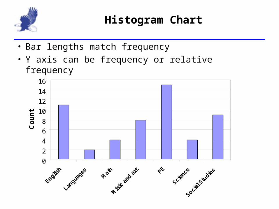
Histogram Chart
• Bar lengths match frequency• Y axis can be frequency or relative frequency
02468
10121416
English
Langua
ges
Math
Misic a
nd ar
t PE
Scienc
e
Social S
tudie
s
Cou
nt

Pareto Chart
• Bar lengths match frequency• Y axis can be frequency or relative frequency• Bars ordered most to least, left to right
0%
5%
10%
15%
20%
25%
30%
PE
English
Social S
tudie
s
Misic a
nd ar
tMath
Scienc
e
Langua
ges
Coun
t
Live example
• Create a histogram of the favorite month
Your Turn
• Create a histogram of the favorite color
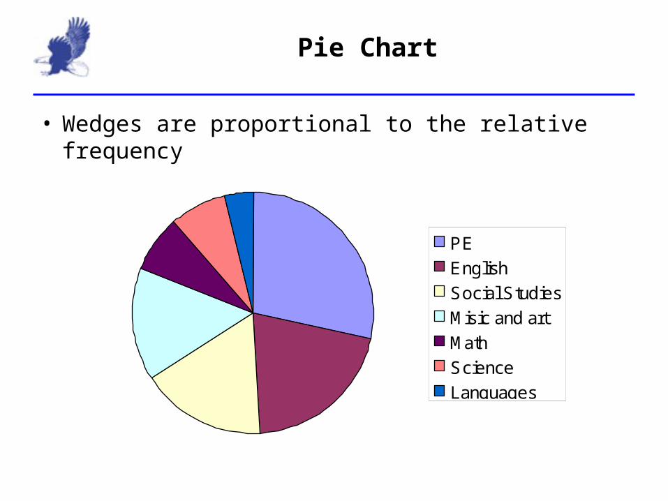
Pie Chart
• Wedges are proportional to the relative frequency
PEEnglishSocial StudiesMisic and artMathScienceLanguages
Creating a Pie Chart
• Create the relative frequency table• Calculate each wedge size:
– Multiply the relative frequency by 360• Use a compass and protractor to create the wedges• Use color and texture to differentiate wedges.
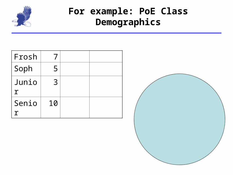
For example: PoE Class Demographics
Frosh 7Soph 5
Junior 3
Senior 10

Your Turn: CS Class Demographics
Frosh 2Soph 7
Junior 3
Senior 8

Pi Chart Example
Histogram
• Classes are represented as vertical bars on a graph– X axis are the class values– Ordered lowest to highest, left to right– Y axis is the frequency or relative frequency
• Length of bar is proportional to the number of counts in each class
• Color and texture differentiate bars from different data sets
• (On a bar chart, the bars are horizontal)

Histogram: August Temperatures
0
2
4
6
8
10
12
65 - 69 70 - 74 75 - 79 80 - 84 85 - 89
Cou
nt
20102010
Your Turn
• Create a histogram of Old Faithful Interval Data

Is this an accurate picture?
12%18%24%30%36%42%48%
Menendez Kean Undecided

Is this better?
0%20%40%60%80%
100%
Menendez Kean Undecided
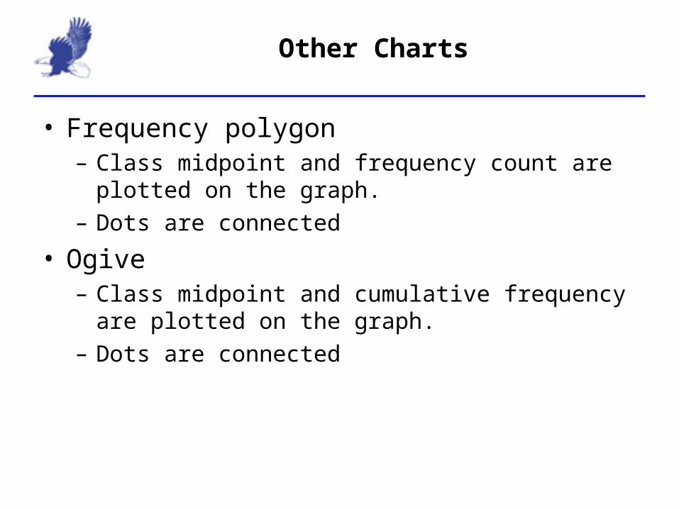
Other Charts
• Frequency polygon– Class midpoint and frequency count are plotted on the
graph.– Dots are connected
• Ogive– Class midpoint and cumulative frequency are plotted on the
graph.– Dots are connected
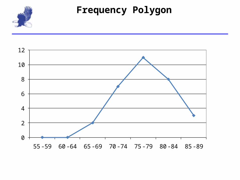
Frequency Polygon
0
2
4
6
8
10
12
55 - 59 60 - 64 65 - 69 70 - 74 75 - 79 80 - 84 85 - 89

Ogive: August Temperatures
0
5
10
15
20
25
30
35
55 - 59 60 - 64 65 - 69 70 - 74 75 - 79 80 - 84 85 - 89
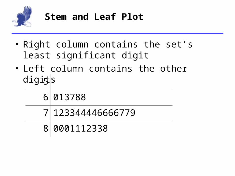
Stem and Leaf Plot
5
6 013788
7 123344446666779
8 0001112338
• Right column contains the set’s least significant digit• Left column contains the other digits
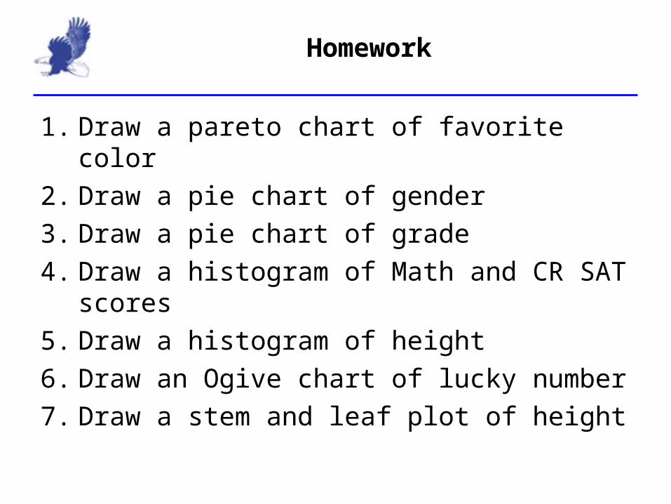
Homework
1. Draw a pareto chart of favorite color2. Draw a pie chart of gender3. Draw a pie chart of grade4. Draw a histogram of Math and CR SAT scores5. Draw a histogram of height6. Draw an Ogive chart of lucky number7. Draw a stem and leaf plot of height

Comparing Graphs
• Comparing the shape of two graphs
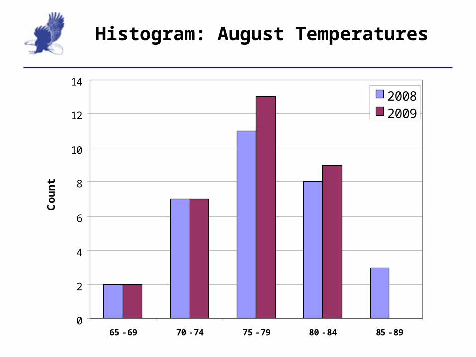
Histogram: August Temperatures
0
2
4
6
8
10
12
14
65 - 69 70 - 74 75 - 79 80 - 84 85 - 89
Coun
t
20082009

Frequency Polygon
0
2
4
6
8
10
12
14
16
18
60 - 64 65 - 69 70 - 74 75 - 79 80 - 84 85 - 89
2008
2008
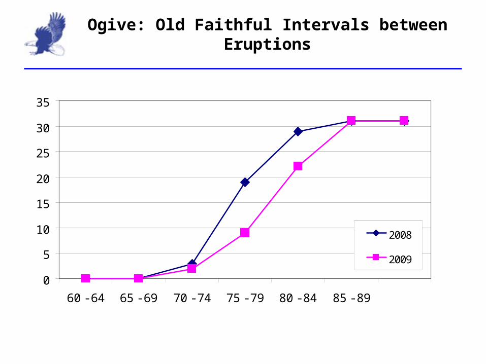
Ogive: Old Faithful Intervals between Eruptions
0
5
10
15
20
25
30
35
60 - 64 65 - 69 70 - 74 75 - 79 80 - 84 85 - 89
2008
2009
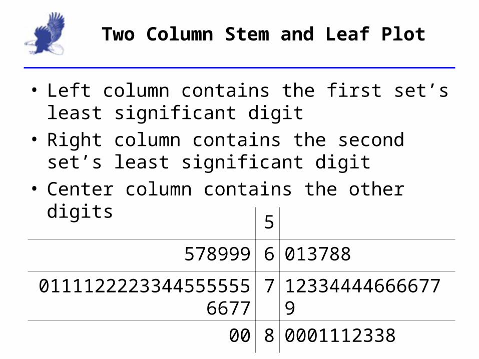
Two Column Stem and Leaf Plot
5
578999 6 013788
01111222233445555556677 7 123344446666779
00 8 0001112338
• Left column contains the first set’s least significant digit
• Right column contains the second set’s least significant digit
• Center column contains the other digits
Related Documents