12/3/2010 ©Evergreen Public Schools 2010 1 Compare Histograms

12/3/2010 ©Evergreen Public Schools 2010 1 Compare Histograms.
Dec 14, 2015
Welcome message from author
This document is posted to help you gain knowledge. Please leave a comment to let me know what you think about it! Share it to your friends and learn new things together.
Transcript

12/3/2010
©Evergreen Public Schools 2010
1
Compare Histograms

©Evergreen Public Schools 2010
2
I can use appropriate summary statistics to compare and describe sets of data and write a conclusion from the data.
Name some summary
statistics you already know.

©Evergreen Public Schools 2010
3
LaunchLaunchLaunchLaunch• How the ways could you compare the
ages of the parents of students in Mr. DeHaas’ class?
• How can we compare the results of the canned food drive from Mountain View HS and Woodland Middle School?
• What is different about the each comparison (parents and food drive)?

©Evergreen Public Schools 2010
4

Ages of ParentsAges of Parents
How old is your mother?How old is your father?What do you expect to see when we
compare the ages of parents of students?
©Evergreen Public Schools 2010
5

©Evergreen Public Schools 2010
6
Ages of Parents – Mr. DeHaas’s Classes
Ages of Parents – Mr. DeHaas’s Classes
mother father mother father mother father
34 44 48 46 26 29
45 39 45 42 57 57
50 49 40 39 49 49
36 67 34 40 39 42
36 38 34 38 35 41
40 43 49 66 34 54
31 29 47 58 35 37
37 40 50 49 43 47
35 38 37 42 48 45
50 41 44 43
31 35 50 47
35 35 40 40

©Evergreen Public Schools 2010
7
Ages of ParentsAges of Parents
We can use Excel to make a scatterplot.
What does the scatterplot tell us?
Parents' Ages
20
25
30
35
40
45
50
55
60
65
70
20 25 30 35 40 45 50 55 60
Mother
Fa
the
r
©Evergreen Public Schools 2010
8
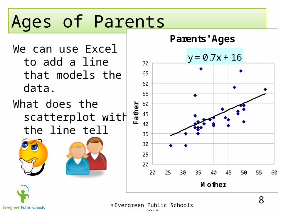
Ages of ParentsAges of Parents
We can use Excel to add a line that models the data.
What does the scatterplot with the line tell us?
Parents' Ages
y = 0.7x + 16
20
25
30
35
40
45
50
55
60
65
70
20 25 30 35 40 45 50 55 60
Mother
Fa
the
r
©Evergreen Public Schools 2010
9
Winter 2010 Food DriveWinter 2010 Food Drive
Wy’East and Woodland Middle Schools had each 2nd period class collect cans for the Food Drive.
How can we use graphs to compare the food collected in each schools Food Drive?
Write a question.What kind of graphs can we use?

©Evergreen Public Schools 2010
10
Food DriveFood Drive
Use histograms to compare the cans of food collected.
Answer yourquestion.
Write everything you can.

©Evergreen Public Schools 2010
11
Ages of ParentsAges of Parents
What more can we learn about the ages of parents with two histograms?
Write everything you can.

©Evergreen Public Schools 2010
12
Team PracticeTeam Practice
• We will compare the Voter turnout for counties in Washington state 2008 an 2010 elections.
• What is a question we might ask that can be answered by looking at a graph of both sets of data?

©Evergreen Public Schools 2010
13
Team PracticeTeam Practice
• Compare the Voter turnout for counties in Washington state 2008 and 2010 elections.
• Answer your question.• What do you know
about the differences?
©Evergreen Public Schools 2010
14
DebriefDebrief
• What can you look for when you compare two histograms?

©Evergreen Public Schools 2010
15
5
3
12
4
Did you hit the target? I can use appropriate summary
statistics to compare and describe sets of data and write a conclusion from the data.
Rate your understanding of the target from 1 to 5.
5 is a bullseye!
©Evergreen Public Schools 2010
16
PracticePractice
• Practice 9-5A Compare Histograms
Related Documents