Click here to get started

Welcome message from author
This document is posted to help you gain knowledge. Please leave a comment to let me know what you think about it! Share it to your friends and learn new things together.
Transcript
1© NHS Elect
1 Patient flow 2 Measurement 3 Seven steps 4 Chart rules 5 Tools
Click here to get started
2© NHS Elect
1 Patient flow 2 Measurement 3 Seven steps 4 Chart rules 5 Tools
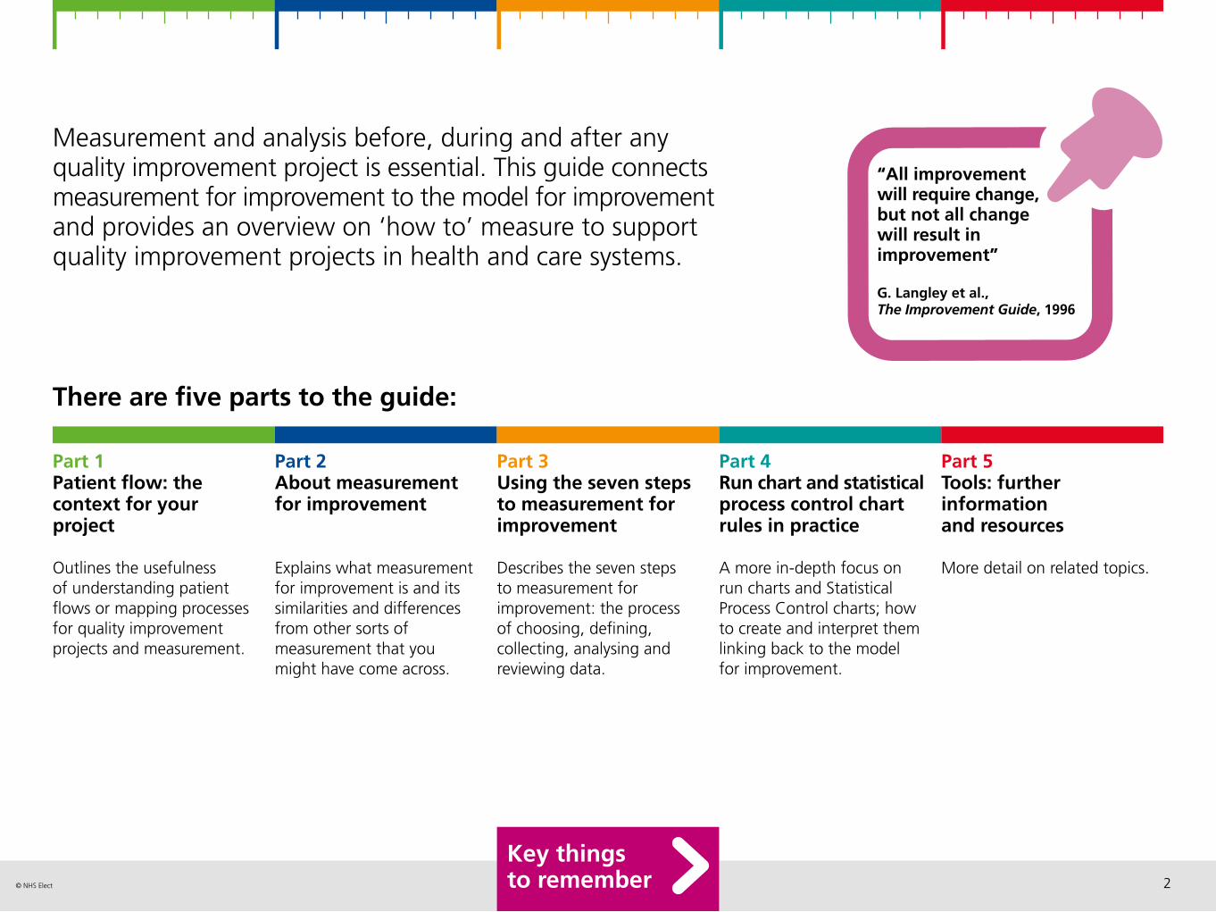
Measurement and analysis before, during and after any quality improvement project is essential. This guide connects measurement for improvement to the model for improvement and provides an overview on ‘how to’ measure to support quality improvement projects in health and care systems.
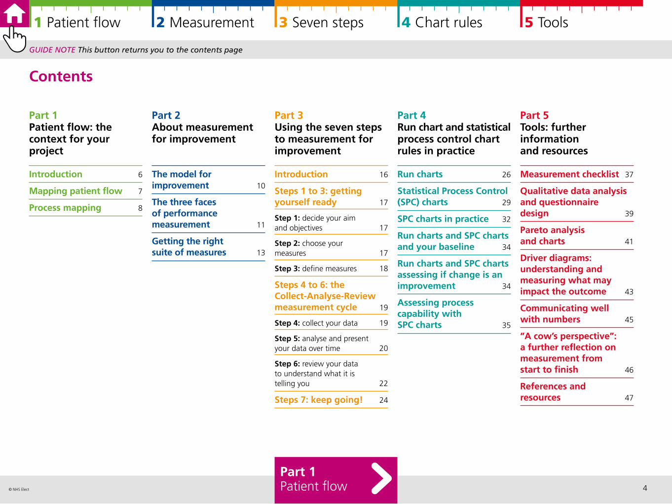
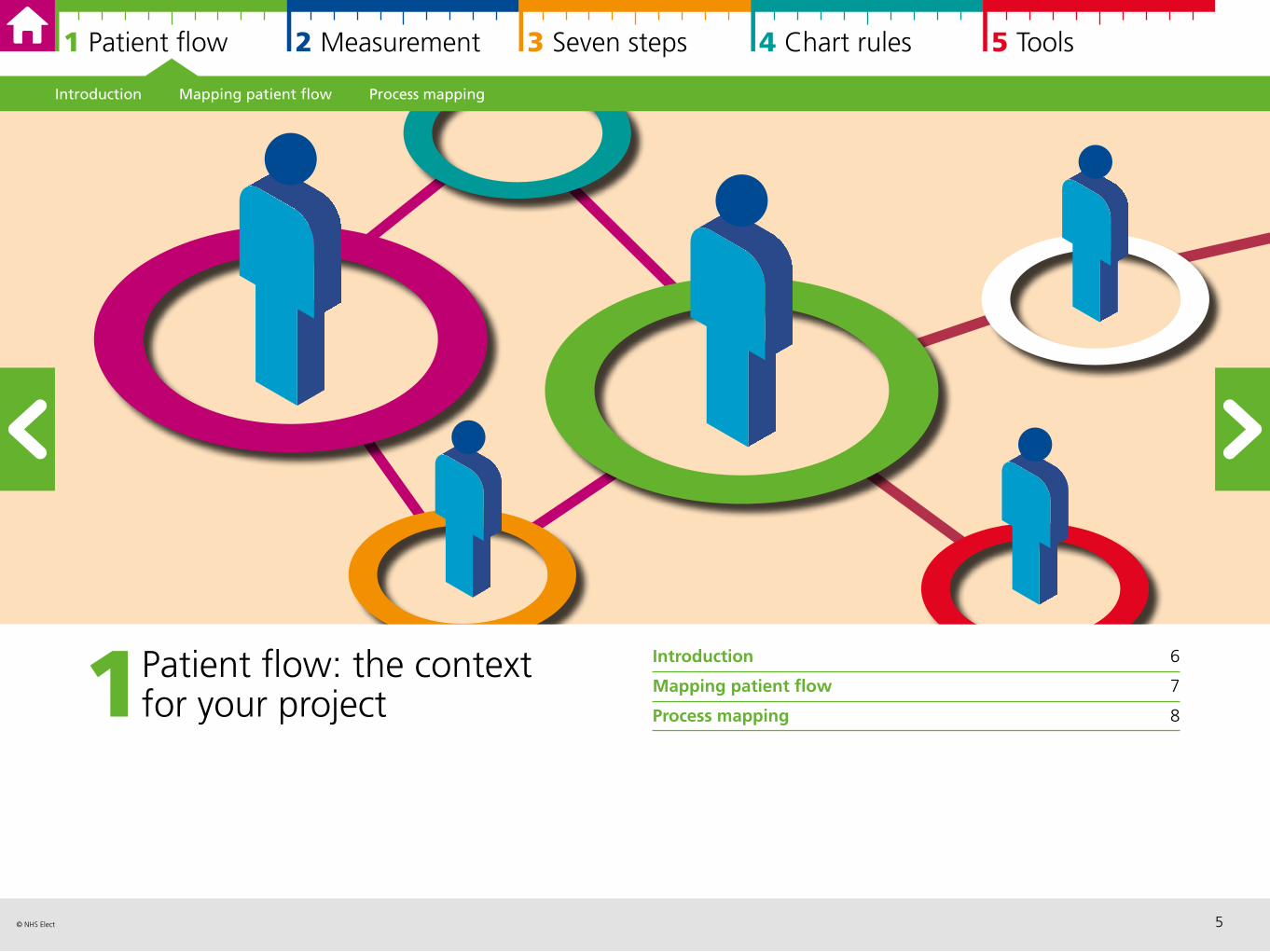
Part 1Patient flow: the context for your project
Outlines the usefulness of understanding patient flows or mapping processes for quality improvement projects and measurement.
Part 2 About measurement for improvement
Explains what measurement for improvement is and its similarities and differences from other sorts of measurement that you might have come across.
Part 3 Using the seven steps to measurement for improvement
Describes the seven steps to measurement for improvement: the process of choosing, defining, collecting, analysing and reviewing data.
Part 4 Run chart and statistical process control chart rules in practice
A more in-depth focus on run charts and Statistical Process Control charts; how to create and interpret them linking back to the model for improvement.
There are five parts to the guide:
Part 5 Tools: further information and resources
More detail on related topics.
“All improvement will require change, but not all change will result in improvement”
G. Langley et al., The Improvement Guide, 1996
Key things to remember
3© NHS Elect
1 Patient flow 2 Measurement 3 Seven steps 4 Chart rules 5 Tools
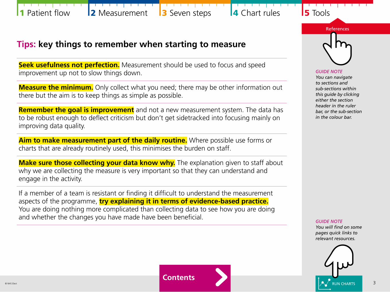
Tips: key things to remember when starting to measure
Seek usefulness not perfection. Measurement should be used to focus and speed improvement up not to slow things down.
Measure the minimum. Only collect what you need; there may be other information out there but the aim is to keep things as simple as possible.
Remember the goal is improvement and not a new measurement system. The data has to be robust enough to deflect criticism but don’t get sidetracked into focusing mainly on improving data quality.
Aim to make measurement part of the daily routine. Where possible use forms or charts that are already routinely used, this minimises the burden on staff.
Make sure those collecting your data know why. The explanation given to staff about why we are collecting the measure is very important so that they can understand and engage in the activity.
If a member of a team is resistant or finding it difficult to understand the measurement aspects of the programme, try explaining it in terms of evidence-based practice. You are doing nothing more complicated than collecting data to see how you are doing and whether the changes you have made have been beneficial.
GUIDE NOTEYou can navigate to sections and sub-sections within this guide by clicking either the section header in the ruler bar, or the sub-section in the colour bar.
Contents
GUIDE NOTEYou will find on some pages quick links to relevant resources.
References
RUN CHARTS
4© NHS Elect
1 Patient flow 2 Measurement 3 Seven steps 4 Chart rules 5 Tools
Part 1Patient flow: the context for your project
Introduction 6
Mapping patient flow 7
Process mapping 8
Part 2 About measurement for improvement
The model for improvement 10
The three faces of performance measurement 11
Getting the right suite of measures 13
Part 3 Using the seven steps to measurement for improvement
Introduction 16
Steps 1 to 3: gettingyourself ready 17
Step 1: decide your aim and objectives 17
Step 2: choose your measures 17
Step 3: define measures 18
Steps 4 to 6: the Collect-Analyse-Review measurement cycle 19
Step 4: collect your data 19
Step 5: analyse and present your data over time 20
Step 6: review your data to understand what it is telling you 22
Steps 7: keep going! 24
Part 4 Run chart and statistical process control chart rules in practice
Run charts 26
Statistical Process Control(SPC) charts 29
SPC charts in practice 32
Run charts and SPC chartsand your baseline 34
Run charts and SPC charts assessing if change is animprovement 34
Assessing process capability with SPC charts 35
Part 5 Tools: further information and resources
Measurement checklist 37
Qualitative data analysis and questionnairedesign 39
Pareto analysis and charts 41
Driver diagrams: understanding and measuring what may impact the outcome 43
Communicating wellwith numbers 45
“A cow’s perspective”: a further reflection on measurement from start to finish 46
References and resources 47
Part 1Patient flow
GUIDE NOTE This button returns you to the contents page
Contents
5© NHS Elect
1 Patient flow 2 Measurement 3 Seven steps 4 Chart rules 5 Tools
1 Patient flow: the context for your project
Introduction 6
Mapping patient flow 7
Process mapping 8
Introduction Mapping patient flow Process mapping
6© NHS Elect
1 Patient flow 2 Measurement 3 Seven steps 4 Chart rules 5 Tools
Visualising and quantifying what is going on, either at a higher level by mapping out patient flows or more detailed process mapping, provides essential context for the majority of quality improvement projects.
It can inform the selection of key measures, identify how and where you expect a new service to impact on other parts of the system, and helps you to prioritise efforts.
What approach you need to take will depend upon your improvement project. Sometimes you will need both a high level and detailed approach, and sometimes one will be sufficient. For both, it is important to involve people working in the areas to help you to map patient flows or processes. It is also useful to involve patients and to be informed by their experiences of care.
Introduction
Introduction Mapping patient flow Process mapping
PROCESSMAPPING
MAPPING PATIENT FLOW
7© NHS Elect
1 Patient flow 2 Measurement 3 Seven steps 4 Chart rules 5 Tools
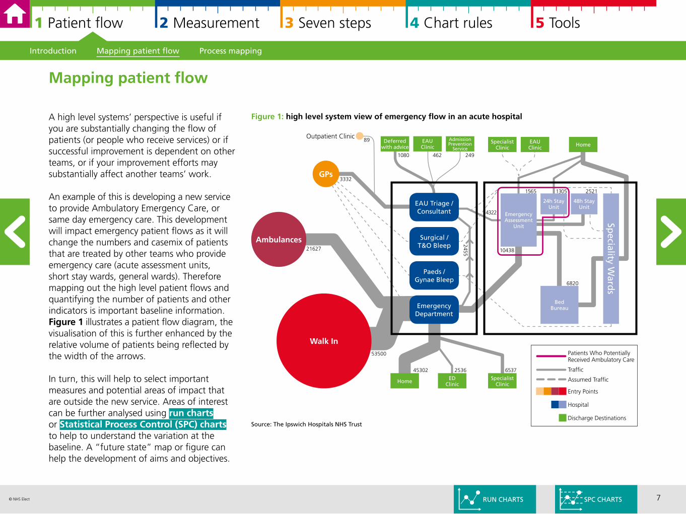
A high level systems’ perspective is useful if you are substantially changing the flow of patients (or people who receive services) or if successful improvement is dependent on other teams, or if your improvement efforts may substantially affect another teams’ work.
An example of this is developing a new service to provide Ambulatory Emergency Care, or same day emergency care. This development will impact emergency patient flows as it will change the numbers and casemix of patients that are treated by other teams who provide emergency care (acute assessment units, short stay wards, general wards). Therefore mapping out the high level patient flows and quantifying the number of patients and other indicators is important baseline information. Figure 1 illustrates a patient flow diagram, the visualisation of this is further enhanced by the relative volume of patients being reflected by the width of the arrows.
In turn, this will help to select important measures and potential areas of impact that are outside the new service. Areas of interest can be further analysed using run charts or Statistical Process Control (SPC) charts to help to understand the variation at the baseline. A “future state” map or figure can help the development of aims and objectives.
Introduction Mapping patient flow Process mapping
Mapping patient flow
Figure 1: high level system view of emergency flow in an acute hospital
Ambulances
Walk In
GPs
Outpatient Clinic
21627
3332
53500
EAU Triage /Consultant
Surgical /T&O Bleep
Paeds /Gynae Bleep
EmergencyDepartment
Deferred with advice
EAUClinic
AdmissionPrevention
ServiceSpecialist
ClinicEAUClinic Home
24h Stay Unit
48h Stay Unit
EmergencyAssessment
Unit
BedBureau
Speciality W
ards
Home EDClinic
SpecialistClinic
1080 462 249
89
13051565 2521
4322
10438
6820
2455
45302 2536 6537
Discharge Destinations
Hospital
Entry Points
Assumed Traffic
Traffic
Patients Who PotentiallyReceived Ambulatory Care
SPC CHARTS
Source: The Ipswich Hospitals NHS Trust
RUN CHARTS
8© NHS Elect
1 Patient flow 2 Measurement 3 Seven steps 4 Chart rules 5 Tools
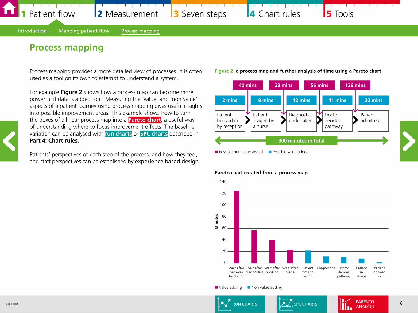
Process mapping provides a more detailed view of processes. It is often used as a tool on its own to attempt to understand a system.
For example Figure 2 shows how a process map can become more powerful if data is added to it. Measuring the ‘value’ and ‘non value’ aspects of a patient journey using process mapping gives useful insights into possible improvement areas. This example shows how to turn the boxes of a linear process map into a Pareto chart, a useful way of understanding where to focus improvement effects. The baseline variation can be analysed with run charts or SPC charts described in Part 4: Chart rules.
Patients’ perspectives of each step of the process, and how they feel, and staff perspectives can be established by experience based design.
Process mapping
2 mins 8 mins 12 mins 11 mins 22 mins
Patient booked in by reception
Patient triaged by a nurse
Diagnostics undertaken
Doctor decides pathway
Patient admitted
40 mins 23 mins 56 mins 126 mins
300 minutes in total
n Possible non value added n Possible value added
Pareto chart created from a process map
140
120
100
80
60
40
20
0
Min
ute
s
Wait after pathway by doctor
Wait after diagnostics
Wait after booking
in
Wait after triage
Patient time to admit
Diagnostics Doctor decides pathway
Patient in
triage
Patient booked
in
n Value adding n Non value adding
Figure 2: a process map and further analysis of time using a Pareto chart
Introduction Mapping patient flow Process mapping
SPC CHARTSRUN CHARTSPARENTOANALYSIS
9© NHS Elect
1 Patient flow 2 Measurement 3 Seven steps 4 Chart rules 5 Tools
The model for improvement The three faces of performance measurement Getting the right suite of measures
2 About measurement for improvement
The model for improvement 10
The three faces of performance measurement 11
Getting the right suite of measures 13
10© NHS Elect
1 Patient flow 2 Measurement 3 Seven steps 4 Chart rules 5 Tools
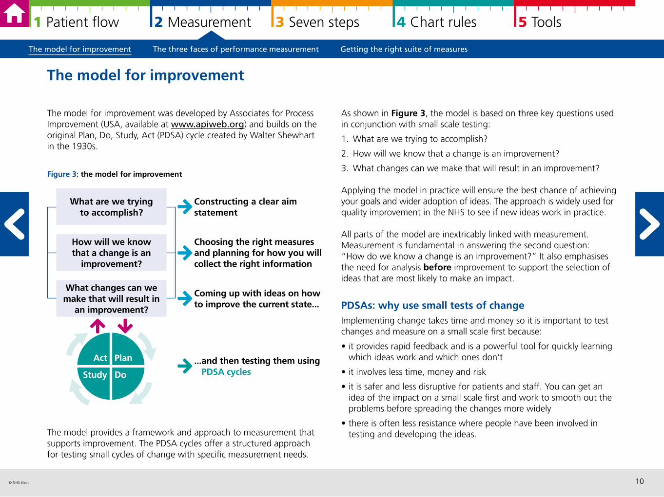
The model for improvement was developed by Associates for Process Improvement (USA, available at www.apiweb.org) and builds on the original Plan, Do, Study, Act (PDSA) cycle created by Walter Shewhart in the 1930s.
Figure 3: the model for improvement
The model provides a framework and approach to measurement that supports improvement. The PDSA cycles offer a structured approach for testing small cycles of change with specific measurement needs.
The model for improvement
As shown in Figure 3, the model is based on three key questions used in conjunction with small scale testing:
1. What are we trying to accomplish?
2. How will we know that a change is an improvement?
3. What changes can we make that will result in an improvement?
Applying the model in practice will ensure the best chance of achieving your goals and wider adoption of ideas. The approach is widely used for quality improvement in the NHS to see if new ideas work in practice.
All parts of the model are inextricably linked with measurement.Measurement is fundamental in answering the second question: “How do we know a change is an improvement?” It also emphasises the need for analysis before improvement to support the selection of ideas that are most likely to make an impact.
PDSAs: why use small tests of change Implementing change takes time and money so it is important to test changes and measure on a small scale first because:
• it provides rapid feedback and is a powerful tool for quickly learning which ideas work and which ones don’t
• it involves less time, money and risk
• it is safer and less disruptive for patients and staff. You can get an idea of the impact on a small scale first and work to smooth out the problems before spreading the changes more widely
• there is often less resistance where people have been involved in testing and developing the ideas.
Constructing a clear aim statement
Choosing the right measures and planning for how you will collect the right information
Coming up with ideas on how to improve the current state...
What are we trying to accomplish?
What changes can we make that will result in
an improvement?
How will we know that a change is an
improvement?
...and then testing them usingPDSA cycles
Plan
Do
Act
Study
The model for improvement The three faces of performance measurement Getting the right suite of measures
11© NHS Elect
1 Patient flow 2 Measurement 3 Seven steps 4 Chart rules 5 Tools
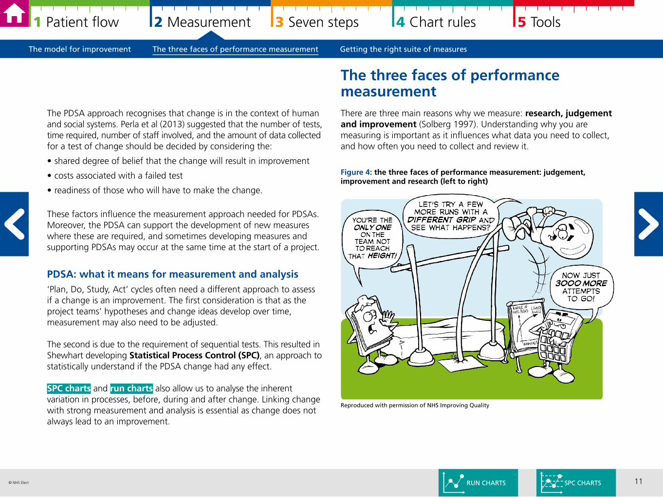
There are three main reasons why we measure: research, judgement and improvement (Solberg 1997). Understanding why you are measuring is important as it influences what data you need to collect, and how often you need to collect and review it.
Figure 4: the three faces of performance measurement: judgement, improvement and research (left to right)
The PDSA approach recognises that change is in the context of human and social systems. Perla et al (2013) suggested that the number of tests, time required, number of staff involved, and the amount of data collected for a test of change should be decided by considering the:
• shared degree of belief that the change will result in improvement
• costs associated with a failed test
• readiness of those who will have to make the change.
These factors influence the measurement approach needed for PDSAs. Moreover, the PDSA can support the development of new measures where these are required, and sometimes developing measures and supporting PDSAs may occur at the same time at the start of a project.
PDSA: what it means for measurement and analysis ‘Plan, Do, Study, Act’ cycles often need a different approach to assess if a change is an improvement. The first consideration is that as the project teams’ hypotheses and change ideas develop over time, measurement may also need to be adjusted.
The second is due to the requirement of sequential tests. This resulted in Shewhart developing Statistical Process Control (SPC), an approach to statistically understand if the PDSA change had any effect.
SPC charts and run charts also allow us to analyse the inherent variation in processes, before, during and after change. Linking change with strong measurement and analysis is essential as change does not always lead to an improvement.
The three faces of performance measurement
Reproduced with permission of NHS Improving Quality
The model for improvement The three faces of performance measurement Getting the right suite of measures
SPC CHARTSRUN CHARTS
12© NHS Elect
1 Patient flow 2 Measurement 3 Seven steps 4 Chart rules 5 Tools
Measuring for improvement is different as shown in Figure 5. The concept of sequential testing means that there needs to be a willingness to frequently change the hypothesis (as you learn more with each test) and an acceptance of working with ‘just enough’ data – i.e. using data and information that is ‘good enough’ rather than perfect.
So there is a strong focus on being pragmatic in your approach to measurement. This can be illustrated as follows:
A quality improvement project aims to reduce falls in care homes. There is a clearly agreed definition of a ‘fall’ and the team decide to monitor all falls rather than differentiate between those that are preventable or not. This minimises the data collection burden but will influence the sensitivity of the measure to change. From other projects experience, they expect a reduction of 18-30% falls, the measure was deemed to be ‘sensitive enough’.Data originating from patient safety in falls, 2009 (pdf).
Measurement for improvement does not seek to prove or disprove whether clinical interventions work – that is measurement for research i.e. to develop evidence based practice. Instead it seeks to answer to answer two questions:
1. How do we make it work here? For example getting evidence into practice
2. And have the changes we made, made a difference?
Clinical staff are often more familiar with measurement for research whereas service managers and those in more strategic roles may be more familiar with measurement for judgement as a way of understanding performance.
There are similarities and differences between the three approaches to measurement.
Measures for improvement are like other measures. They “should be based on agreed, fully described definitions; should be highly or optimally sensitive and specific, be valid and reliable, be a good discriminator, be relevant and actionable for the user, enable comparisons, and be evidence-based”. Summary by Raleigh and Foot (2010). Original source Mainz.
In this respect constructing and defining measures for improvement does not differ from other forms of measurement. Steps 2-4 in the 7 steps for measurement for improvement describe how to do this in practice.
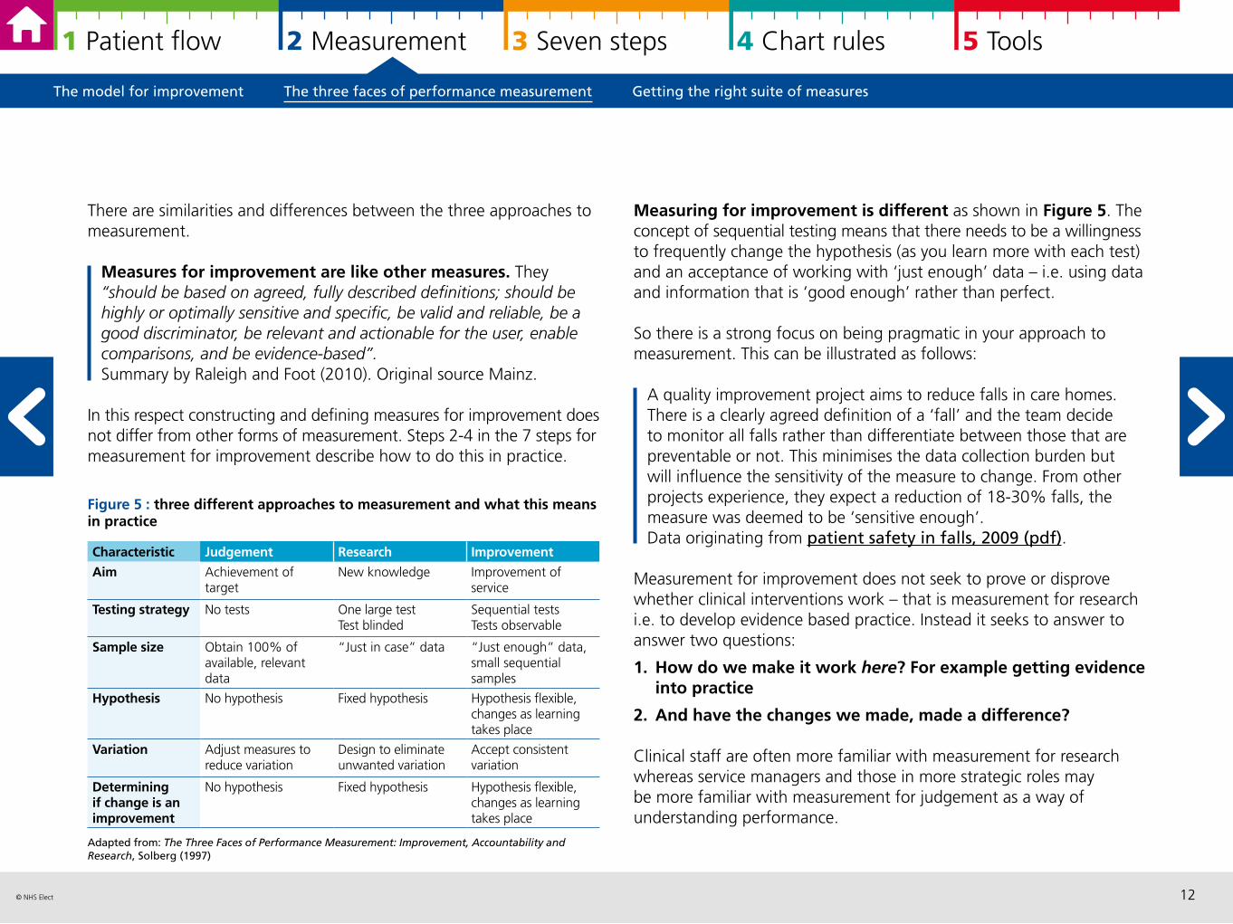
Figure 5 : three different approaches to measurement and what this means in practice
Adapted from: The Three Faces of Performance Measurement: Improvement, Accountability and Research, Solberg (1997)
Characteristic Judgement Research Improvement
Aim Achievement of target
New knowledge Improvement of service
Testing strategy No tests One large testTest blinded
Sequential testsTests observable
Sample size Obtain 100% of available, relevant data
“Just in case” data “Just enough” data, small sequential samples
Hypothesis No hypothesis Fixed hypothesis Hypothesis flexible, changes as learning takes place
Variation Adjust measures to reduce variation
Design to eliminate unwanted variation
Accept consistent variation
Determining if change is an improvement
No hypothesis Fixed hypothesis Hypothesis flexible, changes as learning takes place
The model for improvement The three faces of performance measurement Getting the right suite of measures
13© NHS Elect
1 Patient flow 2 Measurement 3 Seven steps 4 Chart rules 5 Tools
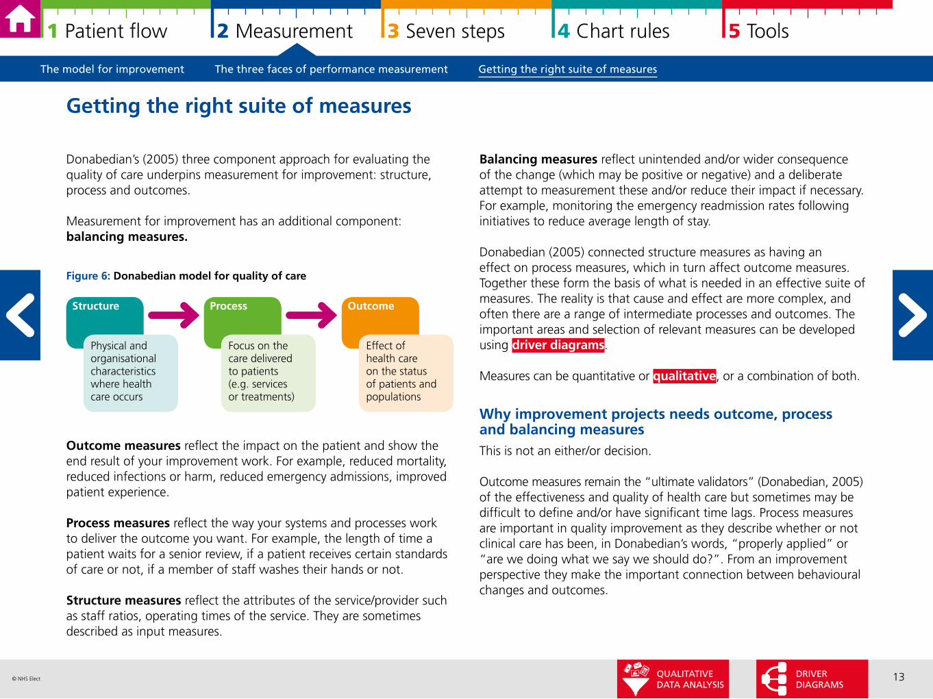
Balancing measures reflect unintended and/or wider consequence of the change (which may be positive or negative) and a deliberate attempt to measurement these and/or reduce their impact if necessary. For example, monitoring the emergency readmission rates following initiatives to reduce average length of stay.
Donabedian (2005) connected structure measures as having an effect on process measures, which in turn affect outcome measures. Together these form the basis of what is needed in an effective suite of measures. The reality is that cause and effect are more complex, and often there are a range of intermediate processes and outcomes. The important areas and selection of relevant measures can be developed using driver diagrams.
Measures can be quantitative or qualitative, or a combination of both.
Why improvement projects needs outcome, process and balancing measures This is not an either/or decision.
Outcome measures remain the “ultimate validators” (Donabedian, 2005) of the effectiveness and quality of health care but sometimes may be difficult to define and/or have significant time lags. Process measures are important in quality improvement as they describe whether or not clinical care has been, in Donabedian’s words, “properly applied” or “are we doing what we say we should do?”. From an improvement perspective they make the important connection between behavioural changes and outcomes.
Donabedian’s (2005) three component approach for evaluating the quality of care underpins measurement for improvement: structure, process and outcomes.
Measurement for improvement has an additional component: balancing measures.
Figure 6: Donabedian model for quality of care
Outcome measures reflect the impact on the patient and show the end result of your improvement work. For example, reduced mortality, reduced infections or harm, reduced emergency admissions, improved patient experience.
Process measures reflect the way your systems and processes work to deliver the outcome you want. For example, the length of time a patient waits for a senior review, if a patient receives certain standards of care or not, if a member of staff washes their hands or not.
Structure measures reflect the attributes of the service/provider such as staff ratios, operating times of the service. They are sometimes described as input measures.
Getting the right suite of measures
Structure Process Outcome
Physical and organisational characteristics where health care occurs
Focus on the care delivered to patients(e.g. services or treatments)
Effect of health care on the status of patients and populations
The model for improvement The three faces of performance measurement Getting the right suite of measures
DRIVER DIAGRAMS
QUALITATIVE DATA ANALYSIS
14© NHS Elect
1 Patient flow 2 Measurement 3 Seven steps 4 Chart rules 5 Tools
It is important to have both process and outcome measures, they connect your theory of change to your expected outcomes. If you measure outcomes without process measures, you cannot be sure if the changes you make have happened in practice and therefore cannot connect improvements to outcomes. If you measure process without outcomes, you cannot be sure if outcomes have changed, and there is risk of “hitting a target [improved process] but missing the point [no improved outcomes]”.
Alongside these two concepts, all improvement projects should actively seek out any potential unintended consequences of change and deliberately measure these as balancing measures. A tip is to listen to sceptics and use their concerns to develop balancing measures.
In summary measurement can show us a number of important pieces of information:
• how well our current process is performing
• whether we have reached an objective
• how much variation is in our data/process
• whether a small test change is going in the correct direction
• whether the changes have resulted in an improvement
• whether a change has been sustained.
Measurement for quality improvement does not have to be complicated. Tracking a few measures over time and presenting the information well is fundamental to developing a change that works well and can be spread.
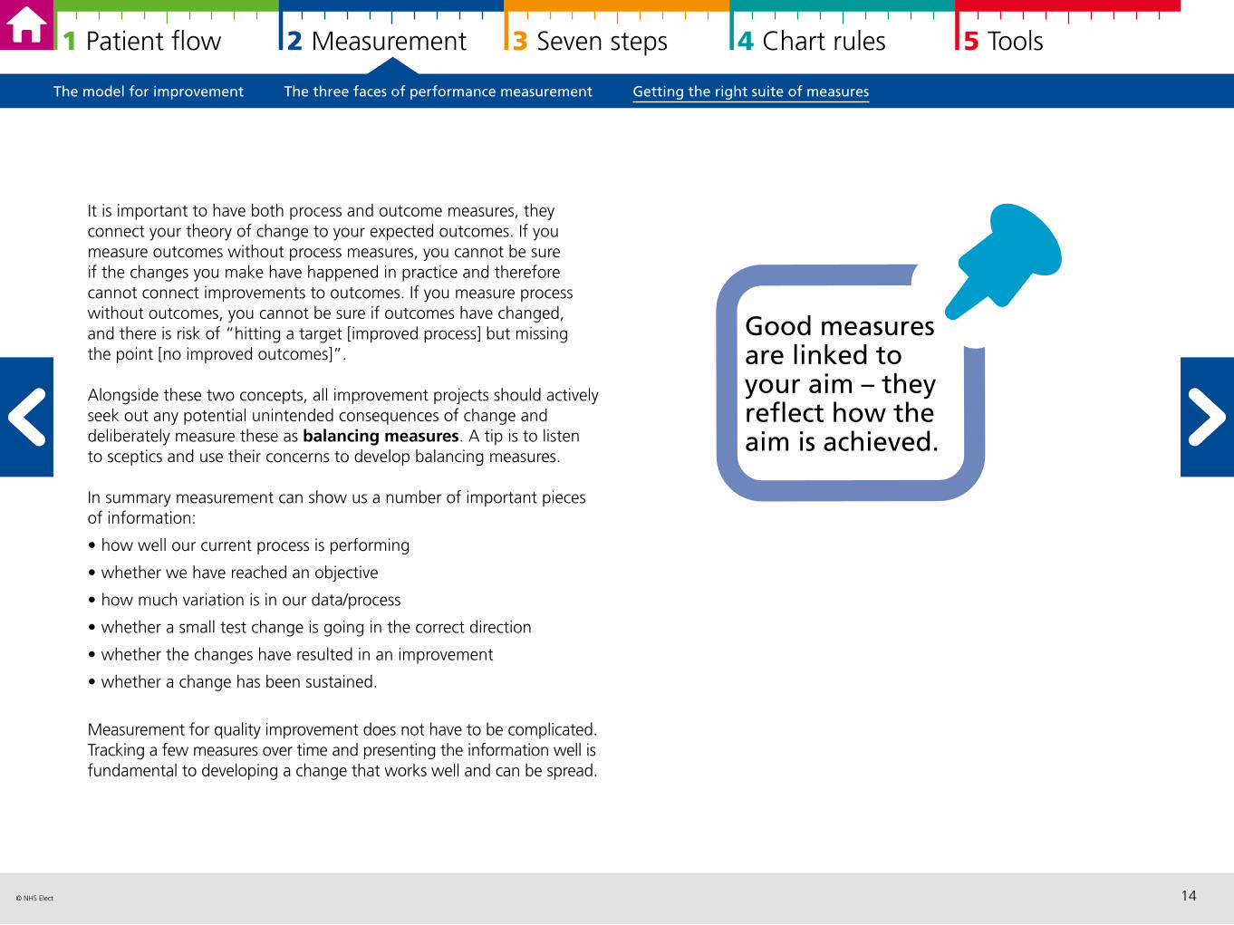
Good measures are linked to your aim – they reflect how the aim is achieved.
The model for improvement The three faces of performance measurement Getting the right suite of measures
15© NHS Elect
1 Patient flow 2 Measurement 3 Seven steps 4 Chart rules 5 Tools
3 Using the seven steps to measurement for improvement
Introduction 16
Steps 1 to 3: getting yourself ready 17
Steps 4 to 6: the Collect-Analyse-Review measurement cycle 19
Step 7: keep going! 24
Introduction Steps 1 to 3: getting yourself ready Steps 4 to 6: the Collect-Analyse-Review measurement cycle Step 7: keep going!
16© NHS Elect
1 Patient flow 2 Measurement 3 Seven steps 4 Chart rules 5 Tools
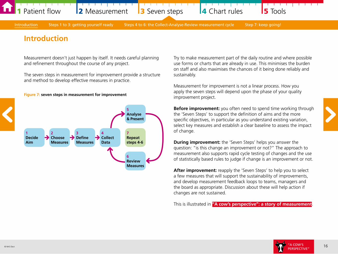
Measurement doesn’t just happen by itself. It needs careful planning and refinement throughout the course of any project.
The seven steps in measurement for improvement provide a structure and method to develop effective measures in practice.
Figure 7: seven steps in measurement for improvement
Try to make measurement part of the daily routine and where possible use forms or charts that are already in use. This minimises the burden on staff and also maximises the chances of it being done reliably and sustainably.
Measurement for improvement is not a linear process. How you apply the seven steps will depend upon the phase of your quality improvement project.
Before improvement: you often need to spend time working through the ‘Seven Steps’ to support the definition of aims and the more specific objectives, in particular as you understand existing variation, select key measures and establish a clear baseline to assess the impact of change.
During improvement: the ‘Seven Steps’ helps you answer the question: “is this change an improvement or not?” The approach to measurement also supports rapid cycle testing of changes and the use of statistically based rules to judge if change is an improvement or not.
After improvement: reapply the ‘Seven Steps’ to help you to select a few measures that will support the sustainability of improvements, and develop measurement feedback loops to teams, managers and the board as appropriate. Discussion about these will help action if changes are not sustained.
This is illustrated in “A cow’s perspective”: a story of measurement.
Introduction Steps 1 to 3: getting yourself ready Steps 4 to 6: the Collect-Analyse-Review measurement cycle Step 7: keep going!
Introduction
1DecideAim
2ChooseMeasures
3DefineMeasures
7Repeat steps 4-6
4CollectData
6ReviewMeasures
5Analyse & Present
“A COW’SPERSPECTIVE”
17© NHS Elect
1 Patient flow 2 Measurement 3 Seven steps 4 Chart rules 5 Tools
Step 1: decide your aim and objectivesThe key points to remember about aim setting are:
• those involved in making the changes should be able to relate the project work to their organisation’s strategic goals
• the objective statement should be SMART: Specific – Measureable – Achievable – Relevant – Time-bound
• make it patient focussed, describe how your change will improve the service or outcomes for patients
• review existing measures, data and available qualitative data
• ensure that you carry out the analysis you need before starting improvement (for example interpreting baseline variation and acting on these)
• be clear about your current baseline and understand priority areas, for example using Pareto analysis to select areas to maximise the impact of change.
Step 2: choose your measuresThe starting point is:
• make sure that you measure your aim and objectives
• consider qualitative data analysis alongside quantitative data
• a few good measures are better than lots of “just in case measures”.
Tools that help to select and identify important measures are:
• Mapping patient flow and/or process mapping
• Driver diagrams.
Remember to include at least one outcome, process and balancing measure. See getting the right suite of measures.
Steps 1 to 3: getting yourself ready
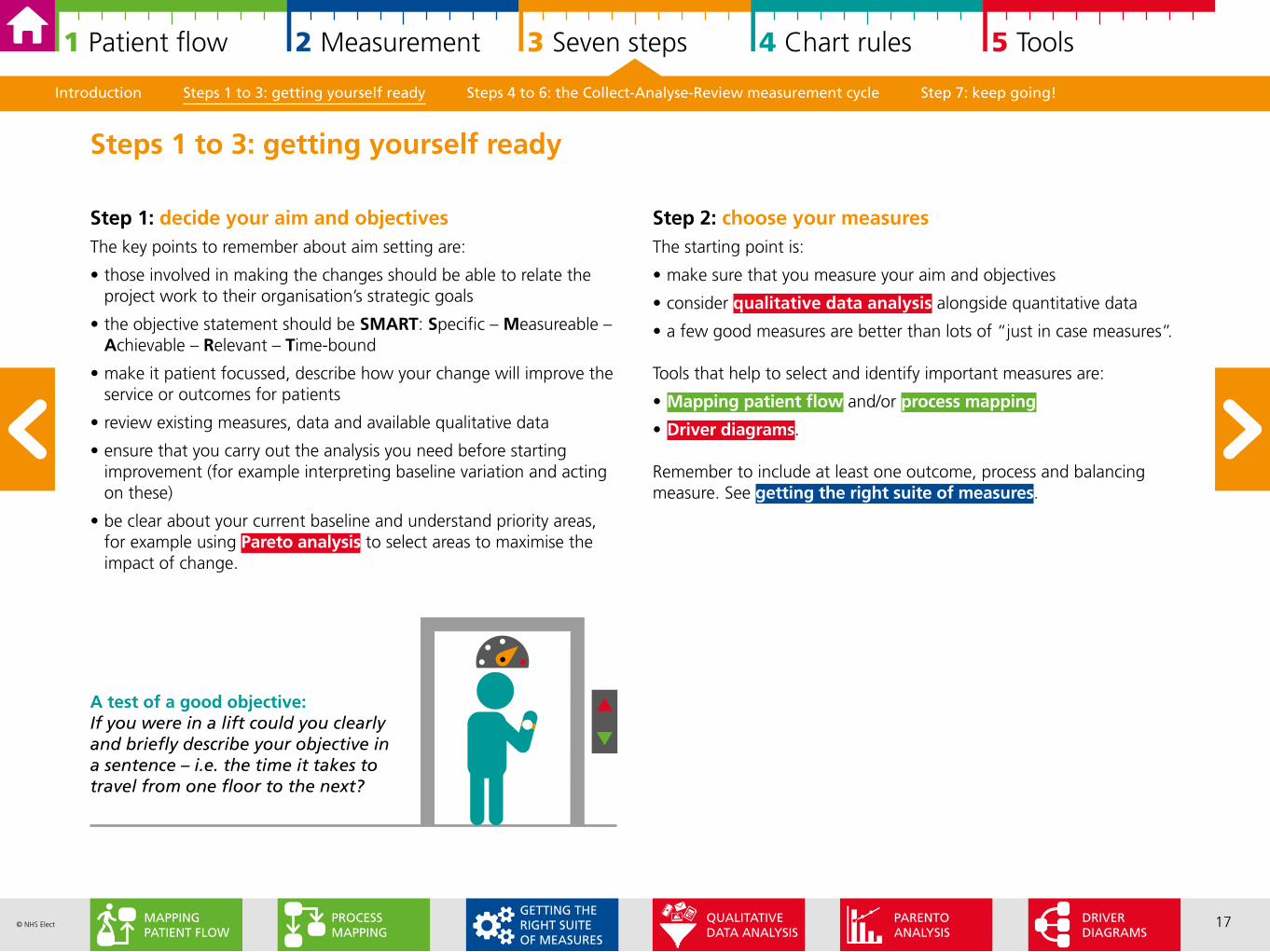
A test of a good objective: If you were in a lift could you clearly and briefly describe your objective in a sentence – i.e. the time it takes to travel from one floor to the next?
Introduction Steps 1 to 3: getting yourself ready Steps 4 to 6: the Collect-Analyse-Review measurement cycle Step 7: keep going!
DRIVER DIAGRAMS
PARENTOANALYSIS
PROCESSMAPPING
MAPPING PATIENT FLOW
QUALITATIVE DATA ANALYSIS
GETTING THE RIGHT SUITE OF MEASURES
18© NHS Elect
1 Patient flow 2 Measurement 3 Seven steps 4 Chart rules 5 Tools
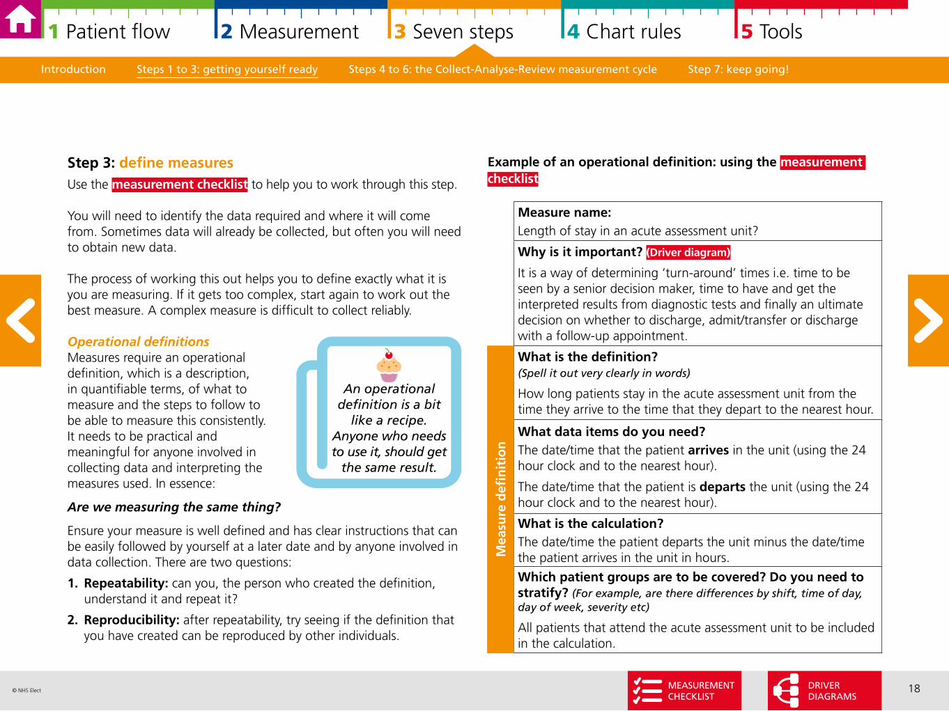
Example of an operational definition: using the measurement checklist
Measure name:Length of stay in an acute assessment unit?
Why is it important? (Driver diagram)
It is a way of determining ‘turn-around’ times i.e. time to be seen by a senior decision maker, time to have and get the interpreted results from diagnostic tests and finally an ultimate decision on whether to discharge, admit/transfer or discharge with a follow-up appointment.
What is the definition? (Spell it out very clearly in words)
How long patients stay in the acute assessment unit from the time they arrive to the time that they depart to the nearest hour.
What data items do you need?The date/time that the patient arrives in the unit (using the 24 hour clock and to the nearest hour).
The date/time that the patient is departs the unit (using the 24 hour clock and to the nearest hour).
What is the calculation?The date/time the patient departs the unit minus the date/time the patient arrives in the unit in hours.
Which patient groups are to be covered? Do you need to stratify? (For example, are there differences by shift, time of day, day of week, severity etc)
All patients that attend the acute assessment unit to be included in the calculation.
Mea
sure
defi
nit
ion
Introduction Steps 1 to 3: getting yourself ready Steps 4 to 6: the Collect-Analyse-Review measurement cycle Step 7: keep going!
Step 3: define measuresUse the measurement checklist to help you to work through this step.
You will need to identify the data required and where it will come from. Sometimes data will already be collected, but often you will need to obtain new data.
The process of working this out helps you to define exactly what it is you are measuring. If it gets too complex, start again to work out the best measure. A complex measure is difficult to collect reliably.
Operational definitions Measures require an operational definition, which is a description, in quantifiable terms, of what to measure and the steps to follow to be able to measure this consistently. It needs to be practical and meaningful for anyone involved in collecting data and interpreting the measures used. In essence:
Are we measuring the same thing?
Ensure your measure is well defined and has clear instructions that can be easily followed by yourself at a later date and by anyone involved in data collection. There are two questions:
1. Repeatability: can you, the person who created the definition, understand it and repeat it?
2. Reproducibility: after repeatability, try seeing if the definition that you have created can be reproduced by other individuals.
An operational definition is a bit
like a recipe. Anyone who needs to use it, should get
the same result.
MEASUREMENTCHECKLIST
DRIVER DIAGRAMS
19© NHS Elect
1 Patient flow 2 Measurement 3 Seven steps 4 Chart rules 5 Tools
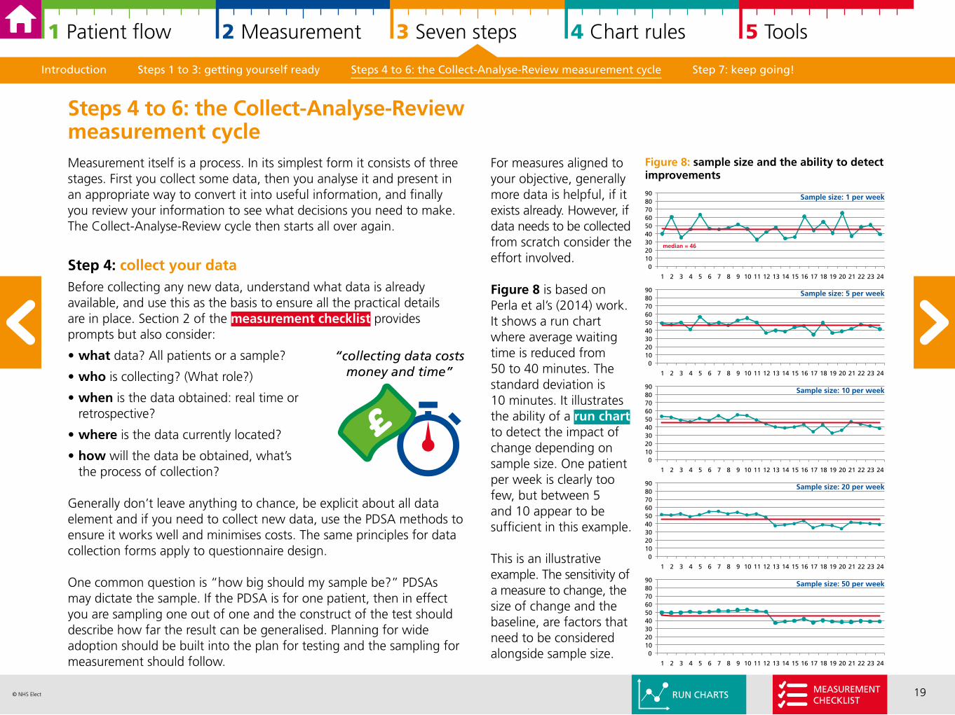
For measures aligned to your objective, generally more data is helpful, if it exists already. However, if data needs to be collected from scratch consider the effort involved.
Figure 8 is based on Perla et al’s (2014) work. It shows a run chart where average waiting time is reduced from 50 to 40 minutes. The standard deviation is 10 minutes. It illustrates the ability of a run chart to detect the impact of change depending on sample size. One patient per week is clearly too few, but between 5 and 10 appear to be sufficient in this example.
This is an illustrative example. The sensitivity of a measure to change, the size of change and the baseline, are factors that need to be considered alongside sample size.
Introduction Steps 1 to 3: getting yourself ready Steps 4 to 6: the Collect-Analyse-Review measurement cycle Step 7: keep going!
Measurement itself is a process. In its simplest form it consists of three stages. First you collect some data, then you analyse it and present in an appropriate way to convert it into useful information, and finally you review your information to see what decisions you need to make. The Collect-Analyse-Review cycle then starts all over again.
Step 4: collect your dataBefore collecting any new data, understand what data is already available, and use this as the basis to ensure all the practical details are in place. Section 2 of the measurement checklist provides prompts but also consider:
• what data? All patients or a sample?
• who is collecting? (What role?)
• when is the data obtained: real time or retrospective?
• where is the data currently located?
• how will the data be obtained, what’s the process of collection?
Generally don’t leave anything to chance, be explicit about all data element and if you need to collect new data, use the PDSA methods to ensure it works well and minimises costs. The same principles for data collection forms apply to questionnaire design. One common question is “how big should my sample be?” PDSAs may dictate the sample. If the PDSA is for one patient, then in effect you are sampling one out of one and the construct of the test should describe how far the result can be generalised. Planning for wide adoption should be built into the plan for testing and the sampling for measurement should follow.
Steps 4 to 6: the Collect-Analyse-Review measurement cycle
0102030405060708090
1 2 3 4 5 6 7 8 9 10 11 12 13 14 15 16 17 18 19 20 21 22 23 24
median = 46
0102030405060708090
1 2 3 4 5 6 7 8 9 10 11 12 13 14 15 16 17 18 19 20 21 22 23 24
Figure 8: sample size and the ability to detect improvements
0102030405060708090
1 2 3 4 5 6 7 8 9 10 11 12 13 14 15 16 17 18 19 20 21 22 23 24
0102030405060708090
1 2 3 4 5 6 7 8 9 10 11 12 13 14 15 16 17 18 19 20 21 22 23 24
0102030405060708090
1 2 3 4 5 6 7 8 9 10 11 12 13 14 15 16 17 18 19 20 21 22 23 24
Sample size: 1 per week
Sample size: 5 per week
Sample size: 10 per week
Sample size: 20 per week
Sample size: 50 per week
“collecting data costs money and time”
RUN CHARTSMEASUREMENTCHECKLIST
20© NHS Elect
1 Patient flow 2 Measurement 3 Seven steps 4 Chart rules 5 Tools
An example of common/special cause variation is how long it takes you to drive to work. For example, I expect my journey to work to take between 35 to 45 minutes. One day there is an accident on the road, and it takes an hour and a half. My typical journey of between 35 to 45 minutes describes common cause variation. The day where there is an accident it is special cause, I can assign the long journey to the accident.
Understanding what type of variation you have before you start improvement with your baseline data is important as it should influence your improvement strategy.
My journey to work example illustrates these points. Following the accident I am unlikely to change the time I leave home generally. I may have a contingency plan for the vital meeting at 9am with the Chief Executive and Board of Directors and leave extra early “just in case” something unexpected happens.
Understanding your baseline gives you crucial contextual information to design your improvement strategy. Knowing your baseline is also important so you can assess the impact of any change.
Introduction Steps 1 to 3: getting yourself ready Steps 4 to 6: the Collect-Analyse-Review measurement cycle Step 7: keep going!
Step 5: analyse and present your data over time In order to be able to demonstrate whether a specific intervention has made an impact, it is essential to plot the measure over time and annotate when changes were introduced against a baseline. Before you start to implement change, understanding variation can supply important knowledge about your processes, and support decision making about improvement.
Variation In the real world everything varies: how long it takes to travel to work? How long it takes to take a patient’s blood pressure? How many patients go to A&E? How many patients need a home visit? There are two different types of variation – common cause and special cause:
Common cause (Random)
• sum of many small variations from real but small causes that are inherent in any process
• therefore it cannot be traced back to a root cause
• stable in time (follows the laws of probability) and therefore relatively predictable
• random variation is a matter of measurement, not goal setting.
Special cause (Assignable)
• variation arising from a single cause that is not part of the process
• therefore can be traced, identified and eliminated (or implemented)
• irregular in time and therefore unpredictable.
If common cause variation(Random)
• process is stable and predictable. • it is inherent to the process• question: is the current performance acceptable • if yes: do nothing• if no: you need to redesign your processes.
If special cause (Assignable)
• process is unstable and unpredictable• variation is caused by factors outside process• external cause should be identified and tackled• you can develop contingency plans.
21© NHS Elect
1 Patient flow 2 Measurement 3 Seven steps 4 Chart rules 5 Tools
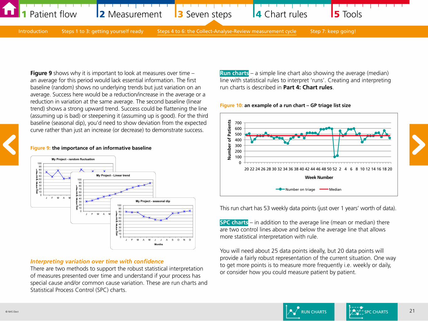
Run charts – a simple line chart also showing the average (median) line with statistical rules to interpret ‘runs’. Creating and interpreting run charts is described in Part 4: Chart rules.
Figure 10: an example of a run chart – GP triage list size
This run chart has 53 weekly data points (just over 1 years’ worth of data).
SPC charts – in addition to the average line (mean or median) there are two control lines above and below the average line that allows more statistical interpretation with rule.
You will need about 25 data points ideally, but 20 data points will provide a fairly robust representation of the current situation. One way to get more points is to measure more frequently i.e. weekly or daily, or consider how you could measure patient by patient.
Introduction Steps 1 to 3: getting yourself ready Steps 4 to 6: the Collect-Analyse-Review measurement cycle Step 7: keep going!
Figure 9 shows why it is important to look at measures over time – an average for this period would lack essential information. The first baseline (random) shows no underlying trends but just variation on an average. Success here would be a reduction/increase in the average or a reduction in variation at the same average. The second baseline (linear trend) shows a strong upward trend. Success could be flattening the line (assuming up is bad) or steepening it (assuming up is good). For the third baseline (seasonal dip), you’d need to show deviation from the expected curve rather than just an increase (or decrease) to demonstrate success.
Figure 9: the importance of an informative baseline
Interpreting variation over time with confidenceThere are two methods to support the robust statistical interpretation of measures presented over time and understand if your process has special cause and/or common cause variation. These are run charts and Statistical Process Control (SPC) charts.
0100200300400500600700
20 22 24 26 28 30 32 34 36 38 40 42 44 46 48 50 52 2 4 6 8 10 12 14 16 18 20
Nu
mb
er o
f Pa
tien
ts
Week Number
Number on triage Median
RUN CHARTS SPC CHARTS
22© NHS Elect
1 Patient flow 2 Measurement 3 Seven steps 4 Chart rules 5 Tools
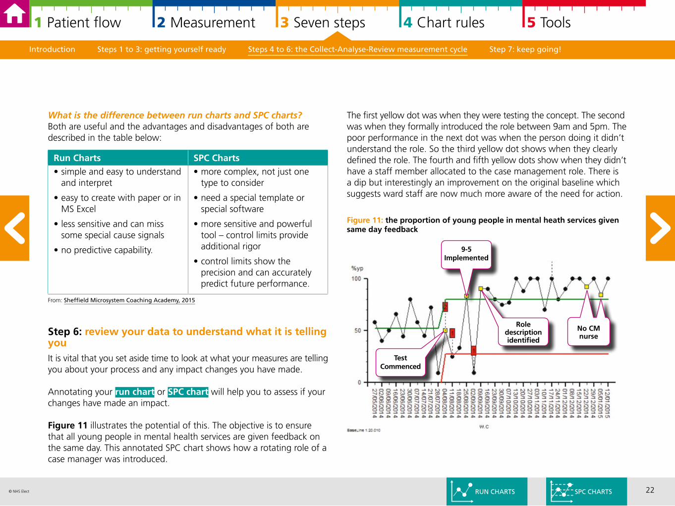
The first yellow dot was when they were testing the concept. The second was when they formally introduced the role between 9am and 5pm. The poor performance in the next dot was when the person doing it didn’t understand the role. So the third yellow dot shows when they clearly defined the role. The fourth and fifth yellow dots show when they didn’t have a staff member allocated to the case management role. There is a dip but interestingly an improvement on the original baseline which suggests ward staff are now much more aware of the need for action.
Figure 11: the proportion of young people in mental heath services given same day feedback
Introduction Steps 1 to 3: getting yourself ready Steps 4 to 6: the Collect-Analyse-Review measurement cycle Step 7: keep going!
What is the difference between run charts and SPC charts?Both are useful and the advantages and disadvantages of both are described in the table below:
From: Sheffield Microsystem Coaching Academy, 2015
Step 6: review your data to understand what it is telling youIt is vital that you set aside time to look at what your measures are telling you about your process and any impact changes you have made.
Annotating your run chart or SPC chart will help you to assess if your changes have made an impact.
Figure 11 illustrates the potential of this. The objective is to ensure that all young people in mental health services are given feedback on the same day. This annotated SPC chart shows how a rotating role of a case manager was introduced.
Run Charts SPC Charts• simple and easy to understand
and interpret
• easy to create with paper or in MS Excel
• less sensitive and can miss some special cause signals
• no predictive capability.
• more complex, not just one type to consider
• need a special template or special software
• more sensitive and powerful tool – control limits provide additional rigor
• control limits show the precision and can accurately predict future performance.
RUN CHARTS SPC CHARTS
No CM nurse
9-5 Implemented
TestCommenced
Role description identified
23© NHS Elect
1 Patient flow 2 Measurement 3 Seven steps 4 Chart rules 5 Tools
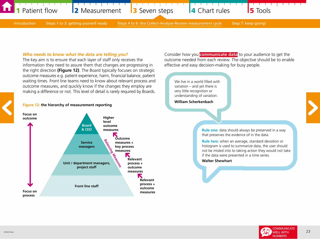
Who needs to know what the data are telling you? The key aim is to ensure that each layer of staff only receives the information they need to assure them that changes are progressing in the right direction (Figure 12). The Board typically focuses on strategic outcome measures e.g. patient experience, harm, financial balance, patient waiting times. Front line teams need to know about relevant process and outcome measures, and quickly know if the changes they employ are making a difference or not. This level of detail is rarely required by Boards.
Figure 12: the hierarchy of measurement reporting
Introduction Steps 1 to 3: getting yourself ready Steps 4 to 6: the Collect-Analyse-Review measurement cycle Step 7: keep going!
Focus onoutcome
Board& CEO
Servicemanagers
Unit / department managers, project staff
Front line staff
Focus onprocess
Relevant process + outcome measures
Relevant process + outcome measures
Outcome measures + key process measures
Higher level outcome measures
Balancing Measures
Rule one: data should always be preserved in a way that preserves the evidence of in the data.
Rule two: when an average, standard deviation or histogram is used to summarize data, the user should not be misled into to taking action they would not take if the data were presented in a time series.
Walter Shewhart
We live in a world filled with variation – and yet there is very little recognition or understanding of variation.
William Scherkenbach
Consider how you communicate data to your audience to get the outcome needed from each review. The objective should be to enable effective and easy decision-making for busy people.
COMMUNICATE WELL WITH NUMBERS
24© NHS Elect
1 Patient flow 2 Measurement 3 Seven steps 4 Chart rules 5 Tools
Introduction Steps 1 to 3: getting yourself ready Steps 4 to 6: the Collect-Analyse-Review measurement cycle Step 7: keep going!
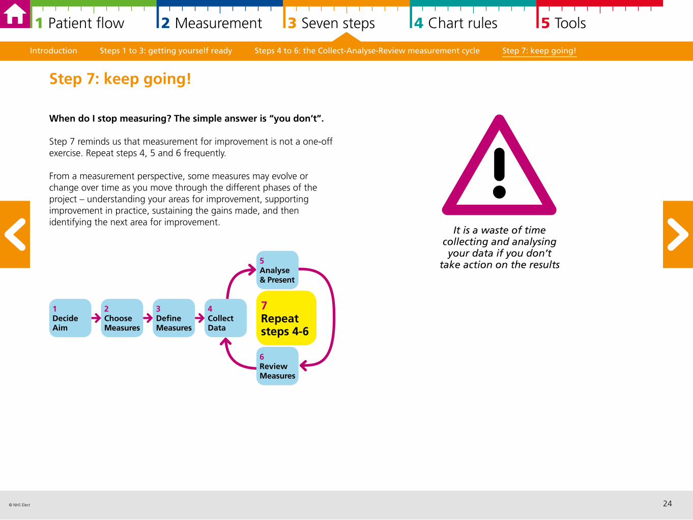
When do I stop measuring? The simple answer is “you don’t”.
Step 7 reminds us that measurement for improvement is not a one-off exercise. Repeat steps 4, 5 and 6 frequently.
From a measurement perspective, some measures may evolve or change over time as you move through the different phases of the project – understanding your areas for improvement, supporting improvement in practice, sustaining the gains made, and then identifying the next area for improvement.
Step 7: keep going!
1DecideAim
2ChooseMeasures
3DefineMeasures
7Repeat steps 4-6
4CollectData
6ReviewMeasures
5Analyse & Present
It is a waste of time collecting and analysing your data if you don’t
take action on the results
25© NHS Elect
1 Patient flow 2 Measurement 3 Seven steps 4 Chart rules 5 Tools
4 Run and statistical process control chart rules in practice
Run charts 26
Statistical Process Control (SPC) charts 29
SPC charts in practice 32
Run charts and SPC charts and your baseline 34
Run and SPC charts assessing if change is an improvement 34
Assessing process capability with SPC charts 35
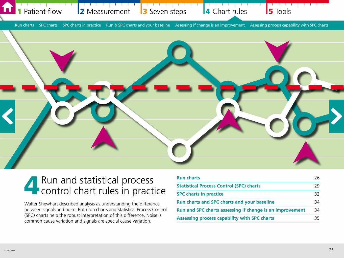
Walter Shewhart described analysis as understanding the difference between signals and noise. Both run charts and Statistical Process Control (SPC) charts help the robust interpretation of this difference. Noise is common cause variation and signals are special cause variation.
Run charts SPC charts SPC charts in practice Run & SPC charts and your baseline Assessing if change is an improvement Assessing process capability with SPC charts
26© NHS Elect
1 Patient flow 2 Measurement 3 Seven steps 4 Chart rules 5 Tools
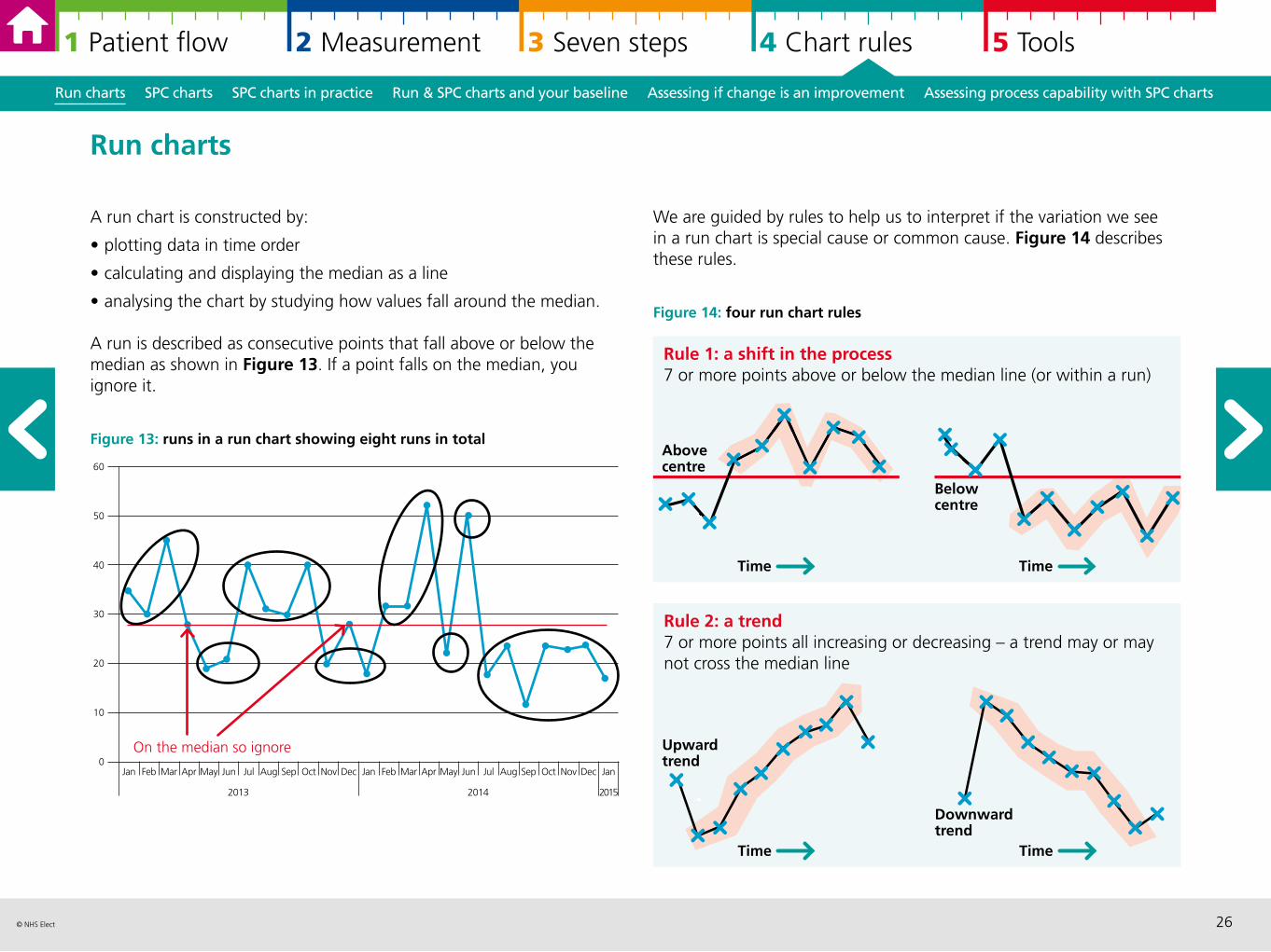
We are guided by rules to help us to interpret if the variation we see in a run chart is special cause or common cause. Figure 14 describes these rules.
Figure 14: four run chart rules
A run chart is constructed by:
• plotting data in time order
• calculating and displaying the median as a line
• analysing the chart by studying how values fall around the median.
A run is described as consecutive points that fall above or below the median as shown in Figure 13. If a point falls on the median, you ignore it.
Figure 13: runs in a run chart showing eight runs in total
Run charts SPC charts SPC charts in practice Run & SPC charts and your baseline Assessing if change is an improvement Assessing process capability with SPC charts
Run charts
30
Jan Feb Mar Apr May Jun Jul Aug Sep Oct Nov Dec Jan Feb Mar Apr May Jun Jul Aug Sep Oct Nov Dec Jan
20142013 2015
On the median so ignore
40
50
20
0
10
60
Rule 1: a shift in the process7 or more points above or below the median line (or within a run)
Above centre
Below centre
Time Time
Rule 2: a trend7 or more points all increasing or decreasing – a trend may or may not cross the median line
Upward trend
Downward trend
Time Time
27© NHS Elect
1 Patient flow 2 Measurement 3 Seven steps 4 Chart rules 5 Tools
Run charts SPC charts SPC charts in practice Run & SPC charts and your baseline Assessing if change is an improvement Assessing process capability with SPC charts
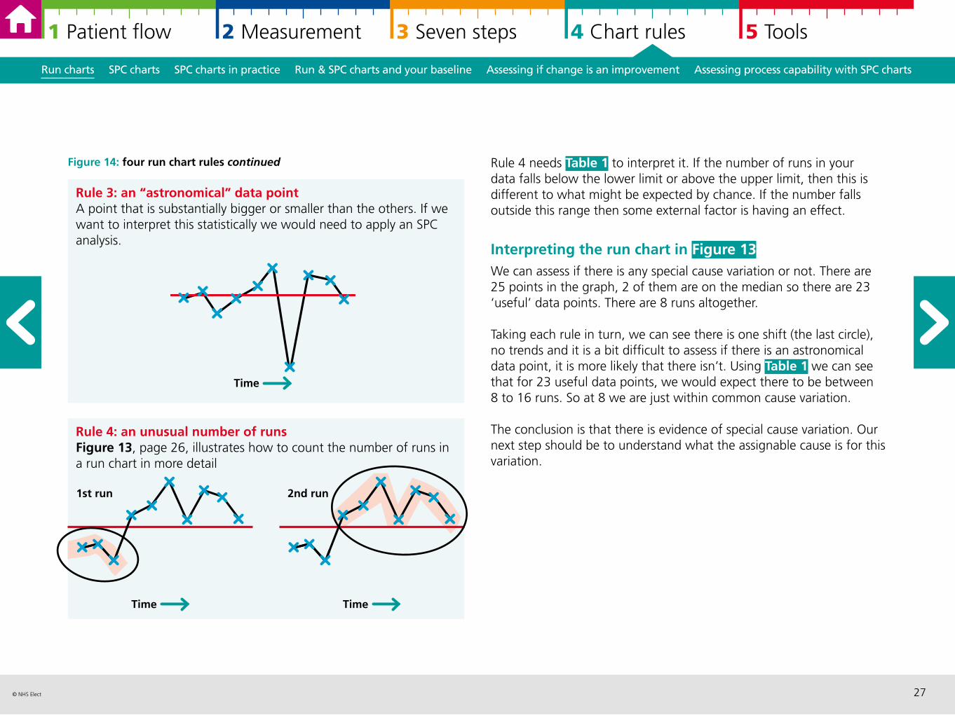
Figure 14: four run chart rules continued Rule 4 needs Table 1 to interpret it. If the number of runs in your data falls below the lower limit or above the upper limit, then this is different to what might be expected by chance. If the number falls outside this range then some external factor is having an effect.
Interpreting the run chart in Figure 13 We can assess if there is any special cause variation or not. There are 25 points in the graph, 2 of them are on the median so there are 23 ‘useful’ data points. There are 8 runs altogether.
Taking each rule in turn, we can see there is one shift (the last circle), no trends and it is a bit difficult to assess if there is an astronomical data point, it is more likely that there isn’t. Using Table 1 we can see that for 23 useful data points, we would expect there to be between 8 to 16 runs. So at 8 we are just within common cause variation.
The conclusion is that there is evidence of special cause variation. Our next step should be to understand what the assignable cause is for this variation.
Rule 3: an “astronomical” data pointA point that is substantially bigger or smaller than the others. If we want to interpret this statistically we would need to apply an SPC analysis.
Time
Rule 4: an unusual number of runsFigure 13, page 26, illustrates how to count the number of runs in a run chart in more detail
1st run
Time
2nd run
Time
28© NHS Elect
1 Patient flow 2 Measurement 3 Seven steps 4 Chart rules 5 Tools
Run charts SPC charts SPC charts in practice Run & SPC charts and your baseline Assessing if change is an improvement Assessing process capability with SPC charts
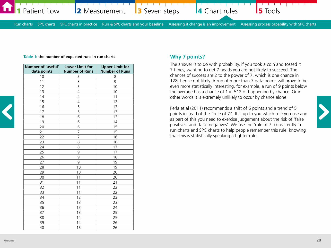
Table 1: the number of expected runs in run charts Why 7 points? The answer is to do with probability, if you took a coin and tossed it 7 times, wanting to get 7 heads you are not likely to succeed. The chances of success are 2 to the power of 7, which is one chance in 128, hence not likely. A run of more than 7 data points will prove to be even more statistically interesting, for example, a run of 9 points below the average has a chance of 1 in 512 of happening by chance. Or in other words it is extremely unlikely to occur by chance alone.
Perla et al (2011) recommends a shift of 6 points and a trend of 5 points instead of the “rule of 7”. It is up to you which rule you use and as part of this you need to exercise judgement about the risk of ‘false positives’ and ‘false negatives’. We use the ‘rule of 7’ consistently in run charts and SPC charts to help people remember this rule, knowing that this is statistically speaking a tighter rule.
Number of 'useful' data points
Lower Limit for Number of Runs
Upper Limit for Number of Runs
10 3 811 3 912 3 1013 4 1014 4 1115 4 1216 5 1217 5 1318 6 1319 6 1420 6 1521 7 1522 7 1623 8 1624 8 1725 9 1726 9 1827 9 1928 10 1929 10 2030 11 2031 11 2132 11 2233 11 2234 12 2335 13 2336 13 2437 13 2538 14 2539 14 2640 15 26
29© NHS Elect
1 Patient flow 2 Measurement 3 Seven steps 4 Chart rules 5 Tools
There are many rules to interpret SPC charts and the power of using specialist software is that these rules are flagged for you so you don’t need to remember them. The following page are an extract from Nelson (1984). Figure 16 describes these rules.
Figure 16: SPC chart rules
Run charts SPC charts SPC charts in practice Run & SPC charts and your baseline Assessing if change is an improvement Assessing process capability with SPC charts
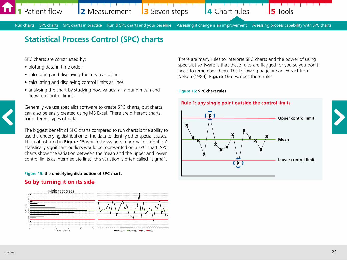
SPC charts are constructed by:
• plotting data in time order
• calculating and displaying the mean as a line
• calculating and displaying control limits as lines
• analysing the chart by studying how values fall around mean and between control limits.
Generally we use specialist software to create SPC charts, but charts can also be easily created using MS Excel. There are different charts, for different types of data.
The biggest benefit of SPC charts compared to run charts is the ability to use the underlying distribution of the data to identify other special causes. This is illustrated in Figure 15 which shows how a normal distribution’s statistically significant outliers would be represented on a SPC chart. SPC charts show the variation between the mean and the upper and lower control limits as intermediate lines, this variation is often called “sigma”.
Figure 15: the underlying distribution of SPC charts
So by turning it on its side
Statistical Process Control (SPC) charts
0 10 20 30 40 50
1 2 3 4 5 6 7 8 9
10 11 12 13 14 15 16 17 18
Number of men
Foot
size
Male feet sizes
P3 P4 P5 P6 P7 P8 P9 P10 P11 P12 P13 P14 P15 P16 P17 P18 P19 P20 P21 P22 P23 P24 P25 P26 P27 P28 P29 P30 P31 P32 P33 P34 P35
Foot size Average LCL UCL
P1 P2
Foot size Average LCL UCL
Rule 1: any single point outside the control limits
Upper control limit
Mean
Lower control limit
30© NHS Elect
1 Patient flow 2 Measurement 3 Seven steps 4 Chart rules 5 Tools
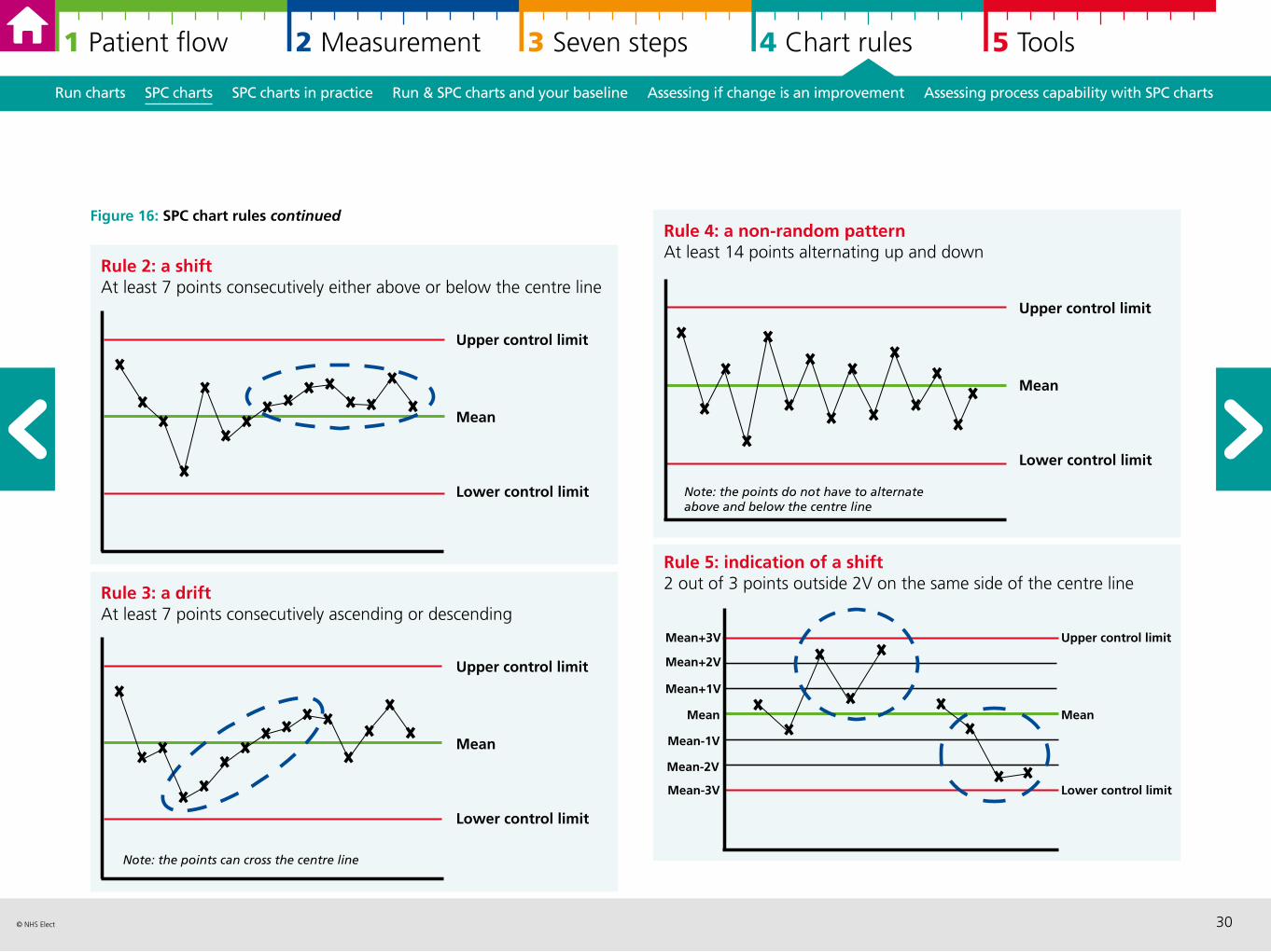
Rule 4: a non-random patternAt least 14 points alternating up and down
Run charts SPC charts SPC charts in practice Run & SPC charts and your baseline Assessing if change is an improvement Assessing process capability with SPC charts
Figure 16: SPC chart rules continued
Upper control limit
Mean
Lower control limit
Note: the points do not have to alternate above and below the centre line
Rule 2: a shiftAt least 7 points consecutively either above or below the centre line
Upper control limit
Mean
Lower control limit
Rule 3: a driftAt least 7 points consecutively ascending or descending
Upper control limit
Mean
Lower control limit
Note: the points can cross the centre line
Rule 5: indication of a shift2 out of 3 points outside 2V on the same side of the centre line
Mean+3V
Mean
Mean-3V
Mean+2V
Mean+1V
Mean-2V
Mean-1V
Upper control limit
Mean
Lower control limit
31© NHS Elect
1 Patient flow 2 Measurement 3 Seven steps 4 Chart rules 5 Tools
Run charts SPC charts SPC charts in practice Run & SPC charts and your baseline Assessing if change is an improvement Assessing process capability with SPC charts
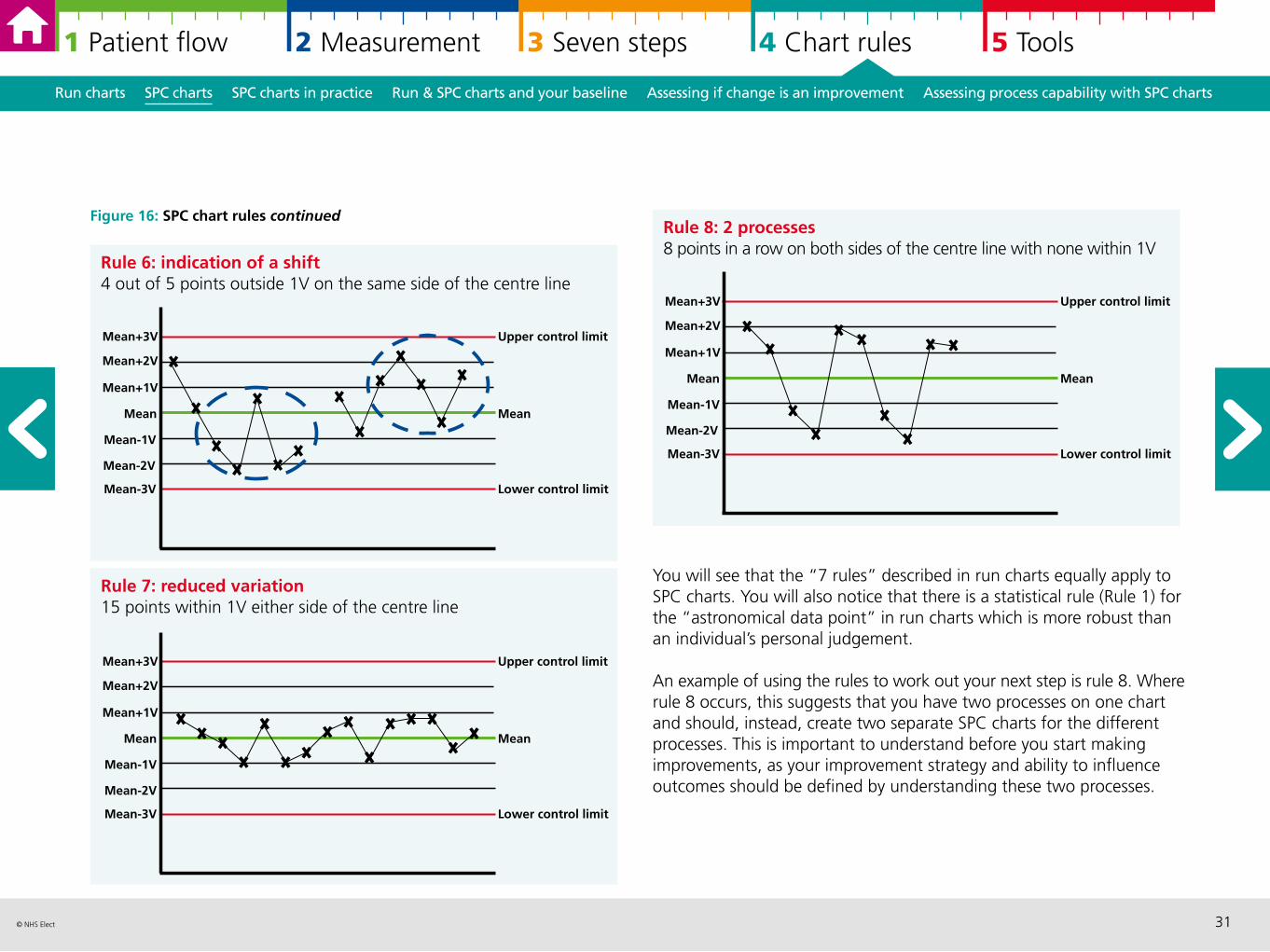
Figure 16: SPC chart rules continued
Mean+1V
Rule 7: reduced variation15 points within 1V either side of the centre line
Upper control limit
Mean
Lower control limit
Mean+3V
Mean
Mean-3V
Mean+2V
Mean-2V
Mean-1V
Rule 8: 2 processes8 points in a row on both sides of the centre line with none within 1V
Upper control limit
Mean
Lower control limit
Mean+3V
Mean
Mean-3V
Mean+2V
Mean+1V
Mean-2V
Mean-1V
Rule 6: indication of a shift4 out of 5 points outside 1V on the same side of the centre line
Mean+3V
Mean
Mean-3V
Mean+2V
Mean+1V
Mean-2V
Mean-1V
Upper control limit
Mean
Lower control limit
You will see that the “7 rules” described in run charts equally apply to SPC charts. You will also notice that there is a statistical rule (Rule 1) for the “astronomical data point” in run charts which is more robust than an individual’s personal judgement.
An example of using the rules to work out your next step is rule 8. Where rule 8 occurs, this suggests that you have two processes on one chart and should, instead, create two separate SPC charts for the different processes. This is important to understand before you start making improvements, as your improvement strategy and ability to influence outcomes should be defined by understanding these two processes.
32© NHS Elect
1 Patient flow 2 Measurement 3 Seven steps 4 Chart rules 5 Tools
Run charts SPC charts SPC charts in practice Run & SPC charts and your baseline Assessing if change is an improvement Assessing process capability with SPC charts
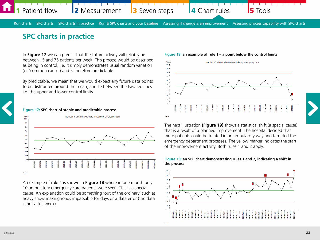
In Figure 17 we can predict that the future activity will reliably be between 15 and 75 patients per week. This process would be described as being in control, i.e. it simply demonstrates usual random variation (or ‘common cause’) and is therefore predictable.
By predictable, we mean that we would expect any future data points to be distributed around the mean, and lie between the two red lines i.e. the upper and lower control limits.
Figure 17: SPC chart of stable and predictable process
An example of rule 1 is shown in Figure 18 where in one month only 10 ambulatory emergency care patients were seen. This is a special cause. An explanation could be something ‘out of the ordinary’ such as heavy snow making roads impassable for days or a data error (the data is not a full week).
SPC charts in practice
Figure 18: an example of rule 1 – a point below the control limits
The next illustration (Figure 19) shows a statistical shift (a special cause) that is a result of a planned improvement. The hospital decided that more patients could be treated in an ambulatory way and targeted the emergency department processes. The yellow marker indicates the start of the improvement activity. Both rules 1 and 2 apply.
Figure 19: an SPC chart demonstrating rules 1 and 2, indicating a shift in the process
33© NHS Elect
1 Patient flow 2 Measurement 3 Seven steps 4 Chart rules 5 Tools
Run charts SPC charts SPC charts in practice Run & SPC charts and your baseline Assessing if change is an improvement Assessing process capability with SPC charts
As we know when the change has occurred both in practice and by looking at the data presented in SPC chart, we have sufficient information to recalculate the control limits around the change as illustrated in Figure 20.
Figure 20: an SPC chart demonstrating the increase in number of patients on AEC pathways
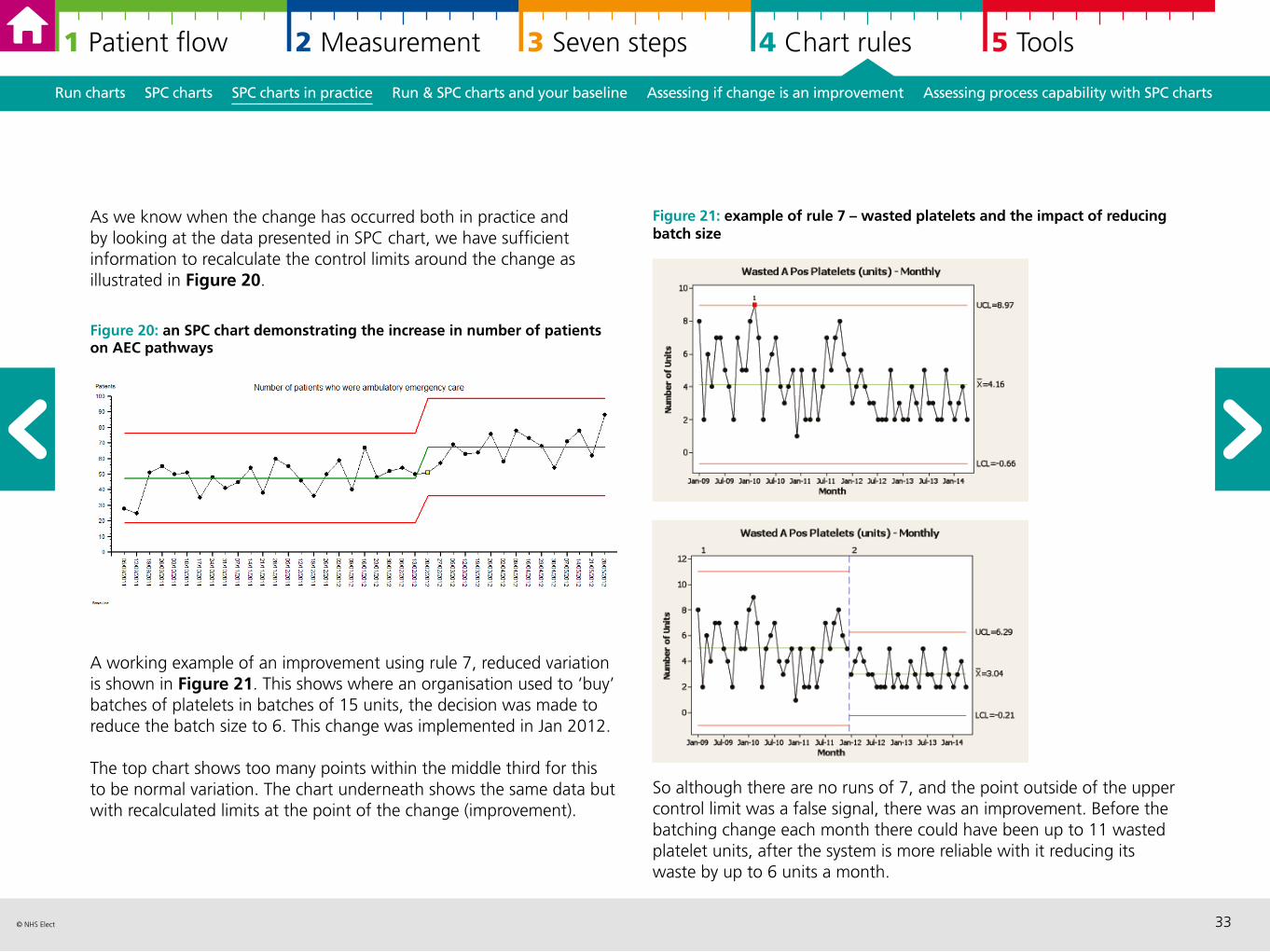
A working example of an improvement using rule 7, reduced variation is shown in Figure 21. This shows where an organisation used to ‘buy’ batches of platelets in batches of 15 units, the decision was made to reduce the batch size to 6. This change was implemented in Jan 2012.
The top chart shows too many points within the middle third for this to be normal variation. The chart underneath shows the same data but with recalculated limits at the point of the change (improvement).
Figure 21: example of rule 7 – wasted platelets and the impact of reducing batch size
So although there are no runs of 7, and the point outside of the upper control limit was a false signal, there was an improvement. Before the batching change each month there could have been up to 11 wasted platelet units, after the system is more reliable with it reducing its waste by up to 6 units a month.
34© NHS Elect
1 Patient flow 2 Measurement 3 Seven steps 4 Chart rules 5 Tools
Run charts SPC charts SPC charts in practice Run & SPC charts and your baseline Assessing if change is an improvement Assessing process capability with SPC charts
Noise, or common cause variation is the desirable state of a system before undertaking a Plan Do Study Act (PDSA) improvement cycle. If the system is unstable and unpredictable then we are not confident about assigning improvement to the PDSA, it could be external factors affecting the result.
Undertaking analysis before improvement allows you to develop a strong baseline. Using weekly data is a good starting point for understanding the baseline.
Sometimes the process that you are looking to improve will display seasonal variations which can be articulated statistically using the run of 7 points rule. If this is the case you can split the chart to understand what is normal for the different time periods (for example winter and summer) based on where the data runs start and end.
Run charts and SPC charts and your baseline
As illustrated, special cause signals can indicate that the changes you have made are an improvement in both run charts and SPC charts, if the change is in the right direction. By annotating your chart, you can make the important link in time when you made the change and when the statistical signal occurs.
You need both the statistical rules together with the evidence of change, to recalculate the median or the mean and control limits for run charts and SPC charts respectively.
Run charts and SPC charts assessing if change is an improvement
MODEL FOR IMPROVEMENT
PD
AS
35© NHS Elect
1 Patient flow 2 Measurement 3 Seven steps 4 Chart rules 5 Tools
Run charts SPC charts SPC charts in practice Run & SPC charts and your baseline Assessing if change is an improvement Assessing process capability with SPC charts
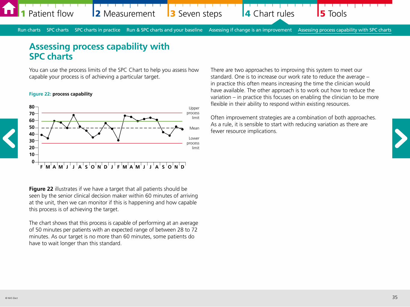
Assessing process capability with SPC charts You can use the process limits of the SPC Chart to help you assess how capable your process is of achieving a particular target.
Figure 22: process capability
Figure 22 illustrates if we have a target that all patients should be seen by the senior clinical decision maker within 60 minutes of arriving at the unit, then we can monitor if this is happening and how capable this process is of achieving the target.
The chart shows that this process is capable of performing at an average of 50 minutes per patients with an expected range of between 28 to 72 minutes. As our target is no more than 60 minutes, some patients do have to wait longer than this standard.
There are two approaches to improving this system to meet our standard. One is to increase our work rate to reduce the average – in practice this often means increasing the time the clinician would have available. The other approach is to work out how to reduce the variation – in practice this focuses on enabling the clinician to be more flexible in their ability to respond within existing resources.
Often improvement strategies are a combination of both approaches. As a rule, it is sensible to start with reducing variation as there are fewer resource implications.
F M A M J J A S O N D J F M A M J J A S O N D
8070605040302010
0
Upperprocess
limit
Lowerprocess
limit
Mean
36© NHS Elect
1 Patient flow 2 Measurement 3 Seven steps 4 Chart rules 5 Tools
5 Tools: further information and resources
Measurement checklist 37
Qualitative data analysis and questionnaire design 39
Pareto analysis and charts 41
Driver diagrams 43
Communicating well with numbers 45
“A cow’s perspective” 46
References and resources 47
Measurement checklist Qualitative data analysis Pareto analysis Driver diagrams Communicating with numbers “A cow’s perspective” References
37© NHS Elect
1 Patient flow 2 Measurement 3 Seven steps 4 Chart rules 5 Tools
Measurement checklist Qualitative data analysis Pareto analysis Driver diagrams Communicating with numbers “A cow’s perspective” References
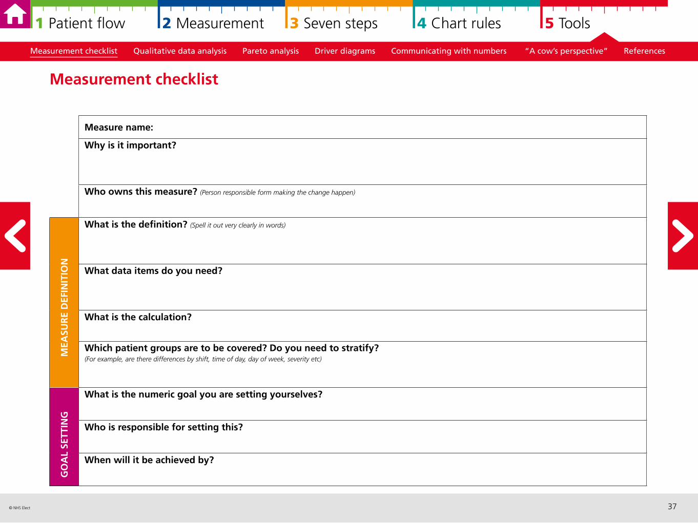
Measurement checklist
Measure name:
Why is it important?
Who owns this measure? (Person responsible form making the change happen)
What is the definition? (Spell it out very clearly in words)
What data items do you need?
What is the calculation?
Which patient groups are to be covered? Do you need to stratify? (For example, are there differences by shift, time of day, day of week, severity etc)
What is the numeric goal you are setting yourselves?
Who is responsible for setting this?
When will it be achieved by?
MEA
SUR
E D
EFIN
ITIO
NG
OA
L SE
TTIN
G
38© NHS Elect
1 Patient flow 2 Measurement 3 Seven steps 4 Chart rules 5 Tools
Measurement checklist Qualitative data analysis Pareto analysis Driver diagrams Communicating with numbers “A cow’s perspective” References
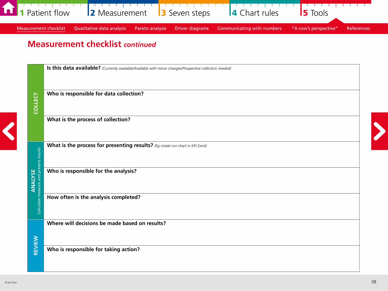
Measurement checklist continued
Is this data available? (Currently available/Available with minor changes/Prospective collection needed)
Who is responsible for data collection?
What is the process of collection?
What is the process for presenting results? (Eg create run chart in MS Excel)
Who is responsible for the analysis?
How often is the analysis completed?
Where will decisions be made based on results?
Who is responsible for taking action?
CO
LLEC
TA
NA
LYSE
Cal
cula
te m
easu
re a
nd
pre
sen
t re
sult
sR
EVIE
W
39© NHS Elect
1 Patient flow 2 Measurement 3 Seven steps 4 Chart rules 5 Tools
Measurement checklist Qualitative data analysis Pareto analysis Driver diagrams Communicating with numbers “A cow’s perspective” References
Qualitative data analysis and questionnaire design Qualitative data can give you an in-depth insight to describe situations, and understand underlying patterns and potentially causal relationships. Some aspects of health care need a stronger qualitative focus at least to sit alongside and/or inform the development of relevant quantitative measures.
Qualitative data can be collected in a variety of different ways and different formats, for example through observation, via interviews, written formats. Some examples include: focus groups, telephone interviewing, photos, videos, online forum discussion, and letters of complaints/compliments. You may come across tools and approaches that are based on qualitative methods, such as experience based design.
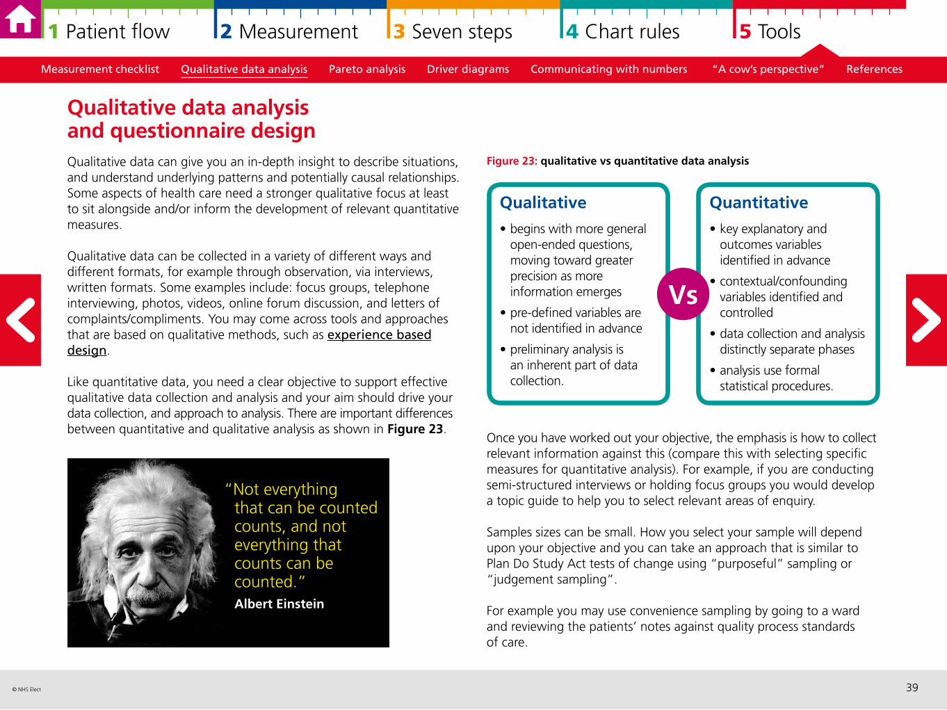
Like quantitative data, you need a clear objective to support effective qualitative data collection and analysis and your aim should drive your data collection, and approach to analysis. There are important differences between quantitative and qualitative analysis as shown in Figure 23.
Figure 23: qualitative vs quantitative data analysis
Once you have worked out your objective, the emphasis is how to collect relevant information against this (compare this with selecting specific measures for quantitative analysis). For example, if you are conducting semi-structured interviews or holding focus groups you would develop a topic guide to help you to select relevant areas of enquiry.
Samples sizes can be small. How you select your sample will depend upon your objective and you can take an approach that is similar to Plan Do Study Act tests of change using “purposeful” sampling or “judgement sampling”.
For example you may use convenience sampling by going to a ward and reviewing the patients’ notes against quality process standards of care.
“Not everything that can be counted counts, and not everything that counts can be counted.” Albert Einstein
Qualitative
• begins with more general open-ended questions, moving toward greater precision as more information emerges
• pre-defined variables are not identified in advance
• preliminary analysis is an inherent part of data collection.
Quantitative
• key explanatory and outcomes variables identified in advance
• contextual/confounding variables identified and controlled
• data collection and analysis distinctly separate phases
• analysis use formal statistical procedures.
Vs
40© NHS Elect
1 Patient flow 2 Measurement 3 Seven steps 4 Chart rules 5 Tools
Measurement checklist Qualitative data analysis Pareto analysis Driver diagrams Communicating with numbers “A cow’s perspective” References
Analysing qualitative data There are clear stages to analysing qualitative data. Firstly organise and sort your data – this usually involves some kind of coding and spending time reading and familiarising yourself with the information. The next stage is developing a framework which ultimately you will categorise and describe the categories or themes using the data itself. This is the main output of the analysis.
A tip throughout is being organised and making notes of ideas, connections as you go along. While there are specialist software packages, we find that spreadsheets such as MS Excel are useful as well.
From qualitative to quantitative and back againSometimes qualitative analysis will help you to select or develop a few relevant quantitative measures.
For example, analysis of complaints found that there was a recurring theme around patients being moved between wards too frequently. This could inform a baseline measure that focused how often patients are moved and their experience of being moved. The project team may choose to speak to patients and families throughout the improvement project and gain qualitative patient stories throughout. We would expect the proportion of complaints relating to “being moved” to reduce, and possibly the number of complaints about being moved to go down. However, our real outcome measure is the number of times patients are moved/improved experience of being moved.
Quantifying with surveys and questionnaires Sometimes the natural next phase is to develop a survey or questionnaire. A tip in developing any quantitative survey is to use the PDSA methodology and apply the seven steps carefully; paying particular attention to making sure the people responding interpret your questions as expected. There many resources available and a number of existing validated questionnaires.
Adjusted from: www.wirral.nhs.uk/document_uploads/Governance/QuestionnaireDesignTips.pdf
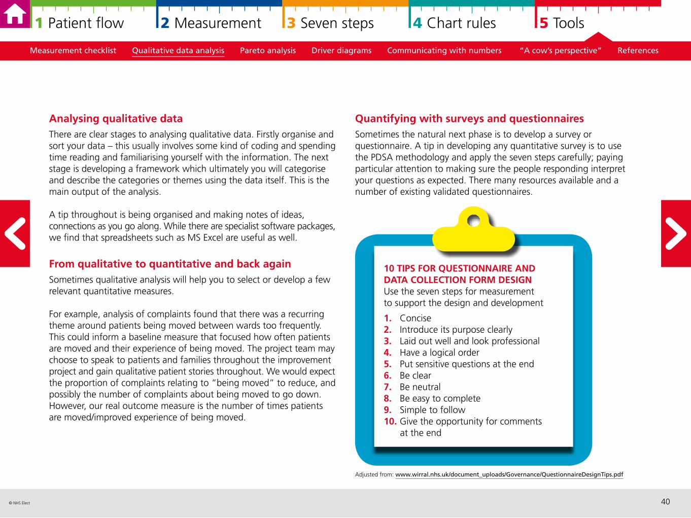
10 TIPS FOR QUESTIONNAIRE AND DATA COLLECTION FORM DESIGNUse the seven steps for measurement to support the design and development
1. Concise2. Introduce its purpose clearly 3. Laid out well and look professional4. Have a logical order5. Put sensitive questions at the end6. Be clear 7. Be neutral 8. Be easy to complete9. Simple to follow 10. Give the opportunity for comments
at the end
41© NHS Elect
1 Patient flow 2 Measurement 3 Seven steps 4 Chart rules 5 Tools
Measurement checklist Qualitative data analysis Pareto analysis Driver diagrams Communicating with numbers “A cow’s perspective” References
Resources As previously highlighted, this guide focuses on measurement for improvement rather than measurement for research (Solberg, 1997). Most of the qualitative literature describes qualitative research methods but the principles are still useful.
However in order to apply these principles to improvement projects, you need both the rigour of ‘seven steps’ and its pragmatism of collecting ‘just enough data’.
The previous pages indicates how you can do this in practice. There is particular attention on ensuring you have a clear objective, clear definition of what you want to collect and how you plan to collect and analyse it.
In terms of interviews and observations, we find that clinicians already have many skills to neutrally collect information from patients, relatives and other members of staff.
This one page article gives a practical example of qualitative research in practiceSeer K, ‘Qualitative data analysis’, Evid Based Nurs (2012) 15:2 doi:10.1136/ebnurs.2011.100352.
One of the original articles highlighting the importance of qualitative analysisPope J, Mays N, ‘Introduction to qualitative methods in health and health services research’, BMJ (1995) 311:42–45.
More tips on designing surveysHarrison C, (2007) ‘Questionnaire Design Tip Sheet’. Harvard University.
Pareto analysis is a technique which has two main benefits:
Firstly, it can categorize and stratify such things as errors, defects, delays, customer complaints or any other measures of your organisation’s processes so that you can identify which ones occur most often and are most important to address.
Secondly, it graphically displays the results in a Pareto chart or Pareto diagram so that the most significant items stand out from the overall picture.
The charts are named after an Italian economist, Vilfredo Pareto, who had observed that 80% of the land in Italy was owned by 20% of the population. Pareto later carried out surveys on a number of other countries and found to his surprise that a similar distribution applied. In the 1940s, quality management guru, Joseph M. Juran, suggested the 80/20 principle could be applied to almost anything, for example:
• 80% of patient complaints arise from 20% of your services
• 80% of delays in operations result from 20% of the possible causes of the delays
• 20% of your services account for 80% of your income.
So, in terms of service improvement, a large majority of problems are attributed to a few key causes and these are the ones that should be prioritised for action. Juran referred to these as the “vital few” and the “useful many”, to encapsulate the idea that by doing 20% of the work you can generate 80% of the benefit of doing the entire job. In service improvement, Pareto analysis is used to guide corrective action and to help the project team take action to fix the things that are causing the greatest number of problems first.
Pareto analysis and charts
42© NHS Elect
1 Patient flow 2 Measurement 3 Seven steps 4 Chart rules 5 Tools
Measurement checklist Qualitative data analysis Pareto analysis Driver diagrams Communicating with numbers “A cow’s perspective” References
This can be a useful reminder when you are selecting a project – there will always be more potential projects than you can possibly tackle at any point in time due to resource constraints (time, staff, money and so on), so select a project which will tackle one of the “vital few” issues rather than one of the “useful many”. Then ensure that you use the data from the Pareto chart to help you with the Specific – Measureable – Achievable elements of your aim statement, clearly explaining why the project was selected and the size of the problem/opportunity.
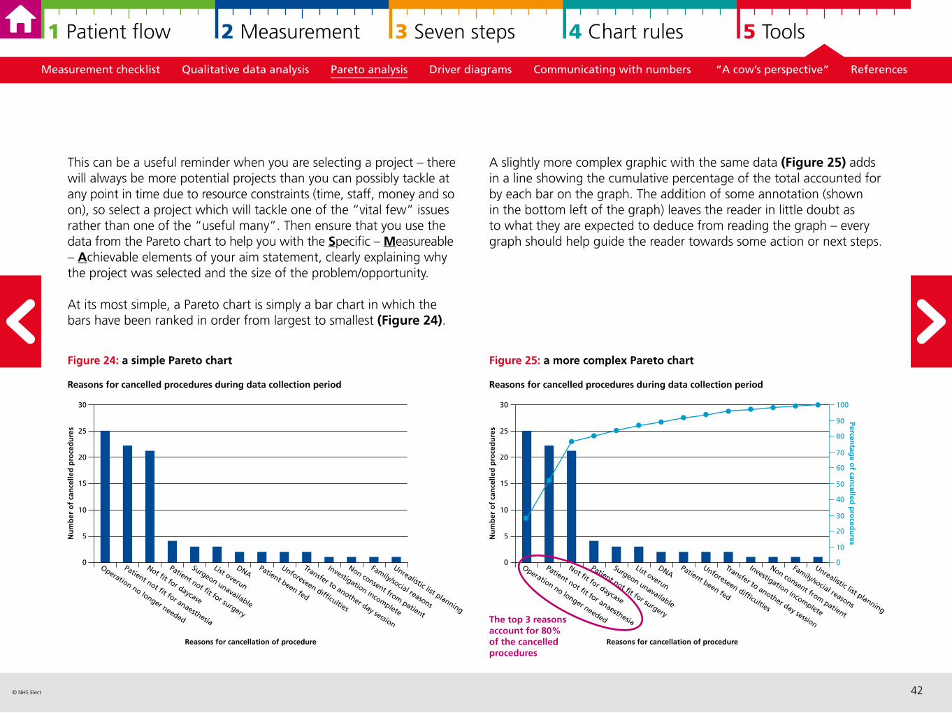
At its most simple, a Pareto chart is simply a bar chart in which the bars have been ranked in order from largest to smallest (Figure 24).
Figure 24: a simple Pareto chart
A slightly more complex graphic with the same data (Figure 25) adds in a line showing the cumulative percentage of the total accounted for by each bar on the graph. The addition of some annotation (shown in the bottom left of the graph) leaves the reader in little doubt as to what they are expected to deduce from reading the graph – every graph should help guide the reader towards some action or next steps.
Figure 25: a more complex Pareto chart
Operation no longer needed
Patient not fit for anaesthesia
Not fit for daycase
Patient not fit for surgery
Surgeon unavailable
List overun
DNAPatient been fed
Unforeseen difficulties
Transfer to another day session
Investigation incomplete
Non consent from patient
Family/social reasons
Unrealistic list planning
30
25
20
15
10
5
0
Nu
mb
er o
f ca
nce
lled
pro
ced
ure
s
Reasons for cancellation of procedure
Reasons for cancelled procedures during data collection period
The top 3 reasons account for 80% of the cancelled procedures
100
50
40
30
20
10
0
90
80
70
60
Percentag
e of can
celled p
roced
ures
43© NHS Elect
1 Patient flow 2 Measurement 3 Seven steps 4 Chart rules 5 Tools
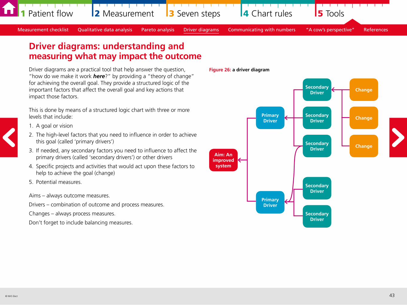
Figure 26: a driver diagram
Measurement checklist Qualitative data analysis Pareto analysis Driver diagrams Communicating with numbers “A cow’s perspective” References
Driver diagrams are a practical tool that help answer the question, “how do we make it work here?” by providing a “theory of change” for achieving the overall goal. They provide a structured logic of the important factors that affect the overall goal and key actions that impact those factors.
This is done by means of a structured logic chart with three or more levels that include:
1. A goal or vision
2. The high-level factors that you need to influence in order to achieve this goal (called ‘primary drivers’)
3. If needed, any secondary factors you need to influence to affect the primary drivers (called ‘secondary drivers’) or other drivers
4. Specific projects and activities that would act upon these factors to help to achieve the goal (change)
5. Potential measures.
Aims – always outcome measures.
Drivers – combination of outcome and process measures.
Changes – always process measures.
Don’t forget to include balancing measures.
Driver diagrams: understanding and measuring what may impact the outcome
Secondary Driver
Primary Driver Change
Change
Aim: An improved
system
Primary Driver
Secondary Driver
Secondary Driver
Secondary Driver
Secondary Driver
Change
44© NHS Elect
1 Patient flow 2 Measurement 3 Seven steps 4 Chart rules 5 Tools
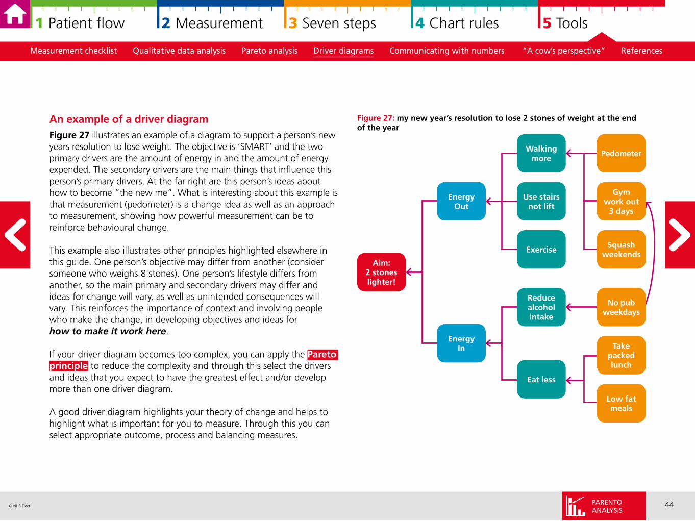
Figure 27: my new year’s resolution to lose 2 stones of weight at the end of the year
Measurement checklist Qualitative data analysis Pareto analysis Driver diagrams Communicating with numbers “A cow’s perspective” References
An example of a driver diagramFigure 27 illustrates an example of a diagram to support a person’s new years resolution to lose weight. The objective is ‘SMART’ and the two primary drivers are the amount of energy in and the amount of energy expended. The secondary drivers are the main things that influence this person’s primary drivers. At the far right are this person’s ideas about how to become “the new me”. What is interesting about this example is that measurement (pedometer) is a change idea as well as an approach to measurement, showing how powerful measurement can be to reinforce behavioural change.
This example also illustrates other principles highlighted elsewhere in this guide. One person’s objective may differ from another (consider someone who weighs 8 stones). One person’s lifestyle differs from another, so the main primary and secondary drivers may differ and ideas for change will vary, as well as unintended consequences will vary. This reinforces the importance of context and involving people who make the change, in developing objectives and ideas for how to make it work here.
If your driver diagram becomes too complex, you can apply the Pareto principle to reduce the complexity and through this select the drivers and ideas that you expect to have the greatest effect and/or develop more than one driver diagram.
A good driver diagram highlights your theory of change and helps to highlight what is important for you to measure. Through this you can select appropriate outcome, process and balancing measures.
Walking more
EnergyOut
Gym work out
3 days
Squashweekends
Aim: 2 stones lighter!
EnergyIn
Reduce alcohol intake
Eat less
Use stairs not lift
Exercise
Pedometer
Take packed lunch
Low fat meals
No pubweekdays
PARENTOANALYSIS
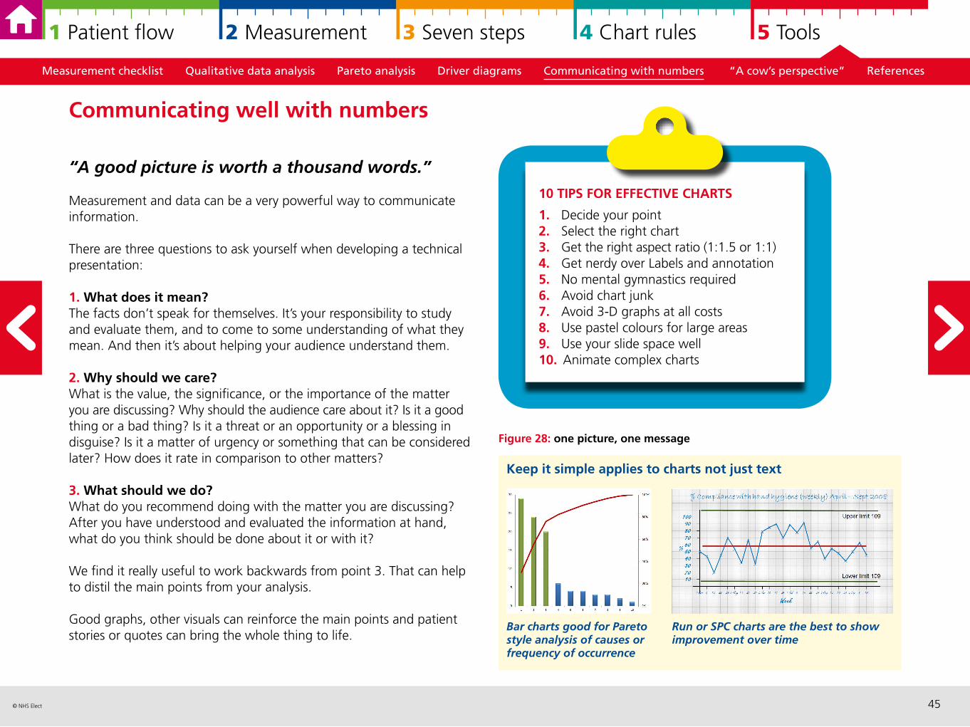
45© NHS Elect
1 Patient flow 2 Measurement 3 Seven steps 4 Chart rules 5 Tools
Figure 28: one picture, one message
Measurement checklist Qualitative data analysis Pareto analysis Driver diagrams Communicating with numbers “A cow’s perspective” References
“A good picture is worth a thousand words.”
Measurement and data can be a very powerful way to communicate information.
There are three questions to ask yourself when developing a technical presentation:
1. What does it mean? The facts don’t speak for themselves. It’s your responsibility to study and evaluate them, and to come to some understanding of what they mean. And then it’s about helping your audience understand them.
2. Why should we care? What is the value, the significance, or the importance of the matter you are discussing? Why should the audience care about it? Is it a good thing or a bad thing? Is it a threat or an opportunity or a blessing in disguise? Is it a matter of urgency or something that can be considered later? How does it rate in comparison to other matters?
3. What should we do?What do you recommend doing with the matter you are discussing? After you have understood and evaluated the information at hand, what do you think should be done about it or with it?
We find it really useful to work backwards from point 3. That can help to distil the main points from your analysis.
Good graphs, other visuals can reinforce the main points and patient stories or quotes can bring the whole thing to life.
Communicating well with numbers
10 TIPS FOR EFFECTIVE CHARTS
1. Decide your point2. Select the right chart3. Get the right aspect ratio (1:1.5 or 1:1)4. Get nerdy over Labels and annotation5. No mental gymnastics required6. Avoid chart junk7. Avoid 3-D graphs at all costs8. Use pastel colours for large areas9. Use your slide space well10. Animate complex charts
Keep it simple applies to charts not just text
Run or SPC charts are the best to show improvement over time
Bar charts good for Pareto style analysis of causes or frequency of occurrence
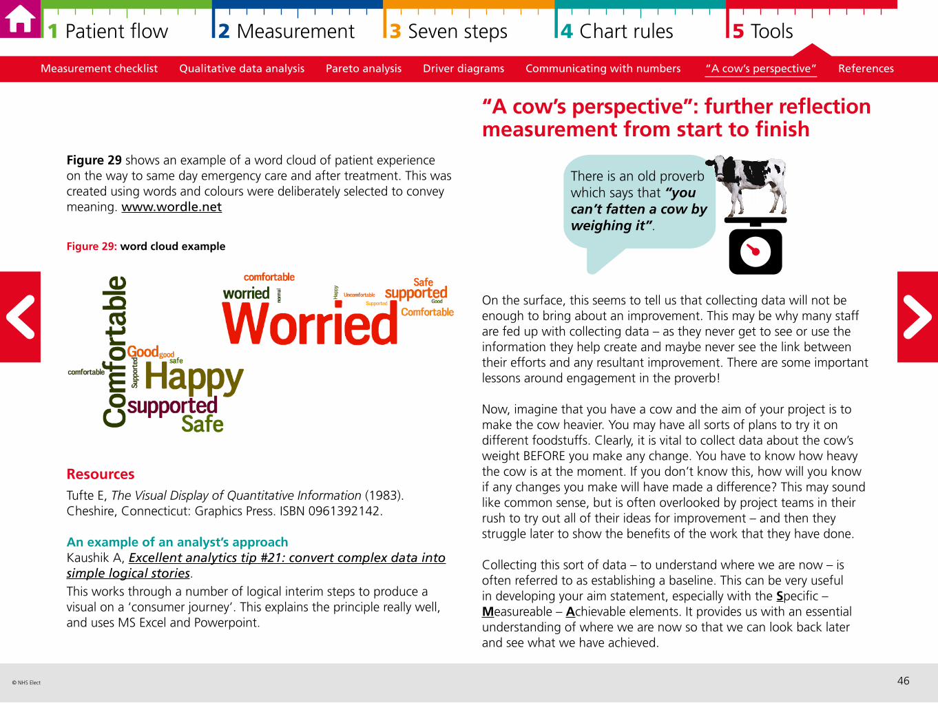
46© NHS Elect
1 Patient flow 2 Measurement 3 Seven steps 4 Chart rules 5 Tools
Figure 29 shows an example of a word cloud of patient experience on the way to same day emergency care and after treatment. This was created using words and colours were deliberately selected to convey meaning. www.wordle.net
Figure 29: word cloud example
Resources Tufte E, The Visual Display of Quantitative Information (1983). Cheshire, Connecticut: Graphics Press. ISBN 0961392142.
An example of an analyst’s approach Kaushik A, Excellent analytics tip #21: convert complex data into simple logical stories. This works through a number of logical interim steps to produce a visual on a ‘consumer journey’. This explains the principle really well, and uses MS Excel and Powerpoint.
Measurement checklist Qualitative data analysis Pareto analysis Driver diagrams Communicating with numbers “A cow’s perspective” References
On the surface, this seems to tell us that collecting data will not be enough to bring about an improvement. This may be why many staff are fed up with collecting data – as they never get to see or use the information they help create and maybe never see the link between their efforts and any resultant improvement. There are some important lessons around engagement in the proverb!
Now, imagine that you have a cow and the aim of your project is to make the cow heavier. You may have all sorts of plans to try it on different foodstuffs. Clearly, it is vital to collect data about the cow’s weight BEFORE you make any change. You have to know how heavy the cow is at the moment. If you don’t know this, how will you know if any changes you make will have made a difference? This may sound like common sense, but is often overlooked by project teams in their rush to try out all of their ideas for improvement – and then they struggle later to show the benefits of the work that they have done.
Collecting this sort of data – to understand where we are now – is often referred to as establishing a baseline. This can be very useful in developing your aim statement, especially with the Specific – Measureable – Achievable elements. It provides us with an essential understanding of where we are now so that we can look back later and see what we have achieved.
“A cow’s perspective”: further reflection measurement from start to finish
There is an old proverb which says that “you can’t fatten a cow by weighing it”.
47© NHS Elect
1 Patient flow 2 Measurement 3 Seven steps 4 Chart rules 5 Tools
Then as you try out your ideas – maybe feeding the cow with cornflakes or rice crispies every day – you need to be collecting data to see if these ideas are making a difference. How heavy is the cow now? Has it put any weight on? Don’t forget that whilst your ideas may seem great, there is always a chance that the cow might lose weight! Not all change is a change for the best and you need to be constantly collecting and analysing the data to see what is happening.
Finally, repeating the measurement after you have made a change allows you to measure the impact of what you have done but also it helps you to check that the change is sustainable. It would be a shame if you made a change which showed an improvement whilst the project was running but then the gains were lost because once the project stopped, things went back to how they used to be. Useful measures should become routine practice in the department which are regularly reviewed with all staff involved which helps to improve shared understanding of performance and goals.
Measurement checklist Qualitative data analysis Pareto analysis Driver diagrams Communicating with numbers “A cow’s perspective” References
Model for improvement Langley GJ, Nolan KM, Norman CL, Provost LP, Nolan TW. The Improvement Guide: A Practical Approach to Enhancing Organizational Performance. New York; Jossey-Bass, 1996. 2nd edition, Wiley Desktop Editions, 2009.
Useful web-based resources Institute for Healthcare Improvement website
Useful overview of 7 steps to measurement for improvement Davidge M, Measurement for improvement 10 minute video. www.youtube.com/watch?v=Za1o77jAnbw
Variation and Statistical Process Control (SPC)A great introduction to variation and SPCWheeler D, Understanding Variation – the Key to Managing Chaos. Knoxville; SPC Press, 2nd edition, 2000.
All you ever wanted to know about control chartsWheeler D, Making sense of data, SPC for the service sector. Knoxville; SPC Press, 2003.
Introduction to run chartsPerla R, Provost L, Murray S, ‘The run chart: a simple analytical tool for learning from variation in healthcare processes’, BMJ Qual Saf, (2011) 20:46e51. doi:10.1136/bmjqs. 2009.037895.
The article we use for control chart rulesNelson L, ‘The Shewhart Control Chart – Tests for Special Causes’, Technical Aids, Journal of Quality Technology, (1984) 16:238–239.
References and resources
48© NHS Elect
1 Patient flow 2 Measurement 3 Seven steps 4 Chart rules 5 Tools
Visualising data The book on displaying your data using excel Smith JM, Meaningful Graphs, Smith JM, 2014.
Video demonstrates power of strong visual display of data (world development focus)Rosling H, Hans Rosing shows the best stats you’ve ever seen, (2006) accessed 06/03/15.
SamplingDetail overview of sampling for improvementPerla RJ, Provost LP, Murray, SK, ‘Sampling Considerations for Health Care Improvement’, Q Manage Health Care, (2013) 22(1): 36–47.
World Health Organisations description of different types of sampling for qualitative data (useful for ‘Plan Do Study Act’ samples)World Health Organisation, ‘5.3 Purposeful sampling for qualitative studies’ and ‘5.4 Probability sampling methods for quantitative studies’ in How to Investigate the Use of Medicines by Consumers, WHO, 2004.
Measurement Original article for the three faces of performance measurement Solberg L, Mosser G, McDonald S, ‘The three faces of performance measurement: improvement, accountability, and research’, Jt Comm J Qual Improv, (1997) 23(3):135–47.
Measurement checklist Qualitative data analysis Pareto analysis Driver diagrams Communicating with numbers “A cow’s perspective” References
Comprehensive overview of measuring quality and different types of measurement and approachesRaleigh VS, Foot C, Getting the measure of quality: opportunities and challenges 2010, King’s Fund, London.
Donabedian’s original work republished Donabedian A, ‘Evaluating the Quality of Medical Care’, The Milbank Quarterly, (2005) 83(4):691–729.
Useful websites/blogswww.davisdatasanity.com Davis Balestracci is an experienced improvement practitioner and statistician who makes data an enjoyable read!
www.kurtosis.co.uk Neil Pettinger is an Information Manager by background and covers a range of topics around data analysis and presentation.
www.staceybarr.comStacey Barr is an Australian who has a background in performance measurement so really speaks to those who think KPIs are the be-all and end-all.
49© NHS Elect
1 Patient flow 2 Measurement 3 Seven steps 4 Chart rules 5 Tools
AcknowledgementsAuthorsMike Davidge, Mike Holmes, Annabel Shaw, Susanna Shouls and Matt Tite
© NHS Elect, February 2015
Design by Sign
Related Documents