1 Accelerating Change in Your Organization Accelerating Change in Your Organization Using Six Sigma Using Six Sigma Prepared for CQAA February 19, 2004 by Dr. Nancy Eickelmann Team Contributors: Dr. Jongmoon Baik, Animesh Anant Software and System Engineering Research Laboratory MOTOROLA LABS

Welcome message from author
This document is posted to help you gain knowledge. Please leave a comment to let me know what you think about it! Share it to your friends and learn new things together.
Transcript

1
Accelerating Change in Your Organization Accelerating Change in Your Organization Using Six SigmaUsing Six Sigma
Prepared for CQAA February 19, 2004
byDr. Nancy Eickelmann
Team Contributors: Dr. Jongmoon Baik, Animesh Anant
Software and System Engineering Research Laboratory
MOTOROLA LABS

2
OutlineOutlineOutlineOutline
• Change Acceleration with Six Sigma• How do we use DMAIC for change?• How do we control variation?• Conclusion

3
What is Six Sigma?What is Six Sigma?What is Six Sigma?What is Six Sigma?
“Six Sigma is a 4-step high performance system to execute business strategy.” Matt Barney, Motorola Inc.
1. Align executives to the right objectives and targets
2. Mobilize improvement teams
3. Accelerate results
4. Govern sustained improvement
http://www.asq.org/pub/sixsigma/motorolafigs.html

4
Accelerating Change - WhatAccelerating Change - What Accelerating Change - WhatAccelerating Change - What
• Create a Community of Practice• Create a Community of Practicioners, i.e.,
– MBB, BB, GB
• Foster a Quality Culture that Institutionalizes Best Practices and Change for Improvement
• Maintain Strategic Focus

5
Accelerating Change - HowAccelerating Change - HowAccelerating Change - HowAccelerating Change - How
Technological Change Desired Time to Adapt
Skills
Procedures
Strategy
Structure
Culture
Level of Adaptation Required
Dimensions of technology transition adapted from [CMU/SEI-93-TR-3].
• Building a shared vision
• Making mental models explicit
• Promoting skill mastery
• Supporting team learning

6
How Do We Use DMAIC for Change? How Do We Use DMAIC for Change?

7
DMAIC: Six Sigma MethodologyDMAIC: Six Sigma MethodologyDMAIC: Six Sigma MethodologyDMAIC: Six Sigma Methodology
DEFINE•Identify customers•Define product/service scope & goals•Define expectations
MEASURE•Process mapping and analysis•Collect data from the process•Calculate sigma level
ANALYSIS•Identify gaps between current and goal performances•Prioritize opportunities to improve •Identify sources of variation
IMPROVE•Create solutions for the problems•Develop implementation plan
CONTROL•Prevent reverting back to the old way •Control the process performance
8
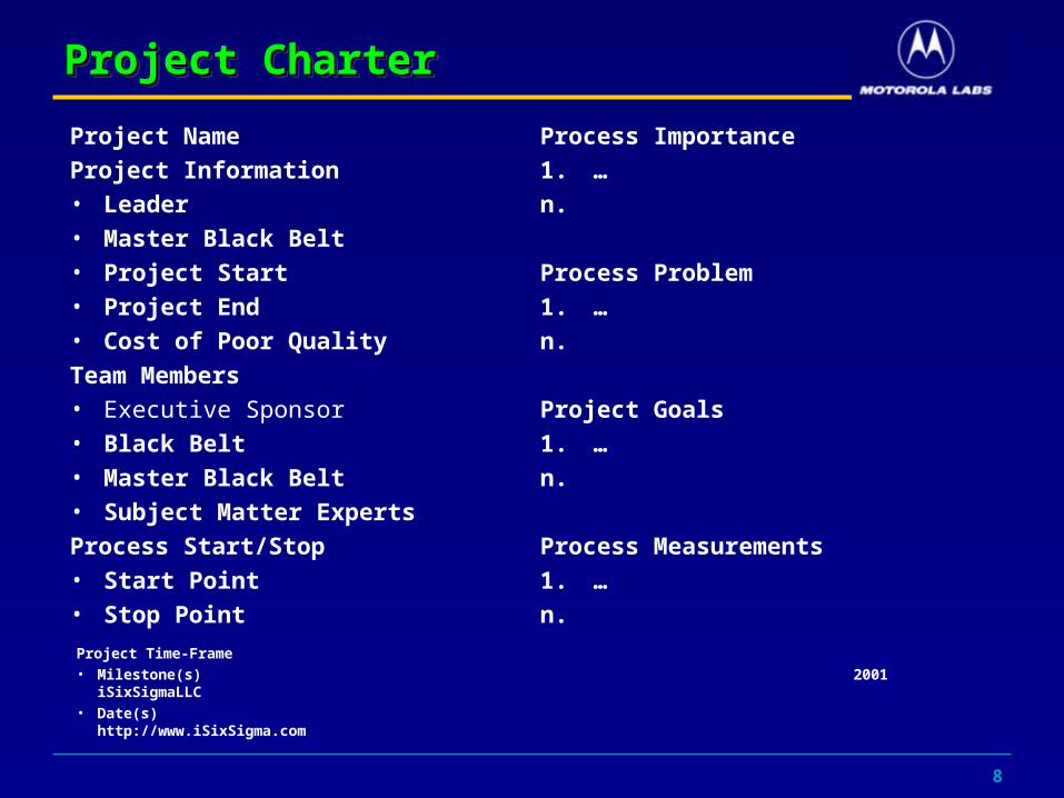
Project CharterProject CharterProject CharterProject Charter
Project Name
Project Information• Leader• Master Black Belt• Project Start• Project End• Cost of Poor Quality
Team Members• Executive Sponsor• Black Belt• Master Black Belt• Subject Matter Experts
Process Start/Stop• Start Point• Stop Point
Process Importance
1. …
n.
Process Problem
1. …
n.
Project Goals
1. …
n.
Process Measurements
1. …
n.
Project Time-Frame• Milestone(s) 2001 iSixSigmaLLC• Date(s) http://www.iSixSigma.com

9
Applying DOEApplying DOEApplying DOEApplying DOE
1. State the Problem with Clarity
2. Select the Output or Response Variables
3. Identify the Process Variables
4. Select the Factor Levels and Ranges of Factor Settings
5. Select the Appropriate Experimental Design
6. Plan the Experiment
7. Execute the Experiment
8. Analyze and Interpret the Results

10
Step 1:State the Problem with ClarityStep 1:State the Problem with ClarityStep 1:State the Problem with ClarityStep 1:State the Problem with Clarity
Defect Prevention is the most cost-effective means of producing high quality software.
Fagan Inspections (FIs) have been shown to be an effective technique of defect prevention.
Motorola has modified this process and performs Modified Fagan Inspections (MFIs) and Formal Technical Reviews (FTRs)
Does it make a difference whether we use: 1. Fagan Inspections 2. Modified Fagan Inspections 3. Formal Technical Reviews

11
Comparison of FI – MFI - FTRComparison of FI – MFI - FTRComparison of FI – MFI - FTRComparison of FI – MFI - FTR
Category MOT_FTR MOT_Insp NASA
Staff 1 4 5
Size (pages) 31.09 4.62 38Detection
Effort (staff-hours) 16.39 3.98 17.5
Preparation Rate
(Pages/hour) 10.11 0.89 4.08Average Defects 2.2 7.36 16
Defects/page 0.13 5.24 0.42
6-Point Kiviat Analysis
0
10
20
30
40Staff
Size (pages)
Detection Effort (staff-hours)
Preparation Rate (Pages/hour)
Average Defects
Defects/page
MOT_FTR
MOT_Insp
NASA
Kiviat AnalysisKiviat Analysis

12
Comparison of MFI - FTRComparison of MFI - FTRComparison of MFI - FTRComparison of MFI - FTR
Summary of measures
• Number of Staff per
Inspection/FTR
• Staff effort expended in
preparation and meeting time
• Preparation Rate per Page
• Preparation Rate per LOC
• Average Defects Found
• Defects per KSLOC
** The p-value (Prob > F) for every measure is statistically significant. The means for Inspections versus FTRs are significantly different for every measure.
Sta
ff
0
10
20
a b c
Group
Pre
p R
ate
(pag
es/h
r)
0
50
100
150
200
250
a b c
Group
Pre
p R
ate
(LO
C/h
r)
0
1000
2000
3000
4000
5000
6000
7000
8000
9000
a b c
Group
Sta
ff E
ffort
-10
10
30
50
70
90
110
a c
Group
Def
ects
/Pag
e
0
10
20
30
40
a b c
Group

13
Step 2:Step 2: Select the Output or Response VariablesSelect the Output or Response VariablesStep 2:Step 2: Select the Output or Response VariablesSelect the Output or Response Variables
• The output variables selected were:
– staff hours of effort per Inspection/FTR– staff hours of effort per sub-activity– defects found per Inspection/FTR

14
Step 3: Identify the Process VariablesStep 3: Identify the Process VariablesStep 3: Identify the Process VariablesStep 3: Identify the Process Variables
Fagan Inspections: Average Effort per FI Process StepAverage Effort per FI Process Step

15
Step 3: Identify the Process VariablesStep 3: Identify the Process VariablesStep 3: Identify the Process VariablesStep 3: Identify the Process Variables
• Number of process steps• Overview effort• Planning effort• Meeting effort• Preparation effort• Preparation rate• Meeting Rate
PLANNING OVERVIEW PREPARATION MEETING REWORK FOLLOW-UP
THIRD HOUR
PLANNING STUDY MEETING FOLLOW-UP
NASA/JPL Formal Inspection Process
Motorola CGISS Forma Technical Review Process

16
Step 4: Select the Factor Levels and Step 4: Select the Factor Levels and Ranges of Factor SettingsRanges of Factor Settings
Step 4: Select the Factor Levels and Step 4: Select the Factor Levels and Ranges of Factor SettingsRanges of Factor Settings
Table 1. High Low Conditions by Experimental Factor Simulation Run/Condition
Factor1 Team Size
Factor 2 # SLOC/Pages
Factor 3 # Defects
1 3 100 5 2 7 600 5 3 3 100 5 4 7 600 5 5 3 100 50 6 3 600 50 7 3 100 50 8 7 600 50

17
Step 5: Select the Experimental DesignStep 5: Select the Experimental DesignStep 5: Select the Experimental DesignStep 5: Select the Experimental Design
• The design selected was a 23 Full Factorial that evaluates 3 input factors for inspections:
• Team Size• Product Size• Estimated Fault Density
• Two of these factors (team size and product size inspected) are both measurable and controllable by management.
• The third factor number of initial defects is considered uncontrolled but measurable and a key factor.

18
Step 6 & 7: Plan & Execute the ExperimentStep 6 & 7: Plan & Execute the ExperimentStep 6 & 7: Plan & Execute the ExperimentStep 6 & 7: Plan & Execute the Experiment
Pattern 111 112 121 122 211 212 221 222
*Staff 3 3 3 3 7 7 7 7
Detection Effort (staff-hours)
2.58 9.95 3.44 13.86 5.73 23.51 7.77 32.83
Preparation Rate (Pages/hr)
7.06 9.74 4.88 6.96 7.41 9.54 5.29 6.73
*Size (pages) 2.94 17.65 2.94 17.65 2.94 17.65 2.94 17.65
Defects/Page 0.03 0.07 3.53 1.13 0.50 0.14 7.03 1.68
Average Defects
0.1 1.26 10.38 19.9 1.46 2.44 20.68 29.56

19
Step 8: Analyze and Interpret the ResultsStep 8: Analyze and Interpret the ResultsStep 8: Analyze and Interpret the ResultsStep 8: Analyze and Interpret the Results
Effect Tests Source Nparm DF Sum of Squares F Ratio Prob > F No. of Inspectors 1 1 63.28125 2392.486 0.0130 Estimated Faults 1 1 708.00845 26767.81 0.0039 Size 1 1 52.73645 1993.817 0.0143 No. of Inspectors*Estimated Faults 1 1 37.93205 1434.104 0.0168 No. of Inspectors*Size 1 1 0.08405 3.1777 0.3255 Estimated Faults*Size 1 1 33.04845 1249.469 0.0180
Parameter Estimate Population Term Original Orthog Coded Orthog t-Test Prob>|t| Intercept 10.72250 10.72250 186.4783 0.0034 No. of Inspectors[3] -2.81250 -2.81250 -48.9130 0.0130 Estimated Faults[5] -9.40750 -9.40750 -163.609 0.0039 Size[100] -2.56750 -2.56750 -44.6522 0.0143 No. of Inspectors[3]*Estimated Faults[5] 2.17750 2.17750 37.8696 0.0168 No. of Inspectors[3]*Size[100] -0.10250 -0.10250 -1.7826 0.3255 Estimated Faults[5]*Size[100] 2.03250 2.03250 35.3478 0.0180

20
Step 8: Analyze and Interpret the ResultsStep 8: Analyze and Interpret the Results Step 8: Analyze and Interpret the ResultsStep 8: Analyze and Interpret the Results
Pareto Plot of Transformed Estimates
Estimated Faults [5]
No. of Inspectors [3]
Size[100]
No. of Inspectors [3]*Estimated Faults [5]
Estimated Faults [5]*Size[100]
No. of Inspectors [3]*Size[100]
Term
-9.4075000
-2.8125000
-2.5675000
2.1775000
2.0325000
-0.1025000
Orthog Es timate

21
Improve based on quantitative resultsImprove based on quantitative resultsImprove based on quantitative resultsImprove based on quantitative results
6-Point Kiviat Analysis for 3-factor, 2-level experiment
0
4
8
12
16
20
24
28
32
36
Staff
Detection Effort (staf f-hours)
Preparation Rate (Pages/hr)
Size (pages)
Defects/Page
Average Defects
Pattern 111
Pattern 112
Pattern 121
Pattern 122
Pattern 211
Pattern 212
Pattern 221
Pattern 222
6 – Point Kiviat Analysis6 – Point Kiviat Analysis
The results for each trial of the simulation are plotted on the Kiviat Chart.

22
DMAIC: Six Sigma MethodologyDMAIC: Six Sigma MethodologyDMAIC: Six Sigma MethodologyDMAIC: Six Sigma Methodology
DEFINE•Identify customers•Define product/service scope & goals•Define expectations
MEASURE•Process mapping and analysis•Collect data from the process•Calculate sigma level
ANALYSIS•Identify gaps between current and goal performances•Prioritize opportunities to improve •Identify sources of variation
IMPROVE•Create solutions for the problems•Develop implementation plan
CONTROL•Prevent reverting back to the old way •Control the process performance

23
Control - Input VariablesControl - Input VariablesControl - Input VariablesControl - Input Variables
0
20
40
60
80
100
120
140
Count P
er
Unit
for
Delta
Siz
e
7 14 21 28 35 42 49 56 63 70 77 84 91
Avg=31.09
LCL=14.36
UCL=47.82
U chart of Size/FTR
U Chart of # Staff/FTR outliers removed
0
2
4
6
8
10
12
14
Count fo
r # P
rep R
evie
wers
7 14 21 28 35 42 49 56 63 70 77 84
Avg=4.56
LCL
UCL=10.96

24
Control – Process VariablesControl – Process VariablesControl – Process VariablesControl – Process Variables
0
10
20
30
40
50
60
70
80
90
100
Count P
er
Unit
for
Pre
p R
ate
7 14 21 28 35 42 49 56 63 70 77 84 91
Avg=10.11
LCL=0.57
UCL=19.65
U Chart of Preparation Rate/FTR
U chart of Defect Detection Effort/FTR
0
20
40
60
80
100
120
Cou
nt P
er U
nit f
or D
efec
t Det
ectio
n E
ffor
t
7 14 21 28 35 42 49 56 63 70 77 84 91
Avg=16.22
LCL=4.14
UCL=28.30

25
Control – Response VariablesControl – Response VariablesControl – Response VariablesControl – Response Variables
U-chart of Fault Density/FTR
0
5
10
15
20
25
Cou
nt P
er U
nit f
or T
otal
Fau
lts
7 14 21 28 35 42 49 56 63 70 77 84 91
Avg=2.20
LCL
UCL=6.64
U Chart of Faults/FTR
0.0
0.1
0.2
0.3
0.4
0.5
0.6
0.7
0.8
0.9
1.0
Cou
nt P
er U
nit f
or F
ault
Den
sity
7 14 21 28 35 42 49 56 63 70 77 84 91
Avg=0.075
LCL
UCL=0.898

26
How Do We Use SPC to Control Variation? How Do We Use SPC to Control Variation?

27
SPC and PredictabilitySPC and PredictabilitySPC and PredictabilitySPC and Predictability
• Shewhart (1931-1980) defined control as:
“A phenomenon will be said to be controlled when, through the use of past experience, we can predict, at least within limits, how the phenomenon will vary in the future. Here it is understood that prediction within limits means that we can state, at least approximately, the probability that the observed phenomenon will fall within given limits.”

28
SPC and VariationSPC and VariationSPC and VariationSPC and Variation
• Processes are executed with inherent variation • Measurements or counts collected on a process will
also vary• Quantifying the process variation is key to
improvement• Understanding causes of variation dictates the
appropriate action in response to that variation

29
SPC and VariationSPC and VariationSPC and VariationSPC and Variation
• Common Causes of Variation– Any unknown or random cause of variation is a common
cause – Common cause variation within predictable limits is a
controlled system or constant system– Common cause variation is addressed through long-term
process improvement efforts
• Special Causes of Variation– Variation that is not part of the constant system is an
assignable or special cause of variation– Special cause variation is an uncontrolled or unstable
system– SPC specifically addresses the identification and
elimination of special causes of variation

30
SPC Data Visualization ToolsSPC Data Visualization ToolsSPC Data Visualization ToolsSPC Data Visualization Tools
Time plots or run charts
20 or more points plotted against the median
Meeting Duration
0
0.5
1
1.5
1 2 3 4 5 6 7 8 9 10 11 12
Build
Dura
tion
(Day
s)
VH
H
N
L
VL
• Run charts show trends or patterns
• Provide visibility into process variation
• Compare before and after a change
• Detect trends, shifts, and cycles in the process

31
SPC Data Visualization ToolsSPC Data Visualization ToolsSPC Data Visualization ToolsSPC Data Visualization Tools
Frequency plot or histogram
0
500
1000
1500
2000
2500
3000
3500
• Frequency plot or histogram graphically depicts the distribution
• Height of the column indicates the frequency a value occurs
• Reveals the centering, spread, and variation of the data

32
SPC Data Visualization ToolsSPC Data Visualization ToolsSPC Data Visualization ToolsSPC Data Visualization Tools
Pareto charts
The pareto principle implies that we can attack problems by focusing on a vital few sources
Pareto Plot of Transformed Estimates
Estimated Faults [5]
No. of Inspectors [3]
Size[100]
No. of Inspectors [3]*Estimated Faults [5]
Estimated Faults [5]*Size[100]
No. of Inspectors [3]*Size[100]
Term
-9.4075000
-2.8125000
-2.5675000
2.1775000
2.0325000
-0.1025000
Orthog Es timate
• Pareto charts depict categorical data
• Height or (length) of each bar represents relative importance
• Bars are arraqnged in descending order left to right (top to bottom)
• Bar for the biggest problem is on the left or the (top)
• Vertical axis height (length) is the sum of all bars

33
SPC Data Visualization ToolsSPC Data Visualization ToolsSPC Data Visualization ToolsSPC Data Visualization Tools
Control charts
Centerline calculation uses the mean not the median
Limits for individual charts require 24 data points
0
100
200
300
400
500
600
Count fo
r S
ize
16 32 48 64 80 96 112 128 144 160 176 192 208 224
Avg=125.00
LCL=7.00
UCL=250.00
• Control charts plot time-ordered data with statistically determined control limits
• Statistical control limits establish process capability
• Differentiates common from special causes
• Useful with all data types
• Provides a common language for process performance

34
How to Construct a Control ChartHow to Construct a Control ChartHow to Construct a Control ChartHow to Construct a Control Chart
• Select the process to be charted• Determine the sampling method and plan• Initiate the data collection• Calculate the appropriate statistics• Plot the data values on the first chart(mean, median
or individuals)• Plot the range or standard deviation of the data on
the second chart (only for continuous data)• Interpret the control chart and determine if the
process is “in control”

35
Process SchematicProcess SchematicProcess SchematicProcess Schematic
Output Variables
UncontrolledProcess
Variables
Input Variables
Controlled Process
Variables
Process
Input Variables
Raw materials
Labor
Energy
Controlled
Pressure
Flow Rate
Uncontrolled
Shift
Team
Output
Yield
Waste or defects

36
Data SamplingData SamplingData SamplingData Sampling
Sampling Approach
Population or Process Data Sample
Random Sampling
Equal chance of selection
Stratified Random Sampling
Proportionate number from each group
Systematic Sampling X1X2 X3 X4 X2 X4
Every nth one
Subgroup Sampling
X X X XX X X X X X XX X X X
N units every ith time, calculate a mean for each subgroup
X X X XX X X X X X X X X
X X X XX X X X X X X X X
X X X X X
X XX X X
X

37
Control ChartsControl ChartsControl ChartsControl ChartsControl Chart Data type Notation
c chart Discrete count C = count of occurrences
u chart Discrete
count
U = c/a
(a = area of possibility)
p chart Discrete
fraction
P = x/n
(x = # defective units,
n = # units per subgroup)
np chart Discrete
Fraction(ct)
n must be roughly constant
Fraction must be based on counts
Individuals
chart
Continuous
Variable(s) data
X = individual measurement
X bar, R
chart
Variables data, sets of measures
N = # items in subgroup
X = individual measurement
Xbar = subgroup average
R = range of subgroup values

38
Control Chart AssumptionsControl Chart AssumptionsControl Chart AssumptionsControl Chart Assumptions
Distribution Related Control Charts
Assumptions
Normal distribution
Used for individuals charts, Xbar, R charts, EWMA charts
Data distributed symmetrically around a mean, peak of curve at the mean
Binomial distribution
Used for p charts P is constant across subgroups, occurences are independent
Poisson distribution
Used for c charts Probability of occurence is constant, occurences are independent and rare

39
Control Chart SelectionControl Chart SelectionControl Chart SelectionControl Chart Selection
p
Start
Type of data
Do the limits look right?
Individual orsubgroup
Equal opportunity
Equal sample
sizes
Detect small shifts
quickly
Item with attribute or
counting
EWMA
individual
Xbar,R
cunp
Try individual chart Transform data
discrete continuous

40
Key Issues for Software Key Issues for Software
• First, software engineering has a large number of key variables that have different degrees of significance depending on the process lifecycle, organizational maturity, degree of process automation, level of expertise in the domain, computational constraints on the product, required properties of the product.
• Second, the individual key variables required to mirror the real world context have the potential property of extreme variance in the set of known values within the same context or across multiple contexts. For instance, programmer productivity a key variable in most empirical studies has been documented at 10:1 and 25:1 variances in the same context.
• Third, software engineering domain variables, in combination, may create a critical mass or contextual threshold not present when studied in isolation.
[1986 IEEE TSE, Basili, Selby and Hutchins]

41
Why is SPC different for software? Why is SPC different for software? Why is SPC different for software? Why is SPC different for software?
Contributing causes for extreme variation in software measurement include:
– People comprise most of the software production process – Software measurement may introduce more variation than
the software process– Size metrics do not count discrete, identical units

42
Questions?Questions?Questions?Questions?
Related Documents


