Analysing AdvertsJACIRA CARVALHO
S1403451
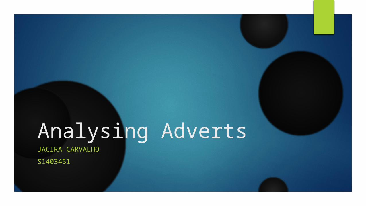
Liking isn’t helping.
This is a charity advert. CRS – Crisis Relief Singapore.http://www.crisisrelief.org/They are trying to get more volunteers to help necessitous families.
The anchorage works really well with the image as it directly connects to the people’s body language (showing their thumbs up to the family).
I believe that the target audience is adults as they are the ones that have access to the money (they are able to raise money to the charity). This might also call more the women’s attention because the people being shown is: a female and her supposed son suffering.
The colour scheme being used is the grayscale. In this advert, the colour black might connote to: death, misery, fear. This is a charitable organization and therefore white might connote to innocence, simplicity and safety.
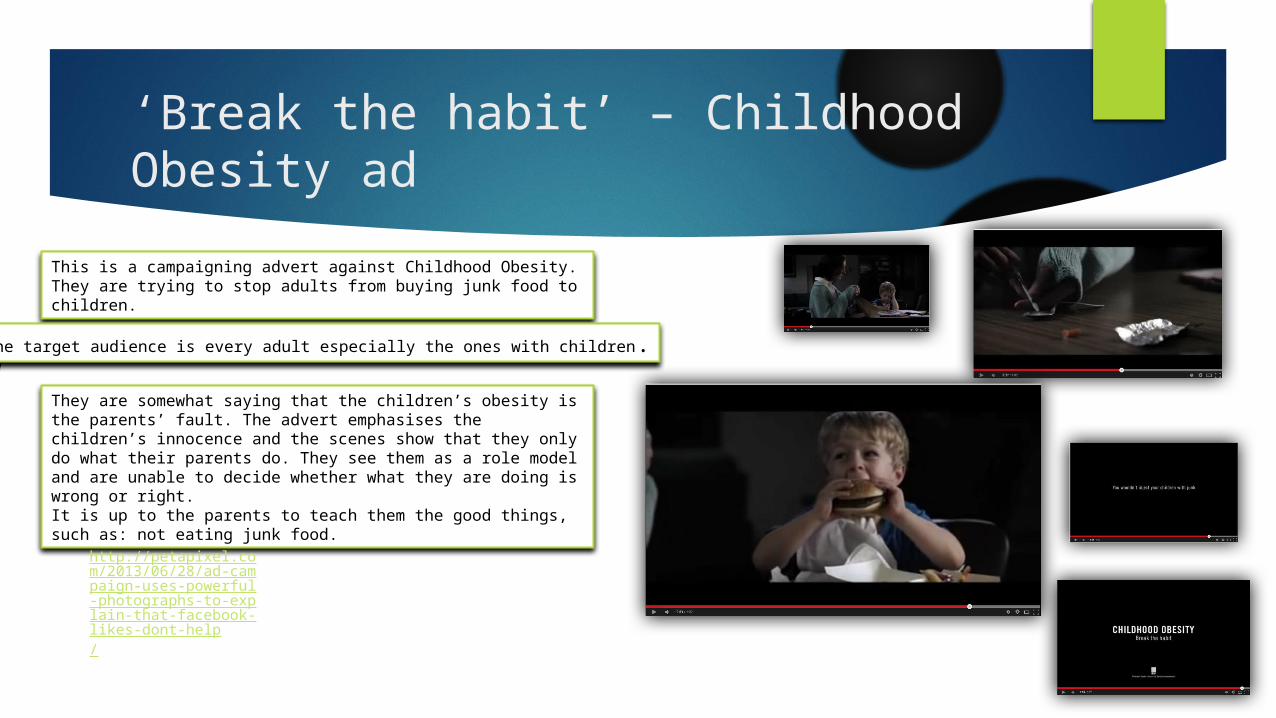
‘Break the habit’ – Childhood Obesity ad
This is a campaigning advert against Childhood Obesity. They are trying to stop adults from buying junk food to children.
They are somewhat saying that the children’s obesity is the parents’ fault. The advert emphasises the children’s innocence and the scenes show that they only do what their parents do. They see them as a role model and are unable to decide whether what they are doing is wrong or right. It is up to the parents to teach them the good things, such as: not eating junk food.
The target audience is every adult especially the ones with children.
http://petapixel.com/2013/06/28/ad-campaign-uses-powerful-photographs-to-explain-that-facebook-likes-dont-help/

Women have the right to speech
This is a company that is trying to stop women’s abuse. They believe women have the right to speak.
The image works really well with the advert purpose. The colour black emphasises the woman’s sadness and the dark background makes her look mysterious.
The logo emphasises that the company is totally dedicated into helping the female population. Therefore, I think that women will be the ones wanting to help.
The internet search box is replacing the woman’s mouth. It is easy for the audience to recognize the internet ‘search box’ as people are used to watch this every time they search for things on internet. This dramatizes the image and it highlights that she has no right to speak.
The advert easily calls the attention of the audience. The image is a close up to the woman’s face which entirely occupies the advert. The image is centred at the eye level; the woman is making eye contact with the audience (direct address).