YOUR FINAL EXAM IS June 14 You must bring two pencils with working erasers!

YOUR FINAL EXAM IS June 14 You must bring two pencils with working erasers!
Dec 27, 2015
Welcome message from author
This document is posted to help you gain knowledge. Please leave a comment to let me know what you think about it! Share it to your friends and learn new things together.
Transcript

YOUR FINAL EXAM IS June 14You must bring two pencils with working
erasers!

What is TEXTURE?
State Learning Objective Key Concept - Texture: Students will learn how texture be used to enhance an artwork
Texture
State Learning Objective Key Concepts 6th Grade Art
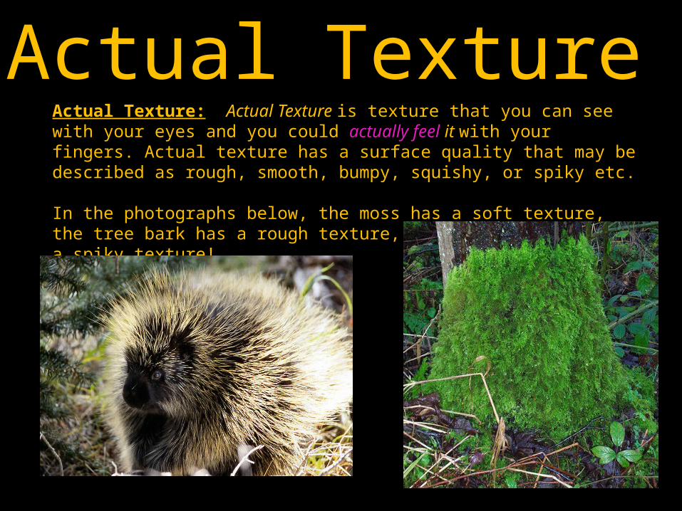
Actual Texture: Actual Texture is texture that you can see with your eyes and you could actually feel it with your fingers. Actual texture has a surface quality that may be described as rough, smooth, bumpy, squishy, or spiky etc. In the photographs below, the moss has a soft texture, the tree bark has a rough texture, and the porcupine has a spiky texture!
Actual Texture

Animals are often defined by their actual texture, such as a fuzzy kitten. This photograph of shows the actual texture of a scaly iguana.

Renaissance artist Titian painted ‘Portrait of Man in Red Cap’ by creating a texture similar to fur… using loose brushstrokes to create a texture.
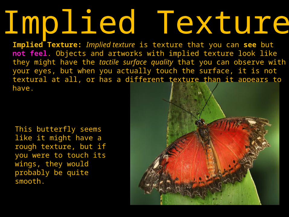
Implied Texture: Implied texture is texture that you can see but not feel. Objects and artworks with implied texture look like they might have the tactile surface quality that you can observe with your eyes, but when you actually touch the surface, it is not textural at all, or has a different texture than it appears to have.
Implied Texture
This butterfly seems like it might have a rough texture, but if you were to touch its wings, they would probably be quite smooth.
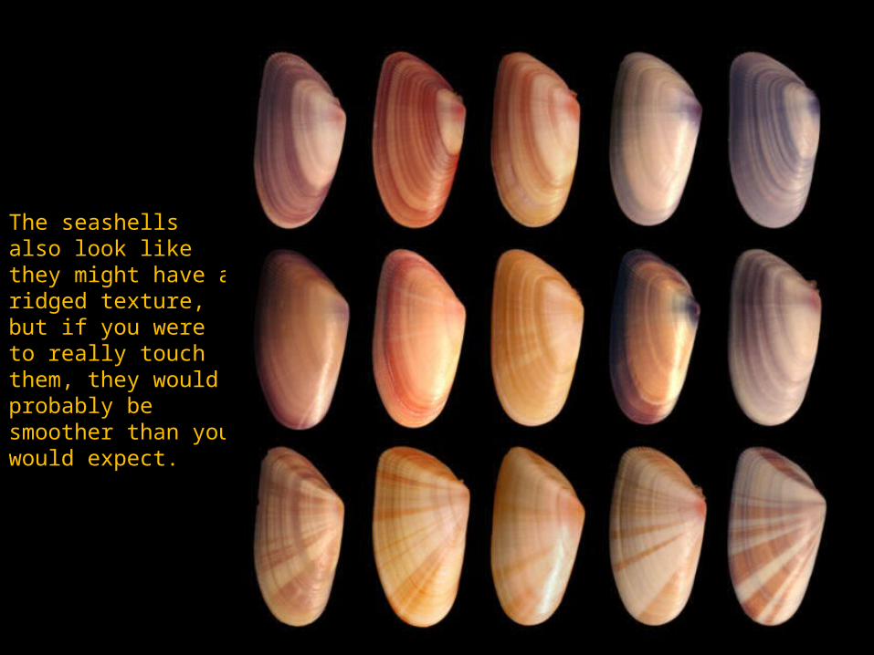
The seashells also look like they might have a ridged texture, but if you were to really touch them, they would probably be smoother than you would expect.

Cataract 3, Bridget Riley, 1967.
Implied texture is created by the lines repeating.
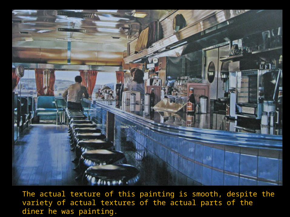
The actual texture of this painting is smooth, despite the variety of actual textures of the actual parts of the diner he was painting. Ralph's Diner, Ralph Goings, 1982.
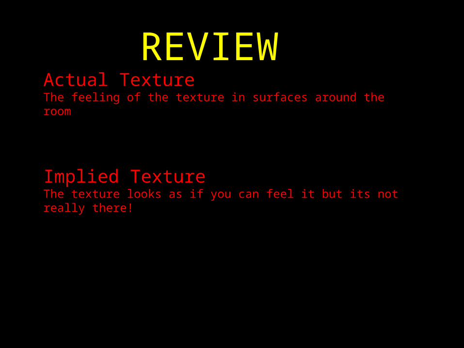
Actual TextureThe feeling of the texture in surfaces around the room
Implied TextureThe texture looks as if you can feel it but its not really there!
REVIEW!
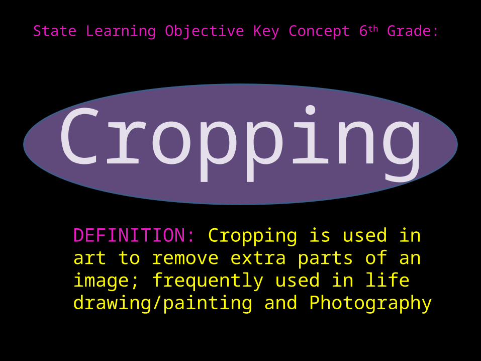
State Learning Objective Key Concept 6th Grade:
CroppingDEFINITION: Cropping is used in art to remove extra parts of an image; frequently used in life drawing/painting and Photography

Why do Artists CROP their artwork?

**Crop to add action or interestCreative or unusual cropping adds interest to ordinary images. Showing just a portion of the main subject creates mystery. Breaking part of the picture out of the box (such as removing all or part of the background) can give
movement to a stationery image.
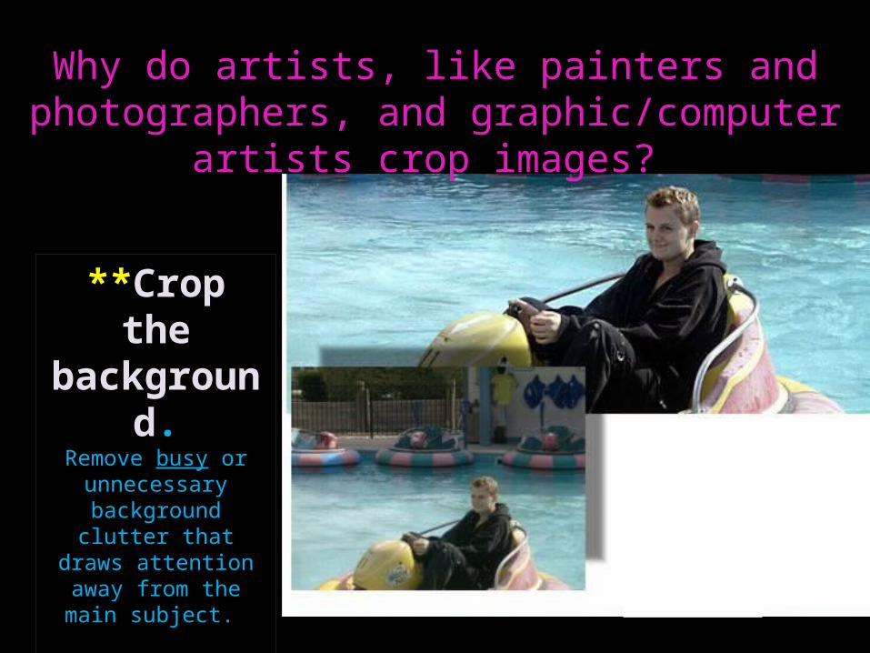
Why do artists, like painters and photographers, and graphic/computer artists crop images?
**Crop the background.
Remove busy or unnecessary background
clutter that draws attention away from the
main subject.

**Crop to show what's important.Change the focus of the photograph or emphasize specific portions of an image by cropping out less important or less desirable people or objects.
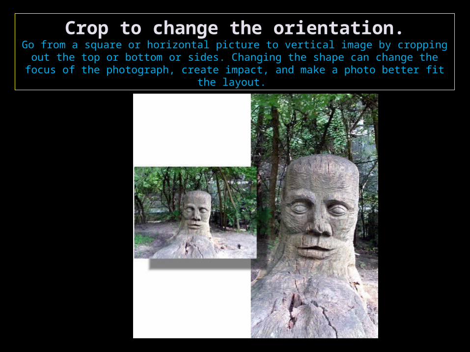
Crop to change the orientation.Go from a square or horizontal picture to vertical image by cropping out the top or bottom or sides. Changing the shape can change the focus of the photograph,
create impact, and make a photo better fit the layout.
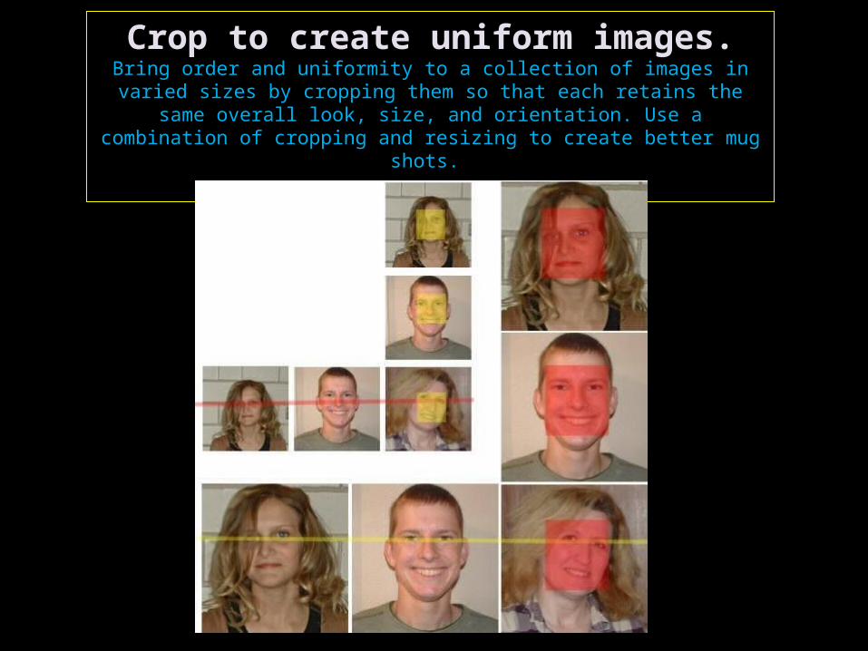
Crop to create uniform images.Bring order and uniformity to a collection of images in varied sizes by cropping them so that each retains the same overall look, size,
and orientation. Use a combination of cropping and resizing to create better mug shots.
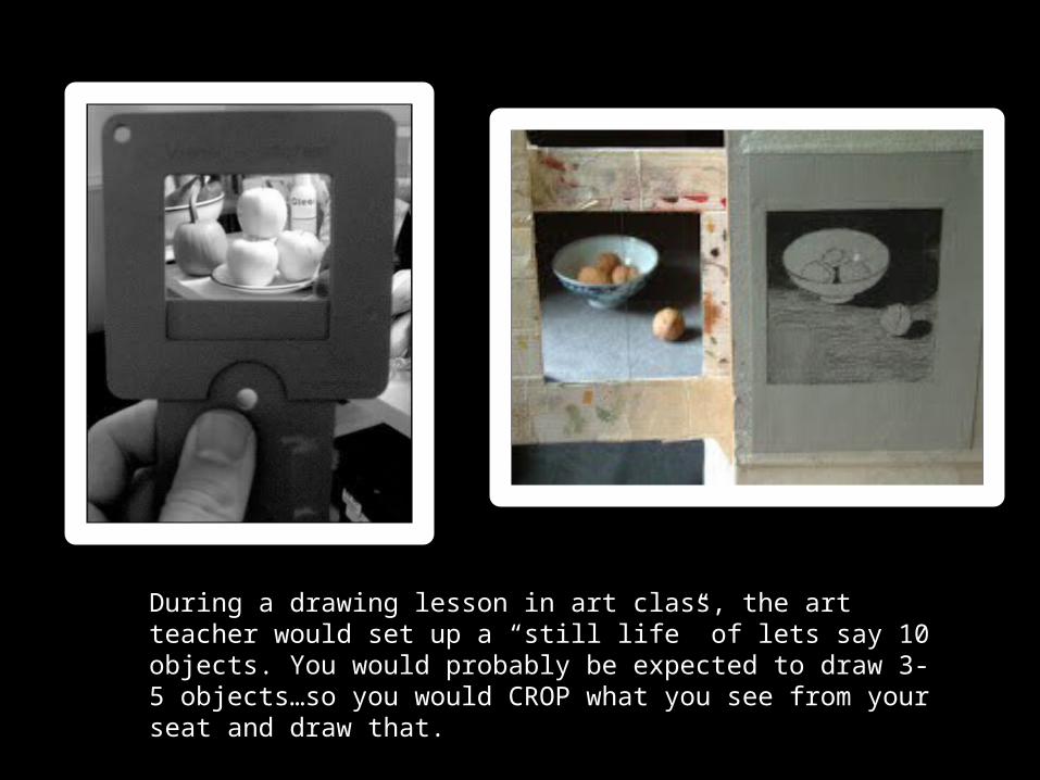
During a drawing lesson in art class, the art teacher would set up a “still life” of lets say 10 objects. You would probably be expected to draw 3-5 objects…so you would CROP what you see from your seat and draw that.

Cropping Exercise: 1. Divide your paper by folding to create four
equal boxes. In these boxes you will draw your composition.
2. Draw a more interesting version of each of these images below by zooming and cropping.
3. When you are done with each drawing draw an arrow to show the light source.
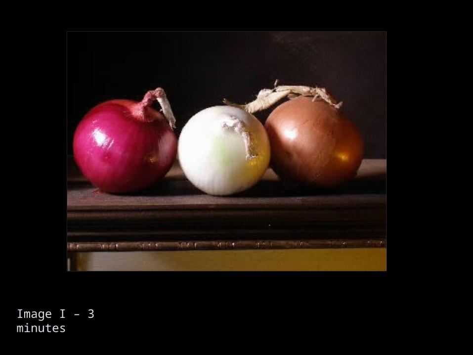
Image I – 3 minutes
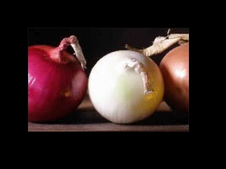

Image II – 3 minutes
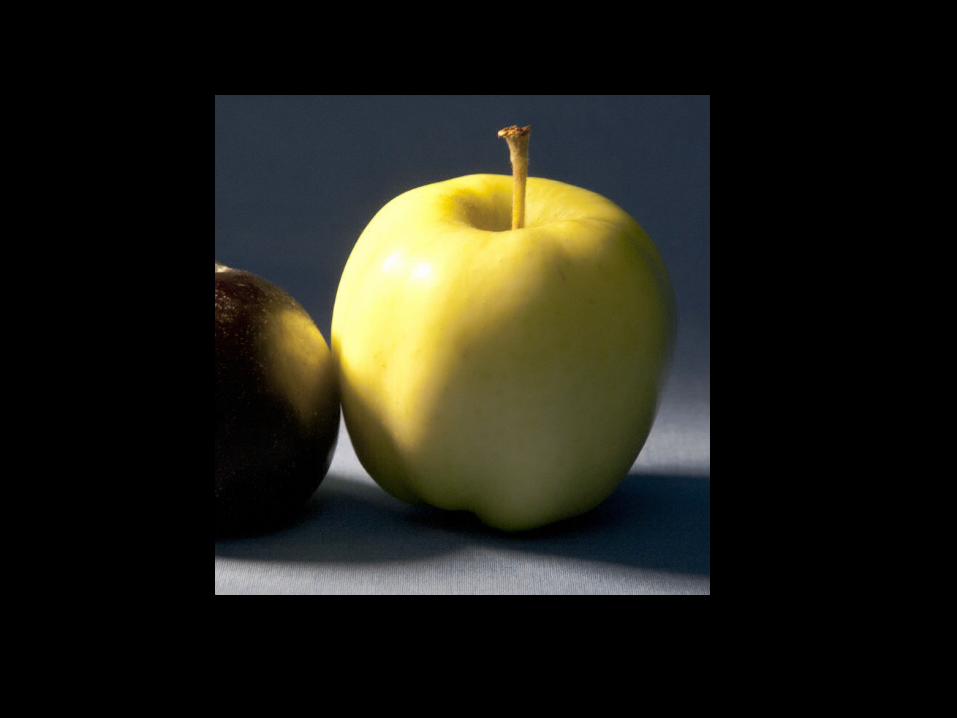

Image III – 3 minutes

Image IV
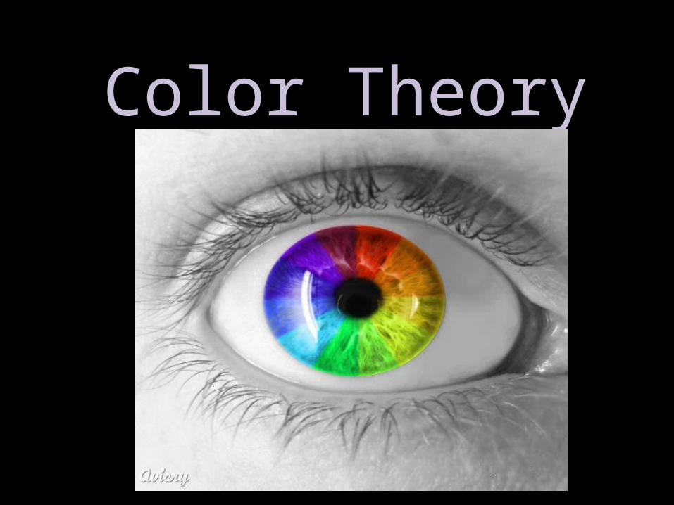
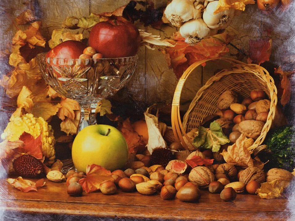
Color Theory

When you read the Color Wheel, what do you find out?
Warm Colors
Cool Colors

Primary Colors:
Secondary Colors: Red/Magenta Yellow Blue/ Cyan
Orange Green Purple/violet
The three main colors on the color wheel. These colors can not be made by mixing other colors together.
The three colors produced when two primary colors are mixed.
PRIMARY COLOR MUSIC VIDEO
http://www.youtube.com/watch?v=SaNgiI7BOys
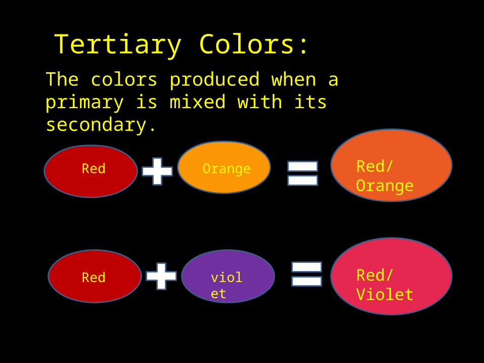
Tertiary Colors:The colors produced when a primary is mixed with its secondary.
Red Orange Red/Orange
Red violet Red/Violet
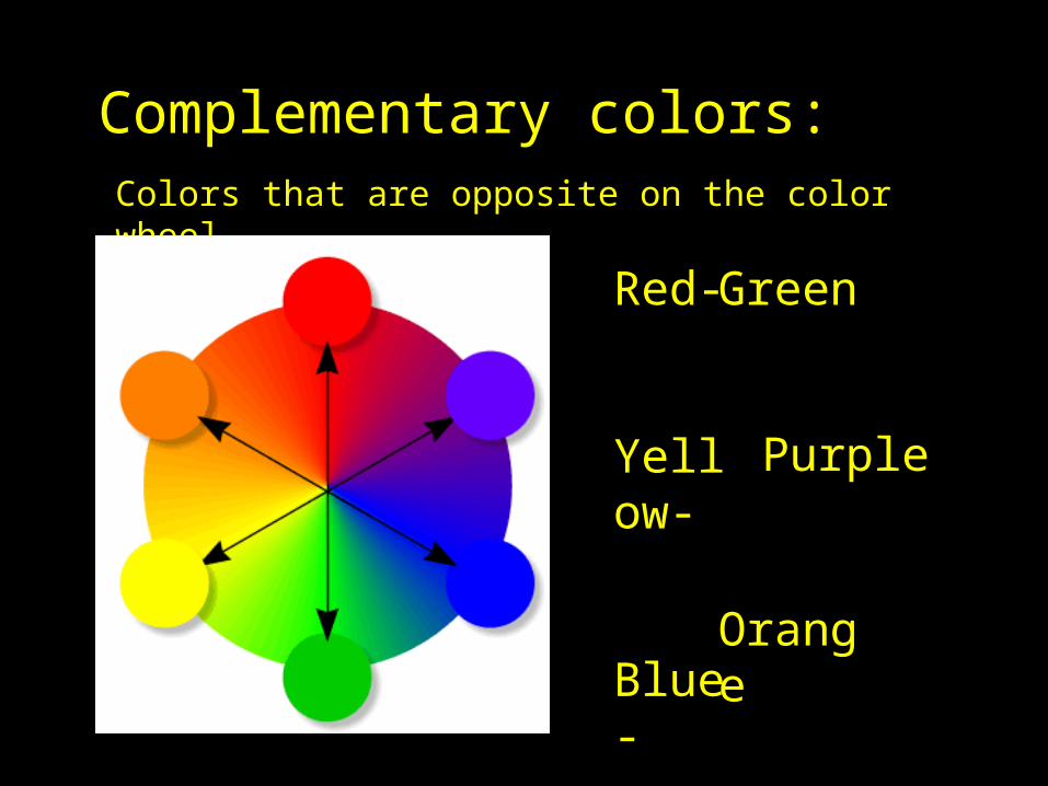
Complementary colors:Colors that are opposite on the color wheel
Red-
Yellow-
Blue-
Green
Purple
Orange
http://www.youtube.com/watch?v=ZSvkAHvxWr4v

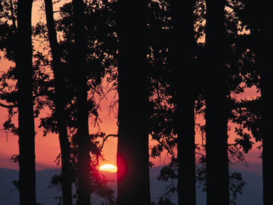
Yellow, orange, and red are called warm colors.
Appear hot like the sun or like fire
Give feelings of gaiety, activity or cheerfulness
Appear to advance-they make body look larger
Can give a nervous impression if overdone

Blue, green, and purple are often labeled cool
colors.Remind us of water or sky
Give feelings of quietness or restfulness
Appear to recede and make body look smaller
Can be depressing if overdone
Cool Colors


Using the following Art Elements, describe how it’s used in the PRINT: a) Lines. Are they straight, curved, swirling, jagged, diagonal, vertical, horizontal, continuous, broken, heavy, thin, dark, light? Do they occur at edges where color, value or texture changes suddenly? Are there lines that direct your attention from one place to another? b) Colors. Are they warm, cook, bright, dull, opaque, and transparent? Are they like colors you see in the real world, or different from real world colors? Is there a dominant color? Are there related colors? c) Values. Are the colors dark? Light? Both? Are there strong contrasts of dark/light? Are there soft contrasts of dark/Light?
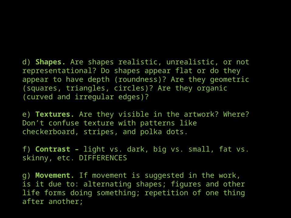
d) Shapes. Are shapes realistic, unrealistic, or not representational? Do shapes appear flat or do they appear to have depth (roundness)? Are they geometric (squares, triangles, circles)? Are they organic (curved and irregular edges)? e) Textures. Are they visible in the artwork? Where? Don’t confuse texture with patterns like checkerboard, stripes, and polka dots. f) Contrast – light vs. dark, big vs. small, fat vs. skinny, etc. DIFFERENCES g) Movement. If movement is suggested in the work, is it due to: alternating shapes; figures and other life forms doing something; repetition of one thing after another;
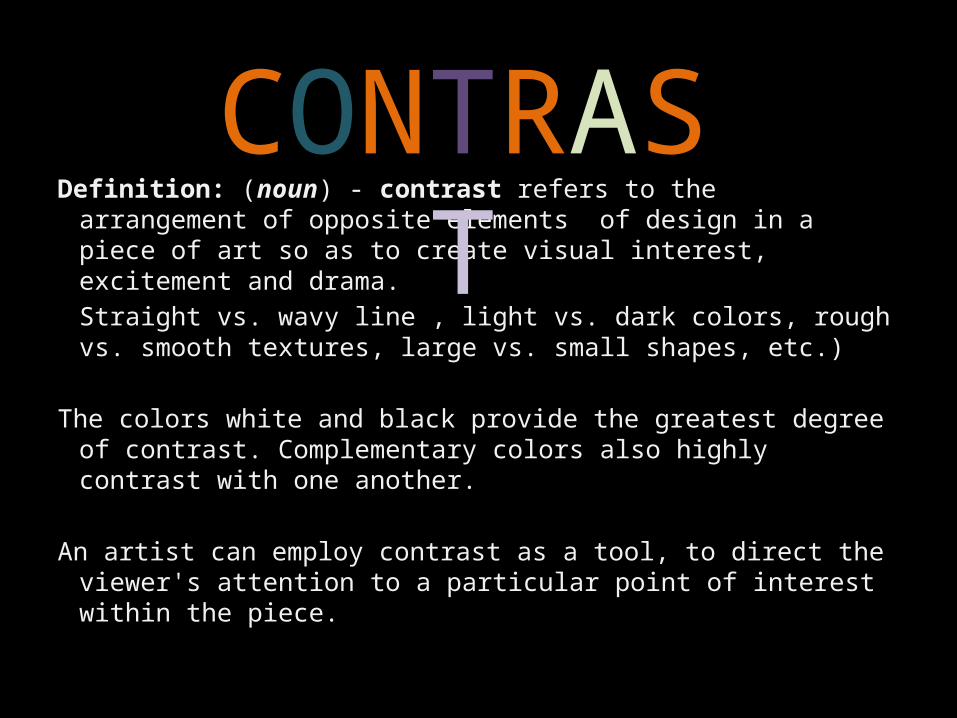
Definition: (noun) - contrast refers to the arrangement of opposite elements of design in a piece of art so as to create visual interest, excitement and drama.Straight vs. wavy line , light vs. dark colors, rough vs. smooth textures, large vs. small shapes, etc.)
The colors white and black provide the greatest degree of contrast. Complementary colors also highly contrast with one another.
An artist can employ contrast as a tool, to direct the viewer's attention to a particular point of interest within the piece.
CONTRAST
What is a print?
• A print is a reproduction, or copy, of an original art work.
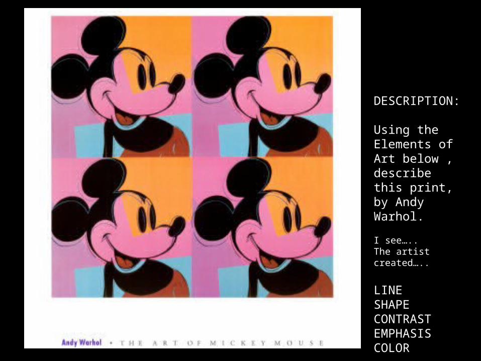
DESCRIPTION:
Using the Elements of Art below , describe this print, by Andy Warhol.
I see…..The artist created…..
LINESHAPECONTRASTEMPHASISCOLOR
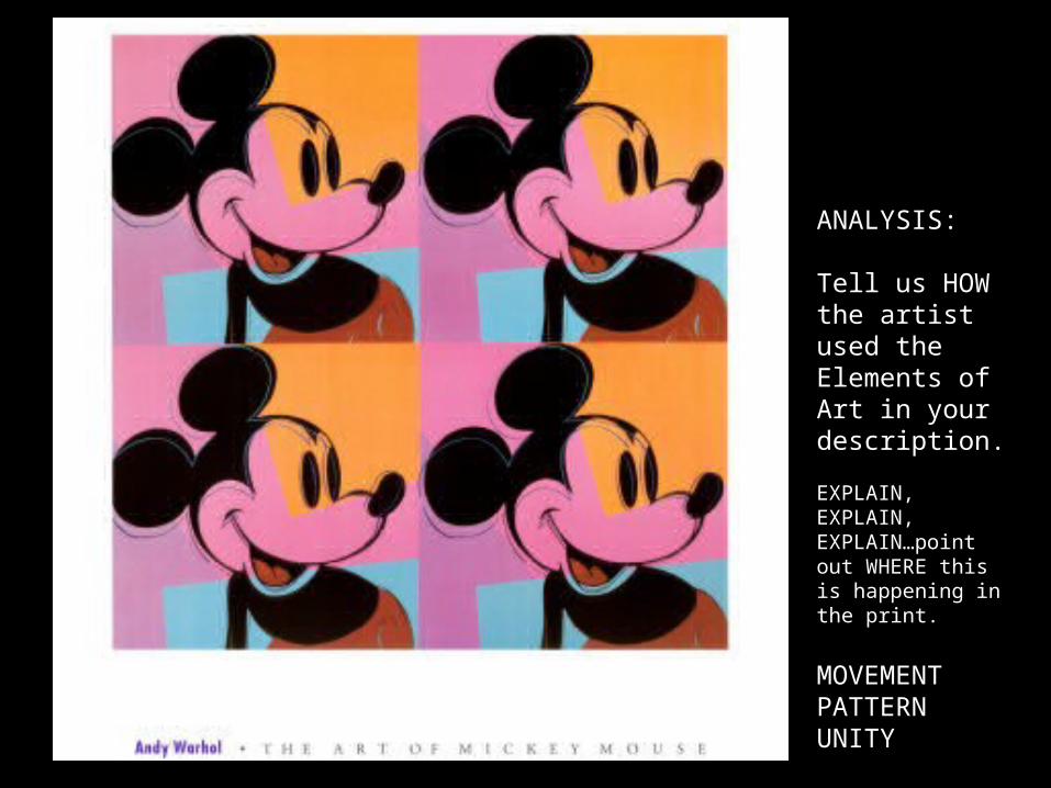
ANALYSIS:
Tell us HOW the artist used the Elements of Art in your description.
EXPLAIN, EXPLAIN, EXPLAIN…point out WHERE this is happening in the print.
MOVEMENTPATTERNUNITY
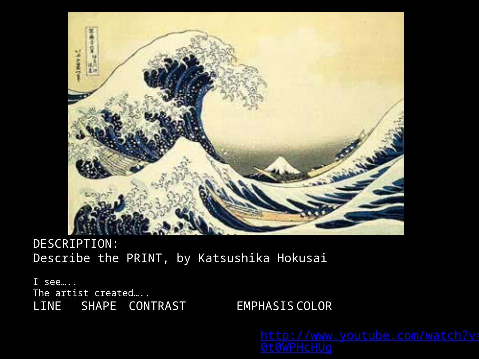
DESCRIPTION:Describe the PRINT, by Katsushika Hokusai
I see…..The artist created…..LINE SHAPE CONTRAST EMPHASIS COLOR
http://www.youtube.com/watch?v=f0t0WPHcHUg RULER REVIEW
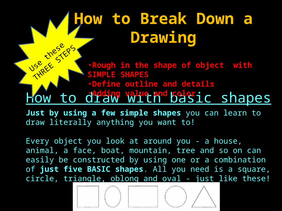
How to draw with basic shapesJust by using a few simple shapes you can learn to draw literally anything you want to!
Every object you look at around you - a house, animal, a face, boat, mountain, tree and so on can easily be constructed by using one or a combination of just five BASIC shapes. All you need is a square, circle, triangle, oblong and oval - just like these!
•Rough in the shape of object with SIMPLE SHAPES •Define outline and details•Adding value and color
How to Break Down a Drawing
Use th
ese
THREE STEPS

Practice Time! c
• Try a sketchy approach. MOVE YOUR ARM not your wrist and fingers.– Draw circles and ovals for two minutes– Draw a basic cubes using the “2 square” approach– Cylinder – using the “2 oval” approach– Try a pencil – Start tutorial
Use th
ese
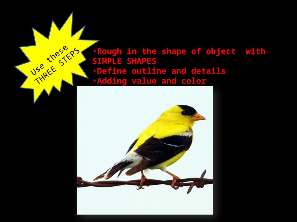
THREE STEPS •Rough in the shape of object with SIMPLE SHAPES
•Define outline and details•Adding value and color
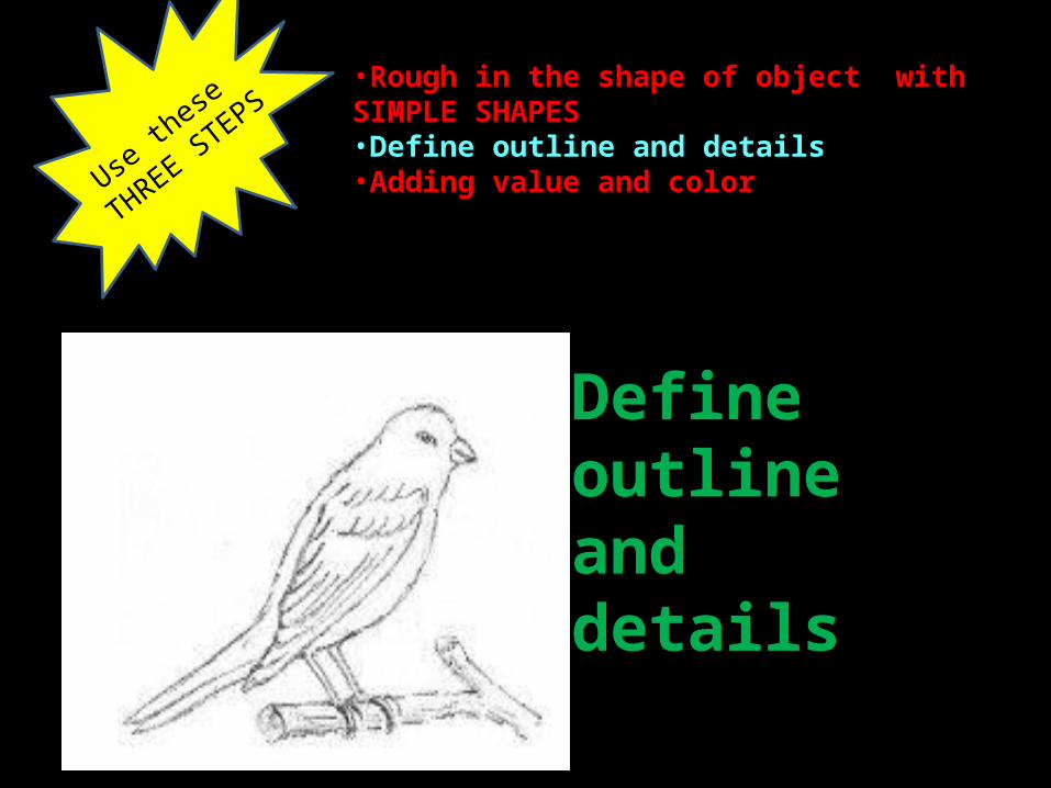
Subject:A Bird
•Rough in the shape of object with SIMPLE SHAPES •Define outline and details•Adding value and color
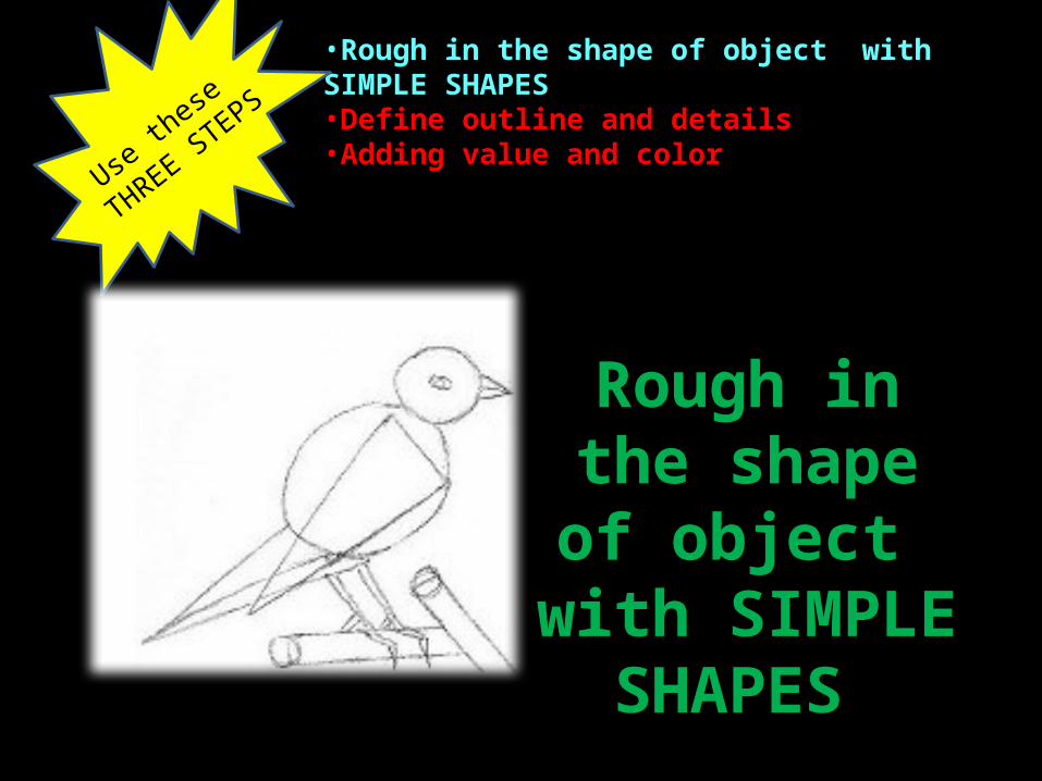
Use th
ese
THREE STEPS
Rough in the shape of object
with SIMPLE SHAPES
•Rough in the shape of object with SIMPLE SHAPES •Define outline and details•Adding value and color
Define outline and details
Use th
ese
THREE STEPS
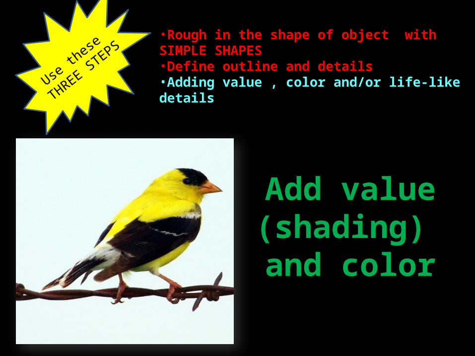
Add value (shading) and
color
Use th
ese
THREE STEPS
•Rough in the shape of object with SIMPLE SHAPES •Define outline and details•Adding value , color and/or life-like details
•Rough in the shape of object with SIMPLE SHAPES •Define outline and details•Adding value and color
Use th
ese
THREE STEPS
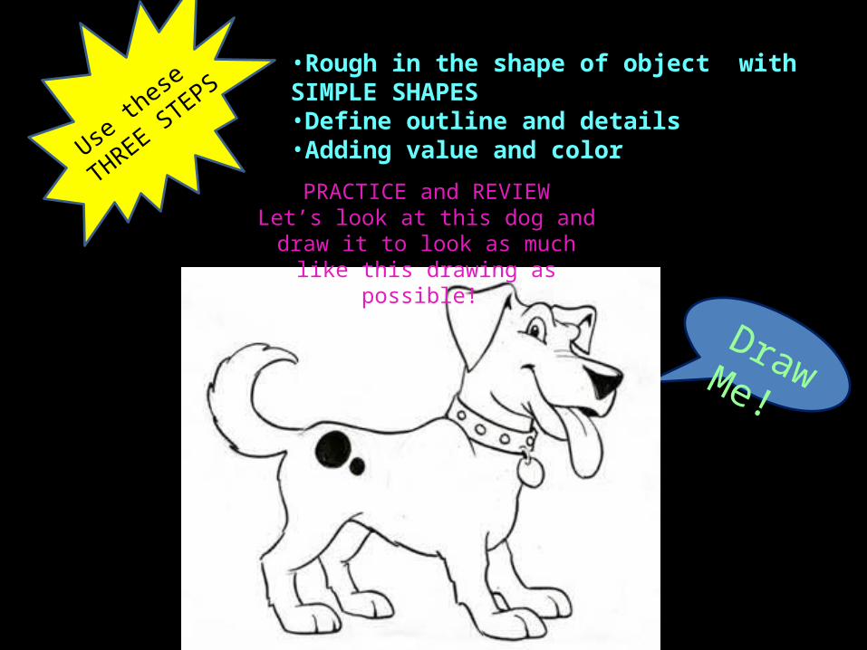
PRACTICE and REVIEWLet’s look at this dog and draw it to look as much like this drawing as possible!
Draw Me!
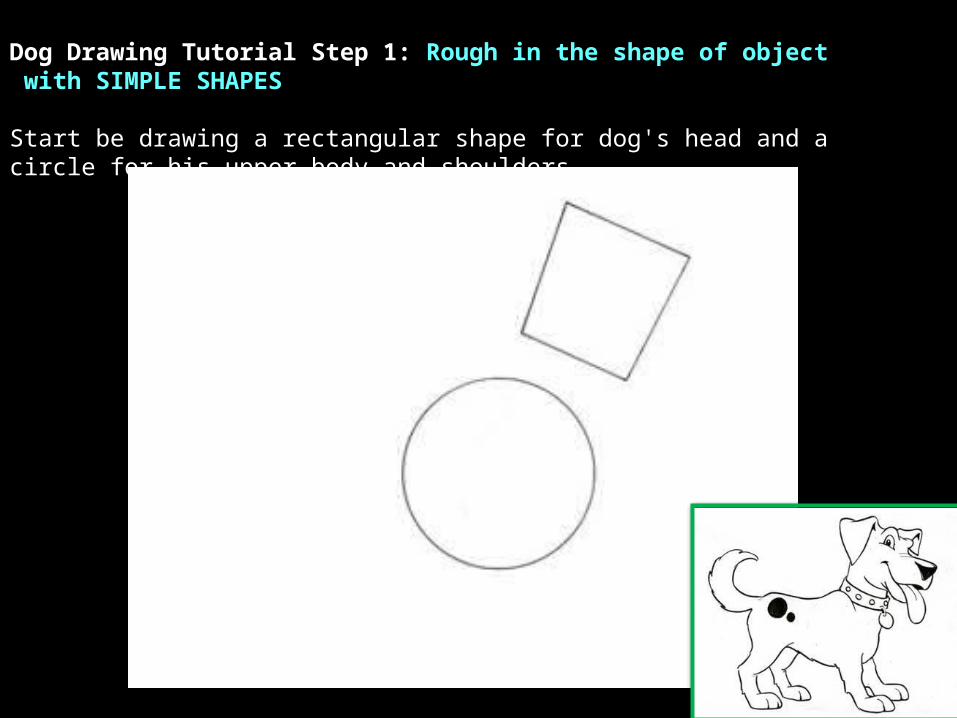
Dog Drawing Tutorial Step 1: Rough in the shape of object with SIMPLE SHAPES
Start be drawing a rectangular shape for dog's head and a circle for his upper body and shoulders.
Dog Drawing Tutorial Step 1: Rough in the shape of object with SIMPLE SHAPES
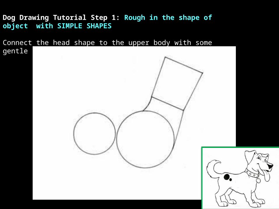
Connect the head shape to the upper body with some gentle curves. Add a circle to place the hips.

Dog Drawing Tutorial Step 1: Rough in the shape of object with SIMPLE SHAPES
Now here is where it really starts looking like a dog. Add some triangle shapes for the ears and nose. Give your dog drawing a tail.

Dog Drawing Tutorial Step 2: Define outline and detailsFollow the drawing carefully to draw dog paws and legs. A dog's back legs bend differently than the front legs. To draw a cute dog give a big smile with his tongue hanging out. If you want a mean dog make him frown or show some teeth. Draw a hump for your dogs eye and another hump for the brow ridge.
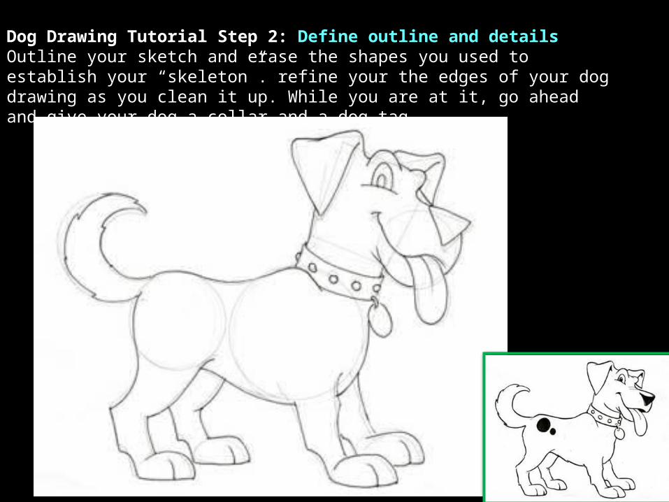
Dog Drawing Tutorial Step 2: Define outline and details Outline your sketch and erase the shapes you used to establish your “skeleton”. refine your the edges of your dog drawing as you clean it up. While you are at it, go ahead and give your dog a collar and a dog tag.
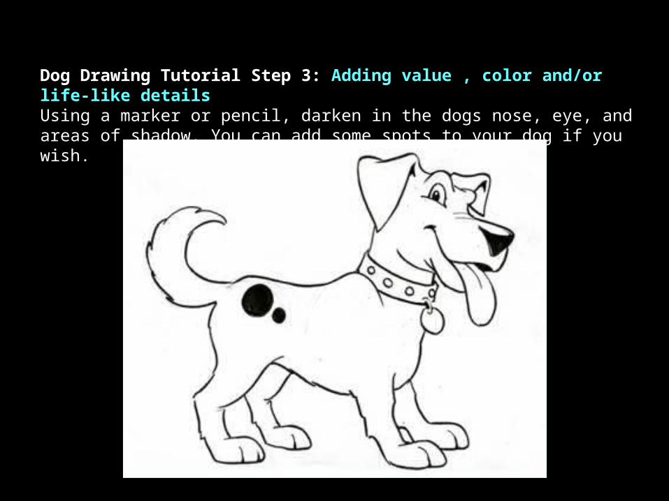
Dog Drawing Tutorial Step 3: Adding value , color and/or life-like detailsUsing a marker or pencil, darken in the dogs nose, eye, and areas of shadow. You can add some spots to your dog if you wish.
Related Documents